Hello! HTML5 And CSS3 Hello A User Friendly Reference Guide R. Crowther (Manning, 2013) WW
User Manual:
Open the PDF directly: View PDF  .
.
Page Count: 561 [warning: Documents this large are best viewed by clicking the View PDF Link!]
- Hello!HTML5andCSS3
- brief contents
- contents
- preface
- acknowledgments
- about this book
- Part 1 Learning HTML5
- 1 Introducing HTML5 markup
- 2 HTML5 forms
- 3 Dynamic graphics
- 4 Audio and video
- 5 Browser-based APIs
- 6 Network and location APIs
- Part 2 Learning CSS3
- 7 New CSS language features
- 8 Layout with CSS3
- 9 Motion and color
- 10 Borders and backgrounds with CSS3
- 11 Text and fonts
- Appendix A A history of web standards
- Appendix B HTML basics
- Appendix C CSS basics
- Appendix D JavaScript
- Index
- Hello!HTML5andCSS3-back
Rob Crowther
A user-friendly reference guide
MANNING
HTML5
&
CSS3
Hello! HTML5 & CSS3

Hello! HTML5 & CSS3
A user-friendly reference guide
Rob Crowther
MANNING
SHELTER ISLAND

For online information and ordering of this and other Manning books, please visit
www.manning.com. The publisher offers discounts on this book when ordered in
quantity. For more information, please contact:
Special Sales Department
Manning Publications Co.
20 Baldwin Road
PO Box 261
Shelter Island, NY 11964
Email: orders@manning.com
©2013 by Manning Publications Co. All rights reserved.
No part of this publication may be reproduced, stored in a retrieval system, or transmitted,
in any form or by means electronic, mechanical, photocopying, or otherwise, without
prior written permission of the publisher.
Many of the designations used by manufacturers and sellers to distinguish their products
are claimed as trademarks. Where those designations appear in the book, and Manning
Publications was aware of a trademark claim, the designations have been printed in initial
caps or all caps.
User Friendly artwork, characters, and strips used by permission from UserFriendly.Org.
All Rights Reserved.
Recognizing the importance of preserving what has been written, it is Manning’s policy to
have the books we publish printed on acid-free paper, and we exert our best efforts to that
end. Recognizing also our responsibility to conserve the resources of our planet, Manning
books are printed on paper that is at least 15 percent recycled and processed without
elemental chlorine.
Manning Publications Co. Development editor: Cynthia Kane
20 Baldwin Road Copyeditor: Tiffany Taylor
PO Box 261 Technical proofreader: Adam London
Shelter Island, NY 11964 Typesetter: Marija Tudor
Cover designer: Marija Tudor
ISBN: 9781935182894
Printed in the United States of America
1 2 3 4 5 6 7 8 9 10 – MAL – 17 16 15 14 13 12

v
brief contents
PART 1 LEARNING HTML5 1
1 Introducing HTML5 markup 3
2 HTML5 forms 38
3 Dynamic graphics 73
4 Audio and video 119
5 Browser-based APIs 153
6 Network and location APIs 191
PART 2 LEARNING CSS3 231
7 New CSS language features 233
8 Layout with CSS3 271
9 Motion and color 313
10 Borders and backgrounds with CSS3 351
11 Text and fonts 392

vii
contents
preface xv
acknowledgments xvii
about this book xix
PART 1 LEARNING HTML5 1
1 Introducing HTML5 markup 3
Why do we need new elements? 4
New elements for page structure 7
Sectioning content 7 ❍ Headings, headers, and the outlining
algorithm 9 ❍ Common page elements 15
The HTML DOCTYPE 17
New elements for content 18
Time 18 ❍ Images and diagrams with <figure> and
<figcaption> 21 ❍ Emphasizing words and phrases 22
HTML5’s new global attributes 23
Accessibility with ARIA 24 ❍ Extending HTML with custom
attributes 26 ❍ Expressing more than just document
semantics with microdata 28
The HTML5 content model 29
Browser support 32
Supporting Internet Explorer 35 ❍ Enabling HTML5 support
in Internet Explorer with html5.js 36
Summary 36
viii contents
2 HTML5 forms 38
The limitations of HTML4 forms 39
Numbers, ranges, dates, and times 42
Validation 46
The required attribute 47 ❍ The min, max, and pattern
attributes 47 ❍ Taking advantage of validation with
CSS 49 ❍ Turning off validation 50
Email and URLs 51
Email addresses 51 ❍ Web addresses 53
Elements for user feedback 53
The <output> element 53 ❍ The <progress> element 55
The <meter> element 56
Less-common form controls 57
Telephone numbers 57 ❍ Color pickers 58
<keygen> 59
New attributes for the <input> element 59
Placeholder text 59 ❍ Form autofocus 61 ❍ Protecting
private information with the autocomplete attribute 61
Extending forms with JavaScript 62
Customizing the validation messages 62 ❍ Triggering
validation with JavaScript 64 ❍ Responding to any
changes in value 64 ❍ Creating combo boxes with
<datalist> 65 ❍ Easy ways to work with form
values in JavaScript 67
Browser support and detecting HTML5 features 68
Browser inconsistencies 69 ❍ Detecting supported
features 69 ❍ The html5-now library 71
Summary 72
3 Dynamic graphics 73
Getting started with <canvas>: shapes, images, and text 74
Drawing shapes 76 ❍ Placing images 82 ❍ Drawing
text 84
Advanced <canvas>: gradients, shadows, and animation 87
Creating gradients 88 ❍ Drawing drop shadows 91
Transformations 92 ❍ Animation 94
contents ix
Getting started with SVG 96
Applying styles to SVG 98 ❍ Drawing common shapes 99
Images, text, and embedded content 101 ❍ Transforms,
gradients, patterns, and declarative animation 105
SVG vs. <canvas> 112
Browser support 114
Supporting <canvas> in older versions of IE with
explorercanvas 114 ❍ SVG in XML vs. SVG in HTML 115
Embedding SVG as an image 115 ❍ Referencing an SVG
image from CSS 116 ❍ Embedding SVG as an object 116
SVG support in older browsers with SVG Web and Raphaël 116
Summary 118
4 Audio and video 119
Audio and video on the modern web 119
The <audio> element 123
Common attributes: controls, autoplay, loop, and preload 124
Codecs and license issues 129 ❍ Using multiple sources 133
The <video> element 134
<video> element attributes 135 ❍ Containers, codecs,
and license issues 138 ❍ Easy encoding with Miro Video
Converter 139 ❍ Advanced encoding with FFmpeg 140
Using multiple sources 142
Controlling audio and video with JavaScript 144
Integrating media with other content 146
Browser support 150
Web server configuration for audio and video 151
Supporting legacy browsers with Flash video 152
Summary 152
5 Browser-based APIs 153
Rich-text editing with the contenteditable attribute 154
Basic text editing 155 ❍ The spellcheck attribute 157
Applying formatting to the editable text 160
Natural user interaction with drag-and-drop 164
Basic drag-and-drop 167 ❍ Drag-and-drop in all
browsers 169
xcontents
Managing the Back button with the history API 173
Updating page state 175 ❍ Using location.hash 176
Example: Implementing an undo feature 177
Getting semantic with the microdata API 179
Using a single microdata format 180 ❍ Using multiple
microdata formats 183
Lag-free interfaces with web workers 185
Browser support 189
Summary 189
6 Network and location APIs 191
Finding yourself with the Geolocation API 192
Finding your location 193 ❍ Finding your location more
accurately 194 ❍ Finding your location continuously 195
Practical uses for geolocation 196
Communication in HTML5 200
Enabling more secure integration with cross-document
messaging 201 ❍ Real-time communication with the
WebSocket API 205
Offline web applications 208
Setting up a development environment 209
The application cache 211 ❍ Managing network
connectivity in offline apps 215
Storing data for offline use 222
Local storage 223 ❍ Session storage 227 ❍ Putting
it all together 228
Browser support 229
Summary 229
PART 2 LEARNING CSS3 231
7 New CSS language features 233
Choosing elements through their relationships 234
Selecting sets of elements with combinators 235
Selecting among a set of elements with
pseudo-classes 240
contents xi
Choosing elements by their attributes 251
Choosing what isn’t 255 ❍ Pseudo-elements 257
Choosing elements based on user interaction 261
Styling form elements based on state 262 ❍ Styling the
page based on the target of the URL 265
Browser support 267
Using jQuery to support older browsers 269
Summary 270
8 Layout with CSS3 271
Underused CSS2 layout features 272
Placing elements on a line with inline-block 272 ❍ Grouping
element dimensions with display: table 275
CSS3 improvements to CSS2 approaches 279
Mixing different length units with calc 279 ❍ Controlling
the box model 284
Using media queries for flexible layout 285
Resolution detection 287 ❍ Changing layout based on
orientation and aspect ratio 291 ❍ Additional
device-detection features 292
The future of CSS layout 293
Using flexible boxes for nested layout 294 ❍ Using the
CSS3 Grid Alignment module 298 ❍ Controlling content
flow with CSS3 Regions 303 ❍ Making complex shapes
with CSS3 Exclusions and Shapes 305
Browser support 308
inline-block in IE6 and IE7 309 ❍ calc in Chrome and
Firefox 310 ❍ box-sizing in Firefox and Safari 5 310
Flexboxes in Chrome, Firefox, IE, and Safari 310
Media queries and old browsers 311 ❍ Regions and
exclusions 311
Summary 311
9 Motion and color 313
Colors and opacity 314
Opacity 314 ❍ RGBA 318 ❍ HSL and HSLA 320
xii contents
CSS transforms 323
2D transforms 324 ❍ 3D transforms 328
CSS transitions 330
Transition timing functions 334 ❍ Transition
property 337 ❍ Transition delay 338 ❍ Triggering
transitions with JavaScript 339
CSS Animation 343
Browser support 346
Opacity in IE8 and earlier 346 ❍ Transforms, transitions,
and animations in current browsers 346 ❍ Using
modernizr.js and jQuery for animation in older
browsers 349
Summary 350
10 Borders and backgrounds with CSS3 351
Drop shadows with CSS3 352
Box shadows 352 ❍ Text shadows 356
Easy rounded corners 358
New features for background images 361
Background size 361 ❍ Multiple backgrounds 365
Background origin and clipping 369
Selective background scaling with border images 371
Basic border-image 372 ❍ Stretching and repeating
border-image sections 374 ❍ Using border-image to
create common effects 377
Creating gradients with CSS 378
Browser support 384
Cross-browser drop shadows 385 ❍ Cross-browser
CSS3 gradients 386 ❍ Cross-browser backgrounds and
border-image 387 ❍ Supporting old versions of Internet
Explorer 388 ❍ CSS3 PIE for easy IE support 390
Summary 391
11 Text and fonts 392
Basic web fonts 393
Gaining control of fonts with the @font-face rule 394
Font formats: EOT, TTF/OTF, and WOFF 398
Browser support for downloadable fonts 399
contents xiii
Making your life easier with font services 400
Downloadable kits: FontSquirrel 400 ❍ Free font services:
Google Web Fonts 403 ❍ Subscription font services:
Fontdeck 405
Advanced web typography 407
font-size-adjust 407 ❍ Advanced font control 409
Text columns 416
Column count and width 416 ❍ Column spans 418
Gaps and rules 419
Wrapping and overflow 420
Word wrap 420 ❍ Text overflow 422
Browser support 423
Summary 423
Appendix A A history of web standards 425
Appendix B HTML basics 441
Appendix C CSS basics 467
Appendix D JavaScript 491
Index 523

xiv contents

xv
preface
I first saw the web in my final year of university in 1993-94. All the cool
kids (bear in mind, this was a Computer Science department) were play-
ing with a strange bit of software called Mosaic on their Sun 4 work-
stations. I had some fun with it and created my first web page (a guide to
Edinburgh pubs), but it didn’t strike me as anything more than a curios-
ity and it certainly didn’t measure up to “proper” document preparation
formats like LaTeX. It’s not the first time I’ve been completely wrong
about technology—and it won’t be the last!
I went back to experimenting with websites in 1997, a full-on blinking,
scrolling plethora of tacky animated gifs which is thankfully long lost. As
I learned more about the web I stopped seeing it as a poor-quality type-
setting system and started seeing it as a great equalizer. Not only was
visiting a web page something anyone could do, making a web page was also
something anyone could do. Since then I’ve been on a mission, not only to
learn as much as I can about making web pages, but to help others learn
how to make them, and this book is a natural extension of that mission.
HTML5 and CSS3 are fascinating to me not only because of their techni-
cal features, but because they represent growth in the web platform after
several years of stagnation. The more the web can do, the more content
can be shared across the world by ordinary people like you and me.

xvi preface

xvii
I’d like to thank my Mum for inspiring my lifelong love of books, my Dad
for inspiring my lifelong love of computers, and my brother for under-
writing my move to London and giving me a chance to get a full-time web
development job. Also sincere thanks to the rest of my family for being
there for me over the years.
A big thank you to Boyd Gilchrist who, while we were both at university,
patiently answered such questions as “What’s this web browser thing,
then?” and “HTML, what the fudge is that?” among many others I
couldn’t be bothered to research on my own in the pre-Google era. Also,
thanks to my other friends at university, especially Graham Barr who not
only put up with living with me for several years but also managed to
keep in touch long enough to read drafts of several chapters in this book.
I’d like to thank everyone at Net Resources, especially my tutor John
Ayscough; Richard O’Connor for giving me the subsequent placement
which was my first commercial web development experience; and Esther
Kuperij for talking him into it. My adventures in web standards have been
greatly aided by the vibrant London web developer community, particu-
larly the London Web Standards and London Web Meetup groups.
Troy Mott at Manning is the person who originally got me involved with
this book project, though at times I’m not sure whether to blame him or
thank him for that! But Troy and all the other people I’ve worked with at
Manning have been massively supportive throughout the writing and
production processes. I’d especially like to thank Katharine Osborne,
Candace Gillhoolley, Cynthia Kane, Bert Bates, Katie Tennant, Tiffany
acknowledgments
xviii acknowledgments
Taylor, Martin Murtonen, Janet Vail, Mary Piergies, and of course
Marjan Bace, for making this book what it is.
Many people reviewed the manuscript at various stages of its develop-
ment, and I would like to thank all the MEAP readers who provided
comments in the forum as well as the following peer reviewers for their
invaluable feedback: ‘Anil’ Radhakrishna, Braj Panda, Brian R. Bondy,
Curtis Miller, Dave Nicolette, Dave Pawson, David McWhirter, Diane
C. Leeper, Edward Welker, Eric Pascarello, Gary Rasmussen, Greg
Donald, Greg Vaughn, James Hatheway, Jason Jung, Jason Kaczor,
John Griffin, Keith Kim, Kieran Mathieson, Lester Lobo, Lisa Morgan,
Mike Greenhalgh, Nikolaos Kaintantzis, Rudy Pena, Sarah Forst, Stu-
art Caborn, Tijs Rademakers, and Yvonne Adams. Special thanks to
Adam London for his careful technical review of the final manuscript
and for testing the code.
Finally, I’d like to acknowledge J. D. “Illiad” Fraser of User Friendly for
letting Manning use the User Friendly cartoon characters in the Hello!
series and for allowing me to put my own words in the characters’
mouths.

xix
You should read this book if you’re interested in learning about the new
features in HTML5 and CSS3 available to web developers and enjoy an
example-driven, visual approach to learning. Readers in any of the fol-
lowing categories should find this book useful:
❂Experienced web developers
❂Novice web developers
❂App developers (iPhone, Android, Windows 8 Metro)
❂Interactive media designers
❂Web designers
Different readers will find different parts of the book interesting. Please
see the later section “Book structure and suggested reading order” for
further guidelines on how to navigate the book.
Extra content for beginners
This book focuses on the new features of HTML5 and CSS3; as such it
expects the reader to have a little experience with their predecessors. But
we will take things slowly, especially in the early chapters, and each feature
discussed will come with example code you can try yourself. If you know
what tags are and what a CSS rule looks like, then you should have few
problems. If you’re new to web development, then you’ll benefit from the
short introduction to HTML and CSS in appendixes B and C.
To use many of the new features in HTML5, it is helpful to have some
knowledge of JavaScript. If you are a complete beginner, then you will
about this book
xx about this book
still find this book useful as it mostly uses small examples which are
easy to experiment with. Appendix D is provided to get you started in
JavaScript.
Book structure and suggested reading order
This book is split into two sections: part 1 concentrates on HTML5 and
part 2 on CSS3. The HTML5 section has chapters on the new markup
features of HTML5, forms and form validation, HTML5’s new dynamic
graphics capabilities, using video and audio, new JavaScript APIs for
client-side development, and new APIs related to networking. As a
rough guideline, the early chapters require little-to-no knowledge of
JavaScript, with each successive chapter building your knowledge
base. The second section starts with a couple of chapters on the nuts
and bolts of CSS3 and selectors, followed by chapters on layout, motion
and color, borders and backgrounds, and fonts and text formatting.
Most of the chapters are self-contained,
although there are a few dependencies.
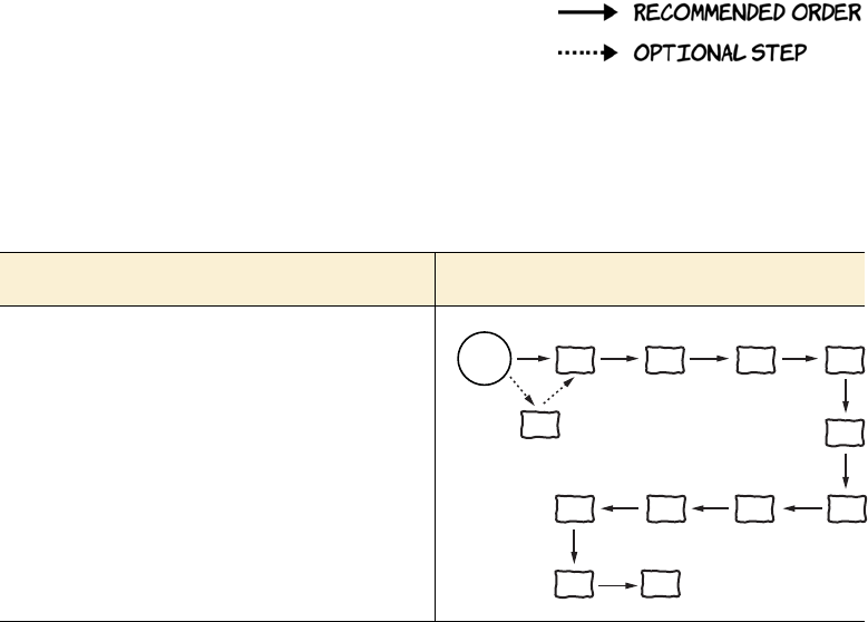
The following chapter diagrams show a
few suggested reading orders, based on your role and what you expect
to get out of the book. Each diagram consists of chapter numbers in
boxes as well as the recommended and optional steps, which are indi-
cated by two types of arrows as shown in the key above.
If you are a ... Read chapters in this order
WEB DEVELOPER
If you’re a web developer looking to get up to speed,
then you should have no problem reading the chap-
ters in numerical order. The CSS used in chapters 2
through 6 should be easy for you to follow. If you’re
interested in the history of HTML and the standards
process, then you can read appendix A before you
dive in. It’s likely that appendixes B through D are
not going to tell you anything you don’t already know,
so there’s no need to bother with them.
start
here 1234
5
6789
11
A
10
about this book xxi
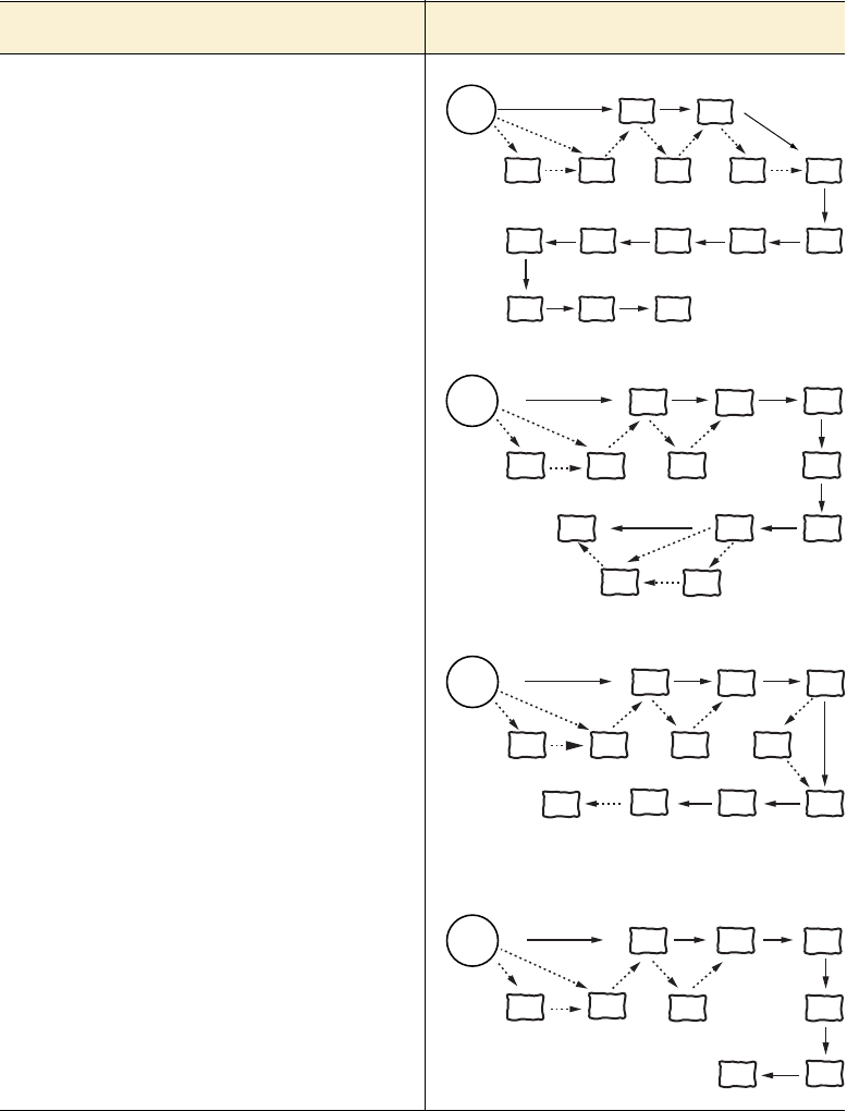
NOVICE WEB DEVELOPER
If you’re a novice web developer, then a slightly dif-
ferent approach is recommended. Again, read
appendix A only if you’re interested in history, but do
read appendixes B, C, and D if you have little-to-no
experience with HTML, CSS, and JavaScript. Read
appendix C and chapter 7 right after chapter 1 to
build your familiarity with CSS so that the limited
amount of CSS used in chapters 2 through 6
doesn’t hold you back.
APP DEVELOPER
If your goal is to be an app developer, either target-
ing mobile devices or Windows 8 Metro style apps,
then the key chapters for you are 1 through 6 which
concentrate on the markup and programming
platform provided by HTML5. Include appendixes B
and D plus chapter 7 if you’re coming to HTML5 from
another platform. Chapter 8 discusses CSS layout,
which will be useful for apps. This diagram assumes
a graphic designer will handle the detailed design
work, so chapters 9 through 11 are not shown.
INTERACTIVE MEDIA DESIGNER
If you’re an interactive media designer who is a
heavy user of Flash for media, animation, or
interactive content, then you can safely skip chapters
2, 5, and 6. Chapter 3 deals with dynamic graphics
and 4 with audio and video, and chapters 9 and 10
deal with the more visual-impact aspects of CSS3.
Chapter 8 on layout will be of less interest to you,
but chapter 11 covers using custom fonts, so you
may want to read that section.
WEB DESIGNER
If you’re a pure web designer with no interest in
JavaScript, then you can read the book while
avoiding most of the code. Any snippets of
JavaScript you’ll come across in chapters 1 and 7
through 11 can be ignored unless you want to try
replicating CSS3 effects in JavaScript for
backwards compatibility.
If you are a ... Read chapters in this order
start
here 1
A B C d 2
3
4
56
7
8
9 1110
start
here
1
AB
C
d
23
4
5
6
7
8
start
here
A B C
d
134
7
11 9
10
start
here
ABC
178
11
9
10

xxii about this book
Characters and conventions
This book uses many graphic elements and typographical conventions
to guide you and help you learn about HTML5 and CSS3. This section
summarizes what you can expect to see.
CHARACTERS
You’ll be helped along by the characters from the popular User Friendly
cartoons. In case you’re not familiar with this web comic, let me intro-
duce each of the characters and explain their roles in this book.
A.J. is the Columbia Internet Web Developer. He loves com-
puter games, nifty art, and has a big-brother relationship with
the Dust Puppy. He’ll be your main guide through HTML5 and
CSS3, pointing out gotchas and giving you extra tips.
The Dust Puppy was born inside of a network server, a result
of the combination of dust, lint, and quantum events. He is
wide-eyed and innocent, with no real grasp of reality, but he’s
pretty cute and people love him. In this book, Dust Puppy’s
main role will be to help you move from one topic to the next,
summarizing what you’ve just learned and letting you know
what’s coming next.
Erwin is a highly advanced Artificial Intelligence (AI) that
resides somewhere on the network. He was created overnight
by the Dust Puppy, who was feeling kind of bored. Erwin will
help out whenever something needs looking up on the internet
or when you need to think like a computer.
Miranda is a trained Systems Technologist and an experienced
UNIX sysadmin. A.J. is her boyfriend and she’ll be helping him
out throughout the book.

about this book xxiii
Greg is in charge of Technical Support at the company. He has
broad technical knowledge but no expertise in web develop-
ment. A.J. is helping him learn about web development, and
he’ll ask questions when A.J. isn’t being clear.
Stef works as the Corporate Sales Manager. He can’t under-
stand the way techies think, so he doesn’t get very far with
them. Although he admires the power of Microsoft’s marketing
muscle, he has a problem with Microsoft salesmen, probably
because they make much more money than he does.
Mike works as a System Administrator, and is responsible for
the smooth running of the network at the office. He will help us
out whenever we need to understand some details of server-side
setup.
Sid is a self-described “lichen of the tech-forest floor,” a long-
lived, deeply experienced and acerbic observer of the geek
gestalt. His history in computing involved vacuum tubes and,
later, punch cards. He carries with him an air of compassion
mixed with disdain for the younger geeks around him.
Pitr works with Mike as a System Administrator. For some rea-
son he always wears dark glasses and has adopted a guttural
Eastern European accent. Pitr will take some time out from his
plans for world domination to keep A.J. in his place and to
demonstrate that attention to minor technical details that makes
geeks so well loved.
Crud Puppy is Dust Puppy’s evil twin and nemesis, born from
the crud in Stef’s keyboard. Whenever we need an antagonist,
Crud Puppy will be happy to oblige.
xxiv about this book
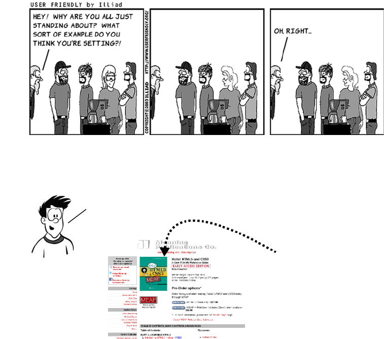
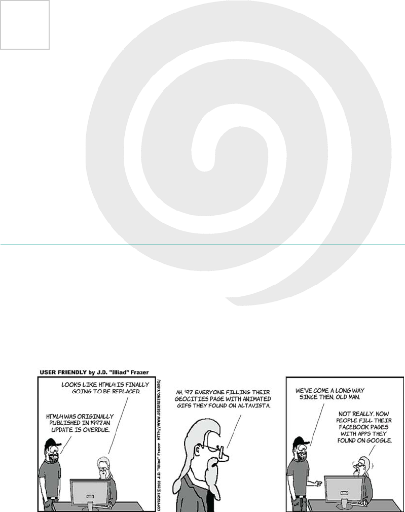
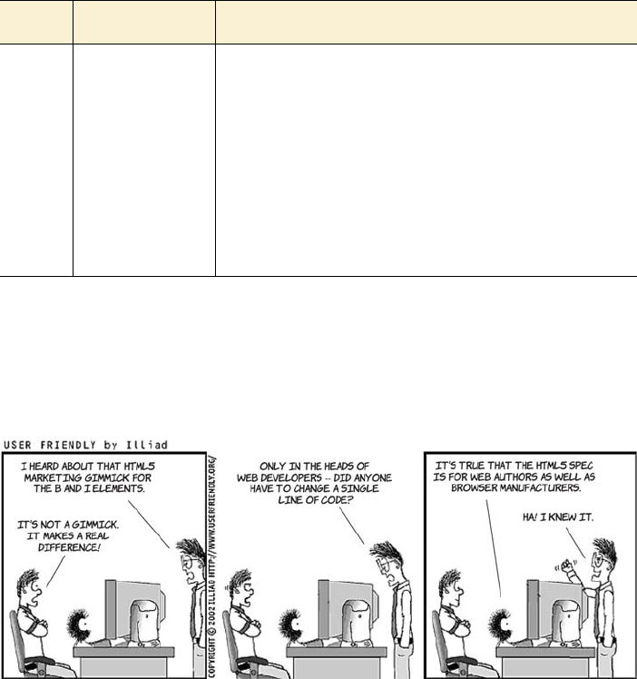
CARTOONS & DIAGRAMS
There are many cartoons and diagrams in this book. The cartoons are
based on the actual User Friendly comic strips. Their intent is humorous
rather than educational as they poke fun at various aspects of web
development. A sample cartoon is shown below.
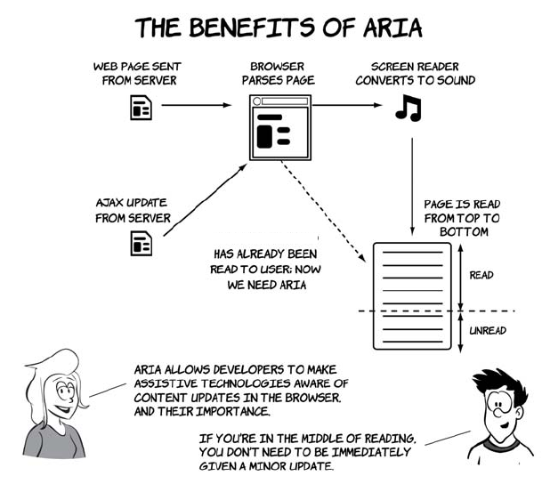
Diagrams are part of the text; they present information that’s easier to
understand in pictorial form. An example diagram follows.
CODE LISTINGS & SNIPPETS
Code listings and snippets and any occurrence of code in the text will
appear in the LucidaMonoEF font. Here is a typical code snippet:
<body>
<p>HTML5 and CSS3</p>
</body>
KEY FEATURES WILL BE
HIGHLIGHTED LIKE THIS.
DIAGRAMS WILL OFTEN BE DISCUSSED
BY CHARACTERS. LIKE THIS.
about this book xxv
Longer listings will look like this:
Code downloads
Up-to-date downloadable code samples and other news about the book
are available from the publisher’s website at www.manning.com/
HelloHTML5andCSS3.
Author Online
Purchase of Hello! HTML5
&
CSS3 includes free access to a private web
forum run by Manning Publications where you can make comments
about the book, ask technical questions, and receive help from the
author and from other users. To access the forum and subscribe to it,
go to www.manning.com/HelloHTML5andCSS3. This page provides
information on how to get on the forum once you’re registered, what
kind of help is available, and the rules of conduct on the forum.
Manning’s commitment to our readers is to provide a venue where a
meaningful dialogue between individual readers and between readers
and the author can take place. It’s not a commitment to any specific
amount of participation on the part of the author, whose contribution to
the book’s forum remains voluntary (and unpaid). We suggest you try
asking the author some challenging questions, lest his interest stray!
The Author Online forum and the archives of previous discussions will
be accessible from the publisher’s website as long as the book is in print.
MORE DETAILED LISTINGS HAVE
ANNOTATIONS JUST LIKE DIAGRAMS. THIS
ONE POINTS OUT THE EARLIER SNIPPET.
LISTINGS WILL ALSO BE DISCUSSED BY
CHARACTERS. HERE IS A SIMPLE WEB PAGE.
<!DOCTYPE html>
<html>
<head>
<title>Hello!</title>
</head>
<body>
<p>HTML5 and CSS3</p>
</body>
</html>
xxvi about this book
About the author
Rob Crowther is a web developer and blogger based in London, UK.
Currently he works for a small software company building web appli-
cations for corporate clients such as BNP Paribas, BNY Mellon, Hon-
eywell, and Young & Co.’s Brewery.

Part 1
Learning HTML5
his part of the book focuses on HTML5. Chapter 1 introduces you to
new and updated markup features in HTML5, chapter 2 discusses
forms and form validation, chapter 3 explores HTML5’s new dynamic
graphics capabilities, chapter 4 talks about how to use video and audio
on your web pages, and chapters 5 and 6 look at the new APIs you can
use for client-side development and networking.

2CHAPTER
3
1
Introducing HTML5 markup
This chapter covers
•New semantic elements in HTML5
•Updated HTML4 elements
•New global attributes
•The HTML5 content model
•Getting new elements to work in old browsers
This chapter assumes you have some knowledge of previous versions of
HTML. If you’re new to HTML, check out appendix B—it should give
you enough information to understand this chapter.

4CHAPTER 1 Introducing HTML5 markup
We’ll start with some background on how and why the particular set of
new elements in HTML5 was chosen. Then we’ll examine new elements
for the overall structure of web pages before moving on to elements,
both new and redefined, intended for particular bits of content. You’ll
then learn about the new attributes in HTML5. Next, we’ll spend a few
pages considering the more conceptual issue of the new approach to
element categorization in HTML5. Finally, you’ll go back to practicali-
ties and learn how to make sure your new HTML5 content will work in
old browsers.
Why do we need new elements?
This section looks at some of the research that went into understanding
the document structures that web authors were trying to describe
semantically with HTML; this information was used to decide which
new elements should be added in HTML5. We’ll then look at each of
the new elements in turn.
HTML4 has two built-in methods for extending the semantics of ele-
ments: the id and class attributes. The id attribute is a unique identi-
fier, but, rather than a random string, the identifier can be a meaningful
word—in other words, it can have semantic value. The class isn’t
What does
semantic
mean?
At heart, HTML is a way of describing hyperlinked documents: documents that
are linked together as part of a network of knowledge. The elements of HTML
are meant to mean something, and that meaning is what we refer to as the se-
mantics. Because HTML describes documents, the semantics are along the lines
of “this content is a paragraph,” “this content is a level-one heading,” and “this
content is an unordered list.”
Being able to describe the structure of a document this way is valuable because
it lets you keep the details of how to best display content separate from the con-
tent itself. The result is that the same web page, if well structured, can easily be
read on a desktop computer, a mobile phone, and a text-to-speech converter.
Compare this to a document format like PDF, where the layout and content are
deeply interlinked because the fidelity of the eventual printed output is the pri-
mary goal. It’s usually awkward to read an A4 PDF on a mobile device because
there’s no option other than to view it at A4 size.
Why do we need new elements? 5
unique, but multiple classes can be applied to a single element like tag-
ging in popular social network tools. Some examples are shown in the
following table.
No definitive standard sets down which values mean what,1 so one site
could use writer for the same thing another site uses author for, or two
sites could use author to mean something completely different. This
isn’t a huge issue, because HTML isn’t intended to describe real-world
things like authors, so the meaning behind those values is likely to be
site-specific anyway. But id and class attributes can also be used to
describe document features; for instance, a nav class would probably
indicate an element that contains navigation. If you were looking for
ideas for new elements to add to HTML to improve its ability to
describe documents, a survey of the sorts of values used in id and class
attributes would be a good place to start.
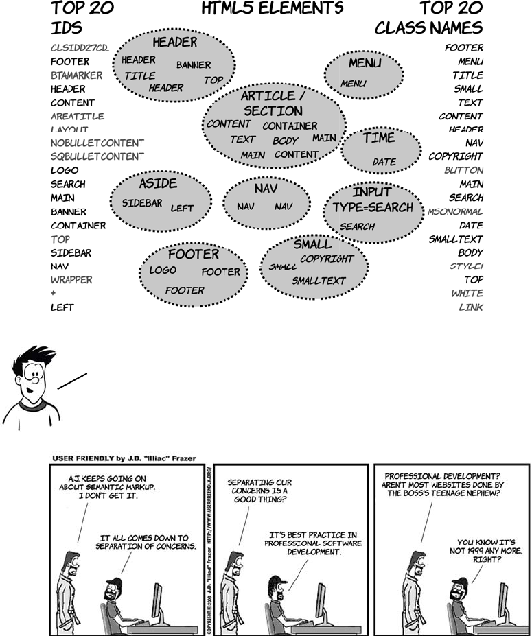
With this in mind, in 2005 several studies were done that attempted to
analyze how authors were using id and class values in markup on the
web. Two of these are of particular interest to us:
❂In November 2005, a study of 1,315 websites counted how often dif-
ferent values for the id attribute were used.
❂In December 2005, a study of slightly over a billion web pages ana-
lyzed, among other things, how often particular class names
appeared.
Markup Suggested meaning
<p> A paragraph
<p id="author"> A paragraph that represents a particular author
<p class="bio"> A paragraph that represents a biography
<p class="author bio"> A paragraph that represents an author biography
1Although some have attempted it. See the discussion of microformats later in this chapter.
6CHAPTER 1 Introducing HTML5 markup
The diagram that follows shows the top 20 results in each category
down each side and the corresponding new HTML5 elements along
with the IDs and classes that inspired them in the middle.
Many of the top IDs, like btamarker and nobulletcontent, are
automatically generated by software such as Microsoft
FrontPage and other office products. Their popularity is
therefore more an indication of the market penetration of
the products than author requirements or intentions.
New elements for page structure 7
In the next section, you’ll learn about some of the new elements that
have been added to HTML5 as a result of this research.
New elements for page structure
By page structure we mean the top-level items: the header, the footer, the
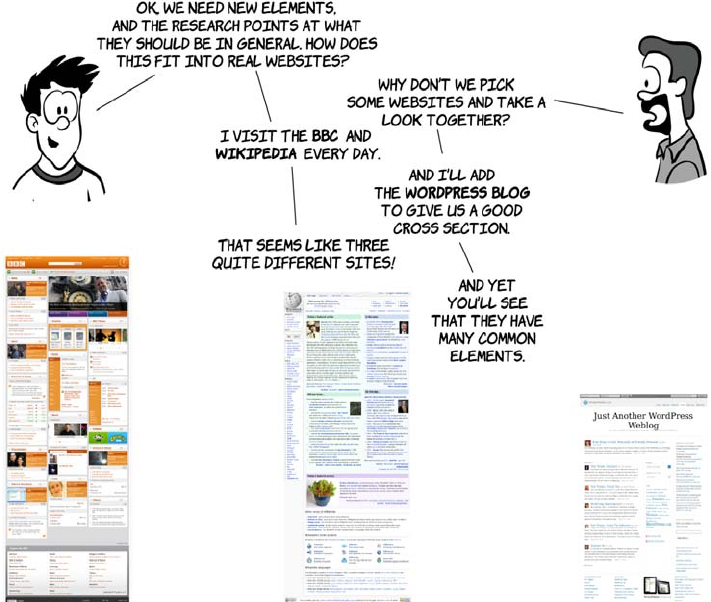
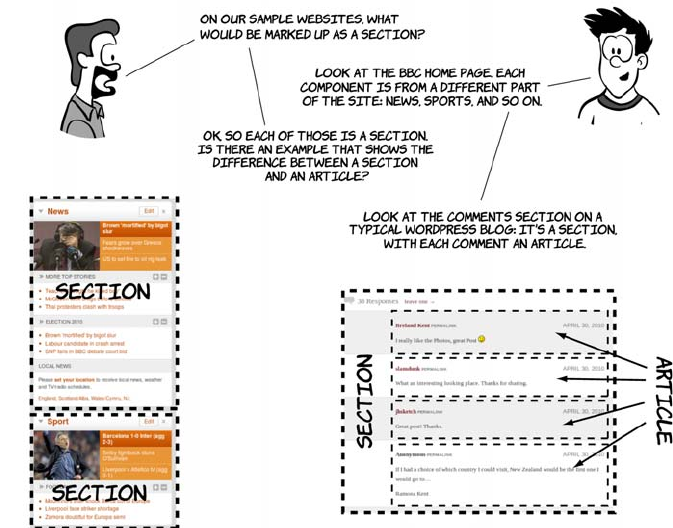
navigation, the main content, and so on. Let’s join A.J. and Greg, who
are discussing the research results from the previous section.
Sectioning content
It’s common for web pages to have many distinct sections. A blog
homepage usually has several blog posts, each a section in itself, and
each blog post may have a comments section or a related-posts section.
HTML4 offers only one type of element for this common need: <div>.
HTML5 adds two new elements: <section> and <article>.
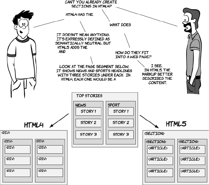
8CHAPTER 1 Introducing HTML5 markup
The <section> and <article> elements are conceptually similar. Articles
and sections can be interchangeable—articles can exist happily within
sections, but articles can also be broken down into sections, and there’s
been a lot of discussion about whether HTML5 really needs both of
them. For now, though, we have both, and you’re probably asking
yourself how to decide which one to use. The key parts of the spec to
focus on when choosing one or the other are as follows:
❂An article is intended to be independently distributable or reusable.
❂A section is a thematic grouping of content.
<section>
<div> element.
<div> mean?
<article> elements.
<div>,
New elements for page structure 9
Headings, headers, and the outlining algorithm
Heading elements provide an implicit structure for documents. A head-
ing indicates the start of a new section and briefly describes the topic of
the text that follows. The level of a heading (levels 1 through 6 in
HTML) indicates an implicit hierarchy. This implicit structure is useful
for the automatic generation of a table of contents. Some websites,
such as Wikipedia, generate a table of contents for each page; screen
readers and other accessibility tools use the table of contents to allow
users to navigate the page more easily. HTML5 formalizes this implicit
structure with the outlining algorithm. In this section, you’ll learn
about this algorithm as well as how it interacts with the two new head-
ing elements, <header> and <hgroup>.
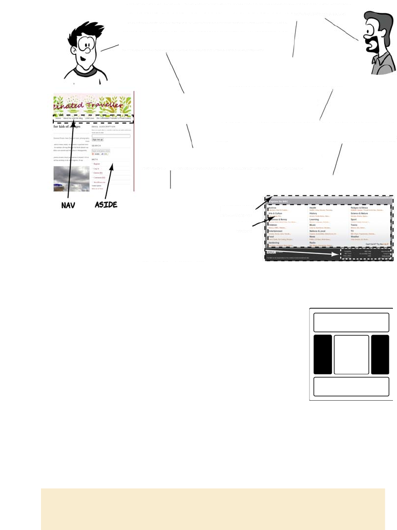
A <header> element appears near the top of a document, a section, or an
article and usually contains the main heading and often some naviga-
tion and search tools. Here’s an example from the BBC website.
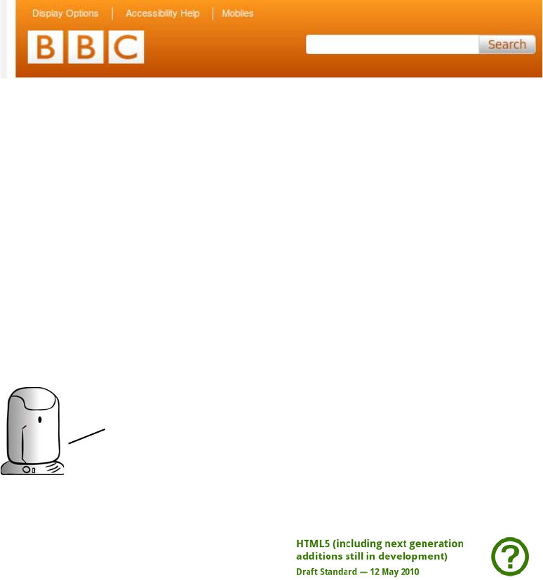
10 CHAPTER 1 Introducing HTML5 markup
Here’s how that might be marked up in HTML5:
<header>
<h1>BBC</h1>
<nav>
<ul>
<li><a href="/options">Display Options</a></li>
<li><a href="/access">Accessibility Help</a></li>
<li><a href="/mobile">Mobiles</a></li>
</ul>
</nav>
<form target="/search">
<input name="q" type="search">
<input type="submit">
</form>
</header>
The <hgroup> element should be used
where you want a main heading
with one or more subheadings. For
an example, let’s look at the HTML5
spec:
<hgroup>
<h1>HTML5
(including next generation
additions still in
development)
</h1>
<h2>Draft Standard —
12 May 2010</h2>
</hgroup>
You’ll learn more about
the <nav> element later
in this chapter. HTML5’s
new form elements will
be covered in depth in
chapter 2.
New elements for page structure 11
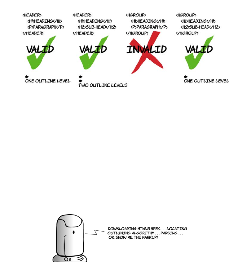
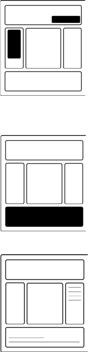
The <header> element can contain any content, but the <hgroup> element
can only contain other headers—that is, <h1> to <h6>, plus <hgroup>
itself. The following diagram demonstrates the differences.
The outlining algorithm generates a table of contents for your docu-
ment based on the section and heading markup you’ve used. In
HTML4, the overall structure of a document was left up to individual
browsers to decide; in HTML5, it’s part of the spec. This benefits you
because any user agents that need an outline, often for accessibility
purposes,2 will generate the same outline for any given document. To
help you get the idea, let’s look at several sample documents. Erwin
will generate the document outline according to the HTML5 spec.
You’ll see how the outline is impacted both by headings and heading
groups as well as the articles and sections we discussed in the previous
section.
2The W3C’s User Agent Accessibility Guidelines recommend that browsers generate a document out-
line in guideline 1.10.2: www.w3.org/TR/UAAG20/#gl-alternative-views.
12 CHAPTER 1 Introducing HTML5 markup
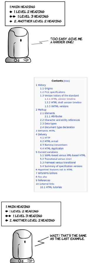
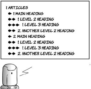
In a plain document with no other sectioning con-
tent, the outline will match the heading levels.
This is similar to the way a table of contents in
Wikipedia is generated (right). Headings can also
be grouped using the <hgroup> element. Let’s see
how they affect the document outline:
<body>
<h1>Main heading</h1>
<p>Some text</p>
<h2>Level 2 heading</h2>
<p>Some more text</p>
<h3>Level 3 heading</h3>
<p>A bit more text</p>
<h2>Another level 2 heading</h2>
<p>The last bit of text</p>
</body>
<hgroup>
<h1>Main heading</h1>
<h2>
Subheading to main heading
</h2>
</hgroup>
<p>Some text</p>
<h2>Level 2 heading</h2>
<p>Some more text</p>
<h3>Level 3 heading</h3>
<p>A bit more text</p>
<hgroup>
<h2>Another level 2 heading</h2>
<h3>
Subheading to level 2 heading
</h3>
</hgroup>
<p>The last bit of text</p>
New elements for page structure 13
The outline will only show the highest level heading from any <hgroup>:
you can see the headings “Subheading to main heading” and “Subhead-
ing to level 2 heading” don’t appear in the outline. The <hgroup> ele-
ment can contain any number of subheadings, but it can only contain
other heading elements.
Next, let’s look at how sections affect the outline:
As you can see, there are now multiple <h1> elements in the document,
but they don’t all sit at the same level of the document outline. In fact,
you can do without any heading element other than <h1>. Let’s look at
another example.
<h1>Sections</h1>
<section>
<h1>Main heading</h1>
<p>Some text</p>
<h2>Level 2 heading</h2>
<p>Some more text</p>
<h3>Level 3 heading</h3>
<p>A bit more text</p>
<h2>Another level 2 heading</h2>
<p>The last bit of text</p>
</section>
<section>
<h1>Main heading</h1>
<p>Some text</p>
<h2>Level 2 heading</h2>
<p>Some more text</p>
<h3>Level 3 heading</h3>
<p>A bit more text</p>
<h2>Another level 2 heading</h2>
<p>The last bit of text</p>
</section>
14 CHAPTER 1 Introducing HTML5 markup
We have achieved the exact same outline as the original example but
using only level-one headings. Earlier, we discussed the similarity
between <section> and <article>. If we replace one with the other in the
previous listing, you can see how similar they are:
<h1>Main heading</h1>
<p>Some text</p>
<section>
<h1>Level 2 heading</h1>
<p>Some more text</p>
<article>
<h1>Level 3 heading</h1>
<p>A bit more text</p>
</article>
</section>
<section>
<h1>Another level 2 heading</h1>
<p>The last bit of text</p>
</section>
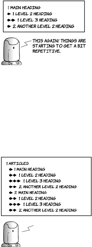
<h1>Articles</h1>
<article>
<h1>Main heading</h1>
<p>Some text</p>
<h2>Level 2 heading</h2>
<p>Some more text</p>
<h3>Level 3 heading</h3>
<p>A bit more text</p>
<h2>Another level 2 heading</h2>
<p>The last bit of text</p>
</article>
<article>
<h1>Main heading</h1>
<p>Some text</p>
<h2>Level 2 heading</h2>
<p>Some more text</p>
<h3>Level 3 heading</h3>
<p>A bit more text</p>
<h2>Another level 2 heading</h2>
<p>The last bit of text</p>
</article>
thiS IS IDENTICAL TO THE
<section>
example.
<section>
AND
<article>
ARE
INTERCHANGEABLE FOR
OUTLINING.
New elements for page structure 15
Now let’s consider the <header> element. It represents the header of a
document, a section, or an article, typically containing headings and
other metadata about the section. You’ll frequently have content that
you don’t want to be part of the heading element itself but that doesn’t
fit in with the following content. Examples would be subheadings,
author bylines, and publishing date information:
Common page elements
There are more new elements than <article>, <section>, <header>, and
<hgroup>. Let’s look at some more pages from our set of typical web-
sites.
<h1>Articles</h1>
<article>
<header>
<h1>Main heading</h1>
<p>Some text</p>
</header>
<h2>Level 2 heading</h2>
<p>Some more text</p>
<h3>Level 3 heading</h3>
<p>A bit more text</p>
<h2>Another level 2 heading</h2>
<p>The last bit of text</p>
</article>
<article>
<header>
<h1>Main heading</h1>
<p>Some text</p>
</header>
<h2>Level 2 heading</h2>
<p>Some more text</p>
<h3>Level 3 heading</h3>
<p>A bit more text</p>
<h2>Another level 2 heading</h2>
<p>The last bit of text</p>
</article>
the <header> element does
not have any impact on
the document outline.
it’s as if it’s not there.
16 CHAPTER 1 Introducing HTML5 markup
The <aside> element is intended for content that
isn’t part of the flow of the text in which it
appears but is still related in some way. In many
books, including this one, you’ll see sidebars for
things such as terminology definitions and
historical background, like the one that follows—
these would be marked up as <aside> if the
book was HTML5. Sidebars are also common
in website design, although the meaning is
slightly different: often they contain navigation
or related links.
Yes. there’s no rule
THAT SAYS you can have
only one per page.
anywhere you have
navigation. you can
use the
<nav>
Element.
links in the footer
are very common.
FOOTER
–
NAV
SMALL
we have
<nav>
for navigation and
<aside>
for
web pages are more than just articles, sections, and
headings. what about other elements?
nonessential content like sidebars.
because the element is more general purpose.
ads. navigation groups, or pullquotes could
also be asides.
<aside>
? that sounds like a stage
direction for a post modern sitcom.
why not just call it sidebar?
hmm, IF YOU SAY SO. WHAT ABOUT FOOTERS? THERE
must be a
<footer>
element to go with
<header>
.
THERE IS, ALONG WITH A
<small>
element for fine
PRINt—LEGAL INFORMATION AND DISCLAIMERS.
hang on. there’s a
<nav>
Element in that footer!
Sidebar
This is an example sidebar. If this were an HTML5 document, it would be marked
up with the <aside> element.
The HTML DOCTYPE 17
The HTML DOCTYPE
The DOCTYPE declaration optionally appears at the start of an HTML
document. It comes from the Standard Generalized Markup Language
(SGML) that was used to define previous versions of HTML in terms of
the language syntax. The DOCTYPE serves two practical functions:
❂It’s used by HTML validation services to determine which version
the document uses.
❂Browsers use the DOCTYPE to determine which rendering mode to use.
The <nav> element is intended for navigation,
both within the page itself, as in the Wikipedia
table of contents, and through the rest of the
website. You can have any number of <nav>
elements on a page. On large sites, it’s common
to have global navigation across the top
(in the <header>) and local navigation in a sidebar
(in an <aside> element).
The <footer> element generally appears at the end
of a document, a section, or an article. As with
the <header> element, its content is generally
metainformation—author details, legal informa-
tion, or links to related information. But it’s valid
to include <section> elements within a footer—for
example, when marking up appendixes.
The <small> element often appears within a
<footer> or <aside> element—it contains copy-
right information, legal disclaimers, and other
fine print. Note that it’s not intended to make text
smaller. You may choose to style its contents
smaller than your main text, but, as with other
elements, its role is to describe its contents, not
prescribe presentation.
18 CHAPTER 1 Introducing HTML5 markup
The rendering modes are Standards, Almost Standards, and Quirks
mode. These modes represent various stages in the history of browser
development and allow modern browsers to display old web pages the
way they were intended. See appendix C for a discussion of these fac-
tors—the short version is, Standards mode is what you want.
HTML5 is defined in terms of its DOM representation after parsing, so
it doesn’t need a DOCTYPE for validation, but we still want legacy brows-
ers to render pages in standards-compliant mode. With this in mind,
the authors of the HTML5 spec worked out the minimal amount of
markup required to trigger Standards mode in browsers:
<!DOCTYPE html>
Compare this with similar declarations for HTML4 and XHTML1:
<!DOCTYPE HTML PUBLIC "-//W3C//DTD HTML 4.01//EN"
"http://www.w3.org/TR/html4/strict.dtd">
<!DOCTYPE html PUBLIC "-//W3C//DTD XHTML 1.0 Strict//EN"
"http://www.w3.org/TR/xhtml1/DTD/xhtml1-strict.dtd">
You can see that the HTML5 DOCTYPE is much shorter, easier to type,
and easier to remember.
New elements for content
There are several other new or redefined elements in HTML5, and in
this section you’ll learn about some of them. HTML5 includes dedi-
cated elements for dates as well as figures and captions, all common
elements of modern web pages. It also rehabilitates the <b> and <i> ele-
ments that were deprecated in HTML4. This section looks at each of
these in turn.
Time
The <time> element allows an unambiguous ISO 8601 date to be
attached to a human-readable version of that date. This is useful if you
want some other website or service to look at your web pages and
extract information. A common use case for this is that you’re advertis-
ing an event on your website and you’d like it to appear in search
results for queries such as “events in London next week.” Alternatively,
New elements for content 19
you might decide to write a program to build a timeline of the English
monarchy by crawling Wikipedia; being able to parse all the dates in a
straightforward way would make this much easier. Following are three
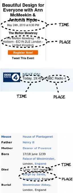
examples of these sorts of pages:
In the previous examples, it should have been fairly easy for you to
pick out the key bits of information even without the big dotted circles,
but computers need a more structured form of data. One approach to
this is microformats.
This WordPress blog is advertising an
upcoming event. You can see the key
components are all present here:
❂An event title
❂A time
❂A place
The BBC website has a page for each
program, and this contains information
about when the program will next be
broadcast. Although the title isn’t shown
here, you can see the key components: a
time and a place (although in this case
the “place” is more abstract).
Finally, Wikipedia has events on many
pages—in this example, the “event” is
the death of Edward I. You may not con-
sider this the same sort of thing as the
previous two examples, but it shares the
same basic characteristics. This pattern
is so common that the microformats
movement established a standard way of
marking it up called hCalendar.
20 CHAPTER 1 Introducing HTML5 markup
The main goal of microformats is to render common information like
events easily parseable by computers without affecting the end-user
presentation.
Addresses, being naturally plain text information with some internal
structure (house number, street name, city, and so on) are relatively
easy to deal with, as long as there’s some way to demarcate the compo-
nents. Microformats manage this by adding a class of location to the
containing element, or alternatively using another microformat, adr, to
describe the address in detail. Dates and times are more complicated.
Take the simple example 1/6/2011. If you’re reading this in the United
States, you probably interpret that as January 6, whereas in the UK
the date is 1st June. Or have another look at the earlier BBC example:
the date is “today.” I took that screenshot some time ago—how useful
is “today” now? You may think this is no more or less ambiguous than
the addresses, but the frustrating thing is that we know that an abso-
lute date and time underlie the more ambiguous human expression that
we see more commonly.
Microformats
Microformats are an effort to extend the expressive power of standard HTML by
using certain attributes, mostly the class attribute, in a standardized way. Pop-
ular microformats include hCard, for describing contact information, adr for ad-
dresses, and hCalendar for describing events. Similar technologies include the
more formal RDFa and HTML5’s own microdata (see section 2.5.3).
Microformats enable a number of useful applications: search
engines that can tell you about nearby upcoming events and
browsers that can automatically add the events to your calendar.
Computers like dates and times in an unambiguous format.
People often find the unambiguous format hard to digest but
can easily understand ambiguous dates from the context. To
serve both, web pages need to provide dates in two formats.

New elements for content 21
HTML5 solves this problem by providing a <time> element. Let’s look
at an example:
<time datetime="2011-06-01">today</time>
We can be more specific:
<time datetime="2011-06-01T18:00:00+01:00">6 o'clock on 1/6/2011</time>
Humans get a readable time that they can disambiguate through the
context in the normal way, and computers can read the ISO 6801 date
and see the date, time, and time zone.
Images and diagrams with <figure> and <figcaption>
Putting an image in a web page is easy enough: the <img> element has
existed since the early days of the web. It was somewhat controversial
at the time, and several alternatives were put forward; but the most
popular browser (Mosaic) implemented it, so it became a de facto stan-
dard. The ability to add images was one of the main things that cata-
pulted the web from being an academic document-sharing network
into a worldwide phenomenon in the mid 1990s, but since that early
take-up not much has changed.
The <img> tag is limited from a semantic standpoint—there’s no visible
way to associate explanatory text with the image. It’s possible to use the
alt and longdesc attributes, but because neither is visible by default, both
have been somewhat ignored or misused in the real world. The <figure>
element offers an alternative—it groups the figure with its caption.
Time and data
Originally the <time> element had a pubdate attribute to allow for its use in
marking up blog posts and other articles. Early in 2012, the entire <time> ele-
ment was removed from the WHATWG version of the spec because it didn’t ap-
pear to be getting used for that purpose. There was something of an uproar
within the community, and the <time> element was reinstated shortly after,
along with a new element, <data>, for more general-purpose association of
human-readable text with data for computers. At the time of writing, this
new element has not yet made it into the W3C version of the spec, so it isn’t
covered here.
22 CHAPTER 1 Introducing HTML5 markup
This is what the markup for the following screenshot looks like:
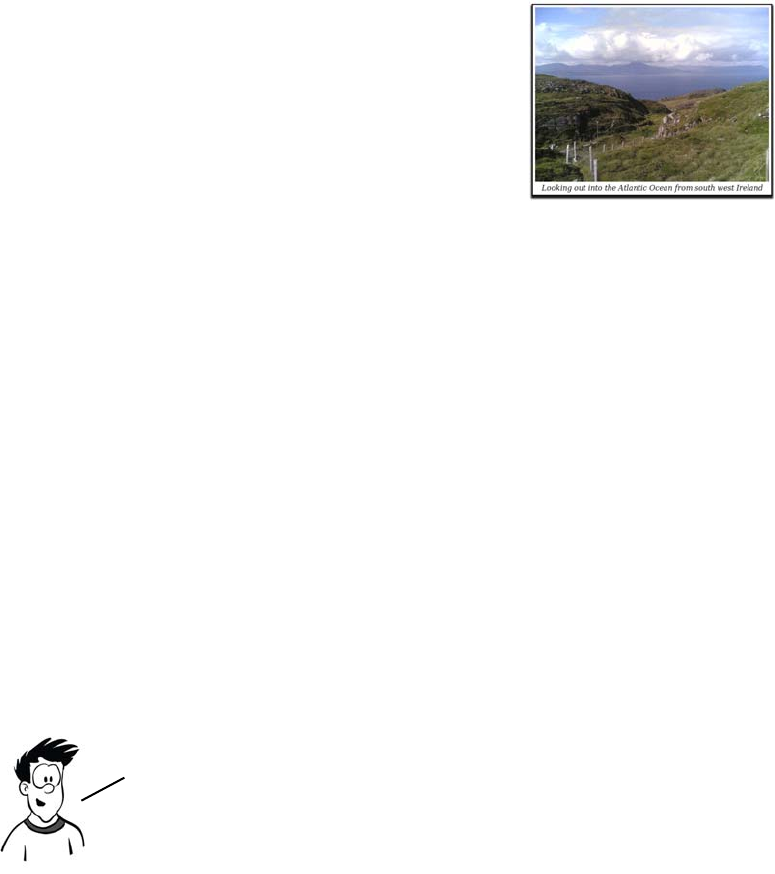
<figure>
<img src="scenery.jpg" alt="Picture of the Irish south coast">
<figcaption>Looking out into the Atlantic Ocean
from south west Ireland</figcaption>
</figure>
Note that <figure> doesn’t have to contain
an <img> element. It might instead contain
an SVG drawing or a <canvas> element, or
even ASCII art in a <pre> element. What-
ever type of graphic it contains, the <figure>
element links the graphic to the caption.
Emphasizing words and phrases
The <b> and <i> elements have a long history in HTML. They were
listed, along with the <em> and <strong> elements, in the character-high-
lighting section of the 1993 IETF draft proposal for HTML. The <b> and
<i> elements are listed in the subsection “Physical Styles” (along with
<tt>)—that is, their purpose was entirely presentational. Meanwhile,
<em> and <strong> (along with several others) are in the subsection
“Logical Styles”—elements with semantic meaning. This early distinc-
tion highlights the problem <b> and <i> would later run into.
You saw at the start of this chapter that separation of concerns is the
Holy Grail of web authoring—HTML for content, CSS for presenta-
tion, and JavaScript for behavior. Because <b> and <i> are entirely pre-
sentational, their use has long been frowned on, and there have been
several serious proposals to remove them from HTML. Meanwhile,
<strong> and <em> have always had a semantic definition while appear-
ing identical to <b> and <i>, respectively, in most browsers.
Ever pragmatic, the HTML5 spec recognizes that, with millions of pages of
legacy content out there, browsers aren’t going to be dropping support
for <b> and <i> any time soon. On the other hand, blindly using <em> instead
of <i> and <strong> instead of <b>, or using a <span> element to apply a
bold or italic style to a word isn’t good practice semantically.
HTML5’s new global attributes 23
So, instead of removing either <b> or <i>, HTML5 redefines and reha-
bilitates them.
As you can see, the HTML4 definition is entirely presentational,
whereas the HTML5 definition goes to great lengths to give a semantic
meaning while remaining compatible with the purely presentational
uses of the two elements for backward compatibility.
HTML5’s new global attributes
An attribute is global if it can be applied to all elements. The two most
obvious global attributes in HTML4 are id and class, which, as you saw
in the section “Why do we need new elements?” can be used to add
Element HTML4 definition HTML5 definition (taken from the spec on May 12, 2010)
<i> Renders as italic
text style
“The i element represents a span of text in an alternate voice
or mood, or otherwise offset from the normal prose, such as a
taxonomic designation, a technical term, an idiomatic phrase
from another language, a thought, a ship name, or some other
prose whose typical typographic presentation is italicized.”
<b> Renders as bold
text style
“The b element represents a span of text to be stylistically offset
from the normal prose without conveying any extra importance,
such as key words in a document abstract, product names in a
review, or other spans of text whose typical typographic presen-
tation is boldened.”
24 CHAPTER 1 Introducing HTML5 markup
extra semantic information to elements. In this section, you’ll learn
about new HTML5 global attributes from three major categories:
❂Accessibility for Rich Internet Applications (ARIA), for providing
extra data to accessibility tools
❂Data-* attributes, for providing extra data for scripts on your page
❂Microdata attributes, for providing extra data to browsers and
scripts on other sites
Accessibility with ARIA
ARIA is a standard developed at the W3C in response to the generally
poor accessibility of early AJAX-based web applications.
Notifying users of AJAX updates isn’t the only benefit ARIA can pro-
vide. ARIA consists of a set of attributes and values that can describe to
assistive technology the roles of various page elements and their status.
In other words, they add semantic value to HTML elements so you can
updated content
HTML5’s new global attributes 25
say “this element is a header,” “this element is navigation,” “this ele-
ment is a toolbar,” and so on. Let’s look at an example:
<body role="document">
<div role="note" aria-live="polite"
aria-relevant="additions removals">
An update added by JavaScript
</div>
<div role="banner">
<h1 role="heading" aria-level="1">The heading</h1>
</div>
<div role="navigation">
<a role="link" href="/home">Home Page</a>
<a role="link" href="/inbox">Inbox</a>
</div>
<div role="main">
A very interesting article goes here.
</div>
<div role="footer">
All rights reserved.
</div>
</body>
This should all sound a little familiar to you. What HTML5 aims to
accomplish through additions such as the <header> and <nav> elements is
similar to what ARIA tries to accomplish in providing better semantics
to assistive technology. But it’s still worth bothering with ARIA
because it has a wider and more far-reaching vocabulary than HTML5
for describing the components of web applications. Plus it already has
wide support among vendors of browsers, operating systems, and
assistive technology.
The HTML5 spec has a long list of elements to which user agents
should automatically assign particular ARIA roles. These elements are
said to have strong native semantics, so if you use HTML5 correctly you’ll
get a certain amount of accessibility for free compared to what HTML4
offered once the browsers and assistive technologies implement sup-
port. The HTML5 spec also explicitly lists the allowed ARIA roles for
those elements where there’s a risk the ARIA role will be in conflict
with the HTML5 semantics—these are implied native semantics. Valida-
tion tools can then flag inappropriate combinations.

26 CHAPTER 1 Introducing HTML5 markup
Using HTML5, you can cut down on the amount of markup required to
provide an accessible user experience. This listing updates the previous
one but takes advantage of the strong and implied native semantics in
place of several of the ARIA attributes:
<body>
<aside aria-live="polite" aria-relevant="additions removals">
An update added by JavaScript
</aside>
<header role="banner">
<h1>The heading</h1>
</header>
<nav>
<a href="/home">Home Page</a>
<a href="/inbox">Inbox</a>
</nav>
<article role="main">
A very interesting article goes here.
</article>
<footer>
All rights reserved.
</footer>
</body>
Extending HTML with custom attributes
Custom data attributes allow authors to add arbitrary data to elements
for their own private use. The idea is that some data isn’t directly rele-
vant to the user but does have meaning to the JavaScript on the page
that can’t be expressed in HTML semantics. It’s a standardization of an
approach taken by several JavaScript widget libraries, such as Dijit
(the Dojo toolkit). These libraries, like HTML5, set out to enhance and
extend the application abilities of HTML4—adding things such as
combo boxes and date pickers, which HTML5 also provides, but also
more complex UI elements such as tree views, drop-down menus, and
Although you don’t have to use the implied ARIA roles on
elements with strong semantics, such as <link> and <nav>, at
present no assistive technologies recognize the HTML5
elements. You should specify both for backward compatibility.

HTML5’s new global attributes 27
tabbed containers. Using one of these libraries, you declare an element
to be a tab control like this:
<div dojoType="dijit.layout.TabContainer">
<div dojoType="dijit.layout.ContentPane" title="My first tab">
Lorem ipsum and all around...
</div>
<div dojoType="dijit.layout.ContentPane" title="My second tab">
Lorem ipsum and all around - second...
</div>
<div dojoType="dijit.layout.ContentPane" title="My last tab">
Lorem ipsum and all around - last...
</div>
</div>
A browser, as with HTML elements, will parse the attribute, even
though it doesn’t recognize it, and add it to the DOM. The Dijit library
will run when the page has loaded, search for these attributes, and run
the appropriate JavaScript to enable the advanced control.
It may seem as though everyone has been getting along fine with creat-
ing their own attributes, so why add support for custom attributes to
HTML5? Well, for one thing, creating your own will stop your markup
from validating.
Failing validation may not bother you too much, but if you’re looking
for that one unintended mistake, having to sift through many intended
ones should be unnecessary. Plus there’s a risk that the attribute names
chosen by the widget libraries will be used in future versions of HTML—
after all, one of the goals of the spec is to codify existing common uses.
The HTML5 solution to both the validation and potential name-clash
issues is the data-* attribute collection. The * is a wildcard—that is, it
can be whatever you want it to be. But anything starting with data- will
be allowed through the validator, and you’re guaranteed that no data-*
attributes will be made part of HTML.
The data-* attributes allow you to add information to your page
for your own personal use. If your goal is to share information
with other websites, you should instead use microdata.
28 CHAPTER 1 Introducing HTML5 markup
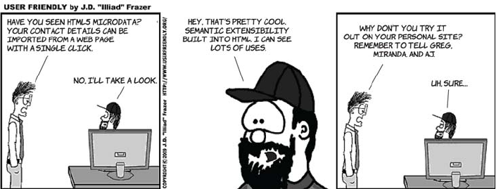
Expressing more than just document semantics with microdata
Microdata extends the expressive power of HTML to cover things that
aren’t strictly markup. You can use microdata to designate a portion of
your page as describing contact information, a calendar event, or
licensing information.
Microdata uses three global attributes: item, itemtype, and itemprop. All
three can be seen in action in this short example that describes contact
information:
<section id="rob" itemscope
itemtype="http://microformats.org/profile/hcard">
<h1 itemprop="fn">Rob Crowther</h1>
<p itemprop="n" itemscope>Full name:
<span itemprop="given-name">Robert</span>
<span itemprop="additional-name">John</span>
<span itemprop="family-name">Crowther</span>
</p>
<p itemprop="org" itemscope>
<span itemprop="organization-name">Manning Publications Co.</span>
(<span itemprop="organization-unit">Hello! Series</span>)
</p>
</section>
This code, because of the itemtype attribute on the parent element ref-
erencing the hCard vocabulary, describes a person—me! The itemprop
attributes are extracted as a set of name-value pairs into a tree-like data
structure following the markup, like this:
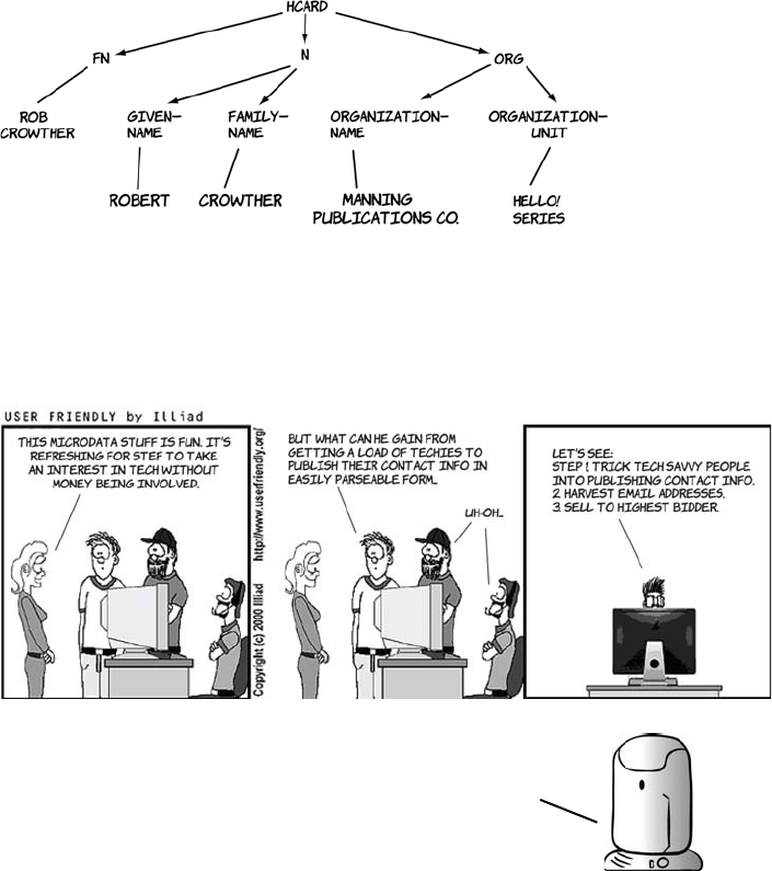
The HTML5 content model 29
This information could then be recovered from the page in a usable for-
mat by a web browser or a search engine. Of course, you may not want
the information to be more easily usable by computers; normal rules of
internet publishing apply.
The HTML5 content model
The content model is somewhat theoretical, but it’s important because
it’s the main way of determining whether it’s valid to use a certain ele-
ment at a particular place in your document. In HTML5, elements are
split into categories. One element can be a member of several catego-
ries; it can also be a member of a category only in particular circum-
stances, such as when an attribute is given a certain value. In this
You’ll learn more about microdata in chapter 5 when
we look at the Microdata API, a convenient method
for extracting the data from a document. The next
section looks at how you can produce a valid HTML5
document by learning about the content model.
30 CHAPTER 1 Introducing HTML5 markup
section, you’ll learn where you can find this information in the spec,
what elements fit into which content categories, and what the content
categories are. The categories of which an element is a member are
stated prominently in the HTML5 spec. The following diagram shows
the content categories of the <hgroup> element.
The spec is good if you have a question about a particular element, but
it’s cumbersome if you want a quick overview. Rather than trawl through
the entire spec, the content categories can be summarized in a table.
Element
Metadata content
Flow content
Phrasing content
Interactive content
Embedded content
Heading content
Sectioning content
<a>, <button>, <input>, <keygen>, <label>,
<select>, <textarea>
● ● ●
<abbr>, <area>, <b>, <bdo>, <br>, <cite>,
<code>, <datalist>, <del>, <dfn>, <em>, <i>,
<ins>, <kbd>, <map>, <mark>, <meter>, <out-
put>, <progress>, <q>, <ruby>, <samp>,
<small>, <span>, <strong>, <sub>, <sup>,
<time>, <var>, <wbr>
● ●
<address>, <blockquote>, <div>, <dl>,
<fieldset>, <figure>, <footer>, <form>,
<header>, <hr>, <ol>, <p>, <pre>, <table>,
<ul>, <Text>
●
<article>, <aside>, <nav>, <section> ● ●
the
<hgroup>
element is in the
flow content and heading
content categories.
The HTML5 content model 31
Now you know which content models apply to which elements, but
that’s only part of the story. You also need to know what content cate-
gories are allowed as children of any given element. The following dia-
gram shows a couple of other excerpts from the HTML5 spec to
illustrate where you can find this information.
<audio>, <embed>, <iframe>, <img*>,
<object>, <video>
● ● ● ●
<base>, <title> ●
<canvas>, <math>, <svg> ● ● ●
<command>, <link>, <meta>, <noscript>,
<script>
● ● ●
<details>, <menu> ● ●
<h1>, <h2>, <h3>, <h4>, <h5>, <h6>, <hgroup> ● ●
<style> ● ●
Element
Metadata content
Flow content
Phrasing content
Interactive content
Embedded content
Heading content
Sectioning content
children.
the
<section>
element allows
flow content children.
the
<pre>
element allows only
phrasing content children.
32 CHAPTER 1 Introducing HTML5 markup
The different content types aren’t applied arbitrarily; each has a dis-
tinct meaning. The following table summarizes the different types.
Now that you know all about the content model, you’ll be able to use
the HTML5 spec to write valid HTML5 documents. That’s more than
enough theory for now. The next section gets back to practicalities and
considers whether your users’ browsers will support HTML5 and what
to do about it if they don’t.
Browser support
Do the new elements we’ve discussed in this chapter work in today’s
browsers? The short answer is, yes (with a couple of exceptions); the
Flow content Most elements are categorized as flow content. It’s the default content
type for elements visible on the page.
Sectioning content Sectioning content defines the scope of headers and footers and feeds
into the document outline.
Heading content Heading content, as you might expect, is just for headings and <hgroup>.
Phrasing content Phrasing content is mostly used to describe the text of a document. In
most cases, phrasing content can only contain other phrasing content.
Embedded content Embedded content is used to put an external resource into the web
page—for example, an image or video.
Interactive content
Interactive content is elements that are specifically intended for user inter-
action—mostly form controls. Note that other elements can be made
responsive to user input through the use of JavaScript, but elements cate-
gorized as interactive content have default functionality in the browser.
Metadata content
Metadata content sets up the presentation or behavior of the rest of the
content, or sets up the relationship of the document with other documents,
or conveys other out-of-band information.
For a text element like <p>, which isn’t required to do much except appear on
the page, there are two principal requirements:
❂It shows up in the DOM with at least a standard set of element properties.
❂It shows up in the user’s browser with some sort of default presentation.

Browser support 33
long answer is a little more complex. Consider this question: what does
it mean to say that a browser supports the <p> element?
It turns out that the first requirement is easy to satisfy—as long as you
follow simple tag-naming rules, you can put any tags in your HTML, and
all browsers will put the tags in the DOM with a default set of properties.
Where problems arise is with regard to the second requirement: having
a default presentation. Browsers have only recently started providing
any default presentation for the new elements in HTML5; for instance,
Firefox 3.6 doesn’t, but Firefox 4.0 does. But this isn’t much of a prob-
lem. As you know, we web authors define our content in HTML and
our presentation in CSS—and browsers work exactly the same way.
The default presentation for the supported elements is defined in CSS.
If you use Firefox, you can even find this file on your hard drive—it’s
called html.css.
Here’s a simple HTML5 document to experiment with:
<header>
<hgroup>
<h1>Hello! HTML 5</h1>
<h2>An example page by Rob Crowther</h2>
</hgroup>
</header>
<nav>
<ul>
<li><a href="#">Link 1</a></li>
<li><a href="#">Link 2</a></li>
<li><a href="#">Link 3</a></li>
</ul>
</nav>
<section>
<article>The first article.</article>
<article>The second article.</article>
</section>
Using these new elements is a matter of taking on the responsibility
of providing some default CSS rules for them. In most cases you’ll
want to write CSS for these elements anyway, so this doesn’t seem
like too much effort. Let’s see how it works with an example.
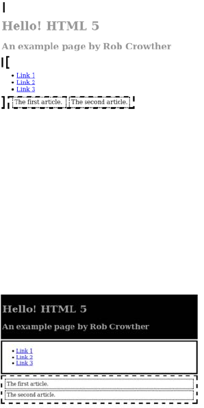
34 CHAPTER 1 Introducing HTML5 markup
Starting with the following basic
styles, this screenshot shows what the
page looks like in a browser that
doesn’t have any default HTML5
styles:
header, nav, section, article
{padding: 4px; margin: 4px;}
header
{ background: #000; color: #999; }
nav
{ border: 4px solid #000; }
section
{ border: 4px dashed #000; }
article
{ border: 2px dotted #000; }
By making a single change to that
CSS, you can make the page work in
most older browsers. See if you can
spot it:
header, nav, section, article
{ padding: 4px; margin: 4px;
display: block; }
header
{ background: #000; color: #999; }
nav
{ border: 4px solid #000; }
section
{ border: 4px dashed #000; }
article
{ border: 2px dotted #000; }
If you specify that the block-level
HTML5 elements <header>, <nav>,
<section>, and <article> should be
display: block, everything works as
you want.
Browser support 35
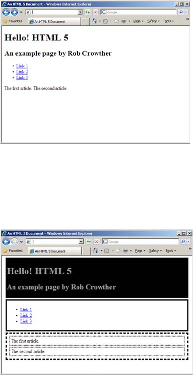
Most of the major browsers work identically in this regard. Unfortu-
nately, there are two exceptions, one minor and one major. The minor
one is Firefox 2.0; Firefox users tend to upgrade regularly, so this ver-
sion is now used by a very small number of people and we won’t worry
about it. The larger problem is Internet Explorer 8 and earlier, which is
still one of the most commonly used browsers on the web.
Supporting Internet Explorer
Internet Explorer won’t apply CSS rules to any elements it doesn’t rec-
ognize. Here’s what the sample page looks like in IE7.
But all is not lost. You can trick IE into recognizing elements with a bit
of JavaScript. This code will persuade IE that the <section> element
exists and should have styles applied to it:
document.createElement("section");
36 CHAPTER 1 Introducing HTML5 markup
Here’s the final listing, with each element we want to use enabled in IE:
<script>
document.createElement("header");
document.createElement("nav");
document.createElement("article");
document.createElement("section");
</script>
<style>
header, nav, section, article {
padding: 4px; margin: 4px; display: block; }
header { background: #000; color: #999; }
nav { border: 4px solid #000; }
section { border: 4px dashed #000; }
article { border: 2px dotted #000; }
</style>
Enabling HTML5 support in Internet Explorer with html5.js
Rather than work out for yourself what elements you need to fix in
Internet Explorer, you can use one of the freely available compatibility
scripts. A simple one with a good following is html5.js, available at
http://code.google.com/p/html5shiv/.
Of course, the main drawback of these approaches is that they won’t
work if JavaScript is disabled in the browser or if something blocks
your JavaScript from being downloaded, such as a corporate content
filter or a personal firewall. Although this is likely to be a small per-
centage of users for most sites, you should do some analysis of your
existing site visitors before embarking on an HTML5 redesign.
Summary
In this chapter, you’ve learned about the new markup elements in
HTML5 and the formal structure provided for them, and the elements
inherited from HTML4, provided by the outlining algorithm and the
content model. You’ve looked at several popular websites and seen
how the content they display fits naturally into the new semantic ele-
ments of HTML5, reducing the need for content authors to add seman-
tic meaning to neutral <div> and <span> tags through the id and class

Summary 37
attributes. You’ve also seen how the new global attributes in HTML5
allow you to extend the expressive power and accessibility of HTML
documents.
Now that you’ve learned how HTML5 improves matters for those
writing traditional HTML documents, it’s time to move on to the
main focus of HTML5: markup for applications. We’ll start in the
next chapter with a look at the enhanced support for forms.
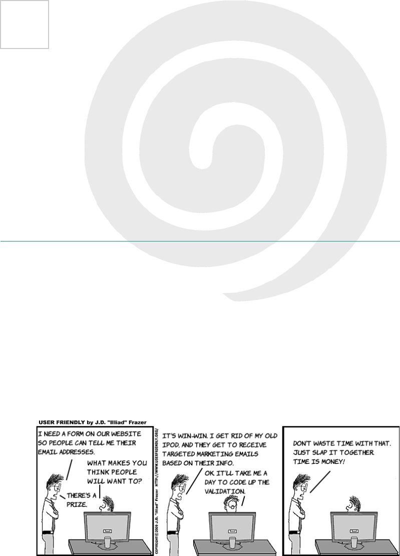
38
2
HTML5 forms
This chapter covers
•New input types in HTML5
•HTML5 form features for improved user experience
•Automatic client-side form validation
Forms are fundamental components of web applications. This chapter
starts with a quick review of the limited options offered in HTML4 and
then moves on to the new form controls HTML5 adds. We’ll investigate
the built-in validation features offered in HTML5 and then look at more
new field types that take advantage of that functionality. After that, we’ll
examine some other new features in HTML5 forms, such as placeholder
The limitations of HTML4 forms 39
text and autofocus, before taking a look at the current state of browser
support and learning how you can take advantage of these new fea-
tures without leaving older browsers behind.
The limitations of HTML4 forms
HTML4 has a paltry selection of input types: three ways of entering
text and three ways of selecting from a predefined list of options. Let’s
review what’s available in HTML4 before you learn about the new fea-
tures available in HTML5:
The text input is the workhorse of
HTML4 forms:
<input type="text" value="abc">
Usually, when you can’t predict what
the user will want to enter but know it
will be fairly short, you have to use an
input of type text. This includes user-
names, dates and times, search terms,
email addresses, URLs, telephone num-
bers, currency, credit card numbers, and
any simple numeric values.
If the user needs to choose from a lim-
ited number of possible values, you can
use a <select> element. A <textarea> ele-
ment is for larger amounts of free text,
when you expect paragraphs rather than
a few words:
<select>
<option selected>Option 1
</option>
<option>Option 2</option>
<option>Option 3</option>
</select>
40 CHAPTER 2 HTML5 forms
The <select> element allows the user to
select from predefined options. It’s nor-
mally a drop-down list (top), but you
can also use the size attribute so that
more than one option shows (bottom):
<select size="3">
<option selected>Option 1
</option>
<option>Option 2</option>
<option>Option 3</option>
</select>
<textarea>abc</textarea>
An alternative to the <select> element is
the use of radio buttons. These are
another type of <input> element, but, in
normal circumstances, there’s more than
one in a set. They’re linked by having
the same value for their name attribute:
<label for="exradio1">Radio 1: </label>
<input type="radio" id="exradio1"
name="exradio">
<label for="exradio2">Radio 2: </label>
<input type="radio" id="exradio2"
name="exradio">
<label for="exradio3">Radio 3: </label>
<input type="radio" id="exradio3"
name="exradio" selected>
Within a set of radio buttons, only one
can be selected at a time. If you want the
user to be able to select multiple items,
you can use either the <select> element
or a set of check boxes:
<label for="excheckbox1">
Checkbox 1:
</label>
<input type="checkbox"
The limitations of HTML4 forms 41
The <fieldset> and <legend> elements are useful for grouping sets of
controls together in long forms. When used correctly, they’re also good
name="checkbox1" id="excheckbox1">
<label for="excheckbox2">
Checkbox 2:
</label>
<input type="checkbox"
name="checkbox1" id="excheckbox2">
Finally, this example shows the <field-
set> element with its <legend>, a file-
upload input, and a submit input:
<fieldset title="Other form elements">
<legend>Example</legend>
<label>
Upload file
<input type="file" name="name">
</label>
</fieldset>
<input type="submit">
Hi, I’m stef murky of
columbia internet.
sign up for our free
newsletter by filling
in this form. all
completed surveys
will be entered into
a prize draw to win
an ipod.*
*terms and conditions
available on request
42 CHAPTER 2 HTML5 forms
for accessibility. The file control is a way to transfer files to the server,
and the Submit button is the most obvious way for the user to send the
entire form back to the server. This set of controls has existed mostly
unchanged since before forms were first added to the standard in 1996.
You can build Stef’s sign-up form out of these rudimentary controls.
The figure shows Stef’s form implemented using HTML4 form con-
trols. The full source code is available for download from www.manning
.com/crowther/. If you’re in the United States and wondering what a
postal code is, it’s similar to a ZIP code—remember that Columbia
Internet is a Canadian ISP.
But the HTML4 forms solution requires a number of compromises. It
uses text inputs for purposes such as numbers and email addresses. For
the rest of this chapter, you’ll learn about the new form controls pro-
vided by HTML5, which are more appropriate for such input.
Numbers, ranges, dates, and times
HTML5 introduces several new form controls that didn’t exist in
HTML4; they give you more precise control over how you gather user
input. In HTML4, all text inputs were just that: text. HTML5 signifi-
cantly expands the range of controls available, not least by providing
two ways of entering numbers and multiple controls for dates and
times. We’ll look at these new controls for numbers, dates, and times in
this section.
Form submission
For a form to be useful in this scenario, there needs to be some server-side pro-
cessing to deal with the form values the browser sends when the user clicks Sub-
mit Query. We don’t want to get bogged down in backend issues in this book, so
A lot of the ideas for HTML5 forms were taken from the XForms 2 proposal,
a partner standard in what was to be the XML based future of the web with
XHTML2 (see appendix A for more details).
_
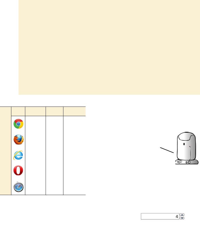
Numbers, ranges, dates, and times 43
(continued)
we assume that one of the techies—Mike, Miranda, or Pitr—will take care of that.
If you want to test your own forms to see what values they’re sending to the serv-
er, you can create a simple PHP file:
<?php
foreach ($_POST as $field_name => $field_value) {
print "Field $field_name : $field_value <br />\n";
}
?>
At the top of your HTML form you’ll then have some code like this:
<form action="collector.php" method="post">
A prebuilt collector.php is available for download from the book’s website at
www.manning.com/crowther/.
The basic number input provides a spinbox:
<input type="number" value="4">
Normally the arrows increment or decre-
ment by 1, but you can adjust this by using
the step attribute. This example increments
in steps of 2:
<input type="number" value="4" step="2">
Most of the screenshots
in the following sections
were taken in Opera 11.60
and 12, because that was
the first browser to add
full support for the new
controls. Exceptions
are mentioned in the text.
Browser support quick check
Number Range Datetime
5 4 20
~ ~ ~
10 10 ~
9 9 9
5 4 ~
44 CHAPTER 2 HTML5 forms
As you can see, the exact value of the range input isn’t clearly visible.
In practice, you might use it for large numbers where accuracy isn’t
important. As with the number control, you can specify a step value:
<input type="range" min="0" max="1000" value="20" step="20">
If an exact number isn’t necessary, you can
use a range control. In the browser, this
renders as a slider:
<input type="range" min="1"
max="10" value="2">
Create a simple date input like this:
<input type="date">
In its unexpanded state (top), it looks
similar to a <select> element. But if you
activate the control, a date picker pops
up (bottom).
The value returned from the date control,
and any default value you want to set, are
in the format yyyy-mm-dd. Using this
standard ordering prevents any confu-
sion relating to date formats in different
countries.
If you want to use range for a numeric input, the best approach is to
either label the high and low values in your HTML or provide some
other user feedback when the control is adjusted—perhaps with an
<output> element (see the section "Elements for user feedback’’).
In the meantime, let’s move on to dates and times.
What the date picker looks like is
left up to the browser. Currently
there’s no way to style it through CSS.
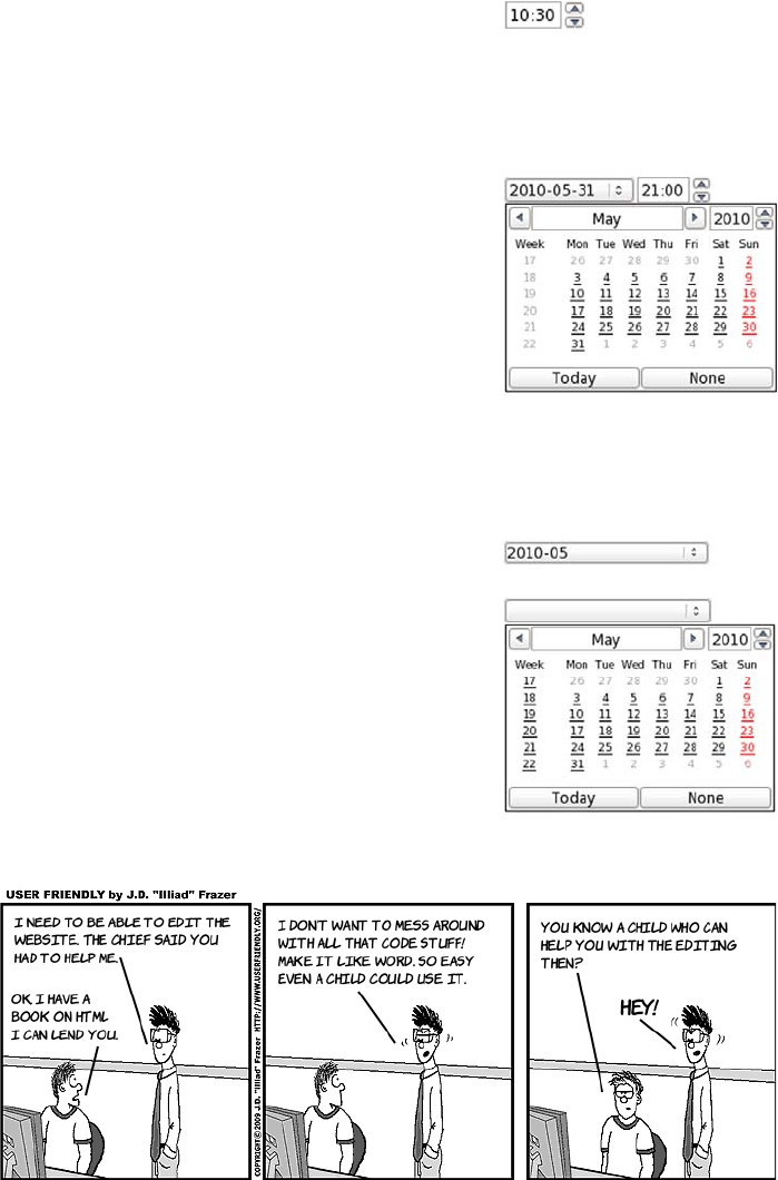
Numbers, ranges, dates, and times 45
Next, the time input:
<input type="time" value="10:30">
Again, styling is determined by the
browser.
If you want the user’s local time, use
datetime-local:
<input type="datetime-local"
value="2010-05-31T21:00">
This looks the same as the datetime control
but without the UTC annotation. In this
example, you can see how to specify a
default value for the datetime and
datetime-local input types:
yyyy-mm-ddThh:mm.
As well as full dates, you can have months
or weeks:
<input type="month"
value="2010-05">
<input type="week">
In Opera, these look identical to the full
date picker, but some browsers may
choose to implement a custom UI.
46 CHAPTER 2 HTML5 forms
Validation
Validation is often a crucial issue on the web, both for security and for
general smooth operation of apps, but it’s something that content
authors frequently get wrong. HTML5 has built-in form-validation fea-
tures. In this section, we’ll look at how you can specify that filling in
certain fields is required, delimit numeric inputs with maximum and
minimum values, and define arbitrary format requirements for any
other text field with regular expressions. We’ll then examine how these
features interact with CSS and JavaScript to allow you to give useful
feedback to your users.
If you’re accepting input from users
through forms, there should always be
validation going on at the server. But
it provides a better experience to let
users know they’ve made mistakes
immediately rather than to let them fill
out the whole form, submit, wait for a
response, and only then find out they
made a mistake.
Browser support quick check
Required Min/Max Pattern
5 5 5
4 4 4
10 10 10
9 9 9
5 5 5
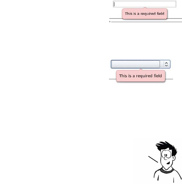
Validation 47
The required attribute
The simplest form of validation is to mark a field as required. In
HTML5 this is done by adding the required attribute. If an input is
marked as required, the browser shouldn’t allow the form to be submit-
ted until the user has provided a value.
The min, max, and pattern attributes
The only native validation built into HTML4 for the text input is the
maxlength attribute. It allows you to specify the maximum number of
characters the user is allowed to enter. This is somewhat useful for
things like dates and phone numbers that have a well-defined length,
but it’s not much use for anything else.
This image shows what happens when a
text input is marked as required and the
user tries to submit the form without
entering a value:
<input type="text" required
name="myrequiredfield">
You can add the required attribute to any
type of input:
<input type="date" required
name="myrequireddate">
As the image shows, the results of not
entering a value are the same in both
examples.
Note that a name attribute is included in the example; this
will label the field’s value when it’s sent to the server. The
automatic validation occurs when the form is submitted,
so you need a submittable form for these examples to work.
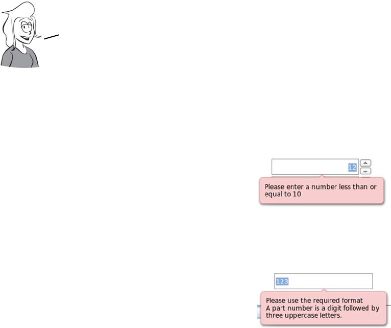
48 CHAPTER 2 HTML5 forms
In HTML5, you can use the min and max attributes on the number input
type. You already saw these attributes on the range control, where they
specify the limits of the slider. On the number control, they trigger an
error when the user tries to submit the form:
<input type="number" max="10"
name="exnumber">
The min attribute works exactly the same
way:
<input type="number" min="4"
name="exnumber">
There’s also help if the format you
require is somewhat more exotic. You
can use the pattern attribute to supply a
regular expression that is then used to
validate the field. This example is taken
from the HTML5 spec:
<input type="text" name="partno"
pattern="[0-9][A-Z]{3}"
title="A part number is a digit
followed by three uppercase
letters.">
If the validation fails, the browser dis-
plays the value of the title attribute, so
you should include some information
there that will help the user in filling
out the form.
If you wanted a number between 1 and 99, you could set maxlength
to 2; this would stop people from entering 100 but not —1. And if
you were looking to limit people to a value between 1 and 50,
maxlength would be even more useless.
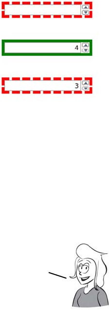
Validation 49
Taking advantage of validation with CSS
In addition to the visible support in the browser for validation (the
messages you’ve seen in the earlier screenshots), HTML5 provides
behind-the-scenes hooks for CSS and JavaScript. These let you pro-
vide immediate visual feedback. CSS has two pseudo-classes that allow
you to provide different styles based on whether they’re currently valid
or invalid.
Here’s a simple pair of CSS rules to put a
green outline around valid controls and a
dotted red outline around invalid controls:
input:valid {
outline: 5px solid green;
}
input:invalid {
outline: 5px dashed red;
}
The images show the result of applying this
CSS to these three number controls:
<input type="number" required>
<input type="number" min="4"
value="4">
<input type="number" min="4" value="3">
In real life, of course, you wouldn’t specify something
invalid as the default value! Note that the validity
state applies even if the form isn’t submittable.
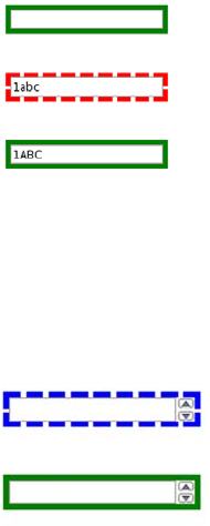
50 CHAPTER 2 HTML5 forms
Turning off validation
Sometimes you want the user to be able to submit the form without
triggering validation. For example, if a form is long and has many sec-
tions, you might want to let the user save their progress and come back
and complete the form later. To do this, HTML5 provides two new
attributes: novalidate and formnovalidate.
The novalidate attribute can be applied to the <form> element itself,
whereas the formnovalidate attribute affects the enter form but should
be applied only to a Submit button:
<input type="submit" value="Save for Later" formnovalidate>
The same CSS works equally well with text con-
trols using the pattern attribute. The three images
shown here are based on the example from the
section “The min, max, and pattern attributes”:
<input type="text"
pattern="[0-9][A-Z]{3}">
<input type="text"
pattern="[0-9][A-Z]{3}"
value="1abc">
<input type="text"
pattern="[0-9][A-Z]{3}"
value="1ABC">
There’s also CSS support for styling required
controls differently through pseudo-classes:
input:required {
outline: 5px dashed blue;
}
input:optional {
outline: 5px solid green;
}
The images show the result of this CSS applied to
these two inputs:
<input type="number" required>
<input type="number">
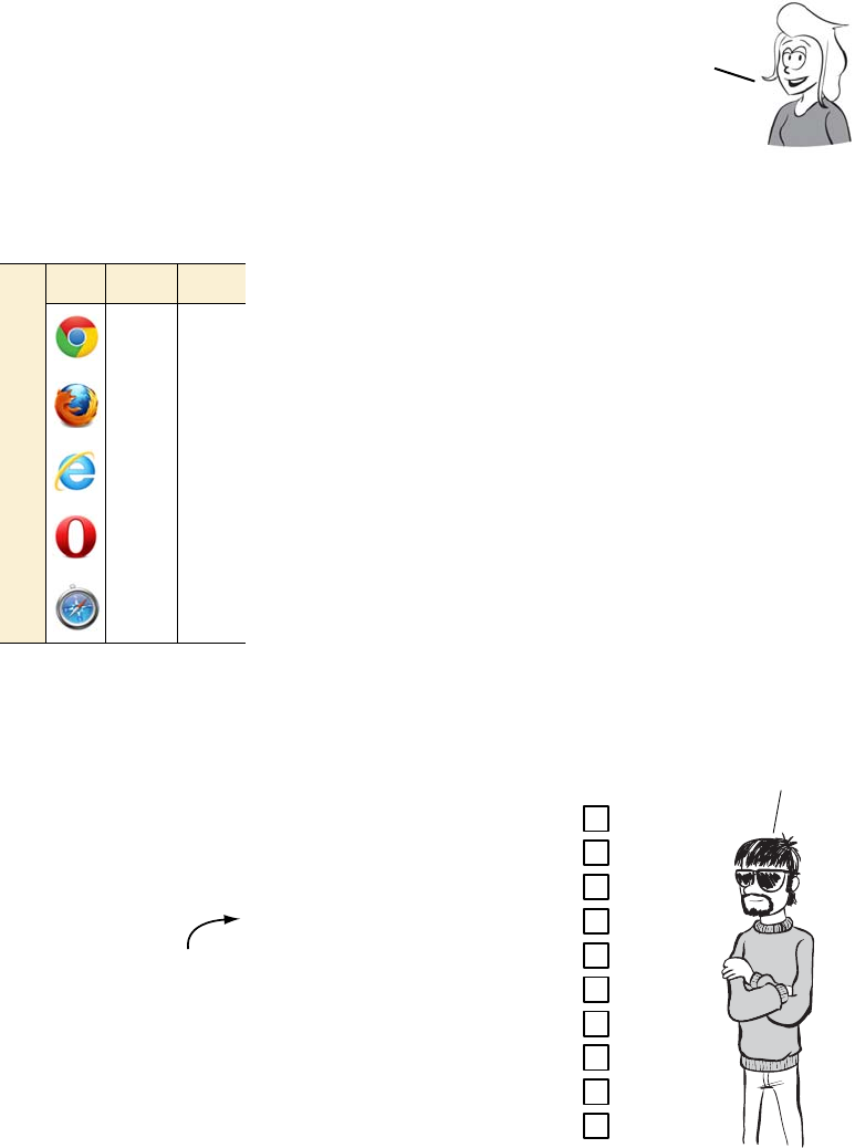
Email and URLs 51
Email and URLs
Now that you’ve seen the validation
features, let’s consider two further
new input types: email and url. We
didn’t look at them until now
because, without HTML5’s validation features, they look and behave
identical to HTML4 text inputs.
Email addresses
Having seen the pattern attribute, you’re probably
thinking it would be straightforward to either
write your own regular expression or find one on
the web and then implement your own email field.
The problem is, you’d probably get it wrong. Email
had reached the popular consciousness even before
the web was born, and despite some confusion,
most people can recognize an email address. Let’s
have one of our resident experts do a quick test to
see if you really know what an email address looks
like.
On the web, there are
probably more forms
where you need to
enter an email
address than forms
where you don’t.
Browser support quick check
email url
5 4
4 4
10 10
9 9
5 4
Pitr’s email validity test
for aspiring evil geniuses
We will
be seeink if you
half as smart as
you thinkink
you are
Valid?
1. rob+crowther@domain.com
2. rob!crowther@domain.com
3. rob@crowther@domain.com
4. rob,crowther@domain.com
5. rob-crowther@domain.com
6. rob_crowther@domain.com
7. rob crowther@domain.com
8. "robcrowther'@domain.com
9. ’rob crowther’@domain.com
10. ’robcrowther’@domain.com
That’s a comma
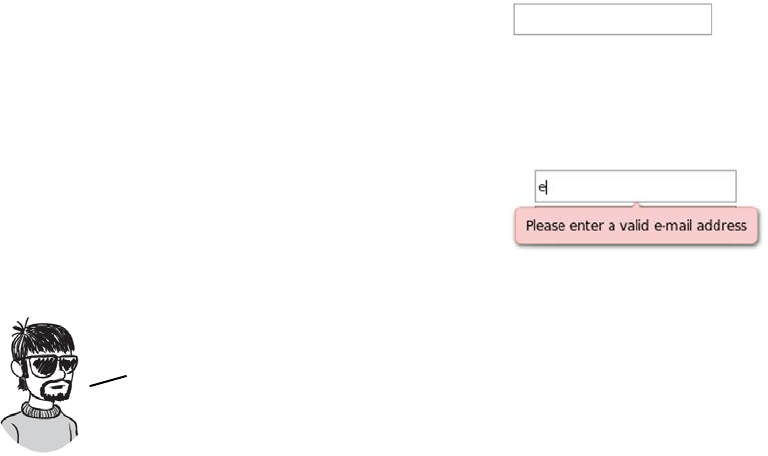
52 CHAPTER 2 HTML5 forms
Easy? Half of them are valid and half of them invalid; Pitr will tell you
which ones are which at the end of the section. Note that by valid we
mean they’re constructed correctly, not that you’ll be able to send email
to them successfully. The reason you’d be almost certainly wrong if you
implemented an email field yourself is that even the experts can’t agree
on what a valid email address looks like. The HTML5 spec itself is
“willfully violating” the standard:
A valid e-mail address is a string that matches the ABNF production 1*(
atext / “.” ) “@" ldh-str 1*( “.” ldh-str ) where atext is defined
in RFC 5322 section 3.2.3, and ldh-str is defined in RFC 1034 section 3.5.
This requirement is a willful violation of RFC 5322, which defines a
syntax for e-mail addresses that is simultaneously too strict (before the
“@” character), too vague (after the “@” character), and too lax
(allowing comments, whitespace characters, and quoted strings in
manners unfamiliar to most users) to be of practical use here.
Here’s the code for this email input:
<input type="email">
Visually it looks the same as a normal
text input.
If you type in an invalid email address
and submit the form, you’ll get an error
message similar to the one shown here.
In HTML5, the invalid emails
addresses are beink 3, 4, 7, 8, and 9.
1, 2, 5, 6, and 10 are beink valid.
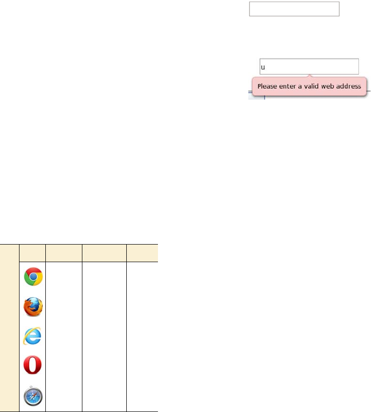
Elements for user feedback 53
Web addresses
Forms in which you enter a URL are also common. Think about the
last time you posted a comment on a blog; it’s likely the form included a
URL field. Like email addresses, valid URLs have some esoteric rules,
but HTML5 means you don’t need to worry about what they are.
Elements for user feedback
Sometimes you may want to show the user a result—something calcu-
lated from the values on the rest of the form. Think of a shopping cart
that shows the running total of the user’s expenditures. In HTML4, you
could use JavaScript to insert the value into a read-only field, or you
might have written the value into the HTML content, but there was no
way to indicate that the field or the value had any sort of relationship to
the form values or even was part of the
form at all. HTML5 changes all that with
its three built-in form controls for user
feedback: output, progress, and meter.
The <output> element
The <output> element allows you to
declare a relationship between one or
more <input> elements and its own
value. The value of the <output> element
can be anything you’d have been happy
to put in an <input> element in HTML4,
such as text, numbers, and dates.
Creating a URL control is as easy as
changing the type:
<input type="url">
Again, there’s no visual indication that a
URL is required. But when you attempt
to submit an invalid URL, you get a
similar message.
Browser support quick check
Output Progress Meter
13 8 8
4 6 6
10 10 ~
911 11
5 ~ ~
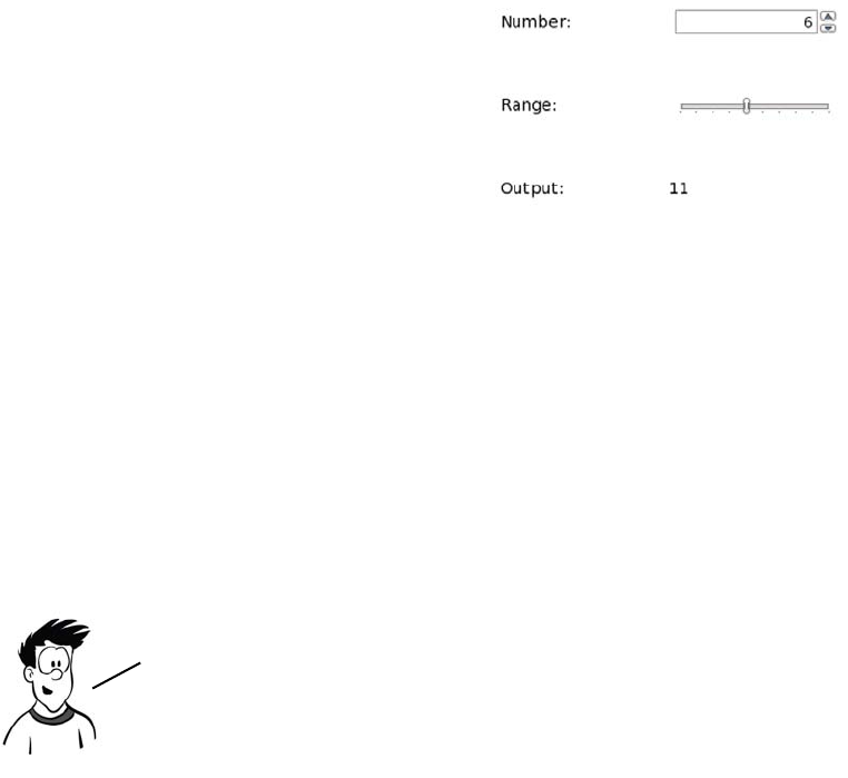
54 CHAPTER 2 HTML5 forms
To see <output> in action, first create a couple of numeric form inputs in
a <fieldset>:
<fieldset>
<legend>Output example</legend>
<label for="one">Number: </label>
<input type="number" name="one">
<label for="two">Range: </label>
<input type="range" name="two" min="0" max="10">
</fieldset>
Finally, you need some script to update the <output> element when
there is input. You do this on the parent <fieldset> element:
<fieldset oninput="out.value = one.valueAsNumber + two.valueAsNumber;">
Now add an <output> element just
before the closing </fieldset>:
<label for="out">Output: </label>
<output id="out" for="one two">
0
</output>
The value goes between the tags
rather than in an attribute as with
an <input> element. The for
attribute indicates the fields
with which the <output> is
associated.
The exact relationship between the <input> elements listed in the for
attribute and the <output> value has to be defined in code. HTML5 doesn’t
attempt to guess whether you want to add, subtract, multiply, or calculate
interest. We’ll discuss the oninput event later in this chapter.
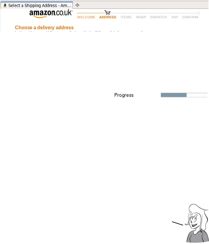
Elements for user feedback 55
The <progress> element
You often see complex processes broken into several steps. Buying a
book at Amazon, for instance, usually proceeds through pages for
entering your personal information, entering your credit card details,
and entering the delivery details, among others, before finally confirm-
ing your purchase. If you make a purchase at Amazon you’ll notice, at
the top of the screen, a progress indicator.
This follows user interface design best practice: when you’re putting a
user through a multistep process, always give them an indication of
how far along they are. This is such a common requirement that
HTML5 adds a special element to support it:
<progress value="5" min="0" max="9">5 out of 9</progress>
WebKit has an initial implementa-
tion in its nightly builds.
The max attribute gives the value that represents completion and the
value that indicates how close to completion you are. The <progress>
element can contain phrasing content—text, inline markup, and
images—but no other <progress> elements. You could represent Ama-
zon’s progress bar like this:
<progress max="7" value="2">
<img src="order-progress-step-2.png" alt="Step 2 of 7">
</progress>
The <progress> element can also be used in applications to give feed-
back on long-running operations like file uploads.
The <progress> element has strong native semantics for the
purposes of ARIA. It should be reported automatically as
being in the ARIA progressbar role by supporting agents. As
we discussed in chapter 1, this improves the accessibility
of your web apps with no extra effort on your part.
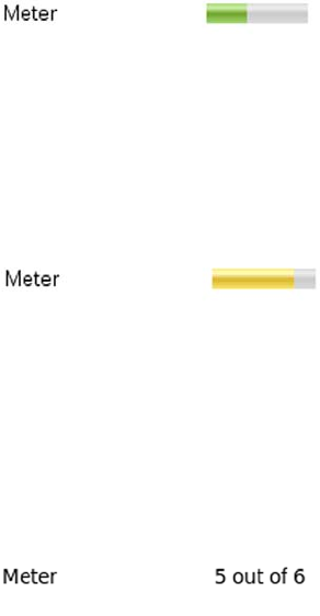
56 CHAPTER 2 HTML5 forms
The <meter> element
The <meter> element is similar to <progress> but more general-purpose
in its semantic value. It should be used to indicate a scalar measure-
ment within known bounds—for example, disk-space usage, progress
through an audio track, or share of a popular vote.
Chrome has support for the <meter>
element in version 6:
<label for="exmeter">Meter</label>
<meter id="exmeter"
value="3" min="1" max="6"
high="5" low="2" optimum="3">
3 out of 6
</meter>
Note the high and low attributes—if
the value encroaches into them, it
has a visible effect:
<label for="exmeter">Meter</label>
<meter id="exmeter"
value="5" min="1" max="6"
high="5" low="2" optimum="3">
5 out of 6
</meter>
As with the <progress> element,
browsers that don’t support the
<meter> element display the fallback
content between the opening and
closing tags. Although we use text
here, you can include an image or
even some SVG that more closely
resembles the rendering of the
browsers that do support <meter>.
Less-common form controls 57
Less-common form controls
Numbers, dates, times, email addresses, and URLs—these are all fields
you’re likely to need in nearly every form, but HTML5 doesn’t stop
there. There are some additional form controls that you’ll need either
less regularly or when you’re building particular types of web applica-
tions. These controls so far lack implementations or common use cases,
but they may see more uptake in the future as HTML is used for more
desktop-style (or mobile) applications.
Telephone numbers
You don’t often need telephone numbers in a
web app, but they’re a common requirement
for things like credit card forms, so HTML5
has an input type for them:
<input type="tel">
But the format for a telephone number is
unpredictable. Phones tend to deal in strings
of digits, but people break them into inter-
national dialing codes, area codes, and local
numbers with spaces, brackets, and dashes.
Browser support quick check
Tel Color <keygen>
4 20 1
4 ~ 1
10 ~ ~
911 3
4 ~ 1.2
What value can
these form fields have?
The tel type seems particularly
useless—it doesn’t even
offer validation.
It’s an accessibility
win—you can tell users what
type of information the field
expects even if the page
content doesn’t make
it clear.
Surely
there’s more
to it than
that.
But it’s based on
guessing and heuristics.
The extra information makes
it more accurate.
My browser seems
to do pretty well
with that already.
It’s also helpful in form
autofill functionality. The
browser can offer only email
addresses you’ve previously
used for email fields and
phone numbers for telephone
fields. Mobile browsers can
automatically insert your
own phone number.
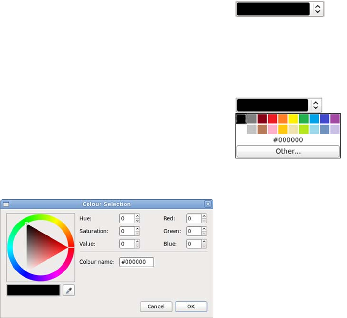
58 CHAPTER 2 HTML5 forms
The HTML5 spec therefore doesn’t specify a format; the tel type is
basically the same as a text input other than in its semantic content. If
you want to enforce a particular format on the tel field, you’ll have to
use the pattern attribute discussed in the section “The min, max, and
pattern attributes.”
Color pickers
Color isn’t widespread in today’s web forms. But because one of the
key focuses of HTML5 is to enable HTML applications, color pickers
are likely to be a more common requirement in the future. The first
implementation of the color input type is in Opera 11.
The HTML5 markup for a color picker is
<input type="color">
The default value is #000000. Selected
values are always in #rrggbb hexadecimal
shorthand.
When the user expands the control, a
selection of common colors is presented.
Currently there’s no way to configure this
set of colors, but clicking the Other button
brings up the full color picker.
New attributes for the <input> element 59
<keygen>
<keygen> originated as a proprietary feature in Netscape Navigator. It
was then reverse-engineered by Opera and WebKit. As long as the ele-
ment is useful, the HTML5 way is to document existing behavior so
that everyone can implement in an interoperable manner. We won’t
use <keygen> in this book, because it depends on relatively complex
server-side code to be useful, but it’s mentioned here for completeness.
New attributes for the <input> element
In addition to the new form con-
trols in HTML5, existing HTML4
form controls have been
extended with new attributes.
You’ve already seen some of
these in the section on validation,
“The required attribute,” where
we covered attributes such as
required and pattern, but several
others can be applied to most
<input> elements: placeholder,
autofocus, and autocomplete.
Placeholder text
A popular technique in recent years has been to put a suggestion for a
field’s required user input in the field by default. This is called
The purpose of <keygen> is to provide an API into your operating
system’s cryptography store. It allows public/private key
exchange to take place between you and the server. If that doesn’t
make any sense to you, it’s safe to skip ahead to the next section.
You’ve now learned about the many new input types
and elements available in HTML5 forms, but it doesn’t
stop there. The next section investigates new form
features that aren’t tied to specific elements.
Browser support quick check
placeholder autofocus autocomplete
10 6 17
4 4 4
10 10 10
11 11 10
5 5 5
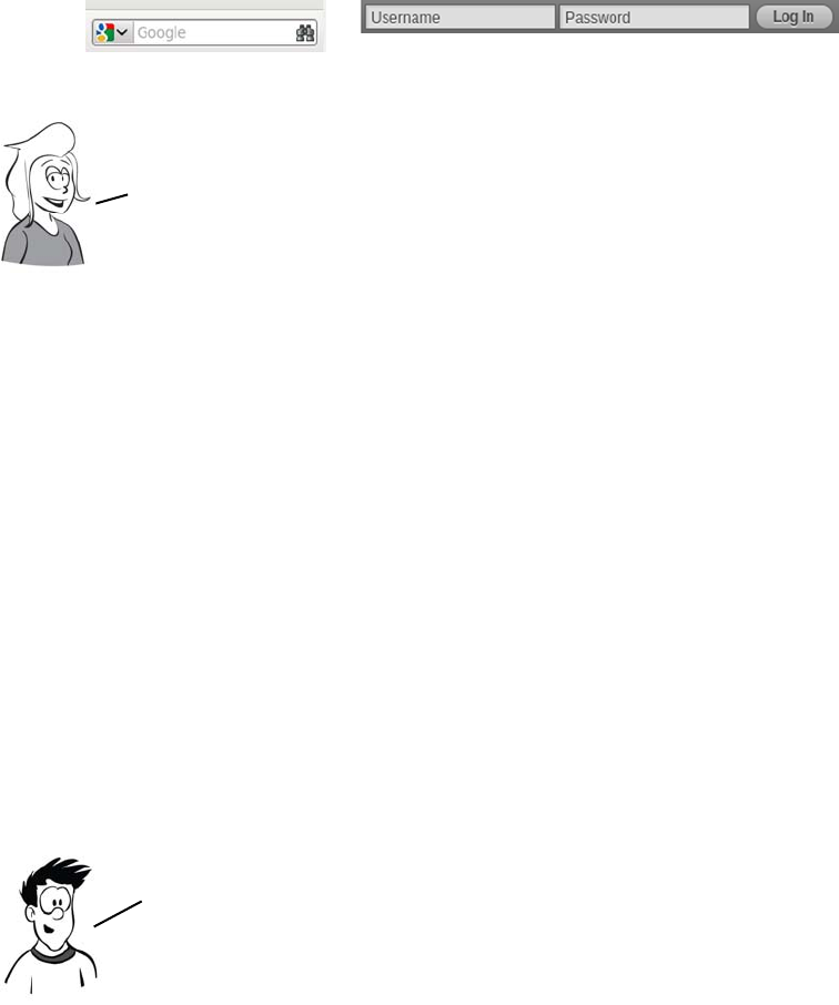
60 CHAPTER 2 HTML5 forms
placeholder text. Here are two examples of placeholder text on the
Firefox search bar and on the WordPress login.
There are several common approaches to achieving this look with
JavaScript. They mostly boil down to two alternatives:
❂Make the input transparent, and place the label element behind it.
❂Hide the label element, but copy the text of the label into the input.
You then have to add JavaScript to remove the placeholder text when
a user clicks the control and put it back if the user leaves the control
without entering a value. But a number of issues can occur:
1Errors in the JavaScript can stop the placeholder text from being
removed when a user clicks into the element. If users have JavaScript
disabled, the text won’t work properly or at all.
2The placeholder can interfere with browser form-fill functionality that
remembers values for frequently used forms.
3Assistive technology has no way of distinguishing between placeholder
text and valid input.
This approach is popular with designers because using field names
as placeholders doesn’t take up any extra space, but provides the
user with useful information about the expected input. It’s also a
compact way of indicating the desired input format.
HTML5 has support for placeholders built in thanks to the
new placeholder attribute. Add this attribute to the
<input> element with the value you want to use.
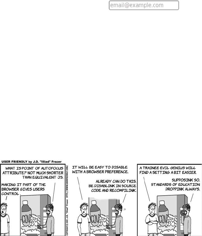
New attributes for the <input> element 61
You’re protected from JavaScript errors causing issues because the
functionality no longer depends on your (or indeed, any) JavaScript.
Browsers can handle the interaction with native functionality better
because everything is now under their control; and for the same rea-
son, browsers can keep assistive technology better informed of what’s
going on.
Form autofocus
As a convenience, many web forms use JavaScript to put the focus on
the first <input> element when the page loads. For instance, if you visit
the Google homepage and start typing, the text will appear in the
search field in the middle of the page. Rather than have everyone write
their own JavaScript routine to achieve this, HTML5 adds support
directly to HTML:
<input type="text" autofocus>
Protecting private information with the autocomplete attribute
The autocomplete attribute allows you to provide a hint to the browser
that the values entered into a field shouldn’t be remembered for future
use by the browser’s auto-form-filling functionality. This could be
because the field accepts information that’s supposed to be secret (for
<input type="email"
placeholder="email@example.com">
62 CHAPTER 2 HTML5 forms
instance, a PIN number) or because the field expects a one-off value
where past values entered are likely to be irrelevant (such as a pass-
word-reset code):
<label>Account: <input type="text" name="ac" autocomplete="off"></label>
<label>PIN: <input type="password" name="pin" autocomplete="off"></label>
Extending forms with JavaScript
Customizing the validation messages
The default validation messages are a little bland. And although the
pattern attribute allows you to include a custom message in the title
attribute, there’s no attribute you can use to provide a custom message
to the other input types. But you can supply a custom message in
script.
Use the setCustomValidity property of
the <input> element in the DOM:
var fldName =
document.getElementById('fullname');
fldName.oninvalid =
function () {
fldName.setCustomValidity("");
if (!fldName.validity.valid) {
fldName.setCustomValidity(
"Nameless ones are not " +
"allowed to take part"
);
}
};
There are several other enhancements to forms in HTML5 over and above
the new controls. These include ways to access validity information
through JavaScript as well as convenience features that either
completely replace the JavaScript you would commonly write for
every form today or make various scripting operations much easier.
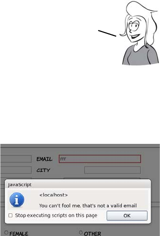
Extending forms with JavaScript 63
As you can see, your message is displayed if the field fails the validity
check. In this case the required attribute was set on the text field like this:
<input id="fullname" type="text" required>
Also, for the oninvalid event to fire, the form must be submitted; see
more on this in the section “Triggering validation with JavaScript.”
Overriding the invalid event on the form element in question lets you
take more complete control of the user experience while still taking
advantage of built-in validation.
This code assumes you have a submittable form with an input like this:
<input id="email" type="email">
The browser will fire the invalid event when the form is submitted and
there is text which is not a valid email address in the field. Note that the
Check the validity property in the
DOM, and add your own code to
report the validity status:
var fldEmail =
document.getElementById('email');
fldEmail.addEventListener(
'invalid',
function(event) {
alert(
"You can't fool me, " +
"that's not a valid email"
);
event.preventDefault();
}
,false);
Note that the first step in the function in the preceding code
snippet resets the custom validity message to an empty
string. This is because setting the custom validity message
forces the valid status to be false. It will be impossible to
submit the form after the error if the message isn’t reset.

64 CHAPTER 2 HTML5 forms
event handler function cancels the default event processing (with
event.preventDefault()) in order to prevent the message from the
browser from also appearing.
Triggering validation with JavaScript
A browser will only trigger form validation when the form is submit-
ted. This is sensible: having error messages pop up repeatedly while the
user’s trying to fill in the form would be distracting.
Suppose you have an email input in your HTML, like this:
<input id="email" type="email">
You can trigger validation by calling the checkValidity() method:
document.getElementById('email').checkValidity();
Responding to any changes in value
Before HTML5, when you had to write your own form-validation code,
it was a common technique to attach the JavaScript validation to the
onchange event handler. But in HTML4, onchange was only a valid attri-
bute on <input>, <select>, and <textarea>, and it was fired only when the
form control that changed lost focus.
There may be occasions when you want to trigger validation without
submitting the form—possibly the allowed values for a later field
on the form depend on the user already having entered a valid email
address, or maybe the input isn’t part of a form at all.
In Opera, the field will be validated as it would be when the form is
submitted. Thus if the email address is invalid, the normal message
will pop up, although this isn’t required by the spec. The method also
works in Firefox 4 and recent Chrome and Safari releases, returning
false if the email address is invalid. You can use the return value to
implement your own notifications.
An event handler is a hook HTML provides to JavaScript to let you run
code when particular things happen. You might want to know when the
page finishes loading (onload), or when the user clicks something
(onclick), or, as in this case, when the user leaves an input field in
which the value has changed (onchange). When the event happens, it is said
to fire. Check appendix D for more on event handlers.

Extending forms with JavaScript 65
HTML5 provides a new event—oninput—which is fired by any form
element when the value changes, as the value changes, and allows all
event-handling attributes to be specified on any element. You’ve
already seen this feature in action when we discussed the <output> ele-
ment. Let’s compare the code that powered the <output> element earlier
(on the left) with a version that relies on attaching to the event handler
of each field (on the right):
Creating combo boxes with <datalist>
One type of form control that’s common in desktop applications but
not available in HTML4 is the combo box, so named because it’s a combi-
nation of a text box and a select list—the user can select from a list or
free-type a value that isn’t on the list. When AJAX was becoming pop-
ular, one of the most common features of the early JavaScript libraries
was support for creating combo-box-like features.
<fieldset oninput="value =
one.valueAsNumber +
two.valueAsNumber">
<label for="one">Number: </label>
<input type="number" name="one">
<label for="two">Range: </label>
<input type="range" name="two"
min="0" max="10">
<label for="out">Output: </label>
<output id="out" for="one two">
0
</output>
</fieldset>
<fieldset>
<label for="one">Number: </label>
<input type="number" name="one"
onchange="out.value =
one.valueAsNumber +
two.valueAsNumber">
<label for="two">Range: </label>
<input type="range" name="two"
onchange="exoutput1.value =
one.valueAsNumber +
two.valueAsNumber">
<label for="out">Output: </label>
<output id="out"
for="one two">6</output>
</fieldset>
Having to handle changes on each <input> element individually can lead
to extra code, but there’s a more important advantage: the onchange
event only fires after the user leaves the field by tabbing out of it or
clicking elsewhere on the page. The oninput event fires for any change.
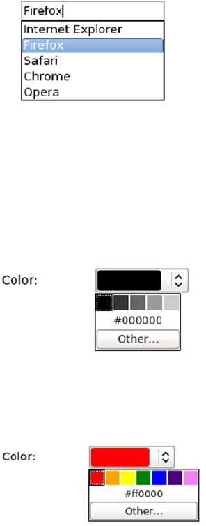
66 CHAPTER 2 HTML5 forms
HTML5 adds support for this directly into the markup with the
<datalist> element. A datalist is a named list of options, similar to the
list of options in a <select> element, which can then be associated with
one or more <input> elements using the list attribute.
In this example, with a screenshot taken in Firefox, the input has been
associated with a <datalist> with the id value "browsers". When a user
selects the input, the list of options pops up. The user can pick one of
the options using the cursor keys or type their own:
At the time of writing, Opera is the only browser to implement the
color input type and allow the <datalist> element to be attached to that.
This sets the default colors available on the initial drop-down:
<input type="text" name="browser"
list="browsers">
<datalist id="browsers">
<option
value="Internet Explorer">
<option value="Firefox">
<option value="Safari">
<option value="Chrome">
<option value="Opera">
</datalist>
<input type="color"
list="greyscale">
<datalist id="greyscale">
<option value="#000000">
<option value="#333333">
<option value="#666666">
<option value="#999999">
<option value="#cccccc">
</datalist>
<input type="color"
list="rainbow">
<datalist id="rainbow">
<option value="#FF0000">
<option value="#FFA500">
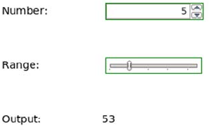
Extending forms with JavaScript 67
Easy ways to work with form values in JavaScript
This is another feature you’ve already seen in action. When you’re
dealing with forms in JavaScript, the value is always a string, even if it
represents a date or a number. Because JavaScript automatically con-
verts the types of any value involved in an expression, this can easily
lead to errors that are hard to spot.
<option value="#FFFF00">
<option value="#008000">
<option value="#0000FF">
<option value="#4B0082">
<option value="#EE82EE">
</datalist>
This code looks similar to the code
you saw in the section “The <output>
element,” but it doesn’t have the
results you might expect:
<label for="one">Number: </label>
<input type="number"
value="5" name="one">
<label for="two">Range: </label>
<input type="range" name="two"
min="0" max="10" value="3">
<label for="out">Output: </label>
<output id="out" for="one two"
onforminput="value =
one.value +
two.value">0</output>
Can you spot the difference?
Compare the last two lines with the
code used earlier (on the right):
one.value +
two.value">0</output>
one.valueAsNumber +
two.valueAsNumber">0</output>
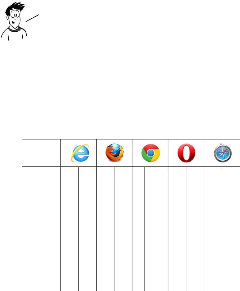
68 CHAPTER 2 HTML5 forms
Browser support and detecting HTML5 features
Unlike the structural elements we looked at in chapter 1, the new form
elements have more complex associated behavior and APIs. The struc-
tural elements merely had to exist; these form elements have to do
something for you to be able to say a browser supports them. With
these more complex requirements, it’s not surprising that support isn’t
yet as far advanced as it might be. The following table shows the level
of support in the current and, where known, upcoming versions of all
the major browsers.
Key:
●Complete or nearly complete support
○Incomplete or alternative support
Little or no support
12 14 4 6 8 9 10 11.1 11.5 5 5.1
Input types ●●●● ●●●●●
Validation API ●●●● ●●●●●
Placeholder ●●●● ●●●●●
Autofocus ●●●● ●●●●●
Input UI ● ●
Range ●● ●●●●
Meter ● ● ● ●
Progress ● ● ● ● ●
Output ● ● ● ● ● ● ●
You might expect 5 + 3 to be 8, but because the form values are strings,
you aren’t performing addition—you’re performing concatenation. It’s
relatively straightforward to work around the issue in HTML4, but why
should you have to? HTML5 provides the properties valueAsDate and
valueAsNumber so that you can get directly at the values you need.

Browser support and detecting HTML5 features 69
Browser inconsistencies
WebKit was one of the first browsers to support the new input types,
enabling keyboards tuned to the required input type on the iPhone.
The latest versions support the validation API, but you need to write
your own code to take advantage of it. Support for the <output> element
was only added in recent versions, but you can always access the value
with innerHTML instead.
Firefox 4 has support for HTML5 forms in the beta release, including
<datalist>. Current versions of Firefox support everything but the new
input types that require some UI (dates and times, numbers). Firefox 4
also added default styling for the :invalid pseudo-class; if you want to
turn that off, use the following in your CSS:
:invalid { box-shadow: none; }
Firefox also has an experimental attribute, x-moz-errormessage, to allow
you to customize the error message:
<input type="email" name="email" x-moz-errormessage="Email please!">
Detecting supported features
As mentioned, if a browser has no support for one of the new form
input types, it will convert it to an input of type text. This makes it easy
to detect whether an input type is supported in JavaScript—just create
an element of the desired type and then immediately look to see if it’s a
text input:
var el = document.createElement("input");
el.setAttribute("type", "date");
if (el.type == "text") {
implementDateValidation();
}
The previous snippet creates a date input and then checks
to see what type the browser thinks it is. If it’s text, you
call a function implementDateValidation to deal with
browsers that don’t support the date input type.

70 CHAPTER 2 HTML5 forms
For date inputs you have to go one step further. If you remember,
WebKit implements the date input type but doesn’t provide any UI for
it. To detect if a UI is provided, set a value on the date element that isn’t
a date:
var el = document.createElement("input");
el.setAttribute("type", "date");
el.value = "text";
if (el. value == "text") {
implementDateUI();
}
You may also want to check whether the user’s browser supports one
of the new form attributes, such as autofocus or placeholder. Here’s
some code to do this:
var el = document.createElement("input");
if (!!('placeholder' in el)) {
window.alert('Placeholder supported');
} else {
window.alert('Placeholder not supported');
}
The final thing you might want to check is whether the browser
supports a particular event, such as the oninvalid event we discussed
earlier:
var eventName = "oninvalid";
var isSupported = !!(eventName in el);
If the browser implements the date UI components, then it will be
impossible to set the value of the input to the string ’’text’’. Therefore,
if the element reports its value as ’’text’’ after you’ve set it, the UI isn’t
implemented by the browser and you should provide your own. You might
also consider setting an appropriate pattern attribute at this point.
The easiest approach is to loop through the available
properties on an element and see if one of them is the attribute
you’re looking for. This same approach can be used for any of the
other new HTML5 attributes, not just form elements.
Browser support and detecting HTML5 features 71
if (!isSupported && el.setAttribute) {
el.setAttribute(eventName, 'return;');
isSupported = typeof el[eventName] == 'function';
}
if (isSupported) {
window.alert('oninvalid supported');
}
The html5-now library
Html5-now is an open source project started by Dean Edwards. Dean
is famous for writing several drop-in scripts for old versions of Internet
Explorer, which made them behave in a standards-compliant manner.
The aim of html5-now.js is to provide a drop-in solution that patches
the browser’s holes in HTML5 support. It’s currently in alpha, but it
already provides a lot of support for HTML5 form controls. Download
it from http://code.google.com/p/html5-now/, and then include it in
your page like this:
<script src="html5-now/html5-now.js"></script>
The result of adding the script to a form can be seen in the screenshots
that follow. On the left is a screenshot of our HTML5 form in Firefox
3.6; all the HTML5 controls render as text. On the right, after html5-
now.js is added, the number and date controls work.
The previous code tries two different approaches. First it looks to see if
the oninvalid event exists in the element properties. If that fails, it tries
to set the event on the element and, similar to the earlier input—type
detection, looks to see if the type of the attribute is a function.
You don’t have to write all this detection code yourself—there’s
already a library that will do the work for you. Check out the
Modernizr library at www.modernizr.com. If you don’t fancy writing
any of your own form—validation code, you can try a different library
that enables HTML5 forms support in all browsers: html5—now.
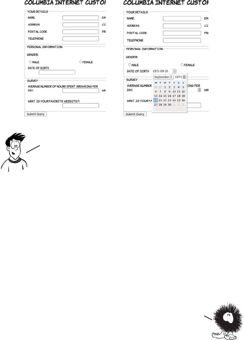
72 CHAPTER 2 HTML5 forms
Summary
In this chapter you’ve learned about the following:
❂How the new form input types available in HTML5 greatly increase
the range of options you had in HTML4
❂How you can reduce the amount of JavaScript you have to write to
validate input
❂Other new features, such as autofocus and placeholder text
❂Support available in web browsers right now, and how to detect
what support is provided by your users’ browsers
You should now be ready to take your forms to the next level with
HTML5!
Html5—now is smart enough to figure out whether the browser
already has support for particular HTML5 features; it won’t interfere
if that’s the case, so it’s safe to use across all browsers. But it’s a
heavyweight script, so if you’re only intending to use a small number
of HTML5 features you’ll be better off detecting them directly, as
discussed in the section “Detecting supported features.’’
In the last two chapters, you’ve learned about HTML5 features that
are extensions of common usages of HTML4 markup. In the next few
chapters, you’ll learn about some of the completely new
functionality in HTML5 for dealing with media and dynamic
graphics. We’ll start in chapter 3 with a look at canvas and SVG, the
two HTML5 technologies for drawing graphics in the browser.

73
3
Dynamic graphics
This chapter covers
•Using the
<canvas>
element to draw shapes, text, and images
•Transforming existing images with
<canvas>
•Using Scalable Vector Graphics (SVG) in your web pages
•The strengths and weaknesses of
<canvas>
and SVG
•Cross-browser support
In this chapter, you’ll learn about HTML5’s facilities for dynamic graph-
ics—graphics that can change in response to user input, data, or simply
time passing. This could include charts representing network activity or
the location of people on a map.
This chapter, especially the parts to do with the <canvas> element,
will make a lot of use of JavaScript. If you’re not familiar with
JavaScript, you should check out appendix D before proceeding.
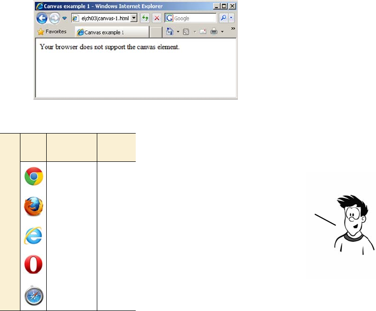
74 CHAPTER 3 Dynamic graphics
Getting started with <canvas>: shapes, images, and text
The <canvas> element is an image you can create with JavaScript. The
markup for it is similar to an <image> element in that you can specify a
width and a height; but it has starting and closing tags that can enclose
fallback content, and it doesn’t reference an external source:
<canvas id="mycanvas" width="320" height="240"
style="outline: 1px solid #999;">
Your browser does not support the canvas element.
</canvas>
In a browser that doesn’t support <canvas> the fallback content is dis-
played, as in this screenshot.
Browser support quick check: <canvas>
Canvas 2D
context
Canvas
text
4.0 4.0
2.0 3.5
9.0 9.0
9.0 10.5
3.1 4.0
You might have a static image as
the fallback if it could
adequately present some of the
information that would be
displayed in <canvas> In
supporting browsers. Or, if you
were particularly ambitious, you
could use an alternative
rendering method such as Flash.
Getting started with <canvas>: shapes, images, and text 75
You may be more interested to see
what the page looks like in a
browser that does support <canvas>.
If you’re wondering where all the
whizzy graphics promised in the
introduction are, well, they don’t
appear by magic. To create pictures
with <canvas>, there needs to be a
JavaScript program that tells the
browser what to draw.
Before you get to drawing something, you need to understand a couple
of things. You need to know how to get a reference to your canvas object
so you can send it drawing commands; and, because you’ll be telling the
<canvas> element to draw shapes on a grid, you need to know how the
grid is defined. First, here’s how to get a reference in JavaScript:
function draw() {
var canvas = document.getElementById('mycanvas');
if (canvas.getContext) {
var ctx = canvas.getContext('2d');
//do stuff
}
}
window.addEventListener("load", draw, false);
Add this code between <script> tags in the <head> of an HTML docu-
ment containing a <canvas> element like that shown in the first listing in
this section. In the following sections, you’ll update the draw() function
to create graphics. If you’re confused about what this document should
look like, please download the code samples from www.manning.com/
crowther/ and look at the file ch03/canvas-1.html.
You have to pass a parameter, 2d, to the getContext method. This gives
you a two—dimensional drawing context. Currently this is the only
parameter supported. Several browser vendors are experimenting
with a three—dimensional drawing context with direct access to
graphics hardware, which will open up possibilities such as 3D
games, virtual—reality experiences, and modeling tools.
76 CHAPTER 3 Dynamic graphics
Drawing shapes
To draw on the canvas, you need to get a drawing context. The context
then gives you access to methods that allow the drawing of lines and
shapes.
Let’s extend the code to draw a line. Lines are a little more complex.
You have to first draw a path, but the path doesn’t appear until you
apply a stroke. If you’ve ever used graphics software like Photoshop,
this process should be familiar to you.
Basic shapes are easy. If you replace the
previous draw() function, you can draw
a rectangle by using the fillRect
method. The only prerequisite is that
you first set the fill color using the
fillStyle method. You call the fillRect
method with four arguments: the x and
y values of the upper-left corner and the
width and height to fill:
function draw() {
if (canvas.getContext) {
var ctx = canvas.getContext('2d');
ctx.fillStyle = 'rgb(255,0,0)';
ctx.fillRect(50,50,100,100);
}
}
In addition to fillRect(), there are also methods to clear an area of
pixels and to draw an empty rectangle: clearRect() and strokeRect(),
respectively. They take the same parameters as fillRect().
Getting started with <canvas>: shapes, images, and text 77
The moveTo method moves the “pen” without recording a path, and the
lineTo method moves the pen and records a path:
function draw() {
var canvas = document
.getElementById('mycanvas');
if (canvas.getContext) {
var ctx = canvas.getContext('2d');
ctx.fillStyle = 'rgb(255,0,0)';
ctx.fillRect(50,50,100,100);
ctx.strokeStyle =
'rgb(0,127,127)';
ctx.moveTo(50,50);
ctx.lineTo(150,150);
ctx.lineWidth = 5;
ctx.stroke();
}
}
Now for a little experiment. What
happens if the line is drawn first and
then the box?
function draw() {
var canvas = document
.getElementById('mycanvas');
if (canvas.getContext) {
var ctx = canvas.getContext('2d');
ctx.strokeStyle =
'rgb(0,127,127)';
ctx.moveTo(50,50);
ctx.lineTo(150,150);
ctx.lineWidth = 5;
ctx.stroke();
ctx.fillStyle = 'rgb(255,0,0)';
ctx.fillRect(50,50,100,100);
}
}
78 CHAPTER 3 Dynamic graphics
As you can see, the line is mostly obscured by the rectangle. You might
think that if you could remove the rectangle the line would still be there
underneath; but after you’ve drawn over it, the line is gone.
What about other shapes? The path-then-stroke approach is the way to
do it. You can use the arc method to draw a circle and then fill it. The
arc method accepts parameters for the location of the center; the
radius; how far around, in radians, the arc should extend; and whether
that should be clockwise or counterclockwise:
function draw(){
var canvas = document
.getElementById('mycanvas');
if (canvas.getContext) {
var ctx = canvas.getContext('2d');
ctx.fillStyle = 'rgb(255,0,0)';
ctx.fillRect(50,50,100,100);
ctx.fillStyle = 'rgb(0,255,0)';
ctx.arc(250, 100,
50, 0,
Math.PI*2,
false);
ctx.fill();
ctx.strokeStyle =
'rgb(0,127,127)';
ctx.moveTo(50,50);
ctx.lineTo(150,150);
ctx.lineWidth = 5;
ctx.stroke();
}
}
The only way to get the line back is to erase both the rectangle
and the line and then draw the line again. The <canvas> element
doesn’t store the elements drawn, only the resulting pixels.
Getting started with <canvas>: shapes, images, and text 79
To ensure that the stroke for the line doesn’t apply to the circle, you need
to explicitly put them on different paths with the beginPath() method:
Other shapes are just a matter of creating a path and then stroking or
filling, or both. If you move the first two shapes over a little, there’s
room to add a triangle. First draw the square and the circle again
slightly further to the left:
ctx.fillStyle = 'rgb(255,0,0)';
ctx.fillRect(5,50,100,100);
ctx.beginPath();
ctx.fillStyle = 'rgb(0,255,0)';
ctx.arc(165, 100, 50, 0, Math.PI*2, false);
function draw(){
var canvas = document
.getElementById('mycanvas');
if (canvas.getContext) {
ctx.fillStyle = 'rgb(255,0,0)';
ctx.fillRect(50,50,100,100);
ctx.beginPath();
ctx.fillStyle = 'rgb(0,255,0)';
ctx.arc(250, 100, 50, 0,
Math.PI*2, false);
ctx.fill();
ctx.beginPath();
ctx.strokeStyle =
'rgb(0,127,127)';
ctx.moveTo(50,50);
ctx.lineTo(150,150);
ctx.lineWidth = 5;
ctx.stroke();
}
}
Note that the stroke you use to draw the line at the
end also gets applied to the circle, even though the
strokeStyle was set after the arc was created.
80 CHAPTER 3 Dynamic graphics
ctx.fill();
ctx.beginPath();
ctx.strokeStyle = 'rgb(0,127,127)';
ctx.moveTo(5,50);
ctx.lineTo(105,150);
ctx.lineWidth = 5;
ctx.stroke();
Put this code in your draw() function inside the if (canvas.getContext)
{} block, replacing what you had previously, and then add the code for
the triangle to it:
ctx.beginPath();
ctx.moveTo(265,50);
ctx.lineTo(315,150);
ctx.lineTo(215,150);
ctx.lineTo(265,50);
ctx.strokeStyle = 'rgb(51,51,51)';
ctx.fillStyle = 'rgb(204,204,204)';
ctx.stroke();
ctx.fill();
Notice that, even though the triangle starts
and ends at the same point, there’s a slight
gap at the top.
To prevent this, you need to close the path
using the closePath method; the additional
line required is highlighted bold:
ctx.beginPath();
ctx.moveTo(265,50);
ctx.lineTo(315,150);
ctx.lineTo(215,150);
ctx.lineTo(265,50);
ctx.closePath();
ctx.strokeStyle = 'rgb(51,51,51)';
ctx.fillStyle = 'rgb(204,204,204)';
ctx.stroke();
ctx.fill();
Getting started with <canvas>: shapes, images, and text 81
You don’t have to restrict yourself to straight lines in paths. Instead of
lineTo, you can use either of two types of curve: quadratic or Bézier.
To simplify things the circle has been removed for now, but the sides of
the triangle have also been made curvy, this time with a quadratic
curve. A quadratic curve is similar, but only needs one control point.
This is the code that drew the triangle, using quadraticCurve instead of
lineTo. Here’s the original triangle drawing code:
ctx.moveTo(265,50);
ctx.lineTo(315,150);
ctx.lineTo(215,150);
ctx.lineTo(265,50);
Replace it with this:
ctx.moveTo(265,50);
ctx.quadraticCurveTo(315,50, 315,150);
ctx.quadraticCurveTo(265,50, 215,150);
ctx.quadraticCurveTo(215,0, 265,50);
Let’s replace the first straight line with a
Bézier curve. Instead of
ctx.moveTo(5,50);
ctx.lineTo(105,150);
use the lines
ctx.moveTo(5,50);
ctx.bezierCurveTo(0,90, 120,70,
105,150)
The last pair of numbers is the end point.
Preceding that are coordinates for the
two control points.
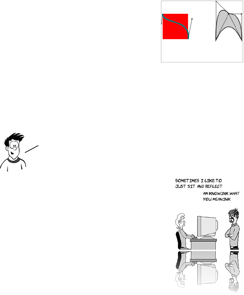
82 CHAPTER 3 Dynamic graphics
Placing images
One of the great features of <canvas> is that
you can use it to manipulate images and
achieve effects that are otherwise difficult to
do with HTML and CSS. Here’s an example
of what can be achieved: a reflection effect.
The <canvas> element can’t download
images—you can’t give it a URL and expect
it to fetch the image. Any image you want to
use must already be available in your page
content. There are various ways to do this,
but the easiest is to include the element in
the normal way. In this case, it’s hidden:
<div style="display: none;">
<img id="myimage" src="example.png" width="236" height="260">
</div>
In this version of the earlier diagram, the
control points have been drawn along
with lines connecting the control points
to the start and end of the path; this
should help you visualize what’s going
on. The drawn lines are distorted from
their direct path so they approach an
imaginary line drawn between the start
or end point and the control point. Check
out the full listings for these examples in
ch03/canvas-6.html and ch03/canvas-6-
controls.html of the code download at
www.manning.com/crowther/.
As you can see, it’s easy to create some interesting shapes. But
drawing curved lines can be hit or miss, especially if you’re
trying to get the curve to line up with some other drawn
object. The best approach is usually trial and error.
Getting started with <canvas>: shapes, images, and text 83
The next few examples take the image at
right and import it into the <canvas>
element. The simplest example is to
import the image and place it on the <can-
vas>.
You call drawImage with three parameters—
the img element and the x and y coordinates:
function draw(){
var canvas = document
.getElementById('mycanvas');
if (canvas.getContext) {
var ctx = canvas.getContext('2d');
var img =
document.getElementById('myimage');
ctx.drawImage(img, 10, 10);
}
}
The example image is too large to fit into the
<canvas> frame. You can easily fix this by
defining a width and height for the placed
image:
if (canvas.getContext) {
var ctx = canvas.getContext('2d');
var img = document
.getElementById('myimage');
ctx.drawImage(
img, 10, 10, 118, 130
);
}
Now you’re calling drawImage with five param-
eters. The additional two are the width and
height of the placed image.
84 CHAPTER 3 Dynamic graphics
The previous example calls drawImage with nine parameters. Let’s exam-
ine them in more detail:
drawImage(img,
80, 100,#
80, 160,#
10, 10,
160, 200)
Drawing text
Let’s now turn our attention to text.
The <canvas> element has a limited
ability to draw single lines of text on
the context. The text-drawing meth-
ods are more suitable for drawing
labels and titles than for rendering
large blocks of text. But the full
graphical-processing ability of the
<canvas> element can be applied to the text that’s drawn, allowing for
effects like this.
You may not even want all of the original
image:
if (canvas.getContext) {
var ctx = canvas.getContext('2d');
var img =
document.getElementById('myimage');
ctx.drawImage(img,
80, 100, 80, 160,
10, 10, 160, 200);
}
The first parameter is still a
reference to the img element.
The x and y of a point
in source image.
Width and height
for section
of source image.
The x and y point in
the canvas for the
placed image.
Width and height for
the placed image
This example takes advantage of the transformation
and gradient fill features of the <canvas> element.
More details about them are in the section “Advanced
<canvas>: gradients, shadows, and animation.’’
Getting started with <canvas>: shapes, images, and text 85
Drawing text on the <canvas> is easy with the fillText method:
The text is drawn in the current font, which is determined by setting
the font property of the drawing context. The <canvas> element’s font
property behaves like the CSS font property, allowing size and font to
be specified simultaneously:
ctx.font = "10pt serif";
If you set the font size a little larger, you can see an alternative method
for drawing text. As with rectangles, you can draw the fill and the
stroke separately:
function draw(){
var canvas = document
.getElementById('mycanvas');
if (canvas.getContext) {
var ctx = canvas.getContext('2d');
ctx.fillText(
'HAI! IZ IN YR ELEMENT
WRITIN YR TXT',
10,10);
}
}
The fillText method has three required
parameters: a string that is the text to be
drawn, and x and y coordinates to deter-
mine where it’s to be drawn.
function draw(){
var canvas = document
.getElementById('mycanvas');
if (canvas.getContext) {
var ctx = canvas.getContext('2d');
ctx.font = "12pt sans-serif";
ctx.fillText(
'HAI! IZ IN YR ELEMENT
WRITIN YR TXT',
10,20);
ctx.strokeText(
'HAI! IZ IN YR ELEMENT
86 CHAPTER 3 Dynamic graphics
WRITIN YR TXT',
10,40);
}
}
You can of course draw both fill and
stroke on a single line of text if you want.
Let’s see what happens if you increase the
font size a bit more. Remember, the exam-
ple <canvas> element is 320 pixels wide:
ctx.font = "20pt sans-serif";
ctx.fillText(
'HAI! IZ IN YR ELEMENT
WRITIN YR TXT',
10,80);
ctx.strokeText(
'HAI! IZ IN YR ELEMENT
WRITIN YR TXT',
10,110);
As you can see, the text that doesn’t fit
flows off the edge of the element without
wrapping.
To work around this issue, you can use the
fourth, optional, parameter to the fillText
and strokeText methods. This parameter
sets a maximum width for the text; if the
text will be wider than the value passed,
the browser makes the text fit either by
narrowing the spacing between the letters
or scaling down the font:
ctx.fillText(
'HAI! IZ IN YR ELEMENT
WRITIN YR TXT',
10,150,300);
ctx.strokeText(
'HAI! IZ IN YR ELEMENT
WRITIN YR TXT',
10,180,300);
Advanced <canvas>: gradients, shadows, and animation 87
If you’ve added all three of these examples to the original listing, then
you should have something similar to the ch03/canvas-text-4.html file
in the code download.
To further control the text position you can set the baseline of the text,
which will adjust where it’s drawn in relation to the coordinates you
provide. This is useful if you’re trying to position labels next to things
on your canvas because it saves you having to work out exactly how
tall the letters will be drawn.
The default value is alphabetic, which means the bottom of an upper-
case letter is placed at the y coordinate you provide in fillText. The
following line sets the baseline to top, which means the top of an upper-
case letter will be placed in line with the provided y coordinate:
ctx.textBaseline = "top";
The following figure shows the previous example alongside a similar
example, except with textBaseline set differently.
Other values for text-
Baseline are hanging,
middle, ideographic, and
bottom.
Advanced <canvas>: gradients, shadows, and animation
With the ability to draw a single-pixel shape on any part of the canvas,
it’s possible for you to create any effect you want by implementing it
textBaseline = "top";textBaseline = "alphabetic";
150px
80px
20px
You can now draw images and text on
your <canvas> element. The simple
examples we’ve covered here may not
seem much more exciting than what
can be achieved with plain HTML and
CSS, but we’ve barely scratched the
surface. In the next section, you’ll
learn about some more advanced
techniques: gradients, drop
shadows, and transformations.
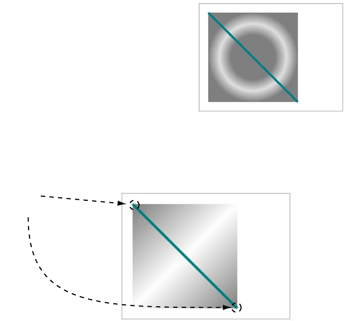
88 CHAPTER 3 Dynamic graphics
yourself in JavaScript. But the <canvas> element has some built-in
shortcuts for particular effects. This section covers them.
Creating gradients
The strokeStyle and fillStyle methods you used in “Drawing shapes”
to set the color of lines and shapes can also accept a gradient object
where the color changes smoothly across a defined space. The <canvas>
element can create two types of gradient:
❂Linear—The gradient follows a straight line.
❂Radial—The gradient is circular.
In this section, you’ll create one example of each. There are three steps
to creating either gradient type in the <canvas> element:
1Create a gradient.
2Specify the color stops.
3Apply the gradient as a fill to a shape.
Here’s a simple linear gradient in
place of the solid fill from the earlier
examples.
You define the extents of the gradient
with the createLinearGradient() met-
hod. This method takes four parameters that define the upper-left and
lower-right corners. The following diagram contains the code and
indicates what the parameters refer to in the screenshot.
var lineargradient = ctx.createLinearGradient(
20,20,
220,220
);
Advanced <canvas>: gradients, shadows, and animation 89
Next you need to add color stops to the lineargradient you just created.
A color stop is a point on the gradient at which you’re setting a specific
color. The browser interpolates between the color stops to create the
gradient. The gradient object has an addColorStop() method for this. It
accepts two parameters: a position and a color. The position is a
number between 0 and 1, where 0 is the start of the gradient and 1 is
the end. The code in the next diagram adds three color stops to your
gradient.
All that remains is to add the gradient to the context as a fillStyle and
draw a shape. Here’s the complete draw() function from ch03/canvas-
9.html:
function draw(){
var canvas = document.getElementById('mycanvas');
if (canvas.getContext) {
var ctx = canvas.getContext('2d');
var lineargradient = ctx.createLinearGradient(20,20,220,220);
lineargradient.addColorStop(0,'rgb(127,127,127)');
lineargradient.addColorStop(0.5,'rgb(255,255,255)');
lineargradient.addColorStop(1,'rgb(127,127,127)');
ctx.fillStyle = lineargradient;
ctx.fillRect(20,20,200,200);
ctx.strokeStyle = 'rgb(0,127,127)';
lineargradient
.addColorStop(
0,
'rgb(127,127,127)'
);
lineargradient
.addColorStop(
0.5,
'rgb(255,255,255)'
);
lineargradient
.addColorStop(
1,
'rgb(127,127,127)'
);
90 CHAPTER 3 Dynamic graphics
ctx.moveTo(20,20);
ctx.lineTo(220,220);
ctx.lineWidth = 5;
ctx.stroke();
}
}
Now let’s create a radial gradient.
For a radial gradient, you use the
createRadialGradient() method. Six
values are required: a center point
and a radius for the inner bound,
and a center point and a radius for
the outer bound. This creates two
circles between which the gradient
is drawn. The two circles and their corresponding parameters are
shown here.
Adding color stops is exactly the same as with the linear gradient,
except that now those stops define circles between the two described in
the createRadialGradient method:
radialgradient.addColorStop(0, 'rgb(127,127,127)');
radialgradient.addColorStop(0.5, 'rgba(127,127,127,0.25)');
radialgradient.addColorStop(1, 'rgb(127,127,127)');
var radialgradient = ctx.createRadialGradient(
120,120,50,
120,120,100
);
Advanced <canvas>: gradients, shadows, and animation 91
Finally, the gradient is applied as a fillStyle as before:
ctx.fillStyle = radialgradient;
ctx.fillRect(20,20,200,200);
Check out the full listing in the file ch03/canvas-10.html in the code
download.
Drawing drop shadows
Drop shadows are an effect much loved by designers, and the
<canvas> element has built-in support. To create a shadow, define the
shadowOffsetX, shadowOffsetY, shadowBlur, and shadowColor properties on
createLinearGradient(
0,0,320,0
);
createLinearGradient(
0,0,100,100
);
createLinearGradient(
100,100,150,150
);
Note that you define both linear and radial gradients with
coordinates relative to the entire canvas context, not the shape
you want to apply them to. If you want the gradient to exactly
fill the shape, you have to make sure you choose the coordinates so
that the gradient appears in the shape you want to fill it with.
The gradient isn’t confined to the coordinates you specify—it
extends across the canvas. The following examples show a linear
gradient created with three different sets of coordinates.
92 CHAPTER 3 Dynamic graphics
the context object; the shadow will then be applied to any shape you
draw.
Transformations
This example shows the earlier square
with a line through it, now with a
shadow in place:
ctx.shadowOffsetX = 2;
ctx.shadowOffsetY = 2;
ctx.shadowBlur = 8;
ctx.shadowColor =
"rgba(0, 0, 0, 0.75)";
Using shadows, you can create effects
such as cutout text:
ctx.shadowOffsetX = 4;
ctx.shadowOffsetY = 2;
ctx.shadowBlur = 5;
ctx.shadowColor =
"rgba(0, 0, 0, 0.9)";
ctx.fillStyle = 'rgb(0,0,0)';
ctx.fillText('HAI!',170,50);
ctx.fillStyle = 'rgb(255,255,255)';
ctx.fillText('IZ IN YR ELEMENT'
,170,70);
ctx.strokeStyle = 'rgb(0,0,0)';
ctx.strokeText('WRITIN YR TXT'
,170,90);
The <canvas> 2D context supports a number of transformations. These
work on the context itself, so you apply the transformation and
then draw whatever you want to appear subject to that transform.
Advanced <canvas>: gradients, shadows, and animation 93
Let’s start with a simple translate transformation. This moves the origin
of the <canvas> element according to the x and y offsets you pass in as
arguments:
If you compare this example with the similar one in “Placing images”
without the transformation, you’ll see you’ve basically moved the image
down and to the right. Not particularly useful when you could have
drawn the image there in the first place, but this technique would be
useful if you wanted to move a collection of objects around while keep-
ing their relative positions the same.
The rotate() method takes a value in radians and rotates the drawing
context by that angle. As with translate, the values you provide to the
drawImage() method are now relative to the transformation.
var img = document
.getElementById('myimage');
ctx.translate(120,20);
ctx.drawImage(
img, 10, 10, 118, 130
);
Next, let’s try rotation:
var img =
document.getElementById('myimage');
ctx.rotate(Math.PI/4);
ctx.drawImage(img, 10, 10, 118, 130);
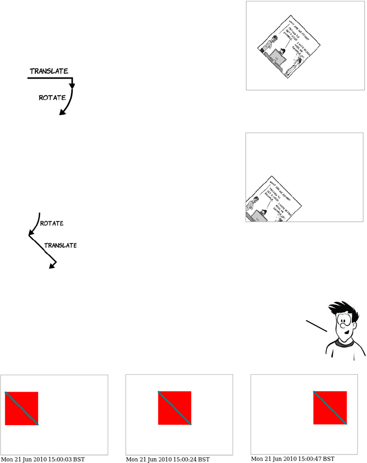
94 CHAPTER 3 Dynamic graphics
You don’t want the image off the <canvas> like that, so let’s translate it
and then rotate it:
Animation
var img =
document.getElementById('myimage');
ctx.translate(120,20);
ctx.rotate(Math.PI/4);
ctx.drawImage(img, 10, 10, 118, 130);
The transformations affect
the whole context, so the
order in which you apply
them is important.
Let’s try the opposite order:
var img =
document.getElementById('myimage');
ctx.rotate(Math.PI/4);
ctx.translate(120,20);
ctx.drawImage(img, 10, 10, 118, 130);
You can see that the rotate
now changes the direction
the translate goes in.
One potential use of the <canvas> element that has many developers excited
is creating games. Already, many arcade classics of the 1980s and ’90s have
been re—created using <canvas>. In order to create games, you need to have
animation. Let’s look at how you can animate your canvas drawings.
Advanced <canvas>: gradients, shadows, and animation 95
Here’s what happens if you forget to explicitly start a new path.
If you forget to close any paths you have open, they’ll be redrawn as
you iterate through your animation steps along with any additions to
the path. Clearing the pixels on the context doesn’t reset the path.
The <canvas> element allows precise, pixel-level control over what is dis-
played and is already considered a rival to Flash in the browser game
marketplace because it works on iPhones and iPads. Experimental
function init() {
draw();
window.setInterval(draw,1000);
}
function draw(){
var now = new Date();
document.getElementById('timestamp').innerHTML
= now.toLocaleString();
var canvas = document.getElementById('mycanvas');
if (canvas.getContext) {
var ctx = canvas.getContext('2d');
ctx.clearRect(0,0,320,240);
ctx.fillStyle = 'rgb(255,0,0)';
ctx.fillRect(now.getSeconds() * 4,50,100,100);
ctx.beginPath();
ctx.strokeStyle = 'rgb(0,127,127)';
ctx.moveTo(now.getSeconds() * 4,50);
ctx.lineTo(now.getSeconds() * 4 + 100,150);
ctx.lineWidth = 5;
ctx.stroke();
}}
draw the
initial state
to start.
ThE
init()
function will
be called on page load.
set an interval to call the
draw()
function every 1000
milliseconds.
As a shortcut, the
state of the
animation is given
by the current time.
explicitly clear the
canvas. the previous
step of the drawing
won’t be removed
automatically.
you need to reset the path so the
previous path isn’t redrawn every
iteration.
the previous example is one of the world’s least exciting
animations implemented with the
<canvas>
element. Pac-man it
isn’t, but this simple demo is enough to demonstrate
the general principles, here’s the code used to generate it:
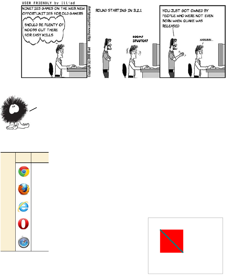
96 CHAPTER 3 Dynamic graphics
versions of <canvas> have full 3D support, and several first-person shoot-
ers from the 1990s have already been ported to allow play in a browser.
Getting started with SVG
Scalable Vector Graphics (SVG) is an XML language
for displaying vector graphics. It has long been possible
to embed SVG within XML-based XHTML documents;
but because HTML5 leads you back to HTML-based
markup, it adds the useful feature that SVG can be
embedded directly.
Let’s create a simple SVG drawing.
Now that you’ve learned about the <canvas> element, it’s time to look
at the second technology available in HTML5 for drawing graphics: SVG.
Browser support quick check:
SVG in HTML
7.0
4.0
9.0
11.6
5.1
Getting started with SVG 97
You’re probably thinking it looks familiar, and you’re right. Many of
the things that can be achieved with <canvas> can also be easily
achieved with SVG. You’ll learn more about the relative strengths and
weaknesses of each in the section “SVG vs. <canvas>,” but for now all
you need to understand is that <canvas> and SVG are based on different
conceptual models of how to create images. <canvas> is what program-
mers call imperative; you provide a detailed list of operations to be per-
formed that will produce a particular result. SVG is declarative; you
provide a description of the final result and let the browser get on with
it. Where <canvas> requires JavaScript, SVG requires markup, much
like HTML, and it can be included directly in HTML5:
<!DOCTYPE html>
<html>
<head>
<title>SVG example 2</title>
</head>
<body>
<svg id="mysvg" viewBox="0 0 320 240"
style="outline: 1px solid #999; width: 320px; height:
240px;">
<rect x="50" y="50" width="100" height="100"
style="fill: rgb(255,0,0)">
</rect>
<line x1="50" y1="50" x2="150" y2="150"
style="stroke: rgb(0,127,127); stroke-width: 5;">
</line>
</svg>
</body>
</html>
There are several interesting things to be seen in this simple example.
First, note that the size of the element on the page is determined by
CSS in the style attribute, but you also define a viewBox with the same
values. Because SVG is a vector format, pixels aren’t as significant; you
can use viewBox to define a mapping between the physical dimensions of
the element, defined in CSS, and the logical coordinates of everything
displayed within.
98 CHAPTER 3 Dynamic graphics
Look what happens if you use these val-
ues: viewBox="0 0 640 480". It’s the same
SVG graphic as before, but rendered into
a larger viewport.
Applying styles to SVG
The previous examples used an inline
style to apply colors and stroke thick-
nesses. Those properties can also be applied directly to the elements in
question, like this:
<rect x="50" y="50" width="100" height="100"
fill="rgb(255,0,0)"></rect>
<line x1="50" y1="50" x2="150" y2="150"
stroke="rgb(0,127,127)" stroke-width="5"></line>
But you can alternatively leave off the style and inline attributes and
use this in your CSS file, and achieve the same results:
rect { fill: rgb(255,0,0); }
line { stroke: rgb(0,127,127); stroke-width: 5; }
It looks much like any other CSS,
albeit with some unusual properties.
As with regular HTML, CSS can
make life much easier if you have a
lot of similar objects because you can
use a class to apply a set of styles to
several elements.
In this example there are three green
squares (upper left, upper right,
lower left) and three blue squares. Rather than specify inline styles on
each one, you can declare their commonality with the class attribute:
<svg id="mysvg" viewBox="0 0 320 240">
<rect x="50" y="50" width="50" height="50" class="earth"></rect>
<rect x="150" y="50" width="50" height="50" class="water"></rect>
<rect x="250" y="50" width="50" height="50" class="earth"></rect>
<rect x="50" y="150" width="50" height="50" class="earth"></rect>
Getting started with SVG 99
<rect x="150" y="150" width="50" height="50" class="water"></rect>
<rect x="250" y="150" width="50" height="50" class="water"></rect>
</svg>
Then you style the common elements with CSS in the <head> of your
document in the usual way:
<style>
rect.earth { fill: rgb(0,127,0); }
rect.water { fill: rgb(0,0,255); }
</style>
Drawing common shapes
Let’s carry on and re-create the rest
of the <canvas> example shapes in
SVG. In addition to the rectangle
and line elements you’ve seen
already, SVG has elements for circles
and arbitrary polygons.
For a circle, you need to provide the
x and y coordinates of the center and
the radius as appropriate attributes.
A polygon is slightly more complex; it has an attribute points that you
use to supply a space-separated list of x,y coordinates. This code, when
placed inside the <svg> element from the listing in the introduction, gen-
erates the previous image:
<rect x="5" y="50" width="100" height="100"
style="fill: rgb(255,0,0);"></rect>
<line x1="5" y1="50" x2="105" y2="150"
style="stroke: rgb(0,127,127); stroke-width: 5;"></line>
<circle cx="165" cy="100" r="50"
style="fill: rgb(0,255,0);"></circle>
<polygon points="265,50 315,150 215,150"
style="stroke: rgb(51,51,51); fill: rgb(204,204,204);
stroke-width: 5;"></polygon>
With the polygon element you don’t have to provide the starting point a
second time; it assumes the shape is closed, and the path drawn returns
to the first point. If you want to draw an open shape, you can use the
100 CHAPTER 3 Dynamic graphics
<polyline> element instead; it uses an identical points attribute but
doesn’t close the path around the shape.
<polygon
points="265,50 315,150 215,150"
style="stroke: rgb(51,51,51);
fill: rgb(204,204,204);
stroke-width: 5;">
</polygon>
<polyline
points="265,50 315,150 215,150"
style="stroke: rgb(51,51,51);
fill: rgb(204,204,204);
stroke-width: 5;">
</polyline>
<path d="M5,50
l0,100 l100,0 l0,-100 l-100,0
M215,100
a50,50 0 1 1 -100,0 50,50 0 1 1 100,0
M265,50
l50,100 l-100,0 l50,-100
z"
style="stroke: rgb(51,51,51);
fill: rgb(204,204,204);
stroke-width: 5;"/>
alThough you can see three shapes in the previous image, they’re a
single SVG element: a path. The <path> element in SVG is very
powerful. here’s the code:
The <path> element works as if it was
an imaginary pen. you then use the
attribute to pass a series of commands
to the pen to tell it what to draw.
Draw two arcs to make a
circle.
Move to coords 5,50. Draw a line to -100,0
relative to the current
position.
Close the path.
Uppercase letters mean
absolute coordinates.
Lowercase letters mean
coordinates relative
to the current pen
position.
You’ve seen several elements
make different shapes in a single
SVG drawing, but there’s also a
way to draw several different
shapes in a single SVG element.
For this you use the <path>
element. Let’s look at an example.
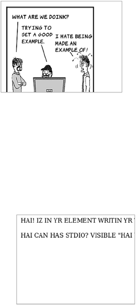
Getting started with SVG 101
It seems like a path can do anything, so why bother to use anything
else? The <path> element is difficult to understand and manipulate
because of its reliance on a single attribute value. In addition, any style
will apply to all shapes on the same path, so all your shapes will have
the same border and color. Of course, nothing is stopping you from
using more than one path with a different style applied to each.
Images, text, and embedded content
Images are easy to embed within your SVG drawing. The syntax is sim-
ilar to that of HTML, and the only additional information you need to
provide over and above the <image> element are the coordinates of the
upper-left corner:
You use an xlink:href to link to the image. The xlink is a namespace, a
legacy of SVG’s XML heritage that leaks through to HTML5; more on
that shortly. Text is handled a little differently in SVG compared to
HTML. In HTML, any text within the body is rendered to the screen—
no special wrapping is required. In SVG, text has to be explicitly
wrapped within a containing element:
<image x="10" y="10"
width="236" height="260"
xlink:href="example.png">
</image>
<text x="10" y="20">
HAI! IZ IN YR ELEMENT WRITIN
YR TXT
</text>
<text x="10" y="60">
HAI
CAN HAS STDIO?
VISIBLE "HAI WORLD!"
KTHXBYE
</text>
102 CHAPTER 3 Dynamic graphics
The previous example highlights another problem: text that won’t fit in
the view isn’t automatically wrapped. Line breaks also have to be
explicitly coded using the <tspan> element:
A nice effect you can achieve on short runs of text is to make the text
follow a path. If you extract the circle part of the path from the earlier
example, you can spread the text along it with the <textpath> element:
<text x="10" y="20">
HAI! IZ IN YR ELEMENT WRITIN
YR TXT
</text>
<text x="10" y="60">
<tspan x="10">HAI</tspan>
<tspan x="10" dy="20">
CAN HAS STDIO?
</tspan>
<tspan x="10" dy="20">
VISIBLE "HAI WORLD!"
</tspan>
<tspan x="10" dy="20">
KTHXBYE
</tspan>
</text>
<defs>
<path id="myTextPath"
d="M215,100
a50,50 0 1 1
-100,0 50,50 0 1 1
100,0">
</path>
</defs>
<text>
<textPath
xlink:href="#myTextPath">
HAI! IZ IN YR ELEMENT
WRITIN YR TXT
</textPath>
</text>
Getting started with SVG 103
As with the <canvas> element, large blocks of text are somewhat
cumbersome in SVG. The text elements are only really useful for
labels and short descriptions. But SVG offers an alternative—you
can embed HTML content inside any element with <foreignObject>.
Everything inside the <foreignObject> element is HTML; and unlike the
SVG <text> element, HTML can cope with wrapping text just fine by
itself. It’s important to remember that the browser isn’t rendering the
contents of <foreignObject> as if they were HTML; the content is HTML
and can be interacted with in the normal way.
The path is created in the <defs> element,
and then you link to it using an xlink:href
like you used for the image earlier. The link
works like other web content, so you could
refer to the path in a separate file if you
wanted to.
You can also apply gradient fills and any
number of other SVG effects to the text.
We’ll cover this in detail in the next section,
but this example shows a gradient from
transparent light green to solid dark green
applied as a fill to a slightly larger version
of the circular text. See ch03/svg-10.html
for the full code for this example.
<rect x="5" y="5" width="10" height="160"
style="stroke-width: 5; stroke: rgb(102,102,102); fill: none;">
</rect>
<foreignObject x="10" y="10" width="100" height="150">
<body>
<p>
<strong>HAI!</strong><br/>
IZ IN YR ELEMENT
<em>WRAPPIN</em> YR TXT
</p>
</body>
</foreignObject>
104 CHAPTER 3 Dynamic graphics
A second example will make this clearer.
On the right is a screenshot of the entire browser window; on the left
it’s zoomed in to just the content of the foreignObject element. The
Duck Duck Go home page has been scaled down and rendered upside
down inside the browser, but it’s still possible to type search terms and
see results returned (even if they’re too small to read!). This was
achieved by wrapping an HTML document inside a <foreignObject>
element in SVG and then applying some transforms:
<svg id="mysvg" viewBox="0 0 800 600">
<g transform="rotate(180) translate(-800,-600)">
<foreignObject x="10" y="10" width="800" height="600">
<body>
<iframe src="http://duckduckgo.com/"
style="width:780px;height:580px">
</iframe>
</body>
</foreignObject>
</g>
</svg>
This example shows a few things you’ve seen before. The viewBox is set
to 800 x 600 pixels, even though the element is 320 x 240 pixels; this
takes care of the scaling. And an <iframe> element is used inside the
<foreignObject> to fetch the Duck Duck Go page. New in this example
are the <g> element for grouping SVG content and the transform attri-
bute, both of which we’ll look at in the next section.
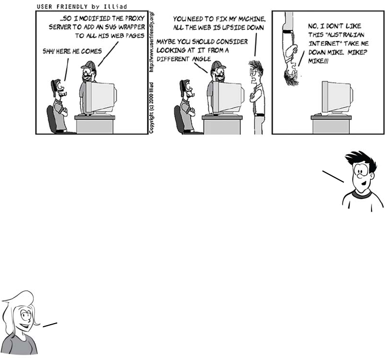
Getting started with SVG 105
Transforms, gradients, patterns, and declarative animation
SVG is a huge topic, worthy of a book by itself, and we’ve barely
scratched the surface so far. In this section, we’ll finish by taking a
quick look at some of the more advanced features.
You saw a transform in action in the last example of the previous sec-
tion. Here it is again:
<g transform="rotate(180) translate(-800,-600)">
The transform attribute accepts a space-separated list of commands that
are applied in order. The element is rotated 180 degrees and then,
because the rotation point by default is the upper-left corner, it’s
moved back into view with the translate transform. You could instead
pass a set of coordinates to the rotate transform and achieve the same
result in a single step:
<g transform="rotate(180,400,300)">
Note that in real life, it’s possible for websites to block
embedding like this by sending information to the browser to
turn on extra security features. This is done to protect users
from more nefarious versions of Mike’s trick on Stef.
When you want to apply an effect to a collection of elements, you use
the grouping element, <g>. Grouping is also useful for other purposes,
for example, if you want to move several elements at the same time.
106 CHAPTER 3 Dynamic graphics
In addition to rotate and translate, there are several other transforma-
tion commands:
❂scale()—You’ve seen examples of scaling already. Earlier examples
scaled the entire viewBox. This command allows you to control it for
specific elements.
❂matrix()—This is a powerful transformation that allows you to emu-
late all the others in combination, if you understand the mathematics
of matrix transformations. If, like me, you missed that particular part
of the curriculum, it’s easiest to stick to the other transformations.
❂skewX() and skewY()—See the following table.
No transform skewX(45)
No transform
skewY(33)

Getting started with SVG 107
GRADIENTS
As with <canvas>, an SVG gradient is defined in a separate object. You
can define this object at the top of your SVG file or element inside a
<defs> element, and then reference the gradient object through CSS:
The <rect> element references the grad1 gradient through its fill style.
See the full listing in the ch03/svg-15.html file in the code download.
PATTERNS AND MASKS
You might expect that you could create a repeating background by
specifying something like fill="url(example.png)", but that won’t work.
You have to add the image to a <pattern>:
<svg viewBox="0 0 320 240">
<defs>
<linearGradient id="grad1"
x1="0%" y1="0%" x2="100%"
y2="100%">
<stop offset="0%" style="
stop-color:rgb(127,127,127);
stop-opacity:1"/>
<stop offset="50%" style="
stop-color:rgb(255,255,255);
stop-opacity:1"/>
<stop offset="100%" style="
stop-color:rgb(127,127,127);
stop-opacity:1"/>
</linearGradient>
</defs>
<rect x="20" y="20"
width="200" height="200"
style="fill: url(#grad1)">
</rect>
</svg>
The transformation functions for SVG and <canvas> look similar,
and they are. The main difference from a developer perspective is
that SVG transformations expect angles in degrees, whereas
<canvas> transformations expect angles in radians.

108 CHAPTER 3 Dynamic graphics
<defs>
<pattern id="img1"
patternUnits="userSpaceOnUse"
width="315" height="212">
<image xlink:href="uf009705.png"
x="0" y="0"
width="305" height="212">
</pattern>
</defs>
Then use the pattern to fill:
<path d="M5,50
l0,100 l100,0 l0,-100 l-100,0
M215,100
a50,50 0 1 1 -100,
0 50,50 0 1 1 100,0
M265,50
l50,100 l-100,0 l50,-100
z"
fill="url(#img1)">
The full listing is in ch03/svg-16.html.
You can apply the same pattern to a
<text> element, although you should
pick your image carefully to ensure
that things are readable:
<text x="0" y="120"
font-family="sans-serif"
font-size="80"
font-weight="bold"
fill="url(#img1)" >
<tspan>HTML5</tspan>
<tspan x="0" y="180"
font-size="70">
ROCKS!
</tspan>
</text>
This code is taken from the file ch03/
svg-17.html.

Getting started with SVG 109
SVG is a large specification, and there’s more than one way to achieve
this same effect. Instead of applying the image as a background to the
text, the text can be used to clip the image. To create a mask, the main
change is that the text should be filled with white:
<mask id="img1" clipPathUnits="userSpaceOnUse" width="320"
height="200">
<text x="0" y="120" font-family="sans-serif"
font-size="80" font-weight="bold" fill="white">
<tspan>HTML5</tspan>
<tspan x="0" y="180" font-size="70">ROCKS!</tspan>
</text>
</mask>
Then attach the mask to the <image>
element with the mask attribute:
<image xlink:href="uf009705.png"
mask="url(#img1)"
x="-10" y="-5"
width="340" height="220" />
The image is positioned to approxi-
mate the previous example; see the
code in ch03/svg-17-clippath.html.
We’ll finish our tour of the advanced features of SVG with a
quick look at the declarative animation capabilities it
offers. In the following screenshots, the text—pattern
example has been animated to move down and then back up again.
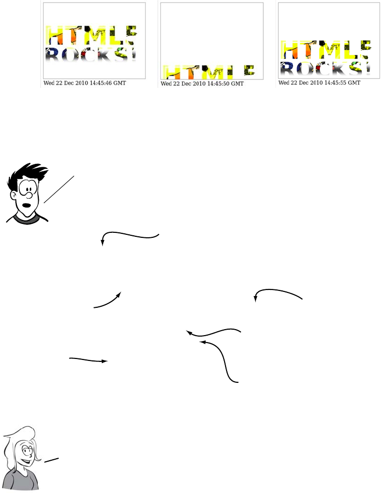
110 CHAPTER 3 Dynamic graphics
Let’s look in detail at how this is done in the listing from ch03/svg-
18.html.
<text x="0" y="120" font-family="sans-serif" font-size="80"
font-weight="bold" fill="url(#img1)" >
<tspan>HTML5</tspan>
<tspan x="0" y="180" font-size="70">ROCKS!</tspan>
<animateTransform fill="freeze"
attributeName="transform" type="translate"
values="0,0;0,220;0,0"
begin="0s" dur="10s"
repeatCount="indefinite">
</text>
Unlike the <canvas> element you don’t need to resort to
JavaScript to get animation. Animations can be described using
the same XML markup used to describe the shapes themselves.
This is the same <text>
element used in the
previous example.
A semicolon−separated list
of values for translate.
To animate, add an
extra child node. the
attributes determine
the animation.
you’ll animate the
translate property
of the transform.
Once complete, repeat
indefinitely.
The animation will Begin
immediately and run for a
duration of 10 seconds.
Note that, unlike with animations on <canvas>, you don’t have to write
programs to redraw the scene every second. You just declare what the
animation should be and let the browser get on with it. This is why SVG
animation was earlier referred to as declarative animation.
Getting started with SVG 111
SVG animations aren’t limited to simple attribute manipulations. Just
as you were able to make text follow a path, it’s also possible to make
an animation follow a path. Here’s an animation around a triangle.
You can see the changes for yourself in ch03/svg-19.html. Here are the
key points:
<text x="0" y="120" font-family="sans-serif" font-size="80"
font-weight="bold" fill="url(#img1)">
<tspan>HTML5</tspan>
<tspan x="0" y="180" font-size="70">ROCKS!</tspan>
<animateMotion
path="M0,0 l50,100 l-100,0 l50,-100 z"
dur="10s" repeatCount="indefinite">
</text>
The ability to animate along a path allows you to define
animations of almost unlimited complexity.
The same <text>
element once
more.
This time the
<animateMotion>
element is used.
The path draws three
lines (a triangle)
and closes.
The path is relative to
the current position
of the element.The animation will last 10 seconds
and repeat indefinitely.
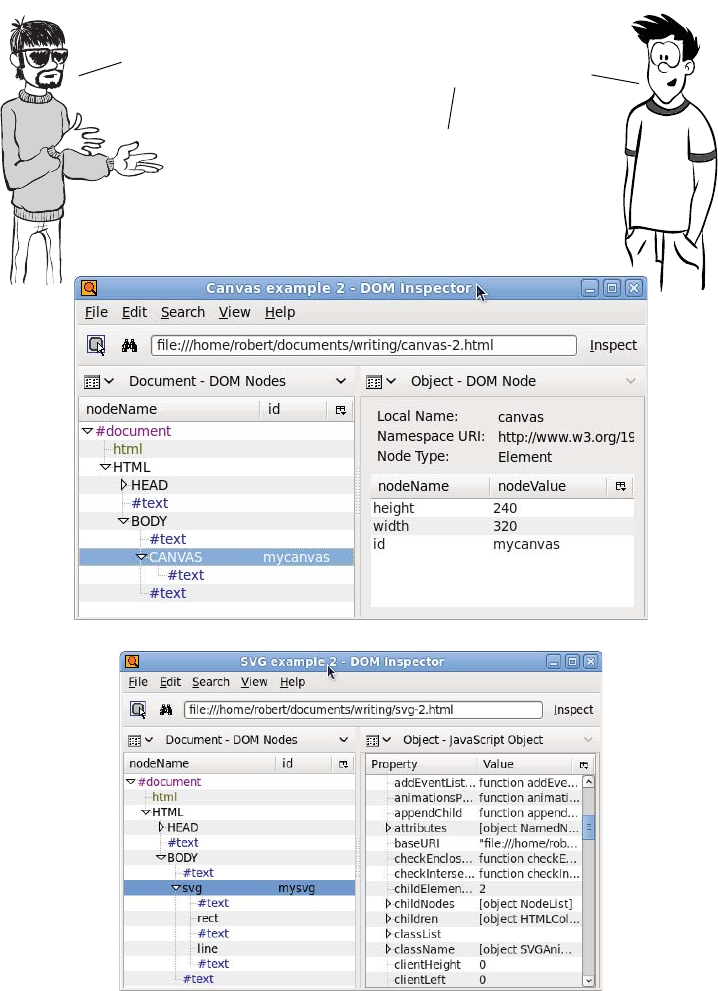
112 CHAPTER 3 Dynamic graphics
SVG vs. <canvas>
I am likink
the <canvas> element.
Clean and simple API
makink happy
developer.
SVG has an API too, but it’s
through the browser DOM,
which doubles as a persistent
object model.
With <canvas>, you have to
manage your own objects.
And it has no internal
structure, as you can see by
comparing the following
two screenshots of DOM
Inspector.
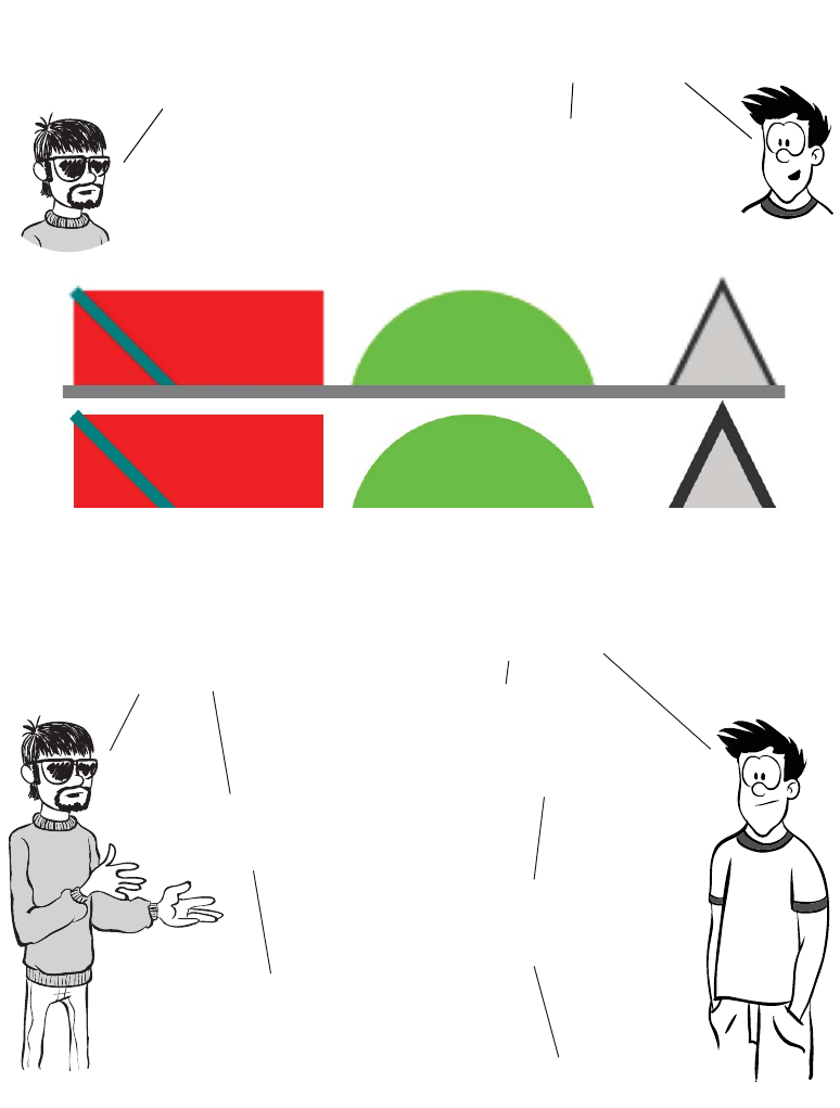
SVG vs. <canvas> 113
Is true. But browser DOM
is beink too heavyweight. Is good
that I am choosing own object
model in <canvas> when mappink
several thousands of minions.
Well, there are issues
once you hit a certain threshold in
the number of objects, but SVG has
other advantages.
The next two screenshots
show the effect of zooming in
eight times on a <canvas>
element compared to an SVG
element.
Ya. Natural vectors is beink nice
feature. But beink practical, can
just be resizink and redrawink
<canvas> element to be matchink
page dimensions.
SVG has other advantages: for
instance, it’s easier to integrate it
with other web content. Also, the
declarative style of SVG may be more
comfortable for web authors whose
strengths lie in HTML and CSS.
Have been discussink this before. Am
not believink markup monkeys is beink
the same think as real developers.
Not all web authors need to be hard core
developers. There are other benefits to the
object model and declarative markup—SVG
will be much easier to make accessible.
Is true, but again beink practical, no
browser is supportink accessibility
features in SVG yet.
Sounds like a good time to look at
browser support for <canvas> and SVG.
True, but why
make extra work
for yourself?
—
114 CHAPTER 3 Dynamic graphics
Browser support
Both <canvas> and SVG have wide support in current browsers, with
prospects for even better support in the respective next releases.
<canvas> support tends to be all or nothing, but the situation with SVG
is a lot more complex.
The SVG spec itself is about as complex as the HTML one, and no
browser fully supports it, so the following table lists the percentage of
the W3C SVG test suite that each browser passes. Figures aren’t avail-
able for all browser versions, so the results for the most recent test in
each browser are shown (thanks to www.codedread.com/svg-
support.php for the figures).
Key:
●Complete or nearly complete support
○Incomplete or alternative support
Little or no support
Supporting <canvas> in older versions of IE with explorercanvas
Internet Explorer was the only major browser that had no support for
the <canvas> element, although support has been added in IE9. But
older versions of IE have support for Vector Markup Language
12 14 4 6 8 9 10 11.5 12 5 5.1
<canvas> ● ● ● ● ● ● ● ● ● ●
<canvas> text ● ● ● ● ● ● ● ● ● ●
SVG score 89.23% 82.30% -59.64% 95.44% 82.48%
SVG as image ● ● ● ● ● ● ● ● ● ●
SVG in CSS ● ● ● ● ● ● ● ● ● ●
SVG as object ● ● ● ● ● ● ● ● ● ●
SVG in XHTML ● ● ● ● ● ● ● ● ● ●
SVG in HTML ● ● ● ● ● ● ● ●
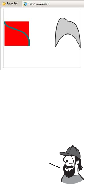
Browser support 115
(VML). VML is a predecessor of SVG, and you’ve already seen that
SVG and <canvas> can do a lot of similar things. The explorercanvas
library implements <canvas> in IE8 and earlier using VML. Activating
explorercanvas is as simple as including a <script> element in the head
of your HTML document:
<head>
<!--[if IE lte 8]><script src="excanvas.js"></script><![endif]-->
</head>
If you add that to any of the examples
you’ve seen in this chapter, you
should see them rendering in IE8 as
the screenshot at right.
SVG in XML vs. SVG in HTML
I mentioned earlier that SVG support
isn’t as clear-cut as <canvas> support.
This isn’t just because the SVG speci-
fication is more complex but also
because there are more ways to use SVG from within a web page. This
is largely because SVG was originally envisioned as one of a family of
XML-based languages that would be used for web content.
In nearly all the major browsers, it has long been possible to embed
SVG content in the XML version of HTML/XHTML. Unfortunately,
there has been one major obstacle to this happening.
Embedding SVG as an image
SVG can be used in the <img> element in the same way as any other
image format:
<img src="svg-2.svg">
Fully compliant XHTML should be delivered from the server as XML
content. The server tells the browser the content type of the file
in the header of the HTTP response. Unfortunately, if you try to
send an XML web page to a version of Internet Explorer earlier
than 9, it refuses to parse the page. Because deploying SVG in XHTML
requires breaking IE, few people have considered it practical.
116 CHAPTER 3 Dynamic graphics
When used this way, SVG still has the advantage of being scalable; you
can set it to take up half the browser window, and it will remain sharp
no matter how high or low your user’s screen resolution. But you lose
the advantage of being able to manipulate the image from the Java-
Script—the elements of the image aren’t present in the DOM.
Referencing an SVG image from CSS
In the same way that it can be used as an image in HTML, SVG can be
referenced as an image in CSS:
div { background: url(svg-2.svg) top right no-repeat; }
Embedding SVG as an object
The <object> element is a general-purpose method to embed any exter-
nal content in your web page. To embed SVG with <object>, you need
to supply two parameters specifying the filename and the file type:
<object type="image/svg+xml" data="svg-2.svg"></object>
In browsers with native support for SVG, the object-embedding
approach has results similar to including the SVG inline: the SVG ele-
ments are available in the DOM and can be manipulated. This tech-
nique works in every browser that has SVG support; and if you’re
using the same SVG image on different pages of your site, it’s cached
the same way a normal image would be, making your site load slightly
faster. The corollary of this, of course, is that if you use the image only
once it will require a second request to the server, making your site
slightly slower to load.
SVG support in older browsers with SVG Web and Raphaël
This is particularly useful in concert with CSS3’s background-size
property, which you’ll learn more about in chapter 10. You can create
background images that scale with the screen resolution but stay sharp.
You don’t have to rely on direct browser support for SVG. Older
browsers and IE offer a couple of JavaScript libraries that
enable SVG support through alternative means.
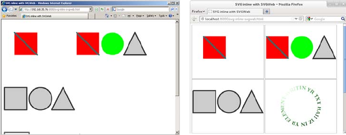
Browser support 117
SVG Web is a JavaScript library that, if it detects the browser has no
native support for SVG, will replace any SVG graphics it finds with a
Flash movie. The Flash movie will then take care of rendering the SVG
in the browser. You have to make some slight modifications to your
web page in order to enable SVG Web. The first is in the head of the
document, where you reference the SVG Web JavaScript library:
<script src="svg.js"></script>
Then you have to surround each of your SVG graphics with <script>
tags:
<script type="image/svg+xml">
<svg viewBox="0 0 320 240">
<rect x="50" y="50" width="100" height="100"
style="fill: rgb(255,0,0)"></rect>
<line x1="50" y1="50" x2="150" y2="150"
style="stroke: rgb(0,127,127); stroke-width: 5;"></line>
</svg>
</script>
Your SVG graphics will then render as SVG in browsers that support it
and as Flash movies in browsers that don’t support SVG. In the follow-
ing examples, at left you can see that SVG Web allows Internet
Explorer to render inline SVG, although it doesn’t match the native
support offered by browsers such as Firefox (shown on the right).

118 CHAPTER 3 Dynamic graphics
The Raphaël JavaScript library takes a different approach. Instead of
making existing SVG work in IE, it presents an API for creating graph-
ics. In Firefox, Chrome, Safari, and Opera it creates SVG; in IE, it cre-
ates VML. The interface Raphaël provides looks similar to the <canvas>
API:
var paper = Raphael(10, 50, 320, 200);
var circle = paper.circle(50, 40, 10);
circle.attr("fill", "#f00");
circle.attr("stroke", "#fff");
Summary
In this chapter you’ve learned how you can generate graphics in your
web page on the fly using two different HTML5 technologies—<canvas>
and SVG. Because both can be created and updated dynamically, they
don’t need the user to reload the page in order to present new informa-
tion to the user.
You’ve learned the basic techniques for drawing shapes and lines with
both technologies, as well as how to import images and apply effects
and transformations. With <canvas> you’ve looked at how to do simple
animation while with SVG you saw how you can import whole web
pages and apply transformations to them.
Raphaël looks similar to <canvas>, but it’s still SVG
underneath. This means that when you call the circle function,
it returns an object. This object can later be modified, and
the drawing will update to reflect the changes; you don’t have
to clear everything and redraw it as you do with <canvas>.
Now that you can create your own graphics on the fly, it’s time to
complete your education on the multimedia possibilities of HTML5
with a look at the new audio and video elements. In the next
chapter, you’ll see that HTML5 makes adding audio and video to web
pages as easy as adding images to web pages is in HTML4.

119
4
Audio and video
This chapter covers
•Why audio and video are important on the web
•Adding audio and video to your web pages
•Encoding audio and video files for the web
•Integrating video with other web platform features and content
Native media support is one of the best known as well as one of the most
controversial HTML5 features. In this chapter, you’ll learn why HTML5
media support is great, why it’s frustrating, and the practical factors you
need to consider when using it.
Audio and video on the modern web
Audio and video are key parts of the modern web. For many sites, video
and audio are parts of the content as integral as the text and pictures—
and in some cases, they’re more important.
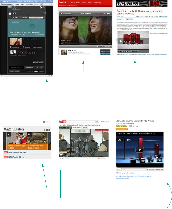
120 CHAPTER 4 Audio and video
For sites like BBC Radio 6 and last.fm, audio is the whole point of the
page. And for podcasts like Buzz Out Loud, visitors expect to hear or
see the content.
News sites like BBC News often offer video and audio as alternative con-
tent, and sites such as YouTube are all about the video content and are
often used to add video to other sites such as I Can Has Cheezburger.
Despite their rising importance, HTML4 offers no built-in method for
adding audio or video to a web page. This makes embedding audio and
Audio and video on the modern web 121
video relatively complex. Compare the markup required to add an
image to a web page with that typically required to add a video.
Because there’s no native support for audio and video, web authors
have had to resort to browser plug-ins. The web has largely settled on
Adobe Flash as a de facto standard, but as the previous code shows,
this is still a good deal more complex than putting an image on a page.
And that’s not all the code that’s required: to add controls such as Play
and Pause, there must be code written inside Flash, and even more
code if the player needs to be integrated into other page content.
Image Video
<img
width="320"
height="240"
id="myimage"
src="myimage.png">
<object
classid="clsid:d27cdb6e-ae6d-11cf-96b8-444553540000"
codebase="http://download.macromedia.com/
pub/shockwave/cabs/flash/
swflash.cab#version=6,0,40,0"
width="320" height="240"
id="myvideoname">
<param name="movie"
value="myvideo.swf">
<param name="quality" value="high">
<param name="bgcolor" value=#ffffff>
<embed href="myvideo.swf"
quality="high" bgcolor="#ffffff"
width="320" height="240"
name="myvideoname"
type="application/x-shockwave-flash"
pluginspage="http://www.macromedia.com/
go/getflashplayer">
</embed>
</object>
One of the reasons for YouTube’s popularity is that it reduces the
complexity of displaying video on the web—instead of doing all the
work yourself, you upload the video to YouTube and then copy and
paste some code. But HTML should make it that simple without the need
for a third—party site. This is a problem remedied in HTML5 with the
introduction of the <audio> and <video> elements.
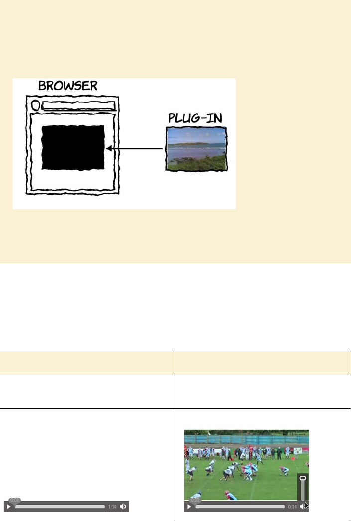
122 CHAPTER 4 Audio and video
Following is the HTML5 code for embedding audio and video, which
compares favorably with the <img> element. The screenshots show the
default presentation of the <video> and <audio> elements in Firefox with
the controls visible.
What is a plug-in?
A plug-in is a generic extension method for HTML that allows the page author to
indicate embedded content that is to be rendered by an external program. The
web browser hands over control of that region of the web page to the external
program. This external program is referred to as a plug-in.
The content rendered by the plug-in is like a black box to the browser. Browser
features like keyboard shortcuts, cookie preferences, and pop-up blockers don’t
apply.
Audio Video
<audio src="myaudio.ogg" controls>
</audio>
<video src="myvideo.ogv" controls>
</video>
The <audio> element 123
Both elements in the previous example have been set to 320 x 240 pix-
els with CSS, although in the case of the <audio> element you can see
this doesn’t achieve much. The <video> element is showing the first
frame of the video. Note that the video is 320 x 180 pixels, but instead
of stretching the video and changing the aspect ratio, the video is made
as wide as possible and centered vertically.
The <audio> element
Audio on the web gained something of a bad rap in the
1990s as thousands of people happily attached back-
ground music to their GeoCities pages, but there are
plenty of legitimate uses for audio in a web page.
Sometimes, websites are entirely about sound—band
home pages should have samples of the band’s work;
dictionaries should allow you to listen to pronuncia-
tion; games need sound effects. As you’ve learned, until
the <audio> element, the only available option was a
browser plug-in. In this section, you’ll learn about the
<audio> element, its supported attributes, file formats,
and how to convert between them.
Firefox shows the controls on the <video>
element only when the user mouses over and at
initial page load, but other browsers have them
visible until the video starts playing.
Now you know why HTML5 has <audio> and <video> elements
and what the basic code looks like. In the following
sections, you’ll learn about the <audio> and <video>
elements in more detail, starting with the <audio> element.
Browser support quick check: audio
Standard
4.0
3.5
9.0
10.5
4.0

124 CHAPTER 4 Audio and video
Common attributes: controls, autoplay, loop, and preload
The <audio> element has several attributes that control its behavior,
including src and controls, which you saw in the simple example. It’s
possible to add the element with no attributes at all:
The screenshot isn’t interesting because there’s nothing to see—with-
out the controls attribute, the element isn’t visible on the page. Having
no visible controls means you have to start the audio playing by other
means—either by using the autoplay attribute (discussed in a moment)
or by providing your own controls (which you’ll learn about in the sec-
tion “The <video> element”).
Adding the controls attribute means the <audio> element has visible
properties:
The preload attribute lets you hint to the browser whether a file is likely
to be needed, so you can avoid excessive server load:
<audio src="myaudio.ogg" controls preload="metadata">
</audio>
It can take the following values:
❂none—You don’t believe the audio resource is likely to be used.
❂metadata—You don’t believe the audio is likely to be used, but the
browser should fetch information such as the dimensions, first
frame, and duration.
<audio src="myaudio.ogg">
</audio>
<audio src="myaudio.ogg"
controls>
</audio>
Hey! Where is it?!!

The <audio> element 125
❂auto—The server will have no problem with the browser download-
ing the entire video even if the user doesn’t explicitly create it.
The browser is free to ignore the preload attribute—for example, a
mobile browser may choose not to download any media over a limited
cell connection unless the user explicitly requests it.
Until recently the loop attribute didn’t have any effect in browsers, but
you can simulate the effect in older browsers with a little JavaScript:
<audio src="myaudio.ogg" controls autoplay onended="this.play();">
</audio>
The ended event is fired when the video has finished playing. The code
waits for that event and starts the audio playing again when it happens.
Be careful with autoplay. Remember, your users may be working in a
quiet environment, or listening to music while they’re browsing, or
depending on the audio provided by their screen-reader software, and
they may not appreciate an audible interruption from a website they
were only visiting to find a phone number.
The autoplay and loop attributes
specify that the file is to start playing
as soon as the user loads the page and
to continue to play repeatedly after
it’s started:
<audio src="myaudio.ogg" controls
autoplay loop>
</audio>
If you’re wondering why the <audio> element has opening and
closing tags, it’s because <audio> is also a container for
other content. That content is displayed only if the
browser doesn’t support the <audio> element. This allows
you to work around a lack of browser support.

126 CHAPTER 4 Audio and video
The next example shows an <audio> element in IE8. The <audio> ele-
ment itself is ignored, and just the contained content is displayed:
Normally you would want to display something more useful than just
the fact that the <audio> element isn’t supported. At least if you show a
link, the user has the chance to download the audio file and listen to it
in an external player:
Compare that with a browser like Firefox that does support the <audio>
element, but not the media type specified in the src:
The <audio> element controls allow for a limited amount of styling with
CSS. Here it’s been set to 200 pixels square in Firefox:
<audio src="myaudio.ogg" controls>
Audio not supported.
</audio>
<audio src="myaudio.ogg" controls>
<a href="myaudio.ogg">
Download myaudio.ogg
</a>
</audio>
<audio src="myaudio.ogg" controls>
Audio not supported.
</audio>
<audio src="myaudio.mp3" controls>
Audio not supported.
</audio>
Firefox doesn’t support MP3, so the
user still sees an audio control, but it’s
inactive. In other browsers, you may
see a broken image icon or some
other indication that the media is
invalid.

The <audio> element 127
The controls have a minimum intrinsic width. If you try to make them
smaller than that, the width will be ignored, as you can see from the
still-visible outline in this example:
Other browsers display slightly differently, as you can see in the next
examples. Chrome (left) behaves similarly to Firefox: the controls
extend out of the defined width and height. But Opera (right) is a little
cleaner-looking at narrow width.
audio {
width: 200px;
height: 200px;
outline: 1px solid #ccc;
}
The outline shows the extent of the element.
As you can see, the width is applied to the
controls but the height is ignored. The next
example makes that clearer:
audio {
width: 100px;
height: 50px;
outline: 1px solid #ccc;
}
audio {
width: 50px;
height: 25px;
outline: 1px solid #ccc;
}
128 CHAPTER 4 Audio and video
It’s currently impossible to change the colors of the controls in any
browser. CSS like the following sets the background color, but it
doesn’t make any difference to the controls themselves:
But it’s possible to use the background in concert with the otherwise-
ignored height property:
audio {
width: 200px;
height: 50px;
outline: 1px solid #ccc;
background-color: #000;
color: #fff;
}
audio {
width: 200px;
height: 200px;
outline: 1px solid #ccc;
background:
url(‘dust-puppy.svg’)
no-repeat top center;
background-size: contain;
}
You could use this CSS to provide an image
of the artist or some sort of cover art.
Designers may be severely disappointed with the lack of styling options
available for the audio controls, but all isn’t lost. In the later section
“Controlling audio and video with JavaScript,” you’ll see how you can
write “your own controls, which you can then style however you wish.
You’ve seen how simple it is to embed audio files, but unfortunately
that’s not the end of the story. In the same way the HTML5 standard doesn’t
specify which types of images a browser should support on <img>, it also
doesn’t specify what types of file should be supported by <audio>; but
unlike images, there are no audio formats that all the browser makers
have decided to support. The next section discusses these issues.
The <audio> element 129
Codecs and license issues
Audio files are usually stored in a compressed format. To be stored on a
computer, they must be encoded into that format; to be played back,
they have to be decoded once again. The software that performs this
encoding and decoding is called a codec. Music files on your computer
usually have a file extension that identifies which codec is needed to
decode them.
The problem with the MP3 codec is that there are several patents on it;
and if you want to distribute software that encodes and decodes MP3,
What is a codec?
In principal, it’s possible to describe the raw data of audio and video streams to
an arbitrary accuracy. For audio, you’d store the amplitude of the sound wave
for each moment in time you wanted to play the sound back; for video, you’d
store the color of each pixel for each frame (usually 25–30 per second) as well
as the sound. But this would lead to impossibly large files for anything of a useful
length.
In practice, you want to compress the audio and video data in the same way you
might compress a large file into a zip archive. A codec is what’s used to com-
press audio and video data for storage and later to decompress the same audio
and video to be played through speakers and displayed on screens in real time.
Codecs can be split into two broad categories: lossless and lossy. Think about a
zip archive: when you extract the content from it, you expect to get back the ex-
act same files you put in—it’s a lossless compression. In the same way, some
codecs are capable of compressing audio and video with no loss of information.
But these files are necessarily still large. The more interesting set of codecs for
the web are lossy—each time they’re used to encode a video stream, some infor-
mation is thrown away, never to be seen again. These codecs can achieve far
greater compression at the expense of some loss of audible or visual quality; the
trick is to throw away data that makes as little difference to human perception
as possible.
You’ve almost certainly heard of at least one codec: MPEG—1 (or 2)
Audio Level III, commonly known as MP3. MP3 is a perfectly good
codec technically—it was the first popular codec able to make a
typical pop song small enough to be downloadable while retaining
CD quality—but there are issues other than the technical ones.
130 CHAPTER 4 Audio and video
you need to pay to license those patents. Mozilla, the makers of
Firefox, takes the position that the web should be built out of free and
open standards and so doesn’t support MP3; instead, Firefox supports
the open Ogg Vorbis (OGG) format. Opera agrees. Google also agrees
in principal but for practical reasons distributes Chrome with MP3
support; Google has also released its own video format, WebM (which
will be discussed further in the video section), which can also be used
in audio-only mode. Apple and Microsoft both already have licenses to
distribute MP3 codecs, so Safari and IE do support it; but, crucially,
they don’t support the free and open OGG format out of the box.
The different format support is summarized in the next table. The short
version is this: no one file format works on all browsers. You’ll need
multiple files to support them all.
To encode a file to OGG, you can use the oggenc command-line utility
available from www.rarewares.org. Use it to convert an uncompressed
WAV file like this:
oggenc myaudio.wav
Browser support quick check:
audio codecs
WAV OGG MP3 AAC WebM
8 5 5 5 8
3.5 3.5 ~ ~ 4
~ ~ 9 9 *
10.5 10.5 ~ ~ 11.1
4** 4 4 **
*IE9 will support WebM if the user downloads an additional
codec.
** Safari will support anything that can be played by Quick-
Time. Users have to download additional codecs.
The <audio> element 131
The output is a file called myaudio.ogg. To improve the quality of the
encoding, use the -b flag to set the bitrate. The -o flag allows you to
specify the output filename:
oggenc myaudio.wav -b 256 -o myhighqualityaudio.ogg
For MP3 audio, you can use the lame command-line utility, also avail-
able from www.rarewares.org:
lame myaudio.wav myaudio.mp3
Again, you can set the minimum bitrate with a command-line flag:
lame -b 256 myaudio.wav myhighqualityaudio.mp3
Bitrate
Bitrate is the number of bits (individual units of information) that are conveyed
or processed per unit of time. Higher bitrates mean greater sound fidelity but
also larger file sizes. Typical bitrates for CD-quality audio are in the 100–160
kbit/s range.
Command-line utilities are handy,
especially if you have a large col-
lection of audio files, because you
can write a script to convert them
all in a single batch. If you just
have one or two files to convert,
you may prefer a GUI-driven
approach. For this, there’s a handy
website: http://media.io. Visit the
site, and select the file you want to
encode from your hard drive.
OGG and MP3 both work by throwing away data that makes little
audible difference to the human ear, but they tend to throw away
different parts of the audio data. For this reason, you shouldn’t
convert between OGG and MP3 except as a last resort—it’s far better
to convert from a lossless format (Free Lossless Audio Codec [FLAC],
WAV, or an original CD) to both OGG and MP3.
132 CHAPTER 4 Audio and video
After the file is uploaded, you’re given a choice of four options for the
codec and, if appropriate, a choice for audio quality.
You’ll have noticed that the file used in this example, despite being
originally encoded with the free FLAC codec, isn’t free content.
Although it’s in the OGG format supported by Firefox, Chrome, or
Opera, I’m not allowed to upload it to my website because I have no
rights to redistribute it. But it will now take up less space on my phone!
Even if I could upload it, the audio wouldn’t play in IE or Safari.
Unless users have installed additional codecs in their operating sys-
tems, Safari and IE won’t play the OGG file—they need MP3.
Select the options you need,
and click Convert; a few sec-
onds later, your encoded file
will be available to download.
Note that the 192 kbps OGG
encoded file is approximately
20% of the file size of the
lossless original.
The <audio> element 133
If different browsers require different file types, how can you support
multiple browsers with a single src attribute? HTML5 anticipates this
issue and provides an easy mechanism for providing the correct source
to each browser. Let’s look at that in the next section.
Using multiple sources
As you’ve just seen, you need to be able to provide different audio files
to different browsers. But each <audio> element only allows you a single
src attribute, so how can you manage that? The design of the <audio>
element has anticipated this requirement. Multiple sources can be pro-
vided for the <audio> element by using the <source> element:
<audio id="myaudio" controls>
<source src="myaudio.mp3" type="audio/mp3">
<source src="myaudio.ogg" type="audio/ogg">
No audio support!
</audio>
The following tables list the common file extensions and MIME types
for audio.
Browsers are expected to scan the list of <source> elements from top to
bottom and load the first one they believe they can play. By using some
Audio type File extensions MIME types
MP3 .mp3 audio/mpeg
MP4 .m4a, .m4b, .m4p, .m4v,
.m4r, .3gp, .mp4, .aac
audio/mp4
audio/aac
OGG .ogg, .oga audio/ogg
WebM .webm audio/webm
WAVE .wav audio/wave (preferred)
audio/wav
audio/x-wav
audio/x-pn-wav
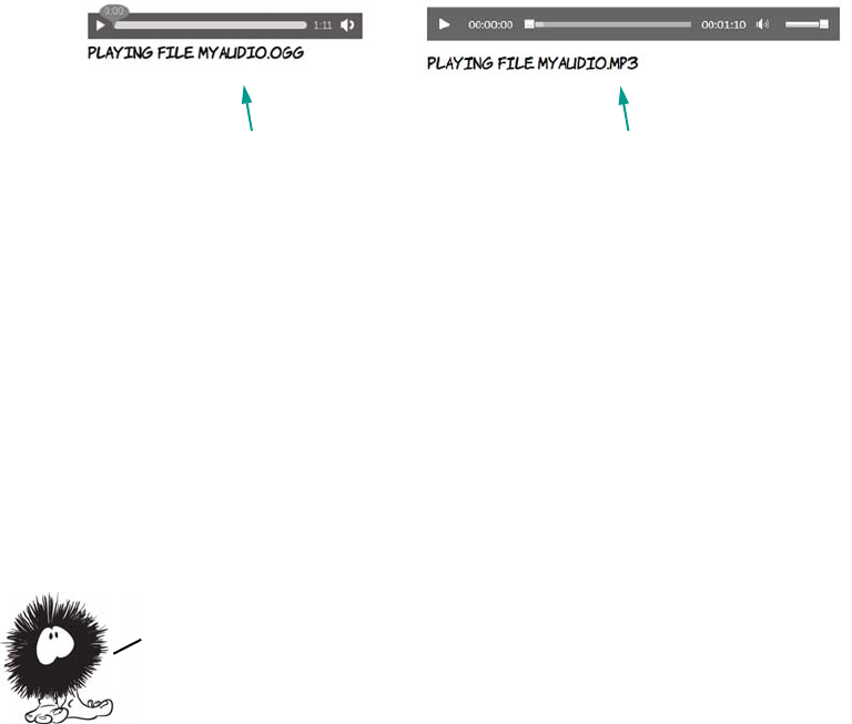
134 CHAPTER 4 Audio and video
JavaScript, you can interrogate the <audio> element and find out which
file is loaded.
Here’s the snippet of JavaScript used in the previous screenshots. Add
it to the <audio> element as an attribute, and add a <div id="source"></
div> after the <audio> element to display the output:
onloadeddata="document.getElementById('source')
.innerHTML = 'Playing file ' +
this.currentSrc.slice(this.currentSrc.lastIndexOf('/')+1);"
This code is executed in the loadeddata event, which means after the
browser has loaded identifying information about the file. You’ll learn
more about manipulating HTML5 media elements with JavaScript in
the section “The <video> element.”
The <video> element
For the many people who don’t obsessively read standards groups’
mailing lists, the first time they became aware of HTML5 was when
they found out that Flash video doesn’t work on the iPhone but
HTML5 video does. As you saw in the introduction, the goal of the
HTML5 <video> element is to make embedding video in your pages as
easy as embedding images. This section looks at the details of making it
work. We’ll follow a pattern similar to the previous section: first the
Firefox plays the .ogg file. Internet Explorer plays the .mp3 file.
Audio is fine, but it lacks visual impact. Let’s move on to
embedding video. In the next section, you’ll see that adding
video to a page in HTML5 is just as simple as adding audio.
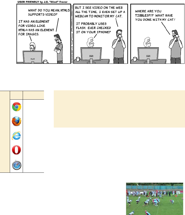
The <video> element 135
allowed attributes, then the various encoding issues, and finally how to
convert between file formats
.
<video> element attributes
The <video> element supports the same attributes as the
<audio> element, with similar results. This section
quickly runs through them in the same way as the sec-
tion on audio.
The sample video
The sample video used in this section’s examples is of the au-
thor playing American football. Because this video was taken
by the author’s mother, we can neatly sidestep any issues in-
volving media distribution rights.
The basic <video> element looks like this:
<video src="00092.webm"></video>
A <video> element without controls is a lit-
tle more interesting than the equivalent
<audio> element because you at least have
the first frame of the video to look at. This
screenshot was taken in Firefox; Opera
and Chrome should work just as well for
the WebM format.
Browser support quick check: video
Standard
4.0
3.5
9.0
10.5
4.0
136 CHAPTER 4 Audio and video
As with the <audio> element, loop only works on the most recent browser
versions, but it can be simulated with the same bit of JavaScript:
onended="this.play();"
Also as with the <audio> element, the <video> element can contain fall-
back content. At the end of this chapter, we’ll look at using that content
to embed an alternative player for your videos using a plug-in, falling
back to HTML4 technologies for browsers that don’t support HTML5.
The <video> element also has its own specific attributes: poster, width,
height, and audio. Let’s look at each of those in turn.
The poster attribute lets you control what’s shown in the <video> ele-
ment when a video isn’t playing. By default, browsers show the first
frame of the video, but you can supply your own image:
As with audio, you can enable the
standard controls with an attribute:
<video src="00092.webm"
controls preload="metadata">
</video>
As with the <audio> element, the preload
attribute provides a hint to the browser
about how likely this video is to be
played by the user.
If you add the autoplay attribute, on
desktop browsers, the video will
download and start playing as soon
as possible:
<video src="00092.webm"
controls autoplay loop>
</video>
The controls are available, but they auto-
hide as the video starts playing.
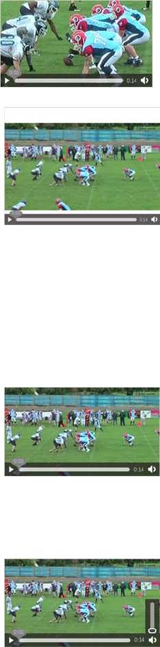
The <video> element 137
<video src="videofile.ogv"
poster="posterimage.jpg">
</video>
The width and height attributes set the
width and height of the <video> element:
<video src="videofile.ogv"
width="400px" height="300px">
</video>
Note that this doesn’t directly set the width
and height of the video itself; the aspect
ratio of the video is always preserved. You
can also set the width and height with CSS:
video {
width: 400px;
height: 300px;
}
If you set width and height attributes and
also set the width and height with CSS, the
CSS wins:
<video src="videofile.ogv"
width="400px" height="300px"
style="width: 320px;
height: 180px;">
</video>
The muted attribute sets the default volume
of the video to 0:
<video src="videofile.ogv" muted>
</video>
Unfortunately it doesn’t yet work in any
browsers, but you can fake it with this bit
of JavaScript:
onloadeddata="this.volume = 0;"
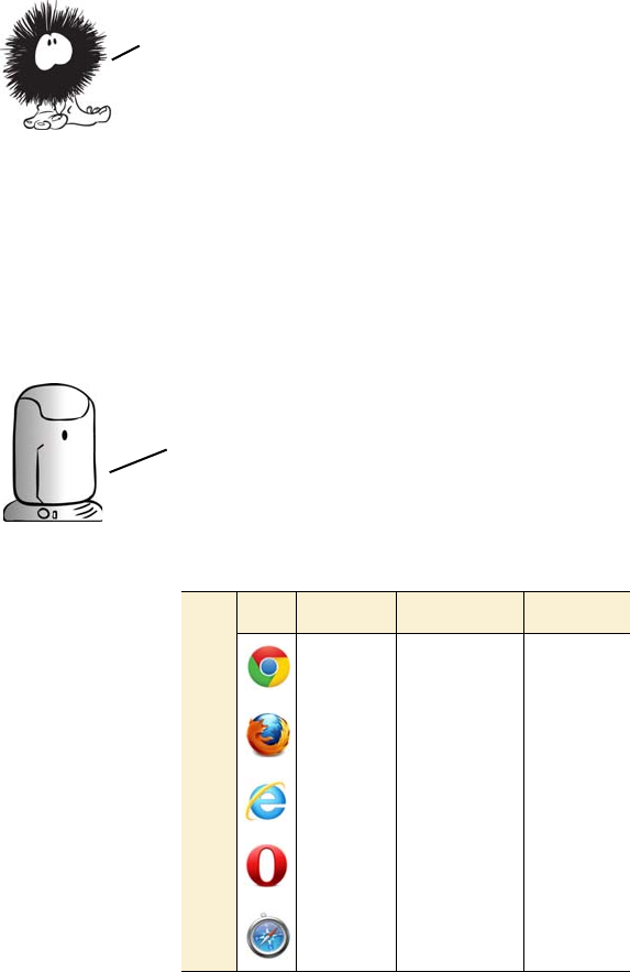
138 CHAPTER 4 Audio and video
Containers, codecs, and license issues
The situation with video is even more complex than with audio because
video files need both a visual and an auditory stream, so they need both
video and audio codecs. A format to contain both audio and video also
needs to be defined.
You now know about all the attributes available on the <video>
element. It’s time to address the thorny issue of video codecs, which is
even more of a mess than the situation with audio codecs. This has been
one of the more contentious issues in the writing of the HTML5 spec,
not least because video support is seen as being so important.
Unlike audio files, where the file extension is linked directly
to the codec being used, with video the file extension is linked
to the container format. To be able to play the video, the browser
needs to support the container format, the video codec, and the
audio codec. In practice, this isn’t too much of a factor because
audio codecs without license fees are always paired with video
codecs that don’t require a license, and vice versa.
Browser support quick check:
video formats
MPEG-4 Ogg/Theora WebM
5* 5 8
~ 3.5 4
9 ~ **
~ 10.5 11.1
4*** ***
* Google has announced that Chrome will stop supporting
MP4 in a future release.
** IE9 will support WebM if the user downloads an addi-
tional codec.
*** Safari will support anything that can be played by Quick-
Time. Users have to download additional codecs
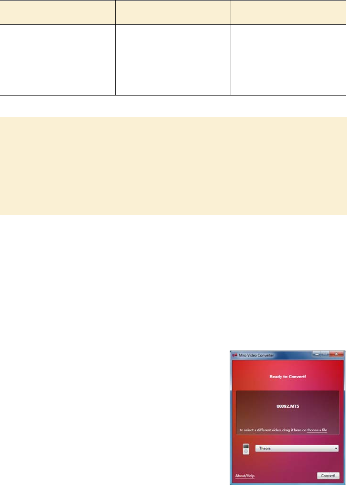
The <video> element 139
Following are the common file extensions and MIME types for video.
Easy encoding with Miro Video Converter
Rather than mess around with the different codecs and encoding
options yourself, there are tools that make things easy for you. One of
the simplest is the Miro Video Converter, available from www.
mirovideoconverter.com.
Miro Video Converter doesn’t present you with a lot of options—just a
place to drop the file you want to convert; a drop-down list to say what
you want to convert it to; and a button to
start the conversion. After you drop a
video file on the central area, only the out-
put format needs to be selected before
you’re ready to go.
The first three options are the main ones
that interest us:
❂Theora is the OGG video format sup-
ported by Opera and Firefox.
Video type File extensions MIME types
MPEG-4 .mp4 video/mp4
OGG .ogg, .ogv video/ogg
WebM .webm video/webm
MPEG-4 profiles
The MPEG-4 standard contains several different profiles in order to support a va-
riety of different expected use cases, ranging from Blu-ray and HDTV to mobile
phones with low screen resolutions. Mobile devices aren’t expected to support
the same profiles as desktop PCs or dedicated home multimedia equipment, so
when you’re encoding videos for use on iPhones make sure you’re targeting the
Simple Profile.
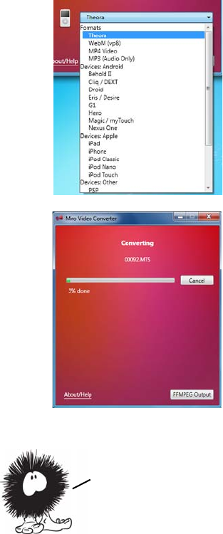
140 CHAPTER 4 Audio and video
❂WebM (VP8) is Google’s new video codec, supported by Chrome and
newer versions of Opera and Firefox.
❂MP4 videoi s the format supported by Safari and IE.
The additional options are variations of
these main three, except that the output
video is scaled for the particular device.
After you set the option, click Convert and,
depending on how large your video is, wait
a few minutes or a few hours. Repeat the
process for as many encodings as you
require.
The main advantage of this approach is that
it’s easy and requires little expertise. The
disadvantage is that if you don’t like the
results, you have to take a different
approach—there are no configuration
options for you to tweak.
Advanced encoding with FFmpeg
FFmpeg is a command-line tool originally written for the Linux operat-
ing system. It’s powerful and has thousands of options that you can set
by passing options on the command line. Rather than get into the
details of how FFmpeg works, which could easily take up a few
Miro Video Converter can give you a head start if you want a more fine—
tuned approach. Note the FFMPEG Output button at lower right in the
figure. FFmpeg is the command—line utility that Miro Video Converter
uses to do the encoding. In the next section, you’ll see how you can use
FFmpeg directly for finer—grained control over the encoding process.
The <video> element 141
chapters, let’s use the Miro Video Converter output as a starting point
and look at some easy ways to tweak things.
If you click the FFMPEG Output button while encoding a WebM
video, you’ll see that the command being used, on Windows, is some-
thing similar to this:
ffmpeg-bin\ffmpeg.exe -y -i "C:\00092.MTS" -f webm
-vcodec libvpx -acodec libvorbis -ab 160000
-crf 22 "C:\00092.webmvp8.webm"
You can run this yourself at the command prompt. Here’s a quick run-
down of what the parameters mean (don’t worry too much about the
details—for the most part you won’t need to change these):
❂-y—Overwrite any existing output without prompting.
❂-f—Container format.
❂-acodec—Audio codec to use.
❂-crf—Set the constant rate factor (crf). This automatically varies the
bitrate to maintain a consistent quality.
❂-i—Input file.
❂-vcodec—Video codec to use.
❂-ab—Audio bitrate to use. Bigger numbers lead to larger files.
One easy change you might want to make is to change the size of the
output video, using the -s parameter. This example sets the output to
320 pixels wide by 180 pixels high:
ffmpeg-bin\ffmpeg.exe -y -i "C:\00092.MTS" -f webm
-vcodec libvpx -acodec libvorbis -ab 160000
-s 320x180 -crf 22 "C:\00092.webmvp8.320.high.webm"
It’s also easy to adjust the quality of the output file by specifying a
bitrate. To do so, use the -b parameter:
ffmpeg-bin\ffmpeg.exe -y -i "C:\00092.MTS" -f webm
-vcodec libvpx -b 3600k -acodec libvorbis -ab 160000
-s 320x180 "C:\00092.webmvp8.high.webm"

142 CHAPTER 4 Audio and video
The same options can be applied to the command for iPhone MP4
encoding, although that has a few extra options specified by default:
ffmpeg-bin\ffmpeg.exe -i "C:\00092.MTS" -f mp4
-acodec aac -ac 2 -strict experimental -ab 160k
-s 320x180 -vcodec libx264
-vpre slow -vpre ipod640 -b 1200k
-threads 0 "C:\00092.iphone.320.mp4"
One thing to watch for when running the Miro version of FFmpeg is
the location of the preset files. The slow and ipod640 presets used in the
previous command correspond to the libx264-slow.ffpreset and
libx264-ipod640.ffpreset files. Put these files in C:\usr\local\share\
ffmpeg so that ffmpeg.exe can find them.
Using multiple sources
Now that you have a collection of video files to support all the different
browsers and devices your users may be using, you can add them to the
<video> element using the <source> element, just as with the <audio> ele-
ment earlier:
<video id="myvideo" controls>
<source src="00092.webm" type="video/webm">
<source src="00092.mp4" type="video/mp4">
<source src="00092.low.mp4" type="video/mp4">
<source src="00092.ogv" type="video/ogg">
No video support!
</video>
As with the <audio> element, it’s possible to find out which file the
browser has chosen by looking at the currentSrc property of the <video>
element in JavaScript. Adding this snippet of code to the <video>
If you expect to have users with older versions of iOS, then you should be
aware that although the <source> element is recognized, only the first one
will ever be used. In the previous examples, you should put the
00092.low.mp4 source first so older iOSs will play it. Of course, this
means users of modern desktop browsers that support MPEG—4 will play this
low—quality video instead of the higher—quality ones further down.
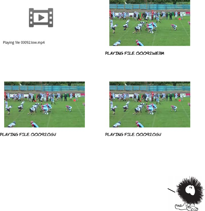
The <video> element 143
element reports the filename to an element with ID 'source' when the
video has loaded:
onloadeddata=
"document.getElementById('source')
.innerHTML = 'Playing file ' +
this.currentSrc.slice(this.currentSrc.lastIndexOf('/')+1);"
Loading the page in a variety of different browsers shows how the mul-
tiple source elements are picked up.
Android browser uses the low-quality MP4. Firefox 4 uses the WebM video.
Firefox 3.6 uses the Ogg video. Desktop Safari uses the high-quality MP4.
You’ve now learned how to add audio and video to your pages, and had a brief
introduction to the minefield that is video encoding for desktop browsers
and mobile devices. But so far, you haven’t seen much of the main advantage of
using HTML5 video and audio: integration with the rest of your page
content. In the next two sections, you’ll learn about the possibilities
this allows, starting with an exploration of the JavaScript API.
144 CHAPTER 4 Audio and video
Controlling audio and video with JavaScript
Earlier in this chapter, you saw that, by default, <audio> and <video> ele-
ments don’t provide controls for the user to interact with them; it’s up
to the web author to explicitly ask for controls to be provided. At the
time, you’d be forgiven for thinking that this is a bit pointless—what
good is a video if you can’t play it? In this section, you’ll discover
exactly how useful it can be to have complete control over the video
from JavaScript.
To begin with, let’s look at playing and pausing a video. This is straight-
forward—the <video> element provides play() and pause() methods:
Instead of providing controls on the video, buttons are provided on the
page. If your first thought when you saw the default controls was,
“Ugh! I don’t like the look of those. How can I style them myself?”
then here is the answer: create your own elements to control the video,
and style them however you wish.
You don’t have to limit yourself to the standard operations of Play and
Pause. This function starts the video play from a point in the middle of
the stream; you pass in the point as a parameter:
<button
onclick="document.getElementById('myvideo')
.play();">
Play
</button>
<button
onclick="document.getElementById('myvideo')
.pause();">
Stop
</button>
function playFrom(secs) {
var v = document
.getElementById('myvideo');
v.currentTime = secs;
v.play();
}
Controlling audio and video with JavaScript 145
Obviously there aren’t many significant points in a 15-second video
clip, but this would be useful if you had a podcast or longer movie and
wanted to provide bookmarks for when particular topics were being
discussed or for the start of each scene.
The value of the meter needs to be continually updated as the video is
playing. For this you use the timeupdate event, adding that to the
<video> element alongside the loadeddata event already being used to
capture the filename of the video being played:
<video id="myvideo" ontimeupdate="updateTime(this);"
onloadeddata="dataLoaded(this);">
Here’s the dataLoaded function. It’s been updated to set the max value of
the <meter> element so that it exactly matches the duration of the loaded
video:
function dataLoaded(v) {
document.getElementById('source')
You can then provide buttons to start
playback from significant points:
<button onclick="playFrom(4);">Play from 4
secs</button>
<button onclick="playFrom(8);">Play from 8
secs</button>
In the example, although the buttons claim
to start the video play at the fourth and
eighth seconds, the user has no way of see-
ing if they really work. When the controls
are hidden, you lose not just Play and Pause
but also the timeline. Fortunately, HTML5
provides a new <meter> element that’s excel-
lent for measuring how much of a video or
audio clip has been played:
<meter id="mymeter" min="0"></meter>
146 CHAPTER 4 Audio and video
.innerHTML = 'Playing file ' +
v.currentSrc.slice(v.currentSrc.lastIndexOf('/')+1);
m = document.getElementById('mymeter');
m.max = v.duration;
m.value = 0;
}
The code to update the meter element is even simpler; it just sets the
value of the <meter> element to the currentTime of the <video> element:
function updateTime(v) {
m = document.getElementById('mymeter');
m.value = v.currentTime;
}
Integrating media with other content
The <video> and <audio> elements are just like any other element on the
web page. They can be styled with CSS and used in JavaScript. To
begin, let’s look at applying CSS transforms and transitions. The fol-
lowing three screenshots show the same web page over the course of 10
seconds.
The code for this example, slightly elided, is shown next; see the full list-
ing in ch04/video-css-transitions.html. Don’t worry too much about the
details for now; read the sections “2D transforms” and “CSS transitions”
Direct access to the <audio> and <video> elements with JavaScript
isn’t the only benefit of having media be an integral part of your
page content; other browser technologies such as CSS and SVG can
also be applied. The next section shows you how.

Integrating media with other content 147
in chapter 9 for a more in-depth discussion. In the meantime, remember
that anything you can do to HTML elements with CSS can be done to the
<video> element:
In the previous chapter, you learned that the <canvas> element can grab
an image from anywhere on the page and subject it to various transfor-
mations. One of the more exciting features of HTML5 is that those
same canvas manipulation tricks also work with the <video> element.
The next example looks at the basic process of getting a frame from the
video into a <canvas> element by making a frame grabber.
First, let’s get the HTML sorted out. Start with the usual <video> ele-
ment, and add as many sources as required; you can use the code from
“Using multiple resources” as a starting point.
div video {
transition-duration: 10s;
}
div:hover video:nth-child(1) {
transform-origin: bottom
right;
transform: rotate(16.5deg);
}
div:hover video:nth-child(2) {
transform-origin: top right;
transform: rotate(33deg);
}
div:hover video:nth-child(3) {
transform-origin: top left;
transform: rotate(66deg);
}
<div>
<video id="myvideo1"
width="160"
autoplay loop>
<source src="00092.webm"
type="video/webm">
<source src="00092.mp4"
type="video/mp4">
<source src="00092.low.mp4"
type="video/mp4">
<source src="00092.ogv"
type="video/ogg">
No video!
</video>
<video id="myvideo2" ...
<video id="myvideo3" ...
</div>
CSS transitions are covered in detail in chapter 9; any of the
effects described in that chapter can be applied to the <video>
element. The previous example applies three transforms to three
identical <video> elements with a 10—second transition on :hover.
148 CHAPTER 4 Audio and video
:
Put the <canvas> element after the div with id 'source'. All the action
happens in the snap() function:
<video id="myvideo" controls>
<source src="00092.webm"
media="video/webm">
No video!
</video>
You need something for the user to
click to signal that they want to grab a
frame. A <button> element is easiest:
<button onclick="snap();">
Snap
</button>
Place that before the <video> element.
You also need a <canvas> element to
put the frame in later:
<canvas id="mycanvas"></canvas>
function snap() {
var video = document
.getElementById('myvideo');
var canvas = document
.getElementById('mycanvas');
canvas.width = video.videoWidth;
canvas.height = video.videoHeight;
var ctx = canvas.getContext('2d');
ctx.drawImage(video, 0, 0);
}
Most of this function is plumbing—
grabbing references to the relevant
elements and setting the width and
height of the canvas to match the
video. The code that draws the cur-
rent frame on the canvas is this:
ctx.drawImage(video, 0, 0);
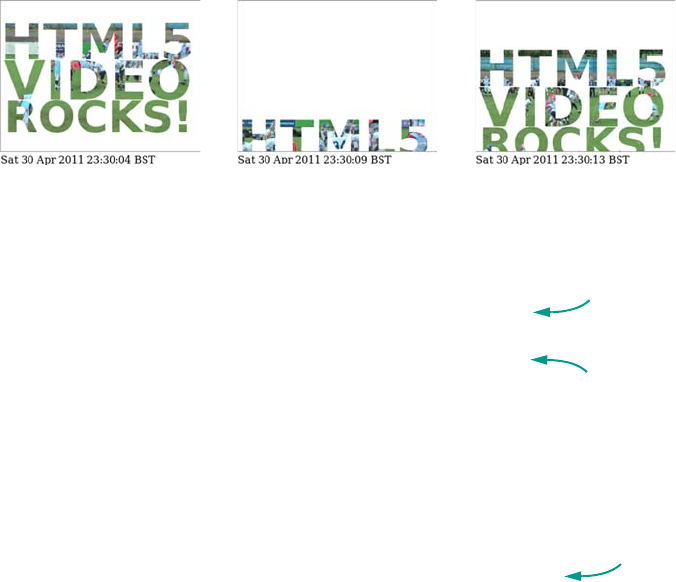
Integrating media with other content 149
The other thing you learned about in the previous chapter was SVG—
in particular applying SVG effects such as transforms, clips, and masks
to HTML content with <foreignObject>. Because the <video> element is
HTML content just like any other, those same effects can be applied.
The following screenshots show a <video> element clipped to appear
inside some text and then animated.
Here’s the content of the SVG embedded into the HTML. Note that the
SVG has HTML embedded into it in turn:
<defs>
<clipPath id="img1" clipPathUnits="userSpaceOnUse"
width="320" height="200">
<text x="0" y="70" font-family="sans-serif"
font-size="80" font-weight="bold">
<tspan>HTML5</tspan>
<tspan x="5" y="134" font-size="85">VIDEO</tspan>
<tspan x="5" y="186" font-size="70">ROCKS!</tspan>
</text>
</clipPath>
</defs>
<g clip-path="url(#img1)">
<foreignObject x="0" y="0" width="320" height="200">
<body>
<video id="myvideo" width="320" height="200"
It’s that simple! If you want to have
some fun, refer back to the canvas
transformations in chapter 3 and try
them on frames of a video.
Clip path to
use on video
Text used to
clip video
HTML
included
in SVG
150 CHAPTER 4 Audio and video
autoplay loop>
<source src="00092.webm" type="video/webm">
<source src="00092.mp4" type="video/mp4">
<source src="00092.low.mp4" type="video/mp4">
<source src="00092.ogv" type="video/ogg">
No video!
</video>
</body>
</foreignObject>
<animateTransform attributeName="transform"
type="translate" values="0,0;0,220;0,0"
begin="0s" dur="10s" fill="freeze"
repeatCount="indefinite">
</g>
Browser support
Support for both <video> and <audio> elements is universal across all
current browsers. The problem at this point is finding the minimum
number of different encodings for maximum browser compatibility.
Does HTML5 video replace Flash?
The short answer is, no. There are several things for which Flash is the only op-
tion now, and some things for which HTML5 video is never likely to be an option.
Flash has support for Real Time Streaming Protocol (RTSP) and the Real Time
Messaging Protocol (RTMP), which provide facilities such as adaptive streaming,
switching the bitrate of the video stream as the available bandwidth varies, and
digital rights management (DRM).
It’s possible that HTML5 video will one day support adaptive streaming, but it’s
extremely unlikely that it will ever support any features for DRM in a cross-
browser fashion. If you want to use DRM on your video and audio content, then
you’ll need to continue using Flash.
SVG animation
As you may have guessed, browser support for audio and video is
something of a thorny subject. Let’s look at the details.
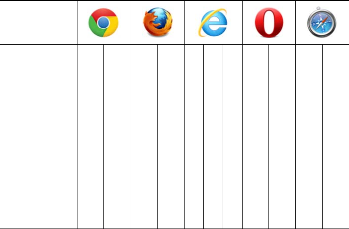
Browser support 151
Key:
●Complete or nearly complete support
○Incomplete or alternative support
Little or no support
Web server configuration for audio and video
The first thing you need to consider when serving video and audio is
that you have to make sure the correct MIME types are sent in the
headers. The MIME type sent by the server should match the value set
in the type attribute. On the common Apache server, this means using
the AddType directive. This can go in the server configuration files or in
an .htaccess file in your website directory. The relevant values for
HTML5 audio and video are as follows:
AddType audio/ogg oga ogg
AddType audio/mp4 m4a
AddType video/ogg ogv
AddType video/mp4 mp4 m4v
AddType video/webm webm
12 14 4 6 8 9 10 11.5 12 55.1
<audio> element ● ● ● ● ● ● ● ● ● ●
WAV audio ● ● ● ● ● ● ● ●
MP3 audio ● ● ● ● ● ●
OGG audio ● ● ● ● ○ ○ ● ● ○ ○
<video> element ● ● ● ● ● ● ● ● ● ●
OGG video ● ● ● ● ○ ○ ● ● ○ ○
MP4 video ● ● ● ● ● ●
WebM video ● ● ● ● ○ ○ ● ● ○ ○
152 CHAPTER 4 Audio and video
Supporting legacy browsers with Flash video
It’s possible to get the best of both worlds: HTML5 video for browsers
that support it and Flash for browsers that don’t. At its simplest, this is
a matter of wrapping the code for Flash inside the <video> element:
<video id="myvideo" controls>
<source src="myvideo.webm" type="video/webm">
<source src="myvideo.mp4" type="video/mp4">
<source src="myvideo.low.mp4" type="video/mp4">
<source src="myvideo.ogv" type="video/ogg">
<object
classid="clsid:d27cdb6e-ae6d-11cf-96b8-444553540000"
codebase="http://download.macromedia.com/
pub/shockwave/cabs/flash/
swflash.cab#version=6,0,40,0"
width="320" height="240"
id="myvideoname">
<param name="movie" value="player.swf">
<param name="quality" value="high">
<param name="bgcolor" value=#ffffff>
<param name="flashvars" value="file=myvideo.mp4">
</object>
No video support, <a href="myvideo.webm">try downloading</a>!
</video>
Browsers that support the <video> element will ignore the fallback con-
tent, whereas browsers that don’t support the <video> element will
ignore that and only see the <object> element that embeds the Flash
plug-in. Browsers that support neither the <video> element nor the
Flash player will see the link to download the video.
Summary
In this chapter, you’ve learned about multimedia on the web, playing
audio and video with simple markup. You’ve seen the benefits of hav-
ing multimedia content integrated with the rest of your web page con-
tent and looked at manipulating that multimedia with JavaScript.
Sources for
HTML5 video
as normal
Add Flash
code in
<video>
element
Flash movie
is a player
Video
file
to play
HTML5 offers many other opportunities for manipulating your
content in new and exciting ways with JavaScript, such as WYSIWYG
editing and drag—and—drop interaction. The next chapter looks at
them in more detail.
153
5
Browser-based APIs
This chapter covers
•Directly editing page content with
contentEditable
•Simulating desktop-like interactions with the drag-and-drop API
•Convenient access to semantic metadata with the microdata API
•How to not break the Back button with the history API
•Keeping web apps responsive with web workers
This chapter looks at HTML5 application programming interfaces (APIs)
that work “in browser”—that is, APIs that work directly with loaded web
pages rather than accessing the network or web and relying on server
functionality.
To follow the examples in this chapter, you’ll need to have a basic
understanding of JavaScript. Read appendix D first if you need
more help. Or, if you’re more of a designer than a developer, skip
ahead to chapter 7, where we start to look in detail at CSS3.
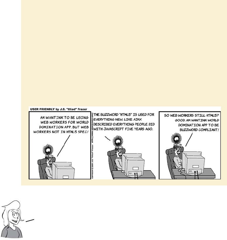
154 CHAPTER 5 Browser-based APIs
Rich-text editing with the contenteditable attribute
The web was originally intended to be a place where people would cre-
ate and share documents. But web browsers are complex to implement
on their own, and existing text editors were good enough for creating
web documents, so the creation and viewing of web content has histor-
ically been kept separate. Various solutions have arisen that enable the
What is an HTML5 API?
The HTML5 spec is ground-breaking in many ways, but one of the key ways is
that it specifies both the syntax of the HTML markup and the APIs you should
use to manipulate the document with JavaScript. Earlier specs kept those sepa-
rate: the Web Hypertext Application Technology Working Group (WHATWG) felt
this was both a source of needless duplication and a recipe for inconsistency.
You’ve already seen several of HTML5’s APIs in action—the form-validation API
in chapter 2, the canvas in chapter 3, and the video and audio APIs in the last
chapter—but there are many more.
The WHATWG produced a very long HTML spec that splits into 11 standards at
the W3C, one of which is the HTML5 spec. In addition, several other specs, such
as the Geolocation API, have never been part of the WHATWG spec but are con-
sidered part of the HTML5 buzzword nevertheless. In this book, we’ll follow the
more liberal definition because that lets you play with more fun stuff!
First, let’s look at one of the APIs that’s part of the core HTML5
specification: contentEditable. It allows ricH—text editing in the
browser–a What
—
You—See—Is—What—You—Get (WYSIWYG) environment similar
to the experience people are used to with modern word processors.
Rich-text editing with the contenteditable attribute 155
creation of content from a web page, but these have
depended mostly on server capabilities rather than
on any built-in support in HTML. This changes in
HTML5 with the advent of the contenteditable and
spellcheck attributes.
Basic text editing
Making an element editable is as easy as adding an attribute:
<p contenteditable="true">Stef works
as the Corporate Sales Manager. He
...
much more money than he does.</p>
If the user clicks the element, a
cursor will appear, and they can
start typing.
Browser support quick check:
contenteditable
Standard
4.0
3.0
5.5
9.00
3.0
156 CHAPTER 5 Browser-based APIs
To make multiple elements editable, you can apply the contenteditable
attribute to the parent, and the child elements will inherit the setting:
In the previous example, both the <h1> and the <p> elements are edit-
able. So is the <img> element, but your only option is deletion—you
can’t edit the image from within the browser with the contenteditable
API. It may be possible to build your own image editor using the
<canvas> element (see chapter 3), but we don’t have room to get into
that here.
You can override the contenteditable value on a parent element by
explicitly setting contenteditable on a child element:
Any text the user types is added to
the document. This requires no
scripting on your part—the
browser does all the work.
<section contenteditable="true">
<h1>Stef</h1>
<p>Stef works...
...than he does.</p>
<img
src="headshots/stef.gif"
alt="Stef">
</section>
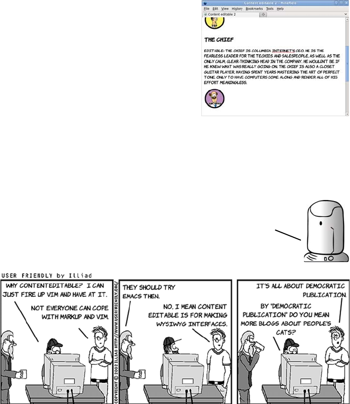
Rich-text editing with the contenteditable attribute 157
The spellcheck attribute
A common feature of word processors is inline spell-checking—spell-
ing mistakes are highlighted by a red squiggle. This feature is also
<section contenteditable="true">
<h1 contenteditable="false">
The Chief
</h1>
<p>The Chief is...
...meaningless.</p>
<img
src="headshots/thechief.gif"
alt="The Chief">
</section>
In this example, the <h1> element isn’t
editable, but every other child ele-
ment of the <section> element is.
Note that IE8 doesn’t treat contenteditable as inheritable.
You’ll need to specify contenteditable="true" on every
element you want to be editable in IE.
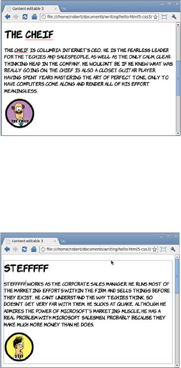
158 CHAPTER 5 Browser-based APIs
available in contenteditable sections. To indicate to the browser that
text should be spell-checked, set the spellcheck attribute to true:
You can also recommend that browsers not spell-check text by setting
the attribute to false. This might be useful if the user was expected to
enter things like codes or part numbers:
Note that, in both cases, the value of the spellcheck attribute is inher-
ited by the child elements. You can override it by specifying it on par-
ticular elements.
<section
contenteditable="true"
spellcheck="true">
<h1>The Chief</h1>
<p>The Chief is Columbia...
...effort meaningless.</p>
<section
contenteditable="true"
spellcheck="false">
<h1>Stef</h1>
<p>Stef works as the...
...than he does.</p>
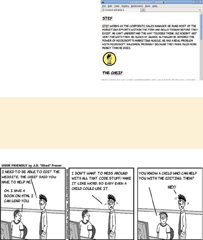
Rich-text editing with the contenteditable attribute 159
So far, we’ve only looked at what’s achievable without JavaScript. For
more advanced formatting, like setting text to bold or italic, or adding
links, you have to start taking advantage of the API, as we’ll discuss in
the next section.
The spellcheck attribute is just
a suggestion; user preferences
are allowed to override every-
thing. If you look at the previ-
ous example in Firefox, you’ll
see that the spellcheck is
active even though the attri-
bute is set to false.
Saving the edited content
The contenteditable attribute only lets you edit the content in the page; it
doesn’t change the file stored on a web server. Although you could save the file
locally to preserve the changes, to make this work as part of a content-manage-
ment system (CMS) you would need to use JavaScript to get the results back to
the server.
160 CHAPTER 5 Browser-based APIs
Applying formatting to the editable text
The HTML5 API provides the execCommand() function for manipulating
text in the contenteditable region. The function has three parameters—
one required, one ignored, and one optional.
The commands for applying bold, italic, and underlined text are all
fairly straightforward. Each requires the command name; all the other
parameters can be left in their default state.
Here’s the command for bold:
execCommand(
'bold',false,''
);
If you add this code to the onclick attribute of a button, the formatting
will be applied to the currently selected text when the button is clicked.
Here are the equivalent commands for italic and underlined text:
execCommand(
'italic',false,''
);
execCommand(
'underline',false,''
);
The following screenshots show the process of applying these three dif-
ferent commands to selected text on the example page.
execCommand(commandName, showDefaultUI, commandArgument)
a string indicating the
operation to perform
a Boolean parameter
that will be ignored
an optional string value used
as a parameter for the command
Let’s extend the previous example by allowing the user to apply
formatting to the text they’re editing. You’ll add buttons to the page that
execute commands on the API when clicked.
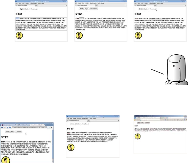
Rich-text editing with the contenteditable attribute 161
Chrome and Opera use
b and i, so your styles
apply.
<b>
Stef
</b>
<i>
works
</i> as the
<u>
Corporate Sales
Manager
</u>.
Firefox inserts span
elements with styles.
<span style="
font-weight: bold;">
Stef
</span>
<span style="
font-style: italic;">
works
</span> as the
<span style="
text-decoration:
underline;">
Corporate Sales
Manager
</span>.
IE inserts strong and
em elements.
<strong>
Stef
</strong>
<em>
works
</em> as the
<u>
Corporate Sales
Manager
</u>.
Although support for the execCommand() method is consistent
cross
—
browser, the implementation of the individual commands
still varies considerably. Following is the markup generated
by following the previous three steps in Chrome and Opera on
the left, IE on the right, and Firefox in the middle.
162 CHAPTER 5 Browser-based APIs
Support for more advanced formatting commands tends to be some-
what flaky cross browsers. Nevertheless, these commands can be use-
ful, so we’ll look at some of them.
Only a limited number of elements can be passed in the argument for
formatblock: IE allows <h1>-6, address, and pre. If you want to have more
control over the exact markup inserted, you can use the inserthtml
command. This means you have to deal with the currently selected text
yourself. Use the HTML5 text-selection API to get the content of the
user’s current selection:
The formatblock command allows
you to wrap the current block in a
new element:
execCommand(
'formatblock',false,'<h1>'
);
The current block
refers to the block-
level parent of the current insertion
point. If you’re focused on a
<paragraph> element, that element
will be converted to the type of
element you specify in the argument.
You can make Firefox use the same markup as Chrome and Opera with the
styleWithCSS command:
execCommand('styleWithCSS', false, false);
As ever, watch out for browser inconsistencies. Firefox replaces
the current block element, so a <p> becomes an <h1> in the previous
example. IE, Chrome, and Opera wrap the old element around the new
one, so the <p> ends up containing an <h1>.
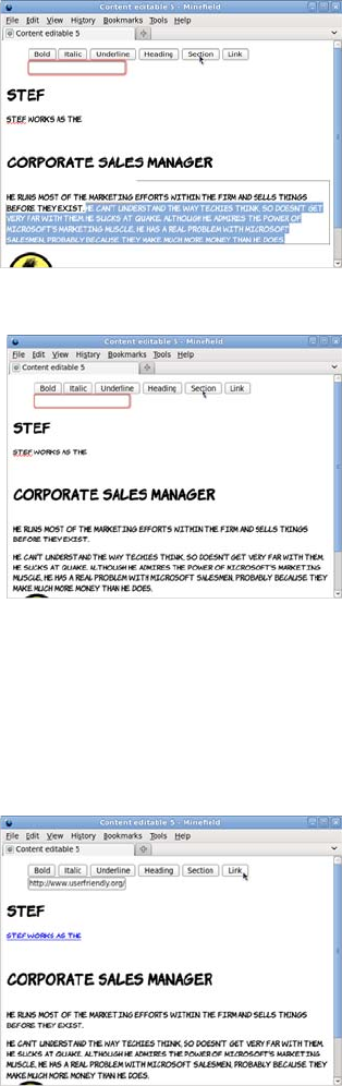
Rich-text editing with the contenteditable attribute 163
Finally, a common requirement when editing web pages is inserting
links. The command for this is CreateLink, but you also need to provide
the user with a way of entering the link as well as the button to apply it:
var selection =
window.getSelection();
var range =
selection.getRangeAt(0); var
contents =
range.extractContents();
We’re not going to cover the text-
selection API in detail here. If you
want to find out more, check out
the specs.
Now you can insert the selection
back into the document inside a
<section> element. The current
selection is replaced with the new
content:
execCommand(
'inserthtml',false,
'<section>' +
contents.textContent +
'</section>');
if (
document
.getElementById('theURL')
.checkValidity()
) {
execCommand(
'CreateLink',
false,document
.getElementById('theURL')
.value
);
}
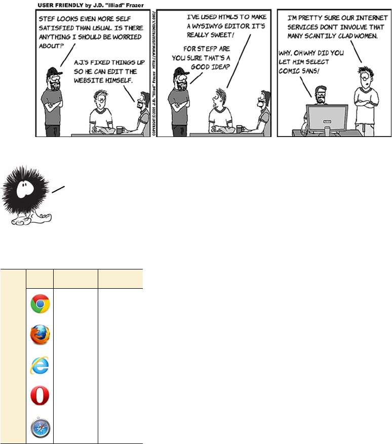
164 CHAPTER 5 Browser-based APIs
Notice that for this example, rather than writing your own code to val-
idate the email address, you take advantage of the HTML5 form-valida-
tion API (see chapter 2 for more details).
Natural user interaction with drag-and-drop
Drag-and-drop is a metaphor familiar on
your desktop computers—you’ve probably
used it for sorting files into folders, adding
attachments to emails, and opening a file in a
particular program. It’s therefore useful when
writing web applications to support this drag-
and-drop metaphor both within your applica-
tion and as an interaction method with other
content on the user’s computer. This function-
ality is provided in HTML5 in the drag-and-
drop API.
A big feature of desktop applications is the ability to drag and
drop
—
blocks of text, images, and files. We’ve become used to being
able to select what we want with the mouse, drag it where we want
it to be, and drop it. In the next section, we’ll look at the HTML5
API that brings drag
—
and
—
drop to web applications.
Browser support quick check:
drag-and-drop
Standard Custom
2.0 -
3.5 -
9.0 6.0
- -
4.0 -
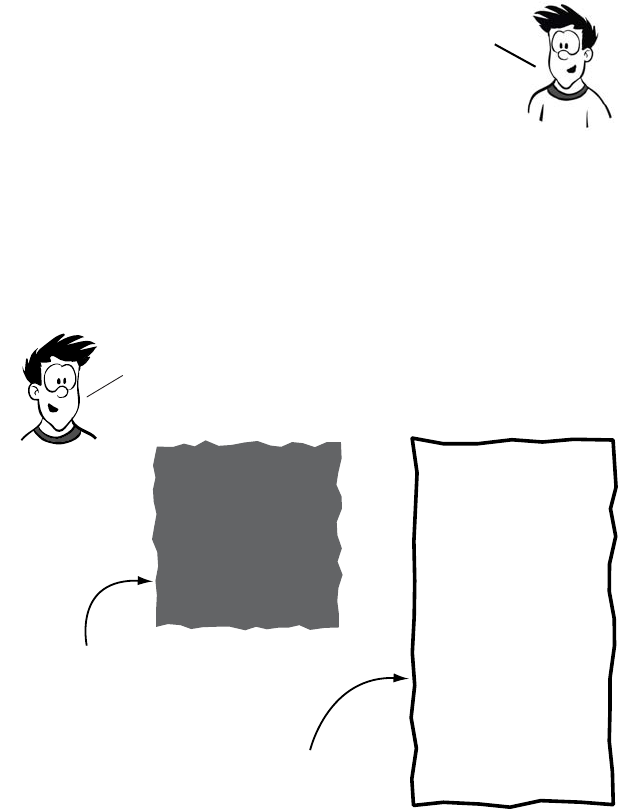
Natural user interaction with drag-and-drop 165
The drag-and-drop API makes use of a few properties and a lot of
events. The following sequence of diagrams gives you an overview of
which events fire when before we dive into code in the following
section.
1
The drag
—
and
—
drop API was originally developed by Microsoft
in IE5.5. Rather than invent an incompatible API, the WHATWG
decided to exhaustively document what IE had implemented.
This has the advantage that the standard mostly works in IE,
but the disadvantage that the API is somewhat more
counterintuitive than most other APIs in the HTML5 spec.
draggable=
true
ondragover=
"Return false;"
Element to accept drop
needs to return false to
the ondragover event.
To perform drag and drop in an html5 page, you need at
least two elements: one to be the element to be dragged
and one to be the drop target.
Element to drag
Needs to have the
draggable attribute
set to true.
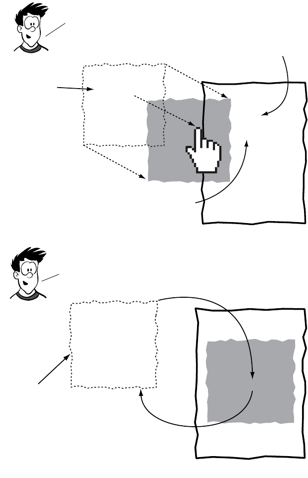
166 CHAPTER 5 Browser-based APIs
Now that you have an overview, let’s examine the details.
2
3
When the user clicks the element and starts dragging it,
the dragstart event is fired. As the element is dragged
over the target, the target fires several events, AS shown here.
ondragstart
The ondragstart
event allows
you to set
parameters on
the drag object.
As the element is dragged over
the target, the ondragover
event is fired repeatedly.
ondragenter
ondragover
ondragover
ondragover
As the dragged element enters the target, the
ondragenter event is fired, allowing you to
provide user feedback or set styles.
Finally, when the user releases the mouse button over the
drop area, the ondrop event is fired, this is your opportunity
to read the data set in the ondragstart event and perform
appropriate actions.
ondrop
A common task for
the ondrop event
IS to remove the
dragged element
from the DOM and
re-insert it as a
child of the target
element.
The dragged
element remains
in the DOM while
being dragged.
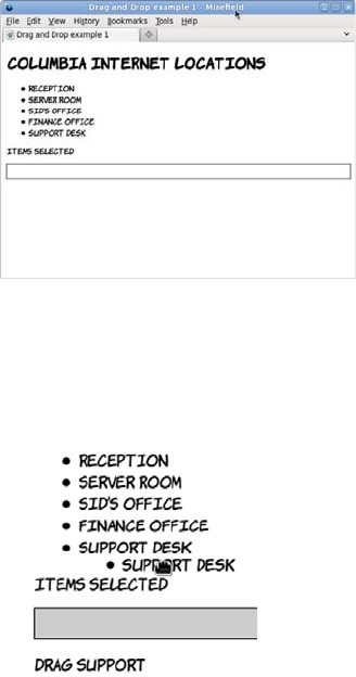
Natural user interaction with drag-and-drop 167
Basic drag-and-drop
To make an element draggable is simple, with a couple of browser
compatibility caveats that we’ll get to later: add a draggable attribute
with value true. This first example, ch05/drag-and-drop-1.html, has a
list of locations in the Columbia Internet offices that you’ll make
draggable:
On each of the elements, the ondragstart attribute has been set. This
function is used to set the data that will be passed by the drag-and-drop
action. For now, you’ll set the text data as the ID of the element:
<ul id="locations">
<li draggable="true"
id="recpt"
ondragstart="drag(event)">
Reception
</li>
...
</ul>
function drag(event) {
event.dataTransfer
.setData('Text',
event.target.id);
log('drag ' + event.target.id);
}
Within the function there’s also a log
command so the sequence of events
firing is recorded on the page. As the
element with ID 'support' is
dragged, the messages are added at
the bottom of the page.
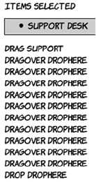
168 CHAPTER 5 Browser-based APIs
The crucial event in the drag-and-drop process is dragOver. Any ele-
ment that is to be a target for dropped elements must capture the
dragOver event and cancel the default action on it:
function dragOver(event) {
event.preventDefault();
log('dragOver ' + event.target.id);
}
When the element is dropped, the drop event is fired. It’s in this event
that the actual work needs to be done. This example removes the list
item from the source list and adds it to the selected list using the stan-
dard appendChild method:
function drop(event) {
var id = event.dataTransfer.getData('Text');
event.target.appendChild(document.getElementById(id));
log('drop ' + event.target.id);
event.preventDefault();
}
If you only want drag-and-drop to work in Firefox, Chrome, and
Safari, that’s all the code you need—you’re done! If you want it to
work in IE too, read ahead to the next section.
These two events can be bound declara-
tively to the drop target element:
ondragover="dragOver(event)"
</ul>
<ul id="drophere"
ondrop="drop(event)">
As you can see, the dragOver event is
fired repeatedly while the dragged ele-
ment is over the drop target.

Natural user interaction with drag-and-drop 169
Drag-and-drop in all browsers
Although the HTML5 drag-and-drop API is based on what IE5.5 imple-
mented, it’s not identical. What that means is that although it’s possible
to write cross-browser code for drag-and-drop that works across
Firefox, Chrome/Safari, and IE, doing so isn’t as straightforward as the
code given in the previous section.
PROBLEM 1
The draggable attribute is an innovation of the HTML5 spec, and IE8
doesn’t recognize it. By default, nothing in the previous example is
draggable in IE.
SOLUTION 1
Links are draggable by default, so by making everything that should be
draggable a link, IE can be supported.
The initial code was simple—a
draggable attribute and an event
handler:
<li draggable="true"
id="recpt"
ondragstart=
"dragstart(event)">
Reception
</li>
Instead of making the list items
draggable, add links around the
text content:
<li id="recpt">
<a ondragstart=
"dragstart(event);"
href="#"
onclick="return false;">
Reception
</a>
</li>
The draggable attribute is no lon-
ger required because links are
draggable by default.

170 CHAPTER 5 Browser-based APIs
PROBLEM 2
Older versions of IE use srcElement instead of target.
SOLUTION 2
Do the standard IE support bait-and-switch.
The original dragstart event
handler assumed that it was the
<li>, with the id, that was drag-
gable:
function dragstart(ev) {
event.dataTransfer
.setData('Text',
event.target.id);
log('drag ' +
event.target.id);
}
Now the link element is used as
a proxy. The element you want
to move is the parent of the one
being dragged:
function dragstart(ev) {
event.dataTransfer
.setData('Text',
event.srcElement
.parentNode.id);
log('drag ' +
event.srcElement
.parentNode.id);
}
The original code uses standard
DOM events, methods, and
properties:
function dragstart(ev) {
event.dataTransfer
.setData('Text',
event.srcElement
.parentNode.id);
log('drag ' +
event.srcElement
.parentNode.id);
}
This is a fairly common problem
in writing cross browser Java-
Script. Test for the existence of
event.target:
function dragstart(ev) {
var target =
event.target ?
event.target :
event.srcElement;
event.dataTransfer
.setData('Text',
target.parentNode.id);
log('drag ' +
target.parentNode.id);
}

Natural user interaction with drag-and-drop 171
PROBLEM 3
The ondragover attribute doesn’t work in IE8 and before.
SOLUTION 3
There are two possible approaches to solving this problem. The first
approach is to handle the dragenter event, which older versions of IE
recognize, instead of the dragover event, which they do not.
The second (and better) approach is to attach the event handler in
script rather than declaratively in the HTML markup. The advantage
of this approach is that, while attaching the handler declaratively will
cause the event to fire, canceling that event won’t make the element a
drop target in IE8 and earlier. But if you use the proprietary attach-
Event() method to attach to the dragOver event in script, canceling that
will make the element a drop target. Attaching the event this way is
straightforward; the code is shown here:
<!--[if lte IE 8]>
<script>
document.getElementById(
'drophere'
).attachEvent(
'ondragover', dragover
);
</script>
<![endif]-->
If you don’t need to support old
versions of IE, you don’t need to
worry about the first approach,
although it’s simple to fix:
<ul id="drophere"
ondrop="drop(event)"
ondragover="dragOver(event)">
In older versions of IE the
dragenter event has to be can-
celled instead of the dragover:
<ul id="drophere"
ondrop="drop(event)"
ondragover="dragOver(event)"
ondragenter=
"dragOver(event)">
Also note that IE8 and earlier
need the dragOver event to
return false;.

172 CHAPTER 5 Browser-based APIs
Note that for advanced developers the best practice is to always attach
event handlers in script. For now, this snippet can be copied and
pasted into your own code.
PROBLEM 4
Chrome is now broken!
SOLUTION 4
Find the closest parent ID.
You can avoid this issue altogether if the elements you want to drag are
links or images—add the ID directly to those draggable elements. An
alternative approach for IE support on elements that aren’t draggable
by default is to add the links dynamically with script only in IE.
This is a strange one. Now that
the draggable item is an anchor
rather than a list item, Chrome
inserts an extra element—the
parentNode no longer has an ID,
so this code doesn’t work:
target.parentNode.id
The solution is to write a utility
function to recurse up the docu-
ment tree until an element with
an ID is found:
function grabOuterId(el) {
if (el.id) {
return el.id;
} else {
return
grabOuterId(el.parentNode)
}
}
Now take every place in the
code where the ID is needed, like
this
event.dataTransfer
.setData('Text',
target.parentNode.id);
And replace it with a call to the
new function:
event.dataTransfer
.setData('Text',
grabOuterId(target)
);
Managing the Back button with the history API 173
Managing the Back button with the history API
One major issue with JavaScript-based
applications is that they break the Back
button. If you update content on the page
with JavaScript rather than loading a new
page from the server, no entry made is in
the browser history; so when the user
clicks Back, expecting to go back to the
previous state, they end up at the previous
site instead.
The problem can be demonstrated simply. All you need is a function
that updates the page in response to user activity
var times = 0;
function doclick() {
times++;
document.getElementById('message').innerHTML =
'Recorded <b>' + times + '</b> clicks';
}
and a little markup:
<div onclick="doclick();">Click Me</div>
<div id="message">Recorded <b>0</b> clicks</div>
In real life, your web page would be doing something more compli-
cated, like fetching new content from the server via AJAX, but a simple
Drag
—
and
—
drop is a great way for users to interact with your web
applications. But the usability gains will be lost if, after spending time
moving through your application, users click the Back button expecting
to go back a page and instead go back to their Start screen. In the next
section, you’ll learn how to use the HTML5 history API to avoid that fate.
Browser support quick check: history API
popState hashchange
5.0 5.0
4.0 3.6
- 8.0
11.5 10.6
5.0 5.0
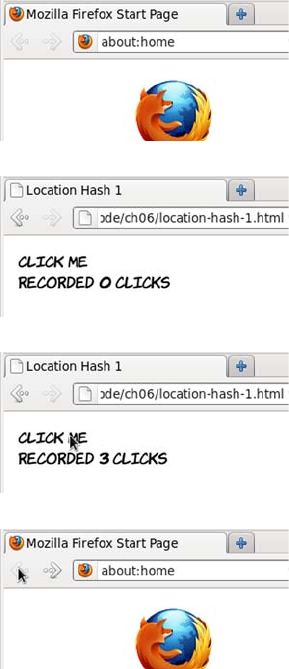
174 CHAPTER 5 Browser-based APIs
update is enough to demonstrate the concept. Let’s see what happens
when the user visits the page.
The doclick() function can be updated to take advantage of the history
API. Each time the page is updated it will also set the location.hash:
function doclick() {
times++;
location.hash = times;
document.getElementById('message').innerHTML =
'Recorded <b>' + times + '</b> clicks';
}
1The user starts on their home
page and decides to visit the
amazing Click Me application
they’ve heard about.
2They type in the URL or fol-
low a link from an email to get
to the Click Me page.
3After a few seconds of enjoy-
able interaction, the page state
has changed several times.
4But when the user clicks the
Back button in the browser,
they find that instead of going
back to a previous page state,
they leap to their home page.
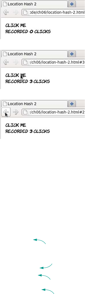
Managing the Back button with the history API 175
Updating page state
Updating the history is only part of the problem; you also need to be
able to update the state of the page to match the state in the history.
Because you’re the one managing the history, it’s up to you to manage
the page state. In order to update your page in response to
location.hash being changed, you can listen to the hashchange event:
function doclick() {
times++;
location.hash = times;
}
window.onhashchange = function() {
if (location.hash.length > 0) {
times =
parseInt(location.hash.replace('#',''),10);
} else {
times = 0;
1The user arrives at the Click
Me page as before.
2Notice that now the URL is
updated after every click—
“#3” has appeared at the end
of it.
3Clicking the Back button now
takes the location back to #2,
demonstrating that page states
have successfully been added
to the history. But note that
clicking the Back button
doesn’t automatically return
the page to its previous state.
Update times;
change hash
b
hashchange
event
c
Check that
hash exists
d
Set times
value
e
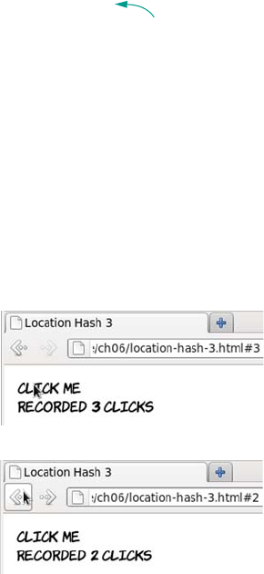
176 CHAPTER 5 Browser-based APIs
}
document.getElementById('message').innerHTML =
'Recorded <b>' + times + '</b> clicks';
}
The doclick() function B is now only responsible for updating the
times variable and changing the hash. The hashchange event c is on the
window object; when it takes place, you check that the hash exists d. In
a real application, you’d also want to check that it had a valid value.
Next, you set the value of times to be the number in the hash e.
Finally, you update the document to reflect the correct page state f.
Let’s look at this new code:
Using location.hash
The location.hash property and the associated hashchange event are use-
ful if you want to tag particular views of your application and allow the
user to navigate between them. Google Mail uses this approach by
allowing you to navigate between your inbox (#inbox), contacts
(#contacts), and other views—if you have a Gmail account, look at
what happens to the URL as you navigate to various different pages
and then click back.
But as far as state information goes, the hash only lets you store a
string. You could encode a more complex object, but the URL would
quickly become long and unwieldy and wouldn’t be memorable for
1As before, the hash in the
URL is updated as the user
clicks.
2But now, when the Back but-
ton is clicked, the onhashchange
function is triggered and the
page state is reset to match
the URL.
Update page
state
f
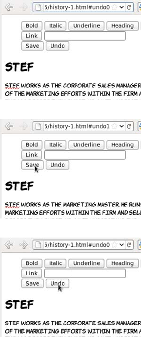
Managing the Back button with the history API 177
your users. If you need more complex information stored as part of the
history, a better approach would be to use the hash as a key to pull fur-
ther state information out of some store. Although you could roll your
own approach to this, HTML5 has provided an API to do it for you
through the history.pushState() method and the popstate event. These
methods allow you to save and reload a complex object.
Example: Implementing an undo feature
The next example extends the content-editable example ch05/content-
editable-5.html from the earlier section to include an undo feature. You
can see the full listing in ch05/history-1.html. Here’s how it works.
1When the page is first loaded,
an initial state is created and
tagged in the URL with the
hash undo0.
2If the user makes a change in
the text and then clicks the
Save button, a new undo
state is created and assigned
to the hash undo1.
3Clicking the Undo button or
clicking the Back button in
the browser returns the page
to the previous state.
178 CHAPTER 5 Browser-based APIs
Now let’s look at the implementation.
A. DECLARE A VARIABLE TO HOLD THE STATE
You start by declaring a global variable to hold your state:
var state;
B. CREATE THE INITIAL STATE
Now you need to set initial values of your state object. For this exam-
ple, you need a property to hold a reference you can use in the hash,
and the content of your editable region:
function init() {
state = {
undonum: 0,
content: document.getElementById('content').innerHTML
};
}
C. SAVE THE STATE WITH PUSHSTATE
When the user saves, that state needs to be updated and then pushed
into the history object:
function save() {
state.undonum++;
state.content = document.getElementById('content').innerHTML;
history.pushState(state, '', '#undo' + state.undonum);
}
The pushState function takes three parameters: the object to be stored
as the state, a title for the state, and a hash to reference the state. Note
that the title is advisory only; currently most browsers ignore it. The
hash will be updated automatically by calling pushState.
D. WRITE A FUNCTION FOR THE POPSTATE EVENT
You also need a function to restore the state: it will be an event handler
for the popState event. The state object is available on the event passed
in, so you grab that and update the page from the content property:
function popState(event) {
if (event.state) {
Getting semantic with the microdata API 179
state = event.state;
document.getElementById('content').innerHTML = state.content;
} else {
history.replaceState(state, '', '#undo' + state.undonum);
}
}
E. HANDLE THE INITIAL STATE, AND ATTACH THE EVENT HANDLER
If there isn’t a state object on the event, then this is the first load;
replace the current state with your initial state object. Now all that’s
needed is to wire up the events:
window.onload = init;
window.onpopstate = popState;
window.onpageshow = popState;
Both onpopstate and onpageshow are required because Firefox, unlike
other browsers, doesn’t fire popstate on the initial page load when no
state is set.
F. SET UP THE MENU BUTTONS
Finally, link the buttons on the menu to appropriate functions:
<button onclick="save();">Save</button>
<button onclick="history.go(-1);">Undo</button>
Getting semantic with the microdata API
The microdata API makes it convenient to
examine and update content that’s been marked
up with microdata. Microdata was discussed in
chapter 1; it’s a method of flexibly extending the
semantics of HTML to describe more than just
text content—for example, contact information,
The HTML5 history API presents a powerful
tool for JavaScript
—
based applications and
has good cross
—
browser support. It’s already
used on major websites such as Google Mail
and Twitter. In the next section, we’ll look
at how you can use content that’s been
semantically enhanced with microdata.
Browser support quick check:
microdata API
Standard
-
16
-
12
-

180 CHAPTER 5 Browser-based APIs
appointments, and licenses. In this section, we’ll look at how to use the
microdata API and then consider some useful applications.
So far, only Opera has implemented this API, although a Firefox
implementation is in progress.
Using a single microdata format
Here’s a simple example of contact information marked up with micro-
data using the hCard vocabulary. This code, along with the script that
follows, is available in ch05/microdata-api-1.html:
<div id="aj" itemscope
itemtype="http://microformats.org/profile/hcard">
<h1 itemprop="fn">
<meta itemprop="n" content="AJ">
A.J.
</h1>
<img itemprop="photo" alt="AJ"
src="http://www.userfriendly.org/cartoons/
cartoons/aj/headshot_aj.gif" >
<a itemprop="email" href="mailto:aj@userfriendly.org">
aj@userfriendly.org
</a>
</div>
With a little added CSS, you can make the
item take on a business card–like appear-
ance, as shown at right.
Now let’s look at how the item data can be
extracted with the microdata API. The
first step is to get a list of all the items in
the document:
var md = document.getItems();
The getItems() method returns a NodeList that represents all the top-
level items in the document. This NodeList has three useful properties:
❂itemType—Tells you what sort of item has been found. In this case,
you’re expecting it to be http://microformats.org/profile/hcard as per
the itemtype attribute in the source.
Getting semantic with the microdata API 181
❂properties—An array that gives you access to values through an
itemValue property on each member.
❂names—An array of property names.
You can examine all three with a simple loop:
for (var i = 0; i < md.length; i++) {
log('Found: ' + md[i].itemType);
for (var j = 0; j < md[i].properties.length; j++) {
log(md[i].properties.names[j] + ': '
+ md[i].properties[j].itemValue);
}
}
The log function writes the string parameter out on the page so you can
examine the output. Here are the results of running that code on the
previous example markup:
Found: http://microformats.org/profile/hcard
fn: A.J.
n: AJ
photo: http://www.userfriendly.org/cartoons/cartoons/aj/
headshot_aj.gif
email: mailto:aj@userfriendly.org
Note that the itemValue property performed a useful service for you
because it understands how to get the value from different types of ele-
ments. For the fn property on the <h1> element, it returned the text con-
tent of the element; for the n property on the <meta> element, it returned
the value of the content attribute; for photo on <img>, it returned the src
value; and for email on an <a> element, it returned the href.
The email value is incorrect: emails shouldn’t have mailto: appended to
the front of them. You might also want to use the subproperties of n,
such as given-name and family-name. Let’s adjust the markup:
<h1 itemprop="fn">
<span itemprop="n" itemscope>
<span itemprop="given-name">A</span>.
<span itemprop="family-name">J</span>.
</span>
182 CHAPTER 5 Browser-based APIs
</h1>
<img itemprop="photo" alt="AJ"
src="http://www.userfriendly.org/cartoons/
cartoons/aj/headshot_aj.gif" >
<span itemprop="email">
<a href="mailto:aj@userfriendly.org">
aj@userfriendly.org
</a>
</span>
You can see the full code in ch05/microdata-api-1a.html. Here are the
results of running the same extraction loop used earlier:
Found: http://microformats.org/profile/hcard
fn: A. J.
n: [object HTMLElement]
photo: http://www.userfriendly.org/cartoons/cartoons/aj/
headshot_aj.gif
email: aj@userfriendly.org
The email is fixed, but now there’s something wrong with the n value.
It’s no longer a simple string, it’s an HTMLElement. This is because if an
item has child properties, itemValue doesn’t contain a string; instead it
contains another NodeList object. You can loop through that one the
same way as before, but it’s easier to define a recursive function:
function getMDProperties(name, props) {
if (name.length > 0) name += '/';
for (var i = 0; i < props.length; i++) {
if (typeof(props[i].itemValue) == 'object') {
getMDProperties(props.names[i],
props[i].itemValue.properties);
} else {
log(name + props.names[i] + ': '
+ props[i].itemValue);
}
}
}
This function is modeled on the loop used before, but it checks to see
whether itemValue is an object. If it is, then the properties of the child
object are passed recursively to the function. The name of the parent
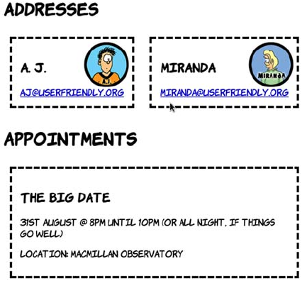
Getting semantic with the microdata API 183
property is passed in as a parameter so the function can list that along-
side its child properties. Now the loop is greatly simplified:
var md = document.getItems();
for (var i = 0; i < md.length; i++) {
log('Found: ' + md[i].itemType);
getMDProperties('',md[i].properties);
}
And the output, as you can see for yourself in ch05/microdata-api-
2.html, is more like you want:
Found: http://microformats.org/profile/hcard
fn: A. J.
n/given-name: A
n/family-name: J
photo: http://www.userfriendly.org/cartoons/miranda/headshot_aj.gif
email: aj@userfriendly.org
Using multiple microdata formats
To finish this short exploration of the microdata API, let’s consider what
you might do with a more complex page that has multiple types of
microdata items available. In ch05/microdata-api-3.html, an additional
hCard has been added as well as an event using the http://
microformats.org/profile/hcalendar#vevent vocabulary.

184 CHAPTER 5 Browser-based APIs
This is what the event markup looks like:
<div itemscope
itemtype="http://microformats.org/profile/hcalendar#vevent">
<h2 itemprop="summary">The Big Date</h2>
<p>
<time itemprop="dtstart" datetime="2011-08-31T20:00:00Z">
31st August @ 8pm
</time>
until
<time itemprop="dtend" datetime="2011-08-31T22:00:00Z">
10pm
</time>
(or all night, if things go well)
</p>
<p>Location:
<span itemprop="location">Macmillan Observatory</span>
</p>
</div>
Keeping the same function as before, all three microdata items are
found and their properties enumerated. But maybe you’re writing a
calendar-event application and are only interested in the events; or,
slightly more creepily, you might be writing context-sensitive advertis-
ing into the page with JavaScript and keen to pull out locations and
dates. Rather than grab all the items and discard the ones you’re not
interested in, you can tell the getItems() method which sort of items
you want:
document.getItems('http://microformats.org/profile/hcalendar#vevent');
The parameter is a space-separated list, so you can specify more than
one type if necessary—for example, if you want to look for items of
The microdata API lets you access structured data within your page
content. This is useful when you’re not in control of the
generation of the content and need to generate an alternative view
or index of the data, or give the user the option of clicking a link
to a contact in their address book or an event in their calendar.

Lag-free interfaces with web workers 185
type http://schema.org/Event as well as the standard events. You can
look at the type-specific example in ch05/ microdata-api-3a.html.
Lag-free interfaces with web workers
All JavaScript in a browser has traditionally been run in a single exe-
cution context (a thread in operating system terms). That changed with
the release of IE8, which separated the execution of interface code and
web-page code, and then the launch of Google Chrome, which was
built from the ground up to be multithreaded. Other browsers have
since followed suit. This made browsers quicker, more responsive, and
more resilient to bad or malicious code, but all the JavaScript in a sin-
gle page still used the one thread assigned to it. There was no way for a
web author to take advantage of multiple threads to offload expensive
processing to another thread while still responding to user input, as
they could in a desktop application. For this purpose, web workers
were created.
Single-threaded and multithreaded
Single-threaded means the web browser does only one thing at a time. After it
starts executing a single JavaScript function, it carries on until that function is
finished. While it’s executing the function, the browser can’t do anything else:
respond to clicks, animate GIFs, scroll the page, and so on. This isn’t unusual; if
you have an old computer with only a single processor with one core, it can only
do one thing at a time too. One of the primary jobs of an operating system is to
switch between applications so quickly that the computer appears to be doing
more than one thing at a time.
Normally, each JavaScript function also executes so quickly that you don’t no-
tice; but some heavy processing, a simple coding mistake, or even a malicious
script could bring the browser to a halt.
If the browser is multithreaded, it can take advantage of the operating system’s
abilities to switch between tasks. If one thread starts eating up resources, the
browser can recognize this on another thread and take corrective action. The ad-
vent of multicore processors, which can do more than one thing at a time, also
opens up an opportunity to increase the performance of the entire browser by
splitting execution across multiple cores.
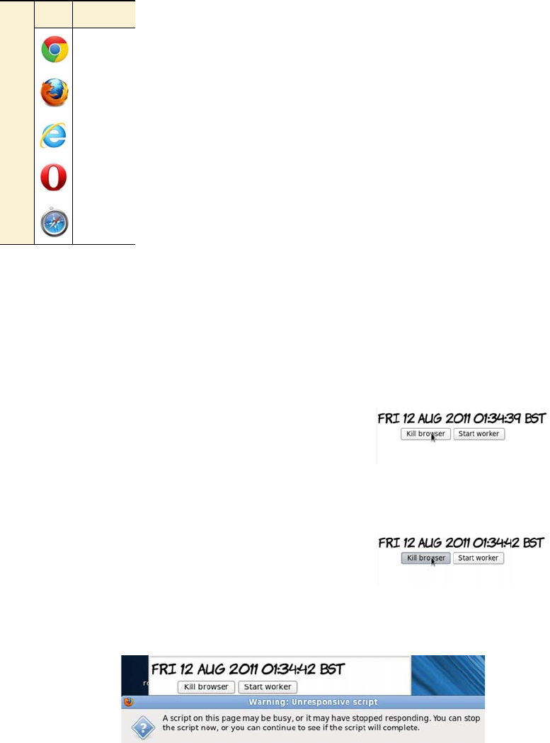
186 CHAPTER 5 Browser-based APIs
To test the utility of web workers, all you need to do is
write some bad code. This function runs a loop several
million times and attempts to report progress to the
page every so often:
function kill_browser() {
log('Starting');
var j = 0;
var n = 1e9;
var p = n/10;
for (var i=0;i<n;i++) {
if (j++ > p) { j=0; log(i); }
}
log('Done');
}
The page has two buttons: one that calls this function directly and one
that calls it via a web worker. Depending on how fast (or slow) your
machine is, you may need to adjust the n value to get the best effect.
Change the exponent (the number after the e) either up or down if you
don’t see the following behavior.
Start by calling kill_browser() directly by
clicking the button. Unfortunately, noth-
ing happens—not even the initial “Start-
ing” message. At this point you may find
that your browser won’t respond to clicks.
The timestamp claims that only 3 seconds
have passed, but it stopped updating the
moment the button was clicked. Eventu-
ally, the browser recognizes the issue and
asks if you want to stop the script.
Browser support quick check:
web workers
Standard
4.0
3.5
10.0
10.60
4.0
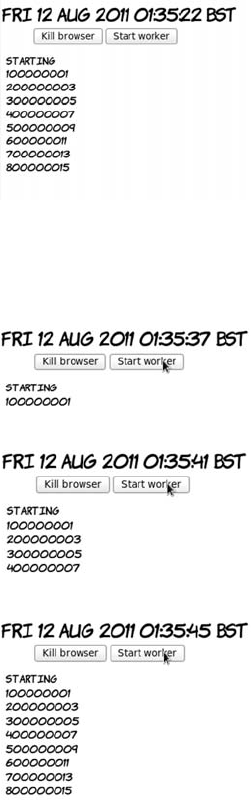
Lag-free interfaces with web workers 187
To turn the kill_browser() function into a web worker, the first and
most obvious change is that you need to put it in a separate file. You
can then create the worker object from the main page like this:
var worker = new Worker("web-worker-1.js");
Workers don’t have access to the DOM; they can’t update elements on
the page or access any global variables in your script. Data has to be
After you stop the script, the other func-
tions—such as log() and the timestamp
updater—get a chance to function. Sud-
denly all the information you were expect-
ing appears.
All in all, this is a pretty bad user experi-
ence, and it doesn’t even give you the
results you were expecting. Let’s look at
what happens when you use a web worker
instead.
With a worker, the difference is immedi-
ately obvious—the “Starting” message
appears straight away.
The other noticeable differences are that
the timestamp continues updating and the
browser remains responsive.
Meanwhile, the computation updates are
posted regularly.

188 CHAPTER 5 Browser-based APIs
passed to and from the worker by messages. Set up a listener for mes-
sages from the worker that logs the data using the usual function:
worker.onmessage = function(event) {
log(event.data);
}
Similarly, you signal that the worker is to start computing by passing it
a message using postMessage:
<button onclick="worker.postMessage('Starting'); return false;">
Start worker
</button>
In the function, all attempts to access the DOM must be removed. This
means replacing the log function with calls to postMessage():
function kill_browser() {
var j = 0;
var n = 1e9;
var p = n/10;
for (var i=0;i<n;i++) {
if (j++ > p) { j=0; postMessage(i); }
}
postMessage('Done');
}
Finally, the worker needs to listen to messages so it knows when to
start:
onmessage = function(event) {
postMessage(event.data);
kill_browser();
}
You can try this example for yourself with the files ch05/web-workers-
1.html and ch05/web-worker-1.js.
Workers are a powerful addition to the web author’s toolkit, allowing
you to write more desktop
—
like applications without resorting to
advanced JavaScript trickery. In the next section, we’ll summarize
browser support for everything covered in this chapter.
Summary 189
Browser support
With the exception of the microdata API, support for everything in this
chapter is surprisingly complete across all major browsers. As men-
tioned in the relevant sections, there are some inconsistencies in the
implementations of contentEditable and drag-and-drop, particularly in
older versions of IE compared to the other browsers, but these aren’t
insurmountable. The richer web applications enabled by these APIs are
already within your reach.
Key:
●Complete or nearly complete support
○Incomplete or alternative support
Little or no support
Summary
This chapter has presented the most interesting HTML5 APIs, focused
on enriching the in-browser experience. We’ve covered creating word
processor–style WYSIWYG editing interfaces and allowing natural
drag-and-drop interactions. You’ve learned that managing the
browser’s history allows you make the Back button behave in a more
sensible way in the context of your application, while the microdata
API gives you access to structured semantic information in page con-
tents. Finally, web workers make your app more responsive by running
12 14 4 6 8 9 10 11.5 12 5 5.1
contentEditable ● ● ● ● ● ● ● ● ● ● ●
Drag-and-drop ● ● ● ● ○ ○ ● ● ●
hashchange ● ● ● ● ● ● ● ● ● ● ●
popState ● ● ● ● ● ● ● ○ ○
Microdata API ●
Web workers ● ● ● ● ● ● ● ● ●

190 CHAPTER 5 Browser-based APIs
any heavy processing in a background thread that doesn’t interfere
with the UI.
The best way to learn more is to try coding for yourself. Download the
book’s sample code to get started.
Now that you’ve learned about APIs for creating rich
browser apps, in the next chapter you’ll look at HTML5
APIs related to networking and communication.
191
6
Network and location APIs
This chapter covers
•Finding the user’s location and proximity to places and people of interest
•Communicating directly with content from other servers
•Having the server push information to the user rather than rely on pull
•Building websites that work when there’s no network connectivity
The previous chapter discussed HTML5 APIs that worked directly with
the content in the browser, but one of the key features of the web is that
it’s not about standalone computers: it’s about a connected network.
HTML5 has a number of APIs related to connectivity and communication,
and you’ll learn about them in this chapter.
Again, the examples in this chapter rely on a basic understanding
of JavaScript. Read appendix D first if you need more help. Or, if
you’re more of a designer than a developer, skip ahead to chapter 7,
where we start to look in detail at CSS3.
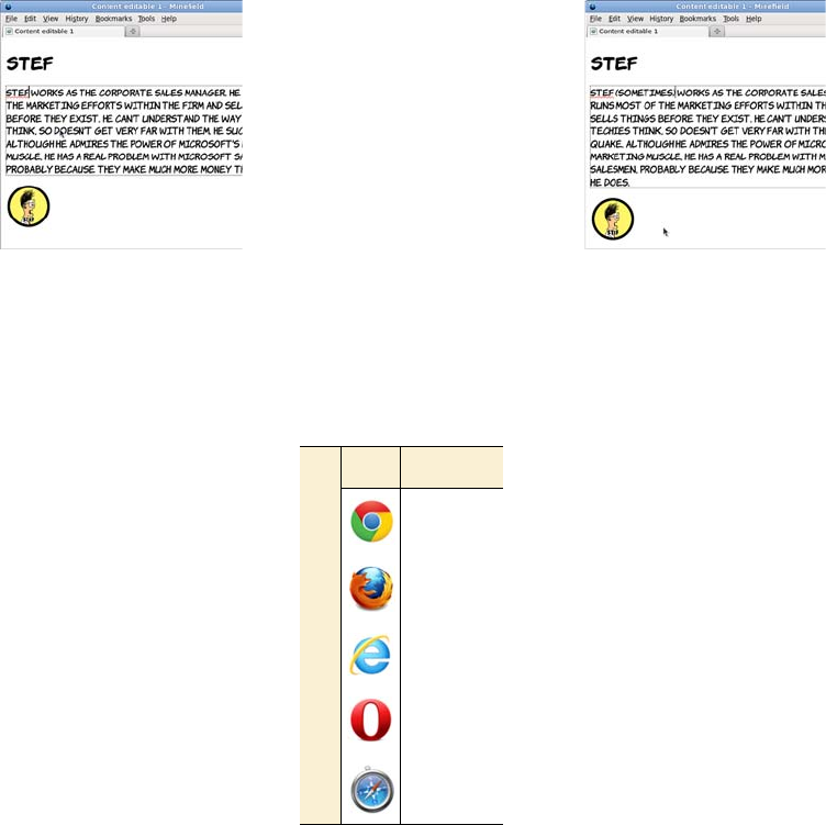
192 CHAPTER 6 Network and location APIs
Finding yourself with the Geolocation API
Location-aware services and applications are a hot topic at the
moment. Most of us are now familiar with navigation devices in our
cars that constantly update position information using the Global Posi-
tioning System (GPS) network. These days, many mobile phones and
other portable devices come with built-in GPS technology, as well as
other positioning services, and the HTML5 Geolocation API exposes
these to your web pages.
Google already uses the
Geolocation API if you
access its site from your
mobile phone. The screen-
shot at left shows that
Google is aware of my cur-
rent location. One of my
options upon searching is
to choose Local, which
provides search results
that are tailored to my cur-
rent location.
Browser support quick check: geolocation
Standard
5.0
3.5
9.0
10.6
5.0
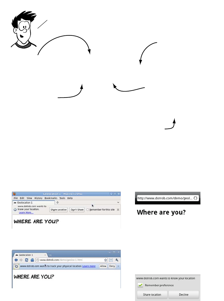
Finding yourself with the Geolocation API 193
Finding your location
The first thing the user will see when they run this code is the browser
asking permission to share their location. Here are examples in Firefox,
Chrome, and the Android browser.
if (navigator.geolocation) {
navigator.geolocation.getCurrentPosition(
function (position)
{
document.getElementById('location').innerHTML =
'Latitude: ' + position.coords.latitude +
' Longitude: ' + position.coords.longitude;
}
)
}
The GeoLocation API is fairly straightforward. let’s look at
some code that queries the user’s current location.
check that the
browser supports
the GeoLocation API.
the getcurrentPosition
function gets the user’s
location.
pass A function to
getCurrentPosition
that will be called when
the browser has
determined the position.
the callback function is
passed a position object.
Use the coords object to
get the latitude and
longitude.
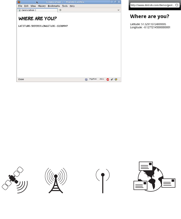
194 CHAPTER 6 Network and location APIs
After the user accepts, the browser looks up the location. When it finds
the location, the function is called and the coordinates are displayed.
Finding your location more accurately
Notice that the two screenshots at the end of the previous section are
reporting different coordinates—they’re about two miles apart. At the
time when these were taken, my phone and my laptop were lying side
by side on the same table—considerably closer than two miles! This
discrepancy is because the browser on my laptop and the browser on
my phone use different location service providers. There are four com-
mon ways of identifying location.
•Accuracy (20–200m)
depends on cell
tower spacing
•Needs mobile signal
•Very accurate (1–20m)
in open space
•Can be slow to
acquire satellite
lock
•Very accurate (10–15m)
in urban areas
•Needs network
connection for
lookup
•Not accurate (1000–40000m)
•Works on desktops
•Needs network
connection
Geolocation options
satellite Cell towerwi–fi address database
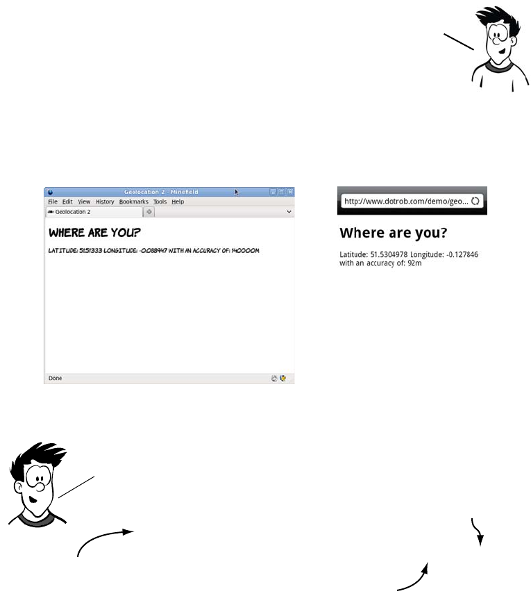
Finding yourself with the Geolocation API 195
Here’s a new version of the previous example, this time displaying the
accuracy.
Finding your location continuously
What if you want to continuously track the user’s position? You could
just call getCurrentPosition() repeatedly, but that’s a waste if the user is
stationary, and it could drain battery life on hand-held devices. A better
It’s not possible to find out exactly which technology was
used to provide the positioning information. But you can
get an idea how accurate the figure is likely to be, because
the coords object also includes an accuracy property.
document.getElementById('location').innerHTML =
'Latitude: ' + position.coords.latitude +
' Longitude: ' + position.coords.longitude +
' with an accuracy of: ' + position.coords.accuracy + 'm'
Using the accuracy is straightforward. the only change that
needs to be made to the previous listing is an extra line in the
code where you write the results to the page.
The coords object also has
an accuracy property.
the accuracy
is a value in
meters.
These lines are
unchanged.
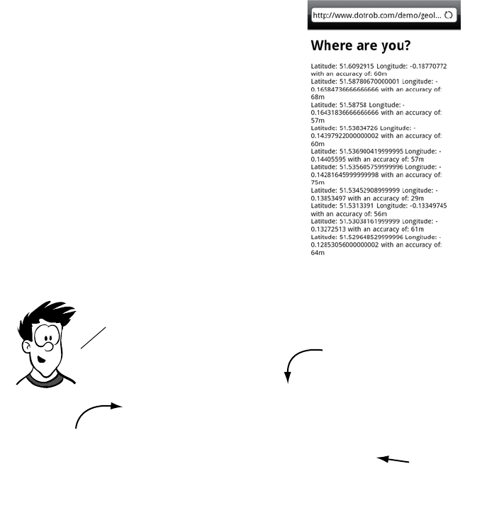
196 CHAPTER 6 Network and location APIs
option is to have the browser tell you when there’s an updated location.
For this, the Geolocation API provides the watchPosition() method.
Practical uses for geolocation
Now that you’ve seen the basics of acquiring position information, let’s
consider how you might use the Geolocation API in practice. We’ll look
at two simple examples: calculating how far the user is from a given
point, and showing the user on a map.
This screenshot shows my progress
through North London over a couple
of hours one afternoon. All I had to do
to get this information was open the
page in the phone’s browser and then
keep the phone in my pocket. When
new geolocation information was
available, the browser activated the
callback function.
navigator.geolocation.watchPosition(
function (position) {
document.getElementById('location').innerHTML =
'Latitude: ' +
position.coords.latitude +
' Longitude: ' +
position.coords.longitude +
' with an accuracy of: ' +
position.coords.accuracy + 'm'
})
The code is almost identical to the previous example. the only
change is in the method called.
watchposition instead of
getCurrentPosition.
These lines are
unchanged.
This function will
now be called
multiple times.
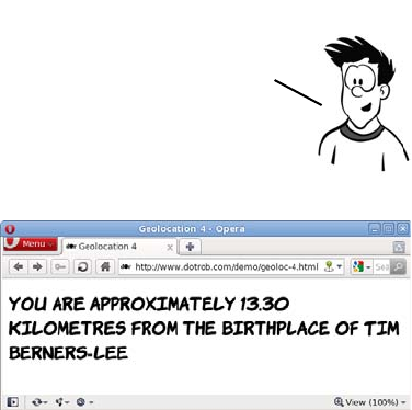
Finding yourself with the Geolocation API 197
The first example calculates how far the user is from the birthplace of
Tim Berners-Lee. Although this example uses a single fixed point for
simplicity, the techniques involved will work just as well for more
advanced scenarios—working out how far apart two users of your
website are, for example.
Rather than learn all that
math for yourself, you can use
an excellent set of JavaScript
utilities from Chris Veness,
available at www.movabletype
.co.uk/scripts/latlong.html. This
library allows you to create
LatLon objects that have several useful methods available. Starting with
a blank HTML5 document, you can create the following page with five
simple steps.
1Start with an empty HTML5 page with a link to the LatLon.js
library. All the JavaScript code goes in the empty init
function:
<!DOCTYPE html>
<html>
<head>
<meta charset="utf-8">
<title>Geolocation 4</title>
<script src="LatLon.js"></script>
<script> function init() { } </script>
</head>
<body onload="init();">
</body>
</html>
You may remember, from school, working out the distance between two
points on a plane using the Pythagorean theorem. Calculating the distance
between two latitude/longitude points isn’t quite as straightforward
because these aren’t points on a flat surface, but points on a sphere.
198 CHAPTER 6 Network and location APIs
2For convenience, create a LatLon object for Tim Berners-Lee’s
birthplace, East Sheen in London:
var eastSheen = new LatLon(Geo.parseDMS('51?27\'49"N'),
Geo.parseDMS('0?15\'49"W'));
3As usual, add a template in your HTML to fit the data into:
<h1>
You are <span id="accuracy"></span>
<span id="distance"></span>
kilometres from the birthplace of Tim Berners-Lee
</h1>
4Add a function to update the template:
function writeLoc(message, accuracy) {
document.getElementById('distance').innerHTML = message;
if (accuracy > 100) {
document.getElementById('accuracy').innerHTML =
'approximately';
}
}
5Take the usual geolocation boilerplate code, and adapt it so
that it creates a LatLon object for the user’s current location.
You can then use the distanceTo method of LatLon to get the
distance between the two points:
if (navigator.geolocation) {
navigator.geolocation.getCurrentPosition(function
(position)
{
var you = new LatLon(position.coords.latitude,
position.coords.longitude);
writeLoc(you.distanceTo(eastSheen),
position.coords.accuracy);
});
}
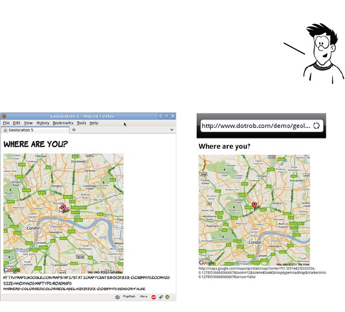
Finding yourself with the Geolocation API 199
Although it’s neat that you can perform calculations on the coordinates
you get from the Geolocation API, most users probably aren’t bothered
by exactly how far they are, as the crow flies, from Tim Berners-Lee’s
birthplace, or any other famous landmark. It’s also likely that, outside
of geocachers, most people aren’t too interested in their exact latitude
and longitude. They’re far more likely to want to know where they are
in some sort of sensible context—in other words, on a map.
The Google Maps API requires some parameters as part of a URL. The
URL can be built in the writeLoc() function and then set to be the
source of an image element. For convenience, create an empty image
element in your page where the map is to appear:
<img id="location">
Google offers a free service for the basic display of a map on a web
page. The next example takes the information from the Geolocation
API and uses it to call up a map of the user’s current location.

200 CHAPTER 6 Network and location APIs
In the callback function, set the URL of the image to the appropriate
Google Maps API call:
function init() { if (navigator.geolocation) {
navigator.geolocation.getCurrentPosition(function (position){
writeLoc(position.coords); });}
function writeLoc(coords) {
var l = 'http://maps.google.com/maps/api/staticmap?center=' +
coords.latitude + ',' + coords.longitude +
'&zoom=12&size=440x440&maptype=roadmap' +
'&markers=color:red|color:red|label:a|' +
coords.latitude + ',' + coords.longitude +
'&sensor=false';
document.getElementById('location').src = l;
document.getElementById('debug').innerHTML = l;
}
When the image URL is set, the browser will load the appropriate map
from the Google Maps API.
Communication in HTML5
The communication model in HTML4 is pretty much the same as it was
in the first version of HTML. The user requests information from a
server, and then the server delivers it. Although innovations like the
XMLHTTPRequest object allow us to do some cunning things, the underly-
ing model is the same. In addition, content loaded from different serv-
ers is usually shielded from other servers—a policy known as same
origin restriction.
Now you know where you are. What about telling someone about it?
Communication is central to the web, but web pages have been
constrained in what they’re allowed to communicate with and how
they’re allowed to do it. HTML5 offers new communication APIs: for
communicating in a safe way in browser—based apps, cross—document
messaging; and for communicating efficiently with a server in real time,
the WebSocket API. The next section looks at these APIs in more detail.
This section necessarily involves some interaction with a
server; discussing how to get everything working on all
possible architectures will take too many pages. If you’re
not comfortable with the server side of things, skip ahead.
Communication in HTML5 201
Enabling more secure integration with cross-document messaging
In many situations, people like to use widgets from other websites
inside their own pages. Common scenarios where this happens are
Facebook’s Like buttons, external commenting systems such as Dis-
qus, and Google Ads. There are two basic approaches for this:
❂The <iframe>—An embedded window inside your page into which
another web page is loaded. The page inside the <iframe> is completely
separate from the page containing the <iframe>, and standard browser
security prevents them from communicating with each other.
❂JavaScript include—An inline <script> element in the host page, which
is allowed to create elements and fetch content from the server from
which it came. The script is completely integrated in the host page
and has access to all the information the host page does.
The problem is that there are two extremes. With the
<iframe>, you can guarantee that the widget doesn’t have
access to any private data about your users that you hap-
pen to be manipulating with JavaScript, because it
doesn’t have access to anything in the host page, includ-
ing any information that might be useful for the script.
With the JavaScript include, the opposite is true: the
script has access to everything in the page, including any
cookies that may be set and any forms the user is filling
in. What’s needed is a solution that maintains the privacy
and security allowed by <iframe>s but allows a controlled
flow of infor-mation between the two domains. This is
what cross-document messaging provides.
Faking multiple domains
Experimenting with multiple domains requires that you have multiple domains
available. If you don’t happen to be one of those people who collect domain
names, you can fake it on your local machine by editing your hosts file. On Win-
dows, this file is usually located at C:\Windows\System32\Drivers \etc\hosts
(note that the filename doesn’t have an extension) and on Linux and Unix systems
at /etc/hosts. The file format is an IP address followed by a number of aliases:
127.0.0.1 myfirstfakedomain.com
127.0.0.1 myotherfakedomain.com
Browser support quick check:
cross-document messaging
Standard
3.0
8.0
9.5
4.0
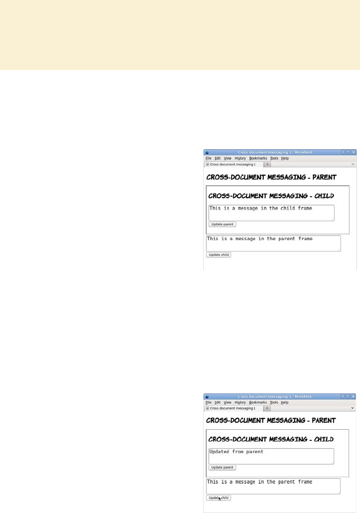
202 CHAPTER 6 Network and location APIs
To experiment with cross-domain messaging, you’ll need two files. The
first, the parent page, contains an <iframe> element that will load the
second child page:
The update_child() function attempts to directly edit the contents of the
child page:
(continued)
If these two lines are added to your hosts file, then browsing to either http://
myfirstfakedomain.com or http://myotherfakedomain.com will direct a request
to a web server running on your local machine.
<iframe width="600px"
height="200px" src="child-1.html">
</iframe>
<textarea id="message">
This is a message in
the parent frame
</textarea>
This page also contains a <button>
that will initiate communication
with the child:
<button onclick="update_child()">
Update child
</button>
function update_child() {
var el = document
.getElementsByTagName(
'iframe'
)[0];
var tb = el.contentDocument
.getElementById('message');
tb.value = 'Updated from parent';
}
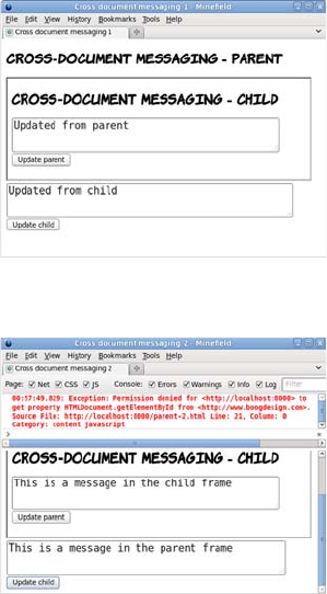
Communication in HTML5 203
The child page is similar:
<textarea id="message">
This is a message in the child frame
</textarea>
But this time, the <button> attempts to communicate with the parent:
<button onclick="update_parent()">Update parent</button>
The pages are otherwise identical, but now when you click Update
Child, the browser reports an error:
Exception: Permission denied for <http://localhost:8000> to get
property HTMLDocument.getElementById from <http://www.boogdesign.com>.
The cross-document messaging API allows you to work around this
security restriction, but it’s slightly more complex than accessing the
When both pages are on the same
domain, it’s possible to access the
elements of the child page directly
and do the same in reverse (access
the parent from the child):
function update_parent() {
var tb = parent.document
.getElementById('message');
tb.value = 'Updated from child';
}
But look what happens if the pages
are served from different domains:
<iframe width="600px"
height="200px"
src="http://www.boogdesign.com/
examples/messaging/child-
2.html">
</iframe>
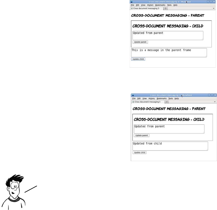
204 CHAPTER 6 Network and location APIs
documents directly. The first step is to add a listener to the page for the
message event that will call a function when a message is received:
window.addEventListener('message', receiver, false);
function receiver(e) {
document.getElementById('message').value = e.data;
}
This event listener can be added in both the parent and child pages.
The update_child() function then needs to be changed to call the post-
Message() method:
The same postMessage() method can be called from the child to the parent:
function update_child() {
var el =
document.getElementsByTagName(
'iframe')[0];
el.contentWindow
.postMessage(
'Updated from parent', '*'
);
}
function update_parent() {
parent
.postMessage(
'Updated from child',
'*'
);
}
Although this functionality allows you, the web developer, great
power, it also increases your responsibility. Now that the browser
has provided a way around a security restriction, you need to
provide your own security checks.
Communication in HTML5 205
In the following code, the receiver() function has been modified to
check the origin of the onmessage event:
function receiver(e) {
if (e.origin == 'http://www.boogdesign.com') {
document.getElementById('message').value = e.data;
} else {
alert('Unauthorized');
}
}
Similarly, the update functions should be modified to send the origin:
function update_parent() {
parent.postMessage('Updated from child', 'http://
www.boogdesign.com');
}
Note that the origin argument here should be the parent’s origin, not
the child’s.
Communicating between documents across domains is just one of the
new communication features in HTML5. It also offers new options for
communicating with the server. The next section will look at the most
exciting of these technologies: WebSockets.
Real-time communication with the WebSocket API
WebSockets are a lightweight protocol, new to HTML5, allowing a
server to communicate directly with a web browser without waiting for
a request. You may be thinking that the web has always had a way for
the browser and server to communicate, and that it’s a fairly fundamen-
tal property, but it’s always had a request-response model. This means
that to receive a response from the server, the browser must first make
a request. Although this is fine for web pages, it has limitations as far as
web-based applications are concerned. If an application relies on fre-
quent updates from the server—for instance, if it’s a multiplayer game
or a chat application—the browser could end up not requesting an
update as it becomes available, or wasting bandwidth requesting
updates when none are available.
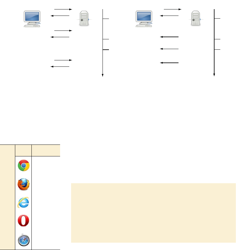
206 CHAPTER 6 Network and location APIs
The WebSocket API solves this problem by allowing the server to initi-
ate a response to the browser without the browser asking for it.
Updates can now be delivered as they’re ready and only when they’re
ready, as the following diagram shows.
In a traditional AJAX model,
updates from the server are sent
when the client asks for them. If
the client doesn’t request an
update, it sits on the server.
With WebSockets, the server is
in control of sending updates.
They can be sent to the client
as soon as they’re available.
A server for WebSockets: Node.js
Experimenting with WebSockets requires a server. The fol-
lowing example uses Node.js, a new server written using Ja-
vaScript. Download Node.js from http://nodejs.org, and
follow the instructions for installing it on your operating sys-
tem. The server-side files used for the example are ch06/
messaging/server-1.js and ch06/messaging/server-2.js.
REQUEST
Response
CLIENT Server
REQUEST
Response
Time
UPDATE 1
Available
UPDATE 2
Available
UPDATE 3
Available
REQUEST
Response
UPDATE 1
Received
UPDATEs 2 & 3
Received
REQUEST
Response
CLIENT Server
Response
Time
UPDATE 1
Available
UPDATE 2
Available
UPDATE 3
Available
Response
UPDATE 1
Received
UPDATE 2
Received
UPDATE 3
Received
Response
Browser support quick check:
WebSockets
Standard
4.0
4.0*
10.0
11.0
5.0
*The WebSocket API is dis-
abled by default in Firefox
4 and 5 and Opera due to a
security concern. It must
be enabled manually.
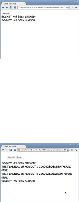
Communication in HTML5 207
The first step on the client side is to create a new WebSocket instance:
Now let’s look at what happens when the server sends a message. In
the browser, you have to handle the onmessage event:
var socket =
new WebSocket(
"ws://localhost:8080/"
);
Then, assign event handlers to the
socket object. In this first example,
the server will wait 10 seconds and
then close the connection, so you
just need to watch the onopen and
onclose events:
socket.onopen = function () {
log("Socket has been opened!");
}
socket.onclose = function () {
log("Socket has been closed");
}
socket.onmessage = function(msg) {
log(msg.data);
}
The data attribute of the event
handler argument contains the
message from the server; in this
case, the current data and time
every 10 seconds.
You can also control the connection
from the browser with the close
method on the socket object:
socket.close();
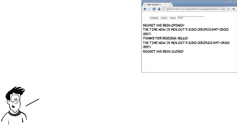
208 CHAPTER 6 Network and location APIs
Finally, you may want to send a message to the server. This is done
with the send() method on the socket object, passing the message as the
parameter:
Offline web applications
Although in the modern world we sometimes take connectivity for
granted, there are plenty of situations where you might want access to
web applications when you’re offline—particularly when, as the
authors of the HTML5 specification hope, more and more of the appli-
cations you use every day are web applications. For a web application
to be available offline, there are two basic requirements:
❂A mechanism for storing the pages and other files (images, scripts,
and stylesheets) required by the application
❂A place to store the user’s data as it’s accessed and updated while the
user is offline
In this section, you’ll learn about HTML5 technologies for the first of
these requirements: the application cache—a way of placing a copy of
your web app on your user’s machine. In the following section, you’ll
learn about the offline storage of data.
function send() {
var msg = document
.getElementById('message').value;
socket.send(msg);
}
The server is set up to echo back
any message it receives.
The WebSockets communication protocol has changed frequently
during development, so if you encounter difficulties, check that
both client and server are using the same version of the protocol.
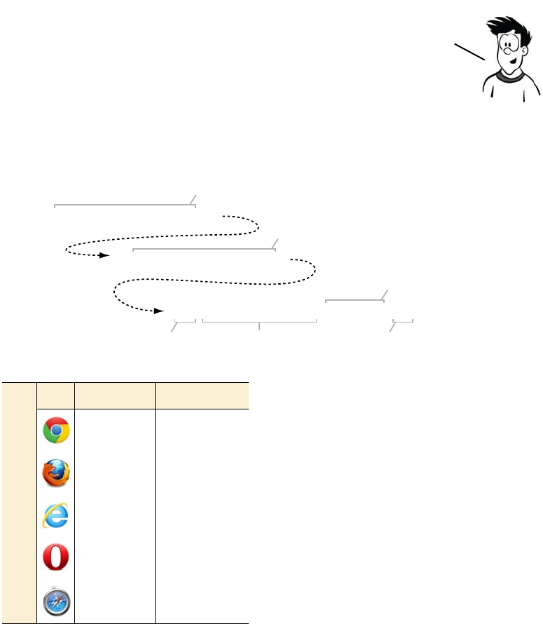
Offline web applications 209
Before going into the application cache, you’ll set up a development
environment and then get a reminder of how web applications work
when they’re online.
Setting up a development environment
SimpleHTTPServer records a line like this every time a request is made
(it’s been split into three sections so it fits better on a single page):
The only parts we’re interested in are
the request and the status code, so I’ll
elide the extra details in the examples
that follow.
In order to understand what’s going on
with offline web applications, you first
need a good understanding of what
normally happens as the browser and
the web server communicate in order
to display a web page. Let’s first exam-
ine the interaction between the web
browser and the server for a simple
The examples in this section use a local web server, the Python module
SimpleHTTPServer, so you can see both ends of the communication in real
time. If you’re running Linux, this module is probably already installed;
otherwise you’ll have to install a standard distribution of Python.
localhost.localdomain -
- [13/May/2011 21:20:16]
"GET /offline-1-a.html HTTP/1.1" 200 -
Requested server name
Date and time of request
Protocol and version
Request methodRequested file Response status
Browser support quick check:
offline apps
App cache Local storage
4.0 4.0
3,5 3,5
- 8.0
10.6 10.5
5.0 5.0
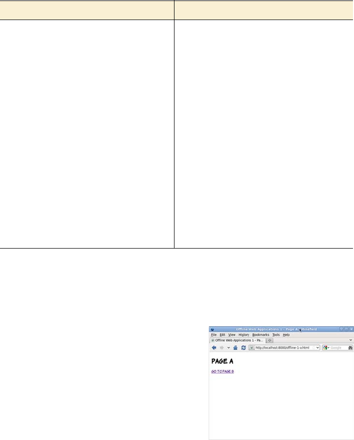
210 CHAPTER 6 Network and location APIs
two-page website, without enabling any of HTML5’s offline features.
Here are the two pages you’ll use.
First, start the local web server:
# python -m SimpleHTTPServer
Serving HTTP on 0.0.0.0 port 8000 ...
ch06/offline-example/offline-1-a.html ch06/offline-example/offline-1-b.html
<!DOCTYPE HTML>
<html>
<head>
<meta charset="utf-8">
<title>
Offline Web Applications 1
- Page A
</title>
<link rel="stylesheet"
href="offline-1.css">
</head>
<body>
<h1>Page A</h1>
<p>
<a href="offline-1-b.html">
Go to page B
</a>
</p>
</body>
</html>
<!DOCTYPE HTML>
<html>
<head>
<meta charset="utf-8">
<title>
Offline Web Applications 1
Page B
</title>
<link rel="stylesheet"
href="offline-1.css">
</head>
<body>
<h1>Page B</h1>
<p>
<a href="offline-1-a.html">
Go to page A
</a>
</p>
<img src="example.png"
alt="An example image">
</body>
</html>
If you load the page in the browser,
the server records the following
requests:
"GET /offline-1-a.html HTTP/1.1" 200 -
"GET /offline-1.css HTTP/1.1" 200 -
The page itself is requested, as is any-
thing required to display that particu-
lar page (in this case the stylesheet),
but none of the links within the page
are loaded.
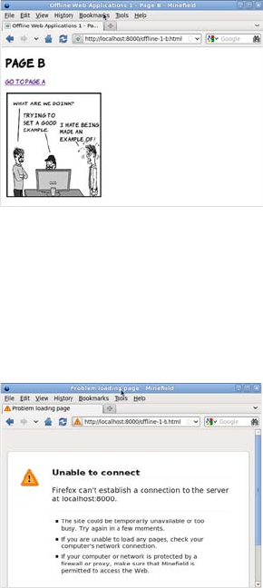
Offline web applications 211
The application cache
The application cache is a service provided by HTML5 web browsers
in which you can store your web apps for offline use. To change the
previous example into an offline application, it requires one small
change and an additional file. At the top of the home page, you need to
add a reference to a manifest file, like this from ch06/offline-example/
example-2-a.html:
<!DOCTYPE HTML>
<html manifest="offline-2.appcache">
When you click the link, the server
records the following two requests:
"GET /offline-1-b.html HTTP/1.1" 200 -
"GET /example.png HTTP/1.1" 200 -
Again, the page itself is requested as
well as the image embedded in the
second page.
Most browsers, in their default config-
urations, cache recently accessed
pages. If you use the Back and For-
ward buttons in your browser at this
point, no new requests will be made to
the server.
Stop the server (press Ctrl-C/Cmd-C
in the terminal):
^CTraceback (most recent call last):
...
KeyboardInterrupt
In the browser, try going back and
forward again. You’ll see that the
pages are still there in the browser’s
temporary cache. But if you try to
reload the page, the browser tries to
contact the server, finds it’s unavail-
able, and shows an error.
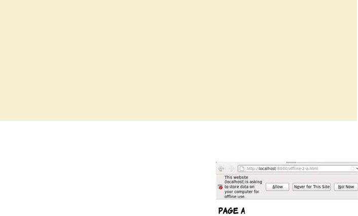
212 CHAPTER 6 Network and location APIs
Then the manifest file itself needs to be created. This is a text file that
begins with the words CACHE MANIFEST and then lists all the files in your
web application, one per line:
CACHE MANIFEST
offline-2-a.html
offline-2-b.html
offline-2.css
example-2.png
Note that it’s not necessary to list the file where the reference to the
manifest appears, because the file that references the manifest is auto-
matically added to the cache; but doing so may save you headaches
later if you end up with a large application and you change the file from
which the manifest is referenced. Also, note that paths are relative to
the manifest file, not the file from which the manifest is referenced.
Manifests and MIME types
The file extension used here for the manifest file is .appcache. This is recom-
mended by the HTML5 spec. Initially, manifest files were given a .manifest ex-
tension, but it was found that Microsoft was already using this extension for
another purpose. To avoid collisions, the recommended file extension was
changed. But the file extension isn’t as important to the browser as the MIME
type the server sends along with the file in the headers. The correct MIME type
for manifest files is text/cache-manifest. MIME types were discussed in chapter
4, when we looked at video.
Start SimpleHTTPServer again, and
access the new page. As before, the
browser requests two files from the
server:
"GET /offline-2-a.html HTTP/1.1" 200
"GET /offline-2.css HTTP/1.1" 200
But this time there’s a difference in the
browser—it’s asking for permission to
store files for offline use.
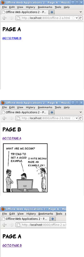
Offline web applications 213
If you click Allow, the browser imme-
diately makes several more requests:
"GET /offline-2.appcache HTTP/1.1" 200
"GET /offline-2-b.html HTTP/1.1" 200
"GET /example-2.png HTTP/1.1" 200
"GET /offline-2.appcache HTTP/1.1" 200
The entire website is now available
offline. You can test this by again stop-
ping SimpleHTTPServer and then, when
no server is running, visiting the sec-
ond page.
Even though you’ve never visited that
page and the server is unavailable, the
browser can display the page to you.
Let’s try a little experiment. Start your
local web server again, but edit the
offline-2-a.html file:
<h1>Edited Page A</h1>
Now visit the page in the browser
again. Notice that your edit isn’t visi-
ble. This is because you’ve told the
browser to store the page locally.
Changes you make to the file on the
server aren’t seen because the browser
doesn’t go back to the server for the
file, even if you reload.
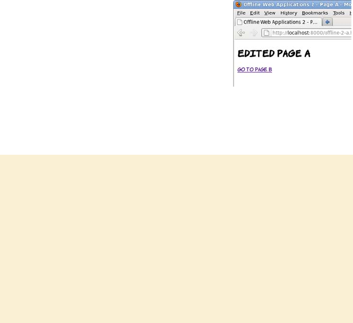
214 CHAPTER 6 Network and location APIs
If you look in the console, you’ll see that the only request the browser
made is for the manifest file:
"GET /offline-2.appcache HTTP/1.1" 200 -
In order to make the browser fetch a new version of any cached file,
the manifest needs to be updated. Any change will do. The best
approach is to add a comment with a version number:
In case you missed that last part, if you want to update a single file in your
application, all the files in your application will be downloaded again.
CACHE MANIFEST
#v1
offline-2-a.html
offline-2-b.html
offline-2.css
example-2.png
When you reload, the edited page appears.
If you check the console, you’ll see that all
the files in the manifest have been down-
loaded again.
Beware the browser cache
There is a certain amount of caching built into HTTP, and browsers are often con-
figured to minimize network traffic by serving pages out of local cache instead
of downloading them again. This isn’t the same as having them in the applica-
tion cache; there are no guarantees or control for the web author. But the brows-
er cache can interfere with the application cache, because the browser may not
look on the network for new versions of files even if it detects that the manifest
file has been updated. In this case, the application cache is updated with files
from the browser cache. The situation is even worse if the manifest file is loaded
into the browser cache—then the user might never see your application updates.
You can avoid issues by explicitly setting caching values in the headers of your
files in the server configuration. Here’s the required line for Apache:
ExpiresByType text/cache-manifest "access plus 0 seconds"

Offline web applications 215
HTML5 provides several options for storing an application’s dynamic
data, as you’ll see in the section “Storing data for offline use.” In the
meantime, the next section will cover the other key features of the
application cache that you need to know about.
Managing network connectivity in offline apps
In this section, you’ll learn about detecting the status of your offline
application: is it currently online or offline? To understand how to do
this, you’ll need to explore some additional features of the manifest file;
but first you’ll see why the built-in Offline API isn’t appropriate.
HTML5 provides the Offline API to detect whether the browser is
offline or online. It consists of the ononline and onoffline events and a
Boolean property, navigator.onLine. These would be an excellent way of
managing when to attempt to sync data with the server—if they worked.
That’s a little harsh—the API does work, but not in a way that’s useful
to web authors. The offline state in HTML5 is tied to the state of the
browser, not the state of your network connection or the availability of
the server. Here are the basics of the API:
❂navigator.onLine—This property is true if the browser thinks it’s
online and false if the browser thinks it’s offline.
❂window.online—This event is fired whenever the browser changes
from an offline state to an online state.
❂window.offline—This event is fired whenever the browser changes
from an online state to an offline state.
A function can be attached to the events either by declaring an ononline
or onoffline attribute on the body element, or by binding an event listener
to the window object in the standard way, as in the following example.
The key point to grasp from this is that the application cache
isn’t a good place to store data that will change often; if
you’re expecting your user to edit data as part of the
application, then you need to store that data elsewhere.
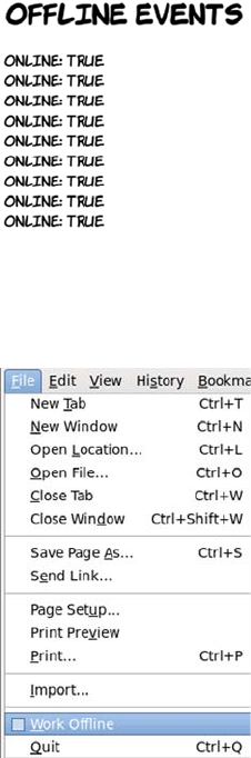
216 CHAPTER 6 Network and location APIs
window.setInterval(
function () { log('onLine: ' + navigator.onLine); },
10000
);
window.addEventListener('online',
function () { log('online event fired'); } ,
false
);
window.addEventListener('offline',
function () { log('offline event fired'); } ,
false
);
The log function writes a message on
the screen so you can see what’s going
on. The full listing is in ch06/offline-
example/offline-events.html.
In the screenshot, the local web server
was started and the page loaded. After
a short time, the local web server was
stopped. As you can see, it made abso-
lutely no difference to the output in the
browser.
The reason is that these events and
properties aren’t designed to track
what’s going on with the network con-
nection or the availability of the
remote server. Instead, they’re
plumbed directly into a menu item in
the browser UI: the Work Offline
entry, which is usually on the File
menu.
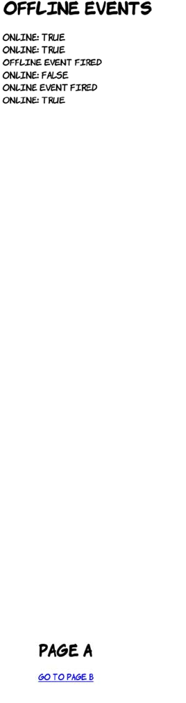
Offline web applications 217
Before you get too disappointed, there’s an alternative approach that
relies on detecting the property that an offline application really cares
about: whether it can connect to the server. To understand this
approach, you need to learn about some further features of the manifest
file: sections introduced with the keywords FALLBACK or NETWORK. A NETWORK
section lists resources that will always be fetched from the network—
they won’t be available when offline. The FALLBACK section lists replace-
ments for certain files or directories when the user’s offline. Here’s ch06/
offline-example/offline-3.appcache, which has a FALLBACK section:
CACHE MANIFEST
#v1
offline-3-a.html
offline-3-b.html
offline-3.css
FALLBACK:
example-3.png dust-puppy-3.png
Let’s see what difference that makes in what files are requested when
the browser makes an initial request for offline-3-a.html:
If the local server is started up again
and the page reloaded, you can see the
effect of selecting and then deselecting
Work Offline in the menu.
This is perfectly reasonable behavior
from the browser if you think about
it—there are so many reasons the
server may not be contactable, that it
can’t be tied to a single property in the
browser or the operating system, or
linked to a simple event.
"GET /offline-3-a.html HTTP/1.1" 200
"GET /offline-3.css HTTP/1.1" 200
"GET /offline-3.appcache HTTP/1.1" 200
"GET /offline-3-b.html HTTP/1.1" 200
"GET /dust-puppy-3.png HTTP/1.1" 200
"GET /offline-3.appcache HTTP/1.1" 200

218 CHAPTER 6 Network and location APIs
Listing ch06/offline-example/offline-4.appcache has a few more new
features:
CACHE MANIFEST
#v1
offline-4.html
FALLBACK:
example-4.png dust-puppy-4.png
CACHE:
offline-4.css
The file dust-puppy-3.png is fetched from
the server even though it isn’t listed in the
opening section of the manifest file.
When offline-3-b.html is visited, it looks the
same as before. Because the server is still
running, the example-3.png image is loaded
as normal.
But if the web server is stopped and the page
reloaded, then, depending on browser set-
tings, the dust-puppy-3.png fallback image
is shown instead.
The significant browser settings are the ones
to do with caching outside of the application
cache. The browser may still choose to show
the image out of the browser cache even
when the server’s unavailable—see the side-
bar “Beware the browser cache” for a dis-
cussion of this issue. If the fallback image
isn’t shown when the page is reloaded, try a
hard reload: Ctrl+F5 on Windows or Linux.
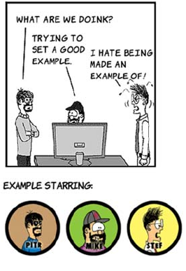
Offline web applications 219
FALLBACK:
headshots/ dust-puppy-4.gif
NETWORK:
*
In addition to multiple FALLBACK sections and a NETWORK section, this list-
ing has two CACHE sections. There are two because CACHE is the default
assumption at the start of the manifest file. It’s possible to switch
between sections at any point by adding one of the three keywords on a
line by itself. This means the manifest file can be arranged to suit the
application rather than forcing everything to fit into three sections.
The other interesting feature of this manifest file is that it demonstrates
the pattern-matching and wildcard ability of the FALLBACK and NETWORK
sections. The NETWORK section has a star in it, which means “match any-
thing”— anything that isn’t listed is requested from the network. This
is the default behavior, so it’s not necessary to include it here, but if you
were developing real offline applications you’d include URL patterns
for your API in this section.
The second FALLBACK section includes a directory. It’s saying, “For any-
thing in the folder headshots, fall back to dust-puppy-4.gif when offline.”
This screenshot shows ch06/offline-
example/offline-4.html when online.
Here’s the markup for this example:
<img src="example-4.png"
alt="An example image">
<p>Example starring:</p>
<img src="headshots/pitr.gif"
alt="Pitr">
<img src="headshots/mike.gif"
alt="Mike">
<img src="headshots/stef.gif"
alt="Stef">

220 CHAPTER 6 Network and location APIs
It’s worth noting that in this particular example, the alt text no longer
corresponds to the images displayed, so it might be a good idea to over-
ride the alt text with JavaScript if you can detect that the page is
offline. As discussed at the beginning of the section, it’s possible to do
this now that you know how FALLBACK works.
There are several possible approaches to using a fallback to detect the
application’s online status, but they all boil down to the same thing:
having a pair of files in the FALLBACK section of the manifest that have an
easily detectable difference between the online and fallback versions.
The complete listings for the two files this example uses are shown in
the following table.
It would certainly be possible to add more complexity; but the
online.txt file will be fetched from the server frequently, so the shorter
the better. In real life, it would be best to stop pandering to human
readability and use values of 1 and 0. Now add these two files in the
FALLBACK section of the manifest file:
CACHE MANIFEST
#v1
And here’s what the same page looks
like when offline. Each image from the
headshots folder has been replaced by
the fallback image without having to
explicitly list each image.
ch06/offline-example/online.txt ch06/offline-example/offline.txt
ONLINE OFFLINE
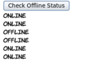
Offline web applications 221
offline-5.html
offline-5.css
offline-checker.js
FALLBACK:
online.txt offline.txt
Here’s the function that’s called when the button is clicked. It calls
another function in the external JavaScript file, passing two functions
as parameters. The first function is executed if the server’s available,
the second if the server’s offline:
function display_online_status() {
check_online(
function() { log('online'); },
function() { log('offline'); }
);
return false;
}
In a real application, the functions passed in would do something use-
ful, such as synchronize the application data with the server or queue it
for later delivery. But in this example, all they do is log the state of the
connection to the page.
Finally, here’s the function that does all the real work. Most of this is
standard AJAX boilerplate; using any one of the popular JavaScript
libraries will reduce the function to about four lines of code. The key
These files can then be used to determine
the online status. In this example it’s
linked to a button: each time the button is
clicked, the online status is checked and
reported.
The full listing is in the files ch06/offline-
example/offline-5.html and ch06/offline-
example/offline-checker.js. The key parts
of the code are shown next.
222 CHAPTER 6 Network and location APIs
line is about halfway down, where req.responseText is checked to see if
it contains the string 'OFFLINE':
function check_online(online_fn, offline_fn) {
var currentTime = new Date()
req = window.XMLHttpRequest ?
new XMLHttpRequest() :
new ActiveXObject("MSXML2.XMLHTTP.3.0");
var freshUrl = 'online.txt?brk=' + currentTime.getTime();
req.open("GET", freshUrl, true);
req.onreadystatechange = function() {
if (req.readyState == 4) {
if (req.status == 200) {
if (req.responseText.indexOf('OFFLINE') > -1) {
offline_fn();
} else {
online_fn();
}
} else {
offline_fn();
}
}
}
req.send(null);
}
Storing data for offline use
In this section, you’ll learn about the Web Storage API, a convenient
way to store data in the browser. Although web storage is crucial for
any sort of offline application, it’s also useful for providing quick access
to data in the browser without having to repeatedly request it from the
server. Web storage comes in two flavors: local storage, which is persis-
tent across browser sessions, and session storage, which is lost when
the user ends their browsing session. The storage APIs are also avail-
able to offline apps, making them extremely useful for caching your
Having your application available when there’s no connectivity is one
thing, but most applications need to interact with data to be useful.
If all the data is on the server, then having the application work
offline isn’t of much use in itself. In the next section, you’ll learn
about storing data so it’s available for offline applications.

Storing data for offline use 223
user’s data for access while they’re offline. The API for each is identical,
so this section concentrates on local storage and then provides a quick
comparison with session storage before finishing with a look at using
web storage in an offline application.
Local storage
For many years, the only option web authors have had for storing data
on the client has been cookies. These are small strings stored in the cli-
ent browser along with an expiry date and a key to reference them by.
They’re then passed back by the browser along with any HTTP request
made to the server that set them.
The local storage APIs create a client-side key-value store so that data
doesn’t have to be repeatedly fetched from the server. Cookies are useful
for tracking things like whether a user is logged on, but they’ve been
forced into a role where they end up storing a significant amount of data.
This is a problem because each request the browser makes contains the
full set of cookies it has. Local storage replaces cookies by providing a
simple in-browser service for associating keys with values. The data
stays in the browser and doesn’t need to be sent back to the server.
This section builds a simple to-do list application using local storage.
First you need some markup for a text input and a button:
To add an item to the to-do list, the user must type a description into
the text input and click the Add button. When the user clicks Add,
<input type="text" id="new_item">
<button onclick="add_item()">
Add
</button>
<ul id="todo_list">
</ul>
Cookies are widely used—any website you visit that allows you
to log in or remembers your past activity or preferences is using
cookies to correlate each request you make with stored
information on the server, but they aren’t without issues.

224 CHAPTER 6 Network and location APIs
three steps are required: add the item to the list element on the page,
add the item to local storage, and finally clear the text input ready for
the next item:
This calls functions to add the item to the list on the page and to add
the same item to local storage. The function that adds an element to the
page is straightforward, using the same DOM scripting techniques that
everyone’s been using for years with HTML4:
function add_item() {
var new_item = document.getElementById('new_item');
add_listitem(new_item.value);
add_storageitem(new_item.value);
new_item.value = '';
}
The interesting thing is the call to the add_storageitem function:
The localStorage object is available from the window object. In this case,
you call the setItem method that adds the provided key-value pair to
the storage. It doesn’t matter what the key is—it just has to be unique.
If you call setItem with a key that already exists, it will overwrite the
previously stored item, so the current time in milliseconds is used. The
function add_item() {
var new_item =
document.
getElementById('new_item');
add_listitem(new_item.value);
add_storageitem(new_item.value);
new_item.value = '';
}
function add_storageitem(item) {
var key = new Date();
window.localStorage.setItem(
key.getTime(),item
);
}
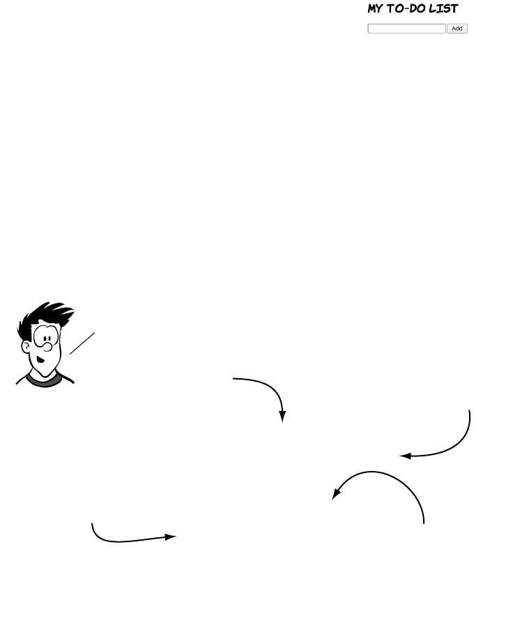
Storing data for offline use 225
value has to be a string, and in this case the value is whatever the user
has typed into the text input. The full code for this first example is in
ch06/offline-example/local-storage-1.html.
Now that your to-do items are in local
storage, they’ll be there the next time you
load the page. Restart your browser and
load the page again to check. You should
see something like the screenshot here.
You’ve not been lied to, your items are in
local storage, but that doesn’t mean they’ll
appear in your page automatically. You
have to write application logic to grab the
contents of localStorage and display it, just
as you had to write code to add the to-do
items to the page in the first place.
var todo_index = window.localStorage.length;
for (var i = 0; i < todo_index; i++) {
add_listitem(
window.localStorage.getItem(
window.localStorage.key(i)
)
);
}
to restore the application STate, you need to run a function when the
page loads that populates the list with the items in localStorage.
You have a function to add an item to the list, so you just need a
function to extract the items from localStorage.
How many items
are stored? Loop through all the
stored items.
Get the key for the
item at the current
index.
Use the key to Get the
current item. and then pass
that to the add function.
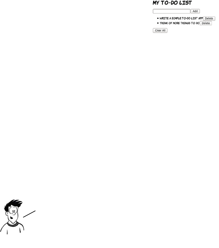
226 CHAPTER 6 Network and location APIs
You can find the complete listing in ch06/offline-example/local-
storage-2.html. Look for the init() function for the previous code.
This depends on knowing which element on the page is associated with
which key in local storage. If a data-* attribute is used to store that
information, then removal is straightforward. That attribute can be cre-
ated in the add_listitem() function if it’s modified to accept both the
key and the item as parameters:
function add_listitem(key, item) {
var li = document.createElement('li');
li.appendChild(document.createTextNode(item));
li.setAttribute("data-key", key);
var but = document.createElement('button');
but.appendChild(document.createTextNode('Delete'));
but.onclick = remove_item;
li.appendChild(but);
document.getElementById('todo_list').appendChild(li);
}
Another change is required to support this. Previously it didn’t matter
what the key was when adding a new item, but now it needs to be
There are some other functions you’ll need
for a complete application. A to-do list
isn’t much use if it’s impossible to remove a
task after completion. To delete a single
item from localStorage, pass its key to the
removeItem() method:
window.localStorage.removeItem(key);
In a fully HTML5—compliant browser, the line
li.setAttribute("data-key", key) would become
li.dataset.key = key. Because no browser has so far
implemented the custom data attribute API, this
example sticks with the traditional DOM API.
Storing data for offline use 227
added to the list item as entries are created. The key is created in the
add_item() method and passed in to both add_listitem() and
add_storageitem():
function add_item() {
var new_item = document.getElementById('new_item');
var key = new Date();
add_listitem(key.getTime(), new_item.value);
add_storageitem(key.getTime(), new_item.value);
new_item.value = '';
}
Finally, a user may want to delete everything in local storage rather
than individual items one at a time. This is easy using the clear()
method:
window.localStorage.clear();
You can look at the finished listing in ch06/offline-example/local-
storage-3.html.
Session storage
So far, the example has used local storage, but the section introduction
also mentioned session storage. Local storage and session storage have
exactly the same API: if you go back through the example and replace
every instance of localStorage with sessionStorage, it will still work.
Here’s the sessionStorage version of the add and remove functions:
function add_storageitem(key, item) {
window.sessionStorage.setItem(key, item);
}
function remove_storageitem(key) {
window.sessionStorage.removeItem(key);
}
There’s a full sessionStorage example in the listing ch06/offline-
example/session-storage-1.html.
The only difference between the two types of storage is the length of
time the items are stored. Session storage is only guaranteed to last as
long as the browser process; if the browser’s closed, then any data
228 CHAPTER 6 Network and location APIs
stored is lost (unless the session-restore features of the browser are
enabled). Local storage lasts until your application clears it, or until the
user manually deletes the data, no matter how many times the
browser’s closed in the meantime.
One note before we proceed: while the capacity of local and session
storage is much larger than that of cookies, it’s still finite, and varies
substantially between browsers. Web storage can be a useful way to
store large amounts of data on the client side but, like all client-side
technologies, you should never rely on it being available all the time.
Putting it all together
Now that the to-do list app is functional, it would be nice to enable it to
work offline. Because the entire thing is self contained—no external
files of any kind, just the single HTML file—you just need an empty
manifest file
CACHE MANIFEST
#v1
and a reference to that manifest in the markup:
<!DOCTYPE HTML>
<html manifest="storage.appcache">
Remember that the file that references the manifest is always cached
and doesn’t need to be listed in the manifest file explicitly. If you have a
set of single-page applications on the same site, then they can all refer-
ence this one manifest file and they’ll be cached the first time the user
visits them. You can try it for yourself on your local web server with
the example file in ch06/offline-example/local-storage-4.html.
You’ve learned about a lot of different HTML5 features in
this chapter, but how many of them can you use right now?
Browser compatibility is summarized in the next section.
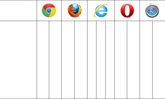
Summary 229
Browser support
Browser support for most of the APIs discussed in this chapter is very
good. Only Internet Explorer lets things down by not supporting Web-
Sockets or the application cache, but support is being considered for a
future release.
Key:
●Complete or nearly complete support
○Incomplete or alternative support
Little or no support
Summary
This chapter has covered a selection of the most interesting HTML5
APIs associated with networking and connectivity. You should now be
able to build apps that
❂Take advantage of the user’s location, thanks to the Geolocation API
❂Communicate in a controlled way with pages on other domains
❂Write real-time chat and game apps with WebSockets
12 14 4 6 8 9 10 11.5 12 5 5.1
Geolocation ● ● ● ● ● ● ● ● ● ●
Cross-document
messaging
● ● ● ● ● ● ● ● ● ● ●
WebSockets ● ● ● ● ● ● ● ● ●
App cache ● ● ● ● ● ● ● ● ●
Session
storage
● ● ● ● ● ● ● ● ● ● ●
Local storage ● ● ● ● ● ● ● ● ● ●

230 CHAPTER 6 Network and location APIs
❂Build apps that work even when there’s no internet connection
❂Store data in the browser with the storage APIs
The best way to learn more is to try coding for yourself. Download the
book’s sample code to get started.
This chapter is the last in this book specifically about HTML5. You’ve
learned how to build HTML5 web pages and seen some of the many new
possibilities for web applications that HTML5 enables. But you don’t
just want your applications to be functional; you also want them to
look beautiful. In the next chapter, you’ll start to explore CSS3 and
the new options it offers for the visual presentation of web pages.

Part 2
Learning CSS3
he second part of the book begins by exploring the basics of CSS3 and
selectors in chapters 7 and 8. Then, chapter 9 discusses how to use
motion and color, chapter 10 covers borders and backgrounds, and
chapter 11 wraps things up with a look at fonts and text formatting.

232 CHAPTER
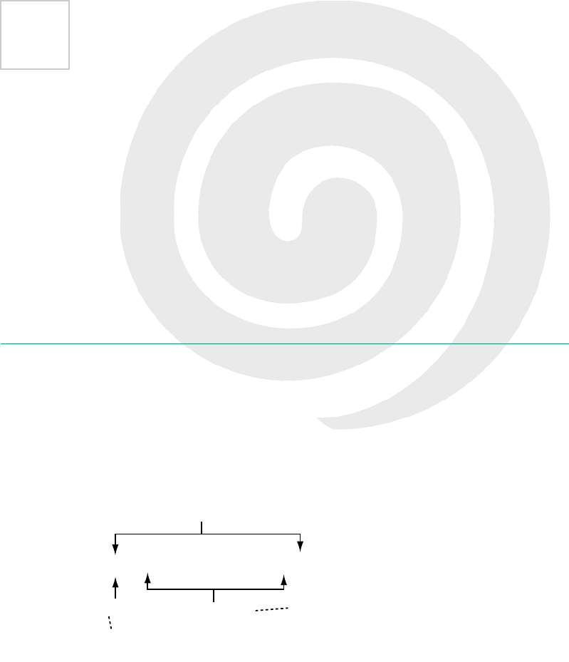
233
7
New CSS language features
This chapter covers
•Selecting elements based on their parents
•Selecting elements based on their siblings
•Selecting elements dynamically according to user activity
Let’s remind ourselves what a CSS rule looks like.
In this chapter we’re concerned entirely with the parts of CSS that appear
outside of the curly brackets—the selectors and associated syntax that
makes up a CSS document. After this chapter, we’ll concentrate almost
completely on the stuff that appears inside the curly brackets—the prop-
erties and values that define the visual effect to be applied. The stuff that
appears inside the curly brackets is naturally more interesting, because
p { font-size: 1.4em; }
Declaration
Selector
Rule
The part that tells the
browser what to do it to
The part that tells the
browser what to do
234 CHAPTER 7 New CSS language features
that’s what lets you change the style
of your pages. But being able to
choose what elements your styles
affect is crucially important for the
whole thing to work.
Choosing elements through their relationships
Here are screenshots of three popular websites, showing three differ-
ent but common design requirements.
What is CSS3?
CSS3 is the third major revision of the W3C CSS specification. Unlike the previous
two revisions, CSS3 is divided into modules—instead of being one, long docu-
ment like CSS1 and CSS2/2.1, there are currently more than 30 individual docu-
ments that are part of CSS3. These are all allowed to progress and mature at their
own rates; depending on the level of interest, some modules will progress to lev-
el 4 before the level-3 work is completed.
Like the term HTML5, the term CSS3 is often given a wider definition than just
the specifications. Many of the features people consider to be CSS3 are actually
in CSS2.1.
Alternating table rows have a
different style.
Links to the current page or
section have a different style.
The first and last elements
have a different style.
There’s an introduction to
CSS in appendix C. If you didn’t
know any CSS before picking
up this book, you should read
that before proceeding.
CSS3 has many more tools for selecting elements, so you’re better
equipped to keep your markup free from elements, classes, and IDs
that have no meaning and are only there to support styling. In the
next section, you’ll see some common design problems and learn
how CSS3 selectors make solving these problems easy.
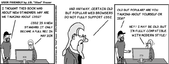
Choosing elements through their relationships 235
Using traditional approaches, you would have to apply classes to each
element. For the previous three examples, the code would be some-
thing like the following, where the class names don’t add any further
meaning to the markup—they just make explicit relationships that are
already present:
In CSS3, thanks to all the new selectors available, you can take advan-
tage of those relationships directly with no need to add extra class attri-
butes. In this section, you’ll learn about the key ways of selecting
elements with CSS combinators and pseudo-classes.
Selecting sets of elements with combinators
Combinators allow you to chain simple selectors together. They’re the
workhorses of CSS. The following diagrams show a simple HTML
fragment as a tree structure and then highlight the elements that the
different rules select using the common CSS2 combinators.
<table>
<tr class="odd">
<td></td>
</tr>
<tr class="even">
<td></td>
</tr>
</table>
<ul>
<li>
<a href="/home"
class="current">
Home
</a>
<a href="/other">
Other
</a>
</li>
</ul>
<ul>
<li class="first">
top + right border
</li>
<li>
right border
</li>
<li class="last">
bottom + right
border
</li>
</ul>
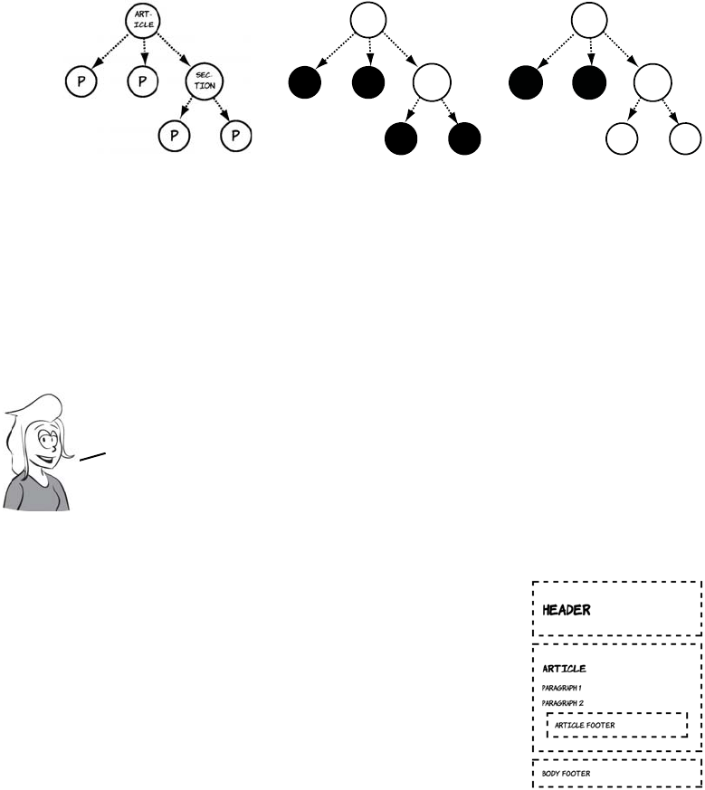
236 CHAPTER 7 New CSS language features
THE ADJACENT-SIBLING COMBINATOR
<article>
<p></p>
<p></p>
<section>
<p></p>
<p></p>
</section>
</article>
article p {}
A space is the
descendant combina-
tor, selecting any p
that is a descendant
of an article element.
article > p {}
The greater-than
symbol is the child
combinator, selecting
only the p elements
that are direct chil-
dren of an article.
Rather than use tree diagrams to illustrate the
new selectors, we’ll use this simple document:
<header>
<h1>Header</h1>
</header>
<article>
<h1>Article</h1>
<p>Paragraph 1</p>
<p>Paragraph 2</p>
<footer>Article footer</footer>
</article>
<footer>
Body footer
</footer>
sec-
Tion
art-
iCLE
P P sec-
Tion
art-
iCLE
P P
First we’ll look at the adjacent—sibling combinator. It was introduced
in CSS2.1, but it isn’t supported by IE6 or 7 and so hasn’t been widely used.
It selects an element that immediately follows another element.
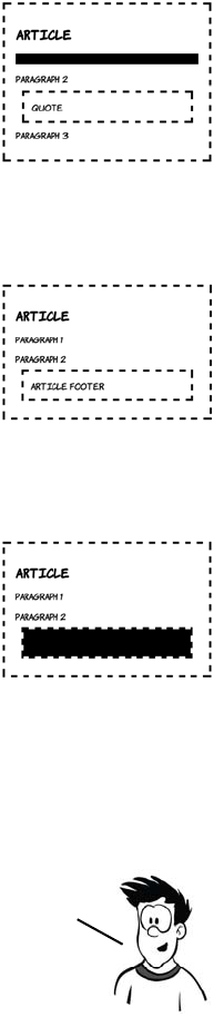
Choosing elements through their relationships 237
See the files sibling-combinator2a.html and sibling-combinator2b.html
in the ch07 folder for these two examples.
The complete listing is available in ch07/sibling-
combinator-1.html.
This rule selects any paragraph elements that
immediately follow a level-one heading element:
h1 + p { background-color: #000; }
You can see in the screenshot that only the first
paragraph is selected. The + is known as the
adjacent-sibling combinator. This example is from
ch07/sibling-combinator-1a.html.
The target element is always listed last. This
rule has no effect because there are no para-
graph elements immediately after footer ele-
ments:
footer + p {
background-color: #000;
}
Switch the two simple selectors around, and you
can see that there are footers that follow para-
graphs:
p + footer {
background-color: #000;
}
The adjacenT—sibling combinator is useful for situations where you might
want to allow a different amount of space depending on what the previous
element was. For example, if you have a heading directly after a paragraph, you
want two lines of space. A heading that follows another heading needs only
one line of space, but the elements have to directly follow one another.
238 CHAPTER 7 New CSS language features
THE GENERAL-SIBLING COMBINATOR
Suppose another element is inserted
between the paragraph and the footer, like
this:
<p>Paragraph 2</p>
<img src="example.png">
<footer>Article footer</footer>
The footer is no longer selected by p +
footer because it doesn’t immediately follow
the paragraph.
For situations where the elements you want to select will share
the same parent as another element, but not necessarily be
directly adjacent, CSS3 offers the general—sibling combinator.
combinator
h1 ~ p {
background-color: #000;
}
Adjacent sibling
combinator
Selects <p> ELEMENTS
that DIRECTLY FOLLOW
Selects aNY <p>
ELEMENT that FOLLOWS
AN <h1> ELEMENT WITH
THE SAME PARENT
h1 + p {
background-color:#000;
}
–
General sibling
–
Choosing elements through their relationships 239
Elements targeted by the general-
sibling combinator have to occur
after the elements targeted by the
preceding selector in the document.
Compare the results of these two
rules. There are three paragraphs
after the h1, but only one of those is
after the blockquote.
For this set of examples, we’ll
make a slight modification to the
HTML. Instead of an article
footer, a blockquote element and a
third paragraph have been
added.
<header>
<h1>Header</h1>
</header>
<article>
<h1>Article</h1>
<p>Paragraph 1</p>
<p>Paragraph 2</p>
<blockquote>Quote</
blockquote>
<p>Paragraph 3</p>
</article>
<footer>
Body footer
</footer>
h1 ~ p {
background-color: #000;
}
blockquote ~ p {
background-color: #000;
}
Listing: ch07/sibling-combinator-1b.html Listing ch07/sibling-combinator-1c.html
Browser support quick check:
combinators
+ ~
1.0 1.0
1.0 1.0
7.0 8.0
6.0 9.5
1.0 1.0
240 CHAPTER 7 New CSS language features
Selecting among a set of elements with pseudo-classes
Combinators allow you to select all elements that fit a particular rela-
tionship. But what if you don’t want to select all of the <p> elements
that are descendants of an <article> element for the same styling? Or
all the rows of a table? CSS pseudo-classes allow you to select the first
element, the last element, or a subset of the elements according to a
pattern. They remove the need to add classes to your markup for
purely stylistic purposes. Before you learn about pseudo-classes, let’s
consider what you would need to do if pseudo-classes didn’t exist, and
why that’s not good practice, with a couple of examples.
The IE6 problem
IE6 is the most successful browser of all time in terms of market share, manag-
ing as much as 90% market share in its heyday. Unfortunately, it’s missing sev-
eral key features of CSS2.1.
The ubiquity of IE6 allowed many organizations to get away with shortcuts in
web app development. The result is that they have since been stuck with expen-
sive-to-replace applications that only work on IE6. It’s impossible to upgrade the
web browser without first replacing all those applications—a slow process. The
end result is that several CSS2.1 features couldn’t be used on most websites un-
til recently, one of which is pseudo-classes.
In the old days (you know, around 2005) when IE6 was predominant, the only
way to do this consistently was to add classes all over your HTML that anticipated
the styling you wanted. With CSS2.1 and CSS3 approaching 90% browser sup-
port, you should now be doing this with pseudo-classes.
The reason only the elements after the blockquote are affected
is that the browser receives the web page as a stream, one
character at a time, and applies styles as it goes along. It
tries to avoid going back and restyling alreadY—rendered
elements, because doing so impacts performance.
You’ve just learned about CSS3’s new combinators, but CSS3 also provides
several pseudO—classes for targeting elements according to their relative
position in the DOM. PseudO—classes act as modifiers to simple selectors—
so instead of selecting all the paragraphs, you can select just the first
one, or just the last one, or every third one. In the next section, you’ll
learn how to use CSS3 pseudO—classes to solve common design problems.
Choosing elements through their relationships 241
SELECTING THE FIRST AND LAST ELEMENT
Styling the first element of any set
differently is common on the web
today. This blog renders the first
paragraph in a larger font to make
it stand out.
The old way to approach this was
to explicitly add a class to the first
paragraph:
<h1>Heading</h1>
<p class="first">
First paragraph...
</p>
This blog goes even further—the
first post is styled differently than
the other posts previewed on the
home page. The first post takes
up the full width and is divided
into columns; the rest of the posts
are in a single column further
down. Again, the usual approach
to this is to add a class in the
markup:
<div class="post first">
<h1>Post 1</h1>
<p>...
</div>
<div class="post">
<h1>Post 2...
For details on CSS columns,
check out chapter 11.
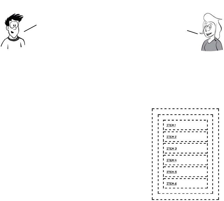
242 CHAPTER 7 New CSS language features
For the next few examples, we’ll use a markup fragment in a style
that’s commonly used for site navigation—an unordered list of links.
The screenshot shows some default styling, putting a dotted outline
around each major element so you can see where it is.
<nav>
<ul>
<li>
<a href="#item1">Item 1</a>
</li>
<li>
<a href="#item2">Item 2</a>
</li>
<li>
<a href="#item3">Item 3</a>
</li>
<li>
<a href="#item4">Item 4</a>
</li>
<li>
<a href="#item5">Item 5</a>
</li>
<li>
<a href="#item6">Item 6</a>
</li>
</ul>
</nav>
To select the first element in the list with-
out adding additional markup, you can use
the :first-child pseudo-class:
Classes are an HTML attribute, not a CSS
one. Although they often provide
convenient hooks for
applying CSS styles, their
role should be to give
additional semantic
information about
your content. That is,
they should describe what
your content is, not what
it looks like.
We’re approaching ivorY—tower territory
here—most of your users won’t care how that
first element is picked out. But
there are benefits to not loading
your markup with presentational
classes: smaller file sizes;
cleaner, more easily
understandable markup; and
less rework when you decide
(for example) to remove the
third element of a list you want
to style in alternating colors.
Choosing elements through their relationships 243
ul li:first-child {
background-color: #000;
}
This selector is saying, “Select the <li> ele-
ments that are the first child of their
respective <ul> elements.”
Selecting the last element is also straight-
forward with the :last-child pseudo-class:
ul li:last-child {
background-color: #000;
}
This selector is saying, “Select the <li> ele-
ments that are the last child of their <ul>
parent elements.”
Pseudo-classes can be used with descen-
dent or child combinators like any other
simple selector. Compare this with the pre-
vious example:
li:last-child {
background-color: #000;
}
li:last-child a {
background-color: #fff;
}
The extra rule selects all <a> elements that
descend from an <li> element that is a last
child. This rule has been used to make the
link visible.
You don’t have to apply these pseudo—classes to a particular
element. They can be used standalone. See if you can work out which
elements this CSS rule will select. The answer is further down:
ul :last-child { background-color: #000; }
244 CHAPTER 7 New CSS language features
SELECTING AN ELEMENT BY ITS ORDERING
What if you don’t want to select just the
first or last child? With :nth-child you can
easily select specific elements by specify-
ing a numeric parameter:
li:nth-child(3), li:nth-child(5) {
background-color: #000;
}
The :first-child pseudo-class is just a
more intuitive way of saying :nth-
child(1).
These examples were taken from
the 2010 Commonwealth Games
website (left) and the admin pages
of my own blog (right). The
markup for the two is remarkably
similar—each gives a specific class
to each <tr> element in the table.
<table>
<tr class="odd">...
<tr class="even">...
<tr class="odd">...
<tr class="even">...
<tr class="odd">...
<tr class="even">...
Often you want to select, not individual elements out of a set, but a subset
of the elements according to some repeating pattern. A common example is
large tables of data in which it’s helpful to give the rows alternating
background colors to aid the eye as it tracks across the values.
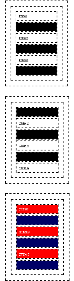
Choosing elements through their relationships 245
You could use :nth-child(1), :nth-child(2), :nth-child(3), and so on to
apply a style to each row in the table in order, but that would be as
much work as adding a class to each row. Instead of specifying a num-
ber as the parameter to :nth-child, you can specify a pattern. Let’s look
at that next.
To select every second element, use the
pattern 2n:
li:nth-child(2n) {
background-color: #000;
}
If you imagine that all the elements are
numbered in order, this selects all the <li>
elements with a number that matches the
pattern 2n for whole number values of n.
Selecting the odd-numbered children this
way looks a little more complex but follows
the same pattern:
li:nth-child(2n-1) {
background-color: #000;
}
The odd-and-even requirements are so
common that there’s a shortcut keyword
for each. This creates a red-and-blue
striped list:
li:nth-child(odd) {
background-color: #f00;
}
li:nth-child(even) {
background-color: #006;
}
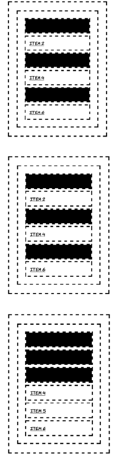
246 CHAPTER 7 New CSS language features
SELECTING FROM THE END BACKWARD
You don’t have to select from the top
down. You can select from the bottom up
with :nth-last-child. It works in the same
way as :nth-child:
li:nth-last-child(2n) {
background-color: #000;
}
The hypothetical values for n extend to
negative numbers, as can be seen if you
try this:
li:nth-last-child(2n+2) {
background-color: #000;
}
You’ll notice that 2n+2 has results identical
to 2n and to 2n-2.
But if n is negative, different rules apply.
Now n will count backwards from the
elements you see; if there are six elements
it will count six back. So adding a fixed
number to it will move the range of
selected elements so that it selects that
number of visible elements. This selector
will target just the first three elements:
li:nth-child(-n+3) {
background-color: #000;
}
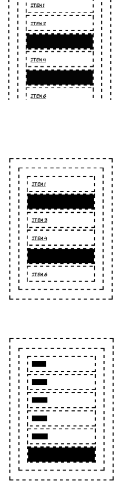
Choosing elements through their relationships 247
MORE COMPLEX SELECTION PATTERNS
The same trick works with :nth-last-child
except, as with last child, the counting is
from the end of the set of elements up. This
selects just the last two odd-numbered
items:
li:nth-last-child(-2n+4) {
background-color: #000;
}
If you increase the number in front of n,
then the pattern extends over more ele-
ments. This rule selects the middle element
out of each set of three:
li:nth-last-child(3n-1) {
background-color: #000;
}
Of course, this still targets only one ele-
ment out of every three. You’d need an
extra rule if you wanted a pattern ABC
instead of ABA.
Now the answer to the mini-quiz AJ posed
earlier. Here’s the code again. The result is
shown in the screenshot:
ul :last-child {
background-color: #000;
}
Did you guess right? Without specifying
that only <li> elements that were last chil-
dren should be styled, the rule now selects
any element that is a last child. The <a>
elements are all the last child of their
respective parent <li> elements.
248 CHAPTER 7 New CSS language features
You may be thinking to yourself that there
are a few situations in which you would
like to select elements that are both first
and last child, like the links in this example.
You can do this by combining the two
pseudo-classes:
ul :first-child:last-child {
background-color: #000;
}
This rule selects elements that are both a
first and a last child and are descendants of
the <ul> element. It’s a bit of a mouthful,
though, so fortunately there’s an alternative
pseudo-class that has the same effect:
ul :only-child {
background-color: #000;
}
Browser support quick check:
child selectors
:first-
child
:last-
child
:nth/:nth-last
child/of type
1.0 1.0 1.0
1.0 1.0 3.5
7.0 9.0 9.0
7.0 9.5 10.10
1.0 1.0 3.0
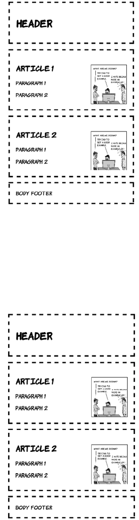
Choosing elements through their relationships 249
SELECTING BY TYPE OF ELEMENT
Sometimes, if the structure is likely to
vary, the element you want to select isn’t
consistently the first or last (or second or
third) child. Here each article has a pic-
ture, but it’s located in a different place in
each one:
<header>
<h1>Header</h1>
</header>
<article>
<h1>Article 1</h1>
<img src="example.png">
<p>Paragraph 1</p>
<p>Paragraph 2</p>
</article>
<article>
<h1>Article 2</h1>
<p>Paragraph 1</p>
<p>Paragraph 2</p>
<img src="example.png">
</article>
<footer>
Body footer
</footer>
How would you write a selector for the
last paragraph of each article? Or could
you select the first article? Let’s try using
:first-child and :last-child:
article:first-child {
background-color: #000;
}
p:last-child {
background-color: #000;
}
As the screenshot shows, these rules have
no effect. The naive solution fails because
neither <article> nor <p> is the first child
of any container.
250 CHAPTER 7 New CSS language features
The first article is the second element on the page. You could select it
with article:nth-child(2), but that would be a fairly fragile solution—it
would break if someone decided to add an advertising banner between
the header and the first article. Each article starts with an <h1>, but
then one article leads with a picture, and the other leads with a para-
graph. In this case, p:nth-child(2) would only select the last paragraph
in the first article.
It’s for situations exactly like these that
we have the :first-of-type pseudo-
class:
article:first-of-type {
background-color: #000;
}
This selector will always apply to the
first article element on the page, as well
as any other first article elements fur-
ther down the tree. Note that the image
isn’t transparent so you can’t see the
background behind it.
The last-of-type pseudo-class works in
the same way, except in reverse:
p:last-of-type {
background-color: #000;
}
If you don’t want the last or the first, or
you want to style according to a pattern,
you can use :nth-first-of-type and
:nth-last-of-type. This work in the
same way as :nth-child except that the
only elements that take part in the count
are those specified by the simple selec-
tor to which you apply the pseudo-class.
Choosing elements by their attributes 251
Choosing elements by their attributes
You should by now be aware that CSS provides convenient shorthand
for selecting elements according to their class and ID. But class and ID
are just two of many attributes that can be applied to HTML elements.
Here are some common scenarios with another common attribute, the
href on links.
If you were using HTML4 and IE6-compatible CSS2, you’d probably
implement these examples by adding an explicit class to the elements
concerned:
In these examples, the class attribute is really just duplicating informa-
tion available in the href attribute. Whenever there’s duplicate informa-
tion, there’s an opportunity for the two sets of information to get out of
sync. For example, what if the document in the third example changes
Different styling for
external links
Different styling
for an element
based on the URL
Different styling for
file downloads
<a
class="external"
href="http://site.com/
">
Visit site
</a>
<a
class="home"
href="/home">
Home
</a>
<a
class="pdf"
href="doc.pdf">
Download document
</a>
You now know all there is to know about CSS3 selectors based on the
structure of the document, but there’s more to CSS3 than that. In the next
section you’ll learn about selecting elements based on their attributes.
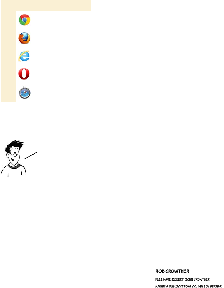
252 CHAPTER 7 New CSS language features
from a PDF to a Word document, so some-
one updates the link but forgets to update
the class? The link would be styled as a
PDF, but it would actually be a Word doc-
ument. Wouldn’t it be handy if there was
some way you could select elements based
on those other attributes rather than rely-
ing on classes and IDs?
CSS3 makes it possible to write selectors
that target these elements based on the
values in the href attribute; these are
called attribute selectors. One excellent
opportunity to use attribute selectors is
microdata. Remember the sample hCard from chapter 2? Here’s the
listing again.
<section id="rob" itemscope
itemtype="http://microformats.org/profile/hcard">
<h1 itemprop="fn">Rob Crowther</h1>
<p itemprop="n" itemscope>Full name:
<span itemprop="given-name">Robert</span>
<span itemprop="additional-name">John</span>
<span itemprop="family-name">Crowther</span>
</p>
<p itemprop="org" itemscope>
<span itemprop="organization-name">Manning Publications Co.</span>
(<span itemprop="organization-unit">Hello! Series</span>)
</p>
</section>
This is what it looks like with no styling
applied. Although you could apply
classes to various elements to attach
styles, you can use the various item*
attributes instead.
Browser support quick check:
attribute selectors
[] = ^ $ * ~
1.0 1.0
1.0 2.0
7.0 7.0
7.0 9.0
1.0 1.0
The following example has been chosen because it presents lots of suitable
attributes to demonstrate styling. But, because microdata can also be
represented entirely on invisible meta elements, this isn’t necessarily a
good general—purpose approach for styling unknown microdata markup.
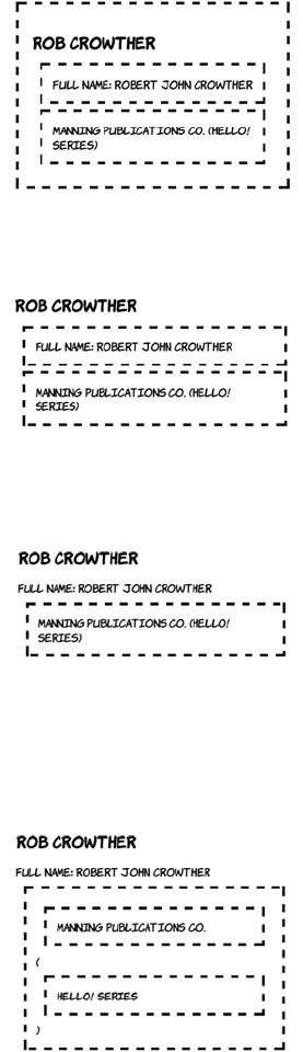
Choosing elements by their attributes 253
The simplest attribute selector is called
the existence selector:
[itemscope] {
outline: 4px dashed black;
}
When you put the attribute name inside
square brackets, the selector will match
any element that has the attribute.
Attribute selectors can be appended to
other simple selectors. To select only
paragraphs that have an itemscope
attribute, use this selector:
p[itemscope] {
outline: 4px dashed black;
}
Although attribute existence can be
useful occasionally, it’s more likely you’ll
be interested in selecting between
attributes with values. The syntax for
this is intuitive:
[itemprop="org"] {
outline: 4px dashed black;
}
Note that three elements have an
itemprop attribute that begins with the
letters org, but only the one that exactly
matches has been selected. It’s possible
to select the elements whose attribute
begins with org:
[itemprop^="org"] {
outline: 4px dashed black;
display: block;
}
254 CHAPTER 7 New CSS language features
Similarly, you can select all the elements
whose itemprop attribute ends with a
particular value:
[itemprop$="name"] {
outline: 4px dashed black;
display: block;
}
In the examples so far, the attribute
value you’re trying to match is a
simple string, so quotes are optional.
You could also write this selector as
[itemprop$=name]. If the value you’re
matching contains characters other
than letters and numbers, then the
quotes are required.
If the significant part of the attribute
value is in the middle rather than at the
start or the end, there’s also an attribute
selector for that:
[itemprop*="tion"] {
outline: 4px dashed black;
display: block;
}
This rule matches any element which
has an itemprop property with a value
which contains tion somewhere
within it.
You can now write selectors that match all three
examples you saw at the start of this section:
External links: a[href^="http://"]
Specific URLs: a[href="/home"]
File downloads: a[href$=".pdf"]
Choosing elements by their attributes 255
The traditional CSS ID selector can now be seen as syntactic sugar for
the attribute selector. These two selectors are equivalent:
But the class selector is slightly more difficult. What attribute selector
we’ve considered so far would be equivalent to .myclass? Let’s consider
some options.
It’s clear that there’s a gap in our toolkit. Fortunately, CSS3 fills this
hole: [class~="myclass"] selects an element with a whitespace-separated
list of values, one of which is myclass.
Choosing what isn’t
So far, we’ve concerned ourselves with positive identification. We’ve
selected the elements that are the first child, and we’ve selected ele-
ments that have a particular attribute. But CSS3 also gives us the abil-
ity to select elements that aren’t the first child or don’t have particular
attributes, with the :not pseudo-class. To understand how this might be
useful, consider how you might lay out a form:
#myid [id="myid"]
Attribute selector Matches Doesn’t match
[class="myclass"] class="myclass" class="myclass
otherclass"
[class^="myclass"] class="myclass
otherclass"
class="otherclass
myclass"
[class*="myclass"] class="otherclass
myclass"
class="notmyclass"
Attribute selector Matches Doesn’t match
[class~="myclass"] class="myclass"
class="myclass
otherclass"
class="notmyclass"
256 CHAPTER 7 New CSS language features
Clearly you want to apply different styles to input elements of type
radio and checkbox. By selecting positively, you have two basic options:
select everything and then override (following, left), or explicitly select
only the items you want to style (following, right):
<label>Text:
<input type="text">
</label>
<label>Range:
<input type="range">
</label>
<label>Radio:
<input type="radio">
</label>
<label>Checkbox:
<input type="checkbox">
</label>
It looks a little disorganized, so let’s
add some styles to make things more
consistent:
input {
margin: 1em;
display: block;
width: 12em;
}
input {
margin: 1em;
display: block;
width: 12em;
}
input[type=radio],
input[type=checkbox] {
display: inline;
width: auto;
}
input { margin: 1em; }
input[type=text],
input[type=search],
input[type=tel],
input[type=url],
input[type=email],
input[type=password],
input[type=datetime],
input[type=date],
input[type=month],
input[type=week],
input[type=time],
input[type=datetime-local],
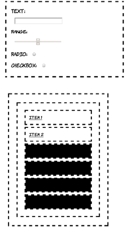
Choosing elements by their attributes 257
The :not pseudo-class allows you to be more succinct than either of
those two examples:
Pseudo-elements
Pseudo-elements are CSS selectors that allow you to style certain page
elements as if an element existed in your markup. It sounds more
complicated than it is, so let’s dive into some examples. A common
typographical feature, almost since the beginning of book publishing, is
input[type=number],
input[type=range],
input[type=color],
input[type=file],
input[type=submit],
input[type=image],
input[type=reset],
input[type=button] {
display: block;
width: 12em;
}
input { margin: 1em; }
input:not([type=checkbox]):not([
type=radio]) {
display: block; width: 12em;
}
You can also combine :not with other
selectors you’ve seen in this chapter. Going
back to the :nth-child examples in the sec-
tion “Selecting among a set of elements
with pseudo-classes,” this is how you select
everything except the first two list items:
li:not(:nth-child(-n+2)) {
background-color: #000;
}
258 CHAPTER 7 New CSS language features
to style the first line or first letter of a
section differently than the following
text. Following are some examples both
from history and the present day.
In order to achieve similar effects, CSS3 has the ::first-line and
::first-letter pseudo-elements. To examine these, we need some suit-
ably weighty prose to live up to our historical antecedents. I’ve chosen
a selection of quotes from Ada Lovelace all marked up as paragraphs
like this:
<p>I never am really satisfied that I
understand anything; because, understand
it well as I may, my comprehension can
only be an infinitesimal fraction of all
Browser support quick check:
pseudo-elements
:no ::first-letter/
::first-line
1.0 1.0
3.0 3.0
5.5. 5.5
10.0 7.0
1.0 1.0
Beowulf manuscript
Circa AD 1000
Opera Logica, Aristotle
Circa AD 1300
Web Browser
AD 2012, about tea time
Drop capsSpecial first−
line formatting
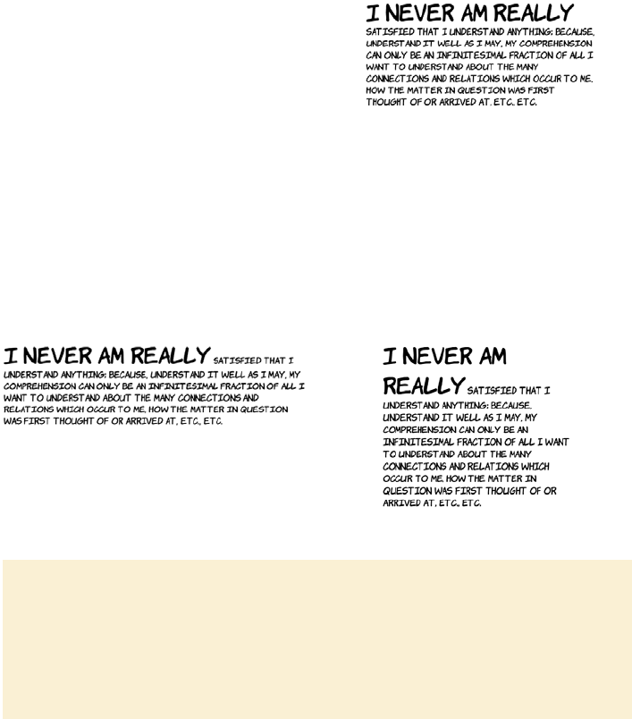
Choosing elements by their attributes 259
If you want to style the first line differently, what do you do? One
option is to insert elements to signify the first line:
This looks OK in the example, but what if the user’s screen is wider or
narrower, or their font is larger, as in the following examples?
I want to understand about the many
connections and relations which occur to
me, how the matter in question was first
thought of or arrived at, etc., etc.</p>
<p><span class="first">I never am
really</span> satisfied that I
understand anything; because,
understand it well as I may, my
comprehension can only be an
infinitesimal fraction of all I want
to understand about the many
connections and relations which
occur to me, how the matter in
question was first thought of or
arrived at, etc., etc.</p>
Pseudo-elements vs. pseudo-classes
Pseudo-elements create virtual elements within your document, as opposed to
pseudo-classes, which rely on properties of the document entered by the author.
In CSS3, pseudo-elements are distinguished by a double colon (::) rather than
the single colon of a pseudo-class. This differs from CSS2, where both used a
single colon.
260 CHAPTER 7 New CSS language features
Using both ::first-line and ::first-letter, it’s straightforward to cre-
ate text that looks similar to the examples from the start of this section:
The ::first-line pseudo-element
puts the onus of calculating what
constitutes the first line of text on
the browser:
p::first-line {
background-color: #000;
}
It applies styles as if there were an
element wrapping all the text on the
first line. But unlike a real element,
you can’t style children of the first
line. The pseudo-element can only
come as the last simple selector in a
selector group.
The ::first-letter pseudo-element
is similar, except that it only selects
the first letter:
p::first-letter {
background-color: #000;
}
Although the background has been
styled in this example because it
stands out in the screenshots, it
would be more common to use a
decorative font for the first letter, or
to increase its size.
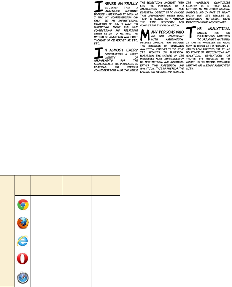
Choosing elements based on user interaction 261
Choosing elements based on user interaction
Dynamic pseudo-classes allow you to assign different styles to ele-
ments based on user activity. One of the best known of these is the
:hover pseudo-class, introduced in CSS2, which lets you apply a differ-
ent style to an element when the mouse pointer is hovering over it (see
appendix C for some examples).
CSS3 adds several new dynamic
pseudo-classes. In this section,
you’ll learn about styling form
elements based on their proper-
ties. This will let you give cues
to your users about the state of
form elements—for example,
whether they’re required or
whether they’re currently valid.
After that, you’ll learn about the
target selector that lets you style
the page based on the current
URL, which is useful for tabbed
interfaces and slide shows.
p {
text-align:
justify;
clear: left;
}
p::first-letter {
font-size: 400%;
float: left;
line-height: 1em;
padding-right:
0.1em;
}
p::first-line {
font-size: 150%;
}
Browser support quick check:
dynamic pseudo-classes
Enabled/
disabled/
checked
Valid/
invalid/
required
Target
1.0 10.0 1.0
3.0 4.0 3.5
9.0 10.0 9.0
9.0 9.5 10.0
3.0 5.0 3.0
262 CHAPTER 7 New CSS language features
Styling form elements based on state
The first dynamic pseudo-classes we’ll
consider are :enabled and :disabled. Here
are two text inputs, one of which is dis-
abled:
<label>Enabled
<input type="text">
</label>
<label>Disabled
<input type="text" disabled>
</label>
Form elements are enabled by default, so
this rule targets the first input:
input:enabled {
outline: 4px solid #000;
}
Most browsers make it fairly obvious
when a form control is disabled, but the
pseudo-classes allow you to add addi-
tional styling:
input:disabled {
outline: 4px solid #000;
}
If your form enables and disables controls
dynamically based on user input, then
:enabled and :disabled allow you to attach
transitions to the changes between the
two states; see chapter 9 for further
details.
You saw several of CSS3’s new dynamic pseudo—classes for
HTML5 forms in chapter 3 when you learned about HTML5
forms. In this section, you’ll see the full set in one place.
Choosing elements based on user interaction 263
The :checked and :indeterminate pseudo-
classes can only be applied to inputs of
type checkbox:
<label>Not checked
<input type="checkbox">
</label>
<label>Checked
<input type="checkbox" checked>
</label>
As you might expect, :checked lets you
style all checked check boxes:
input:checked {
outline: 4px solid #000;
}
You might use this to replace the default
check box with a graphic.
The indeterminate state has to be set by a
script:
input:indeterminate {
outline: 4px solid #000;
}
Note that :indeterminate is independent of
:checked—both checked and unchecked
check boxes can be in the indeterminate state.
You can also use CSS3 with the HTML5
form features, such as validity. Here are
one valid and one invalid form field:
<label>Valid
<input type="url"
value="http://manning.com">
</label>
<label>Invalid
<input type="url"
value="Not a URL">
</label>
264 CHAPTER 7 New CSS language features
The pseudo-class for valid inputs is,
unsurprisingly, :valid:
input:valid {
outline: 4px solid #000;
}
And the corresponding pseudo-class is
invalid:
input:invalid {
outline: 4px solid #000;
}
It’s also possible to style required inputs.
Here are one required and one optional
input (of course, inputs are optional by
default):
<label>Required
<input type="text" required>
</label>
<label>Optional
<input type="text">
</label>
This is the CSS to select an input with the
required attribute:
input:required {
outline: 4px solid #000;
}
And this is the CSS to target just the
optional input:
input:optional {
outline: 4px solid #000;
}
Choosing elements based on user interaction 265
Styling the page based on the target of the URL
Fragment identifiers—a string after a # symbol—are often used to iden-
tify sections within a long document, such as the table of contents at
the top of a Wikipedia article. When the label in the fragment identifier
matches an ID in the document, the browser scrolls the page down to
where that element is displayed.
If the URL has a fragment identifier, then the element with the ID
matching it can be given special styling with the :target pseudo-class.
This is useful for slideshows and tab-based interfaces.
This example uses four paragraphs,
each of which has an id attribute:
<p id="one">I never am really satisfied
that...</p>
<p id="two">In almost every computation
a...</p>
<p id="three">Many persons who are not
conversant...</p>
<p id="four">The Analytical Engine has
no pretensions...</p>
This is what the page looks like if you
load it into your browser with a bare
URL:
http://host/target.html
In AJAX apps, the current state of the application is often
maintained through a fragment identifier to allow easy
bookmarking, as in the following GMail URL.
https://mail.google.com/mail/?shva=1#inbox
Parameters
Protocol
Hostname
1#inbox
Fragment
Identifier
266 CHAPTER 7 New CSS language features
This CSS selector says, “Add a black background to the paragraph ele-
ments that are the target”:
p:target { background: #000; }
Now, if the URL is adjusted to contain a fragment identifier, the
p:target rule is triggered. The following screenshots show the same
page with two different fragment identifiers appended to the URL.
When the fragment is #one, the element with id value one matches the
p:target rule and has a black background.
You can adjust the CSS from the previous example so the paragraphs
are hidden by default but visible when they’re the target:
p { display: none; }
p:target { display: block; }
http://host/target.html#one http://host/target.html#three
Changing the fragment identifier doesn’t reload the page, so the
:target pseudo—class makes it easy to create tabbed interfaces
like that in the next example.
Browser support 267
Browser support
Browser support for CSS3 selectors is excellent across modern brows-
ers. The main issue in browser support is the large numbers of people
still using obsolete versions of Internet Explorer. As you’ll see, it’s easy
to add support for these old browsers using jQuery.
Add a simple menu:
<menu>
<a href="#one">Show one</a>
<a href="#two">Show two</a>
<a href="#three">Show three</a>
<a href="#four">Show four</a>
</menu>
Initially all the tabs are hidden, so all
you see is the menu and an empty
space.
Clicking the Show Two link changes
the URL to http://host/target.html#two.
Now #two is the target. Thanks to the
target selector, the element with id
value two becomes display: block
instead of display: none.
Clicking Show Four changes the
target again: the element with an id
value of four becomes visible.
Now that you’ve seen all the new features, let’s check out what
browser support they have. You may be pleasantly surprised.
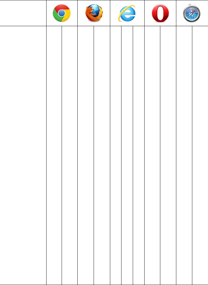
268 CHAPTER 7 New CSS language features
.
Key:
●Complete or nearly complete support
○Incomplete or alternative support
Little or no support
12 14 4 6 8 9 10 11.1 11.5 5 5.1
Adjacent sibling ● ● ● ● ○ ● ● ● ● ● ●
General sibling ● ● ● ● ● ● ● ● ● ●
First/last child ● ● ● ● ● ● ● ● ● ●
nth/last child ● ● ● ● ○ ○ ● ● ● ●
Only child ● ● ● ● ○ ● ● ● ●
Of type ● ● ● ● ○ ○ ● ● ● ●
Attribute ● ● ● ● ● ● ● ● ● ● ●
=● ● ● ● ● ● ● ● ● ● ●
^= ● ● ● ● ● ● ● ● ● ● ●
*= ● ● ● ● ● ● ● ● ● ● ●
$= ● ● ● ● ● ● ● ● ● ● ●
~= ● ● ● ● ● ● ● ● ● ● ●
Not ● ● ● ● ● ● ● ● ● ●
First letter ● ● ● ● ● ● ● ● ● ● ●
First line ● ● ● ● ● ● ● ● ● ● ●
Dis-/enabled ● ● ● ● ● ● ● ● ●
In-/valid ● ● ● ● ● ● ● ● ●
Checked ● ● ● ● ● ● ● ● ● ● ●
Indeterminate ● ● ● ● ● ● ● ● ● ● ●
Optional/required ● ● ● ● ● ● ● ● ●
Target ● ● ● ● ● ● ● ● ● ●
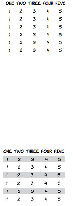
Browser support 269
Using jQuery to support older browsers
The jQuery JavaScript library uses CSS selectors as a key part of its
normal operation. In order for this to work cross-browser, the authors
of jQuery had to implement CSS selectors in JavaScript. This is handy
if you want to use the latest CSS features but still present more limited
older browsers with your intended design.
To add IE8 support without messing up your markup, you can add
some jQuery. Start by adding the library itself:
<script src="jquery-1.5.2.min.js">
</script>
In an IE-only code block, use the jQuery selector engine to match the
nodes using the same selector, and add a class to them:
Here’s a CSS selector that doesn’t work
in IE8 and older:
tbody tr:nth-child(2n+1) {
background: #999;
}
The screenshot shows that in IE8, the
odd rows don’t have the gray back-
ground that the rule specifies.
<!--[if lte IE 8]>
<script>
$(document).ready(
function() {
$('tbody tr:nth-child(2n+1)')
.addClass('odd');
}
)
</script>
<style>
tr.odd { background: #999; }
</style>
<![endif]-->

270 CHAPTER 7 New CSS language features
All that’s now required is to replicate the style elements with that class.
In most cases, you can add the selector to your original rule. But the
nth-child syntax will cause IE8 to treat the whole rule as invalid, so the
style rule also has to be replicated.
Summary
In this chapter, you’ve learned about many new features available in
CSS3 for selecting elements: combinators for selecting elements based
on relationships with their parents; pseudo-classes for selecting ele-
ments based on their relationships with their siblings; attribute selec-
tors that reduce your dependence on class and id attributes; and
dynamic pseudo-classes for giving immediate feedback to users on the
state of form elements. It’s been a lot to get through, but these features
make up the foundation on which all the rest of CSS is built.
Using jQuery to support older browsers is a handy workaround if
there are some CSS3 styles that absolutely must be applied. In later
chapters, you’ll see other JavaScript libraries that can enable CSS3
features in older browsers. These can be massive time—savers. But
remember, they do come at a cost—if you rely on them heavily, they can
significantly increase your page—loading times.
After you’ve picked out elements with selectors, pseudo—classes, and
attribute selectors, you’ll want to apply styles to them. CSS3 offers many
new options in that department, and in the rest of the book you’ll learn
about them. We’ll start in the next chapter with the new options for layout.

271
8
Layout with CSS3
This chapter covers
•
inline-block
and table display values from CSS2
•
calc
and
box-sizing
properties that make CSS2 layout more manageable
•Media queries to give different CSS to different devices
•New CSS3 layout modules: templates, grids, and regions
Many people have complained over the years about the poor tools avail-
able for layout in CSS. This isn’t an unwarranted criticism, because CSS1
had almost no layout tools. No one anticipated that people would start to
do graphic design with web pages until it happened. Several options were
added in CSS2, most of which didn’t see broad browser support until the
release of IE8 in 2009. Given that it’s taken so long for CSS2 layout to be
supported, support for CSS3 layout modules got off to a slow start; but
recently there’s been a lot of activity. This chapter covers both the old fea-
tures of CSS2 that haven’t seen much use and the new features in CSS3
that browsers are just starting to support.

272 CHAPTER 8 Layout with CSS3
Underused CSS2 layout features
CSS2 had several new features for layout—inline-block and table,
table-row, and table-cell values for the display property—but they’ve
seen little use in real websites because of the lack of support for them in
the most popular browser of all time (in terms of market share), IE6. In
this section, we’ll review these underused features of CSS2.
Placing elements on a line with inline-block
inline-block is a compromise between <block> elements and <inline>
elements. A <block> element can have a defined width, height, padding,
and margin and causes a break in the text. An <inline> element sits on
the line of text but can’t have a width, height, padding, or margin. An
inline-block element combines features of both—it sits on the line of
text, but it can be given a specific width, height, padding, and margin.
An HTML5 contribution to tables for layout
The W3C HTML working group has acknowledged the incredible persistence of
the layout table and, thanks to HTML5 and ARIA, has recommended a method
for indicating that a particular table is semantically meaningless (that it’s just for
layout):
<table role="presentation">
This doesn’t mean you should ignore all the best practice advice and convert
your CSS layouts to tables, but it does mean you can easily make old pages more
accessible without a major rewrite. See www.w3.org/html/wg/tracker/issues/
130 for further details.
This simple markup will be used to dem-
onstrate layout with inline block. If you
check the code download for this chapter,
you’ll find an example layout done with
floats, a method familiar to anyone
who’s done any CSS layouts in the last
ten years. Achieving a similar layout
with inline-block requires that you set
the widths of the <section> and <aside>
elements appropriately:
<header>
<h1>Heading</h1>
</header>
<section>
<p>I never am...</p>
</section>
<aside>Side bar</aside>
<footer>Footer</footer>
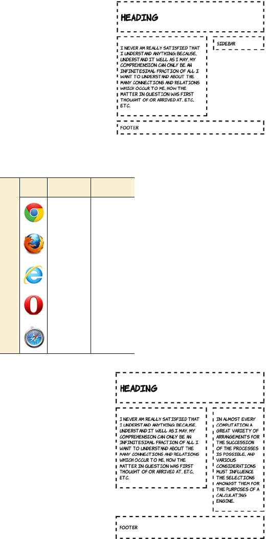
Underused CSS2 layout features 273
header, section, aside, footer {
margin: 2%;
padding: 2%;
outline: 4px dashed black;
vertical-align: top;
}
section, aside {
display: inline-block;
width: 54.5%;
}
aside {
margin-right: 0;
width: 28.5%;
}
inline-block solves several issues
that afflict floats. The first benefit of
inline-block over floats is that the
elements aren’t removed from the
normal document flow. This means
that in a basic two-column layout, it
doesn’t matter which of the columns
is the longest. Any full-width ele-
ment will automatically be pushed
below both columns—no clearing is
required.
Browser support quick check: inline-block
Full Partial
1.0 -
3.0 2.0
8.0 6.0
9.0 -
3.1 -
274 CHAPTER 8 Layout with CSS3
inline-block also makes the behavior
of grids of items more consistent
when there are elements of different
sizes. Elements that are inline-block
are aligned with the normal
character grid, just like lines of
text on a page. In this screenshot,
you can see that the oversize
element forces the entire next
line down.
Being aligned with the normal char-
acter grid does present other issues.
Spacing is no longer entirely con-
trolled by margins. This code is from
ch08/layout-inline-4.html:
div {
margin: 0;
border: 4px dashed black;
display: inline-block;
}
You can see that despite the margin
being set to 0, there’s still a gap
between the elements on each row.
This gap is due to letter and word
spacing. Elements that are
inline-block behave as if they’re
letters or words. Setting negative
spacing removes the gap, as in
ch08/layout-inline-4a.html:
body {
letter-spacing: -0.4em;
word-spacing: -0.4em;
}
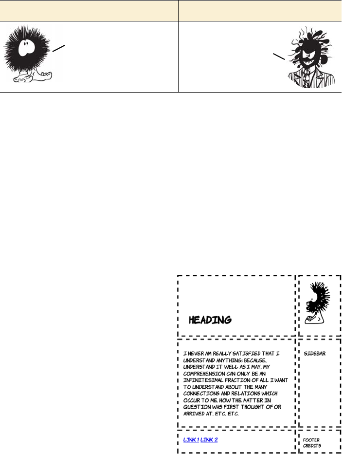
Underused CSS2 layout features 275
Other text properties also affect inline-block elements—baseline align-
ment sometimes causes unexpected spaces to appear between rows of
elements.
Grouping element dimensions with display: table
One question you might well ask yourself: if browsers use CSS for their
layout, what CSS do they use to lay out tables? The simple answer is
that there’s a special CSS display mode for table, as well as display
modes for table-row and table-cell. All of these display modes can be
applied to nontabular elements.
Here’s a simple layout created with display: table. The following markup
is taken from ch08/layout-table-1.html. It’s based on the listing in ch08/
layout-table-1-actualtable.html, which implements the same layout
using an HTML table. If you’ve never done a layout with a table before,
please check out that listing because there’s no room to show it here:
Inline-block good Inline-block bad
<header>
<h1>Heading</h1>
<figure>
<img src="dust-puppy.svg">
</figure>
</header>
<div>
<section>
<p>I never am ...</p>
</section>
<aside>Side bar</aside>
</div>
<footer>
<nav>
<a href="/l1">Link 1</a>
<a href="/l2">Link 2</a>
</nav>
<small>Footer credits</small>
</footer>
Many of the same
benefits as floats,
but without the
clearing issues.
More control over
how the layout breaks.
Issues with
letter spacing.
Baseline
alignment can
trick you.
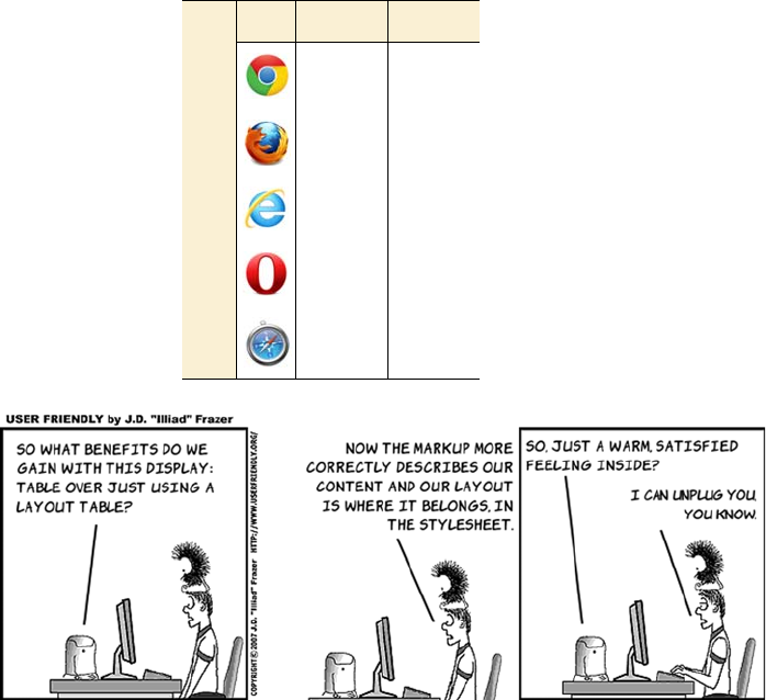
276 CHAPTER 8 Layout with CSS3
This listing was created by
replacing each td, tr, and table
element in the original table lay-
out with more semantic con-
tainer elements. The direct
replacement means you have
suitable elements to attach the
table-row and table-cell styles to
and, because this is a simple doc-
ument, you can set body to be
display: table rather than add an
explicit wrapper in place of the
table element.
body {
display: table;
border-collapse: separate;
border-spacing: 1em;
}
header, div, footer {
display: table-row;
}
section, aside, figure, h1, nav,
small {
display: table-cell;
}
img { max-width: 100px; }
Browser support quick check:
display: table
Full Partial
1.0 -
2.0 -
8.0 -
9.0 -
3.1 -
Underused CSS2 layout features 277
There’s no difference in rendering between the two versions of the
code. This is because the browser inserts an anonymous table object in
place of the missing table row. You can see more clearly how it works if
you look at an example that doesn’t work in your favor. The next list-
ing is from ch08/layout-table-2.html; markup is on the left and CSS is
on the right:
The naive approach to using dis-
play: table might look something
like this. You have classes for
every element of the table hierar-
chy. The following images show
this applied to two different
markup fragments. (See the full
listing in ch08/layout-table-
4.html.)
.grid {
display: table;
border-collapse: separate;
border-spacing: 1em;
}
.row {
display: table-row;
}
.cell {
display: table-cell;
width: 25%;
}
<div class="grid">
<div class="row">
<div class="cell">1</div>
<div class="cell">2</div>
<div class="cell">3</div>
<div class="cell">4</div>
</div>
</div>
<div class="grid">
<div class="cell">5</div>
<div class="cell">6</div>
<div class="cell">7</div>
<div class="cell">8</div>
</div>
<body>
<header>
<h1>Heading</h1>
</header>
<div>
<article>...</article>
<aside>...</aside>
</div>
<footer>Footer</footer>
</body>
body {
display: table;
}
header, footer, div {
display: table-row;
}
article, aside {
display: table-cell;
}
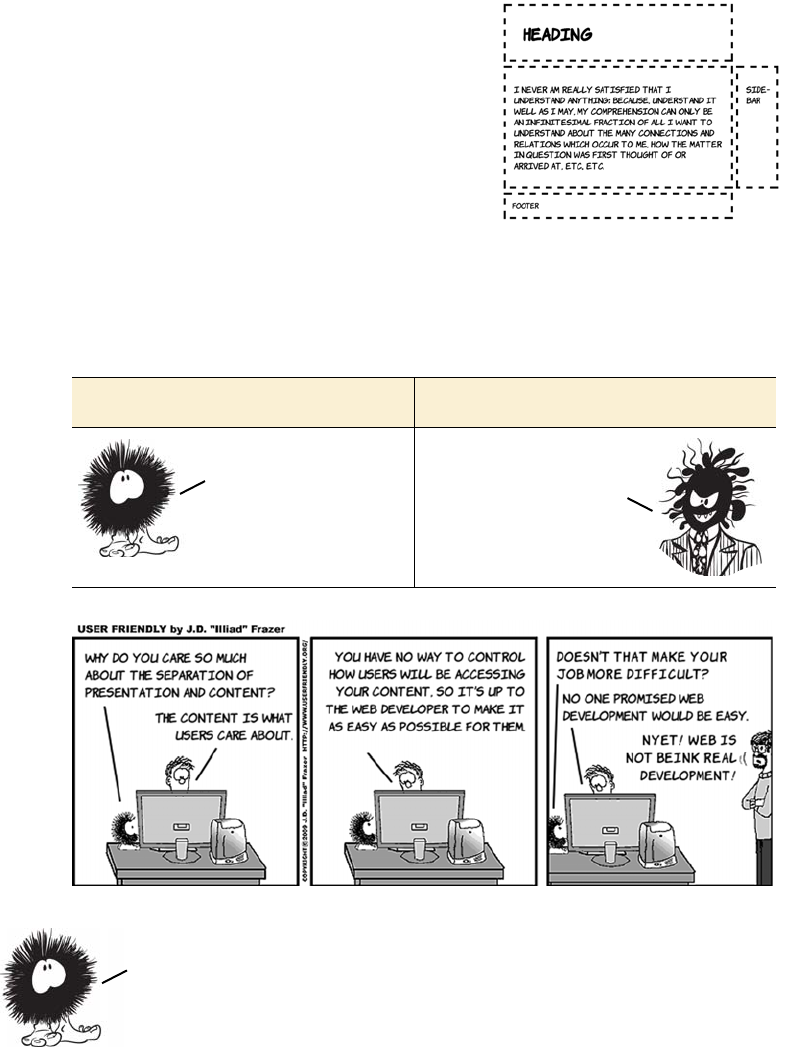
278 CHAPTER 8 Layout with CSS3
For this code, you might expect the
header to extend across the entire
width of the page because it’s set to be
display: table-row. But what actually
happens is shown at right. Because
there are no elements in the row with
display: table-cell, header is promoted
to that role, and an anonymous table
object assumes the role of the table row.
The result is that the header and footer
both have the same width as the first
table-cell element in the middle row.
display: table good display: table bad
Like tables, elements’
visual properties are
related so a set of
elements in a row all
share the same height.
Absolute
responsibility
for layout.
Some of the same
performance
issues as tables.
You now have a grasp of what CSS2 has to offer in terms of layout. The good
news is, since the launch of IE8 in March 2009, every major browser supports
all these approaches. In the next section, you’ll learn about two small but
useful improvements that CSS3 offers for CSS2—compatible layouts.
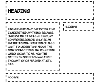
CSS3 improvements to CSS2 approaches 279
CSS3 improvements to CSS2 approaches
One of the major pain points that arise with the CSS layout approaches
mentioned in the previous sections is the control of combined width,
particularly when mixing percentage and pixel units as you saw with
inline-block. CSS3 offers two new features that alleviate this pain:
❂A calc() function
❂The box-sizing property
The calc function allows the construction of widths from multiple
units: for example, 25%—4px. This is useful if several elements need to
fit exactly in a percentage width, but each needs to have a border or
margin of a certain number of pixels. box-sizing gives the web author
control over the problematic CSS box model. Both are covered in more
detail in this section.
Mixing different length units with calc
Many of the issues with using floats or inline-block for layout are due
to the basic incompatibility of different length measurements—how
many pixels to a percentage point, or how an em varies due to factors
beyond your control such as window size and font rendering. Following
is the example layout from the previous discussion of inline-block.
Earlier, all the widths were specified in percentage values, but now
there’s a mixture of percentages, pixels, and ems:
body {
width: 90%;
margin: 0 5%;
font-family:
"Komika Hand", sans-serif;
}
header, section, aside, footer {
margin: 1em;
padding: 1em;
outline: 4px dashed black;
vertical-align: top;
}
section, aside {
display: inline-block;
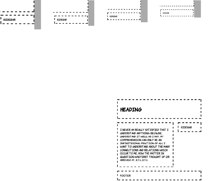
280 CHAPTER 8 Layout with CSS3
You can see that the sidebar is poking out to the right of the header and
the footer. The problem is worse than it appears because how much the
sidebar pokes out depends on many factors. The following screenshots
show the alignment of the sidebar with the footer at various browser
window sizes (the gray bar has been added so you can more easily see
the variation, and the sidebar and footer are shown next to each other
for convenience).
These issues are bound to occur when combining CSS lengths of differ-
ent types. The number of pixels taken up by an em or a percentage will
vary depending on font size and window size. On the other hand, it’s
rare that you’ll want something like a border to be a different width
depending on the width of the browser window. CSS3 provides the calc
function to allow you to combine different units in a predictable way.
width: 54%;
}
aside {
margin-right: 0;
width: 25%;
}
640px width 800px width 1024px width 1280px width
Take the earlier example CSS and,
assuming everything else remains
the same, you can change the
widths to the following:
section, aside {
width: calc(70% - 4.665em);
}
aside {
width: calc(30% - 3.665em);
}
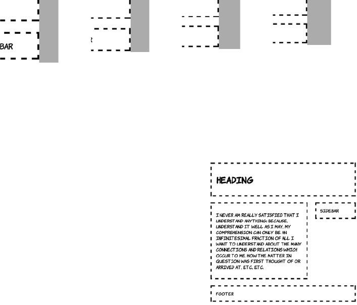
CSS3 improvements to CSS2 approaches 281
As always with inline-block, there’s the issue of letter spacing. A cer-
tain amount of trial and error was involved in arriving at those 4.665em
and 3.665em lengths. A more straightforward approach is to remove
the letter spacing as a factor by setting it to a negative value.
This produces a more reliable lay-
out. And, as the following screen-
shots show, everything stays the
same width at different screen
widths.
640px width 800px width 1024px width 1280px width
body {
letter-spacing: -0.5em;
}
header, section, article, aside,
footer {
letter-spacing: normal;
}
section, aside {
width: calc(70% - 4em);
}
aside {
width: calc(30% - 4em);
}
The negative letter spacing on the
body allows saner width calculations,
but then the letter spacing needs to be
explicitly set on the child elements.
282 CHAPTER 8 Layout with CSS3
Here’s the CSS to generate this screenshot:
div {
float: left;
margin: 0;
padding: 1em 0;
border: 4px dashed black;
}
.half_third {
width: calc(50%/3 - 8px);
}
.half_half {
width: calc(50%/2 - 8px);
There’s more to calc than simple
addition and subtraction. calc
makes it straightforward to do
things that are hard with any
other approach. Imagine that
you have a set of elements of dif-
ferent widths that you want to
display on multiple rows, but
each row should be an identical
width.
Browser support quick check: calc
Full Partial
- 19
- 4.0
9.0 -
- -
- 5.2
Even with calc, it’s difficult to get
things perfect for every width when
using percentages because of
rounding errors—on a window 640
pixels wide, a box of 30% width in this
layout works out as 172.8 pixels wide.
The browser has to choose whether to
render that as 172 or 173 actual pixels,
and you have to hope it all works out.
CSS3 improvements to CSS2 approaches 283
}
.sixth {
width: calc(100%/6 - 8px);
}
.quarters {
width: calc(100%/4 - 8px);
}
And here’s the HTML—assume it fits in a standard HTML5 document;
see ch08/calc-3.html for the full listing:
<div class="half_third">1</div>
<div class="half_half">2</div>
<div class="half_third">3</div>
<div class="half_half">4</div>
<div class="half_third">5</div>
<div class="sixth">A</div>
<div class="sixth">B</div>
<div class="sixth">C</div>
<div class="sixth">D</div>
<div class="sixth">E</div>
<div class="sixth">F</div>
<div class="quarters">00</div>
<div class="quarters">01</div>
<div class="quarters">10</div>
<div class="quarters">11</div>
Because table cells in a column share a width, this is extremely difficult
to do with a single table. And because of rounding errors, it can be dif-
ficult with any other approach unless you choose carefully for the over-
all width.
calc good calc bad
Allows precise control
of lengths specified in
any combination
Requires an
understanding of
how padding, margin,
and border combine
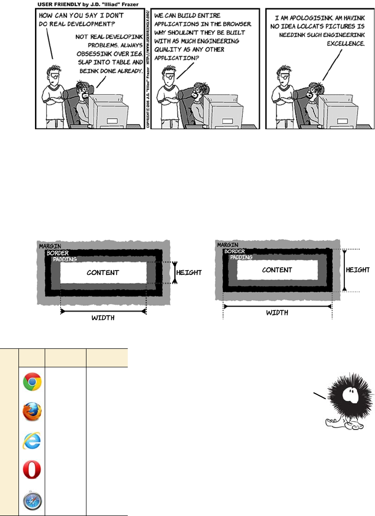
284 CHAPTER 8 Layout with CSS3
Controlling the box model
One of the more difficult aspects of layout in the late 1990s was the
incompatible implementation of the CSS box model. Some browsers
behaved as if the width and the height included the border, whereas the
specification excluded the border and padding from width and height
calculations.
box-sizing: content-box; box-sizing: border-box;
Browser support quick check: box-sizing
Full Partial
10.0 1.0
- 2.0
8.0 -
9.5 -
5.1 3.1
In spite of it being nonstandard, many
people felt that the method of
calculating width that included the
border was more intuitive. So in CSS3
you can specify the sizing calculation
you want with the box-sizing property.
The two alternatives are shown next.
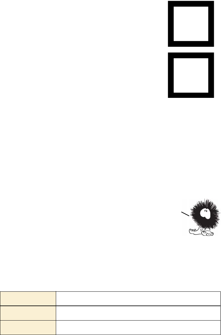
Using media queries for flexible layout 285
Using media queries for flexible layout
CSS has long had the ability to apply different styles based on the out-
put device, whether it’s a PC screen, a handheld device, or a printer.
For instance, a print stylesheet can be applied to an HTML document
in several ways.
This CSS creates two boxes that are exactly the
same size visually, despite differing in width and
height by 50 pixels:
#one {
box-sizing: content-box;
width: 150px;
height: 150px;
border: 25px solid black;
}
#two {
box-sizing: border-box;
width: 200px;
height: 200px;
border: 25px solid black;
}
The markup required is
<div id="one"></div>
<div id="two"></div>
This feature isn’t as obviously useful now that
you have calc, but it might save you some effort
if you want a set of elements to have the same
size but different-width borders.
Linking from HTML <link rel="stylesheet" media="print" href="print.css">
Embedding in HTML <style media="print"></style>
Inline in CSS @media print { }
You’ve now learned about all the currently viable techniques for layout
with CSS. But even with all these tools, it’s a challenge to design a single
layout that works well on powerful desktop PCs, portable tablets, and
mobile phones. Media queries allow you to tailor your layouts to the
capabilities of the device, as you’ll learn in the next section.
286 CHAPTER 8 Layout with CSS3
These are known as media queries. All three of
the previous examples are constraining the
styles they reference or include to only apply
to print media. In CSS2 you could also restrict
to screen, aural, braille, handheld, or speech,
among others. The default, if you don’t spec-
ify anything, is all—the styles will apply no
matter what the output device is.
Media queries avoid browser detection by letting the browser itself
determine what support it has. If a new browser or device comes along
that you hadn’t anticipated, as long as you’ve used media queries, it
should still select the most appropriate set of CSS rules. CSS3 dramati-
cally extends the number of properties that can be used in media que-
ries. In the following sections, you’ll see some practical examples of
media queries in use.
Mobile browser support
CSS3 media queries are especially important for mobile browsers. All the current
major smartphone browsers have support: the iOS and Android standard brows-
ers; mobile Opera and Firefox; and IE in Windows Mobile 7.5.
Browser support quick check:
CSS3 media queries
Full Partial
2.0 -
3.5 -
9.0 -
9.5 -
4.0 3.1
Using media queries for flexible layout 287
Resolution detection
The most common distinguishing features of different devices are
screen resolution and window size. Most desktop users have a browser
window at least 800 pixels wide, whereas most mobile browsers are
less than 800 pixels wide. Media queries let you choose between the
two situations. The basic syntax for creating a set of rules for a window
800 pixels wide is this:
@media screen and (max-width: 800px) { }
@media screen and (max-device-width: 800px) { }
Any CSS rules placed inside the squiggly brackets will only be applied
if the conditions are met. The first rule selects based on the browser
window size, and the second one selects based on display size—the
browser window doesn’t have to fill the entire width of the display for
this rule to match. In this section, you’ll create a layout that adapts to
the size of the browser window. Here’s what the layout looks like in a
window 1024 pixels wide.
Here’s the key markup (see the full listing in ch08/media-queries-
adaptive.html):
<header>
<h1>Adaptive Layout with Media Queries</h1>
</header>
<div>
<nav>
<ul>
288 CHAPTER 8 Layout with CSS3
<li><a href="#">Home</a></li>
<li><a href="#">About</a></li>
<li><a href="#">contact</a></li>
</ul>
</nav>
<article>
<p>I never am really satisfied...</p>
</article>
<aside>
This page is a demo for media queries.
<img src="dust-puppy.svg">
</aside>
</div>
<footer>
<span id="msg480">Viewing 480px or less mode</span>
<span id="msg800">Viewing 800px or less mode</span>
<span id="msg801">Viewing 800px or more mode</span>
</footer>
The default three-column layout is for windows greater than 800 pixels
wide:
body { width: 90%; margin: 0 5%;
font-family: "Komika Hand", sans-serif; }
header,
footer { display: block; width: auto; }
nav ul { list-style: none; margin: 0; padding: 0; }
nav a { display: block; margin: 1em;
padding: 1em; outline: 4px dashed black; }
img { max-width: 100px; display: block;
margin: 0.5em auto; }
div { display: table; outline: none; padding: 0; }
nav,
article,
aside { display: table-cell; }
nav,
aside { width: 25%; }
article { width: 50%; }
#msg480,
#msg800 { display: none; }
If viewed in a window 800 pixels wide or narrower, the page switches
to a two-column layout.
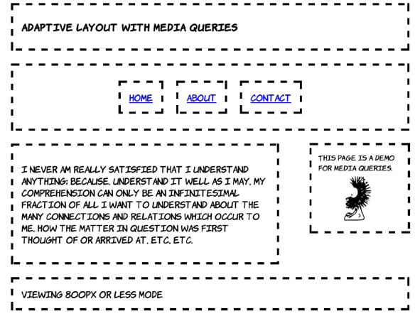
Using media queries for flexible layout 289
This layout is implemented with two sets of rules within media queries.
The first provides a set of rules to be applied for any width less than
800 pixels, and the second is a set of rules that’s applied only when the
window is between 481 and 800 pixels wide. This approach saves
repeating rules:
@media screen and (max-width: 800px) {
div { display: block; overflow: hidden; margin: 0; }
nav { display: block; width: auto; }
nav ul { display: table; border-collapse: collapse;
margin: 0 auto; }
nav li { display: table-cell; }
}
@media screen and (max-width: 800px) and (min-width: 481px) {
h1 { font-size: 110%; }
article,
aside { display: block; }
article { width: 60%; float: left; margin-right: 0; }
aside { width: 20%; font-size: 80%; float: right;
margin: 1.2em; margin-left: 0; }
img { max-width: 60px; }
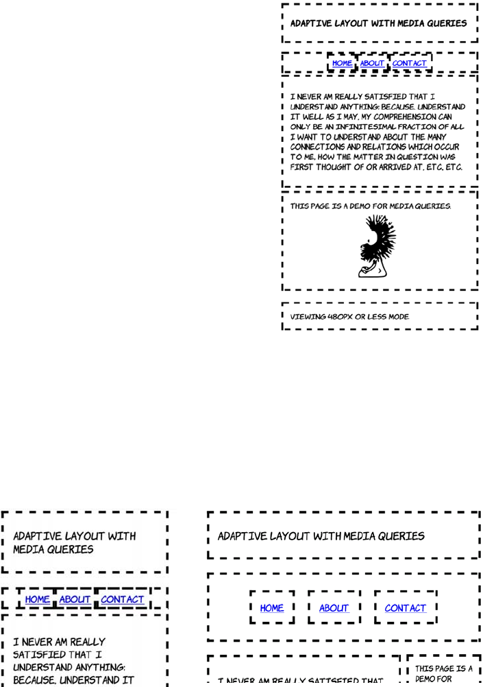
290 CHAPTER 8 Layout with CSS3
#msg480,
#msg801 { display: none; }
#msg800 { display: inherit; }
}
Finally, at a width of 480 pixels or less,
the layout becomes single column.
The majority of the required rules for
this layout were specified in the less-
than-800 pixels example. These rules
mostly adjust the size of elements to
allow more content to appear on a
mobile screen:
@media screen and (max-width: 480px) {
h1 { font-size: 105%; }
nav { padding: 0; }
nav a { margin: 0; padding:
0.25em 0.5em; }
article,
aside { display: block; width: auto; }
#msg800,
#msg801 { display: none; }
#msg480 { display: inherit; }
}
Following are screenshots of the same page on an Android phone in
portrait mode (left) and landscape mode (right).
Portrait (480px width) Landscape (800px width)

Using media queries for flexible layout 291
Changing layout based on orientation and aspect ratio
Maybe you want to do different things on a display that’s 640 pixels
wide and 480 pixels tall compared to one that is 640 pixels wide but
800 pixels tall—you want to know whether the aspect ratio is land-
scape or portrait for a given width. You can specify rules like this:
@media screen and (min-width: 640px and max-height: 480px) { }
@media screen and (min-width: 640px and min-height: 800px) { }
But this is a very fragile solution. For a start, you’re missing windows
that are 640 pixels wide but, perhaps thanks to a permanent toolbar,
only 780 pixels tall. You could adjust to that particular case, but what if
some innovative manufacturer came up with a 700 x 500 pixel device?
In general, the idea behind media queries is for you to end up doing
less work—not rewriting chunks of your stylesheet for every possible
combination of width and height.
Fortunately, CSS3 provides an orientation media query for just this
situation:
@media screen and (min-width: 640px and orientation: portrait) { }
@media screen and (min-width: 640px and orientation: landscape) { }
Orientation is a special case of aspect-ratio. The previous two rules are
equivalent to these:
@media screen and (min-width: 640px and max-aspect-ratio: 1/1 ) { }
@media screen and (min-width: 640px and min-aspect-ratio: 1/1 ) { }
Using aspect-ratio, it’s possible to distinguish between widescreen dis-
plays and traditional monitor sizes:
@media screen and (min-width: 640px and aspect-ratio: 16/9 ) { }
@media screen and (min-width: 640px and aspect-ratio: 4/3 ) { }
In this example, the default layout is a full—sized screen desktop
experience. Media queries were used to adapt to lower resolutions. For
practical uses, it’s often better to do things the other way around—
when IE9 is released all the major desktop browsers will support media
queries. But IE on Windows Mobile 7 won’t, and neither will browsers on
older feature phones. If you expect lots of these visitors, design for
the small screen and use media queries to adapt for larger devices.

292 CHAPTER 8 Layout with CSS3
In this case you may want to select based on the monitor size rather
than the window size:
@media screen and (min-width: 640px and device-aspect-ratio: 16/9 ) { }
@media screen and (min-width: 640px and device-aspect-ratio: 4/3 ) { }
device-aspect-ratio: always matches the monitor, regardless of the
window size.
Additional device-detection features
Media queries can be used for more than just screen sizes. There are
several other features for detection in the spec, and various browser
vendors are introducing more as they add functionality to their brows-
ers. Here are some of the more interesting ones:
❂color—Select rules based on the number of bits available per color
channel, where 8 bits is 255 levels per color. If you can remember the
days of web-safe colors, this feature lets you work around the pixela-
tion issues that web-safe colors avoided. Devices that have limited
color support can be given a more constrained set of background
colors.
❂resolution—Select rules based on the dots per inch (dpi) of the dis-
play. A display with high dpi renders fonts more readably, so you
can use a smaller font size.
❂touch-enabled—This is currently a Mobile Firefox–only feature.
Select rules based on whether the display is a touch input device,
perhaps to give buttons and links more finger space.
❂device-pixel-ratio—Currently a Mobile Safari–only feature. Select
rules based on the zoom level, perhaps to provide a higher-resolution
background image as the user zooms in so the image remains crisp
and sharp.
Can you really make a mobile website with just CSS?
Is it possible to make your website deal with a full range of mobile devices and
desktop PCs just by fiddling with CSS? As with most things, the answer is, “it
depends.”

The future of CSS layout 293
The future of CSS layout
CSS3 has several proposed standards currently under heavy develop-
ment that could completely alter how layout on the web is done. In this
section, you’ll learn about these new approaches, all of which have at
least experimental implementations available. They include flexible
boxes, which are excellent for toolbars and menus; grid-align, which is
great for traditional grid-based designs; and regions, exclusions, and
positioned floats, which are good for multiple-column magazine-style
layouts.
(continued)
A brochureware website that is mostly static pages and doesn’t expect much in-
teraction from the user is almost certainly a good candidate for adaptation with
media queries. Similarly, blogs or other text-heavy websites ought to be straight-
forward enough to make work on a wide range of devices. Mobile users, who are
often paying for their connectivity by the megabyte, might appreciate not being
forced to download huge video files, large graphics, and lots of ads; but if the
site in question is relatively lightweight in this department it shouldn’t be a prob-
lem. Also remember from chapter 4 that if you’re using HTML5 to serve your vid-
eo files, you have built-in functionality to serve lower-resolution and lower-
quality files to mobile devices.
The more application-like a website is, the more likely it is that you won’t be able
to deliver the same content to all devices and end up with a usable experience
for all users. In this situation, you should consider dynamically loading portions
of your app with JavaScript after you’ve determined the capabilities of the device.
One last thing to bear in mind: studies have shown that many desktop users pre-
fer to use the mobile versions of certain popular websites. The mobile versions
are frequently simpler and more task focused—or, looked at another way, the
desktop websites are too complex and confusing. Media queries and mobile web-
sites don’t absolve web authors from thinking about the needs of their users.
CSS3 promises to finally equip web authors with layout tools with
power similar to that available in non—HTML frameworks like Adobe
Flex, Microsoft Silverlight, and Java Swing. In the next section, you’ll
learn how powerful CSS layout may become in the next few years.
294 CHAPTER 8 Layout with CSS3
Using flexible boxes for nested layout
Flexible boxes, commonly referred to as flexboxes, are a layout
approached developed in Firefox to be used for laying out various ele-
ments of the user interface. They’re primarily aimed at creating menus
and toolbars, particularly toolbars made up of nested elements. Cur-
rently Chrome, Firefox, IE10, and Safari have some support for flex-
boxes; you’ll need to add the relevant prefix to get the listings in this
section working.
This section first gives you a quick introduction to flexboxes using this
simple markup fragment, and then looks at practical use cases and
issues:
<div>
<div>1</div>
<div>2</div>
<div>3</div>
<div>4</div>
<div>5</div>
</div>
To produce five equal-size boxes,
set the parent element to display:
box and set equal box-flex values
on the child elements:
div {
width: 90%;
display: box;
}
div div {
box-flex: 1;
}
At the time of writing none of the approaches in this section are suitable
for use on a public website because support is just too spotty. You may be
able to make use of them in a tightly controlled environment such as an
intranet, a web view in an iOS or Android app, or a Windows 8 Metro app.
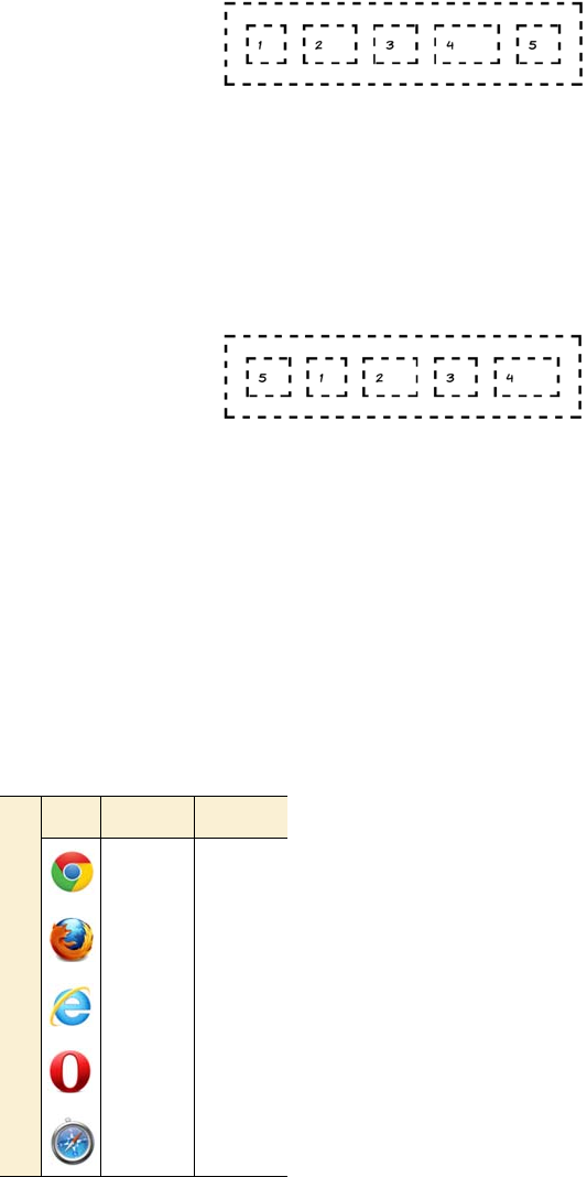
The future of CSS layout 295
Setting a larger box-flex value on
certain elements causes them to
take up an increasing proportion
of the spare space:
div div:nth-child(2) {
box-flex: 2;
}
div div:nth-child(4) {
box-flex: 3;
}
Flexboxes allow elements to be
displayed in a different order than
their position in the markup:
div div {
box-ordinal-group: 2;
}
div div:nth-child(5) {
box-ordinal-group: 1;
}
Because the fifth child is set to be
ordinal-group: 1, it appears before
all the elements that are
ordinal-group: 2.
Browser support quick check: flexbox
Full Partial
- 2.0
- 2.0
- 10.0
- -
- 3.1
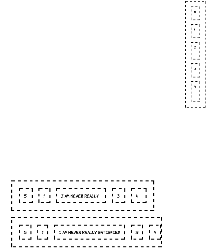
296 CHAPTER 8 Layout with CSS3
Note that even though element 5 is now the first displayed, it’s still the
fifth element as far as the CSS is concerned. Element 2 and element 4
have larger box-flex values, even though they’re now shown as the
third and fifth elements.
This is easily demonstrated by adding some text—the cell will expand
to contain it. The available space gets used up, so the flex can no longer
be distributed.
Although flexboxes are horizontal by default, they
can also be set to be vertical:
div {
width: 5em;
height: 600px;
box-orient: vertical;
}
Note that in both horizontal and vertical cases, you
need to specify a length in that direction in order to
get the flex to appear. This is because the flex dis-
tributed among the elements comes from the left-
over space after the intrinsic size of the elements is
taken away. This can lead to some counter-intuitive
results when the elements with flex don’t have a
well-defined intrinsic width.
The future of CSS layout 297
For collections of elements that do have an intrinsic width, flexboxes
offer an ability that can’t be replicated by tables, display: table, floats,
or inline-block: they can create flexible grids that can have a variable
number of elements per row, as with floats and inline-block, but the
individual elements flex so they exactly fill up each row, as with table
rows and display: table. This is thanks to the multiline property. The
following example has a grid of 60 cells, each containing a number.
At different widths, a different number
of elements fit on each row. If you zoom
in on a few cells, you can see that they’re
also slightly different widths depending
on the size of the container.
Following is a snippet of the markup (left) and the CSS (right)
required for this layout. The key property is box-lines:
800px 640px 480px
<ul>
<li>1</li>
<li>2</li>
<li>3</li>
<li>4</li>
<li>...
...</li>
</ul>
ul {
display: box;
box-lines: multiple;
}
li {
display: block;
box-flex: 1;
min-width: 3em;
}
800px
640px
480px
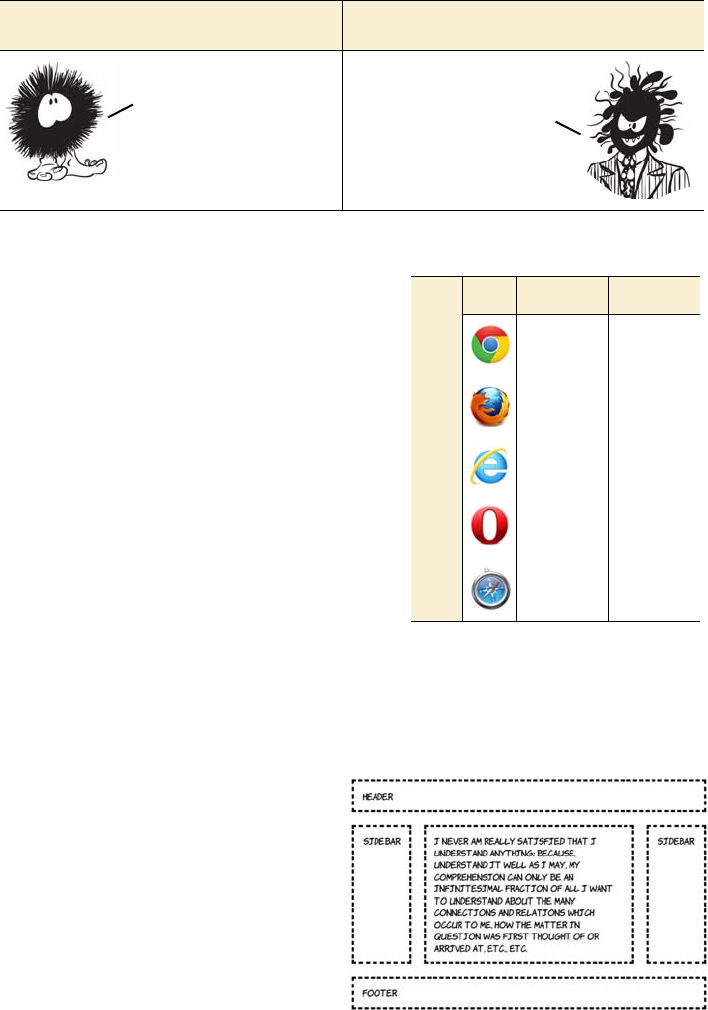
298 CHAPTER 8 Layout with CSS3
Using the CSS3 Grid Alignment module
The CSS3 Grid Alignment module
completely separates the layout from
the elements in your markup. You
use CSS to define a grid and then
assign elements to the grid using a
row and column reference. Cur-
rently only IE10 has any support for
this module, although the WebKit
support is under development. Fol-
lowing is some simple markup that
will be turned into the three-column
layout shown here:
Flexbox good Flexbox bad
<body>
<header>Header</header>
<aside class="b">Side bar</
aside>
<article>I never am really
satisfied... etc., etc.</
article>
<aside class="d">Side bar</
aside>
<footer>Footer</footer>
</body>
Can manipulate layout
order with CSS.
Multiline grids that
exactly fill the
available space.
Intended for toolbars,
menus, and so on rather
than full pages.
Weird things happen
when content has no
fixed intrinsic width.
Browser support quick check:
grid-align
Full Partial
- 19.0*
- -
- 10.0
- -
- 3.1
*Chrome needs a runtime flag to be set to
enable the experimental support; see
https://bugs.webkit.org/show_bug.cgi?id
=60731 for details of progress.
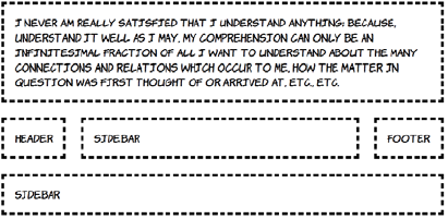
The future of CSS layout 299
A grid is created by defining a set of rows and (or) columns. In this
example, you’ll go ahead and create three columns and three rows on
the <body> element:
body {
display: grid;
grid-columns: auto 1fr auto;
grid-rows: auto 1fr auto;
}
The first and last rows and columns will shrink to fit their content
(auto), and the middle cell of each column will flex so the whole thing
takes up all available space. These declarations create a conceptual grid
into which to fit elements. All that remains is to assign the elements to
the relevant spots of the grid:
header { grid-column: 1; grid-row: 1; grid-column-span: 3; }
aside.b { grid-column: 1; grid-row: 2; }
article { grid-column: 2; grid-row: 2; }
aside.d { grid-column: 3; grid-row: 2; }
footer { grid-column: 1; grid-row: 3; grid-column-span: 3; }
Note that unlike with display: table, it’s possible to have elements span-
ning multiple slots in the layout. This means far less messing around
with wrapper elements to control the styling.
As with template layouts, you can rearrange the content by modifying
the CSS. Here the main content is moved into the top three slots:
header {
grid-column: 1;
grid-row: 2;
}
aside.b {
grid-column: 2;
grid-row: 2;
}
300 CHAPTER 8 Layout with CSS3
More complex layouts are possible if you nest elements. Adjust the
body of your example page to contain the following markup; you’ll
then use a nested grid to lay out the content elements:
The relevant CSS (excluding some rules to add fonts, borders and pad-
ding) is shown next. The <body> element this time contains a two-column
article {
grid-column: 1;
grid-row: 1;
grid-column-span: 3;
}
aside.d {
grid-column: 1;
grid-row: 3;
grid-column-span: 3;
}
footer {
grid-column: 3;
grid-row: 2;
}
<header>Header</header>
<aside>Side bar 1</aside>
<div>
<article>Content 1</article>
<article>Content 2</article>
<article>Content 3</article>
<article>Content 4</article>
<article>Content 5</article>
<article>Content 6</article>
</div>
<aside>Side bar 2</aside>
<footer>Footer</footer>
Note that even though grid—align gives you the opportunity to
completely separate your markup from the layout, this doesn’t mean you
should throw your content into the HTML willy—nilly. Remember that many
users of your content, such as screen—reader users and search engines,
don’t care too much about the layout you’ve achieved with CSS—your
content should make sense in the order it appears in your markup.
The future of CSS layout 301
layout with four rows, but you also assign a two-column, three-row lay-
out to the <div> element:
body {
display: grid;
grid-columns: auto 1fr;
grid-rows: auto 1fr 1fr auto;
}
div {
display: grid;
grid-columns: 1fr 1fr;
grid-rows: 1fr 1fr 1fr;
}
Now distribute the elements around the grid, making the <div> span
two rows:
header { grid-column: 1; grid-row: 1; grid-column-span: 2; }
aside:nth-of-type(1) { grid-column: 1; grid-row: 2; }
aside:nth-of-type(2) { grid-column: 1; grid-row: 3; }
footer { grid-column: 1; grid-row: 4; grid-column-span: 2; }
div { grid-column: 2; grid-row: 2; grid-row-span: 2; }
Because the <article> elements are all children of the <div> element, the
row and column references are for the grid defined on the <div>:
article { min-height: 2em; }
article:nth-child(1) { grid-column: 1; grid-row: 1; }
article:nth-child(2) { grid-column: 2; grid-row: 1; }
article:nth-child(3) { grid-column: 1; grid-row: 2; }
article:nth-child(4) { grid-column: 2; grid-row: 2; }
article:nth-child(5) { grid-column: 1; grid-row: 3; }
article:nth-child(6) { grid-column: 2; grid-row: 3; }
See the full listing in ch08/grid-align-3.html.
The ability of the grid-based layouts to rearrange content with only
CSS makes them an ideal complement to media queries. You’ll now
adapt the previous example to make it respond to media queries.
Here’s what the layout will look like at lower screen resolutions (see
the full listing in ch08/grid-align-4.html).
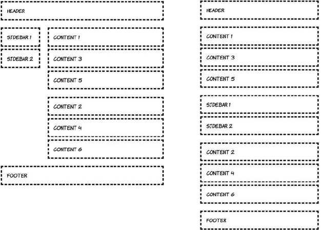
302 CHAPTER 8 Layout with CSS3
To start with, define the single-column, small-screen layout:
body {
display: grid;
grid-rows: auto;
grid-columns: 1fr;
}
header { grid-row: 1; }
#sidebar { grid-row: 3; }
#content1 { grid-row: 2; }
#content2 { grid-row: 4; }
footer { grid-row: 5; }
For windows 600 pixels wide and greater, you’ll switch to a two-
column layout. Note that although the grid can be easily redefined on
the body rule, the elements must be explicitly slotted into that grid:
@media screen and (min-width: 600px) {
body {
grid-columns: auto 1fr;
grid-rows: auto 1fr 1fr auto;
}
640px width 480px width
The future of CSS layout 303
header { grid-column: 1; grid-row: 1; grid-column-span: 2; }
#sidebar { grid-column: 1; grid-row: 2; grid-rowspan: 2; }
#content1 { grid-column: 2; grid-row: 2; }
#content2 { grid-column: 2; grid-row: 3; }
footer { grid-column: 1; grid-row: 4; grid-column-span: 2; }
}
This CSS defines a three-column grid for windows wider than 760 pix-
els. Again, the slot locations have to be explicitly set:
@media screen and (min-width: 760px) {
body {
grid-columns: auto 1fr 1fr;
grid-rows: auto 1fr auto;
}
header { grid-column: 1; grid-row: 1; grid-column-span: 3; }
#sidebar { grid-column: 1; grid-row: 2; }
#content1 { grid-column: 2; grid-row: 2; }
#content2 { grid-column: 3; grid-row: 2; }
footer { grid-column: 1; grid-row: 3; grid-column-span: 3; }
}
Controlling content flow with CSS3 Regions
In print-publishing tools such as Adobe
InDesign, it’s common to create several
text boxes and then link them together
so the content added to them automati-
cally overflows from one box to the next.
In this paradigm, text flows automati-
cally from one region of the page to
another and from one page to another—
you don’t need to calculate how much
text will fit in each region. You specify
some text and a collection of regions,
and the application takes care of the rest.
Grids offer great flexibility in laying out elements on the page and
solve nearly all the issues designers had with CSS layouts compared to
table—based layouts. But the elements being laid out are still
essentially square boxes with a fixed amount of content. In the next
section, you’ll learn about a proposal that lets you fit your content
into any shape and spread it across multiple elements.
Browser support quick check: regions
Full Partial
- 19.0
- -
- 10.0
- -
- 5.2
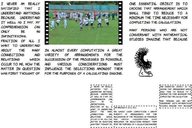
304 CHAPTER 8 Layout with CSS3
Adobe is a W3C member and has decided to give similar capabilities to
web authors—this fulfills a dual goal of making web layout more pow-
erful for web designers while making it easier for Adobe to generate
content straight to the web from its print-publishing tools. To this end
they have proposed the CSS3 Regions module. Adobe has helped
implement support for their proposal in WebKit, and IE10 also has pre-
liminary support. Here’s an example page layout created with the new
Regions module.
The previous screenshot
shows three text boxes. The
diagram at right outlines each
box explicitly. The content in
the boxes flows between them
without having to be assigned
to one box or another as
would normally be required
on a web page.
The HTML contains four <div>
elements. The <div> with id
value source contains all the
content: a set of four para-
graphs.
<div id="source">
<p>I never am really
satisfied...</p>
<p>In almost every
computation...</p>
<p>Many persons who...</p>
<p>The Analytical Engine...</p>
The future of CSS layout 305
Making complex shapes with CSS3 Exclusions and Shapes
The CSS3 Exclusions specification allows you to wrap content in and
around complex shapes. This spec was also born out of Adobe’s pro-
posals; initially it was for shaping the regions now in the CSS3 Regions
specification. The following layout can be achieved with a tweak to the
This is followed by three
empty <div> elements, all with
a class of region. You’ll flow
the content into these three
empty <div> elements.
</div>
<div id="region1" class="region">
</div>
<div id="region2" class="region">
</div>
<div id="region3" class="region">
</div>
<img src="00092.jpg" class="video">
<img src="dust-puppy.png"
class="dp">
The magic happens in the
CSS. First the source <div> is
assigned to flow1. Then the
declaration for elements with a
class of region says to take the
content for these elements
from the flow that has just
been defined.
The remainder of the CSS
positions the region elements
on the page as shown earlier.
Check out ch08/regions-
1.html file for the full code.
#source{
flow-into: flow1;
text-align:justify;
}
.region {
flow-from: flow1;
}

306 CHAPTER 8 Layout with CSS3
CSS from the last example in the previous section. The key difference
from the previous example is the addition of the wrap-shape-mode and
wrap-shape properties:
.region {
flow-from: flow1;
wrap-shape-mode: content;
wrap-shape: polygon(
0px,160px 20px,232px 40px,262px
60px,282px 80px,296px 100px,305px 120px,313px
140px,316px 160px,320px 180px,316px 200px,313px
220px,305px 240px,296px 260px,282px 280px,262px
300px,232px 320px,160px 300px,90px 280px,52px
260px,34px 240px,20px 220px,10px 200px,4px
180px,1px 160px,0px 140px,1px 120px,4px
100px,10px 80px,20px 60px,34px 40px,52px
20px,90px 0px,160px
);
}
#region1 {
wrap-shape: polygon( 0px,320px 0px,0px 320px,320px 0px,320px );
}
#region3 {
wrap-shape: polygon( 0px,320px 320px,0px 320px,320px 0px,320px );
}
The shapes don’t have to contain content—they can also exclude it. This
is what the CSS3 Exclusions module is concerned with. The syntax is
exactly the same as for Regions, but instead of content flowing into the
shapes, the content is flowed around them.
In this example, the content
is displaying as normal
inside the #source element.
Then the shapes are abso-
lutely positioned over that
content. This is changed by
using the around keyword
instead of content:
wrap-shape-mode: around;
The future of CSS layout 307
The Exclusions spec is still under heavy development, but it represents
some useful additions to the web author’s toolkit. Positioned floats are a
concept created by the IE team at Microsoft; they first appeared in
IE10 Platform Preview 2. They achieve results similar to the exclusions
so they have been folded into the Exclusions spec. To demonstrate,
let’s use a simple page with five paragraphs:
<p>I never am really satisfied...</p>
<p>In almost every computation...</p>
<p>Many persons who are not...</p>
<p>The Analytical Engine has no pretensions...</p>
<p>The Analytical Engine weaves algebraic patterns...</p>
Making the last paragraph a positioned float is as simple as setting the
both value for the wrap-flow property:
p:last-child {
width: 200px;
position: absolute;
wrap-flow: both;
top: 75px;
left: 250px;
}
All the other text flows
around the positioned float.
Other possible values are
start and end, which allow
the text to flow only past the
start or end of the object,
leaving the other side empty,
and minimum and maximum
which allow flow only into
narrowest or widest sides,
respectively.
308 CHAPTER 8 Layout with CSS3
Browser support for these new features is still fairly patchy, but they’re
worth exploring now so you can be prepared for the future.
Browser support
As discussed in the introduction, browser support for CSS layout has
long been an issue. Everything in the CSS2 spec is now implemented in
all major browsers: that includes everything discussed in the section
“Underused CSS2 layout features.” Support for the other features
we’ve discussed is patchier, reflecting the experimental nature of the
specifications. The following table shows the details.
In the last example, the
floated element looked a bit
cramped. You can apply spac-
ing to positioned floats with
the wrap-margin property:
p:last-child {
width: 200px;
position: absolute;
wrap-flow: both;
wrap-margin: 1em;
top: 75px;
left: 250px;
}
To demonstrate an alternative
effect, let’s arrange the other
paragraphs into four
columns:
p { display: table-cell; }
You can see that the text still
flows around the floated ele-
ment, even though the four
paragraphs are independently
positioned.
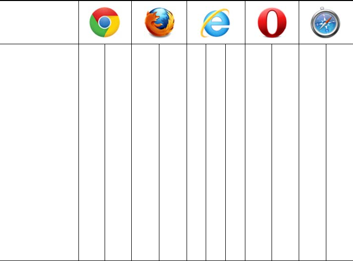
Browser support 309
Key:
●Complete or nearly complete support
○Incomplete or alternative support
Little or no support
inline-block in IE6 and IE7
Although IE didn’t add support for inline-block until version 8, it’s pos-
sible to achieve the same effect by taking advantage of some nonstan-
dard behavior. IE has an internal concept called hasLayout that endows
elements with special properties as far as the layout engine is con-
cerned. For our current purposes, the only thing you need to know is
that an element that is display: inline but also hasLayout will behave
like an inline-block element in other browsers.
One of the simplest ways to trigger hasLayout is to use the IE-specific
CSS extension zoom with a value of 1 (which makes no visible differ-
ence), coupled with the star hack:
display: inline-block;
*display: inline;
zoom: 1;
12 14 4 6 8 9 10 11.5 12 5 5.1
inline-block ● ● ● ● ● ● ● ● ● ● ●
display: table ● ● ● ● ● ● ● ● ● ● ●
calc ○ ○ ● ●
box-sizing ● ● ○ ○ ● ● ● ● ○ ●
Media queries ● ● ● ● ● ● ● ● ● ●
Flexboxes ○ ○ ○ ○ ○ ○ ○
Multiline flexboxes ○
Templates/grids ○
Regions
Exclusions ○
310 CHAPTER 8 Layout with CSS3
Most browsers will ignore the second two properties as invalid,
whereas IE7 and earlier will ignore the first property but process the
second two.
calc in Chrome and Firefox
Firefox requires the -moz- prefix for calc while Chrome requires
-webkit-. For maximum support, you should specify four rules—one
for browsers with no calc support, one for Firefox, and one for stan-
dards-compatible browsers (currently only IE):
width: 23%;
width: -moz-calc(100%/4 - 10px);
width: -webkit-calc(100%/4 - 10px);
width: calc(100%/4 – 10px);
This code sets the element width to 23% in browsers that have no sup-
port for calc and 100%/4–10px for any browser that does support it.
box-sizing in Firefox and Safari 5
Firefox and older versions of Safari require a -moz- prefix for box-sizing:
-moz-box-sizing: border-box;
-webkit-box-sizing: border-box;
box-sizing: border-box;
If you need to support IE8, because of the significant impact the box
model can have on your layout, it’s best to use either IE conditional
comments or modernizr.js to provide alternative rules to that browser.
Flexboxes in Chrome, Firefox, IE, and Safari
Currently, prefixes are required in all browsers that support flexboxes.
To get maximum support, you need to specify each property four times:
div {
display: -moz-box;
display: -webkit-box;
display: -ms-box;
display: box;
-moz-box-orient: vertical;
-webkit-box-orient: vertical;
-ms-box-orient: vertical;
Summary 311
box-orient: vertical;
}
div div {
-moz-box-flex: 1;
-webkit-box-flex: 1;
-ms-box-flex: 1;
box-flex: 1;
}
This code sets the parent <div> element to be a flexbox container and
gives any child <div> elements the same amount of flex in all browsers
that have support.
Media queries and old browsers
If a browser doesn’t support media queries, then it won’t apply any of
the rules listed in a media query section. Any rules outside of a media
query section will constitute the default state of your site, so you should
always consider the sorts of devices the majority of your users will be
browsing with. If your site is primarily for desktop users, then your
default styles should be aimed at a desktop-style layout—around 1000
pixels wide and (most likely) using an older version of IE. If your site is
more mobile focused, then it would be better to target a small screen by
default and add media queries to improve the experience in modern
desktop browsers.
Regions and exclusions
Although IE10 and Chrome both have some support for these modules,
there are several limitations. In IE10 the source content for flow-into
must be an iframe. In Chrome 17–20 you must explicitly enable support
for regions in the about:flags page. Neither browser has much support
for shaped exclusions, but IE10 does support rectangular exclusions.
Summary
In this chapter, you’ve learned about some of the murky past of CSS
layout and how the situation has improved thanks to the gradual
decline of old versions of IE, allowing the use of the full range of CSS2
layout tools. New features like box-model, calc, and media queries
already have wide support and promise to improve the situation even

312 CHAPTER 8 Layout with CSS3
further. Finally, you’ve glimpsed the bright future of CSS layout,
thanks in no small part to the new versions of IE—flexboxes, tem-
plates, grids, and exclusions promise to make web page layout much
easier and more flexible.
To stand out from the crowd, what your web page needS isn’t an
elegantly coded three—column layout—you want color,
movement, and interactivity. In the next chapter, you’ll start
to learn about the flashier aspects of CSS3 as we look at
colors, transformations, transitions, and animations.
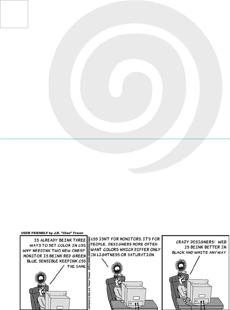
313
9
Motion and color
This chapter covers
•Making elements semitransparent with the
opacity
property
•Making colors semitransparent with RGBA
•A new, more intuitive way to specify color: HSL and HSLA
•Natural user interaction with transitions and animation
In this chapter, we’ll look at some of the snazzier aspects of CSS3—fea-
tures that are much loved by graphic designers.
314 CHAPTER 9 Motion and color
Colors and opacity
In the beginning, the web was black and white, but these days there
aren’t many websites that don’t make extensive use of color. It’s
unlikely the web will revert to black and white any time soon, so it’s a
good thing CSS3 includes several new features for colors. Later in this
section, you’ll learn about RGBA, HSL, and HSLA. First, though, let’s
investigate how CSS3 allows you to achieve another popular effect in
modern web design: semitransparency with the opacity property.
Opacity
Opacity is a measure of what percentage of light is blocked by an object.
In the case of HTML and CSS, the objects are elements on the page.
They are, by default, fully opaque; no light is allowed through, so you
can see nothing of the elements beneath (that is, earlier in the source
code). If a paragraph has a blue background, it completely obscures
any background on the element that contains the paragraph.
Opacity can be used to de-emphasize page elements to let your user
focus on a single important task. This is commonly seen on the web in
the ubiquitous lightbox, shown in action here.
Browser support quick check: opacity
Standard Prefixed
1.0 -
1.0 0.8
9.0 -*
9.0 -
1.2 1.0
*IE has been able to do transformations
with the nonstandard filter attribute
since version 5.5.
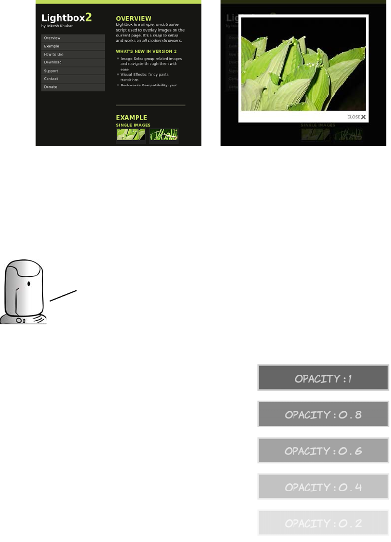
Colors and opacity 315
Before: The normal busy page.
The user has lots of options.
After: The rest of the page is hid-
den behind a semitransparent
layer so the user can concentrate
on the picture.
The opacity property is straightfor-
ward: you specify a value between 0
and 1. The fully opaque default is 1,
and 0 is fully transparent:
div {
background-color: #666;
color: #ccc;
border: 4px solid #ccc;
}
div:nth-child(1) { opacity: 1; }
div:nth-child(2) { opacity: 0.8; }
div:nth-child(3) { opacity: 0.6; }
div:nth-child(4) { opacity: 0.4; }
In this chapter the CSS examples omit sizing information so that you
can focus on the rules for applying opacity, color, and motion. If
you’re re—creating the examples from the text you’ll usually need
to add the following rule to replicate the screenshots:
div {
display: inline-block;
margin: 0.5em;
padding: 0.5em;
}
IN ADDITION TO THE ABOVE, SOME OF the examples use a width: 12em; property.
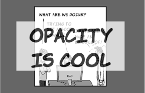
316 CHAPTER 9 Motion and color
A common use of opacity is to make a continuous pattern or background
image always be visible without clashing with the main content. Here
the <h1> element lies on top of the <div> that contains it, but opacity is
used to let the background of the <div> be partly visible through the <h1>:
Here’s the markup. You can see the full listing in ch09/opacity-4.html:
<body>
<div><h1>Opacity is cool</h1></div>
</body>
Although the opacity property isn’t inherited in the CSS sense, the
opacity of the parent element affects that of its child elements. In the
following example, on the right (listing ch09/opacity-2.html), all the
child elements are invisible because they’re contained within an
element that isn’t visible, regardless of their individual opacity values.
div:nth-child(5) { opacity: 0.2; }
div:nth-child(6) { opacity: 0; }
When all the elements are sitting
against the same white background,
the effect of decreasing opacity is the
same as using lighter colors. The full
code for this example is in ch09/opac-
ity-1.html.
body {
background-color: #666;
}
div {
background: url(example.png)
no-repeat 50% 50%;
}
h1 {
background-color: #fff;
color: #000
opacity: 0.75;
}
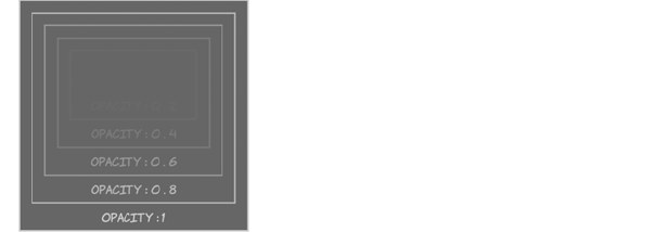
Colors and opacity 317
This is the same as setting an element to visibility: hidden—the ele-
ment isn’t visible, but it’s still taking up space on the page. On the left
(listing ch09/opacity-3.html), the outer element is fully visible, but
transparent child elements don’t cut holes in their opaque parents.
Descending opacity Ascending opacity
div > div > div > div > div > div
{ opacity: 0; }
div > div > div > div > div
{ opacity: 0.2; }
div > div > div > div
{ opacity: 0.4; }
div > div > div { opacity: 0.6; }
div > div { opacity: 0.8; }
div { opacity: 1; }
div > div > div > div > div > div
{ opacity: 1; }
div > div > div > div > div
{ opacity: 0.8; }
div > div > div > div
{ opacity: 0.6; }
div > div > div { opacity: 0.4; }
div > div { opacity: 0.2; }
div { opacity: 0; }
<div><div><div><div><div><div>
opacity : 0
</div>
opacity : 0 . 2
</div>
opacity : 0 . 4
</div>
opacity : 0 . 6
</div>
opacity : 0 . 8
</div>
opacity : 1
</div>
<div><div><div><div><div><div>
opacity : 1
</div>
opacity : 0 . 8
</div>
opacity : 0 . 6
</div>
opacity : 0 . 4
</div>
opacity : 0 . 2
</div>
opacity : 0
</div>
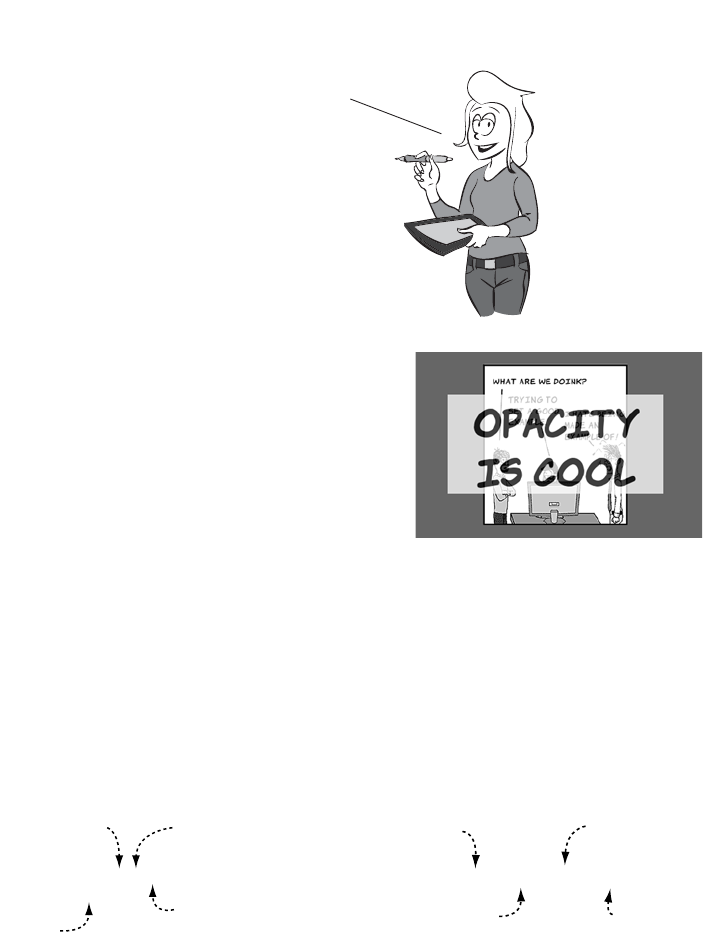
318 CHAPTER 9 Motion and color
RGBA
Sometimes you don’t want to make an
entire element transparent or semi-
transparent. If you refer back to the
example from listing ch09/opacity-
4.html, the text and the background
are semitransparent.
If you want people be able to read large amounts of text like this, then
a semitransparent background would be better combined with fully
opaque text. Rather than make the entire element semitransparent,
CSS3 provides several ways of specifying color values that have a level
of transparency, the first of which is rgba(). You can use rgba() to make
just the background transparent. If you’re used to the hexadecimal
shorthand for specifying colors, these two diagrams show how they’re
related.
50% opacity element with a
dark gray background
Element with a background that is
both dark gray and 50% opacity
A = Alpha (Opacity) = A
Miranda’s Acronym Cheat Sheet
WE techies love our acronyms. Let me
explain the common ones in this chapter:
RGB, RGBA, HSL, and HSLA. The seven letters
mean the same thing in all four.
R = Red
G = Green
B = Blue
Hue= H
Saturation = S
Luminosity = L
background: #666666;
opacity: 0.5;
red component
00−ff
Green component
00−ff
Blue component
00−ff
Opacity
0.0−1.0
background: rgba(102, 102, 102, 0.5);
red component
0−255
Green component
0−255
Blue component
0−255
Alpha Transparency
0.0−0.1
Colors and opacity 319
The primary benefit is that the opacity
is now confined to the background—
the rest of the element’s contents and
attributes can be full opacity.
The difference is even more pro-
nounced for the nested element exam-
ple, where previously setting the outer
element to transparent made the entire
set of elements disappear.
See the full code for this example in
listing ch09/rgba-2.html.
With transparency confined to the
background and not inherited, the text
and borders remain visible on all the
elements:
div > div > div > div > div > div {
background-color:
rgba(102,102,102, 1); }
div > div > div > div > div {
background-color:
rgba(102,102,102, 0.8); }
div > div > div > div {
background-color:
rgba(102,102,102, 0.6); }
div > div > div {
background-color:
rgba(102,102,102, 0.4); }
Browser support quick check: rgba()
Full Partial
2.0 -
3.0 -
9.0 -
10.0 -
3.1 -
320 CHAPTER 9 Motion and color
HSL and HSLA
You may have found yourself wanting a
darker shade of a particular color as a
contrasting element in one of your
designs. This is easy to manage in simple
cases with RGB—just make the num-
bers smaller, as in the next example.
For those of you reading this book on
paper in black and white, the top pair of
elements that follow are shades of gray,
the middle pair are shades of blue, and
the bottom pair are a sort of purple/pink
combination:
div > div {
background-color:
rgba(102,102,102, 0.2); }
div {
background-color:
rgba(102,102,102, 0); }
See listing ch09/rgba-3.html for the full code.
.one {
background-color:
rgb(204,204,204);
color: rgb(102,102,102);
}
.darkone {
background-color:
rgb(102,102,102);
color: rgb(204,204,204);
}
.two {
background-color: rgb(51,102,153);
color: rgb(17,34,51);
}
.darktwo {
background-color: rgb(17,34,51);
color: rgb(51,102,153);
}
Browser support quick check:
hsl() and hsla()
Full Partial
2.0 -
3.0 -
9.0 -
10.0 -
3.1 -
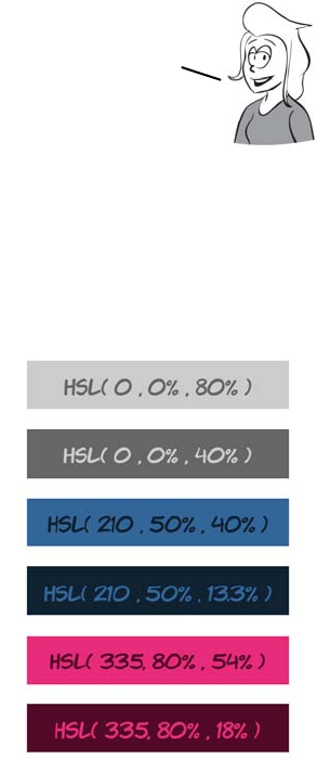
Colors and opacity 321
Although in all three pairs the second color is a darker shade of the first
color, it gets increasingly difficult to see the relationship in the pairs as
the numbers become less regular.
HSL stands for hue, saturation, and luminosity in the same way that RGB
stands for red, green, and blue. The basic color is provided by the hue,
and the saturation determines the intensity of the color—lower satura-
tion means more grey. The luminosity determines how light or dark the
color is. Here’s the same set of colors using HSL notation:
.three {
background-color: rgb(232,44,122);
color: rgb(83,9,40);
}
.darkthree {
background-color: rgb(83,9,40);
color: rgb(232,44,122);
}
.one {
background-color: hsl(0,0%,80%);
color: hsl(0,0%,40%);
}
.darkone {
background-color: hsl(0,0%,40%);
color: hsl(0,0%,80%);
}
.two {
background-color:
hsl(210,50%,40%);
color: hsl(210,50%,13.3%);
}
.darktwo {
background-color:
hsl(210,50%,13.3%);
color: hsl(210,50%,40%);
}
Note that to make the same color darker, you have to adjust three
values. The fact that these pairs of colors are related probably
wouldn’t be obvious if you came across them on different lines of a
CSS file, unless you’re naturally the sort of person who can’t look at a
set of numbers without calculating common factors in your head.
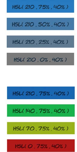
322 CHAPTER 9 Motion and color
In HSL, the luminosity of the color is controlled by one parameter. The
relationship between the colors is therefore far more obvious from the
code, because this is the only parameter that changes.
.three {
background-color:
hsl(335,80%,54%);
color: hsl(335,80%,18%);
}
.darkthree {
background-color:
hsl(335,80%,18%);
color: hsl(335,80%,54%);
}
Here’s what happens when you vary only
the saturation. It’s hard to make out the
differences in a black-and-white book, so
I’ll describe them: the box at the top is
light blue, and the one at the bottom is
gray.
Open the example file to get a better look
at the colors: ch09/colors-hsl-3.html.
If only the hue is varied, you get different
colors with the same saturation and lumi-
nosity. The hue corresponds to a point on
a color wheel, measured in degrees—360
and 0 are the same hue. Using four evenly
spaced points for this example yields a
blue, two shades of green, and a red.
Unfortunately, because the colors have
the same saturation and luminosity, they’ll
be even harder to tell apart in black and
white. Open the example file to see for
yourself: ch09/colors-hsl-4.html.
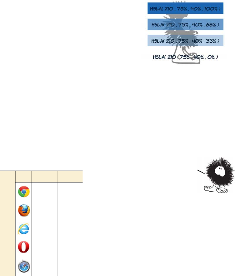
CSS transforms 323
HSL has a semitransparent equivalent: HSLA. Like RGBA, it has a final
parameter that specifies the percentage opacity:
CSS transforms
In chapter 3, you learned about transforms
using the <canvas> element and SVG—these let
you rotate, scale, and skew elements. Similar
functionality is made available as part of
CSS3. Because everything uses the same ren-
dering engine (the browser), this shouldn’t be
too surprising. It’s already implemented—the
browser is just offering different ways to acti-
vate it. Transforms allow your designs to
escape the rectangular world of standard web
pages.
.one {
background-color:
hsla(210,75%,40%,1);
color: hsl(210,75%,13.3%);
}
.two {
background-color:
hsla(210,75%,40%,0.66);
color: hsl(210,75%,13.3%);
}
.three {
background-color:
hsla(210,75%,40%,0.33);
color: hsl(210,75%,13.3%);
}
.four {
background-color:
hsla(210,75%,40%,0);
color: hsl(210,75%,13.3%);
}
Browser support quick check:
2D transforms
Full Partial
- 7.0
- 3.5
- 9.0*
- 10.5
- 3.1
*IE has been able to do transformations
with the nonstandard filter attribute
since version 5.5.
Colors and transparency can add depth
and interest to your designs, but
everything is still basically a
collection of rectangles. If you want
elements at an angle, or text that runs
vertically, then with CSS2 you have to
resort to images. In
the next section,
you’ll learn about
CSS3 transforms. They
let you rotate, skew,
translate, and scale
elements to create an
interesting variety
in your designs.
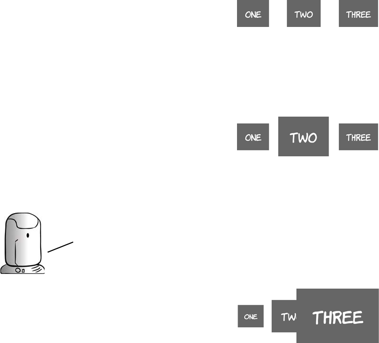
324 CHAPTER 9 Motion and color
2D transforms
To demonstrate CSS 2D transforms, we’ll use this simple page with
three similar elements:
<body>
<div>One</div>
<div>Two</div>
<div>Three</div>
</body>
Here’s the basic CSS:
div {
display: inline-block;
padding: 1em;
margin: 1em;
background-color: #666;
color: #fff;
}
This example picks out the second
element and scales it to 150% of its
initial size:
div:nth-child(2) {
transform: scale(1.5);
}
By default, transformed elements
keep their center point in the same
place. If you scale the third element to
250% of its original size, it partially
covers the second element:
div:nth-child(3) {
transform: scale(2.5);
}
All the examples in this section will need vendor prefixes applied if you
want to try them in current browsers. Add -webkit-, -moz-, -o-, or -ms- to
the front of the transform properties (not the values) for support in
Safari/Chrome, Firefox, Opera, and IE9, respectively. See the section
‘‘Browser supporT’’ at the end of this chapter for further details.
CSS transforms 325
When the elements are rotated around their centers, the visual spacing
can look a little odd. In this example, transform-origin is set for each
element to bring the elements closer together:
The static point around which the
transform is applied can be changed
with the transform-origin property.
Here we set the third element to
expand from its left outward:
div:nth-child(3) {
transform-origin: left;
transform: scale(2.5);
}
You can also rotate elements:
div:nth-child(1) {
transform: rotate(16.5deg);
}
div:nth-child(2) {
transform: rotate(33deg);
}
div:nth-child(3) {
transform: rotate(66deg);
}
div:nth-child(1) div {
transform-origin: bottom right;
transform: rotate(16.5deg);
}
div:nth-child(2) div {
transform-origin: top right;
transform: rotate(33deg);
}
div:nth-child(3) div {
transform-origin: top left;
transform: rotate(66deg);
}
326 CHAPTER 9 Motion and color
The skew functions allow you to create perspective-like effects. Hori-
zontal skewing is achieved with skewX and vertical with skewY:
It’s also possible to move elements around on the page with translateX
and translateY:
In this screenshot, the original posi-
tions of the elements have been
drawn in so you can more easily see
that each element is rotating around a
different reference point.
div:nth-child(1) {
transform: skewX(16.5deg);
}
div:nth-child(2) {
transform: skewY(33deg);
}
div:nth-child(3) {
transform:
skewX(16.5deg) skewY(33deg);
}
div:nth-child(1) {
transform: translateX(50px);
}
div:nth-child(2) {
transform: translateY(50px);
}
div:nth-child(3) {
transform:
translate(-50px, -50px);
}
Note that transforming elements doESn’t affect the rest of your
layout; everything else remains in the place it would be if the there
was no transform. Transforms can be combined to create interesting
effects. In the following example, the three example elements have been
transformed into a pseudo—3D cube using skew, rotate, and translate.
CSS transforms 327
For this trick, you need to add an
extra <div> to the markup to pre-
serve the direction of the content
in the top face:
<div class="cube">
<div>
<div>One</div>
</div>
<div>Two</div>
<div>Three</div>
</div>
The faces are then skewed by 30
or -30 degrees and positioned so
the edges line up. Colors are set
on each face individually to
enhance the perception of depth.
See the blog post “3D Cube using
2D CSS transformation” by Paul
Hayes for a full explanation of
this technique: www.paulrhayes
.com/2009-04/3d-cube-using-
css-transformations/.
.cube div:nth-child(1) div,
.cube div:nth-child(2),
.cube div:nth-child(3) {
padding: 10px;
width: 180px;
height: 180px;
}
.cube > div {
position: absolute;
}
.cube div:nth-child(2) {
transform: skewY(30deg);
background-color: #444;
}
.cube div:nth-child(3) {
transform: skewY(-30deg);
background-color: #666;
left: 200px;
}
.cube div:nth-child(1) div {
transform:
skewY(-30deg) scaleY(1.16);
background-color: #888;
font-size: 0.862em;
}
.cube div:nth-child(1) {
transform: rotate(60deg);
top: -158px;
left: 100px;
}
328 CHAPTER 9 Motion and color
3D transforms
Tricks with transform, translate, and skew are entertaining, but they
aren’t a substitute for real three-dimensional transformations. The
example in the previous section is subtly off—it doesn’t represent a
proper perspective rendering of a cube and the sides don’t quite line
up. Fortunately, the CSS Working Group is working on a standard for
transformations in three dimensions.
This time, because you’re making an actual cube in a 3D space, you
need six elements to form the sides:
<div class="cube">
<div class="one"><p>One</p></div>
<div class="two"><p>Two</p></div>
<div class="three"><p>Three</p></div>
<div class="four"><p>Four</p></div>
<div class="five"><p>Five</p></div>
<div class="six"><p>Six</p></div>
</section>
The first step in 3D transformations is to set a perspective. This defines
the depth of the 3D space within which you’ll be positioning the trans-
formed elements:
body { perspective: 1000; }
Browser support quick check:
3D transforms
Full Partial
- 12.0*
- 10.0*
-10.0
- -
- 4.0*
*Support for 3D transforms requires
the presence of a compatible graphics
card driver.
CSS transforms 329
Next, because you want all six sides of the cube to be transformed
within the same 3D space, you set a transform-style value of preserve-3d
on the parent element:
div.cube {
transform-style: preserve-3d;
position: relative;
}
To start with, all six sides will be stacked on top of each other with
absolute positioning:
div.cube > div
{ position: absolute; color: #fff;
width: 200px; height: 200px; }
Now the individual sides are transformed in 3D. Each side is rotated so
it faces the correct way and then translated along the z-axis by 100 pix-
els (because the sides of the cube are 200 pixels deep). The z-axis is the
third dimension available in the 3D space. Because the rotation occurs
before the translation, each side is pushed away from the center of the
cube in a different direction:
.one {
transform: translateZ(100px);
background: rgba(136,136,136,0.5);
}
.two {
transform: rotateY(90deg) translateZ(100px);
background: rgba(102,102,102,0.5);
}
.three {
transform: rotateX(-180deg) translateZ(100px);
background: rgba(68,68,68,0.5);
}
.four {
transform: rotateY(-90deg) translateZ(100px);
background: rgba(34,34,34,0.5);
}
.five {
transform: rotateX(90deg) translateZ(100px);
background: rgba(153,153,153,0.5);
}
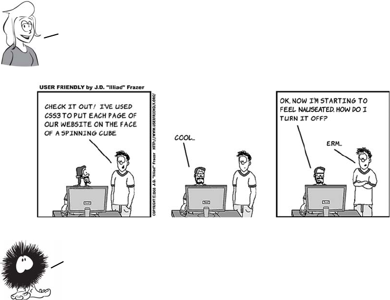
330 CHAPTER 9 Motion and color
.six {
transform: rotateX(-90deg) translateZ(100px);
background: rgba(34,34,34,0.5);
}
Finally, the whole cube is rotated in the z- and x-axes for artistic effect:
div.cube {
transform: rotateZ(-45deg) rotateX(45deg);
}
CSS transitions
A transition is a short animation between two element states, such as
activating a drop-down menu or closing a pop-up message. Instead of
having the elements immediately appear or disappear, the menu might
slide down, and the pop-up message could fade out. Such effects
Wrapping your web page around a cube will certainly be
memorable for visitors, but be careful that you don’t let your
snazzy CSS get in the way of them accessing your content.
Transforms come into their own when combined with
another new CSS3 feature: transitions. You’ll learn
about transitions in the next section.
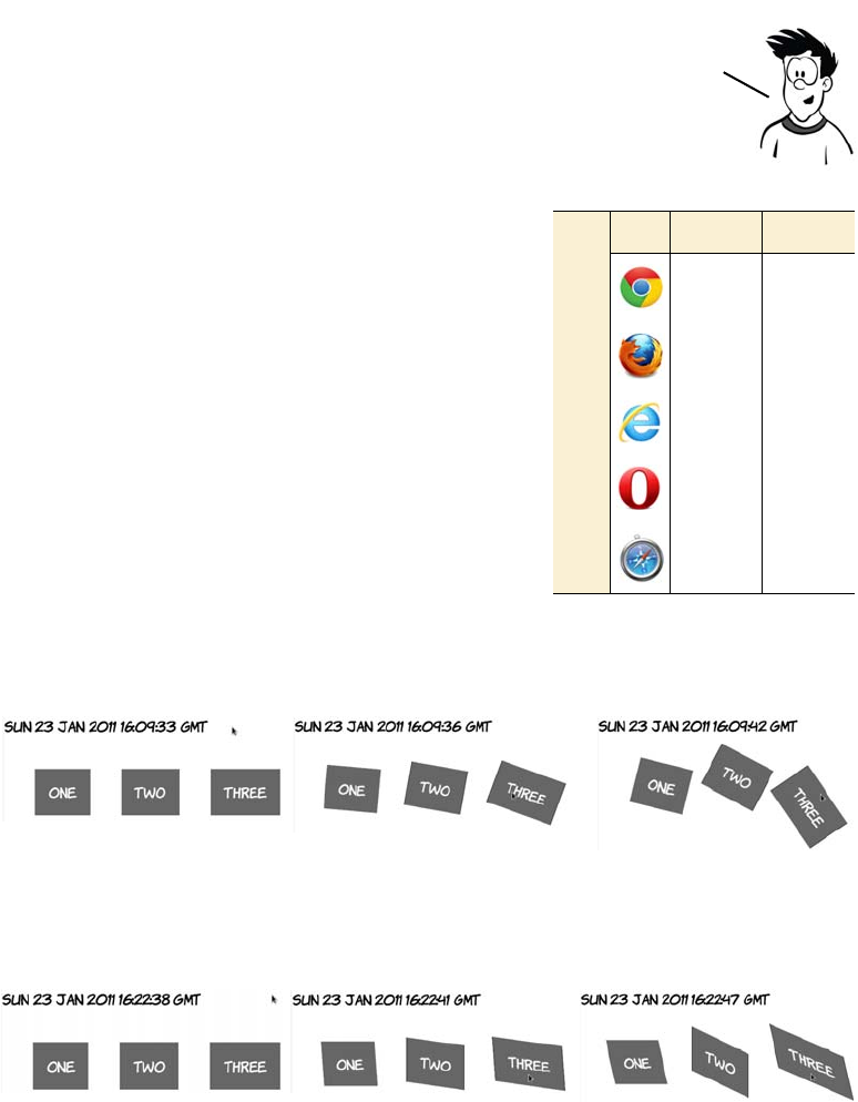
CSS transitions 331
improve usability by making interfaces more realistic and can be used
to clarify relationships.
One simple way to apply transitions is
with a dynamic pseudo-class like
:hover. In the following sets of screen-
shots, three of the transformation
examples from the previous section
have been applied to the :hover state
of a containing <div> with a transition
lasting 10 seconds. Instead of flipping
from one state to the other, the change
happens gradually. If you look care-
fully, the fly-like speck on each
screenshot is the mouse pointer.
This example is from ch09/transforms-5.html with a 10-second
transition.
This example is from ch09/transforms-6.html with a 10-second
transition.
One of the key attractions of the jQuery JavaScript library for
designers is that it makes it easy to create these small animations. CSS
transitions are intended to remove the need for JavaScript to apply
small visual effects, and in this section you’ll learn all about them.
Browser support quick check:
CSS transitions
Full Partial
- 7.0
- 4.0
- 10.0
- 10.5
- 3.1
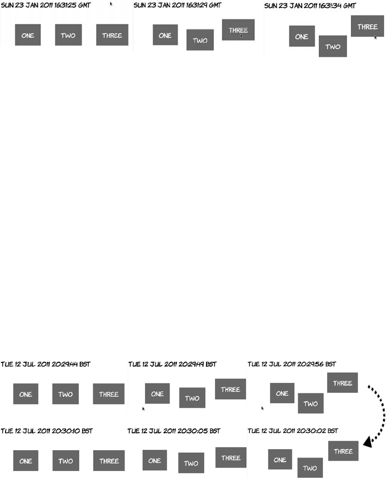
332 CHAPTER 9 Motion and color
This example is from ch09/transforms-7.html with a 10-second
transition:
When transition-duration is set on the default state of the element (in
this case, when it isn’t hover), the same duration applies as the transi-
tion runs both forward and backward—as the element enters the hover
state and leaves it, the transition will last 10 seconds as shown in the
results of listing ch09/transitions-3.html.
The transition-duration property
is the only thing required to cre-
ate the animation:
div div {
transition-duration: 10s;
}
Although all three elements have
unique states when the parent
element is hover, all three are
transitioned according to the pre-
vious rule. Look at ch09/transi-
tions-1.html to see for yourself.
div:hover div:nth-child(1) {
transform-origin: bottom right;
transform: rotate(16.5deg);
}
div:hover div:nth-child(2) {
transform-origin: top right;
transform: rotate(33deg);
}
div:hover div:nth-child(3) {
transform-origin: top left;
transform: rotate(66deg);
}
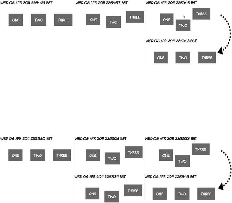
CSS transitions 333
But you can put transition-duration on the hover state. In this case, it
will only apply as the element enters the hover state. When the element
leaves hover, it immediately snaps back to the starting position—a
duration of zero.
This is the critical bit of code from listing ch09/transitions-4.html:
div:hover div { transition-duration: 10s; }
You can also put transition-duration on both states. In the next exam-
ple, the transition lasts 10 seconds as it enters the hover state and 5 sec-
onds as it exits.
The duration for exiting the hover state is specified on the rule without
the :hover:
div div { transition-duration: 5s; }
div:hover div { transition-duration: 10s; }
See the complete example in listing ch09/transitions-5.html.
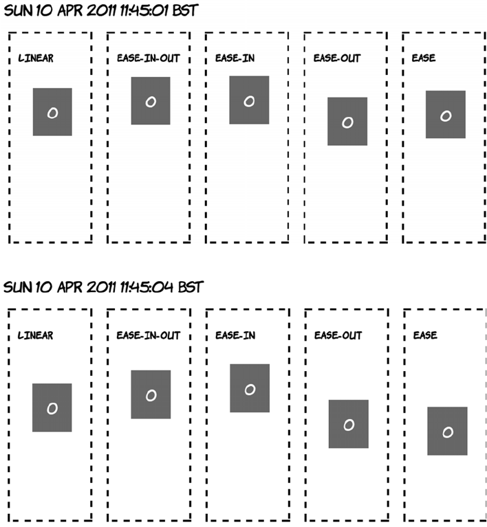
334 CHAPTER 9 Motion and color
Transition timing functions
By default, transitions happen at a constant rate, but you can adjust
that with the transition-timing-function property. The default value is
linear, but several other keywords are available: ease-in-out, ease-in,
ease-out, and ease. The difference is much easier to see than it is to
explain, so the next four screenshots show the values in operation side
by side over a 20-second transition.
The quickest out of the blocks is ease-out, followed by ease. Both ease-
in-out and ease-in are initially slower-moving than linear.
A few seconds later, ease has overtaken ease-out.
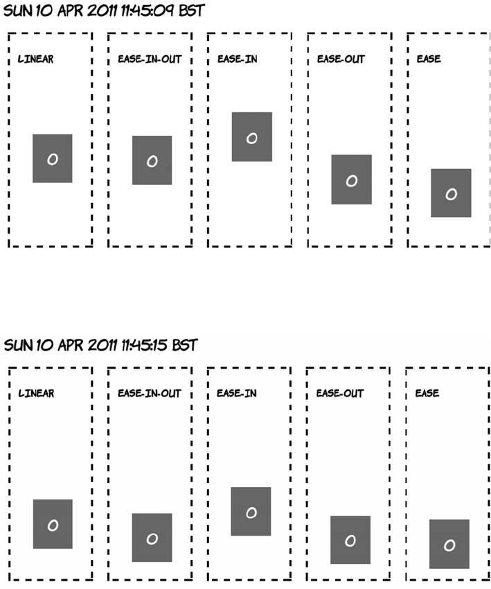
CSS transitions 335
As you go past the halfway point, ease-in-out has accelerated and is
ahead of linear.
Toward the end of the transition, ease-in is starting to catch up with
the rest; remember, all five transitions take 20 seconds to complete.
The non-linear transition timings often appear more natural—things
tend to accelerate and decelerate rather than suddenly start and stop
moving.
336 CHAPTER 9 Motion and color
You’re also not limited to effects on hover; any other dynamic pseudo-
class will work just as well. With a slight modification, the :target
example from chapter 7 can be made to fade smoothly in and out.
The HTML is similar to that in chapter 7. All that’s been added is a
<section> element to allow the paragraphs to be absolutely positioned:
<menu>
<a href="#one">Show one</a>
<a href="#two">Show two</a>
<a href="#three">Show three</a>
<a href="#four">Show four</a>
</menu>
<section>
<p id="one">I never am really satisfied...</p>
<p id="two">In almost every computation...</p>
<p id="three">Many persons who are not conversant...</p>
<p id="four">The Analytical Engine has no pretensions...</p>
</section>
1. The page loads blank. 2. When you click the
first link, the content
starts to fade in.
3. After 10 seconds, the
transition completes.
4. Clicking the second
link starts two transi-
tions. The current text
starts to fade out…
5. …as the new page
starts to fade in.
6. After 10 seconds, the
new content has
replaced the old.
CSS transitions 337
The paragraphs then fade in and out over 10 seconds. The fade-in uses
the timing function ease-in (start slow and finish fast), and the fade-out
uses ease-out so the disappearing paragraph begins to fade out as
quickly as possible, giving immediate feedback to the user:
section { position: relative; }
p {
opacity: 0;
position: absolute;
transition-duration: 10s;
transition-timing-function: ease-out;
}
p:target {
opacity: 1;
transition-timing-function: ease-in;
}
See the full source code in ch09/transitions-6.html.
Transition property
So far, the examples have implicitly chosen which properties they will
apply to by only listing the changed ones in the transition state. Every
property has therefore been subject to the same duration and timing
function. But it’s possible to apply multiple transitions to the same ele-
ment, with each one affecting a different property.
In this section, you’ll take advantage of the fact that all the transition
properties accept multiple properties in a comma-separated list. You
can declare two transition durations, one of 10 seconds and one of 20,
like this:
transition-duration: 10s, 20s;
Then, if you declare transition-property like this
transition-property: top, transform;
the transition of the top property will take 10 seconds, and the transi-
tion of the transform property will take 20 seconds. The next example
compares two elements with the same transition duration but different
transition properties.
338 CHAPTER 9 Motion and color
As you can see, element one drops quickly and expands slowly,
whereas element two expands quickly and drops slowly. The markup is
two <div> elements inside a <section> with this CSS applied to it:
section div {
position: absolute;
top: 0px;
transition-duration: 10s, 20s;
transition-property: top, transform;
}
section div:nth-child(2) {
left: 200px;
transition-property: transform, top;
}
section:hover div {
top: 280px;
transform: scale(1.5);
}
Transition delay
You don’t have to start a transition immediately after whatever action
initiated it. The transition-delay property allows you to specify a wait
before a transition starts. In the following screenshots, element two
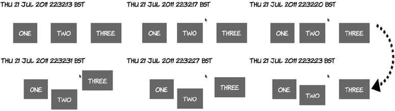
CSS transitions 339
doesn’t begin transitioning until five seconds after element one started,
and element three’s transition begins a further five seconds after that.
The code, from listing ch09/transition-delay-1.html, is identical to that
from ch09/transitions-3.html except for these two rules:
div div:nth-child(2) { transition-delay: 5s; }
div div:nth-child(3) { transition-delay: 10s; }
The most common use for transition-delay is to chain a number of
transitions together. If you want an element to first move and then
enlarge, you specify two transitions like this:
div {
transition-duration: 10s, 10s;
transition-delay: 0, 10s;
transition-property: top, transform;
}
The element will first transition the top value and then transition the
transform. You can see a full example in the code file ch09/transition-
delay-2.html. With transition-delay, it’s possible to create multiple-step
animations, providing that at each step a different property is transi-
tioned. For a more complete approach to animation with CSS, see the
later section “CSS Animation.”
Triggering transitions with JavaScript
After a transition is defined on an element, any change in the computed
style will trigger the animation. This doesn’t have to be due to a

340 CHAPTER 9 Motion and color
dynamic pseudo-class taking effect; you can also change the styles with
JavaScript.
Here’s the HTML for the page:
<menu>
<button onclick="clickme('changeleft')">Change left</button>
<button onclick="clickme('changetop')">Change top</button>
<button onclick="clickme('changecolor')">Change color</button>
<button onclick="reset()">Reset</button>
</menu>
<div id="animateme">Animate Me</div>
Clicking the Change Left but-
ton starts an animation.
Over 10 seconds, the element moves
to the left.
Similarly, clicking Change Top
starts another animation.
Over 10 seconds, the element moves
down from the top of the page.
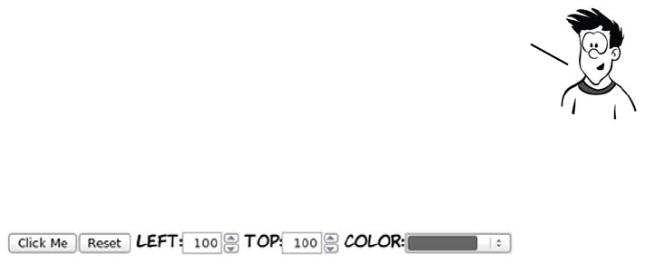
CSS transitions 341
The CSS defines the animation and three classes that adjust the rele-
vant properties:
#animateme {
background-color: #666;
position: absolute;
color: #fff;
left: 100px;
top: 100px;
transition-duration: 10s;
}
.changeleft { left: 250px !important; }
.changetop { top: 300px !important; }
.changecolor { background-color: #ff00ff !important; }
Note that you must use !important because otherwise the ID selector
would take precedence. Finally, here’s the JavaScript function to
apply the styles to the element when the buttons are clicked:
function clickme(classname) {
var el = document.getElementById('animateme');
el.className += " " + classname;
}
And here’s a reset function to clear the styles:
function reset() {
var el = document.getElementById('animateme');
el.setAttribute("style","");
}
This example switches to Opera so you can take advantage of the color
input type.
If you know exactly where the element needs to go, then adding predefined
classes is fine, but if you want to animate an element based on the result
of a calculation or user input, you can set the style properties of the
element directly. The next example demonstrates this approach.
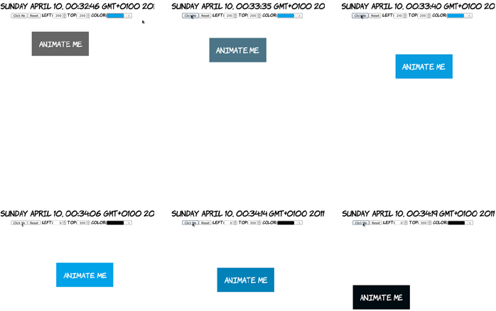
342 CHAPTER 9 Motion and color
<menu>
<button onclick="clickme()">Click Me</button>
<button onclick="reset()">Reset</button>
<label for="myleft">left</label>:
<input id="myleft" type="number" value="100">
<label for="mytop">top</label>:
<input id="mytop" type="number" value="100">
<label for="mycolor">color</label>:
<input id="mycolor" type="color" value="#666666">
</menu>
<div id="animateme">Animate Me</div>
function clickme() {
var el = document.getElementById('animateme');
var left = document.getElementById('myleft').value;
var top = document.getElementById('mytop').value;
var color = document.getElementById('mycolor').value;
el.setAttribute("style","left: " + left + "px; top: " + top +
"px; background-color: " + color + ";");
}
Set the left and top
to 200 and the color
to a light blue.
The element ani-
mates over 10 sec-
onds as before.
The animation is
complete.
Set the left to 0, the
top to 300, and the
color to black.
The element ani-
mates from its cur-
rent position.
After 10 seconds, the
new properties are
in effect.
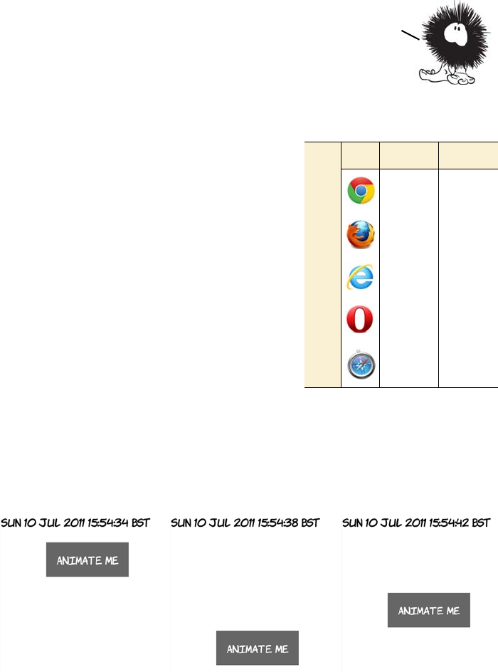
CSS Animation 343
CSS Animation
CSS Animations are a way of chaining
multiple transitions together on the
same property to be performed one
after the other. Transitions are always
linear—a single transition can move an
element from one location to another,
but it can’t move it to a third location
after that. Although you can chain
transitions together using transition-
delay, this technique quickly becomes
unwieldy for more than a few steps,
and you can still transition only one
property at a time. You could, of
course, perform a whole sequence of transitions with JavaScript, but
that would defeat the purpose of transitions—a declarative solution for
simple animations.
This first example makes an element bounce up and down.
To declare an animation, use the @keyframes directive. The first word
after the directive is the name of the animation, followed by a list of
Sometimes you may want more than the simple linear movement
between a set of properties that a transition allows. For example,
you may want an element to bounce or cycle through several states.
The next section shows you how to create these kinds of animations.
Browser support quick check:
CSS Animation
Full Partial
- 4.0
- 5.0
10
- 12
- 4.0
344 CHAPTER 9 Motion and color
keyframes in braces. Keyframes are defined by the keywords from or
to, or a percentage value:
@keyframes bounce {
from { top: 50px; }
25% { top: 350px; }
50% { top: 50px; }
75% { top: 350px; }
to { top: 50px; }
}
For each keyframe, you provide a semicolon-separated list of CSS
properties, just as in a normal CSS rule. For best effect, these should be
properties that can be transitioned; then the browser can take care of
the intermediate animation. The previous keyframes set the top of the
element to be alternately 50 and then 350 pixels.
To apply the animation to an element, use the animation-name property:
#animateme {
position: absolute;
left: 100px;
top: 50px;
animation-duration: 20s;
animation-name: bounce;
animation-iteration-count: infinite;
}
This rule also sets an animation-duration—this works the same way as
transition-duration. The animation will run for 20 seconds, so you can
calculate that the element will have a value of 350 pixels for top after 5
seconds: there are four steps after the from state, and 5 is 25% of 20 sec-
onds. You can also specify animation-iteration-count—this can be a fixed
value such as 3 or, as here, infinite, so the element can bounce up and
down forever (or until you get annoyed enough by the bouncing that you
close the tab). See the full source code in ch09/animations-1.html.
In the next example, two properties are animated simultaneously—the
element still bounces up and down, but it also gets bigger as it reaches
the bottom of the bounce.
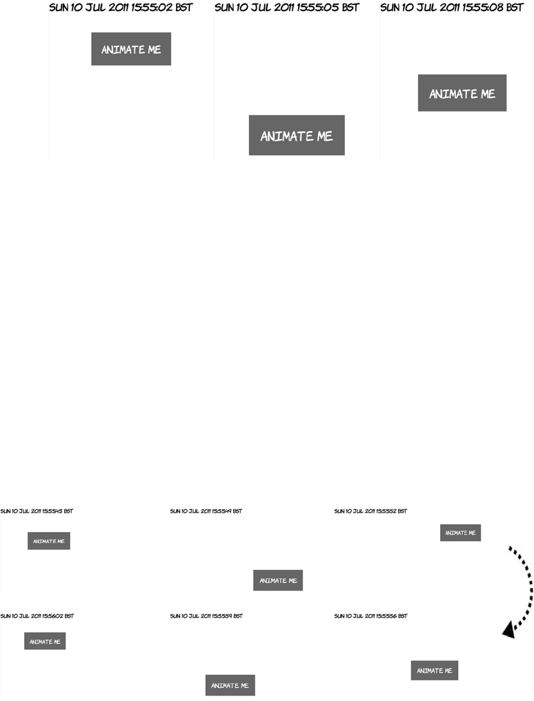
CSS Animation 345
As mentioned earlier, a keyframe is just like a regular CSS rule: you
can list as many properties as you need (although like transitions, not
all properties are animatable). For this example, all that’s been added
to the previous one is a scale transform; see the full source code in
ch09/animations-2.html:
@keyframes bounce {
from { top: 50px; transform: scale(1); }
25% { top: 350px; transform: scale(1.25); }
50% { top: 50px; transform: scale(1); }
75% { top: 350px; transform: scale(1.25); }
to { top: 50px; transform: scale(1); }
}
Just like transitions, multiple animations can be applied simultane-
ously. Next, you see the element doing the same up-and-down bounce
animation as before, but now it’s also sliding left to right.
346 CHAPTER 9 Motion and color
See the complete example in listing
ch09/animations-3.html.
Browser support
Key:
●Complete or nearly complete support
○Incomplete or alternative support
Little or no support
Opacity in IE8 and earlier
Although IE8 doesn’t support the CSS3 opacity property, it does sup-
port setting opacity through its nonstandard filter mechanism:
-ms-filter:"progid:DXImageTransform.Microsoft.Alpha(Opacity=50)";
This CSS will make the element it’s applied to have an opacity value
of 0.5.
Transforms, transitions, and animations in current browsers
All current browsers that have support for transforms, transitions, and ani-
mations require a vendor prefix to make things work. For transforms and
12 14 4 6 8 9 10 11.1 11.5 5 5.1
Opacity ● ● ● ● ○ ● ● ● ● ● ●
RGBA ● ● ● ● ● ● ● ● ● ●
HSL/HSLA ● ● ● ● ● ● ● ● ● ●
2D transforms ○ ○ ○ ○ ○ ○ ○ ○ ○ ○
3D transforms ○ ○ ○ ○ ○
Transitions ○ ○ ○ ○ ○ ○ ○ ○ ○ ○
Animation ○ ○ ○ ○ ○ ○
Now you’ve learned how it
all works; how much of it
can you use right now?
You’ll learn about browser
support in the next
section.
Browser support 347
transitions, this is the normal level of pain for using experimental CSS—
each property has to be listed five times. Here’s a section of code from ch09/
transition-delay-2.html:
-moz-transition-duration: 10s, 10s;
-webkit-transition-duration: 10s, 10s;
-o-transition-duration: 10s, 10s;
-ms-transition-duration: 10s, 10s;
transition-duration: 10s, 10s;
-moz-transition-delay: 0s, 10s;
-webkit-transition-delay: 0, 10s;
-o-transition-delay: 0, 10s;
-ms-transition-delay: 0, 10s;
transition-delay: 0, 10s;
-moz-transition-property: top, -moz-transform;
-webkit-transition-property: top, -webkit-transform;
-o-transition-property: top, -o-transform;
-ms-transition-property: top, -ms-transform;
transition-property: top, transform;
For animations, it’s more of a pain. Even if you’re only animating stan-
dard properties, you must specify the keyframes for every browser you
want to target, not including the standard declaration:
@-moz-keyframes bounce {
from { top: 50px; }
25% { top: 350px; }
50% { top: 50px; }
75% { top: 350px; }
to { top: 50px; }
}
@-webkit-keyframes bounce {
from { top: 50px; }
25% { top: 350px; }
50% { top: 50px; }
75% { top: 350px; }
to { top: 50px; }
}
@-o-keyframes bounce {
from { top: 50px; }
25% { top: 350px; }
50% { top: 50px; }
75% { top: 350px; }
348 CHAPTER 9 Motion and color
to { top: 50px; }
}
@-ms-keyframes bounce {
from { top: 50px; }
25% { top: 350px; }
50% { top: 50px; }
75% { top: 350px; }
to { top: 50px; }
}
Then the element itself needs all the animation-* properties for each
browser:
#animateme {
-moz-animation-duration: 20s;
-moz-animation-name: bounce;
-moz-animation-iteration-count: infinite;
-webkit-animation-duration: 20s;
-webkit-animation-name: bounce;
-webkit-animation-iteration-count: infinite;
-o-animation-duration: 20s;
-o-animation-name: bounce;
-o-animation-iteration-count: infinite;
-ms-animation-duration: 20s;
-ms-animation-name: bounce;
-ms-animation-iteration-count: infinite;
}
Of course, you should add the standard properties to this listing as
well. This will get really fun when the animation properties are stan-
dardized, but you want to use them to animate prefixed properties. For
example, it’s not yet clear if gradients and animations will be standard-
ized at the same time (or even if gradients will be animatable) but if
animations get standardized first in browsers, you could end up writing
code like this:
@keyframes swipe {
from {
-moz-linear-gradient(to right, #fff, #f00)
-webkit-linear-gradient(left, #fff, #f00)
-o-linear-gradient(to right, #fff, #f00)
-ms-linear-gradient(to right, #fff, #f00)
-linear-gradient(to right, #fff, #f00)
Browser support 349
}
50% {
-moz-linear-gradient(to right, #f00, #fff, #f00)
-webkit-linear-gradient(left, #f00, #fff, #f00)
-o-linear-gradient(to right, #f00, #fff, #f00)
-ms-linear-gradient(to right, #f00, #fff, #f00)
-linear-gradient(to right, #f00, #fff, #f00)
}
to {
-moz-linear-gradient(to right, #f00, #fff)
-webkit-linear-gradient(left, #f00, #fff)
-o-linear-gradient(to right, #f00, #fff)
-ms-linear-gradient(to right, #f00, #fff)
-linear-gradient(to right, #f00, #fff)
}
}
Using modernizr.js and jQuery for animation in older browsers
CSS Animations are intended to replace those implemented in libraries
like jQuery. Using modernizr.js, it’s easy to detect whether a browser
supports CSS Animations and, if it doesn’t, to supply equivalent
jQuery animations instead. The following code is taken from ch09/
animations-modernizr.html; it’s based on the earlier example ch09/
animations-1.html:
function bounce(el) {
$(el).animate({top: '350px'}, 5000)
.animate({top: '50px'}, 5000)
.animate({top: '350px'}, 5000)
.animate({top: '50px'}, 5000);
}
$(document).ready( function() {
if(!Modernizr.cssanimations) {
var refreshId;
$(function() {
This is a possible worst—case scenario; no need to start
panicking just yet. It’s to illustrate that animations
necessarily multiply the browser prefix problem.
jQuery equivalent
to bounce
True if animation
is supported
350 CHAPTER 9 Motion and color
$('#wrapper').hover(function() {
bounce($('#animateme'));
refreshId = setInterval(function(){
bounce($('#animateme')) }, 20000);
}, function(){
clearInterval(refreshId);
$('#animateme').stop(true,false)
.animate({top: '50px'},500);
});
});
}
})
Summary
You’re now fully prepared to produce Web 2.0–style designs with lay-
ers of semitransparent elements thanks to opacity and rgba(). You’re
also fully equipped to create sets of complementary colors in your head
thanks to hsl() and hsla(). Transforms and transitions create lots of
possibilities for making user interfaces smoother and more profes-
sional.
hover(), equivalent
to :hover
In the next chapter, you’ll learn about even more CSS3 eye candy. We’ll
cover the new features in CSS3 for backgrounds and borders,
including the extremely popular rounded corners and drop shadows.
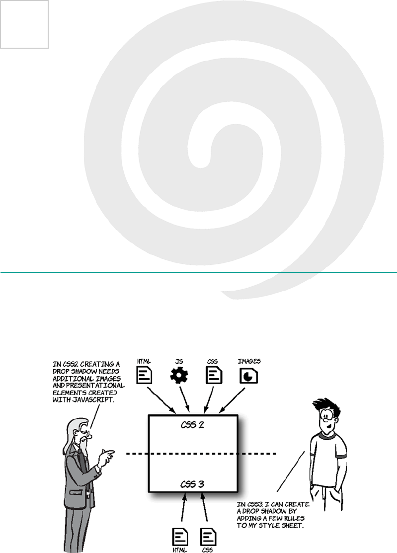
351
10
Borders and backgrounds
with CSS3
This chapter covers
•Adding drop shadows and rounded corners
•New ways to apply and use background images
•Creating gradients with CSS
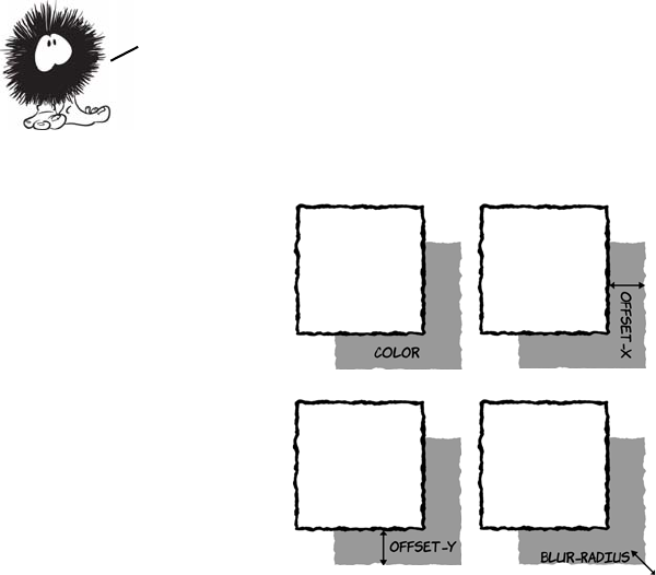
352 CHAPTER 10 Borders and backgrounds with CSS3
CSS3 makes the traditional background image approaches more flexi-
ble and provides declarative options for drop shadows, rounded cor-
ners, and gradients. Solutions that have involved images, JavaScript,
and extra markup can be replaced with simple HTML and CSS.
Drop shadows with CSS3
The pseudo-3D effect provided by drop shadows is a popular design
approach. In the past, designers have gone to great lengths to add this
visual effect, but CSS3 saves a lot of time and resources by having the
functionality built in.
CSS3 defines two types of shadow: box and text. They use a similar
syntax:
text-shadow: rgb(0,0,0) 3px 3px 3px;
box-shadow: rgb(0,0,0) 3px 3px 3px;
A basic shadow, in either case, is defined by four values:
<color> <offset-x> <offset-y> <blur-radius>
Box shadows
color is any valid
CSS color value, such
as #6699cc,
rgb(102,153,204), or
rgba(102,153,204,255).
offset-x is a CSS
length, such as 3px
or 0.5em. Negative
values are allowed.
offset-y is also a
CSS length; negative
values are allowed.
blur-radius is also
a CSS length. Nega-
tive values aren’t
allowed, but this
value is optional.
The next section looks at what each of the
four values used to define a shadow does.
Drop shadows with CSS3 353
SIMPLE BOX SHADOWS
Without the optional blur-radius, a box
shadow isn’t much different from a border.
Here’s an example that only sets an
offset-x:
box-shadow:
rgb(0,0,0) 12px 0px;
And here’s a plain offset-y:
box-shadow:
rgb(0,0,0) 0px 12px;
Adding a blur-radius by itself creates a
more shadow-like effect, even without any
offsets:
box-shadow:
rgb(0,0,0) 0px 0px 12px;
Browser support quick check: box-shadow
Standard Prefixed
10.0 5.0
4.0 3.5
9.0 -
10.5 -
5.0 3.0
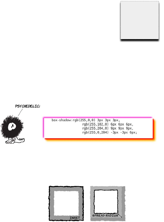
354 CHAPTER 10 Borders and backgrounds with CSS3
COMPLEX BOX SHADOWS
For complex effects, you can add multiple shadows in a comma-
separated list; they can all use different colors and directions. The fol-
lowing example has a red/orange shadow down and to the right and a
purple shadow up and to the left. Whether this is a good idea is up to
you!
The full box-shadow definition includes two additional, optional
elements:
<inset> <color> <offset-x> <offset-y> <blur-radius> <spread-radius>
By combining the blur-radius with the off-
sets, you can set the apparent light source:
box-shadow:
rgb(0,0,0) 0px 12px 12px;
inset, if present,
puts the shadow
inside the element
instead of
outside.
spread-radius is a
CSS length; it causes
the shadow to grow
(positive values) or
shrink (negative
values) relative to the
size of the element.
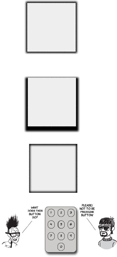
Drop shadows with CSS3 355
Here the shadow grows by
six pixels on every side:
box-shadow: rgb(0,0,0)
0px 0px 12px 6px;
This creates a shadow that
extends evenly all around
the element.
This example shows a
spread-radius combined with
an offset-y:
box-shadow: rgb(0,0,0)
0px 12px 12px 12px;
Using inset, you can achieve
bevel-like effects:
box-shadow: inset rgb(0,0,0)
0px 0px 12px 6px;
Or you can make an element
appear to drop into the page,
in this case by using the
:hover pseudo-class:
div:hover {
box-shadow:
inset rgb(0,0,0)
3px 3px 5px;
}
356 CHAPTER 10 Borders and backgrounds with CSS3
Text shadows
Text shadows work exactly the same as box shadows. They’re defined
by the same four values:
<color> <offset-x> <offset-y> <blur-radius>
We won’t look at these values again;
instead, let’s look at some examples.
Here’s a simple offset-x:
text-shadow:
rgb(51,51,51) 6px 0px;
And here’s an offset-y:
text-shadow:
rgb(51,51,51) 0px 6px;
As with box shadows, things
become more interesting when you
invoke blur-radius:
text-shadow:
rgb(51,51,51) 0px 0px 6px;
Browser support quick check:
text-shadow
Standard Prefixed
4.0 -
3.5 -
- 5.5*
10.0 -
2.0 -
*IE can create text-shadow effects using its
proprietary filter property, but only on
elements that have a transparent back-
ground.
Drop shadows with CSS3 357
And combining that with an offset
can create a 3D feel to match your
box shadows:
text-shadow:
rgb(51,51,51) 0px 6px 6px;
Multiple shadows work as well:
text-shadow:
rgb(51,0,0) 6px 0px,
rgb(0,0,51) 0px 6px;
But be careful, because it’s easy to
create completely unreadable text:
text-shadow:
rgb(51,0,0) 6px 0px 3px,
rgb(0,0,51) 0px 6px 3px;
In most cases, you’ll want to keep
your text shadows small and
subtle.
You can use negative values for
offset-x and offset-y. Doing so
allows for some interesting
pseudo-3D effects if you set the
text color to be the same as the
background color:
color: rgb(255,255,255);
text-shadow:
rgb(51,51,51) -1px -1px;
After drop shadows, the effect most beloved of graphic designers
in the last decade is rounded corners. For a long time web
authors have been using a number of approaches (or hacks) to
create boxes with rounded corners. They’re such a useful effect
that CSS3 provides a way to make them without any of these hacks.
358 CHAPTER 10 Borders and backgrounds with CSS3
Easy rounded corners
Perhaps even more common than the drop shadow in modern web
design is the rounded corner. Even otherwise simple website designs
often use rounded corners for visual effect.
Many of the rounded corners you see on the
web aren’t strictly necessary. An engineer
at Yahoo! once created a version of the
company’s home page without any rounded
corners and discovered that it reduced the
amount of data a user had to download by
more than 50%. When he showed the two
different versions of the page to designers,
they didn’t spot the difference.
CurvyCorners is a JavaScript library for
creating rounded corners on elements. Let’s
see how it compares to the new CSS3 tech-
niques for creating rounded corners.
The lengths web authors have to go to get the rounded corner
look in CSS2 is extraordinary—one popular method involves
adding hundreds of elements to a page just to get rounded
corners on a single element; we’ll look at that in this section.
Browser support quick check:
border-radius
Standard Prefixed
7.0 5.0
4.0 3.5
9.0 -
10.5 -
5.0 3.0
OK, I’m going
to create an element
with rounded corners
using the Curvy
Corners JavaScript
library.
Meanwhile,
I’ll create an
identical looking
element using
CSS3.
_
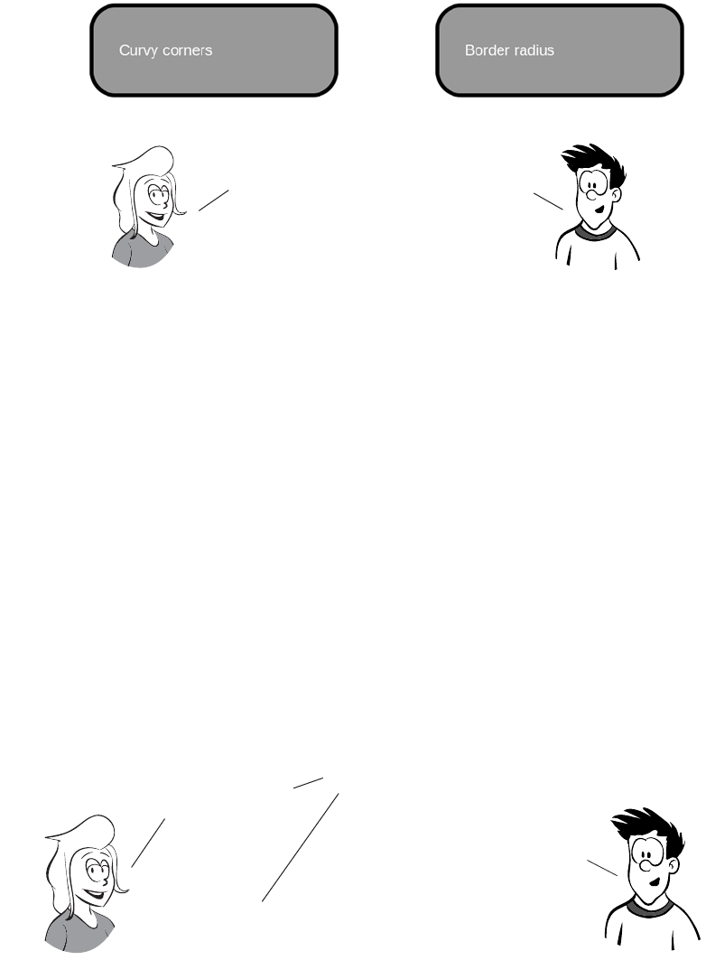
Easy rounded corners 359
<style>
#myBox {
background-color: #999;
border: 6px solid #000;
}
</style>
<script
src="curvycorners.js"></script>
<script>
addEvent(window,
'load', initCorners);
function initCorners() {
var settings = {
tl: { radius: 40 },
tr: { radius: 40 },
bl: { radius: 40 },
br: { radius: 40 },
antiAlias: true
}
</script>
<style>
#myBox {
background-color: #999;
border: 6px solid #000;
border-radius: 40px;
}
</style>
So far the result
doesn’t look any
different, whichever
approach you take.
I agree. Let’s
compare the code
we had to write to
get the rounded
corner effect.
_
It’s starting
to look like the CSS
approach is the winner. Even
though the CurvyCorners
code isn’t complex,
there’s twice as much of it. But I think
you’ve cheated—to get the widest browser
support, you need to add browser-specific
rules to your code.
That’s true, there would be four
extra lines in my CSS if this was
production code. I think I’d still
be winning, though!
This isn’t a competition, AJ. we’re collabo
rating to try to find the best approach!
Let’s look at the client-side markup for each.
360 CHAPTER 10 Borders and backgrounds with CSS3
Er, OK, there’s a little extra markup involved
with CurvyCorners, but it’s not like I had to
write all that HTML myself. Although it was
a bit of a pain having to attach a script, it
wasn’t that much effort on my part.
With the CSS3 approach,
the browser takes care of it all in
the background and may even hand off
the processing to graphics hardware
rather than render shadows itself.
Still, there’ll be a
performance impact on the
browser when scrolling
or resizing, due to having
thousands of extra
elements in the DOM .
On the other hand,
the CurvyCorners approach
will work on nearly every
browser out there, including
old versions of Internet
Explorer.
CSS3 isn’t
supported in every
browser yet, and web
authors will be dealing
with old versions of
some browsers
for years.
Browsers
that support border-radius
will get faster and lighter
weight pages. everyone else
won’t see anything amiss.
That’s true,
but you can easily detect
support for border radius
with JavaScript and only
run the CurvyCorners script
on browsers without
support.
_
_
New features for background images 361
In addition to the single-value
form you saw in the previous
example, you can also use dif-
ferent values for each corner
of an element.
Like the border, padding, and margin properties, the border-radius prop-
erty can accept up to four values. They apply starting from the upper-
left corner and proceed clockwise around the element:
border-radius: 40px 160px 80px 120px;
New features for background images
CSS3 offers four new features for the venerable background image: siz-
ing; multiple backgrounds on a single element; positioning relative to
the border, padding, or content; and clipping according to the border,
padding, or content. In this section, you’ll learn about each of these
new features.
Background size
Background images are intended to be
used purely for decoration, whereas
images placed in HTML are supposed to
mean something—this is the same separa-
tion-of-concerns principal that’s been dis-
cussed in several previous chapters. But
images placed in the markup have certain
practical advantages that can discourage
web authors from doing the right thing.
Later in this chapter, you’ll learn about several features in CSS3 that
provide native support for effects web authors have previously tried
to achieve with background images. There are also new features for
background images themselves. We’ll look at these in the next section.
Browser support quick check:
background-size
Standard Prefixed
7.0 5.0
4.0 3.6
9.0 -
10.5 10.10
5.0 3.0
362 CHAPTER 10 Borders and backgrounds with CSS3
In this example, an image has been set
as a decorative background to a header:
h1 {
background-image:
url('head-banner.png');
background-repeat: no-repeat;
padding-top: 1.85em;
}
Top padding has been set to allow room
for the background image, and the
image itself is sized to match the width
of the heading.
If the heading was to change at all, the
background image might look a little
incongruous. If you translate “Columbia
Internet” into French, for example, sud-
denly you have an image with some text
sticking out underneath. The visual
relationship is lost.
The new background-size property
allows the image to be stretched in
proportion to the dimensions of the
element:
h1 {
background-image:
url('head-banner.png');
background-repeat: no-repeat;
background-size: 100% 1.85em;
padding-top: 1.85em;
One of the advantages of images in markup is that it’s easy to make an inline
image scale according to the size of its container: set the width of the
image to be 100%. But in CSS2 backgrounds, there’s no way to make the image be
anything other than its innate size. The following example shows this issue.
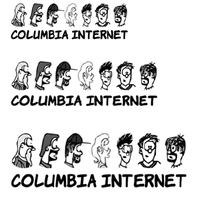
New features for background images 363
The ability to size backgrounds aligns well with vector graphics. In
chapter 3, you learned that SVG graphics, because they’re vectors, are
display: inline-block;
}
The h1 is set to be inline-block so its
width shrink-wraps its content. Then
the background image is set to be a fixed
height and full width. You can see that
the image becomes distorted as the
width of the element forces it to stretch.
For this reason, this approach is suitable
only to allow for small changes in
expected element width.
If the text will stay the same but will
appear in different font sizes, it’s possi-
ble to avoid the aspect-ratio issue. If you
know how wide the text will be, specify
the width and height in proportion to
the aspect ratio:
h1 {
background-image:
url('head-banner.png');
background-repeat: no-repeat;
padding-top: 2.18em;
display: inline-block;
background-size: 11.1em 2.18em;
}
section:nth-of-type(1) h1 {
font-size: 200%;
}
section:nth-of-type(2) h1 {
font-size: 250%;
}
section:nth-of-type(3) h1 {
font-size: 300%;
}
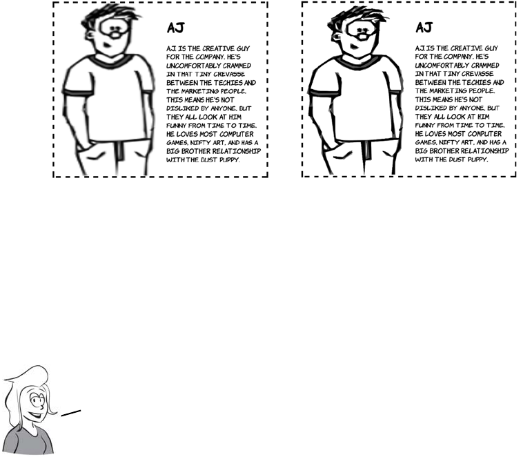
364 CHAPTER 10 Borders and backgrounds with CSS3
smooth and sharp no matter how much you stretch them, whereas bit-
map graphics become blocky and blurry. Following are two examples,
one using a bitmap PNG format and the other SVG. The SVG image is
much sharper.
div {
background-image:
url('aj.png');
background-repeat: no-repeat;
background-size: 50% 100%;
padding-left: 50%;
display: inline-block;
}
div {
background-image:
url('aj.svg');
background-repeat: no-repeat;
background-size: 50% 100%;
padding-left: 50%;
display: inline-block;
}
This example shows the main content
with a semitransparent background over-
laid on a background image set to fill the
entire box. Here’s the markup:
<section>
<div>
<p>In almost every...</p>
Although SVG works well with background sizing, it’s a bad fit for
photographic—type images. You may want to set a single picture
behind your content, similar to the effect achieved by setting a
desktop background on your computer. In this case, the detail of the
image isn’t as important, so distortion is less of an issue.
New features for background images 365
Multiple backgrounds
In CSS2, you’re only allowed one background image per element, but
there are many situations in which you might want more than one
image:
❂A header has a background image spanning the width of the page as
well as a company logo.
</div>
</section>
And here’s the CSS:
section {
margin: 1em;
padding: 5%;
outline: 4px dashed black;
background: url('10years.jpg') top /
100% no-repeat;
display: inline-block;
min-height: 342px;
min-width: 300px;
}
div {
background-color:
rgba(255,255,255,0.66);
}
Unlike the previous examples, it uses
the shorthand syntax. The size appears
with the position separated by a
slash: top / 100%.
Note that although several browsers have implemented background-size,
only Opera has implemented the shorthand syntax. For other browsers,
you’ll have to stick with a separate background-size declaration.
Scaling isn’t the only new background feature
added in CSS3. You can also attach multiple
backgrounds to a single element. In the previous
example, an element was added to the markup whose
only role was to add a background to the text. In
the next section, you’ll see how CSS3 allows you
to do this without additional markup for styling.
366 CHAPTER 10 Borders and backgrounds with CSS3
❂A decorative pull-quote box has opening and closing quotes on
either side.
❂Beveled buttons or tabs have images for the left and right sides.
❂A rough-edged paper scroll effect needs a repeating image down
both sides.
Often, web authors use CSS tricks to size a child element to match its
container so their background images can overlap (this is known as the
sliding doors technique). But they frequently have to introduce an extra
element to support the styling, or even add a decorative image inline in
the markup.
Let’s revisit the last example from
the previous section, except this time
without the additional <div> element
for wrapping the content:
<section>
<p>In almost every...</p>
</section>
Despite losing the extra element, the
page looks the same, because two
Browser support quick check:
multiple backgrounds
Standard Prefixed
7.0 -
3.6 -
9.0 -
10.5 -
3.0 -
All these approaches end up
adding purely presentational
markup to the page or, depending
on the elements, being combined
in a particular way. Although
this usually isn’t a major issue
in these isolated instances, it
indicates a lack of power in the
presentation language, CSS.
This lack of power is addressed
in CSS3, as you’ll see in the
examples that follow.
New features for background images 367
All the other background properties also allow a comma-separated list,
so you could write the previous example as follows:
background-image: url('pitr-head.png'), url('pitr-head.png'),
url('mike-head.png'), url('sid-head.png');
background-position: top right, bottom right,
top left, bottom left;
background-repeat: no-repeat, no-repeat,
no-repeat, no-repeat;
backgrounds are applied to the
<section> element:
section {
margin: 1em;
padding: 5%;
outline: 4px dashed black;
background:
url('trans-66.png')
50% 50% no-repeat,
url('10years.jpg') no-repeat;
background-size: 90% 90%,
100%;
display: inline-block;
}
Adding multiple background images
is a matter of listing them in the back-
ground property, along with any rele-
vant attributes, separated by
commas:
background: top right
url('pitr-head.png') no-repeat,
bottom right
url('aj-head.png') no-repeat,
top left
url('mike-head.png') no-repeat,
bottom left
url('sid-head.png') no-repeat;
See the full example in ch10/back-
grounds-5.html.

368 CHAPTER 10 Borders and backgrounds with CSS3
The background image you list first
will be the closest to the viewer. If
you put all the images in the same
place, you can see that the first
image covers the rest:
background: center
url('pitr-head.png') no-repeat,
center
url('aj-head.png') no-repeat,
center
url('mike-head.png') no-repeat,
center
url('sid-head.png') no-repeat;
See the full example in ch10/back-
grounds-6.html.
You can use this behavior to your
advantage to create interesting
effects. This examples use a
semitransparent PNG image in
between each of the other
background images to create
a progressive fade:
background: top right
url('pitr-head.png') no-repeat,
url('trans-66.png'),
bottom right
url('aj-head.png') no-repeat,
url('trans-66.png'),
top left
url('mike-head.png') no-repeat,
url('trans-66.png'),
bottom left
url('sid-head.png') no-repeat;
See the full example in
ch10/backgrounds-7.html.

New features for background images 369
Background origin and clipping
CSS2 has no control over what part of an element the background
applies to. Because CSS2 doesn’t allow background sizing, most
authors haven’t encountered this limitation; but CSS3 introduces two
new properties to give web authors fine-grained control: background-
origin and background-clip.
The default for background-origin is
padding-box. This means the background
applies to the area containing the padding
but not to the area containing the border:
section {
margin: 1em;
padding: 1em;
border: 1em dashed black;
background-origin: padding-box;
}
Remember, this example image is scaled to
fill its container and set to not repeat.
Setting the origin to border-box means the
background now extends out under the
border:
section {
margin: 1em;
padding: 1em;
border: 1em dashed black;
background-origin: border-box;
}
This section requires an understanding of the CSS
box model to get the most out of it. If you aren’t
sure, please refer to the discussion in appendix C or
the diagrams in chapter 8 before proceeding.

370 CHAPTER 10 Borders and backgrounds with CSS3
Finally, content-box limits the background
to the content area, inside the padding:
section {
margin: 1em;
padding: 1em;
border: 1em dashed black;
background-origin: content-box;
}
The default value for background-clip is
border-box:
section {
margin: 1em;
padding: 1em;
border: 1em dashed black;
background-clip: border-box;
}
Remember that the example is scaled and
set to not repeat.
When applied to backgrounds that don’t
repeat, this is indistinguishable from pad-
ding-box, because of the default value of
background-origin:
section {
margin: 1em;
padding: 1em;
border: 1em dashed black;
background-clip: padding-box;
}
But if the background is allowed to
repeat, the difference becomes apparent.
A setting of padding-box clips the image
inside the border, but for border-box you

Selective background scaling with border images 371
Selective background scaling with border images
When you’re trying to create flexible layouts, you often want a back-
ground that looks the same for most of its length, but with a certain num-
ber of pixels at either end that are slightly different. This is especially
true when you want to create a rounded element with a beveled effect.
can see the repeating image under the
border:
section {
background-clip: border-box;
background-repeat: repeat;
}
Finally, content-box clips the background
to the content area:
section {
margin: 1em;
padding: 1em;
border: 1em dashed black;
background-clip: content-box;
}
Note that even though the background is
clipped, the image is still sized to the pad-
ding-box.
Scaling backgrounds uniformly may not always produce the
effect you want. Although the sliding doors technique provides
a workaround, there’s a more straightforward CSS3 approach to
achieve the same effect: border-image. Let’s look at that next.
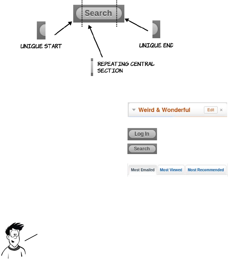
372 CHAPTER 10 Borders and backgrounds with CSS3
Here are some examples:
The border-image property allows you to slice up an image and apply
transformations selectively to each slice. It’s simpler than it sounds, as
you’ll see after a few examples.
Basic border-image
To start with, let’s use the following example image. It’s 240 pixels
square, and it contains five smaller images, each of which is approxi-
mately 80 pixels square.
Rounded corners on a beveled
background from bbc.co.uk
Buttons with rounded corners
and shading on wordpress.com
Tabs with rounded corners and
shading on yahoo.com
The ability to add an image to a border is one of the more powerful
features of CSS3; unfortunately it’s also one of the least intuitive.
Despite being supported by Firefox since version 3.0 it’s seen far
less uptake than several other features in this chapter.
Selective background scaling with border images 373
Let’s start with the simplest possible
example and apply the border image
to an element 720 pixels wide and
400 pixels high:
height: 400px;
width: 720px;
border-width: 80px;
border-style: solid;
border-image: url('border1.png') 80;
As you can see, the center disappears.
If you want to retain the center of the
image, use the fill keyword:
height: 400px;
width: 720px;
border-width: 80px;
border-style: solid;
border-image:
url('border1.png') 80 fill;
The center of the image is stretched
to fill the space, but the corners stay
where they are.
Browser support quick check:
border-image
Standard Prefixed
4.0 -
3.5 -
- -
10.5 -
3.0 -
374 CHAPTER 10 Borders and backgrounds with CSS3
Stretching and repeating border-image sections
This diagram shows what’s going
on. The border-image value of 80
specifies a pixel length, which the
browser uses to slice the image
into nine sections, each of which is
80 pixels square.
The four corner sections aren’t
adjusted: they remain in the corners
of the elements. The center segment
expands to fill the remaining space.
Let’s apply the same rules with this
new image:
height: 400px;
width: 720px;
border-width: 80px;
border-style: solid;
border-image: url('border2.png') 80;
Now the stretching of the middle
segments on the sides is more
apparent.
In the previous example, the
middle segments on the sides are
also stretched, but you can’t see
that because they’re solid white.
To illustrate, let’s look at an
example with a different image.
Selective background scaling with border images 375
The pattern fits neatly inside the
middle segments, each 80 pixels
square. As you saw before, the cor-
ners stay the same but the middle
segments are stretched. This is
because when you omit the third
parameter to border-image, you get
the default. The previous example is
equivalent to this:
border-image:
url('border2.png') 80 stretch;
You can use two other keywords
instead of stretch. The first is repeat:
height: 400px;
width: 720px;
border-width: 80px;
border-style: solid;
border-image:
url('border2.png') 80 repeat;
The image in the middle segment is
repeated across the available width
and height.
The second is round:
border-image:
url('border2.png') 80 round;
It looks like there’s no difference
between repeat and round, but that’s
due to a careful choice of element
size to demonstrate the technique.
If the size of the element is reduced
slightly, the difference is apparent.
Look at the following two screen-
shots of the same two rules applied
to a 680 x 360-pixel element.
376 CHAPTER 10 Borders and backgrounds with CSS3
You may be curious about what hap-
pens to the middle segment when you
use repeat or round. This screenshot
shows that the middle behaves in the
same way as the middle segments on
the border:
border-image:
url('border3.png') 80 fill round;
If you ever need to create internet
bank notes, this may be the way to go.
You can also use different approaches
on the horizontal and vertical borders:
border-image:
url('border3.png')
80 fill round stretch
The first keyword applies to the hori-
zontal borders, and the second to the
vertical borders.
repeat retains the width
of the center segment—
if it doesn’t fit across
the width of the box,
then parts of the
segment are cut off.
round adjusts the
width of the center
segment to fit a
whole number of times
across the width.
When you have a middle segment that makes a repeated pattern,
round will usually be what you want. If the middle segment is a
solid color or gradient, like a beveled edge, use repeat to
avoid any distortion from the browser adjusting the image.
Selective background scaling with border images 377
Using border-image to create common effects
First, let’s make some buttons and tabs. Here’s a generic
image to provide the background for both.
Using this image, you can easily create buttons like these.
The code for the border image on each of these buttons is
border-width: 45px;
border-style: solid;
border-image: url('border4-bevel.png') 45 fill repeat;
Each button’s text size is set individually, and each has a different
amount of text. Notice that the buttons aren’t even the same shape as
the original image, but it has been adapted seamlessly.
Now let’s use the same image to create some tabs.
To achieve tabs, you have to adjust one line of CSS from the previous
example. Set the bottom border width to 0:
border-width: 45px 45px 0px 45px;
border-style: solid;
border-image: url('border4-bevel.png') 45 fill repeat;
Now you know enough to implement all three examples from the
beginning of this section. Let’s take a single, fixed—size image and use
it to make elements that adapt in size to their contents yet retain a
sharp image at the edges for rounded—corner and bevel effects.
378 CHAPTER 10 Borders and backgrounds with CSS3
The border image, as with the buttons, adapts to the size of the content.
Creating gradients with CSS
Gradients—smooth transitions from one color to another—have always
been popular with designers. In CSS2, the only way to implement a
gradient is to create it as an image in a graphics program and attach it
as a background to the element. This has problems and limitations, sev-
eral of which you’re already familiar with:
❂Images don’t always scale well, which can create problems when you
use an image as a background for content that’s intended to scale.
❂If you decide to change your color scheme slightly, you may have to
regenerate all your gradient images.
You’ve already seen the direct support for
box shadows in CSS3, but they can also be
achieved with border-image. If you combine
this CSS with the image on the right, you
can achieve the results that follow:
border-image:
url('drop-shadow.png') 70 repeat;
You’re not likely to use this technique often,
but on occasion you may want more precise
control over a shadow than box-shadow
allows.
border-image is hard to override selectively. If you want
to scale an image across a background with the built–in
CSS support (if available) and border-image if not, you’ll
need to use something like modernizr.js.
Creating gradients with CSS 379
❂Every different gradient you want
to use means an extra download
from the server, increasing page-
load times for users and your
bandwidth requirements.
❂If the element color will change in
response to user interaction—for
example, a menu item on mouse-
over—you need to make twice as
many images, doubling all the
problems just mentioned.
In this section you’ll use a snippet of HTML like this:
<div id="gradient">
</div>
You’ll also need some basic CSS like this:
#gradient {
outline: 1px solid #999;
min-height: 400px;
max-width: 400px;
background: none;
}
The CSS snippets shown next should be inserted in place of the back-
ground: none; property to achieve the screenshots shown in a support-
ing browser. See the section “Browser support” for details of prefixes
required to access experimental support.
Browser support quick check:
gradients
Standard Prefixed
- 3.0
- 3.6
- 10.0*
-11.10
- 4.0
* IE has been able to do simple gradients
with the nonstandard filter attribute
since version 5.5.
CSS gradients are allowed anywhere you currently can specify
an image. At this time, browsers only have support for using
them as backgrounds, so the examples concentrate on that.

380 CHAPTER 10 Borders and backgrounds with CSS3
A simple gradient is easy—specify the direction
and two colors. The browser calculates a gradient
across the entire background, treating the first
color as the starting color and the second as the
end color:
background: linear-gradient(
to bottom, #000, #fff
);
In addition to up and down, gradients can go
from one side to another:
background: linear-gradient(
to right, #000, #fff
);
Maybe you want something other than up and
down or left and right. You can combine the two
to get diagonal gradients:
background: linear-gradient(
to bottom left, #000, #fff
);
The direction can also be specified in degrees.
The above rule is equivalent to this:
background: linear-gradient(
315deg, #000, #fff
);
If you add more colors, the browser treats them
as equally spaced color stops and calculates the
gradient accordingly:
background: linear-gradient(
to bottom, #000, #fff, #000, #fff
);

Creating gradients with CSS 381
Finally, if you don’t want the color stops to be
evenly spaced, you can give percentage values
for each color stop:
background: linear-gradient(
to bottom,
#000,
#fff 15%,
#000 85%,
#fff
);
Radial gradients are as simple as linear gradients.
You supply a start color and an end color:
background: radial-gradient(
#000, #fff
);
The gradient starts at the center and extends to
the boundary of whatever element it’s applied to.
You can achieve more interesting effects by posi-
tioning the center of the gradient:
background: radial-gradient(
at top, #000, #fff
);
The at keyword is used to specify the center point.
The gradient center can be positioned anywhere:
background: radial-gradient(
at 25% 25%, #000, #fff
);
Linear gradients are all very well, but sometimes you want a more
circular effect—for example, a spot highlight on a glassy button.
CSS3 lets you create radial gradients; we’ll look at them now.
382 CHAPTER 10 Borders and backgrounds with CSS3
Using the contain keyword means the gradient
stops when it touches the edges of the containing
element:
background: radial-gradient(
at 25% 25%, contain, #000, #fff
);
As with linear gradients, a radial gradient can
have any number of color stops:
background: radial-gradient(
at 25% 25%, #000, #fff, #000, #fff
);
If you want your gradient to only cover part of
the background, you can use the background-size
property:
background: linear-gradient(
top, #000, #fff
) no-repeat;
background-size: 100% 50%;
This might be most useful when you want to put
a gradient in a fixed part of the background
rather than scale it across the whole thing.
You can also size a radial gradient, although the
effect isn’t as pleasing:
background: radial-gradient(
at 25% 25%, #000, #fff
) no-repeat;
background-size: 100% 50%;
Because gradients replace background images, you can use
the same background properties on them as you use for
background images. You can use this to your advantage to
produce some useful effects, as you’ll see next.
Creating gradients with CSS 383
This does let you see another property of radial
gradients: by default they’re ellipsoid rather than
circular. You haven’t noticed until now because
you’ve been applying them to square elements.
You can make the gradient circular using the
circle keyword:
background: radial-gradient(
circle at 25% 25%, #000, #fff
) no-repeat;
background-size: 100% 50%;
It’s also possible to layer multiple gradients if you
use RGBA colors. Here’s a radial gradient over a
linear gradient to create a highlight effect:
background: radial-gradient(
circle at 25% 25%,
rgba(255,255,255,0.75),
rgba(255,255,255,0)
) no-repeat,
linear-gradient(
to bottom, #000, #fff
) no-repeat;
There’s no reason your gradient can’t have the
same starting and ending colors. This example
modifies the final example from “Multiple back-
grounds” to use a gradient instead of loading an
extra image from the server:
background: top right
url('pitr-head.png') no-repeat,
Note that the specification allows you to specify a size for the gradient
within the gradient itself. One of the reasons the to and at keywords were
added was to allow lengths for sizing to be added unambiguously
alongside the position. However, as yet no browser supports this syntax,
so currently it’s more reliable to use background-size.
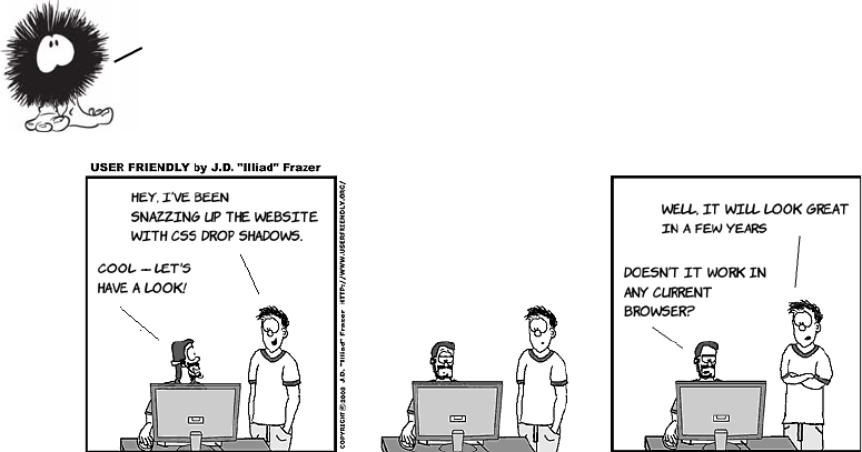
384 CHAPTER 10 Borders and backgrounds with CSS3
This replaces the image used in the multiple-background example in
listing ch10/backgrounds-7.html.
Browser support
Browser support for CSS3 border, background, and gradient features
is pretty good—all the major browsers have some support, or will soon
have support, for everything but border-image in currently released
linear-gradient(top,
rgba(255,255,255,0.5),
rgba(255,255,255,0.5)),
bottom right
url('aj-head.png') no-repeat,
linear-gradient(
top,rgba(255,255,255,0.5),
rgba(255,255,255,0.5)),
top left
url('mike-head.png') no-repeat,
linear-gradient(top,
rgba(255,255,255,0.5),
rgba(255,255,255,0.5)),
bottom left
url('sid-head-bg.png') no-repeat;
Now you’ve seen all the new features. Let’s take a
detailed look at current browser support.
...
Browser support 385
versions. A lot of vendor extensions are involved, and IE8 and earlier
take quite a bit of work, as we’ll look at next.
Key:
●Complete or nearly complete support
○Incomplete or alternative support
Little or no support
Cross-browser drop shadows
Chrome (before 10), Safari (before 5.1), and Firefox (before 4.0) use a
vendor extension for box and text shadows; the vendor extension is the
same for both. Neither of the WebKit browsers initially supported
inset but current versions do; spread-radius support was added in
Chrome 8 and Safari 5 but didn’t work reliably until Chrome 10 and
Safari 5.1. Opera and Microsoft were confident enough in the stability
of the spec to skip the vendor extension stage and implement the box-
shadow rule directly.
To support all browsers, you’ll need to issue multiple declarations like
this:
-moz-box-shadow: rgb(0,0,0) 3px 3px 3px 9px;
-webkit-box-shadow: rgb(0,0,0) 3px 3px 3px, rgb(0,0,0) 3px 3px 9px;
box-shadow: rgb(0,0,0) 3px 3px 3px 9px;
12 14 4 6 8 9 10 11.1 11.5 5 5.1
text-shadow ● ● ● ● ○ ○ ○ ● ● ● ●
box-shadow ● ● ● ● ○ ● ● ● ● ○ ●
border-image ○ ○ ○ ○ ○ ○ ○ ○
border-radius ● ● ● ● ● ● ● ● ● ●
Multiple back-
grounds
● ● ● ● ● ● ● ● ● ●
background-size ● ● ● ● ● ● ● ● ● ●
Gradients ○ ○ ○ ○ ● ○ ○ ○ ○
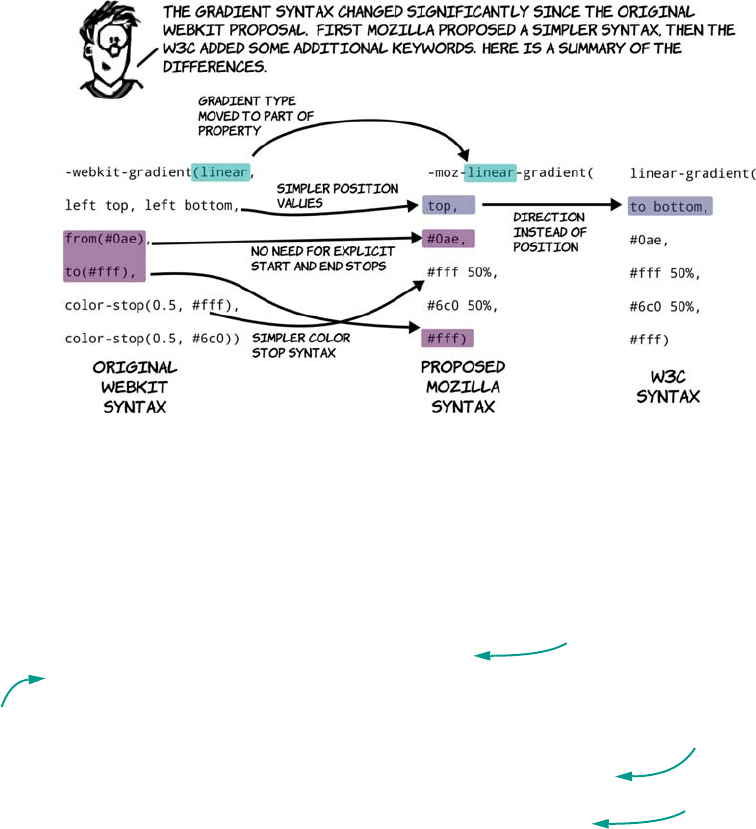
386 CHAPTER 10 Borders and backgrounds with CSS3
Note that, because the old WebKit-based browsers don’t support
spread-radius, an extra shadow has been added in an effort to simulate
the effect. Text shadows are supported, using the standard syntax in
Safari 1.1 and Chrome 2.0, but support for multiple shadows was only
added in the 4.0 versions.
Cross-browser CSS3 gradients
For older WebKit-based browsers, you should use the original syntax.
Use the Mozilla syntax in older Firefox and newer versions of Safari
and Chrome. Newer Firefox as well as Opera 12 and the IE10 preview
support the standard syntax, Firefox and Opera with a vendor prefix.
To support all browsers that support CSS gradients, your cross-
browser code should look something like this:
background: #6c0;
background: -webkit-gradient(linear, left top, left bottom,
from(#00abeb), to(#fff),
color-stop(0.5, #fff),
color-stop(0.5, #66cc00));
background: -webkit-linear-gradient(
top, #0ae, #fff 50%, #6c0 50%, #fff);
background: -moz-linear-gradient(
Fallback for browsers
with no support
Legacy WebKit
support
WebKit support
Legacy
Firefox
support
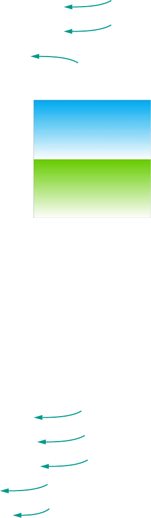
Browser support 387
top, #0ae, #fff 50%, #6c0 50%, #fff);
background: -moz-linear-gradient(
to bottom, #0ae, #fff 50%, #6c0 50%, #fff);
background: -o-linear-gradient(
to bottom, #0ae, #fff 50%, #6c0 50%, #fff);
background: linear-gradient(
to bottom,#0ae,#fff 50%,#6c0 50%,#fff);
This will produce a two-tone gradient like
the following in all browsers that support
CSS3 gradients.
You can see this example in ch10/gradient-
15.html. Browsers that don’t support gradi-
ents display a green background; every-
thing else shows the gradient.
Cross-browser backgrounds and border-image
border-image has changed significantly since it was first introduced. All
the original implementations follow the shorthand property from the
September 2008 Working Draft. Following that draft, significant
changes were made that added specific properties for each component,
such as border-image-source, border-image-slice, and the fill keyword.
Before, border-image was like a subproperty of border; now it’s a stand-
alone property with subproperties of its own.
It’s likely that vendors will move toward the new syntax when the spec
reaches the Proposed Recommendation status. In the meantime, you
can use it in a cross-browser way while still being compatible with the
current spec:
-moz-border-image: url('border1.png') 80;
-webkit-border-image: url('border1.png') 80;
-o-border-image: url('border1.png') 80;
border-image: url('border1.png') 80;
border-image: url('border1.png') 80 fill;
Firefox
support
Opera
support
Support for
current draft
implementations
(at the time of
writing, just IE10)
Legacy Firefox
support
Legacy WebKit
support
Legacy Opera
support
Support for 2008 draft
implementations
Support for current
draft implementations
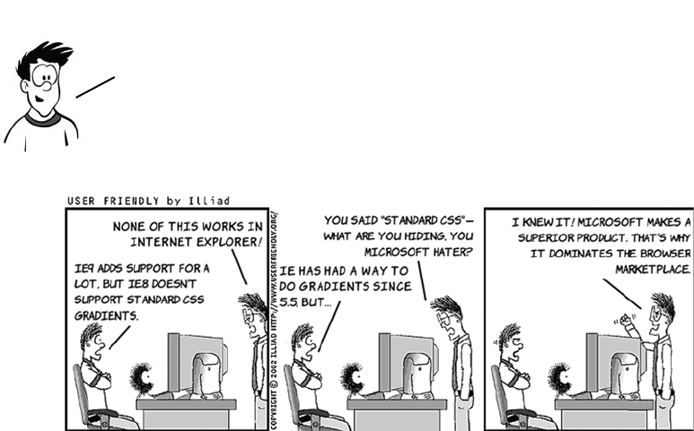
388 CHAPTER 10 Borders and backgrounds with CSS3
To get border-image to work in current browsers, you need to first spec-
ify the vendor-specific properties for Firefox and Safari/Chrome. Next,
give the September 2008 version of the property for Opera, and finally
the current version of the property with the fill keyword. This will
ensure that future browsers that fully implement the property will
render identically to current browsers, which treat fill as being the
default and ignore the fill keyword.
Supporting old versions of Internet Explorer
Internet Explorer was the first browser to implement a method for
specifying drop shadows in CSS, way back in the version 5.5 release.
Microsoft implemented a method of calling an ActiveX control and
applying it to an element that can be used either from CSS or Java-
Script. ActiveX has a pretty bad reputation in web developer circles
that may partly explain why these techniques weren’t seriously
explored until recently. There are two filters for shadows in IE8: Drop-
Shadow and Shadow.
Unfortunately, if you don’t want the behavior from the 2008 spec
that treats fill as the default, there’s no way to override it in
CSS in older browsers. The easiest way to achieve this is to use
an image that’s blank or transparent in the central area.

Browser support 389
The main difference between the two is that Shadow applies a gradient to
the edges, whereas DropShadow is a constant color. The listing for this
example is in ch10/shadow-ie-1.html.
There’s also an IE filter for gradients. Here are
two examples; the full code is in ch10/gradient-
ie-1.html (the lines have been broken so they fit
on the page; in your CSS make sure they appear
on a single line):
-ms-filter: "progid:DXImageTransform.Microsoft.gradient(
GradientType=1, startColorstr=#CC1C5B9B, endColorstr=#E56CBFFF)";
DropShadow can accept a color value with alpha
transparency(make sure all this code goes on a
single line in your CSS):
-ms-filter: "progid:
➥ DXImageTransform.Microsoft.DropShadow
➥ (color=#ff000000, offX=4, offY=4)"
The color parameter here uses four hexadecimal
pairs. The last three pairs are equivalent to the
way you specify black in CSS: #000000. The first
hex pair is a value between 0 and 255 for opac-
ity: FF is fully opaque.
Shadow fades the color to transparent, like box-
shadow, but you must specify an opaque color:
-ms-filter: "progid:
➥ DXImageTransform.Microsoft.Shadow(
➥ color=#000000, direction=135,
➥ strength=4)"
The example has a background color on the element to which the
shadow applies so it will apply to the entire element rather than
just the text. If you want a shadow on the text, you need to leave
the background transparent. As you may guess, this makes applying a
shadow to both the text and the box a bit more interesting.
390 CHAPTER 10 Borders and backgrounds with CSS3
-ms-filter: "progid:DXImageTransform.Microsoft.gradient(
➥ GradientType=0, startColorstr=#88FFFFFF, endColorstr=#00FFFFFF)";
Compared to CSS gradients, they’re very limited. You can specify only
start and end colors; no additional color stops are available, and they
can only be vertical or horizontal.
Note that if you want to use semitransparent colors in the gradient, you
should also set the background color back to transparent in the rule:
background: transparent;
-ms-filter: "progid:DXImageTransform.Microsoft.gradient(
➥ GradientType=0, startColorstr=#88FFFFFF, endColorstr=#00FFFFFF)";
Otherwise both the background color and the gradient will apply, and
you’ll see the gray background through the gradient. The -ms-filter
property doesn’t override an existing background property.
CSS3 PIE for easy IE support
CSS3 PIE takes advantage of another proprietary IE CSS extension—
behaviors—to make older versions of IE support standard CSS3 syn-
tax. A behavior is a script file that executes as the CSS is being applied to
an element. Although there are some performance and security con-
cerns, behaviors offer a convenient way to add CSS3 support in IE8 and
IE9 has full support for the CSS standards for box shadows and
rounded corners. IE10 preview releases have included support for
CSS3 gradients. Use conditional comments to provide a specific
stylesheet to IE8 and earlier if you want to support all
versions, or investigate a solution like CSS3 Pie.

Summary 391
earlier. This element with rounded corners, a
gradient, and a drop shadow was created by
applying a mostly standard CSS rule.
The screenshot was taken in IE8. Here’s the CSS
(see the page in full in ch10/css-pie.html):
div {
border: 1px solid #999;
border-radius: 10px;
box-shadow: rgb(0,0,0) 3px 3px 3px 3px;
-pie-background: linear-gradient(top, #000, #fff);
behavior: url(../libs/PIE/PIE.htc);
}
There are two nonstandard properties here. Behavior is the proprietary
IE property that allows all the magic to happen; it contains the URL of
the file that implements the behaviors. -pie-background is required
because, unlike border-radius and box-shadow, IE8 already understands
the background property and will discard any values that it considers
invalid.
Summary
In this chapter, you’ve learned about features of CSS3 for creating drop
shadows, rounded corners, background effects, and gradients. Most of
these effects could be accomplished visually with CSS2, but that would
involve creating images and various bits of additional markup to apply
them to elements. The CSS3 approach removes the need for extra
markup and additional requests to the server and is easily adaptable to
the content—you don’t need to re-create your background image just
because you decide to make an element 20 pixels wider.
CSS3 isn’T just for visual effects and background images; it also
includes several new features for the formatting and display of text. In
the next chapter you’ll learn about using custom fonts, automatically
formatting text into columns, and advanced font control features.
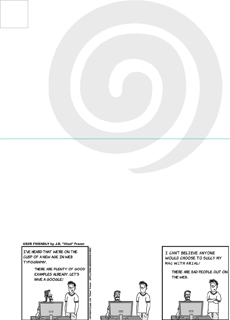
392
11
Text and fonts
This chapter covers
•Adding custom fonts to your pages with
@font-face
•Detailed control of font rendering with
font-feature-settings
•Improving readability with CSS columns
•Controlling text wrapping and overflow
Despite being designed from the start as a way to share text documents,
the web has traditionally had poor typography. In this chapter, you’ll
learn how all that is changing as CSS3 brings in many new features for
control of fonts and text.
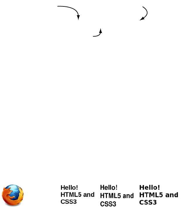
Basic web fonts 393
Basic web fonts
Typography, the art of setting and arranging type, is a big part of design;
a particular typeface is often as much a part of a company’s image as its
logo or corporate color scheme. But in CSS2, there’s basically no way
to specify a font that will be used by all users across all browsers and
operating systems.
Typography on the web has always been limited because of its client-
server design—the font has to be on the client machine, where the ren-
dering is done, and not on the server. This is what leads to standard
font-family declarations like this:
The idea is that Arial (a Microsoft font), Helvetica (the standard Apple
font), and sans-serif will all look relatively similar—but is that true?
Instead of specifying a set of fallbacks, let’s compare what each font by
itself looks like in some different browsers. Here’s the standard CSS
rule split into three:
h1 { font-size: 32px; font-weight: bold; }
div:nth-child(1) { font-family: Arial; }
div:nth-child(2) { font-family: Helvetica; }
div:nth-child(3) { font-family: sans-serif; }
To see the results, let’s use this simple bit of markup repeated three times:
<div><h1>Hello! HTML5 and CSS3</h1></div>
Here’s what the three elements look like in Firefox on my laptop. As
you can see, there’s quite a variation in both size and thickness.
font-family: Arial, Helvetica, sans-serif;
Does the user have this
font? If so, use it.
Otherwise, does the user have this
font? If so, use it instead.
If all else fails, use the
default sans−serif font.
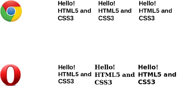
394 CHAPTER 11 Text and fonts
But that’s not the only interesting thing going on. Here’s the same page
in Chrome on my laptop. All the fonts look the same!
To add to the confusion, I’ll now reveal that my Linux laptop has nei-
ther the Arial nor the Helvetica font installed, which is more obvious in
this screenshot of the same page in Opera.
Opera falls back to Bitstream Vera Sans for Arial but renders the
browser default font—which is serif rather than sans-serif—for
Helvetica. Chrome renders all three the same because it falls back to
Bitstream Vera Sans for Arial and Helvetica and also uses it for the
default sans. Firefox tries to use a font similar to the requested one, so
it replaces Arial with Liberation Sans and Helvetica with Nimbus Sans
L, and it uses Bitstream Vera Sans for the default sans font. You can
try it on your own system with listing ch11/font-comparitor.html. This
shows that web authors have almost no control over what fonts end up
being used in their pages. As you can imagine, that drives some design-
ers nuts! It’s one reason you’ve seen so many bad hacks over the years
that replace text with images or Flash movies. But there’s now a practi-
cal standards-based alternative: @font-face.
Gaining control of fonts with the @font-face rule
The @font-face rule allows you to specify a font to be downloaded with
the web page in the same way as markup, images, and script. Here’s a
basic declaration to download the Liberation Sans Bold font:
@font-face {
font-family: "Liberation Sans Bold";
src: url(LiberationSans-Bold.ttf) format("truetype");
}
Basic web fonts 395
Here are the declarations for the other two fonts in the earlier example:
@font-face {
font-family: "Nimbus Sans L Bold";
src: url(NimbusSanL-Bold.ttf) format("truetype");
}
@font-face {
font-family: "Bitstream Vera Sans Bold";
src: url(VeraBd.ttf) format("truetype");
}
Now that the downloadable fonts have been defined, you can reference
them in CSS rules like any other font:
h1 { font-size: 32px; font-weight: normal; }
div:nth-child(1) { font-family: "Liberation Sans Bold"; }
div:nth-child(2) { font-family: "Nimbus Sans L Bold"; }
div:nth-child(3) { font-family: "Bitstream Vera Sans Bold"; }
These rules lead to consistent results cross-browser (except, of course,
Internet Explorer 8 and earlier). Try it for yourself with listing ch11/
font-face-1.html.
Browser support quick check: @font-face
Standard Prefixed
4.0 -
3.5 -
4.0 -
10.0 -
3.1 -
This example has two properties;
font-family and src. font-family
is a name; any name will do,
although it will make your life
easier if it’s representative of
the actual font name. src
specifies a URL to the font file
and a file format.
396 CHAPTER 11 Text and fonts
The browser has two options when bold text is needed: it can either use
a bold version of the font if one is available or scale up the normal font
to make it look bold.
Here’s the CSS:
@font-face {
font-family: "Yanone Kaffeesatz";
src: url(YanoneKaffeesatz-Regular.otf) format("opentype");
}
p {
font-size: 32px;
font-family: "Yanone Kaffeesatz";
}
Let’s start with some normal text
using the Yanone Kaffeesatz font:
<p>Hello! HTML5 and CSS3</p>
Now add a couple of elements that
will render as bold:
<p>Hello! <strong>HTML5</strong> and
<strong>CSS3</strong></p>
A subtle difference you may have noted is that the original example used a
font-weight of bold, but the second example used a font-weight of normal. This
is because the @font-face rules explicitly specified the bold versions of
the fonts, but it’s possible to handle that directly with font-face.
Basic web fonts 397
The browser is now using the bold version of the Yanone Kaffeesatz
font for the bold text. This is more compact and more cleanly rendered
than the standard version of the font automatically adjusted to be bold.
The same approach also works for italics, but using font-style instead
of font-weight. Unfortunately Kaffeesatz doesn’t have an italic variant,
so this example uses the thin variant:
@font-face {
font-family: "Yanone Kaffeesatz";
src: url(YanoneKaffeesatz-Thin.otf) format("opentype");
font-style: italic;
}
With a minor adjustment to the HTML you can see three different
fonts, all from the same family, in one paragraph:
The browser doesn’t have a bold ver-
sion of Kaffeesatz, so it adjusts the
normal font to be thicker and wider.
Add another @font-face declaration.
Notice that it uses the same
font-family name, but it has a differ-
ent URL and specifies a font-weight:
@font-face {
font-family:
"Yanone Kaffeesatz";
src:
url(YanoneKaffeesatz-Bold.otf)
format("opentype");
font-weight: bold;
}
<p>Hello!
<strong>HTML5</strong> and
<em>CSS3</em></p>

398 CHAPTER 11 Text and fonts
Font formats: EOT, TTF/OTF, and WOFF
The @font-face rule was originally introduced in an early draft of the
CSS2 spec, but it was dropped back in 1998, mostly because of the lack
of fonts with licenses that allowed web distribution.
Since 1998, several things have changed:
❂Bandwidth has increased to the point that including a 100–300 KB
font file in your page seems less of a big deal.
❂Font foundries now have the example of the music industry to learn
from.
❂The rise of open source operating systems has led to the creation of
several free but professional fonts funded by companies such as Red
Hat, Canonical, and Google.
❂Tools have improved to the point that it’s now feasible for profes-
sional font designers to produce free fonts in their spare time.
In June 1998, Safari 3.1 was released with support for downloading
TrueType/OpenType fonts (TTF/OTF) with @font-face in its desktop
incarnation and SVG Web fonts, a format tied to the SVG specification,
on mobile devices. Firefox added support with the release of 3.5 in
June 2009, and a brave new world of web typography was born.
Although several smaller font foundries jumped on the bandwagon and
started making their fonts available with web-friendly licenses, the
major ones still weren’t keen to get involved. They wanted a font file
format that couldn’t be used as a desktop font. The answer is the new
W3C Web Open Font Format (WOFF), which is being developed col-
laboratively between browsers, vendors, font foundries, and the W3C.
To overcome the resistance of the foundries, the browser manufacturers
developed their own font formats specifically for the web: Netscape
came up with the Portable Font Resource format (PFR), now as dead as the
Netscape browser; and Microsoft created Embedded OpenType (EOT), which
is still supported in IE today. Neither was successful; few fonts were
ever made available in either format.
Basic web fonts 399
Browser support for downloadable fonts
The previous section mentioned several different font file formats,
among them EOT, TTF/OTF, WOFF, and SVG. The following table
shows which of them are supported in various browsers today.
For widest support across browsers, you need to provide your font in
four different formats—assuming you can find fonts available in all
four formats, or with a liberal enough license that you can convert the
font between formats yourself. In addition, you have to worry about
Browser Support from Support of
4TTF, OTF, and SVG
3.5
3.6
TTF and OTF only
WOFF support added
4.0
9.0
Embedded Open Type (EOT) only
WOFF support added
10.0
11.1
TTF, OTF, and SVG
WOFF support added
(desktop)
3.1
5.1
TTF, OTF, and SVG
WOFF support added
(
iOS)
3.1
4.2
SVG
TTF and OTF support added

400 CHAPTER 11 Text and fonts
various bugs in different browsers’ support of @font-face (see the
browser support section at the end of the chapter for details).
Making your life easier with font services
Rather than search through many different web sites to find the exact
fonts you want, and then purchase them from several different web-
sites and figure out how to set up your server to deliver them correctly
to clients and integrate everything into your CSS, it’s much easier to get
someone else to do that for you. Many online services have appeared in
recent years to simplify getting the fonts you want on your website.
These can be broken down into three broad categories:
❂Font converters and packagers—These services convert fonts you
already have into the formats supported by browsers and provide
you with CSS to incorporate them into your site. You have to deal
with the server-setup side of things yourself.
❂Free font services—The font services deliver the fonts directly from
their own servers, and all you need to do is link to a CSS file pro-
vided by the service. Being free, these services only include freely
downloadable and open source fonts.
❂Paid font services—These services are just like free ones except that,
because you’re paying license fees, the range of fonts available is
vastly improved.
This section walks through one example of each type of service listed,
from choosing fonts to getting them on your web page.
Downloadable kits: FontSquirrel
FontSquirrel (www.fontsquirrel.com) is an online tool for building
packages of font files. These packages contain everything you need to
use the fonts on your own website. Here’s how to use FontSquirrel:
The practical aspects of supporting fonts cross—browser and cross—device
give you plenty to worry about. Fortunately, several services have arisen
online to do that thinking for you; the next section will look at them.
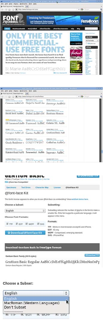
Making your life easier with font services 401
1Go to the website home page and
click the @font-face Kits link in
the main menu.
2You’ll be taken to a page that lists
hundreds of fonts available for
download. Scroll down to the
Serif section, and find the
Gentium Pro font. Click View
Font to see the details.
3On the details page, you can see
what each character looks like
and try out text of your own. Go
to the @font-face Kit tab to select
which font file types you want to
use: TTF, EOT, WOFF, and SVG.
4On this page you can also select a
subset of the characters—so you
only download the English char-
acters if you won’t be using any
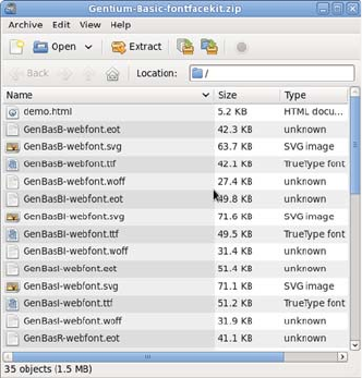
402 CHAPTER 11 Text and fonts
other languages, keeping the file
size down.
Click the Download @font-face
Kit button to download a zip file
of everything you’ll need.
5Look in the zip file you’ve down-
loaded. It contains the following:
Each font in the formats you
selected
A style-sheet file that you can
include directly in your pages
A web page demonstrating the
font
Here’s a rule from the included stylesheet.css file:
@font-face {
font-family: 'GentiumBasicRegular';
src: url('GenBasR-webfont.eot');
src: url('GenBasR-webfont.eot?iefix') format('eot'),
url('GenBasR-webfont.woff') format('woff'),
url('GenBasR-webfont.ttf') format('truetype'),
url('GenBasR-webfont.svg#webfontLblSsz1O') format('svg');
font-weight: normal;
font-style: normal;
}
6And here’s a rule from the
HTML file, demonstrating how it
should be used:
p.style1 {
font: 18px/27px
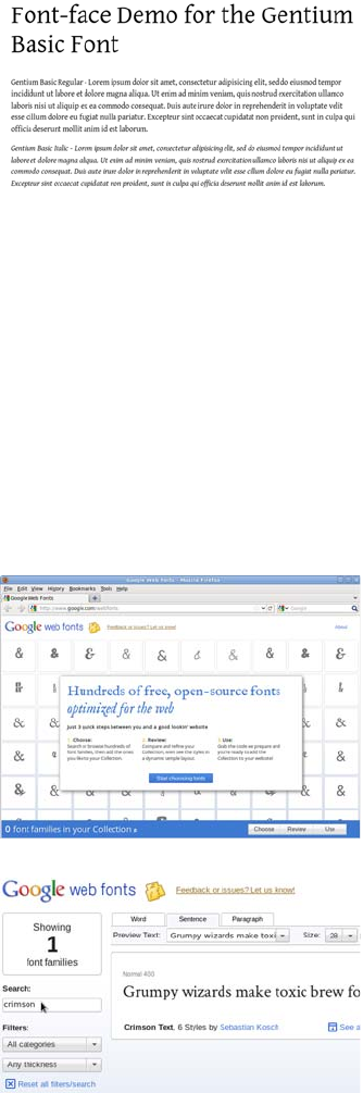
Making your life easier with font services 403
You can see the file in ch11/Gentium-Basic-fontfacekit/demo.html.
Free font services: Google Web Fonts
Downloading a kit with everything you need takes a lot of the work out
of things, but you still have to deal with serving the files yourself. This
means you have to make sure your server is configured correctly for
the font files. In addition, the users downloading the fonts will be using
up your bandwidth. Wouldn’t it be nice if someone else took care of the
server-side stuff for you? Well, Google is offering to do it for free!
'GentiumBasicRegular',
Arial,
sans-serif;
}
1The Google Web Fonts service is
available at www.google.com/
webfonts. Click the Start Choos-
ing Fonts button to begin.
2Like many Google services, the
interface is search based. Search
for a font called Crimson Text by
typing in the Search box.
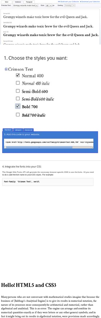
404 CHAPTER 11 Text and fonts
3The See All Styles link lets you
see all the different weights and
styles available. Click the Quick
Use link alongside that.
4You can select which font variants
you want to include (weights of
bold and/or italics). To the right
of the selection is a large graphic
indicator that estimates the
impact of the fonts you’ve chosen
on page load time.
5Instead of a download, you’re
offered two snippets of code to
copy and paste. Scroll down the
page to find them.
The first bit of code is a <link> ele-
ment to include in your document
head. The second is an example
CSS rule making use of the font.
The exact code is as follows:
<link
href='http://
fonts.googleapis.com/
css?family=Crimson+Text:400,700'
rel='stylesheet' type='text/
css'>
font-family: 'Crimson Text',
serif;
6Include these two snippets in
your page, adjusting the CSS rule
as necessary, and you’re good to
go.
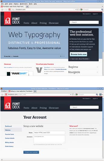
Making your life easier with font services 405
See the full example listing in ch11/fontservices-google.html.
Subscription font services: Fontdeck
The Google service is straightforward and available at an excellent
price—nothing—but this strength is also a weakness. Google can only
offer free fonts for download through its service. If the fonts you want
to use aren’t available, you’ll have to look into one of the subscription
services; several such services are now available.
1This example looks at Fontdeck
(http://fontdeck.com/) because it
allows you to try the fonts for free
and I already have an account.
2You need to provide an email
address to register, and then you
set up a website. This is as simple
as typing in a name and one or
more domain names.
The first 20 distinct IP addresses
to access your website will be
allowed to download any fonts
you choose free of charge, so you
can use Fontdeck to test fonts and
even demonstrate them to clients
without financial outlay.
3After you’ve set up a website, you
need to choose some fonts. These
are arranged by category—serif,
sans-serif, and so on—or you can
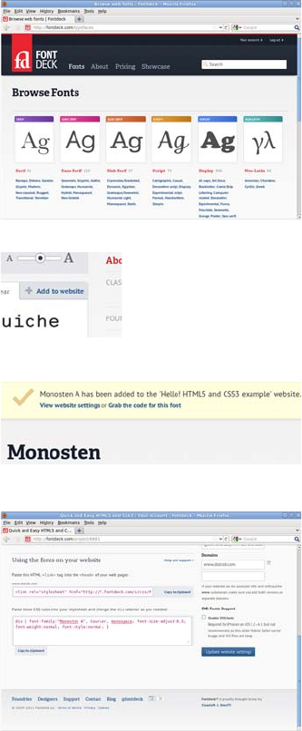
406 CHAPTER 11 Text and fonts
search by font name or tag. For
this example, look for Monosten,
which is under Slab Serif >
Monospaced. Either browse to
the font or search for it.
4On the page for Monosten, look
for the A (regular) and C (bold)
variants and click the Add to
Website link alongside them.
5You should see a banner at the
top of the page with a link that
says Grab the Code for This
Font—go ahead and click it.
6You’re presented with a page that
has code you can copy and paste
into your pages. The code I got is
shown next; I changed the CSS
slightly to apply to the body and
level-one headings.
<link rel="stylesheet" href="http://f.fontdeck.com/s/css/
9tuWCgd+qpLZNXRFuo1XneWWjNE/www.dotrob.com/8881.css"
type="text/css" />
<style>
body {
font-family:"Monosten A", Courier, monospace;
font-size-adjust:0.5;
font-weight:normal;
font-style:normal;
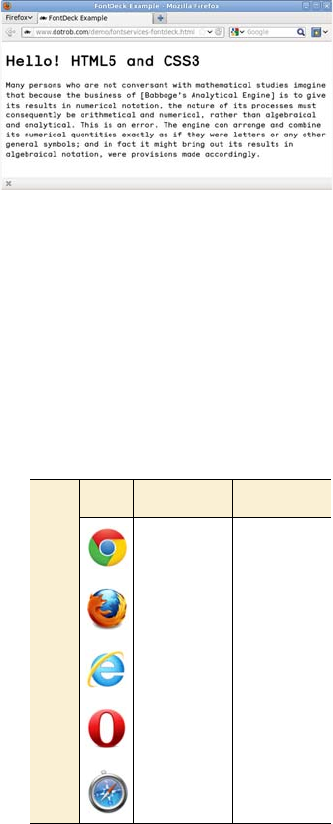
Advanced web typography 407
Advanced web typography
Even with a working @font-face directive, control over fonts on the
web is still far behind what you might see in a typical desktop-publish-
ing program or design package. CSS3 goes beyond letting web devel-
opers control which fonts appear on their web pages: it also offers
features for controlling the details of how those fonts are rendered.
font-size-adjust
As you saw earlier, one of the issues
with fonts on the web is that, should
the primary font be unusable for
some reason, the fallback font may
have different size characteristics.
Fonts that are nominally of the same
size can have visible differences in
weight; this is the case because the
measure of a font depends on the
height of the letters including any
}
h1 {
font-family:"Monosten C", Courier, monospace;
font-size-adjust:0.5;
font-weight:bold;
font-style:normal;
}
</style>
7Here’s my example page in action
using the previous code. See the
full listing in ch11/fontservices-
fontdeck.html. You’ll need to edit
the example file to insert your
own style sheet link to Fontdeck;
otherwise you won’t be able to
download the fonts.
Browser support quick
check: font-size-adjust
Standard Prefixed
- -
3.0 -
- -
- -
- -
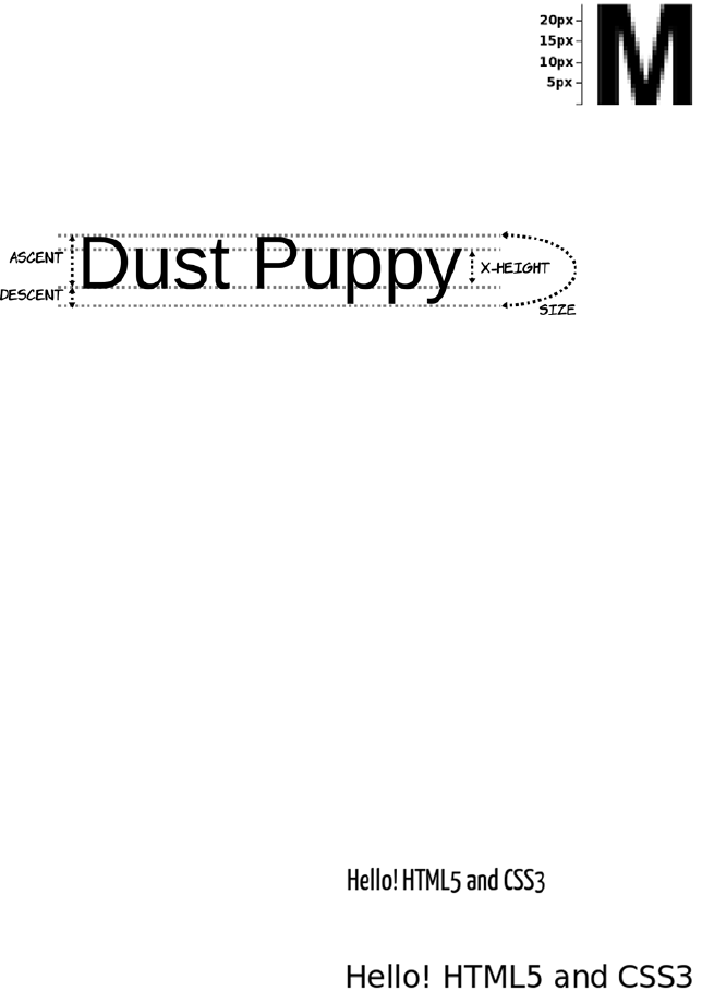
408 CHAPTER 11 Text and fonts
potential ascenders and descenders, whereas the visual size of the font is
more dependent on the x-height—the size of the lowercase characters.
The font-size-adjust property allows you to specify a ratio between the
x-height and the size of your first-choice font. If the browser has to use
one of the fallback fonts, it will automatically adjust the size so the
x-height remains consistent.
You don’t have to work out the x-height exactly; you can discover an
appropriate value through trial and error instead. If you provide a
“wrong” value for font-size-adjust, the font will be noticeably smaller.
Following is an example that shows the difference that specifying font-
size-adjust can make. To begin, let’s look at what happens without that
property:
p {
font-size: 32px;
padding: 0.5em;
font-family: "Yanone Kaffeesatz", sans-serif;
}
The font size in all three examples in the section
“Basic web fonts” was set to 32 pixels. But as you
can see in this magnified view of the Nimbus Sans L
letter
M
, the characters are only about 24 pixels tall.
Following is a diagram showing how the various
font size metrics are related.
If the font is available, then every-
thing is fine.
But if the font isn’t available for
some reason, the fallback font
takes up considerably more space.
Advanced web typography 409
Now let’s add a font-size-adjust property:
p {
font-size: 32px;
padding: 0.5em;
font-family: "Yanone Kaffeesatz", sans-serif;
font-size-adjust:0.5;
}
Note that font-size-adjust only impacts the x-height—the width is still
different. The property’s main advantage is that it preserves the verti-
cal rhythm of your blocks of text.
Advanced font control
This section looks at some of the
advanced features offered by mod-
ern fonts and how they can be con-
trolled from CSS. We’ll start with
ligatures: the replacement of
sequences of separate characters
with a single, joined glyph (the typo-
graphical term for the elements of a
font) and then explore some fea-
tures available for numbers before
finishing with fancy text options
known as contextual swashes.
Again, everything is fine if the
font is available.
But this time, if the font isn’t
available, the fallback font takes
up a similar height.
Browser support quick check:
font features
Standard Prefixed
- 16*
- 4.0
- 10
- -
- -
*(Win/Linux only)
All of these features are attributes of the font being used.
CSS doesn’t create additional glyphs—they have to be present
in the font—but it lets you control when they’re used.
410 CHAPTER 11 Text and fonts
Following are some example ligatures from the Calluna Regular font.
Currently, Firefox and Safari render ligatures automatically, if they’re
available in the font, above a certain font size. CSS3 gives you complete
control over them through the font-feature-settings property. The
property requires a single value: a quoted string containing a comma-
separated list of font settings. To turn on ligatures, you use this CSS:
font-feature-settings: "liga";
All the features have a four-character code. If the value is present, it
means the feature is enabled. It’s also possible to add a value to each
feature:
font-feature-settings: "liga" 1;
A value of 1 or on means the feature is enabled, and 0 or off means the
feature is disabled. The complete list of possible features is available in
Glyphs and ligatures
Glyph is the typographical term for the graphical elements that make up a font.
It differs from a letter—any individual letter can be represented by any one of a
number of glyphs in a font depending on the context in which it’s placed. A com-
mon example in old English was the long s and short s forms that were used at
the start and end of words, respectively—both represented the letter s but use a
different glyph.
A ligature is a glyph that replaces a sequence of letters. In traditional English
printing, this was generally used to increase legibility or to work around limita-
tions of ink or lead type. But in some scripts, the particular ligature used can af-
fect the meaning.
Ligatures are a feature of the font being used. Each font has a replacement table
that maps certain sequences of characters in the text to single glyph.
No ligatures
Ligatures
Advanced web typography 411
the OpenType specification: www.microsoft.com/typography/otspec/
featurelist.htm.In addition to the regular ligatures, a font may also have
a set of more decorative discretionary ligatures. These aren’t enabled
by default but can be enabled through font-feature-settings. Here’s
another example from the Calluna Regular font.
As you can see, the discretionary ligatures are a lot more decorative.
You would normally only enable them for headings or other small sec-
tions of text with a decorative as well as informative role. The CSS for
the second line in the previous example is this:
font-feature-settings: "liga" 1, "dlig";
It’s also possible to select only the additional ligatures:
font-feature-settings: "liga" 0, "dlig";
Normal ligatures
Discretionary ligatures
Letters aren’t the only thing that can be
represented by more than one glyph in a
font, and you may have good reason for
wanting different glyphs in different situ-
ations. This screenshot shows four num-
bers in the Calluna font with the default
rendering. Can you quickly tell which
one of the four is the largest value?
The problem with the normal rendering
of numbers is that, like the rest of the
text, they’re proportionally spaced. This
is fine for numbers in text but not so
good for quick visual comparison in
tables. The Calluna font has several
412 CHAPTER 11 Text and fonts
different sets of numerals, and in this
case the tabular set is more useful:
font-feature-settings: "tnum";
Now you can see immediately that the
largest value number is the second one.
The numbers in the previous examples
are designed to look natural when used
in a paragraph of text, with ascenders
and descenders like regular letters. You
may prefer to have the numbers be a
more consistent height; these are known
as
lining numerals
:
font-feature-settings: "lnum";
The default that’s being overridden here
is Old Style Numerals, which can be
selected with the short code "onum".
Calluna allows you to combine the tabu-
lar and lining properties:
font-feature-settings:
"tnum", "lnum";
Calluna also has a special set of ligatures
for fractions:
font-feature-settings: "frac";
The column on the left is the normal ren-
dering of the text; the fractions are typed
with a slash as in 1/2. The column on the
right has fractions turned on; the three
letters have been replaced with a single
glyph representing the fraction.
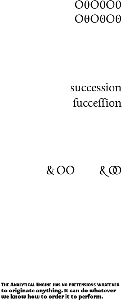
Advanced web typography 413
The Calluna font used so far for the examples doesn’t have much in the
way of historical forms or stylistic alternatives. Let’s switch to the
MEgalopolis Extra font, which has plenty of both.
It’s often difficult to distinguish an
uppercase letter
O
from a zero. In fonts
used in things like text editors, the zero
will have a slash through it to make it
more distinctive. Calluna has both a reg-
ular and a slashed zero. The slashed zero
can be enabled with the zero feature:
font-feature-settings: "zero";
Historical forms can give an authentic
old look to your text. For instance, in
days of yore, the current form for
s
was
only used at the end of words. It was nor-
mal to use a long
s
at the start and in the
middle of words. You can enable the long
s
in Calluna with the hist feature:
font-feature-settings: "hist";
Fonts can also contain stylistic alter-
nates—usually more decorative versions
of certain characters. Calluna has just
one set of stylistic alternates, which con-
tains only two glyphs. Turn on stylistic
alternates by setting salt to on:
font-feature-settings: "salt";
Here’s a sample paragraph
with no special typographic
formatting. The code fol-
lows.
414 CHAPTER 11 Text and fonts
I again rely on Ada Lovelace for the quote:
<p>The Analytical Engine has no pretensions whatever to
originate anything.
It can do whatever we know how to order it to perform.</p>
Here’s the CSS to apply the font:
@font-face {
font-family: megalopolis;
src: url(MEgalopolisExtra.woff) format("woff"),
url(MEgalopolisExtra.otf) format("opentype");
}
p {
font-family: megalopolis, sans-serif;
}
p::first-line {
font-variant: small-caps;
}
You can see the additional ligatures in effect on the small-caps combi-
nations ca, re, and at.
The default stylistic alternatives adds a more curvy s but also a more
traditional y. The property for the second example is as follows:
font-feature-settings: "salt","dlig";
MEgalopolis has six other style sets, which can be turned on with ss01
to ss06. Here are a couple of examples. If you’re following along at
home, I suggest you try ss06 for yourself:
Additional ligatures
Additional ligatures plus
default stylistic alternatives
"ss01"
Advanced web typography 415
BROWSER SUPPORT
Recent versions of the major browsers support some parts of CSS3
advanced font control features using vendor-specific extensions. The
following example shows a complete code listing that enables standard
and discretionary ligatures cross-browser:
-moz-font-feature-settings: "liga", "dlig";
-moz-font-feature-settings: "liga=1, dlig=1";
-ms-font-feature-settings: "liga", "dlig";
-webkit-font-feature-settings: "liga", "dlig";
font-feature-settings: "liga", "dlig";
"ss05"
font-feature-settings Standard CSS3 properties and values
font-feature-settings:
"liga";
font-variant-ligatures:
common-ligatures;
font-feature-settings:
"liga" 0,
dlig";
font-variant-ligatures:
no-common-ligatures
additional-ligatures;
font-feature-settings:
"tnum";
font-variant-numeric:
tabular-nums;
font-feature-settings:
"tnum",
"lnum";
font-variant-numeric:
tabular-nums
lining-nums;
Note that Firefox supported an older version of the spec from
version 4 onwards. It supports the current syntax from version 14
onwards. In order to support both old and new Firefox, you must put
the old syntax second. Newer versions will ignore the old syntax,
but the old versions will attempt to apply the new syntax and fail.
The font-feature-settings property is intended to be
used only for low—level control. The final standard will
include more readable versions for all the most common
options. The following table indicates how the previous
examples map onto the properties currently in the spec.
416 CHAPTER 11 Text and fonts
Text columns
Columns in printed media, such as newspa-
pers and magazines, make text easier to read
by keeping the line length to an optimal 10–
15 words. With CSS2, the only way to create
columns of text is to split the content among
multiple elements and then position them on
the page. This causes issues when updating
the content, because you have to make sure
it remains balanced, and when reading it,
because nothing in the markup indicates that
the two elements share a common text
source. CSS3 adds the ability to render any
element across multiple columns, solving
both issues. You’ll learn how in this section.
Column count and width
font-feature-settings:
"frac";
font-variant-numeric:
diagonal-fractions;
font-feature-settings:
"hist";
font-variant-alternates:
historical-forms;
font-feature-settings:
"ss01";
font-variant-alternates:
styleset(1);
Here’s a simple page with a couple
of paragraphs of text:
<body>
<p>I never am really
satisfied...</p>
<p>In almost every
computation...</p>
</body>
font-feature-settings Standard CSS3 properties and values
Browser support quick check:
CSS columns
Standard Prefixed
- 1.0
- 1.5
10.0 -
11.10 -
- 3.0
(continued)
Text columns 417
The difference between the two becomes obvious if the browser win-
dow is wider. Here are the same two pages at 1024-pixel width.
Turning that into two columns of
text is straightforward:
body {
column-count: 2;
}
The text flows naturally into two
columns with no markup changes,
as you can see in the screenshot.
An alternative approach is to spec-
ify a column width:
body {
column-width: 260px;
}
With a window 640 pixels wide, as
in this example, and taking into
account page margins and padding,
this has a result that’s identical to
the previous rule.
column-count: 2 at 1024px width column-width: 260px at 1024px width
Note that none of the columns shown is exactly 260 pixels wide.
The columns will adjust their width so they use the entire
horizontal space available. If you want columns of an exact width,
you should put them in an appropriately sized container element.
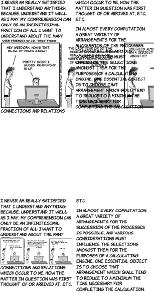
418 CHAPTER 11 Text and fonts
Column spans
You don’t always want everything to fit neatly into columns. You may
sometimes want an individual element to span multiple columns. For
example, in newspapers it’s common for photographs to span multiple
columns of text.
Inserting an element in the text
doesn’t produce useful results:
<p>I never am really satisfied that
I understand anything; because,
understand it well as I may, <img
src="uf012314.gif">my comprehension
can
...</p>
The image is 720 pixels wide, and
the columns are 260 pixels wide.
The result is that the image sticks
out from its column and lies under-
neath the text of the next column.
One useful approach is to limit the
width of any images. When columns
are in use, a width of 100% applies
to the width of the column rather
than the width of the page:
img {
max-width: 100%;
}
But for pictures that are far wider
than they are high, the result may be
that the image is too small. We need
a way for an element to take up
100% of the page width and have
the text columns flow around it.
This is what column-span is for.
Text columns 419
Gaps and rules
In the current CSS3 Multi-column
spec, the column-span property can
take one of two values: 1 or all. The
default is 1: elements span a single
column. A value of all makes the
element span every column:
img {
max-width: 100%;
column-span: all;
}
The column-gap property allows you
to control the spacing between col-
umns:
body {
column-width: 200px;
column-gap: 100px;
}
Three properties control the column
rule. This example shows all three of
them:
body {
column-width: 200px;
column-gap: 100px;
column-rule-style: solid;
column-rule-color: #999;
column-rule-width: 20px;
}
Note that these are analogous to the
border properties.
Rather than specify the three prop-
erties individually, you can use a
420 CHAPTER 11 Text and fonts
Wrapping and overflow
Text wrapping has traditionally been something that, as a web author,
you had to let the browser take care of. In situations where you’d like
more control, CSS3 offers a couple of new properties: word-wrap and
text-overflow. This section looks at each in turn.
Word wrap
CSS3 provides a word-wrap property that controls whether line breaks
are allowed in the middle of words. Normally, text wrapping only
occurs at spaces and punctuation. If a word is too long to fit inside the
containing element without the opportunity for a break, then the ele-
ment expands to contain it.
shorthand version to set all three at
once:
body {
column-width: 200px;
column-gap: 100px;
column-rule: 4px dashed #333;
}
In this example, the column rule
is wider than the column gap:
body {
column-width: 200px;
column-gap: 100px;
column-rule: 300px ridge
#ccc;
}
Note that the column rule sits within the column gap—increasing or
decreasing the width of the column rule doesn’t move the columns
farther apart or closer together. You can even have the column rule
extend underneath the columns, as in the following example.
Wrapping and overflow 421
For regular paragraphs of text, this
isn’t usually a problem. But it can be
an issue for headings and URLs, par-
ticularly if they’re in constrained-
width containers such as sidebars or
text columns. Imagine that you have
a word-of-the-day feature in your
site’s sidebar. The sidebar has a
width of 15em, which is normally
plenty of room; but one day the
word is a long one:
<div>
<h1>Floccinaucinihilipilification</h1>
<p>The act or habit of describing or regarding
something as unimportant.</p>
</div>
Even though the width of the ele-
ment is constrained, the length of
the word forces the entire con-
tainer to be wider:
div { width: 15em; }
Note that the paragraph is still
constrained by the width set.
Here’s where you can use the
word-wrap property. Setting a value
of break-word allows wrapping to
occur within the long word:
div { width: 15em; }
h1 { word-wrap: break-word; }
Browser support quick check:
word-wrap
Standard Prefixed
1.0 -
3.5 -
5.5 -
10.50 -
1.0 -
422 CHAPTER 11 Text and fonts
Text overflow
It may be that you want to keep the word
on one line, so break-word isn’t appropri-
ate. A normal way to do this in CSS2 is to
set the element to overflow: hidden.h1 {
overflow: hidden; }
This works, but it doesn’t look tidy. The
word is cut off part way through a letter.
The text-overflow property lets you make
things look neater:
h1 {
overflow: hidden;
text-overflow: ellipsis;
}
Now the word ends at a letter, and an
ellipsis gives a visual indication that the
word has been truncated. This property is
particularly useful if you’re dealing with
user-generated content that appears in
constrained areas—for example, a Twitter
feed in a sidebar.
Browser support quick check:
text-overflow
Standard Prefixed
1.0 -
7.0 -
6.0 -
11.0 9.0
1.3 -
Summary 423
Browser support
Support for downloadable fonts and WOFF is now available in all
major browsers, but so far, the more advanced font-control features are
available only in Firefox. In terms of other text features, the other
browsers take the lead.
Key:
●Complete or nearly complete support
○Incomplete or alternative support
Little or no support
Summary
Text has always been a fundamental component of web content, but
until recently control of typography has been somewhat limited. In this
chapter, you’ve seen how @font-face can finally provide beautiful
(while still accessible) text on the web, and how web font services can
make it easier to get those fonts onto your web pages. You’ve also had a
tour through the desktop-publishing-like font control capabilities CSS3
12 14 4 6 8 9 10 11.1 11.5 5 5.1
@font-face ● ● ● ● ○ ● ● ● ● ● ●
WOFF ● ● ● ● ● ● ● ● ●
font-size-
adjust
● ●
Font features ○ ○ ○
CSS columns ○ ○ ○ ○ ● ● ● ○ ○
Column span ○ ○ ○ ● ○
word-wrap ● ● ● ● ● ● ● ● ● ● ●
text-overflow ● ● ● ● ● ● ● ● ●

424 CHAPTER 11 Text and fonts
will give us in the future through font-feature-settings. And, continu-
ing the publishing theme, you’ve seen the new features for controlling
columns of text. Finally, you saw some CSS3 features for controlling
text wrapping and overflow, which are useful when you’re fitting con-
tent into text columns and other narrow containers.
That’s the end of the book, but hopefully just the start of your journey
with HTML5 and CSS3. Both standards are evolving at a faster rate than ever
before, opening new possibilities for web authors every month. It’s an
exciting time to be involved with the web; all of us here at Columbia
Internet (and our friends at Manning Publications) hope you can take the
knowledge you’ve gained from this book and go out and make a better web!

425
Appendix A
A history of web standards
n this appendix, you’ll get a brief overview of how the web was invented
and its subsequent development. You’ll also learn how standards are
made by the W3C, why the Web Hypertext Application Technology
Working Group (WHATWG) was formed, and the aims behind HTML5.
To conclude, we’ll take a brief look at the process behind the other major
standard that’s covered in this book: CSS3. None of this information is
necessary to use web standards but, like many other human endeavors,
web standards are a product of their history as much as they are rational
technical documents. An appreciation of the history will help you under-
stand why the standards are the way they are.
A short history of the web
In the following sections, you’ll learn about the history of the web, from
its beginnings as an easy way to share physics papers to its current incar-
nation as the repository of all the world’s knowledge and possible replace-
ment for traditional operating systems. You’ll also learn about the World
Wide Web Consortium (W3C) and its role in providing the standards on
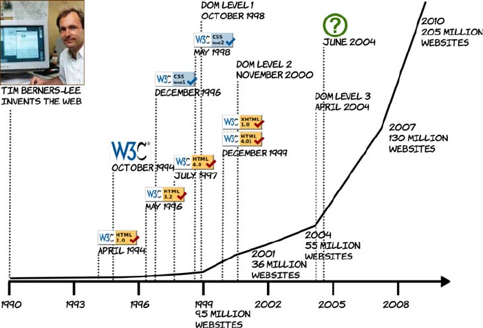
426 APPENDIX A A history of web standards
which the entire web relies. You’ll see how web developers have
pushed the boundaries of what’s possible with HTML4 and CSS2 to
create the need for new standards, and you’ll learn about how many of
the common issues that today’s web developers encounter can be
solved easily in HTML5 and CSS3.
In the beginning
In 1989, Tim Berners-Lee was thinking about the difficulties scientists
at CERN encountered when sharing their papers and research results.
Each had tools for writing papers and other documentation on their
own computers, but CERN was mostly populated by researchers visit-
ing from the universities that employed them. They brought their own
computers with them, so there was a wide variety of different comput-
ers, each with unique documents. If you wanted a document from a fel-
low researcher’s computer, then it was likely you’d either need to learn
to use a different computer or program than you were used to, or you’d
need to transform the output of your colleague’s software to make it
compatible with your own. Berners-Lee had written several of these
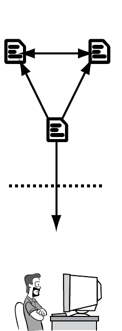
A short history of the web 427
conversion utilities but realized that, instead of a succession of small
utilities, he would be better off solving the general problem. He
believed a hypertext system would be ideal, but systems at the time
were too complex and difficult to author for. He set about designing a
simple hypertext system based on Standard Generalized Markup Lan-
guage (SGML) for a distributed client-server architecture.
This culminated in the release, on Christmas Day 1990, of the World-
WideWeb browser and server. It allowed each individual to publish
their documents in a standard format that anyone else could then read
across the network using the browser. The browser didn’t need to be a
particular bit of software; anyone was free to implement a viewer. The
HTML document format was plain text interspersed with special tags
marked by angle brackets, such as <p> for
paragraph or <li> for list item, to mark the
purpose of the text. These documents could
be easily created on any type of computer.
The idea quickly caught on in the academic
world, and several more browsers
appeared: libwww, Mosaic, Midas, Erwise,
ViolaWWW, and Arena, among others. The
authors of the various web browsers collab-
orated on the www-talk mailing list, dis-
cussing implementation strategies and
arguing about new features. Implementa-
tion usually won out over theory—when
Marc Andreessen proposed the <img> tag, it
was felt by many to be the worst of several
proposals put forward. But Andreessen was
the first person to implement his proposal,
so that was the tag everyone used in their
pages, and it’s the tag we still use today.
The primacy of features over standardiza-
tion threatened to destroy the ideals on
which the web was founded before it even
really got started—the situation was heading
1990–1993
HTML 1.0 ERA
Simple Hyperlinks and images
It’s OK for documentation,
but I can’t see it catching
on for anything else.
Server
Client
428 APPENDIX A A history of web standards
back toward the original state of affairs— documents compatible with
only a single client application.
In an effort to stem the tide, Tim Berners-Lee and Dave Raggett pro-
duced a draft document in April 1993, “Hypertext Markup Language,
Ver 1.0,” and submitted it to the Internet Engineering Task Force
(IETF).
The IETF was the standards body that controlled most of the standards
relevant to the internet: TCP/IP for network communication; DNS for
name resolution, so you can type in an easy-to-remember address like
yahoo.com instead of 67.195.160.76; and SMTP for email, among many
others. The published standards were known as Requests for Com-
ments (RFCs), reflecting the consensual attitude that marked the
growth of the internet over the previous two decades.
The HTML 1.0 draft was overtaken by the rapid development of
browsers. In the time it took to move through the standards process,
the state of the art in web browsers moved on significantly. But the
web was becoming increasingly popular, so the need for some sort of
standard was even more acute: HTML 1.0 was soon to be replaced by
HTML 2.0.
Browser wars
The first commercially successful web browser was Netscape Naviga-
tor. Version 1.0 was released on December 15, 1994 and quickly cap-
tured huge market share. It was based on the Mosaic code originally
developed by Marc Andreessen.
Also in 1994, the World Wide Web Consortium (W3C) was founded by
Tim Berners-Lee. The goal of the W3C was to encourage the adoption
of standards across the internet industry, but initially the HTML stan-
dard efforts remained focused within the IETF.
In August 1995 Microsoft launched Internet Explorer, also based on
the Mosaic code. It was not very competitive with Navigator in fea-
tures and was quickly superseded by version 2.0 in November 1995.
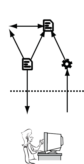
A short history of the web 429
The same year also saw the
launch of Yahoo.com (March
1995), Amazon.com (July 1995),
and eBay.com (September 1995),
along with many other shorter-
lived web brands—or, as they
soon became known, dot-coms.
The internet boom was ready to
happen, and both Netscape and
Microsoft wanted to be in posi-
tion to take advantage of it.
The first official standard for
HTML (HTML 2.0) was published
in April 1994 with revisions in
July 1994 and February 1995; it
was finally accepted as a standard
by the IETF in September 1995.
The goal of the document was to
describe common browser capa-
bilities as of June 1994, so it
reflected most of the functionality
available in the browsers released
that year.
By the time versions 3.0 of IE and Navigator were released in August
1996, IE was much closer in terms of features, and the browser wars
were on. In an effort to grab market share, both vendors rushed to
implement new features with little regard for compatibility. Initially
this wasn’t a problem, because Netscape had as much as 80% of the
market; but as IE gained ground, thanks to improved features and an
aggressive marketing campaign, developers had to contend with two
browsers with similar features but very different implementations.
1993-1995
HTML 2.0 ERA
Introducing The form element
Now I can shop online—
books, clothes, unshielded
Twisted pair cables...
Server
Client
430 APPENDIX A A history of web standards
The W3C attempted to stem the tide by
publishing a draft standard, HTML3. It
wasn’t compatible with either of the major
browsers, so it struggled to gain traction.
A short-term compromise was reached in
HTML 3.2. This more closely reflected the
functionality of contemporary browsers.
Many of the features proposed for
HTML3 were carried forward to the spec
for HTML4.
1995–1997
HTML 3.2 ERA
Client–side interactivity
WITH JavaScript
HMM, annoying animations and
layout tables, not sure this
is progress.
Server
Client
1997–2010
HTML 4.0 ERA
Client–side interactivity
WITH JavaScript
Server
Client
I can do everything on the
web. No need for desktop apps!

A short history of the web 431
From web pages to web applications
As you’ve just seen, HTML was originally designed for sharing docu-
ments. The only interactive elements in HTML 1.0 were the hyperlinks
between documents. HTML 2.0 introduced forms, which allowed users
to send information back to the server. Shortly after that, Netscape
introduced JavaScript that enabled web pages to respond to user
actions without going back to the server at all. In this section, you’ll see
how the addition of client-side interactivity turned out to be a game-
changing move for the web.
Although the early versions of JavaScript were limited, it caught the
imagination of web developers. It was initially developed by Netscape,
but was copied by Microsoft and soon became standardized under the
umbrella of Ecma International as ECMAScript in 1997 (these days,
though, nearly everyone still refers to it as JavaScript).
JavaScript can update browser content through the Document Object
Model (DOM). The DOM represented the HTML document as a tree
of objects, so you’ll frequently hear it referred to as a DOM tree. With
the release of Netscape Navigator (now Communicator) 4.0 and IE
4.0, the DOM became a complete interface, and developers were able
W3C standards process in 1998
In May 1998, the W3C formalized its standards process with the publication of
the document “World Wide Web Consortium Process.” It listed three stages a
standard had to go through:
❂Working Draft (WD)—The proposed standard may go through several
drafts. Once the standard has stabilized, the editor issues a Last Call for
comments, and then the standard can move on to the next stage.
❂Proposed Recommendation (PR)—The Proposed Recommendation stage
lasts at least four weeks. A PR is voted on by W3C members. After the vote,
the standard is either returned to the Working Draft stage or, perhaps with
modifications, advances to be a full recommendation.
❂W3C Recommendation (R)—A Recommendation indicates that consensus
has been reached among W3C Members and the specification is appropriate
for widespread use. After the standard has become a Recommendation, only
minor revisions are allowed to correct minor errors or clarify issues.

432 APPENDIX A A history of web standards
to produce highly interactive web pages. This became known as
Dynamic HTML (DHTML).
Unfortunately, the DOMs implemented in Navigator and IE were very
different—far more incompatible than the implementations of Java-
Script in each browser. This meant that coding DHTML in a cross-
browser—compatible manner was something of a challenge; develop-
ers had to produce two versions of their application code, one for IE
and one for Navigator. The extra code made it more likely that devel-
opers would make mistakes. Sites that made heavy use of DHTML
tended to be unreliable and slow in at least one, if not both, major
browsers. As a result, DHTML and JavaScript gained a bad reputa-
tion. On the other hand, JavaScript was often the only way to work
around the incompatibilities between browsers. This is a purpose for
which JavaScript is still used extensively today. The W3C stepped in
with the DOM Level 1 standard in late 1998, and Microsoft provided
partial support for it in IE5. Netscape planned to add support in its ver-
sion 5.0; but as Netscape struggled to compete with the far greater
resources of Microsoft, that plan never saw the light of day. When
Microsoft released versions 5.5 and 6.0 of IE, version 6.0 claimed “full
DOM Level 1 support,” although inconsistencies in the standard meant
that not everyone agreed. Meanwhile, Netscape faded into the back-
ground, was bought out by AOL, and eventually gave up on browser
development. The code for Navigator was donated to the world as
open source and eventually was reborn as Firefox.
W3C standards process in 1999
In November 1999, an update to the “World Wide Web Consortium Process” doc-
ument added an additional stage to the process: the Candidate Recommenda-
tion. This recognized the need for implementation feedback prior to the
standard being published as a Recommendation:
❂Working Draft (WD)—The initial publication of the standard, used to gather
public feedback. A standard typically has several Working Drafts before
advancing to the next stage.
❂Candidate Recommendation (CR)—After the specification has stabilized, it
becomes a CR. At this point, browser vendors are expected to begin implementing
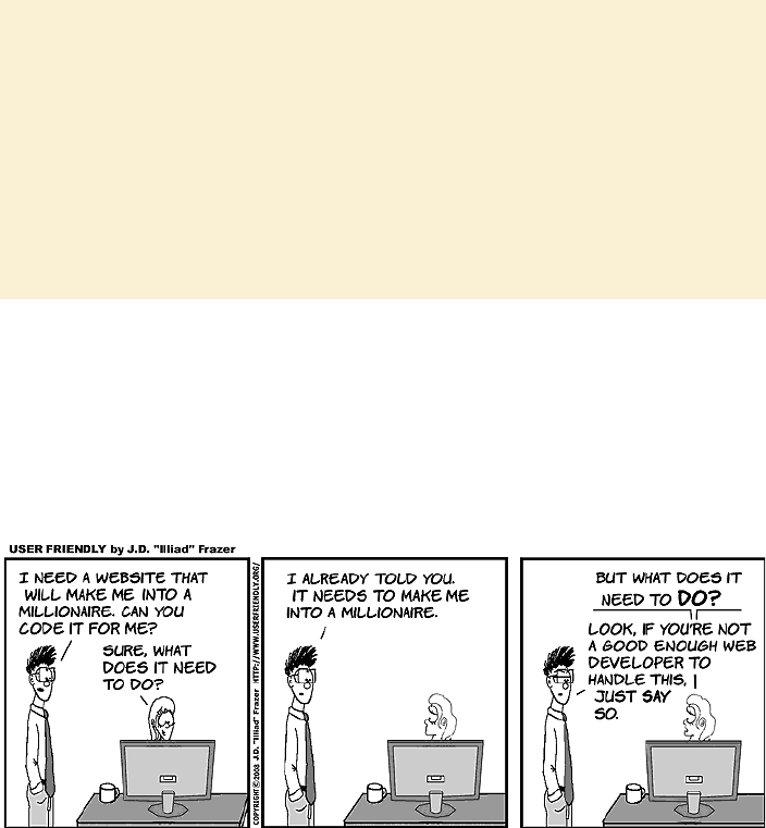
A short history of the web 433
After the frantic pace of releases in the second half of the 1990s, things
slowed down for HTML. The DOM Level 2 spec was published in late
2000, followed by DOM Level 3 in 2004. CSS saw a major revision to
2.1 in February 2004, but it didn’t see full support in IE until the ver-
sion 8 release in March 2009.
Microsoft, no longer under much pressure to advance IE other than to
add features that would be useful within the company’s own products,
drastically reduced the resources devoted to its development. One of
the few features added in this period was the XMLHTTP ActiveX con-
trol (equivalent to a plug-in) as a standard component of IE5. The
XMLHTTP object allowed JavaScript to make an asynchronous
request back to the server to get new data without the user loading a
(continued)
the standard in order to provide feedback about its practicality. It isn’t unusual
for a standard to revert to a WD several times after becoming a CR.
❂Proposed Recommendation (PR)—After some practical implementation
experience has been gained, preferably at least two independent and
interoperable implementations, the standard can advance to the PR status.
This is an opportunity for final review within the W3C. The standard is either
approved by the Advisory Committee and advances to a full Recommenda-
tion, or it returns to WD status for further work.
❂W3C Recommendation (R)—As before, when published as a Recommenda-
tion, the standard is ready for widespread deployment.
434 APPENDIX A A history of web standards
new page. This feature was required for Microsoft’s new web-based
client for the Exchange 2000 email server.
The stage was now set for the boom, from 1998 to 2000, and bust, from
then until 2002, of the dot-com bubble. The web exploded, both in
popular awareness and size, taking advantage of all the features of
HTML4 and, somewhat later, CSS2. Where features were lacking in
the standards, developers used JavaScript or third-party plug-ins,
such as Macromedia’s (now Adobe’s) Flash, to fill in the gaps.
Still, many people thought the future of the web was not with HTML
and CSS. This quote from a Dr. Dobbs article in 2002 is typical: “Even
today, HTML offers scant control over design essentials like typogra-
phy and screen layout, and does little to accommodate complex interac-
tions between browsers and servers. Making a trip to the server after
each mouse click is a fairly inefficient way to deliver information. As
Web development increasingly focuses on applications, markup’s limi-
tations are becoming more and more apparent.”
Two events heralded a new approach to web applications. First, the
Firefox browser, which is the open source descendant of Netscape
Navigator, added its equivalent to IE’s XMLHTTP: the XmlHttpRequest
(XHR) object. Second, Google launched a web-based email application
that took advantage of this feature: Gmail.
Gmail was unlike contemporary websites: after the interface was
loaded, the page was hardly ever reloaded. Whenever the user clicked
a link, instead of visiting a new page, some JavaScript intercepted it,
sent an XHR request to the server, and then updated the already-
loaded page when the request returned. Gmail worked in both IE and
Firefox, and it was fast to use, comparable to desktop email clients
such as Microsoft Outlook.
Although it was far from the first web application to use XHR or simi-
lar techniques, Gmail captured the imagination of web developers
worldwide and led to a spurt in XHR-based web applications and
renewed interest in JavaScript. The approach was soon given the acro-
nym AJAX (for Asynchronous JavaScript and XML), which helped to
A short history of the web 435
distance it from the tawdry reputation of DHTML despite being mostly
the same thing. Although the web had long been touted as a platform
for applications, the AJAX trend looked like it had a chance of making
that possibility a reality.
The competing standards
You may have wondered what the W3C has been doing in the decade
since HTML 4.01 was released. It has, of course, been working on
plenty of standards other than HTML, but it’s also working on a
replacement for HTML4. The W3C decided that the future of HTML
lay in XML. XML is superficially similar to HTML—documents, tags,
and elements all exist in XML, but it has two major differences:
❂XML parsing is much stricter than HTML. A few mistakes in an HTML
document will, in many cases, not even be noticed; the browser will
correct the errors as best it can and carry on. A single error in an
XML document causes the parsing to fail and an error message to be
displayed. The stricter approach allows browsers to be more effi-
cient, which is particularly useful on mobile and low-power devices.
❂XML is extensible. If you want to add new elements to your XML
page, you can do so. You describe those elements in a separate file
and link to it from your document. Your new elements are then just
as valid as any specified by the W3C.
The first step was to redefine HTML 4.01 as an XML standard.
XHTML 1.0 became a Candidate Recommendation in October 2000. It
contained no new elements or features; all the valid elements were
identical to those in HTML 4.01. The only changes came from it now
being a dialect of XML. The plan was to extend XHTML in a modular
fashion by plugging in new XML dialects. Some of the better-known
XML dialects the W3C expected to be plugged in to XHTML were
Scalable Vector Graphics (SVG), which became a CR in August 2000;
and MathML, an XML language for describing equations, which
became a CR in April 1998. The modular approach allowed different
technologies to be worked on at different paces.
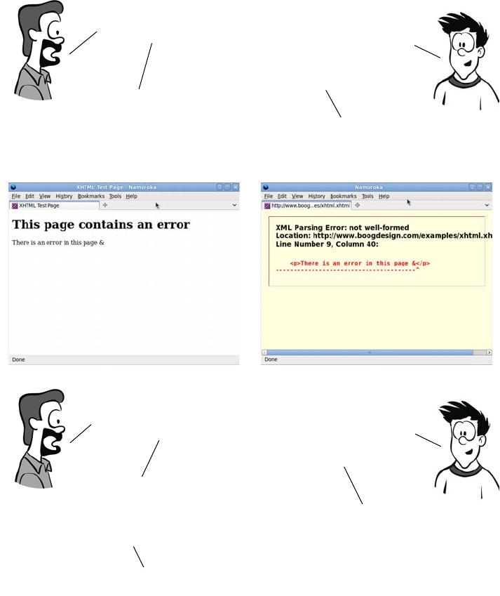
436 APPENDIX A A history of web standards
The drive toward XML meant that HTML was largely sidelined. The
focus was on building compound documents out of various XML dia-
lects. This included the HTML-like XHTML and the previously men-
tioned SVG, MathML, but also XForms, RDF (Resource Description
Framework), and any number of other proposals. It was envisaged that
you might write web applications without using any XHTML at all.
XHTML sounds great!
Why isn’t everyone
using it?The error handling is
too draconian—half
the web would be nothing
but error messages if we
switched tomorrow.
But wouldn’t that enforce
higher standards?
It surely can’t be that bad.OK, let me show you an example,
Here are two identical pages,
except one is XHTML and one is HTML.
You must have made
a major mistake
to get such a horrible
error message!
In both documents,
I used a reserved character,
the ampersand,
without the correct
escape sequence.
Only one character is wrong?
Well, that result does seem
a little excessive, but now
you know you’ve made
a mistake and can correct it.
You might want to display
user content, or pull in content
from another website; that has
to be valid too. And even if you get
things right, IE doesn’t support XHTML
correctly before version 9.
I might have known IE would
come into it somewhere...
Step forward WHATWG 437
In 2004, at the W3C Workshop on Web Applications and Compound
Documents, Opera and Mozilla, concerned that the standards process
might become increasingly irrelevant to the web as it existed in the real
world, put forward a position paper outlining an alternative approach.
This paper outlined seven “Design Principles for Web Application
Technologies” and, in the context of these, proposed answers to the
questions the workshop had set out to answer.
The document was voted down by the rest of the attendees, who
wanted to stick with the current XML, rather than HTML, -based
approach. Two days later, the Web Hypertext Application Technology
Working Group (WHATWG) was formed.
Step forward WHATWG
The WHATWG set out to define the next HTML standard according to
the seven principles set out in Opera’s and Mozilla’s document. They
underpin the entire approach taken by the WHATWG during the
development of HTML5, so let’s look at them now:
❂“Backwards compatibility, clear migration path”—In 2004, IE6 was the
browser of choice for 80% of web users. The WHATWG felt that
there was little point in specifying new HTML functionality unless it
could at least be emulated in IE6 with JavaScript. If a plug-in was
required to emulate the new features in IE6, then the chances were it
would never see large uptake among web developers.
❂“Well-defined error handling”—A major point of incompatibility in con-
temporary browsers was not what happened when the page author
got everything correct, but what happened when they made a mis-
take. The next standard should specify error handling and error
recovery.
❂“Users should not be exposed to authoring errors”—This addressed a major
difference of opinion with the XML-based approach at the W3C.
WHATWG wanted browsers to recover from errors gracefully and,
where recovery was possible, not display an error message to the
user—just like HTML.
438 APPENDIX A A history of web standards
❂“Practical use”—New features should be added based on use cases.
Ideally, these should be based on real issues developers experience in
working around the limits of existing standards.
❂“Scripting is here to stay”—JavaScript had become something of a sec-
ond-class citizen in XHTML. Although the WHATWG preferred a
declarative markup approach, especially for the initial application
state, it recognized that scripting will always have a significant role.
❂“Device-specific profiling should be avoided”—The W3C produced a cut-
down version of the XHTML spec for mobile devices. The
WHATWG felt that authors shouldn’t have to produce different ver-
sions of their markup for different devices.
❂“Open process”—Although the W3C has open mailing lists, it also has
private ones. WHATWG activity is conducted entirely under public
scrutiny.
This isn’t to say the principles of the WHATWG were entirely orthogo-
nal to those being followed by the W3C’s XML-focused working
groups, but there was a significant difference in approach. The W3C
continued to work on XHTML2 while the WHATWG worked on
HTML5. XHTML2 had the backing of the recognized standards body,
but it primarily appealed to people who wanted to use other XML-
based technologies. HTML5 garnered far more popular support with
its “evolution rather than revolution” approach and its exhaustive doc-
umenting of browser behavior.
In addition to the seven principles, the HTML5 spec took the step of
combining the separate HTML and DOM specs by the W3C. Experi-
ence had shown that trying to maintain them as two specifications led
to inconsistencies and incompatibilities. In the HTML5 spec, the DOM
became the basis of correct parsing—two implementations would be
interoperable if they produced the same DOM tree from an HTML
document.
Eventually the W3C realized that it risked being made irrelevant by
real-world events. In March 2007, it relaunched the HTML Working
Group. Mozilla, Apple, and Opera proposed that the WHATWG
HTML5 specs be taken as the starting point of this new group’s work,
CSS2 evolves into CSS3 439
and the rest of the working group agreed. At this point, XHTML2 was
put on hold and everyone was able to agree that the future of the web
would be HTML5.
CSS2 evolves into CSS3
While all this was going on in the world of markup, work was continu-
ing on CSS at the W3C in the form of CSS Level 3, or CSS3 for short.
CSS3 also tried to correct a number of past mistakes in drafting specifi-
cations, starting with fixing CSS2.
The CSS2 specification had been through the 1998 standards process
and thus had no implementation feedback before being published as a
Recommendation. As vendors tried to implement it, a number of issues
were found that made it impossible, or impractical, to achieve compli-
ance with the standard.
CSS 2.1 set out to rectify those mistakes and provide a solid, imple-
mentable base on which to build CSS3. The work to set CSS 2.1 right
has taken more than eight years, but was finally completed in June
2011. But the timing of this was unfortunate. IE6 was released in
August 2001, a few years after the CSS2 publication but a year before
the first draft of CSS 2.1. This is significant because IE6 is the browser
that won the first round of the browser wars. It achieved 83% market
share by 2004 as Netscape collapsed. With no competition, Microsoft
wound up IE development; the web would be stuck on IE6 for many
years. In comparison to the two-year-or-less gap between most previ-
ous IE releases, it would be nearly five years before IE7 appeared.
Even though IE6 had good support for CSS2 compared to other brows-
ers available in 2001, it soon fell behind standards.
CSS3 is modular; it’s split into sections such as Backgrounds and Bor-
ders, Values and Units, and Text Layout. This means that instead of
waiting years for a huge, monolithic standard to be finalized, as has
happened with CSS 2.1, less controversial and more useful sections can
be prioritized and pushed through the standards process more quickly.
In the meantime, until a particular module is ready, the corresponding
section of the CSS 2.1 spec is regarded as the current standard.
440 APPENDIX A A history of web standards
Hey! It seems like half
of CSS3 is really CSS 2.1. It’s all the work of the same
group at the W3C.
CSS2 had to be fixed before
they could move forward.
What’s taking so long?
CSS2 became a standard under
the old process, Now two
fully interoperable
implementations are needed.
But even IE8 supports CSS 2.1!
The W3C had to wait for a library of test
cases; we need to be able to test
whether browsers meet the standard.
AH! Because it’s no good just
saying you meet the standard;
you need to be able to prove it!
Exactly. The CSS 2.1 specification
finally became a W3C
recommendation in June 2011.
Now that the history lesson is out of the way, the rest of the
appendixes are targeted at taking a complete novice at web
development and giving them enough knowledge to appreciate the rest
of this book. They also constitute a useful refresher course for more
experienced web authors. First you’ll learn about HTML itself.

441
Appendix B
HTML basics
f you’ve never created a web page before picking up this book, this
appendix will bring you up to speed on the fundamentals of Hypertext
Markup Language (HTML) so you can fully enjoy the rest of the book. It
covers these areas:
❂Basic HTML syntax: what it’s made up of
❂Common HTML elements for text, metadata, links, and images
❂What makes a particular text file an HTML document
❂How to learn by example with View Source
This short appendix will be a whirlwind introduction. To get you up to
speed as quickly as possible it’s opinionated about issues that are funda-
mentally a matter of style or preference. I won’t waste your time showing
you several slightly different ways of doing the same thing; I’ll concen-
trate on the things you need to know to understand the HTML in this
book.
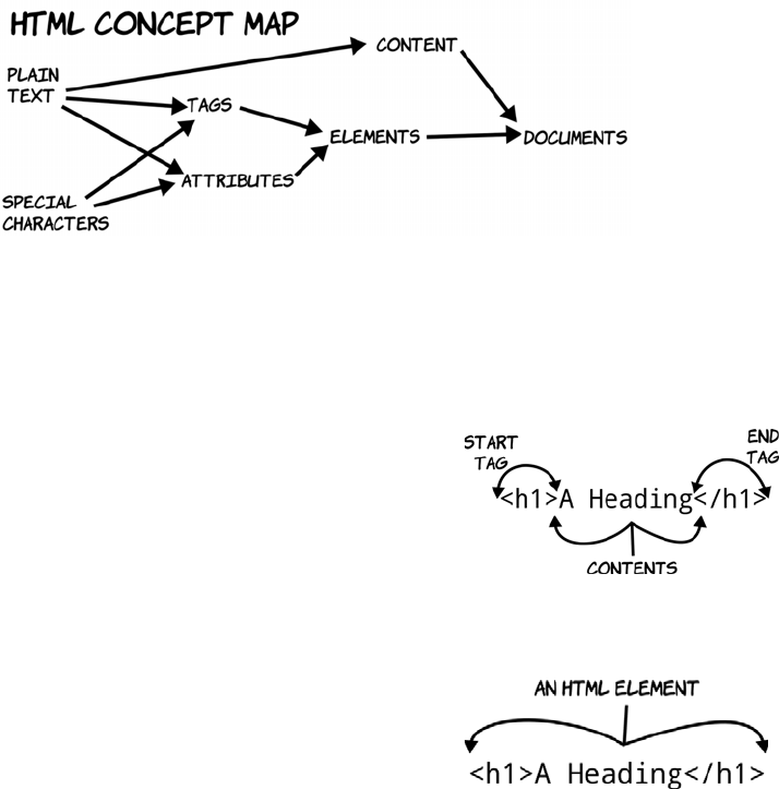
442 APPENDIX B HTML basics
The components of hypertext
HTML is a language for describing hypertext documents. Hypertext
documents are made up of headings, paragraphs, bulleted lists, and,
importantly, links to other hypertext documents; it’s the links that con-
stitute the hyper part of hypertext. In this section, we’ll look at things
from the bottom up, starting with how an HTML document indicates
the existence of a paragraph or a heading before combining everything
to make a document. The following diagram shows the concepts that
make up HTML, from simple components on the left to complete docu-
ments on the right.
Tags, elements, and attributes
A tag is a bit of text that acts as a point demarcation. To create a tag,
HTML gives certain characters special meaning: the angle brackets
< and >.
Putting characters within angle brack-
ets creates a tag. You can see in this
diagram that there are two tags, <h1>
and </h1>: a start tag and an end tag.
An end tag always matches a start tag,
except that it has a slash after the
opening angle bracket.
The combination of a start tag and an
end tag defines an element. Everything
between the two tags is referred to as
the contents of the element.
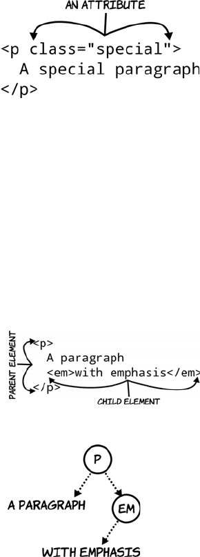
The components of hypertext 443
Some elements need to have at least one attribute to be any use; for
instance, a <link> element has an attribute that contains the address of
the HTML page it links to. Some attributes are specific to certain ele-
ments, and others can be applied to any element. The two most com-
mon attributes you’ll see are id, to assign a unique identifier to an
element, and class, to assign a space-separated list of classes (think of
them as categories or tags). You’ll see these two attributes a lot in
appendix C when you learn about CSS.
HTML documents
An HTML document is a tree of elements descending from an <html> ele-
ment and its two children: <head> for metadata (literally, “data about
data”) and other nonvisible elements, and <body> for the page content.
Start tags can also have attributes: a
name optionally followed by a value.
An attribute is used to select between
different options of element function
or to provide extra information about
what the element describes.
Elements can contain text, but they can
also contain other elements. In this
example we would say, “The <p>
element contains the <em> element.”
Any element that contains other ele-
ments is said to be the parent of those
other elements; those are in turn its chil-
dren—the idea is that the elements form
a tree structure, like a family tree.
The <p> element has two children: the
text “A paragraph” and an <em>
element. The <em> element has one
child: the text it contains.
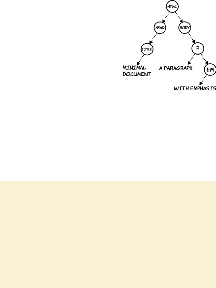
444 APPENDIX B HTML basics
A minimal HTML document can be created out of the earlier fragment
by adding these three necessary elements and a title:
As you see more complex documents with many more elements, bear in
mind that ultimately the browser turns them into a tree like this. When
you’re applying CSS or doing scripting, it’s common to think in terms
of nodes in this tree rather than elements in the document.
<html>
<head>
<title>Minimal document</title>
</head>
<body>
<p>A paragraph
<em>with emphasis</em></p>
</body>
</html>
You can create an HTML document
yourself by opening a text editor,
copying this code into it, and saving
it as a file with the extension .html.
After you’ve done that, double-
clicking the file will open it in your
browser.
Markup, parsing, and rendering
The activity of taking plain text (the content) and turning it into an HTML docu-
ment is called marking up: adding markup to the plain text to indicate which bits
of it are headings, paragraphs, bulleted lists, and links. Note that after a text
document has been marked up into HTML, it’s still also a text document. You
can open it in Notepad or any other text editor, and it’s treated like any other
plain text. Only when the text document is loaded into a browser does it become
a hypertext document. When a string of text like “<p>A paragraph</p>” is de-
scribed as “a paragraph element,” that’s shorthand for “this string of text, when
read by the right piece of software under the right conditions, will create within
that software an entity that is a paragraph element.” The process of taking the
text file containing the markup and turning it into the tree-like representation of
an HTML document is called parsing. The process of taking that tree and show-
ing it to the user is called rendering.
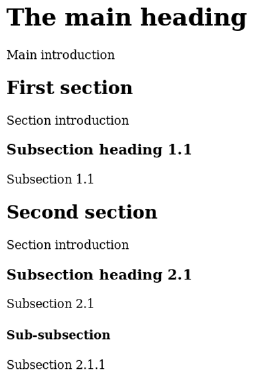
Elements for text 445
Now that you’ve got the general idea, the next section will go into more
detail about common elements for marking up text content.
Elements for text
This section looks at HTML elements for marking up text—which, for
many web pages, is the majority of the content. Nearly every element
can contain text, but several are specifically dedicated to the task. The
most common of these is the paragraph element, <p></p>, of which
you’ve already seen several examples, but there are many others for
headings, unordered lists, ordered lists, line breaks, horizontal rules,
and more.
Headings and paragraphs
Paragraphs and headings work in concert to create the bulk of the text
content of a document and its implicit structure. HTML has six heading
elements, which are numbered 1 through 6: <h1>, <h2>, <h3>, <h4>, <h5>,
and <h6>. The most significant is <h1>, which is usually the document
title; the sections should begin with <h2> elements and the subsections
with <h3>, and so on:
<html>
<head>
<title>
Headings and
implicit structure
</title>
</head>
<body>
<h1>The main heading</h1>
<p>Main introduction</p>
<h2>First section</h2>
<p>Section introduction</p>
<h3>Subsection heading 1.1</h3>
<p>Subsection 1.1</p>
<h2>Second section</h2>
<p>Section introduction</p>
<h3>Subsection heading 2.1</h3>
<p>Subsection 2.1</p>
<h4>Sub-subsection</h4>

446 APPENDIX B HTML basics
Both headings and paragraphs automatically break the flow of text at
the position of their end tag. Although the previous markup shows the
elements on separate lines to match the screenshot, this isn’t necessary.
The markup could be all on a single line, and it wouldn’t change the
results in the browser—all whitespace characters (see sidebar) are col-
lapsed to a single space.
Here’s an example with longer paragraphs. The markup is wrapped at
70 characters, ignoring the position of the tags. The tags are shown in
bold so they’re easier to spot:
<h1>A quote from Ada Lovelace</h1><p>The Analytical Engine has no
pretensions whatever to originate anything. It can do whatever we
know how to order it to perform. It can follow analysis, but it has
no power of anticipating any analytical revelations or truths. Its
province is to assist us in making available what we are already
acquainted with.</p><p>The Analytical Engine weaves algebraic
patterns, just as the Jacquard loom weaves flowers and leaves.</p>
<p>Subsection 2.1.1</p>
</body>
</html>
As you can see, the headings get smaller as they decrease in
importance.
Whitespace
Whitespace is a collective term for any sort of spacing character. To understand
it fully, we need to take a step back and consider what a text file really is. A text
file is a long list of characters, some of which are special control characters to
indicate line feeds, carriage returns, and tab stops. Think of an old-style teletype
or line printer with a print head: these characters are instructions telling the print
head to do something other than print a character but that does take up space.
On modern computers, these characters control the layout you see in a text ed-
itor; you see several lines of text, but only because the text contains several car-
riage returns and line feeds. For HTML purposes, many of the control characters
are considered whitespace. The full list of these characters is as follows: space,
tab, form feed, zero-width space, carriage return, line feed, and combined car-
riage return and line feed.

Elements for text 447
Viewing this markup in the browser reveals that the line breaks go
wherever the elements and the size of the window dictate:
If there’s a situation where a paragraph requires a line break, such as
an address or a verse of poetry, you can use the <br> element:
The <br> element is unique among those covered so far because it con-
sists of a single tag. It can have no children. The <br> element and oth-
ers like it are known as self-closing elements. They’re sometimes written
with a closing slash like this: <br/>.
HTML’s ability to ignore spacing and line breaks and reflow text to fit
the available space is usually an advantage: text flows automatically
<p>The Analytical Engine
weaves algebraic<br>patterns,
just as the<br>Jacquard loom
weaves<br>flowers
and<br>leaves.</p>
Line breaks aren’t for layout
A common beginner’s mistake is to use line-break elements or empty paragraph
tags to increase vertical spacing between two other elements. There’s no need
to do this in HTML: spacing between elements can be entirely controlled with
Cascading Style Sheets (CSS, covered in appendix C).
HTML is for describing content, not presentation. You’ll benefit in the long run
if you avoid using meaningless, empty elements for layout.
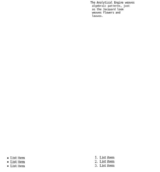
448 APPENDIX B HTML basics
into the space available to it in the browser window, mobile device, or
web-enabled refrigerator on which it happens to be displayed. But
sometimes the original text formatting is significant: for example, pro-
gram listings or command-prompt output. For preformatted text like
this, HTML has the <pre> element:
Notice that the leading space on each line is faithfully reproduced in
the browser output.
Lists
Another common textual feature is lists. Bullet points can make a mem-
orable way to highlight key facts. Some documents are nothing but
lists—you may have sat through terrible presentations that were built
on the philosophy that bulleted lists were an appropriate way to show
paragraphs of text that should be read out loud.
This section will introduce the two most common HTML lists:
❂Unordered
❂Ordered
Each consists of a parent element and one or more child elements.
Unordered and ordered lists differ only in the parent element.
<pre>The Analytical Engine weaves
algebraic patterns, just
as the Jacquard loom
weaves flowers and
leaves.</pre>
<ul>
<li>List item</li>
<li>List item</li>
<li>List item</li>
</ul>
<ol>
<li>List item</li>
<li>List item</li>
<li>List item</li>
</ol>
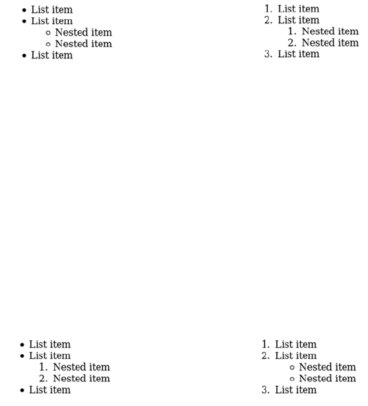
Elements for text 449
An unordered list, the traditional bulleted list of PowerPoint legend, is
made up of a <ul> element and a collection of <li> child list items, and
an ordered list is made up of a <ol> element and a collection of child
<li> items. The list items can themselves include more list elements
with their own list items, resulting in a nested list.
It’s perfectly acceptable to nest ordered lists within unordered lists and
unordered lists within ordered lists.
<ul>
<li>List item</li>
<li>List item
<ul>
<li>Nested item</li>
<li>Nested item</li>
</ul>
</li>
<li>List item</li>
</ul>
<ol>
<li>List item</li>
<li>List item
<ol>
<li>Nested item</li>
<li>Nested item</li>
</ol>
</li>
<li>List item</li>
</ol>
<ul>
<li>List item</li>
<li>List item
<ol>
<li>Nested item</li>
<li>Nested item</li>
</ol>
</li>
<li>List item</li>
</ul>
<ol>
<li>List item</li>
<li>List item
<ul>
<li>Nested item</li>
<li>Nested item</li>
</ul>
</li>
<li>List item</li>
</ol>
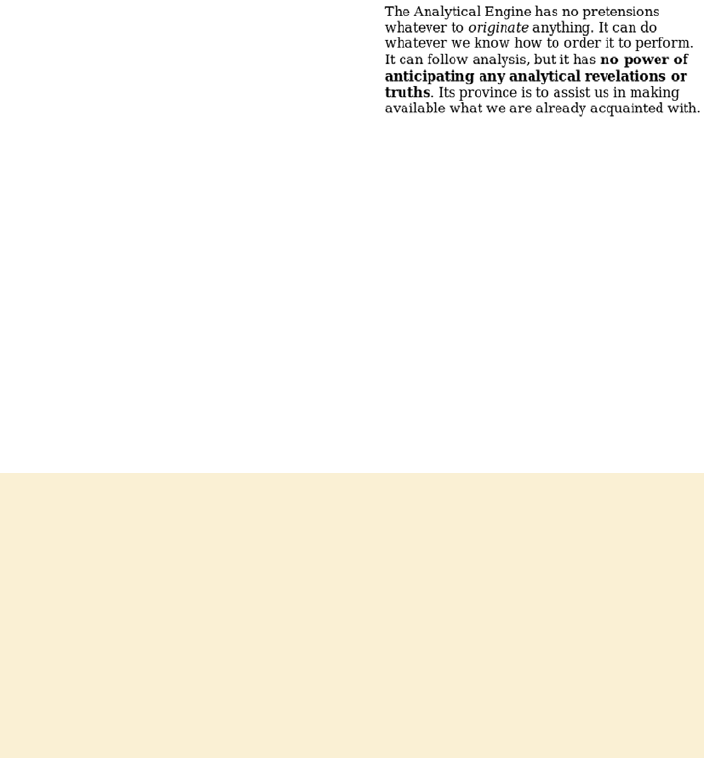
450 APPENDIX B HTML basics
Lists are commonly used to mark up navigation: a list of links. Nested
lists are a good match for the sections and subsections of a website. In
the next section, we’ll look at some elements intended to be used inside
the major structural elements we’ve covered.
Emphasis and typography
Some words and phrases are so important in the context of their para-
graph that they need to be given special emphasis. HTML provides two
elements for this: <em> for emphasis and <strong> for strong emphasis.
<em> and <strong> are inline elements, intended to appear within a line of
text, whereas <p>, <h1>, and <ul> are block elements, intended to create a
new line of text. See the sidebar “Block and inline elements” for further
details.
<p>The Analytical Engine has no
pretensions whatever to
<em>originate</em> anything. It
can do whatever we know how to
order it to perform. It can
follow analysis, but it has
<strong>no power of anticipating
any analytical revelations or
truths</strong>. Its province is
to assist us in making available
what we are already acquainted
with.</p>
Block and inline elements
Visible HTML elements can be split into two broad categories: block and inline.
A block element naturally takes up the full width available to it; consecutive
block elements naturally start below the previous block element. Block elements
include paragraphs, all the headings, and all the list elements you’ve seen.
Inline elements fit exactly to their content and sit naturally on the line of text in
which they’re situated. Inline elements include <strong> and <em> (covered
here) and others such as <b>, <i>, and <abbr>.
The key thing to remember at this point is that block elements can’t appear in
an HTML document as the children of inline elements.
Elements for text 451
The important consequence is that <em> and <strong> are always
descendants of a block-level element like <p>. Block-level elements
should never be children of inline elements, but inline elements can be
children of other inline elements.
There are several other inline elements, but we don’t have room to go
into them. The final section of this appendix lists resources where you
can look them up yourself; in the meantime, remember the rule dis-
cussed here.
Neutral elements: <div> and <span>
<p>A paragraph with
<em>emphasis</em>
</p>
<em>
<p>A paragraph with emphasis</p>
</em>
<p>A paragraph with
<em>
<strong>strong</strong>
emphasis
</em>
</p>
<div class="person">
<p class="full_name">
<span class="first_name">
Rob
</span>
<span class="surname">
Crowther
</span>
</p>
<p class="hometown">
London
</p>
</div>
452 APPENDIX B HTML basics
Not everything can be marked up semantically as a paragraph or as
emphasized text. Sometimes an element is needed to group other ele-
ments, or to allow other information to be attached to a part of the doc-
ument. For these situations, HTML provides the two elements <div>
and <span>.
A <div> is a block-level element, and a <span> is an inline element. By
themselves, these elements are intentionally semantically neutral; they
don’t “mean” anything—or, looked at another way, they can mean
whatever you want them to mean, with the judicious use of id and class
attributes, as in the previous examples. These elements are useful
when you’re applying CSS and creating layouts (more about this in
appendix C).
In this section, you’ve seen a variety of elements for text: paragraphs,
lists, emphasis, and neutral elements. The web would be a dull place if
this was all web pages were capable of. In the next section, you’ll learn
about the elements that make the web interesting: links, images, and
other embedded resources.
Links and embedded resources
Text is all very well, but to make text into hypertext you need to add
links. This section looks at links between documents and links within
documents. It then covers other ways of linking external elements to
HTML documents, both images and more general-purpose objects. To
finish, it looks at <iframe> elements, which give you a way to embed an
entire web page inside another one.
Links and anchors
In HTML content, links that are supposed to be interacted with use the
anchor element, <a>. A link ought to go somewhere, so the target loca-
tion is given in the href (hypertext reference) attribute of the <a> ele-
ment. Three categories of link can be used in the href attribute. The
first is a full URL:
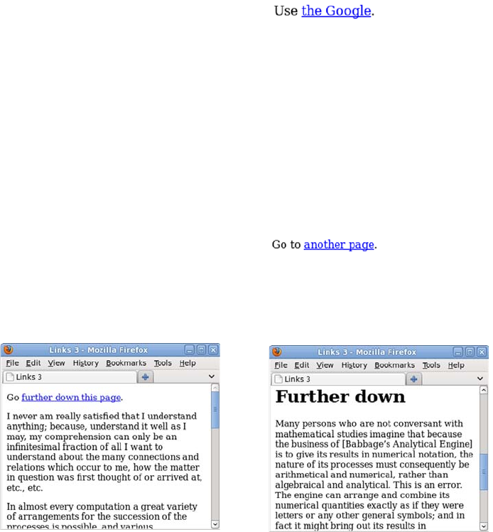
Links and embedded resources 453
It’s common to annotate long documents in this fashion. Applying an
ID to each of the headings allows a table of contents to be built up, let-
ting a reader quickly access the relevant section. For example, on
Wikipedia, each article has a table of contents made up of links you can
click to take you to the relevant part of the article.
<p>Use
<a href="http://www.google.com/">
the Google
</a>.
</p>
This is normally used to link to a
different website. It works equally
well for linking to pages on the cur-
rent site, but the extra characters
required for a full URL are unnec-
essary, as the next example shows.
<p>Go to
<a href="pages/links-3.html">
another page
</a>.
</p>

454 APPENDIX B HTML basics
Images and other objects
Images are embedded in HTML with the <img> element. The basic syn-
tax is extremely simple; just the element itself and a single attribute are
required:
Usually you can do without width and height attributes, either because
the image is sized appropriately to start with or because the size of the
image is controlled with CSS (see appendix C). This lets you determine
how big the image should be depending on what device is used to access
the page. The main benefit of providing dimensions is that browsers
know how much space to allocate when laying out the page, which
improves performance. Notice that the image element is self closing—it
<img src="dust-puppy.svg">
In this case, the image is much larger than the
available browser window, so only the upper-
left part of it appears on the screen.
A less obvious problem is that if the image is
unavailable for some reason, perhaps due to a
failure on the server, or because the user is
browsing without images, or because the author
misspelled the image name, then there will be
no evidence that the image is there at all.
You can correct both these issues with a couple
of common attributes, width (and/or height) and
alt (alternative text):
<img src="dust-puppy.svg"
width="252px" height="356px"
alt="An image of Dust Puppy">
It’s recommended that you always add an alt
attribute to an <img> element. In cases where
the image is purely decorative or is described
textually in some other way, it’s permissible to
set the alt attribute to an empty string: alt="".

Links and embedded resources 455
isn’t allowed to have any descen-
dants. The only widely sup-
ported possibility of providing
fallback content should the
image be unavailable is the alt
attribute. If the image doesn’t
load or isn’t in a format sup-
ported by the browser, then the
user sees the alternative text.
This isn’t something you’re
likely to have noticed unless you
tried viewing the previous exam-
ple in IE8, in which case you saw
something like the image at right.
Many people have long consid-
ered this a failing of the <img>
element. Images appeared in the HTML spec because the most popular
browser had support for them, and with the current syntax. Of course,
it was the most popular browser because, in part, it was the first one
that allowed the viewing of images without launching a separate appli-
cation. Several features common to the early alternative proposals to
the <img> element have ended up as features in the <object> element, a
general-purpose element for embedding content in your page.
The <object> element can link to an arbi-
trary file. The only additional require-
ment is that you specify the file type:
<object
data="dust-puppy.svg"
type="image/svg+xml"
width="252px" height="356px">
An image of Dust Puppy
</object>
In browsers that support SVG images, the
visible result is no different than including
the image with the <img> element.
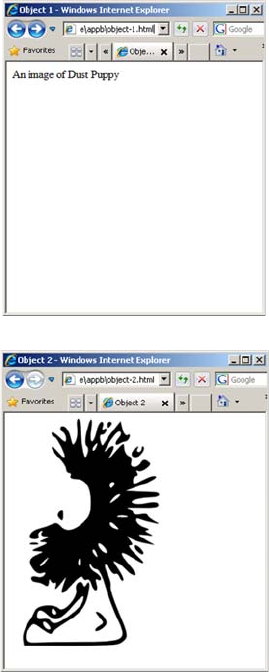
456 APPENDIX B HTML basics
If you have no plans to take advantage of the additional capabilities of
SVG, you’re better off sticking to a standard image format in an <img>
element. But outside of simple examples in books, the <object> element
also allows the extension of the browser with plug-ins. A plug-in is an
external program with support for a particular file type or technology. It
registers the types of files it can support with the browser and, when the
browser comes across an object element specifying one of these file
But in browsers that don’t support SVG,
such as IE8 shown in the screenshot
here, the content of the <object> element
is shown instead. Unlike <img>, <object>
can have as many descendants as you
need. The descendants are known as the
fallback content.
In this case, an obvious option is to
make the fallback content another
image, except this time one that IE8
does support:
<object
data="dust-puppy.svg"
type="image/svg+xml"
width="252px" height="356px">
<img
src="dust-puppy.png"
width="252px"
height="356px">
</object>
IE8 users will miss out on some of the
advanced possibilities enabled by SVG,
such as perfect scaling to any resolution,
but they’ll still see appropriate content.
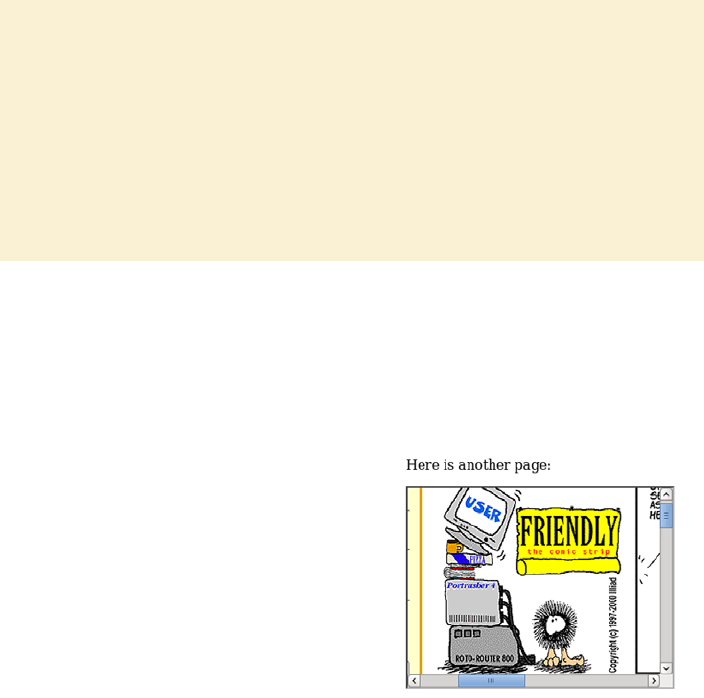
Links and embedded resources 457
types, it hands the data over to the plug-in and lets it control what is dis-
played in the element. This is how the popular Flash plug-in works; it’s
the basis for popular sound and video sites like YouTube and last.fm.
Inline frames
Another common way of embedding content in your web page is the
inline frame, known as the <iframe> element. This lets you create an
embedded browser window inside the one the page is rendering in:
The <iframe> element is used a lot for embedding advertising, display-
ing videos, and Facebook applications.
Why href and src and data?
It may seem like the href, src, and data attributes do the same job for different
elements. Why didn’t HTML standardize on one or the other? Usually href indi-
cates somewhere a user can go, and src indicates something a browser should
fetch, but it’s mostly historical accident whether an element uses one or the oth-
er. It may seem that the <object> element has a data attribute just to force you
to remember a third alternative, but the reasons are mostly historical. Back when
the web was young, some browsers implemented new elements with href and
some with src. The elements that survived to become the first HTML specifica-
tion kept their attributes so as not to break backward compatibility.
<p>Here is another page:</p>
<iframe
src="http://www.userfriendly.org/"
width="320" height="240">
</iframe>
The <iframe> is given dimensions and
an entire other web page has been
loaded into it. The page can be one
from the same site as the parent page,
specially designed to fit within the
bounds of the <iframe>. This is an
easy way to allow parts of the page to
be updated without reloading the
whole thing.
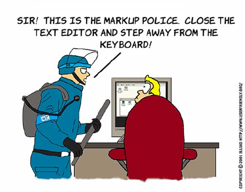
458 APPENDIX B HTML basics
Nonvisible elements
Some HTML elements aren’t intended to be visible in the page. These
usually appear in the head section of the markup, although they can
appear anywhere. You’ve seen at least one example already: the <title>
element, which is usually visible only in the title bar or tab of the
browser, or in search results. Three other elements are commonly seen
in the head section:
❂<link> elements—Reference external resources such as style sheets
❂<script> elements—Specify code to be run in the browser
❂<meta> elements—Provide key-value pairs of metadata
Style sheets and scripting are covered in the next two appendixes, but
the <meta> element isn’t too important. Just remember when you come
across one that it isn’t expected to be displayed.
In the previous sections, there have been a few statements along the
lines of, “You can’t put a paragraph element inside a heading element”
and, “Inline elements should only contain other inline elements, not
block elements.” But what do those statements really mean? The next
section considers these issues.
Parsing and validation
What will happen to you and your web pages if you ignore the advice
given in the previous sections? If you nest a <div> inside a <span> and

Parsing and validation 459
put it on a website, will the whole thing come crashing down around
your ears? Will you be arrested for crimes against markup?
Well, no.
The less trusting among you may have created a document with a para-
graph inside a heading and noted that the document loaded into the
browser just fine, so it may seem as though you can do what I’ve been
saying you can’t. This is an aspect of a wider debate—is an HTML doc-
ument what some bloke says it is, or is it anything that works in the
browser? This is a complex issue, and I don’t have room here to go into
every part of it. This section aims to equip you with a basic understand-
ing of the terms involved and highlight some of the consequences of not
following “the rules.”
Is this an HTML document?
There are different ways that markup can be invalid. In this section,
we’ll look at several examples of invalid HTML, see what a browser
does with them, and then use the examples to introduce the concepts
and terminology involved. To start with, here’s the valid document
from earlier:
A valid document contains only elements listed in the HTML specifica-
tion, and those elements contain each other in ways described in the
specification; there’s a single <html> element with two children, <head>
and <body>; inline elements like <em> are contained within block ele-
ments like <p>; and so on.
<html>
<head>
<title>Minimal document</title>
</head>
<body class="simple">
<p>A paragraph
<em>with emphasis</em></p>
</body>
</html>
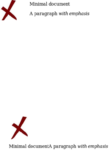
460 APPENDIX B HTML basics
The document can be made invalid in a number of ways. One is to use
elements that don’t exist in the HTML specification. This invalid docu-
ment replaces all the regular tag names with shortened versions:
The browser copes well with this; the main difference is that the title is
now visible, because the browser has no idea what a <t> element is.
In this document, the closing angle bracket has been left off the end of
each line:
Again the browser copes fairly well. The <title> element is lost because
now it’s in position to be an attribute of the <head> element; but the con-
tent is all visible, and the one complete element, <em>, is displayed prop-
erly. This demonstrates that web browsers are resilient to badly
constructed HTML markup, but these two documents are broken in
significantly different ways. To highlight this, let’s force the browser to
attempt to render these documents as XML, which is a much stricter
standard, instead of HTML. To do so, you can change the file extension
from .html to .xhtml. The two documents then create very different
results:
<ht>
<he>
<t>Minimal document</t>
</he>
<bo c="simple">
<p>A paragraph
<em>with emphasis</em></p>
</bo>
</ht>
<html
<head
<title>Minimal document</title
</head
<body class="simple"
<p>A paragraph
<em>with emphasis</em></p
</body
</html
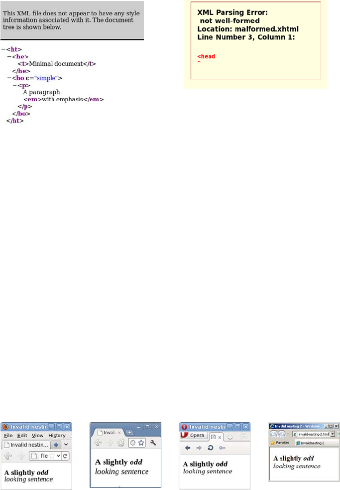
Parsing and validation 461
The first document, even though it has only one valid HTML element,
is structured in a valid way, so the browser still parses it into a tree
structure. Although this document isn’t valid HTML, it’s well formed: the
elements, tags, and attributes follow the basic rules of markup. The
second document doesn’t follow these basic rules, so as well as being
invalid, it’s also not well formed.
There are more subtle ways to make the markup invalid. Consider the
following markup fragment:
<p><strong>A slightly <em>odd</strong> looking sentence</em></p>
This is invalid because the <em> and <strong> elements aren’t nested cor-
rectly. The <em> element starts before the <strong> element end tag, but
the <em> element end tag is outside the <strong> element. Either the two
elements should be entirely separate, or one should be contained within
the other. In keeping with the resiliency demonstrated previously, most
browsers manage to render this fragment similarly.
Invalid document 1 Invalid document 2
Firefox Chrome Opera IE
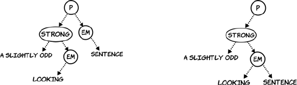
462 APPENDIX B HTML basics
You may be thinking that browsers seem to handle the markup
whether it’s invalid or not, so why should you bother with writing valid
markup? The next section answers that question.
Validation and why you should bother
If browsers can cope just fine with invalid and even not-well-formed
markup—and not only that, different browsers manage to do a similar
job of rendering that invalid markup—why should you bother writing
valid markup in the first place? There are at least three good reasons,
as this section summarizes.
First, even though things look the same when they’re this simple, dif-
ferences probably exist underneath. The earlier sidebar “Markup,
parsing, and rendering” distinguished between the markup in the text
file, the parsing of that markup into an internal structure by the
browser, and the final rendering of that internal structure on the
screen. In the screenshots at the end of the previous section, you saw
the final result of the invalid markup for this fragment:
<p><strong>A slightly <em>odd</strong> looking sentence</em></p>
Although it looked the same in all four browsers, here are the internal
trees they built.
This example involves only three (or four) elements, and already there
are cross-browser differences. The more complex the page becomes,
the more likely invalid markup is to cause an oddity in rendering that’s
hard to discover. This is especially true when CSS and JavaScript are
involved.
Moving on from this first point, browsers and other web tools are opti-
mized for valid markup. Invalid markup is always dealt with as an
Firefox and Chrome Opera and IE
Parsing and validation 463
exception; this means browsers have to do extra work to parse and ren-
der it, which ultimately means invalid pages are slower to render. Also,
unless the particular structure of the invalid markup causes a browser
or tool to crash, bugs in the parsing and rendering of invalid markup
are less likely to be fixed than are those for valid markup. Subtle differ-
ences in parsing and rendering between browsers will eventually lead
to hard-to-discover cross-browser issues in web pages.
Finally, especially when you’re learning, it’s likely that you’ll at some
point ask for help with something that isn’t working the way you
expect. In most online communities that specialize in markup, the first
thing you’ll be asked to do is fix any invalid markup, or at least explain
its existence. This is true for several reasons:
❂As discussed in the previous point, invalid markup often leads to
subtle issues.
❂Error-checking tools are far more useful if they’re pointing out one
major error in your markup rather than the major error buried in
hundreds of minor ones.
❂If you haven’t bothered to write valid markup, many members of
these online communities will view you as not worth their time and
effort to help.
To summarize, the three reasons why you should write valid markup
are as follows:
1Invalid markup leads to subtle differences in parsing and rendering.
2Browsers and development tools are optimized for valid markup.
3It’s easier to get help with valid markup.
Or, looked at from the perspective of why not to write invalid markup,
these three reasons can be rephrased:
1You make things harder for yourself.
2You make things harder for your tools.
3You make it harder for others to help you.
You want to write valid markup, but how do you tell if your markup is
valid? In the final section, you’ll learn about tools you can use to check

464 APPENDIX B HTML basics
your markup for errors as well as tools that will help you examine the
results of your markup in the browser. With these tools, you’ll be well
equipped to learn more for yourself.
Learning more
In this chapter, you’ve learned enough to get you started with HTML.
The best way to build on this foundation is to try things for yourself
and see what happens. This section shows you some tools for doing this
and resources for learning more.
Web tools
After you’ve written some markup, how can you tell if it’s correct?
You’ve seen in this appendix that even when things look OK in the
browser, there can be hidden problems that will eventually trip you up.
Here are a couple of online tools that can help.
The first tool is from the World Wide
Web Consortium (W3C—the body
that defines many web standards):
http://validator.w3.org.
This service checks that your markup
is well formed and follows the rules
described previously, such as no
block-level elements as descendants
of inline elements. You should try to
fix any errors reported.
The validator will check that your
markup is technically correct, but it
doesn’t concern itself with matters
of best practice. For this, you need a
linter like HTML Lint: http://
lint.brihten.com/html/.
Errors reported by a linter are more
concerned with matters of style than
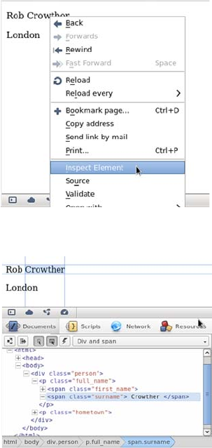
Learning more 465
Browser tools
In addition to websites to help you write markup, all major web brows-
ers come with built-in tools for analyzing what’s going on with your
markup. These differ in the details but all work in broadly the same
fashion. In this section the screenshots come from Opera but instruc-
tions are given for all major browsers.
a validator, so it’s reasonable in some situations to ignore any advice
given if you know what you’re doing. But while you’re still learning,
it’s all likely to be good advice.
The easiest way to activate the tools
in Opera, Chrome, and Safari is to
right-click the area of the page
you’re interested in and select
Inspect Element.
In Firefox, look for the Web
Developer menu option, and select
Inspect. You can activate IE’s tools
by pressing the F12 key or by
selecting Developer Tools from
the Tools menu.
The tools open with a tree view of
the markup, similar to the tree dia-
grams in the opening sections of this
appendix. Use this to highlight ele-
ments you’re interested in and check
that the tree structure the browser
has built corresponds to what you
intended.

466 APPENDIX B HTML basics
Resources and where to go for help
This appendix has been a high-speed introduction to HTML. If your
head is still spinning, here are some alternative resources that take
things at a slightly slower pace:
❂HTML Dog HTML Beginner Tutorial—www.htmldog.com/guides
/htmlbeginner/
❂W3C Web Standards Curriculum—www.w3.org/wiki/Web_Standards
_Curriculum
When you’re building pages of your own, you’ll run into issues that
aren’t described in introductory material. When you have questions,
these are good resources:
❂Web Standards Group mailing list—http://webstandardsgroup.org/mail/
❂WebDesign-L mailing list—www.webdesign-l.com/
❂Doctype Q&A website—http://doctype.com/
You should now know enough about markup to get started
creating your own web pages. but even with the odd image, they’ll
be a bit dull. You can add visual excitement to your web pages
with CSS, which you’ll learn about in the next appendix.

467
Appendix C
CSS basics
f you’ve just read appendix B, you’re probably wondering how those
rather dull textual examples end up looking like the beautiful web pages
you see every day. The answer isn’t some secret extra markup you didn’t
learn about yet, but Cascading Style Sheets (CSS). This appendix will
introduce the main features of CSS, including
❂The basic syntax of CSS
❂Using CSS selectors to apply styles only to certain elements
❂The most common properties and values
❂Using CSS for layout
Rules, selectors, properties, and values
A CSS style sheet is made up of rules. Here are three example CSS rules.
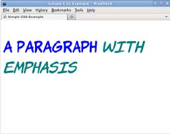
468 APPENDIX C CSS basics
A CSS rule is made up of a selector and a semicolon-separated list of
declarations inside brackets. Each declaration has a property and a
value separated by a colon. If an element in an associated HTML docu-
ment matches a selector in the style sheet, then the declarations will be
applied to that element.
To help you get the idea, here’s a full example page with a style sheet.
The style sheet is in the head section of the document in a <style> ele-
ment. There are three rules in the style sheet: a rule for the <body> ele-
ment, a rule for the <p> element, and a rule for the <em> element:
<!DOCTYPE html>
<html>
<head>
<title>Simple CSS Example</title>
<style>
body {
font-family: "Komika
Hand";
font-size: 250%;
}
p {
color: blue;
font-size: 1.4em;
}
em {
color: teal;
}
</style>
</head>
<body>
<p>A paragraph
<em>with emphasis</em>
</p>
</body>
</html>
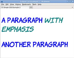
Rules, selectors, properties, and values 469
In the previous example, the style rules are included directly in the
HTML inside a <style> element. This is just one way of applying CSS to
your web pages; the next section will summarize the alternatives.
Adding a style sheet to your HTML
There are four ways to include CSS in HTML. At the lowest level, you
can apply it directly to individual elements with the style attribute.
This is known as an inline style:
<p style="color: red;">Another paragraph</p>
This rule makes just this one paragraph have red text, but it has no
effect on any other paragraphs in your document. The limited impact
of the style attribute means it’s the least efficient way of applying CSS;
it’s usually only seen on elements unique within a site, when people are
creating copy-and-paste widgets, or to work around a localized cross-
browser issue.
Slightly more useful is the <style> element used earlier. The <style> ele-
ment should appear in the <head> element of the HTML document,
although all popular browsers will use the styles if they’re added to the
body instead. Rules in a <style> element apply to everything in that page:
<style> p { color: red; } </style>
The main benefit of this approach over inline styles is that you can con-
trol the styles of multiple elements from a single rule, but they still only
If a second paragraph is added, it has the
same style as the first paragraph because
they both match the rule:
<body>
<p>A paragraph
<em>with emphasis</em>
</p>
<p>Another paragraph</p>
</body>
These are called type selectors because they
match any element of the stated type.

470 APPENDIX C CSS basics
affect the page on which they’re placed. On a multiple-page site, the
rules would have to be included on every page, so it’s far more common
to put all the CSS in a separate file and then link to it from each page.
This <link> element references an external style sheet:
<link href="styles.css" rel="style sheet">
Like the <style> element, the link should appear in the head of the doc-
ument. The file styles.css would then contain the CSS:
p { color: red; }
This same CSS file can be used with every page on the site that links to
it. Most browsers download style.css only once and then reuse it, sav-
ing bandwidth and page-rendering speed.
The final way to include CSS is to link from within existing CSS. This
requires that some CSS has already been included, via a link or a
<style> element:
<style> @import url('styles.css'); </style>
In this example, the style sheet is imported from a <style> element in
the head section of the document.
Inheritance
One of the key properties of CSS is that styles are inherited down the
document tree. In the simple example in the previous section, it’s already
possible to see this feature in action. The font-family property is speci-
fied only for the <body> element, but the elements in the document are
displayed with the Komika Hand font from that rule. This is because all
the other elements are children of the <body> element, so they inherit the
font-family property.
Whitespace in CSS
The <style> element example is a more compact representation than used pre-
viously: everything is on a single line instead of broken out into individual lines.
It doesn’t matter to the browser how the CSS is spaced—whitespace is ignored
just as with HTML, but most human readers find it easier to read if the styles are
broken up across multiple lines.
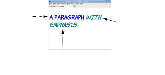
Selecting elements to style 471
font-family isn’t the only property that’s inherited. Here are the rules
for the <p> and <em> elements:
p { color: blue; font-size: 1.4em; }
em { color: teal; }
Inheritance means you don’t have to write style rules for every element
in the document. Setting a font or a color on the <body> element usually
means that all text in the document will be that font and color. To style
specific elements, you need to learn how to write selectors; these will be
covered in the next section.
Selecting elements to style
You learned in the previous section that a CSS rule consists of a selec-
tor and a declaration. The declaration is the set of visual effects to be
applied, and the selector determines what elements will be styled by the
declaration. You saw some selectors in the previous section; they were
examples of type selectors, where the selector consists of the element
name and selects a type of element. But there are many other CSS
selectors as well. In this section, you’ll learn about ID and class selec-
tors; using combinators to join selectors together for greater specificity;
using pseudo-classes to select elements in particular states; and using
media queries to target devices such as printers or cell phones.
ID selectors
An ID selector chooses an element based on the id attribute. This attri-
bute should have a unique value in any given document, so an ID
The p element
is size 1.4em
and blue
The
<em>
element
is also size
1.4em
.
the property
inherits from
the
<p>
rule.
But the <em> is teal. the
property for <em>
overrides the inherited
value from <p> .
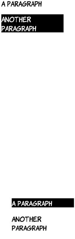
472 APPENDIX C CSS basics
selector will only ever apply to a single element and its descendants.
An ID selector consists of a hash character followed by the id. In the
following example, an element matching the ID selector will reverse
the normal colors: white text on a black background instead of black
text on white.
By themselves, ID selectors aren’t very useful. You certainly wouldn’t
want to add an ID to every element you needed to style. They’re nor-
mally used to pick out particular landmarks on a page. For a more gen-
eral-purpose approach, it’s much better to use the class selector
discussed in the next section.
Class selectors
The class selector chooses elements based on the class attribute. Unlike
the id attribute, values in the class attribute don’t have to be unique
throughout the document, so rules based on class selectors usually
apply to a selection of elements in a document. A class selector consists
of a period (.) followed by the class name and selects any element with
the value myclass in the class attribute:
#myelement {
color: white;
background-color: black;
}
In the markup, only the element with the
matching id attribute is selected:
<p id="yourelement">A paragraph</p>
<p id="myelement">Another paragraph</p>
.myclass {
color: white;
background-color: black;
}
In this example, only one of the paragraphs
has the myclass class:
<p class="myclass">A paragraph</p>
<p class="yourclass">Another paragraph</p>
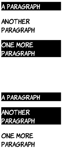
Selecting elements to style 473
Although the previous examples use paragraph elements, it isn’t neces-
sary for all elements with a particular class to be of the same type. This
allows you to use the semantically correct element for a given bit of
content but style related items uniformly. In the source code for this
appendix, you’ll find two additional examples of the class selector that
demonstrate this: class-selectors-4.html and class-selectors-5.html.
Now that you have a basic grasp of simple selectors, the next section
will look at ways of combining them with combinators to make more
complex selectors.
Combinators
Combinators allow simple selectors, like the element, ID, and class selec-
tors in the previous sections, to be combined into more complex rules.
This makes it easy to apply one style to <link> elements in the main con-
tent but different styles to links in the navigation or the page footer.
The most common combinator in CSS is the descendant combinator: a
space between two simple selectors. For the selector to match the
The main benefit of a class selector over the
ID selector is that multiple elements can
have the same class. Here, a third para-
graph is added:
<p class="myclass">A paragraph</p>
<p class="yourclass">Another paragraph</p>
<p class="myclass">One more paragraph</p>
It’s also possible to apply multiple classes to
a single element. In the next example, the
middle paragraph has two classes applied:
<p class="myclass">A paragraph</p>
<p class="yourclass myclass">Another
paragraph</p>
<p class="yourclass">One more paragraph</p>
The .myclass selector selects all the elements
that have myclass as one of the values in the
class attribute.
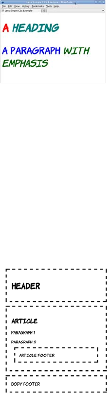
474 APPENDIX C CSS basics
rightmost element, that element must be a descendant of the previous
element. This is easier to understand with an example. Consider this
fragment of HTML:
<h1>A <em>heading</em></h1>
<p>A paragraph <em>with emphasis</em></p>
Now look at these two style rules, both of which select <em> elements:
The child combinator is a greater-than bracket: >. It allows you to select
elements that are direct children of a parent. Because you can already
select according to ancestor elements, you might be wondering why
you also need a child combinator, so let’s look at an example. Here’s a
simple HTML document:
em { color: teal; }
p em { color: darkgreen; }
The second rule selects only those <em> ele-
ments that appear as children of a <p> ele-
ment. In this example, the first <em> (a child of
the <h1> element) is teal, but the second <em>
(a child of the <p> element) is dark green. The
second rule is more specific than the first one,
so it will be preferred whenever both apply.
More on this in the next section. In the meantime, you need to learn
about the child combinator.
<header>
<h1>Header</h1>
</header>
<article>
<h1>Article</h1>
<p>Paragraph 1</p>
<p>Paragraph 2</p>
<footer>Article footer</footer>
</article>
<footer>
Body footer
</footer>
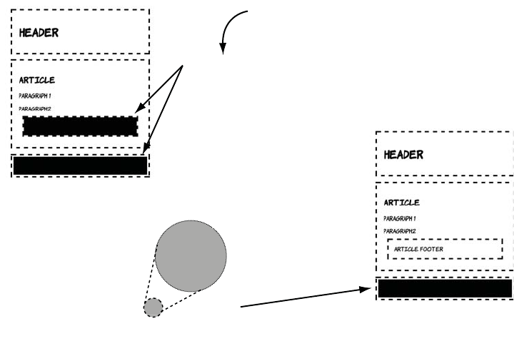
Selecting elements to style 475
The child combinator is useful when you have nesting and the same
element appears multiple times at different depths: for example, a menu
made up from unordered lists where each item is itself an unordered
list. With the child combinator, it’s easy to apply different styles to the
top-level and lower-level items.
Cascading and specificity
The cascading part of Cascading Style Sheets refers to the rules that
determine which of a set of competing rules apply to an element. This is
important because multiple rules can have a definition that applies to
the same property of the same element.
It has a header, an article, and a footer, but note that the <article> ele-
ment also has its own footer. This lets you see the difference between
the descendant and child combinators.
body footer {
background-color: #000;
}
Selects every footer
which is a descendant
of body
Selects only direct
children of body
body > footer{
background-color: #000;
}
>
The child
combinator
DescendAnt
combinator
>
476 APPENDIX C CSS basics
In case this isn’t making much sense to you, let’s look at an example.
Here’s a basic style sheet:
p {
color: white;
background-color: black;
}
Let’s link to it from the head of a document that also includes a <style>
element:
<head>
<title>CSS Cascade 1</title>
<link href="style-1.css" rel="stylesheet">
<style>
p {
color: black;
background-color: white;
}
</style>
</head>
Notice that both the linked style sheet and the <style> element include
a declaration for the color of paragraph elements. Which one should
the browser use? The situation can be complicated further by adding a
style attribute to a <p> element:
<p>A paragraph</p>
<p style="color: silver; background-color: gray;">
Another paragraph
</p>
As the screenshot shows, the browser
chooses the inline style on the element that
has one, rather than either of the styles in the
head or the linked style sheet. Inline styles
always override linked style sheets and styles
in the head; other rules are usually used in
reverse order to which they’re encountered.
Try moving the <link> element after the
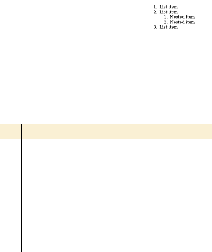
Selecting elements to style 477
This rule wins because it has a higher specificity. The specificity is
based on the selectors used in the rule. You can use this straightfor-
ward process to calculate the specificity of any selector.
Any rule with an ID selector is more specific than any rule with just a
class selector, which in turn is always more specific than any rule made
<style> element in this example, and you’ll
see that the rule in that file is then applied.
But there is a complication. The last rule
encountered is used only because the previ-
ous rules used the same selector. If the selec-
tor in the linked style sheet is changed, then
this rule will win:
body p {
color: white;
background-color: black;
}
Step Action #myelement em .myclass em body p em
1Count the number of ID selectors in
the rule, and make a note of this
value as a.
a = 1 a = 0 a = 0
2Count the number of class selectors
in the rule, and make a note of this
value as b.
b = 0 b = 1 b = 0
3Count the number of type selectors
in the rule, and make a note of this
value as c.
c = 1 c = 1 c = 3
4Combine a, b, and c into a number
where each letter represents a digit.
The highest number is the most
specific.
101 011 003
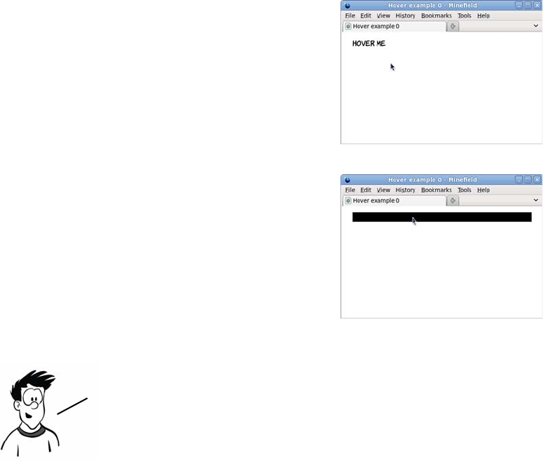
478 APPENDIX C CSS basics
up of only type selectors. But within each group the number of selec-
tors for each type is the significant factor.
Pseudo-classes
One of the original uses for JavaScript when it was introduced by
Netscape back in 1995 was for rollover effects: changing a background
image when the mouse pointer enters or leaves an element. Rather than
require an entire scripting language for a simple visual effect like this,
the ability to select elements based on user activity has been built into
CSS with pseudo-classes.
This example is a page with a para-
graph element:
<p>Hover me</p>
By default, the paragraph is black
text on a white background.
The notation for a pseudo-class is a
colon followed by a keyword. For
rollover effects, the keyword is hover:
p:hover { background-color: #000; }
This rule sets the background of the
element to black when the mouse
pointer hovers over the element.
It’s also possible to use pseudo—classes with combinators,
defining rules for children of an element depending on its
dynamic state. Several interesting effects are possible only
when you do this. Let’s look at a simple example.
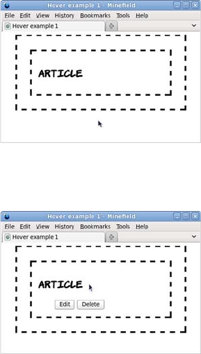
Selecting elements to style 479
This snippet of markup might be part of a content management system.
The idea is that the buttons allow the user to enable edit mode or delete
the element:
<article>
<header>
<h1>Article</h1>
<menu>
<button>Edit</button><button>Delete</button>
</menu>
</header>
</article>
Most of the time, the menu needs to
be hidden so the user can see the end
result more clearly. The menu is there-
fore hidden with this CSS:
header menu {
display: none;
}
You’ll learn more about the display
property in the next section.
With the menu hidden, there’s no
point adding the hover pseudo-class to
that—the mouse pointer will never be
able to hover over an element that
isn’t there. But the <header> element is
visible, so here’s a rule that makes the
<menu> element visible when the mouse
pointer is hovering over the <header>
element:
header:hover menu {
display: inline;
}

480 APPENDIX C CSS basics
This bit of CSS is the basis of most pop-up and drop-down menus on
the web. The only requirement is that the element to be shown is a
descendant of the element that will be hovered over. It lets you present
extra information only when the user indicates they’re interested in it
by putting the mouse pointer in that location.
You should now have a good grasp of the basic syntax involved in CSS
and how to write selectors to pick out the required elements for styling.
All that’s left to learn is the properties and values needed to create
styles.
Properties and values
The interesting parts of CSS are the properties and values that cause
the visible effects seen on the web page. The sheer variety of properties
and values is such that entire books have been written about them.
This section covers the most common values used in styling web pages.
Colors and lengths
The most common values in CSS are colors and lengths. A number of
different properties accept either colors or lengths, or both, as values.
This section gives a brief overview of them; then, in the following sec-
tion, you’ll learn about properties where they can be used.
The previous sections have included several examples of color values.
Mostly the examples have used color keywords such as black and red,
because it’s obvious what these mean even to people who don’t know
CSS, but there are several other ways to describe colors in CSS. These
approaches are more flexible because they provide separate values for
the amount of red, green, and blue that makes up the color. The follow-
ing table shows the same colors expressed four different ways.
Note that the hover pseudo—class assumes users are accessing
the page with a desktop browser and using a mouse. For many
potential users, this isn’t true, including people with
disabilities and users of mobile or tablet devices.
Properties and values 481
The middle two columns use hexadecimal notation. These are numbers
in base 16: after getting to 9, the next number is A, then B, and so on,
up to F. The hexadecimal value FF is equivalent to 255 in decimal. If
the two numerals for each of the red, green, and blue values are the
same, then you can use the shorthand notation in the third column.
Color has its own property. The following example sets the foreground
(text) color of an element and its descendants to blue:
color: #00f;
Lengths are less complicated than colors: they consist of a number fol-
lowed by a unit. The most common units are shown in the next table.
Name #rrggbb #rgb rgb(r,g,b)
Black #000000 #000 rgb(0,0,0)
Blue #0000ff #00f rgb(0,0,255)
Red #ff0000 #f00 rgb(255,0,0)
Yellow #ffff00 #ff0 rgb(255,255,0)
Green #008000 -rgb(0,128,0)
Teal #008080 -rgb(0,128,128)
Silver #c0c0c0 -rgb(192.192,192)
Gray #808080 -rgb(128,128,128)
White #ffffff #fff rgb(255,255,255)
Unit Measures by Description
px Pixels Length in pixel units. The actual size is determined by monitor resolution.
pt Points A measure from typography, equivalent to 1/72 of an inch.
cm Centimeters Absolute length in centimeters. If you’re not in a metric country, you can
also use in for inches.
em Ems Size of the capital M in the current font.
%Percentage Length as a proportion of the size of the element’s parent.
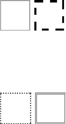
482 APPENDIX C CSS basics
The next section looks at some common properties where these values
are used.
Borders and backgrounds
Two of the most common things to style are borders and backgrounds.
Each is controlled by several different CSS properties, and each has a
shorthand notation that lets you set all the properties in a single line.
This section looks at both of them, starting with borders.
A border has a width, a type, and a color. All three can be set sepa-
rately using the properties border-width (a length), border-style (a spe-
cial property for borders), and border-color (a color, unsurprisingly):
.one {
border-width: 5px;
border-style: solid;
border-color: #999;
}
.two {
border-width: 0.75em;
border-style: dashed;
border-color: #000;
}
The CSS above assumes that some elements
with appropriate classes are defined:
<div class="one"></div>
<div class="two"></div>
<div class="three"></div>
<div class="four"></div>
The shorthand notation uses the border prop-
erty. All that’s required is for the same three
values to be listed with a space between:
.three {
border: 5pt dotted #333;
}
.four {
border: 0.25cm double #666;
}

Properties and values 483
Having both separate and shorthand properties is useful when you need
to style a collection of elements similarly. For instance, if a page has a
pop-up alert message that changes the border color according to the
importance of the image, you can set the general style in one rule and
override the border color with specific classes. If you later decide to cre-
ate a thicker border on all message boxes, then only the general style
needs to be updated rather than each rule for every level of importance.
Backgrounds are slightly more complicated than borders because they
allow the use of images, and these images can be positioned.
As with borders, background properties can be combined into a single
property. The following example places a single copy of back-
ground.png in the center of the element with the rest of the back-
ground red:
background: url(background.png) 50% 50% no-repeat fixed #f00;
Now that you’ve learned the basics of visual styling, it’s time to move
on to layout. To understand CSS layout, you first need to know how
CSS describes the dimensions of elements using the box model.
Property Example values Description
background-color red, #f00, rgb(255,0,0) Any valid color.
background-image url(background.png) A link to an image.
background-repeat repeat, no-repeat,
repeat-x, repeat-y
Should the background image
tile across the background, or
only appear once?
background-position top left, 100px 200px,
50% 50%
Where should the first back-
ground image be placed?
background-attachment scroll, fixed Should the background scroll
with the page or remain fixed
behind the page?
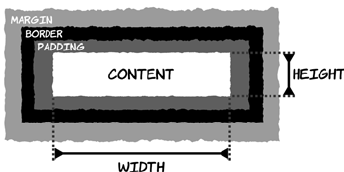
484 APPENDIX C CSS basics
The box model
The CSS box model defines the dimensions of elements as they’re laid
out on the page. In order to do page layout with CSS, as covered in the
next section, it’s important to know how elements are sized.
Elements have a width and
height, padding, a border, and a
margin. The diagram at left
shows how they fit together.
The element’s width is either
defined explicitly or determined
automatically by the browser
based on the content and display mode. Between the content and the
border is the padding; then you have the border (discussed in the pre-
vious section), and finally the margin, which is the space between this
element and the next one.
The padding, border, and margin have associated collections of proper-
ties in CSS. The width of each side can be applied separately, or you can
use shorthand syntax. In the previous section, you saw the border-width:
5px; shorthand. This could also be written in either of these two ways:
There are equivalent properties for the padding and margin:
border-width: 5px 5px 5px 5px; border-top-width: 5px;
border-right-width: 5px;
border-bottom-width: 5px;
border-left-width: 5px;
padding-width: 5px 5px 5px 5px; padding-top-width: 5px;
padding-right-width: 5px;
padding-bottom-width: 5px;
padding-left-width: 5px;
margin-width: 5px 5px 5px 5px; margin-top-width: 5px;
margin-right-width: 5px;
margin-bottom-width: 5px;
margin-left-width: 5px;
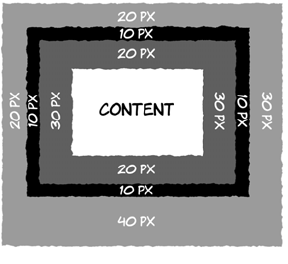
The box model 485
The shorthand property lets you specify one to four lengths. The next
diagram shows a practical example:
Quirks mode and Standards mode
In the late 1990s, there was a lot of confusion about the correct way to
implement CSS. This was particularly apparent in the way different
browsers treated the box model. By the time understanding of the spec
stabilized, several browsers were using incorrect approaches. Worse,
many websites had been created that depended on the incorrect
approach; when the designer is trying to make everything line up
exactly, a difference of a few pixels in width is very visible.
As new browsers were released, they wanted to implement the correct
behavior, but they didn’t want to break the web by making all websites
follow the new rule. To solve the problem, vendors created two render-
ing modes in their new browsers:
❂Standards mode—The browser displays according to the current stan-
dards, as far as they’re understood and can be implemented by the
vendor.
❂Quirks mode—The browser displays according to the incorrect rules
implemented by previous versions of that browser.
padding: 20px 30px;
border-width: 10px;
margin: 20px 30px 40px 20px;
If just one length is given, all four top,
left, bottom, and right are set to that
width. Two lengths set the top and bot-
tom widths to the first value and the left
and right to the second value. If three
lengths are given, the first and last val-
ues set the top and bottom, and both left
and right are set to the second value.
Finally, four values are applied in the
order top, right, bottom, left.
486 APPENDIX C CSS basics
There’s only one standard, so the way different browsers implement
Standards mode has (sometimes slowly) converged on the correct
implementation. But there are as many different ways to implement
Quirks mode as there are old versions of browsers, so pages that ren-
der in Quirks mode can vary wildly even among modern browsers.
In order to decide whether to use Quirks mode or Standards mode, the
browser takes various hints from the HTML. This also varies from
browser to browser; but, broadly, documents that follow the stan-
dards—which have correct markup according to the HTML4 or
XHTML1 specs—use Standards mode. Pages that don’t follow the
standards, or claim to be following earlier versions of HTML, use
Quirks mode.
Generally this has worked pretty well. Web authors creating new
pages and paying attention to their markup have their pages rendered
as they expect, and old pages or pages created by unskilled authors are
rendered as expected (by users who have the same browser as the
designer, at least).
The situation has added complexity to the task of improving from an
unskilled to a skilled web author. Some errors in your markup won’t
trigger Quirks mode, but other errors of apparently similar complexity
will. Authors may make small changes in their code only to have unex-
pectedly large changes in the end results. This inconsistency can be
frustrating and is one of the main reasons cross-browser web authoring
has gained a reputation for being confusing and capricious.
Right now, you need to understand that if you’re seeing markedly dif-
ferent results for the same page across several modern browsers, it’s
likely you’ve accidentally triggered Quirks mode through an error in
markup. The solution is usually to run your markup through one of the
online validators and correct any errors reported.
Display modes: inline, block, and none
Appendix B discussed the difference between block and inline ele-
ments. In addition to being a way to categorize HTML elements, these
also assume a default visual presentation. Inline elements sit in the flow
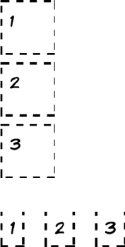
The box model 487
of text, whereas block elements cause line breaks before and after. This
visual presentation can also be controlled by CSS through the display
property by setting the value to either inline or block.
A simple example will illustrate the key differences. Here are three
<div> elements:
<div>1</div> <div>2</div> <div>3</div>
The following styles show the elements’ position and shape:
div {
width: 2.5em;
height: 2.5em;
margin: 0.5em;
padding: 0.5em;
border: 5px dashed black;
}
Setting the display property to block causes all
three elements to sit on a line by themselves,
each with the width, height, padding, and mar-
gin specified:
div { display: block; }
Of course, a <div> element is display: block by
default, so explicitly stating it in CSS isn’t nec-
essary.
Setting the <div> elements to display: inline
has a drastic effect:
div { display: inline; }
Not only are the elements now sitting on the
same line, but they’re considerably smaller.
This is because the width and height properties
don’t apply to inline elements, so each <div> is
now the size of its content plus the margin
specified.
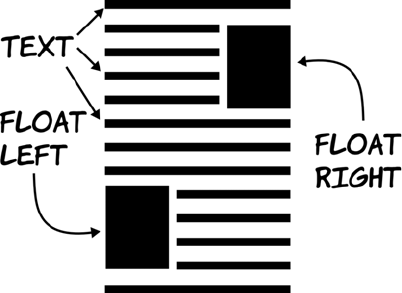
488 APPENDIX C CSS basics
Other values are allowed for the display property. Several are covered
in chapter 8, but one you’ve seen used in this appendix is none. In the
section on pseudo-classes, it was used to hide elements until the user
hovered over a particular area on the screen.
Now that you’ve learned about the box model and display modes, you
have all the prerequisite knowledge required for page layout.
Positioning and layout
In the last 10 years, most CSS layouts have been built around floated
elements, commonly referred to as floats. A floated element is one that’s
outside of the normal flow of text, like a cutout. The text flows around
these floated elements as long as there’s room, as illustrated by the fol-
lowing diagram.
Originally, floated elements were intended to be pictures, tables, and
figures sitting in single columns of text, but people soon figured out
that floats could be used to lay out entire pages.
Floats rely on two CSS properties: float and clear. The float property
determines which side the element floats to, whereas the clear property
determines how the element behaves with respect to other floated ele-
ments. Values for float are left, right, and none; values for clear are
left, right, both, and none.
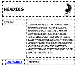
Positioning and layout 489
If two consecutive elements are floated the same way and not cleared,
then as long as there’s available width, they sit alongside each other.
But if the second has clear set, it drops below the first element.
Let’s create this simple layout with
CSS floats. The sidebar is floated left,
the main content is floated right, and
the footer is set to clear both of them.
Widths are set on the sidebar and the
main content to ensure that there’s
room for them to sit side by side.
The markup and CSS for this layout
follow. Some additional CSS is used,
but not shown, to add borders,
margin, and padding to the elements.
Copy the code from the earlier
examples if you’re following along:
<div id="header">
<img src="dust-puppy.svg">
<h1>Heading</h1>
</div>
<div id="main">
<p>I never am really
satisfied...</p>
</div>
<div id="sidebar">
Side bar
</div>
<div id="footer">
<div id="nav">
<a href="/l1">Link 1</a>
<a href="/l2">Link 2</a>
</div>
<div id="smallprint">Credits</div>
</div>
#header img {
float: right;
}
#header h1 {
margin-right: 150px;
}
#main {
float: right;
width: 60%;
}
#sidebar {
float: left;
width: 25%;
}
#footer {
clear: both;
}
#footer > div {
display: inline;
}

490 APPENDIX C CSS basics
Note that the <footer> element needs to have clear set even though it’s
not floated. Nonfloated elements must also be cleared if they appear
below any floated elements; otherwise the floated elements will overlap
them. In this case, the footer would appear directly below the previous
nonfloated element, the header.
There’s plenty more to CSS layout than this simple example can dem-
onstrate, but you now know the basics. As you see more complex lay-
outs and advanced approaches, you should be able to use the
knowledge you’ve gained here to work out what’s going on.
Now you’re up to speed with CSS, It’s time to move on to the third key
web development technology: JavaScript. Whereas HTML and CSS are
naturally fixed after they’re created at the server, JavaScript
allows you to manipulate web pages in the browser itself. The next
appendix will get you started creating these ‘‘dynamic” web pages.

491
Appendix D
JavaScript
he main focus of this book is HTML5 and CSS3, but to take full advantage
of many of the features of these two technologies you’ll end up using
JavaScript quite a lot. The APIs in HTML5 are accessible through
JavaScript, and the techniques you’ve seen for detecting HTML5 and
CSS3 support depend on JavaScript.
The goal of this appendix isn’t to teach you to be a great JavaScript pro-
grammer even if you’ve never programmed before, but to teach you
enough syntax that you can recognize what the examples in the book are
trying to do and enough practical knowledge that you can experiment on
your own to learn more.
Setting up an interactive console
In this appendix, you’ll learn by doing. To do that, you need a way to type
JavaScript code into your browser and immediately see the results. Most
modern browsers come with a built-in facility for this as part of their
developer tools.
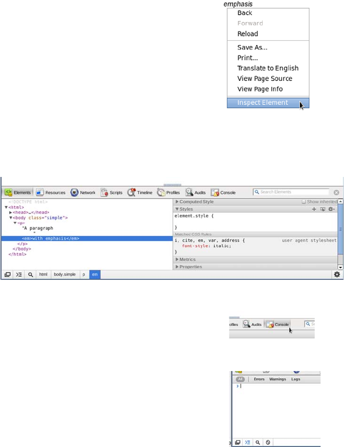
492 APPENDIX D JavaScript
Chrome (and Safari)
Chrome and Safari are both based on the WebKit browsing engine, so
apart from some stylistic differences, their developer tools are identical.
A panel opens at the bottom of the browser window like the one shown
here.
Access the developer tools by right-
clicking any element on the page and
selecting the Inspect Element option.
Look for the Console button in the toolbar
across the top of the panel, and click it.
You should see a command prompt > and a
cursor. You can type in JavaScript and see
it executed immediately.
Setting up an interactive console 493
Here are the key features of the Chrome console. All the examples in
this appendix should work in Chrome.
Firefox
Thanks to its extensible nature, Firefox has long relied on add-ons to fill
the developer tool gap, notably Firebug (discussed in a moment). Newer
versions of Firefox (since version 8) have developer tools built in.
Access these tools from the main
menu under Web Developer. For
now, either select Web Console or
press Ctrl+Shift+K.
The console monitors four things by
default: network requests (Net), CSS,
JavaScript (JS), and console logging
(Web Developer or Logging in newer
versions). You can turn them on and
off individually by clicking the but-
tons along the top of the console. In
this appendix, you may find it helpful
to turn off everything except Java-
Script and console logging.
Chrome Console
Your input appears
alongside arrows
pointing right.Output appears
on a line by
itself.
Errors are indicated
by an x.
494 APPENDIX D JavaScript
The next figure shows the key details of the Firefox console. Most of
the screenshots in the following sections were taken using Firefox.
Other browsers
Several other browsers ought to work equally well. Here’s how you get
to the console in them:
❂Internet Explorer—Press F12, or look for developer tools in the Page
menu.
❂Opera—Right-click the page, and choose Inspect Element from the
context menu.
❂Firefox with Firebug—Press F12, or right-click and select Inspect with
Firebug from the context menu.
Arithmetic and variables
A computer program is based on math. It boils down to a sequence of
mathematical operations on a collection of numbers. If you’ve always
been bad at math, don’t let this frighten you: programming—the act of
composing a program—has as much in common with writing a story as
it does with solving math problems (albeit a story written with unusu-
ally strict grammar and far more punctuation then you’re used to).
Think of it as an obscure subgenre of science fiction. But the simplest
Firefox Console
Your input appears
alongside arrows
pointing left.
Output appears
after an arrow
pointing right.
Errors are indicated
by an x.
Now that you know how to execute JavaScript in your browser of choice,
it’s time to start learning some JavaScript. You’ll begin with arithmetic
and storing the results. Over a few short pages, these simple operations
will build up to programs that can do useful things in your web pages.
Arithmetic and variables 495
programs that can be written are basic mathematical statements, so
we’ll start with them. Open the JavaScript console in your preferred
web browser, and follow along with the examples.
Arithmetic
In this section, you’ll learn how basic arithmetic operations are repre-
sented in JavaScript. The examples are all shown in the Firefox Web
Console, but you should see the same results in any other browser.
Basic addition, subtraction, multiplication,
and division are written in much the same
way as they were in your high school
book. The asterisk (*) is used to indicate
multiplication and the forward slash (/)
division. Expressions and their values are
shown in the console output. Try typing a
few expressions and pressing Enter.
Programmers refer to numbers as operands
and symbols as operators. The entire com-
bination is called an expression. A sequence of expressions terminated
by a semicolon is a statement. The following diagram should help you
get the vocabulary straight.
Any number of operands and operators can be chained together, but
they’re not evaluated left to right. Some operators are more important
than others and are always evaluated first.
2 + 2;
Operator
operandoperand
2 + 2 ;
Expression
statement
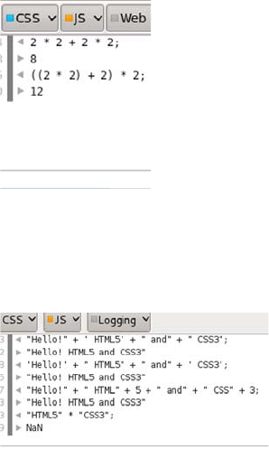
496 APPENDIX D JavaScript
If the string is also a number, it can be used with normal arithmetic
operations, but the results won’t always be what you expect. Java-
Script makes up its own mind about whether you mean arithmetic or
string addition.
In the first example, the multiplica-
tion is performed before the addi-
tion, so the result is 8. The
terminology is that multiplication
has a higher precedence than addition.
To explicitly control the order of
evaluation, you can use parentheses
to group operations. The second
example shows a forced left-to-right
evaluation.
In addition to adding numbers, the +
operator can add text together. Text
values in a JavaScript program are
referred to as strings. Strings are
always demarcated by either double
or single quotes—it doesn’t matter
which as long they’re used in pairs,
as the first two examples show.
Strings and numbers can be added
to each other in certain circum-
stances, although using any of the
other arithmetic operators with
strings leads to a not-a-number
(NaN) result.
In the first two examples, string addition is
used rather than numeric, because addition
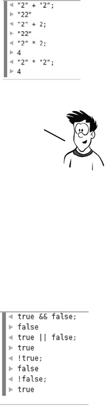
Arithmetic and variables 497
Comparisons
Comparisons are operators that produce a true or false value, otherwise
known as a Boolean value. Comparison operators are crucial when it
comes to branching and looping (see “Branching and looping”). There
are general-purpose comparison operators as well as several operators
that are intended for Boolean values. The three main Boolean opera-
tors are as follows:
can be performed on both numbers and
strings and one of the operands is a string.
The multiplication operation can only be
used with numbers, so the strings are con-
verted automatically to numbers.
Experiment with these operators in the
console until you’re comfortable with these
meanings.
The automatic conversion of numbers to strings can lead to some
unexpected and unwanted behavior, or bugs in programmer parlance, in
your JavaScript programs. in the section “Branching and looping.’’
you’ll learn how to force your operand to be a number.
&& AND Returns true if both oper-
ands are true
|| OR Returns true if either oper-
and is true
!NOT Returns true if its operand
is false
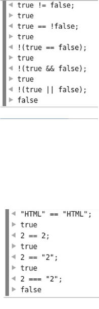
498 APPENDIX D JavaScript
You can compare two values for equality
with these operators:
Note that if you begin comparing things of
different types, you may get unexpected
results.
Because JavaScript helpfully converts
types for you, the equality operators aren’t
always reliable.
Again, if you compare things of different
types, you may get unexpected results. In
the example here, 2 == "2" (comparing an
integer with a string) evaluates to true,
since JavaScript converts the integer 2 to
a string "2" before comparison. But 2 ===
"2" evaluates to false because an integer is
not a string.
== EQUAL Returns true if both
operands are the same
!= NOT
EQUAL
Returns true if the
operands are different
=== IDENTICAL Returns true if the
operands are the same
type and have the
same value
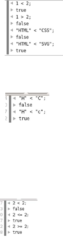
Arithmetic and variables 499
You can check whether something is
smaller or larger than another thing:
When you compare strings with < and >,
JavaScript takes the numeric value of the
characters and compares them. This means
H is greater than C, but H is less than c,
because lowercase letters are all larger
than uppercase letters for comparison pur-
poses. As with the arithmetic operations
you saw earlier, bugs can occur if you’re
expecting to compare numbers but in real-
ity are comparing strings. JavaScript
doesn’t complain in either case.
You can also compare smaller and larger
and equal to:
<LESS
THAN
Returns true if the first
value is less than the
second value
>GREATER
THAN
Returns true if the first
value is greater than the
second value
<= LESS THAN OR
EQUAL TO Returns true if the
first value is less
than or equal to the
second value
>= GREATER THAN
OR EQUAL TO Returns true if the
first value is greater
than or equal to the
second value
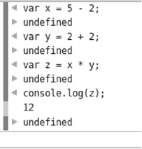
500 APPENDIX D JavaScript
Now you can perform arithmetic and comparisons, but what can you
do with them? Comparisons are used extensively in branching and
looping, which we’ll examine in the section “Branching and looping,”
but if you compare the same fixed values in your program you’ll see the
same results every time. You need to store variable factors in the pro-
gram so you can provide different results according to different start-
ing conditions: you need variables.
Variables
A variable is a place to store the result of a calculation. If you remem-
ber any of your high school algebra, the concept of a variable ought to
be somewhat familiar. You may remember algebra problems something
like this:
5 = 2 + x
In math, working out the variable’s value results in the answer. In this
case, it’s clear that x = 3. But in JavaScript, you express it like this:
var x = 5 – 2;
This code is saying “Create a storage space called x; calculate the result
of 5 – 2; store the result in the storage space called x. The var keyword
allocates a variable.”
After you’ve stored a value in a vari-
able, you can use it in another calcu-
lation, as shown here. First a value is
assigned to x and then to y, and then
the variables x and y are used in a
calculation that assigns a value to z.
The console.log(z) statement is an
example of calling a method on an
object. For now, you don’t need to
know what that means (you’ll learn
more in the section “Functions and
objects”); just be aware that it prints
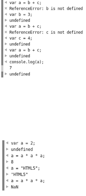
Arithmetic and variables 501
out the current value of whatever
variable you put in the brackets.
Unlike in algebra, you have to define
all the variables that appear on the
right side of the equals sign before
you use them. The sequence of oper-
ations here shows what happens if
you don’t.
When JavaScript can’t understand
your code or is unable to execute it,
an error occurs. Usually this immedi-
ately stops the execution of whatever
program is running. You can see in
this example that the error that c
isn’t defined wasn’t discovered until
b was defined, because the initial
error stopped execution.
After you create a variable, you can
assign it a new value at any time.
When you use the variable in a cal-
culation that assigns a new value to
itself, remember that the assignment
operator sets the new value, and that
always happens last—the value isn’t
updated until the end of the
calculation.
If you put a number in a variable,
nothing stops you from adding a
string to it. But as with previous situ-
ations where JavaScript is equally
happy with a string or a number, this
can lead to confusing errors.
502 APPENDIX D JavaScript
Special operators for variables
Two operators that won’t be familiar to you
from school arithmetic are the post-
increment (++) and post-decrement (--) opera-
tors. They increase and decrease, respec-
tively, the value of a number by one. Post
means they perform the change after the
value has been used in an expression.
Study the sequence of operations in this
screenshot. Notice that the values assigned
to a and b are those of i before the incre-
ment or decrement.
You also need to know about the += opera-
tor and its relatives.
The need to store the result of an expres-
sion into a variable when it’s one of the
operands is so common that a shortcut is
built into JavaScript. Instead of writing
a = a + b;
you can write
a += b;
This works for the other arithmetic opera-
tors, as you can see in the screenshot.
You’ve gained some familiarity with variables, but you
should know about a few more operators. These operators
don’t have any analogue in arithmetic; they’re only useful
when you have values stored in a variable.
Branching and looping 503
In this section, you’ve learned
how to do calculations and com-
parisons and store the results in
variables. That is fundamental to
writing programs but not very
useful by itself. You need to be able to take different actions depending
on the results, or perform actions repeatedly to make it worth your
while to write a program in the first place.
Branching and looping
If your program did some calculations and always produced the same
output, there wouldn’t be a point to it. A program can’t do much unless
it can make decisions based on the variables being passed into it. When
a program executes one block of code rather than another based on the
value of a variable, that’s what we call branching. Looping is a related
concept: executing a block of code multiple times. In this section, you’ll
step back from the console for a few
pages and learn about the various
branching and looping concepts in
JavaScript so that in the following
sections you can see how they’re used.
The term branching, unsurprisingly, comes from an analogy to a tree
branch. Imagine you’re walking along the branch of a tree: eventually
you come to a point where it divides into two. You can choose to go up
one branch or the other one. That’s all branching is in programming—
choosing to go one way or another. The simplest branching construct is
the if statement.
In programming, we call
choosing between
different actions
branching and repeating
actions looping. You’ll
learn about them in the
next section.
A block of code
is one or more
statements
contained
within braces
like these: { }.
if (x % 2 == 0) {
console.log('Even');
} else {
console.log('Odd');
}
A condition that
evaluates to a
boolean.
Do this if the
condition is true.
Do this if the
condition is false.
The else is optional.
remove everything after the bracket
if no action is required.
504 APPENDIX D JavaScript
If you need to check for more than one condition, you can nest the
if...else statements.
An alternative to if...then...else is the switch statement. It lets you
choose from a long list of alternatives based on the value of a variable.
It doesn’t allow the flexibility of if...then...else in comparison opera-
tions but does offer a more easily comprehensible way of presenting
multiple choices.
if (y % 2 == 0) {
console.log('Even');
} else if (y % 3 == 0) {
console.log('Divisible by 3');
} else {
console.log('Not a multiple');
}
if the condition
is false, check
another condition.
The first condition
is the same as before.
switch (z.toLowerCase()) {
case "eat me":
console.log('Grow');
break;
case "drink me":
console.log('Shrink');
break;
default:
console.log('Why is a'
+' raven like a'
+ 'writing desk?');
break;
}
Inside the brackets
is a variable to be
tested.
This is an example of
a method on an
object. more in
"Functions and objects.’’
The variable
passed in is
compared to
each of the
cases in turn. Each case
is ended
by a break.
If none of the
cases match,
the default
is used.
Branching and looping 505
That’s all you need to know about branching, so on to looping. Looping
lets you repeat an operation multiple times. The most common loop is
for.
An alternative to the for loop is the while loop. As you can see from the
following diagram, it has all the same features as the for loop, but the
arrangement is slightly different.
This screenshot shows the output
in the console from the for loop. It
logs 10 lines, counting up from 0
to 9. This is the normal program-
mer way of counting 10 things,
starting at 0, so get used to it!
It’s also normal to use the loop
index variable, i in this case, to
modify the code’s behavior on each
iteration through the loop.
for (var i = 0; i < 10; i++) {
console.log('Loop ' + i);
}
Loop while this
expression is true.
Starting stateIncrement the
variable after
every loop.
statement block to
repeat
var i = 0;
while (i < 10) {
console.log('Loop ' + i);
i += 2;
}
Loop while this
expression is true.
Starting state
Increment the
variable after
every loop.
statement block
to repeat
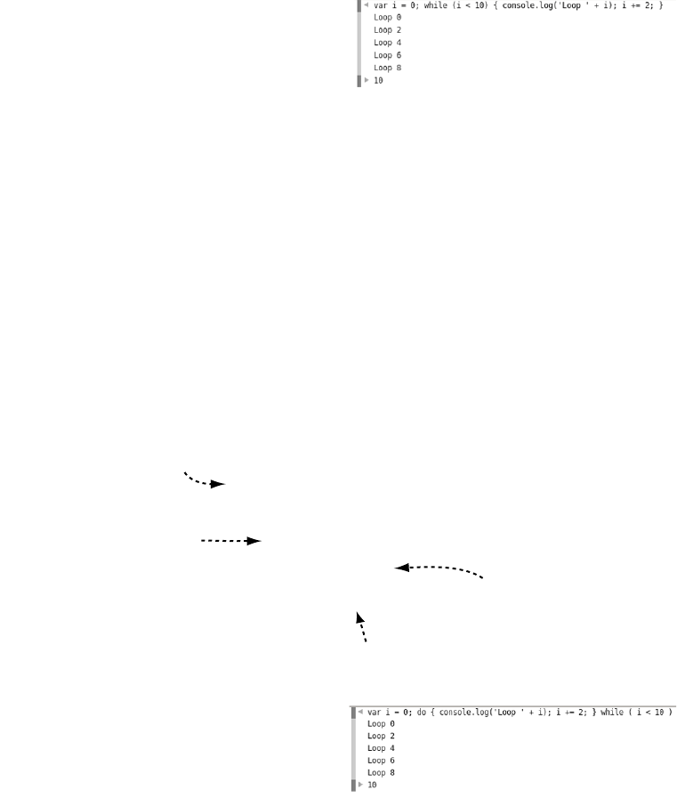
506 APPENDIX D JavaScript
You would normally use a while loop when you weren’t sure how many
iterations (trips through the loop) were required. Whereas the for loop
always counts from something to something, a while loop does as many
or as few iterations as required. For instance, if you had a collection of
10,000 numbers and wanted to find the first one that was even, you
would use a while loop because you would expect to find an even num-
ber in the first few you looked at.
There’s a variation on the while loop called the do...while loop. As you
can see in the next diagram, it’s similar to the while loop; the main differ-
ence is that the test to see whether the loop should continue is at the end.
This screenshot shows the out-
put in the console from the
while loop. Incrementing by
two each time through the loop
means only five iterations.
The previous do...while loop
produces exactly the same
output as the earlier while
loop. For a large number of
iterations, this will always be
true. The main difference
comes when the while loop
may not be executed at all.
var i = 0;
do {
console.log('Loop ' + i);
i += 2;
} while (i < 10)
Loop while this
expression is true.
Starting state
Increment the
variable after
every loop.
statement block
to repeat
Functions and objects 507
Following on the left is a while loop; on the right is a do...while loop
with the same code block and test expression. You can see from the
console output that the while loop doesn’t execute its code block
because the test expression is false. But the do...while loop does exe-
cute its code block, because the test expression isn’t checked until the
end of the loop.
Functions and objects
So far, we’ve covered basic arithmetic operations and comparisons,
variables in which to store results of those operations, and structures
that allow you to control program flow based on variables and compar-
isons. Next you need to learn how to structure those components into
complete programs. This is where functions and objects come in.
Functions
A function takes input, transforms it in some way, and produces out-
put. Here’s an example.
while (false) {
console.log('Loop');
}
do {
console.log('Loop');
} while (false)
The loop never executes if the
condition expression evaluates to
false.
The loop always executes at least
once.
You now know about all the loop types in JavaScript but one.
The final loop type is for...in, but it’s only useful with
objects. You’ll learn about objects in the next section.
508 APPENDIX D JavaScript
It’s worth explaining that again: the parameter is the placeholder in the
function definition. The argument is the value passed into the function
when it’s called. In practice, people ignore this subtle distinction and
use the two terms interchangeably; we’ll try to keep them straight, but
don’t worry about the difference too much.
Real functions generally contain more complex logic, but the examples
here are short so it’s feasible for you to type them into the console.
Here’s a slightly more complex example.
This function is short enough that
you can experiment with it in the
console. To run the code in the
function (or call the function, as a
developer would say), you use the
function name followed by paren-
theses containing the argument
you want to pass. The argument is
assigned to the parameter within
the function body.
function dblMe(n) {
return 2 * n;
}
the code to be executed (the
function body) is placed
between braces.
The function keyword
indicates a function
declaration.
A label gives
the function a
name.
The return keyword
ends the function
and sends a value
back.
the placeholder for
the Data to be passed
into the function,
called the parameter
goes in parentheses.
Functions and objects 509
When you write your own functions, it’s more common to put each
operation on a single line, like this:
function evenMe(n) {
if (n % 2 == 1) {
return n + 1;
} else {
return n;
}
}
But JavaScript, like HTML, doesn’t care about whitespace; that just
makes it easier for humans to read. It works no matter how many lines
it takes up, but for the console you need to get everything onto one line.
Functions can take more than one argument.
Here’s the previous function written in a more conventional style to
make it easier to read. The function rounds the argument n up to the
next multiple of a:
function baseMe(n,a) {
while (n % a != 0) {
n++;
};
return n;
}
Precedence, which you saw in the simple arithmetic examples earlier,
also applies with functions. This is important when you want to pass
the result of one function as an argument to another.
510 APPENDIX D JavaScript
That’s all you need to know about functions—time to move on to
objects.
Objects
Functions let you group your code into convenient units that can then
be called in your program, but you’ll also want to group data and func-
tions together. In JavaScript you do this with objects. In loose terms,
an object is a collection of stuff. The stuff can be variables, functions,
and other objects. JavaScript has several built-in objects, HTML
Functions are evaluated from the
inside out. This probably seems
intuitive; but to confuse the situa-
tion, it’s possible to pass functions
as arguments to other functions.
Here’s a simple function that
expects a function as a parameter:
function applyMe(f,n)
{return f(n);}
To pass the function as an argu-
ment, you specify the function
name without adding parentheses.
Passing functions as arguments is a
common pattern in calling HTML5
APIs. It’s also common to declare
simple, single-use functions
directly. This is called an inline
function: it’s declared and then
thrown away. You can use it only
within the function it’s being
passed to, not elsewhere in your
program, because there’s no label
to refer to it.
Functions and objects 511
provides another set of objects, and the browser still more. You can
also create your own objects; let’s start with that.
This is the same code in an easier-to-read format:
var myObject = {};
myObject.myProperty = 2;
myObject.myMethod = function(n) {
return n * 3;
}
You can then call the method, passing in the property like this:
myObject.myMethod(myObject.myProperty);
Now that you have an object to play with, it’s time to learn about the
final type of loop: for...in. The following screenshot of the console
shows a for...in loop in action on the myObject object just created.
The simplest way to create an
object is with an object literal. An
empty object is a pair of braces.
The object can contain variables
and functions, but when they’re
part of an object they’re referred
to as properties and methods.
In JavaScript, you can access a
property or method on an object
by using a period (.) followed by a
label. You can create properties
and methods by assigning a value,
as shown here.
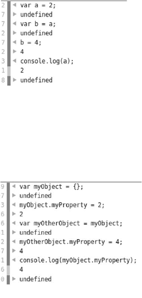
512 APPENDIX D JavaScript
For...in loops through the properties and methods of an object. The
variable prop is set to the label associated with the property or method.
You’ll see it used most often in scripts that check to see if a browser
supports certain HTML5 features. Note that the syntax myObject
['myProperty'] is an alternative way of accessing the myProperty method.
This alternative approach is handy for use inside for...in loops.
Before we finish with objects, it’s important to know that variables that
refer to objects behave slightly differently than variables that refer to
normal values like numbers. To see the difference, let’s do a little
experiment in the console.
1Create a variable a, and give it the
value 2.
2Create a variable b, and give it the
value of a.
3Set the variable b to have a value of
4 instead.
Notice that after you do this, the value
of a is unchanged. Setting b to have a
value of a doesn’t create any sort of
relationship between them. The value
contained in a is copied into b.
Now try a similar sequence of opera-
tions with two variables that refer to
objects. Notice that after assigning
myObject as the value of myOtherObject,
changing the value of myOtherObject
.myProperty also changes the value of
myObject.myProperty. This is because
assigning the object to another vari-
able creates two variables that refer to
the same object.

How JavaScript fits into HTML 513
There are several other features of objects, as well as a few different
ways to create them, but you won’t need to know them for this book.
Just bear in mind that whenever you see periods, you’re almost always
looking at objects with properties and methods.
How JavaScript fits into HTML
The point of learning JavaScript is using it in browsers to do things
with web pages. In this section, you’ll learn how to get your JavaScript
into HTML. You can do this three primary ways: inline in a <script>
element, linked in a separate file, and inline in an event handler. Let’s
look at each in turn.
Inline <script> element
The most straightforward way to add JavaScript to your web page is
to include it inside a <script> element. Here’s a simple example:
<!DOCTYPE html>
<html>
<head>
<title>Inline script</title>
</head>
<body>
<script>
window.alert("Inline script!");
</script>
</body>
</html>
If you create a web page using this code and load it in your browser,
you should see something like the following screenshot (if you’re using
IE, you may need to click the warning bar to allow JavaScript in a
local file).
You now know enough to start putting JavaScript to the use
it was intended for—manipulating web pages. But to do that,
you need to understand how to link JavaScript to a web page.
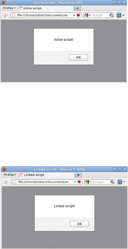
514 APPENDIX D JavaScript
After the previous section, you should have noticed that window is an
object and alert is a method. This is built-in functionality provided by
the browser.
JavaScript linked in a file
In the same way that CSS can be kept in a separate file so it can be used
in more than one web page, so can JavaScript. When you load the
page in your browser, it looks much the same as the previous example.
For this you need two files. The first is an HTML page:
<!DOCTYPE html>
<html>
<head>
<title>Linked script</title>
</head>
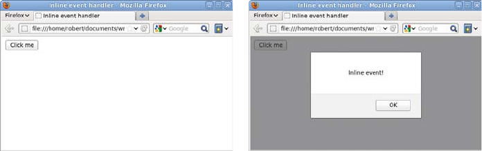
How JavaScript fits into HTML 515
<body>
<script src="myscript.js"></script>
</body>
</html>
Then you need a file called myscript.js containing this line of code:
window.alert('Linked script!');
Inline event handlers
The final way to include JavaScript in a page is through an inline event
handler. Events are things that can happen in a page, such as a user
clicking a button. You’ll learn more about them in the section “Events”;
for now, you just need to know that you can create a handler for a click
event by adding an onclick attribute to an element. This is what the
page looks like.
When you click the button, the alert pops up. Here’s the code:
<!DOCTYPE html>
<html>
<head>
<title>Inline event handler</title>
</head>
<body>
<button onclick="window.alert('Inline event!');">
Click me
</button>
</body>
</html>
You should notice two things about this code. First, no <script> ele-
ments were required: the JavaScript is directly in the markup. Second,
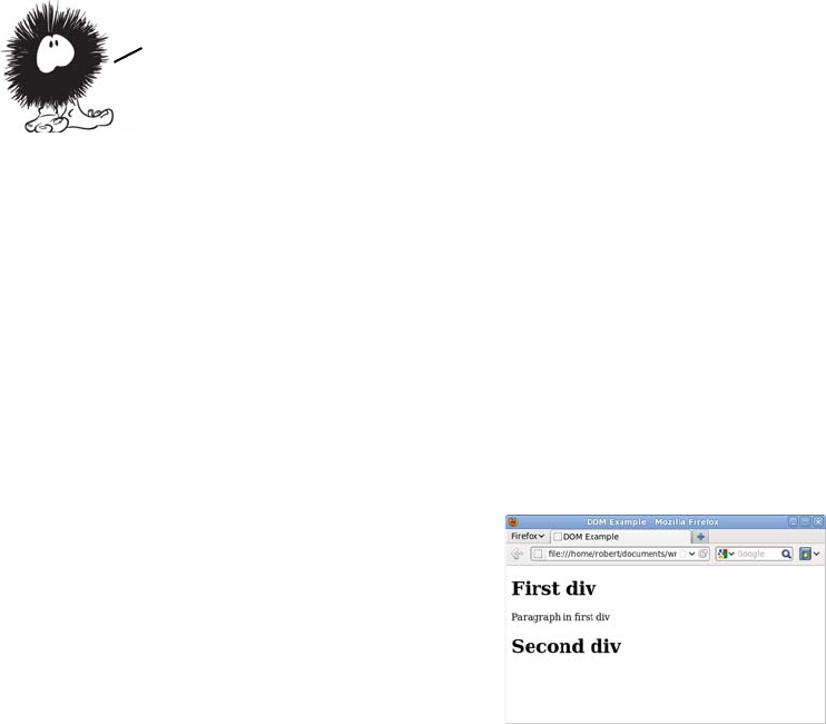
516 APPENDIX D JavaScript
the quotes around the argument to alert are single quotes, unlike the
double quotes used in the previous example. In JavaScript, you can
use either single or double quotes—it doesn’t make any difference as
long as you start and end a given string with the same type of quote.
But double quotes are used in the HTML for the attribute value, so
using double quotes in the JavaScript would make the HTML invalid.
The DOM
The Document Object Model (usually referred to as the DOM) is the
way you access a web page through JavaScript. As the name implies,
it’s based on an object called window. You already used the alert method
of the window object in the previous section. The window object contains
properties and methods provided by the browser, the most important
of which is the document object. The document object contains properties
and methods provided by the web page. To experiment with the docu-
ment object, create a simple web page:
<!DOCTYPE html>
<html>
<head>
<meta charset="utf-8">
<title>DOM Example</title>
</head>
<body>
<div id="first">
<h1>First div</h1>
<p>Paragraph in
first div</p>
</div>
<div id="second">
<h1>Second div</h1>
</div>
</body>
</html>
All three approaches for including JavaScript in a web page that you’ve seen
in this section use the Document Object Model (DOM) to cause things to
happen within the page. The next section looks at the DOM more closely.
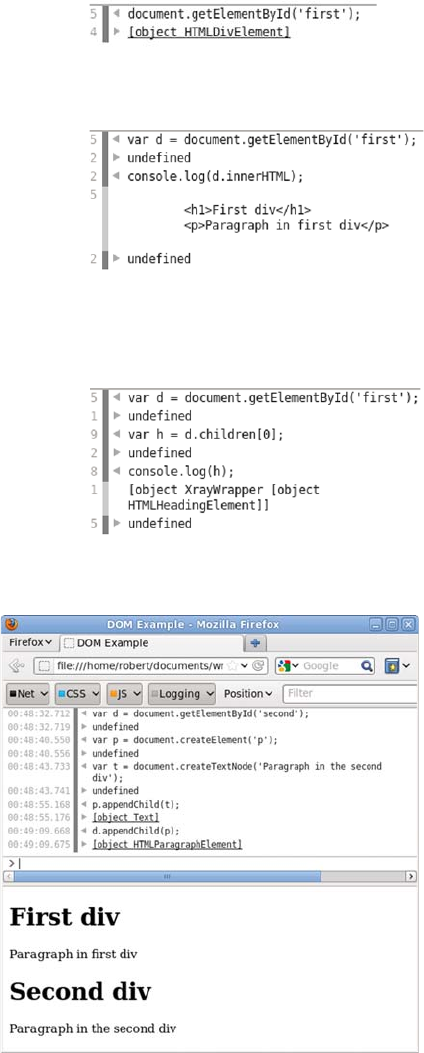
The DOM 517
The DOM isn’t just a
way to access the docu-
ment. You can also use
it to modify the page.
Here’s a quick example.
Open the console, and type in this
code:
document.getElementById('first');
As you can see, the getElementById
method returns an object. This
object also has methods and prop-
erties that you can call:
var d =
document.getElementById('first');
console.log(d.innerHTML);
The elements inside the <div> can
also be accessed through methods
and properties of the element.
This code grabs the first child of
the <div>:
var h = d.children[0]
518 APPENDIX D JavaScript
Here’s the code in more detail:
Events
You saw an event handler in “How JavaScript fits into HTML”—in that
case, an inline event handler. A handler is a function that’s called when
an event happens (when the event fires). In this section, you’ll see how
to deal with events in an external JavaScript file. When you’re attaching
handlers from an external JavaScript file, you need to use the DOM.
Use the simple page you created for exploring the DOM in the previ-
ous section, but add a reference to an external JavaScript file:
<!DOCTYPE html>
<html>
<head>
<meta charset="utf-8">
<title>DOM Example</title>
<script src="events.js"></script>
</head>
<body>
<div id="first">
<h1>First div</h1>
<p>Paragraph in first div</p>
var d = document.getElementById('second');
var p = document.createElement('p');
var t = document.createTextNode(
'Paragraph in the second div');
p.appendChild(t);
d.appendChild(p);
Create a
text node.
Add the
paragraph to
the <div>.
Add the text node
to the paragraph.
Create a
paragraph
element.
The DOM is a huge subject, but this introduction has given you an idea
about what it does as a foundation for learning more. Check the final
section of this appendix for additional resources. It’s time to complete
your understanding of JavaScript with a quick tour of events.
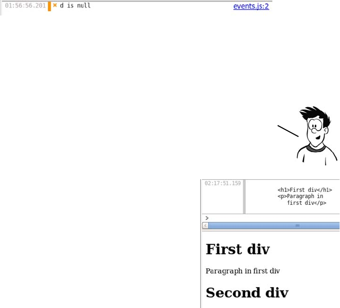
Events 519
</div>
<div id="second">
<h1>Second div</h1>
</div>
</body>
</html>
Of course, you also need to create the JavaScript file. Start with this
code in it:
var d = document.getElementById('first');
console.log(d.innerHTML);
If you load the page now, you’ll see this in the console.
This happens because at the point where the JavaScript executes, no
element has the ID first. The JavaScript is executed as soon as it’s ref-
erenced, in the <head> element. You need the JavaScript to await exe-
cution until after the document is loaded. Fortunately, there’s an event
for just such a scenario.
Wrap the code you want to run in a
function:
function go() {
var d = document
.getElementById('first');
console.log(d.innerHTML);
}
Then use the addEventListener
method to attach your function as a
handler for the window’s load event:
window.addEventListener('load', go);
Note that event—handling code works very differently in older
versions of IE. We don’t have room to go into the details here;
check the “Further reading’’ section for more on the differences.
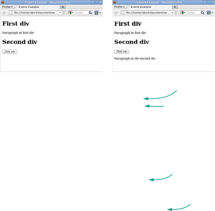
520 APPENDIX D JavaScript
Now let’s extend this example to add a button element and then add a
click handler to the element. The following screenshots show the page
before and after clicking the button.
This is the code to put in the events.js file:
function add_element() {
var d = document.getElementById('second');
var p = document.createElement('p');
var t = document.createTextNode('Paragraph in the second div');
p.appendChild(t);
d.appendChild(p);
}
function go() {
var b = document.createElement('button');
var t = document.createTextNode('Click me');
b.appendChild(t);
b.addEventListener('click', add_element);
var d = document.getElementById('second');
d.appendChild(b);
}
window.addEventListener('load', go);
The final thing you need to be aware of is event bubbling. When an
event occurs, such as a click event, it bubbles up the document tree. This
You can see in the console that the
code now runs as expected. Notice
that a function is being passed as an
argument, as discussed earlier.
Called on
button click
Same code you used
to modify the
document earlier
Creates button
and adds
event listener
Listens
to load
event
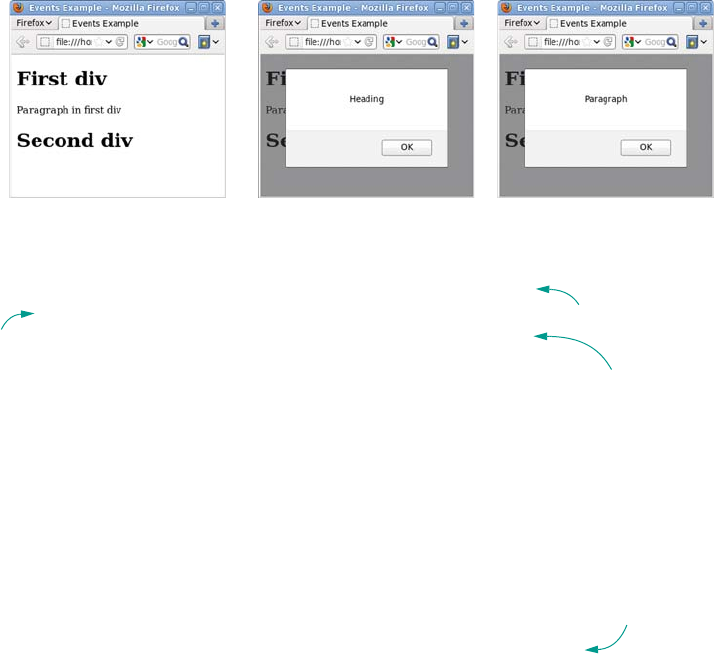
Events 521
means the click event is fired from the element where the event
occurred all the way up to the document root. This example attaches to
the document a click handler that determines what type of element was
clicked.
Returning to the example, edit events.js one more time:
function click_handler(event) {
var el = event.target;
switch (el.nodeName) {
case "DIV":
window.alert('Div');
break;
case "H1":
window.alert('Heading');
break;
case "P":
window.alert('Paragraph');
break;
}
}
function go() {
document.addEventListener('click', click_handler);
}
window.addEventListener('load', go);
Any function added as an event handler receives the event object as a
parameter B. The target property of the event object c is the element
where the event originated. The element object has a nodeName property
d that tells you the type of element clicked. You attach click_handler to
the document to handle all click events e.
Event object
as parameter
b
target
property c
nodeName
property
d
Handles
click
events
e

522 APPENDIX D JavaScript
The main benefit of this approach is that it reduces the number of event
listeners required. This can reduce memory and processing require-
ments for large and complex pages. You’ll see it used frequently in
large-scale web applications.
Further reading
For a detailed discussion of the differences between event handling in
IE and all the other browsers, refer to quirksmode.org: www
.quirksmode.org/js/introevents.html.
For a complete reference of all the methods and properties of the
DOM, check out the Mozilla Developer Network: https://developer
.mozilla.org/en/DOM/.
For an alternative introduction to JavaScript, try “Thau’s JavaScript
Tutorial”: www.webmonkey.com/2010/02/javascript_tutorial/.
Your rapid introduction to JavaScript is now complete. Don’t worry if
you’re still confused—it’s unlikely that you’ll pick it all up in a few pages.
At least nothing you see in the rest of the book should be unfamiliar to
you. Feel free to refer back here any time. If you want to go into JavaScript
in more depth, check out the resources in the next section.
That concludes the appendixes for Hello! HTML5 and CSS3. After reading them
you should have an understanding of how the web was built and how we
arrived at the current standards as well as a working knowledge of the
technologies which make up modern web pages: HTML, CSS, and JavaScript.
Welcome to the world of web development, I hope you enjoy it!

523
Index
Symbols
-- 502
! 497
!= 498
!important 341
.htaccess file 151
@font-face 394–397
browser support for 395
properties 395
@keyframes 343
* 495
/ 495
\:not pseudo-class 255–257
\:nth-child pseudo-
class 244–247
\:target pseudo-class 265–267
&& 497
+ 496
++ 502
+= 502
<> 499
== 498
> 474, 499
|| 497
Numerics
2D transform 327
browser support for 323
origin 325
rotation 325
scaling 324
skewing 326
translation 326
3D transform 328–330
browser support for 328
A
<a> element 452
accessibility 24
Accessibility for Rich Inter-
net Applications. See
ARIA
add_storageitem
function 224
addColorStop method 89
addEventListener
method 519
AddType directive 151
adjacent-sibling
combinator 236–238
adr 20
AJAX 434
AND operator 497
Andreessen, Marc 427
animation 343–346
browser support for 343
animation-* properties
348
keyframes 347
using modernizr.js in
older browsers 349
following a path 111
in <canvas> 96
animation-duration pro-
perty 344
animation-iteration-count
property 344
animation-name property
344
anonymous table object 277
API
browser-based 153–189
browser support
for 189
introduction to 154
network and
location 191–229
appendChild method 168
Apple, audio codec support
130
application programming
interface (API) 153
arc method 78
Arena 427
argument 508
ARIA 24–26
progressbar role 55
article
in an outline 14
vs. section 8
<article> element 7
vs. <section> element 8
<aside> element 16
524 INDEX
aspect-ratio media
query 291
attribute
custom 26–27
global 23
attribute selector 252
and microdata 252
<audio> element 121,
151–152
attributes 124–128
background 128
browser support for 123
codecs 129–133
in IE8 126
loop attribute 125
multiple sources 133–134
opening and closing
tags 125
preload attribute 124
src attribute 124
styling with CSS 126–128
audio
importance of 120
integrating with other
content 146–150
web server
configuration 151
audio file, encoding 130–132
autocomplete 61
autofocus 61
B
<b> element 22–23
HTML4 vs. HTML5 23
back button 173–179
background image
in CSS3 371
multiple backgrounds
365–368
origin and clipping 369
scaling 371–378
size 361–365
background property 367
background-attachment
property 483
background-color
property 483
background-image
property 483
background-position
property 483
background-repeat
property 483
background-size
property 361
cross-browser 387
beginPath method 79
behavior property 391
Berners-Lee, Tim
creation of web 426
HTML 1.0 428
W3C 428
Bézier curve, drawing in
<canvas> 81
bezierCurveTo method 81
bitrate 131
blur-radius 352
<body> element 443
border-color property 482
border-image property
browser support for 373
drop shadows 378
repeat keyword 375
round keyword 375
stretch keyword 375
border-image, fill
keyword 387
border-radius property,
browser support for 358
border-style property 482
border-width
property 482, 484
box model 284
box-flex 294
box-lines 297
box-ordinal-group 295
box-orient 296
box-shadow property,
browser support
for 353
box-sizing property 284
browser support for 284
in Firefox and Safari 5
310
<br> element 447
not for layout 447
branching 503
browser cache vs. applica-
tion cache 214
browser support for
HTML5 32–36
Internet Explorer 35–36
browser support for
HTML5 features 68
detecting 69–71
inconsistencies 69
browser wars 428–430
C
calc function 279–283
browser support for 282
good and bad 283
in Firefox 310
<canvas> element 22,
74–96
animation 94
browser support for 74,
114–118, 123, 130
drop shadows 91–92
fallback content 74
font property 85
games and 94–96
gradients 88–91
IE support for 114
transformations 92–94
canvas
drawing context 76
drawing shapes 76–82
drawing text 84
placing images 82
CERN 426
check boxes 40
checked 263
checkValidity() method 64
INDEX 525
Chrome
<audio> element in 127
HTML validation 465
JavaScript interactive
console 492
support for cross-
document messaging
201, 206
support for, download-
able fonts 399
text formatting 161
video codec support 138
WebM support 140
<circle> element 99
circle
drawing in 78
drawing in SVG 99
class attribute 443, 472
class selector, and attribute
selector 255
class, role of 242
clear property 488
clearRect method 76
closePath method 80
codec 129–132
lossless and lossy 129
video 138–142
browser support
for 138
color media query 292
color property 481
color stop 89
color value, for
shadows 352
column-count property 417
column-gap property 419
column-span property 418
column-width
property 417
combinator, browser sup-
port for 239
communication 200
content
elements 18–23
sectioning 7–8
content model 29–32
content types 32
contentEditable
attribute 154–164
contenteditable attribute
edited content, saving 159
in IE8 157
overriding 156
control character, defini-
tion of 446
cookies 223
coords object 195
createLinearGradient
method 88
CreateLink command 163
createRadialGradient
method 90
cross-document
messaging 201–205
browser support for 201
CSS
<audio> element,
styling 126
box model 484–488
cascading 475–478
child combinator 474
display modes 486
floated elements 488
inheritance 470–471
inline styles 469
layout 488–490
browser support for
features 308
future of 293–308
making mobile website
with 292
properties 480–483
borders and
backgrounds 482
colors and
lengths 480–482
rendering modes 485–486
rules 467–469
selectors 471–480
class selectors 472–473
combinators 473–475
ID selectors 471–472
pseudo-classes 478
specificity 477
style sheet, adding to
HTML 469–470
transitions 330
type selectors 469
whitespace 470
CSS2, layout features,
underused 272–278
CSS3
attribute selector 252–257
and class selector 255
and ID selector 255
appending 253
browser support
for 252
existence selector 253
background images 361
box model 284
combinators 235
drop shadows 352
evolution from
CSS2 439
improvements to CSS2
approaches 279–285
introduction to 234
layout 279–311
modularity 439
new features 233–270
pseudo-classes 240
selecting elements
based on attributes
251–261
based on document
structure 234–251
based on user interac-
tion 261–267
selectors, browser sup-
port for 267
transparency 318
web typography 392–416
CSS3 PIE 390
CurvyCorners 358
526 INDEX
D
data, storing for offline
use 222–228
data-* attributes
collection 27
<datalist> element 65–67
datalist 65
dataLoaded function 145
date input 44
datetime-local input 45
declarative vs.
imperative 97
<defs> element 103, 107
descendant combinator
473
device-aspect-ratio media
query 292
device-pixel-ratio media
query 292
digital rights management
(DRM) 150
Dijit 26
disabled 262
display property 487
display: box 294
display: table 275
browser support for 276
good and bad 278
display: table-cell 278
display: table-row 278
distance from user to a
point, calculating 196
<div> element 7, 452
doclick() 174
DOCTYPE 17–18
document object 516
Document Object Model
(DOM) 431–518
DOM Level 2–3
standards 433
document outline 11
dot-com bubble 434
dot-coms 429
drag-and-drop 164–173
basic 167–168
browser support for 168
sequence of events
165–166
draggable attribute 167
dragOver event 168
drawImage method 83
transformations and 93
drawing context 75
drop event 168
drop shadow
box shadows 352–355
cross-browser 385
inset value 354
text shadows 356
DropShadow, IE 388
Dynamic HTML
(DHTML) 432
dynamic pseudo-class
261–267
E
Ecma International 431
ECMAScript 431
Edwards, Dean 71
element 59
choosing by attributes
251
choosing through
relationships 234–251
margin 484
new
content 18–23
page structure 7–18
reasons for 4–7
selecting among with
pseudo-classes 240–251
sets, selecting with
combinators 235–240
sizing 484
styling based on state 262
<em> element 22, 450
email address, validity
of 51–52
embedded content 32
Embedded OpenType
(EOT) 398
emphasis 450
enabled 262
EQUAL operator 498
event handler 64
Exclusions module 306
execCommand function,
browser support for 161
existence selector 253
explorercanvas library 115
F
FFmpeg 140
<fieldset> element 54
<figcaption> element 21–22
<figure> element 21–22
figure 21–22
fillRect method 76
fillStyle method 76
fillText method 85
Firefox
<audio> element in 126
drag-and-drop in 168
HTML validation 465
JavaScript interactive
console 493
microdata, support for
180
Navigator origins 432
support for
box-sizing property 310
downloadable fonts 399
support for HTML5
features 68, 114, 151
text formatting 161
Theora support 139
video controls 123
x-moz-errormessage
attribute 69
first-child 242
first-letter 260
first-line 258, 260
first-of-type 250
Flash
legacy browsers,
supporting 152
vs. HTML5 video 150
INDEX 527
flexbox 294–298
browser support for 295,
310
good and bad 298
multiline property 297
flexible box 294
float 488
float property 307, 488
flow content 32
font service 400–407
categories 400
Fontdeck 405
font-family property 470
font-feature-settings pro-
perty 410
mapping to CSS3 pro-
perties 415
font-size-adjust property
407–409
browser support for 407
FontSquirrel 400–403
<footer> element 17
<foreignObject>
element 103–105
form
autocomplete 61
controls
color pickers 58
input 39
telephone numbers 57
submission 42
formatblock command
162–163
formnovalidate attribute 50
fragment identifier 265
G
<g> element 104–105
general-sibling
combinator 238–240
Geolocation API 192–200
browser support for 192
practical uses for 196
getContext method 75
getCurrentPosition
method 195
getElementById method
517
getItems() method 180, 184
global attribute 23–29
Global Positioning System
(GPS) 192
glyph 410
Gmail, introduction of 434
Google
audio codec support 130
GPS support 192
map display 199
video codec support 138
Google Mail, navigating
between views 176
Google Maps API 199
Google Web Fonts 403–405
gradient
in Canvas element
applying as fillStyle 89
color stops 89
defining relative to the
entire <canvas>
context 91
extents 88
in CSS 378–384
background-size pro-
perty 382
browser support for 379
contain keyword 382
cross-browser 386
radial 381
in SVG 107
linear 88
radial 90
types 88
GREATER THAN
operator 499
Grid Alignment module 298
H
<h1> element 445
hashchange event 175
hasLayout 309
hCalendar 19–20
hCard 20, 180
<head> element 443
<header> element 9
heading 9–14
heading content 32
<hgroup> element 10
content categories 30
history
storing complex objects
in 177
updating 174–175
history.pushState method
177
hover 261, 331
href attribute 251, 452
HSL 320–323
hsl() function, browser sup-
port for 320
HSLA 320
hsla() function, browser
support for 320
HTML
basics 442–466
documents 443
elements 442
attributes 443
block 450
emphasis 450–451
for text 445–452
headings 445–446
images 454–457
inline 450
inline frames 457
links 452–453
lists 448–450
neutral 451
nonvisible 458
paragraphs 445–448
self-closing 447
markup 444
parsing 444–464
resources 464
browser tools 465
web tools 464
528 INDEX
HTML (continued)
tags 442
attributes 443
parents and children
443
start and end 442
validation, reasons for
462
validity 459–462
vs. XML 435
well-formed 461
whitespace 446
<html> element 443
HTML 1.0 428
HTML 2.0 429
HTML 3.2 430
HTML Lint 464
HTML3 430
HTML4 430
audio and video 120
content, sectioning 7
forms, limitations of
39–42
input types 39
semantics, extending 4
text validation 47
HTML5
accessibility 25
as future of the web 439
browser support for 32
content, sectioning 7
elements, new 6
embedding audio and
video 122
form controls, browser
support for 68
forms, controls 39–72
layout tables 272
principles followed by
WHATWG 437
standards mode 18
video vs. Flash 150
html5-now 71
hue 321
hypertext, components
of 442–445
I
id attribute 4–6, 265, 443,
471
usage analysis 5
ID selector and attribute
selector 255
<iframe> element 104
iframe 201
image 21–22
embedding in SVG 101
embedding SVG as 115
importing 83
placing on a canvas 82
<img> element 21, 454
width attribute 454
imperative vs. declarative
97
inline-block 272–275
browser support for 273
good and bad 275
in IE6 and IE7 309
issues with measure-
ments 279
letter spacing 281
<input> element
new features in HTML5
59–62
setCustomValidity pro-
perty 62
input type
email 51–53
number 43
time 45
input types 43–45
inserthtml command 162
inset value, in box shadow
354
interactive content 32
Internet Engineering Task
Force (IETF) 428
Internet Explorer
behaviors 390
drag-and-drop in 169
filter attribute 314
JavaScript interactive
console 494
launch of 428
MP4 support 140
shadow filters 388
support for 114
downloadable
fonts 399
inline-block 309
text formatting 161
video codec support 138
invalid 264
itemValue property 181
J
JavaScript
adding to HTML
513–516
inline event
handlers 515
linked in a file 514
arithmetic 495–497
precedence 495
terminology 495
branching 503–505
comparisons 497–500
controlling audio and
video 144–146
customizing validation
messages with 62
do...while loop 506
DOM 516
events 518–522
event bubbling 520
extending forms
with 62–68
for loop 505
for...in loop 511
functions 507–510
precedence 509
if statement 503
interactive console, set-
ting up 491–494
introduction of 431
looping 505–507
objects 510–512
object literal 511
INDEX 529
Java Script (continued)
onclick attribute 515
quotes 515
responding to value
changes 64–65
strings
adding 496
comparing 499
switch statement 504
triggering validation
with 64
variables 500
special operands 502
while loop 505
working with form
values 67
JavaScript include 201
jQuery
supporting older
browsers 269–270
using for animation in
older browsers 349
K
keyframe, defining 344
<keygen>element 59
L
last-child 243
last-of-type 250
LatLon library 197
layout, media queries
285–293
LESS THAN operator 499
<li> element 449
libwww 427
ligature
discretionary 411
in CSS3 410
lightbox 314
line, drawing in <canvas> 76
lineTo method 77
lining numeral 412
<link> element 458
link, creating 163
linter 464
loadeddata event 134, 145
local storage 223–227
location
accuracy 195
finding 193
accuracy 194
continuously 195
means of identifying 194
location.hash 174
log command 167
looping 503
M
manifest file 212
CACHE section 219
FALLBACK section 217
NETWORK section 217
pattern-matching and
wildcards 219
updating 214
map of user’s location 199
margin-width property 484
marking up, definition
of 444
mask attribute 109
MathML 435
matrix 106
max attribute 48
max-device-width media
query 287
max-width media
query 287
media query
and grid/template-based
layouts 301
browser support for 286,
311
device detection 292
media.io 131
<meta> element 458
metadata 443
metadata content 32
<meter> element 56, 145
microdata 28–29, 179–185
browser support for 180
global attributes 28
microformats 19
Midas 427
min attribute 48
min-width media query 289
Miro Video Converter
139–140
modernizr.js 349
Mosaic 427
moveTo method 77
Mozilla, audio codec
support 130
MP3 129
browser support for 151
MP4 138
profiles 139
video, browser support
for 140, 151
multiple domains, faking
201
Multipurpose Internet Mail
Extensions
(MIME) 151
myProperty method 512
myscript.js 515
N
<nav> element 17
navigation, global and
local 17
navigator.onLine
property 215
Netscape Navigator 428
Node.js 206
NodeList 180
NOT EQUAL operator
498
NOT operator 497
novalidate attribute 50
nth-child 245
nth-first-of-type 250
nth-last-child 246
nth-last-of-type 250
530 INDEX
number input 43
max and min attributes
48
O
<object> element 116, 455
fallback content 456
plug-ins 456
Offline API 215–217
offline web
application 208–222
application cache 211–215
browser support for 209
development
environment 209–211
fallback display 217
network
connectivity 215
offset-x 352
offset-y 352
Ogg Vorbis (OGG)
130–151
audio, browser support
for 151
video, browser support
for 151
<ol> element 448–449
ondragstart attribute 167
onhashchange function 176
oninput event handler 65
only-child 248
onmessage event 207
onoffline event 215
ononline event 215
onpageshow event 179
onpopstate event 179
opacity 314–317
browser support for in
IE8 and earlier 346
in lightboxes 314
opacity property, browser
support for 314
Opera
<audio> element in 127
audio codec support 130
HTML validation 465
JavaScript interactive
console 494
microdata, support
for 180
support for downloadable
fonts 399
text formatting 161
Theora support 139
WebM support 140
optional 264
OR operator 497
orientation media query 291
orientation, changing lay-
out based on 291–292
outline, sections in 13
<output> element 53–54
P
padding-width property 484
page
state, updating 175
styling based on URL
target 265–267
page structure
elements 7–18
parameter 508
parsing 458
definition of 444
<path> element 100–101
pattern
applying to text 108
in SVG 107–109
pattern attribute 48
perspective 328
phrasing content 32
placeholder attribute 60
placeholder text 59–61
plug-in 122
polygon element 99
polygon, drawing in
SVG 99
<polyline> element 100
popState event 178
popstate event 177
Portable Font Resource
(PFR) 398
post-decrement
operator 502
post-increment
operator 502
postMessage function 204
<pre> element 22, 448
<progress> element 55
prop variable 512
Proposed Recommenda-
tion (PR) 431
pseudo-class 240–251
:first-child 242
:last-child 243
:nth-child 244–247
odd and even 245
patterns 245
:nth-last-child 246
child selectors 243
browser support
for 248
dynamic 261–267
browser support
for 261
IE6 problem 240
standalone 243
pseudo-element 257–261
::first-line 258
browser support for 258
vs. pseudo-class 259
pushState function 178
Q
quadratic curve, drawing
in 81
quadraticCurve method 81
Quirks mode 485
R
radio buttons 40
Raggett, Dave 428
range control 44
Raphaël JavaScript
library 118
INDEX 531
RDFa 20
Real Time Messaging Pro-
tocol (RTMP) 150
Real Time Streaming Pro-
tocol (RTSP) 150
rectangle, drawing in
<canvas> 76
reflection effect 82
Regions module 303
rendering mode 18
rendering, definition of 444
Request for Comments
(RFC) 428
required 264
required attribute 47
resolution media query 292
resolution, detecting
287–291
RGBA 318–320
rgba() function, browser
support for 319
rollover effect 478
rotate 93
rotate method 93
rounded corners
in CSS3 358–361
with CurvyCorners
library 358
S
Safari
audio codec support 130
HTML validation 465
MP4 support 140
support for, download-
able fonts 399
video codec support 138
same origin restriction 200
saturation 321
Scalable Vector Graphics
(SVG) 96, 435
scale 106
<script> element 458
inline 513
<section> element 7
in footers 17
section
in an outline 13
vs. article 8
sectioning content 32
select element 39
semantics
defined 4
implied native semantics
25
strong native semantics
25
server
communicating via
WebSockets 205
session storage 227–228
Shadow, IE 388
shadowBlur property 91
shadowColor property 91
shadowOffsetX
property 91
shadowOffsetY
property 91
sidebar 16
SimpleHTTPServer 209
single-threaded vs. multi-
threaded 185
skewX 106
skewX function 326
skewY 106
slider 44
sliding doors technique 366
<small> element 17
socket object 207
<source> element 133, 142
<span> element 452
spellcheck attribute 155,
157–159
spread-radius value 354
Standards mode 485
standards mode 18
strokeRect method 76
<strong> element 22
<style> element 469
style attribute 469
styleWithCSS
command 162
SVG 96–111
applying styles to 98–99
browser support for 96,
114
content, grouping 104
drawing shapes 99–101
embedding as an
image 115
embedding as an
object 116
embedding HTML in
elements 103
embedding images in 101
image, referencing from
CSS 116
in XML vs. in HTML
115
support in older
browsers 116
transformations in
105–107
SVG Web 117
SVG Web fonts 398
T
<text> element
applying a pattern to 108
text
baseline 87
bold 160
cutout 92
drawing in 84–87
drawing in SVG 101–103
editing 155–157
following a path 102
font 85
formatting 160
advanced 162–164
browser implementa-
tions 161
italic 160
maximum width 86
text input
is the maxlength attri-
bute 47
title attribute 48
532 INDEX
<textarea> element 39
text-overflow property
browser support for 422
<textpath> element 102
text-selection API 162
text-shadow property,
browser support
for 356
Theora, browser support
for 139
<time> element 18–21
time input 45
timeupdate event 145
touch-enabled media
query 292
transform
2D 324
browser support for
vendor prefixes 346
transform attribute 104
transformation
in <canvas>
order of 94
rotate 93
translate 93
in SVG 105–107
matrix 106
scale 106
skewX and skewY 106
translate 105
transform-origin
property 325
transform-style
property 329
transition 330–342
browser support for 331
timing function 334–337
triggering with
JavaScript 339
transition-delay
property 338
transition-duration
property 332
transition-property
property 337–338
translate 93
translate transformation 93
translateX function 326
triangle, drawing in
<canvas> 79
TrueType font (TTF) 398
<tspan> element 102
typography, on the
web 393–394
advanced 407–415
U
<ul> element 448
undo feature 177–179
update_child function 202
URL
fragment identifier 265
validity of 53
user feedback 53–56
V
valid 264
validation 46–50
CSS and 49–50
messages, customizing
62–64
min, max, pattern
attributes 47–48
turning off 50
valueAsDate property 68
valueAsNumber property
68
var keyword 500
Vector Markup Language
(VML) 115
Veness, Chris 197
<video> element
attributes 135–138
browser support
for 150–152
controls 136
currentSrc property 142
fallback content 136
loadeddata event 145
loop attribute 136
multiple sources 142–143
pause() method 144
play() method 144
preload attribute 136
transformations 146–150
width and height, setting
with CSS 137
video controls 144
view, navigating between
176
viewBox 97
ViolaWWW 427
W
W3C Recommendation
(R) 431
W3C Web Open Font For-
mat (WOFF) 398
watchPosition method 196
WAV audio, browser sup-
port for 151
web font 393–400
@font-face rule, support
for 398
advanced features
409–416
browser support
for 409
bold 396–397
comparisons 393
downloadable, browser
support for 399
italic 397
long s 413
numbers 411–412
O vs. zero 413
size metrics 408
stylistic alternates 413
text columns 416–420
browser support
for 416
count and width
416–417
gaps and rules 419
span 418–419
text wrapping 420
INDEX 533
Web Hypertext Application
Technology Working
Group (WHATWG)
154
principles followed in
development of
HTML5 437
web server, configuration
for multimedia 151
web worker 185–188
web, history of 425–437
client-side interactivity
431–435
competing standards
435
WebKit, support for
HTML5 features 69
WebM 130
browser support for 140
video, browser support
for 151
WebSocket API 205–208
browser support for 206
node.js server 206
What You See Is What You
Get (WYSIWYG) 154
whitespace 446
window object 516
word-wrap property
420–421
browser support for 421
Work Offline 216
Working Draft (WD) 431
World Wide Web browser
427
World Wide Web Consor-
tium (W3C) 428
standards process in
1998 431
standards process in
1999 432
validator 464
World Wide Web Con-
sortium Process 431
wrap-margin property 308
wrap-shape-mode
property 306
writeLoc function 199
www-talk mailing list 427
X
XHTML 435
XHTML2 438
xlink:href 101
XML, vs. HTML 435
XMLHTTP control 433
XmlHTTPRequest 434
Y
YouTube, ease of use 121
Z
zoom 309
Whether you’re building web pages, mobile apps, or desktop apps, you need to learn
HTML5 and CSS3. So why wait? Hello! HTML5 & CSS3 is a smart, snappy, and fun
way to get started now.
In this example-rich guide to HTML5 and CSS3, you’ll start with a user-friendly introduction to
HTML5 markup and then take a quick tour through forms, graphics, drag-and-drop, multimedia,
and more. Next, you’ll explore CSS3, including new features like drop shadows, borders, colors,
gradients, and backgrounds. Every step of the way, you’ll find hands-on examples, both large
and small, to help you learn by doing.
What’s inside
Easy-to-follow intro to HTML5 and CSS3
Fully illustrated and loaded with examples
Designed for low-stress learning
No prior experience needed!
Don’t worry—you aren’t alone! The cast of characters from User
Friendly is learning HTML5 and CSS3 along with you as you read.
Rob Crowther is a web developer and blogger from London.
To download their free eBook in PDF, ePub, and Kindle formats, owners
of this book should visit manning.com/HelloHTML5andCSS3
US $39.99 / Can $41.99
WEB DEVELOPMENT/HTML
Rob Crowther
MANNING
HTML5
&
CSS3
Free eBook
see insert
“A fast-paced introduction. Recommended to
anyone who needs a quick-start resource.”
—Jason Kaczor, Microsoft MVP
“It’s 2012. You need this book!”
—Greg Donald, CallProof, LLC
“Everything you need to know explained
simply and clearly.”
—Mike Greenhalgh, NHS Wales
“Level up your web skills!”
—Greg Vaughn, LivingSocial
PROFESSIONAL DEVELOPMENT?
AREN’T MOST WEBSITES DONE BY
THE BOSS’S TEENAGE NEPHEW?
YOU KNOW IT’S
NOT 1999 ANY MORE.
RIGHT?
