Karp Rcommander Intro2
User Manual: Karp-Rcommander-intro2
Open the PDF directly: View PDF ![]() .
.
Page Count: 52

R Commander an introduction
Natasha A. Karp
nk3@sanger.ac.uk
Jan 2014
Preface
This material is intended as an introductory guide to data analysis with R Commander. It was
written as part of an applied statistics course, given at the Wellcome Trust Sanger Institute,
Hinxton, UK. The principle aim is to provide a step-by-step guide on the use of R Commander to
carry out exploratory data analysis and the subsequent application of statistical analysis to
answer questions widely asked in the life sciences.
These notes (version 2) were written with R commander version 2.0-2 under a Window’s operating
system. This document is available for download from the Comprehensive R Archive Network
(http://cran.r-project.org/) and is provided free-of-charge with no warrantee for its use. It is not to be
modified from this form without explicit authorization from the author.
Natasha A. Karp
Senior Biostatistician
Mouse Informatics Group
Wellcome Trust Sanger Institute
Wellcome Trust Genome Campus
Hinxton, CB10 1SA
nk3@sanger.ac.uk

R Commander
Course Content
1. Starting R commander and importing data
1.1 What is R Commander?
1.2 References and additional reading material
1.3 Installing R Commander
1.4 Starting R Commander
1.5 Data entry
1.5.1 Manual entry
1.5.2 Import from text file
1.5.3 Import from Excel
2. Using R Commander to obtain descriptives
2.1 Checking categorical variables
2.2 Checking continuous variables
3. Modifying the dataset
3.1 Compute a new variable
3.2 Converting numeric variables to categorical variables
3.3 Sub-dividing data
4. Using R Commander to explore data
4.1 Graphically
4.1.1 Histograms
4.1.2 Normal Q-Q plots
4.1.3 Scatterplots
4.1.4 Boxplots
4.2 Shapiro-Wilk test for normality
4.3 Kruskal-Wallis Test
5. Using R commander to apply statistical tests
5.1 Comparing the mean
5.1.1 Student’s t-Test
5.1.2 Paired Student’s t-Test
5.1.3 Single Sample t-Test
5.1.4 One-way ANOVA
5.1.5 Two-way ANOVA
5.2 Comparing the variance
5.2.1 Bartlett’s test
5.2.2 Levene’s test
5.2.3 Two variance F-test
5.3 Non-parametric Tests
5.3.1 Two-sample Wilcoxon Test
5.3.2 Paired-samples Wilcoxon Test
5.3.3 Kruskal-Wallis Test
6. Rcommander Odds and Ends
6.1 Exiting and saying script
6.2 Saving and printing output
6.2.1 Copying text
6.2.2 Copying graphs
6.2.3 Markdown System
6.3 Entering commands directly into the script window
7. Making pretty graphs
7.1 Adding a line
7.2 Amending the line appearance
7.3 Amending the plot symbol
7.4 Adding a text label
7.5 Amending the plot colours
7.5.1 On a box plot
7.5.2 On a scatter plot

1. Starting R commander and importing data
1.1 What is R Commander?
It is free statistical software. R commander was developed as an easy to use graphical user
interface (GUI) for R (freeware statistical programming language) and was developed by Prof.
John Fox to allow the teaching of statistics courses and removing the hindrance of software
complexity from the process of learning statistics. This means it has drop down menus that can
drive the statistical analysis of data. It is considered the most viable R-alternative to
commercial statistical packages like SPSS (Wikipedia). The package is highly useful to R novices,
since for each analysis run it displays the underlying R code.
Home page: http://socserv.mcmaster.ca/jfox/Misc/Rcmdr/
It also has an additional 29 plug-ins which provide support for specific analyses, graphics, books
and teaching. See http://www.rcommander.com/ which has a table of available plug ins and links for
further information.
1.2 References and additional reading material
• “The R Commander: A Basic-Statistics Graphical User Interface to R” John Fox
Journal of Statistical Software 2005, Volume 14, Issue 9.
http://www.wlu.ca/documents/42689/Introduction_to_R_and_R_Commander.pdf
• http://socserv.mcmaster.ca/jfox/Misc/Rcmdr/Getting-Started-with-the-Rcmdr.pdf
• http://courses.statistics.com/software/RCommander/RC00.htm
1.3 Installing R commander
You need to first install R and then R commander.
The following link provides good instructions for installation of R:
http://jekyll.math.byuh.edu/other/howto/R/R.shtml
The following link provides good instructions for installation of R commander:
http://jekyll.math.byuh.edu/other/howto/R/Rcmdr.shtml
1.4 Starting the R Commander
i. Open R program
e.g. double click on R icon or start/all programs/R
ii. To open the R commander program type at the prompt library("Rcmdr") and press
return.
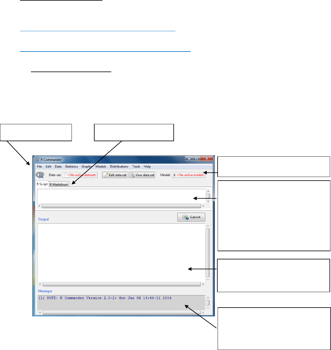
The R commander window shown below will open.
Note: Graphs will appear in a separate Graphics Device Window. Only the most recent
graph will appear. You can use page up and page down keys to recall previous graphs.
Script Window: R commands
generated by the GUI
You can type commands directly here.
Select then by highlighting and then
send the code by pressing the Submit
button (on right below the script
window)
Message Window:
RED: Error messages
GREEN: Warnings
BLUE: Other information
Output Window
DARK BLUE: printed output
RED: command that was used
Toolbar
Drop down menus
Markdown system
Drop down Menu item
File
Menu items for loading and saving script files; for saving output and the R
workspace; and for exiting.
Edit
Menu items (Cut, Copy, Paste, etc.) for editing the contents of the script
and output windows. Right clicking in the script or output window also
brings up an edit “context” menu
Data
Submenus containing menu items for reading and manipulating data.
Statistics
Submenus containing menu items for a variety of basic statistical analyses.
Graphs
Menu items for creating simple statistical graphs.
Models
Menu items and submenus for obtaining numerical summaries,
confidence intervals, hypothesis tests, diagnostics, and graphs for a
statistical model, and for adding diagnostic quantities, such as residuals,
to the data set. Distributions Probabilities, quantiles, and graphs of
standard statistical distributions (to be used, for example, as a substitute
for statistical tables).
Distributions
Probabilities, quantiles, sampling and graphs of standard statistical
distributions
Tools
Menu items for loading R packages unrelated to the Rcmdr package (e.g.,
to access data saved in another package), and for setting some options.
Help
Menu items to obtain information about the R Commander (including an
introductory manual derived from this paper). As well, each R Commander
dialog box has a Help button.
Toolbar buttons
Data set
Shows the name of the active dataset
Button: allows you choose among dataset currently in memory which to
be active
Edit data set
Allows you to open the active dataset
View data set
Allows you to view the active dataset
Model
Shows the name of the active statistical model e.g. linear model
Button: allows you to choose among current models in memory
Menu items are inactive (ie, greyed out) if not applicable to the current context.
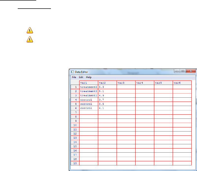
1. 5 Data input
1.5.1 Manual entry
i. Start a new data set through Data -> New data set
ii. Enter a new name for the dataset -> OK
Note: the name cannot have spaces in it
Note: R is case-sensitive hence mydata MyData
iii. A data editor window where you can type in your data using a typical
spreadsheet format. Each row corresponds to an independent object e.g. a
subject on which a measurement was made.
iv. Define the variables (column) by clicking on the column label and then in the
resulting dialog box enter the name and type. Where type can be numeric
(quantitative) or character (qualitative). Click on the x in the right hand corner to
close this dialog box.
v. This data frame is then the active dataset for R commander.
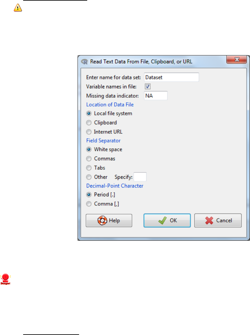
1.5.2 Import from text file
Note: the data file will need to be organized as a classic data frame. Each column
represents a single variable e.g. glucose level. Each row represents an individual. The
header information needs to be contained in a single row.
i. Data -> Import data -> from text file
ii. Chose a name for the new dataset (note you cannot have spaces)
iii. Specify the characteristics of the data files (e.g. commas for csv files) -> OK
iv. Browse and select the file/Open
Once data is imported you should double-check the file was read-in correctly:
v. Message window: are there any errors?
vi. Do the number of rows and columns look as expected?
vii. View the data via View data set button
1.5.3 Import from Excel
Data files can be read in from Excel, however they often have issues. It is recommended that
instead the file is converted to a text file and then import as detailed in 1.5.2.
How?
1. Within Excel: Office -> Save As and select the comma-delimited (.csv) file format.
2 Using R Commander to obtain descriptives
Role of descriptives?
1. Checking for errors
Looking for values that fall outside the possible values for a variable
Looking for excess number of missing values
2. As descriptives
To describe the sample in your report
To address specific research questions
2.1 Checking categorical variables
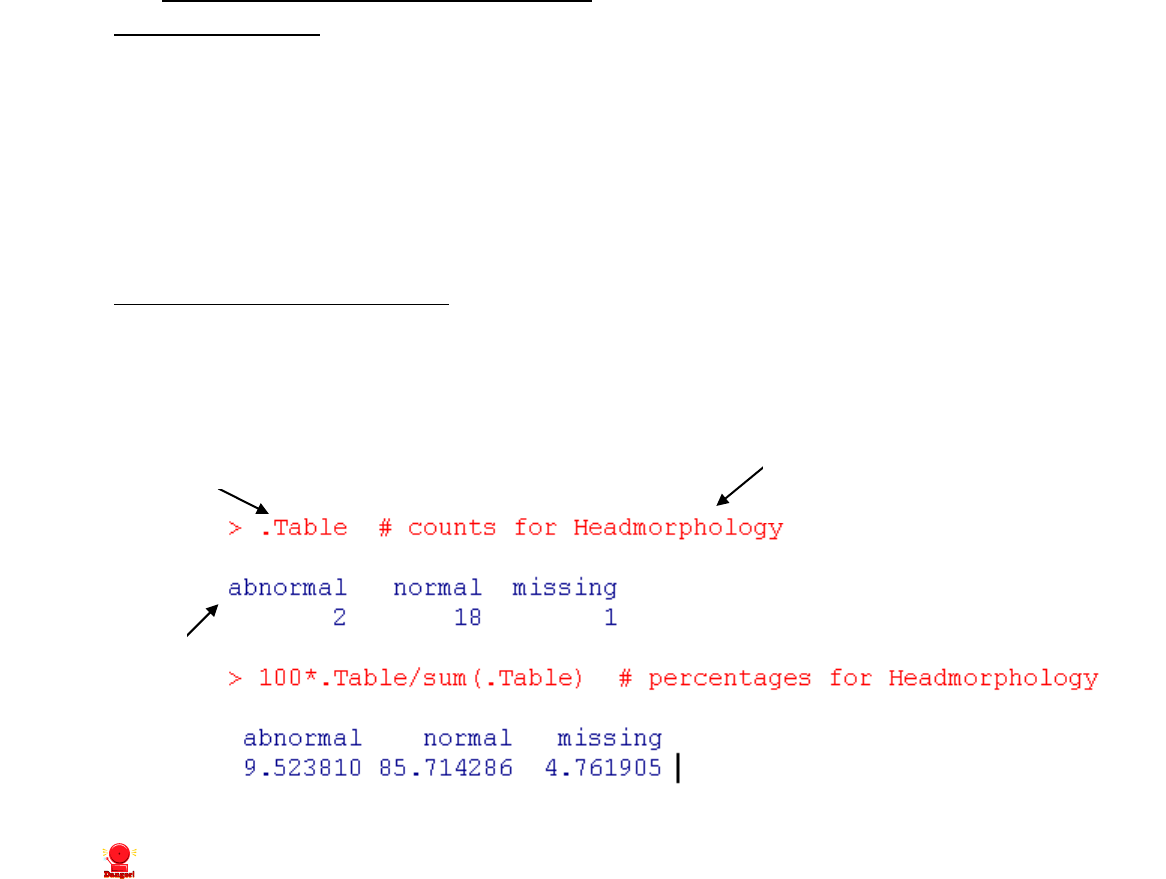
i. Statistics -> Summaries -> Frequency Distributions -> Select the variables->OK
ii. Output: For each variable you selected it will tell you the frequency for each level.
iii.
iv.
v. Check for unexpected levels e.g. norm rather than normal.
vi. Check the number of missing values does it seem appropriate?
The red text following prompt:
R code used to generate output
Red text following #:
Explanation of what the code is doing
The output of
analysis is
shown in blue
2.2 Checking continuous variables
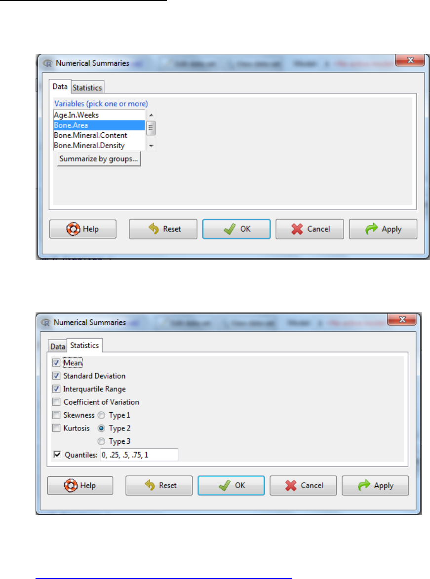
i. Statistics -> Summaries -> Numerical summaries
ii. Select the variables of interest
iii. If you have multiple groups (e.g. control versus treatment) click on summarize by
groups and select the appropriate variable -> OK
iv. Select the statistics tab to amend the output as required.
Note 1: type refers to the algorithm used in the calculation of kurtosis and skewness.
Default of 2 is the current norm. Further information can be found at:
http://cran.r-project.org/web/packages/e1071/e1071.pdf
Note 2: Definition of Kurtosis, Skewness and Coefficient of Variation is explained in the
output table in the next section
Note 3: The quantiles are values which divide the distribution such that there are a
given proportion of observations below the quantile. For example, the median is the
central value of the distribution, such that half the points are less than or equal to it and
half are greater than or equal to it. If you enter 0.2 you asking what is the value of the
variable which of all the measures has 20% of the data smaller than it and 80% larger
than this value.
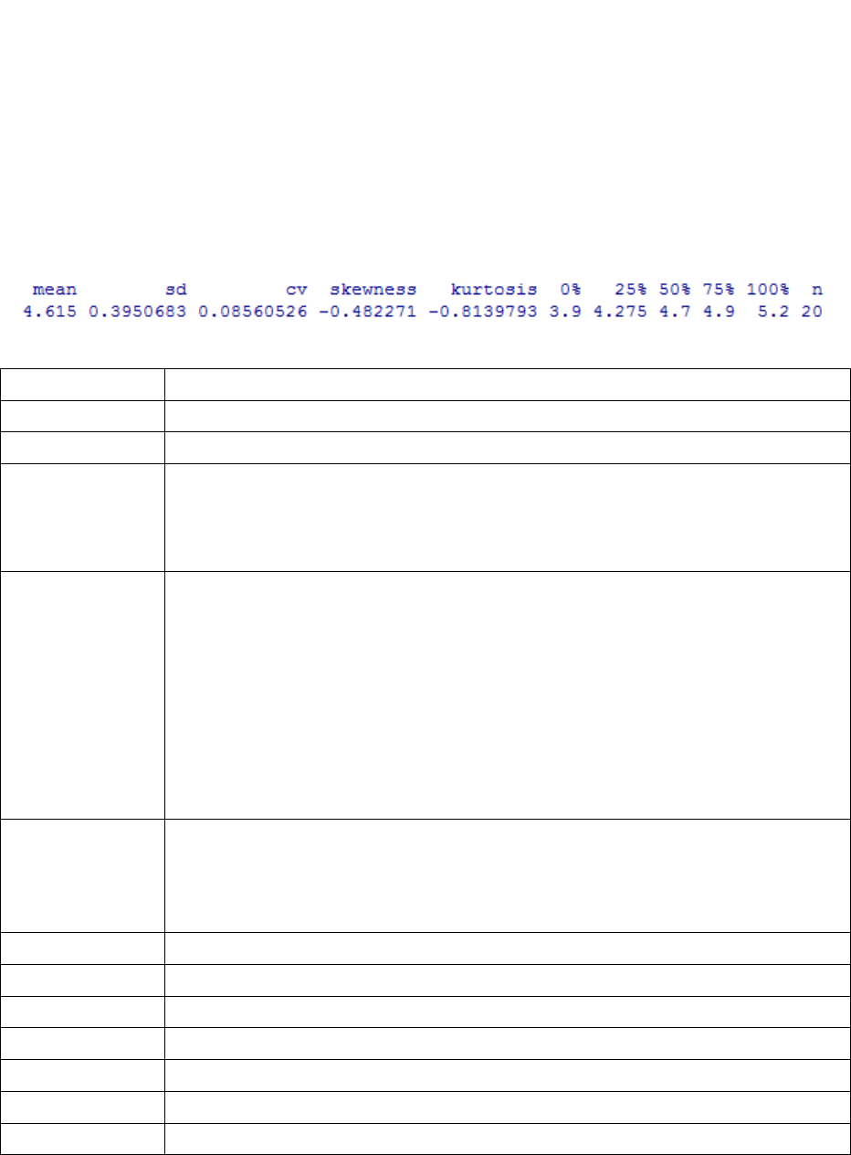
Output:
Understanding the output:
output
What is it?
mean
Measure of central tendency
sd
Standard deviation - a measure of variability in the data
cv
Coefficient of
variance
The coefficient of variation (CV) is a normalized measure of variance. It is
calculated as the ratio of the standard deviation to the mean. It can be
compared across variables as the variability is now on a standardised
scale.
Skewness
Skewness is a measure of symmetry. The output can be positive or
negative. A negative value indicates negative skew indicates meaning that
the tail on the left side of the distribution is longer than the right side and
the bulk of the values lie to the right of the mean. A positive value
indicates positive skew indicates that the tail on the right side is longer
than the left side and the bulk of the values lie to the left of the mean. A
zero value indicates that the values are relatively evenly distributed on
both sides of the mean
kurtosis
Kurtosis is a measure of whether the data are peaked or flat relative to a normal
distribution. A standard normal distribution has a kurtosis of zero. A positive
kurtosis indicates a "peaked" distribution and negative kurtosis indicates a "flat"
distribution.
n
Number of readings
NA
Number of missing values
0%
Minimum value
25%
The value below which 25 percent of the observations may be found.
50%
The value below which 50 percent of the observations may be found.
75%
The value below which 75 percent of the observations may be found.
100%
Maximum value
v. Check your minimum and maximum values – do they make sense?
vi. Check the number of missing values – if there are a lot of missing values you need to ask
why?
vii. Do the mean score(s) make sense? Is it what you expect from previous experience?
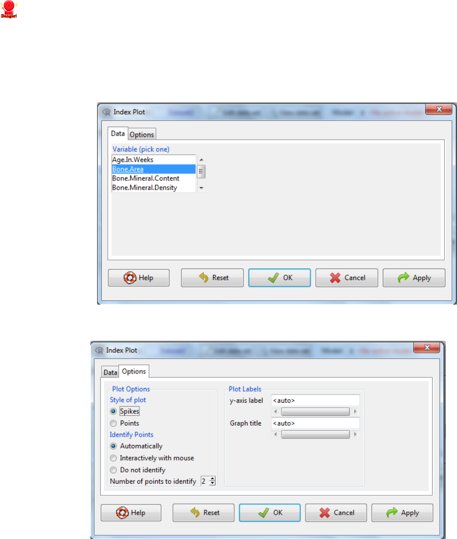
viii. Identifying the outlier
Graphs -> Index Plot
ix. Select the variable of concern
x. Select the options tab to bespoke the output
xi. Outliers can be identified either by selecting
i. Automatically – where the program tries to identify outliers
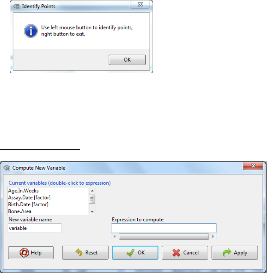
ii. Interactively with mouse, this will lead to the following message on how you
select which points/spikes to identify.
xii. The graph can be amended by
i. Adding title
ii. Amending the axis label
iii. Whether it is spikes or individual points.
xiii. Click to OK to visualize the graph
3. Modifying the dataset
3.1 Compute a new variable
i. Data -> Manage variables in active data set -> Compute new variable
ii. Enter new variable name
iii. An expression (equation) is written to reflect the calculation required. The table
below indicates the operators available and examples of how it could be used. Note:
Double clicking on a variable in the current variables box will send the variable to the
expression.
Operators
Function
Example 1
Example 2
x + y
Addition
Variable 1 + Variable 2
Variable 1 + 25
x – y
Subtraction
Variable 1 – Variable 2
35 - Variable 1
x * y
Multiple
Variable 1*Variable 2
100*Variable 1
x / y
Division
Variable 1/Variable 2
Variable 1 / 63
x ^ y
X to the power of Y
Variable 1 ^ Variable2
Variable1^10
log10(x)
Log10
transformation
Log10(Variable 1)
log(x, base)
Log transformation
to a specified base
Log(Variable 1, 2)
3.2 Converting numeric variables to categorical variables
Categorical variables are measures on a nominal scale i.e. where you use labels. For
example, rocks can be generally categorized as igneous, sedimentary and metamorphic.
The values that can be taken are called levels. Categorical variables have no numerical
meaning but are often coded for easy of data entry and processing in spreadsheets. For
example gender is often coded where male =1 and female = 2. Data can thus be entered
as characters (e.g. ‘normal’) or numeric (e.g. 0, 1, 2). It is important to ensure the
program distinguishes between categorical variables entered numerically and those
variables whose values have a direct numerical meaning.
Assessing whether a variable is entered as categorical:
i. Edit Data Set -> click on each row header and it will tell you it is numeric/categorical
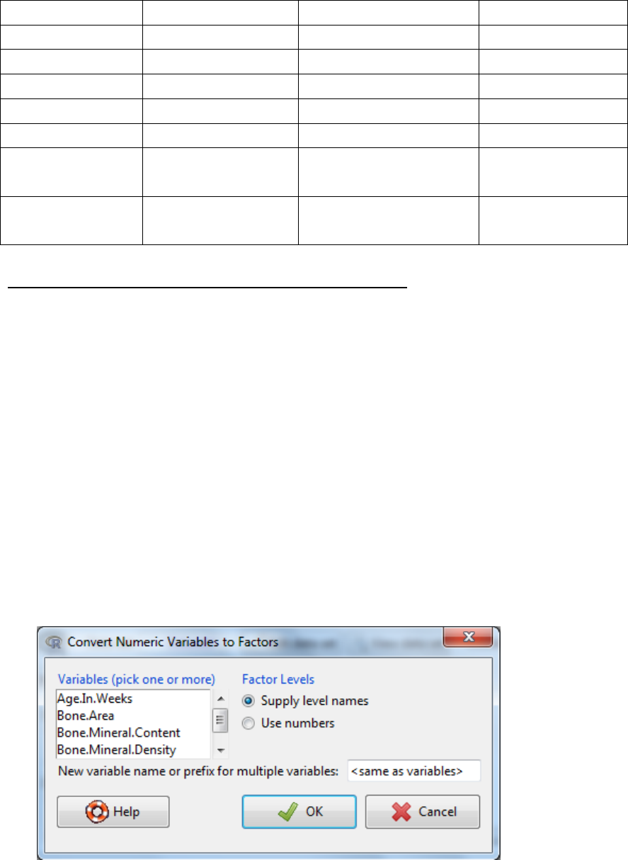
Converting numeric variables to factors:
i. Data -> Manage variables in active data set -> Convert numeric variables to factors…
ii. Select the variables
iii. You can generate a new variable by entering a name in box “new variable name….”
or over-write the original name.
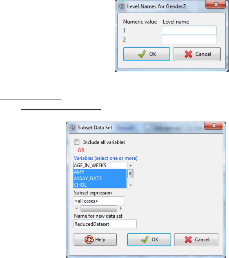
iv. The levels of the factor can be defined either by selecting Use numbers where the
current numbers become the levels or select Supply level names. If you select
Supply level names then another dialog box will appear to enter the name for each
numeric value.
v. OK
3.3 Sub-dividing data
3.3.1 by columns (variables)
i. data -> active data set -> subset active data set..
ii. Untick the Include all variables and Hold the CTRL key to select the variables you wish
to keep
iii. Give the new dataset a name -> OK
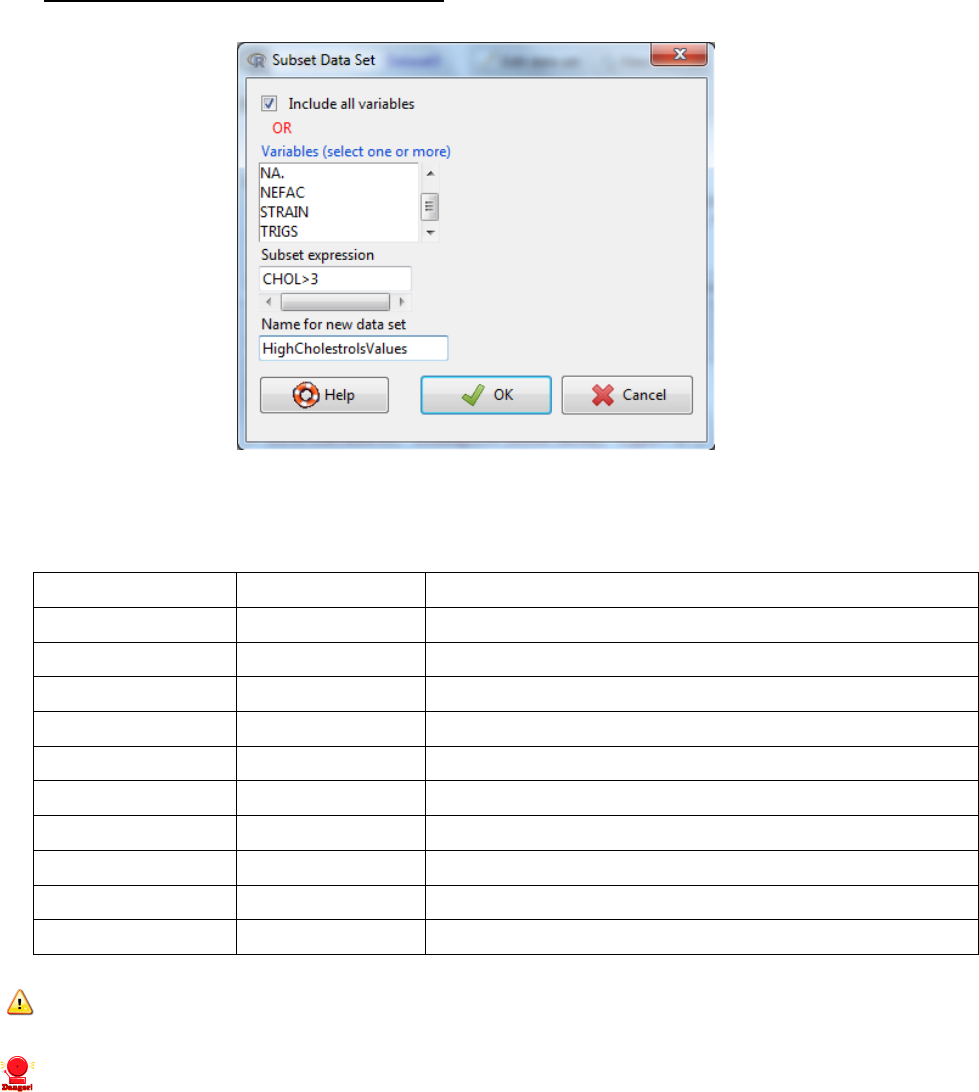
3.3.2 by rows (and variables if you wish)
i. Data -> active dataset -> subset active dataset
ii. Select the variables you wish to include in the new dataset
iii. Write a ‘subset expression’ which is a rule to drive the selection of rows
Symbol/code
Name
Use
==
equality
used to indicate the variable should equal
!=
Inequality
used to indicate the variable should not equal
&
And
used to combine multiple expressions
Or
used to combine multiple expressions
is.na(varname)
Include the missing values of a variable
!is.na(varname)
Exclude the missing values of a variable
>
Greater than
<
Less than
>=
More than or equal to
<=
Less than or equal to
Note 1: If you use a name in an expression you need to surround the name with double
quotes e.g. “name”.
Note 2: the variable name is case-sensitive (i.e. it has to match exactly the name used
as a column header).
Example: GENDER == “Female”
Example 2: GENDER == “Female” & AGE <= 25
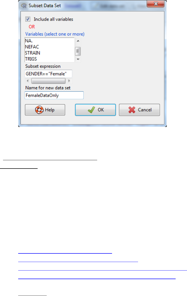
iv. Give the dataset a new name -> OK.
4. Using R Commander to explore data
4.1 Graphically
The R commander is able to generate a variety of basic statistical graphs. The graphic output in
R commander is limited by the choice offered in the menu. There are too many options to be
incorporated sensible. Whilst in R, using the command line, the options are endless. Section 7
of this course, gives examples of how the graphical output can be amended by altering the R
code. For further adjustments, I would recommend speaking to an R user, or using books, and
web resources to learn more.
Some references for producing graphs in R
R Graphics (Computer Science and Data Analysis) by Paul Murrell
http://www.harding.edu/fmccown/R/
http://www.statmethods.net/graphs/index.html
http://freshmeat.net/articles/creating-charts-and-graphs-with-gnu-r
http://www.ats.ucla.edu/stat/R/library/lecture_graphing_r.htm
4.1.1 Histograms
In statistics, a histogram is a graphical display of tabulated frequencies, shown as bars. It shows
what proportion of cases fall into each of several categories.
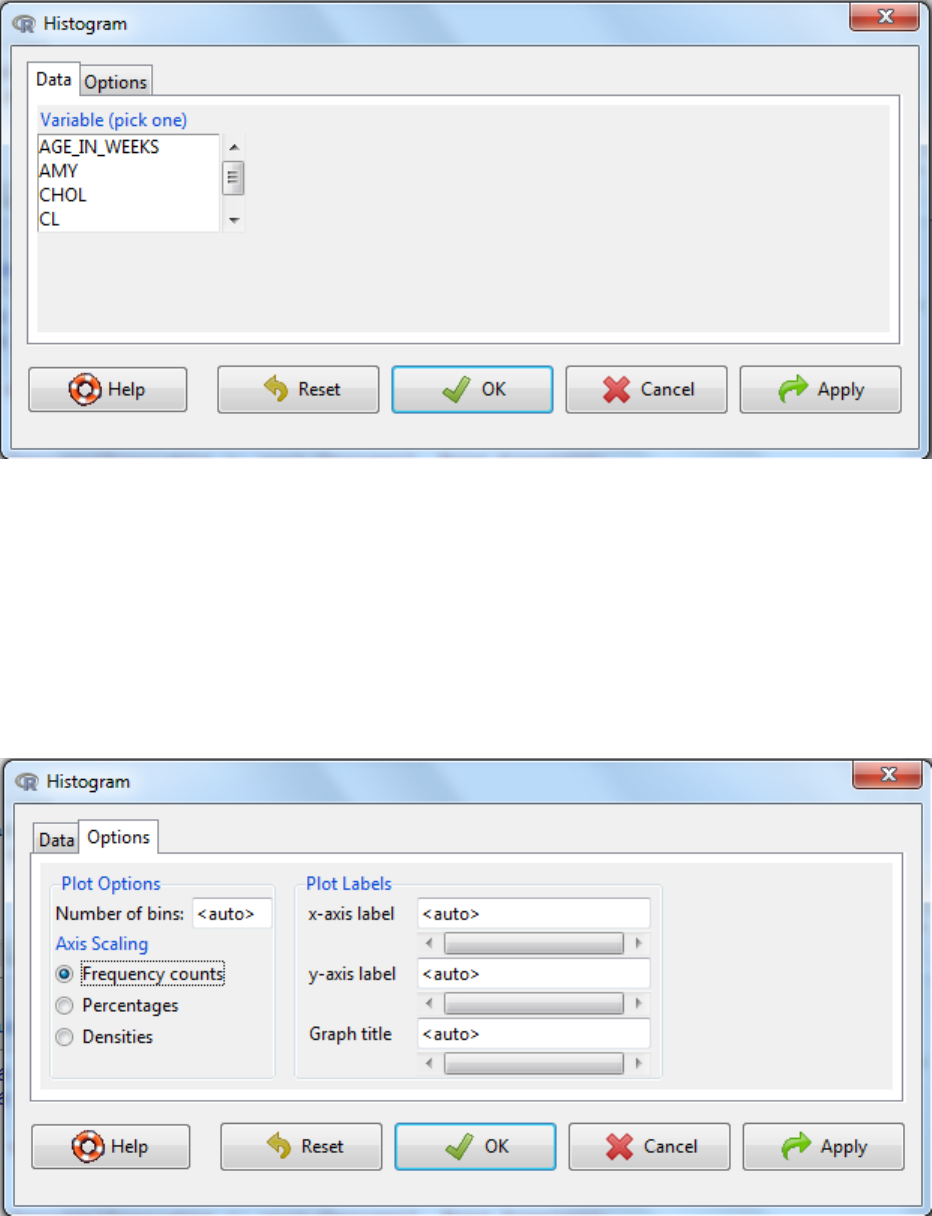
i. Graphs -> Histogram…
ii. Select the variable of interest
iii. Then select the options tab to bespoke the final graph
a. Labels, x-axis, y-axis and title, can be customized here.
b. The scale can be as counts, percentage or densities as required.
c. Finally the number of bins can be determined automatically or defined by entering a
number.
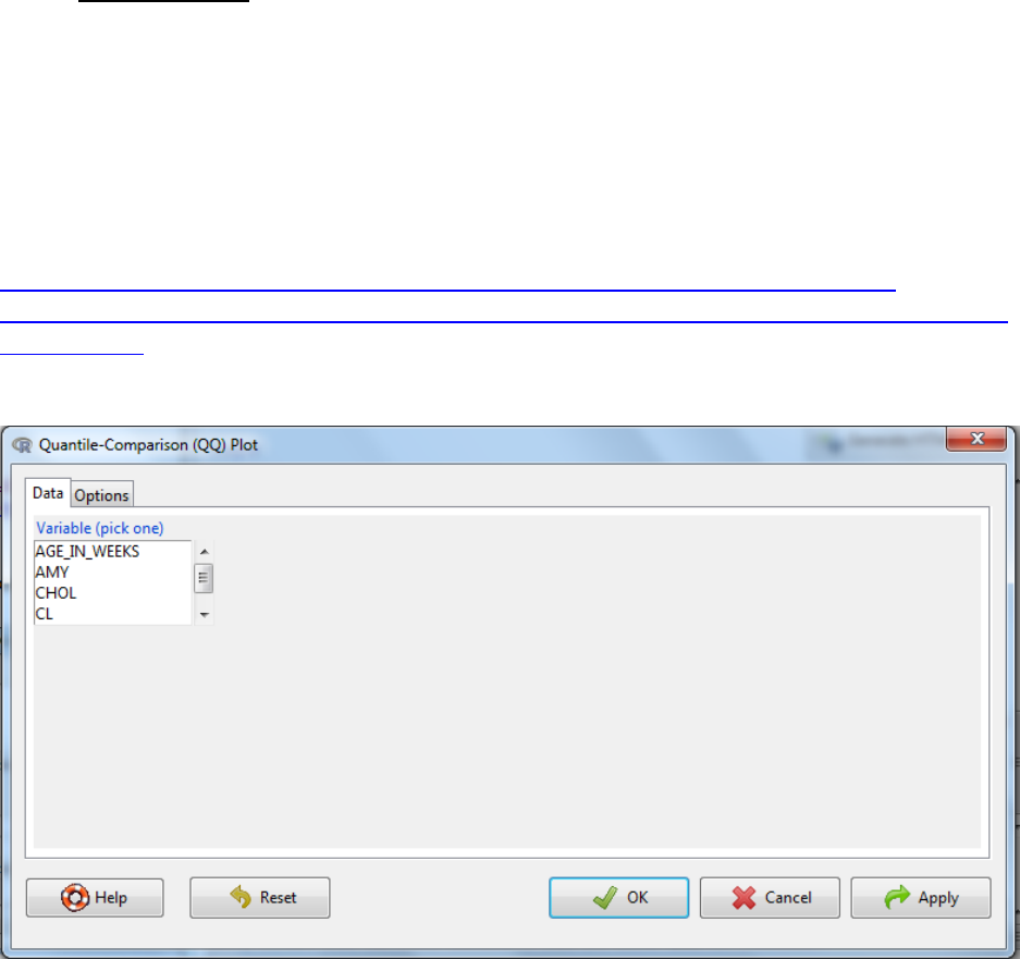
4.1.2 Norm Q-Q plots
In statistics, a Q-Q plot ("Q" stands for quantile) is a probability plot, which is a graphical
method for comparing two probability distributions by plotting their quantiles against each
other. If the two distributions being compared are similar, the points in the Q-Q plot will
approximately lie on the line y = x. A norm Q-Q plot compares the sample distribution against a
normal distribution.
Additional information:
http://www.cms.murdoch.edu.au/areas/maths/statsnotes/samplestats/qqplot.html
http://webhelp.esri.com/arcgisdesktop/9.2/index.cfm?TopicName=Normal_QQ_plot_and_gen
eral_QQ_plot
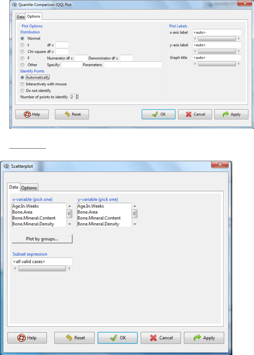
i. Graphs -> Quantile-comparison plot…
ii. Select variable of interest
iii. Then select the options tab to bespoke the final graph
a. Labels, x-axis, y-axis and title, can be customized here.
b. The distribution type and associated characteristics defined. Select normal for a
normal Q-Q plot.
c. There is an option to identify outliers. You can either have outliers automatically
labelled with the index number or interactively where you select the data point to
label with a mouse click.
4.1.3 Scatterplots
i. Graphs -> Scatterplot…
ii. Select the variables for x-axis and y-axis
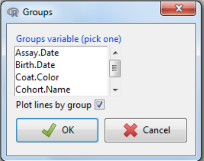
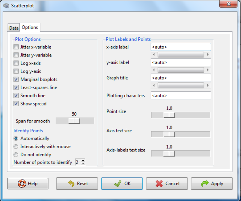
iii. You have the option to plot by groups which will lead to the following dialog box, where you
can select the grouping variable and whether you want the fitted lines to be for the whole
data or by group.
iv. Then select the options tab to customise the final graph.
Labels, x-axis, y-axis and title, can be customized here both in content and
plotting characteristics.
There is an option to identify outliers. You can either have outliers
automatically labelled with the index number or interactively where you
select the data point to label with a mouse click.
If you wish the x or y axis can be logged.
Marginal boxplots: If this selected, then along each axis is shown a boxplot
of the variable for that axis.
Jitter: this is useful when there are many data points to see if they are
overlaying, as a function is used to randomly perturb the points but this does
not influence line fitting.
Least-square line can be selected to fit a best fit linear regression line.
Smooth line – will fit a loess line which is a locally weighted line and is used
to assess whether the assumption of linearity is appropriate. There is an
option to amend the number of data points used in the smooth process.
Show spread – this will give a dotted line surrounding the data and fitted
curves and shows the standard deviation of the data.
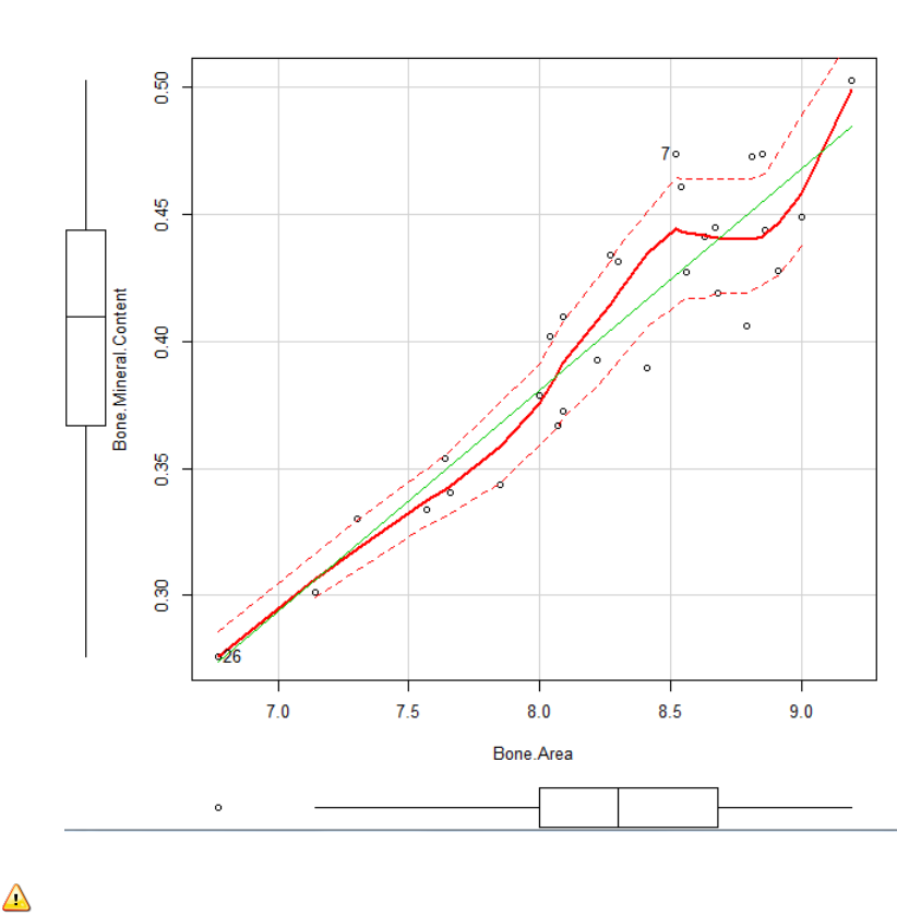
Interpreting the output:
The green line: is the best fit linear regression
The red line: is loess line. A loess line is a locally weighted line and is used to assess
whether the assumption of linearity is appropriate. Visually you are looking to see whether
the loess line suggestions a significant deviation from the linear.
The dotted lines indicate the spread of the data.
The box plots give an indication to the spread of each variable independently.
4.1.4 Box plots
A boxplot, or box and whisker diagram, provides a simple graphical summary of a set of data. It
is a convenient way of graphically visualising data through their five-number summaries: the
smallest observation (minimum), lower quartile (Q1), median (Q2), upper quartile (Q3), and
largest observation (maximum). A quartile is any of the three values which divide the sorted
dataset into four equal parts, so that each part represents one fourth of the sampled
population. Outliers, points which are more than 1.5 the interquartile range (Q3-Q1) away from
the interquartile boundaries are marked individually.
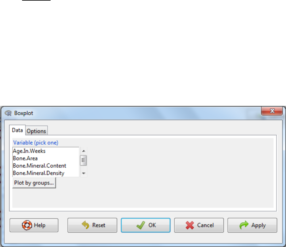
a. Graphs -> Boxplot…
b. Select the variable of interest
c. Plot by groups: allows you to have multiple boxplots in the same graph split by a categorical
variable.
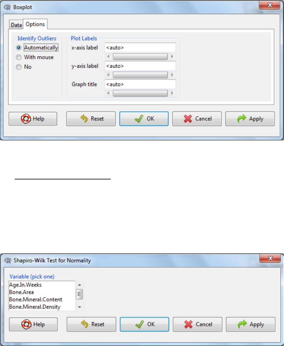
d. Then select the options tab to customize the final graph.
Labels, x-axis, y-axis and title, can be customized here both in content and
plotting characteristics.
There is an option to identify outliers. You can either have outliers
automatically labelled with the index number or interactively where you
select the data point to label with a mouse click.
e. OK
4.2 Shapiro-Wilk test for normality
This is a hypothesis tests with the null hypothesis that the data comes from a normal
distribution. Hence if the p-value is below the significance threshold (typically 0.05), then the
null hypothesis is rejected and the alternative hypothesis is accepted. Here the alternative
hypothesis is that the data does not come from a normal distribution.
a. Statistics -> Summaries -> Shapiro-Wilk test of normality
b. Select the parameter of interest
c. OK
d. Interpretation: If the p-value is below the significance threshold, then there the null
hypothesis is rejected allowing the acceptance of the alternative hypothesis that the
data does not come from a normal distribution.
5. Using R commander to apply statistical tests
5.1 Comparing means
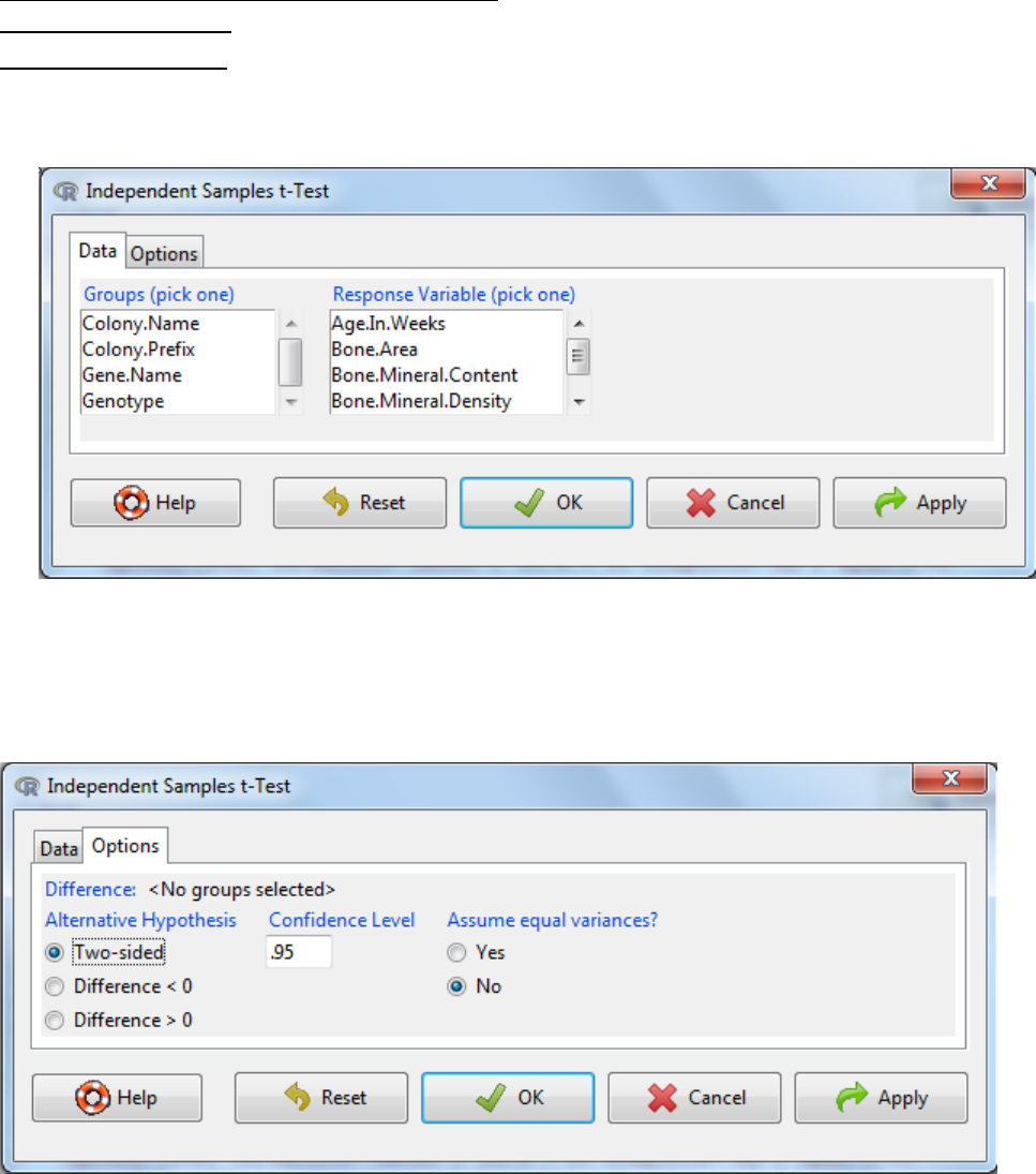
5.1.1 Student’s t-Test
The two-sample Student’s t-Test is used to determine if two population means are equal.
a. Statistics -> Means -> Independent Samples t-Test
b. Select the grouping variable e.g. genotype and the response variable e.g. Bone.Area
c. Under the options tab, there are three things to consider
The alternative hypothesis - Typically you select a two-sided hypothesis; this means the
change in mean can be either an increase or a decrease.
The confidence level: the threshold at which you reject the null hypothesis and accept
the alternate hypothesis. Typically this is 0.05, which is a 5% risk that the difference is a
sampling effect rather than a true population difference.
Assume equal variances: yes or no. As variance is a measure of the spread of the data,
if the spread of the data is different between the two groups then for the statistical test
to work reliable you need to select No. This can be assessed visually by looking at
boxplots of the data (section 4.1.4) and statistically (section 5.2). If you do not assume
equal variance this test is equivalent to the Welch t-Test and is considered more robust.
Small departures from equal variance significantly affect the robustness of results.
d. OK.
e. Interpretation? If the p-value is below the significance threshold, then there is a significant
difference in the mean scores for each of the two groups.
5.1.2 Paired student’s t-Test
In a paired experiment, there is a one-to-one correspondence between the values in the two
samples (e.g. before and after treatment, paired subjects e.g. twins). A paired approach is
considered more sensitive as it is looking for a treatment difference excluding initial
biological differences. As such the null hypothesis for this statistical test is that the average
difference (second measurement minus first) is zero.
Note: Data File Format
Need two columns; one that contains the first number in each data set pair (e.g., “before” data)
and another column that contains the second number in each data set pair. Pairs of numbers
must be in the same row.
Example layout:
Subject WeightBefore WeightAfter
160 57
275 73
367 66
a. Statistics -> Means -> Paired t-Test
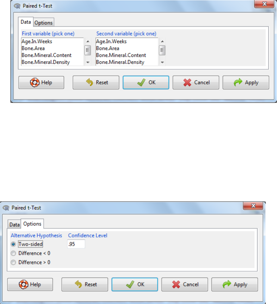
b. Select the first variable
c. Select the second variable
d. Under the options tab, there are two things to consider
The alternative hypothesis can be two sided where the change in mean difference can
be either an increase or a decrease or defined as an increase or a decrease.
The confidence level: the threshold at which you reject the null hypothesis and accept
the alternate hypothesis. Typically this is 0.05, which is a 5% risk that the difference is a
sampling effect rather than a true population difference.
e. OK.
f. Interpretation?
• If the p-value is below the significance threshold, then the mean difference is not equal to 0
• The mean of the difference indicates the average difference (variable 1-variable 2)
• The 95% confidence interval is the confidence interval around the mean difference.
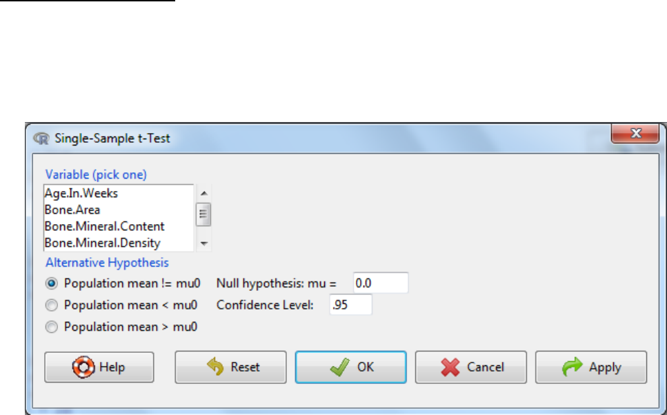
5.1.3 Single sample t-Test
The single sample t-Test tests a null hypothesis that the population mean is equal to a specified
value. If this value is zero (or not entered) then the confidence interval for the sample mean is
given.
a. Statistics -> Means -> Single-sample t-Test
b. Select the variable of interest
c. Enter the proposed mean (Null hypothesis: mu=)
d. Typically the confidence level of 0.95 is used.
e. Three alternative hypothesis are possible:
a. The mean does not equal the specified value (Population mean != mu0)
b. The mean is less than the specified value
c. The mean is more than the specified value
f. OK.
g. Interpretation? If the p-value is below the significance threshold, then the means is not
equal to the specified value.
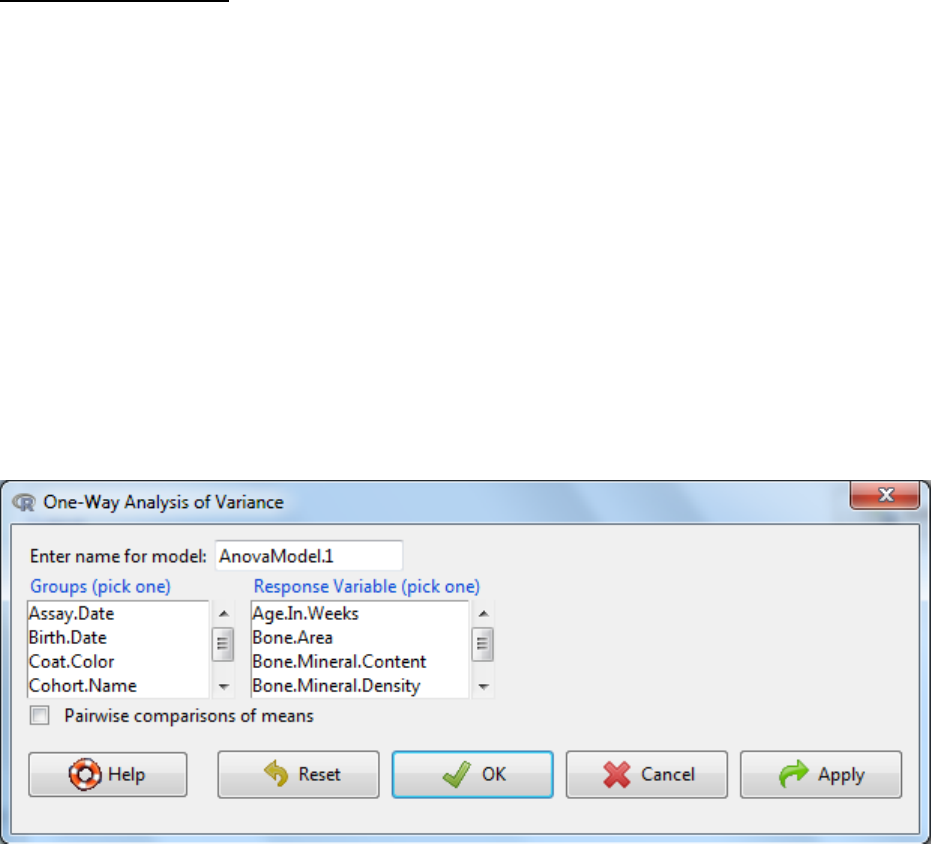
5.1.4 One-Way ANOVA
This test is used when you wish to compare the mean scores of more than two groups. Analysis
of variance is so called because it compares the variance (variability in scores) between the
different groups (believed to be due to the grouping variable) with the variability within each of
the groups (believed to be due to chance). The ratio of the variance is converted to a p-value
which assesses the chance that this difference in variance arises from sampling affects. A
significant p-value indicates that we can reject the null hypothesis which states that the
populations means are equal. It does not however tell us which of the groups are different. If a
significant score is obtained in the one-way ANOVA then post-hoc testing is used to tell where
the difference arose. The software uses Tukey post-hoc comparison procedure which is
essential like a Student’s t-Test however the test takes into account the risk of accumulating
false positives as multiple tests are being conducted.
a. Statistics -> Means -> One-Way ANOVA
b. Enter a name for the model
c. Select a response variable as the variable of interest
d. Select the grouping variable
e. OK
f. Interpretation?
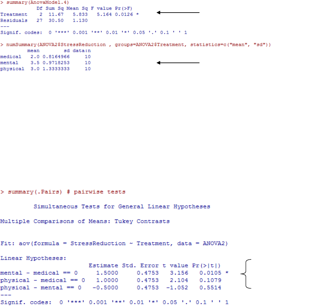
If the p-value is below the significance threshold, then the somewhere there is a statistically
significant difference in the means of two or more groups.
g. If the p-value is significant, repeat the analysis with the pairwise comparisons of means
button ticked. This repeats the analysis with the groups being compared to each other
group using Tukey contrasts
h. Interpretation?
For each possible pair wise comparison, the software calculates the mean difference
for each comparison and tests it with the null hypothesis that the difference should
be zero and returns a p-value on this statistical test.
It also calculates the 95% confidence interval on the observed mean differences for
each pair-wise comparison
p-value
Group summaries
Calculated p-
values for each
comparison
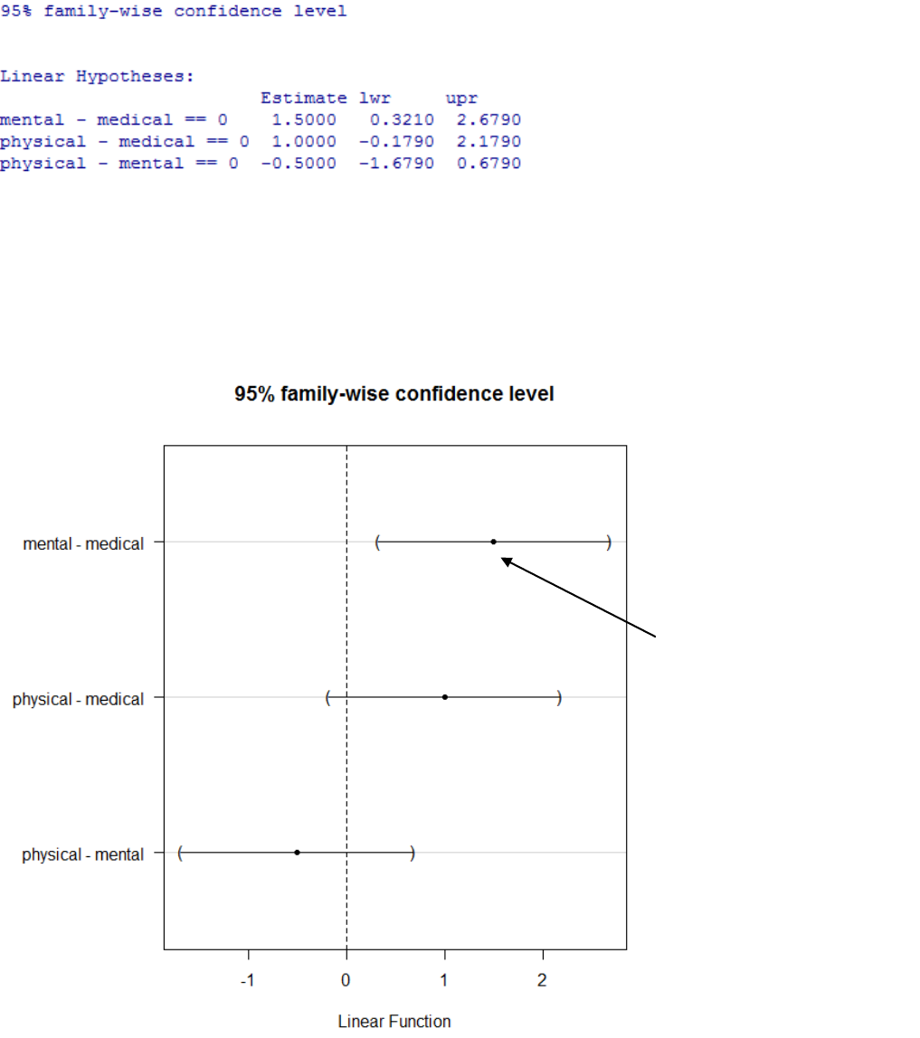
Graphically it visualizes these calculated values. You are looking for comparisons
where the mean difference confidence interval does not span zero indicating a
statistically significant difference between these groups.
This group comparison has
an estimated difference of
1.5 and the confidence
interval on this estimate
does not span zero. Thus this
is the source of the
significant difference.
5.1.5 Two way ANOVA
This test is used when you wish to investigate the effect of two independent variables on a
dependent variable simultaneously. This involves multiple null hypotheses being tested and
hence multiple p-values are calculated.
The null hypotheses:
1. There is no difference in the means of factor A
2. There is no difference in means of factor B
3. There is no interaction between factors A and B
The alternative hypothesis for 1 and 2 is: the means are not equal. The alternative hypothesis
for case 3 is: there is an interaction between A and B. An interaction means the independent
variables (factors) have a complex influence on the dependent variable. Therefore the main
effects alone will not tell the full story and hence the cell means must be examined for each
sub-group.
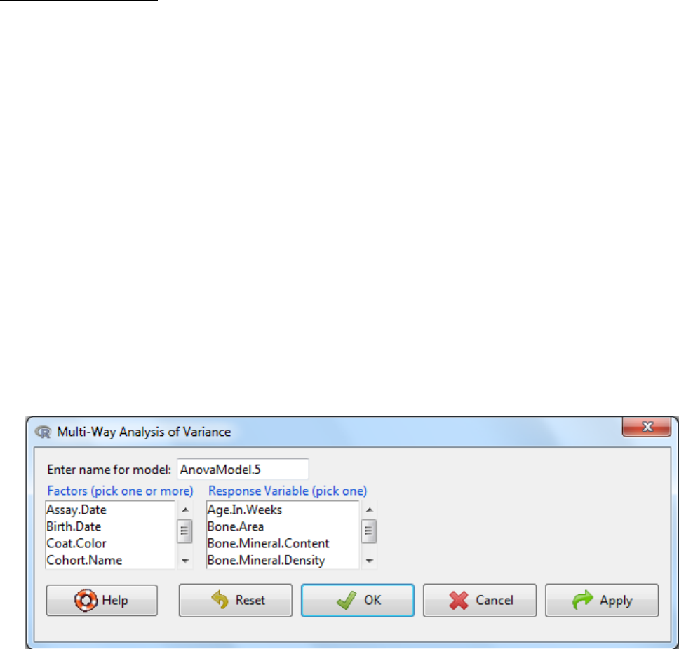
a. Statistics -> Means -> Multi-Way ANOVA
b. Enter a name for the model
c. Select the factors (two for a two-way anova)
d. Select the response variable
e. OK
f. Interpretation?
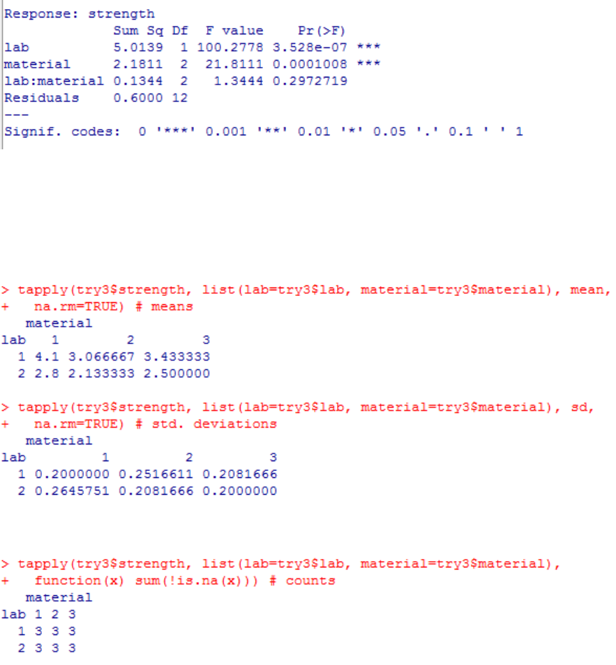
The ANOVA test output lists the significance of the main effects tested (example above: lab and
material). These have significant main effects if the p-value is less than 0.05 and this is shown with
stars. The significance of the interaction (example: lab*material) is also tested and in the example
above is not significant.
Below the ANOVA output is the mean and standard deviation measures for each group.
Finally it tells you how many measures were used in each group via the count function.
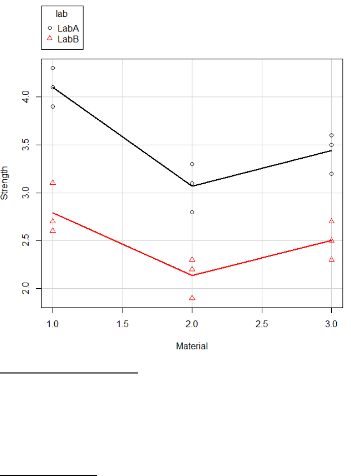
It is important to visualize the data as well as complete statistical analysis, which confirm the
statistical output makes sense. The following graph was generated via scatterplot functionality
(section 4.1.3). Visually you can see that the strength depends on material and lab but there is
no interaction between lab and material as the lines are parallel.
5.2 Comparing the variance
These tests, test if different samples have equal variance (homogeneity of variance). The null
hypothesis is that the variance is equal across all groups. When the calculated p-value falls
below a significance threshold (typically 0.05) then the null hypothesis is rejected and the
alternative hypothesis is accepted that the variance is not equal across groups.
5.2.1 Bartlett’s test
Bartlett's test is sensitive to departures from normality. That is, if your samples come from non-
normal distributions, then Bartlett's test may simply be testing for non-normality rather than
for a difference in variance. The Levene’s test (5.2.2) is an alternative to the Bartlett’s test that
is less sensitive to departures from normality.
a. Statistics -> variances -> Bartlett’s test
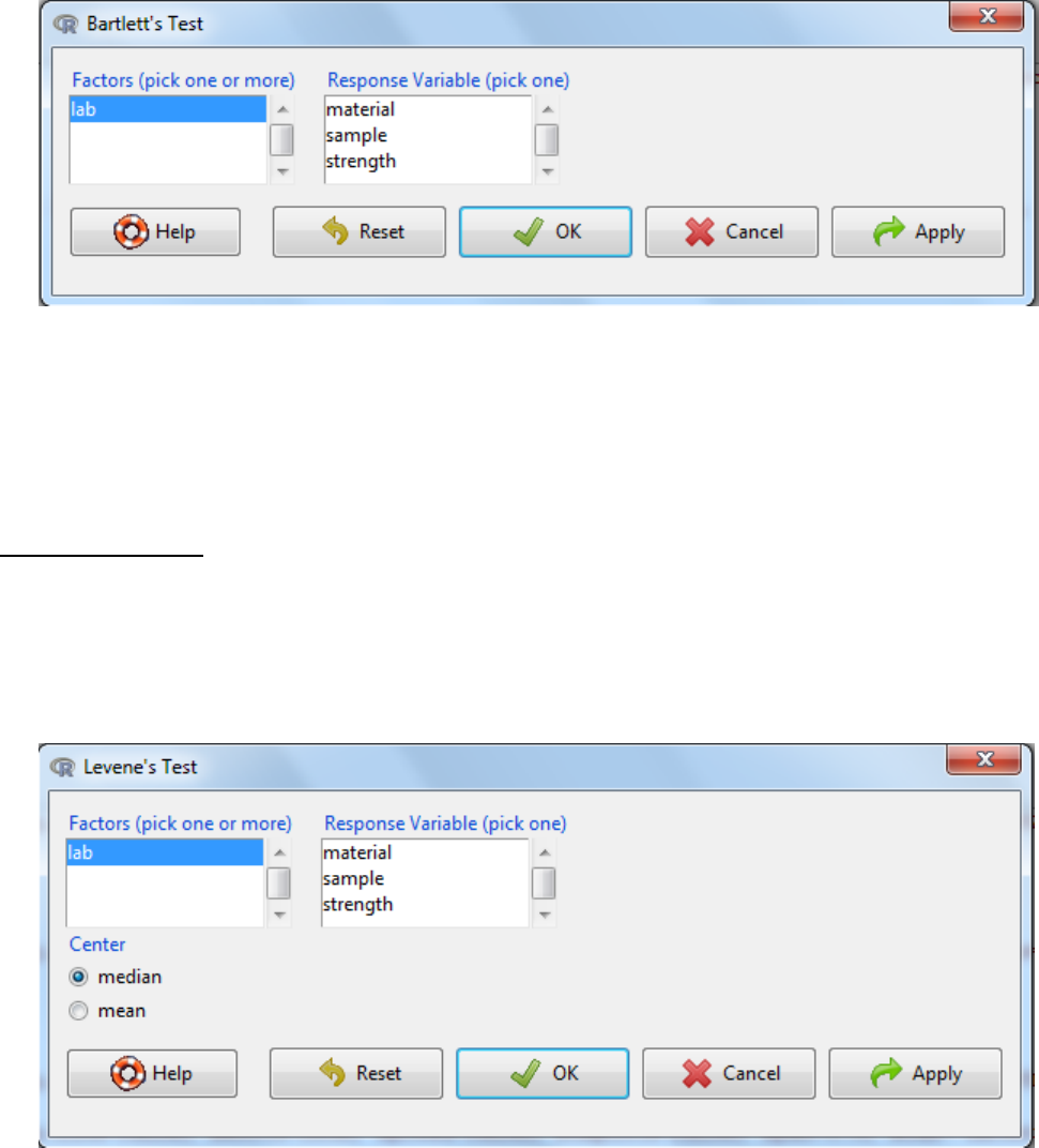
b. Select the Factors (grouping variable)
c. Select the response variable
d. OK
e. Interpretation: If the p-value is below the significance threshold, then the variance is not
equal across the different groups.
5.2.2 Levene’s test
The Levene’s test is less sensitive than the Bartlett test (5.2.1) to departures from normality. If
you have strong evidence that your data do in fact come from a normal, or nearly normal,
distribution, then Bartlett's test has better performance.
a. Statistics -> variance -> Levene’s test
b. Select the Factors (grouping variable)
c. Select the response variable
d. Centre refers to how the central tendency is estimated for each group. Mean gives the
original Levene's test; the default, median, provides a more robust test. The median is the
default as in the statistical literature this is the current preferred method of calculation.
e. OK
f. Interpretation: If the p-value is below the significance threshold, then the variance in the
groups is not equal.
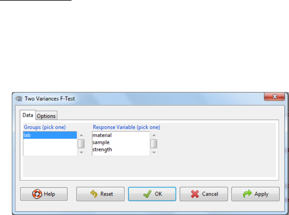
5.2.3 Two variances F-test
An F-Test, is used to test if the standard deviations of two populations are equal. This test can
be a two-tailed test or a one-tailed test. The two-tailed version tests against the alternative that
the standard deviations are not equal. The one-tailed version only tests in one direction that is
the standard deviation from the first population is either greater than or less than (but not
both) the second population standard deviation. The choice is determined by the problem. For
example, if we are testing a new process, we may only be interested in knowing if the new
process is less variable than the old process.
a. Statistics -> variances -> Two variances F-test
b. Select the grouping variable
c. Select the response variable
d. Under the options tab there are two things to consider
The alternative hypothesis can be two sided where the difference in standard
deviation can be either an increase or a decrease or it can be one sided where it
could either be an increase or a decrease.
The confidence level: the threshold at which you reject the null hypothesis and
accept the alternate hypothesis. Typically this is 0.05, which is a 5% risk that the
difference is a sampling effect rather than a true population difference.
e. OK
f. Interpretation: When the p-value falls below the significance threshold the null hypothesis
is rejected and the alternative hypothesis is accepted.
5.3 Non parametric tests
These are statistical tests which are distribution free methods as they do not rely on
assumptions that the data are drawn from a given probability distribution.
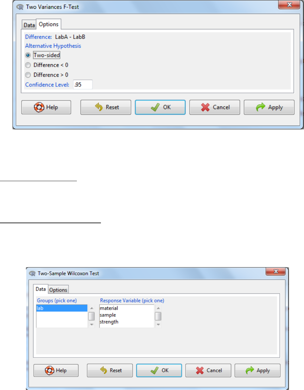
5.3.1 Two-sample Wilcoxon Test
Non-parametric equivalent to the Student’s t-Test. Can also be called two-sample Mann-
Whitney U test. This test assesses whether the values in two samples differ in size.
a. Statistics -> Non-parametric tests -> Two sample Wilcoxon test
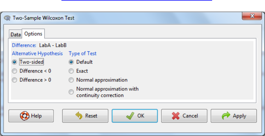
b. Select the grouping variable
c. Select the response variable (variable of interest)
d. Under the options tab there are two things to consider
a. The alternative hypothesis can be two sided where the difference can be either
an increase or a decrease or it can be one sided where it could either be an
increase or a decrease.
b. Type of test.
To speed up calculations, assumptions can be made about distributions of
parameters needed to be estimated in the test e.g. normal approximation or
normal approximation with continuity correction. It is fine for this to occur
when the number of samples is large. An exact test is one that is defined
without parametric assumptions and evaluated without using approximate
algorithms. The function will revert naturally to an exact test if n is low (<50)
and there are no ties (equivalent values) when default is selected and hence is
the recommended setting.
Further information on types of tests can be found at
http://www.amstat.org/publications/jse/v18n2/bellera.pdf.
e. OK
f. Interpretation: When the p-value falls below the significance threshold the null
hypothesis is rejected and the alternative hypothesis is accepted.
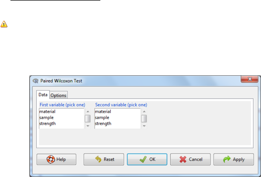
5.3.2 Paired-sample Wilcoxon Test
The Wilcoxon test for paired samples is the non-parametric equivalent of the paired samples t-
test.
Note: Data Format
Need two columns; one that contains the first number in each data set pair (e.g., “before” data)
and another column that contains the second number in each data set pair. Pairs of numbers
must be in the same row.
a. Statistics -> Non-parametric tests -> Paired- sample Wilcoxon test
b. Select the first variable
c. Select the second variable
d. Under the options tab there are two things to consider
a. The alternative hypothesis can be two sided where the difference in standard
deviation can be either an increase or a decrease or it can be one sided where it
could either be an increase or a decrease.
b. Type of test.To speed up calculations, assumptions can be made about distributions of
parameters needed to be estimated in the test e.g. normal approximation or normal
approximation with continuity correction. It is fine for this to occur when the number of
samples is large. An exact test is one that is defined without parametric assumptions
and evaluated without using approximate algorithms. The function will revert naturally
to an exact test if n is low (<50) and there are no ties (equivalent values) when default is
selected and hence is the recommended setting.
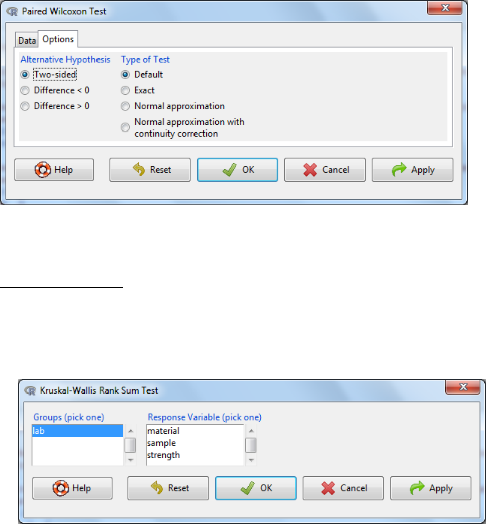
e. OK
f. Interpretation: When the p-value falls below the significance threshold the null
hypothesis is rejected and the alternative hypothesis is accepted.
5.3.3 Kruskal-Wallis Test
This test is a non-parametric method for testing equality of population medians among groups.
It is identical to an ANOVA (5.1.4) with the data replaced by their ranks. It is an extension of the
Two-sample Wilcoxon test to 3 or more groups.
a. Statistics -> Non-parametric tests -> Kruskal-Wallis test
b. Select the grouping variable
c. Select the response variable (variable of interest)
d. OK
e. Interpretation: When the p-value falls below the significance threshold, the alternative
hypothesis is accepted that the population medians among groups tested are not equal.
f. This test does not tell you where the differences are, just that two or more groups differ in
their median. Post-hoc testing is then required between each pair-wise group of interest
using the two-sample Wilcoxon Test (5.3.1).
6. Odds and Ends
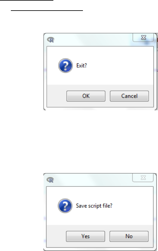
6.1 Exiting and saving script
a. File -> Exit -> From R Commander and R -> OK
b. You will then be asked to confirm that you wish to Exit
c. You will then be asked whether you want to save the script file.
There are two advantages to saving the script
Provides a record of the analysis completed.
During the next session the user can ‘get back to where you left off’ by opening a
saved script and submitting the code.
d. Then you will be asked whether you want to save R Markdown file. The
markdown file is discussed in more detail in section 6.2.3.
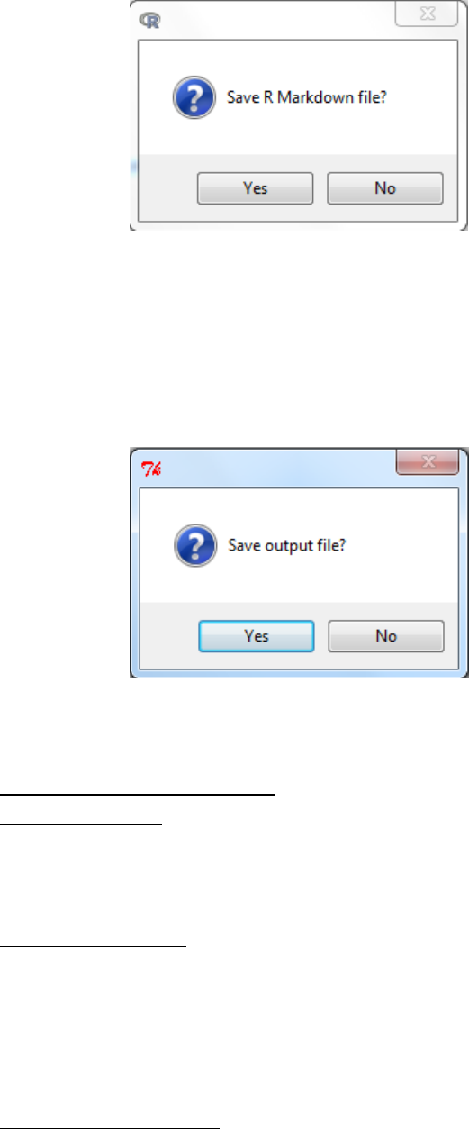
e. Finally you will be asked whether you want to save the output file.
This saves the R workspace and all the objects (e.g. datasets, or models you
created). This can be useful as you would not need to reload everything to
continue studies however note that unless you remember all the objects you
have generated you can get confused by objects (datasets/parameters) being
carried over and used mistakenly. It is generally considered better to save scripts
(coding).
6.2 Saving and printing Output
6.2.1 Copying text
Highlight the text with the mouse -> ctrl-c and paste ctrl-v as you would for any window
application.
6.2.2 Copying graphs
Right-click on the graph, select ‘Copy as meta-file’ and past directly into Word or PowerPoint.
Alternatively can also save the graph as an independent file:
Graphs -> Save graph to file -> as bitmap/EPS/PDF …..
6.2.3 MarkDown System
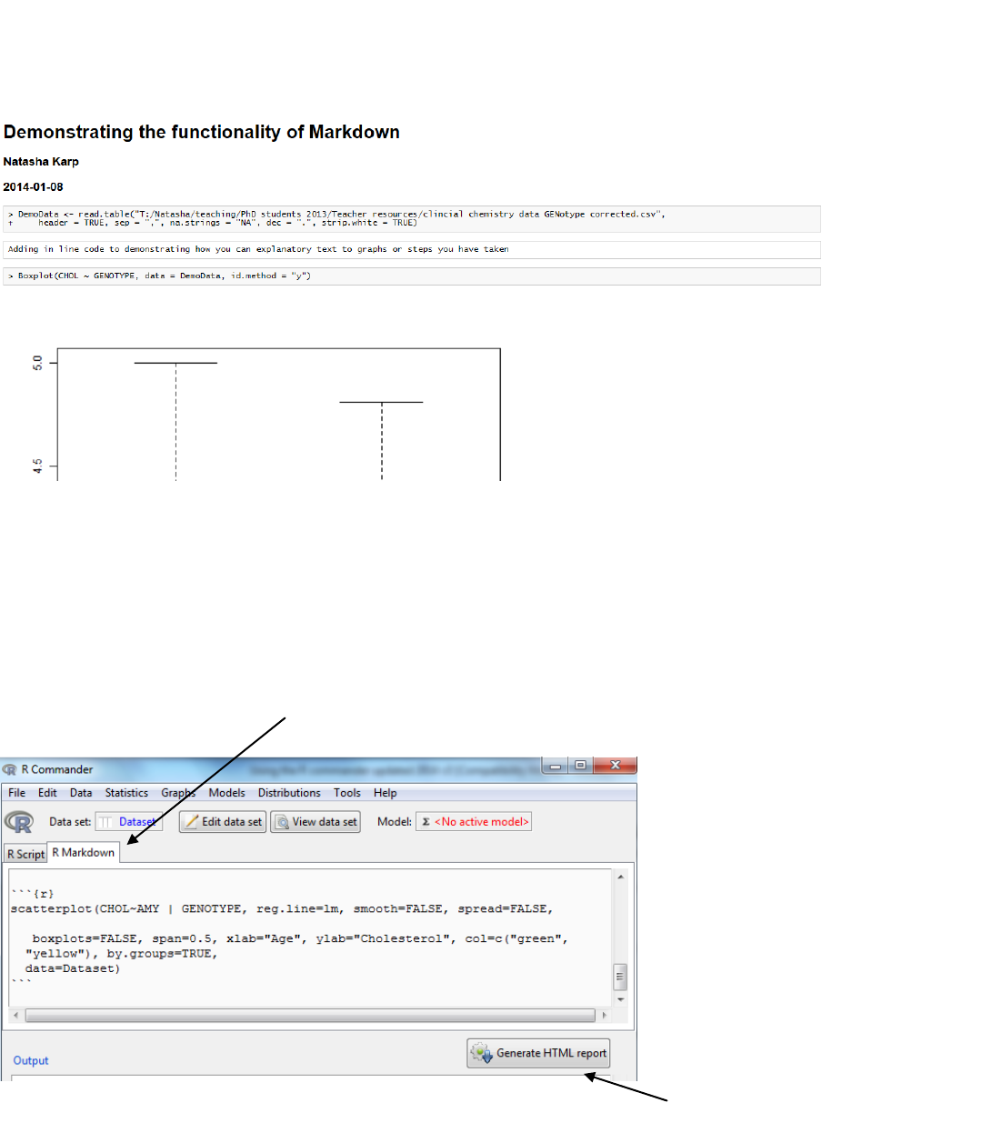
To address the need for reproducibility where analysis is transparent and reported, there is a system
which can generate a report showing code and output. This is achieved through the MarkDown System
which is a tab located on the Rscript window.
The following image demonstrates the type of output you can obtain
To achieve this select the R Markdown tab and you can see that automatically R scripts are
copied into a template of output.
Activate button
R Markdown tab
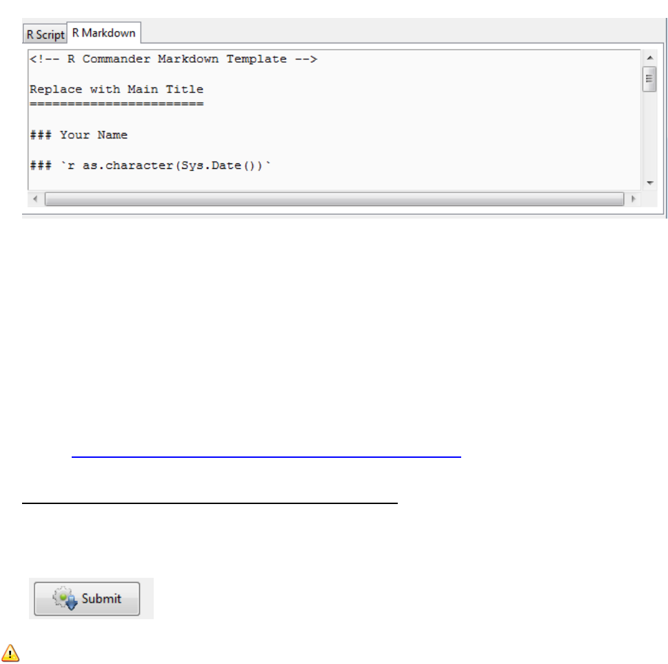
There are some prompts e.g. “Replace with Main Title”
You can add explanatory text can be added by typing in the window and surrounding it by back
ticks. In the example above I added
```
Adding in line code to demonstrating how you can explanatory text to graphs or steps you have
taken
```
The HTML report (easily editable into a word processor, like Microsoft Word or OpenOffice) is
generated with a click.
Further information can be obtained at:
http://www.rstudio.com/ide/docs/authoring/using_markdown
6.3 Entering commands directly into the script window
Commands generated by the R Commander appear in the script window, and you can type and
edit commands in this window. To send this script you have to highlight the relevant text and
press the “Submit” button.
Notes:
1. All lines of a multi-line command must be submitted simultaneously for execution.
Commands that extend over more than one line should have the second and
subsequent lines indented by one or more spaces or tabs.

7. Amending the graphical output
One of the main reasons data analysts turn to R is for its strong graphic capabilities.
However, with R commander, the options on graphs are limited and they don’t look too
pretty and aren’t ideal for reports or presentations. Here I go through some examples of
what you can do and then it should give you grounding for proceeding further if you
require. The overall strategy is to call the code for the basic graph and then amend the code
manually by altering the graphics parameters or by calling a second function to do a
particular job (e.g. adding a label).
For future advice and support on R and graphs I recommend:
1. R Graphics by Paul Murrell
2. Data Analysis and Graphics Using R: An Example-based Approach by John
Maindonald and John Braun.
Amending code - things to notes
1. If you add another parameter (instruction) to a function it needs to form
part of the list so it is placed within the bracket of information passed to that
function and a comma is placed between each instruction.
2. If you are using words to describe the colour you want or to add a label then
it needs to be surrounded by quote marks (i.e. “”) marks so the software
knows that it is looking at string (i.e. text) information.
3. Script is particularly to form so capitals etc. matter.
7.1 Adding a line
a. Use the drop down menus to request a scatter graph. The code used can be seen in the
Rscript window.
The function name comes first and then in brackets are the arguments that are passed to
the function to direct how it works.
b. To add a line, a second function (abline) is needed. The parameters within the brackets
are used to pass the information to the function. These are used to control the line
placement within the graph. If you do not specify the parameter then the parameter will
be set to the default settings (in this case NULL).
Function name
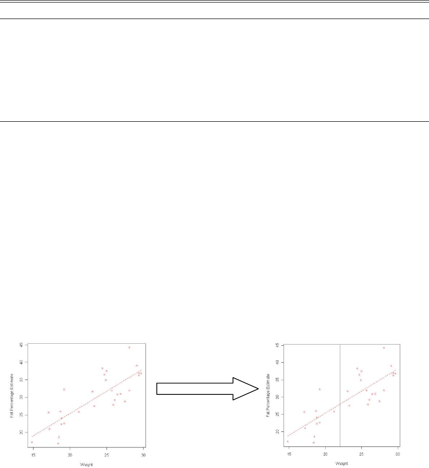
Abline structure: abline(a = NULL, b = NULL, h = NULL, v = NULL, , ...)
parameter
Description
Default
a
intercept
NULL
b
Slope
NULL
h
the y-value(s) for horizontal line(s).
NULL
v
the x-value(s) for vertical line(s).
NULL
...
graphical parameters such as col, lty and lwd and
the line characteristics lend, ljoin and lmitre.
c. Adding a vertical line at point x
i. Type code abline(v=x) into the script window
ii. Highlight the code and submit.
Example:
scatterplot(Fat.Percentage.Estimate~Weight, reg.line=lm, smooth=FALSE,
labels=FALSE, boxplots=FALSE, span=0.5, data=DEXA)
abline(v=22.5)
d. Adding a horizontal line at point x
i. Type code abline(h=x) into the script window
ii. Highlight the code and submit.
e. Adding a line of a known equation
Type code abline(a=x, b=y) into the script window
Highlight the code and submit.
f. Adding an equivalence line
i. Type code abline(b=1) into the script window
ii. Highlight the code and submit.
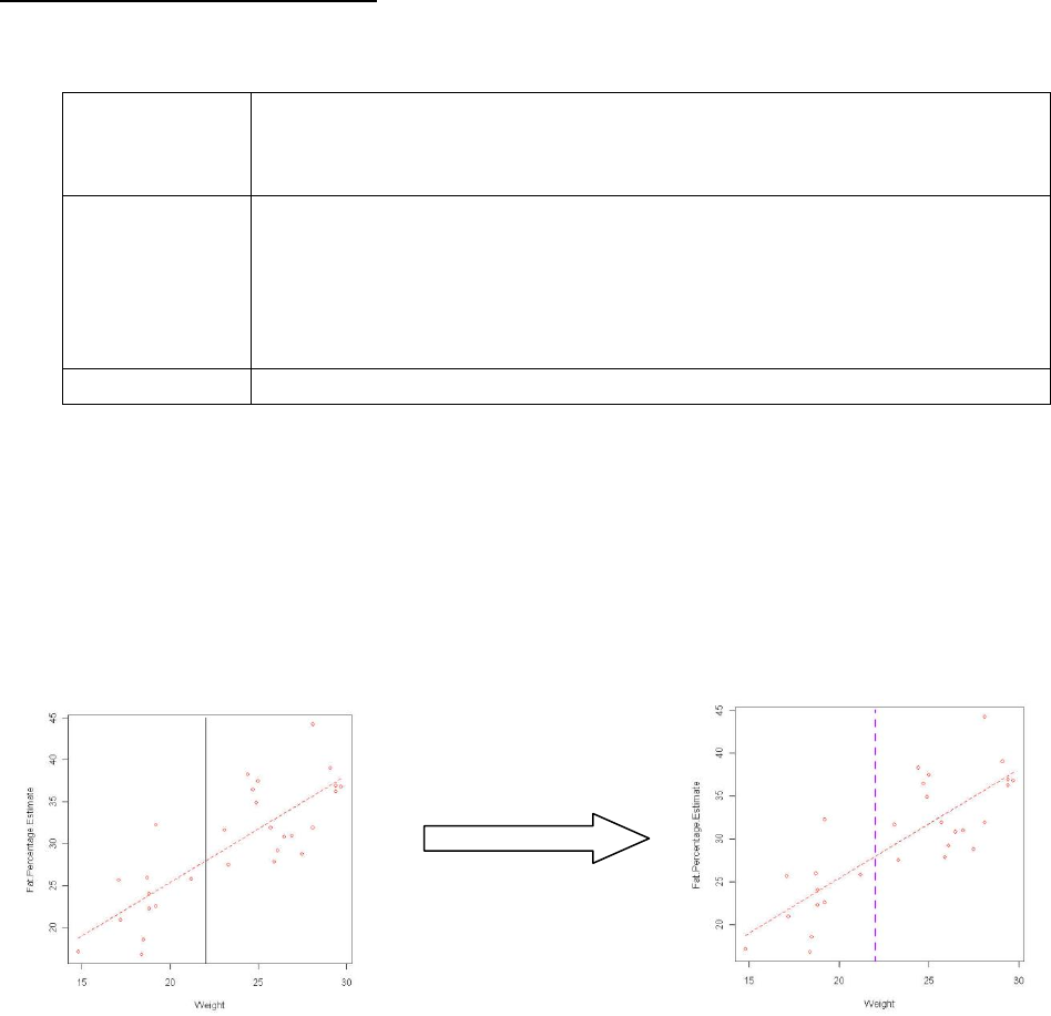
7.2 Amending the line parameters
A number of parameters can be added to the abline function to amend the output
col
The easiest way to specify a colour is to use the name eg “red”. R
understands 657 different colour names. Type colours() to see a full list of
known names.
lty
The line type. Line types can either be specified as an integer (0=blank,
1=solid (default), 2=dashed, 3=dotted, 4=dotdash, 5=longdash, 6=twodash) or
as one of the character strings "blank", "solid", "dashed", "dotted",
"dotdash", "longdash", or "twodash", where "blank" uses ‘invisible
lines’ (i.e., does not draw them).
lwd
The line width, a positive number, defaulting to 1.
Example:
scatterplot(Fat.Percentage.Estimate~Weight, reg.line=lm, smooth=FALSE,
labels=FALSE, boxplots=FALSE, span=0.5, data=DEXA)
abline(v=22.5, col="purple", lty="dashed", lwd=3)
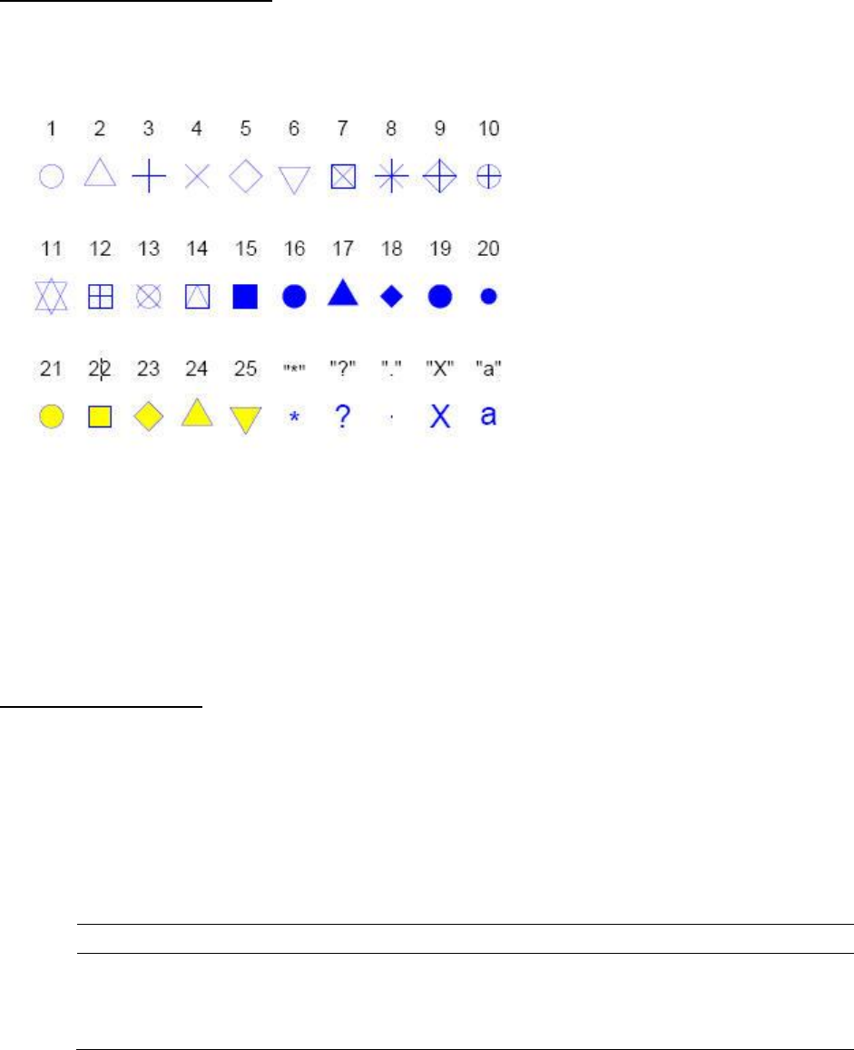
7.3 Amending the plot symbol
R provides a fixed set of 26 data symbols for plotting and the symbol is controlled by the pch
setting. Pch 21 to 25 allow a fill colour separate from the border colour, with the bg setting
controlling the fill colour in these cases.
Example:
scatterplot(Fat.Percentage.Estimate~Weight, reg.line=lm, span=0.5, data=DEXA)
scatterplot(Fat.Percentage.Estimate~Weight, reg.line=lm, pch= 2, col= “red”, span=0.5,
data=DEXA)
7.4 Adding a text label
Here a second function (text) is used to add the text. The parameters within the brackets are
used to pass the information to the function to drive what text and where the text is placed. If
you do not specify the parameter then the parameter will be set to the default settings.
Text function: text (x, y, label, col)
Parameter
Description
Default
X, y
Coordinates where the text “labels” should be written
label
This specifies the text to be written
col
Colour of the text.
Black
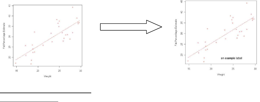
Example 1
scatterplot(Fat.Percentage.Estimate~Weight, reg.line=lm, smooth=FALSE,
labels=FALSE, boxplots=FALSE, span=0.5, data=DEXA)
text(x=25, y=20, label ="an example label")
7.5 Amending the plot colours
7.5.1 For a box plot
a. Use the drop down menus to request a boxplot graph.
b. Amend the script by adding a col parameter.
i. To add a single colour to all boxplots add col=“COLOUR OF YOUR CHOICE”
to the code.
ii. To alter each boxplot individually you need to add a list of colours with
length matching the number of boxplots to the code.
Eg. col=c(“red”, “black”, “green”)
iii. Highlight the amended code and submit.
iv. Example: boxplot(Fat.Percentage.Estimate~Genotype,
lab="Fat.Percentage.Estimate", xlab="Genotype", col=c("grey", "yellow"),
data=DEXA)
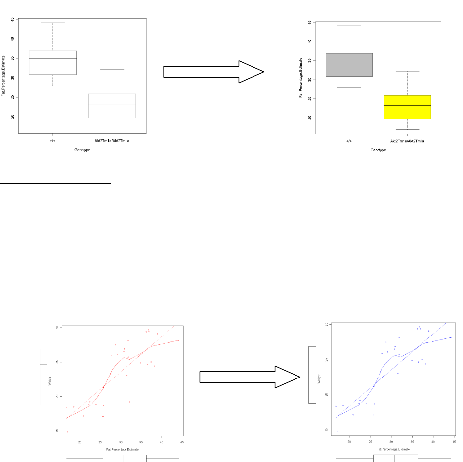
7.5.2 For a scatter plot
a. Using the drop down menus to request a scatter graph.
b. You can change the colour of the scatter graphs by using the col parameter.
a. For a graph with one group you enter col=“blue” into the list.
Example: scatterplot(Weight~Fat.Percentage.Estimate, reg.line=lm, smooth=TRUE,
labels=FALSE, boxplots='xy', span=0.5, col="blue", data=DEXA)
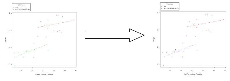
b. For a graph with multiple groups:
You add the colours as a list (E.g. col=c(“red”, “purple”)).
Example: scatterplot(Weight~Fat.Percentage.Estimate | Genotype, reg.line=lm,
smooth=FALSE, labels=FALSE, boxplots=FALSE, span=0.5, by.groups=TRUE, data=DEXA,
col=c("red", "purple"))