La Te X Manual 8 6
User Manual:
Open the PDF directly: View PDF ![]() .
.
Page Count: 106 [warning: Documents this large are best viewed by clicking the View PDF Link!]
- The Grand History of TeX
- LaTeX Singing on Your Computer
- Getting Started
- Playing with Text
- Working with Paragraphs
- Elements of Your Document
- LaTeX with Designers
- When TeX Dates Math
- Extremely simple formulas
- Subperscripts
- Roots
- n()FractionsBinomials
- Sum and integration
- Functions
- Delimiters---never big enough
- Changing typefaces
- Spacing
- Punctuation
- More about Displayed Equations
- Breaking an Inline Equation
- Breaking a Displayed Equation
- Array
- Dress your letters!
- Constructing New Symbols
- Extensible arrows
- Framed Math
- Aligning Your Equations
- Footnotes in Math Mode
- Equation Numbers
- A List of Options of the amsmath Package
- Commutative Diagrams---The amscd Package
- Coloring Your Math---The color Package
- Packages Smarter Than Me
- The mathlig Package
- Miscellaneous
- Two Powerful Packages Mentioned Merely in Passing
- Tables and Graphics
Helin Gai
Duke University
The Art of L
A
T
E
X
Helin Gai
Duke University
Coleen’s Workgroup
Helin Gai
Duke University
ii
,

Helin Gai
Duke University
Contents
1 The Grand History of T
E
X1
1.1 How did L
A
T
E
X come into existence? .................... 1
1.2 I saw many people arguing over the pros and cons of L
A
T
E
X versus
Microsoft Word. What is your attitude? .................. 2
1.3 How hard is L
A
T
E
X? ............................. 3
1.4 How to study L
A
T
E
X? ............................. 3
2 L
A
T
E
X Singing on Your Computer 5
2.1 What’s the easiest way to install L
A
T
E
X on Microsoft Windows? . . . . . 5
2.2 What if I own a glorious Mac? ....................... 5
2.3 How about us Linux users? ......................... 6
3 Getting Started 7
3.1 The Basics: Control Sequence and Environment .............. 7
3.2 Your first masterpiece with L
A
T
E
X...................... 8
3.3 Typesetting Chinese in L
A
T
E
X........................ 11
3.4 A Short Summary .............................. 13
3.5 Dividing your text into parts, chapters, and sections ........... 13
3.6 Options of standard document classes ................... 14
4 Playing with Text 17
4.1 International characters ........................... 17
4.2 Punctuation—what makes life/reading easier ............... 18
4.2.1 Dash—your first lesson with punctuation ............. 18
4.2.2 Quotation marks ........................... 18
4.2.3 Comma and Period .......................... 19
4.2.4 Ellipsis ................................ 19
4.3 Changing typefaces .............................. 20
4.4 Controlling the size of your text ....................... 21
4.5 Is what you type what you get? ....................... 22
4.5.1 Special characters that make T
E
X scream ............. 22
4.5.2 Ligatures ............................... 22
4.6 Manual kerning ................................ 23
5 Working with Paragraphs 25
5.1 Manual line and page breaks ........................ 25
5.2 Moving your text horizontally ........................ 26
5.3 Shaping a paragraph ............................. 26
à

Helin Gai
Duke University
iv CONTENTS
5.4 Reflowing the text .............................. 29
5.5 Hyphenation and Justification technology ................. 31
6 Elements of Your Document 35
6.1 Cross References ............................... 35
6.2 Listing items ................................. 35
6.3 Columns—story in the world of wide documents ............. 37
6.4 Notes, notes, and notes ........................... 38
6.4.1 When footnotes rule . . . ....................... 38
6.4.2 Notes at the end of a chapter .................... 39
6.4.3 Notes dancing in the margin .................... 39
6.5 Programming codes ............................. 39
6.6 Making boxes ................................. 40
6.7 Index ..................................... 41
6.8 Bibliography ................................. 41
7 L
A
T
E
X with Designers 43
7.1 Balancing the elements that live on a page ................. 43
7.2 Dressing the headings ............................ 44
7.3 The flight of the navigator—headers .................... 46
7.4 A not so short short introduction to markers ............... 47
7.5 The design of this book ........................... 48
7.5.1 Shaping the page ........................... 48
7.5.2 Designing headings .......................... 49
7.5.3 Designing running headers ...................... 49
8 When T
E
X Dates Math 51
8.1 Extremely simple formulas .......................... 51
8.2 Super
bscripts .................................. 52
8.2.1 The tensor Package .......................... 53
8.2.2 The vector Package .......................... 53
8.3 √Roots .................................... 54
8.4 Fractions
Binomials................................... 54
8.5 Sum and integration ............................. 57
8.6 Functions ................................... 58
8.7 Delimiters—never big enough ........................ 59
8.7.1 Larggggge Delimiters—The yhmath Package ............ 62
8.8 Changing typefaces .............................. 62
8.9 Spacing .................................... 65
8.10 Punctuation .................................. 68
8.11 More about Displayed Equations ...................... 70
8.12 Breaking an Inline Equation ......................... 72
8.13 Breaking a Displayed Equation ....................... 73
8.14 Array ..................................... 75
8.14.1 The delarray Package ......................... 77
8.14.2 Partitioned matrices ......................... 77
8.14.3 Case structures with the cases package ............... 78
8.15 Dress your letters! .............................. 79
8.15.1 More Accents: The accents Package ................. 80
8.15.2 “ı” in Different Fonts—The dotlessi package ............ 80
8.15.3 The undertilde Package ........................ 81
,
Helin Gai
Duke University
CONTENTS v
8.16 Constructing New Symbols ......................... 81
8.17 Extensible arrows ............................... 81
8.17.1 Extensible arrows with the extarrows package ........... 81
8.17.2 The harpoon Package ......................... 81
8.18 Framed Math ................................. 82
8.19 Aligning Your Equations ........................... 84
8.20 Footnotes in Math Mode ........................... 84
8.21 Equation Numbers .............................. 85
8.21.1 Prime Equation Numbers ...................... 86
8.21.2 Equation Numbers on Both Sides .................. 86
8.21.3 Equation numbers with the subeqnarray package ......... 86
8.22 A List of Options of the amsmath Package ................. 87
8.23 Commutative Diagrams—The amscd Package ............... 88
8.24 Coloring Your Math—The color Package .................. 88
8.25 Packages Smarter Than Me ......................... 88
8.25.1 The polynom package ........................ 88
8.25.2 The longdiv package ......................... 89
8.26 The mathlig Package ............................. 90
8.27 Miscellaneous ................................. 90
8.27.1 Canceling out—The cancel Package ................. 90
8.27.2 The units and nicefrac Packages ................... 90
8.27.3 Math in Titles—The maybemath Package ............. 90
8.27.4 The nccmath Package ........................ 91
8.28 Two Powerful Packages Mentioned Merely in Passing ........... 92
9 Tables and Graphics 95
9.1 External graphics are a lot of fun ...................... 95
9.2 Structuring a table .............................. 95
9.3 Tables that travel a long way ........................ 97
9.4 Floating tables and figures around ..................... 98
9.5 Customizing your captions .......................... 99
à
Helin Gai
Duke University
vi CONTENTS
,
Helin Gai
Duke University
1
The Grand History of T
E
X
This chapter gives you a general overview of the history of T
E
X/L
A
T
E
X and helps you evaluate
whether or not you actually need it. My personal attitude toward the comparison between
T
E
X and Microsoft Word is also discussed in detail. It’s a bit long and tedious, as I want
to include the information I really like. Feel free to skip this chapter—no harm will come,
except it might take longer for you to start appreciating the beauty of T
E
X.
1.1 How did L
A
T
E
X come into existence?
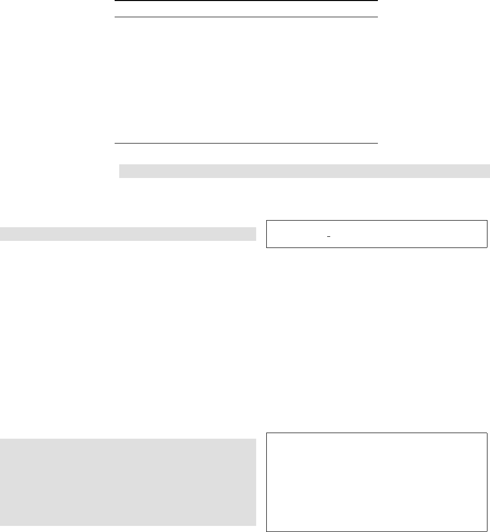
Figure 1.1: Knuth (pro-
nounced /knu:θ/) is the
father of T
E
X. [My special
thanks to Zhichu Chen for
helping me troubleshoot
the code for creating this
marginal figure.]
The journey begins with Donald Ervin Knuth and his T
E
X. Knuth (born January 10,
1938) is a renowned computer scientist and Professor Emeritus of the Art of Computer
Programming at Stanford University. He was the 1974 Turing Award winner and more
or less defined the field “Computer Science” as it is today.
In 1977, Knuth devoted most of his time writing The Art of Computer Programming.
After he got the proofs of the second volume on March 30, he felt greatly discouraged
and wrote in his diary:
Galley proofs for vol. 2 finally arrive, they look awful (typographically) . . . I decide
I have to solve the problem myself.
And so he did. On May 5, he started his major design on T
E
X—a typesetting system
that he could use to create beautiful books. T
E
X is pronounced /tεx/.
Knuth planned to finish the project in 1978, but it eventually took him more than
a decade—it was not until 1989 that the language of T
E
X was frozen. Knuth invented
what he called “literate programming,” a way of producing compilable source code and
high quality cross-linked documentation (typeset in T
E
X) from the same original file.
The language used is called WEB and produces programs in Pascal. The current and the next
paragraphs use material
from Wikipedia.
Since version 3, T
E
X has used an idiosyncratic version numbering system, where
updates have been indicated by adding an extra digit at the end of the decimal, so
that the version number asymptotically approaches π. The current version of T
E
X is
3.141592; it was last updated in December 2002. Knuth has stated that the “absolutely
final change (to be made after [his] death)” will be to change the version number to π,
at which point all remaining bugs will become features. L
A
T
E
X is pronounced
/leitεx/ or /la:tεx/.
Although T
E
X is powerful, many people find it too powerful to master, especially
when it comes to layout design. Based on the idea that authors should be able to
concentrate on writing within the logical structure of their document, rather than
spending their time on the details of formatting, Leslie Lamport implemented L
A
T
E
X.
With L
A
T
E
X, you are not supposed to be concerned about the style—everything
should be pre-defined and fully at your call. You enter your text and L
A
T
E
X takes care
of the formatting. In this sense, L
A
T
E
X is much easier to use than T
E
X. As a matter of
fact, you can literally learn to compose a paper including a table of contents and an
index within an hour or so.
à
Helin Gai
Duke University
2The Grand History of T
E
X
The first popular release, L
A
T
E
X 2.09, appeared in early 1980s and Lamport claims
that it “represents a balance between functionality and ease of use.” After a few years’
development, many new functionalities were added, along with which the problem of
incompatibility arose. In hopes of bringing this situation to an end, the L
A
T
E
X3 Project
was started by a group led by Frank Mittelbach. This is a long term project, and the
first big step forward is the 1994 release, L
A
T
E
X 2ε, which is the focus of this book.
In Duke University, L
A
T
E
X
is required of all students
in Pratt School of
Engineering.
Today, L
A
T
E
X is used by most scientists, and many presses and academic societies
require or prefer submission using L
A
T
E
X.
1.2 I saw many people arguing over the pros and cons of L
A
T
E
X
versus Microsoft Word. What is your attitude?
For me, L
A
T
E
X and Word are two vastly different things, both of which do their own
jobs within their own domains.
T
E
X, as Knuth proposed, is “a new typesetting system intended for the creation of
beautiful books—and especially for books that contain a lot of mathematics.” It is used
by authors to write their manuscript, and many publishers use it in composition. When
the major consideration is typographic quality, T
E
X should be chosen over Word. There
are quite a few advantages:
ligature: Compare “fi”
with “fi,” the latter
evidently looks
unprofessional.
•T
E
X uses a very sophisticated scheme for setting type. It understands concepts
that Word has so far ignored, e.g., ligature, kerning, and so forth.
kerning: Try “wolf” with
the quotation marks in
Word with Times New
Roman—how pathetic can
it be? To be fair, this is
the font’s fault, but to
tune it in Word is tedious.
•T
E
X formats the entire paragraph at a time, while Word formats the text on a
line-by-line basis. It is not rare for Word to produce a very tight line followed by a
loose one. But this hardly ever happens in T
E
X, because T
E
X always looks back
and forth to determine the best breakpoints possible.
In my opinion, only Adobe
Indesign has a
hyphenation algorithm
that is comparable.
•T
E
X has one of the most advanced hyphenation schemes. It could hyphenate
about 90% of permissible hyphen points in a dictionary. What’s more, professional
typesetting requires that no more than three hyphens should appear consecutively
at the end of lines, which is a breeze to accomplish in T
E
X. But you have to pray
that your soul is pure when using Word.
•T
E
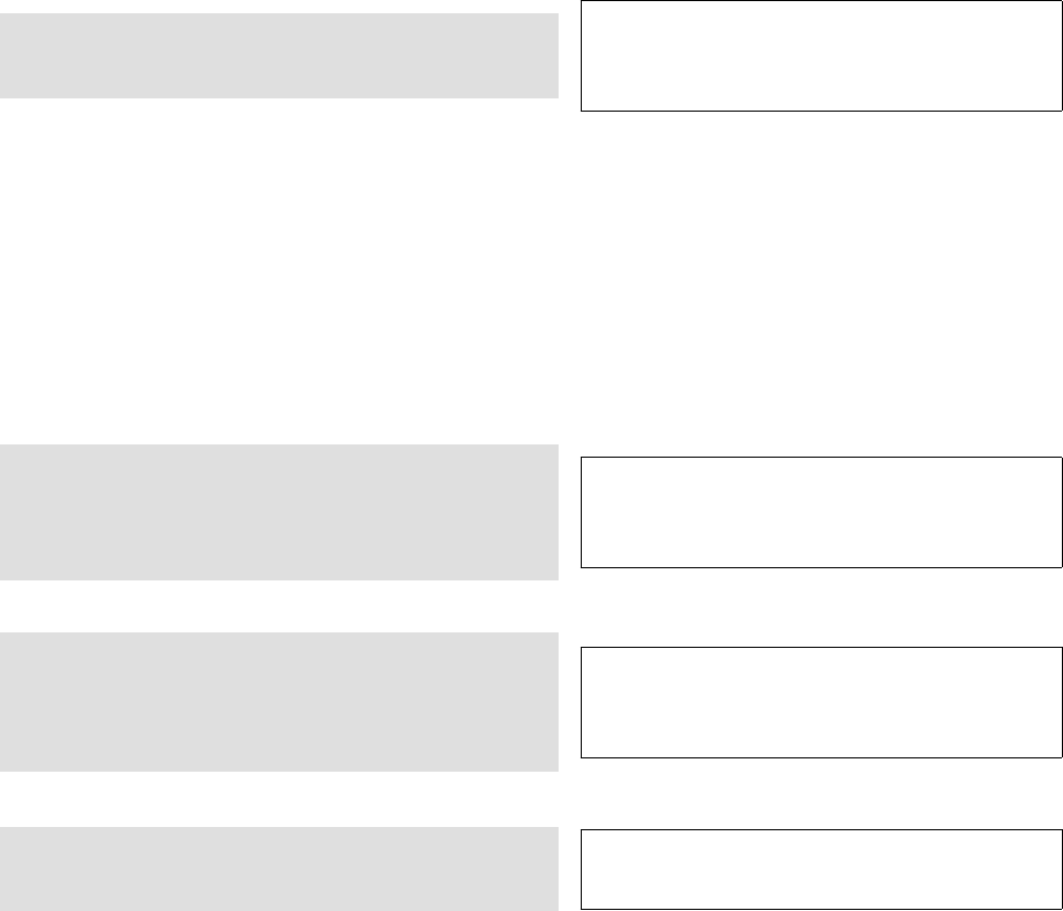
X produces the most beautiful math equations in the world. A classic demo is
shown in figure 1.2.
!
pprime
f(p) = "t>1
f(t)dπ(t)
f p f t d t
pt
( )
=
( ) ( )
!">
prime
#
1
Figure 1.2: The equation on the left is produced with T
E
X, while the one on the right comes out
of Microsoft Office 2003.
In short, Word is not suitable for professional typesetting—it is merely a word
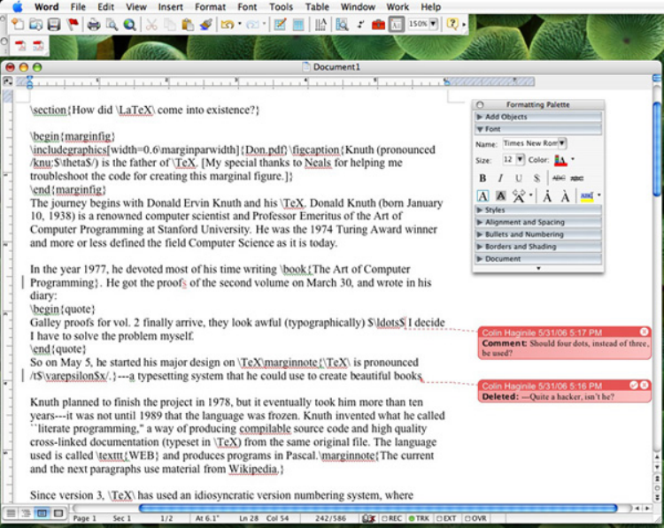
processor. I use it extensively for file exchange. Sometimes, I would even paste an entire
T
E
X source file into a Word document, so that my friend can mark on it with the
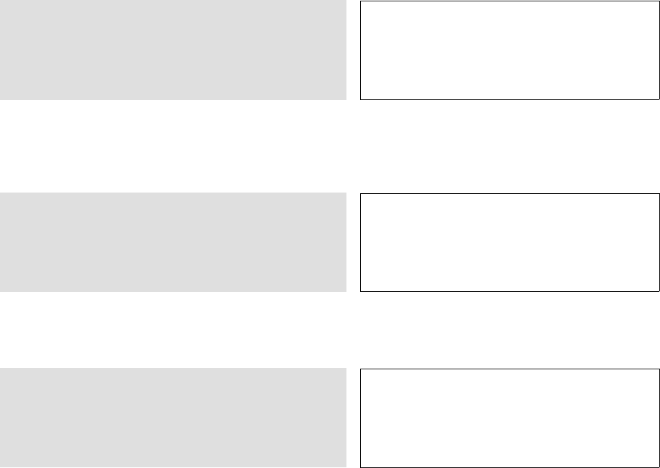
“Tracking” feature (figure 1.3). When I get the document back, it’s very easy for me to
see what changes are made and I can make my decision about whether or not to accept
these changes.
,
Helin Gai
Duke University
1.3 How hard is L
A
T
E
X? 3
Figure 1.3: The Tracking feature in Microsoft Word is handy when a document is reviewed by
other people.
1.3 How hard is L
A
T
E
X?
L
A
T
E
X is perceived to be much easier than Word in many countries. Most authors don’t
know much detail about T
E
X, and yet submit papers written in L
A
T
E
X with ease. The
reason is that most publishers in, say the U.S., have prepared easy-to-use class files
and templates for authors. Therefore, authors are not concerned about the style of
their documents—all they are responsible for is to put text into the pre-estabished
“framework.” In fact, the editors will get very upset if you try to change the style. CT
E
X has grown into a
full-fledged T
E
X society.
Its official website is
www.ctex.org.
The situation is quite different in China. Most authors in our country have far
exceeded the responsibility of an author—they have to create style files so as to typeset
their paper according to the specifications, and this is a task involving much expertise.
The CT
E
X Society has done a great job creating templates and class files in hopes of
easing authors’ work, but there’s much more that needs to be done. This manual is
another effort in facilitating you in your endeavor.
1.4 How to study L
A
T
E
X?
Many people agree that the best way to study L
A
T
E
X is simply to use it. So the best
way to make full use of this book is to try out the examples and do the exercises. This
helps you understand and memorize the commands better. An article telling my
personal story of getting
started with L
A
T
E
X can be
accessed at http://bbs
.ctex.org/forums/
index.php?showtopic=
12955.
To get started, read chapters 2 and 3, and work on the examples. You’ll understand
most of the basic concepts in L
A
T
E
X. When you’ve completed these two chapters, you
à
Helin Gai
Duke University
4The Grand History of T
E
X
do not need to read the remaining of the book chapter by chapter. Rather, start using
L
A
T
E
X—refer to the related chapter when you’re doing specific things in L
A
T
E
X. You
shouldn’t expect to master L
A
T
E
X in a day or two—your patience will pay off (as Master
Yoda might say).
Actually, you probably
never ever have to master
L
A
T
E
X.
If you have a question and can’t find an answer in this book, you can post it in the
forum of the Chinese T
E
X Society (bbs.ctex.org), and you could expect to receive an
answer within 24 hours. But do a search first! The forum has been running for over four
years and the questions that people asked previously have created a huge knowledgebase.
Most of the time, your question has already been answered and it’s always a nice thing
to save others their precious time.
,

Helin Gai
Duke University
2
L
A
T
E
X Singing on Your Computer
2.1 What’s the easiest way to install L
A
T
E
X on Microsoft Win-
dows?
The easiest way to set up L
A
T
E
X on Windows is to use the CT
E
X Suite. The CT
E
X Suite
is based on MiKT
E
X, with various useful applications bundled. It provides complete
support for CCT and CJK, two leading Chinese processing system. The advantage of
the CT
E
X Suite is that it is foolproof—keep clicking “Next,” and everything will be
properly set up, including the difficult Chinese configuration. The current CT
E
X Suite
includes MiKT
E
X, WinEdt, GSview, Ghostscript, etc. The CT
E
X Suite is
developed by Lingyun Wu.
1. Go to http://www.ctex.org/CTeXDownload and download the latest CT
E
X Suite.
There are currently four choices available: the Full version, the Basic version, the
Full Update version, and the Basic update version.
I recommend the Basic version over Full. MiKT
E
X 2.4 and later supports “installa-
tion on-the-fly,” so when you use a package that isn’t installed yet, MiKT
E
X will
automatically download and install it.
The download might take a while. Be patient and God bless your Internet connection.
When it’s downloaded, double-click and follow the instruction on the screen.
2. On the same page, download CT
E
X-Fonts, and install it.
3. Register WinEdt if you’re annoyed by the pop-up windows appearing like a bomb.
4. Congratulations. You’re all set!
If you want more flexibility, you could also try the standalone MiKT
E
X. T
E
XLive
developed by the TUG is also a nice choice.
2.2 What if I own a glorious Mac?
The easiest way to install T
E
X on a Mac is to use MacT
E
X.
1. Go to http://www.tug.org/ftp/tex/mactex/ and download the latest MacT
E
X.
As of March 2006, MacT
E
X has been released as a universal binary and runs
natively on both PowerPC- and Intel-based Macs.
MacT
E
X will install T
E
X, XeT
E
X, Ghostscript, ConT
E
Xt, MusixT
E
X, ImageMagick,
TeXShop, BibDesk, Excalibur, i-Installer, etc.
2. The tricky part is to set up Chinese—it is a hard task because “GBKfont,” the
famous application for creating Chinese fonts, has not yet been ported to Mac OS
X. As of this writing, the easiest way to install Chinese fonts on a Mac is to copy
à
Helin Gai
Duke University
6L
A
T
E
X Singing on Your Computer
everything in the localtexmf folder of CT
E
X Suite to /usr/local/teTeX/share/
texmf.local.
Then go to texmf.local/pdftex/config, make a copy of psfonts.map and re-
name it to pdftex.map. In Terminal, type “sudo mktexlsr,” and this should
work.
(Some people have reported that the map file in certain versions of the CT
E
X
Suite doesn’t work. If you followed the instruction I give here and didn’t solve the
problem, please send an email to me hg9@duke.edu and I’ll send you a map file
that proves to work.)
Other installation options include i-installer, Fink, T
E
XLive, etc., which give you more
flexibility.
2.3 How about us Linux users?
The best T
E
X distribution on Linux is teT
E
X. The following installation procedure is
documented and maintained by lapackapi of the CT
E
X Society, and it works pretty well
on Fedora Core.
1. Go to http://www.tug.org/tetex/ and download teT
E
X. Install it according to
the instruction coming along with the distribution. If you are using Fedora Core,
you could easily install it from your system installation disk.
2. Install tetex-afm and fontforge:
yum install tetex-afm fontforge
3. Download CCT and CJK:
wget ftp://ftp.cc.ac.cn/pub/cct/Linux/cct-0.6180-3a.i386.rpm
wget ftp://ftp.cc.ac.cn/pub/cct/Linux/cct-fonts-1.2-0.i386.rpm
wget ftp://ftp.cc.ac.cn/pub/cct/CJK/CJK-GBKfonts-0.3-15.i386.rpm
wget ftp://ftp.cc.ac.cn/pub/cct/CJK/ctex-0.7-1.i386.rpm
wget ftp://ftp.cc.ac.cn/pub/cct/CJK/CJK-4.6.0-0.src.rpm
wget ftp://ftp.cc.ac.cn/pub/cct/CJK/dvipdfmx-20050307-3zlb.src.rpm
4. Compile the last two packages:
rpmbuild --rebuild *.src.rpm
A few rpm packages will be created in /usr/src/redhat/RPMS/i386/. We can
now safely remove the source packages:
rm *.src.rpm
5. Copy the rpm packages to the current working directory:
cp /usr/src/redhat/RPMS/i386/* .
6. Install the packages:
rpm -ivh *.rpm
7. Install Chinese fonts. Get the font files ready. Suppose you have a font file called
songti.ttf, then simply enter
gbkfont-inst songti.ttf song
,
Helin Gai
Duke University
3
Getting Started
3.1 The Basics: Control Sequence and Environment
One advantage/disadvantage of T
E
X is that it is not wysiwyg (what-you-see-is-what-
you-get), but wytiwyg (what-you-think-is-what-you-get). The general procedure is:
1. Create a file with the extension .tex using any text editor, e.g., Notepad on
Windows, or TextEditor on Mac OS X; but WinEdt and TeXShop are widely used
for this purpose.
2. Enter your text along with commands to let L
A
T
E
X know how to deal with your
manuscript.
3. Compile it with L
A
T
E
X to obtain the final result.
We get started by introducing two fundamental concepts: control sequence and
environment. “\” is called the escape
character.
A control sequence is a kind of command that starts with a backslash (\). There
are two kinds of control sequences. A control word consists of a backslash followed by
one or more letters. For example, the control word ‘\tableofcontents’ instructs L
A
T
E
X
to automatically prepare, format, and output the table of contents. There are a few
more notes about control words:
•T
E
X is case sensitive, so \pi,\Pi,\pI, and \PI are four different commands.
•A space must be placed after a control sequence if it’s followed by a letter. For
example, the control word \TeX produces the logo “T
E
X.” If you want to enter the
word “T
E
Xpert,” the answer is not to enter \TeXpert, because T
E
X will think it’s
processing a command that is composed of seven letters. The correct way is to
enter ‘\TeX pert’—the space terminates the command \TeX and will not actually
produce a space.
Interestingly, \TeX3 does produce T
E
X3—that’s because 3is a digit, not a letter.
•Control sequences can be followed by declarations. There are two kinds of declara-
tions: optional and required.
One example is \section[Duke]{Duke University}. This command tells L
A
T
E
X
that we’re going to start a new section and the section heading is “Duke University.”
But in the table of contents, we want the heading to be displayed as “Duke.” In
this example, [Duke] is optional, and can be simply omitted; {Duke University}
is required, you must put something between the braces. In short, we put optional
stuff between brackets and required declarations between braces.
à
Helin Gai
Duke University
8Getting Started
The second kind of control sequence is a control symbol, consisting of a backslash
followed by a single nonletter. In this case, you don’t need a space to tell T
E
X where
it ends. (Why does this make sense?) For example, \, produces a “thin space” (e.g.,
1\,cm produces ‘1 cm’).
Example 3.1 What are the control sequences in ‘\’m \exercise3.1\\!’?
Answer There are three control sequences. \’ is a control symbol; \exercise is a
control word; and \\ is another control symbol.
Example 3.2 \LaTeX can be used to produce the logo “L
A
T
E
X.” What do you think
the result of ‘\LaTeX is great’ be?
Answer The result would be ‘L
A
T
E
Xis great’.
Example 3.3 The command \input1 will input a file named 1.tex. What do you
think \input123 will do?
Answer The command \input123 will input a file named 1.tex and then outputs the
digits ‘23’. If you want to input a file named 123.tex, you should enter \input{123}.
Example 3.4 Suppose you know that the control sequence \includegraphics can
be used to put an external figure into your T
E
X output. How do you think you could
include a figure lee.jpg with a width of 3 cm?
Answer We can imagine that \includegraphics definitely require a file name after it,
so the file name should be a required argument. Meanwhile, since L
A
T
E
X is super-smart,
we have reason to believe that if we do not specify a width, L
A
T
E
X can process that
automatically; therefore, the width should be optional. So we guess that we should be
entering \includegraphics[width=3cm]{lee.jpg}.
Another important concept I’m to introduce is environment. An environment takes
the form of the following:
\begin{environment_name}
The content ...
\end{environment_name}
Example 3.5 How do you center a paragraph of text?
Answer Here’s how:
\begin{center}
This line should be centered.
\end{center}
3.2 Your first masterpiece with L
A
T
E
X
OK, let’s get down to typeset our first glorious document. By the end of this section,
you would have produced what is shown in figure 3.1.
Launch WinEdt or TeXShop. Then enter the following into the file:
The first section in this
example is from The
Complete Manual of
Typography, and the
second is from The
T
E
Xbook.
1\documentclass{article}
2\usepackage{amsmath}
3\begin{document}
4\title{My First \LaTeX\ Exercise}
5\author{Helin Gai}
6\maketitle
,

Helin Gai
Duke University
3.2 Your first masterpiece with L
A
T
E
X9
My First L
A
T
E
X Exercise
Helin Gai
May 5, 2006
Contents
1 Fonts 1
2 L
A
T
E
X 1
1 The Changing Definition of Font
In the days of handset type, a font1comprised one or more drawers full of type
blocks in a single size. With the advent of the Monotype and Linotype machines,
a font then became a set of molds (or matrices) from which type could be cast
as it was needed, on the fly.
All of this type was destined for a specific kind of printing press, the let-
terpress. On a letterpress the printed impression is created by inking a raised
surface (which can be a photographic image as well as type) whose image is
transferred under pressure to the paper. Recessed areas—those below type-
high—receive no ink, do not come into contact with the paper, and so create
the “blank” areas of the page.
2 The Glorious L
A
T
E
X
The first paragraph of a new section is not indented. T
E
X recognizes the end of
a paragraph when it comes to a blank line in your manuscript file.
Subsequent paragraphs are indented.2(See?) The computer breaks a para-
graph’s text into lines in an interesting way–and hyphenates words automatically
when necessary.
“If there hadn’t been room for this material on the present page, it
would have been inserted on the next one.”
1A term that comes from an early French word meaning “molding” or “casting.”
2Oh, try to avoid footnotes!
1
Figure 3.1: The final result of your first masterpiece created with L
A
T
E
X.
à

Helin Gai
Duke University
10 Getting Started
7
8\tableofcontents
9
10 \section[Fonts]{The Changing Definition of Font}
11
12 In the days of handset type, a \emph{font}\footnote{A term that
13 comes from an early French word meaning ‘‘molding’’ or
14 ‘‘casting.’’} comprised one or more drawers full of type blocks
15 in a single size. With the advent of the Monotype and Linotype
16 machines, a font then became a set of molds (or \emph{matrices})
17 from which type could be cast as it was needed, on the fly.
18
19 All of this type was destined for a specific kind of printing
20 press, the \emph{letterpress}. On a letterpress the printed
21 impression is created by inking a raised surface (which can be
22 a photographic image as well as type) whose image is transferred
23 under pressure to the paper. Recessed areas---those below
24 \emph{type-high}---receive no ink, do not come into contact with
25 the paper, and so create the ‘‘blank’’ areas of the page.
26
27 \end{document}
Save the file and name it example-1.tex. Press the button in WinEdt, or the
button in TeXShop. A file example-1.pdf will be created and you can see the
result in that file.
Now let’s make sense of what you’ve just entered.
A class file is an actual
physical file with the
extension .cls.
Line 1: The control sequence \documentclass will appear in every single one of of
your L
A
T
E
X file. It loads the correct “class file,” a file that has defined all the formatting
commands that you can use. In our case, we used the article class file, because all
that we are writing is a short article. The idea of “class file” is very smart and powerful.
Suppose that you decide to submit your paper to AMS(American Mathematical
Society), all you have to do is to change article to amsart, and your paper will be
reformatted according to the specifications required by AMS. (Why don’t you go ahead
and give it a try?) Other widely used class files include book and report.
A style file is also a
physical file with the
extension .sty.
Line 2: Every once in a while, you’ll want some features that are not built into
L
A
T
E
X itself. But most of the features that you want have been implemented by people
all over the world. They create what we call packages (style files) so that we can use
those features. In our example, we loaded the amsmath package, which is provided by
AMSand has many enhanced features for math typesetting.
The part before \begin{document} is called the preamble.
Line 3: \begin{document} tells L
A
T
E
X that you’re officially ready to start your
document.
Lines 4–6 create the title part. You enter the title of your article with the \title
command, the \author command for author; everything is straightforward. Then
\maketitle outputs this part.
You’ve probably noticed that L
A
T
E
X automatically added the date. This is controlled,
as you might have guessed, by the \date command. Try enter \date{March 35, 2020}
and see what happens. Enter \date{} if you don’t want the date to be displayed.
You might also have realized that I put \ after the command \LaTeX. As I’ve
mentioned before, the space after \LaTeX will be considered as the end of the command.
So we use a control space instead to output the space.
,

Helin Gai
Duke University
3.3 Typesetting Chinese in L
A
T
E
X11
Line 8: \tableofcontents prepares the table of contents, as I’ve mentioned before.
Line 10: \section starts a new section, numbers it, and formats it. The section
title is “The Changing Definition of Font,” but we want it to be shown as “Font” in the
table of contents. (Remember what optional and required declarations are respectively?)
Line 12: We start our text on this line. Note that pressing the “enter” (or “return”)
key once to go to the next line is the same as pressing the space bar; i.e., one return =
one space. So you can end a line anywhere you want.
The \emph command tells L
A
T
E
X to emphasize the part of the text (in italic by
default). \footnote creates a footnote and numbers it automatically.
Line 13: Note that “ is produced with ‘‘ (pressing the key on the left of ‘1’ twice),
and ” is produced with ’’.
Line 17: Remember what a ligature is? I used “fi” as an example in chapter 1. On
line 17, we meet the “fl” ligature. You don’t have to worry about it—T
E
X takes care of
it automatically.
Line 19: Two returns starts a new paragraph!
Line 23: --- is converted into —, what we call an em dash. (What do you think
the result of -- is?)
Now try to enter the remaining of the document yourself.
3.3 Typesetting Chinese in L
A
T
E
X
As I’ve mentioned before, there are two major Chinese typesetting system: CCT and
CJK, each of which has its own advantages. CCT is developed by Linbo Zhang, a
Chinese scholar, and has paid much attention to Chinese typographic conventions.
CJK lacks these typographic consideration but is more flexible and provides better
compatibility with L
A
T
E
X.
A comprehensive solution, the ctex package, is developed by Lingyun Wu, President
of the CT
E
X Society. It uses CJK as its default formatting engine (although you could
easily specify that it uses CCT instead), and also provides commands specially designed
for typesetting Chinese (e.g., declaring Chinese fonts, setting up Chinese-style heading,
and so forth).
We’re going to typeset what is shown in figure 3.2 with the ctex package.
1\documentclass{article}
2\usepackage{ctex}
3\usepackage{amsmath}
4\begin{document}
5\title{·¥©öS}
6\author{ä>}
7\maketitle
8
9\tableofcontents
10
11 \section{\£}
12 ¥©m Ѭ"¤±§,\3d?§L¬§
13 ´Ø¬w«Ñ5"\±^\ ù\ /ª5r1\Ñ"=©¥m
14 ´Ø¬¯K§5¿Ñ\ZÚ§ª(J´
15 "'XµThis is a sample~)JÚ~This is a
16 sample~´vk«O"ùk:·-¡¬¯K"¤±§
17 \TeX perts~¥m@´¬",§XJ\½@§
18 ±Ñ\~\TeX\ perts"
à

Helin Gai
Duke University
12 Getting Started
·¥©öS
ä>
2006 c63F
8¹
1\£1
2o´T
E
Xº1
1\£
¥©mѬ"¤±§,\3d?§L¬§´
جw«Ñ5"\±^ù/ª5r1\Ñ"=©¥m´
ج¯K§5¿Ñ\ZÚ§ª(J´"'
XµThis is a sample )JÚ This is a sample ´vk«O"ùk:·
-¡¬¯K"¤±§T
E
Xperts ¥m@´¬"
,§XJ\½@§±Ñ\T
E
X perts"
y3ëYUüg£§Òm©#ã"CTeX ¬gÄ\3c¡Ñü
Çiål"
2o´T
E
Xº
T
E
X´«`D>füXÚ"§Jø@õUr¿©(¹
üó§§õ900 õ^-§¿T
E
Xk÷õU§^r±Øä/½Âg
C·^#·-5*ÐT
E
XXÚõU"Nõ<|^T
E
XJø÷½ÂõUé
T
E
X?1gmu§Ù¥'Ͷk{IêÆƬí~·ÜuêÆ
[¦^AMS-T
E
X±9·Üu©Ù!w!Ö7L
A
T
E
XXÚ"
1
Figure 3.2: Typesetting Chinese in L
A
T
E
X
,

Helin Gai
Duke University
3.4 A Short Summary 13
19
20 y3ëYUüg£§Òm©#ã"CTeX~¬gÄ\3c¡Ñü
21 Çiål"
Again, here’s some explanation:
Line 2: To load ctex, simply use the \usepackage control sequence. Note how the
style of section titles are different.
Lines 12–18 explain some weird phenomena you would come across in typesetting
Chinese. For example, spaces between Chinese characters will disappear. You would
also notice that I use a ~(tilde) to connect Chinese and English—you don’t have to,
but for the purpose of perfect composition, I recommend that you start cultivating this
great habit.
Try to typeset section 2 yourself.
3.4 A Short Summary
A lot of information has been presented in this chapter. And below is the most basic but
important “template” you should remember. Make sure you understand every single
command in the template.
\documentclass{article/book/report}
\usepackage{ctex} % if you want to typeset Chinese
\usepackage{package_name}
\begin{document}
\title{Title}
\author{Author_name}
\date{Date}
\maketitle
\tableofcontents
\section[Short_title]{Long_title}
--- produces an em dash. ‘‘ produces the left quote.
’’ produces the right quote.
\end{document}
3.5 Dividing your text into parts, chapters, and sections
Headers help your reader find his or her way through your work. As you’ve already
seen, the article class provides \section to fulfill this purpose. But there are more
commands provided by article:
\section{...}
\subsection{...}
\subsubsection{...}
\paragraph{...}
\subparagraph{...}
You should definitely try them out.
à

Helin Gai
Duke University
14 Getting Started
If you want to split your document in parts without influencing the section
numbering you can use:
\part{...}
But if you try the following code (because you’re an eager beaver),
\documentclass{book}
\begin{document}
\section{A new section}
\end{document}
you’ll experience something you wouldn’t expect—the section number is “0.1.” The
reason is that the Level-A heading in the book class is chapter, not section. (Have you
heard of the saying “Divide your article into sections, but your book into chapters”?)
So the following code fixes the problem:
\begin{document}
\chapter{A new chapter}
\section{The first section of the chapter}
\end{document}
The \chapter command is also provided in report.
Note that these commands could be followed by an optional argument, as is
explained before. For example, a chapter title “Duke is one of the best universities in
the United States of America” is a bit too long to be placed in the table of contents,
and you decide that it be replaced with “Duke is one of the best universities in the U.S.”
in the TOC. What you should enter is the following:
\chapter[Duke is one of the best universities in the U.S.]
{Duke is one of the best universities in the United
States of America}
3.6 Options of standard document classes
I’ve already mentioned that a control sequence might be followed with an optional
argument, enclosed in brackets. \documentclass is just another one of the kind.
Table 3.1 lists all available options for the standard article,report, and book
classes.
The table should be studied carefully and the best way to study it is to try
everything out.
This table is abstracted
from The Not So Short
Introduction to L
A
T
E
X 2ε,
with some modification.
,

Helin Gai
Duke University
3.6 Options of standard document classes 15
Table 3.1: Options of standard document classes
Command Meaning
10pt,11pt,12pt Sets the size of the main font in the document.
If none is specified, 10 pt is assumed. Note that
when you change the option from 10pt to 12pt,
the sizes of section headings are adjusted auto-
matically.
a4paper,letterpaper,. . . Defines the paper size. The default size is
letterpaper. Besides that, a5paper,b5paper,
executivepaper, and legalpaper can be speci-
fied.
fleqn By default, all the displayed math formulas are
centered. If you specify fleqn, they will left-align.
leqno Places the numbering of formulas on the left hand
side instead of the right.
titlepage,notitlepage Specifies whether a new page should be started
after the document title or not; i.e., whether the
content before \maketitle should be placed on
a separate page or not. The article class does
not start a new page by default, while report
and book do.
onecolumn,twocolumn Instructs L
A
T
E
X to typeset the document in one
column or two columns.
twoside,oneside Specifies whether double or single sided output
should be generated. The classes article and
report are single sided and the book class is
double sided by default. Note that this option
concerns the style of the document only. The
option twoside does not tell the printer you use
that it should actually make a two-sided printout.
landscape Changes the layout of the document to print in
landscape mode.
openright,openany Starts a new chapter on the right hand page or
on the next page. This does not work with the
article class, as it does not know about chapters.
The report class by default starts chapters on
the next page available and the book class starts
them on right hand pages.
à
Helin Gai
Duke University
16 Getting Started
,
Helin Gai
Duke University
4
Playing with Text
This chapter focuses on how you enter text and set type. Topics covered include: how to
enter the characters not readily available on your keyboard, how to change the typeface of
your text, etc.
4.1 International characters
Every once in a while, you’ll bump into a word like caf`e. If you’re using Mac OS X, this
won’t present any difficulty for you. The keyboard shortcut Option + e creates a tilde, Interestingly, if you press
Option + e + i, the dot of
“i” will disappear: [.
and when you press the key eagain, it will be placed under the tilde:
W W
If you’re using other operation system, you could use T
E
X’s built-in command to
do the similar thing. Table 4.1 lists all the commands for producing accents and other
international symbols.
Table 4.1: Accents and special characters
Sample Command Sample Command Sample Command Sample Command
`o \‘o ´o \’o ˆo \^o ˜o \~o
¯o \=o ˙o \.o ¨o \"o
˘o \u o ˇo \v o ˝o \H o o
.\d o
o
¯\b o oo \t oo ¸o \c o
œ\oe Œ\OE æ\ae Æ\AE
˚a \aa ˚
A\AA
ø\o Ø\O l \l L \L
ı\i \j ¡!‘ ¿?‘
The dotless ı and are useful if you want to put accents over the letters i and j.
Occasionally, they are also used when the baselines are very close (to achieve special
typographic effect)—this is a special occasion when typography overrides logic.
\huge\baselineskip=8pt\lineskip=-2pt
\textbf{Buy\\
\hspace*{10.5pt}R\i ght}
Buy
Rıght
à
Helin Gai
Duke University
18 Playing with Text
4.2 Punctuation—what makes life/reading easier
4.2.1 Dash—your first lesson with punctuation
If you can use dashes correctly, you’ve mastered more than half about T
E
X’s treatment
of punctuation. There are four kinds of dashes built into T
E
X:
•Hyphens (obtained from -) are used a lot for compound words, e.g., daughter-in-law.
It’s also used extensively for separating characters, e.g., 1-800-621-2376.
There’s actually a second
kind of hyphen (a fifth
kind of dash), called a soft
hyphen, which is discussed
in section about
hyphenation.
•En dashes (obtained from --) are widely used instead of “to,” and for prefixing a
compound word; e.g., pages 10–20, London–Paris train, post–World War II.
•Em dashes (obtained from ---) are used for punctuating a sentence—they are
what we often call simply dashes.
•Minus signs (obtained from $-$) are used in math formulas a lot, e.g., −1.
You will learn that all
“inline” math equations
are placed between dollar
signs.
In some Asian countries, number ranges are indicated with a tilde (∼) instead
of an en dash. This is created with the command $\sim$. For example, $-1\sim 2$
produces “−1∼2.” The advantage is that you can use negative signs with it without
causing any confusion—the notation “−1–−2” is weird and unattractive. However, if ∼
is not a tradition in your country, that is, if you’re supposed to use en dash for number
ranges, you should consider using the word “to,” e.g., “−1 to −2.”
In some European countries, an en dash is used in place of an em dash – like what
you just saw. When an en dash is used in this way, you should place a space both before
and after it. However, no spaces are required around an em dash.
Em dashes are sometimes used instead of quotation marks to set off dialogue. In
this case, you should place a space after the dash:
--- Will Colin attend your wedding?\\
--- Of course.
— Will Colin attend your wedding?
— Of course.
4.2.2 Quotation marks
As is mentioned before, we use two ‘(grave accent) for opening quotation marks and ’
(vertical quote) for closing quotation marks. For single quotes, you use just one of each.
‘‘Please press the ‘x’ key.’’ “Please press the ‘x’ key.”
Quotes within quotes can be very tricky. For example, a single quote followed by
a double quote, you can’t simply type ’’’ because L
A
T
E
X will interpret it as a double
quote followed by a single quote, resulting in ”’. But ’ ’’ is unacceptable either—the
space is too big for this purpose. To solve this issue, we introduce thin spaces, which
can be obtained with either \, or \thinspace:
’\,’’ ’ ”
,
Helin Gai
Duke University
4.2 Punctuation—what makes life/reading easier 19
4.2.3 Comma and Period
T
E
X was designed a long time ago, and occasionally it does follow some old typographic
tradition. Take a look at the following result:
Colin, come downstairs. Lee’s here. Colin, come downstairs. Lee’s here.
What you could observe is that the space after the period is slightly bigger than
the one after the comma. T
E
X does this because traditional typography requires a
larger space to indicate the end of a sentence. Following along the same logic, T
E
X
puts more space after an exclamation point (!), and a question mark (?). However, this
tradition is obsolete as this extra space is disturbing. So you should almost always
execute \frenchspacing just before the beginning of every document, instructing T
E
X
to treat commas and periods in the same way, like this:
\frenchspacing
Colin, come downstairs. Lee’s here. Colin, come downstairs. Lee’s here.
T
E
Xnicality
If you decide to follow along the old tradition (like the part you’re currently reading
does), there are a few technical details that you should pay attention to.
•“Mr. Lee” should be entered as Mr.\ Lee (or better yet, Mr.~Lee).
•A period following a capital letter does not produce the extra space. So if a
sentence ends with “U.S.,” you’ll have to tell L
A
T
E
X that the period actually
indicates the end of a sentence by prefixing it with \@, i.e., U.S\@.
•Quotes and parentheses can be “transcended,” i.e., if a period appears just
before a right quote or right parenthesis, the space after the right quote and the
right parenthesis is also bigger than you would imagine. Take care to treat these
special conditions.
4.2.4 Ellipsis
Ellipsis should be used with great care. There are a few different conventions as to how
to use ellipses, but the most widely adopted method is the three-or-four-dot method.
Here’s how The Chicago Manual of Style says about it:
Three dots indicate an omission within a quoted sentence. Four mark the omission
of one or more sentences. When three are used, space occurs both before the first
dot and after the final dot. When four are used, the first dot is a true period—
that is, there is no space between it and the preceding word. What precedes and,
normally, what follows the four dots should be grammatically complete sentences
as quoted, even if part of either sentence has been omitted.
So how to produce an ellipsis? The answer is not to type three periods—the result
of ... is “...” The dots are too close to be pleasant for our eyes. L
A
T
E
X provides a
command for producing ellipsis, \ldots (low dots), which gives “. . .” But this is not
à
Helin Gai
Duke University
20 Playing with Text
the end of the story, unfortunately. If you enter H \ldots H, what you get is “H . . . H,”
i.e., the space is “eaten” by T
E
X. The solution seems to be H \ldots\ H, in which
we use a control space, but the result became “H . . . H.” Look closely! The space on
the right hand side is slightly bigger than the one on the left. The reason is that the
definition of \ldots includes a thin space after the third dots when it is used in text
mode—this is handy if you want to put a comma after it, \ldots, gives the correct
“. . . ,”. The solution, which you probably couldn’t understand, is to use $\ldots$, so
H $\ldots$ H gives the “H . . . H,” which is perfect.
Another question to explore is how to get four dots. The logical way to do so seems
to be . $\ldots$, which gives “. . . . ” But typographic convention dictates even spaces
between the dots, so the solution seems to be use a thin space: .\,$\ldots$ which
gives “. . . .” But the best solution is to use the illogical ‘\ldots.’. (The reason is that
L
A
T
E
X treats the space after a period differently from a normal word space, as is talked
about in “T
E
Xnicality” in section 4.2.3.)
Here’s a concrete example for your reference:
The spirit of our American radicalism is
destructive and aimless\ldots. On the
other side, the conservative party
$\ldots$ is timid, and merely
defensive\ldots. It does not build, nor
write, nor cherish the arts, nor foster
religion, nor establish schools.
The spirit of our American radicalism is de-
structive and aimless. . . . On the other side,
the conservative party . . . is timid, and merely
defensive. . . . It does not build, nor write, nor
cherish the arts, nor foster religion, nor estab-
lish schools.
4.3 Changing typefaces
The default typefaces used by T
E
X includes Computer Modern Roman, Computer
Modern Bold Face,Computer Modern Italics,Computer Modern Slanted, etc. The
commands for changing the typefaces are shown in table 4.2.
The two words “font” and
“typeface” are commonly
misused. “A typeface is a
collection of characters
that are designed to work
together like the parts of a
coordinated outfit. . . . A
font ... is a physical thing,
the description of a
typeface. . . .” You can ask
questions like “What font
was used to set that
typeface?” But you can’t
say, “What font is that?”
Table 4.2: Changing typefaces in L
A
T
E
X
Command Sample Command Sample
\textrm{roman} roman \textit{italic} italic
\textbf{bold face} bold face \textsl{slanted} slanted
\texttt{typewriter} typewriter \textsc{Small Caps} Small Caps
\textsf{sans serif} sans serif
Notice that there are two kinds of oblique typefaces listed in the table. Slanted
typeface could be considered skewed roman, while italic type is designed in a different
style. This will be clear if you see letters that are in an unslanted italic typeface.
You could easily combine these commands to obtain more typefaces (but try not
to abuse this power):
\textbf{\textit{bold italic}}\\
\textit{\texttt{italic typewriter}}
bold italic
italic typewriter
The tricky part is to decide the typeface of the punctuation. One commonly asked
question is “Should the comma after an italic word be italic?” There is no consensus,
,

Helin Gai
Duke University
4.4 Controlling the size of your text 21
but I again conform to The Chicago Manual of Style, which states: “All punctuation
marks should appear in the same font—roman or italic—as the main or surrounding
text, except for punctuation that belongs to a title or an exclamation in a different
font.”
Smith played the title role in
\textit{Hamlet}, \textit{Macbeth}, and
\textit{King Lear}; after his final
performance, he announced his retirement.
She is the author of \textit{Who Next?}
\textbf{Note}: In what follows \dots
Smith played the title role in Hamlet,Mac-
beth, and King Lear; after his final perfor-
mance, he announced his retirement.
She is the author of Who Next?
Note: In what follows . . .
4.4 Controlling the size of your text
We’ve already known that we can change the size of the main text by supplying the
optional arguments of \documentclass. Most submission require a 12-point font, we
can simply write something like \documentclass[12pt]{article} to achieve the effect.
You’ll realize that the section title is now bigger as well. The three pre-defined choices
are 10pt,11pt, and 12pt.
But you could also change the size of your text within your main text. Table 4.3
tells you how. Note that these size changing commands are relative, e.g., tiny becomes
bigger as you change the main text from 10 pt to 12 pt. Table 4.4 tells you the absolute
size produced by these commands as your main font varies.
Table 4.3: Changing the size of the text in L
A
T
E
X
Command Sample Command Sample
\tiny tiny \scriptsize scriptsize
\footnotesize footnotesize \small small
\normalsize normalsize \large large
\Large larger \LARGE even larger
\huge huge \Huge largest
The next question to ask is how you obtain a line of text that is exactly 15 pt big?
The answer is to use the \fontsize{size}{skip}. The {size} argument is the size of
the text, while the {skip} argument specifies the baseline skip adopted. Notice that
after the font size is chosen, you have to execute the font by using the \selectfont
command.
\fontsize{15}{17}\selectfont
Happy Birthday! Happy Birthday!
4.5 Is what you type what you get?
4.5.1 Special characters that make T
E
X scream
There are a few characters that require your special attention:
à
Helin Gai
Duke University
22 Playing with Text
Table 4.4: Absolute point sizes in standard classes
Commands 10pt option 11pt option 12pt option
\tiny 5 pt 6 pt 6 pt
\scriptsize 7 pt 8 pt 8 pt
\footnotesize 8 pt 9 pt 10 pt
\small 9 pt 10 pt 11 pt
\normalsize 10 pt 11 pt 12 pt
\large 12 pt 12 pt 14 pt
\Large 14 pt 14 pt 17 pt
\LARGE 17 pt 17 pt 20 pt
\huge 20 pt 20 pt 25 pt
\Huge 25 pt 25 pt 25 pt
#$%^&_{}~\
These characters are reserved by T
E
X to do unique things. To obtain them, prefix
them with a backslash:
\# \$ \% \^{} \& \_ \{ \} \~{} # $ % ˆ & { } ˜
Some clarification:
•\^ and \~ are special—they’re used for placing accents on letters, e.g., \^{a}
produces ˆa, \~{e} produces ˜e. That’;s what the braces are about. They instruct
ˆand ˜
to put the accent on nothing.
•\\ won’t work because it’s actually used to start a new line. To produce a backslash,
enter $\backslash$.
4.5.2 Ligatures
Ligatures are standard to every professional typesetting system, e.g., T
E
X/L
A
T
E
X, Adobe
Indesign, QuarkXpress, etc. Even Apple’s standard text editor, TextEdit, has built-in
support for ligatures, but the most renowned Microsoft Office doesn’t have this feature.
Let’s take a look at some standard ligature in L
A
T
E
X’s computer modern font:
\textrm{fi, fl, ff, ffi, ffl}\\
\textbf{fi, fl, ff, ffi, ffl}\\
\textit{fi, fl, ff, ffi, ffl}\\
\textsl{fi, fl, ff, ffi, ffl}\\
\textsf{fi, fl, ff, ffi, ffl}\\
\textsc{fi, fl, ff, ffi, ffl}\\
\texttt{fi, fl, ff, ffi, ffl}
fi, fl, ff, ffi, ffl
fi, fl, ff, ffi, ffl
fi, fl, ff, ffi, ffl
fi, fl, ff, ffi, ffl
fi, fl, ff, ffi, ffl
fi, fl, ff, ffi, ffl
fi, fl, ff, ffi, ffl
Evidently, Computer Modern Small Caps and Computer Modern Typewriter do
not have any ligatures at all. As a matter of fact, \texttt{---} produces ---, not an
em dash.
Some typographers think that ligatures should be turned off in headings. This
sometimes doesn’t produce the best result, so you should eyeball the result and make
,

Helin Gai
Duke University
4.6 Manual kerning 23
an informed decision. But the way to disable ligatures in L
A
T
E
X is simply to divide the
letters up:
fi, f{}i, {f}i, f{i} fi, fi, fi, fi
4.6 Manual kerning
“In setting type, it’s often the little things that count.” Kerning adjusts the spaces
between specific letter pairs to make the text look smooth and even. T
E
X automatically
kerns letter pairs according to the metric information that comes along with the font.
For example, letters A and V are automatically placed closer to show up as “AV.”
Without kerning, what you get is “AV,” which is horrible.
But in the domain of typography, it is the optical aspect that really counts. The
phrase “post–World War II” looks unpleasant—according to the metric files, T
E
X placed
the correct amount of space before and after the en dash, but optically it still looks
wrong. So we human have to interfere. Here’s how:
post--\kern-0.5pt World War II post–World War II
à
Helin Gai
Duke University
24 Playing with Text
,

Helin Gai
Duke University
5
Working with Paragraphs
Hyphenation and justification—H&J, for short—is the process a computer program uses
to fit type into lines. T
E
X, as I’ve mentioned a couple of times, has one of the best H&J
engines in the world by formating one paragraph at a time. This chapter helps you deal with
paragraphs in T
E
X more effectively. We get started with basic controls over line breaks and
such, and later get into the details of T
E
X’s typesetting engine.
5.1 Manual line and page breaks
T
E
X, by default, automatically divides your paragraph into lines of the same length,
using its sophisticated hyphenation and justification (H&J) scheme. But every once
in a while, you’ll want to start a new line without starting a new paragraph. You’ve
actually seen a few examples—you can do so with \\.
Sometimes, {\large I}\\
just want to break the line.
Sometimes, I
just want to break the line.
The command \newline produces the same effect. In addition, \\* creates a line
break but also prohibits a page break after the forced line break.
There’s also the \linebreak[n]command. The optional argument nsatisfies n∈Z
and n∈[0,4], and denotes the level you encourage a line break here. So if breaking a
line at the point you specified would produce something hideous, but meanwhile you
specified that n= 1, this command might be possibly ignored. However, \linebreak[4]
would almost always produce a line break. Also notice that the result of \linebreak
differs from that of \newline:
Sometimes, {\large I}\linebreak
just want to break the line at
certain points to make \TeX\ unhappy.
Sometimes, I
just want to break the line at certain
points to make T
E
X unhappy.
That is, \linebreak will justify the text. This command is quite useful when
you are fine tuning your text and have to manually interfere with the text flow. One
application is when you are setting a URL. As you’ll see later in this book, you could
use the \url{...} command provided by the URL package to typeset URLs, and these
URLs will be broken into lines if necessary. However, the way this package works is
to break after periods, while The Chicago Manual of Style requires breaking before a
period. This is the time you’ll have to interfere with L
A
T
E
X. For example,
à
Helin Gai
Duke University
26 Working with Paragraphs
You could visit the site
www.admissions\linebreak[0].duke.edu
for more information about applying to Duke.
You could visit the site www.admissions
.duke.edu for more information about apply-
ing to Duke.
Similarly, L
A
T
E
X provides \newpage and \pagebreak[n]to create manual page
breaks. \newpage terminates the line, fills the remaining of the page with blank space,
and then goes onto the next page; \pagebreak justify the page so that the blank space
is scattered into the text flow where additional vertical spaces is allowed (typically
between paragraphs, before and after a heading, etc.).
5.2 Moving your text horizontally
The environments flushleft and flushright generate paragraphs that are either left-
or right-aligned. The center environment generates centered text. If you do not issue
\\ to specify line breaks, L
A
T
E
X will automatically determine line breaks.
\begin{flushleft}
This text is\\ left-aligned.
\LaTeX\ is not trying to make
each line the same length.
\end{flushleft}
This text is
left-aligned. L
A
T
E
X is not trying to make each
line the same length.
\begin{flushright}
This text is right-\\aligned.
\LaTeX\ is not trying to make
each line the samelength.
\end{flushright}
This text is right-
aligned. L
A
T
E
X is not trying to make each
line the samelength.
\begin{center}
At the centre\\of the earth
\end{center}
At the centre
of the earth
5.3 Shaping a paragraph
Indentation is what controls the shape of a paragraph. And there are a couple of different
indents.
The most well-known indents are the first-line indents, which flag the beginnings
of new paragraphs. We’ve already known a great deal about first-line indents in L
A
T
E
X:
1) The first paragraph after a section heading will not be indented; if you do want to
indent it, the indentfirst package will help; 2) Starting from the second paragraph, L
A
T
E
X
will automatically inserts a first-line indents.
Paragraph indents are often measured in ems, and in L
A
T
E
X the size is controlled
by \parindent, so \setlength{\parindent}{2em} (or simply \partindent=2em) sets
the depth of the indent to be 2 em. If for mysterious reasons you want to cancel the
indent of a specific paragraph, simply prefix it with \noindent.
There is no rule as to how big the first-line indent should be, but generally speaking,
wider measures will profit from deeper indents. In this book, the section number plus
,
Helin Gai
Duke University
5.3 Shaping a paragraph 27
the white space before the section heading is exactly 20 points, so I set the paragraph
indents to be that size in order to create a sense of balance.
The second kind is the hanging indent, which starts after at least one preceding
line has been set “normal.” To achieve this effect, you need to combine two control
sequences:
•\hangindent specifies the depth of the indentation;
•\hangafter specifies the number of normal lines.
The following example demonstrates what you could achieve:
\hangindent=3em \hangafter=2
Duke University is a very young school. Our
history can be traced to as early as 1839,
when Brown’s school house was established.
But it was not until 1924 that Duke came
into existence.
Duke University is a very young school. Our
history can be traced to as early as 1839, when
Brown’s school house was established.
But it was not until 1924 that Duke
came into existence.
The third kind is the running indent, which affect a series of line, at the right or
left margin, or even both. Interestingly, we could use the commands above to achieve
this effect, except that \hangindent should be set negative:
\hangindent=-3em \hangafter=2
Duke University is a very young school. Our
history could be traced to as early as 1839,
when Brown’s school house was established.
But it was not until 1924 that Duke came
into existence.
Duke University is a very young school. Our
history could be traced to as early as 1839,
when Brown’s school house was estab-
lished. But it was not until 1924 that
Duke came into existence.
An interesting question to ask is whether or not the \hangafter could be negative.
The answer is positive:
\hangindent=-3em \hangafter=-2
Duke University is a very young school. Our
history could be traced to as early as 1839,
when Brown’s school house was established.
But it was not until 1924 that Duke came
into existence.
Duke University is a very young school.
Our history could be traced to as early
as 1839, when Brown’s school house was es-
tablished. But it was not until 1924 that Duke
came into existence.
As you can see \hangindent and \hangafter are very powerful, so let’s summarize
their usage a little bit: If \hangindent=x,\hangafter=n, the width of the measure is
h; then if n≥0, hanging indents will occur on lines n+ 1, n+ 2, . . . of the paragraph,
but if n < 0, it will occur on lines 1, 2, . . . , |n|. The indented lines will be of width
h− |x|; if x≥0, the lines will be indented at the left margin, otherwise at the right.
But most of the time, you probably don’t need this much power. The most
important running indents turn out to be used in quotations. And L
A
T
E
X provides two
environments for this purpose: The quote environment doesn’t indent the first line
while the quotation environment does.
à
Helin Gai
Duke University
28 Working with Paragraphs
\parindent=2em
In discussing the reasons for political
disturbances Aristotle observes that
\begin{quote}
revolutions also break out when opposite
parties $\ldots$ are equally balanced\dots.
\end{quote}
In discussing the reasons for political
disturbances Aristotle observes that
\begin{quotation}
revolutions also break out when opposite
parties $\ldots$ are equally balanced\dots.
\end{quotation}
In discussing the reasons for political distur-
bances Aristotle observes that
revolutions also break out when opposite
parties . . . are equally balanced. . . .
In discussing the reasons for political dis-
turbances Aristotle observes that
revolutions also break out when op-
posite parties . . . are equally balanced. . . .
If you actually try them out, you’ll see that the final result you obtain is different
from what is shown above—both the left and the right margins are indented. And
most of the time, you wouldn’t like the default indentation value set by these two
environments. Changing the style of these environments involves more expertise, and
will be introduced in section 1.
Lastly, I’d like to introduce a command that gives you the ultimate power to control
every single line of your paragraph: \parshape. Here’s how The T
E
Xbook describes
it:
In general, ‘\parshape=n i1l1i2l2. . . inln’ specifies a paragraph whose first n
lines will have lengths l1,l2, . . . , ln, respectively, and they will be indented from
the left margin by the respective amounts i1,i2, ..., in. If the paragraph has fewer
than nlines, the additional specifications will be ignored; if it has more than n
lines, the specifications for line nwill be repeated ad infinitum. You can cancel the
effect of a previously specified \parshape by saying ‘\parshape=0’.
Below is a pretty sophisticated example. You could simply ignore the part that I
use to insert the figure and focus on how I use \parshape to control the shape of the
paragraph to leave room for the figure. You’ll understand what I am doing here later in
your life.
\parshape=5
0cm 4cm 0cm 4cm
0cm 4cm 0cm 4cm 0cm \linewidth
\leavevmode\smash{\rlap{\hspace*{4.4cm}%
\lower1.2cm\hbox{%
\includegraphics[width=20mm]
{ColinLee.jpg}}}}%
Lee is my superfriend. He goes to Fudan
University and majors in Software
Engineering. He’s very smart and loves
playing World of Warcraft very much.
Lee is my superfriend. He
goes to Fudan Univer-
sity and majors in Soft-
ware Engineering. He’s
very smart and loves playing World of War-
craft very much.
The shapepar is a pretty
cool package. Read
ftp://ftp.duke.edu/
pub/tex-archive/
macros/latex/contrib/
shapepar/shapepar.pdf
for more information.
By using \parshape, you could literally make your paragraph any shape you want.
But if you want your paragraph to be shaped a heart, there’s a package, shapepar, that
could ease your work. The package provides a few predefined shapes that you could call
up by using \diamondpar,\squarepar, and \heartpar.
,
Helin Gai
Duke University
5.4 Reflowing the text 29
\heartpar{A running indent draws the
margin of the type in from the right or
left edge of the text frame by a specified
distance. Typically page layout programs
refer to these as simply left and right
indents. Because it is construed as a
paragraph attribute, any left or right
indent will affect all lines in a paragraph.}
A running indent
draws the mar- gin of the type
in from the right or left edge of the
text frame by a specified distance.
Typically page layout programs re-
fer to these as simply left and right
indents. Because it is construed
as a paragraph attribute, any
left or right indent will
affect all lines in a
paragraph.
♥
5.4 Reflowing the text
T
E
X is well-programmed, but by no means can it replace the eyes of a good typographer.
Sometimes (although experience tells that this doesn’t happen a lot when setting type
in T
E
X), you’ll observe some discrepancy showing up in the automatic flowed text that
T
E
X cannot observe with its built-in mechanism. There are a few occasions on which
you will need to reflow the text:
•When very loose or tight lines exist. These are actually rare because of T
E
X’s
engine is designed to avoid these. But if verbatim or URLs are in the text flow,
they could cause trouble.
•The same word appear consecutively at the end of lines.
•“River” is another typographic “misbehavior” (figure 5.1). It occurs when word
spaces stack one above the other in successive lines.
•When text is not justified but ragged, the ragged margins might end up in distracting
shapes (e.g., a triangle).
•A very short word ending a paragraph is on an individual line and the paragraph
indent is bigger than the word.
There are many ways to reflow the text. The first way to do so is to use the
\linebreak command (section 5.1).
The example below contains a very loose line caused by a URL:
The website of the \ctex\ Society is
www.ctex.org.
The website of the CT
E
X Society is
www.ctex.org.
We could reflow the text by specifying a “potential” breakpoint with the \linebreak[0]
command:
The website of the \ctex\ Society is
www\linebreak[0].ctex.org.
The website of the CT
E
X Society is www
.ctex.org.
à
Helin Gai
Duke University
30 Working with Paragraphs
Of
all the great rivers of the world, none is as intriguing
as the Pearl. short by world standards, it epitomizes the
old expression that good things come in small pack-
ages. Though the Pearl measures less than 50 miles in total
length from its modest source as a cool mountain spring to the
screaming cascades and steaming estuary of its downstream
reaches, over those miles, the river has in one place or another
everything you could possibly ask for. You can roam among
lush temperate rain forests, turgid white water canyons, con-
templative meanders among aisles of staid aspens (with trout
leaping to slurp all the afternoon insects from its calm sur-
face), and forbidding swamp land as formidable as any that
Humphrey Bogart muddled through in The African Queen.
Figure 5.1: This is an example of “river” from The Complete Manual of Typography. It is more
dramatic when blurred. “There’s no avoiding them, only fixing them.”
Notice that if a linebreak at the point specified will cause dramatic ugliness,
\linebreak[0] will be ignored. The optional argument 0works pretty well in this case,
but it takes practice to get to know the exact value that you should use.
The website of the Chinese \TeX\ Society
is www\linebreak[0].ctex.org.
The website of the Chinese T
E
X Society is
www.ctex.org.
Now let’s take a look at another example: a very short word ends a paragraph and
is set on an individual line:
\parindent=25pt
The most amazing feature of \TeX\ is that it
typesets your document awfully fast and
always tries to find the best breakpoints
ever.
However, sometimes, it does make mistakes.
The most amazing feature of T
E
X is that it
typesets your document awfully fast and al-
ways tries to find the best breakpoints ever.
However, sometimes, it does make mis-
takes.
This is specially bad if the paragraph indent is huge (as is shown in the previous
example), which causes much visual discomfort. There’s a simple command to deal with
this problem: \looseness. If the optimum breakpoints that T
E
X obtained according
to the normal procedure end up with nlines, and if \looseness=l, then T
E
X will try
to reflow the text so as the make the final number of lines as close a possible to n+l
without exceeding the current tolerance. Notes: 1) lcould be a negative integer so that
,

Helin Gai
Duke University
5.5 Hyphenation and Justification technology 31
T
E
X will try to reduce the number of lines; 2) T
E
X only “tries” to make the number of
lines as close to n+las possible—by no means does it mean it will actually succeed.
Naturally, we could “try” to eliminate widows and orphans in the same way.
\parindent=25pt \looseness=-1
The most amazing feature of \TeX\ is that it
typesets your document awfully fast and
always tries to find the best breakpoints
ever.
However, sometimes, it does make mistakes.
The most amazing feature of T
E
X is that
it typesets your document awfully fast and
always tries to find the best breakpoints ever.
However, sometimes, it does make
mistakes.
A third way is to change the value of \tolerance, which specifies how bad a
paragraph could be. (Section 5.5 gives more detail on this question.)
Book printing differs significantly from
ordinary typing with respect to dashes,
hyphens, and minus signs. In good math
books, these symbols are all different;
in fact there usually are at least four
different symbols.
Book printing differs significantly from ordi-
nary typing with respect to dashes, hyphens,
and minus signs. In good math books, these
symbols are all different; in fact there usually
are at least four different symbols.
This paragraph is actually just fine, but maybe you think the word spaces are a
big too close and want to enlarge them to your favor. Of course, you could execute
\looseness=1 to make the paragraph one line longer. But for experiment purposes,
let’s do something more dramatic—by reducing the value of \tolerance.
\tolerance=60
Book printing differs significantly from
ordinary typing with respect to dashes,
hyphens, and minus signs. In good math
books, these symbols are all different;
in fact there usually are at least four
different symbols.
Book printing differs significantly from ordi-
nary typing with respect to dashes, hyphens,
and minus signs. In good math books, these
symbols are all different; in fact there usually
are at least four different symbols.
5.5 Hyphenation and Justification technology
Now let’s take a look at the detail of the H&J technology underlying T
E
X. We’ll get
started with hyphenation. Hyphenation is quite a difficult problem for a computer.
Knuth, in his The T
E
Xbook, gives some excellent examples to demonstrate this point:
[T]he word ‘record’ is supposed to be broken as ‘rec-ord’ when it is a noun, but
‘re-cord’ when it is a verb. The word ‘hyphenation’ itself is somewhat exceptional;
if ‘hy-phen-a-tion’ is compared to similar words like ‘con-cat-e-na-tion’, it’s not
immediately clear why the ‘n’ should be attached to the ‘e’ in one case but not
the other. Examples like ‘dem-on-stra-tion’ vs. ‘de-mon-stra-tive’ show that the
alteration of two letters can actually affect hyphens that are nine positions away.
The current solution that is adopted by T
E
X is developed by Frank M. Liang.
There are a few advantages to these algorithm: 1) It could find about 90% of permissible
à

Helin Gai
Duke University
32 Working with Paragraphs
hyphen points in a large dictionary, which is good enough. 2) When different sources
have different ways to hyphenate a word, T
E
X generally follows Webster’s, which is
the golden standard in the publishing industry. But still, the truth is that T
E
X does
make mistakes and cannot hyphenate every word. If the word “galaxy” needs to be
hyphenated and T
E
X fails to do so, you could interfere by adding discretionary breaks
(i.e., soft hyphens) manually. There are a few ways to do so. If the word galaxy appears
only once in the document, you could add these breaks with \-, e.g., gal\-axy. Another
useful command works as follows:
\discretionary{pre-break}{post-break}{no-break}
So you should enter ga\discretionary{l-}{a}{la}xy. If the word appears a lot
in your document, write \hyphenation{gal-axy} at the beginning of your document,
and T
E
X will work hard on this word every time.
Now let’s turn to justification. To understand the H&J technology in T
E
X, we first
go through a couple of basic concepts.
•Glue: L
A
T
E
X treats every character as a box and glue is used to link the boxes
together. It’s not hard to understand what a glue is. A word space, for instance,
is a glue—it separates two word and shows up on the screen and printout as a
white space, and one fascinating feature of a word space is its ability to stretch
and shrink. But word spaces are not the only kind of glue in T
E
X, the space before
a heading, for example, is also a glue (at least by default).
Suppose the widths of Boxes A and B are 5 points and 6 points respectively, and
the glue between them has a natural width of 3 points, a stretchability of 3 points,
and a shrinkability of 2 points. If Boxes A and B need to be fit on a line of 14
points, that’s great, the natural width of the glue will be adopted. If the line is 16
points, then the glue will stretch by 2 points so that 5 + 6 + 3 + 2 = 16 points.
•Badness: Although word spaces are glue and can shrink and stretch, we do not
want them to shrink or stretch too much. And we first devise a way to measure
the typographic quality of the glue. The badness is defined as an integer that is
approximately 100 times the cube of the ratio by which the glue inside the line
must stretch or shrink to make the line of the required measure. If the badness
calculated exceeds 10 000, then the value 10 000 is used. For instance, if the line
has a total shrinkability of 10 points, but the glue actually shrinks by 9 points, the
badness is then 100 ×(9/10)3= 72.9≈73 (since we take the integer).
A line whose badness is 13 or more is considered “bad.” If its glue shrinks, it is
considered tight; if its glue stretches, it is loose. If the badness is 100 or more and
the line stretches, is is very loose. If the badness is 12 or less, then the line is
regarded as decent. Two adjacent lines are said to be visually incompatible if their
classifications are not adjacent.
•Penalty: A penalty represents the undesirability (“ ‘aesthetic cost’ ”) of breaking
at a certain place. For example, if the line has to break at a discretionary hyphen
(i.e., a soft hyphen), a value of 50 (as will be explained soon) will be used. In other
words, hyphenation is not that desirable in T
E
X’s eye[s?].
Now let’s take a look at how T
E
X formats a paragraph.
T
E
X starts by breaking a paragraph into lines without hyphenating any word. This
process succeeds if none of the resulting lines has a badness exceeding the value of
\pretolerance (100 by default). If that fails, T
E
X hyphenates every word and makes
,
Helin Gai
Duke University
5.5 Hyphenation and Justification technology 33
a second attempt by using \tolerance (200 by default). Here’s a trick, if you make
\pretolerance=10000, the first pass will almost always pass, therefore hyphenations
will not be tried. But this generally results in very bad typographic quality and should
be used with great care.
So T
E
X will now calculate the so-called demerits for every line, by using the formula
below:
d=
(l+b)2+p2,if 0 ≤p≤10 000;
(l+b)2−p2,if −10 000 < p < 0;
(l+b)2,if p≤ −10 000;
where lis the current value of \linepenalty (10 by default), bis the badness of the
line, and pis the penalty associated with the breakpoint.
What T
E
X does is simply to minimize the total demerits of an entire paragraph. In
addition, there’s a bit of more detail. If two consecutive lines are visually incompatible,
the current value of \adjdemerits is added to d(10 000 by default); if two consec-
utive lines end with a soft hyphen, the \doublehyphendemerits are added (10 000
by default); and if the second-last line of the entire paragraph is hyphenated, the
\finalhyphendemerits are added (5000 by default).
à
Helin Gai
Duke University
34 Working with Paragraphs
,

Helin Gai
Duke University
6
Elements of Your Document
6.1 Cross References
You, probably like me, like such statements as “Please refer to section bla.” But here
comes the “problem”—all the section numbers are automatically generated by L
A
T
E
X so
you don’t know what it is until you actually see the “final” result. (Well, how’s it final
without the “bla”?) L
A
T
E
X provides a powerful cross-referencing mechanism to solve
this problem.
Put the command \label{bla} after the sectioning command, where bla can
be any text, ranging from the name of the section to the name of a cat. Then
Please refer to \ref{bla} gives you the correct output (the bla here should match
the bla in the \label definition).
You can use this mechanism with almost any number that is automatically generated
by L
A
T
E
X. One thing to notice, do not give the same argument to two or more \label
commands—you’ll get L
A
T
E
X confused.
6.2 Listing items
Admit it—you love making lists! Everywhere you go, you make lists: a mental lists of
the things you’re going to do between breakfast and lunch, a list of the pros and cons of
reading this book instead of playing basketball, and so on. Luckily, it’s no hard thing to
create a list in L
A
T
E
X, with the enumerate,itemize, and description environments.
Here’s a demo:
\begin{enumerate}
\item Every item starts with \verb"\item":
\label{list}
\begin{itemize}
\item You can nest listings;
\item[-] You can easily change the symbol.
\end{itemize}
\item Oh, you do achieve more:
\begin{description}
\item[Colin] The author of the book;
\item[Lee] Colin’s super friend.
\end{description}
\end{enumerate}
Refer to Item~\ref{list} in the list.
1. Every item starts with \item:
•You can nest listings;
- You can easily change the symbol.
2. Oh, you do achieve more:
Colin The author of the book;
Lee Colin’s super friend.
Refer to Item 1in the list.
Note how you can easily nest these environments, and oh, a special bonus is that
you can also use cross referencing commands as is shown above.
à
Helin Gai
Duke University
36 Elements of Your Document
Table 6.1: Commands controlling a list environment
Levels in the List
Items First Level Second Level Third Level Fourth Level
Commands for controlling the enumerate environment
Counter enumi enumii enumiii enumiv
Representation \theenumi \theenumii \theenumiii \theenumiv
Default Definition \arabic{enumi} \alph{enumii} \roman{enumiii} \Alph{enumiv}
Label Field \lebelenumi \labelenumii \labelenumiii \labelenumiv
Default Form \theenumi. (\theenumii) \theenumiii. \theenumiv.
Numbering Example 1., 2. (a), (b) i., ii., A., B.
Commands for controlling the reference representation of enumerate
Prefix \p@enumi \p@enumii \p@enumiii \p@enumiv
Default Definition {} \theenumi \theenumi(\theenumii) \p@enumiii\theenumiii
Reference Example 1, 2 1a, 2b 1(a)i, 2(b)ii 1(a)iA, 2(b)iiB
Commands for controlling the itemize environment
Command \labelitemi \labelitemii \labelitemiii \labelitemiv
Default Definition \textbullet \normalfont\bfseries\textendash \textasteriskcentered \textperiodcentered
Representation •–∗ ·
The enumerate and itemize environment supports up to four levels of nesting.
Table 6.1 shows the default numbering the referencing scheme of the four levels, and
what commands are used to control them.
This table is abstracted
from The L
A
T
E
X
Companion.
You can control the appearance of your list environment with the information
provided in the table. For example,
\renewcommand\labelenumi{\S\theenumi.}
\begin{enumerate}
\item Hello!
\item I’m a Mac!
\end{enumerate}
§1. Hello!
§2. I’m a Mac!
One of the most popular list style is the circled numbering style (¬,,. . .) The
definition of the \theenumi command is tricky and you probably don’t want to get into
the detail. But the gist is the use of \protect to help such commands as \setcounter to
survive the label-generating process. You need to first load the calc and pifont packages,
then the following code will do the job:
\newcounter{local}
\renewcommand\theenumi
{\protect\setcounter{local}%
{171+\the\value{enumi}}
\protect\ding{\value{local}}}
\renewcommand\labelenumi{\theenumi}
\begin{enumerate}
\item Hello!
\item I’m a MacBook Pro!
\end{enumerate}
¬Hello!
I’m a MacBook Pro!
6.3 Columns—story in the world of wide documents
Column is a powerful weapon prepared for wide documents, e.g., newspapers. The
Elements of Typographic Style states,
,
Helin Gai
Duke University
6.3 Columns—story in the world of wide documents 37
Anything from 45 to 75 characters is widely regarded as a satisfactory length of line
for a single-column page set in a serifed text face in a text size. The 66-character line
(counting both letters and spaces) is widely regarded as ideal. For multiple-column
work, a better average is 40 to 50 characters.
This should guide you to determine what measure to use and whether or not to divide
your documents into columns.
You could simply use the twocolumn option of the standard document class. But
a better solution is to use the multicol package, especially if you want more than two
columns.
\begin{multicols}{3}\raggedright
Anything from 45 to 75 characters is widely
regarded as a satisfactory length of line
for a single-column page set in a serifed
text face in a text size.
\end{multicols}
Anything
from 45 to 75
characters is
widely
regarded as a
satisfactory
length of line
for a single-
column page
set in a
serifed text
face in a text
size.
The two major parameters that you might want to set are \columnseprule, which
controls the width of the rule (default to 0.0 pt), and \columnsep, controlling the
distance between columns (default to 10.0 pt). Here’s an example,
\setlength\columnseprule{0.5pt}
\setlength\columnsep{5pt}
\begin{multicols}{2}
Anything from 45 to 75 characters is widely
regarded as a satisfactory length of line
for a single-column page set in a serifed
text face in a text size.
\end{multicols}
Anything from 45 to
75 characters is widely
regarded as a satisfac-
tory length of line for
a single-column page
set in a serifed text
face in a text size.
By default, the multicol package produces balanced columns. If you wish to place
more text in the left columns, you can increase the value of the counter unbalance,
which determines the number of additional lines in the columns in comparison to the
number that the balancing routine has calculated.
\begin{multicols}{2}
\setcounter{unbalance}{1}
Anything from 45 to 75 characters is widely
regarded as a satisfactory length of line
for a single-column page set in a serifed
text face in a text size.
\end{multicols}
Anything from 45
to 75 characters is
widely regarded as
a satisfactory length
of line for a single-
column page set in a
serifed text face in a
text size.
\begin{multicols}{2}
\setcounter{unbalance}{2}
Anything from 45 to 75 characters is widely
regarded as a satisfactory length of line
for a single-column page set in a serifed
text face in a text size.
\end{multicols}
Anything from 45
to 75 characters is
widely regarded as
a satisfactory length
of line for a single-
column page set in a
serifed text face in a
text size.
à

Helin Gai
Duke University
38 Elements of Your Document
6.4 Notes, notes, and notes
6.4.1 When footnotes rule . . .
Before we get start with this topic, I’d like to have the honor to quote Jill Knuth,
Donald’s daughter, “Don’t use footnotes in your books, Don.” It’s true that sometimes
footnotes can be distractive, but this section assumes that they are a good thing.
To generate a footnote, simply use the command \footnote{...}. For example,
\footnote{Footnotes came ...} produces the footnote at the bottom of the page.1
There are many things you can do to change the default appearance of footnotes:
•The \thefootnote command controls the numbering style of footnotes. For exam-
ple, if you want to use symbols instead of numbers, simply type
\renewcommand\thefootnote{\fnsymbol{footnote}}.
•The \footnoterule changes the appearance of the rule. For example, if you want
to use dashed lines, use
\renewcommand\footnoterule
{\vspace*{-2pt}\dotfill\hfill\hfill\hfill\vspace{2pt}}.
•The distance between footnotes are affected with the length of \footnotesep.
•The distance between the main text and the start of the footnotes is defined by
\skip\footins.
On most occasions, it is
not a good idea to reset
footnote numbers on
every new page, especially
you’re cross referencing
them. Even if you’re not,
the reader might be. It’s
always nice to bear the
reader in mine when
writing and designing. . . .
•The article class numbers all footnotes throughout the entire document, while the
book and report classes resets the footnotes every time a new chapter is started. If
you want footnote numbers to be reset on every new page, try
\usepackage[perpage]{footnote}.
•If you want all footnotes to show up only in the right column in a two-column
document, you could use the ftnright package.
Two lower level command for controlling the footnote mark that I think worth
mentioning are \@makefnmark and \@makefntext. The default definitions are:
\renewcommand\@makefnmark
{\mbox{\textsuperscript{\normalfont\@thefnmark}}}
\renewcommand\@makefntext[1]
{\noindent\makebox[1.8em][r]{\@makefnmark}#1}
The book you’re reading uses a customized style, which is actually pretty popular
in the publishing industry. It is defined with the following modification to the original
definition:
\makeatletter
\renewcommand\@makefntext[1]{\noindent\@thefnmark\kern1em#1}
\makeatother
,
Helin Gai
Duke University
6.5 Programming codes 39
6.4.2 Notes at the end of a chapter
Endnotes are getting more and more popular nowadays, because they don’t affect the
page layout as dramatically as footnotes. What you need is the endnotes package. Now
Some people might even
argue that they don’t
affect the layout at all!
substitute \endnote{...} for \footnote{...}, and \theendnotes will now print out
the endnotes at the designated place. Note that you can use multiple \theendnotes in
a single document; e.g., you can use one at the end of every chapter.
\renewcommand\notesname{End NOTES}
\renewcommand\theendnote{\Roman{endnote}}
\renewcommand\makeenmark
{\textsuperscript{(\theenmark)\enspace}}
In a world of endnotes,%
\endnote{Endnotes are popular.}
we can’t resist the temptation.%
\endnote{Unless you have to.}
\theendnotes
In a world of endnotes,(I) we can’t resist the
temptation.(II)
End NOTES
(I) Endnotes are popular.
(II) Unless you have to.
6.4.3 Notes dancing in the margin
This book makes extensive use of marginal notes to accommodate tons of interesting, ad-
ditional information that doesn’t quite fit into the main text. These marginal notes can be
generated with the \marginpar{...} command. For example, \marginpar{Colin rules!} Colin rules!
generates what you see in the right margin.
By default, text goes to the right margin for one-sided documents, to the outside
margin for the two-sided, and to the nearest margin for two-column formatting. The
placement can be reversed with \reversemarginpar.
Sometimes, you may want a marginal note to vary depending upon which margin
it’s in. For example, to make an arrow pointing to the text, you need a left-pointing
arrow in the right margin and a right-pointing one in the left margin. Here’s how:
\margipar[$\Rightarrow$]{$\Leftarrow$}
6.5 Programming codes
When you reach this section, you must have been using L
A
T
E
X for at least 39 minutes
(assuming you spend one minute reading each page), you should very much appreciate
the capability and beauty of L
A
T
E
X, and you might be considering writing something to
your friends about L
A
T
E
X with L
A
T
E
X. Here comes the problem, how can you tell them
the way to produce the L
A
T
E
X logo? In L
A
T
E
X, you use commands related to verbatim
to obtain such output:
\verb"Hello, \TeX!"
and \verb*"Hello, \TeX!" Hello, \TeX! and Hello, \TeX!
As you might have guessed, the star (*) version makes the spaces (more) visible.
You could also use the verbatim environment to create typed texts that are more than
one line long.
1 Footnotes should came after, not before, any punctuation.
à
Helin Gai
Duke University
40 END NOTES
An interesting package that you might want to try out is alltt, which implements
the alltt environment—it is like verbatim except that backslashes (\) and braces ({
and }) retain their usual meanings.
\begin{alltt}
\TeX\ \emph{is cool}.
\begin{math}a+b\end{math}
\end{alltt}
T
E
Xis cool.
a+b
A more comprehensive solution for typesetting program codes is provided by the
listings package. Here’s a simple example to show you what it can do:
\lstset{numberstyle=\tiny,
numbers=left}
\begin{lstlisting}[language=Pascal]
for i:=1 to maxint do
begin
WrItE(’This is stupid’);
end.
\end{lstlisting}
1for i :=1 to maxint do
2begin
3WrItE( ’ This i s s t u p i d ’ ) ;
4end .
The detail of the package is beyond the scope of the book. But you can find
its documentation at http://www.ctan.org/tex-archive/macros/latex/contrib/
listings/listings-1.3.pdf. Have fun with it!
6.6 Making boxes
\mbox{text} \fbox{text}
\makebox[width][pos]{text} \framebox[width][pos]{text}
\raisebox{lift}[height][depth]{contents}
\setlength\fboxrule{2pt}
\setlength\fboxsep{2mm}
\framebox[5cm][r]{Some words}.
Test \raisebox{2pt}{Hello!}
Some words . Test Hello!
\parbox[pos]{width}{text}
\begin{minipage}[pos]{width}
...
\end{minipage}
,
Helin Gai
Duke University
6.7 Index 41
\begin{minipage}[b]{12mm}
AAAAAAAAAA
\end{minipage}\quad
\begin{minipage}[c]{12mm}
BBBBBBBBBB
\end{minipage}\quad
\begin{minipage}[t]{12mm}
CCCCCCCCCC
\end{minipage}
AAA
AAA
AAA
A
BBB
BBB
BBB
B
CCC
CCC
CCC
C
\rule[lift]{width}{height}
Hello. \rule[4pt]{2cm}{1mm} Hello.
6.7 Index
page vi: \index{animal}
page 5: \index{animal}
page 6: \index{animal}
page 7: \index{animal}
page 11: \index{animalism|see{animal}}
page 17: \index{animal@\emph{animal}}
\index{mammal|textbf}
page 26: \index{animal!mammal!cat}
page 32: \index{animal!insect}
animal, vi, 5–7
insect, 32
mammal
cat, 26
animal, 17
animalism, see animal
mammal, 17
6.8 Bibliography
à
Helin Gai
Duke University
42 END NOTES
,

Helin Gai
Duke University
7
L
A
T
E
X with Designers
This chapter focuses on how to design with L
A
T
E
X. It deals with page layout, and the design
of headers and headings. Although L
A
T
E
X has its built-in mechanism for working on these
things, I will approach them with external packages for simplicity as well as power. The
design of this book is also briefed in this chapter as well. When reading this chapter, bear
in mind that the author of the book is not a professional full-time typographer and that
typography composes probably only about 1/5 of his current life.
7.1 Balancing the elements that live on a page
As is stated in the introduction to this chapter, we’ll not use L
A
T
E
X’ own built-in
mechanism for designing a page but the geometry package instead, because it provides
a much better and easier-to-use interface. Here is a quote from
Robert Bringhurst that I
really want to share, “A
book is a flexible mirror of
the mind and the body. Its
overall size and
proportions, the color and
texture of the paper, the
sound it makes as the
pages turn, and the smell
of the paper, adhesive and
ink, all blend with with
the size and form and
placement of the type to
reveal a little about the
world in which it was
made.”
Shaping a page is a definite art that I haven’t quote mastered. Robert Bringhurst’s
The Elements of Typographic Style provides much insight into the topic, ranging from
the history of different sizes of paper to the musical notation of them. My job is to
tell you how to create what you want to create. Your first task should be to decide
the size of the paper. Of course, you could simply provide an optional argument to
the \documentclass command, but using the geometry package works better most of
the time. The predefined paper size include a0paper to a6paper,b0paper to b6paper,
letterpaper,exectivepaper, and legalpaper. To specify the paper size that you
wanna use, simply say:
\usepackage[letterpaper]{geometry}
Sometimes, you may want to use a paper size that is not predefined. Here’s how:
\usepackage[paperwidth=<dimen>, paperheight=<dimen>]{geometry}
or
\usepackage[papersize={width,height}]{geometry}
Going on, I’d like to introduce an easy way to place the text block. For instance,
in most institutions, professors require that papers be written on the lettersize paper
(8.5 in ×11 in) and that all margins be 1 inch wide. With this information, we can
calculate that the measure (width of the text body) and the text height should be
8.5−2 = 6.5 in and 11 −2 = 9 in, respectively. Simply enter the following:
\usepackage[letterpaper,body={6.5in,9in}]{geometry}
à
Helin Gai
Duke University
44 L
A
T
E
X with Designers
paper
total body
height
width
paperwidth
paperheight
top
bottom
left
(inner)right
(outer)
?
?
6
6
- -
total body
head headheight
headsep
textheight
textwidth
footskip
body
foot
Figure 1: Dimension names used in the geometry package. width=textwidth and
height=textheight by default. left,right,top and bottom are margins. If margins on
verso pages are swapped by twoside option, margins specified by left and right options
are used for the inside and outside margins respectively. inner and outer are aliases of left
and right respectively.
(a) default
paper
6
textheight
?
head
body
foot
?
?
6
6
top
bottom
(b) includehead and includefoot
paper
6
textheight
?
head
body
total body
foot
?
?
6
6
top
bottom
Figure 2: includehead and includefoot include the head and foot respectively into total body.(a)
height =textheight (default). (b) height =textheight +headheight +headsep +
footskip if includehead and includefoot. If the top and bottom margins are fixed,
includehead and includefoot make textheight shorter than default.
In Equation (3), width:=textwidth by default, but marginparsep and marginparwidth are included
in width if includemp option is set true. In Equation (4), height:=textheight by default. If
includehead is set to true,headheight and headsep are considered as a part of height in the the
vertical completion calculation. In the same way, includefoot includes footskip. Note that options
ignore* just exclude the corresponding spaces from textheight, but do not change those lengths them-
selves. Figure 2shows how these options work. Each of the seven dimensions in the right-hand side of
Equations (3) and (4) corresponds to the ordinary L
A
T
EX control sequence with the same name.
Figure 3illustrates various layouts with different layout modes. The dimensions for a header and a
footer can be controlled by nohead or nofoot mode, which sets each length to 0pt directly. On the other
hand, options ignore* do not change the corresponding native dimensions.
3.2 Auto-Completion Scheme
Suppose that the paper size is pre-defined in Equation (1) or (2), if two dimensions out of the three dimen-
sions in the right-hand side of each equation are specified, the rest of the dimensions can be determined by
the specified ones. However, when none or only one of the three dimensions is specified, the rest of the
dimensions can’t generally be determined without some assumptions.
4
Figure 7.1: Dimension names used in the geometry package.
L
A
T
E
X will automatically get everything else properly set up.
However, if you want more control over the layout, refer to figure 7.1. Most of the
parameters you might want to change is shown. A few missing ones are listed here:
footnotesep changes the dimension \skip\footins, separation between the bottom
of text body and the top of footnote text.
marginparwidth changes the width of the marginal ntoes.
marginparsep changes the distance between body and margin notes.
You might have to play with these parameters many times and prepare a few
different sample pages before you find the satisfactory layout. But there’s a pretty
useful package, layouts, which can help you visualize your layout parameter settings.
For example, figure 7.2, which is a thumbnail of the layout of this book is generates
with the following code:
\newcommand\showpage{%
\setlayoutscale{0.25}
\setlabelfont{\tiny}
%\printheadingsfalse
%\printparametersfalse
\currentpage\pagedesign}
\showpage
7.2 Dressing the headings
We will again skip L
A
T
E
X’s built-in mechanism and go straight to the study of the titlesec
package. There are two control sequences to be introduced. The first one affects the
general layout of a heading:
\titleformat{cmd}[shape]{format}
{label}{sep}{before-code}[after-code]
,
Helin Gai
Duke University
7.2 Dressing the headings 45
The circle is at 1 inch from the top and left of the page. Dashed lines represent (\hoffset + 1
inch) and (\voffset + 1 inch) from the top and left of the page.
bHeader
Body
Footer
Note
Margin
Lengths are to the nearest pt.
page height = 795pt page width = 614pt
\hoffset = 0pt \voffset = 0pt
\evensidemargin = 87pt \topmargin = -20pt
\headheight = 12pt \headsep = 15pt
\textheight = 614pt \textwidth = 376pt
\footskip = 29pt \marginparsep = 18pt
\marginparpush = 5pt \columnsep = 10pt
\columnseprule = 0.0pt
Figure 7.2: The layout of the book you’re currently reading.
Yeah, there are many arguments, and it will take a while before you get full grasp of its
capability. (Believe me, it’s very powerful!) Anyway, all the arguments are explained in
table 7.1.
For example,
\titleformat{\section}[runin]{\normalfont\scshape}
{\S\,\oldstylenums{\thesection}.}{0.5em}{}.\quad]
generates a title like this:
§. The Title. The heading is separated from the section text by a dot and a space
of one quad.
(This format is used a lot in legal documents.)
The second command deals with spacing issues related to headings:
\titlespacing*{cmd}{left-sep}{before-sep}{after-sep}[right-sep]
You don’t have to use the starred version. The star would suppress the paragraph
indentation for the paragraph following the heading. This command is much easier than
\titleformat, and a paragraph of explanation will be more than enough:
à

Helin Gai
Duke University
46 L
A
T
E
X with Designers
Table 7.1: The arguments of the titleformat command
Argument Explanation
cmd cmd is the command name of the heading. If you are modifying the
section heading, then you should enter \titleformat{\section}...
shape The shape argument, which is optional, defines the general layout of the
heading. There are nine predefined shapes:
hang, the default, produces a hanging label (like \section in standard
classes);
display puts label and heading text on separate lines (think about the
standard \chapter);
runin generates a run-in heading; i.e., there won’t be a line break after
the heading (like \paragraph);
frame is like display but the heading will be framed;
leftmargin simply puts the heading into the left margin;
rightmargin places the heading in the right margin (duh);
block is the general-purpose shape, which simply typesets the heading
as a single text block;
drop wraps the first paragraph around the heading, using a fixed width
for the heading;
wrap is like drop, but uses the width of the widest heading line.
format This argument applies formatting command to the whole title, both
the label and the heading text; e.g., if you say {\normalfont\scshape},
then the heading will be typeset in the small cap typeface in the main
text size.
label This command only specifies the format of the label. For example,
{SECTION \thesection.} will produce something like “SECTION n,”
where nis the current section number.
sep This parameter determines the distance between the label and title text.
before-code The code entered here will be executed immediately preceding the heading
text. Its last command can take one argument, which will pick up the
heading text. For example, you can say \large\bfseries\filcenter to
make the heading printed out in a bold typeface and centered. Of course,
there are \filleft and \filright to do similar tasks.
after-code Similar to before-code, this is executed after formatting the heading text.
The left-sep argument specifies the increase of the left margin for headings with
the block,display,hang, or frame shape. With leftmargin,rightmargin, or drop
it specifies the width of the heading title, with wrap it specifies the maximum width for
the title, and with runin it specifies the indentation before the title. before-sep specifies
the vertical space added above the heading. after-sep is the distance between the title
and the following paragraph. It could be vertical or horizontal depending on the shape.
And finally, right-sep is the optional length specifying an increase of the right margin.
7.3 The flight of the navigator—headers
If headings have given you much headache, I suggest that you take a nap before reading
on. Headers could be comparatively easier to deal with by using fancyhdr.
To illustrate its usage, I’ll use two examples. Here comes example number 1, which
demonstrates what you could do with a single-sided document. To create what is shown
,

Helin Gai
Duke University
7.3 The flight of the navigator—headers 47
LEFT 1 RIGHT
...................................................
Foot
on the left
Foot on the right
Figure 7.3: Headers in a single-sided document.
in figure 7.3, the following code is used:
\usepackage{fancyhdr}
\pagestyle{fancy}
\lhead{LEFT} \chead{\thepage} \rhead{RIGHT}
\lfoot{Foot\\ on the left}
\cfoot{}
\rfoot{Foot on the right}
\renewcommand\headrule{\dotfill}
\renewcommand\footrulewidth{0.5pt}
This is be pretty straightforward. You have to tell L
A
T
E
X the kind of page style
you want to use is fancy provided by the fancyhdr package. You define the headers and
footers with \nhead and \nfoot, where ncould be l(left), c(centered), and r(right).
You could customize the lines by modifying \headrule,\footrulewidth, etc.
Let’s now go straight to the second example, shown in figure 7.4.
The code used to generate the example is here:
\usepackage{fancyhdr}
\pagestyle{fancy}
\fancyhead[RO,LE]{TITLE}
\fancyhead[LO]{\it\rightmark}
\fancyhead[RE]{\leftmark}
\fancyhead[C]{\thepage}
\fancyfoot[C]{}
\renewcommand\headrule{\hrule height2pt width\headwidth
\vspace{1pt}
\hrule height1pt width\headwidth \vspace{-4pt}}
Again, you have to specify that you’ll be using the fancy page style. All the
headers are defined with \fancyhead and \fancyfoot. (Actually you could first execute
\fancyhf{} to reset everything). You use a combination of L(left), R(right), C(centered),
O(odd-numbered pages), and E(even-numbered pages) to specify which parameter you
want to modify. The two commands \leftmark and \rightmark will be explained in
detail in section 7.4.
For example, to produce a running heading that spans marginal notes, load the
calc package, then write
\fancyheadoffset[RO,LE]{\marginparsep+\marginparwidth}
à

Helin Gai
Duke University
48 L
A
T
E
X with Designers
1 TITLE
1 Chapter
1.1 Section
This is a piece of sample text. This is a piece of
sample text. This is a piece of sample text. This
is a piece of sample text. This is a piece of sample
text. This is a piece of sample text. This is a piece
of sample text. This is a piece of sample text. This
is a piece of sample text. This is a piece of sample
1.1. SECTION 2 TITLE
text. This is a piece of sample text. This is a piece
of sample text. This is a piece of sample text. This
is a piece of sample text. This is a piece of sample
text. This is a piece of sample text. This is a piece
of sample text. This is a piece of sample text. This
is a piece of sample text. This is a piece of sample
text. This is a piece of sample text. This is a piece
of sample text. This is a piece of sample text. This
is a piece of sample text. This is a piece of sample
text. This is a piece of sample text. This is a piece
of sample text. This is a piece of sample text.
Figure 7.4: Headers in a double-sided document.
7.4 A not so short short introduction to markers
Introducing two commands to generate marks:
\markboth{main_mark}{sub_mark}
\markright{sub_mark}
The first command generates a pair of markers, while changes only the sub-mark one,
inheriting the main-mark text from a previous \markboth. For instance, you can set
chapter headings as the main-marks and section headings as sub-marks.
When L
A
T
E
X starts outputting pages, two other markers get involved in the picture;
namely, \leftmark contains the main-mark, and the \rightmark command contains
the current sub-mark.
These markers can be automatically generated from the corresponding heading
commands. This scheme works as follows: all standard heading commands internally
invoke a command \namemark, where name is the name of the heading command (e.g.,
\chaptermark,\sectionmark). For instance, in the book class these commands are
defined (approximately) as follows:
\renewcommand\chaptermark[1]
{\markboth{\chaptername\ \thechapter.#1}{}}
\renewcommand\sectionmark[1]{\markright{\thesection. #1}}
You’ll see some examples or markers at work in section 7.5
7.5 The design of this book
Knowledge is best learned in practical life. In this section, I’ll discuss how the book
you’re reading is designed, with the commands introduced in this and the preceding
chapters.
First of all, I decided that this book would be distributed over the Internet;
therefore, the only choices I have are the letter-size paper and the A4 paper. Since I’m
able to print files free of charge in the computer labs at Duke, where my education and
letter size paper are available, 8.5×11 inch because my apparent choice. Now let’s get
down to the design process.
,
Helin Gai
Duke University
7.5 The design of this book 49
7.5.1 Shaping the page
Letter size paper is intrinsically wide, and I personally love making notes in the margin
and the bottom of the page, so I decided to give generous space to these areas. I chose
top space =inner margin space = 1.1inches; I decided that the outer margin will be
twice as big as the inner margin space, which is 2.2 inches; and I made the bottom
space to be 1.4 inches. Now the text block has the dimension 5.2 inches ×8.5 inches.
I then decided that the running headers will be 15 points away from the text at the The dimension of the text
block is chosen with the
golden mean in mind;
8.5/5.2≈1.63, which is
fairly close to the golden
mean, 1.618.
top. Although the generous margin at the bottom is deliberate, I found it too blank
to be pleasing to the eye. So I decided to put some decoration symbols at the foot,
which are 0.4 inches away from the text. (I could have put the page numbers here, but
I decided to put them at the topic, sticking out in the margin to illustrate some other
commands.) I made the marginal notes to be 1.4 inches wide and 0.25 inches away from
the right margin of the text. Now everything is well planned. To get these specifications
into L
A
T
E
X, I put
\usepackage[letterpaper,inner=1.1in,outer=2.2in,bottom=1.4in,
top=1.1in,headsep=15pt,headheight=12pt,marginparwidth=1.4in,
marginparsep=0.25in,footskip=0.4in]{geometry}
into the style file.
7.5.2 Designing headings
I decided that there will be three levels of headings, A-heads being chapters, B-heads
being sections, and C-heads being subsections.
I chose the bold sans serif typeface for chapter headings, used the Oxford style,
and decided that all the nouns, verbs and other substantive be capitalized. Since I’m
using very lively expressions (even sentences) in my section headings, I decided that
only the first letters be capitalized. But I also chose small caps as the typeface for better
visual effects. The same logic went with subsection headings. Here’s how I implemented
everything with the titlesec package:
\usepackage{titlesec}
\usepackage{color}
\definecolor{darkblue}{rgb}{0,0.08,0.45}
\titleformat{\chapter}[display]
{\normalfont\huge\sffamily\bfseries\filcenter}
{\vspace*{-2cm}
\leavevmode\leaders\vrule height7pt width3pt depth0pt%
\hfill\kern8pt\thechapter\kern8pt%
\leaders\vrule height7pt width3pt depth0pt\hfill}{3pt}
{\vspace*{-5pt}\hrule\vspace{6pt}}
[\vspace{1pt}\hrule\vspace{1cm}]
\newcommand\Bheadfont{\fontsize{11pt}{\baselineskip}\selectfont}
\titleformat{\section}[hang]
{\normalfont\sc\color{blue}\Bheadfont}
{\thesection\hskip0.618em}{0em}{}
\titlespacing*{\section}
{0pt}{15pt plus 2pt minus 2pt}{9pt plus 2pt minus 2pt}
\titleformat{\subsection}[hang]
à
Helin Gai
Duke University
50 L
A
T
E
X with Designers
{\normalfont\sc\color{darkblue}}
{\thesubsection\hskip0.618em}{0em}{}
\titlespacing*{\subsection}
{0pt}{8pt plus 2pt minus 2pt}{8pt plus 2pt minus 2pt}
\titleformat{\subsubsection}[hang]{\normalfont\it}{}{0.618em}{}
\titlespacing*{\subsubsection}
{0pt}{8pt plus 2pt minus 2pt}{4pt plus 2pt minus 2pt}
7.5.3 Designing running headers
I decided to make the page numbers stick out into the margin so that the wide margin
looks less dramatic. I decided to use the chapter title (with no chapter numbers) on even-
numbered pages and section headings (with section numbers) on odd-numbered pages. I
also decided to put two small symbols at the bottom of the page to balance the generous
margin. You’ll see how I used the commands \chaptermark and \sectionmark.
\usepackage{fancyhdr}
\pagestyle{fancy}
\renewcommand{\chaptermark}[1]{\markboth{#1}{}}
\renewcommand{\sectionmark}[1]{\markright{\thesection\ #1}}
\fancyhf{}
\fancyhead[RO]
{\itshape\rightmark\mbox{\rlap{\hskip0.6cm\normalfont\bfseries\thepage}}}
\fancyhead[LE]
{\mbox{\llap{\bfseries\thepage\hskip0.6cm}}\normalfont\itshape\leftmark}
\fancyfoot[LE]{\ding{44}}
\fancyfoot[RO]{\ding{224}}
\renewcommand{\headrulewidth}{0pt}
\fancypagestyle{plain}{%
\fancyhead{}
\renewcommand{\headrulewidth}{0pt}
}
,
Helin Gai
Duke University
8
When T
E
X Dates Math
You might be surprised to
know that this chapter is
actually an abstraction
from my The L
A
T
E
X
Mathematics Companion.
If you are interested in
more typographic detail,
you could read the full
version at http://bbs
.ctex.org/forums/
index.php?showtopic=
29603.
When T
E
X dates math, math feels happy. The story of mathematics in L
A
T
E
X is long and
interesting (at least for me), and no doubt that the length of the chapter is pretty amazing.
It has much information about how to typeset your math properly.
8.1 Extremely simple formulas
The simplest formulas are put between special math brackets, the dollar sign $(“Because
mathematics is supposedly expensive,” said Knuth). Here are some examples:
$-a+2b=3c-4d(5e+6f)$\\
$(x+y)/(x-y)$\\
$\{a,b,c,d,e\}$
−a+ 2b= 3c−4d(5e+ 6f)
(x+y)/(x−y)
{a, b, c, d, e}
Note how T
E
X automatically sets all variables in an italic typeface while all
numerals are upright, which is a math tradition.
Also, if you look closely, you’ll realize that there is some extra space surrounding the
+ and −sign, but none around the /sign. That’s because T
E
X regards such expressions
as “1 /2” to be incorrect. Spacing in equations can be rather challenging, but T
E
X has
a pretty good mechanism to cope with it automatically. So most of the time, you don’t
need to bother about that. As a matter of fact, T
E
X even prevents you from doing
stupid things by ignoring any spaces that you put between $’s. For example,
$(x + y)/(x - z)$ (x+y)/(x−z)
However, if you really need a blank space in your formula, you can type ‘\ ’. For
example, the output of ‘$2\ a$’ is ‘2 a’, which doesn’t make much sense (a little sense
though).
OK, now that you know how to get ‘a+b=c’, what about ‘α+β6=γ’? Well,
you’ll find that most symbols can be obtained simply by putting their names after ‘\’.
For example, ‘α’ can be obtained by typing ‘\alpha’, ‘β’ by ‘\beta’, etc. Others might
need to be memorized, but normally they are not that hard to remember. For example,
‘6=’ is obtained by typing ‘\neq’, which is short for “not equal to.” The symbol ‘∈’
which means “is included in” can be obtained from ‘\in’.
An amazing document, “The Comprehensive L
A
T
E
X Symbol List,” can be download
at http://www.ctan.org/tex-archive/info/symbols/comprehensive/symbols-letter.
pdf. You can find virtually all the symbols you need to write anything—both good and
horrifying mathematics.
à
Helin Gai
Duke University
52 When T
E
X Dates Math
So far, we’ve been talking about inline equations (also called in-text equations).
What if you want to center an equation on an individual line (the so-called displayed
equation)? There are a few L
A
T
E
X environments that can assist you:
\begin{equation}
\delta\times\varepsilon=\theta
\end{equation}
\begin{equation*}
\varphi-\rho\neq\kappa
\end{equation*}
δ×ε=θ(8.1)
ϕ−ρ6=κ
The equation environment not only centers the equation and puts it on an
individual line, it also numbers the equation automatically. The equation* environment
is a variant of equation. It does pretty much the same thing except that it doesn’t
number the equation.
In addition to equation*, you may also try out the displaymath environment.
You can even type a simple \[...\]. Some people might tell you to use $$...$$. Well,
don’t (unless you’re using plain T
E
X, not L
A
T
E
X)! It probably gives the same result as
you want now, but later it might cause you much headache as it is not compatible with
some L
A
T
E
X commands.
8.2 Super
bscripts
Super
bscripts prevail in mathematics. In computers and calculators, we frequently use ‘^’
to indicate a superscript, and ‘_’ to indicate a subscript. The same method is adopted
in L
A
T
E
X:
$z^2$, $b_n$,\\
$x^2y^2$, $x ^2y ^2$\\
$x_12$, $x^12$
z2,bn,
x2y2,x2y2
x12, x12
Notice that ‘^’ and ‘_’ apply only to the next single character. If you want more
than one characters to get super
bscripted, you need to group them with braces:
$x^{2y}$, $y_{3z}$\\
$x^{x^2}$, $y_{y_2}$, $y_{x^2}$
x2y,y3z
xx2,yy2,yx2
Notice that it is illegal to type ‘x^y^z’ and ‘x_y_z’. Even human beings cannot
tell the exact meaning of these notations—obviously, ${x^y}^z$ (xyz) and $x^{y^z}$
(xyz) are different. You have to tell T
E
X which one you want. As a matter of fact, the
former is quite inappropriate, if not totally wrong. You should use (xy)z, which reduces
ambiguity.
Sometimes, you might need to type something like ‘2F3’, in which the subscript ‘2’
follows nothing. You can just type ‘$_2F_3$’. However, the best way would be to insert
an empty group: ‘${}_2F_3$’. (Do you know why?)
But how do we get superscripts and subscripts simultaneously, like super
bscripts?
Well, you may enter the subscript and superscript in any order you want:
,
Helin Gai
Duke University
8.2 Super
bscripts 53
$x^{31415}_{92}+\pi$,
$x_{92}^{31415}+\pi$\\
$F_2^2$, $F{}_2^2$
x31415
92 +π,x31415
92 +π
F2
2,F2
2
One more problem about this topic: primes. To get a prime, simply enter ‘’’:
$y_1’+y’’_2$ y0
1+y00
2
8.2.1 The tensor Package
We’ve already known that Rijkl can be obtained from $R_i{}^j{}_{\!kl}$. This is
rather hard to enter! The tensor package provides an easier solution. Here’s how:
$R\indices{_i^j_{\!kl}}$ Rj
i kl
You can even do some very complex things with this package:
$\tensor[^a_b^c_d]{M}{^a_b^c_d}$ M
a c a c
b d b d
The two commands mentioned above also have “starred” forms, which can collapse
the spacing. This can be quite useful! For example,
$\tensor*[^{14}_6]{\text{C}}{}$ C
14
6
8.2.2 The vector Package
Since we are talking about tensor, we might as well cover vectors here. The vector
package provides some commands to ease the typesetting of vectors. Keep in mind that
the designer of the package might not necessarily abide by the rules I proposed. Anyway,
let me demonstrate some useful commands:
\begin{gather*}
\uvec{p}=\left(\irvec{q}\right)\\
\uuvec{q}=\left(\!\!\icvec{q}\!\!\right)\\
\buvec{r}=\{\rvec{r}{1}{6}\}\\
\bvec{s}=\left[
\!\!\cvec{s}{0}{2}\!\!\right]
\end{gather*}
p= (q1, . . . , qn)
ˆq=
q1
.
.
.
qn
ˆr ={r1, r2, r3, r4, r5, r6}
s=
s0
s1
s2
à
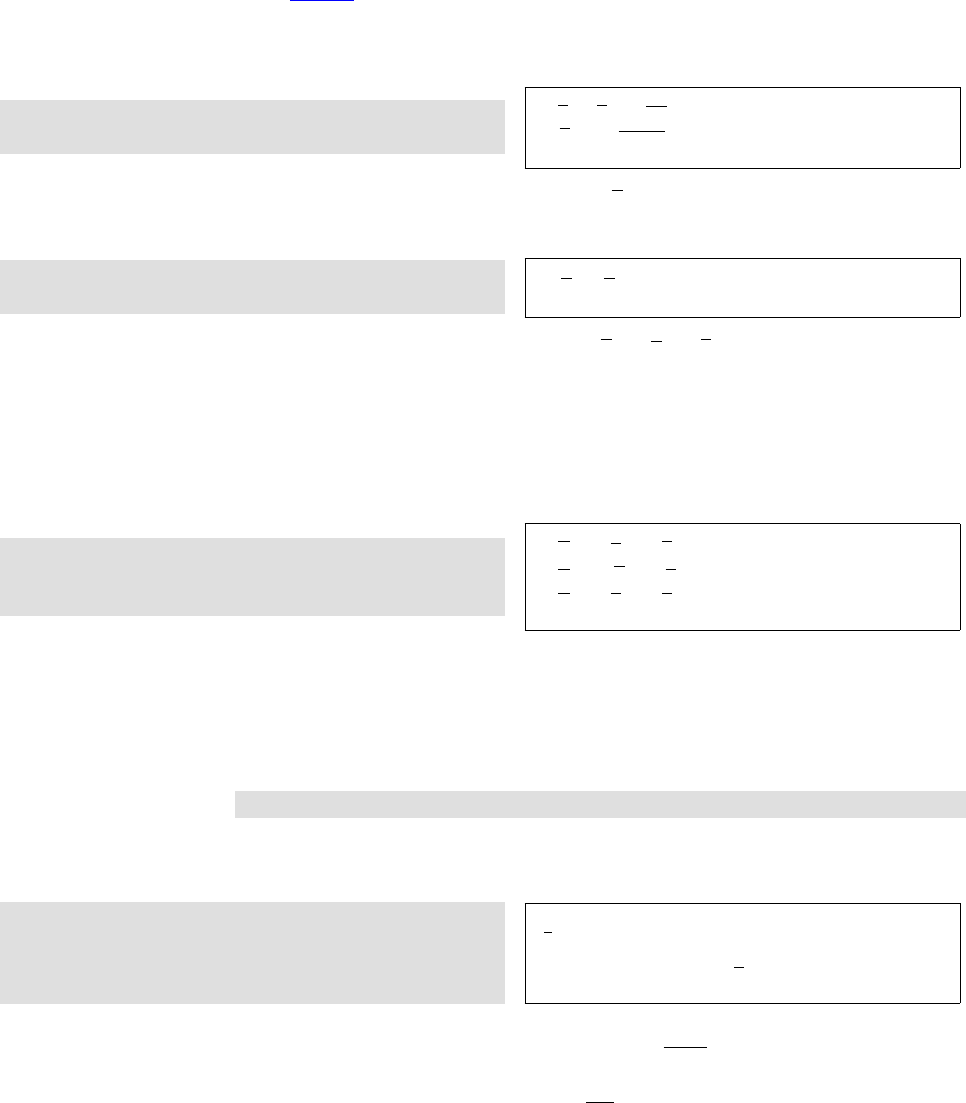
Helin Gai
Duke University
54 When T
E
X Dates Math
8.3 √Roots
Roots are produced by ‘\sqrt[...]{...}’:
$\sqrt2$, $\sqrt2y$, $\sqrt{2y}$\\
$\sqrt[3]{2}$, $\sqrt[n+1]{x+y}$
√2, √2y,√2y
3
√2, n+1
√x+y
Some people might find the standard β
√kunacceptable. You can tune the position
of the index with the amsmath package.
$\sqrt[\leftroot{2}\uproot{4}\beta]{k}$,
$\sqrt[\leftroot{1}\uproot{3}\beta]{k}$
β
√k,β
√k
Some obsessive ones might even find √x+√y+√zunacceptable. (I’m not among
them.) Two commands should be of help: (1) The command \mathstrut produces an
invisible box whose width is zero and whose height and depth are the height and depth
of a parenthesis ‘(’. (2) The command \smash{...} typesets its contents but ignores
both their height and depth. The amsmath package provides an optional argument, used
as follows: \smash[t]{...} ignores the height of the box’s contents, but retains the
depth, while \smash[b]{...} ignores the depth and keeps the height. Compare:
$\sqrt{x}+\sqrt{y}+\sqrt{z}$\\
$\sqrt{x}+\sqrt{\mathstrut y}+\sqrt{z}$\\
$\sqrt{x}+\sqrt{\smash[b]{y}}+\sqrt{z}$
√x+√y+√z
√x+py+√z
√x+√y+√z
8.4 Fractions
Binomials
Let’s now turn to something more challenging—fractions. A fraction is obtained by
typing
\frac{numerator}{denominator}
What is challenging about this? Well, if you try typing a fraction in inline mode and in
display mode, you’ll find that the results are different:
$\frac{1}{2}$,
\begin{equation*}
\frac{1}{2}
\end{equation*}
1
2,
1
2
L
A
T
E
X does this for a good reason: an inline a+b
c+druins the line spacing, as you
can see here; a displayed
a+b
c+d
is equally unacceptable. However, you can change L
A
T
E
X’s behavior by using a few
commands provided by the amsmath package: (1) \dfrac always typesets a fraction as
if it is being typeset in the display mode; (2) \tfrac always typesets a fraction as if it
is being typeset in the inline mode. For example:
,
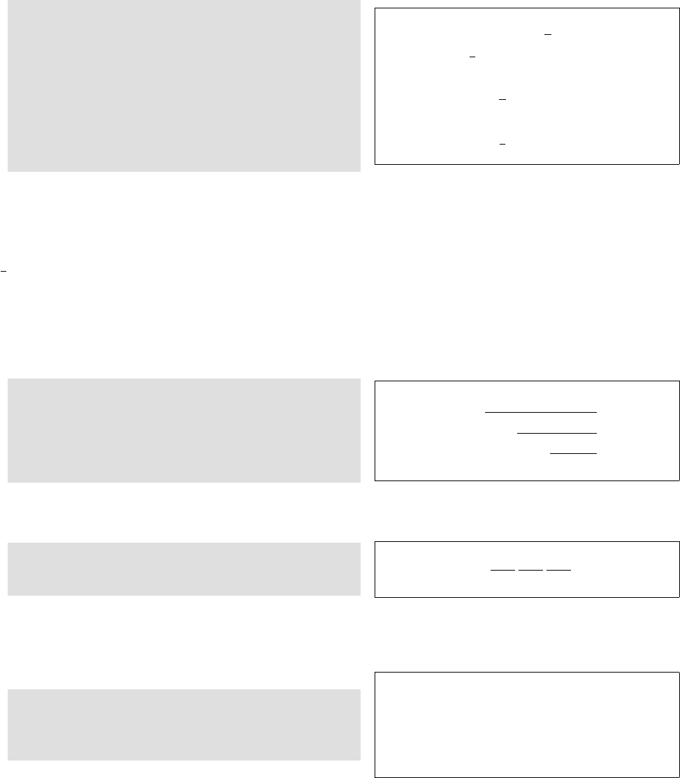
Helin Gai
Duke University
8.4 Fractions
Binomials55
This is an inline formula: $\dfrac{1}{2}$.
But avoid it! Replace it with
$\frac{1}{2}$ or $1/2$.
Instead of \begin{equation*}
\dfrac{1}{2}(a+b),
\end{equation*}
you can try \begin{equation*}
\tfrac{1}{2}(a+b).
\end{equation*}
This is an inline formula: 1
2. But avoid it! Re-
place it with 1
2or 1/2.
Instead of 1
2(a+b),
you can try
1
2(a+b).
Although amsmath makes it fairly easy to achieve whatever you want in your
manuscript, you should try not to abuse it. A general principle is that a math formula
should not affect the line spacing if at all possible. So most inline fractions should
actually be set in the slashed form (e.g., a/b) except for numerical fractions (e.g.,
1
4); therefore, the command \dfrac should never be used in an inline equation. Also,
fractions in subformulas (like sub- and superscripts) should also be set in the slashed
form.
The amsmath package also provides a command for typesetting continued fractions,
\cfrac. It can also be following by an optional [r] or [l] to specify the position of the
numerator:
\begin{equation*}
a_0+\cfrac{b_1}{
a_1+\cfrac[l]{b_2}{
a_2+\cfrac[r]{b_3}{
a_3+\cdots}}}
\end{equation*}
a0+b1
a1+b2
a2+b3
a3+···
You may also use the alternative form:
\[a_0+\frac{b_1}{a_1+}
\frac{b_2}{a_2+}
\frac{b_3}{a_3+}\cdots\]
a0+b1
a1+
b2
a2+
b3
a3+···
Binomial coefficients, like fractions, ought to be treated very carefully. The most
basic command for producing a binomial coefficient is ‘\binom{...}{...}’:
In inline mode: $\binom{k}{2}$.\\
In display mode:
\begin{equation*} \binom{k}{2}
\end{equation*}
In inline mode: k
2.
In display mode:
k
2
I recommend that you use this command all the time. But if you do want to do
some crazy things, you can also use the commands \dbinom and \tbinom provided by
the amsmath package (Think a million times before you do so!!!):
à
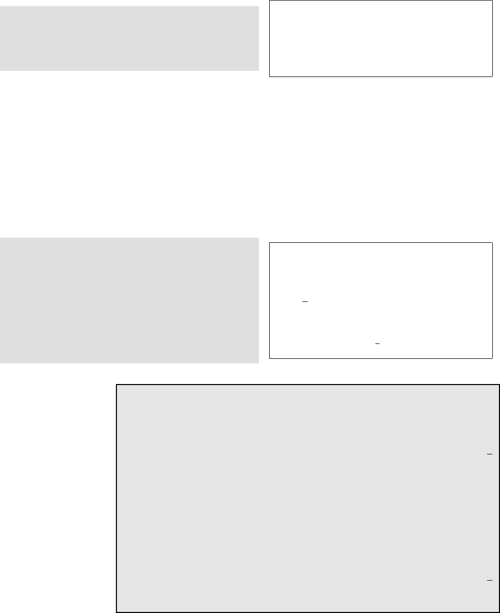
Helin Gai
Duke University
56 When T
E
X Dates Math
In inline mode: $\dbinom{k}{2}$,
which is horrible.\\
In display mode:
\begin{equation*} \tbinom{k}{2}.
\end{equation*}
In inline mode: k
2, which is horrible.
In display mode:
k
2.
It might be helpful to introduce the concept of “styles.” In math mode, there are
four styles:
display For normal symbols in a displayed formula.
text For normal symbols in an in-text formula.
script For subscripts and superscripts.
scriptscript For further levels of sub- and superscripting, such as subscripts of super-
scripts.
Take a look at the following examples:
Compare the small superscript in $a^{x}$
with the large one in $a^{\textstyle x}$.
Instead of using \verb"\dfrac", you can
do it this way: $\displaystyle\frac{1}{2}$.
And instead of using \verb"\tfrac", you
can try this:\begin{equation*}
\textstyle\frac{1}{2}.
\end{equation*}
Compare the small superscript in axwith the
large one in ax.
Instead of using \dfrac, you can do it this
way: 1
2.
And instead of using \tfrac, you can try this:
1
2.
T
E
Xnicality
In case you want to use displayed fractions in inline mode (sigh), I’d also like to
introduce two more commands that would be helpful.
First take a look at the following output:
This is a test. This is a test. This is a test. This is a test. This is a test. 1
2
This is a test. This is a test. This is a test. This is a test. This is a test.
The numerator and denominator almost touch the text above and below. But
after adding the following two lines:
\lineskiplimit=3pt
\lineskip=4pt
things are much better:
This is a test. This is a test. This is a test. This is a test. This is a test. 1
2
This is a test. This is a test. This is a test. This is a test. This is a test.
,
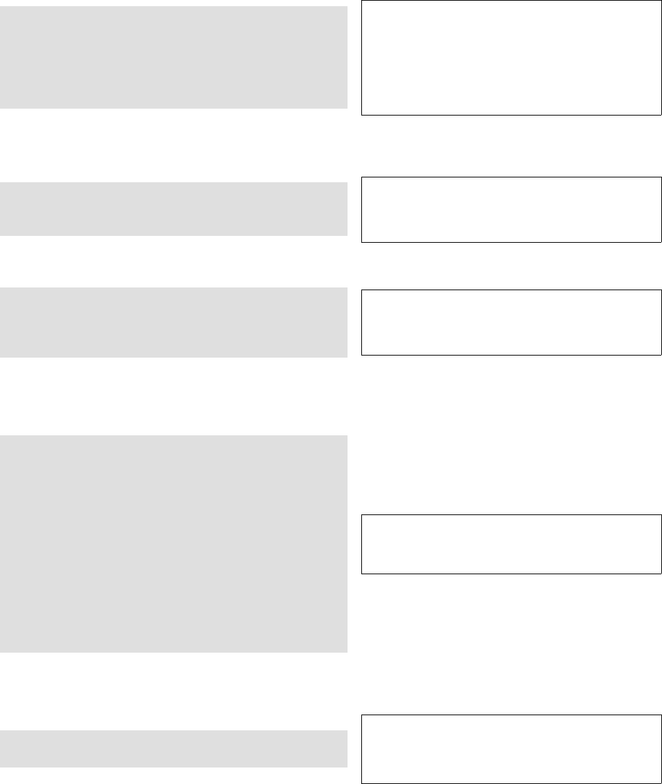
Helin Gai
Duke University
8.5 Sum and integration 57
8.5 Sum and integration
Sum and integration are different in inline and display modes:
Inline: $\sum_{n=1}^k$, $\prod_{n=1}^k$,
$\int_a^b$\\
Display: \begin{equation*}
\sum_{n=1}^k,\qquad \prod_{n=1}^k,
\qquad\int_a^b.
\end{equation*}
Inline: Pk
n=1,Qk
n=1,Rb
a
Display:
k
X
n=1
,
k
Y
n=1
,Zb
a
.
This is actually pretty nice output. However, you might sometimes want to change
the position of the “limits.” Here’s how:
\begin{equation*}
\iint_A,\qquad \iint\limits_A
\end{equation*} ZZA
,ZZ
A
There are a few more commands for producing different integral signs:
\begin{equation*}
\iiint\limits_V,
\idotsint\limits_V, \oint_V
\end{equation*} ZZZ
V
,Z···Z
V
,IV
There is a special symbol representing the Cauchy principal value of Rb
af(x)dx.
It is not built into L
A
T
E
X, and is so far not provided by any packages available on the
Internet. But here’s how you can construct it:
\def\Xint#1{\mathchoice
{\XXint\displaystyle\textstyle{#1}}%
{\XXint\textstyle\scriptstyle{#1}}%
{\XXint\scriptstyle
\scriptscriptstyle{#1}}%
{\XXint\scriptscriptstyle
\scriptscriptstyle{#1}}%
\!\int}
\def\XXint#1#2#3{{
\setbox0=\hbox{$#1{#2#3}{\int}$}
\vcenter{\hbox{$#2#3$}}\kern-.5\wd0}}
\def\dashint{\Xint-}
\[\dashint_a^bf(x)\,\rd x\]
−
Zb
a
f(x) dx
Sometimes, you might have to produce limits of more than one line. The amsmath
package provides the command ‘\substack’ which is helpful:
\[\sum_{\substack{0\leq i\leq m\\
0<j<n}} P(i,j)\] X
0≤i≤m
0<j<n
P(i, j)
à
Helin Gai
Duke University
58 When T
E
X Dates Math
You could stop reading here. But if you want to do more crazy things, continue.
You can try the “style commands” introduced in section 8.4 to change the behavior
of T
E
X:
Inline: $\displaystyle\sum_{n=1}^k$,
$\displaystyle\int_a^b$.
Don’t do these!\\
Display: \begin{equation*}
\textstyle\sum_{n=1}^k,\int_a^b.
\end{equation*}
Inline:
k
X
n=1
,Zb
a
. Don’t do these!
Display: Pk
n=1,Rb
a.
The opposite of \limits is \nolimits (you need a really good reason to use it):
Inline: $\sum\limits_{n=1}^k$,
$\int\limits_a^b$\\
Display: \begin{equation*}
\sum\nolimits_{n=1}^k,\int\limits_a^b
\end{equation*}
Inline:
k
P
n=1
,
b
Ra
Display:
Xk
n=1,
b
Z
a
8.6 Functions
Functions like sin and cos needs special treatment. For one thing, they should be typeset
in an upright typeface. In addition, they should be followed by a thin space provided
that what follows is not a parenthesis. Again, L
A
T
E
X can handle the rules above most of
the time. For example,
$5\sin(a+b)$, $8\cos 2A$ 5 sin(a+b), 8 cos 2A
All the predefined functions are given in table 8.1.
Let’s do some more experiments:
Inline: $\lim_{n\to0}((\sin^2x)/x^2)=1$\\
Display: \begin{equation*}
\lim_{n\to0}\frac{\sin^2x}{x^2}=1
\end{equation*}
Inline: limn→0((sin2x)/x2) = 1
Display:
lim
n→0
sin2x
x2= 1
The behavior of the “limits” can be changed (I’m not saying that you should), in
the same way we deal with Rand P:
Inline: $\lim\limits_{n\to0}
((\sin^22x)/x^2)=1$\\
Display: \begin{equation*}
\lim\nolimits_{n\to0}\frac{\sin^2x}{x^2}=1
\end{equation*}
Inline: lim
n→0((sin22x)/x2) = 1
Display:
limn→0
sin2x
x2= 1
There are two more functions that are useful:
,
Helin Gai
Duke University
8.7 Delimiters—never big enough 59
Table 8.1: Predefined operators and functions
Function Command Function Command Function Command
arccos \arccos arcsin \arcsin arctan \arctan
arg \arg cos \cos cosh \cosh
cot \cot coth \coth csc \csc
deg \deg det \det dim \dim
exp \exp gcd \gcd hom \hom
inf \inf inj lim \injlim ker \ker
lg \lg lim \lim lim inf \liminf
lim sup \limsup ln \ln log \log
max \max min \min Pr \Pr
proj lim \projlim sec \sec sin \sin
sinh \sinh sup \sup tan \tan
tanh \tanh lim
−→ \varinjlim lim \varliminf
lim \varlimsup lim
←− \varprojlim
$1234567\bmod89=48$,\\
$y\pmod{a+b}$
1234567 mod 89 = 48,
y(mod a+b)
Occasionally, you’ll come across functions that are not predefined, e.g., if you type
\arccot, you’ll get an error message.
The command \DeclareMathOperator{cmd}{text} provided by the amsmath
package defines cmd to produce text in the appropriate font for “textual operators.” If
the new function being named is an operator that should, when used in displays, “take
limits” (so that any subscripts and superscripts are placed above and below), then use
the starred form \DeclareMathOperator*. For example, after defining:
\DeclareMathOperator{\arccot}{arccot}
\DeclareMathOperator\meas{meas}
\DeclareMathOperator*\esssup{ess\,sup}
you can type these commands to get amazing results:
\[\arccot x, \quad \meas_1,
\quad \esssup_{x\in A}\] arccot x, meas1,ess sup
x∈A
8.7 Delimiters—never big enough
Sometimes, parentheses are not big enough to “enclose” things, in which cases you
should use the commands ‘\left(’ and ‘\right)’ to precede the delimiters. For example:
\[
\left(\frac{a}{b}\right)
+\left(\frac{c}{d}\right]
\] a
b+c
di
à
Helin Gai
Duke University
60 When T
E
X Dates Math
Table 8.2: Delimiters
Input Delimiter Input Delimiter
(())
[or \lbrack []]
\{ or \lbrace {\} or \rbrace }
\lfloor b\rfloor c
\lceil d\rceil e
\langle h\rangle i
//\backslash \
|or \vert |\| or \Vert k
\uparrow ↑\Uparrow ⇑
\downarrow ↓\Downarrow ⇓
\updownarrow l\Updownarrow m
Table 8.2 gives all the delimiters that are recognized by T
E
X.
If you type ‘.’ after \left or \right, instead of specifying one of the basic
delimiters, you get the so-called null delimiter (which is blank):
\begin{equation*}
\left(\frac{a}{b}\right.
\end{equation*} a
b
This is actually very helpful, as we will see later.
Another use of the commands \left and \right:
$\left|-x\right|=\left|+x\right|$. |−x|=|+x|.
If you leave out the \left and \right, what you get is |− x|=|+x|. The reason
is that T
E
X does not really understand mathematics. It thinks that you are subtracting
‘x’ from ‘|’ and adding ‘x’ to ‘|’, resulting in the extra spaces.
However, the mechanism of \left and \right does not always work as well as
you hope:
\begin{equation*}
\left(a+(a+b)\right)
\end{equation*}
(a+ (a+b))
Well, try this:
\begin{equation*}
\bigl(a+(a+b)\bigr)
\end{equation*} a+ (a+b)
The \big delimiters are just enough bigger than ordinary ones so that the difference
can be perceived, yet small enough to be used in the text of a paragraph. Here are all
of them, in the ordinary size and in the \big size:
( ) [ ] {}bcdehi/\|k ↑⇑↓⇓lm
x
~
w
yw
x
y~
,
Helin Gai
Duke University
8.7 Delimiters—never big enough 61
You can also type \Bigl or \Bigr to get larger symbols suitable for displays:
hinojklmDE./
x
~
w
w
yw
w
x
y~
w
There are \biggl and \biggr versions that are 50% taller than their \big coun-
terparts:
x
~
w
w
w
yw
w
w
x
y~
w
w
Finally, there are \Biggl and \Biggr versions, 2.5 times as tall as the \bigl and
\bigr delimiters:
!"#()$%&'*+,-
x
~
w
w
w
w
yw
w
w
w
x
y~
w
w
w
Any ‘\...l’ delimiter is an opening, and any ‘\...r’ is a closing. There are also
‘\...m’ for use in the middle of formulas.
\begin{equation*}
\left\{\,x\in\mathbb{R}\biggm|
0<\left|x\right|<\frac{5}{3}\,\right\},
\quad\frac{a+1}{b}\bigg/\frac{c+1}{d}
\end{equation*}
x∈R0<|x|<5
3,a+ 1
bc+ 1
d
The ‘\,’ in the first example is for fine tuning. They add the so-called thin spaces.
Also note that in the second example, we use \bigg, not \biggm. That’s because
there’s no need to put extra space around ‘/’. Compare:
\begin{equation}
\frac{a+1}{b}\biggm/\frac{c+1}{d}
\end{equation}
a+ 1
bc+ 1
d(8.2)
BTW, there’s a pretty nice package called braket which can greatly reduce your
effort in typesetting sets:
\begin{equation*}
\Set{x\in\mathbb{R}|
0<\left|x\right|<\frac{5}{3}}\\
\end{equation*} x∈R0<|x|<5
3
Sometimes, \left and \right choose a larger delimiter than you want. You can
tune them:
\begin{equation*}
\left(\sum_{k=1}^n A_k \right)\quad
\biggl(\sum_{k=1}^n A_{k}\biggr)
\end{equation*} n
X
k=1
Ak!n
X
k=1
Ak
However, most of the time, \left and \right are the clear choice. The values of
them are: (1) They are “automatic”—that’s why they produce problems sometimes;
and (2) They can produce arbitrarily large delimiters—much bigger than \biggggg!
à
Helin Gai
Duke University
62 When T
E
X Dates Math
8.7.1 Larggggge Delimiters—The yhmath Package
An old saying goes, “Even T
E
X becomes dumb sometimes.” (Well, maybe not that old.)
And rightly so! Here is the default output of a series of root signs:
v
u
u
u
u
u
u
u
u
u
u
t
v
u
u
u
u
u
u
u
u
u
t
v
u
u
u
u
u
u
u
u
t
v
u
u
u
u
u
u
u
t
v
u
u
u
u
u
u
t
v
u
u
u
u
u
tv
u
u
u
u
tv
u
u
u
tv
u
u
tsrq√x
What’s the word that comes up to your mind when you see the output? “Ugly,” I
suppose. This is what happens here: Only a few root signs were defined in T
E
X. When
they are used out, T
E
X will “construct” new root signs—that’s how the vertical ones
come into being. However, if you load the yhmath package, the output would be very
different and better:
√x
1
An important feature of the yhmath package is that it provides a set of large
delimiters. That is to say, virtually all large delimiters will be different from the original
output of T
E
X. (I hardly ever use this package because although it does provide really
neat root signs, the parentheses are way beyond my sense of aesthetic.)
Anyway, here are a few other features of the package. It also offers some wide accents.
You might remember that there is a limit to T
E
X’s commands such as \widetilde, e.g.,
\widetilde{ABCDEFG} would become ^
ABCDEF G, which is awful. But after loading
the yhmath package, the output becomes:
√x
ABCDEF G
1
Yet, I still insist that (ABCDEF G)∼is a better solution. Hopefully you would agree
with me.
The yhmath package also provides the amatrix environment which is used the
same as amsmath’s pmatrix, but instead of parenthesis, angles are used. For example,
you can easily construct the following:
a1a2
a3a4
I listed here some important features of yhmath which I think are most likely to be
used. But it has other functions. Please refer to http://texcatalogue.sarovar.org/
entries/yhmath.html.
8.8 Changing typefaces
A great difference between
mathematicians and
physicists is that the latter
tend to use upright fonts a
lot more frequently. But in
some countries, including
China and the UK, the
difference is not that
dramatic.
At the very beginning of this chapter, I mentioned that all variables should be set in
italic type, and that all numerals should be set in an upright font. L
A
T
E
X is capable of
,
Helin Gai
Duke University
8.8 Changing typefaces 63
doing this automatically. But it cannot recognize a vector automatically. So you do
have to learn some font-switching commands.
Many physicists set mathematical constants in an upright font, e.g., i2=−1. Here’s
how:
$\mathrm{i}^2=-1$ i2=−1
Although we write ~a, vectors in printed documents are set in boldface. Some people
like upright bold, some prefer italic bold. Both are acceptable, and here’s how to produce
them:
$\mathbf{a}$, $\bm{a}$. a,a.
(To use the command \bm, you have to load the bm package first.)
As you’ve seen in section 8.7, sets of numbers are set in what we call the Blackboard
font, e.g., Rdenotes the set of real numbers. Let’s take a look how to produce this:
Load the \pcg{amsfonts} package!\\
$\mathbb{R}$: the set of real numbers.\\
$\mathbb{N}$: the set of natural
numbers.
Load the amsfonts package!
R: the set of real numbers.
N: the set of natural numbers.
Table 8.3 gives different font switching commands in math mode.
Note that the default italic and the italic produced by \mathit are different:
$different \neq \mathit{different}$. diff erent 6=different.
If you use the upright ‘d’, ‘e’, and ‘i’ a lot, you should define them in your
manuscript:
\newcommand\rd{\mathrm{d}}
\newcommand\re{\mathrm{e}}
\newcommand\ri{\mathrm{i}}
Now, you can get the upright ‘d’, ‘e’, and ‘i’ by simply typing ‘\rd’, ‘\re’, and
‘\ri’:
$\rd x$, $\ri^2=-1$, $\re=2.718\,28\ldots$ dx, i2=−1, e = 2.718 28 . . .
Now think of this problem: how do you get
Pr−j= 0 if r−jis odd.
You might be thinking of doing this, which doesn’t work well:
\[P_{r-j}=0 \mathrm{if} r-j
\mathrm{is odd}.\] Pr−j= 0ifr−jisodd.
à
Helin Gai
Duke University
64 When T
E
X Dates Math
Table 8.3: Math fonts
Command Example
default ABCDEF GHIJKLM NOP QRST U V W XY Z
abcdefghijklmnopqrstuvwxyz
\mathit ABCDEFGHIJKLMNOPQRSTUVWXYZ
abcdefghijklmnopqrstuvwxyz
\mathrm ABCDEFGHIJKLMNOPQRSTUVWXYZ
abcdefghijklmnopqrstuvwxyz
\mathbf ABCDEFGHIJKLMNOPQRSTUVWXYZ
abcdefghijklmnopqrstuvwxyz
\mathsf ABCDEFGHIJKLMNOPQRSTUVWXYZ
abcdefghijklmnopqrstuvwxyz
\mathtt ABCDEFGHIJKLMNOPQRSTUVWXYZ
abcdefghijklmnopqrstuvwxyz
\bmaABCDEF GHIJKLM N OP QRST U V W XY Z
abcdefghijklmnopqrstuvwxyz
\mathfrakbABCDEFGHIJKLMNOPQRSTUVWXYZ
abcdefghijklmnopqrstuvwxyz
\mathcal ABCDEFGHIJKLMNOPQRST UVWXYZ
\mathbbcABCDEFGHIJKLMNOPQRSTUVWXYZ
aNeeds package bm.
bNeeds package amsfonts.
cNeeds package amsfonts.
That’s because blank spaces are ignored in math mode. Now try this:
\[P_{r-j}=0\ \mathrm{if}\ r-j\
\mathrm{is\ odd}.\] Pr−j= 0 if r−jis odd.
However, the amsmath package provides a \text command which is really helpful:
\[P_{r-j}=0\text{ if
$r-j$ is odd.}\] Pr−j= 0 if r−jis odd.
One question remains: how do we get an upright lowercase greek letter? For
instance, some publishers mandates that all constants be typeset in an upright greek;
this obviously includes “pi.” Unfortunately, T
E
X doesn’t have built-in upright lowercase
Greek letters. But I’ve discovered a few approaches that you might want to try:
•Load the package upgreek. Then you can access upright lowercase Greek letters by
typing \up..., e.g., \uppi. This is probably the easiest way on earth, but the bad
news is that the letters produced in this method don’t look that good (for me).
•Load the package txfonts. Then you can access lowercase Greek letters by typing
\...up, e.g., \piup. But the txfonts packages affects the typeface of the whole
documents. An alternative is not to load the package and put the following codes
in your preamble:
\DeclareSymbolFont{lettersA}{U}{txmia}{m}{it}
,

Helin Gai
Duke University
8.8 Changing typefaces 65
\DeclareMathSymbol{\piup}{\mathord}{lettersA}{25}
\DeclareMathSymbol{\muup}{\mathord}{lettersA}{22}
\DeclareMathSymbol{\deltaup}{\mathord}{lettersA}{14}
......
•You can also use the PostScript symbols. Try the following codes:
\usepackage{ifthen}
\makeatletter
\newcommand{\allmodesymb}[2]{\relax\ifmmode{\mathchoice
{\mbox{\fontsize{\tf@size}{\tf@size}#1{#2}}}
{\mbox{\fontsize{\tf@size}{\tf@size}#1{#2}}}
{\mbox{\fontsize{\sf@size}{\sf@size}#1{#2}}}
{\mbox{\fontsize{\ssf@size}{\ssf@size}#1{#2}}}}
\else
\mbox{#1{#2}}\fi}
\makeatother
\newcommand{\greeksym}[1]{\usefont{U}{psy}{m}{n}#1}
\newcommand{\ualpha}{\allmodesymb{\greeksym}{a}}
\newcommand{\udelta}{\allmodesymb{\greeksym}{d}}
\newcommand{\upi}{\allmodesymb{\greeksym}{p}}
......
•The lowercase Greek letters provided by GreekT
E
Xis rather good. But there are
(at least) two problems: (1) It might cause compatibility issues; (2) If you put the
letters in subscripts or superscripts, their size remain the same as in text style.
Anyway, here are the codes:
\input{greektex}
\newcommand\uppi{\text{\gr p}}
\newcommand\upd{\text{\gr d}}
......
T
E
Xnicality
Some publishers require that defined operator be typeset in an upright font; e.g.,
the ‘d’ in dx. Well, the ‘d’ operator shouldn’t present any difficult for you, but the
default partial operator produced by \partial is italic, like this ‘∂’. We can define
the upright version ourselves:
\font\ursymbol=psyr at 10pt % You also use other font sizes.
\def\urpartial{\mbox{\ursymbol\char"B6}}
Now the code ‘\frac{\urpartial f}{\urpartial x}’ gives the following out-
put:
∂f
∂x,
which is perfect!
à
Helin Gai
Duke University
66 When T
E
X Dates Math
Table 8.4: Spaces in math mode
Positive Space Example Negative Space Example
$ab$ ab
$a b$ ab
$a\ b$ a b
$a\,b$ (a\thinspace b)a b a\!b ab
$a\:b$ (a\medspace b)a b a\negmedspace b ab
$a\;b$ (a\thickspace b)a b a\negthickspace b ab
$a\quad b$ a b
$a\text{---}b$ a—b
$a\qquad b$ a b
$a\hspace{0.5cm}b$ a b $a\hspace{-0.5cm}b$ ab
$a\phantom{xx}b$ a b
$axxb$ axxb
8.9 Spacing
We’ve seen the command ‘\,’ which produces a thin space a couple of times. Here’s
another application:
123\,456\,\text{cm} 123 456 cm
But this is by no means the end of the story. L
A
T
E
X provides quite a few commands
for producing horizontal spaces, as are listed in table 8.4.
A few words about the command \phantom in the table. By using the \phantom
command, you can reserve space for characters that do not show up in the final output:
\begin{equation*}
{}^{12}_{\phantom{1}6}\textrm{C}
\qquad \textrm{versus} \qquad
{}^{12}_{6}\textrm{C}
\end{equation*}
12
6C versus 12
6C
T
E
Xnicality
Most of the time, T
E
X can producing the desired spacing. But there are a few
occasions that require your attention:
•A thin space should be added before back subscripts, e.g., a0x1bh is obtained
from $a\,{}_0x_1bh$.
•A thin space should be added before and after ds,dp,dx, and similar combina-
tions of d and another symbol following, e.g.,
Zf(x) dxZZZ drdθdr
•A thin space should be added between a number and a unit, e.g., 1 m= 100 cm.
,
Helin Gai
Duke University
8.9 Spacing 67
•A thick space should be used before a mathematical condition in text, e.g.,
tn(n= 1,2, . . .)
•An em quad should be used between a symbolic statement and a verbal expression
in displayed expressions:
En(t)→e−tas t→ ∞.
•An em quad should be used around conjunctions:
x(a+b) or y(a−b)
•A two-em quad should be used between two separate formulas in the same line
of a display
x2+y2=a, x +y=b.
However, it is generally accepted that symbols in different formulas must be
separated by words, e.g., instead of saying “consider Sq,q < p,” write “consider
Sq, where q < p.”
•A two-em quad should be used between a symbolic statement and a condition
on the statement.
xn−yn−zn=A(n= 0,1, . . . , p)
The T
E
Xbook provides the following fine-tuning examples:
$\sqrt{2}\,x$\\
$\sqrt{\,\lg x}$\\
$O\bigl(1/\sqrt{n}\,\bigr)$\\
$[\,0,1)$\\
$\lg n\,(\lg\lg n)^2$\\
$x^2\!/2$\\
$n/\!\lg n$\\
$\Gamma_{\!2}+\Delta^{\!2}$\\
$R_i{}^j{}_{\!kl}$\\
$\int_0^x\!\int_0^y\rd F(u,v)$\\
$(2n)!/\bigl(n!\,(n+1)!\bigr)$
√2x
√lg x
O1/√n
[ 0,1)
lg n(lg lg n)2
x2
/2
n/lg n
Γ
2+ ∆
2
Rijkl
Rx
0Ry
0dF(u, v)
(2n)!/n! (n+ 1)!
There are also a few commands controlling the vertical space in and around displays.
The vertical spaces before and after each display environment are controlled by the
following rubber lengths, where the values in parentheses are those for \normalsize
with the (default) 10pt option in the standard L
A
T
E
X classes:
•\abovedisplayskip,\belowdisplayskip
The normal vertical space added above and below a mathematical display (default
10pt plus 2pt minus 5pt).
•\abovedisplayshortskip,\belowdisplayshortskip
The (usually smaller) vertical space added above and below a “short display” (0pt
à
Helin Gai
Duke University
68 When T
E
X Dates Math
plus 3pt and 6pt plus 3pt minus 3pt, respectively). A short display is one that
starts to the right of where the preceding text line ends.
Here’s an example demonstrating the use of these commands:
\small
\abovedisplayshortskip=5pt
\belowdisplayshortskip=5pt
\abovedisplayskip=15pt
\belowdisplayskip=15pt
\noindent
Before \begin{equation}
f(x) = \int\frac{\sin x}{x}dx
\end{equation}
\noindent The line doesn’t
end before the formula.
\begin{equation}
f(x) = \int\frac{\sin x}{x}dx
\end{equation}
\noindent And the next line starts as
usual with some text\dots.
Before
f(x) = sin x
xdx (8.3)
The line doesn’t end before the formula.
f(x) = sin x
xdx (8.4)
And the next line starts as usual with some
text. . . .
8.10 Punctuation
In math mode, commas and semicolons are treated as punctuation marks, so T
E
X puts
some extra spaces after them. For example,
$f(x,y;z)$ f(x, y;z)
This is a good mechanism, but it can cause problems. In the U.S., numbers are
grouped by using commas, e.g., ‘123,456’. If you type $123,456$, what you get is
‘123,456’. But I prefer to group numbers with a thin space, e.g., 123 456, as you’ve seen
before.
Interestingly, a period is not treated as a punctuation mark, so $123.456$ does
produce the correct ‘123.456’.
Colon is also treated as a special punctuation in T
E
X—representing “ratio,” e.g.,
‘3 : 4’. But it’s wrong to type something like f:A→B. Instead, try the following:
$f\mathpunct{:}A\to B$ f:A→B
As a matter of act, if you are using standard L
A
T
E
X (without loading the amsmath
package), you can type $f\colon A\to B$. However, the amsmath package makes
unfortunate major changes to the spacing produced by the command \colon.
Now, let’s talk about something more general. When a formula is followed by a
period, comma, semicolon, question mark, exclamation point, etc., put the punctuation
after the $, when the formula is in the text; but put the punctuation before the end of
a display math environment. For example,
,
Helin Gai
Duke University
8.10 Punctuation 69
If $x<0$, we have shown that
\begin{equation*} y=f(x). \end{equation*}
If x < 0, we have shown that
y=f(x).
Similarly, don’t ever type anything like
for $x=a,b$, or $c$. for x=a, b, or c.
It should be
for $x=a$, $b$, or $c$. for x=a,b, or c.
(Better yet, use a tie: ‘or~$c$’.) The reason is that T
E
X will typeset expression ‘$x=a,b$’
as a single formula, so it will put a “thin space” between the comma and the b. This
space will not be the same as the space that T
E
X puts after the comma following the b,
since spaces between words are always bigger than thin spaces.
Another reason for not typing $x=a,b$ is that it inhibits breaking lines in a
paragraph: T
E
X will never break at the space between the comma and the bbecause
breaks after commas in formulas are usually wrong. For example, in the equation, we
certainly don’t want to break something like P(1,2).
We’ve talked much about ellipsis in texts. Now let’s get into the math mode. Since
we realize that \ldots does not produce a thin space after it when used in math mode,
it might cause some problems. Look at the following examples:
$a_1,a_2,a_3,\ldots$.\\
$a_1,a_2,a_3,\ldots.$
a1, a2, a3, . . ..
a1, a2, a3, . . . .
The first one is logical, but the output is “awesome.” The second one looks OK,
but the space after the period would be distorted since it is not really considered an
ending-a-sentence period. The correct way is to type this:
$a_1,a_2,a_3,\ldots\,$. a1, a2, a3, . . . .
But the best way is actually ‘$a_1$, $a_2$, $a_3$,~\ldots.’.
The position of ellipsis is also an art. It is generally correct to produce formulas
like
$x_1+\cdots+x_n$ and $(x_1,\ldots,x_n)$, x1+··· +xnand (x1, . . . , xn),
but wrong to produce formulas like
$x_1+\ldots+x_n$ and $(x_1,\cdots,x_n)$. x1+. . . +xnand (x1,··· , xn).
à
Helin Gai
Duke University
70 When T
E
X Dates Math
If you’ve loaded the amsmath package, try the following:
$x_1+\dots+x_n$ and $(x_1,\dots,x_n)$. x1+··· +xnand (x1, . . . , xn).
The amsmath package decides the position of the ellipsis according to what kind of
symbol follows \dots. If the next symbol is a plus sign, the dots will be centered; if it
is a comma, they will be on the baseline. If the dots fall at the end of a mathematical
formulas, the next object will be something like \end or $, etc., which does not give any
information about how to place the dots. In such a case, you must help by using \dotsc
for “dots with commas,” \dotsb for “dots with binary operator/relation symbols,”
\dotsm for “multiplication dots,” \dotsi for “dots with integrals,” or even \dotso for
“none of the above.” For example,
A series $H_1, H_2, \dotsc\,$, a sum
$H_1+H_2+\dotsb\,$, an orthogonal product
$H_1\times H_2\times\dotsm\,$, and an
infinite integral: \[\int_{H_1}\!
\int_{H_2}\dotsi\;
{-\Gamma}\,\rd\Theta.\]
A series H1, H2, . . . , a sum H1+H2+···,
an orthogonal product H1×H2×···, and an
infinite integral:
ZH1ZH2··· −Γ dΘ.
I also adapt the following examples from The T
E
Xbook to illustrate the proper use
of ellipses:
$x_1+\dots+x_n$\\
$x_1=\dots=x_n$\\
$A_1\times\dots\times A_n$\\
$f(x_1,\dots,x_n)$\\
$x_1x_2\dots x_n$\\
$(1-x)(1-x^2)\dots(1-x^n)$\\
$n(n-1)\dots(1)$\\
$x_1\cdot x_2\cdot\ldots\cdot x_n$
x1+··· +xn
x1=··· =xn
A1× ··· × An
f(x1, . . . , xn)
x1x2. . . xn
(1 −x)(1 −x2). . . (1 −xn)
n(n−1) . . . (1)
x1·x2·. . . ·xn
Caution: the example on the last line is not a typo! But it does look odd, so try to
avoid it.
8.11 More about Displayed Equations
You might want to put two equations on two individual lines, but
\begin{equation*}
(a+b)^2=a^2+2ab+b^2\\
\sin^2\eta+\cos^2\eta=1
\end{equation*}
is not valid, as no line breaks are allowed in an equation* environment. What about
,
Helin Gai
Duke University
8.11 More about Displayed Equations 71
\begin{equation*}
(a+b)^2=a^2+2ab+b^2
\end{equation*}
\begin{equation*}
\sin^2\eta+\cos^2\eta=1
\end{equation*}
(a+b)2=a2+ 2ab +b2
sin2η+ cos2η= 1
You’ll find that there’s too much space between the two equations.
OK, here comes the solution: you can try the gather or gather* environment:
\begin{gather}
(a+b)^2=a^2+2ab+b^2\\
\sin^2\eta+\cos^2\eta=1
\end{gather}
(a+b)2=a2+ 2ab +b2(8.5)
sin2η+ cos2η= 1 (8.6)
If you do not want the equation number, just use the starred form. What if you
want to number the first equation but not the second one?
\begin{gather}
(a+b)^2=a^2+2ab+b^2\\
\sin^2\eta+\cos^2\eta=1\notag
\end{gather}
(a+b)2=a2+ 2ab +b2(8.7)
sin2η+ cos2η= 1
The gather environment is perfect for putting two or more equations on individual
lines, centered. But sometimes, we want to “align” them at a relation symbol. We can
use the align or align* environment.
\begin{align}
x^2+y^2 &= z^2\\
x^3+y^3 &< z^3+\cdots
\end{align}
x2+y2=z2(8.8)
x3+y3< z3+··· (8.9)
Again, if you do not want the equation numbers, use the starred form.
Another challenge, what if we want to “group” these equations and “center” the
equation number vertically? The answer is to use the ...ed variant of the environments
above.
\begin{equation}
\begin{gathered}
(a+b)^2=a^2+2ab+b^2\\
\sin^2\eta+\cos^2\eta=1
\end{gathered}
\end{equation}
(a+b)2=a2+ 2ab +b2
sin2η+ cos2η= 1 (8.10)
Another example:
\begin{equation*}
\begin{aligned}
x^2+y^2 &= z^2\\
x^3+y^3 &< z^3+\cdots
\end{aligned}
\end{equation*}
x2+y2=z2
x3+y3< z3+···
à
Helin Gai
Duke University
72 When T
E
X Dates Math
(What happened to the equation number?)
And another one!
\begin{equation}
\begin{split}
x^2+y^2 &= z^2\\
x^3+y^3 &< z^3+\cdots
\end{split}
\end{equation}
x2+y2=z2
x3+y3< z3+··· (8.11)
Remember how I talked about the “null delimiter”? Let’s take a look at its
application:
\begin{equation*}
\left.
\begin{aligned}
\bm{B}’&=-c\nabla\times\bm{E}\\
\bm{E}’&=c\nabla\times\bm{B}-4\pi\bm{J}
\end{aligned}\right\}
\text{Maxwell’s}
\end{equation*}
B0=−c∇ × E
E0=c∇ × B−4πJ)Maxwell’s
One more command to introduce: \intertext.
\begin{align}
A_1&=N_0(\lambda;\Omega’)-
\phi(\lambda;\Omega’)\\
A_2&=\phi(\lambda;\Omega’)
\phi(\lambda;\Omega)
\intertext{and finally} A_3&=
\mathcal{N}(\lambda;\omega)
\end{align}
A1=N0(λ; Ω0)−φ(λ; Ω0) (8.12)
A2=φ(λ; Ω0)φ(λ; Ω) (8.13)
and finally
A3=N(λ;ω) (8.14)
8.12 Breaking an Inline Equation
When you have formulas in a paragraph, T
E
X may have to break them between lines.
This is a necessary evil, something like the hyphenation of words; we want to avoid it
unless the alternative is worse.
By default, a formula will be broken only after a relation symbol like = or <
or →, or after a binary operation symbol like + or −or ×, where the relation or
binary operation is on the “outer level” of the formula (i.e., not enclosed in {...}). For
example,
equationbreakanequation
$f(x,y)=x^2-y^2=(x+y)(x-y)$.
equationbreakanequation f(x, y) = x2−y2=
(x+y)(x−y).
There’s a chance that T
E
X will break after either of the =signs (it prefers this) or
after the -or +or -(in an emergency). But there won’t be a break after the comma in
any case.
If you don’t want to permit breaking in this example except after the =signs, you
could type
,
Helin Gai
Duke University
8.13 Breaking a Displayed Equation 73
equationbreakanequation
$f(x,y)={x^2-y^2}={(x+y)(x-y)}$.
equationbreakanequation f(x, y) = x2−y2=
(x+y)(x−y).
On the other hand, if you do want to break after the comma, try this:
breakanequationbreakanequation
$f(x,\allowbreak y)=x^2-y^2=(x+y)(x-y)$.
breakanequationbreakanequation f(x, y) =
x2−y2= (x+y)(x−y).
This is not a good example. But sometimes, you might want to break something
like (x1, . . . , xm, y1, . . . , yn).
Another interesting example:
anequation
$f(x,y)=x^2-y^2=(x+y)(x-y)$\\
anequation
$f(x,y)=x^2-y^2=(x+y)\*(x-y)$\\
equation
$f(x,y)=x^2-y^2=(x+y)\*(x-y)$
anequation f(x, y) = x2−y2= (x+y)(x−y)
anequation f(x, y) = x2−y2= (x+y)(x−y)
equation f(x, y) = x2−y2= (x+y)(x−y)
The command \* acts like \-. However, instead of inserting a hyphen, a ×sign is
inserted in text size.
8.13 Breaking a Displayed Equation
Breaking a displayed equation is mostly not preferable, but sometimes you just have to.
Two things that you have to keep in heart when breaking a displayed equation: (1) It is
stated in The T
E
Xbook that “Although formulas within a paragraph always break after
binary operations and relations, displayed formulas break before binary operations and
relations.” (2) Retain the logic of your math equations! I formatted the equations in
this section rather carefully, in the hope that you can figure out the rules lying behind
the surface.
The first environment to introduce is the multline environment, which does the
following:
\begin{multline}
\text{First line of a multline}\\
\text{Centered Middle line}\\
\shoveright{\text{A right Middle}}\\
\text{Another centered Middle}\\
\text{Yet another centered Middle}\\
\shoveleft{\text{A left Middle}}\\
\text{Last line of the multline}
\end{multline}
First line of a multline
Centered Middle line
A right Middle
Another centered Middle
Yet another centered Middle
A left Middle
Last line of the multline (8.15)
Let’s look at a serious example:
à
Helin Gai
Duke University
74 When T
E
X Dates Math
\begin{multline}
A=\lim_{n\to\infty}\Delta x\Bigl(a^2+
\bigl(a^2+2a\Delta x
+(\Delta x)^2\bigr)\\
+\bigl(a^2+2\times2a\Delta x+
2^2(\Delta x)^2\bigr)\\
+\bigl(a^2+2\times3a\Delta x+
3^2(\Delta x)^2\bigr)\\
+\cdots\\
+\bigl(a^2+2\cdot(n-1)a\Delta x+
(n-1)^2(\Delta x)^2\bigr)\Bigr)\\
=\tfrac{1}{3}(b^3-a^3).
\end{multline}
A= lim
n→∞ ∆xa2+a2+ 2a∆x+ (∆x)2
+a2+ 2 ×2a∆x+ 22(∆x)2
+a2+ 2 ×3a∆x+ 32(∆x)2
+···
+a2+ 2 ·(n−1)a∆x+ (n−1)2(∆x)2
=1
3(b3−a3).(8.16)
Now let’s try the align environment.
\begin{align*}
(a+b)^3&=(a+b)(a+b)^2\\
&=(a+b)(a^2+2ab+b^2)\\
&=a^3+3a^2b+3ab^2+b^3
\end{align*}
(a+b)3= (a+b)(a+b)2
= (a+b)(a2+ 2ab +b2)
=a3+ 3a2b+ 3ab2+b3
You can achieve the same effect with the split environment.
\begin{equation*}
\begin{split}
(a+b)^3&=(a+b)(a+b)^2\\
&=(a+b)(a^2+2ab+b^2)\\
&=a^3+3a^2b+3ab^2+b^3
\end{split}
\end{equation*}
(a+b)3= (a+b)(a+b)2
= (a+b)(a2+ 2ab +b2)
=a3+ 3a2b+ 3ab2+b3
Another example. With the following codes (Pay attention to the use of the
command \quad):
\begin{verbatim}
\begin{align*}
x_nu_1+\cdots+x_{n+t-1}u_t&=
x_nu_1+(ax_n+c)u_2+\cdots\\
&\quad+\bigl(a^{t-1}x_n+
c(a^{t-2}+\cdots+1)\bigr)u_t\\
&=(u_1+au_2+\cdots+a^{t-1}u_t)x_n
+h(u_1,\ldots,u_t).
\end{align*}
\end{verbatim}
we can get the following output:
xnu1+··· +xn+t−1ut=xnu1+ (axn+c)u2+···
+at−1xn+c(at−2+··· + 1)ut
= (u1+au2+··· +at−1ut)xn+h(u1, . . . , ut).
,
Helin Gai
Duke University
8.13 Breaking a Displayed Equation 75
Now we’re going to take a look at a very complicated example.
fh,ε(x, y) = εEx,y Ztε
0
Lx,yϕ(εu)ϕ(x) du
=hZLx,zϕ(x) + ρx(dz)
+h 1
tεEyZtε
0
Lx,yx(s)ϕ(x) ds−tεZLx,z ϕ(x)ρx(dz)
+1
tεEyZtε
0
Lx,yx(s)ϕ(x) ds−Ex,y Ztε
0
Lx,yϕ(εs)ϕ(x) ds!
(8.17)
Here are the codes to typeset the equation above.
\begin{verbatim}
\newcommand\ve{\varepsilon} \newcommand\tve{t_{\varepsilon}}
\newcommand\vf{\varphi} \newcommand\yvf{y_{\varphi}}
\newcommand\bfE{\mathbf{E}}
\newcommand\relphantom[1]{\mathrel{\phantom{#1}}}
\begin{equation}
\begin{split}
f_{h,\ve}(x,y)&=\ve\bfE_{x,y}\int_0^{\tve} L_{x,\yvf(\ve u)}\vf(x)\,\rd u\\
&=h\int L_{x,z}\vf(x)+\rho_x(\rd z)\\
&\relphantom{=}{}+h\Biggl(\frac{1}{\tve}\biggl(
\bfE_y \int_0^{\tve} L_{x,y^x(s)}\vf(x)\,\rd s\
-\tve \int L_{x,z}\vf(x)\rho_x(\rd z)\biggr)\\
&\relphantom{=}\phantom{{}+h\Biggl(}+
\frac{1}{\tve}
\biggl(\bfE_y\int_0^{\tve} L_{x,y^x(s)}\vf(x)\,\rd s
-\bfE_{x,y}\int_0^{\tve} L_{x,\yvf(\ve s)}\vf(x)\,\rd s\biggr)\Biggr)
\end{split}
\end{equation}
\end{verbatim}
Standard L
A
T
E
X also provides the eqnarray environment for typesetting equations
that will spread onto a few lines. I hardly use it. But it is introduced below FYI.
\setlength\arraycolsep{2pt}
\begin{eqnarray}
y & = & a+b+c+d\nonumber\\
& & +e+f+g\nonumber\\
& & {}+h+i+j\nonumber\\
& \geq & {}-k-l-m
\end{eqnarray}
y=a+b+c+d
+e+f+g
+h+i+j
≥ − k−l−m(8.18)
I have two comments: (1) Notice the use of the {}. (Can you explain what happens
right here?) (2) Setting \arraycolsep to 2 pt could give better output. (It controls the
space before and after the sign enclosed between &’s.)
By the way, by default L
A
T
E
X does not allow any page break within a displayed
equation. If you do want to allow page breaks, put \allowpagebreak in the preamble
of your document.
à

Helin Gai
Duke University
76 When T
E
X Dates Math
8.14 Array
Arrays, in mathematics, are produced with the array environment. It has a single
argument that specifies the number of columns and the alignment of items within the
columns. For each column in the array, there is a single letter in the argument that
specifies how items in the column should be positioned: cfor centered, lfor flush left,
or rfor flush right. Within the body of the environment, adjacent rows are separated
by a \\ command and adjacent items within a row are separated by an &character.
For example,
\[
\begin{array}{clcr}
a+b+c & uv & x-y & 27\\
a+b & u+v & z & 134\\
a & 3u+uw & xyz & 2\,978
\end{array}
\]
a+b+c uv x −y27
a+b u +v z 134
a3u+uw xyz 2 978
You can do a lot of amazing things with this structure:
\begin{equation*}
P_{r-j}=\left\{\!\!\!
\begin{array}{ll}
0 & \text{if $r-j$ is odd,}\\
r!\,(-1)^{(r-j)/2} &
\text{if $r-j$ is even.}
\end{array}\right.
\end{equation*}
Pr−j=0 if r−jis odd,
r! (−1)(r−j)/2if r−jis even.
The amsmath package provides an alternative:
\begin{equation*}
P_{r-j}=
\begin{cases}
0 & \text{if $r-j$ is odd,}\\
r!\,(-1)^{(r-j)/2} &
\text{if $r-j$ is even.}
\end{cases}
\end{equation*}
Pr−j=(0 if r−jis odd,
r! (−1)(r−j)/2if r−jis even.
If you look closely at the two outputs, you’ll find that they are actually slightly
different. Coleen’s Workgroup prefers the former one, though it is more difficult to enter.
Matrices are produced in the similar way:
\begin{equation*}
\left(\!\!\!\begin{array}{cc} 0& -1\\
1 & 0\end{array}\!\!\!\right)
\end{equation*} 0−1
1 0
Again, the amsmath package provides some simpler solutions:
,
Helin Gai
Duke University
8.14 Array 77
\begin{gather*}
\begin{matrix}0&1\\ 1&0\end{matrix}\quad
\begin{pmatrix}0&1\\ 1&0\end{pmatrix}\\
\begin{bmatrix}0&1\\ 1&0\end{bmatrix}\quad
\begin{Bmatrix}0&1\\ 1&0\end{Bmatrix}\\
\begin{vmatrix}0&1\\ 1&0\end{vmatrix}\quad
\begin{Vmatrix}0&1\\ 1&0\end{Vmatrix}
\end{gather*}
0 1
1 0 0 1
1 0
0 1
1 0 0 1
1 0
0 1
1 0
0 1
1 0
It is generally speaking not preferable to put a matrix in inline mode. However, if
it is a small matrix, you can do it with the smallmatrix environment provided by the
amsmath package:
To show the effect of the matrix on
surrounding lines in side a paragraph,
we put it here:
$\left(\begin{smallmatrix}
1&0\\0&-1
\end{smallmatrix}\right)$ and follow
it with enough text to ensure that there
is at least one full line below the matrix.
To show the effect of the matrix on surround-
ing lines in side a paragraph, we put it here:
1 0
0−1and follow it with enough text to en-
sure that there is at least one full line below
the matrix.
There’s also a command provided by T
E
X that produces a special kind of matrix:
\[\bordermatrix{
&0&1&2\cr
0&A&B&C\cr
1&d&e&f\cr
2&1&2&3}\]
0 1 2
0A B C
1d e f
2 1 2 3
A final trick. Some people (including me) feel the braces are too big when used
with arrays. The following example might give you some insight:1
\[f(x)= \left\{%
\vphantom{\begin{array}{c} a\\[13ex]
\end{array}}\right.\kern-7pt
\begin{array}{ll}
4, & \text{if} \quad x\in (4,\infty), \\
3, & \text{if} \quad x\in (3,4], \\
2, & \text{if} \quad x \in (2,3], \\
1, & \text{if} \quad x \in (1,2], \\
0, & \text{if} \quad x \in (-\infty,1].
\end{array}\]
f(x) =
4,if x∈(4,∞),
3,if x∈(3,4],
2,if x∈(2,3],
1,if x∈(1,2],
0,if x∈(−∞,1].
8.14.1 The delarray Package
The delarray package is a useful general extension to the array package that allows you
to specify opening and closing extensible delimiters to surround a mathematical array
environment.
1 Provided by Neals of the CT
E
X Community.
à
Helin Gai
Duke University
78 When T
E
X Dates Math
\[\bm{Q}=
\begin{array}[t]({cc}) X&Y \end{array}
\begin{array}[t][{cc}]A&B\\ C&D\end{array}
\begin{array}[b]\lgroup{cc}\rgroup
L\\M\end{array}\]
Q=X Y A B
C D
L
M
8.14.2 Partitioned matrices
The pmat package is designed for typesetting partitioned matrices. The \pmat macro
takes three arguments. The first one is a left delimiter (the thing you put immediately
after a \left command). The last one is a right delimiter (the thing you put immediately
after a \right command). As usual, a delimiter may be omitted by using a dot (.).
The middle argument specifies the dashed vertical lines that are to be placed between
columns of the matrix. This argument must contain exactly n−1 characters, where
nis the number of columns of the matrix. If a character is a |then a dashed vertical
line will be placed between the appropriate columns. Otherwise, no dashed line will be
placed between those columns (we recommend the use of the character dot (.) in these
cases). The format of the entries of the partitioned matrix follows the conventions of
plain T
E
X, i.e., entries are separated by a &(just like in L
A
T
E
X), but lines are separated
by a \cr (instead of the \\ used in L
A
T
E
X). All entries are typeset in math mode (in
\textstyle). For technical reasons, a \cr must also be placed at the end of the last
line. The placement of horizontal dashed lines is done with the command \-, which
must be placed immediately after the command \cr. For example,
\[
\begin{pmat}({.|})
a_{11} & a_{12} & b_{11} \cr
a_{21} & a_{22} & b_{21} \cr\-
c_{11} & c_{12} & d_{11} \cr
\end{pmat}
\]
a11 a12 b11
a21 a22 b21
c11 c12 d11
A lot of parameters may be changed to modify the appearance. For more in-
formation, refer to ftp://ibiblio.org/pub/packages/TeX/macros/generic/pmat/
pmat.pdf.
8.14.3 Case structures with the cases package
We already know that case structures can be constructed either with the array envi-
ronment or the cases environment provided by the amsmath package. Here is another
really useful package—cases. Its general syntax goes like this:
\begin{numcases}{left_side}
case_1 & explanation_1 \\
case_2 & explanation_2 \\
...
case_n & explanation_n
\end{numcases}
Let’s take a look at an example:
,
Helin Gai
Duke University
8.15 Dress your letters! 79
\begin{numcases}{|x|=}
x, & for $x \geq 0$\\
-x, & for $x < 0$
\end{numcases} |x|=x, for x≥0 (8.19)
−x, for x < 0 (8.20)
And here is a more complex one:
\begin{verbatim}
\begin{subnumcases}{\label{w} w\equiv}
0 & $c = d = 0$\label{wzero}\\
\sqrt{|c|}\,\sqrt{\frac{1 + \sqrt{1+(d/c)^2}}{2}} & $|c| \geq |d|$ \\
\sqrt{|d|}\,\sqrt{\frac{|c/d| + \sqrt{1+(c/d)^2}}{2}} & $|c| < |d|$
\end{subnumcases}
Then, using $w$ from equation~(\ref{w}), the square root is
\begin{subnumcases}{\sqrt{c+\ri d}=}
0 & $w=0$ (case \ref{wzero})\\
w+\ri\frac{d}{2w} & $w \neq 0$, $c \geq 0$ \\
\frac{|d|}{2w} + \ri w & $w \neq 0$, $c < 0$, $d \geq 0$ \\
\frac{|d|}{2w} - \ri w & $w \neq 0$, $c < 0$, $d < 0$
\end{subnumcases}
\end{verbatim}
The above codes generates the following output:
w≡
0c=d= 0 (8.21a)
p|c|s1 + p1+(d/c)2
2|c| ≥ |d|(8.21b)
p|d|s|c/d|+p1+(c/d)2
2|c|<|d|(8.21c)
Then, using wfrom equation (8.21), the square root is
√c+ id=
0w= 0 (case 8.21a) (8.22a)
w+ i d
2ww6= 0, c≥0 (8.22b)
|d|
2w+ iw w 6= 0, c < 0, d≥0 (8.22c)
|d|
2w−iw w 6= 0, c < 0, d < 0 (8.22d)
8.15 Dress your letters!
Sometimes, you might want to put a “hat” on your letter, e.g., ˆa. All the related
commands are given in table 8.5:
A few comments: (1) The notation ~a and ˆaare only used in handwritten documents.
In professional typesetting, use aand ainstead. (2) If you do want to use the arrow
notation, use \imath and \jmath instead of iand j, e.g., ~ı,ˆ. (3) However, we do use
−−→
AB instead of AB. (4) Instead of ^
A+B, you might consider an alternative: (A+B)∼,
which can be produced by typing $(A+B)\sptilde$ provided by the amsxtra package.
Here are more examples:
à
Helin Gai
Duke University
80 When T
E
X Dates Math
Table 8.5: Accents in math mode
Command Sample Command Sample Command Sample
\acute ´a\bar ¯a\breve ˘a
\check ˇa\dot ˙a\ddot ¨a
\dddot ...
a\grave `a\hat ˆa
\mathring ˚a\tilde ˜a\vec ~a
\underbar a
\overline AB \underline AB \overrightarrow −−→
AB
\overleftarrow ←−−
AB \overleftrightarrow ←→
AB \underleftarrow AB
←−−
\underrightarrow AB
−−→ \underleftrightarrow AB
←→ \widetilde g
AB
\widehat d
AB
$(xyz)\spdddot$\quad$(xyz)\spddot$\\
$(xyz)\spdot$ \quad$(xyz)\spbreve$\\
$(xyz)\spcheck$\quad$(xyz)\sphat$\\
$(xyz)\sptilde$
(xyz)... (xyz)..
(xyz).(xyz)
˘
(xyz)∨(xyz)b
(xyz)∼
There are two more commands there are really useful: \underbrace and \overbrace.
\begin{align*}
y&=x^2+bx+c\\
&=x^2+2\cdot\frac{b}{2}x+c\\
&=\underbrace{x^2+2\cdot\frac{b}{2}x+
\left(\frac{b}{2}\right)^2}_{\left(x+
(b/2)\right)^2}
-\left(\frac{b}{2}\right)^2+c
\end{align*}
y=x2+bx +c
=x2+ 2 ·b
2x+c
=x2+ 2 ·b
2x+b
22
| {z }
(x+(b/2))2
−b
22
+c
8.15.1 More Accents: The accents Package
We’ve talked about accents in section 4.1. But how do we produce stuff like
∗
d. The
accents packages can help. Here are a few examples:
$\accentset{*}{d}$\\
$\accentset{*}{h}$
∗
d
∗
h
If you look at the examples very carefully, you’ll find that the accents package even
takes the skewness of letters into consideration.
The accents package also allows you to dress your letters with “shoes”:
$\underaccent{\bar}{x}$\\
$\underaccent{*}{x}$ ¯
x
∗
x
Refer to http://texcatalogue.sarovar.org/entries/accents.html for more
details.
,
Helin Gai
Duke University
8.16 Constructing New Symbols 81
8.15.2 “ı” in Different Fonts—The dotlessi package
I mentioned in section 4.1 that if you want to “dress” the letter “i” or “j,” you should
first remove the dot by using the commands \imath and \jmath. Question: how can we
make the dotless i and j upright? You might want to try $\mathrm{\imath}$, which
still gives ‘ı’. The solution is provided by the dotlessi package. After loading the package,
you can do the following:
$\vec{\mathsf{\dotlessj}}$\\
$\tilde{\bm{\dotlessi}}$
~
˜
ı
8.15.3 The undertilde Package
The undertilde package provides the \utilde command, which behaves more or less like
T
E
X’s \widetilde, except that the resulting accent is placed under the letter.
$\utilde{a} \neq \widetilde{a}$ a
e6=ea
8.16 Constructing New Symbols
In ISO 31-11:1992 , the symbol ‘adef
=b’ is used to denote “ais by definition equal to
b.” You can easily define it with the ‘\stackrel’ command provided by the amsmath
package:
\newcommand\eqdef{%
\stackrel{\mathrm{def}}{=}}
$a\eqdef b$ adef
=b
8.17 Extensible arrows
The commands \xleftarrow and \xrightarrow produce horizontal relation arrows;
they are intended to have textual decorations above and/or below the arrow and the
length of the arrow is chosen automatically to accommodate the text. These arrows are
normally available in only one size. Thus, they will probably not be suited for use in
fractions, subscripts, or superscripts. For example.
\[
0\xleftarrow[\zeta]{} F\times
\Delta(n-1)
\xrightarrow{\partial_0\alpha(b)}
E^{\partial_0 b}\]
0←−
ζF×∆(n−1) ∂0α(b)
−−−−→ E∂0b
à

Helin Gai
Duke University
82 When T
E
X Dates Math
1 Syntax
\arrowname[sub-script]{super-script}
arrowname is xlongequal,xLongleftarrow, etc.
The parameter [sub-script] is optional.
2 Examples
\xlongequal: Awe love to love
===========
sub Z(1)
\xLongleftarrow: Awe love to love
⇐=========
sub Z(2)
\xLongrightarrow: Awe love to love
=========⇒
sub Z(3)
\xLongleftrightarrow: Awe love to love
⇐========⇒
sub Z(4)
\xLeftrightarrow: Awe love to love
⇐========⇒
sub Z(5)
\xlongleftrightarrow: Awe love to love
←−−−−−−−−→
sub Z(6)
\xlongrightarrow: Awe love to love
−−−−−−−−−→
sub Z(7)
\xleftrightarrow: Awe love to love
←−−−−−−−−→
sub Z(8)
\xlongleftarrow: Awe love to love
←−−−−−−−−−
sub Z(9)
(amsmath)\xleftarrow: Awe love to love
←−−−−−−−−−
sub Z(10)
(amsmath)\xrightarrow: Awe love to love
−−−−−−−−−→
sub Z(11)
\xlongleftarrow: A←−− Z(12)
\xlongrightarrow: A−−→ Z(13)
(amsmath)\xleftarrow: A←− Z(14)
(amsmath)\xrightarrow: A−→ Z(15)
1
Table 8.6: Extendible arrows of the extarrows package
8.17.1 Extensible arrows with the extarrows package
The amsmath package provides a few simple extendable arrows. The extarrows package
is pretty much a supplement. It follows the same syntax of amsmath:
\arrowname[subscript]{superscript}
Examples are listed in table 8.6.
8.17.2 The harpoon Package
Let’s talk a bit more about the notation for directed line segments. Some people do not
like the notation −−→
AB and want a change. The harpoon package is a good choice.
,
Helin Gai
Duke University
8.18 Framed Math 83
$\overrightharp{AB}$, $\overleftharp{AB}$,
$\overrightharpdown{AB}$,
$\overleftharpdown{AB}$,
$\underrightharp{AB}$,
$\underleftharp{AB}$,
$\underrightharpdown{AB}$,
$\underleftharpdown{AB}$
*
AB,
(
AB,
+
AB,
)
AB,
*
AB,
(
AB,
+
AB,
)
AB
8.18 Framed Math
You can use the ‘\fbox’ command to get any inline equation framed. For example:
Let’s frame \fbox{$f(x)=\sqrt{x}$}! Let’s frame f(x) = √x!
Now let’s do a more complex example:
\fboxsep=1mm \fboxrule=1mm
Let’s frame \fbox{$f(x)=\sqrt{x}$}! Let’s frame f(x) = √x!
After loading the color package, we can even frame an inline math formula in a
colored box:
\colorbox{yellow}{ $f(x)=\sqrt{x}$}! f(x) = √x!
Now let’s do the same thing with displayed equation. Some good news for you: the
\fbox command still works.
\fbox{\parbox{0.9\linewidth}{%
\begin{equation}
f(x)=\sqrt{x}\end{equation}}}
f(x) = √x(8.23)
And \colorbox works as well:
\colorbox{yellow}{\parbox{0.9\linewidth}{%
\begin{equation}
f(x)=\sqrt{x}\end{equation}}}
f(x) = √x(8.24)
If you don’t want to frame the equation number, try the \boxed command provided
by the amsmath package:
à
Helin Gai
Duke University
84 When T
E
X Dates Math
\begin{equation}
\boxed{W_t-F\subseteq V(P_i)\subseteq W_t}
\end{equation} Wt−F⊆V(Pi)⊆Wt(8.25)
What if you want the box to be colored as well? We can try the empheq package.
It supports different frames for math environments of the amsmath package.
\begin{empheq}[box=\fbox]{align}
f(x)=\int_1^\infty \frac{1}{x^2}\,\rd t=1
\end{empheq}
\begin{empheq}[box={\fboxsep=10pt
\colorbox{yellow}}]{align}
f(x)=\int_1^\infty \frac{1}{x^2}\,\rd t=1
\end{empheq}
\begin{subequations}
\begin{empheq}[box={
\fboxsep=1pt\colorbox{cyan}}]{align}
f(x)&=\int_1^\infty
\frac{1}{x^2}\,\rd
t=1\\
f(x)&=\int_2^\infty \frac{1}{x^2}\,\rd
t=0.25
\end{empheq}
\end{subequations}
f(x) = Z∞
1
1
x2dt= 1 (8.26)
f(x) = Z∞
1
1
x2dt= 1 (8.27)
f(x) = Z∞
1
1
x2dt= 1
f(x) = Z∞
2
1
x2dt= 0.25
(8.28a)
(8.28b)
8.19 Aligning Your Equations
Let’s now turn to a variant of the align environment:
\begin{flalign}
x&=y & X&=Y & a&=b+c\\
x’&=y’ & X’&=Y’ & a’&=b
\end{flalign}
x=y X =Y a =b+c(8.29)
x0=y0X0=Y0a0=b(8.30)
Isn’t that smart? You can set the space between “column-pairs” by changing \minalignsep,
whose default value is 10pt.
\renewcommand\minalignsep{25pt}
\begin{flalign}
x&=y & X&=Y & a&=b+c\\
x’&=y’ & X’&=Y’ & a’&=b
\end{flalign}
x=y X =Y a =b+c(8.31)
x0=y0X0=Y0a0=b(8.32)
OK, now you’re ready for the following:
\begin{flalign}
x&=y && \text{by hypothesis}\tag{1}\\
x’&=y’&&\text{by definition}\tag{*}\\
x+x’&=y+y’&&\text{by Axiom 1}\tag{$*$}
\end{flalign}
x=yby hypothesis (1)
x0=y0by definition (*)
x+x0=y+y0by Axiom 1 (∗)
Notice the use of \tag.
,

Helin Gai
Duke University
8.20 Footnotes in Math Mode 85
8.20 Footnotes in Math Mode
Let’s do something eccentric. If you want to add a footnote to a displayed equation,
you’ll find that the command \footnote works in a very mysterious way. The correct
solution is to use the \footnotemark and \footnotetext commands.
For example, the following code:
\begin{verbatim}
\begin{displaymath}
a+b=c+d\footnotemark
\end{displaymath}
\footnotetext{Here comes the footnote
in math mode. Hooray!!!}
\end{verbatim}
should give the following glorious output:
a+b=c+d2
8.21 Equation Numbers
The first “crazy” thing you might want to do is to put the equation number on the
left side of your document. To do this is easy—you just turn “on” the leqno option
of your document class, e.g., \documentclass[leqno]{article}. The premise is that
the document class in question provides the leqno option. If not, you can achieve this
by giving options to your amsmath package. To place equation numbers on the left,
say ‘\usepackage[leqno]{amsmath}’. To place equation numbers on the right, say
‘\usepackage[reqno]{amsmath}’, which is the default value.
Going on, let’s talk about the style of equation numbers. This book is prepared
with the standard L
A
T
E
Xbook class. Equation numbers take the form “chapter num-
ber + equation number within the chapter.” You can change this by redefining the
\theequation command. For example,
\renewcommand\theequation{
\thesection-\roman{equation}}
\begin{equation}
a+b=c+d
\end{equation}
a+b=c+d(8.21-xxxiii)
If you want to make the equation numbers to go like “chapter number + equation
number within section,” the amsmath package provides a useful command:
\numberwithin{equation}{section}.
Another topic: sub-equations. The amsmath package provides some useful com-
mands:
2 Here comes the footnote in math mode. Hooray!!!
à
Helin Gai
Duke University
86 When T
E
X Dates Math
\begin{subequations}
\begin{align}
y&=d\\
y&=cx+d\\
y&=bx^2+cx+d\\
y&=ax^3+bx^2+cx+d
\end{align}
\end{subequations}
y=d(8.34a)
y=cx +d(8.34b)
y=bx2+cx +d(8.34c)
y=ax3+bx2+cx +d(8.34d)
OK, now let’s try modifying the equation numbers of the sub-equations:
\renewcommand\theequation{%
\theparentequation{}-\arabic{equation}}
\begin{subequations}
\begin{align}
y&=d\\
y&=cx+d\\
y&=bx^2+cx+d\\
y&=ax^3+bx^2+cx+d
\end{align}
\end{subequations}
y=d(34-35a)
y=cx +d(34-35b)
y=bx2+cx +d(34-35c)
y=ax3+bx2+cx +d(34-35d)
8.21.1 Prime Equation Numbers
First an equation.
\begin{equation}\label{e:previous}
A=B
\end{equation}
That was equation \eqref{e:previous}.
Then the same, with a prime on the number.
\begin{equation}
\tag{\ref{e:previous}$’$}
\label{e:prevprime}
C=D
\end{equation}
And that was equation \eqref{e:prevprime}.
First an equation.
A=B(8.36)
That was equation (8.36).
Then the same, with a prime on the number.
C=D(8.360)
And that was equation (8.360).
Notice, by the way, that when a \ref occurs inside a \tag, and that \tag is
then \label’d, a \ref for the the second \label requires three runs of L
A
T
E
X in order
to get the proper value. (If you run through the logic of L
A
T
E
X’s cross-referencing
mechanisms as they apply in this case, you will see that this is necessary.) Note the use
of \eqref: instead of simply giving the “number,” it also enclose the equation number
in parentheses.
8.21.2 Equation Numbers on Both Sides
I don’t know why anyone wants to do this, but here is the solution just in case.3
3 Provided by mytex of the CT
E
X Community.
,
Helin Gai
Duke University
8.22 A List of Options of the amsmath Package 87
\makeatletter
\def\xlabel#1#2{%
{\@bsphack\protected@write\@auxout{}%
{\string\newlabel{#2}{{#1}{\thepage}}}%
\@esphack}{\mathrm(#1)}}
\makeatother
\begin{flalign}
\xlabel{H1}{eq:refL}&&x=y+z&&
\label{eq:ee1}\\
\xlabel{H2}{eq:xxy}&&a=b^2+c^2-a&&
\label{eq:ee2}
\end{flalign}
(H1) x=y+z(1)
(H2) a=b2+c2−a(2)
1
8.21.3 Equation numbers with the subeqnarray package
The subeqnarray package defines the subeqnarray and subeqnarray* environments,
which behave like the equivalent eqnarray and eqnarray* environments, except that
the individual lines are numbered like 1a, 1b, 1c, etc. Here’s an application:
\begin{subeqnarray}
\label{eqw} \slabel{eq0}
x & = & a \times b \\
\slabel{eq1}
&=&z+t\\
\slabel{eq2}
&=&z+t
\end{subeqnarray}
The first equation is number~\eqref{eq0},
the last is~\eqref{eq2}. The
equation as a whole can be referred to as
equation~\eqref{eqw}.
x=a×b(8.37a)
=z+t(8.37b)
=z+t(8.37c)
The first equation is number (8.37a), the last
is (8.37c). The equation as a whole can be
referred to as equation (8.37).
0Exercise
1. There is a more powerful package called subeqn. Study it!
8.22 A List of Options of the amsmath Package
The amsmath package has the following options:
•centertags
(default) Place equation numbers vertically centered on the total height of the
equation when using the split environment.
à

Helin Gai
Duke University
88 When T
E
X Dates Math
•tbtags
If the equation numbers are on the right, place equation numbers level with the
last line. If the equation numbers are on the left, place equation numbers level with
the first line.
•sumlimimts
(default) Place the subscripts and superscripts of summation symbols above and
below, in displayed equations. It also affects other symbols of the same type, e.g.,
Q,N. However, it doesn’t affect integrals.
•nosumlimits
Place the subscripts and superscripts of summation-type symbols to the side, even
in displayed equations.
•intlimits
It is just like sumlimits, but it works for integral symbols.
•nointlimits
(default) Opposite of intlimits.
•namelimits
(default) It is just like sumlimits, but it works for functions, e.g., det,lim, etc.,
which traditionally have subscripts placed underneath when they occur in a dis-
played equation.
•nonamelimits
You can guess its function, can’t you?
8.23 Commutative Diagrams—The amscd Package
Some commands for producing simple commutative diagrams based on arrays are
available in the amscd package. It provides some useful shorthand forms for specifying
the decorated arrows and other connectors.
In the CD environment the notations @>>>,@<<<,@VVV, and @AAA give right, left,
down, and up arrows, respectively. For example,
\[\begin{CD}
\cov(L) @>>> \non(K) @>>> \cf(K)\\
@VVV @AAA @AAA \\
\add(L) @>>> \add(K) @>>> \cov(K)\\
\end{CD}\]
cov(L)−−−−→ non(K)−−−−→ cf(K)
yx
x
add(L)−−−−→ add(K)−−−−→ cov(K)
Decorations on the arrows are specified as follows. For the horizontal arrows,
material between the first and second >or <symbols will be typeset as a superscript,
and material between the second and third will be typeset as a subscript. Similarly,
material between the first and second, or second and third, As or Vs of vertical arrows
will be typeset as left or right “side-scripts”.
The notations @= and @| give horizontal and vertical double lines.
A “null arrow” (produced by @) can be used instead of a visible arrow to fill out
an array where needed.
,
Helin Gai
Duke University
8.24 Coloring Your Math—The color Package 89
\[\begin{CD}
S^{W_\Lambda}\otimes T @>j>>
T \\
@VVV @VV{\mathop{\rm End} P}V\\
(S\otimes T)/I @= (Z\otimes T)/J
\end{CD}\]
SWΛ⊗Tj
−−−−→ T
y
yEnd P
(S⊗T)/I (Z⊗T)/J
8.24 Coloring Your Math—The color Package
There is no difference in producing colored text and colored math expression. With the
color package, you can do this:
\begin{equation}
\textcolor{blue}{f(x)}=\int_1^\infty
\textcolor{red}{\frac{1}{x^2}}\,\rd x=1
\end{equation}
f(x)=Z∞
1
1
x2dx= 1 (8.38)
8.25 Packages Smarter Than Me
8.25.1 The polynom package
Here comes a package that is better at math than I am. An example should shed some
light on its usage:
\polylongdiv{x^3+x^2-1}{x-1}
x2+ 2x+ 2
x−1x3+x2−1
−x3+x2
2x2
−2x2+ 2x
2x−1
−2x+ 2
1
Here are more examples:
\polyhornerscheme[x=1]{x^3+x^2-1}
110 −1
1 1 2 2
1 2 2 1
\polyfactorize{2x^3+x^2-7x+3} 2x−1
2x+1
2+√13
2x+1
2−√13
2
Also, the output of \polylonggcd{(x-1)(x-1)(x^2+1)}{(x-1)(x+1)(x+1)} is:
à
Helin Gai
Duke University
90 When T
E
X Dates Math
x4−2x3+ 2x2−2x+ 1 = x3+x2−x−1·x−3+6x2−4x−2
x3+x2−x−1 = 6x2−4x−2·1
6x+5
18 +4
9x−4
9
6x2−4x−2 = 4
9x−4
9·27
2x+9
2+ 0
8.25.2 The longdiv package
The longdiv is actually a T
E
X package. So you should load it with ‘\input longdiv.tex’.
Now take a look at what you can do with it:
\longdiv{31415}{2}
15707
231415
20000
11415
10000
1415
1400
15
14
1
8.26 The mathlig Package
The mathlig is a T
E
X package and should be loaded by ‘\input mathlig.tex’. It can
produce special “math ligatures,” like these:
\mathlig{->}{\rightarrow}
\mathlig{<-}{\leftarrow}
\mathlig{<->}{\leftrightarrow}
$->$, $<-$, $<->$
→,←,↔
8.27 Miscellaneous
8.27.1 Canceling out—The cancel Package
Another short section. (Happy?) After loading the cancel package, you can do this:
\[f(x)=\frac{(x^2+1)\cancel{(x-1)}}
{\cancel{(x-1)}(x+1)}\] f(x) = (x2+ 1)
(x−1)
(x−1)(x+ 1)
8.27.2 The units and nicefrac Packages
About the loading of the packages: (1) When you load the units package, the nicefrac
package is loaded automatically; (2) The units package itself has two options, tight
and loose. The default value, tight, indicates a thin space will be added between
the number and the unit. The option loose will add a normal word spacing between
the number and the unit. You should remember that I have said that a thin space is
,
Helin Gai
Duke University
8.27 Miscellaneous 91
preferable! (3) The nicefrac package has two options, nice and ugly. We’ll talk a little
bit about them in a short while. (4) Options specified for the units package will be
passed on to the nicefrac package. (5) The nicefrac package can be used independently.
Let’s now take a look how this package can be used. Suppose no options are
specified; i.e., the options tight and nice are used, this is what you are going to get:
\unit[20]{cm}\\
\unitfrac[20]{m}{s}\\
\nicefrac[\textsf]{m}{s}
20 cm
20 m
/s
m
/s
However, if the \ugly option is specified, the command \unitfrac[20]{m}{s}
will produce 20 m/s.
My recommendation is to use \usepackage[ugly]{units} which would produce
the output I’ve been proposing in this book.
8.27.3 Math in Titles—The maybemath Package
The maybemath package provides a set of commands for adjusting math mode typesetting
to match the context of the surrounding paragraph.
For context-sensitive boldness use \maybebm:
Normal $x^2+\maybebm{x^3}+\cdots$\\
\textbf{$x^2+\maybebm{x^3}+\cdots$}
Normal x2+x3+···
x2+x3+···
For context-sensitive upright math typesetting use \mayberm:
Normal $x^2+\mayberm{x^3}+\cdots$\\
\textit{$x^2+\mayberm{x^3}+\cdots$}
Normal x2+ x3+···
x2+x3+···
Alternatively, to force \mathit in italic contexts use \maybeit:
Normal $x^2+\maybeit{x^3}+\cdots$\\
\textit{$x^2+\maybeit{x^3}+\cdots$}
Normal x2+x3+···
x2+x3+···
The functionality of both \mayberm and \maybeit is combined for convenience in
the command \maybeitrm:
Normal $x^2+\maybeitrm{x^3}+\cdots$\\
\textit{$x^2+\maybeitrm{x^3}+\cdots$}
Normal x2+ x3+···
x2+x3+···
For context-sensitive sans-serif math typesetting use \maybesf:
Normal $x^2+\maybesf{x^3}+\cdots$\\
\textit{$x^2+\maybesf{x^3}+\cdots$}
Normal x2+x3+···
x2+x3+···
à
Helin Gai
Duke University
92 When T
E
X Dates Math
For combined bold-and-sans-serif context handling, a \maybebmsf command is
provided:
Normal $x^2+\maybebmsf{x^3}+\cdots$\\
\textbf{$x^2+\maybebmsf{x^3}+\cdots$}\\
\textsf{$x^2+\maybebmsf{x^3}+\cdots$}\\
\textbf{\textsf{$x^2+\maybebmsf{x^3}+
\cdots$}}
Normal x2+x3+···
x2+x3+···
x2+x3+···
x2+x3+···
The most important application of this package is to control the font in titles. If you
are using the default book or article class files, type things like ‘\section{... $\maybebm{...}$}’
to get the correct font.
8.27.4 The nccmath Package
The nccmath package extends the amsmath package. It also improves spacing control
before display equations and fixes a bug of ignoring the \displaybreak in the amsmath
version of the equation environment.
Its first feature is a modification to the \intertext command:
\begin{align*}
a+b&=c+d.
\intertext[1cm]{Therefore,}
e+f&=g+h.
\end{align*}
a+b=c+d.
Therefore,
e+f=g+h.
As you can see, the additional option can specify a vertical space inserted before
and after the text. If it is omitted, standard T
E
X’s skips are inserted.
It also allows you to create a series of medium-sized mathematics:
\[\medmath{\cfrac{1}{\sqrt 2 +
\cfrac{1}{\sqrt 2 +\dotsb}}}
\quad \cfrac{1}{\sqrt 2 +\cfrac{1}
{\sqrt 2 +\dotsb}}\]
1
√2 + 1
√2 + ···
1
√2 + 1
√2 + ···
Now medium-sized operators:
$\sum_{i=1}^n \medop\sum_{i=1}^n
\displaystyle\sum\nolimits_{i=1}^n$
\quad $\sum\limits_{i=1}^n
\displaystyle \medop\sum_{i=1}^n
\sum_{i=1}^n$ Pn
i=1
n
i=1 Xn
i=1
n
P
i=1
n
i=1
n
X
i=1
There are also commands for producing medium-sized integral, fractions, binomial
coefficient, and matrix.
,
Helin Gai
Duke University
8.28 Two Powerful Packages Mentioned Merely in Passing 93
$\int_a^b\medint\int_a^b
\displaystyle\int_a^b$\quad
$\iint_a^b\medint\iint_a^b$ Rb
a
b
aZb
aRRb
a
b
a
$\frac{x+y}{a-b} \mfrac{x+y}{a-b}
\dfrac{x+y}{a-b}$\quad
$\binom{n}{k} \mbinom{n}{k}
\dbinom{n}{k}$
x+y
a−b
x+y
a−b
x+y
a−bn
kn
kn
k
$\bigl(\begin{smallmatrix} a&b\\c&d
\end{smallmatrix}\bigr)$
$\Bigl(\begin{mmatrix} a&b\\c&d
\end{mmatrix}\Bigr)$
$\begin{pmatrix} a&b\\c&d
\end{pmatrix}$
a b
c d a b
c da b
c d
This package actually has more features. Please refer to ftp://ftp.sunsite.utk.
edu/pub/CTAN/macros/latex/contrib/ncctools/doc/nccmath.pdf.
8.28 Two Powerful Packages Mentioned Merely in Passing
There are two more amazing, brilliant packages I really want to show you. However, they
cause some compatibility issues which disturb the compilation of my book. What’s more,
they themselves come with easy-to-read and well-written documentations. Anyway, I’d
like to give you an overview.
The first package to mention is the nath package. Here is an excerpt from the
documentation of the package:
Nath is a L
A
T
E
X style to separate presentation and content in mathematical
typography. The style delivers a particular context-dependent presentation on the
basis of a rather coarse context-independent notation. Although essentially back-
ward compatible with L
A
T
E
X, Nath aims at producing traditional math typography
even from sources devoid of aesthetic ambitions. Its name is derived from “natural
math notation.”
This description is quite accurate: The nath package has quite some compatibility
issues, but its functions are amazing! I strongly recommend that you read its mar-
velous documentation, which could be obtained at http://texcatalogue.sarovar.
org/entries/nath.html.
Another one is the mathenv package, which can ease your work to a large extent.
The documentation is available at ftp://ftp.sunsite.utk.edu/pub/CTAN/macros/
latex/contrib/bosisio/mathenv
.html.
à
Helin Gai
Duke University
94 When T
E
X Dates Math
,
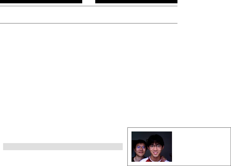
Helin Gai
Duke University
9
Tables and Graphics
9.1 External graphics are a lot of fun
Graphics are always a good thing—they are not miserable to look at, they increase the
length of your paper dramatically. . . . They are just great!
In Microsoft Word, you can insert a graphics by “drag-and-drop.” In L
A
T
E
X, you
don’t even need to drag and drop. For example, if you have a photo named ColinLee.jpg,
you need to: 1) drag and picture into the folder where the T
E
X file you’re compiling
lives, 2) load the grahpicx package, and 3) now you could insert the picture into your
document like this:
\includegraphics[width=3cm]{ColinLee.jpg}
This book recommends that you use the PDF-L
A
T
E
X typesetting engine which support
JPEG and PDF files pretty well. If you’re using the default L
A
T
E
X engine, your best
choice is to use EPS files. If you use files that are not in the EPS format, you’ll have
to specify the bounding box yourself or create a .bb file to help L
A
T
E
X decides the
bounding box of the image. On the contrary, PDF-L
A
T
E
X does not support EPS files. bb=10 20 100 200 sets
the left bottom point of
the bounding box to be
(10,20) and the top right
point to be (100,200).
As you’ve seen in the example, the \includegraphics command could be followed
by optional argument. width is one of them; there are also height,totalheight,scale
(this should be a number), angle,origin (the point that the image rotates along) and
bb.
9.2 Structuring a table
We get started with a simple table that illustrates most of L
A
T
E
X’s own commands for
constructing tables.
à
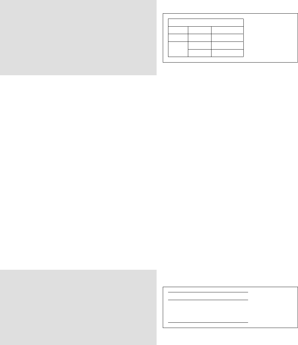
Helin Gai
Duke University
96 Tables and Graphics
\begin{tabular}{|r|c|r|}
\hline
\multicolumn{3}{|c|}{AT\&T Common Stock}\\
\hline
Year & Price & \multicolumn{1}{c|}{Dividend}\\
\hline
1971 & 41--54 & \$2.60\\\hline
2 & 41--54 & 2.70\\\cline{2-3}
3 & 46--55 & 2.97\\\hline
\end{tabular}
AT&T Common Stock
Year Price Dividend
1971 41–54 $2.60
2 41–54 2.70
3 46–55 2.97
As you can see, a table is created with the tabular environment. We set up the
general layout of the table by providing special argument right after \begin{tabular},
using a combination of c(centered), r(right-aligned), l(left-aligned), and p{width}
(a column with automatic line breaks to cater to the specified width). Vertical lines are
specified with ‘|’.
Columns are separated with &(You don’t need to put a &before the first column
though). In other words, a &indicates a jump to the next column. \\ simply starts a
new row and the \hline command produces a horizontal line. Of course, two \hline’s
produce two consecutive horizontal lines. Sometimes, you might want a horizontal line
for just a few of the columns; this is done with the \cline{a-b}” command, where
ais the index number of starting column, and bis the number of the ending column.
For instance, in our example, \cline{2-3} produces a partial horizontal line under the
second and the third columns.
We could “merge cells” with \multicolumn{number}{position}{text}. The number
parameter specifies the total number of cells to merge; the position parameter specifies
how to align the text in the cell; and of course, you need to provide what text to
be placed in the merged cell. You might be wondering why I “merged” one cell in
the example. The reason is that all the text in this column has been specified to be
right-aligned, and I want to center the text in this cell. The \multicolumn command
provides a perfect work around.
There’s one more thing that can be useful in specifying the general layout of the
table: @{...}. It eliminates the space between any two columns and replaces it with the
... that you provide. As you could imagine, if you say r@{}l, then the right-aligned
column will literally “kiss” the left-aligned column. Here’s a very good example from
The Not So Short Introduction to L
A
T
E
X 2εwith some minor modification:
\begin{tabular}{c r @{.} l}
\hline
Pi expression &
\multicolumn{2}{c}{Value} \\
\hline
$\pi$ & 3&1416 \\
$\pi^{\pi}$ & 36&46 \\
$(\pi^{\pi})^{\pi}$ & 80662&7 \\
\hline
\end{tabular}
Pi expression Value
π3.1416
ππ36.46
(ππ)π80662.7
A recent trend is that the design of tables is getting simpler—most modern tables
have no vertical lines and few horizontal lines (like the ones you’ve seen in this book).
L
A
T
E
X is quite capable of producing these tables, but the booktabs provides a few
commands that is going to ease your work a lot!
,

Helin Gai
Duke University
9.3 Tables that travel a long way 97
Table 1: The ISOGRK3 entity set
Entity Unicode Name Unicode
alpha GREEK SMALL LETTER ALPHA 03BA
alpha GREEK SMALL LETTER ALPHA 03BA
alpha GREEK SMALL LETTER ALPHA 03BA
alpha GREEK SMALL LETTER ALPHA 03BA
alpha GREEK SMALL LETTER ALPHA 03BA
alpha GREEK SMALL LETTER ALPHA 03BA
alpha GREEK SMALL LETTER ALPHA 03BA
alpha GREEK SMALL LETTER ALPHA 03BA
alpha GREEK SMALL LETTER ALPHA 03BA
alpha GREEK SMALL LETTER ALPHA 03BA
alpha GREEK SMALL LETTER ALPHA 03BA
alpha GREEK SMALL LETTER ALPHA 03BA
alpha GREEK SMALL LETTER ALPHA 03BA
alpha GREEK SMALL LETTER ALPHA 03BA
alpha GREEK SMALL LETTER ALPHA 03BA
alpha GREEK SMALL LETTER ALPHA 03BA
alpha GREEK SMALL LETTER ALPHA 03BA
alpha GREEK SMALL LETTER ALPHA 03BA
Continued on next page
1
Continued from previous page
Entity Unicode Name Unicode
alpha GREEK SMALL LETTER ALPHA 03BA
alpha GREEK SMALL LETTER ALPHA 03BA
alpha GREEK SMALL LETTER ALPHA 03BA
alpha GREEK SMALL LETTER ALPHA 03BA
alpha GREEK SMALL LETTER ALPHA 03BA
alpha GREEK SMALL LETTER ALPHA 03BA
alpha GREEK SMALL LETTER ALPHA 03BA
alpha GREEK SMALL LETTER ALPHA 03BA
alpha GREEK SMALL LETTER ALPHA 03BA
alpha GREEK SMALL LETTER ALPHA 03BA
alpha GREEK SMALL LETTER ALPHA 03BA
alpha GREEK SMALL LETTER ALPHA 03BA
alpha GREEK SMALL LETTER ALPHA 03BA
alpha GREEK SMALL LETTER ALPHA 03BA
alpha GREEK SMALL LETTER ALPHA 03BA
alpha GREEK SMALL LETTER ALPHA 03BA
2
Figure 9.1: Tables that travel a long way
\tiny
\def\figurespace{\phantom{0}}
\begin{tabular}{@{}crrrr@{}}
\toprule
&\multicolumn{2}{c}{Export contracts (\%)}
&\multicolumn{2}{c}{Import contracts (\%)}\\
\cmidrule(lr){2-3} \cmidrule(l){4-5}
Year & In yen & In dollars
& In yen & In dollars\\
\midrule
1970 & \figurespace0.9 & 90.4 & 0.3 & 80.0\\
1975 & 17.5 & 78.0 & 0.9 & 89.9\\
1980 & 28.9 & 66.3 & 2.4 & 93.1\\
\bottomrule
\end{tabular}
Export contracts (%) Import contracts (%)
Year In yen In dollars In yen In dollars
1970 0.9 90.4 0.3 80.0
1975 17.5 78.0 0.9 89.9
1980 28.9 66.3 2.4 93.1
The commands \toprule,\midrule, and \bottomrule are self-explanatory. The
\cmidrule is like \cline, but you could use rand lput in parentheses to specify which
side of the line to truncate.
9.3 Tables that travel a long way
After loading the longtable package, the work is easy:
\begin{longtable}{@{}lll@{}}
\caption{The ISOGRK3 entity set}\\
\toprule
Entity & Unicode Name & Unicode \\ \midrule
\endfirsthead
\multicolumn{3}{r}{Continued from previous page}\\
\toprule
Entity & Unicode Name & Unicode \\ \midrule
à

Helin Gai
Duke University
98 Tables and Graphics
Figure 9.2: A picture of Colin and his super friend, Lee.
\endhead
\midrule
\multicolumn{3}{r}{Continued on next page}
\endfoot
\bottomrule
\endlastfoot
alpha & GREEK SMALL LETTER ALPHA & 03BA\\
alpha & GREEK SMALL LETTER ALPHA & 03BA\\
alpha & GREEK SMALL LETTER ALPHA & 03BA\\
alpha & GREEK SMALL LETTER ALPHA & 03BA\\
alpha & GREEK SMALL LETTER ALPHA & 03BA\\
alpha & GREEK SMALL LETTER ALPHA & 03BA\\
......
9.4 Floating tables and figures around
Using \begin{tabular} and \includegraphics orders L
A
T
E
X to place the table and
image “here,” and without a caption. But most publications today require a more
flexible mechanism—tables and figures are hardly placed right after a paragraph, and it
is generally agreed that such statements as “Refer to the figure below:” are bad and
should be replaced with something similar to “Refer to figure 3.14.” Luckily, L
A
T
E
X is
born with the support for such “floating bodies.”
A floating figure is created with the figure environment and a floating table is
constructed with table.
For example, figure 9.2 is created with
\begin{figure}[bt]
\includegraphics[width=3cm]{ColinLee.jpg}
\caption{A picture of Colin and his super friend, Lee.}
\label{samplefigure}
\end{figure}
Similarly, you can create a floating table with something like:
\begin{table}[tbhp]
\centering
\caption{...}
\begin{tabular}
...
\end{tabular}
\end{table}
,

Helin Gai
Duke University
9.5 Customizing your captions 99
Table 9.1: Parameters for controlling the float bodies.
topnumber The maximum number of floats allowed at the top of the page
(default to 2). It can be changed with \setcounter.
bottomnumber The maximum number of floats allowed at the bottom of the page
(default to 1). It can be changed with \setcounter.
totalnumber The maximum number of floats allowed on a page (default to 3).
It can be changed with \setcounter.
\topfraction Maximum fraction of the page that can be occupied by floats
at the top of the page (default to 0.7). It can be changed with
\renewcommand.
\bottomfraction Maximum fraction of the page that can be occupied by floats at
the bottom of the page (default to 0.3). It can be changed with
\renewcommand.
\floatsep Rubber length specifying the vertical space added between floats
(default to 12pt plus 2pt minus 2pt for 10 pt and 11 pt docu-
ments, and 14pt plus 2pt minus 4pt for 12 pt documents). This
can be changed with \setlength.
\textfloatsep Rubber length specifying the vertical space added between floats
and the text (default to 20pt plus 2pt minus 4pt).
\intextsep Rubber length specifying the vertical space added below and above
a float that is positioned in the middle of the text.
You might have noticed that there are a few optional arguments immediately
following \begin{table} and \begin{figure}. There are actually give of them in
total and you can use a combination of any one of them. tstands for top, bfor bottom,
pfor page, hfor here, and !means to ignore most of the internal parameters (e.g., the
maximum number of floats allowed on a page). Then [tb] means that L
A
T
E
Xcould place
the figure at the top or at the bottom of a page. Note that hdoesn’t necessarily mean
that L
A
T
E
X will place the figure here, but that L
A
T
E
X will try its best to put it here. If
the page doesn’t have enough space to hold the figure, a different parameter will be
chosen.
Table 9.1 lists some of the most important parameters for controlling the floating
environments.
9.5 Customizing your captions
Captions can be easily customized with the caption package. caption2 used to be my
choice, but it is not
obsolete. Sigh . . .
All the most useful parameters are listed in table ??.
You could pass these options to the package itself, like what you do with the
geometry package. For example, the following code is legitimate:
\usepackage[textfont={rm,it},labelfont{sf}]{caption}
An alternative is to use the \captionsetup command:
\captionsetup[type]{option-value-list}
The advantage is that you’ll be able to specify the “type” of caption that you want to
define. For example, if you say \captionsetup[figure], only the caption of figures
will be affected.
à
Helin Gai
Duke University
100 Tables and Graphics
Table 9.2: Parameters for changing captions.
Parameter Explanation
singlelinecheck Checks if the whole option fits on a single line. If so, it will be
centered.
format The default format is the the standard L
A
T
E
X format. The alter-
native is hang, which specifies that the caption be set with the
label to the left of the caption text; i.e., continuation lines are
indented by the width of the label.
margin, width Sets the width and the margin of the caption.
indentation Sets the indentation of continuation lines.
font Defines the font characteristics for the entire caption. It can take
a set of keywords values including rm,sf,tt,md,bf,up,it,sl,
sc,scriptsize,footnotesize,small,normalsize,large, or
Large. For example, font={sf,bf} sets the caption in the bold
sans serif typeface.
labelfont Sets the font of the label.
textfont Sets the font of the text of the caption.
labelsep Sets the separation between the label and the text. Keywords
include colon,period,space, and newline.
justification Specifies how the paragraph should be justified. Available keywords
are raggedleft,raggedright,centerfirst, and centerlast.
parskip Sets the space between paragraphs in multi-paragraph captions.
aboveskip Sets the space between the caption and float body.
belowskip Space on the opposite side of the caption.
The captions in this book are set up with the following code:
\DeclareCaptionFont{blue}{\color{blue}}
\captionsetup{justification=raggedright,
singlelinecheck=false,font={blue,sf,small}}
,
