Lab 5 Instructions
User Manual:
Open the PDF directly: View PDF ![]() .
.
Page Count: 17

Data Modelling and Analysis – Lab 5: Data Visualisation in R 2018/2019
1
G54DMA - Lab 5: Data Visualisation in R
Instructions
In this lab session, we will learn how to use basic R to visualise data. Additionally, we will learn
to create more sophisticated and customizable graphs using one of the most popular R
packages: ggplot2.
For a comprehensive reference manual on all things R, please refer to An Introduction to R by
Venables et al., which can be found here:
https://cran.r-project.org/doc/manuals/r-release/R-intro.pdf
For a comprehensive reference manual on ggplot2, please refer to ggplot2: Elegant Graphics for
Data Analysis by Hadley Wickham (2015), which can be found in the Additional Resources
section on Moodle.
I recommend you have them with you while you are working on these exercises.
Thorough the labs, we will be using An Introduction to R as a reference manual. Additionally, in
this lab we will be using Hadley Wickham’s ggplot2: Elegant Graphics for Data Analysis for
section C. Chapters or sections of interest will be signalled with “Reading:” in the Instruction
sheets.
Learning outcomes
After this lab session, you will be able to:
· Create simple graphs to analyse your data using basic R.
· Create sophisticated graphs to analyse your data using the ggplot2 library.
· Choose appropriate visualisation methods for data analysis purposes.
Data Modelling and Analysis – Lab 5: Data Visualisation in R 2018/2019
2
1. Simple graphs in R
R has many functions for graphs and plots, for example:
ir = iris #load iris dataset on a variable
pie(table(ir$Species)) #creates a piechart
pie(table(ir$Species), col=c("white","blue","red"))
plot(ir$Sepal.Length, ir$Sepal.Width, ylab="Sepal Width",
xlab="Sepal Length", main="Sepal Width vs Sepal Length") #creates a
scatterplot of sepal length vs sepal width
# You can also colour the points
plot(ir$Sepal.Length, ir$Sepal.Width, ylab="Sepal Width",
xlab="Sepal Length", main="Sepal Width vs Sepal Length", col =
"red") #All points will be red
plot(ir$Sepal.Length, ir$Sepal.Width, ylab="Sepal Width",
xlab="Sepal Length", main="Sepal Width vs Sepal Length", col =
ir$Species) # Points will be coloured according to ir$Species
The parameters xlab and ylab are used to name the axes. The parameter main is used to title
your graph.
To study the distribution of your variables, you can use hist() to create histograms.
hist(ir$Sepal.Width) #creates a histogram for Sepal Width
hist(ir$Sepal.Width, breaks=15, col="red",
main="Histogram of Sepal Width", xlab="Sepal Width")
The parameter breaks determines the number of bins/cells in the histogram, and it can be:
a vector giving the breakpoints between histogram cells.
a function to compute the vector of breakpoints.
a single number giving the number of cells for the histogram.
hist(ir$Sepal.Width, breaks=seq(1,5,by=0.2), col="purple",
main="Histogram of Sepal Width", xlab="Sepal Width") # remember the
seq function?
Data Modelling and Analysis – Lab 5: Data Visualisation in R 2018/2019
3
You can also add extra lines, legends, text, etc. to plots.
abline(v=mean(ir$Sepal.Width),col="red", lwd=3) #adds a mean line in
red
abline(v=median(ir$Sepal.Width),col="green", lwd=3) #adds a median
line in green
legend("topright",c("mean","median"),col=c("red","green"), pch=16)
#created a legend for the graph
R also allows you to create boxplots, which can be a very useful for exploring data:
boxplot(ir$Sepal.Length)
You can also easily plot multiple graphs on one window with the function par():
par(mfrow=c(1,2)) ; # arranges graphs in rows (1 row, 2 columns)
boxplot(ir$Sepal.Length, las=3, main="Sepal length");
boxplot(ir$Sepal.Width, las=3, main="Sepal Width");
The par() function is very flexible. To learn more about its parameters, search
for ??graphics::par in RStudio.
Another form of plotting that can be very helpful for visualising complex data is pairs(), which
returns scatterplots between all attributes passed as parameters.
pairs(ir[,1:2])
pairs(ir[,1:4], col=ir$Species)
Finally, the latest versions of R have introduced interactive 3-dimensional plotting capabilities:
# You will have to install several packages
install.packages("devtools")
library(devtools)
install_github("shinyRGL", "trestletech")
install_github("rgl", "trestletech", "js-class")
library(rgl)

Data Modelling and Analysis – Lab 5: Data Visualisation in R 2018/2019
4
?plot3d
plot3d(ir$Sepal.Length, ir$Sepal.Width, ir$Petal.Length, type="s",
col=as.numeric(ir$Species))
You may not have permissions on the lab machines to install all of these libraries, but you can
experiment on your own computer.
Reading: For more information about visualisation techniques, read chapter 12 of An
Introduction to R.
2. Advanced graphs with ggplot2
As you practice more with the basic visualisation functions from the previous section, you will
probably realise that, while useful, they are quite limited in terms of customisation and
appearance. For more complex graphs, the ggplot2 library is the best alternative.
In this lab, we are going to use the iris dataset and Harver’s worshop on ggplot2 as our main
guide. You can find the tutorial here:
http://tutorials.iq.harvard.edu/R/Rgraphics/Rgraphics.html
The advantages of using ggplot2 are:
consistent underlying grammar of graphs (i.e. all types of graphs follow the same rules and
use the same functions) (Wilkinson, 2005)
plot specification at a high level of abstraction
very flexible
theme system for polishing plot appearance
mature and complete graphics system
many users, active mailing list
That said, there are some things you cannot (or should not) do with ggplot2:
3-dimensional graphics (see the rgl package from the previous section)
Graph-theory type graphs (nodes/edges layout; see the igraph package)
Interactive graphics (see the ggvis package)

Data Modelling and Analysis – Lab 5: Data Visualisation in R 2018/2019
5
What Is The Grammar Of Graphics?
The basic idea is that you will independently specify plot building blocks and combine them to
create just about any kind of graphical display you want. All types of graphs will use the same
building blocks. It is up to you to decide how to use them to create the graph you need. Building
blocks of a graph include:
data
aesthetic mapping
geometric object
statistical transformations
scales
coordinate system
position adjustments
faceting
To do this, there are three major functions that you will use in ggplot2:
ggplot() – for fine, granular control of graphs
geom functions – to add points, lines, boxplots, etc. to the graph.
ggsave() – to quickly save graphs
4.1 Plotting Function - ggplot():
ggplot is called with the data you want to show in the graph.
Let’s see an example with a coloured scatter plot:
#initialization
ir = iris
names(ir) = c("sepal.length", "sepal.width", "petal.length",
"petal.width", "class")
names(ir) #Remember! We saw (Lab 4) as a way of changing names of
fields for dataframes.
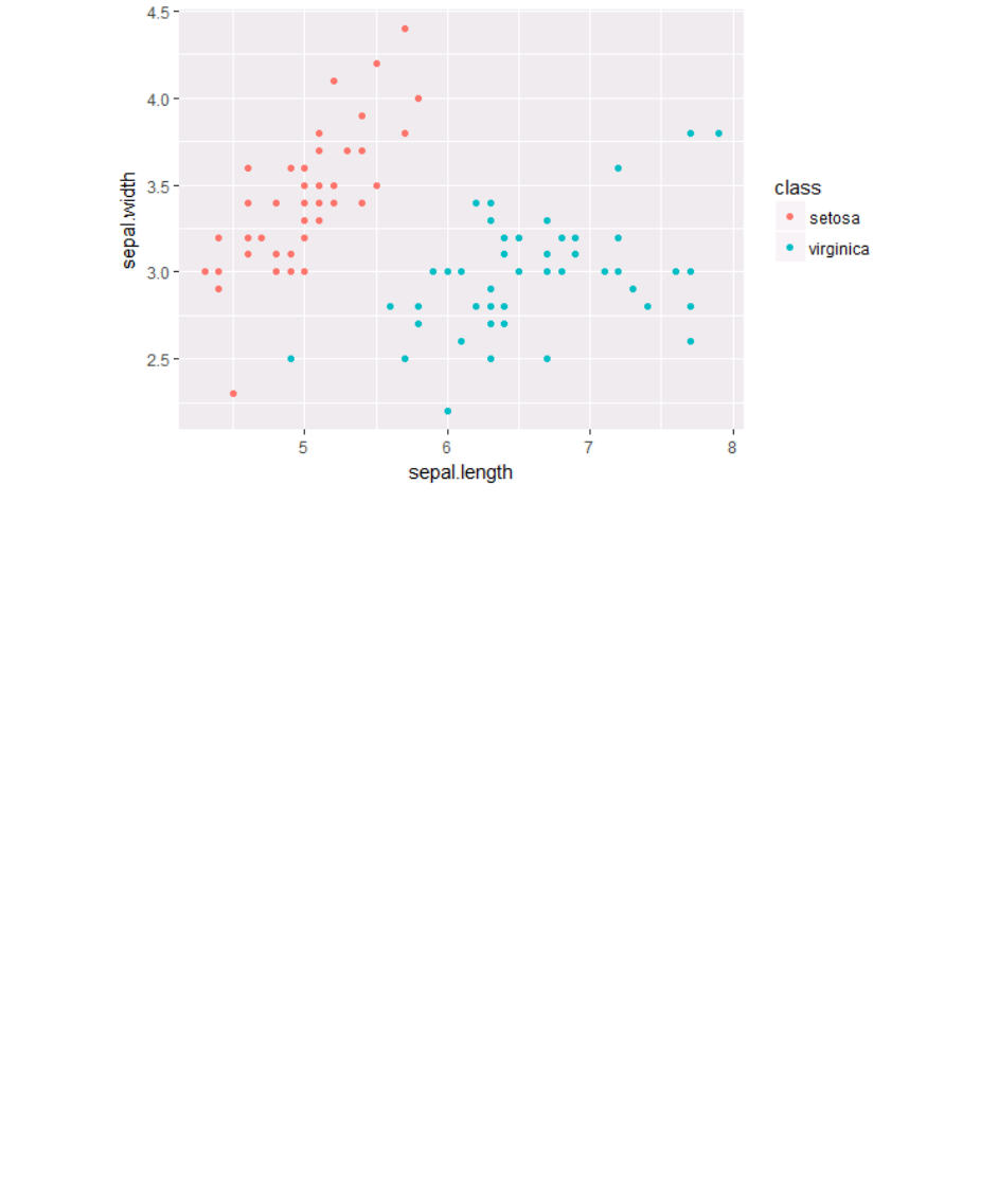
#visualisation
ggplot(subset(ir, class %in% c("setosa", "virginica"))) + geom_po
int(aes(x=sepal.length, y = sepal.width, color = class))
Data Modelling and Analysis – Lab 5: Data Visualisation in R 2018/2019
6
What is the purpose of the section in red? What happens if you change it to:
ggplot(ir) + geom_point(aes(x=sepal.length, y = sepal.width, colo
r = class))
The parameter inside ggplot will specify the default data of your graph. If the input is not a
data.frame, it will be converted to one. If not specified, then data must be suppled in each layer
added to the plot.
4.2 Geoms
Geometric objects are the actual marks we put on a plot. You can think of them as layers of
data that can be shown in the graph. There are several types. The ones we will work with are:
points (geom_point, for scatter plots, dot plots, etc)
lines (geom_line, for time series, trend lines, etc)
boxplot (geom_boxplot, for, well, boxplots!)
A plot must have at least one geom, but there is no upper limit. You can add a geom to a plot
using the + operator
You can get a list of available geometric objects using the code below:
help.search("geom_", package = "ggplot2")
Data Modelling and Analysis – Lab 5: Data Visualisation in R 2018/2019
7
You can also simply type geom_<tab> in any good R IDE (such as Rstudio or ESS) to see a list of
functions starting with geom_.
In ggplot land aesthetic means "something you can see". Examples include:
position (i.e., on the x and y axes)
color ("outside" color)
fill ("inside" color)
shape (of points)
linetype
size
Each type of geom accepts only a subset of all aesthetics –refer to the geom help pages to see
what mappings each geom accepts. Aesthetic mappings are set with the aes() function.
Let’s look at each type of geom separately.
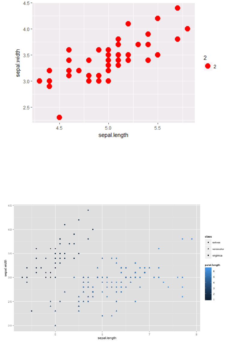
4.2.1 Points (Scatterplot)
Now that we know about geometric objects and aesthetic mapping, we can make a
ggplot. geom_point requires mappings for x and y, all others are optional.
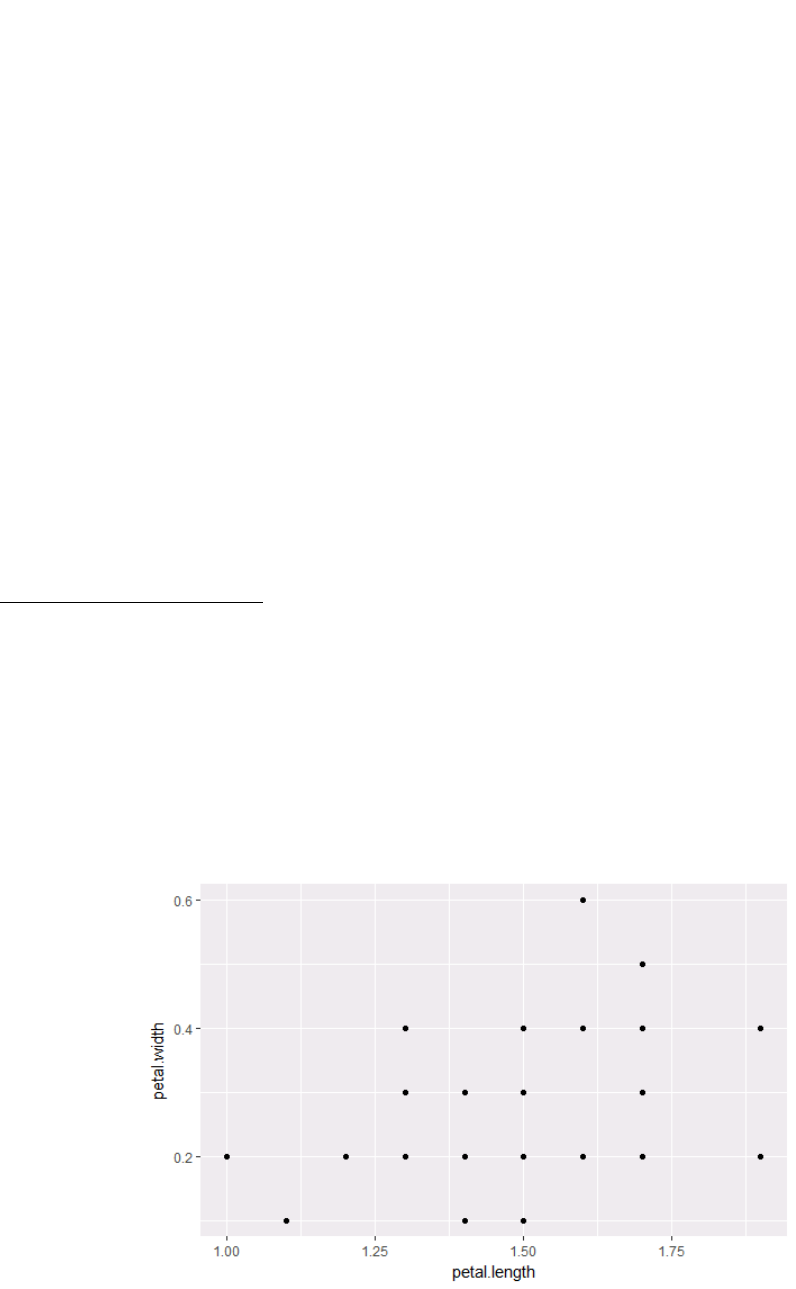
ir_set = subset(ir, class %in% c("setosa")) # grab only setosa
plants
ggplot(ir_set, aes(x=petal.length, y=petal.width)) + geom_point()
#this graph plots Petal length vs Petal width, but only for
setosa plants.
Data Modelling and Analysis – Lab 5: Data Visualisation in R 2018/2019
8
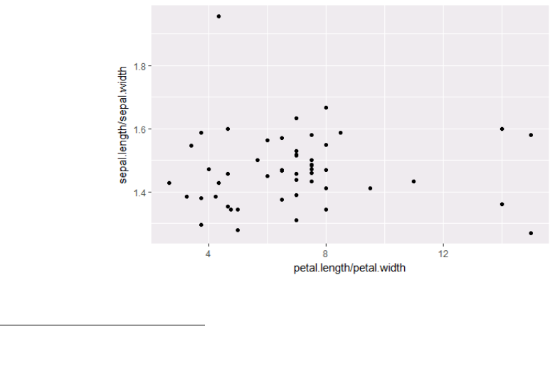
ggplot(ir_set, aes(x=petal.length/petal.width,
y=sepal.length/sepal.width)) + geom_point() # we can change the
data displayed in the aes function, too.
4.2.2 Lines (Prediction Line)
A plot constructed with ggplot can have more than one geom. In that case the mappings
established in the ggplot() call are plot defaults that can be added to or overridden. Our plot
could use a regression line:
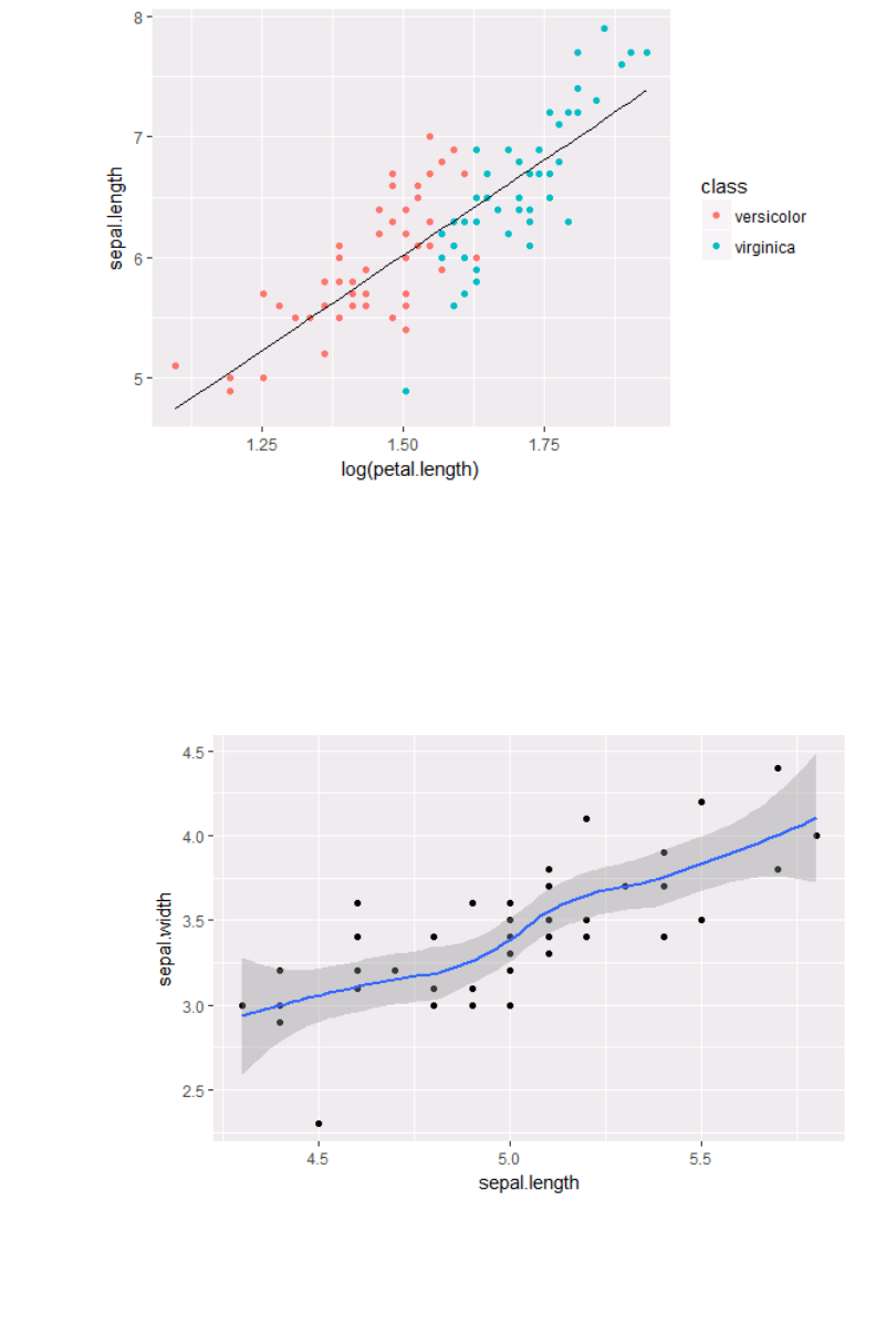
ir_versi = subset(ir, class %in% c("versicolor","virginica"))
ir_versi$pred.SL = predict(lm(sepal.length ~ log(petal.length),
data= ir_versi))
ggplot(ir_versi, aes(x = log(petal.length), y = sepal.length)) +
geom_point(aes(color = class)) + geom_line(aes(y = pred.SL))
Data Modelling and Analysis – Lab 5: Data Visualisation in R 2018/2019
9
Smoothers
Not all geometric objects are simple shapes –the smooth geom includes a line and a ribbon.
ir_set = subset(ir, class %in% c("setosa"))
ggplot(ir_set, aes(x=sepal.length, y=sepal.width)) + geom_point()
+ geom_smooth()
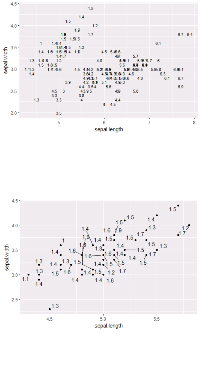
4.2.3 Text (Label Points)
Each geom accepts a particular set of mappings. For example geom_text() accepts a labels mapping.
ggplot(ir, aes(x=sepal.length, y=sepal.width)) +
geom_text(aes(label=petal.length), size=3)
Data Modelling and Analysis – Lab 5: Data Visualisation in R 2018/2019
10
p1 = ggplot(ir_set, aes(x=sepal.length, y=sepal.width))
install.packages("ggrepel")
library("ggrepel")
p1 + geom_point() + geom_text_repel(aes(label=petal.length),
force = 3)
4.3 Aesthetic Mapping VS Assignment
Note that variables are mapped to aesthetics with the aes() function, while fixed aesthetics are
set outside the aes() call. This sometimes leads to confusion, as in this example:
p1 +
Data Modelling and Analysis – Lab 5: Data Visualisation in R 2018/2019
11
geom_point(aes(size = 2), #incorrect! 2 is not a variable
color="red") # this is fine -- all points red
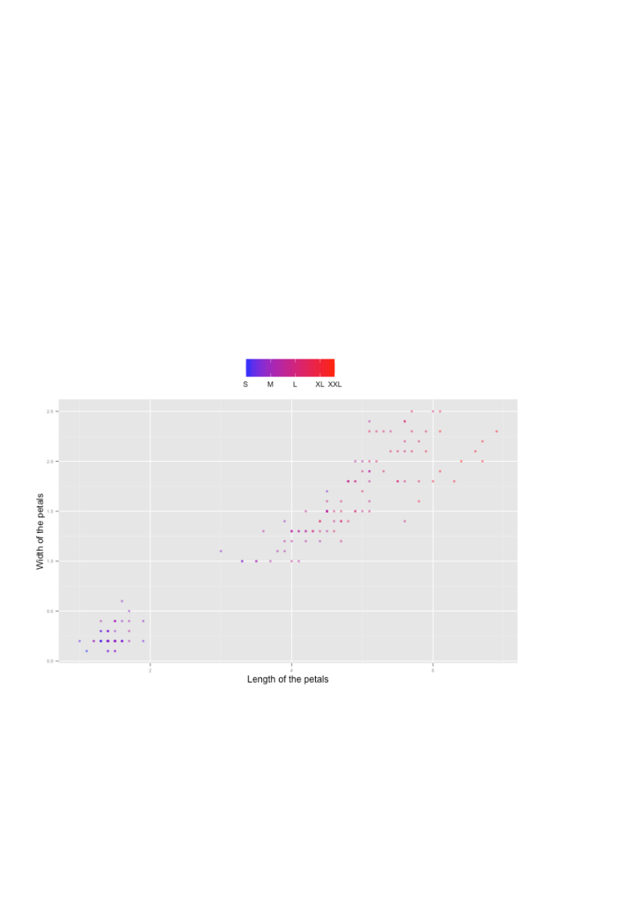
4.3.1 Mapping Variables to Other Aesthetics
Other aesthetics are mapped in the same way as x and y in the previous example.
ggplot(ir, aes(x=sepal.length, y=sepal.width)) +
geom_point(aes(color=petal.length, shape = class))

Data Modelling and Analysis – Lab 5: Data Visualisation in R 2018/2019
12
4.4 Statistical Transformations
Some plot types (such as scatterplots) do not require transformations–each point is plotted at x
and y coordinates equal to the original value. Other plots, such as boxplots, histograms,
prediction lines etc. require statistical transformations. For example:
for a boxplot the y values must be transformed to the median and 1.5(IQR)
for a smoother boxplot the y values must be transformed into predicted values
Each geom has a default statistic, but these can be changed.
4.5 Controlling Aesthetic Mapping: Scales
Aesthetic mapping (i.e., with aes()) only says that a variable should be mapped to an aesthetic. It
doesn't say how that should happen. For example, when mapping a variable
to shape with aes(shape = x) you don't say what shapes should be used. Similarly, aes(color =
z) doesn't say what colours should be used. Describing what colours/shapes/sizes etc. to use is
done by modifying the corresponding scale.
In ggplot2 scales include:
position
colour and fill
size
shape
line type
Scales are modified with a series of functions using a scale_<aesthetic>_<type> naming scheme. Try
typing scale_<tab> to see a list of scale modification functions.
4.5.1 Common Scale Arguments
The following arguments are common to most scales in ggplot2:
name
the first argument gives the axis or legend title
limits
the minimum and maximum of the scale
breaks
the points along the scale where labels should appear
labels
the labels that appear at each break
Data Modelling and Analysis – Lab 5: Data Visualisation in R 2018/2019
13
Specific scale functions may have additional arguments. For example, the scale_color_continuous
function has arguments low and high for setting the colours at the low and high end of the scale.
4.5.2 Scale Modification Examples
Start by constructing a dotplot showing the distribution of home values by Length and Width of
the petals.
p1 = ggplot(ir, aes(x=petal.length, y=petal.width)) +
theme(legend.position = "top", axis.text=element_text(size = 6))
p1 + geom_point(aes(color=sepal.length), alpha = 0.5, size = 1.5) +
scale_x_continuous(name=“Length of the petals") +
scale_y_continuous(name="Width of the petals") +
scale_color_continuous(name="", breaks = c(4.3,5.3,6.3,7.3,7.9),
labels = c("S", "M", "L","XL","XXL"), low = "blue", high = "red")
ggplot2 has a wide variety of color scales. Note that in RStudio you can type scale_ followed by
TAB to get the whole list of available scales.
4.6 Faceting
Faceting is ggplot2 parlance for small multiples
The idea is to create separate graphs for subsets of data
ggplot2 offers two functions for creating small multiples:
1. facet_wrap(): define subsets as the levels of a single grouping variable
Data Modelling and Analysis – Lab 5: Data Visualisation in R 2018/2019
14
2. facet_grid(): define subsets as the crossing of two grouping variables
Facilitates comparison among plots, not just of geoms within a plot
What is the trend in petal length in each class? Start by using a technique we already know –
map the class to color.
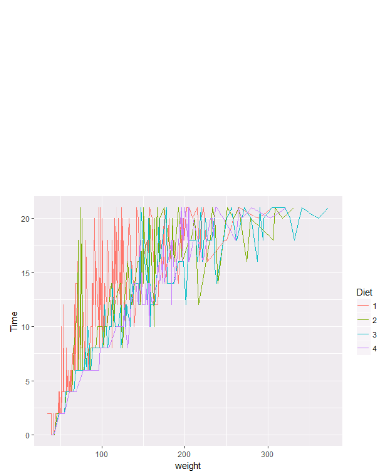
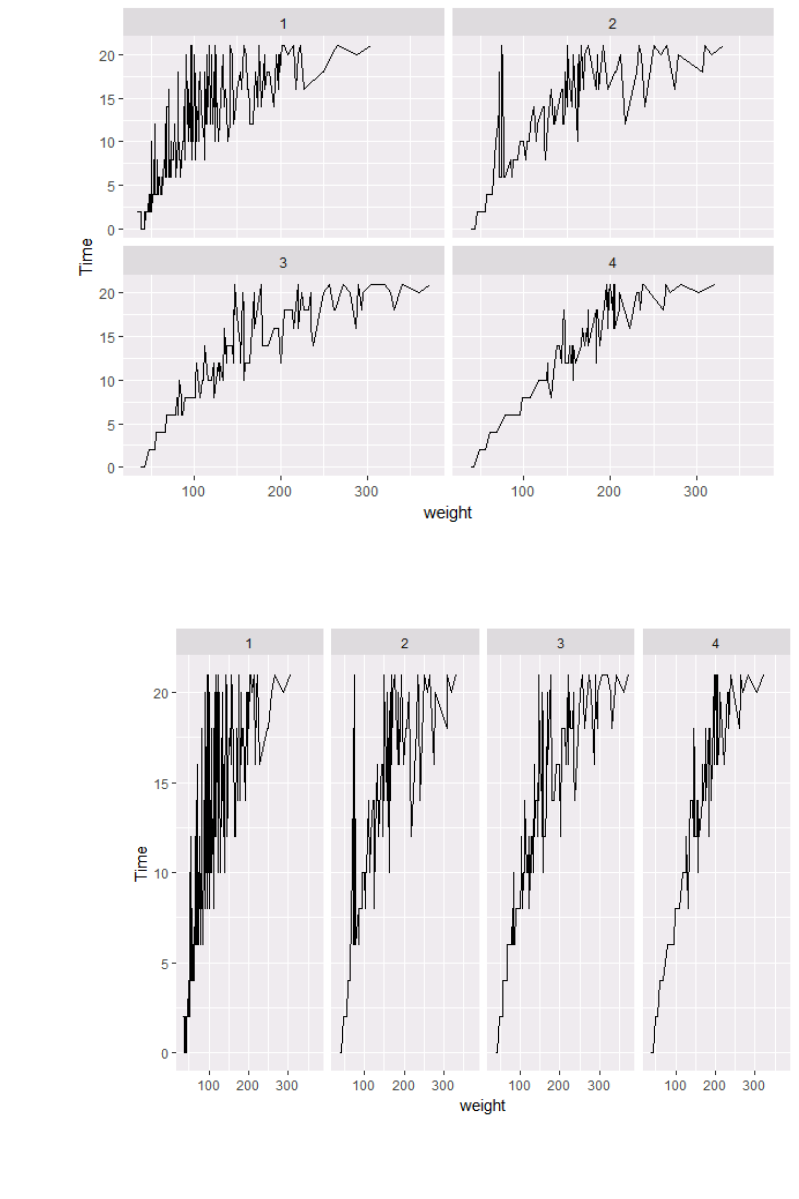
Let’s try this with a different dataset from R: ChickWeight. Let’s try to find the trend of each the
weight in terms of diet:
cw=ChickWeight
p <- ggplot(cw, aes(x = weight , y = Time))
p + geom_line(aes(color = Diet))
There are two problems here: there are too many lines to distinguish each one by colour, and
the lines obscure one another.
Faceting to the rescue!
We can remedy the deficiencies of the previous plot by faceting by state rather than mapping
Diet to colour.
p + geom_line()+facet_wrap(~Diet)
Data Modelling and Analysis – Lab 5: Data Visualisation in R 2018/2019
15
There is also a facet_grid() function for faceting in two dimensions.
p5 = p + geom_line() + facet_grid (~Diet)
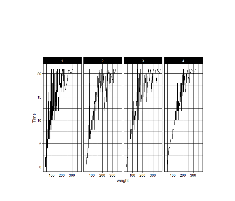
4.7 Themes
The ggplot2 theme system handles non-data plot elements such as:
Axis labels
Plot background
Data Modelling and Analysis – Lab 5: Data Visualisation in R 2018/2019
16
Facet label backround
Legend appearance
Built-in themes include:
theme_gray() (default)
theme_bw()
theme_classc()
For example:
p5 + theme_linedraw()
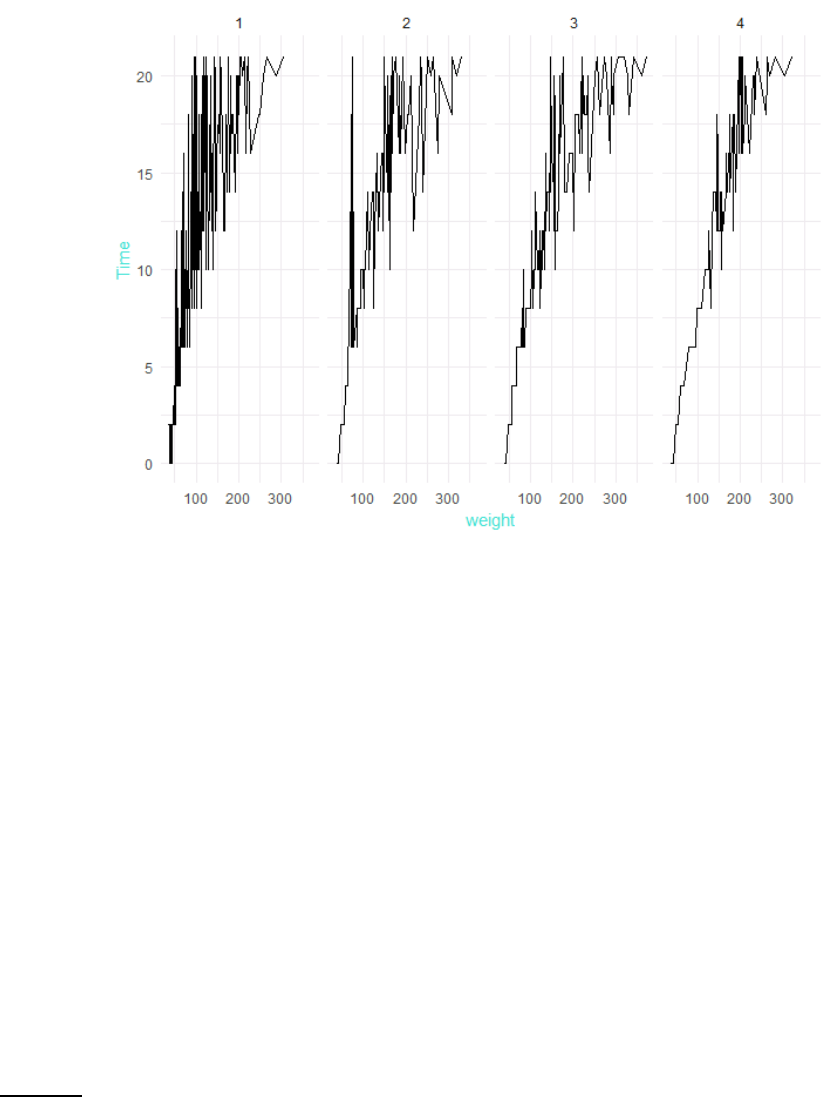
Specific theme elements can be overridden using theme(). For example:
p5 + theme_minimal() + theme(text = element_text(color = "turquoise"))
Data Modelling and Analysis – Lab 5: Data Visualisation in R 2018/2019
17
All theme options are documented in ?theme. You can create new themes, as in the following
example:
theme_new <- theme_bw() +
theme(plot.background = element_rect(size = 1, color = "blue", fill
= "black"),
text=element_text(size = 12, family = "Serif", color =
"ivory"),
axis.text.y = element_text(colour = "purple"),
axis.text.x = element_text(colour = "red"),
panel.background = element_rect(fill = "pink"),
strip.background = element_rect(fill = muted("orange")))
p5 + theme_new
Reading: For more information about ggplot2, read chapters 1 to 5 of ggplot2: Elegant
Graphics for Data Analysis.
