Manual De Tableau
User Manual:
Open the PDF directly: View PDF ![]() .
.
Page Count: 25
Which chart or graph
is right for you?
Authors: Maila Hardin, Daniel Hom, Ross Perez, & Lori Williams
2
You’ve got data and you’ve got questions. Creating a chart or graph links the two, but
sometimes you’re not sure which type of chart will get the answer you seek.
This paper answers questions about how to select the best charts for the type of data
you’re analyzing and the questions you want to answer. But it won’t stop there.
Stranding your data in isolated, static graphs limits the number of questions you can
answer. Let your data become the centerpiece of decision making by using it to tell a story.
Combine related charts. Add a map. Provide lters to dig deeper. The impact? Business
insight and answers to questions at the speed of thought.
Which chart is right for you? Transforming data into an effective visualization (any kind of
chart or graph) is the rst step towards making your data work for you. In this paper you’ll
nd best practice recommendations for when to create these types of visualizations:
1. Bar chart
2. Line chart
3. Pie chart
4. Map
5. Scatter plot
6. Gantt chart
7. Bubble chart
8. Histogram chart
9. Bullet chart
10. Heat map
11. Highlight table
12. Treemap
13. Box-and-whisker plot

3
Bar chart
Bar charts are one of the most common ways to visualize data. Why? It’s quick
to compare information, revealing highs and lows at a glance. Bar charts are
especially effective when you have numerical data that splits nicely into different
categories so you can quickly see trends within your data.
When to use bar charts:
• Comparing data across categories. Examples: Volume of shirts in different
sizes, website trafc by origination site, percent of spending by department.
Also consider:
• Include multiple bar charts on a dashboard. Helps the viewer quickly
compare related information instead of ipping through a bunch of
spreadsheets or slides to answer a question.
• Add color to bars for more impact. Showing revenue performance with
bars is informative, but overlaying color to reveal protability provides
immediate insight.
• Use stacked bars or side-by-side bars. Displaying related data on top of
or next to each other gives depth to your analysis and addresses multiple
questions at once.
• Combine bar charts with maps. Set the map to act as a “lter” so when you
click on different regions the corresponding bar chart is displayed.
• Put bars on both sides of an axis. Plotting both positive and negative data
points along a continuous axis is an effective way to spot trends.
1.
4
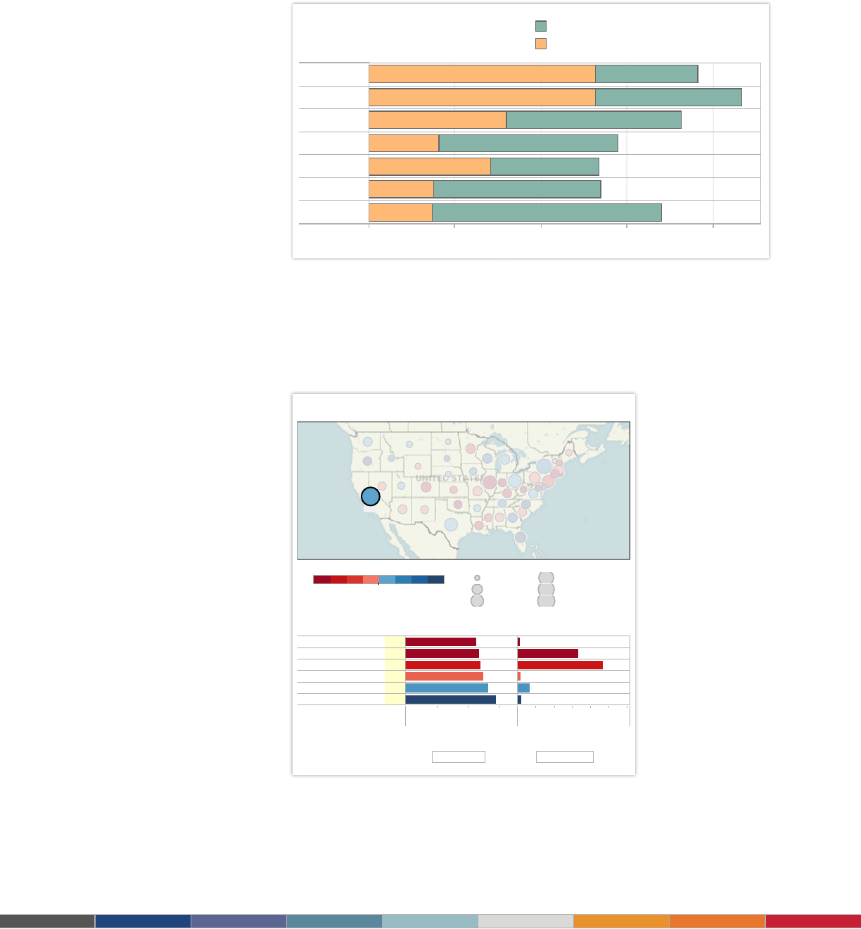
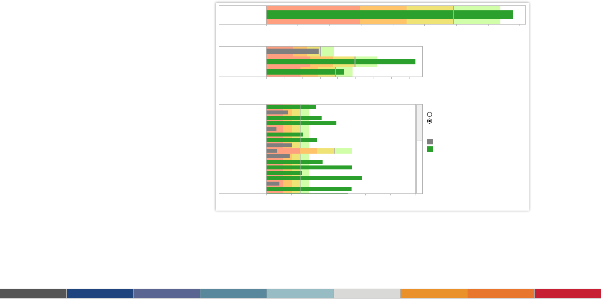
Figure 2: Combine bar charts and maps
Don’t settle for a bar chart that leaves you scrolling to nd the answers you seek. By
combining a bar chart with a map, this dashboard showing public pension funding
ratios in the U.S. provides rich information at a glance. When California is selected, for
example, the bar chart lters to show state-specic information.
Check out another state to see their funding ratio.
Public Pension Funding Ratios Nationwide
About Tableau maps: www.tableausoftware.com/mapdata
48%
Funding Ratio and Unfunded Liability by State
C
lick to filter list below
0% 20% 40% 60%
Funding ratio
$0B $100B $200B $300B
Unfunded liability
Contra Costa County CA
California Teachers CA
California PERF CA
San Diego County CA
LA County ERS CA
San Francisco City & County CA
45% $6B
47% $165B
48% $234B
50% $8B
53% $33B
58% $11B
F
unding Ratio and Unfunded Liability by Plan
C
lick to highlight state
Unfunded liability
$3B
$100B
$200B
$300B
$400B
$457B
48%
Grand Total
$457B
Grand Total
29% 59%
F
unding Ratio
Public Pension Funding Ratios Nationwide
About Tableau maps: www.tableausoftware.com/mapdata
48%
Funding Ratio and Unfunded Liability by State
Click to filter list below
0% 20% 40% 60%
Funding ratio
$0B $100B $200B $300B
Unfunded liability
Contra Costa County CA
California Teachers CA
California PERF CA
San Diego County CA
LA County ERS CA
San Francisco City & County CA
45%
$6B
47%
$165B
48%
$234B
50%
$8B
53%
$33B
58%
$11B
Funding Ratio and Unfunded Liability by Plan
Click to highlight state
Unfunded liability
$3B
$100B
$200B
$300B
$400B
$457B
48%
Grand Total
$457B
Grand Total
29% 59%
Funding Ratio
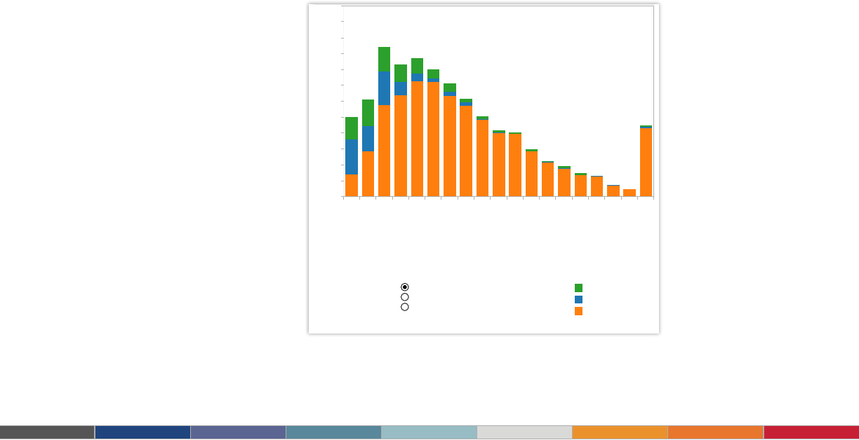
Are Film Sequels Profitable?
Box Office Stats For Major Film Franchises
$0M $100M $200M $300M
Estimated Budget
$0M
$200M
$400M
U.S. Gross
$0M $100M $200M $300M
Estimated Budget
$0M
$200M
$400M
Profit
$0M $50M $100M $150M $200M
Combined Bar Length = Avg. U.S. Gross
Original
Sequel
2nd Sequel
3rd Sequel
4th Sequel
5th Sequel
6th Sequel
Select Movie Franchise:
All
How much does a budget increase affect a sequel's box office?
Click to Highlight Average:
Estimated Budget
Profit
Data: Internet Movie Database, Box Office Mojo.
Figure 1: Tell stories with bar charts
Are lm sequels protable? In this example of a bar chart, you quickly get a sense of how
protable sequels are for box ofce franchises. Select the chart and use the drop-down
lter to see the prot for your favorite movie franchise.
5
5
5
Speed: Get results
10 to 100 times faster
The surgical service teams at Seattle
2 : : Some kind of Header Here
Tableau is fast analytics. In a competitive market
place, the person who makes sense of the data
first is going to win.
5
5
Speed: Get results
10 to 100 times faster
The surgical service teams at Seattle
2 : : Some kind of Header Here
Tableau is fast analytics. In a competitive market
place, the person who makes sense of the data
first is going to win.
Tableau is one of the best tools out there for
creating really powerful and insightful visuals.
We’re using it for analytics that require great data
visuals to help us tell the stories we’re trying to
tell to our executive management team.
– Dana Zuber, Vice President - Strategic Planning Manager, Wells Fargo
6
Black Friday
Now Bigger than Thanksgiving
2004 2005 2006 2007 2008 2009 2010 2011
5
10
15
Search Volume Index
$30.0B
$40.0B
Amount spent (in bil#)
Mouse-over for score
Since 2008, 'Black Friday'
has been a more popular
search term than 'Thanks-
giving.'
Which coincides with the increase in total
amount spent over Black Friday weekend
'Black Friday' & 'Thanksgiving': Comparing Search Term Popularity
Color Legend:
'Black Friday'
'Thanksgiving'
Total Amount Spent (in $bil)
Filter Years:
1/4/2004 to 11/13/2011
In the beginning of Nov. 2011, 'Black Friday' was already a
more searched term on Google than 'Thanksgiving.'
Data: Google Trends, National Retail Federation.
SVI score is averaged over the 2 weeks prior, after and including Thanksgiving/Black Friday
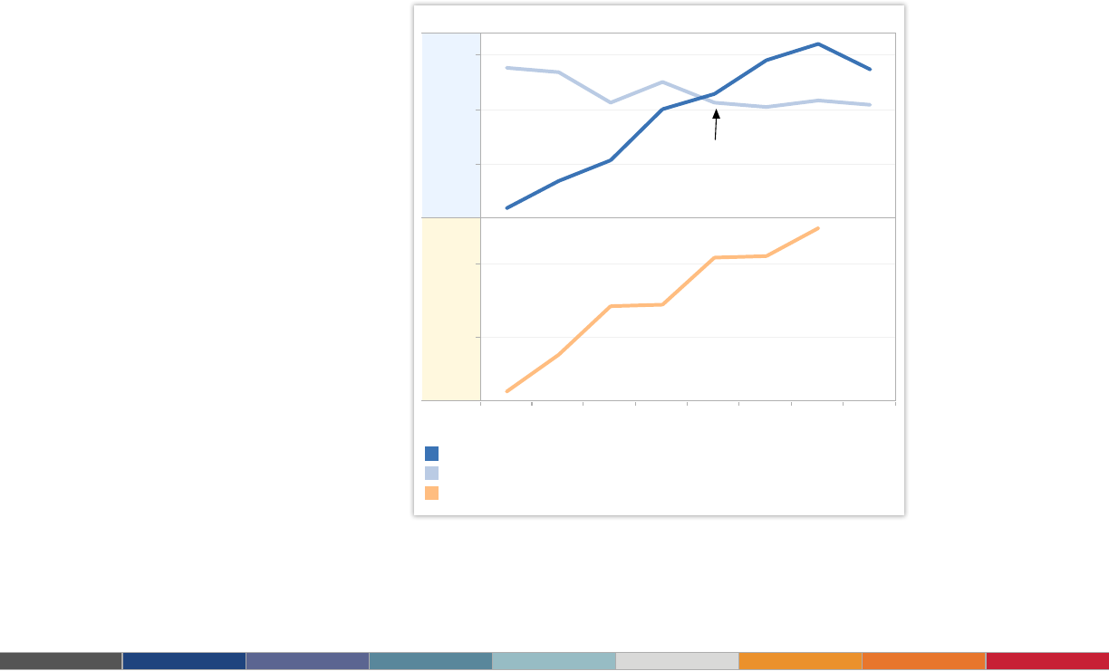
Line chart
Line charts are right up there with bars and pies as one of the most frequently used
chart types. Line charts connect individual numeric data points. The result is a simple,
straightforward way to visualize a sequence of values. Their primary use is to display
trends over a period of time.
When to use line charts:
• Viewing trends in data over time. Examples: stock price change over a ve-
year period, website page views during a month, revenue growth by quarter.
Also consider:
• Combine a line graph with bar charts. A bar chart indicating the volume sold
per day of a given stock combined with the line graph of the corresponding stock
price can provide visual queues for further investigation.
• Shade the area under lines. When you have two or more line charts, ll the
space under the respective lines to create an area chart. This informs a viewer
about the relative contribution that line contributes to the whole.
2.
Figure 3: Basic lines reveal powerful insight
These two line charts illuminate the increasing popularity of “Black Friday” as an epic event in the
United States. It’s quick to see that Thanksgiving lost ground to the popular shopping period in 2008.
7
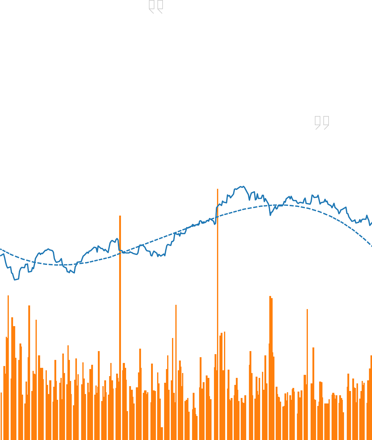
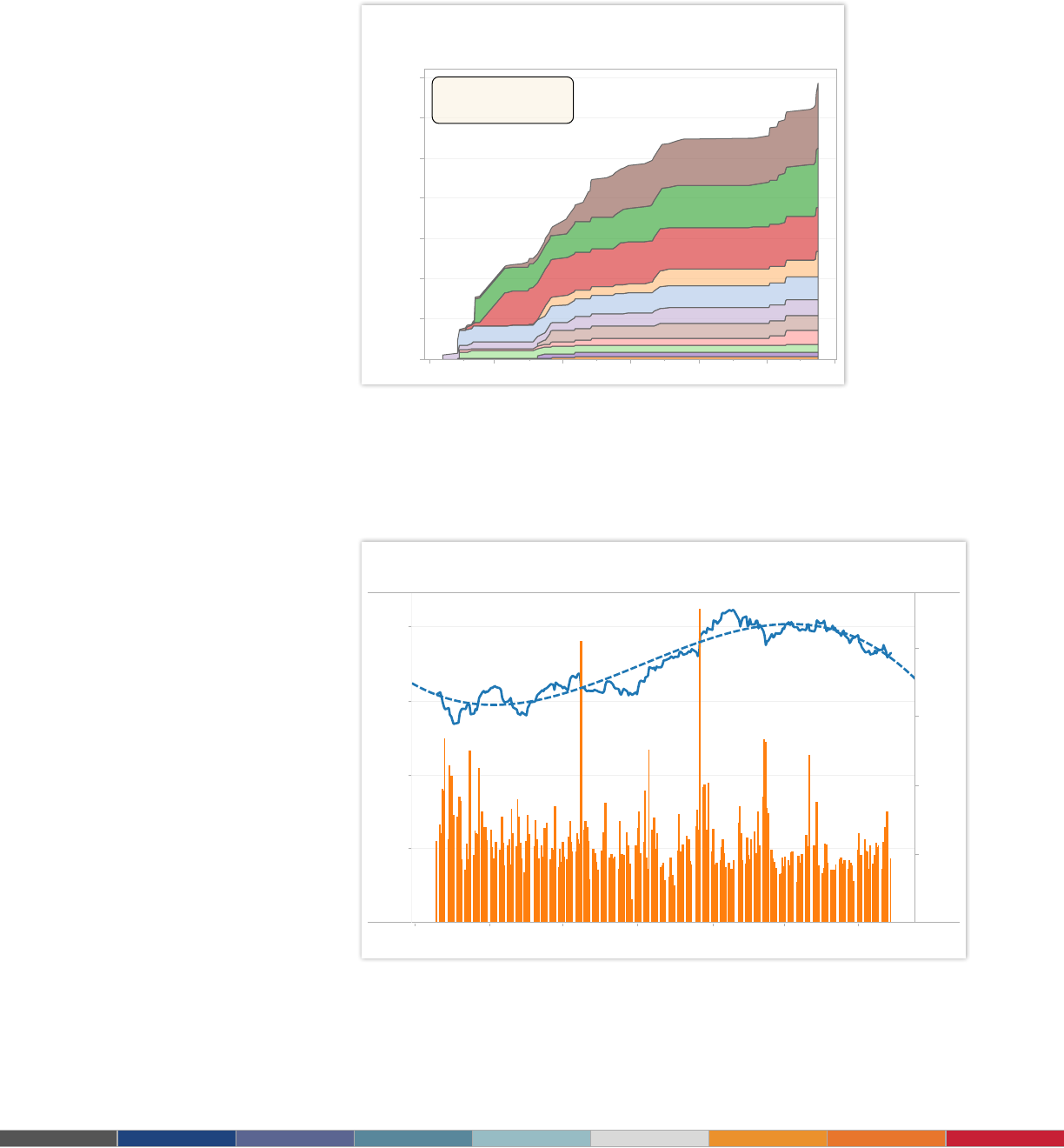
GE Stock Trend Analysis
Jun 1, 10 Aug 1, 10 Oct 1, 10 Dec 1, 10 Feb 1, 11 Apr 1, 11 Jun 1, 11
Date
$0.00
$5.00
$10.00
$15.00
$20.00
Adj Close
0M
50M
100M
150M
200M
Volume
Select date range to update trend line:
6/18/2010 to 6/27/2011
Tech Leads Capital Raised in 2011
Jan 1 Mar 1 May 1 Jul 1 Sep 1 Nov 1 Jan 1
$0
$5,000
$10,000
$15,000
$20,000
$25,000
$30,000
$35,000
Running Sum of Offer Amount (in mil)
Technology
Energy
Health Care
Consumer
Business Services
Real Estate
Select an industry
to view individual companies
Click here to clear filter
Running Total of Capital Raised (by Industry in Descending Order)
$0 $5,000 $10,000 $15,000
Offer Amount (in mil)
Facebook
HCA Holdings, Inc.
Kinder Morgan, Inc.
Nielsen Holdings B.V.
Yandex N.V.
Arcos Dorados Holdings, Inc.
Zynga Inc.
Michael Kors
Air Lease Corp.
Freescale Semiconductor Holdi..
Renren Inc.
BankUnited, Inc.
Groupon Inc.
The Carlyle Group LP
PetroLogistics LP
Data: Hoovers Inc., SEC, Renaissance Capital
Industry Color Legend:
Technology
Energy
Health Care
Consumer
Business Services
Real Estate
Transportation
Industrial
Financial
Materials
Communications
Filter by IPO Date:
1/13/2011 to 12/16/2011
Figure 5: Combine line charts with bar and trend lines
Line charts are the most effective way to show change over time. In this case, GE’s stock
performance over a one-year period is joined with trading volume during the same time frame.
At a glance you can tell there were two signicant events, one resulting in a sell-off and the other
a gain for shareholders. Click the graph and use the lter to select a different date range.
Figure 4: Transform line charts into area charts
Often when you have two or more sets of data in a line chart it can be helpful to shade the area
under the line. In this chart, it’s easy to tell that companies in the technology sector raised more
capital than real estate in 2011.
8
Worldwide Oil Rigs
Land Offshore
A
bout Tableau maps: www.tableausoftware.com/mapdata
Rig Locations
Select Region
Africa
Asia Pacific
Canada
Europe
Latin America
Middle East
Russia and Caspian
US
R
ig Count
2
1,000
2,000
3,000
4,000
5,101
2001 2002 2003 2004 2005 2006 2007 2008 2009 2010
0
50
100
150
200
Country Trends
Pie chart
Pie charts should be used to show relative proportions – or percentages – of
information. That’s it. Despite this narrow recommendation for when to use pies, they
are made with abandon. As a result, they are the most commonly mis-used chart type.
If you are trying to compare data, leave it to bars or stacked bars. Don’t ask your
viewer to translate pie wedges into relevant data or compare one pie to another. Key
points from your data will be missed and the viewer has to work too hard.
When to use pie charts:
• Showing proportions. Examples: percentage of budget spent on different
departments, response categories from a survey, breakdown of how Americans
spend their leisure time.
Also consider:
• Limit pie wedges to six. If you have more than six proportions to communicate,
consider a bar chart. It becomes too hard to meaningfully interpret the pie pieces
when the number of wedges gets too high.
• Overlay pies on maps. Pies can be an interesting way to highlight geographical
trends in your data. If you choose to use this technique, use pies with only a
couple of wedges to keep it easy to understand.
3.
Figure 6: Use pies only to show proportions
Pie charts give viewers a fast way to understand proportional data. Using pie
charts on this map shows the distribution of oil rigs on land vs. offshore in Europe.
9
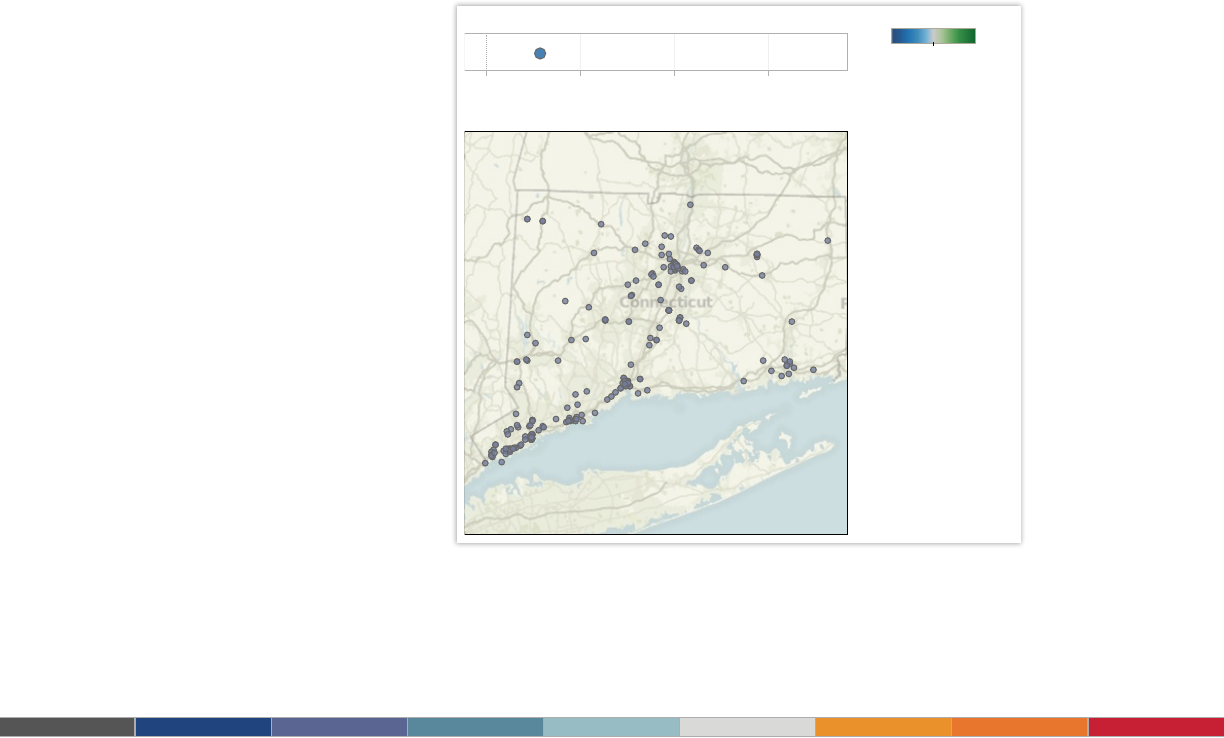
Which U.S. State is the Greenest?
0.0 0.5 1.0 1.5
CT
LEED Buildings by state per million people
About Tableau maps: www.tableausoftware.com/mapdata
Where are the LEED buildings in your state?
0.027 1.774
C
olor Scale:
Select a state:
Connecticut
Search for a city:
Filter by cert. level:
All
Data: US Green Building Council
Note: All individual addresses were geocoded using Google Maps data
Map
When you have any kind of location data – whether it’s postal codes, state
abbreviations, country names, or your own custom geocoding – you’ve got to see your
data on a map. You wouldn’t leave home to nd a new restaurant without a map (or a
GPS anyway), would you? So demand the same informative view from your data.
When to use maps:
• Showing geocoded data. Examples: Insurance claims by state, product export
destinations by country, car accidents by zip code, custom sales territories.
Also consider:
• Use maps as a lter for other types of charts, graphs, and tables. Combine a
map with other relevant data then use it as a lter to drill into your data for robust
investigation and discussion of data.
• Layer bubble charts on top of maps. Bubble charts represent the concentration
of data and their varied size is a quick way to understand relative data. By
layering bubbles on top of a map it is easy to interpret the geographical impact of
different data points quickly.
4.
Figure 7: Provide street-level data on a map
Maps are a powerful way to visualize data. In this visualization you can zero in on
every LEED certied building in the United States based on their street address.
Select any state or city to nd the greenest buildings in that area.

10
5.
Scatter plot
Looking to dig a little deeper into some data, but not quite sure how – or if – different
pieces of information relate? Scatter plots are an effective way to give you a sense of
trends, concentrations and outliers that will direct you to where you want to focus your
investigation efforts further.
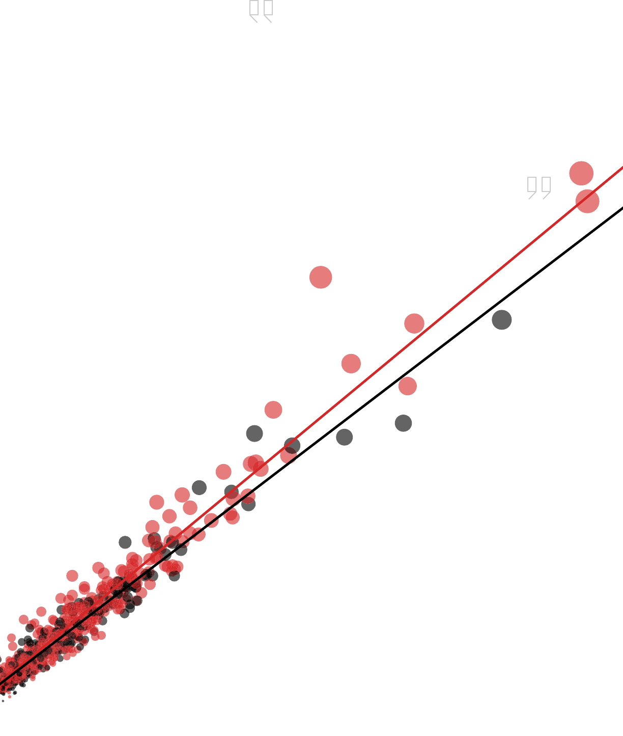
When to use scatter plots:
• Investigating the relationship between different variables. Examples: Male
versus female likelihood of having lung cancer at different ages, technology early
adopters’ and laggards’ purchase patterns of smart phones, shipping costs of
different product categories to different regions.
Also consider:
• Add a trend line/line of best t. By adding a trend line the correlation among
your data becomes more clearly dened.
• Incorporate lters. By adding lters to your scatter plots, you can drill down into
different views and details quickly to identify patterns in your data.
• Use informative mark types. The story behind some data can be enhanced with
a relevant shape
11
Claimant Correlation and Fraud Analysis
0 100 200 300 400 500 600
Distinct count of INCID
$0
$20,000
$40,000
$60,000
$80,000
$100,000
$120,000
Total Claim
Filter Incident Count:
10 to 1,561
Filter Total Claimed:
$0 to $245,764
Filter Total Paid:
$0 to $163,775
Select Region:
Midwest - East North Central
Select Threshold:
0.64
Above Threshold?
False
True
Total Payout
$180
$20,000
$40,000
$60,000
$84,587
Figure 9: Can you spot the fraud?
Using scatter plots is a quick, effective way to spot outliers that might warrant further
investigation. By creating this interactive scatter plot, an insurance investigator can
quickly evaluate where they might have fraudulent activity.
Demographics and Premium Forecasting
-2K 0K 2K 4K 6K 8K 10K 12K
Total Incidents
$100
$120
$140
Avg. Total Paid
Loss Codes for None None, employer cost ratio: 0.71
Select Employer Ratio:
0.71
Filter by Avg. Total Paid:
$49 to $172
Filter by Avg. Total Claim:
$93 to $228
Select Age Group:
30-39
Select Region:
All
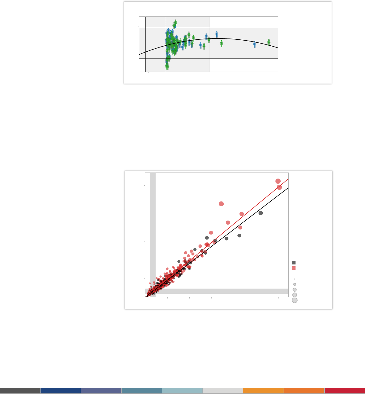
Figure 8: Who is most expensive to insure?
Use an informative icon or “mark type” such as the female and male icons for additional detail
in your scatter plot. Select the graph and lter to see how demographics change insurance
premium forecasting for an employer.
12
5
5
Speed: Get results
10 to 100 times faster
The surgical service teams at Seattle
2 : : Some kind of Header Here
Tableau is fast analytics. In a competitive market
place, the person who makes sense of the data
first is going to win.
5
5
Speed: Get results
10 to 100 times faster
The surgical service teams at Seattle
2 : : Some kind of Header Here
Tableau is fast analytics. In a competitive market
place, the person who makes sense of the data
first is going to win.
Visualizing data using color, shapes, positions on
X and Y axes, bar charts, pie charts, whatever
you use, makes it instantly visible and instantly
signicant to the people who are looking at it.
– Jon Boeckenstedt, Associate Vice President Enrollment Policy and Planning, DePaul University

13
6.
Gantt chart
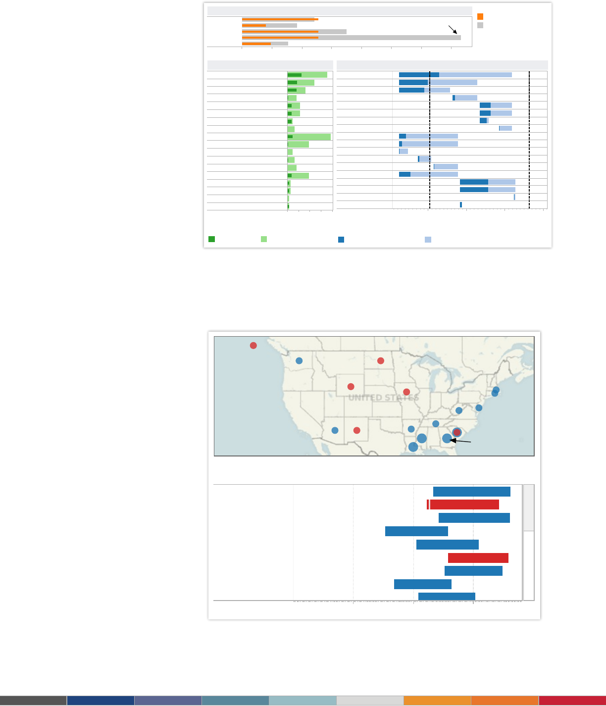
Gantt charts excel at illustrating the start and nish dates elements of a project. Hitting
deadlines is paramount to a project’s success. Seeing what needs to be accomplished –
and by when – is essential to make this happen. This is where a Gantt chart comes in.
While most associate Gantt charts with project management, they can be used to
understand how other things such as people or machines vary over time. You could
use a Gantt, for example, to do resource planning to see how long it took people to hit
specic milestones, such as a certication level, and how that was distributed over time.
When to use Gantt charts:
• Displaying a project schedule. Examples: illustrating key deliverables, owners,
and deadlines.
• Showing other things in use over time. Examples: duration of a machine’s use,
availability of players on a team.
Also consider:
• Adding color. Changing the color of the bars within the Gantt chart quickly
informs viewers about key aspects of the variable.
• Combine maps and other chart types with Gantt charts. Including Gantt
charts in a dashboard with other chart types allows ltering and drill down to
expand the insight provided.
14
0 50 100 150 200 250 300 350
George S
Jill S
Sarah F
Roy D
Terry U
Roy D is in trouble: too much work for
scheduled hours.
Resource Status
0 50 100 150
Hours
1 Project 1
1.1 High-level task 1
1.1.1 Detailed task 1
1.1.2 Detailed task 2
1.2 High-level task 2
1.2.1 Detailed task 3
1.2.1.1 Really detailed task 1
1.2.1.2 Really detailed task 2
2 Project 2
2.1 High-level task 3
2.1.1 Detailed task 4
2.1.2 Detailed task 4
2.1.3 Detailed task 4
2.2 High-level task 4
3 Project 3
3.1 High-level task 5
3.1.1 Detailed task 7
3.1.2 Detailed task 8
Hours Completed by Detailed Task
Aug 20 Aug 30 Sep 9 Sep 19
Days [2009]
Project 1
High-level task 1
Detailed task 1
Detailed task 2
High-level task 2
Detailed task 3
Really detailed task 1
Really detailed task 2
Project 2
High-level task 3
Detailed task 4
Detailed task 4
Detailed task 4
High-level task 4
Project 3
High-level task 5
Detailed task 7
Detailed task 8
Roy D
Roy D
George S
George S
Sarah F
Sarah F
George S
George S
Roy D
Sarah F
Jill S
Jill S
Jill S
Terry U
Sarah F
Roy D
George S
Terry U
Today Freeze
Work Completed by Start Date
Task details legend
Actual hours Scheduled hours
R
emaining hours legend
Remaining schedule hours
Remaining work
G
antt chart legend
Amount complete Length of task
Software Project Management
Top 25 Longest Serving Senators
Data source: http://www.senate.gov/senators/Biographical/longest_serving.htm
About Tableau maps: www.tableausoftware.com/mapdata
Click a State to
see Senators
1906 1946 1986
Robert C. Byrd
Strom Thurmond
Edward M. Kennedy
Carl T. Hayden
John Stennis
Ted Stevens
Ernest F. Hollings
Richard B. Russell
Russell Long
Sort by
Length of Service
Figure 11: Who served the longest?
With a quick glance, this Gantt chart lets you know which U.S. senator held ofce the longest
and which side of the aisle they represented. Select the visualization and use the drop down
menu to see criteria such as party.
Figure 10: Manage project effectively
A Gantt chart is the centerpiece of this dashboard, providing a complete overview of tasks,
owners, due dates, and status. By providing a menu of tasks at the top, a project manager can
drill down as needed to make informed decisions.

15
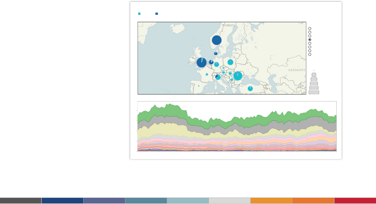
7.
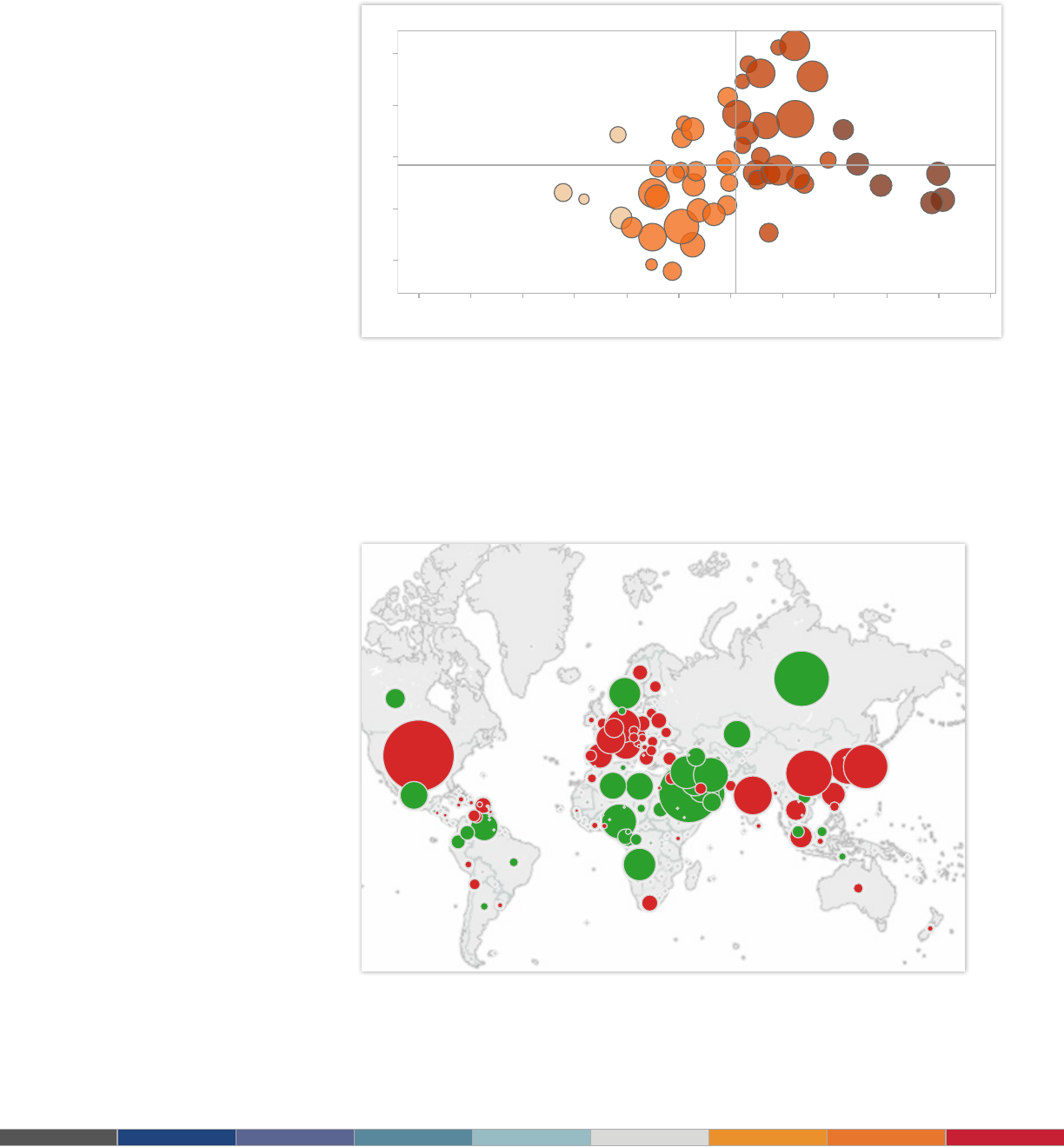
Bubble chart
Bubbles are not their own type of visualization but instead should be viewed as a
technique to accentuate data on scatter plots or maps. Bubbles are not their own type
of visualization but instead should be viewed as a technique to accentuate data on
scatter plots or maps. People are drawn to using bubbles because the varied size of
circles provides meaning about the data.
When to use bubbles:
• Showing the concentration of data along two axes. Examples: sales
concentration by product and geography, class attendance by department and
time of day.
Also consider:
• Accentuate data on scatter plots: By varying the size and color of data points,
a scatterplot can be transformed into a rich visualization that answers many
questions at once.
• Overlay on maps: Bubbles quickly inform a viewer about relative concentration
of data. Using these as an overlay on map puts geographically-related data in
context quickly and effectively for a viewer.
16
About Tableau maps: www.tableausoftware.com/mapdata
Crude Net Balance by Country for 2009,
Normalized by None
Year
2009
Region
All
Net Exporter
Net Importer
Type
Crude
Normalization
None
Imports, Exports, ..
Net Balance
United States
Saudi Arabia
Russia
Japan
Norway
China
Iran
Korea, South
Nigeria
Germany
2,125
2,136
2,320
2,329
2,335
2,385
4,031
4,545
6,824
9,609
Thousands of Barrels
200120.. 20.. 20..
Last Decade
2001 2003 2005 2007 2009
Reserves
-8.1%
-12.2%
6.2%
-13.3%
5.7%
8.2%
-13.5%
-0.5%
3.1%
-6.9%
0
Do..
0
Do..
0
Do..
0
Do..
0
Do..
0
Do..
0
Do..
0
Do..
0
Do..
0
Do..
Latest to Prior
Highlight Tier
Tier A
Tier B
Tier C
Tier D
0.4 0.5 0.6 0.7 0.8 0.9 1.0 1.1 1.2 1.3 1.4 1.5
Avg. Win-Loss Ratio
2
3
4
5
6
KDA
Game Average
Game Average
Hybrid Characters
Assassins & Fighters
Healers
Damagers & Tanks
Character Types
Win-Loss
Ratio Popularity Matches KDA Avg Kills Avg Deaths Avg Assists
Tier A
Sacha
Joen
Hoet
Turden
Warhis
Angok
Tier B
Sagha
10.28
7.07
9.51
7.26
10.21
10.86
5.27
5.71
4.37
4.54
3.91
3.77
4.67
6.04
3.08
4.04
2.5
1.52
4.54
3.865
3.465
3.13
3.695
3.18
37,699
45,200
43,876
45,042
49,493
50,542
1.58%
1.89%
1.84%
1.89%
2.07%
2.12%
1.22
1.24
1.29
1.39
1.40
1.41
9.27
5.49
4.81
3.955
23,975
1.00%
1.19
Summary Statistics
Choose Character
Aldon
Alekim
Angok
Angust
Arir
Atril
Brybur
Cereck
Chyden
Drasayo
Eldwori
Enur
Faor
Garler
Geess
Ghaia
Hoet
Jitin
Joen
Kalldel
Kelech
Kelque
Game Play Analysis
Figure 12: Add data depth with bubbles
In this scatter plot accentuated with bubbles, the varied size and color of circles make it quick
to see how the game’s players compare. Click this dashboard then scroll over the bubbles to get
instant access to more detailed information about each character.
Figure 13: Oil imports and exports at a glance
It’s easy to tell who buys and sells the most oil with green bubbles for net exporters and red
for net importers overlaid on this map. Select a country on the map and the dashboard reveals
details about consumption history.
17
$0 to <$150k
$150k to <$200k
$200k to <$250k
$250k to <$300k
$300k to <$350k
$350k to <$400k
$400k to <$450k
$450k to <$500k
$500k to <$550k
$550k to <$600k
$600k to <$650k
$650k to <$700k
$700k to <$750k
$750k to <$800k
$800k to <$850k
$850k to <$900k
$900k to <$950k
$950k to <$1,000k
Over $1,000k
0
25
50
75
100
125
150
175
200
225
250
275
300
Number of Sales
King Co. SFH Sales Histogram [Sold 2012-06]
Sale Month:
Sold 2012-06
County:
King
Pierce
Snohomish
Distress:
All
Distress Status
Short Sale
Bank Owned
Non-Distressed
8.
Histogram chart
Use histograms when you want to see how your data are distributed across groups.
Say, for example, that you’ve got 100 pumpkins and you want to know how many
weigh 2 pounds or less, 3-5 pounds, 6-10 pounds, etc. By grouping your data into
these categories then plotting them with vertical bars along an axis, you will see the
distribution of your pumpkins according to weight. And, in the process, you’ve created
a histogram.
At times you won’t necessarily know which categorization approach makes sense for
your data. You can use histograms to try different approaches to make sure you create
groups that are balanced in size and relevant for your analysis.
When to use histograms:
• Understanding the distribution of your data. Examples: Number of customers
by company size, student performance on an exam, frequency of a product defect.
Also consider:
• Test different groupings of data. When you are exploring your data and looking
for groupings or “bins” that make sense, creating a variety of histograms can help
you determine the most useful sets of data.
• Add a lter. By offering a way for the viewer to drill down into different categories
of data, the histogram becomes a useful tool to explore a lot of data views quickly.
Figure 14: Which houses are selling?
This histogram shows which houses are seeing the most sales in a month. Explore for yourself
how the histogram changes when you select a different month, county, or distress level.
18
Quota Dashboard
$0 $2,000,000 $4,000,000 $6,000,000 $8,000,000 $10,000,000 $12,000,000 $14,000,000 $16,000,000
Company Total
$0K $1,000K $2,000K $3,000K $4,000K $5,000K $6,000K $7,000K $8,000K
Sales
Central
East
West
Regional Total (click to see salespeople in region)
# of Sales People
# Hitting Quota
% Hitting Quota
% of Sales by Quota Hitters
Quota $
Sales $
Avg. Quota
Avg. Sales per Person
$380,558
$275K
$15,603K
$11,825K
86.6%
65.9%
27
41
Stats- All
0K 200K 400K 600K 800K 1000K 1200K
Achievement: Quota (%) or Sales ($)
Barbara Davis
Betty Clark
Carol Allen
Charles Lee
Christopher Wright
Daniel Gonzalez
David Thompson
Deborah Adams
Donald Mitchell
Donna Walker
Dorothy Harris
Elizabeth Miller
Helen Rodriguez
James Williams
Jennifer Anderson
Jessica Baker
John Jones
Salespeople in All Region: Sales ($)
View by Quota (%) or Sales ($)
%
$
Hit Quota
No
Yes
9.
Bullet chart
When you’ve got a goal and want to track progress against it, bullet charts are for
you. At its heart, a bullet graph is a variation of a bar chart. It was designed to replace
dashboard gauges, meters and thermometers. Why? Because those images typically
don’t display sufcient information and require valuable dashboard real estate.
Bullet graphs compare a primary measure (let’s say, year-to-date revenue) to one or
more other measures (such as annual revenue target) and presents this in the context
of dened performance metrics (sales quota, for example). Looking at a bullet graph
tells you instantly how the primary measure is performing against overall goals (such
as how close a sales rep is to achieving her annual quota).
When to use bullet graphs:
• Evaluating performance of a metric against a goal. Examples: sales quota
assessment, actual spending vs. budget, performance spectrum (great/good/poor).
Also consider:
• Use color to illustrate achievement thresholds. Including color, such as
red, yellow, green as a backdrop to the primary measure lets the viewer quickly
understand how performance measures against goals.
• Add bullets to dashboards for summary insights. Combining bullets with
other chart types into a dashboard supports productive discussions about where
attention is needed to accomplish objectives.
Figure 15: Have you hit your quota?
Tracking a sales team’s progression to hitting its quota is a critical element to managing
success. In this quota dashboard, a sales manager can quickly select to view her team’s
performance by quota percentage or sales amount as well as zero in on regional achievement.
19
5
5
Speed: Get results
10 to 100 times faster
The surgical service teams at Seattle
2 : : Some kind of Header Here
Tableau is fast analytics. In a competitive market
place, the person who makes sense of the data
first is going to win.
5
5
Speed: Get results
10 to 100 times faster
The surgical service teams at Seattle
2 : : Some kind of Header Here
Tableau is fast analytics. In a competitive market
place, the person who makes sense of the data
first is going to win.
Tableau has many great visualization capabilities.
We use a lot of mapping, not only to show
the geographnical location, but also to do a lot
of geocoding and we map relationships with
geocoding the distances.
– Marta Magnuszewska, Intelligence Data Analyst, Allstate Insurance
20
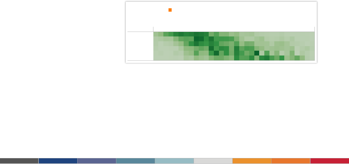
30 40 50 60 70 80
0%
2%
4%
6%
8%
% of Total Sum of Response
Favorite Type of Book by Age
<$50K <$100K <$250K <$500K <$750K $750K+
0%
20%
40%
% of Total Sum of Response
Favorite Type of Book by Income Category
Select book type:
Children's
H
ighlight book type:
Children's
Book Preference Survey
24 26 28 30 32 34 36 38 40 42 44 46 48 50 52 54 56 58 60 62 64 66 68 70 72 74 76 78 80 82 84 86
<$50K
<$100K
<$250K
<$500K
<$750K
$750K+
% of Total Weight by Age and Assets
10.
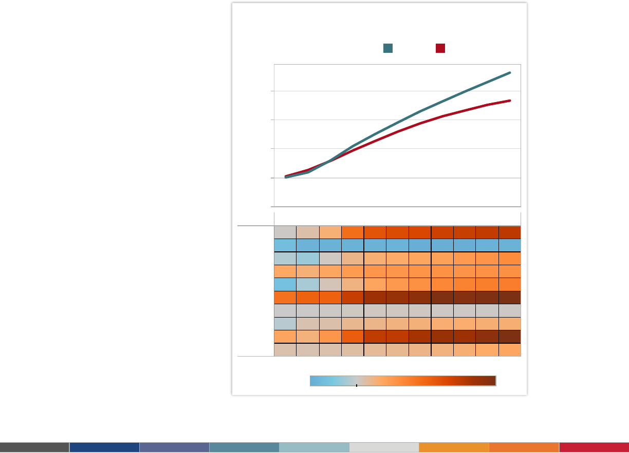
Heat maps
Heat maps are a great way to compare data across two categories using color. The
effect is to quickly see where the intersection of the categories is strongest and weakest.
When to use heat maps:
• Showing the relationship between two factors. Examples: segmentation
analysis of target market, product adoption across regions, sales leads by
individual rep.
Also consider:
• Vary the size of squares. By adding a size variation for your squares, heat
maps let you know the concentration of two intersecting factors, but add a third
element. For example, a heat map could reveal a survey respondent’s sports
activity preference and the frequency with which they attend the event based on
color, and the size of the square could reect the number of respondents in that
category.
• Using something other than squares. There are times when other types of
marks help convey your data in a more impactful way.
Figure 16: Who buys the most books?
In this market segmentation analysis, the heat map reveals a new campaign idea. High-
income households of people in their sixties buy children’s books. Perhaps it’s time for a new
grandparent-oriented campaign?
21
Comparing the 2012 Budget Proposals
$0.0T
$0.2T
$0.4T
$0.6T
$0.8T
Program 2011 2012 2013 2014 2015 2016 2017 2018 2019 2020 2021
Medicaid
Medicare
Interest
Security
Non Sec.
Other
Soc Sec
Revenue
Deficit
Nat Debt 3244
725
466
6
521
129
201
193
-161
301
2755
640
442
5
483
124
193
157
-151
272
2320
545
447
5
455
115
185
131
-147
248
1950
513
414
7
440
104
184
103
-139
228
1615
483
353
9
413
89
173
83
-131
199
1312
460
302
8
392
76
163
63
-119
179
1067
410
250
7
351
57
159
48
-112
151
797
272
211
6
276
35
144
30
-107
106
560
148
99
3
194
9
110
3
-100
27
434
95
76
1
209
-23
80
-16
-92
10
486
209
-56
0
198
-69
104
-7
-75
1
H
ighlight Budget:
Obama Ryan
Select Item to Compare:
Interest
-21.8% 65.9%
R
yan more What is the Spending Difference? Obama more
11.
Highlight table
Highlight tables take heat maps one step further. In addition to showing how data
intersects by using color, highlight tables add a number on top to provide additional detail.
When to use highlight tables:
• Providing detailed information on heat maps. Examples: the percent of a
market for different segments, sales numbers by a reps in a particular region,
population of cities in different years.
Also consider:
• Combine highlight tables with other chart types: Combining a line chart with
a highlight table, for example, lets a viewer understand overall trends as well as
quickly drill down into a specic cross section of data.
Figure 17: Highlight table shows spending difference
This highlight table compares two 2012 budget proposals for the U.S. Click the table to learn more.

22
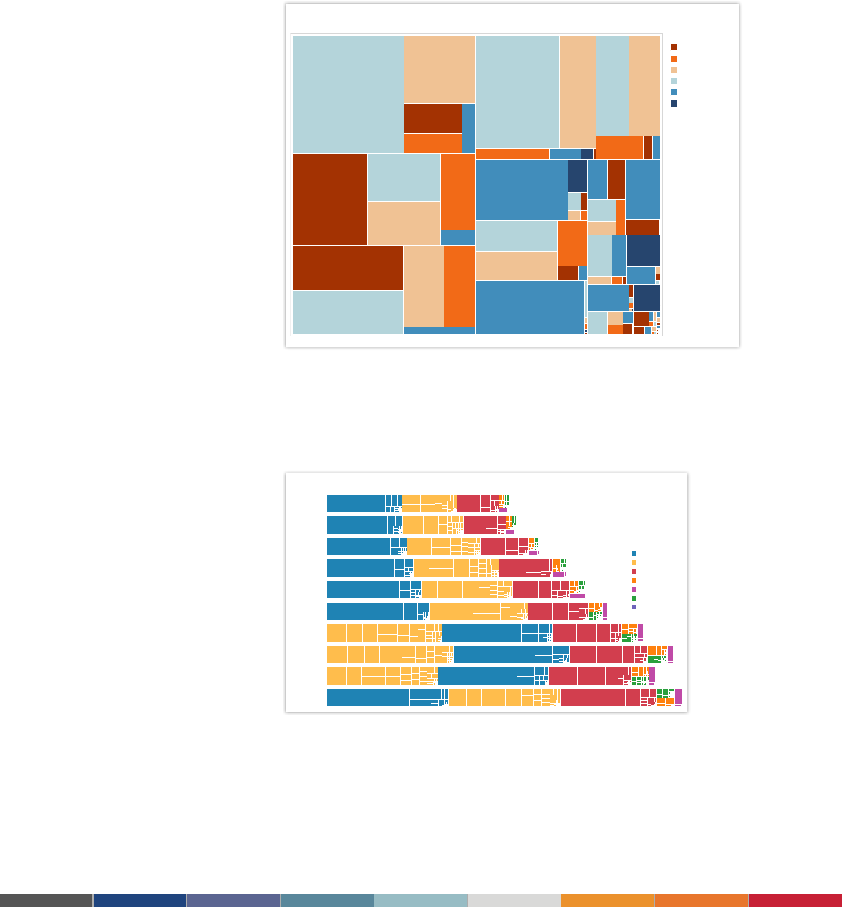
12.
Treemap
Looking to see your data at a glance and discover how the different pieces relate
to the whole? Then treemaps are for you. These charts use a series of rectangles,
nested within other rectangles, to show hierarchical data as a proportion to the whole.
As the name of the chart suggests, think of your data as related like a tree: each
branch is given a rectangle which represents how much data it comprises. Each
rectangle is then sub-divided into smaller rectangles, or sub-branches, again based
on its proportion to the whole. Through each rectangle’s size and color, you can often
see patterns across parts of your data, such as whether a particular item is relevant,
even across categories. They also make efcient use of space, allowing you to see
your entire data set at once.
When to use treemaps:
• Showing hierarchical data as a proportion of a whole: Examples: storage
usage across computer machines, managing the number and priority of technical
support cases, comparing scal budgets between years
Also consider:
• Coloring the rectangles by a category different from how they are
hierarchically structured
• Combining treemaps with bar charts. In Tableau, place another dimension
on Rows so that each bar in a bar chart is also a treemap. This lets you quickly
compare items through the bar’s length, while allowing you to see the proportional
relationships within each bar.
23
2001
2002
2003
2004
2005
2006
2007
2008
2009
2010
World GDP Through Time
Highlight Region
The Americas
Europe
Asia
Middle East
Oceania
Africa
Other
Select Region
All
Click Bar for Details
Setup
Priority: P5
897
Customer
Services
Priority:
#N/A
Priority:
P5
1,788
#N/A
Other
Priority: P5
4,870
Help Request
Priority: P4
2,105
Help Request
Priority: P3
1,995
Help
Request
Priority:
P2
1,144
Feature
Priority: P5
4,680
Usability
Priority:
P4
2,721
Usability
Priority:
P3
2,680
Usability
Priority: P2
Maintenance
Priority: P4
7,845
Maintenance
Support
Priority: P4
3,952
Support
Priority: P3
2,770
Support
Priority:
P2
2,132
Support
Priority: P1
4,261
Feedbacks
Feedbacks
Priority: P4
2,854
Feedbacks
Priority: P3
2,647
Feedbacks
Priority:
P2
2,230
Feedbacks
Priority: P1
5,693
Document
Priority: P4
10,963
Document
Priority: P3
3,987
Document
Priority: P2
Document
Priority: P1
1,433
P
riority
P1
P2
P3
P4
P5
Pre-Support
Support Case Overview
Figure 18: Support Cases at a Glance
This treemap shows all of a company’s support cases, broken by case type, and also priority
level. You can see that Document, Feedback, Support and Maintenance make up the lion share
of support cases. However, in Feedback and Support, P1 cases make up the most number of
cases, whereas most other categories are dominated by relatively mild P4 cases.
Figure 19: Visualizing World GDP
In this treemap-bar chart combination chart, we can see how overall GDP has grown over time
(with the exception of 2009, when GDP fell), but also which regions and countries comprised
most of the world’s GDP. Since 2001, the region ‘The Americas’ made up most of the world’s
GDP, until 2007 for three years. You can also see that GDP for ‘The Americas’ is made up of
largely one rectangle (one country), whereas ‘Europe’ is made up of rectangles that are more
similar in size. Click a rectangle to see which country it represents and how much GDP was
produced (and how much per capita).
24
Two Weeks of Home Sales
Chicago Los
Angeles
San
Francisco
Seattle Washingto
n
DC
$0
$500,000
$
1,000,000
$
1,500,000
$
2,000,000
$
2,500,000
$
3,000,000
$
3,500,000
$
4,000,000
$4,500,000
0 100 200 300 400
# of Homes Sold
Chicago
Los Angeles
Seattle
Washington DC
San Francisco
Homes Sold by City
Filter Date Range
9/16/13 to 10/1/13
Filter by Home Type
Condo/Coop
Multi-Family (2-4 Unit)
Multi-Family (5+ Unit)
Parking
Single Family Residential
Townhouse
Vacant Land
13.
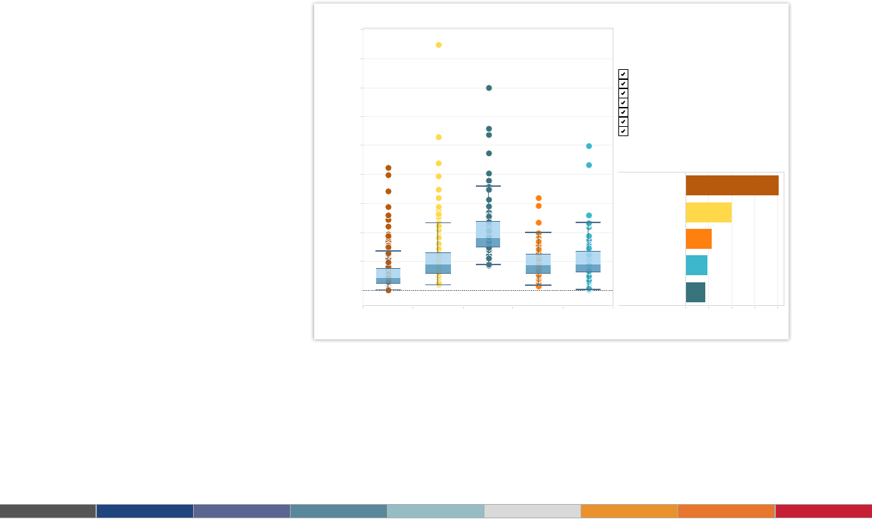
Box-and-whisker Plot
Box-and-whisker plots, or boxplots, are an important way to show distributions of data.
The name refers to the two parts of the plot: the box, which contains the median of the
data along with the 1st and 3rd quartiles (25% greater and less than the median), and
the whiskers, which typically represents data within 1.5 times the Inter-quartile Range
(the difference between the 1st and 3rd quartiles). The whiskers can also be used to
also show the maximum and minimum points within the data.
When to use box-and-whisker plots:
• Showing the distribution of a set of a data: Examples: understanding your
data at a glance, seeing how data is skewed towards one end, identifying outliers
in your data.
Also consider:
• Hiding the points within the box. This helps a viewer focus on the outliers.
• Comparing boxplots across categorical dimensions. Boxplots are great at
allowing you to quickly compare distributions between data sets.
Figure 20: Comparing the sales prices of homes
For this time period, the median prices of homes sold were highest in San Francisco, but
the distribution was wider for Los Angeles. In fact, the most expensive home in Los Angeles
was sold at several times greater than the median. Hover over a point to see its geographic
location and how much it sold for.
25
Tableau and Tableau Software are trademarks of Tableau Software, Inc. All other company and product
names may be trademarks of the respective companies with which they are associated.
About Tableau
Tableau Software helps people see and understand data. Tableau helps anyone quickly analyze,
visualize and share information. More than 15,000 customer accounts get rapid results with Tableau
in the ofce and on-the-go. And tens of thousands of people use Tableau Public to share data in
their blogs and websites. See how Tableau can help you by downloading the free trial at
www.tableausoftware.com/trial.
Additional Resources
Download Free Trial
Related Whitepapers
Why Business Analytics in the Cloud?
5 Best Practices for Creating Effective Campaign Dashboards
See All Whitepapers
Explore Other Resources
· Product Demo
· Training & Tutorials
· Community & Support
· Customer Stories
· Solutions
