PLS_Toolbox 4.0 Manual PLS Chemometrics EVR
User Manual:
Open the PDF directly: View PDF ![]() .
.
Page Count: 420 [warning: Documents this large are best viewed by clicking the View PDF Link!]
- Chemometrics Tutorial
- Software License Agreement
- Table of Contents
- 1. Introduction
- 2. Getting Started with MATLAB and PLS_Toolbox
- 3. An Introduction to Linear Algebra
- Scalars, Vectors and Matrices
- Vector and Matrix Addition and Multiplication
- Orthogonal and Orthonormal Vectors
- Special Matrices
- Gaussian Elimination: Solving Systems of Equations
- Singular Matrices and the Concept of Rank
- Matrix Inverses
- Vector Spaces and Subspaces
- Linear Independence and Basis Sets
- Row Spaces, Column Spaces and Nullspaces
- Orthogonality of Subspaces
- Projections onto Lines
- Projections onto Subspaces and Least Squares
- Ill-conditioned Problems
- Projection Matrices
- Orthogonal and Orthonormal Bases
- Pseudoinverses
- The Singular Value Decomposition
- Conclusion
- 4. Preface to the Tutorial Chapters
- 5. Principal Components Analysis
- Statistics Associated with PCA Models
- A Word About Centering and Scaling
- PCA Example I: The Wine Data Set
- PCA Example II: Application to a Chemical Process
- Choosing the Number of Factors in a PCA Model
- Viewing and Interpreting the Model
- Multivariate Statistical Process Control
- MSPC Example
- PCA Summary
- Multi-Way PCA
- Example of MPCA
- 6. Multivariate Regression
- 7. Advanced Preprocessing
- 8. Classification
- 9. Curve Resolution and Mixture Analysis
- 10. Multi-way Methods
- 11. Variable Selection
- 12. Instrument Standardization
- 13. Robust Statistical Methods
- Preface
- Introduction
- Robust estimation of the covariance matrix
- Example of MCD Method with Body and Brain Weight Data Set
- Robust linear regression
- Example of Robust Regression with Stars data set
- Robust Principal Component Analysis
- Example of Robust PCA with Octane data
- Robust Regression for high-dimensional data
- Robust Principal Component Regression
- Robust Partial Least Squares Regression
- 14. Distribution Fitting Tools
- 15. Returning Users – New Features and Release Notes
- 16. Advanced Software Information
- 17. Bibliography
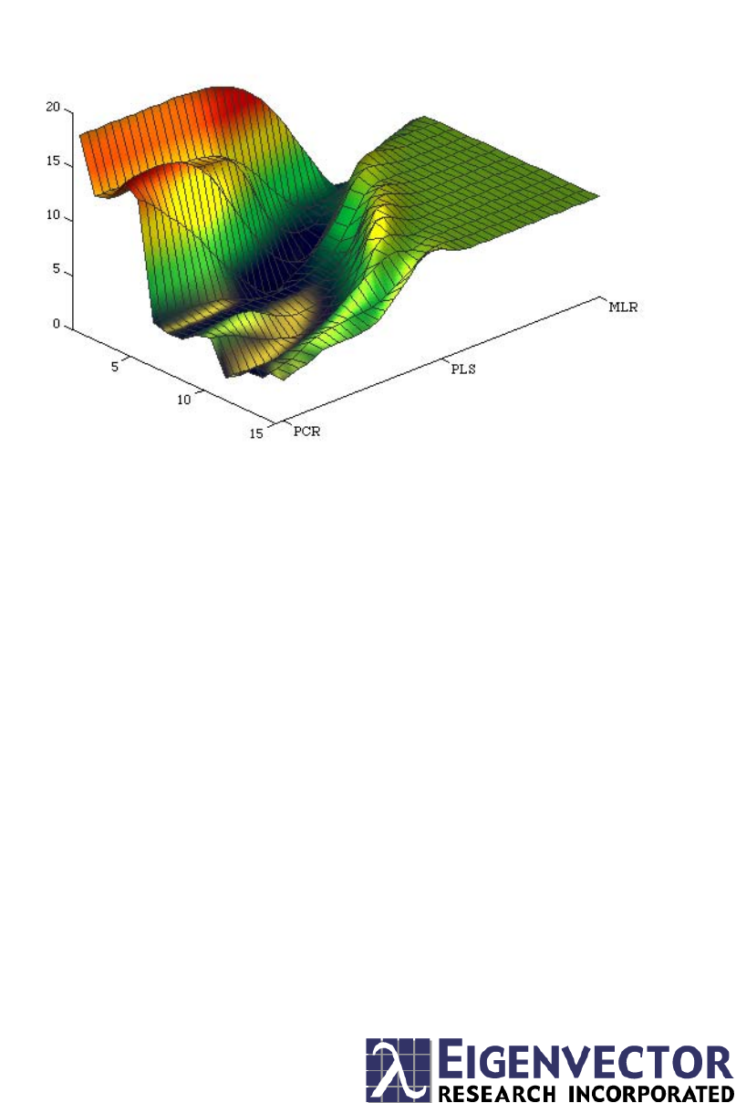
Continuum ParameterNumber of LVs
PRESS
Chemometrics
Tutorial
for PLS_Toolbox and Solo
Barry M. Wise Jeremy M. Shaver
Neal B. Gallagher Willem Windig
Rasmus Bro R. Scott Koch
Chemometrics Tutorial
for PLS_Toolbox and Solo
Barry M. Wise
Neal B. Gallagher
Rasmus Bro
Jeremy M. Shaver
Willem Windig
R. Scott Koch
Eigenvector Research, Inc.
3905 West Eaglerock Drive
Wenatchee, WA 98801
helpdesk@eigenvector.com
www.eigenvector.com
FAX: (509)662-9214

Published by:
Eigenvector Research, Inc., 3905 West Eaglerock Drive, Wenatchee, WA 98801 USA
E-mail: helpdesk@eigenvector.com, Web: www.eigenvector.com
ISBN: 0-9761184-1-6
© Eigenvector Research, Inc. 2006
All rights reserved. Reproduction or use of editorial or pictorial content in any manner is
prohibited without express permission. No patent liability is assumed with respect to the use
of the information contained herein. While every precaution has been taken in the preparation
of this manual, the publisher assumes no responsibility for errors or omissions. Neither is any
liability assumed for damages resulting from the use of the information contained herein.
i
Eigenvector Research, Inc., Software License Agreement
READ THE TERMS AND CONDITIONS OF THIS LICENSE AGREEMENT CAREFULLY BEFORE USING THIS
SOFTWARE. THIS LICENSE AGREEMENT REPRESENTS THE ENTIRE AGREEMENT BETWEEN YOU (THE
“LICENSEE” - EITHER AN INDIVIDUAL OR AN ENTITY) AND EIGENVECTOR RESEARCH, INC., (“EVRI”)
CONCERNING THE PLS_TOOLBOX COMPUTER SOFTWARE CONTAINED HEREIN (“PROGRAM”), AND THE
ACCOMPANYING USER DOCUMENTATION.
BY USING THE SOFTWARE, YOU ACCEPT THE TERMS OF THIS AGREEMENT. IF YOU ARE NOT WILLING TO
DO SO, RETURN THE UNOPENED SOFTWARE IMMEDIATELY FOR A FULL REFUND.
LICENSE GRANT: This license permits licensee to install and use one copy of the Program on a single computer. If
licensee has multiple licenses for the Program, then Licensee may at any time have as many copies of the Program and its
Electronic Documentation in use as it has licenses. “Use” means that a copy is loaded into temporary memory or installed
into the permanent memory of a computer, except that a copy installed on a network server for the sole purpose of
distribution to other computers is not in “use”. Licensee is responsible for limiting the number of possible concurrent users
to the number licensed. Each copy of the Program may be used on a backup computer (when the original is disabled) or a
replacement computer. Replacements may be either permanent or temporary, at the same or different site as the original
computer. The Hardcopy documentation provided with the Program may not be copied.
Licensee shall use the Program only for its internal operations. “Internal operations” shall include use of the Program in the
performance of consulting or research for third parties who engage Licensee as an employee or independent contractor.
Licensee may allow use of the Program by employees, consultants, students and/or (in the case of individual licensees)
colleagues, but Licensee may not make the Program available for use by third parties generally on a “time sharing” basis.
Licensee may make copies of the Program only for backup or archival purposes. All copies of Program, Electronic
Documentation and Hardcopy Documentation shall contain all copyright and proprietary notices in the originals. Licensee
shall not re-compile, translate or convert “M-files” contained in the Program for use with any software other than
MATLAB®, which is a product of The MathWorks, Inc. 3 Apple Hill Drive, Natick, MA 01760-2098, without express
written consent of EVRI. Licensee shall not re-distribute “M-files” contained in the Program, or any derivative thereof,
without express written consent of EVRI.
Licensee shall take appropriate action by instruction, agreement, or otherwise with any persons permitted access to the
Program, so as to enable Licensee to satisfy the obligations under this agreement.
TERM OF AGREEMENT. This Agreement shall continue until terminated by EVRI or Licensee as provided below.
TERMINATION. EVRI may terminate this license by written notice to Licensee if Licensee (a) breaches any material term
of this Agreement, (b) fails to pay the amount charged for this license within Thirty (30) days after the date due, or (c)
ceases conducting business in the normal course, becomes insolvent or bankrupt, or avails itself of or becomes subject to
any proceedings pertaining to insolvency or protection of creditors. Licensee may terminate this Agreement at any time by
written notice to EVRI. Licensee shall not be entitled to any refund if this Agreement is terminated, except of license fees
paid for any Licensed Product for which the testing period has not expired at the time of termination. Upon termination,
Licensee shall promptly return all copies of the Programs and Documentation in Licensee’s possession or control, or
promptly provide written certification of their destruction.
LIMITED WARRANTY; LIMITATION OF REMEDIES. For a period of ninety (90) days from delivery, EVRI
warrants that (a) the media shall be free of defects, or replaced at no cost to Licensee, and (b) the Program will conform in
all material respects to the description of such Program’s operation in the Documentation. In the event that the Program does
not materially operate as warranted, licensees exclusive remedy and EVRI’s sole liability under this warranty shall be (a) the
correction or workaround by EVRI of major defects within a reasonable time or (b) should such correction or workaround
prove neither satisfactory nor practical, termination of the License and refund of the license fee paid to EVRI for the
Program. THE FOREGOING WARRANTY IS IN LIEU OF ALL OTHER WARRANTIES, EXPRESS OR IMPLIED,
INCLUDING BUT NOT LIMITED TO THE WARRANTIES OF MERCHANTABILITY AND FITNESS FOR A
PARTICULAR PURPOSE. EVRI SHALL NOT BE LIABLE FOR ANY SPECIAL, INCIDENTAL OR
CONSEQUENTIAL DAMAGES, INCLUDING WITHOUT LIMITATION LOST PROFITS. Licensee accepts
responsibility for its use of the Program and the results obtained therefrom.
ii
LIMITATION OF REMEDIES AND LIABILITY. The remedies described in this License Agreement are your exclusive
remedies and EVRI’s entire liability. IN NO EVENT WILL EVRI BE LIABLE TO YOU FOR ANY DAMAGES,
INCLUDING LOST PROFITS, LOST BENEFITS, OR OTHER INCIDENTAL OR CONSEQUENTIAL DAMAGES,
RESULTING FROM THE USE OF OR INABILITY TO USE THE PROGRAM OR ANY BREACH OF WARRANTY.
EVRI’s LIABILITY TO YOU FOR ACTUAL DAMAGES FOR ANY CAUSE WHATSOEVER, AND REGARDLESS
OF THE FORM OF ACTION, WILL BE LIMITED TO THE MONEY PAID FOR THE PROGRAM OBTAINED FROM
EVRI THAT CAUSED THE DAMAGES OR THAT IS THE SUBJECT MATTER OF, OR IS DIRECTLY RELATED TO,
THE CAUSE OF ACTION. Some states do not allow the exclusion or limitation of incidental or consequential damages, so
the above limitation may not apply to you.
GENERAL PROVISIONS. Licensee may not assign this License without written consent of EVRI, except to an affiliate,
subsidiary or parent company of Licensee. Should any act of Licensee purport to create a claim. lien, or encumbrance on any
Program, such claim, lien, or encumbrance shall be void. All provisions regarding indemnification, warranty, liability and
limits thereon, and protection of proprietary rights and trade secrets, shall survive termination of this Agreement, as shall all
provisions regarding payment of amounts due at the time of termination. Should Licensee install the Programs outside the
United States, Licensee shall comply fully with all applicable laws and regulations relating to export of technical data. This
Agreement contains the entire understanding of the parties and may be modified only by written instrument signed by both
parties.
PAYMENT: Payment is due in United States currency within thirty days of receipt of the Program. Absent appropriate
exemption certificates(s), Licensee shall pay all taxes.
GOVERNMENT LICENSEES. RESTRICTED RIGHTS LEGEND. Use, duplication, or disclosure by the U.S.
Government is subject to restrictions as set forth in subparagraph (c)(1)(ii) of the Rights in Technical Data and Computer
Software clause at DFARS 52.227-7013.
Licensor is Eigenvector Research, Inc., 3905 West Eaglerock Drive, Wenatchee, WA 98801.
iii
Table of Contents
Eigenvector Research, Inc., Software License Agreement.................................................................................i
Table of Contents.................................................................................................................................................iii
1. Introduction ......................................................................................................................................................1
2. Getting Started with MATLAB and PLS_Toolbox.......................................................................................9
WORKING WITH MATLAB ................................................................................................................................9
About MATLAB.............................................................................................................................................9
Startup.........................................................................................................................................................10
Command Window......................................................................................................................................10
Entering Data..............................................................................................................................................12
Examining the MATLAB Workspace...........................................................................................................15
Saving your work ........................................................................................................................................17
THE PLS_TOOLBOX GUI ENVIRONMENT.........................................................................................................18
Browse ........................................................................................................................................................19
FigBrowser .................................................................................................................................................20
Analysis.......................................................................................................................................................21
Options GUI................................................................................................................................................26
The DataSet Editor......................................................................................................................................36
Viewing and Modifying DataSets with PlotGUI .........................................................................................41
GETTING STARTED WITH PLS_TOOLBOX GUIS...............................................................................................47
Loading Data from the Workspace into GUI Functions .............................................................................47
Importing Data Directly into the GUI.........................................................................................................49
Examining Data in the GUI ........................................................................................................................49
Viewing a PCA Model.................................................................................................................................52
Saving a PCA Model...................................................................................................................................57
Examining a Structure Array in MATLAB ..................................................................................................58
Creating a PLS Model.................................................................................................................................59
3. An Introduction to Linear Algebra...............................................................................................................67
SCALARS, VECTORS AND MATRICES ................................................................................................................67
VECTOR AND MATRIX ADDITION AND MULTIPLICATION .................................................................................70
ORTHOGONAL AND ORTHONORMAL VECTORS .................................................................................................74
SPECIAL MATRICES ..........................................................................................................................................75
GAUSSIAN ELIMINATION: SOLVING SYSTEMS OF EQUATIONS ..........................................................................76
iv
SINGULAR MATRICES AND THE CONCEPT OF RANK..................................................................................77
MATRIX INVERSES ....................................................................................................................................80
VECTOR SPACES AND SUBSPACES.............................................................................................................82
LINEAR INDEPENDENCE AND BASIS SETS .................................................................................................82
ROW SPACES, COLUMN SPACES AND NULLSPACES...................................................................................83
ORTHOGONALITY OF SUBSPACES..............................................................................................................83
PROJECTIONS ONTO LINES ........................................................................................................................84
PROJECTIONS ONTO SUBSPACES AND LEAST SQUARES .............................................................................85
ILL-CONDITIONED PROBLEMS ...................................................................................................................88
PROJECTION MATRICES ............................................................................................................................89
ORTHOGONAL AND ORTHONORMAL BASES ..............................................................................................89
PSEUDOINVERSES .....................................................................................................................................90
THE SINGULAR VALUE DECOMPOSITION ..................................................................................................90
CONCLUSION ............................................................................................................................................93
4. Preface to the Tutorial Chapters............................................................................................................95
SOME DEFINITIONS ...................................................................................................................................95
NOMENCLATURE AND CONVENTIONS .......................................................................................................96
5. Principal Components Analysis .............................................................................................................99
STATISTICS ASSOCIATED WITH PCA MODELS ........................................................................................101
A WORD ABOUT CENTERING AND SCALING ...........................................................................................104
PCA EXAMPLE I: THE WINE DATA SET ..................................................................................................105
PCA EXAMPLE II: APPLICATION TO A CHEMICAL PROCESS....................................................................114
CHOOSING THE NUMBER OF FACTORS IN A PCA MODEL........................................................................115
VIEWING AND INTERPRETING THE MODEL..............................................................................................119
MULTIVARIATE STATISTICAL PROCESS CONTROL ..................................................................................120
MSPC EXAMPLE.....................................................................................................................................124
PCA SUMMARY ......................................................................................................................................127
MULTI-WAY PCA...................................................................................................................................128
EXAMPLE OF MPCA ...............................................................................................................................131
6. Multivariate Regression........................................................................................................................137
MULTIVARIATE CALIBRATION ................................................................................................................137
CLASSICAL LEAST SQUARES...................................................................................................................137
INVERSE LEAST SQUARES .......................................................................................................................139
MLR Example....................................................................................................................................141
PRINCIPAL COMPONENTS REGRESSION ...................................................................................................142
Application of PCR............................................................................................................................143
PARTIAL LEAST SQUARES.......................................................................................................................147
Application of PLS.............................................................................................................................150
RIDGE REGRESSION ................................................................................................................................153
Application of Ridge Regression .......................................................................................................154
COMPARISON OF REGRESSION MODELS ON SFCM EXAMPLE.................................................................155
DETECTING AND DEALING WITH OUTLIERS ............................................................................................157
CONTINUUM REGRESSION.......................................................................................................................162
7. Advanced Preprocessing .......................................................................................................................167
PREPROCESSING GUI..............................................................................................................................167
NOTES ABOUT PREPROCESSING ORDER ..................................................................................................168
NOISE, OFFSET, AND BASELINE FILTERING.............................................................................................169
Smoothing (SavGol) ..........................................................................................................................169
Derivative (SavGol)...........................................................................................................................170
Detrend..............................................................................................................................................171
Baseline (Weighted Least Squares) ...................................................................................................173
v
SAMPLE NORMALIZATION ..............................................................................................................................175
Normalize..................................................................................................................................................176
SNV (Standard Normal Variate) ...............................................................................................................178
MSC (mean) ..............................................................................................................................................180
SIMPLE MATHEMATICAL OPERATIONS ...........................................................................................................182
Absolute Value ..........................................................................................................................................182
Log10 ........................................................................................................................................................182
VARIABLE CENTERING ...................................................................................................................................183
Mean-Center .............................................................................................................................................183
Median-Center ..........................................................................................................................................183
VARIABLE SCALING .......................................................................................................................................184
Autoscale...................................................................................................................................................184
Group Scale ..............................................................................................................................................185
Log Decay Scaling ....................................................................................................................................185
Sqrt Mean Scale ........................................................................................................................................186
MULTIWAY CENTERING AND SCALING ...........................................................................................................186
Multiway Center........................................................................................................................................187
Multiway Scale..........................................................................................................................................187
MULTIVARIATE FILTERING.............................................................................................................................187
OSC (Orthogonal Signal Correction) .......................................................................................................188
GLS Weighting..........................................................................................................................................189
8. Classification.................................................................................................................................................193
DISTANCE MEASURES IN CLUSTER ANALYSIS AND CLASSIFICATION .............................................................193
CLUSTER ANALYSIS AND DENDROGRAMS......................................................................................................194
AN EXAMPLE OF CLUSTER ANALYSIS AND COMPARISON WITH PCA.............................................................195
CLASSIFICATION BY K-NEAREST NEIGHBOR AND BY INSPECTION IN PCA .....................................................197
SIMCA ..........................................................................................................................................................200
PLS-DA .........................................................................................................................................................205
9. Curve Resolution and Mixture Analysis.....................................................................................................213
EVOLVING FACTOR ANALYSIS .......................................................................................................................214
EFA Example ............................................................................................................................................214
EVOLVING WINDOW FACTOR ANALYSIS ........................................................................................................217
Example of EWFA.....................................................................................................................................218
MULTIVARIATE CURVE RESOLUTION .............................................................................................................218
Example of Multivariate Curve Resolution...............................................................................................222
SELF-MODELING MIXTURE ANALYSIS ...........................................................................................................226
Tutorial of mathematical principles..........................................................................................................227
Pure Variable Concept..............................................................................................................................227
Determination of Pure Variables from Pure Component Spectra ............................................................230
Determination of Pure Variables from Mixture Spectra...........................................................................231
Determination of Pure Component Spectra from Pure Variables ............................................................233
MATLAB Code for Pure Variable Method................................................................................................235
TUTORIAL FOR PURITY MODEL BUILDER .......................................................................................................243
Example: Raman Spectra of Time-Resolved Reaction ..............................................................................246
FTIR Microscopy Example .......................................................................................................................255
Raman Spectra Combined Example..........................................................................................................259
MS Time-Resolved Example......................................................................................................................264
INTERACTIVE PROGRAMS FOR VARIABLE SELECTION USING HYPHENATED TECHNIQUES .............................267
Introduction...............................................................................................................................................267
CODA_DW_INTERACTIVE.....................................................................................................................267
COMPARELCMS_SIM_INTERACTIVE...................................................................................................274
vi
10. Multi-way Methods .............................................................................................................................281
MULTI-WAY DATA ..................................................................................................................................281
GENERALIZED RANK ANNIHILATION METHOD .......................................................................................281
An Example with GRAM....................................................................................................................282
PARAFAC .............................................................................................................................................284
Example of Applying PARAFAC .......................................................................................................285
Exploring the PARAFAC Model........................................................................................................287
THE TUCKER3 MODEL ............................................................................................................................288
Example of Tucker3...........................................................................................................................291
PARAFAC2 ...........................................................................................................................................295
MULTILINEAR PARTIAL LEAST SQUARES, N-PLS...................................................................................296
11. Variable Selection................................................................................................................................299
GENETIC ALGORITHMS FOR VARIABLE SELECTION ................................................................................299
Genetic Algorithm Theory .................................................................................................................299
Practical GA Considerations ............................................................................................................302
Analysis of GA Results.......................................................................................................................305
INTERVAL PLS (IPLS) FOR VARIABLE SELECTION .................................................................................309
Practical IPLS Considerations..........................................................................................................310
Using the IPLS Function ...................................................................................................................311
CONCLUSIONS.........................................................................................................................................315
12. Instrument Standardization ...............................................................................................................317
SAMPLE SUBSET SELECTION ...................................................................................................................318
DEVELOPMENT OF THE STANDARDIZATION TRANSFORM........................................................................319
PREDICTION USING STANDARDIZED SPECTRA.........................................................................................321
NON-SQUARE SYSTEMS ..........................................................................................................................322
DOUBLE WINDOW PDS ..........................................................................................................................322
STANDARDIZATION WITH FIR FILTERS ...................................................................................................324
ORTHOGONAL SIGNAL CORRECTION ......................................................................................................324
STANDARDIZATION VIA GENERALIZED LEAST SQUARES WEIGHTING ....................................................325
13. Robust Statistical Methods .................................................................................................................327
PREFACE .................................................................................................................................................327
INTRODUCTION .......................................................................................................................................327
ROBUST ESTIMATION OF THE COVARIANCE MATRIX ...............................................................................328
EXAMPLE OF MCD METHOD WITH BODY AND BRAIN WEIGHT DATA SET .............................................330
ROBUST LINEAR REGRESSION..................................................................................................................334
EXAMPLE OF ROBUST REGRESSION WITH STARS DATA SET ....................................................................335
ROBUST PRINCIPAL COMPONENT ANALYSIS...........................................................................................341
EXAMPLE OF ROBUST PCA WITH OCTANE DATA (ESBENSEN, 2001) .....................................................343
ROBUST REGRESSION FOR HIGH-DIMENSIONAL DATA.............................................................................349
ROBUST PRINCIPAL COMPONENT REGRESSION.......................................................................................350
ROBUST PARTIAL LEAST SQUARES REGRESSION ....................................................................................357
14. Distribution Fitting Tools ...................................................................................................................365
PROBABILITY DISTRIBUTIONS.................................................................................................................365
PARAMETER ESTIMATION .......................................................................................................................366
HYPOTHESIS TESTS .................................................................................................................................367
STATISTICAL PLOTS ................................................................................................................................370
OTHER COMMANDS ................................................................................................................................373
vii
15. Returning Users – New Features and Release Notes for PLS_Toolbox 4.0...........................................375
TOOL SETS.....................................................................................................................................................375
GRAPHICAL USER INTERFACE........................................................................................................................376
COMPLETE LIST OF NEW FUNCTIONS.............................................................................................................379
16. Advanced Software Information...............................................................................................................381
THE DATASET OBJECT ...................................................................................................................................381
Overview of the DataSet Object................................................................................................................381
DataSet Object Tour .................................................................................................................................382
Creating DataSet Objects .........................................................................................................................385
Summary ...................................................................................................................................................388
STANDARD MODEL STRUCTURE.....................................................................................................................389
Introduction ..............................................................................................................................................389
Using Structures .......................................................................................................................................389
PCA Example............................................................................................................................................390
Description................................................................................................................................................391
Summary ...................................................................................................................................................395
USER-DEFINED PREPROCESSING ....................................................................................................................395
Detailed Field Descriptions......................................................................................................................396
Examples...................................................................................................................................................399
Summary ...................................................................................................................................................401
17. Bibliography................................................................................................................................................403
1
1. Introduction
NOTE: most of the content for this chapter has been moved into our documentation wiki.
This content is available in Solo and PLS_Toolbox from the Help menu of the Analysis
GUI or Workspace Browser and in MATLAB with PLS_Toolbox using the help browser,
or by typing the command: helppls
The documentation is also available on-line on the Eigenvector Research website at:
http://wiki.eigenvector.com
The remainder of this manual is dedicated to a tutorial explaining multivariate analysis
and demonstrating the analysis of data using PLS_Toolbox and Solo.
About PLS_Toolbox, Solo, and MATLAB
PLS_Toolbox is a collection of essential and advanced chemometric routines built within
the MATLAB® computational environment. It contains the tools required by engineers
and scientists to explore their data and build predictive models. PLS_Toolbox gets its
name from the Partial Least Squares (PLS) regression method, which has become the
standard calibration method in many chemical applications. Although PLS_Toolbox has
grown far beyond just PLS, the name remains.
Solo is PLS_Toolbox without MATLAB. We us the MATLAB® Compiler™ to compile
all of the PLS_Toolbox GUI interfaces into a standalone application. The only difference
between the two products is access to the MATLAB command line.
Users of earlier versions have provided much of the impetus for inclusion of additional
routines and improvements to existing routines. We encourage you to make suggestions
for routines you would find valuable for inclusion in future versions, and appreciate your
comments on how we can improve PLS_Toolbox. We are especially indebted to those of
you who have shared your routines and improvements to our routines with us.
PLS_Toolbox is frequently updated with new routines as research in the field of
chemometrics continues. It is the intention Eigenvector Research Inc. to keep
PLS_Toolbox as close to the state-of-the-art as practical. As our own research in
chemometrics continues we will add routines that we find useful. Every attempt will be
made to turn significant research results, whether our own or those of others, into
working methods in the shortest time possible. New routines will initially be distributed
to our users through our web site at www.eigenvector.com, and then incorporated into
future versions of the toolbox. It is our goal to make PLS_Toolbox a repository of current
state of the art techniques, and include these techniques long before stand-alone packages
appear on the market.

8
Table 1-1. Suggested Study Guide
If you: Then do the following:
Are new to MATLAB Read Chapter 2, Getting Started
Are new to, or rusty with, Linear Algebra Read Chapter 3, Introduction to Linear
Algebra
Are new to the field of Chemometrics Read Chapter 4-12
Are a knowledgeable chemometrician, but
new to PLS_Toolbox
Read Chapters 2, follow examples in
Chapters 4-12 as needed, and skim chapter
16.
A returning PLS_Toolbox user Read Chapter 15, skim other chapters for
specific information
Want to learn more about the Distribution
Fitting Tool Set
Read Chapter 14, see the PLS_Toolbox
Reference Manual sections for DFT
Want to learn more about Robust methods
and the LIBRA Toolbox
Read Chapter 13
Need more information about Preprocessing Read Chapter 7
9
2. Getting Started with MATLAB,
PLS_Toolbox, and Solo
PLS_Toolbox can be used in many different ways. One can work either from
PLS_Toolbox graphical user interfaces (GUIs) or from the MATLAB development
environment, or both. Solo is comprised of only the GUIs from PLS_Toolbox.
We'll begin this chapter by showing a simple demonstration of loading an Excel file into
MATLAB and exploring it from the command line. The next section will cover, in detail,
the PLS_Toolbox GUI environment. The final section of this chapter is a "quick start"
guide on using PLS_Toolbox GUIs; we'll show how to quickly build a principal
components analysis (PCA) model and a partial least squares (PLS) model.
Working with MATLAB
About MATLAB
MATLAB, an acronym for MATrix LABoratory, is a product of The MathWorks, Inc.,
(Natick, MA). MATLAB is built around the LAPACK and BLAS linear algebra engines.
It is a computational environment especially suited to problems in matrix algebra,
allowing the user to do matrix computations in a command language that looks very
much like standard linear algebra notation. MATLAB, which is required to run the
toolbox routines, is not an inexpensive package (as you probably already know).
However, because of its large collection of built-in functions, powerful graphics, easy-to-
learn language, extensibility, and flexible environment, it is a great value. Another
positive aspect of MATLAB is that it is available for many platforms, including Mac OS
X, Microsoft Windows, Unix, and Linux. Thus, PLS_Toolbox can be run on all these
platforms.
MATLAB can be used in the "command line" mode, where single line commands are
entered at the command prompt (>>), executed immediately, and the results displayed.
MATLAB contains hundreds of commands; a complete description of MATLAB
commands is contained in the manuals provided with the software and through onscreen
help.
We have continued to expand our use of GUIs (Graphical User Interfaces) with
PLS_Toolbox. Version 4.0 has integrated GUIs into eleven of our most popular
chemometric routines. The updated GUIs include a more sophisticated layout allowing
quick access to tools and information, including contextual menus, short cuts, and
integrated help.
Before entering the GUI environment the user must first enter and navigate the command
mode. Thus, some minimal understanding of the command mode is required even of the
beginner. Although a good number of powerful methods are available through our GUIs,
10
there are still several routines only accessible from the command line. It is the intention
of this section to get the new MATLAB user sufficiently comfortable with the command
line mode to load data, do simple manipulations of data, execute PLS_Toolbox GUI
routines, and finally save data and models to permanent media.
Startup
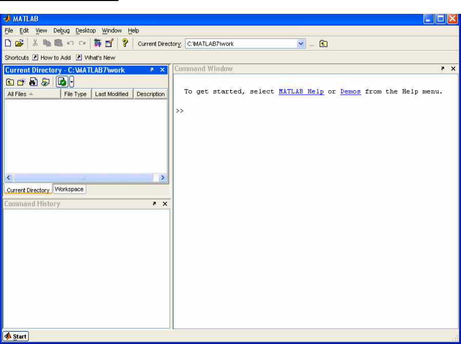
After starting MATLAB from the Desktop, the default three-part window will appear as
shown in Figure 2-1. Clicking the Start button in the lower left-hand corner will display
a list of MATLAB tools, shortcuts, and documentation. Mousing over the top item,
MATLAB, will display a submenu that should have PLS_Toolbox listed at or near the
bottom. Should it not be found, please install PLS_Toolbox as described in Chapter 1,
Installing PLS_Toolbox.
Figure 2.1. Default MATLAB desktop at startup.
Command Window
The heart of MATLAB is the Command Window. It is where commands can be directly
entered by typing them followed by a return. The >> prompt shows that the Command
Window is ready for entering a command.
11
Together, MATLAB and PLS_Toolbox contain hundreds of commands in the form of
scripts and functions. A script is simply a series of commands that are executed when
the command is called. A function is similar to a script except that arguments are passed
to it when it is called and it returns other arguments calculated by the function. A script
runs in the base Workspace and does not return value. Once a script or function has been
defined, it can be called from the command window or by other functions or scripts.
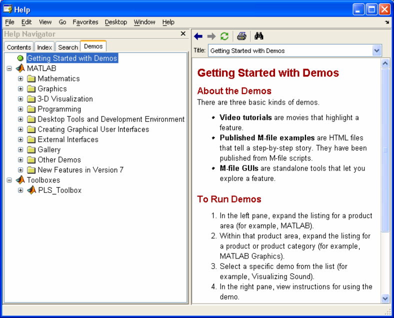
One of the most useful commands for a beginner is demo. (Note that MATLAB is case
sensitive and the commands Demo, DEMO and demO would be interpreted by MATLAB as
different (and most likely undefined) commands.) If the user types demo in the
Command Window (followed by a return), the MATLAB help browser will appear at
the Getting Started with Demos page. It is well worth the time for a new user to explore
both MATLAB and PLS_Toolbox demonstrations.
Another useful command is the help command. It is executed by typing help followed
by the name of the command. For example, type help demo to see instructions on using
the demo command. The demo command requires that you remember the exact name of
the command. If you cannot remember the command name, then use the lookfor
command followed by a key word. For example, lookfor demonstration will cause
MATLAB to search for all commands that use the word demonstration in the first line of
their help file.
Figure 2-2. MATLAB demos window.
12
Finally, provided the Documentation files have been loaded into the computer when
MATLAB was installed, detailed help may be obtained using the Help menu choice in
the top MATLAB command bar.
A record of executed commands can be viewed by scrolling up the Command Window
or by examining the Command History window.
Entering Data
Before MATLAB can do calculations, it needs data to work on. Typing the following
command:
» A=[2 5 3 6
7 3 2 1
5 2 0 3]
defines the variable A equal to the matrix enclosed within the square brackets. The spaces
between the numbers delineate the columns and each return starts a new row. The same
results are obtained if we use the command:
» A=[2 5 3 6; 7 3 2 1; 5 2 0 3]
where the returns have been replaced by semicolons. Either way MATLAB will respond
by typing the resulting matrix:
A =
2 5 3 6
7 3 2 1
5 2 0 3
If you do not wish to see MATLAB echo (print out) the result, end the command with a
semicolon. For example, if you type:
» A=[2 5 3 6; 7 3 2 1; 5 2 0 3];
the variable A will be defined as before, but MATLAB will not echo the result. When
working with very large matrices, the use of the semicolon can prevent thousands of
elements from being printed on the screen.

13
Table 2-1. Properties of a number of beers.
Typing in data by hand can become very tedious for large data sets. MATLAB can read a
variety of files from other major programs that store data. For example, we may wish to
load an Excel file (included as demonstration data with PLS_Toolbox and shown in
Table 2-1) containing data for six brands of beer and eleven properties for each beer
(Analytical data courtesy The Gambrinus Company, San Antonio, TX).
These data can be found in the file Redbeerdata.xls in the PLS_Toolbox/dems directory.
Note: PLS_Toolbox includes several functions for reading .xls and other data files
directly into the DataSet Object format typically used with its functions (see, for
example, xlsreadr). However, here we will use only the built-in MATLAB-based
functions in order to more fully explore MATLAB commands. Redbeerdata.xls may be
loaded into MATLAB by first selecting the File/Import Data... menu from the
Command Window. Once the appropriate file has been found and chosen in the Import
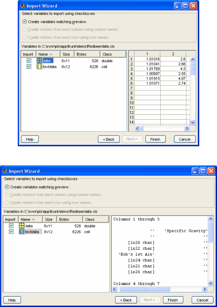
window, the data Import Wizard will present the window shown in Figure 2-3.
Specific
Gravity
App
Extr
Alcohol
(%w/w)
Real
Ext O.G. RDF Calories pH Color IBU
VDK
(ppm)
Shea's
Irish 1.01016 2.60 3.64 4.29 11.37 63.70 150.10 4.01 19.0 16.1 0.02
Iron
Range 1.01041 2.66 3.81 4.42 11.82 64.00 156.30 4.33 11.6 21.1 0.04
Bob's 1st
Ale 1.01768 4.50 3.17 5.89 12.04 52.70 162.70 3.93 30.7 21.1 0.11
Manns
Original 1.00997 2.55 2.11 3.58 7.77 54.90 102.20 4.05 58.9 18.2 0.05
Killarney's
Red 1.01915 4.87 3.83 6.64 14.0 54.30 190.20 4.36 12.3 17.9 0.02
Killian's
Irish 1.01071 2.74 3.88 4.48 12.0 64.10 158.80 4.28 53.0 14.2 0.03
14
Figure 2-3. MATLAB Import Wizard window with data highlighted.
Figure 2-4. MATLAB Import Wizard window with textdata highlighted.
15
The Import Wizard has divided the data into a numerical data matrix (data) and a text
data matrix (textdata). Notice that the matrix data is a 6 x 11 matrix of numbers in this
case. (Matrix notation always refers to rows first followed by the columns.) The variable
textdata is an 8 x 12 matrix of text cells. Highlight the variable data and one can
examine the first 10 x 10 part of the matrix to make sure that MATLAB has properly
delineated the numerical data. Highlighting the variable textdata, as shown in the figure
above, allows the user to see that it is made of text cells from the column and row labels,
and that the numerical data have been removed, leaving blank cells.
Clicking on the Finish button will complete the loading of the data into MATLAB.
Examining the MATLAB Workspace
We can examine MATLAB’s data memory or Workspace by typing whos at the prompt.
» whos
Name Size Bytes Class
data 6x11 528 double array
textdata 8x12 6226 cell array
Grand total is 395 elements using 6226 bytes
If you prefer, the Workspace can be examined by choosing Workspace in the View
menu. A Workspace window will appear.
When we examine the Workspace after loading the data we see that the matrix, data, is a
6 x 11 matrix of double precision numbers or double array. Typing the name of one of
the matrices will cause MATLAB to list the matrix to the screen. For instance, typing
data at the command prompt produces:
» data
data =
Columns 1 through 7
1.0102 2.6000 3.6400 4.2900 11.3700 63.7000 150.1000
1.0104 2.6600 3.8100 4.4200 11.8200 64.0000 156.3000
1.0177 4.5000 3.1700 5.8900 12.0400 52.7000 162.7000
1.0100 2.5500 2.1100 3.5800 7.7700 54.9000 102.2000
1.0192 4.8700 3.8300 6.6400 13.9800 54.3000 190.2000
1.0107 2.7400 3.8800 4.4800 11.9900 64.1000 158.8000
Columns 8 through 11
4.0100 19.0000 16.1000 0.0200
16
4.3300 11.6000 21.1000 0.0400
3.9300 30.7000 21.1000 0.1100
4.0500 58.9000 18.2000 0.0500
4.3600 12.3000 17.9000 0.0200
4.2800 53.0000 14.2000 0.0300
We can examine just one element of the matrix by indicating the row number, followed
by the column number; for example, if we wish to examine the number in the third row
and second column we would type:
» data(3,2)
ans =
4.5000
Notice that the answer to our request has been assigned to a temporary variable called
ans.
We can similarly examine the complete second row by typing:
» data(2,:)
ans =
Columns 1 through 7
1.0104 2.6600 3.8100 4.4200 11.8200 64.0000 156.3000
Columns 8 through 11
4.3300 11.6000 21.1000 0.0400
where the colon represents all the columns.
As we saw in the import wizard, the text data are made up of an 8 x 12 matrix of cells
containing our sample and variable labels and several empty cells where the numbers had
been. This can be seen by typing the matrix name, textdata. Cell arrays are a handy way
to store different length matrices as is often the case when dealing with text. Notice that
the sample labels are located in rows 3 though 8 of the first column. We can define a new
vector, also a cell array, containing our sample names by typing:
» SampleLabels=textdata(3:8,1)
SampleLabels =
'Michael Shea's Irish Amber'
'Iron Range Amber Lager'
17
'Bob's 1st Ale'
'Manns Original Brown Ale'
'Killarney's Red Lager'
'George Killian's Irish Red'
where (3:8,1) is read as rows 3 through 8 inclusive and only column 1. Since the
SampleLabels matrix is only 8 rows long, we could have also typed
» SampleLabels=textdata(3:end,1);
where end indicates the last row (and the semicolon was used to suppress the screen
echo).
We can similarly define a matrix of variable labels by isolating row 1, columns 2 through
12 by typing:
» VariableLabels=textdata(1,2:end)
VariableLabels =
Columns 1 through 3
'Specific Gravity' 'Apparent Extract' 'Alcohol (%w/w)'
Columns 4 through 9
'Real Extract (%w/w)' 'O.G.' 'RDF' 'Calories' 'pH' 'Color'
Columns 10 through 11
'IBU**' ' VDK*** (ppm)'
Type whos to see how we have done. Fortunately, these labels are in a form (cell array of
stirngs) where the PLS_Toolbox GUIs can read them directly.
Saving your work
We have done a great deal of work, so it would be a good idea to save our data to disk.
Before we save the data, there may be some variables that we would like to remove, for
example the variable ans. Perhaps the most dangerous command in MATLAB is the
‘clear’ command. The command clear ans will remove only the variable ans.
However, when clear is not followed by the names of any variables to be removed, it
will remove all the variables in MATLAB memory! To save the remaining variables
choose File/Save Workspace as… from the Command Window and give your data a
name such as Beerdata. The resulting file will be a MATLAB data file with the .mat file
extension. At some later date, when you wish to reload these data, you may use the
Import Data… choice in the File menu as before.
18
Note: For those who prefer not to let their finger leave the keyboard, you may use the
commands ‘load’ and ‘save’ to load and save data respectively. Just type help load
or help save for specific instructions in using these commands. The ‘save’ command
has several advantages in that it allows all or just the specified matrices to be saved and
can save the data in several formats such as ASCII. The main disadvantage is that it will
save the data in the current directory. You may determine the current directory and its
content by using the command ‘what’. Use ‘cd’ to change the current directory (or use
the full path name of where the files should be saved).
The Solo and PLS_Toolbox GUI Environment
Most of the higher-level data analysis tools can be accessed through Graphical User
Interfaces (GUIs) in PLS_Toolbox. In many cases a GUI can make data analysis faster
and easier to perform and interpret than using the command line analogs.
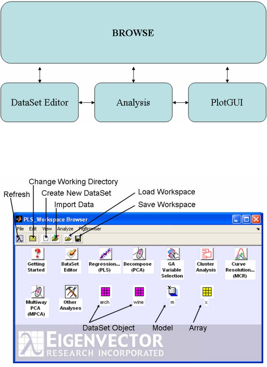
PLS_Toolbox is organized around 4 main GUI tools (Figure 2-5). Each tool is dedicated
to a specific step in the data analysis process.
1) The Browse GUI is the PLS_Toolbox "desktop" environment. Here one has access to
all loaded data, available analysis methods, the DataSet Editor, and other top level tools.
With its "drag and drop" functionality, a user can quickly begin a number of data analysis
tasks.
2) The DataSet Editor is the primary data-handling GUI in PLS_Toolbox. It provides a
variety of functions and tools for loading, editing, and saving data. As its name suggests,
the object used in PLS_Toolbox for managing data is the DataSet Object (see chapter 16
for more information).
3) The Analysis GUI is the core interface with PLS_Toolbox data modeling and
exploration functions. This is where you will create and explore your models.
4) The PlotGUI interface is the principal data visualization tool for PLS_Toolbox. It
provides a vast number of tools for labeling, manipulating, and publishing plots generated
using PLS_Toolbox.
19
Figure 2-5. GUI diagram.
Browse
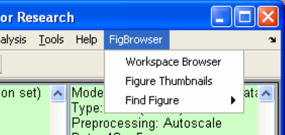
Figure 2-6. PLS_Toolbox Browser.
20
The Browser window (Figure 2-6) shows icons for tools and objects in the PLS_Toolbox
workspace. Each analysis icon opens its respective interface in the named mode (e.g.,
Decompose will open the Analysis window with PCA already selected). The browse
environment is "drag and drop" enabled so you can click on a DataSet icon, drag it over
an analysis icon, and release the click to start the analysis. This will open the Analysis
window with the method pre-selected and load the data. Likewise, you can drag an
existing data or model icon from the browse window over to an Analysis window and
"drop" the data /model into an ongoing analysis.
Although the FigBrowser utility can help you manage figures (see below), you can also
set the Browser to display figures using setplspref (see setplspref and
getplspref in the manual for more information) from the command line using the
following command:
>> setplspref('browse', 'viewfigures', 'true')
Once you’ve set the preferences, you’ll have to restart the Browser for the new
preferences to take affect.
FigBrowser
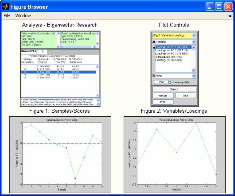
As you work through an analysis you often can generate lots of figures. To help manage
and view those figures, there is a utility called FigBrowser (Figure 2-7). It creates a
thumbnail image of each open figure/window and displays it (Figure 2-8).
Figure 2-7. FigBrowser Menu; selecting Figure Thumbnails will open FigBrowser.
21
Figure 2-8. Figure Browser.
Clicking on a particular figure thumbnail will bring it to the front, make it the "current
figure" in MATLAB, and then close the thumbnail window.
Analysis
The Analysis application provides a common interface for several popular PLS_Toolbox
functions, including:
PCA Purity PARAFAC PLS PLSDA MPCA
MCR Cluster PCR SIMCA MLR
The interface allows the flexibility to switch between analysis methods (for a given type
of data) and will help you manage your developed models. There are various useful tools
integrated into the application that will be described below.
The Analysis interface can be started from Browse or from the command line using the
generic command.
>> analysis

22
It can also be started with a default analysis method selected by typing the PLS_Toolbox
command for the specific analysis of interest without any input arguments. For example,
the command below starts the analysis interface preset to the MCR analysis method.
>> mcr
Main Figure
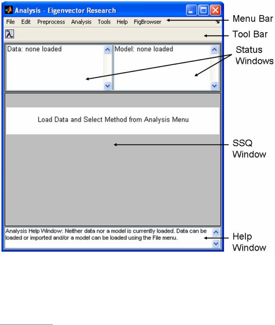
The main Analysis window (Figure 2-9) has a layout with four basic areas. The menu
items allow access to common I/O functionality, data manipulation, and analysis set-up.
The Toolbar contains buttons specific to a particular analysis method. The status
windows show information for the currently loaded data and model. For analysis methods
that generate statistics, the SSQ window will display statistics and allow you to
manipulate the number of components or factors to be modeled. At the bottom of the
figure is a Help Window that displays suggestions for the next step of an analysis. It is
meant as a guide for novice users and can be turned off by right-clicking on the window.
23
Figure 2-9. Main Analysis window.
Some menu items are available at all times, others will be disabled depending on the
loaded data and model type. Notice that when no DataSet Object or model is loaded, all
items except for loading functions are disabled in the menus (see next figure). As you
load data and create models you’ll find appropriate menu items enabled or disabled.
Menu Items - File
The File menu (Figure 2-10) contains functionality to load, save and clear data and
models. Saving and loading occur through a common interface (see the next section). In
general, items dealing with data will allow you to access either the X- or Y-block. The
use of the X- and Y-blocks depends on the analysis method selected; some analysis
methods do not use the Y-block. In all cases, the number of rows (samples) in the Y-
block must match the number of rows (samples) in the X-block. Use Load Data to load

24
MATLAB-formatted variables from .mat files or the MATLAB workspace. If you choose
Load Data/Both, you’ll be prompted to load a Y-block after loading an X-block. Import
Data will load data from sources outside the MATLAB environment, such as
ThermoGalactic .spc, Microsoft Excel, or .txt files. New Data is used to create a DataSet
Object of given size and initial value (e.g., random values (rand), NaN, 0). Note that
PLS_Toolbox and MATLAB also supply several different command line tools for
importing and manipulating data. Often it can be useful to import data from the command
line then load it into Analysis using the standard Load Data menu.
Several types of analyses use "options" to provide additional optional inputs to a
function. These options are stored in structure arrays and can be loaded and saved
similarly to models. They can also be edited via the Edit menu (see next section). See the
documentation for the individual analysis method for more information on specific
options.
Figure 2-10. File menu.
The Save Data menu option saves data as a DataSet Object and saves Models and
Predictions as MATLAB Structures (see the appendix entries for each of the items in the
PLS_Toolbox manual for more information). When you Clear a model, all of the plots
associated with that model are closed automatically. Likewise, if you clear data (X-block
or Y-block) all plots associated with them will close. If data are overwritten, all open
plots will be updated.
25
Once a model has been calculated, most analysis methods allow you to load new data to
which you may then apply an existing model (i.e., make a prediction using the model).
Be aware that if you load new data to be applied to an existing model, the size of the new
data must be the same as that of the old data or you will receive an error.
Once a model has been calculated, if the calibration data are cleared (or overwritten by
loading new data), the model can no longer be modified. The same is true for a model
which has been loaded from a file or the MATLAB workspace. To make any changes,
you must create a new model by using the File/Clear/Model menu option.
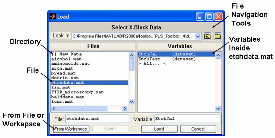
Load and Save operations use a common interface that allows loading from either the
MATLAB workspace or MATLAB-formatted (.mat) files. You can use the interface to
switch between workspace and file modes using the button located in the lower left
corner. The Workspace view allows you to save or load directly to/from the current
MATLAB Workspace. The File view allows you to save or load directly to/from a .mat
file.
In File view (Figure 2-11), the controls at the top of the window allow for standard folder
navigation. The two list boxes, Files and Variables, show, respectively, the available files
in the currently selected folder and the available variables in the currently selected file.
Note that a .mat file can contain several variables and you can select one or more from
the Variables list to load. When saving to a .mat file you must name both the file and the
variable (i.e., both the File and Variable text boxes must have values in them). Also
notice that in the Files list a name preceded with “[ ]” indicates a folder. To navigate into
any folder, either double-click the folder name in the listbox or select it and click the
Open button.
Figure 2-11. Load dialog box.
26
Menu Items - Edit
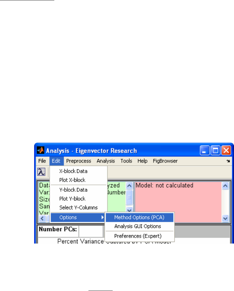
The Edit menu of the Analysis window (Figure 2-12) provides tools for viewing and
manipulating loaded data. The X-block Data and Y-block Data options open the specific
DataSet Object in a DataSet Editor. Selecting Plot X-block or Plot Y-block will open
the DataSet Object with PlotGUI and display plots of general statistics and allow plotting
of subsets of the data (see the DataSet Editor and PlotGUI sections later in this chapter
for more information).
Select Y-Columns is used when the Y-block contains multiple columns. A list of
available columns is presented from which you can choose which of the Y-block columns
to use in the analysis. The top two selections from the Options submenu will open the
Options GUI and allow you to adjust settings the current analysis or for the Analysis GUI
itself. The Preferences selection will open a GUI for adjusting application "preferences"
to override default options (set within a function). Users should be extremely careful if
using the Preferences GUI, changes to a function's preferences will be persistent (even if
MATLAB is exited) and no warnings will be shown.
Figure 2-12. Edit menu.
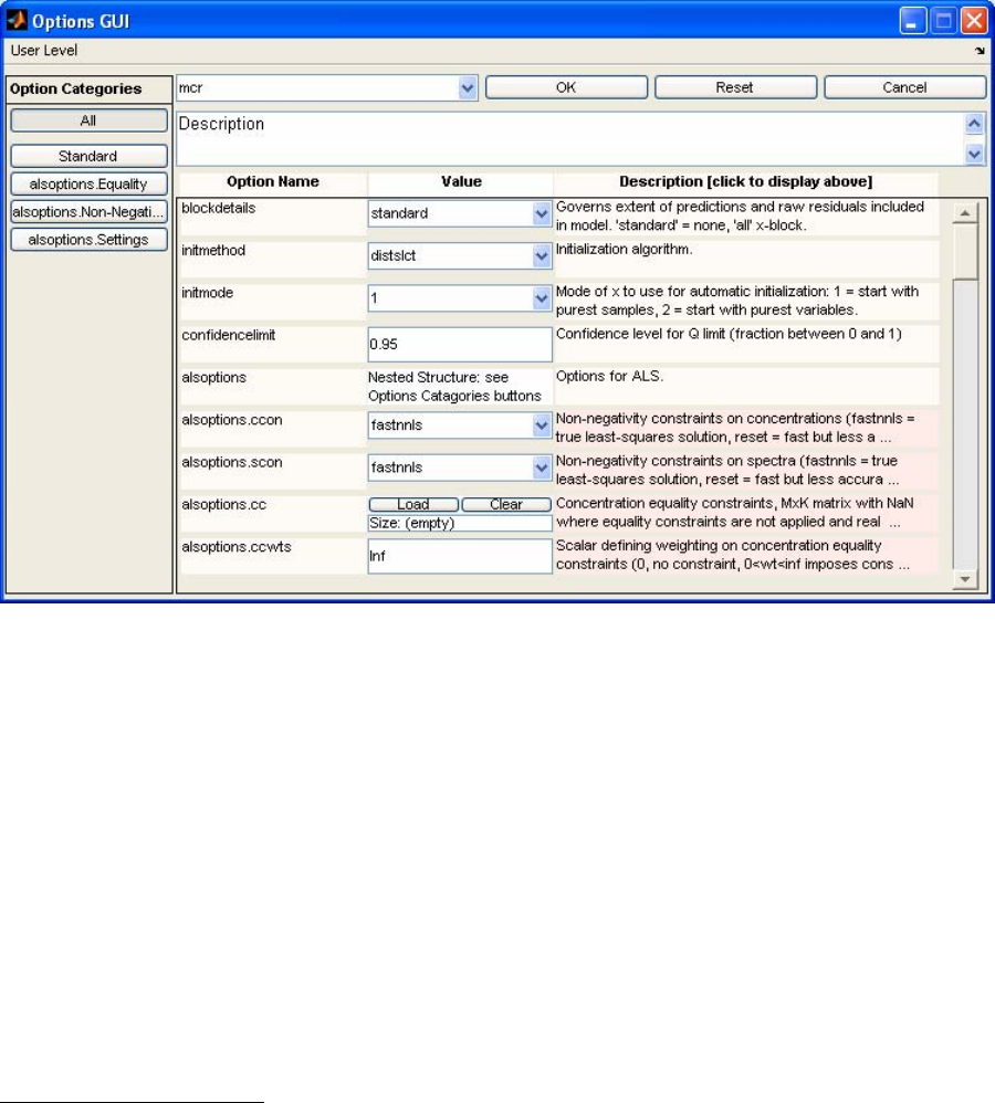
Options GUI
Options provide additional optional inputs to a function. The inputs are stored in a
MATLAB structure array and can be loaded, edited, and saved from the Analysis
interface. The Options GUI is an interface into the Options structure.
27
Figure 2-13. Options GUI window for MCR.
Within the Options GUI you have several ways to narrow down the options available for
editing. The User Level menu will make available only the options that a particular type
of user needs. If set to "advanced," all available options will be displayed. The Options
Categories buttons display logical subsets of options to make it easier to view and
modify options of interest. Substructures will also appear as buttons in the Options
Categories list.
To change an option click on the appropriate box or pulldown menu in the Value list and
enter or select the value you wish. Look at the Description box for a brief explanation of
the options. If the box is pink, the explanation is longer than can fit in the box. Clicking
on the box will display the complete contents in the scrollable Description area above the
list.
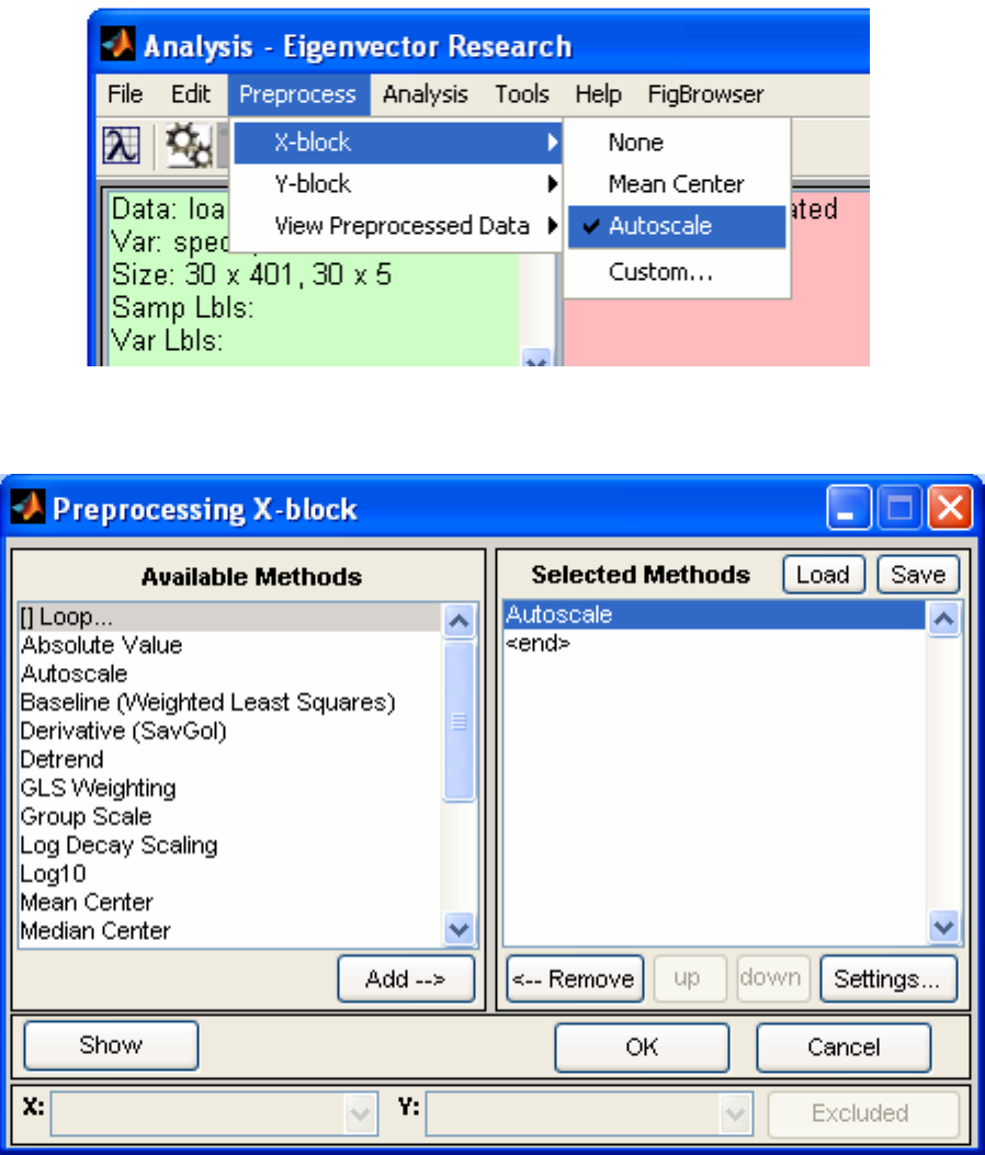
Menu Items - Preprocess
The Preprocess menu (Figure 2-14) allows setting and viewing of preprocessing options.
Each block has a submenu for setting common preprocessing methods directly or for
accessing the Custom Preprocessing figure. After making a change to preprocessing,
you will usually be required to recalculate the model (by clicking the Calc button). View
Preprocessed Data displays the effects of the selected preprocessing on loaded data. The
plot(s) are automatically updated to reflect any changes in preprocessing.
28
Figure 2-14. Preprocess menu.
Figure 2-15. Custom Preprocessing window.
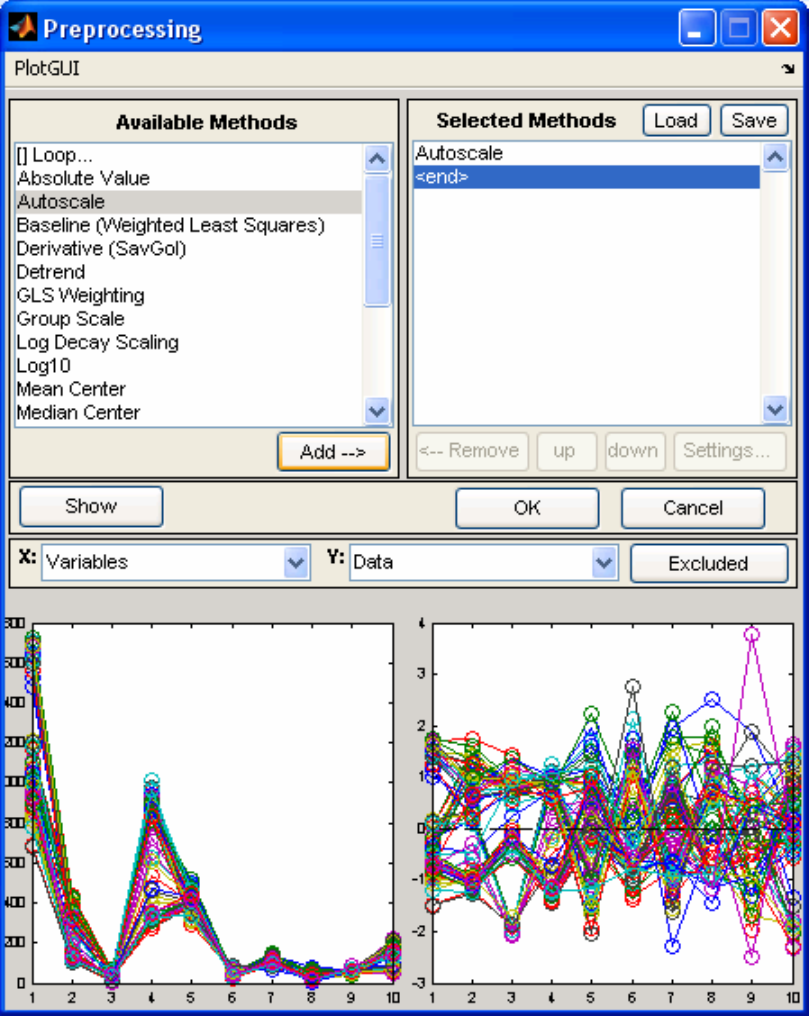
The Custom Preprocessing window (Figure 2-15) allows you to choose from a list of
available preprocessing methods. After selecting a method from the available methods
list, pressing the Add button will insert the selected method into the Selected Methods
list on the right. Some methods will display an additional window for method specific
settings when the item is added to the Selected Methods list. These settings can also be
29
modified by selecting the method in the Selected Methods window, then pressing the
Settings… button.
The Selected Methods are order specific – that is, they get applied in order from top to
bottom. The order of preprocessing can have a very significant effect on an analysis; this
should be carefully considered in the development of a model.
Note that n-way data have different preprocessing methods than 2-way data, and care
should be taken when switching between 2-way and n-way data. Again, you must
recalculate the model after making any changes to preprocessing. You may close the
preprocessing window (using the “X” button in the upper right corner of the figure) at
any time; its settings are automatically saved after each addition.
You can load and save preprocessing settings from/to the MATLAB workspace and .mat
files using the Custom Preprocessing window's Load button.
The Show button will display two plots side by side with the raw data on the left and the
preprocessed data on the right (Figure 2-16). You can select the axis values using the
drop-down menus and toggle the Excluded button to show excluded data.
30
Figure 2-16. Preprocessing GUI with Show clicked.
31
Menu Items - Analysis
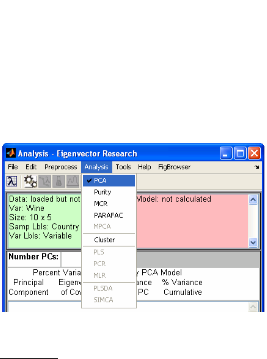
The Analysis menu (Figure 2-17) displays a list of data analysis methods available in the
interface. Only those methods that are valid for the currently loaded data will be enabled
(e.g., in the figure below, the wine demo DataSet Object is loaded and only five
methods are available). Switching methods will cause any currently developed model to
be cleared. If the model is unsaved you will be prompted to save the current model.
The methods available at any time depends on the number of data blocks loaded, the
dimensionality of the data (2-way vs. n-way), and additional details in the DataSet
Object. Methods that require both an X and a Y block (e.g., PLS, PCR, …) will only be
available if both blocks are loaded. Methods that require only an X-block are available if
both X- and Y-blocks are loaded; however, they will only operate on the loaded X-block
while ignoring the Y-block. SIMCA requires that the X-block contain classes for the
samples (see the section on the DataSet Editor later in this chapter, and Chapter 16 for
more information on DataSet Objects). PLSDA requires either classes for the X-block
samples or a Y-block containing class assignments.
Figure 2-17. Analysis menu.
Menu Items - Tools
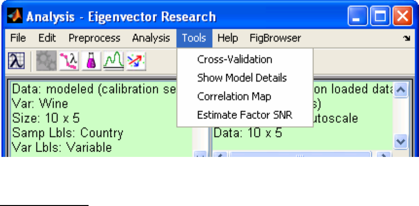
The Tools menu (Figure 2-18) shows utilities available for DataSet Objects and Models.
Cross-Validation displays an interface for selecting and configuring a cross-validation
32
method (see crossval in the reference manual for more information). Cross-Validation
is not available for all methods. Show Model Details displays model statistics and
information in a window from which the user can easily copy the information.
Correlation Map will open a figure containing a map of correlated variables. If there are
less than 20 variables, they will be sorted, with the most correlated variables next to each
other (see crosscor in the reference manual for more information). Estimate Factor
SNR estimates the number of significant factors in multivariate data.
Figure 2-18. Tools menu.
Menu Items - Help
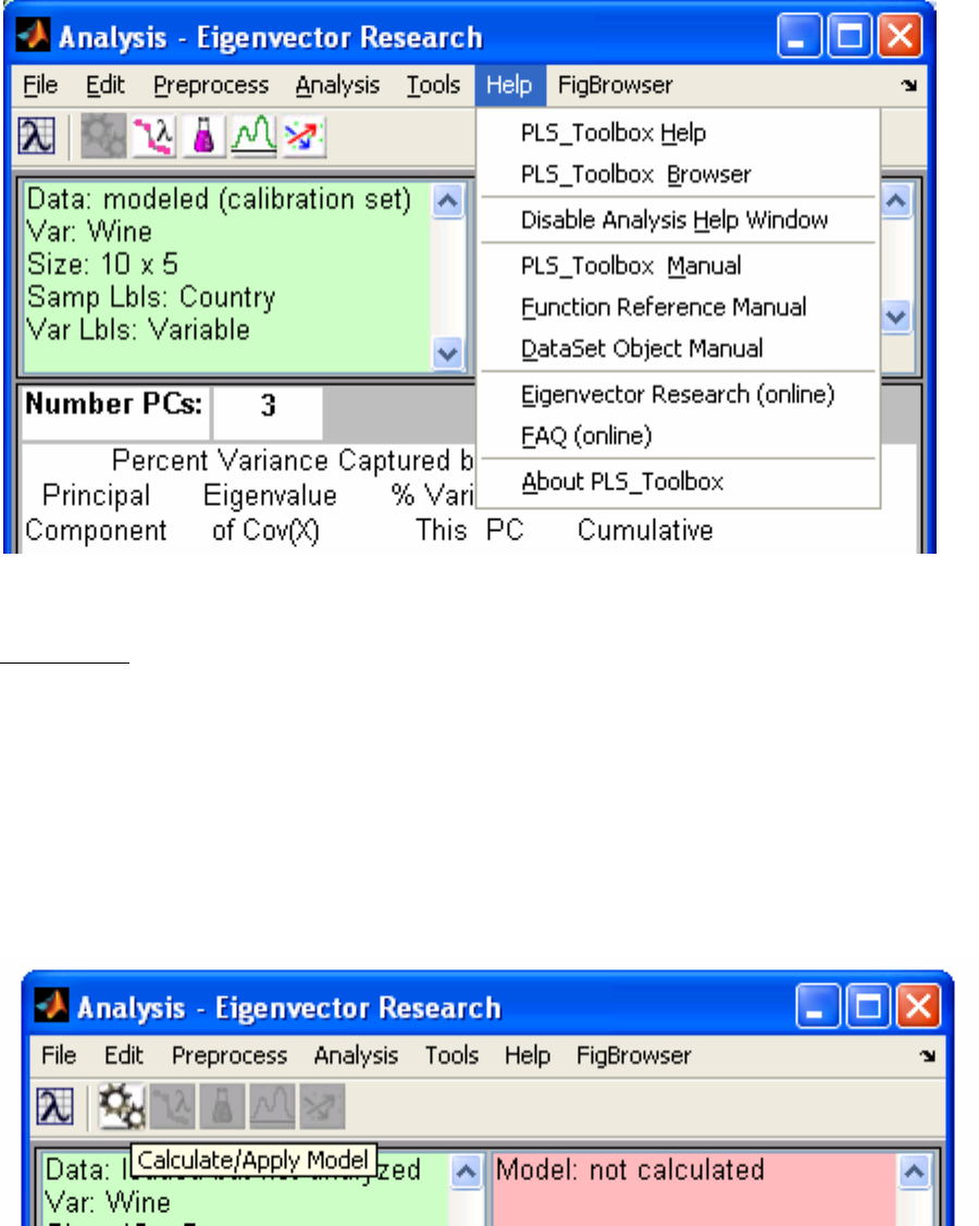
The Help menu (Figure 2-19) has several selections for PLS_Toolbox help and
information. PLS_Toolbox Help is an interactive interface providing topic-specific
assistance on PLS_Toolbox functions. The PLS_Toolbox Browser is a graphical
interface for the Toolbox (see above; clicking the Eigenvector Research Lambda icon
button on the toolbar will also open the Toolbox Browser). The Manual selections open
various portions of this document. The Online selections will open your default browser
to the EVRI homepage or FAQ page. About PLS_Toolbox provides version and
installation information for MATLAB as well as PLS_Toolbox.
33
Figure 2-19. Help menu.
The Toolbar
The toolbar on the Analysis window (Figure 2-20) contains buttons to calculate and
display models and data. The buttons available and their actions depend on the type of
analysis method selected and individual buttons will be automatically enabled or disabled
depending on the status of your analysis. For instance, when you first load data and
choose an analysis, only the calculate button will be enabled. Holding the mouse cursor
over the top of a particular button will display the Tooltip for that button. The
Eigenvector Research Lambda icon button is always present in the toolbar and opens the
PLS_Toolbox Browser.
Figure 2-20. PCA, MCR, PLS and PCR toolbar with Calculate button tooltip.

34
Figure 2-21. Analysis interface with status windows populated
(note right-click menu shown for model status window).
Status Windows
The status windows (Figure 2-21) show information on models and loaded data. Both
windows are right- and left-click enabled. Left-clicking the Data Status Window will
bring up the DataSet Editor with your current data (see the DataSet Editor section below
for more information). Left-clicking the Model status window will display the Show
Model Details window. Right-clicking either window will display a subset of the File
and Edit menu items applicable to the window (see the Model Status Window right-click
menu displayed above). If editing data in the DataSet editor, any changes made will be
automatically updated in the loaded DataSet, but you will need to recalculate the model
upon completion.

35
Figure 2-22. Analysis interface with SSQ table populated.
SSQ Window
The SSQ Window (Figure 2-22) interactively displays Variance Captured or other
statistical information for models. The terminology and data displayed will change
depending on the Analysis selected. To choose the number of components or factors for
an Analysis you can click on the desired number in the Variance Captured Data Table
(don’t forget to recalculate when needed).
For some methods (e.g., MCR and PARAFAC), models are not "nested" – that is, when
you add or remove components, the other components in the model are affected by the
addition or removal (this is not true of PCA, PCR or PLS models, in which adding or
removing a component has no effect on the other components). In these methods, the
SSQ table behaves slightly differently. Instead of obtaining an entire table of variance
captured for all components, even those not included in the model, the variance captured
for only the included components is given. Models with more or fewer components can
be investigated by clicking on the appropriate number of components and clicking
Calculate. (In the rare event that you need to exceed the default maximum number of
factors (20), the Number PCs/Components box is active (editable) and you may enter a
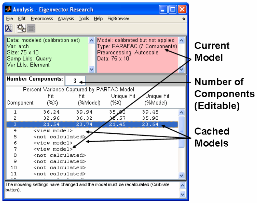
36
larger number manually). Note that once a model with a given number of components is
calculated, it is "cached" so that it can be recalled faster should you want to return to that
model later. These models are indicated in the table by the label "<View Model>".
Clicking on any of these lines followed by Calculate will automatically recall that model.
Describing the different analysis methods is beyond the scope of this chapter. For more
information on the individual methods, please see Chapter 4.
Figure 2-23. Analysis interface showing cached models for PARAFAC analysis.
The DataSet Editor
The DataSet Editor (DSE) (Figure 2-23) is an interface for editing the contents of a
DataSet Object (see “Chapter 16: Advanced Software Information” for more technical
information about DataSet Objects). Using the Editor can be easier and quicker than
manipulating a DataSet Object from the command line. The demonstration below will
run through some of the common functions of the DSE.
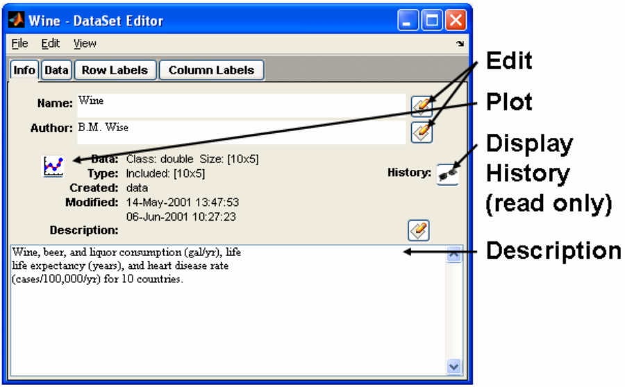
37
Start an empty DataSet Editorby using the MATLAB command below or by clicking the
DataSet Editor icon in the Browser:
>> editds
Load the Wine DataSet Object using the Load command from the File menu. Navigate to
the dems folder in your PLS_Toolbox folder to locate the Wine DataSet. (If you have
already loaded a DataSet object into the MATLAB workspace, you can also double-click
on the DataSet object in the MATLAB Workspace Browser to start the DSE and load the
given DataSet object).
The Load, Save, and Import functions in the File menu are similar to those in the
Analysis interface, allowing you to load or import data from a variety of sources. The
DSE also permits concatenation of data by loading new data with modes that match one
or more modes of the currently loaded data.
After loading the Wine DataSet Object, your editor should look similar to Figure 2-24.
The default tab displayed is Info. Here we can see general information about the DataSet
Object including the author, its size, and date created.
Figure 2-24. DataSet Editor default view.
Fields with the Edit button near them can be edited by clicking the button, editing the
contents of the field, and then clicking Accept (as opposed to Discard) (Figure 2-25).

38
Try changing the “B.” in the Author field to “Barry”. Notice an asterisk appeared next to
Wine in the title bar of the figure after you clicked Accept. This indicates there is
unsaved data, so don’t forget to Save your changes to a new DataSet Object via the File
menu. Name your file and your variable “newwine”. Keep in mind that if you save the
new DataSet to the MATLAB workspace it will be deleted when you exit MATLAB. To
retain it, you must save it to a file from either the DataSet Editor or from the MATLAB
workspace.
Clicking the Plot button or selecting the View/Plot menu item will bring up a figure of
the plotted data as well as a Plot Controls figure for manipulating the plot (see below for
more information on Plot GUI).
Figure 2-25. Editing a DataSet Object field.
The Data Tab
The Data tab (Figure 2-26) allows you to edit individual cells, include/exclude rows and
columns, and to designate rows/columns as Axis Scales, Classes, or the Include field.
For example, to exclude the Wine column, left-click the "Wine" column header, then
right-click (Control-click on some systems) the same column header and select Exclude
Selected from the menu. Applicable results (e.g., changes in the include field or "Use
as") will be reflected in the Mode tab.
The selections in the right-click menu can also be accessed via the Edit menu after
selecting the column of interest. If more than one column or row is selected, the action
will be performed on all selected columns and/or rows.
Other options for the selected column include:
• Extract Data to export the column(s) or row(s) to the workspace or a .mat file,
• Copy to make a copy of the selected column(s) or row(s) on the system clipboard (to
copy into other programs),
• Paste to copy the contents of the clipboard into the selected column(s) or row(s),
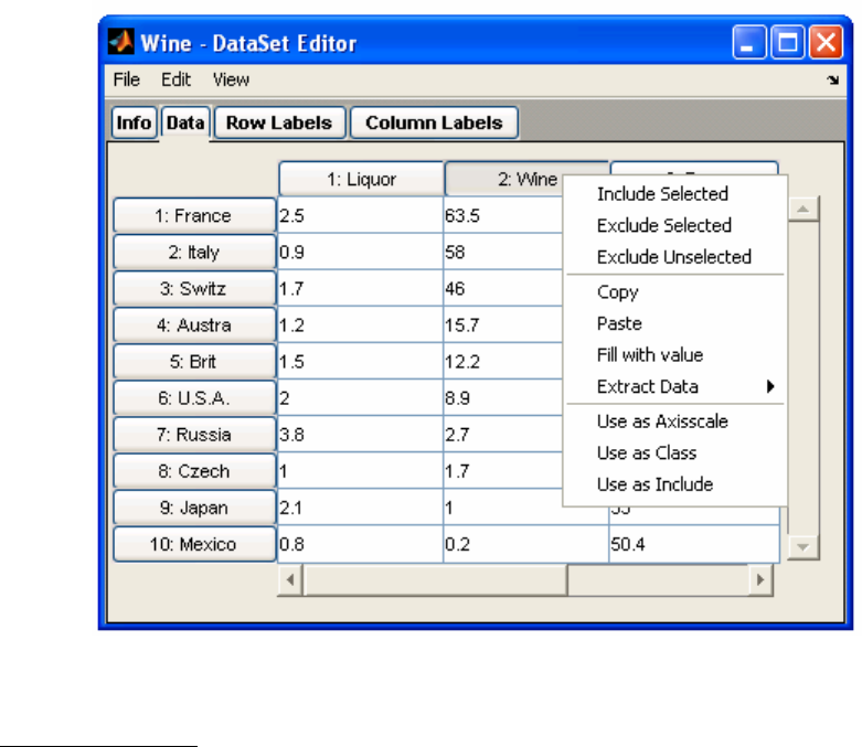
39
• Fill with value changes all cells to value indicated,
• Use as Axisscale / Class / Include which copies the column(s) or row(s) into one of
the label fields of the DataSet (see below).
Figure 2-26. The right-click menu for a data column.
Mode Labels Tabs
The Mode Labels tabs allow you to enter information associated with the different modes
of the data. In a typical two-way DataSet Object, mode 1 (i.e., rows) is related to samples
and mode 2 (i.e., columns) is related to variables. In the Mode Labels tabs, you can set
axis scales, classes, labels and the include field for each mode.
For example, after excluding the Wine column in the Data tab as described above, go to
the Mode 2 Labels tab (Figure 2-27). You’ll notice the Incl. field checkbox next to the
Wine label is not checked. This is because you have just excluded it. Including/Excluding
fields can just as easily be accomplished using the check boxes in the Mode Labels tabs.
You can also directly edit the values in any of the fields here.
The DataSet Editor will allow you to load Labels, Axis Scales, and Classes from the
Mode Label tabs directly from files or variables as long as the information being loaded
is the correct size. This can be a useful tool when you have different data sources that use
the same labels. Above we created a new Wine DataSet Object; now let’s clear and
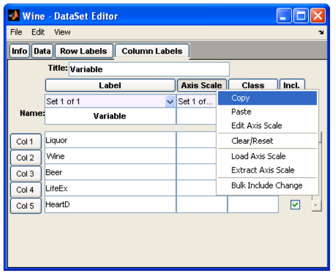
40
reload the Mode 2 Labels. First, right-click the Label header and select Clear/Reset (or
select Edit/Clear/Reset). Next, right-click the Label header again and select Load Label
(or select File/Load Label). This will open the load dialog figure and allow you to
navigate to a .mat file or choose a variable from the workspace. Locate the Wine.mat file
in the dems folder and click Load. The DataSet Editor will automatically extract and load
the Mode 2 Labels from the original DataSet Object.
Figure 2-27. Mode 2 Label tab.
When loading from a DataSet object, the same field from the same mode will always be
used. To load from a different mode, you must first Extract or Copy the contents from
the source DataSet object and Load or Paste them into the target DataSet object. Note
that you can always load or paste from a non-DataSet object, even when that information
was copied from an external program such as Microsoft Excel.
From the Mode Label tabs you can also create multiple Sets of Labels, Axis Scales, and
Classes. This can be useful if you find yourself needing to plot your data against two
different axis scales; for instance, frequency and wavelength. To add an additional set,
click on the set selection pull-down menu just below the column header buttons (This
menu usually says "Set 1" as in Figure 2-27) and choose New Set… and finally confirm
the creation of a new set. You can then enter values manually or select the column header
button and Paste or Load all the values from the clipboard, workspace or file.
Using the Edit selection from the right-click menu will display the contents of the entire
column of Label / Axisscale / Class / Include field in a list box. This can provide quicker

41
way of making changes to these fields. Labels can be copied, manipulated in Excel, then
pasted back into the list.
The Bulk Include Change selection is also available from the menu. It allows a selection
from a list box. You can use the shift and/or control keys while selecting an item in the
box to make changes to the include field.
Other DataSet Editor Features
The DataSet Editor has many powerful data manipulation features. The Edit menu
includes the following utilities:
• Transpose a DataSet object will switch columns and rows – but only for 2-way
DataSet objects.
• Hard-Delete Excluded will permanently remove excluded data from a DataSet
Object.
• Exclude Excessive Missing will automatically exclude rows or columns (or multi-
dimensional indices) in which the number of missing data values (NaNs) exceeds the
allowable amounts, as defined by the missing data replacement algorithm,
'mdcheck'. This action can be used to remove samples or variables which are too
sparse in information to be used in modeling.
• Missing Data Map (from the View menu) will provide a color map of missing data
points (NaNs) in the data matrix. Elements which are not missing are shown in green,
elements which are missing but could be replaced with the standard missing data
replacement algorithm ('mdcheck') are shown in yellow, and elements which are
missing and cannot be replaced by the missing data replacement algorithm are shown
in red.
• Permute Modes will allow you to change the order of modes of the data.
• Concatenate will give you the option to concatenate old and new data (if data are
already loaded and new data are either Loaded or Imported through the DSE File
menu). The old and new data are compared, and if they match in size in one or more
modes, you will be given the option to concatenate the old and new data. By this
method, you can build a larger DataSet Object from several smaller datasets.
In general, the DataSet Editor allows quick and easy access to the contents of a DataSet
Object. It has been integrated into the Analysis interface (as shown earlier) so you can
easily make changes to your data and recalculate your model without having to save and
reload your data or go to the command line.
Viewing and Modifying DataSets with PlotGUI
The 'plotgui' function is also useful when working with DataSet objects. This utility
provides a graphical view of a DataSet object and allows graphical manipulation of the
42
include and class fields. The 'plotgui' Plot Controls window can be invoked from
the MATLAB command line by typing plotgui. It is also used by other PLS_Toolbox
functions and can be accessed from any of a number of different interfaces including the
workspace Browser.
PlotGUI is configured to have a single small controls interface, Plot Controls, which
contains all of the tools necessary to manipulate a particular plot. At any time there may
be several plots (figures) open under "control" of PlotGUI but only one Plot Controls
window. Selecting a plot and clicking on its "gray space" (the gray margin area around
the actual plot axes) will automatically bring the Plot Controls interface to the front.
At the top of the Plot Controls window is a Figure Selector pull-down menu, which
indicates the current figure being controlled. Below this are three Axis Menus, one for
each of the x, y and z axes of a plot. Before data are loaded, all of these menus will be
empty. Data can be loaded into the GUI by using the File/Load Data menu in the Plot
Controls window or by providing it in the command line instruction
» plotgui(mydata)
After loading data, a plot will appear and the pull-down Axis Menus will list the
available columns of the loaded data. Changing the plot is accomplished by changing the
selections on the Axis Menus. Selections from the y-axis menu are plotted against the
selection from the x-axis menu. A three-dimensional plot can be created by selecting an
item from the z-axis menu. If “auto-update” is checked, plots are automatically updated
when new selections are made. Otherwise, the Plot button must be pressed after changing
the axis menu selections.
Multiple y-axis items can be simultaneously plotted by holding down the Control key
when making selections (As these plots can get confusing, a legend can be added to the
plot by selecting Insert/Legend from the menus on the plot itself). In addition to the
columns of the DataSet Object, the x-axis menu also allows plotting against the sample
number (i.e., row number) and any axisscale stored in the DataSet Object. In Figure 2-
28, the Wine DataSet Object has been loaded and the Liquor, Wine, and Beer
consumption values have been selected to plot against sample number (Plot/Columns).
In addition to plotting the contents of the data field, 'plotgui' can also display
information from other DataSet fields. The View menu, shown in Figure 2-28, offers
various options depending on the DataSet Object contents. The top section of this menu
allows display of available labels, classes and excluded data (i.e., columns or rows which
have had their indices removed from the DataSet Object include field). A raw-text table
of the plotted data can be displayed (View/Table) and axis lines (representing zero on
each axis) can be added to the plot.
If labels and numbers on a plot are badly overlapping, they can be "decluttered" by
selecting one of the options from the View/Declutter Labels menu. There are several
levels of decluttering. In addition, if Declutter/Selected Only is checked, then labels will
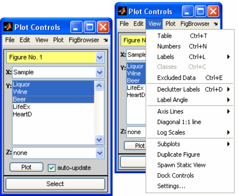
43
be shown only for the points which are selected (see below) on a plot. If no points are
selected, all labels are shown (after decluttering as desired).
The middle portion of the View menu adds various annotations for axes and selects
optional log scaling for the axes.
The bottom part of the View menu contains various other options including creating a
duplicate “linked” (see Selections below) copy of the current figure in a new window or
spawning a static copy of the current plot (i.e., a figure not controlled by plotgui). You
can also create Subplots using the fly-out menu. To operate on a particular subplot just
click on it first, then make selections with Plot Controls.
The Plot menu selects the mode of the DataSet Object from which the menus will select
and plot data. By default this starts at the highest mode (“Columns” in this example) and,
thus, the pull-down axis menus will contain an entry for each column in the DataSet
Object. To plot rows of the DataSet Object, Rows should be selected from this menu, at
which point the axis menus will display all the available rows. The Data Summary
(a) (b)
Figure 2-28. (a) Plot Controls with three columns selected from the Wine DataSet Object. (b)
The View menu options with the Wine DataSet loaded.
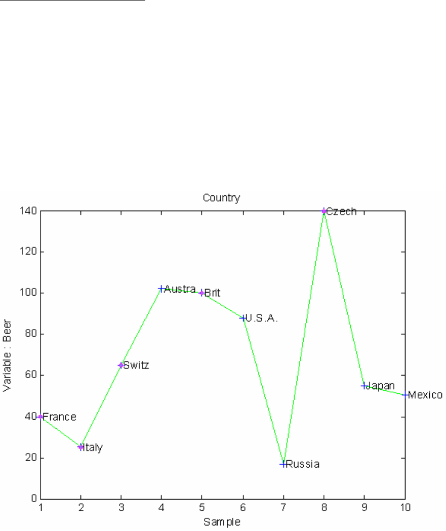
44
selection allows plotting of various statistics from any mode (selected from the x-axis
menu).
Selections: Assigning Classes
The Select button allows you to make a selection from the plotted data. The default
selection mode is a standard rubber-band box in which one corner of a box is marked
when the mouse button is pressed down and the opposite corner is indicated when the
button is let back up. Any points inside the box will be selected. Different selection
modes can be set through the Edit/Selection Mode menu. Points can be added to a
previous selection by pressing Select again and holding down the Shift key while making
the additional selection. In the same manner, points can be removed from a selection
using the Control key while making a selection.
Figure 2-29 illustrates beer consumption versus sample number along with the country
labels attached to each point. All the European countries have been selected. Selected
points are usually shown in pink.
Figure 2-29. Plot of a single column (beer consumption) of the Wine DataSet Object with
country labels and circles indicating selected (European) points.
When points are selected, they can be assigned a class by selecting Edit/Set Class (or
right-clicking the selection and choosing Set Class from the menu) and entering the
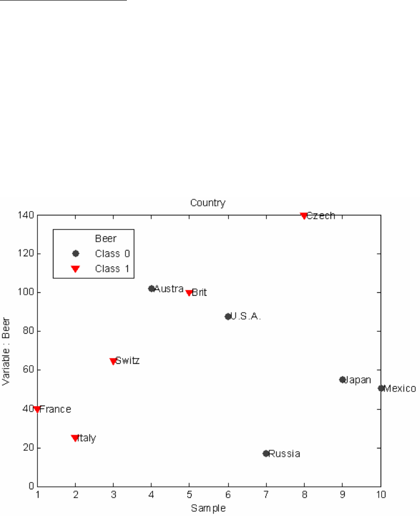
45
desired class (if View/Classes is not turned on, it will be turned on automatically so you
can see symbols representing the current classes for each point). In Figure 2-30, the
European countries have been assigned to class 1, which appear as triangles. The
remaining data are automatically assigned class 0 (zero) and shown as black circles.
Selections: Excluding Data
Selected points can be “excluded” by selecting Edit/Exclude Selection. When points are
excluded, the row or column containing each point is removed from the include field of
the DataSet object. Excluded data can only be viewed in plots if View/Excluded Data is
selected. To re-include previously excluded data, turn on View/Excluded Data, select the
points to re-include, then choose Edit/Include Selection.
Figure 2-31 demonstrates how the Wine data may be viewed by rows by selecting
Plot/Rows. In this case row 1 (France) is selected. The Life Expectancy and Heart
Disease variables have been excluded but View/Excluded Data is turned on so that the
excluded data can be seen as dimmed points. We've also changed the "marker" style by
using View/Settings… and setting the value to "o" (lower case letter o). If a PCA model
were created from these data, it would be based only on the first three variables
(consumption of beer, wine, and liquor).
Figure 2-30. One column of the Wine DataSet with the European countries set as Class 1.
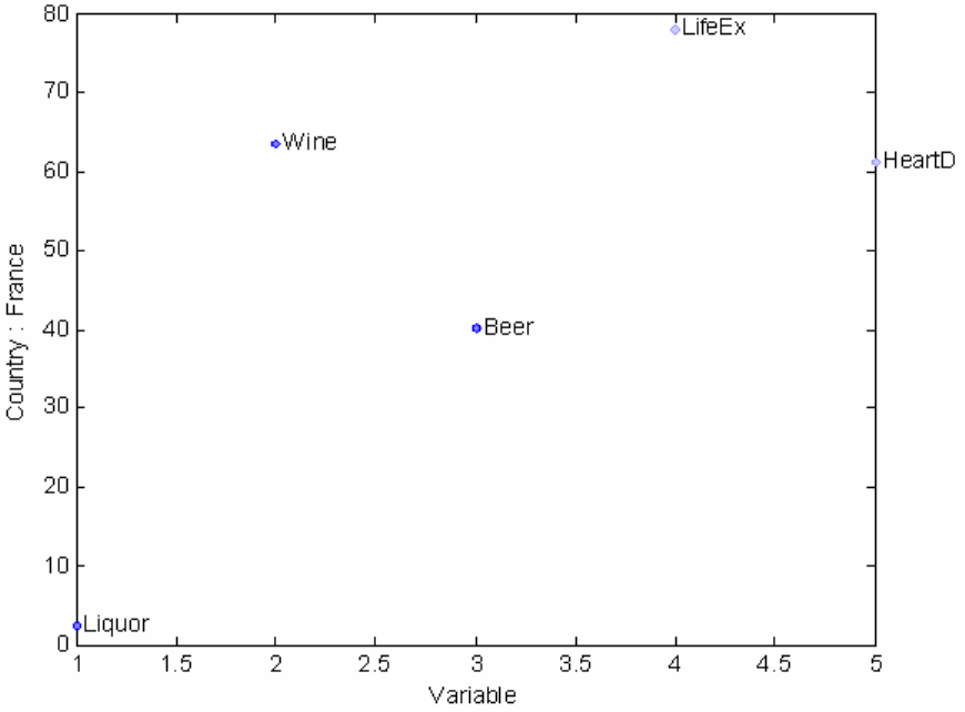
46
Figure 2-31. Wine DataSet row 1 (France) with the last two variables (life expectancy
and heart disease) excluded, but viewed.
Exclusions can also be done on the currently plotted data (i.e., the selection in the y-axis
menu). The Edit/Exclude Plotted menu option will exclude the column(s) or row(s)
currently selected in the y-axis menu. For example, selecting Edit/Exclude Plotted Data
when the wine column is plotted would exclude the wine column from the DataSet
Object. Likewise, selecting Edit/Exclude Not Plotted would exclude everything except
wine from the DataSet Object. An excluded item will still appear in the y-axis menu but
will have a double carrot symbol (>>) prior to the column or row label.
If changes are made to a dataset (e.g,. the class or include fields) using plotgui, these
changes must be saved back to the MATLAB workspace (using File/Save) to use the
modified DataSet Object in other routines. One exception to this is if the plotgui figure
was invoked by another GUI such as Analysis. In this case, the GUI will handle the
changes automatically.
These descriptions of the DataSet Editor and plotgui are intended to introduce you to
manipulating the contents of DataSet Objects. More sophisticated manipulations of
DataSet Objects can be performed at the command line. For more technical information
on DataSet Objects, please see Chapter 16, Advanced Software Information
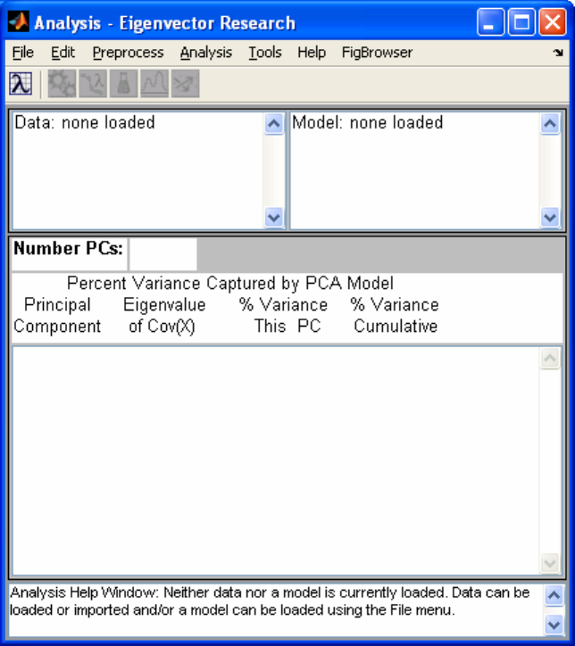
47
Getting Started with Solo and PLS_Toolbox GUIs
Loading Data from the Workspace into GUI Functions
Using the data loaded from Section 2.1, we can perform a PCA analysis of these data in a
PLS_Toolbox GUI (Graphic User Interface). If you type the PLS_Toolbox command
pca, MATLAB will open the Analysis GUI. This GUI is a generic interface to several
analysis methods but when opened using the pca command it has the PCA method pre-
selected in the Analysis menu. The details of PCA and other chemometric routines will
be discussed later – here we intend only to introduce the reader to use of the GUIs. The
initial window generated by the ‘pca’ function is shown in Figure 2-32.
Figure 2-32. Analysis GUI set for PCA.
Data may be loaded using the File/Load Data/X-Block menu of the Analysis window
and then selecting the numerical "data" matrix in the appearing Load window, shown in
Figure 2-33, and clicking on the Load button.

48
Figure 2-33. Load window from PCA tool.
When the data are loaded, the interface creates a DataSet Object out of them. You can
now load the labels created above via the DataSet Editor by selecting Edit/X-Block. Go
to the Row Labels (Mode 1 or Samples) tab and right click the Label button then select
Load Label( Figure 2-34). This will bring up a Load window similar to before where
you can select the SampleLabels cell matrix created above. Do the same for Column
Labels (Mode 2 or Variables) then close the DataSet Editor by clicking on File/Close
(changes are automatically saved).
Figure 2-34. DataSet Editor on Row Labels tab with right-click menu.
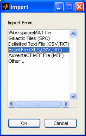
49
Importing Data Directly into the GUI
Thus far in this example, we've used the MATLAB import tools to read Excel data into
the Workspace and then load that data into Analysis. There is a quicker alternative. From
the File/Import Data/X-Block menu selection in Analysis, one can import data directly.
Several of the import functions will also attempt to intelligently build a DataSet Object
with information available in the file. In the case of Redbeerdata.xls, the PLS_Toolbox
Excel file reading functions are able to parse the data and labels directly into a DataSet
Object without a manual step.
Figure 2-35. Import Window.
The import menu item is also available from the DataSet Editor and can be a quick and
easy way of loading data from a file. In some cases the file parsing functions can't
correctly interpret labels and data, so some pre-formatting may be necessary.
Examining Data in the GUI
Once the data has been loaded into the GUI, it can now be examined by selecting
Edit/Plot X-Block in the Analysis window. Two windows will appear. The X-data
window, shown in Figure 2-35, contains the desired graph, while the Plot Controls
window, Figure 2-36, controls the axes and other contents of the graph. (Note: the Figure
number assigned to plot windows depends upon the number and status of other figure
windows, so may not always be the same for a particular type plot.)
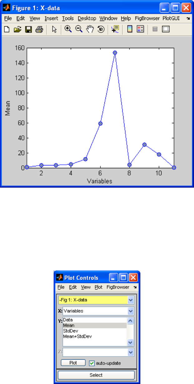
50
Figure 2-36. Raw data window from PCA window.
Notice that in Figure 2-36 the Y-axis is, (by default), the Mean of the variables. You may
change the Y-axis to the data for all the variables by clicking on Data in the Y: menu in
the Plot Controls window. Furthermore you may add labels to the variables by choosing
View/Labels from the Plot Controls window. The result is shown in Figure 2-37. (Note:
there is also a View menu in the Figure window. This menu serves other MATLAB
figure functions.)
Figure 2-37. Plot Controls window from PCA tool.
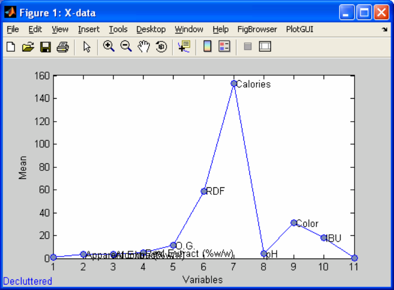
51
Figure 2-38. Plot of the red beer raw data from the PCA window.
If you wish to copy the Figure for pasting into other software for a report or presentation,
choose Edit/Copy Options... in the menu of the Raw Data window, and select the
format that you wish the copy function to use. Then choose Edit/Copy Figure (not
Edit/Copy) from the menu of the Raw Data window. Alternatively, you can use the
File/Export Figure menu selection in the Plot Controls to export the figure directly to
Power Point or Word. Other choices in the Raw Data window menus will allow the user
to modify the axes labels, font styles, axis limits, and many other properties of the plot.
You may use the tool bar at the top of the Raw Data window to do modifications of the
graph such as zooming. For example, to zoom in on a particular part of the figure, click
on the magnifying glass containing the plus (+) sign and, using the mouse, draw a
rectangle over the region you wish to resize. This process may be repeated to further
zoom into a section of the graph. You may zoom out by clicking on the magnifying glass
with the minus (–) sign and then clicking on the graph as many times as necessary. You
may add comments in the interior of the graph by selecting the Insert\Text Box menu
item and drawing a box on the graph where a comment is to be added.
In summary, the Plot Controls window controls what data are plotted in the Raw Data
window, while the Raw Data menus and tool bar control how the plot looks. You may
close both of these windows by clicking on the x in the upper-right corner of the Raw
Data window.

52
Viewing a PCA Model
Returning to the Analysis window, we can instruct the function to create a PCA model
with two principal components by clicking on the calc button (the button with the gears
pictured on it), selecting the second row of the Percent Variance Captured by PCA
Model sub-window and finally clicking on the calc button again (Figure 2-39).
Figure 2-39. Beer data in Analysis window with two-component PCA model.
The additional buttons on the toolbar will then become active when the calculation is
complete. Clicking on these will produce new figure windows along with a Plot Controls
window. Clicking on Plot Eigenvalues (the button with a descending plot and a lambda
symbol) will open an eigenvalue plot of the model.
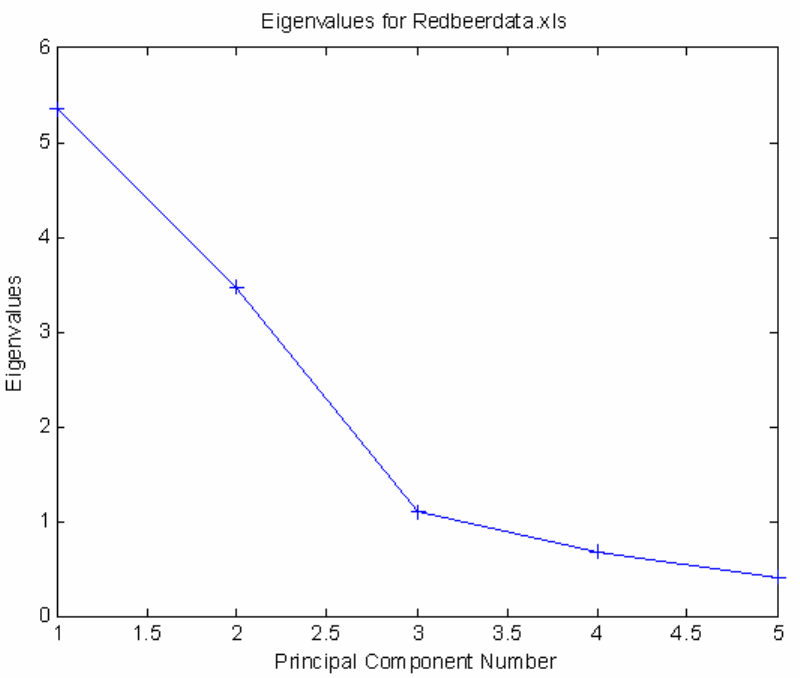
53
Figure 2-40. Eigenvalue plot suggesting two PCs.
The eigenvalue plot suggests a good model can be built using two principal components.
Clicking on Plot Scores (the button with an Erlenmeyer flask on it) will open a scores
plot. Let's look at a scores-scores plot. To do this, use the Plot Controls window to select
Scores on PC 1 for the X: axis and Scores on PC 2 for the Y: axis. Next we'll want to
add labels (View/Labels) and set the lable decluttering to zero so we can see all of the
labels (View/Declutter Labels/None). You can move the individual labels by clicking
and dragging them. The plot should look similar to Figure 2-41.
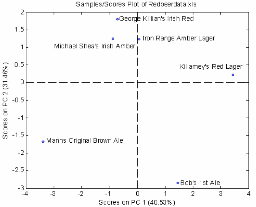
54
Figure 2-41. Scores plot PC1 vs. PC2 (declutter set to "none").
Here we can see that some of the samples group together while others seem to be quite
different. Next, create a biplot by clicking on the button with crossing arrows. Go through
the same steps as above for adding labels and moving individual labels to make a legible
plot. The biplot should look similar to Figure 2-42.
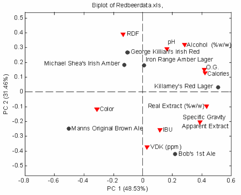
55
Figure 2-42. Biplot PC1 vs. PC2 (declutter set to "none").
Here we can see that the O.G. (original gravity) and Calories variables are highly
correlated (appear very close to each other). We also see that Color and Manns Original
Brown Ale seem to be correlated.
Let's look at a Loadings plot by clicking the button with a green double-peak plot. Again,
choose PC 1 for the X axis and PC 2 for the Y axis and turn off decluttering and position
labels as needed. The loadings plot should look similar to Figure 2-43.
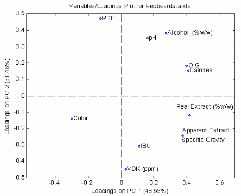
56
Figure 2-43. Loadings Plot PC1 vs. PC2 (declutter set to "none").
The Loadings plot shows the same variable information from the Biplot. We can see what
variables seem to be correlated; for example, Alcohol and pH f.
Finally, let's look at a plot of Q vs. T-Squared plot. We'll leave the declutter on (light).
Some of the labels won't be shown but we'll be able to see the plot more clearly.
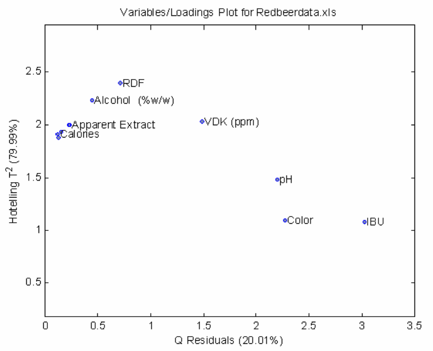
57
Figure 2-44. Q vs. T-Squared Plot (declutter set to "light").
We don't see any really unusual variables here; none of the points are far off on either
axis. Now that we're reasonably happy with our two PC model we can save it.
Saving a PCA Model
Now that we have a model, it can be saved for future use. You may choose File/Save
Model from the Analysis window File menu and give it a location and name. For now
we shall save the model to the MATLAB Workspace as beermodel. The default will
save the model to the MATLAB workspace, but you may choose to save the model to a
file as well. Remember if you do not save the model to a file now or to a file after leaving
the GUI, it will be lost when quitting MATLAB! If you loaded the data from a file in the
GUI, you may also choose to save the data to the MATLAB workspace or to a file using
the File/Save Data menu. You may now leave the GUI by selecting File/close from the
main PCA window.
58
Examining a Structure Array in MATLAB
Typing ‘whos’ will show our original data and our new PCA model, beermodel.
» whos
Name Size Bytes Class
SampleLabels 6x26 312 char array
VariablesLabels 11x19 418 char array
ans 6x26 312 char array
beermodel 1x1 14606 struct array
data 6x11 528 double array
textdata 8x12 6226 cell array
Grand total is 2085 elements using 22402 bytes
Our model has been saved as a new kind of data class called a structure array. We can
examine this new form by typing the name of the variable, beermodel.
» beermodel
beermodel =
modeltype: 'PCA'
name: {'data'}
date: '25-Aug-2002'
time: [2002 8 25 17 16 58.1980]
info: 'Scores are in cell 1 of the loads field.'
loads: {2x1 cell}
tsqs: {2x1 cell}
ssqresiduals: {2x1 cell}
description: {3x1 cell}
detail: [1x1 struct]
A structure array is a great way to keep associated data together. The model output by the
PCA tool is composed of a large and varied set of data. We can examine these by
indicating the subsection or field of the structure array with a period. For example, if we
type:
» beermodel.modeltype
ans =
PCA
the response indicates that this is a PCA model. Some of the fields of our model have
multiple parts. If we type:
59
» beermodel.loads
ans =
[ 6x1 double]
[11x1 double]
the response tells us that beermodel.loads contains both a 6 x 1 and an 11 x 1 double
precision matrix. This field is a cell array. We can examine the second matrix in the cell
array by typing:
» beermodel.loads{2}
ans =
0.3747
0.3747
0.2724
0.4164
0.4003
-0.1282
0.4088
0.1577
-0.3001
0.1101
0.0271
Manually dissecting a model can lead to inconsistencies in the model structure, so it is
recommended, should you need to use or examine your PCA model, that you first try
using a GUI tool. You may start the PCA Tool by typing pca at the command prompt,
and then load your saved model from either the MATLAB Workspace or from a saved
file using the File/Load Model menu in the PCA window.
If you have not saved your model or data from the GUI, be sure to save it now from the
MATLAB Workspace!
Creating a PLS Model
In this example we will create and inspect a PLS (Partial Least Squares Regression,
Chapter 6) model. Use the following commands to load the Hald DataSet and start PLS:
>> load halddata
>> pls
Load both the x and y block data via the File/Load Data/Both menu and click the Calc
button. Then select the first two latent variables and click the Calc button again to create
a model using two latent variables (LVs) (Figure 2-45).
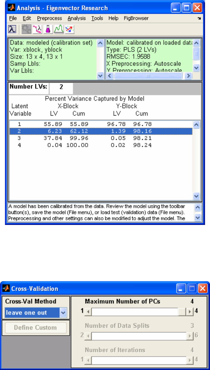
60
Figure 2-45. Two-LV model of Hald DataSet.
Now calculate the cross validation statistics for the model using Tools/Cross-Validation.
Set the Method to "leave one out" (Figure 2-46). This will clear the model;press the Calc
button again to re-calculate the model using cross-validation.
Figure 2-46. Cross-validation for two-LV model.
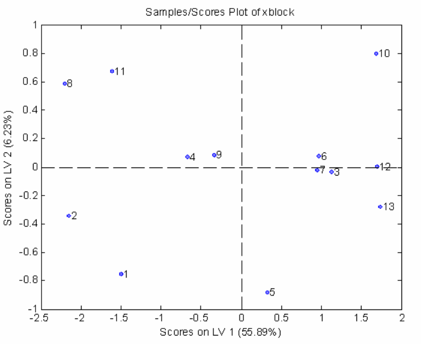
61
Now look at a scores-scores plot by clicking the Scores button and selecting LV1 for the
X: axis and LV 2 for the Y: axis. Also add the sample numbers as labels to each point
using the View/Numbers menu item (Figure 2-47).
Figure 2-47. Scores plot LV1 vs. LV2 (declutter set to "none").
We see that samples 3, 6, and 7 seem to be related. Next, let's change the x-axis to "y-
measured" and the y-axis to "y-predicted". Then add a legend showing the cross-
validation statistics by right-clicking on the green y-predicted line and selecting Show on
figure. Reposition the legend by clicking on it and dragging it to a new position (Figure
2-48).
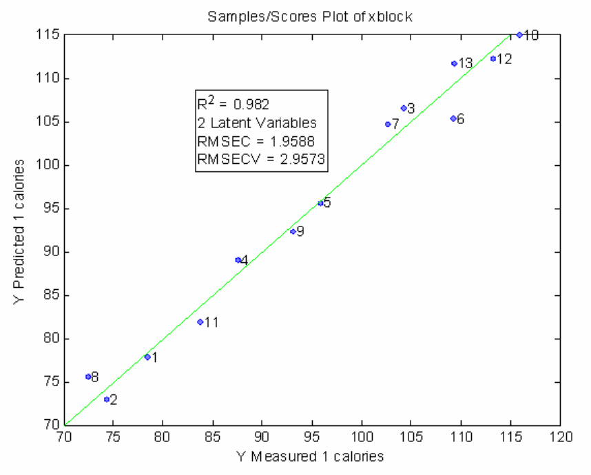
62
Figure 2-48. Y-measured vs. Y-predicted with Cross-Val legend.
It appears as if the model does capture the trend of the data, with a calibration error of
roughly 2 calories.
Now, create a Loadings plot with LV 1 as the x-axis and LV 2 as the y-axis. Add labels
using the View menu item from the Plot Controls (Figure 2-49).
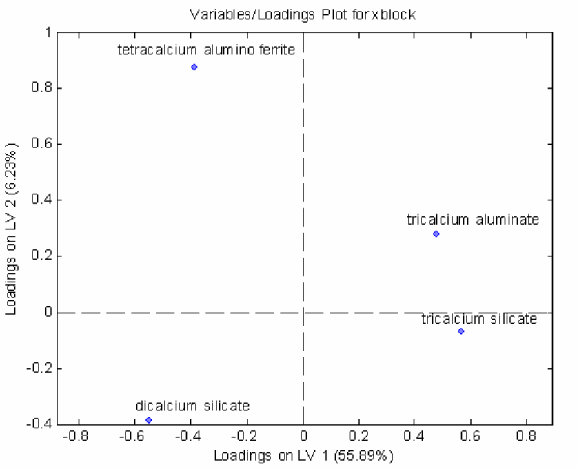
63
Figure 2-49. Loadings plot LV1 vs. LV2.
Here we see that none of the variables are highly correlated in both LV 1 and LV 2. We
also that LV 2 does not capture much variance in tricalcium silicate.
Now look at the regression vector vs. variables by selecting Variable for the x-axis and
Reg Vector for Y 1 calories for the y-axis in the Plot Controls (Figure 2-50). Add labels
and adjust the axis to better see the plot using the following command:
>> axis([.5 4.5 -.55 .55])
Clicking on the y axis menu item in the Plot Controls again will reset the horizontal axis
line correctly.
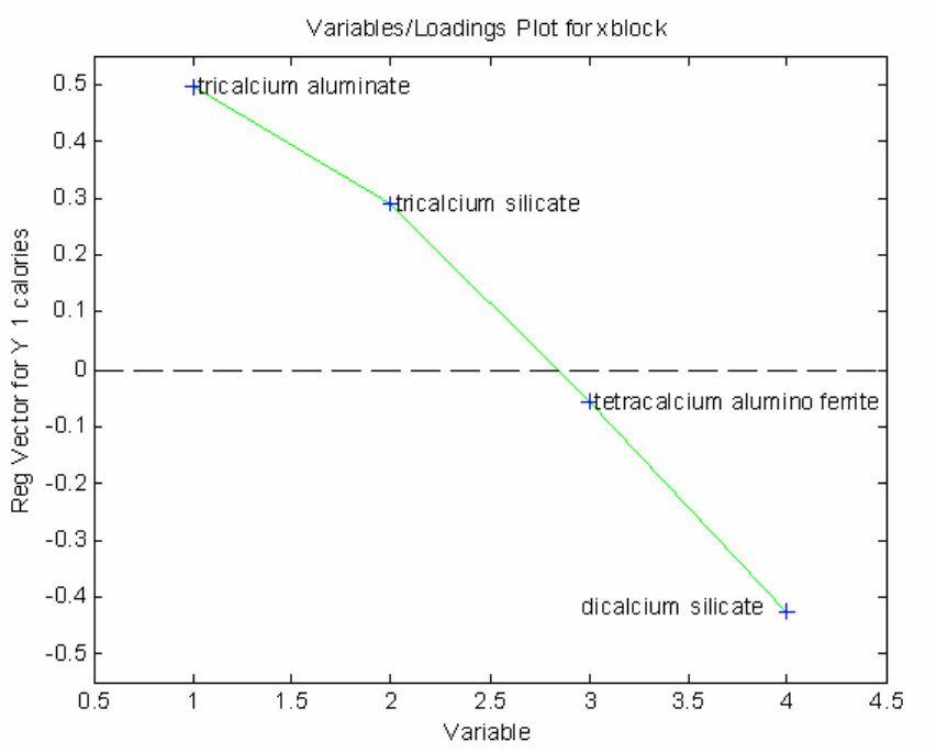
64
Figure 2-50. Regression vector vs. variable (axis adjusted from command line).
This plot suggests that increases in either of the first two variables will tend to increase
the heat of reaction, while an increase in dicalcium silicate will tend to decrease the heat
of reaction. Although the regression coefficient for the third variable (tetracalcium
alumino ferrite) indicates that changes in that variable have little impact on the predicted
heat of reaction, interpretation of regression coefficients can be complicated (see Partial
Least Squares and Principal Component Regression topics in Chapter 6). The regression
coefficients are best understood as the direction in the data which is parallel to the
property of interest (heat of reaction in this case) and perpendicular to other effects
observed in the data.
Finally, create a Q vs. T-squared plot (Figure 2-51) using the same procedure as with the
PCA model from earlier in this chapter (see Figure 2-44).
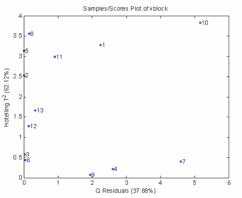
65
Figure 2-51. Plot of T-squared vs. Q.
Samples high in T-squared are described as having high leverage on the model, but none
of the samples seem like they're "on their own" in either T-squared or Q.
This concludes our "quick start" section. We've shown how to load data, calculate a
model, and create some of the typical plots used for PCA and PLS. In the next section
we'll take a more detailed look at the user interfaces.
66
67
3. An Introduction to Linear Algebra
Linear algebra is the language of chemometrics. One cannot expect to truly understand most
chemometric techniques without a basic understanding of linear algebra. This section
reviews the basics of linear algebra and provides a foundation for the Chemometrics Tutorial
section that follows. It is presented in a rather dense fashion: no proofs are given and there is
often little discussion of the theoretical implications of the theorems and results presented.
The goal has been to condense into as few pages as possible the aspects of linear algebra
used in most chemometric methods. MATLAB commands for performing the operations
listed are also included; the reader is encouraged to run the examples presented in the text.
Those already familiar with linear algebra can easily skip this section. Other readers may
find this section to be a good quick review. Those totally unfamiliar with linear algebra
should consider spending some time with a linear algebra text. In particular, those by Gilbert
Strang (see references) are particularly easy to read and understand. Several of the numerical
examples in this section are adapted from Strang’s Linear Algebra and Its Applications,
Second Edition (Academic Press, 1980).
Scalars, Vectors and Matrices
A scalar is a mathematical quantity that is completely described by a single number. Scalar
variables are generally denoted by lowercase letters. Examples of scalar variables include
temperature, density, pressure and flow. In MATLAB, a value can be assigned to a scalar at
the command line:
» a = 5;
Here we have used the semicolon operator to suppress the echo of the result. Without this
semicolon MATLAB would display the result of the assignment:
» a = 5
a =
5
A vector is a mathematical quantity that is completely described by its magnitude and
direction. An example of a three dimensional column vector might be
b =
4
3
5
(3-1)
68
Vectors are generally denoted by bold lowercase letters. (In MATLAB no distinction is made
between the notation for scalars, vectors and matrices: they can be upper or lower case and
bold letters are not used.) In MATLAB, the vector above could be entered at the command in
one of several ways. One way would be to enter the vector with an element on each line, like
this:
» b = [4
3
5]
b =
4
3
5
Another way to enter the vector would be to use the semicolon to tell MATLAB that each
line was completed. For instance,
» b = [4; 3; 5];
produces the same result as above. Note that square bracketsgenerally indicate that the
contents are a vector or matrix.
This vector is represented geometrically in Figure 3-1, where the three components 4, 3 and
5 are the coordinates of a point in three-dimensional space. Any vector b can be represented
by a point in space; there is a perfect match between points and vectors. One can choose to
think of a vector as the arrow, the point in space, or as the three numbers that describe the
point. In a problem with 400 dimensions (such as in spectroscopy), it is probably easiest to
consider the 400 numbers.
The transpose of a column vector is a row vector and vice-versa. The transpose is generally
indicated by a superscript T, though in some instances, including MATLAB, an apostrophe
(') will be used. For example:
b
T = []
4 3 5 (3-2)
In MATLAB, we could easily assign bT to another variable c, as follows:
» c = b'
c =
4 3 5
A matrix is a rectangular array of scalars, or in some instances, algebraic expressions that
evaluate to scalars. Matrices are said to be m by n, where m is the number of rows in the
matrix and n is the number of columns. A 3 by 4 matrix is shown in Equation 3-3.

69
A =
2 5 3 6
7 3 2 1
5 2 0 3
(3-3)
This matrix could be entered in MATLAB as follows:
» A = [2 5 3 6; 7 3 2 1; 5 2 0 3];
4
0
0
4
3
5
0
0
5
0
3
0
Figure 3-1. Geometric representation of the vector [4 3 5]T.
Matrices are usually denoted by bold uppercase letters. The elements of a matrix can be
indicated by their row and column indices, for instance, A2,4 = 1. We can index individual
matrix elements in MATLAB in a similar way, for instance:
» A(2,4)
ans =
1
Note that here we have used curved brackets. Curved brackets are used to index into matrices
and in function calls to indicate a collection of input arguments.
The transpose operator “flips” a matrix along its diagonal elements, creating a new matrix
with the ith row being equal to the jth column of the original matrix:
70
A
T =
2 7 5
5 3 2
3 2 0
6 1 3
(3-4)
This would be done in MATLAB:
» A'
ans =
2 7 5
5 3 2
3 2 0
6 1 3
Vectors and scalars are special cases of matrices. A vector is a matrix with either one row or
column. A scalar is a matrix with a single row and column.
Vector and Matrix Addition and Multiplication
Matrices can be added together provided that the dimensions are consistent; i.e., both
matrices must have the same number of rows and columns. To add two matrices together,
simply add the corresponding elements. For instance:
1 4 3
5 4 0 +
2 4 1
2 6 3 =
3 8 4
7 10 3 (3-5)
In MATLAB we might do this as follows:
» x = [1 4 3; 5 4 0];
» y = [2 4 1; 2 6 3];
» x + y
ans =
3 8 4
7 10 3
Note that if the matrices are not of consistent sizes, the addition will not be defined:
1 4 3
5 4 0 +
2 4
1 2
6 3
= ?? (3-6)
If you try this in MATLAB, you will get the following:
71
» x = [1 4 3; 5 4 0]; y = [2 4; 1 2; 6 3];
» x + y
??? Error using ==> plus
Matrix dimensions must agree.
This is one of the most common error messages you will see when using MATLAB. It tells
you that the operation you are attempting is not defined.
Vector and matrix addition is commutative and associative, so provided that A, B and C are
matrices with the same number of rows and columns, then:
A + B = B + A (3-7)
(A + B) + C = A + (B + C) (3-8)
Vectors and matrices can be multiplied by a scalar. For instance, if c = 2, then (using our
previously defined A):
cA =
4 10 6 12
14 6 4 2
10 4 0 6
Multiplication of a matrix by a scalar in MATLAB is done using the * operator:
» c = 2;
» c*A
ans =
4 10 6 12
14 6 4 2
10 4 0 6
Note that scalar multiplication is commutative and associative, so if c and d are scalars:
cA = Ac (3-9)
(c + d)A = cA + dA (3-10)
Vectors can be multiplied together in two different ways. The most common vector
multiplication is the inner product. For the inner product to be defined, the two vectors must
have the same number of elements or dimension. The inner product is the sum over the
products of corresponding elements. For instance, for two 3 element column vectors a and b
with
a =
2
5
1
and b =
4
3
5
(3-11)
the inner product is

72
aTb = []
2 5 1
4
3
5
= [2*4 + 5*3 + 1*5] = 28 (3-12)
Note that the inner product of two vectors produces a scalar result. In MATLAB, this
example looks like:
» a = [2; 5; 1]; b = [4; 3; 5];
» a'*b
ans =
28
The inner product occurs often in the physical sciences and is commonly referred to as the
dot product. We will see it often in regression problems where we model a system property
or output (such as a chemical concentration or quality variable) as the weighted sum of a
number of different measurements.
The inner product is also used when calculating the length of a vector. The length of a vector
is the square root of the sum of the squares of the vector coefficients (not to be confused with
the number of elements or dimension of a vector). The length of a vector a, denoted ||a|| (also
known as the 2-norm of the vector), is the square root of the inner product of the vector with
itself:
||a|| = aTa (3-13)
We could calculate the norm of the vector a above explicitly in MATLAB with the sqrt
(square root) function. Alternately, we could use the norm function. Both methods are shown
here:
» sqrt(a'*a)
ans =
5.4772
» norm(a)
ans =
5.4772
The vector outer product is encountered less often than the inner product, but will be
important in many instances in chemometrics. Any two vectors of arbitrary dimension
(number of elements) can be multiplied together in an outer product. The result will be an m
by n matrix where m is the number of elements in the first vector and n is the number of
elements in the second vector. As an example, take
73
a =
2
5
1
and b =
4
3
5
7
9
(3-14)
The outer product of a and b is then:
abT =
2
5
1
⊗ []
4 3 5 7 9 =
2*4 2*3 2*5 2*7 2*9
5*4 5*3 5*5 5*7 5*9
1*4 1*3 1*5 1*7 1*9
=
8 6 10 14 18
20 15 25 35 45
4 3 5 7 9
(3-15)
In MATLAB this would be:
» a = [2 5 1]'; b = [4 3 5 7 9]';
» a*b'
ans =
8 6 10 14 18
20 15 25 35 45
4 3 5 7 9
Here we used a slightly different method of entering a column vector: it was entered as the
transpose of a row vector.
Two matrices A and B can be multiplied together, provided that the number of columns in A
is equal to the number of rows in B. The result will be a matrix C that has as many rows as A
and columns as B. Thus, one can multiply Amxn by Bnxp and the result will be Cmxp. The ijth
element of C consists of the inner product of the ith row of A with the jth column of B. As an
example, if
A =
2 5 1
4 5 3 and B =
4 3 5 7
9 5 3 4
5 3 6 7
(3-16)
then
AB =
2*4+5*9+1*5 2*3+5*5+1*3 2*5+5*3+1*6 2*7+5*4+1*7
4*4+5*9+3*5 4*3+5*5+3*3 4*5+5*3+3*6 4*7+5*4+3*7
=
58 34 31 41
76 46 53 69 (3-17)
74
In MATLAB:
» A = [2 5 1; 4 5 3]; B = [4 3 5 7; 9 5 3 4; 5 3 6 7];
» A*B
ans =
58 34 31 41
76 46 53 69
Matrix multiplication is distributive and associative:
A(B + C) = AB + AC (3-18)
(AB)C = A(BC) (3-19)
but is not, in general, commutative:
AB ≠ BA (3-20)
Other useful matrix identities include the following:
(AT)T = A (3-21)
(A + B)T = AT + BT (3-22)
(AB)T = BTAT (3-23)
Orthogonal and Orthonormal Vectors
Vectors are said to be orthogonal if their inner product is zero. The geometric interpretation
of this is that they are at right angles to each other or perpendicular. Vectors are orthonormal
if they are orthogonal and of unit length, i.e,. if their inner product with themselves equals 1.
For an orthonormal set of column vectors vi, with i = 1, 2, ... n, then
viTvj =
0 for i ≠ j
1 for i = j (3-24)
Note that it is impossible to have more than n orthonormal vectors in an n-dimensional space.
For instance, in three dimensions, one can only have three vectors that are orthogonal, and
thus, only three vectors can be orthonormal (although there are an infinite number of sets of
three orthogonal vectors). Sets of orthonormal vectors can be thought of as new basis vectors
for the space in which they are contained. Our conventional coordinate system in three
dimensions consisting of the vectors [1 0 0]T, [0 1 0]T and [0 0 1]T is the most common
orthonormal basis set;, however, as we shall see when we consider Principal Components
Analysis in the next chapter, it is not the only basis set, nor is it always the most convenient
for describing real data.
75
Special Matrices
There are several special matrices that deserve some attention. The first is the diagonal
matrix, which is a matrix whose only non-zero elements lie along the matrix diagonal; i.e.,
the elements for which the row and column indices are equal are non-zero. A sample
diagonal matrix D is shown here:
D =
4 0 0 0
0 3 0 0
0 0 7 0
(3-25)
Diagonal matrices need not have the same number of rows as columns; the only requirement
is that only the diagonal elements be non-zero. We shall see that diagonal matrices have
additional properties which we can exploit.
Another special matrix of interest is the identity matrix, typically denoted as I. The identity
matrix is always square (number of rows equals number of columns) and contains ones on
the diagonal and zeros everywhere else. A 4 by 4 identity matrix is shown here
I4x4 =
1 0 0 0
0 1 0 0
0 0 1 0
0 0 0 1
(3-26)
Identity matrices can be created easily in MATLAB using the eye command. Here we create
the 3 by 3 identity matrix:
» id = eye(3)
id =
1 0 0
0 1 0
0 0 1
Any matrix multiplied by the identity matrix returns the original matrix (provided, of course,
that the multiplication is defined). Thus, for a matrix Amxn and identity matrix I of
appropriate size
AmxnInxn = ImxmAmxn = Amxn (3-27)
The reader is encouraged to try this with some matrices in MATLAB.
A third type of special matrix is the symmetric matrix. Symmetric matrices must be square
and have the property that they are equal to their transpose:
A = AT (3-28)
76
Another way to say this is that Aij = Aji. We will see symmetric matrices turn up in many
places in chemometrics. Covariance matrices, for example, are symmetric.
Gaussian Elimination: Solving Systems of Equations
Systems of equations arise in many scientific and engineering applications. Linear algebra
was largely developed to solve these important problems. Gaussian elimination is the method
that is consistently used to solve systems of equations. Consider the following system of
three equations in three unknowns
2b1 b2 b3
4b1 b2
-2b1 2b2 b3
=
1
-2
7
(3-29)
This system can also be written using matrix multiplication as follows:
2 1 1
4 1 0
-2 2 1
b1
b2
b3
=
1
-2
7
(3-30)
or simply as
Xb = y (3-31)
where
X =
2 1 1
4 1 0
-2 2 1
, b =
b1
b2
b3
, and y =
1
-2
7
(3-32)
The problem is to find the values of b1, b2 and b3 that make the system of equations hold. To
do this, we can apply Gaussian elimination. This process starts by subtracting a multiple of
the first equation from the remaining equations so that b1 is eliminated from them. We see
here that subtracting 2 times the first equation from the second equation should eliminate b1.
Similarly, subtracting -1 times the first equation from the third equation will again eliminate
b1. The result after these first two operations is:
2 1 1
0 -1 -2
0 3 2
b1
b2
b3
=
1
-4
8
(3-33)
The first coefficient in the first equation, 2, is known as the pivot in the first elimination step.
We continue the process by eliminating b2 in all equations after the second, which in this
case is just the third equation. This is done by subtracting -3 times the second equation from
the third equation to produce:
77
2 1 1
0 -1 -2
0 0 -4
b1
b2
b3
=
1
-4
-4
(3-34)
In this step, the second coefficient in the second equation, -1, was the pivot. This system can
now be easily solved by back-substitution. It is apparent from the last equation that b3 = 1.
Substituting this into the second equation yields -b2 = -2; thus, b2 = 2. Substituting b3 = 1
and b2 = 2 into the first equation we find that b1 = -1.
Gaussian elimination is done in MATLAB with the left division operator \ (for more
information about \ type help mldivide at the command line, mldivide is the function name
for \). Our example problem can be easily solved as follows:
» X = [2 1 1; 4 1 0; -2 2 1]; y = [1; -2; 7];
» b = X\y
b =
-1
2
1
It is easy to see how this algorithm can be extended to a system of n equations in n
unknowns. Multiples of the first equation are subtracted from the remaining equations to
produce zero coefficients below the first pivot. Multiples of the second equation are then
used to clear the coefficients below the second pivot, and so on. This is repeated until the last
equation contains only the last unknown and can be easily solved. This result is substituted
into the second to last equation to get the second to last unknown. This is repeated until the
entire system is solved.
Singular Matrices and the Concept of Rank
Gaussian elimination appears straightforward enough; however, are there some conditions
under which the algorithm may break down? It turns out that, yes, there are. Some of these
conditions are easily fixed, while others are more serious. The most common problem occurs
when one of the pivots is found to be zero. If this is the case, the coefficients below the pivot
cannot be eliminated by subtracting a multiple of the pivot equation. Sometimes this is easily
fixed: an equation from below the pivot equation with a non-zero coefficient in the pivot
column can be swapped with the pivot equation and elimination can proceed. However, if all
of the coefficients below the zero pivot are also zero, elimination cannot proceed. In this
case, the matrix is called singular and there is no hope for a unique solution to the problem.
As an example, consider the following system of equations:
1 3 2
2 6 9
3 9 8
b1
b2
b3
=
1
-4
-4
(3-35)
78
Elementary row operations can be used to produce the system:
1 3 2
0 0 5
0 0 2
b1
b2
b3
=
1
-6
-7
(3-36)
This system has no solution as the second equation requires that b3 = -6/5 while the third
equation requires that b3 = -7/2. If we tried this problem in MATLAB we would see the
following:
» X = [1 3 2; 2 6 9; 3 9 8]; y = [1; -4; -4];
» b = X\y
Warning: Matrix is singular to working precision.
b =
-Inf
Inf
-3.5000
We will discuss the meaning of the warning message shortly.
On the other hand, if the right hand side of the system were changed so that we started with:
1 3 2
2 6 9
3 9 8
b1
b2
b3
=
1
-8
-1
(3-37)
This would be reduced by elementary row operations to:
1 3 2
0 0 5
0 0 2
b1
b2
b3
=
1
-10
-4
(3-38)
Note that the final two equations have the same solution, b3 = -2. Substitution of this result
into the first equation yields b1 + 3b2 = 5, which has infinitely many solutions. We can see
that singular matrices can cause us to have no solution or infinitely many solutions and will
generate warnings at the command line. If we do this problem in MATLAB we obtain:
79
» X = [1 3 2; 2 6 9; 3 9 8]; y = [1; -8; -1];
» b = X\y
Warning: Matrix is singular to working precision.
b =
-Inf
Inf
-2.0000
The solution obtained agrees with the one we calculated above, b3 = -2. There are an infinite
number of solutions for b1 and b2. In this case MATLAB chose the -inf and inf, respectively.
Consider once again the matrix from our previous example and its reduced form:
1 3 2
2 6 9
3 9 8
→
1 3 2
0 0 5
0 0 2
(3-39)
We could have taken the elimination one step further by subtracting 2/5 of the second
equation from the third to produce:
1 3 2
0 0 5
0 0 0
(3-40)
This is known as the echelon form of a matrix. It is necessarily upper triangular, that is, all
non-zero entries are confined to be on, or above, the main diagonal (the pivots are the 1 in
the first row and the 5 in the second row). The non-zero rows come first, and below each
pivot is a column of zeros. Also, each pivot lies to the right of the pivot in the row above.
The number of non-zero rows obtained by reducing a matrix to echelon form is the rank of
the matrix. Note that this procedure can be done on any matrix; it need not be square. It can
be shown that the rank of an m by n matrix has to be less than, or equal to, the lesser of m or
n, i.e:.
rank(X) ≤ min(m,n) (3-41)
A matrix whose rank is equal to the lesser of m or n is said to be of full rank. If the rank is
less than min(m,n), the matrix is rank deficient or collinear. MATLAB can be used to
determine the rank of a matrix. In this case we get:
» rank(X)
ans =
2
which is just what we expect based on the result shown in Equation 3-40.

80
Matrix Inverses
The inverse of matrix A, A-1, is the matrix such that AA-1 = I and A-1A = I. It is assumed
here that A, A-1 and I are all square and of the same dimension. Note, however, that A-1
might not exist. If it does, A is said to be invertible, and its inverse A-1 will be unique.
It can also be shown that the product of invertible matrices has an inverse, which is the
product of the inverses in reverse order:
(AB)-1 = B-1A-1 (3-42)
This can be extended to hold with three or more matrices, for example:
(ABC)-1 = C-1B-1A-1 (3-43)
How do we find matrix inverses? We have already seen that we can perform elementary row
operations to reduce a matrix A to an upper triangular echelon form. However, provided that
the matrix A is nonsingular, this process can be continued to produce a diagonal matrix, and
finally, the identity matrix. This same set of row operations, if performed on the identity
matrix, produces the inverse of A, A-1. Said another way, the same set of row operations that
transform A to I transform I to A-1. This process is known as the Gauss-Jordan method.
Let us consider an example. Suppose that we want to find the inverse of
A =
−122
014
112
(3-44)
We will start by augmenting A with the identity matrix, then we will perform row operations
to reduce A to echelon form:
135−|4−00
012−|2−1−0
001|112
→
−100|122
010|014
001|112
We now continue the operation by eliminating the coefficients above each of the pivots. This
is done by subtracting the appropriate multiple of the third equation from the first two, then
subtracting the second equation from the first:
−−
−−
−
−
135|400
2
1
2
1
2
1
|010
4
1
4
3
4
1
|012
→
−−
−−
−
−
135|400
2
1
2
1
2
1
|010
4
1
4
1
4
1
|002

81
Finally, each equation is multiplied by the inverse of the diagonal to get to the identity
matrix:
−−
−
−
4
1
4
3
4
5
|100
2
1
2
1
2
1
|010
8
1
8
1
8
1
|001
(3-45)
The matrix on the right is A-1, the inverse of A. Note that our algorithm would have failed if
we had encountered an incurable zero pivot, i.e,. if A was singular. In fact, a matrix is
invertible if, and only if, it is nonsingular.
This process can be repeated in MATLAB using the rref (reduced row echelon form)
command. We start by creating the A matrix. We then augment it with the identity matrix
using the eye command and use the rref function to create the reduced row echelon form. In
the last step we verify that the 3 by 3 matrix on the right is the inverse of A. (The result is
presented here as fractions rather than decimals by setting the MATLAB command window
display preference to “rational”).
» A = [2 1 1; 4 1 0; -2 2 1];
» B = rref([A eye(3)])
B =
1 0 0 1/8 1/8 -1/8
0 1 0 -1/2 1/2 1/2
0 0 1 5/4 -3/4 -1/4
» A*B(:,4:6)
ans =
1 0 0
0 1 0
0 0 1
A simpler way of obtaining an inverse in MATLAB is to use the inv command:
» Ainv = inv(A)
Ainv =
1/8 1/8 -1/8
-1/2 1/2 1/2
5/4 -3/4 -1/4
82
Another useful property of inverses is:
(AT)-1 = (A-1)T (3-46)
We could also verify this for our example in MATLAB:
» inv(A') - inv(A)'
ans =
0 0 0
0 0 0
0 0 0
Vector Spaces and Subspaces
Before continuing on, it is useful to introduce the concept of a vector space. The most
important vector spaces are denoted R1, R2, R3, ....; there is one for every integer. The space
Rn consists of all column vectors with n (real) components. The exponent n is said to be the
dimension of the space. For instance, the R3 space can be thought of as our “usual” three-
dimensional space: each component of the vector is one of the x, y or z axis coordinates.
Likewise, R2 defines a planar space, such as the x-y plane. A subspace is a vector space that
is contained within another. For instance, a plane within R3 defines a two dimensional
subspace of R3, and is a vector space in its own right. In general, a subspace of a vector
space is a subset of the space where the sum of any two vectors in the subspace is also in the
subspace and any scalar multiple of a vector in the subspace is also in the subspace.
Linear Independence and Basis Sets
In a previous section we defined the rank of a matrix in a purely computational way: the
number of non-zero pivots after a matrix had been reduced to echelon form. We are
beginning to get the idea that rank and singularity are important concepts when working with
systems of equations. To more fully explore these relationships, the concept of linear
independence must be introduced. Given a set of vectors v1, v2, ... , vk, if all non-trivial
combinations of the vectors are nonzero:
c1v1 + c2v2 + ... + ckvk ≠ 0 unless c1 = c2 = ... = ck = 0 (3-47)
then the vectors are linearly independent. Otherwise, at least one of the vectors is a linear
combination of the other vectors and they are linearly dependent.
It is easy to visualize linear independence. For instance, any two vectors that are not scalar
multiples of each other are linearly independent and define a plane. A third vector in that
plane must be linearly dependent as it can be expressed as a weighted sum of the other two
vectors. Likewise, any 4 vectors in R3 must be linearly dependent. Stated more formally, a
set of k vectors in Rm must be linearly dependent if k>m. It is also true that the r nonzero
83
rows of an echelon matrix are linearly independent, and so are the r columns that contain the
pivots.
A set of vectors w1, w2, ... , wk, in Rn is said to span the space if every vector v in Rn can be
expressed as a linear combination of w’s:
v = c1w1 + c2w2 + ... + ckwk for some ci. (3-48)
Note that for the set of w’s to span Rn then k≥n. A basis for a vector space is a set of vectors
that are linearly independent and span the space. Note that the number of vectors in the basis
must be equal to the dimension of the space. Any vector in the space can be specified as one
and only one combination of the basis vectors. Any linearly independent set of vectors can be
extended to a basis by adding (linearly independent) vectors so that the set spans the space.
Likewise, any spanning set of vectors can be reduced to a basis by eliminating linearly
dependent vectors.
Row Spaces, Column Spaces and Nullspaces
Suppose that U is the echelon matrix obtained by performing elimination on the m by n
matrix A. Recall that the rank r of A is equal to the number of nonzero rows of U. Likewise,
the dimension of the row space of A (the space spanned by the rows of A), denoted R(AT), is
equal to r, and the rows of U form a basis for the row space of A, that is, they span the same
space. This is true because elementary row operations leave the row space unchanged.
The column space of A (the space spanned by the columns of A, also referred to as the range
of A), denoted R(A), also has dimension r. This implies that the number of independent
columns in A equals the number of independent rows, r. A basis can be constructed for the
column space of A by selecting the r columns of U that contain non-zero pivots.
The fact that the dimension of the row space is equal to the dimension of the column space is
one of the most important theorems in linear algebra. This fact is often expressed simply as
“row rank = column rank.” This fact is generally not obvious for a random non-square
matrix. For square matrices it implies that, if the rows are linearly independent, so are the
columns. Note also that the column space of A is equal to the row space of AT.
The nullspace of A, N(A), is of dimension n - r. N(A) is the space of Rn not spanned by the
rows of A. Likewise, the nullspace of AT, N(AT), (also known as the left nullspace of A) has
dimension m - r, and is the space of Rm not spanned by the columns of A.
Orthogonality of Subspaces
Earlier we defined orthogonal vectors. Recall that any two vectors v and w are orthogonal if
their inner product is zero. Two subspaces V and W can also be orthogonal, provided that
every vector v in V is orthogonal to every vector w in W; i.e., vTw = 0 for all v and w.
Given the definition of orthogonality of subspaces, we can now state more clearly the
properties of the row space, column space and nullspaces defined in the previous section. For
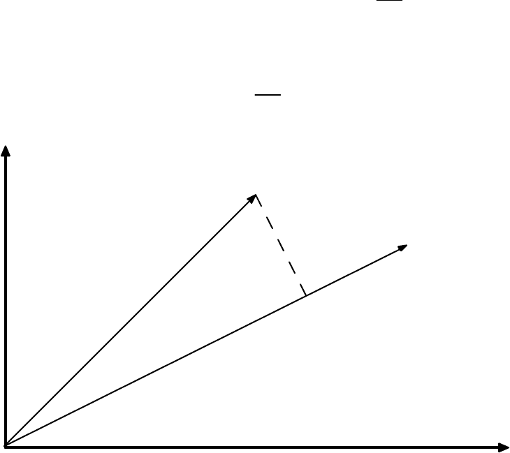
84
any m by n matrix A, the nullspace N(A) and the row space R(AT) are orthogonal subspaces
of Rn. Likewise, the left nullspace N(AT) and the column space R(A) are orthogonal
subspaces of Rm.
The orthogonal complement of a subspace V of Rn is the space of all vectors orthogonal to
V and is denoted V⊥ (pronounced V perp).
Projections onto Lines
We will see in the next chapter that the projection of points onto lines is very important in
many chemometric methods. In general, the projection problem is: given a vector x and a
point defined by the vector y, find the point p along the direction defined by x which is
closest to y. This is illustrated graphically in Figure 3-2. Finding this point p is relatively
straightforward once we realize that p must be a scalar multiple of x; i.e., p = b
^ x, and that
the line connecting y to p must be perpendicular to x:
xT(y - b
^ x) = 0 → xTy = b
^ xTx → b
^ = xTy
xTx (3-49)
Therefore, the projection p of the point y onto the line spanned by the vector x is given by
p = b
^ x = xTy
xTx x (3-50)
x
y
p
Figure 3-2. The projection of the vector y onto the vector x.

85
The (squared) distance from y to p can also be calculated. The result is
||y - p||2 = (yTy)(xTx)-(xTy)2
xTx (3-51)
We may also be interested in the projection of a point y onto a subspace. For instance, we
may want to project the point onto the plane defined by two vectors, or an n-dimensional
subspace defined by a collection of vectors; that is, a matrix. In this case, the vector x in the
two equations above will become the matrix X, and the inner product xTx will become XTX.
If X is m by n and rank r, the matrix XTX is n by n, symmetric (XTX = (XTX)T) and also of
rank r. Thus we see that if X has linearly independent columns, and therefore rank r = n,
then XTX is nonsingular and therefore invertible. This is a very important result, as we shall
see shortly.
Projections onto Subspaces and Least Squares
Previously we have considered solving Xb = y only for systems where there are the same
number of equations as variables (m = n). This system either has a solution or it doesn’t. We
now consider the case of m > n, where we have more samples (rows) than variables
(columns), with the possibility that the system of equations can be inconsistent; that is, there
is no solution which makes the equality hold. In these cases, one can only solve the system
such that the average error in the equations is minimized.
Consider for a moment the single variable case xb = y where there is more than one equation.
The error is nothing more than the length of the vector xb - y, E = ||xb - y||. It is easier,
however, to minimize the squared length:
E
2 = (xb - y)T(xb - y) = xTxb2 - 2xTyb + yTy (3-52)
The minimum of this can be found by taking the derivative with respect to b and setting it to
zero:
dE2
db = 2xTxb - 2xTy = 0 (3-53)
The least squares solution to the problem is then:
b
^ = xTy
xTx (3-54)
This is the same solution we obtained to the projection problem p = b
^ x in Equation 3-49.
Thus, requiring that the error vector be perpendicular to x gave the same result as the least
squares approach. This suggests that we could solve systems in more than one variable by
either geometry or calculus.
Consider now the system Xb = y, where X is m by n, m > n. Let us solve this system by
requiring that Xb
^ - y be perpendicular to the column space of X. For this to be true, each
86
vector in the column space of X must be perpendicular to Xb
^ - y. Each vector in the column
space of X, however, is expressible as a linear combination, say c, of the columns of X, Xc.
Thus, for all choices of c,
(Xc)T(Xb
^ - y) = 0, or cT[XTXb
^ - XTy] = 0 (3-55)
There is only one way that this can be true for all c: the vector in the brackets must be zero.
Therefore, it must be true that
XTXb
^ = XTy (3-56)
These are known as the normal equations for least squares problems. We can now solve for
b
^ by multiplying through by (XTX)-1 to obtain:
b
^ = (XTX)-1XTy (3-57)
The projection of y onto the column space of X is therefore
p = Xb
^ = X(XTX)-1XTy (3-58)
In chemometrics we commonly refer to b
^ as the regression vector. Often X consists of the
matrix of m samples with n measured variables. The vector y consists of some property (such
as a concentration or quality parameter) for the m samples. We then want to determine a b
^
that we can use with new samples, Xnew, to estimate their properties y
^ new:
y
^ new = Xnewb
^ (3-59)
As an example, suppose we measured two variables, x1 and x2, on four samples, and also had
a quality variable y. Our data would then be:
X =
1 1
1 2
2 1
2 2
and y =
6
6
7
11
(3-60)
We can determine a regression vector b
^ that relates the measured variables x1 and x2 to the
quality variable y in MATLAB as follows:
» X = [1 1; 1 2; 2 1; 2 2]; y = [6 6 7 11]';
» b = inv(X'*X)*X'*y
b =
3.0000
2.0000
87
Thus, our model for estimating our quality variable is y = 3x1 + 2x2. In MATLAB, however,
we can simplify this calculation by using the “left division” symbol \ instead of the inv
operator and get the same result:
» b = X\y
b =
3.0000
2.0000
The b
^ can now be used to get p, the projection of y into X, and the difference between y and
its projection into X, d:
» p = X*b
p =
5
7
8
10
» d = y-p
d =
1
-1
-1
1
We can also check to see if d is orthogonal to the columns of X. The simplest way to do this
is to check the value of XTd:
» X'*d
ans =
1.0e-14 *
-0.9770
-0.9770
This gives us the inner product of each of the columns of X with d. We see that the values
are very close to zero, the only difference from zero being due to machine round off error.
Thus, d is orthogonal to the columns of X, as it should be.
88
Ill-conditioned Problems
We have now seen how to solve least squares problems in several variables. Once again, we
might ask: “when might I expect this procedure to fail?” Based on our previous experience
with the solution of m equations in m unknowns and the formation of inverses, we expect that
the least squares procedure will fail when X is rank deficient, that is, when rank(XTX) < n.
However, what about when X is nearly rank deficient; that is, when one column of X is
nearly a linear combination of the other columns? Let us consider such a system:
X =
1 2
2 4
3 6
4 8.0001
and y =
2
4
6
8
(3-61)
Here the second column of X is almost, but not quite, twice the first column. In other words,
X is close to being singular. We can now use MATLAB to estimate a regression vector b
^ for
this problem:
» X = [1 2; 2 4; 3 6; 4 8.0001]; y = [2 4 6 8]';
» b = X\y
b =
2
0
Here we see that the system can be solved exactly by y = 2x1. However, what would happen
if the y data changed a very small amount? Consider changing the third element of y from 6
to 5.9999 and 6.0001. The following results:
» X = [1 2; 2 4; 3 6; 4 8.0001]; y = [2 4 6.0001 8]'; b = X\y
b =
3.7143
-0.8571
» X = [1 2; 2 4; 3 6; 4 8.0001]; y = [2 4 5.9999 8]'; b = X\y
b =
0.2857
0.8571
We see that the regression coefficients changed from b
^ = [3.7143 -0.8571] to b
^ = [0.2857
0.8571] given this very small change in the data. This is an example of what happens in
regression when the X matrix is very close to singular. Methods for dealing with these ill-
conditioned problems will be discussed in the next section.
89
Projection Matrices
We saw previously that given the problem Xb = y, we could obtain the projection of y onto
the columns of X, p, from:
p = X(XTX)-1XTy (3-62)
p = Py (3-63)
The quantity X(XTX)-1XT, which we shall denote P, is a projection matrix. Projection
matrices have two important properties: they are idempotent and symmetric. Thus
PP = P2 = P (3-64)
PT = P (3-65)
It is easy to see that P must be idempotent: the first application of P projects y into X. A
second application won’t change the result since Py will already be in the column space of
X.
Orthogonal and Orthonormal Bases
When we think of a basis for a space, such as the x-y plane, we normally think of an
orthogonal basis; that is, we define our distances in the plane based on two directions that are
perpendicular. Orthogonal basis sets, it turns out, are convenient from both a conceptual and
mathematical perspective. Basis sets can be made even simpler by normalizing the basis
vectors to unit length. The result is an orthonormal basis. An orthonormal basis, v1, v2, ..., vk
has the property that:
viTvj =
0 for i ≠ j
1 for i = j (3-66)
Of course, we are most familiar with the standard basis, v1 = [1 0 ... 0]T, v2 = [0 1 ... 0]T,
etc.; however, it is possible to construct an infinite number of orthonormal bases for any
space of dimension 2 or greater by simply rotating the basis vectors while keeping them at
right angles to each other.
Suppose for a moment that we are interested in projecting a vector y onto an X that consists
of orthonormal columns. In this case, XTX = I, thus
P = X(XTX)-1XT = XXT (3-67)
A square matrix with orthonormal columns is known as an orthogonal matrix (though
orthonormal matrix would have been a better name). An orthogonal matrix Q has the
following properties:
QTQ = I, QQT = I, and QT = Q-1 (3-68)
90
Furthermore, Q will also have orthonormal rows; if Q is an orthogonal matrix, so is QT. We
will see this again shortly when we consider Principal Components Analysis (PCA) in the
next section.
Pseudoinverses
We saw previously that we were not able to solve Xb = y using the “normal equations” in the
case where the columns of X were not independent or collinear. But is that the best we can
do? Are we simply forced to conclude that there is no solution to the problem? In fact, it is
still possible to obtain a least squares solution to the problem. To do so, we must introduce
the concept of the pseudoinverse, X+, for a matrix X that is not invertible. The general
situation when X is collinear is that there are many solutions to Xb = y. Which one should
we choose? The one with minimum length of b
^ , ||b
^ ||. To get this, we require that the
component of b
^ in the nullspace of X be zero, which is the same as saying that b
^ must lie in
the row space of X. Thus, the optimal least squares solution to any Xb = y is b
^ such that:
Xb
^ equals the projection of y into the column space of X, and
b
^ lies in the row space of X.
We call the matrix that solves this problem the pseudoinverse X+, where b
^ = X+y. Note that
when the columns of X are independent,
X+ = (XTX)-1XT (3-69)
This satisfies our requirements stated above. In the case where X is collinear, we must find
another way to calculate X+.
The Singular Value Decomposition
We now introduce the singular value decomposition, or SVD, which will allow us to obtain a
general solution to the problem of finding pseudoinverses. Any m by n matrix X can be
factored into
X = USVT (3-70)
where U is orthogonal and m by m, V is orthogonal and n by n, and S is m by n and diagonal.
The non-zero entries of S are referred to as the singular values and decrease monotonically
from the upper left to the lower right of S.
As an example of the SVD, let us consider the matrix
X =
1 2 3
2 3 5
3 5 8
4 8 12
(3-71)
91
Here we have chosen X to be collinear: the third column is the sum of the first two columns.
We can now use MATLAB to compute the SVD of X, and verify that the product of the U, S
and VT reproduces X.
» X = [1 2 3; 2 3 5; 3 5 8; 4 8 12];
» [U,S,V] = svd(X)
U =
0.1935 0.1403 -0.9670 0.0885
0.3184 -0.6426 0.0341 0.6961
0.5119 -0.5022 -0.0341 -0.6961
0.7740 0.5614 0.2503 0.1519
S =
19.3318 0 0
0 0.5301 0
0 0 0.0000
0 0 0
V =
0.2825 -0.7661 0.5774
0.5221 0.6277 0.5774
0.8047 -0.1383 -0.5774
» U*S*V'
ans =
1.0000 2.0000 3.0000
2.0000 3.0000 5.0000
3.0000 5.0000 8.0000
4.0000 8.0000 12.0000
Note that S is diagonal, and that the diagonal elements decrease from upper left to lower
right. In fact, the last singular value appears to be zero. Recall now that the inverse of a
product is the product of the inverses in reverse order. This leads to an explicit formula for
the pseudoinverse of X, X+:
X+ = VS+UT (3-72)
92
Here we must be very careful in formation of S+. In practice, all singular values that are close
to zero are set to zero in the inverse (the challenge comes with determining what constitutes
“close to zero”). Alternately, one can think of this as truncation of the matrices U, S and V
where only the first r columns of U and V are retained, along with the first r rows and
columns of S, where r = rank(X). In MATLAB, we see for our example:
» U(:,1:2)*S(1:2,1:2)*V(:,1:2)'
ans =
1.0000 2.0000 3.0000
2.0000 3.0000 5.0000
3.0000 5.0000 8.0000
4.0000 8.0000 12.0000
It is apparent that we only need the first two “factors” in the SVD to reproduce the original
data. The inverse of X, X+ can then be calculated from:
» Xinv = V(:,1:2)*inv(S(1:2,1:2))*U(:,1:2)'
Xinv =
-0.2000 0.9333 0.7333 -0.8000
0.1714 -0.7524 -0.5810 0.6857
-0.0286 0.1810 0.1524 -0.1143
Note that this is same result as would be obtained from the MATLAB command pinv, which
uses the SVD and sets all singular values that are within machine precision to zero:
» pinv(X)
ans =
-0.2000 0.9333 0.7333 -0.8000
0.1714 -0.7524 -0.5810 0.6857
-0.0286 0.1810 0.1524 -0.1143
Let us now return to our ill-conditioned regression problem where
X =
1 2
2 4
3 6
4 8.0001
and y =
2
4
6
8
(3-73)
93
Recall that a small change in the third element of y produced wildly different regression
vectors. We can now repeat this problem assuming that the true rank of X is 1; that is, to
within measurement accuracy the second column of X is a multiple of the first column. In
MATLAB we would obtain:
» X = [1 2; 2 4; 3 6; 4 8.0001]; y = [2 4 6 8]';
» [U,S,V] = svd(X);
» Xinv = V(:,1)*inv(S(1,1))*U(:,1)'
Xinv =
0.0067 0.0133 0.0200 0.0267
0.0133 0.0267 0.0400 0.0533
» b = Xinv*y
b =
0.4000
0.8000
With this inverse, changing the third element of y would no longer change the result
significantly:
» y = [2 4 5.9999 8]';
» b = Xinv*y
b =
0.4000
0.8000
» y = [2 4 6.0001 8]';
» b = Xinv*y
b =
0.4000
0.8000
Thus we see that the use of a pseudoinverse can enhance the stability of our calculations. In
the next section we will see additional ways of forming pseudoinverses.
Conclusion
This introduction to linear algebra, while brief, should include most of what the reader needs
to know in order to tackle the chemometrics literature. Interested readers are encouraged to
consult one of the many texts on the subject for more detail on the methods, including proofs
and additional examples.
94
95
4. Preface to the Tutorial Chapters
Although the tools found in PLS_Toolbox are applicable in a wide variety of
applications, its main focus is chemometrics. Chemometrics is often thought of as a sub-
discipline of chemistry, and in particular, analytical chemistry. However, “chemometric
techniques” have been successfully applied in many areas, and in fact, many were
“borrowed” from other disciplines to begin with. Problems that are most often thought of
as being in the domain of the chemical engineer, i.e., chemical processes, can also benefit
from chemometric methods. PLS_Toolbox includes many functions that can be used in
the chemical laboratory or process domain, as well as other non-chemical fields.
In the chapters that follow we provide a tutorial on many of the chemometric methods
included with PLS_Toolbox, and illustrate the methods with some example problems in a
variety of applications. This begins with basic data exploration and regression modeling
and continues through a large number of techniques and applications.
Some Definitions
Before moving on to chemometric techniques, it is important that we define
chemometrics. This has been a matter of debate in the technical community for some
time; however, we choose the following definition: Chemometrics is the science of
relating measurements made on a chemical system to the state of the system via
application of mathematical or statistical methods, and of designing optimal experiments
for investigating chemical systems. It is clear from the definition that chemometrics is a
measurement science and is data-based. The goal of many chemometrics techniques is
the efficient production of an empirical or semi-empirical model, derived from data,
which is used to estimate one or more properties of a system from measurements. It is
less obvious from the definition, perhaps, that chemical systems include those under
observation in the laboratory, as well as those in the open environment, and chemical
processes.
Beyond simply obtaining a model that provides useful predictions, chemometric
techniques can also be used to obtain insight about a chemical system. This is illustrated
in Figure 4-1. One typically starts with some data taken from a system. This data most
often is in the form of a table (typically stored as a data file) which contains, for a number
of samples, some measured properties of the samples. The measurements could be
derived from spectroscopy or other analytical technique, from process measurements as a
function of time, or from some other system. Without any further processing, such a table
would be of little use; it is simply a record of measurements. One might then take the data
table and calculate the means and variances of the variables, and perhaps look for any
trends or correlations between variables. At this point, some information has been
obtained about the system. By looking at additional data sets from the same system or
perhaps designed experiments, one might obtain some knowledge about how the system
functions, such as what peaks in a spectrum are related to a compound of interest or what
manipulated process variables affect particular system outputs. Finally, one might
combine this largely empirical knowledge of how the system operates with fundamental
96
principles from chemistry and physics to develop an understanding of the system. This
understanding may lead to improvements in how the system is used and operated that are
far more valuable than any changes made simply because of predictive models. It is for
this reason that we emphasize tools that may be used to learn about chemical systems,
rather than just provide “black box” models of them.
Chemical systems are typically multivariate, i.e., multiple measurements are made
simultaneously. Therefore, most chemometric methods fall under the class of statistical
techniques known as multivariate analysis. Paraphrasing Anderson (1984), multivariate
statistical analysis is concerned with data that consists of multiple measurements on a
number of individuals, objects or data samples. The measurement and analysis of
dependence between variables is fundamental to multivariate analysis.
Chemistry
and
Physics
Data
Information
Knowledge
Understanding
Figure 4-1. The information hierarchy.
Nomenclature and Conventions
In this tutorial scalars will be represented in lower case italic (s), vectors will be in bold
lower case (b), and matrices (two-dimensional arrays) will be bold upper case (X).
Arrays of dimension 3 or higher (i.e., with three or more modes) will be denoted by
underlined bold upper case letters (D). In two-way data matrices it will be assumed that
97
the rows of the matrix represent samples or observations and the columns represent
variables. The transpose of X will be denoted XT. A vector b is assumed to be a column
vector; row vectors are represented as transposes (bT).
98
99
5. Principal Components Analysis
Today’s laboratory instruments produce a plethora of data. It is not uncommon for
processes to have hundreds or thousands of measured variables. Some analytical
instruments measure tens of thousands of variables. For instance, in a typical FTIR
spectrometer, the absorbance is measured at over 10,000 frequencies. Chemical processes
are becoming more heavily instrumented and the data are recorded more frequently (Wise
et al., 1990; Kresta et al., 1991; Wise and Gallagher, 1996). This increase in
instrumentation is creating a data overload, and the result is that a good deal of the data
are “wasted;” that is, no useful information is obtained from them. The problem is one of
both compression and extraction. Generally, there is a great deal of correlated or
redundant information in laboratory and process measurements. This information must be
compressed in a manner that retains the essential information and is more easily
displayed than each of the variables individually. Also, essential information often lies
not in any individual variable but in how the variables change with respect to one
another; that is, how they co-vary. In this case, the information must be extracted from
the data. Furthermore, in the presence of large amounts of noise, it would be desirable to
take advantage of some sort of signal averaging.
Principal Components Analysis (PCA) (Jackson, 1981) is a favorite tool of
chemometricians for data compression and information extraction. PCA finds
combinations of variables, or factors,that describe major trends in the data. If X is a data
matrix with m rows and n columns, and with each variable being a column and each
sample a row, PCA decomposes X as the sum of r ti and pi, where r is the rank of the
matrix X:
X = t1pT1 + t2pT2 + ... + tkpTk + ... + trpTr (5-1)
Here r must be less than or equal to the smaller dimension of X, i.e., r ≤ min{m,n}. The
ti, pi pairs are ordered by the amount of variance captured. The ti vectors are known as
scores and contain information on how the samples relate to each other. The pi vectors
are known as loadings and contain information on how the variables relate to each other.
Generally the PCA model is truncated after k components and the remaining small
variance factors are consolidated into a residual matrix E:
X = t1pT1 + t2pT2 + ... + tkpTk + E (5-2)
While the form of Equation 5-2 may at first seem foreign, there are chemical systems that
can be modeled with exactly the same equation. For example, if X were a number of
absorbance spectra of mixtures which followed Beer's law (linear additivity), then the ti
could be replaced with concentrations and the pi could be replaced with pure component
spectra.

100
Mathematically, PCA relies upon an eigenvector decomposition of the covariance or
correlation matrix of the process variables. For a given data matrix X with m rows and n
columns, the covariance matrix of X is defined as
cov(X) = XTX
m-1 (5-3)
provided that the columns of X have been “mean-centered" by subtracting off the original
mean of each column. If the columns of X have been “autoscaled” (i.e., adjusted to zero
mean and unit variance by dividing each column by its standard deviation), Equation 5-1
gives the correlation matrix of X. Unless otherwise noted, it is assumed that data are
either mean-centered or autoscaled prior to analysis. In the PCA decomposition, the pi
vectors are eigenvectors of the covariance matrix; that is, for each pi
cov(X)pi = λi pi (5-4)
where λi is the eigenvalue associated with the eigenvector pi. The ti form an orthogonal
set (tiTtj = 0 for i ≠j), while the pi are orthonormal (piTpj = 0 for i ≠j , piTpj = 1 for i =j ).
Note that for X and any ti, pi pair,
Xpi = ti (5-5)
that is, the score vector ti is the linear combination of the original X variables defined by
pi. Another way to look at this is that the ti are the projections of X onto the pi. The ti, pi
pairs are arranged in descending order according to the associated λi. The λi are a
measure of the amount of variance described by the ti, pi pair. In this context, we can
think of variance as information. Because the ti, pi pairs are in descending order of λi, the
first pair captures the largest amount of information of any pair in the decomposition. In
fact, it can be shown that the t1, p1 pair captures the greatest amount of variation in the
data that it is possible to capture with a linear factor, and that each subsequent pair
captures the greatest possible amount of variance remaining after subtracting tipTi from
X.
Generally it is found (and it is usually the objective) that the data can be adequately
described using far fewer factors than original variables. Thus, the data overload problem
can be solved by observing fewer scores (weighted sums of the original variables) than
original variables, with no significant loss of information. It is also often found that PCA
turns up combinations of variables that are useful descriptions, or even predictors, of
particular events or phenomena. These combinations of variables are often more robust
indicators of laboratory sample or process conditions than individual variables due to the
signal averaging aspects of PCA.
Principal Components Analysis is shown graphically in Figure 5-1. Shown here are the
values of three variables measured on a collection of samples. When plotted in three
dimensions, it is apparent that the samples all lie on a plane and can be enclosed by an
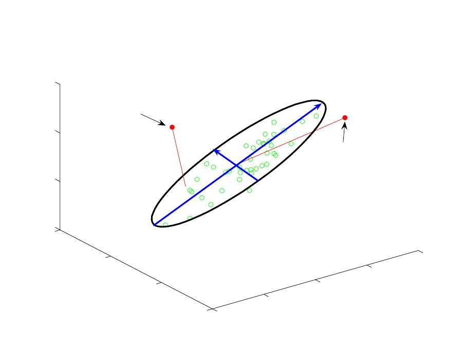
101
ellipse. It is also apparent that the samples vary more along one axis of the ellipse than
along the other. The first PC describes the direction of the greatest variation in the data
set, which is the major axis of the ellipse. The second PC describes the direction of
second greatest variation, which is the minor axis of the ellipse. In this case, a PCA
model (the scores and loadings vectors and associated eigenvalues) with two principal
components adequately describes all the variation in the measurements.
0
1
2
3
4
0
1
2
3
0
1
2
3
Variable 1
Variable 2
Variable 3
First PC
Second PC
Sample with large T2 −
unusual variation inside
the model
Sample with large Q −
unusual variation outside
the model
Figure 5-1. Graphical representation of Principal Components Analysis.
Statistics Associated with PCA Models
Scores (t) from PCA models have mean zero (assuming the data matrix X has been
mean- centered prior to decomposition) with variance equal to their associated
eigenvalue. Thus, if it is assumed that the scores are normally distributed, one can
calculate confidence limits for the scores by applying the Student’s t-distribution.
Therefore, the limits on the scores for the ith PC for confidence limits 1-α would be
t
i,α = ± sqrt(λi)*tm-1,α/2 (5-6)
where m is the number of samples and tm-1,α/2 corresponds to the probability point on the
(single sided) t-distribution with m-1 degrees of freedom and area α/2. A word of caution
102
regarding the use of confidence limits on scores is advised, however. If the underlying
physical phenomena which are related to the scores are not a random process, the scores
will not be normally distributed, violating the assumption of Equation 5-6. Examples of
this include when some of the variables in a system are controlled, when the data come
from a designed experiment, or when the data are clustered due to some underlying
physical phenomena.
It is also possible to calculate a lack-of-fit statistic for PCA models, Q. Q is simply the
sum of squares of each row (sample) of E (from Equation 5-2); i.e., for the ith sample in
X, xi:
Q
i = eieiT = xi(I - PkPkT)xiT (5-7)
where ei is the ith row of E, Pk is the matrix of the k loadings vectors retained in the PCA
model (where each vector is a column of Pk) and I is the identity matrix of appropriate
size (n by n). The Q statistic indicates how well each sample conforms to the PCA model.
It is a measure of the difference, or residual, between a sample and its projection into the
k principal components retained in the model.
A single row of the m by n E matrix, ei, represents the Q contributions for a given
sample. The Q contributions show how much each variable contributes to the overall Q
statistic for the sample while retaining the sign of the deviation in the given variable.
Such contributions can be useful in identifying the variables which contribute most to a
given sample's sum-squared residual error. Because the PCA model captures some
variables more effectively than others, the residual variance may vary widely between
variables. The residual variance for the jth variable is:
sj
2=pij
2
λ
i
i=k+1
r
∑ (5-8)
where pij is the loading of the jth variable in the ith PC (Wise et al., 1989). For the data
from which the model was obtained, this relationship will be exact. If it is assumed that
the eigenvalues of all the PCs not retained in the model are equal, then the variance in the
residual of the jth variable can be estimated using only the PCs and the eigenvalues
retained in the model from:
sj,est
2=
λ
i
i=k+1
r
∑
1−pij
2
i=1
k
∑
(5-9)
The sum of normalized squared scores, known as Hotelling’s T2 statistic, is a measure of
the variation in each sample within the PCA model. T2 is defined as
Ti
2=ti
λ
−1ti
T=xiPk
λ
−1Pk
Txi
T (5-10)

103
where ti refers to the ith row of Tk, the m by k matrix of k scores vectors from the PCA
model, and
λ
is a diagonal matrix containing the eigenvalues (λ1 through
λk) corresponding to k eigenvectors (principal components) retained in the model.
T2 contributions describe how individual variables contribute to the Hotelling's T2 value
for a given sample. The contributions to Ti
2 for the ith sample, tcon,i, is a 1 by k vector
calculated from
tcon,i=ti
λ
−1/2Pk
T=xiPk
λ
−1/2Pk
T (5-11)
The term tcon can be considered a scaled version of the data within the PCA model. The
data are scaled to equalize the variance captured by each PC. Note that this formulation
for T2 contributions has the property that the sum-squared contributions give
Ti
2 for the
given sample. That is,
Ti
2=ti,conti,con
T (5-12)
Confidence limits can be established for the overall residual Q and T2. Confidence limits
can be calculated for Q, provided that all of the eigenvalues of the covariance matrix of
X, the λi, have been obtained (Jackson and Mudholkar, 1979)
Q
α
=Θ
1
c
α
2Θ2h0
2
Θ1
+1+Θ2h0(h0−1)
Θ1
2
1
h0
(5-13)
where
3,2,1ifor
n
1kj
i
j
i==Θ ∑λ
+=
(5-14)
and
h0=1−2Θ1Θ3
3Θ2
2 (5-15)
In Equation 5-13, cα is the standard normal deviate corresponding to the upper (1-α)
percentile. In Equation 5-14, k is the number of principal components retained in the
model and n is the total number of principal components. Thus, n is less than or equal to
the smaller of the number of variables or samples in X. It is much more likely that
residual Q will behave “normally” as opposed to the scores. This is because Q is a
measure of the non-deterministic variation in a system, i.e., the variation remaining after
the deterministic variation has been removed.
104
Statistical confidence limits for the values for T2 can be calculated by means of the F-
distribution as follows:
Tk,m,
α
2=k(m−1)
m−kFk,m−k,
α
(5-16)
Here m is the number of samples used to develop the PCA model and k is the number of
principal component vectors retained in the model.
Some discussion of the geometric interpretation of Q and T2 is perhaps in order. As noted
above, Q is a measure of the variation of the data outside of the principal components
included in the PCA model. Going back to the data in Figure 5-1, Q is a measure of the
distance off the plane containing the ellipse; in fact, Q is the Euclidean distance of the
data point from the plane formed by the two-component model. A sample with a large Q
is shown on the upper left side of the figure. This sample is out of the plane of the model
(although its projection into the model is not unusual). The Q limit defines a distance off
the plane that is considered unusual based on the data used to form the PCA model. T2,
on the other hand, is a measure of the distance from the multivariate mean (the
intersection of the PCs in the figure) to the projection of the sample onto the two
principal components. The T2 limit defines an ellipse on the plane within which the data
normally project. A sample with a large T2 value (but small Q) is shown on the upper
right side of Figure 5-1.
Note that the calculated confidence limits on Q and T2 make some assumptions regarding
the distribution of the data; specifically, that they are multivariate normal. Clearly, data
are often not normally distributed. How can we get away with this assumption? The
central limit theorem states that sums of several different groups will tend to be normally
distributed, regardless of the probability distribution of the individual groups (Anderson,
1984; Box et al., 1978). This suggests that factor-based methods such as PCA will tend to
produce measures that are more normally-distributed than the original data. This
assumption still breaks down in some instances, particularly for T2 statistics where the
data are clustered or otherwise oddly distributed due to some non-normal root cause.
However, residual statistics are surprisingly well-behaved in a very wide variety of cases.
A Word About Centering and Scaling
It was mentioned above that PCA is generally applied to data that have been mean-
centered. Mean-centering translates the axes of the coordinate system to the center of
gravity, or centroid, of the data. In Figure 5-1, this is the point where the two PCs cross.
Without mean-centering, the first PC for the data in Figure 5-1 would go from the origin,
(at the very front of the figure) to the center of the data. This direction may or may not be
a useful description of variation in the system. In some systems one might expect the
various “factors” in the data to have a zero intercept. An example is spectroscopy, where
a concentration of zero corresponds to zero absorbance. In this instance, forcing the PCA
to include zero by not mean-centering may be a reasonable thing to do. In other systems
where the zero point of the measurement scale is arbitrary (e.g., temperature measured in

105
degrees Celsius) the first PC may not provide a useful description of variation in the
system and will further complicate the analysis because subsequent PCs are constrained
to be orthogonal to the first one. In the example shown in Figure 5-1, it is easy to see that
factors that are orthogonal to a line between zero and the data mean are not at all
descriptive of the true nature of the data.
Variance scaling, such as autoscaling (which mean-centers and scales the columns to unit
variance), may be appropriate in systems where the variables have different units; for
example, temperature, pressure and concentration. Principal Components Analysis
attempts to capture variation. Numerically, a variation in temperature between 1000 and
1100 C is much greater than a variation in concentration between 0.01 and 0.1 M.
However, the effect of each of these variables on the system of interest may be very
similar, and the information content of the temperature data is not inherently greater. For
that reason, it may be advisable to autoscale the data. This approach essentially puts all
variables on an equal basis in the analysis. In other systems where all of the variables
have the same units, such as spectroscopy, mean-centering may be the appropriate choice
because one has a reason to believe that variables with a great deal of variation are
actually more important; that is, they contain more information about the system under
observation than those with small variation.
PCA Example I: The Wine Data Set
Now that we have some background in PCA, we can use the technique with a relatively
simple data set to see how it works. The data in Table 5-1 were published in Time
Magazine in January, 1996. The data show the beer, wine and liquor consumption (liters
per year), life expectancy (years) and heart disease rate (cases per 100,000 per year) for
the 10 countries listed. The data are plotted in Figure 5-2 (using the MATLAB bar3
function). It is apparent from the table that there are some significant trends in the data.
For instance, Russia has the highest liquor consumption, lowest beer consumption, lowest
life expectancy, and highest heart disease rate.
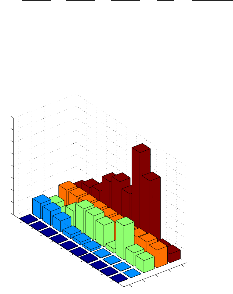
106
Table 5-1. The Wine data set.
liquor wine beer life heart
consumption consumption consumption expectancy disease rate
liter/year liter/year liter/year years cases/10e5/yr
France 2.5 63.5 40.1 78 61.1
Italy 0.9 58.0 25.1 78 94.1
Switzerland 1.7 46.0 65.0 78 106.4
Australia 1.2 15.7 102.1 78 173.0
Great Britain 1.5 12.2 100.0 77 199.7
United States 2.0 8.9 87.8 76 176.0
Russia 3.8 2.7 17.1 69 373.6
Czech Republic 1.0 1.7 140.0 73 283.7
Japan 2.1 1.0 55.0 79 34.7
Mexico 0.8 0.2 50.4 73 36.4
Liquor
Wine
Beer
LifeEx
HeartD
France
Italy
Switz
Austra
Brit
U.S.A.
Russia
Czech
Japan
Mexico
0
50
1
00
1
50
2
00
2
50
3
00
3
50
4
00
Figure 5-2. Raw data from Wine data set.
107
Are the there any other trends in the wine data? Principal Components Analysis will be
used to investigate this more fully. To get started, execute the following commands at the
MATLAB prompt:
» load wine
» pca
This will open the PLS_Toolbox Analysis GUI with PCA pre-selected in the Analysis
menu (Figure 5-3). The wine data can now be loaded into the Analysis GUI by selecting
the Load Data/X-Block option under the File menu; the variable to load is the DataSet
Object called wine. This DataSet Object contains labels for the variables and samples, as
well as other information about the data. At this point, the data have been loaded but not
analyzed. Before analyzing, we should consider how the data should be preprocessed.
There are several preprocessing options listed under the Preprocess/X-Block menu:
none, mean centering, autoscaling, and custom (the default is autoscaling). How should
we scale these data? One hint is that the variables have different units: liters/year, years
and cases/person-year. Furthermore, is drinking one liter of hard liquor equivalent to
drinking a liter of beer? Probably not. This suggests that autoscaling would be a good
choice.
Once the scaling selection is made, a PCA model can be calculated by pressing the
Calculate button. The number of principal components can then be selected by clicking
on the table and highlighting the line with the last chosen PC. In this case, we will choose
two PCs (more on how to select the number of PCs later), then click on the Calculate
button to activate the choice. At this point, the Analysis GUI window should look
identical to the one shown in Figure 5-3. From the table we see that our two-component
model captures more than 78% of the variance in the data, which suggests that the data
are fairly well correlated. However, what is the structure in the data set?

108
Figure 5-3. Wine data loaded and analyzed with PCA.
We can get a quick idea of the relationships between samples by clicking on the Scores
button, which will create a Plot Controls window, as shown in Figure 5-4, and a window
containing a plot of the scores on the first PC (not shown). We can now create a plot of
the scores on the second PC versus scores on the first PC using the Plot Controls, as
follows: select scores on PC 1 from the drop down menu to the right of the X:; select
scores on PC 2 by highlighting it in the box to the right of the Y:. Add labels to the plot
by selecting View/Labels/Country. Add reference lines by selecting View/Axis
Lines/All. This should create the plot shown in Figure 5-5. From this we see that Russia,
in the lower left quadrant, is the most unique country in this data set (at least with regard
to the variables measured). The distance between Russia and its nearest neighbor is
further than that between Russia and any other country on the plot. We also see a trend
that stretches from the Czech Republic to France. We expect that countries with similar
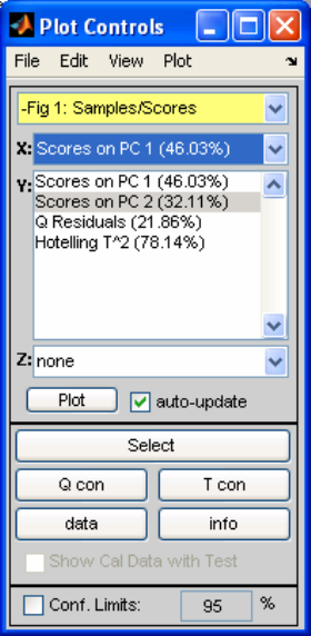
109
scores should be similar. For instance, the U.S., Britain, Australia and Mexico are all
close together, implying that they are similar.
The scores plot shows us about the relationship between samples. What about the
relationships between variables? This information can be obtained from a loadings plot.
Click on the Loads button in the main Analysis window. This will create a plot of
loadings on the first PC (not shown) and will change the contents of the Plot Controls
window to reflect that it is now controlling the Loadings plot. Select Loadings on PC 1
from the drop down menu to the right of the X:, and select Loadings on PC 2 by
highlighting it in the box to the right of the Y:. Add labels to the plot by selecting
View/Labels/variable. Add reference lines by selecting View/Axis Lines/All. This
should create the plot shown in Figure 5-6.
Figure 5-4. Plot Controls window.
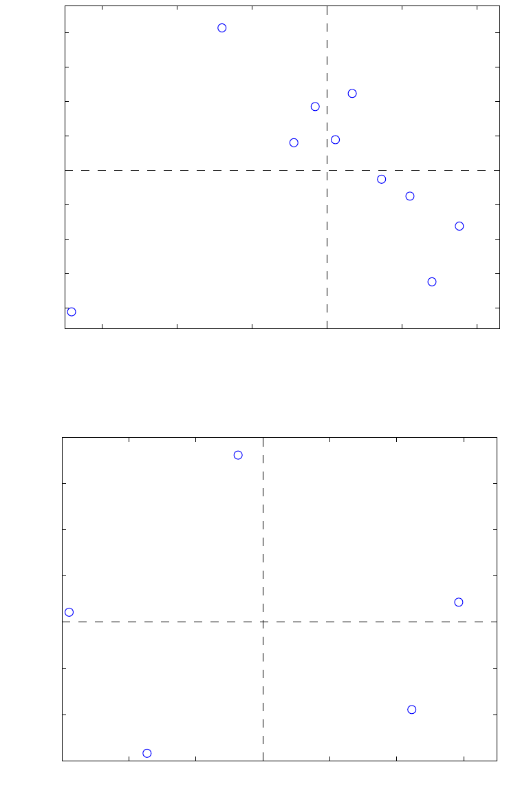
110
−3 −2 −1 0 1 2
−2
−1.5
−1
−0.5
0
0.5
1
1.5
2
Scores on PC 1 (46.03%)
Scores on PC 2 (32.11%)
France
Italy
Switz
Austra
Brit
U.S.A.
Russia
Czech
Japan
Mexico
Figure 5-5. Scores plot from Principal Components Analysis of the Wine data.
−0.4 −0.2 0 0.2 0.4 0.6
−0.4
−0.2
0
0.2
0.4
0.6
Loadings on PC 1 (46.03%)
Loadings on PC 2 (32.11%)
Liquor
Wine
Beer
LifeEx
HeartD
Figure 5-6. Loadings plot from Principal Components Analysis of the Wine data.
111
The loadings plot in Figure 5-6 shows that none of the variables are very similar (no
variables are very close to each other on the plot); however, there are some interesting
things to note. Variables which load most significantly into the first PC are life
expectancy and heart disease rate; these are the variables which are furthest from zero in
the left-right direction on the plot. They load with opposite signs, which indicates that
they are anti-correlated. (It makes some sense that life expectancy varies inversely with
heart disease rate.) We also see that wine has a positive loading on the first PC, and
liquor has a negative loading. This suggests that wine is somewhat positively correlated
with life expectancy; likewise, liquor is somewhat positively correlated with heart
disease. Along the second PC direction, we see that beer loads positively and liquor and
wine load negatively. Considering beer, wine and liquor on the two PCs simultaneously,
we see a sort of ternary diagram with each variable at the point of a triangle. This
suggests a sort of “name your poison” type of phenomenon; countries apparently tend to
trade one of these vices for others, but the sum of the three tends to remain constant.
At this point, we might ask, which variables are responsible for the differences between
the countries? This information comes from considering the scores and loadings
simultaneously. For instance, we might want to know what it is that makes Russia
unique. Russia has a negative score on the first PC and a negative score on the second.
Thus, we look to the loadings plot to see what variables would give us this condition.
Increasing the liquor consumption tends to move a sample down and to the left, while
increasing the heart disease rate tends to move it to the left. Decreasing beer consumption
moves a sample down; decreasing life expectancy moves it to the left. Changes in wine
consumption move samples from upper left to lower right, which is orthogonal to the
direction from the origin of the scores plot to Russia. Thus we would say that Russia
tends towards high liquor consumption, low beer consumption, a high heart disease rate
and low life expectancy. This is confirmed by the original data table.
In a similar way we can determine which variables are responsible for the “trend” from
the Czech Republic to France. As a sample moves from upper left to lower right, heart
disease and beer consumption decrease while life expectancy and wine consumption
increase. Thus, we expect France to have high wine consumption and life expectancy
with low heart disease and beer consumption. For the Czech Republic the opposite should
be true. This is indeed confirmed by the original data table.
Another, sometimes more convenient, way to look at scores and loading plots is to use a
biplot, which is a combined scores and loadings plot. It allows for easy interpretation of
which variables are responsible for the observed differences in the sample scores. Click
on the Biplot button in the main Analysis window, then use the Plot Controls to add
labels and axes to the plot. The result is shown in Figure 5-7. For examples with few
variables and samples, biplots can be very convenient.
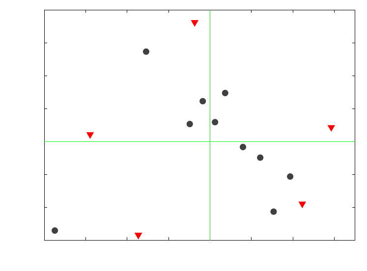
112
−0.8 −0.6 −0.4 −0.2 0 0.2 0.4 0.6
−0.4
−0.2
0
0.2
0.4
0.6
PC 1 (46.03%)
PC 2 (32.11%)
France
Italy
Switz
Austra
Brit
U.S.A.
Russia
Czech
Japan
Mexico
Liquor
Wine
Beer
LifeEx
HeartD
Figure 5-7. Biplot from Principal Components Analysis of the Wine data.
The scores plot obtained in Figure 5-5 suggests some similarity between groups of
countries, e.g., the U.S., Britain, Australia and, surprisingly, Mexico. Is this really the
case? We can check on this by looking at the sample residuals. In the Plot Controls
window, select Scores in the uppermost menu. (If you have closed the scores figure, you
must regenerate it first by clicking the Scores button in the main Analysis window.) For
the X axis select Sample and for the Y axis select Q Residuals. (Add labels using the
View menu if necessary.) The result should look like Figure 5-8. Here we see that
Mexico, is not well described by the PCA model. This indicates that, even though it
projects close to U.S., Australia and Britain, Mexico is actually a relatively long way off
the plane formed by the two PC model.
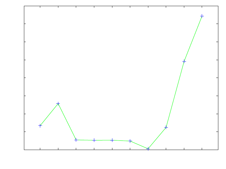
113
1 2 3 4 5 6 7 8 9 10
0
0.5
1
1.5
2
2.5
3
3.5
4
Sample Index
Q Residuals (21.86%)
France
Italy
Switz Austra Brit U.S.A.
Russia
Czech
Japan
Mexico
Figure 5-8. Sample Q residuals for two-PC model of Wine data.
What combination of variables causes Mexico to have this large residual? In other words,
in what direction does a sample move to change the conditions from a country like the
U.S. to one like Mexico? The answer can be obtained by looking at the contributions to
the Q residual. This is just a bar graph of the row of E from Equation 5-2 corresponding
to Mexico. To get the Q contributions for Mexico, select Scores in the Plot Controls
window if it is not already selected. Click on the Q con button, then click on the Mexico
sample in the scores plot. This will produce the plot shown in Figure 5-9 (you may have
to change limits on the axes via the Edit/Axes Properties… menu on the figure to
produce this exact plot). Here it can be seen that Mexico is low in all variables
simultaneously. Again, this can be confirmed by consulting the original data table.
In summary, PCA of the wine data suggests that, over the countries considered, wine
consumption appears to be correlated with life expectancy and decreased heart disease
rate. Is this the whole story? Unfortunately not. PCA does not imply causality, it only
looks for correlation. It does not say that wine consumption causes longevity any more
than it says that longevity causes wine consumption. It should also be noted that there are
many factors that are not at all represented in this data set. For instance, when this data
set was acquired, Russia certainly did not have the health care infrastructure of many of
the other countries, but this is not accounted for in any way. Dietary factors and heredity
are also not considered. However, in spite of its limitations, this simple analysis largely
agrees with what medical researchers are learning about wine consumption and health.
114
12345
−1
−0.8
−0.6
−0.4
−0.2
0
Variable
Q Residual Contribution
Sample 10 Mexico Q Residual = 3.717
Liquor
Wine
Beer
LifeEx
HeartD
Figure 5-9. Q residual contributions for Mexico.
PCA Example II: Application to a Chemical Process
We now consider the use of PCA on data produced by a continuous chemical process, in
this case a Slurry-Fed Ceramic Melter (SFCM) test system (Wise et al., 1991). In this
process, nuclear waste from fuel reprocessing is combined with glass-forming materials.
This slurry is fed into a high temperature glass melter, the SFCM, producing a stable
vitrified product for disposal in a long-term repository. These data are available in the
PLS_Toolbox file replacedata.mat. Raw data from the process, consisting of
temperatures in 20 locations within the melter and the molten glass level, are shown in
Figure 5-10. The temperatures are measured at ten levels in each of two vertical
thermowells that are inserted into the molten glass pool. (The variables are arranged in
the data set so that variables 1 to 10 are from the bottom to the top of thermowell number
1, and variables 11 to 20 are from the bottom to the top of thermowell number 2; variable
21 is the molten glass level.) It is immediately apparent from Figure 5-10 that there is a
great deal of correlation in the data. Many of the variables appear to follow a sawtooth
pattern.
A Principal Components Analysis can be initiated on these data by executing the
following commands at the MATLAB prompt:
» load replacedata
» pca
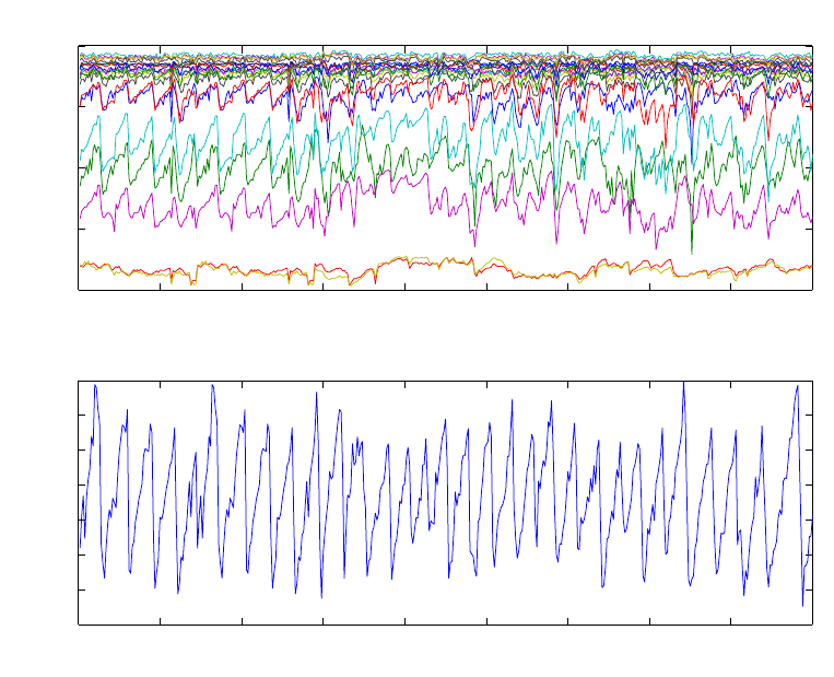
115
The first command loads the data set into the MATLAB workspace. The second
command launches the Analysis GUI pre-set for PCA. The user can now load the data
into the Analysis GUI using the File/Load Data/X-Block menu. Specifically, we want to
load the variable named repcal.
0 50 100 150 200 250 300 350 400 45
0
400
600
800
1000
1200
Sample Number
Temperature
SFCM Temperatures and Level
0 50 100 150 200 250 300 350 400 45
0
20.4
20.6
20.8
21
21.2
21.4
21.6
21.8
Sample Number
Level
Figure 5-10. Raw temperature and level data from SFCM process.
As in the wine example, the first decision to be made is the choice of scaling options. If
these were only temperature data, (where all the variables had the same units and where
variables with larger variance were expected to be more important), an argument could be
made for mean-centering the data. In this case, the inclusion of a level measurement
argues for autoscaling, which is the default preprocessing option. Thus, the model can be
built by simply clicking on the Calculate button, which produces the window shown in
Figure 5-11. The Percent Variance Captured Table shows that the first two PCs capture
substantial amounts of the variation in the model, with 36% and 30%, respectively.
Choosing the Number of Factors in a PCA Model
Once the scaling option is decided, one must determine the number of PCs to retain in the
model. Unfortunately a foolproof method for automating the choice has yet to be
discovered. Instead, the choice must be made based upon a few rules of thumb and the
user’s knowledge of the data.
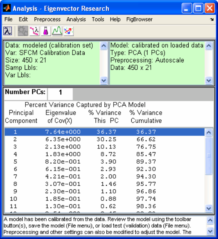
116
Figure 5-11. Analysis GUI with PCA model of Replacedata.
It is generally useful to list the eigenvalues in a table along with the percentage of the
variance that each PC captures, as shown in Figure 5-11. It is also a good idea to plot the
eigenvalues. This can be done in the Analysis window by clicking on the Plot
Eigenvalues/RMSECV (descending plot and a lambda symbol) button, which for our
example problem produces the plot shown in Figure 5-12. When looking at the plot of
eigenvalues, one looks for a “knee” (on the right-hand side) in the line. It can also be
helpful to look at the eigenvalues starting from the smallest ones and going back to the
larger, looking for a sudden jump in the values. It can be seen in Figure 5-12 that the
eigenvalues get gradually larger until number 5 is reached, then there is a sudden jump up
to number 4. This is perhaps more apparent in the table in Figure 5-11, where one can see
how the ratio of successive eigenvalues varies. Note how eigenvalue 4 is larger than
eigenvalue 5 by a factor of ~2.2, but eigenvalue 5 is larger than eigenvalue 6 by a factor
of only ~1.3. This suggests that it may be appropriate to choose four PCs for the model.
The eigenvalues themselves can be considered when choosing number of factors,
provided the data have been autoscaled. In this case, the eigenvalues will sum to the
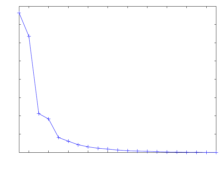
117
number of variables, and eigenvalues can be interpreted as the number of original
variables each PC is worth. For instance, the first PC captures as much variance as over
7.5 original variables, while the second captures as much variance as 6 original variables.
A good rule of thumb is that any PC with an eigenvalue less than 1 is probably not
describing any systematic variance in the system and should likely not be included in the
model. Eigenvalues greater than 2 usually are describing systematic variation (except in
some instances where the number of variables is very large relative to the number of
samples). Eigenvalues between 1 and 2 must be evaluated on a case-by-case basis using
the other rules given in this section.
Eigenvalues of similar size should be retained or eliminated together. In our example, this
rule suggests that PCs 3 and 4, with eigenvalues of 2.1 and 1.8, should either stay or go
together. The reasoning is that in these instances, there is nearly equal variance in two
directions, and the individual PCs are rotationally ambiguous; that is, any rotation of the
pair of PCs spanning the same space is an equally valid representation of the data. Thus,
eliminating only one of them is essentially arbitrary. PC number 5 has an eigenvalue of
0.82, and all subsequent eigenvalues are, of course, smaller, suggesting they should not
be included.
2 4 6 8 10 12 14 16 18 20
0
1
2
3
4
5
6
7
8
Principal Component Number
Eigenvalues
Figure 5-12. Eigenvalues from SFCM data in repdata.mat file.
It is also possible to choose the number of PCs based on cross-validation. In this
procedure, the data set is divided into a number of equal size segments. A PCA model is
then built on all but one of the segments. The model is then used to estimate variables
that are left out of the data (Wise and Ricker, 1991). The error for this “reconstruction” is
then plotted as a function of the number of PCs used. Generally this is presented as the
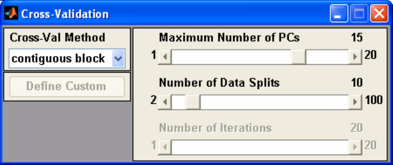
118
root-mean-square error of cross-validation (RMSECV). As PCs which describe large
amounts of systematic variance are added to the model the error should decrease. When
PCs describing only small noise variance are added, the error should increase.
Cross-validation can be performed in the Analysis window by selecting Tools/Cross-
Validation, which opens the Cross-Validation window as shown in Figure 5-13. The
parameters for the cross-validation can be set using this window. In these data, which are
a time series, it makes the most sense to break the data into contiguous blocks (more on
this later). The default setting of breaking the data into 10 blocks is chosen, and up to 15
PCs are to be calculated. Cross-validation is performed by pressing the Calculate button
in the main window. After the calculations are complete, the RMSECV curve can be
viewed by pressing the Plot Eigenvalues/RMSECV button then selecting RMSECV in
the Plot Controls window. The result of this is shown in Figure 5-14, which shows the
Predictive Residual Error Sum of Squares or PRESS value for the data as function of the
number of PCs. This is an indication of how well the data can be reconstructed from the
PCs. This indicates that the minimum reconstruction error was at seven PCs. However,
the decrease after four PCs was relatively modest.
Figure 5-13. Cross-Validation Window.
In this instance, the absolute and relative sizes of the eigenvalues suggest that four PCs
should be retained. The cross-validation suggests that up to seven PCs might be best;
however, most of the improvement in error is achieved before five PCs. Together, these
results suggest four PCs for the final model.
If these rules of thumb were all we had to go on, the choice of the number of PCs would
still not be easy in many cases. One should also consider the amount of “left over”
variation in the data as compared to the expected level of noise or other non-deterministic
variation. In this example, four PCs capture over 85% of the variation. One might ask
whether it is reasonable to expect 15% non-deterministic variance in the system, i.e.,
what is the noise level?
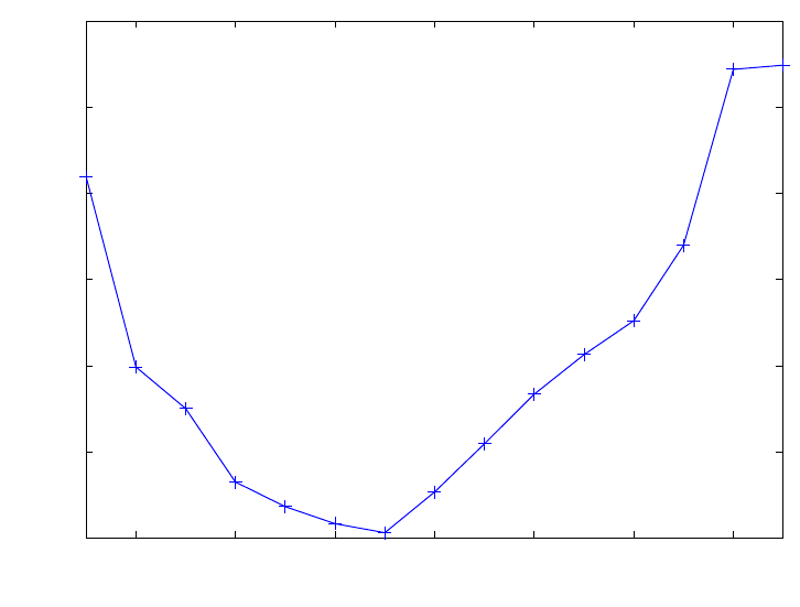
119
2 4 6 8 10 12 14
2
2.5
3
3.5
4
4.5
5
Principal Component Number
RMSECV
Figure 5-14. Cross-validation PRESS curve for SFCM data in replacedata.mat file.
When determining the number of PCs to retain, one should also look at the scores and
loadings. In many problems it can be expected that many variables in the data set will be
quite correlated. This can be because of spatial relationships (for example, temperature
sensors that are close to each other should be related) or frequency relationships (for
example, absorbances at nearby frequencies should be related). Because of these types of
relationships, the loadings for the first few PCs will often be “smooth” or group the
variables in a way that makes physical sense. PCs descriptive of noise, however, will
typically appear random. This is an indication that these PCs do not describe physically
significant variations. Likewise, one may expect that the scores should indicate
similarities in the samples. In our example, these similarities may be due to the dynamic
nature of the data and the fact that the data should be correlated in time. When the scores
become random, it is probable that they are capturing non-deterministic variation.
In this example, the number of PCs can be set to 4 by clicking on the fourth PC in the
table then pressing the Calculate button.
Viewing and Interpreting the Model
Once a preliminary model has been obtained the user can now explore the data by
viewing the scores, which show the relationship between samples, and the loadings,
which show the relationships between variables.
The first principal component scores for the SFCM data are shown in Figure 5-15 and the
corresponding loadings are shown in Figure 5-16. Note how all the temperatures on the
120
left load positively while all the temperatures on the right load negatively. Thus, the
scores capture the difference between the temperatures on the left and right side of the
melter, which apparently varies randomly over time. The sawtooth nature of many of the
process variables, which is attributable to changes in the level in the molten glass pool, is
captured in the second PC. The level is a controlled variable and its affect on the scores is
readily apparent. The scores and loadings for the second PC are shown in Figures 5-17
and 5-18. Examination of the loadings indicates that the variables that contribute most
strongly to the sawtooth trend are those near the surface of the molten glass pool,
variables 7–9 and 15–19. The third and fourth PCs (not shown) are harder to interpret.
Recall that each PC is constrained to be orthogonal to all previous PCs. This constraint
can make interpretation of the loadings and scores for PCs progressively more difficult as
the number of PCs increases.
Multivariate Statistical Process Control
Once a PCA model is developed, it can be combined with tools and techniques from
univariate statistical process control (SPC) to form multivariate statistical process control
(MSPC) tools (Jackson, 1979; Wise et al., 1990, 1991). Control limits can be placed on
the process scores, “sum of scores” T2, and residual Q. Limits can also be placed on the
residuals of individual variables (single columns of E) though this will not be addressed
here. There are multivariate analogs to Shewart, range, and CUSUM charts (Box et al.,
1978). When used for MSPC purposes, PCA models have the additional advantage that
the new scores variables produced, which are linear combinations of the original
variables, are generally more normally-distributed than the original variables themselves.
In our case, we are typically sampling a large number of variables when we form the
PCA scores and thus we would expect the scores, which, like a mean, are a weighted
sum, to be approximately normally-distributed. A word of caution is advised here,
however. In some instances, if score values are associated with a controlled variable
(such as the level of the SFCM in the example above) we would not expect the scores to
be normally-distributed.
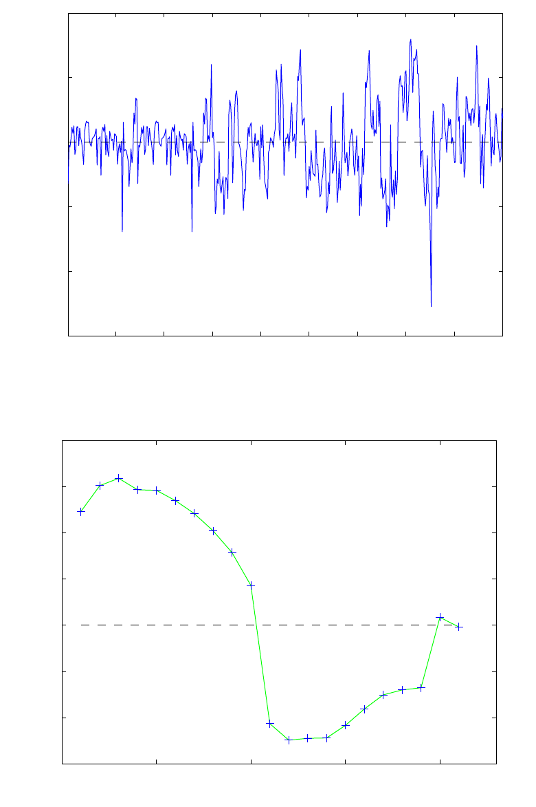
121
50 100 150 200 250 300 350 400 45
0
−15
−10
−5
0
5
10
Sample Scale
Scores on PC 1 (36.37%)
Figure 5-15. Scores on the first PC of the SFCM data.
0 5 10 15 20
−0.2
−0.1
0
0.1
0.2
0.3
Variable
Loadings on PC 1 (36.37%)
01 L−Bottom
02 L−Glass
03 L−Glass
04 L−Glass
05 L−Glass
06 L−Glass
07 L−Glass
08 L−Cap
09 L−Cap
10 L−Plenum
11 R−Bottom
12 R−Glass
13 R−Glass
14 R−Glass
15 R−Glass
16 R−Glass
17 R−Glass
18 R−Cap
19 R−Cap
20 R−Plenum
Glass Leve
l
Figure 5-16. Loadings for the first PC of the SFCM data.
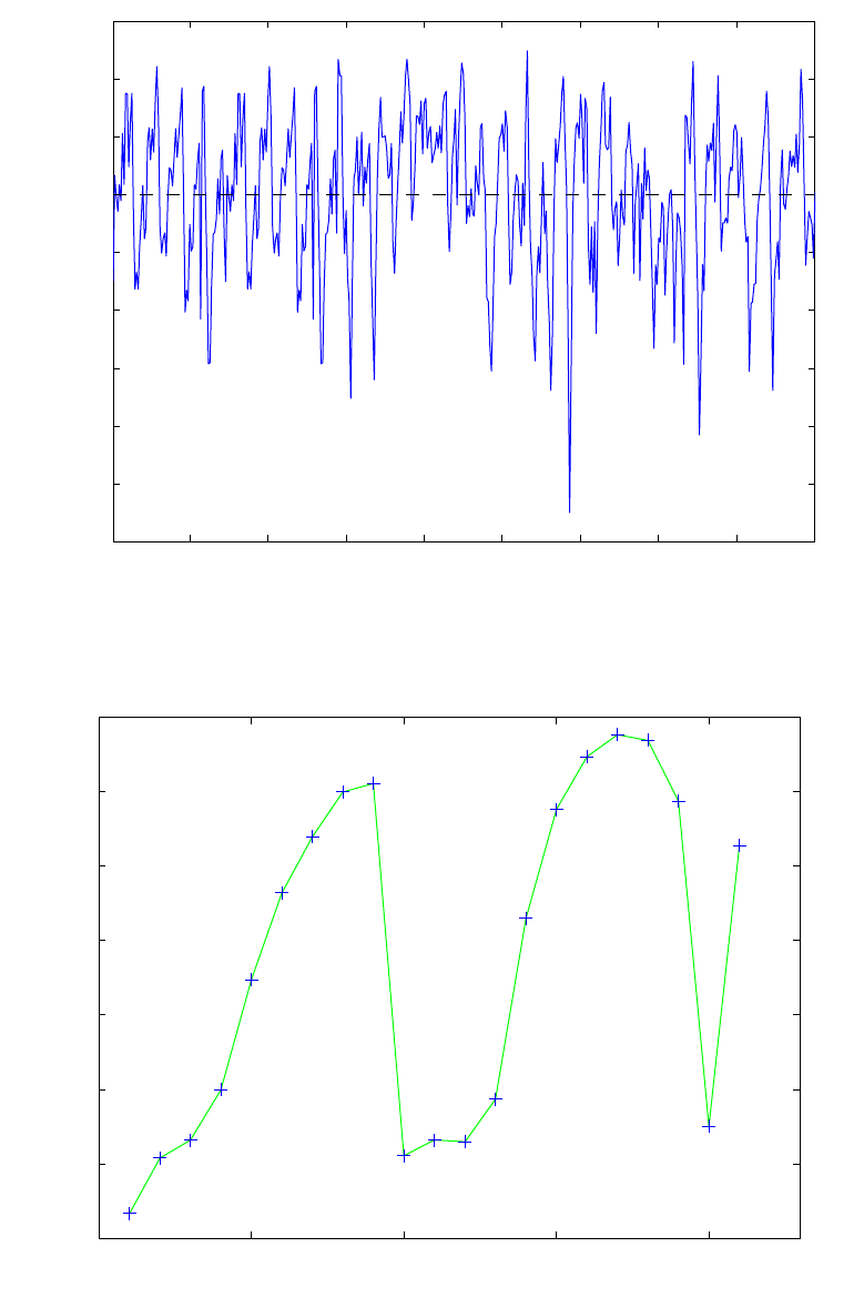
122
50 100 150 200 250 300 350 400 45
0
−12
−10
−8
−6
−4
−2
0
2
4
6
Sample Scale
Scores on PC 2 (30.25%)
Figure 5-17. Scores on the second PC of the SFCM data.
0 5 10 15 20
0
0.05
0.1
0.15
0.2
0.25
0.3
Variable
Loadings on PC 2 (30.25%)
01 L−Bottom
02 L−Glass
03 L−Glass
04 L−Glass
05 L−Glass
06 L−Glass
07 L−Glass
08 L−Cap
09 L−Cap
10 L−Plenum
11 R−Bottom
12 R−Glass
13 R−Glass
14 R−Glass
15 R−Glass
16 R−Glass
17 R−Glass
18 R−Cap
19 R−Cap
20 R−Plenum
Glass Leve
l
Figure 5-18. Loadings for the second PC of the SFCM data.
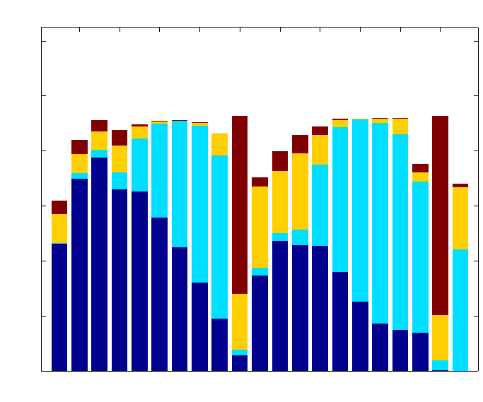
123
The variance captured by the PCA model in each original variable can be viewed by
clicking the varcap button in the Plot Controls window when Loadings are selected in
the top menu. The resulting stacked bar chart is shown in Figure 5-19. Here it can be seen
that the PCA model captures from ~60% to ~93% of the variance in all of the variables.
The plot also shows how the variance is captured by each PC. For instance, PC1 (dark
blue) captures the most variation in the lower temperatures (2-6 and 12-16), while the
second PC (light blue) captures mostly variation in the area where the feed meets the
molten glass, known an the cold cap (7-9, 17-19) and in the level (21). The fourth PC
(dark brown) captures variation in the plenum variables (10 and 20).
2 4 6 8 10 12 14 16 18 20
0
20
40
60
80
100
120
Variable
Percent Variance Captured
Variance Captured for a 4 PC Model of LFCM Calibration Data
01 L−Bottom
02 L−Glass
03 L−Glass
04 L−Glass
05 L−Glass
06 L−Glass
07 L−Glass
08 L−Cap
09 L−Cap
10 L−Plenum
11 R−Bottom
12 R−Glass
13 R−Glass
14 R−Glass
15 R−Glass
16 R−Glass
17 R−Glass
18 R−Cap
19 R−Cap
20 R−Plenum
Glass Level
Figure 5-19. Variance captured for each variable in four-PC model.
A theoretical connection exists between PCA and state space models typically used by
the process control community for describing the dynamics of a chemical process. Much
literature is available concerning the state-space formalism (see, for instance, Åstrom and
Wittenmark, 1984; or Kwakernaak and Sivan, 1972); however, it is useful to provide a
brief introduction here. Consider a linear, time-invariant, discrete, state-space process
model:
x(k+1) = Φx(k) + Γu(k) + υ(k) (5-14)
y(k) = Cx(k) + e(k) (5-15)
where x(k) is the n by 1 state vector at sampling period k, u(k) is the r by 1 vector of
process inputs and y(k) is the p by 1 vector of process measurements. The vector υ(k)
124
represents the state noise or disturbance input to the process; e(k) is measurement noise.
The Φ, Γ, and C matrices are assumed constant. Equation 5-14 shows that the process
state at time k+1 is a function of the state, process inputs and disturbances at time k.
Equation 5-15 shows that the process measurements are related to the process states and
measurement noise.
It has been shown that, for processes where there are more measurements than states, i.e.,
when there are more elements in y than x, variations in the process states appear
primarily as variations in the PCA scores, while noise mainly affects the residuals (Wise
et al., 1990). This allows one to consider only the noise properties of the system when
deriving limits on PCA residuals; the dynamics of the process need not be considered
explicitly. The rapid increase in the availability of process analytical instrumentation has
drastically increased the instances of processes having more measurements than
(significant) states.
MSPC Example
As an example of using a PCA model for MSPC we return now to the SFCM data, which
includes two test data sets, reptest1 and reptest2. The PCA model just developed can
be easily applied to the test data. First, the calibration data must be cleared by selecting
File/Clear/X and Y Blocks in the Analysis window. The new data can then be loaded
using the File/Load Data/X-Block menu and selecting reptest1 in the dialog box. The
model is then applied to the new data by clicking the Calculate button. Scores from the
new data can now be viewed by clicking the Scores button and selecting the desired plot
in the Plot Controls window. Note that the default is to show the new scores along with
the scores from the original data. This option can be changed by toggling the Show Cal
Data with Test checkbox on the Plot Controls window.
As an example, a scores plot which includes the calibration and test data can be produced
by pressing the Scores button and selecting PCs 1 and 2 in the Plot Controls window.
Axes lines can be added by selecting View/Axis Lines/All in the Plot Controls window.
A 99% confidence ellipse can be added by checking the Conf. Limits box in the Plot
Controls window and indicating 99% in the text box. The results of performing this
operation are shown in Figure 5-20. Note that the calibration data are shown as black
circles while the new data are indicated by red circles. From this plot it is apparent that
the new data conform to the old data as far as its projection onto the first two PCs is
concerned. This is certainly not the whole story, however, as we shall see.
When applying an existing model to new data, the single most useful plot is usually the Q
residuals for the new samples. This plot tells if the new samples fit the existing model.
The Q residuals for the new samples can be obtained by selecting Q residuals in the Plot
Controls window when Scores is selected in the uppermost menu (X axis). Figure 5-21
shows a Q residuals plot of only the new samples (the Show Cal Data with Test
checkbox has been unchecked). Note that the 99% confidence limit has been added to the
plot. It is apparent that there is some sort of excursion around sample 50, the Q residuals
get very large and stay that way. What variables are responsible for this deviation from
normal behavior? This information can be obtained by consulting the Q contributions by
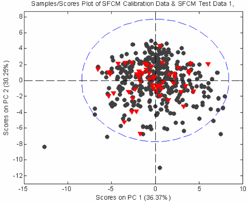
125
clicking on the Q con button in the Plot Controls window then clicking on the point of
interest. The Q contributions are shown for sample 50 in Figure 5-22. (Note that you may
have to adjust axes limits by using the Edit/Axes Properties… in the Q Residual
Contributions plot window to get the exact plot shown.) These contributions suggest
that thermocouple number 5 has gone bad, reading higher than it should. Samples 51-54
have similar residuals (not shown). It is interesting to check sample 33 to see if it was an
early indication of the failure of sensor 5. The residuals for it are shown in Figure 5-23.
Clearly, it is not the same sensor failure, but another type of process anomaly.
Figure 5-20. Scores plot of SFCM data showing new data with calibration data.
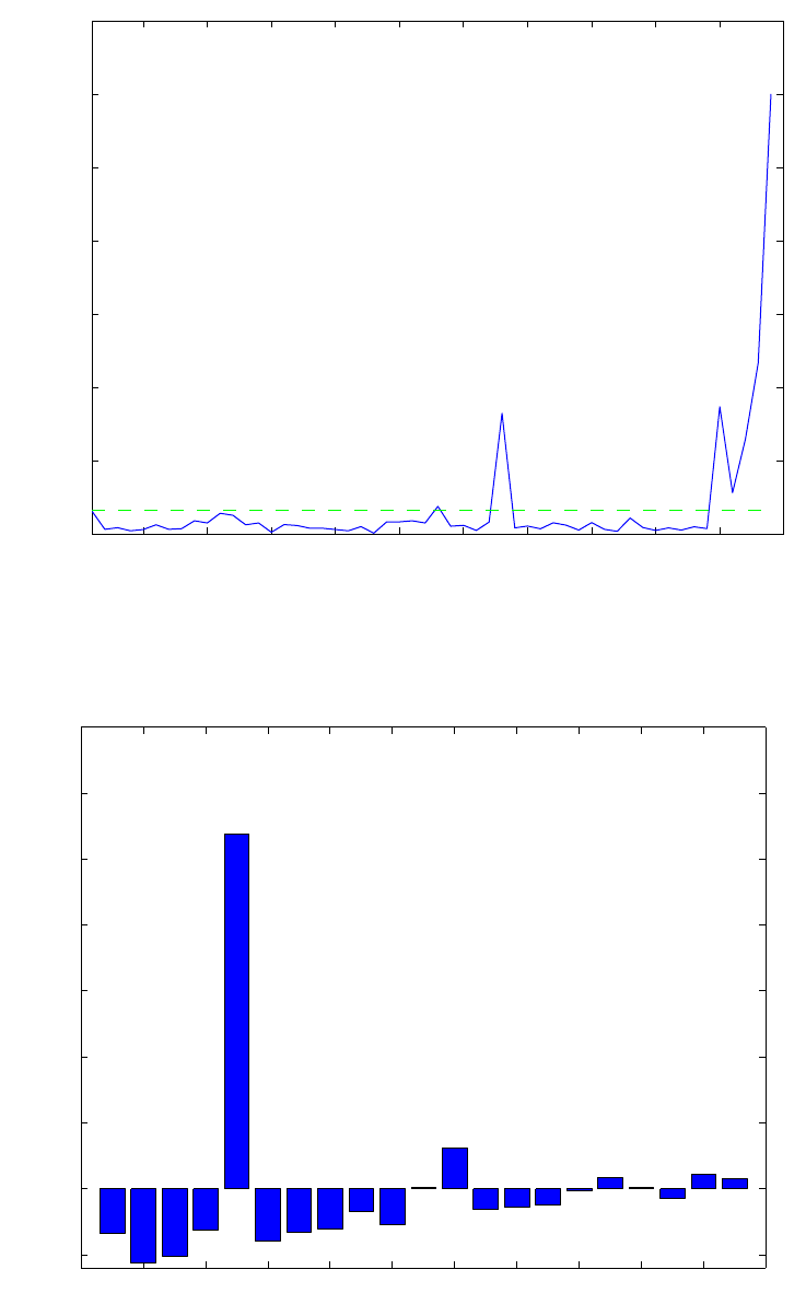
126
5 10 15 20 25 30 35 40 45 50 5
5
0
20
40
60
80
100
120
140
Sample
Q Residuals (14.53%)
Figure 5-21. Q residuals for test samples from SFCM data set.
0 2 4 6 8 10 12 14 16 18 20 2
2
−1
0
1
2
3
4
5
6
7
Variable
Q Residual Contribution
Sample 50 Q Residual = 34.8
01 L−Bottom
02 L−Glass
03 L−Glass
04 L−Glass
05 L−Glass
06 L−Glass
07 L−Glass
08 L−Cap
09 L−Cap
10 L−Plenum
11 R−Bottom
12 R−Glass
13 R−Glass
14 R−Glass
15 R−Glass
16 R−Glass
17 R−Glass
18 R−Cap
19 R−Cap
20 R−Plenum
Glass Level
Figure 5-22. Contributions of the residuals to sample 50 in SFCM test data.
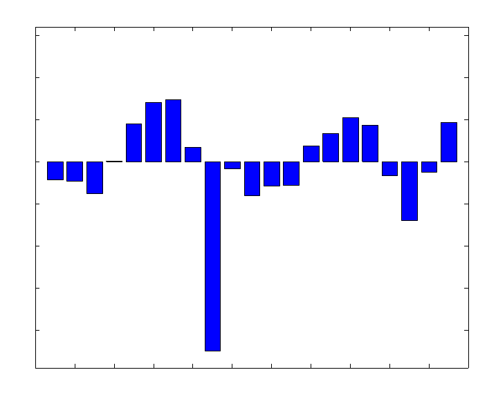
127
0 2 4 6 8 10 12 14 16 18 20 2
2
−4
−3
−2
−1
0
1
2
3
Variable
Q Residual Contribution
Sample 33 Q Residual = 33.01
01 L−Bottom
02 L−Glass
03 L−Glass
04 L−Glass
05 L−Glass
06 L−Glass
07 L−Glass
08 L−Cap
09 L−Cap
10 L−Plenum
11 R−Bottom
12 R−Glass
13 R−Glass
14 R−Glass
15 R−Glass
16 R−Glass
17 R−Glass
18 R−Cap
19 R−Cap
20 R−Plenum
Glass Level
Figure 5-23. Contributions of the residuals to sample 33 in SFCM test data.
If desired, confidence limits can be calculated for the residuals and the contribution plots
can be normalized so that equal residuals are of equal significance (Wise et al., 1990).
(Look for this in a future edition of the toolbox.)
PCA Summary
Principal Components Analysis is a widely used technique for exploring and modeling
multivariate data. It provides an interpretable model of a data set. A PCA model consists
of the following parts:
• a mean vector, used for centering the data
• a vector of standard deviations or other factor, used for variance scaling the
data
• a set of loadings, which describe directions of variations in the data and show
the relationships between the variables
• a set of scores, which show relationships between the samples
• a set of eigenvalues, which give the amount of variance in each of the loading
directions
Statistical limits can be calculated for the model scores, T2, and Q residuals and
individual residuals given the eigenvalues and number of samples in the data.

128
New data can be compared with an existing PCA model by:
• subtracting the original mean from the data
• scaling the data with the original standard deviations or other factor
• projecting the new centered and scaled data onto the loadings to get new
scores, T2 and residual values
• comparing the scores, T2 values, Q residuals and individual residuals to their
previously determined limits
All of these steps are done automatically when using the Analysis tool
The concepts and mathematics used in Principal Components Analysis are common to
many other multivariate techniques. Thus, a good understanding of the technique forms a
good foundation for many other chemometric methods.
Multi-Way PCA
The PCA method outlined above takes no explicit account of the ordered nature of the
data set, i.e., the fact that the data were collected in a sequential manner. Reordering the
samples would produce identical results. There are methods that explicitly consider that
the data set is ordered. These are referred to as multi-way methods because the data are
usually organized into time-ordered blocks that are each representative of a single sample
or process run. The blocks are then arranged into multi-way matrices. Multi-way methods
are particularly useful for the analysis of batch process data and analytical data where a
response is being measured as a function of two or more parameters. Examples include
gas chromatography/mass spectrometry (GC-MS), where the response in ion counts
arriving at the detector is measured as a function of GC retention time and mass/charge.
There are many other “hyphenated” analytical techniques which produce a matrix of data
for each sample.
Consider the three-dimensional data array shown in the top of Figure 5-24. A data matrix
of this type would be typical of a series of runs of a batch process (or a series of samples
from a second order analytical technique such as GC-MS). Here there are j = 1, 2, ..., J
variables measured at times k = 1, 2, ..., K throughout the batch. Similar data will exist on
i = 1, 2, ..., I runs of the batch process. The data can be summarized in the three
dimensional (I × J × K) array X. Different batch runs (samples) are arranged along the
vertical side, different process measurements (variables) along the horizontal side, and
time recedes into the figure. Each horizontal slice through the array is a (J × K) matrix
representing the time history for all variables of a batch of a particular batch or sample.
Each vertical slice made parallel to the front face of the cube is a (I × J) matrix
representing the values of all the variables in all the batches taken at a common time. A
vertical slice made parallel to the side of the cube (the time axis) would represent a (I×
K) matrix of all the time histories of a single variable for all the batches.
There are several methods for decomposing the array X (Geladi, 1989). These methods
include the Tri-Linear Decomposition (TLD) (Sanchez and Kowalski, 1990; Booksh et
al., 1994), Parallel Factor Analysis (PARAFAC) (Smilde and Doornbos, 1991; Smilde et
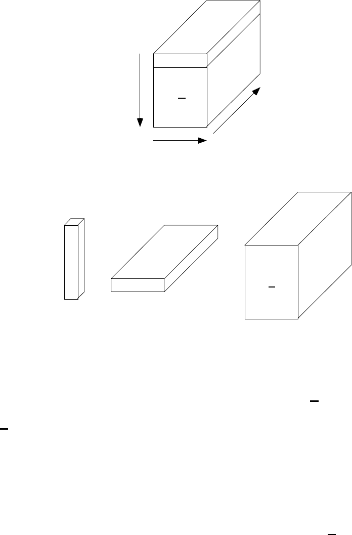
129
al., 1994), and Tucker models (Kroonenberg and de Leeuw, 1980). Each of the
decomposition methods places different constraints on the resulting matrices and vectors.
Here, we will consider one of the more straightforward approaches, that of multi-way
PCA (MPCA) (Wold et al., 1987, Wise et al., 1999).
X
samples
or
batches
I
variables or
measurements
J
time
K
Σ
r = 1
R
E
⊗+
trPr
=
I x 1 x 11 x J x K
I x J x K
Figure 5-24. Three-dimensional data array and multi-way PCA decomposition.
MPCA is statistically and algorithmically consistent with PCA and has the same goals
and benefits (Nomikos and MacGregor, 1994). In MPCA, the array X is decomposed as
the summation of the product of score vectors (t) and loading matrices (P) plus a residual
array E that is minimized in a least-squares sense.
∑
=
+⊗= R
1
r
rr EPtX (5-16)
Here ⊗ is the outer product operator. This decomposition, shown graphically at the
bottom of Figure 5-24, is done in accordance with the principles of PCA and separates
the data in an optimal way into two parts. The noise or residual part E is as small as
possible and is associated with non-deterministic variation in the data. The systematic
part, the sum of the tr⊗Pr, expresses the deterministic variation as one part (t) related only
to batches and a second part (P) related to variables and their time variation.

130
MPCA is equivalent to performing PCA on a large two-dimensional matrix formed by
unfolding the three-way array X in one of six possible ways, only three of which are
essentially different. For example, one might unfold X in such a way as to put each of its
vertical slices (I x J) side by side to the right, starting with the slice corresponding to the
first time interval. The resulting two-dimensional matrix has dimensions (I × JK). This
particular unfolding allows one to analyze variability among batches or samples in X by
summarizing information in the data with respect to variables and their time variation. A
mathematically-equivalent unfolding would be to take slices off the side of X and place
them down the time axis, which also forms a matrix with dimensions (I × JK). (The latter
unfolding orders the matrix with the history of each variable kept together, while the
former orders the matrix with the all the measurements taken at the same time kept
together.) One might also be interested in unfolding X in other ways; however, the
unfolding shown in Figure 5-24 (and the equivalent unfolding mentioned above) are the
only ways that keep batch (sample)-specific information separate from time and variable
information.
The MPCA algorithm proceeds as shown in Figure 5-25. First the matrix is unfolded in
one of the two equivalent ways described above. Each column of the resulting matrix is
then mean-centered and, if appropriate, scaled to unit variance (autoscaled). An
eigenvector decomposition as described in Equations 5-1 and 5-2 is then applied to the
unfolded X. Each of the p, however, is really an unfolded version of the loadings matrix
Pr. After the p are obtained, the Pr can be obtained by reversing the unfolding procedure.
In a similar manner, the three way array E can be formed by folding the PCA residual
matrix E. The Q and T2 statistics can be calculated using the unfolded solution as shown
in Equations 5-7 and 5-10.
This version of MPCA explains the variation of measured variables about their average
trajectories. Subtracting the average trajectory from each variable (accomplished by
mean-centering the columns of the unfolded matrix X) removes the major nonlinear
behavior of the process. The ith elements of the t-score vectors correspond to the ith batch
(sample) and summarize the overall variation in this batch with respect to the other
batches in the database over the entire history of the batch. The P loading matrices
summarize the time variation of the measured variables about their average trajectories.
The elements of P are the weights, which when applied to each variable at each time
interval within a batch, give the t scores for that batch.
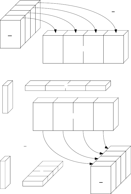
131
X
E
Mean center and scale columns of X
and perform PCA decomposition
Fold resulting p and E
to form P and E
+
✕
Unfold X to form X
X
t
p
E
t P
⊗+
Figure 5-25. Algorithm for performing MPCA.
Example of MPCA
As an example of MPCA, consider the problem of monitoring the manufacture of
semiconductors (Gallagher et al., 1997; Wise et al., 1997, White et al., 1997). There are
many steps in this process; here we will focus on an Al-stack etch process performed on
the commercially available Lam 9600 plasma etch tool. The goal of this process is to etch
the TiN/Al - 0.5% Cu/TiN/oxide stack with an inductively coupled BCl3/Cl2 plasma.
Data from machine state sensors were collected during wafer processing. The machine
data consist of 40 process setpoints and measured and controlled variables sampled at 1
second intervals during the etch. These are engineering variables, such as chamber
pressure and RF power. In this example, twelve non-setpoint process variables with some
normal variation will be used for monitoring, as shown in Table 5-2. Also, the physics of
the problem suggest that these variables should be relevant to process and final product
state. These data are available in the etchdata.mat file included with PLS_Toolbox.
132
Table 5-2. Machine state variables used for process monitoring.
1 Endpoint A Detector 7 RF Impedance
2 Chamber Pressure 8 TCP Tuner
3 RF Tuner 9 TCP Phase Error
4 RF Load 10 TCP Reflected Power
5 RF Phase Error 11 TCP Load
6 RF Power 12 Vat Valve
A series of three experiments were performed where faults were intentionally induced by
changing the TCP power, RF power, pressure, Cl2 or BCl3 flow rate, and He chuck
pressure. Data from 127 wafers with 20 induced faults are available from these three
experiments.
To make the test more representative of an actual sensor failure, the analysis was done
with “reset” values: the controlled variable which was changed was reset to have the
same mean as its normal baseline value, so that it would look normal in the data file. For
example, if the induced fault was a change of the TCP power from 350 to 400 watts, the
data file value of the TCP power was reset from a mean of 400 back to 350 by addition of
a constant bias. The resulting data look as if the controller was seeing a biased sensor for
TCP power and adjusting accordingly; TCP power would appear normal, but it would not
be. The effect of a TCP power offset, however, should be evident (we hope) in the
remaining process variables because the apparent relationship between the TCP power
and the remaining variables should be different.
The ‘mpca’ function can be used to start the analysis interface to develop an MPCA
model of the normal data. Here the data for the 107 normal wafers have been arranged as
a 80 (time steps) by 12 (variables) by 107 (wafers) matrix. Note that in MPCA, the third
mode is the default sample mode (largely for historical reasons). This is in contrast to the
analysis of 2-way arrays, where the first dimension is the sample dimension. For other
multi-way functions in PLS_Toolbox (PARAFAC, Tucker and NPLS), the convention is
also that the first dimension is the sample dimension. In all these methods, however, the
sample mode can be redefined through options.samplemode. A reasonable way to scale
the data is to use group scaling. In this instance, the mean trajectory is subtracted out of
the data but the same variance scaling is used for the entire history of each variable. An
MPCA model can be formed by executing
» load etchdata
» mpca
The first command loads the data set into the MATLAB workspace. The second
command launches the Analysis GUI pre-set for MPCA. The user can now load the
EtchCal data into the Analysis GUI using the File/Load Data/X-Block menu. When
MPCA is selected, the Analysis GUI will default to group scaling, so building a model is
as simple as clicking the Calculate button. The function will display the variance
captured table shown in Table 5-3 and allow the user to explore the scores and loadings
133
plots via the Plot Controls window. Here it looks as though two PCs would be
appropriate based on the distribution of the eigenvalues. A two component model can be
formed by selecting the second line in the variance captured table and clicking the
Calculate button
At first it seems that a model which only captures 46% of the variation in the process is
not a particularly good one. However, it must be remembered that in MPCA the mean
trajectory models a great deal of normal process variation, and this mean is extracted
before calculating the PCA model of the unfolded data.
Table 5-3. Percent variance captured by MPCA model
Principal Eigenvalue % Variance % Variance
Component of Captured Captured
Number Cov(X) This PC Total
--------- ---------- ---------- ----------
1 3.96e+000 33.03 33.03
2 1.51e+000 12.59 45.61
3 3.03e-001 2.53 48.14
4 2.88e-001 2.40 50.54
5 1.95e-001 1.63 52.16
6 1.86e-001 1.55 53.71
7 1.59e-001 1.33 55.04
8 1.44e-001 1.20 56.24
9 1.26e-001 1.05 57.29
10 1.23e-001 1.02 58.31
The scores from the MPCA model can be plotted by clicking the Scores button on the
main Analysis GUI. This will generate a Plot Controls window. Select Scores on PC1
in the X: menu and Scores on PC2 in the Y: menu. The result of this operation is shown
in Figure 5-27. We have also used the legend command to add the legend on the figure
as follows:
» legend(' ','Exp 29','Exp 31','Exp 33')
It can be seen that the calibration data are clustered according to which experiment the
data are from. The experiments were run at widely spaced intervals (many weeks) and
system drift is obvious.
The loadings for the MPCA model can be explored by clicking the Loads button on the
main analysis interface, which will generate a Plot Controls window. Note that the
loadings from MPCA can be quite complex as there is a loading coefficient for each
combination of variable and time step. The default plot shows the loadings on the first
PC, as shown in Figure 5-26. Here each line on the plot represents a variable trajectory
for the first PC. Individual variables can be plotted by clicking Explore in the lower right
hand corner of the Plot Controls window.
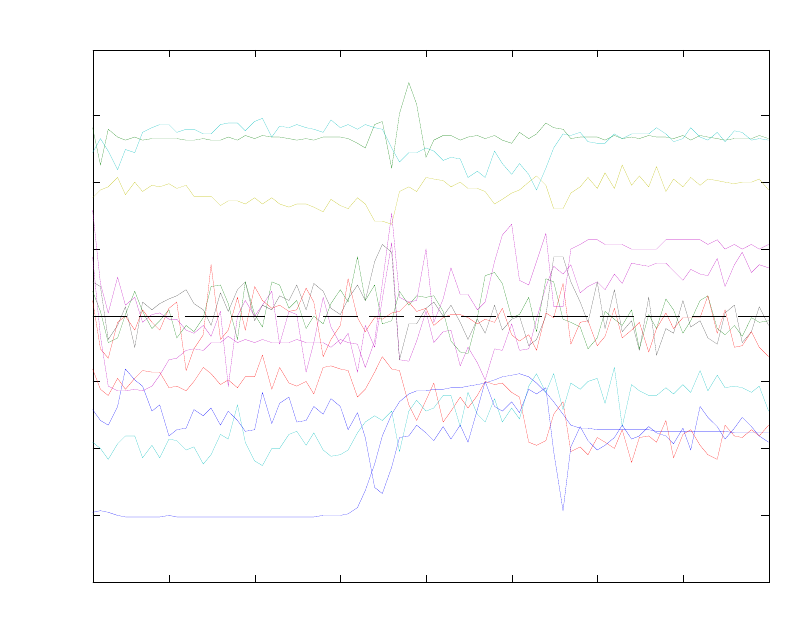
134
Figure 5-26. Loading plot for wafer calibration data.
The MPCA model can be applied to new data in the Analysis GUI as follows: select
File/Clear/X and Y Blocks, then File/Load/X-Block, and select the EtchTest data. Click
the Calculate button to apply the model to the data. The scores of the test data on the
calibration data can be viewed by clicking the Scores button which brings up the Plot
Controls window. This window can be used to produce a scores plot with both the
calibration and test data. Such a result is shown in Figure 5-28. This figure shows the
scores from the new test wafers with the induced faults with the limits based on the
calibration data. Note that if you toggle the Show Cal Data with Test check box on and
off you see that only a few of the test wafers are outside the control limits on these first
two PCs. The residuals, however, show a different story. Figure 5-29 shows the Q
residuals for the test wafers with 95% limits. This figure was produced by first selecting
the calibration data samples using the Select button in the Plot Controls. A good view to
work from is Scores on the First PC versus sample (not shown). Multiple selections can
be made by holding down the shift key on subsequent selections. The selected calibration
samples are then excluded by choosing Edit/Exclude Selection in the Plot Controls
window. Most of the wafers are out, or nearly out, as we would hope. This suggests that
MPCA would be a good tool for detecting faults in batch systems. Additional specificity
can be obtained if models are built on the individual experiments.
10 20 30 40 50 60 70 80
-0.08
-0.06
-0.04
-0.02
0
0.02
0.04
0.06
0.08
Slab
Loadings on PC 1 (33.03%)
Time St ep
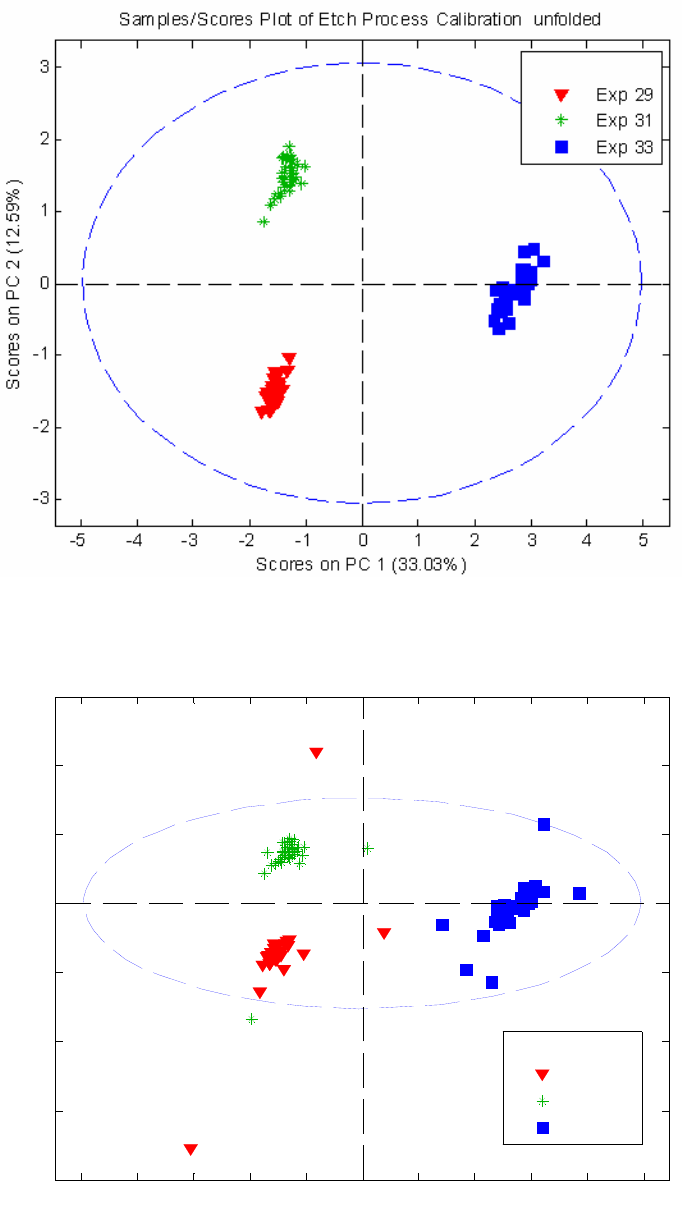
135
Figure 5-27. Scores on first two PCs for wafer calibration data.
Figure 5-28. Scores on first two PCs for wafer test data.
-5 -4 -3 -2 -1 0 1 2 3 4 5
-8
-6
-4
-2
0
2
4
6
Scores on PC 1
(
33.03%
)
Scores on PC 2 (12.59%)
Samples/Scores Plot of caldat & caldat,
Exp 29
Exp 31
Exp 33
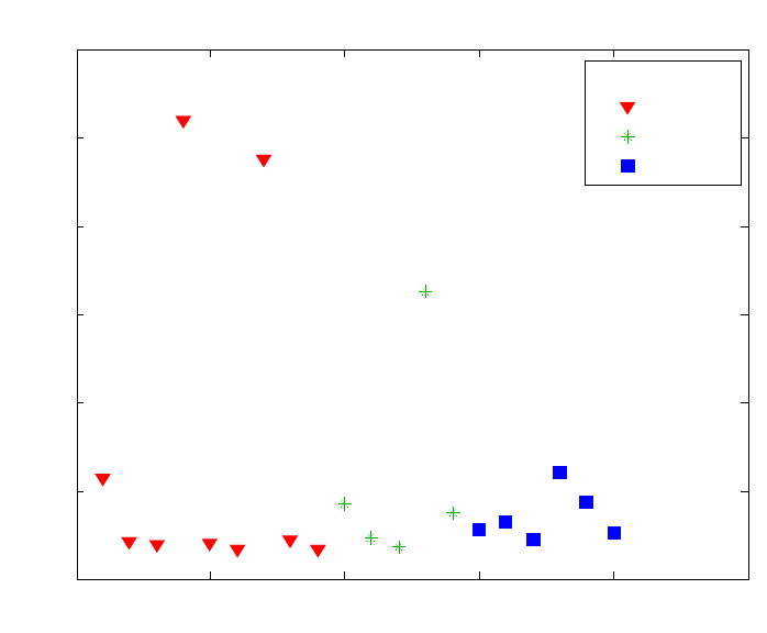
136
Figure 5-29. MPCA Q residuals for test wafers.
0 5 10 15 20 25
0
20
40
60
80
100
120
Sample
Q Residuals (54.39%)
l2915 TCP +50
l2916 RF -12
l2917 RF +10
l2918 Pr +3
l2936 TCP +10
l2937 BCl3 +5
l2938 Pr -2
l2939 Cl2 -5
l2940 He Chuck
l3120 TCP +30
l3121 Cl2 +5
l3141 BCl3 -5
l3142 Pr +2
l3143 TCP -20
l3318 TCP -15
l3319 Cl2 -10
l3320 RF -12
l3339 BCl3 +10
l3340 Pr +1
l3341 TCP +20
Samples/Scores Plot of cal_dat
Tes t 29
Tes t 31
Tes t 33
137
6. Multivariate Regression
Multivariate Calibration
In years past, process measurements consisted primarily of traditional “engineering”
variables such as temperature, pressure, flow rate, and electrical power. In distillation
control, for example, although the aim was to achieve a specific concentration of product
in the overhead stream, the column was controlled based upon pressure and temperature
measurements. Later, the advent of on-line spectrometers provided a means to make even
better estimates of chemical composition. All of these measurements are indirect and rely
on the ability to develop a model that relates the set of measured variables to the chemical
composition of the system (or another, unmeasured, property or state of interest). The
development of so-called regression models is the focus of this section. Although often
used in spectroscopic applications (because of the large amount of information available
in spectroscopic data), the techniques to be discussed have application to a wide range of
data sources and properties-of-interest.
Classical Least Squares
The Classical Least Squares (CLS) model assumes that measurements are the weighted
sum of linearly independent signals (see, for instance, Erickson et al., 1992). In
spectroscopy, for example, the CLS model assumes that measured spectra are the sum of
pure component spectra weighted by the concentration of the analytes. Thus, the model
is:
x = p S (6-1)
where x is the measured response vector, S is the matrix of pure component responses
and p is the vector containing the weights (i.e., concentrations) of the analytes. Generally,
given the vector of measurements, x, one would like to know p, the degree to which each
component contributes to the overall measurement. p can be determined from
p = x S+ (6-2)
where S+ is the pseudoinverse of S, defined for CLS as:
S+ = ST(SST)-1 (6-3)
The main disadvantage of CLS is that the pure responses S of all spectrally-active
components must either be known a priori or estimated using known concentrations of
all spectrally-active components. These estimates must include any minor components
that may not be of interest themselves but may contribute to the measured signal. Given a
matrix of concentrations C and measured spectra X, an estimate of the pure component
spectra Sest can be obtained from
Sest = (CTC)-1CTX (6-4)
138
In Equation 6-4, note that the concentration profiles of all spectrally-active species must
be linearly independent (otherwise (CTC)-1 would not exist, and the pure component
spectra Sest cannot be estimated). Likewise, in Equation 6-3, note that the pure
component responses must also be linearly independent (otherwise, (SST)-1 does not
exist, and S+ cannot be calculated). In the more practical case where the pure component
responses are nearly collinear, S+ can be calculated, but will be rather unstable, in that it
may change a great deal given small changes in the estimates of the pure responses due to
noise or other interferences. In this case, estimates of p obtained by Equation 6-2 may not
be very accurate.
The CLS procedure may be demonstrated using the nir_data.mat file in PLS_Toolbox.
The file contains measured near-infrared absorbance spectra of thirty simulated gasoline
samples that were prepared from five pure components. An estimate of the pure
component spectra can be obtained from the mixture spectra spec1 and the concentration
matrix conc as follows:
» load nir_data
» cspec = spec1(1:25,:);
» cconc = conc(1:25,:);
» tspec = spec1(26:30,:);
» tconc = conc(26:30,:);
» purespec = inv(cconc.data'*cconc.data)*cconc.data'*cspec.data;
» plot(spec1.axisscale{2},purespec);
The estimate of the pure component spectra obtained (purespec, or Sest in Equation 6-4)
is shown in Figure 6-1. The matrix of pure component spectra can then be used to
estimate concentrations of the analytes in the remaining five samples as follows:
» cpred = inv(purespec*purespec')*purespec*tspec.data';
» plot(tconc.data,cpred','+');
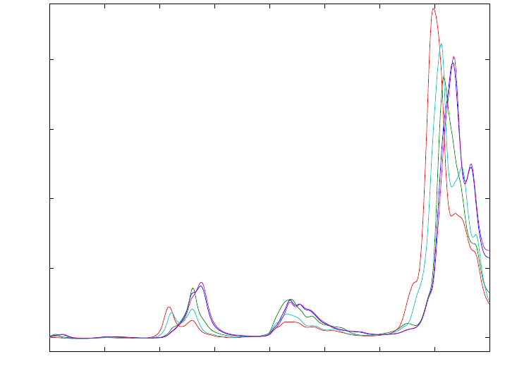
139
800 900 1000 1100 1200 1300 1400 1500 160
0
0
0.005
0.01
0.015
0.02
Wavelength (nm)
Absorbance
Figure 6-1. Estimate of pure component spectra from NIR spectra of simulated gasoline
samples.
The actual versus predicted concentrations are shown in Figure 6-2. In this case, the
predictions are quite good. If, however, the concentrations of one of the analytes in the
calibration spectra is not known, the predictions will suffer considerably. The reader is
encouraged to try this by, for example, excluding one or more of the five columns in the
pure component concentration matrix conc before calculating the pure component
spectra. As will be shown below, unknown concentrations are not a problem with inverse
least squares (ILS) methods.
Inverse Least Squares
It is possible to get around the problem of having to know or estimate S by using an
inverse least squares (ILS) model. ILS assumes that a regression vector b can be used to
determine a property of the system y from the measured variables x (a row vector, such
as a spectrum). Thus, the ILS model is
x b = y (6-5)
Compare this inverse model to the classical model in Equation 6-1. In the classical
model, responses are expressed as a function of pure component concentrations (p),
whereas the inverse model expresses a single concentration (y) as a function of the
responses. Note that the inverse model formulation is more widely applicable than the
classical (CLS) case, for at least two reasons: 1) only the value of the property of interest
(y) needs to be known, and 2) this property is not restricted to being a component
concentration property.
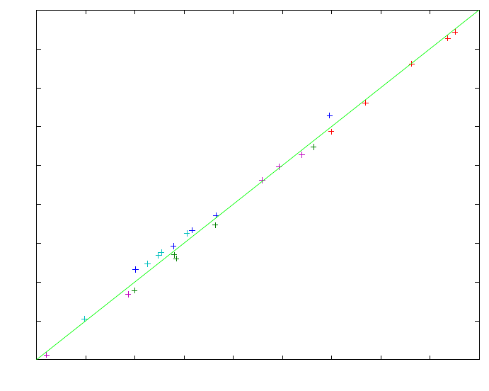
140
The regression vector b must be determined using a collection of measurements X and
the known values of the property of interest, y. Thus, b is estimated from
b = X+ y (6-6)
where X+ is the pseudoinverse of X. There are many ways to determine a pseudoinverse,
but perhaps the most common is Multiple Linear Regression (MLR, also known as
ordinary least squares, OLS). In this case, X+ is defined by
X+ = (XTX)-1XT (6-7)
0 5 10 15 20 25 30 35 40 4
5
0
5
10
15
20
25
30
35
40
45
Actual Concentration
Predicted Concentration
Figure 6-2. Actual versus predicted concentrations of simulated gasoline samples from
NIR spectra.
Unfortunately, this approach often fails in practice because of collinearity of some or all
of the response variables in X (e.g., some columns of X (variables) are linear
combinations of other columns), or because X contains fewer samples than variables
(fewer rows than columns). In either of these cases, (XTX)-1 would not exist. For
example, typical spectroscopy calibration problems are extremely ill-conditioned due to a
high degree of correlation between absorbances at adjacent wavelengths. Also, the
number of wavelength channels offered by the spectrometer is typically greater than the
number of calibration samples that are available. In such a case, any attempt to use more
wavelengths than samples to build an MLR model would result in an underdetermined
situation, where there are an insufficient number of samples to estimate the regression
coefficients of all of the wavelengths.

141
In most real systems, exact collinearity of variables in X is rather rare, due to the
presence of random experimental noise. Nonetheless, when Equation 6-7 is used with
systems that produce nearly collinear data, the solution for b is highly unstable, in that
very small perturbations in the original data (for example, from noise or experimental
error) cause the method to produce wildly different results. The use of highly collinear
variables in MLR also increases the possibility of overfitting the model, meaning that the
calibration may fit the data very well, but fails when used to predict the properties of new
samples. As a result, an important practical aspect of the MLR method is the selection of
response variables to be included in X, such that collinearity is avoided.
MLR Example
As noted in the introduction to this section, the possible applications of regression
methods go beyond the spectral calibration problem. In one such example of MLR, we
will develop a regression model that will enable estimation of the level of molten glass in
the Slurry-Fed Ceramic Melter (SFCM) using temperatures measured in the SFCM (See
the chapter on PCA for more information about these data). In this example, the
temperatures and the level of the molten glass take the place of spectral response
variables and concentration, respectively. The twenty SFCM temperatures, shown in
Figure 5-11, will serve as the predictor variables in this problem, as they will be used to
predict the molten glass level. As noted previously, the measured temperatures rise and
fall with the glass level, which is a controlled variable. A model relating temperatures to
level would serve as a backup to the level measuring instrument, which is a pneumatic
device.
The SFCM temperature and molten glass level data are stored in the file plsdata.mat.
The file contains 300 calibration or “training” samples (xblock1 and yblock1) and 200
test samples (xblock2 and yblock2). A simple model relating temperature to level can be
created using MLR. First we will load the data into MATLAB and delete a few samples
that are known outliers as follows:
» load plsdata
» x = delsamps(xblock1,[73 167 188 278 279]);
» y = delsamps(yblock1,[73 167 188 278 279]);
Note that we deleted the samples from both the predictor (xblock1) and predicted
variables (yblock1). The variables are then mean-centered and a regression vector is
calculated:
» [mx,xmns] = mncn(x.data);
» [my,ymns] = mncn(y.data);
» bmlr = mx\my;
Here we have used the backslash “left division” operator in MATLAB to obtain the
regression vector bmlr. This is equivalent to forming the MLR pseudoinverse (Equation
6-7). With the regression vector and mean-centering parameters in hand, we can now
apply the model to a new data set in order to assess its performance. Model application
142
involves first scaling the new predictor variables, applying the model’s regression
coefficients, and then re-scaling the result, as follows:
» sx = scale(xblock2.data,xmns);
» ymlr = sx*bmlr;
» symlr = rescale(ymlr,ymns);
» plot(1:200,yblock2.data,'-g',1:200,symlr,'-or')
A plot of the measured and predicted level is shown in Figure 6-3. Except for a period
after samples 150 and 175, the predictions look very good. As we will see in the
following sections, however, it may be possible to do somewhat better using other
regression techniques, such as PCR and PLS.
Principal Components Regression
It was mentioned earlier that regression by MLR suffers from two different problems: 1)
the relative abundance of response variables relative to the number of available
calibration samples (for the typical spectral calibration problem), which leads to an
underdetermined situation, and 2) the possibility of collinearity of the response variables
in X, which leads to unstable matrix inversions and unstable regression results. Principal
Components Regression (PCR) is one way to deal with both of these problems (see, for
example, Næs and Martens, 1988; Martens and Næs, 1989; Geladi and Esbensen, 1991;
Höskuldsson, 1996). Instead of regressing the properties of interest (e.g., concentrations,
or molten glass level) onto a set of the original response variables (e.g., spectral response
variables, or temperatures), the properties are regressed onto the principal component
scores of the measured variables, (which, by definition, are orthogonal, and
thereforewell-conditioned). Thus, the pseudoinverse of the response data matrix, X+, is
estimated as
X+ = P (TTT)-1 TT (6-8)
Compared to the estimation of the pseudoinverse for MLR (Equation 6-7), this operation
is much more stable, due to the orthogonality of the principal component scores (T) and
loadings (P). Furthermore, the underdetermined problem in MLR is addressed by the fact
that the maximum possible number of principal components (PCs) is equal to the lesser
of the number of response variables and the number of calibration samples, and, as a
result, can never be greater than the number of calibration samples.
Because it directly addressesthe collinearity problem, PCR can be said to be less
susceptible to overfitting than MLR. However, one could still overfit a PCR model,
through the retention of too many PCs. Therefore, as in PCA, an important part of PCR is
the determination of the optimal number of principal components to retain in the model.
In contrast to a PCA model, however, the purpose of a PCR regression model is to predict
the properties of interest for new samples. As a result, we would like to determine the
number of PCs that optimizes the predictive ability of the model. The appropriate number
of PCs is typically determined by cross-validation, which involves a procedure where the
available data are split sample-wise into a training and a test set. The prediction residual
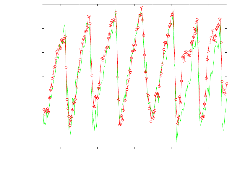
143
error on the test set samples is then determined as a function of the number of PCs
retained in the PCR model. This procedure is usually repeated several times, using
different sample subset selections for training and test sets, such that each sample in the
original data set is part of a test set at least once. A plot of the total “composite”
prediction error over all the test sets as a function of the number of PCs retained in the
model is then used to determine the optimal number of PCs.
For problems in which there are more samples than variables, a PCR model that retains
the maximum possible number of PCs (which is equal to the number of variables) is
identical to the MLR model built using the same set of response variables. In a sense, the
PCR model “converges” to the MLR model as PCs are added. However, in real
applications, it is almost always the case that the optimal number of PCs to retain in the
model is much fewer than the maximum.
0 20 40 60 80 100 120 140 160 180 20
0
19.8
20
20.2
20.4
20.6
20.8
21
Sample Number (Time)
Actual and Predicted Level
Figure 6-3. Actual and predicted glass level for SFCM data test set.
Application of PCR
As an example, we will return to the SFCM temperature and glass level data (plsdata)
that were used to demonstrate MLR. We must first decide how to split the available data
for cross-validation to determine the optimum number of PCs to retain in the PCR model.
When many training samples are available, a good rule of thumb is to use the square root
of the number of samples for the number of repetitions of the cross- validation procedure,
up to a maximum of ten repetitions. With 295 samples in the training set, this rule would
lead to ten repetitions.
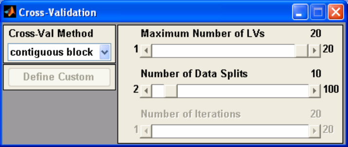
144
We must also decide how to select the test sets for each repetition of the cross-validation
procedure. One possibility would be to form each test set using every 10th sample in the
data set. However, when dealing with data from a dynamic system (where the samples in
the data matrix correspond to sequential points in time), this can be rather dangerous,
because it is often the case that noise in such a system is not random with time; the
variation due to noise on the nth sample is correlated to the noise on the n+1th sample.
Thus, if the cross-validation test sets were chosen using every 10th sample, noise in the
test data might be highly correlated with noise in the training data, which would “bias”
the cross-validation results towards suggesting the retention of PCs that explain only
noise (i.e., overfitting). Instead, when dealing with time series data produced by a
dynamic system, it is better to choose contiguous blocks of data for the test sets, where
the length of the block is longer than the settling time of the process. In our case, it is
convenient to use ten “block-wise” training sets of about thirty samples each. With these
cross-validation settings, the first test set will contain samples 1 to 30, the second will
contain samples 31 to 60, and so on.
The Analysis GUI in PLS_Toolbox can be used to perform cross-validation and build
PCR (and PLS) models. Start the tool by typing pcr at the MATLAB prompt, which will
start the Analysis GUI in the PCR mode. The data can be loaded into the tool by
selecting File/Load Data/Both in the main Analysis window. The user will be prompted
for X-block (predictor) and Y-block (predicted) variables. Here we will use the DataSet
Objects x and y, created previously.
Now that the data are loaded, we need to decide how to preprocess the data for modeling.
Because the response (temperature) variables with the greatest variance in this data set
also appear to be correlated to the molten glass level, we’ll choose to mean-center (rather
than autoscale) the data by selecting Preprocess/X-block/Mean Center in the main
Analysis window. (Note that the scaling for Y is irrelevant if there is only one Y variable,
as is the case here.) If desired, a preliminary model can now be built by clicking the
Calculate button.
Figure 6-4. Cross-validation window.
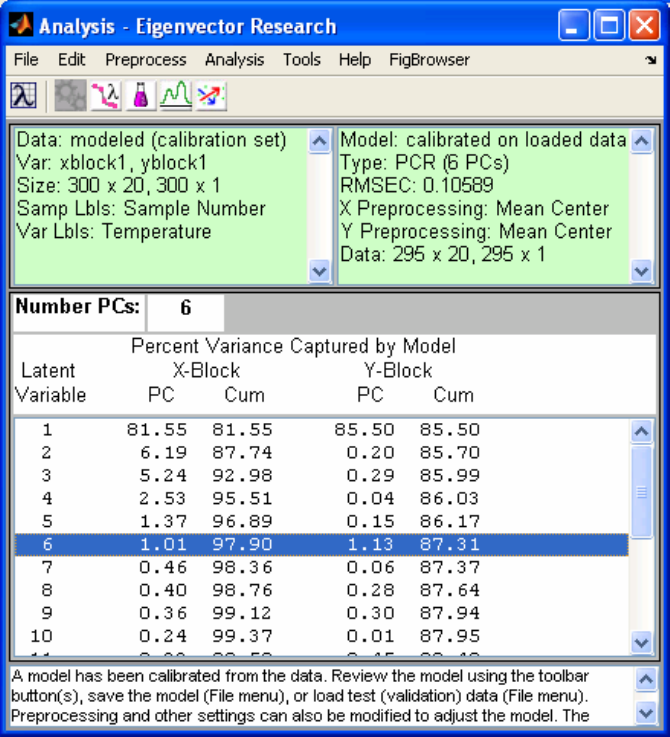
145
We must now decide how to cross-validate the model. Select Tools/Cross-Validation
from the menu to open an additional window where the cross-validation parameters can
be set, as shown in Figure 6-4. Here we will choose to split the data into ten contiguous
block-wise subsets, and to calculate all twenty PCs. Once this selection is made, the user
can close the cross-validation window, go back to the main Analysis window and press
Calculate to cross-validate the model. The variance captured by the PCR model of the
temperature/level data then appears in the main Analysis window (Figure 6-5).
Figure 6-5. Analysis GUI with PCR model.
Now that the PCR model and the cross-validation results have been computed, one can
view the cross-validation results by clicking on the Plot Eigenvalues/RMSECV button.
This action brings up a Plot Controls window, which can be used to set up and
manipulate all plots that involve general model statistics. A common plot that is used to
analyze cross-validation results is called the “Predicted Residual Error Sum of Squares”
(or PRESS) plot, shown in Figure 6-6. This plot can be obtained by selecting Principal
Component Number for X: and RMSECV for Y: in the Plot Controls window. The
Root Mean Square Error of Cross-validation (RMSECV) is a “composite” prediction
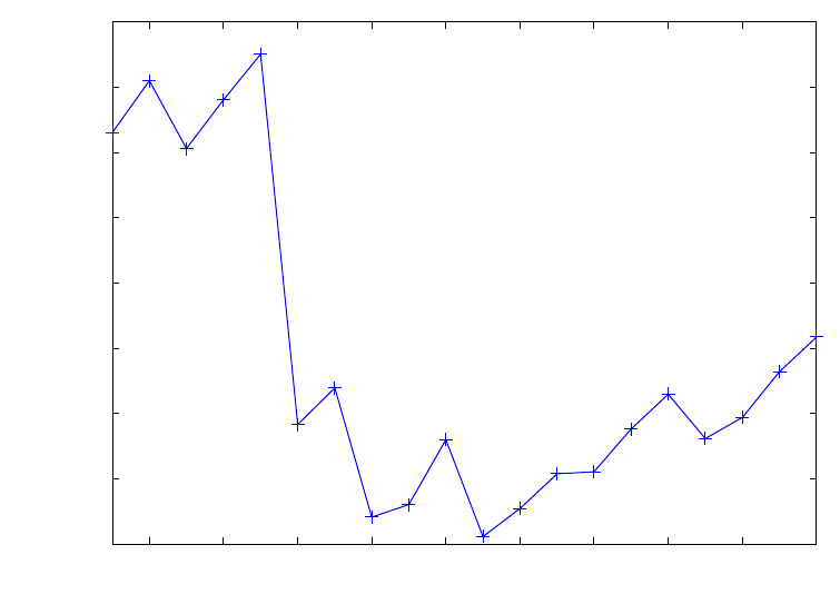
146
error obtained over all repetitions of the cross-validation procedure. Note how the
RMSECV has several local minima and a global minimum at eleven PCs.
The choice of the number of factors to retain in the PCR model can be somewhat
problematic under these conditions. Reasonable choices would include six, eight, or
eleven PCs, as these all produce low RMSECV values. A good rule of thumb is to not
include additional factors unless they improve the RMSECV by at least 2%. Thus, we
would definitely choose eight PCs over eleven PCs since the reduction in RMSECV from
eight to eleven PCs is very small. Our choice is now between six and eight PCs. At this
point, it might help to consider the percent X and Y variance captured in the PCR model
(in the main Analysis window) for making a final determination. Note that PCs 7 and
higher capture less than 0.5% of the variance in both the predictor (X) variables and the
predicted (Y) variable. A second good rule of thumb is that, when building predictive
models, one should strive to use a model with the lowest possible complexity. In this
context, complexity refers to the number of PCs in the PCR model. Given this situation,
where a model with six PCs and a model with eight PCs capture essentially the same
amount of both X and Y variance, this rule suggests that a model with six PCs would be
the best choice. Thus, we choose six PCs for construction of the final model using all 295
training samples. This is done by clicking on the sixth line of the variance captured table
in the Analysis window and then clicking the Calculate button, which will update the
PCR model to include six PCs. Scores and loadings for PCs 1 through 6 can be viewed
using the toolbar buttons across the top of the main window, along with scores versus
actual and fitted y values.
2 4 6 8 10 12 14 16 18 20
0.109
0.11
0.111
0.112
0.113
0.114
0.115
0.116
0.117
Principal Component Number
RMSECV Level
Figure 6-6. PCR RMSECV for melter data example.

147
The model can be saved by selecting File/Save Model, which opens a Save Model
dialog box, and entering a name. Note that the default is to save the model to the
MATLAB workspace. Any model saved to the workspace will be lost whenever the
workspace is cleared; for example, when MATLAB is shut down. Alternatively, the
model can be saved directly to a file by clicking the To File button on the lower left of
the Save Model dialog box. This action would prompt the user to input both a file name
(for the .mat file that will be saved) and a name for the model structure that will reside in
that .mat file.
Returning to the RMSECV plot for the final PCR model (Figure 6-6), note that some PCs
in the final model (specifically, PCs 2, 4 and 5) actually result in an increase in the
model’s estimated prediction error. This result suggests that these specific PCs, although
they help explain variation in the X variables (temperatures), are not relevant for
prediction of the molten glass level. In the next section, we will look at a technique that
will help us avoid these irrelevant factors.
Partial Least Squares
Partial Least Squares (PLS) regression (Wold et al., 1984; Geladi and Kowalski, 1986;
Lorber et al., 1987; Martens and Næs, 1989; Höskuldsson, 1996) is related to both PCR
and MLR, and can be thought of as occupying a middle ground between them. PCR finds
factors that capture the greatest amount of variance in the predictor (X) variables (e.g.,
spectra or the temperatures in the previous example). MLR seeks to find a single factor
that best correlates predictor (X) variables with predicted (Y) variables (e.g.,
concentrations or level). PLS attempts to find factors which both capture variance and
achieve correlation. We commonly say that PLS attempts to maximize covariance, and
this is the explicit objective of the SIMPLS algorithm for PLS.
There are several ways to calculate PLS model parameters (see, for example, de Jong,
1993). Perhaps the most intuitive method is known as NIPALS (Non-Iterative PArtial
Least Squares). NIPALS calculates scores T and loadings P (similar to those used in
PCR), and an additional set of vectors known as weights, W (with the same
dimensionality as the loadings P). The addition of weights in PLS is required to maintain
orthogonal scores.
Both the NIPALS and SIMPLS algorithms for PLS also work when there is more than
one predicted variable (Y). In such cases of multiple Y-variables, scores U and loadings
Q matrices are also calculated for the Y-block. A vector of “inner-relationship”
coefficients, b, which relate the X- and Y-block scores, must also be calculated.
Using NIPALS, the scores, weights, loadings and inner-coefficients are calculated
sequentially. The PLS decomposition is started by selecting one column of Y, yj, as the
starting estimate for u1. Usually the column of Y with the greatest variance is chosen. Of
course, in the case of univariate y, u1 = y. Starting in the X data block:
w1 = XTu1
||XTu1|| (6-9)

148
t1 = Xw1 (6-10)
In the y data block:
q1 = YTt1
||YTt1|| (6-11)
u1 = Yq1 (6-12)
Convergence is then checked by comparing t1 in Equation 6-10 with the value from the
previous iteration. If they are equal within rounding error, the algorithm proceeds to
Equation 6-13 below. If they are not, the algorithm returns to Equation 6-9, using the u1
obtained previously from Equation 6-12. If the Y-block is univariate, Equations 6-11 and
6-12 can be omitted, q1 can be set to 1, and no iteration is required.
The X data block loadings are then calculated, and the scores and weights are rescaled
accordingly:
p1 = XTt1
||t1
Tt1|| (6-13)
p1new = p1ol
d
||p1ol
d
|| (6-14)
t1new = t1old ||p1old|| (6-15)
w1new = w1old ||p1old|| (6-16)
The regression coefficient (b) for the inner relation is then calculated:
b1 = u1
Tt1
t1
Tt1 (6-17)
After the scores and loadings have been calculated for the first factor (which is
commonly called a Latent Variable in PLS), the X- and Y-block residuals are calculated
as follows:
E1 = X - t1p1T (6-18)
F1 = Y - b1t1q1T (6-19)
The entire procedure is now repeated for the next latent variable, starting with Equation
6-9. However, X and Y in Equations 6-9 through 6-12 are replaced with their residuals
E1 and F1, respectively, and all subscripts are incremented by one.
149
It can be shown that PLS forms the matrix inverse defined by:
X+ = W(PTW)-1(TTT)-1TT (6-20)
where the W, P, and T are as calculated above. Compare this expression for the
pseudoinverse of the response data matrix, X+, to the equivalent expressions for MLR
and PCR, in Equations 6-7 and 6-8, respectively. Also, note that the scores and loadings
calculated in PLS are not the same as those calculated in PCA and PCR. They can be
thought of, however, as PCA scores and loadings that have been rotated in a manner that
makes them more relevant for predicting y. As in PCR, the PLS model converges to the
MLR solution if the maximum possible number of latent variables is retained in the
model.
Alternatively, it can be shown that the first PLS weight vector is given by the eigenvector
of XTYYTX that is associated with the largest eigenvalue; i.e.,
λw1 = XTYYTXw1 (6-21)
Based on this equation, another algorithm for calculating PLS models, called SIMPLS,
was developed by Sijmen de Jong (1993). This method relies on orthogonalization of a
Krylof sequence to calculate the PLS weights, which is very non-intuitive but very fast
and accurate. SIMPLS gives the exact same result as NIPALS PLS for univariate y, but a
slightly different solution for multivariate Y. There is some evidence that this solution is
actually slightly superior to the NIPALS PLS solution because it maximizes the
covariance criterion, whereas NIPALS does not. Primarily because of its speed, SIMPLS
is the default PLS algorithm used in PLS_Toolbox. However, NIPALS is available as an
option. For more on SIMPLS-related algorithms, see de Jong, Wise and Ricker (2001).
If the PLS algorithm appears intimidating, do not despair. The important thing to
remember is that PLS attempts to find factors (called Latent Variables) that maximize the
amount of variation explained in X that is relevant for predicting Y. This is in contrast to
PCR, where the factors (called Principal Components) are selected solely based on the
amount of variation that they explain in X.
Because of the unique relationship between weights and loadings in a PLS model, the
calculation of scores for new data does not simply involve a projection onto the loadings,
as it does with PCR or PCA (i.e., Tnew= XnewP) . Given new data, Xnew, the scores for
these new samples are instead calculated using:
Tnew= XnewW(PTW)-1 (6-22)
Like PCR and MLR, prediction of the y-values for new data is accomplished using
Equation 6-5.
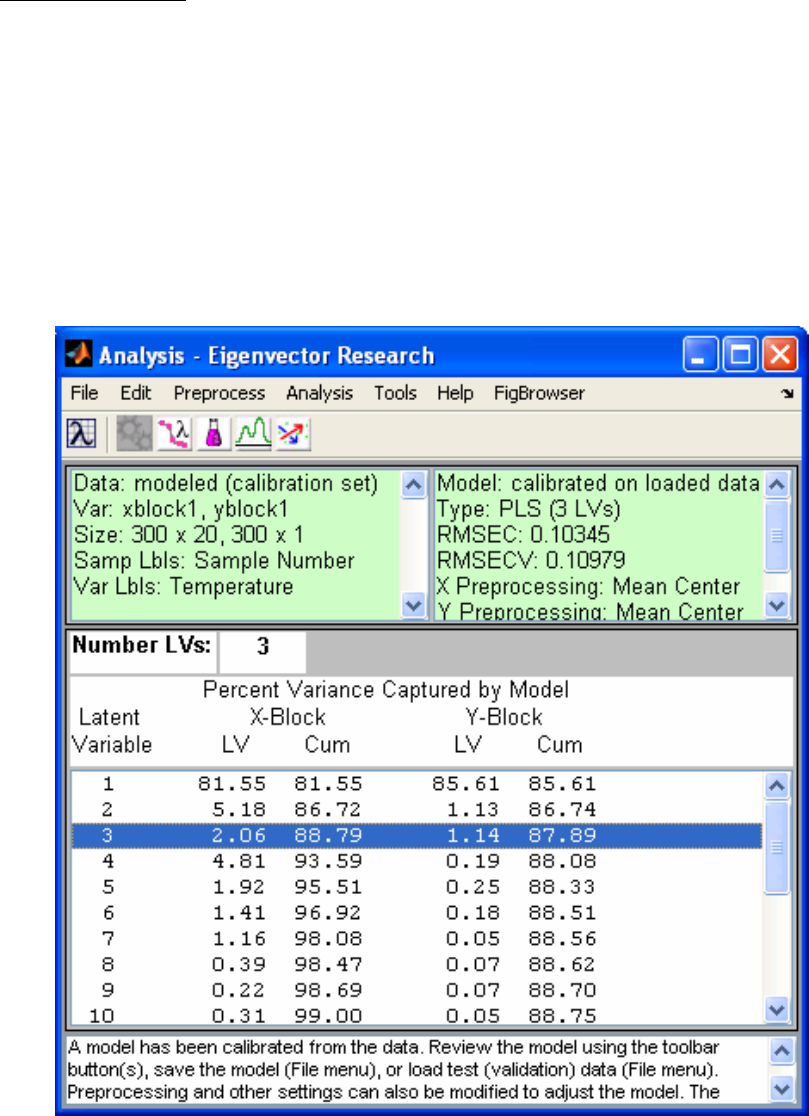
150
Application of PLS
PLS can be applied to our example problem of developing a model that relates the SFCM
temperatures to the molten glass level. As before, we will divide the 295 samples
available for training ten times, leaving a contiguous block of about thirty samples out
each time. Once again, the cross-validation can be done with the Analysis GUI by
selecting PLS in the Analysis menu of the main Analysis window. By default,
PLS_Toolbox uses SIMPLS algorithm for PLS. However, the NIPALS algorithm can be
performed from the command line, or specified for use in the Analysis window by going
to Edit/Options in the Analysis window menu when “PLS” is specified under the
“Analysis” menu. The interface is shown in Figure 6-7, including the variance captured
table.
Figure 6-7. Analysis window showing PLS model.
Figure 6-8 shows the RMSECV versus number of LVs for the PLS model. Note how the
RMSECV goes through an obvious minimum at four LVs, as opposed to the eleven PCs
151
used in the PCR model (Figure 6-6). This is typical of the behavior of PLS relative to
PCR. Because PLS attempts to find factors that describe variance (like PCR) and achieve
correlation (like MLR), PLS models tend to “converge” to the MLR solution faster than
PCR models. For the same number of factors, they also tend to capture more of the
relevant information in X (i.e., the variance which is predictive of Y), which results in
minimum RMSECV at a smaller number of factors.
Recalling our two rules of thumb with regard to selecting the optimal number of factors
(namely, to only choose additional factors when the RMSECV improves by at least 2%,
and to choose as few factors as possible), a three-LV PLS model makes a good final
choice. This choice is also supported by the variance captured in Y as shown in Figure 6-
7. The user can select three LVs for the model by clicking on the third line of the
variance captured table, and then clicking the Calculate button.
As mentioned above, there are often factors in PCR models which do not contribute
positively to the predictive ability of the model (e.g., factors 2, 4, and 5 in our PCR
example; see Figure 6-6). This happens in PCR because the factors (the PCs) are chosen
without consideration of how they relate to the predicted variable. This happens much
less frequently in PLS because the factors (the latent variables) are chosen with regard to
how correlated the factor scores are to the predicted variable.
One could form an “altered” PCR model by leaving out these seemingly irrelevant
factors. The technique of Correlation PCR does this by re-ordering the factors in order of
Y-block variance captured. Most research results, however, have not shown convincingly
that this is a good thing to do. Although reordering the factors allows selection of only
those which provide the most significant Y-block information, it rarely provides a model
which does as well as a PLS model. In fact, Correlation PCR will only do better when the
Y-block measurements contain a significant amount of noise or other errors which
"distract" the PLS algorithm. Interestingly, under these conditions it is also virtually
impossible to prove that Correlation PCR is doing better.
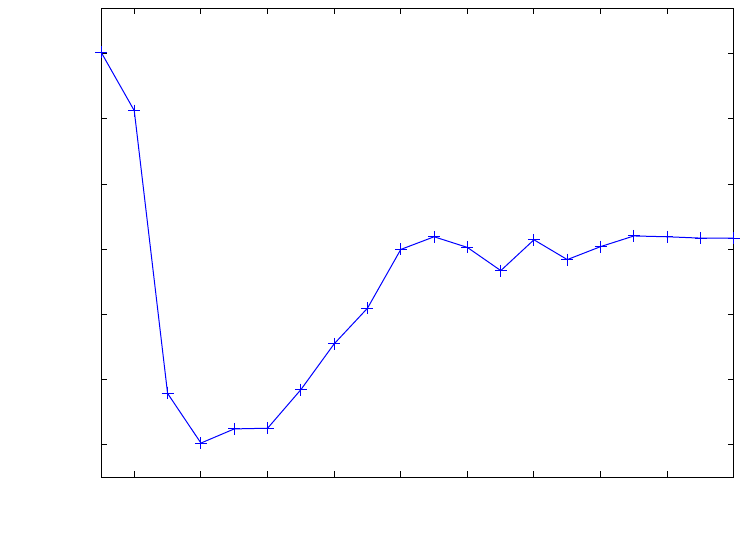
152
2 4 6 8 10 12 14 16 18 20
0.109
0.11
0.111
0.112
0.113
0.114
0.115
Latent Variable Number
RMSECV Level
Figure 6-8. RMSECV for PLS on SFCM data.
We can compare the regression vectors calculated by PLS and PCR (not Correlation
PCR) with the regression vector calculated by MLR, as shown in Figure 6-9. (In the
model structure that is saved via the File/Save Model command in the Analysis window,
the regression vectors are stored in the model.reg field.) It can be seen that the MLR
regression coefficients vary considerably from variable to variable, switching from
positive to negative and back several times. This “ringing” in the coefficients is typical of
models produced by MLR when the problem is ill-conditioned due to the covariance of
the data. Note how the PLS and PCR models have coefficients that are muchsmoother. In
fact, the PLS and PCR models make more sense from a physical standpoint. Because of
the close physical proximity of the temperature sensors in this system, we would expect
adjacent sensors to respond similarly, and therefore would not expect the relationships
between adjacent sensors and the level to be opposite of one another, as the MLR model
coefficients suggest. Also, prior engineering knowledge of the SFCM system predicts
that the molten glass level changes should have the largest effect on variables 6–8 and
16–18. These variables have the largest coefficients in the PLS and PCR models, which
makes good physical sense. In contrast, the largest coefficients in the MLR model are
where the PLS and PCR coefficients are very close to zero. These results suggest that the
MLR model might be overfit, in that it is attempting to explain noise in the temperature
data that is coincidentally correlated to the level.
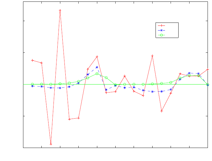
153
0 2 4 6 8 10 12 14 16 18 20
−0.01
−0.005
0
0.005
0.01
Variable Number
Regression Coefficient
MLR
PCR
PLS
Figure 6-9. Regression coefficients in MLR, PCR, and PLS models of SFCM data.
Ridge Regression
Ridge regression (RR), essentially a modification of the MLR method, is another
technique for dealing with ill-conditioned data. Ridge regression gets its name because a
constant is added to the “ridge” of the covariance matrix in the process of forming the
pseudoinverse:
X
+ = (XTX + IΘ)-1 XT (6-23)
Note the difference between this expression of the pseudoinverse and that of the MLR
method in Equation 6-7. The addition of the constant Θ to the ridge has the effect of
making a potentially ill-conditioned covariance matrix (XTX) “look” more like the
identity matrix, which is a perfectly-conditioned matrix. As a result, this addition
stabilizes the values of the coefficients determined from the regression. It also has the
effect of shrinking the coefficients (i.e., decreasing their magnitude). It has been shown
(Draper and Smith, 1981) that the regression vector calculated from ridge regression is
the least squares solution subject to the constraint that the vector is confined to a sphere
centered around the origin. Thus, in some sense, RR assumes that the regression
coefficients are more likely to be small (near zero) than large. Note that it is also possible
to impose a non-spherical constraint on the regression vector by using a specific diagonal
matrix instead of the identity matrix in Equation 6-23. This is often useful when one
knows that certain coefficients are more likely to be close to zero than others.

154
Ridge regression is also used quite often when one is concerned with the values of the
regression coefficients themselves, rather than in prediction. If one can derive needed
information from the coefficients themselves, RR can be an appropriate choice.
The trick in ridge regression is to determine the optimum value of Θ for developing a
predictive model. A common statistical method was outlined by Hoerl et al. (1975). It is
also possible to determine the optimum value through cross-validation.
Application of Ridge Regression
As an example of the use of ridge regression, we will now revisit the SFCM data used in
the examples of PCR and PLS. We will use the PLS_Toolbox functions ridge, which
uses the method of Hoerl and Kennard, and ridgecv, which uses cross-validation to
develop RR models. We will consider values of the ridge constant (Θ) from 0 to 0.015 at
thirty-one different levels, so that we can see the effect of Θ on the coefficients. For
cross-validation, we will split the data ten ways (please see the function help files or the
reference manual for input/output specifications).
» [brr1,theta1] = ridge(mx,my,0.015,31);
» [brr2,theta2,cumpress] = ridgecv(mx,my,0.015,31,10);
The regression coefficients are shown as a function of the ridge parameter in Figure 6-10.
Note how the values shrink as the value of Θ is increased. The value of the ridge
parameter using the method of Hoerl and Kennard is 0.0074, while the value determined
using the cross-validation procedure outlined above is 0.0073. The regression coefficients
are compared with those determined from MLR in Figure 6-11. Note how the regression
coefficients have been shrunk in RR as compared to MLR, but are still quite similar to
the MLR solution, in a qualitative sense.
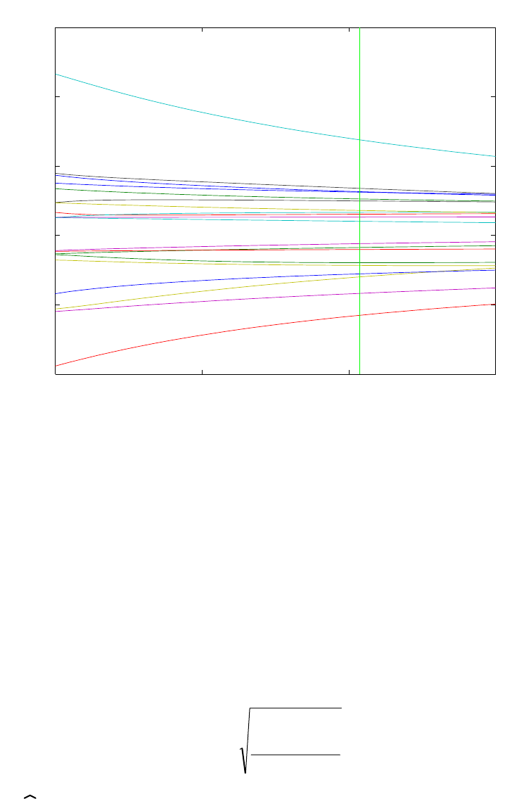
155
0 0.005 0.01 0.01
5
−0.01
−0.005
0
0.005
0.01
0.015
Values of Regression Coefficients as a Function of theta
Value of theta
Regression Coefficients
1
2
3
4
5
6
7
8
9
10
11
12
13
14
15
16
17
18
19
20
Vertical line shows
best guess for theta
theta = 0.0103655
Figure 6-10.Value of the regression coefficients as a function of Θ for SFCM data.
Comparison of Regression Models on SFCM Example
Of course, in the SFCM example, the real reason for forming the regression models is to
make predictions of the SFCM level given the temperatures in the event of a failure of the
level instrument, or to provide a redundant check on the performance of the instrument.
Thus, the best test of the models is their ability to predict the level given new temperature
measurements.
Before comparing the predictive ability of the models, it is useful to review several
quality measures. In all of the measures considered, we are attempting to estimate the
average deviation of the model from the data. The root-mean-square error of calibration
(RMSEC) tells us about the fit of the model to the calibration data. It is defined as:
n
)yy
ˆ
(
RMSEC
n
1i
2
ii
∑
=
−
= (6-24)
where the
y
i are the values of the predicted variable when all samples are included in the
model formation and n is the number of calibration samples. RMSEC is a measure of
how well the model fits the data.

156
0 2 4 6 8 10 12 14 16 18 20
−0.01
−0.005
0
0.005
0.01
Variable Number
Regression Coefficient
MLR
RR
Figure 6-11. Regression coefficients in MLR and RR models of SFCM data.
This is in contrast to the previously mentioned root-mean-square error of cross-validation
(RMSECV) which is a measure of a model’s ability to predict samples that were not used
to build the model. The RMSECV can also be defined using Equation 6-24, where the
y
i
corresponds to predictions for samples that were not included in the model formulation.
Another measure that was mentioned in the cross-validation discussion, the Predicted
Residual Error Sum of Squares (or PRESS), is related to the RMSECV as follows:
RMSECVk = PRESSk
n (6-25)
where k refers to the number of factors (PCs, LVs) used in the model, and n is the
number of calibration samples. PRESSk is the sum of squared prediction errors for the
model which includes k factors. Of course, the exact value of RMSECV depends not only
on k, but on how the cross-validation test sets were formed. It is also common to calculate
PRESS, and thus RMSECV, for a “leave one out” cross-validation (i.e., where each
sample is left out of the model formulation and predicted once).
The RMSECV and PRESS measures typically refer to cross-validation experiments,
where the existing calibration data set is split into different training and test sets in an
effort to assess how a model built using all of the calibration data would perform when
applied to new data. Alternatively, one could designate a completely independent
prediction set of samples that have known Y values, so that such an assessment can be
done directly, In this case, one can calculate a root-mean-square error of prediction
(RMSEP) when the model is applied to new data. RMSEP is calculated exactly as in

157
Equation 6-24, except that the estimates
y
i refer to samples in the independent prediction
set, which were not involved in either model building or cross-validation.
The MLR, PCR, PLS, and RR models developed for the SFCM example can now be
compared using the measures just introduced. Predictions can be made in the Analysis
window by loading new X-block data, then clicking Calculate. The predictions can be
saved to the workspace (or to a file) by selecting File/Save Prediction. This information
is summarized in Table 6-1. An independent data set of 200 samples not used for model
building was used for the calculation of RMSEP.
Table 6-1. Comparison of RMSEC, RMSECV and RMSEP on MLR, PCR, PLS and RR
models of SFCM temperature and level data.
MLR PCR PLS RR
RMSEC 0.0991 0.1059 0.1034 0.0996
RMSECV 0.1122 0.1108 0.1098 0.1122
RMSEP 0.1496 0.1366 0.1396 0.1471
Note how the MLR model shows the smallest value for RMSEC, the error of calibration.
This indicates that, as expected, the MLR model fits the data best. Note, however, from
the RMSECV that the MLR does not predict the best, even for samples within the
original calibration data. The PLS model produces the lowest cross-validation error
(RMSECV). For the prediction on new samples, the PCR model outperforms the other
models, with PLS a close second. In practice, PCR and PLS generally have similar
performance; the main advantage of PLS is often computational speed. In addition, PLS
models generally require fewer factors than PCR models for the same set of data (see
next section), which has advantages in both model implementation and model
interpretation.
It should be evident from the comparison of models that fit and prediction are entirely
different aspects of a model’s performance. If prediction is the goal, a model should be
built with this criterion in mind. The calculation of PRESS from a cross-validation
procedure is one way to measure a model’s predictive ability.
Detecting and Dealing with Outliers
Recall that in the previous examples where we used MLR, PCR, PLS and RR to model
the SFCM data, we started by removing outliers from the data. We’ll now re-work the
problem from the beginning, with all of the data included. Load the plsdata.mat file
and start Analysis preset to PLS by typing pls at the prompt. Load the xblock1 and
yblock1 DataSet Objects into the Analysis window. Select mean-centering for the X-
block by selecting Preprocess/X-block/Mean Center. Calculate a preliminary model by
pressing Calculate. Select 3 LVs by clicking the 3rd line of the variance captured table,
and then click Calculate. The Analysis interface should now match the one shown in
Figure 6-12.
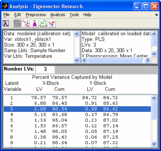
158
Click the Scores button and use the Plot Controls window to make a plot of the Scores
on LV 2 versus Scores on LV 1. Add axis lines with the Plot Controls window
View/Axis Lines/All menu. Add 95% confidence limits by checking the box in the Plot
Controls window. The resulting scores plot should look like Figure 6-13. This scores
plot is the first indication that there may be unusual samples in the data. We can find out
more about the sample in the upper left of this scores plot by clicking info in the Plot
Controls window and then clicking on the point in the plot. Information about the sample
that corresponds to that point comes up in a separate window, as shown in Figure 6-14.
Figure 6-12. Analysis window showing PLS model of SFCM data.
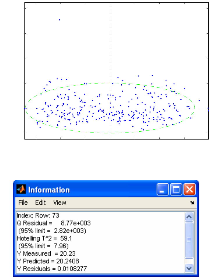
159
−150 −100 −50 0 50 100 150
−50
0
50
100
150
200
Scores on LV 1 (79.57%)
Scores on LV 2 (6.88%)
Figure 6-13. Scores plot from SFCM data with outliers included.
Figure 6-14. Information window for sample 73.
The information window indicates that Sample 73 is indeed unusual, with very large Q
Residual and T2 values compared to the 95% limits. Thus, plots of all the available PLS
scores, as well as plots of the sample-wise Hotelling T2 and Q Residual statistics, can be
quite useful for detecting samples that are unusual due to “extreme” values in their X
data. Similarly, plots of the available PLS loadings, and variable-wise T2 and Q statistics
(obtained by clicking on the Loadings button on the Analysis window) can be useful for
determining unusual X-variables.
In PLS (and PCR) regression, one can also look for sample outliers in the predicted (Y)
data, using the Y Studentized Residual versus Leverage plot, which can be made by
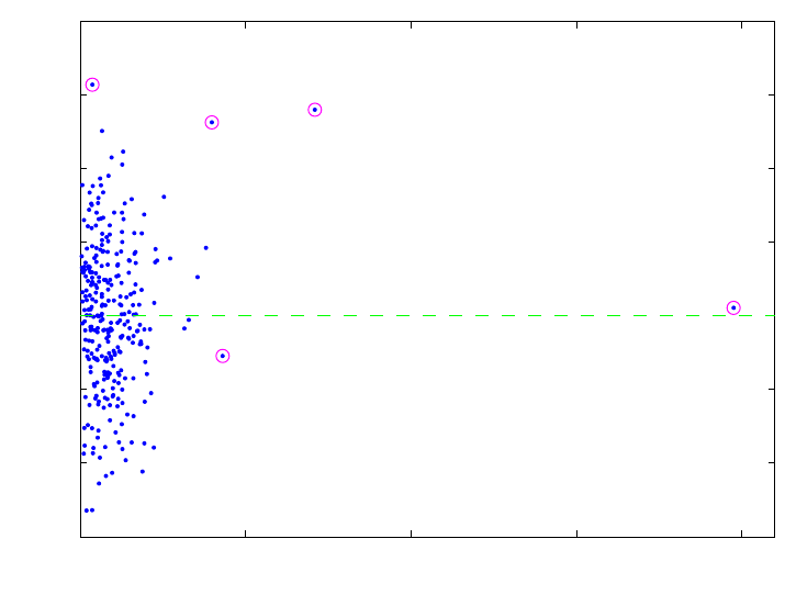
160
selecting the proper options in the Plot Controls window. In the example, this plot
should look like Figure 6-15. Note that, in this plot, the samples that were excluded from
the original analyses of these data are highlighted, which indicates that they have been
selected. In order to select samples, first click on the Select button on the Plot Controls
window, then use the rubber band box on the figure to select them. Multiple selections
can be made by holding down the shift key.
0 0.05 0.1 0.15 0.2
−3
−2
−1
0
1
2
3
4
Leverage
Y Stdnt Residual 1 Level
1
2
3
4
5
6 7
8
9
10
11
12
13
14
15
16
17
18
19
20
21
22
23
24
25
26
27
28 29
30
31
32
33
34
35
36
37
38
39
40
41
42
43
44
45
46
47
48
49
50 51
52
53
54
55
56
57
58
59
60
61
62
63
64
65 66
67
68
69
70
71
72
73
74
75
76
77
78
79
80
81
82 83
84
85
86
87
88
89
90
91
92
93 94
95
96
97
98 99 100
101
102
103
104
105
106
107
108
109
110
111
112
113
114
115
116
117
118
119
120
121
122
123
124
125
126
127
128
129
130
131 132
133
134
135
136
137
138
139
140
141
142
143
144
145
146
147
148 149
150
151
152
153
154
155
156 157
158
159
160
161
162
163
164 165
166
167
168
169
170
171
172
173
174
175
176
177
178
179
180
181
182
183
184
185
186
187
188
189
190
191
192
193
194
195
196
197
198
199
200
201
202
203
204
205
206
207
208
209
210
211
212
213
214
215
216
217
218
219
220
221
222
223
224
225
226
227
228
229
230
231
232
233
234
235
236
237
238
239
240
241
242
243
244
245
246
247
248
249
250
251
252
253
254
255
256
257
258
259
260
261
262
263
264
265
266
267
268
269
270
271
272
273
274
275
276
277
278
279
280
281
282
283
284
285
286
287
288
289
290
291
292
293
294
295
296
297
298
299
300
Figure 6-15. Studentized residuals versus leverage for SFCM data.
Leverage defines the influence that a given sample will have on a model, and is related to
the Hotelling T2 value. The studentized residual is an indication of the lack of fit of the y-
value of a sample. To “studentize” something means to make it mean zero and unit
variance. Thus, the X-axis scale on Figure 6-15 can be interpreted as the number of
standard deviations of error in a sample’s y-value. The upper-most sample, number 167,
has an error with a standard deviation of greater than 3, which is quite large. This
suggests that the “known” y-value associated with this sample may be in error, as there is
no other indication that this sample is unusual (see, for instance, where this sample falls
on a plot of Q versus T2).
The right-most sample, number 73, has a very high leverage, but a very low studentized
Y Residual . Although this sample has a rather unique profile of temperature readings (X-
values), when compared to all the other samples, the PLS model is still able to
sufficiently predict its level (Y-value). In general, samples with very high leverage also
tend to have very low calibration residuals, because they have influenced the model so
greatly.
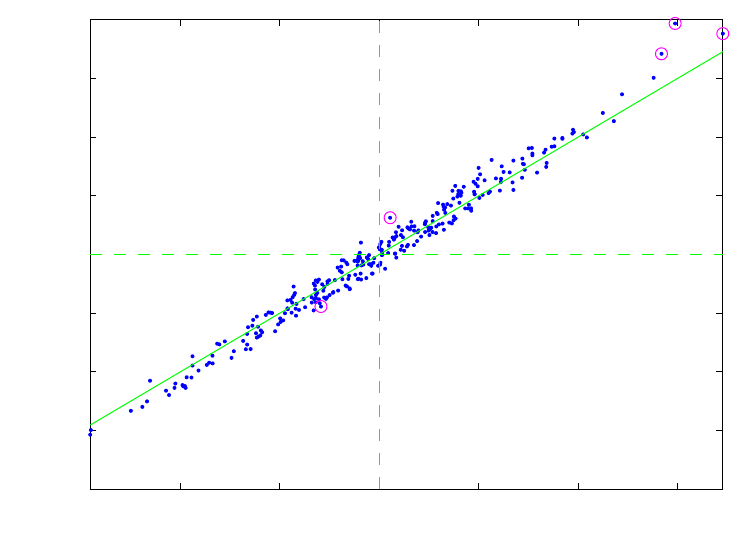
161
The most unusual sample in this data set is probably number 278, as it has both a very
high leverage and a high residual. This suggests that the sample could have a lot of “bad”
influence on the model, due to both its very unique temperature readings (X-values) and
the relative inability of the PLS model to predict its level (Y-value). This can be checked
by making a plot of Y CV Residual versus Y Residual using the Plot Controls window.
The result is shown in Figure 6-16, where a line of slope 1 has been added by executing
dp at the command line. Sample 278 is the uppermost sample on the plot, and is also the
sample with the greatest deviation from the line. Not only does this sample have one of
the largest Y-residuals (distance of the point from the origin in this plot), but it also has
the largest difference between its calibration residual (where it is included in the model
formation) and its cross-validation residual (where it is not included in the model
formation). This result further suggests that this sample does not “fit” well with the rest
of the data, with respect to both its X-data and its Y-data. Note that it is normal for points
on this plot to have a slope slightly greater than 1, as samples generally have a smaller
calibration residual than cross-validation residual.
−0.2 −0.1 0 0.1 0.2 0.3
−0.4
−0.3
−0.2
−0.1
0
0.1
0.2
0.3
0.4
Y Residual 1 Level
Y CV Residual 1 Level
Figure 6-16. Cross-validated Y residual versus Y calibration residual.
Now that we have identified a number of unusual samples, the question becomes: what
do we do with them? In this example, the answer is fairly obvious, because we have
plenty of normal samples and the unusual samples appear to be the result of either
abnormal conditions in the SFCM or errors in the reference (level) values. This suggests
that we can delete the samples with little fear that, in doing so, we will eliminate critical
information from the model. This choice is not always so simple, however. In many
cases, unusual samples represent perfectly normal process states that are merely
underrepresented, and the better choice would be retain these samples, and attempt to

162
collect more samples that are similar to them. Generally, the choice of whether or not to
remove an outlier must be made based not only on the statistics involved but on the
knowledge and experience of the user.
In this case, the model can easily be rebuilt without the suspect samples by selecting
them, as we have already done, then choosing Edit/Exclude Selection in the Plot
Controls window when the Scores are the active figure. Note that this causes the model
information to disappear from the main Analysis window, because the data it was based
on have been edited. The model can now be rebuilt without the suspect data.
Continuum Regression
PCR, PLS and MLR have all been unified under the single technique Continuum
Regression (CR) (Stone and Brooks, 1990; Wise and Ricker, 1993, de Jong, Wise and
Ricker, 2001). CR is a continuously adjustable technique which encompasses PLS and
includes PCR and MLR at opposite ends of the continuum, as shown in Figure 6-17.
When using CR, cross-validation must be done to determine both the number of factors
and the technique within the continuum that produces the optimum model (i.e., the model
that predicts most accurately when used with new data).
Figure 6-17. Relationship between PCR, PLS, MLR and CR.
There are several interesting implementations of CR. Here we will consider a method that
is fairly easily understood, though not particularly efficient. The first step in the CR
method is to perform a singular value decomposition (SVD) on the matrix of predictor
variables X (m by n)
X = U S VT (6-26)
where U (m by m) and V (n by n) are orthonormal matrices and S (m by n) is diagonal
(i.e., zero everywhere except on the matrix diagonal). The elements of S are known as the
singular values, and are placed in S in descending order (i.e., s11 ≥ s22 ≥ s33 and so on).
The SVD is closely related to PCA. In fact, the eigenvectors or loadings P are identical to
V, that is:
V = P (6-27)
PCR
α
= ∞
MLR
α
= 0
PLS
α= 1
Continuum Re
g
ression
163
The relation between the PCA scores T and the SVD model parameters U and S is
U S = T (6-28)
In fact, the PCA model proposed in Equation 5-2 can be written as
X = TkPkT + E = UkSkVkT + E (6-29)
The next step in CR is to form the matrix Sα by taking each of the singular values to the
desired power, α. The new X block, defined as Xα, is then formed as follows:
Xα = U Sα VT (6-30)
The PLS algorithm described earlier can now be used along with the matrix inverse
defined by Equation 6-20 to produce a regression vector, r, for any number of latent
variables desired. That is
r = W(PTW)-1(TTT)-1TTy (6-31)
The regression vector obtained is not properly scaled because of the re-scaled X block.
Any regression vector, r, can be re-scaled, however, by projecting it onto the SVD basis
set V and multiplying by the ratios of the singular values used in Equation 6-19 to the
original singular values calculated in Equation 6-26. Thus:
rscl = r V Sscl VT (6-32)
where
Sscl = Sα ./ S (6-33)
where the symbol “./” indicates term-by-term division of the non-zero elements of the
singular value matrices.
The continuum regression algorithm converges, mathematically at least, to the PCR
solution for large α and to MLR for α = 0. In practice, there are some numerical
difficulties encountered when taking the singular values to high powers. The CR
algorithms included in PLS_Toolbox are typically stable up to a power of ~8, depending
upon the problem. However, at this power, the solution has essentially converged to the
PCR solution and obtaining a solution for higher powers is of little use.
The CR algorithm described above can be understood in terms of “stretching” the space
of the predictor variables. When the singular values are taken to a power greater than 1,
the resulting matrix Xα is stretched relative to X in such a way the directions of greatest
variance in X have even greater relative variance in Xα; that is, the rich get richer and the
poor get poorer. Because PLS attempts to capture variance along with correlation,
making the X matrix more “directional” causes the PLS algorithm to produce latent
variables that are more closely aligned with the principal components of the original X.
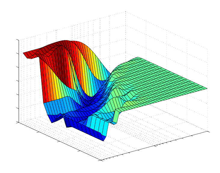
164
As the power m goes to 0, Xα becomes less directional, with all directions coming closer
to having equal variance. With no “preferred” direction for capturing variance, the PLS
algorithm will capture correlation only, producing the MLR solution.
The application of CR to the SFCM temperature and level data will serve as our example.
Cross-validation was used to find the optimal model within the CR parameter space. The
powers investigated spanned the range of 0.25 to 4. The crcvrnd function was used to
cross-validate using a 10-way split of the data, a single iteration, and twenty latent
variables as follows (please see reference section for explanation of input/output syntax):
» powers = 10.^[-1:.05:1];
» [press,fiterr,minlvp,b] = crcvrnd(mx,my,10,1,20,powers,1);
The resulting PRESS surface is plotted in Figure 6-18. Inspection of this PRESS surface
would probably lead one to select the PLS model originally chosen. There is a clear area
of good models near the PLS model with four latent variables.
−1
PLS
1
0
5
10
15
20
3.4
3.5
3.6
3.7
3.8
3.9
4
Continuum Parameter
Cumulative PRESS vs. Number of LVs and Power
Number of LVs
PRESS
Figure 6-18. Continuum Regression cross-validation PRESS surface for SFCM data.
We can also look at the CR prediction error surface, which is shown in Figure 6-19. Here
we see that the model with power = 4 and six LVs is a very good model. This model is
nearly equivalent to our PCR model with six PCs. The very best model on the test set was
at a power of 0.595 with two LVs. This model had an RMSEP of 0.1362 compared to
0.1366 for our six-PC PCR model and 0.1396 for our three-LV PLS model. (Although
this difference is probably not statistically significant, it is consistent with experience.)
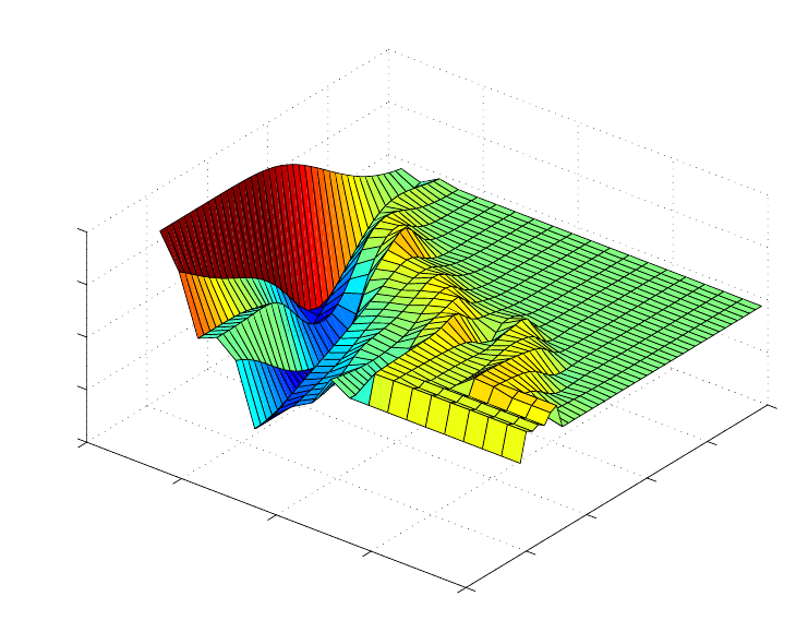
165
Much work remains to be done with CR. The example here exemplifies some of the
problems with selection of a final model. In some instances the selection will be fairly
clear, and often, the best models are found at powers above or below 1. The crcvrnd
function can be used to do repeated cross-validations using different orderings of the data
set. Often this will produce smoother, more interpretable PRESS surfaces. The authors of
PLS_Toolbox would be very interested in hearing about your experience with CR.
0
10
20
30
40
50
0
5
10
15
20
3.5
4
4.5
5
5.5
CR Parameter
Number of LVs
PRESS
Figure 6-19. Continuum Regression prediction PRESS surface for SFCM data.
166
167
7. Advanced Preprocessing
So far, we have dealt with only basic preprocessing of data for use in PCA and
regression, including centering and variance scaling. Often, however, it is useful to do
other types of preprocessing, such as taking derivatives of spectra. Preprocessing is, in
general, the modification of data done before building a model or otherwise analyzing
those data. The purposes of preprocessing are to linearize the response of the variables
and to remove extraneous sources of variation (variance) which are not of interest in the
analysis. Linearization is often important because (1) many modeling methods expect
linear response and, (2) in general, linear responses are easier to model than non-linear
ones. Similarly, interfering sources of variance can cause increased difficulty in
modeling. Interfering variance appears in almost all real data because of systematic errors
present in experiments. This unwanted variance will require the model to work harder
(expend degrees of freedom) to isolate the variance of interest from the interfering
variance.
A variety of preprocessing methods are available in PLS_Toolbox. This chapter describes
some basic information on the methods available to the user both in the Preprocessing
GUI and from the corresponding command line functions. Advanced users are
encouraged to read the help documentation for the command line functions and for the
functions referenced under "See also" therein.
Preprocessing GUI
Many tools in PLS_Toolbox allow for a number of advanced preprocessing techniques to
be used through the preprocess function. This can be accessed from the Analysis
window by selecting Preprocess/X-Block/Custom or Y-Block/Custom, which brings up
the interface shown in Figure 7-1. Techniques may be selected from the list on the left
and moved into the list to execute on the right. Some techniques have adjustable
parameters which can be viewed and modified by selecting the preprocessing step in the
Selected Methods list and clicking on Settings…. The settings for the method will be
displayed in a dialog box. As an example, the Savitzky-Golay derivative preprocessing
settings consist of the window width, polynomial order, and derivative order. In
Autoscale an optional scaling offset can be used to avoid “blowing up” the noise on
variables with very little variance.

168
Figure 7-1. Advanced Preprocessing interface.
It is also important to specify the order in which preprocessing steps are to be done. For
instance, in some pattern recognition problems, it would be natural to normalize the
responses to vectors of unit length, then autoscale the results prior to performing PCA.
The order of preprocessing steps can be changed by selecting a step in the Selected
Methods list and clicking the up or down buttons to change the method's position in the
list. See the discussion below for more information on order in preprocessing.
The preprocess function can also be invoked from the command line as follows:
» s = preprocess;
which will bring up the interface shown in Figure 7-1. After the preprocessing steps are
selected and parameterized, click OK to close the interface. A structure describing the
preprocessing will be stored in s. This structure may be passed to command line calls for
tools such as pca and pls as part of their options structure, allowing for the easy
integration of advanced preprocessing with user-defined scripts.
Notes about Preprocessing Order
Given the wide variety of preprocessing options available and the goals of each, it is of
particular interest to consider the order in which preprocessing is applied. This order is
completely customizable by the user, but there are some basic rules to follow.
In general, it is desirable to perform "row-wise" (sample-based) methods prior to any
"column-wise" (variable-based) methods.

169
A row-wise method is one that acts on each sample one at a time (see, for example,
normalization and derivatization, below). These methods are typically used to remove
unwanted variance from individual samples. The effect on any individual sample is
independent of the other samples in the data.
In contrast, column-wise methods act on variables of the data (see, for example, centering
and scaling). These methods numerically prepare the data for modeling and are thus
usually the last methods applied before modeling. These methods often assume that any
variance in the data is of interest and use and, as such, is important.
During the following discussion, notes will be included with each topic when there is a
deviation or special case in the order that it might be applied.
Noise, Offset, and Baseline Filtering
A variety of methods exist to remove high- or low-frequency interferences (where
frequency is defined as change from variable to variable). These interferences, often
described as noise (high frequency) or background (low frequency) are common in many
measurements but can often be corrected by taking advantage of the relationship between
variables in a data set. In many cases, variables which are "next to" each other in the data
matrix (adjacent columns) are related to each other and contain similar information.
These noise, offset, and baseline filtering methods utilize this relationship to remove
these types of interferences.
Noise, offset, and baseline filtering methods are usually performed fairly early in the
sequence of preprocessing methods. The signal being removed from each sample is
assumed to be only interference and is generally not useful for numerical analyses. One
exception to this is when normalization is also being performed. In these cases, it
sometimes occurs that a background or offset being removed is fairly constant in
response and is, therefore, useful in correcting for scaling errors. For more information,
see the normalization methods described below.
Note that these methods are not relevant when working with variables which do not have
this similarity, such as process variables, genetic markers, or other highly selective or
discrete variables. For such variables, use of multivariate filtering methods (described
later) may be of use for removing interferences.
Smoothing (SavGol)
Smoothing is a low-pass filter used for removing high-frequency noise from samples.
Often used on spectra, this operation is done separately on each row of the data matrix
and acts on adjacent variables. Smoothing assumes that variables which are near to each
other in the data matrix (i.e., adjacent columns) are related to each other and contain
similar information which can be averaged together to reduce noise without significant
loss of the signal of interest.

170
The smoothing implemented in PLS_Toolbox is the Savitzky-Golay (SavGol) algorithm
(Savitzky and Golay, 1964). The algorithm essentially fits individual polynomials to
windows around each point in the spectrum. These polynomials are then used to smooth
the data. The algorithm requires selection of both the size of the window (filter width)
and the order of the polynomial. The larger the window and lower the polynomial order,
the more smoothing that occurs. Typically, the window should be on the order of, or
smaller than, the nominal width of non-noise features.. Note that the same algorithm is
used for derivatives (see below) and can be converted from one into the other by
changing the derivative order setting.
From the command line, this method is performed using the savgol function.
Derivative (SavGol)
Derivatives are a common method used to remove unimportant baseline signal from
samples by taking the derivative of the measured responses with respect to the variable
number (index) or other relevant axis scale (wavelength, wavenumbers, etc.) Derivatives
are a form of high-pass filter and frequency-dependent scaling and are often used when
lower-frequency (i.e., smooth and broad) features such as baselines are interferences and
higher-frequency (i.e., sharp and narrow) features contain the signal of interest. This
method should be used only when the variables are strongly related to each other and
adjacent variables contain similar correlated signal.
The simplest form of derivative is a point-difference first derivative, in which each
variable (point) in a sample is subtracted from its immediate neighboring variable (point).
This subtraction removes the signal which is the same between the two variables and
leaves only the part of the signal which is different. When performed on an entire sample,
a first derivative effectively removes any offset from the sample and de-emphasizes
lower-frequency signals. A second derivative would be calculated by repeating the
process, which will further accentuate higher-frequency features.
Because derivatives de-emphasize lower frequencies and emphasize higher frequencies,
they tend to accentuate noise (high frequency signal). For this reason, the Savitzky-Golay
algorithm is often used to simultaneously smooth the data as it takes the derivative,
greatly improving the utility of derivatized data. For details on the Savitzky-Golay
algorithm, see the description for the smoothing method, above.
As with smoothing, the Savitzky-Golay derivativization algorithm requires selection of
the size of the window (filter width), the order of the polynomial, and the order of the
derivative. The larger the window and lower the polynomial order, the more smoothing
that occurs. Typically, the window should be on the order of, or smaller than, the nominal
width of non-noise features which should not be smoothed. Note that the same algorithm
is used for simple smoothing (see above) and can be converted from one into the other by
changing the derivative order setting.
An important aspect of derivatives is that they are linear operators, and as such, do not
affect any linear relationships within the data. For instance, taking the derivative of
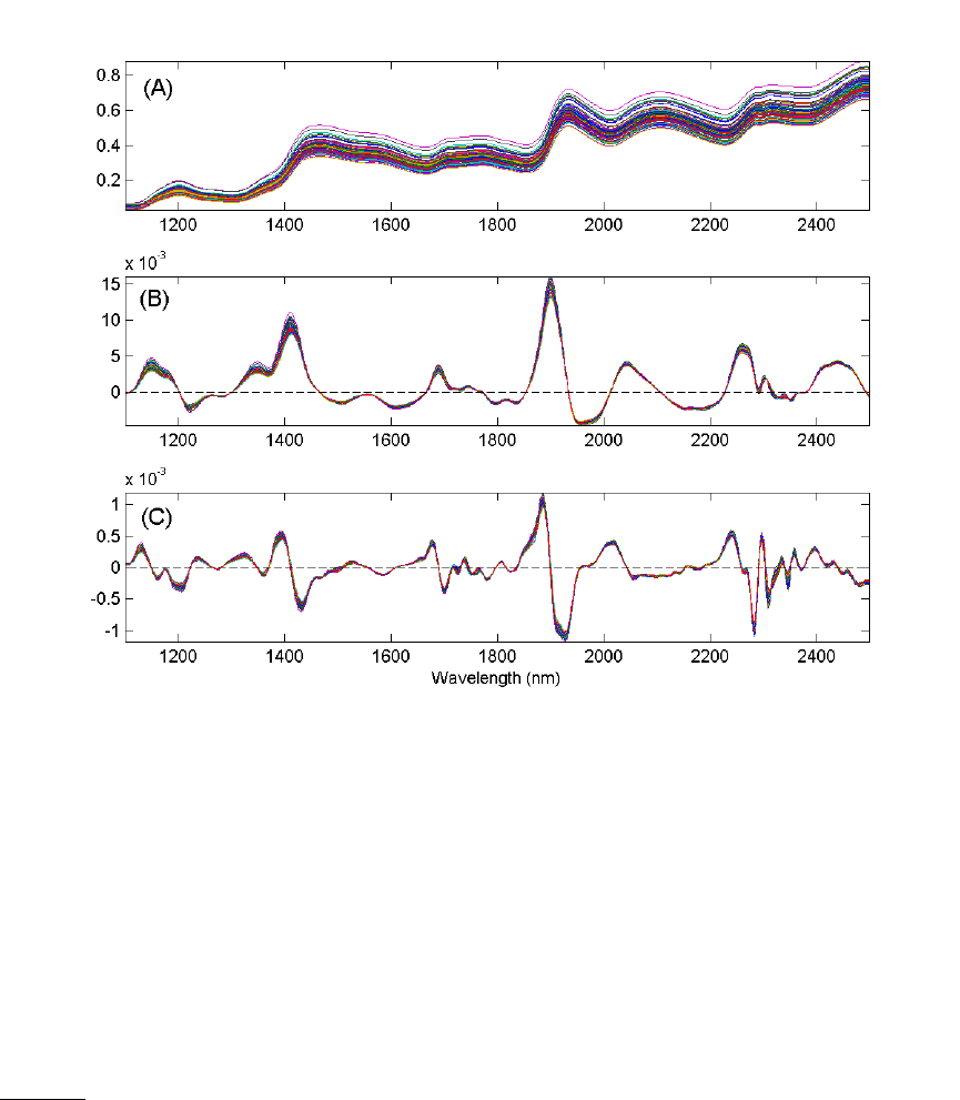
171
absorbance spectra does not change the linear relationship between those data and
chemical concentrations.
Figure 7-2 shows the results of first and second derivativization on the near-IR spectra of
corn. Notice that taking the first derivative has removed the predominant background
variation from the original data. The smaller variations remaining are due to the chemical
differences between samples.
Figure 7-2. NIR spectra of corn (A), the first derivative of the spectra (B), and the second
derivative of the spectra (C).
Note that at the end-points (and at excluded regions) of the variables, limited information
is available to fit a polynomial. The SavGol algorithm approximates the polynomial in
these regions, which may introduce some unusual features, particularly when the
variable-to-variable slope is large near an edge. In these cases, it is preferable to exclude
some variables (e.g., the same number of variables as the window width) at the edges.
From the command line, this method is performed using the savgol function.
Detrend
In cases where a constant, linear, or curved offset is present, the Detrend method can
sometimes be used to remove these effects (see, for example, Barnes et al., 1989).
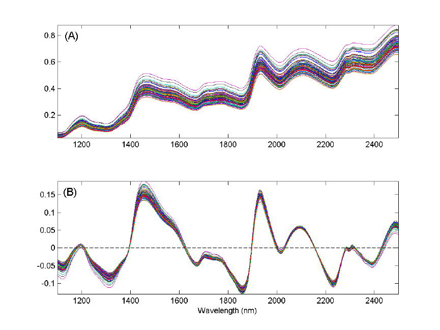
172
Detrend fits a polynomial of a given order to the entire sample and simply subtracts this
polynomial. Note that this algorithm does not fit only baseline points in the sample, but
fits the polynomial to all points, baseline and signal. As such, this method is very simple
to use, but tends to work only when the largest source of signal in each sample is
background interference.
In measurements where the variation of interest (net analyte signal) is a reasonably
significant portion of the variance, Detrend tends to remove variations which are useful to
modeling and may even create non-linear responses from otherwise linear ones. In
addition, the fact that an individual polynomial is fit to each spectrum may increase the
amount of interfering variance in a data set. Due to these reasons, use of Detrend is
recommended only when the overall signal is dominated by backgrounds which are
generally the same shape and are not greatly influenced by chemical or physical
processes of interest. In general, derivatives tend to be far more amenable to use before
multivariate analysis.
Figure 7-3 shows the effect of Detrend on the corn near-IR data. Note that the general
linear offset is removed from all spectra, giving a mean intensity of zero for each
spectrum.
Figure 7-3. The effect of first-order detrending on the corn near-IR spectral data. The
original data are shown in (A) and the detrended data in (B).

173
The single setting for Detrend is the order of polynomial to fit to the data.
From the command line, there is no specific function to perform Detrend (although there
is a MATLAB function of the same name). However, this method can be performed
using the baseline function by indicating that all points in the spectrum are to be used in
the baseline calculation.
Baseline (Weighted Least Squares)
Another method for automatically removing baseline offsets from data is the Baseline
(Weighted Least Squares) preprocessing method. This method is typically used in
spectroscopic applications where the signal in some variables is due only to baseline
(background). These variables serve as good references for how much background should
be removed from nearby variables. The Weighted Least Squares (WLS) baseline
algorithm uses an automatic approach to determine which points are most likely due to
baseline alone. It does this by iteratively fitting a baseline to each spectrum and
determining which variables are clearly above the baseline (i.e., signal) and which are
below the baseline. The points below the baseline are assumed to be more significant in
fitting the baseline to the spectrum. This method is also called asymmetric weighted least
squares. The net effect is an automatic removal of background while avoiding the
creation of highly negative peaks.
Typically, the baseline is approximated by some low-order polynomial (adjustable
through the settings), but a specific baseline reference (or even better, multiple baseline
references) can be supplied. These references are referred to as the baseline "basis."
When specific references are provided as the basis, the background will be removed by
subtracting some amount of each of these references to obtain a low background result
without negative peaks.
When using a polynomial to approximate the baseline, care should be taken in selecting
the order of the polynomial. It is possible to introduce additional unwanted variance in a
data set by using a polynomial of larger order (e.g., greater than 2) particularly if a
polynomial gives a poor approximation of the background shape. This can increase the
rank of a data matrix. In general, baseline subtraction in this manner is not as numerically
safe as using derivatives, although the interpretation of the resulting spectra and loadings
(for example) may be easier.
There are a number of settings which can be used to modify the behavior of the WLS
Baseline method. At the "Novice" user level (see User Level menu in the WLS Baseline
settings window), the order of the polynomial can be selected or a basis (reference
background spectra) can be loaded. If a basis is loaded, the polynomial order setting is
ignored.
At the "Intermediate" user level, several additional settings can be modified including the
selection of two different weight modes, various settings for the weight modes, and the
"trbflag" which allows fitting of a baseline to either the top or the bottom of data (top is
used when peaks are negative-going from an overall baseline shape). In addition, several
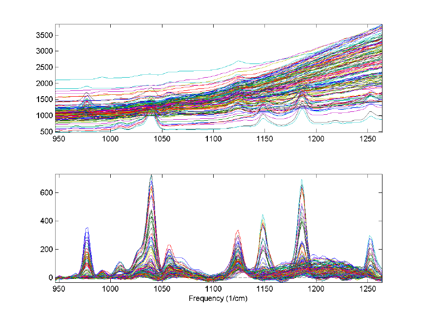
174
settings for ending criteria can be changed. At the "Advanced" user level, additional
advanced settings can be accessed, if desired. See the wlsbaseline function for more
information on the intermediate and advanced baseline options.
An example of the WLS Baseline method is shown in Figure 7-4. The top plot shows the
original spectra with obvious, significant baseline contributions. The bottom plot shows
the same spectra following WLS Baseline application using a second-order polynomial
baseline. Although some baseline features remain after baselining, the narrow Raman
features are much more significant contributor to the remaining signal.
Figure 7-4. Effect of Weighted Least Squares (WLS) Baselining on Raman spectra. The
original data (top plot) and baseline corrected data (bottom plot) are shown.
From the command line, this method is performed using the wlsbaseline function.
There is also a method called baseline which can be used to manually select the
baseline points that will be used to fit a polynomial to each spectrum. The manual
selection method is faster and less prone to introduction of variance, but requires more
knowledge on the part of the user as to what areas of the spectra are truly baseline. In
addition, there is a windowed version of the WLS baseline algorithm called baselinew.
This algorithm fits an individual polynomial to multiple windows across a spectrum and
is better at handling unusually shaped baselines, but requires the selection of an
appropriate window size.
175
Sample Normalization
In many analytical methods, the variables measured for a given sample are subject to
overall scaling or gain effects. That is, all (or maybe just a portion of) the variables
measured for a given sample are increased or decreased from their true value by a
multiplicative factor. Each sample can, in these situations, experience a different level of
multiplicative scaling.
In spectroscopic applications, scaling differences arise from pathlength effects, scattering
effects, source or detector variations, or other general instrumental sensitivity effects (see,
for example, Martens and Næs, 1989). Similar effects can be seen in other measurement
systems due to physical or chemical effects (e.g., decreased activity of a contrast reagent
or physical positioning of a sample relative to a sensor). In these cases, it is often the
relative value of variables which should be used when doing multivariate modeling rather
than the absolute measured value. Essentially, one attempts to use an internal standard or
other pseudo-constant reference value to correct for the scaling effects.
The sample normalization preprocessing methods attempt to correct for these kinds of
effects by identifying some aspect of each sample which should be essentially constant
from one sample to the next, and correcting the scaling of all variables based on this
characteristic. The ability of a normalization method to correct for multiplicative effects
depends on how well one can separate the scaling effects which are due to properties of
interest (e.g., concentration) from the interfering systematic effects.
Normalization also helps give all samples an equal impact on the model. Without
normalization, some samples may have such severe multiplicative scaling effects that
they will not be significant contributors to the variance and, as a result, will not be
considered important by many multivariate techniques.
When creating discriminant analysis models such as PLS-DA or SIMCA models,
normalization is done if the relationship between variables, and not the absolute
magnitude of the response, is the most important aspect of the data for identifying a
species (e.g., the concentration of a chemical isn't important, just the fact that it is there in
a detectable quantity). Use of normalization in these conditions should be considered
after evaluating how the variables' response changes for the different classes of interest.
Models with and without normalization should be compared.
Typically, normalization should be performed before any centering or scaling or other
column-wise preprocessing steps and after baseline or offset removal (see above
regarding these preprocessing methods). The presence of baseline or offsets can impede
correction of multiplicative effects. The effect of normalization prior to background
removal will, in these cases, not improve model results and may deteriorate model
performance.
One exception to this guideline of preprocessing order is when the baseline or
background is very consistent from sample to sample and, therefore, provides a very
useful reference for normalization. This can sometimes be seen in near-infrared

176
spectroscopy in the cases where the overall background shape is due to general solvent or
matrix vibrations. In these cases, normalization before background subtraction may
provide improved models. In any case, cross-validation results can be compared for
models with the normalization and background removal steps in either order and the best
selected.
A second exception is when normalization is used after a scaling step (such as
autoscaling). This should be used when autoscaling emphasizes features which may be
useful in normalization. This reversal of normalization and scaling is sometimes done in
discriminant analysis applications.
Normalize
Simple normalization of each sample is a common approach to the multiplicative scaling
problem. The Normalize preprocessing method calculates one of several different metrics
using all the variables of each sample. Possibilities include:
Name Description Equation*
1-Norm Normalize to (divide each variable by) the
sum of the absolute value of all variables for
the given sample. Returns a vector with unit
area (area = 1) "under the curve."
wi=xi,j
j=1
n
∑
2-Norm Normalize to the sum of the squared value of
all variables for the given sample. Returns a
vector of unit length (length = 1). A form of
weighted normalization where larger values
are weighted more heavily in the scaling.
wi=xi,j
2
j=1
n
∑
Inf-Norm Normalize to the maximum value observed
for all variables for the given sample. Returns
a vector with unit maximum value. Weighted
normalization where only the largest value is
considered in the scaling.
wi=Max(xi)
* Where, in each case, wi is the normalization weight for sample i, xi is the vector of
observed values for the given sample, j is the variable number, and n is the total number
of variables (columns of x).
The weight calculated for a given sample is then used to calculate the normalized sample,
xi,norm, using:
xi,norm =xiwi
−1 (7-1)
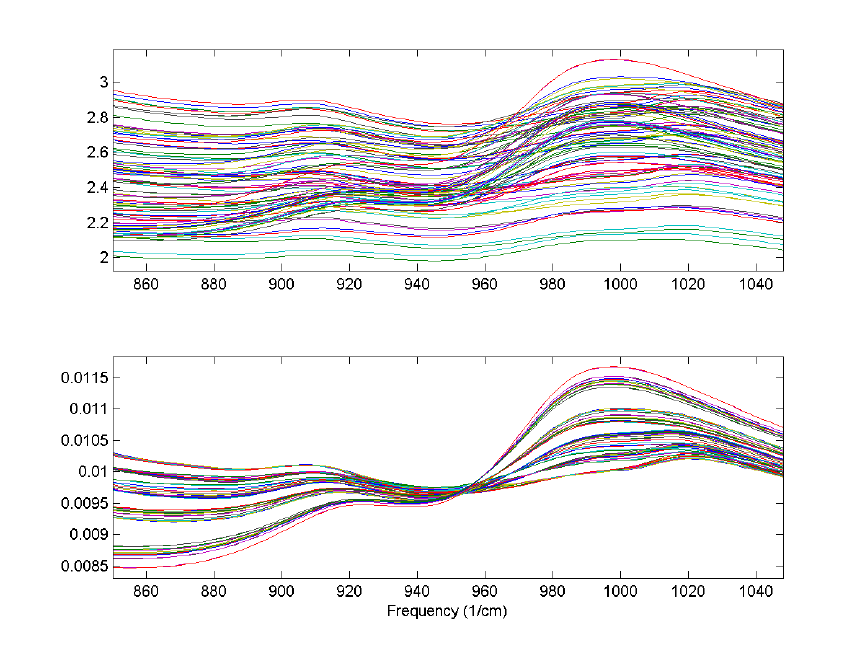
177
An example using the 1-norm on near infrared spectra is shown in Figure 7-5. These
spectra were measured as 20 replicates of 5 synthetic mixtures of gluten and starch
(Martens, Nielsen, and Engelsen, 2003) In the original data (top plot), the five
concentrations of gluten and starch are not discernable because of multiplicative and
baseline effects among the 20 replicate measurements of each mixture. After
normalization using a 1-norm (bottom plot), the five mixtures are clearly observed in
groups of 20 replicate measurements each.
Figure 7-5. Effect of normalization on near-IR spectra of five synthetic gluten and starch
mixtures. Original spectra (top plot) and spectra after 1-norm normalization (bottom plot)
are shown.
From the Preprocessing GUI, the only setting associated with this method is the type of
normalization (1-norm, 2-norm or inf-norm). There is currently no option to perform this
normalization based on anything other than all selected variables.
From the command line, this method is performed using the normaliz function (note the
unusual spelling of the function).

178
SNV (Standard Normal Variate)
Unlike the simple 1-Norm Normalize described above, the Standard Normal Variate
(SNV) normalization method is a weighted normalization (i.e., not all points contribute to
the normalization equally). SNV calculates the standard deviation of all the pooled
variables for the given sample (see for example Barnes et al., 1989). The entire sample is
then normalized by this value, thus giving the sample a unit standard deviation (s = 1).
Note that this procedure also includes a zero-order detrend (subtraction of the individual
mean value from each spectrum - see discussion of detrending, above), and also that this
is different from mean centering (described later). The equations used by the algorithm
are the mean and standard deviation equations:
xi=
xi,j
j=1
n
∑
n (7-2)
wi=
xi,j−xi
()
2
j=1
n
∑
(n−1) +
δ
−1 (7-3)
where n is the number of variables, xi,j, is the value of the jth variable for the ith sample,
and
δ
is a user-definable offset. The user-definable offset can be used to avoid over-
normalizing samples which have near zero standard deviation. The default value for this
offset is zero, indicating that samples will be normalized by their unweighted standard
deviation. The selection of
δ
is dependent on the scale of the variables. A setting near the
expected noise level (in the variables' units) is a good approximation.
This normalization approach is weighted towards considering the values that deviate
from the individual sample mean more heavily than values near the mean. Consider the
example Raman spectrum in Figure 7-6. The horizontal line at intensity 0.73 indicates the
mean of the spectrum. The dashed lines at 1.38 and 0.08 indicate one standard deviation
away from the mean. In general, the normalization weighting for this sample is driven by
how far all the points deviate from the mean of 0.73. Considering the square term in
equation 7-3 and the histogram on the left of Figure 7-6, it is clear that the high intensity
points will contribute greatly to this normalization.
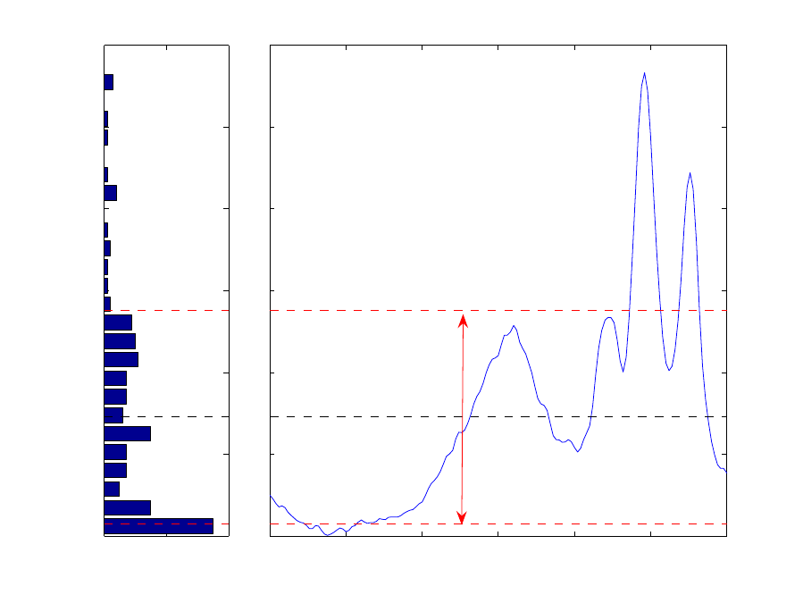
179
0 20 40
0
0.5
1
1.5
2
2.5
3
# Variables
Intensity
450 500 550 600 650 700 750
0
0.5
1
1.5
2
2.5
3
Frequency (1/cm)
Figure 7-6. Example Raman spectrum (right plot) and corresponding intensity histogram
(left plot). The mean of the spectrum is shown as a dashed line at intensity 0.73; one
standard deviation above and below this mean are shown at intensities 1.38 and 0.08 and
indicated by the arrow.
This approach is a very empirical normalization method in that one seldom expects that
variables for a given sample should deviate about their mean in a normal distribution with
unit variance (except in the case where the primary contribution to most of the variables
is noise and the variables are all in the same units). When much of the signal in a sample
is the same in all samples, this method can do very well. However, in cases where the
overall signal changes significantly from sample to sample, problems may occur. In fact,
it is quite possible that this normalization can lead to non-linear responses to what were
otherwise linear responses. SNV should be carefully compared to other normalization
methods for quantitative models.
Figure 7-7 shows the result of SNV on the gluten and starch mixtures described earlier.
Comparing the SNV results to the original spectra and 1-norm spectra shown in Figure 7-
5, it is obvious that SNV gives tighter groupings of the replicate measurements. In fact,
SNV was originally developed for NIR data of this sort, and it behaves well with this
kind of response.
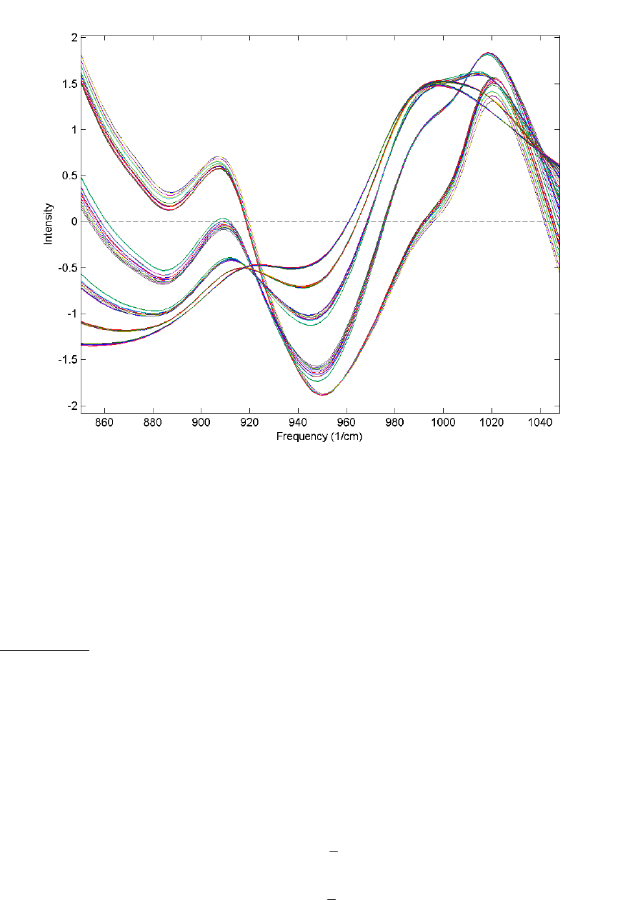
180
Figure 7-7. Effect of SNV normalization on near-IR spectra measured of five synthetic
gluten and starch mixtures.
From the Preprocessing GUI, the only setting associated with this method is the offset.
There is currently no option to perform this normalization based on anything other than
all selected variables.
From the command line, this method is performed using the snv function.
MSC (mean)
Multiplicative signal correction (MSC) is a relatively simple processing step that attempts
to account for scaling effects and offset (baseline) effects (Martens and Næs, 1989). This
correction is achieved by regressing a measured spectrum against a reference spectrum
and then correcting the measured spectrum using the slope (and possibly intercept) of this
fit. Specifically, MSC follows this procedure: Define x as a column vector corresponding
to a spectrum to be standardized and r as a vector corresponding to the reference
spectrum (often this is the mean spectrum of the calibration data set). The vectors are
most often mean-centered according to:
xc = x - x1 (7-4)
rc = r - r1 (7-5)
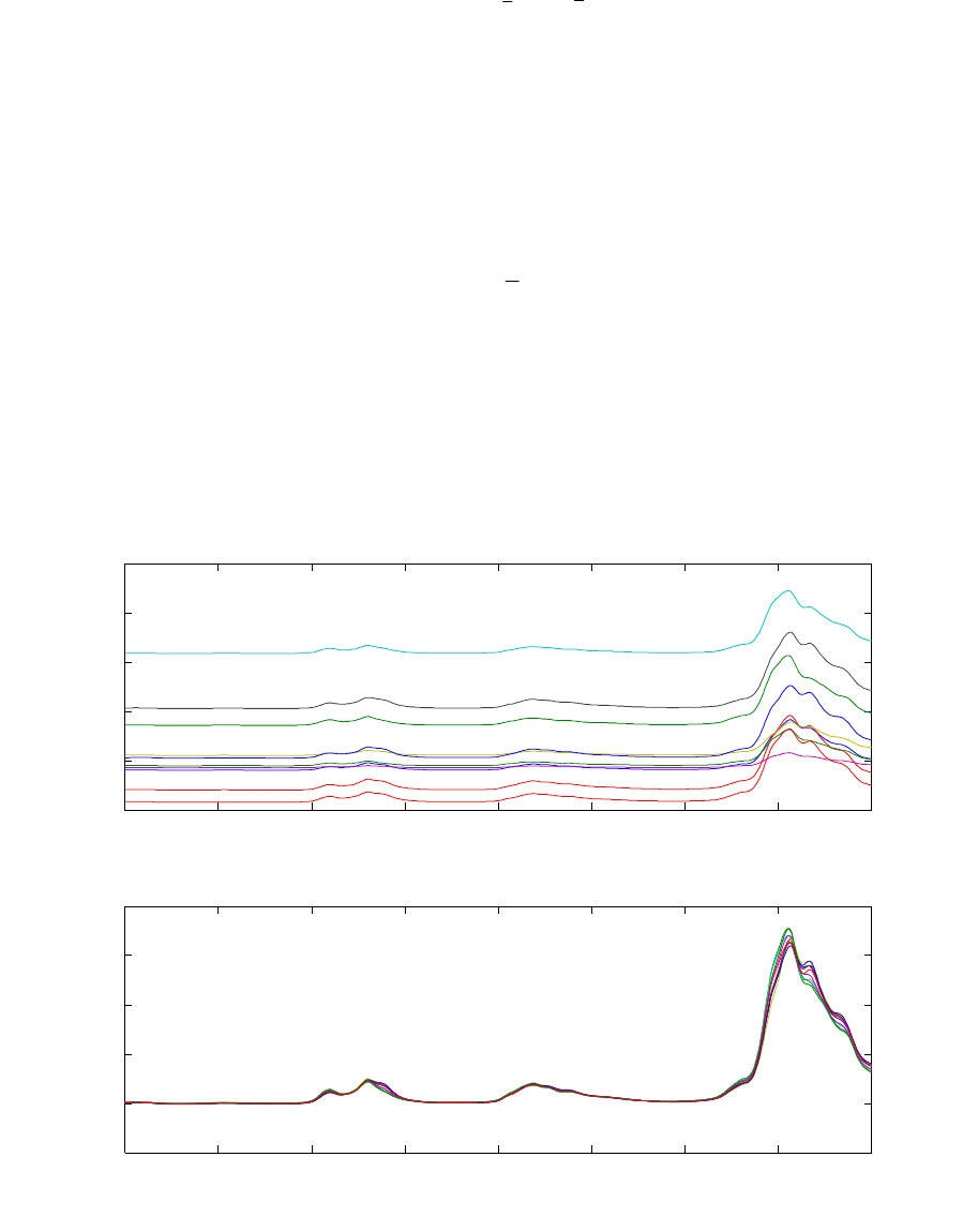
181
where xc and rc are the mean centered vectors, x and
r
are the respective means, and 1
is a vector of ones. The unknown multiplicative factor b is determined using :
b
=
cc
rx
(7-6)
T-1T
b = ( )
cc c c
rr rx (7-7)
and the corrected spectrum ˆ
x is then given by:
ˆ= /b + r
c
xx 1
(7-8)
Figure 7-8 shows an example of MSC using NIR spectra of synthetic gasoline samples
with added baseline and scaling effects. The spectra with artificial baseline and scaling
effects are shown in the top plot. The corrected spectra are shown in the bottom plot. The
corrected spectra were brought to within 0.03 absorbance units of the original spectra (not
shown).
800 900 1000 1100 1200 1300 1400 1500 1600
−1
0
1
2
3
4
Absorbance
Spectra Before MSC
800 900 1000 1100 1200 1300 1400 1500 1600
−0.5
0
0.5
1
1.5
2
Absorbance
Wavelength (nm)
Spectra After MSC
Figure 7-8. Example of Multiplicative Scatter Correction of artificial baseline and scaling
effects.

182
The simulated baseline addition and subsequent correction can be done using the
following commands:
» bspec = spec1.data(21:30,:);
» for i = 1:10, bspec(i,:) = bspec(i,:)*rand(1) + randn(1); end
» [sx,alpha,beta] = mscorr(bspec,mean(spec1.data(1:20,:)));
The first line creates a matrix of ten spectra. The second multiplies them by a random
number between 0 and 1 and adds a random offset. The function mscorr is then used to
correct the spectra using the mean of the first twenty spectra as the reference. The outputs
of mscorr are the corrected spectra (sx), and the intercepts (alpha), and slope (beta)
for the fit of each spectrum to the reference.
From the Preprocessing GUI, there are two settings which can be modified: intercept
and spectral mode. The intercept option controls whether or not the intercept (i.e.,
r
in
equation 7-8) is used. The spectral mode setting defaults to 2 and can only be modified
when x is a multiway matrix. This setting defines the data mode which is associated with
the spectral dimension (i.e., the mode which should be used in the regression). There is
currently no option to perform this normalization based on anything other than all
selected variables.
From the command line, this method is performed using the mscorr function.
Simple Mathematical Operations
Two preprocessing methods involve simple mathematical operations which are used to
linearize or otherwise modify certain kinds of data.
Absolute Value
The absolute value method is used to remove any sign information from the data.
Although unusual, this method may be useful following a derivative or other method
which creates negative values. Such correction can allow the use of non-negativity
constraints, or simply improve interpretability of derivatized spectra. It should be noted,
however, that an absolute value following any method which centers data (such as mean-
or median-centering) may create a non-linear response and complicate modeling.
There are no settings associated with this preprocessing method. The command line
function to perform this operation is the MATLAB command abs.
Log10
A base 10 logarithm (that is, Xp = log10 X ) can be used whenever the response of the
data is linear to the function 10X. Note that negative values will become undefined values
(NaN = Not a Number). Most modeling algorithms will attempt to replace these values

183
with their least-biasing value. As such, the use of an absolute value preprocessing step
prior to a Log10 step may be necessary to avoid problems during modeling.
There are no settings associated with this preprocessing method. The command line
function to perform this operation is the MATLAB command log10.
Variable Centering
As discussed previously in this tutorial, many preprocessing methods are based on the
variance in the data. Such techniques should generally be provided with data which are
centered relative to some reference point. Centering is generically defined as
Xc=X−1x (7-9)
where x is a vector representing the reference point for each variable,
1 is a column-
vector of ones, and Xc represents the centered data. Often the reference point is the mean
of the data. Interpretation of loadings and samples from models built on centered data is
done relative to this reference point. For example, when centering is used before
calculating a PCA model, the resultant eigenvalues can be interpreted as variance
captured by each principal component. Without centering, the eigenvalues include both
variance and the sum-squared mean of each variable.
In most cases, centering and/or scaling (see next section) will be the last method in a
series of preprocessing methods. When other preprocessing methods are being used, they
are usually performed prior to a centering and/or scaling method.
Mean-Center
One of the most common preprocessing methods, mean-centering calculates the mean of
each column and subtracts this from the column. Another way of interpreting mean-
centered data is that, after mean-centering, each row of the mean-centered data includes
only how that row differs from the average sample in the original data matrix.
In the Preprocessing GUI, this method has no adjustable settings. From the command
line, this method is achieved using the mncn function.
For more information on the use of mean-centering, see the discussion on Principal
Components Analysis in Chapter 5.
Median-Center
The median-centering preprocessing method is very similar to mean-centering except that
the reference point is the median of each column rather than the mean. This is considered
one of the "robust" preprocessing methods in that it is not as influenced by outliers
(unusual samples) in the data.

184
In the Preprocessing GUI, this method has no adjustable settings. From the command
line, this method is performed using the medcn function.
Variable Scaling
Variable scaling is another very common method used with multivariate analysis
techniques. Many techniques assume that the magnitude of a measurement is proportional
to its importance and that the level of noise is similar in all variables. When variables
have significantly different scales simply because they are in different units, the
magnitude of the values is not necessarily proportional to the information content.
Likewise, scale is also an issue when some variables contain more noise than other
variables.
Variable scaling helps address these problems by scaling each variable (column) of a data
matrix by some value. The scaling for each variable is presumed to give that variable's
information content an equal standing with the other variables. In general this is
performed by
XS=XS (7-10)
where S is a diagonal matrix of the scaling factors and XS is a matrix of the scaled data.
Note that in some cases, scaling will be combined with a centering step, described above.
If scaling is being used, it will be, in general, the final method applied prior to model
calculation.
Autoscale
This is an exceptionally common preprocessing method which uses mean-centering
followed by dividing each column (variable) by the standard deviation of the column.
That is, the diagonal of the matrix S in equation 7-10 is equal to the inverse of the
standard deviation for each column. The result is that each column of XS has a mean of
zero and a standard deviation of one.
This approach is a valid approach to correcting for different variable scaling and units if
the predominant source of variance in each variable is signal rather than noise. Under
these conditions, each variable will be scaled such that its useful signal has an equal
footing with other variables' signal. However, if a given variable has significant
contributions from noise (i.e., a low signal-to-noise ratio) or has a standard deviation near
zero, then autoscaling will cause this variable's noise to have an equal footing with the
signal in other variables. This variable may then adversely influence the model. Under
these conditions, excluding such variables or using the offset parameter (described
below) is recommended.
Autoscaling includes an adjustable parameter "offset" which is added to each column's
standard deviation prior to scaling. When offset is non-zero, the diagonal of the matrix S

185
in equation 7-10 is equal to (s + offset)-1 where s is the vector of standard deviations for
each column of X. The offset is useful for de-emphasizing variables which have a
standard deviation near zero. By setting the offset to some small value, variables which
have standard deviations near or at that level are not as heavily up-scaled. This
effectively reduces their influence on a model. The exact level for the offset is largely
dependent on the scale and noise level of the data. The default value of offset is zero.
In the Preprocessing GUI, this method has one adjustable setting for the scaling offset.
From the command line, this method is performed using the auto function.
For more information on the use of autoscaling, see the discussion on Principal
Components Analysis in Chapter 5.
Group Scale
Similar to autoscaling, group scaling performs scaling based on standard deviations.
Group scaling is often used when the data consist of several equal-sized blocks of
variables. Each block contains variables in some given unit of measure, but different
blocks use different units. This kind of situation occurs in Multiway Principal
Components Analysis (MPCA).
Group scale is performed by splitting the variables into a predefined number of equally-
sized blocks and scaling each block by the grand mean of their standard deviations. For
each block, the standard deviations for each variable in a block are calculated and the
mean of those standard deviations is used to scale all columns in the block. The same
procedure is repeated for each block of variables. The group scale method does assume
that all blocks have an equal number of columns. Group scaling when different numbers
of variables are in each group can only be done by hand at the MATLAB command line.
In the Preprocessing GUI, this method has one adjustable parameter indicating the
number of blocks to split the variables into. If set to zero, the GUI will attempt to infer
the number of blocks from the size of the original data (if a three-way matrix). From the
command line, this method is performed using the gscale function.
Log Decay Scaling
Log decay scaling is typically used in Mass Spectrometry (MS) and is a first-principle
alternative to autoscaling for MS data. The scaling is based on the assumption that, in
some types of instrumentation, the sensitivity of the instrument is roughly logarithmically
proportional to the size of the mass fragment. The larger the mass, the less sensitive the
instrument and the lower the counts for the given mass. Log decay scaling attempts to
correct for this insensitivity to larger masses by scaling each mass by a continuously
decreasing log function of the form:
/in
i
se
τ
−
= (7-11)

186
where si is the scaling for variable i (sorted in order of increasing mass), n is the total
number of variables and τ (tau) is an adjustable parameter defining the differential scaling
of early masses to later masses. The smaller the value for τ, the more the larger masses
are up-scaled relative to the smaller masses. Selection of τ largely depends on the
instrumentation and the insensitivity to larger masses. The default value for τ is 0.3.
Note that, unlike autoscaling, this method does not mean-center the data.
In the Preprocessing GUI, this method allows for adjustment of τ in the settings. From
the command line, this method is performed using the logdecay function.
Sqrt Mean Scale
In many cases, the goal of scaling is to adjust the magnitude of each variable so that the
level of noise is equal in all variables. In cases where the noise is approximately
proportional to the square root of the signal in each variable, the square root mean scaling
(sqrt mean scale) approach can be used. This method scales each variable by the square
root of the mean of the variable. If the predominant noise source is truly proportional to
the square root of the signal, this effectively corrects all variables to the same level of
noise.
This method has been used effectively to correct Mass Spectra (Keenan and Kotula,
2004) but is also valid in other spectroscopies or measurements where noise is likely to
be shot-noise limited (low light luminescence and Raman spectroscopies, for example).
Note that, unlike autoscaling, this method does not mean-center the data.
In the Preprocessing GUI, there are no adjustable parameters. There is no equivalent
method at the command line, but this scaling can be emulated using the commands:
>> [junk,mx] = mncn(x);
>> sx = sqrt(mx);
>> data = scale(x,sx*0,sx);
Multiway Centering and Scaling
When handling multi-way data (that is, data sets which have three or more modes), there
are two specialized centering and scaling methods which can be used: multiway center
and multiway scale. The details of how these methods work is beyond the scope of this
chapter but details can be obtained from the multiway methods chapter (Chapter 10) and
from the help for the npreprocess command. The basic information on these methods is
given below.
Note that when used together, multiway centering and scaling may need to be done
iteratively if a true convergence is to be reached. The following general guidelines can be
applied:

187
1. Centering across one mode tends to disturb scaling across all modes (except for
particular scaling where the scaling is independent of the level/offset/center, such
as in autoscaling.)
2. Scaling within a mode disturbs centering across the same mode but not across
other modes.
3. Scaling affects scaling in other modes.
More details of these considerations can be found in Bro and Smilde, 2003.
Multiway Center
Performs centering across one or more modes of a multiway array. The result is a matrix
which has a mean of zero for the given mode(s). In the Preprocessing GUI, the only
setting defines which mode or modes should be centered. The npreprocess function can
be used to perform this method at the command line.
Multiway Scale
Performs scaling of one or more modes of a multiway array. In the Preprocessing GUI,
the only setting defines which mode or modes should be scaled. The npreprocess
function can be used to perform this method at the command line.
Multivariate Filtering
In some cases, there is insufficient selectivity in the variables to easily remove things like
backgrounds or other signals which are interferences to a multivariate model. In these
cases, using multivariate filtering methods before model calibration may help simplify
the end model. Multivariate filters identify some unwanted covariance structure (i.e., how
variables change together) and remove these sources of variance from the data prior to
calibration or prediction. In a simple way, these filters can be viewed as pattern filters in
that they remove certain patterns among the variables. The resulting data contain only
those covariance patterns which passed through the filter and are, ideally, useful or
interesting in the context of the model.
Identification of the patterns to filter can be based on a number of different criteria. The
full discussion of multivariate filtering methods is outside the scope of this chapter, but it
is worth noting that these methods can be very powerful for calibration transfer and
instrument standardization problems, as well as for filtering out other differences between
measurements which should otherwise be the same (e.g., differences in the same sample
due to changes with time, or differences within a class of items being used in a
classification problem).
One common method to identify the multivariate filter "target" uses the Y-block of a
multivariate regression problem. This Y-block contains the quantitative (or qualitative)
values for each sample and, theoretically, samples with the same value in the Y-block
should have the same covariance structure (i.e., they should be similar in a multivariate

188
fashion). A multivariate filter can be created which attempts to remove differences
between samples with similar y-values. This filter should reduce the complexity of any
regression model needed to predict these data. Put in mathematical terms, the multivariate
filter removes signals in the X-block (measured responses) which are orthogonal to the
Y-block (property of interest).
Two multivariate filtering methods are provided in the Preprocessing GUI: Orthogonal
Signal Correction (OSC) and Generalized Least Squares Weighting (GLSW). In the
context of the Preprocessing GUI, both methods require a Y-block and are thus only
relevant in the context of regression models. Additionally, as of the current version of
PLS_Toolbox, the GUI access to these functions only permits their use to orthogonalize
to a Y-block, not for calibration transfer applications. From the command line, however,
both of these functions can also be used for calibration transfer or other filtering tasks.
For more information on these uses, please see the calibration transfer and instrument
standardization chapter of this manual.
OSC (Orthogonal Signal Correction)
Orthogonal Signal Correction (Sjöblom et al., 1998) removes variance in the X-block
which is orthogonal to the Y-block. Such variance is identified as some number of factors
(described as components) of the X-block which have been made orthogonal to the Y-
block. When applying this preprocessing to new data, the same directions are removed
from the new data prior to applying the model.
The algorithm starts by identifying the first principal component (PC) of the X-block.
Next, the loading is rotated to make the scores be orthogonal to the Y-block. This loading
represents a feature which is not influenced by changes in the property of interest
described in the Y-block. Once the rotation is complete, a PLS model is created which
can predict these orthogonal scores from the X-block. The number of components in the
PLS model is adjusted to achieve a given level of captured variance for the orthogonal
scores. Finally, the weights, loadings, and predicted scores are used to remove the given
orthogonal component, and are also set aside for use when applying OSC to a new
unknown sample. This entire process can then be repeated on the "deflated" X-block (the
X-block with the previously-identified orthogonal component removed) for any given
number of components. Each cycle results in additional PLS weights and loadings being
added to the total that will be used when applying to new data.
There are three settings for the OSC preprocessing method: number of components,
number of iterations, and tolerance level. The number of components defines how many
times the entire process will be performed. The number of iterations defines how many
cycles will be used to rotate the initial PC loading to be as orthogonal to Y as possible.
The tolerance level defines the percent variance that must be captured by the PLS
model(s) of the orthogonalized scores.
In the Preprocessing GUI, this method allows for adjustment of the settings identified
above. From the command line, this method is performed using the osccalc and oscapp
functions.

189
GLS Weighting
Generalized Least Squares Weighting (GLSW) calculates a filter matrix based on the
differences between pairs or groups of samples which should otherwise be similar.
In the case of a calibration transfer problem, similar samples would be data from the
same samples measured on two different instruments or on the same instrument at two
different points in time. The goal of GLSW is to down-weight the differences between
the two instruments and, therefore, make them appear more similar. A regression model
built from GLSW-filtered data can be used on either instrument after applying the
filtering to any measured spectrum. Although this specific application of GLSW is not
covered by this chapter, the description below gives the mathematical basis of this use.
GLSW can also be used prior to building a regression model in order to remove variance
from the X-block which is mostly orthogonal to the Y-block. This application of GLSW
is similar to OSC (see above), and such filtering can allow a regression model to achieve
a required error of calibration and prediction using fewer latent variables. In this context,
GLSW uses samples with similar Y-block values to identify the sources of variance to
down-weight.
In both cases, a single adjustable parameter,
α
, defines how strongly GLSW
downweights interferences. Adjusting
α
towards larger values (typically above 0.001)
decreases the effect of the filter. Smaller
α
s (typically 0.001 and below) apply more
filtering.
Algorithm. The GLSW algorithm will be described here for the calibration transfer
application (because it is simpler to visualize) and then the use of GLSW in regression
multivariate filtering will be described. In either case, the approach involves the
calculation of a covariance matrix from the differences between similar samples. In the
case of calibration transfer problems, this difference is defined as the numerical
difference between the two groups of mean-centered transfer samples. Given two sample
matrices, X1 and X2, the data are mean-centered and the difference calculated:
X1,mc =X1−1x1 (7-12)
X2,mc =X2−1x2 (7-13)
Xd=X2−X1 (7-14)
where 1 is a vector of ones equal in length to the number of rows in X1, 1
x is the mean of
all rows of X1, and 2
x is the mean of all rows of X2. Note that this requires that X1 and
X2 are arranged such that the rows are in the same order in terms of samples measured on
the two instruments.

190
The next step is to calculate the covariance matrix, C:
C=Xd
TXd (7-15)
followed by the singular-value decomposition of the matrix, which produces the left
eigenvectors, V, and the diagonal matrix of singular values, S:
C=VS2VT (7-16)
Next, a weighted, ridged version of the singular values is calculated
D=S2
α
+1D (7-17)
where 1D is a diagonal matrix of ones of appropriate size and
α
is the weighting
parameter mentioned above. The scale of the weighting parameter depends on the scale
of the variance in Xd. Finally, the inverse of these weighted eigenvalues are used to
calculate the filtering matrix.
G=VD−1VT (7-18)
This multivariate filtering matrix can be used by simply projecting a sample into the
matrix. The result of this projection is that correlations present in the original covariance
matrix are down-weighted (to the extent defined by
α
). The filtering matrix is used both
on the original calibration data prior to model calibration, and any future new data prior
to application of the regression model.
The choice of
α
depends on the scale of the original values but also how similar the
interferences are to the net analyte signal. If the interferences are similar to the variance
necessary to the analytical measurement, then
α
will need to be higher in order to keep
from removing analytically useful variance. However, a higher
α
will decrease the
extent to which interferences are down-weighted. In practice, values between 1 and
0.0001 are often used.
When using GLSW to filter out X-block variance which is orthogonal to a Y-block, a
different approach is used to calculate the difference matrix, d
X. In this situation we
have only one X-block, X, of measured calibration samples, but we also have a Y-block,
y (here defined only for a single column-vector), of reference measurements. To a first
approximation, the Y-block can be considered a description of the similarity between
samples. Samples with similar y values should have similar values in the X-block.
In order to identify the differences between samples with similar y values, the rows of the
X- and Y-blocks are first sorted in order of increasing y value. This puts samples with
similar values near each other in the matrix. Next, the difference between proximate
samples is determined by calculating the derivative of each column of the X-block. These
derivatives are calculated using a 5-point, first-order, Savitzky-Golay first derivative

191
(note that a first-order polynomial derivative is essentially a block-average derivative
including smoothing and derivatizing simultaneously). This derivativization yields a
matrix, d
X, in which each sample (row) is an average of the difference between it and
the four samples most similar to it. A similar derivative is calculated for the sorted Y-
block, yielding vector d
y
, a measure of how different the y values are for each group of 5
samples.
At this point, d
X could be used in equation 7-15 to calculate the covariance matrix of
differences. However, some of the calculated differences (rows) may have been done on
groups of samples with significantly different y values. These rows contain features
which are correlated to the Y-block and should not be removed by GLS. To avoid this,
the individual rows of d
X need to be reweighted by converting the sorted Y-block
differences into a diagonal reweighting matrix, W, in which the ith diagonal element, wi,
is calculated from the rearranged equation
2,
log idiyd
ws
=
−y (7-19)
The value ,di
y
is the ith element of the d
y
vector, and yd
s is the standard deviation of y-
value differences:
2
,
1
()
1
m
di d
yd
i
yy
sm
=
−
=−
∑ (7-20)
The reweighting matrix is then used along with d
X to form the covariance matrix
2T
dd
=CXWX (7-21)
which is then used in equations 7-16 through 7-18 as described above.
In the Preprocessing GUI, the GLSW method allows for adjustment of the weighting
parameter,
α
. From the command line, this method is performed using the glsw
function, which also permits a number of other modes of application (including
identification of "classes" of similar samples).
192
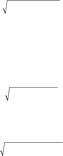
193
8. Classification
Often, data sets consist of samples that belong to several different groups or “classes.”
Classes may differ for many reasons, including variations in sample preparation,
differences in chemical compound type (aromatic, aliphatic, carbonyl, etc.), or variations
in process state (startup, normal, particular faults, etc.). A variety of methods have been
developed for classifying samples based on measured responses.
Methods that attempt to identify groups or classes without using pre-established class
memberships are known as cluster analysis or unsupervised pattern recognition. Methods
that use known class memberships are generally called classification or supervised
pattern recognition. As we will demonstrate, classification of new unknown samples can
be accomplished either manually using unsupervised methods or in an automated manner
using supervised techniques.
Distance Measures in Cluster Analysis and Classification
Most cluster analysis methods are based on the assumption that samples that are close
together in the measurement space are similar and therefore likely to belong to the same
class. There are however, many ways of defining distance between samples. The most
common is simple Euclidean distance, where the distance dij between samples xi and xj is
defined as
()()
T
ij ijij
d=− −xx xx (8-1)
which is simply the square root of the sum of squared differences between the samples.
Preprocessing, such as autoscaling, is often used prior to calculating the distance.
Distance may also be defined based on PCA scores instead of on the raw data. This is in
essence a noise-filtered estimate of the distance, as the deviations between samples in
dimensions not included in the model are not considered. In this case, the distance dij
between samples xi and xj with scores ti and tj (note that ti and tj are 1 x k vectors
containing the scores on all PCs of the model for samples xi and xj) is defined as
()()
T
ij i j i j
d=− −tt tt (8-2)
It is also possible to define the distance based on principal component scores adjusted to
unit variance. This is analogous to the T2 statistic given in Equation 5-10. In this case the
distance in Equation 8-2 is weighted by the inverse of the eigenvalues, λ:
()()
T
1
ij ij ij
d
λ
−
=− −tt tt (8-3)
The distance measure defined in Equation 8-3 is one type of Mahalanobis distance. A
Mahalanobis distance accounts for the fact that, in many data sets, variation in some
directions is much larger in some directions than in others. Therefore, distance in some
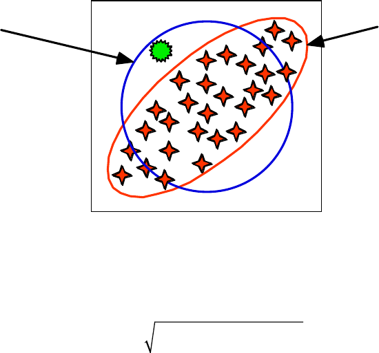
194
directions is more significant than distance in other directions. This is illustrated
graphically in Figure 8-1, which shows a data set (the stars) with lines representing
constant Euclidean and Mahalanobis distances from the centroid. If these lines
represented class boundaries, the data point shown as the sun would be clearly outside the
Mahalanobis line, but would be inside a Euclidean distance line (especially if it were
expanded to encompass all the data points).
Constant
Euclidean
distance from
centroid
Constant
Mahalanobis
distance from
centroid
Figure 8-1. Contrast between Mahalanobis and Euclidean distance measures.
It is also possible to define a Mahalanobis distance based on the raw data. In this case
dij =xi−xj
()
C−1xi−xj
()
T (8-4)
where C is the covariance matrix of the data (defined in Equation 5-3). In this case, all
dimensions in the data are considered when calculating a distance. This measure is not
recommended for high-dimensional data sets with strong covariance because it
overemphasizes dimensions where the variation is due mainly to noise.
Cluster Analysis and Dendrograms
In cluster analysis, each sample is initially assumed to be a lone cluster. All of the
distances between samples are then calculated via one of the methods shown above, and
the samples with the smallest distance are found and linked together. The procedure is
repeated and the samples with the next closest distance are found and linked. The results
are often displayed as a connection dendrogram. An example of this is shown in Figure 8-
2. Here the group of samples (with two measured parameters x1 and x2) are linked
together, starting with the closest two, numbers 4 and 5, followed by the next closest
samples, 1 and 2. Sample 6 is then linked to sample 5, which is already linked to sample
4, and so on. The results are shown in the dendrogram at right. The vertical bars indicate
which samples or groups are linked, while the horizontal position of the bar indicates the
length of the link, i.e., the distance between the linked samples or groups.
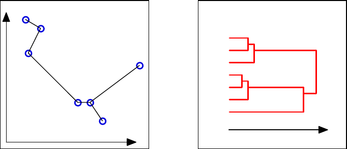
195
12
3
45
6
7
1
2
3
4
5
6
7
Samples connected to
nearest neighbors
Resulting dendrogram
x1
x2
Distance
Figure 8-2. Example of linking in cluster analysis and resulting dendrogram.
In the example shown above, the distance between two groups of points was defined as
the distance between the nearest neighbors of the two groups. For instance, the distance
between samples 3 and 4 was used as the distance between the group of samples 1-3 and
the group of samples 4-7, because samples 3 and 4 were the nearest neighbors of the two
groups. There are other ways to define the distance between two groups. The most
common of these is the centroid method, where the distance between two groups is the
distance between either the center of mass or the average of the groups.
The clusters can be defined from the dendrogram by placing a vertical line across it and
moving it up and down the distance scale. For any given distance, the number of clusters
with all points within that distance is the number of lines in the dendrogram that intersect
the vertical line. In our example, a vertical line placed in the middle of the dendrogram
would indicate three clusters, two of which consisted of three samples each (1-3 and 4-6)
and a remaining lone sample (7).
An Example of Cluster Analysis and Comparison with PCA
As an example of cluster analysis we now consider the “Arch” data set. This data set
consists of the analysis of 75 obsidian samples from four known quarries (samples 1-63)
and artifacts from archeological digs of unknown origin (samples 64-75). The samples
were analyzed for the concentration of 10 metals, (Fe, Ti, Ba, Ca, K, Mn, Rb, Sr, Y, and
Zr), via X-ray fluorescence. The goal of this exercise will be to determine from which
class ( i.e., quarry) each of the unknown samples comes.
Start the “Analysis” tool by typing analysis at the command line, and load in the
Arch.mat data from the PLS_Toolbox/Dems folder. Build a preliminary PCA model of
the data by selecting PCA from the Analysis menu and clicking the Calculate button
(gears), leaving the preprocessing set to the default, autoscaling. Specify a model with
four principal components by clicking on the fourth line of the variance captured table
and again clicking the Calculate button. A nice view of the data can be obtained by
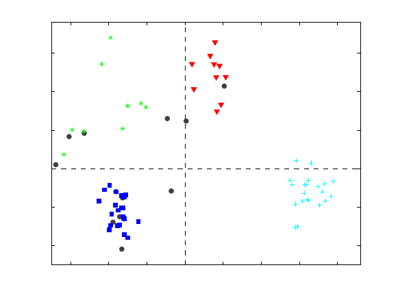
196
clicking the Scores button and plotting Scores on PC1 on the x-axis and Scores on PC2
on the y-axis. The result should look like Figure 8-3 below. The samples from known
quarries are identified with labels beginning with K, SH, ANA and BL. Unknown
samples are labeled s1-s12 and are shown as filled dark grey circles. It is evident that
samples from each of the quarries cluster together.
−3 −2 −1 0 1 2 3 4
−2
−1
0
1
2
3
Scores on PC 1 (52.52%)
Scores on PC 2 (20.78%)
KAVG
K−1B
K−2
K−3A
K−1C
K−1D
K−3B
K−4R
K−4B
K−1A
BLAV1 BLAV9
BL−2
BL−3
BL−6
BL−7
BLAV7
BL−1
BL−8
SH−1
SH−15
SH−S1
SH−68
SH−2
SH−3
SH−5
SH−13
SHII7
SHV18
SHIL1
SHIL1
SHII1
SHV12
SHV24
SHII5
SHIIK
SHIL1
SHV12
SHI10
SHI13
SHV14
SHII7 ANA−2
ANA−3
ANA−4
ANA−5
ANA−6
ANA−7
ANA−8
ANA−9
ANA−1
ANA−1 ANA−1
ANA−1
ANA−1
ANA−1
ANA−1
ANA−1
ANA−1
ANA−1
ANA−1
ANA−2
ANA−2
s1
s2
s3
s4
s5
s6
s7
s8
s9
s10
s11
s12
Samples/Scores Plot of arch
Figure 8-3. Scores on first two principal components of Arch data.
We would now like to produce a dendrogram view of these data. However, before we
proceed, we will exclude the unknown samples from the analysis. This is easily done
from a scores plot of Sample Number on the x-axis versus Score on PC1 on the y-axis.
Click the Select button in Plot Controls window and make a rubber-band box around the
last twelve samples (dark grey circles). In the Plot Controls window, select Exclude
Selection from the Edit menu. From the Analysis menu select Cluster, then click
Calculate. Accept the defaults and click Execute. The result should look like Figure 8-4,
which shows a dendrogram of the samples from known quarries. The vertical line was
added by executing the command vline(2.7,’--g’). Note how the samples from each
quarry are perfectly grouped in the dendrogram, with each group coming off a single
branch to the left of the vertical dashed line, in spite of the fact that the known class
information of the samples was not used in the calculation of the dendrogram.
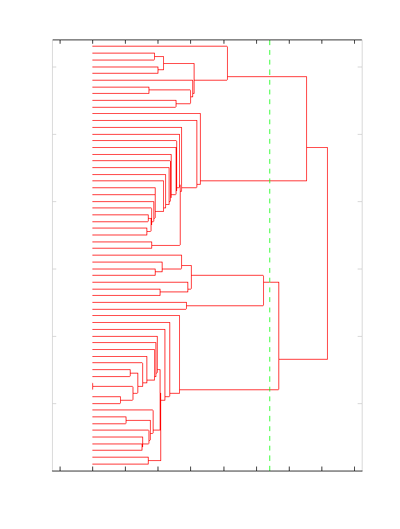
197
−0.5 0 0.5 1 1.5 2 2.5 3 3.5 4
0
10
20
30
40
50
60
Distance to K−Nearest Neighbor
KAVG
K−1B
K−2
K−3A
K−1C
K−1D
K−3B
K−4R
K−4B
K−1A
BLAV1
BLAV9
BL−2
BL−3
BL−6
BL−7
BLAV7
BL−1
BL−8
SH−1
SH−15
SH−S1
SH−68
SH−2
SH−3
SH−5
SH−13
SHII7
SHV18
SHIL1
SHIL1
SHII1
SHV12
SHV24
SHII5
SHIIK
SHIL1
SHV12
SHI10
SHI13
SHV14
SHII7
ANA−2
ANA−3
ANA−4
ANA−5
ANA−6
ANA−7
ANA−8
ANA−9
ANA−1
ANA−1
ANA−1
ANA−1
ANA−1
ANA−1
ANA−1
ANA−1
ANA−1
ANA−1
ANA−1
ANA−2
ANA−2
Dendrogram of Data with Preprocessing: Autoscale
Figure 8-4. Dendrogram of samples from known quarries in Arch data.
Classification by k-Nearest Neighbor and by Inspection in PCA
The success of the dendrogram tells us that all samples of a given class (quarry) have as
their nearest neighbors samples from the same class. This gives us some confidence that
we should be able to assign the class of unknown samples by determining the class of
their nearest known neighbor or neighbors. This leads us to the classification method k-
nearest neighbor, or kNN (Sharaf, 1986). In kNN the class of a sample is determined by
the class of its single nearest neighbor (k = 1) or by a vote of a small (generally odd)
number of its nearest neighbors (k = 3, 5, …). An example of this is shown in Figure 8-5.
Here the unknown sample is the square. Its three nearest neighbors consist of two plusses
and one X; thus, it would be assigned to the class of plusses.
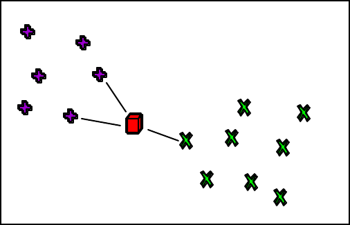
198
Figure 8-5. Classification by kNN.
The class of the unknown samples can be determined by running the command line
function knn. Inputs are the known samples, the test samples, and a flag to indicate that
autoscaling will be used. The results are shown below
>> pclass = knn(arch(1:63,:),arch(64:end,:),1);
Unknown Unknown Class Nearest
Number Label Number Neighbor
------- ------- ------ --------
1 s1 3 SHV24
2 s2 1 KAVG
3 s3 1 K-1C
4 s4 1 K-3A
5 s5 2 BLAV1
6 s6 2 BL-8
7 s7 2 BLAV1
8 s8 3 SHI10
9 s9 3 SH-1
10 s10 3 SH-1
11 s11 3 SH-5
12 s12 3 SHI10
The classification largely agrees with what we might expect from observation of the
principal component scores plot. The samples that are hard to classify from the PCA
scores plot are s1, s3 and s4. The first unknown, s1, is far from any of the groups, but it
does appear to be somewhat closer to class 3, the SH samples. Samples s3 and s4 are
assigned to K (class 1) by kNN, but appear to be equally close to the K and BL (class 2)
groups in Figure 8-3.
Is there a way that we might further explore the data and assign classes using PCA?
Recall that we have so far looked only at the scores on the first two principal
components. Are any of the other PCs useful for classification? It is easy to determine
this by plotting the scores on each of the PCs individually versus sample number, or by
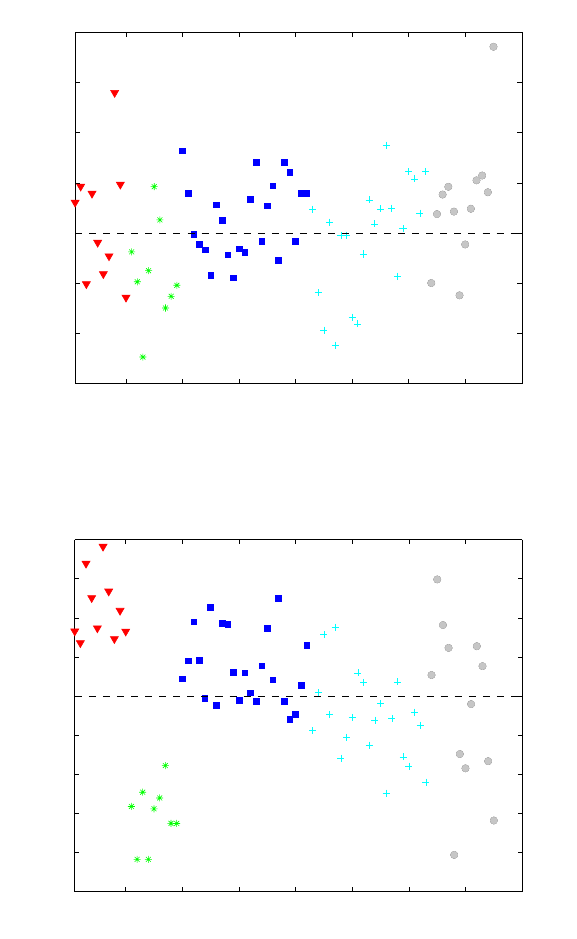
199
doing cross-plots of the scores. It is clear from Figure 8-3 that PCs 1 and 2 are describing
differences between the quarries. What about PC 3, shown in Figure 8-6? This PC
appears to be describing a variation in the data that doesn’t have anything to do with the
quarry, as the sample scores do not appear to be at all correlated with quarry. What about
PC 4, shown in Figure 8-7? On this PC the scores from BL quarry are negative while
those from K and SH are positive or near zero. Thus it appears that PC 4 is useful in
discriminating the quarries.
10 20 30 40 50 60 70 80
−3
−2
−1
0
1
2
3
4
Sample
Scores on PC 3 (10.96%)
KAVG
K−1B
K−2
K−3A
K−1C
K−1D
K−3B
K−4R
K−4B
K−1A
BLAV1
BLAV9
BL−2
BL−3
BL−6
BL−7
BLAV7
BL−1
BL−8
SH−1
SH−15
SH−S1
SH−68
SH−2
SH−3
SH−5
SH−13
SHII7
SHV18
SHIL1
SHIL1
SHII1
SHV12
SHV24
SHII5
SHIIK
SHIL1
SHV12
SHI10
SHI13
SHV14
SHII7
ANA−2
ANA−3
ANA−4
ANA−5
ANA−6
ANA−7
ANA−8
ANA−9
ANA−1
ANA−1
ANA−1
ANA−1
ANA−1
ANA−1
ANA−1
ANA−1
ANA−1
ANA−1
ANA−1
ANA−2
ANA−2
s1
s2
s3
s4
s5
s6
s7
s8
s9
s10
s11
s12
Samples/Scores Plot of arch
Figure 8-6. Scores on PC 3 of Arch data.
10 20 30 40 50 60 70 80
−2.5
−2
−1.5
−1
−0.5
0
0.5
1
1.5
2
Sample
Scores on PC 4 (8.33%)
KAVG
K−1B
K−2
K−3A
K−1C
K−1D
K−3B
K−4R
K−4B
K−1A
BLAV1
BLAV9
BL−2
BL−3
BL−6
BL−7
BLAV7
BL−1
BL−8
SH−1
SH−15
SH−S1
SH−68
SH−2
SH−3
SH−5
SH−13
SHII7
SHV18
SHIL1
SHIL1
SHII1
SHV12
SHV24
SHII5
SHIIK
SHIL1
SHV12
SHI10
SHI13
SHV14
SHII7
ANA−2
ANA−3
ANA−4
ANA−5
ANA−6
ANA−7
ANA−8
ANA−9
ANA−1
ANA−1
ANA−1
ANA−1
ANA−1
ANA−1
ANA−1
ANA−1
ANA−1
ANA−1
ANA−1
ANA−2
ANA−2
s1
s2
s3
s4
s5
s6
s7
s8
s9
s10
s11
s12
Samples/Scores Plot of arch
Figure 8-7. Scores on PC 4 of Arch data.
A plot of the scores on PC 4 versus PC 1 (along with PC 2 versus PC 1, Figure 8-3), can
now be used to determine the source of samples s1, s3 and s4 (Figure 8-8). Sample s1
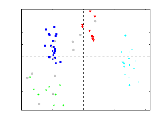
200
remains close to the SH group in the PC 4 versus PC1 plot, so the assignment to the SH
group from kNN appears appropriate. Similarly, samples s3 and s4 remain close to the K
class, suggesting the classification from kNN is correct.
−4 −3 −2 −1 0 1 2 3 4
−2
−1.5
−1
−0.5
0
0.5
1
1.5
2
Scores on PC 1 (53.41%)
Scores on PC 4 (8.33%)
KAVG
K−1B
K−2
K−3A
K−1C
K−1D
K−3B
K−4R
K−4B
K−1A
BLAV1
BLAV9
BL−2
BL−3
BL−6
BL−7
BLAV7
BL−1 BL−8
SH−1
SH−15
SH−S1
SH−68
SH−2
SH−3
SH−5
SH−13
SHII7
SHV18
SHIL1
SHIL1
SHII1
SHV12
SHV24
SHII5
SHIIK
SHIL1
SHV12
SHI10
SHI13
SHV14
SHII7
ANA−2
ANA−3
ANA−4
ANA−5
ANA−6
ANA−7
ANA−8
ANA−9
ANA−1
ANA−1
ANA−1
ANA−1
ANA−1
ANA−1
ANA−1
ANA−1
ANA−1
ANA−1
ANA−1
ANA−2
ANA−2
s1
s2
s3
s4
s5
s6
s7
s8
s9
s10
s11
s12
Samples/Scores Plot of arch
Figure 8-8. Scores of PC4 versus PC1 of Arch data.
In this example we have shown how samples may be classified by the very simple
technique of kNN. Our classifications were confirmed by inspection of a PCA model.
While kNN can be a very useful classification method in many circumstances, there is
much that it doesn’t give you. In particular, there is no information in the kNN model
concerning what variables are useful in separating classes from each other. The PCA
model we generated, however, contains much of this information in the loadings. The
reader is encouraged to use the loadings in the Arch example to determine what variables
are responsible for separating the classes.
SIMCA
We have observed that PCA is a very useful tool for identifying if samples are the same
or different, and what variables are responsible. We also know that a PCA model is a
description of a data set that includes statistical limits and accounts for the fact that
variation in some directions is larger than in others. However, there is no guarantee that a
given PCA model of multiple classes will be useful for differentiating the classes. This is
because the class information was not used in the construction of the model; the PCA
model just attempts to describe the overall variation in the data. So how can we use PCA
in a way that utilizes the properties of the models but incorporates information about the
classes of the calibration data? The answer to this is SIMCA. There is some disagreement
about the source of the acronym, (Soft Independent Method of Class Analogy, Standard
Isolinear Method of Class Assignment, etc.) but there is consensus on the details of the
method (Wold, 1976).
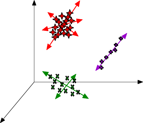
201
A SIMCA model consists of a collection of PCA models, one for each class in the data
set. This is shown graphically in Figure 8-9. Each class can have a different number of
principal components; the number depends on the data in the class. Each PCA sub-model
contains all the usual parts of a PCA model: mean vector, scaling information,
preprocessing such as smoothing and derivatizing, etc.
Class 1
3 PCs
Class 2
1 PC
Class 3
2 PCs
x1
x2
x3
Figure 8-9. Graphical representation of a SIMCA model.
As an example of SIMCA, we now return to the Arch data from the previous example.
Start the Analysis GUI, choose File/Load Data/X-block and load the data from the
PLS_Toolbox/Dems folder. Select SIMCA from the Analysis menu, then click the Show
SIMCA model builder button (the button with the hammer on it). The window shown in
Figure 8-10 should appear. The available classes in the data set are shown on the left.
Note that the unknown samples, which are listed as Class 0 in the arch DataSet Object,
are not listed, as the tool assumes that samples of unknown class are listed as class 0.
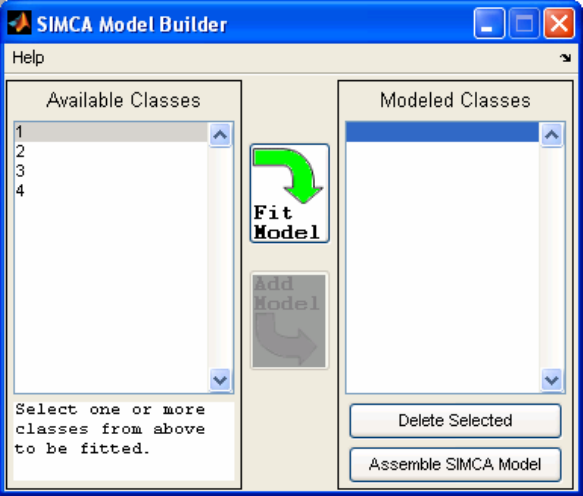
202
Figure 8-10. SIMCA Model Builder window.
Start the model building process by selecting 1 from the Available Classes list then
clicking Fit Model. (Note that it is possible to build a model on combined classes as well
as individual classes.) A PCA model of the Class 1 samples appears in the main Analysis
GUI window. This model can now be developed in the usual way—the number of PCs in
the model can be selected, the preprocessing can be changed, etc. (In our example we’ll
leave the preprocessing set to the default autoscaling.) The samples from the classes not
being modeled, as well as any unknown samples, will be projected onto the class model
under construction. An example of this projection is shown in Figure 8-11, which shows
the model of Class 1, the K class, as triangles. The unknown samples are the filled circles
with labels s1-s12. (The labels were made to appear only on these samples by first
selecting them from a plot of PC1 versus sample number, then selecting View/Labels in
the Plot Controls window.) A 95% ellipse was created by selecting Conf. Limits in the
Plot Controls window. As expected, the samples upon which the model was built fall
near the center of the plot within the 95% ellipse. Sample s2 falls within the scores limit,
and samples s3 and s4 are close (if the limit is adjusted to 99%, these samples fall inside).
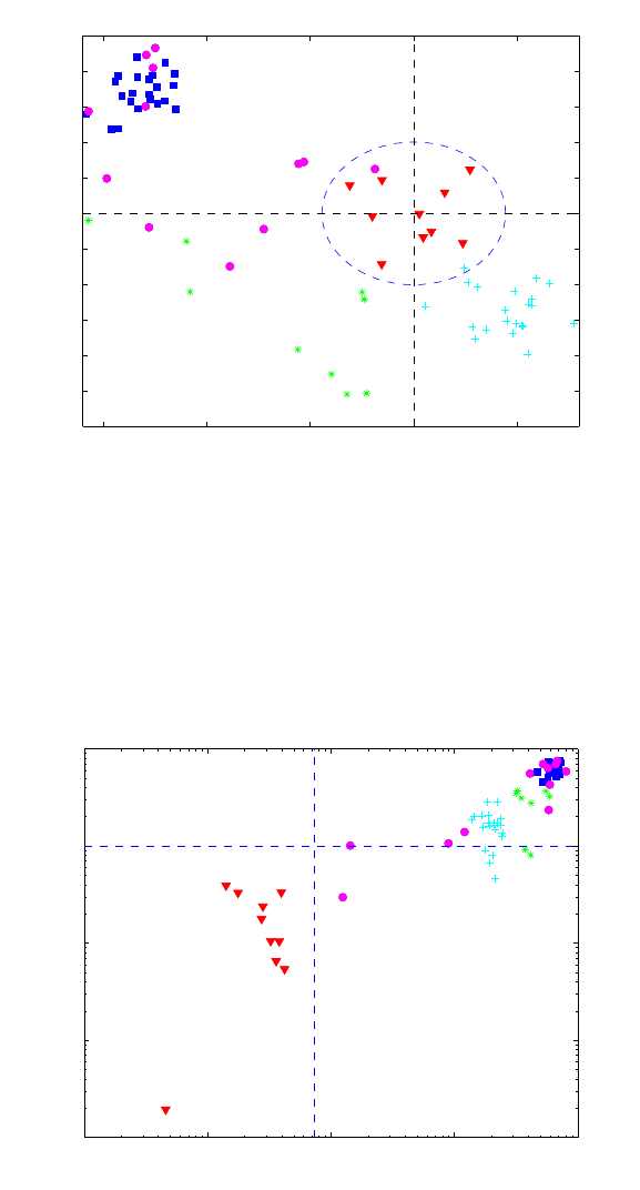
203
−15 −10 −5 0 5
−12
−10
−8
−6
−4
−2
0
2
4
6
8
10
Scores on PC 1 (38.49%)
Scores on PC 2 (30.39%)
s1
s2
s3
s4
s5
s6
s7
s8
s9
s10
s11
s12
Samples/Scores Plot of arch
Figure 8-11. Arch data projected onto model of class 1 (K).
It is also useful to look at the T2 versus Q for the data on the model of Class 1, as shown
in Figure 8-12. Here the axes have been changed to logarithmic scales by selecting
View/Log Scales/All in the Plot Controls window. Samples s2 and s3 are close to the
95% Q limit, while other samples are much further away.
10−1 100101102103
10−2
10−1
100
101
102
Q Residuals (31.12%)
Hotelling T
2
(68.88%)
s1
s2
s3 s4
s5
s6
s7
s8
s9
s10
s11
s12
Samples/Scores Plot of arch
Figure 8-12. T2 versus Q for all the Arch data on the model of class 1 (K).
Once the PCA model of class 1 is finalized, it may be added to the SIMCA model by
clicking the Add Model arrow in the SIMCA Model Builder window. The next class
can then be selected and the procedure repeated. For this example, all PCA models were
constructed with two principal components except for class 3, the SH class, which was
built with one component. Once all the models are built, click on Assemble SIMCA
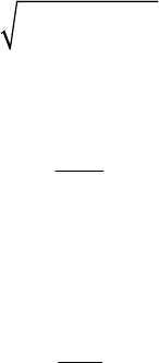
204
Model in the SIMCA Model Builder window. To apply the SIMCA model to the
calibration data and the unknown samples, click the Calculate button (the button with the
gears on it) in the main Analysis GUI window.
To get a quick view of the results, click the Samples/Scores button and plot “Nearest
Class” versus sample number. This should produce the plot shown in Figure 8-13. Note
that all samples are nearest to their respective class. Labels can be added to the unknowns
only by selecting them and turning labels on in the Plot Controls/View menu. A
zoomed-in view focusing on the unknowns is shown in Figure 8-14. Except for sample
s1, the assignments agree well with the classification by inspection and kNN results
above. Note that the plots show the nearest class. The nearest class to a sample is defined
as the class model which results in a minimum distance of the sample i to model j, dij:
dij =Qr
()
2+Tr
2
()
2 (8-5)
with reduced Q:
Qr=Q
Q0.95
(8-6)
where Q0.95 is the 95% confidence interval for the model under consideration, and
reduced T2:
Tr
2=T2
T0.95
2 (8-7)
with a similarly defined T20.95. This distance measure gives equal weighting to distance in
the model space (T2) and residual space (Q). Use of reduced Q and T2 allows direct
comparison of the values of specific samples on different SIMCA submodels. Without
the use of these reduced statistics, each model's T2 and Q values would be on very
different numerical scales and not easily comparable.
Inspection of the reduced Q and T2 plots (not shown) reveals that many of the samples
are not within the 95% limits of the classes.

205
0 10 20 30 40 50 60 70
1
1.5
2
2.5
3
3.5
4
Sample
Nearest Class
Samples/Scores Plot of Test
Figure 8-13. Nearest classes to SIMCA submodels for Arch samples.
60 62 64 66 68 70 72 74 76
1
1.5
2
2.5
3
3.5
4
Sample
Nearest Class
s1
s2 s3 s4
s5 s6 s7
s8 s9 s10 s11 s12
Samples/Scores Plot of Test
Figure 8-14. Nearest classes to SIMCA submodels for unknown Arch samples.
PLS-DA
While SIMCA is often a very useful classification tool, it does have drawbacks, the main
one of these being that the PCA submodels in SIMCA are computed with the goal of
capturing variation within each class. No attempt is made to identify directions in the data
space that discriminate classes directly. We now consider a classification method that
addresses this issue directly: Partial Least Squares Discriminant Analysis (PLS-DA). The
attentive reader will note that the goal of PLS-DA is very similar to that of another
206
common discrimination technique called Linear Discriminant Analysis (LDA). In fact,
Barker and Rayens (2003) have shown that PLS-DA is essentially the inverse-least-
squares approach to LDA and produces essentially the same result but with the noise
reduction and variable selection advantages of PLS.
In PLS-DA we will use PLS to develop a model that predicts the class number for each
sample. In a data set with just two classes, it is easy to see how we might set up a y
variable which indicates if the samples are in one of the classes by setting it to 1 if it is in
the class and 0 if it is not. The model, of course, will not predict either a 1 or 0 perfectly,
so a limit must be set, say 0.5, above which the sample is estimated as a 1 and below
which it is estimated as a 0.
But what if there are more than two classes? It would be possible to set up a y variable
with the class numbered 1, 2 or 3. However, this would imply that class 2 is somehow in
between class 1 and class 3, which likely is not the case. The solution to this is to create a
Y-block with a variable for each class. A 1 indicates a sample belongs to a class, and a 0
indicates that it does not. PLS for multivariate Y can now be performed.
As an example of PLS-DA, we now return to the Arch data set. Load the arch.mat file
into the Analysis GUI by selecting File/Load/X-block in the main Analysis GUI
window. Under the Analysis menu select PLS-DA. Set up cross-validation by selecting
Cross-Validation from the Tools menu. In the Cross-Validation window that appears,
select Venetian Blinds under the Cross-Val Method menu. The defaults of 9 splits of
the data and 10 LVs can be left as they are. Click the Calculate button (the gears) in the
main Analysis GUI window. The result should look like the window shown in Figure 8-
15.
The number of latent variables (LVs) to retain in the model must now be specified. Click
on the Stats button (the button with the pink graph and lambda symbol). The RMSECV
curves for each of the four class variables in the Y-block can viewed by control-clicking
each of the curves in the Plot Controls window. A legend can be added by clicking the
legend icon on the plot. The result should look like Figure 8-16. It is apparent that the
RMSECV for all the class variables level out after three LVs, except for class 1, which
continues down slightly. Based on this, selecting three LVs for the overall model appears
prudent. A selection of three LVs is also supported by the Variance Captured table. Select
three LVs by clicking the third line of the Variance Captured table and then clicking the
Calculate button.
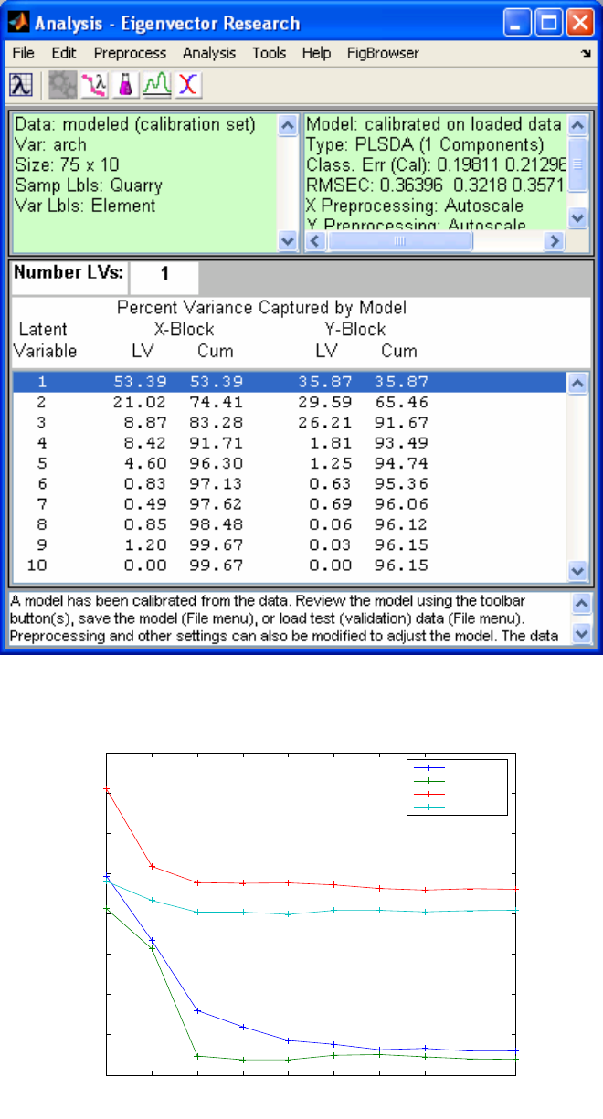
207
Figure 8-15. Analysis GUI main window with PLS-DA model of Arch data.
1 2 3 4 5 6 7 8 9 10
0.2
0.25
0.3
0.35
0.4
0.45
0.5
0.55
Latent Variable Number
Multiple Items (see Legend)
SIMPLS Variance Captured and CV for arch
RMSECV 1
RMSECV 2
RMSECV 3
RMSECV 4
Figure 8-16. RMSECV for classes in PLS-DA model of Arch data.
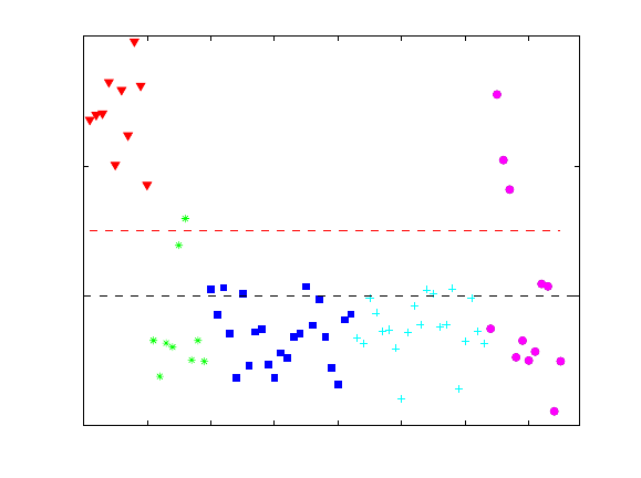
208
Other aspects of the PLS-DA model may now be explored. Click the Samples/Scores
button, and use the Plot Controls window to view the sample scores and the predictions
for all of the samples, including the unknowns, for each of the classes. For instance, it is
possible to view the predictions for class 1 (K) by selecting Y Predicted 1 (Class 1) from
the Y menu. The result for the three-LV PLS-DA model is shown in Figure 8-17. The
calculated threshold is shown as the horizontal red dashed line at approximately 0.35.
The threshold is estimated using Bayes' Theorem and the available data in order to
minimize total errors (see the plsdthres function for more details).
Note that one of the BL samples (green stars) is predicted to be a Class 1 (K). Changing
the model to four LVs corrects this, and appears to have little impact on any of the other
class identifications (Figure 8-18). Note that samples s2-s4 are predicted to be class 1
(K). Samples s5-s7 are predicted as class 2 (BL), and samples s7-s12 are predicted to be
class 3 (SH). Note that sample S7 is predicted to belong to both the BL and SH class (in
both the three-LV and four-LV models). Sample s1 is not predicted to belong to any
model.
The Bayesian threshold calculation assumes that the predicted y values follow a
distribution similar to what will be observed for future samples. Using these estimated
distributions, a threshold is selected at the point where the two estimated distributions
cross; this is the y-value at which the number of false positives and false negatives should
be minimized for future predictions. This calculation assumes that the distribution of
predicted y-values for a class is approximately normal. Small numbers of samples in any
class may bias the threshold. Similar calculations can be done on cross-validated or test-
set y-predictions to verify future performance of the selected threshold. In addition,
examination of the observed distribution of y-values is also warranted. This can be done
by examining the ROC and Threshold plots.
0 10 20 30 40 50 60 70
−0.5
0
0.5
1
Sample
Y Predicted 1 (Class 1)
s1
s2
s3
s4
s5
s6
s7
s8
s9
s10
s11
s12
Samples/Scores Plot of arch
Figure 8-17. PLS-DA three-LV model predictions for class 1 (K).
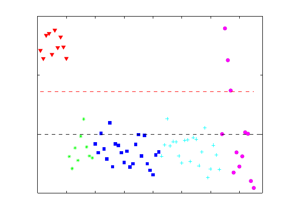
209
0 10 20 30 40 50 60 70
−0.5
0
0.5
1
Sample
Y Predicted 1 (Class 1)
s1
s2
s3
s4
s5
s6
s7
s8
s9
s10
s11
s12
Samples/Scores Plot of arch
Figure 8-18. PLS-DA four-LV model predictions for class 1 (K).
The overall sensitivity and specificity of the model can be accessed by selecting the
View/Show Model Details menu in the Analysis GUI or using the modlrder function at
the command line. In these results, the sensitivity and specificity is reported for each of
the four classes as well as both calibration (self-prediction) and cross-validation results.
In this case, all are reported as perfect (no errors):
Modeled Class: 1 2 3 4
Sensitivity (Cal): 1.000 1.000 1.000 1.000
Specificity (Cal): 1.000 1.000 1.000 1.000
Sensitivity (CV): 1.000 1.000 1.000 1.000
Specificity (CV): 1.000 1.000 1.000 1.000
These values (which, in this case, indicate no errors in either calibration or cross-
validation) can be converted into "fractional error" by subtracting each from 1.
Sensitivity and specificity can also be viewed in a graphical form referred to as a
Receiver Operating Characteristics Curve (ROC curve) by selecting the ROC curves
button in the Analysis GUI toolbar. The result of this is shown in Figure 8-19. The
sensitivity versus specificity for each of the four class models are shown on the left. Each
plot shows the specificity of the model (number of samples predicted as not in the class
divided by actual number not in the class) versus the sensitivity (number of samples
predicted as in the class divided by number actually in the class) as a function of selected
threshold. A curve which reaches the upper left corner implies that at some threshold, the
specificity could be perfect (1) without loss of sensitivity (dropping below 1). The
threshold selected by the PLSDA algorithm is shown as a red circle on each of the
estimated and cross-validated curves.
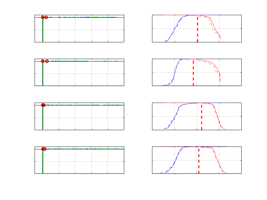
210
00.20.40.60.81
0
0.5
1
Estimated (blue) and
Cross−Validated (green) ROC
Specificity Y1 (1)
Sensitivity Y1 (1) −0.5 0 0.5 1 1.5
0
0.5
1
Estimated (Solid) and
Cross−Validated (Dashed) Responses
Threshold (Y predicted)
Specificity Y1 (1) (blue)
Sensitivity Y1 (1) (red)
00.20.40.60.81
0
0.5
1
Specificity Y2 (2)
Sensitivity Y2 (2) −0.5 0 0.5 1 1.5
0
0.5
1
Threshold (Y predicted)
Specificity Y2 (2) (blue)
Sensitivity Y2 (2) (red)
00.20.40.60.81
0
0.5
1
Specificity Y3 (3)
Sensitivity Y3 (3) −0.5 0 0.5 1 1.5
0
0.5
1
Threshold (Y predicted)
Specificity Y3 (3) (blue)
Sensitivity Y3 (3) (red)
00.20.40.60.81
0
0.5
1
Specificity Y4 (4)
Sensitivity Y4 (4) −0.5 0 0.5 1 1.5
0
0.5
1
Threshold (Y predicted)
Specificity Y4 (4) (blue)
Sensitivity Y4 (4) (red)
Figure 8-19. Receiver Operating Characteristic curves (left) and threshold plots (right) for
PLS-DA model of Arch data.
The figures on the right show the sensitivity and specificity as the threshold value is
varied. Ideally, these lines cross while still at a value of 1. Crossing below a value of 1
indicates that, as the threshold is increased, sensitivity begins to suffer (drops below 1)
before the model is completely specific. The vertical dashed red line indicates the
threshold selected by the PLSDA algorithm. This is the threshold used to calculate the
sensitivity and specificity reported in the model details. The point that the vertical
threshold line crosses the solid red line in any given plot is the calibration sensitivity, and
the point where the threshold line crosses the dashed red line is the cross-validation
sensitivity. Similarly, the point where the threshold line crosses the solid blue line is the
calibration specificity and the point where the threshold line crosses the dashed blue
lineis the cross-validation specificity.
It should be noted that the curves in both sets of plots are estimated based on
interpolation between measured values. It is not unlikely that, as in this example, the
ROC curves show a slightly different sensitivity and specificity result than that given in
the model details. The Model Details results are the exact sensitivity and specificity
determined from the modeled samples. The ROC curve results are the estimated results
given a larger, similarly distributed set of samples.
211
Based on the results shown in Figure 8-19, the PLS-DA model of Arch is nearly a
complete success based on calibration and cross-validation using data with known
classes. The only real issue is sample s7, which is predicted to belong to both the BL and
SH class with approximately equal probability. Inspection of a PCA of the data as well as
scores from the PLS-DA model suggests that this sample is much more likely to be BL
rather than SH. It is possible to add non-linear terms to the model by augmenting the
original data with squares and cross terms of the data. If this is done, the classification of
s7 is BL.
A detailed treatment of the PLS-DA technique is given by Barker and Rayens (2003). In
addition, an example of its use was given by Musumarra (2004).
212
213
9. Curve Resolution and Mixture Analysis
PCA is perhaps the most commonly used factor analysis technique; however, it is not the
only one. In this chapter, additional factor-based techniques are considered that are useful
for extracting information from a data set. While techniques such as PCA calculate
factors based on mathematical properties such as capturing maximum variance and
orthogonality, the factors are often difficult to interpret because they are generally not
directly related to chemical properties. For example, PCA loadings of a data set of
measured spectra generally are not pure component spectra. Instead, the loadings are
typically linear combinations of pure analyte spectra that have positive and negative
intensities. Factor analysis techniques discussed in this chapter are aimed at estimating
factors that have desirable properties from a chemical point of view and are easier to
interpret.
The first two sections of this chapter discuss evolving factor analysis (EFA) and evolving
window factor analysis (EWFA). These two techniques are appropriate for data that are
naturally ordered or have continuity, and can be used to find an initial estimate of the
range of existence of analytes in an evolving system. This discussion is followed by a
section on multivariate curve resolution (MCR). MCR examples utilize EFA results to
initialize the algorithm for an evolving data set. MCR is also known as self-modeling
curve resolution (SMCR) and end member extraction. The MCR section introduces the
mathematical model for the technique as well as the constrained alternating least squares
algorithm (ALS). Although ALS is not the only algorithm used in MCR, it is one of the
most common. It is one of several algorithms available that solve the objective function
in a constrained least squares sense.
A related technique, discussed after MCR, is self-modeling mixture analysis (SMA). The
objectives and mathematical models of MCR and SMA are similar; they both typically
decompose a data matrix into the outer product of non-negative factors. The difference is
that SMA is appropriate for data sets that are not evolving or naturally ordered in time. In
fact, SMA algorithms can be applied to data sets that have continuity, but techniques
specifically designed to take data ordering into account are often not useful for data that
does not have continuity. The SMA section introduces purity-based methods. These
algorithms are based on geometric arguments regarding data that are naturally
decomposed into the outer product of non-negative factors. These algorithms tend to be
fast and work very well when the data are highly selective. However, purity-based
algorithms do not generally find a solution in a least squares sense and are not as
amenable to the inclusion of constraints. Therefore, purity-based methods are very
popular for obtaining (and inspecting) an initial solution that is followed by an algorithm
that allows for a constrained least squares solution.

214
Evolving Factor Analysis
Evolving Factor Analysis (EFA) is one method applied to data that are naturally ordered;
for example, data produced by dynamic systems. Like multi-way principal components
analysis (MPCA), EFA considers the ordered nature of the data set explicitly. EFA is a
general technique for analysis of multivariate data that have an intrinsic order (Keller and
Massart, 1992). Like PCA, EFA can be used to determine how many “factors” are
present in a data set; that is, how many independent sources of variation exist.
Additionally, EFA can be used to determine where in a data set the factors first appear
and where they disappear.
The fundamental idea of EFA is to follow the singular values of a data matrix as rows
(samples) are added. Given a data matrix X (usually not mean-centered when
performing EFA) with m samples and n variables, the singular value of the first row
(sample) is determined. Next, the singular values for the first two rows are calculated,
followed by the first three rows, and so on until all m samples have been considered.
Since the number of samples considered, and thus the number of factors, evolves as the
method proceeds, the technique is known as EFA. Of course, the number of non-zero
singular values can never be greater than the lesser of the number of rows and columns in
the sub-matrix considered. It is also customary to do EFA in the reverse direction, i.e.,
determine the singular values starting from the last row in the matrix and working
upwards until all rows have been considered.
Once the singular values have been determined, they (or their logarithms, since they
usually span many orders of magnitude) can be plotted versus the ordered variable (e.g.,
time). As new factors enter the data, new significant singular values will rise from the
baseline of small singular values associated with noise in the data. Working in the reverse
direction, significant singular values will rise from the baseline when factors disappear
from the data matrix.
EFA Example
As an example of EFA, consider the semiconductor etch process again (see the previous
description of the data set in Chapter 5). Optical Emission Spectroscopy (OES) was used
to measure the plasma during etch. Initially, there is only the BCl3/Cl2 etch gas in the
reactor. When the plasma is ignited, the first layer of aluminum begins to etch away.
Once the aluminum is gone, the titanium nitride (TiN) is uncovered and begins to etch
away. When the TiN layer is gone, the plasma is in contact with only the silicon oxide
layer, which is nearly non-reactive. A set of idealized concentration profiles is shown for
this process in Figure 9-1, along with a set of pure component spectra (obtained using
MCR, discussed below).
Of course, the pure component spectra are not observed directly. Instead the measured
mixture spectra are observed as a function of time, as shown in Figure 9-2. These data
can be found in the oesdata.mat file. Note that the data are stored as a DataSet Object of
type ‘batch.’ Three etch runs are stored, each with a different number of time steps. To
accommodate the different number of time steps (number of rows), the data are stored as

215
Figure 9-1. Concentration profiles and pure component spectra for EFA example.
a cell array in the oesdata.data field. If the data followed the idealized concentration
profiles of Figure 9-1, the results of EFA would be as shown in Figure 9-3. In the forward
analysis, a large singular value exists from the very beginning, a result of the presence of
the etch gas. As Aluminum (Al) begins to etch, another singular value is added. A third
singular value rises from the baseline as TiN begins to etch. In the reverse direction, all
that remains at the end of the run is etch gas. As the TiN etch ends, a singular value rises
from the baseline. Finally, a third singular value emerges as the Al etch ends.
Unfortunately, in reacting systems, evolving factor analysis is seldom this simple (though
it can be in chromatography and other analytical applications where a separation step
precedes the spectroscopic measurement). Figure 9-4 shows the results of EFA on actual
OES data from the first wafer in the data set. Evolving factor analysis can be applied to
this data using the evolvfa function as follows:
» load oesdata;
» [egf,egr] = evolvfa(oesdata.data{1});
Here the input is the matrix of spectra from the first batch and the outputs are the forward
and reverse singular values. The results are shown in Figure 9-4. In this example, both
etch gas and Al are present at the beginning of the run. A second singular value is
0 5 10 15 20 25 30 35 40 45 50
0
1000
2000
3000
4000
Time Step
Concentration
Etch Gas
Aluminum
Titanium
240 260 280 300 320 340 360 380 400 420 440
0
0.1
0.2
0.3
0.4
0.5
Wavelength (nm)
Intensity

216
observed when the Al disappears; that is, when it starts to vary independently from the
etch gas. A fourth minor component is also observed.
Figure 9-2. Optical emission spectra as a function of time.
Figure 9-3. Evolving factor analysis of idealized OES from etch process.
250
300
350
400
450
0
10
20
30
40
50
0
100
200
300
400
500
600
700
800
Wavelength (nm)
Time Step
Intensity
0 5 10 15 20 25 30 35 40 45 50
10
1
10
2
10
3
10
4
10
5
Singular Value
Time
Forward Analysis
0 5 10 15 20 25 30 35 40 45 50
10
1
10
2
10
3
10
4
10
5
Singular Value
Time
Reverse Analysis
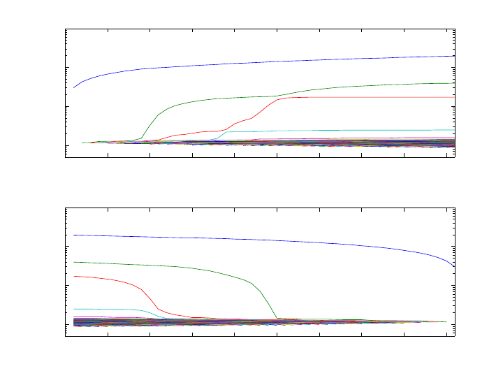
217
0 5 10 15 20 25 30 35 40 45
102
103
104
105
Singular Value
Time
Forward Analysis
0 5 10 15 20 25 30 35 40 45
102
103
104
105
Singular Value
Time
Reverse Analysis
Figure 9-4. Evolving factor analysis of actual OES from etch process.
In summary, EFA provides important information concerning the times of existence of
independently varying factors in the data set. This may be used to identify when analytes
enter a reactor, or when process disturbances or instrument failures occur. However,
interpretation of EFA profiles can be complicated when ranges of existence are highly
overlapped.
Evolving Window Factor Analysis
Evolving Window Factor Analysis (EWFA) is closely related to EFA and can sometimes
be used to resolve ambiguities concerning the range of existence of factors in a data set.
EWFA tracks the singular values of a moving window in a data set. For instance, with a
window width of 21j+ samples, i is incremented 1, ,im
=
… and the singular values of
samples ij− to ij+ are calculated. As in EFA, the singular values are plotted as a
function of index number i. The result is an indication of the number of independently
varying factors in each window.
Consideration must be given to the window width used in EWFA. The window should be
narrow enough to isolate factors which exist in different parts of the data record, but
sufficiently wide to enhance the signal-to-noise obtained by including multiple spectra.
At times the choice is not easy; however, it is a simple matter to try several window
widths and examine the results. One suggestion is to use EFA first to find out how many
factors are present in the entire data set, then use a window width that is one sample
larger than the number of factors.

218
Example of EWFA
As an example of EWFA, the OES data from the semiconductor etch process is used
again. EWFA can be performed on the first wafer of the oesdata.mat file using the ewfa
function as follows:
» load oesdata;
» eigs = ewfa(oesdata.data{1},7);
In this example, the window width was set to 7 and the results are shown in Figure 9-5.
Singular values for the windows near the ends of the record with a width less than 7 are
shown as dashed lines. It is clearly seen that there is only a single source of variation at
both ends of the data record (though we know that at the beginning it is both Al and etch
gas). There are three sources of variation centered around sample 12 and two sources
around sample 23. Given our knowledge of the process, it is a good guess that the two
factors centered around sample 23 are etch gas and TiN. What about around sample 12?
Based on the EFA, we know that there are four factors total in the data set. The three
factors must be etch gas, Al, and an unknown fourth component. Multivariate Curve
Resolution may help us determine its origin.
Multivariate Curve Resolution
EFA and EWFA provide important information regarding the system; namely, the total
number of factors present and their times of appearance and disappearance. However, it
would be impossible to identify the compounds based on this information alone
(additional information is necessary). Nonetheless, the results of EFA do provide a
starting point for the determination of the concentration profiles and pure component
spectra. Techniques for obtaining this additional information are known as Multivariate
Curve Resolution (MCR), or Self Modeling Curve Resolution (SMCR) (see Jiang and
Ozaki, 2002; Tauler et al., 1993a,b, 1994, 1995, 1998; Massart et al., 1998; Hamilton and
Gemperline, 1990; Sánchez et al., 1997). MCR has also been referred to as End Member
Extraction.
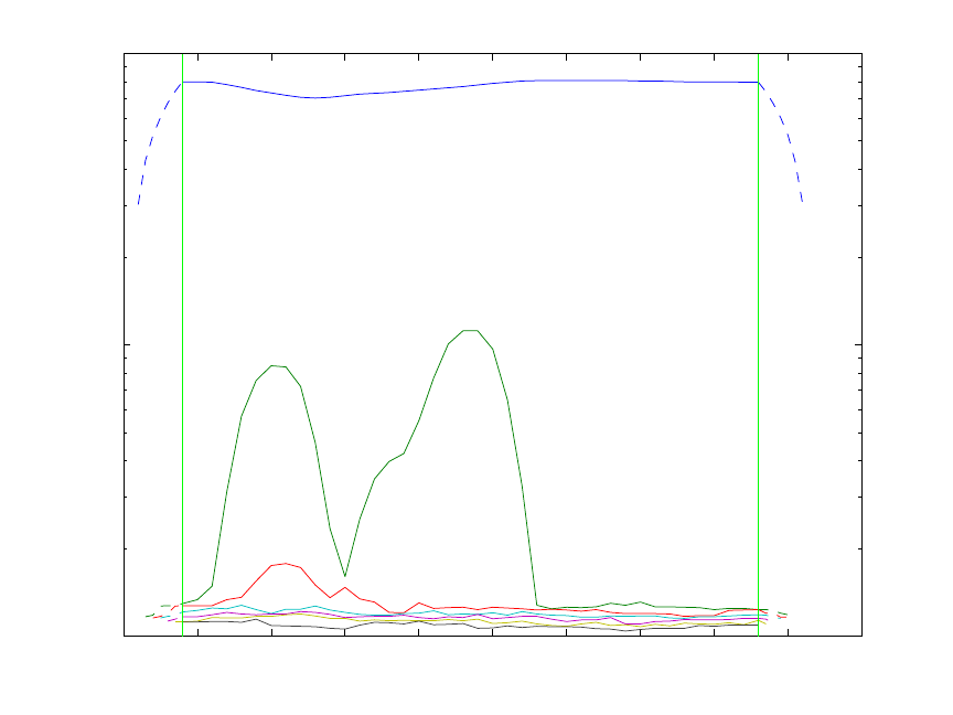
219
0 5 10 15 20 25 30 35 40 45 50
10
2
10
3
10
4
EWFA with Window Width = 7
Sample Number of Window Center
Singular Values
Figure 9-5. Evolving window factor analysis of actual OES from etch process.
The objective of MCR is to extract concentration profiles and pure component spectra
with as few assumptions about the data as possible. Given an mn
×
data matrix X (not
mean-centered) that is the product of a mk
×
matrix of concentration profiles C, and a
nk× matrix of pure component spectra S, where k is the number of analytes,
T
=
+XCS E (9-1)
the goal is to obtain physically meaningful C and S. Obviously this cannot be obtained
directly from a principal components analysis (PCA) decomposition of X without
additional information because the equation:
1TTT
est
−
== =XTPTRRPCS
(9-2)
where
T
est
=
+= +XX ETP E (9-3)
has an infinite number of solutions for any arbitrary invertible k by k transformation
matrix R, resulting in a rotational and intensity ambiguity for C and S if no other
information is known. Here T is a m by k matrix of scores with orthogonal columns,
220
and P is a n by k matrix of orthonormal loadings also referred to as “abstract factors”
(Malinowski, 1991).
Fortunately, more information is typically available. In particular, both concentrations
and spectra are necessarily non-negative. Using this constraint, it is often possible to
extract the pure component spectra through a procedure of alternating and constrained
least squares optimization. For example, non-negativity is a sufficient constraint if there
is sufficient selectivity in the data (Manne, 1995; Tauler, 2001; Gemperline and Cash,
2003). Starting with the results of the EFA, it is possible to obtain an initial estimate of
the concentration profiles, or at least, the range of existence in the data set of each
component. These concentration profiles are used as initial estimates in the constrained
and alternating least squares optimization. At each iteration of the optimization, a new
estimate of the spectra matrix S and of the concentration profiles C is obtained. Iteration
between the following two equations is performed:
TT
est
+
=SCX (9-4)
est
+
=CXS (9-5)
where
()
1
T−
+=CCCC and
(
)
1
T
−
+=SSSS are pseudoinverses of the matrices C and S
respectively. If non-negativity constraints are implemented, Equations (9-4) and (9-5) are
solved subject to these constraints. Equality constraints, such as forcing the concentration
of a particular analyte to zero or some known value, can also be imposed. Selection of the
correct number of components when originally calculating est
X (see Equation 9-3) is
important. Selecting too few components will cause small-variance components to be
undetectable. Although the original unfiltered data, X, can be used, use of est
X can
improve the stability of the pseudoinverse calculations, since est
X is a noise-filtered
estimate of X.
The constrained alternating least squares algorithm discussed above is commonly used.
However, other algorithms that have similar objectives to those stated for MCR above are
also used (see Tomasi et al., 2006; Paatero,1997; Berman et al., 2005). It should be noted
that there is typically an intensity ambiguity in the MCR results, i.e., an ambiguity in the
absolute magnitude of the concentration profiles and pure component spectra. For
example, if D is an arbitrary k by k invertible diagonal matrix then
1TT
est
−
==X CS CDD S . (9-6)
If, however, the concentration of a component is known at any point within the data (e.g.,
by including standards), it is possible to resolve the ambiguity for that particular
component. However, when non-zero equality constraints for a concentration profile
and/or spectrum are unavailable, the estimated spectrum k
s is constrained to be of unit
length such that 1
T
kk
=ss (otherwise a solution might wander about aimlessly without
improving the fit). If additional information is known about the problem, it is possible to
221
incorporate it into the iteration procedure as a constraint. For instance, it is often assumed
that the concentration profiles are unimodal. In other cases, closure or a known
stoichiometry may be used. When additional known (correct) constraints are used, the
quality of the solution obtained generally improves. The most common constraints are
non-negativity that can be applied using hard (Bro and de Jong, 1997) or soft
(Gemperline and Cash, 2003) methods. Other constraints can include hard modeling or
functional constraints (see de Juan et al., 2000; Gurden et al., 2001; Gallagher et al.,
2003).
As mentioned above, good solutions for C and S can be obtained when good selectivity
exists. However, as the selectivity decreases, the estimates can become poor. This is a
result of a rotational ambiguity [Gemperline, 1999; Tauler, 2001). For example, if R is
an arbitrary invertible non-diagonal matrix then
1TT
est
−
==X CS CRR S . (9-7)
Note: Users should be aware of the potential for multiplicative [Equation (9-6)] and
rotational [Equation (9-7)] ambiguities and not over-interpret results from MCR.
Utilizing additional correct constraints can reduce ambiguities in the solution; however,
multiplicative ambiguities mean that C and S are in arbitrary units. In a perfect world,
C and S would be proportional to true concentrations and spectra (at unit concentration
and pathlength); however, rotational ambiguities can make concentration profiles and
spectra look different from the true underlying factors. To emphasize these potential
problems, C will be referred to as “contributions” instead of “concentrations” in the
remainder of this chapter. The columns of the matrix S will still be referred to as spectra
and/or pure component spectra.
It is also possible to combine data sets from different process runs (or analytical runs)
simply by augmented matrices as follows:
11 1
22 2
T
P
PP
== +
XC E
XC E
XS
XC E
(9-8)
where p
X are the ordered data for each of the 1, ,
p
P
=
… process runs and the p
C are
the associated contribution profiles from the runs. Combining data from different runs,
and/or measured standards, may also contribute to the stability of the solutions obtained.
Augmented matrices of standard analytes can be included to improve selectivity and
allow MCR to be used for quantification (see Tauler, 1995; de Juan et al., 1998; Tauler et
al., 1998; de Juan et al., 2001).

222
Example of Multivariate Curve Resolution
As an example of MCR, the data used in the EFA example discussed above are used.
Recall that the approximate range of existence of each component present in the data was
determined using EFA. Due to its small size, the fourth component in this data set is
difficult to estimate; therefore, in the first attempt, only the first three components are
estimated. It is expected that these data can be decomposed as non-negative
concentrations times non-negative spectra, and the default optional constraint for mcr and
its low level decomposition function als. is non-negativity for C and S. The als
function is used in this example.
The first step in the MCR decomposition is to generate an initial estimate of the
contribution profiles, c0 (or spectra). In this case there is reason to believe that the
BCl3/Cl2 etch gas is present for the entire run. Al, however, is only present at the
beginning, and TiN should only be present in the middle. Thus, an initial estimate is
constructed using the expected range of existence of the analytes as follows:
» dat = oesdata.data{1};
» c0 = zeros(46,3);
» c0(:,1) = 1;
» c0(1:12,2) = 1;
» c0(9:24,3) = 1;
The MCR decomposition can be performed using the als function as follows:
» [c,s] = als(dat,c0);
Non-Negativity on C (Fast Least-Squares)
Non-Negativity on S (Fast Least-Squares)
Terminated based on maximum iterations
Elapsed time: 18.3 seconds
Residual (RMSE) 7.956991e+002
Unmodelled Variance is 0.158656 percent
The resulting estimates for the contribution profiles and pure component spectra are
shown in Figure 9-6. The residuals are also plotted as a function of time and wavelength
(Figure 9-7). Figure 9-6 looks close to the expected result; however, the third analyte
(TiN) has non-zero values in the first nine time steps. This was not expected based on the
way the layers are applied to the semiconductor. Additionally, the residuals are high in
the contribution profile about where EFA suggested the fourth component might exist.
Contribution constraints can be used to eliminate non-zero estimates for the TiN where it
is expected to have zero contributions. Constraint matrices are constructed using desired
numerical values where constraints are to be applied, and NaNs in locations where there
are no constraints. This is done as follows:
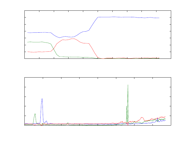
223
Figure 9-6. Results from MCR of OES from etch process with non-negative constraints
and three factors: etch gas (blue), Al (green), TiN (red).
» options = als('options');
» options.cc = zeros(46,3)*NaN;
» options.cc(15:end,2) = 0;
» options.cc(1:8,3) = 0;
» [c,s] = als(dat,c0,options);
Non-Negativity on C (Fast Least-Squares)
Non-Negativity on S (Fast Least-Squares)
Hard Equality Constraints on C: component(s) 2 3
Terminated based on maximum iterations
Elapsed time: 16.8 seconds
Residual (RMSE) 7.966828e+002
Unmodelled Variance is 0.159048 percent
The first command above generates a default options structure, and the following
commands fill in the contributions constraints matrix options.cc. Note that options.cc
is the same size as the expected output c, i.e., it is mk
×
. The results from running als
with the constraints are shown in Figure 9-8. In the contribution estimates, the etch gas is
the upper line. The Al curve starts positive then goes to zero, while the TiN starts at zero,
peaks, and returns to zero.
Next, we use the als function to estimate the contribution profiles and the spectra for the
OES data with four factors. The contributions of the Al and TiN were constrained to be
0 5 10 15 20 25 30 35 40 45 50
0
500
1000
1500
2000
2500
3000
3500
Concentration Profile
C
ALS Results after 100 iterations
0 100 200 300 400 500 600 700 800
0
0.1
0.2
0.3
0.4
0.5
Spectral Profile
S
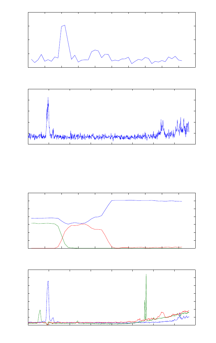
224
zero in ranges suggested by the initial MCR results. A fourth component was constrained
to be zero in the range of time steps 1 to 7 and 15 to 46.
Figure 9-7. Residuals corresponding to the analysis shown in Figure 9-6.
Figure 9-8. Results from MCR of OES with equality constraints: etch gas (blue), Al
(green), TiN (red).
0 5 10 15 20 25 30 35 40 45 50
1
1.5
2
2.5
3x 10
4
Concentration Profile
C Sum Squared Residuals
ALS Results after 100 iterations
0 100 200 300 400 500 600 700 800
0
1000
2000
3000
4000
5000
Spectral Profile
S Sum Squared Residuals
0 5 10 15 20 25 30 35 40 45 50
0
500
1000
1500
2000
2500
3000
3500
Concentration Profile
C
ALS Results after 100 iterations
0 100 200 300 400 500 600 700 800
0
0.05
0.1
0.15
0.2
0.25
0.3
0.35
Spectral Profile
S
225
» load oesdata
» dat = oesdata.data{1};
» c0 = zeros(46,4);
» c0(:,1) = 1;
» c0(1:12,2) = 1;
» c0(9:24,3) = 1;
» c0(5:20,4) = 1;
» options = als('options');
» options.cc = zeros(46,3)*NaN;
» options.cc(15:end,2) = 0;
» options.cc(1:8,3) = 0;
» options.cc(:,4) = NaN;
» options.cc([1:7 15:end],4) = 0;
» [c,s] = als(dat,c0,options);
Non-Negativity on C (Fast Least-Squares)
Non-Negativity on S (Fast Least-Squares)
Hard Equality Constraints on C: component(s) 2 3 4
Terminated based on maximum iterations
Elapsed time: 17.1 seconds
Residual (RMSE) 7.611437e+002
Unmodelled Variance is 0.145175 percent
The result after 100 iterations is shown in Figure 9-9. In this case, the contribution
profiles for the etch gas, Al, and TiN conform very well to those suggested by the major
peaks in the spectra. The fourth component appears to be a background addition. Note
that, based on residuals (not shown), the fit of this model to the data is only slightly better
than a fit using three components, and may not be justified.
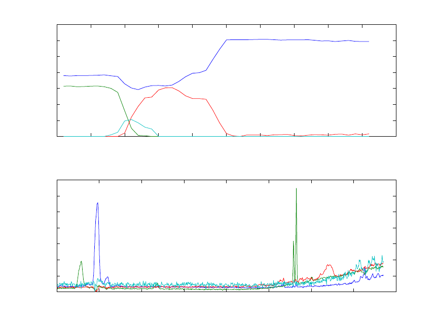
226
0 5 10 15 20 25 30 35 40 45 50
0
500
1000
1500
2000
2500
3000
3500
Concentration Profile
C
ALS Results after 100 iterations
0 100 200 300 400 500 600 700 800
0
0.05
0.1
0.15
0.2
0.25
0.3
0.35
Spectral Profile
S
Figure 9-9. Results from MCR estimate of four factors from OES data: etch gas (blue),
Al (green), TiN (red), unknown fourth factor (cyan).
This example is a fairly typical example of an MCR analysis. Often, the initial results
using only non-negative constraints, and without equality constraints, are not particularly
satisfactory. Additional effort is required to identify and apply the correct constraints to
obtain a good solution. This effort is required because, in many instances, the true
underlying factors cannot be determined based on non-negativity alone. In some cases,
infinitely many solutions can satisfy non-negativity and fit the data equally well.
Self-Modeling Mixture Analysis
Techniques to resolve (decompose) spectral data sets into spectra and their contributions
were originally known under the term self-modeling curve resolution. In this section,
discrimination is made between techniques that rely on continuity in the data and
techniques that do not. Techniques that rely on continuity will be referred to as self-
modeling curve resolution (SMCR) or multivariate curve resolution (MCR). Techniques
that do not rely on continuity, the subject of this section, will be referred to as self-
modeling mixture analysis (SMA). This section has two parts. The first part is a tutorial
that explains the mathematical principles and MATLAB code to perform self-modeling
mixture analysis. The focus of the explanation is based on a geometrical representation.
The second part of the tutorial explains how to use the software with a variety of data
sets.

227
If the reader is familiar with the pure variable concept, he or she can go directly to the
Tutorial of Purity Model Builder, where the use of the program is explained.
Tutorial of mathematical principles
This tutorial will describe the pure variable method for self-modeling mixture analysis
(SMA). Self-modeling mixture analysis is a series of algorithms to resolve (decompose)
spectral mixture data into pure component spectra and their contributions without using
prior information about the mixtures. A truly pure variable, e.g., the response at a specific
wavenumber for IR spectra, or an m/z value for mass spectra, is a variable that has
intensity contributions from only one of the components of the mixtures. Therefore, a
truly pure variable is one that is selective for only a single analyte. This tutorial aims to
give a good understanding of the pure variable method using a minimal amount of
mathematics. Furthermore, this tutorial is not meant to present a literature overview.
Purity-based methods can be applied in an automated sense with minimal user
intervention. However, an important aspect of the method presented here is that it can be
used interactively, allowing users to guide the solution. This is often necessary because in
a practical environment, spectral data sets are generally not based on a careful
experimental design; samples often originate from a manufacturing process with only a
single or very few samples available; or spectra shift due to temperature changes during
the manufacturing of materials. The latter can result in problems for kinetic modeling. It
is difficult to generate algorithms that automatically deal with all these problems and
often human guidance is required. An interactive approach enables the user to account for
deviations from the ideal mixture model and implement chemical and physical
knowledge into the SMA decomposition.
Pure variable methods are often used to initialize other algorithms such as the ALS
algorithm discussed above (see Windig et al., 2002; Windig et al., 2005; Gallagher et al.,
2003a; Gallagher et al., 2003b).
Pure Variable Concept
As mentioned above, SMA resolves (decomposes) mixture data into pure component
spectra and contributions without using prior information about the mixtures. The model
is based on Equation (9-1) and is illustrated in Figure 9-10.
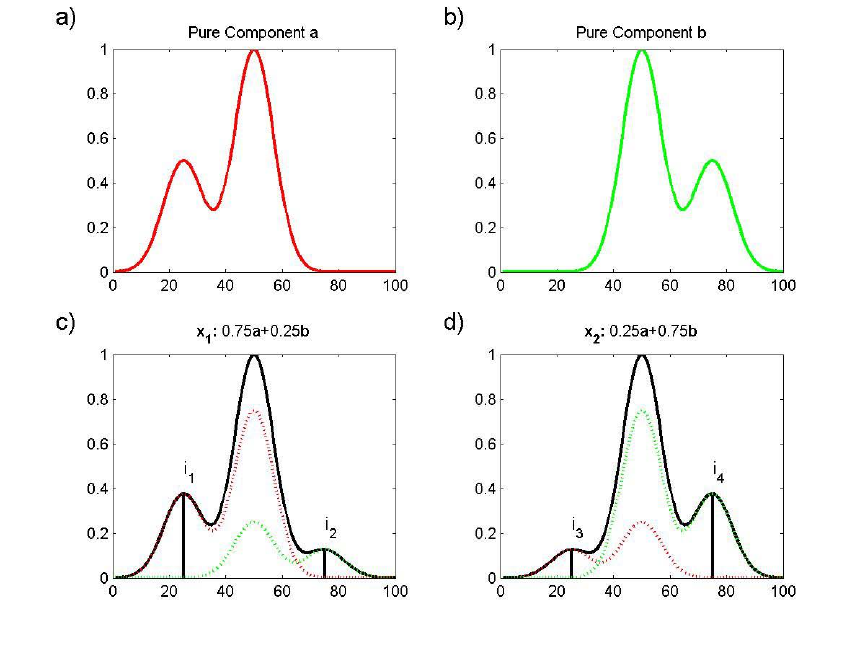
228
Figure 9-10. Panels (a) and (b) show spectra a and b of pure components A and B.
Panels (c) and (d) show mixtures of these two components, 1
x and 2
x. Since a has a
peak around 25, where b does not have a peak, the intensity at 25 in 1
x is a measure of
the amount of a in 1
x. As a result, variable 25 is a pure variable for a. Similarly
variable 75 is a pure variable for b.
In Figure 9-10a, the 1 100x spectrum a of pure component A is given. In Figure 9-10b,
the 1 100x spectrum b of pure component B is given. In Figure 9-10c a 1 100x mixture
1
x of these two components is given (solid line). The mixture spectrum 1
x in Figure 9-
10c contains a 75% contribution of component A, indicated with a dotted line, and a 25%
contribution of component B, also indicated with a dotted line. The
1 100x mixture
spectrum 2
x in Figure 9-10d contains a 25% contribution of a and 75% contribution of
b. Purity-based self-modeling mixture analysis has the following task: given only the
mixture spectra in Figure 9-10c and 9-10d, 1) estimate the pure component spectra in
Figure 9-10a and 9-10b; and 2) calculate their contributions in the mixture spectra (the
numbers in the headers of Figure 9-10c and 9-10d). The term “contributions” is used
instead of “concentrations” since, at best, we can only expect values that are proportional
to concentrations (please see the discussion in the previous section regarding
multiplicative and rotational ambiguities). To obtain concentrations in usable units, at
least one calibration sample is necessary.
229
To show that the task stated above can be completed, the pure variable concept needs to
be introduced. In the spectrum in Figure 9-10c, the line labeled 1
i is at a pure variable of
component A, since only component A has intensity at that variable, and component B
does not. Similarly, the line labeled 2
i in Figure 9-10c is at a pure variable for component
B. The lines labeled 3
i and 4
i in Figure 9-10d are at the same pure variables. It is
important to realize that the variable is pure for a certain component with respect to all
other components. As a consequence, the purity of a variable is not just a function of a
certain component, but also of all other components in the mixture.
Before continuing, it must be realized that not just variable 25 is pure for a; variables 1
through 25 are all pure for a, and variables 75 through 100 are all pure for b. Variables
at 25 and 75 were chosen because they are pure and they have a relatively high intensity.
When the pure variables are known (how to determine the pure variables without
knowing the pure component spectra will be explained later), it is possible to calculate
the spectra of the pure components as rationalized by the following equations.
12 1
34 2
ii
ii
+
=
+
=
abx
abx
(9-9)
12 1
34 2
ii
ii
=
x
a
x
b (9-10)
In Equations (9-9) and (9-10), 1
i represents the intensity at the pure variable of the
unknown component a, and 2
i represents the intensity at the pure variable of the
unknown component b. Since 1
i and 2
i are intensities at pure variables, they are
proportional to the concentrations of the unknowns a and b.
What the equations state is that an amount 1
i of the unknown a plus an amount 2
i of the
unknown b result in the first mixture spectrum 1
x. Similarly, the second equation
represents the composition of the second mixture spectrum. The variables 1
i, 2
i, 3
i, 4
i,
1
x and 2
x are known and desired unknowns are a and b. As a consequence there are
two equations with two unknowns, which can be solved.
It must be realized that the above description is a simplification of the decomposition
problem, since a, b, 1
x and 2
x are not single numbers, but series of numbers, i.e.,
vectors. It could be envisioned that there is one set of equations for each of the 100
channels in the spectra. Also the matrix of coefficients often has more than two rows
(there are more mixtures than unknown components); therefore, least squares solutions
are needed in practice (since the system of equations is over-determined). At this point,
the intent is to show the reader the principle that it is possible to estimate the unknown
spectra, once the pure variables are known. MATLAB code to solve these problems is
given below.

230
Since knowledge of the pure variables holds the key to the pure component spectra,
determination of the pure variables is a valid approach for SMA. To resolve a mixture
data set with the pure variable approach, pure variables must be present. This means that
spectral channels must exist that are selective for each of the components present. If the
variables are not pure, results will likely not represent pure component spectra but instead
will be linear combinations of them (i.e., the results may be hampered by a rotational
ambiguity). However, as is shown later, second derivative data can often be used to
enhance selectivity. As will be shown below, pure variables have properties that make it
possible to determine them by simple means.
Determination of Pure Variables from Pure Component Spectra
In Figures 9-11a and 9-11b, the pure components a and b are shown and the pure
variables are indicated by symbols. Although a and b are shown as continuous profiles,
they are defined by discrete values. Points representing a and b are plotted in Figure 9-
11c. The x-axis represents contributions of a and the y-axis represents contributions of
b. By definition the contributions of pure A and pure B are 1 and a mixture of 50% a and
50% b lies on the line between the points a and b. The plotted points at [0,1] and [1,0]
represent the pure spectra.
Points representing spectral variables can also be plotted. For example, in Figure 9-11d
Variable 25 (also indicated with a triangle in Figure 9-11a) has a value of about [0.5 0].
Values for all 100 variables are plotted in Figure 9-11d. For the techniques discussed
here, the actual position of the variable points is not important, but the direction from the
origin is important. Therefore, each of the 1, ,100j
=
… variables are normalized to unit
length. The results are plotted in Figure 9-11e.
As can be seen in Figure 9-11e, the pure variables lie on the x and y-axis, which is not
surprising considering the definition of pure variables. All the variables that are not pure
are bracketed by the pure variables since all mixture variables (i.e., non-pure variables)
have positive contributions from a and b. This is a crucial property of spectral mixtures:
a mixture consists of positive spectra and positive contributions. In Figure 9-11e the
direction of the pure variables points coincides with the pure spectrum points. This seems
to make sense, but as we will see below, it is not that simple.
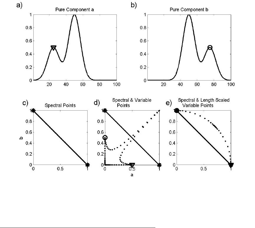
231
Figure 9-11. The values for the two pure components a and b in (a) and (b) results in
(c). Plotting the spectral variables in addition results in (d). Scaling to unit length of the
axes results in (e). Pure variables are indicated with symbols.
Determination of Pure Variables from Mixture Spectra
The example in Figure 9-11 is overly simple because the pure component spectra were
used for these plots. What happens when only mixture spectra are available? This is
shown in Figure 9-12. Figures 9-12c-e show plots of mixture spectra 2
x versus 1
x. The
good news is that the pure variables still have the property that they bracket all other
variables, i.e., the pure variables are on the exterior of the data set. To display the
properties in Figure 9-12 better, a slightly different version is shown in Figure 9-13. The
figure is essentially the same, but the spectral points are labeled with their mixture
composition.
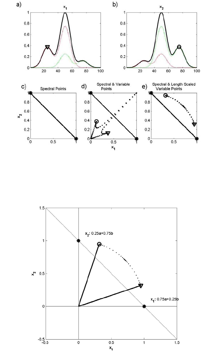
232
Figure 9-12. Mixture spectra 1
x (a) and 2
x (b) (the true unknown pure component
spectra are the dashed lines in panels). The pure variables, indicated with a circle and a
triangle, bracket all the other variables (d) and (e).
Figure 9-13. The same plot as in Figure 9-12d, but now with vectors representing the
pure variables. The two stars indicate the mixture spectra from Figure 9-12a,b. All other
possible mixtures lie in a line through these two stars.
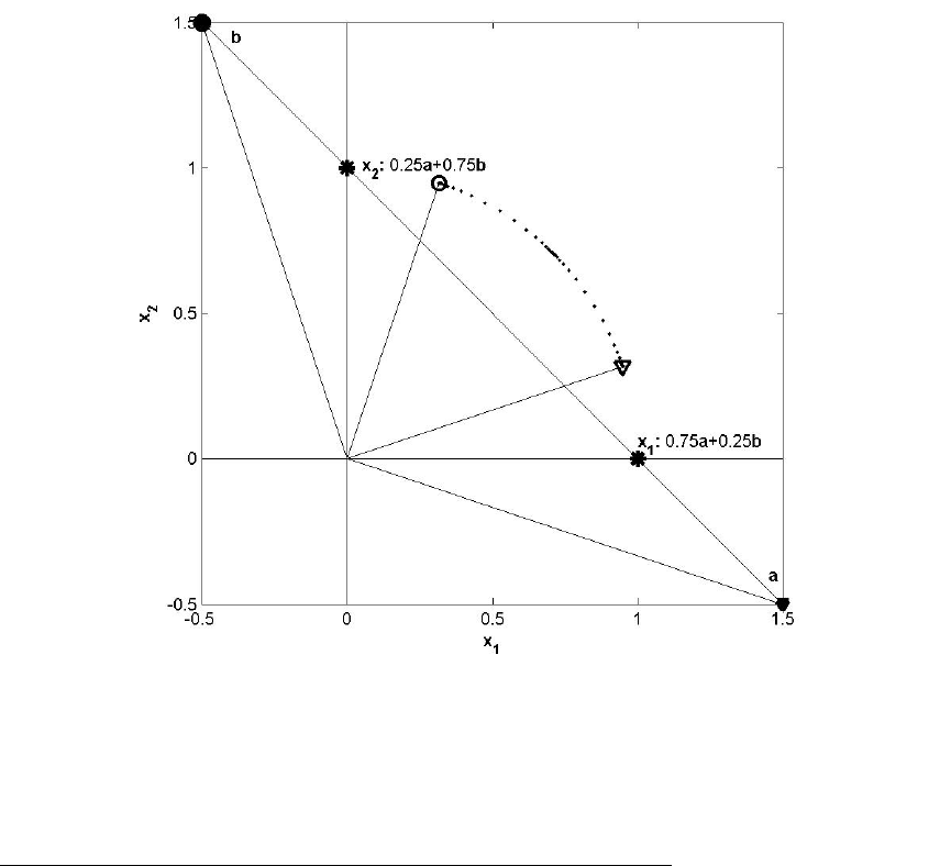
233
Next the spectra of the pure components a and b are determined under the assumption
that 1
i, 2
i, 3
i, 4
i, 1
x, and 2
xare known and recognizing that the difference 12
∆= −xx x is
0.5 0.5∆= −xab
. This result can be used to give 10.5
=
+∆ax x and 20.5=−∆bx x. [A
general solution can be obtained by performing elementary row operations on Equation
(9-10) (see Chapter 3, Introduction to Linear Algebra, for details); however, when the
number of rows in the coefficient matrix is larger than the number of unknowns least
squares is used. The solution for a represents a lengthening of 1
x by half the distance
between the two mixtures (see Figure 9-14). Note that the spectral points representing the
pure spectra do not coincide with the spectral points of the pure variables! Also, the
estimates of a and b are at unknown concentrations (and pathlength) and, as a result, are
often normalized to unit length. At first glance it might appear that the estimated a has
negative intensities because it is below the horizontal x-axis. However, it should be
remembered that the x- and y-axes correspond to mixtures and
(
)
12
1 0.25 0.25=+ −axx.
Figure 9-14. The same plot as in Figure 9-13, but now the points representing the pure
spectra have been added, labeled with a and b, respectively. The two stars indicating the
mixture spectra from Figure 9-12a and b. All other possible mixtures lie in a line through
these two stars.
Determination of Pure Component Spectra from Pure Variables
In an effort to be more clear, Figure 9-14 is explored in more detail. An interactive
MATLAB function purvarmixturedemo is available to reproduce the results in Figure 9-
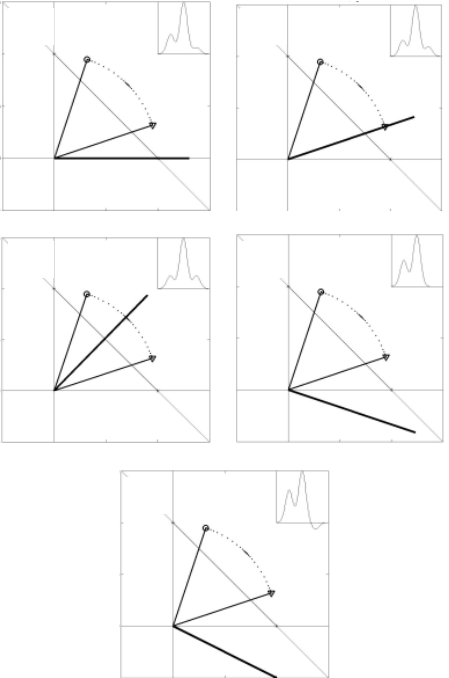
234
15. These spectra (also calculated and displayed by the purvarmixturedemo function)
are based on the original variables, not the variables scaled to unit length. In Figure 9-15a
the direction of the 1
x axis shows, not surprisingly, the spectrum of mixture 1
x. At first
thought, it might be expected that plotting the spectrum in the direction of the pure
variable axis a that the pure component spectrum of a would result (see Figure 9-15b).
However, the spectrum is not the pure component spectrum of a but is instead a mixture
spectrum. Changing the direction further (Figure 9-15c) shows another mixture spectrum
(as should be expected because this direction is interior to the pure variables). This is
clearly the wrong direction for finding the spectrum of pure a. Moving away from the
center clock-wise yields the spectrum of a (Figure 9-15d). This direction corresponds
with the previously determined spectral point of a (Figure 9-14). Moving further in the
clock-wise direction gives a spectrum with negative intensities (Figure 9-15e). In this
case, the negative values suggest an incorrect direction.
Figure 9-15. Similar plot as in Figure 9-14, but with different estimates of the pure
component spectrum for a. The two stars indicating the mixture spectra from Figure 9-
12a,b. All other possible mixtures lie between these two stars.
SMA attempts to answer the following question: what determines the direction
corresponding to pure component a when information used to plot the spectral point a
01
1
0
X
1
X
2
(a)
01
1
0
X
1
X
2
(b)
01
1
0
X
1
X
2
(c)
01
1
0
X
1
X
2
(d)
01
1
0
X
1
X
2
(e)
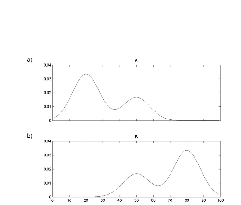
235
in Figure 9-14 is unavailable? The answer lies in the pure variable concept. The spectral
point of a must not have signal from b. This is the definition of a pure variable or
selective variable: a selective variable is one that includes signal from only a single
analyte and has signal free from interferences. As a result, the direction of the spectrum
of a is orthogonal to the pure variable of b. Closer inspection of Figure 9-14d shows
that this is indeed the case. Similarly, the spectrum of b can be found, as indicated with a
solid circle in Figure 9-15.
To summarize the principle of the pure (selective) variable refer back to Figure 9-14.
a) Pure variables (indicated with an open circle and an open triangle) bracket all other
variables i.e., selective variables are on the exterior of the data set.
b) Pure spectrum directions for each analyte are orthogonal to pure variable directions of
all remaining analytes and interferences.
MATLAB Code for Pure Variable Method
The question now is how to put all these pictures in a workable algorithm. To
demonstrate the algorithm, a more realistic data set will be created of a mixture of two
components. The first data set is purvardata, which does not contain noise. The second
data set is purvardata_noise, which contains the same spectra with added noise. A plot
of the two pure components and the contributions of these components in the mixtures is
given in Figure 9-16.
Figure 9-16. The components A and B from which the data sets have been constructed,
using the contributions listed below.
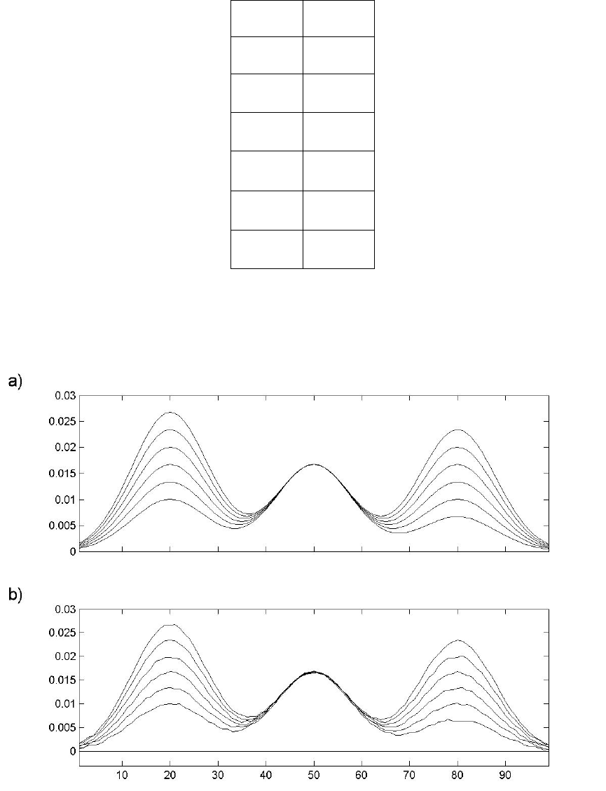
236
Contributions
A B
0.3 0.7
0.4 0.6
0.5 0.5
0.6 0.4
0.7 0.3
0.8 0.2
The noise-free spectra and spectra with noise are shown in Figure 9-17. Noise was added
as a uniform random distribution between +0.00025 and –0.00025, which is
approximately 1%±of the maximum intensity.
Figure 9-17. The demonstration data sets: (a) without noise, (b) with added noise.
To determine the first pure variable, the objective is to find one variable that brackets all
the others (that is, a variable that is on the exterior of the data space). To do this, a
237
reference vector is first established. For this example, a vector with ones is used (the data
set mean could also be used). The angle between this vector and all the other variables in
the data set can be found using the MATLAB function subspace. Since it is common to
work with degrees instead of radians, the output is converted to degrees. The first pure
variable is found by determining the variable with the largest angle with the reference
vector of ones using the following MATLAB commands:
>> load purvardata
>> [nrows,ncols] = size(data);
>> for i=1:ncols
>> angle0(i) = subspace(data.data(:,i),ones(nrows,1));
>> end
>> angle0 = 180*angle0/pi;
>> [dummy,pure_variable_index] = max(angle0)
dummy =
20.7826
pure_variable_index =
99
The first pure variable is at index 99, although variable 75 might have been expected. It is
not yet known which component the first pure variable corresponds to. Although variable
75 seems more appropriate than 99, “purity” as calculated here does not depend on
intensity, so variable 99 is expected to have less overlap with the other component. A plot
of the angle and a star indicating the pure variable is shown in Figure 9-18a, which is
based on the following MATLAB command.
>> subplot(4,1,1), plot(data.axisscale{2},angle0, ...
data.axisscale{2}(pure_variable_index),angle(pure_variable_index),'k*')
The same plot can be made for the data set purvardata_noise using the commands
given above, with the exception that the first line is:
>> load purvardata_noise
A plot of the known contributions for both data sets is based on the following MATLAB
command (Figure 9-18 c and d):
>> plot(data.userdata.purint(:,2),...
data.data(:,pure_variable_index),'*k')
As can be observed in Figure 9-18b and d, the noise causes problems for the estimation
of the pure variable. Although the estimated pure variable is the same for the noiseless
and the noisy data set in this case, this is not typical. The problem lies in the fact that pure
variables bracket all other variables. In other words, the pure variables are the most
independent variables. Since noise is by definition independent of the signal, a noisy
variable behaves like a pure variable. This can be observed by comparing Figure 9-18a
and b. Although the variables 80-99 are basically equally pure in (a), the low intensity
variables (with relatively higher noise) tend to get a higher purity in (b).
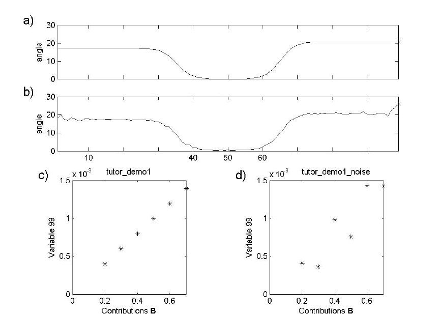
238
Figure 9-18. A plot of the angle of a variable from a vector of ones: (a) noiseless data set
and (b) data set with added noise. The original contributions of B are plotted for the pure
variables for the noiseless data set (c) and for the data set with noise (d).
Since, in general, low-intensity variables contain low signal-to-noise, a correction factor
needs to be developed. The signal-to-noise is generally inversely related to the measured
value, leading to the following proposed noise correction factor:
>> load purvardata_noise
>> offset = 3;
>> mean_data = mean(data.data);
>> max_mean_data = max(mean_data);
>> offset_relative = (offset/100)*max_mean_data;
>> correction_factor = mean_data./(mean_data+offset_relative);
The correction factor is plotted in Figure 9-19a and is multiplied by the angles calculated
above prior to estimating pure variables.
>> angle_corrected = correction_factor.*angle0;
For variables with a high mean value, the correction factor is near one and will have little
effect on the estimated angle. For variables with a low mean value, the offset will be
An
g
le of
p
urvardata with vector of ones
An
g
le of
p
urvardata
_
noise with vector of ones
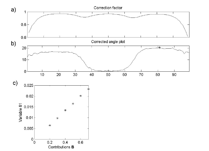
239
significant; as a consequence, the correction factor will be small. The result is that the
estimated angle for these variables is decreased, making them appear “less pure.” The
corrected angles are plotted in Figure 9-19b with the maximum indicated. As can be
observed in Figure 9-19c, the correction results in a pure variable that is not dominated
by noise.
>> pure_variable_index = find(angle_corrected == max(angle_corrected));
>> plot(data.axisscale{2}, angle_corrected,...
data.axisscale{2}(pure_variable_index),...
angle_corrected(pure_variable_index), 'k* ')
>> plot(data.userdata.purint(:,2),...
data.data(:,pure_variable_index),'*k');
Figure 9-19. The correction factor (a) and the corrected angle plot in (b). The
contributions of B versus the contributions of the pure variable are given in (c).
At this point in the analysis, one pure variable has been determined. Note that the angle
spectrum has limited similarity to the original spectra in the data set and the angles do not
reflect the original intensity of the variables. To create a spectrum that reflects the
intensities in the original data, variables are multiplied by their length (two-norm) given
by:
>> length_data = sqrt(sum(data.data.*data.data));
240
In Figure 9-20, the angle spectrum (a) is shown with the length (two-norm) spectrum next
to it (b). Each value in the “length spectrum” is the corrected angle value multiplied by
the corresponding two-norm..
>> angle_corrected_length = angle_corrected.*length_data;
>> plot(data.axisscale{2},angle_corrected_length,...
data.axisscale{2}(pure_variable_index),...
angle_corrected_length(pure_variable_index),'k* ')
The second pure variable is the variable with the largest angle from the first estimated
pure variable calculated as follows:
>> for i=1:ncols
>> angle0(i) = (180/pi)*subspace(data.data(:,i), ...
>> data.data(:,pure_variable_index));
>> end
>> angle_corrected = correction_factor.*angle0;
>> pure_variable_index = [pure_variable_index;
>> find(angle_corrected == max(angle_corrected))]
pure_variable_index =
81
21
The result of the pure variable selection is shown in Figure 9-20c and d. Two pure
variables have now been estimated, and these define a plane, as any two vectors do.
When the next angle spectrum is calculated, the subspace command searches for a third
pure variable, which has the largest angle with this plane. Repeating the MATLAB
commands immediately listed above yields
pure_variable_index =
81
21
99
The results are shown in Figure 9-20e and f. It is obvious from these results that there are
only two pure variables present because both the estimated angle and the length spectrum
are small. After selecting two pure variables, only noise is present.

241
Figure 9-20. The successive series of angle spectra and length spectra. The pure variables
are indicated with a star: 81 (a,b), 21 (c,d), and 99 (e,f).
At this point, it has been determined that the data set has two pure variables. Next
estimates of the pure component spectra and contributions are obtained. For this we’ll put
Equations (9-9) and (9-10) into a more formal form. Equation (9-1) is rewritten:
T
=
+XCS E
(9-11)
where X is a mn× matrix of the original data with the spectra in rows, C is a mk
×
matrix of contributions, and S is a nk
×
matrix with columns corresponding to pure
component spectra. k is the number of analytes present in the data matrix; it is the
number of pure variables estimated. In the pure variable technique, an estimate of C is
obtained by taking the columns of X that represent pure variables, and for clarity the
notation ˆ
C will be used for this. (Recall that the values of the pure variables are not
concentrations; they are proportional to concentrations, and are referred to as
contributions.) The mn× matrix E represents the residual error, which is minimized in
the least squares equations shown below.
The purity technique estimates ˆ
C from the columns of X and both are known. The next
step estimates ˆ
S from
ˆˆ
TT+
=SCX (9-12)
242
where
()
1
ˆˆˆˆ
T−
+=CCCC with the property ˆˆ
T+
=
CC I. In the next step, the contributions are
now calculated from ˆ
S from
ˆ
+
=CXS
(9-13)
where
()
1
ˆˆˆˆ
T
−
+=SSSS. This step reduces the noise in the contributions and this procedure
corresponds to a single iteration of the ALS algorithm discussed above. We can
implement this procedure on the data from the example above using MATLAB. The pure
variable indices obtained above were:
>> pure_variable_index = [81 21];
First, these are extracted from the data matrix to a matrix purint that corresponds to ˆ
C.
>> purint = data.data(:,pure_variable_index);
To calculate the pure spectra ˆT
S we use the following command and assign the pure
spectra to the matrix purspec:
>> purspec = pinv(purint)*data.data;
Next, the spectra are normalized to unit length. In terms of Figure 9-15, the direction of
the pure spectra are known, i.e., the pure spectrum axes, but what’s needed is where the
pure spectrum axis intersects the mixture line. This is simply done by normalizing the
spectra to a total intensity of 1:
>> purspec = normaliz(purspec);
The matrix purint corresponding to Ĉ is estimated from purspec:
>> purint = data.data*pinv(purspec);
The estimated purint is based on normalized data in the least squares calculation, and is
expected to have less noise then the original pure variables. The following commands are
the basis for Figure 9-21.
>> subplot(2,2,1);plot(data.axisscale{2},purspec(1,:),'k');
>> subplot(2,2,2);plot(data.axisscale{2},purspec(2,:),'k');
>> subplot(2,2,3);plot(data.userdata.purint(:,2),purint(:,1),'*k');
>> subplot(2,2,4);plot(data.userdata.purint(:,1),purint(:,2),'*k');
The procedure outlined above showed all the calculations needed for the purity
technique. To learn more about the pure variable method, type purityengine demo or
purity demo at the command line.
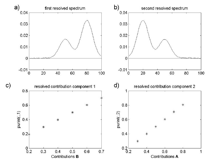
243
Figure 9-21. Resolved spectra (a) and (b), and resolved contributions (c) and (d).
Tutorial for Purity Model Builder
This tutorial is limited at this point to showing the use of Purity in the Analysis GUI.
Familiarity with the purity concept is assumed. A summary of concepts:
a) A pure variable (e.g., a wavenumber) is a variable that has contributions from only one
component.
b) The values of a pure variable are directly proportional to the concentrations of the
associated component. As a consequence, when all pure variables are known the spectra
of the pure components can be calculated.
c) The purity programs demonstrated here determine the pure variables in a stepwise
interactive manner: when the user sets a pure variable, the intensities of the variables
associated with that component will diminish proportionally
Four different uses of the program will be demonstrated. Before using this tutorial one
should first run:
>> puritydemo
244
It is important to do this, since more information is given about the data files.
Furthermore, reference spectra are plotted in the demonstration which are needed to
judge the solutions.
In the text below, the variables or spectra selected by the program are referred to as pure
variables or pure spectra. Although these variables/spectra are the purest mathematically,
this does not mean that they are pure from a chemical point of view. When the pure
variables/spectra are chemically pure, the terms proper pure variable and proper pure
spectrum will be used.
The Purity Model Builder Interface is spawned from the Analysis window using the
Show Purity Model Builder button in the toolbar. After loading new data into the
Analysis window, it will be the only button enabled. Clicking it will bring up the "Model
Builder" interface. Initially the interface will have one toolbar and a Purity menu (see
Figure 9-22). If either of the derivative buttons is clicked, a second toolbar will appear
with buttons specific to the additional plots generated. Table 9-1 describes the function of
each button/menu selection.

245
Table 9-1. List of Purity GUI menu items and buttons.
Name Description
Menu
Transpose Transpose matrix to get pure spectra rather than pure
variables.
Inactivate Inactivate Selected/Zoomed Area of Purity Spectrum.
Colors selected portion of x-axis red and ignores area when
determines the maximum in the purity spectrum.
Reactivate Reactivate Selected/Zoomed Area of Purity Spectrum. Undo
Inactivate.
Max Set Cursor to Maximum Purity Value(s).
Plot Spectrum Plot of original spectra and (if available) the reconstructed
data.
Resolve Resolve spectra and contributions for selected pure
variables.
Continuous/Discrete This determines if the plot is continuous, discrete of bar.
The default is continuous for rows (variable plots) and
continuous for columns (spectrum plots). This is indicated
in the figure, left top, as cc. Pressing the button goes
through all the combinations of continuous, discrete and bar.
Accept Load model back into Analysis and close Purity Model
Builder.
Conventional (top) Toolbar
Set Pure Variable Set Pure Variable at cursor.
Reset Remove last variable. Undo result of 'Set Pure Variable'
Plot at Cursor Plot Variable At Cursor
Cursor Manually move cursor to new location.
Increase Offset Down weight variables.
Decrease Offset Up weight variables.
Window Derivative
Increase
Increase derivative window. Will create second set of plots
if not already displayed.
Window Derivative
Decrease
Decrease derivative window. Will create second set of plots
if not already displayed.
Derivative (bottom) Toolbar [not displayed in default view]
Set Same as above but acting on derivative plots.
Increase Offset Same as above but acting on derivative plots.
Decrease Offset Same as above but acting on derivative plots.
The examples below cover interaction with the "Model Builder" interface. Once a model
has been resolved, it can be loaded back into the Analysis window using the Accept
selection from the Purity menu. One can then further explore and use the model.
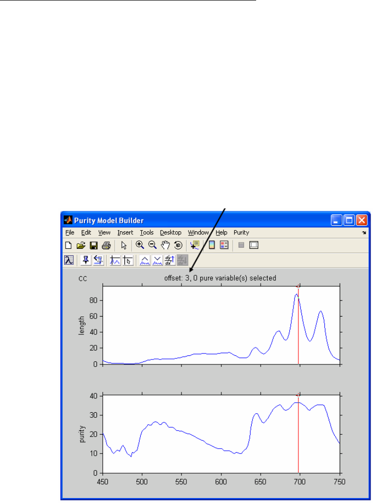
246
Note: Purity is an entirely new method to PLS_Toolbox. As such, not all tools in the
Analysis interface are compatible with Purity models.
Example: Raman Spectra of Time-Resolved Reaction
To get started, load the demonstration data and open the Analysis interface using the
following commands:
>> load raman_time_resolved
>> analysis
The next step is to load the demo data into the Analysis window using File/Load
Data/X-Block. The demonstration data set contains time-resolved Raman spectroscopic
data of four components. Next, go to the Analysis menu and select Purity. Click on the
Perform Purity Analysis button in the Analysis window toolbar (gears icon) to bring up
the Purity Model Builder GUI (Figure 9-22). The top spectrum is the length spectrum,
which has the same units as the original spectra and therefore is easily to relate to the
original. The second spectrum is the purity spectrum, of which the maximum indicates
the purest variable in the data set.
Figure 9-22. The main figure for interactive Purity analysis. Offset is shown in axis title.
The first part of the demonstration will show the effect of the offset, which is a noise
correction factor. The offset is shown above the length spectrum. Its current value is 3.
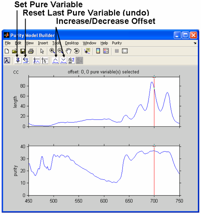
247
By clicking on the 'Decrease Offset' button three times, the offset is changed to the value
0, which results in Figure 9-23.
Figure 9-23. Offset decreased to zero.
The first pure variable, indicated by the cursor, is accepted by clicking the Set Pure
Variable button (the tack icon); clicking it again will set the second pure variable and
result in Figure 9-24. The previously-selected pure variables are indicated with green
markers.
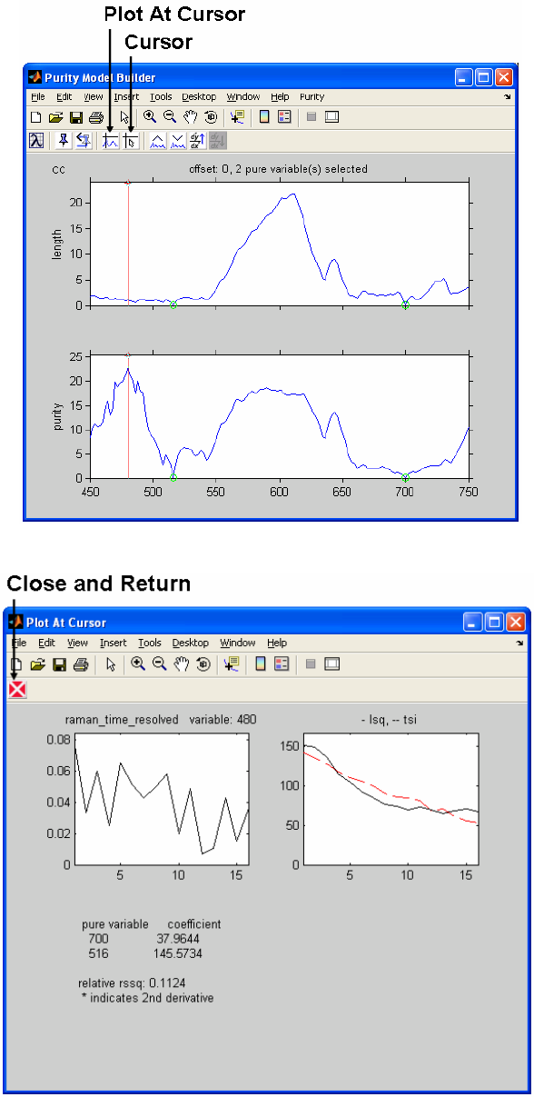
248
Figure 9-24. Two pure variables set (indicated by green marker).
Figure 9-25. Plot of third pure variable.
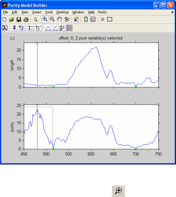
249
The pure variable indicated in the figure above by the red cursor is not a good pure
variable. As can be judged from the length spectrum, this is a low intensity variable. A
plot of this variable also shows its noisy character. This plot can be obtained by clicking
the option Plot At Cursor (Figure 9-25).
Next to a plot of the variable at the cursor (left plot) is a plot of the total signal of all the
spectra (as a function of spectrum number) and the least squares approximation of the
pure variables set that best reproduces the total signal so far. It is obvious that two pure
variables are not enough. The coefficients of the pure variables to obtain the best least
squares approximation are also listed. When the proper number of pure variables has
been chosen, the total signal should be reproduced properly and all the coefficients
should be positive.
Figure 9-25 shows the noisy character of the variable at the cursor position. This
represents a problem with the pure variable approach. Pure variables are the most linearly
independent variables, but so are noise variables. An approach to avoid this spectral
region is by inactivating it. First we return to the main figure by clicking on ‘return’ (the
red "X" icon). Inactivation is done as follows:
Figure 9-26. Zooming in on third pure variable.
a) Use the MATLAB figure toolbar to activate zoom and draw a rubber band box as
indicated in Figure 9-26. The figure will zoom into this part (not shown).
b) Select Inactivate from the Purity menu (as shown in Figure 9-27).
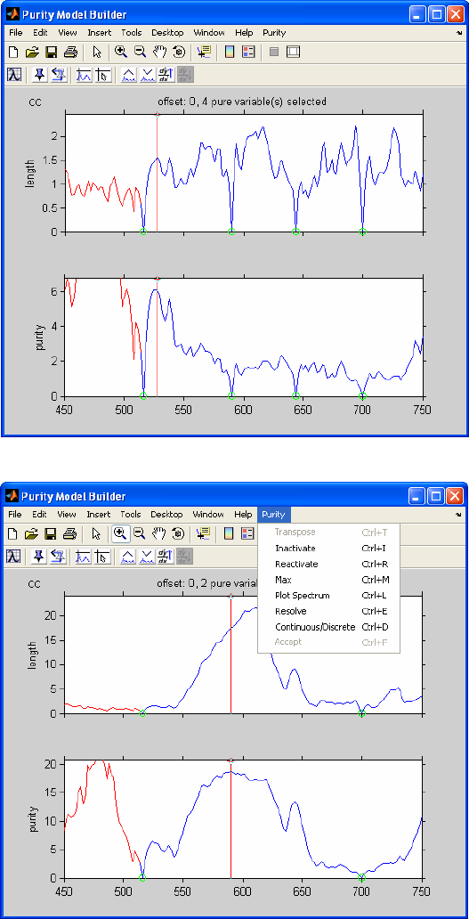
250
The result is shown in Figure 9-27, where the x-axis of the area we zoomed is colored
red. The result of this is that this area is ignored when the program determines the
maximum in the purity spectrum. In this way we can ignore problematic regions in the
spectrum, such as this noisy low-intensity area.
Figure 9-27. Inactivated region and menu.
Figure 9-28. Four pure variables set. No remaining spectral information.
The program will automatically go to the new maximum (the same can be achieved by
selecting Max from the Purity menu). Then accept the pure variable indicated by the
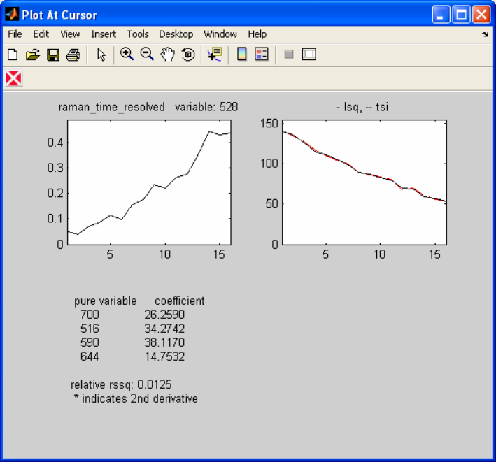
251
program by clicking on Set Pure Variable. Set the next pure variable by clicking the
button again and the result will be Figure 9-28, which shows that there is no spectral
information present anymore. The Plot At Cursor plot in Figure 9-29 shows that the
total signal is reproduced properly with the four pure variables and the coefficients are
positive.
Figure 9-29. Plot at cursor for current pure variable, showing that four pure variables
reproduce the signal properly.
It may seem confusing that the current variable at the cursor does not represent noise.
One has to keep in mind that after selecting the proper number of pure variables, one will
have a noisy purity spectrum. The position of the maximum is basically random, so the
variables at the maximum in the purity spectrum basically do not have any meaning from
a purity point of view.
After concluding that four pure variables describe the data set, the data set can be
resolved after we return to the main figure by clicking on Return. We now resolve the
data set by selecting Resolve from the Purity menu. This results in the resolved spectra
in Figure 9-30. Clicking on the Next button (blue arrow icon) in the figure results in the
resolved contribution profiles in Figure 9-31.
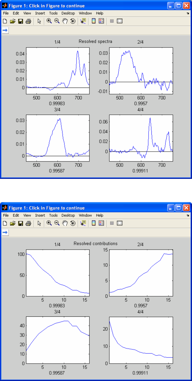
252
Figure 9-30. Resolved spectra.
Figure 9-31. Resolved contributions.
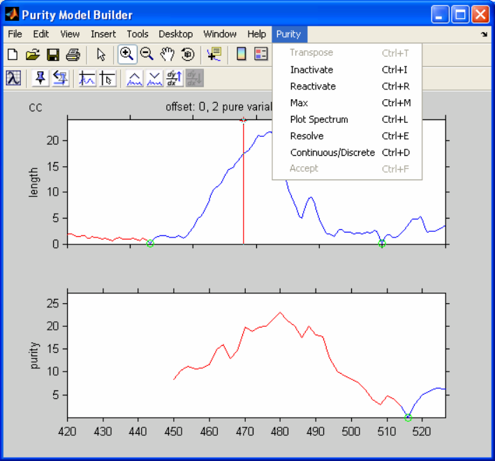
253
Clicking the Next button again will return to the previous length and purity spectrum
(Purity Model Builder). Clicking twice on the Reset Last Variable button resets the last
two pure variables. We now zoom again into the area we just inactivated (colored red), as
indicated in Figure 9-32.
Figure 9-32. Reactivating selected area.
Reactivate the selected area by selecting Reactivate from the Purity menu. The figure
should now look similar to Figure 9-24; the cursor automatically moves to the maximum.
We will now show an alternative to inactivating the region of 450-520 cm-1. In order to
correct problems with low-intensity variables, we can down-weight them by using the
offset. By increasing the offset, the problematic area is decreased in intensity and the pure
variable becomes acceptable. We increase the offset to 3 using the Increase Offset
button, which is a good default value for the offset, followed by using the Reset Last
Variable button twice, which results in Figure 9-33.
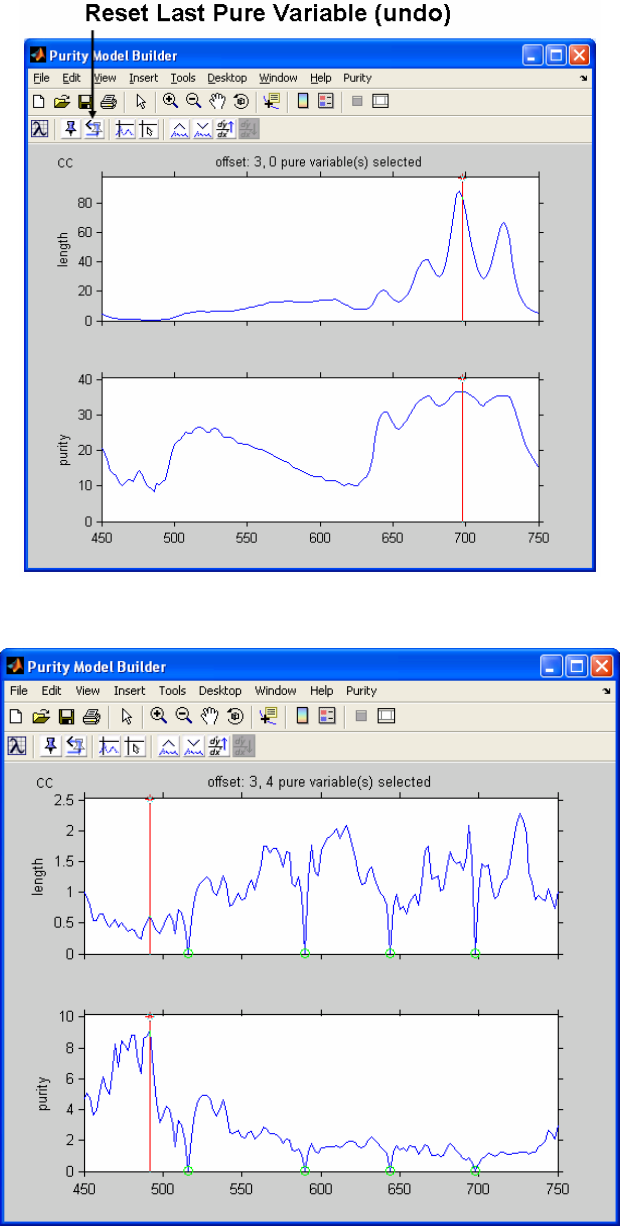
254
Figure 9-33. Offset equals 3 with no pure variables selected.
Figure 9-34. Four pure variables selected with offset at 3.
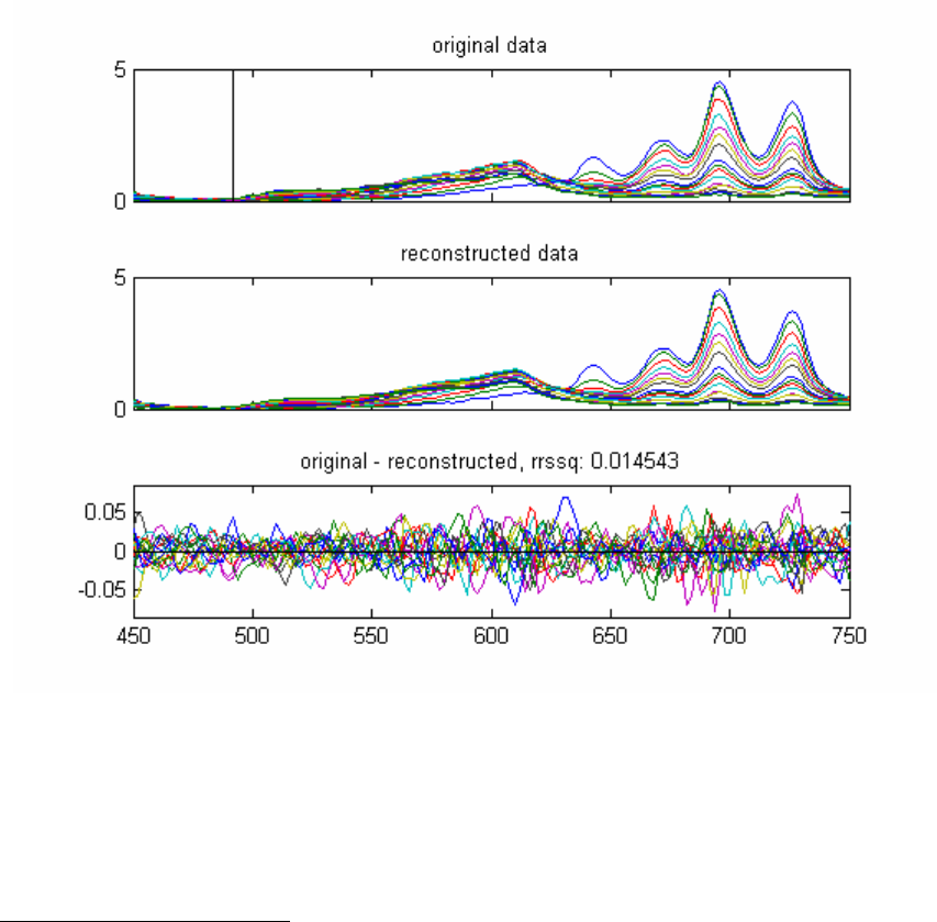
255
When we accept the first four pure variables now, by clicking the Set Pure Variable
button four times, we obtain Figure 9-34, with no problems with low intensity variables.
After determining the pure variables, selecting Resolve from the Purity menu results in
resolved spectra and contributions very similar to those shown in Figures 9-30 and 9-31
above.
A final check of the solution can be done by selecting Plot Spectrum from the Purity
menu. This results in a plot of the original spectra, the spectra reconstructed from the
resolved contribution profiles and spectra, and the differences between the two. See
Figure 9-35.
Figure 9-35. Plot of original, resolved, and difference spectra.
The rrssq value is a relative measure for the differences between the reconstructed and
the original data set. In this case the difference is approximately 1.5%, which is a very
good value.
FTIR Microscopy Example
This example uses FTIR microscopy spectra of a three-layer polymer laminate. We shall
explore the use of second derivative pure variables.
Load the data and start the interface:
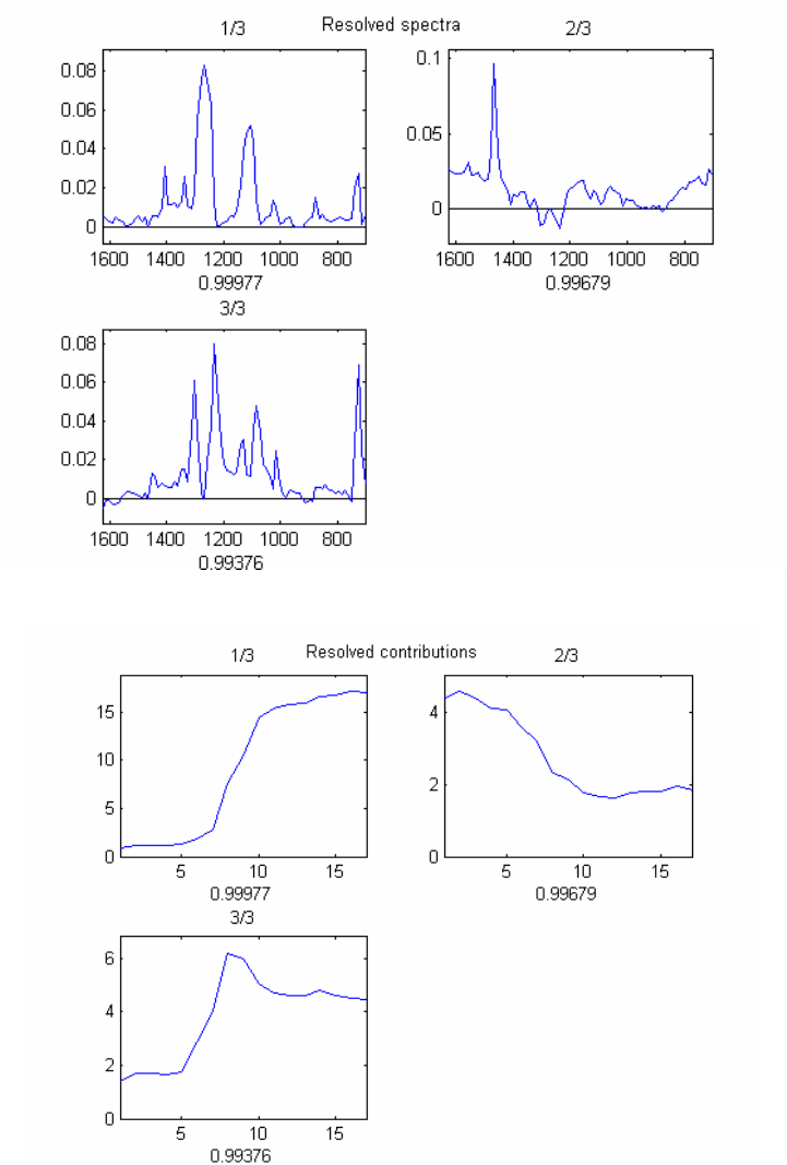
256
>> load FTIR_microscopy
>> purity
Note: One can start the Analysis interface pre-selected to Purity by simply typing purity
at the command line.
Figure 9-36. Resolved spectra for FTIR example.
Figure 9-37. Resolved contributions for FTIR example.

257
Resolve three components in the same fashion as in the first example using the default
settings. This will result in the resolved spectra and contribution profiles in Figures 9-36
and 9-37.
The resolved contribution profiles clearly indicate that the pure variables are not proper
(for more information, run purity demo). After returning to the main program, we first
reset the three pure variables by clicking on the button Reset Last Variable three times.
Next we will use second derivative spectra by clicking the Window Derivative Increase
button four times. The smoothing window for the Savitzky-Golay procedure for
calculating second derivative spectra now has a size of 9, as is listed at the top of the
length spectrum (see Figure 9-38).
Figure 9-38. Savitzky-Golay window increased four times.

258
The major differences in the figure when in Window Derivative mode are:
a) Both the conventional and the second derivative data are shown.
b) There are two series of buttons (two toolbars) for setting pure variables and
increase/decrease offset. The buttons and plots dealing with derivative data have a yellow
hue.
c) For the offset, two values are listed. The first one is for the conventional data, the
second one is for the second derivative data.
We will click three times on Set Pure Variable in the bottom series of buttons.
Resolving the data results in Figures 9-39 and 9-40, which are the correct results.
Figure 9-39. Resolved spectra for FTIR example.

259
Figure 9-40. Resolved contributions for FTIR example.
Raman Spectra Combined Example
This example combines the use of conventional and second derivative pure variables.
Load the data and start the interface:
>> load raman_dust_particles
>> purity
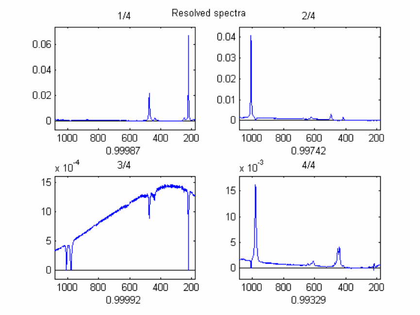
260
Figure 9-41. Resolved spectra.
This example has narrow peaks, identifying the components of the mixtures, and a broad
baseline caused by fluorescence. Using the conventional data and extracting four
components (the three components in the mixture, plus the baseline) results in the
resolved spectra in Figure 9-41.
The third resolved component is the baseline, on which the resolved components reflect
negatively. Using just the second derivative does not resolve the data properly, mainly
because the broad baseline in not present in the second derivative data. A combination of
the conventional and second derivative pure variables needs to be used. For this we reset
all the pure variables and, using the Windows Derivative Increase button several times,
we set the derivative window equal to 9. Since spectra with a baseline such as these have
a high "natural" offset, it is best to set the offset for the conventional data to zero using
the n Decrease Offset button on the top toolbar (see Figure 9-42).
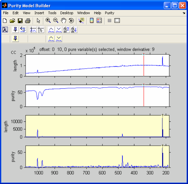
261
Figure 9-42. Window derivative set to 9 and offset decreased to zero.
We can now set the first four pure variables "suggested" by the program (indicated by the
red colored cursor). The first pure variable is conventional (the red cursor appears in the
top two plots in the figure), the other three pure variables are second derivative (the red
cursor appears in the bottom two plots; remember to set these pure variables using the
derivative (bottom) toolbar, resulting in the resolved spectra in Figure 9-43.
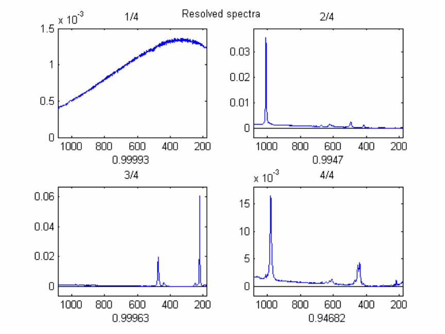
262
Figure 9-43. Resolved spectra with conventional and second derivative pure variables.
The results show a well-defined background spectrum and the three resolved
components. However, there is still a problem in the resolved components with some
baseline contributions, especially in the fourth resolved component. Therefore, we will
try to extract an additional baseline component. The pure variable in the conventional
spectrum is at a peak which we already have chosen as a pure variable in the 2nd
derivative data. Therefore, we inactivate this area and obtain the next pure variable in the
conventional spectrum. Zoom in on the area shown by the red peak in Figure 9-44, select
Inactivate from the Purity menu, and then the cursor will automatically move to the new
max.

263
Figure 9-44. Inactivating area and selecting new pure variable.
The pure variable indicated in the conventional data is a good candidate for the
background spectrum and is “set” using the conventional (top) toolbar. Please note that
the pure variable in the second derivative spectra has a higher value (the cursor is red),
but based on visual inspection it was decided to select the conventional pure variable.
The high purity value in the second derivative data was caused by a residual of a
previously selected pure variable, which can be caused by slight peak shifts or which can
be an artifact of the use of second derivative spectra. More information can be found in
the literature.
The resolved results are shown in Figures 9-45 and 9-46. It is clear that the background
contribution in the resolved component spectra is minimized.
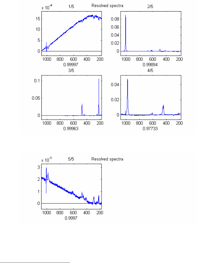
264
Figure 9-45. Resolved spectra.
Figure 9-46. Fifth resolved spectrum.
MS Time-Resolved Example
This example demonstrates a pure spectrum to pure variable solution. Load the data and
start the interface:
>> load MS_time_resolved
>> purity
For MS (mass spectroscopy) data, the pure variable approach is not always easy to apply.
Due to the discontinuous character of the mass spectral data, it is not easy to judge
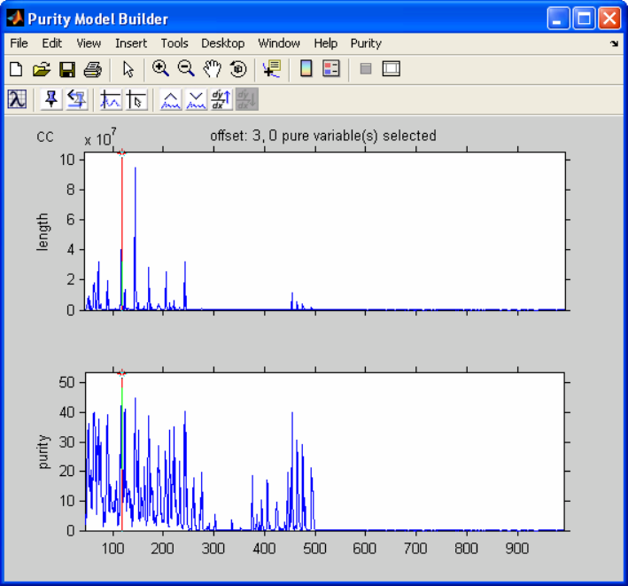
265
visually whether a spectrum represents noise or signal. Furthermore, the programs that
compress the profile data into centroid data often introduce problems. However, MS data
often do have pure variables. A way around the problems with pure variables is first
determining the pure spectra, followed by deriving the pure variables from the pure
spectrum solution.
Figure 9-47. Time-resolved MS data loaded into the Purity Model Builder.
We want to analyze the pure spectra instead of the pure variables; this can be achieved by
basically transposing the matrix. This is done by selecting Transpose from the Purity
menu, resulting in Figure 9-48.
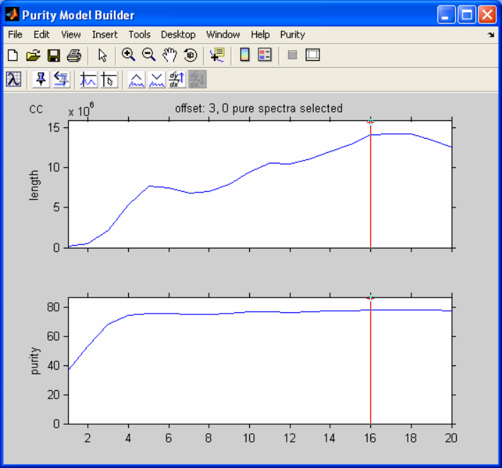
266
Figure 9-48. Transposed data.
After setting three pure spectra and selecting Resolve, we see a window asking us if we
want to calculate the pure variable solution after calculating the pure spectrum solution.
We also see the following statement:
“Reminder: offset change for pure variable calculations may be desirable.”
The reason is the following. The offset is used for both the determination of the pure
spectra and the pure variables. The appropriate offset may be different for the variables
and the spectra. For example, if no low noise level intensity spectra are present, the offset
value of zero can be used for the pure spectra (this would work for this example).
However, a zero value for the determination of the pure variables is likely to give
problems because of noisy variables. Therefore, one might change the zero value for the
offset used to determine the pure spectra to 3 prior to the pure variable resolution step.
We will not change the offset for this example.
After answering the question with Yes, the resolved results appear (Figure 9-49).
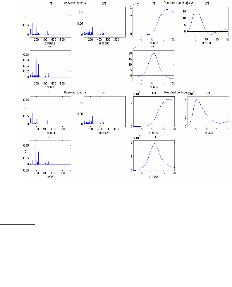
267
Figure 9-49. Resolved results for the time-resolved MS example.
Interactive Programs for Variable Selection Using Hyphenated Techniques
Introduction
This section describes the interactive programs to analyze MS data from hyphenated
techniques. There are two programs. The first program, coda_dw_interactive, selects
the best mass chromatogram based on the smoothness. The second program,
comparelcms_sim_interactive, extracts differences between highly related samples,
e.g., different batches of the same material of which one batch is problematic.
CODA_DW_INTERACTIVE
To start the program, type:
» coda_dw_interactive
The dialog box to read the file comes up. Locate the file lcms.mat in the dems folder of
your PLS_Toolbox installation. Alternatively, the file lcms.mat can be loaded in the
work space prior to starting the program and then read into the program.
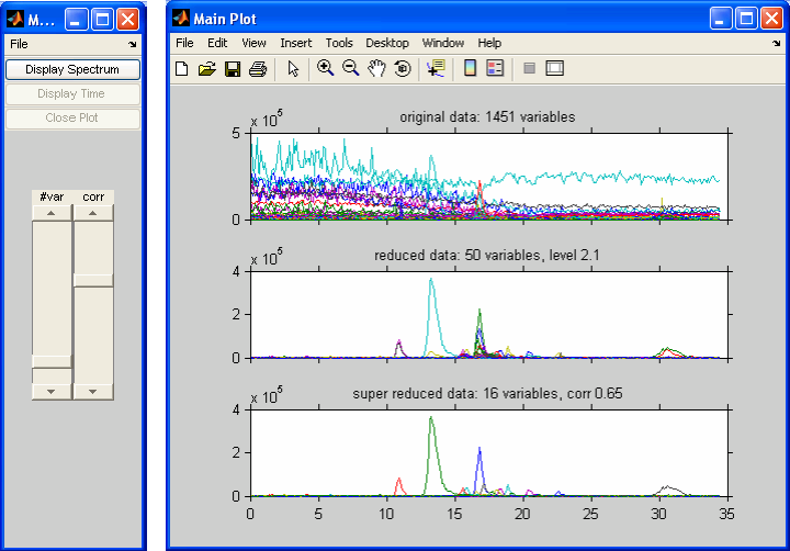
268
Figure 9-50. lcms.mat demonstration DataSet Object at default settings.
After reading in this file the windows in Figure 9-50 will appear. The top plot, in the
Main Plot window, shows an overlay plot with all the mass chromatograms. As the title
shows, there are 1451 chromatograms.
The second (middle) plot shows the variable selection of the algorithm. We refer to this
as the reduced data. It is clear that only ‘good’ chromatograms are shown here. As the
header shows, there are only 50 chromatograms which represent all the chemically
significant information. Also listed in the header is the Durbin-Watson criterion (with a
default value of less than 2.1).
In the second plot, there are generally several correlated chromatograms. The third plot
shows the results when correlated chromatograms are deleted. We refer to this as the
super-reduced data. In this case only 16 chromatograms are necessary to describe all the
significant chemical information, as is listed in the title. The correlation level, also shown
in the title, is 0.65. All the variables with a correlation of greater than 0.65 are deleted;
increasing the correlation level would delete fewer chromatograms.
There are two sliders in the figure's Main Menu. The slider with the title #var
determines how many variables will be displayed in the reduced data in the second plot.
The variables are ranked by their quality, which is based on their value for the Durbin-
Watson criterion. When we increase the slider value to 75 chromatograms (this is listed
in the title of the reduced data), which is equivalent to a level for the value for the
Durbin-Watson criterion of 2.4, variables of a lower quality will be included (see Figure
9-51).
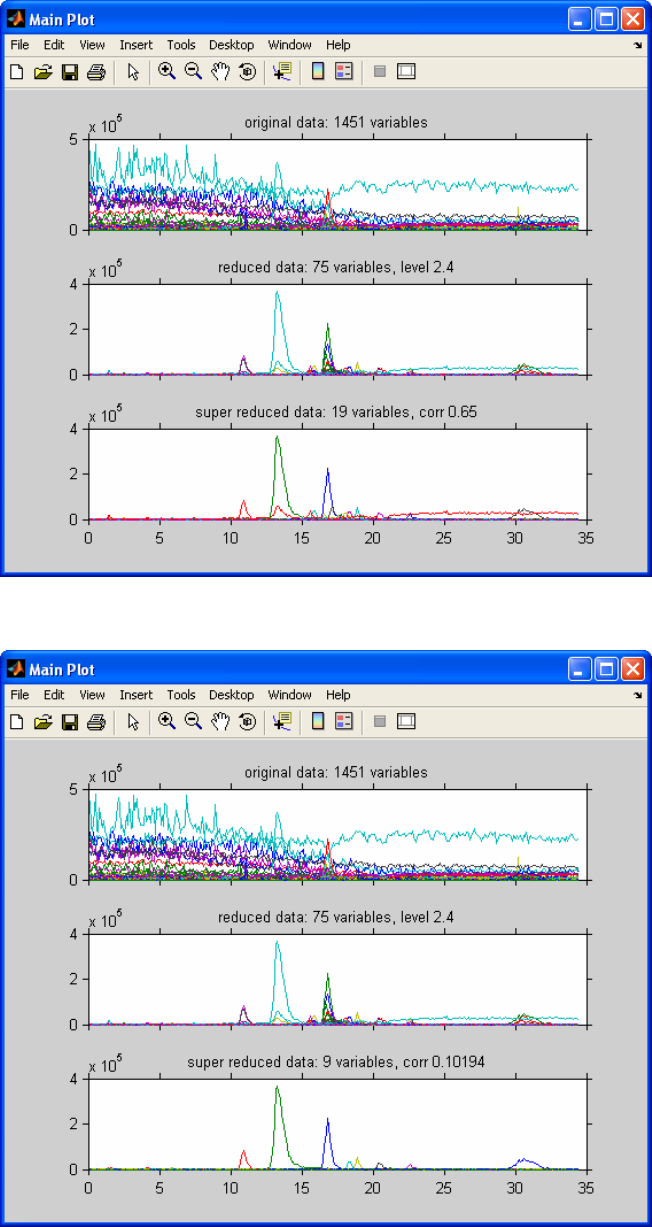
269
Figure 9-51. Number of variables increased to 75
Figure 9-52. Correlation threshold set to 0.1

270
A change of the corr slider will result in changes in the third plot. A change to the value
0.10 (listed in the title of the super-reduced data) will delete too many variables, as we
can see in Figure 9-52. In practice, a starting value of 0.65 appears to be appropriate.
In practice one can make some changes in the #var slider to accommodate the data
reduction the researcher is interested in. The changes in the corr slider are secondary. Its
only purpose is to show a simplified version of the second figure. Once the appropriate
results have been obtained it is possible to plot spectra at any point in the chromatogram
which we will demonstrate below.
When we want to select a chromatographic peak, it may be necessary to zoom in on the
data. For this, the MATLAB zoom button can be used. Although any of the three
plots can be used, Figure 9-53 shows the results of zooming in on the third plot of the
super-reduced data.
Figure 9-53. Zoomed in on super-reduced plot (third plot).

271
Figure 9-54. Selecting green peak
Figure 9-55. Initial spectrum plot.
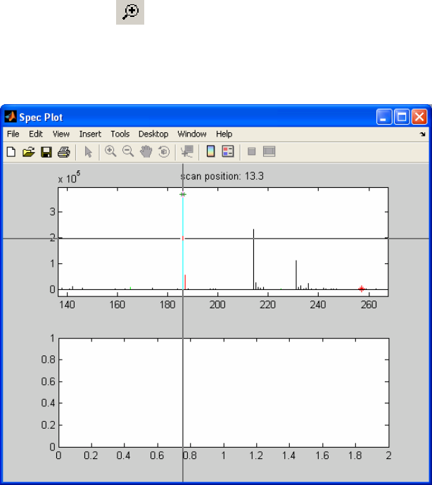
272
When we want to select a peak to obtain the spectrum at that retention time, we choose
the Display Spectrum button. This synchronizes all of the plots to the zoomed plot. We
put the cross-hair on the green peak in the bottom plot as indicated in Figure 9-54.
Clicking while the cross-hair is in that position results in Figure 9-55.
The spectrum shown here is the spectrum at the retention time we selected. This is the
original data with the following color-coding added:
• The (in this case 50) best-quality masses selected by the algorithm are colored red
in the bar plot.
• When the n best quality masses have been selected and colored in red, the best
quality masses (n+1) to 2n are colored in green.
• The super-reduced masses are marked with colored stars. The colors of the stars
correspond with the colors of the super-reduced mass chromatograms.
Since we selected a green super-reduced chromatogram (Figure 9-54), the red bar has a
green star on top (Figure 9-55). So the mass with the green star should be the same as the
green chromatogram in the super-reduced plot. We can check this, but because of the
resolution of the plot we will first zoom in using the regular zoom capabilities of
MATLAB by clicking on the button and drawing a rectangular box around the mass
of interest. Now we will select the mass with the green star by first clicking the Display
Time button from the Main Menu figure, which results in a cross hair, followed by
positioning it on the mass of interest and left-clicking (Figure 9-56).
Figure 9-56. Selecting mass of green chromatogram.
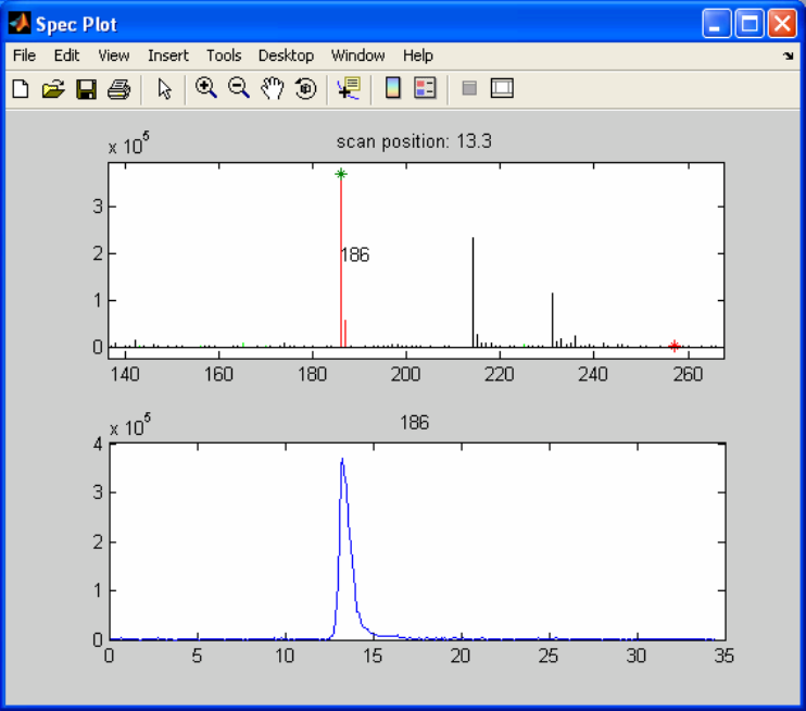
273
When we click the mouse we see the following (see Figure 9-57):
• The chromatogram of the selected mass is plotted.
• The mass is labeled.
The plot of the chromatogram is straightforward. For the labeling of the mass spectrum,
several other features are possible after clicking the Display Time button:
• A mass can be labeled by clicking on the mass of interest.
• In order to achieve a more appropriate labeling one can click on the mass of
interest, keep the mouse button down and drag the cursor to a more appropriate
position for the labeling. Releasing the button shows the label at the last position.
• A label of a mass can be deleted by selecting that mass again and dragging the
cursor outside the plot onto the gray-space of the figure before releasing it.
• Before the Display Time button is selected, the MATLAB zoom capabilities are
available.
Figure 9-57. Zoomed at green peak mass with peak 186 selected.
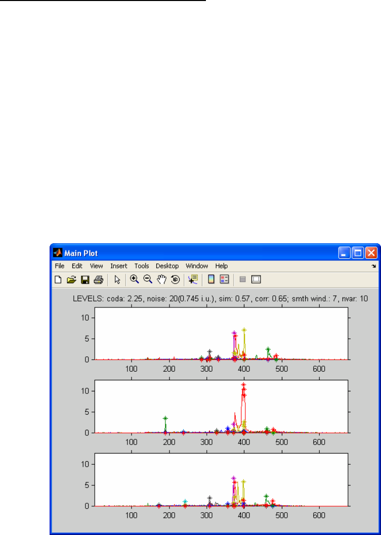
274
This section showed all the options in the coda_dw_interactive program. Keep in mind
that the sliders become inactive as soon as you select a spectrum (by clicking Display
Spectrum) and will remain inactive until you close the Spec Plot.
COMPARELCMS_SIM_INTERACTIVE
To start the program type:
» comparelcms_sim_interactive
Locate the following 3 files in the dems folder of your PLS_Toolbox installation:
lcms_compare1.mat
lcms_compare2.mat
lcms_compare3.mat
As shown before, the files can also be loaded into the workspace prior to running the
program and read from there.
These three files represent batches of the same material. The first data set is a good batch,
the second data set is a bad batch and the third data set is a batch with some problems.
The goal is to extract the differences.
After reading in these files, the windows in Figures 9-58 and 9-59 appear.
Figure 9-58. Default view of demo data
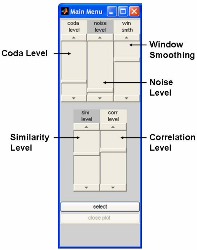
275
Figure 9-59. Default settings of main menu for coda_dw_interactive program.
The three plots show the super-reduced results of the differences between the data sets.
The algorithm has several steps:
a) Data reduction using coda_dw, which is set by slider coda level. The level is shown
in the header of the top plot. The default value is 2.25.
b) Low intensity variables can be eliminated by using the slider noise level. It is defined
(as listed in the title) by ‘counts’, where one count is the lowest intensity change in
the data. The default is 20. The corresponding intensity units are listed in parentheses
(0.745 i.u. in this example).
c) After this initial data reduction we compare the chromatograms. Since some tolerance
for small peak shifts must be present, the data are smoothed with a simple seven-
point averaging filter. The window size can be changed with the slider win smth.
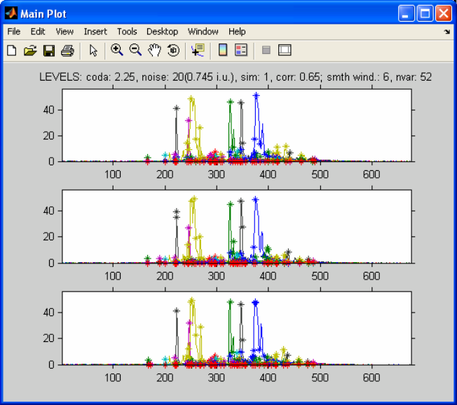
276
d) The smoothed data are compared and a similarity coefficient is calculated with values
between zero and one. We only want to see the chromatograms that are dissimilar, so
the value should be low: the lower the value, the fewer chromatograms are shown.
The default value is 0.57, as listed in the title.
e) As described in the tutorial for coda_wq, the resulting chromatograms may have
several mass chromatograms for a single component. The data are “super-reduced” by
deleting highly correlated chromatograms. The correlation level for the procedure is
set with the slider corr level. The higher its value, the more chromatograms will be
left in.
In practice, one would start increasing the slider coda level to see if other peaks show up,
or lower it when too many noise variables show up. The slider noise level is intuitive, so
changing it need not be discussed. The level of the win smth slider depends on the
quality of the instrumental analysis and generally should not be changed. The slider sim
level determines the level of differences we will see and varying it seems appropriate.
The slider corr level will be constant for most applications.
To give an example, one might want to know what the super-reduced coda_dw results
look like. In this case one sets the slider sim level to its maximum value of one. In this
case all super-reduced mass chromatograms will be shown (Figure 9-60). One can see
that the full y-scale in Figure 9-60 is about 60, while the full scale in Figure 9-58 is about
12. Comparing these figures shows that it is difficult to extract the differences between
the different samples by visual means only.
Figure 9-60. Sim level set to 1.
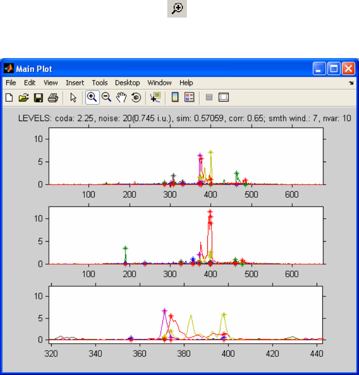
277
When we go back to the settings in the original configuration in Figure 9-58, (restart the
program to get the same color coding), we can pick a chromatographic peak at a certain
retention time and display the spectra.
When we want to select a chromatographic peak it may be necessary to zoom in on the
data. For this, the MATLAB zoom button can be used. Zooming in to the central part
of the chromatograms (we use the third plot here, but other ones can be used too) results
in Figure 9-61.
Figure 9-61. Zoomed in on third plot.
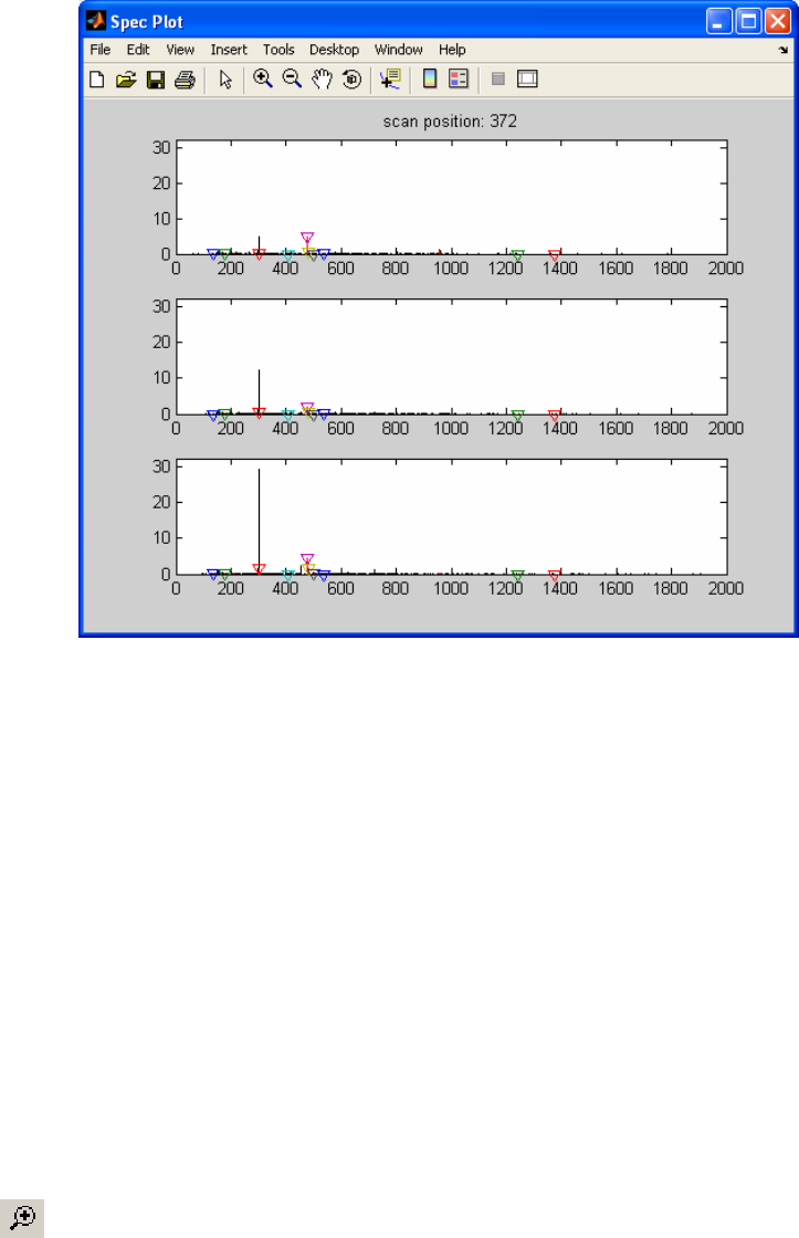
278
Figure 9-62. Spectrum at specified retention time (index 372).
When we want to select a peak to obtain the spectrum at that retention time, we click the
button select. This results in synchronizing all the plots to the zoomed plot. If we put the
cross-hair on the purple peak around 370 and left-click, a figure resembling Figure 9-62
will appear. The spectrum shown here is the spectrum at the retention time we selected.
This is the original data with the following color coding added:
a) The chromatograms with a similarity of less than 0.57 (sim level slider) are colored
red.
b) The super-reduced masses are marked with colored triangles. The colors of the stars
correspond with the colors of the super-reduced mass chromatograms.
Since we selected a purple super-reduced chromatogram (the purple peak at around 370
from Figure 9-61), it is shown with a purple triangle on top of the red bar (Figure 9-62).
So, the mass with the purple triangle should be the same as the purple chromatogram in
the super-reduced plot. We can check this but, because of the resolution of the plot, we
will first need to zoom using the regular zoom capabilities of MATLAB. So we click on
the button and draw a rectangular box around the mass of interest (although we can
zoom on any of the three plots, use the third plot again); the results should look like
Figure 9-63. Now we will select the mass with the purple triangle by using the select
button, which results in a cross hair for clicking on the mass of interest (Figure 9-63).
When we click the mouse we see the chromatograms of selected mass plotted (see Figure
9-64).
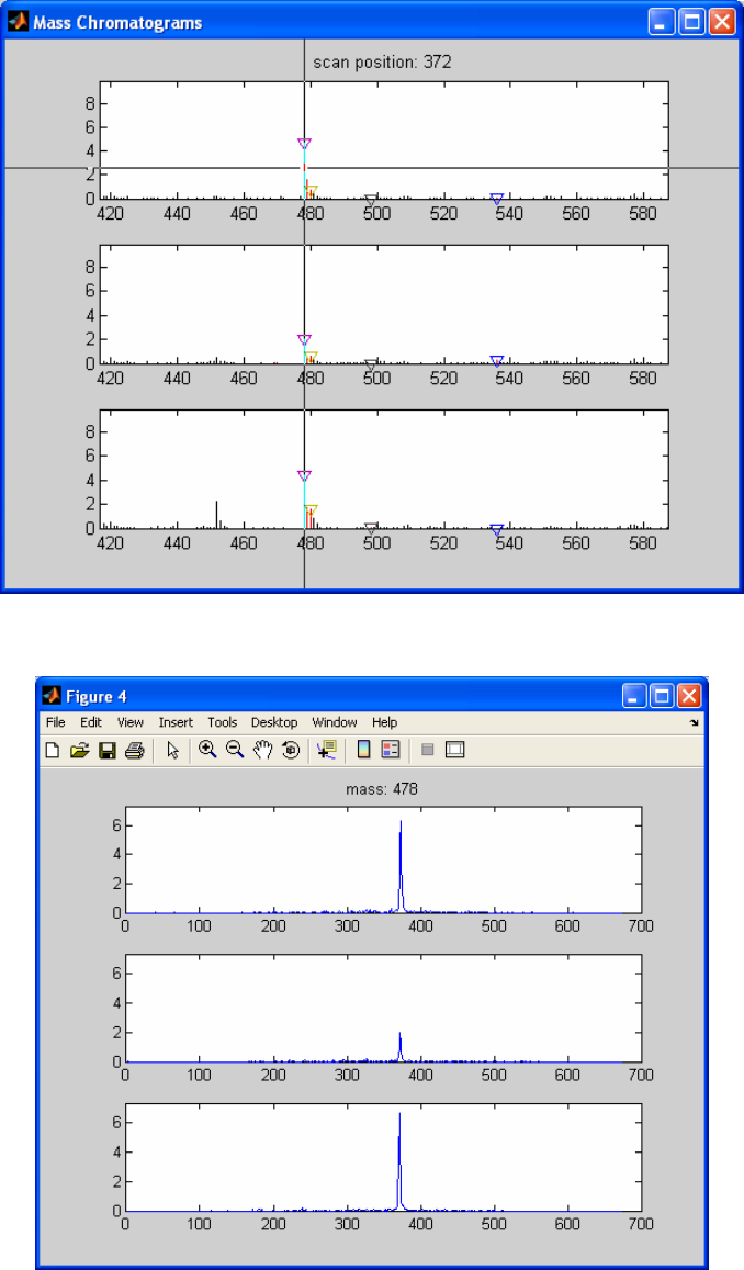
279
Figure 9-63. Selecting spectrum profile for index 372 (zoomed from Figure 9-64).
Figure 9-64. Profile for mass 478.
280
This section discussed all the options in the comparelcms_sim_interactive program.
We can either select another mass in the same spectrum or close the figure and select
another chromatographic peak. When we are working with the plot with the mass spectra,
the sliders are inactivated. Closing all but the Main Plot will reactivate the sliders for
further exploration.
281
10. Multi-way Methods
Multi-way data
In some situations, data have a more complex structure than usual. Most multivariate
methods are suited for handling matrices, which can be considered to be tables of data.
But imagine that you have, for example, a situation where for each sample the
measurements are held in a matrix. When more than one sample is measured, the
structure of the data is more appropriately held in a ‘box’ of data. Such data are called
multi-way data. If each sample yields a matrix of size J×K and there are I samples, then
an I×J×K three-way array is obtained. In PLS_Toolbox there are a number of tools
available for analyzing such data.
Generalized Rank Annihilation Method
One of the earliest applications of multi-way methods in chemistry addressed the
situation where there are two samples only. It has been shown that the Generalized Rank
Annihilation Method (GRAM) can be used to determine the magnitude of a single input
(e.g., concentration of an analyte of interest) in a multiple input response Nm given the
response Nc of a calibration sample of known input magnitude (Sanchez, 1988) where
Nc = XCcYT + E (10-1)
where X and Y are the profiles in each of the two orders and Cc is a diagonal matrix of
concentrations. This leads to the generalized eigenvalue/eigenvector problem
NcZCm = NmZCc (10-2)
where Z is a matrix of eigenvectors. Several algorithms have been proposed for
performing the GRAM procedure. The state-of-the-art appears to be the method proposed
by Wilson (1989), which projects the generally rectangular response matrices Nc and Nm
into square matrices A and B and then solves
AZ = BZΛ (10-3)
using the QZ algorithm developed by Moler and Stewart (1973) and later refined by
Ward (1975). In Equation 10-3, Λ is a diagonal matrix consisting of ratios of
concentrations of analytes in the test and calibration samples.
GRAM is a relatively straightforward method and has utility in a large number of
applications; many second-order analytical methods, such as GC-MS, are bilinear, i.e.,
the data can be modeled as the outer product of concentration profiles and pure
component spectra. The major problem with GRAM is that, in many systems, the
concentration profiles change due to drift in the analytical system(for example, changes
in the GC column in a GC-MS). These shifts can degrade the solutions from GRAM
rapidly. Early implementations of GRAM led to non-meaningful imaginary solutions.
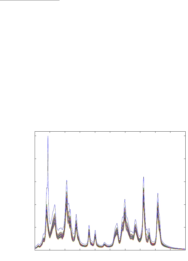
282
Modifications to the original GRAM algorithm (Shousong et al., 1993), however, have
rectified this problem and have led to significantly improved factor estimates.
An Example with GRAM
Willem Windig identified a technique for which GRAM works beautifully: time-decay
Nuclear Magnetic Resonance. In time-decay NMR, a system is given a magnetic pulse
and then the NMR spectra are observed as they decay. Different species decay
exponentially with different half-lives. Windig recognized that, because the decay curves
are exponential, the profile for a single component is the same within a single scale
factor, regardless of the time slice one looks at. Different analytes, however, have
different profiles, because of their different half lives. Thus, one can use GRAM to
decompose a single matrix by inputting slightly different slices of the original matrix.
We will demonstrate GRAM using nmr_data.mat file in the PLS_Toolbox. The data
consist of a 20 by 1176 matrix of time-decay NMR spectra of photographic film. The raw
data are plotted in Figure 10-1. GRAM can be used to extract the pure component spectra
and time decay profiles using the gram function as follows:
» a = nmrdata.data(1:19,:);
» b = nmrdata.data(2:20,:);
» nmrscl = nmrdata.axisscale{2};
» [ord1,ord2,ssq,aeigs,beigs] = gram(a,b,3,1:19,nmrscl);
Figure 10-1. Time-decay NMR data of photographic film from nmr_data.mat.
0
0.511.522.533.544.55
0
50
100
150
200
250
Frequency Shift (ppm)
Intensity
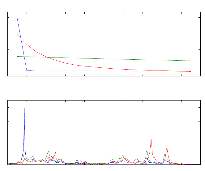
283
In this sequence of commands, the first nineteen samples of the data are assigned to
matrix a, while the second nineteen are assigned to b. The gram function is used to
estimate three factors. Scales for plotting against are also defined. The results from
GRAM are shown in Table 10-1 which gives the eigenvalues for each matrix and their
ratios. The percent values listed give the relative sizes of the eigenvalues for comparison
purposes. The profiles in each of the orders are shown in Figure 10-2.
Table 10-1. Results from GRAM: eigenvalues of A and B matrices.
Comp ____Matrix__A____ ____Matrix__B____ Ratio
Number Eigenval % Eigenval % A/B
1 4.68e+02 8.05 4.40e+00 0.08 106.43
2 5.23e+03 89.89 5.12e+03 98.24 1.02
3 1.20e+02 2.06 8.75e+01 1.68 1.37
The analyte that decays very rapidly and has the peak at ~4.5 ppm is water. The other two
analytes are the gel and the backing of the photographic film. One of these decays much
more rapidly than the other. Note that the spectra of the two are quite highly overlapped.
Thus, the ability to solve for them directly with GRAM is potentially very useful.
Figure 10-2. GRAM results showing “concentration” and spectral profiles.
0 2 4 6 8 10 12 14 16 18 2
0
0
0
.2
0
.4
0
.6
0
.8
1
Profiles in First Order
00.511.522.533.544.55
0
0
.1
0
.2
0
.3
0
.4
Profiles in Second Order

284
PARAFAC
While GRAM solves the problem
Nk = XCkYT + Ek, k=1,..,K (10-4)
for two samples (K = 2), it was later realized that a multi-way model for general K exists.
This is PARallel FACtor analysis, PARAFAC, which was developed in 1970 by R.
Harshman and independently the same year by Carroll and Chang. The notation usually
adopted in three-way modeling (Kiers, 2000) states Equation 10-4 as
Xk = ADkBT + Ek, k=1,..,K (10-5)
where Xk is an I×J matrix and A (I×R), B (J×R), C (K×R). The matrix D is an R×R
diagonal matrix that holds the kth row of C in its diagonal. For all Ks considered
simultaneously, the data are held in a three-way array X of size I×J×K (see Figure 5-24)
and the submatrices Xk are also referred to as frontal slabs.
Written in scalar notation, the model is
xijk =AirBjrCkr +eijk
r
=
1
R
∑ (10-6)
While Equation 10-5 appears to indicate that the model is not symmetric in the way the
different modes (row, columns and so-called tubes) are handled, Equation 10-6 shows
that the model is very similar to PCA and indeed does treat the different modes in the
same manner. It is merely the matrix notation of the three-way array in Equation 10-5
that obscures the symmetry. Comparing the scalar representation with PCA, it is seen that
for data where K = 1, i.e., where there is only one slab, the model degenerates to a
bilinear model.
To obtain some intuition on what this PARAFAC model represents, several different
interpretations are offered in the following examples.
Imagine a matrix X1 obtained from a single run of a chromatographic system with
spectral detection. The analytes are all present at unit concentration. Assuming linearity
and additivity, this matrix can be decomposed into
X
1 = ABT + E1 (10-7)
where A is holding the pure analyte elution profiles in each column and B the
corresponding spectra. Imagine further that a new sample X2 is taken. It contains the
same analytes, but in different concentrations. The above model is not able to model the
data, but by slightly modifying it by scaling each component with the concentration of
the analyte, we get
X
2 = AD2BT + E2 (10-8)

285
where the matrix D2 holds the concentrations on the diagonal. Thus, this new matrix is
described by the same factors (A and B) only in different proportions. This is the idea in
PARallel FACtor analysis – PARAFAC. The idea came from earlier investigations on
how to rotate PCA-like components optimally (Cattell 1944), but has shown to be useful
in a number of different settings.
The most astonishing feature of PARAFAC, compared to PCA, is that PARAFAC is
unique up to scaling and permutation. Scaling ambiguity means that a column of A may
be scaled by any α, as long as the corresponding column of B or C is scaled inversely,
i.e., by 1/α. The permutation ambiguity simply states that you may call component one
component two and vice versa. Apart from these trivial ambiguities, the PARAFAC
model is unique; there is only one solution to this model. Compared to the non-
uniqueness of a bilinear model (see, for example, Equation 9-2), this uniqueness is the
direct reason for much of the popularity of PARAFAC. If the measured data follow a
PARAFAC model, the underlying parameters of the model can be estimated without any
rotational ambiguity. For example, for the above-mentioned chromatographic data, a
correctly-specified PARAFAC model will directly provide estimates of the individual
elution profiles, analyte spectra and concentrations (with the exception that the scaling is
ambiguous).
Example of Applying PARAFAC
As an example of applying PARAFAC, consider excitation-emission fluorescence of a
number of amino acids: Tryptophan (Trp), Tyrosine (Tyr), and Phenylalanine (Phe). The
aminoacids.mat file contains data for five samples. Data from single sample, number 4,
is shown in Figure 10-3. Unlike the first three samples in the data, which are pure
components, this sample is a mixture of all three amino acids.
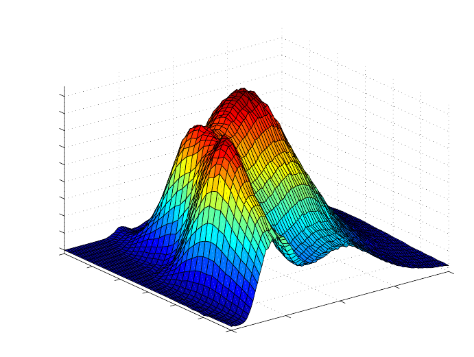
286
Figure 10-3. Sample 4 from amino acids data set.
A PARAFAC model of the data may be easily created with the parafac function as
follows:
» load aminoacids
» model = parafac(X,3);
Fitting PARAFAC ...
Input: 3-way 5 x 201 x 61 array
A 3-component model will be fitted
Mode 1: Unconstrained
Mode 2: Unconstrained
Mode 3: Unconstrained
Convergence criteria:
Relative change in fit : 1e-06
Absolute change in fit : 1e-06
Maximum iterations : 10000
Maximum time : 1h; 0s.
Algorithm : ALS
No missing values
Using fast approximation for initialization (ATLD)
Iteration Rel. Change Abs. Change sum-sq residuals
37 0.0000009174 1.3257991418 1445117.4161680976
Iterations terminated based on relative change in fit error
250
300
350
400
45
0
240
250
260
270
280
290
300
0
50
100
150
200
250
300
350
400
450
Emission
Excitation
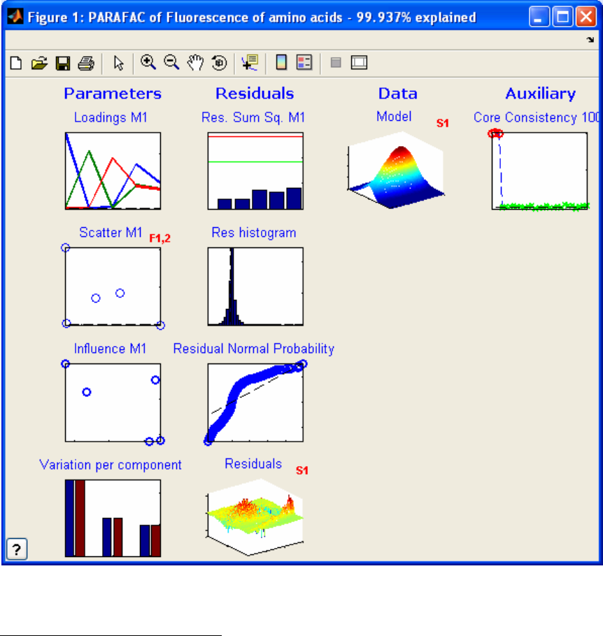
287
Note that the number of iterations required and the exact residuals may be different when
executed at different times. PARAFAC is set to use random starting points in the solution
for the model. The parafac function produces the GUI shown in the screen shot in
Figure 10-4, providing an easy way to view the parameters in the PARAFAC model and
a number of useful diagnostics.
Figure 10-4. PARAFAC output.
Exploring the PARAFAC Model
A PARAFAC model may be explored using the interface shown in Figure 10-4, which is
produced by the parafac function. The interface changes the display and produces
additional information in the following ways:
288
• Click on the title of each plot to see a description of the plot.
• Click on the white background of the plot to change the mode plotted.
• Click on red text to change the sample or factor plotted.
• Right-click (control-click in OS-X) to spawn the figure.
As an example, the loading in each of the modes can be viewed in the upper left window.
It is common to refer to contributions in all factors as loadings; the term scores is not
typically used for PARAFAC. The initial view shows the loadings in the first mode. This
view can be changed by clicking any of the axes or the white background of the figure.
The figure changes to the loadings in the second mode, then in the third mode, then
returns to the first mode. Scatter plots of the loadings for each factor within a mode are
produced in the plot immediately below the loadings plots. For instance, the loadings of
the first two factors in the first mode may be plotted against each other. The mode may be
changed by clicking the axes, while the factors may be changed by clicking the red text.
Different views of the residuals are given in the second column of figures. Residuals are
shown as a function of the index in each mode in the first plot. Again, the mode viewed
can be changed by clicking the axes. The second residuals plot shows a histogram of all
of the residuals, and their normality is evaluated in the third plot. The residuals of
individual samples may be reviewed in the fourth residuals plot.
The individual samples may be viewed in the third column. The fourth column contains a
diagnostic which is useful for evaluating the validity of the model: the core consistency
check. This involves calculating a Tucker core using the loadings from the PARAFAC
model. This Tucker core relates all possible combinations of the factors in each of the
modes to each other (e.g., second factor, first mode; third factor, second mode; first
factor, third mode). If the model is valid, the Tucker model will produce values close to
one for each of the PARAFAC factors (same factor in each mode), but values close to
zero for cross factors (different factors in each mode).
Using the PARAFAC interface to review the amino acids model, we see that the model
appears to be quite good. The loadings window shows that all the loadings are positive,
as expected for this type of data, and the core consistency is quite good.
PLS_Toolbox contains additional tools for multi-way decompositions that are useful
when the data are not as ideally trilinear as the amino acids example. For instance,
PARAFAC2 may be used when one of the sample axes stretches, or when samples have
different numbers of time steps. Tucker models are useful when single factors in some
modes are related to two or more factors in other modes. These models are described in
the sections that follow.
The Tucker3 Model
The Tucker3 model, or three-way PCA model, is one of the most basic three-way models
used in chemometrics. It originates from psychometrics from the pioneering work of
Ledyard Tucker (1964). The algorithmic solution for estimating the model was later
289
substantially improved by Kroonenberg and de Leeuw (1980) and later by ten Berge et
al. (1987).
To explain the Tucker3 model, it is most convenient to start with a PCA model and then
see how that can be extended appropriately. Given an I×J matrix Xk, an R-component
PCA model of the matrix can be written
X
k = ABT + E (10-9)
The matrix A will hold the scores (loadings in the first mode) and B the loadings
(loadings in the second mode). If both the scores and loadings are normalized to a sum-
of-squares of one, then the variance can be kept separately by introducing a diagonal
matrix G. Thus, instead of the above, we now write the model as
X
k = AGBT + E (10-10)
where it is noted that the actual content of A has changed because the norm of each
column is now held in the diagonal of G. This representation of a PCA model is similar
to the truncated singular value decomposition described in Chapter 7, Introduction To
Linear Algebra ; the matrix G corresponding to the singular value matrix is called the
core. In order to prepare the two-way representation for the extension to higher orders,
two further modifications are needed.
The first modification is to allow for off-diagonal values in G. It is worth considering in
detail the implications of such a modification. Usually, the components of a PCA model
are taken in pairs: score one and loading one, score two and loading two, etc. However,
allowing for off-diagonals in G means that the model of the data is not only given by
such pairs. Also the ‘interactions’ of vectors have to be taken into account. For example,
a two-component PCA model with diagonal G would read
X
k = g11a1b1T + g22a2b2T + E (10-11)
whereas with interactions, the corresponding model reads
X
k = g11a1b1T + g22a2b2T + g12a1b2T + g21a2b1T + E (10-12)
The first score vector interacts with the second loading vector (and vice versa) and the
contribution of the interaction is given by the element g12. This added flexibility does not
actually provide better fit for a two-way model, but it does so when going to three- or
higher-way models.
The second important modification of the PCA model is to allow for a different number
of components in the two modes. Imagine that a spectral data set consists of different
amounts of five different analytes, each with different spectra. However, two of the
analytes covary, so that the rank of the matrix is only four. Ideally, it would be possible to
model the data using four score (concentration) vectors and five loading (pure spectra)
vectors, and then handle the fact that two of the analytes have the same concentrations by
adjusting the core G accordingly. The core would then have to be of size 4×5 to allow for

290
the different number of components and if the first two loading columns would
correspond to the first score column, then G could be written:
G=
11000
00100
00010
00001
(10-13)
Using four score vectors in A and five loadings vectors held in B, the model of X would
then read:
X
k = g11a1b1T + g12a1b2T + g23a2b3T + g34a3b4T + g45a4b5T + E (10-14)
As can be seen, the use of a non-quadratic core makes it possible to handle different
numbers of components in the different modes. As for the non-diagonal core, the
introduction of a different number of components does not usually provide a better fit in
two-way analysis, but makes a difference in three- or higher-way models.
The Tucker3 model is a simple extension of the above-mentioned two-way model to the
three-way case. A Tucker3 model of an I × J × K array X is given by three component
matrices A, B and C and a three-way core array G. Whereas a PCA model is defined by a
single number of components, three such numbers have to be defined in a Tucker3
model. The numbers are called RA, RB, and RC, respectively, and they define the number
of columns in A, B and C, respectively. The core array G is of size RA×RB×RC and, just
as in the two-way model, each entry defines the magnitude of the corresponding set of
column vectors in A, B and C. Using scalar notation, the model can be written
xijk =grArBr
CairAbjrBckr
C+eijk
r
C
RC
∑
rB
RB
∑
rA
RA
∑ (10-15)
This is very similar to Equation 10-6, above. The most often used way of stating the
Tucker3 model is by using matrix notation and unfolding the data:
X
(I×JK) = AG(RA×RBRC)(C⊗B)T (10-16)
where X(I×JK) is the three-way array unfolded (matricized) into an I×JK matrix, and where
the core array is rearranged similarly.
The number three in the name Tucker3 is describing that all three modes are reduced. It is
possible to fit a model where only two modes are reduced which would then correspond
to a Tucker2 model. If only one mode is reduced (Tucker1), the model corresponds to a
normal PCA model of the data rearranged into a matrix, i.e., what is typically referred to
(somewhat erroneously) as a multi-way PCA (MPCA) model. If the Tucker model is
applied to a four-way data set and all modes are reduced, then the appropriate name for
that model would be a Tucker4 model.

291
Example of Tucker3
Nørgaard and Ridder (1994) have investigated a problem of measuring samples with
three different analytes on a flow injection analysis (FIA) system where a pH-gradient is
imposed. A carrier stream containing a Britton-Robinson buffer of pH 4.5 was
continuously injected into the system with a flow of 0.375 mL/min. The 77 µL of sample
and 770 µL of reagent (Britton-Robinson buffer pH 11.4) were injected simultaneously
into the system by a six-port valve, and the absorbance was detected by a diode-array
detector (HP 8452A) from 250 to 450 nm in two-nanometer intervals. The absorption
spectrum was determined every second, 89 times during one injection. By the use of both
a carrier and a reagent, a pH gradient is induced over the sample plug from pH 4.5 to
11.4. The three analytes present in the samples are 2-, 3-, and 4-hydroxy-benzaldehyde
(HBA). All three analytes have different absorption spectra depending on whether they
are in their acidic or basic form. Twelve samples of different constitution are measured as
shown in Table 10-2. Thus the data set is a 12 (samples) × 100 (wavelengths) × 89
(times) array. The time mode of dimension 89 is also a pH profile due to the pH-gradient.
For each sample, a landscape is obtained showing the spectra for all times, or, conversely,
the time profiles for all wavelengths. An example landscape is shown in Figure 10-5. It is
characteristic of FIA that there is no physical separation of the samples. All analytes have
the same dilution profile due to dispersion, i.e., all analytes will have total time profiles
that are the same shape.
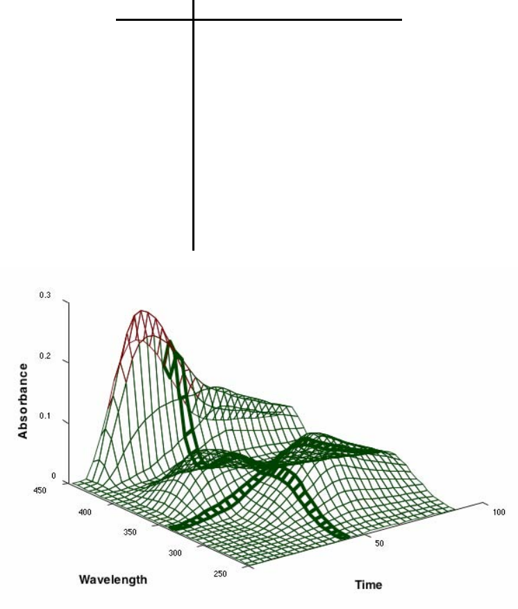
292
Table 10-2. Concentrations of 2HBA, 3HBA, and 4HBA in the twelve samples.
Sample 2HBA 3HBA 4HBA
1 0.05 0.05 0.06
2 0.05 0.10 0.04
3 0.05 0.10 0.06
4 0.10 0.05 0.04
5 0.10 0.10 0.04
6 0.10 0.10 0.06
7 0.00 0.10 0.04
8 0.00 0.10 0.06
9 0.05 0.00 0.06
10 0.10 0.00 0.06
11 0.05 0.10 0.00
12 0.10 0.05 0.00
Figure 10-5. FIA landscape from HBA data.
The time-profile thus maintains its shape at all wavelengths for all samples and for all
analytes. The total profile is the profile actually detected by the photometer and is the
sum of the profiles of protonated and deprotonated analytes. Due to the pH gradient, and
depending on the pKa of a given analyte, the analyte will show up with different amounts
of its acidic and basic form at different times, and hence will have different acidic and
basic profiles in the sample plug. In the figure above these profiles are shown for one
analyte. The first part of the sample plug, i.e., the earliest measurements of a sample, is
dominated by deprotonated analytes, while the end of the sample plug is dominated by
protonated analytes.

293
Due to these special conditions, it is expected that the rank of the data will be different in
the different modes. For example, three concentration (sample) variations are expected
due to the three different analytes. As each analyte has both an acidic and a basic
spectrum, we can expect six different spectral variations. Likewise, there are six profiles
in the temporal mode, but, as the time-profiles have closure, these six underlying profiles
will only span a four-dimensional subspace. More details on these matters can be found
in Bro (1998).
To investigate the variations in the data empirically, an 8×8×8 Tucker3 model was fit.
» load fia;
» model=tucker(FIA,[8 8 8]);
Before looking into the model in detail, the core array was investigated. First the core
was rotated to maximum variance in order to concentrate the variance on as few elements
of the core as possible.
» rotatedcore = coreanal(model,'maxvar');
And the most significant entries of this core are listed as
» coreanal(rotatedcore.core,'list',30);
ANALYSIS OF 8 x 8 x 8 CORE ARRAY
(Comp /Value /Squared /FractionVar /SummedFraction)
[ 1, 1, 1] -18.91 357.47 84.65% 84.65%
[ 1, 2, 2] -5.88 34.59 8.19% 92.84%
[ 2, 3, 1] 3.78 14.31 3.39% 96.23%
[ 2, 4, 2] -2.65 7.02 1.66% 97.89%
[ 2, 2, 1] -1.56 2.44 0.58% 98.47%
[ 3, 2, 1] 1.23 1.50 0.36% 98.82%
[ 2, 2, 2] -1.12 1.26 0.30% 99.12%
[ 2, 1, 2] -0.91 0.83 0.20% 99.32%
[ 1, 4, 3] -0.80 0.64 0.15% 99.47%
[ 3, 5, 1] -0.72 0.52 0.12% 99.59%
[ 3, 4, 1] -0.51 0.26 0.06% 99.65%
[ 3, 2, 2] 0.46 0.21 0.05% 99.70%
[ 2, 3, 2] 0.42 0.18 0.04% 99.74%
[ 3, 5, 2] -0.42 0.18 0.04% 99.79%
[ 1, 3, 2] 0.34 0.12 0.03% 99.81%
[ 3, 6, 2] 0.34 0.12 0.03% 99.84%
[ 2, 2, 3] -0.33 0.11 0.03% 99.87%
[ 3, 4, 2] -0.28 0.08 0.02% 99.88%
[ 4, 1, 3] -0.27 0.07 0.02% 99.90%
[ 1, 3, 3] 0.22 0.05 0.01% 99.91%
[ 1, 7, 3] -0.18 0.03 0.01% 99.92%
[ 4, 1, 4] -0.18 0.03 0.01% 99.93%
[ 3, 1, 2] -0.16 0.02 0.01% 99.93%
[ 5, 1, 2] -0.15 0.02 0.01% 99.94%
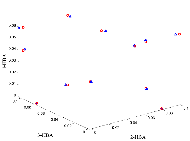
294
[ 2, 4, 1] -0.14 0.02 0.00% 99.94%
[ 1, 6, 3] -0.14 0.02 0.00% 99.95%
[ 1, 3, 4] -0.13 0.02 0.00% 99.95%
[ 3, 3, 2] 0.13 0.02 0.00% 99.96%
[ 4, 2, 4] 0.11 0.01 0.00% 99.96%
[ 4, 2, 3] 0.11 0.01 0.00% 99.96%
The elements in the core are shown according to the amount of variation the
corresponding component combinations explain. Looking at the first 16 most important
components (highlighted in gray), it is observed that in the first sample mode, only three
of the eight components appear. In the third temporal mode, only three components
occur, but in the second spectral mode, six different components occur. The lack of four
significant components in the temporal mode can well be explained by the fact that all
underlying time-profiles are very similar, and hence difficult to distinguish. Apart from
this, the model does seem to confirm the a priori assumptions.
Based on these results, a 3×6×3 component Tucker3 model is fitted to the data. The
scores are shown in Figure 10-6 after rotating them towards the reference concentrations.
As can be seen, the scores are found to be very similar to the reference concentrations.
Figure 10-6. Scores (blue triangles) after rotating the 12×3 score matrix towards the
matrix of reference concentrations (red circles).
295
PARAFAC2
A more exotic, yet very useful, model is the so-called PARAFAC2 model, developed in
1972 by R. A. Harshman (1972). A feasible algorithm was not developed before 1999
(Kiers, ten Berge and Bro, 1999). In some cases a data set—ideally trilinear—does not
conform to the PARAFAC model. The reason can be sampling problems or physical
artifacts. Another problem occurs when the slabs of the array are not of the same row (or
column) dimension. An example could be that in a longitudinal analysis, certain subjects
did not go along all the way (some persons dropped from the experiment before the
analysis ended, some batches were stopped due to breakdown, etc.). It turns out that both
the problem of axis shifts and varying axis dimensions can, in certain cases, be
appropriately handled with the use of the PARAFAC2 model.
Consider a chromatographic data set obtained with spectral detection of some sort, very
generally structured as elution time × wavelength × run/sample. In many situations such a
data set will be well suited for a PARAFAC model. Fitting a PARAFAC model will give
the parameters A (ar being the elution profile or chromatogram of analyte r), B (bf being
the estimated spectrum of analyte the profile or chromatogram of analyte r), and C (ckr
being the relative concentration of analyte r in sample k). If there are shifts in retention
time from run to run, the PARAFAC model can give misleading results, because the
PARAFAC model assumes that the profile of each analyte (ar) is the same in every run.
Instead of forcing the data into the PARAFAC model, it is possible to define a model that
does not require the chromatographic profiles to be identical from run to run, but allows
for some sort of deviation. The PARAFAC2 model is one way of doing so.
The PARAFAC model can be written
X
k = ADkBT, k = 1, ..., K (10-17)
disregarding noise. For the above chromatographic data, Xk would be the measurements
from one chromatographic run. Instead of modeling the Xk matrices directly, consider a
model of an array consisting of the matrices XkTXk. Assuming first that the PARAFAC
model is valid, then for the cross-product array it holds that:
X
kXkT = (ADkBT)T( ADkBT) = BDkATADkBT = BDkGDkBT, (10-18)
k = 1, ..., K, and where G = ATA.
If the model BDkGDkBT is fit to the three-way array of cross-product matrices (XkTXk),
then it is seen that 1) the individual Xk can have a different number of columns and 2) the
matrix A need not be the same in every slab Xk as long as ATA is the same (A is not
estimated directly, only G).
In the chromatographic example, the implication is that B (spectrum estimates) and C
(concentration estimates) should be the same irrespective of elution time, but the
chromatographic profiles need not be the same in every experiment. Only the covariance
or crossproduct matrix of the profile loading matrix should be the same, in order to
conform to the PARAFAC2 model. This is less restrictive than requiring that the profiles
296
be identical as in the PARAFAC model, but it is difficult to see directly what types of
deviations from the trilinear model are then allowed. Kiers et al. (1999) have shown that
requiring G = ATA is equivalent to assuming the model:
X
k = PkHDkBT + Ek, k = 1, ..., K (10-19)
where H is an R×R matrix, Dk and B are defined as before, and the matrix Pk (I×R) is a
columnwise orthonormal matrix. Thus, for every slab, Xk, an individual set of loadings
Ak = PkH is estimated. Because these loadings are required to have the structure PkH it
follows that for any k:
A
kTAk = (PkH)T(PkH) = HTPkTPkH = HTH = G (10-20)
because PkTPk = I. Thus, even though Ak differ from sample to sample, AkTAk is constant
as long as each Ak can be modeled as PkH.
The above model is called the (directly-fitted) PARAFAC2 model. For chromatographic
data, the problem of shifts in retention time can be modeled by the PARAFAC2 model, if
the data are measured such that a baseline is present both before and after the appearance
of the peaks. Also, overlapping peaks must, at least approximately, be shifted similarly.
However, even though the PARAFAC2 model cannot model the kind of deviation
present in the data perfectly, using PARAFAC2 instead of merely PARAFAC can still be
helpful. Typically, if the data are too complex for the PARAFAC model, using the less-
restrictive PARAFAC2 will at least partly remedy the problem, yet still enable a unique
approximate model of the data. And, in any case, the result from PARAFAC2 can give an
indication as to whether PARAFAC is applicable, because, for trilinear data, the
PARAFAC2 model should provide approximately the same results as PARAFAC. So if
the results differ markedly, this is a clear indication that the added flexibility of
PARAFAC2 is needed to handle the variation in the data appropriately.
An important aspect of the PARAFAC2 model is that, like PARAFAC, it is unique in
certain cases. The conditions for uniqueness of the PARAFAC2 model have been much
less studied than the uniqueness of the PARAFAC model. Harshman and Lundy (1996)
and ten Berge and Kiers (1996) give certain results on when uniqueness can be expected.
Multilinear Partial Least Squares, N-PLS
To generalize the PLS approach to multi-way data, a general multilinear PLS (N-PLS)
regression model has been developed (Bro 1996, Smilde 1997, de Jong 1998, Bro et al.
2001).
In the three-way version of PLS, the three-way array of independent variables is
decomposed into a trilinear model similar to the PARAFAC model; however, for N-PLS,
the model is not fitted in a least squares sense but seeks, in accordance with the
philosophy of PLS, to describe the covariance of the dependent and the independent
variables. This is achieved by simultaneously fitting a multilinear model of the dependent
297
variables, a (bi-) linear model of the independent variables, and a regression model
relating the two decomposition models.
Unlike two-way PLS, there are only loading weights in NPLS. In two-way PLS,
additional loadings are introduced to maintain orthogonal scores. However, a similar trick
is not possible in multi-way modeling; therefore, the additional loadings are not
introduced. This also means that, as opposed to the most common two-way PLS
algorithms, NPLS models do not have orthogonal scores.
Another difference from two-way PLS is that the model of the X data is more
complicated to calculate because a Tucker3-like core has to be included. This core is
calculated after the scores, weights and regression coefficients are all determined and is
only introduced to provide appropriate X-residuals for outlier detection and other
purposes. Thus, the interpretation of the NPLS model of X is usually performed as for a
PARAFAC model.
298

299
11. Variable Selection
Genetic Algorithms for Variable Selection
Genetic algorithm variable selection is a technique that helps identify a subset of the
measured variables that are, for a given problem, the most useful for a precise and
accurate regression model. The earlier discussion of multivariate regression describes
how multiple variables can be used together to better predict a separate quantity and how
the expected relationship between the measured variables can be used to identify outliers
and other faults (through Q residuals and Hotelling's T2). Many regression problems
benefit from the multivariate advantages of more precise predictions and outlier
detection. In some cases, however, some variables may be expensive or difficult to
measure (expensive variables) and others may contain noise or interfering signal which
may actually deteriorate the accuracy and/or precision of a regression model (noisy
variables). In these cases, it can be advantageous to discard some variables.
Noisy variables can sometimes be identified with knowledge of the measurement
technique being used. If a given sensor is known to be highly susceptible to noise and/or
responds very little to the changes of interest in a system, it can often be discarded.
Similarly, spectral data often include regions in which the instrumentation has very poor
sensitivity and the species of interest have little to no response. These regions can often
be discarded, thus improving a model. Sometimes, however, the choice of what variables
to discard is not as clear.
Expensive variables pose a similar dilemma. Although many variables may be of use in a
prediction, time, money, or other engineering considerations may preclude measuring all
the variables originally considered for a regression model. In these cases, it is useful to
identify a subset of the variables that allows sufficient prediction accuracy and precision
while minimizing the number of variables to be measured.
Although there are a variety of variable selection methods, genetic algorithms (GA)
provide a straightforward method based on a "survival of the fittest" approach to
modeling data.
Genetic Algorithm Theory
Given an X-block of predictor data and a Y-block of values to be predicted, one can
choose a random subset of variables from X and, through the use of cross-validation and
any of the regression methods described earlier, determine the root-mean-square error of
cross validation (RMSECV) obtained when using only that subset of variables in a
regression model. Genetic algorithms use this approach iteratively to locate the variable
subset (or subsets) which gives the lowest RMSECV.
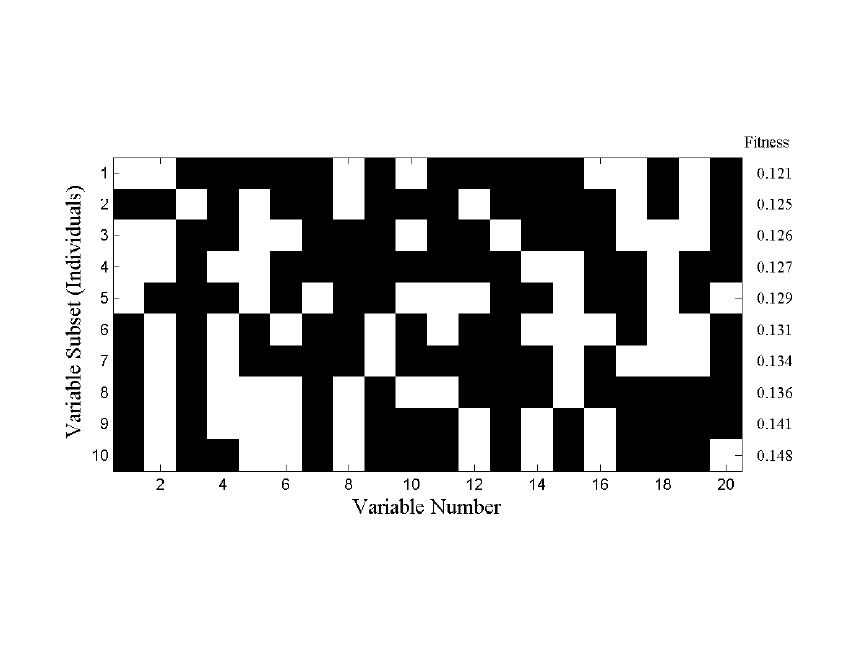
300
Figure 11-1. Map of selected variables for 10 of 64 individuals (white square indicates a
selected variable)
The first step of the GA is to generate a large number (e.g., 32, 64, 128) of random
selections of the variables and calculate the RMSECV for each of the given subsets.
When using factor-based regression methods (e.g., PLS) the maximum number of
allowed factors in a model is limited, and the RMSECV used is the lowest obtained using
up to that limit.
Each subset of variables is called an individual and the yes/no flags indicating which
variables are used by that individual is the gene for that individual. The pool of all tested
individuals is the population. The RMSECV values, described as the fitness of the
individual, indicate how predictive each individual's selection of variables is for the Y-
block. Because of varying levels of noise and interference in the variables, the fitness of
the different individuals in the population will extend over some range of values. Figure
11-1 shows ten out of a total of 64 variable subsets and resultant RMSECV values for the
slurry-fed ceramic melter data (see Chapter 5 for a description of these data).
The RMSECV results for all of the individuals can also be examined as a function of the
number of included variables. Figure 11-2 shows the results obtained from an example
population for the SFCM data. Also shown is the median of all individual RMSECV fits
(dotted line) and the RMSECV obtained using all the variables (dashed line). Note that at
this point, many of the individuals performed worse than when all the variables were
used.
The second step in the GA is selection. The individuals with fitness greater than the
median fitness (i.e., all models above the dotted line in Figure 11-2) are discarded. The
remaining individuals used variables which, for one reason or another, provided a lower
RMSECV – a better fit to the data. At this point, the population has been shrunk to half
its original size. To replace the discarded individuals, the GA "breeds" the retained
individuals.
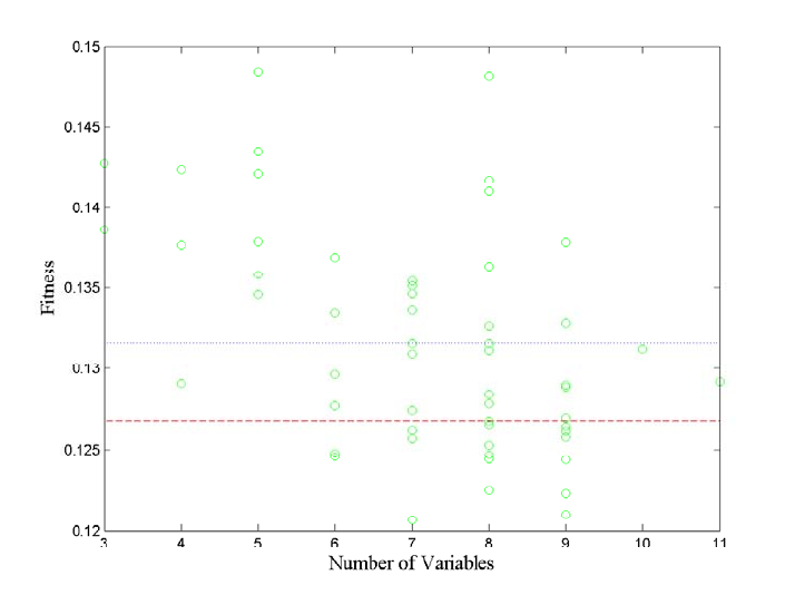
301
Figure 11-2. Fitness (RMSECV) versus the number of variables used by each individual.
In PLS_Toolbox, breeding is done by one of two methods: single or double cross-over. In
single cross-over, the genes from two random individuals are split at some random point
in the gene. The first part of the gene from individual A is swapped with the first part of
the gene from individual B, and the two hybrid genes form two new individuals (C and
D) for the population. This is shown schematically in Figure 11-3. Double cross-over
breeding (also shown in the figure) is very similar to single cross-over except that two
random points in the gene are selected and the middle portions of the two genes are
swapped. The biggest practical difference is that double cross-over usually produces new
individuals with less change from the original parent genes. Put in terms of selected
variables, double cross-over typically creates new variable subsets which more-closely
match the variables included in one parent or the other.
After adding the new individuals to the population, all the individuals' genes are given a
chance for random mutation. This allows for a finite chance of adding or removing the
use of variables that might be over- or under-represented in the population (See variable
13 in Figure 11-1 for an example of an underrepresented variable).
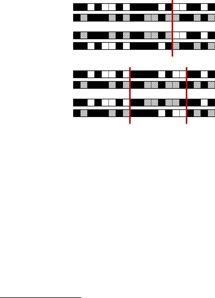
302
Figure 11-3. Schematic of single and double cross-over breeding.
Finally, after all the individuals have been paired and bred, the population returns to the
original size and the process can continue again at the fitness evaluation step. The entire
process is:
1. Generate random variable subsets
2. Evaluate each individual subset of selected variables for fitness to predict Y
3. Discard worse half of individuals
4. Breed remaining individuals
5. Allow for mutation
6. Repeat steps 2-5 until ending criteria are met
The GA will finish (a) after a finite number of iterations or (b) after some percentage of
the individuals in the population are using identical variable subsets. Individuals using
noisy variables will tend to be discarded; thus, the variables used by those individuals
will become less represented in the overall gene population. Likewise, less noisy
variables will become more and more represented. Depending on the number of variables
and the rate of mutation, many of the individuals will eventually contain the same genes.
Practical GA Considerations
One of the biggest risks in GA variable selection is over-fitting. It is possible that the
variables selected may be particularly good for generating a model for the given data, but
may not be useful for future data. This is particularly problematic when analyzing data
with smaller numbers of samples. Although the GA uses a modified version of cross-
validation to help avoid this (see below), it is generally recommended that these
guidelines be followed:
single cross-over
Individual A
Individual B
New Individual C
New Individual D
double cross-over
Individual A
Individual B
New Individual C
New Individual D
303
1. Keep the ending criteria sensitive. The more iterations which occur, the more
feedback the GA will have from the cross-validation information, and thus the more
likely the over-fitting,
2. Use random cross-validation and multiple iterations if practical,
3. Repeat the GA run multiple times and watch for general trends, and
4. When analyzing data with many variables and fewer samples (short-fat problems), set
the window width (see below) to a larger value to use blocks of variables and keep
the maximum number of latent variables low.
In PLS_Toolbox, genetic algorithm variable selection is performed using one of two
functions, the Genetic Algorithm GUI (genalg), or the command-line version
(gaselectr). If the GUI is used, data must first be loaded using the File/Load Data
menu. If any preprocessing should be used, this can be set using the Preprocess menu.
In either the GUI or the command-line routine is used, various GA settings need to be
specified. In the GUI, these settings are selected using graphical controls (see Figure 11-
4); in the command-line interface, the settings are selected via an options structure. The
following describes the settings and gives the name of the appropriate options field in
parenthesis.
• Size of Population (popsize) – The larger the population size, the more time
required for each iteration. Larger populations do, however, provide a better
representation of different variable combinations. One alternative to using a large
population size is to use multiple replicate runs (reps); this, however, does not allow
for interbreeding between potentially useful gene mixtures.
• Window Width (windowwidth) – When adjacent variables contain correlated
information, or the end use of the variable selection is to include or exclude adjacent
variables together as a block (e.g., lower-resolution measurement), the original
variables can be grouped together and included or excluded in "blocks". Window
width indicates how many adjacent variables should be grouped together at a time.
The grouping starts with the first variable and the subsequent (windowwidth-1)
variables.
• % Initial Terms (initialterms) – Specifies the approximate number of variables
(terms) included in the initial variable subsets. Starting with fewer initial terms will
make the identification of useful variables more difficult, but will bias the end
solution towards models with fewer variables. See also Target.
• Target Min/Max (target) and Penalty slope (penaltyslope) – These settings are
used together to guide the algorithm towards a solution with a given number (or
percentage) of included variables. To use this feature, first set some level of penalty
slope to enable the Target Min/Max edit boxes. Prior to discarding the unfit
individuals, each individual is tested for the total number of variables used. Any
individual using more variables than the Target Max or less than the Target Min will
be penalized by increasing the RMSECV fitness, based on the number of variables
above or below the limits times the penalty slope:
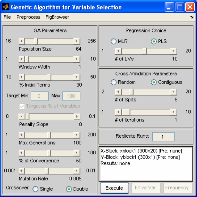
304
RMSECV RMSECV(1+ )n
ρ
′
=
(11-1)
where
ρ
is the penalty slope and n is the number of variables the individual used
above or below the target range. The result is that an individual with a good fit but
using too many or too few variables will be more likely to be discarded, unless the fit
is unusually better than that of other individuals. In the GUI, the penalty slope must
first be selected, then the target range.
Target range can be specified in absolute number of variables or in percentage of total
variables, based on the % checkbox to the right of the target. In the options structure,
the percentage is specified using the targetpct field. A value of 1 (a checked
checkbox in the GUI) indicates that target is specified in percent.
• Max Generations (maxgenerations) and Percent at Convergence (convergence)
– Specify the ending criteria as described earlier. Lower settings for both will help
avoid over-fitting of data. It is sometimes useful to perform many replicate runs with
a lower setting for maximum generations.
• Mutation rate (mutationrate) – The higher the mutation rate, the more chance of
including underrepresented variables or excluding over-represented variables.
Figure 11-4. GUI interface used to specify GA settings.

305
• Regression Choice (algorithm) and # of LVs (ncomp) – Specifies the regression
method as MLR (use all selected variables) or PLS (use latent variables derived from
selected variables). The number of LVs slider (or ncomp option) specifies the
maximum number of latent variables which can be used in a PLS model. This should
generally be kept near the number of LVs necessary to accurately model the data and
should be no more than absolutely necessary (to avoid overfitting).
• Cross-Validation settings (cv, split, iter) – Selects the type and number of
splits and iterations to be used for cross-validation. Note that the contiguous block
cross-validation used by GA is slightly modified from that used in standard cross-
validation. Although the samples are still selected and left-out in contiguous blocks,
the starting position of the first block shifts randomly through the data. This helps
reduce the likelihood of over-fitting.
• Replicate Runs (reps) – This specifies the number of times the GA should be run
using the specified conditions. The results of each cycle will be concatenated together
and will appear together in the results plots, as described below.
The settings can be saved from the GUI for use as an options structure in the command-
line function by selecting File/Save Settings and specifying a variable to which the
options should be saved.
After the settings have been specified as desired, the analysis can be started in the GUI by
selecting Execute. From the command line, executing gaselctr will start the analysis
with the given settings: gaselctr(x,y,options)
Analysis of GA Results
During the analysis, a four-plot figure will be provided and the command window will
display the progress of the GA run. An example is shown in Figure 11-5. The top left plot
indicates the fitness vs. number of included variables for each member of the current
population. The RMSECV obtained using all variables will be shown as a dashed
horizontal line. If target and penalty slope are being used, the penalized fitness will be
shown as red dots along with the actual fitness as the usual green circles.
The top right plot shows the trend of the average fitness (top line) and the best fitness
(bottom line) with generation number. The horizontal dashed line is the RMSECV
obtained using all variables. The best fitness represents how well the best model is doing.
As the population begins to become more similar, the best and average fitness lines
converge. If neither line is changing much, the GA has either reached a consensus of
selected variables or the equivalent solutions with different selected variables.
The bottom right plot shows the change with each generation in the average number of
variables used by each individual in the population. When min/max targets are not being
used, this plot shows the natural trend towards some number of required variables. With
min/max targeting, the plot indicates how well the target is being met, on average.
The bottom left plot indicates the total number of times each variable is used in the
population. Variables which are used more are usually more useful in the regression.
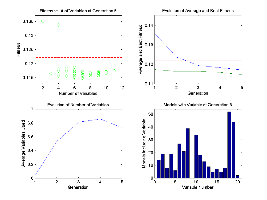
306
Variables which show up less are less useful. Note, however, that depending on the
population size, mutation rate, and total number of generations, the frequency of
inclusion of any given variable may be biased. It is best to compare frequency of usage
with multiple replicates or large, young populations.
Figure 11-5. Example of diagnostic plots shown during GA run.
It is generally true that the entire set of selected variables should be considered as a whole
as opposed to considering each variable as useful on its own. This is because a variable
may only be helpful to prediction when used in conjunction with other variables included
in an individual variable subset.
Once the analysis is done, two additional plot buttons will be available on the GUI: Fit
vs. Var (Fitness versus Number of Variables) and Frequency. These two buttons return
results similar to the top left and bottom right plots, respectively, in Figure 11-5.
However, they include the compiled results from all replicate runs.
Fit vs. Var includes some additional information and can be used to look for trends in
variable usage. Initially, you are presented with a plot of fitness of each individual versus
the number of included variables. Use the mouse to select some range of the individuals
(for example, if you wish to examine only models using more variables, select only these
individuals from the plot). Next, a plot indicating variable usage, color coded by resulting
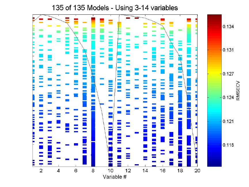
307
RMSECV, will be shown. For reference, the mean of the raw data is overlaid on the plot
of included variables.
Figure 11-6 shows an example of a Fit vs. Var variable usage plot for the SFCM data.
The variable usage plot is most useful to identify trends. If inclusion of a given variable
tends to improve the RMSECV, the inclusion marks for this variable will tend to appear
towards the bottom of the figure. Conversely, a variable which tends to degrade the
RMSECV will tend to appear towards the top of the figure. If a variable doesn't show up
at all, it is likely to be not useful and if it is used in all the models, it is probably more
useful.
It is very important, however, to consider the range of RMSECVs observed through the
models. In many cases, the final RMSECV values will be very similar for the individual
models, and, as such, the differences in selected variables are not important. If, however,
the GA run is stopped early, when a large range in RMSECV exists, more general trends
can be observed. Figure 11-6, for example, shows the results of 135 models after only
three generations. It can be clearly seen that variable 9 is harmful to good RMSECV
while variable 11 is not useful but not harmful.
Figure 11-6. Example of Fit vs. Var plot for SFCM data.
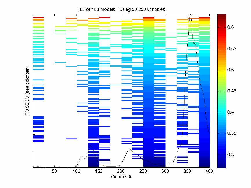
308
Figure 11-7. Example of Fit vs. Var plot for NIR spectra of simulated gasoline.
A second example of fit as a function of variables-used is shown in Figure 11-7. This is
for prediction of the first of five components used for the gasoline simulant discussed in
Chapter 6. The X-block is the spec1 dataset in the nir_data.mat file and the Y-block is
the first column of the conc dataset. For this run, the window width was set to 25
variables, the maximum number of latent variables was set at five, and the analysis was
repeated for a total of six replicate runs; otherwise, all other settings were at their default
value.
Note that the RMSECV covers a fairly large range from just under 0.3% (absolute error
in concentration as weight/weight %) to just above 0.6%, so the worst of these models are
twice as bad as the best models at predicting the concentration. Nearly all models use the
windows of variables centered at 138, 263, 288, and 388. Very few models, and almost
none of the best models, use variables at 38, 63, 88, 138, 188, or 338. These variable
windows are either not useful or are actually detrimental to the prediction of the
concentration of this component. It can be seen that the selected regions fall on or near
the spectral peaks of the mean spectrum, overlaid for reference on the plot.
Once a GA run is complete, the X-block data can be re-saved with only the selected
variables (those used for the model with lowest RMSECV). The menu option File/Save
Best/as Dataset will save the X-block data with the include field set to only the selected
variables. To save only the selected variables as a standard array (i.e., not in DataSet
309
Object format), use File/Save Best/as Matrix. This will save only the selected variables
of the data as a simple array object. Either of these can be read into the Analysis GUI and
used in further modeling.
The results and statistics of the GA run can also be saved as a structure by selecting
File/Save Results and specifying a variable name. This structure contains various fields
including the RMSECV for each final model in the rmsecv field, and the variables
selected for each of those models as a binary representation (1 = selected) in the icol
field. The first row of icol corresponds to the first entry in rmsecv.
Interval PLS (IPLS) for Variable Selection
Similar to the Genetic Algorithm (GA) described above, Interval PLS (IPLS) selects a
subset of variables which will give superior prediction compared to using all the variables
in a data set. Unlike the GA, IPLS does a sequential, exhaustive search for the best
variable or combination of variables. Furthermore, it can be operated in "forward" mode,
where intervals are successively included in the analysis, or in "reverse" mode, where
intervals are successively removed from the analysis.
The "interval" in IPLS can be either a single variable or a "window" of adjacent variables
(as might be used with spectroscopically-correlated or time-correlated variables, where
adjacent variables are related to each other). In this discussion, we will refer to an
"interval" with the understanding that this may include one ore more variables.
In forward mode, IPLS starts by creating individual PLS models, each using only one of
the pre-defined variable intervals. This is similar to what is shown in Figure 11-1, except
that only one of the individual intervals can be "on" at a time. If there are 100 intervals
defined for a given data set, the first step calculates 100 models (one for each interval).
Cross-validation is performed for each of these models and the interval which provides
the lowest model root-mean-square error of cross-validation (RMSECV) is selected. This
is the best single-interval model and the first selected interval, I1.
If only one interval is desired, the algorithm can stop at this point returning the one
selected interval. If, however, more than one interval is desired (to increase information
available to the model and maybe, thereby, improve performance), additional cycles can
be performed. In the second cycle, the first selected interval is used in all models but is
combined with each of the other remaining intervals, one at a time, when creating a new
set of new PLS models. Again using RMSECV, the best combination of two intervals (I1
and one additional interval, I2) is determined. Note that the first selected interval can not
change at this point. This is repeated for as many intervals as requested (up to In).
Reverse mode of IPLS works in an opposite manner to forward mode. All intervals are
initially included in the models, and the algorithm selects a single interval to discard. The
interval which, when excluded, produced a model with the best RMSECV is selected for
permanent exclusion. This is the "worst" interval, I1. If the user has selected that more
than one interval should be excluded, subsequent cycles discard the next worst intervals
based on improved RMSECV when each interval is discarded.

310
Practical IPLS Considerations
The total number of intervals to include or drop (number of cycles to perform) depends
on various factors, including but not limited to:
• The expected complexity of the system being modeled – the more complex (e.g.,
non-linear) the data, the more intervals usually needed.
• The amount of data reduction necessary – if only a fixed number of variables can
be measured in the final experiment, the number of intervals should be limited.
• The distribution of information in the variables – the more distributed the
information, the more intervals needed for a good model.
One method to select the best number of intervals is to cross-validate by repeating the
variable selection using different sub-sets of the data. There is no automatic
implementation of this approach in PLS_Toolbox. However, the IPLS algorithm does
allow one to indicate that the algorithm should continue to add (or remove) intervals until
the RMSECV does not improve. This can give a rough estimate of the total number of
useful intervals. If multiple runs with different sub-sets of the data are done using this
feature, it can give an estimate of the likely "best" number of intervals.
Another consideration is interval "overlap". Variables in the data can be split in a number
of ways.
• Intervals can each contain a single variable, thereby allowing single-variable
selection.
• Intervals can contain a unique range or "window" of variables where each
variable exists in only one interval.
• Intervals can contain overlapping ranges of variables where variables may be
included in two or more intervals and can be included by selecting any of those
intervals.
The decision on which approach to use depends on the uniqueness of information in the
variables of the data and how complex their relationships are. If variables are unique in
their information content, single-variable intervals may be the best approach. If adjacent
variables contain correlated or complementary information, intervals which contain
ranges of variables may provide improved signal-to-noise, increased speed of variable
selection, and decreased chance of over-fitting (that is, selecting variables which work
well on the calibration data but not necessarily on any data for the given system).
In contrast, although allowing overlapping intervals may seem as though it provides the
advantages of increased signal-to-noise and modeling complexity, it may also lead to
over-fitting. The difference between two adjacent windows becomes only the variables
on the edges of the windows (those which are dropped or added by selecting the

311
neighboring intervals.) In addition, overlapping windows can increase the analysis time
considerably.
One general caveat to IPLS variable selection should be carefully considered. It is
possible that, given n different intervals, the best "single interval" model would be
obtained by selecting a given interval (interval 10, for example). The best "two interval"
model, however, might actually be obtained by selecting two different intervals (5 and 6,
for example). Because of the step-wise approach to this IPLS algorithm, once the single-
best interval is selected, it is required to be included in all additional models. As a result,
the two-interval model might include intervals 5 and 10 (because 10 was selected first),
even though 5 and 6 would provide a better RMSECV. This type of situation is most
likely to arise when data are complex and require a significant number of factors for
modeling. In these situations, using larger interval "windows" and requiring the addition
of additional intervals (cycles) should be used. Additionally, the GA method of variable
selection may provide superior results.
Using the IPLS Function
The PLS_Toolbox ipls function takes as input the X- and Y-block data to be analyzed,
the size of the interval windows (1 = one variable per interval), the maximum number of
latent variables to use in any model, and an options structure. The options structure
allows selection of additional features including:
• mode : defines forward or reverse analysis mode.
• numintervals : defines the total number of intervals which should be selected. A
value of inf tells IPLS to continue selecting until the RMSECV does not
improve.
• stepsize : defines the number of variables between the center of each window.
By default, this is empty, specifying that windows should abut each other but not
overlap (i.e., stepsize is equal to the window size).
• mustuse : indices of variables which must be used in all models, whether or not
they are included in the "selected" intervals.
• preprocessing : defines the preprocessing to be performed on each data subset
(for more information, see the preprocess function).
• cvi : cross-validation settings to use (for more information, see the cvi input to
the crossval function).
Demonstration of the ipls function can be done through the analysis of the slurry-fed
ceramic melter (SFCM) thermocouple data previously discussed in Chapter 5. Briefly,
these data consist of measurements from twenty thermocouples at various depths in a
tank of melted ceramic material. As the level of the material rises and falls, the different
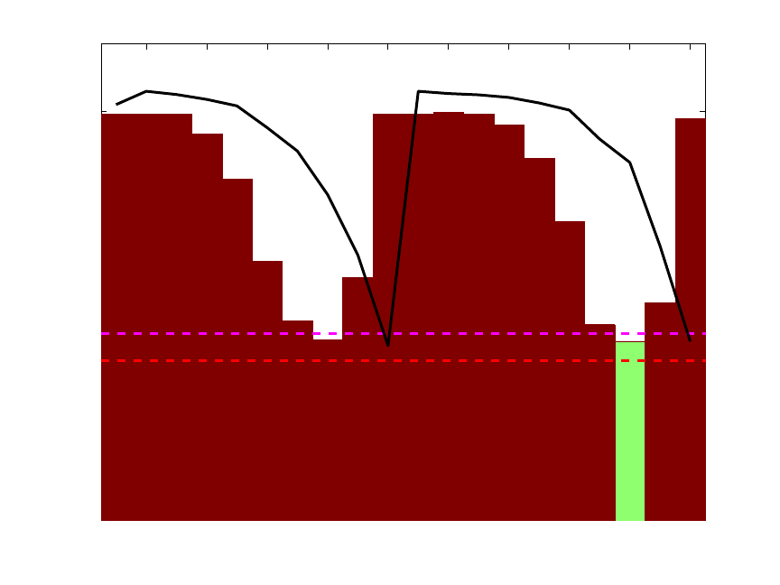
312
thermocouples experience different temperatures. One can use IPLS to consider which
thermocouple or thermocouples are the most useful in determining the level of material.
To do this, ipls is called with the SFCM data and inputs to set the maximum number of
latent variables, interval width, and preprocessing options (autoscaling, in this case):
» load pls_data
» options = ipls('options');
» options.preprocessing = {'autoscale' 'autoscale'};
» int_width = 1; %one variable per interval
» maxlv = 5; %up to 5 latent variables allowed
» sel = ipls(xblock1,yblock1,int_width,maxlv,options);
The result is the plot shown in Figure 11-8.
2 4 6 8 10 12 14 16 18 20
0
0.05
0.1
0.15
0.2
0.25
0.3
0.35
(5 LVs)
(1 LVs)
11111111111111111111 (# LVs)
Variable Number
RMSECV with interval added
Forward iPLS Results
Figure 11-8. First selected interval for SFCM data.
The figure shows the RMSECV obtained for each interval (with the average sample
superimposed as a black line). The numerical values inside the axes along the bottom
(just above the variable number) indicate the number of latent variables (LVs) used to
obtain the given RMSECV. Because each interval contains only a single variable, only 1
LV can be calculated in all cases. The green interval (variable 18) is the selected interval.
The horizontal dashed lines indicate the RMSECV obtained when using all variables and
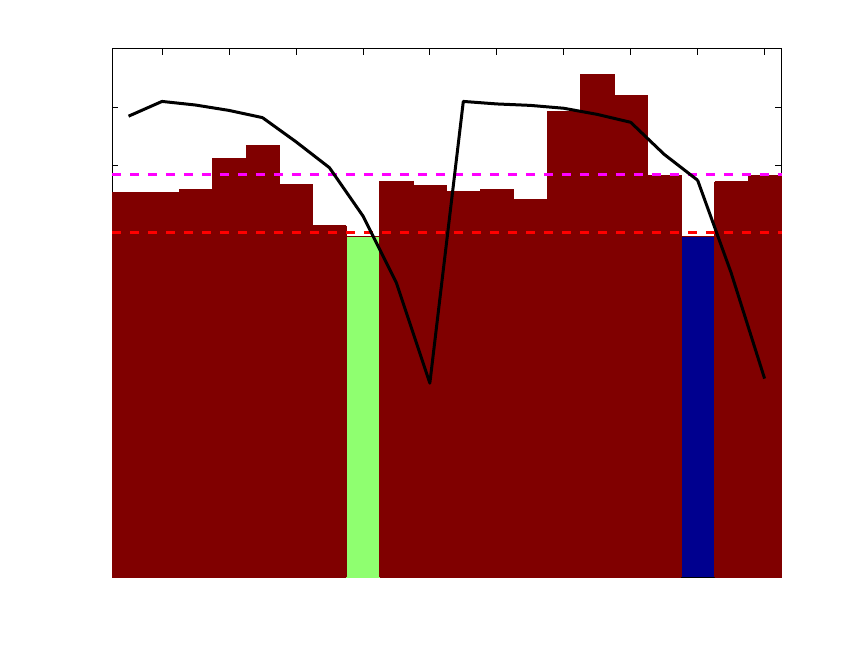
313
1 or 5 LVs. Note that interval 18 on its own gave a slightly better one-LV model than did
the model using all twenty variables. However, a five-LV model using all variables still
did better than any individual interval.
The commands below repeat this analysis but request that two intervals be selected
instead of one. The plot shown in Figure 11-9 is the result.
» options.numintervals = 2;
» sel = ipls(xblock1,yblock1,int_width,maxlv,options);
2 4 6 8 10 12 14 16 18 20
0
0.02
0.04
0.06
0.08
0.1
0.12
0.14
0.16
0.18
(5 LVs)
(1 LVs)
12222221222222222122 (# LVs)
Variable Number
RMSECV with interval added
Forward iPLS Results
Figure 11-9. First two selected intervals for SFCM data.
The figure shows the results at the end of all interval selections. The final selected nth
interval is shown in green. Intervals selected in the first n-1 steps of the algorithm are
shown in blue. Because this analysis included only two intervals being selected, there is
only one interval shown in blue (the first selected interval) and the second selected
interval is shown in green. The height shown for the selected intervals (blue and green) is
equal to the RMSECV for the final model. In this case, the final model with two selected
intervals used only one latent variable (as indicated at the bottom of the bars) and gave an
RMSECV which was slightly better than the RMSECV obtained using five latent
variables and all intervals (dashed red line). Interestingly, the variables selected (numbers
8 and 18) are duplicate measurements at the same depth in the tank. This is a good
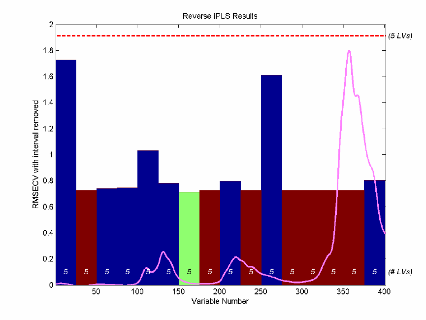
314
indication that the given depth is a good place to measure, should only a single
thermocouple be used.
The final example for IPLS shows the reverse analysis of the gasoline samples discussed
in Chapter 6. In this case, the Y-block being predicted is the concentration of one of five
components in these simulated gasoline mixtures and the X-block is the near-IR spectra
measured for each sample. The reverse IPLS analysis indicates the effect on the
RMSECV when each interval is discarded, and therefore the best interval(s) to discard. In
this case, IPLS will be run with the maxintervals option set to infinity to trigger the
"automatic" mode. The ipls function will continue to remove intervals until removing an
interval would cause the RMSECV to increase. The MATLAB commands are shown
below; the resulting plot is shown in Figure 11-10.
» load nir_data
» options = ipls('options');
» options.preprocessing = {'autoscale' 'autoscale'};
» options.numintervals = inf;
» ipls(spec1,conc(:,1),25,5,options);
Figure 11-10. Reverse IPLS analysis for simulated gasoline samples.
A total of eight intervals were discarded before it was determined that removing any
additional intervals would cause an increase in RMSECV. Intervals marked in red on the
reverse IPLS results plot are those that were discarded in the first seven cycles. The
315
interval marked in green was the last discarded interval. The blue intervals are those that
were retained. Each bar indicates the RMSECV which would have resulted, had the given
interval been discarded. It can be seen that the intervals centered at 38, 113, and 263 are
all critical for a good model (discarding these intervals would result in a significant
increase in RMSECV.) It can also be seen that intervals at 63 and 88 were likely
candidates for exclusion in the last cycle as the RMSECV change would have been nearly
negligible.
It is interesting to compare the IPLS results on the gasoline simulant shown in Figure 11-
10 to those from the GA run on the same data, shown in Figure 11-7. Note that, with a
few exceptions, the same regions are discarded in each case. The biggest discrepancy is
the inclusion of the interval centered at variable 113. This interval was under-represented
in the GA models, but appears to be highly important to the model formed with IPLS-
based selection. The difference is likely due to IPLS having excluded some region in an
earlier cycle which left the 113-centered interval as the only source of some information.
In contrast, the GA models discovered that a different combination of intervals could
achieve a better RMSECV by discarding interval 113 and retaining a different interval.
Note, incidentally, that the final model created by IPLS selection returns an RMSECV of
around 0.71. This is in contrast with the GA result of 0.27 for the same data.
Conclusions
In general it should be remembered that, although variable selection may improve the
error of prediction of a model, it can also inadvertently throw away useful redundancy in
a model. Using a fewer number of variables to make a prediction means that each
variable has a larger influence on the final prediction. If any of those variables becomes
corrupt, there are fewer other variables to use in its place. Likewise, it is harder to detect
a failure. If you keep only as many measured variables as you have latent variables in a
model, you cannot calculate Q residuals, and the ability to detect outliers is virtually
eliminated (except by considering T2 values). As such, the needs of the final model
should always be carefully considered when doing variable selection.
316
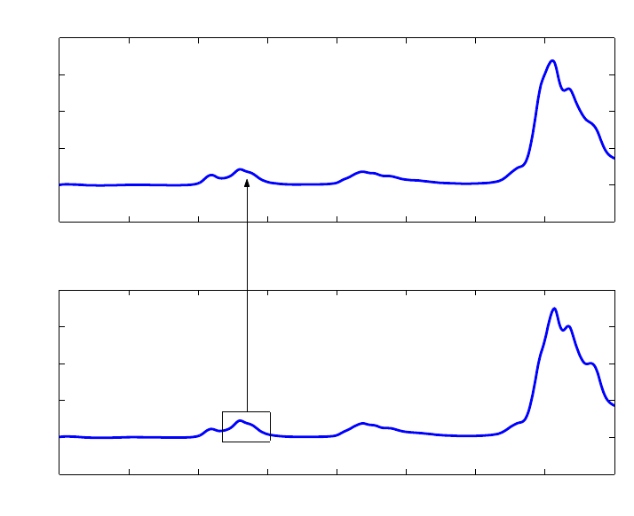
317
12. Instrument Standardization
Once a calibration for a process analytical instrument has been developed, it would be
convenient if it could be transferred to other similar instruments. This would eliminate
the need to run a large number of calibration samples and to develop a completely new
calibration model. Direct transfer of calibrations is not usually satisfactory, however,
because instruments are never identical. It also happens that instruments tend to drift,
which changes their characteristics after some time. Instrument standardization methods
were developed in order to deal with these similar problems.
This problem has been addressed in several different ways by various researchers, but the
methods generally fall into two classes: 1) techniques that attempt to predict the response
of the standard instrument based on the response of the subject instrument, i.e., map the
response of one instrument into another, and 2) techniques that eliminate the differences
between instruments, leaving only the parts they have in common. In the first case, there
is usually a single calibration model, developed on the standard instrument, through
which data from both instruments are processed. In the second case, a model is generally
developed using transformed data from both instruments.
Figure 12-1. Relationship between spectra on different instruments in PDS.
The Piece-wise Direct Standardization (PDS) method (Wang et al., 1991, 1992, 1994) is
of the first type, and is perhaps the most successful calibration transfer technique. It
works by forming “local” linear models that relate the response of the instrument to be
standardized over a range of frequencies to the response of the standard instrument at a
single frequency. This is shown schematically in Figure 12-1. This is in contrast to Direct
800 900 1000 1100 1200 1300 1400 1500 160
0
−0.5
0
0.5
1
1.5
2
Wavelength (nm)
Absorbance
Master Instrument
800 900 1000 1100 1200 1300 1400 1500 160
0
−0.5
0
0.5
1
1.5
2
Wavelength (nm)
Absorbance
Slave Instrument

318
Standardization, (DS), which uses the entire spectrum. Additional techniques of the
second type include Orthogonal Signal Correction (OSC) and Generalized Least Squares
Weighting (GLSW).
Usually, standardization transforms are developed using a small number of samples that
are run on both instruments (or a single instrument at two different times). These samples
are then used to develop either a transform that maps the response of one instrument into
another, or a model that eliminates differences.
Sample Subset Selection
The first step in developing a standardization transform is to select samples that will be
measured on both machines. These can be samples used to form a calibration model or
other samples designed to exercise the instrument in the spectral region of interest. A
convenient method for choosing samples is based upon their multivariate leverage, which
is a measure of their uniqueness in the calibration set. This is a simple procedure which
starts by selecting the sample with the greatest deviation from the multivariate mean of
the calibration samples. All other samples are then orthogonalized with respect to the first
sample and the procedure is repeated. Given a calibration set from Instrument 1,
R
1 (n
samples by m wavelengths), that has been mean-centered, calculate the leverage matrix H
as:
H =
R
1
R
1
T
(12-1)
Note that H is n by n. The diagonal elements of H are the leverages of the samples, i.e.,
hii is the leverage of the ith sample. Select the sample with the highest leverage, rmax. Set
the elements of this spectrum equal to zero, then orthogonalize each remaining spectrum
ri in the data set by performing
rio = ri - rmax ((rmax riT)/(rmax rmaxT)) (12-2)
for each spectrum where rio is the orthogonalized ri. Note that this procedure subtracts
from ri the portion of rmax that projects onto it. This procedure is then repeated as in
Equation 12-2, using the orthogonalized spectra in place of R 1. It is often better to select
samples for calibration transfer utilizing the calibration model inverse R 1+, i.e., the PLS
or PCR approximation to the inverse (see Equations 6-7 and 6-20), in the formation of the
H matrix:
H = R 1R 1+ (12-3)
The diagonal elements of H are then the leverages of the samples with respect to their
influence on the calibration model. The orthogonalization procedure above is then used to
select the samples. This procedure emphasizes samples with a large influence on the
calibration model, as opposed to the procedure above, which emphasizes samples that are
far from the multivariate mean without regard to their direct influence on the model. As a

319
result, the procedure based on the model inverse tends to select samples that exercise the
portions of the spectrum upon which the model most depends.
In some applications as few as three spectra are sufficient for building a transfer function
between instruments; however, additional samples can be beneficial. Once the transfer
samples are identified based on the leverage of their spectra, the samples must be
measured on both spectrometers and the calculation of the standardization can
commence.
The NIR spectra of the simulated gasoline samples contained in nir_data.mat can be
used to demonstrate the development of a standardization transform. The file contains
NIR spectra of the same thirty samples measured on two different instruments. We can
now select five samples from the spectra based on leverage as follows:
» load nir_data
» [specsub,specnos] = stdsslct(spec1.data,5);
The following samples are selected in order: 22, 15, 26, 25, and 1. These are the samples
that are unique. Hopefully, they will also be useful for describing the difference between
the two instruments. Alternatively, a PLS model could be developed for the first analyte
from the NIR data, then a subset could be selected with respect to this model inverse as
shown below. First a default preprocessing structure would be generated and inserted into
a pls options structure. The model could be then be generated, the inverse formed, and
the spectra selected as follows:
» s = preprocess('default','mean center');
» opts = pls('options');
» opts.preprocessing = {s,s};
» mod = pls(spec1.data,conc(:,1),5,opts);
» rinv = rinverse(mod);
» [specsub,specnos] = stdsslct(spec1.data,5,rinv);
This procedure selects the samples 1, 20, 7, 21 and 27. Note, however, that the model
inverse calculated above was based on only the first analyte out of the five analytes in the
data set.
Development of the Standardization Transform
It is assumed that the calibration model is formulated as
y = R1β + 1b1 (12-4)
where y is the concentration vector of the analyte of interest, R1 is the response matrix,
β is the regression vector, b1 is the constant offset of the model and 1 is an m by 1 vector
of ones, where m is the number of samples. After mean-centering:
y = R1
β
(12-5)
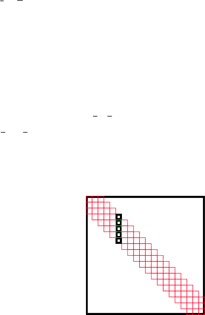
320
where
y
and
R
1 are the mean-centered y and R1, respectively. The relationship between
the instruments is then modeled as:
S1 = S2Fb + 1bsT (12-6)
where S1 is the response of Instrument 1 to the p transfer samples, S2 is the response of
Instrument 2 (or Instrument 1 at a later time), Fb is the transformation matrix, bs is the
background correction which accommodates the additive background difference between
the instruments, and 1 is a p by 1 vector of ones, where p is the number of transfer
samples (rows) in S1 and S2. Note that it is assumed at this point that S1 and S2 are not
mean-centered.
The transfer function matrix, Fb, is then calculated to satisfy:
S1=S2F
b
(12-7)
where S1 and S2 are the mean-centered S1 and S2. As noted previously, Fb can be
calculated several ways, one of which is the PDS method as described above. In PDS, Fb
has the diagonal structure shown in Figure 12-2, where each local model (generally
determined from PLS or PCR) relates the response of a number of channels of Instrument
2 to a single channel on Instrument 1. One such model is shown in bold in the figure.
Figure 12-2. Structure of the PDS transformation matrix Fb.
The PDS standardization matrix and additive background correction can be calculated
with the PLS_Toolbox function ‘stdgen’. Here we will use the subset selected by
‘stdsslect’ above to form the transform and use a window that is five channels wide:
»[stdmp,stdvp] = stdgen(spec1.data(specnos,:),spec2.data(specnos,:),5);
0
0
F =
b

321
Another method, Direct Standardization (Wang et al., 1994), uses
F
b
=S2
+S1 (12-8)
where S2
+ is the pseudoinverse of S2. This is formed through use of the SVD as follows.
Take
S2 = U S VT (12-9)
then
S2
+ = U S-1 VT (12-10)
where S-1 is S with all of the non-zero singular values replaced by their reciprocals.
The additive background term, bs, is calculated as
bs = s1m - FbTs2m (12-11)
where s1m and s2m are the are the mean vectors of S1 and S2 respectively.
The DS standardization matrix and additive background correction are calculated with
the same function, ‘stdgen’, by simply changing the argument of the window width to
0:
»[stdmd,stdvd] = stdgen(spec1.data(specnos,:),spec2.data(specnos,:),0);
Prediction using Standardized Spectra
After calibration and formation of the standardization transform, the concentration
estimate for any spectrum, r2un, measured on Instrument 2 can be obtained using the
calibration model developed on Instrument 1 as
y2un = (r2un Fb + bsT)β + b1 (12-12)
where b1 is defined from Equation 12-4. In MATLAB, the spectra from Instrument 2 can
be standardized for both of the standardization models as follows:
» cspec2p = stdize(spec2.data,stdmp,stdvp);
» cspec2d = stdize(spec2.data,stdmd,stdvd);
The spectra are now ready for use with the models developed on the spectra from the first
instrument.
Figure 12-3 shows the improvement in the root-mean-square difference between the
instruments before and after the standardization. As you can see, there is a considerable
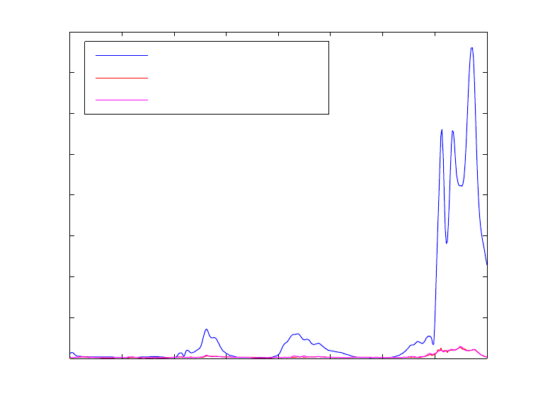
322
improvement in the difference of the responses. Although there appears to be little
difference between the direct and piece-wise direct standardized spectra, in practice the
PDS method produces somewhat better results when the spectra are used for prediction,
because the PDS method does not “overfit” the spectra as much as the direct method.
A full demonstration of instrument standardization methods is contained in the demo
stddemo. This demo uses the NIR data to develop standardization and calibration models
and compare the methods.
800 900 1000 1100 1200 1300 1400 1500 1600
0
0.02
0.04
0.06
0.08
0.1
0.12
0.14
0.16
Wavelength
RMSE reconstruction error
Before Standardization
PDS
DWPDS
Figure 12-3. Mean difference between NIR spectra before and after standardization.
Non-Square Systems
In the example above, both of the instruments considered were very similar; they both
measured the spectra of the samples at 401 points between 800 and 1600 nanometers.
What if the instruments had a different number of channels in that range? The function
stdgen will generate standardization transforms for non-square systems, and was
developed for just such a case. The form of the model is very similar to that of PDS
except the F matrix is not square; rather, it is the number of channels on the instrument to
be standardized by the number of channels on the standard instrument.
Double Window PDS
Another potential issue in standardization involves the use of high resolution spectra such
as FTIR spectra of gas phase samples. In these cases, the spectral features are very
narrow with regions of only baseline noise in between. Models developed with PDS in
323
such a case are fine where there are features in the transfer spectra but not very good in
between. Double window PDS addresses this problem by forming models based on data
on both sides of the current window to be standardized. The second window defines the
range of data outside the original window to be used. The form of the model is identical
to that of PDS; only the way in which the model is identified is different. For instance, let
the transfer spectra from the standard instrument be R1, and the spectra from the
instrument to be standardized be R2. In PDS with a window width (model length) of
2j+1, the model for the ith channel bi is identified by
b
i = R2(:,i-j:i+j)+R1(:,i) (12-13)
where we have used MATLAB notation to indicate which columns of R1 and R2 are used
in the formation of the model bi. The superscript + indicates a pseudoinverse. In double
window PDS, with a first window width (model length) of 2j+1 and a second window
width (identification width) of 2k+1, the model for the ith channel bi is
bi = R2DW+ R1DW (12-14)
where R2DW =
R2(:,i-j-k:i+j-k)
R2(:,i-j-k+1:i+j-k+1)
R2(:,i-j-k+2:i+j-k+2)
...
R2(:,i-j:i+j)
...
R2(:,i-j+k:i+j+k)
and R1DW =
R1(:,i-k)
R1(:,i-k+1)
R1(:,i-k+2)
...
R1(:,i)
...
R2(:,i+k)
Using this scheme, the model for the ith channel is based on a wider range of data. In
order for this scheme to be useful, the instrument transfer function must not be a strong
function of wavelength. The function stdgen implements DWPDS. Our experience using
324
DWPDS in FTIR shows that it may be optimal to have a narrow first window, on the
order of the resolution of the instrument, and very wide second window. DWPDS is
compared with PDS in stddemo using the NIR data, where one would not expect
DWPDS to be particularly advantageous. Still, on the data considered, it is possible to
derive a PDS model with a window width of 3 with the same performance as a model
identified with DWPDS with a window width of 5. This suggests that it is possible to get
a model with additional coefficients, provided that more data are used in the construction
of each of the models. It may be that the DWPDS-derived models are more robust in
practice, but this remains to be investigated.
Standardization with FIR Filters
The stdfir function can be thought of as a moving window MSC and is analogous to
using a finite impulse response modeling methodology. The function, based on the work
by Blank et al. (1996), uses a windowed MSC to correct the spectra to a reference
spectrum with only the center channel of each window being corrected. This technique
has the advantage of using MSC, i.e., only one spectrum on the standard instrument is
required to transfer spectra from a second instrument. Also, if the scattering effect is a
function of wavelength, the windowing may avoid some of the limitations imposed by
using a single multiplicative factor in MSC.
Note that it is advisable to cross-validate over the window width to find the best window
for standardization. Also, it has been found that if the reference spectrum has regions
about the size of the window width which are flat, estimates of the inverse of r′Tr′ in that
window can be poor, resulting in artifacts (e.g., spikes) in the corrected spectra. If the flat
region is not in an area with zero absorbance, the function results might improve if mean-
centering is not used. Another way to stabilize the estimates is to add a constant slope to
the spectra prior to using stdfir and then to take the derivative after standardization.
Also, when using the FIR filter approach Sum and Brown (1997) have reported that
“despite very good precision, a comparatively large bias is manifested in prediction in
some systems.” They also report a methodology for correcting the bias.
Orthogonal Signal Correction
Orthogonal Signal Correction (OSC) is a data preprocessing method that can be used
prior to PLS modeling. In situations where the a PLS model captures a very large amount
of predictor block (X) variance in the first factor but gets very little of the predicted
variable (y or Y), this method can be very helpful. In these cases, it is useful to remove
extraneous variance from X that is unrelated to y. OSC does this by finding directions in
X that describe large amounts of variance while being orthogonal to y. PLS models are
built on OSC-corrected data, then the OSC correction is applied to new data before the
models are applied to that data. OSC can also be used for standardization purposes to
remove variation between instruments that is not related to the variables to be predicted.
An example of this is shown here using the osccalc and oscapp functions with the NIR
data from the previous example.
» load nir_data
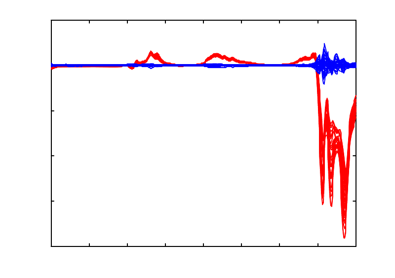
325
» [specsub,specnos] = stdsslct(spec1.data,5);
» x1 = spec1.data(specnos,:); x2 = spec2.data(specnos,:);
» y1 = conc.data(specnos,:);
» x = [x1; x2]; y = [y1; y1];
» [nx,nw,np,nt] = osccalc(x,y,2);
» newx1 = oscapp(spec1.data,nw,np);
» newx2 = oscapp(spec2.data,nw,np);
The difference before and after standardization over all thirty samples is shown in Figure
12-4 below. The RMS errors (not shown) are comparable to those shown in Figure 12-3.
800 900 1000 1100 1200 1300 1400 1500 1600
-0.2
-0.15
-0.1
-0.05
0
0.05
Wavelength (nm)
Absorbance Difference
Difference Between Instruments Before and After OSC
Figure 12-4. Difference between instruments before (red) and after (blue) application of
OSC.
Standardization via Generalized Least Squares Weighting
Like OSC, Generalized Least Squares Weighting (GLSW) is a data preprocessing method
that can be used prior to PLS modeling to remove extraneous variance. When used for
standardizations, the objective is to remove variation that the instruments do not have in
common. PLS models are built on GLSW-corrected data, then the GLSW correction is
performed on new data before the models are applied to that data. An example of this is
shown here using the glsw function and the NIR data from the previous example.
» load nir_data
» [specsub,specnos] = stdsslct(spec1.data,5);
» x1 = spec1.data(specnos,:); x2 = spec2.data(specnos,:);
326
» modl = glsw(x1,x2);
» newx1 = glsw(spec1.data,modl);
» newx2 = glsw(spec2.data,modl);
The difference before and after standardization over all thirty samples is very similar to
the differences shown in Figure 12-4 for OSC. Likewise, the RMS errors (not shown) are
comparable to those shown in Figure 12-3.
327
13. Robust Statistical Methods
Preface
PLS_Toolbox 4.0 includes robust statistical methods for Principal Components Analysis
and Regression. The robust functionality has been incorporated by including a version of
LIBRA, a MATLAB Library for Robust Analysis. LIBRA was developed by the research
groups on robust statistics at Katholieke Universiteit Leuven and the University of
Antwerp. More details concerning LIBRA can be found in Verboven and Hubert, (2005)
and at http://wis.kuleuven.be/stat/robust/LIBRA.html. Eigenvector Research has licensed
LIBRA, and with the help of Drs. Sabine Verboven and Mia Hubert, modified it to make
it work with PLS_Toolbox. This chapter introducing robust statistics was developed
primarily by Verboven and Hubert.
Introduction
Robust methods are developed because atypical observations in a data set heavily affect
the classical estimates of data mean and variance/covariance. Consider the estimation of
the center of the following set of numbers: [10 10.1 10.1 10.1 10.2 10.2 10.3 10.3].
For these data, the mean is 10.16, whereas the median equals 10.15. These two statistics
do not differ much as there are no outliers. However, if the last measurement was
wrongly recorded as 103 instead of 10.3, the mean would be 21.75, whereas the median
still would equal 10.15. This exemplifies the robust nature of the median versus the non-
robust (classical) nature of the mean. Outliers can occur by mistake (as in this example by
misplacement of a decimal point), or other random error, for example, through an
instrument malfunction or a measurement error. These are typically the samples that
should be discovered and corrected or else removed from the data.
Another type of atypical observation is a systematic error where some measurements
belong to a population other than the one under study (caused, for example, by a change
in the experimental conditions). Often atypical observations reveal unique properties.
Consequently, finding this kind of outlier can lead to new discoveries. Outliers are thus
not always wrong or bad, although they are often referred to negatively. They are,
however, different than the bulk of the data under consideration.

328
−10 −5 0 5 10
−2
−1
0
1
2
3
4robust
classical
Figure 13-1. Simulated data set with outliers.
Outliers are the rule rather than the exception in real-world applications. This is
especially true in the area of on-line process analysis, where outliers are always present
because process sensors rarely operate within specifications 100% of the time. In general,
the analyst has limited control over the process that generates the calibration data.
Moreover, detecting multivariate outliers is very difficult, as illustrated in Figure 13-1.
The outlying observations (indicated by ‘+’) do not have abnormal values in either of the
two variables, and hence will not be spotted by looking at the individual variables. The
outliers can only be found by taking into account the covariance structure (the green
ellipse) of the regular data (indicated by ‘o’). The tolerance ellipse based on the classical
covariance estimate (red dashed circle) is enlarged due to the presence of the outliers. In
contrast, the robust Minimum Covariance Determinant (MCD) estimator (Rousseeuw,
1984) is an alternative method of calculating the covariance and clearly encloses only the
regular data points (green ellipse). The need for and effectiveness of robust statistical
methods has also been described in many papers and books; see Hampel (1986), Huber
(1981), Rousseeuw and Leroy (1987).
Robust estimation of the covariance matrix
One of the keystones of the robust methods included in PLS_Toolbox through the
LIBRA toolbox is the Minimum Covariance Determinant (MCD) estimator (Rousseeuw,
1984), a multivariate estimator of location (mean) and scale (variance/covariance). The
main function of the MCD-estimator is to examine the data set X of size m by n for the h-
subset containing the most concentrated data points, or, more formally, to search for the
subset containing h > m/2 observations whose covariance matrix has the lowest
determinant. (Note that the determinant of a covariance matrix is proportional to the
volume enclosed by the corresponding data.) The raw MCD estimate of location is then
the average of these h points, whereas the raw MCD estimate of scatter is their
329
covariance matrix (multiplied by a consistency factor which is discussed later). Based on
these raw MCD estimates, a reweighting step can be added which considerably increases
the finite-sample efficiency (a measure of the desirability of an estimator equal to the
minimum variance in an estimated parameter divided by its actual variance) (Rousseeuw
and Van Driessen, 2000).
The number h is also related to the fraction of outliers (1- α) by the equation
h = ( αm )int (13-1)
where m indicates the total number of observations in the data set, and (...)int indicates the
integer part of αm. The MCD estimator can resist (m-h+1)/m outlying observations,
hence h determines the robustness of the estimator. More formally, it is said that the
MCD estimator has a breakdown value of (m-h+1)/m. The breakdown value of an
estimator is the proportion of arbitrarily large incorrect observations an estimator can
handle before giving an arbitrarily large result. The highest possible breakdown value of
the MCD estimator is attained when h = [(m+n+1)/2].
When a large proportion of contamination by outliers is presumed, h should be chosen
close to 0.5m or
α
should be set equal to 50%. In other cases, an intermediate value for h,
such as 0.75m or
α
= 75%, is recommended to obtain a higher finite-sample efficiency. In
the algorithms, the default value
α
= 0.75 is used, unless you have a priori information
about the data set that can be translated into a smaller or larger value for
α
.
The mcdcov function is an implementation of the FAST-MCD algorithm of Rousseeuw
and Van Driessen (1999). Note that the MCD can only be computed if n < h, otherwise
the covariance matrix of any h-subset has zero determinant. Because m/2 < h, the number
of variables n must be less than m/2. However, detecting several outliers becomes
intrinsically delicate when m/n is small, as some data points may become coplanar by
chance. This is an instance of the “curse of dimensionality”. It is therefore recommended
that m/n > 5 when
α
= 0.5 is used. For small m/n it is preferable to use the MCD
algorithm with
α
= 0.75.
The MCD location and scatter estimates are affine equivariant, which means that they
behave properly under affine transformations of the data. That is, for a data set X in
IRmxn the MCD estimates
()
ˆ
ˆ,
µ
Σ satisfy
ˆˆ
(1)()
ˆˆ
(1) ()
T
m
TT
m
vv
v
µµ
+
=+
Σ+ =Σ
XA X A
XA A X A
(13-2,3)
for all non-singular n by n matrices A and vectors v ∈ IRn. The vector 1m equals the
column vector (1,1,…,1)T of length m.
Using LIBRA in MATLAB, the reweighted MCD estimator of a data matrix X is
computed by typing:
330
>>out = mcdcov(X)
at the command line. The algorithm then runs using all the default settings including
α
=
0.75, 'plots'=1, 'cor'=0, 'ntrial'=500. Running the algorithm in this manner means
that diagnostic plots will be drawn, a correlation matrix will not be computed, and the
algorithm will use 500 random initial n+1 subsets.
To change one or more of the default settings, the input arguments and their new values
have to be specified. Assume, for example, that we have no idea about the amount of
contamination (incorrect observations), and we prefer to apply a highly robust method
and set
α
= 0.50. If we are interested in the corresponding MCD correlation matrix, we
set new parameters by typing:
>> out = mcdcov(X,'alpha',0.50,'cor',1)
The optional arguments can be omitted (meaning that the defaults are used) or they can
be called in an arbitrary order. For example,
>>out = mcdcov(X,'cor',1,'alpha',0.50)
and
>>out=mcdcov(X,'alpha',0.50,'cor',1,'plots',1)
would produce the same result.
Note that the method of setting options for LIBRA functions is different than for
PLS_Toolbox functions. In PLS_Toolbox functions, a single options structure can be
obtained from the function and modified as desired, and then input to the function. In
LIBRA functions, options are specified with option name/options value pairs, much like
MATLAB handle graphics. To see all of the optional inputs, use the command line help
for the function: help mcdcov.
Example of MCD Method with Body and Brain Weight Data Set
To illustrate the MCD method, we analyze the brain and body weight data discussed in
Rousseeuw and Leroy, (1987). This bivariate data set (n = 2) consists of the body and
brain weights of m = 28 animals, including 3 (extinct) dinosaurs. The data can be loaded
into MATLAB and plotted with PLOTGUI by typing:
>> load brain_weight
>> plotgui(brains)
In the plot controls window, select Body Mass (kg) in the x-axis menu, Brain Mass (g) in
the y-axis menu. Set axes to logarithmic by selecting View/Log Scales/All and add labels
by selecting View/Labels/Set 1. This produces the plot shown in Figure 13-2 (the labels
have been moved on some points for clarity).
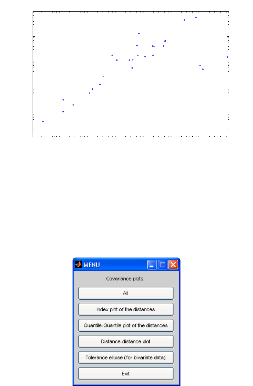
331
D
ecluttered
10
−2
10
−1
10
0
10
1
10
2
10
3
10
4
10
5
10
−1
10
0
10
1
10
2
10
3
10
4
Body Mass (kg)
Brain Mass (g)
Beaver
Cow
Goat
Guinea Pig
Dipliodocus
Asian Elephant
P. Monkey
Cat
Giraffe
Gorilla
Human
African Elephant
Triceratops
Rhesus Monkey
Kangaroo
Golden Hamster
Mouse
Rabbit
Sheep
Jaguar
Chimpanzee
Brachiosaurus
Rat
Mole
Pig
Figure 13-2. Plot of the Brain Weight data set with logarithmic scales.
The MCDCOV function can now be used to determine the subset of samples with
minimum determinant. Because of the very wide range in the data, it will be pre-
processed by taking a base 10 logarithmic transformation of both variables, as follows:
>>out = mcdcov(log10(brains.data))
The function will produce the MENU window shown in Figure 13-3 which allows the
user to make a variety of plots. For now, select Exit and the following output structure is
obtained:

332
Figure 13-3. MENU window from MCDCOV function.
out =
center: [1.3154 1.8569]
cov: [2x2 double]
cor: []
h: 21
Hsubsets: [1x1 struct]
alpha: 0.7500
rd: [1x28 double]
flag: [1 1 1 1 1 0 1 1 1 1 1 1 1 0 1 0 0 1 1 1 1 1 1 1 0 1 1 1]
md: [1x28 double]
cutoff: [1x1 struct]
plane: []
method: [1x42 char]
class: 'MCDCOV'
classic: 0
X: [28x2 double]
The output consists of several fields that contain the location estimate ('out.center'),
the estimated covariance matrix ('out.cov'), and the correlation matrix ('out.cor').
Other fields such as 'out.h' and 'out.alpha' contain information about the MCD
method, while some of the components (e.g., 'out.rd', 'out.flag', 'out.md' and
'out.cutoff') can be used for outlier detection and to construct some graphics. The
'out.class' field is used to detect which figures should be created for this analysis.
Detailed information about this output structure (and that of the raw estimates) can be
found in the help file of the mcdcov function.
The robust distance of an observation i is used to detect whether it is an outlier or not. It
is defined as
RDi = 1
ˆ
ˆˆ
()()
T
iMCDMCDiMCD
xx
µµ
−
−Σ− (13-4)
with ö
µ
MCD and ö
ΣMCD defined as the estimates of MCD location and scatter. This robust
distance is the straightforward robustification of the Mahalanobis distance
MDi = (xi−x)TS−1(xi−x) (13-5)
which uses the classical mean
x
and empirical covariance matrix S-1 as estimates of
location and scatter. Under the normal assumption, the outliers are those observations
having a robust distance larger than the cut-off-value
χ
n,0.975
2, and they receive a flag
equal to zero. The regular observations whose robust distance does not exceed
χ
n,0.975
2
have a flag equal to one.
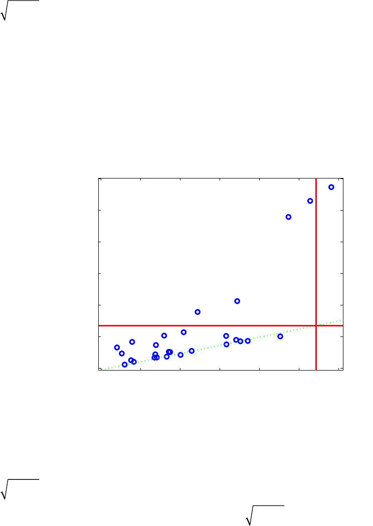
333
The algorithm provides several graphical displays based on the robust distances and the
Mahalanobis distances to help visualize any outliers and to compare the robust and the
classical results. One of these graphics is the distance-distance plot (Rousseeuw and Van
Driessen, 1999) which displays for each observation its robust distance RDi versus its
Mahalanobis distance MDi. A horizontal and a vertical line are drawn at the cutoff value
χ
n,0.975
2. Figure 13-4 shows the distance-distance plot for the body and brain weight
data, with lines drawn at the cutoff value of 2.72. A similar figure can be obtained by
clicking the Distance-distance plot button in the MCDCOV Menu. Five outlying
observations can be clearly seen in Figure 13-4: human, rhesus monkey, triceratops,
brachiosaurus and diplodocus. However, the classical method only identifies the
brachiosaurus measurement as an outlier, as its marker appears beyond the vertical cutoff
line indicating the Mahalanobis distance. The other four outlying observations (human,
rhesus monkey, triceratops and diplodocus) have a large robust distance but a small
Mahalanobis distance. They are not recognized as outliers when using the classical
approach.
0 0.5 1 1.5 2 2.5 3
0
2
4
6
8
10
12
Mahalanobis distance
Robust distance
MCDCOV
Dipliodocus
Human
Triceratops
Rhesus Monkey
Brachiosaurus
Figure 13-4. Brains data set: distance-distance plot.
As this data set is bivariate, we can understand its structure much better by making a
scatter plot (Figure 13-5). Superimposed on the scatter plot is the 97.5% robust
confidence ellipse, which encloses the set of points whose robust distance is equal to
χ
n,0.975
2, as well as the 97.5% classical confidence ellipse, which encloses the set of
points whose Mahalanobis distance is equal to
χ
n,0.975
2. Observations outside these
tolerance ellipses are classified as outliers. We again notice the five outliers found with
the MCD method, while the classical tolerance ellipse again encloses all outliers except
one, the brachiosaurus measurement, which is shown as a borderline case.
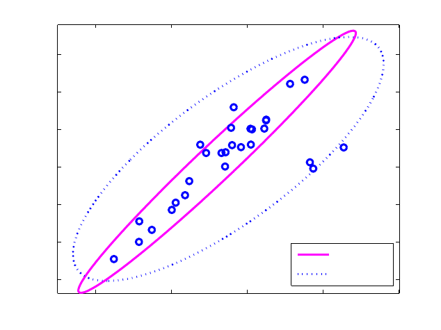
334
−5 0 5 10 15
−2
0
2
4
6
8
10
X1
X2
Tolerance ellipse (97.5%)
Dipliodocus
Human
Triceratops
Rhesus Monkey Brachiosaurus
robust
classical
Figure 13-5. Brains data set: Tolerance ellipses.
Robust linear regression
The multiple linear regression model assumes that, in addition to the n regressors or x-
variables, a response variable y is measured, which can be explained as an affine
combination of the predictors. More precisely, the model says that for all observations
(xi,yi) with i = 1,…, m it holds that
yi=
β
0+
β
1xi1+L+
β
nxin +
ε
i=
β
0+
β
Txi+
ε
i (13-6)
where the errors
ε
iare assumed to be independent and identically-distributed with zero
mean and constant variance
σ
2. Applying a regression estimator to the data yields n+1
regression coefficients 0
ˆˆ ˆ
(,, )
T
n
θ
ββ
=…. The residual ri of case i is defined as
1
ˆ
ˆT
ii i
i
yy y
x
θ
−=−
.
The ordinary least squares (OLS) estimator minimizes the sum of the squared residuals,
but is very sensitive to outliers. LIBRA PLS_Toolbox also contains the Least Trimmed
Squares (LTS) estimator (Rousseeuw, 1984) which minimizes the sum of the h smallest
squared residuals, or
2
:
1
ˆmin ( )
h
LTS i m
i
r
θ
θ
=
=∑ (13-7)
Note that the residuals are first squared, and then ordered
335
(r2)i:1 ≤ (r2)i:2 ≤ …≤ (r2)m:m (13-8)
The interpretation of the h value in this method is the same as for the MCD estimator, and
thus h should be chosen between m/2 and m. Setting h = m yields the OLS estimator. For
h ≈ m/2 we find a breakdown value of 50%, whereas for larger h we obtain a breakdown
value of (m-h+1)/m. The function ltsregres contains an implementation of the FAST-
LTS algorithm (Rousseeuw and Van Driessen, 2000) which is similar to the FAST-MCD
method.
The LTS estimator is regression, scale and affine equivariant. That is, for any X = (x1,
…, xm )T and y = (y1,…, ym)T it holds that
11
0
ˆˆ
(, 1) (,)(,)
ˆˆ
(, ) (,)
ˆˆ ˆ
( 1 ,) ( ( ,) , ( ,) ( ,) )
TT
m
TT T T T
m
Xy Xv c Xy v c
Xcy c Xy
X
A v y XyA Xy XyAv
θθ
θθ
θβββ
−−
++ = +
=
+= −
(13-9,10,11)
for any vector v ∈IRn, any constant c and any nonsingular n by n matrix A. Again
1m = (1,1,...,1)T ∈ IRm. This implies that the estimate transforms correctly under affine
transformations of both the x and y variables.
Example of Robust Regression with Stars data set
We will now consider an example of robust regression with the stars data set (Rousseeuw
and Leroy, 1987). This bivariate data set (n = 2) contains the surface temperature and the
light intensity of m = 47 stars in the direction of Cygnus. The data were preprocessed by
taking a logarithmic transformation of both variables. The linear model we will fit onto
these data is
yi
=
β
0
+
β
1x
+
ε
(13-12)
The regression coefficients
β
0 and
β
1 will be estimated with the OLS estimator as well
as the LTS estimator.
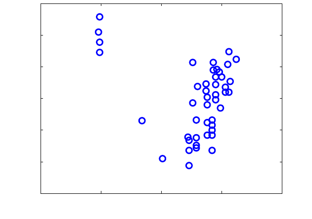
336
3 3.5 4 4.5 5
3.5
4
4.5
5
5.5
6
6.5
7
9
11
20
30
34
Temperature
Intensity
Figure 13-6. Stars data: scatter plot.
The data for this example can be viewed by performing the following commands:
>> load stars
>> plotgui(stars)
and selecting Temperature in the x menu and Intensity in the y menu of the Plot Controls
window. Sample numbers can be added by selecting View/Numbers. From the resulting
scatter plot, shown in Figure 13-6, we see that the majority of the data follow a linear
trend but four outlying stars are apparent in the upper left. In astronomy this is a well-
known phenomenon: the 43 stars in the data cloud belong to the main sequence (common
hydrogen fusing stars), whereas the four remaining stars are giant stars with low surface
temperature but high luminosity due to their great size. The data points representing the
four giant stars are not incorrect observations, but simply come from another population
than the regular data.
A LTS regression can be performed using the command:
>> out=ltsregres(stars.data(:,1),stars.data(:,2),'intercept',1,...
'h',floor(0.75*47),'classic',0,'plots',1)
which generates the interface, which allows access to several diagnostic plots, shown in
Figure 13-7. When the Exit button is pressed, the following output results:
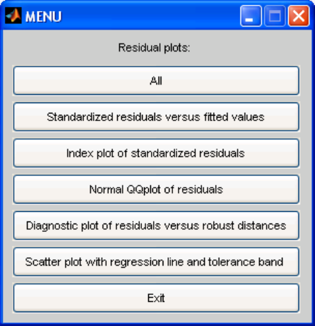
337
Figure 13-7. MENU window from LTSREGRES function.
out =
slope: 3.0462
int: -8.5001
fitted: [47x1 double]
res: [47x1 double]
scale: 0.3365
rsquared: 0.5544
h: 35
Hsubsets: [1x1 struct]
alpha: 0.7447
rd: [1x47 double]
resd: [47x1 double]
cutoff: [1x1 struct]
flag: [47x1 logical]
method: 'Least Trimmed Squares Regression.'
class: 'LTS'
classic: [1x1 struct]
X: [47x1 double]
y: [47x1 double]
in which the field ‘classic’ stores the OLS computations:
slope: -0.4133
int: 6.7935
fitted: [47x1 double]
res: [47x1 double]
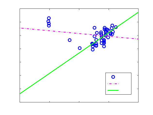
338
scale: 0.5646
rsquared: 0.0443
md: [47x1 double]
resd: [47x1 double]
cutoff: [1x1 struct]
flag: [47x1 logical]
class: 'LS'
X: [47x1 double]
y: [47x1 double]
The OLS-fit for the stars data is thus:
- 0.4133 xi + 6.7935
while the LTS-fit is
3.0462 xi - 8.5001
Note that the slope term changes sign in this example. In the OLS model the slope is
negative, suggesting that intensity goes down with increased temperature. Drawing the
regression lines onto a scatterplot shows that the OLS fit was highly influenced by the
four giant stars whereas the LTS fit nicely describes the linear trend in the majority of the
data (Figure 13-8).
3 3.5 4 4.5 5
0
1
2
3
4
5
6
7
Temperature
Intensity
data
ls
lts
Figure 13-8. Stars data: OLS and LTS fit.
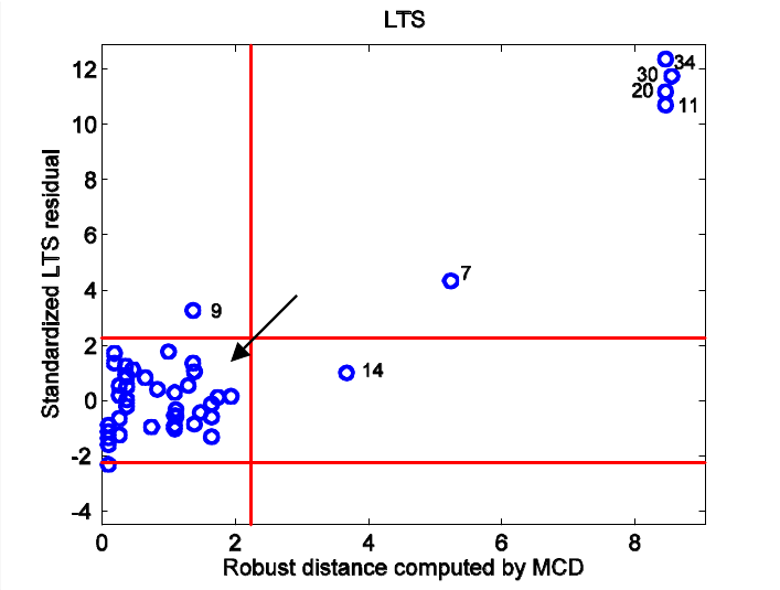
339
With the output of the ltsregres function, one can produce many plots as graphical
tools for model checking and outlier detection, such as a normal quantile plot of the
residuals, and a residual outlier map. The latter, shown in Figure 13-9 for the stars data,
displays the standardized LTS residuals (the residuals divided by a robust estimate of
their scale) versus the robust distances obtained by applying the MCD estimator on the x
variables. The residual outlier maps are divided by cutoff lines into six different areas by
which we can classify the outliers into four different groups: regular observations, good
leverage points, bad leverage points, and vertical outliers.
Figure 13-9. Stars data: Standardized LTS residuals versus robust distances with different
types of outliers indicated.
In Figure 13-9 the regular observations do not exceed any of the cutoffs. The good
leverage points are these observations having a small standardized residual but large
robust (or Mahalanobis) distance. These data points confirm the linear relationship at
larger x values. The observations which need to be examined more closely are the vertical
outliers and the bad leverage points. The vertical outliers are the data points with regular
x values but with y-values deviating from the majority of the y values; hence, they have a
large standardized residual. The observations having aberrant x- and y-values are called
the bad leverage points. Both vertical outliers and bad leverage points tend to pull the
regression line towards them and thus greatly affect the regression line.
The outlier map generated from the classical OLS regression estimates for the Stars data
is shown in Figure 13-10. Compared with the robust residual outlier map, the classical
OLS map would lead to considerably different conclusions. Looking at the robust
residual outlier map in Figure 13-9, five bad leverage points (cases 7, 11, 20, 30, and 34)
0 2 4 6 8
−4
−2
0
2
4
6
8
10
12
9
7
11
20
30 34
Standardized LTS residual
Robust distance computed by MCD
LTS
14
bad leverage points
bad leverage points
good leverage points
vertical
outliers
vertical
outliers
regular
observations
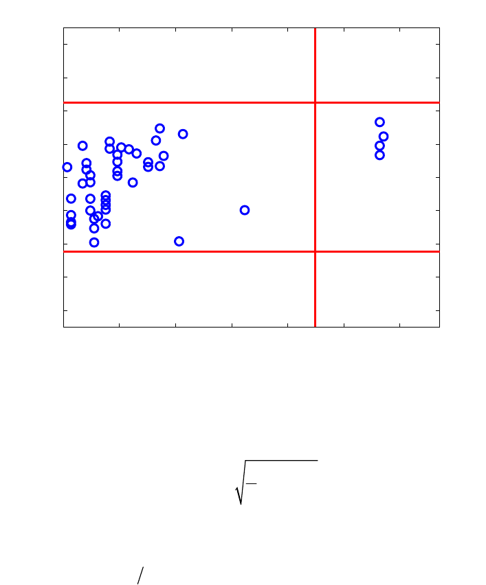
340
can be observed. However, the classical residual outlier map in Figure 13-10 describes
cases 11, 20, 30, and 34 as good leverage points. The robust LTS method thus pinpoints
the giant stars as bad leverage points, whereas the OLS method classifies them as good
leverage points. Clearly, the giant stars attracted the OLS fit towards them; this
phenomenon could already be observed in Figure 13-8 where the regression lines were
fitted onto the data.
0 0.5 1 1.5 2 2.5 3
−4
−3
−2
−1
0
1
2
3
4
20
30
34
14
17
Standardized LS residual
Mahalanobis distance
LS
7
11
Figure 13-10. Stars data: Standardized LS residuals versus Mahalanobis distances.
When using LTS regression, the scale of the errors σ can be estimated by
2
,:
1
1
ˆ()
h
LTS h m i m
i
cr
h
σ
=
=∑ (13-13)
where ri are the residuals from the LTS fit, and ch,m makes ˆ
σ
consistent and unbiased at
Gaussian error distributions. The regression outliers are then identified by their
standardized LTS residuals ˆ
i LTS
r
σ
.
It should be stressed that LTS regression does not throw away a certain percentage of the
data. Instead, it finds a majority fit, which can then be used to detect the actual outliers.
The purpose is not to delete and forget the points outside the tolerance band, but to study
the residual plot in order to find out more about the data. For instance, we notice star 7
intermediate between the main sequence and the giants, which might indicate that this
star is evolving to its final stage.

341
In regression analysis, inference is very important. The LTS by itself is not suited for
inference because of its relatively low finite-sample efficiency. This issue can be resolved
by carrying out a reweighed least squares step. To each observation i, one assigns a
weight wi based on its standardized LTS residual, by setting wi := w(| ˆ
i
LTS
r
σ
|) where w is a
decreasing continuous function. A simpler way, but still effective, is to put
iˆ
1 if r / 2.5
0 otherwise
LTS
i
w
σ
≤
=
(13-14)
Either way, the reweighed LTS fit is then defined by
minimize wiri
2
i=1
m
∑ (13-15)
which can be computed quickly. The result inherits the breakdown value of the LTS
regression, but is more efficient and yields all the usual inferential output such as t-
statistics, F-statistics, an R2 statistic, and the corresponding p-values.
Now, if we also want a reliable prediction of q > 1 properties at once, based on a set of n
explanatory variables, the use of a multivariate regression method is appropriate. The
linear regression model is then formulated as
y
i = β0 + ßTxi + єi i = 1,…,m (13-16)
with yi and єi being q-dimensional vectors that respectively contain the response values
and the error terms of the ith observation with covariance matrix Σє.
To cope with such data, we can use the MCD-regression method (Rousseeuw et al.,
2004). It is based on the MCD estimates of the joint (x,y) variables and thereby yields a
highly robust method. Within the toolbox, this method can be called with the mcdregres
function.
Robust Principal Component Analysis
PCA captures the largest amount of variance of the data possible with the first and each
subsequent component. These components are linear combinations of the original
variables. Looking at them can lead to a better understanding of the different sources of
variation in the data. As a data reduction technique, PCA is frequently the first step in the
analysis of a high-dimensional data set, followed by classification, clustering or other
multivariate techniques. The goal of a robust PCA method is to obtain principal
components that are not influenced much by outliers.
A first group of robust PCA methods is obtained by replacing the classical covariance
matrix by a robust covariance estimator, such as the reweighed MCD estimator (Croux
and Haesbrouck, 2000). Unfortunately, the use of these affine equivariant covariance

342
estimators is limited to small to moderate dimensions. To see why, let us again consider
the MCD estimator. As already explained, the MCD estimator can only be computed if
the number of variables n is smaller than the parameter h. Since h also needs to be
smaller than the number of observations m, consequently n must be smaller than m which
is not the case for high-dimensional data sets.
A second problem is the computation of these robust estimators in high dimensions.
Today's fastest algorithms can handle up to about 100 dimensions, whereas there are
applications, e.g., spectroscopy, with dimensions in the thousands. Moreover, the
accuracy of the algorithms decreases with the dimension n, so it is recommended for
small data sets not to use the MCD in (say) more than 10 dimensions.
Another approach to robust PCA has been proposed in Hubert et al. (2005) and is called
ROBPCA. This method combines ideas of both projection pursuit and robust covariance
estimation. The projection pursuit part is used for the initial dimension reduction. Some
ideas based on the MCD estimator are then applied to this lower-dimensional data space.
Simulations have shown that this combined approach yields more accurate estimates than
the raw projection pursuit algorithm, called RAPCA (Hubert and Verboven, 2001). The
entire description of the ROBPCA method can be found in Hubert et al. (2005).
Since the ROBPCA algorithm is rather complicated, we only describe its main stages.
First, the data are preprocessed by reducing their data space to the affine subspace
spanned by the m observations. As a result, the data are represented using at most m –
1 = rank(XC) variables without loss of information.
In the second step, a measure of outlyingness is computed for each data point (Stahel
1981, Donoho 1982). This measure is obtained by projecting the high-dimensional data
points on many univariate directions d through two data points. On every direction the
univariate MCD estimator of location MCD
µ
ˆand scale MCD
Σ
ˆis computed on the projected
points xjTd (j = 1… m), and for every data point its standardized distance to that center is
measured. Finally, for each data point its largest distance over all the directions is
considered. This yields the outlyingness:
ˆ()
outl max ˆ()
TT
iMCDj
iT
dMCD j
x
dxd
(x ) xd
µ
σ
−
= (13-17)
Next, the covariance matrix h
Σ
ˆof the h data points with the smallest outlyingness values
is computed.
The last stage of ROBPCA consists of projecting all the data points onto the k-
dimensional subspace spanned by the k largest eigenvectors of h
Σ
ˆ and of computing their
center and shape by means of the reweighed MCD estimator. The eigenvectors of this
scatter matrix then determine the robust principal components which can be collected in a

343
loading matrix P with orthogonal columns. The MCD location estimate x
µ
ˆserves as a
robust center.
Note that classical PCA is not affine equivariant because it is sensitive to a rescaling of
the variables, though it is still orthogonally equivariant, which means that the center and
the principal components transform appropriately under rotations, reflections and
translations of the data. More formally, classical PCA allows transformations XQ for any
orthogonal matrix Q (that satisfies Q-1 = QT). Any robust PCA method thus only has to be
orthogonally equivariant.
Example of Robust PCA with Octane data (Esbensen, 2001)
We will illustrate ROPBCA and its diagnostic tools on the Octane data set from Esbensen
(2001), which consists of m = 39 NIR-spectra of gasoline at n = 226 wavelengths from
1100 to 1550 nm. The data can be viewed by executing the following MATLAB
commands:
>> load octane
>> plotgui(spec)
In the Plot Controls window, select Plot/Data Summary, then select Data in the y
menu. The result is shown in Figure 13-11. It is known that six of the samples, numbers
25, 26 and 36-38, are anomalous because alcohol was added. Let us see how the classical
and the robust PCA methods cope with this. We will first use the LIBRA command
robpca, then do the analysis in the Analysis interface.
1100 1150 1200 1250 1300 1350 1400 1450 1500 1550
0
0.1
0.2
0.3
0.4
0.5
Variables
Data
Figure 13-11. Octane data.
If we knew the optimal number of components k, we could call the robpca method with k
specified, e.g.,
344
>> out=robpca(spec.data,'k',3)
Otherwise, we need to select the number of principal components k. The function call
becomes
>> out=robpca(spec.data)
which generates a scree plot of the eigenvalues, as shown in Figure 13-12, and a cross
validated Robust Predicted Error Sum of Squares (R-PRESS) plot, as in Figure 13-13.
The scree plot is a graph of the monotonically decreasing eigenvalues. The optimal
number k is then often selected as the one where the kink in the curve appears. From the
scree plot of the Octane data in Figure 13-12, we decide to retain k = 3 components for
further analysis.
In the output structure from the function robpca we find
P: [226x3 double]
L: [0.0114 0.0017 1.7362e-004]
M: [1x226 double]
T: [39x3 double]
k: 3
h: 32
Hsubsets: [1x1 struct]
sd: [39x1 double]
od: [39x1 double]
cutoff: [1x1 struct]
flag: [1x39 logical]
class: 'ROBPCA'
classic: [1x1 struct]
where the columns of P contain the robust eigenvectors, L is the vector with the
corresponding robust eigenvalues, M is the robust centering vector and the columns of T
contain the robust principal components. Other output variables hold information about
the method and some of them will be used later on to draw outlier maps.

345
2 4 6 8 10
0
2
4
6
8
10
x 10
−3
Index
Eigenvalue
ROBPCA
Figure 13-12. Octane data: Eigenvalue scree plot.
0 2 4 6 8 10
0
0.2
0.4
0.6
0.8
1
1.2
1.4
1.6
1.8 x 10
−3
ROBPCA
Number of LV
R−PRESS
Figure 13-13. Octane data: Robust PRESS curve.

346
However, if we are more interested in the performance of our PCA model for prediction,
a look at the robust PRESS-curve (Figure 13-13) will be more suitable. The robust
PRESS statistic is defined as follows:
R-PRESSk = 2
,
1
1
1ˆ
m
ii ik
m
i
i
i
wx x
w
−
=
=
−
∑
∑ (13-18)
with ,
ˆik
x
−the estimated xi value based on a PCA model with k components and
observation i omitted. The weight wi is zero in case observation i was considered to be an
outlier during the modeling process. When modeling contaminated data, we do not want
to introduce the prediction errors of the outliers, so adjusting the classical PRESS statistic
with these weights gives us a statistic which is more resistant to outlying observations. To
look for the optimal k-value in the R-PRESS curve, we must look for the point where the
curve reaches its minimum and flattens out. For the Octane data k = 3 components may
be a good choice. One could argue that k = 6 has a smaller R-PRESS value but this is a
relatively small improvement.
To visualize and classify the outliers, we can make score outlier maps, as shown in
Figure 13-14 for the robust model and Figure 13-15 for the classical model. For each
observation, the x-axis displays the score distance SDi, (also known as Hotelling’s T2),
within the PCA subspace
SDi = ti
TΛ−1ti with Λ =
λ
1L0
MO M
0L
λ
k
(13-19)
and on the y-axis the orthogonal distance ODi (the square root of Q) to the PCA subspace
ODi = ˆ
ix i
x
Pt
µ
−− (13-20)
where ˆx
µ
is the (robust) center of X. For the score distances, we use the property that
normally distributed data have normally distributed scores, and consequently their
squared Mahalanobis distances have a
χ
k
2 distribution. Hence, we use as cut-off value
χ
k,0.975
2. For the orthogonal distances the approach of Box (1954) is followed. The
squared orthogonal distances can be approximated by a scaled χ2 distribution which in its
turn can be approximated by a normal distribution using the Wilson-Hilferty
transformation. The mean and variance of this normal distribution are then estimated by
applying the univariate MCD to the ODi
23.
Based on their cut-offs (cSD and cOD), these distances yield a classification of the
observations (summarized in Table 1):

347
• the regular data are those observations whose SD and OD are both small,
meaning SD < cSD and OD < cOD
• the good PCA-leverages points have a large SD and a small OD,
so SD > cSD and OD < cOD
• the orthogonal outliers have a small SD and a large OD,
yielding SD < cSD and OD > cOD
• the bad PCA-leverage points having large SD and large OD which results in SD >
cSD and OD > cOD.
The latter two types of observations are highly influential for the classical PCA as this
method tries to make all orthogonal distances as small as possible. For more information
on this outlier map and the horizontal and vertical cut-off values, we refer to Hubert et al.
(2005).
Table 1. Overview of the different types of observations based on their SD and OD
Distances small SD large SD
large OD orthogonal outlier bad PCA-leverage point
small OD regular observation good PCA-leverage point
On the robust outlier map of the Octane data, Figure 13-14, we immediately spot spectra
numbers 25, 26, and 36-39 as bad PCA-leverage points. However, in Figure 13-15, the
outlier map of the classical PCA, only spectrum 26 is indicated as a bad PCA-leverage
point and spectrum 25 is indicated as an orthogonal outlier. This shows that the classical
PCA was indeed influenced by the bad PCA-leverage points. They tilted the PCA-
subspace towards them and hence masked the others for being recognized as bad PCA-
leverage points in the classical analysis.
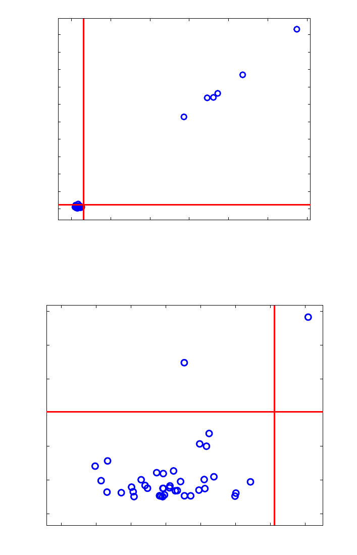
348
0 10 20 30 40 50 60
0
0.1
0.2
0.3
0.4
0.5
0.6
0.7
0.8
0.9
1
Score distance (3 LV)
Orthogonal distance
25
37 36
39
38
26
ROBPCA
Figure 13-14. Octane data: robust score outlier map.
0 0.5 1 1.5 2 2.5 3 3.5
0
0.02
0.04
0.06
0.08
0.1
0.12
Score distance (3 LV)
Orthogonal distance
18
38
23
34
36
25
26
CPCA
Figure 13-15 Octane data: classical score outlier map.
The same analysis can also be performed in the Analysis tool. Start the tool by typing
pca at the MATLAB prompt. Load the variable spec into the tool by choosing File/Load
Data/Xblock and selecting spec in the dialog box. Set the tool to perform robust PCA by
selecting Edit/Options/PCA Method Options. A dialog box as shown in Figure 13-16
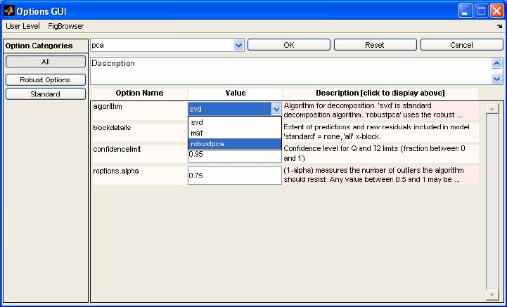
349
will appear. Set the menu to the right of ‘algorithm’ to ‘robust pca’, then click OK to
close the window.
Figure 13-16. Options GUI from Analysis tool.
An analysis can now be done with robust PCA in the same manner as when one works
with the interface with classical PCA. There are several important differences, however.
Because the cutoff points are determined after the number of PCs has been specified, the
robust PCA model is not nested; that is, the data the model is based on may change as the
number of PCs is changed, and thus the early factors in the model may also be
influenced. Thus, when the model is first calculated, the variance captured table only
goes out to a one-PC model and subsequent PCs are not calculated. To see models with
more PCs, click on the line of the table corresponding to the number of PCs desired and
click Calculate.
Another important point is that robust PCA will set outlier data points to be excluded. To
see these points, in the Plot Controls window choose View/Excluded data. The points
will then show up as slightly grayed out.
Robust Regression for high-dimensional data
In case the number of variables n is larger than the number of observations m, there is no
unique OLS solution, and neither can the LTS estimator be computed. Moreover, in any
data set with highly correlated variables (multicollinearity), both OLS and LTS have a
high variance. Two very popular solutions to this problem are offered by Principal
Component Regression (PCR) and Partial Least Squares Regression (PLSR). Both
methods first project the x-data onto a lower dimensional space, either based on
maximizing variance described in the x-data (PCR) or based on maximizing the
covariance between the x-data and y-data (PLS). The general idea is to compress the data

350
without losing important information. Next, a multiple (multivariate) regression analysis
is performed in this lower dimensional design space.
More precisely, both PCR and PLSR assume the following bilinear model which
expresses the connection between the response variable(s) and the explanatory variables
as:
xi=
µ
x+P⋅ti+fi
yi=
µ
y+Θ
T⋅ti+gi
(13-21)
with ti the k-dimensional scores, Θ the k by q sized slope matrix in the regression of yi on
ti, k << p and q ≤ 1. In terms of the original predictors this bilinear model can be rewritten
as
y
i = β0 + ΒT xi + ei (13-22)
The regression coefficients are then calculated as
Β = P Θ (13-23)
β0 = µy - ΒTµx (13-24)
To construct the scores ti, PCR applies PCA to the x-variables, whereas in PLSR they are
constructed by maximizing the covariance between linear combinations of the x and y-
variables. As we are concerned with contaminated data, it is highly advisable to use
robust alternatives. In analogy with classical PCR and PLSR, the robust versions apply
ROBPCA on the x-variables, and on the joint (x,y)-variables, respectively. Next, a robust
regression of the responses yi on the robust scores ti is applied. For PCR we can use the
LTS or the MCD regression method, whereas for PLSR a regression based on the
ROBPCA results is performed.
Robust Principal Component Regression
Example: The Octane data set (continued)
Let us return to the Octane data from the previous section. Besides the 39 NIR-spectra
this data set also contains a univariate (q = 1) response variable which consists of the
octane number for every sample. We know from previous analysis that the samples 25,
26, 36-39 were contained alcohol. We cannot use a classical least squares regression
since the data clearly suffers from multicollinearity, so we apply a robust PCR analysis
(Hubert and Verboven, 2003).
First we have to select the optimal number of components kopt. Whenever we invoke the
function rpcr with its default values, we can choose kopt by looking at the plots of the
robust R2-values and the robust RSS-values.
>>load octane

351
>>rpcr(spec.data,octane.data)
In the univariate case (q = 1) the R2-plot shows us the values
Rk
2=1−
wiri,k
2
i=1
m
∑
wi(yi−yw)2
i=1
m
∑
(13-25)
with
yw=wiyi
i
∑wi
i
∑ and k = 1,…,kmax. The R2-value says in a robust sense that more
than 95% of the y-variability can be described by the fitted model. The curve will become
flat when adding a component does not reduce the residual variance significantly. We can
choose the optimal k such that the R2-curve attains a certain value, e.g. 80%, or until it
becomes nearly flat. For the Octane data this means that k = 3 is a good choice, the curve
becomes flat and the R2-value already reaches more than 95%.
A second option is to look at the robust square root of the Residual Sum of Squares
(RSS) also called the mean squared error (MSE)
RSSk = RMSEk = 1
wi
i=1
m
∑
wiri,k
2
i=1
m
∑ (13-26)
where ri,k = ,
ˆ
iik
yy− is the residual of the i-th observation of the calibration set in a k
component model. From Figure 13-17, we see that for the Octane data a first minimum is
reached at k = 3 and a second one in k = 6. The ultimate goal is to have a RMSE as small
as possible but we also have to keep in mind that we are looking for a dimension
reduction in order to have a manageable and interpretable model.
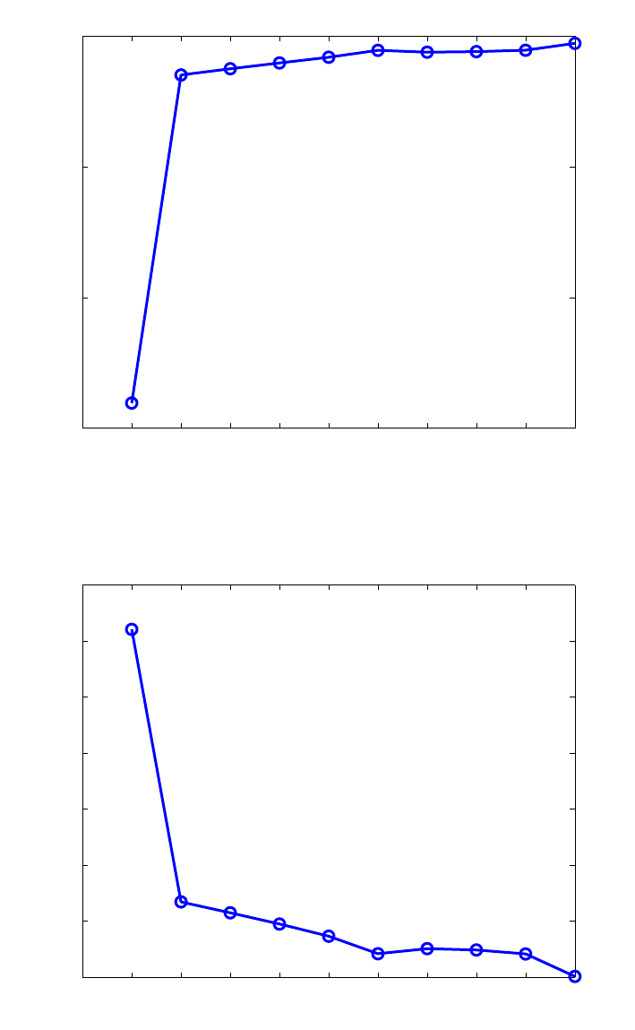
352
1 2 3 4 5 6 7 8 9 10
0.85
0.9
0.95
1
Number of components
Robust R2−value
RPCR
Figure 13-17. Octane data: the R2-plot.
1 2 3 4 5 6 7 8 9 10
0.1
0.2
0.3
0.4
0.5
0.6
0.7
0.8
Number of components
RPCR
Square Root of Robust RSS−value
Figure 13-18. Octane data: RSS plot.
Comparing the RMSE6 = 0.0202 against the RMSE3 = 0.0464 gives us a 2% decrease in
the error. Moreover, by looking at the R2 we already know that we have a good prediction
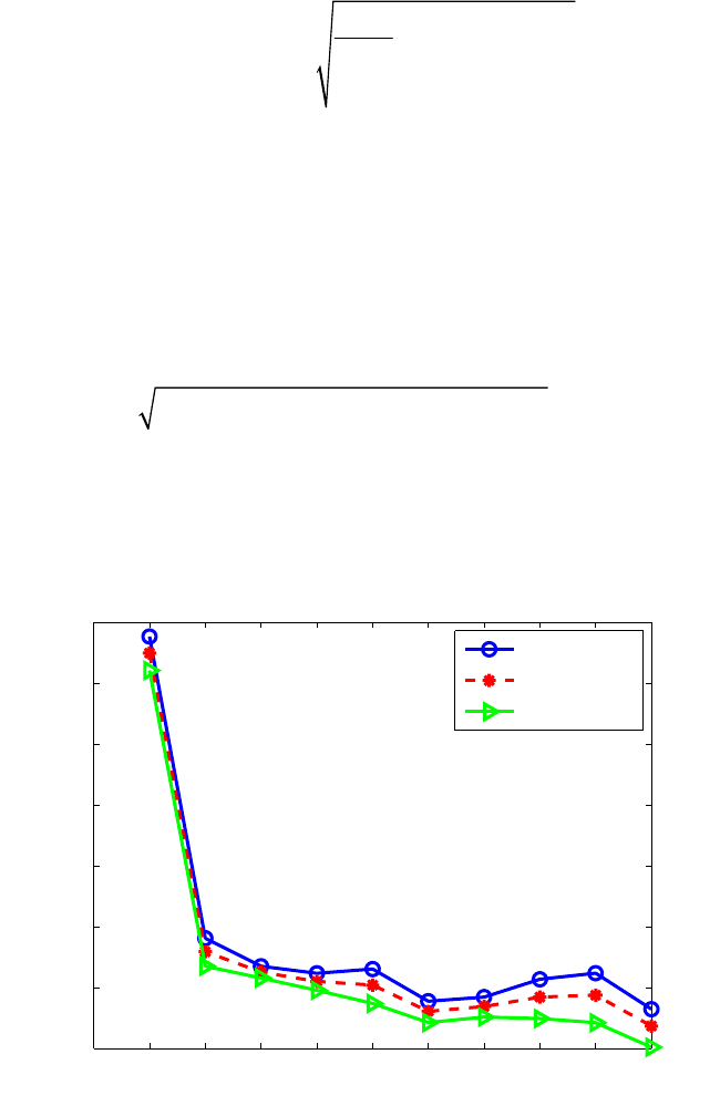
353
model at k = 3. Taking all facts into account we decide to take 3 as the optimal number of
components for this model.
Thus far, the decision about kopt was based on the calibration data. It is also possible to
perform a cross-validated version of the RMSE. The RMSECV can be defined in a robust
way by taking into account weights wi
R-RMSECVk =
()
2
,
1
1
1ˆ
m
ii ik
m
i
i
i
wy y
w
−
=
=
−
∑
∑ (13-27)
for univariate response variables yi. Now, if we choose kopt too small, much of the
information in the data will be lost. Moreover, the regression model will not fit the data
very well. On the other hand, if kopt is too large, overfitting will cause a loss of prediction
power because the regression model was fit to the noise in the data. So instead of making
a decision about the optimal number based on a statistic explaining the predictive ability
(e.g. the RMSECV) or the goodness-of-fit (e.g. RMSE) alone, let us look at a
combination of these measurements.
RCSk =
γ
R-RMSECVk
2+(1 −
γ
) R-RMSEk
2 , 0 ≤ γ ≤ 1. (13-28)
The Robust Component Selection statistic (RCS) as proposed by Engelen and Hubert
(2005) allows us to choose whether we like to emphasize on the prediction (γ = 1) or on
the goodness of fit (γ = 0) aspects of our regression model.
1 2 3 4 5 6 7 8 9 10
0.1
0.2
0.3
0.4
0.5
0.6
0.7
0.8
Number of components
RCS value
RPCR
γ = 1 (CV)
γ = 0.5
γ = 0 (RSS)
Figure 13-19. Octane data: Robust Component Selection plot.
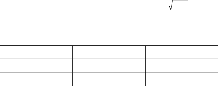
354
Based on the curves in Figure 13-19, we decide to take k = 3 as our optimal choice for the
Octane data. To produce this plot we have to call the rpcr function with the optional input
variable ‘rmsecv’ set to one.
>> out = rpcr(X, y, ‘rmsecv’,1)
The output of the rpcr function also includes the score and orthogonal distances from the
robust PCA analysis. By default, the PCA-score outlier map will again be plotted
(Figures 13-14). In addition, both classical and robust residual outlier maps (Figures 20-
21) are generated. The function displays the standardized LTS residuals versus the score
distances, and can be used to classify the observations according to the regression model.
As can be seen from Table 2, we distinguish regular data (small SD and small absolute
residual), good leverage points (large SD but small absolute residual), vertical outliers
small SD and large absolute residual), and bad leverage points (large SD and large
absolute residuals). Large absolute residuals are those that exceed
χ
1,0.975
2= 2.24. Under
normally distributed errors, this happens with probability 2.5%. The vertical outliers and
bad leverage points are the most harmful for classical calibration methods as they disturb
the linear relationship.
Table 2. Overview of the different types of observations based on their SD and ResD distances
Distances small SD Large SD
large ResD vertical outlier bad leverage point
small ResD regular observation good leverage point
In Figure 13-20 we observe the six outlying spectra as good leverage points in the robust
PCR regression model. Four other spectra are detected as vertical outliers (spectra 7, 9,
13, and 32) and should be investigated in more detail. The classical PCR, on the other
hand, does not discover the vertical outliers (Figure 13-21). Only spectrum 26 is
highlighted as a good leverage point. The presence of contamination in the data clearly
affected the classical analysis.
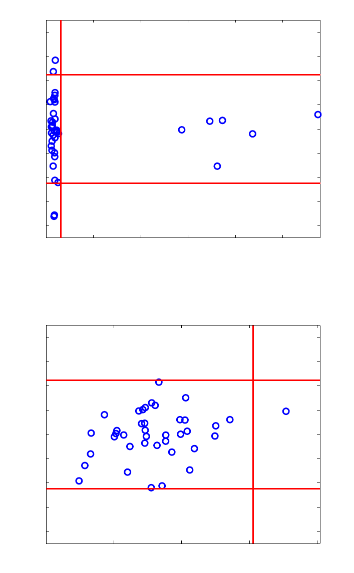
355
0 10 20 30 40 50
−4
−3
−2
−1
0
1
2
3
4
25
37
36
39
38
26
32
7
13
Standardized residual
Score distance (3 LV)
RPCR
9
Figure 13-20. Octane data: robust regression outlier map.
0 1 2 3 4
−4
−3
−2
−1
0
1
2
3
4
36
18
38
23 34 26
7
9
13
Standardized residual
Score distance (3 LV)
CPCR
Figure 13-21. Octane data: classical regression outlier map.
Robust PCR can be performed in the Analysis GUI. Start the Analysis GUI by typing
pcr at the command lin, or by starting the interface any other way and selecting
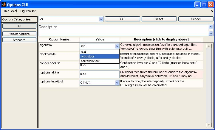
356
Analysis/PCR. Choose File/Load Data/Both from the menu and select spec for the x-
data and octane for the y-data. Choose Edit/Options/Method Options (PCR), which
will bring up the window shown in Figure 13-22. Next to the algorithm label, select
robustpcr from the menu, then click OK. Select Preprocess/X-block/mean center. A
model can now be calculated by clicking the Calculate button. Note, however, that the
variance captured table does not go beyond the first PC. To calculate a three-PC model,
select the third line of the variance captured table and click Calculate again. The
interface will now appear as shown in Figure 13-23. The PCR model can now be
explored in the usual way. When viewing scores plots, choose View/Excluded Data to
view the scores of the data points considered outliers and not used in the final model
calculation.
Figure 13-22 Options interface for PCR.
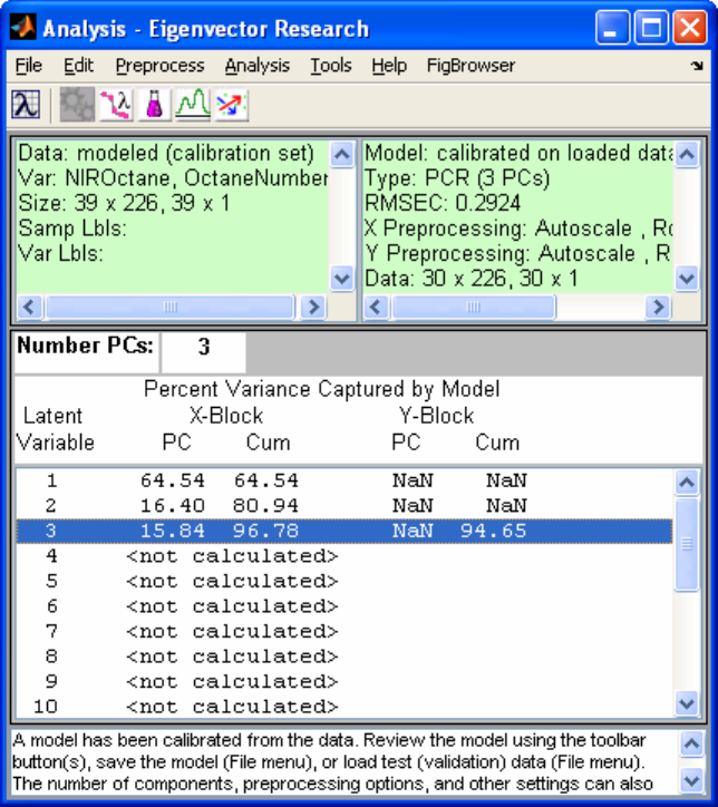
357
Figure 13-23 Analysis interface with robust PCR model variance captured table.
Robust Partial Least Squares Regression
Hubert and Vanden Branden (2003) developed a robust version of PLS known as
RSIMPLS. The method starts by applying ROBPCA on the joint x- and y-variables in
order to replace the empirical cross-covariance between X and Y and the empirical
covariance matrix of X, by robust estimates, and then proceeds analogously to the
SIMPLS algorithm. At the end, instead of the multivariate linear regression (MLR), a
robust regression method will be performed.
The proposed robust PLS algorithm has several equivariance properties. The ROBPCA
method is orthogonally equivariant, which means that orthogonal transformations of the
data (rotations, reflections) transform the loadings appropriately and leave the scores
unchanged. Consequently, it can easily be derived that RSIMPLS is equivariant for
translations and orthogonal transformations in x and y. More precisely, let u ∈ IRn, v ∈
IRq, C any n-dimensional orthogonal matrix and D any q-dimensional orthogonal matrix.
If
()
0
ˆˆ
,
β
Β denotes the estimates by running RSIMPLS on the original data (xi, yi), it holds
that:
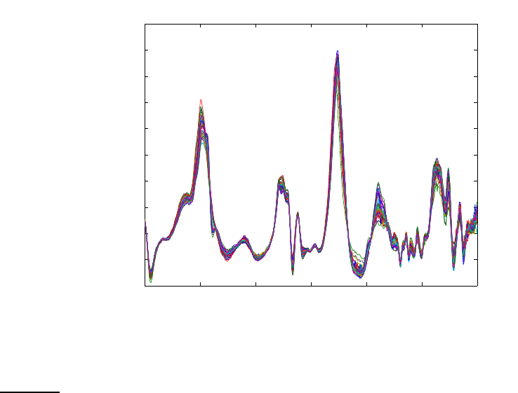
358
()
()
00
ˆˆ
,
ˆˆ
ˆ
,
T
ii
TT
ii
Cx u Dy v C D
Cx u Dy v D v D C u
ββ
Β+ +=Β
++=+−Β
(13-29,30)
1200 1400 1600 1800 2000 2200
−0.1
−0.05
0
0.05
0.1
0.15
0.2
0.25
0.3
0.35
0.4
Variables
Data
Figure 13-24. Biscuit data : raw spectra.
Example: Biscuit Dough data (Osborne et al., 1984)
This data set consists of 40 NIR reflectance spectra of biscuit dough with measurements
every two nanometers, from 1200nm up to 2400nm. The responses are the percentages
of four constituents in the biscuit dough: y1 = fat, y2 = flour, y3 = sucrose and y4 = water.
The data can be viewed by executing the following MATLAB commands:
>> load biscuit
>> plotgui(spec)
From the Plot Controls Window, select Plot/Data Summary, then select Data from the
menu for Y data. The plot shown in Figure 13-24 is the result.
Because there is a significant correlation among the regressors, it is appropriate to
perform a multivariate regression. This can be done from the MATLAB command line
with the rsimpls function as follows:
>> out = rsimpls(spec.data,recipe.data)

359
1 2 3 4
0.55
0.6
0.65
0.7
0.75
0.8
0.85
0.9
0.95
1
Number of components
Robust R2−value
RSIMPLS
Figure 13-25. Biscuit data : Robust R2-plot.
1 2 3 4
0.2
0.4
0.6
0.8
1
1.2
1.4
1.6
1.8
Number of components
RSIMPLS
Square Root of Robust RSS−value
Figure 13-26. Biscuit data: Robust RSS plot.
In this example the number of components k is limited to 4 by the algorithm to avoid
overfitting. Similar to the RPCR analysis, we draw plots (Figures 13-25 and 13-26) to
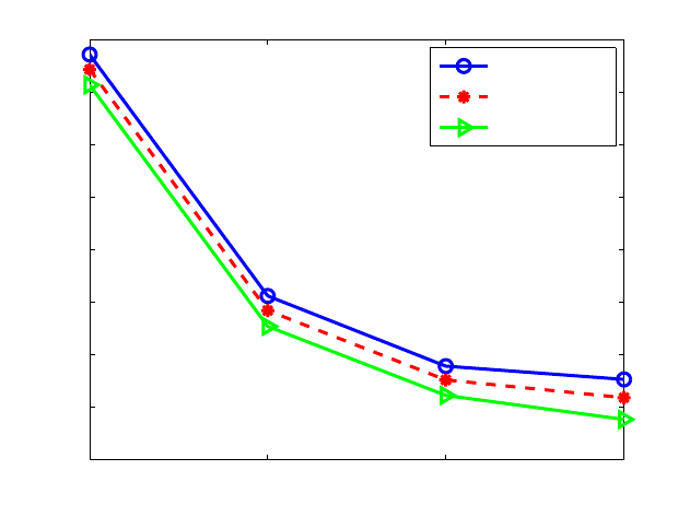
360
select the optimal number of components. Retaining three components gives us a R2 of
96.7% and a RMSE of 0.4456.
1 2 3 4
0.2
0.4
0.6
0.8
1
1.2
1.4
1.6
1.8
Number of components
RCS value
RSIMPLS
γ = 1 (CV)
γ = 0.5
γ = 0 (RSS)
Figure 13-27. Biscuit data : Robust Component selection plot.
Calculating a leave-one-out cross validated RMSE (Figure 13-27) also leads to the
conclusion that kopt = 3.
The robust score outlier map shows four bad PCA-leverage points: spectra 20, 21, 23,
and 24. Observation 7 is an orthogonal outlier. The classical score outlier map, howeve,
only reveals observation 23 and observation 15 as outliers. Moreover, spectrum 23 is
considered to be a good PCA-leverage point. This shows again that the bad PCA-
leverages have such a large impact on the classical PCA-step of the algorithm that the 3-
dimensional PCA-subspace also tries to enclose them and consequently camouflages
these outliers.
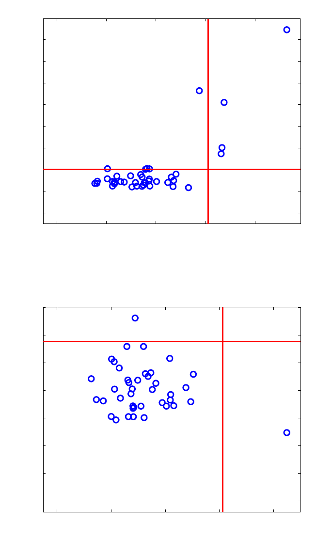
361
01234
0
0.05
0.1
0.15
0.2
0.25
0.3
0.35
0.4
Score distance (3 LV)
Orthogonal distance
31
24
21
20
7
23
RSIMPLS
Figure 13-28. Biscuit data: Robust score outlier map.
0 1 2 3 4
0
0.02
0.04
0.06
0.08
0.1
0.12
0.14
Score distance (3 LV)
Orthogonal distance
20
37
7
23
22 31
15
CSIMPLS
Figure 13-29. Biscuit data: Classical score outlier map.
For the Biscuit Dough data set, we obtain regression outlier maps for the robust (Figure
13-28) and the classical SIMPLS (Figure 13-29) which are slightly different from the
regression outlier maps we found for the Octane data. In multivariate calibration (q > 1),
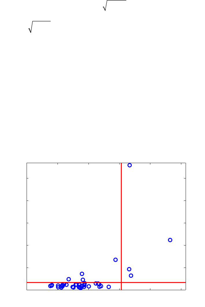
362
the residuals are also q-dimensional with estimated covariance matrix ˆ
ε
Σ. On the vertical
axis the outlier map then displays the residual distances, defined as
1
ˆ
ResD T
iii
ε
−
=Σrr (13-31)
with cut-off value
χ
q,0.975
2.
RSIMPLS shows that observation 21 has an extremely high residual distance. Other
vertical outliers are 7, and 22, whereas there are a few boundary cases. The bad leverage
points spotted in Figure 13-30 are the spectra 20, 23, and 24. The classical SIMPLS on
the other hand tries to make all the residuals as small as possible, resulting in exposing
one clear vertical outlier 21. As in Figure 13-31, observation 23 is also distinguished, but
due to its large score distance rather than to its residual distance, so it seems to fit the
regression model rather well.
Robust PLS can be performed in the analysis interface by selecting Analysis/PLS from
the menu, then selecting Edit/Options/Method Options (PLS). In the interface select
robust PLS from the menu next to algorithm. The analysis then proceeds as usual. To
view outlier data points, select View/Excluded Data from the plot controls window when
viewing scores plots.
0 1 2 3 4 5
0
10
20
30
40
50
31
4
33 20
22 24
7
23
21
Residual distance
Score distance (3 LV)
RSIMPLS
Figure 13-30. Biscuit data : robust regression outlier map.
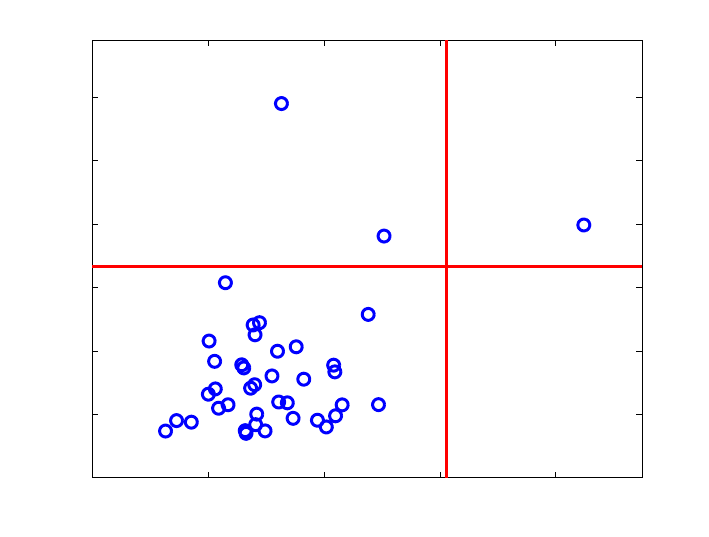
363
0 1 2 3 4
0
1
2
3
4
5
6
37
20
2
7 23
21
Residual distance
Score distance (3 LV)
CSIMPLS
Figure 13-31. Biscuit data: classical regression outlier map.
364
365
14. Distribution Fitting Tools
NOTE: Throughout this section, we assume that you will want to investigate the
distributional properties of a vector of data. The data should be stored as a column vector
in MATLAB. Our examples in this section use random data generated by specifying
>> x = normdf('random',[100 1])
The Distribution Fitting Tool Set supplies capabilities for investigating the distribution of
a sample of data. This includes functions for graphically assessing the fit of a sample to a
distribution, as well as formal statistical tests. In addition, these tests and plots may be
incorporated in your own analytical tools.
Probability Distributions
The Distribution Fitting Tool Set supports sixteen distributions. For each distribution,
there is a function input describing the method being called. These methods include:
• Probability density function ('density', 'd')
• Cumulative probability (distribution) function ('cumulative', 'c')
• Quantile (inverse probability) function ('quantile', 'q')
• Random number generator ('random', 'r')
Table 14.1 lists the available distributions and their associated function names.
Table 14.1. Distributions and their function names.
Distribution Function Name
Beta betadf
Cauchy cauchydf
Chi-squared chidf
Exponential expdf
Gamma gammadf
Gumbel gumbeldf
Laplace laplacedf
Logistic logisdf
Lognormal lognormdf
Normal normdf
Pareto paretodf
Rayleigh raydf
Student's t tdf
Triangle triangledf
Uniform unifdf
Weibull weibulldf
366
So, to find the quantile of the normal distribution for a value of 0.975 (for a two-sided
test of the mean at, for instance, significance level 0.05), we can type:
>> normdf('q',0.975,0,1)
ans =
1.9600
All the above commands can be used either in an interactive way or in your own
functions and scripts. In addition, the sixteen distributions are also supported in the
goodness-of-fit tests and statistical plots. Commands that support the distributions expect
you to provide the name of the distribution as one of the input arguments. Below is a
table of names along with minimal acceptable abbreviations. Note that you do not have to
abbreviate the distribution name if you choose not to.
Distribution Abbreviation Distribution Abbreviation
Beta bet Lognormal logn
Cauchy cau Normal nor
Chi-squared chi Pareto par
Exponential exp Rayleigh ray
Gamma gam Student's t stu
Gumbel gum Triangle tri
Laplace lap Uniform uni
Logistic logi Weibull wei
These names are used for commands such as
plotqq(x,'distribution')
plotcqq(x,'distribution')
parammle(x,'distribution')
where distribution is the name (which may be abbreviated as indicated in the table) of
the candidate distribution to consider in the command. For example, we can test the
consistency of the random number generator and estimator at the same time (for the
exponential distribution in this case) by typing:
>> parammle(rexp(100000,3.5),'exp')
ans =
a: 3.5031
b: 0
Parameter Estimation
You can obtain best-fit parameter estimates for the supported distributions with the
parammle command. Note that the command returns a structure with up to three
parameter estimates. See the Reference Manual entries for details on individual
distributions.
367
>> n = normdf('r',[1000 1],3,2) ;
Now, using this randomly generated data (from known distributions), let's see how the
command can be used to find the maximum likelihood estimates of the candidate
distributions.
>> parammle(n,'normal')
ans =
a: 2.9097
b: 1.9691
Note that some distributions (beta, Cauchy, gamma, Gumbel, and Weibull) will take
longer to find the maximum likelihood estimates, as the estimators are not analytically
known. Instead, they are solved for by optimizing the likelihood. The next step in
estimating parameters is to decide if the distribution with the maximum likelihood
estimates for the associated parameters fits the data (the sample). Assessing the fit is the
subject of the next two sections.
Hypothesis Tests
The Distribution Fitting Tool Set includes tests to formally assess the fit of data to
distributions. In the previous section, we generated 1000 random numbers from a normal
distribution. What if we had asked for the maximum likelihood estimates for the
exponential distribution? We would have seen
>> parammle(n,'exponential')
ans =
a:0.3136
While we have obtained estimates for the distribution parameters, we have not obtained
any information about how well that distribution fits the data in our sample. To do that,
we use the testing commands. Below, we illustrate their use.
>> chitest(n,'normal')
ans =
chi2: 14.1162
pval: 0.7215
df: 18
classes: 19
parameters: [1x1 struct]
E: [1x19 double]
O:[1 10 13 21 47 57 97 108 126 139 115 108 59 50 27 10 6 4 2]
Using the defaults for the Bv,w()=uv−1
0
1
∫1−u()
w−1du test (chi-squared test), we see that
the first member of the returned structure is the test statistic and the second member is the
368
associated p-value. The null hypothesis of the test is that the candidate distribution is the
parent distribution of the sample and the result of our test is not significant; there is not
enough evidence to reject the hypothesis that the data come from a normal distribution.
This is good as we actually synthesized the data from a normal distribution. Let's see
what the test has to say for the logistic distribution.
>> chitest(n,'logistic')
ans =
chi2: 25.3681
pval: 0.1151
df: 18
classes: 19
parameters: [1x1 struct]
E: [1x19 double]
O:[1 10 13 21 47 57 97 108 126 139 115 108 59 50 27 10 6 4 2]
Again we fail to reject the hypothesis. This time the hypothesis was that the parent
distribution was the logistic distribution. If we were faced with these results in practice,
we would conclude that the normal distribution was a more likely candidate, as the p-
value for that test was less significant; there was even less evidence to reject the normal
distribution as the parent distribution. In practice, you will see that it is common to have a
situation where more than one distribution can be used to characterize the sample. How
about if we look at a more asymmetric distribution like the beta distribution?
>> chitest(n,'beta')
ans =
chi2: 57.1553
pval: 5.8475e-006
df: 18
classes: 19
parameters: [1x1 struct]
E: [1x19 double]
O:[1 10 13 21 47 57 97 108 126 139 115 108 59 50 27 10 6 4 2]
The results here show significant evidence (at 0.0000058 level) that the parent
distribution is not the beta distribution. Did you notice that the result of the test is a
structure? The parameters field of the returned structure contains the maximum
likelihood estimates for the candidate distribution. Using the test is another way (different
from using the parammle command) to obtain these estimates.
Another test is the Kolmogorov-Smirnov test. This test is less powerful than the chi-
squared test as it does not provide a p-value. However, since the probability value (were
it included) is a monotonic function of the returned statistic (Dn), we can base our
conclusions on the statistic itself. The smaller the value of the returned statistic, the less
evidence exists to reject that candidate distribution. So, if we were looking for the best
candidate, we would choose the one with the smallest value of the Kolmogorov-Smirnov
statistic.
369
>> kstest(n,'normal')
ans =
ks: 0.4894
Dn: 0.0155
parameters: [1x1 struct]
>> kstest(n,'logistic')
ans =
ks: 0.8606
Dn: 0.0272
parameters: [1x1 struct]
>> kstest(n,'exponential')
ans =
ks: 9.9796
Dn: 0.3156
parameters: [1x1 struct]
Again, we would conclude (based on these three comparisons) that the normal
distribution best fits the data because the value of Dn is smallest for the most likely
parent distribution. Instead of using these commands, however, we can use the distfit
command to report the fit statistics for all of the distributions.
The command distfit(n) reports the results from most-likely to least-likely parent
distribution using the chi-squared test.
p-value Distribution
0.7215 Normal
0.1151 Logistic
0.0017 Weibull
0.0000 Beta
0.0000 Laplace
0.0000 Uniform
0.0000 Triangle
0.0000 Rayleigh
0.0000 Pareto
0.0000 Lognormal
0.0000 Gumbel
0.0000 Gamma
0.0000 Exponential
0.0000 Chi squared
0.0000 Cauchy
Ordered from most likely to least likely parent distribution.
P-values are for rejecting the associated distribution
It has been said that a picture is worth a thousand words, so the next section presents
those commands that allow you to illustrate the fit of a distribution to the sample. You
can do either before or after you have looked at the formal statistical test results.
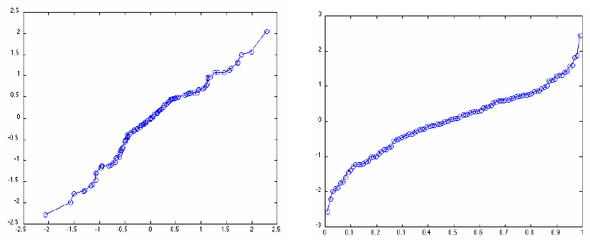
370
Using these tests is backwards from most statistical analyses. Usually one wishes to reject
the null hypothesis in some specific case, such that one may conclude the alternative
hypothesis. In this case, however, we wish to reject all but one of the tests, such that we
then conclude that there is evidence to exclude all but one possible parent distribution for
the data. In many cases, we will fail to reject more than one test and must then choose
one of the candidate distributions. We can do that by choosing the one with the smallest
test statistic and therefore the least amount of evidence for rejection.
Statistical Plots
There are many plots available from the Distribution Fitting Tool Set; examples of each
are included here. The data were generated as random Gaussian variates with mean zero
and variance one, using the normdf command included in the Tool Set. On the left in
Figure 14-1 is a symmetry plot. This plot illustrates the symmetric properties of a dataset.
The plot on the right is a percentile plot.
a) b)
Figure 14-1. a) Symmetry plot (PLOTSYM)of 100 random normals, b) Percentile plot
(PLOTPCT) of 100 random normals.
In addition to these exploratory data plots, the Tool Set includes commands for
graphically investigating the distributional properties of a sample. One can produce
empirical distribution plots, quantile plots (comparing to each of the supported
distributions), conditional quantile plots (comparing to each of the supported
distributions), and kernel density plots (comparing to each of the supported distributions).
The empirical distribution plot is a plot of the estimated cumulative distribution. All
cumulative distributions, F(x), have the following properties:
1. Fx
1
()≥Fx
2
()if x1≥x2
2. F−∞
()=0
3. F∞()=1.
For our sample of random normals (created using the command x=normdf('r',[100
1])), the empirical distribution plot obtained from plotedf(x) is shown in Figure 14-2.
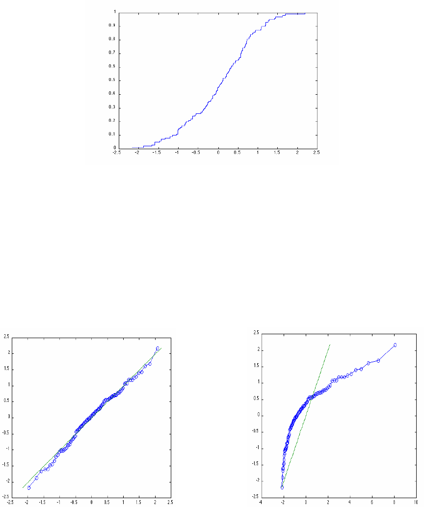
371
Figure 14-2. Empirical distribution plot.
The quantile plot is used to graphically assess the fit of a sample to a candidate
distribution. More accurately, this is called a quantile-quantile plot, because it depicts a
graph of the sample quantiles versus the quantiles of the candidate distribution. Figure
14-3 illustrates the quantile plot of our sample with the normal (correct) distribution (left)
and the best-fit exponential distribution (right). The fit of the candidate distribution is
assessed graphically by noting that using the correct distribution results in a diagonal line
in the quantile plot. The plot on the left was obtained by specifying
plotqq(x,'normal') and the plot on the right was obtained by specifying
plotqq(x,'exp').
a) b)
Figure 14-3. a) Quantile plot for normal distribution, b)Quantile plot for exponential
distribution.
Note how the quantiles for the best-fit normal distribution fall along the solid diagonal
line in the graph on the left, but the quantiles of the best fit exponential distribution do
not coincide with a diagonal line.
In the Distribution Fitting Tool Set, the best-fit distributions include offsets such that the
entire distribution is shifted to accommodate the range of the sample data. In addition to
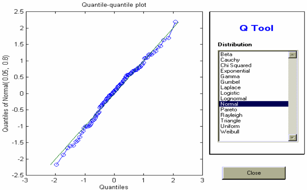
372
plotting the quantile plots using the plotqq command, we could also use the qtool
interactive tool to choose candidate distributions for comparisons. This tool is illustrated
in Figure 14-4.
Figure 14-4. PLOTQQ GUI interface.
Conditional quantile plots as described in by Kafadar and Spiegelman (1986) are also
available in this Tool Set.
Another method for investigating the density of a sample is to plot a density estimate.
Density estimates are available from the toolbox where the density is calculated using a
kernel density estimate. The user may use the interactive commands to investigate
various kernel density estimates or may use the ktool graphical tool.
Figure 14-5 shows two density estimates. On the left is a density estimate using the
Epanechnikov kernel with an overlaid best-fit normal density, and on the right is a
density estimate using the Parzen kernel with an overlaid best-fit exponential density.
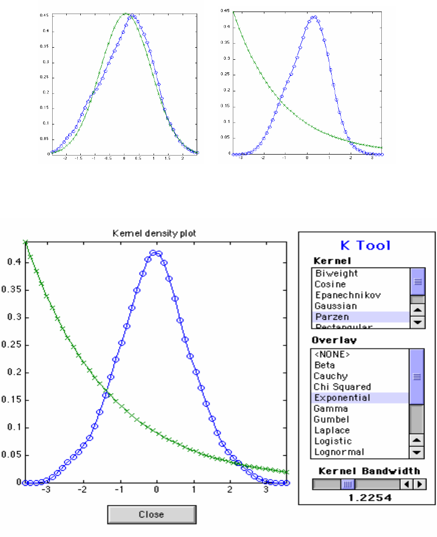
373
Figure 14-5. Density estimate plots.
Using the interactive tool (Figure 14-6) makes it easy to overlay different candidate
distributions, select kernels, and alter the bandwidth selection for the kernel estimator.
Figure 14-6. KTOOL GUI interface.
Other Commands
In addition to the focus on distribution fitting, the Tool Set also includes commands to
assist investigations of usual hypothesis testing. There are commands for summarizing
data, testing means, and testing variances. For exploratory data analysis, one typically
wants to look at various summary measures. The summary command creates a structure
374
with these values. Additionally, the means command provides various measures of
central tendency and the pctile1 command provides percentiles. Using random data, we
can see the usefulness of these commands:
>> summary(n)
ans =
ks: 31.3267
mean: 1.8708
std: 2.8305
n: 1000
min: -5.9327
max: 10.1949
p10: -1.7725
p25: -0.0858
p50: 1.9606
p75: 3.8402
p90: 5.5716
skew: -0.0307
kurt: 2.8300
375
15. Returning Users – New Features and
Release Notes for PLS_Toolbox 4.0
Version 4.0 of PLS_Toolbox includes new functions, improvements in our existing
functions, new "tool sets" of associated functions, and expansion of our Graphical User
Interfaces. A list of all of these changes would be dry reading, so this chapter will
highlight some of the most significant changes. There are, however, many underlying
changes which are not reported in this document.
Tool Sets
This release of PLS_Toolbox includes several new "tool sets" which we have sub-divided
into their own folders within PLS_Toolbox. These tool sets include:
1. Distribution Fitting Tools – This tool set provides a large set of distribution fitting
tools including fifteen different distributions. The tools create random distributions
for any of these fifteen common distributions, and also calculate the quantile,
probability density function, and cumulative density function for each distribution.
There are also a variety of GUI and Plotting tools for analyzing and generating data.
This tool set is comparable to the contents of The Mathworks' statistics toolbox. For
more information on this tool set type:
helpwin pls_toolbox/dft
2. Peak Fitting Tools – This tool set includes command-line tools for rapid locating and
fitting of standard peak shapes. This initial release includes fitting of any number of
Gaussian, Lorentzian, and/or mixed peaks. For more information on this tool set,
type:
helpwin pls_toolbox/peakfit
and see the new functions peakfind, peakstruct, and fitpeaks.
3. Optimization Tools – This tool set features a fast Levenberg-Marquardt nonlinear-
optimization tool. It is included for use with peakfit tools or for custom user
applications. For more information on this tool set type:
helpwin pls_toolbox/optimize
4. Robust Tools – These robust analysis tools are a subset of the well-known LIBRA
Toolbox, developed by Mia Hubert's research group at the Katholieke Universiteit
Leuven (www.kuleuven.be). These tools are used to extend PCA, PCR, and PLS
functionality to include robust analysis options. See the algorithm options on these
functions for more information. Also, the individual LIBRA functions can be used
directly. For more information on the robust functions, type:
helpwin robust\LIBRA_PLStoolb
376
Graphical User Interface
Version 4.0 introduces some major changes to the Browse, Analysis, and DataSet Editor
GUIs. These three GUIs now form the primary environment to analyze and manipulate
data and models in PLS_Toolbox. PlotGUI has also been significantly enhanced to allow
more plot manipulation, data selection, and data and plot exporting options. In addition,
we are introducing two new GUI tools, FigBrowser and TrendTool.
1. Browse - The PLS_Toolbox Workspace browser has become a full-featured GUI to
allow users to import, modify, and analyze data. The standard DataSet Editor import
functions are available in this GUI's menus. In addition, double-clicking data items
allows editing of those items. Some other highlights of this new interface include:
• “Drag and drop” of data. Data can be operated on by dragging them to a variety of
other objects including:
¾ Other data, to augment two or more DataSet Objects
¾ Models, to apply model to data
¾ An Analysis Shortcut in the browser window, to start the specific analysis
method and pre-load the data for analysis
¾ Other PLS_Toolbox windows, to load the data into the specified Analysis,
PlotGUI, or DataSet Editor window (if permitted).
• "Drag and drop" of models. Models can be dragged into Analysis windows to
load them into the Analysis GUI.
• Right-click functionality. All workspace objects (data, models) can also be
modified or operated on by right-clicking the object's icon.
• New menu options to automatically load selected data or models into analysis for
a specific analysis method.
2. Analysis – The primary GUI for multivariate data analysis in PLS_Toolbox now
includes:
• Color-coded status-boxes (top two boxes in window) indicating current status of
the Analysis interface. The status boxes also have“right-click” functionality for
the most commonly needed operations.
• A new Help Window at bottom of main window offering guidance in working
with the interface.
• A shortcut to the PLS_Toolbox Workspace browser by clicking on the EVRI
Logo button (see Browse for more information).
• A new OptionsGUI for modifying options for almost all Analysis methods. This
allows access to a variety of powerful options including:
¾ Robust option selection of PCA, PCR, and PLS.
¾ MCR options.
• New Methods added to the Analysis menu:
¾ MPCA – Multiway Principal Components Analysis.
¾ MLR – Multiple Linear Regression.
• Preprocess/Custom options (for both X and Y blocks) allowing the side-by-side
viewing of the effect of selected methods on the data.
• Better linking of selections in the data, preprocessed data, scores, and loadings
plot windows. Selections in scores or loadings plots are reflected in original data
377
plots (however, the reverse is not true). Selections in data and preprocessed data
plots are reflected between each.
• Improvements in delimited text file importer. The standard text-file importer
(xclreadr from the command line) now attempts an intelligent parsing of generic
text files to try to locate labels and extra data, and places these items into a
DataSet Object for your use.
• Improved model status content. The model status window now reflects RMSEC,
RMSECV, and RMSEP information, when available.
• A new demo for the Analysis GUI. A step-by-step demonstration of how to use
the Analysis interface for PCA analysis is accessible by typing
analysis_pcademo.
• Drill-down functionality in Q and T Contribution plots. Most standard analysis
methods allow tracking from Q and T contribution plots back to the original data
by clicking on a given variable. MPCA allows drill-down from "summary"
contribution plots to the full (variable vs. time) contribution data.
• The ability of the Analysis GUI to recognize when you have re-loaded the data
used to calibrate a model, allowing you to modify the model (when the model
type and settings permit - some model types do not permit this feature).
3. DataSet Editor – The editor used to import, create, modify and edit DataSet Objects
now includes:
• Exporting to CSV. DataSet Objects can now be exported to a standard Comma
Separated Values format which is readable by Microsoft Excel and other
programs.
• Direct editing of Label fields. Labels, classes, axis scales, and the "include" field
can all be quickly edited by selecting the appropriate "mode" (rows, columns,
etc.), clicking on the given label header button, and then selecting the Edit/Edit
field menu (or by right-clicking the label heading and selecting Edit field).
• Quick bulk exclusion or inclusion of a range of samples or variables using the
Bulk Include Change menu option.
• Improved copy and paste functionality for label fields. Copying and pasting
between the different label fields (Label, Axis Scale, Class) is greatly enhanced.
Pasting labels into the Class field, for example, now automatically translates text
labels into the numerical codes required by the Class field, and the Label field
accepts several standard text formats copied from other programs.
4. PlotGUI – The general interface used by most of the GUI functions in PLS_Toolbox
for plotting of data and results now includes:
• Menu Additions:
¾ File
• Export figure to MS PowerPoint and Export Figure to MS Word.
Provides an easy way to export a plot; similar to the MATLAB figure
export function.
378
¾ Edit
• Copy Figure and Copy Plotted Data. Sends image of figure (Copy
Figure) or numeric data plotted in figure (Copy Plotted Data) to your
system clipboard.
• Select Class. All samples or variables of a given class (or classes) can be
easily selected from a list of classes.
¾ View
• Labels. Individual labels can now be dragged and dropped to adjust
position.
• Classes/Outline Class Groups Draws smallest-region borders around
each group of samples in a class.
• Classes/Labels now allows access to multiple class sets.
• Declutter Labels. Additional levels of decluttering are now available
along with improved logic. "Decluttered" notice now appears on figure
when decluttering is in use (Right-click this notice to hide or change
options).
• Subplots. Multiple axes (subplots) are now supported. The contents of
each subplot can be individually selected by clicking on the subplot, then
selecting the desired data from the plot controls. Note that some settings
are used for all subplots.
• Appearance: Improved support for date stamp labels. Date stamp axis scales are
automatically recognized and plotted with best-fit labels. Click "Plot" after
zooming to readjust labels.
• Keyboard shortcuts for View menu items.
• Better support for Data Set Objects with label problems (none or duplicates).
• Command-line support for color-coding scatter plots using either external data or
a given column/row of the plotted data.
5. Trendtool – A new graphical analysis tool which permits the user to use right-click
to mark a variable of interest and view how that variable changes in the "other"
dimension of a Data Set Object. Subtraction of reference points or linear baselines, as
well as integration of multiple adjacent variables, are also supported by right-clicking
a previously-set marker. This tool can be accessed from the command line by typing:
trendtool(data) where data is the DataSet Object to analyze.
6. FigBrowser - This new GUI is initially available on Analysis and PLS_Workspace
browser windows but, when selected, is automatically available on all figures. It
allows quick navigation between figures, either from thumbnail images of the figures
or from a pull-down list in the FigBrowser menu.
7. Genalg – The genetic algorithm variable selection tool GUI. Improved preprocessing
support includes viewing of preprocessed data and "pre-application" of preprocessing
(allows faster analysis).
379
Complete List of New Functions
This release of PLS_Toolbox also includes the following new command-line functions:
1. New importers, exporters, and data viewing tools
encodexml - Converts standard data types into XML-encoded text.
idateticks - Converts axis labels into intelligent date ticks.
mtfreadr - Reader for AdventaCT Multi-Trace Format files.
parsemixed - Parses numerical and text data into a DataSet Object.
querydb - Uses ODBC/ADO or JDBC to execute SQL queries.
trendtool - Univariate trend analysis tool.
writecsv - Exports a DataSet object to a comma-separated values
(CSV) file.
2. New analysis functions and associated tools
ipls - Interval PLS variable selection.
matchvars - Aligns variables of a dataset to allow prediction with
a model.
mlr - Multiple Linear Regression for multivariate Y.
mlrengine - Multiple Linear Regression computational engine.
modelselector - Creates or applies a model selector model.
3. New calculation tools
lsq2topb - Fits a polynomial to the top/(bottom) of data.
med2top - Fits a constant to top/(bottom) of data.
varcapy - Calculate percent y-block variance captured by a PLS
regression model.
vip - Calculate Variable Importance in Projection from
regression model.
4. Figure and Workspace Management Aids
clean - Clears and closes everything in the workspace.
exportfigure - Automatically exports figures to an external program.
figbrowser - Browser with icons of all Matlab figures.
keep - Clears all except named variables in workspace.
5. User Customization
browse_shortcuts - Defines shortcuts available on the EVRI Workspace
Browser.
editds_importmethods - List of user-defined import methods for DataSet
Editor.
editds_userimport - Example user-defined importer for editds.
optionsgui - Creates options gui for specified function.
380
381
16. Advanced Software Information
MATLAB provides several different data types for managing and working with data.
Along with all of the typical numeric and character data types, MATLAB also supports
two higher order data types: structures and cell arrays. MATLAB also allows, through the
use of classes, the creation of custom data types. In this chapter, you will see how
PLS_Toolbox implements these data types to more effectively manage data.
The DataSet Object
A typical data set contains more than just a simple matrix or n-way array; the data set
may also include labels for samples and variables, axes to plot the samples and variables
against, and a host of other information such as class membership, authorship
information, etc. When this information is entered in MATLAB, it often becomes a set of
individual variables of different classes, such as a double array for the main data,
character arrays or cell arrays containing character strings for the labels, and/or Boolean
logicals to indicate which samples or variables are to be included in the analysis. The
MATLAB workspace can quickly become cluttered with many different variables
associated with the full data set.
A cluttered workspace can be an inconvenience, but real problems often occur when parts
of the data set are deleted, or when parts are edited in a way that makes them inconsistent
with other parts. An example would be if samples were deleted from a data matrix
without deleting their corresponding sample labels. This can lead to problems further
down the data analysis chain.
Overview of the DataSet Object
The DataSet Object (DSO) was created to address the problem of managing data in
MATLAB. When added to a MATLAB installation, the DSO creates a new class of
objects called dataset. DSOs are used to “glue” the individual parts of a data set
together. This allows complete data sets to be described by single variables in the
MATLAB workspace. But perhaps more importantly, DSOs have a number of features
that assure that data are consistent and traceable. These features include:
• Data consistency: Fields in DSOs are not allowed to be inconsistent. For
example, it is not possible to create a DSO where the number of labels for
samples does not match the number of samples, or where the axis scale for
variables does not match the number of variables.
• Soft deletes: The DSO contains information (in the include field) that can be
used to exclude data from an analysis without deleting the excluded data.
382
Thus, a soft delete can be performed that excludes data from a particular
analysis while still retaining the entire original data record.
• Data history: All additions and modifications to the DSO are stored in the
.history field. This field provides a traceable record that can be used to
reconstruct a DSO from the original data sources.
• Data description: Text describing the data set is stored in the .description
field, and is easily viewed.
• Userdata: The userdata field of the DSO can be used to store any user-
supplied meta-data associated with the DSO. This data can be extracted by
user-defined routines. This feature makes the DSO easily extensible.
• Date stamps, authorship: The DSO includes creation (date) and
modification (moddate) dates, author information (author), and the name of
the data set (name).
• Overloading: Because a DSO is its own class of variable in the MATLAB
workspace, existing functions can be overloaded with new functions which
work on DSOs in a sensible way. For instance, the size function is
overloaded for a DSO to give the size of the data matrix contained in the
DSO.
All of these features make managing data in MATLAB easier than ever before.
DataSet Object Tour
Perhaps the best way to understand how DSOs work is to examine a couple of them.
Several data sets are included with PLS_Toolbox, and all of them are in the form of
DSOs. We will start with the smallest one, the Wine data set. Clear the MATLAB
workspace (save anything important first!) and at the command line type:
» load wine
» whos
Name Size Bytes Class
wine 10x5 6050 dataset object
Grand total is 920 elements using 6050 bytes
We have now loaded the Wine data set. When the ‘whos’ command is used, we see that
there is a single variable in the workspace, wine, of Class dataset object, with a data
field that is 10 by 5. We can look at the contents of wine by typing:
383
» wine
wine =
name: Wine
type: data
author: B.M. Wise
date: 14-May-2001 13:47:54
moddate: 06-Jun-2001 10:27:24
data: 10x5 [double]
label: {2x1} [array (char)]
Mode 1 [Country: 10x6]
Mode 2 [Variable: 5x6]
axisscale: {2x1} [vector (real)]
Mode 1 [: ]
Mode 2 [: ]
title: {2x1} [vector (char)]
Mode 1 [: 'Country']
Mode 2 [: 'Variable']
class: {2x1} [vector (integer)]
Mode 1 [: ]
Mode 2 [: ]
include: {2x1} [vector (integer)]
Mode 1 [: 1x10]
Mode 2 [: 1x5]
description: Wine, beer, and liquor consumption (gal/yr), life
life expectancy (years), and heart disease rate
(cases/100,000/yr) for 10 countries.
history: {1x1 cell} [array (char)]
userdata:
From this we see that the name of the data is Wine and that the type is “data.” Other types
are also possible, such as “image” and “batch.” The author is listed, followed by the
creation date and last-modified date. The next field, data, contains the actual data table.
These data, or the data from any DSO field, can be extracted from the DSO just as they
would be from a conventional structure array (type help struct or refer to the
Examining a Structure Array section of Chapter 2 for help) using DSOname.fieldname
syntax. For instance:
384
» wine.data
ans =
2.5000 63.5000 40.1000 78.0000 61.1000
0.9000 58.0000 25.1000 78.0000 94.1000
1.7000 46.0000 65.0000 78.0000 106.4000
1.2000 15.7000 102.1000 78.0000 173.0000
1.5000 12.2000 100.0000 77.0000 199.7000
2.0000 8.9000 87.8000 76.0000 176.0000
3.8000 2.7000 17.1000 69.0000 373.6000
1.0000 1.7000 140.0000 73.0000 283.7000
2.1000 1.0000 55.0000 79.0000 34.7000
0.8000 0.2000 50.4000 73.0000 36.4000
The labels can be extracted in a similar manner:
» wine.label
ans =
[10x6] char
[ 5x6] char
Note that ans is a cell array, i.e., the labels for each mode of the array are stored in a cell
that is indexed to that mode. Thus, the labels for mode 1, the data set rows, can be
extracted with:
» wine.label{1}
ans =
France
Italy
Switz
Austra
Brit
U.S.A.
Russia
Czech
Japan
Mexico
Note that curly brackets, {}, are used to index into cell arrays (type help cell for more
information on cell arrays). In a similar way the labels for mode 2, the data set columns,
can be extracted by executing:
385
» wine.label{2}
ans =
Liquor
Wine
Beer
LifeEx
HeartD
Other fields in the DSO include .axisscale (e.g., time or wavelength scale), .title
(titles for the axes), and .class (e.g., class variables for samples). Note that a typical
data set will not have all of the available fields filled. The Wine data set does not have
axis scales, for instance, nor class variables.
DSOs also allow for multiple sets of many of these fields; for instance, you may store
more than one set of labels for a particular mode. Most GUI tools including Analysis,
PlotGUI and the DataSet Editor support multiple sets but there are some rare situations
where their use has not yet been fully implemented. GUIs allow limited support of
multiple sets; axis scales and titles are not yet completely supported in the main Analysis
GUI.
The user is encouraged to explore more of the DSOs included with PLS_Toolbox. For an
example with axis scales, please see spec1 in the nir_data.mat file. For an example
with class variables, please see arch in the arch.mat file.
Creating DataSet Objects
There are several ways to create a DSO. The most basic way assumes that you are
starting with many of the pieces already in your MATLAB workspace. As an example,
let’s create a small data set entirely from scratch, consisting of a small data table and the
labels for samples and variables:
» data = [41 73 205
38 71 188
25 74 175
48 70 212
56 69 145]
data =
41 73 205
38 71 188
25 74 175
48 70 212
56 69 145
386
» vars = {'Age','Height','Weight'}
vars =
'Age' 'Height' 'Weight'
» names = {'Jim','Biff','Bob','Al','Scooter'}
names =
'Jim' 'Biff' 'Bob' 'Al' 'Scooter'
Note that the easy way to create labels is to put them in cell arrays by using the curly
brackets, {}. (This is easier than creating character arrays where all the rows have to be
the same length.) We can form a DSO we’ll call guydata using the dataset command
and the variable data as follows:
» guydata = dataset(data)
guydata =
name: data
type: data
author:
date: 05-Nov-2002 10:57:47
moddate: 05-Nov-2002 10:57:47
data: 5x3 [double]
label: {2x1} [array (char)]
Mode 1 [: ]
Mode 2 [: ]
axisscale: {2x1} [vector (real)]
Mode 1 [: ]
Mode 2 [: ]
title: {2x1} [vector (char)]
Mode 1 [: ]
Mode 2 [: ]
class: {2x1} [vector (integer)]
Mode 1 [: ]
Mode 2 [: ]
include: {2x1} [vector (integer)]
Mode 1 [: 1x5]
Mode 2 [: 1x3]
description:
history: {1x1 cell} [array (char)]
userdata:
The DSO guydata now contains the 5x3 data table in the guydata.data field. The labels
can be added into the structure as follows:
387
» guydata.label{1} = names;
» guydata.label{2} = vars;
What if we inadvertently tried to put the sample labels, which belong in mode 1 (data set
rows), into the mode 2 (data set columns) .label field?
» guydata.label{2} = names
??? Error using ==> dataset/subsasgn
Number of rows (or cell elements) in input 'label' must
=size(x.data,vdim) = 3.
This illustrates an important aspect of the DSO, which is that it will not let you make
nonsensical assignments. It forces the data and their associated elements to be consistent.
Further assignments can be made into the DSO, with the following results:
» guydata.author = 'My name here';
» guydata.name = 'Guys in the Office';
» guydata.description = {'Some data describing the age, height,';
'and weight of some guys in the office.'};
We can now inspect the contents of guydata as follows:
» guydata
guydata =
name: Guys in the Office
type: data
author: My name here
date: 05-Nov-2002 10:57:47
moddate: 05-Nov-2002 11:00:00
data: 5x3 [double]
label: {2x1} [array (char)]
Mode 1 [: 5x7]
Mode 2 [: 3x6]
axisscale: {2x1} [vector (real)]
Mode 1 [: ]
Mode 2 [: ]
title: {2x1} [vector (char)]
Mode 1 [: ]
Mode 2 [: ]
class: {2x1} [vector (integer)]
Mode 1 [: ]
Mode 2 [: ]
include: {2x1} [vector (integer)]
Mode 1 [: 1x5]
Mode 2 [: 1x3]
388
description: Some data describing the age, height,
and weight of some guys in the office.
history: {1x1 cell} [array (char)]
userdata:
DSOs can also be created using the DataSet Editor GUI, which may be started by typing
editds at the command prompt. The individual parts of the data may be loaded into the
GUI, then saved as a DSO in the workspace by selecting Save from the File menu.
Finally, there are some functions written into PLS_Toolbox to load data from files
directly into DSOs. One example is xclreadr, which loads data from Excel spreadsheets
that have been saved as delimited text. To try this, type:
» xcldata = xclreadr('xclreadrdata.txt')
xcldata =
name: xclreadrdata.txt
type: data
author: Created by XCLREADR
date: 05-Nov-2002 11:01:04
moddate: 05-Nov-2002 11:01:04
data: 3x3 [double]
label: {2x1} [array (char)]
Mode 1 [: 3x9]
Mode 2 [: 3x11]
axisscale: {2x1} [vector (real)]
Mode 1 [: ]
Mode 2 [: ]
title: {2x1} [vector (char)]
Mode 1 [: ]
Mode 2 [: ]
class: {2x1} [vector (integer)]
Mode 1 [: ]
Mode 2 [: ]
include: {2x1} [vector (integer)]
Mode 1 [: 1x3]
Mode 2 [: 1x3]
description: Test file for XCLREADR
history: {1x1 cell} [array (char)]
userdata:
Here the labels have been stripped off the original file and placed in the proper fields of
the DSO, along with the data table.
Summary
The DataSet Object is a handy way to keep all the pieces of a data set organized. It is
convenient to move new data into a DSO as soon as it is imported into MATLAB. Pieces,
such as class identifiers, can then be added to it as the analysis proceeds. Because the
389
DSO keeps track of its own history, the entire story of its construction is contained within
it. PLS_Toolbox contains several tools for editing and viewing DSOs. See Chapter 2 for
more information on the DataSet Editor and PlotGUI. For more technical information on
the structure of DSOs, please see the DataSet Object specification documentation
(DataObject401.pdf).
Standard Model Structure
Introduction
Many higher-level PLS_Toolbox functions such as PCA and PLS output the results of
analyses in a standard model format. This format, the Standard Model Structure, contains
the key results of an analysis, as well as information needed to reproduce those results.
The Standard Model Structure is typically used by PLS_Toolbox functions to review the
model calibration or apply it to new data (for example, predicting on unknown data).
However, the experienced user can access much of the information in the model from the
command line to perform various tasks. This section describes the standard model
structure in general and also shows some of these advanced applications.
Using Structures
As the name implies, Standard Model Structures are created with a MATLAB variable
type called a “structure.” In a MATLAB structure, a single variable contains one or more
named "fields" (consider it like a variable containing other variables). These fields are
accessed by giving the base variable name (here called "model") followed by a period
and the name of the field. For example:
model.date
returns the contents of the date field from the model.
In the case of Standard Model Structures, the fields which show up are standardized to
help the user identify useful parts of any model. Some of the fields of the Standard Model
Structure have self-explanatory contents, such as description strings; other fields contain
data matrices with varying contents. Additionally, some Standard Model Structure fields
contain MATLAB cell arrays. A cell array is a container for matrices or strings that can
be indexed into. When cell arrays are used, they are denoted either by the word "cell" or
by surrounding the size or content with curly brackets, { }. For more information about
indexing into cell arrays, see the MATLAB documentation on cells; in general, they are
indexed using curly brackets giving the indices of the cell to extract, e.g., mycell{2,3}
One special field in all Standard Model Structures is the detail field. This field contains
a separate structure with lower-level details about the model. The contents of this field
vary between different model types and typically contains important details about the
model. The contents are accessed by simply addressing first the top-level variable (e.g.
“model”), then the detail field, then finally the sub-field to extract. For instance, to access
390
the sum squared captured information (ssq table) for a pca model you would use the
following:
model.detail.ssq
Although the exact fields present in any model vary depending on the model type, the
following example, a PCA model, shows many of the general model characteristics.
PCA Example
model =
modeltype: 'PCA'
datasource: {[1x1 struct]}
date: '29-Mar-2004'
time: [2004 3 29 8 57 37.4400]
info: 'Scores are in cell 1 of the loads field.'
loads: {2x1 cell}
pred: {[]}
tsqs: {2x1 cell}
ssqresiduals: {2x1 cell}
description: {3x1 cell}
detail: [1x1 struct]
model.datasource{1}=
name: 'Wine'
author: 'B.M. Wise'
date: [2001 5 14 13 47 53.9500]
moddate: [2001 6 6 10 27 23.5100]
size: [10 5]
model.detail=
data: {[]}
res: {[]}
ssq: [5x4 double]
rmsec: []
rmsecv: []
means: {[]}
stds: {[]}
reslim: {[3.1403]}
tsqlim: {[10.0327]}
reseig: [3x1 double]
cv: ''
split: []
iter: []
includ: {2x1 cell}
label: {2x1 cell}
labelname: {2x1 cell}

391
axisscale: {2x1 cell}
axisscalename: {2x1 cell}
title: {2x1 cell}
titlename: {2x1 cell}
class: {2x1 cell}
classname: {2x1 cell}
preprocessing: {[1x1 struct]}
options: [1x1 struct]
Description
model
modeltype: Contains a keyword defining the type of model.
datasource: Contains information about the data used for the model, but does
not contain original data. datasource basically contains a subset of the fields of
the original DataSet Object. If more than one block of data is used for a model
(e.g., PLS models require two blocks), datasource will be size 1xj, where j is
the number of blocks used for the model (1x2 in the case of PLS).
date: Contains a string description of the date on which the model was
calculated.
time: Contains a time-stamp vector including, in order, the year, month, day,
hour, minute, and second at which the model was created. Useful for
distinguishing between different models, as no two models can be created with
the same time-stamp.
loads: Contains factors recovered for the data. In the case of PCA or PLS
models, the rows are the "scores" and "loadings" of the data. For PARAFAC, it is
the loadings of each mode. The size of the loads field will be dxj, where d is the
number of modes (dimensions) and j is the number of blocks of data used by the
model (Table 1). PCA models will be 2x1 (two modes, one block), PLS models
will usually be 2x2 (two modes, two blocks), PARAFAC will often be dx1 where
d is at least 3. Other model types follow this same pattern.
Table 16-1. Loads field contents.
Model Type Field loads contains:
PCA, MCR { X-block Scores
X-block Loadings }
PLS, PCR { X-block Scores Y-block Scores
X-block Loadings Y-block Loadings }
PARAFAC { X-block Loadings (mode 1)
X-block Loadings (mode 2)
X-block Loadings (mode 3)
… }
392
The contents of each cell will generally be an mxk array in which m is the size of
the given block for the given mode (e.g., for loads{1,1}, m would be equal to the
size of the first mode of the X-block) and k is the number of components or
factors included in the model. This format may be different for different model
types.
Examples of indexing into the loads field:
For a PCA model, a plot of the scores for all principal components can be made
using:
plot(model.loads{1});
To plot the scores for only the first principal component, type:
plot(model.loads{1}(:,1));
Similarly, a plot of the loadings for the first principal component can be made
using:
plot(model.loads{2}(:,1);
You can also use the model to export data so that they can be used in other
programs. The following could be used to export an XY text-formatted file of the
loadings of the first principal component:
xy=[ [1:size(model.loads{2},1)]' model.loads{2}(:,1) ];
save xy.prn xy –ascii
If the axisscale field for this data contains a useful axis to plot against, the XY
data can be created using
xy=[model.detail.axisscale{2}(model.detail.includ{2})' ...
model.loads{2}(:,1)];
Similarly, the axisscale could be used in the plot commands given above.
The goal of PCA is to recreate a data set from its loadings and scores. When the
proper number of principal components is used one can reproduce the original
data set within the noise level. The reconstructed data is calculated as follows:
data_reconstructed = model.loads{1}*model.loads{2}';
It is also possible to reconstruct the data with fewer factors. The general command
for n principal components is:
model.loads{1}(:,1:n) * model.loads{2}(:,1:n)';
393
tsqs: Contains Hotelling's T2 values. The T2 values are a distance measure of
the scores or loadings with respect to their respective origins. The tsqs field is a
cell equal in size and similar in definition to the loads field. The field will be size
dxj, where d is the number of modes (dimensions) and j is the number of blocks
of data used by the model. Row 1 contains the mode 1 T2 values (samples), row 2
contains the T2 values for mode 2 (variables), etc., while column 1 contains T2
values for the X-block and column 2 contains T2 values for the Y-block (if any
was used for the given model type).
A relatively large value in tsqs{1,1} indicates a sample that has relatively large
influence and loading on the PCA model. Similarly, large values in tsqs{2,1}
indicate variables with significant influence and loading on the model. These are
often used with statistical limits given in the details field and discussed below.
When a model is applied to new data, the output prediction structure will contain
the T2 values for the predictions rather than the calibration data.
ssqresiduals: Contains the sum-of-squares (SSQ) differences between the
original data and the reconstructed data. The field will be size dxj, where d is the
number of modes (dimensions) and j is the number of blocks of data used by the
model. The first row of the cell contains sum-of-squares differences for each
sample (indicating samples which have large out-of-model residuals), while the
second row contains sum-of-squares differences for each variable (indicating
variables which have large out-of-model residuals). Again, each block is
represented by a column, so the X-block sample sum-of-squares residuals can be
extracted using:
model.ssqresiduals{1,1}
When a model is applied to new data, the output prediction structure will contain
the SSQ residuals for the predictions rather than the calibration data.
model.detail
data: Contains the data used to calculate the model. In order to save memory,
many methods do not save the primary (X) block in the first cell. See the options
for a given analysis method to learn more about storing the X-block data in the
model (see, for example, the blockdetails option for PCA and PLS). Y-block
data (i.e., model.detail.data{2} ) is usually stored, when available.
res: Contains the residuals calculated as the difference between the
reconstructed data and the original data. As with the detail.data field, the X-
block residuals are not usually stored, due to excessive size. As such, this field
may be empty. If using a two-block method such as PLS, the second cell of
model.detail.res will usually contain the prediction residuals.
394
rmsec and rmsecv: Contain any root-mean-square error of calibration and
cross-validation (respectively) that was calculated for the model. These are
vectors equal in length to the maximum number of factors requested for a given
cross-validation calculation. A value of NaN will be used for any value which was
not calculated.
ssq: Contains the eigenvalues or other variance-captured information for a
model. For PCA models–, the first column is the PC number, the second column
contains the eigenvectors, the third column contains the eigenvalues scaled to a
sum of 100, and the last column contains the cumulative eigenvalues. As such, the
eigenvalues can be extracted using:
model.detail.ssq(:,3)
For PLS models, the first column is the Latent Variable number, followed by the
variance captured for the X-block, the cumulative variance captured for the X-
block, the variance captured for the Y-block, and the cumulative variance
captured for the Y-block.
Users should be advised that other model types use this field in different ways.
For more information contact Eigenvector Research at
helpdesk@eigenvector.com.
reslim: Contains the 95% confidence limit for the block 1 sample Q residuals;
i.e., for the values in model.ssqresiduals{1}. For PCA, this value is calculated
using :
residuallimit(model,.95)
For some multiway model types this field may contain a structure with additional
information. For help on this topic, contact Eigenvector Research at
helpdesk@eigenvector.com.
tsqlim: A cell containing the 95% confidence limit for the block 1 sample T2
values in model.tsqs. For PCA, this value is calculated using
[n_samples,n_pcs]=size(model.loads{1});
tsqlim(n_samples,n_pcs,.95);
For some multiway model types, this field may contain a structure with additional
information. For help on this topic, contact Eigenvector Research at
helpdesk@eigenvector.com.
reseig: Contains the residual eigenvalues for PCA models only.
cv, split, iter: Contain information about the settings used when cross-
validating the model, including:
395
cv: the encoded cross-validation method
split: the total number of splits (test groups)
iter: the number of iterations (for random mode only)
includ, label, labelname, axisscale, axisscalename, title,
titlename, class, classname: Contain information from DataSet Object
fields. If the original data used to calculate the model were stored in a DataSet
Object, certain fields from the DataSet Object are extracted and stored in the
model. Each of these fields is extracted for each mode and each block such that
model.detail.label{1,2} returns the mode 1 labels for block 2 (Y-block), and
model.detail.class{2,1} returns the mode 2 classes for block 1 (X-block). For
more information on these fields, see the DataSet Object section at the beginning
of this chapter.
Note that although DataSet Objects use the second index of many of these fields
to store multiple "sets," the model structures indicate the block number with the
second index, and the set number with the third index.
preprocessing: Contains a cell of preprocessing structures. The preprocessing
structures are used with the function preprocess to process the data for the
model. There is one structure in the cell for each block required by the model and
each structure may have zero, one or multiple records, with each record
representing one preprocessing method applied to the data. Thus, the X-block
preprocessing is stored in model.detail.preprocessing{1}.
options: Contains the options given as input to the modeling function.
Summary
Similar to a DataSet Object, the Standard Model Structure organizes results of an analysis
into a logical hierarchy. From this structure, a user can both explore results and generate
predictions. As you become more familiar with its organization, you will see how
convenient it is to access and manipulate model information using the Standard Model
Structure.
User-Defined Preprocessing
Each preprocessing method available in the preprocess function is defined using a
preprocessing structure. The standard methods are defined in the preprocatalog file,
and additional user-defined methods can be defined in the preprouser file. The methods
defined in these two files are available to all functions making use of the preprocess
function. See the preprouser file for examples of defining and adding methods to the
available methods catalog. The fields in a preprocessing structure include:
description - textual description of the particular method.
calibrate - cell containing the line(s) to execute during a calibration operation.

396
apply - cell containing the line(s) to execute during an apply operation.
undo - cell containing the line(s) to execute during an undo operation.
out - cell used to hold calibration-phase results for use in apply or undo.
settingsgui - function name to execute when the "Settings" button is pressed in the
GUI.
settingsonadd - Boolean: 1 = automatically bring up settings GUI when method is
"added".
usesdataset - Boolean: indicates if this method should be passed a DataSet Object
(1) or a raw matrix (0)
caloutputs - integer: number of expected items in field out after calibration has
been performed.
keyword - text string which users can pass to preprocess to obtain this structure.
userdata - user-defined variable often used to store method options.
Detailed Field Descriptions
description: Contains a short (1-2 word) description of the method. The value
will be displayed in the GUI and can also be used as a string keyword (see also
keyword) to refer to this method. For example:
pp.description = 'Mean Center';
calibrate, apply, undo: Contain a single cell of one or more command strings
to be executed by preprocess when performing calibration, apply or undo
operations. Calibrate actions are done on original calibration data, whereas
apply is done on new data. The undo action is used to remove preprocessing from
previously preprocessed data, although it may be undefined for certain methods.
If this is the case, the undo string should be an empty cell.
The command strings should be valid MATLAB commands. Each command will
be executed inside the preprocess environment in which the following variables
are available:
data: The actual data on which to operate and in which to return modified
results. If the field usesdataset is 1 (one) then data will be a DataSet
Object. Otherwise, data will be a standard MATLAB variable which has
been extracted from the DataSet Object. In the latter case, the extracted
data will not contain any excluded columns from the original DataSet
Object. In addition, in calibrate mode rows excluded in the original
DataSet Object will not be passed. All rows, excluded or not, are passed in
apply and undo modes.
If writing a DataSet Object-enabled preprocessing function, it is expected
that the function will calibrate using only included rows but apply and
undo the preprocessing to all rows.

397
out: Contents of the preprocessing structure field out. Any changes will be
stored in the preprocessing structure for use in subsequent apply and undo
commands.
userdata: Contents of the preprocessing structure field userdata. Any
changes will be stored in the preprocessing structure for later retrieval.
Read-only variables: Do not change the value of these variables.
include: Contents of the original DataSet Object's include field.
otherdata: Cell array of additional inputs to preprocess which follow the
data. For example, these inputs are used by PLS_Toolbox regression
functions to pass the y-block for use in methods which require that
information.
originaldata: Original DataSet Object unmodified by any preprocessing
steps. For example, originaldata can be used to retrieve axis scale or
class information even when usesdataset is 0 (zero) and, thus, data is
the extracted data.
In order to assure that all samples (rows) in the data have been appropriately
preprocessed, an apply command is automatically performed following a
calibrate call. Note that excluded variables are replaced with NaN.
Examples:
The following calibrate field performs mean-centering on data,
returning both the mean-centered data as well as the mean values which
are stored in out{1}:
pp.calibrate = { '[data,out{1}] = mncn(data);' };
The following apply and undo fields use the scale and rescale
functions to apply and undo the previously determined mean values
(stored by the calibrate operation in out{1}) with new data:
pp.apply = { 'data = scale(data,out{1});' };
pp.undo = { 'data = rescale(data,out{1});' };
out: Contains non-data outputs from calibrations. This output is usually
information derived from the calibration data which is required to apply the
preprocessing to new data. This field will be updated following a calibrate call,
and the entire preprocessing structure will be output. For example, when
autoscaling, the mean and standard deviation of all columns are stored as two
entries in out{1} and out{2}. See the related field caloutputs. Usually, this
field is empty in the default, uncalibrated structure.

398
settingsgui: Contains the name of a graphical user interface (GUI) function
which allows the user to set options for this method. The function is expected to
take as its only input a standard preprocessing structure, from which it should take
the current settings and output the same preprocessing structure modified to meet
the user's specifications. Typically, these changes are made to the userdata field,
then the commands in the calibrate, apply and undo fields will use those
settings.
The design of GUIs for selection of options is beyond the scope of this document
and the user is directed to autoset.m and savgolset.m, both of which use GUIs
to modify the userdata field of a preprocessing structure. Example:
pp.settingsgui = 'autoset';
settingsonadd: Contains a Boolean (1=true, 0=false) value indicating if, when
the user selects and adds the method in the GUI, the method's settingsgui
should be automatically invoked. If a method usually requires the user to make
some selection of options, settingsonadd=1 will guarantee that the user has had
an opportunity to modify the options or at least choose the default settings.
Example:
pp.settingsonadd = 1;
usesdataset: Contains a Boolean (1=true, 0=false) value indicating if the
method is capable of handling DataSet Objects or can only handle standard
MATLAB data types (double, uint8, etc).
1 = function can handle DataSet Objects; preprocess will pass entire DataSet
Object. It is the responsibility of the function(s) called by the method to
appropriately handle the include field.
0 = function needs standard MATLAB data type; preprocess will extract
data from the DataSet Object prior to calling this method and reinsert
preprocessed data after the method. Although excluded columns are
never extracted and excluded rows are not extracted when performing
calibration operations, excluded rows are passed when performing
apply and undo operations.
Example:
pp.usesdataset = 0;
caloutputs: Contains the number of values expected in field out if a calibrate
operation has been performed, for functions which require a calibrate operation
prior to an apply or undo. For example, in the case of mean centering, the mean
values stored in the field out are required to apply or undo the operation. Initially,
out is an empty cell ({}) but following the calibration, it becomes a single-item
cell (length of one). By examining this length, preprocess can determine if a

399
preprocessing structure contains calibration information. The caloutputs field,
when greater than zero, indicates to preprocess that it should test the out field
prior to attempting an apply or undo.
Example:
In the case of mean-centering, the length of out should be 1 (one) after
calibration:
pp.caloutputs = 1;
keyword: Contains a string which can be used to retrieve the default
preprocessing structure for this method. When retrieving a structure by keyword,
preprocess ignores any spaces and is case-insensitive. The keyword (or even the
description string) can be used in place of any preprocessing structure in
calibrate and default calls to preprocess:
pp = preprocess('default','meancenter');
Example:
pp.keyword = 'Mean Center';
userdata: A user-defined field. This field is often used to hold options for the
particular method. This field can also be updated following a calibrate
operation.
Example:
In savgol several variables are defined with various method options, then
they are assembled into userdata:
pp.userdata = [windowsize order derivative];
Examples
The preprocessing structure used for sample normalization is shown below. The
calibrate and apply commands are identical and there is no information that is stored
during the calibration phase; thus, caloutputs is 0. The order of the normalization is set
in userdata and is used in both calibrate and apply steps.
400
pp.description = 'Normalize';
pp.calibrate = {'data = normaliz(data,0,userdata(1));'};
pp.apply = {'data = normaliz(data,0,userdata(1));'};
pp.undo = {};
pp.out = {};
pp.settingsgui = 'normset';
pp.settingsonadd = 0;
pp.usesdataset = 0;
pp.caloutputs = 0;
pp.keyword = 'Normalize';
pp.userdata = 2;
The preprocessing structure used for Savitsky-Golay smoothing and derivatives is shown
below. In many ways, this structure is similar to the sample normalization structure,
except that savgol takes a DataSet Object as input and, thus, usesdataset is set to 1.
Also note that because of the various settings required by savgol, this method makes use
of the settingsonadd feature to bring up the settings GUI as soon as the method is
added.
pp.description = 'SG Smooth/Derivative';
pp.calibrate =
{'data=savgol(data,userdata(1),userdata(2),userdata(3));'};
pp.apply =
{'data=savgol(data,userdata(1),userdata(2),userdata(3));'};
pp.undo = {};
pp.out = {};
pp.settingsgui = 'savgolset';
pp.settingsonadd = 1;
pp.usesdataset = 1;
pp.caloutputs = 0;
pp.keyword = 'sg';
pp.userdata = [ 15 2 0 ];
The following example invokes multiplicative scatter correction (MSC) using the mean
of the calibration data as the target spectrum. The calibrate cell here contains two
separate operations; the first calculates the mean spectrum and the second performs the
MSC. The third input to the MSC function is a flag indicating whether an offset should
also be removed. This flag is stored in the userdata field so that the settingsgui
(mscorrset) can change the value easily. Note that there is no undo defined for this
function.
pp.description = 'MSC (mean)';
pp.calibrate = { 'out{1}=mean(data);
data=mscorr(data,out{1},userdata);' };
pp.apply = { 'data = mscorr(data,out{1});' };
pp.undo = {};
pp.out = {};
401
pp.settingsgui = 'mscorrset';
pp.settingsonadd = 0;
pp.usesdataset = 0;
pp.caloutputs = 1;
pp.keyword = 'MSC (mean)';
pp.userdata = 1;
Summary
The Preprocessing Structure provides a generic framework within which a user can
organize and automate preprocessing with PLS_Toolbox. Both MATLAB structure and
cell data types are used extensively in the Preprocessing Structure. Any custom
preprocessing you define yourself can be combined with the numerous methods provided
by PLS_Toolbox in order to meet your analysis needs.
402
403
17. Bibliography
Anderson, T.W., An Introduction to Multivariate Statistical Analysis, Wiley, New York,
New York, 1984.
Åstrom K.J. and B. Wittenmark, Computer Controlled Systems, Prentice-Hall,
Englewood Cliffs, NJ, 1984.
Barker, M., W. Rayens, "Partial Least Squares for Discrimination", J. Chemometrics,
17(3), 166-173, 2003.
Barnes, R.J., Dhanoa, M.S. and Lister, S.J. "Standard normal variate transformation and
detrending of NIR spectra" Appl. Spectrosc. 43, 772-777, 1989.
Beebe, K.R. and B.R. Kowalski, “An Introduction to Multivariate Calibration and
Analysis”, Anal. Chem., 59, 1007A, 1987.
Beebe, K.R., R.J. Pell and M.B. Seasholtz, Chemometrics: A Practical Guide, John
Wiley & Sons, New York, 1998.
Berman, M., A. Phatak, and R. Lagerstrom, “ICE: A Statistical Approach to Identifying
Constituents of Biomedical Hyperspectral Images,” IEEE Transactions on Geoscience
and Remote Sensing, 42(10), 2085-2095, 2004.
Blank, T.B., S.T. Sum, S.D. Brown, and S.L. Monfre, “Transfer of Near-Infrared
Multivariate Calibrations without Standards”, Anal. Chem., 68(17), 2987–2995, 1996.
Booksh, K.S. and B.R. Kowalski, “Error Analysis of the Generalized Rank Annihilation
Method”, J. Chemometrics, 8, 45-63, 1994.
Booksh, K.S., and B.R. Kowalski, “Theory of Analytical Chemistry,” Anal. Chem., 66,
782A-791A, 1994.
Booksh, K.S., Z. Lin, Z. Wang and B.R. Kowalski, “Extension of Trilinear
Decomposition Method with an Application to the Flow Probe Sensor”, Anal. Chem., 66,
2561-2569, 1994.
Box, G.E.P., W.G. Hunter, and J.S. Hunter, Statistics for Experimenters, John Wiley and
Sons, New York, NY, 1978.
Box, G.E.P., "Some theorems on quadratic forms applied in the study of analysis of
variance problems: Effect of inequality of variance in one-way classification," Annals of
Mathematical Statistics 25, 33-51, 1954.
Bro, R., “Multiway calibration. Multilinear PLS,” J. Chemometrics, 10(1), 47-61, 1996.
404
Bro, R. and S. de Jong, “A Fast Non-Negatively Constrained Least Squares Algorithm”,
J. Chemometrics, 11(5), 393-401, 1997.
Bro, R., A. K. Smilde, and S. de Jong, “On the difference between low-rank and subspace
approximation: improved model for multi-linear PLS regression,” Chemom. Intell. Lab.
Syst., 58(1), 3-13, 2001.
Bro, R., Smilde, A.K., "Centering and Scaling in Component Analysis", J.
Chemometrics, 17, 16-33, 2003.
Brown, P.J., C.H. Spiegelman, and M.C. Denham, “Chemometrics and Spectral
Frequency Selection”, Phil. Trans. R. Soc. Lond. A, 337, 311-322, 1991.
Cleveland, W.S., “Robust Locally Weighted Regression and Smoothing Scatterplots,” J.
American Stat. Assoc., 74(368), 1979.
Croux, C. and Haesbroeck, G., "Principal components analysis based on robust
estimators of the covariance or correlation matrix: influence functions and efficiencies."
Biometrika 87, 603-618, 2000.
de Jong, S., “SIMPLS: an alternative approach to partial least squares regression”,
Chemom. Intell. Lab. Syst., 18, 251-263, 1993.
de Jong, S., B. M. Wise and N. L. Ricker, “Canonical Partial Least Squares and
Continuum Power Regression,” J. Chemometrics, Vol. 15, 85-100, 2001.
de Jong, S., “Regression coefficients in multilinear PLS,” J. Chemometrics, 12, 77-81,
1998.
de Juan, A., Rutan, S.C., Tauler, R., and Massart, D.L., “Comparison between the direct
tri-linear decomposition and the multivariate curve resolution-alternating least squares
methods for the resolution of three-way data sets,” Chemom. Intell. Lab. Syst., 40, 19–32,
1998.
de Juan, A., M. Maeder, M. Martínez, R. Tauler, “Combining hard- and soft-modelling to
solve kinetic problems,” Chemom. Intell. Lab. Syst., 54, 123-141, 2000.
de Juan, A. and R. Tauler, “Comparison of three-way resolution methods for non-trilinear
chemical data sets,” J. Chemometrics, 15(10), 749-771, 2001.
Donoho, D.L., "Breakdown properties of multivariate location estimators." Qualifying
paper, Harvard University, Boston, 1982.
Draper, H.R. and H. Smith, Applied Regression Analysis, Second Edition, John Wiley
and Sons, New York, NY, 1981.
Engelen, S. and Hubert, M., "Fast model selection for robust calibration methods,"
Analytica Chimica Acta 544, 219-228, 2005.
405
Erickson, C.L., M.J. Lysaght, and J.B. Callis, “Relationship between Digital Filtering and
Multivariate Regression in Quantitative Analysis,” Anal. Chem., 64(24), 1155A–1163A,
1992.
Esbensen, K.H., "Multivariate Data Analysis in Practice," Camo Process AS (5th
edition), 2001.
Faber, K., A. Lorber, and B.R. Kowalski, “Analytical Figures of Merit for Tensorial
Calibration”, J. Chemometrics, 11(5), 419-461, 1997.
Freund, J.E., Statistics A First Course, 3rd Edition, Prentice Hall, NJ, 1981, p. 236.
Gallagher, N.B., B.M. Wise, and C. W. Stewart, “Application of Multi-way Principal
Components Analysis to Nuclear Waste Storage Tank Monitoring,” Computers in Chem.
Engng., 20, suppl., s739-s744, 1996.
Gallagher, N.B., B.M. Wise, S.W. Butler, D.D. White, Jr., and G.G. Barna (1997).
“Development and Benchmarking of Multivariate Statistical Process Control Tools for a
Semiconductor Etch Process: Improving Robustness Through Model Updating,” Proc.
IFAC ADCHEM 1997, Banff, Canada, 1997.
Gallagher, N.B., J.M. Shaver, E.B. Martin, J. Morris, B.M. Wise, and W. Windig, “Curve
resolution for images with applications to TOF-SIMS and Raman”, Chemo. and Intell.
Lab. Sys., 73(1), 105–117, 2003.
Gallagher, N.B., D.M. Sheen, J.M. Shaver, B.M. Wise, and J.F. Shultz, “Estimation of
trace vapor concentration-pathlength in plumes for remote sensing applications from
hyperspectral images”, SPIE Proceedings, 5093, 184–194, 2003.
Geladi, P., “Analysis of multi-way (multi-mode) data,” Chemo. and Intell. Lab. Sys., 7,
11-30, 1989.
Geladi, P. and B.R. Kowalski, “PLS Tutorial” Anal. Chim. Acta., 185(1), 1986.
Geladi, P. and H. Grahn, Multivariate Image Analysis, Wiley, Chichester, 1996.
Geladi, P., “Sampling and local models for multivariate image analysis”, Microchimica
Acta, 120, pps. 211-230, 1995.
Gemperline, P.J., “Computation of the Range of Feasible Solutions in Self-Modeling
Curve Resolution Algorithms,” Anal. Chem., 71, 5398-5404, 1999.
Gemperline, P.J., and E. Cash, “Advantages of Soft versus Hard Constraints in Self-
Modeling Curve Resolution Problems. Alternating Least Squares with Penalty
Functions”, Anal. Chem., 75(16), 4236-4243, 2003.
406
Gurden, S.P., J.A. Westerhuis, S. Bijlsma, and A.K. Smilde, “Modelling of Spectroscopic
Batch Process Data Using Grey Models to Incorporate External Information”, Journal of
Chemometrics, 15, 101-121, 2001.
Hamilton, J.C., and P.J. Gemperline, J. Chemometrics, 4, 1-13, 1990.
Hampel, F.R., Ronchetti, E.M., Rousseeuw, P.J., Stahel, W.A. Robust Statistics: The
Approach Based on Influence Functions, Wiley: New York, 1986.
Harshman, R.A., UCLA Working Papers in Phonetics, 16(1), 1970.
Harshman, R.A., “PARAFAC2: Mathematical and technical notes,” UCLA working
papers in phonetics, 22, pps. 30-47, 1972.
Harshman, R.A., and M. E. Lundy, “Uniqueness proof for a family of models sharing
features of Tucker's three-mode factor analysis and PARAFAC/CANDECOMP,”
Psychometrika, 61, pps. 133-154, 1996.
Henshaw, J.M., L.W. Burgess, K.S. Booksh and B.R. Kowalski, “Multicomponent
Determination of Chlorinated Hydrocarbons using a Reaction-Based Chemical Sensor.
1.”, Anal. Chem., 66, 3328-3336, 1994.
Hirschfeld, T. Anal. Chem., 52, 297A, 1980.
Hoerl, A.E., R.W. Kennard and K.F. Baldwin, “Ridge regression: some simulations,”
Communications in Statistics, 4, 105-123, 1975.
Holland, J.H., “Genetic Algorithms,” Scientific American, 267(1), 66, 1992.
Höskuldsson, A., Prediction Methods in Science and Technology, Thor Publishing,
Denmark, 1996.
Huber, P.J., Robust Statistics, Wiley: New York, 1981.
Hubert, M., Rousseeuw, P.J. and Verboven, S., "A Fast Method for Robust Principal
Components with Applications to Chemometrics," Chemometrics and Intelligent
Laboratory Systems 60, 101-111, 2002.
Hubert, M. and Verboven, S., "A robust PCR method for high-dimensional regressors."
Journal of Chemometrics 17, 438-452, 2003.
Hubert, M. and Vanden Branden, K., "Robust methods for Partial Least Squares
regression," Journal of Chemometrics 17, 537-549, 2003.
Hubert, M., Rousseeuw, P.J., Vanden Branden, K. "ROBPCA: a new approach to robust
principal component analysis." Technometrics 47, 64-79, 2005.
Jackson, J.E. and G.S. Mudholkar, “Control Procedures for Residuals Associated With
Principal Component Analysis”, Technometrics, 21(3), 1979.
407
Jackson, J.E., “Principal Components and Factor Analysis: Part 1-Principal
Components,” J. Qual. Tech., 13(1), 1981.
Jackson, J.E., A User’s Guide to Principal Components, John Wiley & Sons, New York,
NY, 1991.
Kafadar, K. and C.H. Spiegelman. "An Alternative to Ordinary Q-Q Plots: Conditional
Q-Q Plots," Comp. Stat. and Data Anal. 4(3), 167-184, 1986.
Kargacin, M.E., and B.R. Kowalski, Anal. Chem., 58, 2300-2306 (1986).
Keenan, M.R. and Kotula, P.G. "Optimal scaling of TOF-SIMS spectrum-images prior to
multivariate statistical analysis", Appl. Surf. Science, 231-232, 240-244, 2004.
Keller, H.R. and D.L. Massart, “Evolving Factor Analysis,” Chemom. Intell. Lab. Syst.,
12, 209-224, 1992.
Kelly, J.J., C.H. Barlow, T.M. Jinguji and J.B. Callis, Anal. Chem., 61, 313-20, 1989.
Kiang, J.-H. and Y. Ozaki, Self-modeling curve resolution (SMCR): Principles,
techniques, and applications” Appl. Spectr. Rev, 37, 321-345, 2002.
Kiers, H.A.L., J. M. F. ten Berge, and Rasmus Bro, “PARAFAC2 - Part I. A direct fitting
algorithm for the PARAFAC2 model,” Journal of Chemometrics, 13, pps. 275-294, 1999.
Kosanovich, K.A., M.J. Piovoso, K.S. Dahl, J.F. MacGregor and P. Nomikos (1994).
“Multi-Way PCA Applied to an Industrial Batch Process,” Proc. 1994 American Control
Conference, 1994.
Kresta, J.V., J.F. MacGregor, and T.E. Marlin, “Multivariate Statistical Monitoring of
Process Operating Performance,” Can. J. of Chem. Eng., 69, 35-47, 1991.
Kroonenberg, P.M., and J. de Leeuw, “Principal component analysis of three-mode data
by means of alternating least squares algorithms,” Psychometrika, 45, 69-97, 1980.
Kwakernaak, H., and R. Sivan, Linear Optimal Control Systems, Wiley, New York, NY,
1972.
Leardi, R., "Genetic algorithms in chemometrics and chemistry: a review", J.
Chemometrics, 15, 559-569.
Lindgren, F., P. Geladi, A. Berglund, M. Sjöstrom, and S. Wold, “Interactive Variable
Selection (IVS) for PLS. Part II: Chemical Applications”, J. Chemometrics, 9(5), 331-
342, 1995.
Lindgren, F., P. Geladi, R. Stefan, M. Sjöstrom, and S. Wold, “Interactive Variable
Selection (IVS) for PLS. Part I: Theory and Algorithms”, J. Chemometrics, 8(5), 349-
363, 1994.
408
Ljung, L., System Identification Toolbox User's Guide, The MathWorks, Inc., Natick,
MA 1991.
Ljung, L., System Identification: Theory for the User, Prentice-Hall, Inc., New Jersey,
1987.
Lorber, A., L. E. Wangen and B. R. Kowalski, “A Theoretical Foundation for the PLS
Algorithm,” J. Chemometrics, 1(19), 1987.
Lorber, A., N.M. Faber and B.R. Kowalski, Anal. Chem. 69, 1620, 1997.
Lucasius, C.B. and G. Kateman, “Understanding and using genetic algorithms Part 1.
Concepts, properties and context,” Chemom. Intell. Lab. Syst., 19, 1-33, 1993.
Lucasius, C.B. and G. Kateman, “Understanding and using genetic algorithms Part 2.
Representation, configuration and hybridization” Chemom. Intell. Lab. Syst., 25, 99-145,
1994.
Malinowski, E.R., “Factor Analysis in Chemistry”, Second Edition, John Wiley & Sons,
New York, NY, 1991.
Manne, R., “On the Resolution Problem in Hyphenated Chromatography”, Chemo. Intll.
Lab. Sys., 27, 89–94, 1995.
Martens, H. and Næs, T., Multivariate Calibration, John Wiley & Sons, New York, NY,
1989.
Martens H, Nielsen J.P., Engelsen S.B., Anal. Chem. 75, 394–404, 2003.
Massart, D.L., B.G.M. Vandeginste, L.M.C. Buydens, S. De Jong, P.J. Lewi, J. Smeyers-
Verbeke, "Handbook of Chemometrics and Qualimetrics, Part B," Elsevier, New York,
243-306, 1998..
McShane, M.J., G. L. Coté, and C.H. Spiegelman, “Variable Selection in Multivariable
Calibration of a Spectroscopic Glucose Sensor”, Appl. Spectrosc., 51(10), 1559–1564,
1997.
Moler, C.B. and G.W. Stewart, SIAM J. Numer Anal., 10, 241, 1973.
Musumarra, G., V. Barresi, D. F. Condorelli, C. G. Fortuna, S. Scirè, "Potentialities of
multivariate approaches in genome-based cancer research: identification of candidate
genes for new diagnostics by PLS discriminant analysis", J. Chemometrics, 18(3), 125-
132, 2004.
Næs, T. and H. Martens, “Principal Component Regression in NIR Analysis: Viewpoints,
Background Details and Selection of Components,” J. Chemometrics, 2, 1988.
409
Næs, T., T. Isaksson and B. Kowalski, “Locally Weighted Regression and Scatter
Correction for Near-Infrared Reflectance Data,” Anal. Chem., 62(7), 1990.
Nomikos, P. and J.F. MacGregor, “Monitoring Batch Processes Using Multiway
Principal Component Analysis,” AIChE Journal, 40(8), 1361-1375, 1994.
Nomikos, P. and J.F. MacGregor, “Multivariate SPC charts for monitoring batch
processes,” Technometrics, 37(1), 1995.
Nørgaard L, and C. Ridder, “Rank annihilation factor analysis applied to flow injection
analysis with photodiode-array detection,” Chemom. Intell. Lab. Syst., 23, pp.107, 1994.
Osborne B.G., Fearn T., Miller A.R., and Douglas S., "Application of near infrared
reflectance spectroscopy to the compositional analysis of biscuits and biscuit dough,"
Journal of Scientific Food Agriculture 35, 99-105, 1984.
Paatero, P., “Least Squares Formulation of Robust Non-Negative Factor Analysis”,
Chemometrics and Intelligent Laboratory Systems, 37, 23-35, 1997.
Phelan, M.K., C.H. Barlow, J.J. Kelly, T.M. Jinguji and J.B. Callis, Anal. Chem.,
61,1419-24, 1989.
Qin S. J. and T. J. McAvoy, “Nonlinear PLS Modeling Using Neural Networks”,
Computer & Chemical Engineering, 16, 379-392, 1992
Ricker, N.L., “The Use of Biased Least-Squares Estimators for Parameters in Discrete-
Time Pulse-Response Models,” Ind. Eng. Chem. Res., 27(2), 343, 1988.
Rousseeuw, P.J. "Least Median of Squares Regression." Journal of the American
Statistical Association 79, 871-880, 1984.
Rousseeuw, P.J., Leroy, A. Robust Regression and Outlier Detection, John Wiley: New
York, 1987.
Rousseeuw, P.J. and Van Driessen, K., "A Fast Algorithm for the Minimum Covariance
Determinant Estimator," Technometrics 41, 212-223, 1999.
Rousseeuw, P. J. and Van Driessen, K., "An Algorithm for Positive-Breakdown
Regression Based on Concentration Steps." in Data Analysis: Scientific Modeling and
Practical Application (edited by W. Gaul, O. Opitz and M. Schader), Berlin: Springer-
Verlag, 335-346, 2000.
Rousseeuw, P.J., Van Aelst, S., Van Driessen, K., and Agulló, J., Robust Multivariate
Regression, Technometrics, 46, 293-305, 2004.
Sage, A.P. and C.C. Whitle III, Optimum systems control, Second edition, Prentice Hall,
Inc. Englewood Cliffs, N.J. 1977.
410
Sanchez, E., and B.R. Kowalski, “Tensorial Calibration: I. First Order Calibration”, J.
Chemometrics, 2, 247-263, 1988.
Sanchez E., and B.R. Kowalski, “Tensorial Calibration: II. Second Order Calibration”, J.
Chemometrics, 2, 265-283, 1988.
Sanchez E., and B.R. Kowalski, “Tensorial Resolution: A Direct Trilinear
Decomposition”, J. Chemometrics, 4, 29-46, 1990.
Sánchez, F.C., Vandeginste, B.G.M., Hancewicz, T.M., and Massart, D.L., “Resolution
of Complex Liquid Chromatography-Fourier Transform Infrared Spectroscopy Data”,
Anal. Chem., 69, 1477-1484, 1997.
Savitzky, A., and M.J.E. Golay, “Smoothing and Differentiation of Data by Simplified
Least Squares Procedures, Anal. Chem., 36, 1627, 1964.
Sharaf, M.A., D.L. Illman, and B.R. Kowalski, Chemometrics, John Wiley & Sons, New
York, 1986.
Sjöblom, J., O. Svensson, M. Josefson, H. Kullberg and S. Wold, “An evaluation of
orthogonal signal correction applied to calibration transfer of near infrared spectra,”
Chemo. and Intell. Lab. Sys., 44, 229-244, 1998.
Smilde, A.K. and D.A. Doornbos, “Three way methods for the calibration of
chromatographic systems: comparing PARAFAC and Three-way PLS,” J.
Chemometrics, 5, 345-360, 1991.
Smilde, A.K., R. Tauler, J.M. Henshaw, L.W. Burgess and B.R. Kowalski,
“Multicomponent Determination of Chlorinated Hydrocarbons using a Reaction-Based
Chemical Sensor. 3.”, Anal. Chem., 66, 3345-3351, 1994.
Smilde, A.K., "Three-Way Analyses Problems and Prospects", Chemom. and Intel. Lab.
Syst., 15, 143-157, 1992.
Smilde, A.K., Y. Wang and B.R. Kowalski, “Theory of Medium-Rank Second-Order
Calibration with Restricted-Tucker Models,” J. Chemometrics, 8, 21-36, 1994.
Smilde, A.K.,. “Comments on multilinear PLS” J. Chemometrics, 11(5), pps. 367-377,
1997.
Spiegelman, C.H., M.J. McShane, M.J. Goetz, M. Motamedi, Q.L. Yue, and G.L. Coté,
“Theoretical Justification of Wavelength Selection in PLS Calibration: Development of a
New Algorithm”, Anal. Chem., 70(1), 35-44, 1998.
Stahel, W.A., "Robuste Schätzungen: infinitesimale Optimalität und Schätzungen von
Kovarianzmatrizen." PhD thesis, ETH Zürich, 1981.
411
Steinier, J., Y. Termonia, and J. Deltour, “Comments on Smoothing and Differentiation
of Data by Simplified Least Squares Procedure,” Anal. Chem., 44, 1906, 1972.
Stephanopolous, G., Chemical Process Control, Prentice Hall, Englewood Cliffs, N.J.
1984.
Stone, M. and R.J. Brooks, “Continuum Regression: Cross-validated Sequentially-
constructed Prediction embracing Ordinary Least Squares, Partial Least Squares, and
Principal Components Regression”, J. R. Statist. Soc. B, 52, 337-369, 1990.
Sum, S.T. and S.D. Brown, “Standardization of Fiber Optic Probes for Near Infrared
Multivariate Calibrations”, submitted to Applied Spectroscopy, MS No. 97-01793, 1997.
Tauler, R. “Multivariate Curve Resolution Applied to Second Order Data,” presented at
the First International Chemometrics InterNet Conference, Chemo. and Intell. Lab. Sys.,
30(1), 133-146, 1995.
Tauler, R. and B. Kowalski, Anal. Chem., 65, 2040-2047, 1993.
Tauler, R., A. Izquierdo-Ridorsa and E. Casassas, “Simultaneous Analysis of Several
Spectroscopic Titrations with Self-Modelling Curve Resolution”, Chemo. and Intell. Lab.
Sys., 18, 293-300, 1993.
Tauler, R., A.K. Smilde, J.M. Henshaw, L.W. Burgess and B.R. Kowalski,
“Multicomponent Determination of Chlorinated Hydrocarbons using a Reaction-Based
Chemical Sensor. 2 Chemical Speciation Using Multivariate Curve Resolution”, Anal.
Chem., 66, 3337-3344, 1994.
Tauler, R., A. Smilde, and B.R. Kowalski, “Selectivity, Local Rank, Three-Way Data
Analysis and Ambiguity in Multivariate Curve Resolution”, J. Chemometrics, 9, 31-58,
1995.
Tauler, R., I. Marqués, and E. Casassas, “Multivariate Curve Resolution Applied to
Three-Way Trilinear Data: Study of a Spectrofluorimetric Acid-Base Titration of
Salycylic Acid at Three Excitation Wavelengths,” J. Chemometrics, 12, 55-75, 1998.
Tauler, R., “Calculation of maximum and minimum band boundaries of feasible solutions
for species profiles obtained by multivariate curve resolution”, J. Chemometrics, 15,
627–646, 2001.
ten Berge, J.M.F., J. de Leeuw, and P. M. Kroonenberg, “Some additional results on
principal components analysis of three-mode data by means of alternating least squares
algorithms,” Psychometrika, 52, pps.183-191, 1980.
ten Berge, J.M.F., and H. A. L. Kiers, “Some uniqueness results for PARAFAC2,”
Psychometrika, 61, pps. 123-132, 1996.
Tomasi, G., and R. Bro, Comp. Stat. Data Anal., 50,1700-1734, 2006.
412
Tucker, L. R., in Problems in Measuring Change, p. 122, University of Wisconsin Press,
Madison, WI, 1963.
Tucker, L.R., “The extension of factor analysis to three-dimensional matrices,” In:
Contributions to Mathematical Psychology, edited by N. Frederiksen and H. Gulliksen,
New York, Holt, Rinehart & Winston, 1964, p. 110-182.
Verboven, S., and Hubert, M., "LIBRA: a MATLAB Library for Robust Analysis,"
Chemometrics and Intelligent Laboratory Systems, 75, 127-136, 2005.
Wang, Y., D.J. Veltkamp and B.R. Kowalski, “Multivariate Instrument Standardization,”
Anal. Chem., 63(23), 2750-2756, 1991.
Wang, Y., M.J. Lysaght and B.R. Kowalski, “Improvement of Multivariate Calibration
through Instrument Standardization,” Anal. Chem., 64(5), 562-565, 1992.
Wang, Z., T. Dean and B.R. Kowalski, “Additive Background Correction in Multivariate
Instrument Standardization,” Anal. Chem., 67(14), 2379–2385, 1995.
Wang, Z., T. Isaksson and B.R. Kowalski, “New Approach for Distance Measurement in
Locally Weighted Regression,” Anal. Chem., 66, 249-260, 1994.
Ward, R.C. SIAM J. Numer Anal., 12, 835, 1975.
Wentzell, P.D., D.T. Andrews, D.C. Hamilton, K. Faber, and B.R. Kowalski, “Maximum
likelihood principal component analysis”, J. Chemometrics, 11(3), 1997.
Wilson, B.E., E. Sanchez and B.R. Kowalski, J. Chemometrics, 3, 493-498, 1989.
Windig, W., “Self-Modeling Mixture Analysis of Spectral Data with Continuous
Concentration Profiles”, Chemo. and Intell. Lab. Sys., 16, 1-23, 1992.
Windig, W., and D.A. Stephenson, “Self-Modeling Mixture Analysis of 2nd-Derivative
Near Infrared Spectral Data using the SIMPLISMA Approach”, Anal. Chem., 64, 2735-
2742, 1992.
Windig, W., B. Antalek, J.L. Lippert, Y. Batonneau, C. Bremard, "Combined use of
conventional and second-derivative data in the SIMPLISMA self-modeling mixture
analysis approach," Anal. Chem., 74, 1371-1379, 2002
Windig, W., N.B. Gallagher, J.M. Shaver and B.M. Wise, "A new approach for
interactive self-modeling mixture analysis," Chemom. Intell. Lab. Syst., 77, 85-96, 2005.
Wise, B.M and N. B. Gallagher, “The Process Chemometrics Approach to Chemical
Process Fault Detection and Supervision,” J. Process Control, 6(6), 329-348, 1996.
Wise, B.M. and B.R. Kowalski, “Process Chemometrics” in Process Analytical
Chemistry, 259-312, Blackie Acadamic & Professional, London, 1995
413
Wise, B.M. and Gallagher, N.B. “Multi-way Analysis in Process Monitoring and
Modeling,” AIChE Symposium Series, 93(316) 271-274, 1997.
Wise, B.M. and N. L. Ricker, “Identification of Finite Impulse Response Models using
Continuum Regression,” J. Chemometrics, 7(1), 1-14, 1993.
Wise, B.M. and N. L. Ricker, “Identification of Finite Impulse Response Models with
Principal Components Regression: Frequency-Response Properties,” Process Control
and Quality, 4, 77-86, 1992.
Wise, B.M. and N. L. Ricker, “Recent Advances in Multivariate Statistical Process
Control: Improving Robustness and Sensitivity,” IFAC Symposium on Advanced Control
of Chemical Processes, Toulouse, France, October 1991.
Wise, B.M., “Adapting Multivariate Analysis for Monitoring and Modeling Dynamic
Systems,” Ph.D. Dissertation, University of Washington, Seattle, 1991.
Wise, B.M., B.R. Holt, N.B. Gallagher and S. Lee, “A Comparison of Neural Networks,
Non-Linear Biased Regression and a Genetic Algorithm for Dynamic Model
Identification” Chemom. Intell. Lab. Syst, 30, 81-89, 1995.
Wise, B.M., D.J. Veltkamp, N.L. Ricker, B.R. Kowalski, S.M. Barnes and V. Arakali,
“Application of Multivariate Statistical Process Control (MSPC) to the West Valley
Slurry-Fed Ceramic Melter Process,” Waste Management '91 Proceedings, Tucson AZ
1991.
Wise, B.M., N. L. Ricker and D. J. Veltkamp, “Upset and Sensor Failure Detection in
Multivariate Processes,” AIChE 1989 Annual Meeting, November 1989.
Wise, B.M., N.L. Ricker, D.J. Veltkamp and B.R. Kowalski, “A Theoretical Basis for the
Use of Principal Components Models for Monitoring Multivariate Processes”, Process
Control and Quality, 1(1), 41-51, 1990.
Wise, B.M., N.B. Gallagher, S.W. Butler, D. White and G.G. Barna, “A Comparison of
Principal Components Analysis, Multi-way Principal Components Analysis, Tri-linear
Decomposition and Parallel Factor Analysis for Fault Detection in a Semiconductor Etch
Process,” Journal of Chemometrics, Vol. 13, pps 379-396, 1999.
Wise, B.M., N.B. Gallagher and E.B. Martin, “Application of PARAFAC2 to Fault
Detection and Diagnosis in Semiconductor Etch,” J. Chemometrics, Vol. 15, pps. 285-
298, 2001.
Wise, B.M. and P. Geladi, "A Brief Introduction to Multivariate Image Analysis," North
American/International Chemometrics Society Newsletter, Vol. 21, November, 2000.
Wold, S., “Nonlinear PLS modelling II: Spline inner relation (SPL_PLS)”, Chemom.
Intell. Lab. Syst., 14, 1992.
414
Wold, S., "Pattern recognition by means of disjoint principal component models." Patt.
Recog., 8, 127-139, 1976.
Wold, S., A. Ruhe, H. Wold, and W.J. Dunn III, “The Collinearity Problem in Linear
Regression. The Partial Least Square Approach to Generalized Inverses”, SIAM J. Sci.
Stat. Compute., 5, 735-743, 1994.
Wold, S., K. Esbensen, and P. Geladi, “Principal Components Analysis,” Chemo. and
Intell. Lab. Sys., 2, 37-52, 1987.
Wold, S., N. Kettaneh-Wold and B. Skagerberg, “Nonlinear PLS modeling,” Chemom.
Intell. Lab. Syst., 7, 53-65, 1989.
Wold, S., P. Geladi, K. Esbensen, and J. Ohman,. “Multi-Way Principal Components and
PLS-Analysis”, J. Chemometrics, 1, 41-56, 1987.
Wold, S., H. Antti, F. Lindgren and J. Öhman, “Orthogonal signal correction of near-
infrared spectra,” Chemo. and Intell. Lab. Sys., 44, 175-185, 1998.
Zhu, C., and G.M. Hieftje, Appl. Spectrosc., 46, 69-72, 1992.