PRIMEFACES BEGINNERS GUIDE
K.%20Siva%20Prasad%20Reddy%20-%20PrimeFaces%20Beginner's%20Guide-Packt%20Publishing%20(2013)
User Manual:
Open the PDF directly: View PDF  .
.
Page Count: 378 [warning: Documents this large are best viewed by clicking the View PDF Link!]
- Cover
- Copyright
- Credits
- About the Author
- About the Reviewers
- www.PacktPub.com
- Table of Contents
- Preface
- Chapter 1: Introduction to PrimeFaces
- Introducing the features of PrimeFaces
- Installing and configuring PrimeFaces
- Time for action – installing and configuring PrimeFaces
- Creating a HelloWorld application using PrimeFaces
- Time for action – creating a HelloWorld program using PrimeFaces
- Creating simple forms using PrimeFaces
- Time for action – creating a user registration form
- Performing form validations
- Time for action – validating the user registration form
- Performing client-side validations
- Time for action – client-side e-mail validation
- Understanding partial page rendering (PPR)
- Time for action – partial processing on the user details form
- Updating the view using AJAX
- Time for action – updating the view using AJAX
- Updating the view using AJAX listeners
- Time for action – validate the UserName using AJAX listeners
- Performing tasks periodically using a poll component
- Time for action – using the poll component to display the current time
- Time for action – manually start and stop polling
- Invoking server-side methods from JavaScript using RemoteCommand
- Time for action – validate e-mail using RemoteCommand
- Summary
- Chapter 2: Introducing Sample
Application TechBuzz
- Understanding the requirements of the TechBuzz application
- Understanding the high-level design of the TechBuzz application
- Understanding the TechBuzz data model
- Looking at TechBuzz screenshots
- Setting up of the development environment for TechBuzz
- Time for action – installing the required software
- Summary
- Chapter 3: Using PrimeFaces Common
Utility Components
- Introducing the Message component
- Time for action – displaying FacesMessage using <p:message>
- Time for action – displaying FacesMessage with HTML content
- Introducing the Messages component
- Time for action – displaying FacesMessage using <p:messages>
- Displaying notifications using the Growl component
- Time for action – displaying FacesMessages with growl
- Displaying tooltips using the Tooltip component
- Time for action – displaying tooltip for UI components
- Time for action – using global tooltips
- Partial Processing and Rendering PPR (Partial Page Rendering) is a different concept. using the Fragment component
- Time for action – using the Fragment component
- Introducing the Sticky component
- Introducing the RequestContext utility
- Time for action – updating UI components using RequestContext.update()
- Time for action – executing JavaScript using RequestContext.execute()
- Time for action – adding callback parameters using RequestContext.addCallbackParam()
- Displaying popup dialogs using the Dialog component
- Time for action – displaying a dialog
- Time for action – client - side callbacks for onShow and onHide
- Time for action – the Dialog component close event listener
- Time for action – creating dialog with a registration form
- Introducing dialog framework
- Time for action – showing the search users screen in dialog
- Time for action – passing data from the search users dialog to the source page
- Introducing the ConfirmDialog component
- Time for action – creating a confirmation dialog
- Displaying notifications using the NotificationBar component
- Time for action – displaying notification messages
- Time for action – automatically hiding NotificationBar
- Blocking a region using the BlockUI component
- Time for action – blocking the form
- Understanding PrimeFaces selectors
- Time for action – updating UI components using jQuery Selectors
- Introducing the search expression framework
- Summary
- Chapter 4: Introducing the PrimeFaces
Client-side Validation Framework
- Configuring and using the Client-side Validation framework
- Time for action – performing client-side validations
- Triggering client-side validations based on events
- Supporting I18N for validation messages
- Extending the CSV framework with custom JSF validators
- Time for action – using the custom JSF validator on the client side
- Extending the CSV framework with custom JSF converters
- Time for action – using the custom JSF converter on the client side
- Using the CSV framework with the Bean Validation API
- Time for action – using the CSV framework with the Bean Validation API
- Extending the CSV framework with custom Bean Validation annotations
- Time for action – using the custom Bean Validation annotation with the CSV framework
- Summary
- Chapter 5: Introducing Text Input Components
- Getting text input with the InputText component
- Time for action – using the InputText component
- Introducing the InputTextarea component
- Time for action – using InputTextarea
- Getting formatted input using the InputMask component
- Time for action – reading formatted input using InputMask
- Introducing the Password component
- Time for action – using password strength indicator and match mode
- Introducing the Editor component
- Time for action – using editor client-side API methods
- Inplace editing using the Inplace component
- Time for action – using the Inplace editor
- Providing completion suggestions using the AutoComplete component
- Time for action – using basic AutoComplete
- Time for action – using AutoComplete with POJO support
- Time for action – selecting multiple items using AutoComplete
- Time for action – using the ItemSelect and ItemUnselect events
- Time for action – displaying tooltips on suggestion items using the Itemtip facet
- Summary
- Chapter 6: Working with Selection
Input Components
- Creating the toggle button using SelectBooleanButton
- Time for action – using the SelectBooleanButton component
- Creating the On or Off options using SelectBooleanCheckbox
- Time for action – using the SelectBooleanCheckbox component
- Introducing SelectManyCheckbox
- Time for action – using the SelectManyCheckbox component
- Introducing SelectOneRadio
- Time for action – using the SelectOneRadio component
- Introducing SelectOneButton
- Time for action – using the SelectOneButton component
- Introducing SelectManyButton
- Time for action – using the SelectManyButton component
- Creating drop-down lists using SelectOneMenu
- Time for action – using SelectOneMenu with editable and filter features
- Time for action – using SelectOneMenu with POJOs
- Time for action – grouping options in SelectOneMenu
- Introducing SelectOneListbox
- Time for action – using SelectOneListbox with POJOs
- Introducing SelectManyMenu
- Time for action – using SelectManyMenu
- Creating the overlay menu using SelectCheckboxMenu
- Time for action – using SelectCheckboxMenu
- Creating the overlay menu with a default command using SplitButton
- Time for action – using SplitButton
- Introducing the PickList component
- Time for action – using the basic PickList component
- Time for action – using the advanced PickList component
- Introducing the MultiSelectListbox component
- Time for action – using the MultiSelectListbox component
- Summary
- Chapter 7: Introducing Advanced
Input Components
- Introducing the Calendar component
- Time for action – displaying a pop-up Calendar with navigator
- Time for action – displaying a multipage calendar with Localization and the dateSelect event listener
- Time for action – using Calendar with a date range
- Time for action – using Calendar's advanced customization options
- Time for action – Calendar with the time picker options
- Time for action – using the Rating component
- Time for action – using the Spinner component
- Time for action – using the Slider component
- Time for action – using CAPTCHA for user registration
- Time for action – using the FileUpload component
- Time for action – using the FileDownload component
- Summary
- Chapter 8: Working with Data Components
- Introducing the DataList component
- Time for action – displaying unordered and ordered data using DataList
- Time for action – using DataList with pagination
- Displaying tabular data using the DataTable component
- Time for action – using DataTable with pagination
- Time for action – using DataTable with filtering
- Time for action – using DataTable with multiple row selection support
- Time for action – using DataTable with row editing support
- Time for action – using DataTable with cell-editing support
- Time for action – loading the DataTable data lazily
- Displaying data in the grid layout using the DataGrid component
- Exporting data into PDF/XLS/XML/CSV formats using the DataExporter component
- Time for action – using DataExporter to export data into XLS and PDF formats
- Summary
- Chapter 9: Introducing Advanced Data Visualization Components
- Displaying data with sliding effects using the Carousel component
- Time for action – creating Carousel using tabs
- Introducing the TagCloud component
- Time for action – displaying tags as TagCloud
- Time for action – choosing a tag in TagCloud with the select Event
- Displaying hierarchical data using the Tree component
- Time for action – creating a Tree component
- Introducing the TreeTable component
- Time for action – displaying posts using the TreeTable component
- Introducing the Schedule component
- Time for action – creating the Schedule component
- Summary
- Chapter 10: Working with Layout Components
- Introducing the Panel component
- Time for action – using Panel with event listeners
- Time for action – creating Panel with custom actions
- Introducing the PanelGrid component
- Time for action – using PanelGrid with rowspan and colspan features
- Displaying overflowed content using ScrollPanel
- Time for action – using a ScrollPanel component
- Creating workflows using a Wizard component
- Time for action – using Wizard to implement workflows
- Creating stacked panels using the AccordionPanel component
- Time for action – creating AccordionPanel with dynamic tabs and event listener
- Creating a tabbed panel using a TabView component
- Time for action – using TabView with dynamic tabs and event listeners support
- Creating complex layouts using the Layout component
- Time for action – creating FullPage layout
- Creating portal like layout using a Dashboard component
- Time for action – creating a Dashboard layout
- Summary
- Chapter 11: Introducing Navigation Components
- Understanding MenuModel
- Introducing the Menu component
- Time for action – creating a simple Menu
- Time for action – displaying an overlay menu with trigger
- Introducing the MenuButton component
- Time for action – creating MenuButton
- Displaying multilevel nested menus using TieredMenu
- Time for action – displaying a multilevel menu using TieredMenu
- Creating nested menus with SlideMenu
- Time for action – creating the SlideMenu component
- Creating a horizontal navigation menu using Menubar
- Time for action – creating a Menubar component
- Creating a multicolumn menu using MegaMenu
- Time for action – creating MegaMenu with multiple columns
- Creating tab-based menus using TabMenu
- Time for action – creating the TabMenu component
- Time for action – tracking an active tab dynamically
- Introducing the PanelMenu component
- Time for action – creating the PanelMenu component
- Introducing ContextMenu
- Time for action – creating ContextMenu
- Time for action – creating ContextMenu for DataTable
- Time for action – creating ContextMenu for the Tree component
- Introducing the Breadcrumb navigation menu
- Time for action – creating the Breadcrumb menu
- Time for action – creating the Breadcrumb menu programmatically
- Summary
- Chapter 12: Drawing Charts
- Creating a Line chart
- Time for action – creating a Line chart
- Creating an Area chart
- Creating a Bar chart
- Time for action – creating a Bar chart
- Creating a Pie chart
- Time for action – creating a Pie chart
- Creating a Donut chart
- Exporting charts as images
- Rendering dynamic charts using the JFreeChart API
- Time for action – creating a Pie chart using the JFreeChart API
- Creating interactive charts using the itemSelect Ajax event
- Summary
- Chapter 13: Using PrimeFaces Themes
- Configuring and using themes
- Using stateless ThemeSwitcher
- Time for action – using the stateless ThemeSwitcher component
- Using stateful ThemeSwitcher
- Time for action – applying a user-specific theme using stateful ThemeSwitcher
- Creating and using custom theme
- Time for action – creating a new theme
- Time for action – installing and configuring PrimeFaces extensions
- Summary
- Index


PrimeFaces Beginner's Guide
Get your JSF-based projects up and running with this
easy-to-implement guide on PrimeFaces
K. Siva Prasad Reddy
BIRMINGHAM - MUMBAI
PrimeFaces Beginner's Guide
Copyright © 2013 Packt Publishing
All rights reserved. No part of this book may be reproduced, stored in a retrieval system,
or transmied in any form or by any means, without the prior wrien permission of the
publisher, except in the case of brief quotaons embedded in crical arcles or reviews.
Every eort has been made in the preparaon of this book to ensure the accuracy of the
informaon presented. However, the informaon contained in this book is sold without
warranty, either express or implied. Neither the author, nor Packt Publishing, and its dealers
and distributors will be held liable for any damages caused or alleged to be caused directly
or indirectly by this book.
Packt Publishing has endeavored to provide trademark informaon about all of the
companies and products menoned in this book by the appropriate use of capitals.
However, Packt Publishing cannot guarantee the accuracy of this informaon.
First published: November 2013
Producon Reference: 1181113
Published by Packt Publishing Ltd.
Livery Place
35 Livery Street
Birmingham B3 2PB, UK.
ISBN 978-1-78328-069-8
www.packtpub.com
Cover Image by Prashant Timappa Shey (sparkling.spectrum.123@gmail.com)

Credits
Author
K. Siva Prasad Reddy
Reviewers
Thomas Andraschko
Mauricio Fenoglio
Sudheer Jonna
Nilesh Namdeo Mali
Acquision Editor
Joanne Fitzpatrick
Lead Technical Editor
Rika Dewani
Technical Editors
Gauri Dasgupta
Jalasha D'costa
Dipika Gaonkar
Siddhi Rane
Project Coordinator
Kran Berde
Proofreaders
Julie Jackson
Joanna McMahon
Indexer
Tejal R. Soni
Graphics
Sheetal Aute
Producon Coordinator
Nilesh R. Mohite
Cover Work
Nilesh R. Mohite

About the Author
K. Siva Prasad Reddy is a Senior Soware Engineer living in Hyderabad, India, and
having more than seven years of experience in developing enterprise applicaons with Java
and JavaEE technologies. Siva is a Sun Cered Java Programmer and has a lot of experience
in server-side technologies such as Java, JavaEE, Spring, Hibernate, MyBas, JSF, PrimeFaces,
and WebServices (SOAP/REST). Siva is also the author of Java Persistence with MyBas 3,
Packt Publishing.
Siva normally shares the knowledge he has acquired on his blog at www.sivalabs.in. If
you want to nd out more about his work, you can follow him on Twier (@sivalabs) and
GitHub (https://github.com/sivaprasadreddy).
I would like to thank my wife Neha, for all the support she gave me at every
step of the process; without her this wouldn't have been possible.
Also, thanks to my parents and sister for their moral support in compleng
this dream.

About the Reviewers
Thomas Andraschko was born in 1989 in Bavaria, Germany. He has over seven years of
experse in soware development, wherein his rst JSF experience was in 2008 with Apache
MyFaces 1.2 and Apache MyFaces Trinidad.
Over the years, he has managed various projects, with other technologies as well, such as
JSP, Servlets, Spring MVC, .NET WinForms, and even Ninject and ASP.NET.
Thomas is the founder of PrimeFaces Extensions, an Apache OpenWebBeans commier
since 2012, and a PrimeFaces core developer and commier since 2013.
Thomas normally shares his knowledge on his blog at http://tandraschko.blogspot.de.
Thomas is currently employed at the Instut für Vorsorge und Finanzplanung GmbH as
Soware Architect.
This is the rst me he has been involved in the publicaon of a book.
I would like to thank my friends Çağatay Çivici and Oleg Varaksin for their
work on PrimeFaces and PrimeFaces Extensions, and their great teamwork
in the last few years.
Also, a big thanks to all other PrimeFaces Extensions team members, the
Apache MyFaces community, and the Apache OpenWebBeans community.
Mauricio Fenoglio is a Senior Soware Engineer and Architect living in Montevideo,
Uruguay. He is a Computer Engineering graduate who studied Informacs at The University
of the Republic.
He has over ve years of experience developing enterprise web applicaons, especially
using JEE.

He is also an acve contributor to the open source project PrimeFaces Extensions. He enjoys
using JSF, PrimeFaces, and the most up-to-date web technologies.
When he isn't coding, he likes to hang out with his girlfriend and pracce kitesurng at the
nearest beach.
This is the rst me he has been involved in the publicaon of a book as a reviewer.
Sudheer Jonna was born in Andhra Pradesh, India, in 1987. Currently, he is working as
a soware developer in Chennai, India. He has completed his Master's degree in Computer
Applicaons from JNTU University. His main occupaon in the last three years has been
building web applicaons based on Struts, JSF, Spring, jQuery, and JPA—all relang to the
banking and nancial securies domain.
He is an experienced JSF expert and has been working with the component library of
PrimeFaces since 2011. He is also a well-known, recognized member of the PrimeFaces
community and project member of the PrimeFaces Extensions project—addional JSF 2
components for PrimeFaces.
Besides these menoned technologies, he writes technical arcles, online training, book
reviews (for Packt Publishing), provides suggesons through forums and blogs, and involves
himself in opmizing performance in web applicaons during his free me. He is interested
in the R&D of various popular J2EE frameworks and many other technologies.
Sudheer can be contacted on his Gmail account, sudheer.jonna@gmail.com, where he
also shares his knowledge.
Nilesh Namdeo Mali has completed his B.E. in Computer Engineering from Pune University.
He has more than ve years of experience in soware development, especially in J2EE, JSF, and
PrimeFaces. He is also commier to the PrimeFaces Extensions open source project.
I would like to thank my family for supporng me.

www.PacktPub.com
Support les, eBooks, discount offers and more
You might want to visit www.PacktPub.com for support les and downloads related to
your book.
Did you know that Packt oers eBook versions of every book published, with PDF and ePub
les available? You can upgrade to the eBook version at www.PacktPub.com and as a print
book customer, you are entled to a discount on the eBook copy. Get in touch with us at
service@packtpub.com for more details.
At www.PacktPub.com, you can also read a collecon of free technical arcles, sign up
for a range of free newsleers and receive exclusive discounts and oers on Packt books
and eBooks.
TM
http://PacktLib.PacktPub.com
Do you need instant soluons to your IT quesons? PacktLib is Packt's online digital book
library. Here, you can access, read and search across Packt's enre library of books.
Why Subscribe?
Fully searchable across every book published by Packt
Copy and paste, print and bookmark content
On demand and accessible via web browser
Free Access for Packt account holders
If you have an account with Packt at www.PacktPub.com, you can use this to access PacktLib
today and view nine enrely free books. Simply use your login credenals for immediate access.

Table of Contents
Preface 1
Chapter 1: Introducon to PrimeFaces 7
Introducing the features of PrimeFaces 8
Installing and conguring PrimeFaces 8
Time for acon – installing and conguring PrimeFaces 9
Creang a HelloWorld applicaon using PrimeFaces 11
Time for acon – creang a HelloWorld program using PrimeFaces 11
Creang simple forms using PrimeFaces 12
Time for acon – creang a user registraon form 13
Performing form validaons 15
Time for acon – validang the user registraon form 16
Performing client-side validaons 18
Time for acon – client-side e-mail validaon 19
Understanding paral page rendering (PPR) 21
Time for acon – paral processing on the user details form 21
Subming paral data to the server 24
Updang the view using AJAX 25
Time for acon – updang the view using AJAX 25
Updang the view using AJAX listeners 27
Time for acon – validate the UserName using AJAX listeners 27
Performing tasks periodically using a poll component 29
Time for acon – using the poll component to display the current me 29
Controlling the polling process using external triggers 30
Time for acon – manually start and stop polling 31
Invoking server-side methods from JavaScript using RemoteCommand 31
Time for acon – validate e-mail using RemoteCommand 32
Summary 34

Table of Contents
[ ii ]
Chapter 2: Introducing Sample Applicaon TechBuzz 35
Understanding the requirements of the TechBuzz applicaon 36
Understanding the high-level design of the TechBuzz applicaon 37
Understanding the TechBuzz data model 37
Looking at TechBuzz screenshots 38
User authencaon 38
TechBuzz home page 38
User account screen 39
Creang a post screen 40
User roles management 40
Posts in tree view 41
Posts frequency charts 42
Seng up of the development environment for TechBuzz 42
Time for acon – installing the required soware 43
Summary 44
Chapter 3: Using PrimeFaces Common Ulity Components 45
Introducing the Message component 46
Time for acon – displaying FacesMessage using <p:message> 46
Displaying messages with HTML content 47
Time for acon – displaying FacesMessage with HTML content 48
Introducing the Messages component 49
Time for acon – displaying FacesMessage using <p:messages> 49
Displaying nocaons using the growl component 51
Time for acon – displaying FacesMessages with growl 52
Displaying toolps using the Toolp component 52
Time for acon – displaying toolp for UI components 53
Using global toolps 53
Time for acon – using global toolps 54
Paral Processing and Rendering using the Fragment component 54
Time for acon – using the Fragment component 55
Introducing the Scky component 57
Introducing the RequestContext ulity 58
Updang UI components 58
Time for acon – updang UI components using RequestContext.update() 58
Execung JavaScript from server-side code 59
Time for acon – execung JavaScript using RequestContext.execute() 59
Adding AJAX callback parameters 60

Table of Contents
[ iii ]
Time for acon – adding callback parameters using
RequestContext.addCallbackParam() 60
Scrolling to a component 62
Displaying pop-up dialogs using the Dialog component 62
Time for acon – displaying a dialog 62
Using the Dialog component's client-side callbacks 64
Time for acon – client-side callbacks for onShow and onHide 64
Handling the dialog close event 65
Time for acon – the Dialog component close event listener 65
Working with a Dialog component containing forms 66
Time for acon – creang dialog with a registraon form 66
Introducing dialog framework 70
Time for acon – showing the search users screen in dialog 71
Passing data from the dialog back to the source page 72
Time for acon – passing data from the search users dialog to the source page 73
Displaying FacesMessage in dialog 74
Introducing the ConrmDialog component 75
Time for acon – creang a conrmaon dialog 75
Using the global ConrmDialog component 76
Displaying nocaons using the NocaonBar component 77
Time for acon – displaying nocaon messages 78
Hiding NocaonBar automacally 78
Time for acon – automacally hiding NocaonBar 79
Blocking a region using the BlockUI component 80
Time for acon – blocking the form 80
Understanding PrimeFaces selectors 82
Time for acon – updang UI components using jQuery Selectors 83
Introducing the search expression framework 85
Summary 87
Chapter 4: Introducing the PrimeFaces Client Side Validaon Framework 89
Conguring and using the Client-side Validaon framework 90
Time for acon – performing client-side validaons 90
Triggering client-side validaons based on events 92
Supporng I18N for validaon messages 93
Extending the CSV framework with custom JSF validators 94
Time for acon – using the custom JSF validator on the client side 94
Extending the CSV framework with custom JSF converters 96
Time for acon – using the custom JSF converter on the client side 97
Using the CSV framework with the Bean Validaon API 99

Table of Contents
[ iv ]
Time for acon – using the CSV framework with the Bean Validaon API 100
Extending the CSV framework with custom Bean Validaon annotaons 102
Time for acon – using the custom Bean Validaon annotaon with
the CSV framework 103
Summary 106
Chapter 5: Introducing Text Input Components 107
Geng text input with the InputText component 107
Time for acon – using the InputText component 108
Introducing the InputTextarea component 109
Time for acon – using InputTextarea 110
Geng formaed input using the InputMask component 112
Time for acon – reading formaed input using InputMask 113
Introducing the Password component 114
Time for acon – using password strength indicator and match mode 115
Introducing the Editor component 117
Time for acon – using editor client-side API methods 119
Inplace eding using the Inplace component 120
Time for acon – using the Inplace editor 121
Providing compleon suggesons using the AutoComplete component 123
Time for acon – using basic AutoComplete 124
Using AutoComplete with POJO support 125
Time for acon – using AutoComplete with POJO support 126
Selecng mulple items 128
Time for acon – selecng mulple items using AutoComplete 129
Handling the ItemSelect and ItemUnselect Events 129
Time for acon – using the ItemSelect and ItemUnselect events 129
Displaying toolps using the Itemp facet 131
Time for acon – displaying toolps on suggested items using the Itemp facet 131
Summary 132
Chapter 6: Working with Selecon Input Components 133
Creang the toggle buon using SelectBooleanBuon 134
Time for acon – using the SelectBooleanBuon component 134
Creang the On or O opons using SelectBooleanCheckbox 135
Time for acon – using the SelectBooleanCheckbox component 136
Introducing SelectManyCheckbox 137
Time for acon – using the SelectManyCheckbox component 137
Introducing SelectOneRadio 140
Time for acon – using the SelectOneRadio component 140
Introducing SelectOneBuon 143
Time for acon – using the SelectOneBuon component 143

Table of Contents
[ v ]
Introducing SelectManyBuon 144
Time for acon – using the SelectManyBuon component 144
Creang drop-down lists using SelectOneMenu 145
Time for acon – using SelectOneMenu with editable and lter features 146
Using SelectOneMenu with POJOs 146
Time for acon – using SelectOneMenu with POJOs 147
Grouping opons in SelectOneMenu 148
Time for acon – grouping opons in SelectOneMenu 148
Introducing SelectOneListbox 150
Time for acon – using SelectOneListbox with POJOs 151
Introducing SelectManyMenu 152
Time for acon – using SelectManyMenu 152
Creang the overlay menu using SelectCheckboxMenu 153
Time for acon – using SelectCheckboxMenu 153
Creang the overlay menu with a default command using SplitBuon 155
Time for acon – using SplitBuon 155
Introducing the PickList component 156
Time for acon – using the basic PickList component 156
Using the PickList component with POJO support 158
Time for acon – using the advanced PickList component 158
Introducing the MulSelectListbox component 160
Time for acon – using the MulSelectListbox component 162
Summary 164
Chapter 7: Introducing Advanced Input Components 165
Introducing the Calendar component 166
Time for acon – displaying a pop-up Calendar with navigator 168
Understanding Internaonalizaon (I18N) and Localizaon (L10N) 168
Time for acon – displaying a mulpage calendar with Localizaon
and the dateSelect event listener 171
Restricng the date selecon within the date range 173
Time for acon – using Calendar with a date range 173
Using Calendar with advanced customizaon opons 174
Time for acon – using Calendar's advanced customizaon opons 175
Using the Calendar component's me picker opons 176
Time for acon – Calendar with the me picker opons 176
Star-based rang using the Rang component 177
Time for acon – using the Rang component 177
Introducing the Spinner component 179
Time for acon – using the Spinner component 180
Geng input on a scale using the Slider component 181

Table of Contents
[ vi ]
Time for acon – using the Slider component 183
Prevenng spam and bots using CAPTCHA validaon 184
Time for acon – using CAPTCHA for user registraon 184
Uploading les using the FileUpload component 186
Time for acon – using the FileUpload component 190
Downloading les using the FileDownload component 192
Time for acon – using the FileDownload component 192
Summary 194
Chapter 8: Working with Data Components 195
Introducing the DataList component 195
Time for acon – displaying unordered and ordered data using DataList 196
Using DataList with paginaon support 198
Time for acon – using DataList with paginaon 200
Displaying tabular data using the DataTable component 201
Using paginaon support 202
Time for acon – using DataTable with paginaon 203
Using columns sorng support 204
Using column ltering support 204
Time for acon – using DataTable with ltering 205
Selecng DataTable rows 207
Selecng a single row 207
Selecng rows using a row click 208
Selecng rows using a radio buon / checkbox 209
Time for acon – using DataTable with mulple row selecon support 209
Using the row expansion feature 211
Using the inline row eding feature 212
Time for acon – using DataTable with row eding support 212
Using the cell eding feature 214
Time for acon – using DataTable with cell eding support 214
Loading data leisurely 215
Time for acon – loading the DataTable data leisurely 215
Using the column grouping support 217
Using the scrolling feature 218
Using the frozenRows feature 219
Applying custom styles for rows 219
Using the resizable and draggable columns feature 219
Displaying data in the grid layout using the DataGrid component 220
Exporng data into PDF/XLS/XML/CSV formats using the
DataExporter component 221
Time for acon – using DataExporter to export data into XLS and PDF formats 222
Summary 224

Table of Contents
[ vii ]
Chapter 9: Introducing Advanced Data Visualizaon Components 225
Displaying data with sliding eects using the Carousel component 225
Time for acon – creang Carousel using tabs 227
Introducing the TagCloud component 230
Time for acon – displaying tags as TagCloud 230
Time for acon – choosing a tag in TagCloud with the select Event 231
Displaying hierarchical data using the Tree component 233
Time for acon – creang a Tree component 233
Introducing the TreeTable component 241
Time for acon – displaying posts using the TreeTable component 241
Introducing the Schedule component 244
Time for acon – creang the Schedule component 244
Summary 247
Chapter 10: Working with Layout Components 249
Introducing the Panel component 250
Time for acon – using Panel with event listeners 251
Using Panel with pop-up menu 252
Using Panel with custom acons 253
Time for acon – creang Panel with custom acons 253
Introducing the PanelGrid component 254
Time for acon – using PanelGrid with rowspan and colspan features 255
Displaying overowed content using ScrollPanel 257
Time for acon – using a ScrollPanel component 257
Creang workows using a Wizard component 258
Time for acon – using Wizard to implement workows 259
Creang stacked panels using the AccordionPanel component 263
Loading tabs content dynamically 265
Creang a dynamic number of tabs 265
Handling tabChange and tabClose events 266
Time for acon – creang AccordionPanel with dynamic tabs and event listener 267
Creang a tabbed panel using a TabView component 268
Loading tabs content dynamically 270
Creang TabView with closable tabs 271
Tab headers with dierent orientaons 272
Creang TabView with a dynamic number of tabs 272
Creang TabView with scrollable tabs 273
Handling TabView component's events 273
Time for acon – using TabView with dynamic tabs and event listeners support 274
Creang complex layouts using the Layout component 275
Time for acon – creang FullPage layout 276

Table of Contents
[ viii ]
Creang an element-based layout 277
Creang nested layouts 278
Handling layout events 279
Creang portal like layout using a Dashboard component 280
Time for acon – creang a Dashboard layout 280
Summary 283
Chapter 11: Introducing Navigaon Components 285
Understanding MenuModel 286
Building menus declaravely 286
Building menus programmacally 288
Introducing the Menu component 290
Time for acon – creang a simple Menu 290
Displaying Menu based on trigger 291
Time for acon – displaying an overlay menu with trigger 292
Introducing the MenuBuon component 293
Time for acon – creang MenuBuon 293
Displaying mullevel nested menus using TieredMenu 295
Time for acon – displaying a mullevel menu using TieredMenu 295
Creang nested menus with SlideMenu 296
Time for acon – creang the SlideMenu component 296
Creang a horizontal navigaon menu using Menubar 297
Time for acon – creang a Menubar component 298
Creang a mulcolumn menu using MegaMenu 299
Time for acon – creang MegaMenu with mulple columns 299
Creang tab-based menus using TabMenu 301
Time for acon – creang the TabMenu component 301
Time for acon – tracking an acve tab dynamically 302
Introducing the PanelMenu component 303
Time for acon – creang the PanelMenu component 303
Introducing ContextMenu 304
Time for acon – creang ContextMenu 305
Integrang DataTable with ContextMenu 306
Time for acon – creang ContextMenu for DataTable 306
Integrang Tree with ContextMenu 308
Time for acon – creang ContextMenu for the Tree component 308
Introducing the Breadcrumb navigaon menu 310
Time for acon – creang the Breadcrumb menu 311
Time for acon – creang the Breadcrumb menu programmacally 311
Summary 312

Table of Contents
[ ix ]
Chapter 12: Drawing Charts 313
Creang a Line chart 313
Time for acon – creang a Line chart 316
Creang an Area chart 318
Creang a Bar chart 319
Time for acon – creang a Bar chart 321
Creang a Pie chart 322
Time for acon – creang a Pie chart 323
Creang a Donut chart 324
Exporng charts as images 326
Rendering dynamic charts using the JFreeChart API 327
Time for acon – creang a Pie chart using the JFreeChart API 327
Creang interacve charts using the ItemSelect AJAX event 329
Summary 329
Chapter 13: Using PrimeFaces Themes 331
Conguring and using themes 331
Using stateless ThemeSwitcher 333
Time for acon – using the stateless ThemeSwitcher component 333
Using stateful ThemeSwitcher 335
Time for acon – applying a user-specic theme using stateful ThemeSwitcher 335
Creang and using a custom theme 338
Time for acon – creang a new theme 339
Drag-and-drop support 341
Working with GoogleMaps using the GMap component 341
Mulmedia components 341
PrimeFaces push 341
The PrimeFaces extensions 341
Time for acon – installing and conguring PrimeFaces extensions 342
PrimeFaces mobile 344
PrimeUI 344
Summary 344
Index 345
Preface
PrimeFaces is a leading open source user interface (UI) component library for Java Server
Faces (JSF)-based web applicaons. PrimeFaces provides more than 100 UI components with
a rich look and feel and theming support. At the me of wring this book, the latest version
of PrimeFaces is 4.0, which works well with JSF 2.x.
PrimeFaces Beginner's Guide will take you through the process of installing, conguring, and
using PrimeFaces in your JSF-based web applicaons. Usage of PrimeFaces components are
explained through simple and praccal examples with step-by-step instrucons. By the end
of the book, you will have a hands-on experience on how to use PrimeFaces eecvely.
What this book covers
Chapter 1, Introducon to PrimeFaces, introduces PrimeFaces, along with details on how
to install and congure it by creang a simple Hello World applicaon. This chapter also
provides an overview of various PrimeFaces features, such as AJAX support, Paral Page
Rendering (PPR), and explains Poll and Remote Command components, which come in
very handy at mes.
Chapter 2, Introducing Sample Applicaon TechBuzz, provides an overview of the sample
applicaon TechBuzz, which we are going to build incrementally throughout the book, and
explains what PrimeFaces components will be used for various requirements. This chapter
also provides an overall picture on seng up the development environment with all the
required soware, such as JDK, IDE, database, and so on.
Chapter 3, Using PrimeFaces Common Ulity Components, introduces various commonly
used ulity components provided by PrimeFaces, such as Growl, Toolp, BlockUI,
NocaonBar, and so on. This chapter also explains new features introduced in PrimeFaces
4.0, such as Fragment, Scky, Search Expression Framework, and Dialog Framework.

Preface
[ 2 ]
Chapter 4, Introducing PrimeFaces Client Side Validaon Framework, covers PrimeFaces
Client Side Validaons (CSV) Framework in detail, explaining how to congure and enable
client-side validaons, integrang the CSV framework with the Bean Validaon API, and
extending the CSV framework to support custom JSF Validators/-Converters and custom
Bean Validaon Annotaons.
Chapter 5, Introducing Text Input Components, covers various input text components such
as InputText, InputTextArea, Password, InputMask, Inplace Editor, and Rich Text Editor. This
chapter also explains the AutoComplete component in detail, explaining how to use it with
POJO support, mulple item selecon, and so on.
Chapter 6, Working with Selecon Input Components, covers several PrimeFaces
selecon components, including SelectOneMenu, SelectManyMenu, SelectOneRadio,
SelectManyCheckbox, PickList, MulSelectListbox, and so on.
Chapter 7, Introducing Advanced Input Components, explains how to work with advanced
input components, such as Calendar, Rang, Spinner, and Slider. Readers will also learn
about uploading and downloading les using FileUpload and FileDownload components.
This chapter also explains how to prevent span and bots using CAPTCHA validaon.
Chapter 8, Working with Data Components, covers various data components, such as
DataList, DataGrid, and explains DataTable features in depth, including paginaon, sorng,
ltering, row/cell eding, and so on. Readers will also learn about exporng DataTable data
to Excel, PDF, and XML using the DataExporter component.
Chapter 9, Introducing Advanced Data Visualizaon Components, introduces advanced data
visualizaon components, such as Carousel, TagCloud, and Schedule. Readers will also learn
about displaying data in a Tree structure using Tree and TreeTable components.
Chapter 10, Working with Layout Components, explains how to create simple and complex
layouts using Panel, PanelGrid, AccordionPanel, TabView, and Layout components, and
describes various customizaon opons. This chapter also covers creang workow-style
forms using the Wizard component and Portal-like Layouts using the Dashboard component.
Chapter 11, Introducing Navigaon Components, explains creang dierent styles of menus
using various navigaon components, such as Menu, SlideMenu, TieredMenu, Menubar,
MegaMenu, TabMenu, and Breadcrumb.
Chapter 12, Drawing Charts, covers how to visualize data in a graphical format using a variety
of chart formats, such as Line, Bar, Pie, and Donut charts. This chapter also introduces how
to render charts created by the JFreeChart API.
Chapter 13, Using PrimeFaces Themes, introduces how to use built-in themes provided
by PrimeFaces and how to create custom themes using the online ThemeRoller tool.
Readers will also learn about how to dynamically change themes using the ThemeSwitcher
component. This chapter also gives a brief overview of various PrimeFaces sibling projects,
such as PrimeFaces Extensions, PrimeUI, PrimeFaces Mobile, and PrimeFaces Push.

Preface
[ 3 ]
What you need for this book
You will need the following soware to follow the examples:
Java JDK 1.5+ (http://www.oracle.com/technetwork/java/javase/
downloads/index.html)
PrimeFaces latest version (http://www.primefaces.org/downloads.html)
MySQL (http://www.mysql.com/) or any other relaonal database that has a
JDBC driver
Eclipse (http://www.eclipse.org) or any of your favorite Java IDE
Apache Maven build tool (http://maven.apache.org/)
Browser tools: as we are going to learn a lot more about UI design using the
PrimeFaces component, it would be really helpful to have tools such as the FireBug
plugin for Firefox or Chrome Developer Tools for the Google Chrome browser
Who this book is for
This book is for you if you would like to learn and use PrimeFaces for your JSF-based
applicaons, and if you are looking for a praccal guide with an easy-to–follow, step-by-step
approach along with plenty of examples. Prerequisites required for this book are basic JSF
and jQuery skills.
Conventions
In this book, you will nd several headings appearing frequently.
To give clear instrucons of how to complete a procedure or task, we use:
Time for action – heading
1. Acon 1
2. Acon 2
3. Acon 3
Instrucons oen need some extra explanaon so that they make sense, so they are
followed with:

Preface
[ 4 ]
What just happened?
This heading explains the working of tasks or instrucons that you have just completed.
You will also nd a number of styles of text that disnguish between dierent kinds of
informaon. Here are some examples of these styles, and an explanaon of their meaning.
Code words in text, database table names, folder names, lenames, le extensions,
pathnames, dummy URLs, user input, and Twier handles are shown as follows: "We can
disable AJAX submit by seng aribute ajax="false"."
A block of code is set as follows:
<h:panelGrid columns="2">
<p:outputLabel value="UserName"/>
<p:inputText value="#{userController.userName}"/>
<p:outputLabel value="Password"/>
<p:password value="#{userController.password}"/>
<p:commandButton action="#{userController.login}" value="Login" />
</h:panelGrid>
When we wish to draw your aenon to a parcular part of a code block, the relevant lines
or items are set in bold:
<h:panelGrid columns="2">
<p:outputLabel value="UserName"/>
<p:inputText value="#{userController.userName}"/>
<p:outputLabel value="Password"/>
<p:password value="#{userController.password}"/>
<p:commandButton action="#{userController.login}" value="Login" />
</h:panelGrid>
Any command-line input or output is wrien as follows:
cd /ProgramData/Propeople
rm -r Drush
git clone --branch master http://git.drupal.org/project/drush.git

Preface
[ 5 ]
New terms and important words are shown in bold. Words that you see on the screen, in
menus or dialog boxes for example, appear in the text like this: "On the Select Desnaon
Locaon screen, click on Next to accept the default desnaon."
Warnings or important notes appear in a box like this.
Tips and tricks appear like this.
Reader feedback
Feedback from our readers is always welcome. Let us know what you think about this book—
what you liked or may have disliked. Reader feedback is important for us to develop tles
that you really get the most out of.
To send us general feedback, simply send an e-mail to feedback@packtpub.com, and
menon the book tle through the subject of your message.
If there is a topic that you have experse in and you are interested in either wring or
contribung to a book, see our author guide on www.packtpub.com/authors.
Customer support
Now that you are the proud owner of a Packt book, we have a number of things to help you
to get the most from your purchase.
Downloading the example code
You can download the example code les for all Packt books you have purchased from your
account at http://www.packtpub.com. If you purchased this book elsewhere, you can
visit http://www.packtpub.com/support and register to have the les e-mailed directly
to you.

Preface
[ 6 ]
Errata
Although we have taken every care to ensure the accuracy of our content, mistakes do happen.
If you nd a mistake in one of our books—maybe a mistake in the text or the code—we
would be grateful if you would report this to us. By doing so, you can save other readers from
frustraon and help us improve subsequent versions of this book. If you nd any errata, please
report them by vising http://www.packtpub.com/submit-errata, selecng your book,
clicking on the errata submission form link, and entering the details of your errata. Once your
errata are veried, your submission will be accepted and the errata will be uploaded to our
website, or added to any list of exisng errata, under the Errata secon of that tle.
Piracy
Piracy of copyright material on the Internet is an ongoing problem across all media. At Packt,
we take the protecon of our copyright and licenses very seriously. If you come across any
illegal copies of our works, in any form, on the Internet, please provide us with the locaon
address or website name immediately so that we can pursue a remedy.
Please contact us at copyright@packtpub.com with a link to the suspected
pirated material.
We appreciate your help in protecng our authors, and our ability to bring you
valuable content.
Questions
You can contact us at questions@packtpub.com if you are having a problem with any
aspect of the book, and we will do our best to address it.

1
Introduction to PrimeFaces
Java Server Faces (JSF) is a component-oriented framework for building
web application using Java. JSF makes it easy to build web application
by automating common tasks such as populating input parameter values
into Java Beans by parsing input parameters, performing validations, and
rendering or updating views. But building web application with rich User
Interfaces (UI) still remains a challenge as Java developers may or may not be
good at building fancy UI components using HTML, JavaScript directly. As JSF is
a component-based framework, it allows building custom UI components with
rich look and feel and can be reusable in any project.
The good news is that there are many open source and proprietary frameworks
providing readymade reusable UI components, which can be used in any
JSF-based applications. Among the several UI component libraries available
today, PrimeFaces is an outstanding UI component library in terms of features
and ease of use.
In this chapter, we will cover:
Introducing the features of PrimeFaces
Installing and conguring PrimeFaces
Creang a HelloWorld applicaon using PrimeFaces
Creang simple forms using PrimeFaces
Performing form validaons
Performing client-side validaons
Understanding paral page rendering (PPR)

Introducon to PrimeFaces
[ 8 ]
Updang view using AJAX
Updang view using AJAX listeners
Performing tasks periodically using the poll component
Invoking server-side methods from JavaScript using RemoteCommand
In this chapter, we will see what features make PrimeFaces an outstanding library, how to
install and congure PrimeFaces and start using some of its basic components.
PrimeFaces is an open source JSF component library with 100+ rich UI components support.
It has built-in AJAX support based on standard JSF 2.0 AJAX APIs.
Introducing the features of PrimeFaces
PrimeFaces provides the following set of features, which makes it powerful UI component
library yet easy to use:
More than 100 rich UI components
Built-in AJAX support
Zero conguraons
Does not require any third-party library dependencies for most of the components
Integrated with ThemeRoller
30+ readily available themes
Supports IE8+, Chrome, Firefox, Safari, and Opera browsers
Installing and conguring PrimeFaces
The PrimeFaces library comes as a single jar le and doesn't have any mandatory third-party
library dependencies. So to use PrimeFaces, it is sucient to add PrimeFaces jar along with
a JSF implementaon library such as Oracle's Mojarra or Apache's MyFaces.
However, based on the PrimeFaces features that you want to use, you may need to add
some third-party libraries. The following table describes library dependency needed for a
parcular feature:
Dependency Type Version Description
JSF runtime 2.0, 2.1, or 2.2 Required Apache MyFaces or Oracle Mojarra
itext 2.1.7 Optional DataExporter (PDF)
apache poi 3.7 Optional DataExporter (Excel)
Chapter 1
[ 9 ]
Dependency Type Version Description
rome 1.0 Optional FeedReader
commons-
fileupload
1.2.1 Optional FileUpload
commons-io 1.4 Optional FileUpload
The preceding table contains the third-party library versions, which are tested and known to
be working ne with PrimeFaces-4.0 version. Other versions might also work ne but they
are not ocially tested.
If you are using a servlet container such as Apache Tomcat, then
you need to add JSF implementaon library dependencies such
as Oracle's Mojarra or Apache MyFaces. If you are using any
JavaEE applicaon servers such as, JBoss AS, Glasssh, WebLogic,
and so on; then there is no need to add JSF implementaon
libraries explicitly as they come in-built with applicaon server.
Some applicaon servers may not have latest JSF implementaon
libraries. So, check whether your applicaon server has JSF
2.0 or 2.1 or 2.2 implementaon libraries or not. Consult your
applicaon server specic documentaon to see how to override
server libraries with latest versions.
In this book, we will be using PrimeFaces-4.0, which is latest version at the me of wring
along with Oracle's Mojarra-2.2.3 JSF implementaon.
Time for action – installing and conguring PrimeFaces
Perform the following steps to install and congure PrimeFaces to your web applicaon:
1. Congure JSF FacesServlet in web.xml:
<servlet>
<servlet-name>Faces Servlet</servlet-name>
<servlet-class>javax.faces.webapp.FacesServlet</servlet-
class>
<load-on-startup>1</load-on-startup>
</servlet>
<servlet-mapping>
<servlet-name>Faces Servlet</servlet-name>
<url-pattern>*.jsf</url-pattern>
</servlet-mapping>

Introducon to PrimeFaces
[ 10 ]
Downloading the example code
You can download the example code les for all Packt
books you have purchased from your account at
http://www.packtpub.com. If you purchased
this book elsewhere, you can visit http://www.
packtpub.com/support and register to have the
les e-mailed directly to you.
2. If you are not using Maven, then you can download PrimeFaces-4.0.jar from
http://www.primefaces.org/downloads.html and add it to classpath.
3. If you are using Maven, then add PrimeFaces maven repository to the repository list,
and add PrimeFaces-4.0 dependency in pom.xml.
<repository>
<id>prime-repo</id>
<name>Prime Repo</name>
<url>http://repository.primefaces.org</url>
</repository>
<dependency>
<groupId>org.primefaces</groupId>
<artifactId>primefaces</artifactId>
<version>4.0</version>
</dependency>
<dependency>
<groupId>com.sun.faces</groupId>
<artifactId>jsf-api</artifactId>
<version>2.2.3</version>
</dependency>
<dependency>
<groupId>com.sun.faces</groupId>
<artifactId>jsf-impl</artifactId>
<version>2.2.3</version>
</dependency>
What just happened?
We have congured PrimeFaces repository and primefaces-4.0.jar dependency in our
maven pom.xml, so that the PrimeFaces library is available to the web applicaon classpath.
We have congured FacesServlet and mapped to the URL paern *.jsf, other popular URL
paerns used are /faces/*, *.faces, and *.xhtml.

Chapter 1
[ 11 ]
The PrimeFaces libraries from 4.0 version will be available in
Maven Central, so you need not congure the PrimeFaces
repository. But if you want to use snapshot versions, you need to
congure the PrimeFaces repository in pom.xml.
Creating a HelloWorld application using PrimeFaces
In previous secon, we have congured and installed PrimeFaces. To start using PrimeFaces
components, all we need to do is adding the namespace xmlns:p=http://primefaces.
org/ui to JSF pages.
Let us create a simple JSF page using PrimeFaces to see whether we have successfully
installed and congured PrimeFaces.
Time for action – creating a HelloWorld program
using PrimeFaces
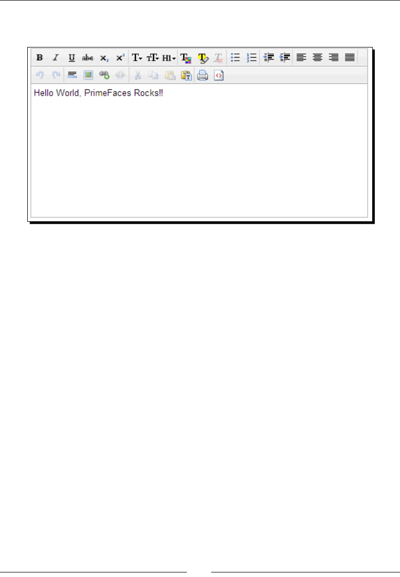
Let us create a helloworld.xhtml le with the PrimeFaces namespace conguraon,
and use the PrimeFaces editor component to display a rich HTML editor. Perform the
following steps:
1. To start using PrimeFaces components all we need to do is add the namespace
xmlns:p=http://primefaces.org/ui in JSF facelets page.
<!DOCTYPE html>
<html xmlns="http://www.w3.org/1999/xhtml"
xmlns:h="http://java.sun.com/jsf/html"
xmlns:f="http://java.sun.com/jsf/core"
xmlns:ui="http://java.sun.com/jsf/facelets"
xmlns:p="http://primefaces.org/ui">
<f:view contentType="text/html">
<h:head>
<title>First PrimeFaces Page</title>
</h:head>
<body>
<h:form>
<p:editor value="Hello World, PrimeFaces
Rocks!!"/>
</h:form>
</body>
</f:view>
</html>
Introducon to PrimeFaces
[ 12 ]
2. Run the applicaon and point your browser to http://localhost:8080/
chapter01/helloworld.jsf. We can see the rich text editor as follows:
What just happened?
We have tested PrimeFaces conguraon by using PrimeFaces editor component
<p:editor/>. As we have congured PrimeFaces properly, we are able to see rich
HTML editor.
Make sure you have the <h:head> tag in your facelets page to avoid "PrimeFaces
not found" JavaScript error.
To make PrimeFaces work properly on webkit layout engine-based browsers
such as, Chrome/Safari, enforce contentType to text/html using <f:view
contentType="text/html">.
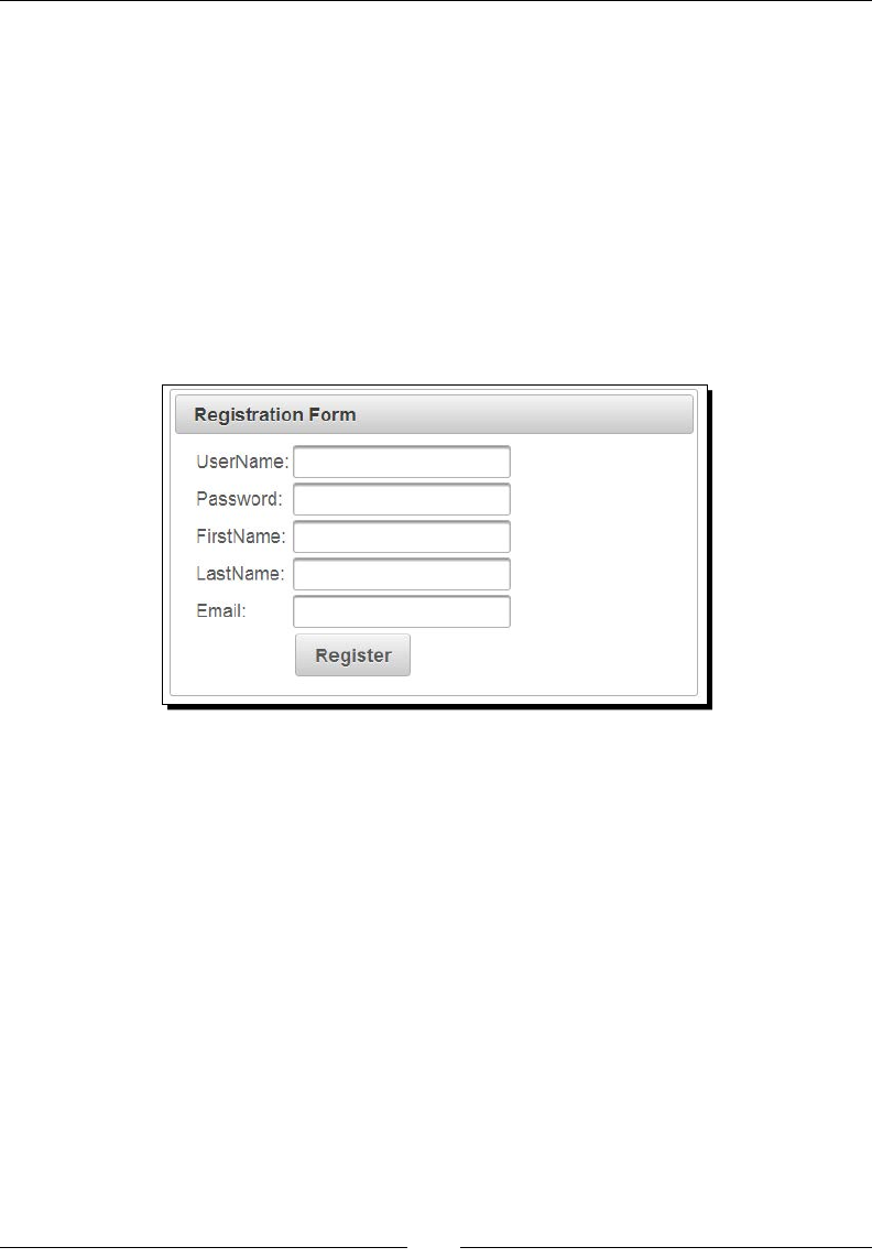
Creating simple forms using PrimeFaces
PrimeFaces provides various input elements such as inputText, password,
inputTextarea, commandButton, commandLink, and so on, which are extensions
to the standard JSF components providing addional features and theming support.
To get a feel of how to use PrimeFaces components, let us create a simple user registraon
form using PrimeFaces components.

Chapter 1
[ 13 ]
Time for action – creating a user registration form
Let's start using PrimeFaces components by creang a simple user registraon form, steps
for the same are as follows:
1. Create a User.java POJO (Plain Old Java Object):
public class User
{
private Integer id;
private String userName;
private String password;
private String firstName;
private String lastName;
private String email;
private String phone;
//setters & getters
}
2. Create a JSF managed bean UserController.java, using the following code:
@ManagedBean
@RequestScoped
public class UserController
{
private User registrationUser;
public UserController() {
this.registrationUser = new User();
}
public User getRegistrationUser() {
return registrationUser;
}
public void setRegistrationUser(User registrationUser) {
this.registrationUser = registrationUser;
}
public String register()
{
System.out.println("Register User :"+
this.registrationUser);
String msg = "User Registered Successfully";
FacesContext.getCurrentInstance().addMessage(null, new
FacesMessage(FacesMessage.SEVERITY_INFO, msg, msg));

Introducon to PrimeFaces
[ 14 ]
FacesContext.getCurrentInstance().getExternalContext()
.getFlash().setKeepMessages(true);
return "registration.jsf?faces-redirect=true";
}
}
3. Create a registration.xhtml page to build the user registraon form using
PrimeFaces components as follows:
<!DOCTYPE html>
<html xmlns="http://www.w3.org/1999/xhtml"
xmlns:h="http://java.sun.com/jsf/html"
xmlns:f="http://java.sun.com/jsf/core"
xmlns:ui="http://java.sun.com/jsf/facelets"
xmlns:p="http://primefaces.org/ui">
<h:head>
<title>Registration</title>
</h:head>
<body>
<h:form id="registrationForm">
<p:panel header="Registration Form" style="width: 500px;">
<p:messages/>
<h:panelGrid columns="2">
<p:outputLabel value="UserName:"/>
<p:inputText id="userName" value="#{userController.
registrationUser.userName}" label="UserName" />
<p:outputLabel value="Password:"/>
<p:password id="password" value="#{userController.
registrationUser.password}" label="Password"/>
<p:outputLabel value="FirstName:"/>
<p:inputText id="firstName" value="#{userController.
registrationUser.firstName}" label="FirstName"/>
<p:outputLabel value="LastName:"/>
<p:inputText id="lastName" value="#{userController.
registrationUser.lastName}"/>
<p:outputLabel value="Email:"/>
<p:inputText id="email" value="#{userController.
registrationUser.email}"/>
Chapter 1
[ 15 ]
<p:outputLabel value=""/>
<p:commandButton action="#{userController.register}"
value="Register" update="registrationForm"/>
</h:panelGrid>
</p:panel>
</h:form>
</body>
</html>
4. Run the applicaon and point your browser to http://localhost:8080/
chapter01/registration.jsf. Then you can see the following screenshot,
Registraon Form:
What just happened?
We have created a sample user registraon form using PrimeFaces UI components
<p:inputText/>, <p:password/>, <p:commandButton/>, and so on. We are looking
for input components with rich look and feel because we used PrimeFaces components,
which are extensions to the standard JSF UI components with theming support.
Performing form validations
Validang user submied data is very common and a crucial part of any web applicaon.
JSF itself provides support for UI component validaon and PrimeFaces enhances it with
addional features.

Introducon to PrimeFaces
[ 16 ]
In the previous secon, we have created a sample user registraon form but we did not
validate the form for any mandatory elds. Let us enhance the registraon form with the
validaons for mandatory elds.
Assume we have the following validaon rules for the registraon form:
UserName should not be blank.
Password should not be blank and should be at least four characters.
FirstName should not be blank.
Time for action – validating the user registration form
We can use JSF validaons for performing the earlier menoned validaons on the
registraon form. We can also perform validaons using PrimeFaces AJAX-based validaons
by hooking up with JavaScript events, for this perform the following steps:
1. Update registrationWithVal.xhtml to build a user registraon form along
with validaon support using the following code:
<!DOCTYPE html>
<html xmlns="http://www.w3.org/1999/xhtml"
xmlns:h="http://java.sun.com/jsf/html"
xmlns:f="http://java.sun.com/jsf/core"
xmlns:ui="http://java.sun.com/jsf/facelets"
xmlns:p="http://primefaces.org/ui">
<h:head>
<title>Registration</title>
</h:head>
<body>
<h:form id="registrationForm">
<p:panel header="Registration Form" style="width: 800px;">
<p:messages />
<h:panelGrid columns="3">
<p:outputLabel value="UserName:*"/>
<p:inputText id="userName" value="#{userController.
registrationUser.userName}"
required="true" label="UserName" >
<p:ajax event="keyup" update="userNameMsg"/>
</p:inputText>
<p:message id="userNameMsg" for="userName"/>

Chapter 1
[ 17 ]
<p:outputLabel value="Password:*"/>
<p:password id="password" value="#{userController.
registrationUser.password}"
required="true" label="Password">
<f:validateLength minimum="4"/>
<p:ajax update="passwordMsg" event="keyup"/>
</p:password>
<p:message id="passwordMsg" for="password"/>
<p:outputLabel value="FirstName:*"/>
<p:inputText id="firstName" value="#{userController.
registrationUser.firstName}"
required="true" label="FirstName">
</p:inputText>
<p:message id="firstNameMsg" for="firstName"/>
<p:outputLabel value="LastName:"/>
<p:inputText id="lastName" value="#{userController.
registrationUser.lastName}"/>
<p:message id="lastNameMsg" for="lastName"/>
<p:outputLabel value="Email:"/>
<p:inputText id="email" value="#{userController.
registrationUser.email}"/>
<p:message id="emailMsg" for="email"/>
<p:outputLabel value=""/>
<p:commandButton action="#{userController.register}"
value="Register" update="registrationForm"/>
<p:outputLabel value=""/>
</h:panelGrid>
</p:panel>
</h:form>
</body>
</html>
Introducon to PrimeFaces
[ 18 ]
2. Run the applicaon and point your browser to http://localhost:8080/
chapter1/registrationWithVal.jsf. Leave UserName and FirstName
blank and enter password with less than four characters and submit the
form. Then Registraon Form will be redisplayed with errors as shown in the
following screenshot:
What just happened?
We have used input validaons such as required, minimum length, and so on. We have
used PrimeFaces AJAX-based validaons using <p:ajax> on the keyup JavaScript event.
So as you type in the password, it will get validated and update the validaon message
immediately. You can also use <p:ajax> with other JavaScript events such as keydown,
keypress, mouseover, and so on.
Beware of registering AJAX event listeners for JavaScript events
such as keyup, keydown, and so on; as it may increase
processing overhead and degrade performance. So use this
feature cauously.
Performing client-side validations
PrimeFaces also supports hooking up client-side JavaScript event handlers (onclick,
onblur, onchange, and so on) for many of its UI Components. We can use this feature
to perform client-side validaons and reduce the server validaon roundtrips.

Chapter 1
[ 19 ]
Time for action – client-side e-mail validation
In our Registraon Form, we can do some basic e-mail format validaon on client side itself
thereby reducing the server roundtrip. We can create a JavaScript funcon to validate e-mail
using Regex, and then hook it up with the onchange event on e-mail input eld. Perform the
following steps for the same:
1. Write a JavaScript funcon to validate e-mail address:
function validateEmail()
{
var emailReg = /^([\w-\.]+@([\w-]+\.)+[\w-]{2,4})?$/;
var email = $.trim($("#userForm\\:email").val());
if(email ==''){
$("#userForm\\:emailMsg").text("");
$("#userForm\\:emailMsg").attr("class", "");
return;
}
if( emailReg.test( email ) ) {
$("#userForm\\:emailMsg").text("Valid Email");
$("#userForm\\:emailMsg").attr("class", "ui-messages-info
ui-widget ui-corner-all ui-messages-info-summary");
} else {
$("#userForm\\:emailMsg").text("Invalid Email");
$("#userForm\\:emailMsg").attr("class", "ui-message-error
ui-widget ui-corner-all ui-message-error-detail");
}
}
2. Add the validateEmail() funcon as an event handler for the onchange event
on the e-mail input eld:
<h:form id="userForm">
<p:outputLabel value="Email:"/>
<p:inputText id="email" value="#{userController.user.email}"
onchange="validateEmail();" />
<p:message id="emailMsg" for="email"/>
</h:form>
What just happened?
We have created a JavaScript funcon to validate e-mail using Regex. Using the jQuery
API we have added an info/error message nofying us whether the e-mail is valid or
invalid. We have hooked up this funcon to the onchange event of the e-mail inputText
element. So validateEmail() gets invoked as soon as the e-mail value is changed and
shows the message.

Introducon to PrimeFaces
[ 20 ]
We got the e-mail eld using $("#userForm\\:email"), where userForm is the ID of
the form and email is the ID of the e-mail inputText eld. JSF generates the IDs with
colon (:) separator, but jQuery has a special meaning for colon .So we have replaced the
colon (:) with \\:
Instead of replacing the colon by yourself, you can use the PrimeFaces.
escapeClientId() ulity funcon as follows:
function validateEmail()
{
var emailReg = /^([\w-\.]+@([\w-]+\.)+[\w-]{2,4})?$/;
var email = $.trim($(PrimeFaces.escapeClientId("userForm:email"))
.val());
if(email ==''){
$(PrimeFaces.escapeClientId("userForm:emailMsg")).text("");
$(PrimeFaces.escapeClientId("userForm:emailMsg")).attr("class",
"");
return;
}
if( emailReg.test( email ) ) {
$(PrimeFaces.escapeClientId("userForm:emailMsg")).
text("Valid Email");
$(PrimeFaces.escapeClientId("userForm:emailMsg")).
attr("class", "ui-messages-info ui-widget ui-corner-all ui-
messages-info-summary");
} else {
$(PrimeFaces.escapeClientId("userForm:emailMsg")).
text("Invalid Email");
$(PrimeFaces.escapeClientId("userForm:emailMsg")).
attr("class", "ui-message-error ui-widget ui-corner-all ui-
message-error-detail");
}
}
Since JSF2.x, we can also change the JSF ID separator character using
the following <context-param> conguraon in web.xml:
<context-param>
<param-name>javax.faces.SEPARATOR_CHAR</
param-name>
<param-value>-</param-value>
</context-param>
The preceding client-side validaon process involves performing manual validaons using
JavaScript/jQuery. PrimeFaces-4.0 introduced the Client Side Validaon (CSV) framework
with more powerful features, which we will discuss in Chapter 4, Introducing the PrimeFaces
Client Side Validaon Framework.

Chapter 1
[ 21 ]
Understanding partial page rendering (PPR)
PrimeFaces provides a generic paral page rendering (PPR) mechanism to update specic
JSF components with AJAX.
PrimeFaces provides process, update aributes to indicate which view components need to
be processed or updated. Paral processing also provides some keywords which has some
special meaning.
Keyword Description
@this Component that triggers the PPR is processed.
@parent Parent of the PPR trigger is processed.
@form Encapsulating form of the PPR trigger is processed.
@namingcontainer Encapsulating naming container.
@none No component is processed, useful to revert changes to form.
@all Whole component tree is processed just like a regular request.
Somemes, we may need to process the form parally based on the acon triggered on the
form. A very common scenario is, there can be mulple submit buons in a form and you
need to perform validaons based on the acon performed and ignore other eld validaons
that are irrelevant to the acon invoked.
For example, assume we are viewing a User Detail Form and we can update the user details
or delete the user record using Update and Delete submit buons. For updang, the user
elds, userId, userName, and firstName are mandatory where as for deleng, only
userId is required. So, when the Update buon is clicked, validaons should be performed
on userId, userName, and firstName elds. But when the Delete buon is clicked,
validaons on userName and firstName should be skipped.
Time for action – partial processing on the user details form
In this secon, we will demonstrate how to process only a subset of components based on
the acon performed.
1. Create userDetails.xhtml with the User Details Form containing update and
delete acons:
<h:form id="userDetailsForm">
<p:panel header="User Details Form" style="width: 800px;">
<p:messages/>
<h:panelGrid columns="3">
<p:outputLabel value="UserId:*"/>

Introducon to PrimeFaces
[ 22 ]
<p:inputText id="userId" value="#{userController.loginUser.
id}" required="true" label="UserId" />
<p:message id="userIdMsg" for="userId"/>
<p:outputLabel value="UserName:*"/>
<p:inputText id="userName" value="#{userController.loginUser.
userName}" required="true"
label="UserName" />
<p:message id="userNameMsg" for="userName"/>
<p:outputLabel value="Password:*"/>
<p:password id="password"
value="#{userController.loginUser.password}"
required="true" label="Password"/>
<p:message id="passwordMsg" for="password"/>
<p:outputLabel value="FirstName:*"/>
<p:inputText id="firstName"
value="#{userController.loginUser.firstName}"
required="true" label="FirstName"/>
<p:message id="firstNameMsg" for="firstName"/>
<p:commandButton value="Update"
action="#{userController.updateUser()}"
update="userDetailsForm"/>
<p:commandButton value="Delete"
action="#{userController.deleteUser()}"
update="userDetailsForm"/>
</h:panelGrid>
</p:panel>
</h:form>
2. Create a managed bean UserController.java to perform update and
delete acons:
@ManagedBean
@RequestScoped
public class UserController
{
private User loginUser;
public UserController()
{
this.loginUser = new User();
}

Chapter 1
[ 23 ]
public User getLoginUser()
{
return loginUser;
}
public void setLoginUser(User loginUser)
{
this.loginUser = loginUser;
}
public String updateUser() {
System.out.println("Updating User Id:
"+this.loginUser.getId());
String msg = "User updated Successfully";
FacesContext.getCurrentInstance().addMessage(null, new
FacesMessage(FacesMessage.SEVERITY_INFO, msg, msg));
return "userDetails.jsf";
}
public String deleteUser() {
System.out.println("deleting User Id:
"+this.loginUser.getId());
String msg = "User deleted Successfully";
FacesContext.getCurrentInstance().addMessage(null, new
FacesMessage(FacesMessage.SEVERITY_INFO, msg, msg));
return "userDetails.jsf";
}
}
3. Run the applicaon and point your browser to http://localhost:8080/
chapter01/userDetails.jsf.
When you click on the Delete buon, the whole form will be processed, and displays a
form with error messages if any required elds are blank. To resolve this issue, we can use
the process aribute to specify only the UserId eld to be processed and invoke the
deleteUser() method:
<p:commandButton value="Delete"
action="#{userController.deleteUser()}"
process="@this,userId" update="userDetailsForm"/>

Introducon to PrimeFaces
[ 24 ]
What just happened?
We have used the process aribute to specify which components to be processed so that
we can bypass the other elds' validaons, which are irrelevant to the invoked acon. Also
note that <p:commandButton> issues an AJAX request by default. So if you want to redirect
to a dierent page aer acon logic is executed make it a non-AJAX request by seng
ajax="false".
Submitting partial data to the server
Both JSF AJAX implementaon and PrimeFaces serializes the whole form data, and post it to
server even for AJAX requests that will process only paral components. In the case of forms
with more number of input components, we will be sending huge payload even though
only few specic components will be processed on server side. This process unnecessarily
consumes server resources.
PrimeFaces provides partialSubmit feature, which enables to serialize and send only the
components data that will be processed on server side. By default partialSubmit feature
is disabled, and we can enable this feature globally by conguring the following context
parameter in web.xml:
<context-param>
<param-name>primefaces.SUBMIT</param-name>
<param-value>partial</param-value>
</context-param>
The preceding conguraon enables partialSubmit feature globally. We can override this
partialSubmit behavior for specic command components or AJAX events as follows:
<p:commandButton value="Delete"
action="#{userController.deleteUser()}" process="@this,userId"
partialSubmit="true" update="userDetailsForm"/>
<p:inputText id="userName"
value="#{userController.registrationUser.userName}" required="true"
label="UserName">
<p:ajax event="keyup"
listener="#{userController.checkUserNamesExists()}"
update="userNameMsg" partialSubmit="true"/>
</p:inputText>
You can see the dierence between payload data sending to server when partialSubmit
is enabled and disabled using rebug or chrome developer tools.

Chapter 1
[ 25 ]
Updating the view using AJAX
AJAX support became a must for any framework or library used for building rich and
interacve web applicaons. AJAX features make the web applicaon more responsive by
updang parts of the page without requiring full page reload.
PrimeFaces has in-built AJAX support and is based on JSFs server-side APIs. On client side,
PrimeFaces use the most popular JavaScript library jQuery.
Processing a form submission and updang the porons of view using AJAX is very
commonly used feature in web applicaons. Let us see how we can submit a form and
update the view using AJAX.
Time for action – updating the view using AJAX
Let us create a Login Form with user name and password. When form is submied, show the
login status using AJAX. Perform the following steps for the same:
1. Create a login.xhtml page with login form as follows:
<h:form id="loginForm">
<p:panel header="Login Form" style="width: 500px;">
<h:panelGrid columns="2">
<p:outputLabel value="UserName"/>
<p:inputText value="#{userController.loginUser.
userName}"/>
<p:outputLabel value="Password"/>
<p:password value="#{userController.loginUser.
password}"/>
<p:commandButton action="#{userController.login}"
value="Login" update="loginStatusMsg"/>
<p:commandButton type="reset" value="Reset"/>
<p:outputLabel value="#{userController.loginStatus}"
id="loginStatusMsg"/>
</h:panelGrid>
</p:panel>
</h:form>
2. Create a UserController.java managed bean as follows:
@ManagedBean
@RequestScoped
public class UserController
{
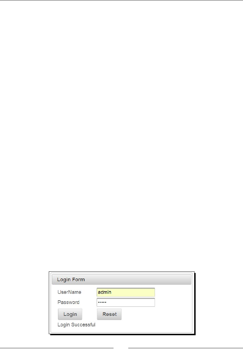
Introducon to PrimeFaces
[ 26 ]
private User loginUser;
private String loginStatus;
public UserController() {
this.loginUser = new User();
}
public User getLoginUser() {
return loginUser;
}
public void setLoginUser(User loginUser) {
this.loginUser = loginUser;
}
public String getLoginStatus() {
return loginStatus;
}
public void setLoginStatus(String loginStatus) {
this.loginStatus = loginStatus;
}
public String login() {
boolean validCredentials = "admin".equals(loginUser.
getUserName()) &&
"admin".equals(loginUser.getPassword());
this.loginStatus = validCredentials? "Login Successful" :
"Login failed";
return null;
}
}
3. Point the browser to http://localhost:8080/chapter01/login.jsf.
When you enter UserName and Password and click on the Login buon, the login status
should be displayed using AJAX. Have a look at the following screenshot:

Chapter 1
[ 27 ]
What just happened?
We have created a Login Form with UserName and Password elds. When we submit the
form, the model gets updated and login status will be set based on the provided credenals.
As we have specied to update the view component with the ID loginStatusMsg through
update="loginStatusMsg", when you click on the Login buon, the login status will be
displayed without complete page refresh.
Updating the view using AJAX listeners
Somemes we may need instant feedback to be shown as and so user lls the form,
instead of showing error messages aer form submission. For example, in user Registraon
Form, we may want to check whether the UserName is already in use and show an error
message immediately.
PrimeFaces provides AJAX listener support to invoke method on JSF managed bean. We can
use this feature to check whether the entered UserName is already in use or not, and update
the view to show error message using AJAX, even before subming the enre form.
Time for action – validate the UserName using AJAX listeners
Let's add AJAX event listener keyup event to the UserName input eld so that as you type, it
will check if the username entered is already in use or not.
1. Create viewAjaxListener.xhtml with registraon form to validate the
UserName using AJAX Listener as follows:
<h:form id="registrationForm">
<p:panel header="Registration Form" style="width: 800px;">
<h:panelGrid columns="3">
<p:outputLabel value="UserName:*"/>
<p:inputText id="userName"
value="#{userController.registrationUser.userName}"
required="true" label="UserName">
<p:ajax event="keyup"
listener="#{userController.checkUserNamesExists()}"
update="userNameMsg"/>
</p:inputText>
<p:message id="userNameMsg" for="userName"/>
<p:outputLabel value="Password:*"/>
<p:password id="password"
value="#{userController.registrationUser.password}"
required="true" label="Password"/>
<p:message id="passwordMsg" for="password"/>
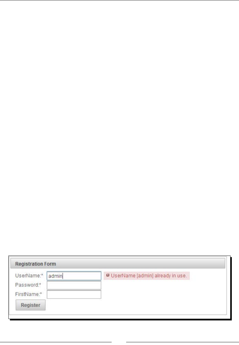
Introducon to PrimeFaces
[ 28 ]
<p:outputLabel value="FirstName:*"/>
<p:inputText id="firstName"
value="#{userController.registrationUser.firstName}"
required="true" label="FirstName"/>
<p:message id="firstNameMsg" for="firstName"/>
<p:commandButton action="#{userController.register}"
value="Register" update="registrationForm"/>
</h:panelGrid>
</p:panel>
</h:form>
2. Create a UserController.java managed bean with the
checkUserNamesExists() method to check whether the entered UserName is
already in use or not and add the error message accordingly:
public void checkUserNamesExists()
{
String userName = this.registrationUser.getUserName();
if("admin".equals(userName) || "test".equals(userName))
{
String msg = "UserName ["+userName+"] already in use.";
FacesContext.getCurrentInstance().addMessage
("registrationForm:userName",
new FacesMessage(FacesMessage.SEVERITY_ERROR, msg,
msg));
}
}
3. Point your browser to http://localhost:8080/chapter01/
viewAjaxListener.jsf.
Enter admin or test in the UserName eld then you should see the error message
displayed immediately as in the following screenshot:

Chapter 1
[ 29 ]
What just happened?
We have used AJAX listener in conjuncon with keyup event on the UserName input
eld. So for each keyup event the callback method checkUserNamesExists() will be
invoked to check whether the entered UserName value is admin or test, and adds error
message if it is. As we are updang the view component with ID userNameMsg using
update="userNameMsg", the error message is displayed immediately using the AJAX update.
Performing tasks periodically using a poll component
PrimeFaces provides poll component, which can be used to perform acons via JSF managed
bean methods, periodically on regular intervals.
Suppose we want to display current me on web pages. We can do it by using poll
component. We can update the currentTime view component using <p:poll>
component to display current me for every second without reloading the enre page.
Time for action – using the poll component to display the
current time
Let's display live me by polling server me for every second and display it using the
poll component.
1. Create poll.xhtml with a poll component to display currentTime as follows:
<h:form>
<p:outputLabel value="Current Time:" /> <p:outputLabel
id="currentTime" value="#{serverTimeBean.time}"/>
<p:poll interval="1"
listener="#{serverTimeBean.updateTime()}"
update="currentTime"/>
</h:form>
2. Create ServerTimeBean.java managed bean with the updateTime() method
to set the currentTime value as follows:
@ManagedBean
@RequestScoped
public class ServerTimeBean
{
private String time;
public void setTime(String time) {
this.time = time;
}
Introducon to PrimeFaces
[ 30 ]
public String getTime() {
return time;
}
public void updateTime() {
SimpleDateFormat sdf = new SimpleDateFormat("yyyy-MM-dd
hh:mm:ss");
this.time = sdf.format(new Date());
}
}
What just happened?
We have used the <p:poll> component to call listener method updateTime() on
ServerTimeBean for every second by specifying interval="1", and updated the
view to display current me using AJAX.
The poll component provides the following aributes, which provides addional control on
its behavior:
AttributeName Description
onstart JavaScript handler to execute before AJAX request begins.
oncomplete JavaScript handler to execute when AJAX request is completed.
onsuccess JavaScript handler to execute when AJAX request succeeds.
onerror JavaScript handler to execute when AJAX request fails.
autoStart In autoStart mode, polling starts automatically on page load, to
start polling on demand set it to false.
stop Stops polling when true.
Controlling the polling process using external triggers
Somemes, we may want to have control on when to start/stop the polling process, stop
polling based on some criteria, and so on. The PrimeFaces poll component provides these
features with addional aributes giving you full control on polling process.
For example, we want to start polling when the Start buon is clicked, and stop polling when
the Stop buon is clicked.

Chapter 1
[ 31 ]
Time for action – manually start and stop polling
We will now demonstrate how to start and stop polling using external triggers such as start
and stop buons using following steps:
1. Create a form with a poll component and start/stop buons to start and stop polling
using following code:
<h:form>
<p:outputLabel value="Current Time:" /> <p:outputLabel
id="currentTime" value="#{serverTimeBean.time}"/>
<p:poll interval="1"
listener="#{serverTimeBean.updateTime()}"
update="currentTime" widgetVar="currentTimePoller"
autoStart="false"/> <br/>
<p:button value="Start" onclick="currentTimePoller.start()"
href="#" />
<p:button value="Stop" onclick="currentTimePoller.stop()"
href="#"/><br/>
</h:form>
What just happened?
We have set the autoStart aribute to false, so that polling does not start automacally
on page load. We have given a name for the poll component using widgetVar
="currentTimePoller" so that we can invoke start() and stop() methods on the
poll component. We have associated the start() and stop() methods to the buon's
onclick events. So when we click on the Start buon, polling will start and when we click
on the Stop buon, polling will be stopped.
PrimeFaces provides PrimeFaces push, which is beer
suitable for asynchronous processing. Prefer using
PrimeFaces push over <p:poll> component. For more
informaon see http://www.primefaces.org/
showcase/push/index.jsf.
Invoking server-side methods from JavaScript using
RemoteCommand
RemoteCommand component provides an opon to invoke server-side methods, say JSF
managed bean methods, from JavaScript client-side code directly. This feature comes in
handy when some task needs some client-side acon and server-side logic. When you
declare a RemoteCommand component to invoke a JSF managed bean method, then you can
call it like a JavaScript funcon, with the remoteCommand name from the JavaScript code.

Introducon to PrimeFaces
[ 32 ]
Suppose in our user Registraon Form, we want to validate e-mail format rst on client
side using Regex and if it is in valid e-mail format, then we want to check whether the
e-mail is already in use or not using server-side logic. We can do this by using the
RemoteCommand component.
Time for action – validate e-mail using RemoteCommand
We will now take a look at how to invoke server-side logic from JavaScript code using
RemoteCommand. First we will check the e-mail format on client side using JavaScript, and
then invoke server-side logic to check if the user provided e-mail already in use or not.
Perform the following steps:
1. Create a method using following code in the UserController managed bean to
check whether the given e-mail is already in use or not:
@ManagedBean
@RequestScoped
public class UserController
{
public void checkEmailExists()
{
String email = this.registrationUser.getEmail();
if("admin@gmail.com".equals(email) || "test@gmail.com".
equals(email))
{
String msg = "Email ["+email+"] already in use.";
FacesContext.getCurrentInstance().addMessage
("registrationForm:email",
new FacesMessage(FacesMessage.SEVERITY_ERROR,
msg, msg));
}
}
}
2. On the user registraon page, create validateEmail() JavaScript funcon for
checking e-mail format, and use a remoteCommand component to invoke the
checkEmailExists() actionListener method to check whether the given
e-mail is already in use or not:
<!DOCTYPE html>
<html xmlns="http://www.w3.org/1999/xhtml"
xmlns:h="http://java.sun.com/jsf/html"
xmlns:f="http://java.sun.com/jsf/core"
xmlns:ui="http://java.sun.com/jsf/facelets"
xmlns:p="http://primefaces.org/ui">

Chapter 1
[ 33 ]
<h:head>
<title>Home</title>
<script>
function validateEmail()
{
var emailReg = /^([\w-\.]+@([\w-]+\.)+[\w-]{2,4})?$/;
var email = $.trim($(PrimeFaces.escapeClientId
("registrationForm:email")).val());
if(email ==''){
$(PrimeFaces.escapeClientId("registrationForm:emailMsg"))
.text("");
$(PrimeFaces.escapeClientId("registrationForm:emailMsg"))
.attr("class", "");
return;
}
if( emailReg.test( email ) ) {
checkDuplicateEmail();
} else {
$(PrimeFaces.escapeClientId("registrationForm:emailMsg")).
text("Invalid Email");
$(PrimeFaces.escapeClientId("registrationForm:emailMsg"))
.attr("class", "ui-message-error ui-widget ui-corner-
all ui-message-error-detail");
}
}
</script>
</h:head>
<body>
<h:form id="registrationForm">
<p:panel header="Registration Form" style="width: 800px;">
<h:panelGrid columns="3">
<p:outputLabel value="Email:"/>
<p:inputText id="email"
value="#{userController.registrationUser.email}"
onblur="validateEmail();" />
<p:message id="emailMsg" for="email"/>
<p:commandButton action="#{userController.register}"
value="Register" update="registrationForm"/>
</h:panelGrid>
</p:panel>
<p:remoteCommand name="checkDuplicateEmail"
actionListener="#{userController.checkEmailExists()}"
update="emailMsg"/>
</h:form>
</body>
</html>

Introducon to PrimeFaces
[ 34 ]
What just happened?
We have created a validateEmail() JavaScript funcon to check the e-mail format using
Regex and will be called on onblur event on e-mail input element. In the validateEmail()
funcon, if the e-mail format is invalid we are showing the error message as "Invalid email!!",
otherwise we are invoking the remoteCommand checkDuplicateEmail as JavaScript
funcon, which invokes the UserController.checkemailExists() method and add
error message if the e-mail is already in use.
Summary
You have now been introduced to the PrimeFaces component library and did hands-on
with some cool PrimeFaces features, but this is just the beginning. There are plenty more
powerful yet easy to use Rich UI components, which we will be looking in further chapters.
In this chapter, we took a glance at the PrimeFaces features and learned how to install
and congure PrimeFaces. We have started by creang a simple HelloWorld applicaon
and learned performing validaons and various AJAX features. We also learned how to
use PrimeFaces PPR feature. Lastly, we have learned about polling and RemoteCommand
components, which come very handy at mes.
In the next chapter, we will take a look into the sample applicaon TechBuzz that we will be
building incrementally throughout the book. We will also discuss the applicaon's domain
model, creang the project structure and some sample screenshots of the applicaon.

2
Introducing Sample
Application TechBuzz
If all concepts were explained with an example, then they would be much easier
to understand. That's what we are going to do here!
As you progress through the book, if you could apply the knowledge in building
a sample application, then you will get not only theoretical knowledge on
PrimeFaces, but also hands-on experience on how to use PrimeFaces in your
real projects. So, we will be building a sample application called TechBuzz
incrementally throughout this book.
TechBuzz is a knowledge sharing system wherein users can post about what is
going on in the field of technology read others' posts, rate others' posts, and so
on. You should note that this application is purposely very simple, and indeed
many of its features were conceived so that we could highlight a particular
piece of PrimeFaces functionality. As our primary focus is on how to use
PrimeFaces, we will be discussing more about building the user interface using
PrimeFaces, and you can find the complete backend logic implementation in the
source code of this book.
In this chapter, we will cover:
Understanding the requirements of the TechBuzz applicaon
Understanding the high-level design of the TechBuzz applicaon
Understanding the TechBuzz data model
Looking at TechBuzz screenshots
Seng up of the development environment for TechBuzz

Introducing Sample Applicaon TechBuzz
[ 36 ]
In this chapter, we will discuss the funconal requirements of the TechBuzz applicaon and
describe how we will be using PrimeFaces features to implement them.
Understanding the requirements of the TechBuzz
application
TechBuzz is a community website where people can share their thoughts, ideas, and
experiences on various technology-related topics. The user can post informaon such as
when a new framework is released, upcoming technology training, informaon on newly
published books, and so on. Also users can view others' posts, rate others' posts, view other
users' proles, and search for posts based on keywords or tags.
The TechBuzz system will have role-based access control security, and users with three types
of roles: Administrator, Moderator, and Normal. TechBuzz users will be able to perform
various acons based on his/her role.
Normal users can perform the following acons:
New users can register
Exisng users can log in
View a list of posts from all the users
View the details of a post
Add comments to a post
Rate other user's posts
Create a new post
Update his/her own post
Search posts by text, tag(s)
View other user's proles
Moderators can perform the following acons:
Edit other user's posts
Add/Remove tags for posts
Administrators can perform the following acons:
Disable a user account
Assign/Revoke the Moderator privilege to/from a user
Create, update, and delete tags
Make any user post visible or invisible
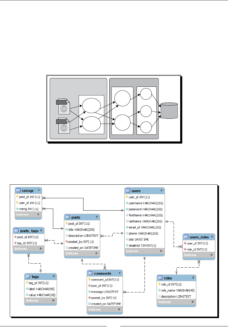
Chapter 2
[ 37 ]
Understanding the high-level design of the TechBuzz
application
The TechBuzz applicaon will be developed using the MVC (Model View Controller)
design paern. For the Model layer, we will use the Spring framework to provide various
business layer services. The View layer will be developed using JSF Facelets and PrimeFaces
components. The Controller layer will be implemented using JSF managed beans. The
following diagram depicts how each layer will communicate with other layers:
Facelets /
PrimeFaces
Components
JSF
ManagedBean
User
Controller
Buzz
Controller
User
DAO
Post
DAO
Tag
DAO
Database
Spring Container
User
Service
Buzz
Service
html
html
Understanding the TechBuzz data model
The following diagram depicts the database model for the TechBuzz applicaon:
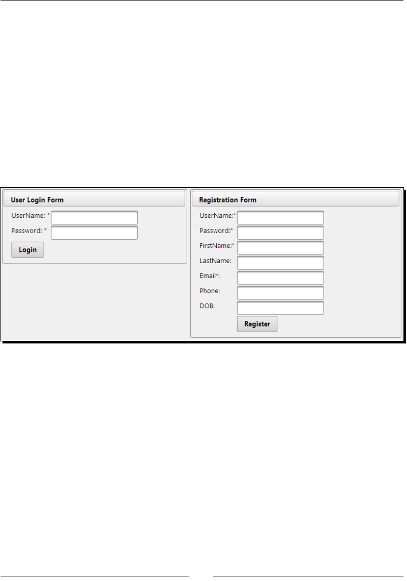
Introducing Sample Applicaon TechBuzz
[ 38 ]
Looking at TechBuzz screenshots
In this secon, we will see the sample screenshots of the TechBuzz applicaon which we are
going to build incrementally throughout the book.
User authentication
New users can register with the TechBuzz applicaon and then log in to the system.
To implement registraon and login screens, we can use various PrimeFaces input
components, Calendar, and Message components. Also we will learn how to perform
form validaons as well using the techniques described in the Performing form validaons
secon of Chapter 1, Introducon to PrimeFaces, and Chapter 4, Introducing the PrimeFaces
Client Side Validaon Framework.
TechBuzz home page
When the user successfully logs in to TechBuzz, the Home page will be displayed with the
list of posts posted by all the users, in reverse chronological order in a paginated manner.
To implement this, we will use the DataList component along with paginaon.

Chapter 2
[ 39 ]
User account screen
Users can view his/her own and other user's account details such as their name, e-mail, and
the posts he/she posted, and so on. For this, we will be using the TabView component.
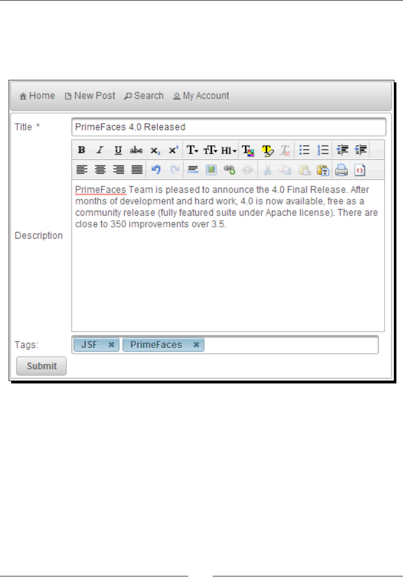
Introducing Sample Applicaon TechBuzz
[ 40 ]
Creating a post screen
The user can create a new post with a tle and message, and associate relevant tags to the
post. To implement this, we will use PrimeFaces input components and the AutoComplete
component while choosing Tags.
User roles management
The TechBuzz applicaon will have role-based authencaon and authorizaon security,
which enables only authorized users to perform acons. For this, we will be creang
privileges and roles, and associate privileges to roles. Administrators can add or remove roles
to/from users. To implement this, we will use the PickList component.
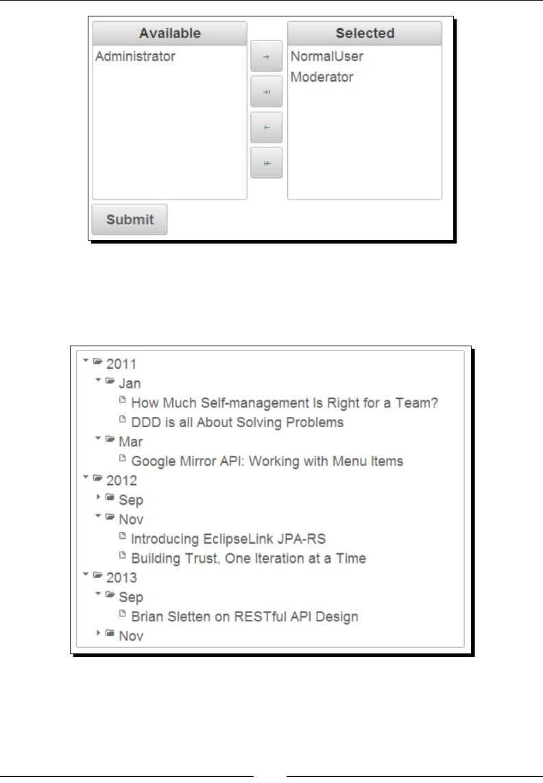
Chapter 2
[ 41 ]
Posts in tree view
Somemes, the user would like to see the posts based on year, month, and date. For this, we
will use the Tree component to show posts in the tree format as follows:
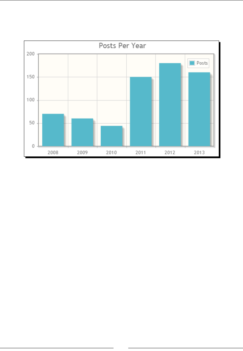
Introducing Sample Applicaon TechBuzz
[ 42 ]
Posts frequency charts
Administrators can view the frequency of posts per day/month/year in a graphical
representaon using Chart components.
Setting up of the development environment for TechBuzz
In this secon, we will go through the development environment setup process to get ready
for developing the TechBuzz applicaon. As PrimeFaces is a lightweight UI component
framework for JSF-based applicaons, there are no specic requirements for parcular IDEs,
web servers, or databases. You can use your favorite IDE, servlet container, and database.
The TechBuzz applicaon will be developed following three-er architecture. We will be
using JSF/PrimeFaces for the presentaon er, Spring for the business er, and Spring JDBC
for the persistence er.

Chapter 2
[ 43 ]
Time for action – installing the required software
For developing the TechBuzz applicaon, we will be using the following soware and tools:
1. JDK: PrimeFaces needs JDK 1.5 or later. We can download and install JDK from
http://www.oracle.com/technetwork/java/javase/downloads/index.
html.
2. IDE: We will be using Eclipse as the IDE, but if you want to use the NetBeans IDE,
IntelliJ IDEA or any other IDEs, you can import and use them without any changes,
as TechBuzz is a Maven-based web applicaon. You can download and install the
Eclipse IDE from http://www.eclipse.org/downloads/.
3. Applicaon server: PrimeFaces can run on any servlet container such as Apache
Tomcat, Jey, JBoss, Glasssh, and so on. We will be using Apache Tomcat for
TechBuzz but you can deploy and run on any of the servlet containers. You
can download Apache Tomcat 7.0.39 from http://tomcat.apache.org/
download-70.cgi.
4. Database: For the TechBuzz applicaon, we will be using the MySQL database.
You can use any other relaonal databases such as Oracle, Postgres, and so on,
as per your choice. You can download and install the MySQL database from
http://dev.mysql.com/downloads/.
5. Build tool: We will be using Maven as a build tool for the TechBuzz applicaon. You can
download and install Maven from http://maven.apache.org/download.cgi.
6. Browser tools: As we are going to learn a lot more about UI design using PrimeFaces
components, it would be really helpful to have tools such as the Firebug plugin for
Firefox or Chrome Developer Tools for the Google Chrome browser.
What just happened?
We have installed all the required soware and tools for developing the TechBuzz
sample applicaon. As you progress through this book, you can add features to the
TechBuzz applicaon.
Once all the required soware are installed, start your IDE and create a sample JSF project,
and congure PrimeFaces as specied in the Installing and conguring PrimeFaces secon
of Chapter 1, Introducon to PrimeFaces. You can create a sample Facelets page, include
a PrimeFaces namespace and use any PrimeFaces component such as <p:editor/> or
<p:calendar mode="inline"/>. Now, you can run the applicaon by choosing an
applicaon server that you have congured in your IDE. If you have congured PrimeFaces
correctly, you should see the PrimeFaces component with a rich theme support.

Introducing Sample Applicaon TechBuzz
[ 44 ]
Summary
In this chapter, we have discussed the funconal requirements for the sample applicaon
TechBuzz, seen some sample UI screenshots, and prepared the development environment
by installing the required soware and tools.
In the next chapter, we will look into commonly used PrimeFaces components such as
Dialog, Growl, Message, Toolp, BlockUI, and so on, so that we will be familiar with these
components and use them while developing the TechBuzz applicaon.

3
Using PrimeFaces Common
Utility Components
Most of the web applications need some common features such as displaying
alerts, confirmation dialogs, error messages, tooltips and so on. JavaScript
provides many of these features but those features are basic and limited.
PrimeFaces provides some utility components such as Dialog, Tooltip, Growl,
BlockUI and so on, that are commonly used with enhanced features and
theming capabilities.
In this chapter we will cover the following topics:
Displaying FacesMessages using Message, Messages, and Growl
Displaying toolps using the Toolp component
Paral Processing and Rendering using the Fragment component
Introducing the Scky component
Using the RequestContext Ulity
Using the Dialog and ConrmDialog components
Displaying nocaon messages using NocaonBar
Blocking UI components using BlockUI
Working with the PrimeFaces Selectors API
Introducing the search expression framework

Using PrimeFaces Common Ulity Components
[ 46 ]
Introducing the Message component
Message is an enhanced version of the standard JSF Message component with addional
features and skinning capabilies. The <p:message> component is similar to the standard
JSF's <h:message>, and is used to output a single message for a specic component as
follows:
<p:message for="email"/>
The <p:message/> component provides the following aributes, which can be used to
customize message display:
showSummary: This species whether the summary of FacesMessages should be
displayed. Default value is false
showDetail: This species whether the detail of FacesMessages should be
displayed. Default value is true
for: ID of the component whose message is to be displayed
display: Display mode can be text, icon, or both. Default is both.
text: Only message text is displayed
icon: Only message severity is displayed and message text is visible as a
tooltip
both: Both icon and text are displayed
escape: This denes whether HTML would be escaped or not. Default value is true.
severity: This only displays a comma-separated list of severies.
Time for action – displaying FacesMessage using <p:message>
Let us see how to display FacesMessages with dierent display modes and severity levels.
1. Create a form with three required input elds and display validaon errors using
<p:message> as follows:
<h:form id="userRegForm" style="width: 500px; padding-left:
10px;">
<p:panel header="Messages - Using 'display' modes" >
<h:panelGrid columns="3">
<p:outputLabel value="EmailId"/>
<p:inputText id="emailId"
value="#{messagesController.user.emailId}" required="true"
requiredMessage="Enter EmailId"/>
<p:message for="emailId"/>
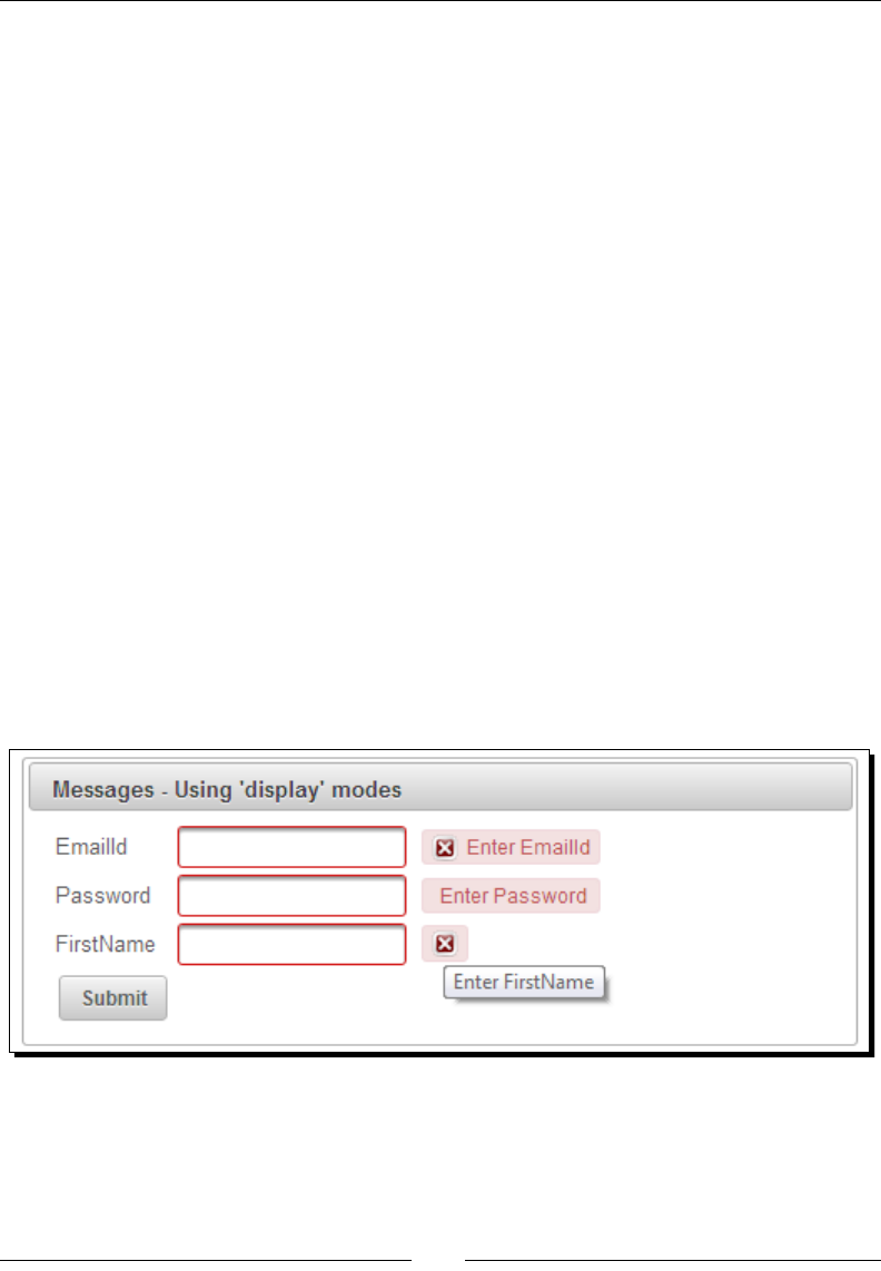
Chapter 3
[ 47 ]
<h:outputText value="Password" />
<p:password id="password"
value="#{messagesController.user.password}"
required="true"
requiredMessage="Enter Password"/>
<p:message for="password" display="text"/>
<h:outputText value="FirstName" />
<p:inputText id="firstName"
value="#{messagesController.user.firstName}"
required="true"
requiredMessage="Enter FirstName"/>
<p:message for="firstName" display="icon" severity="warn,
error" />
<p:commandButton value="Submit"
actionListener="#{messagesController.doRegister}"
update="userRegForm"/>
</h:panelGrid>
</p:panel>
</h:form>
What just happened?
We have displayed error messages using the <p:message> component for each of the input
elds. We have also used dierent types of display modes. We have restricted FirstName
input eld messages to display only warn and error severity messages.
Displaying messages with HTML content
The Message component replaces the HTML content by default. You can use the escape
aribute to turn on/o this behavior. By default, escape is set to TRUE.

Using PrimeFaces Common Ulity Components
[ 48 ]
Time for action – displaying FacesMessage with HTML content
Let us see how to use the escape aribute, while displaying FacesMessages with HTML
content. Perform the following steps:
1. Create a form with two input elds as follows:
<h:form id="form1" style="width: 500px; padding-left: 10px;">
<p:panel header="Messages with HTML content - Using 'escape'
attribute">
<h:panelGrid columns="3">
<h:outputText value="FirstName" />
<p:inputText id="fName"
value="#{messagesController.user.firstName}"/>
<p:message for="fName" escape="false" />
<h:outputText value="LastName" />
<p:inputText id="lName"
value="#{messagesController.user.lastName}"/>
<p:message for="lName" escape="true" />
<p:commandButton value="Submit"
actionListener="#{messagesController.addHtmlMessages}"
update="form1"/>
</h:panelGrid>
</p:panel>
</h:form>
2. In acon Handler method, addHtmlMessages(), add FacesMessage with
HTML content:
public void addHtmlMessages()
{
FacesContext.getCurrentInstance().addMessage("form1:fName",
new FacesMessage(FacesMessage.SEVERITY_INFO, "<font
size='4'>FirstName : "+user.getFirstName()+"</font>",
null));
FacesContext.getCurrentInstance().addMessage("form1:lName",
new FacesMessage(FacesMessage.SEVERITY_INFO, "<font
size='4'>LastName :"+user.getLastName()+"</font>",
null));
}
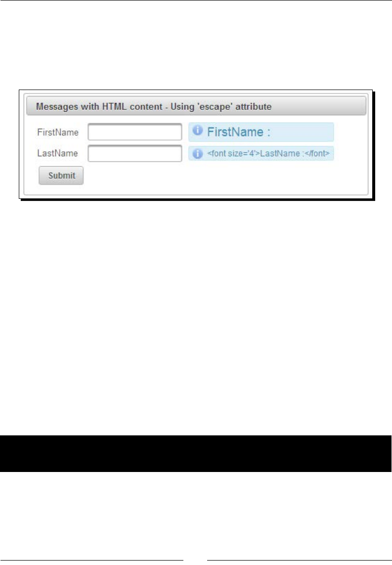
Chapter 3
[ 49 ]
What just happened?
We have added FacesMessages with HTML content for both fName and lName clientIds.
For fName, we haven't escaped HTML content, so the message displayed is with font size 4.
But for lName, we set escape="true" and hence, the HTML content is displayed as it is
(with HTML tags).
Introducing the Messages component
The Messages component <p:messages> is an enhanced version of the standard JSF
<h:messages> component with skinning capabilies. The <p:messages> component can
be used to display mulple messages corresponding to UI elements.
The <p:messages/> component supports the following addional aributes in addion to
the aributes supported by <p:message>:
globalOnly: When true, only FacesMessage with no clientIds are displayed.
Default value is false.
autoUpdate: This enables the autoupdate mode if set to TRUE. Default value is
false.
for: This species the name of associated key, takes precedence when used
with globalOnly.
closable: This adds a close icon to hide the messages.
Time for action – displaying FacesMessage using
<p:messages>
Let us see how to display mulple FacesMessage using <p:messages>:
1. Create a form with two commandButton elements and the <p:messages/>
component using the following code:
<h:form style="width: 500px; padding-left: 10px;">
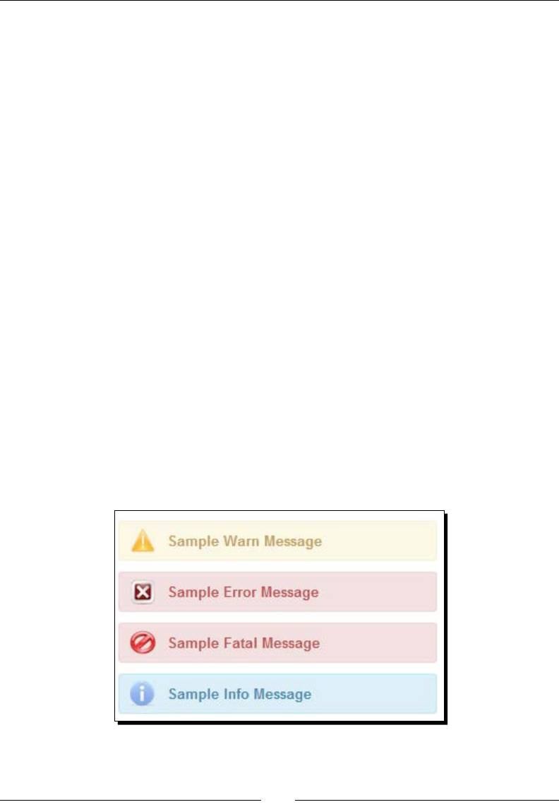
Using PrimeFaces Common Ulity Components
[ 50 ]
<p:panel header="Messages with All Severity levels">
<p:messages globalOnly="true" autoUpdate="true"/>
<p:commandButton value="Show FacesMessages"
actionListener="#{messagesController.addMultipleMsgs}"/>
</p:panel>
</h:form>
2. Add FacesMessage in the actionListener method as follows:
public void addMultipleMsgs()
{
FacesContext.getCurrentInstance().addMessage(null, new
FacesMessage(FacesMessage.SEVERITY_INFO,"Sample Info Msg",
null));
FacesContext.getCurrentInstance().addMessage(null, new
FacesMessage(FacesMessage.SEVERITY_WARN,"Sample Warn Msg",
null));
FacesContext.getCurrentInstance().addMessage(null, new
FacesMessage(FacesMessage.SEVERITY_ERROR,"Sample Error
Msg", null));
FacesContext.getCurrentInstance().addMessage(null, new
FacesMessage(FacesMessage.SEVERITY_FATAL,"Sample Fatal
Msg", null));
}
What just happened?
We added FacesMessage objects with various severity levels in the actionListener
method addMultipleMsgs(), and updated the form using autoUpdate="true".
Then <p:messages/> displays all of those errors as follows:
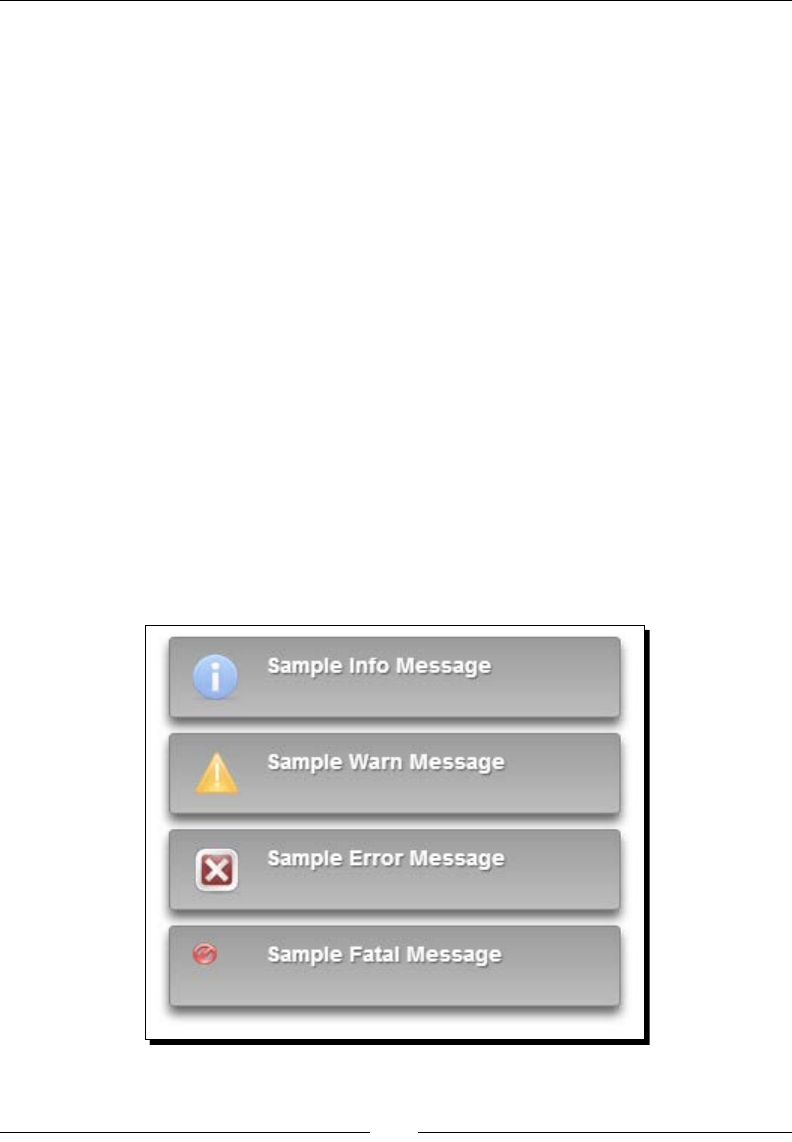
Chapter 3
[ 51 ]
Displaying notications using the growl component
The PrimeFaces Growl component is similar to MAC OS's growl nocaon widget, which
can be used to display FacesMessage. The Growl component is similar to the Messages
component, and thus have similar aributes to customize its behavior.
We can use the following aributes to customize the Growl components behavior:
autoUpdate: When enabled, growl is updated for each AJAX request implicitly.
severity: It is a comma-separated list of severity levels for display purposes only.
globalOnly: When true, only the FacesMessage without client IDs are
displayed. Default is false.
sticky: It species whether the message should stay instead of being hidden
automacally. Default is false.
life: It is the duraon in milliseconds to display non-scky messages. Default
is 6000 ms.
for: Idener of the component whose messages to display only, takes precedence
when used with globalOnly.
escape: It denes whether HTML would be escaped or not, defaults to true.
Let us see how to use the <p:growl> component to display the FacesMessage objects
as follows:

Using PrimeFaces Common Ulity Components
[ 52 ]
Time for action – displaying FacesMessages with growl
We will see how to display FacesMessages with dierent severity levels as Growl
nocaons using <p:growl>. Perform the following steps:
1. Create a JSF page with a form and growl component:
<p:growl id="growl1" autoUpdate="true"
severity="info,warn,error, fatal" sticky="true"
globalOnly="true"/>
<h:form>
<p:commandButton
actionListener="#{messagesController.addMultipleMsgs}"
value="Add Multiple Messages"/>
</h:form>
What just happened?
When the buon is clicked, we have added FacesMessages. The growl component gets
updated automacally and displayed nocaons because we have set autoUpdate mode
to true.
Displaying tooltips using the Tooltip component
Browsers provide nave support for showing toolps using the title aribute, but it is too
primive. PrimeFaces provides a Toolp component with enhanced features and various
customizaon opons such as eects, events and custom content support.
By default, toolps will be displayed on the mouseover event and hides on the mouseout
event. We can customize this behavior using the showEvent and hideEvent aributes:
<p:tooltip for="emailId" showEvent="focus" hideEvent="blur"
value="Please enter Email Id (Ex: admin@gmail.com)"/>
We can also specify toolp text using the title aribute on the component itself:
<p:inputText id="emailId" value="" title="Please enter Email Id (Ex:
admin@gmail.com)"/>
<p:tooltip for="emailId" showEvent="focus" hideEvent="blur" />
We can apply dierent styles of eects while showing or hiding toolps using the
showEffect and hideEffect aributes:
<p:tooltip for="emailId" showEffect="slide" hideEffect="explode"
showEvent="focus" hideEvent="blur" value="Please enter Email Id
(Ex: admin@gmail.com)"/>
In addion to plain text, we can also display HTML content, images, and so on as toolps.

Chapter 3
[ 53 ]
Time for action – displaying tooltip for UI components
Let us see how to display toolps on various events, with dierent eects and containing
HTML elements, such as images, by performing the following steps:
1. Create a form with input elds and add a <p:tooltip> component to display the
toolp using the following code:
<h:form title="Tooltip demo form">
<p:panel header="Form with Tooltips">
<h:panelGrid columns="3">
<p:outputLabel value="EmailId:"/>
<p:inputText id="emailId" value=""/>
<p:tooltip for="emailId" value="Please enter Email Id (Ex:
admin@gmail.com)"/>
<p:outputLabel value="FirstName:"/>
<p:inputText id="firstName" value=""/>
<p:tooltip for="firstName" showEvent="focus"
hideEvent="blur"
value="Please enter FirstName"/>
<p:outputLabel value="LastName:"/>
<p:inputText id="lastName" value=""/>
<p:tooltip for="lastName" showEffect="slide"
hideEffect="explode" value="Please enter LastName"/>
<p:commandLink id="photo" value="OptimusPrime"/>
<p:tooltip for="photo">
<p:graphicImage value="/resources/images/optimusprime.
jpg"/>
</p:tooltip>
</h:panelGrid>
</p:panel>
</h:form>
What just happened?
We have used the <p:tooltip> component to display toolps with custom eects and
events. Also, we have used the <p:tooltip> component to display HTML content such
as images using <p:graphicImage>.
Using global tooltips
We can bind toolps globally to all clickable elements with the title aribute instead of
specifying for each element separately.

Using PrimeFaces Common Ulity Components
[ 54 ]
Time for action – using global tooltips
Let us see how we can use global toolps to display toolps for all the components,
which are specifying the title aribute. Perform the following steps:
1. Include a global Toolp component and specify toolps for various components
using the title aribute as follows:
<p:tooltip />
<h:form>
<h:panelGrid id="grid" columns="2" cellpadding="5">
<h:outputText value="Input: " />
<p:inputText id="focus" title="Tooltip for an input"/>
<h:outputText value="Link: " />
<h:outputLink id="fade" value="#" title="Tooltip for a
link">
<h:outputText value="Fade Effect" />
</h:outputLink>
<h:outputText value="Button: " />
<p:commandButton value="Update" title="Update
Components" update="@parent"/>
</h:panelGrid>
</h:form>
What just happened?
We have used a global <p:tooltip/> component to display toolps for all the components,
which have a title aribute set. This is a preferable approach to using a <p:tooltip>
component for each component separately. You can customize toolps for any specic
component by adding <p:tooltip> to the respecve component individually.
Partial Processing and Rendering using the
Fragment component
The Fragment component can be used to dene a segment of components that should be
parally processed, and updated when an AJAX request is triggered by any descendant
component. This comes in very handy when there are mulple secons of the form with
dierent acons for each segment.
By using fragments, Paral Processing and Rendering becomes very easy because we
don't need to specify the component IDs to be processed using the process aribute,
and component IDs to be updated using the update aribute.

Chapter 3
[ 55 ]
For example, in the User Account screen we can have User Details and Contact Details
secons, each with a command buon to update the respecve secons' elds.
Time for action – using the Fragment component
Let us look at how we can use two fragments for the User Details and Contact Details
secons and parally process each of them individually. Perform the following steps for using
two fragment components:
1. Create a form with two fragments for User Details and Contact Details secons
as follows:
<h:form>
<p:panel header="User Account>
<p:fragment autoUpdate="true">
<p:fieldset legend="User Details">
<h:panelGrid columns="3">
<h:outputLabel for="emailId" value="EmailId:" />
<p:inputText id="emailId" value="#{userController.emailId}"
required="true" label="emailId"/>
<p:message for="emailId" display="icon"/>
<h:outputLabel for="firstName" value="FirstName:" />
<p:inputText id="firstName" value="#{userController.
firstName}" required="true" label="FirstName"/>
<p:message for="firstName" display="icon"/>
<h:outputLabel for="lastName" value="LastName:" />
<p:inputText id="lastName" value="#{userController.
lastName}" />
<p:message for="lastName" display="icon"/>
<p:commandButton value="Save"
actionListener="#{userController.updateUserDetails()}"/>
</h:panelGrid>
</p:fieldset>
</p:fragment>
<p:fragment autoUpdate="true">
<p:fieldset legend="Contact Details">
<h:panelGrid columns="3">
<h:outputLabel for="phone" value="Phone:" />
<p:inputText id="phone" value="#{userController.phone}"
required="true" label="Phone"/>
<p:message for="phone" display="icon"/>
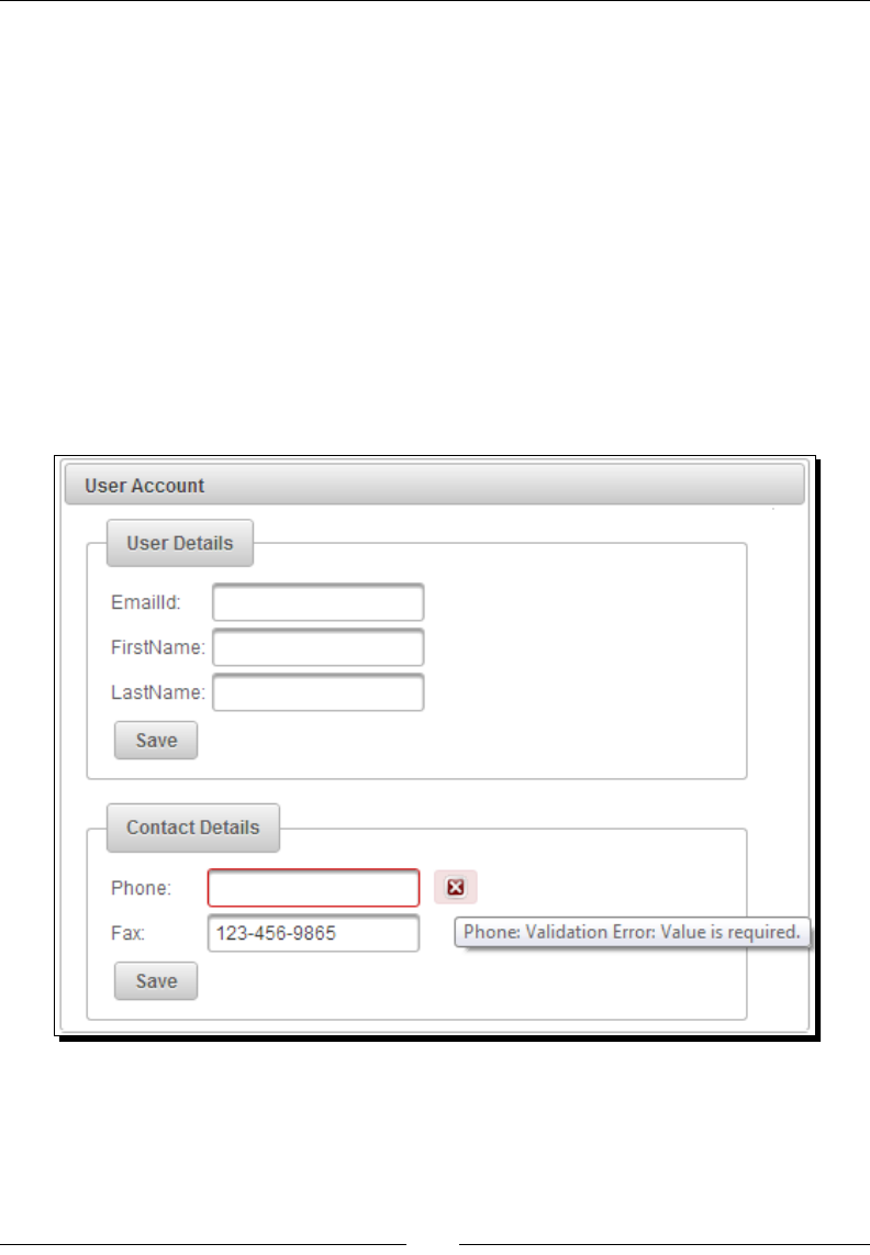
Using PrimeFaces Common Ulity Components
[ 56 ]
<h:outputLabel for="fax" value="Fax:" />
<p:inputText id="fax" value="#{userController.fax}" />
<p:message for="fax" display="icon"/>
<p:commandButton value="Save" actionListener="#
{userController.updateContactDetails()}"/>
</h:panelGrid>
</p:fieldset>
</p:fragment>
</p:panel>
</h:form>
What just happened?
We have created two <p:fragment> components to wrap each of the User Details and
Contact Details secons. Have a look at the following screenshot:
When you click on the Save buon in the User Details secon, only EmailId, FirstName,
and LastName elds will be processed and updated. Similarly, when you click on the Save
buon in the Contact Details secon, only Phone and Fax elds will be parally processed
and updated. Even though some required elds in other fragments are blank, they won't be
processed and hence no error messages will be displayed.

Chapter 3
[ 57 ]
Introducing the Sticky component
Scky component can be used to make other components sck within the viewport while
scrolling. For example, we may want to sck the top header and navigaon menu bar secon
of the web page while scrolling.
Let us see how we can make the header and menu bar scky with a <p:sticky>
component using the following code:
<h:body>
<div class="wrapper">
<p:panel id="headerSection">
<p:panel id="header" style="height: 80px; margin-bottom: 2px;">
<h1>TechBuzz</h1>
</p:panel>
<h:form id="mainMenuForm">
<p:menubar>
<p:menuitem value="Home" url="home.jsf"/>
<p:menuitem value="New Post" url="createPost.jsf"/>
<p:menuitem value="Search" url="search.jsf"/>
<p:menuitem value="My Account" url="userAccount.jsf"/>
<p:menuitem value="Administration" url="admin.jsf"/>
</p:menubar>
</h:form>
</p:panel>
<p:panel style="margin-bottom: 3px; min-height: 500px;">
<ui:insert name="bodyContent"/>
</p:panel>
</div>
<p:sticky target="headerSection" margin="3"/>
</h:body>
Here we have specied the header secon panel with the component ID headerSection
as the target of the <p:sticky> component. So, when you scroll through the web page, the
headerSection panel content will sck at the top of the page. Also, we have specied the
margin in pixels for the Scky component via the margin aribute.
The DataTable component has out-of-the-box
support for the Scky header by seng the aribute
stickyHeader="true".

Using PrimeFaces Common Ulity Components
[ 58 ]
Introducing the RequestContext utility
RequestContext is a ulity class provided by PrimeFaces with the following features,
which come in handy at mes:
Update UI components from Managed Bean methods programmacally
Execute JavaScript from Managed Bean methods
Add AJAX callback parameters
ScrollTo a specic component aer the AJAX update
The RequestContext ulity class can be used with both AJAX and Non-AJAX requests. We
can also use the requestContext.isAjaxRequest() method to determine whether the
current request is an AJAX or Non-AJAX request.
Updating UI components
Normally we use the update aribute to specify the component ID(s) that needs to be
updated aer an AJAX request is completed.
We can also update the components using the org.primefaces.context.
RequestContext ulity funcon.
Time for action – updating UI components using
RequestContext.update()
In this secon, we will demonstrate how to update client-side view components from the
server side using the following steps:
1. Create a form with an input eld and a submit buon as follows:
<h:form id="form1">
<h:panelGrid columns="2">
<h:outputLabel value="EmailId" />
<p:inputText id="emailId" value="#{requestContextController.
emailId}"/>
<p:commandButton id="submitBtn" value="Submit" actionListener=
"#{requestContextController.handleSubmit}" />
</h:panelGrid>
<h:outputText value="You have Entered :
#{requestContextController.emailId}" />
</h:form>

Chapter 3
[ 59 ]
2. In the acon handler method, update the form component using the
RequestContext.update() method as follows:
public void handleSubmit(ActionEvent ae)
{
RequestContext.getCurrentInstance().update("form1");
}
What just happened?
We got a RequestContext instance using RequestContext.getCurrentInstance()
and used the update() method to update the form component with id="form1". So, if
you enter admin@gmail.com in the e-mail input eld and click on the Submit buon, you
will see the updated text as You have Entered: admin@gmail.com.
Executing JavaScript from server-side code
You can execute JavaScript code using the RequestContext.execute() method.
Suppose you want to display a dialog box once the form submission request is
completed successfully.
Time for action – executing JavaScript using
RequestContext.execute()
We will now take a look at how to execute client-side JavaScript code from server-side code
by performing the following steps:
1. Create a form with a Dialog component using the following code:
<h:form id="form1">
<h:panelGrid columns="2">
<h:outputLabel value="EmailId" />
<p:inputText id="emailId" value="#{requestContextController.
emailId}"/>
<p:commandButton id="submitBtn" value="Submit" actionListener=
"#{requestContextController.handleSubmit}" />
</h:panelGrid>
<p:dialog header="Information" widgetVar="dlg"
closeOnEscape="true" modal="true">
You have Entered : #{requestContextController.emailId}
</p:dialog>
</h:form>

Using PrimeFaces Common Ulity Components
[ 60 ]
2. In the acon handler method, execute the JavaScript call, dlg.show(),
to display a dialog widget using the RequestContext.execute() method.
Use the following code for the same:
public void handleSubmit(ActionEvent ae)
{
RequestContext context = RequestContext.getCurrentInstance();
context.update("form1");
context.execute("dlg.show()");
}
What just happened?
When the Submit buon is clicked, we have updated the form and executed the JavaScript
code dlg.show() which displays a dialog widget.
Adding AJAX callback parameters
Somemes, we may need to execute an AJAX request and perform some UI updates based
on the callback parameters received from managed bean methods.
Let us see how we can add a basic parameter and a Plain Old Java Object (POJO), which will
be serialized into JSON as a callback parameter.
Time for action – adding callback parameters using
RequestContext.addCallbackParam()
In this secon, we will see how to add callback parameters to an AJAX response payload by
performing the following steps:
1. Create a form with an input eld and submit buon using the following code:
<h:form id="form1">
<h:panelGrid columns="2">
<h:outputLabel value="EmailId" />
<p:inputText id="emailId"
value="#{requestContextController.emailId}" required="true"/>
<p:commandButton id="submitBtn" value="Submit"
actionListener="#{requestContextController.handleSubmit}"
oncomplete="handleComplete(xhr, status, args)"/>
</h:panelGrid>
<h:outputText value="You have Entered :
#{requestContextController.emailId}" />
</h:form>

Chapter 3
[ 61 ]
2. Implement the oncomplete callback JavaScript funcon handleComplete()
as follows:
<script type="text/javascript">
function handleComplete(xhr, status, args)
{
if(args.validationFailed) {
alert("Validation Failed");
}
else {
var text = "Email Id :"+ args.emailId + "\n"+"FirstName
:"+args.user.firstName+"\nLastName "+args.user.lastName;
alert(text);
}
}
</script>
3. In the acon handler method, add callback parameters using the
RequestContext.addCallbackParam() method as follows:
public void handleSubmit(ActionEvent ae)
{
RequestContext context = RequestContext.getCurrentInstance();
context.update("form1");
context.addCallbackParam("emailId", emailId);
User user = new User();
user.setFirstName("Optimus");
user.setLastName("Prime");
context.addCallbackParam("user", user);
}
What just happened?
In the acon handler method, we have added callback parameters using RequestContext.
addCallbackParam("paramName", paramValue).
We have created a JavaScript callback funcon handleComplete(xhr, status, args)
to be executed on compleon of the AJAX request.
By default, the validationFailed callback parameter is added implicitly if JSF validaon
fails. So, inially we are checking whether there are any validaon failures and then we will
display, emailId, user's firstName and lastName extracted from the args parameter,
which we have added using the RequestContext.addCallbackParam() method.
The user object that we added as a callback parameter is converted into JSON format as
{"firstName":"Optimus", "lastName":"Prime"}.

Using PrimeFaces Common Ulity Components
[ 62 ]
Scrolling to a component
We can use the RequestContext.scrollTo() method to scroll to a component aer an
AJAX request is completed:
RequestContext.getCurrentInstance().scrollTo("clientId");
Internally, this method will call the JavaScript funcon PrimeFaces.scrollTo
("clientId"). So you can directly use this in your JavaScript to scroll to any component.
Displaying pop-up dialogs using the Dialog component
Dialog is a container component that can contain other components, and overlay other
elements on the page. By default, the Dialog component will not be visible. We can use
a client-side API to show or hide the dialog.
Time for action – displaying a dialog
Let us see how to create a basic Dialog component and show/hide based on buon click
events by performing the following steps:
1. Create a form with a Dialog component and two buons to show and hide the
dialog using the following code:
<h:form>
<p:commandButton value="ShowDialog" onclick="dlg1.show();"
type="button" />
<p:commandButton value="HideDialog" onclick="dlg1.hide();"
type="button" />
<p:dialog id="simpleDialog" header="Simple Dialog"
widgetVar="dlg1" width="300" height="50">
<h:outputText value="PrimeFaces Simple Dialog" />
</p:dialog>
</h:form>
What just happened?
We have created a Dialog component using <p:dialog> and used two
<p:commandButton> components to perform show and hide acons on the dialog box
using client-side API calls dlg1.show() and dlg1.hide().
The Dialog component has the following aributes, which can be used to customize
its behavior:
widgetVar: This species the n Name of the client-side widget.
visible: When enabled, the dialog is visible by default. The default is false.

Chapter 3
[ 63 ]
header: This is the text of the header.
footer: This is the text of the footer.
modal: It enables modality, default is false.
draggable: This species drag ability, default is true.
resizable: It species resizability, default is true.
closable: This denes if close icon should be displayed or not, default is true .
position: This denes where the dialog should be displayed. By default, dialog is
posioned at the center of the viewport. We can change the locaon by seng the
posion value using the following ways:
Single string value representing the position within viewport, such as
position= "center". Other possible values are left, right, top, and bottom.
Comma - separated x and y co-ordinate values such as position="150, 450".
Comma - separated position values such as position="right,top".
showEffect: This species the eect to use when showing the dialog.
hideEffect: This species the eect to use when hiding the dialog.
onShow: This determines the client-side callback to execute when dialog
is displayed.
onHide: This determines the client-side callback to execute when dialog is hidden.
minimizable: This determines whether a dialog is minimizable or not, default
is false.
maximizable: This determines whether a dialog is maximizable or not, default
is false.
appendToBody: This appends Dialog component as a child of the document body.
Default is false.
closeOnEscape: This denes whether dialog should close on the escape key,
default is false.
dynamic: This enables lazy loading of the content with AJAX, default is false.
focus: This denes which component to have focus by default.
We can apply dierent styles of eects while displaying or hiding the dialog using the
showEffect and hideEffect aributes:
<p:dialog id="simpleDialog" header="Simple Dialog" widgetVar="dlg1"
width="300" height="50"
showEffect="bounce" hideEffect="explode">
<h:outputText value="PrimeFaces Simple Dialog" />
</p:dialog>
Available opons for showEffect and hideEffect are: blind, bounce, clip, drop,
explode, fade, fold ,highlight, puff, pulsate, scale, shake, size, slide,
and transfer.

Using PrimeFaces Common Ulity Components
[ 64 ]
Using the Dialog component's client-side callbacks
Let us see how we can hook-up client-side JavaScript funcons as callbacks using the onShow
and onHide aributes.
Time for action – client-side callbacks for onShow and onHide
Here we will demonstrate how to trigger JavaScript funcons when dialog show and hide
events happen. Perform the following steps:
1. Create a Dialog component and two JavaScript funcons to be called as callback
funcons for onShow and onHide events:
<h:head>
<script>
function simpleDlgOnShowCallback()
{
alert('Simple Dialog displayed successfully');
}
function simpleDlgOnHideCallback()
{
alert('Simple Dialog is closed successfully');
}
</script>
</h:head>
<h:form>
<p:commandButton value="ShowDialog" onclick="dlg1.show();"
type="button" />
<p:commandButton value="HideDialog" onclick="dlg1.hide();"
type="button" />
<p:dialog id="simpleDialog" header="Simple Dialog"
widgetVar="dlg1"
width="300" height="50"
onShow="simpleDlgOnShowCallback()"
onHide="simpleDlgOnHideCallback()">
<h:outputText value="PrimeFaces Simple Dialog" />
</p:dialog>
</h:form>

Chapter 3
[ 65 ]
What just happened?
We have created two JavaScript funcons, simpleDlgOnShowCallback() and
simpleDlgOnHideCallback() and hooked-up as callback funcons using the onShow
and onHide aributes. When you click on the ShowDialog buon, the dialog will be shown
and simpleDlgOnShowCallback() will be invoked. Similarly, when you click on the
HideDialog buon or close the dialog using the close icon, then the dialog will be closed
and simpleDlgOnHideCallback() will be invoked.
Handling the dialog close event
For the Dialog component, you can also register event listeners for close, minimize, and
maximize events.
Time for action – the Dialog component close event listener
Let us see how we can register a listener for the close event using the following steps:
1. Create a Dialog component and register a close event listener using the
<p:ajax> tag:
<h:form id="form3" style="width: 400px;">
<p:messages id="msgs" for="SampleDialog"/>
<p:panel header="Dialog - Close Event Listener">
<p:commandButton value="ShowDialog" onclick="dlg3.show();"
type="button" />
<p:dialog id="SampleDialog" header="Sample Dialog"
widgetVar="dlg3" width="300" height="50"
showEffect="bounce" hideEffect="explode"
closeOnEscape="true">
<p:ajax event="close" update="msgs"
listener="#{dialogController.handleDialogClose}"/>
<p:outputLabel value="PrimeFaces Dialog"/>
</p:dialog>
</p:panel>
</h:form>
2. Implement the handleDialogClose() method to handle the close event:
public void handleDialogClose(CloseEvent event)
{
String msg = event.getComponent().getId() + " dialog is
closed";
FacesContext facesContext =
FacesContext.getCurrentInstance();
FacesMessage message = new FacesMessage
(FacesMessage.SEVERITY_INFO, msg, msg);
facesContext.addMessage("SampleDialog", message);
}

Using PrimeFaces Common Ulity Components
[ 66 ]
What just happened?
We have created a dialog and hooked-up a close event listener using <p:ajax
event="close" update="msgs" listener="#{dialogController.
handleDialogClose}"/>. So when dialog is closed, the event listener method
handleDialogClose() will be invoked. In handleDialogClose() we have added a
INFO FacesMessage to FacesContext. As we have specied to update the <p:messages
id="msgs"/> component with update="msgs", the message is displayed as SampleDialog
dialog is closed. Similarly, we can register event listeners for minimize and maximize events.
Working with a Dialog component containing forms
We can create Dialog components containing other complex components including forms,
data tables, and so on. In our TechBuzz applicaon, we will have a register link in the
menu bar and when the user clicks on the register link, we will show a dialog containing
a registraon form. If there are any validaon errors, the registraon form should be
redisplayed with error messages, otherwise the user should be registered, close the dialog,
and display a registraon success message.
Time for action – creating dialog with a registration form
In this secon, we will demonstrate how to use forms in Dialog components and close the
dialog condionally such as in a successful form submission.
1. Create a dialog containing a user Registraon Form using the following code:
<p:messages id="globalMsgs" globalOnly="true"
autoUpdate="true"/>
<h:outputLink id="registerLink" value="javascript:void(0)"
onclick="registrationDlg.show()" title="Registration">
<p:outputLabel value="Register"/>
</h:outputLink>
<p:dialog id="registrationDlgId" widgetVar="registrationDlg"
header="Registration Form"
focus="registrationFormDlg:firstName">
<h:form id="registrationFormDlg">
<p:messages id="regmsgs" severity="error"/>
<h:panelGrid columns="2" width="400px">
<p:outputLabel value="EmailId:"/>
<p:inputText
value="#{dialogController.registerUser.emailId}"
required="true" label="EmailId"/>

Chapter 3
[ 67 ]
<p:outputLabel value="Password"/>
<p:password
value="#{dialogController.registerUser.password}"
required="true" label="Password"/>
<p:outputLabel value="FirstName:*" />
<p:inputText id="firstName"
value="#{dialogController.registerUser.firstName}"
required="true" label="FirstName"/>
<p:outputLabel value="LastName:" />
<p:inputText id="lastName"
value="#{dialogController.registerUser.lastName}" />
<p:outputLabel value="Phone:" />
<p:inputText id="phone"
value="#{dialogController.registerUser.phone}" />
<p:outputLabel value="DOB:" />
<p:calendar
value="#{dialogController.registerUser.dob}"
id="dob"/>
<p:commandButton value="Register"
actionListener="#{dialogController.doRegister}"
update="@form" oncomplete=
"handleRegistrationRequest(xhr, status, args)"/>
</h:panelGrid>
</h:form>
</p:dialog>
2. Create an oncomplete event handler callback JavaScript funcon
handleRegistrationRequest():
function handleRegistrationRequest(xhr, status, args)
{
if(args.validationFailed || !args.registered) {
$("#registrationDlgId").effect("shake", { times:3 }, 100);
} else {
registrationDlg.hide();
$("#registerLink").fadeOut();
}
}
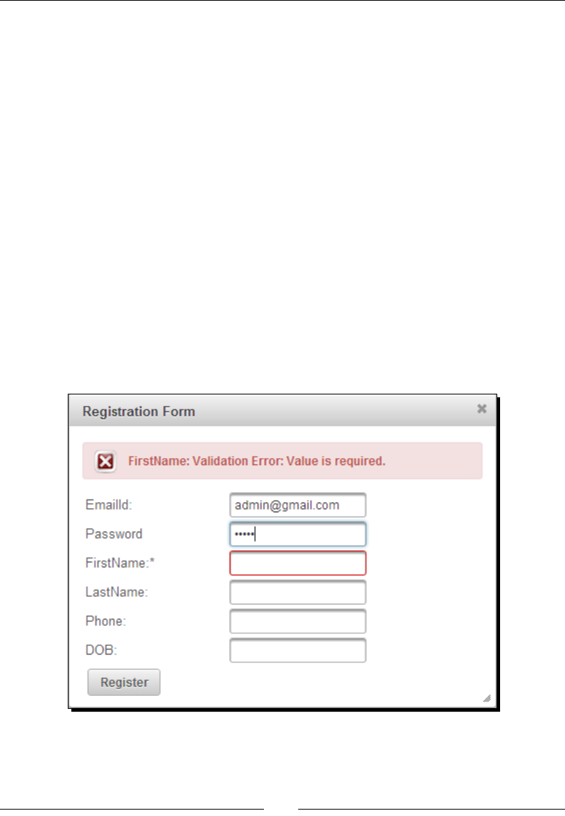
Using PrimeFaces Common Ulity Components
[ 68 ]
3. Create the doRegister() method in the DialogController managed bean:
public void doRegister()
{
boolean registered = false;
try {
System.out.println("Register User "+registerUser);//write
code for persisting user data into database
String msg = "User Registered successfully";
FacesContext.getCurrentInstance().addMessage(null, new
FacesMessage(FacesMessage.SEVERITY_INFO, msg, msg));
registerUser = new User();
registered = true;
} catch (Exception e) {
String msg = e.getMessage();
String componentId = "registrationFormDlg";
FacesContext.getCurrentInstance().addMessage(componentId,
new FacesMessage(FacesMessage.SEVERITY_ERROR, msg, msg));
}
RequestContext.getCurrentInstance().addCallbackParam
("registered", registered);
}

Chapter 3
[ 69 ]
What just happened?
We have created a complex dialog box, which contains the user's Registraon Form.
By default, focus will be on the FirstName eld as we have specied focus=
"registrationFormDlg:firstName". We hooked-up a JavaScript callback funcon
handleRegistrationRequest(xhr, status, args) for the oncomplete
event. When the registraon form is submied, we are checking whether there are
any validaon errors using args.validationFailed. Also, we are checking whether
registraon is successful or not with args.registered, which we have added in the
DialogController.doRegister() handler method. In case of validaon errors
or registraon failed, we have applied a shake eect for dialog and displayed errors
using <p:messages>. On successful registraon, we are closing the dialog using
registrationDlg.hide() and hiding the register link using
$("#registerLink").fadeOut().
Here, we have used a JavaScript - centric approach to condionally close the dialog. There is
another approach to close the dialog condionally.
If registraon is successful then we can close the dialog in the DialogController.
doRegister() method using RequestContext.execute("script") as follows:
<p:commandButton value="Register" actionListener="#{dialogController.
doRegister}" update="msgs"/>
public void doRegister()
{
try {
userService.register(registerUser);
FacesContext.getCurrentInstance().addMessage(null, new
FacesMessage(FacesMessage.SEVERITY_INFO, "User Registered
successfully", null));
RequestContext.getCurrentInstance().execute
("registrationDlg.hide();");
RequestContext.getCurrentInstance().execute
("$('#registerLink').fadeOut();");
registerUser = new User();
} catch (Exception e) {
FacesContext.getCurrentInstance().addMessage
("registrationFormDlg", new
FacesMessage(FacesMessage.SEVERITY_ERROR,
e.getMessage(), null));
}
}

Using PrimeFaces Common Ulity Components
[ 70 ]
We will learn more features of the RequestContext ulity in the next dialog
framework secon.
We should keep in mind the following important ps from
the ocial PrimeFaces User Guide while using the
Dialog component:
Use appendToBody with care as the page definition and HTML DOM would be different,
for example if the dialog is inside a <h:form> component and appendToBody is
enabled, on the browser, dialog would be outside the form and may cause unexpected
results. In this case, nest a form inside a dialog.
Do not place dialog inside tables, containers as in divs with relative positioning or with
non - visible overflow defined. In cases such as these, functionality might be broken. This is
not a limitation but a result of the DOM model. For example, dialog inside a layout unit, tab
view, and accordion are a few of examples. The same applies to confirmDialog as well.
Introducing dialog framework
PrimeFaces 4.0 introduces a new dialog framework, which can be used to generate dynamic
dialog components at runme with the content from any external facelets page.
In order to use a dialog framework, rst we need to congure DialogActionListener,
DialogNavigationHandler, and DialogViewHandler in faces-config.xml as follows:
<faces-config ...>
<application>
<action-listener>
org.primefaces.application.DialogActionListener
</action-listener>
<navigation-handler>
org.primefaces.application.DialogNavigationHandler
</navigation-handler>
<view-handler>
org.primefaces.application.DialogViewHandler
</view-handler>
</application>
</faces-config>
We can use the RequestContext.openDialog() and RequestContext.
closeDialog() methods to open and close the dialog components.

Chapter 3
[ 71 ]
Time for action – showing the search users screen in dialog
Let us see how we can display the search users page (searchUsers.xhtml) in the
Dialog component.
1. Create a CommandButton buon whose actionListener triggers open the dialog
using the RequestContext.openDialog() method:
<p:commandButton value="Search Users" actionListener="#{userContro
ller.searchUsersForm}" />
public void searchUsersForm()
{
RequestContext.getCurrentInstance().
openDialog("searchUsers");
}
2. Create the search users page searchUsers.xhtml as follows:
<!DOCTYPE html>
<html xmlns="http://www.w3.org/1999/xhtml"
xmlns:h="http://java.sun.com/jsf/html"
xmlns:f="http://java.sun.com/jsf/core"
xmlns:ui="http://java.sun.com/jsf/facelets"
xmlns:p="http://primefaces.org/ui">
<h:head>
<title>Search Users</title>
</h:head>
<h:body>
<h:form>
<p:inputText value="#{userController.searchName}"/>
<p:commandButton value="Search" actionListener="#{use
rController.searchUsersByName}" update="usersTbl"/>
<p:dataTable id="usersTbl" value="#{userController.
searchUsers}" var="user">
<p:column headerText="EmailId">
#{user.emailId}
</p:column>
<p:column headerText="Name">
#{user.firstName} #{user.lastName}
</p:column>
</p:dataTable>
</h:form>
</h:body>
</html>

Using PrimeFaces Common Ulity Components
[ 72 ]
What just happened?
When you click on the Search Users buon, a new dialog will be opened with the response
of searchUsers.xhtml page content.
We can also use the other overloaded openDialog() method to pass oponal
conguraon parameters:
RequestContext.openDialog(String outcome, Map<String,Object>
options, Map<String,List<String>> params);
The following is the list of supporng opons:
modal: This controls modality of the dialog. Default value is false.
resizable: When enabled, this makes dialog resizable. Default value is true.
draggable: When enabled, this makes dialog draggable. Default value is true.
width: This species the width of the dialog. Default value is auto.
height: This species the height of the dialog. Default value is auto.
contentWidth: This species the width of the dialog content. Default value is 640.
contentHeight: This species the height of the dialog content. Default value
is auto.
We can open the dialog with customizaon opons as follows:
public void searchUsersForm()
{
Map<String,Object> options = new HashMap<String, Object>();
options.put("modal", true);
options.put("resizable", false);
options.put("contentHeight", 800);
RequestContext.getCurrentInstance().openDialog("searchUsers",
options,null);
}
Passing data from the dialog back to the source page
The dialog framework also supports passing data from the dialog back to the parent page.
The trigger component, which opens the dialog, needs to have a dialogReturn AJAX event
listener registered to receive data returned from the dialog.

Chapter 3
[ 73 ]
Time for action – passing data from the search users dialog to
the source page
Let us add a new column Select to the DataTable in the searchUsers.xhtml page
to select a user, and pass the selected user's details back to source page. Perform the
following steps:
1. Create a DataTable component with a Select column to choose a user row using
the following code:
<p:dataTable id="usersTbl"
value="#{userController.searchUsers}" var="user">
<p:column headerText="EmailId">
#{user.emailId}
</p:column>
<p:column headerText="Name">
#{user.firstName} #{user.lastName}
</p:column>
<p:column headerText="Select">
<p:commandButton icon="ui-icon-search"
actionListener="#{userController.selectSearchUser
(user)}" />
</p:column>
</p:dataTable>
2. When the user selects a row (user), close the dialog by passing the selected user
object as data:
public void selectSearchUser(User user){
RequestContext.getCurrentInstance().closeDialog(user);
}
3. Register the dialogReturn AJAX listener to the Search Users buon, which will
receive the SelectEvent object as a parameter. We can obtain the selected user
object from SelectEvent with event.getObject(), and update the UserDetails
PanelGrid to display the selected user details:
<p:commandButton value="Search Users"
actionListener="#{userController.searchUsersForm}">
<p:ajax event="dialogReturn"
listener="#{userController.handleSelectSearchUser}"
update="UserDetails"/>
</p:commandButton>
<h:panelGrid id="UserDetails" columns="2">
<h:outputLabel value="EmailId" />
<h:outputText value="#{userController.searchUser.emailId}" />
<h:outputLabel value="FirstName" />
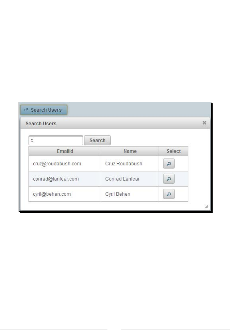
Using PrimeFaces Common Ulity Components
[ 74 ]
<h:outputText value="#{userController.searchUser.firstName}" />
</h:panelGrid>
public void handleSelectSearchUser(SelectEvent event){
this.searchUser = (User) event.getObject();
}
What just happened?
We have created a CommandButton buon to open a dialog with the Search Users form.
When the user searches for users, the results will be populated in a data table. When you
select any user by clicking on the Select buon, the selected user object will be passed back
to the source page and display the results in the User Details panel grid.
Displaying FacesMessage in dialog
The dialog framework also provides a simple ulity method, RequestContext.showMess
ageInDialog(FacesMessage) to display FacesMessage in a dialog. This comes in very
handy when displaying the user acon status once the applicaon logic is executed:
<p:commandButton value="Delete" actionListener="#{userController.
deleteUser}" />
public void deleteUser() {
//logic to delete user
RequestContext.getCurrentInstance().showMessageInDialog(new
FacesMessage("User deleted successfully"));
}
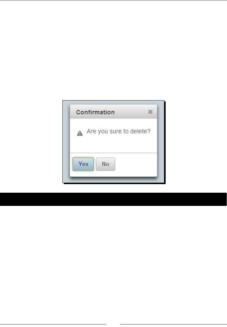
Chapter 3
[ 75 ]
At the moment, <p:commandButton> and <p:commandLink> supports
dialogReturn
Nested dialogs are not supported
Calls to the DialogFramework API within a non-AJAX are ignored
Introducing the ConrmDialog component
The ConfirmationDialog component is a replacement for the tradional JavaScript
conrm dialog with skinning and customizaon features.
Very common scenarios to display the conrm dialog box is when the user tries to delete
some data.
Time for action – creating a conrmation dialog
Let us see how to create a conrmaon dialog with Yes and No opons.
1. Create a conrmaon dialog using <p:confirmDialog> with two buons for
Yes and No opons:
<h:form id="form1" style="width: 300px; margin-left: 5px;">
<p:growl/>
<p:panel header="User Form">
<h:panelGrid columns="2">
<h:outputText value="EmailId:" />
<p:inputText value="admin@gmail.com"/>
<p:commandButton value="Delete" onclick="cnfDlg.show()"
/>
</h:panelGrid>
</p:panel>
<p:confirmDialog widgetVar="cnfDlg" header="Confirmation"
message="Are you sure to delete?" >

Using PrimeFaces Common Ulity Components
[ 76 ]
<p:commandButton value="Yes"
actionListener="#{confirmDialogController.handleDelete}"
oncomplete="cnfDlg.hide();" update="form1"/>
<p:commandButton value="No" onclick="cnfDlg.hide();"/>
</p:confirmDialog>
</h:form>
2. Implement the acon handler method using the following code:
public void handleDelete(ActionEvent event)
{
FacesMessage msg = new
FacesMessage(FacesMessage.SEVERITY_INFO, "Deleted
Successfully",null);
FacesContext.getCurrentInstance().addMessage(null, msg);
}
What just happened?
We have created a ConfirmDialog box using the <p:confirmDialog> component with
Yes and No buons. As ConfirmDialog is hidden by default, we have created a Delete
buon to display the conrmaon dialog. When a Delete buon is clicked, we will display
the ConfirmationDialog using a client-side JavaScript API call cnfDlg.show(). When
the Yes buon is clicked, the acon handler method handleDelete() will be executed.
Once the AJAX request is completed, the oncomplete event callback gets invoked where we
are closing the ConfirmationDialog box using the cnfDlg.hide() method. If the No
buon is clicked, then we are simply closing the Conrmaon dialog box using the
cnfDlg.hide() method.
Using the global ConrmDialog component
In our applicaons we might want to display conrmaon dialogs with Yes or No opons in
many scenarios. Instead of creang a separate <p:confirmDialog> component for each of
the scenarios, we can use a single global conrm dialog box.
We can create a global ConfirmationDialog as follows:
<p:confirmDialog global="true">
<p:commandButton value="Yes" type="button" styleClass="ui-
confirmdialog-yes" icon="ui-icon-check"/>
<p:commandButton value="No" type="button" styleClass="ui-
confirmdialog-no" icon="ui-icon-close"/>
</p:confirmDialog>

Chapter 3
[ 77 ]
Note that in the global ConfirmDialog component, the command component with
styleClass="ui-confirmdialog-yes" triggers a Yes acon, and the command
component with styleClass="ui-confirmdialog-no" triggers a No acon.
Once the global ConfirmDialog component is dened, any trigger component, such as the
Delete buon in the preceding example, can use <p:confirm> behavior by passing specic
header text, dialog messages and icon values:
<p:commandButton value="Delete"
actionListener="#{userController.deleteUser()}">
<p:confirm header="Confirmation" message="Are you sure to delete?"
icon="ui-icon-alert"/>
</p:commandButton>
Suppose you want to display a conrm dialog while deleng a Tag. We no longer need to
create a <p:confirmDialog>, instead we can just use <p:confirm> to trigger the global
ConfirmDialog as follows:
<p:commandButton value="Delete" actionListener="#{adminController.
deleteTag()}">
<p:confirm header="Confirmation" message="Are you sure to delete
Tag?" icon="ui-icon-alert"/>
</p:commandButton>
The global ConfirmDialog component is very useful as we can dene the global
ConfirmDialog component in the main layout page and can use <p:conrfirm>
to show ConfirmDialog whenever required.
Displaying notications using the NoticationBar
component
The NotificationBar is a component to display nocaons as a xed posioned panel
either on top or boom of the page. As the nocaon bar is a Panel component, you can
place other JSF components inside it. You can use client-side API methods show() and
hide() respecvely to show and hide the nocaon bar through the widgetVar value.

Using PrimeFaces Common Ulity Components
[ 78 ]
Time for action – displaying notication messages
Let us see how to create a simple nocaon bar to display a message using JavaScript
show() and hide() methods.
1. Create a NocaonBar component to display nocaon messages and two
buons to show and hide the nocaon bar widget:
<p:notificationBar id="bar" widgetVar="notifBar" style="height:
20px; background-color: #8B0000;">
<h:outputText value="There are New Unread Emails in your
MailBox." style="color:#FFF;font-size:20px;"/>
</p:notificationBar>
<h:form>
<p:commandButton value="Show" onclick="notifBar.show()"/>
<p:commandButton value="Hide" onclick="notifBar.hide()"/>
</h:form>
What just happened?
We have created a nocaon bar widget using a <p:notificationBar> component. When
the Show and Hide buons are clicked, we have displayed and closed NotificationBar
using the client-side JavaScript API calls notifBar.show() and notifBar.hide().
By default, NotificationBar is hidden. If you want to display NotificationBar on page
load set autoDisplay="true".
You can apply eects while displaying and hiding the NocaonBar using the effect
aribute. Default is fade. If you don't want to apply any eects, you can set eect="none"
which will turn o the animaon eects. Also you can set the speed of eect using the
effectSpeed aribute that can take normal, slow or fast as its value:
<p:notificationBar id="bar" widgetVar="notifBar" effect="slide"
effectSpeed="slow" style="height: 20px; background-color: #8B0000;">
<h:outputText value="There are New Unread Emails in your MailBox."
style="color:#FFF;font-size:20px;"/>
</p:notificationBar>
By default, NotificationBar will be placed at the top of the page. You can set
position="bottom" to display NotificationBar at the boom of the page.
As the NotificationBar posioning is xed, even if you scroll the page, the nocaon
bar will not scroll.
Hiding NoticationBar automatically
Once the nocaon bar is displayed, you may want to hide it automacally with a delay.
You can do this using the JavaScript setTimeout() method as follows:

Chapter 3
[ 79 ]
Time for action – automatically hiding NoticationBar
In this secon we will demonstrate how to display the PrimeFaces NocaonBar
component and automacally hide it using the JavaScript setTimeout() funcon.
1. Create a NocaonBar widget and buons to show and hide it using the
following code:
<p:notificationBar id="bar" widgetVar="notifBar" position="top"
effect="slide" effectSpeed="slow" style="height: 20px;
background-color: #8B0000;">
<h:outputText value="There are New Unread Emails in your
MailBox." style="color:#FFF;font-size:20px;"/>
</p:notificationBar>
<h:form>
<p:commandButton value="Show" onclick="notifBar.show()"/>
<p:commandButton value="Hide" onclick="notifBar.hide()"/>
<p:commandButton value="Show & Auto Hide"
onclick="showNotifBar()"/>
</h:form>
2. Create an onclick event handler JavaScript funcon showNotifBar() using the
following code:
<script>
var timeoutID = null;
function showNotifBar()
{
notifBar.show();
timeoutID = window.setTimeout(hideNotifBar, 5000);
}
function hideNotifBar()
{
notifBar.hide();
if(timeoutID != null)
{
window.clearTimeout(timeoutID);
}
}
</script>

Using PrimeFaces Common Ulity Components
[ 80 ]
What just happened?
When the Show & Auto Hide buon is clicked, the showNotifBar() funcon gets
invoked and the nocaon bar is displayed by calling notifBar.show(). Also, we are
using the window.setTimeout() funcon to call hideNotifBar() with a delay of 5000
milliseconds, which will close the nocaon bar using the notifBar.hide() method.
Blocking a region using the BlockUI component
The BlockUI component can be used to block other JSF UI components during AJAX processing.
With the special AJAX integraon, AJAX requests from any of the trigger components will block
the UI component for the onstart event and unblock for the oncomplete event.
We may want to block a parcular UI component or even enre page while some background
processing is running. For example, when we submit a form, we may want to block the form
to prevent users from doing any acon on the form unl the response is received from the
server.
Time for action – blocking the form
In this secon, we will demonstrate how to block a specic region, such as a form, while the
form submission background process is sll running.
1. Create a user Registraon Form and BlockUI component to block the form while
registraon is inprocess using the following code:
<p:growl autoUpdate="true"/>
<h:form id="form1">
<p:panel header="BlockUI">
<h:panelGrid columns="2">
<h:outputLabel value="EmailId" />
<p:inputText value="#{blockUIController.
registerUser.emailId}"/>
<h:outputLabel value="Password" />
<p:password value="#{blockUIController.registerUser.
password}"/>
<p:commandButton id="submitBtn" value="Register"
actionListener="#{blockUIController.doRegister}"/>
</h:panelGrid>
</p:panel>
<p:blockUI block="form1" trigger="submitBtn"/>
</h:form>
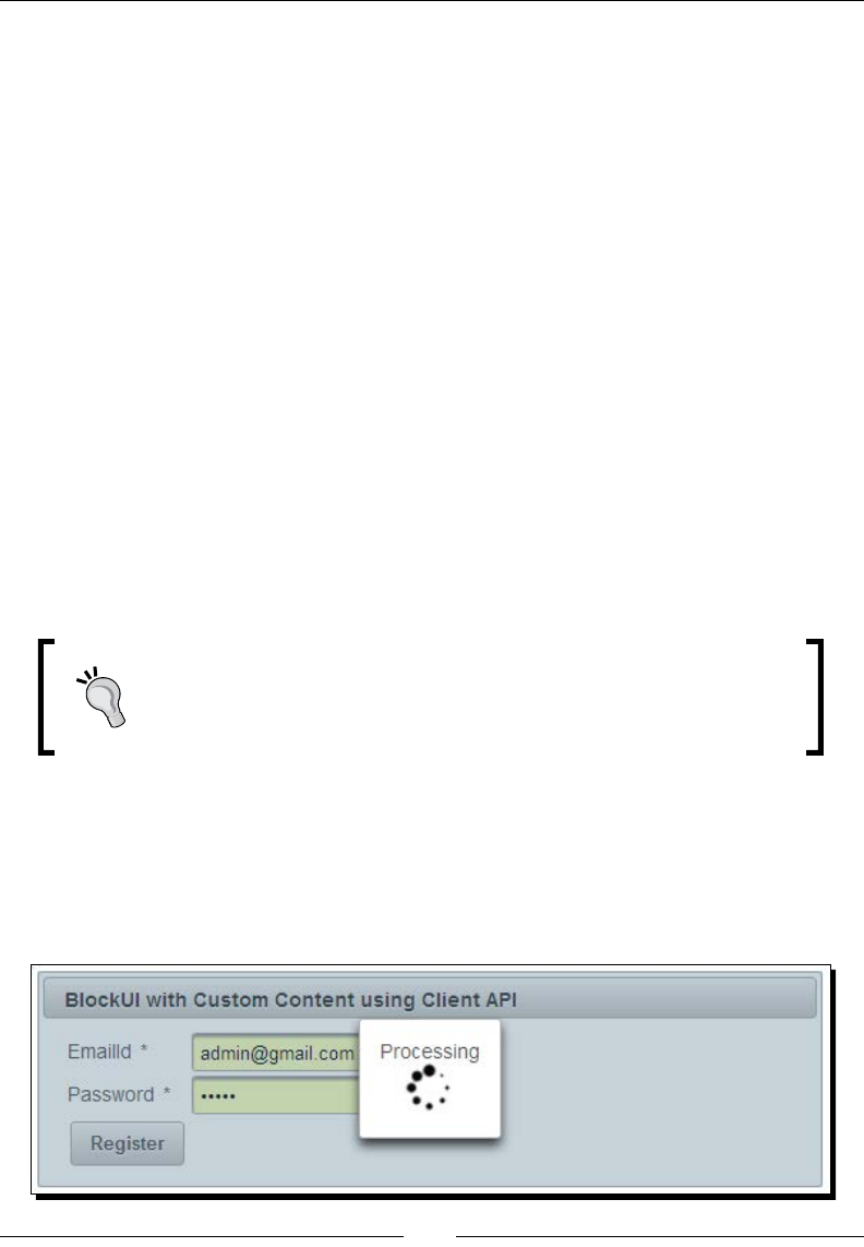
Chapter 3
[ 81 ]
2. Create an acon handler method doRegister():
public void doRegister()
{
//To simulate 5 seconds delay from server
try {
Thread.sleep(5000);
} catch (InterruptedException e) {
e.printStackTrace();
}
System.out.println("Register User :"+registerUser);
FacesContext.getCurrentInstance().addMessage(null,
new FacesMessage(FacesMessage.SEVERITY_INFO, "User
Registered successfully", null));
}
What just happened?
We have used the <p:blockUI> component to block the Registraon Form when the form
is submied by the user, and automacally unblock when the response is received
from the server.
The block aribute needs to be set to the id of the component to be blocked, and
the trigger aribute needs to be set to the ID(s) of the component(s), which triggers
the blocking acon.
BlockUI supports multiple triggers by setting comma - separated
component ids to trigger blocking
BlockUI doesn't support blocking absolute or fixed positioned
components such as Dialog or ConfirmDialog components
You can also display custom content such as loading or processing animaon images when
the UI component is blocked as follows:
<p:blockUI block="regForm" trigger="submitBtn">
Processing<br />
<p:graphicImage value="/resources/images/ajax-loader.gif"/>
</p:blockUI>

Using PrimeFaces Common Ulity Components
[ 82 ]
You can also use a client-side JavaScript API to block UI components as follows:
<p:commandButton id="submitBtn" value="Register"
actionListener="#{userController.doRegister}" onclick="bui.show()"
oncomplete="bui.hide()"/>
<p:blockUI block="regForm" widgetVar="bui">
Processing<br />
<p:graphicImage value="/resources/images/ajax-loader.gif"/>
</p:blockUI>
Here, instead of using the trigger aribute on the <p:blockUI> component, we
triggered blocking and unblocking acons with show() and hide() JavaScript methods
using onclick and oncomplete events on commandButton.
Understanding PrimeFaces selectors
The jQuery library has great support for selecng DOM elements based on various criteria
such as ID, name, or CSS class and so on.
Following are a few examples on how to use jQuery Selectors to select DOM elements:
$("p"): All <p> elements
$("#userId"): The element with id="userId"
$(".navbar"): All elements with class="navbar"
PrimeFaces has integraon with the jQuery Selector API for referencing JSF component models.
So you can use the jQuery Selector API to choose components to be processed or updated.
In most of the scenarios, using the jQuery Selector API for nding UI components yields
beer performance as the components are picked by navigang through the DOM tree on
the client side instead of navigang through the JSF component tree on the server side and
hence reduce the load on the server.
You can give a selector expression to update and process UI components using the
following syntax:
process="@(expression)" update="@(expression)"
For example, process="@(.ui-panel :input)" update="@(.ui-panel)"
Here, the process selector selects all input components in panel components and proceses
them. Similarly, the update selector selects all panel components and updates them.

Chapter 3
[ 83 ]
Time for action – updating UI components using jQuery
Selectors
Let us see how to use the jQuery Selector API to update JSF UI components.
1. Create a form with some mandatory input elds and commandButtons. When
buons are clicked, update the form or elds using jQuery Selector expressions
as follows:
<h:form id="loginForm" styleClass="myform" style="width: 500px;">
<p:panel header="Login Form">
<p:messages/>
<h:panelGrid columns="2">
<h:outputText value="EmailId:" />
<p:inputText value="#{jQuerySelectorController.user.emailId}"
required="true" label="EmailId"/>
<h:outputText value="Password:" />
<p:password value="#{jQuerySelectorController.user.password}"
required="true" label="Password"/>
<p:commandButton value="Update Form" actionListener="#{jQueryS
electorController.doLogin}"
update="@(#loginForm)"/>
<p:commandButton value="Update Fields" actionListener="#{jQuer
ySelectorController.doLogin}"
process="@(:input)" update="@(:input)"/>
</h:panelGrid>
</p:panel>
</h:form>
2. Implement the acon handler method doLogin():
public void doLogin()
{
if("admin@gmail.com".equals(user.getEmailId()) && "admin".
equals(user.getPassword()))
{
FacesContext.getCurrentInstance().addMessage(null,
new FacesMessage(FacesMessage.SEVERITY_INFO, "Login
successful", null));
} else {
FacesContext.getCurrentInstance().addMessage(null,
new FacesMessage(FacesMessage.SEVERITY_ERROR, "Login
failed", null));
}
}

Using PrimeFaces Common Ulity Components
[ 84 ]
What just happened?
When the Update Form buon is clicked, we are updang the form component using
the jQuery Selector @(#loginForm). When we click on the Update Fields buon,
we are processing and updang only input elds using jQuery Selector expressions
process="@(:input)" update="@(:input)".
We can also update the loginForm using the style class instead of id as follows:
<p:commandButton value="Login"
actionListener="#{jQuerySelectorController.doLogin}"
update="@(.myform)"/>
The jQuery Selector API is feature rich and easy to use. You can nd more informaon on
jQuery Selectors at http://api.jquery.com/category/selectors/.
Following are some commonly used jQuery Selectors to nd UI components in the DOM tree:
Expression Description
@(*) All elements in the document.
@(#lastname) The element with id="lastname".
@(.header) All elements with class="header".
@(.header,.preview) All elements with the class "header" or "preview".
@(p) All <p> elements.
@(p:first) The first <p> element.
@(p:last) The last <p> element.
@(tr:even) All even <tr> elements.
@(tr:odd) All odd <tr> elements.
@(:focus) The element that currently has focus.
@([href]) All elements with a href attribute.
@(:input) All input elements.
@(:text) All input elements with type="text".
@(:selected) All selected input elements.
@(:checked) All checked input elements.
We can use these selector expressions for the update and process aributes to specify
which UI components have to be updated or processed.

Chapter 3
[ 85 ]
Introducing the search expression framework
PrimeFaces 4.0 introduces a new search expression framework for referencing UI
components on both the client and server side with more keywords. In addion to more
keywords, the search expression framework also supports nested composite expressions
as well, which gives ner control on selecng components.
JSF supports referencing UI components by using component ideners and also
provides some keywords to refer commonly used UI elements such as, @this, @all,
@none, and @form.
@this: Represents current component
@all: Represents whole view
@form: Represents closest ancestor form of current component
@none: Represents no component
Look at the following form which uses ideners for paral processing and updang
the form:
<h:form id="loginForm">
...
<p:commandButton id="loginBtn" process="loginBtn"
update="loginForm"/>
</h:form>
Instead of using component ideners we can use the keywords so that if the ideners are
changed we don't need to update in all the places:
<h:form id="loginForm">
...
<p:commandButton id="loginBtn" process="@this" update="@form"/>
</h:form>
But JSF supporng keywords are very limited. PrimeFaces provides the following addional
keywords for many of the commonly used components:
@parent: Represents parent of the current component
@child(n): Represents nth child
@previous: Represents previous sibling
@next: Represents next sibling
@widgetVar(name): Represents component with given widgetVar
@namingcontainer: Represents closest ancestor naming container of
current component
@composite: Represents closest composite component ancestor

Using PrimeFaces Common Ulity Components
[ 86 ]
In addion to these new keywords, the PrimeFaces search expression framework also
supports nested composite expressions such as @this:@parent, @parent:@child(1),
or @widgetVar(registrationForm):@child(2):compId.
Let us see how we can use these search expressions to paral process and update components:
<h:form widgetVar="registrationForm">
<p:panel id="panel" header="User Registration Form" style="margin-
bottom:10px;">
<p:messages id="messages" />
<h:panelGrid columns="3">
<h:outputLabel for="@next" value="EmailId: *" />
<p:inputText id="emailId" value="#{userController.emailId}"
required="true" label="EmailId"/>
<p:message for="@previous" />
<h:outputLabel for="firstName" value="FirstName: *" />
<p:inputText id="firstName" value="#{userController.firstName}"
required="true" label="FirstName"/>
<p:message for="firstName" />
<h:outputLabel for="lastName" value="LastName: *" />
<p:inputText id="lastName" value="#{userController.lastName}"
required="true" label="LastName"/>
<p:message for="lastName" />
</h:panelGrid>
</p:panel>
<h:panelGrid columns="1">
<p:commandButton value="Process Form" process="@parent:@parent"
update="@form"/>
<p:commandButton value="Process LastName" process="@form:@
child(1):lastName" update="@all"/>
<p:commandButton value="Process RegistrationForm Widget"
process="@widgetVar(registrationForm)" update="@form"/>
</h:panelGrid>
</h:form>
In the preceding form, the Process Form buon processes the form because @parent
refers to the parent <h:panelGrid>; and @parent:@parent refers to the parent of
<h:panelGrid>, which is <h:form widgetVar="registrationForm">.
The Process LastName processes the LastName component because @
form:child(1):lastName represents the component whose ID is the lastName within
the rst child component of the enclosing form, which is <p:panel id="panel" ..>.

Chapter 3
[ 87 ]
The Process RegistraonForm Widget buon processes the RegistrationForm
component because @widgetVar(registrationForm) refers to the component whose
widgetVar="registrationForm".
Also we have used <h:outputLabel for="@next"..> and <p:message for="@
previous" /> both referring to <p:inputText id="emailId" ..>.
Summary
In this chapter, we have learned about frequently used PrimeFaces UI components such as
Messages, Growl, Fragment, Scky, Dialog, ConrmDialog, BlockUI, and NocaonBar. We
learned how to use RequestContext ulity methods and looked into the PrimeFaces jQuery
Selectors API integraon. Also, we have explored how to use a dialog framework and search
expression framework.
In the next chapter, we will learn a very important and interesng topic, PrimeFaces Client
Side Validaon (CSV) framework, which is introduced in the latest PrimeFaces4.0.

4
Introducing the PrimeFaces
Client Side Validation Framework
In most of the web applications, getting input data from the user, validating,
and converting the user-entered text into domain objects is an obvious process.
So, JSF hooks up these common steps into a Request Processing Lifecycle of a
web request. JSF provides input data conversions and validations on the server
side. But many applications demand performing validations on the client side,
to reduce the load on the server, as well as to provide immediate feedback on
validation errors.
PrimeFaces 4.0 introduces a brand new Client Side Validation (CSV) framework,
which performs input data conversions and validations on the client side
which is compatible with the server-side implementation. The PrimeFaces CSV
framework not only supports built-in JSF validators and converters, but also
provides extension points to work with custom validators and converters.
In this chapter, we will cover:
Conguring and using the Client Side Validaon framework
Triggering client-side validaons based on events
Supporng I18N for validaon messages
Extending the CSV framework with custom JSF validators and converters
Using the CSV framework with the Bean Validaon API
Extending the CSV framework with custom Bean Validaon annotaons

Introducing the PrimeFaces Client Side Validaon Framework
[ 90 ]
Conguring and using the Client Side Validation
framework
The PrimeFaces CSV feature is disabled by default. To enable the Client-side Validaon
framework, we need to congure <context-param> in the web.xml le as follows:
<context-param>
<param-name>primefaces.CLIENT_SIDE_VALIDATION</param-name>
<param-value>true</param-value>
</context-param>
We can trigger client-side validaons by seng the validateClient aribute to true on
command components such as <p:commandButton> or <p:commandLink>.
Time for action – performing client-side validations
Let us see how we can create a User Registraon form with regular JSF validators and
converters, and perform validaons using the PrimeFaces Client-side Validaon framework,
by performing the following step:
1. Create a User Registraon form and enable client-side validaons by seng the
validateClient aribute to true:
<h:form id="registrationForm">
<p:panel header="User Registration">
<h:panelGrid columns="3">
<p:outputLabel value="EmailId:*"/>
<p:inputText id="emailId"
value="#{userController.registerUser.emailId}"
label="EmailId" required="true">
<f:validateRegex pattern="^[_A-Za-z0-9-\+]+(\.[_A-Za-
z0-9-]+)*@[A-Za-z0-9-]+(\.[A-Za-z0-9]+)*(\.[A-Za-
z]{2,})$" />
</p:inputText>
<p:message for="emailId"/>
<p:outputLabel value="Password:*"/>
<p:password id="password"
value="#{userController.registerUser.password}"
required="true" label="Password">
<f:validateLength minimum="4" maximum="12"/>
</p:password>
<p:message for="password"/>

Chapter 4
[ 91 ]
<p:outputLabel value="FirstName:*"/>
<p:inputText id="firstName"
value="#{userController.registerUser.firstName}"
required="true" label="FirstName"/>
<p:message for="firstName"/>
<p:outputLabel value="LastName:"/>
<p:inputText id="lastName"
value="#{userController.registerUser.lastName}"/>
<p:message for="lastName"/>
<p:outputLabel value="Phone:"/>
<p:inputText id="phone"
value="#{userController.registerUser.phone}"
validatorMessage="Invalid Phone. Phone number
should be in 999-999-9999 format">
<f:validateRegex pattern="^\d{3}-\d{3}-\d{4}$"/>
</p:inputText>
<p:message for="phone"/>
<p:outputLabel value="DOB:"/>
<p:inputText id="dob"
value="#{userController.registerUser.dob}"
label="DOB"
validatorMessage="Invalid DOB. Date should be in
MM/dd/yyyy format">
<f:convertDateTime pattern="MM/dd/yyyy" />
</p:inputText>
<p:message for="dob"/>
<p:commandButton action="#{userController.doRegister}"
value="Register" update="@form" validateClient="true"/>
</h:panelGrid>
</p:panel>
</h:form>
What just happened?
The User Registraon form performs conversions and validaons on the client side instead
of regular JSF server-side conversions and validaons, as we have enabled the PrimeFaces
Client-side Validaon framework by seng the validateClient="true" aribute on
<p:commandButton>.
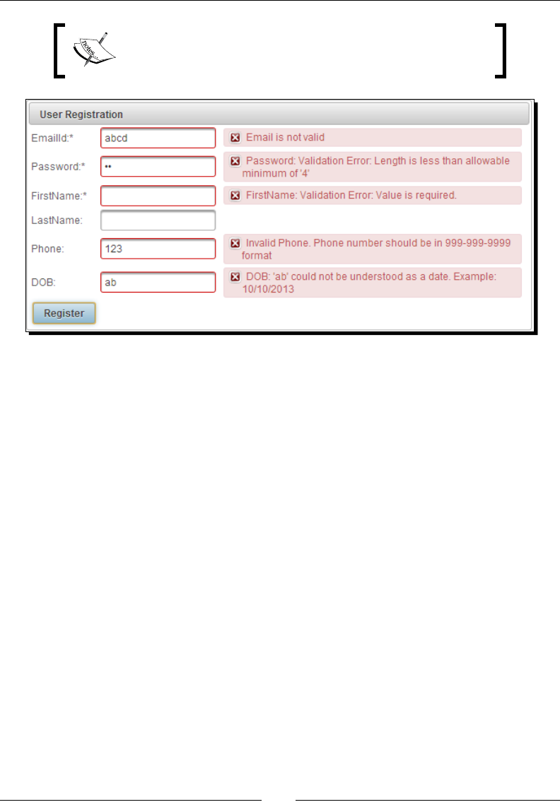
Introducing the PrimeFaces Client Side Validaon Framework
[ 92 ]
The PrimeFaces CSV framework works with PrimeFaces
components only and doesn't support standard JSF components
such as <h:inputText>, <h:inputSecret>, and so on.
With the client-side validaons enabled, all required eld validaons, length validaon,
the DOB (Date of Birth) value conversion/validaon, and the EmailId or Phone values
regex validaons will be performed on the client side. Similarly, you can use other JSF
validaons such as <f:validateDoubleRange/>, <f:validateLongRange/>, and
the <f:convertNumber/> converter as well.
Triggering client-side validations based on events
The client-side validaons get triggered when the form is submied, that is when you
click on the command component with the validateClient aribute set to true. But
somemes, we may want to show validaon errors immediately instead of waing for the
user to submit the form.
We can enable instant validaons using <p:clientValidator/> for various events such as
change(default), blur, keyup, and so on, as follows:
<p:inputText id="emailId"
value="#{userController.registerUser.emailId}" label="EmailId"
required="true" validatorMessage="#{msg['invalid.email']}">
<f:validateRegex pattern="^[_A-Za-z0-9-\+]+(\.[_A-Za-z0-9-
]+)*@[A-Za-z0-9-]+(\.[A-Za-z0-9]+)*(\.[A-Za-z]{2,})$" />
<p:clientValidator />
</p:inputText>
<p:password id="password"
value="#{userController.registerUser.password}"

Chapter 4
[ 93 ]
required="true" label="Password">
<f:validateLength minimum="4" maximum="12"/>
<p:clientValidator event="blur"/>
</p:password>
In the preceding form, the EmailId input eld will be validated if the values are changed as
change, which is the default event. The Password eld will be validated when it loses focus.
The PrimeFaces CSV framework supports AJAX and non-AJAX requests as well as
Paral Processing and Rendering.
For non-AJAX requests, all the visible and editable input components in the form will be
validated and message components must be placed inside the form.
The following CommandBuon component triggers the non-AJAX request, and all the input
elds will be processed and redisplay the User Registraon page along with error messages,
if any validaons or conversions failed:
<p:commandButton action="#{userController.doRegister}" ajax="false"
validateClient="true" value="Register"/>
The following CommandBuon component triggers an AJAX request and only the EmailId
and Password elds will be processed and the enclosing form will be updated:
<p:commandButton action="#{userController.doRegister}"
value="Register" validateClient="true" process="emailId,
password" update="@form"/>
Supporting I18N for validation messages
The PrimeFaces CSV framework displays conversion or validaon errors in the same
way as the JSF server-side conversion or validaon error messages, and also supports
Internaonalizaon (I18N). You can nd more informaon on Internaonalizaon in the
Understanding Internaonalizaon (I18N) and Localizaon (L10N) secon of Chapter 7,
Introducing Advanced Input Components.
You can have error messages in ResourceBundles that are registered in the faces-config.
xml le and use them for validaon or conversion messages as follows:
<p:inputText id="email"
value="#{userController.registerUser.emailId}" label="EmailId"
required="true" validatorMessage="#{msg['invalid.email']}">
<f:validateRegex pattern="^[_A-Za-z0-9-\+]+(\.[_A-Za-z0-9-
]+)*@[A-Za-z0-9-]+(\.[A-Za-z0-9]+)*(\.[A-Za-z]{2,})$" />
<p:clientValidator />
</p:inputText>
<p:message for="email"/>
Introducing the PrimeFaces Client Side Validaon Framework
[ 94 ]
Create the messages.properties le which contain messages for the English locale
as follows:
invalid.email=EmailId is invalid
Also, create the messages_fr.properties le which contain messages for the French
locale as follows:
invalid.email=Email est invalide
A validaon error message will be displayed based on the current locale if EmailId is invalid.
PrimeFaces only provides English translaons for the built-in
JSF conversion and validaon error messages. You can nd
the PrimeFaces client-side validaon message templates in
the primefaces-4.0.jar/META-INF/resources/
primefaces/validation/validation.js le.
Extending the CSV framework with custom JSF validators
In addion to built-in converters and validators, JSF supports creang custom converters and
validators. We can also extend the PrimeFaces CSV framework to support custom converters
and validators, and perform conversions and validaons on the client side, similar to the
built-in converters and validators.
To create a custom JSF validator, we need to implement javax.faces.validator.
Validator. To make this custom validator work with the PrimeFaces CSV framework, we
also need to implement the org.primefaces.validate.ClientValidator interface to
provide a client validator ID and validaon metadata.
Time for action – using the custom JSF validator on the
client side
Let us see how we can create a custom JSF validator and use it with the PrimeFaces CSV
framework, by performing the following steps:
1. Create the CreditCardValidator class to validate whether the credit card
number is in the 9999 9999 9999 9999 format or not:
import java.util.*;
import java.util.regex.Pattern;
import javax.faces.application.FacesMessage;
import javax.faces.component.UIComponent;
import javax.faces.context.FacesContext;

Chapter 4
[ 95 ]
import javax.faces.validator.FacesValidator;
import javax.faces.validator.Validator;
import javax.faces.validator.ValidatorException;
import org.primefaces.validate.ClientValidator;
@FacesValidator("creditCardValidator")
public class CreditCardValidator implements Validator,
ClientValidator
{
private Pattern pattern;
private static final String CC_PATTERN = "^\\d{4} \\d{4}
\\d{4} \\d{4}$";
public CreditCardValidator() {
pattern = Pattern.compile(CC_PATTERN);
}
public void validate(FacesContext context, UIComponent
component, Object value) throws ValidatorException {
if(value == null) {
return;
}
if(!pattern.matcher(value.toString().trim()).matches()) {
throw new ValidatorException(new
FacesMessage(FacesMessage.SEVERITY_ERROR,
"Validation Error", value + " is not a valid
creditcard number"));
}
}
public Map<String, Object> getMetadata() {
Map<String, Object> metadata = new HashMap<String,
Object>();
metadata.put("data-error-msg", "Invalid CreditCard
Number");
return metadata;
}
public String getValidatorId() {
return "creditCardValidator";
}
}
2. Implement the client-side validator funcon and congure it:
<script type="text/javascript">
PrimeFaces.validator['creditCardValidator'] =
{
pattern: /\d{4} \d{4} \d{4} \d{4}/,
validate: function(element, value) {

Introducing the PrimeFaces Client Side Validaon Framework
[ 96 ]
if(!this.pattern.test(value)) {
throw {
summary: 'Validation Error',
detail: element.data('error-msg')
}
}
}
};
</script>
3. Register the CreditcardValidator class for the CreditCard input eld:
<h:form>
...
<p:inputText id="cc" value="#{paymentController.cc}">
<f:validator validatorId="creditCardValidator" />
</p:inputText>
<p:message for="cc" />
...
<p:commandButton value="Submit" ajax="false"
validateClient="true"/>
</h:form>
What just happened?
We have implemented the validate() method to check the credit card format using the
Regular Expression API. Also, we have implemented the getValidatorId() method to
return the name of the client-side validator ID and getMetadata() to return the metadata
that will be used by the client-side validate funcon. In the preceding code snippets, we
have congured the client-side validator funcon using <script> tags inside the facelets
pages directly. But it is a beer approach to put it in the separate JavaScript le and include
them using the <h:outputStylesheet> tag.
We need to add metadata with the key paern data-{keyname}
in order to obtain the value on the client side using element.
data('{keyname}').
Extending the CSV framework with custom JSF converters
Similarly, we can also create a custom JSF converter and extend the PrimeFaces CSV framework
to perform conversions on the client side. To make this custom converter work with the
PrimeFaces CSV framework, we also need to implement the org.primefaces.convert.
ClientConverter interface to provide the client converter ID and validaon metadata.

Chapter 4
[ 97 ]
Time for action – using the custom JSF converter on the
client side
Let us see how we can create a custom JSF converter and use it with the PrimeFaces CSV
framework, by performing the following steps:
1. Create a bean named CreditCardBean:
public class CreditCardBean
{
private String number;
public CreditCardBean(String number)
{
this.number = number;
}
public String toString()
{
return number;
}
}
2. Create the CreditCardConverter class to convert a string value into the
CreditCardBean object and vice versa by implemenng javax.faces.
convert.Converter and org.primefaces.convert.ClientConverter:
@FacesConverter("creditCardConverter")
public class CreditCardConverter implements Converter,
ClientConverter
{
private static final String CC_PATTERN = "^\\d{4} \\d{4}
\\d{4} \\d{4}$";
@Override
public Object getAsObject(FacesContext context, UIComponent
component, String value)
{
if (value==null || value.trim().equals("")) {
return null;
}
else {
if(!Pattern.compile(CC_PATTERN).matcher(value).
matches()){
FacesMessage msg = new
FacesMessage(FacesMessage.SEVERITY_ERROR,
"Conversion Error", "Can't convert
"+value+" into CreditCard Number");

Introducing the PrimeFaces Client Side Validaon Framework
[ 98 ]
throw new ConverterException(msg);
}
return new CreditCardBean(value);
}
}
@Override
public String getAsString(FacesContext context, UIComponent
component, Object value)
{
if (value == null || value.equals("")) {
return "";
} else if(value instanceof CreditCardBean){
return String.valueOf(((CreditCardBean)
value).toString());
}
return "";
}
@Override
public Map<String, Object> getMetadata()
{
return null;
}
@Override
public String getConverterId()
{
return "creditCardConverter";
}
}
3. Implement and congure the client-side CreditCard converter:
<script type="text/javascript">
PrimeFaces.converter['creditCardConverter'] = {
pattern: /\d{4} \d{4} \d{4} \d{4}/,
convert: function(element, value) {
if(!this.pattern.test(value)) {
throw {
summary: 'Conversion Error',
detail: value + ' cannot be converted into
CreditCard Number'
}
}
return value;
}
};
</script>

Chapter 4
[ 99 ]
4. Register CreditCardConverter for the CreditCard input eld:
<h:form>
...
<h:outputLabel for="creditCardBean" value="CreditCard:" />
<p:inputText id="creditCardBean"
value="#{paymentController.creditCardBean}">
<f:converter converterId="creditCardConverter"/>
<f:validator validatorId="creditCardValidator" />
</p:inputText>
<p:message for="creditCardBean"/>
...
<p:commandButton value="Submit" ajax="false"
validateClient="true"/>
</h:form>
What just happened?
We have implemented the getAsObject() and getAsString() methods to convert
the CreditCard bean into a string and vice versa. Also, we have implemented the
getConverterId() method to return the name of the client-side converter ID and
getMetadata() to return the metadata that will be used by the client-side convert( )
funcon. We have implemented the client-side converter funcon by checking the credit
card number format using JavaScript regex. Here, we are not really converng the input into
any other data type. But in real scenarios, you may have to convert the input string value
into number, date, or currency types.
Using the CSV framework with the Bean Validation API
The Bean Validaon API simplies the data validaon process using metadata constraint
annotaons on Java beans. The Bean Validaon API also supports XML-based constraint
denions, but many prefer annotaons due to its ease of use. The Bean Validaon API
provides most of the commonly used constraints and we can create our own custom
validators also, if required.
JSF provides out-of-the-box integraon with the Bean Validaon API, which means instead
of specifying the validaons inside facelets pages, we can dene the validaon constraints
on Java beans. When you submit the form, if there are any violaons to the metadata
constraints, those errors will be displayed as FacesMessages with ERROR severity.
The PrimeFaces Client-side Validaon framework also supports Bean Validaon API-based
validaons and performs the validaons on the client side.

Introducing the PrimeFaces Client Side Validaon Framework
[ 100 ]
Time for action – using the CSV framework with the Bean
Validation API
Let us see how we can use the Bean Validaon API to specify validaon constraints and
perform validaons using PrimeFaces client-side validaons, by performing the following steps:
1. Create the UserBean class and specify the validaon constraints using the Bean
Validaon API annotaons:
public class UserBean
{
private Integer id;
@Pattern(regexp="^[_A-Za-z0-9-\\+]+(\\.[_A-Za-z0-9-]+)*@[A-
Za-z0-9-]+(\\.[A-Za-z0-9]+)*(\\.[A-Za-z]{2,})$",
message="Invalid Email Id")
private String emailId;
@Size(min=2,max=5)
private String password;
@Size(min=1, message="FirstName should not be empty")
private String firstName;
private String lastName;
@Pattern(regexp="^\\d{3}-\\d{3}-\\d{4}$")
private String phone;
@Past
private Date dob;
@AssertTrue(message="You must agree to Terms and
Conditions")
private boolean agreeToTnc;
//setters and getters
}
2. Create the User Registraon form:
<h:form id="registrationForm">
<p:panel header="User Registration">
<h:panelGrid columns="3">
<p:outputLabel value="EmailId:*"/>
<p:inputText id="emailId"
value="#{userController.userBean.emailId}"
label="EmailId">
<p:clientValidator event="blur"/>
</p:inputText>
<p:message for="emailId"/>
<p:outputLabel value="Password:*"/>

Chapter 4
[ 101 ]
<p:password id="password"
value="#{userController.userBean.password}"
label="Password">
<p:clientValidator/>
</p:password>
<p:message for="password"/>
<p:outputLabel value="FirstName:*"/>
<p:inputText id="firstName"
value="#{userController.userBean.firstName}"
label="FirstName"/>
<p:message for="firstName"/>
<p:outputLabel value="LastName:"/>
<p:inputText id="lastName"
value="#{userController.userBean.lastName}"/>
<p:message for="lastName"/>
<p:outputLabel value="Phone:"/>
<p:inputText id="phone"
value="#{userController.userBean.phone}"/>
<p:message for="phone"/>
<p:outputLabel value="DOB:"/>
<p:inputText id="dob"
value="#{userController.userBean.dob}"
label="DOB">
<f:convertDateTime pattern="MM/dd/yyyy" />
</p:inputText>
<p:message for="dob"/>
<h:outputLabel for="agreeToTnc" value="Agree to
Terms and Conditions " />
<p:selectBooleanCheckbox id="agreeToTnc"
value="#{userController.userBean.agreeToTnc}"
/>
<p:message for="agreeToTnc" />
<p:commandButton
action="#{userController.doRegister}"
value="Register" validateClient="true"
update="@form"/>
</h:panelGrid>
</p:panel>
</h:form>
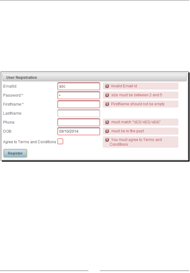
Introducing the PrimeFaces Client Side Validaon Framework
[ 102 ]
What just happened?
We have specied the validaon metadata on UserBean properes using various
annotaons such as @Size, @Pattern, @AssertTrue, and so on. We have not specied
any validaons in the registraon form, and enabled client-side validaons using the
validateClient="true" aribute on <p:commandButton>.
When you click on the Register buon, the form data will be validated on the client side and
displays error messages accordingly. Also, note that we have used <p:clientValidator/>
for the EmailId and Password elds to trigger validaons immediately instead of waing ll
the form is submied.
Extending the CSV framework with custom Bean
Validation annotations
The Bean Validaon API also supports creang custom validaon annotaons and we can
extend the PrimeFaces CSV framework to support custom Bean Validaon annotaons as well.
We can create a custom Bean Validaon annotaon and specify constraint validator
using the @Constraint annotaon. In order to make it work with the PrimeFaces
CSV framework, we also need to specify the client-side constraint resolver using the
@ClientConstraint annotaon.

Chapter 4
[ 103 ]
Time for action – using the custom Bean Validation annotation
with the CSV framework
In this secon, we will demonstrate how to create a custom CreditCard validator @
CreditCard using the Bean Validaon API, and show how to extend the PrimeFaces
CSV framework to work with the custom Bean Validaon annotaon @CreditCard, by
performing the following steps:
1. Create a custom Bean Validaon annotaon @CreditCard:
@Target({METHOD,FIELD,ANNOTATION_TYPE})
@Retention(RUNTIME)
@Constraint(validatedBy=CreditCardConstraintValidator.class)
@ClientConstraint(resolvedBy=CreditCardClientValidation
Constraint.class)
@Documented
public @interface CreditCard
{
String message() default "{com.packtpub.techbuzz.validation.
creditcard.invalid}";
Class<?>[] groups() default {};
Class<? extends Payload>[] payload() default {};
}
2. Implement the CreditCardConstraintValidator class by implemenng
ConstraintValidator<CreditCard, String>:
public class CreditCardConstraintValidator implements
ConstraintValidator<CreditCard, String>
{
private Pattern pattern;
private static final String CC_PATTERN = "^\\d{4} \\d{4}
\\d{4} \\d{4}$";
public void initialize(CreditCard a) {
pattern = Pattern.compile(CC_PATTERN);
}
public boolean isValid(String value,
ConstraintValidatorContext cvc) {
if(value == null)
return true;
else{
return pattern.matcher(value.toString()).matches();
}
}
}

Introducing the PrimeFaces Client Side Validaon Framework
[ 104 ]
3. Implement CreditCardClientValidationConstraint by implemenng
ClientValidationConstraint:
public class CreditCardClientValidationConstraint implements
ClientValidationConstraint
{
public Map<String, Object> getMetadata(ConstraintDescriptor
constraintDescriptor) {
Map<String,Object> metadata = new HashMap<String,
Object>();
Map attrs = constraintDescriptor.getAttributes();
String message = (String)attrs.get("message");
if(message != null){
metadata.put("data-cc-msg", message);
}
return metadata;
}
public String getValidatorId() {
return "CreditCard";
}
}
4. Implement the client-side validator and congure it:
<script type="text/javascript">
PrimeFaces.validator['CreditCard'] = {
pattern: /\d{4} \d{4} \d{4} \d{4}/,
MESSAGE_ID:
'com.packtpub.techbuzz.validation.
creditcard.invalid',
validate: function(element, value) {
var vc = PrimeFaces.util.ValidationContext;
if(!this.pattern.test(value)) {
var msgStr = element.data('cc-msg');
var msg = msgStr ? {summary:msgStr, detail:
msgStr} : vc.getMessage(this.MESSAGE_ID);
throw msg;
}
}
};
</script>

Chapter 4
[ 105 ]
5. Use a custom @CreditCard annotaon for validang the creditCard property:
public class PaymentController
{
@CreditCard(message="Invalid CreditCard Number")
private String creditCard;
...
}
<h:form>
...
<h:outputLabel value="CreditCard:" />
<p:inputText id="creditCard"
value="#{paymentController.creditCard}" />
<p:message for="creditCard"/>
...
<p:commandButton value="Submit" ajax="false"
validateClient="true"/>
</h:form>
What just happened?
We have created a custom Bean Validaon constraint annotaon @CreditCard
and implemented ConstraintValidator. We have also implemented the
ClientValidationConstraint resolver CreditCardClientValidationConstraint
to return a client validator ID and metadata that will be used by the client-side validator. We
have implemented the client-side validator JavaScript funcon and congured it. Finally,
we have used the @CreditCard annotaon with the creditCard property and provided a
custom validator error message using the message aribute. We have enabled the client-side
validaons using validateClient="true" for the form submission command component.
We need to add the custom Bean Validaon message keys in the
ValidationMessages.properties le which should be available
in the root classpath.
PrimeFaces only provides English translaons for built-in Bean Validaon error
messages. You can nd the corresponding PrimeFaces client-side validaon message
templates in the primefaces-4.0.jar/META-INF/resources/primefaces/
validation/beanvalidation.js le.

Introducing the PrimeFaces Client Side Validaon Framework
[ 106 ]
Summary
In this chapter, we have learned how to use the PrimeFaces Client-side Validaon (CSV)
framework to perform conversions and validaons on the client side. We looked at how
to use the Bean Validaon API along with the CSV framework. Also, we learned how to
extend the CSV framework to work with custom JSF converters/validators and custom
Bean Validaon annotaons.
In the next chapter, we will learn about the most important topic, PrimeFaces input
UI components. Also, we will learn about some advanced input components such as
InputMask, Editor, and AutoComplete widgets.

5
Introducing Text Input Components
PrimeFaces provides several text input components, among them some that
are enhanced versions of standard JSF UI components with additional features
and theming support. In addition to that, PrimeFaces also provides its own
advanced input components such as InputText, InputTextarea, Password,
InputMask, Editor, Inplace, AutoComplete, and so on, which will help to build
the applications with a rich look and feel.
In this chapter we will cover:
Geng text input with the InputText component
Advanced uses of InputTextarea
Geng input in specic format using InputMask
Using the Password component along with strength indicator and match mode
Rich text eding using Editor
Advanced eding using the Inplace editor
Providing suggesons using AutoComplete
Getting text input with the InputText component
InputText is an extension of the standard JSF <h:inputText> component with
skinning capabilies:
<p:inputText id="emailId" value="#{userController.loginUser.emailId}"
required="true"/>

Introducing Text Input Components
[ 108 ]
PrimeFaces provides an addional type aribute for the <p:inputText> component,
which can be used to generate other types of input elds such as the hidden input text
eld, which is similar to the standard JSF <h:inputHidden> component:
<p:inputText id="id" value="#{userController.registerUser.id}"
type="hidden" />
Similar to the JSF <h:inputText> component, PrimeFaces <p:inputText> supports
various JavaScript events such as onclick, onmouseover, onfocus, and so on.
Time for action – using the InputText component
Let us see how we can use various features of the <p:inputText> component such as
creang text, hidden type input elds, JavaScript event handlers, and so on:
1. Create a form with input elds of type text and hidden:
<h:form id="form1">
<p:panel header="InputText Components">
<h:panelGrid columns="2">
<h:outputLabel value="EmailId" />
<p:inputText id="emailId"
value="#{userController.registerUser.emailId}"
required="true" onclick="$(this).select();"/>
<h:outputLabel for="firstName" value="FirstName"/>
<p:inputText id="firstName"
value="#{userController.registerUser.firstName}"
required="true" label="FirstName"
onchange="firstNameChanged()" />
<p:inputText id="id"
value="#{userController.registerUser.id}"
type="hidden" />
<p:commandButton value="Submit" update="@form"/>
</h:panelGrid>
</p:panel>
</h:form>
2. Create the JavaScript event handler method, firstNameChanged(), as follows:
function firstNameChanged ()
{
alert("FirstName value changed");
}

Chapter 5
[ 109 ]
What just happened?
We have used <p:inputText> components to create text type input elds: emailId and
firstName, and hidden type input eld id. Also, we have used JavaScript callback event
handlers for the onclick and onchange events. We can also register AJAX event listeners
to execute server-side logic using <p:ajax>, as follows:
<p:inputText id="lastName"
value="#{userController.registerUser.lastName}">
<p:ajax event="change"
listener="#{userController.handleLastNameChanged}"/>
</p:inputText>
We can also make InputText components as read-only input elds by seng the readonly
aribute to true:
<p:inputText id="userId" value="#{userController.registerUser.id}"
readonly="true" />
Introducing the InputTextarea component
InputTextarea is an extension to the standard JSF <h:inputTextarea> component with
support for AutoComplete, autoResize, remaining characters counter, and theming features:
<p:inputTextarea cols="50" rows="5"
value="#{userController.loginUser.bio}"/>
The <p:inputTextarea> component provides the following addional aributes in
addion to the JSF <h:inputTextarea> aributes:
autoResize: Species auto growing when being typed. Default is true.
maxlength: Maximum number of characters that can be entered in this eld.
counter: ID of the output component to display remaining characters.
counterTemplate: Template text to display in counter.
completeMethod: Method to provide AutoComplete suggesons.
minQueryLength: Minimum number of characters to be typed to run a query.
Default is 3.
queryDelay: Delay in milliseconds before sending each query. Default is 700.
scrollHeight: Height of the viewport for AutoComplete suggesons.
In our TechBuzz applicaon, we will use the <p:inputTextarea> component for various
screens such as My Account, Add Comment, and so on.
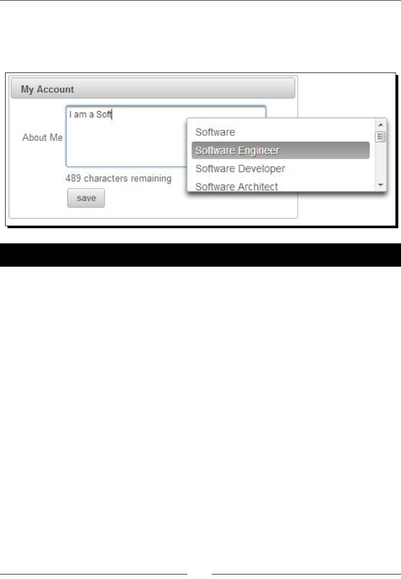
Introducing Text Input Components
[ 110 ]
In the My Account screen, we will have an InputTextarea eld to enter the user's biography
with maximum limit of 500 characters and AutoComplete suggesons for some commonly
used words. We will also display the number of characters remaining, as shown in the
following screenshot:
Time for action – using InputTextarea
In this secon, we will demonstrate how to use the AutoComplete feature with InputTextarea
and show how many more characters can be entered into that eld, which is shown as follows:
1. Create the user account form with <p:inputTextarea> to enter the user's
biography:
<h:form id="myAccountForm">
<p:panel header="My Account">
<h:panelGrid columns="2">
<p:outputLabel for="bio" value="About Me"/>
<p:inputTextarea id="bio"
value="#{userController.loginUser.bio}"
cols="50" rows="5"
completeMethod="#{userController.completeBio}"
minQueryLength="4" scrollHeight="100"
counter="counter" counterTemplate="{0}
characters remaining" maxlength="500"
autoResize="true" />
<h:outputText id="counter" value="" />
<p:commandButton value="save"
actionListener="#{userController.updateUser}"
update="@form"/>
</h:panelGrid>
</p:panel>
</h:form>

Chapter 5
[ 111 ]
2. Implement the completeBio() method to provide suggesons as follows:
public List<String> completeBio(String query)
{
List<String> values = new ArrayList<String>();
if("soft".equalsIgnoreCase(query))
{
values.add("Software");
values.add("Software Engineer");
values.add("Software Developer");
values.add("Software Architect");
values.add("Software Development");
values.add("Software Solutions");
values.add("Software Development Methodologies");
values.add("Software Development Process");
values.add("Software Development Life Cycle");
values.add("Software Design");
values.add("Software Design Guidelines");
values.add("Software Design Strategies");
values.add("Software Testing");
values.add("Software Testing Tools");
values.add("Soft skills");
}
else if("java".equalsIgnoreCase(query))
{
values.add("Java");
values.add("Java Programming");
values.add("Java Platform");
values.add("JavaScript");
}
return values;
}
What just happened?
We have created an InputTextarea eld with a maximum size of 500 characters, using
the maxlength="500" aribute to enter the biography details, along with a counter
component to display the number of characters remaining, using the counter aribute.
The counter template is customized to display text as {0} characters remaining. The default
counterTemplate value is {0}, which means it will display only the number of characters
remaining. The InputTextarea component height will be automacally increased if required
as the autoResize aribute is set to true.

Introducing Text Input Components
[ 112 ]
We have used the completeMethod aribute to provide AutoComplete suggesons. The
search query will be triggered only aer typing a minimum of four characters in a word
because we have specied minQueryLength="4". If the number of suggesons is more,
then it will display all the suggesons and the list size will be overowed. We have set the
height of viewport for the AutoComplete suggesons box using scrollHeight="100", so
if there are more suggesons then the suggeson box will be displayed with a scrollbar.
Getting formatted input using the InputMask component
The InputMask component can be used to read input in a specic format. For example, we
may want the user to enter a phone number in the XXX-XXX-XXXX format. We can use the
<p:inputMask> component to read the input in the given format, restricng the user from
entering invalid data:
<p:inputMask value="#{userController.registerUser.phone}" mask="999-
999-9999"/>
The mask template can have the following characters, which have special meaning:
9: Represents a single digit, that is from 0 to 9.
a: Represents an alphabec character, that is from A to Z and a to z.
*: Represents any alphanumeric character, that is 0 to 9, A to Z, or a to z.
Let us see a few examples of mask templates:
<p:inputMask mask="(999) 999-99-9999"/>
This mask template (999) 999-99-9999 restricts the input to contain any digit in place of
9 in the template. It won't allow the user to enter any non-digit character in place of 9.
Some valid inputs are: (111) 123-45-6789, (435) 222-99-0987.
<p:inputMask mask="aaa999"/>
This mask template mask="aaa999" only allows three alphabec characters followed by
three digits.
Some valid inputs are: ABC123, pqr321, eFh234.
<p:inputMask mask="a*-a999"/>
This mask template a*-a999 restricts the input to contain any digit in place of 9, any
alphabec character in place of a, and any alphanumeric in place of * in the template.
Some valid inputs are: A8-d123, da-a321, x2-t234, XY-Z123.
We can set some porons of the input as oponal using the ? symbol. Anything menoned
aer ? in the mask template is oponal.
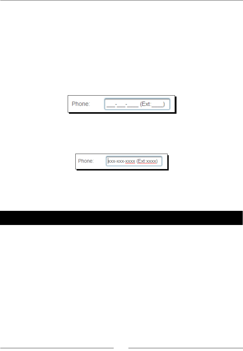
Chapter 5
[ 113 ]
Suppose we want the user to enter a phone number, and oponally he/she can enter
an extension:
<p:inputMask mask="(999) 999-9999? x9999" />
In this mask template, (999) 999-9999? x9999, we have x9999 aer the ? symbol,
which means this part is oponal.
Some valid values are: (122) 222-2222 x222, (122) 222-2222, (122) 222-2222 x2.
By default, the placeholder will be displayed as underscore (_), as shown in the
following screenshot:
We can customize the placeholder character using the placeHolder aribute:
<p:inputMask id="phone" value="#{userController.loginUser.phone}"
mask="999-999-9999? (Ext:9999)" placeHolder="X"/>
In our TechBuzz applicaon, the user can update his/her phone number in the My Account
screen. We will use the <p:inputMask> component to enter the phone number in a
predened format.
Time for action – reading formatted input using InputMask
Let's look at how to get phone number input in the 999-999-9999? (Ext:9999) format
using the InputMask component:
1. Create a form with a Phone input eld to read a phone number in the 999-999-
9999? (Ext:9999) format, by using the following code:
<h:form id="form1">
<p:panel header="My Account">
<h:panelGrid columns="2">
<p:outputLabel for="phone" value="Phone"/>
<p:inputMask id="phone"
value="#{userController.loginUser.phone}"
mask="999-999-9999? (Ext:9999)"
placeHolder="X"/>
</h:panelGrid>
</p:panel>
</h:form>

Introducing Text Input Components
[ 114 ]
What just happened?
We have used the <p:inputMask> component to read a phone number in the 999-999-
9999 format. To set the extension number as oponal, we have menoned the extension
part aer the ? symbol. As we have set the placeholder to X, when you put the cursor in the
Phone input eld, the mask is displayed as XXX-XX-XXXX? (Ext:XXXX).
Introducing the Password component
The Password component is an extended version of the standard JSF <h:inputSecret>
component with theme integraon, strength indicator, and match mode support.
A basic Password component can be created as follows:
<p:password value="#{userController.registerUser.password}" />
We can also provide feedback on the strength of the password using the feedback
aribute. As you type in the password eld, it will provide feedback on whether the entered
password is Weak, Good, or Strong based on the combinaon of characters used.
Password strength is determined by the characters used in the ranges [0-9], [a-z, A-Z],
and [!@#$%^&*?_~.,;=]:
<p:password value="#{userController.loginUser.password}"
feedback="true"/>
By default, when feedback is on and the Password eld is blank it will show a toolp with the
text Please enter a password. Based on the strength of the password entered, it will display
toolps as Weak, Good, or Strong. You can customize these toolp values as follows:
<p:password value="#{userController.loginUser.password}"
feedback="true"
promptLabel="Please enter Password"
weakLabel="Weak password"
goodLabel="Good Password" strongLabel="Strong
Password" />
Instead of displaying the feedback in toolps, you can also display the feedback inline, just
under the Password eld, using the inline aribute as follows:
<p:password value="#{userController.loginUser.password}"
feedback="true" inline="true"/>
Password matching is a very common requirement for many web applicaons. Generally for
the user registraon or change password features, we would like to enter a password and
conrm the password and both of them should match with each other. The <p:password>
component provides a password matching feature with the match aribute. We have to set
the match aribute to id of the other Password component against which we want to match.

Chapter 5
[ 115 ]
In our TechBuzz applicaon, we will use the <p:password> component in user registraon
and change password screens. In the Change Password screen, we want the user to enter
Current Password, New Password, and Conrm Password. We will display the strength of
the new password and verify whether the new password and the conrm password values
are matching or not.
Time for action – using password strength indicator and
match mode
Let us see how to implement the Change Password screen using <p:password> components:
1. Create the Change Password form:
<h:form id="changePwdForm">
<p:messages id="messages" showDetail="true"
autoUpdate="true"/>
<p:panel header="Change Password">
<h:panelGrid columns="2">
<p:outputLabel for="oldPwd" value="Current Password"/>
<p:password id="oldPwd"
value="#{userController.changePwd.currentPwd}"
required="true"/>
<p:outputLabel for="newPwd" value="New Password"/>
<p:password id="newPwd"
value="#{userController.changePwd.newPwd}"
feedback="true"
promptLabel="Enter New Password"
weakLabel="Weak Password"
goodLabel="Good Password"
strongLabel="Strong Password"
match="confPwd" required="true"/>
<p:outputLabel for="confPwd" value="Confirm Password"/>
<p:password id="confPwd"
value="#{userController.changePwd.newPwd}"
required="true"/>
<p:commandButton value="Submit"
actionListener="#{userController.changePassword}"
update="@form"/>
</h:panelGrid>
</p:panel>
</h:form>
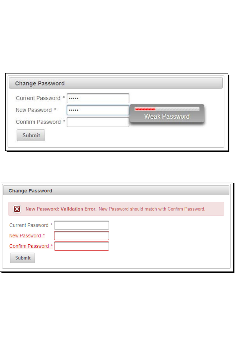
Introducing Text Input Components
[ 116 ]
What just happened?
We have created three password elds using the <p:password> component. For the New
Password input eld, we have enabled feedback support using the feedback="true"
aribute. Also, we have used the match aribute for the New Password eld to match with
the Conrm Password eld.
If the New Password value is weak, then the feedback will be displayed as shown in the
following screenshot:
If the New Password and Conrm Password values are not matching, then you will see the
error message as shown in the following screenshot:
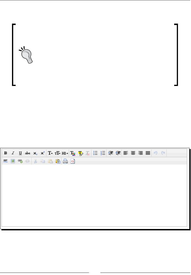
Chapter 5
[ 117 ]
Make sure the showDetail aribute value is set to true to display the detailed
error message.
The Password component's match aribute should be specied on
the New Password eld to match against the Conrm Password eld.
Password matching doesn't work if you specify the match aribute
on the Conrm Password eld to match against the New Password
eld. That means the following code doesn't work:
<p:password id="newPwd"
value="#{userController.changePwd.newPwd}"
required="true"/>
<p:password id="confPwd"
value="#{userController.changePwd.newPwd}"
required="true" match="newPwd"/>
Introducing the Editor component
Editor is an input component with rich text eding capabilies. The Editor component comes
with a toolbar containing various opons to apply HTML styles. The Editor component can be
created as follows:
<p:editor id="buzzText"
value="#{postController.newPost.description}"/>
We can customize the toolbar opons using the controls aribute as follows:
<p:editor id="buzzText" value="#{postController.newPost.description}"
controls="bold italic underline strikethrough font numbering size
color source" />
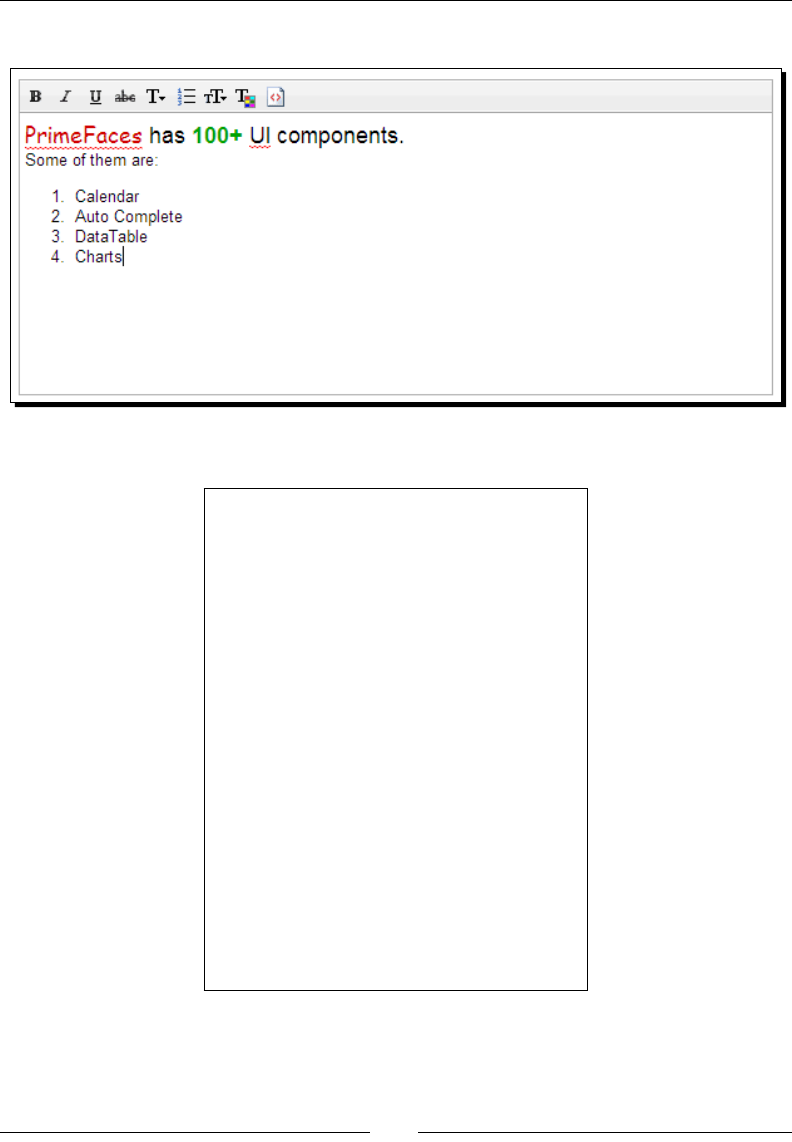
Introducing Text Input Components
[ 118 ]
With this customizaon, the Editor looks like the following screenshot:
The following is the full list of all available controls:
bold
italic
underline
strikethrough
subscript
superscript
font
size
style
color
highlight
bullets
numbering
alignle
center
alignright
jusfy
undo
redo
rule
image
link
unlink
cut
copy
paste
pastetext
print
source
outdent
indent
removeFormat

Chapter 5
[ 119 ]
The <p:editor> component provides the following client-side API methods:
Method Description
init() Initializes a lazy editor, subsequent calls do not reinitialise the editor.
saveHTML() Saves HTML text in iframe back to the textarea.
clear() Clears the text in the editor.
enable() Enables editing.
disable() Disables editing.
focus() Adds cursor focus to the edit area.
selectAll() Selects all text in the editor.
getSelectedHTML() Returns selected text as HTML.
getSelectedText() Returns selected text in plain format.
Time for action – using editor client-side API methods
Let us create an Editor component and see how to use it as a rich text editor and perform
various operaons using client-side API methods:
1. Create a form with the <p:editor> component and buons to invoke various
client-side API methods.
<h:form id="form1">
<p:editor id="buzzText" widgetVar="editor"
value="#{postController.newPost.description}"
controls="bold italic underline strikethrough font
numbering size color source"/>
<p:commandButton type="button" value="Submit"
update="display" oncomplete="dlg.show()" />
<p:commandButton type="button" value="Clear"
onclick="editor.clear()"/>
<p:commandButton type="button" value="Enable"
onclick="editor.enable()" />
<p:commandButton type="button" value="Disable"
onclick="editor.disable()" />
<p:commandButton type="button" value="SelectAll"
onclick="editor.selectAll()" />
<p:commandButton type="button" value="Get Selected HTML"
onclick="alert(editor.getSelectedHTML());" />
<p:commandButton type="button" value="GetSelectedText"
onclick="alert(editor.getSelectedText());" />
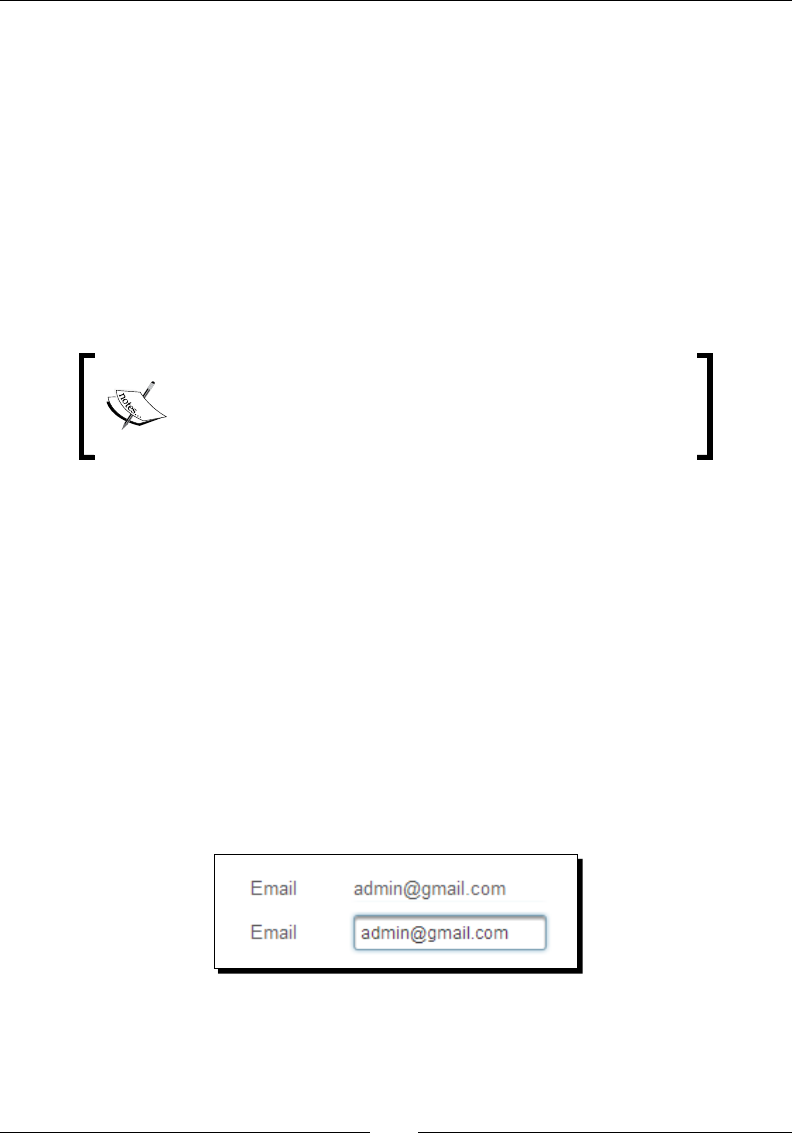
Introducing Text Input Components
[ 120 ]
<p:dialog header="Content" widgetVar="dlg"
showEffect="fade" hideEffect="fade" modal="true">
<h:outputText id="display"
value="#{postController.newPost.description}"
escape="false" />
</p:dialog>
</h:form>
What just happened?
We have created a rich text editor component using <p:editor> and invoked various client-
side API methods through the widgetVar aribute value.
Editor is not integrated with ThemeRoller since there is only
one icon set for the controls. At the me of wring this book,
<p:editor> doesn't support internaonalizaon and all the
toolps for the controls will be displayed in English.
Inplace editing using the Inplace component
The Inplace editor provides easy Inplace eding and inline content display. The Inplace editor
consists of two elements: display element is the inial clickable label, and inline element is
the hidden content that is displayed when display element is toggled.
Let us see how we can use the inplace editor for an input text eld:
<p:inplace emptyLabel="Enter Email Here">
<p:inputText value="admin@gmail.com"/>
</p:inplace>
Here, an admin@gmail.com e-mail ID will be displayed as a label. When you click on that
label, then an input text eld will be displayed with the admin@gmail.com value.

Chapter 5
[ 121 ]
The Inplace editor component <p:inplace> provides the following aributes to customize
its behavior:
label: Label to be shown in the display mode.
emptyLabel: Label to be shown in the display mode when value is empty.
effect: Eect to be used when toggling. Default is fade.
effectSpeed: Speed of the eect. Default is normal.
editor: Species the editor mode. Default is false.
saveLabel: Toolp text of the Save buon in editor mode. Default is Save.
cancelLabel: Toolp text of the Cancel buon in the editor mode. Default is Cancel.
event: Name of the client-side event to display inline content. Default is click.
toggleable: Denes whether Inplace is toggleable or not. Default is true.
In addion to text elds, we can also use other types of input components such as drop-down
lists, checkboxes, radio buons, and so on with the inplace editor.
We can use the editor aribute to display the Save and Cancel buons next to the
editor, to accept or reject the edited value. We can use the saveLabel and cancelLable
aributes to override the default toolp values of the Save and Cancel buons. We can also
register event listeners for the save and cancel events.
Time for action – using the Inplace editor
Let us see how to use the Inplace editor with the drop-down component along with editor
support, and register event listeners for the save and cancel events:
1. Create a form using Inplace editor components, as follows:
<h:form id="inplaceForm">
<p:panel header="Inplace Editing" >
<h:panelGrid columns="2">
<p:outputLabel for="email" value="Email"/>
<p:inplace id="email" emptyLabel="Enter Email Here"
editor="true" effect="slide"
effectSpeed="fast">
<p:ajax event="save"
listener="#{userController.handleSave}"/>
<p:ajax event="cancel"
listener="#{userController.handleCancel}"/>
<p:inputText
value="#{userController.user.emailId}"/>
</p:inplace>
<p:outputLabel for="gender" value="Gender"/>
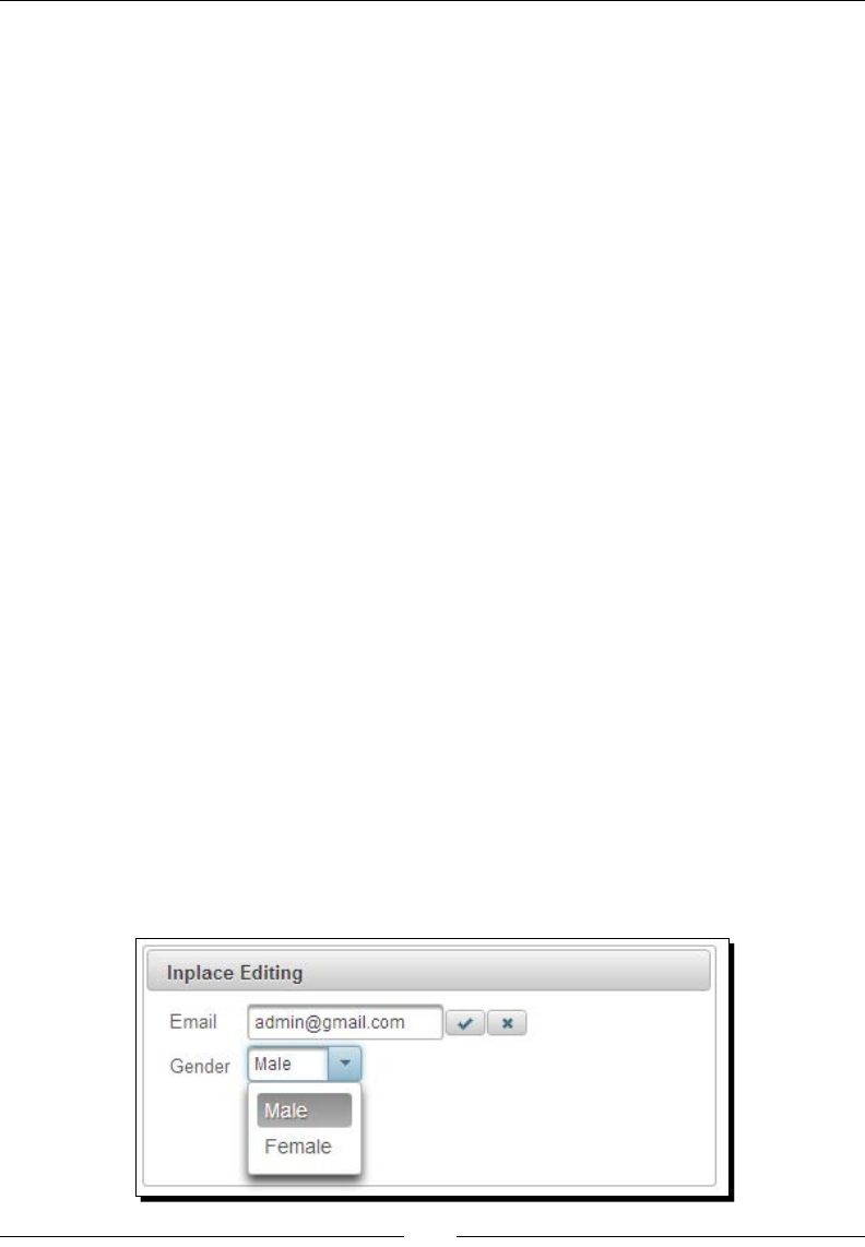
Introducing Text Input Components
[ 122 ]
<p:inplace id="gender" emptyLabel="Select Gender"
event="dblclick">
<p:selectOneMenu
value="#{userController.user.gender}">
<f:selectItem itemLabel="Male"
itemValue="Male" />
<f:selectItem itemLabel="Female"
itemValue="Female" />
</p:selectOneMenu>
</p:inplace>
</h:panelGrid>
</p:panel>
</h:form>
2. Implement the save and cancel event listener methods:
public void handleSave()
{
System.out.println("handleSave");
//add custom logic here
}
public void handleCancel()
{
System.out.println("handleCancel");
//add custom logic here
}
What just happened?
We have used the Inplace editor with an input text eld and a drop-down box. We have used
the dblclick event to display Gender in the drop-down box instead of the default click
event. For the emailId Inplace editor, we have set editor="true", which displays the
Save and Cancel buons that can be used to apply or cancel eding. We have also registered
event listeners for the save and cancel events on the editor using the <p:ajax>
component, as shown in the following screenshot:

Chapter 5
[ 123 ]
Providing completion suggestions using the
AutoComplete component
The AutoComplete component provides a list of matching suggesons based on what you
have already typed in the input eld. This enables the user to quickly select available opons
without the need of completely typing the value.
In our TechBuzz applicaon, we will use the <p:autoComplete> component in the Search
Users screen. In the Search Users screen, we can search other users by their e-mail IDs. By
using the AutoComplete component, we will display a list of e-mail IDs that start with what
the user typed in the input eld, by using the following code:
<p:autoComplete value="#{userController.searchEmail}"
completeMethod="#{userController.completeEmail}"/>
The AutoComplete component provides the following aributes to customize its behavior:
maxResults: Maximum number of results to be displayed.
minQueryLength: Number of characters to be typed before starng to query.
Default value is 1.
queryDelay: Delay to wait in milliseconds before sending each query to the server.
Default value is 300.
forceSelection: When enabled, AutoComplete only accepts input from the
selecon list. Default value is false.
scrollHeight: Denes the height of the item's viewport.
effect: Eect to use when showing/hiding suggesons.
effectDuration: Duraon of eect in milliseconds. Default value is 400.
dropdown: Enables the drop-down mode when set to true. Default value is false.
itemTipMyPosition: Posion of the itemp corner relave to the item. Default
value is left top.
itemTipAtPosition: Posion of the Item's corner relave to Itemp. Default
value is right bottom.
cache: When enabled, AutoComplete caches the searched result list. Default
value is false.
cacheTimeout: Timeout value for cached results. Default value is 300000.
emptyMessage: Text to display when there is no data to display.

Introducing Text Input Components
[ 124 ]
Time for action – using basic AutoComplete
Let us see how to use the AutoComplete component in the Search Users screen to display a
list of matching e-mail IDs:
1. Create a Search Users form with the AutoComplete component to search by e-mail ID:
<h:form id="searchUserForm">
<h:panelGrid columns="2">
<p:outputLabel for="searchUser" value="Search Users By
Email"/>
<p:autoComplete id="searchUser"
value="#{userController.searchEmail}"
completeMethod="#{userController.completeEmail}"/>
<p:commandButton
action="${userController.searchUsers()}"
value="Submit" update="@form"/>
</h:panelGrid>
</h:form>
2. Implement the completeEmail() method to provide suggesons:
public List<String> completeEmail(String query)
{
List<String> emails = new ArrayList<String>();
List<User> users = userService.findAllUsers();
for (User user : users)
{
if(user.getEmailId().startsWith(query))
{
emails.add(user.getEmailId());
}
}
return emails;
}
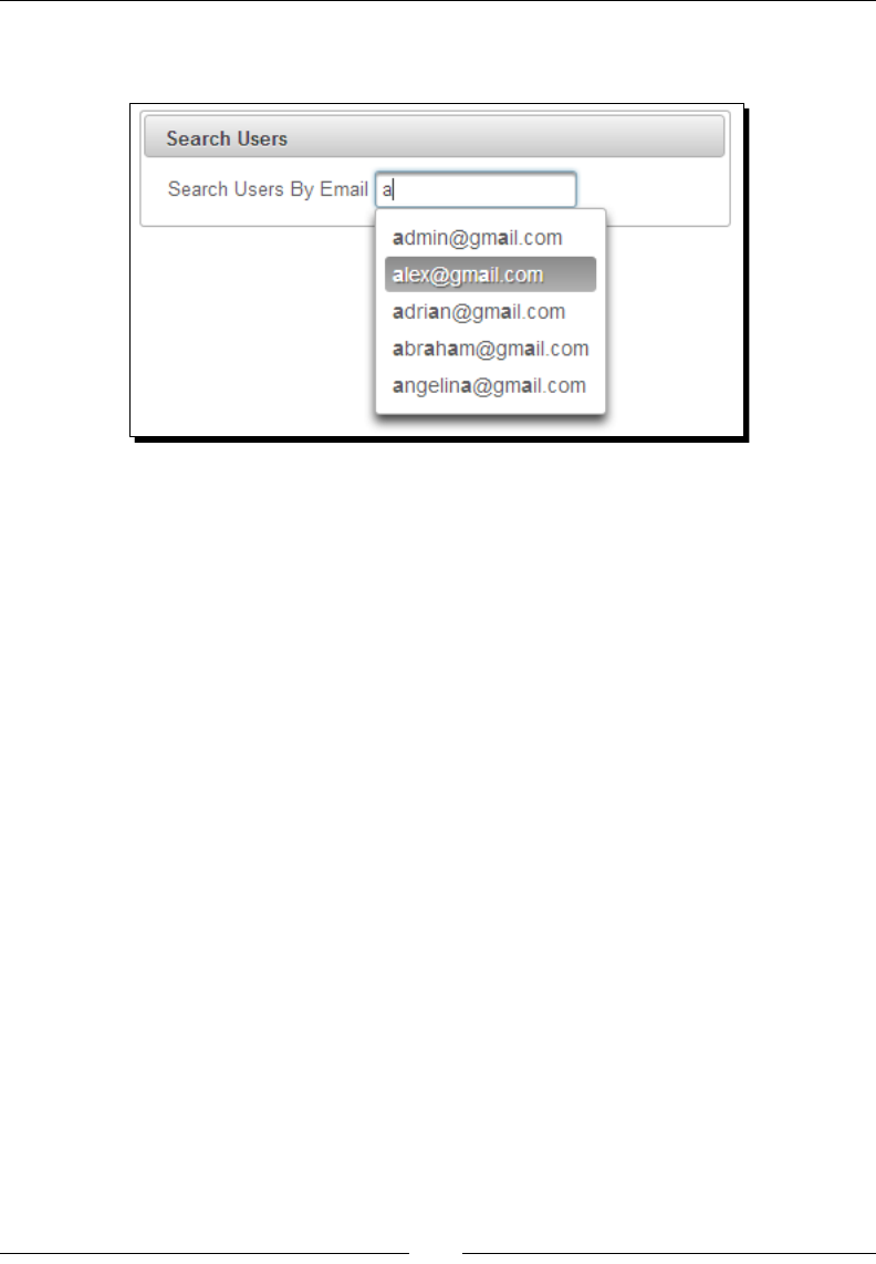
Chapter 5
[ 125 ]
When you start typing in the search input eld, a list of matching e-mail IDs will be displayed
as shown in the following screenshot:
What just happened?
When you start typing in the input eld, the completeMethod handler's
completeEmail(query) gets invoked by passing the value you typed in the input eld. We
are fetching all the user e-mail IDs from the database and returning only those e-mail IDs
that start with a query value. The AutoComplete component displays a list of suggesons
that we have returned from the completeEmail(query) method.
We can also enable caching of AutoComplete search results using the cache and
cacheTimeout aributes, as follows:
<p:autoComplete id="searchUser" value="#{userController.searchEmail}"
completeMethod="#{userController.completeEmail}"
cache="true" cacheTimeout="30000">
</p:autoComplete>
Here, AutoComplete results will be cached for 30,000 milliseconds. If you enter the
same query, then results will be returned from cache instead of invoking the server-side
userController.completeEmail() method.
Using AutoComplete with POJO support
In the preceding AutoComplete example, we have used List<String> objects returned
from the completeMethod handler to populate suggesons. Instead of Strings, we can
use Plain Old Java Objects (POJO) to populate AutoComplete suggesons with the use
of a FacesConverter.
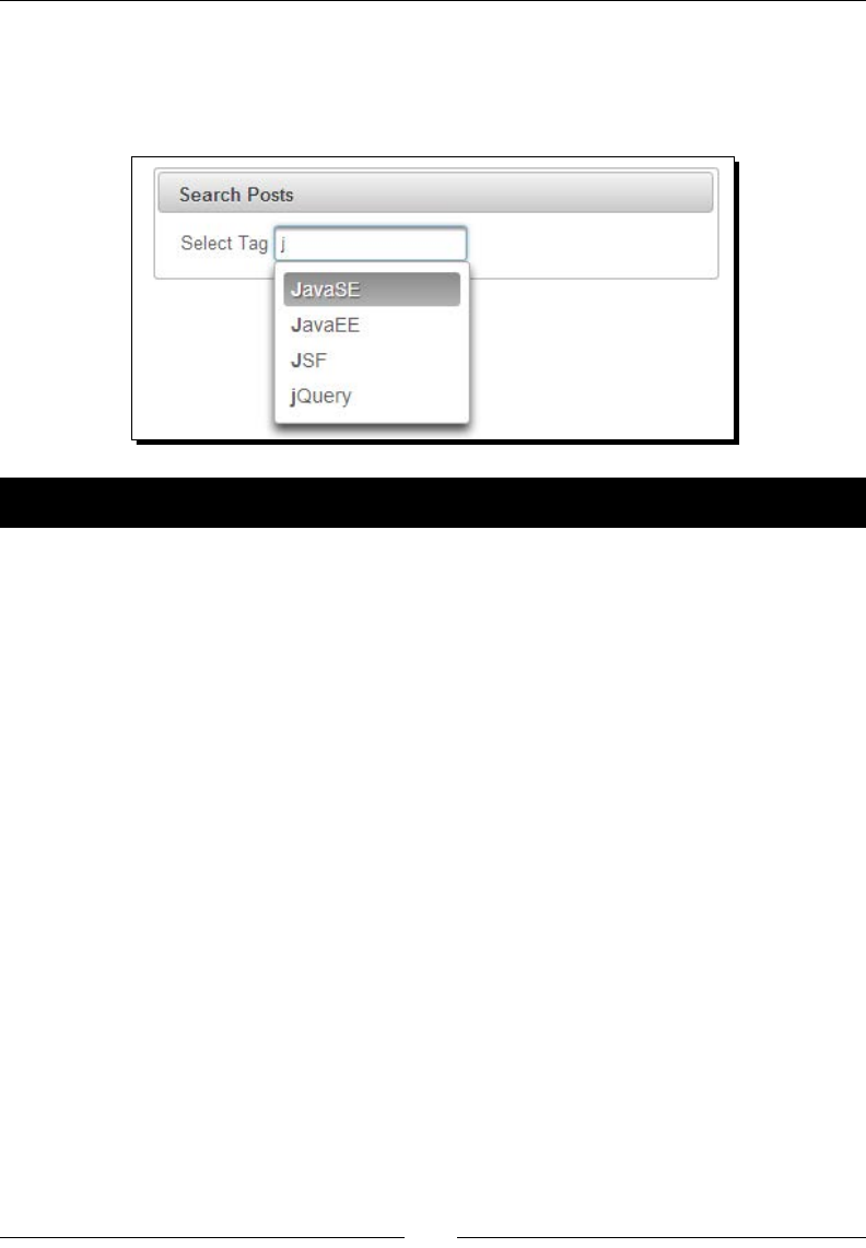
Introducing Text Input Components
[ 126 ]
In our TechBuzz applicaon, we will have a Search Posts screen where you can search posts
by Tag. We can use the <p:autoComplete> component to provide suggesons for matching
Tag names as user types in the input eld. Instead of using List<String> values to
populate suggesons, we will use List<Tag> POJOs, as shown in the following screenshot:
Time for action – using AutoComplete with POJO support
Let us see how we can use List<Tag> objects to populate the AutoComplete component:
1. Create the Search Posts form with the AutoComplete component:
<p:autoComplete value="#{postController.searchTag}"
completeMethod="#{postController.completeTag}"
var="t" itemLabel="#{t.label}" itemValue="#{t}"
converter="tagConverter"/>
2. Implement the completeMethod handler method and the completeTag()
method returning the List<Tag> object:
public List<Tag> completeTag(String query)
{
if(query == null){
return new ArrayList<Tag>();
}
List<Tag> tags = new ArrayList<Tag>();
List<Tag> allTags = loadTagsFromDataSource();
for (Tag tag : allTags)
{
if(tag.getLabel().toLowerCase().
startsWith(query.toLowerCase()))
{
tags.add(tag);
}
}
return tags;
}

Chapter 5
[ 127 ]
3. Implement the TagConverter class:
@FacesConverter(value="tagConverter", forClass=Tag.class)
public class TagConverter implements Converter
{
@Override
public Object getAsObject(FacesContext context, UIComponent
component, String value)
{
if (value==null || value.trim().equals(""))
{
return null;
}
try
{
int id = Integer.parseInt(value);
List<Tag> tags = loadTagsFromDataSource();
for (Tag t : tags )
{
if (t.getId() == id)
{
return t;
}
}
} catch(NumberFormatException exception)
{
throw new ConverterException(new
FacesMessage(FacesMessage.SEVERITY_ERROR,
"Conversion Error", "Not a valid Tag"));
}
return null;
}
@Override
public String getAsString(FacesContext context, UIComponent
component, Object value)
{
if (value == null || value.equals("")) {
return "";
} else {
return String.valueOf(((Tag) value).getId());
}
}
}
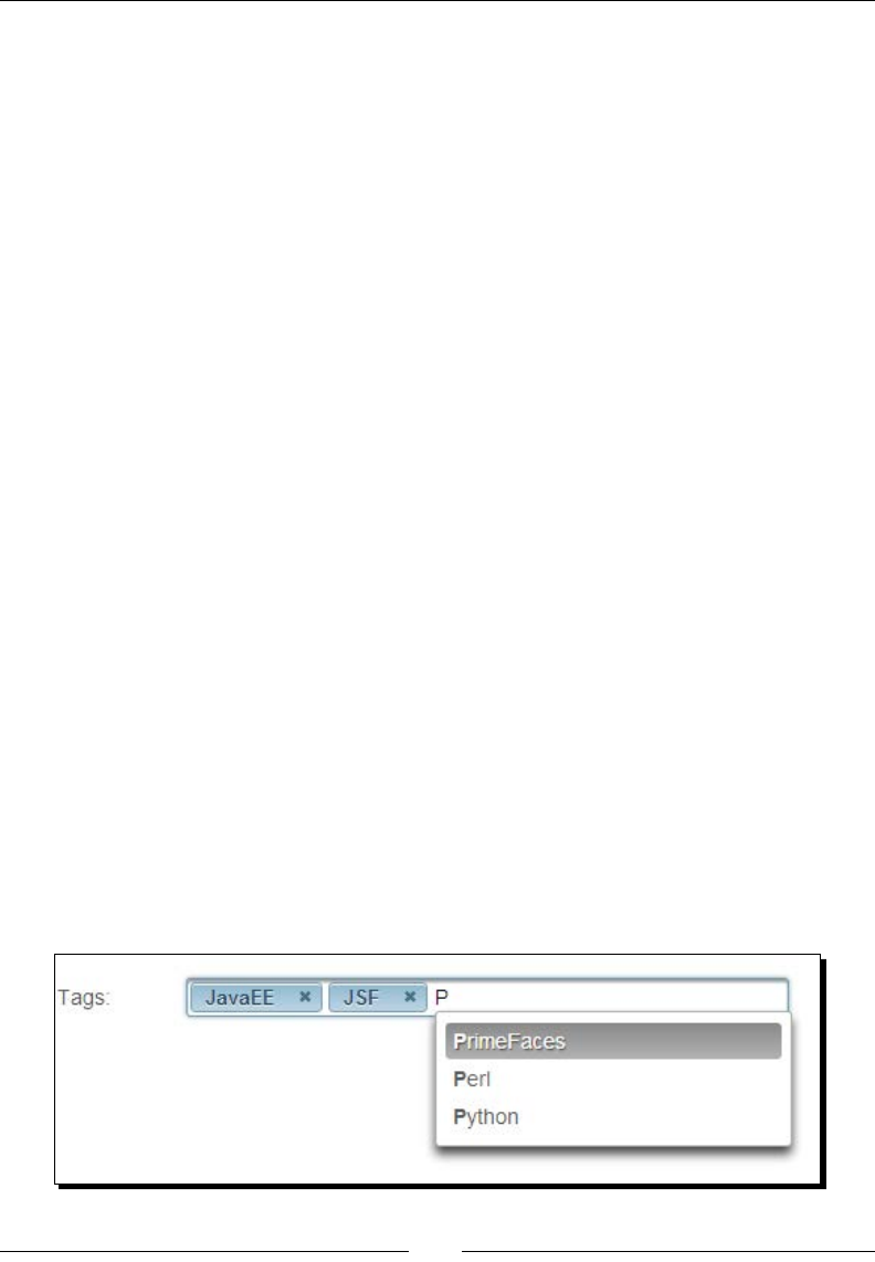
Introducing Text Input Components
[ 128 ]
What just happened?
In the completeMethod handler's completeTag(query), we are returning List<Tag>
objects by loading the tag details from the database that start with the entered query. We
have used the <p:autoComplete> component's var aribute to store Tag object while
iterang through the collecon, the itemLabel aribute to specify which property to
display in the suggeson box, and the itemValue aribute to specify the value of the entry.
We have used the TagConverter class to convert String to Tag and Tag to String by
looking up against tag details loaded from the database.
You can also display custom content as labels using nested <p:column> elements:
<p:autoComplete value="#{postController.searchTag}"
completeMethod="#{postController.completeTag}"
var="t" itemLabel="#{t.label}" itemValue="#{t}"
converter="tagConverter">
<p:column>
#{t.label} - #{t.value}
</p:column>
<p:column>
<p:graphicImage value="/resources/images/tags/#{t.value}.png"
width="40" height="50"/>
</p:column>
</p:autoComplete>
Selecting multiple items
The AutoComplete component supports mulple item selecon as well. We can use mulple
item selecon features by seng the multiple aribute to true.
In our TechBuzz applicaon, while creang a new post, we can select mulple tags that are
associated with the post content.
For example, if we are posng about PrimeFaces, then we can select the JavaEE, JSF, and
PrimeFaces tags as shown in the following screenshot:

Chapter 5
[ 129 ]
Time for action – selecting multiple items using AutoComplete
Let us see how to use the <p:autoComplete> component with mulple selecon:
1. Create the new post form with the AutoComplete component to select mulple tags:
<p:autoComplete id="newPostTags"
value="#{postController.newPost.tags}"
completeMethod="#{postController.completeTag}"
maxResults="10" minQueryLength="2" queryDelay="400"
effect="slide"
var="t" itemLabel="#{t.label}" itemValue="#{t}"
converter="tagConverter" multiple="true">
</p:autoComplete>
What just happened?
We have used the <p:autoComplete> component with mulple selecon support by
seng the multiple aribute to true. We have also used various other aributes such as
maxResults, minQueryLength, queryDelay, forceSelection, and effect to customize
the <p:autoComplete> component behavior. As we have set minQueryLength to 2, the
query gets triggered only aer typing a minimum of two characters. Keep the sensible value
for queryDelay to reduce the load on the server when you are typing the query quickly.
Handling the ItemSelect and ItemUnselect Events
The AutoComplete component supports the itemSelect and itemUnselect events in
addion to the events inherited from the normal input text component. The itemSelect
event get triggered when an item is selected from the list of suggesons. If the AutoComplete
component is a mulple selecon eld then the itemUnselect event gets triggered when
an item is removed by clicking on the close icon on one of the selected items. We can use the
itemSelect event to check whether the user is trying to add a duplicate tag or not.
Time for action – using the ItemSelect and ItemUnselect events
Let us see how to use the AutoComplete component's itemSelect and
itemUnselect events:
1. Create a form with the AutoComplete component and register the itemSelect
and itemUnselect event listeners:
<p:autoComplete id="newPostTags"
value="#{postController.newPost.tags}"
completeMethod="#{postController.completeTags}"

Introducing Text Input Components
[ 130 ]
maxResults="10" minQueryLength="1"
queryDelay="400"
var="t" itemLabel="#{t.label}" itemValue="#{t}"
converter="tagConverter" multiple="true">
<p:ajax event="itemSelect"
listener="#{postController.handleTagSelected}"/>
<p:ajax event="itemUnselect"
listener="#{postController.handleTagUnselected}"/>
</p:autoComplete>
2. Implement event listener methods: handleTagSelected() and
handleTagUnselected():
public void handleTagSelected(SelectEvent selectEvent)
{
Tag selectedObj = (Tag) selectEvent.getObject();
Integer tagid = selectedObj.getId();
Tag duplicateTag = null;
int count = 0;
for(Tag t : selectedTags) {
if(tagid == t.getId()){
duplicateTag = t;
count++;
}
}
if(count > 1) {
boolean removed = selectedTags.remove(duplicateTag);
RequestContext.getCurrentInstance()
.update("newPostForm:newPostTags");
JSFUtils.addErrorMessage("You have selected duplicate
Tag :"+selectedObj.getLabel());
} else {
JSFUtils.addInfoMessage("You have selected
:"+selectedObj.getLabel());
}
}
public void handleTagUnselected(UnselectEvent unselectEvent)
{
Tag unselectedObj = (Tag) unselectEvent.getObject();
FacesContext.getCurrentInstance().addMessage(null, new
FacesMessage("You have unselected
:"+unselectedObj.getLabel()));
}

Chapter 5
[ 131 ]
What just happened?
We have registered event listeners for the itemSelect and itemUnselect events
by using the <p:ajax> component. When the itemSelect event gets triggered, the
handleTagSelected(org.primefaces.event.SelectEvent selectEvent)
event listener method gets triggered. We obtained the selected the Tag object by calling
selectEvent.getObject() and checked whether there was a duplicate tag and removing
it. Aer removing the duplicate tag, we have updated the AutoComplete component using
the RequestContext.update() ulity method. Similarly, the itemUnselect event
listener also gets triggered by the org.primefaces.event.UnselectEvent parameter,
from which we obtained the removed Tag object.
Displaying tooltips using the Itemtip facet
When you mouse over the suggeson items, we can display toolps using the Itemp facet.
In the preceding example, when you mouse over the Tags label, we can display the tag
descripon using Itemp, as follows.
Time for action – displaying tooltips on suggested items using
the Itemtip facet
In this secon, we will take a look at how to display toolps with custom content for
AutoComplete suggeson items using the Itemp facet:
1. Create the AutoComplete component for Tags and display the tag descripon
using itemTip:
<p:autoComplete id="newPostTags"
value="#{postController.newPost.tags}"
completeMethod="#{postController.completeTags}"
maxResults="10" minQueryLength="2"
queryDelay="400"
var="t" itemLabel="#{t.label}" itemValue="#{t}"
converter="tagConverter" multiple="true"
itemTipMyPosition="left top" itemTipAtPosition="right
bottom">
<f:facet name="itemtip">
<h:panelGrid columns="2" style="text-align: left">
<f:facet name="header">
Tag Details
</f:facet>
<h:outputText value="Label: " />
<h:outputText value="#{t.label}" />
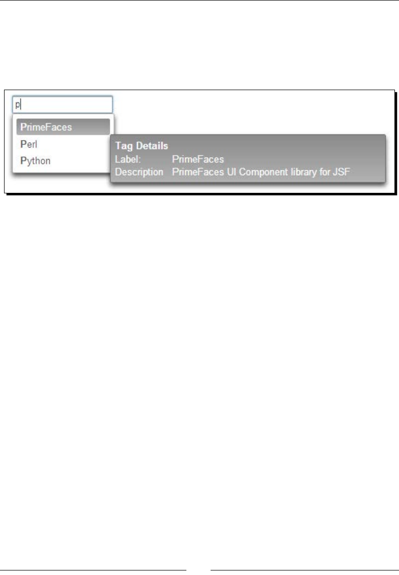
Introducing Text Input Components
[ 132 ]
<h:outputText value="Description: " />
<h:outputText value="#{t.description}" />
</h:panelGrid>
</f:facet>
</p:autoComplete>
What just happened?
When you mouse over suggeson items, the tag descripon will be displayed as a toolp
using the Itemp facet.
Summary
In this chapter, we have learned how to use PrimeFaces text input components that are
very commonly used in web applicaons. We have looked into using the advanced features
of InputTextarea, Password, InputMask, and Inplace components. Also, we learned how
to use the AutoComplete component with POJO support, mulple selecon, and Itemp
display features. In the next chapter, we will learn how to use selecon input components
such as SelectManyCheckbox, SelectOneRadio, SelectOneMenu, SelectOneListbox,
SelectManyMenu, and so on.

6
Working with Selection
Input Components
Selection components such as drop-down lists, checkboxes, and radio buttons
are vey commonly used elements in web applications. But native HTML
selection input components are very limited and don't provide enough features
to build modern complex and rich user interfaces. To address this, PrimeFaces
provides several selection input components with enhanced features and
theming support.
In this chapter, we will cover the following components:
Creang the toggle buon using SelectBooleanBuon
Creang the On or O opons using SelectBooleanCheckbox
Introducing SelectManyCheckbox
Introducing SelectOneRadio
Introducing SelectOneBuon
Introducing SelectManyBuon
Creang drop-down lists using SelectOneMenu
Introducing SelectOneListbox
Introducing SelectManyMenu
Creang the overlay menu using SelectCheckboxMenu
Creang the overlay menu with a default command using SplitBuon
Introducing the PickList component
Introducing the MulSelectListbox component

Working with Selecon Input Components
[ 134 ]
Creating the toggle button using SelectBooleanButton
The SelectBooleanBuon component is used to select a yes or no decision with
a toggle buon:
<h:outputText value="Subscribe to Email Notifications: " />
<p:selectBooleanButton value="#{selectionController.subscribed}"
onLabel="Yes" offLabel="No" onIcon="ui-icon-check" offIcon="ui-icon-
close" />
Here, the onLabel and offLabel aributes are mandatory. We can change the labels and
icons using the onLabel, offLabel, onIcon, and offIcon aributes.
We can also add an event listener to the <p:selectBooleanButton> component using a
nested <p:ajax> element.
Time for action – using the SelectBooleanButton component
Let us see how to save user preferences on subscribing to weekly e-mail nocaons using
the <p:selectBooleanButton> component, by performing the following steps:
1. Create a User Preferences form:
<h:form>
<p:panel header="User Preferences" style="width: 400px;
margin: 0 auto;">
<p:messages autoUpdate="true"/>
<h:panelGrid columns="2" style="margin-bottom:10px"
cellpadding="5">
<h:outputText value="Subscribe to Email
Notifications: " />
<p:selectBooleanButton
value="#{selectionController.
subscribeToEmailNotif}" onLabel="Yes" offLabel="No"
onIcon="ui-icon-check" offIcon="ui-icon-close">
<p:ajax update="display"
listener="#{selectionController.
handleEmailSubscription}"/>
</p:selectBooleanButton>
</h:panelGrid>
<h:panelGrid columns="1" id="display">
<h:outputText value="Subscribed to Email Notification :
#{selectionController.subscribeToEmailNotif}" />
</h:panelGrid>
</p:panel>
</h:form>
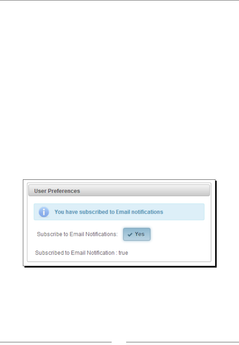
Chapter 6
[ 135 ]
2. Implement the handleEmailSubscription()event listener method:
@ManagedBean
@RequestScoped
public class SelectionController
{
private boolean subscribeToEmailNotif;
//setters & getters
public void handleEmailSubscription()
{
if(subscribeToEmailNotif){
//logic to subscribe
} else {
//logic to unsubscribe
}
}
}
What just happened?
We have used the <p:selectBooleanButton> component to create a Yes or No type
boolean buon and registered an event listener using the <p:ajax> element. When you
click on the buon, the handleEmailSubscription() method gets invoked and updates
the user preferences, as shown in the following screenshot:
Creating the On or Off options using
SelectBooleanCheckbox
The SelectBooleanCheckbox component is an extended version of the standard checkbox with
theme integraon. We can also add an event listener to the <p:selectBooleanCheckbox>
component using a nested <p:ajax> element.

Working with Selecon Input Components
[ 136 ]
Time for action – using the SelectBooleanCheckbox component
Let us see how to use <p:selectBooleanCheckbox> along with the AJAX listener support,
by performing the following step:
1. Create the User Preferences form using <p:selectBooleanCheckbox>
components:
<h:form>
<p:panel header="User Preferences" style="width: 500px;">
<p:messages/>
<h:panelGrid columns="2" style="margin-bottom:10px"
cellpadding="5">
<h:outputText value="Show Online Status: " />
<p:selectBooleanCheckbox
value="#{selectionController.showOnlineStatus}" />
<h:outputText value="Accept Private Messages: " />
<p:selectBooleanCheckbox
value="#{selectionController.recievePrivateMsgs}">
<p:ajax update="display"
listener="#{selectionController.
updateUserpreferences}"/>
</p:selectBooleanCheckbox>
</h:panelGrid>
<p:commandButton value="Submit" update="@form"
actionListener="#{selectionController.
updateUserpreferences}"/>
<h:panelGrid columns="1" id="display">
<h:outputText value="Show Online Status :
#{selectionController.showOnlineStatus}" />
<h:outputText value="Accept Private Messages :
#{selectionController.recievePrivateMsgs}" />
</h:panelGrid>
</p:panel>
</h:form>
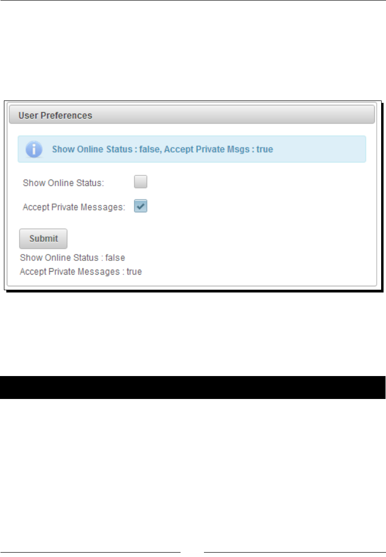
Chapter 6
[ 137 ]
What just happened?
We have used <p:selectBooleanCheckbox> components to create checkboxes
represenng the user preferences on Show Online Status and Accept Private Msgs. We
have registered a click event listener on the Accept Private Messages checkbox using
<p:ajax>. When you check or uncheck the Accept Private Messages checkbox, then
updateUserpreferences() gets invoked, as shown in the following screenshot:
Introducing SelectManyCheckbox
The SelectManyCheckbox component is an extended version of the JSF standard
SelectManyCheckbox component with theme integraon.
Time for action – using the SelectManyCheckbox component
Let us see how we can use the <p:selectManyCheckbox> component, by performing the
following steps:
1. Create a form using the <p:selectManyCheckbox> components:
<h:form id="form1" style="width:500px; margin: 0 auto;">
<p:messages autoUpdate="true" escape="false" />
<p:panel header="SelectManyCheckBox">
<h:panelGrid columns="2" style="margin-bottom:10px"
cellpadding="5">

Working with Selecon Input Components
[ 138 ]
<h:outputText value="Favourite Tags: " />
<p:selectManyCheckbox
value="#{selectionController.favoriteTags}">
<f:selectItem itemLabel="JSF" itemValue="jsf" />
<f:selectItem itemLabel="PrimeFaces"
itemValue="primefaces" />
<f:selectItem itemLabel="Spring" itemValue="spring"
/>
</p:selectManyCheckbox>
<h:outputText value="Popular Tags: " />
<p:selectManyCheckbox value="#{selectionController.
selectedPopularTags}">
<f:selectItem itemLabel="Web2.0" itemValue="web2.0" />
<f:selectItems
value="#{selectionController.popularTags}" />
</p:selectManyCheckbox>
<h:outputText value="Tags: " />
<p:selectManyCheckbox
value="#{selectionController.selectedTags}"
layout="pageDirection" >
<f:selectItems value="#{selectionController.tags}"
/>
</p:selectManyCheckbox>
<h:outputText value="Tags(Pojo): " />
<p:selectManyCheckbox value=
"#{selectionController.selectedTagsFromPojos}"
layout="pageDirection" converter="#{tagConverter}">
<f:selectItems value=
"#{selectionController.tagPojos}" var="tag"
itemLabel="#{tag.label}" itemValue="#{tag}"/>
</p:selectManyCheckbox>
</h:panelGrid>
<p:commandButton value="Submit" update="@form"
actionListener="#{selectionController.
handleSelectMany}"/>
</p:panel>
</h:form>

Chapter 6
[ 139 ]
2. Implement data inializaon and the actionListener method in the
SelectionController managed bean:
@ManagedBean
@RequestScoped
public class SelectionController
{
private List<String> tags;
private Map<String, String> popularTags = null;
private List<String> selectedTags;
private List<String> favoriteTags;
private List<String> selectedPopularTags;
private List<Tag> tagPojos;
private List<Tag> selectedTagsFromPojos;
public SelectionController()
{
tags = new ArrayList<String>();
tags.add("JSF");
tags.add("PrimeFaces");
tags.add("JPA");
tags.add("jQuery");
popularTags = new HashMap<String, String>();
popularTags.put("Java","java");
popularTags.put("JavaScript","javascript");
popularTags.put("PrimeFaces","primefaces");
tagPojos = new ArrayList<Tag>();
tagPojos.add(new Tag(1, "JavaSE", "java-se", "Java
Programming Language"));
tagPojos.add(new Tag(2, "JavaEE", "java-ee", "Java
Enterprise Edition"));
tagPojos.add(new Tag(3, "Spring", "spring", "Spring
Framework"));
}
//setters & getters
public void handleSelectMany()
{
String msg = "Selected Values :";
msg += "";//logic to append selected Options
FacesContext.getCurrentInstance().addMessage(null, new
FacesMessage(msg));
}
}
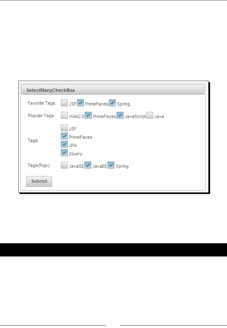
Working with Selecon Input Components
[ 140 ]
What just happened?
We have created Favorite Tags checkboxes using the <p:selectManyCheckbox>
component with opons using inline <f:selectItem> tags. For Popular Tags checkboxes,
we have used the Map<String, String> object to populate opons where key
becomes itemLabel and value becomes itemValue. Similarly we have seen how
to use List<String> objects to populate opons for Tags checkboxes along with
layout="pageDirection" to display checkboxes vercally. Default value for the layout
aribute is lineDirection. Also, we have used List<Tag> POJOs to populate Tags(Pojo)
checkboxes by using TagConverter:
Introducing SelectOneRadio
The SelectOneRadio component is an extended version of the JSF standard SelectOneRadio
component with theme integraon.
Time for action – using the SelectOneRadio component
Let us see how to use the <p:selectOneRadio> component, by performing the
following steps:
1. Create a form with <p:selectOneRadio> components:
<h:form id="form" style="width: 500px; margin: 0 auto;">
<p:panel header="SelectOneRadio">
<h:panelGrid columns="2" style="margin-bottom:5px"
cellpadding="2">

Chapter 6
[ 141 ]
<h:outputText value="Gender: " />
<p:selectOneRadio id="gender"
value="#{selectionController.gender}">
<f:selectItem itemLabel="Male" itemValue="M" />
<f:selectItem itemLabel="Female" itemValue="F" />
</p:selectOneRadio>
<h:outputText value="Favourite Server: " />
<p:selectOneRadio id="server"
value="#{selectionController.selectedServer}"
layout="pageDirection">
<f:selectItems
value="#{selectionController.servers}"/>
</p:selectOneRadio>
<h:outputText value="Favourite Tag: " />
<p:selectOneRadio id="tag"
value="#{selectionController.selectedTag}"
converter="#{tagConverter}">
<f:selectItems
value="#{selectionController.tagPojos}"
var="tag" itemLabel="#{tag.label}"
itemValue="#{tag}"/>
</p:selectOneRadio>
</h:panelGrid>
<p:commandButton value="Submit" update="@form"/>
<p:separator/>
<h:outputText value="Gender :
#{selectionController.gender}, Server :
#{selectionController.selectedServer}, Tag :
#{selectionController.selectedTag.label} " />
</p:panel>
</h:form>
2. Inialize data in the managed bean:
@ManagedBean
@RequestScoped
public class SelectionController
{
private String gender;
private List<String> servers;
private String selectedServer;
private List<Tag> tagPojos;
private Tag selectedTag;
//setters & getters
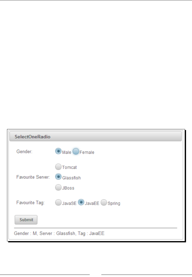
Working with Selecon Input Components
[ 142 ]
public SelectionController()
{
tagPojos = loadTagsFromDatabase();
servers = new ArrayList<String>();
servers.add("Tomcat");
servers.add("Glassfish");
servers.add("JBoss");
}
}
What just happened?
We have created the radio buon selecon components using <p:selectOneRadio>.
For the Gender radio buon, we have used stac opons using inline <f:selectItem>
tags. For the Favourite Server radio buon, we have used dynamic data along with
layout="pageDirection" to display opons vercally. The default layout
aribute's value is lineDirection, which displays opons horizontally. We have also
used POJOs to populate <p:selectOneRadio> opons using converter. By default,
<p:selectOneRadio> displays radio buons with theme support. If you want to turn
o theming and display as nave HTML radio buons, set the aribute plain to true:
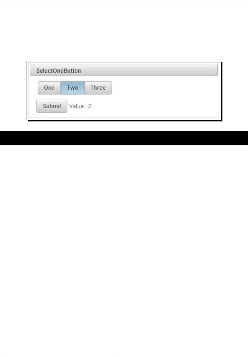
Chapter 6
[ 143 ]
Introducing SelectOneButton
SelectOneBuon is an input component to select opons using regular buons instead of
radio buons. The SelectOneBuon component's behavior is similar to the SelectOneRadio
component, except opons are displayed as buons instead of radios, as shown in the
following screenshot:
Time for action – using the SelectOneButton component
Let us see how to use the <p:selectOneButton> component, by performing the
following step:
1. Create a form with the <p:selectOneButton> component with mulple opons:
<h:form>
<p:panel header="SelectOneButton">
<h:panelGrid style="margin-bottom:5px" cellpadding="3">
<p:selectOneButton
value="#{selectionController.number}">
<f:selectItem itemLabel="One" itemValue="1"/>
<f:selectItem itemLabel="Two" itemValue="2"/>
<f:selectItem itemLabel="Three" itemValue="3"/>
</p:selectOneButton>
</h:panelGrid>
<p:commandButton value="Submit" update="display"/>
<h:outputText id="display" value=" Value :
#{selectionController.number}" />
</p:panel>
</h:form>
What just happened?
We have used the <p:selectOneButton> component to display opons as toggle buons.
When you click on any opon buon and submit the form, then the selected opon value
is displayed.
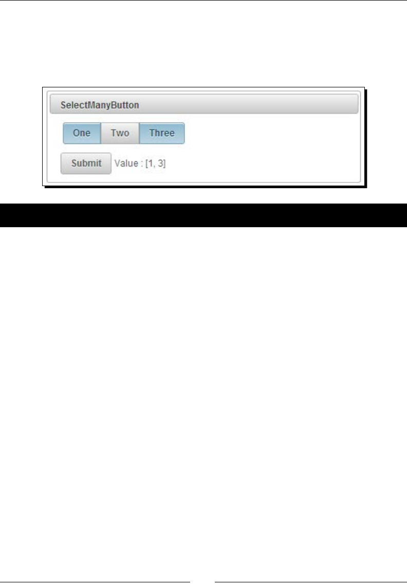
Working with Selecon Input Components
[ 144 ]
Introducing SelectManyButton
SelectManyBuon is a mulselect component similar to the SelectManyCheckbox
component, except opons will be displayed as buons instead of checkboxes, as shown
in the following screenshot:
Time for action – using the SelectManyButton component
Let us see how to use the <p:selectManyButton> component, by performing the
following step:
1. Create a form with the <p:selectManyButton> component with mulple opons:
<h:form>
<p:panel header="SelectManyButton">
<h:panelGrid style="margin-bottom:5px" cellpadding="3">
<p:selectManyButton
value="#{selectionController.numbers}">
<f:selectItem itemLabel="One" itemValue="1"/>
<f:selectItem itemLabel="Two" itemValue="2"/>
<f:selectItem itemLabel="Three" itemValue="3"/>
</p:selectManyButton>
</h:panelGrid>
<p:commandButton value="Submit" update="display"/>
<h:outputText id="display"value=" Value :
#{selectionController.numbers}" />
</p:panel>
</h:form>
What just happened?
We have used the <p:selectManyButton> component to display opons as toggle
buons. When you select mulple opon buons and submit the form, then the selected
opons values are displayed.
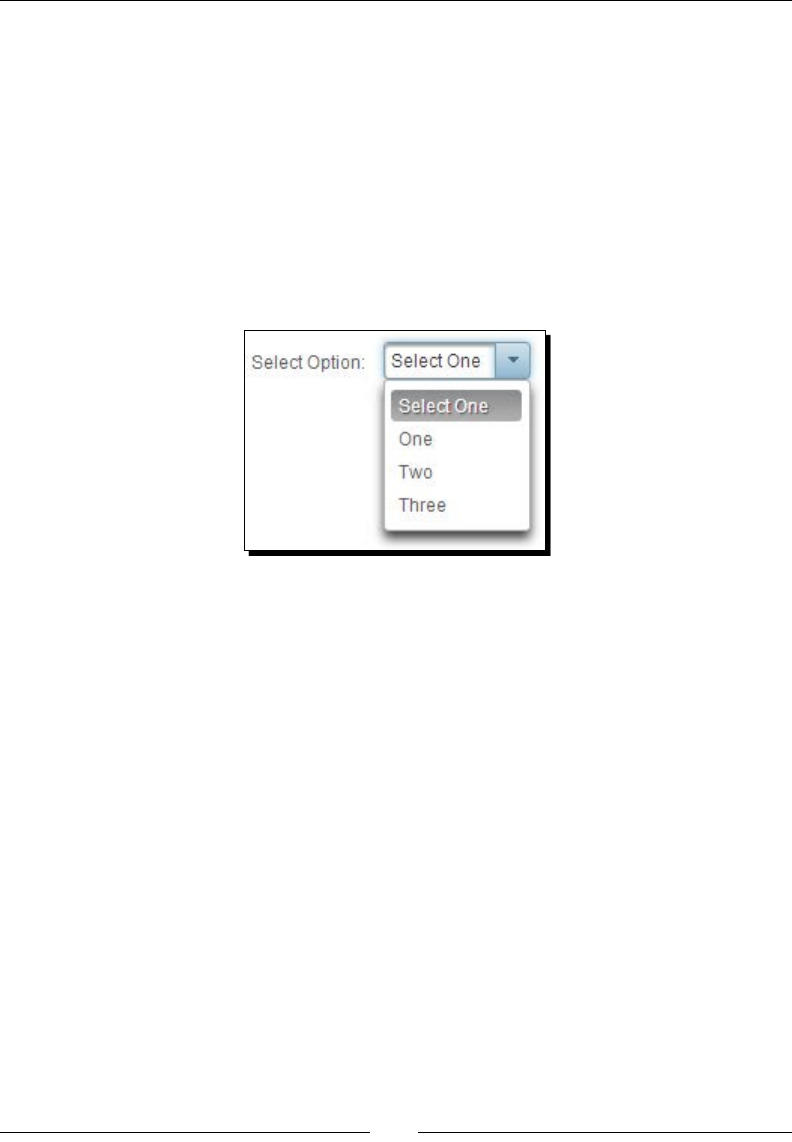
Chapter 6
[ 145 ]
Creating drop-down lists using SelectOneMenu
The SelectOneMenu component is an extended version of the standard SelectOneMenu
component with theme integraon. We can create a basic drop-down list using
<p:selectOneMenu> as follows:
<p:selectOneMenu value="#{selectionController.number}">
<f:selectItem itemLabel="Select One" itemValue="" />
<f:selectItem itemLabel="One" itemValue="1" />
<f:selectItem itemLabel="Two" itemValue="2" />
<f:selectItem itemLabel="Three" itemValue="3" />
</p:selectOneMenu>
The <p:selectOneMenu> component provides the following aributes to customize
it's behavior:
effect: Name of the toggle animaon. Default value is fade. Available eect
opons are blind, bounce, clip, drop, explode, fold, highlight, puff,
pulsate, scale, shake, size, slide, and none.
effectSpeed: Duraon of toggle animaon in milliseconds. Default value is 400.
editable: If true, selected items become editable. Default value is false.
maxlength: Maximum number of characters allowed in editable SelectOneMenu.
filter: Renders lter input eld. Default value is false.
filterMatchMode: Match mode for ltering, valid values are startsWith,
contains, endsWith, and custom. Default value is startsWith.
filterFunction: Client-side funcon to use in custom ltering. Filter funcon will
take itemLabel and filterValue as arguments.
caseSensitive: Denes whether ltering would be case sensive. Default value
is false.
Let us see how to use the <p:selectOneMenu> component with editable and lter features.
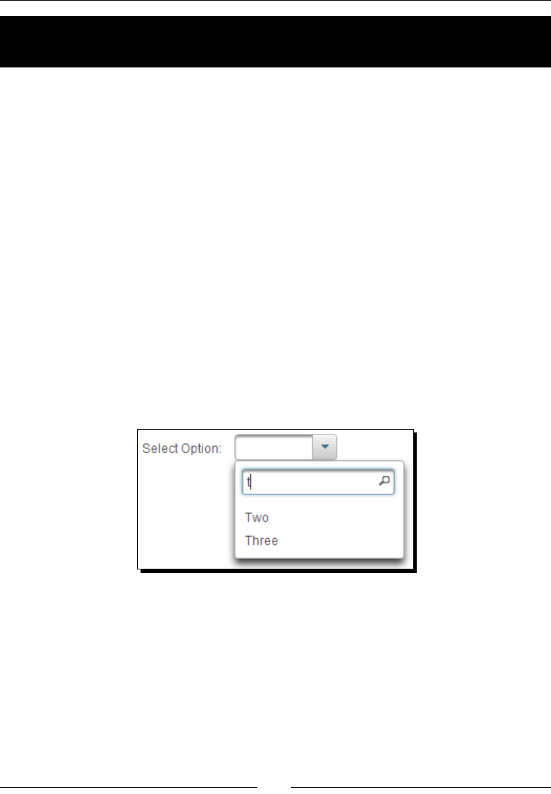
Working with Selecon Input Components
[ 146 ]
Time for action – using SelectOneMenu with editable and lter
features
Let's look at how to create a drop-down menu with editable opons, by performing the
following step:
1. Create a SelectOneMenu drop-down list using the editable and filter aributes:
<p:selectOneMenu value="#{selectionController.selectedOption}"
effect="fade" editable="true" filter="true"
filterMatchMode="startsWith">
<f:selectItem itemLabel="Select One" itemValue="" />
<f:selectItem itemLabel="One" itemValue="One" />
<f:selectItem itemLabel="Two" itemValue="Two" />
<f:selectItem itemLabel="Three" itemValue="Three" />
</p:selectOneMenu>
What just happened?
As we have set the editable aribute to true, we can select an exisng opon, select and
edit an exisng opon, or write an enrely new opon. When you click on the drop-down list
icon, it will display the list of opons along with a lter input textbox. When you type in the
lter text, opons will be ltered based on the lter mode that we are using, as shown in the
following screenshot:
Using SelectOneMenu with POJOs
The <p:selectOneMenu> component can also be used with POJO instead of plain Strings.
You can populate SelectOneMenu opons with the list of POJOs and get the selected value
as a POJO using converter.

Chapter 6
[ 147 ]
Time for action – using SelectOneMenu with POJOs
In this secon, we will demonstrate how to use SelectOneMenu backed by a collecon of
POJOs by using a converter, by performing the following steps:
1. Create a SelectOneMenu component using List<Tag> POJOs:
<p:selectOneMenu value="#{selectionController.selectedTag}"
converter="tagConverter">
<f:selectItem itemLabel="Select One" itemValue="" />
<f:selectItems value="#{selectionController.tagPojos}"
var="tag" itemLabel="#{tag.label}" itemValue="#{tag}"/>
</p:selectOneMenu>
2. Inialize List<Tag> POJOs in the managed bean:
@ManagedBean
@RequestScoped
public class SelectionController
{
private List<Tag> tagPojos;
private Tag selectedTag;
public SelectionController()
{
tagPojos = new ArrayList<Tag>();
tagPojos.add(new Tag(1, "JavaSE", "java-se", "Java
Programming Language"));
tagPojos.add(new Tag(2, "JavaEE", "java-ee", "Java
Enterprise Edition"));
tagPojos.add(new Tag(3, "Spring", "spring", "Spring
Framework"));
}
//setters & getters
}
What just happened?
We have inialized the List<Tag> POJOs in the managed bean and populated opons
using <f:selectItems value="#{selectionController.tagPojos}" var="tag"
itemLabel="#{tag.label}" itemValue="#{tag}"/>. It will iterate through the
collecon and uses label as itemLabel and tag object as itemValue. We have used
tagConverter to convert String to Tag and Tag to String.
We should override the equals() and hasCode() methods in
the POJO class so that the SelectOneMenu component will be able
to compare POJO objects and determine the selected POJO.
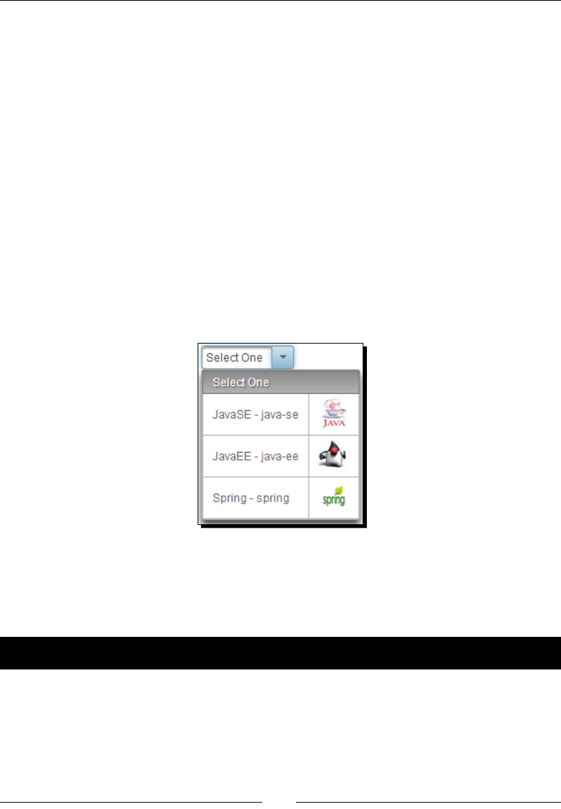
Working with Selecon Input Components
[ 148 ]
We can also display custom content using nested <p:column> facets. The advantage of
using nested <p:column> facets for displaying opons is that we can display custom content
with rich content, also including images:
<p:selectOneMenu value="#{selectionController.selectedTag}" var="t"
converter="tagConverter">
<f:selectItem itemLabel="Select One" itemValue="" />
<f:selectItems value="#{selectionController.tagPojos}" var="tag"
itemLabel="#{tag.label}" itemValue="#{tag}"/>
<p:column>
#{t.label} - #{t.value}
</p:column>
<p:column>
<p:graphicImage value="/resources/images/tags/#{t.value}.png"
width="32px" height="32px"/>
</p:column>
</p:selectOneMenu>
The preceding SelectOneMenu component displays opons with custom content as shown in
the following screenshot:
Grouping options in SelectOneMenu
We can group the opons in the SelectOneMenu drop-down list using the javax.faces.
model.SelectItemGroup and javax.faces.model.SelectItem objects.
Time for action – grouping options in SelectOneMenu
Let us see how to display SelectOneMenu opons in groups, by performing the following step:
1. Create the SelectOneMenu component with opon groups using the
SelectItemGroup and SelectItem objects:
@ManagedBean
@RequestScoped
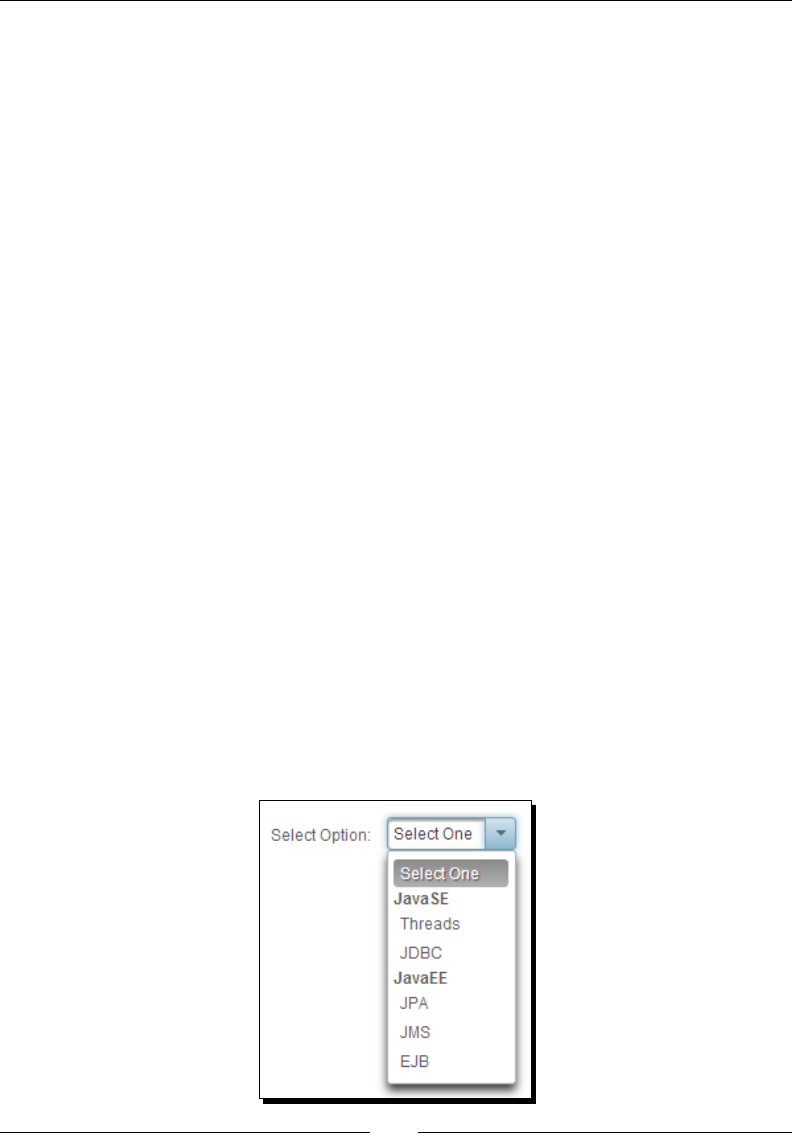
Chapter 6
[ 149 ]
public class SelectionController
{
private List<SelectItem> tagItems = new
ArrayList<SelectItem>();
private String selectedTagItem;
public SelectionController()
{
SelectItemGroup g1 = new SelectItemGroup("JavaSE");
g1.setSelectItems(new SelectItem[] {new
SelectItem("Threads", "Threads"), new
SelectItem("JDBC", "JDBC")});
SelectItemGroup g2 = new SelectItemGroup("JavaEE");
g2.setSelectItems(new SelectItem[] {new
SelectItem("JPA", "JPA"), new SelectItem("JMS",
"JMS"), new SelectItem("EJB", "EJB")});
tagItems.add(g1);
tagItems.add(g2);
}
}
<p:selectOneMenu
value="#{selectionController.selectedTagItem}">
<f:selectItem itemLabel="Select One" itemValue="" />
<f:selectItems value="#{selectionController.tagItems}" />
</p:selectOneMenu>
What just happened?
We have grouped the opons using javax.faces.model.SelectItemGroup,
and javax.faces.model.SelectItem, and used List<SelectItem> for populang
drop-down list opons to display the opons in groups:
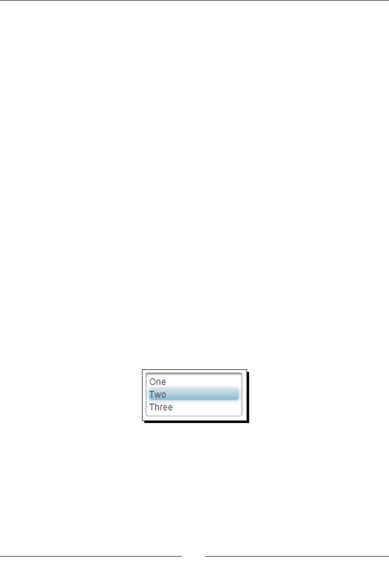
Working with Selecon Input Components
[ 150 ]
SelectOneMenu also provides the following client-side API funcons that can be invoked on
the widgetVar value to perform various operaons:
show(): Shows the overlay menu.
hide(): Hides the overlay menu.
blur(): Invokes the blur event.
focus(): Invokes the focus event.
enable(): Enables component.
disable(): Disables component.
getSelectedValue(): Returns value of the selected item.
getSelectedLabel(): Returns label of the selected item.
selectValue(itemValue): Selects the opon based on given value.
Introducing SelectOneListbox
The SelectOneListbox component is an extended version of the standard SelectOneListbox
component with theme integraon. Basic usage of <p:selectOneListbox> is as follows:
<p:selectOneListbox value="#{selectionController.number}">
<f:selectItem itemLabel="One" itemValue="1" />
<f:selectItem itemLabel="Two" itemValue="2" />
<f:selectItem itemLabel="Three" itemValue="3" />
</p:selectOneListbox>
The preceding <p:selectOneListbox> component will be rendered as shown in the
following screenshot:
We can also use POJOs to populate <p:selectOneListbox> opons. Let us see how to
populate SelectOneListbox using POJOs.
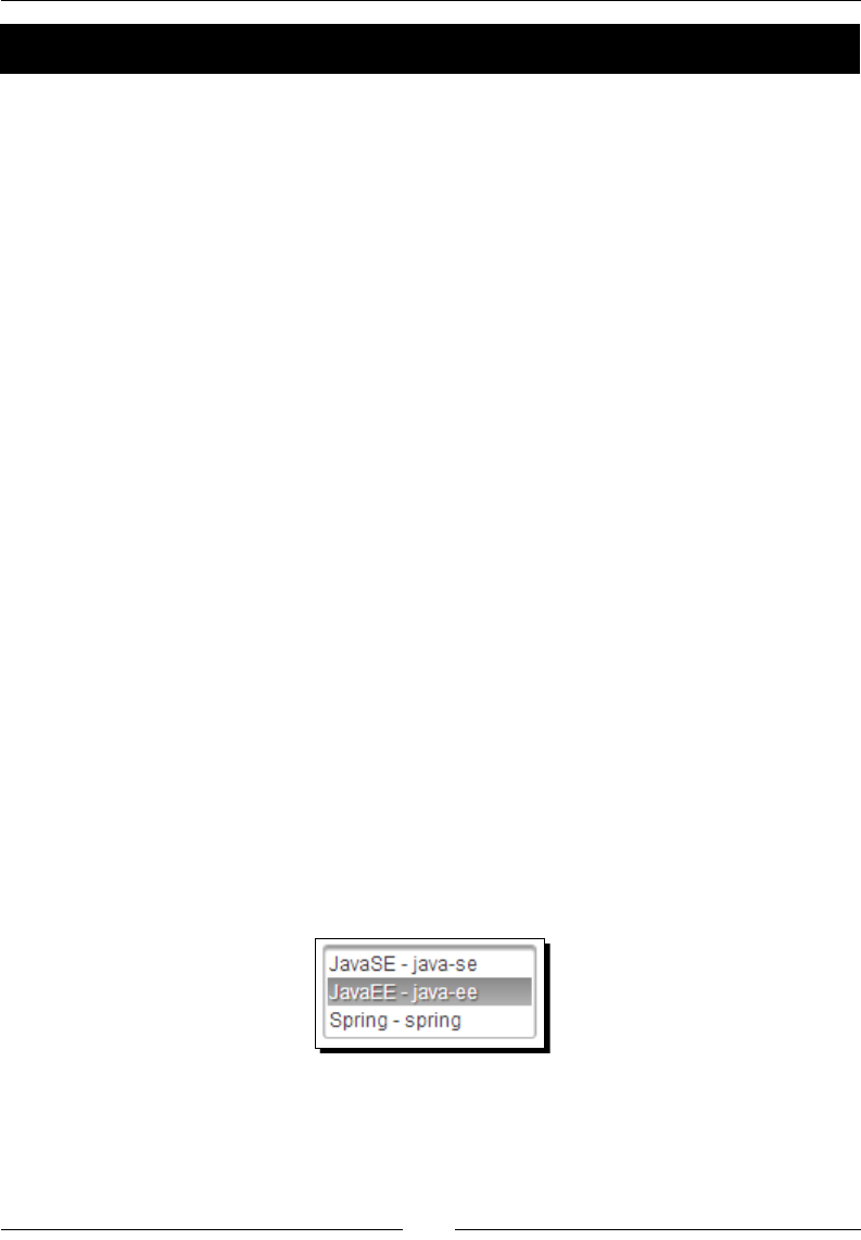
Chapter 6
[ 151 ]
Time for action – using SelectOneListbox with POJOs
Let's look at creang a SelectOneListbox backed by a collecon of POJOs using a converter,
by performing the following step:
1. Create a form with the SelectOneListbox component using POJOs:
<h:form>
<p:panel header="SelectOneListbox">
<h:panelGrid columns="2" style="margin-bottom:5px"
cellpadding="3">
<h:outputText value="Listbox Using POJO: " />
<p:selectOneListbox
value="#{selectionController.selectedTag}" var="t"
converter="#{tagConverter}">
<f:selectItems
value="#{selectionController.tagPojos}"
var="tag"
itemLabel="#{tag.label}" itemValue="#{tag}"/>
<p:column>
#{t.label} - #{t.value}
</p:column>
</p:selectOneListbox>
</h:panelGrid>
<p:commandButton value="Submit" update="display" />
<h:outputText id="display" value="Listbox Using POJO:
#{selectionController.selectedTag.label}"/>
</p:panel>
</h:form>
What just happened?
We have used List<Tag> POJOs to populate the <p:selectOneListbox> component
opons using tagConverter and displayed custom content using nested <p:column> facets:

Working with Selecon Input Components
[ 152 ]
Introducing SelectManyMenu
The SelectManyMenu component is an extended version of the standard SelectManyMenu
component with theme integraon. SelectManyMenu is similar to SelectOneListbox but
provides the ability to select mulple opons. To select mulple opons, you can press Ctrl
and select Opons or use the showCheckbox="true" aribute, which displays a checkbox
for each opon.
Time for action – using SelectManyMenu
Let us see how to use <p:selectManyMenu> with POJOs and the showCheckbox aribute,
by performing the following step:
1. Create a form with <p:selectManyMenu> components:
<h:form>
<p:panel header="SelectManyMenu">
<h:panelGrid columns="2" style="margin-bottom:10px"
cellpadding="5">
<h:outputText value="Basic SelectManyMenu: " />
<p:selectManyMenu value="#{selectionController.numbers}">
<f:selectItem itemLabel="One" itemValue="1" />
<f:selectItem itemLabel="Two" itemValue="2" />
<f:selectItem itemLabel="Three" itemValue="3" />
</p:selectManyMenu>
<h:outputText value="SelectManyMenu using POJO: " />
<p:selectManyMenu
value="#{selectionController.selectedTagsFromPojos}"
var="t" showCheckbox="true"
converter="#{tagConverter}">
<f:selectItems value="#{selectionController.tagPojos}"
var="tag" itemLabel="#{tag.label}" itemValue="#{tag}"/>
<p:column>
#{t.label} - #{t.value}
</p:column>
</p:selectManyMenu>
</h:panelGrid>
<p:commandButton value="Submit" update="display" />
<h:panelGrid id="display">
<h:outputText value="Basic: #{selectionController.numbers}" />
<h:outputText value="POJO:
#{selectionController.selectedTagsFromPojos}"/>
</h:panelGrid>
</p:panel>
</h :form>
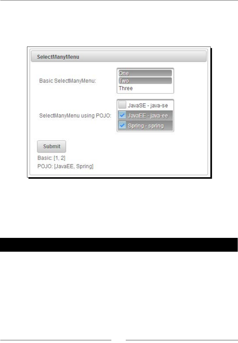
Chapter 6
[ 153 ]
What just happened?
We have used List<Tag> POJOs to populate the <p:selectManyMenu> component
opons. As we have set the showCheckbox aribute to true, each opon is displayed with
a checkbox to select that opon, as shown in the following screenshot:
Creating the overlay menu using SelectCheckboxMenu
SelectCheckboxMenu is a mulselect component that displays opons in an overlay. When
you click on the SelectCheckboxMenu component, it will display a list of opons each with a
checkbox to select, and contains a lter text eld to lter out the opons.
Time for action – using SelectCheckboxMenu
Let us see how to use <p:selectCheckboxMenu> to select mulple opons, by performing
the following step:
1. Create a form with the <p:selectCheckboxMenu> component as follows:
<h:form>
<p:panel header="SelectCheckboxMenu" style="width: 400px;
height: 500px; margin: 0 auto;">
<p:messages autoUpdate="true"/>
<h:panelGrid style="margin-bottom:5px" cellpadding="3">
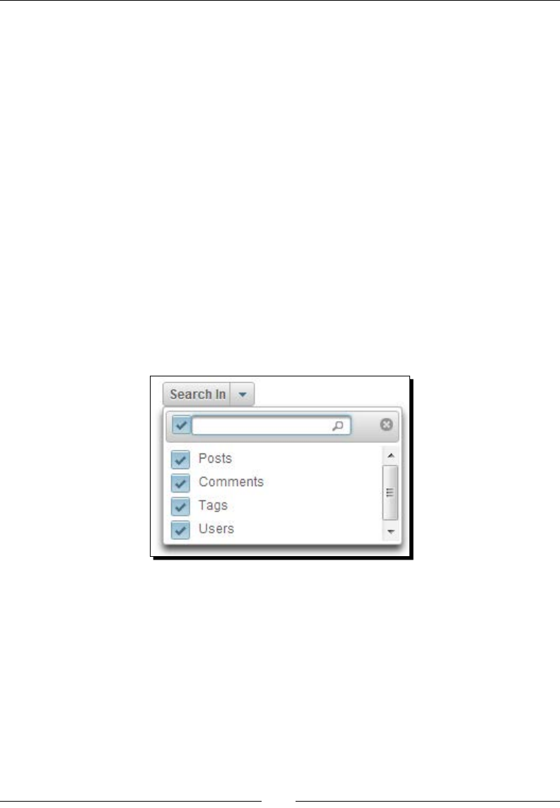
Working with Selecon Input Components
[ 154 ]
<p:selectCheckboxMenu
value="#{selectionController.
selectedSearchInOptions}"
label="Search In" filter="true"
filterText="Filter"
filterMatchMode="startsWith"
panelStyle="width:220px">
<f:selectItems
value="#{selectionController.searchInOptions}"
/>
</p:selectCheckboxMenu>
</h:panelGrid>
<p:commandButton value="Submit" update="display"/>
<h:outputText id="display" value="Value :
#{selectionController.selectedSearchInOptions}" />
</p:panel>
</h:form>
What just happened?
The preceding code displays SelectCheckboxMenu as shown in the following screenshot:
We have used List<String> type object searchInOptions to populate opons. When
the user selects opons and clicks on submit, the selected opons will be saved into the
List<String> type object selectedSearchInOptions and is displayed on the form.
The SelectCheckboxMenu component supports two AJAX behavior events, change and
toggleSelect. The toggleSelect event gets triggered when the Select all checkbox
is checked or unchecked. The change event gets triggered if any of the opons are checked
or unchecked.
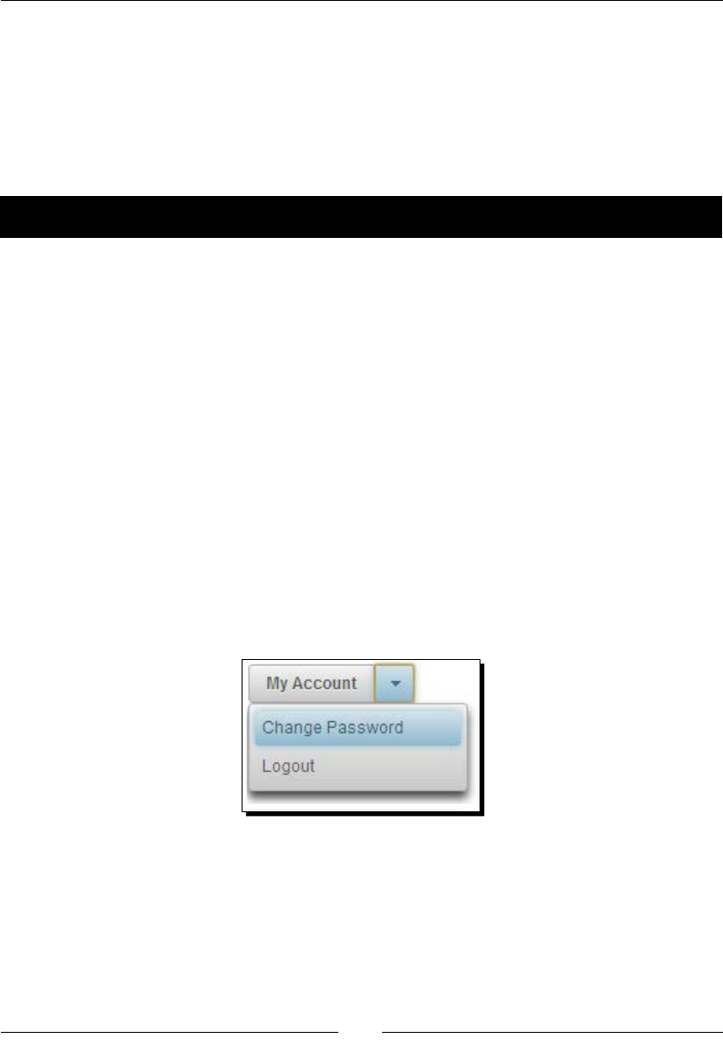
Chapter 6
[ 155 ]
Creating the overlay menu with a default command
using SplitButton
The SplitBuon component displays a command buon with an adjacent drop-down list
icon. When you click on the buon, the acon associated with that buon will be performed.
When you click on the drop-down list icon it will display a list of other available opons.
Time for action – using SplitButton
Let us see how we can use the <p:splitButton> component, by performing the
following step:
1. Create a form with the <p:splitButton> component with My Account as the
default acon, and Change Password and Logout as other opons:
<h:form>
<p:splitButton value="My Account"
actionListener="#{selectionController.showAccount}" >
<p:menuitem value="Change Password" url="changePwd.jsf"
/>
<p:menuitem value="Logout" ajax="false"
actionListener="#{selectionController.logout}"/>
</p:splitButton>
</h:form>
What the just happened?
The preceding code displays SplitBuon as shown in the following screenshot:
We have used <p:splitButton> with default acon My Account, which triggers the acon
listener method selectionController.showAccount(). We have provided the other
acon items using <p:menuitem> elements.

Working with Selecon Input Components
[ 156 ]
Introducing the PickList component
PickList is a dual list input component that is used for transferring data between two
dierent collecons with the following features:
Drag-and-drop-based reordering
Transion eects
POJO support
Filtering
Capons
Checkbox selecon
Client-server callbacks
PickList uses custom domain model org.primefaces.model.DualListModel, which
contains source and target lists.
Time for action – using the basic PickList component
Let us see how we can create a PickList component to grant and revoke privileges to and
from users, by performing the following steps:
1. Inialize DualListModel in the managed bean:
public class PickListController
{
private DualListModel<String> privileges;
public PickListController()
{
List<String> privilegesSource = new
ArrayList<String>();
List<String> privilegesTarget = new
ArrayList<String>();
privilegesSource.add("Create User");
privilegesSource.add("Delete User");
privilegesSource.add("Disable User");
privilegesSource.add("Remove Buzz Post");
privileges = new
DualListModel<String>(privilegesSource,
privilegesTarget);
}
//setter and getter for privileges
}
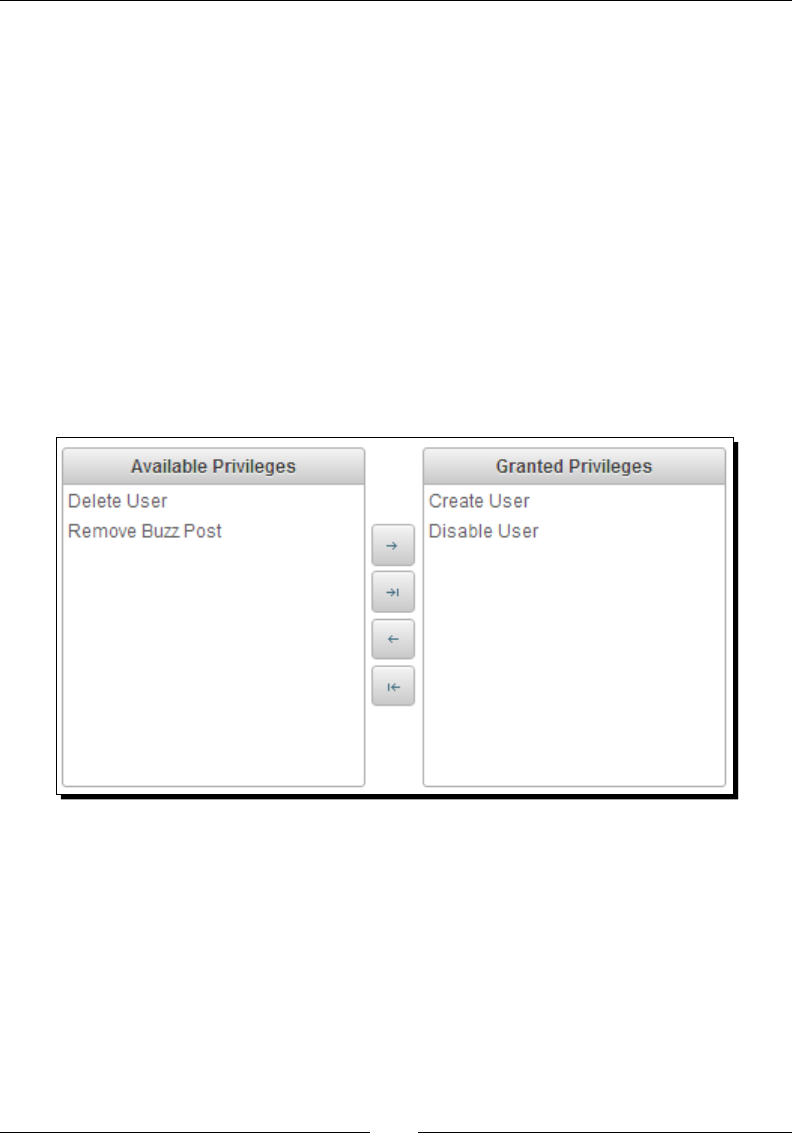
Chapter 6
[ 157 ]
2. Use the <p:pickList> component to create a PickList component:
<p:pickList id="pickList"
value="#{pickListController.privileges}"
var="privilege"
itemLabel="#{privilege}"
itemValue="#{privilege}">
<f:facet name="sourceCaption">Available
Privileges</f:facet>
<f:facet name="targetCaption">Granted Privileges</f:facet>
</p:pickList>
What just happened?
We have created a basic PickList component by creang a DualListModel instance as
a backing bean and inialized with opons. Now, we can transfer the opons between the
two lists using various transfer controls as shown in the following screenshot:
The PickList component provides the following aributes for customizaon:
addLabel: Title of the the add buon. Default is Add.
addAllLabel: Title of the add all buon. Default is Add All.
removeLabel: Title of the remove buon. Default is Remove.
removeAllLabel: Title of the remove all buon. Default is Remove All.
moveUpLabel: Title of the move up buon. Default is Move Up.
moveTopLabel: Title of the move top buon. Default is Move Top.
moveDownLabel: Title of the move down buon. Default is Move Down.

Working with Selecon Input Components
[ 158 ]
moveBottomLabel: Title of the move boom buon. Default is Move Bottom.
itemDisabled: Species whether an item can be picked or not.
showSourceControls: Species visibility of reorder buons of source list. Default
is false.
showTargetControls: Species visibility of reorder buons of target list. Default
is false.
onTransfer: Client-side callback to execute when an item is transferred from one
list to another.
showSourceFilter: Displays and inputs lter for source list. Default is false.
showTargetFilter: Displays and inputs lter for target list. Default is false.
filterMatchMode: Match mode for ltering, valid values are startsWith,
contains, endsWith, and custom. Default is startsWith.
filterFunction: Name of the JavaScript funcon for custom ltering.
showCheckbox: When true, a checkbox is displayed next to each item. Default
is false.
Using the PickList component with POJO support
In addion to simple types such as String, PickList can be used with POJOs by using converter.
Let us see how we can use a PickList component to assign and revoke roles to/from users.
Time for action – using the advanced PickList component
Let's look at creang a PickList component backed by a collecon of POJOs using converter,
by performing the following steps:
1. Create a user-role management form with the PickList component:
<p:growl id="msg" escape="false" />
<p:pickList id="pojoPickList"
value="#{pickListController.roles}"
converter="#{roleConverter}"
var="role" itemValue="#{role}"
itemLabel="#{role.roleName}"
showSourceControls="true" showTargetControls="true"
showSourceFilter="true" showTargetFilter="true"
showCheckbox="true" filterMatchMode="contains"
effect="bounce">

Chapter 6
[ 159 ]
<f:facet name="sourceCaption">Available Roles</f:facet>
<f:facet name="targetCaption">Assigned Roles</f:facet>
<p:ajax event="transfer"
listener="#{pickListController.onTransfer}"
update="msg" />
<p:column style="width:100%">
#{role.roleName}
</p:column>
</p:pickList>
2. Inialize DualListModel<Role> in the PickListController class and
implement the onTransfer() listener method.
public class PickListController
{
private DualListModel<Role> roles;
public PickListController()
{
List<Role> source = loadRolesFromDatabase();
List<Role> target = new ArrayList<Role>();
roles = new DualListModel<Role>(source, target);
}
//setter and getter for roles
public void onTransfer(TransferEvent event)
{
StringBuilder builder = new StringBuilder();
for(Object item : event.getItems()) {
builder.append(((Role)
item).getRoleName()).append("<br />");
}
String msg = null;
if(event.isAdd()){
msg = "Assigned Roles:<br/>"+builder.toString();
} else {
msg = "Revoked Roles:<br/>"+builder.toString();
}
FacesContext.getCurrentInstance().addMessage(null, new
FacesMessage(msg));
}
}
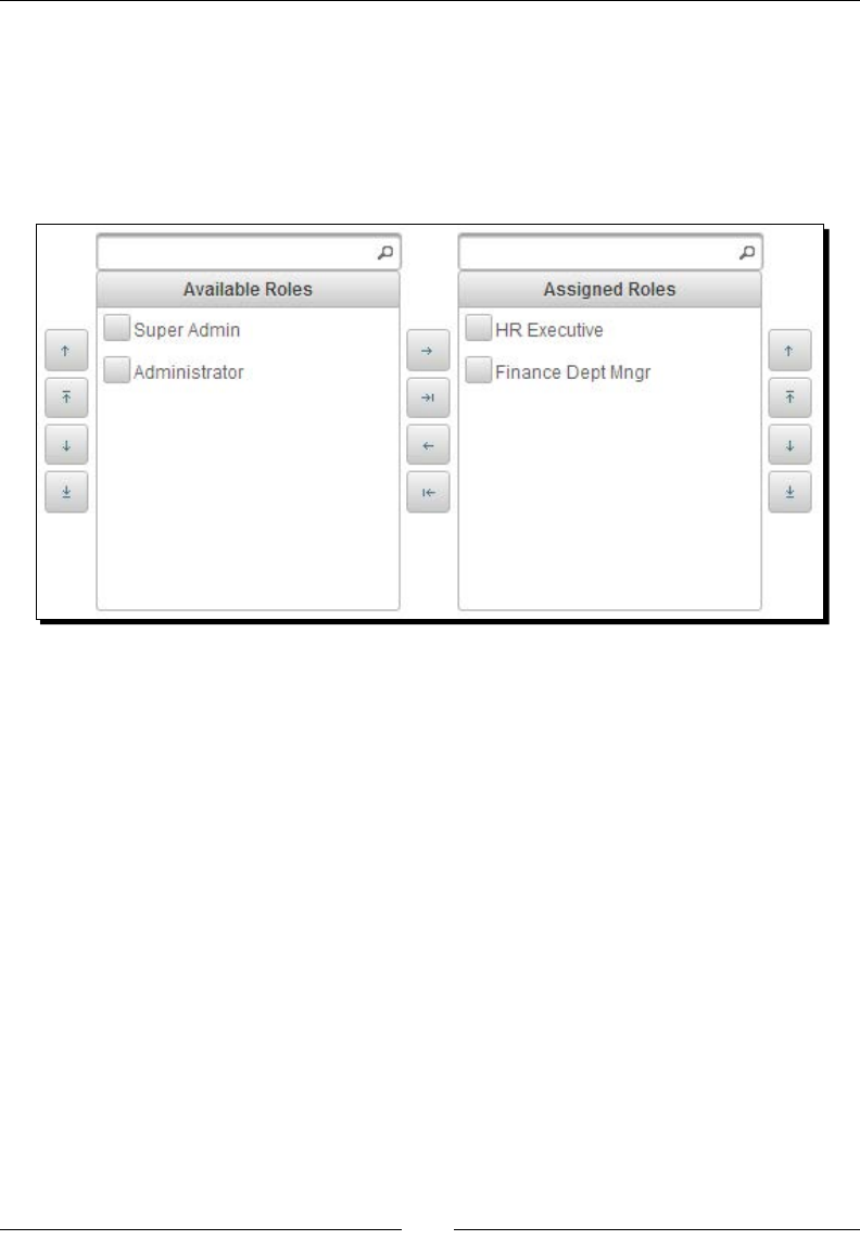
Working with Selecon Input Components
[ 160 ]
What just happened?
We have used DualListModel<Role> for populang the PickList data by
loading roles details from the database and registering RoleConverter using
converter=#{roleConverter}. Also we have displayed the opons using nested
<p:column> elements. The advantage of using nested <p:column> elements is that
we can display custom content, such as images, as opons:
We have used the showSourceControls and showTargetControls aributes to display
the Move Up, Move Top, Move Down, and Move Boom buons for source and target lists.
We have used the showSourceFilter and showTargetFilter aributes to provide
ltering opons on both the lists. As we have set showCheckbox="true", a checkbox is
displayed with each opon so that you can select mulple opons and add them all at one go.
As of now, PickList component supports only the transfer event, which is the only
available AJAX event and default event too. We have registered an event listener method,
pickListController.onTransfer(TransferEvent event), for the transfer event,
which gets triggered whenever you transfer an opon between source and target lists. You
can use event.isAdd() or event.isRemove() to determine whether the move is from
source to target or target to source.
Introducing the MultiSelectListbox component
MulSelectListbox is a selecon component that can be used to select an item from a
collecon of items with the parent-child hierarchical relaonship.
For example, in e-commerce applicaons, we can display various types of categories and
associated subcategories using MulSelectListbox.

Chapter 6
[ 161 ]
For the MulSelectListbox component, we need to give a list of SelectItem instances,
where each item can be a SelectItemGroup instance with its associated child
SelectItem instances.
Time for action – using the MultiSelectListbox component
Let us see how to create a MulSelectListbox component to display categories and its
subcategories based on the selected category, by performing the following steps:
1. Instanate List<SelectItem> instances with details of categories and
subcategories:
public class CatalogController
{
private List<SelectItem> categories;
private String selectedCategory;
public CatalogController()
{
categories = new ArrayList<SelectItem>();
SelectItemGroup homeAppliancesGrp = new
SelectItemGroup("Home Appliances");
SelectItemGroup homeDecorGrp = new
SelectItemGroup("Home & Decor");
SelectItem clocks = new SelectItem("Wall Clocks");
SelectItem candleHolders = new SelectItem("Candle
Holders");
SelectItem artPrints = new SelectItem("Art Prints");
homeDecorGrp.setSelectItems(new SelectItem[] { clocks,
candleHolders,artPrints });
SelectItem indoorLighting = new SelectItem("Indoor
Lighting");
homeAppliancesGrp.setSelectItems(new SelectItem[] {
homeDecorGrp,indoorLighting });
SelectItemGroup electronicsGrp = new
SelectItemGroup("Electronics");
SelectItemGroup mobilesGrp = new
SelectItemGroup("Mobiles");
SelectItem android = new SelectItem("Android Phones");
SelectItem windows = new SelectItem("Windows Phones");
SelectItem dualSim = new SelectItem("Dual SIM Phones");
mobilesGrp.setSelectItems(new SelectItem[] { android,
windows, dualSim });

Working with Selecon Input Components
[ 162 ]
SelectItemGroup laptopsGrp = new
SelectItemGroup("Laptops");
SelectItem apple = new SelectItem("Apple");
SelectItem dell = new SelectItem("Dell");
laptopsGrp.setSelectItems(new SelectItem[] { apple, dell
});
SelectItemGroup camerasGrp = new
SelectItemGroup("Cameras");
SelectItem canon = new SelectItem("Canon");
SelectItem nikon = new SelectItem("Nikon");
camerasGrp.setSelectItems(new SelectItem[] { canon,
nikon });
electronicsGrp.setSelectItems(new SelectItem[] {
mobilesGrp, laptopsGrp, camerasGrp });
SelectItemGroup booksGrp = new
SelectItemGroup("Books");
SelectItem literature = new SelectItem("Literature");
SelectItem fiction = new SelectItem("Fiction");
booksGrp.setSelectItems(new SelectItem[] { literature,
fiction });
categories.add(homeAppliancesGrp);
categories.add(electronicsGrp);
categories.add(booksGrp);
}
// setters and getters
}
2. Create the MulSelectListbox component backing with the
List<SelectItem> instance:
<h:form>
<p:multiSelectListbox
value="#{multiSelectListboxBean.selectedCategory}"
effect="slide">
<f:selectItems value="#{multiSelectListboxBean.categories}"
/>
</p:multiSelectListbox>
<p:commandButton value="Show Products"
update="selectedCategory/>
<h:outputText id="selectedCategory" value="Selected
Category: #{catalogController.selection}"/>
</h:form>
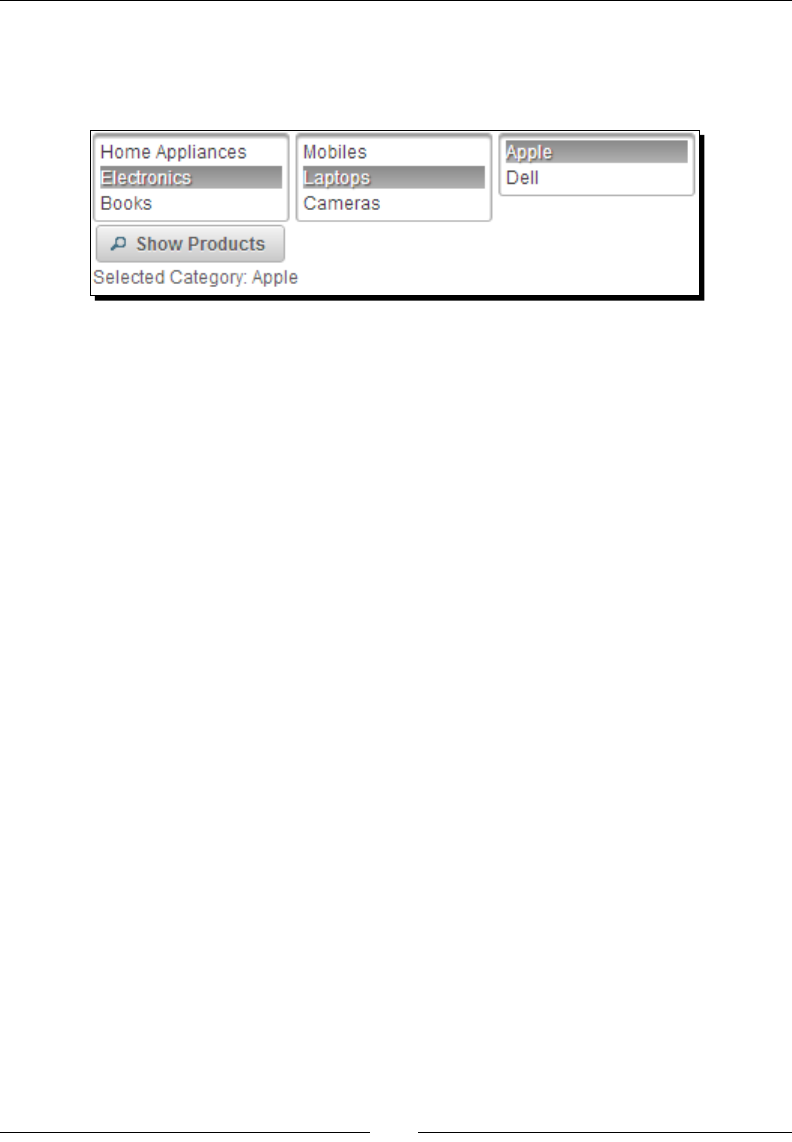
Chapter 6
[ 163 ]
What just happened?
We have created List<SelectItem> instances with the SelectItemGroup and
SelectItem objects with the parent-child hierarchical relaonship:
In MulSelectListbox, when you click on a category group, associated subcategories and
opons will be displayed in an adjacent Listbox. We can select the desired category by
clicking on any of the leaf (SelectItem) nodes.
Summary
In this chapter, we have learned how to use various PrimeFaces selecon input components
such as SelectManyCheckbox, SelectOneRadio, SelectOneMenu, SelectOneListbox,
SelectManyMenu, PickList, and so on. In the next chapter, we will learn about PrimeFaces
advanced input components such as Calendar, Rang, Spinner, Slider, File Upload, and so on.

7
Introducing Advanced
Input Components
PrimeFaces provides several advanced input components such as Calendar,
Spinner, Slider, Rating, and so on, which can be used to build rich user
interfaces. Also, PrimeFaces provides the FileUpload and FileDownload
components that simplify the process of uploading and downloading of files
and provide an enhanced HTML5-powered FileUpload editor. In addition to
these, PrimeFaces provides the CAPTCHA validation component that can be
used to prevent spam and bots from crawling into our system.
Calendar is a very commonly-used component. PrimeFaces provides the
Calendar component with lots of features and customization options such
as inline/pop-up calendar, year/month navigation, customizable locale/date
format support, and many more.
The Spinner component comes in very handy when getting input with increment
and decrement features with a configurable step value.
In e-commerce applications we can use the Slider component to select a range
of prices to filter the products display. And, we can use the Rating component
to rate the product based on a rating scale.
In this chapter we will cover:
Introducing the Calendar component
Star-based rang using the Rang component
Introducing the Spinner component

Introducing Advanced Input Components
[ 166 ]
Geng input on a scale using Slider
Prevenng spam and bots using CAPTCHA validaon
Uploading les using the FileUpload component
Downloading les using the FileDownload component
Introducing the Calendar component
Calendar is a date and me picker component that provides the following list of features:
Pop-up and inline display modes
Localizaon support
Month and year navigator
Date and me range restricon
Mulple pages calendar
Customizable date formats
AJAX event support for the dateSelect event
Advanced customizaon for enabling/disabling dates and applying custom styles
for dates
A basic Calendar component can be displayed using <p:calendar> as follows:
<p:calendar value="#{userController.registerUser.dob}"/>
The <p:calendar> component provides the following aributes to customize its behavior:
mindate: This sets the calendar's minimum visible date.
maxdate: This sets the calendar's maximum visible date.
pages: This enables mulple page rendering. The default value is 1.
disabled: This disables the calendar when set to true. The default value is false.
mode: This denes how the calendar will be displayed. The default value is popup.
Valid values are popup and inline.
pattern: The date format paern for localizaon. The default value is MM/dd/yyyy.
locale: This is the locale to be used for labels and conversion.
navigator: This enables the month/year navigator. The default value is false.
timeZone: String or a java.util.TimeZone instance to specify the mezone
used for date conversion. This defaults to TimeZone.getDefault().
readonly: This makes both the input text and pop-up buon of Calendar disabled.
The default value is false.

Chapter 7
[ 167 ]
readonlyInput: This provides a read-only access to only the input text of a
pop-up calendar. You can change the date using the datepicker buon. The default
value is false.
showButtonPanel: This provides for the visibility of the buon panel containing
Today and Done buons. The default value is false.
effect: This species the eect to use when displaying and showing the
pop-up calendar.
effectDuration: This is the duraon of the eect. The default value is normal.
showOn: This is a client-side event that displays the pop-up calendar. The default
value is both. Valid values are focus, button, and both.
showWeek: This displays the week number next to each week. The default value
is false.
disabledWeekends: This disables weekend columns. The default value is false.
showOtherMonths: This displays days belonging to other months. The default
value is false.
selectOtherMonths: This enables selecon of days belonging to other months.
The default value is false.
yearRange: This provides the year range for the navigator, with the default being
c-10:c+10.
timeOnly: If set to true, this shows only the me picker without the date.
The default value is false.
stepHour: These are hour steps. The default value is 1.
stepMinute: These are minute steps. The default value is 1.
stepSecond: These are second steps. The default value is 1.
minHour: This species the minimum boundary for hour selecon. The default
value is 0.
maxHour: This species the maximum boundary for hour selecon. The default
value is 23.
minMinute: This species the minimum boundary for minute selecon. The default
value is 0.
maxMinute: This species the maximum boundary for minute selecon. The default
value is 59.
minSecond: This species the minimum boundary for second selecon. The default
value is 0.
maxSecond: This species maximum boundary for second selecon. The default
value is 59.
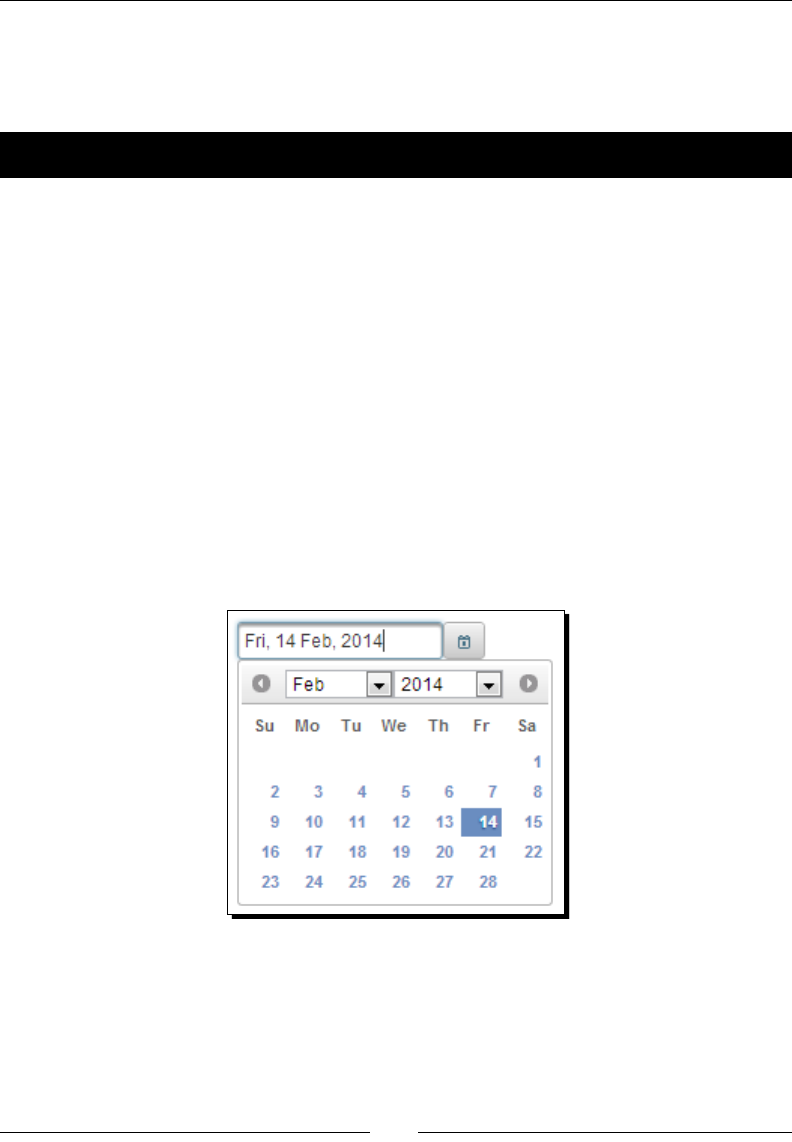
Introducing Advanced Input Components
[ 168 ]
pagedate: This species the inial date to display if the value is null.
beforeShowDay: This is the client-side callback to execute before displaying a date;
used to customize the date display.
Time for action – displaying a pop-up Calendar with navigator
Let us see how we can display a pop-up Calendar component when a buon is clicked with
the custom date format and navigator features.
To do this, create the <p:calendar> component using the navigator and
pattern aributes:
<p:calendar value="#{userController.registeredUser.dob}"
showOn="button" navigator="true" pattern="EEE, dd MMM, yyyy"/>
What just happened?
We have created a Calendar component and congured it to be displayed when a buon
icon is clicked on, using the showOn aribute. As we have set navigator="true", year
and month drop-down lists are displayed for easy navigaon. Also, we have customized
the date format to be displayed in the EEE, dd MMM, yyyy format using the pattern
aribute. When a date is selected, it will be displayed as Fri, 14 Feb, 2014. This is shown in
the following screenshot:
Understanding Internationalization (I18N) and Localization (L10N)
Before discussing how to localize the Calendar component, rst let us understand what
Internaonalizaon (I18N) and Localizaon (L10N) is. Some web applicaons need to
support mulple languages based on the user locale, which means that all the text on the
screen should be displayed in the user-locale-specic locale.

Chapter 7
[ 169 ]
For supporng Internaonalizaon, we will store all the text, such as labels, messages, and
so on, in externalized locale-specic properes les.
For example, we can store all messages in properes les, also known as resource bundles,
with the base name messages.
For default, for the English language, we can store messages either in messages.
properties or messages_en.properties. For the French locale, we can store messages
in messages_fr.properties, and for the Spanish locale, we can store in messages_
es.properties. Here en, fr, es, and so on are ISO 639 ISO language codes. These
resource bundles should be placed in the classpath.
English (default): messages.properties
label_password=Password
invalid_login=Login failed. Please try again
password_blank=Please enter password
French: messages_fr.properties
label_password=mot de passe
invalid_login=Échec de la connexion. S'il vous plaît essayer de
nouveau
password_blank=S'il vous plaît entrer mot de passé
Spanish: messages_es.properties
label_password=contraseña
invalid_login=Error de acceso. Por favor, inténtelo de nuevo
password_blank=Por favor, introduzca la contraseña
Now, you need to register the resource bundles base name in faces-config.xml as follows:
<faces-config xmlns="http://java.sun.com/xml/ns/javaee"
xmlns:xsi="http://www.w3.org/2001/XMLSchema-instance"
xsi:schemaLocation="http://java.sun.com/xml/ns/javaee
http://java.sun.com/xml/ns/javaee/web-facesconfig_2_0.xsd"
version="2.0">
<application>
<resource-bundle>
<base-name>messages</base-name>
<var>msgs</var>
</resource-bundle>
</application>
</faces-config>

Introducing Advanced Input Components
[ 170 ]
With the preceding <resource-bundle> conguraon, JSF picks the appropriate
properes le based on the user locale. If no resource bundle exists for the user locale,
the default resource bundle (messages.properties) will be used.
Once the messages are externalized into resource bundles, we can refer to them in our
facelets pages as follows:
<h:outputLabel value="#{msgs.label_password}" />
While adding FacesMessage objects, we can obtain the current locale-specic message
as follows:
FacesContext context = FacesContext.getCurrentInstance();
ResourceBundle bundle = context.getApplication().
getResourceBundle(context, "msgs");
String message = bundle.getString(str);
context.addMessage(null, new FacesMessage(message));
Localizaon (L10N) means rendering a view using a specic locale. By default, the locale
informaon will be obtained from the view's locale. We can override the locale by using the
<f:view> element as follows:
<f:view contentType="text/html" locale="fr">
...
</f:view>
The preceding facelets page renders using the French locale resource bundle,
messages_fr.properties.
We can also resolve locale dynamically and render a view based on a user-preferred locale
as follows:
<f:view contentType="text/html" locale="#{loginUser.locale}">
...
</f:view>
Here #{loginUser.locale} resolves to a user-preferred locale and picks the appropriate
resource bundle to resolve messages.
The PrimeFaces Calendar component uses a shared PrimeFaces.locales property to
display the labels. PrimeFaces only provides English translaons, so in order to localize the
calendar, we need to put corresponding locales into a JavaScript le and include the scripng
le to the page, as follows:
<h:outputScript library="js" name="calendarLocales.js" />
For already translated locales of the calendar, see http://code.google.com/p/
primefaces/wiki/PrimeFacesLocales.

Chapter 7
[ 171 ]
Time for action – displaying a multipage calendar with
Localization and the dateSelect event listener
Let us see how we can display an inline calendar with mulple months displayed in the
French locale and register the dateSelect event listener.
1. Congure the locale-specic Calendar labels in the calendarLocales.js le and
save it in the resources/js folder:
<script type="text/javascript">
PrimeFaces.locales['tr'] = {
closeText: 'kapat',
prevText: 'geri',
nextText: 'ileri',
currentText: 'bugün',
monthNames: ['Ocak','Subat','Mart','Nisan','Mayis','Haziran','
Temmuz','Agustos','Eylül','Ekim','Kasim','Aralik'],
monthNamesShort: ['Oca','Sub','Mar','Nis','May','Haz', 'Tem','
Agu','Eyl','Eki','Kas','Ara'],
dayNames: ['Pazar','Pazartesi','Sali','Çarsamba','Persembe',
'Cuma','Cumartesi'],
dayNamesShort: ['Pz','Pt','Sa','Ça','Pe','Cu','Ct'],
dayNamesMin: ['Pz','Pt','Sa','Ça','Pe','Cu','Ct'],
weekHeader: 'Hf',
firstDay: 1,
isRTL: false,
showMonthAfterYear: false,
yearSuffix: '',
timeOnlyTitle: 'Zaman Seçiniz',
timeText: 'Zaman',
hourText: 'Saat',
minuteText: 'Dakika',
secondText: 'Saniye',
ampm: false,
month: 'Ay',
week: 'Hafta',
day: 'Gün',
allDayText : 'Tüm Gün'
};
</script>
2. Include the calendarLocales.js script le in the facelets page:
<h:outputScript library="js" name="calendarLocales.js" />

Introducing Advanced Input Components
[ 172 ]
3. Create the <p:calendar> component displaying labels in the French language
using the locale aribute:
<p:calendar value="#{calendarController.dob}"
mode="inline"
locale="fr"
pages="3">
<p:ajax event="dateSelect"
listener="#{calendarController.handleDobSelect}"
update="growl"/>
</p:calendar>
4. Implement the handleDobSelect() event listener method as shown:
@ManagedBean
@RequestScoped
public class CalendarController
{
public void handleDobSelect(SelectEvent se)
{
Date date = (Date) se.getObject();
FacesContext.getCurrentInstance().addMessage(null, new
FacesMessage("DOB Selected :"+date));
}
}
What just happened?
We have created a Calendar component with the inline display mode to display three
months using pages="3". We have congured the French locale Calendar labels and set
locale="fr", which displayed the Calendar labels in French. Also, we have registered an
event listener for the dateSelect event using <p:ajax>. When you click on any date,
the handleDobSelect(org.primefaces.event.SelectEvent event) method
gets invoked and we can get the selected date using the event.getObject() method. In
the pop-up mode, Calendar also supports regular AJAX behavior events such as blur and
keyup. The resultant Calendar is shown as follows:

Chapter 7
[ 173 ]
In earlier versions of PrimeFaces, Calendar's dateSelect event
listener method receives an instance of org.primefaces.
event.DateSelectEvent. But, since PrimeFaces 3.5,
the DateSelectEvent class was removed and instead the
SelectEvent instance is passed. For more informaon,
see http://forum.primefaces.org/viewtopic.
php?f=3&t=27590 and https://code.google.com/p/
primefaces/issues/detail?id=2937.
Restricting the date selection within the date range
Let us see how we can create a Calendar with a minimum and maximum date
selecon restricons.
We can specify the mindate and maxdate values as strings in the format specied with the
pattern aribute:
<p:calendar value="#{userController.registeredUser.dob}" pattern="dd-
MM-yyyy" mindate="01-06-2013" maxdate="15-08-2013"/>
Time for action – using Calendar with a date range
Let us see how we can use the mindate and maxdate values from backing beans.
1. Create a Calendar component with a date selecon range using the mindate and
maxdate aributes:
<p:calendar value="#{userController.registeredUser.dob}"
pattern="dd-MM-yyyy"
mindate="#{userController.dobMinDate}"
maxdate="#{userController.dobMaxDate}"
showButtonPanel="true"
showWeek="true"
showOtherMonths="true"
selectOtherMonths="false"
effect="slideDown"
/>
2. Implement the getMinDate() and getMaxDate() methods to return minimum
and maximum dates:
@ManagedBean
@RequestScoped
public class UserController
{
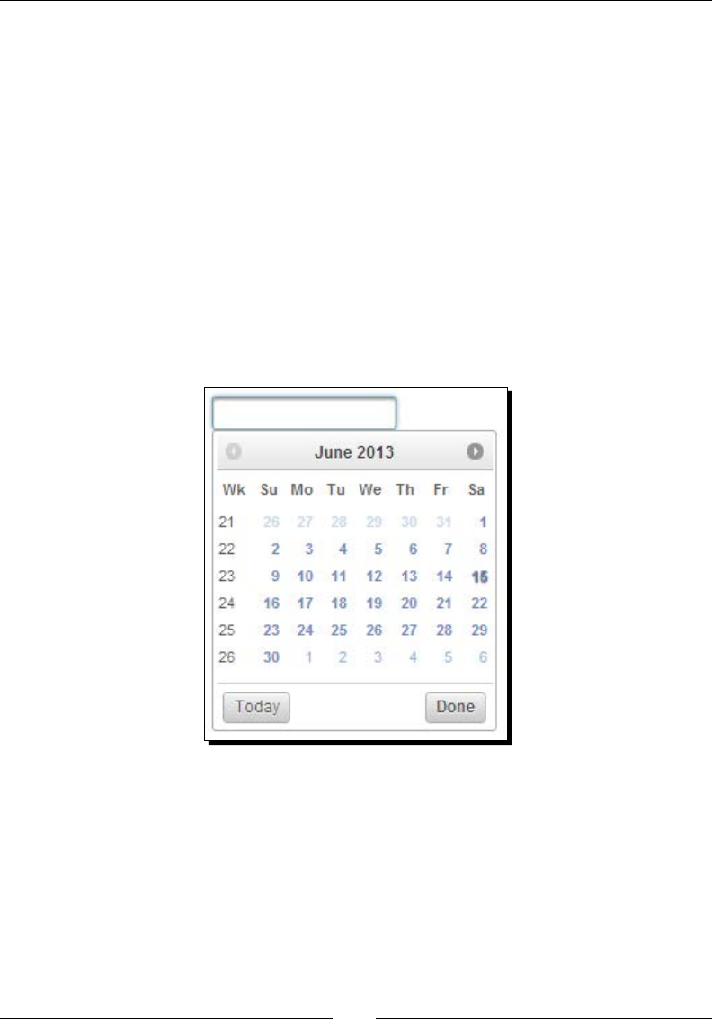
Introducing Advanced Input Components
[ 174 ]
public Date getDobMinDate() throws ParseException
{
return new SimpleDateFormat("dd-MM-yyyy").parse("01-06-2013");
}
public Date getDobMaxDate() throws ParseException
{
return new SimpleDateFormat("dd-MM-yyyy").parse("15-08-2013");
}
}
What just happened?
We have specied the date range, which allows selecng any date between the mindate
and maxdate values only. Also, we have seen how to use other aributes such as
showButtonPanel, showWeek, effect, and so on:
Using Calendar with advanced customization options
PrimeFaces Calendar components provide opons to customize enabling/disabling dates
and for applying custom styles for each date using the beforeShowDay JavaScript callback
funcon. This callback funcon takes date as the input parameter and returns an array with
two values, of which the rst value represents the enable/disable ag, and the second value
represents the style class to be applied.
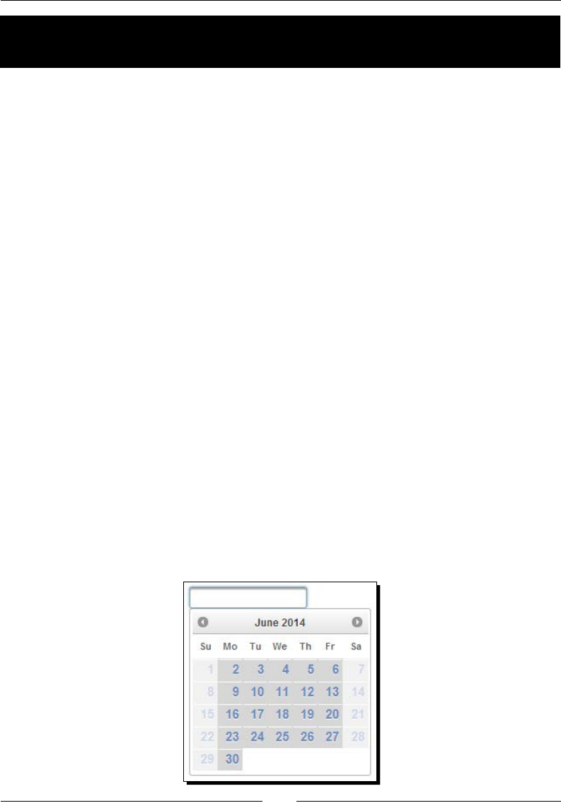
Chapter 7
[ 175 ]
Time for action – using Calendar's advanced customization
options
Let us see how we can customize the Calendar component to disable Saturday and Sunday
dates and apply a custom style.
1. Create the JavaScript funcon disableSatSundays() using the following code:
function disableSatSunDays(date)
{
var day = date.getDay();
return [(day != 0 && day != 6), 'myCalendar'];
}
Create a new custom style myCalendar.
<style type="text/css">
.myCalendar
{
font-size: 15px;
background-color: #D3D3D3;
}
</style>
2. Create a Calendar component and congure the beforeShowDay aribute to
invoke the disableSatSundays() callback funcon:
<p:calendar value="#{userController.registeredUser.dob}" beforeSho
wDay="disableSatSunDays"/>
What just happened?
We have customized the Calendar to disable all Saturday and Sunday dates using the
beforeShowDay aribute and applying the myCalendar CSS style. Even though we restricted
selecng Saturdays and Sundays, it is always advisable to perform validaons on the server side
because there could be other means of geng input data, such as les from batch jobs.
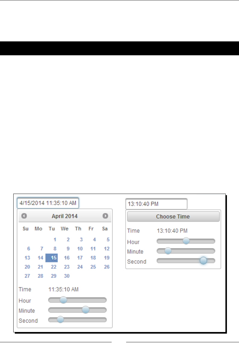
Introducing Advanced Input Components
[ 176 ]
Using the Calendar component's time picker options
The PrimeFaces's Calendar component also provides a me picker opon to select the hour,
minutes, and seconds.
Time for action – Calendar with the time picker options
Let us see how we can use the Calendar component as the date and me picker.
Create a Calendar component with me picker opons using the pattern aribute:
<p:calendar value="#{calendarController.meetingTime}"
pattern="MM/dd/yyyy HH:mm:ss a"
stepHour="2" stepMinute="5" stepSecond="10"
minHour="9" maxHour="18"/>
What just happened?
We have used pattern="MM/dd/yyyy HH:mm:ss a", which makes the Calendar
component display the me selecon opons. Here HH, mm, ss and a represents the
hour, minutes, seconds and A.M./P.M. respecvely. We have also used other opons such as
stepHour and stepMinute to specify the step value while dragging the sliders. Similar to the
date range, we can also menon the me range using the minHour, maxHour, minMinute,
maxMinute, minSecond, and maxSecond aributes. We can also use the Calendar
component to display only the me picker opons by using the timeOnly="true" aribute.
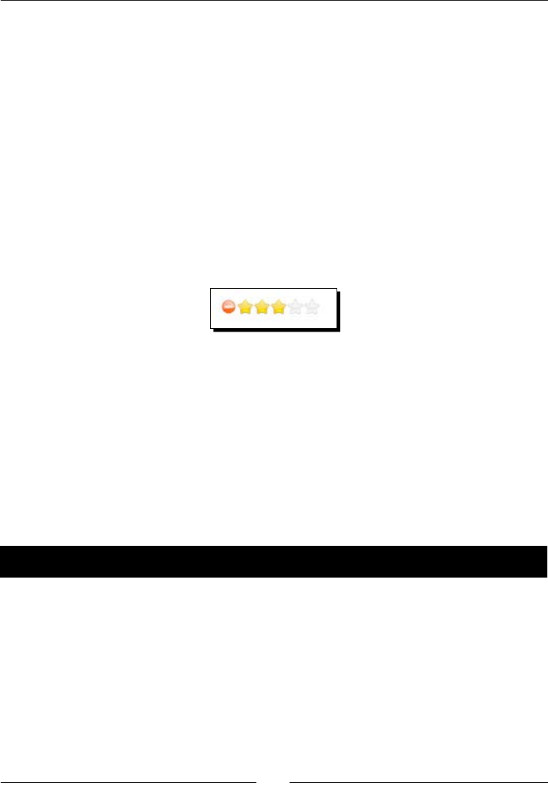
Chapter 7
[ 177 ]
The Calendar component provides the following client-side API funcons:
getDate(): This returns the currently selected date
setDate(date): This sets the calendar display date
disable(): This disables the calendar
enable(): This enables the calendar
Star-based rating using the Rating component
The Rang component is a star-based rang input with AJAX callback support for the rate
and cancel events:
<p:rating value="#{postController.selectedPost.rating}" />
By default, the Rang component displays ve stars along with a cancel icon as follows:
The Rang component provides the following aributes to customize its behavior:
stars: This species the number of stars to display. The default value is 5.
cancel: When enabled, this aribute displays a cancel icon to reset the rangs. The
default value is true.
onRate: This is a client-side callback, which is executed when a rang takes place.
disabled: This disables user interacon. The default value is false.
readonly: This disables user interacon without disabled visuals. The default value
is false.
Time for action – using the Rating component
Let us see how we can use the Rang component with 10 stars and use the rate and
cancel AJAX event listeners:
1. Create a Rang component and register the AJAX listeners for the rate and cancel
events, using the following code:
<p:growl id="growl"/>
<p:rating value="#{postController.selectedPost.rating}"
stars="10">
<p:ajax event="rate" listener="#{postController.
handlePostRating}" update="growl" />
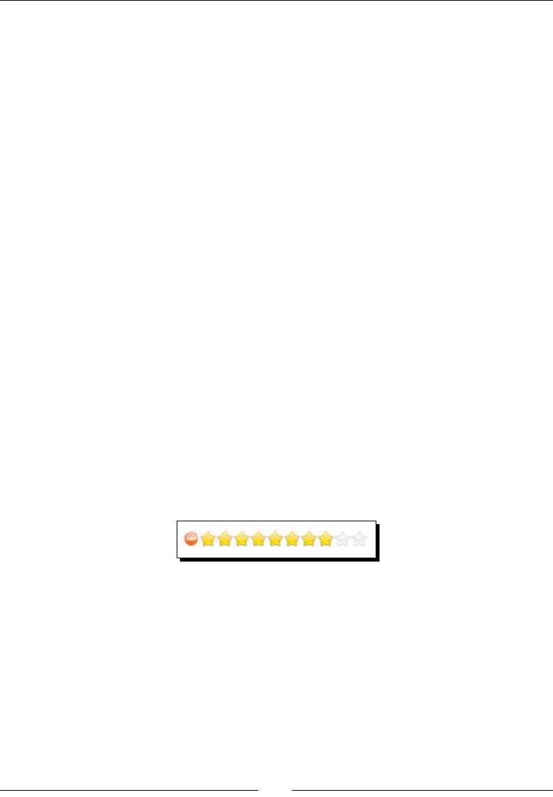
Introducing Advanced Input Components
[ 178 ]
<p:ajax event="cancel" listener="#{postController.
handlePostRatingCancel}" update="growl" />
</p:rating>
2. Implement the event listener methods:
@ManagedBean
@RequestScoped
public class PostController
{
private Post selectedPost;
//setters and getters
public void handlePostRating(RateEvent rateEvent) {
Integer rate = (Integer) rateEvent.getRating();
JSFUtils.addInfoMessage("Post rated:" +rate);
}
public void handlePostRatingCancel() {
JSFUtils.addInfoMessage("Post Rating Cancelled");
}
}
What just happened?
We have used the <p:rating> component with stars="10" so that it will display a 10-stars-
based Rang component. We have registered event listeners using the <p:ajax> element for
the rate and cancel events. When you click on a star, the handlePostRating() method
gets invoked, and if you click on the cancel icon, the handlePostRatingCancel() method
gets invoked.
You can use the onRate aribute to register a client-side JavaScript callback funcon
as follows:
<p:rating value="#{postController.selectedPost.rating}"
onRate="alert('Post rated :' + value)"/>
The onRate callback funcon is called when a star is selected with value as the
only parameter.
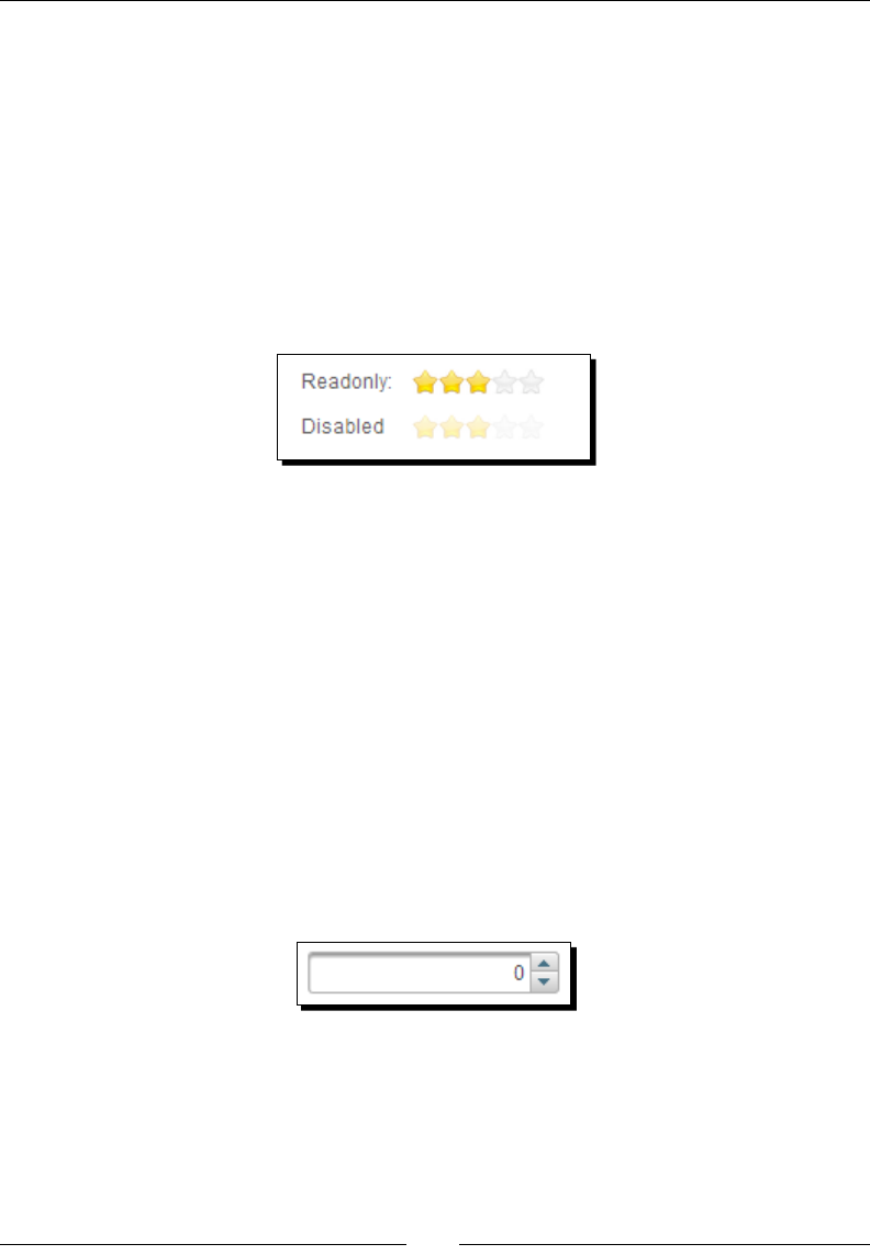
Chapter 7
[ 179 ]
Somemes, we may need to display the Rang component in the read-only mode without
the cancel icon. We can apply the read-only access to the Rang component using the
following code snippet:
<p:rating value="#{postController.selectedPost.rating}"
readonly="true"/>
If you use readonly="true", stars will be displayed as acve but in the read-only mode,
this prevents users from rang. Alternavely, you can use disabled="true", which
displays only the number of stars based on the rang value and the stars will be disabled.
If you set readonly="true" or disabled="true", the cancel icon will not be displayed
automacally. These are shown in the following screenshot:
The Rang component provides the following client-side API funcons:
getValue(): This returns the current rang value
setValue(value): This sets the rang value
disable(): This disables the Rang component
enable(): This enables the Rang component
reset(): This clears the rang value
Introducing the Spinner component
The Spinner component is used to provide an input with increment and decrement buons
on an input text. A basic Spinner component can be created as follows:
<p:spinner value="#{spinnerController.quantity}" />
The Spinner component provides the following aributes to customize its behavior:
stepFactor: This species the stepping factor for each increment and decrement.
The default value is 1.
min: This is the minimum boundary value.
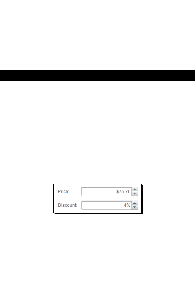
Introducing Advanced Input Components
[ 180 ]
max: This is the maximum boundary value.
prefix: This is the prex of the input.
suffix: This is the sux of the input.
By default, when you click on the increment/decrement buons, the value will increment/
decrement by 1. We can bind the Spinner component to decimal type properes and
customize the increment/decrement value by seng the stepFactor aribute to the
desired step value. Also, we can specify the minimum and maximum boundary values for the
Spinner component and the prex/sux to be displayed with the Spinner component value.
Time for action – using the Spinner component
Let us see how we can use the Spinner component:
1. Create a Spinner component to hold a double value, say price, that steps by 0.25
with the $ prex:
<p:spinner value="#{spinnerController.price}" prefix="$"
stepFactor="0.25" />
2. Create another Spinner component to hold a discount value with a % sux and the
discount value should be between 0 and 10:
<p:spinner value="#{spinnerController.discount}" suffix="%"
min="0" max="10" />
What just happened?
We have used the <p:spinner> component to create Spinner components with various
features such as stepFactor, the min/max boundaries, and prefix/suffix.
However, even if you specify the min and max boundaries, the Spinner component will allow
you to enter any value outside the boundaries directly in the text eld. We can restrict entering
the value in the Spinner input text eld manually using the onkeydown event as follows:
<p:spinner value="#{spinnerController.discount}" suffix="%" min="0"
max="10" onkeydown="return false;"/>
However, doing server-side validaons will be safe in case the data comes through other
channels such as batch processes.
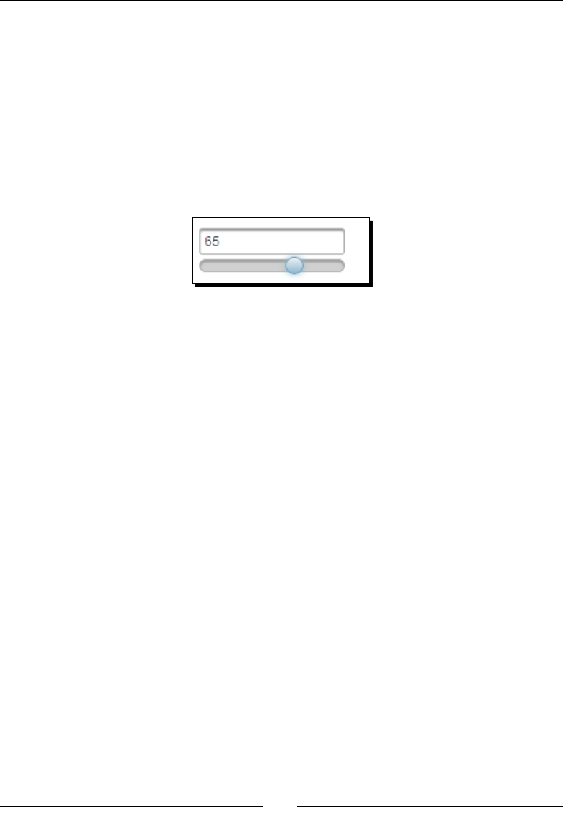
Chapter 7
[ 181 ]
Getting input on a scale using the Slider component
The Slider component can be used to take input by using a slider bar. Slider requires an input
component to hold the value selected by the slide bar.
The Slider component's for aribute is used to set the id value of the input component
whose input will be provided by the slider.
A basic Slider component can be created as follows:
<p:inputText id="zoomlevelId" value="#{sliderController.zoomLevel}" />
<p:slider for="zoomLevelId"/>
The Slider component provides the following aributes to customize its behavior:
for: This is the ID of the input text that the slider will be used for.
display: This is the ID of the component to display the slider value.
minValue: This is the minimum value of the slider. The default value is 0.
maxValue: This is the maximum value of the slider. The default value is 100.
animate: This is the Boolean value to enable/disable the animated move when the
background of slider is clicked. The default value is true.
type: This sets the type of the slider, horizontal or vertical. This default value
is horizontal.
step: These are xed pixel increments that the slider moves in. The default
value is 1.
disabled: This disables or enables the slider. The default value is false.
onSlideStart: This is the client-side callback to execute when sliding begins.
onSlide: This is the client-side callback to execute during sliding.
onSlideEnd: This is the client-side callback to execute when sliding ends.
range: When enabled, two handles are provided for selecng a range. The default
value is false.
displayTemplate: This enables the string template to use when updang the
display. Valid placeholders are {value}, {min}, and {max}.
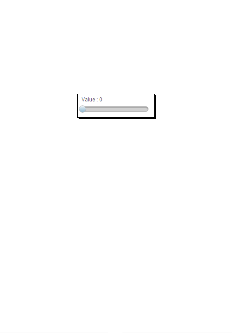
Introducing Advanced Input Components
[ 182 ]
Somemes, we may want to display only Slider along with its value, without the input text
eld. To implement this, we can bind the slider to a hidden input component and use the
display aribute to specify an outputText eld ID to show the slider value:
<h:panelGrid columns="1" style="margin-bottom:10px">
<h:outputText id="display" value="Value : #{sliderController.
zoomLevel}" />
<h:inputHidden id="zoomLevelId" value="#{sliderController.
zoomLevel}"/>
<p:slider for="zoomLevelId" display="display" style="width:150px"
displayTemplate="Value : {value}"/>
</h:panelGrid>
We can display the slider vercally using the type="vertical" aribute, by default
type is set to horizontal. We can specify the value boundaries for the slider using the
minValue and maxValue aributes. By default, the slider steps by 1, but we can customize
it using the step aribute.
Let us see how we can use the Slider component's type, minValue, maxValue, and step:
<h:inputText id="zoomLevelId" value="#{sliderController. zoomLevel}"
/>
<p:slider for="zoomLevelId" type="vertical" minValue="0" maxValue="50"
step="10"/>
However, even if you specify the min and max boundaries, the Slider component allows
entering any value outside the boundaries directly in the text eld. We can restrict entering a
value in the slider input text eld manually as follows:
<h:inputText id="zoomLevelId" value="#{sliderController. zoomLevel}"
onfocus="this.readOnly=true;"/>
Or:
<h:inputText id="zoomLevelId" value="#{sliderController. zoomLevel}"
onkeydown="return false;"/>
The Slider component can also be used as a range selector. To use Slider as a range selector,
set the range aribute to true and specify the comma-separated pair of input elds to bind
the minimum and maximum values.
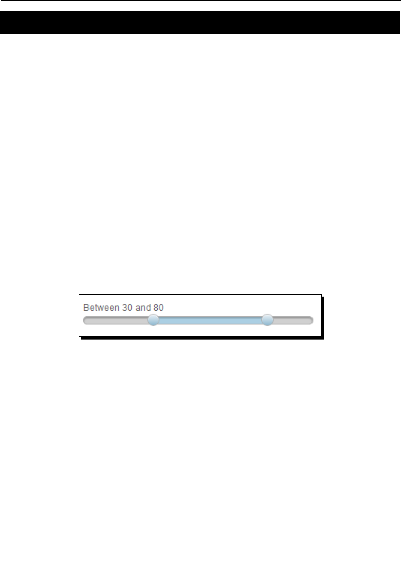
Chapter 7
[ 183 ]
Time for action – using the Slider component
Let us see how to use Slider as a range selector.
Create a Slider component with the range aribute set to true:
<h:panelGrid columns="1" style="margin-bottom:10px">
<h:outputText id="displayRange" value="Between #{sliderController.
minPrice} and #{sliderController.maxPrice}"/>
<p:slider for="minPriceId1,maxPriceId2" display="displayRange"
style="width:300px" range="true" displayTemplate="Between {min} and
{max}"/>
<h:inputHidden id="minPriceId1" value="#{sliderController.minPrice}"
/>
<h:inputHidden id="maxPriceId2" value="#{sliderController.maxPrice}"
/>
</h:panelGrid>
What just happened?
We have used the <p:slider> component along with the range="true" aribute, which
makes it as range selector. We bound the Slider's min and max values to two hidden input
elds and displayed the selected range values using the displayTemplate aribute.
Slider supports the slideEnd AJAX event that is red when the slide completes. You
can register the event listener method, which can take the org.primefaces.event.
SlideEndEvent argument:
<h:inputText id="zoomLevelId" value="#{sliderController.zoomLevel}" />
<p:slider for="zoomLevelId">
<p:ajax event="slideEnd" listener="#{sliderController.onSlideEnd}"/>
</p:slider>
public void onSlideEnd(SlideEndEvent event) {
int value = event.getValue();
JSFUtils.addInfoMessage( "Value: " + value);
}

Introducing Advanced Input Components
[ 184 ]
Preventing spam and bots using CAPTCHA validation
CAPTCHA is a form validaon component based on the reCAPTCHA API. Generally, CAPTCHA
validaon is used to prevent spam and bots entering into the system.
To use the PrimeFaces CAPTCHA component, rst we need to get the public key and private
key from http://recaptcha.net. Once we have the public and private keys, we need to
congure them as context parameters in web.xml as follows:
<context-param>
<param-name>primefaces.PRIVATE_CAPTCHA_KEY</param-name>
<param-value>REPLACE_YOUR_PRIVATE_KEY_HERE</param-value>
</context-param>
<context-param>
<param-name>primefaces.PUBLIC_CAPTCHA_KEY</param-name>
<param-value>REPLACE_YOUR_PUBLIC_KEY_HERE</param-value>
</context-param>
Time for action – using CAPTCHA for user registration
Now, let us see how to use the PrimeFaces Captcha component for user registraon.
1. Create a user registraon form with the Captcha component:
<h:form>
<p:messages showDetail="true" autoUpdate="true"/>
<h:panelGrid columns="2">
<h:outputLabel value="EmailId" />
<p:inputText value="#{userController.registerUser.emailId}"
required="true" label="EmailId"/>
<h:outputLabel value="Password" />
<p:password value="#{userController.registerUser.password}"
required="true" label="Password"/>
<p:captcha label="Captcha" theme="red"/>
<h:outputLabel value="" />
<p:commandButton value="Register" ajax="false" actionListener=
"#{userController.doRegister}" />
</h:panelGrid>
</h:form>
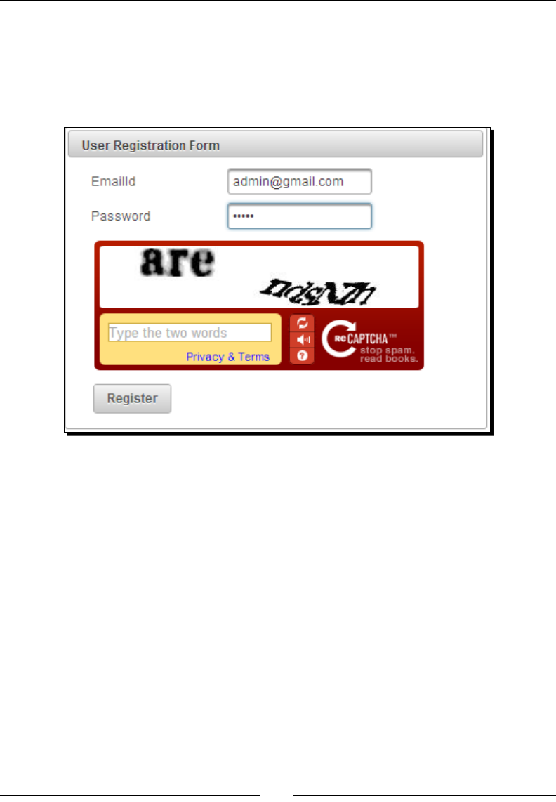
Chapter 7
[ 185 ]
What just happened?
We have created the User Registraon Form window using the Captcha component along
with other required input elds such as EmailId and Password. When the user clicks on
the Register buon, the form will be submied using a non-AJAX request. If the CAPTCHA
validaon failed, the form will be redisplayed with the following error message:
If you want to use an AJAX request to submit the form, you need to add
oncomplete="Recaptcha.reload()" to <p:commandButton> to
regenerate a new CAPTCHA image.
The Captcha component provides the following customizaon aributes:
theme: This species the theme of the Captcha. The default is red and other
possible values are white, blackglass, and clean.
language: This species the key of the supported languages. The default value is en.
label: This is the user presentable eld name.
secure: This enables HTTPS support. The default value is false.
By default, PrimeFaces displays the following error messages if the CAPTCHA validaon failed:
primefaces.captcha.INVALID = {0}: Validation Error: Value is not
valid.
primefaces.captcha.INVALID_detail = {0}: ''{1}'' does not match the
displayed text.

Introducing Advanced Input Components
[ 186 ]
You can customize these error messages by providing customized messages
using message bundles. Add the following custom messages to the
validationmessages.properties le:
primefaces.captcha.INVALID=Invalid Captcha value
primefaces.captcha.INVALID_detail={0}: ''{1}'' does not match the
captcha image text.
Now, congure <message-bundle> in the faces-config.xml le as shown in the
following code:
<faces-config ...>
<application>
<message-bundle>validationmessages</message-bundle>
</application>
</faces-config>
A couple of useful ps
Use the label option to provide readable error
messages in case validation fails
Enable secure option to support HTTPS; otherwise,
browsers will give warnings
Uploading les using the FileUpload component
The PrimeFaces FileUpload component provides a le upload mechanism with
HTML5-powered UI with capabilies such as drag-and-drop, uploading mulple les, and
progress tracking, and also supports graceful degradaon for legacy browsers, such as IE8+.
PrimeFaces supports both commons-fileupload for JSF 2.1 and Servlet 3.0 Mulpart for JSF
2.2 environments through its autodetecon mechanism, and we can also explicitly congure
the preferred method by conguring primefaces.UPLOADER <context-param> in web.
xml, as shown in the following code snippet:
<context-param>
<param-name>primefaces.UPLOADER</param-name>
<param-value>auto</param-value>
</context-param>
The valid values for primefaces.UPLOADER are auto, commons, and native. A brief
explanaon for these is menoned as follows:
auto: This is the default mode and PrimeFaces determines the appropriate method
by checking the JSF runme environment. If the JSF runme is at least 2.2, the
native uploader is selected; otherwise, commons.

Chapter 7
[ 187 ]
commons: This mode uses commons-fileupload irrespecve of the environment
and works well on both Servlet 2.5 and 3.0 environments.
native: This mode uses the Servlet 3.x MulPart API to upload the les. If JSF
runme is less than 2.2, an excepon will be thrown.
To be able to use the Commons FileUpload mechanism, either through the auto or commons
mode, rst we need to congure FileUploadFilter, which parses MultiPartRequest,
in web.xml as follows:
<filter>
<filter-name>PrimeFaces FileUpload Filter</filter-name>
<filter-class> org.primefaces.webapp.filter.FileUploadFilter </
filter-class>
<init-param>
<param-name>thresholdSize</param-name>
<param-value>51200</param-value>
</init-param>
<init-param>
<param-name>uploadDirectory</param-name>
<param-value>C:/primefaces/temp</param-value>
</init-param>
</filter>
<filter-mapping>
<filter-name>PrimeFaces FileUpload Filter</filter-name>
<servlet-name>Faces Servlet</servlet-name>
</filter-mapping>
Here, thresholdSize and uploadDirectory are oponal init parameters:
thresholdSize: This parameter bears the maximum le size in bytes to keep
uploaded les in memory. If a le exceeds this limit, it'll be temporarily wrien to disk.
uploadDirectory: This parameter bears the directory path, where the temporary
les that exceeds the threshold size will be placed. By default, it is System.
getProperty("java.io.tmpdir").
The PrimeFaces FileUpload component in the commons mode uses commons-fileupload.
jar and commons-io.jar. So, add the following dependencies in the Maven le, pom.xml,
to add these two JARs to the classpath:
<dependency>
<groupId>commons-fileupload</groupId>
<artifactId>commons-fileupload</artifactId>
<version>1.2.1</version>
</dependency>
Introducing Advanced Input Components
[ 188 ]
<dependency>
<groupId>commons-io</groupId>
<artifactId>commons-io</artifactId>
<version>1.4</version>
</dependency>
We can create a FileUpload component as follows:
<h:form enctype="multipart/form-data">
<p:fileUpload fileUploadListener="#{userController.
handleUserPicUpload}"/>
</h:form>
This FileUpload component, which by default works in the advanced mode, allows
uploading one or more les and invokes the fileUploadListener method, once for each
of the selected les with FileUploadEvent as the parameter, from which we can get the
le data. This is shown in the following code:
@ManagedBean
@RequestScoped
public class UserController
{
public void handleUserPicUpload(FileUploadEvent event) throws
IOException
{
UploadedFile uploadedFile = event.getFile();
String fileName = uploadedFile.getFileName();
String contentType = uploadedFile.getContentType();
byte[] contents = uploadedFile.getContents();
InputStream inputstream = uploadedFile.getInputstream();
JSFUtils.addInfoMessage("User Picture uploaded successfully");
}
}
The following screenshot shows the result:

Chapter 7
[ 189 ]
The FileUpload component provides the following aributes for customizaon:
fileUploadListener: This method is invoked when a le is uploaded.
multiple: This allows mulle selecon when true. The default value is false.
auto: This enables auto le uploads. The default value is false.
label: This species the label of the browse buon. The default value is Choose.
allowTypes: This species the regular expression to restrict uploadable les.
sizeLimit: This species the maximum le size limit in bytes.
fileLimit: This species the maximum number of les that can be uploaded.
showButtons: This determines the visibility of the Upload and Cancel buons in
the buon bar. The default value is true.
mode: This species the mode of the le upload. This can be simple or advanced.
The default value is advanced.
uploadLabel: This is the label of the Upload buon. The default value is Upload.
cancelLabel: This is the label of the Cancel buon. The default value is Cancel.
invalidSizeMessage: This species the message to be displayed when the size
limit exceeds the parcular given value.
invalidFileMessage: This species the message to be displayed when the le is
not accepted.
dragDropSupport: This helps determine whether or not to enable drag-and-drop
from the lesystem. The default value is true.
onstart: This is the client-side callback to be executed when the upload begins.
oncomplete: This is the client-side callback to be executed when the upload ends.
disabled: This disables the component when set to true. The default value
is false.
If you want a simple le upload funconality, similar to the tradional <input type=
"file">, you can use <p:fileUpload> with mode= "simple":
<h:form enctype="multipart/form-data">
<p:fileUpload value="#{userController.userPic}" mode="simple"/>
<p:commandButton value="Submit" ajax="false"/>
</h:form>

Introducing Advanced Input Components
[ 190 ]
Then, perform the following code:
@ManagedBean
@RequestScoped
public class UserController
{
private org.primefaces.model.UploadedFile userPic;
//setter and getter
}
By default, the <p:fileUpload> component works in a single le selecon mode
(multiple="false"), which means you can select only one le through the le browser at a
me. But sll, it will allow you to select mulple les, one at a me, and you can upload all of
them at once. You can set the aribute, multiple="true", to be able to select mulple les
at a me through the le browser. Also, you can set auto="true" to trigger the uploading
process as soon as you select a le without requiring to click on the Upload buon.
You can restrict the type of les to be uploaded using the allowTypes aribute:
<p:fileUpload fileUploadListener="#{userController.
handleUserPicUpload}" allowTypes="/(\.|\/)(gif|jpe?g|png)$/"/>
Here, we restricted the les to be uploaded only of the type .gif, .jpg, .jpeg, or
.png, using the regular expression. If you select any other type of le, the Invalid
le type error message will be displayed. You can customize this message using the
invalidFileMessage aribute.
You can restrict the le size using the sizeLimit aribute, specifying the maximum limit in
bytes. For example, if you want to restrict the le size to be a maximum of 10 Kilobytes, you
can set sizeLimit="10240", shown as follows:
<p:fileUpload fileUploadListener="#{userController.
handleUserPicUpload}" sizeLimit="10240"/>
Time for action – using the FileUpload component
Let us see how we can use the FileUpload component to upload the user prole image of
type .jpg, .jpeg, .gif, or .png, which should be a maximum of 1 MB:
1. Create a user account form to upload the user image:
<h:form enctype="multipart/form-data">
<p:fileUpload
fileUploadListener="#{userController.handleUserPicUpload}"
allowTypes="/(\.|\/)(gif|jpe?g|png)$/"
invalidFileMessage="Only gif, jpg or png type images are
allowed"
Chapter 7
[ 191 ]
sizeLimit="1048576"
invalidSizeMessage="File size should not exceed 1MB"/>
</h:form>
2. Implement the actionListener method to save the uploaded image:
public void handleUserPicUpload(FileUploadEvent event)
{
UploadedFile uploadedFile = event.getFile();
String fileName = uploadedFile.getFileName();
byte[] contents = uploadedFile.getContents();
//logic to save byte[]
FacesMessage msg = new FacesMessage("Succesful", uploadedFile.
getFileName()+ " is uploaded.");
FacesContext.getCurrentInstance().addMessage(null, msg);
JSFUtils.addInfoMessage("User picture uploaded successfully");
}
What just happened?
We have used the <p:fileUpload> component to upload the image of type .gif,
.jpg, .jpeg, or png. We have restricted the le size to be a maximum of 1 MB using
sizeLimit="1048576". We have also customized the error messages for an invalid le
type and invalid size errors using the invalidFileMessage and invalidSizeMessage
aributes.

Introducing Advanced Input Components
[ 192 ]
Downloading les using the FileDownload component
The FileDownload component is used to stream binary data such as images, PDFs,
spreadsheets, or any other types of les. The FileDownload component is used with
any JSF command components, such as commanButton or commanLink, to trigger the
downloading acon:
<h:commandLink value="Download">
<p:fileDownload value="#{userController.userPic}" />
</h:commandLink>
The value aribute of FileDownload must be an org.primefaces.model.
StreamedContent instance. We can use the built-in org.primefaces.model.
DefaultStreamedContent class that implements the StreamedContent interfaces or
we, ourselves, can implement the StreamedContent interface to suit our needs beer.
By default, the PrimeFaces <p:fileDownload> component dispatches content as an
attachment. You can set the contentDisposition aribute to inline to let the
browser open the le internally without a prompt.
As FileDownload needs a full page refresh, if you are using
<p:commandButton> or <p:commandLink> to trigger the download
acon, you must set ajax="false" on the command components:
<p:commandButton value="Download" ajax="false">
<p:fileDownload value="#{userController.userPic}" />
</p:commandButton>
As FileDownload is a non-AJAX process we can't use <p:ajaxStatus> to monitor the
progress. PrimeFaces provides the PrimeFaces.monitorDownload(startFunction,
endFunction) ulity method to bind JavaScript callback funcons to trigger on start and
end of the download process.
Time for action – using the FileDownload component
Let us see how we can use the FileDownload component:
1. Create the FileDownload component:
<p:dialog modal="true" widgetVar="statusDialog" header="File
Download Status" draggable="false" closable="false"
resizable="false">
<p:graphicImage value="/resources/images/ajax-loader.gif" />
</p:dialog>
<h:form>

Chapter 7
[ 193 ]
<p:commandButton id="downloadBtn" value="Download" ajax="false"
onclick="PrimeFaces.monitorDownload(onDownloadStart,
onDownloadStop)" icon="ui-icon-arrowthick-1-s">
<p:fileDownload value="#{userController.userPic}" />
</p:commandButton>
</h:form>
2. Implement the JavaScript callback methods to show the dialog box when the
download starts and close the dialog when the download completes:
<script type="text/javascript">
function onDownloadStart()
{
statusDialog.show();
}
function onDownloadStop()
{
statusDialog.hide();
}
</script>
3. Implement the managed beans getUserPic() method to return an instance of
StreamedContent:
@ManagedBean
@RequestScoped
public class UserController
{
public StreamedContent getUserPic()
{
InputStream stream = this.getClass().
getResourceAsStream("sample_report.pdf");
StreamedContent file = new DefaultStreamedContent(stream,
"application/pdf", "sample_report.pdf");
return file;
}
}

Introducing Advanced Input Components
[ 194 ]
What just happened?
We have used the <p:fileDownload> component along with <p:commandButton>
to trigger the download process and set ajax="false" to disable the AJAX mode.
We have read sample_report.pdf, which is there in the classpath and created the
DefaultStreamedContent instance. We used the PrimeFaces.monitorDownload()
ulity method to monitor the download process, the onDownloadStart() funcon gets
triggered when the download starts, which displays the modal dialog with the in-progress
icon, and once the downloading is completed, the onDownloadStop()funcon gets
triggered, which hides the modal dialog.
Summary
In this chapter, we have learned how to use various PrimeFaces advanced input components
such as Calendar, Slider, Spinner, Rang, FileUpload, and FileDownload.
In the next chapter, we will learn about data components such as DataList, DataGrid,
DataTable, and exporng data into PDF/Excel using DataExporter.
8
Working with Data Components
PrimeFaces provides several data iteration components, which include DataList,
DataTable, DataGrid, and so on. These can be used to display data in a tabular
format. Also, PrimeFaces provides the DataExporter component to export data
into PDF, Excel, CSV, or XML formats.
In this chapter we will cover:
Displaying data in a list layout using DataList
Displaying data in a tabular format using DataTable
Displaying data in a grid layout using the DataGrid component
Exporng data into PDF, XLS, CSV, and XML formats using DataExporter
Introducing the DataList component
The DataList component displays a collecon of data in the list layout with several display
types and supports AJAX paginaon. The DataList component iterates through a collecon
of data and renders its child components for each item.
Let us see how to use <p:dataList> to display a list of tag names as an unordered list:
<p:dataList value="#{tagController.tags}" var="tag" type="unordered"
itemType="disc">
#{tag.label}
</p:dataList>

Working with Data Components
[ 196 ]
The preceding <p:dataList> component displays tag names as an unordered list of
elements marked with disc type bullets. The valid type opons are unordered, ordered,
definition, and none.
We can use type="unordered" to display items as an unordered collecon along with
various itemType opons such as disc, circle, and square. By default, type is set to
unordered and itemType is set to disc.
We can set type="ordered" to display items as an ordered list with various itemType
opons such as decimal, A, a, and i represenng numbers, uppercase leers, lowercase
leers, and roman numbers respecvely.
Time for action – displaying unordered and ordered data
using DataList
Let us see how to display tag names as unordered and ordered lists with various
itemType opons.
1. Create <p:dataList> components to display items as unordered and ordered
lists using the following code:
<h:form>
<p:panel header="Unordered DataList">
<h:panelGrid columns="3">
<h:outputText value="Disc"/>
<h:outputText value="Circle" />
<h:outputText value="Square" />
<p:dataList value="#{tagController.tags}" var="tag"
itemType="disc">
#{tag.label}
</p:dataList>
<p:dataList value="#{tagController.tags}" var="tag"
itemType="circle">
#{tag.label}
</p:dataList>
<p:dataList value="#{tagController.tags}" var="tag"
itemType="square">
#{tag.label}
</p:dataList>
</h:panelGrid>
</p:panel>

Chapter 8
[ 197 ]
<p:panel header="Ordered DataList">
<h:panelGrid columns="4">
<h:outputText value="Number"/>
<h:outputText value="Uppercase Letter" />
<h:outputText value="Lowercase Letter" />
<h:outputText value="Roman Letter" />
<p:dataList value="#{tagController.tags}" var="tag"
type="ordered">
#{tag.label}
</p:dataList>
<p:dataList value="#{tagController.tags}" var="tag"
type="ordered" itemType="A">
#{tag.label}
</p:dataList>
<p:dataList value="#{tagController.tags}" var="tag"
type="ordered" itemType="a">
#{tag.label}
</p:dataList>
<p:dataList value="#{tagController.tags}" var="tag"
type="ordered" itemType="i">
#{tag.label}
</p:dataList>
</h:panelGrid>
</p:panel>
</h:form>
2. Implement the TagController.getTags() method to return a collecon
of tag objects:
public class TagController
{
private List<Tag> tags = null;
public TagController()
{
tags = loadTagsFromDB();
}
public List<Tag> getTags()
{
return tags;
}
}
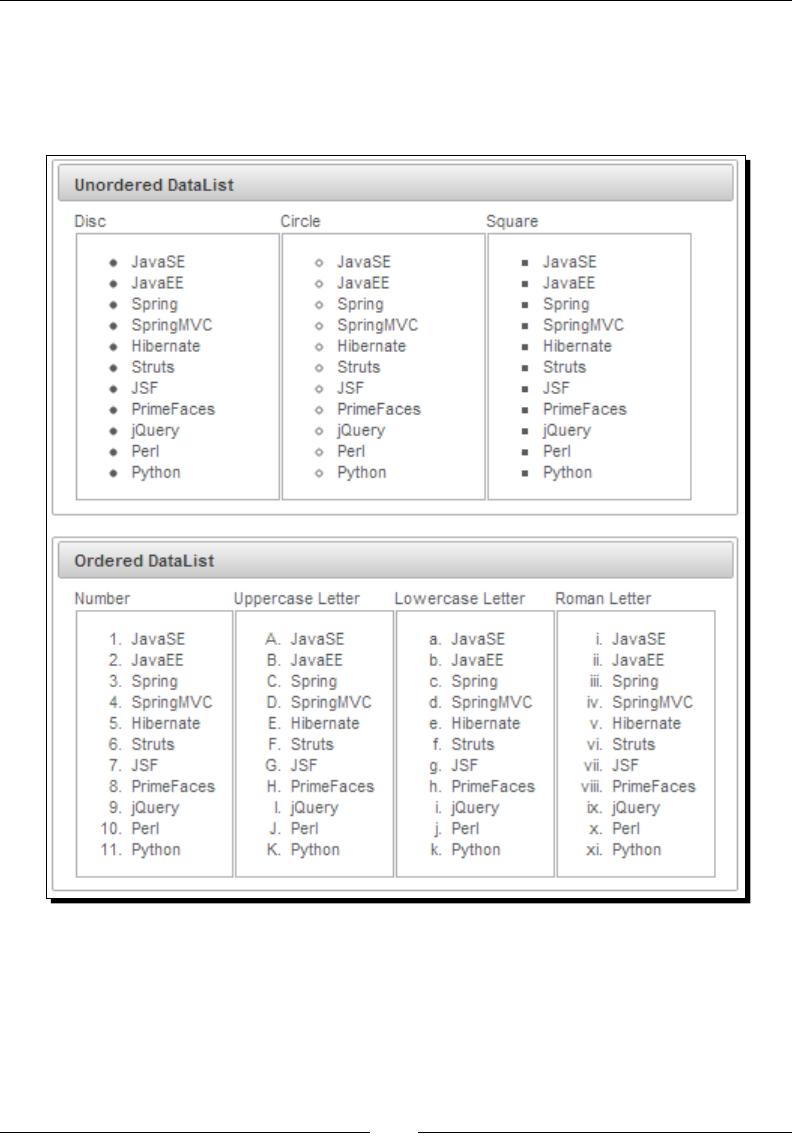
Working with Data Components
[ 198 ]
What just happened?
We have created DataList components to display tag names as an unordered list using
type="unordered" and as an ordered list using type="ordered" with various supported
itemTypes values. This is shown in the following screenshot:
Using DataList with pagination support
DataList has built-in paginaon support that can be enabled by seng paginator="true".
By enabling paginaon, the various page navigaon opons will be displayed using the
default paginator template. We can customize the paginator template to display only the
desired opons.

Chapter 8
[ 199 ]
The paginator can be customized using the paginatorTemplate opon that accepts the
following keys of UI controls:
FirstPageLink
LastPageLink
PreviousPageLink
NextPageLink
PageLinks
CurrentPageReport
RowsPerPageDropdown
Note that {RowsPerPageDropdown} has its own template, and opons to
display is provided via the rowsPerPageTemplate aribute (for example,
rowsPerPageTemplate="5,10,15"). Also, {CurrentPageReport} has its own template
dened with the currentPageReportTemplate opon. You can use the {currentPage},
{totalPages}, {totalRecords}, {startRecord}, and {endRecord} keywords within
the currentPageReport template. The default is "{currentPage} of {totalPages}".
The default paginator template is "{FirstPageLink} {PreviousPageLink}
{PageLinks} {NextPageLink} {LastPageLink}".
We can customize the paginator template to display only the desired opons.
For example:
{CurrentPageReport} {FirstPageLink} {PreviousPageLink} {PageLinks}
{NextPageLink} {LastPageLink} {RowsPerPageDropdown}
The paginator can be posioned using the paginatorPosition aribute in three dierent
locaons: top, bottom, or both (default).
The DataList component provides the following aributes for customizaon:
rows: This is the number of rows to be displayed per page.
first: This species the index of the rst row to be displayed. The default is 0.
paginator: This enables paginaon. The default is false.
paginatorTemplate: This is the template of the paginator.
rowsPerPageTemplate: This is the template of the rowsPerPage dropdown.
currentPageReportTemplate: This is the template of the
currentPageReport UI.
pageLinks: This species the maximum number of page links to display. The
default value is 10.

Working with Data Components
[ 200 ]
paginatorPosition: This species the posion of the paginator. Valid values are
top, bottom, or both. The default is both.
paginatorAlwaysVisible: This denes whether the paginator should be
hidden when the total data count is less than the number of rows per page.
The default is true.
rowIndexVar: This species the name of the iterator to refer to for each row index.
varStatus: This species the name of the exported request scoped variable
to represent the state of the iteraon, the same as in the <ui:repeat>
aribute varStatus.
Time for action – using DataList with pagination
Let us see how we can use the DataList component's paginaon support to display ve
tags per page.
Create a DataList component with paginaon support along with a custom
paginatorTemplate:
<p:panel header="DataList Pagination">
<p:dataList value="#{tagController.tags}" var="tag" id="tags"
type="none"
paginator="true" rows="5"
paginatorTemplate="{CurrentPageReport} {FirstPageLink}
{PreviousPageLink} {PageLinks} {NextPageLink} {LastPageLink}
{RowsPerPageDropdown}"
rowsPerPageTemplate="5,10,15">
<f:facet name="header">
Tags
</f:facet>
<h:outputText value="#{tag.id} - #{tag.label}" style="margin-
left:10px" />
<br/>
</p:dataList>
</p:panel>
What just happened?
We have created a DataList component along with paginaon support by seng
paginator="true". We have customized the paginator template to display addional
informaon such as CurrentPageReport and RowsPerPageDropdown. Also, we have used
the rowsPerPageTemplate aribute to specify the values for RowsPerPageDropdown.
The following screenshot displays the result:
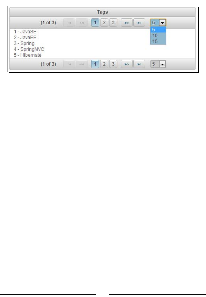
Chapter 8
[ 201 ]
Displaying tabular data using the DataTable component
DataTable is an enhanced version of the standard DataTable that provides various addional
features such as:
Paginaon
Lazy loading
Sorng
Filtering
Row selecon
Inline row/cell eding
Condional styling
Expandable rows
Grouping and SubTable, and many more
In our TechBuzz applicaon, the administrator can view a list of users and enable/disable user
accounts. First, let us see how we can display a list of users using basic DataTable as follows:
<p:dataTable id="usersTbl" var="user" value="#{adminController.
users}">
<f:facet name="header">
List of Users
</f:facet>
<p:column headerText="Id">
<h:outputText value="#{user.id}" />
</p:column>
<p:column headerText="Email">
<h:outputText value="#{user.emailId}" />
</p:column>
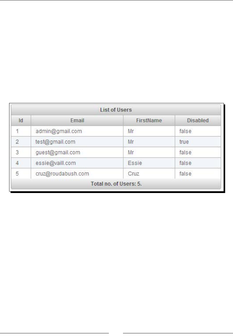
Working with Data Components
[ 202 ]
<p:column headerText="FirstName">
<h:outputText value="#{user.firstName}" />
</p:column>
<p:column headerText="Disabled">
<h:outputText value="#{user.disabled}" />
</p:column>
<f:facet name="footer">
Total no. of Users: #{fn:length(adminController.users)}.
</f:facet>
</p:dataTable>
The following screenshot shows us the result:
PrimeFaces 4.0 introduced the Scky component and provides out-of-the-box support for
DataTable to make the header scky, while scrolling using the stickyHeader aribute:
<p:dataTable var="user" value="#{adminController.users}"
stickyHeader="true">
...
</p:dataTable>
Using pagination support
If there are a large number of users, we may want to display users in a page-by-page style.
DataTable has in-built support for paginaon and works the same as described in the Using
DataList with paginaon support secon.
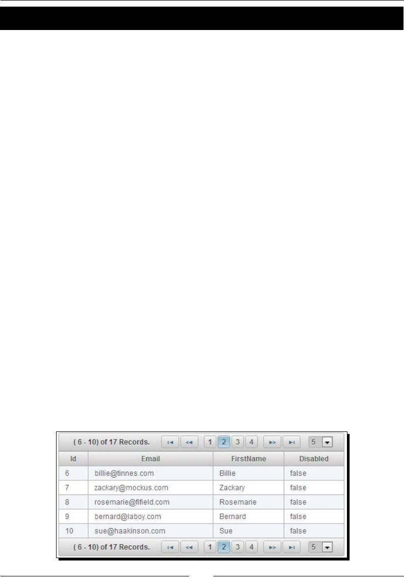
Chapter 8
[ 203 ]
Time for action – using DataTable with pagination
Let us see how we can display ve users per page using paginaon.
Create a DataTable component using paginaon to display ve records per page, using the
following code:
<p:dataTable id="usersTbl" var="user" value="#{adminController.users}"
paginator="true" rows="5"
paginatorTemplate="{CurrentPageReport} {FirstPageLink}
{PreviousPageLink} {PageLinks} {NextPageLink} {LastPageLink}
{RowsPerPageDropdown}"
currentPageReportTemplate="( {startRecord} - {endRecord}) of
{totalRecords} Records."
rowsPerPageTemplate="5,10,15">
<p:column headerText="Id">
<h:outputText value="#{user.id}" />
</p:column>
<p:column headerText="Email">
<h:outputText value="#{user.emailId}" />
</p:column>
<p:column headerText="FirstName">
<h:outputText value="#{user.firstName}" />
</p:column>
<p:column headerText="Disabled">
<h:outputText value="#{user.disabled}" />
</p:column>
</p:dataTable>
What just happened?
We have created a DataTable component with the paginaon feature to display ve rows per
page. Also, we have customized the paginator template and provided an opon to change
the page size dynamically using the rowsPerPageTemplate aribute.

Working with Data Components
[ 204 ]
Using columns sorting support
DataTable comes with built-in support for sorng on a single column or mulple columns.
You can dene a column as sortable using the sortBy aribute as follows:
<p:column headerText="FirstName" sortBy="#{user.firstName}">
<h:outputText value="#{user.firstName}" />
</p:column>
You can specify the default sort column and sort order using the sortBy and sortOrder
aributes on the <p:dataTable> element:
<p:dataTable id="usersTbl2" var="user" value="#{adminController.
users}" sortBy="#{user.firstName}" sortOrder="descending">
</p:dataTable>
The <p:dataTable> component's default sorng algorithm uses a Java comparator, you
can use your own customized sort method as well:
<p:column headerText="FirstName" sortBy="#{user.firstName}"
sortFunction="#{adminController.sortByFirstName}">
<h:outputText value="#{user.firstName}" />
</p:column>
public int sortByFirstName(Object firstName1, Object firstName2)
{
//return -1, 0 , 1 if firstName1 is less than, equal to or greater
than firstName2 respectively
return ((String)firstName1).compareToIgnoreCase(((String)
firstName2));
}
By default, DataTable's sortMode is set to single. To enable sorng on mulple columns,
set sortMode to multiple. In mulcolumns' sort mode, you can click on a column while
the metakey (Ctrl or command) adds the column to the order group:
<p:dataTable id="usersTbl" var="user" value="#{adminController.users}"
sortMode="multiple">
</p:dataTable>
Using column ltering support
DataTable provides support for column-level ltering as well as global ltering (on all
columns) and provides an opon to hold the list of ltered records. In addion to the default
match mode startsWith, we can use various other match modes such as endsWith,
exact, and contains.

Chapter 8
[ 205 ]
Time for action – using DataTable with ltering
Let us see how we can use lters with the users' DataTable.
1. Create a DataTable component and apply column-level lters and a global lter to
apply lters on all columns:
<p:dataTable widgetVar="userTable" var="user"
value="#{adminController.users}"
filteredValue="#{adminController.filteredUsers}"
emptyMessage="No Users found for the given Filters">
<f:facet name="header">
<p:outputPanel>
<h:outputText value="Search all Columns:" />
<p:inputText id="globalFilter" onkeyup="userTable.filter()"
style="width:150px" />
</p:outputPanel>
</f:facet>
<p:column headerText="Id">
<h:outputText value="#{user.id}" />
</p:column>
<p:column headerText="Email" filterBy="#{user.emailId}"
footerText="contains" filterMatchMode="contains">
<h:outputText value="#{user.emailId}" />
</p:column>
<p:column headerText="FirstName" filterBy="#{user.firstName}"
footerText="startsWith">
<h:outputText value="#{user.firstName}" />
</p:column>
<p:column headerText="LastName" filterBy="#{user.lastName}"
filterMatchMode="endsWith" footerText="endsWith">
<h:outputText value="#{user.lastName}" />
</p:column>
<p:column headerText="Disabled" filterBy="#{user.disabled}"
filterOptions="#{adminController.userStatusOptions}"
filterMatchMode="exact" footerText="exact">
<h:outputText value="#{user.disabled}" />
</p:column>
</p:dataTable>
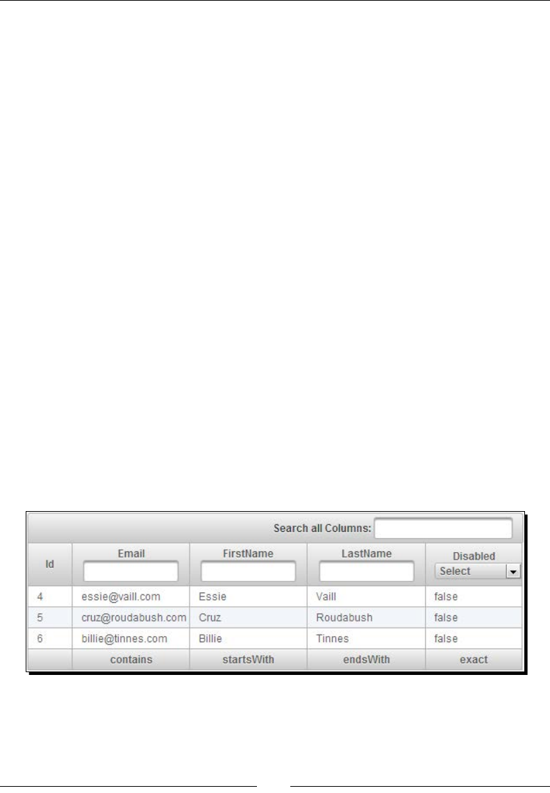
Working with Data Components
[ 206 ]
2. Inialize userStatusOptions in AdminController managed bean:
@ManagedBean
@ViewScoped
public class AdminController
{
private List<User> users = null;
private List<User> filteredUsers = null;
private SelectItem[] userStatusOptions;
public AdminController()
{
users = loadAllUsersFromDB();
this.userStatusOptions = new SelectItem[3];
this.userStatusOptions[0] = new SelectItem("", "Select");
this.userStatusOptions[1] = new SelectItem("true", "True");
this.userStatusOptions[2] = new SelectItem("false", "False");
}
//setters and getters
}
What just happened?
We have used various filterMatchMode instances, such as startsWith, endsWith,
and contains, while applying column-level lters. We have used the filterOptions
aribute to specify the predened lter values, which is displayed as a select drop-down list.
As we have specied filteredValue="#{adminController.filteredUsers}", once
the lters are applied, the ltered users' list will be populated into the filteredUsers
property. This following is the resultant screenshot:
Since PrimeFaces Version 4.0, we can specify the sortBy and filterBy properes as
sortBy="emailId" and filterBy="emailId" instead of sortBy="#{user.emailId}"
and filterBy="#{user.emailId}".

Chapter 8
[ 207 ]
A couple of important ps
It is suggested to use a scope longer than the request, such as the
view scope, to keep the filteredValue attribute so that the
filtered list is still accessible after filtering.
The filter located at the header is a global one applying to all fields;
this is implemented by calling the client-side API method called
filter(). The important part is to specify the ID of the input text
as globalFilter, which is a reserved identifier for DataTable.
Selecting DataTable rows
Selecng one or more rows from a table and performing operaons such as eding or
deleng them is a very common requirement. The DataTable component provides several
ways to select one or more row(s).
Selecting a single row
We can use a PrimeFaces Command component, such as commandButton
or commandLink, and bind the selected row to a server-side property using
<f:setPropertyActionListener>, shown as follows:
<p:dataTable id="usersTbl" var="user" value="#{adminController.
users}">
<!-- Column definitions -->
<p:column style="width:20px;">
<p:commandButton id="selectButton" update=":form:userDetails"
icon="ui-icon-search" title="View">
<f:setPropertyActionListener value="#{user}"
target="#{adminController.selectedUser}" />
</p:commandButton>
</p:column>
</p:dataTable>
<h:panelGrid id="userDetails" columns="2" >
<h:outputText value="Id:" />
<h:outputText value="#{adminController.selectedUser.id}"/>
<h:outputText value="Email:" />
<h:outputText value="#{adminController.selectedUser.emailId}"/>
</h:panelGrid>

Working with Data Components
[ 208 ]
Selecting rows using a row click
Instead of having a separate buon to trigger binding of a selected row to a server-side
property, PrimeFaces provides another simpler way to bind the selected row by using
selectionMode, selection, and rowKey aributes. Also, we can use the rowSelect
and rowUnselect events to update other components based on the selected row, shown
as follows:
<p:dataTable var="user" value="#{adminController.users}"
selectionMode="single" selection="#{adminController.selectedUser}"
rowKey="#{user.id}">
<p:ajax event="rowSelect" listener="#{adminController.
onRowSelect}" update=":form:userDetails"/>
<p:ajax event="rowUnselect" listener="#{adminController.
onRowUnselect}" update=":form:userDetails"/>
<!-- Column definitions -->
</p:dataTable>
<h:panelGrid id="userDetails" columns="2" >
<h:outputText value="Id:" />
<h:outputText value="#{adminController.selectedUser.id}"/>
<h:outputText value="Email:" />
<h:outputText value="#{adminController.selectedUser.emailId}"/>
</h:panelGrid>
Similarly, we can select mulple rows using selectionMode="multiple" and bind the
selection aribute to an array or list of user objects:
<p:dataTable var="user" value="#{adminController.users}"
selectionMode="multiple" selection="#{adminController.
selectedUsers}" rowKey="#{user.id}">
<!-- Column definitions -->
</p:dataTable>
rowKey should be a unique idener from your data model
and should be used by DataTable to nd the selected rows. You
can either dene this key by using the rowKey aribute or by
binding a data model that implements org.primefaces.
model.SelectableDataModel.

Chapter 8
[ 209 ]
When the multiple selecon mode is enabled, we need to hold the Ctrl or command key
and click on the rows to select mulple rows. If we don't hold on to the Ctrl or command
key and click on a row the previous selecon will be cleared with only the last clicked row
selected. We can customize this behavior using the rowSelectMode aribute. If you set
rowSelectMode="add", when you click on a row, it will keep the previous selecon and
add the current selected row even if you don't hold the Ctrl or command key. The default
rowSelectMode value is new. We can disable the row selecon feature altogether by
seng disabledSelection="true".
Selecting rows using a radio button / checkbox
Another very common scenario is having a radio buon or checkbox for each row, and the
user can select one or more rows and then perform acons such as edit or delete.
The DataTable component provides a radio-buon-based, single row selecon using a nested
<p:column> element with selectionMode="single":
<p:dataTable var="user" value="#{adminController.users}"
selection="#{adminController.selectedUser}" rowKey="#{user.id}">
<p:column selectionMode="single"/>
<!-- Column definitions -->
</p:dataTable>
The DataTable component also provides checkbox-based, mulple row selecon using a
nested <p:column> element with selectionMode="multiple":
<p:dataTable var="user" value="#{adminController.users}"
selection="#{adminController.selectedUsers}" rowKey="#{user.id}">
<p:column selectionMode="multiple"/>
<!-- Column definitions -->
</p:dataTable>
In our TechBuzz applicaon, the administrator would like to have a facility to be able to
select mulple users and disable them all in one go. Let us see how we can implement this
using the checkbox-based, mulple rows selecon.
Time for action – using DataTable with multiple row
selection support
In this secon we will demonstrate how to select mulple user rows and disable the
selected users.
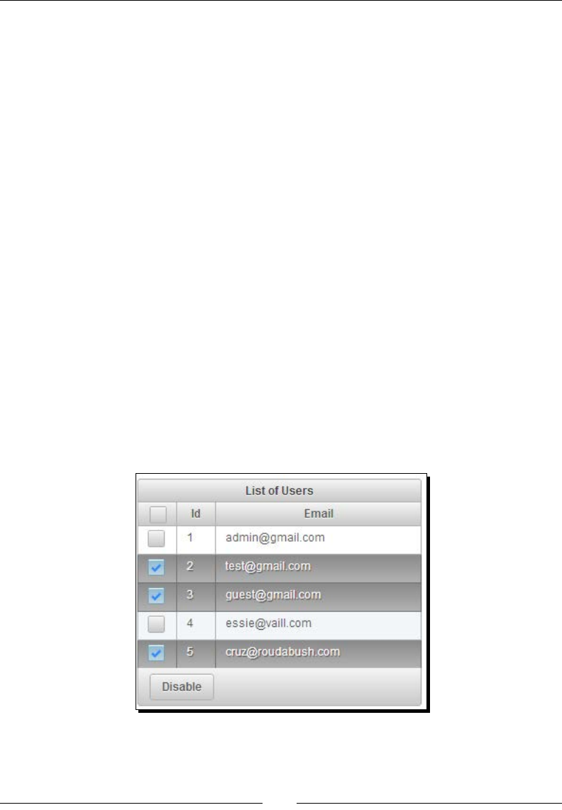
Working with Data Components
[ 210 ]
Create a DataTable component with the multiple row selecon mode enabled, using the
following code:
<p:dataTable var="user" value="#{adminController.users}"
selection="#{adminController.selectedUsers}" rowKey="#{user.id}">
<p:column selectionMode="multiple"/>
<p:column headerText="Id" width="20px;">
<h:outputText value="#{user.id}" />
</p:column>
<p:column headerText="Email" >
<h:outputText value="#{user.emailId}" />
</p:column>
<f:facet name="footer">
<p:commandButton value="Disable" actionListener="#{adminControll
er.disableSelectedUsers}"/>
</f:facet>
</p:dataTable>
What just happened?
We have created a DataTable component with mulple row selecon support by using a
nested <p:column> with selectionMode="multiple", which displays a checkbox for
each row to select.
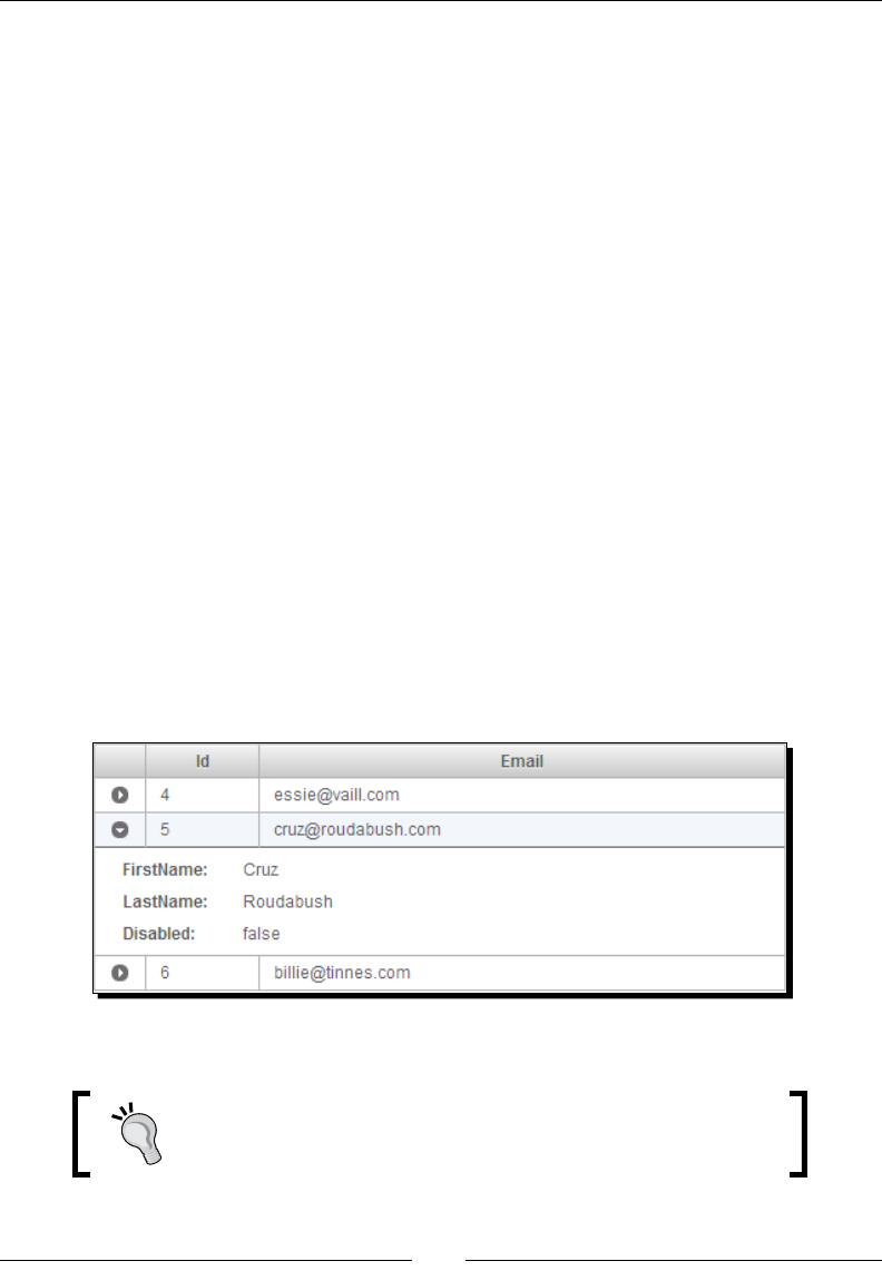
Chapter 8
[ 211 ]
Using the row expansion feature
A row can be expanded to display detailed content using a row expansion column and the
expansion facet. The <p:rowToggler> component places an expand/collapse icon.
Clicking on a collapsed row loads expanded content with AJAX.
Let us see how to use the row expansion feature of DataTable:
<p:dataTable var="user" value="#{adminController.users}">
<p:column style="width:15px;">
<p:rowToggler />
</p:column>
<p:column headerText="Email" >
<h:outputText value="#{user.emailId}" />
</p:column>
<p:rowExpansion>
<h:panelGrid columns="2">
<h:outputText value="FirstName: " />
<h:outputText value="#{user.firstName}" />
<h:outputText value="Disabled: " />
<h:outputText value="#{user.disabled}" />
</h:panelGrid>
</p:rowExpansion>
</p:dataTable>
The preceding code renders a DataTable component with the row expansion feature
as follows:
We can make the rows expanded by default by seng the expandedRow aribute to true.
It is a very common mistake that many developers forget to add
<p:rowToggler>. Without <p:rowToggler>, the DataTable
row toggling doesn't work.

Working with Data Components
[ 212 ]
Using the inline row editing feature
The DataTable component supports inline eding of data in row- and cell-based eding
modes. Row-based eding is the default mode. For inline row/cell eding, the input
and output facets are used to display data as labels in the output mode and as input
components in the input mode. For the row-based eding mode, DataTable provides the
rowEdit and rowEditCancel AJAX events to handle the save and cancel acons on the
edited row data.
Time for action – using DataTable with row editing support
Let us see how to use the DataTable component row eding feature:
1. Create a DataTable component with the editable mode enabled by seng
editable to true:
<p:dataTable id="usersTbl" var="user" value="#{adminController.
users}" editable="true">
<p:ajax event="rowEdit" listener="#{adminController.onEdit}"/>
<p:ajax event="rowEditCancel" listener="#{adminController.
onCancel}"/>
<p:column headerText="Email">
<h:outputText value="#{user.emailId}" />
</p:column>
<p:column headerText="FirstName">
<p:cellEditor>
<f:facet name="output">
<h:outputText value="#{user.firstName}" />
</f:facet>
<f:facet name="input">
<p:inputText value="#{user.firstName}"/>
</f:facet>
</p:cellEditor>
</p:column>
<p:column headerText="Disabled">
<p:cellEditor>
<f:facet name="output">
<h:outputText value="#{user.disabled}" />
</f:facet>
<f:facet name="input">
<h:selectOneMenu value="#{user.disabled}" >
<f:selectItem itemLabel="True" itemValue="true"/>
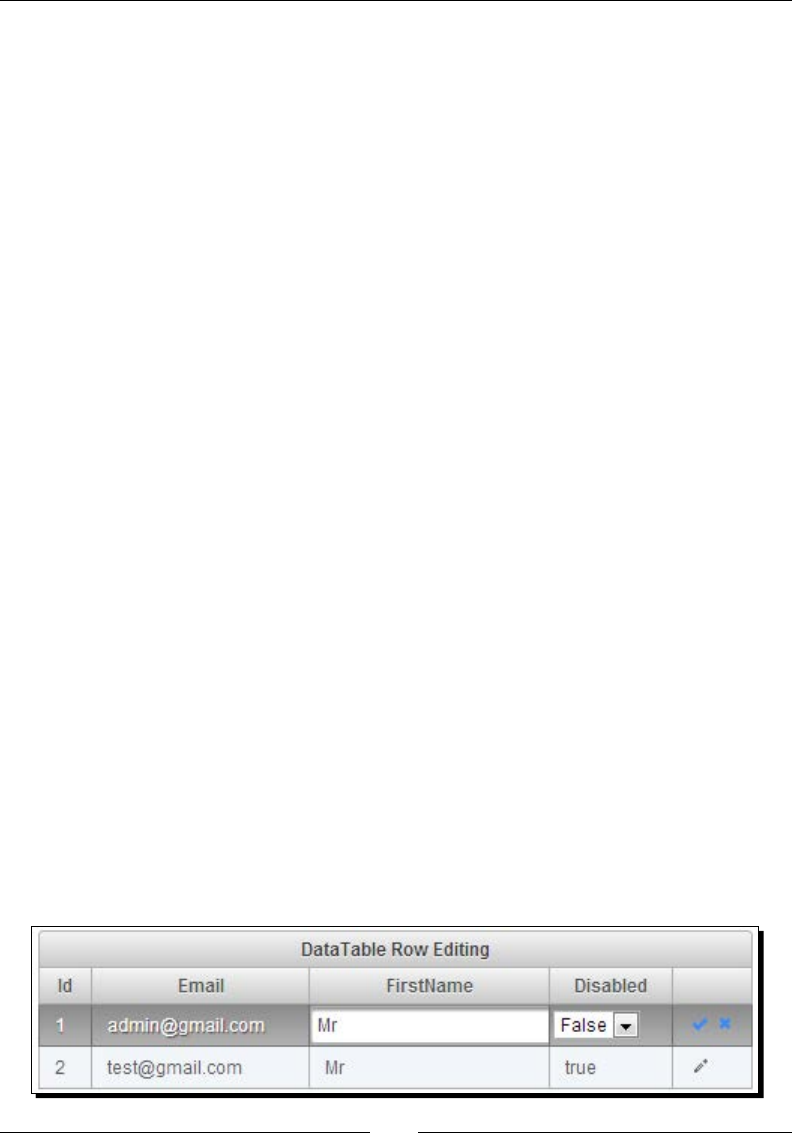
Chapter 8
[ 213 ]
<f:selectItem itemLabel="False" itemValue="false"/>
</h:selectOneMenu>
</f:facet>
</p:cellEditor>
</p:column>
<p:column style="width:6%">
<p:rowEditor />
</p:column>
</p:dataTable>
2. Implement the rowEdit and rowEditCancel events' listener methods:
public void onEdit(RowEditEvent event)
{
User user = (User) event.getObject();
FacesMessage msg = new FacesMessage("Edited User Id : "+ user.
getId());
FacesContext.getCurrentInstance().addMessage(null, msg);
}
public void onCancel(RowEditEvent event)
{
User user = (User) event.getObject();
FacesMessage msg = new FacesMessage("Editing Cancelled for User
Id: "+ user.getId());
FacesContext.getCurrentInstance().addMessage(null, msg);
}
What just happened?
We have created DataTable with row eding enabled by seng editable="true". The
columns that we want to edit were wrapped in <p:cellEditor> with the output facet
to display as the label and the input facet to display as the input element. We have used
the <p:rowEditor> component to display the row edit icon. When the edit icon is clicked,
the row switches to the edit mode and it shows the save and cancel icons to save or cancel
the changes made to that row. When the save icon is clicked on, the rowEdit event listener
method, onEdit(), will be invoked and if you click on the cancel icon, the rowEditCancel
event listener method, onCancel(), will be invoked. A screenshot of the funconing is
shown as follows:

Working with Data Components
[ 214 ]
Using the cell editing feature
As menoned earlier, DataTable also supports the cell-based eding mode. In this mode, a
cell switches to the edit mode when it is clicked on; losing focus triggers the cellEdit AJAX
event, which saves the change value.
Time for action – using DataTable with cell editing support
Let us see how to use the cell eding feature of DataTable:
1. Create a DataTable component with the editable mode enabled by seng
editable to true and editMode to cell, as shown in the following code:
<p:dataTable id="usersTbl" var="user" value="#{adminController.
users}" editable="true" editMode="cell">
<p:ajax event="cellEdit" listener="#{adminController.
onCellEdit}"/>
<p:column headerText="FirstName">
<p:cellEditor>
<f:facet name="output">
<h:outputText value="#{user.firstName}" />
</f:facet>
<f:facet name="input">
<p:inputText value="#{user.firstName}"/>
</f:facet>
</p:cellEditor>
</p:column>
</p:dataTable>
2. Implement the cellEdit AJAX event listener method, onCellEdit():
public void onCellEdit(CellEditEvent event)
{
Object oldValue = event.getOldValue();
Object newValue = event.getNewValue();
if(newValue != null && !newValue.equals(oldValue))
{
FacesMessage msg = new FacesMessage("Cell Changed :"+ "Old: "
+ oldValue + ", New:" + newValue);
FacesContext.getCurrentInstance().addMessage(null, msg);
}
}

Chapter 8
[ 215 ]
What just happened?
We have created a DataTable component with the cell-based eding mode enabled by seng
editMode to cell. When an editable cell is clicked on, it switches to the editable mode and
on losing focus, it saves the edited value and invokes the cellEdit event listener method,
onCellEdit().
Loading data leisurely
At mes we may need to work with huge volumes of data where you can't load the whole
data into the memory and display it. In those cases, we might want to load a subset of data
in a page-by-page manner lazily.
DataTable supports loading data lazily by using org.primefaces.model.LazyDataModel
as the data provider and seng lazy ="true". We need to implement a custom model
object by extending org.primefaces.model.LazyDataModel and implement the
load() method to fetch page data that sases the sorng and ltering criteria applied
on the DataTable:
public List<User> load(int first, int pageSize, String sortField,
SortOrder sortOrder, Map<String,String> filters) {
// code to fetch data based on applied sorting/filters
}
Here, the load() method parameters represents:
first: This species the index of the rst row to display
pageSize: This species the number of rows to load on the page
sortField: This species the name of the sort eld, for example, "firstName"
for sortBy="#{user.firstName}"
sortOrder: This is an enumeraon of type org.primefaces.model.
SortOrder; could be either ASCENDING or DESCENDING
filter: A map with eld names as keys (for example, "id" for
filterBy="#{user.id}") and their corresponding lter values
Time for action – loading the DataTable data leisurely
Let us see how to use DataTable with the lazy loading feature.
1. Create a DataTable component with the LazyDataModel binding and set the lazy
aribute to true, as shown in the following code:
<p:dataTable id="usersTbl" var="user" value="#{adminController.
lazyUserModel}" paginator="true" rows="10" lazy="true">
<p:column headerText="Id" sortBy="#{user.id}" >

Working with Data Components
[ 216 ]
<h:outputText value="#{user.id}" />
</p:column>
<p:column headerText="FirstName" filterBy="#{user.firstName}"
sortBy="#{user.firstName}">
<h:outputText value="#{user.firstName}" />
</p:column>
</p:dataTable>
2. Implement LazyUserModel by extending LazyDataModel to load data lazily:
import org.primefaces.model.LazyDataModel;
import org.primefaces.model.SortOrder;
public class LazyUserModel extends LazyDataModel<User>
{
public User getRowData(String rowKey) {
return loadUserFromDBByUserId(rowKey);
}
public Object getRowKey(User user) {
return user.getId();
}
public List<User> load(int first, int pageSize, String
sortField, SortOrder sortOrder, Map<String,String> filters)
{
//get the count of total no. of records with filters
applied
int dataSize = getTotalRecordsCount();
this.setRowCount(dataSize);
//load pageSize rows starting from index first by applying
sorting and filters from datasource
List<User> data = loadDataFromDB();
return data;
}
}
What just happened?
We have created a DataTable component with a lazy loading feature by seng lazy to true
and binding the property to the LazyDataModel object. In the load() method, we load
only a subset (page) of data that sases the applied lters and sorng.

Chapter 8
[ 217 ]
Using the column grouping support
Grouping is dened by the ColumnGroup component used to combine the DataTable header
and footers.
In the TechBuzz applicaon, the administrator would like to see the stascs of the tag-wise
posts count, for last year and the current year. Let us see how we can use the DataTable
Grouping feature to implement this screen.
Create a DataTable component and display a header and footer using ColumnGroups:
<p:dataTable var="tagStats" value="#{adminController.
tagStatisticsList}">
<f:facet name="header">
Tag Usage Statistics
</f:facet>
<p:columnGroup type="header">
<p:row>
<p:column rowspan="2" headerText="Tag" />
<p:column colspan="2" headerText="Posts Associated with Tag" />
</p:row>
<p:row>
<p:column headerText="Last Year" />
<p:column headerText="This Year" />
</p:row>
</p:columnGroup>
<p:column headerText="Tag">
<h:outputText value="#{tagStats.tag}" />
</p:column>
<p:column headerText="Posts Count">
<h:outputText value="#{tagStats.postsCountLastYear}" />
</p:column>
<p:column headerText="Posts Count">
<h:outputText value="#{tagStats.postsCountThisYear}" />
</p:column>
<p:columnGroup type="footer">
<p:row>
<p:column style="text-align:right" footerText="Totals:"/>
<p:column style="text-align:left" footerText="#{adminController.
lastYearPostsCount}" />
<p:column style="text-align:left" footerText="#{adminController.
thisYearPostsCount}" />
</p:row>
</p:columnGroup>
</p:dataTable>
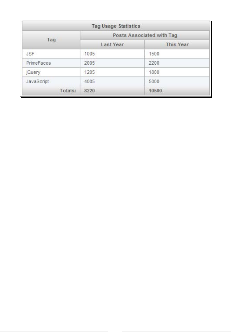
Working with Data Components
[ 218 ]
The result is shown in the following screenshot:
The DataTable component also provides various other features such as scrolling, frozen rows,
condional coloring, resizable columns, and column reordering.
Using the scrolling feature
DataTable supports client and live scrolling. In the client mode, whole data is rendered. By
enabling the liveScroll opon, the data is loaded during scrolling. To enable scrolling,
we need to set scrollable="true" and use the scrollHeight and scrollWidth
aributes to specify scroll viewport height and width:
<p:dataTable id="usersTbl" var="user" value="#{adminController.users}"
scrollable="true" scrollHeight="150" scrollWidth="400">
…
</p:dataTable>
By enabling liveScroll, the data will be loaded while scrolling using AJAX. We can specify
the number of rows to load on a live scroll using the scrollRows aribute, as shown in the
following code:
<p:dataTable var="user" value="#{adminController.users}"
scrollable="true" scrollHeight="150" liveScroll="true"
scrollRows="25">
…
</p:dataTable>

Chapter 8
[ 219 ]
Using the frozenRows feature
Somemes we may want some rows to be displayed as scky rows while scrolling. We can
specify the rows to be displayed as scky using the frozenRows aribute:
<p:dataTable var="user" value="#{adminController.users}"
scrollable="true" scrollHeight="150" frozenRows="#{adminController.
frozenUsers}">
..
</p:dataTable>
Applying custom styles for rows
We can apply custom styles condionally using the rowStyleClass aribute. Suppose we
want to display users in red color if the user status is disabled:
<p:dataTable var="user" value="#{adminController.users}"
rowStyleClass="#{user.disabled eq true ? 'disabledUser' : null}">
</p:dataTable>
<style type="text/css">
.disabledUser {
background-color: #FF0000;
color: #FFFFFF;
}
</style>
Using the resizable and draggable columns feature
By default, DataTable columns are not resizable and columns can't be reordered. We can
make columns resizable by seng the resizableColumns aribute to true. By seng
draggableColumns="true", we can rearrange the column order by dragging-and-
dropping column headers:
<p:dataTable var="user" value="#{adminController.users}"
draggableColumns="true" resizableColumns="true">
</p:dataTable>
The column order is preserved in postbacks and the colReorder event is available as an
AJAX event.
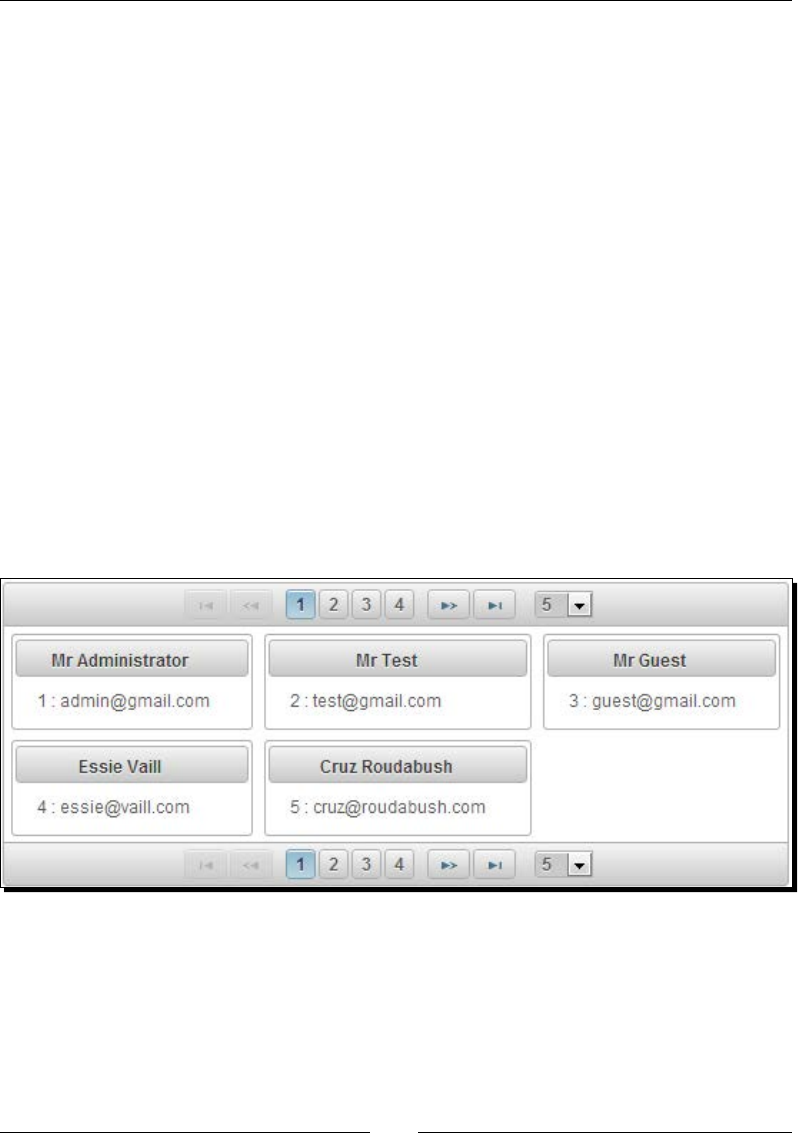
Working with Data Components
[ 220 ]
Displaying data in the grid layout using the
DataGrid component
The DataGrid component can be used to display a collecon of data in the grid layout along
with paginaon support.
Let us see how we can use the DataGrid component to display user details in a grid layout
using paginaon, displaying ve users per page:
<p:dataGrid var="user" value="#{adminController.users}"
columns="3" rows="5" paginator="true"
rowsPerPageTemplate="5,10,15">
<p:panel header="#{user.firstName} #{user.lastName}"
style="text-align:center">
<h:panelGrid columns="1">
<h:outputText value="#{user.id} : #{user.emailId}" />
</h:panelGrid>
</p:panel>
</p:dataGrid>
The preceding code displays DataGrid as shown in the following screenshot:
As we have specied columns="3" and rows="5", DataGrid displayed ve items arranged
in three columns resulng in two rows. Here, rows represent the number of items to be
displayed per page, not the actual number of rows in DataGrid.

Chapter 8
[ 221 ]
Exporting data into PDF/XLS/XML/CSV formats using the
DataExporter component
The DataExporter component provides the ability to export the DataTable data into various
formats such as Excel, PDF, CSV, and XML. DataExporter provides opons for:
Exporng enre DataTable rows
Exporng only current page rows
Exporng only selected rows
Excluding parcular columns
Customizing exporng data using pre- and post-processors
To export data into PDF and Excel formats, we need itext.jar and apache-poi.jar
respecvely to be added to the classpath:
<dependency>
<groupId>org.apache.poi</groupId>
<artifactId>poi</artifactId>
<version>3.7</version>
</dependency>
<dependency>
<groupId>com.lowagie</groupId> <artifactId>itext</artifactId>
<version>2.1.7</version>
</dependency>
The basic usage of DataExporter is as follows:
<p:dataTable id="usersTbl" var="user" value="#{adminController.
users}">
//columns
</p:dataTable>
<p:commandButton value="Export to Excel" ajax="false">
<p:dataExporter type="xls" target="usersTbl" fileName="users"/>
</p:commandButton>
The DataExporter component provides the following aributes to customize its behavior:
type: This species the export type. Valid values are xls, pdf, csv, and xml.
target: This is the ID of the DataTable whose data we want to export.
fileName: This is the lename of the generated export le, defaults to the
DataTable ID.
encoding: This species the character encoding to use. The default is UTF-8.

Working with Data Components
[ 222 ]
pageOnly: When set, it exports only the current page instead of the whole dataset.
The default value is false.
selectionOnly: When enabled, only the selecon would be exported. The default
value is false.
preProcessor: This species the preprocessor method expression for the
exported document.
postProcessor: This species the postprocessor method expression for the
exported document.
Time for action – using DataExporter to export data into XLS and
PDF formats
Let us see how we can use various features of DataExporter, such as exporng a whole
dataset, exporng the only current page, and excluding some columns:
1. Create a DataTable and a DataExporter component to export all the data, only page
data, and register pre- and post-processors for XLS and PDF exporters:
<p:dataTable id="usersTbl" var="user" value="#{adminController.
users}" rowKey="#{user.id}" paginator="true" rows="10">
<p:column headerText="Id">
<f:facet name="header">
<h:outputText value="Id" />
</f:facet>
<h:outputText value="#{user.id}" />
</p:column>
<p:column>
<f:facet name="header">
<h:outputText value="Email" />
</f:facet>
<h:outputText value="#{user.emailId}" />
</p:column>
<p:column exportable="false">
<f:facet name="header">
<h:outputText value="Disabled" />
</f:facet>
<h:outputText value="#{user.disabled}" />
</p:column>
</p:dataTable>
<h:panelGrid columns="2">
<p:panel header="Export All Data">

Chapter 8
[ 223 ]
<h:commandLink>
<p:graphicImage value="/resources/images/excel.png"/>
<p:dataExporter type="xls" target="usersTbl"
fileName="users" postProcessor="#{adminController.postProcessXLS}"
/>
</h:commandLink>
<h:commandLink>
<p:graphicImage value="/resources/images/pdf.png"/>
<p:dataExporter type="pdf" target="usersTbl"
fileName="users" preProcessor="#{adminController.preProcessPDF}"/>
</h:commandLink>
<h:commandLink>
<p:graphicImage value="/resources/images/csv.png"/>
<p:dataExporter type="csv" target="usersTbl"
fileName="users" />
</h:commandLink>
<h:commandLink>
<p:graphicImage value="/resources/images/xml.png"/>
<p:dataExporter type="xml" target="usersTbl"
fileName="users"/>
</h:commandLink>
</p:panel>
<p:panel header="Export Page Data">
<h:commandLink>
<p:graphicImage value="/resources/images/excel.png"/>
<p:dataExporter type="xls" target="usersTbl"
fileName="users" pageOnly="true" />
</h:commandLink>
<h:commandLink>
<p:graphicImage value="/resources/images/pdf.png"/>
<p:dataExporter type="pdf" target="usersTbl"
fileName="users" pageOnly="true"/>
</h:commandLink>
<h:commandLink>
<p:graphicImage value="/resources/images/csv.png"/>
<p:dataExporter type="csv" target="usersTbl"
fileName="users" pageOnly="true"/>
</h:commandLink>
<h:commandLink>
<p:graphicImage value="/resources/images/xml.png"/>
<p:dataExporter type="xml" target="usersTbl"
fileName="users" pageOnly="true"/>
</h:commandLink>
</p:panel>
</h:panelGrid>

Working with Data Components
[ 224 ]
2. Implement pre- and post-processor methods using the following code:
public void postProcessXLS(Object document)
{
HSSFWorkbook wb = (HSSFWorkbook) document;
HSSFSheet sheet = wb.getSheetAt(0);
HSSFRow header = sheet.getRow(0);
//perform operations on sheet/header etc
}
public void preProcessPDF(Object document) throws IOException,
BadElementException, DocumentException
{
Document pdf = (Document) document;
pdf.open();
pdf.setPageSize(PageSize.A4);
//other operations on PDF
}
What just happened?
We have created a DataTable component with the paginator support to display 10 rows
per page. We have created two sets of DataExporter components, one to export whole data
and another to export only the current page data, into XLS, PDF, CSV, and XML formats.
Note that we have used the exportable="false" aribute on the disabled <p:column>
element and hence the disabled column data won't be exported. Also, we have registered
preProcessor for PDF exporter and postProcessor for XLS exporter to manipulate the
data before/aer the exporng process.
A couple of important ps
To be able to export the column name headings, you should
use the <f:facet name="header"> facets instead of
<p:column headerText="...">.
As of PrimeFaces Version 4.0, pre- and post-processor support is
available only for XLS and PDF exporters, but not for CSV or XML.
Summary
In this chapter, we have learned about data components, such as DataList and DataTable,
along with various features, such as paginaon, sorng, ltering, lazy loading, and so on.
Also, we have seen how to use DataExporter for exporng data into PDF, Excel, CSV, and XML
formats. In the next chapter, we will look into advanced data visualizaon components such
as Carousel, Tree, TagCloud, and so on.

9
Introducing Advanced Data
Visualization Components
PrimeFaces provides various Data Visualization Components, such as Carousel,
TagCloud, Tree, TreeTable, and Schedule, which can be used to display data in
different formats.
In this chapter, we will cover:
Displaying data with sliding eects using the Carousel component
Introducing the TagCloud component
Displaying hierarchical data in Tree and TreeTable formats
Managing events using the Schedule component
Displaying data with sliding effects using the
Carousel component
Carousel is a mulpurpose component to display a set of data or general content with
slide eects.
On many websites, a Company's informaon such as what they do, about their products and
other types of services they provide, will be displayed in a slideshow style. We can use the
Carousel component to implement this kind of feature.
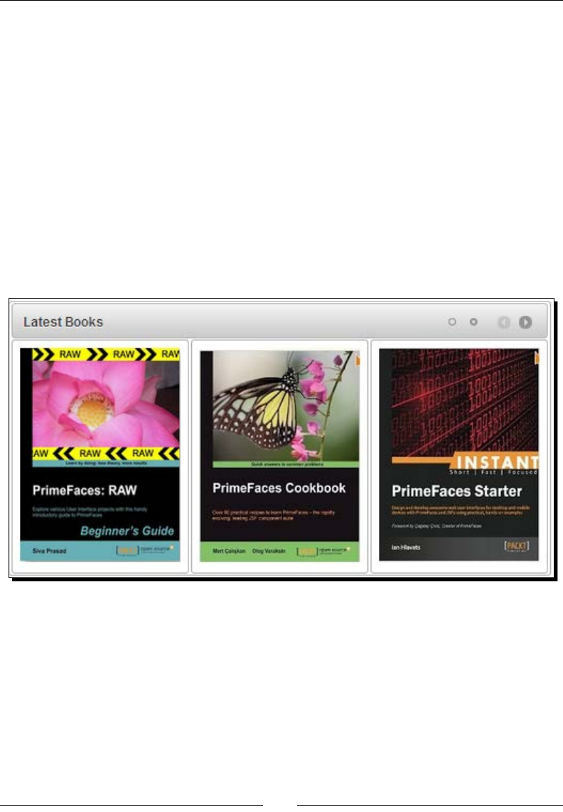
Introducing Advanced Data Visualizaon Components
[ 226 ]
Suppose we are building an e-commerce bookstore applicaon and want to display all
the latest books on the home page in a slideshow style. Let us see how we can use a
<p:carousel> component to implement this.
<p:carousel value="#{carouselController.books}" var="book"
headerText="Latest Books">
<h:panelGrid columns="1" style="width:100%" cellpadding="5">
<p:graphicImage value="/resources/images/books/#{book}"
width="180px" height="220px;"/>
</h:panelGrid>
</p:carousel>
Here CarouselController.books is a List<String> containing the image names.
The <p:carousel> component iterates through List<String> and displays each image.
By default <p:carousel> displays three items and provides navigaon icons to show other
items. The following screenshot shows the same:
The Carousel component provides the following aributes to customize its behavior:
numVisible: This is the number of visible items per page. The default value for it is 3.
rstVisible: This is the index of the rst element that is to be displayed. The default
value for it is 0.
circular: This enables the connuous scrolling. The default value for it is FALSE.
vercal: This enables the vercal scrolling. The default value for it is FALSE.
autoPlayInterval: This sets the me in milliseconds to have the Carousel component
start scrolling automacally aer being inialized. The default value for it is 0.

Chapter 9
[ 227 ]
pageLinks: This denes the number of page links of the paginator. The default value
for it is 3.
eect: This is the name of the animaon, it could be fade or slide. The default
value for it is slide.
easing: This is the name of the easing animaon. The default value for it is
easeInOutCirc.
eectDuraon: This is the duraon of the animaon in milliseconds. The default
value for it is 500.
dropdownTemplate: This is the template string for the drop-down paginator.
The default value for this is {page}.
itemStyle: This is the inline style of each item.
itemStyleClass: This is the style class of each item.
headerText: This is the label for the header.
footerText: This is the label for the footer.
Somemes we might want to display the Carousel component with items containing stac
data only. For example, we might want to display a Carousel component in the header
secon of a company's website displaying About Us, Services, Products, and Contact Us
slides. The informaon on these slides might be stac and need not be fetched from
the server. In these kinds of scenarios, we can use the Carousel component with nested
<p:tab> components to display a specic number of items. The <p:tab> is a Layout
component which we will discuss in Chapter 10, Working with Layout Components.
Time for action – creating Carousel using tabs
Let us see how we can create a Carousel component with the nested <p:tab> components,
with each <p:tab> displaying one book's details.
Create a <p:carousel> component with nested <p:tab> components:
<p:carousel id="tabsCarousel" numVisible="1" itemStyle="height:220px;w
idth:600px;" effect="easeInStrong"
headerText="Latest Books">
<p:tab title="PrimeFaces Beginners Guide">
<h:panelGrid columns="2" cellpadding="10">
<p:graphicImage value="/resources/images/books/PFBG_Raw.jpg"
width="150px" height="200px;"/>
<h:outputText
value="Description about PrimeFaces Beginners Guide." />

Introducing Advanced Data Visualizaon Components
[ 228 ]
</h:panelGrid>
</p:tab>
<p:tab title="PrimeFaces Cookbook">
<h:panelGrid columns="2" cellpadding="10">
<p:graphicImage value="/resources/images/books/PF_Cookbook.jpg"
width="150px" height="200px;"/>
<h:outputText
value=" Description about PrimeFaces Cookbook." />
</h:panelGrid>
</p:tab>
<p:tab title="JSF 2.0 Cookbook">
<h:panelGrid columns="2" cellpadding="10">
<p:graphicImage value="/resources/images/books/JSF2_Cookbook.
jpg" width="150px" height="200px;"/>
<h:outputText
value=" Description about JSF2 Cookbook." />
</h:panelGrid>
</p:tab>
<p:tab title="Instant PrimeFaces Starter">
<h:panelGrid columns="2" cellpadding="10">
<p:graphicImage value="/resources/images/books/PF_Starter.jpg"
width="150px" height="200px;"/>
<h:outputText
value=" Description about Instant PrimeFaces Starter." />
</h:panelGrid>
</p:tab>
</p:carousel>
What just happened?
We have created a Carousel component with nested <p:tab> components instead of
iterang through a collecon of items. We have set numVisible="1" so that one tab will
be visible at a me. As the default value for pageLinks is 3 and we have four tabs to display
in Carousel, a dropdown will be displayed with the page numbers. The following screenshot
shows the same:
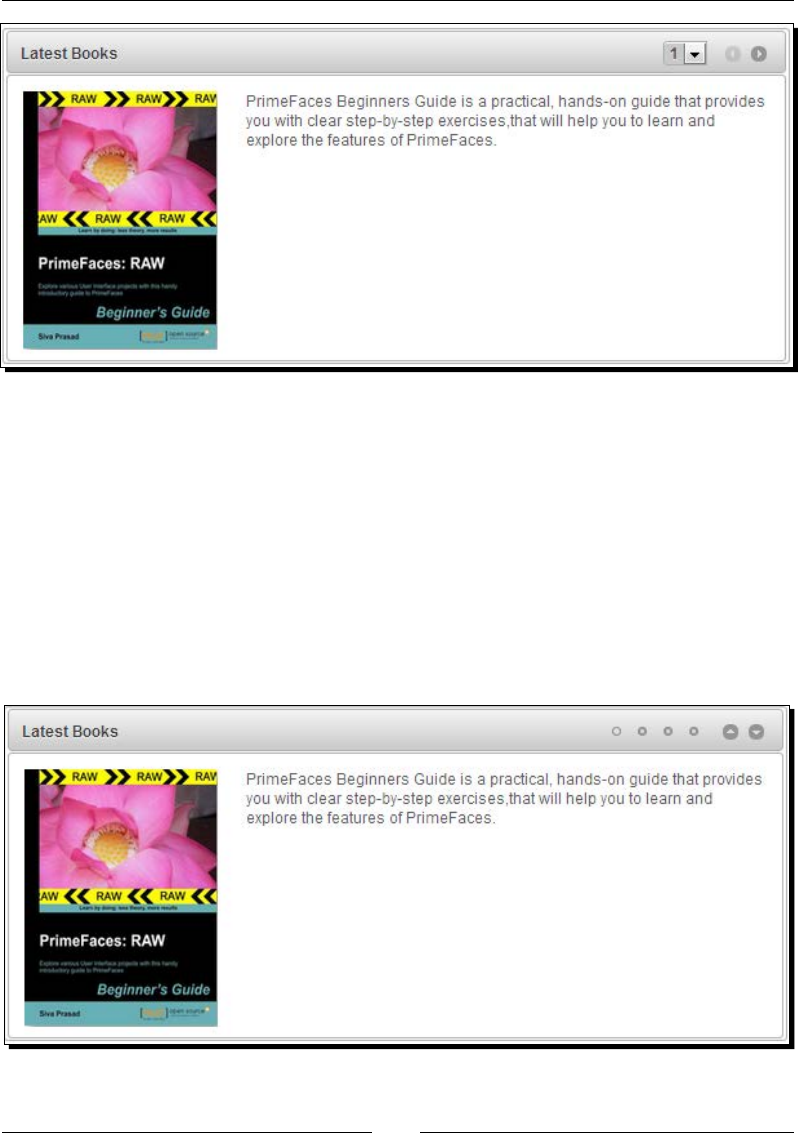
Chapter 9
[ 229 ]
The Carousel component also provides an automac slideshow feature using the
autoPlayInterval aribute, which takes me in milliseconds to start scrolling automacally.
Also we can set the circular aribute to true so that the items will be scrolled in a circular
fashion. By default, Carousel scrolls horizontally, we can set vertical="true" to scroll
vercally. The following code and screenshot will explain how it's done:
<p:carousel id="tabsCarouselSlideshow" numVisible="1"
itemStyle="height:220px;width:600px;"
effect="easeInStrong" pageLinks="4" vertical="true"
autoPlayInterval="4000" circular="true" headerText="Latest Books">
...
</p:carousel>

Introducing Advanced Data Visualizaon Components
[ 230 ]
The preceding Carousel component slides the items vercally every four seconds, and aer
the fourth item, it will again start displaying the rst item circularly. Also note that the Up
and Down icons are displayed instead of the Previous and Next icons because it is vercally
scrolling Carousel.
The JSF components which implement the interface javax.
faces.component.NamingContainer are called
the NamingContainer components. Many of the PrimeFaces
components, such as AccordianPanel, Carousel, DataGrid,
DataList, DataTable, TabView, Tree, TreeTable, and so on
are NamingContainer components. While referencing
components in other NamingContainer components, we
should give the absolute componentId path something such as
:formId:compId:elementId.
Introducing the TagCloud component
TagCloud displays a collecon of Tags with dierent zoom levels using strengths associated
with each Tag.
To use the TagCloud component we need to create an object of type org.primefaces.
model.tagcloud.TagCloudModel. Each Tag will be represented by an instance of
org.primefaces.model.tagcloud.TagCloudItem interface. PrimeFaces provides
default implementaons of DefaultTagCloudModel, DefaultTagCloudItem for
TagCloudModel, and TagCloudItem respecvely. Each TagCloudItem contains label,
url, and strength properes. The tag strength can be between one and ve.
Time for action – displaying tags as TagCloud
Let us see how we can create a TagCloud component and inialize it with some sample
Tag data.
1. Create the TagCloud component using <p:tagCloud>:
<p:tagCloud model="#{tagController.model}"/>
2. Create the TagCloudModel object and populate TagCloudItem:
public class TagController
{
private TagCloudModel model;
public TagController()
{
model = new DefaultTagCloudModel();

Chapter 9
[ 231 ]
model.addTag(new DefaultTagCloudItem("PrimeFaces",
"/posts.jsf?tag=primefaces",5);
model.addTag(new DefaultTagCloudItem("JSF", "#",3);
model.addTag(new DefaultTagCloudItem("jQuery",2);
}
}
What just happened?
We have created a TagCloudModel object using DefaultTagCloudModel and populated
TagCloudItem with various labels, urls, and strengths. For the "PrimeFaces" tag
we provided the URL relave to our applicaon path "/posts.jsf?tag=primefaces".
The URL is oponal; its default value is "#".
TagCloud supports the select AJAX event. Only tags where URL equals "#" can trigger the
select event. In the preceding code, we haven't specied any URL for the jQuery tag and
hence the default value # will be used. So when you click on the jQuery tag, the select
event will be red.
In our TechBuzz applicaon, we will display the available tags as TagCloud and users can click
on any tag to display posts associated with that tag.
Time for action – choosing a tag in TagCloud with the
select Event
In this secon we will create a TagCloud component and display posts based on the
selected tag.
1. Create a TagCloud component to display tags and a DataList component to
display posts associated with that selected tag:
<p:tagCloud model="#{tagController.model}">
<p:ajax event="select" update="posts"
listener="#{tagController.onSelect}" />
</p:tagCloud>
<p:panel header="Posts by Tag">
<p:dataList value="#{tagController.posts}" var="post" id="posts"
type="none">
<h:outputText value="#{post.title}"/><br/>
<h:outputText value="#{post.description}"/><br/>
<p:separator/>
</p:dataList>
</p:panel>

Introducing Advanced Data Visualizaon Components
[ 232 ]
2. Implement methods to get tags and posts by a selected tag.
public class TagController
{
private BuzzService buzzService;
private static Random random = new Random();
private TagCloudModel model;
private List<Post> posts;
public TagController()
{
model = new DefaultTagCloudModel();
posts = buzzService.findAllPosts();
List<Tag> tags = buzzService.findAllTags();
for (Tag tag : tags)
{
model.addTag(new DefaultTagCloudItem(tag.getLabel(),
getStrength(1, 5)));
}
}
public void onSelect(SelectEvent event)
{
TagCloudItem item = (TagCloudItem) event.getObject();
String label = item.getLabel();
FacesMessage msg = new FacesMessage("Selected Tag: "+
item.getLabel());
FacesContext.getCurrentInstance().addMessage(null, msg);
posts = buzzService.findPostsByTag(label);
}
private int getStrength(int low, int high)
{
return random.nextInt(high-low) + low;
}
//setters & getters for model, posts
}
What just happened?
We have created a TagCloud and registered the select event listener to invoke
the TagController.onSelect(SelectEvent) method. We have obtained the
selected tag label and fetched posts associated with that Tag, and updated the posts
DataList component.

Chapter 9
[ 233 ]
Displaying hierarchical data using the Tree component
The Tree component can be used to represent hierarchical data in a tree structure.
A Tree component can be created using the org.primefaces.model.TreeNode instance
as the root of the tree. PrimeFaces provides a default implementaon of the TreeNode
interface org.primefaces.model.DefaultTreeNode.DefaultTreeNode.
In our TechBuzz applicaon, we would like to display PostTitle in the tree structure using the
Year/Month/PostTitle hierarchy.
Time for action – creating a Tree component
Let us see how we can use a Tree component to display PostTitle in a tree structure.
1. Inialize the root TreeNode component and add child nodes.
public class TreeController
{
private TreeNode root;
public TreeController()
{
root = new DefaultTreeNode("Root", null);
TreeNode node2013 = new DefaultTreeNode("2013", root);
TreeNode node2012 = new DefaultTreeNode("2012", root);
TreeNode node2011 = new DefaultTreeNode("2011", root);
TreeNode jan2013 = new DefaultTreeNode("Jan", node2013);
TreeNode feb2013 = new DefaultTreeNode("Feb", node2013);
TreeNode aug2012 = new DefaultTreeNode("Aug", node2012);
TreeNode sep2012 = new DefaultTreeNode("Sep", node2012);
TreeNode nov2011 = new DefaultTreeNode("Nov", node2011);
TreeNode jan2013Post1 = new DefaultTreeNode("PrimeFaces Elite
3.5.5 Released", jan2013);
TreeNode jan2013Post2 = new DefaultTreeNode("PrimeFaces
Extensions 0.7 Released", jan2013);
TreeNode feb2013Post1 = new DefaultTreeNode("Spring Framework
4.0
M1: WebSocket Support", feb2013);
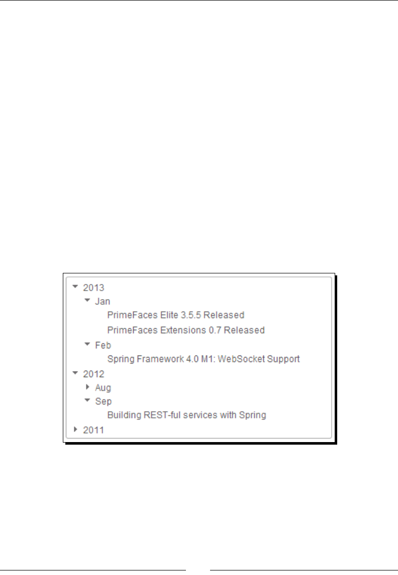
Introducing Advanced Data Visualizaon Components
[ 234 ]
TreeNode aug2012Post1 = new DefaultTreeNode("EclipseLink 2.5
Release Available for Download", aug2012);
TreeNode sep2012Post1 = new DefaultTreeNode("Building REST-ful
services with Spring", sep2012);
TreeNode nov2011Post1 = new DefaultTreeNode("PrimeUI 0.9
Released", nov2011);
}
}
2. Create the Tree component using the <p:tree> component.
<p:tree value="#{treeController.root}" var="node">
<p:treeNode>
<h:outputText value="#{node}"/>
</p:treeNode>
</p:tree>
What just happened?
We have created a TreeNode instance as the root of the tree and added 2011, 2012, and
2013 year child nodes. For each year we have added Month child nodes and added PostTitle
child nodes to the Month nodes. The following gure shows the same:
The TreeNode interface provides the following methods to obtain its data, type, parent
node, child nodes, and also selecng or expanding nodes programmacally, and so on.
public interface TreeNode
{
public String getType();
public Object getData();
public List<TreeNode> getChildren();

Chapter 9
[ 235 ]
public TreeNode getParent();
public void setParent(TreeNode treeNode);
public boolean isExpanded();
public void setExpanded(boolean expanded);
public int getChildCount();
public boolean isLeaf();
public boolean isSelected();
public void setSelected(boolean value);
public boolean isSelectable();
public void setSelectable(boolean selectable);
public boolean isPartialSelected();
public void setPartialSelected(boolean value);
public void setRowKey(String rowKey);
public String getRowKey();
}
These methods come in very handy when manipulang the Tree component from the
server-side code.
Loading tree nodes dynamically using AJAX
By default, the Tree nodes get loaded eagerly and toggling happens on the client side. We can
load nodes dynamically by seng the dynamic aribute to true. In dynamic mode, when a
node is expanded, child nodes will be loaded dynamically using AJAX. We can also set the cache
aribute to true to cache the loaded nodes instead of fetching every me from the server.
<p:tree value="#{treeController.root}" var="node" dynamic="true"
cache="true">
<p:treeNode>
<h:outputText value="#{node}"/>
</p:treeNode>
</p:tree>
Selecting tree nodes
The Tree component also supports selecng a single node or mulple nodes using the
selecon modes single, multiple, and checkbox. By using selectionMode=multiple,
we can select mulple nodes by holding down the Ctrl or Command key and clicking on
nodes. When selectionMode is set to checkbox, a checkbox is displayed for each node
and we can select mulple nodes by selecng checkboxes.
<p:tree value="#{treeController.root}" var="node"
selectionMode="single" selection="#{treeController.selectedNode}">
<p:treeNode>
<h:outputText value="#{node}" />
</p:treeNode>
</p:tree>

Introducing Advanced Data Visualizaon Components
[ 236 ]
<p:tree value="#{treeController.root}" var="node"
selectionMode="multiple" selection="#{treeController.selectedNodes}">
<p:treeNode>
<h:outputText value="#{node}" />
</p:treeNode>
</p:tree>
<p:tree value="#{treeController.root}" var="node"
selectionMode="checkbox" selection="#{treeController.selectedNodes}">
<p:treeNode>
<h:outputText value="#{node}" />
</p:treeNode>
</p:tree>
Handling node expand, collapse, select and unselect events
The Tree component provides AJAX events for select, unselect, expand, and
collapse events.
<p:growl id="messages" escape="false"/>
<p:tree value="#{treeController.root}" var="node"
selectionMode="checkbox" selection="#{treeController.selectedNodes}">
<p:ajax event="expand" update="messages" listener="#{treeController.
onNodeExpand}" />
<p:ajax event="collapse" update="messages"
listener="#{treeController.onNodeCollapse}" />
<p:ajax event="select" update="messages" listener="#{treeController.
onNodeSelect}" />
<p:ajax event="unselect" update="messages"
listener="#{treeController.onNodeUnselect}" />
<p:treeNode>
<h:outputText value="#{node}" />
</p:treeNode>
</p:tree>
Implement event listener methods.
public void onNodeExpand(NodeExpandEvent event) {
FacesContext.getCurrentInstance().addMessage(null, new
FacesMessage("Expanded : "+ event.getTreeNode()));
}
public void onNodeCollapse(NodeCollapseEvent event) {
FacesContext.getCurrentInstance().addMessage(null, new
FacesMessage("Collapsed : "+ event.getTreeNode()));
}
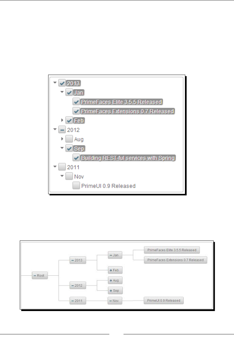
Chapter 9
[ 237 ]
public void onNodeSelect(NodeSelectEvent event) {
FacesContext.getCurrentInstance().addMessage(null, new
FacesMessage("Selected : "+ event.getTreeNode()));
}
public void onNodeUnselect(NodeUnselectEvent event) {
FacesContext.getCurrentInstance().addMessage(null, new
FacesMessage("Unselected : "+ event.getTreeNode()));
}
Rendering the tree horizontally
By default, the Tree component is displayed as a Vercal tree (orientation is vertical).
We can display the Tree horizontally by seng the orientation aribute to horizontal,
as shown in the following screenshot:

Introducing Advanced Data Visualizaon Components
[ 238 ]
Displaying nodes with icons
The Tree component also supports displaying a specic icon for a specic type of node.
For example, TechBuzz posts could be a text document, a picture or a video type post.
We can display a dierent icon based on the type of node using the nested <p:treeNode>
element for each type.
We need to specify the type of the node as the rst argument to the DefaultTreeNode
objects.
TreeNode jan2013Post1 = new DefaultTreeNode("pic","PrimeFaces Elite
3.5.5 Released", jan2013);
TreeNode jan2013Post2 = new DefaultTreeNode("pic","PrimeFaces
Extensions 0.7 Released", jan2013);
TreeNode feb2013Post1 = new DefaultTreeNode("video","Spring Framework
4.0 M1: WebSocket Support", feb2013);
TreeNode aug2012Post1 = new DefaultTreeNode("document","EclipseLink
2.5 Release Available for Download", aug2012);
TreeNode sep2012Post1 = new DefaultTreeNode("document","Building
REST-ful services with Spring", sep2012);
TreeNode nov2011Post1 = new DefaultTreeNode("video","PrimeUI 0.9
Released", nov2011);
By using nested <p:treeNode> elements, specify the icon to be displayed using the icon
aribute based on the type value. Also we can perform slide eects while expanding and
collapsing nodes by seng the animate aribute to true.
<p:tree value="#{treeController.root}" var="node" animate="true">
<p:treeNode expandedIcon="ui-icon-folder-open"
collapsedIcon="ui-icon-folder-collapsed">
<h:outputText value="#{node}"/>
</p:treeNode>
<p:treeNode type="document" icon="ui-icon-document">
<h:outputText value="#{node}" />
</p:treeNode>
<p:treeNode type="pic" icon="ui-icon-image">
<h:outputText value="#{node}" />
</p:treeNode>
<p:treeNode type="video" icon="ui-icon-video">
<h:outputText value="#{node}" />
</p:treeNode>
</p:tree>
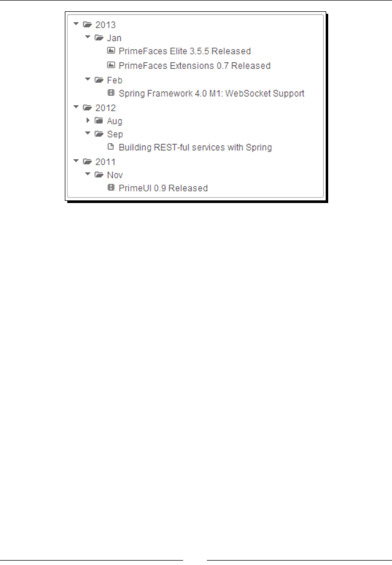
Chapter 9
[ 239 ]
We can aach a ContextMenu for the Tree component to provide context-specic
acons. We will discuss how to use ContextMenu in detail in Chapter 11, Introducing
Navigaon Components.
Reordering Tree nodes using Drag and Drop
The Tree component supports reordering nodes by dragging-and-dropping them within the
same tree and it also can be transferred to another tree component.
To enable the drag-and-drop feature, set draggable="true" and droppable="true" on
the <p:tree> component.
<p:tree value="#{treeController.root}" var="node" draggable="true"
droppable="true">
...
</p:tree>
The Tree component supports a dragdrop AJAX event that gets triggered when you drag
and drop a node:
<p:tree id="tree1" value="#{treeController.root}" var="node"
draggable="true" droppable="true">
<p:ajax event="dragdrop" listener="#{treeController.handleDragDrop}"
/>
<p:treeNode>
<h:outputText value="#{node}" />
</p:treeNode>
</p:tree>
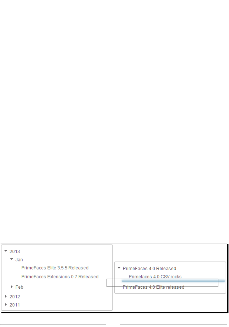
Introducing Advanced Data Visualizaon Components
[ 240 ]
public void handleDragDrop(TreeDragDropEvent event)
{
TreeNode dragNode = event.getDragNode();
TreeNode dropNode = event.getDropNode();
int dropIndex = event.getDropIndex();
String msg = "Dragged " + dragNode.getData()+ " and Dropped on " +
dropNode.getData() + " at " + dropIndex;
JSFUtils.addInfoMessage(msg);
}
In the preceding Tree component we can reorder nodes within the same tree. But if you
want to transfer nodes into another tree, then we need to dene the scope using the
dragdropScope aribute. You can transfer a node from the source tree to the target tree
if the source and target tree have the same dragdropScope.
<p:tree id="tree1" value="#{treeController.root}" var="node"
draggable="true" droppable="false" dragdropScope="treeDnDScope">
<p:treeNode>
<h:outputText value="#{node}" />
</p:treeNode>
</p:tree>
<p:tree id="tree2" value="#{treeController.root2}" var="node"
draggable="true" droppable="true" dragdropScope="treeDnDScope">
<p:ajax event="dragdrop"
listener="#{treeController.handleDragDrop}" />
<p:treeNode>
<h:outputText value="#{node}" />
</p:treeNode>
</p:tree>
In the preceding code, we have two Tree components which have the same dragdropScope
value "treeDnDScope" so that we can transfer nodes from Tree1 to Tree2. We can also
reorder nodes within Tree2 as both draggable and droppable are set to true. But we
can't reorder nodes in Tree1 or transfer nodes from Tree2 to Tree1 because dropping is
disabled in Tree1 by seng droppable="false".

Chapter 9
[ 241 ]
We can further customize the drag-and-drop feature by using the dragMode and
dropRestrict aributes.
dragMode: Represents the target node that would be dropped. Valid values are
self (default), parent and ancestor.
dropRestrict: By seng to sibling we can restrict the drop target to be a parent.
Default value is none.
<p:tree id="tree1" value="#{treeController.root}" var="node"
draggable="true" droppable="false" dragdropScope="treeDnDScope"
dragMode="parent">
...
</p:tree>
<p:tree id="tree2" value="#{treeController.root2}" var="node"
draggable="true" droppable="true" dragdropScope="treeDnDScope"
dropRestrict="sibling">
...
</p:tree>
In the preceding code, we have set dragMode="parent" on Tree1. If we drag PrimeFaces
Elite 3.5.5 Released node then the target node that would be dropped is Jan. If we have set
dragMode="ancestor" then it would be 2013.
Also we have specied dropRestrict="sibling" on Tree2. With this, we can drag any node
from Tree1 and drop it into Tree2 as the child of an exisng node but not as a root node. The
default value of dropRestrict is none which will allow you to drop a node as a root node.
Introducing the TreeTable component
The TreeTable component is used to display hierarchical data in a tabular format. The
TreeTable component can be considered as a combo of the Tree and DataTable features.
Time for action – displaying posts using the TreeTable
component
Let us see how we can display posts using the TreeTable component in the Year/Month/Posts
hierarchy.
1. Create a root TreeNode and add Year, Month, and Posts child nodes:
public class TreeTableController
{
private TreeNode root;

Introducing Advanced Data Visualizaon Components
[ 242 ]
public TreeTableController() {
root = new DefaultTreeNode("Root", null);
TreeNode node2013 = new DefaultTreeNode(new
PostNode("2013",""),
root);
TreeNode node2012 = new DefaultTreeNode(new
PostNode("2012",""),
root);
TreeNode node2011 = new DefaultTreeNode(new
PostNode("2011",""),
root);
TreeNode jan2013 = new DefaultTreeNode(new PostNode("Jan",""),
node2013);
TreeNode feb2013 = new DefaultTreeNode(new PostNode("Feb",""),
node2013);
TreeNode aug2012 = new DefaultTreeNode(new PostNode("Aug",""),
node2012);
TreeNode sep2012 = new DefaultTreeNode(new PostNode("Sep",""),
node2012);
TreeNode nov2011 = new DefaultTreeNode(new PostNode("Nov",""),
node2011);
TreeNode jan2013Post1 = new DefaultTreeNode(new
PostNode("PrimeFaces Elite 3.5.5 Released", "John"),
jan2013);
TreeNode jan2013Post2 = new DefaultTreeNode(new
PostNode("PrimeFaces Extensions 0.7 Released", "Mike"),
jan2013);
TreeNode feb2013Post1 = new DefaultTreeNode(new
PostNode("Spring
Framework 4.0 M1: WebSocket Support", "James"), feb2013);
TreeNode aug2012Post1 = new DefaultTreeNode(new
PostNode("EclipseLink 2.5 Release Available for Download",
"Roger"), aug2012);
TreeNode sep2012Post1 = new DefaultTreeNode(new
PostNode("Building REST-ful services with Spring", "Jenny"),
sep2012);
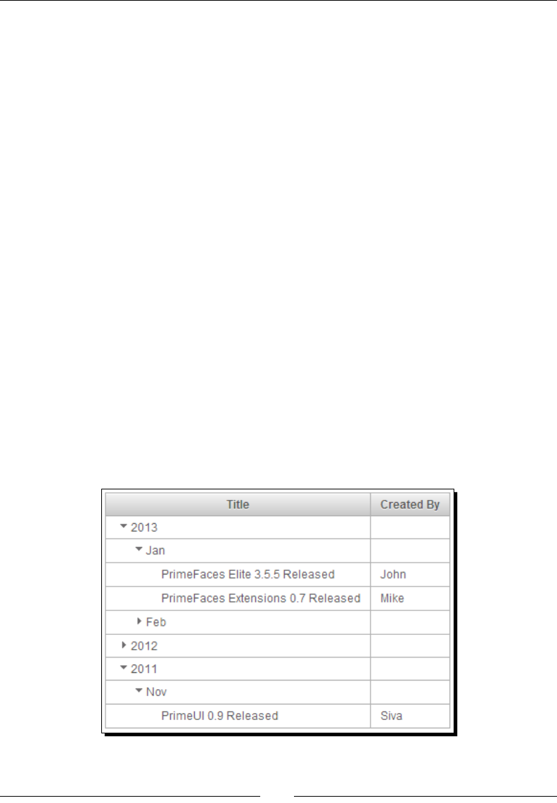
Chapter 9
[ 243 ]
TreeNode nov2011Post1 = new DefaultTreeNode(new
PostNode("PrimeUI
0.9 Released", "Siva"), nov2011);
}
public TreeNode getRoot() {
return root;
}
}
2. Create a TreeTable component using <p:treeTable> and dene the columns to be
displayed using nested <p:column> elements.
<p:treeTable value="#{treeTableController.root}" var="node">
<p:column headerText="Title">
<h:outputText value="#{node.title}" />
</p:column>
<p:column headerText="Title">
<h:outputText value="#{node.createdBy}" />
</p:column>
</p:treeTable>
What just happened?
We have created a TreeTable component similar to the Tree component. We have added
PostNode objects as TreeNode data which takes title and createdBy values. For
Year and Month nodes createdBy values are blank, and for post tles we have set
the createdBy values. When the TreeTable component is rendered we can see the
Year/Month/Post details in the tree structure as shown in the following screenshot:

Introducing Advanced Data Visualizaon Components
[ 244 ]
Similar to the Tree component, the TreeTable component also supports node selecon using
single, multiple, and checkbox seleconModes, supports select, unselect, expand,
collapse AJAX events and ContextMenu binding. Also similar to the DataTable component,
TreeTable supports resizable columns, horizontal/vercal scrolling features, and so on.
Introducing the Schedule component
The Schedule component is an Outlook/iCal-like JSF component to manage events. The
Schedule component supports Month, Week, and Day-based views, lazy loading of events,
i18n support, and AJAX event listeners for the dateSelect, eventSelect, eventMove,
and eventResize events.
To create the Schedule component we need to create an instance of org.primefaces.
model.ScheduleModel and add events which are instances of org.primefaces.model.
ScheduleEvent. The DefaultScheduleModel and DefaultScheduleEvent are default
implementaons for ScheduleModel and ScheduleEvent provided by PrimeFaces.
Time for action – creating the Schedule component
Let us see how to create a Schedule component and inialize some sample events.
1. Create the ScheduleModel instance and add the ScheduleEvent objects.
Also implement the event listener methods for dateSelect, eventSelect,
eventMove, and eventResize events.
@ManagedBean
@ViewScoped
public class ScheduleController implements Serializable
{
private ScheduleModel eventModel;
public ScheduleController()
{
eventModel = new DefaultScheduleModel();
eventModel.addEvent(new DefaultScheduleEvent("John BirthDay",
buildDate(2013,10,15,9,10), buildDate(2013,10,15,9,40)));
eventModel.addEvent(new DefaultScheduleEvent("Meeting with ABC
Corp", buildDate(2013,10,15,12,0),buildDa
te(2013,10,15,13,0)));
eventModel.addEvent(new DefaultScheduleEvent("Product XYZ
Release
Plan Meeting", buildDate(2013,10,16,8,0),
buildDate(2013,10,16,9,0)));
}

Chapter 9
[ 245 ]
private Date buildDate(int year, int month, int day, int hour,
int
minute)
{
Calendar t = Calendar.getInstance();
t.set(year, month, day);
t.set(Calendar.HOUR, hour);
t.set(Calendar.MINUTE, minute);
t.set(Calendar.SECOND, 0);
return t.getTime();
}
public void onEventSelect(SelectEvent selectEvent) {
ScheduleEvent event = (ScheduleEvent) selectEvent.getObject();
FacesContext.getCurrentInstance().addMessage(null, new
FacesMessage("Selected Event :"+event.getTitle()));
}
public void onDateSelect(SelectEvent selectEvent) {
Date date = (Date) selectEvent.getObject();
FacesContext.getCurrentInstance().addMessage(null, new
FacesMessage("Schedule Event at:"+date));
}
public void onEventMove(ScheduleEntryMoveEvent event) {
String msg = "Event moved. Day delta:" + event.getDayDelta() +
",
Minute delta:" + event.getMinuteDelta();
FacesContext.getCurrentInstance().addMessage(null, new
FacesMessage(msg));
}
public void onEventResize(ScheduleEntryResizeEvent event) {
String msg = "Event resized. Day delta:" + event.getDayDelta()
+
", Minute delta:" + event.getMinuteDelta();
FacesContext.getCurrentInstance().addMessage(null, new
FacesMessage(msg));
}
}
2. Create a Schedule component using <p:schedule> and register event listeners
using nested <p:ajax> elements.
<p:growl id="messages" autoUpdate="true" />
<p:schedule value="#{scheduleController.eventModel}"
widgetVar="myschedule">
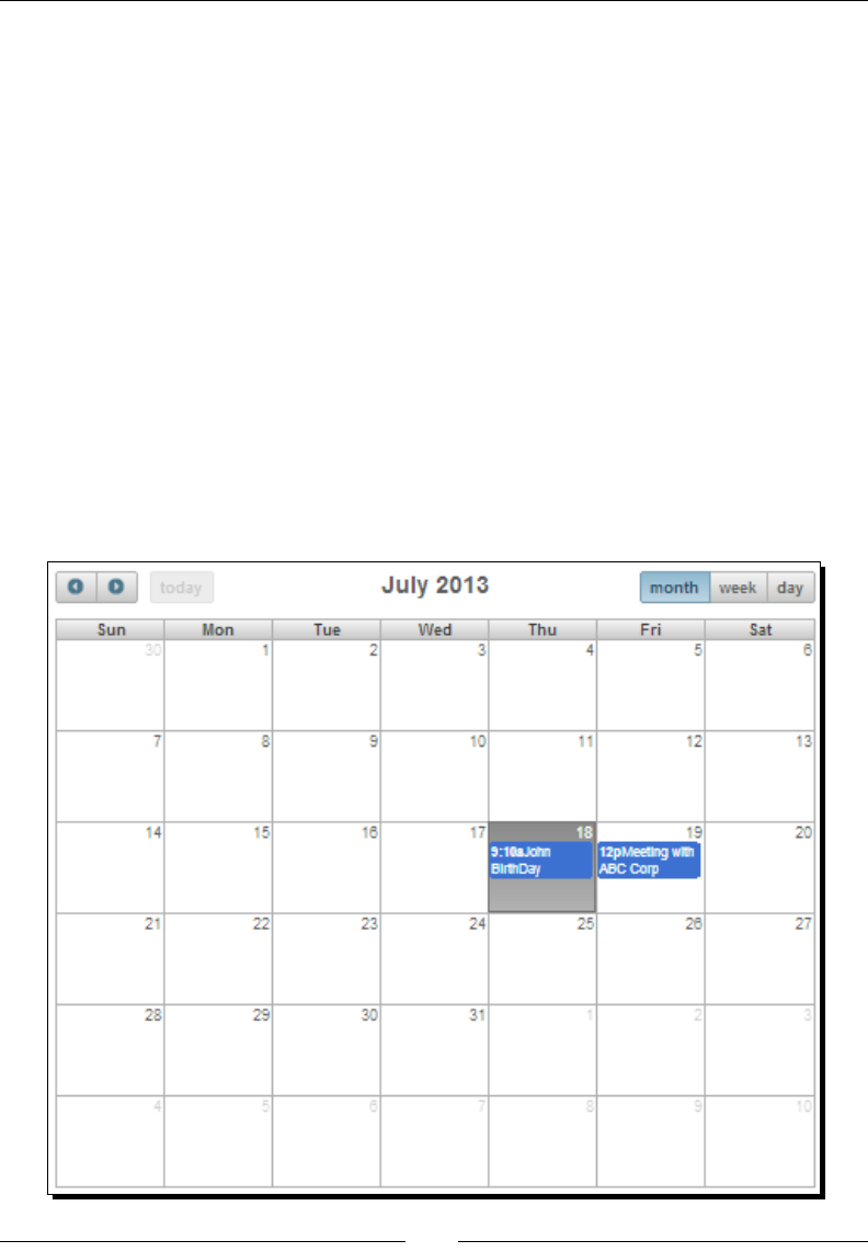
Introducing Advanced Data Visualizaon Components
[ 246 ]
<p:ajax event="dateSelect"
listener="#{scheduleController.onDateSelect}" />
<p:ajax event="eventSelect"
listener="#{scheduleController.onEventSelect}"/>
<p:ajax event="eventMove"
listener="#{scheduleController.onEventMove}"/>
<p:ajax event="eventResize"
listener="#{scheduleController.onEventResize}"/>
</p:schedule>
What just happened?
We have created a Schedule component with backing the DefaultScheduleModel
instance. We have added a few DefaultScheduleEvent instances that represent events.
Also we have registered event listeners for dateSelect, eventSelect, eventMove, and
eventResize events.
To add a new event, we can use the dateSelect event listener to display a form to take
event details, and on submit we can save the new event details in the database and add to
DefaultScheduleModel.

Chapter 9
[ 247 ]
When using the Schedule component backed by DefaultScheduleModel we need to load
all the events eagerly. Instead we can use org.primefaces.model.LazyScheduleModel
to load only the events that belong to the displayed meframe lazily.
The LazyScheduleModel interface has a loadEvents(Date start, Date end)
method to load events which will be called with new boundaries every me the displayed
meframe is changed.
class MyLazyScheduleModel extends LazyScheduleModel
{
@Override
public void loadEvents(Date start, Date end)
{
clear();
//fetch events between start and end times
addEvent(new DefaultScheduleEvent(event1Title, event1StartTime,
event1EndTime));
addEvent(new DefaultScheduleEvent(event2Title, event2StartTime,
event2EndTime);
}
}
Summary
In this chapter, we have learned about Data Visualizaon components, such as Carousel,
TagCloud, Tree, TreeTable, and Schedule. In the next chapter, we will look into Layout
components such as Panel, PanelGrid, ScrollPanel, Accordion, TabView, Wizard, and so on.

10
Working with Layout Components
One of the key aspects of developing web applications with rich user interfaces
is creating content holder components with rich look and feel. But creating
complex content holder components using plain HTML is tedious process and
Java developers may not be good enough at web designing to create fancy
user interfaces.
We may want to show data in tabbed panels or in accordion style. Similarly we
might want to create Panels with various customizations such as minimizable,
closable and with support for toolbar options.
Many of the web applications follow Border Layout style templates with a
standard header on top, a navigation bar on left side and copyright information
at the bottom.
Also, in many of the web applications, we may need to implement workflow kind
of processes with a series of forms (also called Wizards) for collecting data step
by step and complete the process once all the necessary information is provided.
To support these types of common needs, PrimeFaces provides various Layout
Components such as Panel, PanelGrid, ScrollPanel, AccordionPanel, TabView,
Wizard and various Layout styles.
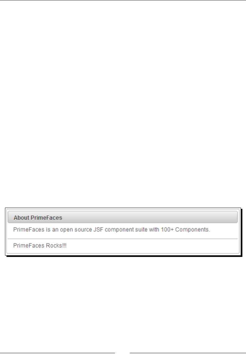
Working with Layout Components
[ 250 ]
In this chapter we will cover the following topics:
Using Panel, PanelGrid, and ScrollPanel
Creang stacked panels using AccordionPanel
Creang tabbed panels using TabView
Creang workow style forms using Wizard
Creang complex layouts using the Layout component
Creang Portal like Layouts using Dashboard
Introducing the Panel component
Panel is a generic component that can be used to hold other JSF components. Panel
component supports features such as, header, footer, toggling, closing, custom acons,
and pop-up menus. Also, Panel component provides support for AJAX event listeners for
toggle and close events.
Let us see how to create a basic panel component:
<p:panel header="About PrimeFaces" footer="PrimeFaces Rocks!!!">
<p:outputLabel value="PrimeFaces is an open source JSF component
suite with 100+ Components."/>
</p:panel>
The preceding Panel component will be rendered as follows:
Panel component provides the following aributes to customize its appearance
and behavior:
header: Header text.
footer: Footer text.
toggleable: Makes panel toggleable. Default is false.
toggleSpeed: Speed of toggling in milliseconds. Default is 1000.
collapsed: Renders a toggleable panel as collapsed. Default is false.

Chapter 10
[ 251 ]
closable: Make panel closable. Default is false.
closeSpeed: Speed of closing eect in milliseconds. Default is 1000.
visible: Renders panel as visible. Default is true.
closeTitle: Toolp for the close buon.
toggleTitle: Toolp for the toggle buon.
menuTitle: Toolp for the menu buon.
toggleOrientation: Denes the orientaon of the toggling, valid values are
vercal and horizontal. Default is vercal.
We can enable toggling and closing of the panel by seng toggleable and closable
aributes to true.
Time for action – using Panel with event listeners
Let us see how we can create a panel with close and toggle opons and register AJAX event
listeners for close and toggle events.
1. Create a Panel component and register event listeners for close and toggle events:
<p:panel id="AboutPrimeFacesPanel" closable="true"
toggleable="true">
<p:ajax event="close" listener="#{sampleController.handleClose}"
/>
<p:ajax event="toggle" listener="#{sampleController.
handleToggle}"/>
<f:facet name="header">
About PrimeFaces
</f:facet>
<f:facet name="footer">
PrimeFaces Rocks!!!
</f:facet>
<p:outputLabel value="PrimeFaces is an open source JSF component
suite with 100+ Components."/>
</p:panel>
2. Implement event listener methods:
public class SampleController
{
public void handleClose(CloseEvent event)
{
FacesMessage message = new FacesMessage("Closed Panel Id:"
+ event.getComponent().getId());
FacesContext.getCurrentInstance().addMessage(null, message);
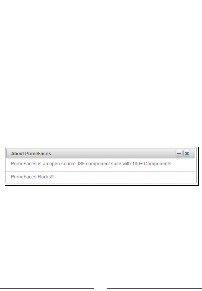
Working with Layout Components
[ 252 ]
}
public void handleToggle(ToggleEvent event)
{
FacesMessage message = new FacesMessage("Toggled Panel
Id: "+ event.getComponent().getId() + " ,Status:" + event.
getVisibility().name());
FacesContext.getCurrentInstance().addMessage(null,
message);
}
}
What just happened?
We have created a panel component and enabled close and toggle features by seng
toggleable and closable aributes to true. We have used header and footer facets
instead of aributes to specify header and footer values so that we can easily customize
the header and footer text. We have registered AJAX event listeners for close and toggle
events to invoke handleClose(CloseEvent) and handleToggle(ToggleEvent)
methods respecvely. We have obtained the panel ID from event object as event.
getComponent().getId(). Also we can get the status of visibility from ToggleEvent
using event.getVisibility() as HIDDEN or VISIBLE:
Using Panel with pop-up menu
A Panel component has built-in support for displaying a pop-up menu in the top-right corner
using options facet as follows:
<p:panel widgetVar="panel" header="About PrimeFaces" closable="true"
toggleable="true">
<f:facet name="options">
<p:menu>
<p:submenu label="Settings">
<p:menuitem value="Toggle" url="#" icon="ui-icon-newwin"
onclick="panel.toggle()"/>
<p:menuitem value="Remove" url="#" icon="ui-icon-close"
onclick="panel.close()"/>
</p:submenu>
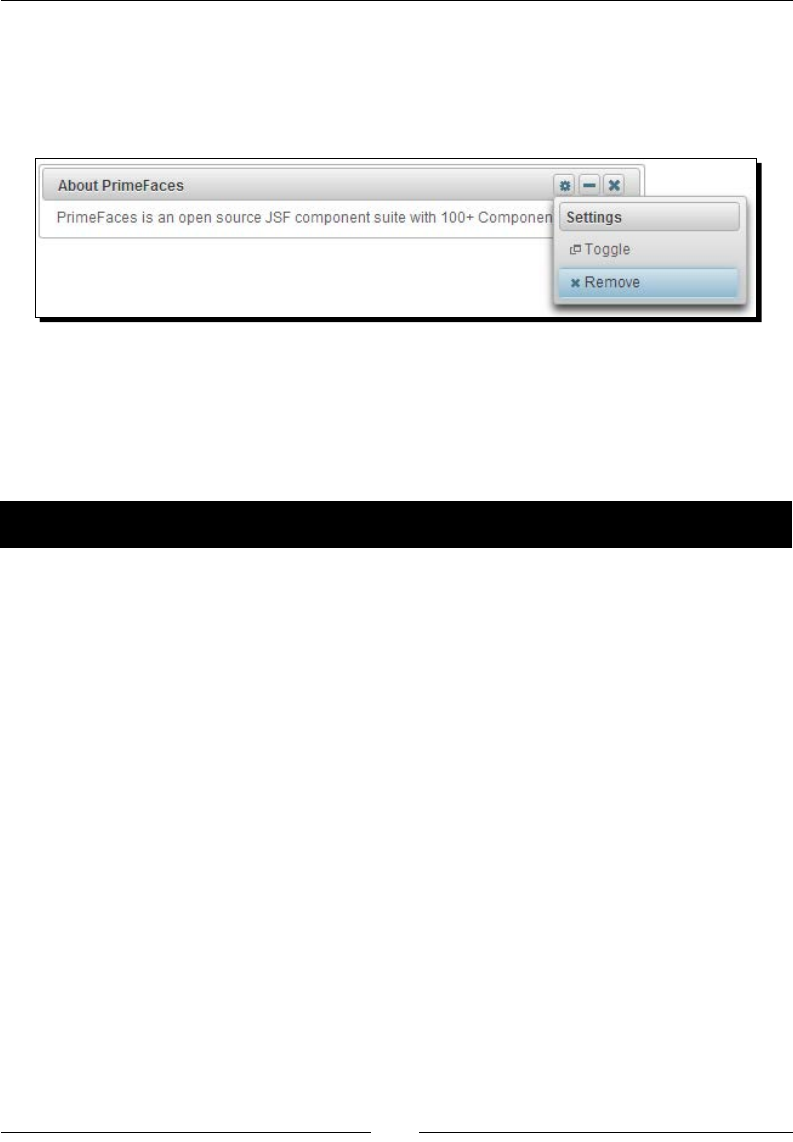
Chapter 10
[ 253 ]
</p:menu>
</f:facet>
<p:outputLabel value="PrimeFaces is an open source JSF component
suite with 100+ Components."/>
</p:panel>
Using Panel with custom actions
We can add custom acons to a panel tle bar using the actions facet. Let us see how to
add two custom acons to the tle bar, one to display a Help dialog component and another
to go to home page.
Time for action – creating Panel with custom actions
In this secon we will look at creang a panel with two custom acons.
1. Create a panel component and add custom acons using the actions facet:
<p:dialog widgetVar="helpWidget" header="PrimeFaces Help">
<p>Forum: http://forum.primefaces.org/ </p>
</p:dialog>
<p:panel header="About PrimeFaces" footer="PrimeFaces Rocks!!!">
<f:facet name="actions">
<h:outputLink styleClass="ui-panel-titlebar-icon ui-corner-all
ui-state-default" value="javascript:void(0)"
onclick="helpWidget.show()">
<h:outputText styleClass="ui-icon ui-icon-help" />
</h:outputLink>
<h:outputLink styleClass="ui-panel-titlebar-icon ui-corner-all
ui-state-default" value="welcome.jsf?faces-redirect=true">
<h:outputText styleClass="ui-icon ui-icon-home" />
</h:outputLink>
</f:facet>
<p:outputLabel value="PrimeFaces is an open source JSF component
suite with 100+ Components."/>
</p:panel>
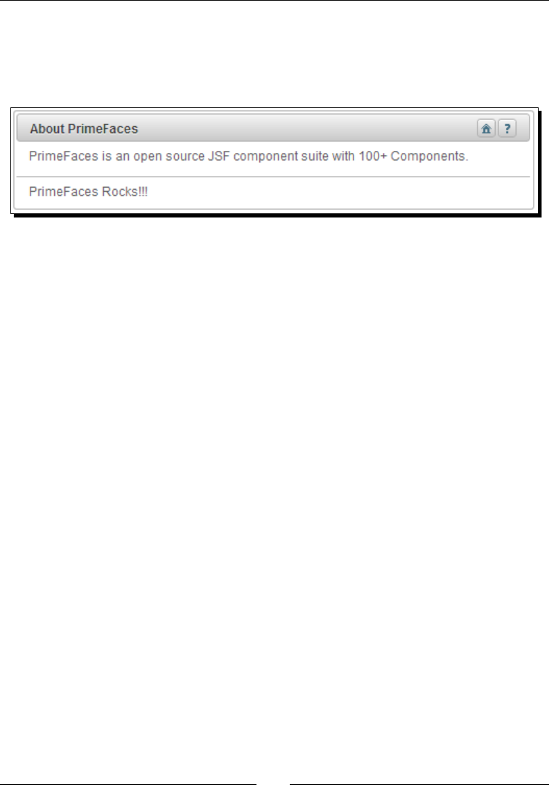
Working with Layout Components
[ 254 ]
What just happened?
We have added two custom acons to panel tle bar using actions facet. When you click
on the Help icon we are showing the Help dialog component, and when you click on the
Home icon we are navigang to welcome page.
In many scenarios we might want to have help icon to show some informaon about panel
content. In these cases custom acons facet is very helpful.
When panel is toggled only panel body will be toggled, but not footer
In order to close or toggle a panel using client-side JavaScript functions panel.close()
or panel.toggle(), the closable or toggleable features should be
enabled respectively
In legacy browsers like IE7/8 try to use toggleSpeed="0" and closeSpeed="0" to
avoid style related issues
Introducing the PanelGrid component
The panelGrid component is an extension to a standard JSF <h:panelGrid> component
supporng rowspan and colspan features along with theming support.
Let us see how to create a PanelGrid along with header and footer:
<p:panelGrid columns="2">
<f:facet name="header">
<h:outputLabel value="User Login Form" />
</f:facet>
<h:outputLabel value="UserName:" />
<p:inputText value="#{userController.userName}"/>
<h:outputLabel value="Password:" />
<p:password value="#{userController.password}"/>
<f:facet name="footer">
<p:commandButton value="Login"/>
<p:commandButton type="reset" value="Rest"/>
</f:facet>
</p:panelGrid>
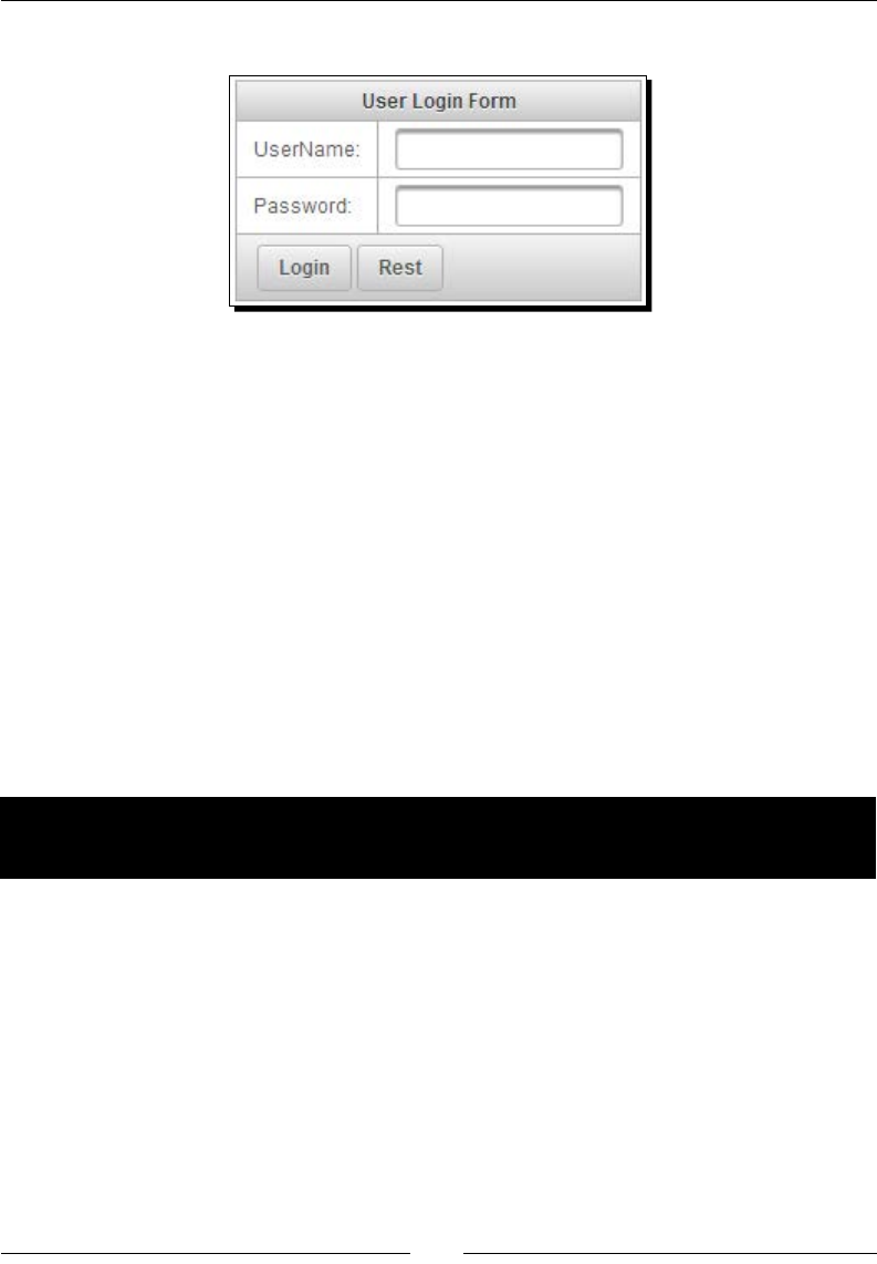
Chapter 10
[ 255 ]
The preceding code renders a panelGrid component as follows:
By default PrimeFaces panelGrid generates an HTML table with borders. If you want to
remove borders you can apply a custom style to remove borders as follows:
<p:panelGrid columns="2" styleClass="loginPanelGrid">
...
</p:panelGrid>
<style type="text/css">
.loginPanelGrid tr, .loginPanelGrid td {
border: none;
}
</style>
Somemes we need to display data that span across mulple columns and rows. The
panelGrid component provides support for rowspan and colspan to hold data that
span across rows and columns.
Time for action – using PanelGrid with rowspan and
colspan features
Let us see how to use a panelGrid component's rowspan and colspan features.
1. Create a panelGrid component and use rowspan and colspan aributes of
<p:column> to specify number of rows or columns to span across:
<p:panelGrid>
<f:facet name="header">
<p:row>
<p:column colspan="5">
Posts Statistics By Tag
</p:column>
</p:row>
<p:row>

Working with Layout Components
[ 256 ]
<p:column >Tag</p:column>
<p:column>Month</p:column>
<p:column>Posts</p:column>
<p:column>Total</p:column>
</p:row>
</f:facet>
<p:row>
<p:column rowspan="2">JSF</p:column>
<p:column>JAN</p:column>
<p:column>120</p:column>
<p:column rowspan="2">270</p:column>
</p:row>
<p:row>
<p:column>FEB</p:column>
<p:column>150</p:column>
</p:row>
<p:row>
<p:column rowspan="2">PrimeFaces</p:column>
<p:column>JAN</p:column>
<p:column>220</p:column>
<p:column rowspan="2">570</p:column>
</p:row>
<p:row>
<p:column>FEB</p:column>
<p:column>350</p:column>
</p:row>
<f:facet name="footer">
<p:row>
<p:column colspan="3" style="text-align: right;">Grand
Total</p:column>
<p:column>840</p:column>
</p:row>
</f:facet>
</p:panelGrid>
What just happened?
We have created a panelGrid component, and added rows using nested <p:row>
elements. We have added columns for each row using <p:column> and specied the
rows and columns to span using rowspan and colspan aributes respecvely:
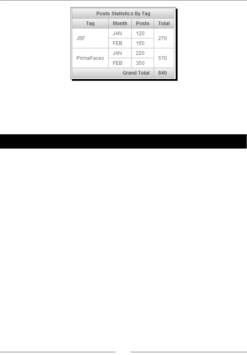
Chapter 10
[ 257 ]
Displaying overowed content using ScrollPanel
The ScrollPanel component can be used to display overowed content with theme aware
scrollbars as well as nave browser scrollbars.
Time for action – using a ScrollPanel component
Let us see how we can use ScrollPanel to display overowed content with scrollbars.
1. Create a ScrollPanel and set height and width using a style aribute:
<p:scrollPanel style="width:300px;height:250px">
<p:dataTable var="user" value="#{adminController.users}">
<f:facet name="header">
List of Users
</f:facet>
<p:column headerText="Id">
<h:outputText value="#{user.id}" />
</p:column>
<p:column headerText="Email">
<h:outputText value="#{user.emailId}" />
</p:column>
<p:column headerText="FirstName">
<h:outputText value="#{user.firstName}" />
</p:column>
<p:column headerText="Disabled">
<h:outputText value="#{user.disabled}" />
</p:column>
</p:dataTable>
</p:scrollPanel>
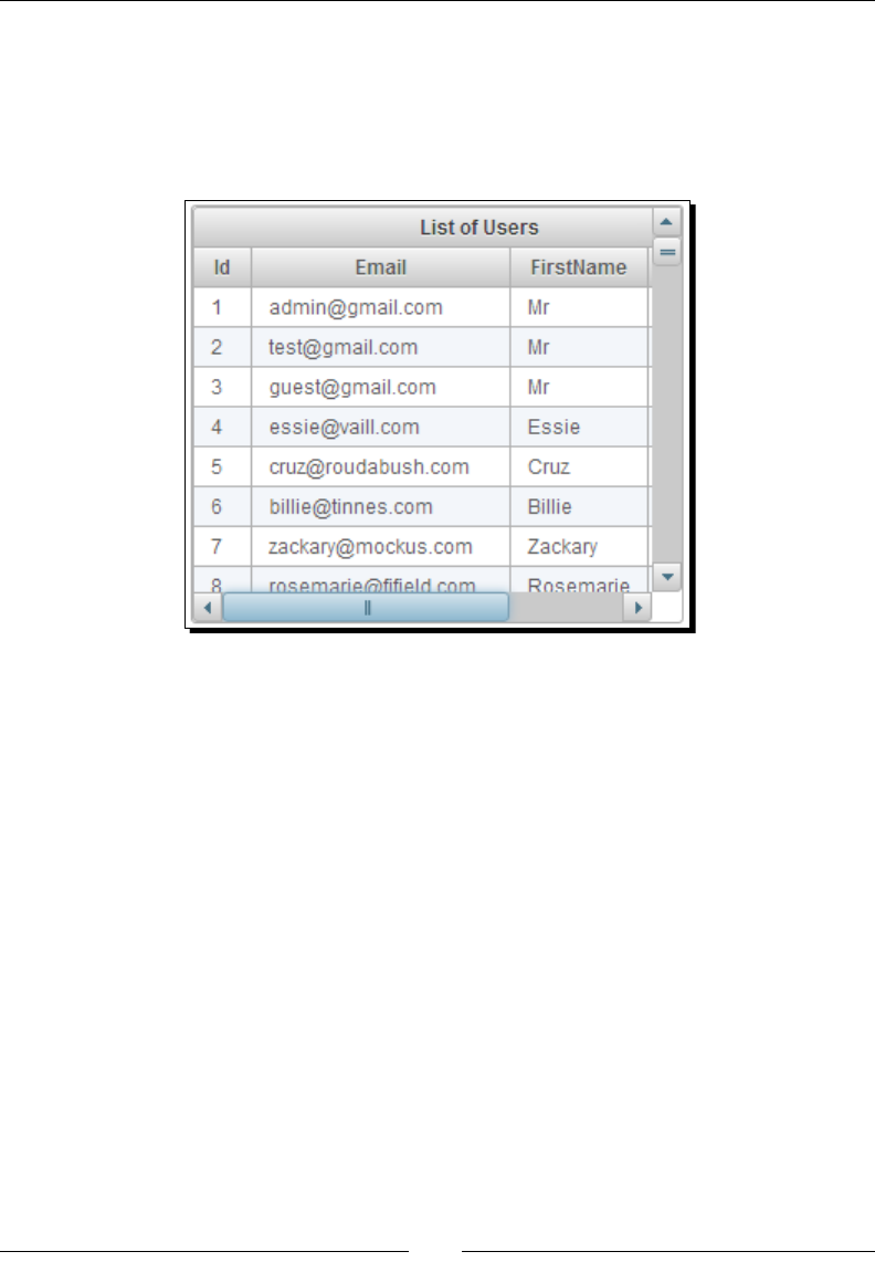
Working with Layout Components
[ 258 ]
What just happened?
We have created a ScrollPanel component and set its width and height using a style
aribute. As the nested dataTable height and width exceeds the height and width of
ScrollPanel, theme aware scrollbars are displayed. You can set the mode aribute to native
if you want to display nave browser scrollbars instead of theme aware scrollbars:
Creating workows using a Wizard component
Oen we may need to implement workows which involve mulple steps to complete a task.
For example, in e-commerce an applicaon placing an order involves adding products to
cart, entering shipping/billing address, entering payment informaon, and then subming
the order. At each step we may need to perform validaons on the current page elds and
move forward if no validaon failures occur. A wizard component provides exactly this kind
of funconality.
A Wizard component is a complex UI component to implement workows in a single page.
Each step in the workow will be represented by a tab in a wizard component and displays
Next and Back buons to move across the steps. When you click on the Next buon, it
performs validaons, and if any validaon errors are found on the current page elds then
current page will be redisplayed along with error. Note that when you navigate to previous
steps by clicking on the Back buon validaons won't be executed. Oponally, we can use
flowListener feature to execute server-side logic when moving between the steps and
can alter the step navigaon if required.
Let us take a simple example of creang a new contact in phonebook. Adding a new contact
may involve entering personal details, address info, and contact details.

Chapter 10
[ 259 ]
Time for action – using Wizard to implement workows
Let us see how we can implement adding a new contact as a workow using a Wizard
component. In rst step, we need to enter personal details such as, FirstName, LastName,
and so on. In second step we enter details such as Address details and in third step Contact
Information such as, e-mail and phone.
1. Create a Wizard component with three steps for entering personal details, address
details, and contact details:
<p:wizard widgetVar="wiz" flowListener="#{wizardController.
onFlowProcess}">
<!-- Personal Details Tab -->
<p:tab id="personal" title="Personal">
<p:panel header="Personal Details">
<p:messages />
<h:panelGrid columns="2">
<h:outputLabel value="Firstname: *" />
<p:inputText value="#{wizardController.user.firstName}"
required="true" label="Firstname"/>
<h:outputLabel value="Lastname: *" />
<p:inputText value="#{wizardController.user.lastName}"
required="true" label="Lastname"/>
<h:outputLabel value="Skip to last: " />
<h:selectBooleanCheckbox
value="#{wizardController.skip}" />
</h:panelGrid>
</p:panel>
</p:tab>
<!-- Address Details Tab -->
<p:tab id="address" title="Address">
<p:panel header="Address Details">
<p:messages />
<h:panelGrid columns="2">
<h:outputLabel value="Street: " />
<p:inputText value=
"#{wizardController.user.address.street}" />
<h:outputLabel value="City: " />
<p:inputText value=
"#{wizardController.user.address.city}" />
<h:outputLabel value="ZipCode: " />
<p:inputText value=
"#{wizardController.user.address.zip}" />
<h:outputLabel value="Country: " />
<p:inputText value=
"#{wizardController.user.address.country}" />
<h:outputLabel value="Skip to last: " />

Working with Layout Components
[ 260 ]
<h:selectBooleanCheckbox value=
"#{wizardController.skip}" />
</h:panelGrid>
</p:panel>
</p:tab>
<!-- Contact Information -->
<p:tab id="contact" title="Contact">
<p:panel header="Contact Information">
<p:messages />
<h:panelGrid columns="2">
<h:outputLabel value="Phone: *" />
<p:inputText value="#{wizardController.user.phone}"
required="true" label="Phone"/>
<h:outputLabel value="EmailId: " />
<p:inputText value="#{wizardController.user.emailId}"/>
<h:outputLabel value="Skip to last: " />
<h:selectBooleanCheckbox value=
"#{wizardController.skip}" />
</h:panelGrid>
</p:panel>
</p:tab>
<!-- Confirmation Tab with all the details -->
<p:tab id="confirm" title="Confirmation">
<p:panel header="Confirmation">
<h:panelGrid id="confirmation" >
<h:panelGrid columns="2">
<h:outputLabel value="Firstname: " />
<h:outputText value=
"#{wizardController.user.firstName}"/>
<h:outputLabel value="Lastname: " />
<h:outputText value=
"#{wizardController.user.lastName}"/>
</h:panelGrid>
<br/>
<h:panelGrid columns="2">
<h:outputLabel value="Street: " />
<h:outputText value=
"#{wizardController.user.address.street}"/>
<h:outputLabel value="City: " />
<h:outputText value=
"#{wizardController.user.address.city}"/>
<h:outputLabel value="State: " />
<h:outputText value=
"#{wizardController.user.address.state}"/>
<h:outputLabel value="ZipCode: " />
<h:outputText value=
"#{wizardController.user.address.zip}"/>

Chapter 10
[ 261 ]
<h:outputLabel value="Country: " />
<h:outputText value=
"#{wizardController.user.address.country}"/>
</h:panelGrid>
<br/>
<h:panelGrid columns="2">
<h:outputLabel value="EmailId: " />
<h:outputText value=
"#{wizardController.user.emailId}"/>
<h:outputLabel value="Phone: " />
<h:outputText value=
"#{wizardController.user.phone}"/>
</h:panelGrid>
</h:panelGrid>
<p:commandButton value="Submit" actionListener=
"#{wizardController.save}" process="@this"/>
</p:panel>
</p:tab>
</p:wizard>
2. Implement flowListener and save methods.
@ManagedBean
@ViewScoped
public class WizardController implements Serializable
{
private static Logger logger =
Logger.getLogger(WizardController.class.getName());
private boolean skip;
private User user = new User();
//setters and getters
public String onFlowProcess(FlowEvent event) {
String currentStep = event.getOldStep();
String nextStep = event.getNewStep();
logger.debug("Current Step:" + currentStep);
logger.debug("Next Step:" + nextStep);
if(skip)
{
skip = false;
return "confirm";
}
else {
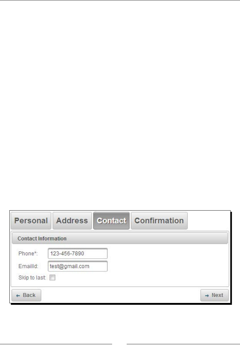
Working with Layout Components
[ 262 ]
return event.getNewStep();
}
}
public void save() {
//logic to save User
FacesMessage msg = new FacesMessage("Successfully saved
User details.");
FacesContext.getCurrentInstance().addMessage(null,
msg);
}
}
What just happened?
We have created a wizard component containing four steps, rst three steps to get
personal details, address, contact details; and fourth step to display all these details
to conrm before saving.
When you click on the Back or Next buon, the flowListener method
WizardController.onFlowProcess(FlowEvent) will be invoked. We can get the
current step and next step details from FlowEvent using event.getOldStep() and
event.getNewStep() methods. From the flowListener method we will return the id
of the next tab to be displayed. Here we are maintaining a Boolean skip ag in each step so
that user can skip to the Conrmaon page directly if the current page validaons succeed.
In the flowListener method we are checking for skip ag, and if it is checked we are
taking the user to conrmaon page directly by returning conrmaon tab ID confirm:
Chapter 10
[ 263 ]
Also a Wizard component provides the following client-side callback methods to navigate
through steps and Show/Hide navigaon buons:
next(): Proceeds to next step
back(): Goes back in ow
getStepIndex(): Returns the index of current step
showNextNav(): Shows Next buon
hideNextNav(): Hides Next buon
showBackNav(): Shows Back buon
hideBackNav(): Hides Back buon
If you want to customize the navigaon of a wizard component, you can set the
showNavBar aribute to false, and use next() and back() JavaScript funcons on
widgetVar value for navigaon.
We should use a wizard component with ManagedBean of
scope greater than RequestScoped such as ViewScoped
or SessionScoped, because the backing bean should retain
the data across mulple requests.
Creating stacked panels using the AccordionPanel
component
The AccordionPanel component is a container component with vercally stacked panels.
A basic AccordionPanel can be created as follows:
<p:accordionPanel>
<p:tab title="PrimeFaces">
<h:outputText value="PrimeFaces is an open source JSF component
library with 100+ Rich UI Components support. It has built-in
Ajax support based on standard JSF 2.0 Ajax APIs." />
</p:tab>
<p:tab title="JSF">
<h:outputText value="JavaServer Faces is a Java specification for
building component-based user interfaces for web
applications. It was formalized as a standard through the Java
Community Process and is part of the Java Platform, Enterprise
Edition." />
</p:tab>
<p:tab title="JavaEE">
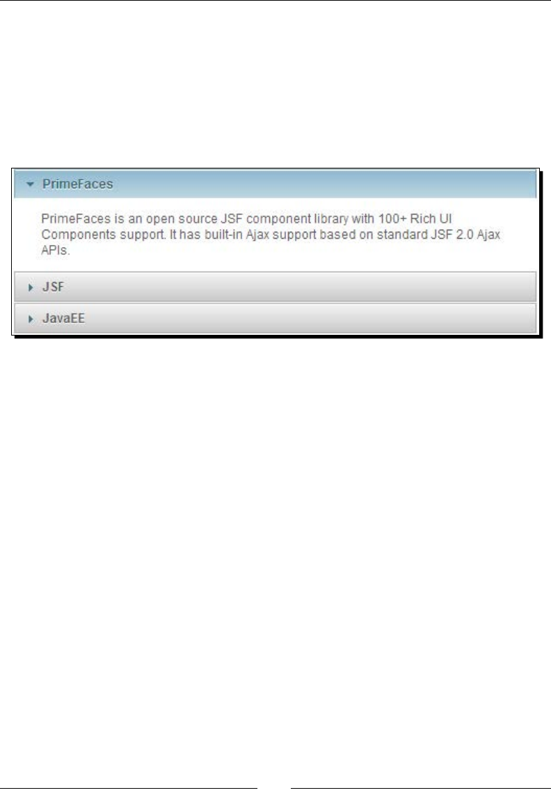
Working with Layout Components
[ 264 ]
<h:outputText value="Java Platform, Enterprise Edition (Java EE)
is the standard in community-driven enterprise software. Java
EE is developed using the Java Community Process, with
contributions from industry experts, commercial and open source
organizations, Java User Groups, and countless individuals." />
</p:tab>
</p:accordionPanel>
The preceding code displays a AccordionPanel component as follows:
AccordionPanel component supports the following aributes to customize its behavior:
activeIndex: Index of the acve tab or a comma separated string of indexes when
mulple mode is on. Default is 0.
onTabChange: Client-side callback to invoke when an inacve tab is clicked.
onTabShow: Client-side callback to invoke when a tab gets acvated.
dynamic: When enabled loads data lazily. Default is false.
cache: Denes if acvang a dynamic tab should load the contents from server
again. Default is true.
value: List to iterate to display a dynamic number of tabs.
var: Name of iterator to use in a dynamic number of tabs.
multiple: Controls mulple selecon. Default is false.
By default, only one tab can be expanded, when you click on the other tab, then current tab
gets collapsed and the new tab will be expanded. You can set the multiple aribute to
true to enable mulple tab selecon:
<p:accordionPanel multiple="true">
...
</p:accordionPanel>
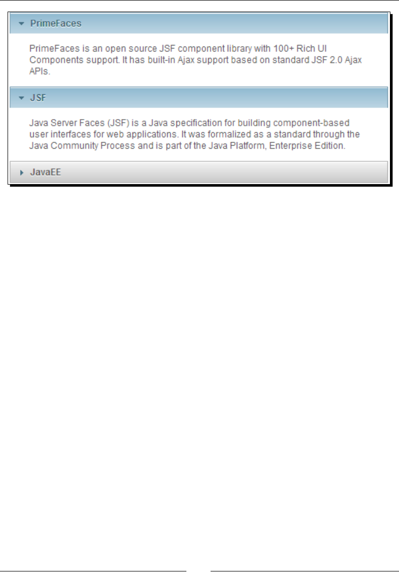
Chapter 10
[ 265 ]
Loading tabs content dynamically
By default, AccordionPanel loads all the tabs content eagerly. We can set the dynamic
aribute to true to enable lazy loading of tabs content. When dynamic loading is enabled,
only acve tabs content will be loaded lazily using AJAX. We can also enable caching of
loaded tabs content by seng the cache aribute to true. When caching is enabled,
toggling on an already loaded tab doesn't iniate AJAX request.
<p:accordionPanel dynamic="true" cache="true">
<p:tab title="PrimeFaces">
<h:outputText value="#{sampleController.tab1Content}" />
</p:tab>
<p:tab title="JSF">
<h:outputText value="#{sampleController.tab2Content}" />
</p:tab>
<p:tab title="JavaEE">
<h:outputText value="#{sampleController.tab3Content}" />
</p:tab>
</p:accordionPanel>
Creating a dynamic number of tabs
In the preceding code snippet, we have created an AccordionPanel component using stac
tab denions. Somemes we may have to create an AccordionPanel component with a
dynamic number of tabs using data loading from the server.

Working with Layout Components
[ 266 ]
We can create AccordionPanel backed by a collecon of objects, and create tabs dynamically
as follows:
<p:accordionPanel value="#{tagController.tags}" var="tag">
<p:tab title="#{tag.label}">
<h:outputText value="#{tag.description}" />
</p:tab>
</p:accordionPanel>
Here we have created AccordionPanel backed by tagController.tags, which is
List<Tag> objects. It will create a tab for each Tag in the collecon.
Handling tabChange and tabClose events
The AccordionPanel component supports tab change and tab close event listeners on
both client and server side. We can create a server-side tabChange and tabClose event
listeners as follows:
<p:accordionPanel value="#{tagController.tags}" var="tag">
<p:ajax event="tabChange" listener="#{tagController.onTabChange}"/>
<p:ajax event="tabClose" listener="#{tagController.onTabClose}"/>
<p:tab title="#{tag.label}">
<h:outputText value="#{tag.description}" />
</p:tab>
</p:accordionPanel>
When you click on any inacve tab, tabChange event gets triggered and event listener
method onTabChange() will be invoked with TabChangeEvent as a parameter. When
you collapse an acve tab then the tabClose event gets triggered with TabCloseEvent
as parameter:
public void onTabChange(TabChangeEvent event)
{
String activeTabId = event.getTab().getId();
JSFUtils.addInfoMsg("Active Tab:" + activeTabId);
}
public void onTabClose(TabCloseEvent event)
{
String tabId = event.getTab().getId();
JSFUtils.addInfoMsg("Closed Tab:" + tabId);
}

Chapter 10
[ 267 ]
Similarly, we can aach client-side JavaScript callback funcons for tabChange and tabShow
events using the onTabChange and onTabShow aributes. The onTabChange callback is
called before a tab is shown and the onTabShow callback is called aer a tab is shown. Both
callback funcons receive container element of the tab to show as the parameter.
<p:accordionPanel value="#{tagController.tags}" var="tag"
onTabChange="tabChanged(panel)" onTabShow="tabShowed(panel)>
<p:tab title="#{tag.label}">
<h:outputText value="#{tag.description}" />
</p:tab>
</p:accordionPanel>
<script type="text/javascript">
function tabChanged(panel)
{
alert("Tab Changed");
}
function tabShowed(panel)
{
$(panel).effect( "highlight", {color:"#669966"}, 3000 );
}
</script>
Let us see how we can use AccordionPanel to display each tag details in a tab and disable the
tabs, which are not associated with any posts.
Time for action – creating AccordionPanel with dynamic tabs
and event listener
Create AccordionPanel and specify to disable a tab if no posts are associated with the tag
using the disabled aribute of the <p:tag> element:
<p:accordionPanel value="#{tagController.tags}" var="tag"
activeIndex="2">
<p:ajax event="tabChange" listener="#{tagController.onTabChange}"/>
<p:tab title="#{tag.label}" disabled="#{empty tag.posts}">
<h:outputText value="#{tag.description}" />
</p:tab>
</p:accordionPanel>
Working with Layout Components
[ 268 ]
What just happened?
We have created an AccordionPanel backed by the List<Tag> collecon. We have specied
disabled="#{empty tag.posts}" to disable a tab if there are no posts associated with
that tag. As there are no posts associated with struts and hibernate tags, these two tabs are
disabled. Also, we have specied activeIndex="2" to expand the third tab by default,
instead of rst tab:
Creating a tabbed panel using a TabView component
A TabView component is a tabbed panel component, similar to AccordionPanel, providing
features such as dynamic tabs, lazy loading of tabs, and server/client-side event listeners
for tabChange, tabShow events. Usage of the TabView component is very similar to
AccordionPanel.
In our TechBuzz applicaon we will use a TabView component to show the User Account
screen to display user-specic informaon in mulple tabs, such as My Prole, Change
Password, and My Buzz.
Let us see how to create a User Account page using a TabView component:
<p:tabView>
<p:tab title="My Profile">
<p:panel header="Personal Info">
<h:panelGrid columns="2" columnClasses="label">

Chapter 10
[ 269 ]
<h:outputLabel value="First Name:" />
<h:outputText value=" #{userController.loginUser.firstName}"/>
<h:outputLabel value="Last Name:" />
<h:outputText value=" #{userController.loginUser.lastName}"/>
<h:outputLabel value="Email:"/>
<h:outputText value=" #{userController.loginUser.emailId}"/>
<h:outputLabel value="Phone: " />
<h:outputText value=" #{userController.loginUser.phone}"/>
</h:panelGrid>
</p:panel>
</p:tab>
<p:tab title="Change Password">
<h:form id="changePwdForm">
<p:messages id="messages" severity="error" showDetail="true"
autoUpdate="true"/>
<p:panel header="Change Password">
<h:panelGrid columns="2">
<p:outputLabel for="oldPwd" value="Current Password"/>
<p:password id="oldPwd" value=
"#{userController.changePwd.currentPwd}" required="true"/>
<p:outputLabel for="newPwd" value="New Password"/>
<p:password id="newPwd" value="#{userController.changePwd.newPwd}"
feedback="true"
promptLabel="Enter New Password"
weakLabel="Weak Password"
goodLabel="Good Password"
strongLabel="Strong Password"
match="confPwd" required="true"/>
<p:outputLabel for="confPwd" value="Confirm Password"/>
<p:password id="confPwd" value="#{userController.changePwd.newPwd}"
required="true"/>
<p:commandButton value="Submit" actionListener=
"#{userController.changePassword}" update="@form"/>
</h:panelGrid>
</p:panel>
</h:form>
</p:tab>
<p:tab title="My Buzz">
Working with Layout Components
[ 270 ]
<p:dataList value="#{postController.posts}" var="post" id="posts"
paginator="true" rows="10" type="none">
<h:outputText value="#{post.title}" style="margin-left:10px;
font-size:7; font-weight:bold" /><br />
<h:outputText value="#{post.description}" style="margin-
left:10px" escape="false"/><br /><br />
<p:separator/>
</p:dataList>
</p:tab>
</p:tabView>
The preceding code renders a TabView component as follows:
Loading tabs content dynamically
We can load tabs content lazily using AJAX by seng the dynamic aribute to true. Also
we can enable caching of loaded tab content by seng the cache aribute to true:
<p:tabView dynamic="true" cache="false">
<p:tab title="My Profile">
...
</p:tab>
<p:tab title="Change Password">
...
</p:tab>
<p:tab title="My Buzz">
...
</p:tab>
</p:tabView>
Chapter 10
[ 271 ]
Creating TabView with closable tabs
The TabView component also supports closable tabs, and you can register a server-side
AJAX listener for the tabClose event.
<p:tabView>
<p:ajax event="tabClose" listener=
"#{sampleController.onTabClose}"/>
<p:tab title="My Profile" closable="true">
...
</p:tab>
<p:tab title="Change Password" closable="true">
...
</p:tab>
<p:tab title="My Buzz" closable="true">
...
</p:tab>
</p:tabView>
public void onTabClose(TabCloseEvent event)
{
FacesMessage msg = new FacesMessage("Closed Tab: " +
event.getTab().getTitle());
FacesContext.getCurrentInstance().addMessage(null, msg);
}
The preceding TabView component renders closable tabs as follows:
When you click on tab's close icon, tab will be closed and the tabClose event listener
method will be invoked.
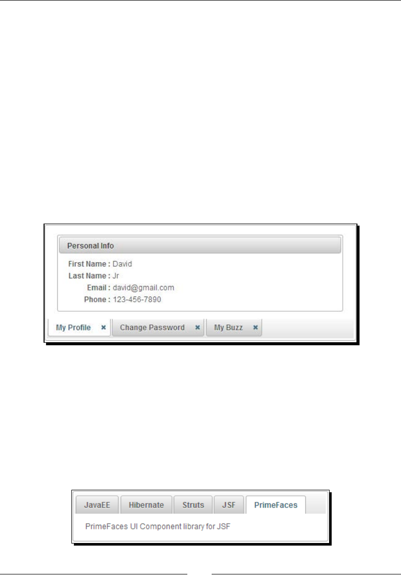
Working with Layout Components
[ 272 ]
Tab headers with different orientations
By default, the TabView component display tab headers at the top. You can change the
posion of tab headers using the orientation aribute. The valid orientation values
are top, bottom, left, and right:
<p:tabView orientation="bottom">
<p:tab title="My Profile">
...
</p:tab>
<p:tab title="Change Password">
...
</p:tab>
<p:tab title="My Buzz">
...
</p:tab>
</p:tabView>
Creating TabView with a dynamic number of tabs
Instead of stac tab denions, we can also create a TabView component with dynamic
number of tabs using data backed by a server-side collecon of objects:
<p:tabView value="#{tagController.tags}" var="tag">
<p:tab title="#{tag.label}">
<h:outputText value="#{tag.description}" />
</p:tab>
</p:tabView>
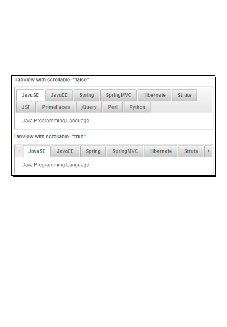
Chapter 10
[ 273 ]
Creating TabView with scrollable tabs
We can create a TabView component with scrollable tabs to deal with more number of tabs
by seng scrollable aribute to true.
<p:tabView value="#{tagController.tags}" var="tag" scrollable="true">
<p:tab title="#{tag.label}">
<h:outputText value="#{tag.description}" />
</p:tab>
</p:tabView>
When scrollable feature enabled TabView will get scroll buons to scroll across the tabs.
Handling TabView component's events
The TabView component supports onTabChange and onTabShow client-side callbacks.
The onTabChange callback is executed when an inacve tab is clicked and the onTabShow
callback is executed when an inacve tab becomes acve to be shown. These callbacks
receive an argument index, which represents the index of the tab clicked:
<p:tabView onTabChange="tabChanged(index)"
onTabShow="tabShowed(index)">
<p:tab title="My Profile">
...
</p:tab>
<p:tab title="Change Password">
...
</p:tab>
<p:tab title="My Buzz">
...

Working with Layout Components
[ 274 ]
</p:tab>
</p:tabView>
<script type="text/javascript">
function tabChanged(index)
{
alert("Tab Changed:"+index);
}
function tabShowed(index)
{
alert("Tab Show:"+index);
}
</script>
The TabView component supports the following client-side funcons, which can be invoked
on widgetVar value:
select(index): Acvates tab with given index
disable(index): Disables tab with given index
enable(index): Enables tab with given index
remove(index): Removes tab with given index
getLength(): Returns the number of tabs
getActiveIndex(): Returns index of current tab
Let us see how we can use TabView with dynamic data from server side and register event
listeners for tabChange and tabClose event listeners.
Time for action – using TabView with dynamic tabs and event
listeners support
Let us look at how we can create a TabView component with dynamic number of tabs that
are loaded lazily and handle tabChange and tabClose events:
1. Create a TabView component backed by server-side data and register tabChange
and tabClose event listeners:
<p:tabView value="#{tagController.tags}" var="tag"
dynamic="true" cache="false" activeIndex="2">
<p:ajax event="tabChange" listener=
"#{sampleController.onTabChange}"/>
<p:ajax event="tabClose" listener=
"#{sampleController.onTabClose}"/>
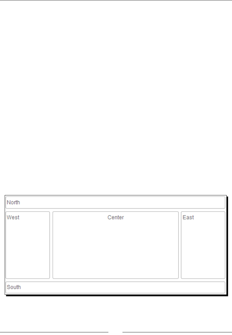
Chapter 10
[ 275 ]
<p:tab title="#{tag.label}" closable="true" disabled="#{empty
tag.posts}">
<h:outputText value="#{tag.description}" />
</p:tab>
</p:tabView>
What just happened?
We have created a TabView component backed by the List<Tag> collecon. We
have specied disabled="#{empty tag.posts}" to disable the tab if there are
no posts associated with that tag. Also, we have specied activeIndex="2" to expand
the third tab by default instead of rst tab. When an inacve tab is acvated then the
tabChange event listener gets invoked. When a tab is closed then the tabClose event
listener gets invoked. Also we can apply transion eect and its duraon using effect
and effectDuration aributes.
Creating complex layouts using the Layout component
Many of the web applicaons use a standard border layout model, where it has ve regions
(north, south, west, east, and center) to present data. To support this common usecase
PrimeFaces provides layout component which provides border layout component with
various customizaon features such as full page layout, toggling, closing, resizing of regions,
and ability to create complex layouts using nested layouts.
The following diagram depicts how border layout look like:

Working with Layout Components
[ 276 ]
Layout can be applied for full page or for a specic region in a page. You can set
fullPage="true" to create full page layout, by default fullPage="false". Each region
is created by using a <p:layoutUnit> subcomponent. You can enable toggling, closing,
and resizing of the units by seng collapsible, closable, resizable aributes to true on the
<p:layoutUnit> elements.
Time for action – creating FullPage layout
Let us see how to create a FullPage layout component with ve regions:
1. Create a Layout component using <p:layout fullPage="true">.
<p:layout fullPage="true">
<p:layoutUnit position="north" size="100" resizable="true"
closable="true" collapsible="true">
<center><font size="6">TechBuzz</font></center>
</p:layoutUnit>
<p:layoutUnit position="south" size="100" header="Footer"
resizable="true" closable="true" collapsible="true">
<h:outputText value="Copyright @ 2013" />
</p:layoutUnit>
<p:layoutUnit position="west" size="200"
header="NavigationBar" resizable="true" closable="true"
collapsible="true">
<h:form>
<h:link value="User Management" /><br/>
<h:link value="Tag Config" /><br/>
<h:link value="System Admin"/>
</h:form>
</p:layoutUnit>
<p:layoutUnit position="east" size="200" header="Latest Buzz"
resizable="true" closable="true" collapsible="true"
effect="drop">
<h:outputText value="PrimeFaces forum reached 98,000
posts." />
</p:layoutUnit>
<p:layoutUnit id="centerUnit" position="center">
<h:outputText value="FullPage Layout using PrimeFaves
Layout Component." />
</p:layoutUnit>
</p:layout>
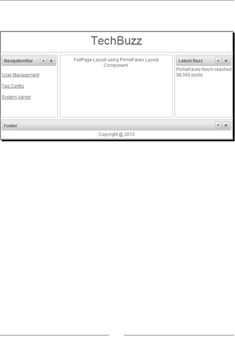
Chapter 10
[ 277 ]
What just happened?
We have created a FullPage layout with ve regions, which will display as follows:
As we have enabled toggling and closing features of layout units, we can minimize or close
the individual units.
Creating an element-based layout
We can also use Layout component to create a border layout container within a specic
region in page by seng fullPage="false", which is default.
Let us see how we can create element-based layout:
<p:layout style="min-width:250px;min-height:220px;" id="layout">
<p:layoutUnit position="west" resizable="true" size="100">
West
</p:layoutUnit>
<p:layoutUnit position="north">
North
</p:layoutUnit>
<p:layoutUnit position="south" >
South
</p:layoutUnit>
<p:layoutUnit position="center">
<center>Center</center>
</p:layoutUnit>
</p:layout>

Working with Layout Components
[ 278 ]
Creating nested layouts
We can also create complex layout containers using nested layouts.
Let us see how we can create a nested layout with a main outer layout, which contains a
nested layout with north and center layoutUnits in its center layoutUnit.
<p:layout fullPage="true">
<p:layoutUnit position="north" size="80" resizable="true">
<center><font size="6">TechBuzz</font></center>
</p:layoutUnit>
<p:layoutUnit position="south" size="50" header="Footer"
resizable="true">
<center><h:outputText value="Copyright @ 2013" /></center>
</p:layoutUnit>
<p:layoutUnit position="east" size="200" header="Latest Buzz"
resizable="true">
<h:outputText value="PrimeFaces forum reached 98,000 posts." />
</p:layoutUnit>
<p:layoutUnit position="west" size="150" header="NavigationBar"
resizable="true">
<h:form>
<h:link value="User Management" /><br/>
<h:link value="Tag Config" /><br/>
<h:link value="System Admin"/>
</h:form>
</p:layoutUnit>
<p:layoutUnit position="center">
<p:layout>
<p:layoutUnit position="north" size="50" resizable="true">
<font size="4">Tag Configuration</font>
</p:layoutUnit>
<p:layoutUnit position="center">
<h:outputText value="List of Tags:" />
<p:dataList value="#{tagController.tags}" var="tag">
<h:outputText value="#{tag}" />
</p:dataList>
</p:layoutUnit>
</p:layout>
</p:layoutUnit>
</p:layout>
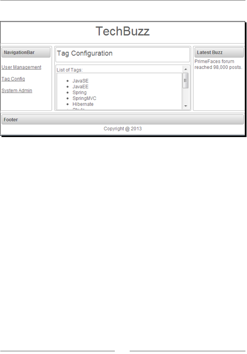
Chapter 10
[ 279 ]
The preceding code renders a nested layout as follows:
Handling layout events
Layout component supports AJAX event listeners for toggle, close, and resize events.
<p:layout fullPage="true">
<p:ajax event="toggle" listener=
"#{sampleController.handleLayoutToggle}" />
<p:ajax event="close" listener=
"#{sampleController.handleLayoutClose}" />
<p:ajax event="resize" listener=
"#{sampleController.handleLayoutResize}" />
...
</p:layout>
public void handleLayoutClose(org.primefaces.event.CloseEvent event)
{
String msg = "Position: "+((LayoutUnit)event.getComponent()).
getPosition();
FacesMessage message = new FacesMessage(FacesMessage.SEVERITY_INFO,
"LayoutUnit Closed", msg);
FacesContext.getCurrentInstance().addMessage(null, message);
}
public void handleLayoutToggle(org.primefaces.event.ToggleEvent
event)
{

Working with Layout Components
[ 280 ]
String msg = "Position: "+((LayoutUnit)event.getComponent()).
getPosition() + " , Status:" +
event.getVisibility().name();
FacesMessage message = new FacesMessage
(FacesMessage.SEVERITY_INFO,"LayoutUnit Toggled",msg);
FacesContext.getCurrentInstance().addMessage(null, message);
}
public void handleLayoutResize(org.primefaces.event.ResizeEvent
event)
{
String msg = "Position:
"+((LayoutUnit)event.getComponent()).getPosition();
FacesMessage message = new FacesMessage(FacesMessage.SEVERITY_INFO,
"LayoutUnit Resized", msg);
FacesContext.getCurrentInstance().addMessage(null, message);
}
If you are working with forms and full page layout, avoid using a form that
contains layoutUnits, as generated DOM may not be the same. Instead create
forms within layoutUnits.
Update layoutUnit contents instead of updang layoutUnits itself.
Except center layoutUnit, other layout units must have dimensions dened
using size opon.
Creating portal like layout using a Dashboard component
Dashboard is layout component that provides portal like layout with drag-and-drop feature
to rearrange its UI widgets as per user choice.
To create a Dashboard layout we need to create a custom model object of type org.
primefaces.model.DashboardModel. We can create mulple panel widgets and group
them by adding to org.primefaces.model.DashboardColumn, which in turn should be
added to DashboardModel.
Time for action – creating a Dashboard layout
Let us see how to create a Dashboard layout component:
1. Create a Dashboard Layout using <p:dashboard>.
<p:dashboard id="board" model="#{dashboardController.model}">
<p:panel id="twitter" header="Twitter">
<h:outputText value="Twitter feed" />

Chapter 10
[ 281 ]
</p:panel>
<p:panel id="facebook" header="Facebook">
<h:outputText value="Facebook feed" />
</p:panel>
<p:panel id="youtube" header="YouTube">
<h:outputText value="YouTube Videos" />
</p:panel>
<p:panel id="dzone" header="DZone">
<h:outputText value="DZone Posts" />
</p:panel>
<p:panel id="jcg" header="Java Code Geeks">
<h:outputText value="JavaCodeGeeks Posts" />
</p:panel>
<p:panel id="linkedIn" header="LinkedIn">
<h:outputText value="LinkedIn Content" />
</p:panel>
</p:dashboard>
2. Create and inialize org.primefaces.model.DashboardModel backing
model object:
public DashboardController()
{
model = new DefaultDashboardModel();
DashboardColumn column1 = new DefaultDashboardColumn();
DashboardColumn column2 = new DefaultDashboardColumn();
DashboardColumn column3 = new DefaultDashboardColumn();
column1.addWidget("twitter");
column1.addWidget("facebook");
column1.addWidget("youtube");
column2.addWidget("linkedIn");
column3.addWidget("dzone");
column3.addWidget("jcg");
model.addColumn(column1);
model.addColumn(column2);
model.addColumn(column3);
}
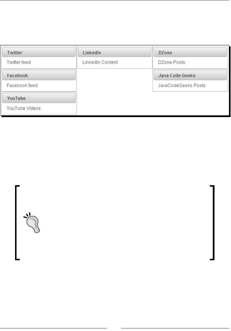
Working with Layout Components
[ 282 ]
What just happened?
We have created a portal kind of Dashboard with six panel widgets ed into three columns.
We can drag-and-drop any panel into other widget posions as per our preference. If you
want to disable drag-and-drop feature set disabled="false".
You can programmacally move panel widget from one locaon to another locaon using
the transferWidget() method on the DashboardModel instance:
void transferWidget(DashboardColumn from, DashboardColumn to, String
widgetId, int index)
This method will relocate the widget idened with widget id to the given index of the new
column from old column.
By default, if you move all the panels from one column to another and
the column is empty then you can't ll that column again by dragging
panels back.
To have columns of a xed size you need to dene ui-dashboard-
column style with the preferred width.
<style type="text/css">
.ui-dashboard-column {
width:200px;
}
</style>

Chapter 10
[ 283 ]
The Dashboard component supports the reorder AJAX event and invokes the event listener
method with org.primefaces.event.DashboardReorderEvent type parameter:
<p:dashboard id="board" model="#{dashboardController.model}"
disabled="false">
<p:ajax event="reorder" listener="#{dashboardController.
handleReorder}" />
...
</p:dashboard>
public void handleReorder(DashboardReorderEvent event)
{
FacesMessage message = new FacesMessage();
message.setSummary("Reordered: " + event.getWidgetId());
message.setDetail("Item index: " + event.getItemIndex()
+ ", Column index: " + event.getColumnIndex()
+ ", Sender index: " + event.getSenderColumnIndex());
FacesContext.getCurrentInstance().addMessage(null, message);
}
Summary
In this chapter, we have learned how to create and use complex user interface layouts using
various layout components such as Panel, PanelGrid, ScrollPanel, AccordionPanel, and TabView.
We have learned how to create workows using a Wizard component. We have created
complex border layout-style full page layout using layout component. Also we have created a
sample portal kind of layout using a dashboard component with drag-and-drop capabilies.
In the next chapter, we will learn about navigaon components such as Menus, BreadCrumb,
Toolbar, and so on.

11
Introducing Navigation Components
Typically, web applications have many screens and users navigate through
the screens using various types of navigation menus. HTML has a very basic
support for navigating through screens using hyperlinks or form submissions.
Various JavaScript libraries provide a rich set of navigation components
such as drop-down menus, pop-up menus, tabbed menus, and so on.
PrimeFaces brings support for most of the rich navigation menu components
to JSF-based applications.
PrimeFaces provides various navigation components such as Menu,
TieredMenu, Menubar, MegaMenu, TabMenu, ContextMenu, Breadcrumb
menu, and so on.
In this chapter we will cover:
Understanding MenuModel
Introducing the Menu component
Introducing the MenuBuon component
Displaying mullevel nested menus using TieredMenu
Creang nested menus with SlideMenu
Creang a horizontal navigaon menu using Menubar
Creang the mulcolumn menu using MegaMenu
Creang tab-based menus using TabMenu
Introducing the PanelMenu Component
Introducing ContextMenu
Introducing the Breadcrumb navigaon menu

Introducing Navigaon Components
[ 286 ]
Understanding MenuModel
Many of the PrimeFaces menu components such as Menu, TieredMenu, SlideMenu,
MegaMenu, MenuBar, TabMenu, PanelMenu, and Breadcrumb are backed by the org.
primefaces.model.MenuModel instance, and can also be created in a declarave way
using the same <p:menuitem> and <p:submenu> elements.
Building menus declaratively
We can create menus declaravely using the <p:menuitem> and <p:submenu> elements.
The <p:submenu> element can be used to group menu opons, and submenus can be
nested inside other submenus.
The <p:menuitem> element provides the following opons to customize its behavior:
value: Label of the MenuItem.
icon: Path of the MenuItem image.
title: Advisory toolp informaon.
disabled: Disables the MenuItem component. Default is false.
target: Target type of the URL navigaon.
url: URL to be navigated when MenuItem is clicked.
outcome: Navigaon case outcome.
action: Acon to be invoked when MenuItem is clicked.
actionListener: Acon listener to be invoked when MenuItem is clicked.
immediate: When true, acon of this MenuItem is processed aer the Apply
Request phase. Default is false.
partialSubmit: Enables serializaon of values belonging to the parally
processed components only. Default is false.
ajax: Species submit mode. Default is true.
async: When set to true, AJAX requests are not queued. Default is false.
process: Component ID(s) to process parally instead of whole view.
update: Client-side ID of the component(s) to be updated aer the async paral
submit request.
includeViewParams: Denes whether page parameters should be in the target
URI. Default is false.
fragment: Idener of the target page element to scroll to.
global: Global AJAX requests are listened to by the ajaxStatus component, seng
global to false will not trigger ajaxStatus. Default is true.
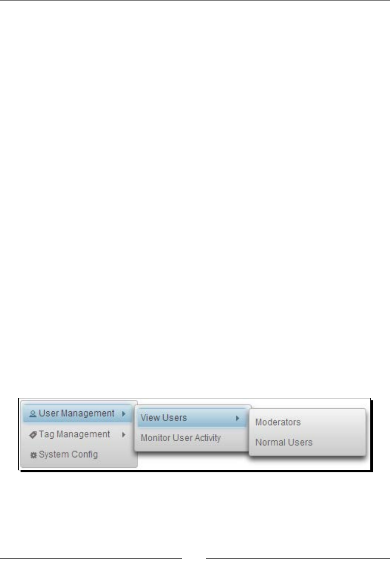
Chapter 11
[ 287 ]
onclick: JavaScript event handler for the click event.
onstart: JavaScript handler to execute before the AJAX request begins.
oncomplete: JavaScript handler to execute when the AJAX request is completed.
onsuccess: JavaScript handler to execute when the AJAX request succeeds.
onerror: JavaScript handler to execute when the AJAX request fails.
Let us examine the following TieredMenu denion:
<p:tieredMenu style="width:180px">
<p:submenu label="User Management" icon="ui-icon-person">
<p:submenu label="View Users">
<p:menuitem value="Moderators" url="tieredMenu.jsf"/>
<p:menuitem value="Normal Users"
action="#{menuController.showUserManagement()}"/>
</p:submenu>
<p:menuitem value="Monitor User Activity"
actionListener="#{menuController.showUserActivity()}"
ajax="false"/>
</p:submenu>
<p:submenu label="Tag Management" icon="ui-icon-tag">
<p:menuitem value="View Tags" url="tieredMenu.jsf"/>
<p:menuitem value="Tag Stistics" outcome="tieredMenu"/>
</p:submenu>
<p:menuitem value="System Config" icon="ui-icon-gear"
outcome="tieredMenu"/>
</p:tieredMenu>
The preceding code renders a TieredMenu component, which we are going to discuss in
the later secon of this chapter, with mulple submenus and nested submenus. When you
mouse over any MenuItem, it will display Submenu opons if it has any, as shown in the
following screenshot:
The <p:submenu> element can contain child <p:submenu> elements to display nested
submenus. We can display an icon for MenuItem and Submenu headings using the
icon aribute.

Introducing Navigaon Components
[ 288 ]
We can specify GET type navigaons using the url or outcome aributes, as shown in the
following code snippet:
<p:menuitem value="View Configuration" outcome="tieredMenu"/>
<p:menuitem value="View Tags" url="tieredMenu.jsf"/>
We can send a POST request using the action or actionListener aributes. By default,
the POST request is issued using AJAX, we can alter this behavior using the ajax aribute,
shown as follows:
<p:menuitem value="Normal Users"
action="#{menuController.showUserManagement()}"/>
<p:menuitem value="Monitor User Activity"
actionListener="#{menuController.showUserActivity()}"
ajax="false"/>
Building menus programmatically
We can create menus dynamically by creang an instance of MenuModel programmacally
and adding the org.primefaces.model.menu.DefaultMenuItem and org.
primefaces.model.menu.DefaultSubMenu instances, represenng menuitems and
submenus, respecvely.
Let us see how to create the same Menu component that we created declaravely in the
previous secon in a programmac way:
void initMenuModel()
{
menuModel = new DefaultMenuModel();
DefaultSubMenu sm1 = new DefaultSubMenu();
sm1.setLabel("User Management");
sm1.setIcon("ui-icon-person");
DefaultSubMenu sm1Menu1 = new DefaultSubMenu();
sm1Menu1.setLabel("View Users");
DefaultMenuItem sm1Menu1Ite1 = new DefaultMenuItem();
sm1Menu1Ite1.setValue("Moderators");
sm1Menu1Ite1.setUrl("tieredMenu.jsf");
DefaultMenuItem sm1Menu1Ite2 = new DefaultMenuItem();
sm1Menu1Ite2.setValue("Normal Users");
sm1Menu1Ite2.setCommand("#{menuController
.showUserManagement()}");
sm1Menu1Ite2.setAjax(false);
sm1Menu1.addElement(sm1Menu1Ite1);
sm1Menu1.addElement(sm1Menu1Ite2);

Chapter 11
[ 289 ]
DefaultMenuItem sm1Item2 = new DefaultMenuItem();
sm1Item2.setValue("Monitor User Activity");
sm1Item2.setCommand("#{menuController.
showUserActivity()}");
sm1Item2.setAjax(false);
sm1.addElement(sm1Menu1);
sm1.addElement(sm1Item2);
menuModel.addElement(sm1);
DefaultSubMenu sm2 = new DefaultSubMenu();
sm2.setLabel("Tag Management");
sm2.setIcon("ui-icon-tag");
DefaultMenuItem sm2Item1 = new DefaultMenuItem();
sm2Item1.setValue("View Tags");
sm2Item1.setOutcome("menu");
DefaultMenuItem sm2Item2 = new DefaultMenuItem();
sm2Item2.setValue("Tag Stistics");
sm2Item2.setUrl("menu.jsf");
sm2.addElement(sm2Item1);
sm2.addElement(sm2Item2);
menuModel.addElement(sm2);
DefaultMenuItem sm3 = new DefaultMenuItem();
sm3.setValue("System Config");
sm3.setIcon("ui-icon-gear");
menuModel.addElement(sm3);
}
Here, we have created an instance of MenuModel and added the DefaultMenuItem and
DefaultSubMenu type instances to MenuModel.
We have used the following methods to set various properes of the DefaultMenuItem
and DefaultSubMenu components:
menuItem.setValue(String) : Set the label of MenuItem.
menuItem.setIcon(String): Set the icon name.
menuItem.setOutcome(String): Set the outcome(facelets page) name.
menuItem.setUrl(String): Set the target URL path.
menuItem.setCommand(String): Binds the MethodExpression String to be
invoked when MenuItem is clicked.
menuItem.setAjax(Boolean): Enable or disable the AJAX submission mode.

Introducing Navigaon Components
[ 290 ]
submenu.setLabel(String): Set the Submenu header label.
submenu.setIcon(String): Set the icon name for the header.
submenu.addElement(Menuitem): Adds MenuItem or another nested Submenu
to Submenu group.
menuModel.addElement(Menuitem): Adds a MenuItem or Submenu to
MenuModel at root level.
Introducing the Menu component
Menu is a navigaon component that can contain menuitems or submenus. We can
create a Menu component either in declarave or programmac way. In many of the web
applicaons, there would be a le-hand side navigaon bar that contains all the navigaon
links grouped according to related acons. To create such a navigaon menu, we can use the
<p:menu> component.
Time for action – creating a simple Menu
Let us see how to create a simple Menu in a declarave fashion, by performing the
following step:
1. Create a Menu component using <p:menu> with <p:menuitem> and
<p:submenu> to add menuitems and Submenu groups:
<p:menu>
<p:menuitem value="System Config" outcome="menu"/>
<p:submenu label="User Management" >
<p:menuitem value="View Users"
actionListener="#{menuController.
showUserManagement()}"/>
<p:menuitem value="Monitor User Activity"
actionListener="#{menuController.
showUserActivity()}" ajax="false"/>
</p:submenu>
<p:submenu label="Tag Management">
<p:menuitem value="View Tags" url="menu.jsf"/>
<p:menuitem value="Tag Statistics" outcome="menu"/>
</p:submenu>
</p:menu>
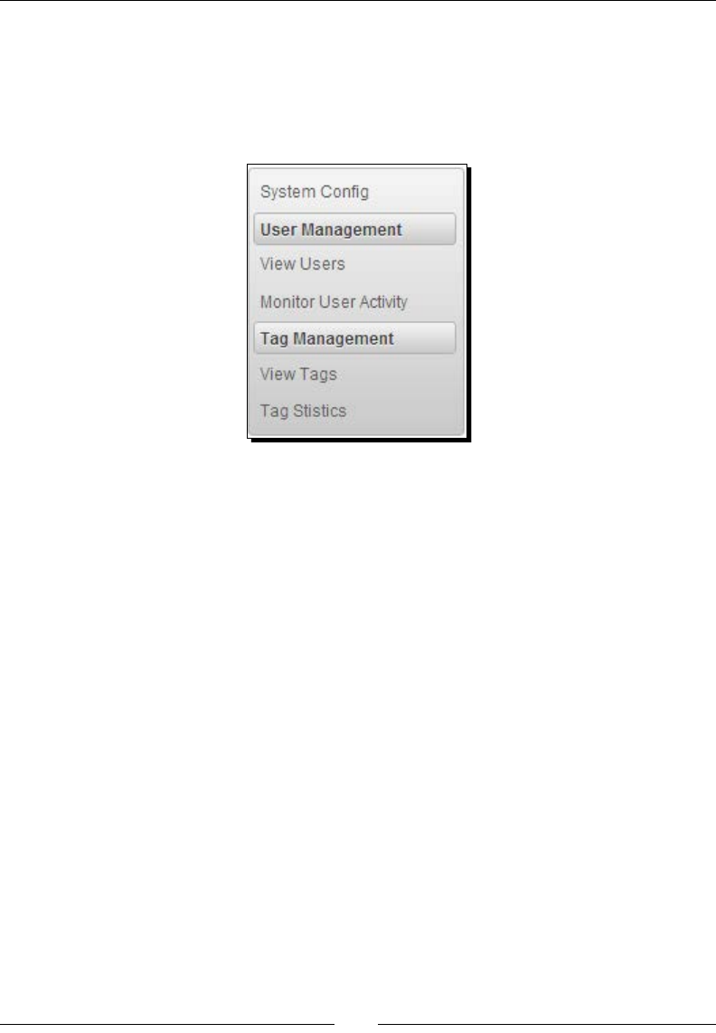
Chapter 11
[ 291 ]
What just happened?
In the preceding code snippet, we have created a menu using the <p:menu> component.
We have added a MenuItem, <p:menuitem>, directly at the root level and added two
Submenu <p:submenu> elements, which in turn contains <p:menuitem> elements.
This menu component will be displayed as shown in the following screenshot:
As you can see, the rst MenuItem is added to the menu at the root level without any
header, and Submenu items are displayed with a header name that we have menoned
using the label aribute.
Instead of stac menus created in declarave fashion, we can create dynamic menus
programmacally by binding an instance of the org.primefaces.model.MenuModel
type to the model aribute:
<p:menu model="#{menuController.menuModel}"></p:menu>
Displaying Menu based on trigger
By default, Menu will be displayed as an inline component on the page load. Instead of
displaying as an inline menu, we can set the overlay aribute to true and dene a trigger
to show the menu. The posion of the menu will be relave to the trigger component and
specied using the my and at aributes:
my: Corner of menu to align with the trigger element.
at: Corner of trigger to align with the Menu element.

Introducing Navigaon Components
[ 292 ]
The valid values for my and at is a combinaon of:
le
right
boom
top
Time for action – displaying an overlay menu with trigger
Let us see how we can create a menu that will be displayed on clicking a buon, by
performing the following step:
1. Create an overlay menu and dene a trigger component to show it:
<p:commandButton id="overlayBtn" value="ShowMenu"
type="button"/>
<p:menu overlay="true" trigger="overlayBtn" my="left top"
at="right bottom">
<p:menuitem value="System Config" outcome="menu"/>
<p:submenu label="User Management" >
<p:menuitem value="View Users"
actionListener="#{menuController.
showUserManagement()}"/>
<p:menuitem value="Monitor User Activity"
actionListener="#{menuController.
showUserActivity()}" ajax="false"/>
</p:submenu>
<p:submenu label="Tag Management">
<p:menuitem value="View Tags" url="menu.jsf"/>
<p:menuitem value="Tag Statistics" outcome="menu"/>
</p:submenu>
</p:menu>
What just happened?
We have created a menu and bound the trigger aribute to id of commandButton.
Once the page is loaded, only the ShowMenu buon will be displayed. When you click
on the ShowMenu buon, the menu will be displayed at the posion as per the my and
at aribute values.
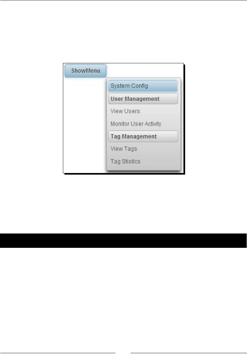
Chapter 11
[ 293 ]
By default, the click event on the trigger component displays the menu. You can change it
using the triggerEvent aribute:
<p:menu overlay="true" trigger="overlayBtn" triggerEvent="mouseover"
my="left top" at="left bottom">
...
</p:menu>
Introducing the MenuButton component
MenuBuon is a menu component that will display one or more menuitems in a pop-up
menu.
Time for action – creating MenuButton
Let us see how we can create MenuBuon declaravely, by performing the following steps:
1. Create the MenuBuon component using <p:menuButton>:
<p:menuButton value="Administration">
<p:menuitem value="View Users"
actionListener="#{menuController.
showUserManagement()}"/>
<p:menuitem value="Tag Management" outcome="menuButton"/>
<p:menuitem value="System Config" url="menuButton.jsf"/>
</p:menuButton>
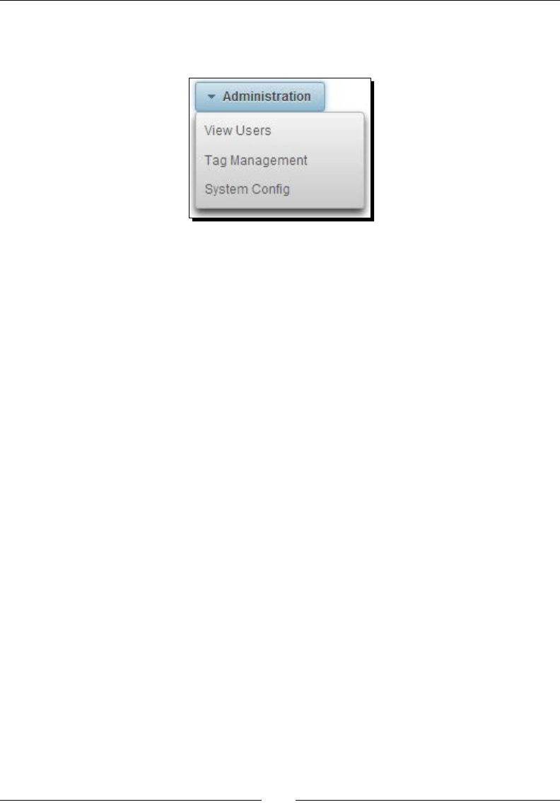
Introducing Navigaon Components
[ 294 ]
The preceding MenuBuon component will be rendered as shown in the
following screenshot:
2. We can also build the same the MenuBuon component programmacally
as follows:
<p:menuButton value="Administration" model="#{menuController.
menuButtonModel}"></p:menuButton>
3. Create menuButtonModel, which is an instance of type org.primefaces.
model.MenuModel:
public MenuModel getMenuButtonModel()
{
MenuModel menuButtonModel = new DefaultMenuModel();
DefaultMenuItem item1 = new DefaultMenuItem();
item1.setValue("View Users");
item1.setCommand("#{menuController.showUserManagement()}");
menuButtonModel.addElement(item1);
DefaultMenuItem item2 = new DefaultMenuItem();
item2.setValue("Tag Management");
item2.setOutcome("menuButton");
menuButtonModel.addElement(item2);
DefaultMenuItem item3 = new DefaultMenuItem();
item3.setValue("System Config");
item3.setUrl("menuButton.jsf");
menuButtonModel.addElement(item3);
return menuButtonModel;
}

Chapter 11
[ 295 ]
What just happened?
We have learned how to create the MenuBuon component both declaravely
and programmacally.
Displaying multilevel nested menus using TieredMenu
TieredMenu is a menu component that can be used to display nested submenus with
overlays. Similar to the <p:menu> component, TieredMenu can be created programmacally
and also supports the trigger-based menu display.
Time for action – displaying a multilevel menu using TieredMenu
Let us see how to create a TieredMenu with mullevel nested submenus, by performing the
following step:
1. Create a TieredMenu component with mullevel menu opons using nested
<p:submenu> elements:
<p:tieredMenu style="width:180px">
<p:submenu label="User Management" icon="ui-icon-person">
<p:submenu label="View Users">
<p:menuitem value="Moderators"
url="tieredMenu.jsf"/>
<p:menuitem value="Normal Users"
actionListener="#{menuController.
showUserManagement()}"/>
</p:submenu>
<p:menuitem value="Monitor User Activity"
actionListener="#{menuController.
showUserActivity()}" ajax="false"/>
</p:submenu>
<p:submenu label="Tag Management" icon="ui-icon-tag">
<p:menuitem value="View Tags" url="tieredMenu.jsf"/>
<p:menuitem value="Tag Stistics"
outcome="tieredMenu"/>
</p:submenu>
<p:submenu label="System Config" icon="ui-icon-gear">
<p:menuitem value="Email Server" icon="ui-icon-mail-
closed" outcome="tieredMenu"/>
</p:submenu>
</p:tieredMenu>
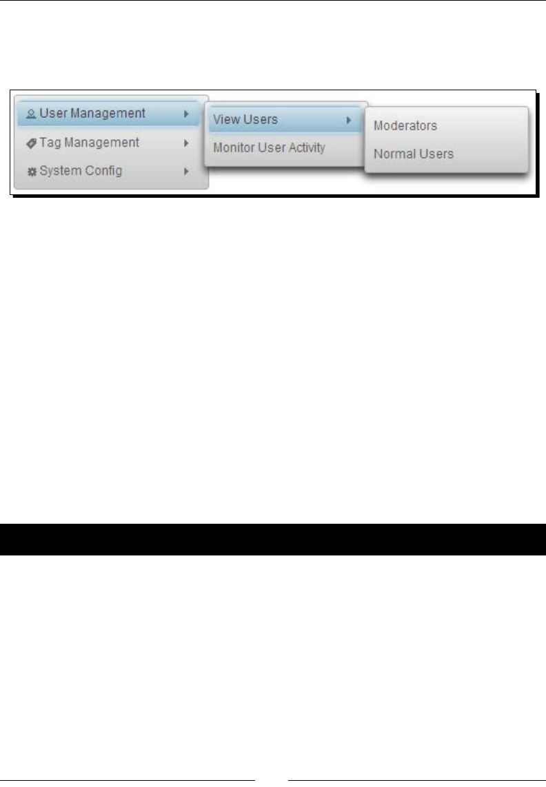
Introducing Navigaon Components
[ 296 ]
What just happened?
We have created a TieredMenu component that displays mullevel submenu opons as
shown in the following screenshot:
The TieredMenu component can also be created programmacally and can be displayed
using a trigger component:
<p:commandButton id="menuButton" value="ShowMenu" type="button"/>
<p:tieredMenu overlay="true" trigger="menuButton"
model="#{menuController.menuModel}" my="left top" at="right
bottom"/>
By default, Submenu opons will be displayed when you hover the mouse over the Submenu
header. We can set the aribute autoDisplay="false", so that Submenu opons will
only be displayed when you click on the Submenu.
Creating nested menus with SlideMenu
SlideMenu is a menu component that can be used to display nested submenus with sliding
animaon. When you click on any Submenu, the menuitems will be displayed along with a
Back buon to navigate back to the parent-level menu.
Time for action – creating the SlideMenu component
Let us see how we can create a SlideMenu, by performing the following step:
1. Create SlideMenu with mullevel submenus using <p:slideMenu> declaravely:
<p:slideMenu style="width:180px">
<p:submenu label="User Management" icon="ui-icon-person">
<p:submenu label="View Users">
<p:menuitem value="Moderators"
outcome="slideMenu"/>
<p:menuitem value="Normal Users"
actionListener="#{menuController.
showUserManagement()}"/>
</p:submenu>
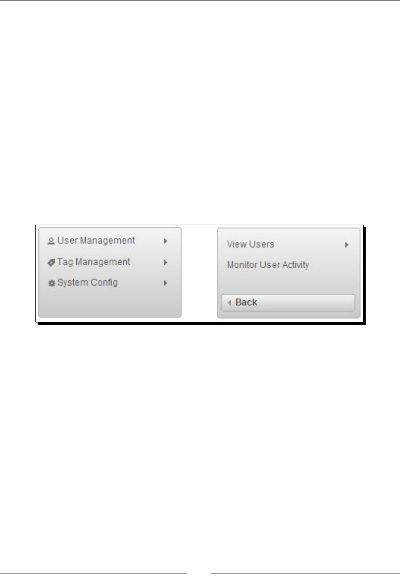
Chapter 11
[ 297 ]
<p:menuitem value="Monitor User Activity"
actionListener="#{menuController.
showUserActivity()}" ajax="false"/>
</p:submenu>
<p:submenu label="Tag Management" icon="tag-icon">
<p:menuitem value="View Tags" url="slideMenu.jsf"/>
<p:menuitem value="Tag Stistics" outcome="slideMenu"/>
</p:submenu>
<p:submenu label="System Config" icon="ui-icon-gear">
<p:menuitem value="View Configuration"
outcome="slideMenu"/>
</p:submenu>
</p:slideMenu>
What just happened?
The preceding code will display a SlideMenu as shown in the following screenshot:
When you click on the User Management MenuItem, then Submenu items will be displayed
along with a Back buon to navigate back to the parent menu.
The SlideMenu component can also be created programmacally, can be displayed using a
trigger component, and supports enabling or disabling the autoDisplay feature.
Creating a horizontal navigation menu using Menubar
Menubar is a horizontal navigaon menu that can be used to display mullevel menuitems
and submenus. We can use the same MenuModel used for previous menu components for
the Menubar component as well.
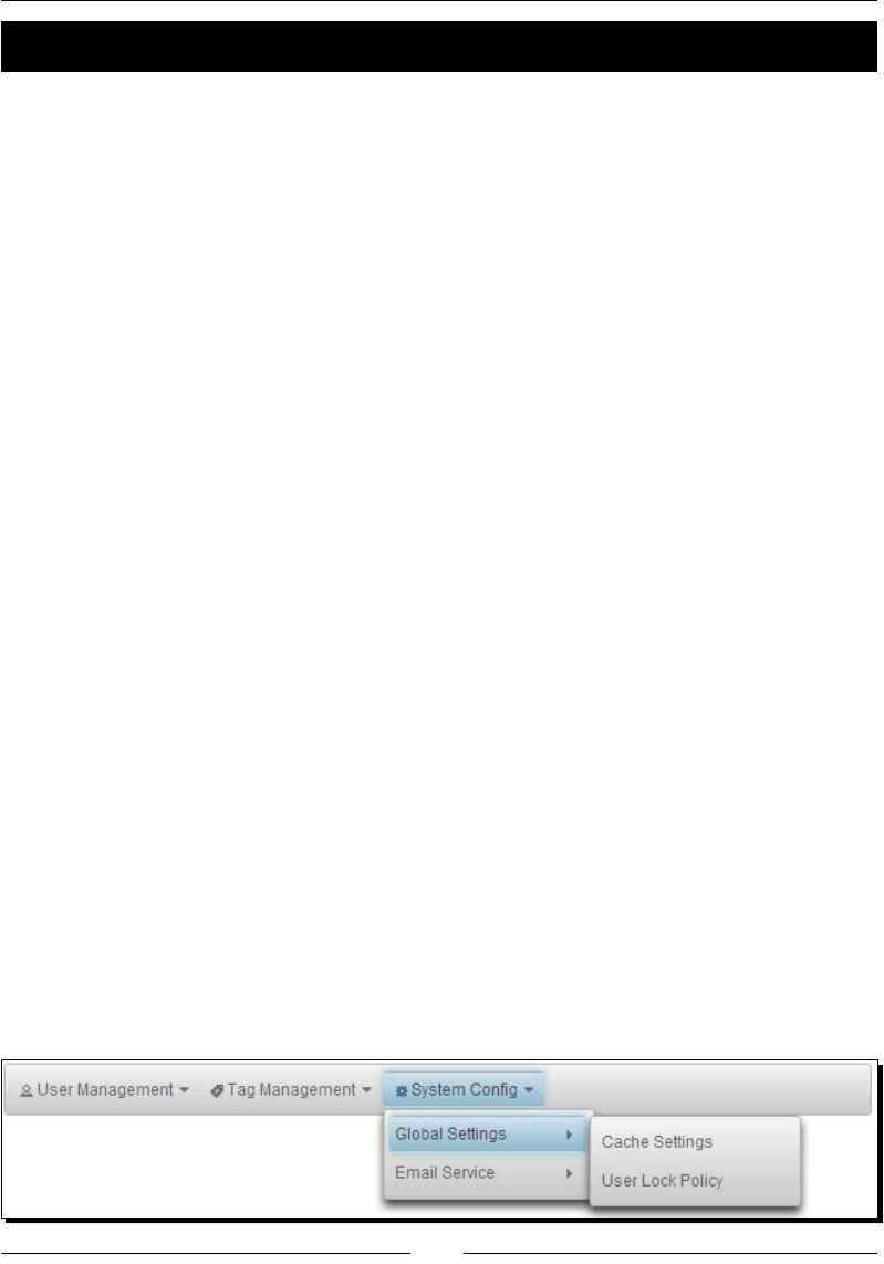
Introducing Navigaon Components
[ 298 ]
Time for action – creating a Menubar component
Let us see how to create a Menubar component, by performing the following step:
1. Create a Menubar component using <p:menubar> declaravely:
<p:menubar autoDisplay="false">
<p:submenu label="User Management" icon="ui-icon-person">
<p:menuitem value="Disable/Enable Users"
actionListener="#{menuController.
showUserManagement()}"/>
<p:menuitem value="View User Activity"
actionListener="#{menuController.
showUserActivity()}" ajax="false"/>
</p:submenu>
<p:submenu label="Tag Management" icon="ui-icon-tag">
<p:menuitem value="View Tags" url="menubar.jsf"/>
<p:menuitem value="Create Tag" outcome="menubar"/>
</p:submenu>
<p:submenu label="System Config" icon="ui-icon-gear">
<p:submenu label="Global Settings">
<p:menuitem value="Cache Settings"
url="menubar.jsf"/>
<p:menuitem value="User Lock Policy"
outcome="menubar"/>
</p:submenu>
<p:submenu label="Email Service">
<p:menuitem value="SMTP Settings"
url="menubar.jsf"/>
</p:submenu>
</p:submenu>
</p:menubar>
What just happened?
We have created the Menubar component with three Submenu components at the root
level using <p:submenu> and added menuitems for each Submenu using <p:menuitem>.
We also added a nested Submenu for the System Cong MenuItem. The preceding code
renders a Menubar component as shown in the following screenshot:

Chapter 11
[ 299 ]
Similar to other menu components, the Menubar component also supports creang menu
opons programmacally and enabling/disabling the autoDisplay feature.
Creating a multicolumn menu using MegaMenu
MegaMenu is a horizontal navigaon menu that displays menu opons in the grid layout and
each MenuItem and Submenu should be dened inside a <p:column> element.
Generally, in e-commerce applicaons, there might be many subcategories in each category.
In such scenarios, we can use MegaMenu to display all submenus at once, instead of leng
the user navigate through mulple levels of ered menus.
Time for action – creating MegaMenu with multiple columns
Let us see how to create a mulcolumn menu using the MegaMenu component, by
performing the following step:
1. Create the MegaMenu component with mulple columns using <p:column> to
group the menu opons into a column:
<p:megaMenu>
<p:submenu label="Users">
<p:column>
<p:submenu label="Normal Users">
<p:menuitem value="View Users" url="#"/>
<p:menuitem value="User Activity" url="#"/>
</p:submenu>
<p:submenu label="Inactive Users">
<p:menuitem value="View Inactive Users"
url="#"/>
<p:menuitem value="Unlock Users" url="#"/>
</p:submenu>
</p:column>
<p:column>
<p:submenu label="Moderators">
<p:menuitem value="View Moderators" url="#"/>
<p:menuitem value="Deleted Buzz" url="#"/>
</p:submenu>
</p:column>
</p:submenu>
<p:submenu label="Tags">
<p:column>
<p:submenu label="Tag Management">
<p:menuitem value="View Tags" url="#"/>
<p:menuitem value="Create Tags" url="#"/>
</p:submenu>
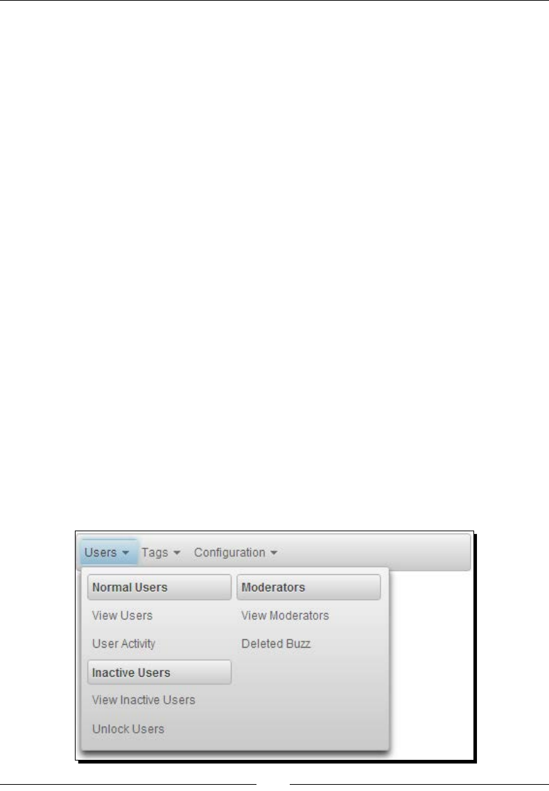
Introducing Navigaon Components
[ 300 ]
</p:column>
<p:column>
<p:submenu label="Tag Usage">
<p:menuitem value="Tags Statistics" url="#"/>
<p:menuitem value="Tags usage By User"
url="#"/>
</p:submenu>
</p:column>
</p:submenu>
<p:submenu label="Configuration">
<p:column>
<p:submenu label="Global Settings">
<p:menuitem value="Cache Settings" url="#"/>
<p:menuitem value="User Lock Policy" url="#"/>
</p:submenu>
<p:submenu label="Email Server Settings">
<p:menuitem value="SMTP Settings" url="#"/>
<p:menuitem value="POP3 Settings" url="#"/>
</p:submenu>
</p:column>
</p:submenu>
</p:megaMenu>
What just happened?
We have created a MegaMenu component to display three root-level menus: Users, Tags,
and Conguraon. In each menu, we are displaying all the submenus and menuitems in
mulple columns.
The preceding code displays a MegaMenu component as shown in the following screenshot:
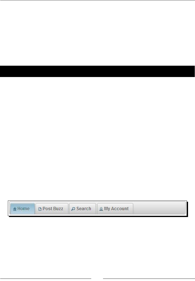
Chapter 11
[ 301 ]
Creating tab-based menus using TabMenu
TabMenu is a navigaon component that displays menuitems as tabs. TabMenu takes a list
of menuitems and displays each as a tab. Similar to other menu components, we can do GET
requests to MenuItem using the url or outcome aributes and can send POST requests
using the action or actionListener aributes.
In the TechBuzz applicaon, we will be using the TabMenu component to display a top-level
navigaon bar to display the Home, Post Buzz, Search, and My Account screens as tabs.
Time for action – creating the TabMenu component
Let us see how to create a TabMenu component, by performing the following step:
1. Create the TabMenu component with four Menu opons to show the Home, Post
Buzz, Search, and My Account screens:
<p:tabMenu activeIndex="0">
<p:menuitem value="Home" url="home.jsf" icon="ui-icon-
home"/>
<p:menuitem value="Post Buzz" outcome="newPost" icon="ui-
icon-document"/>
<p:menuitem value="Search"
action="#{menuController.showSearchPage}" ajax="false"
icon="ui-icon-search" />
<p:menuitem value="My Account"
actionListener="#{menuController.showMyAccount()}"
icon="ui-icon-person" />
</p:tabMenu>
What just happened?
The preceding code renders a TabMenu component as shown in the following screenshot:
Here, we have associated various types of requests for each MenuItem. For the Home tab,
we have bound a GET request to home.jsf using the url aribute. For the Post Buzz
tab, we associated a GET request using the outcome aribute to show the newPost.
xhtml facelets page. For the Search tab, we bound a non-AJAX POST request to invoke
the menuController.showSearchPage() method using the action aribute. For the
My Account tab, we associated an AJAX POST request to invoke the actionListener
aribute's method menuController.showMyAccount().

Introducing Navigaon Components
[ 302 ]
Only one of the tabs of a TabMenu component will be displayed as an acve tab, based on
the activeIndex value. So, in the preceding TabMenu component, the Home tab will be
displayed as acve.
But in applicaons, we might need to keep track of activeIndex dynamically, based on the
tab that the user clicked.
Time for action – tracking an active tab dynamically
Let us see how we can maintain the activeIndex value of the tab that the user clicked, so
that we can display the user-clicked tab as an acve tab, by performing the following steps:
1. To dynamically keep track of the acve tab, we can create a template containing the
TabMenu denion with activeIndex bound to a dynamic property:
<ui:composition xmlns="http://www.w3.org/1999/xhtml"
xmlns:ui="http://java.sun.com/jsf/facelets"
xmlns:p="http://primefaces.org/ui">
<p:tabMenu activeIndex="#{activeIndex}">
<p:menuitem value="Home" url="home.jsf" icon="ui-icon-
home"/>
<p:menuitem value="Post Buzz" outcome="tabMenu"
icon="ui-icon-document"/>
<p:menuitem value="Search"
action="#{menuController.showSearchPage}"
ajax="false" icon="ui-icon-search" />
<p:menuitem value="My Account"
actionListener="#{menuController.showMyAccount()}"
icon="ui-icon-person" />
</p:tabMenu>
</ui:composition>
2. In client pages, we can include that template using <ui:insert> and pass the
activeIndex parameter value using <ui:param> as follows:
To display the rst tab as an acve tab, pass the activeIndex parameter's value as 0.
<ui:include file="/tabMenuTemplate.xhtml">
<ui:param name="activeIndex" value="0" />
</ui:include>
To display the second tab as an acve tab, pass the activeIndex parameter's
value as 1.
<ui:include file="/tabMenuTemplate.xhtml">
<ui:param name="activeIndex" value="1" />
</ui:include>

Chapter 11
[ 303 ]
What just happened?
We have created a template for showing TabMenu with all the tabs denions and we are
including this template in each screen using <ui:include>. Instead of hard coding the
TabView activeIndex value, we are geng the activeIndex value as a parameter from
individual screens using <ui:param>.
Similar to other Menu components, we can build the TabMenu component's MenuModel
programmacally and use the model aribute to bind Menu opons.
Introducing the PanelMenu component
PanelMenu is a hybrid component of AccordionPanel and Tree components where the leaf
nodes can be used as navigaonal menuitems to send GET or POST requests. First-level
submenus will be rendered as AccordionPanels and descendant submenus rendered as
Tree nodes.
Time for action – creating the PanelMenu component
Let us see how to create a PanelMenu component, by performing the following step:
1. Create the PanelMenu component using <p:panelMenu> and add menuitems and
submenus using <p:menuitem> and <p:submenu>:
<p:panelMenu style="width:200px">
<p:submenu label="User Management">
<p:submenu label="View Users" icon="ui-icon-person">
<p:menuitem value="Moderators" url="#" />
<p:menuitem value="Normal Users"
actionListener="#{menuController.
showUserManagement()}"/>
</p:submenu>
</p:submenu>
<p:submenu label="Tag Management">
<p:menuitem value="View Tags" url="panelMenu.jsf"
icon="ui-icon-tag"/>
<p:menuitem value="Tag Stistics" outcome="panelMenu"
icon="ui-icon-image"/>
</p:submenu>
<p:submenu label="System Config" >
<p:menuitem value="View Configuration"
outcome="panelMenu" icon="ui-icon-gear"/>
</p:submenu>
</p:panelMenu>
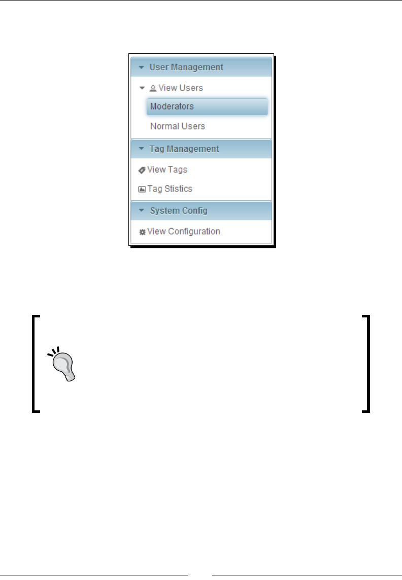
Introducing Navigaon Components
[ 304 ]
What just happened?
The preceding code renders a PanelMenu component as shown in the following screenshot:
Here, top-level submenus User Management, Tag Management, and System Cong
are displayed as AccordionPanel headers and the nested submenus and menuitems are
displayed as Tree nodes.
The PanelMenu component stores the submenus in open or close
state in cookies and maintains that state across the web pages. The
cookie name is panelMenu-<id>, where <id> is the client ID
of <p:panelMenu>. When the user navigates to the same page
again, PanelMenu will be displayed in the same state as it was in
the previously viewed state. If you want to turn o this feature, you
can either call the widget's clearState() method or clear the
cookie from response on the server side.
Introducing ContextMenu
The ContextMenu component can be used to display an overlay menu on the mouse's
right-click event. Oponally, we can aach ContextMenu to any JSF component and contain
nested submenus and menuitems. If you don't specify any parcular JSF component,
ContextMenu will be aached to the enre page, meaning right-clicking anywhere on the
page will display the same ContextMenu.

Chapter 11
[ 305 ]
The ContextMenu component provides the following aributes to customize its behavior:
for: ID of the component to aach to.
event: Event to bind the ContextMenu display, default is contextmenu, which
means right-click.
model: The MenuModel instance to create menu programmacally.
nodeType: Specic type of Tree nodes to aach to.
beforeShow: Client-side callback to execute before showing.
Time for action – creating ContextMenu
Let us see how to create a page-level and component-level ContextMenu, by performing the
following steps:
1. Create a ContextMenu component with menu opons using <p:menuitem>
and <p:submenu>:
<p:contextMenu>
<p:submenu label="PrimeFaces">
<p:menuitem value="Website"
url="http://www.primefaces.org"/>
<p:menuitem value="Showcase"
url="http://www.primefaces.org/showcase/ui/home.jsf"/>
<p:menuitem value="Forum"
url="http://forum.primefaces.org/"/>
<p:menuitem value="IssueTracker"
url="http://www.primefaces.org/issuetracker.html"/>
</p:submenu>
<p:submenu label="jQuery">
<p:menuitem value="jQuery" url="http://jquery.com/"/>
<p:menuitem value="jQueryUI"
url="http://jqueryui.com/"/>
</p:submenu>
<p:menuitem value="JSF"
url="http://javaserverfaces.java.net/"/>
</p:contextMenu>
With the preceding ContextMenu component denion, if you right-click anywhere
on the page, an overlay menu will be displayed with submenus and menuitems.
2. We can aach a ContextMenu component to many parcular JSF components
using the for aribute. Let us see how to aach the preceding ContextMenu to
a Buon component:
<p:button id="myButton" value="ShowMenu"/>
<p:contextMenu for="myButton">
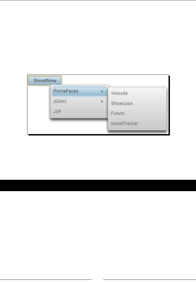
Introducing Navigaon Components
[ 306 ]
...
</p:contextMenu>
With the preceding code, ContextMenu will be displayed when you right-click on the
ShowMenu buon.
What just happened?
We have learned how to create a page-level ContextMenu as well as bind a ContextMenu to
a parcular JSF component. With the preceding code, if you right-click on the ShowMenu
buon, ContextMenu will be displayed as shown in the following screenshot:
Integrating DataTable with ContextMenu
Data components such as DataTable, Tree, and TreeTable have special integraon with
ContextMenu. Let us see how to aach a ContextMenu to a DataTable to display a menu
with the View and Disable opons, when you right-click on table rows.
Time for action – creating ContextMenu for DataTable
In this secon, we will take a look at how we can integrate ContextMenu with DataTable,
so that we will see a custom menu instead of a browser menu, when you right-click on any
DataTable row, by performing the following steps:
1. Create a DataTable component with the single row selecon mode:
<p:dataTable id="usersTbl" var="user"
value="#{adminController.users}" style="width: 300px;"
paginator="true" rows="5" selectionMode="single"
selection="#{adminController.selectedUser}"
rowKey="#{user.id}" >
<f:facet name="header">
List of Users
</f:facet>

Chapter 11
[ 307 ]
<p:column headerText="Id" width="20px;">
<h:outputText value="#{user.id}" />
</p:column>
<p:column headerText="Email" >
<h:outputText value="#{user.emailId}" />
</p:column>
</p:dataTable>
2. Create a Dialog component to display the selected user details:
<p:dialog widgetVar="selectedUserDlg">
<h:panelGrid id="userDetails" columns="2" >
<h:outputText value="Id:" />
<h:outputText
value="#{adminController.selectedUser.id}" />
<h:outputText value="Email:" />
<h:outputText
value="#{adminController.selectedUser.emailId}" />
<h:outputText value="FirstName:" />
<h:outputText
value="#{adminController.selectedUser.firstName}"
/>
<h:outputText value="LastName:" />
<h:outputText value="#{adminController.selectedUser.
lastName}" />
</h:panelGrid>
</p:dialog>
3. Create a ContextMenu component and aach it to DataTable with two menuitems
for viewing and disabling the selected user record:
<p:contextMenu for="usersTbl">
<p:menuitem value="View" update="userDetails" icon="ui-
icon-search" oncomplete="selectedUserDlg.show()"/>
<p:menuitem value="Disable" update="usersTbl" icon="ui-
icon-close" actionListener="#{adminController.
disableSelectedUser}"/>
</p:contextMenu>
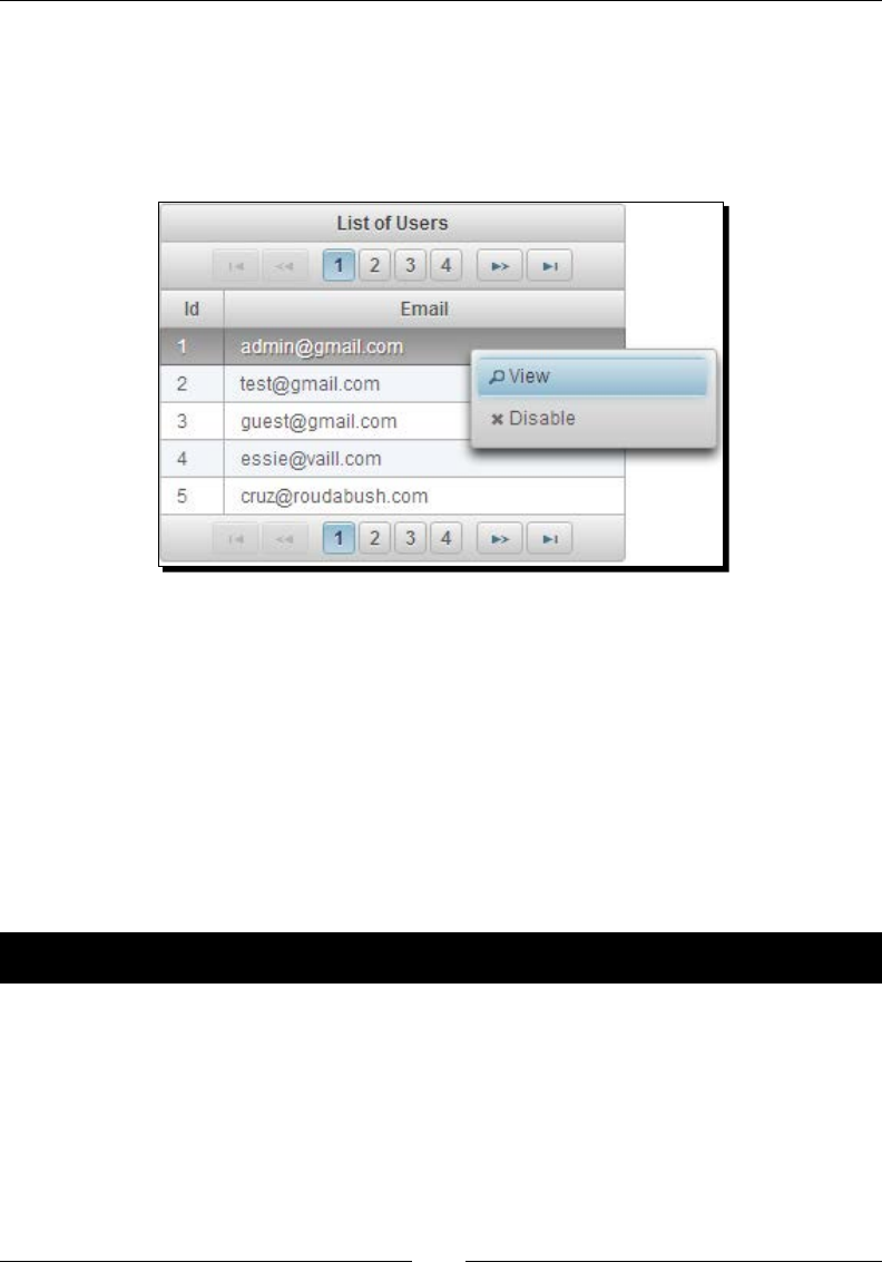
Introducing Navigaon Components
[ 308 ]
What just happened?
We have created a DataTable component with the single row selecon mode. We have
created a ContextMenu with the View and Disable menuitems and aached it to the
DataTable. When you right-click on any row, it will display a ContextMenu as shown in
the following screenshot:
When the View MenuItem is clicked, we are displaying selected user details in a dialog box.
When the Disable MenuItem is clicked, an AJAX POST request will be executed to invoke the
adminController.disableSelectedUser() method.
Integrating Tree with ContextMenu
The Tree component has a ner integraon with ContextMenu to display a separate context
menu for dierent node types.
Let us see how we can aach a dierent ContextMenu for the document and picture type
Tree nodes.
Time for action – creating ContextMenu for the Tree component
In this secon, we will take a look at how we can integrate ContextMenu with Tree, so that
we will see a custom menu instead of the browser menu, when you right-click on any Tree
node, by performing the following steps:
1. Create a Tree component with single selecon mode having dierent node types
such as document, picture, and video:
<p:tree id="docTree" value="#{treeController.rootx}" var="node"
animate="true" style="width: 350px;"

Chapter 11
[ 309 ]
selectionMode="single"
selection="#{treeController.selectedNode}">
<p:ajax event="select" update=":form:docNode,:form:picNode"
/>
<p:treeNode expandedIcon="ui-icon-folder-open"
collapsedIcon="ui-icon-folder-collapsed">
<h:outputText value="#{node}"/>
</p:treeNode>
<p:treeNode type="document" icon="ui-icon-document">
<h:outputText value="#{node}" />
</p:treeNode>
<p:treeNode type="picture" icon="ui-icon-image">
<h:outputText value="#{node}" />
</p:treeNode>
<p:treeNode type="video" icon="ui-icon-video">
<h:outputText value="#{node}" />
</p:treeNode>
</p:tree>
2. Create two dialog components to display the document and picture type
selected nodes:
<p:dialog id="docNode" widgetVar="docNodeDlg" header="Selected
Document Node">
<h:outputText value="#{treeController.selectedNode.data}"
/>
</p:dialog>
<p:dialog id="picNode" widgetVar="picNodeDlg" header="Selected
Picture Node">
<h:outputText value="#{treeController.selectedNode.data}"
/>
</p:dialog>
3. Create two context menus and associate them to the Tree component's document
and picture type nodes:
<p:contextMenu for="docTree" nodeType="document">
<p:menuitem value="View Document" icon="ui-icon-search"
oncomplete="docNodeDlg.show()"/>
</p:contextMenu>
<p:contextMenu for="docTree" nodeType="picture">
<p:menuitem value="View Picture" icon="ui-icon-search"
oncomplete="picNodeDlg.show()"/>
</p:contextMenu>
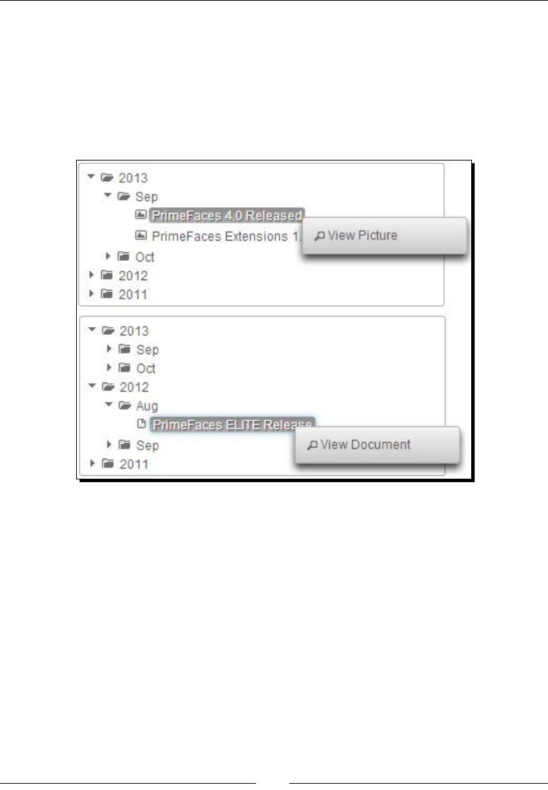
Introducing Navigaon Components
[ 310 ]
What just happened?
We have created a Tree component with the single selecon mode and various node
types such as document, picture, and video. We have created one ContextMenu and
associated it with the document type Tree nodes and another ContextMenu aached to
the picture type tree nodes. When you right-click on the document type nodes, we will
see the ContextMenu associated with document nodes. Similarly, when you right-click on
picture type nodes, we will see the ContextMenu associated with picture type nodes:
Introducing the Breadcrumb navigation menu
Breadcrumb is a navigaon component that provides contextual informaon about the page
hierarchy in the workow. The Breadcrumb menu provide links back to each previous page
the user navigated through, to get to the current page.
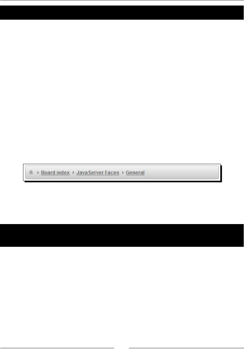
Chapter 11
[ 311 ]
Time for action – creating the Breadcrumb menu
Let us see how to create a Breadcrumb menu, by performing the following step:
1. Create a Breadcrumb menu and provide navigaon menu opons
using <p:menuitem>:
<p:breadCrumb>
<p:menuitem value="PrimeFaces"
url="http://www.primefaces.org/" />
<p:menuitem value="Board index"
url="http://forum.primefaces.org/index.php" />
<p:menuitem value="JavaServer Faces"
url="http://forum.primefaces.org/viewforum.php?f=19" />
<p:menuitem value="General"
url="http://forum.primefaces.org/viewforum.php?f=3" />
</p:breadCrumb>
What just happened?
The preceding code displays the Breadcrumb menu component as shown in the
following screenshot:
The preceding Breadcrumb menu component is a stac menu. But for many of the web
applicaons, Breadcrumb menus should be dynamic, reecng their current locaon in the
page hierarchy.
Time for action – creating the Breadcrumb menu
programmatically
We can create dynamic Breadcrumb menus by creang a MenuModel object
programmacally and binding the <p:breadcrumb> component's model aribute
to the MenuModel instance as follows:
<p:breadCrumb model="#{menuController.breadcrumbMenuModel}"/>
1. Create the MenuModel component and add menuitems:
public MenuController()
{
breadcrumbMenuModel = new DefaultMenuModel();
MenuItem item1 = new MenuItem();
item1.setValue("PrimeFaces");
item1.setUrl("http://www.primefaces.org/");

Introducing Navigaon Components
[ 312 ]
breadcrumbMenuModel.addMenuItem(item1);
MenuItem item2 = new MenuItem();
item2.setValue("Board index");
item2.setUrl("http://forum.primefaces.org/index.php");
breadcrumbMenuModel.addMenuItem(item2);
MenuItem item3 = new MenuItem();
item3.setValue("JavaServer Faces");
item3.setUrl("http://forum.primefaces.
org/viewforum.php?f=19");
breadcrumbMenuModel.addMenuItem(item3);
MenuItem item4 = new MenuItem();
item4.setValue("General");
item4.setUrl("http://forum.primefaces.
org/viewforum.php?f=3");
breadcrumbMenuModel.addMenuItem(item4);
}
What just happened?
Here, we have created a dynamic Breadcrumb menu by using instanang MenuModel
programmacally. For the menuitems, we have associated GET requests by seng the url
property. We can also associate AJAX or non-AJAX POST requests by seng the action or
actionListener aributes:
The first MenuItem of the Breadcrumb menu will be displayed as the home icon
In addition to GET requests using the url attribute, we can also send AJAX or non-AJAX
POST requests using the action or actionListener attributes
If you specify both the url and action/actionListener attributes, then url
takes precedence and performs a GET request and will not invoke action/
actionListener methods
Summary
In this chapter, we have learned how to create and use menus declaravely and
programmacally. We have seen how to create simple menus using the Menu component,
and mullevel menus using the TieredMenu and SlideMenu components. We also looked
into creang horizontal navigaon menus using the Menubar and MegaMenu components.
We learned how to create ContextMenu and aach it to various other JSF components
such as DataTable and Tree. Finally, we learned how to create Breadcrumb menus to display
current contextual locaon of the page hierarchy.
In the next chapter, we will look into drawing various types of charts, such as Line, Bar, and
Pie charts, and exporng them as images.

12
Drawing Charts
Businesses use various reporting tools to compare results and measure
performance. Often businesses want reports in graphical representations such
as charts so that it will be easy to compare the results and measure the overall
performance of their business. PrimeFaces provides support for creating various
types of charts, such as Line, Area, Bar, Pie, Donut, Bubble, MeterGauge,
and Open High Low Close (OHLC). PrimeFaces also supports rendering charts
generated by JFreeCharts.
In our TechBuzz application, administrators can see the statistics of the number
of posts by tags, in each year, with graphical representation using various types
of charts.
In this chapter, we will cover the following commonly used charts:
Creang a Line chart
Creang an Area chart
Creang a Bar chart
Creang a Pie chart
Creang a Donut chart
Exporng charts as images
Rendering dynamic charts using the JFreeChart API
Creang interacve charts using the ItemSelect AJAX event
Creating a Line chart
A Line chart represents a series of data points in a line graph. The Line chart data model
should be an instance of org.primefaces.model.chart.CartesianChartModel.

Drawing Charts
[ 314 ]
Let us see how to visualize a number of posts for various tags in each year using the Line chart.
<p:lineChart value="#{chartController.chartModel}"
legendPosition="se"/>
The chartModel can be created and inialized as follows:
public ChartController()
{
CartesianChartModel chartModel = new CartesianChartModel();
ChartSeries primefacesSeries = new ChartSeries();
primefacesSeries.setLabel("PrimeFaces");
primefacesSeries.set("2009", 150);
primefacesSeries.set("2010", 250);
primefacesSeries.set("2011", 300);
primefacesSeries.set("2012", 240);
primefacesSeries.set("2013", 400);
ChartSeries jquerySeries = new ChartSeries();
querySeries.setLabel("jQuery");
jquerySeries.set("2009", 210);
jquerySeries.set("2010", 150);
jquerySeries.set("2011", 200);
jquerySeries.set("2012", 280);
jquerySeries.set("2013", 320);
chartModel.addSeries(primefacesSeries);
chartModel.addSeries(jquerySeries);
}
public CartesianChartModel getChartModel()
{
return chartModel;
}
The preceding Line chart component renders as follows:

Chapter 12
[ 315 ]
Here, we have created a Line chart with two series of data represenng the number of posts
with tags, PrimeFaces and jQuery from the year 2009 to 2013. We also menoned displaying
legends in the SouthEast posion using legendPosition="se". The other possible
legendPosition values are nw, w, sw, ne, or e, represenng NorthWest, West, SouthWest,
NorthEast, East, and SouthEast respecvely.
The Line chart component supports the following aributes to customize its representaon
and behavior:
tle: This is the tle of the chart.
legendPosion: This is the posion of the legend.
minX: This is the minimum X axis value.
maxX: This is the maximum X axis value.
minY: This is the minimum Y axis value.
maxY: This is the maximum Y axis value.
xaxisLabel: This is the label of the x-axis.
yaxisLabel: This is the label of the y-axis.
xaxisAngle: This is the angle of the x-axis cks.
yaxisAngle: This is the angle of the y-axis cks.
breakOnNull: This determines whether line segments should be broken at null
value. False will join points on either side of the line. The default value of it is false.
seriesColors: This is the comma-separated list of colors in hex format.
zoom: This enables plot zooming. The default value for it is false.
animate: This enables the animaon on plot rendering. The default value for
it is false.
shadow: This shows the shadow eect or not. The default value for it is true.
ll: This is set to true to ll under lines. The default value for it is false.
stacked: This is set to true to stack series. The default value for it is false.
showMarkers: If enabled, this shows markers at data points. The default value
for it is true.
legendCols: This is the column count of legend. The default value for it is 1.
legendRows: This is the row count of legend.
showDataTip: This denes the visibility of dataTip. The default for it is true.
datapFormat: This is the template for dataps.
extender: This is the client-side JavaScript funcon to extend the chart with
jqPlot opons.
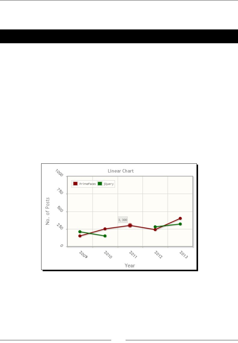
Drawing Charts
[ 316 ]
Let us see how we can create a Line chart with various customizaons such as labels on X
and Y axes, custom series colors, zooming, and animaon.
Time for action – creating a Line chart
In this secon, we will create a Line chart depicng the number of posts with PrimeFaces
and jQuery tags from years 2009 to 2013.
1. Create a Line chart with custom labels, axis angles, series colors, and enable
zooming and animaon.
<p:lineChart value="#{chartController.chartModel}"
style="width: 450px; height: 300px;"
title="Linear Chart"
legendPosition="nw"
xaxisLabel="Year" yaxisLabel="No. of Posts"
xaxisAngle="45" yaxisAngle="45"
minY="0" maxY="1000"
breakOnNull="true" zoom="true" animate="true"
seriesColors="800000,006400"
legendCols="2"/>
What just happened?
Here, we have specied the labels and angles for X-axis and Y-axis. We have also customized
the series to display #800000 and #006400 colors instead of the default colors. As we have
specied breakOnNull="true" the jQuery series disconnected at year 2011. If you set
breakOnNull="false", which is the default, the jQuery data point at year 2010 will be
directly connected to the data point at year 2012.
Chapter 12
[ 317 ]
We have enabled zooming by seng zoom="true" and hence we can zoom any region of
the chart by selecng the region on the canvas plot.
It seems some of the chart components such as Line and Bar
charts missed the dependency of jquery-plugins.js.
If the charts are not rendering and showing errors such as
TypeError: c.browser is undefined then include the
jquery-plugins.js manually. You can obtain the jquery-
plugins.js le from primefaces-4.0.jar/META-INF/
resources/primefaces/jquery/jquery-plugins.js.
When you move your mouse over any data point, a dataTip will be displayed showing
[index, value]. We can customize the dataTip by seng a p format using the
datatipFormat aribute as follows:
<p:lineChart title="Line Chart" value="#{chartController.chartModel}"
legendPosition="nw" style="width: 450px; height: 300px;"
datatipFormat="#{chartController.datatipFormat}"
/>
public String getDatatipFormat()
{
return "<span style=\"display:none;\">%s</span><span>No. of Posts:
%s</span>";
}
In the custom dataTipFormat, the rst %s represents
index and the second %s represents value.
The PrimeFaces chart components use the jqPlot charng library (http://www.jqplot.
com/) which is a canvas-based charng engine. The PrimeFaces chart components provide
support for many of the commonly used opons. However jqPlot charts support many more
customizaon opons. To make those jqPlot opons available, PrimeFaces provides an
Extender feature to ulize and congure those advanced conguraon opons.
<p:pieChart value="#{chartController.pieChartModel}"
style="width: 350px; height: 250px;"
legendPosition="ne"
extender="ext"/>
<script type="text/javascript">
function ext()
{

Drawing Charts
[ 318 ]
//this = chart widget instance
//this.cfg = options
this.cfg.grid= {
borderColor: '#A52A2A',
borderWidth: 2,
background: '#FAEBD7'
};
}
</script>
For more jqPlot opons see http://www.jqplot.com/docs/files/optionsTutorial-
txt.html.
By default, markers will be displayed at data points as
filledCircles. We can customize them by using org.
primefaces.model.chart.LineChartSeries instead
of org.primefaces.model.chart.ChartSeries
and set marker styles using lineChartSeries.
setMarkerStyle("diamond"). Valid values for marker
styles are circle, diamond, square, filledCircle,
filledDiamond, or filledSquare.
We can also set dierent marker styles using the extender
feature as follows:
this.cfg.seriesDefaults.markerOptions = {
style: 'square'
};
Creating an Area chart
We can create an Area chart using the Line chart component by seng fill="true" to
ll under the lines from the X-axis, which visually looks like an Area chart. Also, we can set
stacked="true" to display the series stacked on top of the other series by adding data sets.
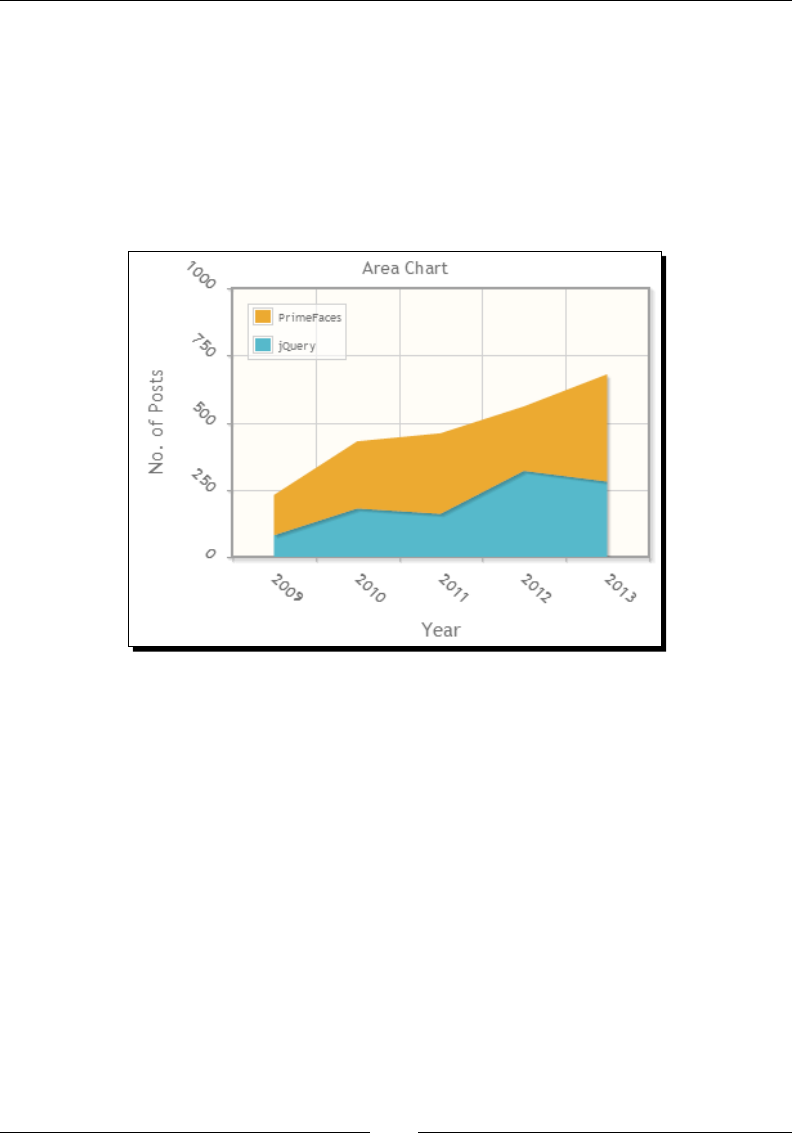
Chapter 12
[ 319 ]
Let us see how we can create Area charts using the <p:lineChart> component by using
fill and stacked aributes.
<p:lineChart title="Area Chart" value="#{chartController.chartModel}"
legendPosition="nw" style="width: 450px; height: 300px;"
xaxisLabel="Year" yaxisLabel="No. of Posts" xaxisAngle="45"
yaxisAngle="45"
minY="0" maxY="1000"
fill="true" stacked="true"/>
Here we have created a Stacked Area chart using the <p:lineChart> component by seng
fill="true" and stacked="true".
Creating a Bar chart
The Bar chart component visualizes a series of data points as bars. We can use the same
org.primefaces.model.chart.CartesianChartModel type instance, which we used
for the Line chart, to provide the data for the Bar chart.
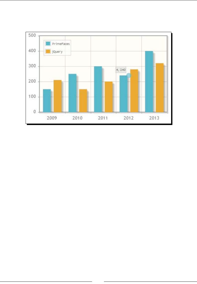
Drawing Charts
[ 320 ]
Let us create a Bar chart represenng tags usage stascs over recent years.
<p:barChart value="#{chartController.chartModel}" legendPosition="nw"
style="width: 400px; height: 250px;" />
A Bar chart also supports most of the features supported by the Line chart, such as labels
and angles for X and Y axis, various legendPositions, seriesColors, stacked, zoom,
animate, custom dataTipFormat, and so on. In addion to these opons, the Bar chart
provides the following opons to customize its behavior:
barPadding: This is the padding of the bars. The default value for it is 8.
barMargin: This is the margin of the bars. The default value for it is 10.
orientaon: This is the orientaon of the bars, the valid values for it are vercal and
horizontal. The default value for it is vercal.
min: This is the minimum boundary value.
max: This is the maximum boundary value.
Let us see how we can create a Bar chart with a horizontal orientaon and custom
seriesColors.
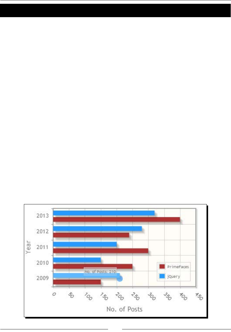
Chapter 12
[ 321 ]
Time for action – creating a Bar chart
Let us look at creang a Bar chart with horizontal orientaon displaying the number of posts
with PrimeFaces and jQuery tags from years 2009 to 2013.
1. Create a Bar chart using horizontal orientaon with custom seriesColors and
dataTipFormat.
<p:barChart value="#{chartController.chartModel}"
style="width: 400px; height: 250px;"
xaxisLabel="No. of Posts" yaxisLabel="Year"
xaxisAngle="45"
datatipFormat="#{chartController.datatipFormat}"
legendPosition="se" barMargin="5" barPadding="4"
seriesColors="A52A2A, 1E90FF"
orientation="horizontal" animate="true"
/>
2. Write a method to return the custom dataTipFormat.
public String getDatatipFormat()
{
return "<span>No. of Posts: %s</span>";
}
What just happened?
We have created a horizontal Bar chart by seng orientation="horizontal". We have
customized the series colors by seng seriesColors="A52A2A, 1E90FF".

Drawing Charts
[ 322 ]
Also we have customized the datap format using the datatipFormat aribute to display
the p as No. of Posts: 210.
For Bar charts with a vertical orientaon, the rst %s
represents index and the second %s represents value.
For Bar charts with a horizontal orientaon, the rst %s
represents value and the second %s represents index.
We can also create a Stacked Bar chart with bars stacked on top of each other by seng
stacked="true".
<p:barChart value="#{chartController.chartModel}"
style="width: 400px; height: 250px;"
legendPosition="nw" stacked="true"/>
Creating a Pie chart
The Pie chart component renders the category data as a Pie chart. The Pie chart uses the
org.primefaces.model.chart.PieChartModel type instance as a backing bean model.
Let us see how we can create a Pie chart represenng the percentage of posts being created
with various tags:
<p:pieChart value="#{chartController.pieChartModel}"
style="width: 350px; height: 250px;"
showDataLabels="true" legendPosition="ne"/>
public class ChartController
{
private PieChartModel pieChartModel;
public ChartController()
{
pieChartModel = new PieChartModel();
pieChartModel.set("JSF", 380);
pieChartModel.set("PrimeFaces", 455);
pieChartModel.set("jQuery", 202);
pieChartModel.set("JPA", 180);
}
public PieChartModel getPieChartModel()
{
return pieChartModel;
}
}
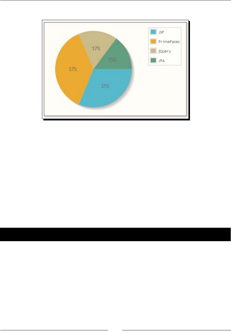
Chapter 12
[ 323 ]
The preceding code renders a Pie chart as follows:
In addion to the title, legendPosition, seriesColors, fill, shadow, legendCols,
legendRows, extender opons, the Pie chart component also provides the following
opons to customize its behavior:
diameter: This is the diameter of the pie, it is auto computed by default.
sliceMargin: This is the gap between the slices. The default value for it is 0.
showDataLabels: This displays data on each slice. The default value for it is false.
dataFormat: This is the format of the data labels. The default value for it is
percent. Other valid values for it are label and value.
Let us see how we can create a Pie chart with a custom diameter, sliceMargin, and
dataFormat opons.
Time for action – creating a Pie chart
In this secon we are going to create a Pie chart with various customizaon opons, such
as diameter, sliceMargin, and dataFormat showing the total number of posts that are
posted with each tag.
1. Create a Pie chart without lling the slices with colors, gaps between slices, and
displaying the slice data value instead of the percentage.
<p:pieChart value="#{chartController.pieChartModel}"
style="width: 350px; height: 250px;"
title="Post Statistics By Tag"
legendPosition="ne"
legendCols="2"
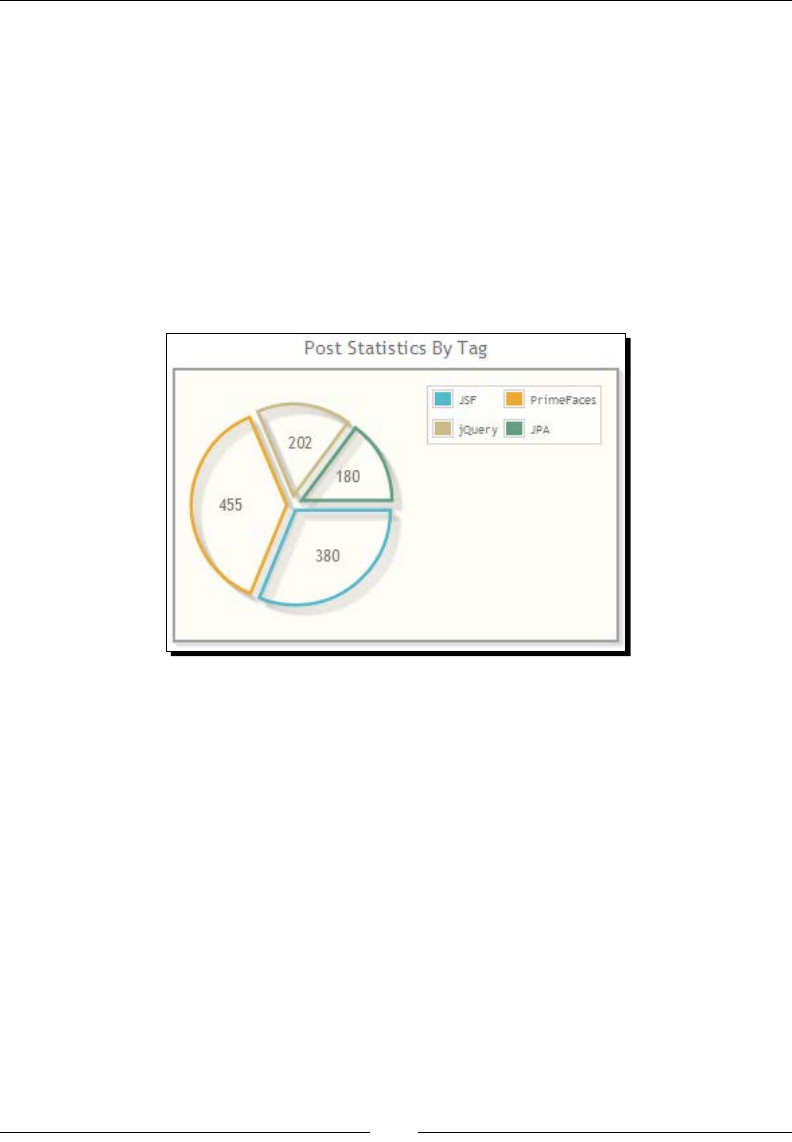
Drawing Charts
[ 324 ]
showDataLabels="true"
diameter="150"
sliceMargin="5"
fill="false"
dataFormat="value"/>
What just happened?
We have created a Pie chart by disabling the color lling for slices by seng fill= "false".
By seng the dataFormat= "value", the slice data value will be displayed instead of
the percentage. Also we have specied the custom diameter value instead of using the
computed value.
Creating a Donut chart
The Donut chart visualizes a mulseries Pie chart in a single plot. The Donut chart uses
the org.primefaces.model.chart.DonutChartModel type instance as a backing
bean model.
Let us see how we can create a Donut chart represenng the number of posts being posted
with various tags in years 2011, 2012, and 2013 years.
<p:donutChart value="#{chartController.donutChartModel}"
style="width: 350px; height: 250px;"
legendPosition="se"
sliceMargin="5"
dataFormat="value" />
public class ChartController
{
private DonutChartModel donutChartModel;
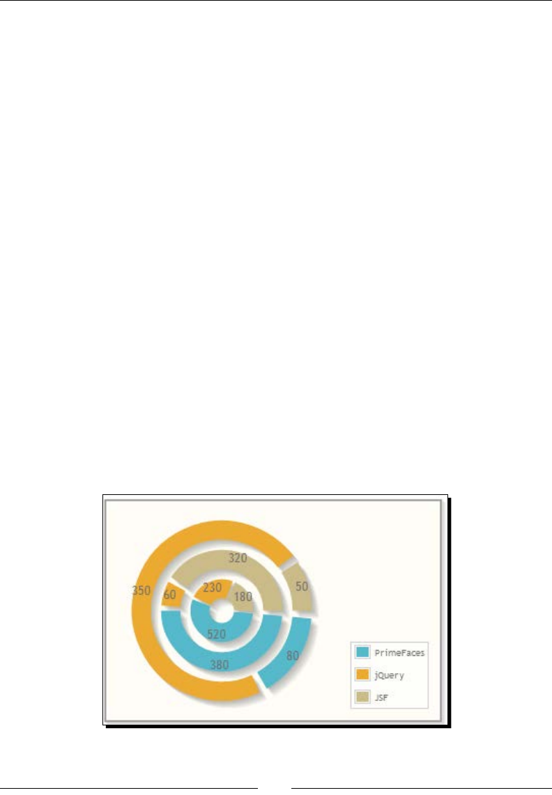
Chapter 12
[ 325 ]
public ChartController()
{
donutChartModel = new DonutChartModel();
Map<String, Number> year2011Circle = new HashMap<String,
Number>();
year2011Circle.put("PrimeFaces", 80);
year2011Circle.put("jQuery", 350);
year2011Circle.put("JSF", 50);
donutChartModel.addCircle(year2011Circle);
Map<String, Number> year2012Circle = new HashMap<String,
Number>();
year2012Circle.put("PrimeFaces", 380);
year2012Circle.put("jQuery", 60);
year2012Circle.put("JSF", 320);
donutChartModel.addCircle(year2012Circle);
Map<String, Number> year2013Circle = new HashMap<String,
Number>();
year2013Circle.put("PrimeFaces", 520);
year2013Circle.put("jQuery", 230);
year2013Circle.put("JSF", 180);
donutChartModel.addCircle(year2013Circle);
}
public DonutChartModel getDonutChartModel()
{
return donutChartModel;
}
}
The preceding code renders a Donut chart as follows:
Similar to the Pie chart, a Donut chart also supports fill, sliceMargin opons.

Drawing Charts
[ 326 ]
Exporting charts as images
PrimeFaces provides the ability to export charts generated by various chart components
as images using the client-side API method widgetVar.exportAsImage().
<h:form id="form1">
<p:lineChart widgetVar="chartWgt"
value="#{chartController.chartModel}"
style="width:500px;height:300px"
title="Linear Chart"
legendPosition="e"
minY="0" maxY="600"/>
<p:commandButton type="button" value="Export"
onclick="exportChart()"/>
<p:dialog widgetVar="dlg" showEffect="fade" modal="true"
header="Chart as an Image">
<p:outputPanel id="output" layout="block"
style="width:500px;height:300px"/>
</p:dialog>
</h:form>
<script type="text/javascript">
function exportChart()
{
$(PrimeFaces.escapeClientId('form1:output')).empty().
append(chartWgt.exportAsImage());
dlg.show();
}
</script>
Here, we have created a Line chart with widgetVar= "chartWgt". When you click on the
Export buon we are calling chartWgt.exportAsImage() and appending the generated
image to outputPanel in the dialog.
The chart export feature won't work in IE7/8 but it works ne on IE9
and other browsers.

Chapter 12
[ 327 ]
Rendering dynamic charts using the JFreeChart API
PrimeFaces internally uses the jqPlot library, which is based on jQuery, to generate charts
using a canvas element. We can also create charts on the server side using the JFreeChart
library (http://www.jfree.org/jfreechart/) and render the chart images using the
PrimeFaces <p:graphicImage> component.
To add the JFreeChart jar le to the classpath, add the following maven dependency.
<dependency>
<groupId>jfree</groupId>
<artifactId>jfreechart</artifactId>
<version>1.0.13</version>
</dependency>
Let us see how we can create a Pie chart using the JFreeChart API and render it using the
PrimeFaces <p:graphicImage>.
Time for action – creating a Pie chart using the JFreeChart API
In this secon, we will demonstrate how to create a Pie chart using the JFreeChart API and
rendering it using the <p:graphicImage> and StreamedContent API.
1. Create a Pie chart using the JFreeChart API and aach the PrimeFaces
StreamedContent to a stream-generated chart image.
import java.io.File;
import java.io.FileInputStream;
import org.jfree.chart.ChartFactory;
import org.jfree.chart.ChartUtilities;
import org.jfree.chart.JFreeChart;
import org.jfree.data.general.DefaultPieDataset;
import org.jfree.data.general.PieDataset;
import org.primefaces.model.DefaultStreamedContent;
import org.primefaces.model.StreamedContent;
public StreamedContent getJfreeChart()
{
StreamedContent content = null;
try
{
DefaultPieDataset dataset = new DefaultPieDataset();
dataset.setValue("PrimeFaces", 455);
dataset.setValue("JSF", 380);
dataset.setValue("jQuery", 202);
dataset.setValue("JPA", 180);
boolean legend=true, tooltip=true, urls =false;
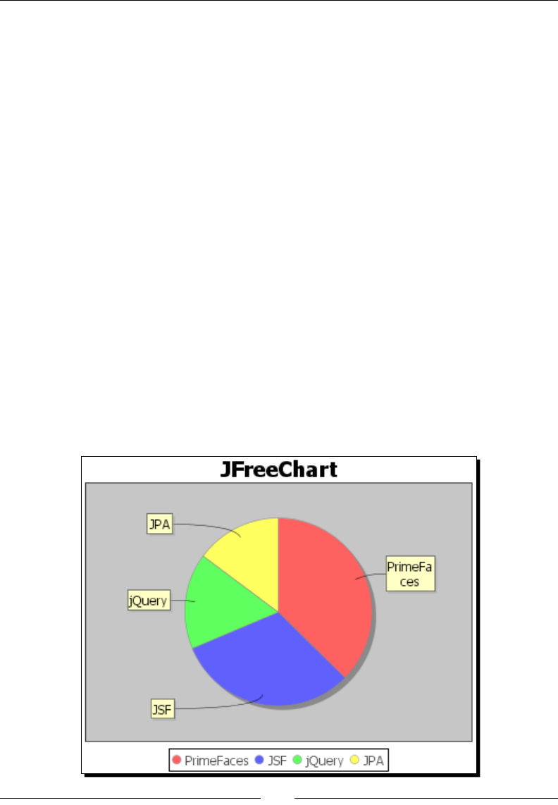
Drawing Charts
[ 328 ]
JFreeChart chart = ChartFactory.createPieChart("JFreeChart",
dataset, legend, tooltip, urls);
File chartFile = new File("jfreechart");
int width=375, height=300;
ChartUtilities.saveChartAsPNG(chartFile, chart, width,
height);
content = new DefaultStreamedContent(new
FileInputStream(chartFile), "image/png");
} catch (Exception e)
{
e.printStackTrace();
throw new RuntimeException(e);
}
return content;
}
2. Render the chart image using <p:graphicImage>
<p:graphicImage value="#{chartController.jfreeChart}"/>
What just happened?
We have created a chart using the JFreeChart API as an image le on the server side.
We have displayed the chart using the <p:graphicImage> component by using the
StreamedContent adapter to stream image le content.

Chapter 12
[ 329 ]
Creating interactive charts using the ItemSelect
AJAX event
All of the PrimeFaces chart components support the itemSelect AJAX event which gets
triggered when a series of charts are clicked on. The itemSelect event listener method
receives an org.primefaces.event.ItemSelectEvent instance from which we can
obtain an item index and a series index.
<p:growl id="growl" showDetail="true"/>
<p:pieChart value="#{chartController.pieChartModel}"
style="width: 350px; height: 250px;"
showDataLabels="true" legendPosition="ne">
<p:ajax event="itemSelect" listener="#{chartController.itemSelect}"
update="growl"/>
</p:pieChart>
public void itemSelect(ItemSelectEvent event)
{
FacesMessage msg = new FacesMessage(FacesMessage.SEVERITY_INFO,
"Item selected",
"Item Index: " + event.getItemIndex()
+ ", Series Index:" + event.getSeriesIndex());
FacesContext.getCurrentInstance().addMessage(null, msg);
}
We can use this itemSelect event listener to build drilldown charts. For example, when
you click on a jQuery slice of a Pie chart, we can use the itemSelect listener and show a
pop-up dialog with a Line chart displaying the count of jQuery posts over the years.
Summary
In this chapter, we have learned how to create various types of charts, such as Line, Area,
Bar, and Donut. We also looked at exporng charts as images using the client-side API. In
addion, we have looked into how to create dynamic images on the server side using the
JFreeChart library and displaying them as a graphic image.
In the next chapter, we will look into how to use various built-in PrimeFaces themes,
and how to build applicaons supporng mulple themes with the ability to switch
themes dynamically.

13
Using PrimeFaces Themes
PrimeFaces components are built with theming support based on the
ThemeRoller CSS framework. At the time of writing this book, PrimeFaces
provides 38 pre-designed community themes which are ready to use for free.
We can also create our own themes using the online ThemeRoller tool and
integrate them with PrimeFaces.
Our TechBuzz applicaon will be developed with mulple themes support, and users can
select their favorite theme and change to other themes at anyme.
In this chapter we will cover the following topics:
Conguring and using themes
Using stateless ThemeSwitcher
Using stateful ThemeSwitcher
Creang and using custom theme
Conguring and using themes
The PrimeFaces components come with a default theme support called aristo and doesn't
require any explicit conguraon. If you want to use other themes you need to add those
themes dependencies and congure them explicitly.
PrimeFaces themes are bundled as JAR les and we can download them from PrimeFaces
Themes Repository http://repository.primefaces.org/org/primefaces/themes/.

Using PrimeFaces Themes
[ 332 ]
Currently PrimeFaces provides the following list of community themes, which are free to use:
aerdark
aernoon
aerwork
aristo
black-e
blitzer
bluesky
bootstrap
casablanca
cruze
cuperno
dark-hive
delta
dot-luv
eggplant
excite-bike
ick
glass-x
home
hot-sneaks
humanity
le-frog
midnight
mint-choc
overcast
pepper-grinder
redmond
rocket
sam
smoothness
south-street
start
sunny
swanky-purse
trontasc
ui-darkness
ui-lightness
vader
If you are using the Maven build tool you can add the boostrap theme jar as a Maven
dependency as follows:
<dependency>
<groupId>org.primefaces.themes</groupId>
<artifactId>bootstrap</artifactId>
<version>1.0.10</version>
</dependency>
In addion to these individual theme jars, PrimeFaces provides the all-themes jar, which
includes all the themes support. In Maven pom.xml you can congure the all-themes jar
dependency as follows:
<dependency>
<groupId>org.primefaces.themes</groupId>
<artifactId>all-themes</artifactId>
<version>1.0.10</version>
</dependency>

Chapter 13
[ 333 ]
Once the PrimeFaces theme jar(s) are added to classpath, we need to congure the
primefaces.THEME context parameter in web.xml. The following conguraon enables
the bootstrap theme:
<context-param>
<param-name>primefaces.THEME</param-name>
<param-value>bootstrap</param-value>
</context-param>
With the preceding context parameter conguraon all the PrimeFaces components will be
rendered using bootstrap theme. If you want to switch to any other theme you just need to
change the theme name and no other conguraon change is required.
Using stateless ThemeSwitcher
The PrimeFaces ThemeSwitcher component provides the ability to change theme on the y
without page refresh. Usage of ThemeSwitcher is similar to the SelectOneMenu component.
Time for action – using the stateless ThemeSwitcher component
Let us see how we can change theme dynamically using the ThemeSwitcher component.
1. Create a <p:themeSwitcher> component by providing list of theme names
as opons:
<p:themeSwitcher style="width:165px">
<f:selectItem itemLabel="Choose Theme" itemValue="" />
<f:selectItems value="#{userPreferences.themes}" />
</p:themeSwitcher>
2. Implement a managed bean method to return the list of all Primefaces supporng
theme names:
@ManagedBean
@SessionScoped
public class UserPreferences implements Serializable
{
private List<String> themes;
public UserPreferences()
{
themes = new ArrayList<String>();
themes.add("afterdark");
themes.add("afternoon");
themes.add("afterwork");
themes.add("aristo");
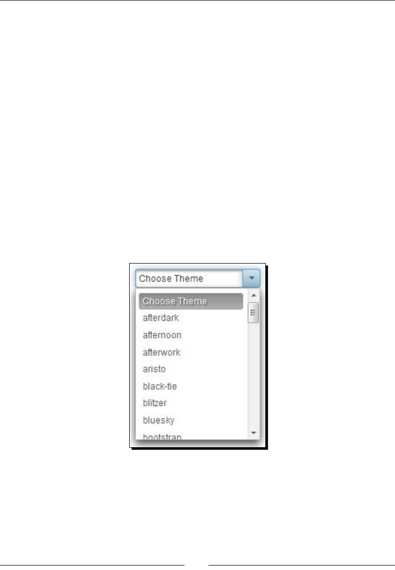
Using PrimeFaces Themes
[ 334 ]
themes.add("black-tie");
themes.add("blitzer");
themes.add("bluesky");
themes.add("bootstrap");
...
...
themes.add("ui-darkness");
themes.add("ui-lightness");
themes.add("vader");
}
public List<String> getThemes()
{
return themes;
}
}
What just happened?
The preceding ThemeSwitcher component renders a drop-down menu with a list of themes
as follows:
When you select a theme, the selected theme will be applied to the current page without
refreshing the enre page.
However, when you navigate to a dierent screen the page will be rendered using the theme
congured in web.xml. To keep track of the selected theme throughout the session we can
use stateful ThemeSwitcher, which we are going to discuss next.

Chapter 13
[ 335 ]
Using stateful ThemeSwitcher
We have seen how to congure a theme in web.xml using a context parameter. Instead
of conguring a stac theme name, we can bind it to an EL expression, which resolves to
theme name.
Time for action – applying a user-specic theme using stateful
ThemeSwitcher
In this secon we will learn how to use the ThemeSwitcher component to apply theme for
enre applicaon based on user preference, and how a user can dynamically switch themes:
1. Congure Primefaces theme name in web.xml using EL expression:
<context-param>
<param-name>primefaces.THEME</param-name>
<param-value>#{userPreferences.selectedTheme}</param-value>
</context-param>
Here EL expression #{userPreferences.selectedTheme} resolves to
a theme name.
2. Create ThemeSwitcher component using <p:themeSwitcher> with
value="#{userPreferences.selectedTheme}" along with the AJAX
event listener to update the user-preferred theme to the selected theme name
on server side:
<p:themeSwitcher value="#{userPreferences.selectedTheme}"
style="width:165px">
<f:selectItem itemLabel="Choose Theme" itemValue="" />
<f:selectItems value="#{userPreferences.themes}" />
<p:ajax listener="#{userPreferences.saveUserTheme}"/>
</p:themeSwitcher>
@ManagedBean
@SessionScoped
public class UserPreferences implements Serializable
{
private List<String> themes;
private String selectedTheme = "aristo";
public UserPreferences()
{
themes = new ArrayList<String >();
themes.add("afterdark");
...
...

Using PrimeFaces Themes
[ 336 ]
themes.add("vader");
}
public List<String> getThemes()
{
return themes;
}
public void setSelectedTheme(String selectedTheme)
{
this.selectedTheme = selectedTheme;
}
public String getSelectedTheme()
{
return selectedTheme;
}
public void saveUserTheme()
{
//logic to update the user preferred theme name in DB
}
}
What just happened?
We have congured a Primefaces theme name using EL expression to apply a user preferred
theme. Also we have created a ThemeSwitcher component, which provides the ability to
change theme dynamically. When you change theme, the selected theme name will be
stored in userPreferences.selectedTheme and invokes AJAX event listener method
saveUserTheme() where you can write logic to persist the user-preferred theme in
database. As theme name conguraon in web.xml is referring to #{userPreferences.
selectedTheme} the selected theme will be maintained across all pages.
Without AJAX event listener, ThemeSwitcher won't invoke
userPreferences.setSelectedTheme() immediately when you
change theme. Register the <p:ajax> event listener if you want to trigger
immediate processing of this component as follows:
<p:themeSwitcher value="#{userPreferences.
selectedTheme}">
<f:selectItem itemLabel="ChooseTheme" itemValue="" />
<f:selectItems value="#{userPreferences.themes}" />
<p:ajax/>
</p:themeSwitcher>

Chapter 13
[ 337 ]
We can also create an advanced ThemeSwitcher component displaying a theme preview
image along with theme name using the nested <p:column> elements:
@ManagedBean
@SessionScoped
public class UserPreferences implements Serializable
{
private String selectedTheme = "aristo";
private List<Theme> themePojos;
public UserPreferences()
{
themePojos = new ArrayList<Theme>();
themePojos.add(new Theme("afterdark","afterdark.png"));
themePojos.add(new Theme("afternoon","afternoon.png"));
themePojos.add(new Theme("afterwork","afterwork.png"));
...
...
}
public List<Theme> getThemePojos()
{
return themePojos;
}
public void setSelectedTheme(String selectedTheme)
{
this.selectedTheme = selectedTheme;
}
public String getSelectedTheme()
{
return selectedTheme;
}
}
Here, Theme is a simple Java Bean with name and image properes:
<p:themeSwitcher value="#{userPreferences.selectedTheme}"
style="width:180px" var="theme">
<f:selectItem itemLabel="Select Theme" itemValue="" />
<f:selectItems value="#{userPreferences.themePojos}" var="t"
itemLabel="#{t.name}" itemValue="#{t}"/>
<p:ajax listener="#{userPreferences.saveUserTheme}"/>
<p:column>
#{theme.name}
</p:column>
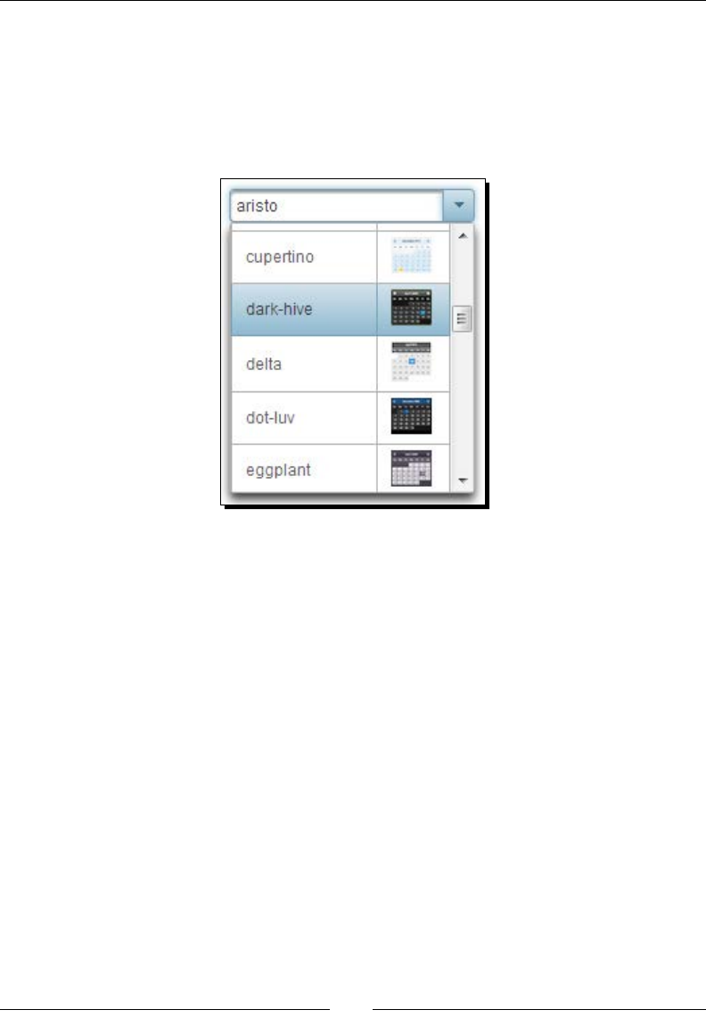
Using PrimeFaces Themes
[ 338 ]
<p:column>
<p:graphicImage value="/resources/images/themes/#{theme.image}"/>
</p:column>
</p:themeSwitcher>
The preceding ThemeSwitcher component will be displayed along with theme preview
image as follows:
Creating and using a custom theme
In addion to the predesigned themes provided by PrimeFaces, you can also create your
own themes using ThemeRoller online tool http://jqueryui.com/themeroller/.
To use your custom theme you need to update the generated theme CSS le to the suite
PrimeFaces infrastructure and package it as a JAR le.
For creang a new theme go to http://jqueryui.com/themeroller/ and update
various CSS styles to match your needs. There are various types of UI widgets on the same
page using the theme styles that are currently applied on the ThemeRoller tool, so you can
see what the components looks like as you update the styles.
Instead of starng from scratch you can choose one of the exisng themes in the Gallery tab
and edit it:
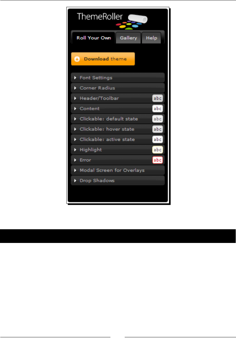
Chapter 13
[ 339 ]
Let us see how we can create a new theme named seablue.
Time for action – creating a new theme
In this secon we will look at how we can create custom theme using the online ThemeRoller
tool, and convert it into PrimeFaces theme library.
1. Using online ThemeRoller tool update the styles, click on the Download Theme
buon which will take you to the Download Builder screen.
2. Uncheck component Toggle All checkbox, enter primefaces-seablue in the
Theme Folder Name input box and click on Download.

Using PrimeFaces Themes
[ 340 ]
3. Extract the downloaded ZIP le and go into the CSS folder. You can see the following
folder structure:
primefaces-seablue
- jquery-ui-{version}.custom.css
-jquery-ui-{version}.custom.min.css
-images/
4. Now rename jquery-ui-{version}.custom.css to theme.css.
5. Image references in the theme.css le must be converted to JSF resource loading
expressions.
For example, url(images/ui-bg_flat_75_ffffff_40x100.png)
needs to be changed to url("#{resource['primefaces-seablue:images/
ui-bg_flat_75_ffffff_40x100.png']}").
6. Package the theme les as JAR with the following structure:
seablue.jar
-META-INF
-resources
-primefaces-seablue
-theme.css
-images/
What just happened?
We have created a new theme called embolden using the ThemeRoller online tool and
packaged as JAR le conrming the PrimeFaces themes infrastructure. Now we can use
this new theme same as predesigned themes.
At any me, we can view and modify the customized theme using
the URL at the top of the css le generated by ThemeRoller tool.
When you go to that URL you can see the ThemeRoller online tool
with all the customizaons you have applied so far.
We have seen how to create custom theme using online ThemeRoller tool, and convert
it into a PrimeFaces theme library JAR le to t into the PrimeFaces theme infrastructure.
However updang the CSS les generated by the ThemeRoller tool manually might be
tedious process. There is an online ThemeRoller to PrimeFaces themes converter tool
(https://themeroller.osnode.com/) to automate this process. You can upload the
custom theme ZIP le generated by ThemeRoller tool and provide the desired custom theme
name, and then it will automacally convert into PrimeFaces theme JAR le.

Chapter 13
[ 341 ]
Now that you have been introduced to most of the PrimeFaces components that are
commonly used in web applicaons, there are few more components that are very useful
based on type of applicaons.
Drag-and-drop support
PrimeFaces provides drag-and-drop features with various customizaons such as, horizontal-
only or vercal-only dragging, cloning, revert and draggable within a container, and so on.
We can use these drag-and-drop features to build user-friendly rich UIs.
Working with GoogleMaps using the GMap component
PrimeFaces provides GMap component to integrate with the GoogleMaps API with various
features such as, Zooming, StreetView, InfoWindow, and so on; which is very useful if you
are developing an applicaon providing geolocaon-based services.
Multimedia components
PrimeFaces provides various mulmedia components to work with images or videos like
ImageCropper to crop images by selecng a region, ImageCompare to compare two images,
PhotCam to take photos from WebCam, and Galleria to display content gallery with various
eects. PrimeFaces also provides a media component, which is a cross browser generic
player to embed mulmedia content like video and audio with various formats such as ash,
Windows Media, RealPlayer, quickme, and PDF.
PrimeFaces push
PrimeFaces push is based on atmosphere framework, providing support building real me
asynchronous applicaons using transports such as, WebSocket, Server Side Events, Long
Polling, Streaming, JSONP, and tradional AJAX techniques.
For more informaon see http://www.primefaces.org/
showcase/push/index.jsf and https://github.com/
Atmosphere/atmosphere.
The PrimeFaces extensions
The PrimeFaces extensions is an open source component library, which is built on top of
PrimeFaces, providing enhanced features along with various addional ulies such as
ClientBehaviors, Converters, TagHandlers, and so on.

Using PrimeFaces Themes
[ 342 ]
Time for action – installing and conguring PrimeFaces
extensions
Let us see how we can install PrimeFaces extensions and congure it.
1. Congure a primefaces-extensions.jar dependency in pom.xml:
<dependency>
<groupId>org.primefaces.extensions</groupId>
<artifactId>primefaces-extensions</artifactId>
<version>1.0.0</version>
</dependency>
2. Add a primefaces-extensions namespace and use any of its components.
Let us use toolp component's autoShow feature:
<!DOCTYPE html>
<html xmlns="http://www.w3c.org/1999/xhtml"
xmlns:h="http://java.sun.com/jsf/html"
xmlns:p="http://primefaces.org/ui"
xmlns:pe="http://primefaces.org/ui/extensions">
<h:head>
</h:head>
<h:body>
<h:form style="width: 800px; margin: 0 auto;">
<h:panelGrid column="3">
<h:outputLabel value="Name:" />
<p:inputText id="name" value="" title="Enter your Name"/>
<pe:tooltip for="name" autoShow="true"/>
</h:panelGrid>
</h:form>
</h:body>
</html>
What just happened?
We have congured a primefaces-extensions.jar dependency in pom.xml and added
its namespace xmlns:pe="http://primefaces.org/ui/extensions" in our facelets
page. We have demonstrated how to use PrimeFaces extensions toolp component's
autoShow feature.

Chapter 13
[ 343 ]
The following are some of the notable extension components:
DynaForm: Normally we use stac forms with xed input elds. But in some cases
we may need to build forms dynamically based on conguraons. In those scenarios
we can use DynaForm to build a dynamic form with labels, inputs, and any other
input components by using DynaFormModel backing bean. DynaForm component
supports expandable extended view area (grid), autoSubmit feature, open/close
state saving, and so on.
MasterDetail: Displaying MasterDetail form is a common requirement in many
applicaons. The MasterDetail component provides exible navigaon system
between master and detail forms with Breadcrumb, Wizard, and Drilldown style
of navigaon.
KeyFilter: The KeyFilter component is similar to InputMask but provides many
addional features such as regex based paern matching, and easy to use
predened paern aliases.
Exporter: Exporter is extension of the dataExporter component with features such
as, mulple tables, expandable tables, subtable, grouping, cell eding, customized
format, and dynamic columns table. Exporter also supports exporng the DataList
component data in addion to DataTable.
CKEditor: CKEditor is a WYSIWYG (What You See Is What You Get) rich text editor,
which provides plenty of formang opons like Microso Word and OpenOce
applicaons. This component is very useful for content posng scenarios such as
blogging, forum posng ,and so on.
TriStateCheckbox/TriStateManyCheckbox: TriStateCheckbox and
TriStateManyCheckbox are enhanced versions of SelectBooleanCheckbox and
SelectManyBooleanCheckbox with three states for undened, checked, and
unchecked mapping to 0, 1, 2 String values.
Toolp: The toolp extension component enhances the PrimeFaces toolp
component by providing addional features like shared toolp that can be applied
for mulple components based on selector, autoShow mode to display toolps
automacally on page load and client-side API to show, hide, and destroy toolps
via JavaScript.
Timeline: The Timeline is an interacve visualizaon chart to visualize events in me
with automac adjustment to mescale on the axis. Timeline events can span across
mulple dates or on a single date. Timeline supports zooming and moving events in
the meline by dragging and scrolling.

Using PrimeFaces Themes
[ 344 ]
PrimeFaces extensions provide many more features in addion to the menoned components
in the preceding bullet list. For more informaon on PrimeFaces extension project visit
http://primefaces-extensions.github.io/ and see a live showcase demo at
http://fractalsoft.net/primeext-showcase-mojarra/views/home.jsf. If you
face any issues you can le bugs at https://github.com/primefaces-extensions/
primefaces-extensions.github.com/issues.
PrimeFaces mobile
PrimeFaces Mobile is a UI toolkit, powered by jQuery Mobile and PrimeFaces, to create JSF
applicaons opmized for mobile devices. Mobile applicaons developed using PrimeFaces
Mobile can be run on iPhone, Android, Palm, Blackberry, and Windows Mobile plaorms. For
more informaon see http://www.primefaces.org/showcase/mobile/index.jsf.
PrimeUI
PrimeUI is a JavaScript widget library based on jQueryUI. PrimeUI embraces the latest
HTML5 and CSS3 features to build rich UI widgets. Similar to PrimeFaces, PrimeUI also
integrated with ThemeRoller and supports mulple themes. At the me of wring this
book, PrimeUI provided 35+ UI widgets including the commonly used Datatable, Accordion,
AutoComplete, Dialog, Menu, Paginator, TabView, Tree, and so on. For more informaon
see http://www.primefaces.org/primeui/.
As you might already know, no soware is bug free. PrimeFaces has a vibrant community
forum http://forum.primefaces.org/ to post any PrimeFaces-related issues or
bugs and get help from PrimeFaces experts and other PrimeFaces users. You can also use
PrimeFaces issue tracker, http://www.primefaces.org/issuetracker.html to le
bugs or create new feature requests and track them.
Summary
In this chapter, we have learned how to use PrimeFaces provided themes, and how to use
ThemeSwitcher component to change themes dynamically. We have also learned how to
create custom themes using ThemeRoller online tool and use it.
PrimeFaces is a rapidly growing open source JSF component suite, and providing more
and more components for each release. So keep an eye on what is coming up next in the
PrimeFaces ecosystem. For more informaon, visit http://www.primefaces.org/.
We wish you all the best and happy coding!
Index
Symbols
@ClientConstraint annotaon 102
@Constraint annotaon 102
<h:message> component 46
<p:commandBuon> component 90
<p:commandLink> component 90
<p:growl> component
used, for displaying FacesMessages 51
<p:menuitem> element
opons 286, 287
<p:message> component
about 46
aributes 46
used, for displaying FacesMessage 46, 47
<p:messages> component
aributes 49
used, for displaying FacesMessages 49, 50
<p:selectBooleanBuon> component 134
<p:selectOneMenu> component
aributes 145
A
AccordionPanel component
about 263
aributes 264
creang, with dynamic tabs 267
creang, with event listeners 267
tabChange event, handling 266, 267
tabClose event, handling 266, 267
tabs content, loading 265
tabs, creang 265
used, for creang stacked panels 263, 264
acve tab
tracking, dynamically 302, 303
advanced customizaon opons, Calendar
component 174, 175
advanced PickList component
using 158, 160
AJAX
used, for loading tree nodes 235
used, for updang view 25, 27
AJAX listeners
used, for updang view 27, 29
used, for validang UserName input
eld 27, 29
area chart component
about 318
creang 319
aributes, AccordionPanel component
acveIndex 264
cache 264
dynamic 264
mulple 264
onTabChange 264
onTabShow 264
value 264
var 264
aributes, bar chart component
barMargin 320
barPadding 320
max 320
min 320
orientaon 320

[ 346 ]
aributes, Calendar component
beforeShowDay 168
disabled 166
disabledWeekends 167
eect 167
eectDuraon 167
locale 166
maxdate 166
maxHour 167
maxMinute 167
maxSecond 167
mindate 166
minHour 167
minMinute 167
minSecond 167
mode 166
navigator 166
pagedate 168
pages 166
paern 166
readonly 166
readonlyInput 167
selectOtherMonths 167
showBuonPanel 167
showOn 167
showOtherMonths 167
showWeek 167
stepHour 167
stepMinute 167
stepSecond 167
meOnly 167
meZone 166
yearRange 167
aributes, Captcha component
label 185
language 185
secure 185
theme 185
aributes, Carousel component
autoPlayInterval 226
circular 226
dropdownTemplate 227
easing 227
eect 227
eectDuraon 227
rstVisible 226
footerText 227
headerText 227
itemStyle 227
itemStyleClass 227
numVisible 226
pageLinks 227
vercal 226
aributes, ContextMenu component
beforeShow 305
event 305
for 305
model 305
nodeType 305
aributes, DataExporter component
encoding 221
leName 221
pageOnly 222
postProcessor 222
preProcessor 222
seleconOnly 222
target 221
type 221
aributes, DataList component
currentPageReportTemplate 199
rst 199
pageLinks 199
paginator 199
paginatorAlwaysVisible 200
paginatorPosion 200
paginatorTemplate 199
rowIndexVar 200
rows 199
rowsPerPageTemplate 199
varStatus 200
aributes, FileUpload component
allowTypes 189
auto 189
cancelLabel 189
disabled 189
dragDropSupport 189
leLimit 189
leUploadListener 189
invalidFileMessage 189
invalidSizeMessage 189
label 189
mode 189
mulple 189
oncomplete 189

[ 347 ]
onstart 189
showBuons 189
sizeLimit 189
uploadLabel 189
aributes, Growl component
autoUpdate 51
escape 51
for 51
globalOnly 51
life 51
severity 51
scky 51
aributes, line chart component
animate 315
breakOnNull 315
datapFormat 315
extender 315
ll 315
legendCols 315
legendPosion 315
legendRows 315
maxX 315
maxY 315
minX 315
minY 315
seriesColors 315
shadow 315
showDataTip 315
showMarkers 315
stacked 315
tle 315
xaxisAngle 315
xaxisLabel 315
yaxisAngle 315
yaxisLabel 315
zoom 315
aributes, panel component
closable 251
closeSpeed 251
closeTitle 251
collapsed 250
footer 250
header 250
menuTitle 251
toggleable 250
toggleOrientaon 251
toggleSpeed 250
toggleTitle 251
visible 251
aributes, pie chart component
dataFormat 323
diameter 323
showDataLabels 323
sliceMargin 323
aributes, <p:message> component
display 46
escape 46
for 46
severity 46
showDetail 46
showSummary 46
aributes, <p:messages> component
autoUpdate 49
closable 49
for 49
globalOnly 49
aributes, Rang component
cancel 177
disabled 177
onRate 177
readonly 177
stars 177
aributes, Slider component
animate 181
disabled 181
display 181
displayTemplate 181
for 181
maxValue 181
minValue 181
onSlide 181
onSlideEnd 181
onSlideStart 181
range 181
step 181
type 181
aributes, Spinner component
max 180
min 179
prex 180
stepFactor 179
sux 180
AutoComplete component
about 123

[ 348 ]
aributes 123
used, for providing compleon suggesons 123
used, for selecng mulple items 129
using 124, 125
using, with POJO support 125-128
B
bar chart component
about 319
aributes 320
creang 320-322
Bean Validaon API
CSV framework, using with 99-102
BlockUI component
used, for blocking form 80, 81
Breadcrumb menu
about 310
creang 311, 312
C
Calendar component
about 166
advanced customizaon opons 174, 175
aributes 166-168
client-side API funcons 177
features 166
me picker opons, using 176, 177
using, with date range 173, 174
callback parameters
adding, RequestContext.addCallbackParam()
method used 60, 61
CAPTCHA 184
Captcha component
aributes 185
CAPTCHA validaon
used, for prevenng spam 184-186
Carousel component
about 225
aributes 226, 227
creang, tabs used 227-230
used, for displaying data with sliding
eects 225-227
cell-eding support, DataTable
component 214, 215
charts
about 313
exporng, as images 326
CKEditor 343
client-side API funcons, Calendar
component 177
client-side API funcons, Rang component
disable() 179
enable() 179
getValue() 179
reset() 179
setValue(value) 179
Client Side Validaon. See CSV framework
client side validaons
performing 18-20, 90-92
triggering, based on events 92, 93
colspan feature, PanelGrid component 255, 256
column ltering support, DataTable
component 204, 206
column grouping support, DataTable
component 217, 218
columns sorng support, DataTable
component 204
compleon suggesons
providing, AutoComplete component used 123
complex layouts
creang, layout component used 275
conguraon, PrimeFaces 8-10
conrmaon dialog
creang 75, 76
ConrmDialog component 75
ContextMenu component
about 304
aributes 305
creang 305, 306
DataTable, integrang with 306-308
Tree component, integrang with 308, 310
CSV framework
conguring 90
extending, with custom Bean Validaon
annotaons 102-105
extending, with custom JSF converters 96-99
extending, with custom JSF validators 94, 96
using 90
using, with Bean Validaon API 99-102
custom acons
panel component, using with 253
custom Bean Validaon annotaons
used, for extending CSV framework 102-105

[ 349 ]
custom JSF converters
CSV framework, extending with 96-99
custom JSF validators
CSV framework, extending with 94, 96
custom themes
creang 338-340
using 341
D
dashboard component
about 280
used, for creang portal like layout 280
dashboard layout component
creang 280-283
data
displaying, in grid layout with DataGrid
component 220
passing, from dialog back to source page 73, 74
DataExporter component
about 221
aributes 221
data, exporng into PDF/XLS/XML/CSV
formats 221
used, for exporng data into PDF
format 222, 224
used, for exporng data into XLS
format 222, 224
DataGrid component
used, for displaying data in grid layout 220
DataList component
about 195
aributes 199, 200
used, for displaying ordered data 196, 197
used, for displaying unordered data 196, 197
using, with paginaon support 198-200
DataTable component
about 201
cell eding feature, using 214, 215
column ltering support, using 204, 206
column grouping support, using 217, 218
columns sorng support, using 204
custom styles, applying for rows 219
draggable columns feature 219
frozenRows feature, using 219
inline row eding feature, using 212, 213
integrang, with ContextMenu 306-308
lazy loading 215, 216
resizable column feature 219
row expansion feature, using 211
rows, selecng 207
rows, selecng with checkbox 209
rows, selecng with radio buon 209
rows, selecng with row click 208
scrolling feature, using 218
single row, selecng 207
used, for displaying tabular data 201, 202
using, with mulple row selecon
support 209, 210
using, with paginaon 203
data, with sliding eects
displaying, Carousel component used 225-227
date range
Calendar component, using with 173, 174
date selecon, restricng within 173
dateSelect event listener
mulpage calendar, displaying with 171, 172
date selecon
restricng, within date range 173
DefaultSubMenu component
methods 289
development environment
seng up, for TechBuzz applicaon 42
dialog component
about 62
creang, with registraon form 66-70
client-side callbacks, using for onHide
event 64, 65
client-side callbacks, using for onShow
event 64, 65
close event listener, handling 65, 66
FacesMessage, displaying 74
search users screen, displaying in 71, 72
used, for displaying popup dialogs 62, 63
dialog framework 70
donut chart component
about 324
creang 325
drag-and-drop feature
used, for reordering tree nodes 239-241
drag-and-drop features, PrimeFaces 341
draggable columns feature, DataTable
component 219

[ 350 ]
drop-down lists
creang, SelectOneMenu component used 145
DynaForm 343
dynamic charts
rendering, JFreeChart API used 327, 328
E
editor client-side API methods
using 119, 120
Editor component 117-119
element-based layout
creang 277
email
validang, RemoteCommand used 32, 34
event listeners
panel component, using with 251, 252
events
managing, Schedule component used 244
Exporter 343
extension components
CKEditor 343
DynaForm 343
Exporter 343
KeyFilter 343
MasterDetail 343
Timeline 343
Toolp 343
TriStateCheckbox 343
TriStateManyCheckbox 343
external triggers
used, for controlling polling process 30
F
FacesMessage
displaying, in dialog 74
displaying, <p:message> component
used 46, 47
used, for displaying HTML content 48, 49
FacesMessages
displaying, with Growl component 52
features, PrimeFaces 8
FileDownload component
about 192
used, for downloading les 192, 194
les
downloading, FileDownload component
used 192, 194
uploading, FileUpload component used 187,
188, 189
FileUpload component
about 186
aributes 189
used, for uploading le 187-189
using 190, 191
form
blocking 80, 81
creang, PrimeFaces used 12-15
formaed input
obtaining, InputMask component
used 112, 113
reading, InputMask component used 113, 114
form validaons
performing 15
fragment component
about 54
used, for paral processsing and
rendering (PPR) 54-56
frozenRows feature, DataTable component 219
FullPage layout component
creang 276, 277
G
Glasssh 9
global ConrmDialog component
using 76
global toolp
using 53, 54
GMap component
used, for working with GoogleMaps 341
GoogleMaps
working with 341
grouping opons, SelectOneMenu
component 148-150
Growl component
about 51
used, for displaying FacesMessages 52
H
handleEmailSubscripon() method 135

[ 351 ]
HelloWorld applicaon
creang, PrimeFaces used 11, 12
hierarchical data
displaying, Tree component used 234, 235
high-level design, TechBuzz applicaon 37
home page, TechBuzz screenshots 38
horizontal navigaon menu
creang, Menubar component used 298, 299
HTML content
FacesMessage, displaying with 48, 49
message, displaying with 47
I
iCal 244
images
charts, exporng as 326
inline row eding feature, DataTable
component 212, 213
Inplace component
aributes 121
used, for inplace eding 120-122
Inplace editor 120
InputMask component
about 112
used, for obtaining formaed input 112, 113
used, for reading formaed input 113, 114
InputTextArea component
about 109
aributes 109
using 110-112
InputText component
about 107
used, for obtaining text input 108, 109
installaon, PrimeFaces 8-10
interacve charts
creang, ItemSelect AJAX event used 329
Internaonalizaon (I18N)
about 93, 168
supporng 169
supporng, for validaon messages 93, 94
ItemSelect AJAX event
used, for creang interacve charts 329
ItemSelect event
handling 129
using 130, 131
Itemp facet
used, for displaying toolps 131, 132
ItemUnselect event
handling 129
using 130, 131
J
JavaScript code
execung, RequestContext.execute()
method used 59, 60
Java Server Faces. See JSF
JBoss AS 9
JFreeChart API
used, for rendering dynamic charts 327, 328
jqPlot
URL, for opons 318
jqPlot charng library
URL 317
jQuery Selectors
used, for updang UI components 83, 84
JSF 7
K
KeyFilter 343
L
layout component
used, for creang complex layouts 275
layout events
handling 279
lazy loading support, DataTable
component 215, 216
line chart component
about 313
aributes 315, 316
creang 314-317
Localizaon (L10N)
about 168
mulpage calendar, displaying with 171, 172
M
MasterDetail form 343

[ 352 ]
MegaMenu component
about 299
used, for creang mulcolumn menu 299, 300
Menubar component
about 297
creang 298
used, for creang horizontal
navigaon menu 298
MenuBuon component
about 293
creang 293, 295
Menu component 290
MenuModel 286
menus
building, programmacally 288, 289
creang 290, 291
creang, declaravely 286
displaying, based on trigger 291
message component 46
messages
displaying, with HTML content 47
messages component 49
Model View Controller. See MVC
Mojarra-2.2.3 9
mulcolumn menu
creang, MegaMenu component used 299, 300
mullevel nested menus
displaying, TieredMenu component
used 295, 296
mulmedia components, PrimeFaces 341
mulpage calendar
displaying, with dateSelect event
listener 171, 172
displaying, with Localizaon 171, 172
mulple FacesMessages
displaying, <p:messages> component
used 49, 50
mulple items
selecng, AutoComplete component used 129
mulple row selecon support, DataTable
component 209, 210
MulSelectListbox component
about 160
using 162, 164
MVC 37
N
navigator
pop-up Calendar component, displaying
with 168
nested layouts
creang 278
nested menus
creang, SlideMenu component used 297
nocaonbar
hiding, automacally 79, 80
NocaonBar component
about 77
used, for displaying nocaons 77
nocaons
displaying, NocaonBar component used 77
O
opons, <p:menuitem> element
acon 286
aconListener 286
ajax 286
async 286
disabled 286
fragment 286
global 286
icon 286
immediate 286
includeViewParams 286
onclick 287
oncomplete 287
onerror 287
onstart 287
outcome 286
paralSubmit 286
process 286
target 286
tle 286
update 286
url 286
value 286
ordered data
displaying, DataList component used 196, 197
Outlook 244
overowed content
displaying, ScrollPanel component
used 257, 258

[ 353 ]
overlay menu
creang, SelectCheckboxMenu used 153, 154
displaying, with trigger 292
P
paginaon
DataList component, using with 198-200
DataTable component, using with 203
panel component
about 250
aributes 250, 251
creang 250
using, with custom acons 253
using, with event listeners 251, 252
using, with pop-up menu 252
PanelGrid component
about 254
creang 254, 255
using, with colspan feature 255, 256
using, with rowspan feature 255, 256
PanelMenu component
about 303
creang 303, 304
paral data
subming, to server 24
Paral Page Rendering (PPR) 21
paral processing
on user detail form 21-24
Paral Processing and Rendering (PPR) 54, 93
Password component 114
password matching 114
password match mode
using 115-117
password strength 114
password strength indicator
using 115-117
PickList component
about 156
aributes 157
using 157
using, with POJO support 158, 160
pie chart component
about 322
aributes 323
creang 323, 324
Plain Old Java Object (POJO) 60, 125
SelectOneListbox component, using with 151
SelectOneMenu component, using with 147
POJO support
AutoComplete, using with 125-128
poll component
used, for displaying current me 29, 30
used, for displaying tasks 29, 30
polling
controlling, external triggers used 30
starng, manually 31
stopping, manually 31
pop-up Calendar component
displaying, with navigator 168
popup dialogs
displaying, dialog component used 62, 63
pop-up menu
panel component, using with 252
portal like layout
creang, dashboard component used 280
posts
displaying, TreeTable Component used 241-244
post screen, TechBuzz screenshots
creang 40
posts frequency charts, TechBuzz screenshots 42
PrimeFaces
about 8, 107
conguring 8-10
features 8
installing 8-10
mulmedia components 341
selectors 82
used, for creang forms 12-15
used, for creang HelloWorld applicaon 11, 12
PrimeFaces-4.0 9
PrimeFaces extensions
about 341
conguring 342
installing 342
PrimeFaces Mobile 344
PrimeFaces push 341
PrimeFaces Themes Repository 331
PrimeUI
about 344
URL 344

[ 354 ]
R
Rang component
about 177
aributes 177
client-side API funcons 179
used, for star-based rang input 177, 178
region
blocking, BlockUI component used 80, 81
registraon form
dialog, creang with 66-70
RemoteCommand component
used, for invoking server-side methods 32, 34
used, for validang email 32, 34
RequestContext.addCallbackParam() method
used, for adding callback parameters 60, 61
RequestContext.execute() method
used, for execung JavaScript code 59, 60
requestContext.isAjaxRequest() method 58
RequestContext.scrollTo() method
used, for scrolling to component 62
RequestContext.update() method
used, for updang UI components 58, 59
RequestContext ulity 58
resizable column feature, DataTable
component 219
row expansion feature, DataTable
component 211
rowspan feature, PanelGrid
component 255, 256
S
Schedule component
about 244
creang 244-246
used, for managing events 244
scrolling feature, DataTable component 218
ScrollPanel component
about 257
used, for displaying overowed
content 257, 258
search expression framework
about 85
using 86
search users page
displaying, in dialog component 71, 72
SelectBooleanBuon component
about 134
used, for creang toggle buon 134, 135
using 134, 135
SelectBooleanCheckbox component
about 135
used, for creang O opon 135
used, for creang On opon 135
using 136, 137
SelectCheckboxMenu component
about 153
used, for creang overlay menu 153, 154
select Event
used, for selecng tag in TagCloud 231, 232
SelectManyBuon component
about 144
using 144
SelectManyCheckbox component
about 137
using 137, 139, 140
SelectManyMenu component
about 152
using 152, 153
SelectOneBuon component
about 143
using 143
SelectOneListbox component 150
SelectOneMenu component
about 145
grouping opons 148-150
used, for creang drop-down lists 145
using, with editable opons 146
using, with lter opons 146
using, with POJOs 147, 151
SelectOneRadio component
about 140
using 141, 142
selectors, PrimeFaces 82
server
paral data, subming to 24
server-side methods
involking, from JavaScript 32, 34
SlideMenu component
about 296
creang 296
used, for creang nested menus 297

[ 355 ]
Slider component
about 181
aributes 181
using 182
spam
prevenng, CAPTCHA validaon used 184-186
Spinner component
about 179
aributes 179
using 180
SplitBuon component
about 155
overlay menu, creang with default
command 155
stacked panels
creang, AccordionPanel component
used 263, 264
stateful ThemeSwitcher
about 335
used, for applying user specic theme 335-338
stateless ThemeSwitcher component
about 333
themes, changing dynamically 333, 334
scky component 57
T
tab-based menus
creang, TabMenu component used 301
tabbed panel
creang, TabView component used 268
TabMenu component
about 301
acve tab, tracking dynamically 302, 303
creang 301
used, for creang tab-based menus 301
tabs
used, for creang Carousel component 227-230
tabular data
displaying, DataTable component
used 201, 202
TabView component
about 268
creang, with closable tabs 271
creang, with dynamic number of tabs 272
creang, with scrollable tabs 273
events, handling 273, 274
tab headers, using with dierent
orientaons 272
tabs content, loading 270
used, for creang tabbed panel 268
using, with dynamic tabs support 274, 275
using, with event listeners support 274, 275
TagCloud component
about 230
creang 230, 231
TagController.getTags() method 197
tags
displaying, as TagCloud 230, 231
selecng, in TagCloud 231, 232
tasks
performing, poll component used 29, 30
TechBuzz
about 35, 36
acons, based on roles 36
development environment, seng up for 42
TechBuzz applicaon
high-level design 37
required soware, installing 43
requisites 36
TechBuzz data model 37
TechBuzz screenshots
about 38
home page 38
post screen, creang 40
posts frequency charts 42
posts, in tree view 41
user account screen 39
user authencaon 38
user roles management 40
text input
obtaining, InputText component used 108, 109
ThemeRoller
about 338
themes, creang 338
URL 338
themes
conguring 331-333
using 331-333
TieredMenu component
about 287, 295
used, for displaying mullevel nested
menus 295, 296
Timeline component 343

[ 356 ]
me picker opons, Calendar
component 176, 177
toggle buon
creang, SelectBooleanBuon component
used 134, 135
toolp component
about 343
used, for displaying toolps 52
toolps
displaying, for UI component 53
displaying, Itemp facet used 131, 132
displaying, toolp component used 52
Tree component
about 233
collapse event 236
creang 233
expand event 236
integrang, with ContextMenu
component 308, 310
nodes, displaying with icon 238, 239
select event 236
tree nodes, displaying with drag-and-drop
feature 239-241
tree nodes, loading with AJAX 235
tree nodes, selecng 235
tree, rendering horizontally 237
unselect event 236
used, for displaying hierarchical data 234, 235
tree nodes
displaying, with icon 238, 239
loading, dynamically with AJAX 235
reordering, drag-and-drop feature
used 239-241
selecng 235
TreeTable Component
about 241
used, for displaying posts 241, 243
TriStateCheckbox 343
TriStateManyCheckbox 343
U
UI components
toolps, displaying for 53
updang, jQuery Selectors used 83, 84
updang, RequestContext.update()
method used 58, 59
unordered data
displaying, DataList component used 196, 197
user account screen, TechBuzz screenshots 39
user authenicaon, TechBuzz screenshots 38
UserName input eld
validang, AJAX listener used 27, 29
user registraon form
creang 13
validang 16, 18
user roles management, TechBuzz
screenshots 40
user specic theme
applying, stateful ThemeSwitcher used 335-338
V
validaon messages
Internaonalizaon (I18N), supporng
for 93, 94
view
updang, AJAX listeners used 27-29
updang, view used 25, 27
W
WebLogic 9
wizard component
about 258
used, for creang workows 258
used, for implemenng workows 259- 263
workows
creang, wizard component used 258
implemenng, wizard component
used 259-263
WYSIWYG (What You See Is What You Get) 343

Thank you for buying
PrimeFaces Beginner's Guide
About Packt Publishing
Packt, pronounced 'packed', published its rst book "Mastering phpMyAdmin for Eecve
MySQL Management" in April 2004 and subsequently connued to specialize in publishing
highly focused books on specic technologies and soluons.
Our books and publicaons share the experiences of your fellow IT professionals in adapng
and customizing today's systems, applicaons, and frameworks. Our soluon based books
give you the knowledge and power to customize the soware and technologies you're
using to get the job done. Packt books are more specic and less general than the IT books
you have seen in the past. Our unique business model allows us to bring you more focused
informaon, giving you more of what you need to know, and less of what you don't.
Packt is a modern, yet unique publishing company, which focuses on producing quality,
cung-edge books for communies of developers, administrators, and newbies alike. For
more informaon, please visit our website: www.packtpub.com.
About Packt Open Source
In 2010, Packt launched two new brands, Packt Open Source and Packt Enterprise, in order
to connue its focus on specializaon. This book is part of the Packt Open Source brand,
home to books published on soware built around Open Source licences, and oering
informaon to anybody from advanced developers to budding web designers. The Open
Source brand also runs Packt's Open Source Royalty Scheme, by which Packt gives a royalty
to each Open Source project about whose soware a book is sold.
Writing for Packt
We welcome all inquiries from people who are interested in authoring. Book proposals
should be sent to author@packtpub.com. If your book idea is sll at an early stage and you
would like to discuss it rst before wring a formal book proposal, contact us; one of our
commissioning editors will get in touch with you.
We're not just looking for published authors; if you have strong technical skills but no wring
experience, our experienced editors can help you develop a wring career, or simply get
some addional reward for your experse.
PrimeFaces Cookbook
ISBN: 978-1-84951-928-1 Paperback: 328 pages
Over 90 praccal recipes to learn PrimeFaces – the
rapidly evolving, leading JSF component suite
1. The rst PrimeFaces book that concentrates on
praccal approaches rather than the theorecal ones
2. Readers will gain all the PrimeFaces insights
required to complete their JSF projects successfully
3. Wrien in a clear, comprehensible style and
addresses a wide audience on modern,
trend-seng Java/JEE web development
Instant PrimeFaces Starter
ISBN: 978-1-84951-990-8 Paperback: 90 pages
Design and develop awesome web user interfaces
for desktop and mobile devices with PrimeFaces and
JSF2 using praccal, hands-on examples
1. Learn something new in an Instant! A short, fast,
focused guide delivering immediate results
2. Integrate Google Maps in your web applicaon to
show search results with markers and overlays with
the PrimeFaces gmap component
3. Develop a customizable dashboard for your users
that displays charts with live data, news feeds, and
draggable widgets
4. Implement a live chat system that uses Prime
Push to send updates to desktop and mobile users
simultaneously
Please check www.PacktPub.com for information on our titles

Java EE 7 Developer Handbook
ISBN: 978-1-84968-794-2 Paperback: 634 pages
Develop professional applicaons in Java EE 7 with
this essenal reference guide
1. Learn about local and remote service endpoints,
containers, architecture, synchronous and
asynchronous invocaons, and remote
communicaons in a concise reference
2. Understand the architecture of the Java EE plaorm
and then apply the new Java EE 7 enhancements to
benet your own business-crical applicaons
3. Learn about integraon test development on
Java EE with Arquillian Framework and the Gradle
build system
Learning JavaScriptMVC
ISBN: 978-1-78216-020-5 Paperback: 124 pages
Learn to build well-structured JavaScript web
applicaons using JavaScriptMVC
1. Install JavaScriptMVC in three dierent ways,
including installing using Vagrant and Chef
2. Document your JavaScript codebase and generate
searchable API documentaon
3. Test your codebase and applicaon as well as
learning how to integrate tests with the connuous
integraon tool, Jenkins
Please check www.PacktPub.com for information on our titles
