Panoply Manual
_Panoply%20Manual
User Manual:
Open the PDF directly: View PDF ![]() .
.
Page Count: 43
- Introduction
- What’s New
- Importing the Panoply Package
- QuickStart: Your First Panel
- The Creative Potential of Digital Comics
- Setting up a Panel
- Creating Captions
- Creating Dialogue Balloons
- Adding Audio
- Keyboard Shortcuts
- Keyframe Timeline Shortcuts
- The Panoply Prefab
- Renderer Settings
- Controller Settings
- Scene Settings
- Audio Sequencing
- Background Settings
- PlayMaker Actions
- Arrive At Step
- Disable Navigation
- Enable Navigation
- Enter Step Range
- Exit Step Range
- Leave Current Step
- Leave Step
- Localizing Captions and Balloons
- Getting Started with LeanLocalization
- How to Integrate with Other Localization Systems
- Integrating With Your Own Code
- PanoplyCore
- PanoplyEventManager
- PanoplyScene
- Version History
Reference Manual
v1.1.5
by Erik Loyer
Copyright © 2014-2018 Erik Loyer!
Page ! of !1 43

Panoply Reference Manual
Table of Contents
Introduction"4
What’s New"4
Importing the Panoply Package"5
QuickStart: Your First Panel"6
The Creative Potential of Digital Comics"9
Setting up a Panel"11
Creating Captions"21
Creating Dialogue Balloons"23
Adding Audio"25
Keyboard Shortcuts"26
Keyframe Timeline Shortcuts"26
The Panoply Prefab"27
Renderer Settings"27
Controller Settings"27
Scene Settings"28
Audio Sequencing"29
Background Settings"30
PlayMaker Actions"31
Arrive At Step"31
Disable Navigation"31
Enable Navigation"31
Enter Step Range"32
Exit Step Range"32
Leave Current Step"32
Leave Step"33
Localizing Captions and Balloons"34
Getting Started with LeanLocalization"35
How to Integrate with Other Localization Systems"37
Integrating With Your Own Code"38
Copyright © 2014-2018 Erik Loyer. All rights reserved.
Page ! of !2 43

Panoply Reference Manual
Introduction
Panoply is a code library which brings the visual language of comics to the Unity
platform. Its features include:
• Multiple on-screen panels, each of which is its own camera in 3D space
• Robust, grid-based panel layout options on a timeline
• Graphical, click-and-drag layout and keyframe editing
• Smooth gesture-driven navigation from panel to panel
• Parallax effects triggered by mouse or device motion
• Works with 2D and 3D assets
• Panel artwork management and choreography
• Dynamic dialogue balloons and captions
• Configure looped and one-shot audio effects that can be triggered at each step
• Built-in support for localization using the free LeanLocalization library
• Can easily be extended to integrate with other localization libraries
• Includes PlayMaker actions for triggering events at specific steps on the timeline
Panoply has been specifically designed to provide a smooth, satisfying digital comics
experience that respects the readerly qualities of the medium while opening up a wide
range of creative possibilities.
What’s New
Version 1.1.5
•Fixed bug that caused panel contents to overlap
•Fixed bug that caused certain steps to revert to earlier keyframes
•Now requires Unity version 5.6 or greater in preparation for future development!
Copyright © 2014-2018 Erik Loyer. All rights reserved.
Page ! of !4 43

Panoply Reference Manual
Importing the Panoply Package
In order to use Panoply in your project, first you’ll need to import its package, either by
double-clicking on it or by using the Import Package > Custom Package… option in the
Assets menu in Unity.
!
Always be sure to back up your project before importing
a new version of the package—this is good practice before
upgrading any component that plays a major role in your
project.
Copyright © 2014-2018 Erik Loyer. All rights reserved.
Page ! of !5 43
Panoply Reference Manual
QuickStart: Your First Panel
Here’s a quick tutorial that will get you up and running with your first Panoply panel. The
content? A cube. The action? Over the course of four steps, the panel will move on screen
and then off again. Ready?
1. Create a new scene.
By default, Unity adds a camera to the scene. Go ahead and delete this camera.
2. Add the Panoply prefab to the scene.
Panoply needs this prefab in your scene to work its magic. You’ll find it in Panoply >
Prefabs.
3. Add a cube.
Position the cube at 50, 0, 5 and set its rotation to 30, 150, 0. Now we have something to
look at.
4. Add a directional light.
Set the light’s rotation to 50, 330, 0 to add some shading to the cube. If you’re using
Unity 5, you can skip this step, as new scenes include a directional light by default.
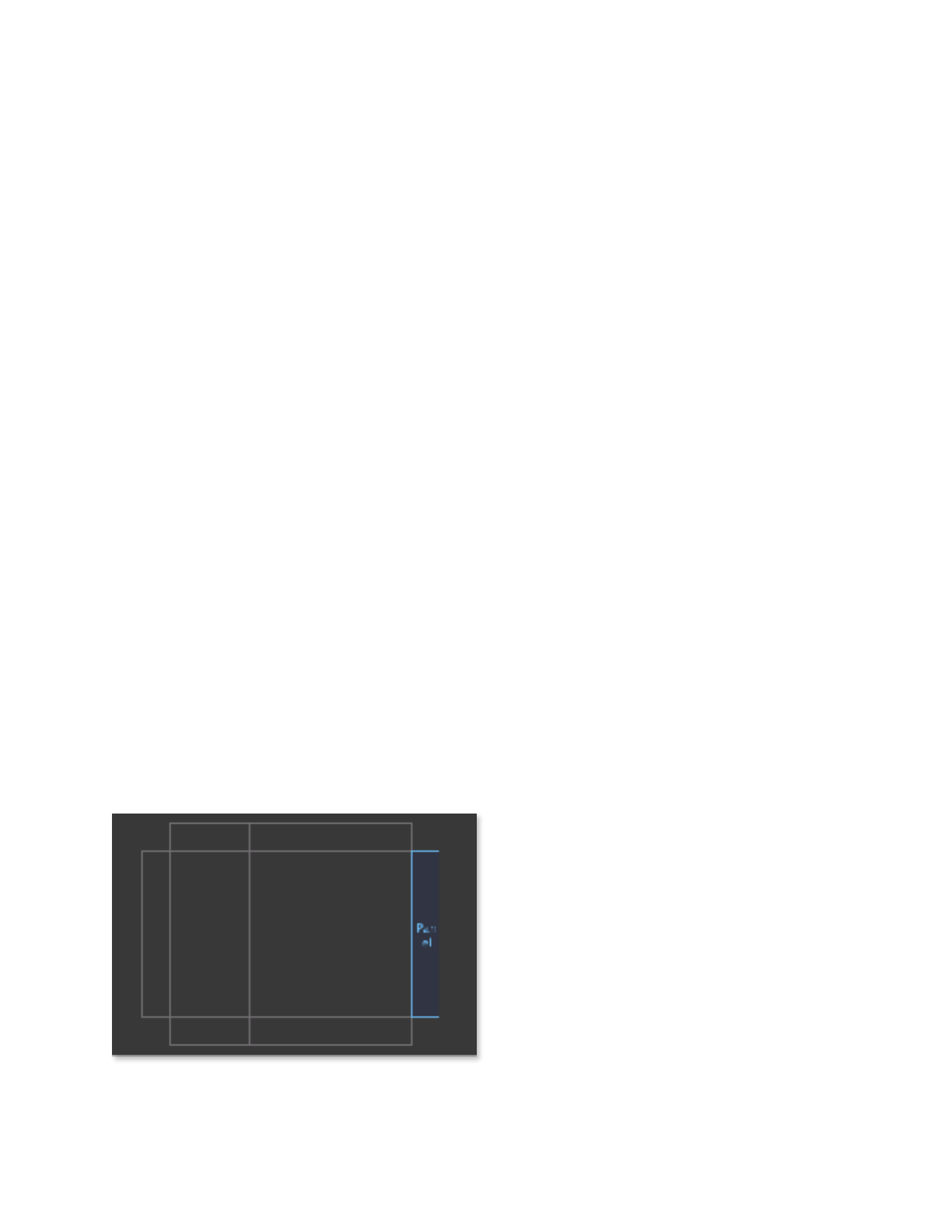
5. Add the Panel prefab to your scene and select it.
This creates a new panel. Notice the layout grid that appears in the Inspector when the
panel is selected. Click and drag within the grid to set the panel’s position to match the
image below:
!
Copyright © 2014-2018 Erik Loyer. All rights reserved.
Page ! of !6 43
Panoply Reference Manual
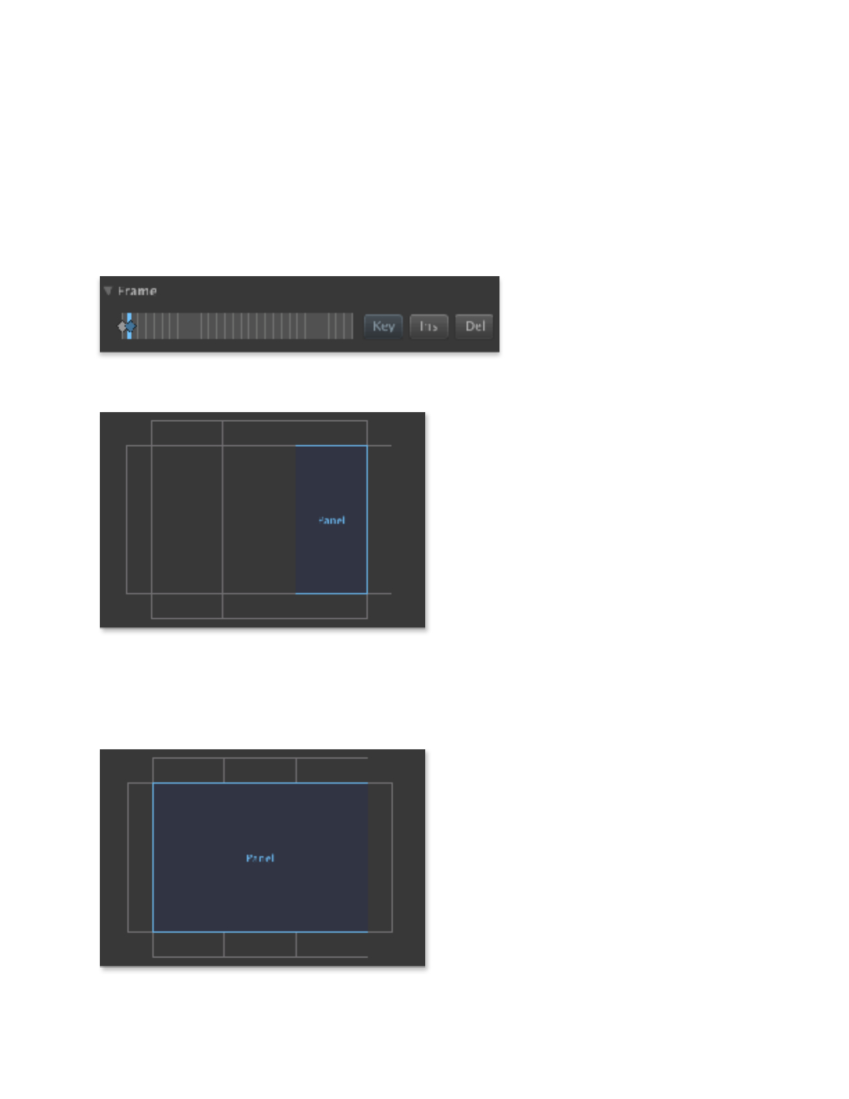
6. Drag the Global timeline slider to step 1.
Time to add a new keyframe at step one. Click the Key button next to the timeline above
the grid to set a keyframe:
and then click and drag in the grid to set the panel’s position as follows:
!
7. Drag the Global timeline slider to step 2.
Click the Key button again to set a keyframe at step 2, and then click and drag in the grid
to set the panel’s position as follows:
!
Copyright © 2014-2018 Erik Loyer. All rights reserved.
Page ! of !7 43
Panoply Reference Manual
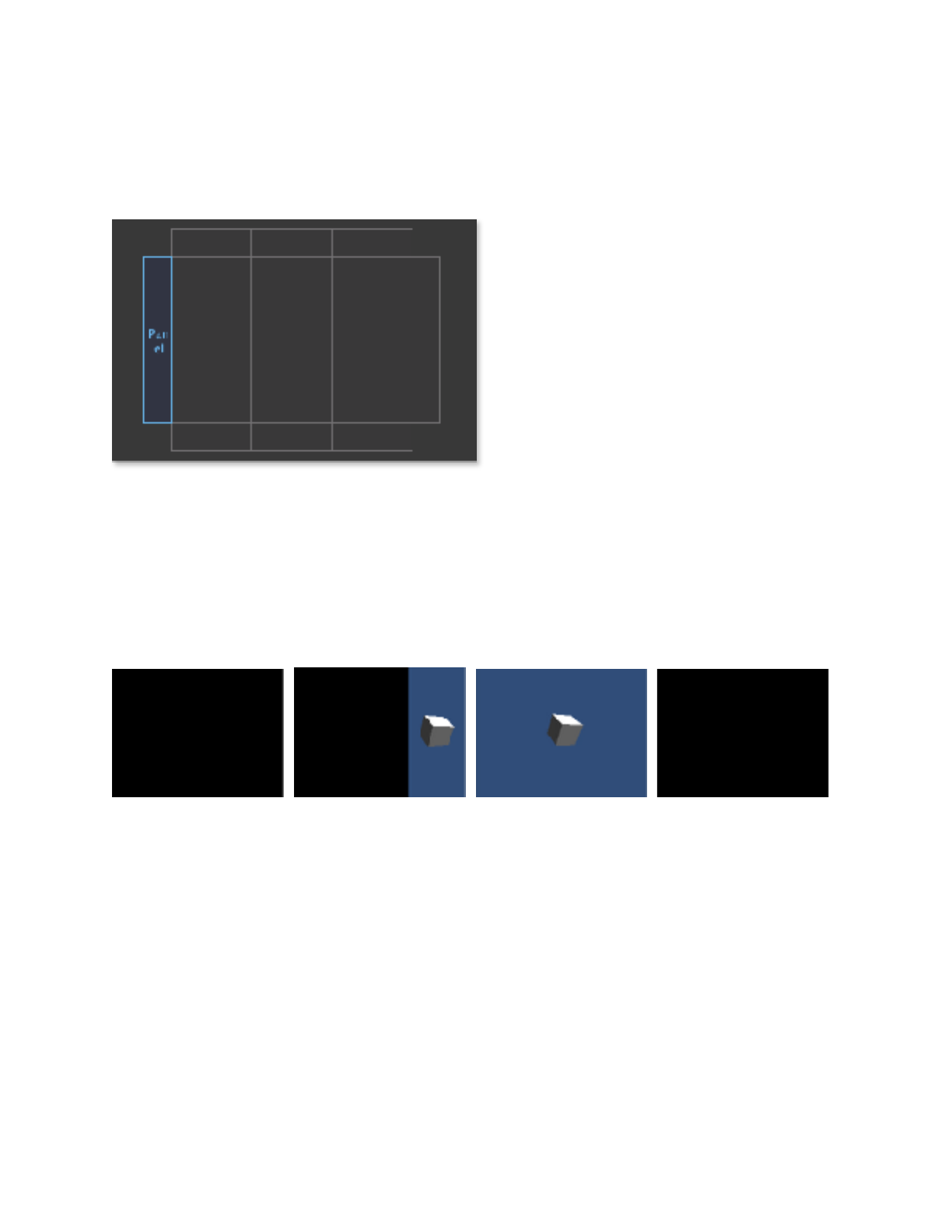
8. Drag the Global timeline slider to step 3.
Click the Key button again to set a keyframe at step 3, and then click and drag in the grid
to set the panel’s position as follows:
!
9. Play the scene.
You should see a black screen. Click and drag from right to left to advance to the next
step, and your panel with the cube should slide in from the right, occupying the right third
of the screen. Repeat, and the panel should expand to cover the whole screen. Advance
one more time, and the panel should move offscreen to the left. The whole sequence
should unfold like this:
! ! ! !
That’s it—you’ve created your first panel and choreographed its motion over time.
Congrats!!
Copyright © 2014-2018 Erik Loyer. All rights reserved.
Page ! of !8 43

Panoply Reference Manual
The Creative Potential of Digital Comics
If you purchased Panoply because you’re interested in making digital comics, welcome to
a strange and wonderful world! You’re probably itching to dive in and start making, BUT
—if I can have a moment of your time—I just want to point out:
DIGITAL COMICS ARE REALLY DIFFERENT FROM PRINT COMICS!
Really. If you go into this thinking you’re going to quickly spruce up your print comic
with some animation, you’re going to get frustrated fast. So, sit back, relax, and take a
moment to unlearn all you have learned with these helpful tips…
Tip #1: There are no pages here.
Seems obvious, right? Sure, but what’s less obvious is… what exactly does a comic
become without pages? That leads us to Tip #2…
Tip #2: Your story is a series of steps.
A Panoply scene is a timeline made up of many discrete steps, and with each new step,
something changes. Maybe a new panel appears. Maybe an existing panel moves. Maybe
a character’s expression changes, maybe the lighting shifts, maybe a sound plays, maybe
anything! Your story is the sum total of all of the changes that happen along Panoply’s
timeline.
Tip #3: Each panel is a camera.
This is one of the coolest things about Panoply—each panel is its own window on a fully
3D world. This means that anything you can point a camera at in Unity can become part
of your comic, whether it’s 2D, 3D, static, animated, or anything in between.
Tip #4: The reader is in control.
One of the fundamentals of Panoply is that, just like in a print comic, the reader is always
in control of the pace of the action. There’s no built-in way to create “cut scenes” or pre-
rendered sequences that play out while the reader passively watches. Why? Because in my
experience, promising readers control and then yanking it away from them every few
minutes so you can show a video is bad manners! And it can prevent people from
immersing themselves in your story.
Copyright © 2014-2018 Erik Loyer. All rights reserved.
Page ! of !9 43

Panoply Reference Manual
I hope these tips are helpful to you. Remember: this field is wide open, and there’s tons of
room for experimentation and new ideas. Maybe you’ll come up with some of them! Be
creative, thoughtful, and bold!
(Intrigued by this line of thought? Check out my site timeframing.com, where I post all
kinds of thoughts and experiments about what comics and screens do together.)!
Copyright © 2014-2018 Erik Loyer. All rights reserved.
Page ! of !10 43
Panoply Reference Manual
Setting up a Panel
This tutorial digs deeper into the process of setting up a panel in Panoply, with
explanations of the features and settings you’ll encounter along the way.
1. Import your artwork.
If you’re working with 2D artwork in Unity 4.3 or later, you’ll generally want to import
each piece of art as a Sprite, but Panoply works with any kind of asset you can point a
camera at. (Make sure you turn off the “Generate Mip Maps” option if it’s not needed, as
digital comic artwork is typically only viewed at a single scale).
2. Drag the Panel prefab to the scene.
The prefab is a camera that will be used to render the panel’s content. Select the prefab in
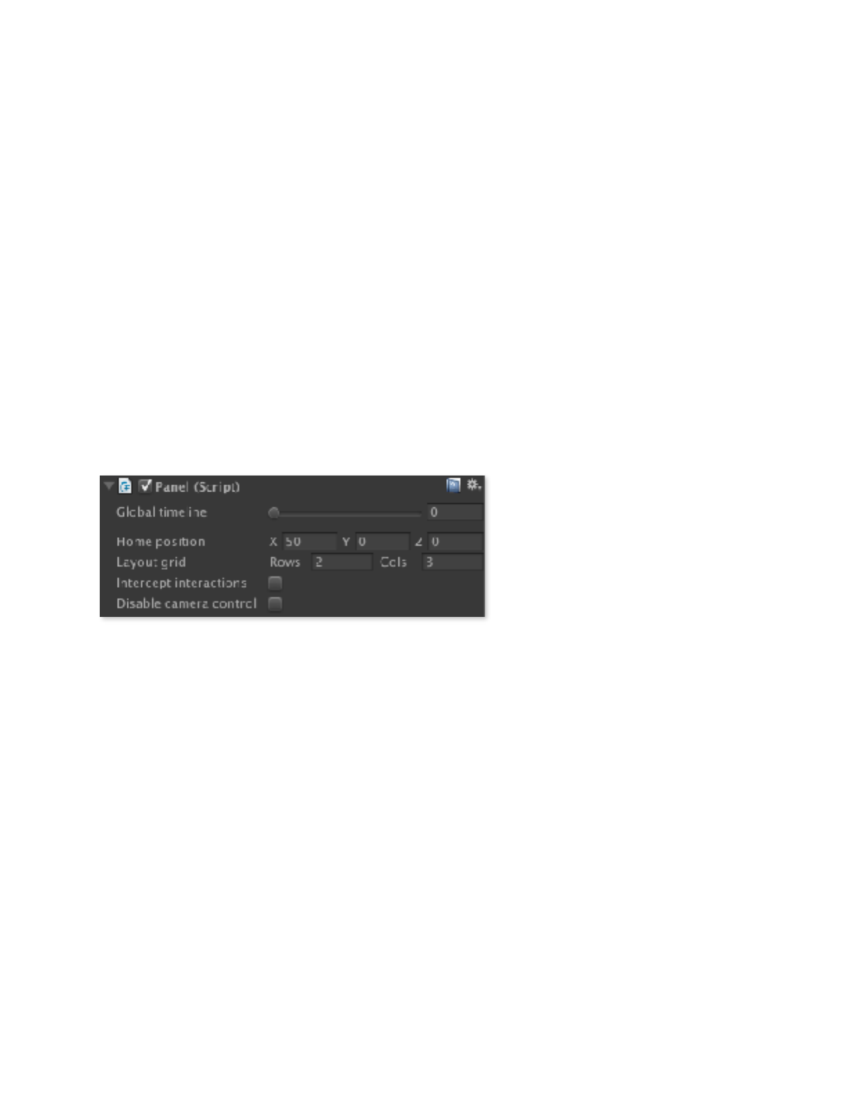
the scene, and you’ll see the Panel component appear in the Inspector window. The top
of the Panel inspector includes some global settings, shown below.
Global timeline. This slider lets
you preview the current state of
the timeline by dragging from
discrete step to discrete step. If
you hold down Shift while
dragging, you can preview how
the smoothed transitions from
step to step will look. As a
shortcut, while in Play mode you can also use the left and right arrow keys to quickly
move from step to step.
Home position. Since setting up a panel involves pointing the camera at artwork in
Unity’s world space, it’s important to keep the artwork and cameras for each panel far
enough apart so that one panel isn’t able to “see” the artwork from another (you could
also use Unity’s Layers feature to prevent this). This parameter sets the default camera
position for the panel. Normally you don’t need to change this, as each panel you add to
your scene will automatically offset itself on the X axis from the previous panel (to change
the amount of this offset, see the Home Position X Offset field in the Panoply Prefab’s
Scene settings).
Layout grid. Comic panels are often laid out on a grid, and the Panel component
follows this model to make layout easier. You can set the number of rows and columns in
the grid for this panel.
Copyright © 2014-2018 Erik Loyer. All rights reserved.
Page ! of !11 43
Panoply Reference Manual
Intercept interactions. Checking this box will cause touches and clicks within the
panel to be ignored, instead of being used to trigger transitions from one step to the next.
This makes room for custom scripting to intercept those actions and use them to add
interactivity within the panel.
Disable camera control. Checking this box will prevent the panel from affecting the
camera’s position or orientation. This is useful when you only want the panel to affect
where the camera is rendered on the screen, while other scripts (like, for example, an FPS
controller) determine the camera’s transform in 3D space.
3. Add your artwork to the scene.
Position your artwork with respect to the new panel’s camera as you want it to appear in
the panel. Note that when working with 2D artwork, sometimes a larger layer that’s
further away from the camera can appear on top of a smaller layer that’s closer to the
camera but further away from the center of the camera’s view. This is a common problem
when working with 2D assets in a 3D environment, and can be solved using Unity’s
Sorting Layer functionality to assign the respective sprites to different layers that are
drawn in the order you prefer.
4. Add the Artwork component to any 2D assets you want to arrange in depth.
One of the benefits of creating a comic in 3D space is depth. By arranging your layers on
the z-axis, even very slight camera movements create a striking impression of dimension.
Normally, however, moving an object further from the camera makes it appear smaller,
which can become a problem with 2D artwork, as layers which are further from the
camera are no longer registered properly with other layers which are closer. You could
alter the scale of each layer to restore it’s original apparent size, but this quickly becomes
tedious.
The Artwork component takes care of this by automatically scaling up artwork according
to its distance from the camera, so it remains properly registered. To use the component,
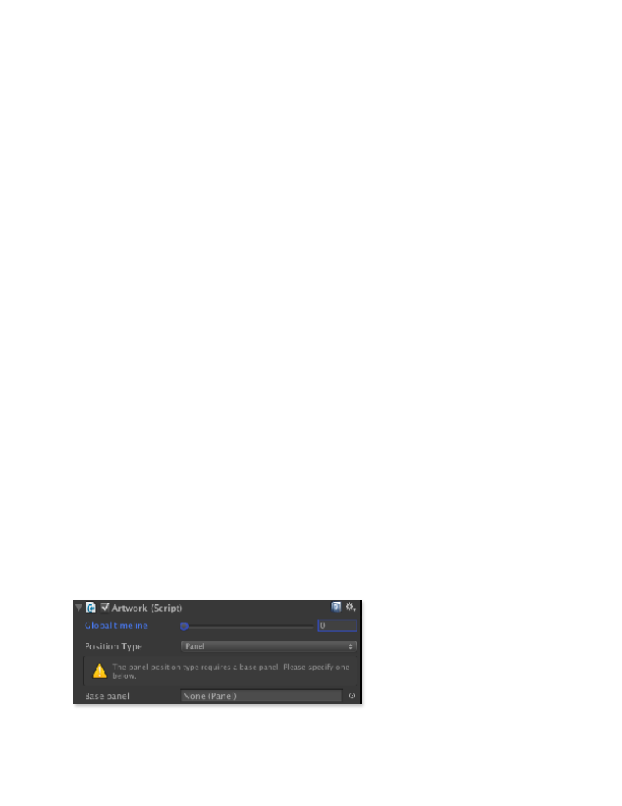
drag it to the object you’re working with. Select the object, and you’ll see this in the
inspector:
Position type. By default, the
Artwork component’s Position
Type is set to Panel, meaning it
will base its position on the
home position of a specific
panel. This keeps the artwork
aligned with the panel’s camera.
(Other position options include
Copyright © 2014-2018 Erik Loyer. All rights reserved.
Page ! of !12 43
Panoply Reference Manual
Local and Global.) Drag the
panel you just created from the
Hierarchy into the Base Panel
field to link your artwork to the
panel.
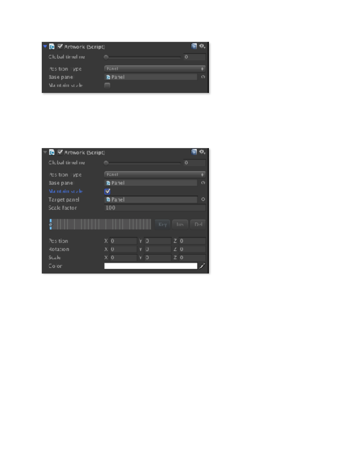
Now, the Artwork component
should look something like this:
Maintain scale. This enables
the auto-scaling. When this item
is selected, additional controls
appear (see below).
Target panel. Set this to the
panel to be used for calculating
the scale (you can drag the
panel itself to this field to select
it).
Scale factor. A multiplier
value for the auto-scaling
function, this lets you tweak the
overall amount of scaling
applied to the object (if your artwork appears too large or too small, you can adjust this
value accordingly). Be sure to keep this value consistent across all layers in a given panel
in order to keep them registered.
Keyframe timeline. Shows the location of artwork keyframes on the global timeline.
Position, Rotation, Scale, and Color. Once the Artwork component is added to a
game object, these properties are managed here, and can be altered over time.
Once you have all of your artwork arranged in depth how you like it, proceed to the next
step.
Copyright © 2014-2018 Erik Loyer. All rights reserved.
Page ! of !13 43

Panoply Reference Manual
!
Note that these settings apply only to artwork within panels—if
you want to set a whole panel to appear on top of any others
you’ll need to set the Depth value for that panel’s camera to a
higher value.
Copyright © 2014-2018 Erik Loyer. All rights reserved.
Page ! of !14 43
Panoply Reference Manual
5. Open the panel’s frame foldout.
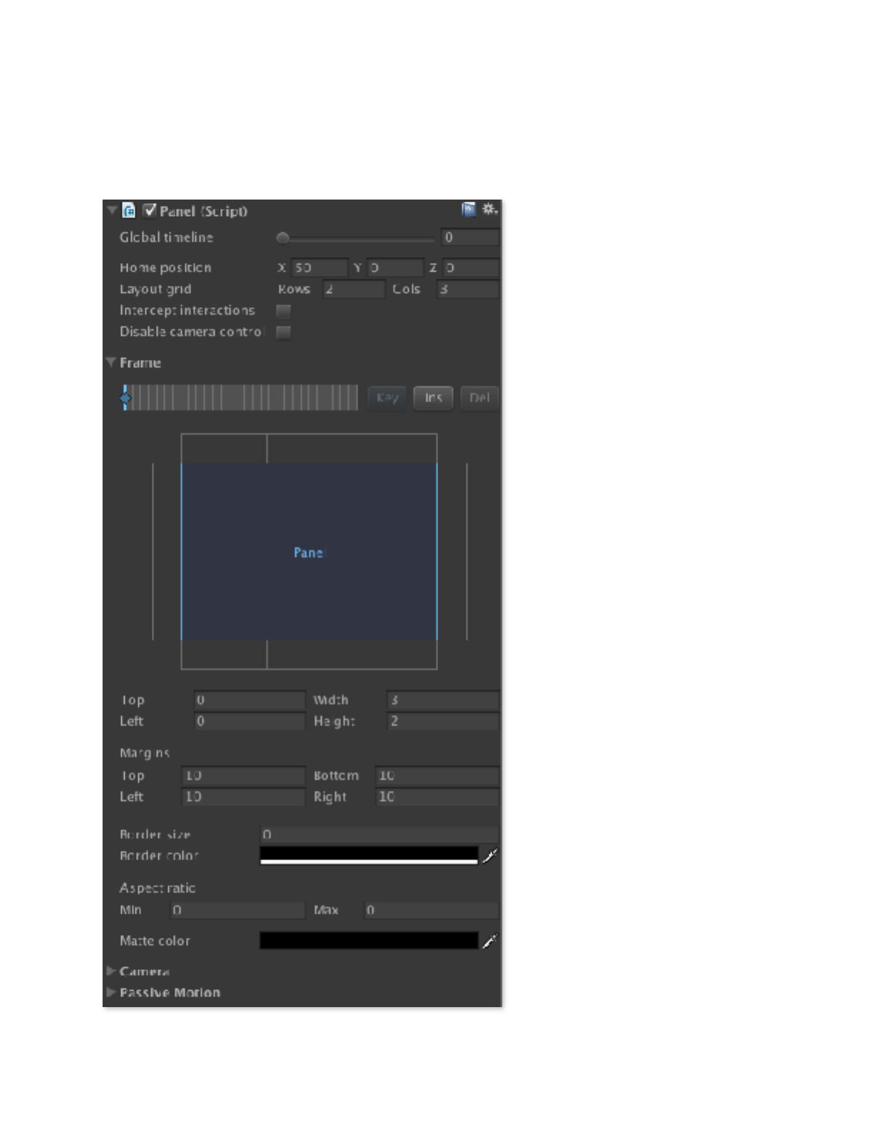
Select the Panel you dragged into the scene again, and open the Frame foldout if it isn’t
already open. This is what you’ll see:
A panel’s frame determines its
position and size on the screen.
Changing a panel’s frame settings
over time can cause it to move or
change shape as the user
proceeds from step to step.
Keyframe timeline. Enables
editing of the panel’s frame
keyframes on the global timeline.
Each keyframe is shown as a
diamond on its corresponding
step. You can click and drag the
Global timeline slider or in the
keyframe timeline itself to change
the current step (see Keyframe
Timeline Shortcuts for more
quick editing features). Three
buttons at right allow you to edit
the keyframe timeline:
• The Key button adds a new
keyframe at the current step, or
removes the current keyframe if
one has already been created.
• The Ins button inserts a step at
the current timeline position.
This can be done either within
the frame timeline only, or across
all panels, artwork, and captions
in the scene.
• The Del button deletes a step
at the current timeline position.
This can be done either within
the frame timeline only, or across
Copyright © 2014-2018 Erik Loyer. All rights reserved.
Page ! of !15 43

Panoply Reference Manual
all panels, artwork, and captions in the scene.
Layout schematic. This graphic shows the state of the layout grid in the current step
on the global timeline. The selected panel is shown in blue, and all other panels are
shown in gray. The center of the grid corresponds to the visible area of the screen, while
the “wings” of the grid at the top, right, bottom, and left allow you to see and position the
panel offscreen (this is how you create transitions in which a panel slides into view). To
reposition the panel, just click and drag within the grid.
Top, Left, Width, and Height. These four values are a numerical way of specifying
the panel’s position in the layout grid. Top and Left set the position of the panel’s top-left
corner in grid units, while Width and Height set the size of the panel, also in grid units.
Margins. Contracts the frame of the panel by the specified number of pixels at its top,
right, bottom, and left edges. Useful for fine-tuning layout and creating gutters.
Border size and color. Adds an inset border around the panel at the specified width
and color.
Aspect Ratio. Enables you to specify a minimum and maximum aspect ratio for this
panel that will be enforced above all other layout settings. This is useful for
accommodating multiple screen sizes while still ensuring that panels don’t change shape
so much that they reveal the borders of your artwork. Normally, a given panel will crop its
contents depending on its size—when aspect ratio constraints are set, the panel’s content
will be scaled to fit the panel’s dimensions.
Matte Color. Set the color and opacity of a mask that covers the entire panel. Used for
creating panels that appear to fade in and out from one state to the next.
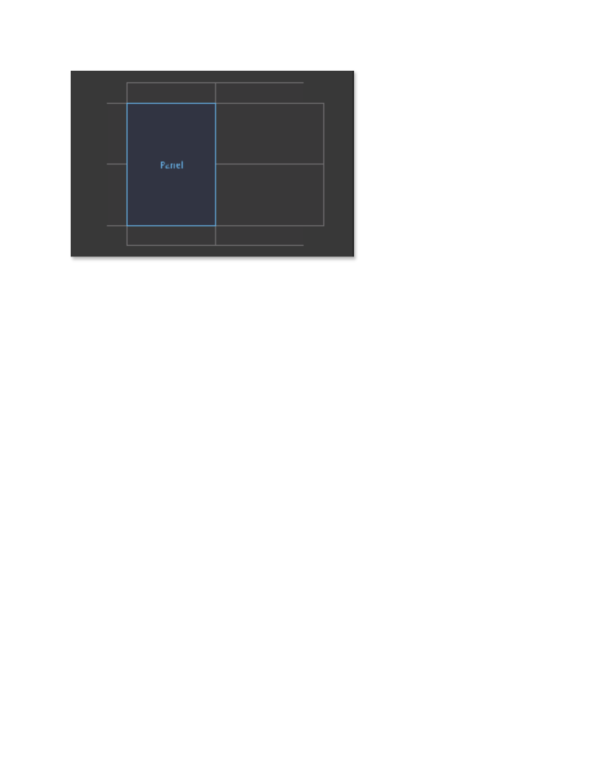
6. Set up the first frame step.
Before beginning this step, make sure the Global timeline is set to 0.
For the purposes of this tutorial, let’s set up our new panel to appear in the lower-right
corner, and then move and change shape to fill the left half of the screen. The first thing
we need to do is to set up the panel’s grid—this determines the possible positions it can
occupy.
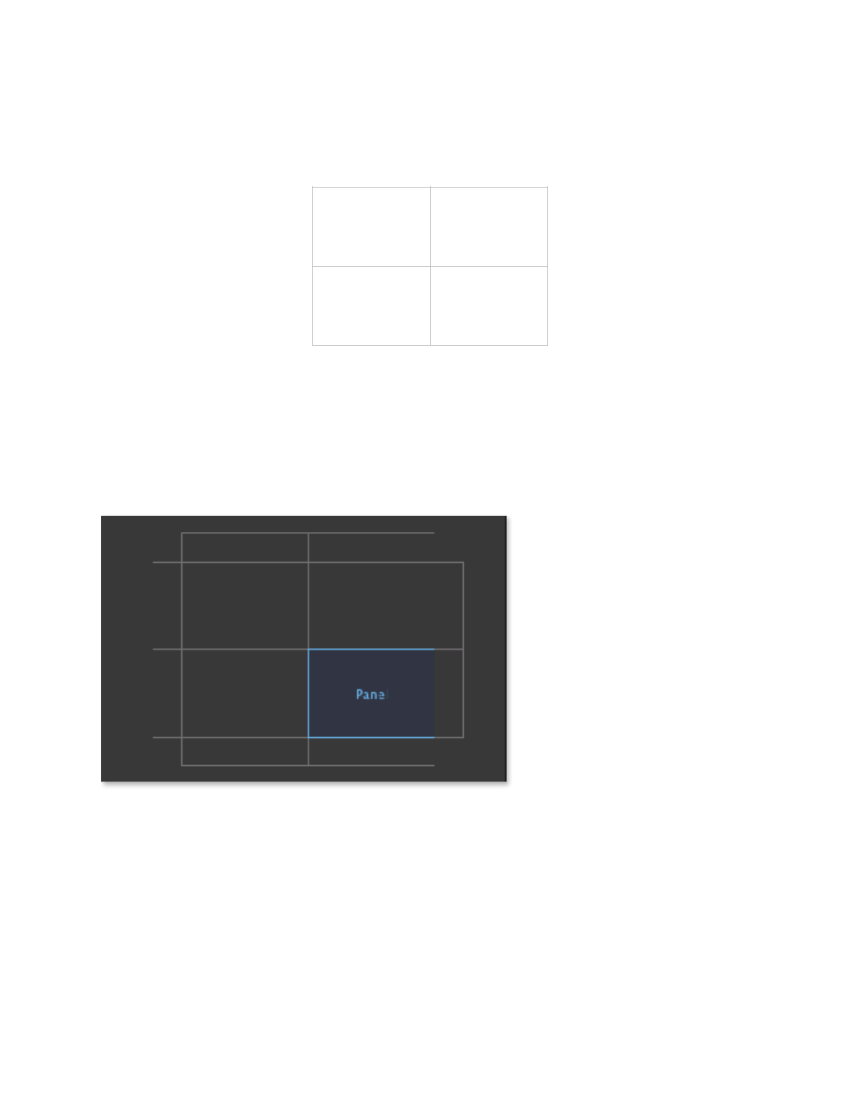
Since our two panel positions depend on the screen being divided into quadrants, we can
set the Grid Rows and Grid Cols values to 2 and 2, respectively. This divides
the screen into halves both vertically and horizontally, like so:
Copyright © 2014-2018 Erik Loyer. All rights reserved.
Page ! of !16 43
Panoply Reference Manual
By setting Grid Rows and Grid Cols to 2 and 2, we’ve created an invisible grid that splits
the screen into quadrants. We can then use the Layout Schematic to position the panel on
this grid.
To set up the initial state of our panel, click and drag in the Layout Schematic to set up
our panel’s position and dimensions as follows:
!
7. Set up the second frame step.
Drag the Global timeline to 1.
To create a new frame key for this step, click the Key button.
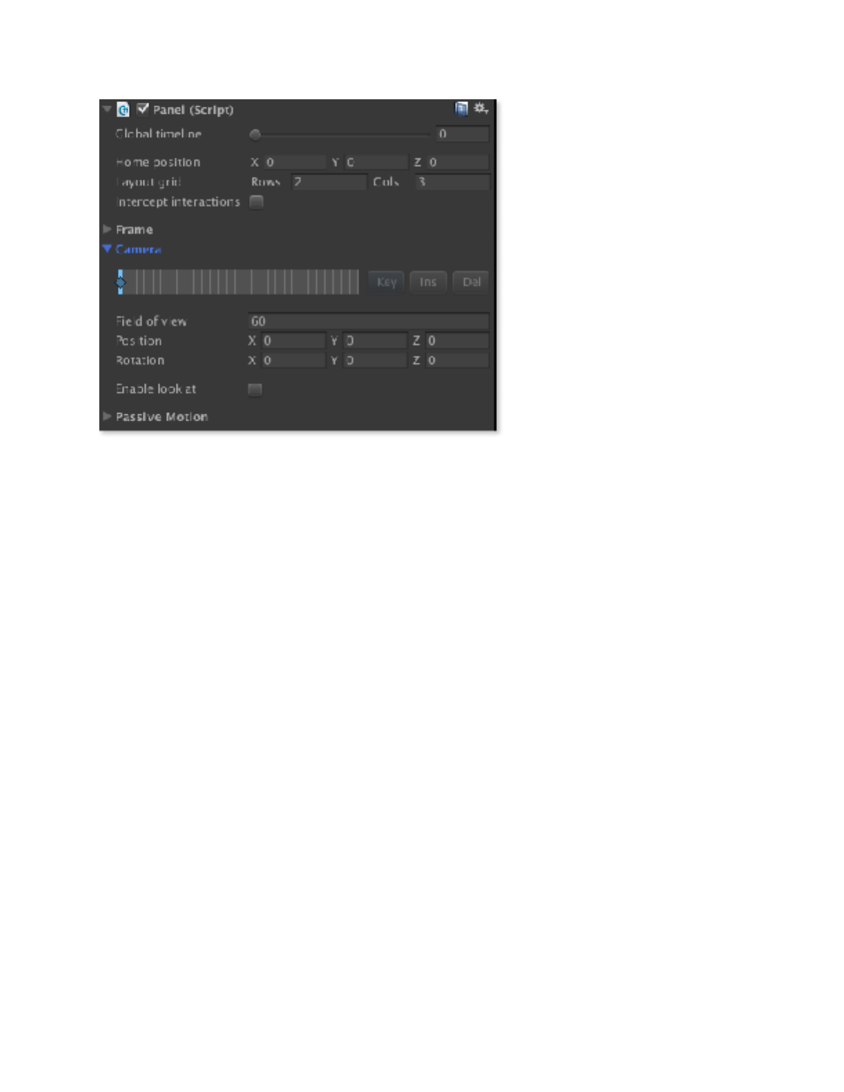
To move the panel to occupy the left half of the screen, click and drag in the Layout
Schematic to set up our panel’s position and dimensions as follows:
Copyright © 2014-2018 Erik Loyer. All rights reserved.
Page ! of !17 43
Panoply Reference Manual
!
8. Test the transition.
That’s it! You’ve set up a panel and created a transition that moves it from one part of the
screen to another. You can click the play button to try it out for real. Click and drag to the
left to advance to the next step, and to the right to return to the previous step.
9. Explore the Camera foldout.
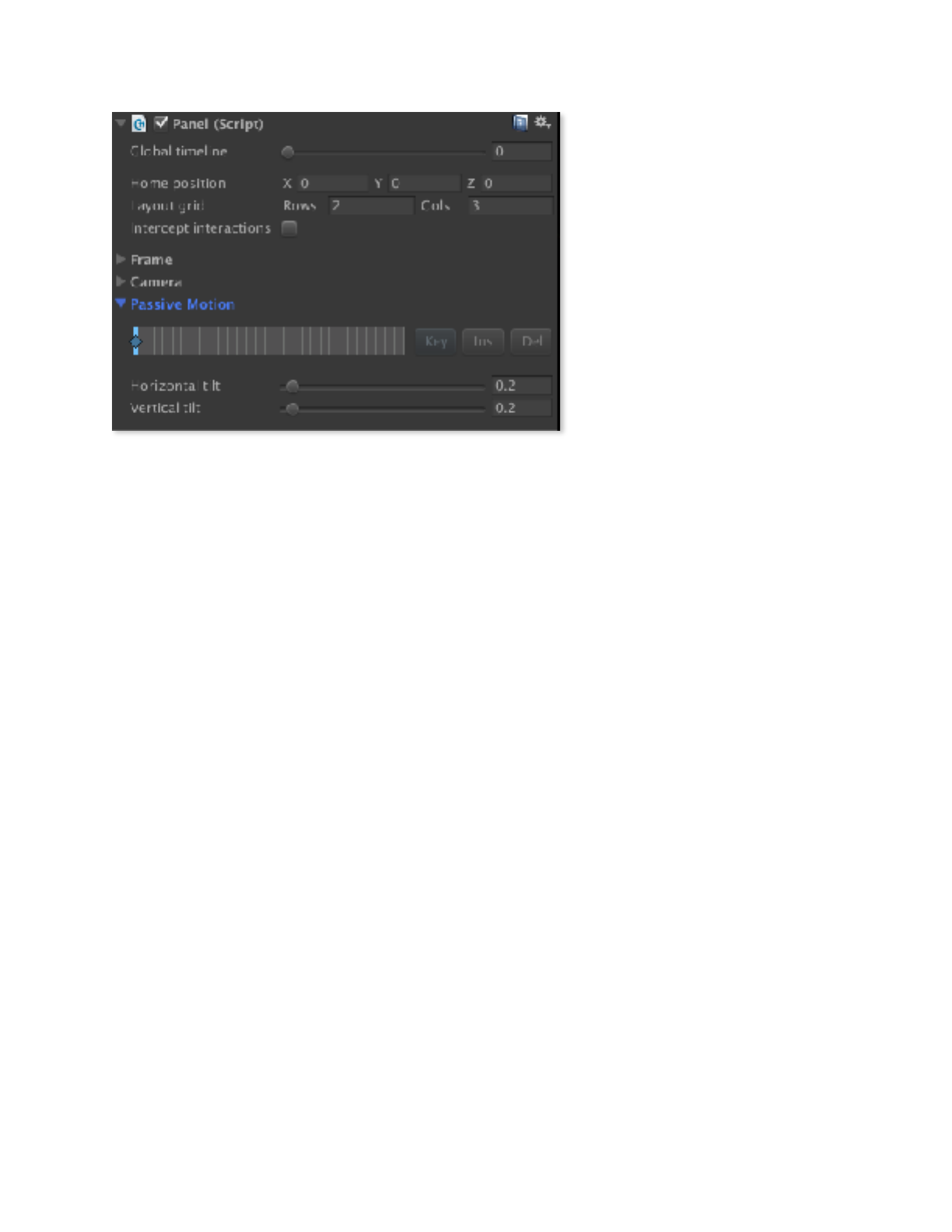
The controls in the Camera foldout let you choreograph the movement of the panel’s
camera (i.e. its position and orientation in 3D space) independently of the layout of its
frame.
Click the Camera foldout to open it, and this is what you’ll see:
Copyright © 2014-2018 Erik Loyer. All rights reserved.
Page ! of !18 43
Panoply Reference Manual
Keyframe timeline. Just as
in the Frame foldout, the
Camera foldout lets you set
keyframes along the global
timeline (see Keyframe
Timeline Shortcuts for quick
editing features).
Field of View. The current
field of view of the camera, in
degrees.
Position. The current position
of the camera, relative to the
home position of the panel.
Rotation. The current
rotation of the camera.
Enable look at. When checked,#an extra set of fields appears allowing you to specify a
target (X,Y,Z) for the camera to point towards (relative to its home position). When
combined with passive motion (see below), this can give the feeling that when the user tilts
the device, they are tilting the camera as well, as opposed to just moving it in space.
10. Explore the Passive Motion foldout.
The controls in the Camera foldout let you choreograph the way in which “passive”
movement (i.e. mouse or accelerometer movement) affects the panel camera. By default,
each panel is set to impart a slight amount of passive motion to its camera, to enhance
3D effects when the user tilts their device or moves their mouse.
Click the Passive Motion foldout to open it, and this is what you’ll see:
Copyright © 2014-2018 Erik Loyer. All rights reserved.
Page ! of !19 43
Panoply Reference Manual
Keyframe timeline. Just as
in the Frame foldout, the
Passive Motion foldout lets you
set keyframes along the global
timeline (see Keyframe
Timeline Shortcuts for quick
editing features).
Horizontal tilt. Sets the
amount of horizontal
movement imparted to the
camera when horizontal passive
motion is detected.
Vertical tilt. Sets the amount of vertical movement imparted to the camera when
vertical passive motion is detected.
Copyright © 2014-2018 Erik Loyer. All rights reserved.
Page ! of !20 43
Panoply Reference Manual
Creating Captions
Panoply’s captions allow you to create some of the most essential parts of comic visual
language: narration boxes and dialogue/thought balloons. This is done using the
Caption component. This section will show you how to add a caption to a panel and
configure it as a standard narration box (the next section will cover creating dialogue
balloons).
1. Add the Caption component to the panel.
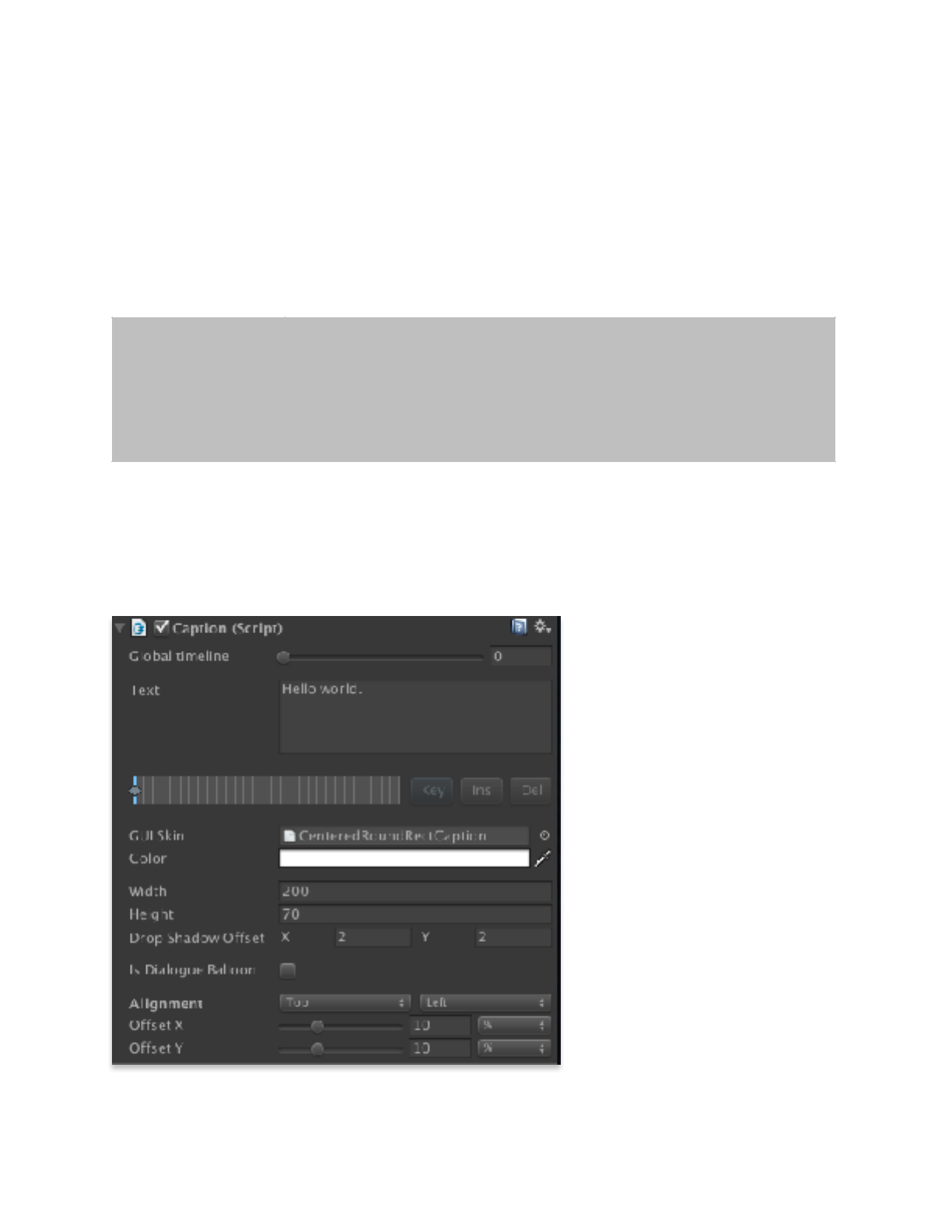
Captions are linked to panels, and you’ll need to add one instance of the component for
every caption you want to add to a given panel. When you add the component to your
panel, it will look like this:
Text. Here is where you enter
the text of the caption.
Keyframe timeline. Just as
in the Panel and Artwork
components, the Caption
component lets you set
keyframes along the global
timeline. This makes it possible
to change a caption’s position,
look, or content over time (see
Keyframe Timeline Shortcuts
for quick editing features).
GUI Skin. This setting allows
you to customize the look of the
visual element that encloses the
text. The Panoply package
includes a default skin called
CenteredRoundRectCaption
!
Be sure to set the reference screen size on the PanoplyRenderer
component of the Panoply prefab in your scene before you
begin creating captions, as it can affect their size and position.
Copyright © 2014-2018 Erik Loyer. All rights reserved.
Page ! of !21 43

Panoply Reference Manual
that displays a white rounded rectangle behind the text. By customizing the Label settings
of this skin, or by creating your own, you can vary the shape, color, font, padding, etc. of
your caption.
For more information about creating your own GUI Skins, see Unity’s documentation.
Color. A tint which is applied to the caption.
Width and Height. The dimensions of the caption.
Drop Shadow Offset. Determines the horizontal and vertical distance from the
caption in pixels at which a hard-edged drop shadow will be drawn.
Is Dialogue Balloon. Check this option to turn the caption from a standard text box
into a dialogue/thought balloon with a tail (see below for explanation of the additional
options that become available when this option is selected).
Alignment. Aligns the caption with the vertical/horizontal edges or center of the panel.
Offset. Horizontal and vertical pixel offset from the alignment position.
2. Enter caption text.
If your panel is currently visible, you should see the text appear in very small type at the
top left.
3. Drag the CenteredRoundRectCaption to the GUI Skin parameter.
This will give the caption a more conventional appearance, with standard-sized text on a
while round rectangular background.
4. Adjust width and height.
Captions do not auto-size to fit their contents, so pick some values that fit your text nicely.
5. Set alignment and offset.
Use the alignment settings to position your caption where you want it to appear in your
panel. You can even use negative values to make the caption overlap the edges of the
panel, or even appear entirely outside of the panel.
Copyright © 2014-2018 Erik Loyer. All rights reserved.
Page ! of !22 43
Panoply Reference Manual
That’s all it takes to create for a standard narration box—of course you can customize the
GUI Skin you use to add more personality to your own captions. Next we’ll look at how
to convert this caption into a dialogue balloon.
Creating Dialogue Balloons
In the previous section we walked through creating a standard narration box. The same
Caption component is used to create dialogue balloons. This section will cover creating
just such a balloon.
1. Add the Caption component to the panel.
Captions are linked to panels, and you’ll need to add one instance of the component for
every caption you want to add to a given panel.
See the previous section for an
explanation of the parameters
above the Is Dialogue Balloon
checkbox.
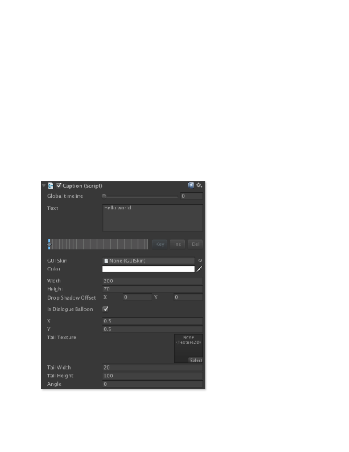
2. Select the Is Dialogue Balloon
checkbox.
This will cause the controls at
the bottom of the component
to change, like so:
X and Y. These values
determine where the pointy end
of the balloon’s tail is located,
as a ratio of the panel’s size. An
X value of 0 will position the
point at the left edge of the
panel, while a value of 1 will
move it to the right edge.
Similarly, a Y value of 0 will
place the point at the top edge
of the panel, while a value of 1
will position it at the bottom
edge.
Copyright © 2014-2018 Erik Loyer. All rights reserved.
Page ! of !23 43

Panoply Reference Manual
Tail Texture. Sets the texture that will be used to draw the tail of the balloon. Panoply
includes a default texture called balloon_stem that can be used to draw a standard
straight and pointy tail.
Tail width and height. Allows you to set the dimensions of the tail.
Angle. Controls the angle of the tail and thus the direction at which the dialogue balloon
extends from it.
3. Enter balloon text.
If your panel is currently visible, you should see the text appear in very small type at the
top left.
4. Drag the CenteredRoundRectCaption to the GUI Skin parameter.
This will give the caption a more conventional appearance, with standard-sized text on a
while round rectangular background.
5. Adjust width and height.
Captions do not auto-size to fit their contents, so pick some values that fit your text nicely.
6. Set the drop shadow offset.
Setting both X and Y values to 3 will add a nice drop shadow to your balloon.
7. Drag the balloon_stem texture to the Tail Texture parameter.
This will give your balloon a visible tail. You can also provide your own custom tail
artwork instead.
8. Adjust the angle of the balloon.
Change the angle parameter so that your balloon’s tail is pointing in the direction you
want.
9. Adjust the position of the balloon.
Use the X and Y values to point the tail of the balloon as a specific position within the
panel.
10. Adjust the width and height of the tail.
Copyright © 2014-2018 Erik Loyer. All rights reserved.
Page ! of !24 43
Panoply Reference Manual
Use these settings to fine-tune the shape and size of your balloon’s tail.
That’s all it takes to create a dialogue balloon! Remember, you can customize or create
your own GUI Skin and Tail Texture to create different styles of dialogue and thought
balloons.
Adding Audio
To add a soundtrack to your scene, apply the AudioTrack component to any game object.
Each AudioTrack handles playback of a single Audio Clip across the duration of your
scene. You can add multiple AudioClips to a single game object, or spread them across
multiple game objects, perhaps by type or panel (recommended).
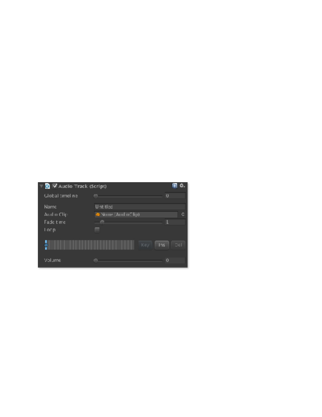
1. Add the AudioTrack component to a game object.
When you add the component, it will look like this:
Name. Enter a name for the
track to help you remember
what it contains.
Audio Clip. Drag in the audio
clip for the sound you want to
play.
Fade time. Sets the
approximate time in seconds
that it takes to fade from one
keyframe’s volume level to
another’s.
Loop Checkbox. If the sound should should loop, check this box.
Keyframe timeline. Just as in the Panel, Artwork, and Caption components, the Audio
Track component lets you set keyframes along the global timeline. This makes it possible
to change a sound’s volume over time (see Keyframe Timeline Shortcuts for quick editing
features).
Volume Slider. Drag the slider to set the volume of the sound in the current step.!
Copyright © 2014-2018 Erik Loyer. All rights reserved.
Page ! of !25 43
Panoply Reference Manual
Keyboard Shortcuts
A few keyboard shortcuts are available to speed up navigation while your scene is running
in Play mode.
Keyframe Timeline Shortcuts
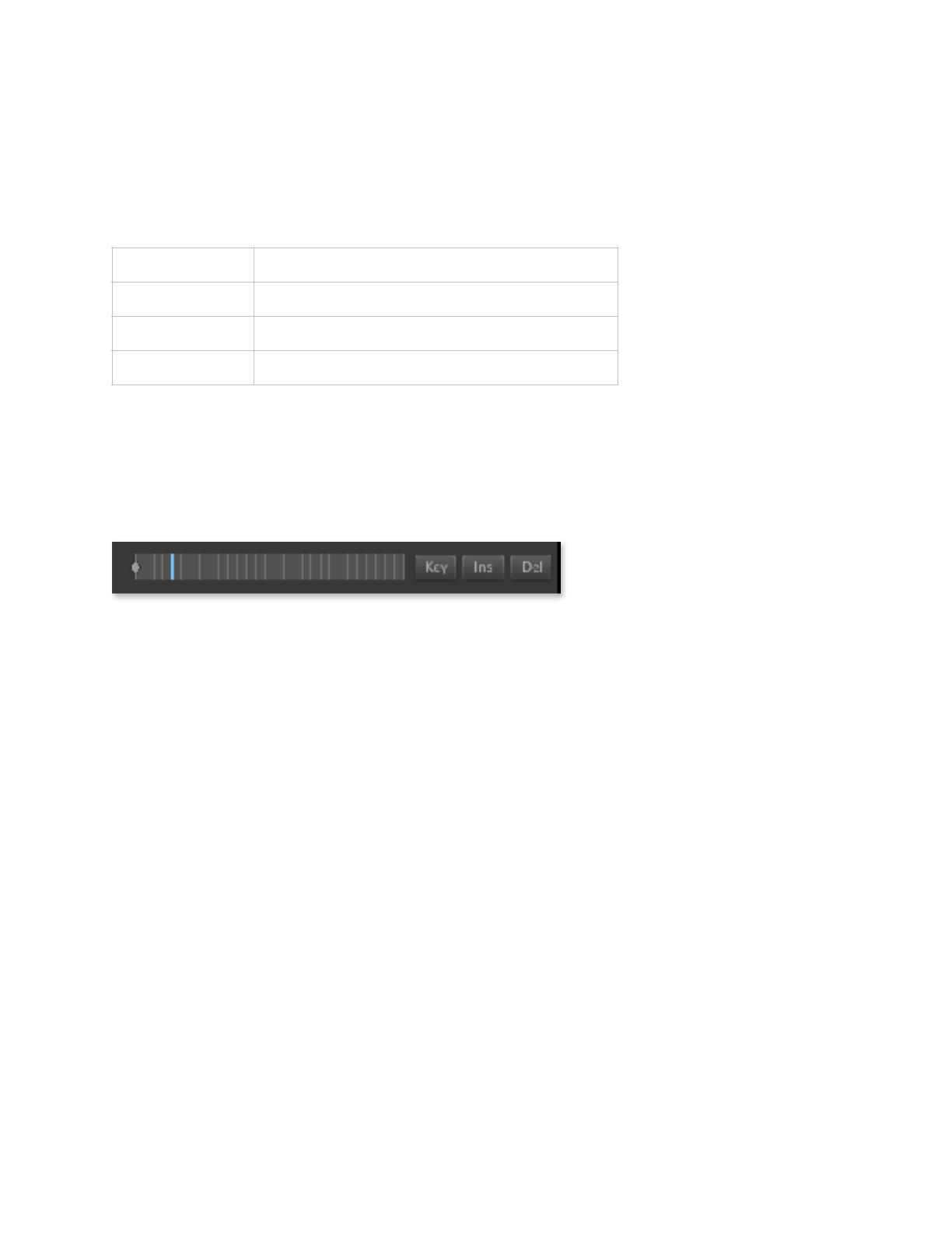
The keyframe editor has a few hidden features for making keyframe editing easier.
Click or click and drag to set timeline position. You can navigate the timeline
easily without using the global timeline slider just by clicking or clicking and dragging in
the timeline.
Click and drag to move a keyframe. Any existing keyframe (except the first one) can
be moved on the timeline simply by clicking and dragging it to a new position.
Click to add or remove a keyframe. Clicking the current position on the timeline
will add a keyframe there, or remove an existing keyframe. If you mistakenly add or
remove a keyframe with this technique, just Undo the action.!
Left arrow
Go to the previous step
Right arrow
Go to the next step
Up arrow
Go to the first step (only works in the editor)
Down arrow
Go to the last step (only works in the editor)
Copyright © 2014-2018 Erik Loyer. All rights reserved.
Page ! of !26 43
Panoply Reference Manual
The Panoply Prefab
The Panoply prefab contains components with global settings that affect the engine.
Renderer Settings
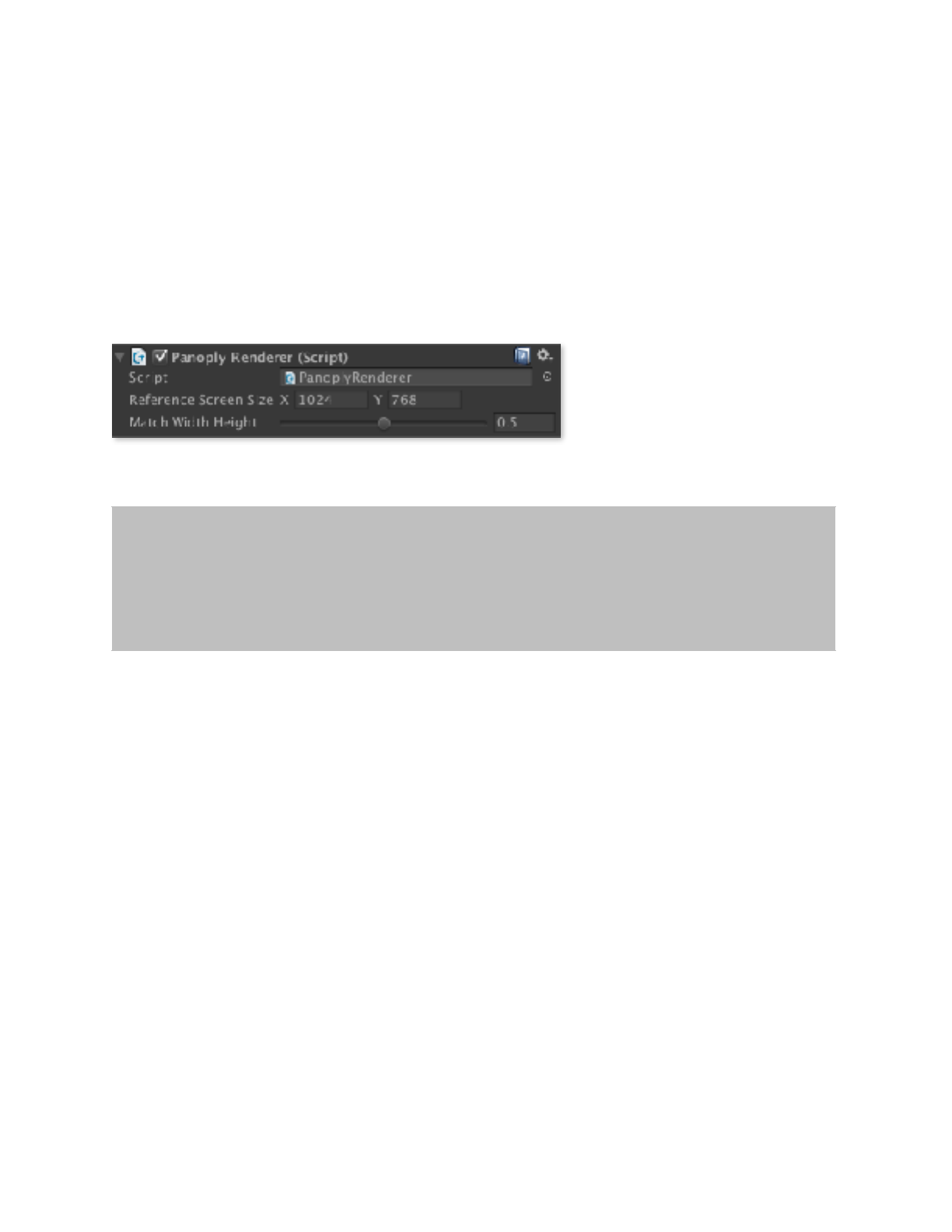
The PanoplyRenderer component let you change settings relating to how content is
rendered.
Reference Screen Size. The
base screen dimensions to use
when calculating how much to
scale captions. In general, this
should be set to the “ideal”
screen dimensions of your content on your primary target device.
Match Width Height. The degree to which captions are scaled to match the screen’s
current horizontal vs. vertical dimensions with respect to the reference screen size. A value
of 0 means that only the horizontal dimension is considered, while a value of 1 means
that only the vertical dimension is considered. Intermediate values blend horizontal and
vertical scaling.
Controller Settings
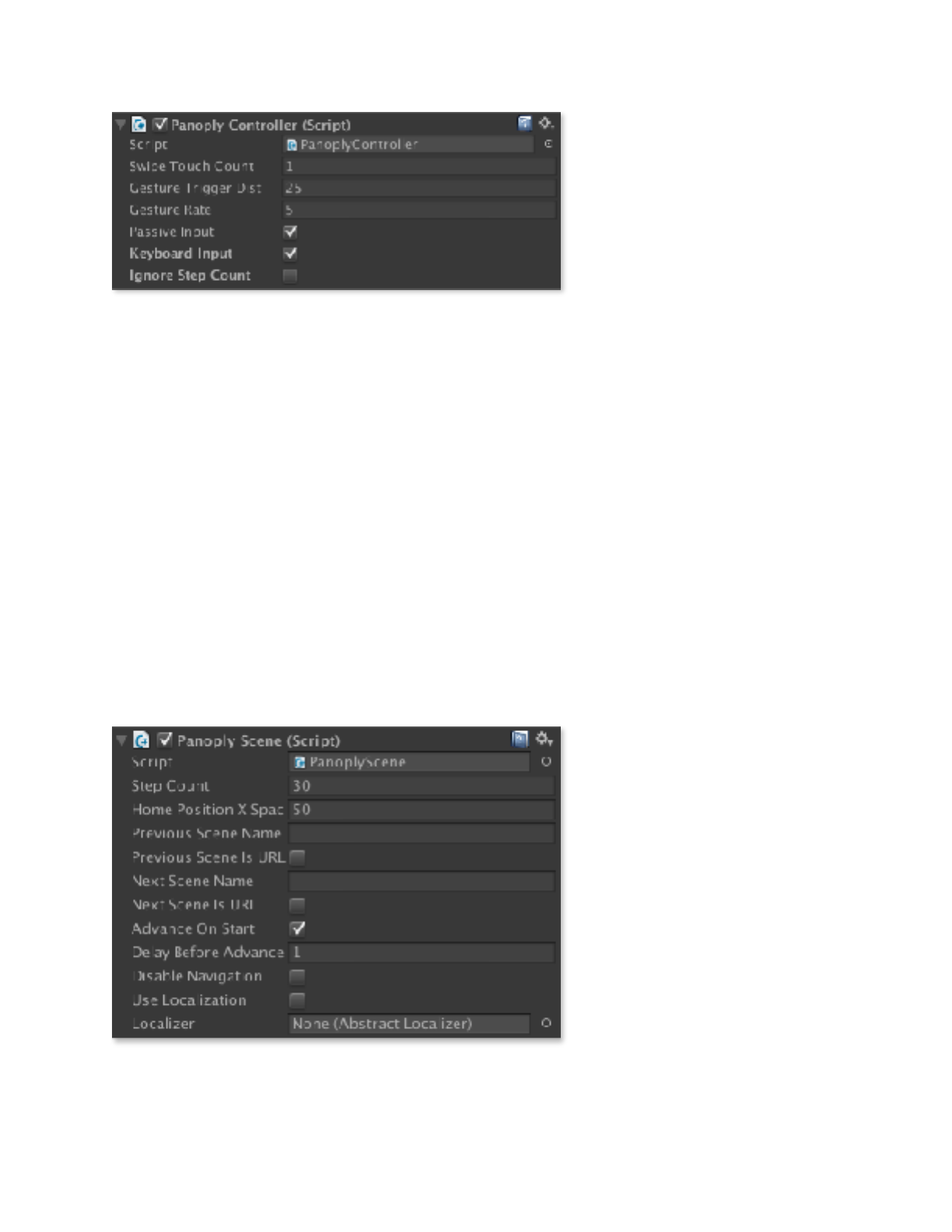
The PanoplyController component lets you change settings relating to how user input
is handled.
!
Note that it’s very important to set the reference screen size
before you begin creating captions, as it can affect their size
and position.
Copyright © 2014-2018 Erik Loyer. All rights reserved.
Page ! of !27 43
Panoply Reference Manual
Swipe Touch Count. The
number of simultaneous
touches required to trigger a
swipe.
Gesture Trigger Dist. The
number of pixels the reader
must drag or swipe to trigger
advancing the scene to the next
step.
Gesture Rate. The rate at which the transition from step to step occurs. Larger
numbers mean faster transitions.
Passive Input. Enables passive input from sources like mouse position or the
accelerometer, which can be used for parallax 3D effects.
Keyboard Input. Enables keyboard input so that the the user can navigate from step to
step using the arrow keys.
Ignore Step Count. Allows user to navigate to steps beyond the scene’s maximum step
count, effectively disabling automatic navigation to the previous and next scene.
Scene Settings
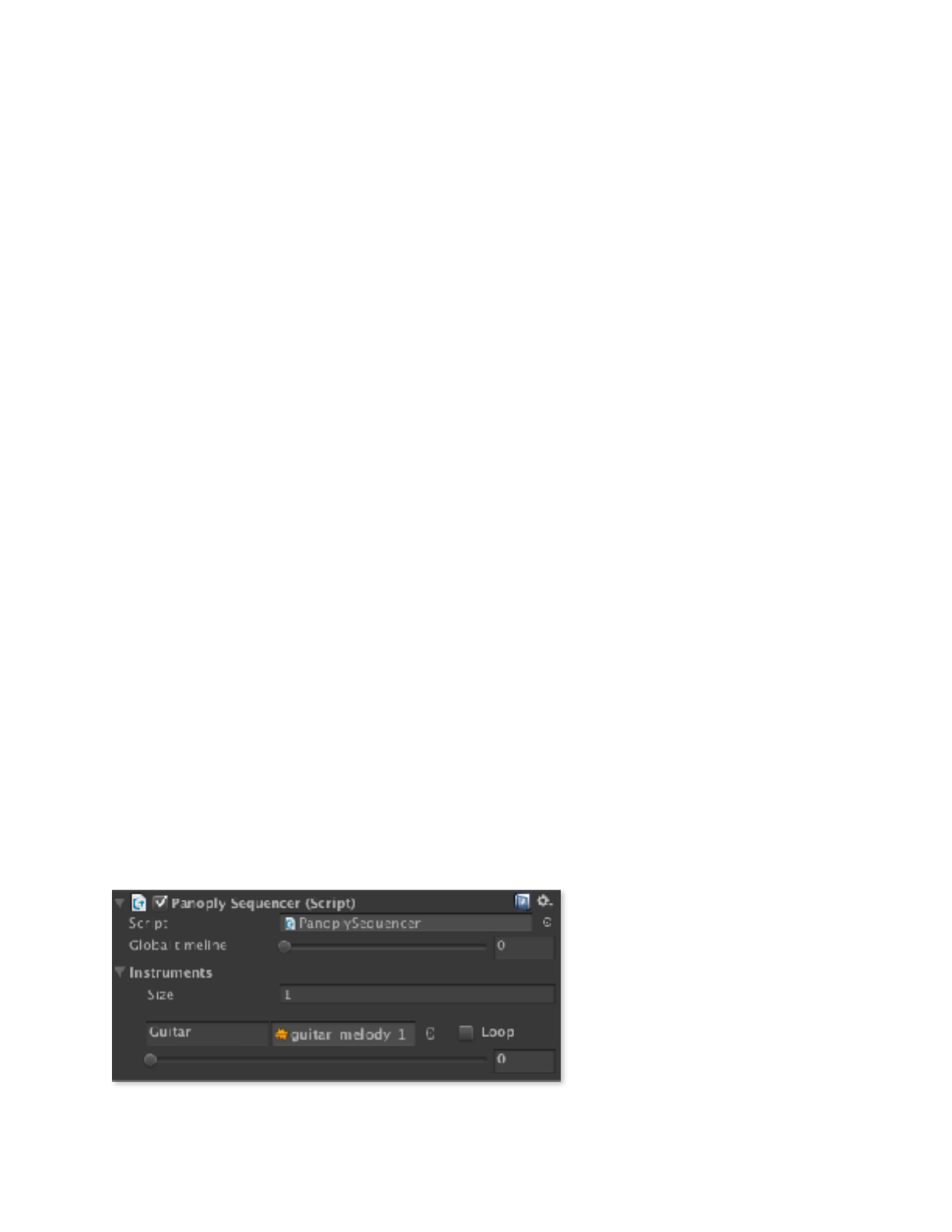
The PanoplyScene
component lets you change the
duration of your scene and
designate what scene the reader
should be taken to when they
navigate past its beginning or
end.
Step Count. This is the total
number of steps in your scene.
Home Position X Spacing.
Determines the amount of
automatic spacing between the
Home Position of each new
panel added to the scene and the Home Positions of the previous panels.
Copyright © 2014-2018 Erik Loyer. All rights reserved.
Page ! of !28 43
Panoply Reference Manual
Previous Scene Name. The name of the scene the reader should be taken to when
they swipe backwards from the first step of the current scene.
Previous Scene Is URL. When checked, Panoply will attempt to load the previous
scene name as a URL instead of as a Unity level.
Next Scene Name. The name of the scene the reader should be taken to when they
swipe past the last step in the current scene.
Next Scene Is URL. When checked, Panoply will attempt to load the next scene name
as a URL instead of as a Unity level.
Advance On Start. Whether or not the scene should automatically advance to step 1
upon starting up.
Delay Before Advance. The delay in seconds before the scene automatically advances
to step 1 (when enabled).
Disable Navigation. Prevents the user from swiping to the next or previous step. When
set programmatically from your code or a PlayMaker action, this can be useful if you
want to temporarily allow other interactions without worrying about the user accidentally
swiping to the next step.
Use Localization / Localizer. When Use Localization is checked, Panoply will use the
component set in the Localizer field to handle localization of captions and balloons. The
text of the caption or balloon will be used as the “key” to retrieve the correct translation
from the localizer for the device’s current system language. For details, see Localizing
Captions and Balloons.
Audio Sequencing
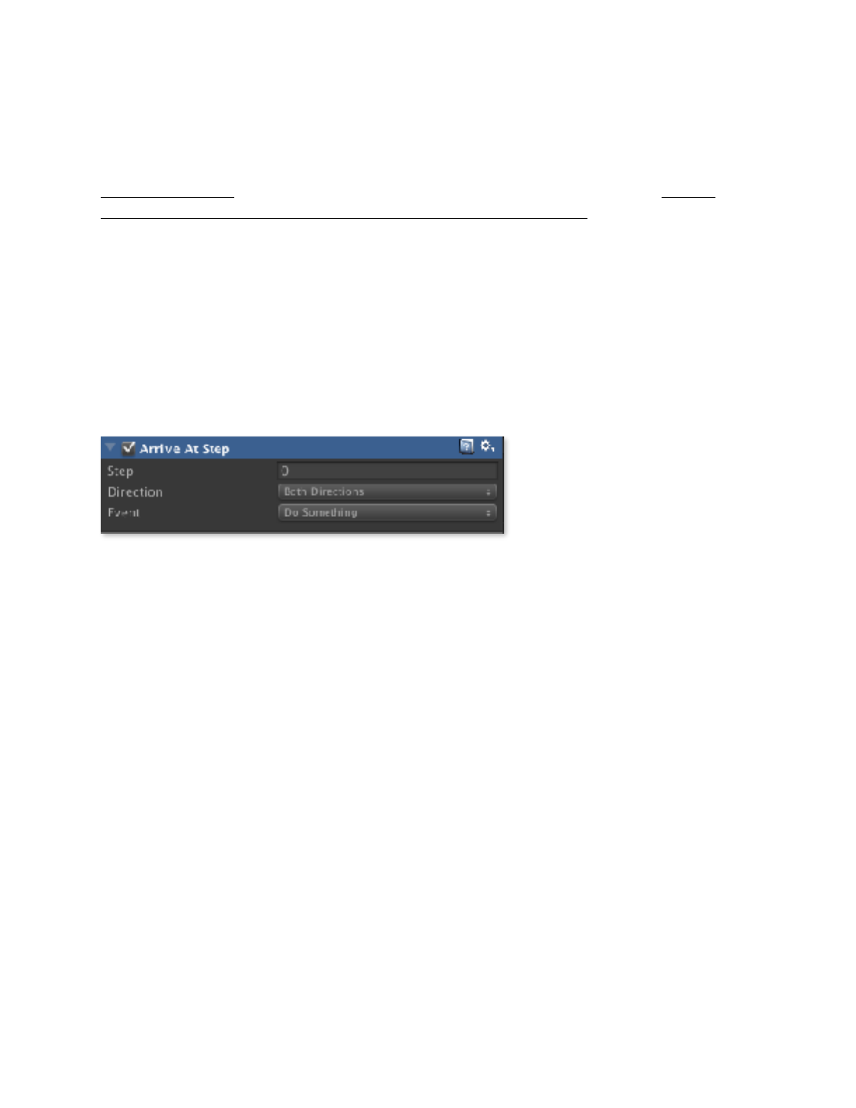
The PanoplySequencer
component let you set up sound
effects to be played when the
user arrives at specific steps on
the timeline.
Copyright © 2014-2018 Erik Loyer. All rights reserved.
Page ! of !29 43

Panoply Reference Manual
Global timeline. This slider lets you preview the current state of the timeline by
dragging from discrete step to discrete step.
Instruments. Each channel of audio in the sequencer is called an Instrument. You can
set the total number of instruments to be used in the scene by changing the number in the
Size parameter.
Each Instrument has four components:
Name. Enter a name that will help you remember what the instrument is.
Audio Clip. Drag in the audio clip for the sound you want the instrument to play.
Loop Checkbox. If the sound should should loop, check this box.
Volume Slider. Drag the slider to set the volume of the sound in the current step.
Setting up your audio sequencing is a matter of adding an Instrument for each sound you
want to be played in the scene, deciding whether the sound should loop, and then setting
the volume of the sound for each step of the scene by dragging the global timeline slider
and then adjusting the volume for each instrument.
Background Settings
If you expand the Panoply prefab in the Hierarchy you’ll see that it contains a
Background Camera which provides the background color for the gutters between
panels but which will not render any content of its own. To adjust the background color
(set to black by default), you can edit the camera’s Background setting.
!
The PanoplySequencer component is included for legacy
compatibility only. It is recommended that you use the
AudioTrack component for audio features going forward, as it
uses the same user-friendly keyframe interface as the other
components, and unlike PanoplySequencer, it responds to
global insert and delete keyframe actions.
Copyright © 2014-2018 Erik Loyer. All rights reserved.
Page ! of !30 43
Panoply Reference Manual
PlayMaker Actions
PlayMaker is a popular third-party visual scripting package for Unity (for details, see
hutonggames.com). You can download a separate Unity package (get it here: http://
opertoon.com/downloads/panoply/PanoplyPlayMakerActions.zip) that includes
PlayMaker actions for triggering events from specific steps on the Panoply global timeline.
Once this package is imported, the actions can be accessed under “Panoply” in
PlayMaker’s Action Browser.
Arrive At Step
The Arrive At Step action lets you trigger an event when the reader arrives at a specific
step on the global timeline.
Step. The step on the global
timeline at which the event is to
be triggered.
Direction. Determines
whether the event can be
triggered whenever the step is reached, or only while traveling forward or backward along
the global timeline.
Event. The event to be triggered.
Disable Navigation
The Disable Navigation action turns off all swipe navigation. This can be useful if you
want to temporarily allow other types of interaction without the possibility of the user
accidentally swiping to a new step.
Enable Navigation
The Enable Navigation action turns on swipe navigation, enabling the user to swipe to
the next or previous step.
Copyright © 2014-2018 Erik Loyer. All rights reserved.
Page ! of !31 43
Panoply Reference Manual
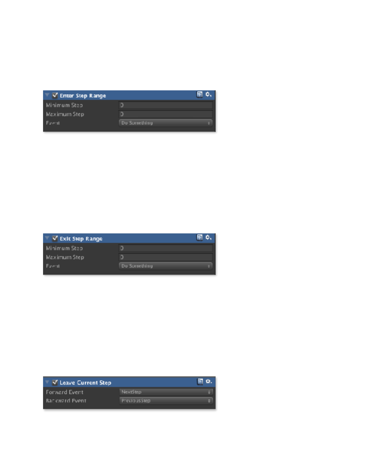
Enter Step Range
The Enter Step Range action lets you trigger an event when the reader enters a specific
range of steps on the global timeline.
Minimum Step. Defines the
low end of the range of steps
on the global timeline.
Maximum Step. Defines the
high end of the range of steps
on the global timeline.
Event. The event to be triggered.
Exit Step Range
The Exit Step Range action lets you trigger an event when the reader leaves a specific
range of steps on the global timeline.
Minimum Step. Defines the
low end of the range of steps
on the global timeline.
Maximum Step. Defines the
high end of the range of steps
on the global timeline.
Event. The event to be triggered.
Leave Current Step
The Leave Current Step action lets you trigger an event when the reader leaves the
current step on the global timeline.
Forward Event. The event to
be triggered when the user
moves to a step following the
current step.
Copyright © 2014-2018 Erik Loyer. All rights reserved.
Page ! of !32 43
Panoply Reference Manual
Backward Event. The event to be triggered when the user moves to a step prior to the
current step.
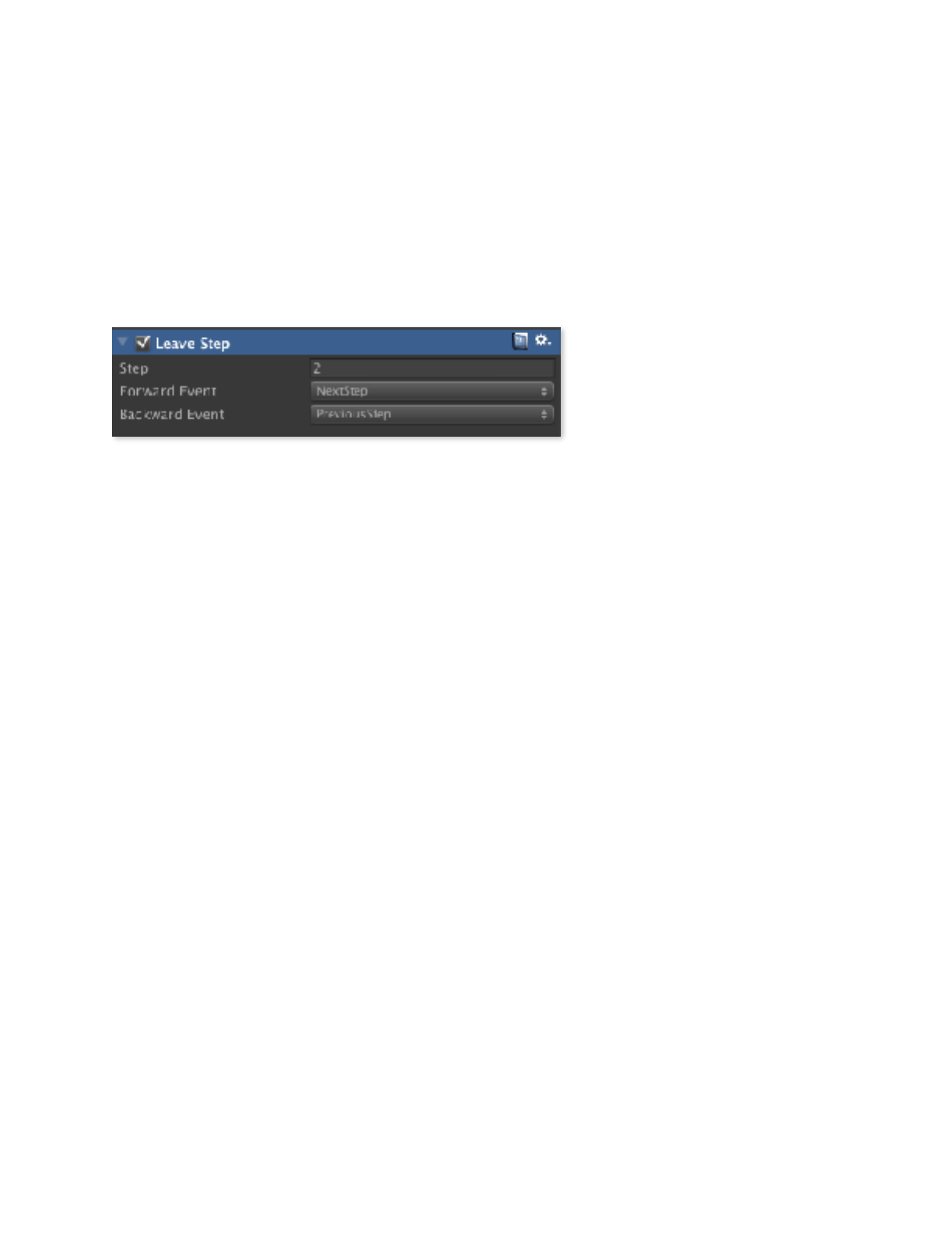
Leave Step
The Leave Step action lets you trigger an event when the reader leaves a specific step on
the global timeline.
Step. The step on the global
timeline which, when left
behind, triggers the event.
Direction. Determines
whether the event can be
triggered whenever the step is left behind, or only when leaving while moving forward or
backward along the global timeline.
Event. The event to be triggered.
Copyright © 2014-2018 Erik Loyer. All rights reserved.
Page ! of !33 43

Panoply Reference Manual
Localizing Captions and Balloons
Panoply includes built-in integration with the free LeanLocalization asset (http://u3d.as/
bdU) so you can easily localize your project’s captions and balloons. If you’d prefer to use
a different localization system, writing code to connect it to Panoply is easy.
When creating localized captions and balloons for Panoply, instead of putting the desired
text in the inspector directly, you enter a “key” which is then used to retrieve the text in
the desired language. For example, while in a non-localized English project a caption that
reads “Good morning!” would simply contain that text, in a localized project the caption
might contain the key “greeting,” which is then associated with “Good morning!” in the
English translation, and “Bonjour!” in the French.
Note that caption and balloon sizes do not vary depending on the language, so you must
make sure each instance is large enough to accommodate all of your translations.
Copyright © 2014-2018 Erik Loyer. All rights reserved.
Page ! of !34 43

Panoply Reference Manual
Getting Started with LeanLocalization
LeanLocalization by Carlos Wilkes (available here: http://u3d.as/bdU) is a simple and
free localization library appropriate for smaller teams and projects.
1. Download and install the LeanLocalization library.
You can find it here: http://u3d.as/bdU
2. Add the LeanLocalization game object to the hierarchy.
Select GameObject > Lean > Localization.
3. Download and install Panoply’s LeanLocalization package.
You can find it here: http://opertoon.com/downloads/panoply/
LeanLocalizationForPanoply.zip
4. Drag the LeanLocalizationForPanoply prefab to the hierarchy.
You’ll find it in Panoply/Localizers/.
5. Activate Panoply’s localization.
Select the Panoply prefab and check the Use Localization checkbox in the PanoplyScene
inspector. Then, drag the LeanLocalizationForPanoply prefab to the Localizer slot in the
inspector.
6. Add languages.
Select the LeanLocalization game object. In the Inspector, click the Add button to the
right of Languages to add your first language. Select a language. Repeat this process for
as many languages as you wish to add.
7. Add phrases.
Click the Add button to the right of Phrases to add a phrase. Enter the “key” that
identifies the phrase (this is the same text you will enter in your captions and balloons).
Repeat this process for as many phrases as you need.
8. Add translations.
For each phrase and language, click Create Translation and enter the translated text.
Copyright © 2014-2018 Erik Loyer. All rights reserved.
Page ! of !35 43

Panoply Reference Manual
9. Select a language.
Select the language you want to work with first by clicking the List button and choosing
one of the available options. (Note: This is for testing purposes only. When the final app is
run on a device, this selection will be overridden with the device’s current system
language.)
10. Create captions and balloons.
Add your captions and balloons to your Panoply panels, entering the key you created for
the phrase you want to appear into the Text field for each.
11. Test.
Be sure to test your localizations early and often, both within the Unity Editor and on
your target devices, to make sure they display appropriately.
Copyright © 2014-2018 Erik Loyer. All rights reserved.
Page ! of !36 43

Panoply Reference Manual
How to Integrate with Other Localization Systems
Integrating Panoply with other localization systems is easy. You simply need to create a
new script that extends the AbstractLocalizer class, replacing the two default methods
with your own. Note that authoring will be easiest if the localization system you choose
works in the Unity Editor outside of Play mode, since Panoply captions and balloons can
only be authored outside of Play mode.
Your new script needs only to contain the SetLanguage and GetLocalizedText methods
for setting the current language and retrieving localized text, respectively. See the
LeanLocalizationForPanoply script (shown below) for an example of how this is done.
!!
using UnityEngine;
using System.Collections;
using Lean;
// Panoply localizer for LeanLocalization asset (http://u3d.as/bdU)
// Last tested with version 1.0.6
namespace Opertoon.Panoply {
public class LeanLocalizationForPanoply : AbstractLocalizer {
public override void SetLanguage( string language ) {
LeanLocalization.Instance.SetLanguage( language );
}
public override string GetLocalizedText( string key ) {
return LeanLocalization.GetTranslationText( key );
}
}
}
Copyright © 2014-2018 Erik Loyer. All rights reserved.
Page ! of !37 43

Panoply Reference Manual
Integrating With Your Own Code
For more advanced integration with your project, you may find it helpful to access aspects
of Panoply from your own code. This can be used to trigger actions when the reader
arrives at specific points on the global timeline, or to change the reader’s position on the
timeline.
Panoply is written in C#, and is in the namespace Opertoon.Panoply.
PanoplyCore
Static Properties
PanoplyCore.interpolatedStep float
The current interpolated position on the global timeline. Panoply is constantly changing
this value to approach the current targetStep value. Use this property to determine or set
the user’s current position on the global timeline.
PanoplyCore.scene PanoplyScene
A static reference to the current PanoplyScene object.
PanoplyCore.targetStep int
The current destination step on the global timeline. Panoply will always try to smoothly
transition to this step.
Static Methods
DecrementStep ()
Decrements the targetStep (current destination step on the global timeline) by one.
Copyright © 2014-2018 Erik Loyer. All rights reserved.
Page ! of !38 43

Panoply Reference Manual
GoToFirstStep ()
Sets the targetStep (current destination step on the global timeline) to zero.
GoToLastStep ()
Sets the targetStep (current destination step on the global timeline) to its maximum value
for the current scene.
IncrementStep ()
Increments the targetStep (current destination step on the global timeline) by one.
SetInterpolatedStep ( step : float )
Sets the interpolatedStep (current interpolated position on the global timeline) to the
specified value.
SetTargetStep ( step : int )
Sets the targetStep (current destination step on the global timeline) to the specified value.
PanoplyEventManager
Events
OnTargetStepChanged ( int : oldStep, int : newStep )
Triggered every time current destination step on the global timeline is changed. The
oldStep variable contains the number of the prior target step, and the newStep variable
contains the number of the new target step.
Copyright © 2014-2018 Erik Loyer. All rights reserved.
Page ! of !39 43

Panoply Reference Manual
PanoplyScene
Properties
disableNavigation bool
When disableNavigation is set to true, Panoply will ignore clicks, drags, and swipes. You
can use this property to temporarily turn off navigation so the the user can interact with
the contents of a panel.
Copyright © 2014-2018 Erik Loyer. All rights reserved.
Page ! of !40 43

Panoply Reference Manual
Version History
Version 1.1.5
•Fixed bug that caused panel contents to overlap
•Fixed bug that caused certain steps to revert to earlier keyframes
•Now requires Unity version 5.6 or greater in preparation for future development
Version 1.1.4
•Fixed bug that could disable vertical passive motion
•Borders are now drawn even when overlapped by depth-only panels
•Fixed issues with inconsistent artwork scaling in the editor when playback is started
and stopped
Version 1.1.3
•Optimized performance for scenes with many steps and panels
Version 1.1.2
•Removed unnecessary files
Version 1.1.1
•Added ability to disable keyboard navigation
•Fixed bug that caused depth-only panel cameras to subtract their surface area from
mattes of other panel cameras beneath them
•Fixed bug that caused display issues with panels on the edges of the screen
Version 1.1
•Added panel borders
•Added ability to set the speed at which an audio track fades
•Added ability to disable a panel’s camera control
•Fixed bug that made it impossible to do an insert on the first frame of the global
timeline
•Fixed bug that disabled an audio track if it only had one keyframe
•One-shot audio clips now fade as needed while they play
•Fixed bug that sometimes caused captions to flash when a scene launched
Version 1.0
•Added visual keyframe editor
•Added global keyframe insert and delete
•Added ability to set artwork position locally, globally, or based on its panel
Copyright © 2014-2018 Erik Loyer. All rights reserved.
Page ! of !41 43

Panoply Reference Manual
•Added ability to globally disable navigation
•Added AudioTrack component with full keyframe editing support
•Panels now automatically space themselves apart from each other on the X axis
•Captions now automatically load default skins
•Performance optimizations
•Fixed bug that caused errors when extending the global timeline
•Fixed bug that doubled the object’s transform values when the Artwork component
was added to it
•Fixed a number of warnings and errors
Version 0.9.4
•Added localization features
•Fixed bug that caused one-shot audio to loop
Version 0.9.3
•Renamed the product (previously known as Opertoonity)
•All scripts namespaced and converted to C# (see update instructions below)
•Implemented new graphical layout tool
•Removed standalone components
Version 0.9.2
•Tweaked content scaling to behave more naturally
•Added an event (OnTargetStepChanged) which is triggered whenever the
destination step "
on the global timeline is changed
•The LeaveStep and LeaveCurrentStep PlayMaker event now support sending
separate "
events when the reader moves to the next and previous steps on the global timeline
•Fixed bug that didn’t reset the global timeline to zero when starting a new scene
•Fixed bug that immediately loaded the previous scene when Advance On Start was
set to "
true and a previous scene was specified
•Package should no longer trigger warnings when imported into Unity 5
•Fixed bug that prevented keyboard navigation from triggering PlayMaker actions "
Version 0.9.1
•Fixed bug that showed a one-pixel row of content for panels positioned below the
bottom of the screen
•Added volume control to non-looped sounds
•Using the up/down arrows to skip to the beginning or end of the current scene now
only works in the editor
Copyright © 2014-2018 Erik Loyer. All rights reserved.
Page ! of !42 43

Panoply Reference Manual
•Specify the number of fingers required to trigger swipe gestures
•Captions are now scaled based on a reference screen size
•Improved handling of aspect ratio constraints for panels
•Fixed bug that didn’t set the current step to zero when arriving at a new scene that
had auto-advance turned off "
Version 0.9.0
•Automatic advancement to step 1 can be turned on or off
•Set the delay before automatic advancement occurs
•Sample multi-panel scene
•Five PlayMaker actions that trigger events at specific steps
•No longer necessary to manually add Hold or End steps to Panels, Captions, or
Artwork
•Documented how to access and set the current timeline step from code (see
“Integrating With Your Code”)
•Documented keyboard shortcuts "
Version 0.8.9
•Set the length of your scene in steps
•Specify the previous and next scenes to which the reader can navigate
•Per-step audio sequencing
Copyright © 2014-2018 Erik Loyer. All rights reserved.
Page ! of !43 43
