Quick Appsfor Share Point_6.7_User Guide Point 6.7 User
User Manual: QuickAppsforSharePoint_6.7_UserGuide
Open the PDF directly: View PDF  .
.
Page Count: 411 [warning: Documents this large are best viewed by clicking the View PDF Link!]

QuickApps for SharePoint® 6.7
User Guide
© 2017 AgreeYa
ALL RIGHTS RESERVED.
This guide contains proprietary information protected by copyright. The software described in this guide is furnished under
a software license or nondisclosure agreement. This software may be used or copied only in accordance with the terms of
the applicable agreement. No part of this guide may be reproduced or transmitted in any form or by any means, electronic
or mechanical, including photocopying and recording for any purpose other than the purchaser’s personal use without the
written permission of AgreeYa
The information in this document is provided in connection with AgreeYa products. No license, express or implied, by estoppel or
otherwise, to any intellectual property right is granted by this document or in connection with the sale of AgreeYa products.
EXCEPT AS SET FORTH IN THE TERMS AND CONDITIONS AS SPECIFIED IN THE LICENSE AGREEMENT FOR THIS PRODUCT, AGREEYA
ASSUMES NO LIABILITY WHATSOEVER AND DISCLAIMS ANY EXPRESS, IMPLIED OR STATUTORY WARRANTY RELATING TO ITS PRODUCTS
INCLUDING, BUT NOT LIMITED TO, THE IMPLIED WARRANTY OF MERCHANTABILITY, FITNESS FOR A PARTICULAR PURPOSE, OR NON-
INFRINGEMENT. IN NO EVENT SHALL AGREEYA BE LIABLE FOR ANY DIRECT, INDIRECT, CONSEQUENTIAL, PUNITIVE, SPECIAL OR
INCIDENTAL DAMAGES (INCLUDING, WITHOUT LIMITATION, DAMAGES FOR LOSS OF PROFITS, BUSINESS INTERRUPTION OR LOSS OF
INFORMATION) ARISING OUT OF THE USE OR INABILITY TO USE THIS DOCUMENT, EVEN IF AGREEYA HAS BEEN ADVISED OF THE
POSSIBILITY OF SUCH DAMAGES. AgreeYa makes no representations or warranties with respect to the accuracy or completeness of
the contents of this document and reserves the right to make changes to specifications and product descriptions at any time
without notice. AgreeYa does not make any commitment to update the information contained in this document.
If you have any questions regarding your potential use of this material, contact:
AgreeYa Solutions,
605 Coolidge Dr.
Folsom, CA 95630
USA
Refer to our web site (www.agreeya.com) for regional and international office information.
Trademarks
AgreeYa, the AgreeYa logo are trademarks of AgreeYa and/or its affiliates. Microsoft, Internet Explorer, SharePoint,
Windows, Windows Server, SQL Server are either registered trademarks or trademarks of Microsoft Corporation in the United
States and/or other countries. Salesforce and Salesforce.com are trademarks of Salesforce.com. K2, K2BlackPearl are
registered trademarks of Sourcecode Technology Holdings Inc. in the United States and/or other countries. Domino is a
registered trademark of International Business Machines Corporation. Telerik is a registered trademark of Telerik AD in the
United States and either a registered trademark or trademark of Telerik AD in other countries. Oracle and Java are
registered trademarks of Oracle and/or its affiliates. Nintex and its product logos are registered trademarks owned by
Nintex USA LLC and Nintex Pty Ltd. SAP is the trademark(s) or registered trademark(s) of SAP AG in Germany and in several
other countries. Google and Google Chrome is a trademark or registered trademark of Google Inc. Netscape Navigator is a
registered trademark of AOL Inc. Other trademarks and trade names may be used in this document to refer to either the
entities claiming the marks and names or their products. AgreeYa disclaims any proprietary interest in the marks and names
of others.
Legend
CAUTION: A CAUTION icon indicates potential damage to hardware or loss of data if instructions are not followed.
WARNING: A WARNING icon indicates a potential for property damage, personal injury, or death.
IMPORTANT NOTE, NOTE, TIP, MOBILE, or VIDEO: An information icon indicates supporting information.
QuickApps for SharePoint User Guide
Updated - August 2016
Software Version - 6.7

Contents
Introducing QuickApps for SharePoint® . . . . . . . . . . . . . . . . . . . . . . . . . . . . . . . . . 8
About this Guide . . . . . . . . . . . . . . . . . . . . . . . . . . . . . . . . . . . . . . . . . . . . . . . . . 8
About QuickApps for SharePoint . . . . . . . . . . . . . . . . . . . . . . . . . . . . . . . . . . . . . . . 8
Features of QuickApps for SharePoint . . . . . . . . . . . . . . . . . . . . . . . . . . . . . . . . 8
qCalendarView . . . . . . . . . . . . . . . . . . . . . . . . . . . . . . . . . . . . . . . . . . . . . . . . 10
Overview . . . . . . . . . . . . . . . . . . . . . . . . . . . . . . . . . . . . . . . . . . . . . . . . . . . . . .10
qCalendar Pages . . . . . . . . . . . . . . . . . . . . . . . . . . . . . . . . . . . . . . . . . . . . . . . . .10
Content Page . . . . . . . . . . . . . . . . . . . . . . . . . . . . . . . . . . . . . . . . . . . . . . . .11
Behavior Page . . . . . . . . . . . . . . . . . . . . . . . . . . . . . . . . . . . . . . . . . . . . . . . .22
Appearance Page . . . . . . . . . . . . . . . . . . . . . . . . . . . . . . . . . . . . . . . . . . . . . .28
Advanced Page . . . . . . . . . . . . . . . . . . . . . . . . . . . . . . . . . . . . . . . . . . . . . . .32
qCaptionDisplay . . . . . . . . . . . . . . . . . . . . . . . . . . . . . . . . . . . . . . . . . . . . . . . . 34
Overview . . . . . . . . . . . . . . . . . . . . . . . . . . . . . . . . . . . . . . . . . . . . . . . . . . . . . .34
qCaptionDisplay Pages . . . . . . . . . . . . . . . . . . . . . . . . . . . . . . . . . . . . . . . . . . . . .35
Content Page . . . . . . . . . . . . . . . . . . . . . . . . . . . . . . . . . . . . . . . . . . . . . . . .35
Appearance Page . . . . . . . . . . . . . . . . . . . . . . . . . . . . . . . . . . . . . . . . . . . . . .35
Advanced Page . . . . . . . . . . . . . . . . . . . . . . . . . . . . . . . . . . . . . . . . . . . . . . .37
qCascadingMenu . . . . . . . . . . . . . . . . . . . . . . . . . . . . . . . . . . . . . . . . . . . . . . . 39
Overview . . . . . . . . . . . . . . . . . . . . . . . . . . . . . . . . . . . . . . . . . . . . . . . . . . . . .39
qCascadingMenu Pages . . . . . . . . . . . . . . . . . . . . . . . . . . . . . . . . . . . . . . . . . . . . .40
Content Page . . . . . . . . . . . . . . . . . . . . . . . . . . . . . . . . . . . . . . . . . . . . . . . .40
Behavior Page . . . . . . . . . . . . . . . . . . . . . . . . . . . . . . . . . . . . . . . . . . . . . . . .41
Appearance Page . . . . . . . . . . . . . . . . . . . . . . . . . . . . . . . . . . . . . . . . . . . . . .42
Advanced Page . . . . . . . . . . . . . . . . . . . . . . . . . . . . . . . . . . . . . . . . . . . . . . .43
qCascadingMenu Procedures . . . . . . . . . . . . . . . . . . . . . . . . . . . . . . . . . . . . . . . . .45
Configuring qCascadingMenu . . . . . . . . . . . . . . . . . . . . . . . . . . . . . . . . . . . . . .45
qChartView . . . . . . . . . . . . . . . . . . . . . . . . . . . . . . . . . . . . . . . . . . . . . . . . . . . 47
Overview . . . . . . . . . . . . . . . . . . . . . . . . . . . . . . . . . . . . . . . . . . . . . . . . . . . . . .47
qChartView Pages . . . . . . . . . . . . . . . . . . . . . . . . . . . . . . . . . . . . . . . . . . . . . . . .47
Content Page . . . . . . . . . . . . . . . . . . . . . . . . . . . . . . . . . . . . . . . . . . . . . . . .47
Behavior Page . . . . . . . . . . . . . . . . . . . . . . . . . . . . . . . . . . . . . . . . . . . . . . . .55
Appearance Page . . . . . . . . . . . . . . . . . . . . . . . . . . . . . . . . . . . . . . . . . . . . . .55
Advanced Page . . . . . . . . . . . . . . . . . . . . . . . . . . . . . . . . . . . . . . . . . . . . . . .85
qChartView Procedures . . . . . . . . . . . . . . . . . . . . . . . . . . . . . . . . . . . . . . . . . . . .87
Configuring qChartView . . . . . . . . . . . . . . . . . . . . . . . . . . . . . . . . . . . . . . . . .87
Formatting Links . . . . . . . . . . . . . . . . . . . . . . . . . . . . . . . . . . . . . . . . . . . . . .87
Setting Number Formatting . . . . . . . . . . . . . . . . . . . . . . . . . . . . . . . . . . . . . . .90
Setting Number Scaling . . . . . . . . . . . . . . . . . . . . . . . . . . . . . . . . . . . . . . . . . .94
Using MultiSeriesStackedColumn2D and MultiSeriesStackedColumn2DLineDual
YAxis Charts . . . . . . . . . . . . . . . . . . . . . . . . . . . . . . . . . . . . . . . . . . . . . . . . .97
QuickApps for SharePoint® 6.7
3
User Guide

qDiscussionView . . . . . . . . . . . . . . . . . . . . . . . . . . . . . . . . . . . . . . . . . . . . . . . 99
Overview . . . . . . . . . . . . . . . . . . . . . . . . . . . . . . . . . . . . . . . . . . . . . . . . . . . . . .99
qDiscussionView Pages . . . . . . . . . . . . . . . . . . . . . . . . . . . . . . . . . . . . . . . . . . . . .99
Content Page . . . . . . . . . . . . . . . . . . . . . . . . . . . . . . . . . . . . . . . . . . . . . . . .99
Behavior Page . . . . . . . . . . . . . . . . . . . . . . . . . . . . . . . . . . . . . . . . . . . . . . . 109
Appearance Page . . . . . . . . . . . . . . . . . . . . . . . . . . . . . . . . . . . . . . . . . . . . . 109
Advanced Page . . . . . . . . . . . . . . . . . . . . . . . . . . . . . . . . . . . . . . . . . . . . . . 112
qDiscussionView Procedures . . . . . . . . . . . . . . . . . . . . . . . . . . . . . . . . . . . . . . . .
114 Configuring qDiscussionView . . . . . . . . . . . . . . . . . . . . . . . . . . . . . . . . . . . . .
114 Sorting the qDiscussionView . . . . . . . . . . . . . . . . . . . . . . . . . . . . . . . . . . . . . .
114 Understanding the Complex Category Index List . . . . . . . . . . . . . . . . . . . . . . . .
115 Configuring qDiscussionView with the Complex Category Index List . . . . . . . . . . . .
116
qDynamicLayout . . . . . . . . . . . . . . . . . . . . . . . . . . . . . . . . . . . . . . . . . . . . . . .119
Overview . . . . . . . . . . . . . . . . . . . . . . . . . . . . . . . . . . . . . . . . . . . . . . . . . . . . . 119
qDynamicLayout Pages . . . . . . . . . . . . . . . . . . . . . . . . . . . . . . . . . . . . . . . . . . . . 119
Content Page . . . . . . . . . . . . . . . . . . . . . . . . . . . . . . . . . . . . . . . . . . . . . . . 119
Appearance Page . . . . . . . . . . . . . . . . . . . . . . . . . . . . . . . . . . . . . . . . . . . . . 121
Advanced Page . . . . . . . . . . . . . . . . . . . . . . . . . . . . . . . . . . . . . . . . . . . . . . 122
qDynamicLayout Procedures . . . . . . . . . . . . . . . . . . . . . . . . . . . . . . . . . . . . . . . . 123
Configuring qDynamicLayout . . . . . . . . . . . . . . . . . . . . . . . . . . . . . . . . . . . . . 123
qExcelViewer . . . . . . . . . . . . . . . . . . . . . . . . . . . . . . . . . . . . . . . . . . . . . . . . .124
Overview . . . . . . . . . . . . . . . . . . . . . . . . . . . . . . . . . . . . . . . . . . . . . . . . . . . . . 124
qExcelViewer Pages . . . . . . . . . . . . . . . . . . . . . . . . . . . . . . . . . . . . . . . . . . . . . . 124
Content Page . . . . . . . . . . . . . . . . . . . . . . . . . . . . . . . . . . . . . . . . . . . . . . . 124
Appearance Page . . . . . . . . . . . . . . . . . . . . . . . . . . . . . . . . . . . . . . . . . . . . . 126
Advanced Page . . . . . . . . . . . . . . . . . . . . . . . . . . . . . . . . . . . . . . . . . . . . . . 127
qExcelViewer Procedures . . . . . . . . . . . . . . . . . . . . . . . . . . . . . . . . . . . . . . . . . . 128
Configuring qExcelViewer . . . . . . . . . . . . . . . . . . . . . . . . . . . . . . . . . . . . . . . 128
qHelpLink . . . . . . . . . . . . . . . . . . . . . . . . . . . . . . . . . . . . . . . . . . . . . . . . . . . .130
Overview . . . . . . . . . . . . . . . . . . . . . . . . . . . . . . . . . . . . . . . . . . . . . . . . . . . . 130
qHelpLink Pages . . . . . . . . . . . . . . . . . . . . . . . . . . . . . . . . . . . . . . . . . . . . . . . . 130
Content Page . . . . . . . . . . . . . . . . . . . . . . . . . . . . . . . . . . . . . . . . . . . . . . . 131
Behavior Page . . . . . . . . . . . . . . . . . . . . . . . . . . . . . . . . . . . . . . . . . . . . . . . 132
Appearance Page . . . . . . . . . . . . . . . . . . . . . . . . . . . . . . . . . . . . . . . . . . . . . 132
Advanced Page . . . . . . . . . . . . . . . . . . . . . . . . . . . . . . . . . . . . . . . . . . . . . . 133
qItemDisplay . . . . . . . . . . . . . . . . . . . . . . . . . . . . . . . . . . . . . . . . . . . . . . . . . .135
Overview . . . . . . . . . . . . . . . . . . . . . . . . . . . . . . . . . . . . . . . . . . . . . . . . . . . . 135
qItemDisplay Pages . . . . . . . . . . . . . . . . . . . . . . . . . . . . . . . . . . . . . . . . . . . . . . 135
Content Page . . . . . . . . . . . . . . . . . . . . . . . . . . . . . . . . . . . . . . . . . . . . . . . 135
Behavior Page . . . . . . . . . . . . . . . . . . . . . . . . . . . . . . . . . . . . . . . . . . . . . . . 137
Appearance Page . . . . . . . . . . . . . . . . . . . . . . . . . . . . . . . . . . . . . . . . . . . . . 137
Advanced Page . . . . . . . . . . . . . . . . . . . . . . . . . . . . . . . . . . . . . . . . . . . . . . 139
qListForm . . . . . . . . . . . . . . . . . . . . . . . . . . . . . . . . . . . . . . . . . . . . . . . . . . . .141
QuickApps for SharePoint® 6.7
4
User Guide

Overview . . . . . . . . . . . . . . . . . . . . . . . . . . . . . . . . . . . . . . . . . . . . . . . . . . . . . 141
User Permissions . . . . . . . . . . . . . . . . . . . . . . . . . . . . . . . . . . . . . . . . . . . . . 143
qListForm Pages . . . . . . . . . . . . . . . . . . . . . . . . . . . . . . . . . . . . . . . . . . . . . . . . 143
Content Page . . . . . . . . . . . . . . . . . . . . . . . . . . . . . . . . . . . . . . . . . . . . . . . 144
Behavior Page . . . . . . . . . . . . . . . . . . . . . . . . . . . . . . . . . . . . . . . . . . . . . . . 166
Appearance Page . . . . . . . . . . . . . . . . . . . . . . . . . . . . . . . . . . . . . . . . . . . . . 178
Advanced Page . . . . . . . . . . . . . . . . . . . . . . . . . . . . . . . . . . . . . . . . . . . . . . 181
qListForm Procedures . . . . . . . . . . . . . . . . . . . . . . . . . . . . . . . . . . . . . . . . . . . . 185
Adding items to a list in SharePoint using qListForm . . . . . . . . . . . . . . . . . . . . . . 185
Creating and Editing Collapsible Sections . . . . . . . . . . . . . . . . . . . . . . . . . . . . . 186
qListView . . . . . . . . . . . . . . . . . . . . . . . . . . . . . . . . . . . . . . . . . . . . . . . . . . . .189
Overview . . . . . . . . . . . . . . . . . . . . . . . . . . . . . . . . . . . . . . . . . . . . . . . . . . . . . 189
Configuration Wizard . . . . . . . . . . . . . . . . . . . . . . . . . . . . . . . . . . . . . . . . . . . . . 190
qListView Pages . . . . . . . . . . . . . . . . . . . . . . . . . . . . . . . . . . . . . . . . . . . . . . . . 190
Content Page . . . . . . . . . . . . . . . . . . . . . . . . . . . . . . . . . . . . . . . . . . . . . . . 191
Behavior Page . . . . . . . . . . . . . . . . . . . . . . . . . . . . . . . . . . . . . . . . . . . . . . . 205
Appearance Page . . . . . . . . . . . . . . . . . . . . . . . . . . . . . . . . . . . . . . . . . . . . . 211
Advanced Page . . . . . . . . . . . . . . . . . . . . . . . . . . . . . . . . . . . . . . . . . . . . . . 217
qListView Procedures . . . . . . . . . . . . . . . . . . . . . . . . . . . . . . . . . . . . . . . . . . . . . 223
Configuring Basic Settings using the Configuration Wizard . . . . . . . . . . . . . . . . . . 223
Configuring a Basic ListView with Filters using ezEdit . . . . . . . . . . . . . . . . . . . . . 223
qManagement . . . . . . . . . . . . . . . . . . . . . . . . . . . . . . . . . . . . . . . . . . . . . . . . .225
Overview . . . . . . . . . . . . . . . . . . . . . . . . . . . . . . . . . . . . . . . . . . . . . . . . . . . . . 225
qManagement Pages . . . . . . . . . . . . . . . . . . . . . . . . . . . . . . . . . . . . . . . . . . . . . 225
Content Page . . . . . . . . . . . . . . . . . . . . . . . . . . . . . . . . . . . . . . . . . . . . . . . 225
Appearance Page . . . . . . . . . . . . . . . . . . . . . . . . . . . . . . . . . . . . . . . . . . . . . 226
Advanced Page . . . . . . . . . . . . . . . . . . . . . . . . . . . . . . . . . . . . . . . . . . . . . . 228
qManagement Procedures . . . . . . . . . . . . . . . . . . . . . . . . . . . . . . . . . . . . . . . . . . 229
Configuring qManagement . . . . . . . . . . . . . . . . . . . . . . . . . . . . . . . . . . . . . . . 229
Exploring Web apps . . . . . . . . . . . . . . . . . . . . . . . . . . . . . . . . . . . . . . . . . . . 230
Searching Web apps . . . . . . . . . . . . . . . . . . . . . . . . . . . . . . . . . . . . . . . . . . . 230 Setting
New Property Values . . . . . . . . . . . . . . . . . . . . . . . . . . . . . . . . . . . . . 230
qMediaView . . . . . . . . . . . . . . . . . . . . . . . . . . . . . . . . . . . . . . . . . . . . . . . . . . .232
Overview . . . . . . . . . . . . . . . . . . . . . . . . . . . . . . . . . . . . . . . . . . . . . . . . . . . . . 232
qMediaView Pages . . . . . . . . . . . . . . . . . . . . . . . . . . . . . . . . . . . . . . . . . . . . . . . 232
Content Page . . . . . . . . . . . . . . . . . . . . . . . . . . . . . . . . . . . . . . . . . . . . . . . 233
Appearance Page . . . . . . . . . . . . . . . . . . . . . . . . . . . . . . . . . . . . . . . . . . . . . 236
Advanced Page . . . . . . . . . . . . . . . . . . . . . . . . . . . . . . . . . . . . . . . . . . . . . . 240
qMultiSelector . . . . . . . . . . . . . . . . . . . . . . . . . . . . . . . . . . . . . . . . . . . . . . . . .241
Overview . . . . . . . . . . . . . . . . . . . . . . . . . . . . . . . . . . . . . . . . . . . . . . . . . . . . . 241
qMultiSelector Pages . . . . . . . . . . . . . . . . . . . . . . . . . . . . . . . . . . . . . . . . . . . . . 241
Content Page . . . . . . . . . . . . . . . . . . . . . . . . . . . . . . . . . . . . . . . . . . . . . . . 241
Appearance Page . . . . . . . . . . . . . . . . . . . . . . . . . . . . . . . . . . . . . . . . . . . . . 244
Advanced Page . . . . . . . . . . . . . . . . . . . . . . . . . . . . . . . . . . . . . . . . . . . . . . 245
QuickApps for SharePoint® 6.7
5
User Guide

qPageRedirector . . . . . . . . . . . . . . . . . . . . . . . . . . . . . . . . . . . . . . . . . . . . . . .247
Overview . . . . . . . . . . . . . . . . . . . . . . . . . . . . . . . . . . . . . . . . . . . . . . . . . . . . . 247
qPageRedirector Pages . . . . . . . . . . . . . . . . . . . . . . . . . . . . . . . . . . . . . . . . . . . . 248
Content Page . . . . . . . . . . . . . . . . . . . . . . . . . . . . . . . . . . . . . . . . . . . . . . . 248
Appearance Page . . . . . . . . . . . . . . . . . . . . . . . . . . . . . . . . . . . . . . . . . . . . . 248
Advanced Page . . . . . . . . . . . . . . . . . . . . . . . . . . . . . . . . . . . . . . . . . . . . . . 250
qPanelMenu . . . . . . . . . . . . . . . . . . . . . . . . . . . . . . . . . . . . . . . . . . . . . . . . . .252
Overview . . . . . . . . . . . . . . . . . . . . . . . . . . . . . . . . . . . . . . . . . . . . . . . . . . . . 252
qPanelMenu Pages . . . . . . . . . . . . . . . . . . . . . . . . . . . . . . . . . . . . . . . . . . . . . . . 253
Content Page . . . . . . . . . . . . . . . . . . . . . . . . . . . . . . . . . . . . . . . . . . . . . . . 253
Behavior Page . . . . . . . . . . . . . . . . . . . . . . . . . . . . . . . . . . . . . . . . . . . . . . . 255
Appearance Page . . . . . . . . . . . . . . . . . . . . . . . . . . . . . . . . . . . . . . . . . . . . . 255
Advanced Page . . . . . . . . . . . . . . . . . . . . . . . . . . . . . . . . . . . . . . . . . . . . . . 257
qPanelMenu Procedures . . . . . . . . . . . . . . . . . . . . . . . . . . . . . . . . . . . . . . . . . . . 258
Configuring qPanelMenu . . . . . . . . . . . . . . . . . . . . . . . . . . . . . . . . . . . . . . . . 258
qSelector . . . . . . . . . . . . . . . . . . . . . . . . . . . . . . . . . . . . . . . . . . . . . . . . . . . .260
Overview . . . . . . . . . . . . . . . . . . . . . . . . . . . . . . . . . . . . . . . . . . . . . . . . . . . . . 260
qSelector Pages . . . . . . . . . . . . . . . . . . . . . . . . . . . . . . . . . . . . . . . . . . . . . . . . 261
Content Page . . . . . . . . . . . . . . . . . . . . . . . . . . . . . . . . . . . . . . . . . . . . . . . 261
Appearance Page . . . . . . . . . . . . . . . . . . . . . . . . . . . . . . . . . . . . . . . . . . . . . 263
Advanced Page . . . . . . . . . . . . . . . . . . . . . . . . . . . . . . . . . . . . . . . . . . . . . . 265
qSIChartView . . . . . . . . . . . . . . . . . . . . . . . . . . . . . . . . . . . . . . . . . . . . . . . . . .267
Overview . . . . . . . . . . . . . . . . . . . . . . . . . . . . . . . . . . . . . . . . . . . . . . . . . . . . 267
qSIChartView Pages . . . . . . . . . . . . . . . . . . . . . . . . . . . . . . . . . . . . . . . . . . . . . . 267
Content Page . . . . . . . . . . . . . . . . . . . . . . . . . . . . . . . . . . . . . . . . . . . . . . . 268
Behavior Page . . . . . . . . . . . . . . . . . . . . . . . . . . . . . . . . . . . . . . . . . . . . . . . 277
Appearance Page . . . . . . . . . . . . . . . . . . . . . . . . . . . . . . . . . . . . . . . . . . . . . 282
Advanced Page . . . . . . . . . . . . . . . . . . . . . . . . . . . . . . . . . . . . . . . . . . . . . . 311
qSIChartView Procedures . . . . . . . . . . . . . . . . . . . . . . . . . . . . . . . . . . . . . . . . . . 313
Configuring qSIChartView . . . . . . . . . . . . . . . . . . . . . . . . . . . . . . . . . . . . . . . 313
Formatting Links . . . . . . . . . . . . . . . . . . . . . . . . . . . . . . . . . . . . . . . . . . . . . 313
Setting Number Formatting . . . . . . . . . . . . . . . . . . . . . . . . . . . . . . . . . . . . . . 315
Setting Number Scaling . . . . . . . . . . . . . . . . . . . . . . . . . . . . . . . . . . . . . . . . . 320
Using MultiSeriesStackedColumn2D and MultiSeriesStackedColumn2DLineDual
YAxis Charts . . . . . . . . . . . . . . . . . . . . . . . . . . . . . . . . . . . . . . . . . . . . . . . . 323
qSIListForm . . . . . . . . . . . . . . . . . . . . . . . . . . . . . . . . . . . . . . . . . . . . . . . . . . .324
Overview . . . . . . . . . . . . . . . . . . . . . . . . . . . . . . . . . . . . . . . . . . . . . . . . . . . . . 324
qSIListForm Pages . . . . . . . . . . . . . . . . . . . . . . . . . . . . . . . . . . . . . . . . . . . . . . . 325
Content Page . . . . . . . . . . . . . . . . . . . . . . . . . . . . . . . . . . . . . . . . . . . . . . . 325
Behavior Page . . . . . . . . . . . . . . . . . . . . . . . . . . . . . . . . . . . . . . . . . . . . . . . 333
Appearance Page . . . . . . . . . . . . . . . . . . . . . . . . . . . . . . . . . . . . . . . . . . . . . 342
Advanced Page . . . . . . . . . . . . . . . . . . . . . . . . . . . . . . . . . . . . . . . . . . . . . . 344
qSIListView . . . . . . . . . . . . . . . . . . . . . . . . . . . . . . . . . . . . . . . . . . . . . . . . . . .346
Overview . . . . . . . . . . . . . . . . . . . . . . . . . . . . . . . . . . . . . . . . . . . . . . . . . . . . . 346
QuickApps for SharePoint® 6.7
6
User Guide

qSIListView Pages . . . . . . . . . . . . . . . . . . . . . . . . . . . . . . . . . . . . . . . . . . . . . . . 347
Content Page . . . . . . . . . . . . . . . . . . . . . . . . . . . . . . . . . . . . . . . . . . . . . . . 347
Behavior Page . . . . . . . . . . . . . . . . . . . . . . . . . . . . . . . . . . . . . . . . . . . . . . . 358
Appearance Page . . . . . . . . . . . . . . . . . . . . . . . . . . . . . . . . . . . . . . . . . . . . . 362
Advanced Page . . . . . . . . . . . . . . . . . . . . . . . . . . . . . . . . . . . . . . . . . . . . . . 366
qSISelector . . . . . . . . . . . . . . . . . . . . . . . . . . . . . . . . . . . . . . . . . . . . . . . . . . .369
Overview . . . . . . . . . . . . . . . . . . . . . . . . . . . . . . . . . . . . . . . . . . . . . . . . . . . . 369
qSISelector Pages . . . . . . . . . . . . . . . . . . . . . . . . . . . . . . . . . . . . . . . . . . . . . . . 370
Content Page . . . . . . . . . . . . . . . . . . . . . . . . . . . . . . . . . . . . . . . . . . . . . . . 370
Behavior Page . . . . . . . . . . . . . . . . . . . . . . . . . . . . . . . . . . . . . . . . . . . . . . . 376
Appearance Page . . . . . . . . . . . . . . . . . . . . . . . . . . . . . . . . . . . . . . . . . . . . . 376
Advanced Page . . . . . . . . . . . . . . . . . . . . . . . . . . . . . . . . . . . . . . . . . . . . . . 378
Custom Action Help . . . . . . . . . . . . . . . . . . . . . . . . . . . . . . . . . . . . . . . . . . . . .380
Overview . . . . . . . . . . . . . . . . . . . . . . . . . . . . . . . . . . . . . . . . . . . . . . . . . . . . 380
Custom Action . . . . . . . . . . . . . . . . . . . . . . . . . . . . . . . . . . . . . . . . . . . . . . . . . 380
ICustomActionEx Interface . . . . . . . . . . . . . . . . . . . . . . . . . . . . . . . . . . . . . . 380
ICustomAction Interface (Deprecated) . . . . . . . . . . . . . . . . . . . . . . . . . . . . . . . 386
Debugging . . . . . . . . . . . . . . . . . . . . . . . . . . . . . . . . . . . . . . . . . . . . . . . . . 389
Using the Custom Action Class . . . . . . . . . . . . . . . . . . . . . . . . . . . . . . . . . . . . 390
Deploying Custom Action Class . . . . . . . . . . . . . . . . . . . . . . . . . . . . . . . . . . . . 390
ezLocalizer . . . . . . . . . . . . . . . . . . . . . . . . . . . . . . . . . . . . . . . . . . . . . . . . . . .391
Creating a New Project . . . . . . . . . . . . . . . . . . . . . . . . . . . . . . . . . . . . . . . . . . . 391
Opening an Existing Project . . . . . . . . . . . . . . . . . . . . . . . . . . . . . . . . . . . . . . . . 392
Finding Values in a Project . . . . . . . . . . . . . . . . . . . . . . . . . . . . . . . . . . . . . . . . . 392
My First App . . . . . . . . . . . . . . . . . . . . . . . . . . . . . . . . . . . . . . . . . . . . . . . . . .393
Overview . . . . . . . . . . . . . . . . . . . . . . . . . . . . . . . . . . . . . . . . . . . . . . . . . . . . . 393
Using My First App . . . . . . . . . . . . . . . . . . . . . . . . . . . . . . . . . . . . . . . . . . . . . . . 393
Application Templates . . . . . . . . . . . . . . . . . . . . . . . . . . . . . . . . . . . . . . . . . . .394
Installing the Application Templates . . . . . . . . . . . . . . . . . . . . . . . . . . . . . . . . . . . 394
Adding the CRM template . . . . . . . . . . . . . . . . . . . . . . . . . . . . . . . . . . . . . . . . . . 394
Adding the Help Desk Template . . . . . . . . . . . . . . . . . . . . . . . . . . . . . . . . . . . . . . 395
Adding the Project Dashboard Template . . . . . . . . . . . . . . . . . . . . . . . . . . . . . . . . 396
Adding the Project Workspace . . . . . . . . . . . . . . . . . . . . . . . . . . . . . . . . . . . . . . . 396
Sample Charts . . . . . . . . . . . . . . . . . . . . . . . . . . . . . . . . . . . . . . . . . . . . . . . . .398
Contacting AgreeYa . . . . . . . . . . . . . . . . . . . . . . . . . . . . . . . . . . . . . . . . . . . . . .
409 Technical support resources . . . . . . . . . . . . . . . . . . . . . . . . . . . . . . . . . . . . . . . .
409
QuickApps for SharePoint® 6.7
7
User Guide

1
Introducing QuickApps for SharePoint®
• About this Guide
• About QuickApps for SharePoint
• Features of QuickApps for SharePoint
About this Guide
This guide describes how to use the web apps component of QuickApps for SharePoint. It contains the
information required to perform general tasks and is intended for network administrators,
consultants, analysts, and any other IT professionals using QuickApps for SharePoint.
Before using this guide, see the QuickApps for SharePoint - Quick Start Guide for installing and activating
QuickApps for SharePoint. The same document also introduces the basic operation of QuickApps for
SharePoint, using a simple configuration to externalize documents in a sample SharePoint environment.
About QuickApps for SharePoint
QuickApps for SharePoint enables you to build applications that can be easily supported, maintained, and
upgraded to ensure their long-term impact and return on investment. Because web apps automates simple or
mundane tasks, you can free up SharePoint development resources and satisfy business requirements without
costly custom coding.
Features of QuickApps for SharePoint
QuickApps for SharePoint is deployed as a SharePoint Solution. The benefit of the solution package
deployment is the ability to deploy web apps in selected Web Applications using the SharePoint Central
Administration site. It also provides the flexibility to turn on/off QuickApps for SharePoint as a site feature.
When a new site or site collection is created, the Admin or Site Designer can activate the QuickApps for
SharePoint - Web apps Library to enable the web apps for newly added site collections.
This product allows you to:
• use point-and-click configuration instead of custom code to customize SharePoint solutions up to
80 percent faster
• meet your most complex business requirements, from interface enhancements to complete
solutions, without needing custom development training or experience
• use My First App to configure compelling SharePoint list views and charts in a few simple mouse clicks
• quickly build better SharePoint solutions with easy-to-use web apps featuring built-in video training
and tutorials. Discover best practices and tips and tricks from SharePoint peers and AgreeYa experts in
the collaborative QuickApps community at www.SharePointforAll.com.
• maximize your SharePoint investment by accelerating SharePoint development cycles in order to
save resources, time and money on costly enhancements
• empower end users to make their own customizations without risk to the environment, freeing
expensive development resources for more value-added projects
www.agreeya.com
QuickApps for SharePoint
®
6.7
8
User Guide
• accelerate SharePoint application development cycles using ready-made templates to deliver help
desk, project management and CRM applications that are easily supported, maintained, and extended
• build applications that you can easily maintain and support with no custom coding
• exceed user expectations and extend applications beyond what’s natively possible with features
that deliver tabular forms to save screen space, dynamically show and hide parts of a form, and
establish parent-child relationships to ensure reliable data entry
• deliver sophisticated custom solutions that can be upgraded with ease from SharePoint version to version
• bring data together from all of your enterprise application systems, such as Oracle®, SAP®, SQL
Server® and Salesforce.com®, without the hassle of copying the data manually into SharePoint
• build dashboards and charts that provide full visibility of your K2® workflows (including real-time
workflow) status. Then build rich SharePoint forms that drive business processes, so users can
take action on K2 workflows from directly within the SharePoint form (for SharePoint 2010 only)
• create custom actions with out-of-the-box and Nintex® workflows
• use ribbons. For more information, see Ribbon Groups on page 9.
Ribbon Groups
A Ribbon group is delivered for each web app that supports the SharePoint and SharePoint Foundation
Server Ribbon UI.
The contextual group contains the “Commands” contextual tab for the web app on the page, which in turn,
contains different Ribbon groups. When you select a web app, you can access such functions as ezEdit and
Help.
NOTE: To hide the Ribbon, enable the corresponding property in the Configuration Editor.
When multiple web apps are added to the page, different Ribbon tabs are added in the order of the web app
appearance on the page. Each tab’s name defaults to the Title property of the web app.
The display name of the tab can be changed using the web app property, Ribbon Appearance. This property
allows you to customize the display name for the tab. If this property is filled out, it overrides the web app's
Title property. If both of these properties are empty, the default name, “Commands”, is used.
The web app’s ribbon may consists of one or more of the following groups:
Table 1. Ribbon Groups
Group
Description
Manage Group
Contains the buttons: “Save and Close”, “Edit Item”, “Edit Series”, and “Cancel”
depending on the context. For example, if you are working with a form of type
EditListItem, the group will contain the “Save and Close” button. If the form type
is DisplayListItem or DisplayDocument, and you are working with a Calendar list,
the button is “Edit Series”. The text for Save and Cancel buttons can be changed
by using the Toolbar Appearance tab.
Actions Group
Contains a set of action buttons seen in the regular toolbar, The Ribbon organizes
the actions into different groups. In general, any button shown in the toolbar and
not in the “Manage” or “Custom Actions” groups is found in the “Actions” group.
This includes “Alert Me”, “Manage Permissions”, or “Manage Copies”.
Custom Actions
Contains a set of custom actions defined in the Custom Actions properties.
Group
Setting & Help
Contains buttons from the web app context menu: “ezEdit”, “Help” and “About”.
Group
www.agreeya.com
QuickApps for SharePoint
®
6.7
9
User Guide

2
qCalendarView
• Overview
• qCalendar Pages
Overview
The qCalendarView aggregates data from one or more SharePoint lists and displays it in calendar form.
The qCalendarView allows you to:
• Aggregate data from multiple lists that reside in different SharePoint sites. The lists to be
aggregated are defined in the Viewed Lists property.
• Ensure the referential integrity of the records in the dependent lists by preventing the deletion of
the parent record. The dependent lists are defined in the Viewed Lists property.
• View your data by Month, Week, or Day.
• Display non-recurring and recurring events from Calendar lists.
• Customize the look and feel for each part of the calendar by using a skin.
• Define a static filter using the CAML Filter expression or Complex Filter expression. The Complex
Filter expression supports time functions (for example, AddDays) and time expression (such as
[TODAY]) to filter out the data based on the moving time window. This feature is called Data Aging.
• Access the most common functions on the data item, such as View Properties, Edit Properties, Alert
Me, Export to ICalendar, and Delete. The author can turn off the context menu by setting the Enable
Context Menu property to False.
• Show or hide the calendar based on the site group and cross-site group membership of the
currently logged-in user by using the Show User Groups and Hide User Groups properties.
• Enable the chart view to consume a filter from another web app that implements IWebPartRow
or IWebPartParameter interface.
TIP: To maintain the same look and feel across all web apps, save the web app as a template, and re-
import it into the SharePoint gallery to reuse it.
NOTE: The IWebPartParameter consumer implementation is labeled with Get Filter From in the web app
Connection menu. This interface cannot be connected with the obsolete IFilterProvider or IRowProvider
implementation. Do not connect this new interface with the old interface that is marked obsolete.
qCalendar Pages
You can configure this web app through its pages that are accessible through ezEdit. qCalendar contains the
following pages:
• Content Page
• Behavior Page
• Appearance Page
www.agreeya.com
QuickApps for SharePoint
®
6.7
10
User Guide
• Advanced Page
Content Page
The Content page allows you to enter the content for your web app. It contains the following:
• Primary Content
• Optional Content
• Search/Filter Panel
• Filtering
Primary Content
The Primary Content page is default category. You need to configure one or more elements in this page to
get started using this web app.
Primary Content contains the following:
Table 1. Primary Content
Element
Description
Title
Allows you to enter a title for the Web app, or accept the default. This field is
mandatory.
Viewed Lists
See Viewed Lists on page 11.
ID HTTP Parameter
Allows the qListForm and several other web apps to an HTTP Parameter called ID to
identify the item to be displayed or edited. This HTTP Parameter is usually generated
automatically by the viewer web app, such as qListForm or qCalendarView, when you
select an item to be displayed or edited.
NOTE: If qCalendar is placed on a web app page that is contained within a document
library, the page will generate an error if the value of the ID HTTP Parameter is bigger
than the number of pages within the document library. To prevent this error from
happening, rename the ID HTTP Parameter.
By default, the value of this property is "ID". You can change the value of this property
to something else, such as LID. In that case, when you select "View Properties" or "Edit
Properties" in the context menu, the URL of the display or edit form becomes:
http://mysite.com/EditFormURL.aspx?LID=xxx
NOTE: Set the same property in the qListForm to the same value.
Begin Date Field
Allows you to enter the name of the field in the SharePoint list that contains the begin
Name
date information. The default value is Start Time, which is the begin date field name
for the SharePoint calendar list. If the calendar displays data from another type of list,
you may have to adjust the value of this property. For example, if you want to display
data from the Tasks list based on the Due Date of the tasks, then use Due Date as the
value of this property.
End Date Field Name
Allows you to enter the name of the field in the SharePoint list that contains the end
date information. This property is optional. The default value is End Time, which is
the end date field name for the SharePoint calendar list. If the calendar displays data
from another type of list, you may have to adjust the value of this property or leave
the value of the properly blank if it is not applicable.
Viewed Lists
The Viewed Lists section defines:
• the lists whose data is aggregated in the calendar
www.agreeya.com
QuickApps for SharePoint
®
6.7
11
User Guide
• the Dependent Lists for each list. If the Dependent Lists information is provided, the Calendar View
checks whether or not there are child records in the Dependent Lists when the user tries to delete
an item from the calendar. If there are, the Calendar View does not delete the selected item.
Viewed List contains the following list attributes:
Table 2. Viewed Lists
List Attributes
Description
Advanced Mode
Turn on if you want to edit Viewed Lists in XML format. For example:
<Lists>
<List SiteUrl="." ListName="wfpub" IncludeSubsites="false" IncludeThisSite="false"
IsRollUpList="false" RolledUpListName="Public Library"
UseUploadFormInLayoutsFolder="false">
<DependentLists />
</List>
</Lists>
Site URL
The URL to the site that contains the list to be searched. The URL can be absolute
(http://...) or relative to the current page URL. This attribute is mandatory.
When using a relative URL, you can use a single dot (.) to denote the current path, a
double dot (..) to denote the previous path, and a slash (/) to denote the root path.
List Name
The name of the SharePoint list that is edited or displayed by this Calendar View. The
list name is case sensitive. If the list name contains spaces, include the spaces here as
well.
To denote the current list, you can use a single dot (.) as the list name.
NOTE: This only works if the qCalendarView is contained in the AllItems.aspx. For
example, if you are replacing the Microsoft Calendar View in the AllItems.aspx of the
Tasks list and you use a single dot as the ListName attribute, the ListName attribute
of the qCalendarView ise set to Tasks. If you want to save the list as a template and
then use it somewhere else, the name of the new list might not be Tasks and using
this relative list name automatically picks up the new list name for the view.
Include Subsites
If selected, the Calendar View searches all the subsites for a list whose name
specified in the ListName and aggregate the information from those list.
NOTE: If you have many subsites, the information may take a long time to aggregate.
Use this attribute if you have only a few subsites. You must test this feature in your
environment to see whether or not the response comes back in a reasonable amount
of time and the request does not time out.
Include This Site
Used in conjunction of the IncludeSubsites attribute. If you set this property to true,
the list in the current site is not aggregated by the Calendar View. The current site is
the site whose URL is specified in the SiteUrl attribute.
Is Rollup List
Indicates whether or not the list specified by the SiteUrl and ListName attributes
contains the Site URLs of the lists to be aggregated instead of the data to be
aggregated. If you set this to true, the list specified by the SiteUrl and ListName must
have a field that contains the URL information. By default, the name of that field is
Site URL. If you use different field name, specify the name using the
SiteUrlFieldName attribute below.
Rolled Up List Name
Used in conjunction with the Is Rollup List property, indicates the name of the lists to
be rolled up if you check the Is Rollup List check box.
If you want to aggregate more than one list from each site specified in the rollup list,
you can define more than one List elements with the same rollup list, but different
Rolled Up List Name. For example, if you want to aggregate Public Library and Private
Library document libraries from each site, you can specify the following:
Site URL Field Name
Used in conjunction with the Is Rollup List property, indicates the field that contains
the Site URLs of the lists to be aggregated. This attribute is optional if the field name
is Site URL.
NOTE: The Site URL field must be a single line of text field.
www.agreeya.com
QuickApps for SharePoint
®
6.7
12
User Guide

Table 2. Viewed Lists
List Attributes
Description
Active Field Name
Used in conjunction with the Is Rollup List property. The rollup list may contain a
Yes/No field to indicate whether or not a particular site should be included in the
rollup. This property is optional if the name of this field is Active.
NOTE: The Active field must be a Yes/No field.
Reset Session Names
Resets (sets to NULL) the value of the session variables whose name is specified in this
attribute. You can specify multiple names by separating them with commas.
You can reset the session name if you have Multi Persistent Selectors in the target
page. Usually, you must reset all but the last persistent selector session values. This
ensures that the item that you want to pre-select in the last persistent selector is not
filtered out by the previous persistent selector.
Set Session Name
Allows the calendar to store the selected item in the session under the name
specified in the attribute. The item is selected when the user clicks a hyperlink
created by using the Link To, Link To Target URL, or the Link To Source properties.
You can specify this attribute when you have a Persistent Selector web app in the
target page and you want that persistent selector to pre-select the item the user
chose in this calendar.
Target URL
When the LinktoTargetUrl attribute of a specific column is selected (in the Primary
Content page), the data in that column becomes a hyperlink to the URL specified in
this attribute.
NOTE: The Target Url can use the <%field name%> field replacement expression. If
you are using Advanced Mode, you must use the encoded form of the < and >
characters, which are < and > respectively.
NOTE:
Use the LinktoTargetUrl attribute if you want each list to have a different URL;
for example, when you want to aggregate multiple lists from the same workspace and
connect a certain column to the display form of the list. In that case, the URL to the
display form of each list can be different.
New Form URL
Indicates the URL where the form to create a new item in the list resides. The URL is
relative to the Site URL of the list. The user is redirected to the specified URL when
the New Item button in the toolbar is clicked. If not defined, the user is redirected to
the NewForm.aspx of the list (or Upload.aspx for the document library).
Edit Form URL
Indicates the URL where the form to edit an item in the list resides. The URL is
relative to the Site URL of the list. The user is redirected to the specified URL when
the user clicks Edit Properties in the Context Menu. If not defined, the user is
redirected to the EditForm.aspx of the list.
Redefining the Edit Form URL is useful if you have different ways of editing an item
depending on the current view. For example, in the view for external vendor, you may
want to give them an edit form that does not contain all the fields in the list.
NOTE: The ID and Source HTTP parameters are automatically appended to the Edit
Form URL during redirection.
This attribute is usually used in conjunction with the qListForm web app.
Display Form URL
Indicates where the URL where the form to display an item in the list resides. The URL
is relative to the Site URL of the list. The user is redirected to the specified URL when
the user clicks View Properties in the Context Menu. If not defined, the user is
redirected to the DisplayForm.aspx of the list.
Redefining the Display Form URL is useful if you have different way of displaying an
item depending on the current view. For example, in the view for external vendor,
you may want to give them a display form that does not contain all the fields in the
list.
NOTE:
The ID and Source HTTP parameters are automatically appended to the Display
Form URL during redirection.
This attribute is usually used in conjunction with the qListForm web app.
www.agreeya.com
QuickApps for SharePoint
®
6.7
13
User Guide

Optional Content
You can configure the following optional content:
Table 3. Optional Content
Element
Description
Recurrence Field Name
Allows you to enter the name of the field in the SharePoint list that contains the
recurrence data. This property is optional. The default value is RecurrenceData,
the name of the field for the SharePoint calendar list that contains the recurrence
data. If the calendar displays data from another type of list, leave the value of
the properly blank. Only the event list can have recurrence data (SharePoint does
not allow you to add a new field to the list with Recurrence type).
Display Field Name
Allows you to enter the name of the field in the SharePoint list that contains the
title for the item. The default value is Title, which is the name of the field for the
SharePoint event list that contains the event title. If the calendar displays data
from another type of list, you may have to adjust the value of this property. For
example, if you want to display data from the Projects list, you may use Project
Name for the value of this property.
If you want to display the information from more than one fields, then specify the
format in the Display Format property.
Display Format
Allows you to enter the format of the title. You can use the <%FieldName%> field
replacement expression to refer to a certain field. The FieldName is case
sensitive. This property takes precedence over the Display Field Name property.
NOTE: For more information, see Display Format on page 14.
Tooltip Field Name
Allows you to enter the name of the field in the SharePoint list that contains the
description for the item. The description for the item is displayed as a tooltip
when you hover your mouse over an item in the calendar. The default value is
Description, which is the name of the field for the SharePoint event list that
contains the event description. If the calendar displays data from another type of
list, you may have to adjust the value of this property. For example, if you want to
display data from the Tasks list, you may use Task Description for the value of this
property.
If you want to display the information from more than one field, specify the
format in the Tooltip Format property.
Tooltip Format
Allows you to enter the format of the tooltip. You can use the <%FieldName%>
field replacement expression to refer to a certain field. The FieldName is case
sensitive. This property takes precedence over the Tooltip Field Name property.
Display Format
This attribute specifies how the field value is formatted when displayed.
The syntax for the Display Format string is as follow: {0:FormatString}. The following are the value of
the Display Format attribute grouped by the type of the value to be formatted.
Table 4. Basic Number Formatting
Format
Type
Output (if input is double
value 2.34)
Output (if input is integer value
12400)
{0:c}
Currency
$2.34
$12,400
{0:d}
Decimal (whole
N/A
12400
number)
{0:e}
Scientific
2.340000e+000
1.240000e+004
www.agreeya.com
QuickApps for SharePoint
®
6.7
14
User Guide
Table 4. Basic Number Formatting
Format
Type
Output (if input is double
value 2.34)
Output (if input is integer value
12400)
{0:n}
Number with
2.34
12,400
commas for
thousands
{0:x}
Hexadecimal
N/A
cf90
Table 5. Custom Number Formatting
Specifier
Note
Example
Output (if input is 12400.25)
0
Zero placeholder
{0:00.00}
12400.250
#
Digit placeholder
{0:##.####}
12400.25
.
Decimal point
{0:0.0}
12400.3
,
Thousands
{0:0,0}
12,400
separator
%
Percent (Multiplies
{0:0%}
1240025%
by 100 and add %
sign)
For custom number formatting, you can combine different specifiers. For example: {0:0,0%} will
output 1,240,025%.
Table 6. Date Formatting
Format
Type
Output (if input is November 14, 2007 10:34:23 PM)
{0:d}
Short date
11/14/2007
{0:D}
Long date
November 14, 2007
{0:t}
Short time
10:34 PM
{0:T}
Long time
10:34:23 PM
{0:f}
Full date and time
November 14, 2007 10:34 PM
{0:F}
Full date and time (long)
November 14, 2007 10:34:23 PM
{0:g}
Default date and time
11/14/2007 10:34 PM
{0:G}
Default date and time
11/14/2007 10:34:23 PM
(long)
{0:M}
Month and day
November 14
{0:r}
RFC1123 date string
Wed, 14Nov2007 10:24:23 GMT
{0:s}
Sortable date string
2007-14-11T22:34:23
{0:u}
Universal sortable, local
2007-14-11 22:34:23 PM
time
{0:U}
Universal GMT
November 14, 2007 10:34:23 PM
{0:Y}
Month and year
November, 2007
Table 7. Custom Date Formatting
Specifier
Note
Example
Output (if input is November
14, 2007 10:34:23 PM)
dd
Day
{0:00.0}
14
ddd
Day name
{0:##.####}
Wed
ddd
Full day name
{0:0.0}
Wednesday
www.agreeya.com
QuickApps for SharePoint
®
6.7
15
User Guide

Table 7. Custom Date Formatting
Specifier
Note
Example
Output (if input is November
14, 2007 10:34:23 PM)
f,ff,...
Second fraction
{0:fff}
230
gg
Era
{0:gg}
A.D.
hh
2 digit hour
{0:hh}
10
HH
2 digit hour in 24 hour
{0:HH}
22
format
mm
Minute 00-59
{0:mm}
34
MM
Month 01-12
{0:MM}
11
MMM
Month abbreviation
{0:MMM}
Nov
MMMM
Full month name
{0:MMMM}
November
ss
Seconds 00-59
{0:ss}
23
tt
AM or PM
{0:tt}
PM
yy
Year, 2 digits
{0:yy}
07
yyyy
Year
{0:yyyy}
2007
zz
Timezone offsets, 2
{0:zz}
-05
digits
zzz
Full timezone offsets
{0:zzz}
-05:00
:
Separator
{0:hh:mm:ss}
10:34:23
/
Separator
{0:dd/MM/yyyy
14/11/2007
Search/Filter Panel
The Search/Filter Panel allows you to define the panels for search, filter, and replace in the web app.
The Search/Filter Panel contains the following elements:
Table 8. Search/Filter Panel
Element
Description
Searched Fields
See Searched Fields on page 17.
Show Search All Fields
Determines whether the Filter panel should display the control to search all fields in
Control in Search
the list. When set to true, the following control is shown in the Filter panel:
Panel
The Search All Fields Control allows you to do the following:
• Combine the search all fields functionality with other search criteria that has
been entered for specific fields.
When the search all fields criteria is entered, the Filter panel will construct a
filter expression with the "Contain" operator for the following fields in the list:
Single line of text, Multiple lines of text, Choice, Lookup (only Lookup to a
Single Text field and Lookup to a Number field are supported), Person or Group
and Hyperlink or Picture. If the list contains a Lookup to Number field, Search
All Fields will not work for negative numbers for that field. The Filter panel will
use the entire keywords as the value to be searched. Therefore, if you enter
"High Priority" in the search all fields control and perform the search, it will
find the following sentence:
‘This is a high priority task’
However, it will not find the following sentence:
‘The priority is not always high’
www.agreeya.com
QuickApps for SharePoint
®
6.7
16
User Guide
Table 8. Search/Filter Panel
Expand Filter panel
Allows you to automatically open the Filter panel by default so that the user can
on Load
perform a search quickly. When set to true, the Filter panel opens when the web app
is loaded for the first time.
Panel Button Location
Determines the location of the Go, Reset and Close buttons in the Filter panel. This
property also determines the location of the Go and Close buttons in the Replace
panel.
Searched Fields
This property defines what fields are displayed in the Filter panel. If defined, the calendar view displays
the Filter button in the toolbar. To disable the search feature in the calendar view, you can leave this
property blank. If defined, the calendar view displays Filter or Search menu items under the Actions button
in the toolbar. To disable the search feature in the calendar view, you can leave this property blank.
You will be able to perform a search by pressing Enter.
NOTE: Pressing Enter will not allow you to perform a search on such fields as external data, people
picker, managed metadata, and a drop-down list. Instead, the default behavior will occur.
NOTE: For the Number type field, the “Contain” operator is not supported for negative numbers, and is
not available for the following fields: Lookup to DateTime field, Lookup to Calculated field, and Lookup
to ID field.
Specify the following field properties:
Table 9. Searched Fields
Field Property
Description
Advanced Mode
Turn on if you want to edit Searched Fields in XML format.
Field Name
Indicates the element you are editing.
Title
Displays title for the field. The value can be a plain string or an encoded HTML
string.
Description
Describes the field. This is useful if you want to give a short instruction or
explanation about the field.
Default Value
Defines the default value for the field.
You can define a text, a number or a date. A date value must be specified in ISO
8601 format: YYYY-MM-DDThh:mm:ssZ, for example: midnight of February 14, 2002
is 2002-02-14T00:00:00Z.
Default Operator
Defines the default operator for the field.
Fixed Operator
Defines the operator for the field. If specified, the list to select the operator for
this field is turned off.
Use People Editor
Enables you to enter any user information that is in your directory service.
If you set this to True and the field to be searched is a People and Group field, the
Filter panel shows the People Editor control for entering the search criteria.
Column Count
Defines the number of columns for the options in a multi-choice field or in a choice-
and-lookup field if the Enable Multi Choice attribute is set to True. This is useful in
case your choice or lookup fields have too many choices and you want to break the
choices into several columns to minimize the vertical scrolling in your form.
Enable Multi Choice
If set to True, allows you to select multiple options for the choice-and-lookup field.
Therefore, the user can specify a condition like "A or B". This attribute is ignored by
other field types.
To search a cross-site lookup field, you must specify one or more List elements
inside the Field element. The cross-site lookup field is displayed as two drop
downs.
Sort Field
Defines the field that is used to sort the value in the list menu. The field name is
case sensitive.
www.agreeya.com
QuickApps for SharePoint
®
6.7
17
User Guide
Table 9. Searched Fields
Field Property
Description
Sort Order
Allows you to sort the values in ascending or descending order.
AutoPostBack
When set to true, this attribute causes the Filter panel to refresh when the user
changes the selection in a lookup field or cross-site lookup field.
You need to set AutoPostBack to true if this field is a lookup or a cross-site lookup
field and it is being used to filter another lookup or cross-site lookup field in the
Filter panel.
Parent Field
Defines another lookup or cross-site lookup field that is used to filter this field.
Parent Filter Field Name
Defines the field in the parent field that is used to filter this field. It is the primary
key in the list that is used in the lookup or cross-site lookup field.
Filter Field Name
Defines the field in the list that is used by this lookup or cross-site lookup field that
is filtered by the parent filter field.
Display Field Name
Shows the name of the field whose value is displayed in the list menu. The field
name is case sensitive. Use this attribute instead of the Display Format attribute if
you only want to display a single field in the list menu.
Display Format
Indicates the format of the value that is displayed in the list menu. Define this
attribute instead of the Display Field Name attribute if you want to display multiple
fields in the list menu. You can use the field replacement expression <%Field%> to
refer to a field.
NOTE:
If you are using Advanced Mode, you must use the encoded form of the < and
> characters, which are < and >, respectively unless you type in the value in
the Searched Fields editor in the List View Editor, where the Editor encodes the
characters automatically.
NOTE: For more information, see Display Format on page 14.
Site URL
Indicates the Site URL of the field. You can use an absolute or relative URL.
List Name
Indicates the name of the List. The field name is case sensitive.
Site Name
Indicates the name of the site specified in the Site URL. This is used in case you
have multiple lists. In this case, the first list menu to select the list displays as "List
Name in Site Name". You can use any name for the Site Name. It does not have to
match the real title of the Site.
Filtering
The Filtering page allows you to use CAML filters to dynamically filter records or use Complex Filters to
define static filter for the data.
The Filtering page contains the following:
Table 10. Filtering
Element
Description
CAML Filter
Allows you to specify the CAML (Collaboration Application Markup Language) query
expression to filter your data. CAML is an XML-based query language. The CAML Filter will
only be applied to the data. The filter will not be applied to the responses.
For more information, see CAML Filters on page 19.
Complex Filter
Allows you to use the Complex Filter expression to define a static filter for the data. The
complex filter is applied to the data after the CAML Filter is applied.
NOTE: The Complex Filter is provided here only for backward compatibility reason. In the
past, Complex filter was used to support date functions.
For more information, see Complex Filters on page 21.
www.agreeya.com
QuickApps for SharePoint
®
6.7
18
User Guide
CAML Filters
CAML Filter expressions help filter data by providing a way to link multiple conditions.
Turn Advanced Mode on if you want to edit CAML Filters in XML format.
CAUTION: If the web app supports both CAML Filter and Complex Filter, use the CAML Filter. The CAML
Filter processes data in the SQL Server, so the data is transferred to the Web Server. The Complex Filter
processes data in the Web Server. If you specify both CAML Filter and Complex Filter, the CAML Filter is
processed first.The Complex Filter remains for backward compatibility reasons.
The operators and field names in the CAML Filter are case sensitive. For the field name, use the internal
name of the field.
NOTE: This is different from the Complex Filter that uses the Display Name.
The Boolean operators <And> and <Or> are supported in CAML Filter. These operators are used to combine
two conditions. They must contain exactly two conditions. For example:
<And><Eq>...</Eq><Gt>...</Gt></And>
If you need to link more than two conditions, such as Condition1 And Condition 2 And Condition3, you must
nest these operators. For example:
<And><Eq>...</Eq><And><Gt>...</Gt><Lt>...</Lt></And></And>
You can specify conditions for CAML Filter in either of the following ways:
• <IsNull><FieldRef Name="InternalFieldName"/></IsNull>
This returns all entries whose field specified by InternalFieldName does not contain any value.
• <IsNotNull><FieldRef Name="InternalFieldName"/></IsNotNull>
This returns all entries whose field specified by InternalFieldName contains values (including
empty string value).
• <Operator><FieldRef Name="InternalFieldName"/><Value
Type="TypeName"> ValueToCompare</Value><Operator>
Where:
Value is
Operator One of the following:
• Eq — equals to operator
• Neq — not equals to operator
• Gt — greater than operator
• Geq — greater than or equals to operator
• Lt — less than operator
• Leq — less than or equals to operator
• Contains — a string operator to check whether a string contains the
specified value
• BeginsWith — a string operator to check whether a string begins with
the specified value
www.agreeya.com
QuickApps for SharePoint
®
6.7
19
User Guide
Value is
TypeName One of the following:
• Text
• Integer
• Float
• DateTime
NOTE: When you compare a DateTime value, only the date is being processed.
The time part is ignored by SharePoint
ValueTo
Compare
Using CAML Filters
One of the following:
• String
• Number
• Date/Time value in the format — YYYY-MM-DDTHH:MM:SSZ
• Date/Time value in the format :
- <Today OffsetDays="number"/> — today's date with optional number of
days to offset the today's date. You can use the OffsetDays attribute to do
date range filter. The OffsetDays attribute value must be a number (both
positive and negative numbers))
- <UserID/> — the current user. This value only works if the field is a
user lookup field)
CAML filters allow you set the following variables to validate text fields:
Table 11. CAML Filter variables
Variable
Description
<%Now%>
Current time and date
%FilePath%>
Complete path for a file in a document library
<%CurrentUserName%>
Display name of the current user
<%CurrentLoginName%>
Login name of the current user
<%CurrentUserID%>
ID of the current user, for example: 1
<%CurrentUserEmail%>
Email address of the current user
Variables work if you store either the user name, login name, user ID, or email address in a Single Line of
Text field. qListForm and qSIListForm use variables in the Fixed Value or Form Component Behavior sections.
For a field of type Single-line-of-Text or Multi-line Plain Text, the Operator drop-down menu contains the
value, Matches, as an operator for comparing the field value to a regular expression.
Examples of common regular expressions:
• Match beginning of a string: ^Test matches any string that starts with “Test”.
• Match ending of a string: test$ matches any string that ends with “test”.
• Telephone number: ^\d{3}-\d{3}-\d{4}$ matches any phone number in the format of 555-555-5555.
Using Dynamic Variables
The CAML Filter can also be used with dynamic variables. The Value element in the CAML Filter can come
from various sources such as an HTTP Parameter and Session.
www.agreeya.com
QuickApps for SharePoint
®
6.7
20
User Guide

NOTE: If you want to use Advanced Mode, you can extend the value element in the CAML filter.
Some examples are:
• to enter the value in the Value element - <Value Type="Text">Some Text</Value>
• to retrieve the value from an HTTP parameter - <Value Type="Text"
Source="HttpParameter" SourceName="NameOfHTTPParameter"/>
to retrieve the value from the Session variable - <Value Type="Text" Source="Session"
SessionName="SessionName" SourceName="NameOfHTTPParameter" SiteUrl="url"
ListName="ListName"/>
to compare values of two fields - <Value
Type="FieldName" Source="Field">Editor</Value>
Complex Filters
Complex Filter provides a powerful way to concatenate multiple conditions.
CAUTION: If the web app supports both CAML Filter and Complex Filter, use the CAML Filter. The CAML
Filter processes data in the SQL Server, so the data is transferred to the Web Server. The Complex Filter
processes data in the Web Server. If you specify both CAML Filter and Complex Filter, the CAML Filter is
processed first. The Complex Filter remains for backward compatibility reasons.
The date and time value must be enclosed in # and specified in ISO 8601 format: YYYY-MM-DDThh:mm:ssZ.
For example, midnight of February 14, 2002 is #2002-02-14T00:00:00Z#.
The operators and field names in the Complex Filter are case sensitive. For the field name, use the
display name of the field (include all spaces if there are any).
The following Boolean operators are supported in Complex Filter:
• NOT — This is used to negate a condition. For example, to get all employees whose name does not
start with M, they syntax is: NOT Employee Name LIKE 'M%'
• AND and OR — This is used to concatenate two conditions. The AND operator takes precedence over
the OR. Use parentheses to change the precedence of the operator.
For example, to get all employees in the Accounting or IT department and hired after 1/1/2004:
(Department='Accounting' OR Department='IT') AND Hired Date>#2004-01-01T00:00:00Z#
Specify conditions for Complex Filter is specified in one of following ways:
1 FieldName IS NULL
This will return all entries whose field specified by FieldName does not contain any value.
Some entries contain an empty string value ("") and their display is indistinguishable from the entries with
a NULL value. If you want to return such entries, use FieldName='' as the filter expression.
2 FieldName IS DBNULL
This will return all entries whose field specified by FieldName contains DBNull value. It is tricky to
determine whether a field is empty, contains null value or contains DBNull value. It all depends on
the field type and the type of back end system that you are dealing with. Therefore, try each one
("fieldName IS NULL", "fieldName IS DBNULL" or "fieldName=''") in order to identify which one is the
appropriate option for your needs.
3 FieldName IS NOT NULL
This will return all entries whose field specified by FieldName contains values (including empty
string value).
4 FieldName comparison-operator FieldExpression
Comparison operator is one of these: =, <> (not equal), <, >, <=, >=,
LIKE FieldExpression can be one of the following:
www.agreeya.com
QuickApps for SharePoint
®
6.7
21
User Guide

• String — A string is enclosed with single quote; for example 'Accounting'. A string can contain
wild-card character % or * when used in conjunction with the LIKE operator. For example: 'M%',
'M*'. A wild-card character is not allowed in the middle of a string. Therefore, this expression is
illegal: 'Te*xt'
• Numbers — Numbers are not enclosed. For example: 20, 20.5, 0.5. If you enclose a number with
a single quote, it is treated as string.
• Dates — For example: February 5, 2005 11:50 PM is #2005-02-05T23:50:00Z#.
• [ME] — This expression is replaced with the name of the currently logged-in user.
• [TODAY] — This expression is replaced with midnight of today's date.
• [NOW] — This expression is replaced with the current date and time.
• Date function — The following date functions are supported: AddSeconds, AddMinutes,
AddHours, AddDays, AddMonths and AddYears. Their syntax is DateFunction(dateValue,
number). For example: AddDays([TODAY], 7) adds 7 days to today's date
The following are some examples of the complex filter:
1 All my current task that are due within 7 days
PerformedBy=[ME] AND DueDate>=[TODAY] AND DueDate<=AddDays([TODAY], 7)
2 All unassigned tasks that are due within 3 days
PerformedBy IS NULL AND DueDate>=[TODAY] AND DueDate<=AddDays([TODAY], 3)
3 All overdue tasks
DueDate<[TODAY]
Behavior Page
The Behavior page allows you to configure behaviors, such as adding buttons or menus, so the user can
perform operations when using the web app.
The Behavior page contains the following:
• Actions
• Navigation
• Views
Actions
The list form has some pre-defined actions, such as Save, Delete, Copy or Move. You can also write your
own custom action and hook it up with the list form.
The Actions page contain the following elements:
Table 12. Actions
Element Description
Custom Actions For more information, see Custom Actions on page 22.
Custom Actions
This property enables you to define additional buttons in the toolbar or context menu item in the context menu. You
can program that button or context menu item to do a series of actions. The List Form supports some built-
www.agreeya.com
QuickApps for SharePoint
®
6.7
22
User Guide

in actions. However, you can write your own custom action using one of the .NET languages, compile it, and
call it by the List Form. See Custom Action Help on page 380 to see how to write your own custom actions.
NOTE: The toolbar button affects all the items that are selected in the List Form. The context menu
item affects only the item that is being right-clicked regardless of how many items are selected in your
List Form.
Here are some ways that you can use this functionality:
• Add a custom toolbar button called "Assign All to Me" that will assign all of the selected tasks in the
List Form to me.
• Add a custom toolbar called "Approve" that will change the status of all of the selected expense items
to Approved.
• Create a custom context menu item called "Publish" that will move the right-clicked document
into another document library.
• Create a custom context menu item or toolbar item to start a workflow.
• With the ability to write your own custom action, you can virtually do anything to the data when
you click the custom button that you define.
NOTE: The custom action in the List Form does not support the Save action.
www.agreeya.com
QuickApps for SharePoint
®
6.7
23
User Guide

Table 13. Custom Actions
Element Description
Advanced Mode Turn on if you want to edit Custom Actions in XML format:
<CustomActions>
<Toolbar>
<ActionItem ID="UniqueID" Text="text" TextResourceID="textResourceID" Position="0"
PromptText="promptText" PrompTextResourceID=”prompTextResourceID”
ImageUrl=”URL” AccessKey=”AccessKeyCharacter”>
<Action Type="Delete" />
<Action Type="Move" TargetFolder="targetFolder" TargetSiteURL="targetSiteUrl"
TargetListName="targetListName" />
<Action Type="Copy" TargetFolder="targetFolder" TargetSiteURL="targetSiteUrl"
TargetListName="targetListName" />
<Action Type="GoToURL" URL="TargetURL">
<Parameter Name="parameterName" Source="Session" SourceName="fieldName"
SessionName=”sessionName” />
<Parameter Name="parameterName" Source="RowFromAnotherWebPart"
SourceName="fieldName" />
<Parameter Name="parameterName" Source="HttpRequest"
SourceName="httpParameterName" />
<Parameter Name="parameterName" Source="ListItem"
SourceName="httpParameterName" />
</Action>
<Action Type="GoToSource"/>
<Action Type="Custom" Class="IUIActionImpl" />
</ActionItem>
</Toolbar>
<ContextMenu>
<ActionItem ID="UniqueID" Text="text" TextResourceID="textResourceID" Position="0"
PromptText="promptText" PrompTextResourceID=”prompTextResourceID”
ImageUrl=”URL” AccessKey=”AccessKeyCharacter”>
<Action Type="Delete" />
<Action Type="Move" TargetFolder="targetFolder" TargetSiteURL="targetSiteUrl"
TargetListName="targetListName" />
<Action Type="Copy" TargetFolder="targetFolder" TargetSiteURL="targetSiteUrl"
TargetListName="targetListName" />
<Action Type="GoToURL" URL="TargetURL">
<Parameter Name="parameterName" Source="Session" SourceName="fieldName"
SessionName=”sessionName” />
<Parameter Name="parameterName" Source="RowFromAnotherWebPart"
SourceName="fieldName" />
<Parameter Name="parameterName" Source="HttpRequest"
SourceName="httpParameterName" />
<Parameter Name="parameterName" Source="ListItem"
SourceName="httpParameterName" />
</Action>
<Action Type="GoToSource"/>
<Action Type="Custom" Class="IUIActionImpl" />
</ActionItem>
</ContextMenu>
</CustomActions>
www.agreeya.com
QuickApps for SharePoint
®
6.7
24
User Guide
Table 13. Custom Actions
Element
Description
IsSeparator
Allows you to set the item as a separator.
ID
Allows you to enter a unique ID that will identify the item. Use a descriptive identifier to
configure the action item with the editor.
Text
Allows you to enter how the action item is displayed in the toolbar.
Text Resource
Allows you to define this property if you support a a multi-lingual site. This attribute defines
ID
the identifier of the string in the Resource List that is used as the title of the Web app. The
Text Resource ID and the current cultural setting (identified with the Culture HTTP
parameter) are used to retrieve the string in the Resource List. If the string with the given
identifier and culture is not found, the value in the Text attribute is used.
Prompt Text
Allows you to prompt the user to click the toolbar button or the context menu item.
Prompt Text
Allows you to define this property if you support a multi-lingual site. The property defines the
Resource ID
identifier of the string in the Resource List that is used as the title of the Web app. The
Resource ID and the current cultural setting (identified with the Culture HTTP parameter) are
used to retrieve the string in the Resource List. If the string with the given identifier and
culture is not found, the default is used.
Access Key
Allows you to define one character from the Text attribute that becomes the access key to
(Toolbar Only)
this toolbar button or context menu item. For example, if you define a letter T as the access
key, you can press ALT+T and the browser will put the focus on this button or context menu
item. If there are multiple elements on the page with the same access key, you can repeat
ALT+T repeatedly until you get the focus on this toolbar button or context menu item.
Position
Allows you to set the position of the button in the toolbar. The index starts with 0.
Show User
Allows you to list SharePoint groups whose members can view the Web app. Separate groups
Groups
with commas.
Hide User
Allows you to list SharePoint groups whose members cannot view the Web app. Separate site
Groups
group names with commas (for example, Administrators, Readers).
If a user is a member of a group that is defined in both Show User Groups and Hide User
Groups, the user cannot
www.agreeya.com
QuickApps for SharePoint
®
6.7
25
User Guide

When you add an action, you can configure the following:
Element
Description
Name
An optional element which allows you to identify a given action in order to access it from
another action. You can refer to this action from the GoToURL action and from
ICustomActionEx Interface.
Type
Allows you to determine the type of the action. Here are the options:
• Delete — deletes the item.
• GoToURL — redirects the user to a specific URL. You must specify the URL and
where you want the URL to open. You must select from one of the following
source parameters:
• Input - the current user information as the value of the parameter
• Session - the name of the session variable where the value comes from
when the source is set to Session
• HttpRequest - the value of the parameter that is retrieved from the HTTP
parameters in the page URL. The name of the HTTP parameter is defined in
the SourceName attribute. As an example, say the current page URL is
http://mysite.com/default.aspx?ProductType=Hardware. If the
SourceName attribute is ProductType, the value of the ProductType HTTP
parameter, which is Hardware, is used as the value of the parameter.
• ListItem - the value of the parameter is a list item or row
• RowFromAnotherWebPart — the parameter for the GoToURL action can be
retrieved from the output of another action that comes first in the sequence of
actions defined in the ActionItem. There are two types of action that can
produce an output: an action with Type of ExecuteOperation, and an action
with Type of Custom that points to custom action implementation of
ICustomActionEx Interface. You do that by defining the SourceName attribute of
the action. This is the syntax of the SourceName attribute when you use
ResultFormAction source: <ActionName>.<ResultType>[.Name], where
ActionName refers to the Name attribute of the action that produces the
output, ResultType can be OutParameter (if the action result is returned
through one of the out or inout parameter) or RawData - (if the action result is
returned as an object). Name is optional. It further designates the object we
want to use for the parameter. You do not have to specify the Name when the
ResultType is RawData. However, if the ResultType is OutParameter, this name
specifies the name of the out or input key value pair.
• ResultFromAction - the parameter for the GoToURL action can be retrieved
from the output of another action that comes first in the sequence of
actions defined in the ActionItem
You must define a source name (where in the source you want to get your
information from), name (the name of the parameter that is appended to
the URL you specified), and Session (the name of the session variable where
the value comes from when the source is set to Session)
• GoToSource — redirects the user to the URL specified in the Source HTTP parameter.
The URL to the page must look like: http://...?Source=URL for this option to work.
• StartWorkflow — starts the specified workflow in the Workflow Name drop-
down field. You must select a Workflow name.
• ReturnToMasterChart — returns the user to the master chart page. You use
this action type if this web app is located in the drill down page.
• Custom — implements your own custom action and call it with this action type.
Enter a Class name that implements the ICustomActionEx or ICustomAction
interface, or select a class from the drop-down list, if available.
www.agreeya.com
QuickApps for SharePoint
®
6.7
26
User Guide
Navigation
The Navigation page allows you to configure how and where the user will navigate in the web app. It contains
the following elements:
Table 14. Navigation
Element
Description
LinkTo
Allows you to turn the field into a hyperlinked column to the specified URL. The URL can be
an absolute or relative URL. The LinkTo can use the <%field name%> field replacement
expression.
NOTE: If you are using Advanced Mode, you must use the encoded form of the < and >
characters, which are < and >, respectively.
If you use a relative URL, the URL is appended to the site URL of the target site. For
example, specify "Lists/Calendar/EditForm.aspx?ID=<%ID%>" as the value of this
property. If the user clicks an event that comes from the Calendar list in Workspace A,
whose site URL is "http://mydomain/sites/mysite", the user is directed to
http://mydomain/sites/mysite/Lists/Calendar/EditForm.aspx?ID=23 (this assumes that the
user clicks the event with ID=23).
When the calendar view points to a document library, you can use a special field
replacement expression <%FilePath%> to get a complete path for the file.
LinkToTargetURL
Allows you to make the field value a hyperlink to the URL specified in the TargetUrl
attribute in the Viewed Lists property.
Use the LinkToTarget URL when you aggregate lists with different name. In that case,
specify a different TargetUrl for each list in the Viewed Lists property and the calendar
view redirects the user to the correct URL depending on the list from where the clicked
item comes.
Link To Source
Allows you to make the field value a hyperlink to the URL specified in the Source HTTP
parameter of the current request. For this option to work, the current page URL must look
like: http://.....?Source=....
When do you use this attribute as opposed to the Link To or the Link To Target URL
attributes? A typical case is when the URL for the hyperlink is dynamic. This could be
because it contains dynamic parameters or the URL is different depending on the referral
page.
Use the LinkToSource when you want to make the URL in the link dynamic. In that case, you
can pass in the URL for the link into the HTTP parameter of your page. For example, say
that we have a page where the user can select a particular contact from the Contacts list.
This page might be useful for several cases in your application and you cannot hard code
the URL because you may want the user to be redirected to different URL depending where
they are in the application. In that case, you can specify the URL for the hyperlink in the
URL of the page.
Views
The Views page allows you to set views so the user to view the data in a calendar.
The Views page contains the following element:
Table 15. Views
Element
Description
Search Session Name
The calendar will store the search criteria, last selected folder, sort criteria, and
other list view dynamic settings in the session variable with this name.
The calendar also use the Search Session Name to communicate those settings to
qExcelViewer and qChartView located in the page whose URL specified in the Excel
Viewer URL or Chart Viewer URL property, respectively. Therefore, the Search
Session Name in those web apps must be set to the same value as the session name
in this calendar.
www.agreeya.com
QuickApps for SharePoint
®
6.7
27
User Guide
Appearance Page
The Appearance page allows you to set the overall look and feel of the web app. This page contains the
following:
• Ribbon
• Toolbar
• Legend
• Calendar
• Context Menu
• Layout
• Other
Ribbon
The Ribbon page allows you to set the display name of the Ribbon.
Table 16. Ribbon
Element
Description
SharePoint Ribbon Tab
Allows you to edit the display name of the Ribbon tab.
Name
Toolbar
The Toolbar page allows you to configure the appearance of the toolbar. It contains the following:
Table 17. Toolbar
Element
Description
Toolbar Skin Name
Allows you to enter the skin name for the toolbar.
Show New Button
Allows you to display the New button.
Show Connect To Outlook
Allows you to display the Connect to Outlook button.
Button
Show Alert Me Button
Allows you to show the Alert Me button in the toolbar.
Legend
The Legend page allows you to configure the appearance of the legend. It contains the following:
Table 18. Legend
Element
Description
Legend Title
Allows you to enter a title of the legend.
Legend Color Appearance
Allows you to select the list title and color and font color for a list that your
selected in Viewed Lists.
Show Legend
Allows you to show the legend.
Legend Show Mode
Allows you to select where to position the legend.
Legend Show User Groups
Allows you to select the SharePoint members who can view the legend.
Legend Hide User Groups
Allows you to select the SharePoint members who cannot view the legend.
www.agreeya.com
QuickApps for SharePoint
®
6.7
28
User Guide

Calendar
The Calendar page contains the following:
Table 19. Calendar
Element
Description
Skin Name
Allows you to enter the skin name for the calendar view.
Calendar Width
Allows you to enter the width of the calendar view in pixels. The default is 700.
Calendar Width Unit
Allows you to enter unit of measure for the calendar width.
Calendar Height
Allows you to enter the height of the calendar view in pixels. The default is 500.
Row Height
Allows you to specify the row height for each day/week view and the appointment for
the month view in pixels.
Month View Visible
Allows you to enter the number of appointments visible per day when in the month
Appointments Per
view. The default is 3.
Day
Overflow Behavior
Allows you to o scroll or expand the page when the calendar view is not large enough to
display all the data.
Default Calendar
Allows you to set the default view for the Calendar web app. This can be either Day,
View
Week or Month.
Enable Day View
Allows you to switch to view one day at a time in the Calendar web app
Enable Week View
Allows you to switch to view one week at a time in the Calendar web app.
Enable Month View
Allows you to switch to view one month at a time in the Calendar web app.
First Day of Week
Allows you to determine the first day that is displayed in the week view and month
view. The default value is Sunday.
Last Day of Week
Allows you to determine the last day that is displayed in the week view and month view.
The default value is Saturday.
Allow Delete
Allows you to determine whether or not the delete button should be shown on every
appointment in the calendar. The delete button appears when you hover your mouse
over the appointment. If you set this property to false, the delete button is not shown
during the mouse over. By default, Allow Delete is set to true.
www.agreeya.com
QuickApps for SharePoint
®
6.7
29
User Guide

Table 19. Calendar
Element
Description
Appearance Field
Allows you to determine the name of the field whose values is used to determine the
Name
color of the appointment. This allows appointments to be displayed in different colors
based on the value in this predefined field. For example, to display all appointments in
conference room 5 with red and all appointments in conference room 6 with blue, the
Appearance Field Name would be "Location".
There are 2 additional fields that you can use as Appearance Field Name. These fields
are not part of the list but used internally by the Calendar View:
• Workspace URL — this is the URL of the site that contains the containing list.
When using the Workspace URL in the Appearance Field Name, you need to
specify the absolute URL of the site in the FieldValue attribute in the Color
Appearance property, for example: http://www.mysite.com/site1
• List Name — this is the name of the list that contains the appointment. When
using the List Name in the Appearance Field Name, you need to specify the
name of the list in the FieldValue attribute in the Color Appearance property,
for example: Project Calendar
Color Appearance
Allows you to determine the color of the appointment for a certain value in the field
specified by the Appearance Field Name. Turn on Advanced Mode if you want to edit
Color Appearance in XML:
<Appearance>
<AppointmentAppearance FieldValue="fieldValue" BackgroundColor="color"
FontColor="color" />
<AppointmentAppearance FieldValueRange="number-number"
BackgroundColor="color" FontColor="color" />
</Appearance>
For example:
<Appearance>
<AppointmentAppearance FieldValue="Conference Room 5" BackgroundColor="Red"
FontColor="Black" />
<AppointmentAppearance FieldValue="Conference Room 6" BackgroundColor="Blue"
FontColor="Orange" />
</Appearance>
The following are the attributes of the Color Appearance property:
• FieldValue — specifies the value for the field.
• BackgroundColor — is optional and it specifies the background color of the
appointment for the specified value in the FieldValue attribute. The color can be
specified as a well-known color such as white, black, cyan, lightGray, as a RGB
value such as 255, 255,255, or you can specify it as #FFFFFF, #CCDDEE.
• FontColor — is optional and it specifies the font color of the appointment for
the specified value in the FieldValue attribute. The color can be specified as a
well-known color such as white, black, cyan, lightGray, as a RGB value such as
255, 255,255, or you can specify it as #FFFFFF, #CCDDEE. The FontColor
attribute is ignored if you specify a URL in the Link To property or set the Link
To Source or Link To Target URL properties to true.
• FieldValueRange — Instead of using the FieldValue attribute, you can also
use this attribute to determine a range of value, such as 0-100, 101-200.
FieldValueRange can only be used if you specify the name of a Number or
Currency field in the Appearance Field Name property.
Context Menu
The Context Menu page contains the following:
www.agreeya.com
QuickApps for SharePoint
®
6.7
30
User Guide
Table 20. Context Menu
Element
Description
Enable Context Menu
Allows you to show the context menu.
Context Menu Skin Name
Allows you to set he skin name for the context menu.
Show View Properties
Allows you to show the View Properties menu item in the context menu.
Show Edit Properties
Allows you to show the Edit Properties menu item in the context menu.
Show Manage Permissions
Allows you to show the Manage Permissions menu item in the context menu.
Show Alert Me
Allows you to show the Alert Me menu item in the context menu.
Show Workflows
Allows you to show the Workflows Properties menu item in the context
menu.
Layout
The Layout page allows you to set the overall layout of the web app. It contains the following:
Table 21. Layout
Element
Description
Width
Allows you to set the web app to a fixed width
Height
Allows you to set the web app to a fixed height
Chrome State
Allows you to select if the web app can be minimized or not when you open the web app.
If Minimized is selected, then only the Title Bar displays.
Chrome Type
Allows you to select the kind of border to display around the web app.
Hidden
Select this check box if you want the web app hidden
Direction
Allows you to set how the text in the web app displays depending on the language, either
from Left to Right or Right to Left
Other
The Other page allows you to set the appearance of other elements in the web app. It contains the following:
Table 22. Other
Element
Description
Allow Minimize
Select this check box if you want the web app minimized
Allow Close
Select this check box if you want the web app removed from the page
Allow Hide
Select this check box if you want the web app hidden
Allow Zone Change
Select this check box if you want the web app moved to a different zone
Allow Connections
Select this check box if you want the web app to participate in connections to
other web apps
Allow Editing in Personal View
Select this check box if you want the web app modified in a personal view
Export Mode
Allows you to select the level of data that can be exported for this web app
Title URL
Allows you to add the title of a URL as extra information about the web app
Description
Allows you to enter a description of the web app that is displayed as a Tooltip
when you hover your mouse over the web app title or icon.
Help URL
Allows you to enter the location of a file containing Help information about
the web app.
www.agreeya.com
QuickApps for SharePoint
®
6.7
31
User Guide
Table 22. Other
Element
Description
Help Mode
Allows you to specify how a browser displays Help content for the web app,
either in a separate window which you must close before returning to the
Web Page (Mode), in a separate window that you do not need to close before
returning to the Web Page (Modeless), or in the current browser window
(Navigate)
Catalog Icon Image URL
Allows you to specify the location of a file containing an image to be used as
the web app icon in the Web app List. The image size must be 16 by 16
pixels.
Title Icon Image URL
Allows you to specify the location of a file containing an image to be used in
the web app title bar. The image size must be 16 by 16 pixels.
Import Error Message
Allows you to specify a message that appears if there is a problem importing
the web app
Advanced Page
The Advanced page allows you to set advanced features of the web app, such as the following:
• Security
• Resources
Security
The Security page allows you to set which users are allowed to view the web app. It contains the following:
Table 23. Security
Element
Description
Show User
Allows you to list SharePoint groups whose members can view the Web app. Separate groups
Groups
with commas.
Hide User
Allows you to list SharePoint groups whose members cannot view the Web app. Separate site
Groups
group names with commas (for example, Administrators, Readers).
If a user is a member of a group that is defined in both Show User Groups and Hide User
Groups, the user cannot
Target
Allows you to have the Web app to appear only to people who are members of a particular
Audiences
group or audience.
An audience can be identified by using a SharePoint group, a distribution list, a security
group, or a global audience.
Resources
The Resources page allows you to enable Localization in the web app using resource lists.
Localization
Localization contains the following elements.
NOTE: While this feature is still available to use, we recommend using ezLocalizer. For more
information, see ezLocalizer on page 391.
www.agreeya.com
QuickApps for SharePoint
®
6.7
32
User Guide
Table 24. Localization
Element
Description
Resource List
Allows you to support a multi-lingual site. In a multi-lingual site, there are some
settings, such as the web app, whose value can change depending on the current
culture setting. The Resource List property defines the list that contains the string
values for different cultures. The resource list must contain 3 columns:
• Resource ID — This field contains the identifier to refer to the string. You can
have multiple strings with the same Resource ID as long as their Culture value
is different.
• Culture — This field contains the culture for the string. For the default
culture, leave the Culture field blank.
• Value — This field contains the value for the string.
The Lists element can contain only one List element. The following are the attributes
for the List element:
• SiteUrl — The URL to the site that contains the resource list. The URL can be
absolute (http://...) or relative to the current page URL. This attribute is
mandatory.
• ListName — The name of the resource List. The list name is case sensitive.
Title Resource ID
Allows you to support a multi-lingual site. The property defines the identifier of the
string in the Resource List that is used as the text of the web app. The Resource ID
and the current cultural setting (identified with the Culture HTTP parameter) are
used to retrieve the string in the Resource List. If the string with the given identifier
and culture is not found, the default is used.
View Properties Context
Allows you to set the text for the View Properties context menu.
Menu Text Resource ID
Edit Properties Context
Allows you to set the text for the Edit Properties context menu.
Menu Text Resource ID
Manage Permissions
Allows you to set the text for the Manage Permissions context menu.
Context Menu Text
Resource ID
Alert Me Context Menu
Allows you to set the text for the Alert Me context menu.
Text Resource ID
Workflows Context
Allows you to set the text for the Workflows context menu.
Menu Text Resource ID
New Button Text
Allows you to enter a text resource ID for the New button.
Resource ID
Connect to Outlook
Allows you to enter a text resource ID for the Connect to Outlook button.
Button Text Resource ID
Alert Me Button Text
Allows you to enter a text resource ID for the Alert Me button.
Resource ID
Filter Button Text
Allows you to enter a text resource ID for the Filter button.
Resource ID
www.agreeya.com
QuickApps for SharePoint
®
6.7
33
User Guide
3
qCaptionDisplay
• Overview
• qCaptionDisplay Pages
Overview
The qCaptionDisplay is a web app that displays a message from a SharePoint list. The text for the message is
identified with a Caption ID.
Storing the message in a list, as opposed to hard coding it in a page, increases the site maintainability. This is
useful if the site is replicated. If you need to make a change to the message, you only have to do it in one
place; just change the list. The list usually resides outside of the replicated site.
You can localize the title and the messages displayed by the caption display. You can define different Title
for different cultures using the Resource List and the Title Resource ID properties. The culture for the page
can be defined by appending the Culture HTTP parameter to the page URL. For example:
http://hostname/sites/sitename/default.aspx?Culture=en-US
To use the caption display, you must first define a source list for the captions. The SharePoint list for the
caption display should contain these fields:
• Caption ID — This field is mandatory. It is a single-line text field that contains the identifier for
the caption.
• Caption — This field is mandatory. This is a multiple-line text field that contains the message.
• Culture — This field is optional. You must have this field if you want to have different messages for a
different culture. You can define different captions with the same Caption ID, but different Culture.
You must leave the value for the default culture blank. For example:
Table 1. Culture
Caption ID
Culture
Caption
sites.mysite.default.aspx
Welcome to my site
sites.mysite.default.aspx
id-ID
Selamat datang ke situs saya
NOTE: Make sure that the Allow rich HTML text in the Caption field is set to No.
If your list uses different name for the fields, define the name in the Caption ID Field Name, Caption Field
Name and Culture Field Name properties.
NOTE: The Caption field can contain plain text or a piece HTML.
You can create the source by selecting AgreeYa Caption Display List (under Custom Lists in SharePoint).
This automatically creates a list that contains all of the above fields.
Define a convention for the Caption ID value that makes it easy for you to identify where the message is
used. For example, use the URL of the page, remove the host name from the URL and replace all / with .
(period). Therefore, if the page URL is http://hostname/sites/mysite/default.aspx, the Caption ID is
sites.mysite.default.aspx.
www.agreeya.com
QuickApps for SharePoint
®
6.7
34
User Guide
qCaptionDisplay Pages
You can configure this web app through its tabs that are accessible through ezEdit. qCaptionDisplay contains
the following tabs:
• Content Page
• Appearance Page
• Advanced Page
Content Page
The Content page allows you to enter the content for your web app. It contains the following:
• Primary Content
Primary Content
The Primary Content page is default category. You need to configure one or more elements in this page to
get started using this web app.
Primary Content contains the following:
Table 2. Primary Content
Element
Description
Title
Allows you to enter a title for the Web app. This field is mandatory.
Site URL
Allows you to enter the URL to the site that contains the list. The URL can be
absolute (http://...) or relative to the current page URL. This attribute is mandatory.
List Name
Allows you to enter a list name. The name is case sensitive. If the name of the list
contains spaces, include the spaces in the List Name.
Caption ID
Allows you to enter the identifier that locates the message in the list.
Caption ID Field Name
Allows you to enter the name of the field containing the caption ID. The default
value is User Caption ID.
Caption Field Name
Allows you to enter the name of the field containing the message. The default value
is Caption.
Culture Field Name
Allows you to enter the name of the field containing the Culture. The default value is
User Culture.
Appearance Page
The Appearance page allows you to set the overall look and feel of the web app. This page contains the
following:
• Ribbon
• Layout
• Other
Ribbon
The Ribbon page allows you to set the display name of the Ribbon.
www.agreeya.com
QuickApps for SharePoint
®
6.7
35
User Guide
Table 3. Ribbon
Element
Description
SharePoint Ribbon Tab
Allows you to edit the display name of the Ribbon tab.
Name
Layout
The Layout page allows you to set the overall layout of the web app. It contains the following:
Table 4. Layout
Element
Description
Width
Allows you to set the web app to a fixed width
Height
Allows you to set the web app to a fixed height
Chrome State
Allows you to select if the web app can be minimized or not when you open the web app.
If Minimized is selected, then only the Title Bar displays.
Chrome Type
Allows you to select the kind of border to display around the web app.
Hidden
Select this check box if you want the web app hidden
Direction
Allows you to set how the text in the web app displays depending on the language, either
from Left to Right or Right to Left
Other
The Other page allows you to set the appearance of other elements in the web app. It contains the following:
Table 5. Other
Element
Description
Allow Minimize
Select this check box if you want the web app minimized
Allow Close
Select this check box if you want the web app removed from the page
Allow Hide
Select this check box if you want the web app hidden
Allow Zone Change
Select this check box if you want the web app moved to a different zone
Allow Connections
Select this check box if you want the web app to participate in connections to
other web apps
Allow Editing in Personal View
Select this check box if you want the web app modified in a personal view
Export Mode
Allows you to select the level of data that can be exported for this web app
Title URL
Allows you to add the title of a URL as extra information about the web app
Description
Allows you to enter a description of the web app that is displayed as a Tooltip
when you hover your mouse over the web app title or icon.
Help URL
Allows you to enter the location of a file containing Help information about
the web app.
Help Mode
Allows you to specify how a browser displays Help content for the web app,
either in a separate window which you must close before returning to the Web
Page (Mode), in a separate window that you do not need to close before
returning to the Web Page (Modeless), or in the current browser window
(Navigate)
Catalog Icon Image URL
Allows you to specify the location of a file containing an image to be used as
the web app icon in the Web app List. The image size must be 16 by 16
pixels.
www.agreeya.com
QuickApps for SharePoint
®
6.7
36
User Guide
Table 5. Other
Element
Description
Title Icon Image URL
Allows you to specify the location of a file containing an image to be used in
the web app title bar. The image size must be 16 by 16 pixels.
Import Error Message
Allows you to specify a message that appears if there is a problem importing
the web app
Advanced Page
The Advanced page allows you to set advanced features of the web app, such as the following:
• Security
• Resources
Security
The Security page allows you to set which users are allowed to view the web app. It contains the following:
Table 6. Security
Element
Description
Show User
Allows you to list SharePoint groups whose members can view the Web app. Separate groups
Groups
with commas.
Hide User
Allows you to list SharePoint groups whose members cannot view the Web app. Separate site
Groups
group names with commas (for example, Administrators, Readers).
If a user is a member of a group that is defined in both Show User Groups and Hide User
Groups, the user cannot
Target
Allows you to have the Web app to appear only to people who are members of a particular
Audiences
group or audience.
An audience can be identified by using a SharePoint group, a distribution list, a security
group, or a global audience.
Resources
The Resources page allows you to enable Localization in the web app using resource lists.
Localization
Localization contains the following elements.
NOTE: While this feature is still available to use, we recommend using ezLocalizer. For more
information, see ezLocalizer on page 391.
www.agreeya.com
QuickApps for SharePoint
®
6.7
37
User Guide

Table 7. Localization
Element
Description
Resource List
Allows you to support a multi-lingual site. In a multi-lingual site, there are some
settings, such as the web app, whose value can change depending on the current
culture setting. The Resource List property defines the list that contains the string
values for different cultures. The resource list must contain 3 columns:
• Resource ID — This field contains the identifier to refer to the string. You can
have multiple strings with the same Resource ID as long as their Culture value
is different.
• Culture — This field contains the culture for the string. For the default
culture, leave the Culture field blank.
• Value — This field contains the value for the string.
The Lists element can contain only one List element. The following are the attributes
for the List element:
• SiteUrl — The URL to the site that contains the resource list. The URL can be
absolute (http://...) or relative to the current page URL. This attribute is
mandatory.
• ListName — The name of the resource List. The list name is case sensitive.
Title Resource ID
Allows you to support a multi-lingual site. The property defines the identifier of the
string in the Resource List that is used as the text of the web app. The Resource ID
and the current cultural setting (identified with the Culture HTTP parameter) are
used to retrieve the string in the Resource List. If the string with the given identifier
and culture is not found, the default is used.
www.agreeya.com
QuickApps for SharePoint
®
6.7
38
User Guide

4
qCascadingMenu
• Overview
• qCascadingMenu Pages
• qCascadingMenu Procedures
Overview
The qCascadingMenu lets you create complex menus that occupy minimum screen real estate.
qCascadingMenu offers the ability to:
• display items from multiple SharePoint lists. Each list can contain multiple top-level items.
• define a static FilterExpression using a Complex Filter expression. The ability to filter enables you
to define the items to be displayed in your menu.
• show or hide the top-level items that come from a certain list based on the site group membership of
the currently logged-in user.
• hide menu items whose target URLs are not accessible by the current user.
• define an icon for each menu item, and define the target frame for the target page.
• localize the title and the menu item text. You can define different Title for different cultures using
the Resource List and the Title Resource ID properties. Your can define the culture appending the
Culture HTTP parameter to the page URL. For example:
http://hostname/sites/sitename/default.aspx?Culture=en-US
To configure this web app, we recommend that you use the AgreeYa Menu List custom list template. Use the
template to define a source list for the menu items on a SharePoint site. For information on how to create
the source list, see Configuring qCascadingMenu on page 45. This automatically creates a list which contains
the following columns by default:
Table 1. List Columns
Column
Description
Text
Provide the text for the menu item.
Menu ID
Provides the ID for the menu item.
Parent Menu ID Provides the ID of the menu item that is the parent of this menu item.
Target Url
Provides the target URL for the menu item.
NOTE: This is not a Hyperlink field because Hyperlink field does not let you use a relative
URL.
Target
Indicates where to open the target page. Specify _blank to open the page in a new window.
Leave the target column empty to redirect the current window to the target URL.
Icon Url
Provides the URL to the icon for the menu item.
Access Key
Indicates the shortcut key to activate the menu item. You can activate the menu item by
pressing ALT+Access Key Character.
Culture
Indicates the culture for this menu item
www.agreeya.com
QuickApps for SharePoint
®
6.7
39
User Guide

You must map these columns in the source list to the corresponding field names in the Configuration section
in the Web app. For more information on the Configuration section, see Configuration on page 40. For more
information on how to configure the qCascadingMenu Web app, see Configuring qCascadingMenu on page 45.
qCascadingMenu Pages
You can configure this Web app through its tabs that are accessible through ezEdit. qCascadingMenu
contains the following tabs:
• Content Page
• Behavior Page
• Appearance Page
• Advanced Page
Content Page
The Content page allows you to enter the content for your web app. It contains the following:
• Primary Content
Primary Content
The Primary Content page is default category. You need to configure one or more elements in this page to
get started using this web app.
Primary Content contains the following:
Table 2. Primary Content
Element
Description
Title
Allows you to enter a title for the Web app, or accept the default. This field is
mandatory.
Configuration
See Configuration on page 40.
Configuration
This property defines the source list and behavior of the cascading menu. The Configuration element
can contain one or more Menu elements. Each menu element can read a different source.
You can define the following in the Configuration section:
www.agreeya.com
QuickApps for SharePoint
®
6.7
40
User Guide

Table 3. Configuration
Field
Description
Advanced Mode
Turn on Advanced Mode if you want to edit Configuration in XML format:
<Configuration>
<Menu SiteUrl="url" ListName="listName" FilterExpression="filterExpression"
TextFieldName="Text" MenuIdFieldName="Menu Id" TargetUrlFieldName="Target Url"
TargetFieldName="Target" IconUrlFieldName="Icon Url" AccessKeyFieldName="Access
Key" CultureFieldName="Culture" ShowUserGroups="Group1, Group2"
HideUserGroups="Group1, Group2" CheckUserAccess="true/false"/>
</Configuration>
Site URL
Allows you to set the URL to the site that contains the list to be searched. The URL can
be absolute (http://...) or relative to the current page URL. This attribute is
mandatory.
When using a relative URL, you can use a single dot (.) to denote the current path, a
double dot (..) to denote the previous path, and a slash (/) to denote the root path.
List Name
Allows you to enter the name of the list. The name is case sensitive. If the name of the
list contains spaces, include the spaces in the List Name.
Filter Expression
Allows you to filter the data. The Complex Filter Expression to filter the data. For
more information, see Complex Filters on page 21.
Text Field Name
Allows you to set the field that contains the text for the menu item.
Menu ID Field Name
Allows you to set the name of the field that contains the menu ID for the menu item.
Parent Menu ID Field
Allows you to set the name of the field that contains the parent ID for the menu item.
Name
Target URL Field
Allows you to set the name of the field that contains the indicator of where to open
Name
the target URL.
Target Field Name
Allows you to set the name of the field that contains the indicator of where to open
the target page.
Icon URL Field Name
Allows you to set the name of the field that contains the icon URL for the menu item.
Culture Field Name
Allows you to set the name of the field that contains the culture for the menu item.
Access Key Field
Allows you to set the name of the field that contains the access key for the menu item.
Name
Show User Groups
Allows you to show groups where the user is a member of one of the SharePoint groups
listed. Separate site group names with commas.
Hide User Groups
Allows you to hide groups where the user is member of one of the SharePoint groups
listed. Separate site group names with commas.
Check User Access
Allows you to show only the menu items that point to the workspace which the current
can access.
NOTE: Performance can be affected when checking the access for each menu item,
especially for large menus. Also, make sure that every menu item points to a page in a
SharePoint site that is reachable from the current site (as opposed to any external site
such as MSN, Google)
Behavior Page
The Behavior page allows you to configure behaviors, such as adding buttons or menus, so the user can
perform operations when using the web app.
The Behavior Page contains the following:
• Navigation
www.agreeya.com
QuickApps for SharePoint
®
6.7
41
User Guide

Navigation
The Navigation page allows you to configure how and where the user will navigate in the web app. It contains
the following elements:
Table 4. Navigation
Element
Description
Target URL Relative to
Allows you to append the value of the target URL to the URL of the master page. By
Master Page URL
default, this property is set to true to maintain backward compatibility with the
existing applications who assumed that the relative URL is appended to the relative
URL of the master page.
Appearance Page
The Appearance page allows you to set the overall look and feel of the web app. This page contains the
following:
• Ribbon
• Menu
• Layout
• Other
Ribbon
The Ribbon page allows you to set the display name of the Ribbon.
Table 5. Ribbon
Element
Description
SharePoint Ribbon Tab
Allows you to edit the display name of the Ribbon tab.
Name
Menu
The Menu page allows you to configure the appearance of the menu. It contains the following:
Table 6. Menu
Element
Description
Skin Name
Allows you to enter the skin name for the menu.
Menu Flow
Allows you to select if you want the menu flow horizontal or vertical.
Vertical Flow Width
Allows you to set the width if your menu flow is vertical.
Layout
The Layout page allows you to set the overall layout of the web app. It contains the following:
Table 7. Layout
Element
Description
Width
Allows you to set the web app to a fixed width
Height
Allows you to set the web app to a fixed height
www.agreeya.com
QuickApps for SharePoint
®
6.7
42
User Guide
Table 7. Layout
Element
Description
Chrome State
Allows you to select if the web app can be minimized or not when you open the web app.
If Minimized is selected, then only the Title Bar displays.
Chrome Type
Allows you to select the kind of border to display around the web app.
Hidden
Select this check box if you want the web app hidden
Direction
Allows you to set how the text in the web app displays depending on the language, either
from Left to Right or Right to Left
Other
The Other page allows you to set the appearance of other elements in the web app. It contains the following:
Table 8. Other
Element
Description
Allow Minimize
Select this check box if you want the web app minimized
Allow Close
Select this check box if you want the web app removed from the page
Allow Hide
Select this check box if you want the web app hidden
Allow Zone Change
Select this check box if you want the web app moved to a different zone
Allow Connections
Select this check box if you want the web app to participate in connections to
other web apps
Allow Editing in Personal View
Select this check box if you want the web app modified in a personal view
Export Mode
Allows you to select the level of data that can be exported for this web app
Title URL
Allows you to add the title of a URL as extra information about the web app
Description
Allows you to enter a description of the web app that is displayed as a Tooltip
when you hover your mouse over the web app title or icon.
Help URL
Allows you to enter the location of a file containing Help information about
the web app.
Help Mode
Allows you to specify how a browser displays Help content for the web app,
either in a separate window which you must close before returning to the
Web Page (Mode), in a separate window that you do not need to close before
returning to the Web Page (Modeless), or in the current browser window
(Navigate)
Catalog Icon Image URL
Allows you to specify the location of a file containing an image to be used as
the web app icon in the Web app List. The image size must be 16 by 16
pixels.
Title Icon Image URL
Allows you to specify the location of a file containing an image to be used in
the web app title bar. The image size must be 16 by 16 pixels.
Import Error Message
Allows you to specify a message that appears if there is a problem importing
the web app
Advanced Page
The Advanced page allows you to set advanced features of the web app, such as the following:
• Security
• Resources
www.agreeya.com
QuickApps for SharePoint
®
6.7
43
User Guide
Security
The Security page allows you to set which users are allowed to view the web app. It contains the following:
Table 9. Security
Element
Description
Target
Allows you to have the Web app to appear only to people who are members of a particular
Audiences
group or audience.
An audience can be identified by using a SharePoint group, a distribution list, a security
group, or a global audience.
Resources
The Resources page allows you to enable Localization in the web app using resource lists.
Localization
Localization contains the following elements.
NOTE: While this feature is still available to use, we recommend using ezLocalizer. For more
information, see ezLocalizer on page 391.
Table 10. Localization
Element
Description
Resource List
Allows you to support a multi-lingual site. In a multi-lingual site, there are some
settings, such as the web app, whose value can change depending on the current
culture setting. The Resource List property defines the list that contains the string
values for different cultures. The resource list must contain 3 columns:
• Resource ID — This field contains the identifier to refer to the string. You can
have multiple strings with the same Resource ID as long as their Culture value
is different.
• Culture — This field contains the culture for the string. For the default
culture, leave the Culture field blank.
• Value — This field contains the value for the string.
The Lists element can contain only one List element. The following are the attributes
for the List element:
• SiteUrl — The URL to the site that contains the resource list. The URL can be
absolute (http://...) or relative to the current page URL. This attribute is
mandatory.
• ListName — The name of the resource List. The list name is case sensitive.
Title Resource ID
Allows you to support a multi-lingual site. The property defines the identifier of the
string in the Resource List that is used as the text of the web app. The Resource ID
and the current cultural setting (identified with the Culture HTTP parameter) are
used to retrieve the string in the Resource List. If the string with the given identifier
and culture is not found, the default is used.
www.agreeya.com
QuickApps for SharePoint
®
6.7
44
User Guide
qCascadingMenu Procedures
You can perform the following procedures using qCascadingMenu:
• Configuring qCascadingMenu
Configuring qCascadingMenu
To configure qCascadingMenu
1 Create a source list from AgreeYa Menu List in SharePoint. The source list for the cascading menu
will contain the following fields:
• Text - This field is mandatory. This is a single line of text field that provides the text for the
menu item.
• Menu Id - This field is mandatory. This is a single line of text field that provides the ID for
the menu item.
• Parent Menu Id - This field is mandatory. This is a single line of text field that provides the
parent ID for the menu item.
• Target Url - This field is optional. This is a single line of text field that provides the target URL
for the menu item. Please note that this is not a Hyperlink field because Hyperlink field does
not let you use a relative URL.
• Target - This field is optional. This is a single line of text field that indicates where to open
the target page.
• Icon Url - This field is optional. This is a single line of text field that provides the URL to the
icon for the menu item.
• Access Key - This field is optional. This is a single line of text field (one character) that
indicates the shortcut key to activate the menu item. You can activate the menu item by
pressing ALT+Access Key Character.
• Culture - This field is optional. This is a single line of text field that indicates the culture for
this menu item.
2 Create a top-level menu. Click New Item to add information to your source list.
3 Create an entry in the list with blank Parent Menu Id, for example:
Table 11. Example of cascading menu list that contains two different cultures and invariants
Text
Menu Id
Parent
Target Url
Target
Icon Url
Access
Culture
Menu Id
Key
Public Web
01
P
Sites
Web Sites
01
W
id-ID
untuk Publik
Microsoft®
01.01
01
http://www.microsoft.
_blank
search.gif
M
com
Microsoft
01.01
01
http://www.microsoft.
_blank
search.gif
M
id-ID
com
Google®
01.02
01
http://www.google.com
_blank
search.gif
G
Google
01.02
01
http://www.google.com
_blank
search.gif
G
id-ID
Other Places
01.03
01
O
Situs Lain
01.03
01
S
id-ID
CNN
01.03.01
01.03
http://www.cnn.com
C
www.agreeya.com
QuickApps for SharePoint
®
6.7
45
User Guide
Table 11. Example of cascading menu list that contains two different cultures and invariants
CNN
01.03.01
01.03
http://www.cnn.com
C
id-ID
ABC News
01.03.02
01.03
http://www.abcnews.
A
com
ABC News
01.03.02
01.03
http://www.abcnews.
A
id-ID
com
The cascading menu can also read any type of list that contains at least the first four fields: Text,
Menu Id, Parent Menu Id and Target Url.
NOTE: If the name of the fields is not specified, you must define the field name mapping in
the Configuration property.
4 Add qCascadingMenu to your site collection page.
5 Open ezEdit.
The Primary Content page opens by default.
6 From the Configuration section, select the source list created in SharePoint, and click OK.
7 Click Edit next to the list name.
8 For each field name, select the corresponding column name (from the source list created in SharePoint). For
example, for Text Field Name, select Text; for Menu Id Field Name, select Menu Id. Click OK.
9 If needed, configure the elements in the other tabs.
10 When done configuring each tab, click OK.
www.agreeya.com
QuickApps for SharePoint
®
6.7
46
User Guide

5
qChartView
• Overview
• qChartView Pages
• qChartView Procedures
Overview
qChartView aggregates data from one or more SharePoint lists and displays it in different chart types.
qChartView has the following features:
• Different chart types including multi series chart, combination chart, 2D and 3D charts.
• Ability to display data from multiple lists, even when the lists are in different sites, site collections
or web applications (as long as they are in the same configuration database).
• Ability to customize the look of the chart
• Ability to display one or more trend lines in the chart
• Dual Y Axis support, making your charts more readable when the minimum and maximum values in
your data series are very different
• Ability to generate multiple data series based on dynamic data
• Ability to create drill down charts.
• Dynamic language switching and Flash and JavaScript (HTML5) support
qChartView Pages
You can configure this web app through its tabs that are accessible through ezEdit. qChartView contains
the following tabs:
• Content Page
• Behavior Page
• Appearance Page
• Advanced Page
Content Page
When you open ezEdit in qChartView, the Content page opens by default. It contains the following:
• Primary Content
• Filtering
• Search/Filter Panel
www.agreeya.com
QuickApps for SharePoint
®
6.7
47
User Guide

Primary Content
The Primary Content page is default category. You need to configure one or more elements in this page to
get started using this web app.
Primary Content contains the following:
Table 1. Primary Content
Element
Description
Title
Allows you to add a title for the web app.
Viewed Lists
See Viewed Lists on page 48 for more information
Chart Type
Allows you to select the type of chart used to display the data. For examples of each chart
type, see Sample Charts on page 398.
When you select one of the Multi Series, Scroll or Stacked chart type, you must define
multiple data series in the Configuration property. Otherwise you will get a blank chart.
Configuration
See Configuration on page 49 for more information.
Viewed Lists
This property defines the lists whose data is aggregated in the Chart View.
The following are the elements for the Viewed Lists attribute.
Table 2. Viewed Lists
Element
Description
Advanced Mode
Turn on if you want to edit Viewed Lists in XML format:
<Lists>
<List SiteUrl="siteUrl" ListName="listName" [optional attributes] />
</Lists>
Site URL
Allows you to set the URL to the site that contains the list to be searched. The URL can
be absolute (http://...) or relative to the current page URL. This attribute is
mandatory.
When using a relative URL, you can use a single dot (.) to denote the current path, a
double dot (..) to denote the previous path, and a slash (/) to denote the root path.
List Name
Allows you to set the name of the SharePoint list. The list name is case sensitive. If the
list name contains spaces, include the spaces here as well.
To denote the current list, you can use a single dot (.) as the list name.
Include Subsites
Allows you to search all subsites for a list whose name specified in the ListName, and
aggregate the information from those list.
NOTE: If you have many subsites, the information may take a long time to aggregate.
Use this attribute if you have only a small amount of subsites. You must test this
feature in your environment to see whether or not the response comes back in a
reasonable amount of time and the request does not time out.
Include This Site
Used in conjunction of the IncludeSubsites attribute. If you set this property to true,
the list in the current site is aggregated by the Chart View. The current site is the site
whose URL is specified in the SiteUrl attribute.
Is Rollup List
Indicates whether or not the list specified by the SiteUrl and ListName attributes
contains the Site URLs of the lists to be aggregated instead of the data to be
aggregated. If you set this to true, the list specified by the SiteUrl and ListName must
have a field that contains the URL information. By default, the name of that field is
Site URL. If you use different field name, specify the name using the SiteUrlFieldName
attribute below.
www.agreeya.com
QuickApps for SharePoint
®
6.7
48
User Guide
Table 2. Viewed Lists
Element
Description
Rolled Up List Name
Used in conjunction with the IsRollupList property, indicates the name of the lists to be
rolled up if you set the IsRollupList to true.
If you want to aggregate more than one list from each site specified in the rollup list,
you can define more than one List elements with the same rollup list, but different
RolledUpListName.
Site URL Field Name
Used in conjunction with the IsRollupList property, indicates the field that contains the
Site URLs of the lists to be aggregated. This attribute is optional if the field name is
Site URL.
NOTE: The Site URL field must be a single line of text field.
Active Field Name
Used in conjunction with the IsRollupList property. The rollup list may contain a
Yes/No field to indicate whether or not a particular site should be included in the
rollup. This property is optional if the name of this field is Active.
NOTE: The Active field must be a Yes/No field.
Configuration
This property defines how the data should be grouped in the X Axis and the data series for the chart.
The Configuration element should contain only one X-Axis and one Series element. Each Series element
may contain one or more Items element.
The Configuration section contains the following:
Table 3. Configuration
Element
Description
Advanced Mode
Turn on if you want to edit Configuration in XML format:
<Configuration LookupThresholdControlSetting=”On”>
<XAxis FieldName="FieldName" [optional attributes]/>
<Series>
<Items FieldName="FieldName"
AggregateFunction="Count|Avg|Sum|Min|Max|StdDev|Var" [optional
attributes]/>
<Items FieldName="FieldName"
AggregateFunction="Count|Avg|Sum|Min|Max|StdDev|Var" [optional
attributes]/>
</Series>
</Configuration>
Query All Fields
Controls how Web apps behave in relation to the Chart View Lookup Threshold in
SharePoint Resource Throttling. The options are:
• Default — uses the level set in the Configuration Editor. If you have
selected Query All Fields check box in the Configuration Editor, the Web
Part will query only those fields that are not included in the Chart View
Lookup Threshold. If the Query All Fields check box is cleared, the Web
Part will query all fields.
• On — If the Web app level is On, the Web app queries all fields in lists,
except Lookup fields.
• Off — If the Web app level is Off, the Web app queries all fields in lists,
including Lookup fields.
• Explicit — If the Web app level is Explicit, the Web app queries only those
fields selected in the Display Fields. This option renders the best
performance for your Web app.
www.agreeya.com
QuickApps for SharePoint
®
6.7
49
User Guide

Table 3. Configuration
Element
Description
Field Name
Specifies the name of the field that corresponds to the x axis data. This attribute
is mandatory. The field name is case sensitive.
Case Sensitive Calculations
Allows you to perform case-sensitive calculations (sum, count, avg) on lists. The
calculations are performed as case insensitive if this property is not selected.
Display Only Those X-Axis
Select this check box if you want to display only X-axis values that contain data.
Values That Contain Data
If this check box is not selected, all X-axis values are displayed on the chart.
NOTE: This is applicable only if you have selected Choice (menu to choose from)
as the Column type for your Field Name property.
Sort By
Allows you to select how you want to group the data on the chart, either by field
name or data series number. The value of this property does not have to be the
same as the value in the Field Name attribute.
Sort Order
Specifies how the values in the column specified by the Sort By should be
ordered, either ascending or descending.
If you want to add a data series, configure the following:
Table 4. Data Series
Element
Description
Field Name (for Data
Specifies the field whose values are aggregated and plotted against the values in
Series)
the X- Axis.
NOTE: Only Number or Currency field can be used in the FieldName. The field
name is case-sensitive.
Aggregate Function
Specifies the aggregation function to be performed on the field specified in the
FieldName attribute. The following aggregation functions are supported: Count,
Avg, Sum, StdDev, Var, Min, or Max.
Series Name
Allows the series name to be displayed in the legend as the title in case of
multiple data series.
Chart Series Type
Defines the chart type for this series when you use one of the combination chart
in the Chart Type property. The choices are: COLUMN, AREA or LINE. This
attribute is ignored for any non-combination chart type.
Filter Expression
Defines the filter that is applied for the data in this series. The filter is defined
using the Complex Filter. For more information, see Complex Filters on page 21.
Filter Field Name
Determines the field name whose data is used to generate a dynamic data series.
The chart view will analyze the data in this field and generate the filter
expression for each data series automatically, one per unique value in the field.
This attribute is useful if the data that you should use as the filter expression for
the data series is dynamic.
Drill Down Chart URL
Determines the URL of the page that contains the drill down chart for this data
series.
Show Values
Allows you to determine whether to show the values for this dataset.
NOTE: This attributes is only applicable for a multi-series chart.
Include in Legend
Allows you to determine whether to include the series name of this dataset in the
legend.
NOTE: This attribute is only applicable for a multi series chart.
www.agreeya.com
QuickApps for SharePoint
®
6.7
50
User Guide

Table 4. Data Series
Parent Y Axis
Allows you to set the parent axis of the dataset - P (primary) or S (secondary).
Primary datasets are drawn as on the left y-axis and secondary on the right y-axis.
In 3D Column (or stacked Column) + Line Combination Charts, the columns draw
against primary y-axis and the lines against secondary y-axis. In 2D dual Y
combination charts, you can choose what dataset to render against which y-axis.
NOTE: This attribute is only applicable for a chart with a dual y axis.
Hide
Allows you to sort a data series that will not be displayed on the chart.
NOTE: This option is only valid for multi-series charts only.
Examples of Configuration Property
The following is an example of the Configuration property if you want to display data from your Sales list.
Your Sales list contains the sales amount for every month in the year. There are 3 fields in the list: Year,
Month, and Amount. For example, say you want to display the month in the X axis. You also wants to create
the data series dynamically based on the year field.
If you are using Advanced Mode, here is the XML:
<Configuration>
<Series>
<Items FieldName="Amount" AggregateFunction="Sum" ChartSeriesType="COLUMN" FilterFieldName="Year" />
</Series>
<XAxis FieldName="Month" SortFieldName="Month" />
</Configuration>
The following shows the resulting chart
www.agreeya.com
QuickApps for SharePoint
®
6.7
51
User Guide

Figure 1. Example of Configuration Property chart
Filtering
The Filtering page allows you to use CAML filters to dynamically filter records or use Complex Filters to
define static filter for the data.
The Filtering page contains the following:
Table 5. Filtering
Element
Description
CAML Filter
Allows you to specify the CAML (Collaboration Application Markup Language) query
expression to filter your data. CAML is an XML-based query language. The CAML Filter will
only be applied to the data. The filter will not be applied to the responses.
NOTE: If you are using an external list created from SQL, CAML Filter is not supported for
the following SQL data types and corresponding operators:
• Int/Tinyint/Smallint/float and 'Begins With' & 'Contains'
• Bit (Boolean) and 'Contains'
• Money and 'Contains'
For more information, see CAML Filters on page 19.
Complex Filter
Allows you to use the Complex Filter expression to define a static filter for the data. The
complex filter is applied to the data after the CAML Filter is applied.
NOTE: The Complex Filter is provided here only for backward compatibility reason. In the
past, Complex filter was used to support date functions.
For more information, see Complex Filters on page 21.
Search/Filter Panel
The Search/Filter Panel allows you to define the panels for search, filter, and replace in the web app.
www.agreeya.com
QuickApps for SharePoint
®
6.7
52
User Guide
The Search/Filter Panel contains the following elements:
Table 6. Search/Filter Panel
Element
Description
Searched Fields
See Searched Fields on page 53.
Turn On List View Link
Allows you to link this chart view with qListView. When selected, the chart view will
Mode
display the same data that is displayed in the listview, with the same filters and sort
condition applied. The filters and the sort conditions are being passed by the List View
using Session variable. Therefore, you must set the Search Session Name property to
the same value as the Search Session Name property in the listview.
NOTE: The chart view does not have Search/Filter panel available in this mode.
Turn On List Searcher
Allows you to perform a search before the chart view displays any data.
Mode
Show Search All
Fields Control in
Search Panel
Determines whether the Filter panel should display the control to search all fields
in the list. When set to true, the following control is shown in the Filter panel:
The Search All Fields Control allows you to do the following:
• Combine the search all fields functionality with other search criteria that
has been entered for specific fields.
• When the search all fields criteria is entered, the Filter panel will construct a
filter expression with the "Contain" operator for the following fields in the
list: Single line of text, Multiple lines of text, Choice, Lookup (only Lookup to
a Single Text field and Lookup to a Number field are supported), Person or
Group and Hyperlink or Picture. If the list contains a Lookup to Number field,
Search All Fields will not work for negative numbers for that field. The Filter
panel will use the entire keywords as the value to be searched. Therefore, if
you enter "High Priority" in the search all fields control and perform the
search, it will find the following sentence:
‘This is a high priority task’
However, it will not find the following sentence:
‘The priority is not always high’
Expand Filter panel
Allows you to automatically open the Filter panel by default so that the user can
on Load
perform a search quickly. When set to true, the Filter panel opens when the web app
is loaded for the first time.
Panel Button Location
Determines the location of the Go, Reset and Close buttons in the Filter panel. This
property also determines the location of the Go and Close buttons in the Replace
panel.
Searched Fields
This property defines what fields are displayed in the Search Filter panel.
You will be able to perform a search by pressing Enter.
NOTE: Pressing Enter will not allow you to perform a search on such fields as external data, people
picker, managed metadata, and a drop-down list. Instead, the default behavior will occur.
NOTE: For the Number type field, the “Contain” operator is not supported for negative numbers, and is
not available for the following fields: Lookup to DateTime field, Lookup to Calculated field, and Lookup
to ID field.
You can further edit fields using the following elements:
www.agreeya.com
QuickApps for SharePoint
®
6.7
53
User Guide
Table 7. Searched Fields
Element
Description
Advanced Mode
Turn on if you want to edit Searched Fields in XML format:
<Fields>
<Field Name="fieldName" [optional attributes]/>
<!-- To search a cross site lookup field, use one of the following two formats -->
<Field Name="fieldName" DisplayFieldName="fieldName" SortField="fieldName"
[optional attributes]>
<List SiteUrl="siteUrl" SiteName="siteName" ListName="listName"/>
</Field>
<Field Name="fieldName" DisplayFormat="fieldName" SortField="fieldName" [optional
attributes]>
<List SiteUrl="siteUrl" SiteName="siteName" ListName="listName"/>
</Field>
</Fields>
Field Name
Indicates the element you are editing.
Title
Displays title for the field. The value can be a plain string or an encoded HTML string.
Description
Describes the field. This is useful if you want to give a short instruction or explanation about
the field.
Default Value
Defines the default value for the field.
You can define a text, a number or a date. A date value must be specified in ISO
8601 format: YYYY-MM-DDThh:mm:ssZ, for example: midnight of February 14, 2002 is 2002-
02-14T00:00:00Z.
Default
Defines the default operator for the field.
Operator
Fixed Operator
Defines the operator for the field. If specified, the list to select the operator for this field is
turned off.
Use People
Enables you to enter any user information that is in your directory service.
Editor
If you set this to True and the field to be searched is a People and Group field, the Filter
panel will show the People Editor control for entering the search criteria.
Column Count
Defines the number of columns for the options in a multi-choice field or in a choice-and-
lookup field if the Enable Multi Choice attribute is set to True. This is useful in case your
choice or lookup fields have too many choices and you want to break the choices into
several columns to minimize the vertical scrolling in your form.
Enable Multi
If selected, allows you to select multiple options for the choice-and-lookup field. Therefore,
Choice
the user can specify a condition like "A or B". This attribute is ignored by other field types.
To search a cross-site lookup field, you must specify one or more List elements inside the
Field element. The cross-site lookup field is displayed as two drop downs.
Sort Field
Defines the field that is used to sort the value in the list. The field name is case sensitive.
Sort Order
Allows you to sort the values in ascending or descending order.
AutoPostBack
When selected, causes the Filter panel to refresh when the user changes the selection in a
lookup field or cross-site lookup field.
You need to set AutoPostBack to true if this field is a lookup or a cross-site lookup field and
it is being used to filter another lookup or cross-site lookup field in the Filter panel.
Parent Field
Defines another lookup or cross-site lookup field that is used to filter this field. The parent
field must be listed before this field in the XML property.
Parent Filter
Defines the field in the parent field that is used to filter this field. It is the primary key in
Field Name
the list that is used in the lookup or cross-site lookup field.
Filter Field
Defines the field in the list that is used by this lookup or cross-site lookup field that is
Name
filtered by the parent filter field.
www.agreeya.com
QuickApps for SharePoint
®
6.7
54
User Guide
Table 7. Searched Fields
Element
Description
Display Field
Shows the name of the field whose value is displayed in the list. The field name is case
Name
sensitive. Use this attribute instead of the Display Format attribute if you only want to
display a single field in the list.
Display Format
Indicates the format of the value that is displayed in the list. Define this attribute instead of
the Display Field Name attribute if you want to display multiple fields in the drop-down
menu. You can use the field replacement expression <%Field%> to refer to a field.
NOTE: If you are using Advanced Mode, you must use the encoded form of the < and >
characters, which are < and >, respectively unless you type in the value in the
Searched Fields editor in the List View Editor, where the Editor will encode the characters
automatically for you.
NOTE: For more information, see Display Format on page 14.
Site URL
Indicates the Site URL of the field. You can use an absolute or relative URL.
List Name
Indicates the name of the List. The field name is case sensitive.
Site Name
Indicates the name of the site specified in the Site URL. This is used in case you have
multiple lists. In this case, the first drop-down menu to select the list will display as "List
Name in Site Name". You can use any name for the Site Name. It does not have to match the
real title of the Site.
Behavior Page
The Behavior page allows you to configure behaviors, such as adding buttons or menus, so the user can
perform operations when using the web app.
The Behavior page contains the following:
• Views
Views
Table 8. Views
Element Description
Search Session Name If Turn On List View Link Mode is selected, the Chart View will retrieve the Viewed
Lists and filter criteria from the session under this name. This value must match with
the Search Session Name property that you specify in the qListView. If the Turn On List
View Link Mode is not selected, the Chart View uses this search session name to store
the search criteria specified in the Search/Filter panel.
Appearance Page
The Appearance page allows you to set the overall look and feel of the web app. This page contains the
following:
• Ribbon
• Chart
• Toolbar
• Layout
• Other
www.agreeya.com
QuickApps for SharePoint
®
6.7
55
User Guide
Ribbon
The Ribbon page allows you to set the display name of the Ribbon.
Table 9. Ribbon
Element
Description
SharePoint Ribbon Tab
Allows you to edit the display name of the Ribbon tab.
Name
Chart
The Chart Page allows you to define characteristics of your charts.
Chart Appearance contains the following elements
Table 10. Chart Appearance
Element
Description
Chart Width
Allows you to specify the width of the chart in pixels.
Chart Height
Allows you to specify the height of the chart in pixels.
Chart Attributes
For more information, see Chart Attributes on page 56.
Trend Lines
For more information, see Trend Lines on page 75.
Style
For more information, see Styles on page 76.
Series Appearance
For more information, see Series Appearance on page 82.
Chart Attributes
Advanced Mode
Turn on Advanced Mode if you want to edit Chart Attributes in XML format.
Title and Axis Name
The Chart View allows you to add a caption, sub-caption, x-axis title, and y-axis title for your charts. You
can configure the font properties for each of them individually or collectively. You can also apply styles and
animation effects to them.
Table 11. Title and Axis
Element
Description
Caption
Allows you to add a title.
Sub-caption
Allows you to add a subtitle to your chart.
X-Axis Name
Allows you to set the x-axis name.
Y-Axis Name
Allows you to seta y-axis name.
Rotate Y Axis Name
Allows you to set rotate the name of the y-axis. The y-axis name is rotated by default
on the chart. If you're using UTF-8 characters, those characters would not appear in
rotated mode, as the qChartView uses embedded characters for rotation. In that
case, you can opt to show y-axis name in horizontal form by setting this attribute to
false.
Y Axis Name Width
Allows you to set the maximum width that the non-rotated y-axis title can assume.
Border and Background
Background refers to the entire background of the chart.
You can also have a border around the chart. By default, the border is on in 2D charts and off in 3D Charts.
www.agreeya.com
QuickApps for SharePoint
®
6.7
56
User Guide
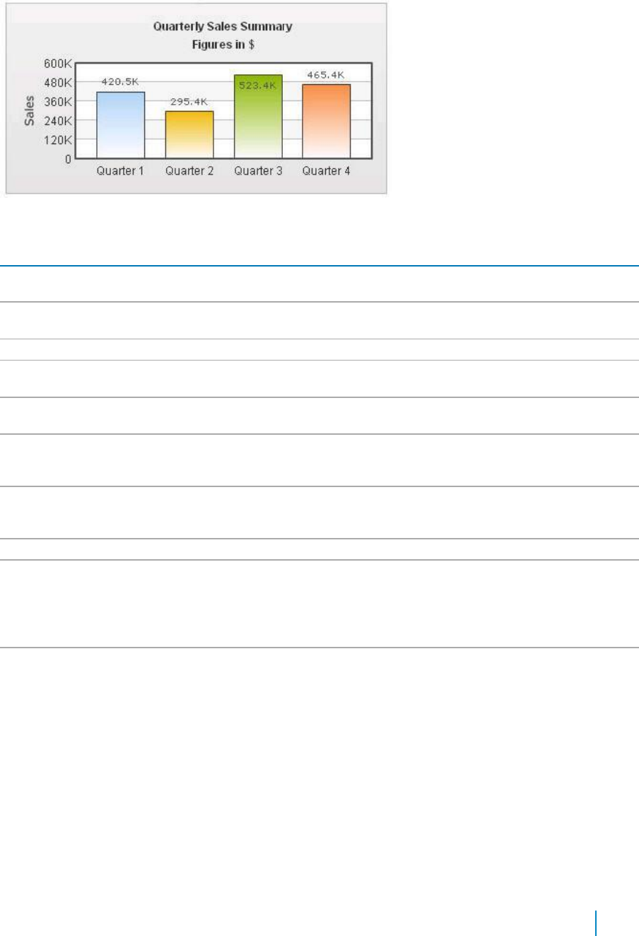
Shown below is a chart with a border around the chart.
Figure 2. Border around chart
Table 12. Border and Background
Element
Description
Show Border
Allows you to show a border around the chart. By default, it is set to true in 2D
charts and false in 3D charts.
Border Color
Allows you to set the border color of the chart. Use hex color code. To use the color
picker, click on the color swatch square.
Border Thickness
Allows you to set the border thickness of the chart (in pixels).
Border Alpha
Allows you to set the border alpha (transparency) of the chart. The range is from 0-
100.
Background Color
Allows you to fill the background as gradient. If you need to define two (or more)
colors, separate them by a comma.
Background Alpha
Allows you to specify a respective alpha (transparency) for each color code that
you've specified in the Background Color attribute, Separate the alphas by comma.
The range is from 0-100
Background Ratio
Allows you to set the ratio of each color in the gradient on a scale of 100. The total
ratios specified as this attribute should sum up to 100. For example, if you want to
plot a equidistant gradient for 2 colors, specify Background Ratio as "0,100".
Background Angle
Allows you to set the angle of the gradient fill.
Background Image or
Allows you to specify an external image (GIF,JPEG, or PNG only) or a SWF file as the
SWF URL
background of the chart. Specify the URL (with relative path) of the background
image or SWF File. Make sure that the image and the chart SWF file are in the same
sub-domain.
If you specify an absolute URL, the background image will not be shown.
Background Image or
Allows you to configure the alpha of the background (loaded) image using this
SWF Alpha
property.
Chart Canvas
Canvas refers to the area in which the chart is plotted.
www.agreeya.com
QuickApps for SharePoint
®
6.7
57
User Guide
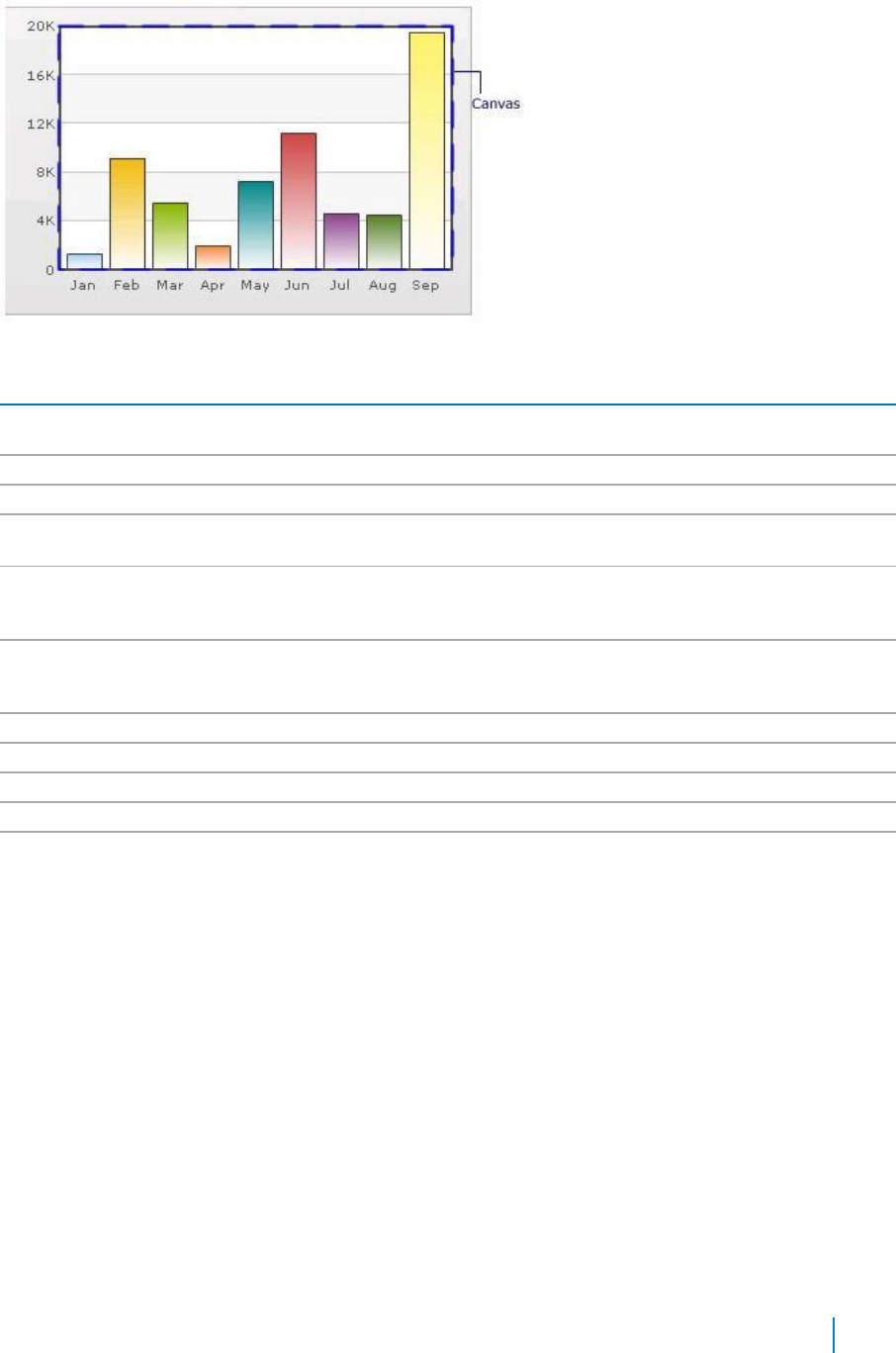
Figure 3. Canvas
Table 13. Canvas
Element
Description
Canvas Border Color
Allows you set the border color for the Canvas. Use hex color code. To use the
color picker, click on the color swatch square.
Canvas Border Thickness
Allows you set thickness of canvas border (in pixels)
Canvas Border Alpha
Allows you set alpha for canvas border.
Canvas Background Color
Allows you set the background color for the Canvas. Use hex color code. To use a
gradient fill, specify all the colors of the gradient separated by commas.
Canvas Background Alpha
Allows you to specify a respective alpha (transparency) for each color code that
you've specified in Canvas Background Color attribute. Separate the alphas by
comma.
Canvas Background Ratio
Allows you to set the ratio of each color in the gradient on a scale of 100. The
total ratios specified as this attribute should sum up to 100. For example, if you
want to plot a equidistant gradient for 2 colors, specify canvasbgRatio as "0,100".
Canvas Background Angle
Allows you to set the angle of the gradient fill (in degrees - 0-360).
Show Canvas Background
Allows you to set the canvas background for a 3D chart (and canvas).
Show Canvas Base
Allows you to set the canvas base for a 3D chart (and canvas).
Canvas Background Depth
Allows you to set the depth of canvas background for a 3D chart (and canvas).
Canvas Base Depth
Allows you to set the height of canvas base (in pixels) for a 3D chart (and
canvas).
Data Plot
Plot refers to the column, lines in a column, line chart respectively.
For all the charts, you can specify custom color for each data plot using the color attribute of <set /> element.
The color must be in hex code format (RRGGBB) without #.
<chart ....>
<set label='Jan' value='420000' color='FF0000'/>
<set label='Feb' value='910000' color='00FF00'/>
<set label='Mar' value='720000' color='0000FF'/>
....
</chart>
www.agreeya.com
QuickApps for SharePoint
®
6.7
58
User Guide
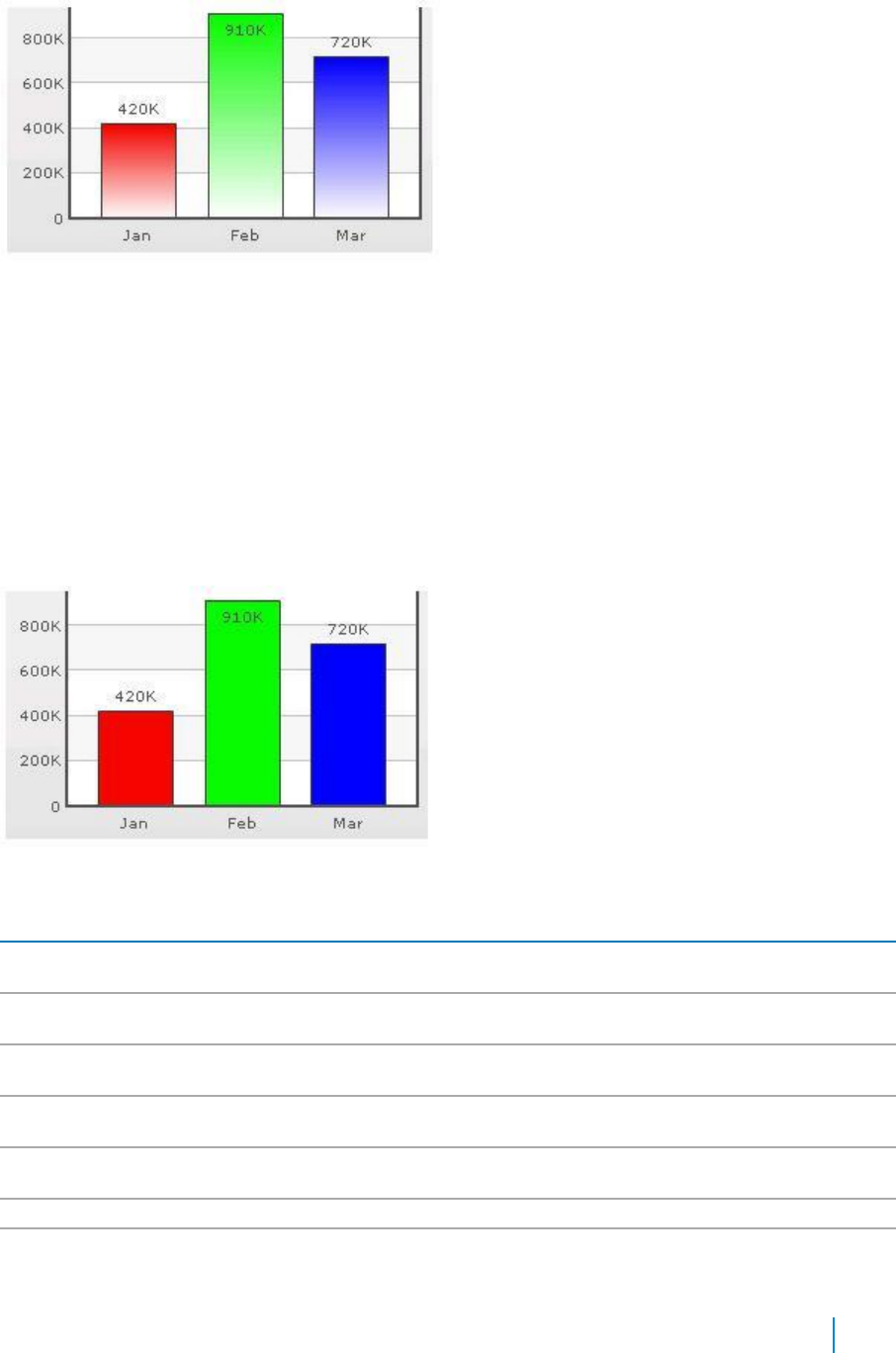
Figure 4. Data Plot
By default, most charts have FFFFFF as the plot gradient color. If you wish to use solid fills for the column
(or area), use the Plot Gradient Color attribute without any color defined for it, that is, plotGradientColor=''
<chart plotGradientColor='' ....>
<set label='Jan' value='420000' color='FF0000'/>
<set label='Feb' value='910000' color='00FF00'/>
<set label='Mar' value='720000' color='0000FF'/>
....
</chart>
Figure 5. Data Plot with solid fills
Table 14. Data Plot
Element
Description
Plot Gradient Color
Allows you to globally add a gradient color to the entire plot (column, area) of chart
by specifying a color as its attribute.
Plot Fill Angle
Allows you set the fill angle for gradient if you've opted to fill the plot (column, area)
as gradient. The range is from 0 - 360.
Plot Fill Ratio
Allows you set the ration for gradient if you've opted to fill the plot (column, area) as
gradient. The range is from 0 - 100.
Plot Fill Alpha
Allows you set the fill alpha for gradient if you've opted to fill the plot (column, area)
as gradient.
Show Plot Border
Allows you to show or hide the plot border. By default, each data plot (column, area,
pie) shows a border.
Plot Border Dashed
Allows you to make the plot border dashed by setting this attribute to true.
Plot Border Dash
Allows you to set the length of each dash.
Length
www.agreeya.com
QuickApps for SharePoint
®
6.7
59
User Guide
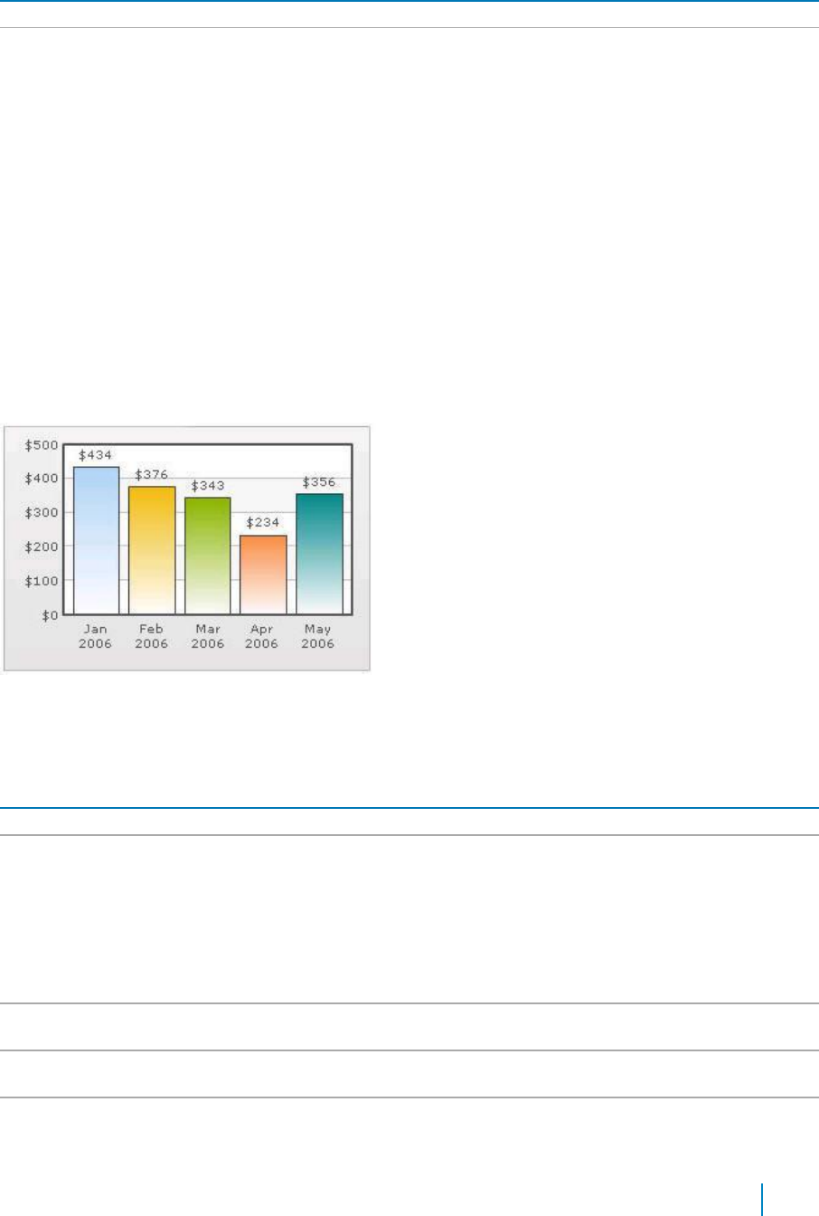
Table 14. Data Plot
Element
Description
Plot Border Dash Gap
Allows you to set the gap between each dash.
Use Round Edges
Allows you to plot columns/bars with rounded edges and glass effect gradients in
charts that support 2D Columns or Bars (like column charts, bar charts, 2D
combination charts).
NOTE: In this mode, the following features do not work:
• When you plot the columns with rounded edges, shadow is applied to them
by default and show Shadow attribute no longer works. If you want to
remove shadow from this mode, override the shadow with a new shadow
style (applied to DATAPLOT) with alpha as 0.
• Plot fill properties like gradient color, angle. no longer work as the colors
for gradient are now calculated by the chart itself.
• Plot border properties no longer work in this mode. Also, you cannot
render the border as dash in this mode.
Data Labels
Data labels refer to the names for the data points that appear on the x-axis.
Figure 6. Data Labels
In the chart shown above, the dates are the data labels for the chart. By default, they get wrapped when
there is not enough space on the chart.
Table 15. Data Labels
Element
Description
Show Labels
Allows you to show the data labels.
Label Display
Allows you to display the data labels can be displayed on the charts in the following ways:
• Wrap — By default, all the labels are shown in wrap mode, which enables you to
wrap your long x-axis labels in multiple lines.
• Rotate — allows you to rotate or slant the x-axis labels.
• Stagger — distributes labels into multiple lines (by default 2).
NOTE:
Rotate mode does not work if you have non-English characters in your x-axis labels as
the charts use embedded fonts to render rotated labels.
Slant Labels
Allows you to slant the labels at 45 degrees if you are using the Rotate mode for the Label
Display.
Stagger Lines
Allows you to choose the number of lines to stagger the labels if you are using the Stagger
mode for the Label Display.
Label Step
Allows you to show every n-th label instead of all labels if your X Axis labels represent a
continuous quantity like time and date.
www.agreeya.com
QuickApps for SharePoint
®
6.7
60
User Guide
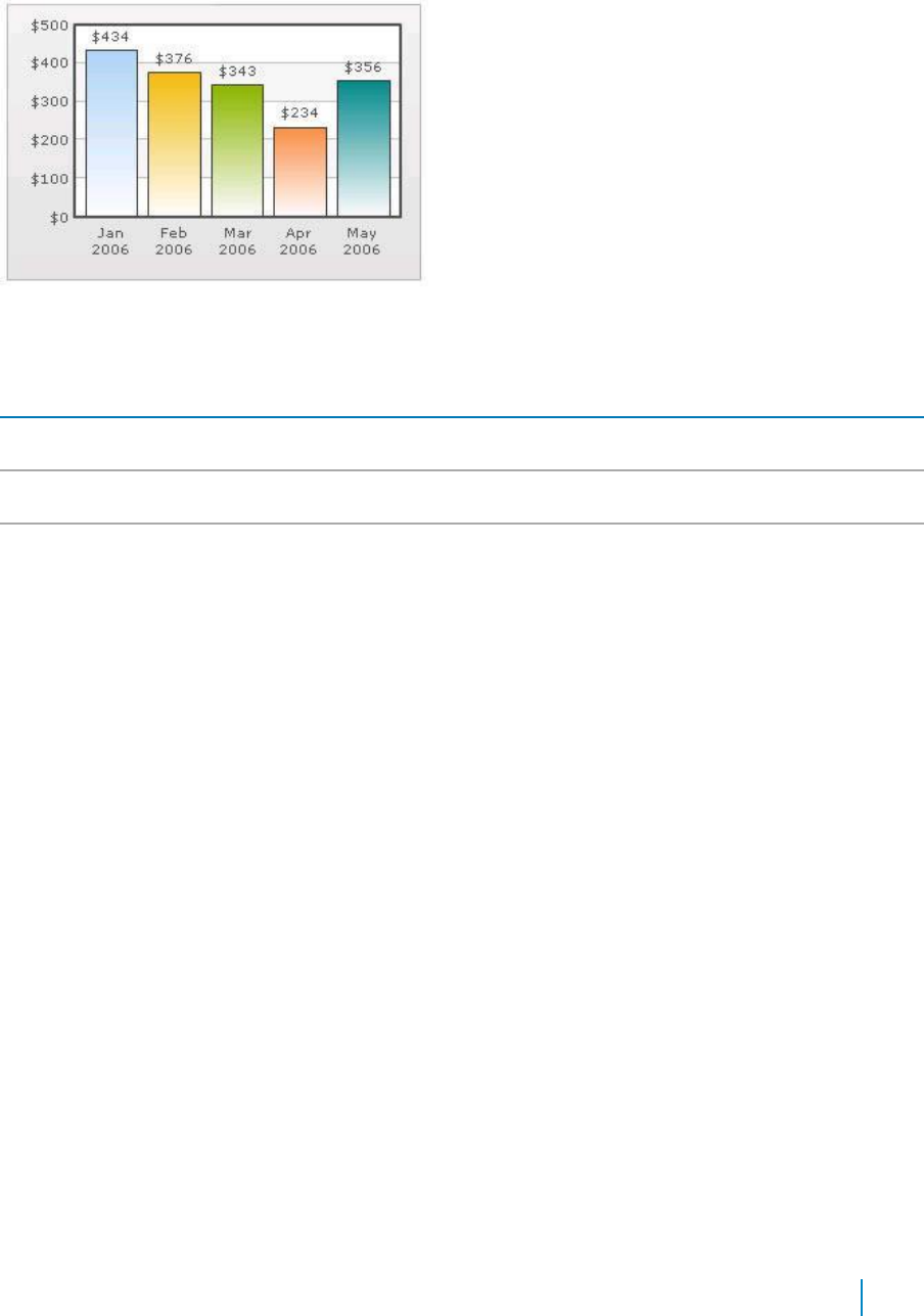
Data Values
Data values refer to the plot values such as line, column, and bar displayed beside it.
Figure 7. Data Values
In the chart shown above, the dollar values appearing above the column are the data values.
Table 16. Data Values
Element
Description
Show Values
Allows you to show data values. By default, the data values are shown. To hide them, set
this attribute to false.
Rotate Values
Allows you to rotate the values. By default, the chart will show the data values
horizontally.
Place Values
Allows you to place the data values inside the columns.
Inside
External Logo
You can load external logos at run-time to be displayed over the chart. The logos can be GIF/JPEG/PNG or
SWF files that reside on the same sub-domain as the chart SWF.
www.agreeya.com
QuickApps for SharePoint
®
6.7
61
User Guide

Figure 8. External Logo
Table 17. External Logo
Element
Description
Logo URL
Allows you to specify the URL of the logo. You may use relative or absolute URL as long as
the image and the chart SWF file are in the same sub-domain.
Logo Position
Allows you to set the position of the logo can be configured using this attribute.
Logo Alpha
Allows you to set the opacity of the logo once it has loaded.
Logo Scale
Allows you to set the scale of the logo, once it has loaded. The scale of 100 will display the
logo in its original size. The scale of less than 100 will shrink the logo. The scale of more
than 100 will enlarge the logo.
Logo Link
Allows you to link the logo to an external URL. This link can open in same window, new
window, pop-up windows or frames. For information on how to format the link, see Trend
Lines on page 75.
Font Properties
You can specify generic font properties for all the text on the chart using the attributes given below.
Table 18. Font Properties
Element
Description
Base Font Name
Allows you set the font face (family) of all the text (data labels, values) on chart. If
you specify Outside Canvas Base Font Name attribute also, then this attribute
controls only the font face of text within the chart canvas bounds.
Base Font Size
Allows you to set the base font size of the chart, that is, all the values and the names
in the chart that lie on the canvas are displayed using the font size provided here.
The range is from 0 - 72.
Base Font Color
Allows you to set the base font color of the chart, that is, all the values and the
names in the chart that lie on the canvas are displayed using the font color provided
here. Use hex color code. To use the color picker, click on the color swatch square.
Outside Canvas Base
Allows you classify all the text in the chart into 2: the text inside the canvas which
Font Name
consists of only the tool tip and the data values and all the text outside the canvas.
You can define a base font group for all the text outside the canvas as well.
This attribute sets the base font family of the chart font which lies outside the
canvas, that is, all the values and the names in the chart that lie outside the canvas
are displayed using the font name provided here.
www.agreeya.com
QuickApps for SharePoint
®
6.7
62
User Guide

Table 18. Font Properties
Element
Description
Outside Canvas Base
Allows you to set the base font size of the chart, that is, all the values and the names
Font Size
in the chart that lie outside the canvas are displayed using the font size provided
here. The range is from 0 - 72
Outside Canvas Base
Allows you to set the base font color of the chart, that is, all the values and the
Font Color
names in the chart that lie outside the canvas are displayed using the font color
provided here.
Chart Palettes
qChartView offers 5 palettes. The palette theme configures colors of the following:
• Background and border
• Canvas border and background
• Fonts
• 4Div lines
• Tooltip
• Anchors
• Legend
The internal palette does not cover the color of the data items. To change the color of the data items, use
the Palette Colors attribute or Series Appearance property.
Table 19. Chart Palettes
Element
Description
Palette
Allows you to select the palette number.
Palette Colors
Allows you to specify your own palette for data items by providing a list of hex
colors.
Y Axis
Chart limits are the minimum and maximum y-axis values. qChartView automatically calculates the best
chart limits when you do not specify them explicitly.
.
Table 20. Y Axix
Element
Description
Y Axis Min Value
Allows you to set the chart limits explicitly.
Y Axis Max Value
Allows you to set the chart limits explicitly.
NOTE: The Y Axis Max Value must be bigger than any of the values in the data
series. Otherwise, the value will not be honored by the chart view.
Set Adaptive Y Min
Allows you to set whether the y-axis lower limit would be 0 (in case of all positive
values on chart) or should the y-axis lower limit adapt itself to a different figure
based on values provided to the chart.
Primary Y Axis Min Value
Allows you to explicitly set the lower limit of the primary y-axis. If you do not
specify this value, it is automatically calculated by qChartView based on the data
provided by you.
Primary Y Axis Max Value
Allows you to explicitly set the upper limit of the primary y-axis. If you do not
specify this value, it is automatically calculated by qChartView based on the data
provided by you.
Secondary Y Axis Min
Allows you to explicitly set the lower limit of the secondary y-axis. If you do not
Value
specify this value, it is automatically calculated by qChartView based on the data
provided by you.
www.agreeya.com
QuickApps for SharePoint
®
6.7
63
User Guide

Table 20. Y Axix
Element
Description
Secondary Y Axis Max
Allows you to explicitly set the upper limit of the secondary y-axis. If you do not
Value
specify this value, it is automatically calculated by qChartView based on the data
provided by you.
Primary Y Axis Name
Allows you to set the primary y-axis title.
Secondary Y Axis Name
Allows you to set the secondary y-axis title.
Set Adaptive Secondary
Allows you to set whether the secondary y-axis lower limit would be 0 (in case of all
Y Min
positive values on chart) or should the y-axis lower limit adapt itself to a different
figure based on values provided to the chart.
Primary Y Axis Name
Allows you to set choose a maximum width (in pixels) that is applied to primary y-
Width
axis name, if you do not rotate y-axis name.
Secondary Y Axis Name
If you opt to not rotate y-axis name, you can choose a maximum width (in pixels)
Width
that is applied to secondary y-axis name.
Division Lines
Divisional lines are horizontal lines running through the canvas. They break up the y axis into smaller
units helping in better visual data interpretation.
Figure 9. Division Lines
Table 21. Division Lines
Element
Description
Adjust Division Lines
Allows you to explicitly specify the y-axis upper and lower limit values, and also
the number of divisional lines. In those cases, you need to automatic adjustment
of divisional lines by setting this attribute to false. Then you can specify the y-
axis upper and lower limits using the Y Axis Max Value and Y Axis Min Value
attributes respectively.
Number of Division Lines
Allows you to set the number of divisional lines.
Div Line Effect
Allows you to enable to apply an effect, for example, EMBOSS, or BEVEL to the
divisional lines. This attribute is applicable to MultiSeriesCombination3D chart
type only.
Show Y Axis Values
Allows you to show all the y-axis values.
Y Axis Values Step
Allows you to skip every nth Y Axis value.
Division Lines
Allows you to set the color for divisional lines.
Division Lines Thickness
Allows you to set the thickness of divisional lines. The range is from 1 - 5.
www.agreeya.com
QuickApps for SharePoint
®
6.7
64
User Guide

Table 21. Division Lines
Element
Description
Division Lines Alpha
Allows you to set the alpha of divisional lines. The range is from 0 - 100.
Is Dashed
Allows you to set the divisional line to be dashed.
Division Lines Dash Length
Allows you to set the length of each dash.
Division Lines Dash Gap
Allows you to set the gap between each dash.
Show Alternate H Grid
Allows you to set the horizontal grid bands alternately between the divisional
Color
lines for all 2D charts. They can be hidden by setting this attribute to false.
Alternate H Grid Color
Allows you to set the color of the horizontal grid bands.
Alternate H Grid Alpha
Allows you to set the alpha of the horizontal grid bands. The range is from 0 -
100.
Vertical Div Lines
Allows you to set the vertical divisional lines running through the canvas in a
line/area chart. They help in relating the data to its respective label, when there
is a large amount of data.
Number of Vertical Div
Allows you to set the number of vertical div lines.
Lines
Vertical Div Lines Color
Allows you to set the color of the vertical axis division lines.
Vertical Div Lines Thickness
Allows you to set the thickness of the vertical axis division lines in pixels.
Vertical Div Lines Alpha
Allows you to set the alpha of vertical axis division lines. The range is from 0 -
100.
Is Dashed
Allows you to set the vertical axis division lines as dashed.
Vertical Div Lines Dash
Allows you to set the length of each dash.
Length
Vertical Div Lines Dash Gap
Allows you to set the gap between each dash..
Show Alternate V Grid
Allows you to set the vertical grid bands alternately between the vertical
Color
divisional lines.
Alternate V Grid Color
Allows you to set the color of the alternate vertical grid bands.
Alternate V Grid Alpha
Allows you to set the alpha (transparency) of the alternate vertical grid bands.
Show V Line Label Border
Allows you to set the borders for all labels for vLines in the chart. If you want to
show label border for just a particular vLine, you can override this value by
specifying border configuration for that specific vLine.
Zero Plane
Zero plane is a plane which separates the positive and negative numbers on a chart having both of them.
Figure 10. Zero Plane
www.agreeya.com
QuickApps for SharePoint
®
6.7
65
User Guide
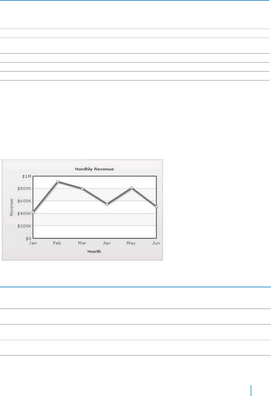
Table 22. Zero Plane
element
description
Show Zero Plane
Allows you set the zero plane in the column, line, and the area chart. It can be
removed in the line chart but not in the column or the area chart because they use
this as their base to draw. It can be removed in the line chart by setting this
attribute to false.
Zero Plane Color
Allows you set the color of the zero plane.
Zero Plane Alpha
Allows you set the alpha (transparency) of the zero plane. The range is from 0 -
100.
Zero Plane Thickness
Allows you set the thickness of the zero plane in pixels.
Zero Plane Show Border
Allows you set the whether to show border of zero plane for a 3D chart.
Zero Plane Border Color
Allows you set the border color of zero plane for a 3D chart.
Zero Plane Mesh
Allows you set the whether to draw the zero plane as a wireframe mesh or as a
filled plane. If set to true, a mesh on the zero plane of the chart is drawn. This
attribute is applicable to MultiSeriesCombination3D chart type only.
Anchors
Each data point in a line or area chart is represented by an anchor. The anchors help identify the data point
better in the chart. They also show a tool tip showing the data point details when the mouse is hovered
over them, and can be linked to other pages as well.
Figure 11. Anchors
Table 23. Anchors
Element
Description
Draw Anchors
Allows you show the anchors. The anchors are displayed by default. To hide them, set
this attribute to false. Once the anchors are hidden, the tool tips for the data points will
not be displayed and the links will not work.
Anchor Alpha
Allows you set the alpha of entire anchors. The range is from 0 - 100. If you need to hide
the anchors but still have tool tip and link, set Anchor Alpha to ‘0’
Anchor Sides
Allows you to set the number of sides the anchor will have. For example, an anchor with
3 sides would represent a triangle, with 4 it would be a square. The range is from 3 - 20.
Anchor Radius
Allows you to set the radius (in pixels) of the anchor. The greater the radius, the bigger
the anchor size.
Anchor Border Color
Allows you to set the border color of anchors.
www.agreeya.com
QuickApps for SharePoint
®
6.7
66
User Guide
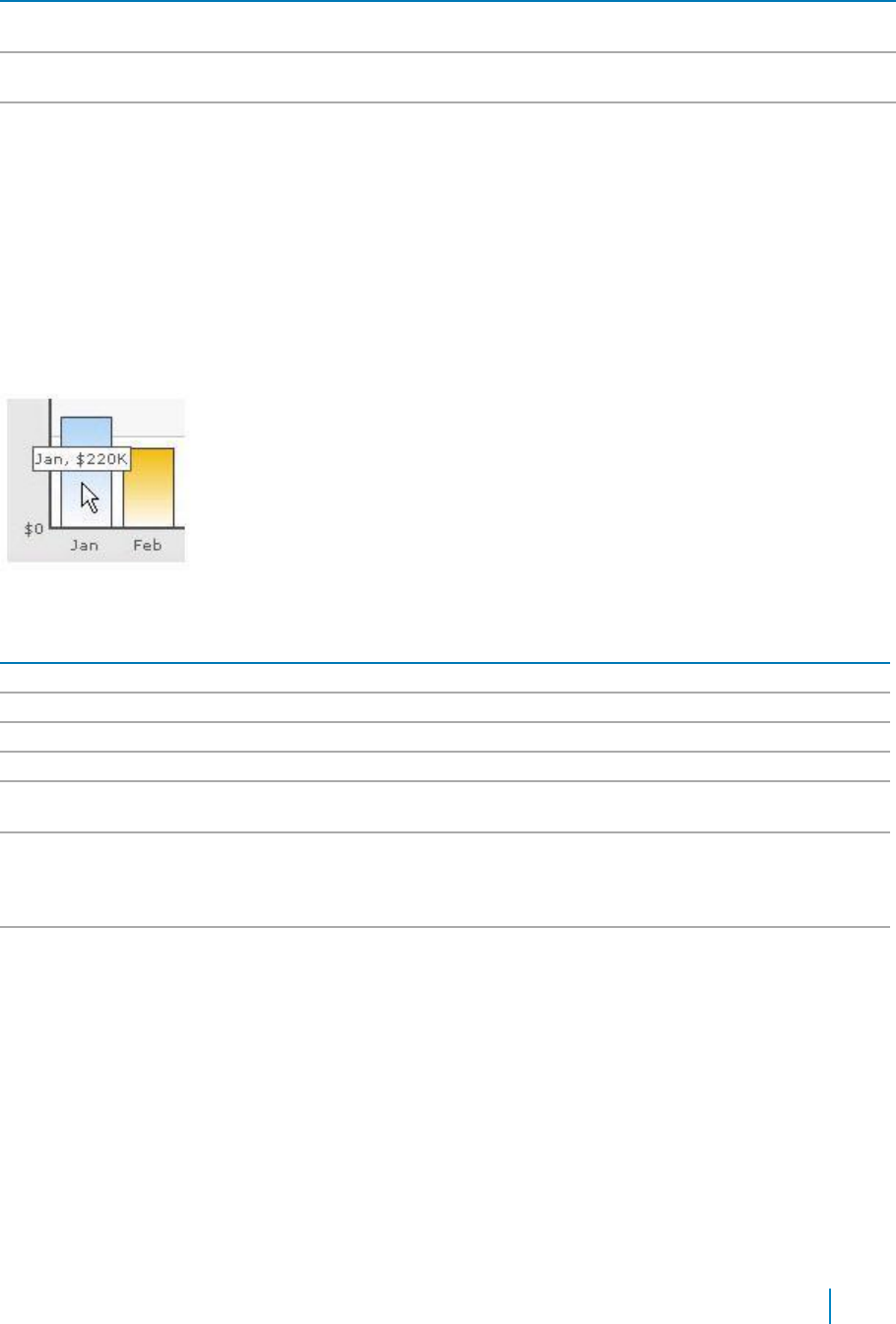
Table 23. Anchors
Element
Description
Anchor Border
Allows you to set the border thickness (in pixels) of the anchors.
Thickness
Anchor Background
Allows you to set the background color of anchors.
Color
Anchor Background
Allows you to set the alpha of anchor background. The range is from 0 - 100.
Alpha
Tool Tip
A tool tip is shown when the mouse is hovered over a particular data point. It shows the following information:
• Single series chart (except pie & doughnut): Name & value
• Pie & Doughnut: Name & value/percentage
• Multi-series & combination chart: Series Name, Category Name, Data Value
Figure 12. Tool Tip
Table 24. Tool Tip
Element
Description
Show Tool Tip
Allows you to set the tool tip.
Show Tool Tip Shadow
Allows you to show the tool tip shadow.
Tool Tip Border Color
Allows you to customize the border color of the tool tip.
Tool Tip Background Color
Allows you to customize the background color of the tool tip.
Tool Tip Separator Character
Allows you to specify a character to separate the name and value displayed in
tool tip.
Series Name in Tool Tip
Allows you to control whether series name will appear in the tool tip. For multi-
series and combination charts, qChartView shows the following information in
tool tip (unless tool text is explicitly defined): "Series Name, Category Name,
Data Value".
Show Percent In Tool Tip
Allows you to show percentage values in Tool Tip for Pie or Doughnut chart. By
default, the Pie or Doughnut chart shows percentage values in Tool Tip.
Paddings and Margins
qChartView lets you define various paddings and margins using pixels. These attributes are listed one-by-
one below.
By default, qChartView provides some padding between the chart border and the canvas. This is called
the chart margin and each margin can be set individually.
www.agreeya.com
QuickApps for SharePoint
®
6.7
67
User Guide
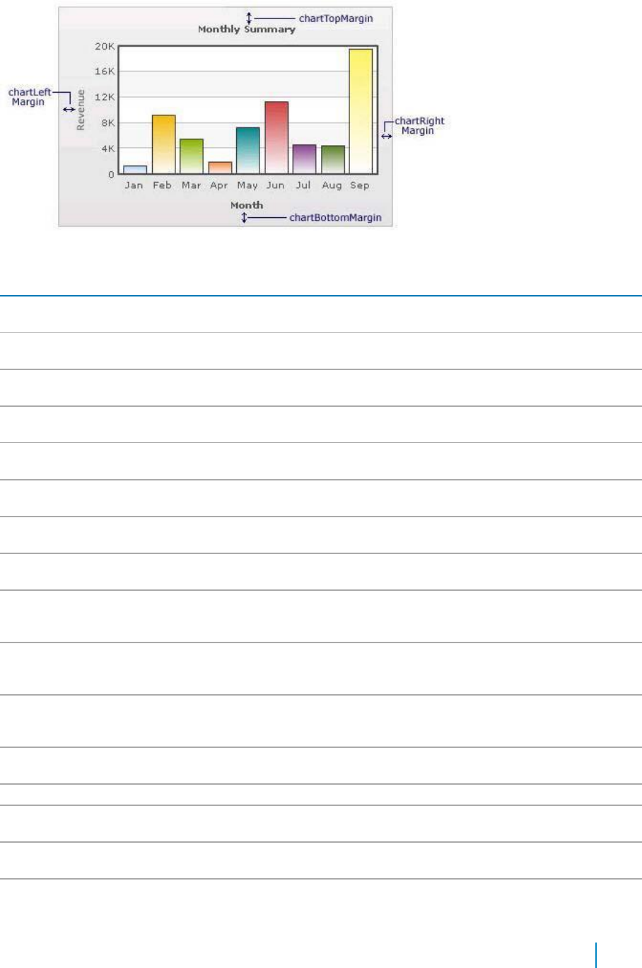
Figure 13. Paddings and Margins
Table 25. Paddings and Margins
Element
Description
Left Margin
Allows you to set the amount of empty space on the left side of your chart. Nothing is
rendered in this space.
Right Margin
Allows you to set the amount of empty space on the right side of your chart. Nothing is
rendered in this space.
Top Margin
Allows you to set the amount of empty space ton the top of your chart. Nothing is
rendered in this space.
Bottom Margin
Allows you to set the amount of empty space on the bottom of your chart. Nothing is
rendered in this space.
Canvas Left Margin
Allows you to set the amount of empty space on the left side of the canvas. Nothing is
rendered in this space.
Canvas Right Margin
Allows you to set the amount of empty space on the right side of the canvas. Nothing is
rendered in this space.
Canvas Top Margin
Allows you to set the amount of empty space t on the top of the canvas. Nothing is
rendered in this space.
Canvas Bottom
Allows you to set the amount of empty space on the bottom of the canvas. Nothing is
Margin
rendered in this space.
Caption Padding
Allows you to set the amount of space between the caption of the chart and the top of
the chart canvas. If you have a sub-caption defined in the chart, it controls the space
between the sub-caption and the top of the chart canvas.
X Label Gap
Allows you to set the vertical space between the labels and canvas wall edge. If you
want more space between the canvas and the x-axis labels, you can use this attribute to
control it.
Y Label Gap
Allows you set the horizontal space between the canvas wall edge and the y-axis values
or trend line values (on left/right side). This is particularly useful, when you want more
space between your canvas and y-axis values.
X Axis Name Padding
Allows you to set the distance between the top of x-axis title and the bottom of data
labels (or canvas, if data labels are not shown).
Y Axis Name Padding
Allows you to set the padding between the y-axis name and values.
Y Axis Values Padding
Allows you to set the padding between the left end of the chart canvas and the y-axis
values.
Label Padding
Allows you to set the vertical space between the canvas bottom edge and the data
labels.
Value Padding
Allows you to control the space between your columns/anchors and the value
textboxes.
www.agreeya.com
QuickApps for SharePoint
®
6.7
68
User Guide

Table 25. Paddings and Margins
Element
Description
Canvas Padding
For a line/area chart, allows you to set the padding between the canvas border and the
position where the line/area chart begins to draw is called canvas padding.
Plot Space Percent
On a column chart, allows you to set the spacing between two columns. By default, the
spacing is set to 20% of canvas width. For example, if you wanted all columns to stick to
each other without any space in between, you can set plotSpacePercent to 0. Similarly,
if you want very thin columns, you can set plotSpacePercent to its max value of 80.
Smart Labels and Lines
Smart labels are the labels for the pie/doughnut chart. The smart labels prevent overlapping of labels
even when large number of labels are placed in close vicinity.
Figure 14. Smart Labels and Lines
Table 26. Smart Labels and Lines
Element
Description
Enable Smart Labels
Allows you to enable the smart labels (if required to save chart space or when there
are few pie segments). When the smart labels are switched off, the pie labels would
be displayed without the smart label lines. But if they number of labels increases and
smart labels are not being used, then the labels might overlap.
Smart Line Color
Allows you to set the color of smart label connector lines.
Smart Line Thickness
Allows you to set the thickness (in pixels) of smart label connector lines.
Smart Line Alpha
Allows you to set the alpha (transparency) of smart label connector lines. The range is
0 - 100.
Is Smart Line Slanted
Allows you to set the smart lines (smart label connector lines) in two ways: Slanted or
Straight.
Label Distance
Allows you to set the distance of the label/value text boxes from the pie/doughnut
edge in pixels. You must set Enable Smart Labels to false for this attribute to take
effect.
Smart Label Clearance
Allows you to set the clearance distance of a label (for sliced-in pies) from adjacent
sliced out pies in pixels.
Skip Overlap Labels
Allows you to skip the overlapping labels if you have too many labels in your pie chart
(which is difficult to adjust even using smart labels). In that case, you have the option
to set this attribute to true. The labels of the least significant pies would be removed.
Show Percent Values
Allows you to set the actual value of the pie segment to be displayed in the label or
the percentage value. By default, the actual values are displayed. When you want to
display their percentages, set this attribute to true.
www.agreeya.com
QuickApps for SharePoint
®
6.7
69
User Guide
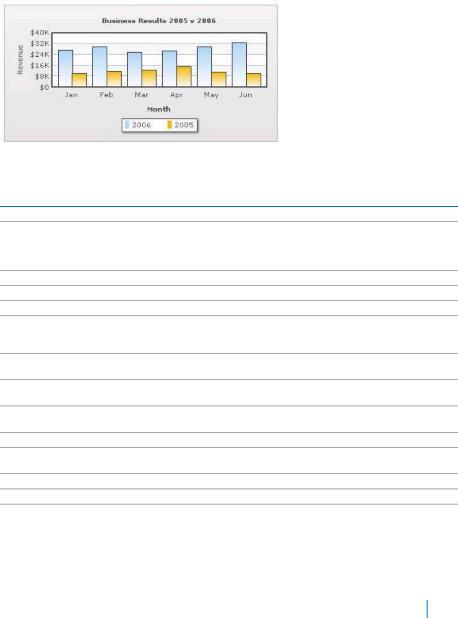
Legend
In multi-series/combination charts, the series name of each dataset shows up in the legend of the chart. This
helps you relate a data plot to its series name using its color. A dynamically generated series will be prefixed
in the legend with the series name if a series name has been configured. The legend does not appear for
single-series charts because there is only one series in the chart.
Figure 15. Legend
The legend below the chart helps identify the series name.
Table 27. Legend
Element
Description
Show Legend
Allows you to show the legend.
Interactive Legend
Allows you to make the legend interactive. Interactive Legend only works for a
combination chart. In the combination chart, you can click the legend to show/hide
the values of the data items. If you set Interactive Legend to false, then legend will
not be interactive.
Legend Caption
Allows you to add a caption for the entire legend by setting the same here.
Legend Marker Circle
Allows you to use square legend keys or circular ones.
Reverse Legend
Allows you to reverse the order of items in legend.
Legend Position
Allows you to place the legend in 2 positions: RIGHT and BOTTOM. It gets placed
below the canvas by default. To place it to the right of the chart canvas, set Legend
Position = 'RIGHT'.
Allow Drag
Allows you to make the legend dragable. End viewers of the chart can drag the
legend around on the chart.
Legend Background
Allows you to set the background color for the legend.
Color
Legend Background
Allows you to set the background alpha (transparency) for the legend. The range is 0
Alpha
- 100.
Legend Border Color
Allows you to set the border color for the legend.
Legend Border
Allows you to set the border thickness, in pixels, for the legend.
Thickness
Legend Border Alpha
Allows you to set the border alpha for the legend. The range is 0 - 100.
Legend Shadow
Allows you to set a shadow for legend.
Legend Scroll
Allows you to set the background color of the scroll bar. If you've too many items on
Background Color
the legend, a scroll bar appears.
www.agreeya.com
QuickApps for SharePoint
®
6.7
70
User Guide

Table 27. Legend
Element
Description
Legend Scroll Bar Color
Allows you to set the bar color of the scroll bar. If you've too many items on the
legend, a scroll bar shows up on the same.
Legend Scroll Button
Allows you to set the color of buttons on the scroll bar. If you've too many items on
Color
the legend, a scroll bar shows up on the same.If you've too many items on the
legend, a scroll bar shows up on the same.
Number Formatting
qChartView offers you a lot of options to format your numbers on the chart from number prefixes and
suffixes to controlling the decimal places to scaling your numbers based on a pre-defined scale.
.
Table 28. Number Formatting
Element
Description
Format Number
Allows you to determine whether the numbers displayed on the chart are formatted
using commas, for example, 40,000 if Format Number is true and 40000 if Format
Number is false.
Format Number Scale
Allows you to determine whether to add K (thousands) and M (millions) to a number
after truncating and rounding it - for example, if Format Number Scale is set true,
1043 would become 1.04K (with decimals set to 2 places). Same with numbers in
millions - a M will added at the end.
Default Number Scale
Allows you to set the default unit of the numbers that you are providing to the chart.
Number Scale Unit
Allows you to set the unit of each block of the scale.
Number Scale Value
Allows you to set the range of the various blocks that constitute the scale.
Number Prefix
Allows you to add a prefix to all the numbers visible on the graph. For example, to
represent all dollars figure on the chart, you could specify this attribute to ' $' to
show like $40000, $50000.
Number Suffix
Allows you to add a suffix to all the numbers visible on the graph. For example, to
represent all figure quantified as per annum on the chart, you could specify this
attribute to ' /a' to show like 40000/a, 50000/a.
Decimal Separator
Allows you to specify the character to be used as the decimal separator in a number.
Thousand Separator
Allows you to specify the character to be used as the thousands separator in a
number.
In Decimal Separator
Allows you to input the decimal separator.
In Thousand Separator
Allows you to input the thousand separator.
Decimals
Allows you to set the number of decimal places to which all numbers on the chart
would be rounded. The range is from 0 - 10.
Force Decimals
Allows you to add 0 padding at the end of decimal numbers. For example, if you set
decimals as 2 and a number is 23.4. If force Decimals is set to 1, qChartView will
convert the number to 23.40 (note the extra 0 at the end).
Y Axis Value Decimals
Allows you to specify the div line values decimal precision. The range is from 0 - 10.
3D Chart Attributes
The 3D Combination chart is a true 3D chart which offers features such as viewing from a specific camera
angle, definition of light source, use of dynamic lighting, and rotation.
The various elements of a 3D Combination chart are shown below:
www.agreeya.com
QuickApps for SharePoint
®
6.7
71
User Guide
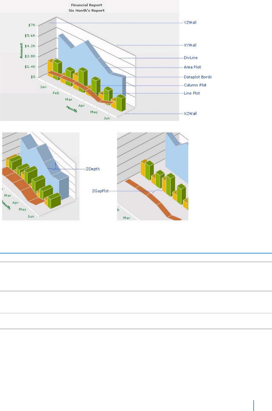
Figure 16. 3D Charts
Table 29. 3D Charts
Element
Description
Is 2D
Allows you to decide whether initially to draw a 2D view of the chart.
Chart Order
Allows you to set the order by which different types of charts will appear. The value
can be any combination of 'column', 'line' or 'area', each separated by a comma. By
default, the order is: line, column, area. You can change to any order you like, for
example, 'column, area, line' or 'line, area'.
Chart On Top
Allows you to decide whether or not the chart canvas is placed over the extra chart
elements (caption, subcaption, legend). This feature is visible when the chart canvas
is zoomed/scaled. +
Auto Scaling
Allows you to decide whether or not the chart is allowed to best fit automatically
after a user interaction, for example, rotation.
Allow Scaling
Allows you to set whether to allow zoom-in/zoom-out.
NOTE: Scaling or use of mouse is compatible only with Windows® Operating System.
www.agreeya.com
QuickApps for SharePoint
®
6.7
72
User Guide
Table 29. 3D Charts
Element
Description
Animate 3D
Allows you to show the initial plot animation. By default, the 3D chart is rendered with
a default animation.
To globally set off all animation set Animation to false. This would not only set off 3D
animations, but also disable all animations applied using <styles>. The additional use
of Animate 3D can override this value. Hence, a combination of Animation = false and
Animate 3D = true would disable all animations applied using <styles> but, enable
animation of the 3D canvas.
Exe Time
Allows you to set the time that the chart takes to animate. This attribute also sets the
time taken by the chart canvas to animate when the chart is transformed to any view
(View3D, View 2D, Reset View).
Camera Angle
Allows you to define the camera angle.
X/Camera Angle Y
• Camera Angle X lets you specify the camera angle (for view around the chart
vertically) from which the chart is viewed initially in no animation mode (when
animate3D='0) . If not specified, the default value is 30. The range is from 0 to
360 and 0 to -360.
• Camera Angle Y lets you specify the camera angle (for view around the chart
horizontally) from which the chart is viewed initially in no animation mode
(when animate3D='0). If not specified, the default value is -45. The range is
from 0 to 360 and 0 to -360.
Since this is a true 3D chart, it's rendered as a 3D model that is viewed from a specific
camera angle. The camera can simply be defined as the eye of a real viewer. When
you have set Animate 3D to 0, you can define the camera angle using two attributes -
Camera Angle X and Camera Angle Y.
When you use animation, you can also set up the starting camera view from which the
camera view starts animating, and the final camera view to which the chart would
finally be rotated. For this, you need to use Start Angle X, Start Angle Y, End Angle X
and End Angle Y attributes.
Start Angle X/End
Start Angle X — Allows you to specify the view angle (for view around the chart
Angle X
vertically) at which rotation of the chart starts (when the chart is initialized). The
rotation stops at endAngX. If not specified, the default values for both the attributes
are 30. The range is from 0 to 360 and 0 to -360. This is for animated charts (when
animate3D='1').
End Angle X — Allows you to specify the view angle (for view around the chart
vertically) at which rotation of the chart ends (when the chart is initialized). The
rotation starts at startAngX. If not specified, the default values for both the attributes
are 30. The range is from 0 to 360 and 0 to -360. This is for animated charts (when
animate3D='1').
Start Angle Y/End
Start Angle Y — Allows you to specify the view angle (for view around the chart
Angle Y
horizontally) from which rotation of the chart starts (when the chart is initialized).
The rotation stops at endAngY. If not specified, the default values for both the
attributes are -45. The range is from 0 to 360 and 0 to -360. This is for animated charts
(when animate3D='1').
End Angle Y — Allows you to specify the view angle (for view around the chart
horizontally) at which rotation of the chart ends (when the chart is initialized). The
rotation starts at startAngY. If not specified, the default values for both the attributes
are -45. The range is from 0 to 360 and 0 to -360. This is for animated charts (when
animate3D='1').
Light Angle X/Light
Light Angle X — Allows you to specify the angular position of the light source (for X-
Angle Y
axis) w.r.t the chart world coordinate system. The range is from 0 to 360 and 0 to -360.
Light Angle Y — Allows you to specify the angular position of the light source (for Y-
axis) w.r.t the chart world coordinate system. The range is from 0 to 360 and 0 to -360.
www.agreeya.com
QuickApps for SharePoint
®
6.7
73
User Guide

Table 29. 3D Charts
Element
Description
Intensity
Allows you to control the intensity of the light that falls on the chart elements. The
range of this attribute lies between 0 to 10. 10 would provide light with maximum
intensity, and you will get the brightest view of the chart. If you set the value to 0,
light is provided with least intensity. However, the chart will never appear in full
darkness even you set intensity to 0. A faint light is always made available. By default,
the value is set to 2.5.
Dynamic Shading
Allows you to set the chart in dynamic shading/non-world mode. If set to false, the
chart is in world mode.
For example, you can have a Combination 3D Chart that has two different lighting
systems to light up the chart elements. The light source may be fixed outside the
chart. This causes only those sides of the chart to get the light which face the light
source. Thus, when the chart is manually rotated, dynamic shades are created on the
chart surfaces. This system of lighting is called dynamic shading.
World lighting is where the light source is fixed with the chart. In this case, the light
source rotates with the rotation of the chart. Hence, the surface facing the light
source gets lightened and continues to be in the bright side despite any manual
rotation of the chart being made, whereas the surface not facing the light keeps
remaining in darkness with every chart rotation.
Bright 2D
Allows you to set maximum brightness to the chart while being rendered in 2D mode.
This is applicable only when you've set Dynamic Shading to true. However, once you
set this attribute to true, you cannot use Light Angle X and Light Angle Y attributes.
Rather, it automatically sets up the light sources to give the brightest view of the
chart in 2D mode.
Allow Rotation
Allows you to decide whether to stop any user interactive rotation of the chart or not.
If it is set to false, the interactive rotation is barred.
Constrain Vertical
Allows you to rotate up to 90 degrees (top or bottom) from 0 degree position. You can
Rotation
also specify these limits using Minimum Vertical Rotation Angle and Maximum Vertical
Rotation Angle attributes. This is only applicable to user's mouse interactively with the
chart.
Minimum Vertical
Allows you to set the minimum allowed angle up to which a user can rotate the chart
Rotation Angle
vertically. This is only applicable to user's mouse interactively with the chart.
Maximum Horizontal
Allows you to set the maximum allowed angle up to which a user can rotate the chart
Rotation Angle
horizontally. This is only applicable to user's mouse interactively with the chart.
Z Depth
Allows you to set the depth (3D thickness) of each DATAPLOT object using zDepth
attribute.
Z Gap Plot
Allows you to specify a gap between all dataplots in a 3D combination chart, as more
than one DATAPLOT types can exist due to different datasets.
A Z Gap Plot set to 0 will show no gap between dataplots.
YZ Wall Depth
Allows you to set the depth of the YZ wall of 3D chart.
ZX Wall Depth
Allows you to set the depth of the ZX wall of 3D chart.
XY Wall Depth
Allows you to set the depth of the XYwall of 3D chart.
Clustered
Allows you to set a Combination 3D chart in clustered mode. In a Combination 3D
chart, you can plot multiple number of datasets which can be rendered as Column.
Custom About Menu Item
You can change the default "About QuickApps for SharePoint" context menu item to show your label and link
it to your own URL using the below attributes.
www.agreeya.com
QuickApps for SharePoint
®
6.7
74
User Guide
Table 30. Custom About Menu
Element
Description
Show About Menu
Allows you to set up a custom context menu in the chart, which can show your
Item
text and can be linked to your URL. For example, you can set the context menu
of the chart to include "About your company name" and then link to your
company home page. By default, the chart shows "About QuickApps for
SharePoint" when right-clicked.
About Menu Item
Allows you to set a menu item label for the custom context menu item.
Label
About Menu Item Link
Allows you to provide a link for the custom context menu item. You can specify
the link in qChartView link format to be able to open the same in new window,
pop-ups, frames or as JavaScript links.
Functional
These attributes let you control a variety of functional elements on the chart.
Table 31. Functional
Element
Description
Animation
Allows you to control animation in your charts. If you do not want to animate any part of the
chart, set this to false. This would also disable all animations applied using <styles>. Animate 3D
can override this value. By default, animation is set to true.
Click URL
Allows you to set a URL as a hotspot for a chart. For more information, see Formatting Links.
Trend Lines
Trend Lines allow you to specify the horizontal/vertical lines spanning the chart canvas which aid
in interpretation of data with respect to some pre-determined value.
Trend Lines contain the following:
Table 32. Trend Lines
Element
Description
Advanced Mode
Turn on if you want to edit Trend Lines in XML format.
Start Value
Allows you to set the start value for the trend line
End Value
Allows you to set the ending y-axis value for the trend line
Display Value
Allows you to display a string caption for the trend line by its side
Color
Allows you to set the color of the trend line and its text
Is Trend Zone
Allows you to set the trend as a zone rather than a line
Thickness
Allows you to set the thickness of the trend line
Alpha
Allows you to set the alpha transparency of the trend line
Dashed
Allows you to set the trend line as a dashed line
Dash Length
Allows you to set the length of each dash in pixels
Dash Gap
Allows you to set the gap length between each dash
Value on Right
Allows you to show if the trend line is on the right or left side of the chart
Tool Text
Allows you to show tool text when hovered over a trend line
Parent Y Axis
Allows to you set whether the trend line should be plotted against a primary or secondary Y
axis (If you use a dual Y Axis chart). If you do not use a dual Y axis chart, the trend line is
plotted against the primary Y axis.
www.agreeya.com
QuickApps for SharePoint
®
6.7
75
User Guide
Styles
Styles help you apply font, effects and animations to various objects of the chart. Styles lends a
simple mechanism using which you can easily control the visual layout of charts.
Styles allows you to:
• Define your own style attributes using the Style Editor.
• Associate them with defined Objects of the chart from within the Style Editor.
• Have better control over chart look & feel.
• Group together in one element in the XML document, thereby separating data from visual formatting.
• Store the entire style definition in a central location in your application, so that all charts
within application can utilize it.
• Re-use style definitions. Each style can be applied to multiple chart objects or vice versa.
Each object on the chart has been assigned a unique name, for direct association with style definitions. For
example, the background of the chart is termed as BACKGROUND. Similarly, the plot (columns, lines, areas)
on the chart is named as DATAPLOT. This enables you to associate each style to multiple chart objects or
associate multiple chart objects to a particular style.
You can find the list of objects for each chart in individual Chart XML Sheet.
You can define one or more styles for a chart from the Styles Editor. To add a style, click Add. To see more
attributes for a particular style, click Edit for the style. To delete a style, select the check box of the style
and click Delete.
Styles contains the following:
Table 33. Styles
Element
Description
Advanced
Turn on if you want to edit Styles in XML format:
Mode
<styles>
<definition>
<style name='MyFirstFontStyle' type='font' face='Verdana' size='12' color='FF0000' bold='1'
bgColor='FFFFDD' />
<style name='MyFirstAnimationStyle' type='animation' param='_xScale' start='0'
duration='2' />
<style name='MyFirstShadow' type='Shadow' color='CCCCCC' />
</definition>
<application>
<apply toObject='Caption' styles='MyFirstFontStyle,MyFirstShadow' />
<apply toObject='Canvas' styles='MyFirstAnimationStyle' />
<apply toObject='DataPlot' styles='MyFirstShadow' />
</application>
</styles>
Name
Allows you to assign your custom name for the style definition. Style name can only include
alphabets and numbers. Punctuation marks (including underscore) should not be used. Style
name must be unique, that is, two style definitions cannot have the same name.
www.agreeya.com
QuickApps for SharePoint
®
6.7
76
User Guide

Table 33. Styles
Element Description
Type Allows you to set the following types:
• Font — allows you to control text properties for all the text on the chart. You can
set: Font — allows you to set the font type
Size — allows you to set the font size Color — allows you
to set the font color Bold — allows you to set the font
weigh Underline — allows you to assign underline
character Background Color — allows you to set the
background color Border Color — allows you to set the
border color
Is HTML — allows you to render the text as HTML
Left Margin — allows you to set the left margin of the text
Letter Spacing — allows you to set the space between the letters in the text
• Animation — Allows you to define your custom animations for different elements of the
chart. By default, qChartView animates the data plot (columns, lines, area) only.
However, you can define your custom animations for other chart objects (like captions,
titles, values) in the XML. Each chart object can have multiple animation properties (like
x, y, xscale, yscale, alpha) and each sequence can have its own duration.
Param — Allows you to you specify the property of chart object which you want to
animate, such a _x (animate the x position), _y (animate the y position), _xScale
(animate the x-scale), _yScale (animate the y-scale), alpha (helps the alpha
transition animation effect), _rotation (animate pies and doughnuts in circles)
Start — allows you to set the start value of the animation
Duration — allows you to control the duration of animation in seconds
Easing — allows you to specify the pattern of animation easing.
www.agreeya.com
QuickApps for SharePoint
®
6.7
77
User Guide

Table 33. Styles
Element Description
Type • Shadow — Allows you to apply shadow effect to any object on the chart.
Distance — allows you to set the offset distance of the shadow
Angle — allows you to set the angle of the shadow
Color — allows you to set the color of the shadow
Alpha — allows you to set the alpha transparency of the shadow
BlurX — allows you set the amount of horizontal blur on the shadow. Values that are a
power of 2 (such as 2, 4, 8, 16 and 32) are optimized to render more quickly than
other values.
BlurY — allows you to set the amount of vertical blur on the shadow. Values that are
a power of 2 (such as 2, 4, 8, 16 and 32) are optimized to render more quickly than
other values.
Strength — allows you to set the strength of the imprint or spread. The higher the
value, the more color is imprinted and the stronger the contrast between the
shadow and the background.
Quality — allows you to set the number of times to apply the shadow effect. Valid
values are 0 to 15. The default value is 1, which is equivalent to low quality. A value
of 2 is medium quality, and a value of 3 is high quality. Shadow with lower values are
rendered quicker
• Glow — lets you apply glow effects to objects on the
chart. Color — allows you to set the color of the glow
Alpha — allows you to set the alpha transparency of the glow
BlurX — allows you set the amount of horizontal blur on the glow. Values that are a
power of 2 (such as 2, 4, 8, 16 and 32) are optimized to render more quickly than
other values.
BlurY — allows you to set the amount of vertical blur on the glow. Values that are a
power of 2 (such as 2, 4, 8, 16 and 32) are optimized to render more quickly than
other values.
Strength — allows you to set the strength of the imprint or spread. The higher the
value, the more color is imprinted and the stronger the contrast between the
shadow and the background.
Quality — allows you to set the number of times to apply the glow effect. Valid values
are 0 to 15. The default value is 1, which is equivalent to low quality. A value of 2 is
medium quality, and a value of 3 is high quality. Shadow with lower values are
rendered quicker.
www.agreeya.com
QuickApps for SharePoint
®
6.7
78
User Guide
Table 33. Styles
Element Description
• Bevel — Allows you to apply bevel effect for any of the chart
objects. Angle — allows you to set the angle of the bevel
Distance — allows you to set the offset distance of the bevel
Shadow Color — allows you to set the shadow color of the bevel
Shadow Alpha — allows you to set the alpha transparency value of the shadow
color Highlight Color — allows you to set the highlight color of the bevel
Highlight Alpha — allows you to set the alpha transparency value of the highlight color
BlurX — allows you set the amount of horizontal blur on the bevel. Values that are a
power of 2 (such as 2, 4, 8, 16 and 32) are optimized to render more quickly than
other values.
BlurY — allows you to set the amount of vertical blur on the bevel. Values that are a
power of 2 (such as 2, 4, 8, 16 and 32) are optimized to render more quickly than
other values.
Strength — allows you to set the strength of the imprint or spread. The higher the
value, the more color is imprinted and the stronger the contrast between the
shadow and the background.
Quality — allows you to set the number of times to apply the bevel. Valid values are 0 to
15. The default value is 1, which is equivalent to low quality. A value of 2 is medium
quality, and a value of 3 is high quality. Shadow with lower values are rendered quicker.
• Blur — Allows you to create a blur effect for any object on the chart.
BlurX — allows you set the amount of horizontal blur. Values that are a power of 2
(such as 2, 4, 8, 16 and 32) are optimized to render more quickly than other values.
BlurY — allows you to set the amount of vertical blur. Values that are a power of 2
(such as 2, 4, 8, 16 and 32) are optimized to render more quickly than other values.
Quality — allows you to set the number of times to apply the filter. Valid values are 0 to
15. The default value is 1, which is equivalent to low quality. A value of 2 is medium
quality, and a value of 3 is high quality. Shadow with lower values are rendered quicker.
Custom defined styles to chart objects
To apply your defined styles to chart objects, make sure that you have the list of chart objects present in
each chart.
For example, the following chart objects are for 2D Single Series Column Chart:
Table 34. Chart Objects for 2D Series Column Chart
Object Name
Description
Features Supported
Animation Parameters Supported
BACKGROUND
entire background of the chart
•
Animation
•
_alpha
•
Shadow
•
_x
•
Glow
•
_y
•
Bevel
•
_xScale
•
Blur
•
_yScale
CANVAS
T the area in which the actual
•
Animation
•
_alpha
chart is plotted. It is represented
•
Shadow
•
_x
by a bounded rectangle. In 3D
•
Glow
•
_y
charts, it refers to the 3D base on
•
Bevel
•
_xScale
which the columns are built.
•
Blur
•
_yScale
www.agreeya.com
QuickApps for SharePoint
®
6.7
79
User Guide
Table 34. Chart Objects for 2D Series Column Chart
Object Name
Description
Features Supported
Animation Parameters Supported
CAPTION
The heading of the chart
•
Animation
•
_alpha
•
Font
•
_x
•
Shadow
•
_y
•
Glow
•
Bevel
•
Blur
DATALABELS
The x-axis labels of the data
•
Animation
•
_alpha
•
Font
•
_x
•
Shadow
•
_y
•
Glow
•
Bevel
•
Blur
DATAPLOT
The actual plot of the chart. For
•
Animation
•
_alpha
example, in Column 2D chart,
•
Shadow
•
_x
columns are referred to as
•
Glow
•
_y
DATAPLOT.
•
Bevel
•
_xScale
•
Blur
•
_yScale
DATAVALUES
The plot values that is, value of
•
Animation
•
_alpha
each data (line, column, bar, pie),
•
Font
•
_x
which is displayed beside the data
•
Shadow
•
_y
plot.
•
Glow
•
Bevel
•
Blur
DIVLINES
The horizontal or vertical lines
•
Animation
•
_alpha
running through the canvas. Each
•
Shadow
•
_y
divisional line signifies a smaller
•
Glow
•
_yScale
unit of the entire axis thus aiding
•
Bevel
the users in interpreting the
chart.
•
Blur
HGRID
Alternate color bands between
•
Animation
•
_alpha
two successive horizontal
•
Shadow
•
_y
divisional lines
•
Glow
•
_xScale
•
Bevel
•
_yScale
•
Blur
SUBCAPTION
The sub-heading of the chart
•
Animation
•
_alpha
•
Font
•
_x
•
Shadow
•
_y
•
Glow
•
Bevel
•
Blur
TOOLTIP
The tool tip shown when mouse is
•
Font (only
hovered over the data plots
Font, Size
and Color
attributes are
supported)
www.agreeya.com
QuickApps for SharePoint
®
6.7
80
User Guide

Table 34. Chart Objects for 2D Series Column Chart
Object Name
Description
Features Supported
Animation Parameters Supported
TRENDLINES
Horizontal/vertical lines spanning
•
Animation
•
_alpha
the chart canvas which aid in
•
Shadow
•
_y
interpretation of data with
•
Glow
•
_xScale
respect to some pre-determined
•
Bevel
•
_yScale
value.
•
Blur
•
TRENDVALUES The display values of trend-lines
(if any)
•
Animation
•
_alpha
•
Font
•
_x
•
Shadow
•
_y
• Glow
• Bevel
• Blur
VLINES Vertical separator lines that help
you separate blocks of data.
These lines run through the
height of the chart, thereby
segregating data into different
blocks. In case of bar charts,
they are horizontal and run
through the width of chart.
•
Animation
•
_alpha
•
Shadow
•
_y
•
Glow
•
_xScale
•
Bevel
•
_yScale
• Blur
XAXISNAME
The x-axis title of the chart
•
Animation
•
_alpha
•
Font
•
_x
•
Shadow
•
_y
•
Glow
•
Bevel
•
Blur
YAXISNAME
The y-axis title of the chart
•
Animation
•
_alpha
•
Font
•
_x
•
Shadow
•
_y
•
Glow
•
Bevel
•
Blur
YAXISVALUES The limit values or divisional line
values, which are displayed along
the y-axis of the chart
•
Animation
•
_alpha
•
Font
•
_x
•
Shadow
•
_y
•
Glow
•
_rotation
• Bevel
• Blur
The following XML does the work of applying styles to different chart objects:
<application>
<apply toObject='Caption' styles='MyFirstFontStyle,MyFirstShadow'
/> <apply toObject='Canvas' styles='MyFirstAnimationStyle' />
<apply toObject='DataPlot' styles='MyFirstShadow'
/> </application>
Each <apply> element helps to apply multiple styles to one chart object; for example, in our code, we first
apply the MyFirstFontStyle font style to Caption of the chart and then apply the shadow style MyFirstShadow
to the same object.
If you are using multiple styles, ensure:
www.agreeya.com
QuickApps for SharePoint
®
6.7
81
User Guide
• you separate the style names using comma
for example, <apply toObject='Caption' styles='MyFirstFontStyle,MyFirstShadow' />
• when you apply a single style to multiple objects, define <apply> element for each object and
then assign the style for it.
for example,
<apply toObject='Caption' styles='MyFirstShadow' />
<apply toObject='DataPlot' styles='MyFirstShadow' />
You CANNOT separate the object list by comma and then assign a single style to it - the following is
INVALID:
<apply toObject='Caption,DataPlot' styles='MyFirstShadow' />
• The style name specified during application has been defined earlier in style definition and the
spelling are correct, else, qChartView will ignore it and log the error in Debug Window.
Series Appearance
This property enables you to specify the appearance of the data series and data items in the series.
The Appearance element can contain one or more Series Appearance elements. Each Series Appearance
element controls the appearance of the data series in the chart. Therefore, the first Series Appearance
element controls the appearance of the first data series, the second one contains the second data series, and
so on. See the Configuration property on how to define multiple data series in the chart.
The Series Appearance contains the following:
Table 35. Series Appearance
Element
Description
Advanced Mode
Turn on if you want to edit Series Appearance in XML format:
<Appearance>
<SeriesAppearance [optional attributes]>
<ItemAppearance [optional attributes] />
<ItemAppearance [optional attributes] />
</SeriesAppearances>
<SeriesAppearance [optional attributes]>
<ItemAppearance [optional attributes] />
<ItemAppearance [optional attributes]/>
</SeriesAppearances>
</Appearance>
Color
Allows you to set the color using which columns, lines, area of that dataset would be drawn.
Alpha
Allows you to set the alpha (transparency) of the entire dataset at the Series Appearance
level. The range is from 0 - 100.
Ratio
Allows you to control the ratio of each color using a comma separated list of ratios, if you
are showing columns as gradients,
Dashed
Allows you to set whether this dataset would appear as dashed.
Show Plot
Allows you to set whether to show the border of this dataset.
Border
Plot Border
Allows you to set the color of the plot border.
Color
Plot Border
Allows you to set the thickness of the plot border lines.
Thickness
Plot Border
Allows you to set the alpha transparency of the plot border lines
Alpha
www.agreeya.com
QuickApps for SharePoint
®
6.7
82
User Guide

Table 35. Series Appearance
Element
Description
Line Thickness
Allows you to set the thickness of the lines for the particular dataset in pixels.
Line Dash
Allows you to define the length of the dash, if the lines are to be shown as dash for the
Length
particular dataset.
Line Dash Gap
Allows you to define the length of the gap between dashes, if the lines are to be shown as
dash for the particular dataset.
Draw Anchors
Allows you set whether to draw anchors for the particular dataset. If the anchors are not
shown, then the tool tip and links will not work for the dataset.
Anchor Sides
Allows you set the number of sides that the anchors of the particular dataset will have. For
example, an anchor with 3 sides would represent a triangle, with 4 it would be a square and
so on. The range is from 3 - 20.
Anchor Radius
Allows you to set the radius (in pixels) of the anchors of the particular dataset. Greater the
radius, bigger would be the anchor size.
Anchor Border
Allows you set the border color of anchors of the particular dataset. Use hex code of colors.
Color
To use the color picker, click on the color swatch square.
Anchor Border
Allows you set border thickness of anchors of the particular dataset in pixels.
Thickness
Anchor
Allows you set the background color of anchors of the particular dataset. Use hex code of
Background
colors. To use the color picker, click on the color swatch square.
Color
Anchor Alpha
Allows you set the alpha of entire anchors of the particular dataset. If you need to hide the
anchors for the dataset but still enable tool tips, set this as 0.
Anchor
Allows you set the alpha (transparency) of anchor background of the particular dataset. The
Background
range is from 0 - 100.
Alpha
The Series Appearance element can contain zero or more Item Appearance elements. If you do specify any
Item Appearance element, every item in the series is displayed according to the settings in the Series
Appearance element. The Item Appearance is applied as follows:
• If you specify the Item Value in the Item Appearance, the settings are applied based on the X axis
value of the item. For example, if the X axis shows the value of the Priority field in the Tasks list, you
can make all the High priority items displayed in red.
• If you specify Y Axis Value Range in the Item Appearance, the settings are applied based on the Y axis
value of the item. For example, you can highlight any data items that falls within a certain range with
a certain color (low sales number with red, high sales number with blue).
• If neither is specified, the settings are applied in the order they are listed. This means the first Item
Appearance controls the appearance of the first data item in the series, the second one controls the
second data item in the series, and so on. In this case, if the data series has more items to display
than the number of Item Appearance, the remaining items are displayed with the settings specified by
the Series Appearance. Having said this, it is better to define more Item Appearance elements when
you have a variable number of items to display in the chart.
Item Appearance contains the following:
Table 36. Item Appearance
Element
Description
Item Value
Allows you to specify the settings in the Item Appearance element that are applied to the
data items whose X axis value match with the specified value.
Y Axis Value
Allows you to apply the color is applied based on the Y axis value of the item, if you specify
Range
Y Axis Value Range,
www.agreeya.com
QuickApps for SharePoint
®
6.7
83
User Guide
Table 36. Item Appearance
Element
Description
Color
Allows you to define the color of data series at the Series Appearance level for multi-series
and combination charts. However, if you wish to highlight a particular data item, you can
specify its color at Item Appearance level.
Display Value
Allows you to display a custom string value if instead of the numerical value of this data.
Tooltext
Allows you to display more information for the data item as tool tip. By default, qChartView
shows the series Name, Category Name and value as tool tip text for that data item.
Alpha
Allows you to define the alpha of datasets at the Series Appearance level for multi-series and
combination charts, However, if you wish to highlight a particular data item, you can specify
its alpha at Item Appearance level using this attribute. The range is from 0 - 100.
Dashed
Allows you to set whether the border of this data item should appear as dashed.
Anchor Sides
Lets you specify item specific sides of the anchor in a line/area chart. The range is from 3 -
20.
Anchor Radius
Lets you specify item specific radius (in pixels) of the anchor in a line/area chart.
Anchor Border
Lets you specify item specific border color of the anchor. Use hex code of colors. To use the
Color
color picker, click on the color swatch square
Anchor Border
Lets you specify item specific border thickness in pixels) of the anchor in a line/area chart.
Thickness
Anchor
Lets you specify item specific background color of the anchor in a line/area chart.
Background
Color
Anchor Alpha
Lets you specify item specific alpha (transparency) of the anchor in a line/area chart. The
range is from 0 - 100.
Anchor
Lets you specify item specific alpha (transparency) of the anchor background in a line/area
Background
chart. The range is from 0 - 100.
Alpha
Toolbar
The Toolbar Appearance Tab contains the following:
Table 37. Toolbar Appearance
Element
Description
Toolbar Skin Name
Allows you to enter the skin name for the toolbar.
Show Return to Master Chart
If selected, displays the Return To Master Chart Button. This button will
Button
appear only if the Source parameter exists in the URL of the current page.
When the user clicks this button, the user is returned back to the URL
specified in the Source HTTP parameter.
Layout
The Layout page allows you to set the overall layout of the web app. It contains the following:
Table 38. Layout
Element
Description
Width
Allows you to set the web app to a fixed width
Height
Allows you to set the web app to a fixed height
Chrome State
Allows you to select if the web app can be minimized or not when you open the web app.
If Minimized is selected, then only the Title Bar displays.
www.agreeya.com
QuickApps for SharePoint
®
6.7
84
User Guide

Table 38. Layout
Element
Description
Chrome Type
Allows you to select the kind of border to display around the web app.
Hidden
Select this check box if you want the web app hidden
Direction
Allows you to set how the text in the web app displays depending on the language, either
from Left to Right or Right to Left
Other
The Other page allows you to set the appearance of other elements in the web app. It contains the following:
Table 39. Other
Element
Description
Allow Minimize
Select this check box if you want the web app minimized
Allow Close
Select this check box if you want the web app removed from the page
Allow Hide
Select this check box if you want the web app hidden
Allow Zone Change
Select this check box if you want the web app moved to a different zone
Allow Connections
Select this check box if you want the web app to participate in connections to
other web apps
Allow Editing in Personal View
Select this check box if you want the web app modified in a personal view
Export Mode
Allows you to select the level of data that can be exported for this web app
Title URL
Allows you to add the title of a URL as extra information about the web app
Description
Allows you to enter a description of the web app that is displayed as a Tooltip
when you hover your mouse over the web app title or icon.
Help URL
Allows you to enter the location of a file containing Help information about
the web app.
Help Mode
Allows you to specify how a browser displays Help content for the web app,
either in a separate window which you must close before returning to the
Web Page (Mode), in a separate window that you do not need to close before
returning to the Web Page (Modeless), or in the current browser window
(Navigate)
Catalog Icon Image URL
Allows you to specify the location of a file containing an image to be used as
the web app icon in the Web app List. The image size must be 16 by 16
pixels.
Title Icon Image URL
Allows you to specify the location of a file containing an image to be used in
the web app title bar. The image size must be 16 by 16 pixels.
Import Error Message
Allows you to specify a message that appears if there is a problem importing
the web app
Advanced Page
The Advanced page allows you to set advanced features of the web app, such as the following:
• Security
• Resources
Security
The Security page allows you to set which users are allowed to view the web app. It contains the following:
www.agreeya.com
QuickApps for SharePoint
®
6.7
85
User Guide
Table 40. Security
Element
Description
Target
Allows you to have the Web app to appear only to people who are members of a particular
Audiences
group or audience.
An audience can be identified by using a SharePoint group, a distribution list, a security
group, or a global audience.
Resources
The Resources page allows you to enable Localization in the web app using resource lists.
Localization
Localization contains the following elements.
NOTE: While this feature is available to use, we recommend using ezLocalizer. For more information,
see ezLocalizer on page 391.
Table 41. Localization
Element
Description
Resource List
Allows you to support a multi-lingual site. In a multi-lingual site, there are some
settings, such as the web app, whose value can change depending on the current
culture setting. The Resource List property defines the list that contains the string
values for different cultures. The resource list must contain 3 columns:
• Resource ID — This field contains the identifier to refer to the string. You can
have multiple strings with the same Resource ID as long as their Culture value
is different.
• Culture — This field contains the culture for the string. For the default
culture, leave the Culture field blank.
• Value — This field contains the value for the string.
The Lists element can contain only one List element. The following are the attributes
for the List element:
• SiteUrl — The URL to the site that contains the resource list. The URL can be
absolute (http://...) or relative to the current page URL. This attribute is
mandatory.
• ListName — The name of the resource List. The list name is case sensitive.
Title Resource ID
Allows you to support a multi-lingual site. The property defines the identifier of the
string in the Resource List that is used as the text of the web app. The Resource ID
and the current cultural setting (identified with the Culture HTTP parameter) are
used to retrieve the string in the Resource List. If the string with the given identifier
and culture is not found, the default is used.
www.agreeya.com
QuickApps for SharePoint
®
6.7
86
User Guide

Table 41. Localization
Element
Description
Return to Master Chart
By default, the text for the Return to Master Chart toolbar button is retrieved from
Button Text Resource ID
the resource file that is included in the product. If the resource file in the culture
that you want to use is not available, define the text for the Return to Master Chart
toolbar button in the Resource List and specify its Resource ID. This Resource ID and
the current cultural setting (identified with the Culture HTTP parameter) are used to
retrieve the string in the Resource List. If the string with the given identifier and
culture is not found, the default text from the invariant resource file is used.
Filter Button Text
By default, the text for the Filter toolbar button is retrieved from the resource file
Resource ID
that is included in the product. If the resource file is not available, define the text
for the Filter toolbar button in the Resource List and specify its Resource ID. This
Resource ID and the current cultural setting (identified with the Culture HTTP
parameter) are used to retrieve the string in the Resource List. If the string with the
given identifier and culture is not found, the default text from the invariant resource
file is used.
qChartView Procedures
You can perform the following procedures using qChartView:
• Configuring qChartView
• Formatting Links
• Setting Number Formatting
• Setting Number Scaling
• Using MultiSeriesStackedColumn2D and MultiSeriesStackedColumn2DLineDual YAxis Charts
Configuring qChartView
To configure qChartView
1 Add qChartView to your page.
2 Open ezEdit.
The Primary Content page opens by default.
3 Configure each element as needed and click OK.
4 If needed, configure the elements in the other tabs.
5 When done configuring each tab, click OK.
Formatting Links
You can perform the following procedures with links:
• Defining Links for a Chart
• Opening Links in a New Window
• Linking to Frames
• Setting Number Formatting
www.agreeya.com
QuickApps for SharePoint
®
6.7
87
User Guide

Defining Links for a Chart
To define a link for any data plot
1 From Chart Attributes, click Edit.
2 Click Functional.
3 In the Click URL field, define the link attribute as in the following
example: link='ShowDetails.asp%3FMonth%3DJan'
With the above XML, the data plot (be it column, pie or line/area anchor), when clicked, will take to
the page ShowDetails.asp?Month=Jan, which might contain another chart to show detailed results for
the month of January.
The chart view expects all the links in URL Encoded format, if you have characters special
characters (such as ?,&) in your link. When the user clicks the link, the chart view decodes it and
invokes ShowDetails.asp?Month=Jan.
All the server-side scripting languages provide a generic function to URL Encode any string.
Opening Links in a New Window
You can open the link in a new window instead of the same window.
To open a link in a new window
1 From Chart Attributes, click Edit.
2 Click Functional.
3 In the Click URL field, add n- before any link, as in the following example:,
link='n-ShowDetails.asp%3FMonth%3DJan'
The above link, when clicked, opens in a new window.
Opening Links in Pop-up Windows
The chart view also allows you to open your links in pop-up windows.
To open a link in pop-up window
1 From Chart Attributes, click Edit.
2 Click Functional.
3 In the Click URL field, define the link as in the following example: link="P-
detailsWin,width=400,height=300,toolbar=no,scrollbars=no, resizable=no-
ShowDetails.asp%3FMonth%3DJan"
Where:
• P- denotes that the link is to be opened in a new pop-up window.
• detailsWin specifies a name for the new window. If you want all the links to open in the same
pop-up, use the same window name across all links. However, if you want each link to open in
a new pop-up, specify a different window name for each link.
• height specifies the height of the window in pixels.
• width specifies the width of the window in pixels.
• resizable when enabled, allows the user to manually resize the window by dragging its edges
or corners.
www.agreeya.com
QuickApps for SharePoint
®
6.7
88
User Guide

NOTE: You can include other attributes, such as:
• menubar specifies whether or not to display a menu bar at the top of the window.
• toolbar specifies whether or not to display the main toolbar (with the back,
forward, stop buttons).
• location specifies whether or not to display the location bar (the Address Bar
in Internet Explorer®) - where URLs are typed and displayed.
• directories specifies whether or not to display any additional toolbar (for
example, the Links Bar in Internet Explorer).
• status specifies whether or not to display the status bar at the foot of the window.
• left specifies the distance in pixels of the new window from the left edge of the
screen. (This applies to Internet Explorer. For Netscape Navigator® use screenX).
• top specifies the distance in pixels of the new window from the top edge of the
screen. (This applies to Internet Explorer. For Netscape Navigator use screenY).
• fullscreen when enabled causes the window to open in full-screen mode
(Internet Explorer only.)
• scrollbars specify whether or not to display the horizontal and vertical
scrollbars that normally appear when the page content is larger tan the screen.
• -ShowDetails.asp%3FMonth%3DJan denotes the actual link to be invoked
Linking to Frames
The chart view allows you to open links in specified frames too. To do so, you just specify the name of the
frame in the link itself.
To open link in a specified frame
1 From Chart Attributes, click Edit.
2 Click Functional.
3 In the Click URL field, set the link as in the following example: link='F-
FrameName-ShowDetails.asp%3FMonth%3DJan'
Where:
• F denotes the link opens in a frame
• -FrameName denotes the name of the frame to be opened
• -ShowDetails.asp%3FMonth%3DJan denotes the actual link to be opened. The link needs to be
URL Encoded.
In this example, the main frameset is contained in FrameExample.html, which has two vertical frame pane-
one on top containing the chart (FramePages\FrameChart.html) and one on bottom to show the linked frame
pages. The bottom pane by default shows FramePages\LowerFrame.html which contains the message "Click on
columns above to view details".
The setup looks like the following:
www.agreeya.com
QuickApps for SharePoint
®
6.7
89
User Guide
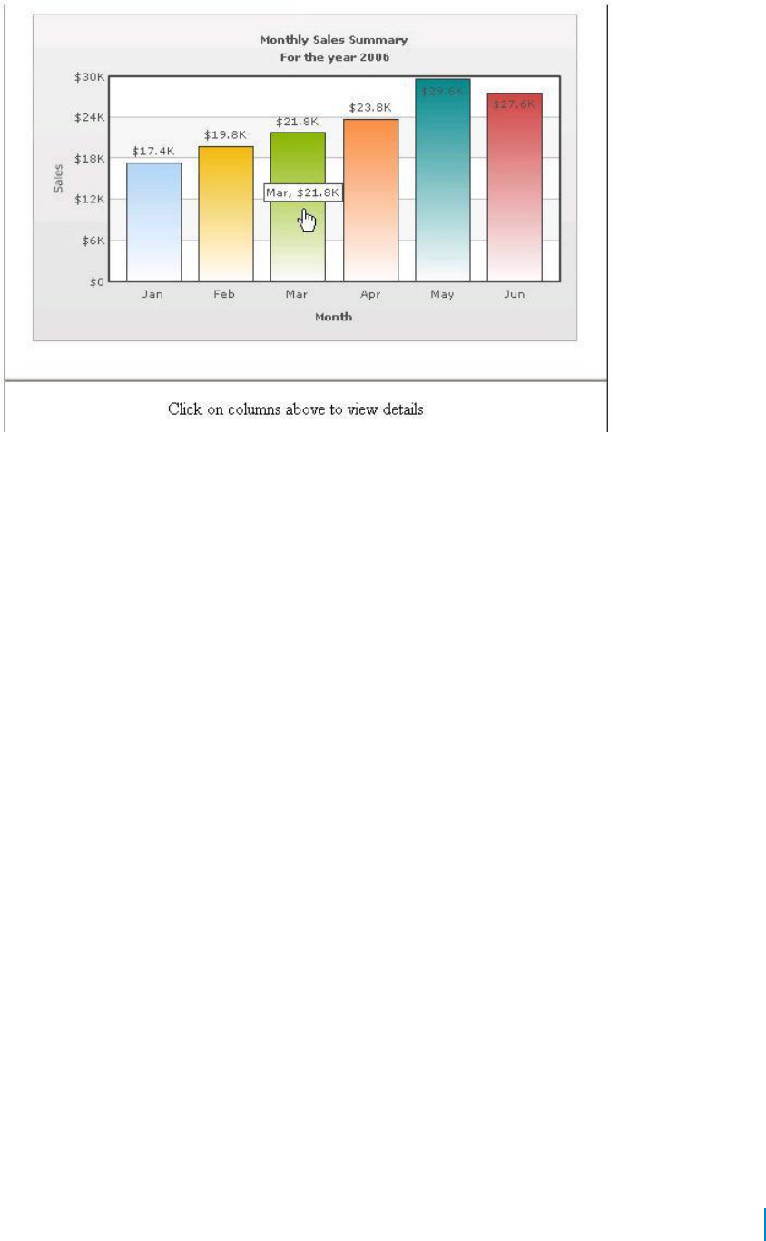
Figure 17. Linking to Frames
Setting Number Formatting
You can perform the following procedures:
• Controlling Decimal Precision
• Automatic Number Formatting
• Setting Custom Thousand and Decimal Separator Character
• Adding Number Prefix and Suffix
• Formatting Y-axis Values Decimal in Manual Div-Lines Mode
Controlling Decimal Precision
All the charts types in qChartView support the attribute decimals. This single attribute lets you control
the decimal precision of all the numbers on the chart. Using this attribute, you can globally set the
number of decimal places of ALL numbers of the chart.
To globally set the number of decimal places
1 From Chart Attributes, click Edit.
2 Click Number Formatting.
3 Enter a value in the Decimal box.
4 Click Save.
For example, if you have numbers on your chart as 12.432, 13.4 and 13 and you set Decimals='2' , the
numbers would be converted to 12.43, 13.4 and 13 respectively.
www.agreeya.com
QuickApps for SharePoint
®
6.7
90
User Guide
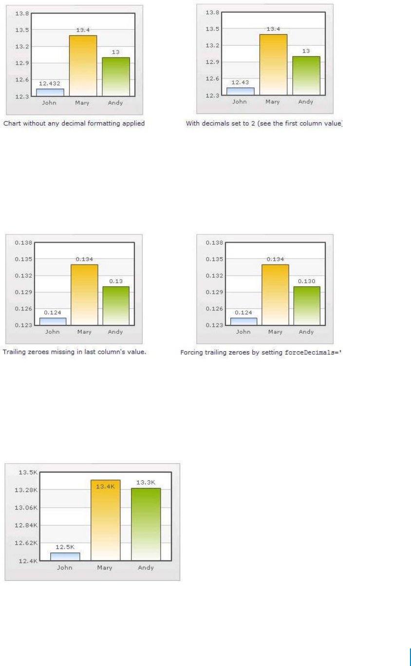
Figure 18. Controlling decimal precision
Similarly, if you had data as 0.12342, 0.134 and 0.13, and you set Decimals as 3, qChartView would
output 0.124, 0.134 and 0.13 respectively.
Even though the Decimals is set to 3, qChartView does not add the 0 padding to 0.13 to form 0.130. However,
if you want your numbers on the chart to have trailing zeroes too, you can set Force Decimals=true and now
the numbers would show as 0.124, 0.134 and 0.130 respectively, as shown in these examples:
Figure 19. Force decimals
Automatic Number Formatting
qChartView automatically formats your numbers by adding K,M (Kilo, Million) and proper commas to
the numbers, as shown in this example:
Figure 20. Automatic Number Formatting
The data for chart is 12500, 13400 and 13300. qChartView automatically formats the number scaling to
convert to K (Thousands) & M (Millions).
www.agreeya.com
QuickApps for SharePoint
®
6.7
91
User Guide
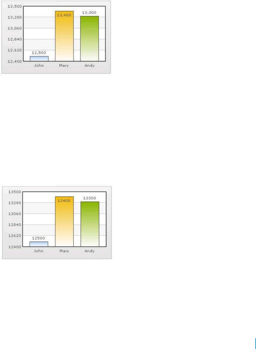
If you do not want to truncate numbers
1 From Chart Attributes, click Edit.
2 Click Number Formatting.
3 From Format Number Scale, select False.
4 Click Save.
When you now view the chart, you will see the following:
Figure 21. Not truncating numbers
In the example above, qChartView is showing full numbers on the chart. It has also added commas to
the numbers at the required places.
If you do not want to set commas
1 From Chart Attributes, click Edit.
2 Click Number Formatting.
3 From Format Number, select False.
4 From Format Number Scale, select False.
5 Click Save.
Figure 22. Not setting commas
The commas have been removed from numbers.
Setting Custom Thousand and Decimal Separator Character
By default, qChartView uses . (dot) as decimal separator and , (comma) as thousand separator character.
However, you can customize this character depending on your requirements. For example, you can swap
the separator characters.
www.agreeya.com
QuickApps for SharePoint
®
6.7
92
User Guide
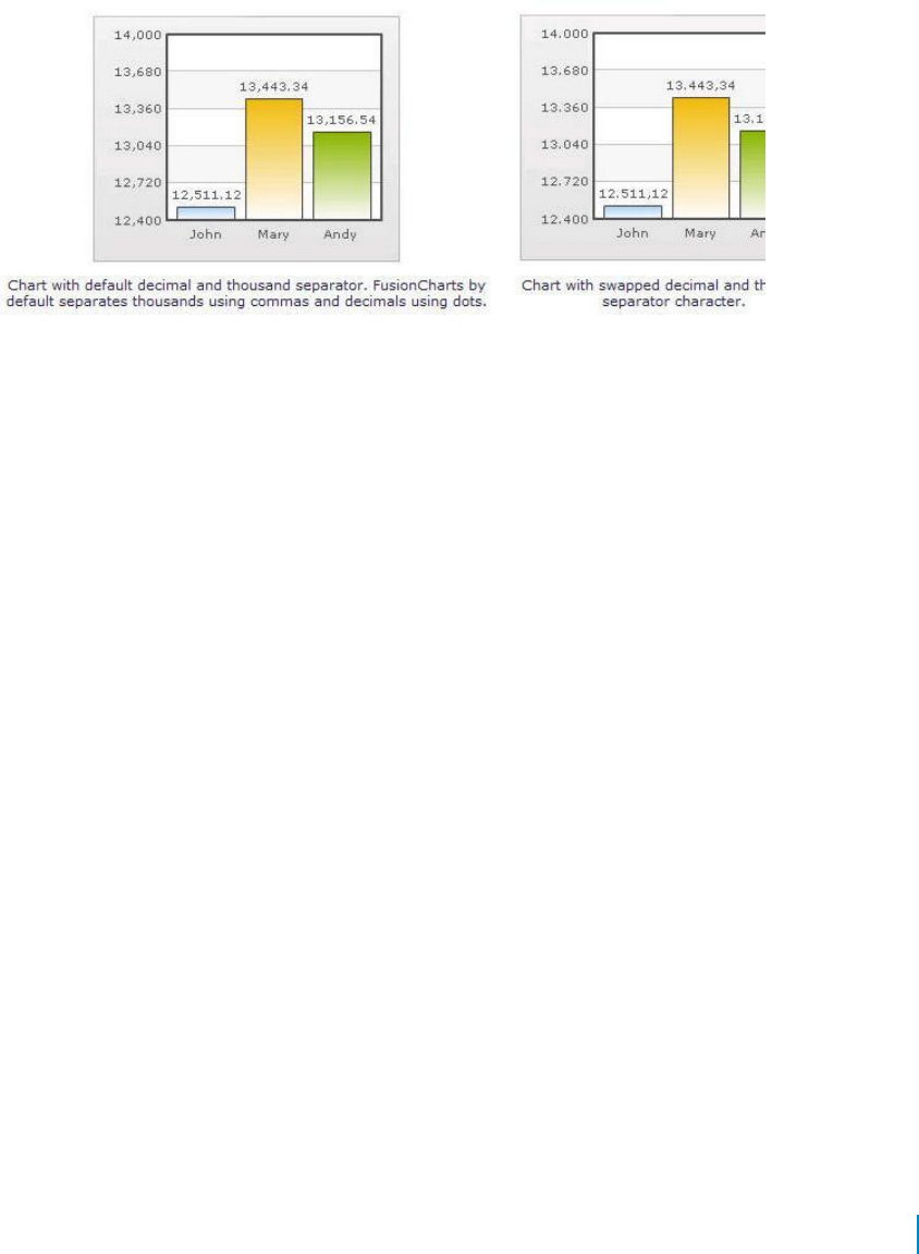
To swap separator characters
1 From Chart Attributes, click Edit.
2 Click Number Formatting.
3 In the In Decimal Separator, enter ,.
4 In the In Thousand Separator, enter ..
5 Click Save.
Figure 23. Swap separator characters
Adding Number Prefix and Suffix
qChartView allows you to add a prefix or suffix to all numbers on the chart.
To add a number prefix or suffix
1 From Chart Attributes, click Edit.
2 Click Number Formatting.
3 In the Number Prefix box, enter a character or value.
For example, to represent dollar figures, enter $.
4 In the Number Suffix box, enter a character or value.
For example, to represent figures quantified per annum, enter p.a.
5 Click Save.
If you intend to use special characters for Number Prefix or Number Suffix, URL Encode them when
using dataXML method. For example, if you wish to have numberSuffix as % (for example, 30%):
numberSuffix='%25'
In dataURL method, you can directly specify the character.
www.agreeya.com
QuickApps for SharePoint
®
6.7
93
User Guide
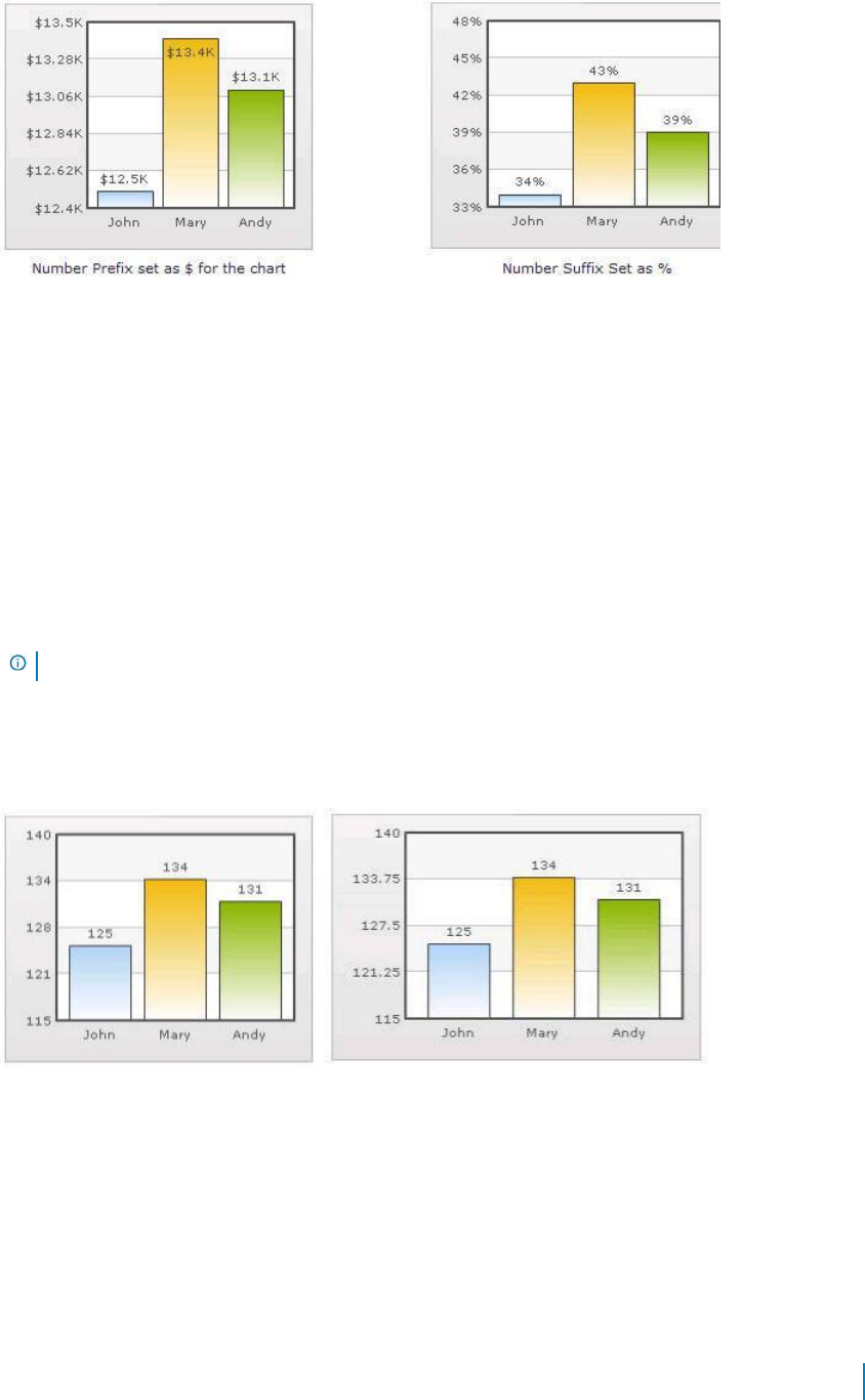
Figure 24. Adding number prefixes and suffixes
Formatting Y-axis Values Decimal in Manual Div-Lines Mode
If you want to set the number of divisional lines on chart, you can control the decimals of y-axis
values separately. For example, consider the following attributes and chart:
Y Axis Min Value='115' Y Axis Max Value='140' Zero Plane=false Number of Division Lines='3'>
In this chart, the chart lower limit, upper limit, and number of divisional lines have been manually set.
qChartView will not automatically adjust divisional lines. In the chart, qChartView has truncated decimals
from y-axis values, as it cannot find any other decimal values on the chart.
You can, however, show decimals on y-axis values in this case (when Zero Plane is false) using Y Axis
Value Decimals attribute, for example Y Axis Min Value='115' Y Axis Max Value='140' Zero Plane=false
Number of Division Lines='3' Y Axis Value Decimals='2' Decimals='0' >.
NOTE: Force Decimals does not work in this mode.
When you now see the chart, 2 decimal places on y-axis values appear. But, the other numbers on chart
would still have 0 decimal places.
Figure 25. Formatting y-axis
Setting Number Scaling
Number scaling lets you define your own scales for numbers and then apply it to all numbers on the chart.
For example, if your numbers on the chart are greater than 1000, qChartView scales them to K (Thousands) or
M (Millions). For example, if you plot a chart with data as 12500, 13400 and 13300, you will see the following
chart:
www.agreeya.com
QuickApps for SharePoint
®
6.7
94
User Guide

Figure 26. Setting number scaling
qChartView has scaled the numbers down to K. By default, qChartView has the K,M (1000,1000) scaling
defined for each chart. You can, however, customize it.
You can perform the following procedures:
• Adding Billions to Default Scaling
• Putting Time in Scale
Adding Billions to Default Scaling
qChartView, by default, has 1000,1000 (K,M) scaling defined for all charts. It does not have the scaling
for billions defined. You can modify the number scaling to add billion so that the final scale looks like
1000,1000,1000 (K,M,B).
This scale would look something like:
• 1000 = 1 K
• 1000 K = 1 M
• 1000 M = 1 B
To convert this scale into qChartView format
1 From Chart Attributes, click Edit.
2 Click Number Formatting.
3 In the Number Scale Value box, enter 1000,1000,1000.
4 In the Number Scale Unit box, enter K,M,B.
5 Click Save.
Whatever numeric figure was present on the left hand side of the table is put in Number Scale Value
and whatever unit was present on the right side of the scale table has been put under Number Scale
Unit - all separated by commas.
If you want to set the chart formatting flags
1 From Chart Attributes, click Edit.
2 Click Number Formatting.
3 From Format Number, select True.
4 From Format Number Scale, select True.
5 In the Number Prefix box, enter $.
6 Click Save.
www.agreeya.com
QuickApps for SharePoint
®
6.7
95
User Guide

When you now view a chart containing data in billions, you will see the following chart. Note that
the chart now contains figure both in millions and billions.
Figure 27. Setting chart formatting
Putting Time in Scale
If you want to plot time-related figures on the chart, you can set the time in each process to range from a
few seconds to few days. You can build a scale indicating time and then specify it to the chart:
• 60 seconds = 1 minute
• 60 minute = 1 hr
• 24 hrs = 1 day
• 7 days = 1 week
To convert this scale in qChartView
1 From Chart Attributes, click Edit.
2 Click Number Formatting.
3 In the Default Number Scale box, enter s.
The default number scale is now represented in seconds.
4 In the Number Scale Value box, enter 60,60,24,7.
5 In the Number Scale Unit box, enter min,hr,day,wk.
6 Click Save.
Whatever numeric figure was present on the left hand side of the table is put in Number Scale Value
and whatever unit was present on the right side of the scale table has been put under Number Scale
Unit - all separated by commas.
If you want to set the chart formatting flags
1 From Chart Attributes, click Edit.
2 Click Number Formatting.
3 From Format Number, select True.
4 From Format Number Scale, select True.
5 Click Save.
When you now view the chart, you'll see that all the data has been automatically scaled to the
best value:
• 38 is converted to 38s
www.agreeya.com
QuickApps for SharePoint
®
6.7
96
User Guide
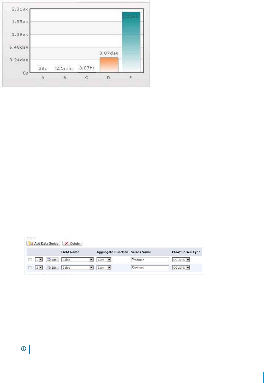
• 150 is converted to 2.50min
• 11050 is converted to 3.07hr
• 334345 is converted to 3.87 day
• 1334345 is converted to 2.21wk
Figure 28. Time scaling
Using MultiSeriesStackedColumn2D and
MultiSeriesStackedColumn2DLineDual
YAxis Charts
To use MultiSeriesStackedColumn2D and MultiSeriesStackedColumn2DLineDualYAxis
For example, you want to use a list that shows total sales for products and services from 2001-2006.
1 Open qChartView in ezEdit.
2 Edit the Viewed Lists section and select a list.
3 In the Chart Type section, select MultiSeriesStackedColumn2D
or MultiSeriesStackedColumn2DLineDualYAxis.
4 Edit the Configuration section, and select a field name; for example, Year.
5 Click Add Data Series and add two data series; for example:
Each series represents a stack within group of stacks.
6 Click Edit in each data series and enter a filter expression. This step is
optional. Use a filter expression only if your data is a subset of all list data.
In this example, Products and Services are subsets for the overall Sales list, enter a filter expression such as
ProductType=’Product’ for the Product series and ProductType="Services’ for the Services series.
7 Select a filter field name for each data series; for example, Name.
NOTE: You can use the same field name in each series if you enter a filter expression.
www.agreeya.com
QuickApps for SharePoint
®
6.7
97
User Guide

qChartView stacks the data according to filter field’s value. If the Filter Field Name is not set, the
chart is not rendered as stack.
Each series represents a stack within group of stacks.
www.agreeya.com
QuickApps for SharePoint
®
6.7
98
User Guide

6
qDiscussionView
• Overview
• qDiscussionView Pages
• qDiscussionView Procedures
Overview
qDiscussionView allows you to view multiple discussions lists at once. These discussion lists can reside in
another site, another site collection, or another web application as long as they are in the same
configuration database.
qDiscussionView Pages
You can configure this web app through its pages that are accessible through ezEdit. qDiscussionView contains
the following pages:
• Content Page
• Behavior Page
• Appearance Page
• Advanced Page
Content Page
The Content page allows you to enter the content for your web app. It contains the following:
• Primary Content
• Filtering
• Search/Filter Panel
• Sorting
Primary Content
The Primary Content page is default category. You need to configure one or more elements in this page to
get started using this web app.
Primary Content contains the following:
www.agreeya.com
QuickApps for SharePoint
®
6.7
99
User Guide

Table 1. Primary Content
Element
Description
Title
Allows you to enter a title for the Web app, or accept the default. This field is
mandatory.
Viewed Lists
See Viewed Lists on page 100.
Display Fields
See Display Fields on page 103
ID HTTP Parameter
Allows the qDiscussionView and several other web apps to an HTTP Parameter called
Name
ID to identify the item to be displayed or edited. This HTTP Parameter is usually
generated automatically by the viewer web app, when you select an item to be
displayed or edited.
NOTE: If qDiscussionView is placed on a web app page that is contained within a
document library, the page will generate an error if the value of the ID HTTP
Parameter is bigger than the number of pages within the document library. To prevent
this error from happening, rename the ID HTTP Parameter.
By default, the value of this property is "ID". You can change the value of this property
to something else, such as LID. In that case, when you select "View Properties" or "Edit
Properties" in the context menu, the URL of the display or edit form becomes:
http://mysite.com/EditFormURL.aspx?LID=xxx
NOTE: Set the same property in the qListForm to the same value.
Viewed Lists
The Viewed Lists section defines:
• the discussion lists whose data is viewed in qDiscussionView and how it is aggregated. You can define
the lists to be aggregated one by one, in a Rolled-Up list, or from lists with a particular name from all
the subsites (recursive rollup)
• the dependent lists for each list. If the Dependent Lists information is provided, qDiscussionView
will check whether or not there are child records in the Dependent Lists when you delete items
from the view. If there are any, qDiscussionView will not delete the selected items.
You will need the qListForm web app in order to establish a relationship between different lists.
The following are the elements for the Viewed List attribute:
www.agreeya.com
QuickApps for SharePoint
®
6.7
100
User Guide
Table 2. Viewed Lists
Element
Description
Advanced
Turn on if you want to edit Viewed Lists in XML format:
Mode
<Lists>
<List SiteUrl="siteUrl" ListName="listName" IncludeSubsites="true/false"
IncludeThisSite="true/false" IsRollupList="true/false" SiteUrlFieldName="fieldName"
RolledUpListName="listName" TargetUrl="targetUrl" SetSessionName="sessionName"
ResetSessionNames="name1, name2" NewFormUrl="URL" EditFormUrl="URL"
DisplayFormUrl="URL">
<!-- To define dependent lists, add a DependentLists element inside the List element -->
<DependentLists>
<List SiteUrl="siteUrl" ListName="listName" KeyFieldName="keyFieldName" />
<List SiteUrl="siteUrl" ListName="listName" KeyFieldName="keyFieldName" />
</DependentLists>
</List>
<List ...></List>
<List ...></List>
</Lists>
Site URL
The URL to the site that contains the list to be searched. The URL can be absolute (http://...)
or relative to the current page URL. This attribute is mandatory.
When using a relative URL, you can use a single dot (.) to denote the current path, a double
dot (..) to denote the previous path, and a slash (/) to denote the root path.
List Name
The name of the SharePoint list that is edited or displayed by this Discussion View. The list
name is case sensitive. If the list name contains spaces, include the spaces here as well.
To denote the current list, you can use a single dot (.) as the list name.
NOTE: This only works if the qDiscussionView is contained in the AllItems.aspx. For example,
if you are replacing the Microsoft® Discussion View in the AllItems.aspx of the Tasks list and
you use a single dot as the ListName attribute, the ListName attribute of the qDiscussionView
is set to Tasks. If you want to save the list as a template and then add it somewhere else, the
name of the new list might not be Tasks and using this relative list name will automatically
pick up the new list name for the view.
Include
If set to true, the Discussion View will search all the subsites for a list whose name specified in
Subsites
the ListName and aggregate the information from those list.
NOTE: If you have many subsites, the information may take a long time to aggregate. Use this
attribute if you have only a small amount of subsites. You must test this feature in your
environment to see whether or not the response comes back in a reasonable amount of time
and the request does not time out.
Include This
Used in conjunction of the IncludeSubsites attribute. If you set this property to true, the list in
Site
the current site will be aggregated by the Discussion View. The current site is the site whose
URL is specified in the SiteUrl attribute.
Is Rollup List
Indicates whether or not the list specified by the SiteUrl and ListName attributes contains the
Site URLs of the lists to be aggregated instead of the data to be aggregated. If you set this to
true, the list specified by the SiteUrl and ListName must have a field that contains the URL
information. By default, the name of that field is Site URL. If you use different field name,
specify the name using the SiteUrlFieldName attribute.
www.agreeya.com
QuickApps for SharePoint
®
6.7
101
User Guide
Table 2. Viewed Lists
Element
Description
Rolled Up List
Used in conjunction with the IsRollupList property, indicates the name of the lists to be rolled
Name
up if you set the IsRollupList to true.
If you want to aggregate more than one list from each site specified in the rollup list, you can
define more than one List elements with the same rollup list, but different RolledUpListName.
For example, if you want to aggregate Public Library and Private Library document libraries
from each site, you can specify the following:
<Lists>
<List SiteUrl="." ListName="Project Sites" IsRollupList="true" SiteUrlFieldName="Project Site
URL" RolledUpListName="Public Library" />
<List SiteUrl="." ListName="Project Sites" IsRollupList="true" SiteUrlFieldName="Project Site
URL" RolledUpListName="Private Library" />
</Lists>
Site URL Field
Used in conjunction with the IsRollupList property, indicates the field that contains the Site
Name
URLs of the lists to be aggregated. This attribute is optional if the field name is Site URL.
NOTE: The Site URL field must be a single line of text field.
Active Field
Used in conjunction with the IsRollupList property. The rollup list may contain a Yes/No field
Name
to indicate whether or not a particular site should be included in the rollup. This property is
optional if the name of this field is Active.
NOTE: The Active field must be a Yes/No field.
Reset Session
Resets (sets to NULL) the value of the session variables whose name is specified in this
Names
attribute. You can specify multiple names by separating them with commas; for example
TaskSession, IssueSession.
You can reset the session name if a discussion may have one or more tasks associated with it.
In addition to storing the selected discussion in the session, you may store the dependent task
information in the session as well. This means that every time you store a new discussion into
a session, you need to reset the dependent task information from the session as well.
Set Session
Defines the name of the session variable where the Discussion View will store the item whose
Name
column is being clicked by the user. The user can click the item if one of the LinkTo,
LinkToTarget or the LinkToSource attributes in the Display Fields property is defined.
This attribute is usually used if you have another web app (such as the qListForm) that can
consume the stored values from the session.
You can set the session name when you want to consume the item from a session variable in a
qListForm later.
Target URL
When the LinkToTarget attribute of a specific column is set to true (in the Display Fields
property), the data in that column becomes a hyperlink to the URL specified in this attribute.
NOTE: The TargetUrl can use the <%field name%> field replacement expression. If you are
using Advanced Mode, you must use the encoded form of the < and > characters, which are
< and > respectively.
Use the LinkToTargetUrl attribute if you want each list to have a different URL; for example,
when you want to aggregate multiple lists from the same workspace and connect a certain
column to the display form of the list. In that case, the URL to the display form of each list is
different.
New Form URL
Indicates the URL where the form to create a new item resides. The URL is relative to the Site
URL of the list. The user is redirected to the specified URL when one of the New buttons in the
toolbar is clicked. If not defined, the user is redirected to the NewForm.aspx of the list (or
Upload.aspx for the document library).
Redefining the New Form URL is useful if you have different way of creating an item
depending on the current view. For example, in the view for external vendor, you may want to
give them a new form that does not contain all the fields in the list.
NOTE: The Source HTTP parameter is automatically appended to the New Form URL during
redirection.
This attribute is usually used in conjunction with qListForm.
www.agreeya.com
QuickApps for SharePoint
®
6.7
102
User Guide

Table 2. Viewed Lists
Element
Description
Reply Form
Indicates the URL where the form to create a new response resides. The URL is relative to the
URL
Site URL of the list. The user is redirected to the specified URL when the Reply button in the
toolbar or in the preview panel or the Reply context menu item is clicked. If not defined, the
user is redirected to the URL specified in the NewFormUrl, if one is defined. Otherwise, the
user is redirected to the NewForm.aspx of the list.
Redefining the Reply Form URL is useful if you want to have a different form to create a reply
than the one that is used to create a new discussion. For example, in the form to create a
reply, you may want to use 2 qListForms. The first qListForm is used to display the detail of
the parent discussion and the second qListForm is used to create the response itself.
NOTE: The Source HTTP parameter is automatically appended to the Reply Form URL during
redirection.
This attribute is usually used in conjunction with qListForm.
Edit Form URL
Indicates the URL where the form to edit an item in the list resides. The URL is relative to the
Site URL of the list. The user is redirected to the specified URL when the user clicks Edit
Properties in the Context Menu. If not defined, the user is redirected to the EditForm.aspx of
the list.
Redefining the Edit Form URL is useful if you have different ways of editing an item depending
on the current view. For example, in the view for external vendor, you may want to give them
an edit form that does not contain all the fields in the list.
NOTE: The ID and Source HTTP parameters are automatically appended to the Edit Form URL
during redirection.
This attribute is usually used in conjunction with qListForm.
Display Form
The URL where the form to display an item in the list resides. The URL is relative to the Site
URL
URL of the list. The user is redirected to the specified URL when the user clicks View
Properties in the Context Menu. If not defined, the user is redirected to the DisplayForm.aspx
of the list.
Redefining the Display Form URL is useful if you have different way of displaying an item
depending on the current view. For example, in the view for external vendor, you may want to
give them a display form that does not contain all the fields in the list.
NOTE: The ID and Source HTTP parameters are automatically appended to the Display Form
URL during redirection.
This attribute is usually used in conjunction with qListForm.
Site URL
The URL to the site that contains the dependent list.
List Name
The name of the dependent list. The list name is case sensitive.
Key Field
The name of the field in the dependent list that contains the ID of the parent item. It is the
Name
foreign key in the dependent list. The key field is usually a single line of text that contains the
parent item ID or a cross-site lookup field to the parent list. The name is case sensitive.
Display Fields
This property defines the fields that should be displayed in the tree list panel of qDiscussionView.
The Display Field contains the following elements:
www.agreeya.com
QuickApps for SharePoint
®
6.7
103
User Guide
Table 3. Display Fields
Element
Description
Advanced Mode
Turn on if you want to edit Display Fields in XML format:
<Fields LookupThresholdControlSettings=”On”>
<Field Name="fieldName" [optional attributes]/>
<!-- Grouped field -->
<Field Name="fieldName" Grouped="true" SortDirection="asc|desc"
GroupExpanded="true|false" />
</Fields>
Query All Fields
Controls how Web apps behave in relation to the Discussion View Lookup Threshold in
SharePoint Resource Throttling. The options are:
• Default — uses the level set in the Configuration Editor. If you have selected
Query All Fields check box in the Configuration Editor, the Web app will query
only those fields that are not included in the Discussion View Lookup Threshold. If
the Query All Fields check box is cleared, the Web app will query all fields.
• On — If the Web app level is On, the Web app queries all fields in lists, except
Lookup fields.
• Off — If the Web app level is Off, the Web app queries all fields in lists, including
Lookup fields.
• Explicit — If the Web app level is Explicit, the Web app queries only those fields
selected in the Display Fields. This option renders the best performance for
your Web app.
Title
Indicates the title of the field. This is useful if the real field name is too long and you want
to abbreviate the title in the field header, or if you simply want to display a different title
in the field header. If this attribute is not specified, the value specified in the Name
attribute is used in the field header. For example:
<Field Name="Created By" Title="Author" />
Title Resource ID
Indicates the identifier in the Resource List that is used as the title of the field. The
TitleResourceID and the current cultural setting (identified with the Culture HTTP
parameter) are used to retrieve the string in the Resource List. If the string with the given
identifier is not found, the default Title is used.
Width
Indicates the width of the field. You can specify the value in pixels (Width="20px") or
percentage (Width="20%").
We recommend leaving at least one field where you do not specify this property. That field
will take up the remaining width of the page. For example:
<Field Name="Subject" Width="100px" />
Align
Indicates the horizontal alignment for the field. The values is one of the following: left,
right, or center. For example:
<Field Name="Created" Align="right" />
Item Style
Indicates the style for the item. You can define the style as you would in a CSS class; for
example, color: red; font-weight: bold
Item CSS Class
Indicates the distinct style for the column and you already have defined the style in an
external CSS file.
Display Field
If specified, indicates a cross-site lookup field. It contains the name of the field in the
Name
cross-site list that contains the value to be displayed. The field name is case sensitive.
A cross-site lookup field enables you to lookup a list that resides in another site, another
site collection, or another web application as long as it is in the same configuration
database. You need the qListForm web app to create a cross-site lookup field.
www.agreeya.com
QuickApps for SharePoint
®
6.7
104
User Guide

Table 3. Display Fields
Element
Description
Display Format
If specified, indicates a cross-site lookup field. It contains the format of the value that is
displayed. Define this attribute if you want to display values from multiple fields. You can
use the field replacement expression <%Field%> to refer to a field.
NOTE: If you are using Advanced Mode, you must use the encoded form of the < and >
characters, which are < and >, respectively unless you type in the value in the
Display Fields editor in the Discussion View Editor, where the Editor will encode the
characters automatically for you.
NOTE: For more information, see Display Format on page 14.
Show User Groups
Allows you to show groups where the user is a member of one of the SharePoint groups
listed. Separate site group names with commas.
Hide User Groups
Allows you to hide groups where the user is a member of one of the SharePoint groups
listed. Separate site group names with commas.
Hyperlink Field
If this field is a SharePoint Hyperlink or Picture field, indicates the target window for the
Target
hyperlink. For example, use "_blank" if you want to open the target URL in a new window.
If this attribute is left blank, the target URL will open in the current window.
This attribute will not affect the hyperlink column created with the LinkTo, LinkToSource
or LinkToTargetURL attributes.
Link To
Indicates that the Discussion View will turn the field into a hyperlinked column to the
specified URL. The URL can be an absolute or relative URL. The LinkTo can use the <%field
name%> field replacement expression.
NOTE: If you are using Advanced Mode, you must use the encoded form of the < and >
characters, which are < and >, respectively unless you type in the value in the
Display Fields editor in the Discussion View Editor, where the Editor will encode the
characters automatically for you.
If you use a relative URL, the URL is appended to the site URL of the target site. For
example, specify "Lists/TeamDiscussion/EditForm.aspx?ID=<%ID%>" as the value of
this property. If you click a customer record that comes from the Customers list in
Workspace A, whose site URL is "http://mydomain/sites/mysite", you are directed to
http://mydomain/sites/mysite/Lists/TeamDiscussion/EditForm.aspx?ID=23 (assuming you
click the discussion with ID=23).
Here is an example on how to make the Subject field a hyperlink column to the edit form
of the Discussion list:
<Field Name="Subject"
LinkTo="Lists/TeamDiscussion/EditForm.aspx?ID=<%ID%>&Source=..
/../default.aspx" />
Link To Target
If set to true, indicates the Discussion View will make the field value a hyperlink to the URL
specified in the TargetUrl attribute in the Viewed Lists property.
Use this element when you aggregate lists with different name. In that case, you specify a
different TargetUrl for each list in the Viewed Lists property and the Discussion View will
redirect the user to the correct URL depending on the list where the clicked item comes
from.
Link To Source
The Discussion View will make the field value a hyperlink to the URL specified in the
Source HTTP parameter of the current request. For this option to work, the current page
URL must look like: http://.....?Source=....
Use this element when the URL for the hyperlink is dynamic. This could be because it
contains dynamic parameters or the URL is different depending on the referral page.
Also, when you want to make the URL in the link dynamic. In that case, you can pass in the
URL for the link into the HTTP parameter of your page.
www.agreeya.com
QuickApps for SharePoint
®
6.7
105
User Guide
Table 3. Display Fields
Element
Description
Is Complex
If selected, you can set the following:
Category
• Complex Category Index Site URL — By default, the complex category index list
resides in the same site as the discussion list itself. If this is not the case, then you
must specify the URL of the site that contains the index list here.
• Complex Category Index List Name — By default, the complex category index list is
named "<Discussion list name> Categories". For example, if your discussion list name is
"Team Discussion", then its index list name is "Team Discussion Categories". If this is not
the case, then you must specify the name of the index list here.
Grouped Allows you to group data by:
• Sort Direction — This attribute determines whether the values in the header of
the grouped field must be displayed in ascending or descending order. The options
are asc for ascending order or desc for descending order. The default value is asc.
• Group Expanded — If set to true, the group is initially expanded. Otherwise, it
is collapsed. If not specified, the default value is false.
NOTE: Grouping is not supported on any field that has "Allow Multiple Values" enabled.
Filtering
The Filtering page allows you to use CAML filters to dynamically filter records.
The Filtering page contains the following:
Table 4. Filtering
Element
Description
CAML Filter
Allows you to specify the CAML (Collaboration Application Markup Language) query
expression to filter your data. CAML is an XML-based query language. The CAML Filter
will only be applied to the data. The filter will not be applied to the responses.
For more information, see CAML Filters on page 19.
Search/Filter Panel
The Search/Filter Panel allows you to define the panels for search, filter, and replace in the web app.
The Search/Filter Panel contains the following elements:
Table 5. Search/Filter Panel
Element
Description
Searched Fields
See Searched Fields on page 107.
Expand Filter panel
Allows you to automatically open the Filter panel by default so that the user can
on Load
perform a search quickly. When set to true, the Filter panel opens when the web app
is loaded for the first time.
Panel Button Location
Determines the location of the Go, Reset and Close buttons in the Filter panel. This
property also determines the location of the Go and Close buttons in the Replace
panel.
Show Apply On Top
Level Discussions
Only in search panel
Determines whether the check box, “Apply only on Top Level Discussions”, is shown
in the filter panel. If you check this check box when performing the search, the
qDiscussionView will filter only the top level discussion and the search results will be
shown in the structure they are supposed to be (under the correct grouping, etc). If
you clear this check box when performing the search, the search results will be
displayed in a flat structure.
www.agreeya.com
QuickApps for SharePoint
®
6.7
106
User Guide
Table 5. Search/Filter Panel
Show Search All
Fields Control in
Search Panel
Determines whether the Filter panel should display the control to search all fields
in the list. When set to true, the following control is shown in the Filter panel:
The Search All Fields Control allows you to do the following:
• Combine the search all fields functionality with other search criteria that
has been entered for specific fields.
• When the search all fields criteria is entered, the Filter panel will construct a
filter expression with the "Contain" operator for the following fields in the
list: Single line of text, Multiple lines of text, Choice, Lookup (only Lookup to
a Single Text field and Lookup to a Number field are supported), Person or
Group and Hyperlink or Picture. If the list contains a Lookup to Number field,
Search All Fields will not work for negative numbers for that field. The Filter
panel will use the entire keywords as the value to be searched. Therefore, if
you enter "High Priority" in the search all fields control and perform the
search, it will find the following sentence:
‘This is a high priority task’
However, it will not find the following sentence:
‘The priority is not always high’
Turn On List Searcher Allows the user to perform a search before the listview display any data.
Mode
Searched Fields
This property defines which fields are displayed in the Filter panel. If defined, the discussion view
displays Filter or Search menu items under the Actions button in the toolbar. To disable the search
feature in the discussion view, you can leave this property blank.
You will be able to perform a search by pressing Enter.
NOTE: Pressing Enter will not allow you to perform a search on such fields as external data, people
picker, managed metadata, and a drop-down list. Instead, the default behavior will occur.
NOTE: For the Number type field, the “Contain” operator is not supported for negative numbers, and is
not available for the following fields: Lookup to DateTime field, Lookup to Calculated field, and Lookup
to ID field.
You can further edit fields using the following elements:
Table 6. Searched Fields
Element
Description
Advanced Mode
Turn on if you want to edit Searched Fields in XML format:
<Fields>
<Field Name="fieldName" [optional attributes]/>
<!-- To search a cross site lookup field, use one of the following two formats -->
<Field Name="fieldName" DisplayFieldName="fieldName" SortField="fieldName" [optional
attributes]>
<List SiteUrl="siteUrl" SiteName="siteName" ListName="listName"/>
</Field>
<Field Name="fieldName" DisplayFormat="fieldName" SortField="fieldName" [optional
attributes]>
<List SiteUrl="siteUrl" SiteName="siteName" ListName="listName"/>
</Field>
</Fields>
Field Name
Indicates the element you are editing.
Title
Displays title for the field. The value can be a plain string or an encoded HTML string.
Description
Describes the field. This is useful if you want to give a short instruction or explanation
about the field.
www.agreeya.com
QuickApps for SharePoint
®
6.7
107
User Guide
Table 6. Searched Fields
Element
Description
Default Value
Defines the default value for the field.
You can define a text, a number or a date. A date value must be specified in ISO
8601 format: YYYY-MM-DDThh:mm:ssZ, for example: midnight of February 14, 2002 is 2002-
02-14T00:00:00Z.
Default Operator
Defines the default operator for the field.
Fixed Operator
Defines the operator for the field. If specified, the list to select the operator for this field is
turned off.
Use People
Enables you to enter any user information that is in your directory service.
Editor
If you set this to True and the field to be searched is a People and Group field, the Filter
panel shows the People Editor control for entering the search criteria.
Column Count
Defines the number of columns for the options in a multi-choice field or in a choice-and-
lookup field if the Enable Multi Choice attribute is set to True. This is useful in case your
choice or lookup fields have too many choices and you want to break the choices into
several columns to minimize the vertical scrolling in your form.
Enable Multi
If set to True, allows you to select multiple options for the choice-and-lookup field.
Choice
Therefore, the user can specify a condition like "A or B". This attribute is ignored by other
field types.
To search a cross-site lookup field, you must specify one or more List elements inside the
Field element. The cross-site lookup field is displayed as two drop downs.
Sort Field
Defines the field that is used to sort the value in the drop-down menu. The field name is
case sensitive.
Sort Order
Allows you to sort the values in ascending or descending order.
AutoPostBack
When set to true, this attribute causes the Filter panel to refresh when the user changes the
selection in a lookup field or cross-site lookup field.
You need to set AutoPostBack to true if this field is a lookup or a cross-site lookup field and
it is being used to filter another lookup or cross-site lookup field in the Filter panel.
Parent Field
Defines another lookup or cross-site lookup field that is used to filter this field. The parent
field must be listed before this field in the XML property.
Parent Filter
Defines the field in the parent field that is used to filter this field. It is the primary key in
Field Name
the list that is used in the lookup or cross-site lookup field.
Filter Field Name
Defines the field in the list that is used by this lookup or cross-site lookup field that is
filtered by the parent filter field.
Display Field
Shows the name of the field whose value is displayed in the drop-down menu. The field
Name
name is case sensitive. Use this attribute instead of the Display Format attribute if you only
want to display a single field in the drop-down menu.
Display Format
Indicates the format of the value that is displayed in the drop-down menu. Define this
attribute instead of the Display Field Name attribute if you want to display multiple fields in
the drop-down menu. You can use the field replacement expression <%Field%> to refer to a
field.
NOTE: If you are using Advanced Mode, you must use the encoded form of the < and >
characters, which are < and >, respectively unless you type in the value in the
Searched Fields editor in the List View Editor, where the Editor will encode the characters
automatically for you.
NOTE: For more information, see Display Format on page 14.
Site URL
Indicates the Site URL of the field. You can use an absolute or relative URL
List Name
Indicates the name of the List. The field name is case sensitive.
Site Name
Indicates the name of the site specified in the Site URL. This is used in case you have
multiple lists. In this case, the first drop-down menu to select the list will display as "List
Name in Site Name". You can use any name for the Site Name. It does not have to match the
real title of the Site.
www.agreeya.com
QuickApps for SharePoint
®
6.7
108
User Guide
Sorting
The Sorting page allows you to define the sorting criteria and paging type and size in the web app.
The Sorting page contains the following elements:
Table 7. Sorting
Element
Description
Sort Fields
Defines the initial sorting criterion for the data. This is the syntax for this
property:
FieldName1 [SortDirection], FieldName1 [SortDirection]
SortDirection is either ASC (ascending order) or DESC (descending order). The
FieldName and the SortDirection are case sensitive. If the SortDirection is not
specified, ascending order is assumed. For example:
First Name ASC, Last Name DESC, Company
Behavior Page
The Behavior page allows you to configure behaviors, such as adding buttons or menus, so the user can
perform operations when using the web app.
The Behavior page contains the following:
• Actions
• Views
Actions
The Actions page contain the following elements:
Table 8. Actions
Element
Description
Row Double Click
Allows you to select which action to perform when you double-click a row.
Action
Views
The Views page allows you to set views so the user to view the data.
The Views page contains the following elements:
Table 9. Views
Element
Description
Search Session Name
The DiscussionView will store the search criteria, last selected folder, sort
criteria, and other DiscussionView dynamic settings in the session variable
with this name.
Appearance Page
The Appearance page allows you to set the overall look and feel of the web app. This page contains the
following:
• Ribbon
www.agreeya.com
QuickApps for SharePoint
®
6.7
109
User Guide
• View
• Toolbar
• Context Menu
• Layout
• Other
Ribbon
The Ribbon page allows you to set the display name of the Ribbon.
Table 10. Ribbon
Element
Description
SharePoint Ribbon Tab
Allows you to edit the display name of the Ribbon tab.
Name
View
The View page allows you to set views so the user to view the data.
The View page contains the following elements:
Table 11. View
Element
Description
Selection Column
Allows you to set the row selection type. The options are:
Type
• None: The user must click the row to select it.
• MultiRowSelector: The discussion view will display a check box as the first
column. To select a row, the user checks the check box for that row. To select
multiple rows, the user checks the check box for each row to be selected.
Maximum Top Level
Allows you to set the maximum number of top level discussions to be displayed on one
Discussions Per Page
page.
Expand To Level
Allows you to determine how many levels should be expanded when the Discussion
View is loaded for the first time.
Show Preview Panel
Allows you to display the preview panel.
Skin Name
Allows you to specify the skin name for the tree list panel in the Discussion View. The
skin name is associated with a folder under the following directory in the web server:
C:\Program Files\Common Files\Microsoft
Shared\WebServerExtensions\14\TEMPLATE\LAYOUTS\QuestSoftware\DevExpress\9.3\
Themes
The skin folder will contain the CSS file and images needed to control the visual
appearance of the grid. If none of the provided skins satisfy your need, you can copy
one of the existing skins and modify it. You must follow the CSS class name convention
in the CSS file, which is class name followed by the skin name; for example,
dxtlControl_Office2003Blue.
Splitter Skin Name
Allows you to specify the skin name for the splitter in the Discussion View. The skin
folder will contain the CSS file and images needed to control the visual appearance of
the grid. If none of the provided skins satisfy your need, you can copy one of the
existing skins and modify it. You must follow the CSS class name convention in the CSS
file, which is class name followed by the skin name; for example, RadSplitter_Office.
Splitter Orientation
Allows you to divide the treeview and the Preview panel either horizontally or
vertically using a splitter.
Tree View List Panel
Allows you to set the height (when the splitter orientation is Horizontal) or the width
Size
(when the splitter orientation is Vertical) of the treeview list panel in pixels.
www.agreeya.com
QuickApps for SharePoint
®
6.7
110
User Guide
Table 11. View
Preview Panel Size
Allows you to set the height (when the splitter orientation is Horizontal) or the width
(when the splitter orientation is Vertical) of the Preview panel in pixels.
Grid Lines
Allows you to specify if the tree list can display no grid lines, horizontal grid line,
vertical grid lines or both depending on the Grid Lines property.
Toolbar
The Toolbar page allows you to configure the appearance of the toolbar. It contains the following:
Table 12. Toolbar
Element
Description
Toolbar Skin Name
Allows you to enter the skin name for the toolbar.
Show Filter Button at Top
Allows you to show the Filter/Search button as a top level button. If not
selected, If set to false, the Filter/Search button is shown under the Actions
button.
Show New Item Button
Allows you to display the New button.
Show Delete Button
Allows you to display the Delete button
Show Connect To Outlook
Allows you to display the Connect to Outlook button.
Button
Show Alert Me Button
Allows you to show the Alert Me button in the toolbar.
Show Reply Button
Allows you to display the Reply button.
Show Expand All Button
Allows you to display the Expand All button.
Show Collapse All Button
Allows you to display the Collapse All button.
Context Menu
The Context Menu page contains the following:
Table 13. Context Menu
Element
Description
Enable Context Menu
Allows you to show the context menu.
Context Menu Skin Name
Allows you to set he skin name for the context menu.
Show View Properties
Allows you to show the View Properties menu item in the context menu.
Show Edit Properties
Allows you to show the Edit Properties menu item in the context menu.
Show Reply
Allows you to show the Reply menu item in the context menu.
Show Delete Item
Allows you to show the Delete Item menu item in the context menu.
Show Manage Permissions
Allows you to show the Manage Permissions menu item in the context menu.
Show Alert Me
Allows you to show the Alert Me menu item in the context menu.
View Properties Context Menu
Allows you to set the text for the View Properties context menu.
Text
Edit Properties Context Menu
Allows you to set the text for the Edit Properties context menu.
Text
Reply Context Menu Text
Allows you to set the text for the Reply context menu.
Delete Item Context Menu Text
Allows you to set the text for the Delete Item context menu.
Manage Permissions Context
Allows you to set the text for the Manage Permissions context menu.
Menu Text
Alert Me Context Menu Text
Allows you to set the text for the Alert Me context menu.
www.agreeya.com
QuickApps for SharePoint
®
6.7
111
User Guide
Layout
The Layout page allows you to set the overall layout of the web app. It contains the following:
Table 14. Layout
Element
Description
Width
Allows you to set the web app to a fixed width
Height
Allows you to set the web app to a fixed height
Chrome State
Allows you to select if the web app can be minimized or not when you open the web app.
If Minimized is selected, then only the Title Bar displays.
Chrome Type
Allows you to select the kind of border to display around the web app.
Hidden
Select this check box if you want the web app hidden
Direction
Allows you to set how the text in the web app displays depending on the language, either
from Left to Right or Right to Left
Other
The Other page allows you to set the appearance of other elements in the web app. It contains the following:
Table 15. Other
Element
Description
Allow Minimize
Select this check box if you want the web app minimized
Allow Close
Select this check box if you want the web app removed from the page
Allow Hide
Select this check box if you want the web app hidden
Allow Zone Change
Select this check box if you want the web app moved to a different zone
Allow Connections
Select this check box if you want the web app to participate in connections to
other web apps
Allow Editing in Personal View
Select this check box if you want the web app modified in a personal view
Export Mode
Allows you to select the level of data that can be exported for this web app
Title URL
Allows you to add the title of a URL as extra information about the web app
Description
Allows you to enter a description of the web app that is displayed as a Tooltip
when you hover your mouse over the web app title or icon.
Help URL
Allows you to enter the location of a file containing Help information about
the web app.
Help Mode
Allows you to specify how a browser displays Help content for the web app,
either in a separate window which you must close before returning to the
Web Page (Mode), in a separate window that you do not need to close before
returning to the Web Page (Modeless), or in the current browser window
(Navigate)
Catalog Icon Image URL
Allows you to specify the location of a file containing an image to be used as
the web app icon in the Web app List. The image size must be 16 by 16
pixels.
Title Icon Image URL
Allows you to specify the location of a file containing an image to be used in
the web app title bar. The image size must be 16 by 16 pixels.
Import Error Message
Allows you to specify a message that appears if there is a problem importing
the web app
Advanced Page
The Advanced page allows you to set advanced features of the web app, such as the following:
www.agreeya.com
QuickApps for SharePoint
®
6.7
112
User Guide
• Security
• Resources
Security
The Security page allows you to set which users are allowed to view the web app. It contains the following:
Table 16. Security
Element
Description
Target
Allows you to have the Web app to appear only to people who are members of a particular
Audiences
group or audience.
An audience can be identified by using a SharePoint group, a distribution list, a security
group, or a global audience.
Resources
The Resources page allows you to enable Localization in the web app using resource lists.
Localization
Localization contains the following elements.
NOTE: While this feature is still available to use, we recommend using ezLocalizer. For more
information, see ezLocalizer on page 391.
Table 17. Localization
Element
Description
Resource List
Allows you to support a multi-lingual site. In a multi-lingual site, there are some
settings, such as the web app, whose value can change depending on the current
culture setting. The Resource List property defines the list that contains the string
values for different cultures. The resource list must contain 3 columns:
• Resource ID — This field contains the identifier to refer to the string. You can
have multiple strings with the same Resource ID as long as their Culture value
is different.
• Culture — This field contains the culture for the string. For the default
culture, leave the Culture field blank.
• Value — This field contains the value for the string.
The Lists element can contain only one List element. The following are the attributes
for the List element:
• SiteUrl — The URL to the site that contains the resource list. The URL can be
absolute (http://...) or relative to the current page URL. This attribute is
mandatory.
• ListName — The name of the resource List. The list name is case sensitive.
Title Resource ID
Allows you to support a multi-lingual site. The property defines the identifier of the
string in the Resource List that is used as the text of the web app. The Resource ID
and the current cultural setting (identified with the Culture HTTP parameter) are
used to retrieve the string in the Resource List. If the string with the given identifier
and culture is not found, the default is used.
View Properties Context
Allows you to enter a text resource ID for the View Properties context menu.
Menu Resource Text ID
Edit Properties Context
Allows you to enter a text resource ID for the Edit Properties context menu.
Menu Resource ID
www.agreeya.com
QuickApps for SharePoint
®
6.7
113
User Guide
Table 17. Localization
Element
Description
Reply Context Menu
Allows you to enter a text resource ID for the Reply context menu.
Text Resource ID
Delete Item Context
Allows you to enter a text resource ID for the Delete Item context menu.
Menu Resource ID
Manage Permissions
Allows you to enter a text resource ID for the Manage Permissions context menu.
Context Menu Resource
ID
Alert Me Context Menu
Allows you to enter a text resource ID for the Alert Me context menu.
Resource ID
Filter Button Text
Allows you to enter a text resource ID for the Filter button.
Resource ID
qDiscussionView Procedures
You can perform the following procedures using qDiscussionView:
• Configuring qDiscussionView
• Sorting the qDiscussionView
• Configuring qDiscussionView with the Complex Category Index List
Configuring qDiscussionView
To configure qDiscussionView
1 Add qDiscussionView to your page.
2 Open ezEdit.
The Primary Content page opens by default.
3 Configure each element as needed and click OK.
4 If needed, configure the elements in the other tabs.
5 When done configuring each tab, click OK.
Sorting the qDiscussionView
You can sort the entries in the qDiscussionView by clicking the column header. Clicking the column header
again will alternate between ascending and descending order.
Due to the hierarchical nature of the discussions and their responses, the sorting will sort the node
against another nodes in the same level. For example, if the following discussion structure exists:
* Discussion 1
- Response 1.1
- Response 1.1.1
- Response 1.1.2
- Response 1.2
- Response 1.2.1
www.agreeya.com
QuickApps for SharePoint
®
6.7
114
User Guide

- Response 1.2.2
* Discussion 2
- Response 2.1
- Response 2.1.1
- Response 2.1.2
- Response 2.2
- Response 2.2.1
- Response 2.2.2
When you click the Subject column header:
• Discussion 1 is sorted against Discussion 2
• Response 1.1 is sorted against Response 1.2.
• Response 2.1 is sorted against Response 2.2.
• Response 1.1.1 is sorted against Response 1.1.2.
• Response 1.2.1 is sorted against Response 1.2.2.
• Response 2.1.1 is sorted against Response 2.1.2.
• Response 2.2.1 is sorted against Response 2.2.2.
To clear the sorting for a certain column
• Press Ctrl and click the column header.
To sort multiple columns
• Press Shift and click other column headers.
The sort index depends on which column you click first. For example, if you click Created field and
then click Shift + Subject field, the entries are sorted based on the Created field first and then Subject
field, regardless the Subject field appeared first.
Understanding the Complex Category Index List
The Complex Category Index List allows qDiscussionView to function like the Lotus Notes response document
which contains a category attribute. qDiscussionView maintains the index list when one or more discussions
are deleted. You must mark the complex category field in your discussion list, so qDiscussionView will know
that the complex category field exists and the index list is updated.
To mark the complex category field in your discussion list
1 From the menu, select ezEdit.
2 From the Display Fields section, select Edit.
3 Select Edit for each field name you want displayed.
4 Select the Is Complex Category check box, and click OK.
The Complex Category Index List can contain multiple categories such as: Category1, Category2, Category3.
In this case, the discussion is displayed in each of the multiple categories in the treeview. For example, if
Discussion A contained ‘Category1, Category2, Category3’ in the Complex Category Index List, it would be
displayed in the treeview view as follows:
- Category1
- Discussion A
- Category2
www.agreeya.com
QuickApps for SharePoint
®
6.7
115
User Guide

- Discussion A
- Category3
- Discussion A
The sorting is disabled when you use grouped complex category field.
The category field can contain nested categories, such as: Category1\Category2\Category3. In this case,
the discussion is displayed in the nested categories in the treeview. For example, if Discussion A contained
‘Category1\Category2\Category3’ in the complex category field, it would be displayed in the treeview as
follows:
- Category1
- Category2
- Category3
Discussion A
The category field can contain a mix of multiple and nested categories. For example, if Discussion A contained
‘Category1, Category2, Category3, Level1\Level2\Level3’ in the complex category field, it would be displayed
in the listview as follows:
-- Category1
- Discussion
A - Category2
- Discussion
A - Category3
- Discussion A
- Level1 -
Level2 -
Level3
Discussion A
In order to support complex categories while maintaining good performance, the Complex Category must be
indexed. Another SharePoint list is used to store the index. There are two ways to create the Complex
Category Index list.
To create the Complex Category Index List
1 From qDiscussionView, select Create Complex Category Index List.
2 Accept the default site URL or enter another site URL.
3 Enter the list name.
Once created, the index appears when you get lists from the Viewed List section of the web app.
For mass creation of the Complex Category Index list after discussion lists are migrated from Lotus Notes, use
the Complex Category Indexer tool. After the migration job, there are many unindexed discussion lists. This
tool creates the Complex Category Index list and populate it at the same time.
Configuring qDiscussionView with the
Complex Category Index List
If you have a Discussion list that you want to appear in different categories, you would configure the
Complex Category Index List. The Complex Category Index List allows qDiscussionView to function like the
Lotus Notes response document which contains a category attribute.
www.agreeya.com
QuickApps for SharePoint
®
6.7
116
User Guide
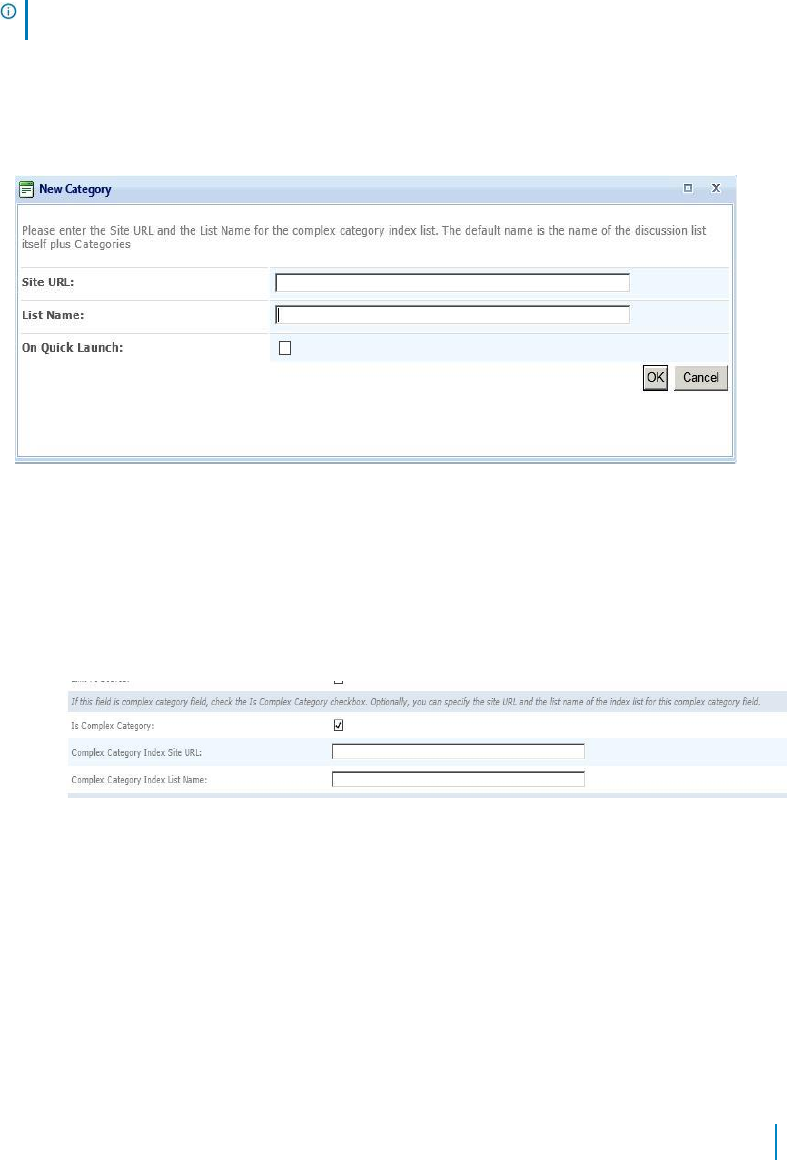
qDiscussionView maintains the index list when one or more discussions are deleted. You must mark the
complex category field in your discussion list, so qDiscussionView will know that the complex category field
exists and the index list is updated.
To configure qDiscussionView with Complex Category Index List
1 Create a discussion board list in SharePoint. For example, create a discussion board list
called "Discussion".
2 Create a column for Discussion. Enter the name "Category" and select Single Line of Text or
Multiple Lines of Text as the Type.
NOTE: Refer to the SharePoint documentation on how to create a column and
discussion board list.
3 Create a SharePoint page, add a qDiscussionView web app, and open ezEdit. In Viewed Lists, select
Discussion.
4 From the qDiscussionView drop-down menu, select Create Complex Category Index
List. The New Category dialog box opens.
5 Enter a Complex Category Index Site URL and List Name.
The List Name defaults to discussion board list name plus Categories. For example, the default list
name is Discussion Categories.
6 Open ezEdit of the qDiscussionView web app.
a From Display Fields, select Edit next to "Category" created in step 2.
b Select Is Complex Category check box.
c Enter a Complex Category Index Site URL and Complex Category Index List Name. This name
must the same as the list name entered in Step 5 (in our example, Discussion Categories).
7 Replace SharePoint's out-of-the-box web apps on the NewItem, EditItem, and ViewItem pages
with qListForm web apps.
You must replace the out-of-the-box web app with the qListForm to use the Complex
Category Discussion feature in qListForm.
www.agreeya.com
QuickApps for SharePoint
®
6.7
117
User Guide
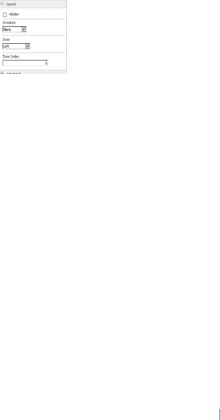
a Hide out-of-the box web apps. From the web app drop-down, select Edit Web app. From the
Layout section, select the Hidden check box.
b Add a qListForm web app. Open ezEdit.
c For Form Type, select NewListItem to replace Default New Form from the out-of-the-box
web app.
d Create two more qListForm web apps. Open ezEdit. For Form Type, select:
• DisplayListItem to replace Default Display Form from the out-of-the-box web app
• EditListItem to replace Default Edit Form from the out-of-the-box web app
8 In each qListForm web app:
a Select Edit from Display Fields and select Edit next to Category (created in step 2).
b Select Complex Category as the Field Type. Enter a Complex Category Index Site URL and List
Name. This name must the same as the list name entered in Step 5 (in our example,
Discussion Categories).
You can now use qListForm to view, edit, and update complex categories and view
discussion threads grouped by complex categories.
www.agreeya.com
QuickApps for SharePoint
®
6.7
118
User Guide
7
qDynamicLayout
• Overview
• qDynamicLayout Pages
• qDynamicLayout Procedures
Overview
The qDynamicLayout Web app allows you to create a customized layout by placing multiple Web apps and
HTML elements on one page. This helps you manage page space more effectively.
qDynamicLayout Pages
You can configure this Web app through its tabs that are accessible through ezEdit. qDynamicLayout
contains the following pages:
• Content Page
• Appearance Page
• Advanced Page
Content Page
When you open ezEdit in qDynamicLayout, the Primary Content page opens by default, and contains
the following editable sections:
• Primary Content
Primary Content
The Primary Content page is default category. You need to configure one or more elements in this page to
get started using this web app.
Primary Content contains the following:
Table 1. Primary Content
Element
Description
Title
Allows you to enter a title for the Web app, or accept the default. This field is
mandatory.
Layout
See Layout on page 120.
View Settings
See View Setting on page 120.
www.agreeya.com
QuickApps for SharePoint
®
6.7
119
User Guide
Layout
The Tab Layout allows you to pick where to add the tabs and what the tabs should be named.
The following are elements found in the Layout section.
Table 2. Layout
Element
Description
Advanced Mode
Allows you to edit Layout in XML format:
<FormLayout Type="Tab" Orientation="HorizontalTop">
<Container ID="Test" Label="DiscussionView" Description="" />
</FormLayout>
ID
Allows you to give an ID to each tab
The IDs can contain letters ([A-Z, a-z]), digits ([0-9]), hyphens ("-"), and underscores
("_") only.
Label
Allows you to name each tab
Description
Allows you to add a description to each tab, if necessary
Show User Groups
Allows you to list SharePoint groups whose members can view the web app. Separate
groups with commas (for example, Administrators, Readers).
Hide User Groups
Allows you to list SharePoint groups whose members cannot view the web app.
Separate site group names with commas (for example, Administrators, Readers).
If users are defined in Show User Groups and Hide User Groups, Hide Groups takes
precedence.
Default
Allows you to define the default tab for qDynamicLayout. If this element is not
specified, the first tab listed in the Layout becomes the default tab. If the tab for the
specified element is hidden, then the first non-hidden tab becomes the default tab.
View Setting
The View Setting section allows you to select in what tabs the Web apps should appear and in which order.
The following are elements found in the View Settings section.
Table 3. View Setting
Element
Description
Advanced Mode
Turn on if you want to edit View Settings in XML format:
<ViewSetting>
<Content Type="WebPart" ContainerID="1">
<WebPart ID="g_59f7fda1_4405_45c8_bba0_f354db68bab8" Type="DiscussionView"
ClientId="MSOZoneCell_WebPartWPQ18" />
</Content>
</ViewSetting>
Web app Title
Indicates the name the Web app to be added
Web app Type
Indicates the type of Web app to be added
Container
If you have more than one qDynamicLayout Web app, the Container indicates if a Web
Part is already part of another qDynamicLayout Web app and the name of that
qDynamicLayout Web app. You cannot configure these Web apps from another
qDynamicLayout Web app. You can configure only those Web apps that are contained in
the qDynamicLayout you are editing.
Tab ID
Allows you to select the tab where to add the Web app. The Tab ID appears when you
configure the IDs in the Layout section
www.agreeya.com
QuickApps for SharePoint
®
6.7
120
User Guide
Appearance Page
The Appearance page allows you to set the overall look and feel of the web app. This page contains the
following:
• Ribbon
• Skin
• Layout
• Other
Ribbon
The Ribbon page allows you to set the display name of the Ribbon.
Table 4. Ribbon
Element
Description
SharePoint Ribbon Tab
Allows you to edit the display name of the Ribbon tab.
Name
Skin
The Skin page allows you to configure the appearance of the web app.
Table 5. Skin
Element
Description
Skin Name
Allows you to select the skin name for the Web app. If you have a custom skin, you can add it
to the following folder:
• for SharePoint 2010: C:\Program Files\Common Files\Microsoft Shared\Web Server
Extensions\14\TEMPLATE\LAYOUTS\QuestSoftware\Telerik\Q32013SP1\Skins
• for SharePoint 2013: C:\Program Files\Common Files\Microsoft Shared\Web Server
Extensions\15\TEMPLATE\LAYOUTS\QuestSoftware\Telerik\Q32013SP1\Skins
• for SharePoint 2016: C:\Program Files\Common Files\Microsoft Shared\Web Server
Extensions\16\TEMPLATE\LAYOUTS\QuestSoftware\Telerik\Q32013SP1\Skins
When creating a custom skin, you can refer to the Sample Skin folder in the install directory.
Layout
The Layout page allows you to set the overall layout of the web app. It contains the following:
Table 6. Layout
Element
Description
Width
Allows you to set the web app to a fixed width
Height
Allows you to set the web app to a fixed height
Chrome State
Allows you to select if the web app can be minimized or not when you open the web app.
If Minimized is selected, then only the Title Bar displays.
Chrome Type
Allows you to select the kind of border to display around the web app.
Hidden
Select this check box if you want the web app hidden
Direction
Allows you to set how the text in the web app displays depending on the language, either
from Left to Right or Right to Left
www.agreeya.com
QuickApps for SharePoint
®
6.7
121
User Guide
Other
The Other page allows you to set the appearance of other elements in the web app. It contains the following:
Table 7. Other
Element
Description
Allow Minimize
Select this check box if you want the web app minimized
Allow Close
Select this check box if you want the web app removed from the page
Allow Hide
Select this check box if you want the web app hidden
Allow Zone Change
Select this check box if you want the web app moved to a different zone
Allow Connections
Select this check box if you want the web app to participate in connections to
other web apps
Allow Editing in Personal View
Select this check box if you want the web app modified in a personal view
Export Mode
Allows you to select the level of data that can be exported for this web app
Title URL
Allows you to add the title of a URL as extra information about the web app
Description
Allows you to enter a description of the web app that is displayed as a Tooltip
when you hover your mouse over the web app title or icon.
Help URL
Allows you to enter the location of a file containing Help information about
the web app.
Help Mode
Allows you to specify how a browser displays Help content for the web app,
either in a separate window which you must close before returning to the
Web Page (Mode), in a separate window that you do not need to close before
returning to the Web Page (Modeless), or in the current browser window
(Navigate)
Catalog Icon Image URL
Allows you to specify the location of a file containing an image to be used as
the web app icon in the Web app List. The image size must be 16 by 16
pixels.
Title Icon Image URL
Allows you to specify the location of a file containing an image to be used in
the web app title bar. The image size must be 16 by 16 pixels.
Import Error Message
Allows you to specify a message that appears if there is a problem importing
the web app
Advanced Page
The Advanced page allows you to set advanced features of the web app, such as the following:
• Security
Security
The Security page allows you to set which users are allowed to view the web app. It contains the following:
Table 8. Security
Element
Description
Target
Allows you to have the Web app to appear only to people who are members of a particular
Audiences
group or audience.
An audience can be identified by using a SharePoint group, a distribution list, a security
group, or a global audience.
www.agreeya.com
QuickApps for SharePoint
®
6.7
122
User Guide

qDynamicLayout Procedures
You can perform the following procedures using qDynamicLayout:
• Configuring qDynamicLayout
Configuring qDynamicLayout
If a Web app is hidden or closed, you cannot add it to qDynamicLayout.
If you delete qDynamicLayout, only the qDynamicLayout container is deleted, the Web apps contained within
it are not.
You cannot configure the View Settings section until you have added a Web app to a tab in qDynamicLayout.
To configure qDynamicLayout
1 Add the qDynamicLayout Web app to your page.
2 Open ezEdit.
The Primary Content page opens by default.
3 Configure each element as needed and click OK.
4 If needed, configure the elements in the other tabs.
5 When done configuring each tab, click OK.
You do not have to add a Web app to a tab right away. You can add one later or add more Web apps to the
same tab.
To add a Web app later or add more Web apps to the same tab
1 From Site Actions, select Edit Page.
2 Select Add a Web app.
3 Select a Web app and click Add.
4 From qDynamicLayout Web app, select ezEdit.
5 From View Settings section, select Edit.
6 Select the Web app you just added.
7 Select the Tab ID for the Web app.
8 Click OK.
To configure a Web app within a qDynamicLayout Web app
1 From Site Actions, select Edit Page.
2 From qDynamicLayout Web app, select a tab.
3 From the tab, select ezEdit.
4 Configure and save the Web app.
www.agreeya.com
QuickApps for SharePoint
®
6.7
123
User Guide

8
qExcelViewer
• Overview
• qExcelViewer Pages
• qExcelViewer Procedures
Overview
qExcelViewer lets you view data in Microsoft Excel. The Excel viewer works in conjunction with the qListView.
qExcelViewer Pages
You can configure this web app through its tabs that are accessible through ezEdit. qExcelViewer contains
the following tabs:
• Content Page
• Appearance Page
• Advanced Page
Content Page
The Content page allows you to enter the content for your web app. It contains the following:
• Primary Content
Primary Content
The Primary Content page is default category. You need to configure one or more elements in this page to
get started using this web app.
Primary Content contains the following:
Table 1. Primary Content
Element
Description
Title
Allows you to enter a title for the Web app, or accept the default. This field is
mandatory.
Session Name
Allows you to enter the name of the Session variable where the Excel Viewer expects
to find all the information that has been set by a qListView. This name must match the
Search Session Name in qListView.
Show Header
Allows you to show the column name in the first row.
www.agreeya.com
QuickApps for SharePoint
®
6.7
124
User Guide

Table 1. Primary Content
Element
Description
Display Fields
See Display Fields on page 125.
Child View Display
Defines the fields that should be displayed in the view for the child record. For more
Fields
information, see Child View Display Fields on page 129.
Display Fields
This property defines the fields that should be displayed in the Excel spreadsheet.
This property is optional if the properties in the Custom Display section are specified. In that case, the default
display for the search results is turned off and the custom display is used. You can also combine a custom
display with the Display Fields; for example, if you want to display the data in the grid and to provide the
summary of the data or disclaimer using the custom display.
The Display Fields section contains the following:
Table 2. Display Fields
Element
Description
Advanced Mode
Turn on if you want to edit Display Fields in XML format:
<Fields LookupThresholdControlSetting=”On”>
<Field Name="fieldName" [optional attributes]/>
<Field Name="fieldName" [optional attributes]/>
</Fields>
Query All Fields
Controls how Web apps behave in relation to the Excel View Lookup Threshold in
SharePoint Resource Throttling. The options are:
• Default — uses the level set in the Configuration Editor. If you have selected
Query All Fields check box in the Configuration Editor, the Web app will query
only those fields that are not included in the Excel View Lookup Threshold. If the
Query All Fields check box is cleared, the Web app will query all fields.
• On — If the Web app level is On, the Web app queries all fields in lists,
except Lookup fields.
• Off — If the Web app level is Off, the Web app queries all fields in lists,
including Lookup fields.
• Explicit — If the Web app level is Explicit, the Web app queries only those
fields selected in the Display Fields. This option renders the best performance
for your Web app.
Title
Allows you to set the title for the field header. This is useful if the real field name is
too long and you want to abbreviate the title in the field header, or if you simply want
to display a different title in the field header. If this attribute is not specified, the
value specified in the Name attribute is used in the field header.
Align
Allows you to set the alignment for the field.
Display Field
Allows you to specify the name of a field in the cross-site list. You only specify this if
Name
the field that you are trying to display is a cross-site lookup field.
If you want to display multiple fields from the cross-site lookup field, use the Display
Format.
Display Format
Allows you to set the format of the value that is displayed in a cross-site lookup field.
You use this attribute if you want to display values from multiple fields.
NOTE: You can use the field replacement expression <%Field%> to refer to a field. If
you are using Advanced Mode, you must use the encoded form of the < and >
characters, which are < and >, respectively, unless you use the Excel Viewer
Editor which will encode it automatically for you.
For more information, see Display Format on page 14.
www.agreeya.com
QuickApps for SharePoint
®
6.7
125
User Guide
Appearance Page
The Appearance page allows you to set the overall look and feel of the web app. This page contains the
following:
• Ribbon
• Layout
• Other
Ribbon
The Ribbon page allows you to set the display name of the Ribbon.
Table 3. Ribbon
Element
Description
SharePoint Ribbon Tab
Allows you to edit the display name of the Ribbon tab.
Name
Layout
The Layout page allows you to set the overall layout of the web app. It contains the following:
Table 4. Layout
Element
Description
Width
Allows you to set the web app to a fixed width
Height
Allows you to set the web app to a fixed height
Chrome State
Allows you to select if the web app can be minimized or not when you open the web app.
If Minimized is selected, then only the Title Bar displays.
Chrome Type
Allows you to select the kind of border to display around the web app.
Hidden
Select this check box if you want the web app hidden
Direction
Allows you to set how the text in the web app displays depending on the language, either
from Left to Right or Right to Left
Other
The Other page allows you to set the appearance of other elements in the web app. It contains the following:
Table 5. Other
Element
Description
Allow Minimize
Select this check box if you want the web app minimized
Allow Close
Select this check box if you want the web app removed from the page
Allow Hide
Select this check box if you want the web app hidden
Allow Zone Change
Select this check box if you want the web app moved to a different zone
Allow Connections
Select this check box if you want the web app to participate in connections to
other web apps
Allow Editing in Personal View
Select this check box if you want the web app modified in a personal view
Export Mode
Allows you to select the level of data that can be exported for this web app
Title URL
Allows you to add the title of a URL as extra information about the web app
www.agreeya.com
QuickApps for SharePoint
®
6.7
126
User Guide

Table 5. Other
Element
Description
Description
Allows you to enter a description of the web app that is displayed as a Tooltip
when you hover your mouse over the web app title or icon.
Help URL
Allows you to enter the location of a file containing Help information about
the web app.
Help Mode
Allows you to specify how a browser displays Help content for the web app,
either in a separate window which you must close before returning to the Web
Page (Mode), in a separate window that you do not need to close before
returning to the Web Page (Modeless), or in the current browser window
(Navigate)
Catalog Icon Image URL
Allows you to specify the location of a file containing an image to be used as
the web app icon in the Web app List. The image size must be 16 by 16
pixels.
Title Icon Image URL
Allows you to specify the location of a file containing an image to be used in
the web app title bar. The image size must be 16 by 16 pixels.
Import Error Message
Allows you to specify a message that appears if there is a problem importing
the web app
Advanced Page
The Advanced page allows you to set advanced features of the web app, such as the following:
• Security
• Resources
Security
The Security page allows you to set which users are allowed to view the web app. It contains the following:
Table 6. Security
Element
Description
Target
Allows you to have the Web app to appear only to people who are members of a particular
Audiences
group or audience.
An audience can be identified by using a SharePoint group, a distribution list, a security
group, or a global audience.
Resources
The Resources page allows you to enable Localization in the web app using resource lists.
Localization
Localization contains the following elements.
NOTE: While this feature is still available to use, we recommend using ezLocalizer. For more
information, see ezLocalizer on page 391.
www.agreeya.com
QuickApps for SharePoint
®
6.7
127
User Guide
Table 7. Localization
Element
Description
Resource List
Allows you to support a multi-lingual site. In a multi-lingual site, there are some
settings, such as the web app, whose value can change depending on the current
culture setting. The Resource List property defines the list that contains the string
values for different cultures. The resource list must contain 3 columns:
• Resource ID — This field contains the identifier to refer to the string. You can
have multiple strings with the same Resource ID as long as their Culture value
is different.
• Culture — This field contains the culture for the string. For the default
culture, leave the Culture field blank.
• Value — This field contains the value for the string.
The Lists element can contain only one List element. The following are the attributes
for the List element:
• SiteUrl — The URL to the site that contains the resource list. The URL can be
absolute (http://...) or relative to the current page URL. This attribute is
mandatory.
• ListName — The name of the resource List. The list name is case sensitive.
Title Resource ID
Allows you to support a multi-lingual site. The property defines the identifier of the
string in the Resource List that is used as the text of the web app. The Resource ID
and the current cultural setting (identified with the Culture HTTP parameter) are
used to retrieve the string in the Resource List. If the string with the given identifier
and culture is not found, the default is used.
qExcelViewer Procedures
You can perform the following procedures using qExcelViewer:
• Configuring qExcelViewer
Configuring qExcelViewer
To configure qExcelViewer
1 Create a new blank page and give it an .aspx extension. This name must appear in the Excel Viewer
URL property of qListView.
2 Add qExcelViewer to your page.
3 Open ezEdit.
The Primary Content page opens by default.
4 Enter a session name. This session must be the same as the Search Session Name created in qListView.
5 Select some display fields.
6 When done configuring each tab, click OK.
NOTE: If you are using Excel 2010, if you have more than 8 outline levels, some rows will
be hidden. To show all data, select all rows and right-click the rows. Select Unhide.
www.agreeya.com
QuickApps for SharePoint
®
6.7
128
User Guide
Child View Display Fields
This property defines the fields that should be displayed in the Excel spreadsheet. When you select the
Edit button, a dialog box opens with a list of field names based on the session name which you have saved
in qListView.
The Child View Display Fields section contains the following:
Table 8. Child View Display Fields
Element
Description
Advanced Mode
Turn on if you want to edit Display Fields in XML format:
<Fields LookupThresholdControlSetting="Default">
<Field Name="Title" InternalName="Title" />
</Fields>
Query All Fields
Controls how Web apps behave in relation to the Excel View Lookup Threshold in
SharePoint Resource Throttling. The options are:
• Default — uses the level set in the Configuration Editor. If you have selected
Query All Fields check box in the Configuration Editor, the Web app will query
only those fields that are not included in the Excel View Lookup Threshold. If the
Query All Fields check box is cleared, the Web app will query all fields.
• On — If the Web app level is On, the Web app queries all fields in lists,
except Lookup fields.
• Off — If the Web app level is Off, the Web app queries all fields in lists,
including Lookup fields.
• Explicit — If the Web app level is Explicit, the Web app queries only those
fields selected in the Display Fields. This option renders the best
performance for your Web app.
Title
Allows you to set the title for the field header. This is useful if the real field name is
too long and you want to abbreviate the title in the field header, or if you simply want
to display a different title in the field header. If this attribute is not specified, the
value specified in the Name attribute is used in the field header.
Align
Indicates the horizontal alignment for the field. The values is one of the following:
left, right, or center. For example:
<Field Name="Created" Align="right" />
Display Field
Allows you to specify the name of a field in the cross-site list. You only specify this if
Name
the field that you are trying to display is a cross-site lookup field.
If you want to display multiple fields from the cross-site lookup field, use the Display
Format.
Display Format
Allows you to set the format of the value that is displayed in a cross-site lookup field.
You use this attribute if you want to display values from multiple fields.
NOTE: You can use the field replacement expression <%Field%> to refer to a field. If
you are using Advanced Mode, you must use the encoded form of the < and >
characters, which are < and >, respectively, unless you use the Excel Viewer
Editor which will encode it automatically for you.
For more information, see Display Format on page 14.
www.agreeya.com
QuickApps for SharePoint
®
6.7
129
User Guide

9
qHelpLink
• Overview
• qHelpLink Pages
Overview
qHelpLink provides a context-sensitive help functionality. The help link enables each page to be connected to
a different help file or to no help file (in which case the help link will not be visible). This capability lets the
site administrator or author issue the help files in stages.
The help link information is stored in a SharePoint list. The SharePoint list for the help link should contain:
• Context ID — This field is mandatory. This is a single line of text that contains the identifier for the
help URL.
• Help Url — This field is mandatory. This is a single line of text that contains the URL for the help file.
• Culture — This field is optional. You must have this field if you want to have a different Help URL for
different culture. You can define different Help URLs with the same Caption ID but different Help
URL. You must leave the value for the default culture blank. For example:
Table 1. Culture
Context ID
Culture
Help Url
sites.mysite.default.aspx
defaultHelp.aspx
sites.mysite.default.aspx
id-ID
defaultHelp.id-ID.aspx
If your list uses different names for the fields, you must define the name in the Context ID Field Name, Help
Url Field Name, and Culture Field Name properties.
The Help URL field may contain an absolute or a relative URL.
You can create the source list easily by using the “AgreeYa Help List” under Custom Lists in SharePoint. This
will automatically create a list that contains all of the above fields.
qHelpLink Pages
You can configure this web app through its tabs that are accessible through ezEdit. qHelpLink contains the
following tabs:
• Content Page
• Behavior Page
• Appearance Page
• Advanced Page
www.agreeya.com
QuickApps for SharePoint
®
6.7
130
User Guide
Content Page
The Content page allows you to enter the content for your web app. It contains the following:
• Primary Content
• Custom Display
Primary Content
The Primary Content page is default category. You need to configure one or more elements in this page to
get started using this web app.
Primary Content contains the following:
Table 2. Primary Content
Element
Description
Site Url
Allows you to set the URL to the site that contains the list. The URL can be
absolute (http://...) or relative to the current page URL. This attribute is
mandatory.
When using a relative URL, you can use a single dot (.) to denote the current
path, a double dot (..) to denote the previous path, and a slash (/) to denote the
root path.
List Name
Allows you to set the name of the list. The name is case sensitive. If the name of
the list contains spaces, include the spaces in the List Name.
Context ID
Allows you to set the identifier to locate the help URL in the list.
NOTE:
Define a convention for the Context ID value that will make it easy for you
to identify where the help URL is used. For example, use the page URL, remove
the host name from the URL, and replace all / (slash) with . (dot). Therefore, if
the page URL is http://hostname/sites/mysite/default.aspx, the Context ID is
sites.mysite.default.aspx
Context ID Field Name Allows you to set the name of the field containing the context ID. The default
value is User Context ID.
Help Url Field Name
Allows you to set the name of the field containing the message. The default
value is Help URL.
Culture Field Name
Allows you to set the name of the field containing the Culture. The default value
is User Culture.
Help Text
Allows you to set the text for the help link. The default value is Help. You can
replace this value with HTML such as <img border="0" title="Help"
src="imageURL"> to display an image instead of text.
Custom Display
The Custom Display page contains the following:
Table 3. Custom Display
Element
Description
CSS Style
Allows you to set the CSS style for the help link. The default value is empty. You
can define this as you would define the styles in a CSS class.
CSS Class
Allows you to set the CSS class name for the help link. The class name must be
defined in an external CSS file. If defined, this priority takes precedence over the
CSS Style class.
www.agreeya.com
QuickApps for SharePoint
®
6.7
131
User Guide
Behavior Page
The Behavior page allows you to configure behaviors, such as adding buttons or menus, so the user can
perform operations when using the web app.
The Behavior page contains the following:
• Navigation
Navigation
The Navigation page allows you to configure how and where the user will navigate in the web app. It contains
the following elements:
Table 4. Navigation
Element
Description
Target
Allows you to define how the help file should be displayed. The default value is
_blank, which means the help file opens in a new window. Another alternative
is the name of a frame or another window.
Appearance Page
The Appearance page allows you to set the overall look and feel of the web app. This page contains the
following:
• Ribbon
• Layout
• Other
Ribbon
The Ribbon page allows you to set the display name of the Ribbon.
Table 5. Ribbon
Element
Description
SharePoint Ribbon Tab
Allows you to edit the display name of the Ribbon tab.
Name
Layout
The Layout page allows you to set the overall layout of the web app. It contains the following:
Table 6. Layout
Element
Description
Width
Allows you to set the web app to a fixed width
Height
Allows you to set the web app to a fixed height
Chrome State
Allows you to select if the web app can be minimized or not when you open the web app.
If Minimized is selected, then only the Title Bar displays.
Chrome Type
Allows you to select the kind of border to display around the web app.
Hidden
Select this check box if you want the web app hidden
Direction
Allows you to set how the text in the web app displays depending on the language, either
from Left to Right or Right to Left
www.agreeya.com
QuickApps for SharePoint
®
6.7
132
User Guide
Other
The Other page allows you to set the appearance of other elements in the web app. It contains the following:
Table 7. Other
Element
Description
Allow Minimize
Select this check box if you want the web app minimized
Allow Close
Select this check box if you want the web app removed from the page
Allow Hide
Select this check box if you want the web app hidden
Allow Zone Change
Select this check box if you want the web app moved to a different zone
Allow Connections
Select this check box if you want the web app to participate in connections to
other web apps
Allow Editing in Personal View
Select this check box if you want the web app modified in a personal view
Export Mode
Allows you to select the level of data that can be exported for this web app
Title URL
Allows you to add the title of a URL as extra information about the web app
Description
Allows you to enter a description of the web app that is displayed as a Tooltip
when you hover your mouse over the web app title or icon.
Help URL
Allows you to enter the location of a file containing Help information about
the web app.
Help Mode
Allows you to specify how a browser displays Help content for the web app,
either in a separate window which you must close before returning to the
Web Page (Mode), in a separate window that you do not need to close before
returning to the Web Page (Modeless), or in the current browser window
(Navigate)
Catalog Icon Image URL
Allows you to specify the location of a file containing an image to be used as
the web app icon in the Web app List. The image size must be 16 by 16
pixels.
Title Icon Image URL
Allows you to specify the location of a file containing an image to be used in
the web app title bar. The image size must be 16 by 16 pixels.
Import Error Message
Allows you to specify a message that appears if there is a problem importing
the web app
Advanced Page
The Advanced page allows you to set advanced features of the web app, such as the following:
• Security
• Resources
Security
The Security page allows you to set which users are allowed to view the web app. It contains the following:
Table 8. Security
Element
Description
Target
Allows you to have the Web app to appear only to people who are members of a particular
Audiences
group or audience.
An audience can be identified by using a SharePoint group, a distribution list, a security
group, or a global audience.
www.agreeya.com
QuickApps for SharePoint
®
6.7
133
User Guide
Resources
The Resources page allows you to enable Localization in the web app using resource lists.
Localization
Localization contains the following elements.
NOTE: While this feature is still available to use, we recommend using ezLocalizer. For more
information, see ezLocalizer on page 391.
Table 9. Localization
Element
Description
Resource List
Allows you to support a multi-lingual site. In a multi-lingual site, there are some
settings, such as the web app, whose value can change depending on the current
culture setting. The Resource List property defines the list that contains the string
values for different cultures. The resource list must contain 3 columns:
• Resource ID — This field contains the identifier to refer to the string. You can
have multiple strings with the same Resource ID as long as their Culture value
is different.
• Culture — This field contains the culture for the string. For the default
culture, leave the Culture field blank.
• Value — This field contains the value for the string.
The Lists element can contain only one List element. The following are the attributes
for the List element:
• SiteUrl — The URL to the site that contains the resource list. The URL can be
absolute (http://...) or relative to the current page URL. This attribute is
mandatory.
• ListName — The name of the resource List. The list name is case sensitive.
Title Resource ID
Allows you to support a multi-lingual site. The property defines the identifier of the
string in the Resource List that is used as the text of the web app. The Resource ID
and the current cultural setting (identified with the Culture HTTP parameter) are
used to retrieve the string in the Resource List. If the string with the given identifier
and culture is not found, the default is used.
www.agreeya.com
QuickApps for SharePoint
®
6.7
134
User Guide

10
qItemDisplay
• Overview
• qItemDisplay Pages
Overview
qItemDisplay displays the item that was put into a session variable by another web app, such as qListView or
qListForm. If you want to select something from a large list, you can use a combination of qItemDisplay and
qListView. qListView is used to select the item and qItemDisplay is used to display the item after it is
selected. Because qItemDisplay is a row provider, you can use this web app to pass the selected item to
qListForm to be consumed or to a qListView to filter the data.
qItemDisplay supports multiple languages, and Dynamic language switching and Flash and JavaScript
(HTML5). You can define different a Title for different languages using the Resource List and the Title
Resource ID properties.
qItemDisplay Pages
You can configure this web app through its tabs that are accessible through ezEdit. qHelpLink contains the
following tabs:
• Content Page
• Behavior Page
• Appearance Page
• Advanced Page
Content Page
The Content page allows you to enter the content for your web app. It contains the following:
• Primary Content
• Custom Display
Primary Content
The Primary Content page is default category. You need to configure one or more elements in this page to
get started using this web app.
Primary Content contains the following:
www.agreeya.com
QuickApps for SharePoint
®
6.7
135
User Guide
Table 1. Primary Content
Element
Description
Title
Allows you to add a title to the web app.
Session Name
Allows you to set the name of the session variable where qItemDisplay retrieves
the selected item information. This name must be set to the same value as the
name specified in the:
• Set Session Name attribute in the Viewed Lists property of the qListView if
you use the listview to select the item.
• Set Session Name property of the qListForm if you use the List Form to put
the item into the session
Site URL
Allows you to set the URL to the site that contains the list to be searched. The
URL can be absolute (http://...) or relative to the current page URL. This
attribute is mandatory.
When using a relative URL, you can use a single dot (.) to denote the current
path, a double dot (..) to denote the previous path, and a slash (/) to denote the
root path.
List Name
Allows you to set the name of the SharePoint list. The list name is case sensitive.
If the list name contains spaces, include the spaces here as well.
To denote the current list, you can use a single dot (.) as the list name.
Display Field Name
Allows you to set the name of the field that you want to display in the selector.
The field name is case sensitive.
If you want to display information from multiple fields, use the Display Format
properties. The Display Field Name property is ignored if the Display Format
property is defined.
Display Format
Allows you to configure the format of the items that are displayed. This property
can contain a plain text value or a piece of HTML. You can use a field
replacement expression (<%field name %>) to refer to a field name. For example,
you can display Employee ID and Employee Name as follows:
<strong>Employee ID</strong>: <%Employee ID %><br>
<strong>Employee Name</strong>: <%Employee Name%>
The item is displayed as:
Employee ID: 1001
Employee Name: John Smith
For more information, see Display Format on page 14.
No Selected Item
Allows you to set the message that is displayed if the qItemDisplay does not find
Message
the selected item information in the session variable. The default value is No
Item Selected.
Custom Display
The Custom Display page contains the following:
Table 2. Custom Display
Element
Description
Style
Allows you to set the CSS style for the help link. The default value is empty. You
can define this as you would define the styles in a CSS class.
CSS Class
Allows you to set the CSS class name for the help link. The class name must be
defined in an external CSS file. If defined, this priority takes precedence over the
CSS Style class.
www.agreeya.com
QuickApps for SharePoint
®
6.7
136
User Guide

Behavior Page
The Behavior page allows you to configure behaviors, such as adding buttons or menus, so the user can
perform operations when using the web app.
The Behavior page contains the following:
• Navigation
Navigation
The Navigation page allows you to configure how and where the user will navigate in the web app. It contains
the following elements:
Table 3. Navigation
Element
Description
No Selected Item
If specified, the user will be redirected to this URL if the qItemDisplay does not
Redirect URL
find the selected item information in the Session. The page specified by this
URL usually contains the Web app to select the item.
Appearance Page
The Appearance page allows you to set the overall look and feel of the web app. This page contains the
following:
• Ribbon
• Toolbar
• Layout
• Other
Ribbon
The Ribbon page allows you to set the display name of the Ribbon.
Table 4. Ribbon
Element
Description
SharePoint Ribbon Tab
Allows you to edit the display name of the Ribbon tab.
Name
Toolbar
The Toolbar page allows you to configure the appearance of the toolbar. It contains the following:
www.agreeya.com
QuickApps for SharePoint
®
6.7
137
User Guide

Table 5. Toolbar
Element
Description
Toolbar Skin Name
Allows you to enter the skin name for the toolbar.
Change Value Button Text
Allows you to change the selected item that is displayed in qItemDisplay.
Because qItemDisplay is read-only, the user must go to another page to change
the value. That other page usually contains another web app, such as
qListView. The Selected Item Display provides a button in the toolbar to
redirect the user to the Change Value page. This property defines the text for
that button. The default value is Change Value. You may want to change this
value to something else, for example, Change Selected Project, or Change
Selected Customer.
Change Value Button Icon URL
Allows you to define the URL for the icon for the Change Value button. This
property is optional if you do not want to have an icon on the button.
Change Value Button URL
Allows you to define the URL for the change value page. If this property is not
defined, the Change Value button will not be displayed.
NOTE: NOTE: This value is usually the same as the value in the No Selected
Item Redirect URL.
Layout
The Layout page allows you to set the overall layout of the web app. It contains the following:
Table 6. Layout
Element
Description
Width
Allows you to set the web app to a fixed width
Height
Allows you to set the web app to a fixed height
Chrome State
Allows you to select if the web app can be minimized or not when you open the web app.
If Minimized is selected, then only the Title Bar displays.
Chrome Type
Allows you to select the kind of border to display around the web app.
Hidden
Select this check box if you want the web app hidden
Direction
Allows you to set how the text in the web app displays depending on the language, either
from Left to Right or Right to Left
Other
The Other page allows you to set the appearance of other elements in the web app. It contains the following:
Table 7. Other
Element
Description
Allow Minimize
Select this check box if you want the web app minimized
Allow Close
Select this check box if you want the web app removed from the page
Allow Hide
Select this check box if you want the web app hidden
Allow Zone Change
Select this check box if you want the web app moved to a different zone
Allow Connections
Select this check box if you want the web app to participate in connections to
other web apps
Allow Editing in Personal View
Select this check box if you want the web app modified in a personal view
Export Mode
Allows you to select the level of data that can be exported for this web app
Title URL
Allows you to add the title of a URL as extra information about the web app
www.agreeya.com
QuickApps for SharePoint
®
6.7
138
User Guide

Table 7. Other
Element
Description
Description
Allows you to enter a description of the web app that is displayed as a Tooltip
when you hover your mouse over the web app title or icon.
Help URL
Allows you to enter the location of a file containing Help information about
the web app.
Help Mode
Allows you to specify how a browser displays Help content for the web app,
either in a separate window which you must close before returning to the
Web Page (Mode), in a separate window that you do not need to close before
returning to the Web Page (Modeless), or in the current browser window
(Navigate)
Catalog Icon Image URL
Allows you to specify the location of a file containing an image to be used as
the web app icon in the Web app List. The image size must be 16 by 16
pixels.
Title Icon Image URL
Allows you to specify the location of a file containing an image to be used in
the web app title bar. The image size must be 16 by 16 pixels.
Import Error Message
Allows you to specify a message that appears if there is a problem importing
the web app
Advanced Page
The Advanced page allows you to set advanced features of the web app, such as the following:
• Security
• Resources
Security
The Security page allows you to set which users are allowed to view the web app. It contains the following:
Table 8. Security
Element
Description
Target
Allows you to have the Web app to appear only to people who are members of a particular
Audiences
group or audience.
An audience can be identified by using a SharePoint group, a distribution list, a security
group, or a global audience.
Resources
The Resources page allows you to enable Localization in the web app using resource lists.
Localization
Localization contains the following elements.
NOTE: While this feature is still available to use, we recommend using ezLocalizer. For more
information, see ezLocalizer on page 391.
www.agreeya.com
QuickApps for SharePoint
®
6.7
139
User Guide

Table 9. Localization
Element
Description
Resource List
Allows you to support a multi-lingual site. In a multi-lingual site, there are some
settings, such as the web app, whose value can change depending on the current
culture setting. The Resource List property defines the list that contains the string
values for different cultures. The resource list must contain 3 columns:
• Resource ID — This field contains the identifier to refer to the string. You can
have multiple strings with the same Resource ID as long as their Culture value
is different.
• Culture — This field contains the culture for the string. For the default
culture, leave the Culture field blank.
• Value — This field contains the value for the string.
The Lists element can contain only one List element. The following are the attributes
for the List element:
• SiteUrl — The URL to the site that contains the resource list. The URL can be
absolute (http://...) or relative to the current page URL. This attribute is
mandatory.
• ListName — The name of the resource List. The list name is case sensitive.
Title Resource ID
Allows you to support a multi-lingual site. The property defines the identifier of the
string in the Resource List that is used as the text of the web app. The Resource ID
and the current cultural setting (identified with the Culture HTTP parameter) are
used to retrieve the string in the Resource List. If the string with the given identifier
and culture is not found, the default is used.
www.agreeya.com
QuickApps for SharePoint
®
6.7
140
User Guide

11
qListForm
• Overview
• qListForm Pages
• qListForm Procedures
Overview
The qListForm replaces the Microsoft List Form web app. qListForm provides many features to create
relationships among lists. The only native SharePoint capability that creates relationships between two lists
is the lookup field. However, the lookup field can only see one field from a list that resides in the same
workspace. This limits your ability to create a sophisticated application across several workspaces.
With qListForm, you have the ability to:
• support different content type in the list
• support dynamic language switching and Flash and JavaScript (HTML5)
• place the List Form in any page, including list-supporting forms, such as DispForm.aspx,
EditForm.aspx, NewForm.aspx, and Upload.aspx.
• create, update, or display an item from lists in another site. The target list is defined using Site URL
and List Name properties.
• define a custom toolbar button. You can associate the custom toolbar button with one or more
actions. The list form has some pre-defined actions, such as Save, Delete, Copy or Move. You can also
write your own custom action and hook it up with the list form.
• use various form types: DisplayListItem, NewListItem, EditListItem, DisplayDocument,
UploadDocument, CreateDocument and EditDocument. This is defined in the Form Type property.
• filter a lookup/cross-site lookup field with another lookup/cross-site lookup field using the master-
detail capability
• insert an image, upload documents, and do a spell-check using the Rich Text Editor.
• customize the Rich Text Editor’s toolbar using Rich Text Editor Toolbar Settings.
• create collapsible sections in the Rich Text Editor. For more information, see Creating and
Editing Collapsible Sections on page 186.
• show or hide user fields based on the SharePoint group membership of the user.
• define whether to hide, show, enable, or disable a field, a group of fields or a tab in the list form
based on the condition of the fields.
• create a new document and define the metadata for the new document, and enter the metadata
for multiple file uploads.
• redirect users after saving information: GoToNextPageUrl, GoToSource and TrySourceThenNextPageUrl.
• define a different URL for the Save and Close button, Cancel button and the Edit Item button.
• create a new record or update records in dependent lists.
• add child list and create a relationship between parent and child list.
www.agreeya.com
QuickApps for SharePoint
®
6.7
141
User Guide

• ensure the referential integrity of the records in the dependent lists by preventing the deletion of
the parent record.
• manage attachments in the List Form if the target list is attachment-enabled.
• add new lookup item
• add user from people picker control
• insert an image as an attachment to the list item using the Image Manager toolbar button.
• define a mask for the input. Enforcing the format increases the consistency and data correctness.
• create a description for each field in plain text or HTML.
• define a new title for the field.
• add rating for an item.
• assign a fixed value to a field, and assign a formatted value to a field based on values in other fields.
• fill the value of a field from a value stored in the Session variable.
• create a cross-site lookup field. A cross-site lookup field is similar to the SharePoint lookup field,
except it can look up multiple lists in any workspaces that are accessible from the current site by the
current user.
• sort entries in the cross-site lookup field.
• auto-fill a field based on value of a field that belongs to a parent field. The parent field can be a
lookup field or a cross-site lookup field. This feature ensures data consistency and correctness when
the value from the parent field is replicated in the target field.
• hide a field. A hidden field is processed during postback, but it will not be displayed.
• create a read only field.
• store the displayed, new, or updated items into the Session. This feature enables a List Form
to communicate with another web app, such as qSelector in another page.
• display the options for multi-choice fields in multiple columns.
• send an email while editing or creating an item using the List Form Emailer.
• The List Form Emailer requires you to put the MailSettings configuration in the web.config file. You
have to do this because the List Form Emailer does not use the SharePoint email capability due to its
limitation of sending a maximum of 1000 characters.
NOTE: The List Form Emailer requires you to put the MailSettings configuration in the web.config
file. You have to do this because the List Form Emailer does not use the SharePoint email
capability due to its limitation of sending a maximum of 1000 characters. The MailSettings
configuration looks like the following (you only have to add the lines with bold font):
<configuration>
<configSections>
<sectionGroup name="QuestSoftware">
<section name="MailSettings" type="System.Configuration.SingleTagSectionHandler,
System, Version=1.0.5000.0, Culture=neutral, PublicKeyToken=b77a5c561934e089" />
</sectionGroup>
</configSections>
<QuestSoftware>
<MailSettings OutboundSmtpServer="Smtp server name or IP
address"/> </QuestSoftware>
</configuration>
• use IRowConsumer and IWebPartRow interfaces to auto-fill a certain field based on field
in a consumed row.
www.agreeya.com
QuickApps for SharePoint
®
6.7
142
User Guide
NOTE: The IRowConsumer interface is obsolete. It is provided here only for backward
compatibility reason. When you establish the web app connection, this interface is labeled
Consume Row From (Obsolete) in the web app Connections menu. Use the IWebPartRow
consumer implementation that is labeled with Get Row From.
The IWebPartRow consumer implementation is labeled with Get Row From in the web app Connection
menu. This interface cannot be connected with the obsolete IRowProvider implementation. Do not
connect this new interface with the old interface that is marked obsolete.
• use IRowProvider and IWebPartRow interfaces to provide a row to another web app, such
as qListForm or qSelector.
NOTE: The IWebPartRow implementation is labeled with Send Row To in the web app Connection
menu. This interface cannot be connected with the obsolete IRowConsumer or IFilterConsumer
implementation. Do not connect this new interface with the old interface that is marked obsolete.
The IRowProvider interface is obsolete. It is provided here only for backward compatibility
reason. When you establish the web app connection, this interface is labeled Consume Row From
(Obsolete) in the web app Connections menu. Use the IWebPartRow consumer implementation
that is labeled with Send Row To.
User Permissions
In order for qListForm to work, the user must have a minimum set of permissions in their permission level.
Table 1. User Permissions
Form Type
Minimum set of permissions
NewListItem
Item, Edit Items, View Items, View Pages, Browse User Information, Open
UploadDocument
Add Item, Edit Items, View Items, View Application Pages, View Pages, Browse User
Information, Open
EditListItem
Items, View Items, View Pages, Browse User Information, Open
EditDocument
Items, View Items, View Application Pages, View Pages, Browse User Information, Open
DisplayListItem
View Items, View Pages, Open
DisplayDocument
View Items, View Application Pages, View Pages, Open
CreateDocument
Add Item, Edit Items, View Items, View Application Pages, View Pages, Browse User
Information, Open
If you do not meet the above minimum requirements, you will see "Access is denied" message either when
the list form is loaded or when it is saved.
qListForm Pages
You can configure this web app through its pages that are accessible through ezEdit. qListForm contains the
following pages:
• Content Page
• Behavior Page
• Appearance Page
• Advanced Page
www.agreeya.com
QuickApps for SharePoint
®
6.7
143
User Guide

Content Page
The Content page allows you to enter the content for your web app. It contains the following:
• Primary Content
• System Integration
• Optional Content
Primary Content
The Primary Content page is default category. You need to configure one or more elements in this page to
get started using this web app.
Primary Content contains the following:
Table 2. Primary Content
Element
Description
Title
Allows you to enter a title for the Web app, or accept the default. This field is mandatory.
Site Url
Allows you to set the URL to the site that contains the list to be searched. The URL can be
absolute (http://...) or relative to the current page URL. This attribute is mandatory.
When using a relative URL, you can use a single dot (.) to denote the current path, a double dot
(..) to denote the previous path, and a slash (/) to denote the root path.
If you want to connect the List Form with another web app in Microsoft SharePoint Designer, the
Site URL property must contain an absolute URL.
List Name
Allows you to enter the name of the SharePoint list or document library that is edited or
displayed by this List Form. The list name is case sensitive. If the list name contains spaces,
include the spaces here as well.
To denote the current list that contains the form, you can use a single dot (.) as the list name.
NOTE: This only works if the qListForm is contained in the NewForm.aspx, EditForm.aspx,
DispForm.aspx or Upload.aspx. For example, if you are replacing the Microsoft List Form in the
NewForm.aspx of the Tasks list and you use a single dot as the List Name, the List Name property
of the qListForm is set to Tasks. If you want to save the list as a template and then add it
somewhere else, the name of the new list might not be Tasks and using this relative list name
will automatically pick up the new list name for the form
Child List
Allows you to select child list. For more information, see Child List on page 187.
www.agreeya.com
QuickApps for SharePoint
®
6.7
144
User Guide
Table 2. Primary Content
Element Description
Form Type Allows you to choose one of the following:
• DisplayListItem — The form is used to display a list item (all fields are read-only).
• NewListItem — The form is used to create a new item in the list.
• EditListItem — The form is used to edit a list item.
• DisplayDocument — The form is used to display a document metadata.
• UploadDocument — The form is used to upload a document into a document library.
• EditDocument — The form is used to modify a document metadata.
• CreateDocument — The form is used to create a new document in the document library
in a similar manner as the NewListItem except it will display the "File Name" field as
the first field in the form. When you click the Save and Close button, a document is
created and the metadata specified in the form is applied to the new document. After
the document is created, the qListForm will append EditDoc=1 HTTP parameter to the
URL where the user is redirected to. If the redirected page contains a qListForm, it will
open up the newly created document. The target folder of the new document is
specified by the RootFolder HTTP parameter in the URL. If the RootFolder is not
specified, the document is created in the root folder of the document library. The
qListForm determines which template is used to create the new document using one of
the following methods:
By using the document template specified in the content type. The content type is specified by
the ContentTypeId HTTP parameter in the URL. If the ContentTypeId is not specified, the
default content type is used by the list form.
The user can select a document template from a document library. The 2 properties of the list
form, Template List Site URL and Template List Name, specify the Site URL and List Name of
the doc library that contains the document template. When both are specified, the qListForm
will display a drop-down menu above the Field Name field that contains list of documents in
that doc library. The user can then select a document that will serve as a template for the
new document.
When this property is set to DisplayListItem, EditListItem, DisplayDocument, or EditDocument, the
URL of the current page must contain an ID HTTP parameter to indicate the identifier of the item to
be displayed or edited. The ID HTTP parameters are usually included by the List Form when you click
New Item in its toolbar or View Properties or Edit Properties in its context menu.
Form Layout For more information, see Form Layout on page 146.
Display
For more information, see Display Fields on page 154.
Fields
NOTE: Use the Related Items check box if you want to display the child list along with parent
list.
Child List
Defines the fields that should be displayed in the view for the child records. For more
Display
information, see Child List Display Fields on page 187.
Fields
www.agreeya.com
QuickApps for SharePoint
®
6.7
145
User Guide

Table 2. Primary Content
Element
Description
Relationship
For more information, see Relationship Mapping on page 188.
Mapping
ID HTTP
Allows the qListForm and several other web apps to an HTTP Parameter called ID to identify the
Parameter
item to be displayed or edited. This HTTP Parameter is usually generated automatically by the
Name
viewer web app, such as qListForm or qCalendarView, when you select an item to be displayed
or edited.
NOTE:
If qListForm is placed on a web app page that is contained within a document library, the
page will generate an error if the value of the ID HTTP Parameter is bigger than the number of
pages within the document library. To prevent this error from happening, rename the ID HTTP
Parameter.
By default, the value of this property is "ID". You can change the value of this property to
something else, such as LID. In that case, when you select "View Properties" or "Edit Properties"
in the context menu, the URL of the display or edit form becomes:
http://mysite.com/EditFormURL.aspx?LID=xxx
Set the same property in the qListForm to the same value.
Form Layout
This property enables you to define the layout of the fields in the List Form. If this property is not defined,
the List Form will display the fields in two column format: the first column is the field title and the second
column is the control for the field.
This property is related to the Display Fields property. The Form Layout property defines the layout type
and the containers. In order to place a certain field in a specific container, you will use the Tab/Container
ID attribute of the Field element in the Display Fields property.
The Form Layout element can contain zero or more Container elements. You may not have to define any
container for a certain type of layout manager. Some custom layout manager may have a fixed set of
containers that do not need to be defined.
The Form Layout section contains the following:
www.agreeya.com
QuickApps for SharePoint
®
6.7
146
User Guide
Table 3. Form Layout
Form Layout
Description
type
Advanced Mode
Turn on if you want to edit Form Layout in XML format:
<FormLayout Type="TabLayout">
<Container Type="containerType" ID="containerID1" Label="tabText1"
ShowUserGroups="group1,group2" HideUserGroups="group3,group4">
<Container Type="containerType" ID="containerID2" Label="tabText2"
ShowUserGroups="group3,group4" HideUserGroups="group1,group2">
</FormLayout>
Tab Layout
Groups the fields in multiple tabs. You can add tabs to this layout by setting values for the
following:
• ID — the identifier for the tab. This ID must be unique for each container that is
defined in the Form Layout. This identifier is referred to in the ContainerID
attribute of the Field element in the Display Fields Property.
• Label — the label for the container. Otherwise, if the container needs a label, it
will use the ID.
• ShowUserGroups — the container is shown if the current user is a member of at
least one of the specified SharePoint groups. You can define multiple SharePoint
group names here by separating them with commas.
• HideUserGroups — the container is hidden if the current user is a member of at
least one of the specified SharePoint groups. You can define multiple SharePoint
group names here by separating them with commas. The HideUserGroups attribute
will take precedence if the current user is a member of one of the groups specified
in the HideUserGroups and ShowUserGroups.
Custom Layout
Uses the custom layout manager class specified in the LayoutManagerClassName attribute
to layout the fields. Using the custom layout, you can write your own custom Layout
Manager where you can layout the fields in any way you want it or even create your own
custom controls in the form. For more detail on how to write your own custom Layout
Manager class, see System Integration on page 163.
You can add containers to this layout by setting values for the following:
• ID — the identifier for the tab. This ID must be unique for each container that is
defined in the Form Layout. This identifier is referred to in the ContainerID
attribute of the Field element in the Display Fields Property.
• Type — they type of container.
• Label — the label for the container. Otherwise, if the container needs a label, it
will use the ID.
• ShowUserGroups — the container is shown if the current user is a member of at
least one of the specified SharePoint groups. You can define multiple SharePoint
group names here by separating them with commas.
• HideUserGroups — the container is hidden if the current user is a member of at
least one of the specified SharePoint groups. You can define multiple SharePoint
group names here by separating them with commas. The HideUserGroups attribute
will take precedence if the current user is a member of one of the groups specified
in the HideUserGroups and ShowUserGroups.
www.agreeya.com
QuickApps for SharePoint
®
6.7
147
User Guide
Table 3. Form Layout
Form Layout
Description
type
MultiColumn
Displays the data in multiple columns. You can select the number of columns, and select if
Layout
you want to render and control in a single row (displays the Label/Input control on the
same row. If not selected, the Label/Input control is on separate row. Being on the separate
row gives more screen real estate to render multiple columns. If this is selected, column
span and row span attributes are applied to grouped field.)
Tab and
MultiColumn
Layout
Groups the fields in multiple tabs and in multiple columns in each tab.
You can add tabs to this layout by setting values for the following:
• ID — the identifier for the tab. This ID must be unique for each container that is
defined in the Form Layout. This identifier is referred to in the ContainerID
attribute of the Field element in the Display Fields Property.
• Label — the label for the tab. Otherwise, if the container needs a label, it will
use the ID.
• ShowUserGroups — the tab is shown if the current user is a member of at least one
of the specified SharePoint groups. You can define multiple SharePoint group
names here by separating them with commas.
• HideUserGroups — the tab is hidden if the current user is a member of at least one
of the specified SharePoint groups. You can define multiple SharePoint group
names here by separating them with commas. The HideUserGroups attribute will
take precedence if the current user is a member of one of the groups specified in
the HideUserGroups and ShowUserGroups.
• Render and Control in a single row — the tab displays the Label/Input control on
the same row. If not selected, the Label/Input control is on separate row. Being on
the separate row gives more screen real estate to render multiple columns. If this
is selected, column span and row span attributes are applied to grouped field.
Custom Layout
The Custom Layout capability enables you to write your own Layout Manager for the qListForm or qSIListForm.
This document explains the programming interface for writing the custom Layout Manager and how to
deploy your custom Layout Manager into the server.
Layout Manager
A Layout Manager is a part of the list form that determines the layout of the controls on the form. The type
of the layout for your form is specified in the Form Layout property. Out of the box, the list form provides
two layout managers:
Table 4. Layout Manager
Layout manager
Description
Default Layout Manger
Is used if the Form Layout property of the list form is blank. The default layout
manager lays out the controls vertically in two columns: the first column is the
field title and the second column is the control for the field.
Tab Layout Manager
Enables you to group your fields into multiple tabs. You can use the Tab layout
manager by specifying TabLayout in the Type attribute of the FormLayout
element in the Form Layout property.
You can create your own Layout Manager:
• When you want to layout the controls in a way that is not provided by the out of the box layout
managers. For example, grouping the controls in different sections and having multiple sections in
the same row.
www.agreeya.com
QuickApps for SharePoint
®
6.7
148
User Guide
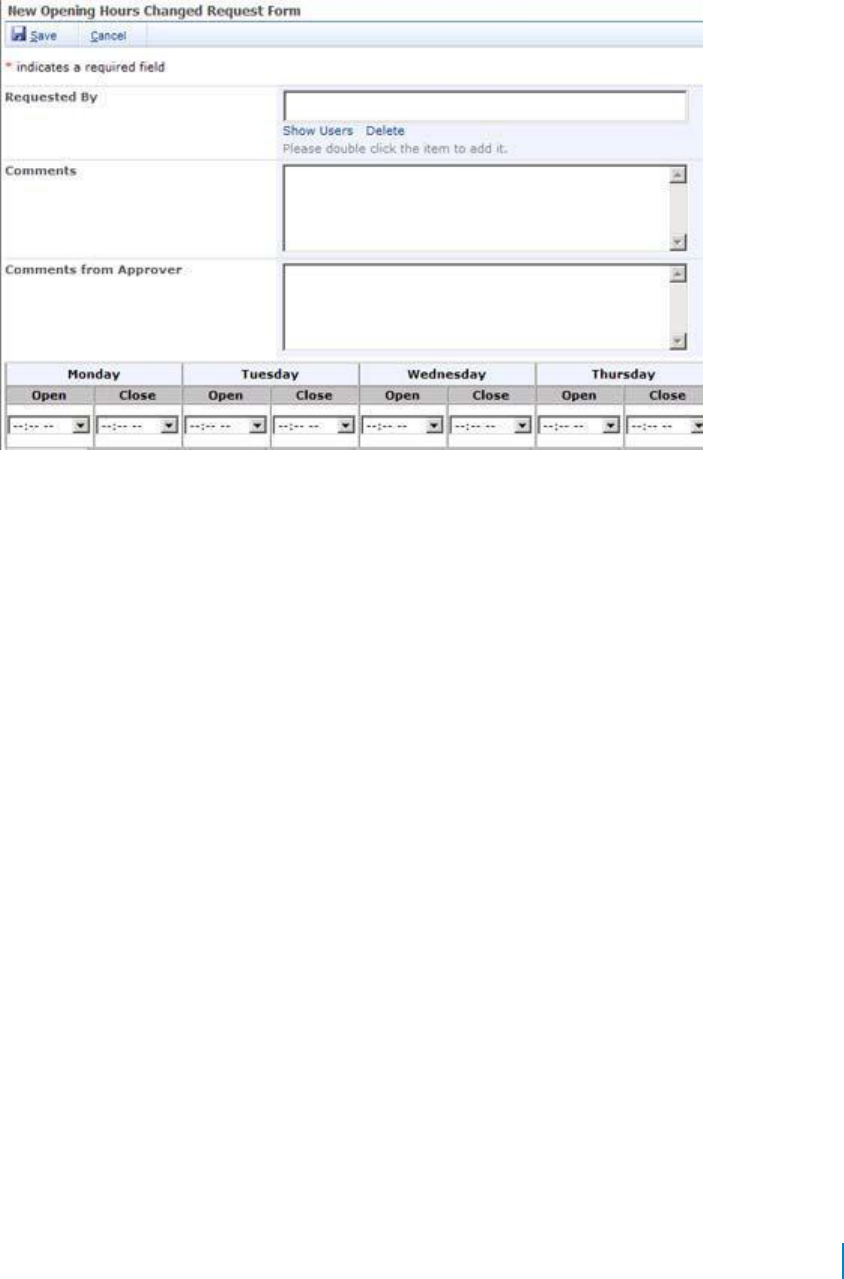
• When you want to create a custom control for one or more fields in the form. For example, in Figure 1,
the table at the bottom of the form is a custom control created by the custom layout manager. This
table contains the list of opening hours for a restaurant for every day during the week.
Figure 1. Creating a custom control
You can create your own custom Layout Manager class or use the sample custom Layout Manager class that
is shipped with QuickApps for SharePoint.
To open the sample code
1 Select Start | All Programs | AgreeYa | QuickApps for SharePoint | Sample
Code. The Sample Code folder opens in Windows Explorer.
2 Double-click SampleCode.sln.
This opens the solution in Microsoft Visual Studio. The sample custom Layout Manager class can be
found in SampleLayoutManager.cs file in the SampleCustomActionsAndCustomLayouts project.
Custom Layout Manager Class
If you want to write your own custom Layout Manager class, ensure the following:
• A Class Library project is created using Microsoft Visual Studio
• Microsoft SharePoint Server is installed and running properly
• QuickApps for SharePoint is installed and running properly in your SharePoint environment
• You have a strong name key file to sign your assembly
Programming Interface
Your custom Layout Manager classes must be derived from WA.Core.LayoutManager.FormLayoutManager
class. This class is located in WA.Core.DLL that is installed in the Global Assembly Cache (GAC) when you
install the QuickApps for SharePoint.
Properties
The following are the properties of the WA.Core.LayoutManager.FormLayoutManager class:
www.agreeya.com
QuickApps for SharePoint
®
6.7
149
User Guide
Table 5. WA.Core.LayoutManager.FormLayoutManger class properties
Property
Description
FormType
indicates the type of list form that contains the layout manager class. The type of this
property is FormTypeEnum enumeration and the options are New, Edit or Display. This
property is useful when you create custom controls in your layout manager. For example,
when the FormType is Display, you may want to make your custom control read only.
WebPart
references the parent web app, which is either a qListForm or a qSIListForm.
FormItem
references the item that is being created, edited, or displayed in the form. The type of
this property is System.Object. The real type of the FormItem depends on whether the
Layout Manager is used in the qListForm or qSIListForm. The qListForm will assign a
Microsoft.SharePoint.SPListItem object to the FormItem property. The qSIListForm will
assign a System.Collections.Hashtable object to the FormItem property. The Hashtable
contains a key value pair of field name and field value. You can use the FormItem to get
the values of the fields to populate your custom controls and to save the value from your
custom controls back to the form.
FormLayout
indicates an XML string that is entered in the Form Layout property of the qListForm or
qSIListForm. You can use this information to find out about the containers that are
specified for your layout manager.
ClientSide
indicates a read only property to get the name of the Javascript function that is called in
ValidationError
the validation error in the client side, such as a required field that is empty, number field
Handler
outside a specific range. You do this only if you need special handling such as showing the
control with the validation error. For example, the Tab layout manager groups fields in
different tabs. The field with the validation error maybe located in the tab that is not
currently shown. In that case, the Tab layout manager needs to show the tab that
contains the field with the validation error.
NOTE: Your layout manager class can override this property.
Methods
The following are the methods of the WA.Core.LayoutManager.FormLayoutManager class.
www.agreeya.com
QuickApps for SharePoint
®
6.7
150
User Guide
Table 6. WA.Core.LayoutManager.FormLayoutManager class methods
Method
Description
public abstract void
Is called by the list form during initialization phase (in the OnInit method).
AddControlToContainer(System.
The list form will create controls for the fields specified in the Display
Web.UI.Control control, string
Fields property and then call this method to add the control to the layout
containerID, string
manager. Your layout manager class must override this method. The
fieldDisplayName, string
following are the parameters for this method:
fieldInternalName, Guid fieldID,
• control – the control to be added
string fieldDescription, bool
• containerID – the ID of the container where this control should be
isFieldRequired, bool
added. The containerID for the field is specified in the Display
isControlHidden)
Fields property of the list form. If not specified, the containerID is
NULL.
• fieldDisplayName – the display name of the field that owns this
control. For qListForm, this means the display name for the
SharePoint field, which is usually different than the internal name
of the field.
• fieldInternalName – the internal name of the field that owns this
control. For qListForm, this means the internal name for the
SharePoint field, which is usually different than the display name
of the field. For example, the internal name of the “Assigned To”
field may be “Assigned _x0020_To”. For qSIListForm, the
fieldDisplayName and the fieldInternalName are the same.
• fieldID – the unique identifier for the field. This is a good candidate
to use as a unique key to keep track of your fields. For example,
when the list form needs to hide the controls for certain fields by
using the HideControl method, it will use the fieldID as parameter.
• fieldDescription – the description for the field. This is the field
description that is specified by the user in the Display Fields
property of the list form. It’s up to you on how you want to display
it in your layout manager. One option is to display the description
underneath the control. If not specified, the fieldDescription is
NULL.
• isFieldRequired – a boolean flag to indicate whether or not this is
required field. You may want to put some visual indicator for
required fields such as a ‘*’ in the field title.
• isControlHidden – a boolean field to indicate whether or not the
control for the field should be hidden. The user can mark a certain
field as a hidden field in the Display Fields property. If a field is
hidden, you still have to add the control into the control hierarchy
but you need to hide it in a certain way. For example, you can set
the style’s Display attribute to None.
public abstract void
Is called if the list form needs to display a certain message on the form.
AddMessageToContainer(string
For example, if the Email Notification Section in the qListForm is enabled,
message, string containerID)
the qListForm will call this method to generate this message: "If you want
to send an email notification, please complete the following information.”
The email is sent if you enter one or more email addresses in the To field.
You need to display the message in the layout manager when this method
is called.
public abstract void
Is called if the list form needs to hide a certain control. For example,
HideControl(Guid fieldID)
when the qListForm is editing a Calendar item, the Start Time and End
Time fields needs to be hidden when the user checks the All Day Event and
Recurrence fields. You must implement this method for your layout
manager to support the Form Component Behavior property of the list
form.
www.agreeya.com
QuickApps for SharePoint
®
6.7
151
User Guide
Table 6. WA.Core.LayoutManager.FormLayoutManager class methods
Method
Description
public abstract void
Is called if the list form needs to show a certain control. For example,
ShowControl(Guid fieldID)
when the qListForm is editing a Calendar item, the Start Time and End
Time fields needs to be shown when the user unchecks either the All Day
Event or Recurrence fields. You must implement this method for your
layout manager to support the Form Component Behavior property of the
list form.
public virtual void
Is called if the list form needs to enable a certain control. You must
EnableControl(Guid fieldID)
implement this method for your layout manager to support the Form
Component Behavior property of the list form.
public virtual void
Is called if the list form needs to disable a certain control. You must
DisableControl(Guid fieldID)
implement this method for your layout manager to support the Form
Component Behavior property of the list form.
public virtual void
Is called if the list form needs to show a certain container in your layout
ShowContainer(Guid fieldID)
manager. You must implement this method for your layout manager to
fully support the Form Component Behavior property of the list form.
public virtual void
You layout manager class may override this method. The list form will call
HideContainer(Guid fieldID)
this method if it needs to hide a certain container in your layout manager.
You must implement this method for your layout manager to fully support
the Form Component Behavior property of the list form.
public virtual void
Is called if the list form needs to enable a certain container in your layout
EnableContainer(Guid fieldID)
manager. You must implement this method for your layout manager to
fully support the Form Component Behavior property of the list form.
public virtual void
Is called if the list form needs to disable a certain container in your layout
DisableContainer(Guid fieldID)
manager. You must implement this method for your layout manager to
fully support the Form Component Behavior property of the list form.
public virtual void
Overridden if this method creates custom controls for certain fields. You
PopulateFormControls()
must create the custom controls already in the OnInit method. The list
form will call this method during pre-render phase and you can use the
FormItem property to get the values for the fields and populate your
custom controls. You do not have to populate the controls that are
created by the list form and added by the AddControlToContainer method.
Those controls is populated by the list form.
public virtual void
Overridden if this method creates custom controls for certain fields. The
SaveValuesToFormItem()
list form will call this method after the user clicks the save button in the
form. You must write back the value from your custom controls to the
FormItem so that the list form can save the value back to SharePoint or
your external system.
Debugging
In order to debug the code, generate the debug version of the DLL and copy the DLL and PDB file into the
bin folder under the root folder of your SharePoint application. If you cannot find the bin folder, you can
create one. Sign your assembly with a strong name key file.
NOTE: You can set the output folder of your project to the bin folder of your SharePoint application.
Therefore, the DLL and PDB files are automatically updated every time you compile your application.
Physical Path
To find the physical path of the root folder of your SharePoint application
1 Select Start | Control Panel | Administrative Tools | Internet Information Services (IIS) Manager.
2 Expand the node with your computer name.
3 Expand the Web Sites folder.
www.agreeya.com
QuickApps for SharePoint
®
6.7
152
User Guide

4 Find the node that represents your site. The SharePoint site should contain _layouts, _vti_bin
and _wpresources underneath it.
5 Right-click the node and select Properties.
6 Select Home Directory tab.
The value in the Local path tells you the physical path of your root folder.
Trust Level
Once you generate the debug version, you should change the trust level for your web application to Full
while debugging the custom Layout Manager class. The trust level is specified in the web.config. Find the
trust element in your web.config and change the level to Full.
<trust level="Full" originUrl="" />
Using the Custom Layout Manager Class
In order to use your custom Layout Manager class, you should refer to it in the Form Layout property of
the qListForm or qSIListForm as follows:
<FormLayout Type="CustomLayout" LayoutManagerClassName="Fully qualified class
name of the custom Layout Manager" />
NOTE: When you specify the class name in the LayoutManagerClassName attribute in the
FormLayout element, you must use a fully qualified class name.
For example, in order to use the SampleLayoutManager class that comes in the sample code, specify
the following in the Form Layout property:
<FormLayout Type="CustomLayout"
LayoutManagerClassName="MyCompany.DevStudio.SampleLayoutManager,
MyCompany.DevStudio, Version=1.0.0.0, Culture=neutral,
PublicKeyToken=451cac61f7ec4225" />
Constructing the XML
To use the Form Layout property editor to construct the XML
1 Make sure that you have compiled your custom layout manager project and put the resulting DLL into
the bin folder of your SharePoint web application.
2 Create a qSIListForm.
3 Select Web app Menu | Configure from the SI List Form.
4 Click Edit on the Form Layout property.
5 Select CustomLayout in the Form Layout Type drop-down menu.
6 Select the class name in the drop-down menu under the Layout Manager Class Name.
7 Click OK.
Debugging the Code
To debug the code in your custom Layout Manager class
1 Open the SharePoint page that contains the qListForm or qSIListForm that contains the custom
Layout Manager.
2 Open your project's solution using Visual Studio.
3 Select Debug | Attach to Process.
4 Select w3wp.exe in the process list.
If w3wp.exe is not listed, make sure that you check Show processes in all sessions. You may see
more than one w3wp.exe listed. If you do, select the one with your user name or try it one by one
until you find the process that contains the executable for your code.
www.agreeya.com
QuickApps for SharePoint
®
6.7
153
User Guide
5 Click Attach.
6 Set some breakpoints in your custom action code.
7 Invoke your custom action by clicking the custom toolbar button or the custom context menu that
you configure in qListView or qListForm.
Deploying the Custom Layout Manager Class
When it is ready to deploy the solution, build your custom action project in release mode. Sign the assembly
with a strong name key file. This ensures the assembly created can be deployed into Global Assembly Cache
(GAC).You can deploy your assembly into the GAC by using the gacutil.exe that comes with the .NET
Framework SDK. Here is the command: gacutil /i <DLLName>.
Once the assembly is dropped into the GAC, your class is ready to use.
Display Fields
This property defines what fields should be displayed in the List Form and how the fields are populated.
When you select the Edit button, a dialog box opens with a list of field names based on the list you
have selected. You can enter a title and description for each field name.
You can add more details to the field names.
Table 7. Display Fields
Element
Description
Advanced Mode
Turn on if you want to edit Display fields in XML format. For example:
<DisplayFields>
<Fields ContentType="Task">
<Field Name="Title" ConsumeHTTPParameterName="InitTitle" />
</Fields>
</DisplayFields>
Field Name
Displays the field name.
Title
Allows you to change the displayed title for the field. The value can be a plain string or an
encoded HTML string. Change the displayed title, for example, when the title is too long or
to make the title more descriptive.
Title Resource ID
If supporting a multi-lingual site, you may want to display a different Title for the field
depending on the current culture. This property defines the identifier in the Resource List
that is used as the title of the field. The TitleResourceID and the current cultural setting
(identified with the Culture HTTP parameter) are used to retrieve the string in the
Resource List. If the string with the given identifier is not found, the default Title is used.
Tooltip
Allows you to set the text that is displayed in the tooltip when you hover your mouse over
the control for the field in the list form. If you do not specify this attribute, the display
name of the field is used as the tooltip text.
Tooltip Resource
If supporting a multi-lingual site, you may want to display a different tooltip for the field
ID
depending on the current culture. This property defines the identifier in the Resource List
that is used as the title of the field. The Tooltip Resource ID and the current cultural setting
(identified with the Culture HTTP parameter) are used to retrieve the string in the
Resource List. If the string with the given identifier is not found, the default tooltip is used.
Description
Allows you to set the field description. It can be a plain string or an encoded HTML string.
The Description is added below the field value.
Description
If supporting a multi-lingual site, you may want to display a different description for the
Resource ID
field depending on the current culture. This property defines the identifier in the Resource
List that is used as the title of the field. The Description Resource ID and the current
cultural setting (identified with the Culture HTTP parameter) are used to retrieve the
string in the Resource List. If the string with the given identifier is not found, the default
description is used.
www.agreeya.com
QuickApps for SharePoint
®
6.7
154
User Guide
Table 7. Display Fields
Element
Description
Width (in pixels)
Allows you to set the width of the control in pixels.
Some controls, such as the Rich Text Editor, have minimum width and it will not honor the
specified width if it is smaller than its minimum width.
Column Span
Allows you to set the span of the column.
Row Span
Allows you to set the span of the row.
Hidden
Allows you to hide the field.If the field is hidden, the List Form will not modify that field at
all. If you hide the field using the Hidden attribute, the field is processed according to the
way it is defined, but it will not be shown in the List Form.
Group Name
Allows you to create dynamic behavior for a group of fields. The list form can be defined to
have dynamic behavior where certain fields or group of fields can be hidden, shown,
disabled, or enabled based on certain conditions. The value in the Group Name field is
referred to in the Form Component Behavior property.
Column Count
Allows you to define the number of columns that the choices for the multi-choice field
should be broken into. This is useful if you have many choices in your multi-choice field to
minimize the vertical scrolling when entering the data into the list form. This attribute is
ignored if the field is not a multi-choice field.
Hide Select and
Allows you to hide the Select All and Unselect All links in the multi-choice field control. If
Unselect All
not specified, the Select All and Unselect All links are shown by default. This attribute is
ignored if the field is not a multi-choice field.
Auto Post Back
If selected, allows the control to refresh the form when its value changes. This attribute is
applicable for the following field types: Lookup field, Cross-site lookup field, Yes/No and
Choice. This attribute is ignored for other field types. This attribute should be set to true in
the following scenarios:
• When a lookup field or cross site lookup field is defined as the Parent Field
of another field.
• When a lookup field, cross site lookup field, Yes/No, or choice field is being used
in the conditions of the Form Component Behavior property.
Use People
If selected, allows the qListForm to display the People Editor control for the People and
Editor
Group field. With the People Editor control, you can lookup any user in your directory
service. By default, the value is false. If set to false, the qListForm will display the users
from the site user list.
This attribute only effects the People and Group field. It is ignored for any other fields.
There is a known issue in the SharePoint People Editor control where it cannot persist its
value during AJAX operation. Therefore, you need to set Enable AJAX property to false
when you use the People Editor control and have an auto-postback lookup field in the form.
Use Current User
If selected, allows the name of the current user to become the default value of the People
as Default Value
and Group field when the Form Type is set to New List Item or Upload Document. This
attribute is ignored if the Form Type property is set to another value or when the field is
not a People and Group field. By default, the value is false.
Do not Render as
This attribute affects the display of the Person or Group field, the lookup field or the cross-
Hyperlink
site lookup field when the Form Type is set to Display List Item or Display Document. If set
to true, the value of those kinds of field is rendered as plain text instead of hyperlink.
Disable Resize
This attribute determines whether or not the Rich Text Editor for the Rich Text Field can be
resized. To resize a Rich Text Editor, you can drag the resize handle in the lower right hand
corner of the editor. The resize handle is hidden when this attribute is set to true.
Expand Options
Allows you to expand the list of users or options when selected.
on Load
Show User
Allows you to list SharePoint groups whose members can view the web app. Separate
Groups
groups with commas.
www.agreeya.com
QuickApps for SharePoint
®
6.7
155
User Guide

Table 7. Display Fields
Element Description
Hide User Groups Allows you to list SharePoint groups whose members cannot view the web app. Separate
site group names with commas (for example, Administrators, Readers).
If users are defined in Show User Groups and Hide User Groups, Hide Groups takes
precedence.
Mask
Allows you to define the format of the input for a single line of text field. This property is
ignored for another field type. The mask can contain characters and input-mask-flags such
as:
# — digit or space, optional. If this position is blank in the mask, it is rendered as a prompt
character.
L — uppercase letter, optional. Restricts input to the ASCII letters A-Z.
l (lower case L) — lowercase letter, optional. Restricts input to the ASCII letters a-z.
a — accepts any character
<n..m> — restricts the user input to the declared numeric range, for example: <0..255>.
The numeric range mask part must occupy multiple characters of the mask.
<option1|option2|option3> — restricts user input to one of the set options, for example:
<Sun|Mon|Tue|Wed|Thu|Fri|Sat>.
\ — escapes a mask character, turning it into a literal. "\\" is the escape sequence for a
backslash.
All other characters — all non mask elements will appear as themselves. Literals always
occupy a static position in the mask at run time, and cannot be moved or deleted by the
user.
Prompt
Allows you to define the character that is displayed and saved in place of the empty
Character
characters when you specify a Mask. If not specified, "_" (underscore) is used as the default
prompt character. Specify only a single character in this attribute.
Parent Field
Allows you to define another lookup or cross-site lookup field that is used to filter this
field. The parent field must be listed before this field in the XML property.
Parent Filter
Allows you to define the field in the parent field that is used to filter this field. In other
Field Name
words, it is the primary key in the list that is used in the lookup or cross-site lookup field.
Filter Field Name Allows you to define the field in the list that is used by this lookup or cross-site lookup
field that is filtered by the parent filter field.
Field Type
Allows you to select a field type. More options are available depending on the field type
selected. The default is regular field. See the following fields for more information:
•
Fixed Value
• Consume Value from an HTTP Parameter
•
Calculated Format
• Autofill with a lookup/cross-site lookup field
• Consume value from a row provided by another web app
• Consume value from a session
•
Lookup Field
• Cross-site Lookup
•
System Integration
•
Complex Category
Fixed Value
You can assign a fixed value to a field using the FixedValue attribute.
For example, to assign Accounting to the Department field:
<Field Name="Department" FixedValue="Accounting"/>
Additionally, you can use special variables for the FixedValue attribute.
www.agreeya.com
QuickApps for SharePoint
®
6.7
156
User Guide
• <CurrentUserID/> — this value is replaced by the ID of the currently logged in user. If you want to assign the
current user to the People and Group field, use this variable. If you are using Advanced Mode and you would
like to assign a task to the currently logged in user, you can specify the following Field element: <Field
Name="Assigned To" FixedValue="<CurrentUserID/>" /> (If you are using Advanced Mode)
• <CurrentUserName/> — this value is replaced by the name of the currently logged in user.
• <CurrentUserEmail/> — this value is replaced by the email of the currently logged in user.
• <CurrentLoginName/> — this value is replaced by the login name of the currently logged in user. The
login name is usually in the form of domain\username.
• <Today/> — this value is replaced by today's date.
• <Now/> — this value is replaced by the current date and time.
NOTE: If you are using SharePoint Form-Based Authentication, the above variables will return
the following, for example:
• CurrentUserName=testuser
• CurrentLoginName=i:0#.f|<site>|testuser
• CurrentUserID=6
• CurrentUserEmail=testuser@company.com
You can edit the following:
Table 8. Fixed Value
Element
Description
Allow Edit
Allows you to edit the fixed value field.The value that is retrieved from the Fixed Value
attribute will only be used to initialize the field. Afterwards, the user can modify the value
as they wish and save it.
www.agreeya.com
QuickApps for SharePoint
®
6.7
157
User Guide
Consume Value from an HTTP Parameter
The HTTP Parameter Consumer field gets its value from an HTTP parameter. This is the attribute to create an
HTTP Parameter Consumer field:
Table 9. Consume Value from an HTTP Parameter
Element
Description
Consume HTTP
Allows you to enter the name of the HTTP parameter whose value is to be consumed.
Parameter Name
Allow Edit
Allows you to edit the fixed value field.The value that is retrieved from the Fixed Value
attribute will only be used to initialize the field. Afterwards, the user can modify the
value as they wish and save it.
Calculated Format
You can format a value of a field using values from other fields by using the CalculatedFormat attribute. The
value of the another field can be referred to using the <%fieldName%> field replacement expression. If you
are using Advanced Mode, you must use the encoded form of the < and > characters, which are < and >,
respectively unless you type in the value in the Display Fields editor in the List Form Editor, where the Editor
will encode the characters automatically for you.
For example, if you want to format the Full Name field as Last Name, First Name, the Field element should
be specified as:
<Field Name="Full Name" CalculatedFormat="<%Last Name%>, <%First Name%>" />
Another example is to assign a ten-digit number to the AccountNumber field using the ID of the list item. If
the ID is less than 10 digits, it is padded with zeros.
<Field Name="AccountNumber"
CalculatedFormat="<%{0:0000000000} ID%>"/>
This attribute can also be used to make a field read-only. For example, to make the AccountNumber a read-
only field:
<Field Name="AccountNumber" CalculatedFormat="<%AccountNumber%>" />
Autofill with a lookup/cross-site lookup field
The Auto Fill field gets its value from the parent field. The parent field must be a lookup field or a cross-
site lookup field.
The following are the attributes to create an auto-fill field:
Table 10. Autofill with a lookup/cross-site lookup field
Element
Description
Parent Field
Allows you to defines the name of the parent field. The parent field must be
specified before any of the child fields.
Auto Fill Display
Allows you to define the field in the parent field where the value comes from
Field Name
Auto Fill Display
Allows you to define the string format for the values. This attribute takes
Format
precedence over the Auto Fill Display Field Name attribute. The format of the
Auto Fill Display Format is the same as the format used in the Calculated Format
attribute.
Allow Edit
Allows you to define if this field is editable. By default, the list form displays this
field type as a non-editable field. If this attribute is set to true, this field is
editable.
For example, a List Form is used to edit the Employee list. Manager is a field in the Employee list, and it is a
lookup field. Two other fields, ManagerFirstName and ManagerLastName, are filled based on the row selected
in the Manager field. The Fields element for the Manager, ManagerFirstName,and ManagerLastName will look
like the following:
www.agreeya.com
QuickApps for SharePoint
®
6.7
158
User Guide

<DisplayFields>
<Fields ContentType="Employee">
<Field Name="Manager" AutoPostBack="true"/>
<Field Name="ManagerFirstName" ParentField="Manager" AutoFillDisplayFieldName="FirstName"/>
<Field Name="ManagerLastName" ParentField="Manager" AutoFillDisplayFieldName="LastName"/>
</Fields>
</DisplayFields>
Set the AutoPostBack attribute to true in the parent field. Otherwise, the ManagerFirstName and
the ManagerLastName fields will not be refreshed when the user selects another manager.
Consume value from a row provided by another web app
The row consumer field gets its value from the row that is consumed by this List Form. To create a row
consumer field, you must connect the List Form with another web app that implements the IRowProvider
interface (such as the qSelector or qMultiSelectors).
These are the attributes to create a row consumer field:
Table 11. Consume value from a row provided by another web app
Element
Description
Consume Row
Allows you to defines the field name in the row from where the value comes.
Display Field Name
Consume Row
Allows you to define the string format for the values. This attribute takes
Display Format
precedence over the Consume Row Display Field Name attribute. The format of the
Consume Row Display Format is the same as the format used in the Calculated
Format attribute.
Allow Edit
Allows you to define if this field is editable. By default, the list form displays this
field type as a non-editable field. If this attribute is set to true, this field is
editable.
For example, a List Form is used to edit a Tasks list. The Tasks list contains a Project Name field, and this
field is configured as a row consumer field. The row is provided by a qSelector web app that displays the list
of projects from the Projects list and is connected to the List Form.
<DisplayFields>
<Fields ContentType="Task">
<Field Name="ProjectName"
ConsumeRowDisplayFieldName="Name"/> </Fields>
</DisplayFields>
Consume value from a session
Session consumer field gets its value from a row that is stored in the session object. The concept is similar to
Row Consumer Field Attributes. However, if you need to get values from multiple providers, you must use the
Session Consumer Field instead of Row Consumer Field because the List Form can only be connected to one
row provider.
To create a session consumer field, you must first declare a Sessions element. A Sessions element can contain
one or more Session elements. The Sessions element contains the information about the list where the row
stored in the session comes from. After the Sessions element is defined, you can use it in the Field element.
The XML for the session consumer field looks like the following:
<DisplayFields>
<Sessions>
<Session Name="sessionName" SiteUrl="siteUrl"
ListName="listName"/> </Sessions>
<Fields ContentType="contentType1">
<Field Name="field Name" ConsumeSessionName="sessionName"
ConsumeSessionDisplayFieldName="displayFieldName"/>
</Fields>
</DisplayFields>
www.agreeya.com
QuickApps for SharePoint
®
6.7
159
User Guide
These are the attributes to create a row consumer field:
Table 12. Consume value from a session
Element
Description
Name
Allows you to enter the name of the session you want to consume.
Site URL
Allows you to enter the URL of the list site.
List Name
Allows you to enter the list name.
Consume Session
Allows you to defines the field name in the session from where the value comes.
Display Field Name
Consume Session
Allows you to define the string format for the values. This attribute takes precedence
Display Format
over the Consume Session Display Field Name attribute. The format of the Consume
Session Display Format is the same as the format used in the Calculated Format
attribute.
If you select New List Item type as Form type, leave this field blank unless it is in simple
text format.
Allow Edit
Allows you to define if this field is editable. By default, the list form displays this field
type as a non-editable field. If this attribute is set to true, this field is editable.
You can replace the Consume Session Display Field Name attribute with Consume Session Display Format if
you want to use multiple fields as the source of values for this field.
For example, a List Form is used to edit a Tasks list. The Tasks list contains a Project Name field, and this
field is configured as a session consumer field. The row is provided by a qSelector web app in another page
that is visited before this page is opened.
<DisplayFields>
<Sessions>
<Session Name="ProjectsSession" SiteUrl="../../.." ListName="Projects"
/> </Sessions>
<Fields ContentType="Task">
<Field Name="ProjectName" ConsumeSessionName="ProjectsSession"
ConsumeSessionDisplayFieldName="Name"/>
</Fields>
</DisplayFields>
Lookup Field
You can sort and filter the entries for the Lookup fields by using the Sort Field and CAML Filter
attributes, respectively. These attributes are ignored if the field is not a lookup field.
For example, if you are using Advanced Mode and you want to sort the Related Task lookup field by its title
and only want to show high priority tasks, you can specify the following configuration:
<Field Name="Related Task" SortField="Title" CamlFilter="<Eq>

<FieldRef Name="Priority" />
 <Value
Type="Choice">(1) High</Value>
</Eq>" />
Cross-site Lookup
Cross-site lookup is the capability of the List Form to refer to multiple lists in different sites.
To use this feature, create a single-line-of-text field, not a lookup field. Internally, the List Form will store
the field value in this format: siteUrl;#listName;#listItemId.
For example, add a Document Type field to the metadata of every document that you store in the document
library. One way of doing this is to make this field a choice field. However, if you need to change the options
for the Document Type, you have to go to every document library in every site to change it. The same
problem occurs if you make the Document Type field a SharePoint lookup field (because SharePoint can look
up a list in the same site). The solution is to make the Document Type field a cross-site lookup field. You can
create a Document Type list in a centralized place and create a DocumentType field (as single line of text
field) in every document library. Configure this field as:
www.agreeya.com
QuickApps for SharePoint
®
6.7
160
User Guide
<Field Name="DocumentType" DisplayFieldName="Type" SortField="Type" AutoPostBack="true">
<List SiteUrl="../../.." SiteName="Dashboard" ListName="DocumentType" />
</Field>
The Display Field Name attribute can be replaced with Display Format attribute if you want to display
multiple fields in the drop-down menu. The value of the Display Format attribute is in the same format as
that of the Calculated Format attribute.
The above configuration assumes the following conditions:
• The DocumentType list resides three levels above the current page (indicated by ../../.. in the Site
URL attribute).
• The Document Type list contains one field called Type that contains the text for the document type,
such as Budget, Proposal, Manual.
• You want to display the document types sorted alphabetically using the Sort Field attribute. If you do
not specify the Sort Field, the document types are sorted in the order they appear in the list; sorted by
list item ID.
• The Site Name attribute is a text description of the Site URL. It does not have to match with the
real name of the site pointed to by Site URL.
• You want the form to be refreshed every time you select another item by specifying
AutoPostBack="true". This is necessary if this field is a parent field of other fields in the form and
the child fields are visible. Otherwise, it is optional.
You can specify more than one List element inside the Field element. If you do, the List Form will display two
dropdowns. The first drop-down menu selects the list and the second drop-down menu selects the items in
the list. This function makes the Site Name important because the first drop-down menu displays the list as
List Name in SiteName.
System Integration
System Integration (SI) field gets its values from a data column accessible through the System
Integration Framework — the same mechanism used by SI Web apps to connect to external data sources.
In order to use the SI Field, the qListForm should be added to a web app page which belongs to a SharePoint
site that has System Integration configuration defined. It also requires that the Catalog property be defined
prior to specifying the SI Field.
The required attributes for a field of this type:
Table 13. System Integration
Element
Description
Entity Name
Allows you to specify which entity to use from Catalog property.
Operation Name
Allows you to specify which entity operation to use from Catalog property to retrieve
the options from the external system. The syntax for the operation is
EntityName.OperationName. Both the entity and the operation must already be defined
in the Catalog property.
Data Member/Data
Allows you to specify the data table name that contains the options in case the
Index
operation returns multiple tables. If the external system returns multiple data tables
without names, you can use the DataIndex attribute to refer to the table. The index is a
number and it starts with 0 (not 1).
Data Text Field
Allows you to specify the column in the data table whose value is displayed in the drop-
down menu.
Data Value Field
Allows you to specify the column in the data table that contains the real value that
should be saved back to the external system.
Define the DataTextField/DataValueField to be the primary key column for your
external data and any other columns as the source for the secondary fields to ensure
data integrity; however, it is not required.
www.agreeya.com
QuickApps for SharePoint
®
6.7
161
User Guide

Table 13. System Integration
Element
Description
Secondary Field
Allows you to specify an additional column in the data table whose value is displayed in
Name
the drop-down menu. This is an optional field. Secondary fields are elements under the
regular display field so you can specify one or more fields. These fields is read-only.
Data Value Field
Allows you to specify the column in the data table from which the actual value is used
that is associated with the displayed Secondary Field.
Eliminate Duplicate
Allows you to specify whether you want to eliminate duplicate values in the drop-down
Values
menu.
Use Item Picker
Allows you to specify whether to use an entity item picker or a drop-down list to display
the System Integration column. The default is to use the drop-down list. If you select to
use the item picker, you may specify zero or more Finder Operations to be used by the
entity item picker. The Finder Operation references the entity.operation defined in the
System Integration Catalog property. You can define one or more entity/operation in
the Catalog to help filter the data returned from the external system. Select the Add
Operation button to add a Finder Operation:
• Finder Operation — specifies a valid entity and operation defined in
Catalog property to be used in the LookupOperation.
• Filter Field — the field name to be used for filtering. If the operator takes an
argument, the filtering happens in the back-end server. If not, the filtering
happens in the web server by using the data view filter. The filter field name
is also used to match the finder operation during the item picker search.
• Data Member/Data Index — defines the data table name that contains the options in
case the operation returns multiple tables. If the external system returns multiple
data tables without names, you can use the DataIndex attribute to refer to the
table. The index is a number and it starts with 0 (not 1).
The Item Picker option provides the ability to filter a large amount of data before
bringing the filtered data into the list form. The default, drop-down list, option will
bring all the data over to SharePoint and display it all in a list. Make sure to take into
account the amount of data that is returned when deciding the best option to display
SI column data using drop-down menu or item picker.
Here is an example:
<DisplayFields>
<Sessions />
<Fields ContentType="Task">
<Field Name="Title" />
<Field Name="Priority" />
<Field Name="Status" />
<Field Name="AWEmployeeID" LookupOperation="Product.EmployeeList"
DataMember="row" DataTextField="LoginID" DataValueField="EmployeeID">
<SecondaryField Name="AWContactID" DataValueField="EmployeeID"
/> <SecondaryField Name="AWLoginID" DataValueField="LoginID" />
</Field>
</Fields>
</DisplayFields>
Complex Category
The Complex Category field allows the SharePoint discussion view webpart to function like the Lotus
Notes response document which contains a category attribute. Categories that allow multiple values are
not supported.
www.agreeya.com
QuickApps for SharePoint
®
6.7
162
User Guide
The attributes for a field of this type:
Table 14. Complex Category
Element
Description
Edit Mode
Allows you to define how the treeview for the complex category control should be
displayed. There are two options:
• Inline — the treeview control is displayed in the form itself which enable the user
to assign and edit the complex category values directly in the form
• Popup — the treeview control will display the complex category value as a read
only field with and Edit link. When the user clicks the Edit link, it will display the
treeview in a popup dialog box. The Popup option is recommended if you have
many categories to be displayed in the treeview.
Complex
Allows you to index the Complex Category field. Another SharePoint list is used to store the
Category Index
index. The Complex Category Index Site URL is the site URL of the index list. If not defined,
Site URL
the Complex Category Index Site URL will default to the current site URL.
Complex
Allows you to set the list name of the index list. If not defined, the Complex Category Index
Category Index
List Name will default to the name of the discussion list plus Categories. For example, if
List Name
your discussion list name is Team Discussion, then the index list name is Team Discussion
Categories.
Height
Allows you to define the height of the complex category control in pixels. If not specified,
it will always fit the whole categories in the form without a scrollbar
Expand to Level
Allows you to define the number of category levels that can be expanded when the
complex category control is loaded for the first time.
System Integration
This property defines the entity and the operations related to the entity.
www.agreeya.com
QuickApps for SharePoint
®
6.7
163
User Guide
Catalog
Entities contain the following elements:
Table 15. Catalog
Element
Description
Advanced Mode
Turn on if you want to edit the Catalog in XML format. This property is an XML string in
this format:
<Catalog>
<Entity Name="entityName" System="systemName" Service="serviceName"
Default="true/false">
<Properties>
<Property Name="propertyName" Type="typeName" Value="propertyValue" />
<Property Name="propertyName" Type="typeName" Value="propertyValue" />
</Properties>
<Operation Name="operationName" Method="methodName" Default="True/False" >
<Parameter Source="sourceType" SessionName="sessionName"
SourceName="sourceName" Type="parameterType" Name="parameterName"
Usage="usageType" Value="value" />
<Parameter Source="sourceType" SessionName="sessionName"
SourceName="sourceName" Type="parameterType" Name="parameterName"
Usage="usageType" Value="value" />
</Operation>
</Entity>
<Entity>
..</Entity>
</Catalog>
System
Allows you to specify the system name that is defined in the System Integration
configuration file. If the system name does not exist in the System Integration
configuration file, you will get an error.
Service
Allows you to specify the service name that is defined in the System Integration
configuration file. The service name that you specify here must belong to system that
you specify in the System attribute. If the service name does not exist in the System
Integration configuration file, you will get an error.
Name
Allows you to specify the name of the entity which must be unique within this Catalog.
The name does not have to match with any name in your external system. However, it is
recommended that you use a descriptive name for your entity.
Set Session Name
Allows you to enter name of the session variable where the edited or newly created item
is stored when it is saved, or the item that is being displayed or edited is stored when it
is loaded.
Reset Session
Allows you to reset (set to NULL) the value of the session variable whose name is
Names
specified in this attribute. Specify multiple names by separating them with commas.
Default
Allows you to define this entity as the default for the list form. If this element is not
specified, the first entity that is listed in the catalog becomes the default entity. The
default operation of the default entity is the operation that is used to retrieve the data
when the list form is loaded for the first time in edit or display mode.
You can add operations to your entities by configuring the following elements:
Table 16. Operations
Element
Description
Name
Allows you to specify the name of the operation. This name does not have to match with any
name in your external system. This name is used to refer to this operation in the Action property.
www.agreeya.com
QuickApps for SharePoint
®
6.7
164
User Guide
Table 16. Operations
Element
Description
Method
Allows you to specify the real name of the operation in your external system. For example, it
may refer to the name of a web service method. Or it may refer to the name of a stored
procedure in your SQL Server database.
Default
Allows you to define this operation as the default. The default operation is the first operation
that is called to retrieve the entity to be displayed or edited. If this attribute is not specified,
the first operation listed in the entity becomes the default operation.
You can define parameters for the operation by configuring the following elements:
Table 17. Parameters
Element
Description
Name
Allows you to specify the name of the parameter.
Source
Allows you to define the source of this parameter. The source can be one of the following:
• DefaultValue — the value of the parameter that is the default
• NullValue — the value of the parameter is blank
• FixedValue — the value of the parameter that is defined in the Value attribute
• HttpRequest — the value of the parameter that is retrieved from the HTTP parameters
in the page URL. The name of the HTTP parameter is defined in the SourceName
attribute. As an example, say the current page URL is
http://mysite.com/default.aspx?ProductType=Hardware. If the SourceName attribute is
ProductType, the value of the ProductType HTTP parameter, which is Hardware, is used
as the value of the parameter.
• Input — the value of the parameter that is retrieved from one of the input fields in the
form. You specify the name of the input field in the SourceName attribute.
Additionally, you can retrieve the current user information as the value of the
parameter. You can specify one of the following name in the SourceName attribute to
retrieve the current user information:
• RowFromAnotherWebPart — the value of the parameter that is retrieved from the
row that is consumed from another web app. You specify the name of the field that
is consumed in the SourceName attribute.
• Session — the value of the parameter that is retrieved from the row that is stored in the
session. You specify the name of the session in the SessionName attribute. You specify
the name of the field that is consumed in the SourceName attribute.
• ComplexType — the value of the parameter is an object based on the Type attribute and
Member definition inside the Parameter. Array and nested complex types are supported.
• Array — the value of the parameter is an array of values
• XML — the value of the parameter that is dynamically built when the condition is
execute at runtime
Usage
Allows you to define the direction for this parameter. The options are In, Out, InOut, or
ReturnValue.
You can define one or more Property elements.
Table 18. Properties
Element
Description
Name
Allows you to specify the name of the property. Refer to the documentation for the DAO Provider
to your external system will tell you the name of the property that you must define.
Type
Allows you to specify type of value that is specified in the Value attribute. Example:
System.String.
Value
Allows you to specify the value of the property.
www.agreeya.com
QuickApps for SharePoint
®
6.7
165
User Guide

Optional Content
You can configure the following optional content:
Table 19. Optional Content
Element
Description
Display Attachment Field
Allows Display Attachment field to be displayed on the form
Display Creation and
Allows Display Creation and Modification Info field to be displayed on the form
Modification Info
Display Required Field
Allows Required Fields Messages to be displayed on the form
Message
Enable Multiple File
Allows Enable Multiple File Upload field to be displayed on the form
Upload
Check Overwrite Existing
Allows Check Overwrite Existing File check box to be displayed on the form
File check box
Show Save As File Textbox
Allows Show Save As File textbox to be displayed on the form
Hide Parent Folder Name
Allows Hide Parent Folder Name to be displayed on the form
Allow Lookup Item
Allows Add New Lookup Item link to be displayed in the form using which a user
Addition
can add new lookup item from the form itself. The link will be visible only in edit
mode of the form.
NOTE: This only works if you have edit permission for the list.
Behavior Page
The Behavior page allows you to configure behaviors, such as adding buttons or menus, so the user can
perform operations when using the web app.
The Behavior page contains the following:
• Actions
• Form
• Navigation
• Email Notification
Actions
The list form has some pre-defined actions, such as Save, Delete, Copy or Move. You can also write your
own custom action and hook it up with the list form.
The Actions page contain the following elements:
www.agreeya.com
QuickApps for SharePoint
®
6.7
166
User Guide
Table 20. Actions
Element
Description
Custom Actions
For more information, see Custom Actions on page 167.
Custom Action Error
Allows you to set where the error message is displayed if the custom action throws an
Display
exception. The options are:
• Inline — the error message is displayed in the list form above the displayed
fields.
• Popup — the error message is displayed in a popup dialog box.
• InlineAndPopup — the error message is displayed in a popup dialog box and
inline above the displayed fields.
Popup is the default.
This property will only affect the error message that is returned by the ICustomAction
implementation. It will not affect the error that is generated internally by the List
Form.
Custom Actions
This property enables you to define additional buttons in the toolbar or context menu item in the context menu. You
can program that button or context menu item to do a series of actions. The List Form supports some built-in
actions. However, you can write your own custom action using one of the .NET languages, compile it, and call it by
the List Form. See Custom Action Help on page 380 to see how to write your own custom actions.
NOTE: The toolbar button affects all the items that are selected in the List Form. The context menu
item affects only the item that is being right-clicked regardless of how many items are selected in your
List Form.
Here are some ways that you can use this functionality:
• Add a custom toolbar button called "Assign All to Me" that will assign all of the selected tasks in the
List Form to me.
• Add a custom toolbar called "Approve" that will change the status of all of the selected expense items
to Approved.
• Create a custom context menu item called "Publish" that will move the right-clicked document
into another document library.
• Create a custom context menu item or toolbar item to start a workflow.
• With the ability to write your own custom action, you can virtually do anything to the data when
you click the custom button that you define.
NOTE: The custom action in the List Form does not support the Save action.
The Custom Actions element contains one Toolbar element and one Context Menu element. These elements
can contain one or more Action Item elements. You can associate the Action Item with one or more Action
elements. The Action element define a certain operation that is carried out by the action item when it is
clicked. When you add an action item, you can configure the following:
www.agreeya.com
QuickApps for SharePoint
®
6.7
167
User Guide

Table 21. Custom Actions
Element
Description
Advanced Mode
Turn on if you want to edit Custom Actions in XML format. Here are the schema of
this property:
<CustomActions>
<Toolbar>
<ActionItem ID="UniqueID" Text="text" TextResourceID="textResourceID"
Position="0" PromptText="promptText" PrompTextResourceID=”prompTextResourceID”
ImageUrl=”URL” AccessKey=”AccessKeyCharacter”>
<Action Type="Delete" />
<Action Type="Move" TargetFolder="targetFolder"
TargetSiteURL="targetSiteUrl" TargetListName="targetListName" />
<Action Type="Copy" TargetFolder="targetFolder" TargetSiteURL="targetSiteUrl"
TargetListName="targetListName" />
<Action Type="GoToURL" URL="TargetURL">
<Parameter Name="parameterName" Source="Session"
SourceName="fieldName" SessionName=”sessionName” />
<Parameter Name="parameterName" Source="RowFromAnotherWebPart"
SourceName="fieldName" />
<Parameter Name="parameterName" Source="HttpRequest"
SourceName="httpParameterName" />
<Parameter Name="parameterName" Source="ListItem"
SourceName="httpParameterName" />
</Action>
<Action Type="GoToSource"/>
<Action Type="Custom" Class="IUIActionImpl" />
</ActionItem>
</Toolbar>
<ContextMenu>
<ActionItem ID="UniqueID" Text="text" TextResourceID="textResourceID"
Position="0" PromptText="promptText" PrompTextResourceID=”prompTextResourceID”
ImageUrl=”URL” AccessKey=”AccessKeyCharacter”>
<Action Type="Delete" />
<Action Type="Move" TargetFolder="targetFolder"
TargetSiteURL="targetSiteUrl" TargetListName="targetListName" />
<Action Type="Copy" TargetFolder="targetFolder" TargetSiteURL="targetSiteUrl"
TargetListName="targetListName" />
<Action Type="GoToURL" URL="TargetURL">
<Parameter Name="parameterName" Source="Session"
SourceName="fieldName" SessionName=”sessionName” />
<Parameter Name="parameterName" Source="RowFromAnotherWebPart"
SourceName="fieldName" />
<Parameter Name="parameterName" Source="HttpRequest"
SourceName="httpParameterName" />
<Parameter Name="parameterName" Source="ListItem"
SourceName="httpParameterName" />
</Action>
<Action Type="GoToSource"/>
<Action Type="Custom" Class="IUIActionImpl" />
</ActionItem>
</ContextMenu>
</CustomActions>
IsSeparator
Allows you to set the item as a separator.
ID
Allows you to enter a unique ID that will identify the item. Use a descriptive
identifier to configure the action item with the editor.
Text
Allows you to enter how the action item is displayed in the toolbar.
www.agreeya.com
QuickApps for SharePoint
®
6.7
168
User Guide
Table 21. Custom Actions
Element
Description
Text Resource ID
Allows you to define this property if you support a a multi-lingual site. This attribute
defines the identifier of the string in the Resource List that is used as the title of the
Web app. The Text Resource ID and the current cultural setting (identified with the
Culture HTTP parameter) are used to retrieve the string in the Resource List. If the
string with the given identifier and culture is not found, the value in the Text
attribute is used.
Prompt Text
Allows you to prompt the user to click the toolbar button or the context menu item.
Prompt Text Resource ID
Allows you to define this property if you support a multi-lingual site. The property
defines the identifier of the string in the Resource List that is used as the title of the
Web app. The Resource ID and the current cultural setting (identified with the
Culture HTTP parameter) are used to retrieve the string in the Resource List. If the
string with the given identifier and culture is not found, the default is used.
Access Key (Toolbar
Allows you to define one character from the Text attribute that becomes the access
Only)
key to this toolbar button or context menu item. For example, if you define a letter
T as the access key, you can press ALT+T and the browser will put the focus on this
button or context menu item. If there are multiple elements on the page with the
same access key, you can repeat ALT+T repeatedly until you get the focus on this
toolbar button or context menu item.
Position
Allows you to set the position of the button in the toolbar. The index starts with 0.
Show User Groups
Allows you to list SharePoint groups whose members can view the Web app. Separate
groups with commas.
Hide User Groups
Allows you to list SharePoint groups whose members cannot view the Web app.
Separate site group names with commas (for example, Administrators, Readers).
If a user is a member of a group that is defined in both Show User Groups and Hide
User Groups, the user cannot
www.agreeya.com
QuickApps for SharePoint
®
6.7
169
User Guide

When you add an action, you can configure the following:
Element
Description
Name
An optional element which allows you to identify a given action in order to access it from another
action. You can refer to this action from the GoToURL action and from ICustomActionEx Interface.
Type
Allows you to determine the type of the action. Here are the options:
• Delete — deletes the item.
• Move — allows you to move the item to a target. You must specify a Target Site URL, Target
List Name, and Target Folder. This action only works for document in a document library.
• Copy — allows you to copy the item to a target. You must specify a Target Site URL,
Target List Name, and Target Folder.
• GoToURL — redirects the user to a specific URL. You must specify the URL and where
you want the URL to open. You must specify the following parameters:
• Input - the current user information as the value of the parameter
• Session - the name of the session variable where the value comes from when
the source is set to Session
• HttpRequest - the value of the parameter that is retrieved from the HTTP
parameters in the page URL. The name of the HTTP parameter is defined in the
SourceName attribute. As an example, say the current page URL is
http://mysite.com/default.aspx?ProductType=Hardware. If the SourceName
attribute is ProductType, the value of the ProductType HTTP parameter, which
is Hardware, is used as the value of the parameter.
• ListItem - the value of the parameter is a list item or row
• RowFromAnotherWebPart — the parameter for the GoToURL action can be
retrieved from the output of another action that comes first in the sequence of
actions defined in the ActionItem. There are two types of action that can produce
an output: an action with Type of ExecuteOperation, and an action with Type of
Custom that points to custom action implementation of ICustomActionEx Interface.
You do that by defining the SourceName attribute of the action. This is the syntax
of the SourceName attribute when you use ResultFormAction source:
<ActionName>.<ResultType>[.Name], where ActionName refers to the Name
attribute of the action that produces the output, ResultType can be OutParameter
(if the action result is returned through one of the out or inout parameter) or
RawData - (if the action result is returned as an object). Name is optional. It
further designates the object we want to use for the parameter. You do not have
to specify the Name when the ResultType is RawData. However, if the ResultType
is OutParameter, this name specifies the name of the out or input key value pair.
• ResultFromAction - the parameter for the GoToURL action can be retrieved from
the output of another action that comes first in the sequence of actions defined in
the ActionItem
You must define a source name (where in the source you want to get your
information from), name (the name of the parameter that is appended to the URL
you specified), and Session (the name of the session variable where the value
comes from when the source is set to Session)
• GoToSource — redirects the user to the URL specified in the Source HTTP parameter.
The URL to the page must look like: http://...?Source=URL for this option to work.
• StartWorkflow — starts the specified workflow in the Workflow Name drop-down field.
You must select a Workflow name.
• ReturnToMasterChart — returns the user to the master chart page. You use this action
type if this web app is located in the drill down page.
• Custom — implements your own custom action and call it with this action type. Enter a
Class name that implements the ICustomActionEx or ICustomAction interface, or select
a class from the drop-down list, if available.
www.agreeya.com
QuickApps for SharePoint
®
6.7
170
User Guide
Form
The Form page contains the following elements:
Table 22. Form
Element
Description
Form Initialization
Allows the List Form to be automatically pre-populated when the Form Type
Actions
property is set to NewListItem, CreateDocument, or UploadDocument. The List
Form will call the defined custom actions that are specified in this property.
The fields that cannot be automatically pre-populated are:
• Auto-fill field (fixed value, consume value from an HTTP parameter,
calculated format, consume value from a session, consume row from a row
provided by another web app, auto fill with a lookup or cross-site lookup
field)
•
BDC Column
•
SI Column
•
Complex category field
• Cross site lookup field
See the Custom Action Help on page 380 chapter on how to write a custom action to
initialize the list form.
You can click Edit and turn on Advanced Mode to edit Form Initialization Actions in
XML:
<FormInitialization>
<Action Name=”initial 1” Type="Custom"
Class="MyCompany.DevStudio.SampleFormInitializationAction,
MyCompany.DevStudio, Version=1.0.0.0, Culture=neutral,
PublicKeyToken=451cac61f7ec4225" / >
<Action Name=”initial 2” Type="Custom"
Class="MyCompany.DevStudio.SampleFormInitializationAction2,
MyCompany.DevStudio, Version=1.0.0.0, Culture=neutral,
PublicKeyToken=451cac61f7ec4225" / >
</FormInitialization>
Form initialization is a way to auto fill the form. It should not be used in
conjunction with another auto fill method. If you do this, the result is
unpredictable (that is sometimes the value from form initialization will take
precedence, but sometimes the value from the other auto fill method will take
precedence).
Form Component
For more information, see Form Component Behavior on page 172.
Behavior
Dependent Lists
For more information, see Dependent Lists on page 175.
Template List Site URL
Allows you to specify the site URL of the document library that contains the
document template that is used to create a new document when the Form Type is
“Create Document”.
Template List Name
Allows you to specify the List Name of the document library that contains the
document template that is used to create a new document when the Form Type is
‘CreateDocument’.
When both the Template List Site URL and the Template List Name are specified,
the qListForm will display a drop-down menu above the Field Name field that
contains list of documents in that doc library. The user can then select a
document that will serve as a template for the new document.
www.agreeya.com
QuickApps for SharePoint
®
6.7
171
User Guide

Form Component Behavior
This property is used to control the conditional behavior of the different components in the form, such as a
field, a group of fields, or a tab. You can specify the following conditional behaviors: Show When, Hide
When, Enabled When, Disabled When, Valid When, Invalid When, and Required When. See Table 24 for more
information.
ValidWhen, InvalidWhen, and RequiredWhen are used with SharePoint List Item and Column validation.
The validation is processed by:
1 The Form Component Behavior is processed first. If it succeeds (meaning no condition is true for
InvalidWhen and no condition fails for ValidWhen and no condition is true for RequiredWhen), it goes
on to perform SharePoint Column and List Item Validation. If they succeed, then Save and Close
procedures follow.
2 The implementation of SharePoint List and Column validation applies to qListForm Save and Close
action only. If user defines a custom action that has "performValidation" flag set to true, it will only
enforce Form Component Behavior and will ignore List and Column Validation.
This property is an XML string in this format:
The Form Component Behavior element can contain one or more Component elements. Each
Component element controls the behavior of a specific component in the form like a field or tab.
The Component element contains the following elements:
Table 23. Form Components
Element
Description
Advanced Mode
Allows you to edit Form Component Behavior in XML.
<FormComponentBehavior>
<Component Type="Field/Group/Container"
ID="ComponentID"> <ShowWhen>
[Condition specified in CAML Filter format]
</ShowWhen>
<HideWhen>
[Condition specified in CAML Filter format]
</HideWhen>
<EnabledWhen>
[Condition specified in CAML Filter format]
</EnabledWhen>
<DisabledWhen>
[Condition specified in CAML Filter format]
</DisabledWhen>
<InvalidWhen Message=”Custom Message when condition is
true”> [Condition specified in CAML Filter format]
</InvalidWhen>
<ValidWhen Message=”Custom Message when condition is
true”> [Condition specified in CAML Filter format]
</ValidWhen>
<RequiredWhen Message=”Custom Message when condition is
true”> [Condition specified in CAML Filter format]
</RequiredWhen>
</Component>
<Component ...>
<Component ...>
</FormComponentBehavior>
www.agreeya.com
QuickApps for SharePoint
®
6.7
172
User Guide
Table 23. Form Components
Element
Description
Type
Defines the type of the component that is assigned the dynamic behavior. The
choices are: Field, Group, or Container (that is, tab).
ID
Defines the ID or name of the component whose behavior is defined to be dynamic.
When the Type is set to Field, this ID refers to the Name of a field that is defined
in the Display Fields property. When the Type is set to Group, this ID refers to the
Group Name attribute of a field that is defined in the Display Fields property.
When the Type is set to Container, this ID refers to the ID of a container that is
defined in the Form Layout property.
The Component element may contain any or none of the following conditional behavior elements:
Table 24. Conditional Behavior Components
Element
Description
Show When
Defines the conditions of when the form component should be shown.
Hide When
Defines the conditions of when the form component should be hidden. This
conditional behavior takes precedence over the other conditional behavior.
Therefore, if Hide When and Show When are defined and both evaluate to
true, the component is hidden.
Enabled When
Defines the conditions of when the form component should be enabled.
Disabled When
Defines the conditions of when the form component should be disabled. This
conditional behavior takes precedence over the Enabled When conditional
behavior. Therefore, if Enabled When and Disabled When are defined and both
evaluate to true, the component is disabled.
Required When
Defines the conditions of when the form component should be required. This
conditional behavior is for fields only. It has no effect on a field that has been
defined as required by SharePoint. A custom message can be specified. It is
displayed when the Required When condition is satisfied. The message is
displayed by default in red after the input control on the form. However you
can specify any text or HTML code as the Message attribute.
Valid When
Defines the conditions of when the form component should be valid. This
conditional behavior is for fields only. A custom message can be specified. It is
displayed when the Valid When condition is satisfied. The message is displayed
by default in red after the input control on the form. However you can specify
any text or HTML code as the Message attribute.
Invalid When
Defines the conditions of when the form component should be invalid. This
conditional behavior is for fields only. This conditional behavior takes
precedence over the Valid When conditional behavior. Therefore, if Valid
When and Invalid When are defined and both evaluate to true, the field is
invalid. A custom message can be specified. It is displayed when the Invalid
When condition is satisfied. The message is displayed by default in red after
the input control on the form. However you can specify any text or HTML code
as the Message attribute.
For fields of type text, numeric or date/time, regular expression matching can be used for validation. Use
the “Matching” operator in the conditional behavior element.
The following are some examples of how to use this property:
1 Show the Resolved Date and Resolved By fields when the Status field is changed to "Resolved". By
specifying both fields’ GroupName attribute in the Display Fields property to “ResolvedFieldsGroup”,
it is defined that both fields belong to the same group.
<FormComponentBehavior>
<Component Type="Group"
ID="ResolvedFieldsGroup"> <ShowWhen>
<Eq><FieldRef Name="Status"/><Value Type="Choice">Resolved</Value></Eq>
www.agreeya.com
QuickApps for SharePoint
®
6.7
173
User Guide

</ShowWhen>
</Component>
</FormComponentBehavior>
2 Enable the "Amount Paid" field when the Invoice Status field is changed to "Paid".
<FormComponentBehavior>
<Component Type="Field" ID="Amount
Paid"> <EnabledWhen>
<Eq><FieldRef Name="Invoice Status"/><Value
Type="Choice">Paid</Value></Eq> </EnabledWhen>
</Component>
</FormComponentBehavior>
3 Hide the Reason field when the Project Status field is not "Behind"
<FormComponentBehavior>
<Component Type="Field" ID="Reason">
<HideWhen>
<Neq><FieldRef Name="Project Status"/><Value
Type="Choice">Behind</Value></Neq> </HideWhen>
</Component>
</FormComponentBehavior>
4 Show error message if field, Assigned To, is blank when Status is “In Process”
<FormComponentBehavior>
<Component Type="Field" ID="Assigned To">
<InvalidWhen Message="Assigned To Must be filled if Status is In
Process"> <And>
<IsNull>
<FieldRef Name="AssignedTo"
/> </IsNull>
<Eq>
<FieldRef Name="Status" />
<Value Type="Choice">In
Progress</Value> </Eq>
</And>
</InvalidWhen>
</Component>
</FormComponentBehavior>
5 Field % Complete must be between 0 and 100
<FormComponentBehavior>
<Component Type="Field" ID="% Complete">
<ValidWhen Message="% Complete must be between 0 and
100"> <And>
<Geq>
<FieldRef Name="PercentComplete" /> <Value
Type="Number">0</Value>
</Geq>
<Leq>
<FieldRef Name="PercentComplete"
/> <Value Type="Number">1</Value>
</Leq>
</And>
</ValidWhen>
</Component>
</FormComponentBehavior>
www.agreeya.com
QuickApps for SharePoint
®
6.7
174
User Guide
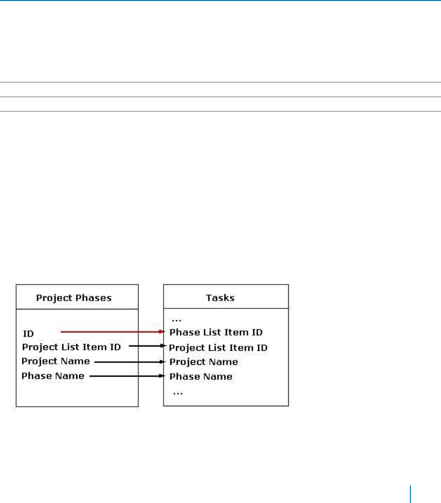
Dependent Lists
This property identifies the child lists to be updated when the List Form saves the changes to the current
list item.
This property works in conjunction with the Form Type property. When the Form Type property is set to
EditListItem or EditDocument, the List Form will update the values in the child lists. When the Form Type
property is set to NewListItem or UploadDocument, the List Form will create a new record in the child lists.
This is useful when you have two lists with a one-to-one relationship.
This property also prevents the deletion of the current item if there are any child records in the specified lists.
The user can delete a record when the Form Type property is set to DisplayListItem or EditListItem.
The Lists element can contain multiple List elements. One List element represents one child list. These are
the attributes of the List element:
Table 25. Dependent Lists
Element
Description
Advanced Mode
Allows you to edit Dependent Lists in XML. The value of this property is an XML string in this
format:
<Lists>
<List SiteUrl="siteURL" ListName="listName" KeyFieldName="keyFieldName">
<Field SourceFieldName="sourceFieldName" TargetFieldName="targetFieldName"/>
</List>
</Lists>
Site URL
Allows you to set the URL of the site that contains the child list.
List Name
Allows you to set the name of the child list. The name is case sensitive
Key Field Name
Allows you to set the name of the field in the child list that contains the ID of the parent
item. The key field is usually a single line of text that contains the parent item ID or a cross-
site lookup field to the parent list. The name is case sensitive.
The List element can contain zero or more Field elements. One Field element represents a field in the child
list that needs to be updated. These are the attributes of the Tasks list:
• Source — The name of the field in the parent list where the value comes from. The name is
case sensitive.
• Target — The name of the field in the child list where the value is copied to when the parent record
is saved. The name is case sensitive.
The following diagram illustrates parent child relationship between two different lists
Figure 2. Parent/Child Relationship between two lists
The Project Phases list is the parent list of the Tasks list. The ID field is the primary key in the Project Phases list
because the value of the ID field is guaranteed to be unique (every SharePoint list and library contains a field called
ID. This field cannot be modified and its value is uniquely auto-generated by SharePoint). The Phase List
www.agreeya.com
QuickApps for SharePoint
®
6.7
175
User Guide

Item ID is the foreign key in the Tasks list. We replicate the value of the Project List Item ID, Project Name
and Phase Name into the fields with the same name in the Tasks list.
For example, if the List Form is configured to edit an item in the Project Phases list, then every time we
modify the information in the Project Phase list we need to make sure the values that are replicated and the
Tasks lists are modified. The following is how the Dependent List property should be setup:
<Lists>
<List SiteUrl="." ListName="Tasks" KeyFieldName="Phase List Item ID">
<Field SourceFieldName="Project List Item ID"TargetFieldName="Project List Item
ID"/> <Field SourceFieldName="Project Name"TargetFieldName="Project Name"/>
<Field SourceFieldName="Phase Name"TargetFieldName="Phase
Name"/> </List>
</Lists>
Navigation
The Navigation page allows you to configure how and where the user will navigate in the web app. It contains
the following elements:
Table 26. Navigation
Element Description
Save Button Click Action Determines what will happen when the user clicks the Save and Close button on the
toolbar. These are the choices for this property:
• GoToNextPageUrl — Go to the page specified in the Next Page URL
property. You can use this option if you always want the user to go to the
same URL every time they save the form.
• GoToSource — Go to the page specified in the Source HTTP parameter. For
this option to work, the URL of the current page must contain the Source
HTTP parameter (http://...?Source=...). This option will give you the same
behavior as the Microsoft List Form. If you open the form using qListView,
the listview automatically sets the Source HTTP parameter for you. If you
use this option and the Source HTTP is not in the URL, the list form will give
you an error.
• TrySourceThenNextPageUrl — Go to the page specified in the Source http
parameter if one exists. If not, go to the page specified in the Next Page URL
property. This option is the most commonly used one. Most of the time, you
want to go the URL specified in the Source HTTP parameter. However, if that
parameter is not available (for example, the user may type in the URL
directly in the address bar), you want to have an alternative URL to go to.
Next Page URL
Works in conjunction with the Save Button Click Action property. When this property
is set to GoToNextPageUrl or TrySourceThenNextPageUrl, allows you to set the page
to go to when the user clicks the Save and Close button on the toolbar if the Save
Button Click Action property is set to GoToNextPageUrl or
TrySourceThenNextPageUrl.
If this field is blank, you are redirected to the List's Web Address.
www.agreeya.com
QuickApps for SharePoint
®
6.7
176
User Guide
Table 26. Navigation
Element
Description
Cancel Button Click
Determines what will happen when the user clicks the Cancel button on the toolbar.
Action
• SameActionAsSaveAndClose — This is the default value. You may want to
select another option if you want the Cancel button to behave differently
than the Save and Close button. This option is useful if you want to guide the
user through a series of steps when doing data entry. For example, when user
is in Form1, clicking Save and Close will bring them to Form 2 while clicking
Cancel button will bring them back to the home page.
• GoToGoBackUrl — Go to the page specified in the Go Back URL property. You
can use this option if you always want the user to go to the same URL every
time they save the form.
• GoToSource — Go to the page specified in the Source HTTP parameter. For
this option to work, the URL of the current page must contain the Source
HTTP parameter (http://...?Source=...). This option will give you the same
behavior as the Microsoft List Form. If you open the form using qListView, the
listview automatically sets the Source HTTP parameter for you. If you use this
option and the Source HTTP is not in the URL, the list form gives you an error.
• TrySourceThenGoBackUrl — Go to the page specified in the Source http
parameter if one exists. If not, go to the page specified in the Go Back URL
property. This option is the most commonly used one. Most of the time, you
want to go the URL specified in the Source HTTP parameter. However, if that
parameter is not available (for example, the user may type in the URL
directly in the address bar), you want to have an alternative URL to go to.
Go Back URL
Allows you to set which page to go to after the user clicks the Cancel button on the
toolbar if the Cancel Button Click Action property is set to GoToGoBackUrl or
TrySourceThenGoBackUrl.
Show Edit Button
Allows you to display the Edit Item button when the Form Type is set to
DisplayListItem or DisplayDocument.
Edit Form URL
Allows you to set the page to go to after the Edit Item button is clicked. If not
defined, the user will redirected to the EditForm.aspx of the list.
The Edit Item button will show up when the Form Type is set to Display Item or
Display Document and the Show Edit Button property is set to true.
Show Version History
Allows you to display the Version History button.
Button
Display Form URL
Displays the history of changes in the Multiple Lines of Text field when the Append
Changes to Existing Text setting in the field is turned on. The user can click one of
the texts in the history list to view that version of the text. This property define the
URL of the Display Form to display previous version of the text. If this property is not
defined, the default Display Form of the list is used.
Email Notification
The Email Notification page allows you to configure the web app to be sent as an email. It contains the
following:
Table 27. Email Notification
Element
Description
Display Email
Allows you to determines whether or not the email notification section should be
Notification Section
displayed in the List Form. The email notification will enable the user to send an
email to one or more recipients when an item is added or modified.
Subject
Allows you to specify the default subject that is displayed by the list item email.
Message
Allows you to specify the default message that is displayed by the list item email.
Allow Custom Message
Allows you to set the list item to allow the user to modify the message.
www.agreeya.com
QuickApps for SharePoint
®
6.7
177
User Guide
Table 27. Email Notification
Include Link to List or
Allows you to allows the hyperlinks to the AllItems.aspx of the list or document
Library
library.
Include Link to Item
Allows you to determine whether the message will include the hyperlink to the
newly added or modified list item.
Include Document as
Allows you to allow the email to contain the selected document as attachments.
Attachment
User Selection Mode
Allows you to select user from the parent site or address book.
• Plain Text— If the plain text option is selected, a text box will be displayed
in which you can type email IDs. Also, a list of all parent site users will be
displayed from which the user can be selected.
• People Picker — If the people picker is selected, address book will be
displayed from which you can add user.
User Selection Scope
Allows you to choose the source from which the user will be selected. It can be
from All Web User or a specific SharePoint Group.
Advanced Mode: Turn on if you want to edit Web User in XML format. XML will look
like the following:
<Scopes>
<Scope Name="AllWebUsers" />
</Scopes>
Turn on if you want to edit SharePoint Group in XML format. XML will look like the
following:
<Scopes>
<Scope Name="SPGroup" [selected scope] GroupName="SPGroupName" [sharepoint
group name] GroupID=" GroupID " [sharepoint group ID]
GroupSiteUrl="groupSiteUrl" />
</Scopes>
Appearance Page
The Appearance page allows you to set the overall look and feel of the web app. This page contains the
following:
• Ribbon
• Toolbar
• Control
• Layout
• Other
Ribbon
The Ribbon page allows you to set the display name of the Ribbon.
Table 28. Ribbon
Element
Description
SharePoint Ribbon Tab
Allows you to edit the display name of the Ribbon tab.
Name
www.agreeya.com
QuickApps for SharePoint
®
6.7
178
User Guide

Toolbar
The Toolbar page allows you to configure the appearance of the toolbar. It contains the following:
Table 29. Toolbar
Element
Description
Toolbar Location
Allows you to define where a toolbar for the list form should be displayed. The
choices are TopAndBottom, Top, Bottom or None. Select None if you do not
want to display the regular toolbar. Only the Ribbon buttons are displayed in
this case.
Toolbar Skin Name
Allows you to enter the skin name for the toolbar.
Show Save Button
Allows you to display the Save and Close button.
Show Cancel Button
Allows you to display the Cancel button.
Show Delete Button
Allows you to show the Delete button in the toolbar.
Show Mark Private/Public
Allows you to display the Mark Private/Public toggle button. This button will
Button
only be displayed for a new form or an edit/display form and the logged in user
is the creator of the item. If an item is marked as private, only the creator can
see it.
In New or Edit mode, if this property is changed for an item, the change takes
place when the Save button is clicked. In Display mode, if this property is
changed for an item, the change takes place immediately with the following
popup message:
“Are you sure you want to make this item private? This change will take place
immediately”
OR
“Are you sure you want to make this item public? This change will take place
immediately”
Show Manage Permissions
Allows you to display the Manage Permissions button.
Button
Show Manage Copies Button
Allows you to display the Manage Copies button.
Show Workflows Button
Allows you to display the Workflows button.
Show Alert Me Button
Allows you to show the Alert Me button in the toolbar. The Alert Me button
creates a list-level alert.
Save and Close Button Text
Allows you to set the display text for Save and Close button.
Cancel Button Text
Allows you to set the display text for the Cancel button.
Control
The Control page allows you to set the appearance of your user controls in a web app. It contains the following:
The Control page contains the following:
www.agreeya.com
QuickApps for SharePoint
®
6.7
179
User Guide
Table 30. Control
Element
Description
Rich Text Editor Skin
Allows you to select the skin name for the rich text editor. The rich text editor
Name
appears in the form when the Type attribute of the Field element in the Display
Fields property is set to RichText. If you have a custom skin, you can add it to the
following folder for SharePoint 2010:C:\Program Files\Common Files\Microsoft
Shared\Web Server
Extensions\14\TEMPLATE\LAYOUTS\QuestSoftware\Telerik\Q32013SP1\Skins, for
SharePoint 2013: C:\Program Files\Common Files\Microsoft Shared\Web Server
Extensions\15\TEMPLATE\LAYOUTS\QuestSoftware\Telerik\Q32013SP1\Skins or for
SharePoint 2016: C:\Program Files\Common Files\Microsoft Shared\Web Server
Extensions\16\TEMPLATE\LAYOUTS\QuestSoftware\Telerik\Q32013SP1\Skins
When creating a custom skin, you can refer to the Sample Skin folder in the install
directory.
Clear your browser cache frequently while working with custom skins. In IE, CSS
cache can be cleared by clicking the Clear Cache button in the CSS tab of
Developer Tools, located under the Tools menu of the browser.
Rich Text Editor Toolbar
Define the toolbar groups and the order in which they appear in the toolbar for
Settings
the text editor for rich text and enhanced rich text.
You can edit Rich Text Editor Toolbar Settings in XML by turning on Advanced
Mode.
Complex Category Tree
Allows you to specify the skin name for the Complex Category Tree in the list
Skin Name
form. If you have a custom skin, you can add it to the following folder for
SharePoint 2010:C:\Program Files\Common Files\Microsoft Shared\Web Server
Extensions\14\TEMPLATE\LAYOUTS\QuestSoftware\Telerik\Q32013SP1\Skins, for
SharePoint 2013: C:\Program Files\Common Files\Microsoft Shared\Web Server
Extensions\15\TEMPLATE\LAYOUTS\QuestSoftware\Telerik\Q32013SP1\Skins.
SharePoint 2016: C:\Program Files\Common Files\Microsoft Shared\Web Server
Extensions\16\TEMPLATE\LAYOUTS\QuestSoftware\Telerik\Q32013SP1\Skins.
When creating a custom skin, you can refer to the Sample Skin folder in the install
directory.
Drop-Down Skin Name
Allows you to specify the skin name for the drop-down menu control for the choice
field. If you have a custom skin, you can add it to the following folder for
SharePoint 2010:C:\Program Files\Common Files\Microsoft Shared\Web Server
Extensions\14\TEMPLATE\LAYOUTS\QuestSoftware\Telerik\Q32013SP1\Skins, for
SharePoint 2013: C:\Program Files\Common Files\Microsoft Shared\Web Server
Extensions\15\TEMPLATE\LAYOUTS\QuestSoftware\Telerik\Q32013SP1\Skins.
SharePoint 2016: C:\Program Files\Common Files\Microsoft Shared\Web Server
Extensions\16\TEMPLATE\LAYOUTS\QuestSoftware\Telerik\Q32013SP1\Skins.
When creating a custom skin, you can refer to the Sample Skin folder in the install
directory.
Layout
The Layout page allows you to set the overall layout of the web app. It contains the following:
Table 31. Layout
Element
Description
Width
Allows you to set the web app to a fixed width
Height
Allows you to set the web app to a fixed height
Chrome State
Allows you to select if the web app can be minimized or not when you open the web app.
If Minimized is selected, then only the Title Bar displays.
Chrome Type
Allows you to select the kind of border to display around the web app.
www.agreeya.com
QuickApps for SharePoint
®
6.7
180
User Guide
Table 31. Layout
Element
Description
Hidden
Select this check box if you want the web app hidden
Direction
Allows you to set how the text in the web app displays depending on the language, either
from Left to Right or Right to Left
Other
The Other page allows you to set the appearance of other elements in the web app. It contains the following:
Table 32. Other
Element
Description
Allow Minimize
Select this check box if you want the web app minimized
Allow Close
Select this check box if you want the web app removed from the page
Allow Hide
Select this check box if you want the web app hidden
Allow Zone Change
Select this check box if you want the web app moved to a different zone
Allow Connections
Select this check box if you want the web app to participate in connections
to other web apps
Allow Editing in Personal View
Select this check box if you want the web app modified in a personal view
Export Mode
Allows you to select the level of data that can be exported for this web app
Title URL
Allows you to add the title of a URL as extra information about the web app
Description
Allows you to enter a description of the web app that is displayed as a Tooltip
when you hover your mouse over the web app title or icon.
Help URL
Allows you to enter the location of a file containing Help information about
the web app.
Help Mode
Allows you to specify how a browser displays Help content for the web app,
either in a separate window which you must close before returning to the
Web Page (Mode), in a separate window that you do not need to close before
returning to the Web Page (Modeless), or in the current browser window
(Navigate)
Catalog Icon Image URL
Allows you to specify the location of a file containing an image to be used as
the web app icon in the Web app List. The image size must be 16 by 16
pixels.
Title Icon Image URL
Allows you to specify the location of a file containing an image to be used in
the web app title bar. The image size must be 16 by 16 pixels.
Import Error Message
Allows you to specify a message that appears if there is a problem importing
the web app
Advanced Page
The Advanced page allows you to set advanced features of the web app, such as the following:
• Ajax
• Session
• Security
• Resources
www.agreeya.com
QuickApps for SharePoint
®
6.7
181
User Guide

Ajax
The AJAX page allows you to configure AJAX in your web app.It contains the following:
Table 33. AJAX
Element
Description
Enable AJAX
Allows you to enable AJAX for the List Form. AJAX enables the List Form to carry out some
operations within the grid without refreshing the whole page. For example, when you sort a
column by clicking its column header or change the page by clicking the pager, the List Form
only refreshes the data in the grid without causing the whole page to post back. However,
there are times when AJAX causes some issues. In this case, you must disable the AJAX
capability of the List Form.
The following are some known situations where you need to disable AJAX:
• In Internet Explorer 6, the data grid will fail to carry out the AJAX operation. If
your user base reports this issue, you can disable the AJAX to fix it.
• If you use javascript's document.write() method in the Results Body property of the
Custom Display, the text that is generated using document.write() will not be
rendered after the AJAX operation. This is true even if you do not call the
document.write() directly within the Results Body but rather through another
javascript function that calls document.write().
www.agreeya.com
QuickApps for SharePoint
®
6.7
182
User Guide
Session
The Session page allows you to set or reset the session variable in the web app. It contains the following:
Table 34. Session
Element
Description
Set Session
Defines the name of the session variable where:
Name
• The edited or newly created item is stored when it is saved.
• The item that is being displayed or edited is stored when it is loaded.
Use the list form to display a Task and a listview underneath it to display Task Serial Notes.
The list form will filter the listview so that the listview will only show the serial notes for the
displayed task. When you click the New Item button to create a new task serial notes, you
want some of the fields in the task serial notes to be auto-filled with the fields from the
current task. In that case, you set the session name in the list form so that the current task is
stored in the session and you can consume it in the new form for the task serial notes.
Reset Session
Allows you to reset the List Form (set to NULL) the value of the session variable whose name is
Name
specified in this attribute. You can specify multiple names by separating them with commas.
Security
The Security page allows you to set which users are allowed to view the web app. It contains the following:
Table 35. Security
Element
Description
Target
Allows you to have the Web app to appear only to people who are members of a particular
Audiences
group or audience.
An audience can be identified by using a SharePoint group, a distribution list, a security group,
or a global audience.
Resources
The Resources page allows you to enable Localization in the web app using resource lists.
Localization
Localization contains the following elements.
NOTE: While this feature is still available to use, we recommend using ezLocalizer. For more
information, see ezLocalizer on page 391.
www.agreeya.com
QuickApps for SharePoint
®
6.7
183
User Guide

Table 36. Localization
Element
Description
Resource List
Allows you to support a multi-lingual site. In a multi-lingual site, there are some
settings, such as the web app, whose value can change depending on the current
culture setting. The Resource List property defines the list that contains the string
values for different cultures. The resource list must contain 3 columns:
• Resource ID — This field contains the identifier to refer to the string. You can
have multiple strings with the same Resource ID as long as their Culture value
is different.
• Culture — This field contains the culture for the string. For the default
culture, leave the Culture field blank.
• Value — This field contains the value for the string.
The Lists element can contain only one List element. The following are the
attributes for the List element:
• SiteUrl — The URL to the site that contains the resource list. The URL can be
absolute (http://...) or relative to the current page URL. This attribute is
mandatory.
• ListName — The name of the resource List. The list name is case sensitive.
Title Resource ID
Allows you to support a multi-lingual site. The property defines the identifier of the
string in the Resource List that is used as the text of the web app. The Resource ID
and the current cultural setting (identified with the Culture HTTP parameter) are
used to retrieve the string in the Resource List. If the string with the given identifier
and culture is not found, the default is used.
Save and Close Button
Allows you to enter a text resource ID for the Save and Close button.
Text Resource ID
Cancel Button Text
Allows you to enter a text resource ID for the Cancel button.
Resource ID
Delete Button Text
Allows you to enter a text resource ID for the Delete button.
Resource ID
Edit Button Text
Allows you to enter a text resource ID for the Edit button.
Resource ID
Approve/Reject Item
Allows you to enter a text resource ID for the Approve/Reject Item button.
Button Text Resource ID
Check In Button Text
Allows you to enter a text resource ID for the Check In button.
Resource ID
Check Out Button Text
Allows you to enter a text resource ID for the Check Out button.
Resource ID
Manage Permissions
Allows you to enter a text resource ID for the Manage Permissions button.
Button Text Resource ID
Manage Copies Button
Allows you to enter a text resource ID for the Manage Copies button.
Text Resource ID
Version History Button
Allows you to enter a text resource ID for the Version History button.
Text Resource ID
Workflows Button Text
Allows you to enter a text resource ID for the Workflows button.
Resource ID
Alert Me Button Text
Allows you to enter a text resource ID for the Alert Me button.
Resource ID
Mark Private Button
Allows you to enter a text resource ID for the Mark Private button.
Text Resource ID
Mark Public Button Text
Allows you to enter a text resource ID for the Mark Public button.
Resource ID
www.agreeya.com
QuickApps for SharePoint
®
6.7
184
User Guide
Table 36. Localization
Element
Description
Indicates Required Field
Allows you to enter a text resource ID for the Indicates Required Field button.
Button Text Resource ID
Parent Folder Text
Allows you to enter a text resource ID for the Parent folder.
Resource ID
Destination Folder Text
Allows you to enter a text resource ID for the Destination Folder.
Resource ID
qListForm Procedures
You can perform the following procedures using qListForm:
• Adding items to a list in SharePoint using qListForm
• Creating and Editing Collapsible Sections
Adding items to a list in SharePoint using qListForm
If you want to add items to a SharePoint list using qListForm, you must replace the out-of-box web app with
qListForm.
To replace out-of-box SharePoint ListForm with qListForm
1 Create a list in SharePoint, for example Document List.
2 From Modify Form Web apps, select New Default List.
3 Add qListForm.
4 Open ezEdit.
5 From Primary Content, enter a title, a site URL, and the name of the list you created in SharePoint.
6 From Form Type, select NewListItem. Click OK.
7 Hide the out-of-the-box SharePoint List.
a From the SharePoint list, select Edit Web app.
b From the Layout section, click Hidden.
NOTE: Do not delete the Microsoft List Form. Doing so may render your list unusable.
www.agreeya.com
QuickApps for SharePoint
®
6.7
185
User Guide
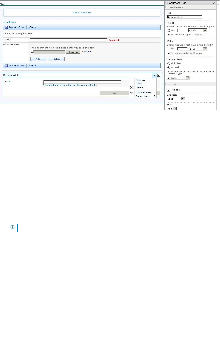
Figure 3. Edit Web app
8 Click Stop Editing from the SharePoint ribbon.
You are returned to the list in SharePoint. When you click Add new item, the QuickApps
qListForm opens.
Creating and Editing Collapsible Sections
Collapsible Sections are useful for organizing documents that contain a lot of information since you can use them to
collapse one or more paragraphs into a single line. You can expand the paragraphs when necessary by clicking the
triangle that appears to the left of a collapsed section. In Lotus Notes, this capability already exists and for users
migrating from Notes to SharePoint, this feature allows for seamless migration of this type of text.
There are three editing modes in rich text editor:
• Design — allows you to turn a section of text to collapsible or expanded
• HTML — allows you to work directly with specified markup to turn text into a collapsible section
• Preview — allows you to click to expand or collapse a section of text that is marked up as
collapsible text.
NOTE: Collapsible text does not work in Internet Explorer 7.
To create a collapsible section
1 Select the text that you want to collapse.
2 Click Apply Section.
The selected text becomes a collapsible section with a section header with a default title of
“New Section”. This title can be changed.
To remove a collapsible section
1 Select the section header.
2 Click Remove Section.
Nested sections can be created by allowing a section header and section repeated inside the
parent section. The section header can be aligned to the left (default), right, and center.
www.agreeya.com
QuickApps for SharePoint
®
6.7
186
User Guide

Child List
This property defines the following:
• The list whose data is viewed in the listform and the manner it is aggregated. There are a few ways
that you can aggregate information from multiple lists in the listform. First, you can define the lists to
be aggregated one by one. Second, you can define the site URL for the aggregated lists in a Rolled-Up
list. Third, you can aggregate the information from lists with a particular name from all the subsites
(recursive rollup).
The Lists element can contain one or more List elements. The listform will aggregate the information from all
of the List elements that you specify. To define the hierarchical listform, each List element can contain one
child List element.
The following are the elements for the Child List attribute.
Table 37. Child List
Element
Description
Advanced Mode
Turn on if you want to edit Viewed Lists in XML format. XML will look like the following:
<Lists>
<List SiteUrl="." ListName="Employee List" />
</Lists>
Site URL
Allows you to set the URL to the site that contains the list to be searched. The URL can
be absolute (http://...) or relative to the current page URL. This attribute is
mandatory.
When using a relative URL, you can use a single dot (.) to denote the current path, a
double dot (..) to denote the previous path, and a slash (/) to denote the root path.
NOTE: If you want to connect the listform with another Web app in Microsoft
SharePoint Designer, the SiteUrl property must contain an absolute URL. We
recommend that you keep all URLs in the Web app configuration relative to ensure site
portability. If you must, use an absolute URL temporarily, make the connection, and
then change the URL to a relative one.
List Name
Allows you to enter the name of the SharePoint list that is edited or displayed. The list
name is case sensitive. If the list name contains spaces, include the spaces here as
well.
To denote the current list, you can use a single dot (.) as the list name.
NOTE: This only works if the qListForm is contained in the AllItems.aspx. For example,
if you are replacing the Microsoft List View in the AllItems.aspx of the Tasks list and
you use a single dot as the ListName attribute, the ListName attribute of the qListForm
is set to Tasks. If you want to save the list as a template and then add it somewhere
else, the name of the new list might not be Tasks and using this relative list name will
automatically pick up the new list name for the view.
Child List Display Fields
This property defines what fields should be displayed in the List Form and how the fields are populated. When you
select the Edit button, a dialog box opens with a list of field names based on the list you have selected.
You can add more details to the field names.
The following are the elements for the Child List Display Fields attribute.
www.agreeya.com
QuickApps for SharePoint
®
6.7
187
User Guide
Table 38. Child List Display Fields
Element
Description
Advanced Mode
Turn on if you want to edit Display Fields in XML format. XML will look like the
following:
<Fields LookupThresholdControlSetting="Default">
<Field Name="Title" InternalName="Title" />
</Fields>
Query All Fields
Controls how Web apps behave in relation to the List Form Lookup Threshold in
SharePoint Resource Throttling. The options are:
• Default — uses the level set in the Configuration Editor. If you have selected
Query All Fields check box in the Configuration Editor, the Web app will query
only those fields that are not included in the List View Lookup Threshold. If the
Query All Fields check box is cleared, the Web app will query all fields.
• On — If the Web app level is On, the Web app queries all fields in lists, except
Lookup fields.
• Off — If the Web app level is Off, the Web app queries all fields in lists,
including Lookup fields.
NOTE:
Explicit — If the Web app level is Explicit, the Web app queries only those fields
selected in the Display Fields. This option renders the best performance for your Web
Part.
Title
Allows you to change the displayed for the field. The value can be a plain string or an
encoded HTML string. Change the displayed title, for example, when the title is too
long or to make the title more descriptive.
Width (in pixels)
Allows you to set the width of the control in pixels.
Some controls, such as the Rich Text Editor, have minimum width and it will not honor
the specified width if it is smaller than its minimum width.
Align
Indicates the horizontal alignment for the field. The values is one of the following:
left, right, or center. For example:
<Field Name="Created" Align="right" />
Relationship Mapping
Allows you to create a relationship between parent and child list. When you select the Edit button, a dialog
box opens with a list of parent and child key fields based on the list.
The following are the elements for the Relationship Mapping attribute.
Table 39. Relationship Mapping
Element
Description
Advanced Mode
Turn on if you want to edit Relationship Mapping in XML format. XML will look like the
following:
<Mappings>
<Mapping ParentListName="ListName" ParentSiteUrl="siteUrl"
ChildListName="ListName" ChildSiteUrl=" siteUrl " ParentFieldName="
parentKeyFieldName" Operator="EqualsTo" ChildFieldName=" childkeyFieldName" />
</Mappings>
Parent Key Field
Allows you to select Parent Key Field Name.
Name
Child Key Field Name
Allows you to select Child Key Field Name.
www.agreeya.com
QuickApps for SharePoint
®
6.7
188
User Guide

12
qListView
• Overview
• Configuration Wizard
• qListView Pages
• qListView Procedures
Overview
qListView aggregates data from one or more SharePoint lists and displays the information in a grid.
This Web app has an intuitive user interface that allows you to:
• Configure the most complex aspects of web apps. This user interface is accessed from the Configure
item on the web app menu at the upper right corner of the list display.
• Aggregate data from multiple lists from various SharePoint sites. The lists to be aggregated are defined
in the Viewed Lists property. You can define the lists that you want to aggregate individually in the
property, define it in a centralized list or ask the listview to aggregate lists with a specific name from
all the subsites (recursive rollup).
• Display hierarchical data. For example, you can display the information from the Customer list and
Sales list in the same view.
• Display data from lists with multiple content types. The listview displays a New button for each content type
in the list so that the user can create items with different content types from the listview.
• Ensure the referential integrity of the records in the dependent lists by preventing the deletion of
the parent record.
• Divide the data into multiple pages to limit their size and render pages faster. This feature is called
Paging. There are two Paging Modes available: Numeric Pager and Next Previous. If the number of rows
in a table is more than the specified Page Size, the data is divided into multiple pages and a Pager is
displayed at the bottom of the listview to enable the user to navigate to different pages.
• Define a static filter using CAML Filter expression or Complex Filter expression. Both types of filter
expression supports time functions and time expression (such as [TODAY]) to filter out data based on
a moving time window. This feature is called Data Aging.
• Define the dynamic filter or search criteria using the Find panel. The web app author can define the
fields that are shown in this panel using the Searched Fields property.
• Filter a lookup/cross-site lookup field with another lookup/cross-site lookup field.
• Replace the value of a certain field in the list. The user can either mass-replace the value of
the selected item or define the condition for the items to be replaced.
• Define the initial static sort expression using the Sort Fields property. The listview can sort the
data based on multiple fields.
• Export child list to Microsoft Excel in conjunction with qExcelViewer.
• Sort the data in the listview by clicking the grid headers.
• Define multiple levels of grouping on the data using the Grouped attribute in the Display Fields
property. You can also display the sum or item counts in the group header.
www.agreeya.com
QuickApps for SharePoint
®
6.7
189
User Guide
• Support the List Searcher mode in listview. If Turn On List Searcher Mode is set to True, the listview
does not display data until the user performs a search.
• Turn off the individual buttons in the toolbar.
• User can edit office documents in browser after installing Office Web App and configure with SharePoint.
• Manage the folders from one or more lists/document libraries in the Folder Panel.
• Display the value of a cross-site lookup field. A cross-site lookup field is similar to the SharePoint lookup
field, except that it can look up multiple lists in any workspaces that are accessible from the current site by
the current user. The cross-site lookup field is identified by the Display Field Name or Display Format
attributes in the Display Fields property. You can use qListForm to populate a cross-site lookup field.
• Access the most common functions for data items, such as View Properties, Edit Properties and
Send Email. If enabled, you can access the context menu by right-clicking the entry in the listview.
NOTE: The Send Email item in the context menu enables the user to send an email with a
custom message to one or more recipients. The email message may contain the link to
the item, the link to the list or library and in case of document library, the document as
an attachment. This feature requires you to put the MailSettings configuration in your
web.config file. You need to do this because the Send Email does not use the SharePoint
email capability due to its limitation of sending a maximum of 1000 characters.
• Change the URL of the new form, edit form, and display form using the Viewed Lists property.
• Show or hide the listview based on the site group membership of the currently logged in user.
• Display the data in virtually any format that can be achieved with JavaScript and HTML. With
this feature, you can create many types of custom reports on the data.
• Support dynamic language switching and Flash and JavaScript (HTML5)
• Export data to Microsoft Excel in conjunction with qExcelViewer.
• Provide data from the whole listview to another web app using IWebPartTable interface.
• Consume a filter from another web app that implements IRowProvider or IFilterProvider interface.
NOTE: The IFilterConsumer interface is obsolete. It is provided here only for backward
compatibility reason. When you establish the web app connection, this interface is
labeled Consume Filter From (Obsolete) in the web app Connections menu. Use the
IWebPartParameter consumer implementation that is labeled with Get Filter From.
The listview is a consumer for the IWebPartParameter interface. This capability enables the chart
view to consume a filter from another web app that implements IWebPartRow or IWebPartParameter
interface.
The IWebPartParameter consumer implementation is labeled with Get Filter From in the web app
Connection menu. This interface cannot be connected with the obsolete IFilterProvider or IRowProvider
implementation. Do not connect this new interface with the old interface that is marked obsolete
Configuration Wizard
qListView uses a configuration wizard to walk you through basic configuration tasks. For more information on using
the Configuration Wizard, see Configuring Basic Settings using the Configuration Wizard on page 223.
qListView Pages
You can configure this web app through its pages that are accessible through ezEdit. qListView contains
the following pages:
• Content Page
www.agreeya.com
QuickApps for SharePoint
®
6.7
190
User Guide

• Behavior Page
• Appearance Page
• Advanced Page
Content Page
The Content page contains the following:
• Primary Content
• Filtering
• Search/Filter/Replace Panel
• Sorting/Paging
• Custom Display
Primary Content
The Primary Content page is default category. You need to configure one or more elements in this page to
get started using this web app.
Primary Content contains the following:
Table 1. Primary Content
Element
Description
Title
Allows you to enter a title for the Web app, or accept the default. This field is
mandatory.
Viewed Lists
See Viewed Lists on page 191 for more information.
Display Fields
See Display Fields on page 195 for more information.
Child View Display
Defines the fields that should be displayed in the view for the child records. See
Fields
Display Fields on page 195 for more information.
Expand Child View on
Determines if the child view is expanded or collapsed when the listview is loaded for
Load
the first time. By default, this property is set to false which means the hierarchical
listview does not expand the child view. If set to true, the entire child view expands
when the listview is loaded for the first time.
Enable New Item Link
Allows you to display the New Item link in the child view.
in Child View
ID HTTP Parameter
Allows the qListForm and several other web apps to an HTTP Parameter called ID to
Name
identify the item to be displayed or edited. This HTTP Parameter is usually generated
automatically by the viewer web app, such as qListView or qCalendarView, when you
select an item to be displayed or edited.
NOTE: If qListForm is placed on a web app page that is contained within a document
library, the page will generate an error if the value of the ID HTTP Parameter is bigger
than the number of pages within the document library. To prevent this error from
happening, rename the ID HTTP Parameter.
By default, the value of this property is "ID". You can change the value of this property
to something else, such as LID. In that case, when you select "View Properties" or "Edit
Properties" in the context menu, the URL of the display or edit form becomes:
http://mysite.com/EditFormURL.aspx?LID=xxx
Set the same property in the qListForm to the same value.
Viewed Lists
This property defines the following:
www.agreeya.com
QuickApps for SharePoint
®
6.7
191
User Guide

• The lists whose data is viewed in the listview and the manner it is aggregated. There are a few ways
that you can aggregate information from multiple lists in the listview. First, you can define the lists to
be aggregated one by one. Second, you can define the site URL for the aggregated lists in a Rolled-Up
list. Third, you can aggregate the information from lists with a particular name from all the subsites
(recursive rollup).
• The parent list and the child list in the hierarchical listview. You can only define one child element per
list. The hierarchical listview does not work when you aggregate the information using the Rolled-Up
list and recursive rollup.
• The Dependent Lists for each list. If the Dependent Lists information is provided, the listview
checks whether there are child records in the Dependent Lists when the user tries to delete items
from the listview. If there are any, the listview will not delete the selected items.
The Lists element can contain one or more List elements. The listview will aggregate the information from all
of the List elements that you specify. To define the hierarchical listview, each List element can contain one
child List element.
The following are the elements for the Viewed List attribute.
Table 2. Viewed List
Element
Description
Advanced Mode
Turn on if you want to edit Viewed Lists in XML format. XML will look like the following:
<Lists>
<List SiteUrl="siteUrl" ListName="listName" IncludeSubsites="true/false"
IncludeThisSite="true/false" IsRollupList="true/false" SiteUrlFieldName="fieldName"
RolledUpListName="listName" TargetUrl="targetUrl" SetSessionName="sessionName"
ResetSessionNames="name1, name2" NewFormUrl="URL" EditFormUrl="URL"
DisplayFormUrl="URL">
<!-- To define a child list in a hierarchical listview, you can add List element in the
parent List element. You can only have one child list. -->
<List SiteUrl="siteUrl" ListName="listName"
ParentKeyFieldName="parentKeyFieldName" ChildKeyFieldName="childkeyFieldName"
TargetUrl="targetUrl" SetSessionName="sessionName" ResetSessionNames="name1,
name2" NewFormUrl="URL" EditFormUrl="URL"
UseUploadFormInLayoutsFolder="true/false" DisplayFormUrl="URL">
<!-- To define dependent lists, add a DependentLists element inside the List element
-->
<DependentLists>
<List SiteUrl="siteUrl" ListName="listName" KeyFieldName="keyFieldName" />
<List SiteUrl="siteUrl" ListName="listName" KeyFieldName="keyFieldName" />
</DependentLists>
</List>
<List ...></List>
<List ...></List>
</Lists>
Site URL
Allows you to set the URL to the site that contains the list to be searched. The URL can
be absolute (http://...) or relative to the current page URL. This attribute is
mandatory.
When using a relative URL, you can use a single dot (.) to denote the current path, a
double dot (..) to denote the previous path, and a slash (/) to denote the root path.
NOTE: If you want to connect the listview with another Web app in Microsoft
SharePoint Designer, the SiteUrl property must contain an absolute URL. We
recommend that you keep all URLs in the Web app configuration relative to ensure site
portability. If you must, use an absolute URL temporarily, make the connection, and
then change the URL to a relative one.
www.agreeya.com
QuickApps for SharePoint
®
6.7
192
User Guide
Table 2. Viewed List
Element
Description
List Name
Allows you to enter the name of the SharePoint list that is edited or displayed. The list
name is case sensitive. If the list name contains spaces, include the spaces here as
well.
To denote the current list, you can use a single dot (.) as the list name.
NOTE: This only works if the qListView is contained in the AllItems.aspx. For example,
if you are replacing the Microsoft List View in the AllItems.aspx of the Tasks list and
you use a single dot as the ListName attribute, the ListName attribute of the qListView
is set to Tasks. If you want to save the list as a template and then add it somewhere
else, the name of the new list might not be Tasks and using this relative list name will
automatically pick up the new list name for the view.
Include Subsites
If set to true, the listview searches all the subsites for a list whose name specified in
the ListName and aggregate the information from those list.
NOTE: If you have many subsites, the information may take a long time to aggregate.
Use this attribute if you have only a small amount of subsites. You must test this
feature in your environment to see whether or not the response comes back in a
reasonable amount of time and the request does not time out.
Include This Site
Used in conjunction of the IncludeSubsites attribute. If you set this property to true,
the list in the current site will not be aggregated by the listview. The current site is the
site whose URL is specified in the SiteUrl attribute.
Is Rollup List
Indicates whether or not the list specified by the SiteUrl and ListName attributes
contains the Site URLs of the lists to be aggregated instead of the data to be
aggregated. If you set this to true, the list specified by the SiteUrl and ListName must
have a field that contains the URL information. By default, the name of that field is
Site URL. If you use different field name, specify the name using the SiteUrlFieldName
attribute.
Rolled Up List Name
Used in conjunction with the IsRollupList property, indicates the name of the lists to be
rolled up if you set the IsRollupList to true.
If you want to aggregate more than one list from each site specified in the rollup list,
you can define more than one List elements with the same rollup list, but different
RolledUpListName.
Site URL Field Name
Used in conjunction with the IsRollupList property, indicates the field that contains the
Site URLs of the lists to be aggregated. This attribute is optional if the field name is
Site URL.
NOTE: The Site URL field must be a single line of text field.
Active Field Name
Used in conjunction with the v IsRollupList property. The rollup list may contain a
Yes/No field to indicate whether or not a particular site should be included in the
rollup. This property is optional if the name of this field is Active.
NOTE: The Active field must be a Yes/No field.
Reset Session Names
Resets (sets to NULL) the value of the session variables whose name is specified in this
attribute. You can specify multiple names by separating them with commas; for
example TaskSession, IssueSession.
You can reset the session name if a list has one or more tasks associated with it. In
addition to storing the selected list in the session, you may store the dependent task
information in the session as well. This means that every time you store a new list into
a session, you need to reset the dependent task information from the session as well.
Set Session Name
Defines the name of the session variable where the listview stores the item whose
column is being clicked by the user. The user can click the item if one of the LinkTo,
LinkToTarget or the LinkToSource attributes in the Display Fields property is defined.
This attribute is usually used if you have another Web app (such as the qListForm) that
can consume the stored values from the session.
You can set the session name when you want to consume the item from a session
variable in a qListForm later.
www.agreeya.com
QuickApps for SharePoint
®
6.7
193
User Guide
Table 2. Viewed List
Element
Description
Target URL
When the LinkToTarget attribute of a specific column is set to true (in the Display
Fields property), the data in that column becomes a hyperlink to the URL specified in
this attribute.
NOTE: If you using Advanced Mode, the TargetUrl can use the <%field name%> field
replacement expression. But you must use the encoded form of the < and > characters,
which are < and > respectively.
Use the LinkToTargetUrl attribute if you want each list to have a different URL; for
example, when you want to aggregate multiple lists from the same workspace and
connect a certain column to the display form of the list. In that case, the URL to the
display form of each list is different.
Create Document
When specified, the New button (and all the buttons for specific content types
Form URL
underneath it) will redirect the user to the URL specified by this attribute. Normally,
the page pointed to by CreateDocumentFormUrl will contain a qListForm to create the
new document. For more detail about this, see the Create Document section of the
qListForm chapter.
CreateDocumentFormUrl will affect all types of list, not just document library.
There is no difference between CreateDocumentFormUrl and NewFormUrl when the
list is not a document library. You can specify either to affect the target URL for the
New button. But if both are specified, the CreateDocumentFormUrl will take
precedence. When the list is a document library, CreateDocumentFormUrl will affect
the New button and the NewFormUrl will affect the Upload button.
New Form URL
Indicates the URL where the form to create a new item resides. The URL is relative to
the Site URL of the list. The user is redirected to the specified URL when one of the
New buttons in the toolbar is clicked. If not defined, the user is redirected to the
NewForm.aspx of the list (or Upload.aspx for the document library).
Redefining the New Form URL is useful if you have different way of creating an item
depending on the current view. For example, in the view for external vendor, you may
want to give them a new form that does not contain all the fields in the list.
NOTE: The Source HTTP parameter is automatically appended to the New Form URL
during redirection.
This attribute is usually used in conjunction with the qListForm Web app.
Edit Form URL
Indicates the URL where the form to edit an item in the list resides. The URL is relative
to the Site URL of the list. The user is redirected to the specified URL when the user
clicks Edit Properties in the Context Menu. If not defined, the user is redirected to the
EditForm.aspx of the list.
Redefining the Edit Form URL is useful if you have different ways of editing an item
depending on the current view. For example, in the view for external vendor, you may
want to give them an edit form that does not contain all the fields in the list.
NOTE: The ID and Source HTTP parameters are automatically appended to the Edit
Form URL during redirection.
This attribute is usually used in conjunction with the qListForm Web app.
Display Form URL
The URL where the form to display an item in the list resides. The URL is relative to the
Site URL of the list. The user is redirected to the specified URL when the user clicks
View Properties in the Context Menu. If not defined, the user is redirected to the
DisplayForm.aspx of the list.
Redefining the Display Form URL is useful if you have different way of displaying an
item depending on the current view. For example, in the view for external vendor, you
may want to give them a display form that does not contain all the fields in the list.
NOTE: The ID and Source HTTP parameters are automatically appended to the Display
Form URL during redirection.
This attribute is usually used in conjunction with the qListForm Web app.
www.agreeya.com
QuickApps for SharePoint
®
6.7
194
User Guide
Table 2. Viewed List
Element
Description
Launch Form In
Defines how the form pages (NewForm, EditForm, DisplayForm) associated with a
SharePoint list are launched. There are 3 different options: Dialog, New Window, and
Current Window. This property defaults to <Empty> in which case the form dialog
obeys the settings under List Settings/Advanced Settings.
NOTE: If you select Dialog, you can configure the dialog width and height.
Use Upload Form in
Allows you to link to the Upload.aspx page in the _Layouts folder instead of the
Layouts Folder
Upload.aspx page in the Forms folder of the document library.
NOTE: This option was useful with SharePoint 2007. It is still available for legacy
purposes, but you no longer need to enable it.
The List element for the child list must contain these additional attributes:
Table 3. List element for child list
Element
Description
Parent Key Field
Allows you to enter a name in the field in the parent list that will act as the filter for
Name
the child records. In other words, this is the primary key field in the parent list.
Child Key Field Name
Allows you to enter a name in the field in the child list that is filtered by the value
from the parent key field. In other words, this is the foreign key field in the child list.
The List element can contain only one DependentLists element. The DependentLists element can contain one
or more List element. The List element inside the DependentList can contain the following attribute:
Table 4. List element inside Dependent Lists
Element
Description
Site URL
Allows you to enter the URL to the site that contains the dependent list.
List Name
Allows you to enter the name of the dependent list. The list name is case sensitive.
This property along with the SiteUrl defines the dependent list.
Key Field Name
Allows you to enter the name of the field in the dependent list that contains the ID of
the parent item. In another word, the KeyFieldName is the foreign key in the
dependent list. The key field is usually a single line of text that contains the parent
item ID or a cross-site lookup field to the parent list. The name is case sensitive
Display Fields
This property defines the fields that should be displayed.
This property is optional if the properties in the Custom Display section is specified. In that case, the default
display is turned off and the custom display is used. You can also combine the custom display with the
Display Fields. A good example is when you want to display data in a grid and provide a summary of the data
or a disclaimer using a custom display.
The Display Field contains the following elements:
NOTE: In addition to the fields in the list, the listview recognizes several special fields. You can
display the following fields, group the fields or use it as a field replacement expression in the
CalculatedValue attribute.
• Item Location — The format of the Item Location value is ListName in SiteUrl. This field is useful
when you aggregate multiple values into the listview to tell you where a particular item comes from.
• Workspace URL — This field contains the URL of the site that contains the containing list.
• List Name — This field contains the name of the containing list.
• Folder — The server relative URL of the folder that contains this item.
www.agreeya.com
QuickApps for SharePoint
®
6.7
195
User Guide
• File Path — The complete URL for a file in the document library. This variable is only available
for document library.
Table 5. Display Field
Element
Description
Advanced Mode
Turn on if you want to edit Display Fields or Child View Display Fields in XML format. In
XML, Displayed Fields look like:
<Fields LookupThresholdControlSettings=”On”>
<Field Name="fieldName" [optional attributes]/>
<!-- For a grouped field, you can specify one or more aggregated values --
> <Field Name="fieldName" Grouped="true" SortDirection="asc|desc"
GroupExpanded="true|false">
<Aggregate Function="aggregateFunction" FieldName="fieldName" Text="text"/>
<Aggregate Function="aggregateFunction" FieldName="fieldName" Text="text"/>
</Field>
</Fields>
Query All Fields
Controls how Web apps behave in relation to the List View Lookup Threshold in
SharePoint Resource Throttling. The options are:
• Default — uses the level set in the Configuration Editor. If you have selected
Query All Fields check box in the Configuration Editor, the Web app will query
only those fields that are not included in the List View Lookup Threshold. If the
Query All Fields check box is cleared, the Web app will query all fields.
• On — If the Web app level is On, the Web app queries all fields in lists, except
Lookup fields.
• Off — If the Web app level is Off, the Web app queries all fields in lists, including
Lookup fields.
• Explicit — If the Web app level is Explicit, the Web app queries only those fields
selected in the Display Fields. This option renders the best performance for
your Web app.
Add Field
Allows you to add custom fields to be displayed in the web app.
NOTE: If you are using a CalculatedValue or FixedValue attribute, you must first add and
configure at least one custom field.
Field Name
Indicates the name of the field selected. If you select Custom, you can change the field
name.
NOTE: If you configure Calculated Value, Fixed Value, Display Field Name, and Display
Format, ensure the custom field name does not contain spaces. If the name contains
spaces, an error message is returned.
Title
Indicates the title of the field. This is useful if the real field name is too long and you
want to abbreviate the title in the field header, or if you simply want to display a
different title in the field header. If this attribute is not specified, the value specified in
the Name attribute is used in the field header. For example:
<Field Name="Created By" Title="Author" />
Title Resource ID
Indicates the identifier in the Resource List that is used as the title of the field. The
TitleResourceID and the current cultural setting (identified with the Culture HTTP
parameter) is used to retrieve the string in the Resource List. If the string with the given
identifier is not found, the default Title is used.
Width
Indicates the width of the field. You can specify the value in pixels (Width="20px") or
percentage (Width="20%").
We recommend leaving at least one field where you do not specify this property. That
field will take up the remaining width of the page. For example:
<Field Name="Subject" Width="100px" />
www.agreeya.com
QuickApps for SharePoint
®
6.7
196
User Guide

Table 5. Display Field
Element
Description
Align
Indicates the horizontal alignment for the field. The values is one of the following: left,
right, or center. For example:
<Field Name="Created" Align="right" />
Item Style
Indicates the style for the item in the row. You can define the style as you would in a CSS
class; for example, color: red; font-weight: bold
Item CSS Class
Indicates the distinct style for the column and you already have defined the style in an
external CSS file.
Fixed Value
Fixed Value appears if you have selected Custom as a Display Field. This allows you to
display text as a value for this field. This is useful when you want static text such as Edit
displayed in a field. You can then make this text a hyperlink using either the Link To, Link
To Target or Link To Source attributes.
NOTE:
If you are using Advanced Mode, you can configured Fixed Value as in the following
example:
<Field Name="EditColumn" FixedValue="Edit"
LinkTo="Lists/ListName/EditForm.aspx?ID=<%ID%>" />
To display an icon instead of a text, you can do the following (it assumes that you have
pencil.gif in the images folder in your site:
<Field Name="EditColumn" FixedValue="<img src="images/edit.gif"
border=0>" LinkTo="Lists/ListName/EditForm.aspx?ID=<%ID%>" />
www.agreeya.com
QuickApps for SharePoint
®
6.7
197
User Guide

Table 5. Display Field
Element Description
Calculated Value Calculated Value appears if you have selected Custom as a Display Field.
NOTE: If you are using Advanced Mode, this attribute recognizes the field replacement
expression <%Field%> to refer to a field. The listview will replace the field replacement
expression with the value of the field for each row of data. You must use the encoded
form of the < and > characters, which are < and >, respectively, unless you type in
the value in the Display Fields editor in the List View Editor, where the Editor will
encode the characters automatically for you.
You can use this attribute to:
• Display the values from multiple fields in one grid column. For example, to display a
full name, you can concatenate the first name and last name as follows:
<Field Name="CalculatedFullName" Title="Full Name"
CalculatedValue="<%First Name%> <%Last Name%>" />
• Reformat the values of another field, using the Display Format on page 14. You
can specify the Display Format in the Field replacement expression as follow:
<%{DisplayFormat}FieldName%>
For example, if you have a Date Time Field called "Start Date" and you want to
display it in a short date format, you can use the following field replacement
expression: <%{0:d}Start Date%>. To see the available display format, see
Display Format on page 14.
• Format the display of a certain column in the grid. For example, you can display
the Status of your project with different colors depending on its value. In order
to do this, you can write a JavaScript function and then call that JavaScript
function using this attribute.
<Field Name="CalculatedProjectStatus" Title="Status"
CalculatedValue="<script>FormatProjectStatus('<%Status%>');</scri
pt>" />
The above example assumes you have a JavaScript method called
DisplayProjectStatus defined on your page or in a JavaScript file that is included
in your page. That JavaScript method looks like:
<script language="javascript"> function
FormatProjectStatus(status)
{
var displayedStatus =
status; if (status = 'Behind')
{
displayedStatus = '<font color="red">' + status + '</font>';
}
return displayedStatus;
}
</script>
You can format the value of the field in virtually any way you want..
NOTE: You can only call one JavaScript function in the CalculatedValue attribute and
the JavaScript function must return a string.
Display Field Name If specified, indicates a cross-site lookup field. It contains the name of the field in the
cross-site list that contains the value to be displayed. The field name is case sensitive.
A cross-site lookup field enables you to lookup a list that resides in another site, another site
collection, or another web application as long as it is in the same configuration database.
You need the qListForm Web app to create a cross-site lookup field.
www.agreeya.com
QuickApps for SharePoint
®
6.7
198
User Guide
Table 5. Display Field
Element
Description
Display Format
If specified, indicates a cross-site lookup field. It contains the format of the value that is
displayed. Define this attribute if you want to display values from multiple fields.
NOTE: If you are using Advanced Mode, you can use the field replacement expression
<%Field%> to refer to a field. You must use the encoded form of the < and > characters,
which are < and >, respectively unless you type in the value in the Display Fields
editor in the List View Editor, where the Editor will encode the characters automatically
for you.
NOTE: For more information, see Display Format on page 14.
Show User Groups
Allows you to show groups where the user is a member of one of the SharePoint groups
listed. Separate site group names with commas.
Hide User Groups
Allows you to hide groups where the user is a member of one of the SharePoint groups
listed. Separate site group names with commas.
Hyperlink Field
If this field is a SharePoint Hyperlink or Picture field, indicates the target window for the
Target
hyperlink. For example, use "_blank" if you want to open the target URL in a new window.
If this attribute is left blank, the target URL will open in the current window.
This attribute will not affect the hyperlink column created with the LinkTo, LinkToSource
or LinkToTargetURL attributes.
Link To
Indicates that the list view turns the field into a hyperlinked column to the specified URL.
The URL can be an absolute or relative URL.
NOTE: If you are using Advanced Mode, the LinkTo can use the <%field name%> field
replacement expression. You must use the encoded form of the < and > characters, which
are < and >, respectively unless you type in the value in the Display Fields editor in
the List View Editor, where the Editor will encode the characters automatically for you. If
you use a relative URL, the URL is appended to the site URL of the target site. For
example, specify "Lists/TeamDiscussion/EditForm.aspx?ID=<%ID%>" as the value of
this property. If you click a customer record that comes from the Customers list in
Workspace A, whose site URL is "http://mydomain/sites/mysite", you are directed to
http://mydomain/sites/mysite/Lists/TeamDiscussion/EditForm.aspx?ID=23 (assuming you
click the discussion with ID=23).
Link To Target
Allows the list view to make the field value a hyperlink to the URL specified in the Target
Url attribute in the Viewed Lists property.
The LinkToTarget URL is used when you aggregate lists with different names. You can
specify a different TargetUrl for each list in the Viewed Lists property and the list view
will redirect the user to the correct URL depending on the list from where the clicked
item comes.
Link To Source
The list view will make the field value a hyperlink to the URL specified in the Source
HTTP parameter of the current request. For this option to work, the current page URL
must look like: http://.....?Source=....
Use this element when the URL for the hyperlink is dynamic. This could be because it
contains dynamic parameters or the URL is different depending on the referral page.
Also, when you want to make the URL in the link dynamic. In that case, you can pass in
the URL for the link into the HTTP parameter of your page.
Open Link In
Allows you to define how the Link To Field opens. There are 3 different options: Dialog,
NewWindow, and CurrentWindow.
NOTE: If you select Dialog, you can configure the dialog width and height.
NOTE: If you are using Internet Explorer 9, the "NewWindow" option requires the user to
set the following: Internet Options | General |Tabs| Settings| When a pop-up is
encountered | 'Always open pop-ups in a new window'.
HTML Encode
If selected, the value in the field is encoded first prior to being displayed. You need to set
this to true if this field contains values that are surrounded by < and >, such as <abc>.
Without the encoding, the value will not be displayed properly.
www.agreeya.com
QuickApps for SharePoint
®
6.7
199
User Guide
Table 5. Display Field
Element
Description
Do Not Render as
If selected, the value of fields is rendered as plain text instead of hyperlink.
Hyperlink
Grouped
Allows you to group data by:
• Sort Direction — This attribute determines whether the values in the header of the
grouped field must be displayed in ascending or descending order. The options are
asc for ascending order or desc for descending order. The default value is asc.
• Group Expanded — If set to true, the group is initially expanded. Otherwise, it
is collapsed. If not specified, the default value is false.
NOTE: Grouping is not supported on any field that has "Allow Multiple Values" enabled.
The Field element can contain one or more Aggregate elements if its Grouped attribute is set to true.
The following are the attributes of the Aggregate element:
Table 6. Aggregate element attributes
Element Description
Text Allows you to enter the text that will precede the aggregated value when displayed.
Aggregate Function Allows you to select a function.
Field Name Allows you to enter a field name where the aggregation is performed.
Filtering
The Filtering page allows you to use CAML filters to dynamically filter records or use Complex Filters to
define static filter for the data.
The Filtering page contains the following:
Table 7. Filtering
Element
Description
CAML Filter
Allows you to specify the CAML (Collaboration Application Markup Language) query
expression to filter your data. CAML is an XML-based query language. The CAML Filter
will only be applied to the data. The filter will not be applied to the responses.
For more information, see CAML Filters on page 19.
CAML Filter for
Allows you to filter the folders that are displayed in the folder panel. This is useful if
Folders
you maintain the metadata on your folders and want to display folders with specific
properties.
For more information, see CAML Filters on page 19.
Apply CAML Filter on
Allows you to apply the CAML Filter for folders only on the first level folder. By
First Level Folder
default, the value is false. If set to true, the listview applies the CAML Filter for
Only
folders on the first level folder (that is, folders located directly under the root folder)
but will not apply the CAML Filter on the subsequent level.
Complex Filter
Allows you to use the Complex Filter expression to define a static filter for the data.
The complex filter is applied to the data after the CAML Filter is applied.
NOTE: The Complex Filter is provided here only for backward compatibility reason. In
the past, Complex filter was used to support date functions.
For more information, see Complex Filters on page 21.
www.agreeya.com
QuickApps for SharePoint
®
6.7
200
User Guide
Search/Filter/Replace Panel
The Search/Filter/Replace Panel allows you to define the panels for search, filter, and replace in the web app.
You will be able to perform a search by pressing Enter.
NOTE: Pressing Enter will not allow you to perform a search on such fields as external data, people
picker, managed metadata, and a drop-down list. Instead, the default behavior will occur.
The Search/Filter/Replace Panel contains the following elements:
Table 8. Search/Filter/Replace Panel
Element
Description
Searched Fields
See Searched Fields on page 202.
Fields Excluded from
Defines which fields from the list must be excluded from the Field Name drop-down
Replace Panel
menu in the Replace panel.
The Fields element can contain one or more Field elements. The Field element can
contain one attribute, which is the Name attribute. The Name attribute is the display
name of the field to be excluded from the Replace panel.
NOTE: Turn Advanced Mode on if you want to edit this field in XM L format. This
property is an XML in this format:
<Fields>
<Field Name="Field1"/>
<Field Name="Field2"/>
</Fields>
Show Include Sub
Determines whether the Include Sub Folders check box is displayed in the Filter
Folders Check Box In
panel. When you select this property and the Show Folders Button property in the
Search Panel
Toolbar Appearance page, the Include Sub Folders check box will appear as the first
row in the search/Filter panel.
NOTE: Select this element when the folder panel is enabled and the view and the
search are limited only on the currently selected folder. The Include Sub Folders
check box is useful if you want to include the subfolders of the current folder in the
search.
Show Search All Fields
Determines whether the Filter panel should display the control to search all fields in
Control in Search
the list. When set to true, the following control is shown in the Filter panel:
Panel
The Search All Fields Control allows you to do the following:
• Combine the search all fields functionality with other search criteria that has
been entered for specific fields.
• When the search all fields criteria is entered, the Filter panel will construct a
filter expression with the "Contain" operator for the following fields in the list:
Single line of text, Multiple lines of text, Choice, Lookup (only Lookup to a
Single Text field and Lookup to a Number field are supported), Person or Group
and Hyperlink or Picture. If the list contains a Lookup to Number field, Search
All Fields will not work for negative numbers for that field. The Filter panel
will use the entire keywords as the value to be searched. Therefore, if you
enter "High Priority" in the search all fields control and perform the search, it
will find the following sentence:
‘This is a high priority task’
However, it will not find the following sentence:
‘The priority is not always high’
Expand Filter panel
Allows you to automatically open the Filter panel by default so that the user can
on Load
perform a search quickly. When set to true, the Filter panel opens when the web app
is loaded for the first time.
www.agreeya.com
QuickApps for SharePoint
®
6.7
201
User Guide
Table 8. Search/Filter/Replace Panel
Panel Button Location
Determines the location of the Go, Reset and Close buttons in the Filter panel. This
property also determines the location of the Go and Close buttons in the Replace
panel.
Turn On List Searcher
Allows the user to perform a search before the listview display any data.
Mode
Searched Fields
This property defines which fields are displayed in the Filter panel. If defined, the listview displays Filter
or Search menu items under the Actions button in the toolbar.
NOTE: If the item count in the list exceeds the List View Threshold in SharePoint (see,
http://office.microsoft.com/en-us/sharepoint-foundation-help/manage-lists-and-libraries-with-many-
items-HA010377496.aspx), the search will fail. Set the filter settings to lessen the item count, and set
the search fields in the index. If the returned items, based on the search, return too many results, the
search will still fail.
NOTE: For the Number type field, the “Contain” operator is not supported for negative numbers, and is
not available for the following fields: Lookup to DateTime field, Lookup to Calculated field, and Lookup
to ID field.
To disable the search feature in the listview, leave this property blank.
The Searched Fields element can contain multiple Field elements:
Table 9. Searched Fields
Element
Description
Advanced Mode
Turn on if you want to edit Searched Lists in XML format. This property is an XML
string in the following format:
<Fields>
<Field Name="fieldName" [optional attributes]/>
<!-- To search a cross site lookup field, use one of the following two formats -->
<Field Name="fieldName" DisplayFieldName="fieldName" SortField="fieldName"
[optional attributes]>
<List SiteUrl="siteUrl" SiteName="siteName" ListName="listName"/>
</Field>
<Field Name="fieldName" DisplayFormat="fieldName" SortField="fieldName"
[optional attributes]>
<List SiteUrl="siteUrl" SiteName="siteName" ListName="listName"/>
</Field>
</Fields>
Field Name
Indicates the element you are editing.
Title
Displays title for the field. The value can be a plain string or an encoded HTML
string.
Description
Describes the field. This is useful if you want to give a short instruction or
explanation about the field.
Default Value
Defines the default value for the field.
You can define a text, a number or a date. A date value must be specified in ISO
8601 format: YYYY-MM-DDThh:mm:ssZ, for example: midnight of February 14, 2002
is 2002-02-14T00:00:00Z.
Default Operator
Defines the default operator for the field.
Fixed Operator
Defines the operator for the field. If specified, the drop-down menu to select the
operator for this field is turned off.
www.agreeya.com
QuickApps for SharePoint
®
6.7
202
User Guide
Table 9. Searched Fields
Element
Description
Use People Editor
Enables you to enter any user information that is in your directory service.
If you set this to True and the field to be searched is a People and Group field, the
Filter panel will show the People Editor control for entering the search criteria.
Column Count
Defines the number of columns for the options in a multi-choice field or in a choice-
and-lookup field if the Enable Multi Choice attribute is set to True. This is useful in
case your choice or lookup fields have too many choices and you want to break the
choices into several columns to minimize the vertical scrolling in your form.
Enable Multi Choice
Allows you to select multiple options for the choice-and-lookup field. Therefore,
the user can specify a condition like "A or B". This attribute is ignored by other field
types.
To search a cross-site lookup field, you must specify one or more List elements
inside the Field element. The cross-site lookup field is displayed as two drop downs.
Sort Field
Defines the field that is used to sort the value in the drop-down menu. The field
name is case sensitive.
Sort Order
Allows you to sort the values in ascending or descending order.
AutoPostBack
Use the Filter panel to refresh when the user changes the selection in a lookup field
or cross-site lookup field.
You need to set AutoPostBack to true if this field is a lookup or a cross-site lookup
field and it is being used to filter another lookup or cross-site lookup field in the
Filter panel.
Parent Field
Defines another lookup or cross-site lookup field that is used to filter this field. The
parent field must be listed before this field in the XML property.
Parent Filter Field Name
Defines the field in the parent field that is used to filter this field. It is the primary
key in the list that is used in the lookup or cross-site lookup field.
Filter Field Name
Defines the field in the list that is used by this lookup or cross-site lookup field that
is filtered by the parent filter field.
Display Field Name
Shows the name of the field whose value is displayed in the drop-down menu. The
field name is case sensitive. Use this attribute instead of the Display Format
attribute if you only want to display a single field in the drop-down menu.
Display Format
Indicates the format of the value that is displayed in the drop-down menu. Define
this attribute instead of the Display Field Name attribute if you want to display
multiple fields in the drop-down menu. You can use the field replacement
expression <%Field%> to refer to a field.
NOTE:
If you are using Advanced Mode, you must use the encoded form of the < and
> characters, which are < and >, respectively unless you type in the value in
the Searched Fields editor in the List View Editor, where the Editor will encode the
characters automatically for you.
Site URL
Indicates the Site URL of the field. You can use an absolute or relative URL.
List Name
Indicates the name of the List. The field name is case sensitive.
Site Name
Indicates the name of the site specified in the Site URL. This is used in case you
have multiple lists. In this case, the first drop-down menu to select the list will
display as "List Name in Site Name". You can use any name for the Site Name. It
does not have to match the real title of the Site.
Sorting/Paging
The Sorting/Paging page allows you to define the sorting criteria and paging type and size in the web app.
The Sorting/Paging page contains the following elements:
www.agreeya.com
QuickApps for SharePoint
®
6.7
203
User Guide
Table 10. Sorting/Paging
Element
Description
Sort Fields
Allows you to define the initial sorting criterion for the data. This is the syntax for this
property:
FieldName1 [SortDirection], FieldName1 [SortDirection]
SortDirection is either ASC (ascending order) or DESC (descending order). The
FieldName and the SortDirection are case sensitive. If the SortDirection is not
specified, ascending order is assumed. For example:
First Name ASC, Last Name DESC, Company
NOTE:
You cannot define criteria to sort custom fields. To sort custom fields, click the
column in qListView. You can sort custom fields under the following circumstances
only:
• the custom field search data total count is less than MaxQueryRowCount's value
(by default, this value is 2000)
• the custom field is only a calculated value
• the custom field’s calculated value is not written in JavaScript code
Child View Sort Fields
Defines the initial sorting criterion for the data in the view for the child records. This
property has the same syntax as that of the Sort Fields property.
Disable Multi Column
Allows you to sort the listview one column at a time. This means that if the user clicks
Sorting
a column header to sort the data by that column, any previous sort with another
column is cancelled.
The default value of this property is false, which means the user can sort using
multiple columns.
Paging Mode
Allows you to select the type of pager that is displayed at the bottom of the listview if
the items must be divided into multiple pages.
Page Size
Allows you to set the maximum number of rows that is displayed in one page. If the
number of rows is larger than the Page Size, the data is divided into several pages. You
can navigate the pages using the Pager displayed at the bottom of the listview.
Custom Display
The custom display properties lets the page designer customize the display of the data using HTML and
JavaScript. The custom display appears after the default display (if the Display Fields property is defined).
Three properties define the custom display. The example in each property illustrates how to display
the FullName field of the search results in an HTML table.
Table 11. Custom Display
Element
Description
Results Header
Allows you to set the value of this property that is rendered once before the Results
Body. This property is a good place to include any JavaScript file, defining any
JavaScript function, or define any HTML elements for the header.
Example: These are the customers that match your search
criteria.<br><table><tr><th>Full Name</th></tr>
Results Body
Allows you to set the value of this property that is repeated once for every row in the
search results. You can use the <%field name%> field replacement expression to refer
to the value of a certain field.
Example: <tr><td><%FullName%></td>
Results Footer
Allows you to set the value of this property that is rendered once after the Results
Body.
Example: </table>
www.agreeya.com
QuickApps for SharePoint
®
6.7
204
User Guide
Behavior Page
The Behavior page allows you to configure behaviors, such as adding buttons or menus, so the user can
perform operations when using the web app.
The Behavior page contains the following:
• Actions
• Views
• Email Notification
Actions
This property enables you to define additional buttons in the toolbar or context menu item in the context menu. You
can program that button or context menu item to do a series of actions. The listview supports some built-in actions.
However, you can write your own custom action using one of the .NET languages, compile it, and call it by the
listview. See Custom Action Help on page 380 to see how to write your own custom actions.
NOTE: The toolbar button affects all the items that are selected in the listview. The context menu
item affects only the item that is being right-clicked regardless of how many items are selected in your
listview.
Here are some ways that you can use this functionality:
• Add a custom toolbar button called "Assign All to Me" that will assign all of the selected tasks in
the listview to me.
• Add a custom toolbar called "Approve" that will change the status of all of the selected expense items
to Approved.
• Create a custom context menu item called "Publish" that will move the right-clicked document
into another document library.
• Create a custom context menu item or toolbar item to start a workflow.
• With the ability to write your own custom action, you can virtually do anything to the data when
you click the custom button that you define.
The Actions page contain the following elements:
Table 12. Actions
Element Description
Custom Actions For more information, see Custom Actions on page 205.
Custom Actions
NOTE: The custom action in the listview does not support the Save action.
The Custom Actions element contains one Toolbar element and one Context Menu element. These elements
can contain one or more Action Item elements. You can associate the Action Item with one or more Action
elements. The Action element define a certain operation that is carried out by the action item when it is
clicked.When you add an action item, you can configure the following:
www.agreeya.com
QuickApps for SharePoint
®
6.7
205
User Guide

Table 13. Custom Actions
Element
Description
Advanced Mode
Turn on if you want to edit Custom Actions in XML format. Here are the schema of
this property:
<CustomActions>
<Toolbar>
<ActionItem ID="UniqueID" Text="text" TextResourceID="textResourceID"
Position="0" PromptText="promptText" PrompTextResourceID=”prompTextResourceID”
ImageUrl=”URL” AccessKey=”AccessKeyCharacter”>
<Action Type="Delete" />
<Action Type="Move" TargetFolder="targetFolder"
TargetSiteURL="targetSiteUrl" TargetListName="targetListName" />
<Action Type="Copy" TargetFolder="targetFolder" TargetSiteURL="targetSiteUrl"
TargetListName="targetListName" />
<Action Type="GoToURL" URL="TargetURL">
<Parameter Name="parameterName" Source="Session"
SourceName="fieldName" SessionName=”sessionName” />
<Parameter Name="parameterName" Source="RowFromAnotherWebPart"
SourceName="fieldName" />
<Parameter Name="parameterName" Source="HttpRequest"
SourceName="httpParameterName" />
<Parameter Name="parameterName" Source="ListItem"
SourceName="httpParameterName" />
</Action>
<Action Type="GoToSource"/>
<Action Type="Custom" Class="IUIActionImpl" />
</ActionItem>
</Toolbar>
<ContextMenu>
<ActionItem ID="UniqueID" Text="text" TextResourceID="textResourceID"
Position="0" PromptText="promptText" PrompTextResourceID=”prompTextResourceID”
ImageUrl=”URL” AccessKey=”AccessKeyCharacter”>
<Action Type="Delete" />
<Action Type="Move" TargetFolder="targetFolder"
TargetSiteURL="targetSiteUrl" TargetListName="targetListName" />
<Action Type="Copy" TargetFolder="targetFolder" TargetSiteURL="targetSiteUrl"
TargetListName="targetListName" />
<Action Type="GoToURL" URL="TargetURL">
<Parameter Name="parameterName" Source="Session"
SourceName="fieldName" SessionName=”sessionName” />
<Parameter Name="parameterName" Source="RowFromAnotherWebPart"
SourceName="fieldName" />
<Parameter Name="parameterName" Source="HttpRequest"
SourceName="httpParameterName" />
<Parameter Name="parameterName" Source="ListItem"
SourceName="httpParameterName" />
</Action>
<Action Type="GoToSource"/>
<Action Type="Custom" Class="IUIActionImpl" />
</ActionItem>
</ContextMenu>
</CustomActions>
IsSeparator
Allows you to set the item as a separator.
ID
Allows you to enter a unique ID that will identify the item. Use a descriptive
identifier to configure the action item with the editor.
Text
Allows you to enter how the action item is displayed in the toolbar.
www.agreeya.com
QuickApps for SharePoint
®
6.7
206
User Guide

Table 13. Custom Actions
Element
Description
Text Resource ID
Allows you to define this property if you support a a multi-lingual site. This attribute
defines the identifier of the string in the Resource List that is used as the title of the
Web app. The Text Resource ID and the current cultural setting (identified with the
Culture HTTP parameter) are used to retrieve the string in the Resource List. If the
string with the given identifier and culture is not found, the value in the Text
attribute is used.
Prompt Text
Allows you to prompt the user to click the toolbar button or the context menu item.
Prompt Text Resource ID
Allows you to define this property if you support a multi-lingual site. The property
defines the identifier of the string in the Resource List that is used as the title of the
Web app. The Resource ID and the current cultural setting (identified with the
Culture HTTP parameter) are used to retrieve the string in the Resource List. If the
string with the given identifier and culture is not found, the default is used.
Access Key (Toolbar
Allows you to define one character from the Text attribute that becomes the access
Only)
key to this toolbar button or context menu item. For example, if you define a letter
T as the access key, you can press ALT+T and the browser will put the focus on this
button or context menu item. If there are multiple elements on the page with the
same access key, you can repeat ALT+T repeatedly until you get the focus on this
toolbar button or context menu item.
Position
Allows you to set the position of the button in the toolbar. The index starts with 0.
Show User Groups
Allows you to list SharePoint groups whose members can view the Web app. Separate
groups with commas.
Hide User Groups
Allows you to list SharePoint groups whose members cannot view the Web app.
Separate site group names with commas (for example, Administrators, Readers).
If a user is a member of a group that is defined in both Show User Groups and Hide
User Groups, the user cannot
www.agreeya.com
QuickApps for SharePoint
®
6.7
207
User Guide

When you add an action, you can configure the following:
Table 14. Action
Element
Description
Name
An optional element which allows you to identify a given action in order to access it from another
action. You can refer to this action from the GoToURL action and from ICustomActionEx
Interface.
Type
Allows you to determine the type of the action. Here are the options:
• Delete — deletes the item.
• Move — allows you to move the item to a target. You must specify a Target Site URL, Target
List Name, and Target Folder. This action only works for document in a document library.
• Copy — allows you to copy the item to a target. You must specify a Target Site URL,
Target List Name, and Target Folder.
• GoToURL — redirects the user to a specific URL. You must specify the URL and where
you want the URL to open. If you select to open the URL in a dialog, you can configure
the dialog width and height. You must specify the following parameters:
• Input - the current user information as the value of the parameter
• Session - the name of the session variable where the value comes from when
the source is set to Session
• HttpRequest - the value of the parameter that is retrieved from the HTTP
parameters in the page URL. The name of the HTTP parameter is defined in the
SourceName attribute. As an example, say the current page URL is
http://mysite.com/default.aspx?ProductType=Hardware. If the SourceName
attribute is ProductType, the value of the ProductType HTTP parameter, which
is Hardware, is used as the value of the parameter.
• ListItem - the value of the parameter is a list item or row
• RowFromAnotherWebPart — the parameter for the GoToURL action can be retrieved
from the output of another action that comes first in the sequence of actions defined
in the ActionItem. There are two types of action that can produce an output: an action
with Type of ExecuteOperation, and an action with Type of Custom that points to
custom action implementation of ICustomActionEx Interface. You do that by defining
the SourceName attribute of the action. This is the syntax of the SourceName
attribute when you use ResultFormAction source: <ActionName>.<ResultType>[.Name],
where ActionName refers to the Name attribute of the action that produces the
output, ResultType can be OutParameter (if the action result is returned through one
of the out or inout parameter) or RawData - (if the action result is returned as an
object). Name is optional. It further designates the object we want to use for the
parameter. You do not have to specify the Name when the ResultType is RawData.
However, if the ResultType is OutParameter, this name specifies the name of the out
or input key value pair.
• ResultFromAction - the parameter for the GoToURL action can be retrieved from
the output of another action that comes first in the sequence of actions defined
in the ActionItem. You must define a source name (where in the source you want
to get your information from), name (the name of the parameter that is
appended to the URL you specified), and Session (the name of the session variable
where the value comes from when the source is set to Session)
• GoToSource — redirects the user to the URL specified in the Source HTTP parameter.
The URL to the page must look like: http://...?Source=URL for this option to work.
• StartWorkflow — starts the specified workflow in the Workflow Name drop-down field.
You must select a Workflow name.
• ReturnToMasterChart — returns the user to the master chart page. You use this action
type if this web app is located in the drill down page.
• Custom — implements your own custom action and call it with this action type. Enter a
Class name that implements the ICustomActionEx or ICustomAction interface, or select
a class from the drop-down list, if available.
www.agreeya.com
QuickApps for SharePoint
®
6.7
208
User Guide
Views
The Views page allows you to set views so the user to view the data in Excel or a chart.
The Views page contains the following elements:
Table 15. Views
Element
Description
Search Session Name
The listview will store the search criteria, last selected folder, sort criteria, and
other listview dynamic settings in the session variable with this name.
The listview also use the Search Session Name to communicate those settings to
qExcelViewer and qChartView located in the page whose URL specified in the Excel
Viewer URL or Chart Viewer URL property, respectively. Therefore, the Search
Session Name in those web apps must be set to the same value as the session name
in this listview.
Excel Viewer URL
Allows you to set the URL of the page that contains qExcelViewer. If this property is
specified, the Export to Excel button is displayed in the toolbar. The target page
specified by the URL must contain qExcelViewer. The Search Session Name property
of qExcelViewer must be set to the same value as the Search Session Name property
of this qListView.
Chart Viewer URL
Allows you to set the URL of the page that contains qChartView. If this property is
specified, the View in Chart button is displayed in the toolbar. The target page
specified by the URL must contain qChartView. The Search Session Name property
of qChartView must be set to the same value as the Search Session Name property
of this qListView.
Email Notification
The Email Notification page allows you to configure the web app to be sent as an email.
The Email Notification page contains the following:
Table 16. Email Notification
Element
Description
Subject
Allows you to specify the default subject that is displayed by the list item email.
Message
Allows you to specify the default message that is displayed by the list item email.
Allow Custom Message
Allows you to set the list item to allow the user to modify the message.
Include Link to List or
Allows you to allows the hyperlinks to the AllItems.aspx of the list or document
Library
library.
Send Email Context Menu
Allows you to display the text for the "Send Email" item of the right-click context
Text
menu. The default value for this text is "Send Email". An example of another value
that is commonly used is "Forward".
Include Document as
Allows you to allow the email to contain the selected document as attachments.
Attachment
www.agreeya.com
QuickApps for SharePoint
®
6.7
209
User Guide
Appearance Page
The Appearance page allows you to set the overall look and feel of the web app. This page contains the
following:
• Ribbon
• Grid
• Toolbar
• Context Menu
• Folder Tree
• Email Notification Editor
• Layout
• Other
Ribbon
The Ribbon page allows you to set the display name of the Ribbon.
Table 17. Ribbon
Element Description
SharePoint Ribbon Tab Name Allows you to edit the display name of the Ribbon tab.
Grid
The Grid page allows you set the appearance of the grid in the web app.
The Grid contains the following:
Table 18. Grid
Element
Description
Selection Column Type
Allows you to set a column type:
• None: Use None if you want to click the row to select it or press Ctrl or
Shift and click the row to select multiple rows.
• MultiRowSelector: Use this option if want the listview to display a check
box as the first column. To select a row, select the check box for that
row. To select multiple rows, select the check box for each row to be
selected.
• SingleRowSelector: Use this option if want the listview to display a check
box as the first column. To select a row, select the check box for that
row.
Hide Expand\Collapse Image
Allows you to hide the +/- sign next to a list item if the item contains 0 child
When No Child Item
items.
www.agreeya.com
QuickApps for SharePoint
®
6.7
210
User Guide

Table 18. Grid
Element
Description
Skin Name
Allows you to select the skin name for the grid in the listview. If you have a
custom skin, you can add it to the following folder for SharePoint
2010:C:\Program Files\Common Files\Microsoft Shared\Web Server
Extensions\14\TEMPLATE\LAYOUTS\QuestSoftware\Telerik\Q32013SP1\Skins, for
SharePoint 2013: C:\Program Files\Common Files\Microsoft Shared\Web Server
Extensions\15\TEMPLATE\LAYOUTS\QuestSoftware\Telerik\Q32013SP1\Skins.
or for SharePoint 2016: C:\Program Files\Common Files\Microsoft Shared\Web
Server
Extensions\16\TEMPLATE\LAYOUTS\QuestSoftware\Telerik\Q32013SP1\Skins.
When creating a custom skin, you can refer to the Sample Skin folder in the
install directory.
Header Style
Allows you to enter the style for the header. You can define the style as you
would in a CSS class.
Example: font-family: verdana; color: black; background-color: #FFCC99;
height: 20px;
Header CSS Class
Allows you to enter the CSS class name for the grid's header. If this property is
specified, it will override the style defined in the Header Style property. You
must define the class specified here in an external CSS file.
Pager Style
Allows you to enter the style for the pager. You can define the style as you
would in a CSS class; for example, font-family: verdana; color: black;
background-color: #FFCC99; height: 20px;
Pager CSS Class
Allows you to enter the CSS class name for the pager. If this property is
specified, it will override the style defined in the Pager Style property. You
must define the class specified here in an external CSS file.
Item Style
Allows you to enter the style for the item. You can define the style as you would
in a CSS class; for example, color: red; font-weight: bold
Item CSS Class
Allows you to enter the CSS class name for the item in the odd-numbered row
(1, 3, 5, and so on.). If this property is specified, it will override the style
defined in the Item Style property. You must define the class specified here in
an external CSS file.
Alternating Item Style
Allows you to enter the style for the item in the even-numbered row (2, 4, 6,
and so on). You can define the style as you would in a CSS class; for example,
font-family: verdana; color: yellow; font-weight: bold;
Alternating Item CSS Class
Allows you to enter the CSS class name for the item in the even number row (2,
4, 6, and so on). If this property is specified, it will override the style defined in
the Alternating Item Style property. You must define the class specified here in
an external CSS file.
Selected Item Style
Allows you to enter the style for the selected item in the grid. You can define
the style as you would in a CSS class; for example, backgroundcolor: orange
!important; color: blue !important;
You can add "!important" after the color name so that this color will override
the selected item style provided by the skin.
Selected Item CSS Class
Allows you to enter the CSS class name for the selected item in grid. If this
property is specified, it overrides the style defined in the Selected Item Style
property. You must define the class specified here in an external CSS file.
Main View Appearance Field
Allows you to define the name of the field whose values determine the color of
Name
the row in the main view. The value of this field is compared against the
FieldValue and FieldValueRange in the Color Appearance property.
www.agreeya.com
QuickApps for SharePoint
®
6.7
211
User Guide

Table 18. Grid
Element
Description
Child View Appearance Field
Allows you to define the name of the field whose values determine the color of
Name
the row in the child view. The value of this field is compared against the
FieldValue and FieldValueRange in the Color Appearance property.
Color Appearance
Allows you to define the color of the rows in the main view, child view, and
group header.
Turn Advanced Mode on if you want to edit Color Appearance in XML format:
<Appearance>
<MainViewAppearance>
<RowAppearance FieldValue="value1"
BackgroundColor="color1" FontColor="color2" />
<RowAppearance FieldValueRange="number - number"
BackgroundColor="color3" FontColor="color4" />
</MainViewAppearance>
<ChildViewAppearance>
<RowAppearance FieldValue="value1"
BackgroundColor="color1" FontColor="color2" />
<RowAppearance FieldValueRange="number - number"
BackgroundColor="color3" FontColor="color4" />
</ChildViewAppearance>
<GroupeHeaderAppearance>
<RowAppearance FieldValue="value1"
BackgroundColor="color1" FontColor="color2" />
<RowAppearance FieldValueRange="number - number"
BackgroundColor="color3" FontColor="color4" />
</GroupHeaderAppearance>
</Appearance>
You must specify those elements in that sequence. For example, if you specify
ChildViewAppearance before the MainViewAppearance you will get an error
that the XML is not valid.
To add color for the group header, you must enable grouping for displayed fields
before specifying field value, background color and font color.
Select the Edit button, then click Add Row Appearance to enter values in the
following:
• Field Value — value for the field
• Field Value Range — a range of values for the field, including negative
values
• Background Color — the background color of the row for the specified
value in the Field Value attribute. The color can be specified as a well-
known color such as white, black, cyan, lightGray, as a RGB value such as
255, 255,255, or you can specify it as #FFFFFF, #CCDDEE.
• Font Color — the font color of the row for the specified value in the Field
Value attribute. The color can be specified as a well-known color such as
white, black, cyan, light gray, as a RGB value such as 255, 255,255, or
you can specify it as #FFFFFF, #CCDDEE. The Font Color attribute is
ignored if you specify a URL in the LinkTo attribute or set the
LinkToSource or LinkToTargetURL attributes to true.
www.agreeya.com
QuickApps for SharePoint
®
6.7
212
User Guide

Toolbar
The Toolbar page allows you to configure the appearance of the toolbar. It contains the following:
Table 19. Toolbar Appearance
Element
Description
Toolbar Skin Name
Allows you to enter the skin name for the toolbar.
Show Filter Button at Top
Allows you to show the Filter/Search button as a top level button. If not
selected, If set to false, the Filter/Search button is shown under the
Actions button.
Show New Item Button
Allows you to show the New Item button in the toolbar.
Show Upload Button
Allows you to show the Upload button in the toolbar.
Show Upload Button Type
When the Show Upload Button property is selected, the Show Upload
Button Type property will determine which upload button will be displayed
in the toolbar. This property has three options: SingleFileUploadOnly,
MultipleFileUploadOnly, or SingleFileAndMultipleFileUpload.
NOTE: The Show Upload Button Type is available in SharePoint 2010 only.
Show Folders Button
Allows you to show the Folders button in the toolbar.
Show Delete Button
Allows you to show the Delete button in the toolbar.
Show Replace Button
Allows you to show the Replace button in the toolbar.
Show Copy/Move Button
Allows you to show the Copy/Move button in the toolbar.
Show Open with Windows Explorer
Allows you to show the Open with Windows Explorer button in the toolbar.
Button
Show Connect to Outlook Button
Allows you to show the Connect to Outlook button in the toolbar. The
Connect To Outlook button lets users view their SharePoint lists in their
Microsoft Outlook Calendar. The Connect To Outlook button will work only
if you have Microsoft Outlook installed in you computer and it only works
for the SharePoint list.
Show Alert Me Button
Allows you to show the Alert Me button in the toolbar. The Alert Me button
creates a list-level alert.
Show Export Button
Allows you to show the Export button in the toolbar.
Show Print Button
Allows you to show the Print button in the toolbar.
Context Menu
The Context Menu page allows you to set the look and feel of the context menu. It contains the following:
Table 20. Context Menu Appearance
Element
Description
Enable Context Menu
Allows you to show the context menu.
Context Menu Method
Allows you to define how the context menu is shown if the Enable Context Menu
property is set to True. There are three options in this property:
• RightClick — The user can open the context menu by right clicking the row
in the listview. This is the default option.
• ShowContextMenuColumn — The listview will show the context menu
column. The context menu column shows a drop-down arrow image which
will open the context menu when clicked.
• RightClickAndShowContextMenuColumn — The user can open the context
menu either by right clicking the row or by using the context menu column.
Show View Properties
Allows you to show the View Properties menu item in the context menu.
Show Edit Properties
Allows you to show the Edit Properties menu item in the context menu.
www.agreeya.com
QuickApps for SharePoint
®
6.7
213
User Guide
Table 20. Context Menu Appearance
Element
Description
Show Delete Item
Allows you to show the Delete Item menu item in the context menu.
Show Manage Permissions
Allows you to show the Manage Permissions menu item in the context menu.
Show Alert Me
Allows you to show the Alert Me menu item in the context menu.
Show Version History
Allows you to show the Show Version History menu item in the context menu.
Show Workflows
Allows you to show the Show Workflows menu item in the context menu.
Show Check Out
Allows you to show the Show Check Out menu item in the context menu.
Show Check In
Allows you to show the Show Check In menu item in the context menu.
Show Discard Check Out
Allows you to show the Show Discard Check Out menu item in the context menu.
Show Edit Document
Allows you to show the Show Edit Document menu item in the context menu.
Show Edit in Browser
Allows you to show the Show Edit in Browser menu item in the context menu.
Show Download a Copy
Allows you to show the Show Download a Copy menu item in the context menu.
Show Create Document
Allows you to show the Show Create Document Workspace menu item in the
Workspace
context menu.
Show Send Mail
Allows you to show the Send Mail menu item in the context menu.
Show Publish/Unpublish
Allows you to show the Show Publish/Unpublish Major Version menu item in the
Major Version
context menu.
Folder Tree
The Folder Tree page allows you set the appearance of the Folder panel. It contains the following:
Table 21. Folder Tree
Element
Description
Folder Tree Skin Name
Allows you to specify the skin name.
The folder tree is enabled if you select the Show Folders Button check box
in the Toolbar Appearance tab.
Show Folder Tree on Page Load
If this check box and the Show Folders Button property are selected, the
folder panel is initially expanded. This is convenient for your user if they
use folders a lot in the lists or library.
Folder Tree Height
Allows you to set the height of the folder panel in pixels. The default is
300.
Email Notification Editor
The Email Notification Editor allows you to set the appearance of rich text editor in the Send Email panel.
It contains the following:
www.agreeya.com
QuickApps for SharePoint
®
6.7
214
User Guide
Table 22. Email Notification
Element
Description
Rich Text Editor Skin
Allows you to specify the skin name for the rich text editor in the Send Email panel.
Name
If you have a custom skin, you can add it to the following folder for SharePoint
2010:C:\Program Files\Common Files\Microsoft Shared\Web Server
Extensions\14\TEMPLATE\LAYOUTS\QuestSoftware\Telerik\Q32013SP1\Skins, for
SharePoint 2013: C:\Program Files\Common Files\Microsoft Shared\Web Server
Extensions\15\TEMPLATE\LAYOUTS\QuestSoftware\Telerik\Q32013SP1\Skins.
or for SharePoint 2016: C:\Program Files\Common Files\Microsoft Shared\Web Server
Extensions\16\TEMPLATE\LAYOUTS\QuestSoftware\Telerik\Q32013SP1\Skins.
When creating a custom skin, you can refer to the Sample Skin folder in the install
directory.
Layout
The Layout page allows you to set the overall layout of the web app. It contains the following:
Table 23. Layout
Element
Description
Width
Allows you to set the web app to a fixed width
Height
Allows you to set the web app to a fixed height
Chrome State
Allows you to select if the web app can be minimized or not when you open the web app.
If Minimized is selected, then only the Title Bar displays.
Chrome Type
Allows you to select the kind of border to display around the web app.
Hidden
Select this check box if you want the web app hidden
Direction
Allows you to set how the text in the web app displays depending on the language, either
from Left to Right or Right to Left
Other
The Other page allows you to set the appearance of other elements in the web app. It contains the following:
Table 24. Other
Element
Description
New Item Panel Style
Defines the style of the new item panel. The new item panel is displayed when you click the New
button in the toolbar and there are multiple lists being aggregated in the view. The new item panel
lets the user select which list the new item should be created into. There are two options for the
style:
• Elaborate — the new item panel displays the list of possible content types for
the list, the location and the description for the list. This is the default value.
• Compact — the new item panel displays the list of possible content types for
the list but it does not display the location and the description for the list.
Allow Minimize
Select this check box if you want the web app minimized
Allow Close
Select this check box if you want the web app removed from the page
Allow Hide
Select this check box if you want the web app hidden
Allow Zone Change
Select this check box if you want the web app moved to a different zone
Allow Connections
Select this check box if you want the web app to participate in connections to other
web apps
Allow Editing in
Select this check box if you want the web app modified in a personal view
Personal View
Export Mode
Allows you to select the level of data that can be exported for this web app
www.agreeya.com
QuickApps for SharePoint
®
6.7
215
User Guide
Table 24. Other
Element
Description
Title URL
Allows you to add the title of a URL as extra information about the web app
Description
Allows you to enter a description of the web app that is displayed as a Tooltip when
you hover your mouse over the web app title or icon.
Help URL
Allows you to enter the location of a file containing Help information about the web
part.
Help Mode
Allows you to specify how a browser displays Help content for the web app, either in a
separate window which you must close before returning to the Web Page (Mode), in a
separate window that you do not need to close before returning to the Web Page
(Modeless), or in the current browser window (Navigate)
Catalog Icon Image
Allows you to specify the location of a file containing an image to be used as the web
URL
part icon in the Web app List. The image size must be 16 by 16 pixels.
Title Icon Image URL
Allows you to specify the location of a file containing an image to be used in the web
part title bar. The image size must be 16 by 16 pixels.
Import Error Message
Allows you to specify a message that appears if there is a problem importing the web
part
Advanced Page
The Advanced page allows you to set advanced features of the web app, such as the following:
• Ajax
• Query Settings
• Security
• Resources
Ajax
The AJAX page allows you to configure AJAX in your web app.It contains the following:
Table 25. AJAX
Element
Description
Enable AJAX
Allows you to enable AJAX for the listview. AJAX enables the listview to carry out some
operations within the grid without refreshing the whole page. For example, when you sort a
column by clicking its column header or change the page by clicking the pager, the listview
only refreshes the data in the grid without causing the whole page to post back. However,
there are times when AJAX causes some issues. In this case, you must disable the AJAX
capability of the listview.
The following are some known situations where you need to disable AJAX:
• In Internet Explorer 6, the data grid will fail to carry out the AJAX operation. If
your user base reports this issue, you can disable the AJAX to fix it.
• If you use javascript's document.write() method in the Results Body property of
the Custom Display, the text that is generated using document.write() will not be
rendered after the AJAX operation. This is true even if you do not call the
document.write() directly within the Results Body but rather through another
javascript function that calls document.write().
Query Settings
The Query Settings page allows you to set a query in the web app. It contains the following:
www.agreeya.com
QuickApps for SharePoint
®
6.7
216
User Guide
Table 26.
Element
Description
Maximum Row
Determines the maximum number of rows that are retrieved from the list. As an example of
Count
when you may need to do this, when you want to show the last 5 documents that were
modified recently. In this case, you will set the Maximum Row Count property to 5.
Most of the time when you use this property, turn off the paging feature and show all of the
rows in one page. In this case, you need to set the Page Size property (in the Grid Appearance
page) to a bigger number than in the Maximum Row Count property.
Security
The Security page allows you to set which users are allowed to view the web app. It contains the following:
Table 27. Security
Element
Description
Show User
Allows you to list SharePoint groups whose members can view the web app. Separate groups
Groups
with commas.
Hide User
Allows you to list SharePoint groups whose members cannot view the Web app. Separate site
Groups
group names with commas (for example, Administrators, Readers).
If a user is a member of a group that is defined in both Show User Groups and Hide User
Groups, the user cannot view the Web app.
Target
Allows you to have the Web app to appear only to people who are members of a particular
Audiences
group or audience.
An audience can be identified by using a SharePoint group, a distribution list, a security
group, or a global audience.
Resources
The Resources page allows you to enable Localization elements in the web app using resource lists.
Localization
Localization contains the following elements.
NOTE: While this feature is still available to use, we recommend using ezLocalizer. For more
information, see ezLocalizer on page 391.
www.agreeya.com
QuickApps for SharePoint
®
6.7
217
User Guide
Table 28. Localization
Element
Description
Resource List
Allows you to support a multi-lingual site. In a multi-lingual site, there are some settings,
such as the Web app , whose value can change depending on the current culture setting.
The Resource List property defines the list that contains the string values for different
cultures. The resource list must contain 3 columns:
• Resource ID — This field contains the identifier to refer to the string. You can have
multiple strings with the same Resource ID as long as their Culture value is different.
• Culture — This field contains the culture for the string. For the default culture,
leave the Culture field blank.
• Value — This field contains the value for the string.
The Lists element can contain only one List element. The following are the attributes for
the List element:
• SiteUrl — The URL to the site that contains the resource list. The URL can be
absolute (http://...) or relative to the current page URL. This attribute is
mandatory.
• ListName — The name of the resource List. The list name is case sensitive.
Title Resource ID
Allows you to support a multi-lingual site. The property defines the identifier of the string
in the Resource List that is used as the text of the Web app. The Resource ID and the
current cultural setting (identified with the Culture HTTP parameter) are used to retrieve
the string in the Resource List. If the string with the given identifier and culture is not
found, the default is used.
View Properties
By default, the text for the View Properties context menu is retrieved from the resource file
Context Menu
that is included in the product. If the resource file is not available, define the text for the
Text Resource ID
View Properties context menu item in the Resource List and specify its Resource ID. This
Resource ID and the current cultural setting (identified with the Culture HTTP parameter)
are used to retrieve the string in the Resource List. If the string with the given identifier
and culture is not found, the default text from the invariant resource file is used.
Edit Properties
By default, the text for the Edit Properties context menu is retrieved from the resource file
Context Menu
that is included in the product. If the resource file is not available, define the text for the
Text Resource ID
Edit Properties context menu item in the Resource List and specify its Resource ID. This
Resource ID and the current cultural setting (identified with the Culture HTTP parameter)
are used to retrieve the string in the Resource List. If the string with the given identifier
and culture is not found, the default text from the invariant resource file is used.
Delete Item
By default, the text for the Delete Item context menu is retrieved from the resource file
Context Menu
that is included in the product. If the resource file is not available, define the text for the
Text Resource ID
Delete Item context menu item in the Resource List and specify its Resource ID. This
Resource ID and the current cultural setting (identified with the Culture HTTP parameter)
are used to retrieve the string in the Resource List. If the string with the given identifier
and culture is not found, the default text from the invariant resource file is used.
Manage
By default, the text for the Manage Permissions context menu is retrieved from the
Permissions
resource file that is included in the product. If the resource file is not available, define the
Context Menu
text for the Manage Permissions context menu item in the Resource List and specify its
Text Resource ID
Resource ID. This Resource ID and the current cultural setting (identified with the Culture
HTTP parameter) are used to retrieve the string in the Resource List. If the string with the
given identifier and culture is not found, the default text from the invariant resource file is
used.
Alert Me Context
By default, the text for the Alert Me context menu is retrieved from the resource file that is
Menu Text
included in the product. If the resource file is not available, define the text for the Alert Me
Resource ID
context menu item in the Resource List and specify its Resource ID. This Resource ID and the
current cultural setting (identified with the Culture HTTP parameter) are used to retrieve
the string in the Resource List. If the string with the given identifier and culture is not
found, the default text from the invariant resource file is used.
www.agreeya.com
QuickApps for SharePoint
®
6.7
218
User Guide

Table 28. Localization
Element
Description
Version History
By default, the text for the Version History context menu is retrieved from the resource file
Context Menu
that is included in the product. If the resource file is not available, define the text for the
Resource ID
Version History context menu item in the Resource List and specify its Resource ID. This
Resource ID and the current cultural setting (identified with the Culture HTTP parameter)
are used to retrieve the string in the Resource List. If the string with the given identifier
and culture is not found, the default text from the invariant resource file is used.
Workflows
By default, the text for the Workflows context menu is retrieved from the resource file that
Context Menu
is included in the product. If the resource file is not available, define the text for the
Text Resource ID
Workflows context menu item in the Resource List and specify its Resource ID. This Resource
ID and the current cultural setting (identified with the Culture HTTP parameter) are used to
retrieve the string in the Resource List. If the string with the given identifier and culture is
not found, the default text from the invariant resource file is used.
Check Out
By default, the text for the Check Out context menu is retrieved from the resource file that
Context Menu
is included in the product. If the resource file is not available, define the text for the Check
Text Resource ID
Out context menu item in the Resource List and specify its Resource ID. This Resource ID
and the current cultural setting (identified with the Culture HTTP parameter) are used to
retrieve the string in the Resource List. If the string with the given identifier and culture is
not found, the default text from the invariant resource file is used.
Check In Context
By default, the text for the Check In context menu is retrieved from the resource file that is
Menu Text
included in the product. If the resource file is not available, define the text for the Check In
Resource ID
context menu item in the Resource List and specify its Resource ID. This Resource ID and the
current cultural setting (identified with the Culture HTTP parameter) are used to retrieve
the string in the Resource List. If the string with the given identifier and culture is not
found, the default text from the invariant resource file is used.
Undo Check Out
By default, the text for the Undo Check Out context menu is retrieved from the resource
Context Menu
file that is included in the product. If the resource file is not available, define the text for
Text Resource ID
the Undo Check Out Context Menu in the Resource List and specify its Resource ID. This
Resource ID and the current cultural setting (identified with the Culture HTTP parameter)
are used to retrieve the string in the Resource List. If the string with the given identifier
and culture is not found, the default text from the invariant resource file is used.
Edit Document
By default, the text for the Edit Document context menu is retrieved from the resource file
Context Menu
that is included in the product. If the resource file is not available, define the text for the
Text Resource ID
Edit Document context menu in the Resource List and specify its Resource ID. This Resource
ID and the current cultural setting (identified with the Culture HTTP parameter) are used to
retrieve the string in the Resource List. If the string with the given identifier and culture is
not found, the default text from the invariant resource file is used.
Edit in Browser
By default, the text for the Edit in Browser context menu is retrieved from the resource file
Context Menu
that is included in the product. If the resource file is not available, define the text for the
Text Resource ID
Edit in Browser context menu in the Resource List and specify its Resource ID. This Resource
ID and the current cultural setting (identified with the Culture HTTP parameter) are used to
retrieve the string in the Resource List. If the string with the given identifier and culture is
not found, the default text from the invariant resource file is used.
Download Copy
By default, the text for the Download Copy context menu is retrieved from the resource file
Context Menu
that is included in the product. If the resource file in the culture that you want to use is not
Text Resource ID
available, define the text for the Download Copy in the Resource List and specify its
Resource ID. This Resource ID and the current cultural setting (identified with the Culture
HTTP parameter) are used to retrieve the string in the Resource List. If the string with the
given identifier and culture is not found, the default text from the invariant resource file is
used.
www.agreeya.com
QuickApps for SharePoint
®
6.7
219
User Guide

Table 28. Localization
Element
Description
Create
By default, the text for the Create Document Workspace context menu is retrieved from the
Document
resource file that is included in the product. If the resource file is not available, define the
Workspace
text for the Create Document Workspace context menu in the Resource List and specify its
Context Menu
Resource ID. This Resource ID and the current cultural setting (identified with the Culture
Text Resource ID
HTTP parameter) are used to retrieve the string in the Resource List. If the string with the
given identifier and culture is not found, the default text from the invariant resource file is
used.
Send Email
By default, the text for the Send Email context menu is retrieved from the resource file
Context Menu
that is included in the product. If the resource file is not available, define the text for the
Text Resource ID
Send Email context menu in the Resource List and specify its Resource ID. This Resource ID
and the current cultural setting (identified with the Culture HTTP parameter) are used to
retrieve the string in the Resource List. If the string with the given identifier and culture is
not found, the default text from the invariant resource file is used.
Action Button
By default, the text for the Action toolbar button is retrieved from the resource file that is
Text Resource ID
included in the product. However, we may not have the resource file in the culture that you
want to use. In this case, you can simply define the text for the Action toolbar button in the
Resource List and specify its Resource ID here. This Resource ID and the current cultural
setting (identified with the Culture HTTP parameter) are used to retrieve the string in the
Resource List. If the string with the given identifier and culture is not found, the default
text from the invariant resource file is used.
Filter Button
By default, the text for the Filter toolbar button is retrieved from the resource file that is
Text Resource ID
included in the product. However, we may not have the resource file in the culture that you
want to use. In this case, you can simply define the text for the Filter toolbar button in the
Resource List and specify its Resource ID here. This Resource ID and the current cultural
setting (identified with the Culture HTTP parameter) are used to retrieve the string in the
Resource List. If the string with the given identifier and culture is not found, the default
text from the invariant resource file is used.
New Button Text
By default, the text for the New toolbar button is retrieved from the resource file that is
Resource ID
included in the product. However, we may not have the resource file in the culture that you
want to use. In this case, you can simply define the text for the New toolbar button in the
Resource List and specify its Resource ID here. This Resource ID and the current cultural
setting (identified with the Culture HTTP parameter) are used to retrieve the string in the
Resource List. If the string with the given identifier and culture is not found, the default
text from the invariant resource file is used.
Upload Button
By default, the text for the Upload toolbar button is retrieved from the resource file that is
Text Resource ID
included in the product. However, we may not have the resource file in the culture that you
want to use. In this case, you can simply define the text for the View in Chart toolbar
button in the Resource List and specify its Resource ID here. This Resource ID and the
current cultural setting (identified with the Culture HTTP parameter) are used to retrieve
the string in the Resource List. If the string with the given identifier and culture is not
found, the default text from the invariant resource file is used.
Upload
By default, the text for the Upload Documents toolbar button is retrieved from the resource
Document
file that is included in the product. However, we may not have the resource file in the
Button Text
culture that you want to use. In this case, you can simply define the text for the Upload
Resource ID
Documents toolbar button in the Resource List and specify its Resource ID here. This
Resource ID and the current cultural setting (identified with the Culture HTTP parameter)
are used to retrieve the string in the Resource List. If the string with the given identifier
and culture is not found, the default text from the invariant resource file is used.
Upload Multiple
By default, the text for the Upload Multiple Documents toolbar button is retrieved from the
Documents
resource file that is included in the product. However, we may not have the resource file in
Button Text
the culture that you want to use. In this case, you can simply define the text for the Upload
Resource ID
Multiple Documents toolbar button in the Resource List and specify its Resource ID here.
This Resource ID and the current cultural setting (identified with the Culture HTTP
parameter) are used to retrieve the string in the Resource List. If the string with the given
identifier and culture is not found, the default text from the invariant resource file is used.
www.agreeya.com
QuickApps for SharePoint
®
6.7
220
User Guide

Table 28. Localization
Element
Description
Delete Button
By default, the text for the Delete toolbar button is retrieved from the resource file that is
Text Resource ID
included in the product. However, we may not have the resource file in the culture that you
want to use. In this case, you can simply define the text for the Delete toolbar button in the
Resource List and specify its Resource ID here. This Resource ID and the current cultural
setting (identified with the Culture HTTP parameter) are used to retrieve the string in the
Resource List. If the string with the given identifier and culture is not found, the default
text from the invariant resource file is used.
Show Folders
By default, the text for the Show Folders toolbar button is retrieved from the resource file
Button Text
that is included in the product. However, we may not have the resource file in the culture
Resource ID
that you want to use. In this case, you can simply define the text for the Show Folders
toolbar button in the Resource List and specify its Resource ID here. This Resource ID and
the current cultural setting (identified with the Culture HTTP parameter) are used to
retrieve the string in the Resource List. If the string with the given identifier and culture is
not found, the default text from the invariant resource file is used.
Replace Button
By default, the text for the Replace toolbar button is retrieved from the resource file that is
Text Resource ID
included in the product. However, we may not have the resource file in the culture that you
want to use. In this case, you can simply define the text for the Replace toolbar button in
the Resource List and specify its Resource ID here. This Resource ID and the current cultural
setting (identified with the Culture HTTP parameter) are used to retrieve the string in the
Resource List. If the string with the given identifier and culture is not found, the default
text from the invariant resource file is used.
Copy Move
By default, the text for the Copy Move toolbar button is retrieved from the resource file
Button Text
that is included in the product. However, we may not have the resource file in the culture
Resource ID
that you want to use. In this case, you can simply define the text for the Copy Move toolbar
button in the Resource List and specify its Resource ID here. This Resource ID and the
current cultural setting (identified with the Culture HTTP parameter) are used to retrieve
the string in the Resource List. If the string with the given identifier and culture is not
found, the default text from the invariant resource file is used.
Open with
By default, the text for the Open with Windows Explorer toolbar button is retrieved from
Windows
the resource file that is included in the product. However, we may not have the resource
Explorer Button
file in the culture that you want to use. In this case, you can simply define the text for the
Text Resource ID
Open with Windows Explorer toolbar button in the Resource List and specify its Resource ID
here. This Resource ID and the current cultural setting (identified with the Culture HTTP
parameter) are used to retrieve the string in the Resource List. If the string with the given
identifier and culture is not found, the default text from the invariant resource file is used.
Connect to
By default, the text for the Connect to Outlook toolbar button is retrieved from the
Outlook Button
resource file that is included in the product. If the resource file is not available, define the
Text Resource ID
text for the Connect to Outlook toolbar button in the Resource List and specify its Resource
ID. This Resource ID and the current cultural setting (identified with the Culture HTTP
parameter) are used to retrieve the string in the Resource List. If the string with the given
identifier and culture is not found, the default text from the invariant resource file is used.
Alert Me Button
By default, the text for the Alert Me toolbar button is retrieved from the resource file that
Text Resource ID
is included in the product. However, we may not have the resource file in the culture that
you want to use. In this case, you can simply define the text for the Alert Me toolbar button
in the Resource List and specify its Resource ID here. This Resource ID and the current
cultural setting (identified with the Culture HTTP parameter) are used to retrieve the string
in the Resource List. If the string with the given identifier and culture is not found, the
default text from the invariant resource file is used.
Export Button
By default, the text for the Export toolbar button is retrieved from the resource file that is
Text Resource ID
included in the product. However, we may not have the resource file in the culture that you
want to use. In this case, you can simply define the text for the Export toolbar button in the
Resource List and specify its Resource ID here. This Resource ID and the current cultural
setting (identified with the Culture HTTP parameter) are used to retrieve the string in the
Resource List. If the string with the given identifier and culture is not found, the default
text from the invariant resource file is used.
www.agreeya.com
QuickApps for SharePoint
®
6.7
221
User Guide

Table 28. Localization
Element
Description
Print Button Text
By default, the text for the Print toolbar button is retrieved from the resource file that is
Resource ID
included in the product. However, we may not have the resource file in the culture that you
want to use. In this case, you can simply define the text for the Print toolbar button in the
Resource List and specify its Resource ID here. This Resource ID and the current cultural
setting (identified with the Culture HTTP parameter) are used to retrieve the string in the
Resource List. If the string with the given identifier and culture is not found, the default
text from the invariant resource file is used.
View in Excel
By default, the text for the View in Excel toolbar button is retrieved from the resource file
Button Text
that is included in the product. However, we may not have the resource file in the culture
Resource ID
that you want to use. In this case, you can simply define the text for the View in Excel
toolbar button in the Resource List and specify its Resource ID here. This Resource ID and
the current cultural setting (identified with the Culture HTTP parameter) are used to
retrieve the string in the Resource List. If the string with the given identifier and culture is
not found, the default text from the invariant resource file is used.
View in Chart
By default, the text for the View in Chart toolbar button is retrieved from the resource file
Button Text
that is included in the product. However, we may not have the resource file in the culture
Resource ID
that you want to use. In this case, you can simply define the text for the View in Chart
toolbar button in the Resource List and specify its Resource ID here. This Resource ID and
the current cultural setting (identified with the Culture HTTP parameter) are used to
retrieve the string in the Resource List. If the string with the given identifier and culture is
not found, the default text from the invariant resource file is used.
qListView Procedures
You can perform the following procedures using qListView:
• Configuring Basic Settings using the Configuration Wizard
• Configuring a Basic ListView with Filters using ezEdit
Configuring Basic Settings using the
Configuration Wizard
To configure basic settings
1 Add qListView to your page.
2 Select the ezWizard menu item from the Web app Menu of the qListView.
3 Select one or more lists whose data you want to view, and click Next.
4 Select the fields you want displayed and the order you want them displayed. Click
Next. If you want to change your selections, select Previous.
5 Click Finish.
Configuring a Basic ListView with Filters using ezEdit
To configure basic List View with filters
1 Open ezEdit.
2 From the Content page, select Primary Content.
www.agreeya.com
QuickApps for SharePoint
®
6.7
222
User Guide
3 Replace the default title with a new one.
4 Select Edit from the Viewed List section.
This section is populated with lists selected when you configured basic settings.
5 If
you want to
then
Add a list
Click Add List to find a list.
1
Enter the Site URL or if using a relative URL, you can use a
single dot (.) to denote the current path, a double dot (..)
to denote the previous path, and a slash (/) to denote the
root path.
2
Select Search Subsites check box.
3
Click Get Lists.
4
Select the lists that you want to use and click OK.
5
Click Save.
Edit a list that is already
Click Edit next to the name of a list.
displayed
If you want to include a child list, select Add Child List.
If you want to include a dependent list, select Add
Dependent List.
6 From the Display Fields section, click Edit.
a Select the Field Names that you wish to display.
b If you want, click Edit to edit any of the fields.
c Click Save.
7 Select the Search/Filter/Replace page.
8 Click Edit in Searched Fields, and select some field names on which you want to filter your web app.
Click OK.
9 Click OK again.
A basic List View displays. Click Actions | Filter to filter the web app based on the fields selected in
step 8.
www.agreeya.com
QuickApps for SharePoint
®
6.7
223
User Guide

13
qManagement
• Overview
• qManagement Pages
• qManagement Procedures
Overview
qManagement allows you to view and manage your web apps in one location. From qManagement, you can:
• easily view and explore the hierarchy of the site where qManagement is located and its subsites
• search for one or more web apps by type or by property
• replace a property value with another one to one or more web apps
• display your search and replace results in a table view
• open ezEdit in the table view
NOTE: When you perform a search and replace, you will not see the ezEdit icon in the table view if you
do not have proper permissions.
In order to see all sites and subsites in qManagement, you must have administrator permissions. If you do
not have administrator permissions, some sites and subsites may not be displayed.
qManagement Pages
You can configure this web app through its tabs that are accessible through ezEdit. qManagement contains the
following tabs:
• Content Page
• Appearance Page
• Advanced Page
Content Page
When you open ezEdit in qManagement, the Content Page opens by default, and contains the following:
• Primary Content
• Paging
Primary Content
The Primary Content page is default category. You need to configure one or more elements in this page to
get started using this web app.
www.agreeya.com
QuickApps for SharePoint
®
6.7
225
User Guide
Primary Content contains the following:
Table 1. Primary Content
Element Description
Title Allows you to enter a title for the web app.
Paging
Table 2. Paging
Element Description
Paging Allows you to set:
• Paging Mode - the type of pager that is displayed at the bottom of qManagement if
the items must be divided into multiple pages.
Page Size - the maximum number of rows that is displayed in one page. If the number of
rows is larger than the Page Size, the data is divided into several pages. You can navigate
the pages using the Pager displayed at the bottom of qManagement.
Appearance Page
The Appearance page allows you to set the overall look and feel of the web app. This page contains the
following:
• Ribbon
• Grid
• Layout
• Other
Ribbon
The Ribbon page allows you to set the display name of the Ribbon.
Table 3. Ribbon
Element
Description
SharePoint Ribbon Tab
Allows you to edit the display name of the Ribbon tab.
Name
Grid
The Grid page allows you set the appearance of the grid in the web app.
The Grid contains the following:
www.agreeya.com
QuickApps for SharePoint
®
6.7
226
User Guide
Table 4. Grid
Element
Description
Skin Name
Allows you to select the skin name for the grid in the listview. If you have a custom skin, you
can add it to the following folder for SharePoint 2010:C:\Program Files\Common
Files\Microsoft Shared\Web Server
Extensions\14\TEMPLATE\LAYOUTS\QuestSoftware\Telerik\Q32013SP1\Skins, for SharePoint
2013: C:\Program Files\Common Files\Microsoft Shared\Web Server
Extensions\15\TEMPLATE\LAYOUTS\QuestSoftware\Telerik\Q32013SP1\Skins or for SharePoint
2016: C:\Program Files\Common Files\Microsoft Shared\Web Server
Extensions\16\TEMPLATE\LAYOUTS\QuestSoftware\Telerik\Q32013SP1\Skins.
When creating a custom skin, you can refer to the Sample Skin folder in the install directory.
Layout
The Layout page allows you to set the overall layout of the web app. It contains the following:
Table 5. Layout
Element
Description
Width
Allows you to set the web app to a fixed width
Height
Allows you to set the web app to a fixed height
Chrome State
Allows you to select if the web app can be minimized or not when you open the web app.
If Minimized is selected, then only the Title Bar displays.
Chrome Type
Allows you to select the kind of border to display around the web app.
Hidden
Select this check box if you want the web app hidden
Direction
Allows you to set how the text in the web app displays depending on the language, either
from Left to Right or Right to Left
Other
The Other page allows you to set the appearance of other elements in the web app. It contains the following:
Table 6. Other
Element
Description
Allow Minimize
Select this check box if you want the web app minimized
Allow Close
Select this check box if you want the web app removed from the page
Allow Hide
Select this check box if you want the web app hidden
Allow Zone Change
Select this check box if you want the web app moved to a different zone
Allow Connections
Select this check box if you want the web app to participate in connections to
other web apps
Allow Editing in Personal View
Select this check box if you want the web app modified in a personal view
Export Mode
Allows you to select the level of data that can be exported for this web app
Title URL
Allows you to add the title of a URL as extra information about the web app
Description
Allows you to enter a description of the web app that is displayed as a Tooltip
when you hover your mouse over the web app title or icon.
Help URL
Allows you to enter the location of a file containing Help information about
the web app.
www.agreeya.com
QuickApps for SharePoint
®
6.7
227
User Guide

Table 6. Other
Element
Description
Help Mode
Allows you to specify how a browser displays Help content for the web app,
either in a separate window which you must close before returning to the
Web Page (Mode), in a separate window that you do not need to close before
returning to the Web Page (Modeless), or in the current browser window
(Navigate)
Catalog Icon Image URL
Allows you to specify the location of a file containing an image to be used as
the web app icon in the Web app List. The image size must be 16 by 16
pixels.
Title Icon Image URL
Allows you to specify the location of a file containing an image to be used in
the web app title bar. The image size must be 16 by 16 pixels.
Import Error Message
Allows you to specify a message that appears if there is a problem importing
the web app
www.agreeya.com
QuickApps for SharePoint
®
6.7
228
User Guide
Advanced Page
The Advanced page allows you to set advanced features of the web app, such as the following:
• Ajax
• Security
Ajax
The AJAX page allows you to configure AJAX in your web app.It contains the following:
Table 7. AJAX
Element
Description
Enable AJAX
Allows you to enable AJAX for the List Form. AJAX enables the List Form to carry out
some operations within the grid without refreshing the whole page. For example, when
you sort a column by clicking its column header or change the page by clicking the pager,
the List Form only refreshes the data in the grid without causing the whole page to post
back. However, there are times when AJAX causes some issues. In this case, you must
disable the AJAX capability of the List Form.
The following are some known situations where you need to disable AJAX:
• In Internet Explorer 6, the data grid will fail to carry out the AJAX operation.
If your user base reports this issue, you can disable the AJAX to fix it.
• If you use javascript's document.write() method in the Results Body property of
the Custom Display, the text that is generated using document.write() will not
be rendered after the AJAX operation. This is true even if you do not call the
document.write() directly within the Results Body but rather through another
javascript function that calls document.write().
Security
The Security page allows you to set which users are allowed to view the web app. It contains the following:
Table 8. Security
Element
Description
Show User
Allows you to list SharePoint groups whose members can view the web app. Separate groups
Groups
with commas.
Hide User
Allows you to list SharePoint groups whose members cannot view the web app. Separate site
Groups
group names with commas (for example, Administrators, Readers).
NOTE:
If a user is a member of a group that is defined in both Show User Groups and Hide User
Groups, the user cannot view the web app.
Target
Allows you to have the Web app to appear only to people who are members of a particular
Audiences
group or audience.
An audience can be identified by using a SharePoint group, a distribution list, a security
group, or a global audience.
www.agreeya.com
QuickApps for SharePoint
®
6.7
229
User Guide
Table 9. Display
Element
Description
Enable AJAX
When checked, allows you to enable AJAX for qManagement to carry out some
operations within the web app without refreshing the whole page. For example,
when you sort a column by clicking its column header or change the page by
clicking the pager, qManagement only refreshes the data in the grid without
causing the whole page to post back.
AJAX must be disabled in Internet Explorer 6, the data grid will fail to carry out the
AJAX operation. If a user reports this issue, you can disable the AJAX to fix it.
NOTE: You must enable AJAX to set an AJAX timeout value.
Skin Name
Allows you to select the skin name for the web app. If you have a custom skin, you
can add it to the following folder for SharePoint 2010:C:\Program Files\Common
Files\Microsoft Shared\Web Server
Extensions\14\TEMPLATE\LAYOUTS\QuestSoftware\Telerik\Q32013SP1\Skins, for
SharePoint 2013: C:\Program Files\Common Files\Microsoft Shared\Web Server
Extensions\15\TEMPLATE\LAYOUTS\QuestSoftware\Telerik\Q32013SP1\Skins or for
SharePoint 2016: C:\Program Files\Common Files\Microsoft Shared\Web Server
Extensions\16\TEMPLATE\LAYOUTS\QuestSoftware\Telerik\Q32013SP1\Skins.
When creating a custom skin, you can refer to the Sample Skin folder in the install
directory.
qManagement Procedures
You can perform the following procedures using qManagement:
• Configuring qManagement
• Exploring Web apps
• Searching Web apps
• Setting New Property Values
Configuring qManagement
To configure qManagement
1 Add qManagement to your page.
2 Open ezEdit.
The Primary Content page opens by default.
3 Select the following:
• if you want to enable AJAX
• if you want to wait a specified amount of time for the result of an AJAX asynchronous
postback operation
• the skin name
• if you want to display the web app to certain user groups
• if you want to hide the web app from certain user groups
4 Click OK.
www.agreeya.com
QuickApps for SharePoint
®
6.7
230
User Guide
Exploring Web apps
Once qManagement is configured, the Explorer View opens by default. The Explorer View shows the site where
qManagement is located as the root node, and all its subsites as child nodes. From the Explorer View, you can:
• open a SharePoint web app page
• open ezEdit
• delete a web app
• get more details about the web app, such as web app type, web app product, and version number.
NOTE: The actions available in the treeview depend on your SharePoint permissions.
Searching Web apps
You can search a list of specific web apps by selecting web app names only or selecting web app names and
entering property values.
To search Web apps
1 Open qManagement, and click Search.
2 Select a web app type.
Click the ... button to select a single web app type or multiple web app types.
3 Select a web app property.
The web app properties displayed depend on the web app type selected. If you have selected multiple
web app types, then the common web app properties are displayed.
4 Select a search condition, and enter a property
value. These steps are optional.
5 Click Go.
The results is displayed in a table showing the following:
• Web app title
• Web app type
• the path where the web app is located
• an Edit icon which opens ezEdit for the found web app. You will not see the ezEdit icon if you
do not have proper permissions.
Setting New Property Values
NOTE: Setting new property values in your web apps using qManagement may take a long time. If it
times out, you can increase the time-out value in the Web.Config file by setting the executionTimeout
attribute.
NOTE: This new time-out value is automatically applied to any web app that is on the same page as
qManagement, and has an AJAX operation enabled.
TIP: Because it can take a long time, set new property values during off-peak hours. If you want to see
which web apps are affected by setting new values, perform a search first. You can search and replace
properties in Web apps only.
www.agreeya.com
QuickApps for SharePoint
®
6.7
231
User Guide
To set new property values
1 Open qManagement, and click Replace.
2 Select a web app type.
Click the ... button to open a dialog that allows you to select a single web app type or multiple web
app types.
3 Select a web app property.
The web app properties displayed depend on the web app type selected. If you have selected multiple
web app types, the common web app properties are displayed.
4 Select a search condition, and enter a property
value. These steps are optional.
5 Enter a new property value.
NOTE: Ensure you enter the applicable value you want set to a new value.
For example, if you enter the following:
• Web app Type = qListView
• Web app Property = Title
• Search Condition = Contains
• Property Value = Financial Department Web app
• Set Property Value to = Human Resources
• The new value is Human Resources, not Human Resources Web app.
NOTE: If you enter invalid values in the Web apps property, that Web app may become
inoperable. If you leave this value blank, the old property value is replaced with a
blank value.
6 Click Go.
NOTE: When you set a new property value, it cannot be undone.
The results is displayed in a table showing the following:
• the total number of results, including the number that have succeeded and/or failed
• Web app title
• Web app type
• the path where the Web app is located
• an Edit icon which opens ezEdit for the found Web app. You will not see the ezEdit icon if you
do not have proper permissions.
• a status showing if setting the new property value succeeded or failed. If you see a Failed
status, you can click Failed to see an error message of why the action failed.
TIP: If you want to print your results, export the results to an Excel spreadsheet first.
www.agreeya.com
QuickApps for SharePoint
®
6.7
232
User Guide

14
qMediaView
• Overview
• qMediaView Pages
Overview
qMediaView provides support for the SharePoint Picture and Asset Libraries. The Picture Library provides the
ability to upload and share pictures in SharePoint. The Asset Library provides the same ability but with all
your digital assets such as images, audio, video, and other content from many applications.
VIDEO: Playing audio and video files requires Microsoft Silverlight. To download, go to
http://www.microsoft.com/getsilverlight/Get-Started/Install/Default.aspx. Make sure the
status of Microsoft Silverlight is enabled in Internet Explorer’s Add-ons Manager.
To enable Silverlight in Internet Explorer Add-ons Manager
1 Click Tools | Manage Add-ons.
2 Select All add-ons.
3 Select Enabled for Microsoft Silverlight in the Add-on list.
qMediaView allows you to:
• provides the ability to manage multiple media type resources in SharePoint
• aggregate media from multiple picture libraries and asset libraries from various SharePoint sites
• select one or more audio or video files and play them consecutively in a playlist fashion
• view the media in several different ways: List, Metadata, Slide Show, Image Gallery
• navigate the folder structures using breadcrumb navigation. The breadcrumb is displayed in between
the ribbon button and the picture library view. The breadcrumb navigation bar is displayed as All >>
Site/Picture Library Name >> Folder Name >> Subfolder Name. When there are multiple libraries
defined in Viewed List property, the Root node "All" is displayed allowing you to navigate to the
aggregated view of the all picture libraries' root folder structure.
• divide the data into multiple pages to limit their size and render pages faster, known as Paging
• define the dynamic filter or search criteria using the Filter panel, and supports the List Searcher mode
in the Media View
qMediaView Pages
You can configure this web app through its pages that are accessible through ezEdit. qMediaView contains the
following pages:
• Content Page
• Appearance Page
• Advanced Page
www.agreeya.com
QuickApps for SharePoint
®
6.7
232
User Guide

Content Page
The Content page allows you to enter the content for your web app. It contains the following:
• Primary Content
• Search/Filter Panel
• Paging
Primary Content
The Primary Content page is default category. You need to configure one or more elements in this page to
get started using this web app.
Primary Content contains the following:
Table 1. Primary Content
Element
Description
Title
Allows you to add a title to the web app.
Viewed Lists
For more information, see Viewed Lists on page 233.
Display Fields
For more information, see Display Fields on page 234..
Enable AJAX
Allows you to enable AJAX. AJAX enables the Media View to carry out some operations
within the frame without refreshing the whole page. For example, when you change
the page by clicking the pager, the Media View only refreshes the data in the grid
without causing the whole page to post back. However, there are times when AJAX
causes some issues. In this case, you must disable the AJAX capability of the Media
View.
The following are some known situations where you need to disable AJAX:
• In Internet Explorer 6, the data frame will fail to carry out the AJAX operation.
If your user base reports this issue, you can disable the AJAX to fix it.
• If you use javascript's document.write() method in the Results Body property of
the Custom Display, the text that is generated using document.write() will not
be rendered after the AJAX operation.This is true even if you do not call the
document.write() directly within the Results Body but rather through another
javascript function that calls document.write().
Skin Name
Allows you to specify the skin name for the frame in the Media View. The skin name is
associated with a folder under the following directory in the web server:
C:\Program Files\Common Files\Microsoft Shared\Web
ServerExtensions\14\TEMPLATE\LAYOUTS\QuestSoftware\DevExpress\9.3\Themes
The skin folder will contain the CSS file and images needed to control the visual
appearance of the grid. If none of the provided skins satisfy your need, you can copy
one of the existing skins and modify it. You must follow the CSS class name convention
in the CSS file, which is class name followed by the skin name; for example,
dxtlControl_Office2003Blue.
Viewed Lists
The Viewed Lists section defines the lists whose data is viewed in the Media View. To aggregate
information from multiple lists, define the lists one by one using this property.
The following are the elements for the Viewed List attribute.
www.agreeya.com
QuickApps for SharePoint
®
6.7
233
User Guide
Table 2. Viewed Lists
Element
Description
Advanced Mode
Turn on if you want to edit Viewed Lists in XML format. For example:
<Lists>
<List SiteUrl="." ListName="MyPicLib" />
<List SiteUrl="./TeamBlog" ListName="Photos" />
</Lists>
Site URL
Allows you to set the URL to the site that contains the list to be searched. The URL can
be absolute (http://...) or relative to the current page URL. This attribute is
mandatory.
When using a relative URL, you can use a single dot (.) to denote the current path, a
double dot (..) to denote the previous path, and a slash (/) to denote the root path.
List Name
Allows you to set the name of the SharePoint list that is edited or displayed. The list
name is case sensitive. If the list name contains spaces, include the spaces here as
well.
To denote the current list, you can use a single dot (.) as the list name.
NOTE: This only works if the qMediaView is contained in the AllItems.aspx. For
example, if you are replacing the Microsoft Media View in the AllItems.aspx of the
Tasks list and you use a single dot as the ListName attribute, the ListName attribute of
the qMediaView is set to Tasks. If you want to save the list as a template and then add
it somewhere else, the name of the new list might not be Tasks and using this relative
list name will automatically pick up the new list name for the view.
Display Fields
This property defines the fields that should be displayed in the Media View.
The Display Field contains the following elements:
Table 3. Display Fields
Element
Description
Advanced Mode
Turn on if you want to edit Display Fields in XML format:
<Fields>
<Field Name="Name" InternalName="FileLeafRef" />
<Field Name="Type" InternalName="DocIcon" />
<Field Name="Copy Source" InternalName="_CopySource" />
<Field Name="File Size" InternalName="FileSizeDisplay" />
<Field Name="Preview" InternalName="PreviewOnForm" />
<Field Name="Picture Width" InternalName="ImageWidth" />
<Field Name="Description" InternalName="Description" />
</Fields>
Field Name
If specified, indicates a cross-site lookup field. It contains the name of the field in the
cross-site list that contains the value to be displayed. The field name is case sensitive.
A cross-site lookup field enables you to lookup a list that resides in another site, another
site collection, or another web application as long as it is in the same configuration
database. You need the qListForm web app to create a cross-site lookup field.
Title
Indicates the title of the field. This is useful if the real field name is too long and you want
to abbreviate the title in the field header, or if you simply want to display a different title
in the field header. If this attribute is not specified, the value specified in the Name
attribute is used in the field header. For example:
<Field Name="Created By" Title="Author" />
www.agreeya.com
QuickApps for SharePoint
®
6.7
234
User Guide
Table 3. Display Fields
Element
Description
Width
Indicates the width of the field. You can specify the value in pixels (Width="20px") or
percentage (Width="20%").
We recommend leaving at least one field where you do not specify this property. That field
will take up the remaining width of the page. For example:
<Field Name="Subject" Width="100px" />
Align
Indicates the horizontal alignment for the field. The values is one of the following: left,
right, or center. For example:
<Field Name="Created" Align="right" />
Search/Filter Panel
The Search/Filter Panel allows you to define the panels for search, filter, and replace in the web app.
The Search/Filter Panel contains the following elements:
Table 4. Search/Filter Panel
Element
Description
Searched Fields
See Searched Fields on page 235.
Expand Filter panel
Allows you to automatically open the Filter panel by default so that the user can
on Load
perform a search quickly. When set to true, the Filter panel opens when the web app
is loaded for the first time.
Turn on Media Search
Allows you to perform a search before the Media View displays any data.
Mode
Show Search All
Fields Control in
Search Panel
Determines whether the Filter panel should display the control to search all fields
in the list. When set to true, the following control is shown in the Filter panel:
The Search All Fields Control allows you to do the following:
• Combine the search all fields functionality with other search criteria that
has been entered for specific fields.
When the search all fields criteria is entered, the Filter panel will construct a
filter expression with the "Contain" operator for the following fields in the
list: Single line of text, Multiple lines of text, Choice, Lookup (only Lookup to
a Single Text field and Lookup to a Number field are supported), Person or
Group and Hyperlink or Picture. If the list contains a Lookup to Number field,
Search All Fields will not work for negative numbers for that field. The Filter
panel will use the entire keywords as the value to be searched. Therefore, if
you enter "High Priority" in the search all fields control and perform the
search, it will find the following sentence:
‘This is a high priority task’
However, it will not find the following sentence:
‘The priority is not always high’
Panel Button Location Determines the location of the Go, Reset and Close buttons in the Filter panel.
This property also determines the location of the Go and Close buttons in the
Replace panel.
Searched Fields
This property defines which fields is displayed in the Filter panel. If defined, the Media View displays the
Filter menu items under the Actions tab. To disable the Filter feature, leave this property blank.
www.agreeya.com
QuickApps for SharePoint
®
6.7
235
User Guide
You will be able to perform a search by pressing Enter.
NOTE: Pressing Enter will not allow you to perform a search on such fields as external data, people
picker, managed metadata, and a drop-down list. Instead, the default behavior will occur.
NOTE: For the Number type field, the “Contain” operator is not supported for negative numbers, and is
not available for the following fields: Lookup to DateTime field, Lookup to Calculated field, and Lookup
to ID field.
The Fields element can contain multiple Field elements.The following are the elements for the Searched Fields.
Table 5. Searched Fields
Element
Description
Advanced Mode
Turn on if you want to edit Searched Fields in XML format.
<Fields> <Field Name="Name" InternalName="FileLeafRef" />
<Field Name="Title" InternalName="Title" />
<Field Name="File Type" InternalName="FileType" />
<Field Name="Site Name" InternalName="Site Name" />
</Fields>
Name
Specifies the name of the field. The field name is case sensitive. If the field name
contains spaces, include the spaces in the name as well.
Title
Allows you to set the displayed title for the field. The value can be a plain string or an
encoded HTML string.
Width
Allows you to set description that is displayed under the field value. This is useful if
you want to give a short instruction or explanation about the field.
Paging
Paging allows you to set the following:
Table 6. Paging
Element
Description
Page Size
Allows you to set the maximum number of items that are displayed in one page. If
the number of items is larger than the Page Size, the data is divided into several
pages. The user can navigate the pages using the Pager displayed at the bottom of
the page.
Paging Mode
Allows you to set the type of pager that is displayed at the bottom of the page if
the items must be divided into multiple pages. A numeric pager is more user-
friendly because you are not bound to only next or previous pages. However, the
numeric pager consumes a lot more resources to generate, especially when the
list contains a large number of items. The next previous pager is more efficient
when the following conditions are fulfilled:
• When the Display Fields property does not contain grouped fields.
• When the Viewed Lists property only contain one list.
Appearance Page
The Appearance page allows you to set the overall look and feel of the web app. This page contains the
following:
• Ribbon
• View
• Slide Show Appearance
• Layout
www.agreeya.com
QuickApps for SharePoint
®
6.7
236
User Guide
• Other
Ribbon
The Ribbon page allows you to set the display name of the Ribbon.
Table 7. Ribbon
Element
Description
SharePoint Ribbon Tab
Allows you to edit the display name of the Ribbon tab.
Name
View
The View page contains the following:
Table 8. View
Element
Description
Media View Type
The media can be viewed in several different ways. For a picture library: List,
Metadata, Slide Show, or Image Gallery. For an asset library: All Assets and
Thumbnails. The mode that is used by the web app when the page is first
loaded can be set using this property. The user can change the viewing mode
on the fly as well using the View tab of the qMediaView Web app.
Skin Name
The skin name for the frame in the Media View. The skin name is associated
with a folder under the following directory in the web server:
C:\Program Files\Common Files\Microsoft Shared\Web Server
Extensions\14\TEMPLATE\LAYOUTS\QuestSoftware\Telerik\Q22011\Skins
The following skins are available out of the box: Black, Default, Forest, Hay,
Office2007, Outlook, Simple, Sitefinity, Sunset, Vista, Web20, WebBlue,
Windows7.
The skin folder will contain the CSS file and images needed to control the
visual appearance of the grid. If none of the provided skins satisfy your need,
you can define your own skin. The easiest way to do so is by copying one of the
existing skins and modify it. Please note that you must follow the CSS class
name convention in the CSS file, which is class name followed by the skin
name; e.g., .RadListView_Default.
Slide Show Appearance
The Slide Show Appearance Tab contains the following:
www.agreeya.com
QuickApps for SharePoint
®
6.7
237
User Guide
Table 9. Slide Show Appearance
Element
Description
Slide Show Style
Allows you to specify the different styles for the slide show. You can
change the style on the fly as well using the View tab of qMediaView. The
options are as follows:
• AutomaticAdvance — Media items are scrolled automatically at the
specified speed.
• ButtonsOver — Media items are scrolled by hovering over the
control buttons for each scroll direction.
• Buttons — Media items are scrolled by clicking the control buttons
for each scroll direction.
• SlideShow — Media items are automatically advanced with an
optional transition effect (for example fade) instead of scrolling.
• SlideShowButtons — Media items are displayed by clicking the
control buttons for each sliding direction.
• Carousel — Media items are automatically displayed in carousel
style.
• CarouselButtons — Media items are displayed in carousel style by
clicking the control buttons for each scroll direction.
• CoverFlow — Media items are automatically displayed in cover flow
style.
• CoverFlowButtons — Media items are automatically displayed in
cover flow style by clicking the control buttons for each flow
direction.
Scroll Duration (milliseconds) Allows you to specify, in milliseconds, the speed for the scrolling frames.
The default is 500.
Frame Duration
Allows you to specify, in milliseconds, the speed each frame will display.
(milliseconds)
The default is 500. This property is ignored in the Buttons and
SlideShowButtons modes.
Wrap Frames
Allows you to set the frame to scroll from the beginning again once it
reaches the last frame.
Slide Animation Type
Allows you to specify the skin name for the grid in the listview. Specifies
the type of the animation. The options are Fade, Pulse and CrossFade.
Slide Animation Duration
Allows you to specify the slide show animation duration in milliseconds.
(milliseconds)
The default is 3000.This property is only applicable when the Slide Show
Style is set to 'SlideShow' or 'SlideShowButtons'.
Item Width (px)
Allows you to specify the rotator item's width in pixels. The default is 550.
This property is only applicable when the Slide Show Style is set to
'SlideShow' or 'SlideShowButtons'.
Item Height (px)
Allows you to specify the rotator item's height in pixels. The default is
410. This property is only applicable when the Slide Show Style is set to
'SlideShow' or 'SlideShowButtons'.
Rotator Width (px)
Allows you to specify the rotator width in pixels. The default is 550. This
property is only applicable when the Slide Show Style is set to 'SlideShow'
or 'SlideShowButtons'.
Rotator Height (px)
Allows you to specify the rotator height in pixels. The default is 410. This
property is only applicable when the Slide Show Style is set to 'SlideShow'
or 'SlideShowButtons'.
www.agreeya.com
QuickApps for SharePoint
®
6.7
238
User Guide
Table 9. Slide Show Appearance
Element
Description
Enable Ribbon Bar
Allows you to specify if the Ribbon Bar is visible or hidden. The default is
Visible. This property is only applicable when the Slide Show Style is set to
'SlideShow' or 'SlideShowButtons'.
Scroll Duration
Allows you to specify possible directions for the scrolling frames. The
options are Horizontal and Vertical. This property is only applicable when
the Slide Show Style is set to a 'Button' type style.
Layout
The Layout page allows you to set the overall layout of the web app. It contains the following:
Table 10. Layout
Element
Description
Width
Allows you to set the web app to a fixed width
Height
Allows you to set the web app to a fixed height
Chrome State
Allows you to select if the web app can be minimized or not when you open the web app.
If Minimized is selected, then only the Title Bar displays.
Chrome Type
Allows you to select the kind of border to display around the web app.
Hidden
Select this check box if you want the web app hidden
Direction
Allows you to set how the text in the web app displays depending on the language, either
from Left to Right or Right to Left
Other
The Other page allows you to set the appearance of other elements in the web app. It contains the following:
Table 11. Other
Element
Description
Allow Minimize
Select this check box if you want the web app minimized
Allow Close
Select this check box if you want the web app removed from the page
Allow Hide
Select this check box if you want the web app hidden
Allow Zone Change
Select this check box if you want the web app moved to a different zone
Allow Connections
Select this check box if you want the web app to participate in connections to
other web apps
Allow Editing in Personal View
Select this check box if you want the web app modified in a personal view
Export Mode
Allows you to select the level of data that can be exported for this web app
Title URL
Allows you to add the title of a URL as extra information about the web app
Description
Allows you to enter a description of the web app that is displayed as a Tooltip
when you hover your mouse over the web app title or icon.
Help URL
Allows you to enter the location of a file containing Help information about
the web app.
Help Mode
Allows you to specify how a browser displays Help content for the web app,
either in a separate window which you must close before returning to the
Web Page (Mode), in a separate window that you do not need to close before
returning to the Web Page (Modeless), or in the current browser window
(Navigate)
www.agreeya.com
QuickApps for SharePoint
®
6.7
239
User Guide
Table 11. Other
Element
Description
Catalog Icon Image URL
Allows you to specify the location of a file containing an image to be used as
the web app icon in the Web app List. The image size must be 16 by 16
pixels.
Title Icon Image URL
Allows you to specify the location of a file containing an image to be used in
the web app title bar. The image size must be 16 by 16 pixels.
Import Error Message
Allows you to specify a message that appears if there is a problem importing
the web app
Advanced Page
The Advanced page allows you to set advanced features of the web app, such as the following:
• Ajax
• Security
Ajax
The AJAX page allows you to configure AJAX in your web app.It contains the following:
Table 12. Ajax
Element
Description
Enable Ajax
Allows you to enable AJAX for the List Form. AJAX enables the List Form to carry out some
operations within the grid without refreshing the whole page. For example, when you sort a
column by clicking its column header or change the page by clicking the pager, the List Form
only refreshes the data in the grid without causing the whole page to post back. However,
there are times when AJAX causes some issues. In this case, you must disable the AJAX
capability of the List Form.
The following are some known situations where you need to disable AJAX:
• In Internet Explorer 6, the data grid will fail to carry out the AJAX operation. If
your user base reports this issue, you can disable the AJAX to fix it.
• If you use javascript's document.write() method in the Results Body property of the
Custom Display, the text that is generated using document.write() will not be
rendered after the AJAX operation. This is true even if you do not call the
document.write() directly within the Results Body but rather through another
javascript function that calls document.write().
Security
The Security page allows you to set which users are allowed to view the web app. It contains the following:
Table 13. Security
Element
Description
Target
Allows you to have the Web app to appear only to people who are members of a particular
Audiences
group or audience.
An audience can be identified by using a SharePoint group, a distribution list, a security
group, or a global audience.
www.agreeya.com
QuickApps for SharePoint
®
6.7
240
User Guide
15
qMultiSelector
• Overview
• qMultiSelector Pages
Overview
qMultiSelector contains one or more qSelector web apps. When multiple selectors are displayed, one selector
will filter the next one. For example, when if you have two lists called Projects and Phases, the first selector
displays the data from the Projects list, while the second selector displays the data from the Phases list.
Only phases that belong to the project selected in the first selector are displayed.
qMultiSelector supports multiple languages. You can define a different title for different languages using the
Resource List and the Title Resource ID properties. The culture for the page can be defined by appending
the Culture HTTP parameter to the page URL. For example:
http://hostname/sites/sitename/default.aspx?Culture=en-US
qMultiSelector implements the row provider interface. It can provide a row to another Row Consumer web app
or a filter to another Filter Consumer web app.
The List Form implements IRowProvider interface. It can provide a row to another Row Consumer web app or
a filter to another Filter Consumer web app.
NOTE: IRowProvider is obsolete. It is provided here only for backward compatibility reason. When
you establish the web app connection, this interface is labeled Provide Row To (Obsolete) in the web
app Connections menu. Use the IWebPartRow implementation that is labeled with Send Row To.
The List Form also implements IWebPartRow interface, and it can provide a row to another web app, such
as qListView.
NOTE: IWebPartRow is labeled with Send Row To in the web app Connection menu. This interface
cannot be connected with the obsolete IRowConsumer or IFilterConsumer implementation. Do not
connect this new interface with the old interface that is marked obsolete.
qMultiSelector Pages
You can configure this web app through its pages that are accessible through ezEdit. qMultiSelector contains
the following pages:
• Content Page
• Appearance Page
• Advanced Page
Content Page
The Content page allows you to enter the content for your web app. It contains the following:
www.agreeya.com
QuickApps for SharePoint
®
6.7
241
User Guide
• Primary Content
Primary Content
The Primary Content page is default category. You need to configure one or more elements in this page to
get started using this web app.
Primary Content contains the following:
Table 1. Primary Content
Element
Description
Title
Allows you to enter a title for the web app.
Selector Direction
Allows you to control the positioning of the selectors. If LeftToRight is selected, the
selectors are positioned side by side. If TopToBottom is selected, the selectors are
stacked on top of one another.
Configuration
See Configuration on page 242.
Configuration
This property defines the configuration for each selector.
The top-level element is called Configuration. This element contains one or more PersistentSelector
elements. Each PersistentSelector element represents one qSelector selector. Most attributes in the
PersistentSelector element are the same properties as those defined for qSelector without spaces in its name.
For example, the Show Empty Selection property in the qSelector becomes the ShowEmptySelection attribute
in the PersistentSelector element.
The Configuration section contains the following:
Table 2. Configuration
Element
Description
Advanced Mode
Turn on if you want to edit Configuration in XML format.
<Configuration>
<PersistentSelector Title="Select a Project" SessionName="ProjectSession" SiteUrl="."
ListName="Projects" DisplayFieldName="Project Name"
DisplayFields="<Fields><Field Name="Project ID"/><Field
Name="Project Name"/></Fields>" />
<PersistentSelector Title="The select a Phase" ParentFilterFieldName="ID"
FilterFieldName="Project List Item ID" SessionName="PhaseName" SiteUrl="."
ListName="Phases" DisplayFieldName="Phase Name" />
</Configuration>
Title
Allows you to enter a title that is displayed above the selector.
Site URL
Allows you to enter the URL to the site that contains the list to be searched. The URL
can be absolute (http://...) or relative to the current page URL.
List Name
Allows you to enter a list name
Session Name
Allows you to define the search session variable name where the qSelector stores the
last selected item. If you want to associate several selectors, you must define the
same Search Session Name property for all of them.
Hidden
Allows you hide the field to prevent other users from changing the selection.
Parent Filter Field
Allows you to enter the field name from the previous selector that is used to filter the
Name
information in this selector.
Filter Field Name
Allows you to enter the field name in the selector that filters the information.
Display Field Name
Allows to enter the name of the field that you want to display in the selector.If you
want to display information from multiple fields, use the Display Format properties.
The Display Field Name property is ignored if the Display Format property is defined.
www.agreeya.com
QuickApps for SharePoint
®
6.7
242
User Guide

Table 2. Configuration
Element
Description
Display Format
Allows you to define the format of the items that are displayed in the selector. You can
use field replacement expression (<%field name %>) to refer to a field name. For more
information, see Display Format on page 14.
Display Fields
Allows you to define the fields that are displayed in the drop-down menu of the web
part. You can enter values for the following:
• Site URL - Indicates the Site URL of the field. You can use an absolute or
relative URL
• List Name - Indicates the name of the List. The field name is case sensitive.
• Parent Filter Field Name - Defines the field in the parent field that is used to
filter this field. It is the primary key in the list that is used in the lookup or
cross-site lookup field.
• Filter Field Name - Defines the field in the list that is used by this lookup or
cross-site lookup field that is filtered by the parent filter field.
Eliminate Duplicate
Allows you to define whether or not you want to eliminate duplicate values in the
Values
drop-down menu. This is useful in case you want to use the selector as a filter to
another Web app.
CAML Filter
Allows you to enter a CAML (Collaboration Application Markup Language) query
Expression
expression to filter your data. CAML is an XML based query language. For more
information, see CAML Filters on page 19.
Complex Filter
Allows you enter Complex Filter expression to define a static filter for the data. The
complex filter is applied to the data after the CAML Filter is applied. For more
information, see Complex Filters on page 21.
Sort Field
Allows you to enter a value that is used to sort the entries in the qSelector. This
property accepts a single field name.
Sort Ascending
Allows you to sort the entries in the ascending order. Deselect this check boxif you
want the entries in descending order. This field is ignored if the Sort Field property is
not defined.
Show Empty Selection
Allows you to display the value of Empty Selection Item Name property as the first
item.
You should check this property if you want the user to be able to select nothing.
Selecting nothing returns the entire unfiltered list. Another case is when the qSelector
acts as a filter to another web app and you want the ability to pass an empty filter.
This means the other web app will display all its data unfiltered.
Empty Selection Item
Allows you to display a specified value as the first item in the Selector when the Show
Name
Empty Selection is checked. The default is - Select One -.
Empty Drop Down
Allows you to display specified text that is displayed in the drop-down menu when it
Item Name
contains no list items. The default is <Empty>.
Persistent Width
Allows you to set the width of the input part for the persistent selector.
Selector
Drop Down Width
Allows you to set the width of the drop-down for the selector in pixels. If you specify
the width for each field in the Display Fields property in pixels, the value of this
property is usually the total width of all fields.
Drop Down Height
Allows you to set the height of the drop-down menu.
Refresh Page When
Allows you to determine whether the page should be refreshed when you select
Selection Changed
another item in the selector. By default, the value is false, which means that the page
is only posted back.
www.agreeya.com
QuickApps for SharePoint
®
6.7
243
User Guide
Appearance Page
The Appearance page allows you to set the overall look and feel of the web app. This page contains the
following:
• Ribbon
• Selector
• Layout
• Other
Ribbon
The Ribbon page allows you to set the display name of the Ribbon.
Table 3. Ribbon
Element
Description
SharePoint Ribbon Tab
Allows you to edit the display name of the Ribbon tab.
Name
Selector
The Selector page allows you to configure the appearance of the selector. It contains the following:
Table 4. Toolbar
Element
Description
Skin Name
Allows you to select the skin name for the grid in the listview. If you have a custom skin, you
can add it to the following folder for SharePoint 2010:C:\Program Files\Common
Files\Microsoft Shared\Web Server
Extensions\14\TEMPLATE\LAYOUTS\QuestSoftware\Telerik\Q32013SP1\Skins, for SharePoint
2013: C:\Program Files\Common Files\Microsoft Shared\Web
ServerExtensions\15\TEMPLATE\LAYOUTS\QuestSoftware\Telerik\Q32013SP1\Skins or for
SharePoint 2016: C:\Program Files\Common Files\Microsoft Shared\Web
ServerExtensions\16\TEMPLATE\LAYOUTS\QuestSoftware\Telerik\Q32013SP1\Skins.
When creating a custom skin, you can refer to the Sample Skin folder in the install directory.
Layout
The Layout page allows you to set the overall layout of the web app. It contains the following:
Table 5. Layout
Element
Description
Width
Allows you to set the web app to a fixed width
Height
Allows you to set the web app to a fixed height
Chrome State
Allows you to select if the web app can be minimized or not when you open the web app.
If Minimized is selected, then only the Title Bar displays.
Chrome Type
Allows you to select the kind of border to display around the web app.
Hidden
Select this check box if you want the web app hidden
Direction
Allows you to set how the text in the web app displays depending on the language, either
from Left to Right or Right to Left
www.agreeya.com
QuickApps for SharePoint
®
6.7
244
User Guide
Other
The Other page allows you to set the appearance of other elements in the web app. It contains the following:
Table 6. Other
Element
Description
Allow Minimize
Select this check box if you want the web app minimized
Allow Close
Select this check box if you want the web app removed from the page
Allow Hide
Select this check box if you want the web app hidden
Allow Zone Change
Select this check box if you want the web app moved to a different zone
Allow Connections
Select this check box if you want the web app to participate in connections to other
web apps
Allow Editing in
Select this check box if you want the web app modified in a personal view
Personal View
Export Mode
Allows you to select the level of data that can be exported for this web app
Title URL
Allows you to add the title of a URL as extra information about the web app
Description
Allows you to enter a description of the web app that is displayed as a Tooltip when
you hover your mouse over the web app title or icon.
Help URL
Allows you to enter the location of a file containing Help information about the web
part.
Help Mode
Allows you to specify how a browser displays Help content for the web app, either in
a separate window which you must close before returning to the Web Page (Mode),
in a separate window that you do not need to close before returning to the Web Page
(Modeless), or in the current browser window (Navigate)
Catalog Icon Image URL
Allows you to specify the location of a file containing an image to be used as the web
part icon in the Web app List. The image size must be 16 by 16 pixels.
Title Icon Image URL
Allows you to specify the location of a file containing an image to be used in the web
part title bar. The image size must be 16 by 16 pixels.
Import Error Message
Allows you to specify a message that appears if there is a problem importing the web
part
Advanced Page
The Advanced page allows you to set advanced features of the web app, such as the following:
• Security
• Resources
Security
The Security page allows you to set which users are allowed to view the web app. It contains the following:
Table 7. Security
Element
Description
Target
Allows you to have the Web app to appear only to people who are members of a particular
Audiences
group or audience.
An audience can be identified by using a SharePoint group, a distribution list, a security
group, or a global audience.
www.agreeya.com
QuickApps for SharePoint
®
6.7
245
User Guide
Resources
The Resources page allows you to enable Localization in the web app using resource lists.
Localization
Localization contains the following elements.
NOTE: While this feature is still available to use, we recommend using ezLocalizer. For more
information, see ezLocalizer on page 391.
Table 8. Localization
Element
Description
Resource List
Allows you to support a multi-lingual site. In a multi-lingual site, there are some settings,
such as the web app, whose value can change depending on the current culture setting.
The Resource List property defines the list that contains the string values for different
cultures. The resource list must contain 3 columns:
• Resource ID — This field contains the identifier to refer to the string. You can
have multiple strings with the same Resource ID as long as their Culture value is
different.
• Culture — This field contains the culture for the string. For the default
culture, leave the Culture field blank.
• Value — This field contains the value for the string.
The Lists element can contain only one List element. The following are the attributes
for the List element:
• SiteUrl — The URL to the site that contains the resource list. The URL can
be absolute (http://...) or relative to the current page URL. This attribute
is mandatory.
• ListName — The name of the resource List. The list name is case sensitive.
Title Resource ID Allows you to support a multi-lingual site. The property defines the identifier of the
string in the Resource List that is used as the text of the web app. The Resource ID and
the current cultural setting (identified with the Culture HTTP parameter) are used to
retrieve the string in the Resource List. If the string with the given identifier and culture
is not found, the default is used.
www.agreeya.com
QuickApps for SharePoint
®
6.7
246
User Guide

16
qPageRedirector
• Overview
• qPageRedirector Pages
Overview
qPageRedirector sends users to a designated URL. To accomplish this, you could create a "My Home" hyperlink
on your page that redirects the user to the MyHomeRedirect.aspx page. In the MyHomeRedirect.aspx page,
you would put a Page Redirector web app.
qPageRedirector reads a list that contains two columns: User Name and URL. It will search the list for the
entry with User Name equals to the current logged on user. If it finds it, it will redirect the user to the URL
mapped to that user in the list.
The SharePoint list for the Page Redirector must contain these two fields:
• User Name — a user lookup field that defines the user.
• URL — a text field. It can contain relative or absolute URL
If your list uses different names for the fields, you must define the names in the User Name Field Name and
the URL Field Name property of the Page Redirector.
Here is the sample list:
Table 1. Sample List
User Name URL
Questdev\jsmith home/jsmith.aspx
Questdev\kbrown home/kbrown.aspx
When jsmith logs in, it will redirect him to home/jsmith.aspx.
You can localize the title of the Page Redirector. You can define different Titles for different cultures using
the Resource List and the Title Resource ID properties. You can use the Culture Selector web app to set the
culture for the site. The Culture Selector web app will define the culture using the Culture HTTP parameter as
shown in the following example:
http://hostname/sites/sitename/default.aspx?Culture=en-US
www.agreeya.com
QuickApps for SharePoint
®
6.7
247
User Guide
qPageRedirector Pages
You can configure this web app through its tabs that are accessible through ezEdit. qPageRedirector
contains the following tabs:
• Content Page
• Appearance Page
• Advanced Page
Content Page
The Content page allows you to enter the content for your web app. It contains the following:
• Primary Content
Primary Content
The Primary Content page is default category. You need to configure one or more elements in this page to
get started using this web app.
Primary Content contains the following:
Table 2. Primary Content
Element
Description
Title
Allows you to enter a title for the Web app. This field is mandatory.
Site URL
Allows you to enter the URL to the site that contains the list. The URL can be absolute
(http://...) or relative to the current page URL. This attribute is mandatory.
List Name
Allows you to enter a list name. The name is case sensitive. If the name of the list
contains spaces, include the spaces in the List Name.
User Name Field
Allows you to enter the name of the field containing the user name. The default value
Name
is User Name.
URL Field Name
Allows you to enter the name of the field containing the URL. The default value is URL.
Appearance Page
The Appearance page allows you to set the overall look and feel of the web app. This page contains the
following:
• Ribbon
• Menu
• Layout
• Other
Ribbon
The Ribbon page allows you to set the display name of the Ribbon.
Table 3. Ribbon
Element
Description
SharePoint Ribbon Tab
Allows you to edit the display name of the Ribbon tab.
Name
www.agreeya.com
QuickApps for SharePoint
®
6.7
248
User Guide
Menu
The Menu page allows you to configure the menu items in the web app. It contains the following:
Table 4. Toolbar
Element
Description
Skin Name
Allows you to select the skin name for the grid. If you have a custom skin, you can add it to
the following folder for SharePoint 2010:C:\Program Files\Common Files\Microsoft
Shared\Web Server
Extensions\14\TEMPLATE\LAYOUTS\QuestSoftware\Telerik\Q32013SP1\Skins, for SharePoint
2013: C:\Program Files\Common Files\Microsoft Shared\Web
ServerExtensions\15\TEMPLATE\LAYOUTS\QuestSoftware\Telerik\Q32013SP1\Skins or for
SharePoint 2016: C:\Program Files\Common Files\Microsoft Shared\Web
ServerExtensions\16\TEMPLATE\LAYOUTS\QuestSoftware\Telerik\Q32013SP1\Skins.
When creating a custom skin, you can refer to the Sample Skin folder in the install directory.
Menu Width
Allows you to enter the width of the menu (in pixels).
Menu Height
Allows you to enter the height of the menu (in pixels).
Layout
The Layout page allows you to set the overall layout of the web app. It contains the following:
Table 5. Layout
Element
Description
Width
Allows you to set the web app to a fixed width
Height
Allows you to set the web app to a fixed height
Chrome State
Allows you to select if the web app can be minimized or not when you open the web app.
If Minimized is selected, then only the Title Bar displays.
Chrome Type
Allows you to select the kind of border to display around the web app.
Hidden
Select this check box if you want the web app hidden
Direction
Allows you to set how the text in the web app displays depending on the language, either
from Left to Right or Right to Left
Other
The Other page allows you to set the appearance of other elements in the web app. It contains the following:
Table 6. Other
Element
Description
Allow Minimize
Select this check box if you want the web app minimized
Allow Close
Select this check box if you want the web app removed from the page
Allow Hide
Select this check box if you want the web app hidden
Allow Zone Change
Select this check box if you want the web app moved to a different zone
Allow Connections
Select this check box if you want the web app to participate in connections to
other web apps
Allow Editing in Personal View
Select this check box if you want the web app modified in a personal view
Export Mode
Allows you to select the level of data that can be exported for this web app
Title URL
Allows you to add the title of a URL as extra information about the web app
Description
Allows you to enter a description of the web app that is displayed as a Tooltip
when you hover your mouse over the web app title or icon.
www.agreeya.com
QuickApps for SharePoint
®
6.7
249
User Guide

Table 6. Other
Element
Description
Help URL
Allows you to enter the location of a file containing Help information about
the web app.
Help Mode
Allows you to specify how a browser displays Help content for the web app,
either in a separate window which you must close before returning to the
Web Page (Mode), in a separate window that you do not need to close before
returning to the Web Page (Modeless), or in the current browser window
(Navigate)
Catalog Icon Image URL
Allows you to specify the location of a file containing an image to be used as
the web app icon in the Web app List. The image size must be 16 by 16
pixels.
Title Icon Image URL
Allows you to specify the location of a file containing an image to be used in
the web app title bar. The image size must be 16 by 16 pixels.
Import Error Message
Allows you to specify a message that appears if there is a problem importing
the web app
Advanced Page
The Advanced page allows you to set advanced features of the web app, such as the following:
• Security
• Resources
Security
The Security page allows you to set which users are allowed to view the web app. It contains the following:
Table 7. Security
Element
Description
Target
Allows you to have the Web app to appear only to people who are members of a particular
Audiences
group or audience.
An audience can be identified by using a SharePoint group, a distribution list, a security
group, or a global audience.
Resources
The Resources page allows you to enable Localization in the web app using resource lists.
Localization
Localization contains the following elements.
NOTE: While this feature is still available to use, we recommend using ezLocalizer. For more
information, see ezLocalizer on page 391.
www.agreeya.com
QuickApps for SharePoint
®
6.7
250
User Guide

Table 8. Localization
Element
Description
Resource List
Allows you to support a multi-lingual site. In a multi-lingual site, there are some
settings, such as the web app, whose value can change depending on the current
culture setting. The Resource List property defines the list that contains the string
values for different cultures. The resource list must contain 3 columns:
• Resource ID — This field contains the identifier to refer to the string. You can
have multiple strings with the same Resource ID as long as their Culture value
is different.
• Culture — This field contains the culture for the string. For the default
culture, leave the Culture field blank.
• Value — This field contains the value for the string.
The Lists element can contain only one List element. The following are the attributes
for the List element:
• SiteUrl — The URL to the site that contains the resource list. The URL can be
absolute (http://...) or relative to the current page URL. This attribute is
mandatory.
• ListName — The name of the resource List. The list name is case sensitive.
Title Resource ID
Allows you to support a multi-lingual site. The property defines the identifier of the
string in the Resource List that is used as the text of the web app. The Resource ID
and the current cultural setting (identified with the Culture HTTP parameter) are
used to retrieve the string in the Resource List. If the string with the given identifier
and culture is not found, the default is used.
www.agreeya.com
QuickApps for SharePoint
®
6.7
251
User Guide
17
qPanelMenu
• Overview
• qPanelMenu Pages
• qPanelMenu Procedures
Overview
qPanelMenu groups navigation items into multiple panels. The panel menu is similar to that on the left side
of Microsoft Outlook.
qPanelMenu has the ability to:
• display items from different SharePoint lists. Each SharePoint list can contain the definition for
multiple panels. The source lists for the menu are defined in the Configuration property.
• define a static FilterExpression using Complex Filters so you can define the items to be displayed in
your menu.
• show or hide the top-level items that come from a certain list based on the site group membership of
the currently logged-in user.
• hide menu items whose target URLs are not accessible by the current user
• define an icon for each menu item, and define the target frame for the target page.
• define different Title for different cultures using the Resource List and the Title Resource ID
properties. Your can define the culture appending the Culture HTTP parameter to the page URL. For
example: http://hostname/sites/sitename/default.aspx?Culture=en-US
To configure this web app, we recommend that you use the AgreeYa Menu List custom list template. Use the
template to define a source list for the menu items on a SharePoint site. For information on how to create
the source list, see Configuring qPanelMenu on page 258. This automatically creates a list which contains the
following columns by default:
Table 1. Menu List Custom List Template
Column
description
Text
Provide the text for the menu item.
Menu ID
Provides the ID for the menu item.
Parent Menu ID Provides the ID of the menu item that is the parent of this menu item.
Target Url
Provides the target URL for the menu item.
NOTE:
This is not a Hyperlink field because Hyperlink field does not let you use a relative URL.
Target
Indicates where to open the target page. Specify _blank to open the page in a new window.
Leave the target column empty to redirect the current window to the target URL.
Icon Url
Provides the URL to the icon for the menu item.
Access Key
Indicates the shortcut key to activate the menu item. You can activate the menu item by
pressing ALT+Access Key Character.
Culture
Indicates the culture for this menu item
www.agreeya.com
QuickApps for SharePoint
®
6.7
252
User Guide

You must map these columns in the source list to the corresponding field names in the Configuration section
in the Web app. For more information on the Configuration section, see Configuration on page 253. For more
information on how to configure the qPanelMenu Web app, see Configuring qPanelMenu on page 258.
qPanelMenu Pages
You can configure this Web app through its tabs that are accessible through ezEdit. qPanelMenu contains
the following pages:
• Content Page
• Behavior Page
• Appearance Page
• Advanced Page
Content Page
The Content page allows you to enter the content for your web app. It contains the following:
• Primary Content
• Optional Content
Primary Content
The Primary Content page is default category. You need to configure one or more elements in this page to
get started using this web app.
Primary Content contains the following:
Table 2. Primary Content
Element
Description
Title
Allows you to enter a title for the web app.
Configuration
See Configuration on page 253.
Configuration
This property defines the source list and behavior of the Panel Menu. The Configuration element can
contain one or more Menu elements. Each menu element can read a different source.
The following are the elements for the Configuration section:
www.agreeya.com
QuickApps for SharePoint
®
6.7
253
User Guide
Table 3. Configuration
Element
Description
Advanced Mode
Turn on if you want to edit Configuration in XML format.
<Configuration>
<Menu SiteUrl="url" ListName="listName" FilterExpression="filterExpression"
TextFieldName="Text" MenuIdFieldName="Menu Id" TargetUrlFieldName="Target Url"
TargetFieldName="Target" IconUrlFieldName="Icon Url" AccessKeyFieldName="Access
Key" CultureFieldName="Culture" ShowUserGroups="Group1, Group2"
HideUserGroups="Group1, Group2" CheckUserAccess="true/false"/>
</Configuration>
Site URL
Allows you to set the URL to the site that contains the list to be searched. The URL can
be absolute (http://...) or relative to the current page URL. This attribute is
mandatory.
When using a relative URL, you can use a single dot (.) to denote the current path, a
double dot (..) to denote the previous path, and a slash (/) to denote the root path.
List Name
Allows you to enter the name of the list. The name is case sensitive. If the name of
the list contains spaces, include the spaces in the List Name.
Filter Expression
Allows you to filter the data. The Complex Filter Expression to filter the data. For
more information, see Complex Filters on page 21.
Menu ID Field Name
Allows you to set the name of the field that contains the text for the menu item. This
attribute is optional if the field name is Text.
Parent Menu ID Field
Allows you to set the name of the field that contains the parent ID for the menu item.
Name
This attribute is optional if the field name is Parent Menu ID.
Target URL Field
Allows you to set the name of the field that contains the indicator of where to open
Name
the target URL. This attribute is optional if the field name is Target Url.
Target Field Name
Allows you to set the name of the field that contains the indicator of where to open
the target page. This attribute is optional if the field name is Target.
Icon URL Field Name
Allows you to set the name of the field that contains the icon URL for the menu item.
This attribute is optional if the field name is Icon Url.
Culture Field Name
Allows you to set the name of the field that contains the culture for the menu item.
This attribute is optional if the field name is Culture.
Access Key Field
Allows you to set the name of the field that contains the access key for the menu
Name
item. This attribute is optional if the field name is Access Key.
Show User Groups
Allows you to show groups where the user is a member of one of the SharePoint groups
listed. Separate site group names with commas.
Hide User Groups
Allows you to hide groups where the user is a member of one of the SharePoint groups
listed. Separate site group names with commas.
Check User Access
Allows you to show only the menu items that point to the workspace which the current
can access.
NOTE: Performance can be affected when checking the access for each menu item,
especially for large menus. Also, make sure that every menu item points to a page in a
SharePoint site that is reachable from the current site (as opposed to any external
site, such as Google®)
www.agreeya.com
QuickApps for SharePoint
®
6.7
254
User Guide
Optional Content
The Optional Content page contains the following:
Table 4. Optional Content
Element
Description
Expand Effect
Allows you to set the visual effect that is applied when the panel items are expanded
or collapsed. The default expand effect is Linear.
Expand Group Indices
Allows you to set the indices of the groups that are expanded initially when the page
is loaded. The index starts with 0. For example, if you want to expand the first and
the third groups, specify: 0, 2
Expand All Parent Menu
Allows you to expand all parent menu items when the page is loaded. Parent menu
Items on Load
items are all menu items that contain sub menu items underneath it. If you set this to
true, you do not have to define the Expanded Group Indices property since it will
automatically expand the top level menu items as well.
Expand Mode
Allows you to set the behavior of the panels when one is expanded or collapsed. The
default expand mode is MultipleExpandedItems. This expand mode enables you to
expand multiple panels at the same time.
Behavior Page
The Behavior page allows you to configure behaviors, such as adding buttons or menus, so the user can
perform operations when using the web app.
The Behavior page contains the following:
• Navigation
Navigation
The Navigation page allows you to configure how and where the user will navigate in the web app. It contains
the following elements:
Table 5. Navigation
Element
Description
Target URL Relative to
Allows you to append the value of the target URL to the URL of the master page. By
Master URL
default, this property is set to true to maintain backward compatibility with the
existing applications who assumed that the relative URL is appended to the relative
URL of the master page.
Appearance Page
The Appearance page allows you to set the overall look and feel of the web app. This page contains the
following:
• Ribbon
• Menu
• Layout
• Other
www.agreeya.com
QuickApps for SharePoint
®
6.7
255
User Guide
Ribbon
The Ribbon page allows you to set the display name of the Ribbon.
Table 6. Ribbon
Element
Description
SharePoint Ribbon Tab
Allows you to edit the display name of the Ribbon tab.
Name
Menu
The Menu page allows you to configure the menu items in the web app. It contains the following:
Table 7. Toolbar
Element
Description
Skin Name
Allows you to select the skin name for the grid in the listview. If you have a custom skin, you
can add it to the following folder for SharePoint 2010:C:\Program Files\Common
Files\Microsoft Shared\Web Server
Extensions\14\TEMPLATE\LAYOUTS\QuestSoftware\Telerik\Q32013SP1\Skins, for SharePoint
2013: C:\Program Files\Common Files\Microsoft Shared\Web Server
Extensions\15\TEMPLATE\LAYOUTS\QuestSoftware\Telerik\Q32013SP1\Skins or for SharePoint
2016: C:\Program Files\Common Files\Microsoft Shared\Web Server
Extensions\16\TEMPLATE\LAYOUTS\QuestSoftware\Telerik\Q32013SP1\Skins.
When creating a custom skin, you can refer to the Sample Skin folder in the install directory.
Menu Width
Allows you to enter the width of the menu (in pixels).
Menu Height
Allows you to enter the height of the menu (in pixels).
Layout
The Layout page allows you to set the overall layout of the web app. It contains the following:
Table 8. Layout
Element
Description
Width
Allows you to set the web app to a fixed width
Height
Allows you to set the web app to a fixed height
Chrome State
Allows you to select if the web app can be minimized or not when you open the web app.
If Minimized is selected, then only the Title Bar displays.
Chrome Type
Allows you to select the kind of border to display around the web app.
Hidden
Select this check box if you want the web app hidden
Direction
Allows you to set how the text in the web app displays depending on the language, either
from Left to Right or Right to Left
Other
The Other page allows you to set the appearance of other elements in the web app. It contains the following:
Table 9. Other
Element
Description
Allow Minimize
Select this check box if you want the web app minimized
Allow Close
Select this check box if you want the web app removed from the page
www.agreeya.com
QuickApps for SharePoint
®
6.7
256
User Guide
Table 9. Other
Element
Description
Allow Hide
Select this check box if you want the web app hidden
Allow Zone Change
Select this check box if you want the web app moved to a different zone
Allow Connections
Select this check box if you want the web app to participate in connections to
other web apps
Allow Editing in Personal View
Select this check box if you want the web app modified in a personal view
Export Mode
Allows you to select the level of data that can be exported for this web app
Title URL
Allows you to add the title of a URL as extra information about the web app
Description
Allows you to enter a description of the web app that is displayed as a Tooltip
when you hover your mouse over the web app title or icon.
Help URL
Allows you to enter the location of a file containing Help information about
the web app.
Help Mode
Allows you to specify how a browser displays Help content for the web app,
either in a separate window which you must close before returning to the
Web Page (Mode), in a separate window that you do not need to close before
returning to the Web Page (Modeless), or in the current browser window
(Navigate)
Catalog Icon Image URL
Allows you to specify the location of a file containing an image to be used as
the web app icon in the Web app List. The image size must be 16 by 16
pixels.
Title Icon Image URL
Allows you to specify the location of a file containing an image to be used in
the web app title bar. The image size must be 16 by 16 pixels.
Import Error Message
Allows you to specify a message that appears if there is a problem importing
the web app
Advanced Page
The Advanced page allows you to set advanced features of the web app, such as the following:
• Security
• Resources
Security
The Security page allows you to set which users are allowed to view the web app. It contains the following:
Table 10. Security
Element
Description
Target
Allows you to have the Web app to appear only to people who are members of a particular
Audiences
group or audience.
An audience can be identified by using a SharePoint group, a distribution list, a security
group, or a global audience.
Resources
The Resources page allows you to enable Localization in the web app using resource lists.
www.agreeya.com
QuickApps for SharePoint
®
6.7
257
User Guide
Localization
Localization contains the following elements.
NOTE: While this feature is still available to use, we recommend using ezLocalizer. For more
information, see ezLocalizer on page 391.
Table 11. Localization
Element
Description
Resource List
Allows you to support a multi-lingual site. In a multi-lingual site, there are some settings,
such as the web app, whose value can change depending on the current culture setting.
The Resource List property defines the list that contains the string values for different
cultures. The resource list must contain 3 columns:
• Resource ID — This field contains the identifier to refer to the string. You can have
multiple strings with the same Resource ID as long as their Culture value is different.
• Culture — This field contains the culture for the string. For the default
culture, leave the Culture field blank.
• Value — This field contains the value for the string.
The Lists element can contain only one List element. The following are the attributes
for the List element:
• SiteUrl — The URL to the site that contains the resource list. The URL can
be absolute (http://...) or relative to the current page URL. This attribute
is mandatory.
• ListName — The name of the resource List. The list name is case sensitive.
Title Resource ID Allows you to support a multi-lingual site. The property defines the identifier of the string
in the Resource List that is used as the text of the web app. The Resource ID and the
current cultural setting (identified with the Culture HTTP parameter) are used to retrieve
the string in the Resource List. If the string with the given identifier and culture is not
found, the default is used.
qPanelMenu Procedures
You can perform the following procedures using qPanelMenu:
• Configuring qPanelMenu
Configuring qPanelMenu
To configure qPanelMenu
1 Create a source list from AgreeYa Menu List in SharePoint. The list will contain the following fields:
• Text - This field is mandatory. This is a single line of text field that provides the text for the
menu item.
• Menu Id - This field is mandatory. This is a single line of text field that provides the ID for
the menu item.
• Parent Menu Id - This field is mandatory. This is a single line of text field that provides the
parent ID for the menu item.
• Target Url - This field is optional. This is a single line of text field that provides the target URL
for the menu item. Please note that this is not a Hyperlink field because Hyperlink field does
not let you use a relative URL.
www.agreeya.com
QuickApps for SharePoint
®
6.7
258
User Guide
• Target - This field is optional. This is a single line of text field that indicates where to open
the target page.
• Icon Url - This field is optional. This is a single line of text field that provides the URL to the
icon for the menu item.
• Access Key - This field is optional. This is a single line of text field (one character) that
indicates the shortcut key to activate the menu item. You can activate the menu item by
pressing ALT+Access Key Character.
• Culture - This field is optional. This is a single line of text field that indicates the culture for
this menu item.
2 Create a top-level menu. Click New Item to add information to your source list.
3 Create an entry in the list with blank Parent Menu Id, for example:
Table 12. Example of Panel Menu List
Text
Menu
Parent
Target URL Target Icon URL
Access
Culture
ID
Menu ID
Key
Projects
01
P
Project
01
P
id-ID
Project One
01.01
01
Project1
O
Project Status
01.01
01
Project1
S
id-ID
Multi Projects
01.02
01
MultiProjects
M
Bank Project
01.02
01
MultiProjects
B
id-ID
The Panel Menu can also read any type of list that contains at least the first four fields: Text, Menu
Id, Parent Menu Id, and Target Url.
NOTE: If the name of the fields is not specified, you must define the field name mapping
in the Configuration property.
4 Add qPanelMenu to your site collection page.
5 Open ezEdit.
The Primary Content page opens by default.
6 From the Configuration section, select the source list created in SharePoint, and click OK.
7 Click Edit next to the list name.
8 For each field name, select the corresponding column name (from the source list created in SharePoint). For
example, for Text Field Name, select Text; for Menu Id Field Name, select Menu Id. Click OK.
IMPORTANT: You must build the parent menu before building child menu. If a child menu list item
references a menu ID of another list item, this list item must have been used to construct a menu.
9 If needed, configure the elements in the other tabs.
10 When done configuring each tab, click OK.
www.agreeya.com
QuickApps for SharePoint
®
6.7
259
User Guide
18
qSelector
• Overview
• qSelector Pages
Overview
qSelector displays data from a SharePoint list in a drop-down control. qSelector remembers the last
item selected, even after you leave the page.
Using qSelector, you can:
• keep the context of your work. For example, you can manage multiple projects in one workspace easily by
using qSelector. You can place a selector that displays the project information on every page in your
application and use that selector to filter the data in the qListView or any other view on the page.
Because the selector remembers the last item selected even as you move from page to page, you
only see the data for the same project until you switch to another project.
• place a selector above a qListForm to select a certain item and then feed that item to the list
form because the qSelector is a row provider.
• support dynamic language switching and Flash and JavaScript (HTML5)
qSelector supports multiple languages. You can define a different Title for different languages using the
Resource List and the Title Resource ID properties. The culture for the page can be defined by appending
the Culture HTTP parameter to the page URL. For example:
http://hostname/sites/sitename/default.aspx?Culture=en-US qSelector
implements the following web app connection interfaces:
• IRowProvider interface, which provides a row to another Row Consumer web app or a filter to another
Filter Consumer web app.
NOTE: The IRowProvider interface is obsolete. It is provided here only for backward
compatibility reason. When you establish the web app connection, this interface is
labeled Provide Row To (Obsolete) in the web app Connections menu. Use the
IWebPartRow implementation that is labeled with Send Row To.
• IWebPartRow interface, which provides a row to another web app, such as qListView.
NOTE: The IWebPartRow implementation is labeled with Send Row To in the web app
Connection menu. This interface cannot be connected with the obsolete IRowConsumer
or IFilterConsumer implementation. Do not connect this new interface with the old
interface that is marked obsolete.
• IFilterConsumer interface, which consumes a filter from another web app that implements
IRowProvider or IFilterProvider interface.
NOTE: The IFilterConsumer interface is obsolete. It is provided here only for backward
compatibility reason. When you establish the web app connection, this interface is
labeled Consume Filter From (Obsolete) in the web app Connections menu. Use the
IWebPartParameter consumer implementation that is labeled with Get Filter From.
www.agreeya.com
QuickApps for SharePoint
®
6.7
260
User Guide
• IWebPartParameter interface, which enables the selector to consume a filter from another web app
that implements IWebPartRow or IWebPartParameter interface.
NOTE: The IWebPartParameter consumer implementation is labeled with Get Filter From
in the web app Connection menu. This interface cannot be connected with the obsolete
IFilterProvider or IRowProvider implementation. Do not connect this new interface with
the old interface that is marked obsolete.
qSelector Pages
You can configure this web app through its pages that are accessible through ezEdit. qMultiSelector contains
the following pages:
• Content Page
• Appearance Page
• Advanced Page
Content Page
The Content page allows you to enter the content for your web app. It contains the following:
• Primary Content
• Filtering
• Sorting
• Selection
Primary Content
The Primary Content page is default category. You need to configure one or more elements in this page to
get started using this web app.
Primary Content contains the following:
Table 1. Primary Content
Element
Description
Title
Allows you to enter a title for the web app.
Search Session
Allows you to define the search session variable name where the qSelector stores the last
Name
selected item. If you want to associate several selectors, you must define the same Search
Session Name property for all of them.
Site URL
Allows you to enter the URL to the site that contains the list to be searched. The URL can
be absolute (http://...) or relative to the current page URL.
List Name
Allows you to enter a list name
Display Field
Allows to enter the name of the field that you want to display in the selector.If you want
Name
to display information from multiple fields, use the Display Format properties. The Display
Field Name property is ignored if the Display Format property is defined.
Display Format
Allows you to define the format of the items that are displayed in the selector. You can
use field replacement expression (<%field name %>) to refer to a field name. For more
information, see Display Format on page 14.
www.agreeya.com
QuickApps for SharePoint
®
6.7
261
User Guide
Table 1. Primary Content
Element
Description
Display Fields
Allows you to define the fields that are displayed in the drop-down menu of the web app.
If defined, the choices in the drop-down menu are displayed in a grid.
This property is an XML string in this format:
<Fields>
<Field Name="fieldName" Width="width" />
<Field Name="fieldName" Width="width" />
</Fields>
The <Fields> element may contain one or more <Field> elements.
• Name - The name of the field. The field name is case-sensitive.
• Width - The display width of the field. The value can be in pixel (for example:
200px) or percent (for example: 30%).
Eliminate
Allows you to define whether or not you want to eliminate duplicate values in the drop-
Duplicate Values
down menu. This is useful in case you want to use the selector as a filter to another Web
Part.
Filtering
The Filtering page allows you to use CAML filters to dynamically filter records or use Complex Filters to
define static filter for the data.
The Filtering page contains the following:
Table 2. Filtering
Element
Description
CAML Filter
Allows you to specify the CAML (Collaboration Application Markup Language) query
expression to filter your data. CAML is an XML-based query language. The CAML Filter will
only be applied to the data. The filter will not be applied to the responses.
For more information, see CAML Filters on page 19.
Complex Filter
Allows you to use the Complex Filter expression to define a static filter for the data. The
complex filter is applied to the data after the CAML Filter is applied.
NOTE: The Complex Filter is provided here only for backward compatibility reason. In the
past, Complex filter was used to support date functions.
For more information, see Complex Filters on page 21.
Sorting
The Sorting page allows you to define the sorting criteria.
The Sorting page contains the following elements:
Table 3. Sorting/Paging
Element
Description
Sort Fields
Allows you to enter a value that is used to sort the entries. This property accepts a
single field name.
Sort in Ascending
Allows you to sort the entries in the ascending order. Deselect this check box if you
Order
want the entries in descending order. This field is ignored if the Sort Field property is
not defined.
www.agreeya.com
QuickApps for SharePoint
®
6.7
262
User Guide
Selection
The Selection page allows you to configure what do with empty selections. This page contains the following:
Table 4. Selection
Element
Description
Show Empty Selection
Allows you to display the value of Empty Selection Item Name property as the first
item.
You should check this property if you want the user to be able to select nothing.
Selecting nothing returns the entire unfiltered list. Another case is when the
qSelector acts as a filter to another web app and you want the ability to pass an
empty filter. This means the other web app will display all its data unfiltered.allow
customer to select the behavior of the empty selection. And this option is only valid
for the "Get Filter From" connection type.
Turn Off Filtering When
Allows you to turn filtering on or off if Show Empty Selection is selected. This option
Empty Selection is
is only valid for the "Get Filter From" connection type.
Chosen
Empty Selection Item
Allows you to display a specified value as the first item in the Selector when the
Name
Show Empty Selection is checked. The default is - Select One -.
Empty Drop-Down Item
Allows you to display specified text that is displayed in the drop-down menu when it
Name
contains no list items. The default is <Empty>.
Refresh Page When
Allows you to determine whether the page should be refreshed when you select
Selection Changed
another item in the selector. By default, the value is false, which means that the
page is only posted back.
Appearance Page
The Appearance page allows you to set the overall look and feel of the web app. This page contains the
following:
• Ribbon
• Selector
• Layout
• Other
Ribbon
The Ribbon page allows you to set the display name of the Ribbon.
Table 5. Ribbon
Element
Description
SharePoint Ribbon Tab
Allows you to edit the display name of the Ribbon tab.
Name
Selector
The Selector page allows you to configure the appearance of the selector. It contains the following:
www.agreeya.com
QuickApps for SharePoint
®
6.7
263
User Guide
Table 6. Toolbar
Element
Description
Skin Name
Allows you to select the skin name for the grid. If you have a custom skin, you can
add it to the following folder for SharePoint 2010:C:\Program Files\Common
Files\Microsoft Shared\Web Server
Extensions\14\TEMPLATE\LAYOUTS\QuestSoftware\Telerik\Q32013SP1\Skins, for
SharePoint 2013: C:\Program Files\Common Files\Microsoft Shared\Web Server
Extensions\15\TEMPLATE\LAYOUTS\QuestSoftware\Telerik\Q32013SP1\Skins or for
SharePoint 2016: C:\Program Files\Common Files\Microsoft Shared\Web Server
Extensions\16\TEMPLATE\LAYOUTS\QuestSoftware\Telerik\Q32013SP1\Skins.
When creating a custom skin, you can refer to the Sample Skin folder in the install
directory.
Persistent Selector Width Allows you to specify the width of the input part for the selector.
Drop Down Width
Allows you to specify the width of the drop-down menu for the selector in pixels. If
you specify the width for each field in the Display Fields property in pixels, the
value of this property is usually the total width of all fields.
Drop Down Height
Allows you to specify the height of the drop-down menu for the selector.
Layout
The Layout page allows you to set the overall layout of the web app. It contains the following:
Table 7. Layout
Element
Description
Width
Allows you to set the web app to a fixed width
Height
Allows you to set the web app to a fixed height
Chrome State
Allows you to select if the web app can be minimized or not when you open the web app.
If Minimized is selected, then only the Title Bar displays.
Chrome Type
Allows you to select the kind of border to display around the web app.
Hidden
Select this check box if you want the web app hidden
Direction
Allows you to set how the text in the web app displays depending on the language, either
from Left to Right or Right to Left
Other
The Other page allows you to set the appearance of other elements in the web app. It contains the following:
Table 8. Other
Element
Description
Allow Minimize
Select this check box if you want the web app minimized
Allow Close
Select this check box if you want the web app removed from the page
Allow Hide
Select this check box if you want the web app hidden
Allow Zone Change
Select this check box if you want the web app moved to a different zone
Allow Connections
Select this check box if you want the web app to participate in connections to
other web apps
Allow Editing in Personal View
Select this check box if you want the web app modified in a personal view
Export Mode
Allows you to select the level of data that can be exported for this web app
Title URL
Allows you to add the title of a URL as extra information about the web app
www.agreeya.com
QuickApps for SharePoint
®
6.7
264
User Guide
Table 8. Other
Element
Description
Description
Allows you to enter a description of the web app that is displayed as a Tooltip
when you hover your mouse over the web app title or icon.
Help URL
Allows you to enter the location of a file containing Help information about
the web app.
Help Mode
Allows you to specify how a browser displays Help content for the web app,
either in a separate window which you must close before returning to the
Web Page (Mode), in a separate window that you do not need to close before
returning to the Web Page (Modeless), or in the current browser window
(Navigate)
Catalog Icon Image URL
Allows you to specify the location of a file containing an image to be used as
the web app icon in the Web app List. The image size must be 16 by 16
pixels.
Title Icon Image URL
Allows you to specify the location of a file containing an image to be used in
the web app title bar. The image size must be 16 by 16 pixels.
Import Error Message
Allows you to specify a message that appears if there is a problem importing
the web app
Advanced Page
The Advanced page allows you to set advanced features of the web app, such as the following:
• Security
• Resources
Security
The Security page allows you to set which users are allowed to view the web app. It contains the following:
Table 9. Security
Element
Description
Target
Allows you to have the Web app to appear only to people who are members of a particular
Audiences
group or audience.
An audience can be identified by using a SharePoint group, a distribution list, a security
group, or a global audience.
Resources
The Resources page allows you to enable Localization in the web app using resource lists.
Localization
Localization contains the following elements.
NOTE: While this feature is still available to use, we recommend using ezLocalizer. For more
information, see ezLocalizer on page 391.
www.agreeya.com
QuickApps for SharePoint
®
6.7
265
User Guide

Table 10. Localization
Element
Description
Resource List
Allows you to support a multi-lingual site. In a multi-lingual site, there are some
settings, such as the web app, whose value can change depending on the current
culture setting. The Resource List property defines the list that contains the string
values for different cultures. The resource list must contain 3 columns:
• Resource ID — This field contains the identifier to refer to the string. You can
have multiple strings with the same Resource ID as long as their Culture value
is different.
• Culture — This field contains the culture for the string. For the default
culture, leave the Culture field blank.
• Value — This field contains the value for the string.
The Lists element can contain only one List element. The following are the attributes
for the List element:
• SiteUrl — The URL to the site that contains the resource list. The URL can be
absolute (http://...) or relative to the current page URL. This attribute is
mandatory.
• ListName — The name of the resource List. The list name is case sensitive.
Title Resource ID
Allows you to support a multi-lingual site. The property defines the identifier of the
string in the Resource List that is used as the text of the web app. The Resource ID
and the current cultural setting (identified with the Culture HTTP parameter) are
used to retrieve the string in the Resource List. If the string with the given identifier
and culture is not found, the default is used.
www.agreeya.com
QuickApps for SharePoint
®
6.7
266
User Guide

19
qSIChartView
• Overview
• qSIChartView Pages
• qSIChartView Procedures
Overview
The qSIChartView aggregates data from your external system and displays it in different chart types.
qSIChartView allows you to:
• produce 34 different chart types
• display data from multiple lists, even when the lists are in different sites, site collections, or
web applications (as long as they are in the same configuration database).
• customize the look of the chart, including adding animation to your chart, and rendering your charts
in Flash and Javascript
• view your web apps in SharePoint on PC, Mac, various browsers and iPad, iPhone mobile devices where
Flash is not available
• display one or more trend lines in the chart
• Some charts support dual Y Axis, make your charts more readable with dual Y axis support
• filter your data, and generate multiple data series based on dynamic data
• create drill down charts
• display, create, and edit data in your external systems. Out of the box, this Web app supports the
DAO Provider for:
• Web Services
• SQL Server
• Oracle
• Domino Server using XML over HTTP
• Salesforce
• K2Server (for SharePoint 2010 only)
TIP: To better understand SI web apps, read the System Integration Developer Guide.
qSIChartView Pages
You can configure this web app through its tabs that are accessible through ezEdit. qSIChartView contains
the following tabs:
• Content Page
• Behavior Page
www.agreeya.com
QuickApps for SharePoint
®
6.7
267
User Guide
• Appearance Page
• Advanced Page
Content Page
When you open ezEdit in qSIChartView, the Content page opens by default. It contains the following:
• Primary Content
• Filtering
• Search/Filter Panel
Primary Content
The Primary Content page is default category. You need to configure one or more elements in this page to
get started using this web app.
Primary Content contains the following:
Table 1. Display
Element
Description
Title
Allows you to add a title for the web app.
Catalog
See Catalog on page 268 for more information.
Chart Type
Allows you to select the type of chart used to display the data. For examples of each chart
type, see Sample Charts on page 398.
When you select one of the Multi Series, Scroll or Stacked chart type, you must define multiple
data series in the Configuration property. Otherwise you will get a blank chart.
Configuration
See Configuration on page 272 for more information.
Catalog
This property defines the entity and the operations related to the entity.
NOTE: If you are using a Salesforce system, the parameters that are available depend on the method
selected. See the System Integration Developer Guide for the methods and parameters.
The Catalog section contains one or more entities. An entity identifies which system and service you have
defined in the Configuration Editor. An entity contains one or more operations that can be executed on
the entity, and consists of the following attributes:
www.agreeya.com
QuickApps for SharePoint
®
6.7
268
User Guide

Table 2. Catalog
Element Description
Advanced Mode Turn on if you want to edit the Catalog in XML format:
<Catalog>
<Entity Name="entityName" System="systemName" Service="serviceName"
Default="true/false" SetSessionName="sessionName" ResetSessionNames="sessionName">
<Properties>
<Property Name="propertyName" Type="typeName" Value="propertyValue" />
<Property Name="propertyName" Type="typeName" Value="propertyValue" />
</Properties>
<Operation Name="operationName" Method="methodName" Default="True/False"
> <Parameter Source="sourceType" SessionName="sessionName"
SourceName="sourceName" Type="parameterType" Name="parameterName"
Usage="usageType" Value="value" />
<Parameter Source="sourceType" SessionName="sessionName"
SourceName="sourceName" Type="parameterType" Name="parameterName"
Usage="usageType" Value="value" />
</Operation>
</Entity>
<Entity>...</Entity>
</Catalog>
System
Allows you to specify the system name that is defined in the System Integration configuration
file. If the system name does not exist in the System Integration configuration file, you will
get an error.
Service
Allows you to specify the service name that is defined in the System Integration
configuration file. The service name that you specify here must belong to system that you
specify in the System attribute. If the service name does not exist in the System Integration
configuration file, you will get an error.
Name
Allows you to specify the name of the entity which must be unique within this Catalog. The
name does not have to match with any name in your external system. However, it is
recommended that you use a descriptive name for your entity.
Set Session
Allows you to enter name of the session variable where the edited or newly created item is
Name
stored when it is saved, or the item that is being displayed or edited is stored when it is
loaded.
Reset Session
Allows you to reset (set to NULL) the value of the session variable whose name is specified in
Names
this attribute. Specify multiple names by separating them with commas.
Operations
An operation contains the following properties.
www.agreeya.com
QuickApps for SharePoint
®
6.7
269
User Guide

Table 3. Operations
Element
Description
Name
Allows you to define the name of the operation. This name does not have to match with any
name in your external system.
Method Type
There are three supported types:
• TableDirect — select this type to return all the data in a table. Specify the schema
and table name in the Method field below.
• Stored Procedure — select this type to use a stored procedure to update or return
data. Specify the schema and stored procedure in the Method field below. Once a
stored procedure is selected, the Editor updates with the parameters that are defined
for the stored procedure. It is recommended that you do not add or remove these
parameters or change the “Name”, “Source”, or “Usage” fields.
• Text — select this type to use free form PL/SQL string to query or update the
database. If your SQL string requires parameters, you will need to add them manually
by clicking the Add Parameter button.
NOTE: This attribute is only applicable for Oracle systems.
Method
Allows you to set the real name of the operation in your external system. For example, it may
refer to the name of a web service method. Or it may refer to the name of a stored procedure
in your SQL Server database.
Default
Allows you to select this operation as the default for the entity. The default operation is the
first operation that is called to retrieve the entity to be displayed. If this attribute is not
specified, the first operation listed in the entity becomes the default operation.
Operation Parameters
You can click Edit to add parameters to your operation. You can define the following:
www.agreeya.com
QuickApps for SharePoint
®
6.7
270
User Guide
Table 4. Operation Parameters
Parameter
Description
Name
Allows you to set the parameter name that is used when calling the operation in your external
system.
Source
Allows you to define the source of this parameter, which can be one of the following:
• Default Value — the default value of the parameter type or default instance of the
parameter type. You must specify a type and usage (the direction for the
parameter). For example, if the parameter type is Boolean, the Default Value for the
parameter is false; if the parameter type is String, the default value is null. If a
simple class or structure is involved, an instance of the object is created and used as
the parameter value.
• NullValue — the value of the parameter is null. You must specify a type and usage.
• FixedValue — the value of the parameter. You must specify a value, type, and usage.
• HttpRequest — the value of the parameter is retrieved from the HTTP parameters in
the page URL. You must specify a Source Name (the source name where the value is
retrieved) and usage. As an example, say the current page URL is
http://mysite.com/default.aspx?ProductType=Hardware. If the SourceName
attribute is ProductType, the value of the ProductType HTTP parameter, which is
Hardware, is used as the value of the parameter.
• Input — you can link a field on the form to an operation parameter. You must specify
a Source Name, type, and usage.
You can also use this source type to retrieve the current user information as the
value of the parameter. You can retrieve the following information:
CurrentUserName - display name of the current
user CurrentLoginName - login name of the current
user CurrentUserID - ID of the current user
CurreUserEmail - email address of the current user
• RowFromAnotherWebPart — the value of the parameter that is retrieved from the row
that is consumed from another web app. You must specify a Source Name and type.
• Session — the value of the parameter that is retrieved from the row that is stored in
the session. You specify Session Name (define the name of the session where the row
of information is retrieved), Source Name, type, and usage.
• ComplexType — the value of the parameter is an object based on the Type
attribute and Member definition inside the Parameter. Array and nested complex
types are supported. You must specify type and usage.
• Array — the value of the parameter is an array of values. You must specify type
and usage.
• XML — the value of the parameter that is dynamically built when the condition
is execute at runtime. You must specify type and usage.
NOTE: For sources related to Salesforce, see the System Integration Developer Guide.
You can define one or more Property elements.
Table 5. Properties
Element
Description
Name
Allows you to specify the name of the property. Refer to the documentation for the DAO Provider
to your external system will tell you the name of the property that you must define.
Type
Allows you to specify type of value that is specified in the Value attribute. Example:
System.String.
Value
Allows you to specify the value of the property.
www.agreeya.com
QuickApps for SharePoint
®
6.7
271
User Guide
Configuration
This property defines how the data should be grouped in the X Axis and the data series for the chart.
The Configuration element should contain only one X Axis and one Series element. Each Series element
may contain one or more Items element.
Configuration Properties
The Configuration section contains the following properties:
Table 6. Configuration Properties
Element
Description
Advanced Mode
Turn on if you want to edit Configuration in XML format.
<Configuration>
<XAxis FieldName="FieldName" [optional attributes]/>
<Series>
<Items FieldName="FieldName"
AggregateFunction="Count|Avg|Sum|Min|Max|StdDev|Var" [optional attributes]/
<Items FieldName="FieldName"
AggregateFunction="Count|Avg|Sum|Min|Max|StdDev|Var" [optional attributes]/
</Series>
/Configruration>
Data Index/Data
Allows you to define the data table name that contains the options in case the
Member
operation returns multiple tables. If the external system returns multiple data tables
without names, you can use the Data Index attribute to refer to the table. The index is
a number and it starts with 0 (not 1).
NOTE: These are optional.
Field Name
Specifies the name of the field that corresponds to the x axis data. This attribute is
mandatory. The field name is case sensitive.
Display Format
Allows you to specify how the X axis values are formatted when displayed. For more
detail about the syntax of the Display Format attribute, see Display Format on page 14.
Sort By
Allows you to select how you want to group the data on the chart, either by field name
or data series number. The value of this property does not have to be the same as the
value in the Field Name attribute.
Sort Order
Specifies how the values in the column specified by the Sort By should be ordered,
either ascending or descending.
Data Series
You can define a data series for the chart by configuring the following properties:
Table 7. Data Series
property
description
Field Name
Allows you to specify the field whose values are aggregated and plotted against
the values in the Y Axis.
NOTE: Only Number or Currency field can be used in the Field Name. The field
name is case sensitive.
Aggregate Function
Allows you to specify the aggregation function to be performed on the field
specified in the Field Name attribute. The following aggregation functions are
supported: Count, Avg, Sum, StdDev, Var, Min, or Max.
Series Name
Allows you to display a series name in the legend as title of the series.
NOTE: This applies to multiple data series charts.
Chart Series Type
Allows you to define the chart type for this series when you use one of the
combination chart in the Chart Type property. The choices are: COLUMN, AREA or
LINE. This attribute is ignored for any non-combination chart type
www.agreeya.com
QuickApps for SharePoint
®
6.7
272
User Guide
Table 7. Data Series
property
description
Filter Expression
Allows you to define the filter that is applied for the data in this series. The filter
is defined using the Complex Filter expression. For more information, see
Complex Filters on page 21.
Filter Field Name
Allows you to determine the field name whose data is used to generate a dynamic
data series. The chart view will analyze the data in this field and generate the
filter expression for each data series automatically, one per unique value in the
field. This attribute is useful if the data that you should use as the filter
expression for the data series is dynamic.
Drill Down Chart URL
Allows you to determine the URL of the page that contains the drill down chart
for this data series. A drill down is the capability to click a chart item to display
more detailed information about the chart item.
Show Values
Allows you to show the values for this dataset.
NOTE: This attribute is only applicable for a multi series chart.
Include in Legend
Allows you to determine if you want to include the series name of this dataset in
the legend. This can be particularly useful when you're using combination charts
and you've used the area/line chart to plot a trend, and you do not want the
series name of that trend to appear in legend.
NOTE: This attribute is only applicable for a multi series chart.
Parent Y Axis
Allows you to set the parent axis of the dataset - P (primary) or S (secondary).
Primary datasets are drawn as on the left y-axis and secondary on the right y-
axis. In 3D Column (or stacked Column) + Line Combination Charts, the columns
draw against primary y-axis and the linesagainst secondary y-axis. In 2D dual Y
combination charts, you can choose which dataset to render against which y-axis.
NOTE: This attribute is only applicable for a chart with a dual y axis.
Hide
Allows you to sort a data series that will not be displayed on the chart.
NOTE: This option is only valid for multi-series charts only.
Examples of Configuration Property
The following is an example of the Configuration property if you want to display data from your Sales list.
Your Sales list contains the sales amount for every month in the year. There are 3 fields in the list: Year,
Month and Amount. For example, say you want to display the month in the X axis. You also wants to create
the data series dynamically based on the year field.
If you are using Advanced Mode, here is the XML:
<Configuration>
<Series>
<Items FieldName="Amount" AggregateFunction="Sum" ChartSeriesType="COLUMN" FilterFieldName="Year" />
</Series>
<XAxis FieldName="Month" SortFieldName="Month" />
</Configuration>
The following shows the resulting chart:
www.agreeya.com
QuickApps for SharePoint
®
6.7
273
User Guide

Figure 1. Configuration property chart
Filtering
The Filtering page allows you to use Complex Filters to define static filter for the data.
The Filtering page contains the following:
Table 8. Filtering
Element
Description
Complex Filter
Allows you to use the Complex Filter expression to define a static filter for the data. The
complex filter is applied to the data after the CAML Filter is applied.
NOTE: The Complex Filter is provided here only for backward compatibility reason. In the
past, Complex filter was used to support date functions.
For more information, see Complex Filters on page 21.
Search/Filter Panel
The Search/Filter Panel allows you to define the panels for search, filter, and replace in the web app.
The Search/Filter Panel contains the following elements:
Table 9. Search/Filter Panel
Element
Description
Searched Fields
See Searched Fields on page 275.
Turn On List Searcher
Allows you to perform a search before the chart view displays any data.
Mode
Expand Filter panel
Allows you to automatically open the Filter panel by default so that the user can
on Load
perform a search quickly. When set to true, the Filter panel opens when the web app
is loaded for the first time.
www.agreeya.com
QuickApps for SharePoint
®
6.7
274
User Guide
Table 9. Search/Filter Panel
Filter Usage Criteria Allow you to pass the filter criteria to the DAO provider layer. There are three options
in this property:
• PassToDAOProvider — The filter criteria is passed to the DAO Provider. When
you select this, the filter criteria will not be used to filter the data that is
returned by the external system (because the SI List View assumes that the
data has been filtered by the external system).
• FilterData — The filter criteria is used to filter the data that is returned by the
external system.
• PassToDAOProviderAndFilterData — The filter criteria is passed to the DAO
Provider and is used to filter the data that is being returned by the external
system.
When you select PassToDAOProvider or PassToDAOProviderAndFilterData, you can use
the filter criteria as parameter values in the operations in the Catalog property. In order
to do so, you specify the parameter source as Input and the source name as:
• FieldName.Value — allows you to retrieve the value that is entered by the user
in the Filter panel for a specific field.
• FieldName.MaxValue — allows you to retrieve the maximum value that is
entered by the user in the Filter panel for the field that has Between operator,
such as DateTime field.
• FieldName.Operator - allows you to retrieve the operator that is specified by
the user for a specific field.
There is a possibility that your back-end only handles "Equals" operator. In that
case, you can use the FixedOperator="Equals" attribute in the Searched Fields
property so that the user can only use the
Panel Button Location Determines the location of the Go, Reset and Close buttons in the Filter panel.
This property also determines the location of the Go and Close buttons in the
Replace panel.
Searched Fields
This property defines what fields are displayed in the Search Filter panel.
You will be able to perform a search by pressing Enter.
NOTE: Pressing Enter will not allow you to perform a search on such fields as external data, people
picker, managed metadata, and a drop-down list. Instead, the default behavior will occur.
You can further edit fields using the following elements:
Table 10. Searched Fields
Element Description
Advanced
Mode
Turn on if you want to edit Searched Fields in XML format.
<Fields>
<Field Name="fieldName" [optional attributes]/>
<!-- To search a cross site lookup field, use one of the following two formats -->
<Field Name="fieldName" DisplayFieldName="fieldName" SortField="fieldName"
[optional attributes]>
<List SiteUrl="siteUrl" SiteName="siteName"
ListName="listName"/> </Field>
<Field Name="fieldName" DisplayFormat="fieldName" SortField="fieldName"
[optional attributes]>
<List SiteUrl="siteUrl" SiteName="siteName"
ListName="listName"/> </Field>
</Fields>
Field Name
Indicates the element you are editing.
Title
Displays title for the field. The value can be a plain string or an encoded HTML string.
www.agreeya.com
QuickApps for SharePoint
®
6.7
275
User Guide

Table 10. Searched Fields
Element
Description
Description
Describes the field. This is useful if you want to give a short instruction or explanation about
the field.
Default
Defines the default value for the field.
Value
You can define a text, a number or a date. A date value must be specified in ISO 8601 format:
YYYY-MM-DDThh:mm:ssZ, for example: midnight of February 14, 2002 is 2002-02-14T00:00:00Z.
Default
Defines the default operator for the field.
Operator
Fixed
Defines the operator for the field. If specified, the list to select the operator for this field is
Operator
turned off.
Use People
Enables you to enter any user information that is in your directory service.
Editor
If you set this to True and the field to be searched is a People and Group field, the Filter panel
will show the People Editor control for entering the search criteria.
Column
Defines the number of columns for the options in a multi-choice field or in a choice-and-lookup
Count
field if the Enable Multi Choice attribute is set to True. This is useful in case your choice or
lookup fields have too many choices and you want to break the choices into several columns to
minimize the vertical scrolling in your form.
Enable Multi
If selected, allows you to select multiple options for the choice-and-lookup field. Therefore,
Choice
the user can specify a condition like "A or B". This attribute is ignored by other field types.
To search a cross-site lookup field, you must specify one or more List elements inside the Field
element. The cross-site lookup field is displayed as two drop downs.
Sort Field
Defines the field that is used to sort the value in the list. The field name is case sensitive.
Sort Order
Allows you to sort the values in ascending or descending order.
AutoPostBac
When selected, causes the Filter panel to refresh when the user changes the selection in a
k lookup field or cross-site lookup field.
You need to set AutoPostBack to true if this field is a lookup or a cross-site lookup field and it
is being used to filter another lookup or cross-site lookup field in the Filter panel.
Parent Field
Defines another lookup or cross-site lookup field that is used to filter this field. The parent field
must be listed before this field in the XML property.
Parent Filter
Defines the field in the parent field that is used to filter this field. It is the primary key in the
Field Name
list that is used in the lookup or cross-site lookup field.
Filter Field
Defines the field in the list that is used by this lookup or cross-site lookup field that is filtered
Name
by the parent filter field.
Display Field
Shows the name of the field whose value is displayed in the list. The field name is case
Name
sensitive. Use this attribute instead of the Display Format attribute if you only want to display a
single field in the list.
Display
Indicates the format of the value that is displayed in the list. Define this attribute instead of
Format
the Display Field Name attribute if you want to display multiple fields in the drop-down menu.
You can use the field replacement expression <%Field%> to refer to a field.
NOTE: If you are using Advanced Mode, you must use the encoded form of the < and >
characters, which are < and >, respectively unless you type in the value in the Searched
Fields editor in the List View Editor, where the Editor will encode the characters automatically
for you.
NOTE: For more information, see Display Format on page 14.
Site URL
Indicates the Site URL of the field. You can use an absolute or relative URL.
List Name
Indicates the name of the List. The field name is case sensitive.
Site Name
Indicates the name of the site specified in the Site URL. This is used in case you have multiple
lists. In this case, the first drop-down menu to select the list will display as "List Name in Site
Name". You can use any name for the Site Name. It does not have to match the real title of the
Site.
www.agreeya.com
QuickApps for SharePoint
®
6.7
276
User Guide
Behavior Page
The Behavior page allows you to configure behaviors, such as adding buttons or menus, so the user can
perform operations when using the web app.
The Behavior page contains the following:
• Actions
• Views
Actions
The list form has some pre-defined actions, such as Save, Delete, Copy or Move. You can also write your
own custom action and hook it up with the list form.
The Actions page contain the following elements:
Table 11. Actions
Element Description
Custom Actions For more information, see Custom Actions on page 277.
Custom Actions
This property enables you to define additional buttons in the toolbar or context menu item in the context menu. You
can program that button or context menu item to do a series of actions. The List Form supports some built-in
actions. However, you can write your own custom action using one of the .NET languages, compile it, and call it by
the List Form. See Custom Action Help on page 380 to see how to write your own custom actions.
NOTE: The toolbar button affects all the items that are selected in the List Form. The context menu
item affects only the item that is being right-clicked regardless of how many items are selected in your
List Form.
Here are some ways that you can use this functionality:
• Add a custom toolbar button called "Assign All to Me" that will assign all of the selected tasks in the
List Form to me.
• Add a custom toolbar called "Approve" that will change the status of all of the selected expense items
to Approved.
• Create a custom context menu item called "Publish" that will move the right-clicked document
into another document library.
• Create a custom context menu item or toolbar item to start a workflow.
• With the ability to write your own custom action, you can virtually do anything to the data when
you click the custom button that you define.
NOTE: The custom action in the List Form does not support the Save action.
The Custom Actions element contains one Toolbar element and one Context Menu element. These elements
can contain one or more Action Item elements. You can associate the Action Item with one or more Action
elements. The Action element define a certain operation that is carried out by the action item when it is
clicked. When you add an action item, you can configure the following:
www.agreeya.com
QuickApps for SharePoint
®
6.7
277
User Guide

Table 12. Custom Actions
Element
Description
Advanced Mode
Turn on if you want to edit Searched Fields in XML format.
<CustomActions>
<Toolbar>
<ActionItem ID="UniqueID" Text="text" TextResourceID="textResourceID" Position="0"
PromptText="promptText" PrompTextResourceID=”prompTextResourceID”
ImageUrl=”URL” AccessKey=”AccessKeyCharacter”>
<Action Type="Delete" /
<Action Type="Move" TargetFolder="targetFolder" TargetSiteURL="targetSiteUrl"
TargetListName="targetListName" />
<Action Type="Copy" TargetFolder="targetFolder" TargetSiteURL="targetSiteUrl"
TargetListName="targetListName" />
<Action Type="GoToURL" URL="TargetURL">
<Parameter Name="parameterName" Source="Session" SourceName="fieldName"
SessionName=”sessionName” />
<Parameter Name="parameterName" Source="RowFromAnotherWebPart"
SourceName="fieldName" />
<Parameter Name="parameterName" Source="HttpRequest"
SourceName="httpParameterName" />
<Parameter Name="parameterName" Source="ListItem"
SourceName="httpParameterName" />
</Action>
<Action Type="GoToSource"/>
<Action Type="Custom" Class="IUIActionImpl" />
</ActionItem>
</Toolbar>
<ContextMenu>
<ActionItem ID="UniqueID" Text="text" TextResourceID="textResourceID" Position="0"
PromptText="promptText" PrompTextResourceID=”prompTextResourceID”
ImageUrl=”URL” AccessKey=”AccessKeyCharacter”>
<Action Type="Delete" />
<Action Type="Move" TargetFolder="targetFolder" TargetSiteURL="targetSiteUrl"
TargetListName="targetListName" />
<Action Type="Copy" TargetFolder="targetFolder" TargetSiteURL="targetSiteUrl"
TargetListName="targetListName" />
<Action Type="GoToURL" URL="TargetURL">
<Parameter Name="parameterName" Source="Session" SourceName="fieldName"
SessionName=”sessionName” />
<Parameter Name="parameterName" Source="RowFromAnotherWebPart"
SourceName="fieldName" />
<Parameter Name="parameterName" Source="HttpRequest"
SourceName="httpParameterName" />
<Parameter Name="parameterName" Source="ListItem"
SourceName="httpParameterName" />
</Action>
<Action Type="GoToSource"/>
<Action Type="Custom" Class="IUIActionImpl" />
</ActionItem>
</ContextMenu>
</CustomActions>
IsSeparator
Allows you to set the item as a separator.
ID
Allows you to enter a unique ID that will identify the item. Use a descriptive
identifier to configure the action item with the editor.
Text
Allows you to enter how the action item is displayed in the toolbar.
www.agreeya.com
QuickApps for SharePoint
®
6.7
278
User Guide
Table 12. Custom Actions
Element
Description
Text Resource ID
Allows you to define this property if you support a a multi-lingual site. This
attribute defines the identifier of the string in the Resource List that is used as the
title of the Web app. The Text Resource ID and the current cultural setting
(identified with the Culture HTTP parameter) are used to retrieve the string in the
Resource List. If the string with the given identifier and culture is not found, the
value in the Text attribute is used.
Prompt Text
Allows you to prompt the user to click the toolbar button or the context menu item.
Prompt Text Resource ID
Allows you to define this property if you support a multi-lingual site. The property
defines the identifier of the string in the Resource List that is used as the title of the
Web app. The Resource ID and the current cultural setting (identified with the
Culture HTTP parameter) are used to retrieve the string in the Resource List. If the
string with the given identifier and culture is not found, the default is used.
Access Key (Toolbar
Allows you to define one character from the Text attribute that becomes the access
Only)
key to this toolbar button or context menu item. For example, if you define a letter
T as the access key, you can press ALT+T and the browser will put the focus on this
button or context menu item. If there are multiple elements on the page with the
same access key, you can repeat ALT+T repeatedly until you get the focus on this
toolbar button or context menu item.
Position
Allows you to set the position of the button in the toolbar. The index starts with 0.
Show User Groups
Allows you to list SharePoint groups whose members can view the Web app.
Separate groups with commas.
Hide User Groups
Allows you to list SharePoint groups whose members cannot view the Web app.
Separate site group names with commas (for example, Administrators, Readers).
If a user is a member of a group that is defined in both Show User Groups and Hide
User Groups, the user cannot
www.agreeya.com
QuickApps for SharePoint
®
6.7
279
User Guide
When you add an action, you can configure the following:
Element
Description
Name
An optional element which allows you to identify a given action in order to access it from
another action. You can refer to this action from the GoToURL action and from
ICustomActionEx Interface.
Type
Allows you to determine the type of the action. Here are the options:
• Delete — deletes the item.
• GoToURL — redirects the user to a specific URL. You must specify the URL and
where you want the URL to open. You must specify the following parameters:
• Input - the current user information as the value of the parameter
• Session - the name of the session variable where the value comes from
when the source is set to Session
• HttpRequest - the value of the parameter that is retrieved from the HTTP
parameters in the page URL. The name of the HTTP parameter is defined in
the SourceName attribute. As an example, say the current page URL is
http://mysite.com/default.aspx?ProductType=Hardware. If the
SourceName attribute is ProductType, the value of the ProductType HTTP
parameter, which is Hardware, is used as the value of the parameter.
• ListItem - the value of the parameter is a list item or row
• RowFromAnotherWebPart — the parameter for the GoToURL action can be
retrieved from the output of another action that comes first in the sequence of
actions defined in the ActionItem. There are two types of action that can
produce an output: an action with Type of ExecuteOperation, and an action
with Type of Custom that points to custom action implementation of
ICustomActionEx Interface. You do that by defining the SourceName attribute of
the action. This is the syntax of the SourceName attribute when you use
ResultFormAction source: <ActionName>.<ResultType>[.Name], where
ActionName refers to the Name attribute of the action that produces the
output, ResultType can be OutParameter (if the action result is returned
through one of the out or inout parameter) or RawData - (if the action result is
returned as an object). Name is optional. It further designates the object we
want to use for the parameter. You do not have to specify the Name when the
ResultType is RawData. However, if the ResultType is OutParameter, this name
specifies the name of the out or input key value pair.
• ResultFromAction - the parameter for the GoToURL action can be retrieved
from the output of another action that comes first in the sequence of
actions defined in the ActionItem
You must define a source name (where in the source you want to get your
information from), name (the name of the parameter that is appended to
the URL you specified), and Session (the name of the session variable where
the value comes from when the source is set to Session)
• GoToSource — redirects the user to the URL specified in the Source HTTP parameter.
The URL to the page must look like: http://...?Source=URL for this option to work.
• StartWorkflow — starts the specified workflow in the Workflow Name drop-
down field. You must select a Workflow name.
• ReturnToMasterChart — returns the user to the master chart page. You use
this action type if this web app is located in the drill down page.
• Custom — implements your own custom action and call it with this action type.
Enter a Class name that implements the ICustomActionEx or ICustomAction
interface, or select a class from the drop-down list, if available.
www.agreeya.com
QuickApps for SharePoint
®
6.7
280
User Guide

Views
Table 13. Views
Element Description
Search Session Name If Turn On List View Link Mode is selected, the SIChartView will retrieve the Viewed
Lists and filter criteria from the session under this name. This value must match with
the Search Session Name property that you specify in the qListView. If the Turn On List
View Link Mode is not selected, the SIChartView uses this search session name to store
the search criteria specified in the Search/Filter page.
Display Message
Allows you to display messages, such as informational messages or warnings at the top
from DAO Provider
of a web app. For more information on DAO providers, see System Integration
Developer Guide.
Custom
Message Display
See Custom Message Display.
Allows you to specify a custom message based on certain conditions.
We currently do not support mapping for the messages that the Display Messages
From DAO Provider property enables.
If you want to edit Custom Message Display in XML format, turn on Advanced Mode.
CustomMessageDisplay contains the following properties:
• Display When — allows you to set the conditions to display a custom error
message. When defining the Display When condition, the following operators
are supported: Eq (Equal) Neq (Not Equal) Null, Is Not Null, Begins With,
Contains and Matches (for regular expression).
• Custom Message — The error message that you want displayed when the
Display When condition is set.
If a Display When condition is set during runtime but a custom message is not
specified, the original message is displayed. If you want to hide the original message,
use a blank string or any html code that renders no visible cues, such as
<div> </div>, for the CustomMessage attribute.
When multiple Custom Message elements are defined for this property, the first
Custom Message, whose Display When condition is set, is used.
If no conditions are met, an error message from the selected external system
is displayed.
Custom Message Display
Allows you to specify a custom message based on certain conditions.
We currently do not support mapping for the messages that the Display Messages From DAO Provider
property enables.
If you want to edit Custom Message Display in XML format, turn on Advanced Mode.
CustomMessageDisplay contains the following properties:
• Display When — allows you to set the conditions to display a custom error message. When defining
the Display When condition, the following operators are supported: Eq (Equal) Neq (Not Equal) Null,
Is Not Null, Begins With, Contains and Matches (for regular expression).
• Custom Message — The error message that you want displayed when the Display When condition is set.
If a Display When condition is set during runtime but a custom message is not specified, the original message
is displayed. If you want to hide the original message, use a blank string or any html code that renders no
visible cues, such as <div> </div>, for the CustomMessage attribute.
When multiple Custom Message elements are defined for this property, the first Custom Message, whose
Display When condition is set, is used.
If no conditions are met, an error message from the selected external system is displayed.
www.agreeya.com
QuickApps for SharePoint
®
6.7
281
User Guide
Appearance Page
The Appearance page allows you to set the overall look and feel of the web app. This page contains the
following:
• Ribbon
• Chart
• Toolbar
• Layout
• Other
Ribbon
The Ribbon page allows you to set the display name of the Ribbon.
Table 14. Ribbon
Element
Description
SharePoint Ribbon Tab
Allows you to edit the display name of the Ribbon tab.
Name
Chart
The Chart Page allows you to define characteristics of your charts.
Chart Appearance contains the following elements
Table 15. Chart Appearance
Element
Description
Chart Width
Allows you to specify the width of the chart in pixels.
Chart Height
Allows you to specify the height of the chart in pixels.
Chart Attributes
For more information, see Chart Attributes on page 282.
Trend Lines
For more information, see Trend Lines on page 301.
Style
For more information, see Styles on page 302.
Series Appearance
For more information, see Series Appearance on page 308.
Chart Attributes
Advanced Mode
Turn on Advanced Mode if you want to edit Chart Attributes in XML format.
Title and Axis Name
The Chart View allows you to add a caption, sub-caption, x-axis title, and y-axis title for your charts. You
can configure the font properties for each of them individually or collectively. You can also apply styles and
animation effects to them.
Table 16. Title and Axis
Element
Description
Caption
Allows you to add a title.
Sub-caption
Allows you to add a subtitle to your chart.
X-Axis Name
Allows you to set the x-axis name.
www.agreeya.com
QuickApps for SharePoint
®
6.7
282
User Guide
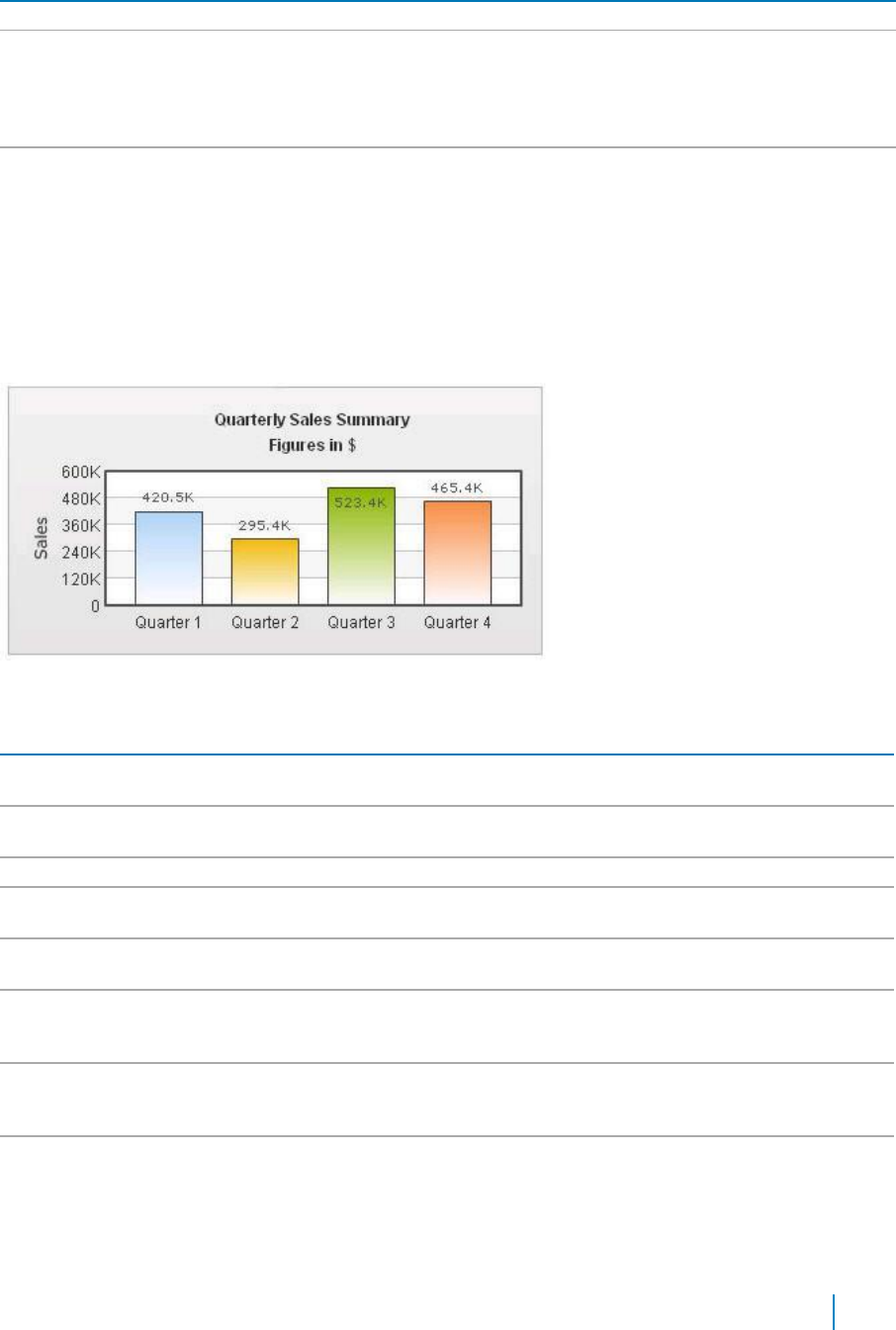
Table 16. Title and Axis
Element
Description
Y-Axis Name
Allows you to seta y-axis name.
Rotate Y Axis Name
Allows you to set rotate the name of the y-axis. The y-axis name is rotated by default
on the chart. If you're using UTF-8 characters, those characters would not appear in
rotated mode, as the qSIChartView uses embedded characters for rotation. In that
case, you can opt to show y-axis name in horizontal form by setting this attribute to
false.
Y Axis Name Width
Allows you to set the maximum width that the non-rotated y-axis title can assume.
Border and Background
Background refers to the entire background of the chart.
You can also have a border around the chart. By default, the border is on in 2D charts and off in 3D Charts.
Shown below is a chart with a border around the chart.
Figure 2. Border around chart
Table 17. Border and Background
Element
Description
Show Border
Allows you to show a border around the chart. By default, it is set to true in 2D
charts and false in 3D charts.
Border Color
Allows you to set the border color of the chart. Use hex color code. To use the color
picker, click on the color swatch square.
Border Thickness
Allows you to set the border thickness of the chart (in pixels).
Border Alpha
Allows you to set the border alpha (transparency) of the chart. The range is from 0-
100.
Background Color
Allows you to fill the background as gradient. If you need to define two (or more)
colors, separate them by a comma.
Background Alpha
Allows you to specify a respective alpha (transparency) for each color code that
you've specified in the Background Color attribute, Separate the alphas by comma.
The range is from 0-100
Background Ratio
Allows you to set the ratio of each color in the gradient on a scale of 100. The total
ratios specified as this attribute should sum up to 100. For example, if you want to
plot a equidistant gradient for 2 colors, specify Background Ratio as "0,100".
Background Angle
Allows you to set the angle of the gradient fill.
www.agreeya.com
QuickApps for SharePoint
®
6.7
283
User Guide
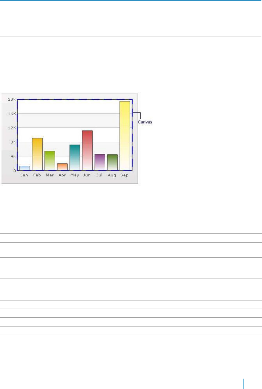
Table 17. Border and Background
Element
Description
Background Image or
Allows you to specify an external image (GIF,JPEG, or PNG only) or a SWF file as the
SWF URL
background of the chart. Specify the URL (with relative path) of the background
image or SWF File. Make sure that the image and the chart SWF file are in the same
sub-domain.
If you specify an absolute URL, the background image will not be shown.
Background Image or
Allows you to configure the alpha of the background (loaded) image using this
SWF Alpha
property.
Chart Canvas
Canvas refers to the area in which the chart is plotted.
Figure 3. Canvas
Table 18. Canvas
Element
Description
Canvas Border Color
Allows you set the border color for the Canvas. Use hex color code. To use the
color picker, click on the color swatch square.
Canvas Border Thickness
Allows you set thickness of canvas border (in pixels)
Canvas Border Alpha
Allows you set alpha for canvas border.
Canvas Background Color
Allows you set the background color for the Canvas. Use hex color code. To use a
gradient fill, specify all the colors of the gradient separated by commas.
Canvas Background Alpha
Allows you to specify a respective alpha (transparency) for each color code that
you've specified in Canvas Background Color attribute. Separate the alphas by
comma.
Canvas Background Ratio
Allows you to set the ratio of each color in the gradient on a scale of 100. The
total ratios specified as this attribute should sum up to 100. For example, if you
want to plot a equidistant gradient for 2 colors, specify canvasbgRatio as "0,100".
Canvas Background Angle
Allows you to set the angle of the gradient fill (in degrees - 0-360).
Show Canvas Background
Allows you to set the canvas background for a 3D chart (and canvas).
Show Canvas Base
Allows you to set the canvas base for a 3D chart (and canvas).
Canvas Background Depth
Allows you to set the depth of canvas background for a 3D chart (and canvas).
Canvas Base Depth
Allows you to set the height of canvas base (in pixels) for a 3D chart (and
canvas).
Data Plot
Plot refers to the column, lines in a column, line chart respectively.
www.agreeya.com
QuickApps for SharePoint
®
6.7
284
User Guide
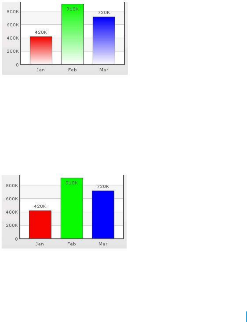
For all the charts, you can specify custom color for each data plot using the color attribute of <set /> element.
The color must be in hex code format (RRGGBB) without #.
<chart ....>
<set label='Jan' value='420000' color='FF0000'/>
<set label='Feb' value='910000' color='00FF00'/>
<set label='Mar' value='720000' color='0000FF'/>
....
</chart>
Figure 4. Data Plot
By default, most charts have FFFFFF as the plot gradient color. If you wish to use solid fills for the column
(or area), use the Plot Gradient Color attribute without any color defined for it, that is, plotGradientColor=''
<chart plotGradientColor='' ....>
<set label='Jan' value='420000' color='FF0000'/>
<set label='Feb' value='910000' color='00FF00'/>
<set label='Mar' value='720000' color='0000FF'/>
....
</chart>
Figure 5. Data Plot with solid fills
www.agreeya.com
QuickApps for SharePoint
®
6.7
285
User Guide
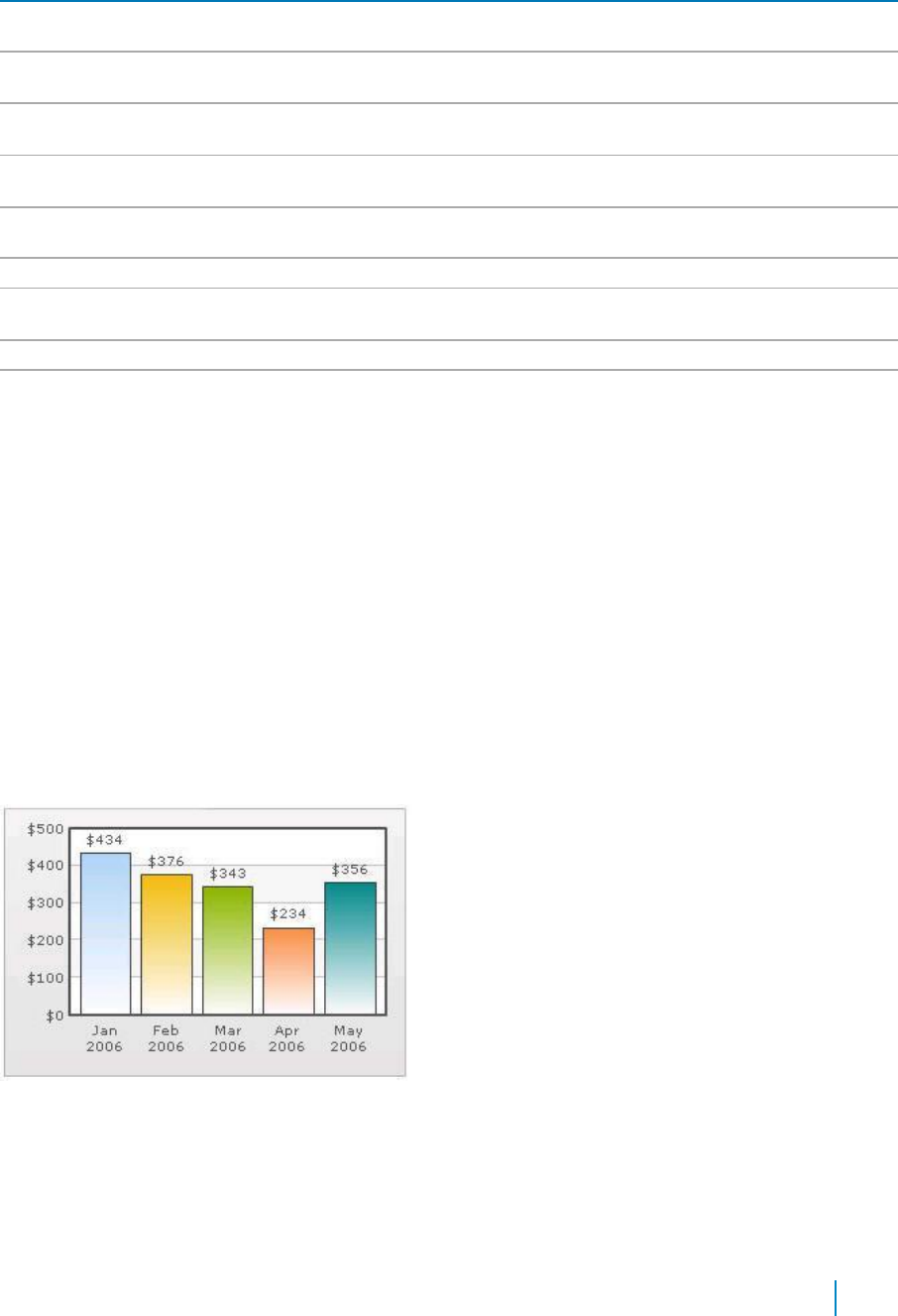
Table 19. Data Plot
Element
Description
Plot Gradient Color
Allows you to globally add a gradient color to the entire plot (column, area) of chart
by specifying a color as its attribute.
Plot Fill Angle
Allows you set the fill angle for gradient if you've opted to fill the plot (column, area)
as gradient. The range is from 0 - 360.
Plot Fill Ratio
Allows you set the ration for gradient if you've opted to fill the plot (column, area) as
gradient. The range is from 0 - 100.
Plot Fill Alpha
Allows you set the fill alpha for gradient if you've opted to fill the plot (column, area)
as gradient.
Show Plot Border
Allows you to show or hide the plot border. By default, each data plot (column, area,
pie) shows a border.
Plot Border Dashed
Allows you to make the plot border dashed by setting this attribute to true.
Plot Border Dash
Allows you to set the length of each dash.
Length
Plot Border Dash Gap
Allows you to set the gap between each dash.
Use Round Edges
Allows you to plot columns/bars with rounded edges and glass effect gradients in
charts that support 2D Columns or Bars (like column charts, bar charts, 2D
combination charts).
NOTE: In this mode, the following features do not work:
• When you plot the columns with rounded edges, shadow is applied to them by
default and show Shadow attribute no longer works. If you want to remove
shadow from this mode, override the shadow with a new shadow style (applied
to DATAPLOT) with alpha as 0.
• Plot fill properties like gradient color, angle. no longer work as the colors for
gradient are now calculated by the chart itself.
• Plot border properties no longer work in this mode. Also, you cannot render
the border as dash in this mode.
Data Labels
Data labels refer to the names for the data points that appear on the x-axis.
Figure 6. Data Labels
In the chart shown above, the dates are the data labels for the chart. By default, they get wrapped when
there is not enough space on the chart.
www.agreeya.com
QuickApps for SharePoint
®
6.7
286
User Guide
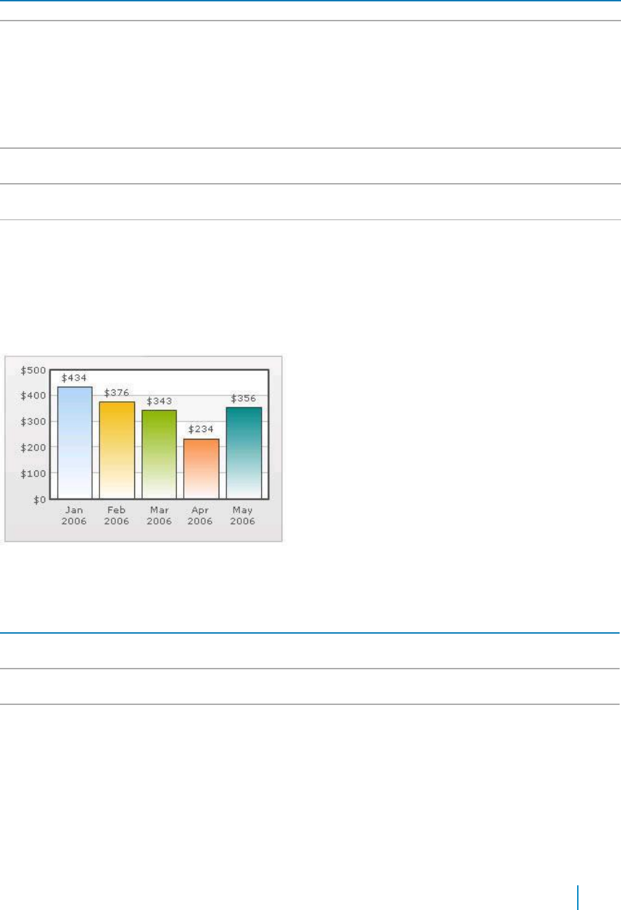
Table 20. Data Labels
Element
Description
Show Labels
Allows you to show the data labels.
Label Display
Allows you to display the data labels can be displayed on the charts in the following ways:
• Wrap — By default, all the labels are shown in wrap mode, which enables you to
wrap your long x-axis labels in multiple lines.
• Rotate — allows you to rotate or slant the x-axis labels.
• Stagger — distributes labels into multiple lines (by default 2).
NOTE:
Rotate mode does not work if you have non-English characters in your x-axis labels as
the charts use embedded fonts to render rotated labels.
Slant Labels
Allows you to slant the labels at 45 degrees if you are using the Rotate mode for the Label
Display.
Stagger Lines
Allows you to choose the number of lines to stagger the labels if you are using the Stagger
mode for the Label Display.
Label Step
Allows you to show every n-th label instead of all labels if your X Axis labels represent a
continuous quantity like time and date.
Data Values
Data values refer to the plot values such as line, column, and bar displayed beside it.
Figure 7. Data Values
In the chart shown above, the dollar values appearing above the column are the data values.
Table 21. Data Values
Element
Description
Show Values
Allows you to show data values. By default, the data values are shown. To hide them, set
this attribute to false.
Rotate Values
Allows you to rotate the values. By default, the chart will show the data values
horizontally.
Place Values
Allows you to place the data values inside the columns.
Inside
External Logo
You can load external logos at run-time to be displayed over the chart. The logos can be GIF/JPEG/PNG or
SWF files that reside on the same sub-domain as the chart SWF.
www.agreeya.com
QuickApps for SharePoint
®
6.7
287
User Guide
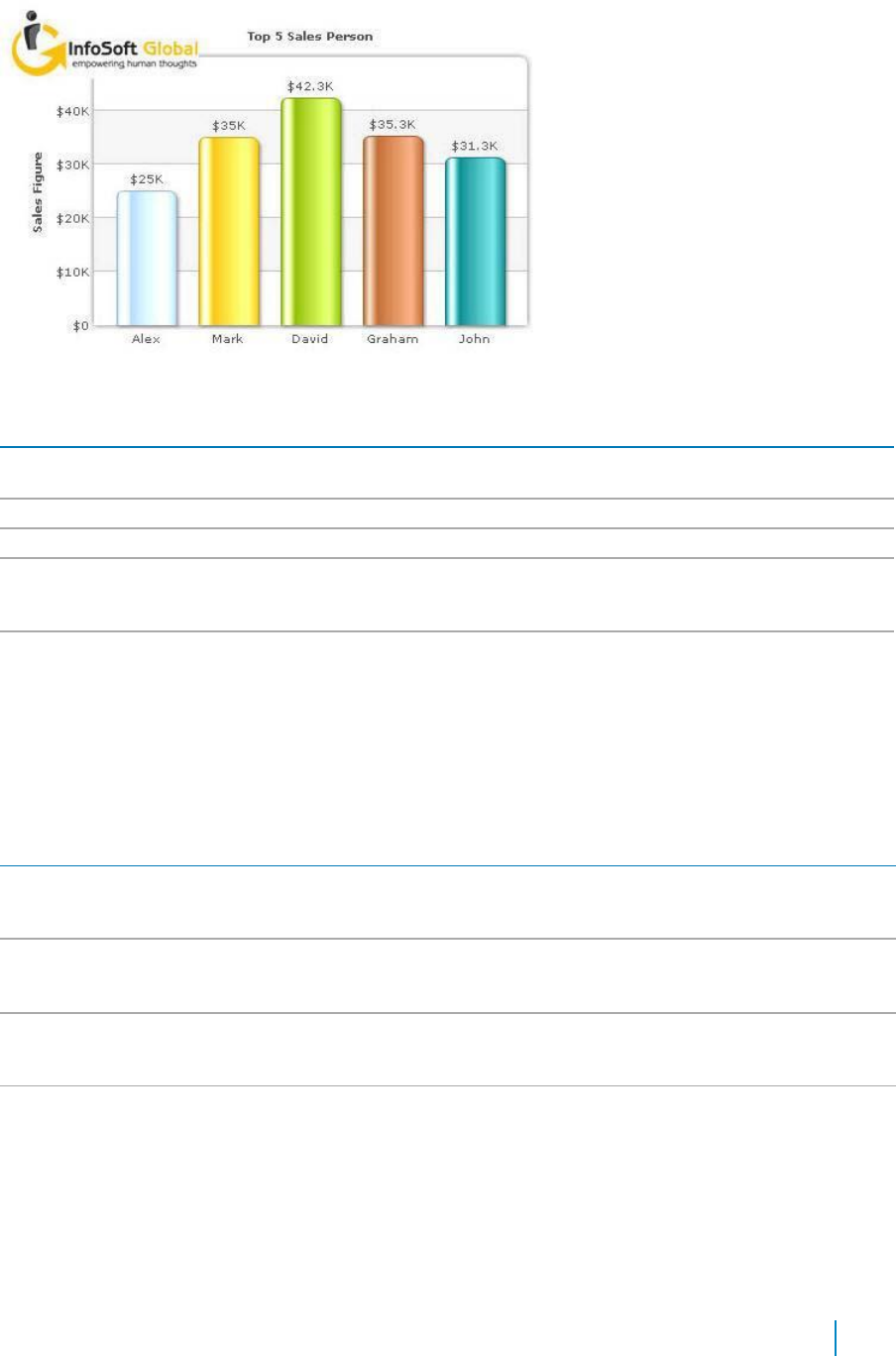
Figure 8. External Logo
Table 22. External Logo
Element
Description
Logo URL
Allows you to specify the URL of the logo. You may use relative or absolute URL as long as
the image and the chart SWF file are in the same sub-domain.
Logo Position
Allows you to set the position of the logo can be configured using this attribute.
Logo Alpha
Allows you to set the opacity of the logo once it has loaded.
Logo Scale
Allows you to set the scale of the logo, once it has loaded. The scale of 100 will display the
logo in its original size. The scale of less than 100 will shrink the logo. The scale of more
than 100 will enlarge the logo.
Logo Link
Allows you to link the logo to an external URL. This link can open in same window, new
window, pop-up windows or frames. For information on how to format the link, see Trend
Lines on page 301.
Font Properties
You can specify generic font properties for all the text on the chart using the attributes given below.
Table 23. Font Properties
Element
Description
Base Font Name
Allows you set the font face (family) of all the text (data labels, values) on chart. If
you specify Outside Canvas Base Font Name attribute also, then this attribute
controls only the font face of text within the chart canvas bounds.
Base Font Size
Allows you to set the base font size of the chart, that is, all the values and the names
in the chart that lie on the canvas are displayed using the font size provided here.
The range is from 0 - 72.
Base Font Color
Allows you to set the base font color of the chart, that is, all the values and the
names in the chart that lie on the canvas are displayed using the font color provided
here. Use hex color code. To use the color picker, click on the color swatch square.
Outside Canvas Base
Allows you classify all the text in the chart into 2: the text inside the canvas which
Font Name
consists of only the tool tip and the data values and all the text outside the canvas.
You can define a base font group for all the text outside the canvas as well.
This attribute sets the base font family of the chart font which lies outside the
canvas, that is, all the values and the names in the chart that lie outside the canvas
are displayed using the font name provided here.
www.agreeya.com
QuickApps for SharePoint
®
6.7
288
User Guide

Table 23. Font Properties
Element
Description
Outside Canvas Base
Allows you to set the base font size of the chart, that is, all the values and the names
Font Size
in the chart that lie outside the canvas are displayed using the font size provided
here. The range is from 0 - 72
Outside Canvas Base
Allows you to set the base font color of the chart, that is, all the values and the
Font Color
names in the chart that lie outside the canvas are displayed using the font color
provided here.
Chart Palettes
qSIChartView offers 5 palettes. The palette theme configures colors of the following:
• Background and border
• Canvas border and background
• Fonts
• 4Div lines
• Tooltip
• Anchors
• Legend
The internal palette does not cover the color of the data items. To change the color of the data items, use
the Palette Colors attribute or Series Appearance property.
Table 24. Chart Palettes
Element
Description
Palette
Allows you to select the palette number.
Palette Colors
Allows you to specify your own palette for data items by providing a list of hex
colors.
Y Axis
Chart limits are the minimum and maximum y-axis values. qSIChartView automatically calculates the best
chart limits when you do not specify them explicitly.
.
Table 25. Y Axix
Element
Description
Y Axis Min Value
Allows you to set the chart limits explicitly.
Y Axis Max Value
Allows you to set the chart limits explicitly.
NOTE: The Y Axis Max Value must be bigger than any of the values in the data
series. Otherwise, the value will not be honored by the chart view.
Set Adaptive Y Min
Allows you to set whether the y-axis lower limit would be 0 (in case of all positive
values on chart) or should the y-axis lower limit adapt itself to a different figure
based on values provided to the chart.
Primary Y Axis Min Value
Allows you to explicitly set the lower limit of the primary y-axis. If you do not
specify this value, it is automatically calculated by qSIChartView based on the data
provided by you.
Primary Y Axis Max Value
Allows you to explicitly set the upper limit of the primary y-axis. If you do not
specify this value, it is automatically calculated by qSIChartView based on the data
provided by you.
Secondary Y Axis Min
Allows you to explicitly set the lower limit of the secondary y-axis. If you do not
Value
specify this value, it is automatically calculated by qSIChartView based on the data
provided by you.
www.agreeya.com
QuickApps for SharePoint
®
6.7
289
User Guide
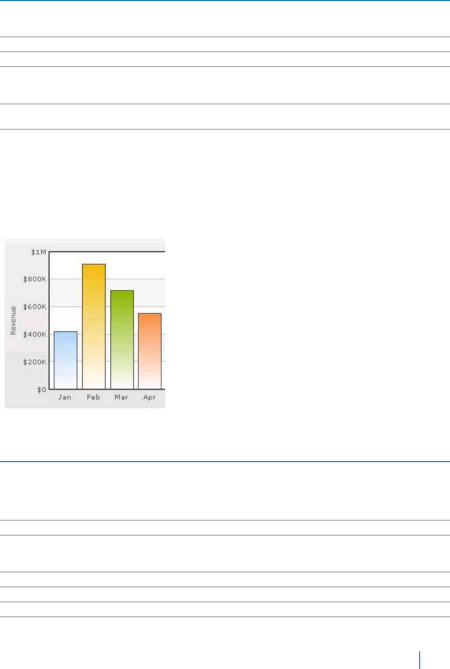
Table 25. Y Axix
Element
Description
Secondary Y Axis Max
Allows you to explicitly set the upper limit of the secondary y-axis. If you do not
Value
specify this value, it is automatically calculated by qSIChartView based on the data
provided by you.
Primary Y Axis Name
Allows you to set the primary y-axis title.
Secondary Y Axis Name
Allows you to set the secondary y-axis title.
Set Adaptive Secondary
Allows you to set whether the secondary y-axis lower limit would be 0 (in case of all
Y Min
positive values on chart) or should the y-axis lower limit adapt itself to a different
figure based on values provided to the chart.
Primary Y Axis Name
Allows you to set choose a maximum width (in pixels) that is applied to primary y-
Width
axis name, if you do not rotate y-axis name.
Secondary Y Axis Name
If you opt to not rotate y-axis name, you can choose a maximum width (in pixels)
Width
that is applied to secondary y-axis name.
Division Lines
Divisional lines are horizontal lines running through the canvas. They break up the y axis into smaller
units helping in better visual data interpretation.
Figure 9. Division Lines
Table 26. Division Lines
Element
Description
Adjust Division Lines
Allows you to explicitly specify the y-axis upper and lower limit values, and also
the number of divisional lines. In those cases, you need to automatic adjustment
of divisional lines by setting this attribute to false. Then you can specify the y-
axis upper and lower limits using the Y Axis Max Value and Y Axis Min Value
attributes respectively.
Number of Division Lines
Allows you to set the number of divisional lines.
Div Line Effect
Allows you to enable to apply an effect, for example, EMBOSS, or BEVEL to the
divisional lines. This attribute is applicable to MultiSeriesCombination3D chart
type only.
Show Y Axis Values
Allows you to show all the y-axis values.
Y Axis Values Step
Allows you to skip every nth Y Axis value.
Division Lines
Allows you to set the color for divisional lines.
Division Lines Thickness
Allows you to set the thickness of divisional lines. The range is from 1 - 5.
www.agreeya.com
QuickApps for SharePoint
®
6.7
290
User Guide
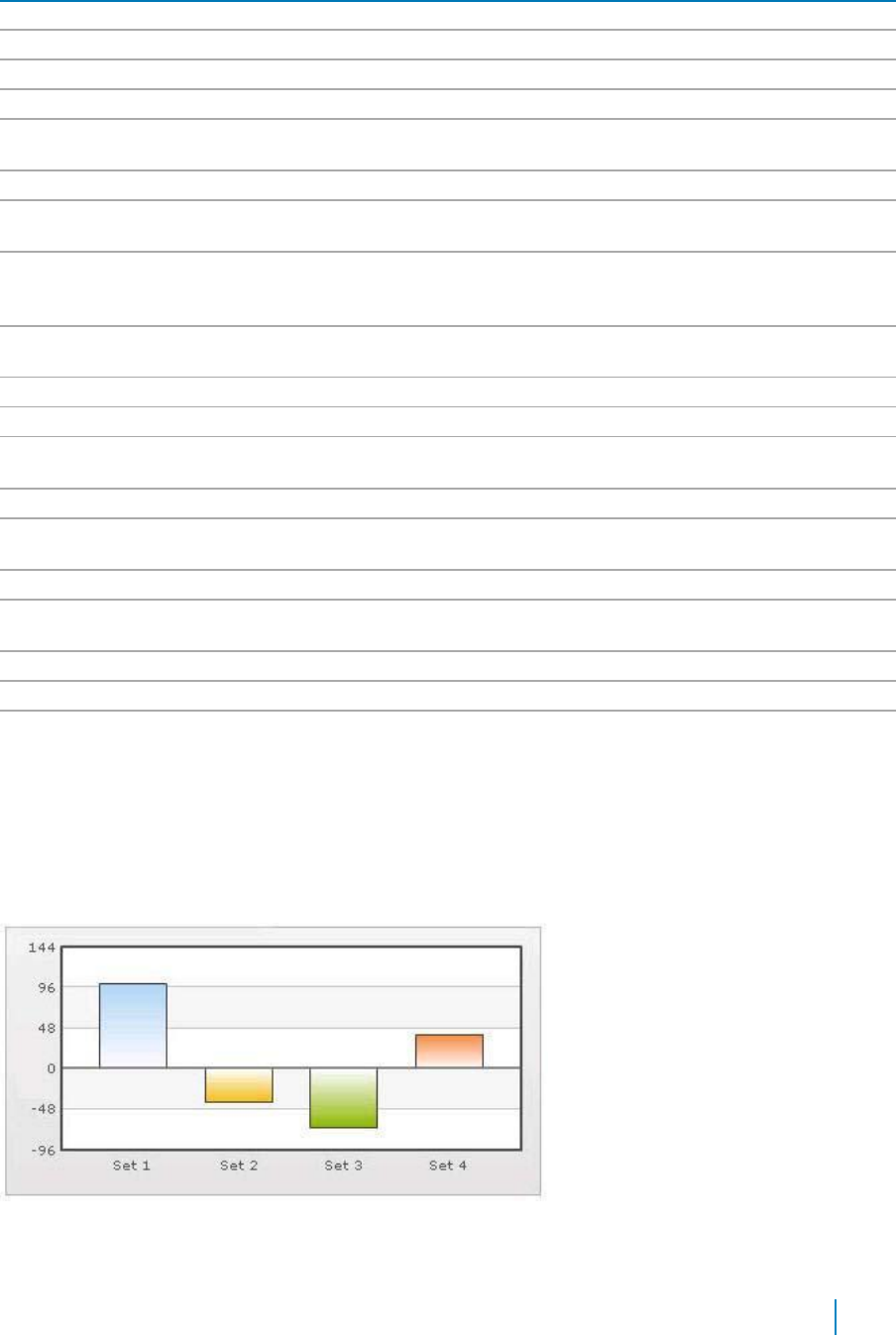
Table 26. Division Lines
Element
Description
Division Lines Alpha
Allows you to set the alpha of divisional lines. The range is from 0 - 100.
Is Dashed
Allows you to set the divisional line to be dashed.
Division Lines Dash Length
Allows you to set the length of each dash.
Division Lines Dash Gap
Allows you to set the gap between each dash.
Show Alternate H Grid
Allows you to set the horizontal grid bands alternately between the divisional
Color
lines for all 2D charts. They can be hidden by setting this attribute to false.
Alternate H Grid Color
Allows you to set the color of the horizontal grid bands.
Alternate H Grid Alpha
Allows you to set the alpha of the horizontal grid bands. The range is from 0 -
100.
Vertical Div Lines
Allows you to set the vertical divisional lines running through the canvas in a
line/area chart. They help in relating the data to its respective label, when there
is a large amount of data.
Number of Vertical Div
Allows you to set the number of vertical div lines.
Lines
Vertical Div Lines Color
Allows you to set the color of the vertical axis division lines.
Vertical Div Lines Thickness
Allows you to set the thickness of the vertical axis division lines in pixels.
Vertical Div Lines Alpha
Allows you to set the alpha of vertical axis division lines. The range is from 0 -
100.
Is Dashed
Allows you to set the vertical axis division lines as dashed.
Vertical Div Lines Dash
Allows you to set the length of each dash.
Length
Vertical Div Lines Dash Gap
Allows you to set the gap between each dash.
Show Alternate V Grid
Allows you to set the vertical grid bands alternately between the vertical
Color
divisional lines.
Alternate V Grid Color
Allows you to set the color of the alternate vertical grid bands.
Alternate V Grid Alpha
Allows you to set the alpha (transparency) of the alternate vertical grid bands.
Show V Line Label Border
Allows you to set the borders for all labels for vLines in the chart. If you want to
show label border for just a particular vLine, you can override this value by
specifying border configuration for that specific vLine.
Zero Plane
Zero plane is a plane which separates the positive and negative numbers on a chart having both of them.
Figure 10. Zero Plane
www.agreeya.com
QuickApps for SharePoint
®
6.7
291
User Guide

Table 27. Zero Plane
element
description
Show Zero Plane
Allows you set the zero plane in the column, line, and the area chart. It can be
removed in the line chart but not in the column or the area chart because they use
this as their base to draw. It can be removed in the line chart by setting this
attribute to false.
Zero Plane Color
Allows you set the color of the zero plane.
Zero Plane Alpha
Allows you set the alpha (transparency) of the zero plane. The range is from 0 -
100.
Zero Plane Thickness
Allows you set the thickness of the zero plane in pixels.
Zero Plane Show Border
Allows you set the whether to show border of zero plane for a 3D chart.
Zero Plane Border Color
Allows you set the border color of zero plane for a 3D chart.
Zero Plane Mesh
Allows you set the whether to draw the zero plane as a wireframe mesh or as a
filled plane. If set to true, a mesh on the zero plane of the chart is drawn. This
attribute is applicable to MultiSeriesCombination3D chart type only.
Anchors
Each data point in a line or area chart is represented by an anchor. The anchors help identify the data point
better in the chart. They also show a tool tip showing the data point details when the mouse is hovered
over them, and can be linked to other pages as well.
Figure 11. Anchors
Table 28. Anchors
Element
Description
Draw Anchors
Allows you show the anchors. The anchors are displayed by default. To hide them, set
this attribute to false. Once the anchors are hidden, the tool tips for the data points will
not be displayed and the links will not work.
Anchor Alpha
Allows you set the alpha of entire anchors. The range is from 0 - 100. If you need to hide
the anchors but still have tool tip and link, set Anchor Alpha to ‘0’
Anchor Sides
Allows you to set the number of sides the anchor will have. For example, an anchor with
3 sides would represent a triangle, with 4 it would be a square. The range is from 3 - 20.
Anchor Radius
Allows you to set the radius (in pixels) of the anchor. The greater the radius, the bigger
the anchor size.
Anchor Border Color
Allows you to set the border color of anchors.
www.agreeya.com
QuickApps for SharePoint
®
6.7
292
User Guide

Table 28. Anchors
Element
Description
Anchor Border
Allows you to set the border thickness (in pixels) of the anchors.
Thickness
Anchor Background
Allows you to set the background color of anchors.
Color
Anchor Background
Allows you to set the alpha of anchor background. The range is from 0 - 100.
Alpha
Tool Tip
A tool tip is shown when the mouse is hovered over a particular data point. It shows the following information:
• Single series chart (except pie & doughnut): Name & value
• Pie & Doughnut: Name & value/percentage
• Multi-series & combination chart: Series Name, Category Name, Data Value
Figure 12. Tool Tip
Table 29. Tool Tip
Element
Description
Show Tool Tip
Allows you to set the tool tip.
Show Tool Tip Shadow
Allows you to show the tool tip shadow.
Tool Tip Border Color
Allows you to customize the border color of the tool tip.
Tool Tip Background Color
Allows you to customize the background color of the tool tip.
Tool Tip Separator Character
Allows you to specify a character to separate the name and value displayed in
tool tip.
Series Name in Tool Tip
Allows you to control whether series name will appear in the tool tip. For multi-
series and combination charts, qSIChartView shows the following information in
tool tip (unless tool text is explicitly defined): "Series Name, Category Name,
Data Value".
Show Percent In Tool Tip
Allows you to show percentage values in Tool Tip for Pie or Doughnut chart. By
default, the Pie or Doughnut chart shows percentage values in Tool Tip.
Paddings and Margins
qSIChartView lets you define various paddings and margins using pixels. These attributes are listed one-by-
one below.
By default, qSIChartView provides some padding between the chart border and the canvas. This is called
the chart margin and each margin can be set individually.
www.agreeya.com
QuickApps for SharePoint
®
6.7
293
User Guide

Figure 13. Paddings and Margins
Table 30. Paddings and Margins
Element
Description
Left Margin
Allows you to set the amount of empty space on the left side of your chart. Nothing is
rendered in this space.
Right Margin
Allows you to set the amount of empty space on the right side of your chart. Nothing is
rendered in this space.
Top Margin
Allows you to set the amount of empty space ton the top of your chart. Nothing is
rendered in this space.
Bottom Margin
Allows you to set the amount of empty space on the bottom of your chart. Nothing is
rendered in this space.
Canvas Left Margin
Allows you to set the amount of empty space on the left side of the canvas. Nothing is
rendered in this space.
Canvas Right Margin
Allows you to set the amount of empty space on the right side of the canvas. Nothing is
rendered in this space.
Canvas Top Margin
Allows you to set the amount of empty space t on the top of the canvas. Nothing is
rendered in this space.
Canvas Bottom
Allows you to set the amount of empty space on the bottom of the canvas. Nothing is
Margin
rendered in this space.
Caption Padding
Allows you to set the amount of space between the caption of the chart and the top of
the chart canvas. If you have a sub-caption defined in the chart, it controls the space
between the sub-caption and the top of the chart canvas.
X Label Gap
Allows you to set the vertical space between the labels and canvas wall edge. If you
want more space between the canvas and the x-axis labels, you can use this attribute to
control it.
Y Label Gap
Allows you set the horizontal space between the canvas wall edge and the y-axis values
or trend line values (on left/right side). This is particularly useful, when you want more
space between your canvas and y-axis values.
X Axis Name Padding
Allows you to set the distance between the top of x-axis title and the bottom of data
labels (or canvas, if data labels are not shown).
Y Axis Name Padding
Allows you to set the padding between the y-axis name and values.
Y Axis Values Padding
Allows you to set the padding between the left end of the chart canvas and the y-axis
values.
Label Padding
Allows you to set the vertical space between the canvas bottom edge and the data
labels.
Value Padding
Allows you to control the space between your columns/anchors and the value
textboxes.
www.agreeya.com
QuickApps for SharePoint
®
6.7
294
User Guide
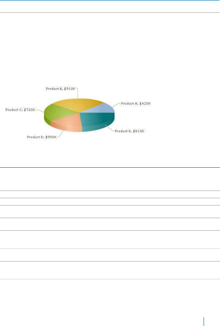
Table 30. Paddings and Margins
Element
Description
Canvas Padding
For a line/area chart, allows you to set the padding between the canvas border and the
position where the line/area chart begins to draw is called canvas padding.
Plot Space Percent
On a column chart, allows you to set the spacing between two columns. By default, the
spacing is set to 20% of canvas width. For example, if you wanted all columns to stick to
each other without any space in between, you can set plotSpacePercent to 0. Similarly,
if you want very thin columns, you can set plotSpacePercent to its max value of 80.
Smart Labels and Lines
Smart labels are the labels for the pie/doughnut chart. The smart labels prevent overlapping of labels
even when large number of labels are placed in close vicinity.
Figure 14. Smart Labels and Lines
Table 31. Smart Labels and Lines
Element
Description
Enable Smart Labels
Allows you to enable the smart labels (if required to save chart space or when there
are few pie segments). When the smart labels are switched off, the pie labels would
be displayed without the smart label lines. But if they number of labels increases and
smart labels are not being used, then the labels might overlap.
Smart Line Color
Allows you to set the color of smart label connector lines.
Smart Line Thickness
Allows you to set the thickness (in pixels) of smart label connector lines.
Smart Line Alpha
Allows you to set the alpha (transparency) of smart label connector lines. The range is
0 - 100.
Is Smart Line Slanted
Allows you to set the smart lines (smart label connector lines) in two ways: Slanted or
Straight.
Label Distance
Allows you to set the distance of the label/value text boxes from the pie/doughnut
edge in pixels. You must set Enable Smart Labels to false for this attribute to take
effect.
Smart Label Clearance
Allows you to set the clearance distance of a label (for sliced-in pies) from adjacent
sliced out pies in pixels.
Skip Overlap Labels
Allows you to skip the overlapping labels if you have too many labels in your pie chart
(which is difficult to adjust even using smart labels). In that case, you have the option
to set this attribute to true. The labels of the least significant pies would be removed.
Show Percent Values
Allows you to set the actual value of the pie segment to be displayed in the label or
the percentage value. By default, the actual values are displayed. When you want to
display their percentages, set this attribute to true.
www.agreeya.com
QuickApps for SharePoint
®
6.7
295
User Guide
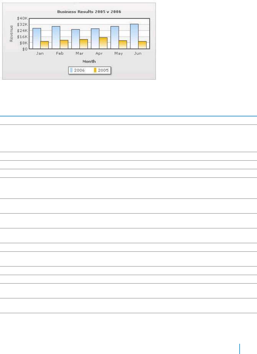
Legend
In multi-series/combination charts, the series name of each dataset shows up in the legend of the chart. This
helps you relate a data plot to its series name using its color. The legend does not appear for single-series
charts because there is only one series in the chart.
Figure 15. Legend
The legend below the chart helps identify the series name.
Table 32. Legend
Element
Description
Show Legend
Allows you to show the legend.
Interactive Legend
Allows you to make the legend interactive. Interactive Legend only works for a
combination chart. In the combination chart, you can click the legend to show/hide
the values of the data items. If you set Interactive Legend to false, then legend will
not be interactive.
Legend Caption
Allows you to add a caption for the entire legend by setting the same here.
Legend Marker Circle
Allows you to use square legend keys or circular ones.
Reverse Legend
Allows you to reverse the order of items in legend.
Legend Position
Allows you to place the legend in 2 positions: RIGHT and BOTTOM. It gets placed
below the canvas by default. To place it to the right of the chart canvas, set Legend
Position = 'RIGHT'.
Allow Drag
Allows you to make the legend dragable. End viewers of the chart can drag the
legend around on the chart.
Legend Background
Allows you to set the background color for the legend.
Color
Legend Background
Allows you to set the background alpha (transparency) for the legend. The range is 0
Alpha
- 100.
Legend Border Color
Allows you to set the border color for the legend.
Legend Border
Allows you to set the border thickness, in pixels, for the legend.
Thickness
Legend Border Alpha
Allows you to set the border alpha for the legend. The range is 0 - 100.
Legend Shadow
Allows you to set a shadow for legend.
Legend Scroll
Allows you to set the background color of the scroll bar. If you've too many items on
Background Color
the legend, a scroll bar appears.
Legend Scroll Bar Color
Allows you to set the bar color of the scroll bar. If you've too many items on the
legend, a scroll bar shows up on the same.
Legend Scroll Button
Allows you to set the color of buttons on the scroll bar. If you've too many items on
Color
the legend, a scroll bar shows up on the same.If you've too many items on the
legend, a scroll bar shows up on the same.
www.agreeya.com
QuickApps for SharePoint
®
6.7
296
User Guide
Number Formatting
qSIChartView offers you a lot of options to format your numbers on the chart from number prefixes and
suffixes to controlling the decimal places to scaling your numbers based on a pre-defined scale.
.
Table 33. Number Formatting
Element
Description
Format Number
Allows you to determine whether the numbers displayed on the chart are formatted
using commas, for example, 40,000 if Format Number is true and 40000 if Format
Number is false.
Format Number Scale
Allows you to determine whether to add K (thousands) and M (millions) to a number
after truncating and rounding it - for example, if Format Number Scale is set true,
1043 would become 1.04K (with decimals set to 2 places). Same with numbers in
millions - a M will added at the end.
Default Number Scale
Allows you to set the default unit of the numbers that you are providing to the chart.
Number Scale Unit
Allows you to set the unit of each block of the scale.
Number Scale Value
Allows you to set the range of the various blocks that constitute the scale.
Number Prefix
Allows you to add a prefix to all the numbers visible on the graph. For example, to
represent all dollars figure on the chart, you could specify this attribute to ' $' to
show like $40000, $50000.
Number Suffix
Allows you to add a suffix to all the numbers visible on the graph. For example, to
represent all figure quantified as per annum on the chart, you could specify this
attribute to ' /a' to show like 40000/a, 50000/a.
Decimal Separator
Allows you to specify the character to be used as the decimal separator in a number.
Thousand Separator
Allows you to specify the character to be used as the thousands separator in a
number.
In Decimal Separator
Allows you to input the decimal separator.
In Thousand Separator
Allows you to input the thousand separator.
Decimals
Allows you to set the number of decimal places to which all numbers on the chart
would be rounded. The range is from 0 - 10.
Force Decimals
Allows you to add 0 padding at the end of decimal numbers. For example, if you set
decimals as 2 and a number is 23.4. If force Decimals is set to 1, qSIChartView will
convert the number to 23.40 (note the extra 0 at the end).
Y Axis Value Decimals
Allows you to specify the div line values decimal precision. The range is from 0 - 10.
3D Chart Attributes
The 3D Combination chart is a true 3D chart which offers features such as viewing from a specific camera
angle, definition of light source, use of dynamic lighting, and rotation.
The various elements of a 3D Combination chart are shown below:
www.agreeya.com
QuickApps for SharePoint
®
6.7
297
User Guide

Figure 16. 3D Charts
Table 34. 3D Charts
Element
Description
Is 2D
Allows you to decide whether initially to draw a 2D view of the chart.
Chart Order
Allows you to set the order by which different types of charts will appear. The value
can be any combination of 'column', 'line' or 'area', each separated by a comma. By
default, the order is: line, column, area. You can change to any order you like, for
example, 'column, area, line' or 'line, area'.
Chart On Top
Allows you to decide whether or not the chart canvas is placed over the extra chart
elements (caption, subcaption, legend). This feature is visible when the chart canvas
is zoomed/scaled. +
Auto Scaling
Allows you to decide whether or not the chart is allowed to best fit automatically
after a user interaction, for example, rotation.
Allow Scaling
Allows you to set whether to allow zoom-in/zoom-out.
NOTE: Scaling or use of mouse is compatible only with Windows Operating System.
www.agreeya.com
QuickApps for SharePoint
®
6.7
298
User Guide

Table 34. 3D Charts
Element
Description
Animate 3D
Allows you to show the initial plot animation. By default, the 3D chart is rendered with
a default animation.
To globally set off all animation set Animation to false. This would not only set off 3D
animations, but also disable all animations applied using <styles>. The additional use
of Animate 3D can override this value. Hence, a combination of Animation = false and
Animate 3D = true would disable all animations applied using <styles> but, enable
animation of the 3D canvas.
Exe Time
Allows you to set the time that the chart takes to animate. This attribute also sets the
time taken by the chart canvas to animate when the chart is transformed to any view
(View3D, View 2D, Reset View).
Camera Angle
Allows you to define the camera angle.
X/Camera Angle Y
• Camera Angle X lets you specify the camera angle (for view around the chart
vertically) from which the chart is viewed initially in no animation mode (when
animate3D='0) . If not specified, the default value is 30. The range is from 0 to
360 and 0 to -360.
• Camera Angle Y lets you specify the camera angle (for view around the chart
horizontally) from which the chart is viewed initially in no animation mode
(when animate3D='0). If not specified, the default value is -45. The range is
from 0 to 360 and 0 to -360.
Since this is a true 3D chart, it's rendered as a 3D model that is viewed from a specific
camera angle. The camera can simply be defined as the eye of a real viewer. When
you have set Animate 3D to 0, you can define the camera angle using two attributes -
Camera Angle X and Camera Angle Y.
When you use animation, you can also set up the starting camera view from which the
camera view starts animating, and the final camera view to which the chart would
finally be rotated. For this, you need to use Start Angle X, Start Angle Y, End Angle X
and End Angle Y attributes.
Start Angle X/End
Start Angle X — Allows you to specify the view angle (for view around the chart
Angle X
vertically) at which rotation of the chart starts (when the chart is initialized). The
rotation stops at endAngX. If not specified, the default values for both the attributes
are 30. The range is from 0 to 360 and 0 to -360. This is for animated charts (when
animate3D='1').
End Angle X — Allows you to specify the view angle (for view around the chart
vertically) at which rotation of the chart ends (when the chart is initialized). The
rotation starts at startAngX. If not specified, the default values for both the attributes
are 30. The range is from 0 to 360 and 0 to -360. This is for animated charts (when
animate3D='1').
Start Angle Y/End
Start Angle Y — Allows you to specify the view angle (for view around the chart
Angle Y
horizontally) from which rotation of the chart starts (when the chart is initialized).
The rotation stops at endAngY. If not specified, the default values for both the
attributes are -45. The range is from 0 to 360 and 0 to -360. This is for animated charts
(when animate3D='1').
End Angle Y — Allows you to specify the view angle (for view around the chart
horizontally) at which rotation of the chart ends (when the chart is initialized). The
rotation starts at startAngY. If not specified, the default values for both the attributes
are -45. The range is from 0 to 360 and 0 to -360. This is for animated charts (when
animate3D='1').
Light Angle X/Light
Light Angle X — Allows you to specify the angular position of the light source (for X-
Angle Y
axis) w.r.t the chart world coordinate system. The range is from 0 to 360 and 0 to -360.
Light Angle Y — Allows you to specify the angular position of the light source (for Y-
axis) w.r.t the chart world coordinate system. The range is from 0 to 360 and 0 to -360.
www.agreeya.com
QuickApps for SharePoint
®
6.7
299
User Guide
Table 34. 3D Charts
Element
Description
Intensity
Allows you to control the intensity of the light that falls on the chart elements. The
range of this attribute lies between 0 to 10. 10 would provide light with maximum
intensity, and you will get the brightest view of the chart. If you set the value to 0,
light is provided with least intensity. However, the chart will never appear in full
darkness even you set intensity to 0. A faint light is always made available. By default,
the value is set to 2.5.
Dynamic Shading
Allows you to set the chart in dynamic shading/non-world mode. If set to false, the
chart is in world mode.
For example, you can have a Combination 3D Chart that has two different lighting
systems to light up the chart elements. The light source may be fixed outside the
chart. This causes only those sides of the chart to get the light which face the light
source. Thus, when the chart is manually rotated, dynamic shades are created on the
chart surfaces. This system of lighting is called dynamic shading.
World lighting is where the light source is fixed with the chart. In this case, the light
source rotates with the rotation of the chart. Hence, the surface facing the light
source gets lightened and continues to be in the bright side despite any manual
rotation of the chart being made, whereas the surface not facing the light keeps
remaining in darkness with every chart rotation.
Bright 2D
Allows you to set maximum brightness to the chart while being rendered in 2D mode.
This is applicable only when you've set Dynamic Shading to true. However, once you
set this attribute to true, you cannot use Light Angle X and Light Angle Y attributes.
Rather, it automatically sets up the light sources to give the brightest view of the
chart in 2D mode.
Allow Rotation
Allows you to decide whether to stop any user interactive rotation of the chart or not.
If it is set to false, the interactive rotation is barred.
Constrain Vertical
Allows you to rotate up to 90 degrees (top or bottom) from 0 degree position. You can
Rotation
also specify these limits using Minimum Vertical Rotation Angle and Maximum Vertical
Rotation Angle attributes. This is only applicable to user's mouse interactively with the
chart.
Minimum Vertical
Allows you to set the minimum allowed angle up to which a user can rotate the chart
Rotation Angle
vertically. This is only applicable to user's mouse interactively with the chart.
Maximum Horizontal
Allows you to set the maximum allowed angle up to which a user can rotate the chart
Rotation Angle
horizontally. This is only applicable to user's mouse interactively with the chart.
Z Depth
Allows you to set the depth (3D thickness) of each DATAPLOT object using zDepth
attribute.
Z Gap Plot
Allows you to specify a gap between all dataplots in a 3D combination chart, as more
than one DATAPLOT types can exist due to different datasets.
A Z Gap Plot set to 0 will show no gap between dataplots.
YZ Wall Depth
Allows you to set the depth of the YZ wall of 3D chart.
ZX Wall Depth
Allows you to set the depth of the ZX wall of 3D chart.
XY Wall Depth
Allows you to set the depth of the XYwall of 3D chart.
Clustered
Allows you to set a Combination 3D chart in clustered mode. In a Combination 3D
chart, you can plot multiple number of datasets which can be rendered as Column.
Custom About Menu Item
You can change the default "About QuickApps for SharePoint" context menu item to show your label and link
it to your own URL using the below attributes.
www.agreeya.com
QuickApps for SharePoint
®
6.7
300
User Guide
Table 35. Custom About Menu
Element
Description
Show About Menu
Allows you to set up a custom context menu in the chart, which can show your
Item
text and can be linked to your URL. For example, you can set the context menu
of the chart to include "About your company name" and then link to your
company home page. By default, the chart shows "About QuickApps for
SharePoint" when right-clicked.
About Menu Item
Allows you to set a menu item label for the custom context menu item.
Label
About Menu Item Link
Allows you to provide a link for the custom context menu item. You can specify
the link in qSIChartView link format to be able to open the same in new window,
pop-ups, frames or as JavaScript links.
Functional
These attributes let you control a variety of functional elements on the chart.
Table 36. Functional
Element
Description
Animation
Allows you to control animation in your charts. If you do not want to animate any part of the
chart, set this to false. This would also disable all animations applied using <styles>. Animate 3D
can override this value. By default, animation is set to true.
Click URL
Allows you to set a URL as a hotspot for a chart. For more information, see Formatting Links.
Trend Lines
Trend Lines allow you to specify the horizontal/vertical lines spanning the chart canvas which aid
in interpretation of data with respect to some pre-determined value.
Trend Lines contain the following:
Table 37. Trend Lines
Element
Description
Start Value
Allows you to set the start value for the trend line
End Value
Allows you to set the ending y-axis value for the trend line
Display Value
Allows you to display a string caption for the trend line by its side
Color
Allows you to set the color of the trend line and its text
Is Trend Zone
Allows you to set the trend as a zone rather than a line
Thickness
Allows you to set the thickness of the trend line
Alpha
Allows you to set the alpha transparency of the trend line
Dashed
Allows you to set the trend line as a dashed line
Dash Length
Allows you to set the length of each dash in pixels
Dash Gap
Allows you to set the gap length between each dash
Value on Right
Allows you to show if the trend line is on the right or left side of the chart
Tool Text
Allows you to show tool text when hovered over a trend line
Parent Y Axis
Allows to you set whether the trend line should be plotted against a primary or
secondary Y axis (If you use a dual Y Axis chart). If you do not use a dual Y axis chart,
the trend line is plotted against the primary Y axis.
www.agreeya.com
QuickApps for SharePoint
®
6.7
301
User Guide
Styles
Styles help you apply font, effects and animations to various objects of the chart. Styles lends a
simple mechanism using which you can easily control the visual layout of charts.
Styles allows you to:
• Define your own style attributes using the Style Editor.
• Associate them with defined Objects of the chart from within the Style Editor.
• Have better control over chart look & feel.
• Group together in one element in the XML document, thereby separating data from visual formatting.
• Store the entire style definition in a central location in your application, so that all charts
within application can utilize it.
• Re-use style definitions. Each style can be applied to multiple chart objects or vice versa.
Each object on the chart has been assigned a unique name, for direct association with style definitions. For
example, the background of the chart is termed as BACKGROUND. Similarly, the plot (columns, lines, areas)
on the chart is named as DATAPLOT. This enables you to associate each style to multiple chart objects or
associate multiple chart objects to a particular style.
You can find the list of objects for each chart in individual Chart XML Sheet.
Styles contains the following:
Table 38. Styles
Element
Description
Advanced
Turn on if you want to edit Styles in XML format.
Mode
styles>
<definition>
<style name='MyFirstFontStyle' type='font' face='Verdana' size='12' color='FF0000' bold='1'
bgColor='FFFFDD' />
<style name='MyFirstAnimationStyle' type='animation' param='_xScale' start='0'
duration='2' />
<style name='MyFirstShadow' type='Shadow' color='CCCCCC' />
</definition>
<application>
<apply toObject='Caption' styles='MyFirstFontStyle,MyFirstShadow' />
<apply toObject='Canvas' styles='MyFirstAnimationStyle' />
<apply toObject='DataPlot' styles='MyFirstShadow' />
</application>
</styles>
Name
Allows you to assign your custom name for the style definition. Style name can only include
alphabets and numbers. Punctuation marks (including underscore) should not be used. Style
name must be unique, that is, two style definitions cannot have the same name.
www.agreeya.com
QuickApps for SharePoint
®
6.7
302
User Guide

Table 38. Styles
Element Description
Type Allows you to set the following types:
• Font — allows you to control text properties for all the text on the chart. You can
set: Font — allows you to set the font type
Size — allows you to set the font size Color — allows you
to set the font color Bold — allows you to set the font
weigh Underline — allows you to assign underline
character Background Color — allows you to set the
background color Border Color — allows you to set the
border color
Is HTML — allows you to render the text as HTML
Left Margin — allows you to set the left margin of the text
Letter Spacing — allows you to set the space between the letters in the text
• Animation — Allows you to define your custom animations for different elements of the
chart. By default, qSIChartView animates the data plot (columns, lines, area) only.
However, you can define your custom animations for other chart objects (like captions,
titles, values) in the XML. Each chart object can have multiple animation properties (like
x, y, xscale, yscale, alpha) and each sequence can have its own duration.
Param — Allows you to you specify the property of chart object which you want to
animate, such a _x (animate the x position), _y (animate the y position), _xScale
(animate the x-scale), _yScale (animate the y-scale), alpha (helps the alpha
transition animation effect), _rotation (animate pies and doughnuts in circles)
Start — allows you to set the start value of the animation
Duration — allows you to control the duration of animation in seconds
Easing — allows you to specify the pattern of animation easing.
www.agreeya.com
QuickApps for SharePoint
®
6.7
303
User Guide

Table 38. Styles
Element Description
Type • Shadow — Allows you to apply shadow effect to any object on the chart.
Distance — allows you to set the offset distance of the shadow
Angle — allows you to set the angle of the shadow
Color — allows you to set the color of the shadow
Alpha — allows you to set the alpha transparency of the shadow
BlurX — allows you set the amount of horizontal blur on the shadow. Values that are a
power of 2 (such as 2, 4, 8, 16 and 32) are optimized to render more quickly than
other values.
BlurY — allows you to set the amount of vertical blur on the shadow. Values that are
a power of 2 (such as 2, 4, 8, 16 and 32) are optimized to render more quickly than
other values.
Strength — allows you to set the strength of the imprint or spread. The higher the
value, the more color is imprinted and the stronger the contrast between the
shadow and the background.
Quality — allows you to set the number of times to apply the shadow effect. Valid
values are 0 to 15. The default value is 1, which is equivalent to low quality. A value
of 2 is medium quality, and a value of 3 is high quality. Shadow with lower values are
rendered quicker
• Glow — lets you apply glow effects to objects on the
chart. Color — allows you to set the color of the glow
Alpha — allows you to set the alpha transparency of the glow
BlurX — allows you set the amount of horizontal blur on the glow. Values that are a
power of 2 (such as 2, 4, 8, 16 and 32) are optimized to render more quickly than
other values.
BlurY — allows you to set the amount of vertical blur on the glow. Values that are a
power of 2 (such as 2, 4, 8, 16 and 32) are optimized to render more quickly than
other values.
Strength — allows you to set the strength of the imprint or spread. The higher the
value, the more color is imprinted and the stronger the contrast between the
shadow and the background.
Quality — allows you to set the number of times to apply the glow effect. Valid values
are 0 to 15. The default value is 1, which is equivalent to low quality. A value of 2 is
medium quality, and a value of 3 is high quality. Shadow with lower values are
rendered quicker.
www.agreeya.com
QuickApps for SharePoint
®
6.7
304
User Guide

Table 38. Styles
Element Description
• Bevel — Allows you to apply bevel effect for any of the chart
objects. Angle — allows you to set the angle of the bevel
Distance — allows you to set the offset distance of the bevel
Shadow Color — allows you to set the shadow color of the bevel
Shadow Alpha — allows you to set the alpha transparency value of the shadow
color Highlight Color — allows you to set the highlight color of the bevel
Highlight Alpha — allows you to set the alpha transparency value of the highlight color
BlurX — allows you set the amount of horizontal blur on the bevel. Values that are a
power of 2 (such as 2, 4, 8, 16 and 32) are optimized to render more quickly than
other values.
BlurY — allows you to set the amount of vertical blur on the bevel. Values that are a
power of 2 (such as 2, 4, 8, 16 and 32) are optimized to render more quickly than
other values.
Strength — allows you to set the strength of the imprint or spread. The higher the
value, the more color is imprinted and the stronger the contrast between the
shadow and the background.
Quality — allows you to set the number of times to apply the bevel. Valid values are 0 to
15. The default value is 1, which is equivalent to low quality. A value of 2 is medium
quality, and a value of 3 is high quality. Shadow with lower values are rendered quicker.
• Blur — Allows you to create a blur effect for any object on the chart.
BlurX — allows you set the amount of horizontal blur. Values that are a power of 2
(such as 2, 4, 8, 16 and 32) are optimized to render more quickly than other values.
BlurY — allows you to set the amount of vertical blur. Values that are a power of 2
(such as 2, 4, 8, 16 and 32) are optimized to render more quickly than other values.
Quality — allows you to set the number of times to apply the filter. Valid values are 0 to
15. The default value is 1, which is equivalent to low quality. A value of 2 is medium
quality, and a value of 3 is high quality. Shadow with lower values are rendered quicker.
Custom defined styles to chart objects
To apply your defined styles to chart objects, make sure that you have the list of chart objects present in
each chart.
For example, the following chart objects are for 2D Single Series Column Chart:
Table 39. Chart Objects for 2D Series Column Chart
Object Name
Description
Features Supported
Animation Parameters Supported
BACKGROUND
entire background of the chart
•
Animation
•
_alpha
•
Shadow
•
_x
•
Glow
•
_y
•
Bevel
•
_xScale
•
Blur
•
_yScale
CANVAS
T the area in which the actual
•
Animation
•
_alpha
chart is plotted. It is represented
•
Shadow
•
_x
by a bounded rectangle. In 3D
•
Glow
•
_y
charts, it refers to the 3D base on
•
Bevel
•
_xScale
which the columns are built.
•
Blur
•
_yScale
www.agreeya.com
QuickApps for SharePoint
®
6.7
305
User Guide

Table 39. Chart Objects for 2D Series Column Chart
Object Name
Description
Features Supported
Animation Parameters Supported
CAPTION
The heading of the chart
•
Animation
•
_alpha
•
Font
•
_x
•
Shadow
•
_y
•
Glow
•
Bevel
•
Blur
DATALABELS
The x-axis labels of the data
•
Animation
•
_alpha
•
Font
•
_x
•
Shadow
•
_y
•
Glow
•
Bevel
•
Blur
DATAPLOT
The actual plot of the chart. For
•
Animation
•
_alpha
example, in Column 2D chart,
•
Shadow
•
_x
columns are referred to as
•
Glow
•
_y
DATAPLOT.
•
Bevel
•
_xScale
•
Blur
•
_yScale
DATAVALUES
The plot values that is, value of
•
Animation
•
_alpha
each data (line, column, bar, pie),
•
Font
•
_x
which is displayed beside the data
•
Shadow
•
_y
plot.
•
Glow
•
Bevel
•
Blur
DIVLINES
The horizontal or vertical lines
•
Animation
•
_alpha
running through the canvas. Each
•
Shadow
•
_y
divisional line signifies a smaller
•
Glow
•
_yScale
unit of the entire axis thus aiding
•
Bevel
the users in interpreting the
chart.
•
Blur
HGRID
Alternate color bands between
•
Animation
•
_alpha
two successive horizontal
•
Shadow
•
_y
divisional lines
•
Glow
•
_xScale
•
Bevel
•
_yScale
•
Blur
SUBCAPTION
The sub-heading of the chart
•
Animation
•
_alpha
•
Font
•
_x
•
Shadow
•
_y
•
Glow
•
Bevel
•
Blur
TOOLTIP
The tool tip shown when mouse is
•
Font (only
hovered over the data plots
Font, Size
and Color
attributes are
supported)
www.agreeya.com
QuickApps for SharePoint
®
6.7
306
User Guide
Table 39. Chart Objects for 2D Series Column Chart
Object Name
Description
Features Supported
Animation Parameters Supported
TRENDLINES
Hhorizontal/vertical lines
•
Animation
•
_alpha
spanning the chart canvas which
•
Shadow
•
_y
aid in interpretation of data with
•
Glow
•
_xScale
respect to some pre-determined
•
Bevel
•
_yScale
value.
•
Blur
•
TRENDVALUES The display values of trend-lines
(if any)
•
Animation
•
_alpha
•
Font
•
_x
•
Shadow
•
_y
• Glow
• Bevel
• Blur
VLINES Vertical separator lines that help
you separate blocks of data.
These lines run through the
height of the chart, thereby
segregating data into different
blocks. In case of bar charts,
they are horizontal and run
through the width of chart.
•
Animation
•
_alpha
•
Shadow
•
_y
•
Glow
•
_xScale
•
Bevel
•
_yScale
• Blur
XAXISNAME
The x-axis title of the chart
•
Animation
•
_alpha
•
Font
•
_x
•
Shadow
•
_y
•
Glow
•
Bevel
•
Blur
YAXISNAME
The y-axis title of the chart
•
Animation
•
_alpha
•
Font
•
_x
•
Shadow
•
_y
•
Glow
•
Bevel
•
Blur
YAXISVALUES The limit values or divisional line
values, which are displayed along
the y-axis of the chart
•
Animation
•
_alpha
•
Font
•
_x
•
Shadow
•
_y
•
Glow
•
_rotation
• Bevel
• Blur
The following XML does the work of applying styles to different chart objects:
<application>
<apply toObject='Caption' styles='MyFirstFontStyle,MyFirstShadow'
/> <apply toObject='Canvas' styles='MyFirstAnimationStyle' />
<apply toObject='DataPlot' styles='MyFirstShadow'
/> </application>
Each <apply> element helps to apply multiple styles to one chart object; for example, in our code, we first
apply the MyFirstFontStyle font style to Caption of the chart and then apply the shadow style MyFirstShadow
to the same object.
If you are using multiple styles, ensure:
www.agreeya.com
QuickApps for SharePoint
®
6.7
307
User Guide

• you separate the style names using comma
for example, <apply toObject='Caption' styles='MyFirstFontStyle,MyFirstShadow' />
• when you apply a single style to multiple objects, define <apply> element for each object and
then assign the style for it.
for example,
<apply toObject='Caption' styles='MyFirstShadow' />
<apply toObject='DataPlot' styles='MyFirstShadow' />
You CANNOT separate the object list by comma and then assign a single style to it - the following is
INVALID:
<apply toObject='Caption,DataPlot' styles='MyFirstShadow' />
• The style name specified during application has been defined earlier in style definition and the
spelling are correct, else, qSIChartView will ignore it and log the error in Debug Window.
Series Appearance
This property enables you to specify the appearance of the data series and data items in the series.
The Appearance element can contain one or more Series Appearance elements. Each Series Appearance
element controls the appearance of the data series in the chart. Therefore, the first Series Appearance
element controls the appearance of the first data series, the second one contains the second data series, and
so on. See the Configuration property on how to define multiple data series in the chart.
The Series Appearance contains the following:
Table 40. Series Appearance
Element
Description
Advanced Mode
Turn on if you want to edit Series Appearance in XML format.
<Appearance>
<SeriesAppearance [optional attributes]>
<ItemAppearance [optional attributes] />
<ItemAppearance [optional attributes] />
</SeriesAppearances>
<SeriesAppearance [optional attributes]>
<ItemAppearance [optional attributes] />
<ItemAppearance [optional attributes]/>
</SeriesAppearances>
</Appearance>
Color
Allows you to set the color using which columns, lines, area of that dataset would be drawn.
Alpha
Allows you to set the alpha (transparency) of the entire dataset at the Series Appearance
level. The range is from 0 - 100.
Ratio
Allows you to control the ratio of each color using a comma separated list of ratios, if you
are showing columns as gradients,
Dashed
Allows you to set whether this dataset would appear as dashed.
Show Plot
Allows you to set whether to show the border of this dataset.
Border
Plot Border
Allows you to set the color of the plot border.
Color
Plot Border
Allows you to set the thickness of the plot border lines.
Thickness
Plot Border
Allows you to set the alpha transparency of the plot border lines
Alpha
www.agreeya.com
QuickApps for SharePoint
®
6.7
308
User Guide
Table 40. Series Appearance
Element
Description
Line Thickness
Allows you to set the thickness of the lines for the particular dataset in pixels.
Line Dash
Allows you to define the length of the dash, if the lines are to be shown as dash for the
Length
particular dataset.
Line Dash Gap
Allows you to define the length of the gap between dashes, if the lines are to be shown as
dash for the particular dataset.
Draw Anchors
Allows you set whether to draw anchors for the particular dataset. If the anchors are not
shown, then the tool tip and links will not work for the dataset.
Anchor Sides
Allows you set the number of sides that the anchors of the particular dataset will have. For
example, an anchor with 3 sides would represent a triangle, with 4 it would be a square and
so on. The range is from 3 - 20.
Anchor Radius
Allows you to set the radius (in pixels) of the anchors of the particular dataset. Greater the
radius, bigger would be the anchor size.
Anchor Border
Allows you set the border color of anchors of the particular dataset. Use hex code of colors.
Color
To use the color picker, click on the color swatch square.
Anchor Border
Allows you set border thickness of anchors of the particular dataset in pixels.
Thickness
Anchor
Allows you set the background color of anchors of the particular dataset. Use hex code of
Background
colors. To use the color picker, click on the color swatch square.
Color
Anchor Alpha
Allows you set the alpha of entire anchors of the particular dataset. If you need to hide the
anchors for the dataset but still enable tool tips, set this as 0.
Anchor
Allows you set the alpha (transparency) of anchor background of the particular dataset. The
Background
range is from 0 - 100.
Alpha
The Series Appearance element can contain zero or more Item Appearance elements. If you do specify any
Item Appearance element, every item in the series is displayed according to the settings in the Series
Appearance element. The Item Appearance is applied as follows:
• If you specify the Item Value in the Item Appearance, the settings are applied based on the X axis
value of the item. For example, if the X axis shows the value of the Priority field in the Tasks list, you
can make all the High priority items displayed in red.
• If you specify Y Axis Value Range in the Item Appearance, the settings are applied based on the Y axis
value of the item. For example, you can highlight any data items that falls within a certain range with
a certain color (low sales number with red, high sales number with blue).
• If neither is specified, the settings are applied in the order they are listed. This means the first Item
Appearance controls the appearance of the first data item in the series, the second one controls the
second data item in the series, and so on. In this case, if the data series has more items to display
than the number of Item Appearance, the remaining items are displayed with the settings specified by
the Series Appearance. Having said this, it is better to define more Item Appearance elements when
you have a variable number of items to display in the chart.
Item Appearance contains the following:
Table 41. Item Appearance
Element
Description
Item Value
Allows you to specify the settings in the Item Appearance element that are applied to the
data items whose X axis value match with the specified value.
Y Axis Value
Allows you to apply the color is applied based on the Y axis value of the item, if you specify
Range
Y Axis Value Range,
www.agreeya.com
QuickApps for SharePoint
®
6.7
309
User Guide

Table 41. Item Appearance
Element
Description
Color
Allows you to define the color of data series at the Series Appearance level for multi-series
and combination charts. However, if you wish to highlight a particular data item, you can
specify its color at Item Appearance level.
Display Value
Allows you to display a custom string value if instead of the numerical value of this data.
Tooltext
Allows you to display more information for the data item as tool tip. By default,
qSIChartView shows the series Name, Category Name and value as tool tip text for that data
item.
Alpha
Allows you to define the alpha of datasets at the Series Appearance level for multi-series and
combination charts, However, if you wish to highlight a particular data item, you can specify
its alpha at Item Appearance level using this attribute. The range is from 0 - 100.
Dashed
Allows you to set whether the border of this data item should appear as dashed.
Anchor Sides
Lets you specify item specific sides of the anchor in a line/area chart. The range is from 3 -
20.
Anchor Radius
Lets you specify item specific radius (in pixels) of the anchor in a line/area chart.
Anchor Border
Lets you specify item specific border color of the anchor. Use hex code of colors. To use the
Color
color picker, click on the color swatch square
Anchor Border
Lets you specify item specific border thickness in pixels) of the anchor in a line/area chart.
Thickness
Anchor
Lets you specify item specific background color of the anchor in a line/area chart.
Background
Color
Anchor Alpha
Lets you specify item specific alpha (transparency) of the anchor in a line/area chart. The
range is from 0 - 100.
Anchor
Lets you specify item specific alpha (transparency) of the anchor background in a line/area
Background
chart. The range is from 0 - 100.
Alpha
Toolbar
The Toolbar Appearance Tab contains the following:
Table 42. Toolbar Appearance
Element
Description
Toolbar Skin Name
Allows you to enter the skin name for the toolbar.
Show Return to Master Chart
If selected, displays the Return To Master Chart Button. This button will
Button
appear only if the Source parameter exists in the URL of the current page.
When the user clicks this button, the user is returned back to the URL
specified in the Source HTTP parameter.
Layout
The Layout page allows you to set the overall layout of the web app. It contains the following:
Table 43. Layout
Element
Description
Width
Allows you to set the web app to a fixed width
Height
Allows you to set the web app to a fixed height
Chrome State
Allows you to select if the web app can be minimized or not when you open the web app.
If Minimized is selected, then only the Title Bar displays.
www.agreeya.com
QuickApps for SharePoint
®
6.7
310
User Guide
Table 43. Layout
Element
Description
Chrome Type
Allows you to select the kind of border to display around the web app.
Hidden
Select this check box if you want the web app hidden
Direction
Allows you to set how the text in the web app displays depending on the language, either
from Left to Right or Right to Left
Other
The Other page allows you to set the appearance of other elements in the web app. It contains the following:
Table 44. Other
Element
Description
Allow Minimize
Select this check box if you want the web app minimized
Allow Close
Select this check box if you want the web app removed from the page
Allow Hide
Select this check box if you want the web app hidden
Allow Zone Change
Select this check box if you want the web app moved to a different zone
Allow Connections
Select this check box if you want the web app to participate in connections to
other web apps
Allow Editing in Personal View
Select this check box if you want the web app modified in a personal view
Export Mode
Allows you to select the level of data that can be exported for this web app
Title URL
Allows you to add the title of a URL as extra information about the web app
Description
Allows you to enter a description of the web app that is displayed as a Tooltip
when you hover your mouse over the web app title or icon.
Help URL
Allows you to enter the location of a file containing Help information about
the web app.
Help Mode
Allows you to specify how a browser displays Help content for the web app,
either in a separate window which you must close before returning to the
Web Page (Mode), in a separate window that you do not need to close before
returning to the Web Page (Modeless), or in the current browser window
(Navigate)
Catalog Icon Image URL
Allows you to specify the location of a file containing an image to be used as
the web app icon in the Web app List. The image size must be 16 by 16
pixels.
Title Icon Image URL
Allows you to specify the location of a file containing an image to be used in
the web app title bar. The image size must be 16 by 16 pixels.
Import Error Message
Allows you to specify a message that appears if there is a problem importing
the web app
Advanced Page
The Advanced page allows you to set advanced features of the web app, such as the following:
• Security
• Resources
Security
The Security page allows you to set which users are allowed to view the web app. It contains the following:
www.agreeya.com
QuickApps for SharePoint
®
6.7
311
User Guide
Table 45. Security
Element
Description
Target
Allows you to have the Web app to appear only to people who are members of a particular
Audiences
group or audience.
An audience can be identified by using a SharePoint group, a distribution list, a security
group, or a global audience.
Resources
The Resources page allows you to enable Localization in the web app using resource lists.
Localization
NOTE: While this feature is still available to use, we recommend using ezLocalizer. For more
information, see ezLocalizer on page 391.
Localization contains the following elements.
Table 46. Localization
Element
Description
Resource List
Allows you to support a multi-lingual site. In a multi-lingual site, there are some settings,
such as the web app, whose value can change depending on the current culture setting.
The Resource List property defines the list that contains the string values for different
cultures. The resource list must contain 3 columns:
• Resource ID — This field contains the identifier to refer to the string. You can have
multiple strings with the same Resource ID as long as their Culture value is different.
• Culture — This field contains the culture for the string. For the default
culture, leave the Culture field blank.
• Value — This field contains the value for the string.
The Lists element can contain only one List element. The following are the attributes for
the List element:
• SiteUrl — The URL to the site that contains the resource list. The URL can be
absolute (http://...) or relative to the current page URL. This attribute is
mandatory.
• ListName — The name of the resource List. The list name is case sensitive.
Title Resource ID
Allows you to support a multi-lingual site. The property defines the identifier of the string
in the Resource List that is used as the text of the web app. The Resource ID and the
current cultural setting (identified with the Culture HTTP parameter) are used to retrieve
the string in the Resource List. If the string with the given identifier and culture is not
found, the default is used.
Return to Master
By default, the text for the Return to Master Chart toolbar button is retrieved from the
Chart Button
resource file that is included in the product. If the resource file in the culture that you
Text Resource ID
want to use is not available, define the text for the Return to Master Chart toolbar button
in the Resource List and specify its Resource ID. This Resource ID and the current cultural
setting (identified with the Culture HTTP parameter) are used to retrieve the string in the
Resource List. If the string with the given identifier and culture is not found, the default
text from the invariant resource file is used.
Filter Button
By default, the text for the Filter toolbar button is retrieved from the resource file that is
Text Resource ID
included in the product. If the resource file is not available, define the text for the Filter
toolbar button in the Resource List and specify its Resource ID. This Resource ID and the
current cultural setting (identified with the Culture HTTP parameter) are used to retrieve
the string in the Resource List. If the string with the given identifier and culture is not
found, the default text from the invariant resource file is used.
www.agreeya.com
QuickApps for SharePoint
®
6.7
312
User Guide

qSIChartView Procedures
You can perform the following procedures using qSIChartView:
• Configuring qSIChartView
• Formatting Links
• Setting Number Formatting
• Setting Number Scaling
• Using MultiSeriesStackedColumn2D and MultiSeriesStackedColumn2DLineDual YAxis Charts
Configuring qSIChartView
To configure qSIChartview
1 Add qSIChartView to your page.
2 Open ezEdit.
The Primary Content page opens by default.
3 Configure each element as needed and click OK.
4 If needed, configure the elements in the other tabs.
5 When done configuring each tab, click OK.
Formatting Links
You can perform the following procedures with links:
• Defining Links for a Chart
• Opening Links in a New Window
• Linking to Frames
• Opening Links in Pop-up Windows
Defining Links for a Chart
To define a link for any data plot
1 From Chart Attributes, click Edit.
2 Click Functional.
3 In the Click URL field, define the link attribute as in the following
example: link='ShowDetails.asp%3FMonth%3DJan'
With the above XML, the data plot (be it column, pie or line/area anchor), when clicked, will take to
the page ShowDetails.asp?Month=Jan, which might contain another chart to show detailed results for
the month of January.
The chart view expects all the links in URL Encoded format, if you have characters special
characters (such as ?,&) in your link. When the user clicks the link, the chart view decodes it and
invokes ShowDetails.asp?Month=Jan.
All the server-side scripting languages provide a generic function to URL Encode any string.
www.agreeya.com
QuickApps for SharePoint
®
6.7
313
User Guide

Opening Links in a New Window
You can open the link in a new window instead of the same window.
To open a link in a new window
1 From Chart Attributes, click Edit.
2 Click Functional.
3 In the Click URL field, add n- before any link, as in the following example:,
link='n-ShowDetails.asp%3FMonth%3DJan'
The above link, when clicked, opens in a new window.
Opening Links in Pop-up Windows
The chart view also allows you to open your links in pop-up windows.
To open a link in pop-up window
1 From Chart Attributes, click Edit.
2 Click Functional.
3 In the Click URL field, define the link as in the following example: link="P-
detailsWin,width=400,height=300,toolbar=no,scrollbars=no, resizable=no-
ShowDetails.asp%3FMonth%3DJan"
Where:
• P- denotes that the link is to open in a new pop-up window.
• detailsWin specifies a name for the new window. If you want all the links to open in the same
pop-up, use the same window name across all links. However, if you want each link to open in
a new pop-up, specify a different window name for each link.
• height specifies the height of the window in pixels.
• width specifies the width of the window in pixels.
• resizable when enabled, allows the user to manually resize the window by dragging its edges
or corners.
• scrollbars specify whether or not to display the horizontal and vertical scrollbars that
normally appear when the page content is larger tan the screen.
NOTE: You can include other attributes, such as:
• menubar specifies whether or not to display a menu bar at the top of the window.
• toolbar specifies whether or not to display the main toolbar (with the back,
forward, stop buttons).
• location specifies whether or not to display the location bar (the Address Bar
in Internet Explorer) - where URLs are typed and displayed.
• directories specifies whether or not to display any additional toolbar (for
example, the Links Bar in Internet Explorer).
• status specifies whether or not to display the status bar at the foot of the window.
• left specifies the distance in pixels of the new window from the left edge of the
screen. (This applies to Internet Explorer. For Netscape Navigator use screenX).
• top specifies the distance in pixels of the new window from the top edge of the
screen. (This applies to Internet Explorer. For Netscape Navigator use screenY).
• fullscreen when enabled causes the window to open in full-screen mode
(Internet Explorer only.)
• -ShowDetails.asp%3FMonth%3DJan denotes the actual link to be invoked
www.agreeya.com
QuickApps for SharePoint
®
6.7
314
User Guide
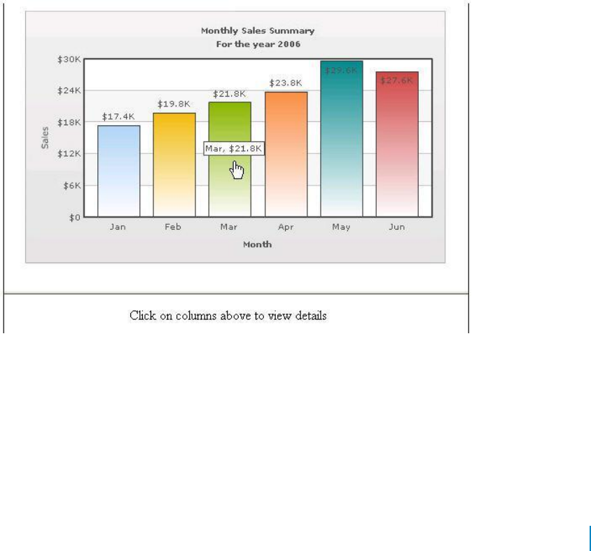
Linking to Frames
The chart view allows you to open links in specified frames too. To do so, you just specify the name of the
frame in the link itself.
To open link in a specified frame
1 From Chart Attributes, click Edit.
2 Click Functional.
3 In the Click URL field, set the link as in the following example: link='F-
FrameName-ShowDetails.asp%3FMonth%3DJan'
Where:
• F denotes the link opens in a frame
• -FrameName denotes the name of the frame to be opened
• -ShowDetails.asp%3FMonth%3DJan denotes the actual link to be opened. The link needs to be
URL Encoded.
In this example, the main frameset is contained in FrameExample.html, which has two vertical frame pane-
one on top containing the chart (FramePages\FrameChart.html) and one on bottom to show the linked frame
pages. The bottom pane by default shows FramePages\LowerFrame.html which contains the message "Click on
columns above to view details ".
The setup looks as:
Figure 17. Linking to Frames
Setting Number Formatting
You can perform the following procedures:
• Controlling Decimal Precision
• Automatic Number Formatting
• Setting Custom Thousand and Decimal Separator Character
www.agreeya.com
QuickApps for SharePoint
®
6.7
315
User Guide
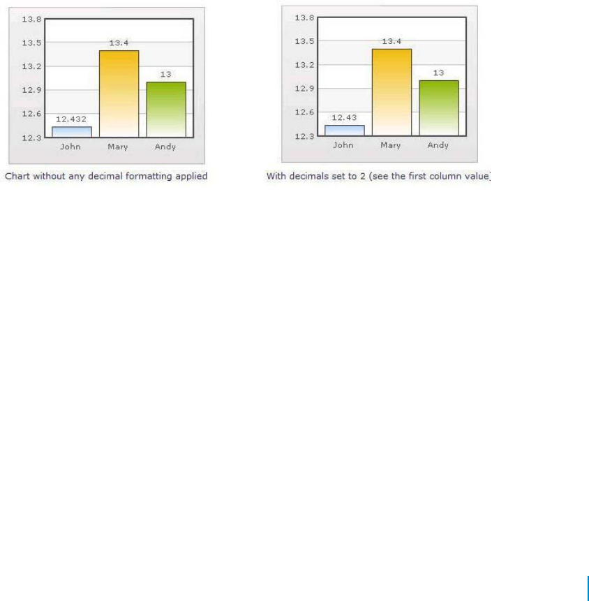
• Opening Links in Pop-up Windows
• Adding Number Prefix and Suffix
• Formatting Y-axis Values Decimal in Manual Div-Lines Mode
Controlling Decimal Precision
All the charts types in qSIChartView support the attribute decimals. This single attribute lets you control
the decimal precision of all the numbers on the chart. Using this attribute, you can globally set the number
of decimal places of ALL numbers of the chart.
To globally set the number of decimal places
1 From Chart Attributes, click Edit.
2 Click Number Formatting.
3 Enter a value in the Decimal box.
4 Click Save.
For example, if you have numbers on your chart as 12.432, 13.4 and 13 and you set Decimals='2' , the
numbers would be converted to 12.43, 13.4 and 13 respectively.
Figure 18. Decimal Precision
Similarly, if you had data as 0.12342, 0.134 and 0.13, and you set Decimals as 3, qSIChartView would
output 0.124, 0.134 and 0.13 respectively.
Even though the Decimal is set to 3, qSIChartView does not add the 0 padding to 0.13 to form 0.130. However,
if you want your numbers on the chart to have trailing zeroes too, you can set Force Decimals=true and now
the numbers would show as 0.124, 0.134 and 0.130 respectively, as shown in the examples:
www.agreeya.com
QuickApps for SharePoint
®
6.7
316
User Guide
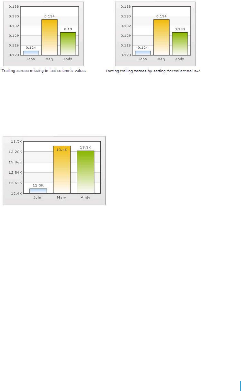
Figure 19. Force decimals
Automatic Number Formatting
qSIChartView automatically formats your numbers by adding K,M (Kilo, Million) and proper commas to
the numbers, as shown in the example:
Figure 20. Automatic Number Formatting
The data for chart is 12500, 13400 and 13300. qSIChartView automatically formats the number scaling
to convert to K (Thousands) & M (Millions).
If you do not want to truncate numbers
1 From Chart Attributes, click Edit.
2 Click Number Formatting.
3 From Format Number Scale, select False.
4 Click Save.
When you now view the chart, you will see the following:
www.agreeya.com
QuickApps for SharePoint
®
6.7
317
User Guide
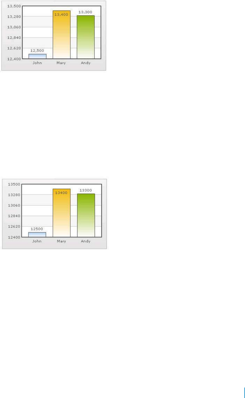
Figure 21. Not truncating numbers
In the example above, qSIChartView is showing full numbers on the chart. It has also added commas to
the numbers at the required places.
If you do not want to set commas
1 From Chart Attributes, click Edit.
2 Click Number Formatting.
3 From Format Number, select False.
4 From Format Number Scale, select False.
5 Click Save.
Figure 22. Not setting commas
The commas have been removed from numbers.
Setting Custom Thousand and Decimal Separator Character
By default, qSIChartView uses . (dot) as decimal separator and , (comma) as thousand separator character.
However, you can customize this character depending on your requirements. For example, you can swap
the separator characters.
To swap separator characters
1 From Chart Attributes, click Edit.
2 Click Number Formatting.
3 In the In Decimal Separator, enter ,.
4 In the In Thousand Separator, enter ..
5 Click Save.
www.agreeya.com
QuickApps for SharePoint
®
6.7
318
User Guide
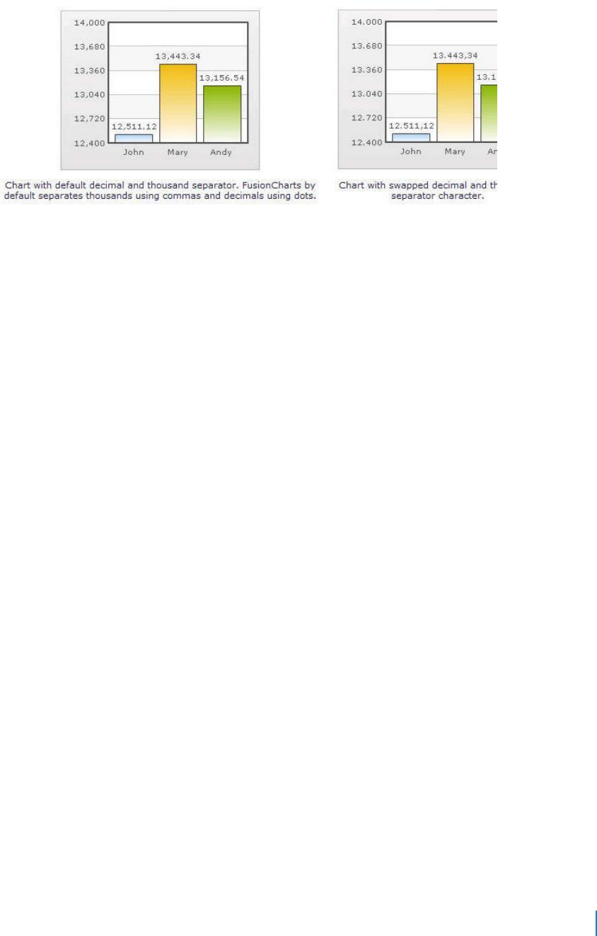
Figure 23 shows the output.
Figure 23. Swap separator characters
Adding Number Prefix and Suffix
qSIChartView allows you to add a prefix or suffix to all numbers on the chart.
To add a number prefix or suffix
1 From Chart Attributes, click Edit.
2 Click Number Formatting.
3 In the Number Prefix box, enter a character or value.
For example, to represent dollar figures, enter $.
4 In the Number Suffix box, enter a character or value.
For example, to represent figures quantified per annum, enter p.a.
5 Click Save.
If you intend to use special characters for Number Prefix or Number Suffix, URL Encode them when
using dataXML method. For example, if you wish to have numberSuffix as % (for example, 30%):
numberSuffix='%25'
In dataURL method, you can directly specify the character.
www.agreeya.com
QuickApps for SharePoint
®
6.7
319
User Guide
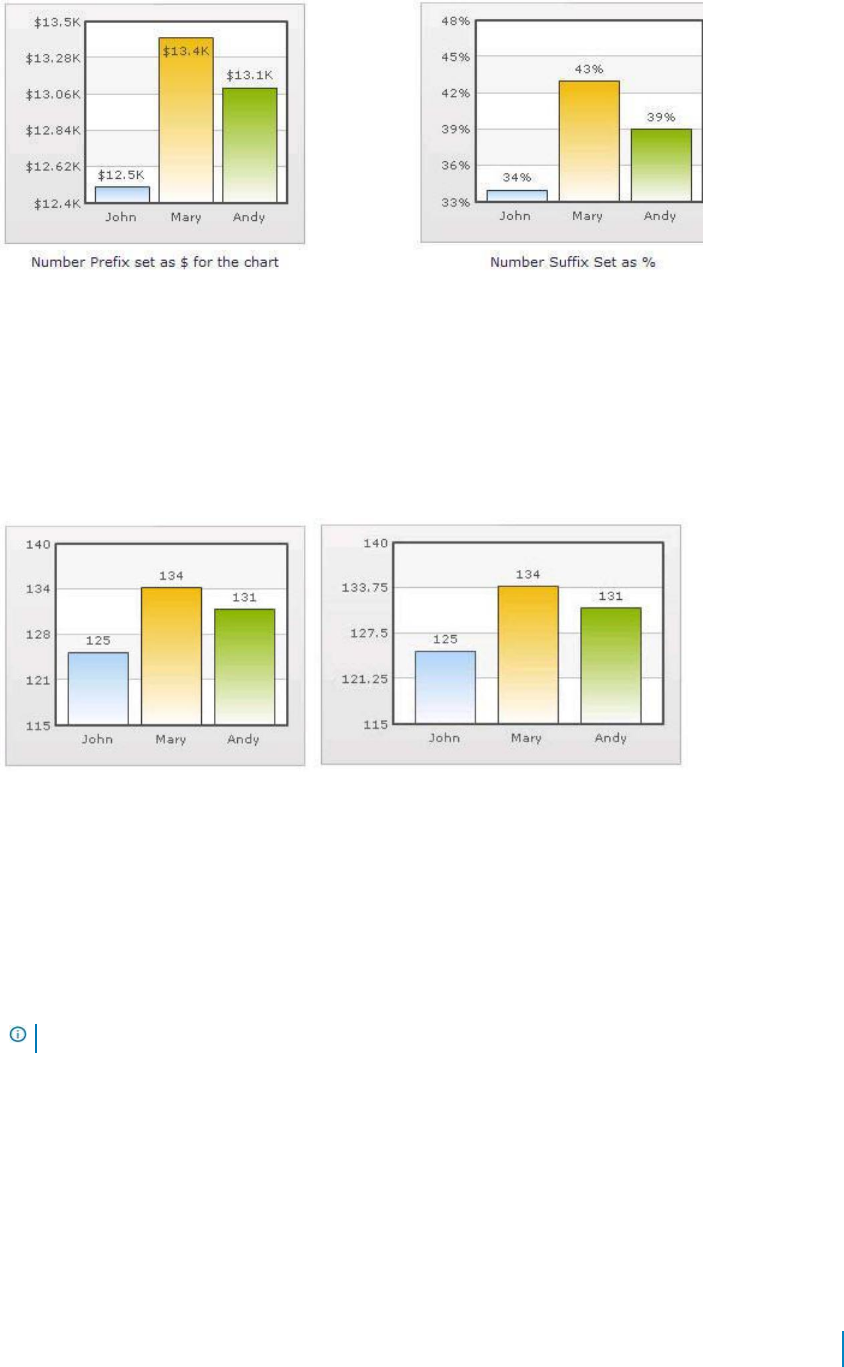
Figure 24. Adding number prefixes and suffixes
Formatting Y-axis Values Decimal in Manual Div-Lines Mode
If you want to set the number of divisional lines on chart, you can control the decimals of y-axis
values separately. For example, consider the following attributes and chart:
Y Axis Min Value='115' Y Axis Max Value='140' Zero Plane=false Number of Division Lines='3' >
Figure 25. Formatting y-axis
In this chart, the chart lower limit, upper limit, and number of divisional lines have been manually set.
qSIChartView will not automatically adjust divisional lines. In the chart, qSIChartView has truncated
decimals from y-axis values, as it cannot find any other decimal values on the chart.
You can, however, show decimals on y-axis values in this case (when Zero Plane is false) using Y Axis
Value Decimals attribute, for example Y Axis Min Value='115' Y Axis Max Value='140' Zero Plane=false
Number of Division Lines='3' Y Axis Value Decimals='2' Decimals='0' >.
When you now see the chart, 2 decimal places on y-axis values appear. But, the other numbers on chart
would still have 0 decimal places.
NOTE: Force Decimals does not work in this mode.
Setting Number Scaling
Number scaling lets you define your own scales for numbers and then apply it to all numbers on the chart.
For example, if your numbers on the chart are greater than 1000, qSIChartView scales them to K (Thousands)
or M (Millions). For example, if you plot a chart with data as 12500, 13400 and 13300, you will see the
following chart:
www.agreeya.com
QuickApps for SharePoint
®
6.7
320
User Guide
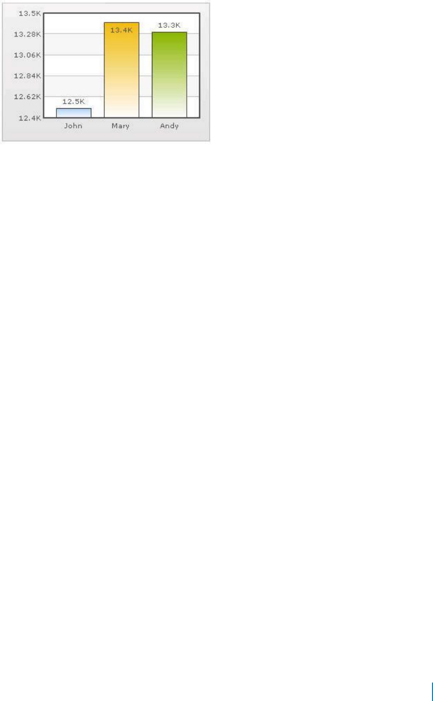
Figure 26. Setting number scaling
qSIChartView has scaled the numbers down to K. By default, qSIChartView has the K,M (1000,1000)
scaling defined for each chart. You can, however, customize it.
You can perform the following procedures:
• Adding Billions to Default Scaling
• Putting Time in Scale
Adding Billions to Default Scaling
qSIChartView, by default, has 1000,1000 (K,M) scaling defined for all charts. It does not have the scaling
for billions defined. You can modify the number scaling to add billion so that the final scale looks like
1000,1000,1000 (K,M,B).
This scale would look something like:
• 1000 = 1 K
• 1000 K = 1 M
• 1000 M = 1 B
To convert this scale into qSIChartView format
1 From Chart Attributes, click Edit.
2 Click Number Formatting.
3 In the Number Scale Value box, enter 1000,1000,1000.
4 In the Number Scale Unit box, enter K,M,B.
5 Click Save.
Whatever numeric figure was present on the left hand side of the table is put in Number Scale Value
and whatever unit was present on the right side of the scale table has been put under Number Scale
Unit - all separated by commas.
If you want to set the chart formatting flags
1 From Chart Attributes, click Edit.
2 Click Number Formatting.
3 From Format Number, select True.
4 From Format Number Scale, select True.
5 In the Number Prefix box, enter $.
6 Click Save.
www.agreeya.com
QuickApps for SharePoint
®
6.7
321
User Guide
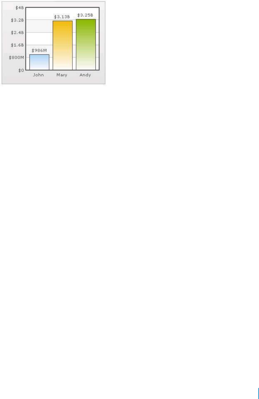
When you now view a chart containing data in billions, you will see the following chart. Note that
the chart now contains figure both in millions and billions.
Figure 27. Setting chart formatting
Putting Time in Scale
If you want to plot time-related figures on the chart, you can set the time in each process to range from a
few seconds to few days. You can build a scale indicating time and then specify it to the chart:
• 60 seconds = 1 minute
• 60 minute = 1 hr
• 24 hrs = 1 day
• 7 days = 1 week
To convert this scale in qSIChartView
1 From Chart Attributes, click Edit.
2 Click Number Formatting.
3 In the Default Number Scale box, enter s.
The default number scale is now represented in seconds.
4 In the Number Scale Value box, enter 60,60,24,7.
5 In the Number Scale Unit box, enter min,hr,day,wk.
6 Click Save.
Whatever numeric figure was present on the left hand side of the table is put in Number Scale Value
and whatever unit was present on the right side of the scale table has been put under Number Scale
Unit - all separated by commas.
If you want to set the chart formatting flags
1 From Chart Attributes, click Edit.
2 Click Number Formatting.
3 From Format Number, select True.
4 From Format Number Scale, select True.
5 Click Save.
When you now view the chart, you'll see that all the data has been automatically scaled to the
best value:
• 38 is converted to 38s
www.agreeya.com
QuickApps for SharePoint
®
6.7
322
User Guide

• 150 is converted to 2.50min
• 11050 is converted to 3.07hr
• 334345 is converted to 3.87 day
• 1334345 is converted to 2.21wk
Figure 28. Time scaling
Using MultiSeriesStackedColumn2D and
MultiSeriesStackedColumn2DLineDual
YAxis Charts
To use MultiSeriesStackedColumn2D and MultiSeriesStackedColumn2DLineDualYAxis
For example, you want to use a list that shows total revenue (Sales minus Cost) for all products from 2001-2006.
1 Open qSIChartView in ezEdit.
2 Configure the Catalog section.
3 In the Chart Type section, select MultiSeriesStackedColumn2D
or MultiSeriesStackedColumn2DLineDualYAxis.
4 Edit the Configuration section, and enter a field name; for example, Year.
5 Click Add Data Series and add two data series; for example:
Each series represents a stack within group of stacks.
6 Click Edit in each data series and enter a filter field name; for example, Name.
qSIChartView stacks the data according to filter field’s value. If the Filter Field Name is not set,
the chart is not rendered as stack.
NOTE: You can use the same field name in each series if you enter a filter expression.
www.agreeya.com
QuickApps for SharePoint
®
6.7
323
User Guide

20
qSIListForm
• Overview
• qSIListForm Pages
Overview
qSIListForm is a form that displays data from external systems, such as SQL Server, Web Services, K2, or
Salesforce. It allows you to associate a custom toolbar button with one or more actions, and enables you
to write complex validation logic.
This web app validates the following properties before setting them:
• Form Component Behavior. If this succeeds, it will execute the custom action.
• Fields that are marked as required. See Required on page 331.
• Displayed Fields Type (if Number is selected as the type). See Type on page
331. qSIListForm allows you to:
• define a mask for the input. Enforcing the format increases the consistency and data correctness.
• create a description for each field. The description can be plain text or HTML.
• define a new title for the field. This is useful if the title is too long or if you want to display a
different title for the field.
• assign a fixed value to a field.
• assign a formatted value to a field based on values in other fields. The only requirement is that
the parent fields must precede the field to be assigned.
• fill the value of a field from a value stored in the Session variable. This feature usually works
in conjunction with another web app, such as qSISelector or qSIListView.
• auto-fill a certain field based on field in a consumed row.
• implement the IWebPartRow interface to provide a row to another web app, such as qSIListView
or qSISelector.
• hide a field. A hidden field is processed during postback, but it will not be displayed.
• create a read -only field.
• store the displayed, new, or updated items into the Session. This feature enables a List Form
to communicate with another web app, such as qSISelector in another page.
• display, create, and edit data in your external systems. Out of the box, this Web app supports the
DAO Provider for:
• Web Services
• SQL Server
• Oracle
• Domino Server using XML over HTTP
• Salesforce
www.agreeya.com
QuickApps for SharePoint
®
6.7
324
User Guide
• K2Server (for SharePoint 2010 only)
• Define a different title for different languages using the Resource List and the Title Resource ID
properties. You can also define different texts for the buttons in the list form toolbar for different
languages. The culture for the page can be defined by appending the Culture HTTP parameter to
the page URL; for example, http://hostname/sites/sitename/default.aspx?Culture=en-US
TIP: To better understand SI web apps, read the System Integration Developer Guide.
qSIListForm Pages
You can configure this web app through its tabs that are accessible through ezEdit. qSIListForm contains the
following tabs:
• Content Page
• Behavior Page
• Appearance Page
• Advanced Page
Content Page
The Content page allows you to enter the content for your web app. It contains the following:
• Primary Content
• Optional Content
Primary Content
The Primary Content page is default category. You need to configure one or more elements in this page to
get started using this web app.
Primary Content contains the following:
Table 1. Primary Content
Element
Description
Title
Allows you to enter a title for the Web app, or accept the default. This field is
mandatory.
Catalog
See Catalog on page 325.
Form Type
Allows you to choose one of the following:
• DisplayEntity — The form is used to display an entity (all fields are read-only).
• NewEntity — The form is used to create a new entity.
• EditEntity — The form is used to edit an entity.
Form Layout
For more information, see Form Layout on page 327.
Display Fields
For more information, see Display Fields on page 329.
Catalog
This property defines the entity and the operations related to the entity.
www.agreeya.com
QuickApps for SharePoint
®
6.7
325
User Guide
Entities contain the following elements:
Table 2. Catalog
Element
Description
Advanced Mode
Turn on if you want to edit Catalog in XML format.
<Catalog>
<Entity Name="entityName" System="systemName" Service="serviceName"
Default="true/false">
<Properties>
<Property Name="propertyName" Type="typeName" Value="propertyValue" />
<Property Name="propertyName" Type="typeName" Value="propertyValue" />
</Properties>
<Operation Name="operationName" Method="methodName" Default="True/False" >
<Parameter Source="sourceType" SessionName="sessionName"
SourceName="sourceName" Type="parameterType" Name="parameterName"
Usage="usageType" Value="value" />
<Parameter Source="sourceType" SessionName="sessionName"
SourceName="sourceName" Type="parameterType" Name="parameterName"
Usage="usageType" Value="value" />
</Operation>
</Entity>
<Entity>
..</Entity>
</Catalog>
System
Allows you to specify the system name that is defined in the System Integration
configuration file. If the system name does not exist in the System Integration
configuration file, you will get an error.
Service
Allows you to specify the service name that is defined in the System Integration
configuration file. The service name that you specify here must belong to system that you
specify in the System attribute. If the service name does not exist in the System
Integration configuration file, you will get an error.
Name
Allows you to specify the name of the entity which must be unique within this Catalog.
The name does not have to match with any name in your external system. However, it is
recommended that you use a descriptive name for your entity.
Set Session Name
Allows you to enter name of the session variable where the edited or newly created item
is stored when it is saved, or the item that is being displayed or edited is stored when it is
loaded.
Reset Session
Allows you to reset (set to NULL) the value of the session variable whose name is specified
Names
in this attribute. Specify multiple names by separating them with commas.
Default
Allows you to define this entity as the default for the list form. If this element is not
specified, the first entity that is listed in the catalog becomes the default entity. The
default operation of the default entity is the operation that is used to retrieve the data
when the list form is loaded for the first time in edit or display mode.
You can add operations to your entities by configuring the following elements:
Table 3. Operations
Element
Description
Name
Allows you to specify the name of the operation. This name does not have to match with any
name in your external system. This name is used to refer to this operation in the Action property.
Method
Allows you to specify the real name of the operation in your external system. For example, it
may refer to the name of a web service method. Or it may refer to the name of a stored
procedure in your SQL Server database.
Default
Allows you to define this operation as the default. The default operation is the first operation
that is called to retrieve the entity to be displayed or edited. If this attribute is not specified,
the first operation listed in the entity becomes the default operation.
www.agreeya.com
QuickApps for SharePoint
®
6.7
326
User Guide
You can define parameters for the operation by configuring the following elements:
Table 4. Parameters
Element
Description
Name
Allows you to specify the name of the parameter.
Source
Allows you to define the source of this parameter. The source can be one of the following:
• DefaultValue — the value of the parameter that is the default
• NullValue — the value of the parameter is blank
• FixedValue — the value of the parameter that is defined in the Value attribute
• HttpRequest — the value of the parameter that is retrieved from the HTTP parameters
in the page URL. The name of the HTTP parameter is defined in the SourceName
attribute. As an example, say the current page URL is
http://mysite.com/default.aspx?ProductType=Hardware. If the SourceName attribute is
ProductType, the value of the ProductType HTTP parameter, which is Hardware, is used
as the value of the parameter.
• Input — the value of the parameter that is retrieved from one of the input fields in the
form. You specify the name of the input field in the SourceName attribute.
Additionally, you can retrieve the current user information as the value of the
parameter. You can specify one of the following name in the SourceName attribute to
retrieve the current user information:
• RowFromAnotherWebPart — the value of the parameter that is retrieved from the
row that is consumed from another web app. You specify the name of the field that
is consumed in the SourceName attribute.
• Session — the value of the parameter that is retrieved from the row that is stored in
the session. You specify the name of the session in the SessionName attribute. You
specify the name of the field that is consumed in the SourceName attribute.
• ComplexType — the value of the parameter is an object based on the Type attribute and
Member definition inside the Parameter. Array and nested complex types are supported.
• Array — the value of the parameter is an array of values
• XML — the value of the parameter that is dynamically built when the condition is
execute at runtime
Usage
Allows you to define the direction for this parameter. The options are In, Out, InOut, or
ReturnValue.
You can define one or more Property elements.
Table 5. Properties
Element
Description
Name
Allows you to specify the name of the property. Refer to the documentation for the DAO
Provider to your external system will tell you the name of the property that you must define.
Type
Allows you to specify type of value that is specified in the Value attribute. Example:
System.String.
Value
Allows you to specify the value of the property.
Form Layout
This property enables you to define the layout of the fields in the List Form. If this property is not defined,
the List Form will display the fields in two column format: the first column is the field title and the second
column is the control for the field.
This property is related to the Display Fields property. The Form Layout property defines the layout type
and the containers. In order to place a certain field in a specific container, you will use the Tab/Container
ID attribute of the Field element in the Display Fields property.
www.agreeya.com
QuickApps for SharePoint
®
6.7
327
User Guide
The Form Layout element can contain zero or more Container elements. You may not have to define any
container for a certain type of layout manager. Some custom layout manager may have a fixed set of
containers that do not need to be defined.
The Form Layout section contains the following:
Table 6. Form Layout
Form Layout
Description
type
Advanced Mode
Turn on if you want to edit Form Layout in XML format:
<FormLayout Type="TabLayout">
<Container Type="containerType" ID="containerID1" Label="tabText1"
ShowUserGroups="group1,group2" HideUserGroups="group3,group4">
<Container Type="containerType" ID="containerID2" Label="tabText2"
ShowUserGroups="group3,group4" HideUserGroups="group1,group2">
</FormLayout>
Tab Layout
Groups the fields in multiple tabs. You can add tabs to this layout by setting values for the
following:
• ID — the identifier for the tab. This ID must be unique for each container that is
defined in the Form Layout. This identifier is referred to in the ContainerID
attribute of the Field element in the Display Fields Property.
• Label — the label for the container. Otherwise, if the container needs a label, it
will use the ID.
• ShowUserGroups — the container is shown if the current user is a member of at
least one of the specified SharePoint groups. You can define multiple SharePoint
group names here by separating them with commas.
• HideUserGroups — the container is hidden if the current user is a member of at
least one of the specified SharePoint groups. You can define multiple SharePoint
group names here by separating them with commas. The HideUserGroups attribute
will take precedence if the current user is a member of one of the groups specified
in the HideUserGroups and ShowUserGroups.
Custom Layout
Uses the custom layout manager class specified in the LayoutManagerClassName attribute to
layout the fields. Using the custom layout, you can write your own custom Layout Manager
where you can layout the fields in any way you want it or even create your own custom
controls in the form. For more detail on how to write your own custom Layout Manager
class, see Custom Layout on page 148.
You can add containers to this layout by setting values for the following:
• ID — the identifier for the tab. This ID must be unique for each container that is
defined in the Form Layout. This identifier is referred to in the ContainerID
attribute of the Field element in the Display Fields Property.
• Type — the type of container.
• Label — the label for the container. Otherwise, if the container needs a label, it
will use the ID.
• ShowUserGroups — the container is shown if the current user is a member of at
least one of the specified SharePoint groups. You can define multiple SharePoint
group names here by separating them with commas.
• HideUserGroups — the container is hidden if the current user is a member of at
least one of the specified SharePoint groups. You can define multiple SharePoint
group names here by separating them with commas. The HideUserGroups attribute
will take precedence if the current user is a member of one of the groups specified
in the HideUserGroups and ShowUserGroups.
www.agreeya.com
QuickApps for SharePoint
®
6.7
328
User Guide
Table 6. Form Layout
Form Layout
Description
type
MultiColumn
Displays the data in multiple columns. You can select the number of columns, and select if
Layout
you want to render and control in a single row (displays the Label/Input control on the same
row. If not selected, the Label/Input control is on separate row. Being on the separate row
gives more screen real estate to render multiple columns. If this is selected, column span
and row span attributes are applied to grouped field.)
Tab and
MultiColumn
Layout
Groups the fields in multiple tabs and in multiple columns in each tab.
You can add tabs to this layout by setting values for the following:
• ID — the identifier for the tab. This ID must be unique for each container that is
defined in the Form Layout. This identifier is referred to in the ContainerID
attribute of the Field element in the Display Fields Property.
• Label — the label for the tab. Otherwise, if the container needs a label, it will
use the ID.
• ShowUserGroups — the tab is shown if the current user is a member of at least one
of the specified SharePoint groups. You can define multiple SharePoint group
names here by separating them with commas.
• HideUserGroups — the tab is hidden if the current user is a member of at least one
of the specified SharePoint groups. You can define multiple SharePoint group
names here by separating them with commas. The HideUserGroups attribute will
take precedence if the current user is a member of one of the groups specified in
the HideUserGroups and ShowUserGroups.
• Render and Control in a single row — the tab displays the Label/Input control on
the same row. If not selected, the Label/Input control is on separate row. Being on
the separate row gives more screen real estate to render multiple columns. If this
is selected, column span and row span attributes are applied to grouped field.
Display Fields
This property defines what fields should be displayed in the List Form and how the fields are populated.
NOTE: You must configure Display Fields before configuring Form Component Behavior.
Advanced Mode
Turn on if you want to edit Display Fields in XML format.
Data Index/Data Member
NOTE: This section is optional.
The Data Index allows you to define the index of the data table that contains the data to be displayed. This is
useful when the operation that retrieves the data from external system returns multiple data tables. If the
data table does not have any meaningful name, use the Data Index propertY.
The Data Member allows you to define the name of the data table that contains the data to be displayed. This
is useful when the operation that retrieves the data from external system returns multiple data tables and
those tables do not have any meaningful name. If the data table has meaningful name, you can refer to it by
using the Data Member property.
If neither the Data Member or the Data Index is specified, the first data table in the data set is used.
Fields
You can add fields by selecting them from a list automatically displayed or by manually adding them.
www.agreeya.com
QuickApps for SharePoint
®
6.7
329
User Guide
Loading Fields
If the default operation of the external system (selected in the Catalog section) contains data, click Load
Fields to display a list of fields. Select the fields you want to display in the web app.
NOTE: Loading Fields is supported in the qSIListForm Web app only.
Adding Fields
If the default operation does not contain data, select Add Fields.
You can add fields and enter values for the following:
Table 7. Adding Fields
Values
Description
Field Name
Displays the field name.
Title
Allows you to change the displayed title for the field. The value can be a plain string or
an encoded HTML string. Change the displayed title, for example, when the title is too
long or to make the title more descriptive.
Description
Allows you to set the field description. It can be a plain string or an encoded HTML
string. The Description is added below the field value.
Field Properties
Click Edit next to a field name to further define its properties by configuring the following:
Table 8. Field Properties
Properties
Description
Name
Displays the field name.
Title
Allows you to change the displayed title for the field. The value can be a plain string or an
encoded HTML string. You can change the displayed title, for example, when the title is too
long or to make the title more descriptive.
Title Resource ID
If supporting a multi-lingual site, you may want to display a different Title for the field
depending on the current culture. This property defines the identifier in the Resource List
that is used as the title of the field. The TitleResourceID and the current cultural setting
(identified with the Culture HTTP parameter) are used to retrieve the string in the
Resource List. If the string with the given identifier is not found, the default Title is used.
Tooltip
Allows you to set the text that is displayed in the tooltip when you hover your mouse over
the control for the field in the list form. If you do not specify this attribute, the display
name of the field is used as the tooltip text.
Tooltip Resource
If supporting a multi-lingual site, you may want to display a different tooltip for the field
ID
depending on the current culture. This property defines the identifier in the Resource List
that is used as the title of the field. The Tooltip Resource ID and the current cultural
setting (identified with the Culture HTTP parameter) are used to retrieve the string in the
Resource List. If the string with the given identifier is not found, the default tooltip is used.
Description
Allows you to set the field description. It can be a plain string or an encoded HTML string.
The Description is added below the field value.
Description
If supporting a multi-lingual site, you may want to display a different description for the
Resource ID
field depending on the current culture. This property defines the identifier in the Resource
List that is used as the title of the field. The Description Resource ID and the current
cultural setting (identified with the Culture HTTP parameter) are used to retrieve the
string in the Resource List. If the string with the given identifier is not found, the default
description is used.
Width (in pixels)
Allows you to set the width of the control in pixels.
NOTE: Some controls, such as the Rich Text Editor, have minimum width and it will not
honor the specified width if it is smaller than its minimum width.
www.agreeya.com
QuickApps for SharePoint
®
6.7
330
User Guide
Table 8. Field Properties
Properties
Description
Column Span
Allows you to set the span of the column.
Row Span
Allows you to set the span of the row.
Type
Allows you to define the type of field. The following types are supported:
• SingleLineofText
• MultipleLinesofText
• RichText - disables resizing text
• Choice - allows you to define the options for the Choice field or retrieves the
options for the names of the data table in a dataset.
• Number - when selected, allows you enter a minimum and maximum value, and select
the number of decimal places and if you want these numbers as a percentage
• Currency
• DateTime - allows you to enter DateOnly or DateTime
• Boolean
Required
Select this check box if this field is required.
Hidden
Allows you to hide the field.If the field is hidden, the List Form will not modify that field at
all. If you hide the field using the Hidden attribute, the field is processed according to the
way it is defined, but it will not be shown in the List Form.
Auto Post Back
If selected, allows the control to refresh the form when its value changes. This attribute
should be set to true in the following scenarios:
• When a choice field is used in the conditions of the Form Component
Behavior property.
• When a choice field is passed as a parameter to another operation that is used
to populate another choice field.
Group Name
Allows you to create dynamic behavior for a group of fields. The list form can be defined to
have dynamic behavior where certain fields or group of fields can be hidden, shown,
disabled, or enabled based on certain conditions. The value in the Group Name field is
referred to in the Form Component Behavior property.
Mask
Allows you to define the format of the input. The mask can contain characters and input-
mask-flags such as:
# — digit or space, optional. If this position is blank in the mask, it is rendered as a prompt
character.
L — uppercase letter, optional. Restricts input to the ASCII letters A-Z.
l (lower case L) — lowercase letter, optional. Restricts input to the ASCII letters a-z.
a — accepts any character
<n..m> — restricts the user input to the declared numeric range, for example: <0..255>.
The numeric range mask part must occupy multiple characters of the mask.
<option1|option2|option3> — restricts user input to one of the set options, for example:
<Sun|Mon|Tue|Wed|Thu|Fri|Sat>.
\ — escapes a mask character, turning it into a literal. "\\" is the escape sequence for a
backslash.
All other character — all non mask elements will appear as themselves. Literals always
occupy a static position in the mask at run time, and cannot be moved or deleted by the
user.
Prompt
Allows you to define a placeholder to enter a character that is displayed and saved in place
Character
of the empty characters when you specify a mask. If not specified, "_" (underscore) is used
as the default prompt character. Specify only a single character in this attribute.
Field Type
Allows you to select a field type. More options are available depending on the field type
selected. For more information, see Field Types on page 332.
www.agreeya.com
QuickApps for SharePoint
®
6.7
331
User Guide

Field Types
Select one of the following field types.
Table 9. Field Types
Field types
Description
Regular Field
Allows you to assign a regular field. This is the default.
Fixed Value
You can assign a fixed value to a field using the FixedValue attribute. For example,
to assign Accounting to the Department field:
<Field Name="Department" FixedValue="Accounting"/>
Additionally, you can use special variables for the FixedValue attribute.
• <CurrentUserID/> — this value is replaced by the ID of the currently logged in
user. If you want to assign the current user to the People and Group field, use
this variable. If you are using Advanced Mode and you would like to assign a
task to the currently logged in user, you can specify the following Field
element: <Field Name="Assigned To" FixedValue="<CurrentUserID/>" />
• <CurrentUserName/> — this value is replaced by the name of the currently
logged in user.
• <CurrentUserEmail/> — this value is replaced by the email of the currently
logged in user.
• <CurrentLoginName/> — this value is replaced by the login name of the
currently logged in user. The login name is usually in the form of
domain\username.
• <Today/> — this value is replaced by today's date.
• <Now/> — this value is replaced by the current date and time.
NOTE: If you are using SharePoint Form-Based Authentication, the above variables
will return the following, for example:
•
CurrentUserName=testuser
•
CurrentLoginName=i:0#.f|<site>|testuser
•
CurrentUserID=6
•
CurrentUserEmail=testuser@company.com
You can set the following:
• Allow Edit - select this check box to edit the field value in the form;
otherwise, it is read-only.
Consume Value for an
The HTTP Parameter Consumer field gets its value from an HTTP parameter. This is
HTTP Parameter
the attribute to create an HTTP Parameter Consumer field. You can set the
following:
• Consume HTTP Parameter Name - allows you to enter the name of the HTTP
parameter whose value is to be consumed.
• Allow Edit - select this check box to edit the field value in the form;
otherwise, it is read-only.
Calculated Format
You can format a value of a field using values from other fields by using the
CalculatedFormat attribute. The value of the another field can be referred to using
the <%fieldName%> field replacement expression.
NOTE: If you are using Advanced Mode, you must use the encoded form of the < and
> characters, which are < and >, respectively unless you type in the value
in the Display Fields editor in the List Form Editor, where the Editor will encode
the characters automatically for you.
www.agreeya.com
QuickApps for SharePoint
®
6.7
332
User Guide
Table 9. Field Types
Field types
Description
Consume value from a
The row consumer field gets its value from the row that is consumed by this List
row provided by another
Form. To create a row consumer field, you must connect the List Form with another
Web app
web app that implements the IRowProvider interface (such as the qSISelector).
You can set the following:
• Consume Row Display Field Name - allows you to define the field name in the
row from where the value comes.
• Consume Row Display Format - allows you to define the string format for the
values. This attribute takes precedence over the Consume Row Display Field
Name attribute. The format of the Consume Row Display Format is the same
as the format used in the Calculated Format attribute. If you select
NewEntity type as Form type, leave this field blank unless it is in simple text
format.
• Allow Edit - select this check box to edit the field value in the form;
otherwise, it is read-only
Consume from another
Session consumer field gets its value from a row that is stored in the session object.
session
If you require values from multiple providers, use the Session Consumer field type
instead of Row Consumer field type because the List Form can only be connected to
one row provider.
You can set the following:
• Session Name - enter the name of the session
• Consume Session Display Field Name - allows you to defines the field name in
the session from where the value comes.
• Consume Session Display Format - allows you to define the string format for
the values. This attribute takes precedence over the Consume Session Display
Field Name attribute. The format of the Consume Session Display Format is
the same as the format used in the Calculated Format attribute.
• Allow Edit - select this check box to edit the field value in the form;
otherwise, it is read-only
Optional Content
You can configure the following optional content:
Table 10. Optional Content
Element
Description
Display Required Field
Allows Required Fields Messages to be displayed on the form
Message
Behavior Page
The Behavior page allows you to configure behaviors, such as adding buttons or menus, so the user can
perform operations when using the web app.
The Behavior page contains the following:
• Actions
• Form
• Views
www.agreeya.com
QuickApps for SharePoint
®
6.7
333
User Guide
Actions
The list form has some pre-defined actions, such as Save, Delete, Copy or Move. You can also write your
own custom action and hook it up with the list form.
The Actions page contain the following elements:
Table 11. Actions
Element
Description
Custom Actions
For more information, see Custom Actions on page 334.
Custom Action Error
Allows you to set where the error message is displayed if the custom action throws an
Display
exception. The options are:
• Inline — the error message is displayed in the list form above the displayed
fields.
• Popup — the error message is displayed in a popup dialog box.
• InlineAndPopup — the error message is displayed in a popup dialog box and
inline above the displayed fields.
Popup is the default.
This property will only affect the error message that is returned by the ICustomAction
implementation. It will not affect the error that is generated internally by the List
Form.
Custom Actions
This property enables you to define additional buttons in the toolbar or context menu item in the context menu. You
can program that button or context menu item to do a series of actions. The List Form supports some built-in
actions. However, you can write your own custom action using one of the .NET languages, compile it, and call it by
the List Form. See Custom Action Help on page 380 to see how to write your own custom actions.
NOTE: The toolbar button affects all the items that are selected in the List Form. The context menu
item affects only the item that is being right-clicked regardless of how many items are selected in your
List Form.
Here are some ways that you can use this functionality:
• Add a custom toolbar button called "Assign All to Me" that will assign all of the selected tasks in the
List Form to me.
• Add a custom toolbar called "Approve" that will change the status of all of the selected expense items
to Approved.
• Create a custom context menu item called "Publish" that will move the right-clicked document
into another document library.
• Create a custom context menu item or toolbar item to start a workflow.
• With the ability to write your own custom action, you can virtually do anything to the data when
you click the custom button that you define.
NOTE: The custom action in the List Form does not support the Save action.
The Custom Actions element contains one Toolbar element and one Context Menu element. These elements
can contain one or more Action Item elements. You can associate the Action Item with one or more Action
elements. The Action element define a certain operation that is carried out by the action item when it is
clicked. When you add an action item, you can configure the following:
www.agreeya.com
QuickApps for SharePoint
®
6.7
334
User Guide

Table 12. Custom Actions
Element
Description
Advanced Mode
Turn on if you want to edit Custom Actions in XML format.
<CustomActions>
<Toolbar>
<ActionItem ID="UniqueID" Text="text" TextResourceID="textResourceID" Position="0"
PromptText="promptText" PrompTextResourceID=”prompTextResourceID”
ImageUrl=”URL” AccessKey=”AccessKeyCharacter”>
<Action Type="Delete" />
<Action Type="Move" TargetFolder="targetFolder" TargetSiteURL="targetSiteUrl"
TargetListName="targetListName" />
<Action Type="Copy" TargetFolder="targetFolder" TargetSiteURL="targetSiteUrl"
TargetListName="targetListName" />
<Action Type="GoToURL" URL="TargetURL">
<Parameter Name="parameterName" Source="Session" SourceName="fieldName"
SessionName=”sessionName” />
<Parameter Name="parameterName" Source="RowFromAnotherWebPart"
SourceName="fieldName" />
<Parameter Name="parameterName" Source="HttpRequest"
SourceName="httpParameterName" />
<Parameter Name="parameterName" Source="ListItem"
SourceName="httpParameterName" />
</Action>
<Action Type="GoToSource"/>
<Action Type="Custom" Class="IUIActionImpl" />
</ActionItem>
</Toolbar>
<ContextMenu>
<ActionItem ID="UniqueID" Text="text" TextResourceID="textResourceID" Position="0"
PromptText="promptText" PrompTextResourceID=”prompTextResourceID”
ImageUrl=”URL” AccessKey=”AccessKeyCharacter”>
<Action Type="Delete" />
<Action Type="Move" TargetFolder="targetFolder" TargetSiteURL="targetSiteUrl"
TargetListName="targetListName" />
<Action Type="Copy" TargetFolder="targetFolder" TargetSiteURL="targetSiteUrl"
TargetListName="targetListName" />
<Action Type="GoToURL" URL="TargetURL">
<Parameter Name="parameterName" Source="Session" SourceName="fieldName"
SessionName=”sessionName” />
<Parameter Name="parameterName" Source="RowFromAnotherWebPart"
SourceName="fieldName" />
<Parameter Name="parameterName" Source="HttpRequest"
SourceName="httpParameterName" />
<Parameter Name="parameterName" Source="ListItem"
SourceName="httpParameterName" />
</Action>
<Action Type="GoToSource"/>
<Action Type="Custom" Class="IUIActionImpl" />
</ActionItem>
</ContextMenu>
</CustomActions>
IsSeparator
Allows you to set the item as a separator.
ID
Allows you to enter a unique ID that will identify the item. Use a descriptive
identifier to configure the action item with the editor.
Text
Allows you to enter how the action item is displayed in the toolbar.
www.agreeya.com
QuickApps for SharePoint
®
6.7
335
User Guide

Table 12. Custom Actions
Element
Description
Text Resource ID
Allows you to define this property if you support a a multi-lingual site. This attribute
defines the identifier of the string in the Resource List that is used as the title of the
Web app. The Text Resource ID and the current cultural setting (identified with the
Culture HTTP parameter) are used to retrieve the string in the Resource List. If the
string with the given identifier and culture is not found, the value in the Text
attribute is used.
Prompt Text
Allows you to prompt the user to click the toolbar button or the context menu item.
Prompt Text Resource ID
Allows you to define this property if you support a multi-lingual site. The property
defines the identifier of the string in the Resource List that is used as the title of the
Web app. The Resource ID and the current cultural setting (identified with the
Culture HTTP parameter) are used to retrieve the string in the Resource List. If the
string with the given identifier and culture is not found, the default is used.
Access Key (Toolbar
Allows you to define one character from the Text attribute that becomes the access
Only)
key to this toolbar button or context menu item. For example, if you define a letter
T as the access key, you can press ALT+T and the browser will put the focus on this
button or context menu item. If there are multiple elements on the page with the
same access key, you can repeat ALT+T repeatedly until you get the focus on this
toolbar button or context menu item.
Position
Allows you to set the position of the button in the toolbar. The index starts with 0.
Show User Groups
Allows you to list SharePoint groups whose members can view the Web app.
Separate groups with commas.
Hide User Groups
Allows you to list SharePoint groups whose members cannot view the Web app.
Separate site group names with commas (for example, Administrators, Readers).
If a user is a member of a group that is defined in both Show User Groups and Hide
User Groups, the user cannot
www.agreeya.com
QuickApps for SharePoint
®
6.7
336
User Guide

When you add an action, you can configure the following:
Element
Description
Name
An optional element which allows you to identify a given action in order to access it from
another action. You can refer to this action from the GoToURL action and from
ICustomActionEx Interface.
Type
Allows you to determine the type of the action. Here are the options:
• Delete — deletes the item.
• Move — allows you to move the item to a target. You must specify a Target Site
URL, Target List Name, and Target Folder. This action only works for document in
a document library.
• Copy — allows you to copy the item to a target. You must specify a Target Site
URL, Target List Name, and Target Folder.
• GoToURL — redirects the user to a specific URL. You must specify the URL and
where you want the URL to open. You must specify the following parameters:
- Input - the current user information as the value of the parameter
- Session - the name of the session variable where the value comes from when
the source is set to Session
- HttpRequest - the value of the parameter that is retrieved from the HTTP
parameters in the page URL. The name of the HTTP parameter is defined in the
SourceName attribute. As an example, say the current page URL is
http://mysite.com/default.aspx?ProductType=Hardware. If the SourceName
attribute is ProductType, the value of the ProductType HTTP parameter, which
is Hardware, is used as the value of the parameter.
- ListItem - the value of the parameter is a list item or row
- RowFromAnotherWebPart — the parameter for the GoToURL action can be
retrieved from the output of another action that comes first in the sequence of
actions defined in the ActionItem. There are two types of action that can produce
an output: an action with Type of ExecuteOperation, and an action with Type of
Custom that points to custom action implementation of ICustomActionEx Interface.
You do that by defining the SourceName attribute of the action. This is the syntax
of the SourceName attribute when you use ResultFormAction source:
<ActionName>.<ResultType>[.Name], where ActionName refers to the Name
attribute of the action that produces the output, ResultType can be OutParameter
(if the action result is returned through one of the out or inout parameter) or
RawData - (if the action result is returned as an object). Name is optional. It
further designates the object we want to use for the parameter. You do not have
to specify the Name when the ResultType is RawData. However, if the ResultType
is OutParameter, this name specifies the name of the out or input key value pair.
- ResultFromAction - the parameter for the GoToURL action can be retrieved from
the output of another action that comes first in the sequence of actions defined
in the ActionItem
You must define a source name (where in the source you want to get your
information from), name (the name of the parameter that is appended to the URL
you specified), and Session (the name of the session variable where the value
comes from when the source is set to Session)
• GoToSource — redirects the user to the URL specified in the Source HTTP parameter.
The URL to the page must look like: http://...?Source=URL for this option to work.
• StartWorkflow — starts the specified workflow in the Workflow Name drop-
down field. You must select a Workflow name.
• ReturnToMasterChart — returns the user to the master chart page. You use
this action type if this web app is located in the drill down page.
• Custom — implements your own custom action and call it with this action type.
Enter a Class name that implements the ICustomActionEx or ICustomAction
interface, or select a class from the drop-down list, if available.
www.agreeya.com
QuickApps for SharePoint
®
6.7
337
User Guide
Form
The Form page contains the following elements:
Table 13. Form
Element
Description
Form Initialization
Allows the List Form to be automatically pre-populated when the Form Type
Actions
property is set to NewListItem, CreateDocument or UploadDocument. The List Form
will call the defined custom actions that are specified in this property.
The fields that cannot be automatically pre-populated are:
• Auto-fill field (fixed value, consume value from an HTTP parameter,
calculated format, consume value from a session, consume row from a
row provided by another web app, auto fill with a lookup or cross-site
lookup field)
• BDC Column
• SI Column
• Complex category field
• Cross site lookup field
See the Custom Action Help on page 380 chapter on how to write a custom action
to initialize the list form.
Turn on Advanced Mode if you want to edit Form Initialization Actions in
XML format.
<FormInitialization>
<Action Name=”initial 1” Type="Custom"
Class="MyCompany.DevStudio.SampleFormInitializationAction,
MyCompany.DevStudio, Version=1.0.0.0, Culture=neutral,
PublicKeyToken=451cac61f7ec4225" / >
<Action Name=”initial 2” Type="Custom"
Class="MyCompany.DevStudio.SampleFormInitializationAction2,
MyCompany.DevStudio, Version=1.0.0.0, Culture=neutral,
PublicKeyToken=451cac61f7ec4225" / >
</FormInitialization>
Form initialization is a way to auto fill the form. It should not be used in
conjunction with another auto fill method. If you do this, the result is
unpredictable (that is sometimes the value from form initialization will take
precedence, but sometimes the value from the other auto fill method will take
precedence).
Form Component
For more information, see Form Component Behavior on page 338.
Behavior
Form Component Behavior
This section is used to control the conditional behavior of the different components in the form, such as a
field, a group of fields or a tab. There are four different conditional behaviors that can be specified: Show
When, Hide When, Enabled When, and Disabled When. For fields, there are three additional conditional
behaviors that can be specified: Valid When, Invalid When, and Required When.
NOTE: You must configure Display Fields before configuring Form Component Behavior.
You can define one or more form component definitions.
www.agreeya.com
QuickApps for SharePoint
®
6.7
338
User Guide
Table 14. Definition
Definition
Description
Advanced
Turn on if you want to edit Form Component Behavior in XML format.
Mode
<FormComponentBehavior>
<Component Type="Field/Group/Container" ID="ComponentID">
<ShowWhen>
[Condition specified in CAML Filter format]
</ShowWhen>
<HideWhen>
[Condition specified in CAML Filter format]
</HideWhen>
<EnabledWhen>
[Condition specified in CAML Filter format]
</EnabledWhen>
<DisabledWhen>
[Condition specified in CAML Filter format]
</DisabledWhen>
<InvalidWhen Message=”Custom Message when condition is true”>
[Condition specified in CAML Filter format]
</InvalidWhen>
<ValidWhen Message=”Custom Message when condition is true”>
[Condition specified in CAML Filter format]
</ValidWhen>
<RequiredWhen Message=”Custom Message when condition is true”>
[Condition specified in CAML Filter format]
</RequiredWhen>
</Component>
<Componet ...>
<Component ...>
</FormComponentBehavior>
Type
Defines the type of the component that is assigned the dynamic behavior. The choices are: Field,
Group, or Container (that is, tab).
ID
Defines the ID or name of the component whose behavior is defined to be dynamic. When the
Type is set to Field, this ID refers to the Name of a field that is defined in the Display Fields
property. When the Type is set to Group, this ID refers to the Group Name attribute of one or
more fields defined in the Display Fields property. When the Type is set to Container, this ID
refers to the ID of a container that is defined in the Form Layout property.
To see details for a form component, you can configure the following properties:
Table 15. Definition Properties
Property
Description
Show When
Defines the conditions of when the form component should be shown.
Hide When
Defines the conditions of when the form component should be hidden. This
conditional behavior takes precedence over the Show When conditional behavior.
Therefore, if Hide When and Show When are defined and both evaluate to true, the
component is hidden.
Enabled When
Defines the conditions of when the form component should be enabled.
www.agreeya.com
QuickApps for SharePoint
®
6.7
339
User Guide
Table 15. Definition Properties
Property
Description
Disabled When
Defines the conditions of when the form component should be disabled. This
conditional behavior takes precedence over the Enabled When conditional behavior.
Therefore, if Enabled When and Disabled When are defined and both evaluate to
true, the component is disabled.
Required When
Defines the conditions of when the form component should be required. This
conditional behavior is for fields only. A custom message can be specified. It is
displayed when the Required When condition is satisfied. The message is displayed
by default in red after the input control on the form. However, you can specify any
text or HTML code as the Message attribute.
Valid When
Defines the conditions of when the form component should be valid. This
conditional behavior is for fields only. A custom message can be specified. It is
displayed when the Valid When condition is satisfied. The message is displayed by
default in red after the input control on the form. However you can specify any text
or HTML code as the Message attribute.
Invalid When
Defines the conditions of when the form component should be invalid. This
conditional behavior is for fields only. This conditional behavior takes precedence
over the Valid When conditional behavior. Therefore, if Valid When and Invalid
When are defined and both evaluate to true, the field is invalid. A custom message
can be specified. It is displayed when the Invalid When condition is satisfied. The
message is displayed by default in red after the input control on the form. However
you can specify any text or HTML code as the Message attribute.
For fields of type text, numeric or date/time, regular expression matching can be used for validation. Use
the “Matching” operator in the conditional behavior element.
The following are some examples of how to use this property:
1 Show the Resolved Date and Resolved By fields when the Status field is changed to "Resolved". By
specifying both fields’ GroupName attribute in the Display Fields property to “ResolvedFieldsGroup”,
it is defined that both fields belong to the same group.
<orFmComponentBehavior>
<Component Type="Group" ID="ResolvedFieldsGroup">
<ShowWhen>
<Eq><FieldRef Name="Status"/><Value Type="Choice">Resolved</Value></Eq>
</ShowWhen>
</Component>Enable the "Amount Paid" field when the Invoice Status fie
</FormComponentBehavior>
2 ld is changed to "Paid".
<FormComponentBehavior>
<Component Type="Field" ID="Amount
Paid"> <EnabledWhen>
<Eq><FieldRef Name="Invoice Status"/><Value
Type="Choice">Paid</Value></Eq> </EnabledWhen>
</Component>
</FormComponentBehavior>
3 Hide the Reason field when the Project Status field is not
"Behind" <FormComponentBehavior>
<Component Type="Field" ID="Reason">
www.agreeya.com
QuickApps for SharePoint
®
6.7
340
User Guide

<HideWhen>
<Neq><FieldRef Name="Project Status"/><Value
Type="Choice">Behind</Value></Neq> </HideWhen>
</Component>
</FormComponentBehavior>
4 Show error message if field, Assigned To, is blank when Status is “In
Process” <FormComponentBehavior>
<Component Type="Field" ID="Assigned To">
<InvalidWhen Message="Assigned To Must be filled if Status is In
Process"> <And>
<IsNull>
<FieldRef Name="AssignedTo"
/> </IsNull>
<Eq>
<FieldRef Name="Status" />
<Value Type="Choice">In
Progress</Value> </Eq>
</And>
</InvalidWhen>
</Component>
</FormComponentBehavior>
5 Field % Complete must be between 0 and
100 <FormComponentBehavior>
<Component Type="Field" ID="% Complete">
<ValidWhen Message="% Complete must be between 0 and
100"> <And>
<Geq>
<FieldRef Name="PercentComplete"
/> <Value Type="Number">0</Value>
</Geq>
<Leq>
<FieldRef Name="PercentComplete"
/> <Value Type="Number">1</Value>
</Leq>
</And>
</ValidWhen>
</Component>
</FormComponentBehavior>
www.agreeya.com
QuickApps for SharePoint
®
6.7
341
User Guide

Views
The Views page contains the following:
Table 16. Views
Element
Description
Display Messages from
Allows you to display messages, such as informational messages or warnings at the top
DAO Provider
of a web app. For more information on DAO providers, see System Integration
Developer Guide.
Custom
Message Display
Allows you to specify a custom message based on certain conditions.
We currently do not support mapping for the messages that the Display Messages
From DAO Provider property enables.
Turn on Advanced Mode if you want to edit Custom Message Display in XML format.
CustomMessageDisplay contains the following properties:
• Display When — allows you to set the conditions to display a custom error
message. When defining the Display When condition, the following
operators are supported: Eq (Equal) Neq (Not Equal) Null, Is Not Null, Begins
With, Contains and Matches (for regular expression).
• Custom Message — The error message that you want displayed when the
Display When condition is set.
If a Display When condition is set during runtime but a custom message is not
specified, the original message is displayed. If you want to hide the original
message, use a blank string or any html code that renders no visible cues, such as
<div> </div>, for the CustomMessage attribute.
When multiple Custom Message elements are defined for this property, the
first Custom Message, whose Display When condition is set, is used.
If no conditions are met, an error message from the selected external system
is displayed.
Appearance Page
The Appearance page allows you to set the overall look and feel of the web app. This page contains the
following:
• Ribbon
• Toolbar
• Control
• Layout
• Other
Ribbon
The Ribbon page allows you to set the display name of the Ribbon.
Table 17. Ribbon
Element
Description
SharePoint Ribbon Tab
Allows you to edit the display name of the Ribbon tab.
Name
www.agreeya.com
QuickApps for SharePoint
®
6.7
342
User Guide
Toolbar
The Toolbar page allows you to configure the appearance of the toolbar. It contains the following:
Table 18. Toolbar
Element
Description
Toolbar Location
Allows you to define where a toolbar for the list form should be displayed.
The choices are TopAndBottom, Top, Bottom or None. Select None if you
do not want to display the regular toolbar. Only the Ribbon buttons are
displayed in this case.
Toolbar Skin Name
Allows you to enter the skin name for the toolbar.
Control
The Control page allows you to set the appearance of your user controls in a web app. It contains the following:
The Control page contains the following:
Table 19. Control
Element
Description
Rich Text Editor Skin
Allows you to select the skin name for the rich text editor. The rich text editor
Name
appears in the form when the Type attribute of the Field element in the Display
Fields property is set to RichText. If you have a custom skin, you can add it to the
following folder for SharePoint 2010:C:\Program Files\Common Files\Microsoft
Shared\Web Server
Extensions\14\TEMPLATE\LAYOUTS\QuestSoftware\Telerik\Q32013SP1\Skins, for
SharePoint 2013: C:\Program Files\Common Files\Microsoft Shared\Web Server
Extensions\15\TEMPLATE\LAYOUTS\QuestSoftware\Telerik\Q32013SP1\Skins or for
SharePoint 2016: C:\Program Files\Common Files\Microsoft Shared\Web Server
Extensions\16\TEMPLATE\LAYOUTS\QuestSoftware\Telerik\Q32013SP1\Skins
When creating a custom skin, you can refer to the Sample Skin folder in the install
directory.
Clear your browser cache frequently while working with custom skins. In IE, CSS
cache can be cleared by clicking the Clear Cache button in the CSS tab of
Developer Tools, located under the Tools menu of the browser.
Drop-Down Skin Name
Allows you to specify the skin name for the drop-down menu control for the choice
field. If you have a custom skin, you can add it to the following folder for
SharePoint 2010:C:\Program Files\Common Files\Microsoft Shared\Web Server
Extensions\14\TEMPLATE\LAYOUTS\QuestSoftware\Telerik\Q32013SP1\Skins, for
SharePoint 2013: C:\Program Files\Common Files\Microsoft Shared\Web Server
Extensions\15\TEMPLATE\LAYOUTS\QuestSoftware\Telerik\Q32013SP1\Skins or for
SharePoint 2016: C:\Program Files\Common Files\Microsoft Shared\Web Server
Extensions\16\TEMPLATE\LAYOUTS\QuestSoftware\Telerik\Q32013SP1\Skins.
When creating a custom skin, you can refer to the Sample Skin folder in the install
directory.
Layout
The Layout page allows you to set the overall layout of the web app. It contains the following:
Table 20. Layout
Element
Description
Width
Allows you to set the web app to a fixed width
Height
Allows you to set the web app to a fixed height
www.agreeya.com
QuickApps for SharePoint
®
6.7
343
User Guide
Table 20. Layout
Element
Description
Chrome State
Allows you to select if the web app can be minimized or not when you open the web app.
If Minimized is selected, then only the Title Bar displays.
Chrome Type
Allows you to select the kind of border to display around the web app.
Hidden
Select this check box if you want the web app hidden
Direction
Allows you to set how the text in the web app displays depending on the language, either
from Left to Right or Right to Left
Other
The Other page allows you to set the appearance of other elements in the web app. It contains the following:
Table 21. Other
Element
Description
Allow Minimize
Select this check box if you want the web app minimized
Allow Close
Select this check box if you want the web app removed from the page
Allow Hide
Select this check box if you want the web app hidden
Allow Zone Change
Select this check box if you want the web app moved to a different zone
Allow Connections
Select this check box if you want the web app to participate in connections
to other web apps
Allow Editing in Personal View
Select this check box if you want the web app modified in a personal view
Export Mode
Allows you to select the level of data that can be exported for this web app
Title URL
Allows you to add the title of a URL as extra information about the web app
Description
Allows you to enter a description of the web app that is displayed as a
Tooltip when you hover your mouse over the web app title or icon.
Help URL
Allows you to enter the location of a file containing Help information about
the web app.
Help Mode
Allows you to specify how a browser displays Help content for the web app,
either in a separate window which you must close before returning to the
Web Page (Mode), in a separate window that you do not need to close before
returning to the Web Page (Modeless), or in the current browser window
(Navigate)
Catalog Icon Image URL
Allows you to specify the location of a file containing an image to be used as
the web app icon in the Web app List. The image size must be 16 by 16
pixels.
Title Icon Image URL
Allows you to specify the location of a file containing an image to be used in
the web app title bar. The image size must be 16 by 16 pixels.
Import Error Message
Allows you to specify a message that appears if there is a problem importing
the web app
Advanced Page
The Advanced page allows you to set advanced features of the web app, such as the following:
• Security
• Resources
www.agreeya.com
QuickApps for SharePoint
®
6.7
344
User Guide
Security
The Security page allows you to set which users are allowed to view the web app. It contains the following:
Table 22. Security
Element
Description
Target
Allows you to have the Web app to appear only to people who are members of a
Audiences
particular group or audience.
An audience can be identified by using a SharePoint group, a distribution list, a security
group, or a global audience.
Resources
The Resources page allows you to enable Localization in the web app using resource lists.
Localization
Localization contains the following elements.
NOTE: While this feature is still available to use, we recommend using ezLocalizer. For more
information, see ezLocalizer on page 391.
Table 23. Localization
Element
Description
Resource List
Allows you to support a multi-lingual site. In a multi-lingual site, there are some
settings, such as the web app, whose value can change depending on the current
culture setting. The Resource List property defines the list that contains the string
values for different cultures. The resource list must contain 3 columns:
• Resource ID — This field contains the identifier to refer to the string. You can
have multiple strings with the same Resource ID as long as their Culture value
is different.
• Culture — This field contains the culture for the string. For the default
culture, leave the Culture field blank.
• Value — This field contains the value for the string.
The Lists element can contain only one List element. The following are the
attributes for the List element:
• SiteUrl — The URL to the site that contains the resource list. The URL can be
absolute (http://...) or relative to the current page URL. This attribute is
mandatory.
• ListName — The name of the resource List. The list name is case sensitive.
Title Resource ID
Allows you to support a multi-lingual site. The property defines the identifier of the
string in the Resource List that is used as the text of the web app. The Resource ID
and the current cultural setting (identified with the Culture HTTP parameter) are
used to retrieve the string in the Resource List. If the string with the given identifier
and culture is not found, the default is used.
Indicates Required Field
Allows you to enter a text resource ID for the Indicates Required Field button.
Button Text Resource ID
www.agreeya.com
QuickApps for SharePoint
®
6.7
345
User Guide

21
qSIListView
• Overview
• qSIListView Pages
Overview
qSIListView displays data from your external system in a grid, and allows you to:
• customize the look and feel by using Skin.
• divide the data into multiple pages to limit their size and render pages faster. This feature is called
Paging. There are two Paging Modes available: Numeric Pager and Next Previous. If the number of rows
in a table is more than the specified Page Size, the data is divided into multiple pages and a Pager is
displayed at the bottom of the listview to enable the user to navigate to different pages
• retrieve the data from your external system one page at a time using custom paging. In order to use
this feature, your external system must provide a method to retrieve one page of data by using the
page size and page index parameters. If your external system does not support custom paging, you can
still page your date as described in the previous point.
• define a static filter using Complex Filter (For more information, see Complex Filters on page 21.).
The Complex Filter expression supports time functions (such as AddDays) and time expression (such as
[TODAY]) to filter out data based on a moving time window. This feature is called Data Aging.
• define the initial static sort expression using the Sort Fields property. The listview can sort the
data based on multiple fields.
• sort the data in the listview by clicking the grid headers. Clicking the header repeatedly will change
the sort direction for that field from ascending, descending and neutral (no filter). You can sort the
data in the listview using multiple fields.
• create a relationship between parent and child entity.
• define multiple levels of grouping on the data using the Grouped attribute in the Display Fields
property. You can also display the sum or item counts in the group header.
• show or hide the listview based on the site group membership of the currently logged in user by using
the Show User Groups and Hide User Groups properties.
• display the data in virtually any format that can be achieved with JavaScript and HTML. With this
feature, you can create many types of custom reports on the data. The JavaScript and HTML for a
custom display is defined in the Results Header, Results Body and the Results Footer properties.
• consume a filter from another web app that implement IWebPartRow or IWebPartParameter interface.
• consume a row from another web app that implement IWebPartRow interface. The row that the
listview consumed can be passed into the operation to retrieve the data as a parameter or can be used
in the custom action.
• display, create, and edit data in your external systems. Out of the box, this Web app supports the
DAO Provider for:
• Web Services
• SQL Server
www.agreeya.com
QuickApps for SharePoint
®
6.7
346
User Guide
• Oracle
• Domino Server using XML over HTTP
• Salesforce
• K2Server (for SharePoint 2010 only)
TIP: To better understand SI web apps, read the System Integration Developer Guide.
qSIListView Pages
You can configure this web app through its tabs that are accessible through ezEdit. qSIListView contains
the following pages:
• Content Page
• Behavior Page
• Appearance Page
• Advanced Page
Content Page
The Content page contains the following:
• Primary Content
• Filtering
• Search/Filter Panel
• Sorting/Paging
• Custom Display
Primary Content
The Primary Content page is default category. You need to configure one or more elements in this page to
get started using this web app.
Primary Content contains the following:
Table 1. Primary Content
Element
Description
Title
Allows you to enter a title for the Web app, or accept the default. This field is
mandatory.
Catalog
See Catalog on page 348.
Display Fields
See Display Fields on page 350.
Entity Relationship
See Entity Relationship on page 349
www.agreeya.com
QuickApps for SharePoint
®
6.7
347
User Guide
Catalog
Entities contain the following elements:
Table 2. Catalog
Element
Description
Advanced Mode
Turn on if you want to edit Catalog in XML format.
System
Allows you to specify the system name that is defined in the System Integration
configuration file. If the system name does not exist in the System Integration
configuration file, you will get an error.
Service
Allows you to specify the service name that is defined in the System Integration
configuration file. The service name that you specify here must belong to system that
you specify in the System attribute. If the service name does not exist in the System
Integration configuration file, you will get an error.
Name
Allows you to specify the name of the entity which must be unique within this Catalog.
The name does not have to match with any name in your external system. However, it is
recommended that you use a descriptive name for your entity.
Set Session Name
Allows you to enter name of the session variable where the edited or newly created item
is stored when it is saved, or the item that is being displayed or edited is stored when it
is loaded.
Reset Session
Allows you to reset (set to NULL) the value of the session variable whose name is
Names
specified in this attribute. Specify multiple names by separating them with commas.
Default
Allows you to define this entity as the default for the list form. If this element is not
specified, the first entity that is listed in the catalog becomes the default entity. The
default operation of the default entity is the operation that is used to retrieve the data
when the list form is loaded for the first time in edit or display mode.
You can add operations to your entities by configuring the following elements:
Table 3. Operations
Element
Description
Name
Allows you to specify the name of the operation. This name does not have to match with any
name in your external system. This name is used to refer to this operation in the Action property.
Method
Allows you to specify the real name of the operation in your external system. For example, it
may refer to the name of a web service method. Or it may refer to the name of a stored
procedure in your SQL Server database.
Default
Allows you to define this operation as the default. The default operation is the first operation
that is called to retrieve the entity to be displayed or edited. If this attribute is not specified,
the first operation listed in the entity becomes the default operation.
www.agreeya.com
QuickApps for SharePoint
®
6.7
348
User Guide
You can define parameters for the operation by configuring the following elements:
Table 4. Parameters
Element
Description
Name
Allows you to specify the name of the parameter.
Source
Allows you to define the source of this parameter. The source can be one of the following:
• DefaultValue — the value of the parameter that is the default
• NullValue — the value of the parameter is blank
• FixedValue — the value of the parameter that is defined in the Value attribute
• HttpRequest — the value of the parameter that is retrieved from the HTTP parameters
in the page URL. The name of the HTTP parameter is defined in the SourceName
attribute. As an example, say the current page URL is
http://mysite.com/default.aspx?ProductType=Hardware. If the SourceName attribute is
ProductType, the value of the ProductType HTTP parameter, which is Hardware, is used
as the value of the parameter.
• Input — the value of the parameter that is retrieved from one of the input fields in the
form. You specify the name of the input field in the SourceName attribute.
Additionally, you can retrieve the current user information as the value of the
parameter. You can specify one of the following name in the SourceName attribute to
retrieve the current user information:
• RowFromAnotherWebPart — the value of the parameter that is retrieved from the
row that is consumed from another web app. You specify the name of the field that
is consumed in the SourceName attribute.
• Session — the value of the parameter that is retrieved from the row that is stored in the
session. You specify the name of the session in the SessionName attribute. You specify
the name of the field that is consumed in the SourceName attribute.
• ComplexType — the value of the parameter is an object based on the Type attribute and
Member definition inside the Parameter. Array and nested complex types are supported.
• Array — the value of the parameter is an array of values
• XML — the value of the parameter that is dynamically built when the condition is
execute at runtime
Usage
Allows you to define the direction for this parameter. The options are In, Out, InOut, or
ReturnValue.
You can define one or more Property elements.
Table 5. Properties
Element
Description
Name
Allows you to specify the name of the property. Refer to the documentation for the DAO Provider
to your external system will tell you the name of the property that you must define.
Type
Allows you to specify type of value that is specified in the Value attribute. Example:
System.String.
Value
Allows you to specify the value of the property.
Entity Relationship
Allows you to create a parent-child entity relationship. The default entity from the Catalog will be considered
as the Parent Entity. If no default entity is chosen in the Catalog, then the first entity in catalog is considered
as default entity. Anyone of the remaining entities can be used to select as a child entity. When you select
the Edit button, a dialog box opens with a list of parent and child key fields based on the list.
Entities contain the following elements:
www.agreeya.com
QuickApps for SharePoint
®
6.7
349
User Guide
Table 6. Entity Relationship
Element
Description
Advanced
Turn on if you want to edit Entity Relationship in XML format. XML will look like the following
Mode
<EntityRelations>
<EntityRelation ParentEntity="parentEntityName" ParentKeyFieldName=" parentKeyFieldName"
ChildEntity="childEntityName" ChildKeyFieldName="childKeyFieldName" Default="true" />
</EntityRelations>
Parent
Allows you to select parent entity key field name.
Entity Key
Field
Name
Child
Allows you to select child entity.
Entity
Child
Allows you to select child entity key field name.
Entity Key
Field
Name
Display Fields
This property defines what fields should be displayed in the ListView and how the fields are populated.
Advanced Mode
Turn on if you want to edit Display Fields in XML format.
Data Index/Data Member
NOTE: This section is optional.
The Data Index allows you to define the index of the data table that contains the data to be displayed. This is
useful when the operation that retrieves the data from external system returns multiple data tables. If the
data table does not have any meaningful name, use the Data Index propertY.
The Data Member allows you to define the name of the data table that contains the data to be displayed. This
is useful when the operation that retrieves the data from external system returns multiple data tables and
those tables do not have any meaningful name. If the data table has meaningful name, you can refer to it by
using the Data Member property.
If neither the Data Member or the Data Index is specified, the first data table in the data set is used.
Fields
Click Add Field to add fields to be displayed in the web app. You can add the following values for the fields
to be displayed.
Table 7. Fields
Values
Description
Name
Displays the field name.
Title
Allows you to change the displayed title for the field. The value can be a plain string or an
encoded HTML string. Change the displayed title, for example, when the title is too long or
to make the title more descriptive.
Width
Allows you to set the width. It can be a plain string or an encoded HTML string. The
Description is added below the field value.
www.agreeya.com
QuickApps for SharePoint
®
6.7
350
User Guide
Field Properties
You can further define properties for the fields to be displayed by configuring the following:
Table 8. Field Properties
Property
Description
Field Name
Displays the field name.
Title
Allows you to change the displayed title for the field. The value can be a plain string or an
encoded HTML string. Change the displayed title, for example, when the title is too long
or to make the title more descriptive.
Title Resource ID
If supporting a multi-lingual site, you may want to display a different Title for the field
depending on the current culture. This property defines the identifier in the Resource List
that is used as the title of the field. The TitleResourceID and the current cultural setting
(identified with the Culture HTTP parameter) are used to retrieve the string in the
Resource List. If the string with the given identifier is not found, the default Title is used.
Horizontal Align
Allows you to set the horizontal alignment.
Vertical Align
Allows you to set the vertical alignment.
Hidden
Allows you to hide the field. If the field is hidden, the qSIListView will not modify that
field at all. If you hide the field using the Hidden attribute, the field is processed
according to the way it is defined, but it does not display.
Width
Allows you to set the width of the control in pixels.
NOTE: Some controls, such as the Rich Text Editor, have minimum width and it will not
honor the specified width if it is smaller than its minimum width.
Item Style
Allows you to define a distinct style for the item. You should define the style as you would
define the style in CSS file.
Item CSS Style
Allows you to define a distinct style for the column and you already have defined the style
in an external CSS file.
This attribute takes precedence over the Item Style attribute.
Fixed Value
Allows you to enter the text that is displayed as a value for this field. This is useful when
you want static text such as Edit displayed in a field. You can then make this text a
hyperlink using either the LinkTo or LinkToSource attributes.
NOTE: If you are using Advanced Mode, you can configure Fixed Value as in the following
example:
<Field Name="EditColumn" FixedValue="Edit"
LinkTo="Lists/ListName/EditForm.aspx?ID=<%ID%>" />
To display an icon instead of a text, you can do the following (it assumes that you have
pencil.gif in the images folder in your site:
<Field Name="EditColumn" FixedValue="<img src="images/edit.gif"
border=0>" LinkTo="Lists/ListName/EditForm.aspx?ID=<%ID%>" />
www.agreeya.com
QuickApps for SharePoint
®
6.7
351
User Guide

Table 8. Field Properties
Property
Description
Calculated Value
Recognizes the field replacement expression <%Field%> to refer to a field. The listview
replaces the field replacement expression with the value of the field for each row of data.
When using this attribute, you must use the Name of a field that does not exist in the list.
It is because the listview constructs this field dynamically instead of using an existing field
in the list. If you use the name of an existing field, you will get an error that the field
already exists.
NOTE: If you are using Advanced Mode, you must use the encoded form of the < and >
characters, which are < and >, respectively, unless you type in the value in the
Display Fields editor in the List View Editor, where the Editor will encode the characters
automatically for you. This attribute helps you:
• Display a full name by concatenating the first name and last name as follows:
<Field Name="CalculatedFullName" Title="Full Name"
CalculatedValue="<%First Name%> <%Last Name%>" />
• Display the status of your project with different colors depending on its value. In
order to do this, you can write a JavaScript function and then call that
JavaScript function using this attribute.
<Field Name="CalculatedProjectStatus" Title="Status"
CalculatedValue="<script>FormatProjectStatus('<%Status%>');</script
>" />
This assumes you have a JavaScript method called DisplayProjectStatus defined
on your page or in a JavaScript file that is included in your page. That JavaScript
method looks like:
<script language="javascript"> function
FormatProjectStatus(status)
{
var displayedStatus =
status; if (status = 'Behind')
{
displayedStatus = '<font color="red">' + status + '</font>';
}
return displayedStatus;
}
</script>
You can format the value of the field in virtually any way you want. For example,
you can replace the text value with different images to give the user a pleasant
look in the presentation.
NOTE: You can only call one JavaScript function in the CalculatedValue attribute and the
JavaScript function must return a string.
Link To
The listview turns the field into a hyperlinked column to the specified URL. The URL can
be an absolute or relative URL. The LinkTo can use the <%field name%> field replacement
expression.
NOTE: If you are using Advanced Mode, you must use the encoded form of the < and >
characters, which are < and >, respectively unless you type in the value in the
Display Fields editor in the List View Editor, where the Editor will encode the characters
automatically for you.
Every field that you refer to in the field replacement expression must be specified in the
Display Fields property. If you do not want to show that field to the user, you can use the
Hidden attribute to hide the field. If you use a relative URL, the URL is appended to the
URL of the current page.
Here is an example on how to make the Title field a hyperlink column to the edit form of
the Tasks list:
<Field Name="ProjectName" LinkTo="ProjectDetail.aspx?ID=<%Projec
tID%>&Source=default.aspx" />
www.agreeya.com
QuickApps for SharePoint
®
6.7
352
User Guide
Table 8. Field Properties
Property
Description
Link To Source
The listview will make the field value a hyperlink to the URL specified in the Source HTTP
parameter of the current request. For this option to work, the current page URL must look
like: http://.....?Source=....
The LinkToSource is useful when you want to make the URL in the link dynamic. In that
case, you can pass in the URL for the link into the HTTP parameter of your page. For
example, say that we have a page where the user can select a particular contact from the
Contacts list. This page might be useful for several cases in your application and you
cannot hard code the URL because you may want the user to be redirected to different
URL depending where they are in the application. In that case, you can specify the URL for
the hyperlink in the URL of the page.
Open Link In
Allows you to define how the Link To Field opens.
NOTE: If you select Dialog, you can configure the dialog width and height.
NOTE: For Internet Explorer 9, the "NewWindow" option requires the user to set the
following: Internet Options | General |Tabs | Settings > When a pop-up is encountered >
'Always open pop-ups in a new window'.
HTML Encode
Allows the value in the field to be encoded first prior to being displayed. You need to set
this to true if this field contains values that are surrounded by < and >, such as <abc>.
Without the encoding, the value will not be displayed properly.
Display Format
Specifies how the field value is formatted when displayed. For more detail about the
syntax of the DisplayFormat attribute, see Display Format on page 14.
The Field element can contain one or more Aggregate elements if its Grouped attribute is
set to true. The following are the attributes of the Aggregate element:
• Text — The text that will precede the aggregated value when it is displayed.
• Aggregate Function — These are the choices for the aggregate function: Sum,
Min, Max, Last, First, Count.
• Field Name — The name of the field where the aggregation is performed.
• Format String — This attribute defines how the aggregated value is displayed.
See the syntax of the format string in the DisplayFormat attribute.
Grouped
Allows the data to be grouped by this field. You can set the Grouped attribute of multiple
fields to true if you want to have a subgroup.
• Group Sort Direction — This attribute determines whether the values in the
header of the grouped field must be displayed in ascending or descending order.
The options are asc for ascending order or desc for descending order. The default
value is asc.
• Group Expanded — If set to true, the group is initially expanded. Otherwise, it
is collapsed. If not specified, the default value is true.
When you select Grouped, you can add aggregate elements.
• Text — allows you set the text that precedes the aggregated value when displayed
• Aggregate Value — allows you to choose an aggregate function
• Field Name — allows you to enter the name of the field where the aggregation
will happen
• Format String — defines how the aggregated value is displayed
Filtering
The Filtering page allows you to use Complex Filters to define static filter for the data.
The Filtering page contains the following:
www.agreeya.com
QuickApps for SharePoint
®
6.7
353
User Guide
Table 9. Filtering
Element
Description
Complex Filter
Allows you to use the Complex Filter expression to define a static filter for the data.
The complex filter is applied to the data after the CAML Filter is applied.
NOTE: The Complex Filter is provided here only for backward compatibility reason. In
the past, Complex filter was used to support date functions.
For more information, see Complex Filters on page 21.
Search/Filter Panel
The Search/Filter Panel allows you to define the panels for search, filter, and replace in the web app.
The Search/Filter Panel contains the following elements:
Table 10. Search/Filter Panel
Element
Description
Searched Fields
See Searched Fields on page 355.
Expand Filter panel
Allows you to automatically open the Filter panel by default so that the user can
on Load
perform a search quickly. When set to true, the Filter panel opens when the web app
is loaded for the first time.
Turn On List Searcher
Allows the user to perform a search before the listview display any data.
Mode
Filter Criteria Usage
Allow you to pass the filter criteria to the DAO provider layer. There are three options
in this property:
• PassToDAOProvider — The filter criteria is passed to the DAO Provider. When
you select this, the filter criteria will not be used to filter the data that is
returned by the external system (because the SI List View assumes that the
data has been filtered by the external system).
• FilterData — The filter criteria is used to filter the data that is returned by the
external system.
• PassToDAOProviderAndFilterData — The filter criteria is passed to the DAO
Provider and is used to filter the data that is being returned by the external
system.
When you select PassToDAOProvider or PassToDAOProviderAndFilterData, you can use
the filter criteria as parameter values in the operations in the Catalog property. In
order to do so, you specify the parameter source as Input and the source name as:
• FieldName.Value — allows you to retrieve the value that is entered by the user
in the Filter panel for a specific field.
• FieldName.MaxValue — allows you to retrieve the maximum value that is
entered by the user in the Filter panel for the field that has Between operator,
such as DateTime field.
• FieldName.Operator - allows you to retrieve the operator that is specified by
the user for a specific field.
There is a possibility that your back-end only handles "Equals" operator. In that case,
you can use the FixedOperator="Equals" attribute in the Searched Fields property so
that the user can only use the Equals operator.
Panel Button Location
Determines the location of the Go, Reset and Close buttons in the Filter panel. This
property also determines the location of the Go and Close buttons in the Replace
panel.
www.agreeya.com
QuickApps for SharePoint
®
6.7
354
User Guide
Searched Fields
This property defines which fields are displayed in the Filter panel. If defined, the web app will display Filter
button in the toolbar. To disable the search feature, you can leave this property blank. If defined, the web
app will display Filter or Search menu items under the Actions button in the toolbar. To disable the search
feature, you can leave this property blank.
You will be able to perform a search by pressing Enter.
NOTE: Pressing Enter will not allow you to perform a search on such fields as external data, people
picker, managed metadata, and a drop-down list. Instead, the default behavior will occur.
You can further edit fields using the following elements:
Table 11. Searched Fields
Element
Description
Advanced Mode
Turn on if you want to edit Searched Fields in XML format.
This property is an XML string in the following format:
<Fields>
<Field Name="fieldName" [optional attributes]/>
<!-- To search a cross site lookup field, use one of the following two formats -->
<Field Name="fieldName" DisplayFieldName="fieldName" SortField="fieldName" [optional
attributes]>
<List SiteUrl="siteUrl" SiteName="siteName" ListName="listName"/>
</Field>
<Field Name="fieldName" DisplayFormat="fieldName" SortField="fieldName" [optional
attributes]>
<List SiteUrl="siteUrl" SiteName="siteName" ListName="listName"/>
</Field>
</Fields>
Name
Indicates the element you are editing.
Type
Allows you to select a type of field.
Title
Displays title for the field. The value can be a plain string or an encoded HTML string.
Default Value
Defines the default value for the field.
You can define a text, a number or a date. A date value must be specified in ISO 8601 format:
YYYY-MM-DDThh:mm:ssZ, for example: midnight of February 14, 2002 is 2002-02-
14T00:00:00Z.
Default
Defines the default operator for the field.
Operator
Fixed Operator
Defines the operator for the field. If specified, the drop-down menu to select the operator
for this field is turned off.
Column Count
Defines the number of columns for the options in a multi-choice field or in a choice-and-
lookup field if the Enable Multi Choice attribute is set to True. This is useful in case your
choice or lookup fields have too many choices and you want to break the choices into several
columns to minimize the vertical scrolling in your form.
Date Time
Available if you select DateTime as a type.
Format
www.agreeya.com
QuickApps for SharePoint
®
6.7
355
User Guide

Table 11. Searched Fields
Element
Description
Enable Multi
Available if you select Choice as a type. Allows you to select multiple options for the choice-
Choice
and-lookup field. Therefore, the user can specify a condition like "A or B". This attribute is
ignored by other field types.
To search a cross-site lookup field, you must specify one or more List elements inside the
Field element. The cross-site lookup field is displayed as two drop downs.
Choice
Allows you to define how you want to define the options in your Choice field. It is a drop-
Population
down list with the following options: Manually or Using Operation in the Catalog. For more
Type
information, see the below paragraphs.
If you select Choice as the field type, you can define the options in your choice field.
You can hardcode the options directly under the Field element. Select the
ChoicePopulationType of ‘Manually’ to do this. Here is an example:
<Field Name="EmployeeStatus" Type="Choice">
<Option Text="Active" Value="1" />
<Option Text="Retired" Value="2" />
</Field>
If the Value attribute is not specified, the Text is used as the value.
You can specify an action that will retrieve the options from your external system. Select the
ChoicePopulationType of ‘Using Operation in the Catalog’ to do this. The syntax is:
<Field Name="fieldName" Type="Choice">
<Lookup Operation="EntityName.OperationName" DataMember="tableName"
DataTextField="textFieldName" DataValueField="valueFieldName" />
</Field>
-OR-
<Field Name="fieldName" Type="Choice">
<Lookup Operation="EntityName.OperationName" DataIndex="index"
DataTextField="textFieldName" DataValueField="valueFieldName" />
</Field>
• The Operation defines the operation that is used to retrieve the options from the
external system. The syntax for the operation is EntityName.OperationName. Both
the entity and the operation must already be defined in the Catalog property.
• The DataMember defines the data table name that contains the options in case the
operation returns multiple tables. If external system returns multiple data tables
without name, you can use the DataIndex attribute to refer to the table. The index
is a number and it starts with 0 (not 1).
• The DataTextField defines the column in the data table whose value is displayed in
the drop-down menu.
• The DataValueField defines the column in the data table that contains the real
value that should be saved back to the external system.
Sorting/Paging
The Sorting/Paging page allows you to define the sorting criteria and paging type and size in the web app.
The Sorting/Paging page contains the following elements:
www.agreeya.com
QuickApps for SharePoint
®
6.7
356
User Guide
Table 12. Sorting/Paging
Element
Description
Sort Fields
Allows you to define the initial sorting criterion for the data. This is the syntax for this
property:
FieldName1 [SortDirection], FieldName1 [SortDirection]
SortDirection is either ASC (ascending order) or DESC (descending order). The
FieldName and the SortDirection are case sensitive. If the SortDirection is not
specified, ascending order is assumed. For example:
First Name ASC, Last Name DESC, Company
NOTE:
You cannot define criteria to sort custom fields. To sort custom fields, click the
column in qListView. You can sort custom fields under the following circumstances
only:
• the custom field search data total count is less than MaxQueryRowCount's value
(by default, this value is 2000)
• the custom field is only a calculated value
• the custom field’s calculated value is not written in JavaScript code
Allow Custom Paging
Defines whether or not your default operation supports custom paging. Custom paging
feature enables your operation to retrieve the data from your external system one
page at a time. If you set this property to true, your operation should take the
PageSize, PageIndex and SortFields parameters. Click here to see the example in the
Catalog property for an operation that supports custom paging feature.
If your default operation does not support custom paging, you should set this property
to false. In the absence of custom paging, the SI List View will automatically page the
data for you if the number of rows in your data table is larger than the number in the
Page Size property.
If you deal with a large number of data in the external system, we recommend that
you use custom paging to improve the response time of the list view.
Paging Mode
Allows you to select the type of pager that is displayed at the bottom of the listview if
the items must be divided into multiple pages.
Page Size
Allows you to set the maximum number of rows that is displayed in one page. If the
number of rows is larger than the Page Size, the data is divided into several pages. You
can navigate the pages using the Pager displayed at the bottom of the listview.
Custom Display
The custom display properties lets the page designer customize the display of the data using HTML and
JavaScript. The custom display appears after the default display (if the Display Fields property is defined).
Three properties define the custom display. The example in each property illustrates how to display
the FullName field of the search results in an HTML table.
Table 13. Custom Display
Element
Description
Results Header
Allows you to set the value of this property that is rendered once before the Results
Body. This property is a good place to include any JavaScript file, defining any
JavaScript function, or define any HTML elements for the header.
Example: These are the customers that match your search
criteria.<br><table><tr><th>Full Name</th></tr>
www.agreeya.com
QuickApps for SharePoint
®
6.7
357
User Guide
Table 13. Custom Display
Results Body
Allows you to set the value of this property that is repeated once for every row in the
search results. You can use the <%field name%> field replacement expression to refer
to the value of a certain field.
Example: <tr><td><%FullName%></td>
Results Footer
Allows you to set the value of this property that is rendered once after the Results
Body.
Example: </table>
Behavior Page
The Behavior page allows you to configure behaviors, such as adding buttons or menus, so the user can
perform operations when using the web app.
The Behavior page contains the following:
• Actions
• Views
Actions
This property enables you to define additional buttons in the toolbar or context menu item in the context menu. You
can program that button or context menu item to do a series of actions. The listview supports some built-in actions.
However, you can write your own custom action using one of the .NET languages, compile it, and call it by the
listview. See Custom Action Help on page 380 to see how to write your own custom actions.
NOTE: The toolbar button affects all the items that are selected in the listview. The context menu
item affects only the item that is being right-clicked regardless of how many items are selected in your
listview.
Here are some ways that you can use this functionality:
• Add a custom toolbar button called "Assign All to Me" that will assign all of the selected tasks in
the listview to me.
• Add a custom toolbar called "Approve" that will change the status of all of the selected expense items
to Approved.
• Create a custom context menu item called "Publish" that will move the right-clicked document
into another document library.
• Create a custom context menu item or toolbar item to start a workflow.
• With the ability to write your own custom action, you can virtually do anything to the data when
you click the custom button that you define.
The Actions page contain the following elements:
Table 14. Actions
Element Description
Custom Actions For more information, see Custom Actions on page 358.
Custom Actions
NOTE: The custom action in the listview does not support the Save action.
The Custom Actions element contains one Toolbar element and one Context Menu element. These elements can
contain one or more Action Item elements. You can associate the Action Item with one or more Action elements.
www.agreeya.com
QuickApps for SharePoint
®
6.7
358
User Guide

The Action element define a certain operation that is carried out by the action item when it is clicked.When
you add an action item, you can configure the following:
Table 15. Custom Actions
Element
Description
Advanced Mode
Turn on if you want to edit Custom Actions in XML format.
<CustomActions>
<Toolbar>
<ActionItem ID="UniqueID" Text="text" TextResourceID="textResourceID" Position="0"
PromptText="promptText" PrompTextResourceID=”prom
<Action Type="Delete" />
<Action Type="Move" TargetFolder="targetFolder" TargetSiteURL="targetSiteUrl"
TargetListName="targetListName" />
<Action Type="Copy" TargetFolder="targetFolder" TargetSiteURL="targetSiteUrl"
TargetListName="targetListName" />
<Action Type="GoToURL" URL="TargetURL">
<Parameter Name="parameterName" Source="Session" SourceName="fieldName"
SessionName=”sessionName” />
<Parameter Name="parameterName" Source="RowFromAnotherWebPart"
SourceName="fieldName" />
<Parameter Name="parameterName" Source="HttpRequest"
SourceName="httpParameterName" />
<Parameter Name="parameterName" Source="ListItem" SourceName="httpParameterName"
/>
</Action>
<Action Type="GoToSource"/>
<Action Type="Custom" Class="IUIActionImpl" />
</ActionItem>
</Toolbar>
<ContextMenu>
<ActionItem ID="UniqueID" Text="text" TextResourceID="textResourceID" Position="0"
PromptText="promptText" PrompTextResourceID=”prompTextResourceID” ImageUrl=”URL”
AccessKey=”AccessKeyCharacter”>
<Action Type="Delete" />
<Action Type="Move" TargetFolder="targetFolder" TargetSiteURL="targetSiteUrl"
TargetListName="targetListName" />
<Action Type="Copy" TargetFolder="targetFolder" TargetSiteURL="targetSiteUrl"
TargetListName="targetListName" />
<Action Type="GoToURL" URL="TargetURL">
<Parameter Name="parameterName" Source="Session" SourceName="fieldName"
SessionName=”sessionName” />
<Parameter Name="parameterName" Source="RowFromAnotherWebPart"
SourceName="fieldName" />
<Parameter Name="parameterName" Source="HttpRequest"
SourceName="httpParameterName" />
<Parameter Name="parameterName" Source="ListItem" SourceName="httpParameterName"
/>
</Action>
<Action Type="GoToSource"/>
<Action Type="Custom" Class="IUIActionImpl" />
</ActionItem>
</ContextMenu>
</CustomActions>
IsSeparator
Allows you to set the item as a separator.
ID
Allows you to enter a unique ID that will identify the item. Use a descriptive identifier to
configure the action item with the editor.
Text
Allows you to enter how the action item is displayed in the toolbar.
www.agreeya.com
QuickApps for SharePoint
®
6.7
359
User Guide

Table 15. Custom Actions
Element Description
Text Resource ID Allows you to define this property if you support a a multi-lingual site. This attribute
defines the identifier of the string in the Resource List that is used as the title of the Web
app. The Text Resource ID and the current cultural setting (identified with the Culture
HTTP parameter) are used to retrieve the string in the Resource List. If the string with the
given identifier and culture is not found, the value in the Text attribute is used.
Prompt Text
Allows you to prompt the user to click the toolbar button or the context menu item.
Prompt Text
Allows you to define this property if you support a multi-lingual site. The property defines
Resource ID
the identifier of the string in the Resource List that is used as the title of the Web app. The
Resource ID and the current cultural setting (identified with the Culture HTTP parameter)
are used to retrieve the string in the Resource List. If the string with the given identifier and
culture is not found, the default is used.
Access Key
Allows you to define one character from the Text attribute that becomes the access key to
(Toolbar Only)
this toolbar button or context menu item. For example, if you define a letter T as the access
key, you can press ALT+T and the browser will put the focus on this button or context menu
item. If there are multiple elements on the page with the same access key, you can repeat
ALT+T repeatedly until you get the focus on this toolbar button or context menu item.
Position
Allows you to set the position of the button in the toolbar. The index starts with 0.
Show User
Allows you to list SharePoint groups whose members can view the Web app. Separate groups
Groups
with commas.
Hide User
Allows you to list SharePoint groups whose members cannot view the Web app. Separate site
Groups
group names with commas (for example, Administrators, Readers).
If a user is a member of a group that is defined in both Show User Groups and Hide User
Groups, the user cannot
When you add an action, you can configure the following:
www.agreeya.com
QuickApps for SharePoint
®
6.7
360
User Guide

Table 16. Action
Element
Description
Name
An optional element which allows you to identify a given action in order to access it from another
action. You can refer to this action from the GoToURL action and from ICustomActionEx
Interface.
Type
Allows you to determine the type of the action. Here are the options:
• GoToURL — redirects the user to a specific URL. You must specify the URL and where
you want the URL to open. If you select to open the URL in a dialog, you can configure
the dialog width and height.
• You must specify the following parameters:
• Input - the current user information as the value of the parameter
• Session - the name of the session variable where the value comes from when
the source is set to Session
• HttpRequest - the value of the parameter that is retrieved from the HTTP
parameters in the page URL. The name of the HTTP parameter is defined in the
SourceName attribute. As an example, say the current page URL is
http://mysite.com/default.aspx?ProductType=Hardware. If the SourceName
attribute is ProductType, the value of the ProductType HTTP parameter, which
is Hardware, is used as the value of the parameter.
• ListItem - the value of the parameter is a list item or row
• RowFromAnotherWebPart — the parameter for the GoToURL action can be retrieved
from the output of another action that comes first in the sequence of actions defined
in the ActionItem. There are two types of action that can produce an output: an action
with Type of ExecuteOperation, and an action with Type of Custom that points to
custom action implementation of ICustomActionEx Interface. You do that by defining
the SourceName attribute of the action. This is the syntax of the SourceName
attribute when you use ResultFormAction source: <ActionName>.<ResultType>[.Name],
where ActionName refers to the Name attribute of the action that produces the
output, ResultType can be OutParameter (if the action result is returned through one
of the out or inout parameter) or RawData - (if the action result is returned as an
object). Name is optional. It further designates the object we want to use for the
parameter. You do not have to specify the Name when the ResultType is RawData.
However, if the ResultType is OutParameter, this name specifies the name of the out
or input key value pair.
• ResultFromAction - the parameter for the GoToURL action can be retrieved from
the output of another action that comes first in the sequence of actions defined
in the ActionItem
You must define a source name (where in the source you want to get your
information from), name (the name of the parameter that is appended to the
URL you specified), and Session (the name of the session variable where the
value comes from when the source is set to Session)
• GoToSource — redirects the user to the URL specified in the Source HTTP parameter.
The URL to the page must look like: http://...?Source=URL for this option to work.
• StartWorkflow — starts the specified workflow in the Workflow Name drop-down field.
You must select a Workflow name.
• ReturnToMasterChart — returns the user to the master chart page. You use this action
type if this web app is located in the drill down page.
• Custom — implements your own custom action and call it with this action type. Enter a
Class name that implements the ICustomActionEx or ICustomAction interface, or select
a class from the drop-down list, if available.
www.agreeya.com
QuickApps for SharePoint
®
6.7
361
User Guide
Views
The Views page allows you to set views so the user to view the data in Excel or a chart.
The Views page contains the following elements:
Table 17. Views
Element
Description
Search Session Name
The listview will store the search criteria, last selected folder, sort criteria, and
other listview dynamic settings in the session variable with this name.
The listview also use the Search Session Name to communicate those settings to
qExcelViewer and qChartView located in the page whose URL specified in the Excel
Viewer URL or Chart Viewer URL property, respectively. Therefore, the Search
Session Name in those web apps must be set to the same value as the session name
in this SIListView.
Display Message from
The external data that comes from the backend system sometimes contains
DAO Provider
messages, such as informational messages or warnings. The SI List Form displays
these messages at the top of the webpart. The Display Messages From DAO Provider
property determines whether or not these messages should be displayed. There are
times when you want to suppress these messages especially when the messages are
not useful to the end user.
Custom Message Display
Allows you to specify a custom message based on certain conditions.
We currently do not support mapping for the messages that the Display Messages
From DAO Provider property enables.
Turn on Advanced Mode if you want to edit Custom Message Display in XML format.
CustomMessageDisplay contains the following properties:
• Display When — allows you to set the conditions to display a custom error
message. When defining the Display When condition, the following operators
are supported: Eq (Equal) Neq (Not Equal) Null, Is Not Null, Begins With,
Contains and Matches (for regular expression).
• Custom Message — The error message that you want displayed when the
Display When condition is set.
If a Display When condition is set during runtime but a custom message is not
specified, the original message is displayed. If you want to hide the original
message, use a blank string or any html code that renders no visible cues, such as
<div> </div>, for the CustomMessage attribute.
When multiple Custom Message elements are defined for this property, the first
Custom Message, whose Display When condition is set, is used.
If no conditions are met, an error message from the selected external system is
displayed.
Appearance Page
The Appearance page allows you to set the overall look and feel of the web app. This page contains the
following:
• Ribbon
• Grid
• Toolbar
• Context Menu
• Layout
• Other
www.agreeya.com
QuickApps for SharePoint
®
6.7
362
User Guide
Ribbon
The Ribbon page allows you to set the display name of the Ribbon.
0
Table 18. Ribbon
Element
Description
SharePoint Ribbon Tab
Allows you to edit the display name of the Ribbon tab.
Name
Grid
The Grid page allows you set the appearance of the grid in the web app.
The Grid contains the following:
Table 19. Grid
Element
Description
Selection Column
Allows you to set a column type:
Type
• None: Use None if you want to click the row to select it or press Ctrl or Shift
and click the row to select multiple rows.
• MultiRowSelector: Use this option if want the listview to display a check box as
the first column. To select a row, select the check box for that row. To select
multiple rows, select the check box for each row to be selected.
• SingleRowSelector: Use this option if want the listview to display a check box
as the first column. To select a row, select the check box for that row.
Hide Expand\Collapse
Allows you to hide the +/- sign next to a list item if the item contains 0 child items.
Image When No Child
Item
Skin Name
Allows you to select the skin name for the grid in the listview. If you have a custom
skin, you can add it to the following folder for SharePoint 2010:C:\Program
Files\Common Files\Microsoft Shared\Web Server
Extensions\14\TEMPLATE\LAYOUTS\QuestSoftware\Telerik\Q32013SP1\Skins, for
SharePoint 2013: C:\Program Files\Common Files\Microsoft Shared\Web Server
Extensions\15\TEMPLATE\LAYOUTS\QuestSoftware\Telerik\Q32013SP1\Skins or for
SharePoint 2016: C:\Program Files\Common Files\Microsoft Shared\Web Server
Extensions\16\TEMPLATE\LAYOUTS\QuestSoftware\Telerik\Q32013SP1\Skins
When creating a custom skin, you can refer to the Sample Skin folder in the install
directory.
Header Style
Allows you to enter the style for the header. You can define the style as you would in a
CSS class.
Example: font-family: verdana; color: black; background-color: #FFCC99; height:
20px;
Header CSS Class
Allows you to enter the CSS class name for the grid's header. If this property is
specified, it will override the style defined in the Header Style property. You must
define the class specified here in an external CSS file.
Pager Style
Allows you to enter the style for the pager. You can define the style as you would in a
CSS class; for example, font-family: verdana; color: black; background-color:
#FFCC99; height: 20px;
Pager CSS Class
Allows you to enter the CSS class name for the pager. If this property is specified, it
will override the style defined in the Pager Style property. You must define the class
specified here in an external CSS file.
Item Style
Allows you to enter the style for the item. You can define the style as you would in a
CSS class; for example, color: red; font-weight: bold
www.agreeya.com
QuickApps for SharePoint
®
6.7
363
User Guide

Table 19. Grid
Element
Description
Item CSS Class
Allows you to enter the CSS class name for the item in the odd-numbered row (1, 3, 5,
and so on.). If this property is specified, it will override the style defined in the Item
Style property. You must define the class specified here in an external CSS file.
Alternating Item Style
Allows you to enter the style for the item in the even-numbered row (2, 4, 6, and so
on). You can define the style as you would in a CSS class; for example, font-family:
verdana; color: yellow; font-weight: bold;
Alternating Item CSS
Allows you to enter the CSS class name for the item. If this property is specified, it
Class
will override the style defined in the Alternating Item Style property. You must define
the class specified here in an external CSS file.
Selected Item Style
Allows you to enter the style for the selected item in the grid. You can define the style
as you would in a CSS class; for example, backgroundcolor: orange !important; color:
blue !important;
You can add "!important" after the color name so that this color will override the
selected item style provided by the skin.
Selected Item CSS
Allows you to enter the CSS class name for the selected item in grid. If this property is
Class
specified, it overrides the style defined in the Selected Item Style property. You must
define the class specified here in an external CSS file.
www.agreeya.com
QuickApps for SharePoint
®
6.7
364
User Guide
Table 19. Grid
Element
Description
Main View Appearance
Allows you to define the name of the field whose values determine the color of the
Field Name
row in the main view. The value of this field is compared against the FieldValue and
FieldValueRange in the Color Appearance property.
Color Appearance
Allows you to define the color of the rows in the main view, child view, and group
header.
Turn on Advanced Mode if you want to edit Color Appearance in XML format.
<Appearance>
<MainViewAppearance>
<RowAppearance FieldValue="value1" BackgroundColor="color1"
FontColor="color2" />
<RowAppearance FieldValueRange="number - number"
BackgroundColor="color3" FontColor="color4" />
</MainViewAppearance>
<GroupeHeaderAppearance>
<RowAppearance FieldValue="value1" BackgroundColor="color1"
FontColor="color2" />
<RowAppearance FieldValueRange="number - number"
BackgroundColor="color3" FontColor="color4" />
</GroupHeaderAppearance>
</Appearance>
To add color for the group header, you must enable grouping for displayed fields
before specifying field value, background color and font color.
Select the Edit button, then click Add Row Appearance to enter values in the
following:
• Field Value — value for the field
• Field Value Range — a range of values for the field, including negative values
• Background Color — the background color of the row for the specified value in
the Field Value attribute. The color can be specified as a well-known color
such as white, black, cyan, lightGray, as a RGB value such as 255, 255,255, or
you can specify it as #FFFFFF, #CCDDEE.
• Font Color — the font color of the row for the specified value in the Field Value
attribute. The color can be specified as a well-known color such as white,
black, cyan, light gray, as a RGB value such as 255, 255,255, or you can specify
it as #FFFFFF, #CCDDEE. The Font Color attribute is ignored if you specify a URL
in the LinkTo attribute or set the LinkToSource or LinkToTargetURL attributes to
true.
Toolbar
The Toolbar page allows you to configure the appearance of the toolbar. It contains the following:
Table 20. Toolbar
Element
Description
Toolbar Skin Name
Allows you to enter the skin name for the toolbar.
Show Export Button
Allows you to display the Export button.
Show Print Button
Allows you to display the Print button.
www.agreeya.com
QuickApps for SharePoint
®
6.7
365
User Guide
Context Menu
The Context Menu page allows you to set the look and feel of the context menu. It contains the following:
Table 21. Context Menu Appearance
Element
Description
Show Context Menu
Allows you to define how the context menu is shown if the Enable Context
Method
Menu property is set to True. There are three options in this property:
• RightClick — The user can open the context menu by right clicking the
row in the listview. This is the default option.
• ShowContextMenuColumn — The listview will show the context menu
column. The context menu column shows a drop-down arrow image
which will open the context menu when clicked.
• RightClickAndShowContextMenuColumn — The user can open the
context menu either by right clicking the row or by using the context
menu column.
Layout
The Layout page allows you to set the overall layout of the web app. It contains the following:
Table 22. Layout
Element
Description
Width
Allows you to set the web app to a fixed width
Height
Allows you to set the web app to a fixed height
Chrome State
Allows you to select if the web app can be minimized or not when you open the web
part. If Minimized is selected, then only the Title Bar displays.
Chrome Type
Allows you to select the kind of border to display around the web app.
Hidden
Select this check box if you want the web app hidden
Direction
Allows you to set how the text in the web app displays depending on the language,
either from Left to Right or Right to Left
Other
The Other page allows you to set the appearance of other elements in the web app. It contains the following:
Table 23. Other
Element
Description
Allow Minimize
Select this check box if you want the web app minimized
Allow Close
Select this check box if you want the web app removed from the page
Allow Hide
Select this check box if you want the web app hidden
Allow Zone Change
Select this check box if you want the web app moved to a different
zone
Allow Connections
Select this check box if you want the web app to participate in
connections to other web apps
Allow Editing in Personal View
Select this check box if you want the web app modified in a personal
view
Export Mode
Allows you to select the level of data that can be exported for this web
part
www.agreeya.com
QuickApps for SharePoint
®
6.7
366
User Guide
Table 23. Other
Element
Description
Title URL
Allows you to add the title of a URL as extra information about the web
part
Description
Allows you to enter a description of the web app that is displayed as a
Tooltip when you hover your mouse over the web app title or icon.
Help URL
Allows you to enter the location of a file containing Help information
about the web app.
Help Mode
Allows you to specify how a browser displays Help content for the web
part, either in a separate window which you must close before returning
to the Web Page (Mode), in a separate window that you do not need to
close before returning to the Web Page (Modeless), or in the current
browser window (Navigate)
Catalog Icon Image URL
Allows you to specify the location of a file containing an image to be
used as the web app icon in the Web app List. The image size must be
16 by 16 pixels.
Title Icon Image URL
Allows you to specify the location of a file containing an image to be
used in the web app title bar. The image size must be 16 by 16 pixels.
Import Error Message
Allows you to specify a message that appears if there is a problem
importing the web app
Advanced Page
The Advanced page allows you to set advanced features of the web app, such as the following:
• Ajax
• Security
• Resources
Ajax
The AJAX page allows you to configure AJAX in your web app.It contains the following:
Table 24. AJAX
Element
Description
Enable AJAX
Allows you to enable AJAX for the listview. AJAX enables the listview to carry out some
operations within the grid without refreshing the whole page. For example, when you
sort a column by clicking its column header or change the page by clicking the pager, the
listview only refreshes the data in the grid without causing the whole page to post back.
However, there are times when AJAX causes some issues. In this case, you must disable
the AJAX capability of the listview.
The following are some known situations where you need to disable AJAX:
• In Internet Explorer 6, the data grid will fail to carry out the AJAX operation.
If your user base reports this issue, you can disable the AJAX to fix it.
• If you use javascript's document.write() method in the Results Body property of
the Custom Display, the text that is generated using document.write() will not
be rendered after the AJAX operation. This is true even if you do not call the
document.write() directly within the Results Body but rather through another
javascript function that calls document.write().
www.agreeya.com
QuickApps for SharePoint
®
6.7
367
User Guide
Security
The Security page allows you to set which users are allowed to view the web app. It contains the following:
Table 25. Security
Element
Description
Show User
Allows you to list SharePoint groups whose members can view the web app. Separate
Groups
groups with commas.
Hide User
Allows you to list SharePoint groups whose members cannot view the Web app. Separate
Groups
site group names with commas (for example, Administrators, Readers).
If a user is a member of a group that is defined in both Show User Groups and Hide User
Groups, the user cannot view the Web app.
Target
Allows you to have the Web app to appear only to people who are members of a
Audiences
particular group or audience.
An audience can be identified by using a SharePoint group, a distribution list, a security
group, or a global audience.
Resources
The Resources page allows you to enable Localization elements in the web app using resource lists.
Localization
Localization contains the following elements.
NOTE: While this feature is still available to use, we recommend using ezLocalizer. For more
information, see ezLocalizer on page 391.
Table 26. Localization
Element
Description
Resource List
Allows you to support a multi-lingual site. In a multi-lingual site, there are some
settings, such as the Web app , whose value can change depending on the current
culture setting. The Resource List property defines the list that contains the string
values for different cultures. The resource list must contain 3 columns:
• Resource ID — This field contains the identifier to refer to the string. You can
have multiple strings with the same Resource ID as long as their Culture value is
different.
• Culture — This field contains the culture for the string. For the default culture,
leave the Culture field blank.
• Value — This field contains the value for the string.
The Lists element can contain only one List element. The following are the attributes
for the List element:
• SiteUrl — The URL to the site that contains the resource list. The URL can be
absolute (http://...) or relative to the current page URL. This attribute is
mandatory.
• ListName — The name of the resource List. The list name is case sensitive.
Title Resource ID Allows you to support a multi-lingual site. The property defines the identifier of the
string in the Resource List that is used as the text of the Web app. The Resource ID
and the current cultural setting (identified with the Culture HTTP parameter) are
used to retrieve the string in the Resource List. If the string with the given identifier
and culture is not found, the default is used.
www.agreeya.com
QuickApps for SharePoint
®
6.7
368
User Guide
Table 26. Localization
Element
Description
Action Button
By default, the text for the Action toolbar button is retrieved from the resource file
Text Resource ID
that is included in the product. However, we may not have the resource file in the
culture that you want to use. In this case, you can simply define the text for the Action
toolbar button in the Resource List and specify its Resource ID here. This Resource ID
and the current cultural setting (identified with the Culture HTTP parameter) are used
to retrieve the string in the Resource List. If the string with the given identifier and
culture is not found, the default text from the invariant resource file is used.
Filter Button
By default, the text for the Filter toolbar button is retrieved from the resource file that
Text Resource ID
is included in the product. However, we may not have the resource file in the culture
that you want to use. In this case, you can simply define the text for the Filter toolbar
button in the Resource List and specify its Resource ID here. This Resource ID and the
current cultural setting (identified with the Culture HTTP parameter) are used to
retrieve the string in the Resource List. If the string with the given identifier and
culture is not found, the default text from the invariant resource file is used.
Export Button
By default, the text for the Export toolbar button is retrieved from the resource file
Text Resource ID
that is included in the product. However, we may not have the resource file in the
culture that you want to use. In this case, you can simply define the text for the Export
toolbar button in the Resource List and specify its Resource ID here. This Resource ID
and the current cultural setting (identified with the Culture HTTP parameter) are used
to retrieve the string in the Resource List. If the string with the given identifier and
culture is not found, the default text from the invariant resource file is used.
Print Button Text
By default, the text for the Print toolbar button is retrieved from the resource file that
Resource ID
is included in the product. However, we may not have the resource file in the culture
that you want to use. In this case, you can simply define the text for the Print toolbar
button in the Resource List and specify its Resource ID here. This Resource ID and the
current cultural setting (identified with the Culture HTTP parameter) are used to
retrieve the string in the Resource List. If the string with the given identifier and
culture is not found, the default text from the invariant resource file is used.
www.agreeya.com
QuickApps for SharePoint
®
6.7
369
User Guide
22
qSISelector
• Overview
• qSISelector Pages
Overview
qSISelector displays data from a SharePoint list in a drop-down control. This web app remembers the last item
selected, even after you leave the page.
Using qSISelector, you can:
• manage multiple projects in one workspace. You can place a selector that displays the project information
on every page in your application and use that selector to filter the data in the qListView or any other view
on the page. Because the selector remembers the last item selected even as you move from page to page,
you only see the data for the same project until you switch to another project.
• place a selector above a qListForm to select a certain item and then feed that item to the list
form because the qSISelector is a row provider.
• display, create, and edit data in your external systems. Out of the box, this Web app supports the
DAO Provider for:
• Web Services
• SQL Server
• Oracle
• Domino Server using XML over HTTP
• Salesforce
• K2Server (for SharePoint 2010 only)
TIP: To better understand SI web apps, read the System Integration Developer Guide.
qSISelector supports multiple languages. You can define a different Title for different languages using the
Resource List and the Title Resource ID properties. The culture for the page can be defined by appending
the Culture HTTP parameter to the page URL. For example:
http://hostname/sites/sitename/default.aspx?Culture=en-US qSISelector
implements the following web app connection interfaces:
• IWebPartRow interface, which provides a row to another web app, such as qSIListView.
NOTE: The IWebPartRow implementation is labeled with Send Row To in the web app
Connection menu. This interface cannot be connected with the obsolete IRowConsumer
or IFilterConsumer implementation. Do not connect this new interface with the old
interface that is marked obsolete.
• IWebPartRow interface, which enables the selector to consume a row from another web app that
implements IWebPartRow interface. The value from the consumed row can be used in the operator for
a certain operation in the Actions property.
www.agreeya.com
QuickApps for SharePoint
®
6.7
369
User Guide
NOTE: The IWebPartRow consumer implementation is labeled with Get Row From in the
web app Connection menu. This interface cannot be connected with the obsolete
IFilterProvider or IRowProvider implementation. Do not connect this new interface with
the old interface that is marked obsolete.
qSISelector Pages
You can configure this web app through its pages that are accessible through ezEdit. qSISelector contains the
following pages:
• Content Page
• Behavior Page
• Appearance Page
• Advanced Page
Content Page
The Content page allows you to enter the content for your web app. It contains the following:
• Primary Content
• Filtering
• Sorting
• Selection
Primary Content
The Primary Content page is default category. You need to configure one or more elements in this page to
get started using this web app.
Primary Content contains the following:
Table 1. Primary Content
Element
Description
Title
Allows you to enter a title for the web app.
Catalog
See Catalog on page 371.
Data Member
Allows you to define the name of the data table that contains the data to be displayed.
This is useful when the operation that retrieves the data from external system returns
multiple data tables. If the data table does not have any meaningful name, use the
Data Index property.
Data Index
Allows you to define the index of the data table that contains the data to be displayed.
This is useful when the operation that retrieves the data from external system returns
multiple data tables and those tables do not have any meaningful name. If the data
table has meaningful name, you can refer to it by using the Data Member property.
If neither the Data Member or the Data Index property is specified, the first data table
in the data set is used.
Primary Key Field
Allows you to define the field name in the returned data table that is used as the
Name
primary key. The primary key field must have a unique value for every row in the data
table. The qSISelector will use the value in the primary key field to differentiate one
row in the data table from another.
www.agreeya.com
QuickApps for SharePoint
®
6.7
370
User Guide
Table 1. Primary Content
Element
Description
Display Field Name
Allows to enter the name of the field that you want to display in the selector.If you
want to display information from multiple fields, use the Display Format properties.
The Display Field Name property is ignored if the Display Format property is defined.
Display Format
Allows you to define the format of the items that are displayed in the selector. You can
use field replacement expression (<%field name %>) to refer to a field name.
Display Fields
Allows you to define the fields that are displayed in the drop-down menu of the web
part. If defined, the choices in the drop-down menu are displayed in a grid.
This property is an XML string in this format:
<Fields>
<Field Name="fieldName" Width="width" />
<Field Name="fieldName" Width="width" />
</Fields>
The <Fields> element may contain one or more <Field> elements.
• Name - The name of the field. The field name is case-sensitive.
• Width - The display width of the field. The value can be in pixel (for example:
200px) or percent (for example: 30%).
Eliminate Duplicate
Allows you to define whether or not you want to eliminate duplicate values in the drop-
Values
down menu. This is useful in case you want to use the selector as a filter to another
Web app.
Catalog
This property defines the entity and the operations related to the entity. This property is an XML string in
this format:
NOTE: If you are using a Salesforce system, the parameters that are available depend
on the method selected. See the System Integration Developer Guide for the methods
and parameters.
The Catalog section contains one or more entities. An entity identifies which system and service you have
defined in the Configuration Editor. An entity contains one or more operations that can be executed on
the entity, and consists of the following attributes:
www.agreeya.com
QuickApps for SharePoint
®
6.7
371
User Guide
Table 2. Catalog
Element
Description
Advanced Mode
Turn on if you want to edit Catalog in XML format.
<Catalog>
<Entity Name="entityName" System="systemName" Service="serviceName"
Default="true/false" SetSessionName="sessionName"
ResetSessionNames="sessionName">
<Properties>
<Property Name="propertyName" Type="typeName" Value="propertyValue" />
<Property Name="propertyName" Type="typeName" Value="propertyValue" />
</Properties>
<Operation Name="operationName" Method="methodName" Default="True/False" >
<Parameter Source="sourceType" SessionName="sessionName"
SourceName="sourceName" Type="parameterType" Name="parameterName"
Usage="usageType" Value="value" />
<Parameter Source="sourceType" SessionName="sessionName"
SourceName="sourceName" Type="parameterType" Name="parameterName"
Usage="usageType" Value="value" />
</Operation>
</Entity>
<Entity>...</Entity>
</Catalog>
System
Allows you to specify the system name that is defined in the System Integration
configuration file. If the system name does not exist in the System Integration
configuration file, you will get an error.
Service
Allows you to specify the service name that is defined in the System Integration
configuration file. The service name that you specify here must belong to system that
you specify in the System attribute. If the service name does not exist in the System
Integration configuration file, you will get an error.
Name
Allows you to specify the name of the entity which must be unique within this Catalog.
The name does not have to match with any name in your external system. However, it
is recommended that you use a descriptive name for your entity.
Set Session Name
Allows you to enter name of the session variable where the edited or newly created
item is stored when it is saved, or the item that is being displayed or edited is stored
when it is loaded.
Reset Session Names
Allows you to reset (set to NULL) the value of the session variable whose name is
specified in this attribute. Specify multiple names by separating them with commas.
Default
Allows you to define this entity as the default for the list form. If this element is not
specified, the first entity that is listed in the catalog becomes the default entity. The
default operation of the default entity is the operation that is used to retrieve the data
when the list form is loaded for the first time in edit or display mode.
Operations
An operation contains the following properties.
www.agreeya.com
QuickApps for SharePoint
®
6.7
372
User Guide

Table 3. Operations
Element
Description
Name
Allows you to define the name of the operation. This name does not have to match with any
name in your external system.
Method
There are three supported types:
• TableDirect — select this type to return all the data in a table. Specify the schema
and table name in the Method field below.
• Stored Procedure — select this type to use a stored procedure to update or return
data. Specify the schema and stored procedure in the Method field below. Once a
stored procedure is selected, the Editor updates with the parameters that are defined
for the stored procedure. It is recommended that you do not add or remove these
parameters or change the “Name”, “Source”, or “Usage” fields.
• Text — select this type to use free form PL/SQL string to query or update the
database. If your SQL string requires parameters, you will need to add them manually
by clicking the Add Parameter button.
NOTE: This attribute is only applicable for Oracle systems.
Method
Allows you to set the real name of the operation in your external system. For example, it may
refer to the name of a web service method. Or it may refer to the name of a stored procedure
in your SQL Server database.
Default
Allows you to select this operation as the default for the entity. The default operation is the
first operation that is called to retrieve the entity to be displayed. If this attribute is not
specified, the first operation listed in the entity becomes the default operation.
Operation Parameters
You can click Edit to add parameters to your operation. You can define the following:
www.agreeya.com
QuickApps for SharePoint
®
6.7
373
User Guide
Table 4. Operation Parameters
Parameter
Description
Name
Allows you to set the parameter name that is used when calling the operation in your external
system.
Source
Allows you to define the source of this parameter, which can be one of the following:
• Default Value — the default value of the parameter type or default instance of the
parameter type. You must specify a type and usage (the direction for the
parameter). For example, if the parameter type is Boolean, the Default Value for
the parameter is false; if the parameter type is String, the default value is null. If a
simple class or structure is involved, an instance of the object is created and used as
the parameter value.
• NullValue — the value of the parameter is null. You must specify a type and usage.
• FixedValue — the value of the parameter. You must specify a value, type, and usage.
• HttpRequest — the value of the parameter is retrieved from the HTTP parameters in
the page URL. You must specify a Source Name (the source name where the value is
retrieved) and usage. As an example, say the current page URL is
http://mysite.com/default.aspx?ProductType=Hardware. If the SourceName
attribute is ProductType, the value of the ProductType HTTP parameter, which is
Hardware, is used as the value of the parameter.
• Input — you can link a field on the form to an operation parameter. You must specify
a Source Name, type, and usage.
You can also use this source type to retrieve the current user information as the
value of the parameter. You can retrieve the following information:
CurrentUserName - display name of the current
user CurrentLoginName - login name of the current
user CurrentUserID - ID of the current user
CurreUserEmail - email address of the current user
• RowFromAnotherWebPart — the value of the parameter that is retrieved from the row
that is consumed from another web app. You must specify a Source Name and type.
• Session — the value of the parameter that is retrieved from the row that is stored in
the session. You specify Session Name (define the name of the session where the
row of information is retrieved), Source Name, type, and usage.
• ComplexType — the value of the parameter is an object based on the Type
attribute and Member definition inside the Parameter. Array and nested complex
types are supported. You must specify type and usage.
• Array — the value of the parameter is an array of values. You must specify type
and usage.
• XML — the value of the parameter that is dynamically built when the condition
is execute at runtime. You must specify type and usage.
NOTE: For sources related to Salesforce, see the System Integration Developer Guide.
Properties
The Catalog section contains the following properties:
Element
Description
Name
Allows you to specify the name of the property. Refer to the documentation for the DAO
Provider to your external system will tell you the name of the property that you must define.
Type
Allows you to specify type of value that is specified in the Value attribute. Example:
System.String.
Value
Allows you to specify the value of the property.
www.agreeya.com
QuickApps for SharePoint
®
6.7
374
User Guide
Filtering
The Filtering page allows you to use Complex Filters to define static filter for the data.
The Filtering page contains the following:
Table 5. Filtering
Element
Description
Complex Filter
Allows you to use the Complex Filter expression to define a static filter for the data. The
complex filter is applied to the data after the CAML Filter is applied.
NOTE: The Complex Filter is provided here only for backward compatibility reason. In the
past, Complex filter was used to support date functions.
For more information, see Complex Filters on page 21.
Sorting
The Sorting page allows you to define the sorting criteria.
The Sorting page contains the following elements:
Table 6. Sorting/Paging
Element
Description
Sort Fields
Allows you to enter a value that is used to sort the entries. This property accepts a
single field name.
Sort in Ascending
Allows you to sort the entries in the ascending order. Deselect this check box if you
Order
want the entries in descending order. This field is ignored if the Sort Field property is
not defined.
Selection
The Selection page allows you to configure what do with empty selections. This page contains the following:
Table 7. Selection
Element
Description
Show Empty Selection
Allows you to display the value of Empty Selection Item Name property as the
first item.
You should check this property if you want the user to be able to select
nothing. Selecting nothing returns the entire unfiltered list. Another case is
when the qSelector acts as a filter to another web app and you want the
ability to pass an empty filter. This means the other web app will display all
its data unfiltered.allow customer to select the behavior of the empty
selection. And this option is only valid for the "Get Filter From" connection
type.
Turn Off Filtering When Empty
Allows you to turn filtering on or off if Show Empty Selection is selected. This
Selection is Chosen
option is only valid for the "Get Filter From" connection type.
Empty Selection Item Name
Allows you to display a specified value as the first item in the Selector when
the Show Empty Selection is checked. The default is - Select One -.
Empty Drop-Down Item Name
Allows you to display specified text that is displayed in the drop-down menu
when it contains no list items. The default is <Empty>.
Refresh Page When Selection
Allows you to determine whether the page should be refreshed when you
Changed
select another item in the selector. By default, the value is false, which
means that the page is only posted back.
www.agreeya.com
QuickApps for SharePoint
®
6.7
375
User Guide

Behavior Page
The Behavior page allows you to configure behaviors, such as adding buttons or menus, so the user can
perform operations when using the web app.
The Behavior page contains the following:
• Views
Views
The Views page contains the following:
Table 8. Views
Element
Description
Display Messages from
Allows you to display messages, such as informational messages or warnings at the top
DAO Provider
of a web app. For more information on DAO providers, see System Integration
Developer Guide.
Custom
Message Display
Allows you to specify a custom message based on certain conditions.
We currently do not support mapping for the messages that the Display Messages
From DAO Provider property enables.
Turn on Advanced Mode if you want to edit Custom Message Display in XML format.
CustomMessageDisplay contains the following properties:
• Display When — allows you to set the conditions to display a custom error
message. When defining the Display When condition, the following
operators are supported: Eq (Equal) Neq (Not Equal) Null, Is Not Null, Begins
With, Contains and Matches (for regular expression).
• Custom Message — The error message that you want displayed when the
Display When condition is set.
If a Display When condition is set during runtime but a custom message is not
specified, the original message is displayed. If you want to hide the original
message, use a blank string or any html code that renders no visible cues, such as
<div> </div>, for the CustomMessage attribute.
When multiple Custom Message elements are defined for this property, the
first Custom Message, whose Display When condition is set, is used.
If no conditions are met, an error message from the selected external system
is displayed.
Appearance Page
The Appearance page allows you to set the overall look and feel of the web app. This page contains the
following:
• Ribbon
• Persistent Selector
• Layout
• Other
Ribbon
The Ribbon page allows you to set the display name of the Ribbon.
www.agreeya.com
QuickApps for SharePoint
®
6.7
376
User Guide
Table 9. Ribbon
Element
Description
SharePoint Ribbon Tab
Allows you to edit the display name of the Ribbon tab.
Name
Persistent Selector
The Selector page allows you to configure the appearance of the selector. It contains the following:
Table 10. Toolbar
Element
Description
Skin Name
Allows you to select the skin name for the grid in the listview. If you have a custom
skin, you can add it to the following folder for SharePoint 2010:C:\Program
Files\Common Files\Microsoft Shared\Web Server
Extensions\14\TEMPLATE\LAYOUTS\QuestSoftware\Telerik\Q32013SP1\Skins, for
SharePoint 2013: C:\Program Files\Common Files\Microsoft Shared\Web Server
Extensions\15\TEMPLATE\LAYOUTS\QuestSoftware\Telerik\Q32013SP1\Skins or for
SharePoint 2016: C:\Program Files\Common Files\Microsoft Shared\Web Server
Extensions\16\TEMPLATE\LAYOUTS\QuestSoftware\Telerik\Q32013SP1\Skins.
When creating a custom skin, you can refer to the Sample Skin folder in the install
directory.
Persistent Selector Width Allows you to specify the width of the input part for the selector.
Drop Down Width
Allows you to specify the width of the drop-down menu for the selector in pixels. If
you specify the width for each field in the Display Fields property in pixels, the
value of this property is usually the total width of all fields.
Drop Down Height
Allows you to specify the height of the drop-down menu for the selector.
Layout
The Layout page allows you to set the overall layout of the web app. It contains the following:
Table 11. Layout
Element
Description
Width
Allows you to set the web app to a fixed width
Height
Allows you to set the web app to a fixed height
Chrome State
Allows you to select if the web app can be minimized or not when you open the web app.
If Minimized is selected, then only the Title Bar displays.
Chrome Type
Allows you to select the kind of border to display around the web app.
Hidden
Select this check box if you want the web app hidden
Direction
Allows you to set how the text in the web app displays depending on the language, either
from Left to Right or Right to Left
Other
The Other page allows you to set the appearance of other elements in the web app. It contains the following:
www.agreeya.com
QuickApps for SharePoint
®
6.7
377
User Guide
Table 12. Other
Element
Description
Allow Minimize
Select this check box if you want the web app minimized
Allow Close
Select this check box if you want the web app removed from the page
Allow Hide
Select this check box if you want the web app hidden
Allow Zone Change
Select this check box if you want the web app moved to a different zone
Allow Connections
Select this check box if you want the web app to participate in connections to
other web apps
Allow Editing in Personal View
Select this check box if you want the web app modified in a personal view
Export Mode
Allows you to select the level of data that can be exported for this web app
Title URL
Allows you to add the title of a URL as extra information about the web app
Description
Allows you to enter a description of the web app that is displayed as a Tooltip
when you hover your mouse over the web app title or icon.
Help URL
Allows you to enter the location of a file containing Help information about
the web app.
Help Mode
Allows you to specify how a browser displays Help content for the web app,
either in a separate window which you must close before returning to the
Web Page (Mode), in a separate window that you do not need to close before
returning to the Web Page (Modeless), or in the current browser window
(Navigate)
Catalog Icon Image URL
Allows you to specify the location of a file containing an image to be used as
the web app icon in the Web app List. The image size must be 16 by 16
pixels.
Title Icon Image URL
Allows you to specify the location of a file containing an image to be used in
the web app title bar. The image size must be 16 by 16 pixels.
Import Error Message
Allows you to specify a message that appears if there is a problem importing
the web app
Advanced Page
The Advanced page allows you to set advanced features of the web app, such as the following:
• Security
• Resources
Security
The Security page allows you to set which users are allowed to view the web app. It contains the following:
Table 13. Security
Element
Description
Target
Allows you to have the Web app to appear only to people who are members of a particular
Audiences
group or audience.
An audience can be identified by using a SharePoint group, a distribution list, a security
group, or a global audience.
Resources
The Resources page allows you to enable Localization in the web app using resource lists.
www.agreeya.com
QuickApps for SharePoint
®
6.7
378
User Guide
Localization
Localization contains the following elements.
NOTE: While this feature is still available to use, we recommend using ezLocalizer. For more
information, see ezLocalizer on page 391.
-
Table 14. Localization
Element
Description
Resource List
Allows you to support a multi-lingual site. In a multi-lingual site, there are some settings,
such as the web app, whose value can change depending on the current culture setting. The
Resource List property defines the list that contains the string values for different cultures.
The resource list must contain 3 columns:
• Resource ID — This field contains the identifier to refer to the string. You can have
multiple strings with the same Resource ID as long as their Culture value is different.
• Culture — This field contains the culture for the string. For the default culture,
leave the Culture field blank.
• Value — This field contains the value for the string.
The Lists element can contain only one List element. The following are the attributes
for the List element:
• SiteUrl — The URL to the site that contains the resource list. The URL can be absolute
(http://...) or relative to the current page URL. This attribute is mandatory.
• ListName — The name of the resource List. The list name is case sensitive.
Title Resource ID Allows you to support a multi-lingual site. The property defines the identifier of the string
in the Resource List that is used as the text of the web app. The Resource ID and the
current cultural setting (identified with the Culture HTTP parameter) are used to retrieve
the string in the Resource List. If the string with the given identifier and culture is not
found, the default is used.
www.agreeya.com
QuickApps for SharePoint
®
6.7
379
User Guide

A
Custom Action Help
• Overview
• Custom Action
Overview
The Custom Action capability enables you to write a custom code that can be called from qListView,
qListForm, qSIListView or qSIListForm. In your custom code, you can:
• write a complex custom validation and abort the action if the data is invalid.
• copy the item to another list or library before the item is saved in a qListForm.
• initialize one or more fields in the qListForm when the list form is initialized. Refer to the Form Initialization
Actions property of the qListForm and qSIListForm on how to call this kind of custom action.
Custom Action
To write your own custom action, ensure:
• A Class Library project is created using Microsoft Visual Studio
• Microsoft SharePoint Server is installed and running properly
• QuickApps for SharePoint is installed and running properly in your SharePoint environment
• You have a strong name key file to sign your assembly
Your custom action classes must implement either the WA.Core.ICustomAction interface or
the WA.Core.ICustomActionEx interface.
ICustomActionEx Interface
The ICustomActionEx interface is located in WA.Core.DLL that is installed in the Global Assembly Cache
(GAC) when you install the QuickApps for SharePoint.
The following is the signature of the WA.Core.ICustomActionEx interface:
public interface ICustomActionEx
{
ActionResult Perform(CustomActionContext context, CustomActionCancelEventArgs evt);
}
www.agreeya.com
QuickApps for SharePoint
®
6.7
380
User Guide
Parameters
The following table lists the parameters of the Perform method.
TIP: Any exception thrown within the Perform method is caught by the web app. Afterwards, the web
app will set the event's Cancel property to true and set its error message with the exception's
Message property.
Table 1. Perform method parameters
Parameter
Description
CustomActionContext
Allows you to:
• Access the HTTPContext object using HTTPContext property. The HTTPContext
object allows you to access the Request and Response objects to do various
things.
• Access the collection of items where this action is to be performed. This
collection contains Microsoft.SharePoint.PListItem objects (for qListView and
qListForm) or System.Data.DataRow objects (for qSIListView, qSIListForm and
qSIChartView). The following statements are true for the second parameters:
This parameter is never null and it will contain zero or more SPListItem or
DataRow objects.
When your custom code is called from the qListForm's toolbar button or
qListView's context menu item, the collection will contain one SPListItem
object, which is the item that is being right-clicked in the listview or displayed
in the list form.
When your custom code is called from the qListView's toolbar button, it may
contain zero or more SPListItem objects, which are the items that are selected
in the listview.
When your custom code is called from the qSIListForm's toolbar button or
qSIListView's context menu item, the collection will contain one DataRow
object, which is the row that is being right-clicked in the listview or displayed
in the list form.
When your custom code is called from the qSIListView's toolbar button, it may
contain zero or more DataRow objects, which are the rows that are selected in
the listview.
When your custom code is called from the qSIChartView's toolbar button, it
contains all the rows that are being used in the chart view
CustomActionCancel
Is used to tell the web app about the outcome of the action. The Perform method may
EventArgs
return an object of ActionResult class. This ActionResult is stored by the framework
and can be accessed by another action that is executed after this action. If your action
does not need to return anything, you can return null.
It allows you to:
• Cancel the operation by setting the Cancel property to true.
• Set a custom error message by setting the Message property.
• Access the web app that invokes this action by using the Source property. You
may analyze the property of the web app to do different things in your code.
Example
The following is a simple implementation that demonstrates how to retrieve SPListItem object(s) from the
passed in parameter, process the parameters, and how to notify the web apps about the outcome of the
custom action.
Below is an example of a custom action class. This class verifies that if this item has high priority, it must
be assigned to somebody. Otherwise, it will cancel the operation.
using System;
www.agreeya.com
QuickApps for SharePoint
®
6.7
381
User Guide

using System.Web;
using System.Collections;
using System.Collections.Generic;
using System.Text;
using System.ComponentModel;
using Microsoft.SharePoint;
using WA.Core;
namespace MyCompany.DevStudio
{
/// <summary>
/// A sample custom action that you can use to validate a Task in the Tasks list.
///
/// In this case, the sample custom action ensures that a high priority task must be assigned
to somebody.
/// If not, the sample custom action will cancel the action and generates an error message.
/// </summary>
public class SampleCustomActionEx : ICustomActionEx
{
/// <summary>
/// The Perform method is called by the webpart when the action item (such
/// as toolbar button or context menu item) is clicked.
/// </summary>
/// <param name="context">The CustomActionContext object that contains the HTTP Request
and HTTP Context.
/// If the custom action is invoked from an SI Web app, it will also contain a collection of DataRows
/// where the action is performed. If the custom action is invoked from a non-SI Web app, it will
contain
/// a collection of SPListItem object.</param>
/// <param name="evt">The event argument that can be used to cancel the action and
/// to carry the error message back to the Web app.</param>
/// <returns></returns>
public ActionResult Perform(CustomActionContext context, CustomActionCancelEventArgs
evt) {
ActionResult actionResult = new ActionResult();
if (context.Items == null || context.Items.Count == 0)
{
evt.Cancel = true;
// you may construct a simple message for popup message or html text if message is shown as
inline
evt.Message = "There is no item to validate.";
www.agreeya.com
QuickApps for SharePoint
®
6.7
382
User Guide

return actionResult;
}
// This sample custom action is meant to be used by a qListView or qListForm
// that points to a Task list. Therefore, the items contains SPListItem
objects. SPListItem item = null;
IEnumerator enumerator = context.Items.GetEnumerator();
while (enumerator.MoveNext())
{
item = enumerator.Current as
SPListItem; if (item != null)
{
if (item["Priority"] != null)
{
string priority = item["Priority"].ToString();
if ("(1) High".Equals(priority))
{
if (item["Assigned To"] == null ||
string.IsNullOrEmpty(item["Assigned To"].ToString()))
{
evt.Cancel = true;
evt.Message = "A high priority task must be assigned to a user";
}
}
}
}
}
/* The following code shows you how you can store the result from this action to be used
by another action
* in the chain of actions of the ActionItem. The lines are commented out because they are
not really used
* in this action. It is for illustration purposes only.
*
* You have two ways to store the data. First, you can store the data as RawData in
the actionResult. Here is an example:
actionResult.RawData = someData;
* You can also store the data as key-value pairs in the OutParameters of the actionResult.
Here is an example:
*
actionResult.OutParameters["Name"] = someData;
*/
/* The following code shows you how you can use the result from another action. The lines are
www.agreeya.com
QuickApps for SharePoint
®
6.7
383
User Guide

* commented out because they are not really used in this action. It is for illustration purpose
only.
*
* You can access the RawData that comes from another action the following name.
* ActionName - this is the name of the action that stores the result.
* RawData - use this specifier to get the RawData
*
object rawData = context.GetActionResult("ActionName.RawData");
* You can also access the key-value pairs in the OutParameters by using the following specifier:
* ActionName - this is the name of the action that stores the result.
* OutParameter - use this specifier to get to the OutParameters key-value pairs
* Name - the key for the value in the OutParameters key-value pairs
object val =
context.GetActionResult("ActionName.OutParameter.Name"); */
return actionResult;
}
}
}
Here is another example of a custom action class. This custom action class can be used to initialize a
qListForm. using System;
using System.Web;
using System.Collections;
using System.Collections.Generic;
using System.Text;
using System.ComponentModel;
using Microsoft.SharePoint;
using Microsoft.SharePoint.WebControls;
using Microsoft.SharePoint.Utilities;
using Microsoft.SharePoint.Administration;
using Microsoft.SharePoint.WebPartPages;
using System.IO;
using System.Net.Mail;
using System.Security.Principal;
using System.Runtime.InteropServices;
using System.Threading;
using WA.Core;
namespace MyCompany.DevStudio
{
www.agreeya.com
QuickApps for SharePoint
®
6.7
384
User Guide

/// <summary>
/// A sample custom action that you can use to validate a Task in the Tasks list.
///
/// In this case, the sample custom action ensures that a high priority task must be assigned
to somebody.
/// If not, the sample custom action will cancel the action and generates an error message.
/// </summary>
public class InitializeFormAction : ICustomActionEx
{
/// <summary>
/// The Perform method is called by the webpart when the fields in the list form are initialized.
/// </summary>
/// <param name="context">The CustomActionContext object that contains the HTTP Request
and HTTP Context.
/// If the custom action is invoked from an qSIListForm, it will also contain a collection
of Hashtable
/// where the action is performed. If the custom action is invoked from a qListForm, it will contain
/// a collection of SPListItem object.</param>
/// <param name="evt">The event argument that can be used to cancel the action and
/// to carry the error message back to the Web app.</param>
/// <returns></returns>
public ActionResult Perform(CustomActionContext context, CustomActionCancelEventArgs
evt) {
ActionResult actionResult = new ActionResult();
if (context.Items == null || context.Items.Count == 0)
{
return actionResult;
}
// This sample custom action is meant to be used by a qListForm
// that points to a Task list. Therefore, the items contains SPListItem
objects. SPListItem item = null;
IEnumerator enumerator = context.Items.GetEnumerator();
while (enumerator.MoveNext())
{
item = enumerator.Current as
SPListItem; if (item != null)
{
// Initialize the title with a
value item["Title"] = "New Task";
www.agreeya.com
QuickApps for SharePoint
®
6.7
385
User Guide
}
}
return actionResult;
}
}
NOTE: Microsoft Visual Studio.Net 2010/2012 project must contain references to the following two DLLs:
• C:\Windows\Microsoft.NET\assembly\GAC_MSIL\Microsoft.SharePoint\v4.0_15.0.0.0__71e9bce111e94
29c\Microsoft.SharePoint.dll
• C:\Windows\Microsoft.NET\assembly\GAC_MSIL\WA.Core\v4.0_4.0.0.0__2b4b09f1c57c8f0b\WA.Core. dll
ICustomAction Interface (Deprecated)
This interface is deprecated starting from version 5.0. Use the ICustomActionEx Interface on page 380 instead.
The ICustomAction interface is located in WA.Core.DLL that is installed in the Global Assembly Cache
(GAC) when you install QuickApps for SharePoint.
The following is the signature of the WA.Core.ICustomAction interface:
public interface ICustomAction
{
void Perform(HttpContext context,
ICollection listItems,
CustomActionCancelEventArgs evt);
}
Parameters
The following table lists the parameters of the Perform method.
TIP: Any exception thrown from the custom action classes is caught by the web app. Afterwards, the
web app will set the event's Cancel property to true and set its error message with the exception’s
Message property.
www.agreeya.com
QuickApps for SharePoint
®
6.7
386
User Guide

Table 2. Perform method parameters
Parameter
Description
HttpContext
Allows you to access the Request and Response object
a collection of
Allows the following:
Microsoft.SharePoint.PListItem
• This parameter is never null and it will contain zero or more
objects (for qListView and
SPListItem or DataRow objects.
qListForm) or a collection of
• When your custom code is called from the qListForm's toolbar
System.Data.DataRow objects (for
button or qListView's context menu item, the collection will contain
qSIListView, qSIListForm and
one SPListItem object, which is the item that is being right-clicked
qSIChartView)
in the listview or displayed in the list form.
• When your custom code is called from the qListView's toolbar
button, it may contain zero or more SPListItem objects, which are
the items that are selected in the listview.
• When your custom code is called from the qSIListForm's toolbar
button or qSIListView's context menu item, the collection will
contain one DataRow object, which is the row that is being right-
clicked in the listview or displayed in the list form.
• When your custom code is called from the qSIListView's toolbar
button, it may contain zero or more DataRow objects, which are the
rows that are selected in the listview.
• When your custom code is called from the qSIChartView’s toolbar
button, it contains all the rows that are being used in the chart
view.
CustomActionCancelEventArgs
Is used to tell the web app about the outcome of the action. This allows
you to:
• Cancel the operation
• Set a custom error message
Example
The following is a simple implementation that demonstrates how to retrieve SPListItem object(s) from the
passed in parameter, process the parameters, and how to notify the web apps about the outcome of the
custom action.
Below is an example of a custom action class. This class verifies that if this item has high priority, it must
be assigned to somebody. Otherwise, it will cancel the operation.
using System;
using System.Web;
using System.Collections;
using System.Collections.Generic;
using System.Text;
using System.ComponentModel;
using Microsoft.SharePoint;
using WA.Core;
namespace CustomActionSample
{
public class MyCustomAction : ICustomAction
www.agreeya.com
QuickApps for SharePoint
®
6.7
387
User Guide
{
public void Perform(HttpContext context, ICollection listItems, CustomActionCancelEventArgs
evt) {
if (listItems.Count == 0)
{
evt.Cancel = true;
evt.Message = "There is no item to validate";
return;
}
SPListItem item = null;
IEnumerator enumerator = listItems.GetEnumerator();
while (enumerator.MoveNext())
{
item = enumerator.Current as SPListItem;
if (item != null)
{
if (item["Priority"] != null)
{
string priority = item["Priority"].ToString();
if ("(1) High".Equals(priority))
{
if (item["Assigned To"] == null ||
string.IsNullOrEmpty(item["Assigned To"].ToString()))
}
evt.Cancel = true;
evt.Message = "A high priority task must be assigned to a user";
}
}
}
}
}
}
}
}
NOTE: Microsoft Visual Studio.Net 2010/2012 project must contain references to the following two dlls:
• C:\Windows\Microsoft.NET\assembly\GAC_MSIL\Microsoft.SharePoint\v4.0_15.0.0.0__71e9bce111e94
29c\Microsoft.SharePoint.dll
• C:\Windows\Microsoft.NET\assembly\GAC_MSIL\WA.Core\v4.0_4.0.0.0__2b4b09f1c57c8f0b\WA.Core. dll
www.agreeya.com
QuickApps for SharePoint
®
6.7
388
User Guide

Debugging
In order to debug the code, generate the debug version of the DLL and copy the DLL and PDB file into the
bin folder under the root folder of your SharePoint application. If you cannot find the bin folder, you can
create one. Sign your assembly with a strong name key file.
NOTE: You can set the output folder of your project to the bin folder of your SharePoint application.
Therefore, the DLL and PDB files are automatically updated every time you compile your application.
Physical Path
To find the physical path of the root folder of your SharePoint application
1 Select Start | Control Panel | Administrative Tools | Internet Information Services (IIS) Manager.
2 Expand the node with your computer name.
3 Expand the Web Sites folder.
4 Find the node that represents your site. The SharePoint site should contain _layouts, _vti_bin
and _wpresources underneath it.
5 Right-click the node and select Properties.
6 Select Home Directory tab.
The value in the Local path tells you the physical path of your root folder.
Trust Level
Once you generate the debug version, you should change the trust level for your web application to Full
while debugging the custom action. The trust level is specified in the web.config. Find the trust element in
your web.config and change the level to Full.
<trust level="Full" originUrl="" />
Debugging the Code
To debug your code
1 Open the SharePoint page that contains the listview or list form web apps that contains the custom
action.
2 Open your project's solution using Visual Studio.
3 Select Debug | Attach to Process.
4 Select w3wp.exe in the process list. If w3wp.exe is not listed, make sure that you check Show
processes in all sessions. You may see more than one w3wp.exe listed. If you do, select the one with
your user name.
5 Click Attach.
6 Set some breakpoints in your custom action code.
7 Invoke your custom action by clicking the custom toolbar button or the custom context menu that
you configure in the listview or the list form web app.
www.agreeya.com
QuickApps for SharePoint
®
6.7
389
User Guide

Using the Custom Action Class
When you specify the class name in the action item with type Custom, you must use a fully qualified class
name. The Custom Action Editor will automatically show you all the custom action classes that are located in
the bin folder of your SharePoint application.
Figure 1. Custom Action Editor
Deploying Custom Action Class
When it is ready to deploy the solution, build your custom action project in release mode. Sign the assembly
with a strong name key file. This ensures the assembly created can be deployed into Global Assembly Cache
(GAC).You can deploy your assembly into the GAC by using the gacutil.exe that comes with the .NET
Framework SDK. Here is the command: gacutil /i <DLLName>.
Once the assembly is dropped into the GAC, your class is ready to use.
www.agreeya.com
QuickApps for SharePoint
®
6.7
390
User Guide

B
ezLocalizer
ezLocalizer allows you to translate your Web apps to various languages.
You can perform the following functions:
• Creating a New Project
• Opening an Existing Project
• Finding Values in a Project
Creating a New Project
To create a new project
1 Select Start | All Programs | AgreeYa | QuickApps for SharePoint ezLocalizer | ezLocalizer.
2 Select File | New.
3 Select where you want to store your project and what version of Web apps you are translating. Click
OK. The selected version of Web apps resource file opens.
4 Click the Select Languages button.
5 Select one or more languages from the Available Languages column, move them to the
Selected Languages column, and click OK.
The selected languages will be the target languages to which your resource files are translated.
6 Enter the translated invariant value in the Value in <Language> column.
7 Click Save to save your resource project.
The project will be saved in the folder you have chosen in step 3.
8 Click Compile to generate the .dll files for the selected language.
If one or more values are not translated, an error message appears asking if you want to continue. If
you click Yes, you can keep the values blank or overwrite the blank values with existing invariant
values. You can choose not to create satellite assemblies if you are not finished translating the
resource files or overwriting existing assemblies you have previously compiled.
For more information on satellite assemblies, see
http://msdn.microsoft.com/en-us/library/sb6a8618(v=vs.90).aspx.
www.agreeya.com
QuickApps for SharePoint® 6.7
392
User Guide
9 If you are using:
Sharepoint 2010
Sharepoint 2013
Sharepoint 2016
• Copy the assemblies to
1
Install GACUTIL.
1
Install GACUTIL.
the GAC of your Web
Download it from
Download it from
Front-end servers
http://www.microsoft.
http://www.microsoft.
where you have
com/en-
com/en-
QuickApps for
us/download/details.as
us/download/details.as
SharePoint 2010
px?id=8279.
px?id=8279.
installed and activated.
2
From the command
2
From the command
NOTE: To copy your assemblies
prompt, run:
prompt, run:
to GAC, drag your DLLs into the
GACUTIL /i <FULL
GACUTIL /i <FULL
C:\Windows\Assembly folder.
PATH>WA.Resources.
PATH>WA.Resources.
To uninstall the assemblies,
resources.dll
resources.dll
right-click an assembly, and
GACUTIL /i <FULL
GACUTIL /i <FULL
select Uninstall.
PATH>/Quest.Resour
PATH>/Quest.Resour
ces.resources.dll
ces.resources.dll
NOTE: If the DLLs are installed
NOTE: If the DLLs are installed
correctly, they are located at
correctly, they are located at
%Windows%\Microsoft.Net\asse
%Windows%\Microsoft.Net\asse
mbly\GAC_MSIL.
mbly\GAC_MSIL.
3
Copy gacutil.exe and
3
Copy gacutil.exe and
gacutil.exe.config and
gacutil.exe.config and
run the commands to
run the commands to
every Web Front-end
every Web Front-end
server that has
server that has
QuickApps for
QuickApps for
SharePoint 2013
SharePoint 2016
installed and activated.
installed and activated.
10 Restart IIS.
NOTE: You must restart IIS to see the translated values.
Opening an Existing Project
To open an existing project
1 Select Start | All Programs | AgreeYa | QuickApps for SharePoint ezLocalizer | ezLocalizer.
2 Select File | Open, and select an existing project.
3 Make any necessary changes.
4 Click Save to save your resource project.
5 Click Compile to generate the .dll files for the selected language.
NOTE: For more information, see Creating a New Project on page 392.
Finding Values in a Project
You can find a name, invariant value, or translated value in a single category or the entire project.
www.agreeya.com
QuickApps for SharePoint® 6.7
393
User Guide

To find a name, invariant value, or translated value
1 Select Actions | Find.
The Find tab opens.
2 Select a category.
3 Enter a name, invariant value, or translated value to find.
4 Click Find to find the name or value in a single category.
OR
Click Find All to find the name or value in the entire project.
www.agreeya.com
QuickApps for SharePoint® 6.7
394
User Guide

C
My First App
• Overview
• Using My First App
Overview
My First App allows you to create a basic SharePoint application. You can add, edit, and view items in
a SharePoint list, and then, if desired, plot the data from the list in a chart.
Before you begin, ensure that the SharePoint site contains the list you want to use. If a list does not
already exist, create one.
NOTE: You need to be a site owner in order to use My First App.
Using My First App
To use My First App
1 Ensure the My First App feature is activated on your site collection.
2 From any site in your site collection where you want to build your first app, click Site Settings.
3 Click My First App.
4 Click Start.
5 Pick a SharePoint list, and click Next.
6 Select a chart type, enter a chart name, and select fields for X-axis and Y-axis, and a function to
compile the Y-axis data.
NOTE: If you do not want to build a chart, keep the default "No Chart".
7 Click Next.
8 Select a target location and enter a page name for your app.
9 Click Build.
When the app is completed, you can either go to your app right away or build another
app. If you want to configure the list and chart, select ezEdit from the Ribbon tabs.
For information on qChartView, see qChartView on page 47. For information on qListView, see
qListView on page 189.
www.agreeya.com
QuickApps for SharePoint
®
6.7
393
User Guide
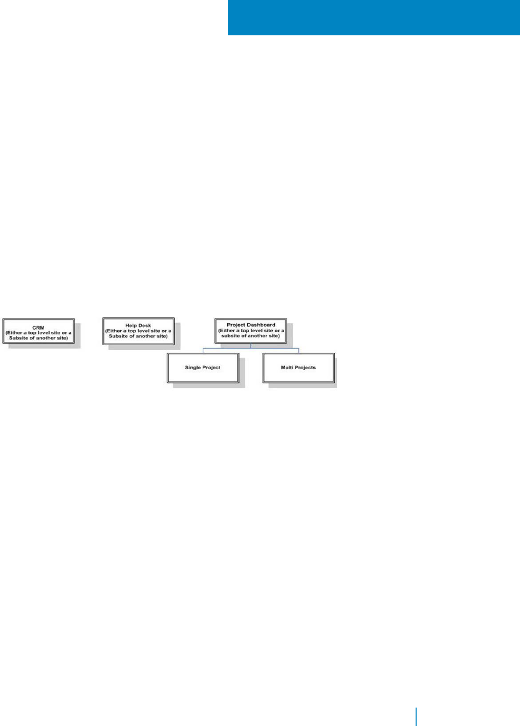
D
Application Templates
• Installing the Application Templates
• Adding the CRM template
• Adding the Help Desk Template
• Adding the Project Dashboard Template
• Adding the Project Workspace
Installing the Application Templates
QuickApps for SharePoint comes with several application templates. You can use these application templates
as a turn-key solution, extend it to your own need, or as an example for your own application.
Figure 1. Structure of the application templates:
The Single Project and Multi Projects sites must be added underneath the Project Dashboard site. Otherwise, you
will see an error in the Panel Menu citing that the list for the menu cannot be found. This is because the lists for
the Single Project's and Multi Project's panel menu are located in the Project Dashboard site.
The Application Site Templates in SharePoint are delivered as SharePoint solution packages: AgreeYa CRM
Site.wsp, AgreeYa Help Desk Site.wsp, AgreeYa Multi Project Site.wsp, AgreeYa Project Dashboard Site.wsp,
and AgreeYa Single Project Site.wsp.
To install the application templates
1 Copy the solution packages (.wsp files) to a local folder.
2 Click the Application Templates link on the QuickApps for SharePoint autorun screen of the installer.
3 Open the Solutions Gallery in SharePoint.
4 On the SharePoint Ribbon Solutions tab, click Upload Solution. Browse and upload the Site
Application Template.
5 Click Activate to activate it if you want the Site Template to appear in the New Site dialog box later.
Adding the CRM template
The CRM can be a top-level site or a subsite of another site.
www.agreeya.com
QuickApps for SharePoint
®
6.7
394
User Guide

The CRM application template can be used to manage customer data such as companies, contacts,
tasks, conversation records, and sales funnel (sales opportunities).
To add the CRM template
1 Open Sites and workspaces in SharePoint.
2 Click Create.
3 Complete the site information and select the CRM Site template under the Custom tab.
4 Click Create.
Next, you must configure the administrator group. The member of this group will see the
Administration Pages panel in the panel menu.
To configure the administrator group
1 Open People and groups in SharePoint.
2 Click New to create Administrators group and assign members to this group.
If you want to create announcements that are displayed in the Home page, login as a member of
the Administrators group and select Administration Pages | Application Setup in the panel menu.
Click the New button in the Companies listview in the Home page to create company records. When
you click Save and View Details, the company record is saved and you will redirected to the Company
Detail page where you can enter the Contacts, Tasks, Conversation Records and Sales Funnel (Sales
Opportunities) for that company.
Adding the Help Desk Template
The Help Desk can be a top-level site or a subsite of another site.
The Help Desk application template can be used to manage Help Desk tickets and to look for help desk
related information such as links, FAQs, and Knowledge Base Articles.
To add the Help Desk template
1 Open Sites and workspaces in SharePoint.
2 Click Create on the toolbar.
3 Complete the site information and select the Help Desk Site template under the Custom tab.
4 Click Create.
Next, you must configure the group for the help desk users.
To configure the group for help desk users
1 Open People and groups in SharePoint.
2 Create 4 new groups (3 new groups if you have already created an Administrators group) and
assign members to these groups.
• Administrators — The members of this group can see the Administration Pages panel in the
panel menu.
• Help Desk Users — This is the group for a regular user. Regular users can create a ticket and
track their existing tickets. They can also lookup the resources in the site.
• Help Desk Technicians — Help Desk Technician can do everything that the Help Desk User can
do. Also, they can assign a ticket to themselves or other technician and working on the ticket.
• Help Desk Supervisors — Help Desk Supervisor can do everything that the Help Desk Technician
can do. Also, they can administer the list of help desk technician and add FAQ, and Knowledge
Base articles.
www.agreeya.com
QuickApps for SharePoint
®
6.7
395
User Guide

If you do not log in as a member of Help Desk Supervisors, open another window and log in as
a supervisor.
Select Supervisor | Administrative Page in the menu. At a minimum, you must fill in the Help
Desk Technician information and the Supported Products. You can also create other information
such as Announcements, Help Desk Links, FAQs, and Knowledge Base Articles in this page.
After the setup is done, anybody can start using the site. The first thing that the user can do is to
create a new ticket by clicking the New button in the My New or Unassigned Tickets view in the home
page. After a ticket is created, the owner of the ticket can keep track the life cycle of the ticket by
clicking the Active Tickets, Resolved Tickets and Closed Tickets links in the panel menu.
Help Desk Technicians can login to the site and look for newly created tickets using the New or
Unassigned Tickets page. The link to navigate to this page is available in the panel menu. Somebody
must be a member of the Help Desk Technicians member to be able to see this menu. Help Desk
Technicians can also see any tickets that are assigned to him/her, resolved by him/her or closed
tickets that are resolved by him/her by clicking the appropriate links in the panel menu.
Any user can look for information such as FAQs, discussion board, Knowledge Base Articles, by clicking
the links in the panel menu. Only a member of Help Desk Supervisors group can create FAQs,
Knowledge Base Articles, by using the administrative page.
Adding the Project Dashboard Template
The Project Dashboard can be a top-level site or a subsite of another site.
The Project Dashboard, Single Project, and Multi Projects application templates can be used to
manage different aspect of a project, such as Tasks, Issues, and documents.
To add the Project Dashboard template
1 Open Sites and workspaces in SharePoint.
2 Click Create.
3 Complete the site information and select the Project Dashboard Site template under the Custom tab.
4 Click Create.
Next, you must configure the administrator group if you have not done so. The member of this group
will see the Administration Pages panel in the panel menu.
To configure the administrator group
1 Open People and groups in SharePoint.
2 Create an Administrators group and assign members to this group.
The Project Dashboard site itself does not contain any data. You must create one or more Single
Project sites or Multi Project sites as subsites of the Project Dashboard site.
Adding the Project Workspace
The Project Workspace must be created under the Project Dashboard.
To add the project workspace
1 Open Sites and workspaces in SharePoint.
2 Click Create on the toolbar.
3 Complete the site information and select either the template Single Project Site or Multi Project
Site under the Custom tab.
www.agreeya.com
QuickApps for SharePoint
®
6.7
396
User Guide

4 Click Create.
Login as a member of the Administrators group and select Administration Pages | Application Setup
in the panel menu. Setup your projects, phases for your projects, and other information pertaining to
the projects. For the Single Project site, you must create only one Project. You can create more than
one projects in the Multi Project site.
After the project is setup, any user can login to the project site and start managing the Tasks, Issues
and documents related to the project. In the Multi Project site, the user can switch between one
project and another by selecting it in the selector that is located above the listview in each page. The
selected project is memorized when the user navigates between pages enabling them to see the data
only for the selected project.
The user can also go to the Project Dashboard site to see the aggregated information from all the
subsites. For example, a manager can easily monitor the health of all the projects in the home page
of the Project Dashboard site.
www.agreeya.com
QuickApps for SharePoint
®
6.7
397
User Guide
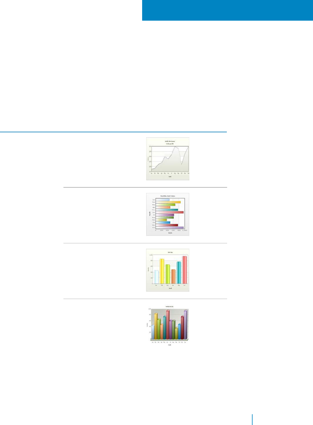
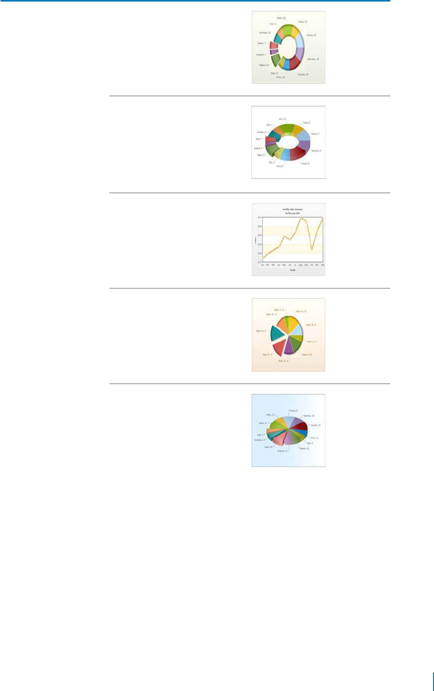
Table 1. Sample charts
Chart Group Chart Type Example
Doughnut2D
Doughnut3D
Line
Pie2D
Pie3D
www.agreeya.com
QuickApps for SharePoint
®
6.7
399
User Guide
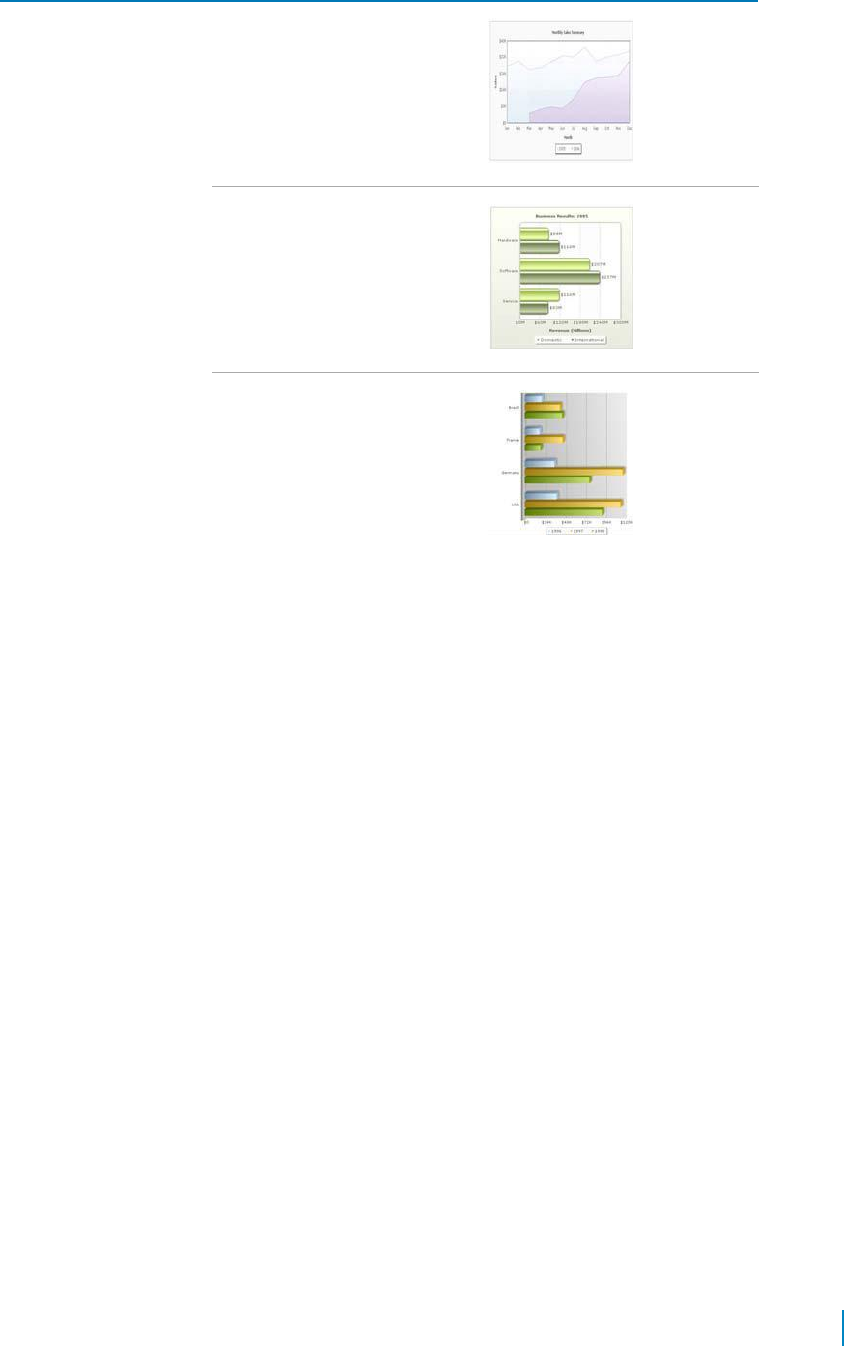
Table 1. Sample charts
Chart Group
Chart Type
Example
Multi-Series
MultiSeriesArea
MultiSeriesBar2D
MultiSeriesBar3D
www.agreeya.com
QuickApps for SharePoint
®
6.7
400
User Guide
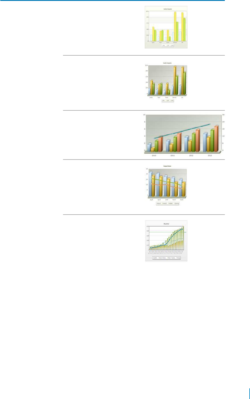
Table 1. Sample charts
Chart Group Chart Type Example
MultoSeriesColumn2D
MultiSeriesColumn3D
MultiSeriesColumn3DAnd
LineDualYAxis
MultiSeriesColumnAndLine3D
MultiSeriesCombination2D
www.agreeya.com
QuickApps for SharePoint
®
6.7
401
User Guide
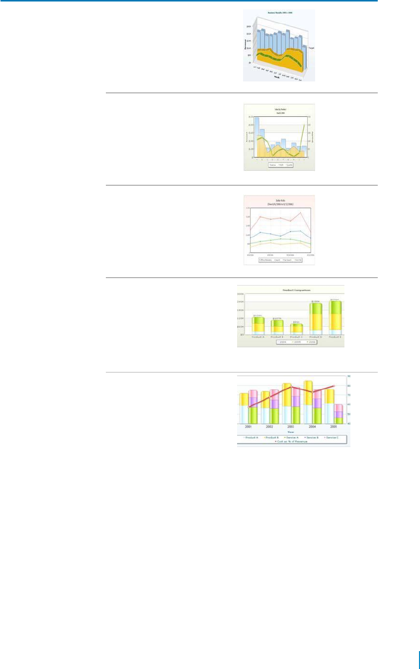
Table 1. Sample charts
Chart Group Chart Type Example
MultiSeriesCombination3D
MultiSeriesCombination2DDual
YAxis
MultiSeriesLine
MultiSeriesStackedColumn2D
For more information on this
chart type, see Using
MultiSeriesStackedColumn2D
and
MultiSeriesStackedColumn2DLi
neDual YAxis Charts on page
97.
MultiSeriesStackedColumn2DD
ualYAxis
For more information on this
chart type, see Using
MultiSeriesStackedColumn2D
and
MultiSeriesStackedColumn2DLi
neDual YAxis Charts on page
97.
www.agreeya.com
QuickApps for SharePoint
®
6.7
402
User Guide
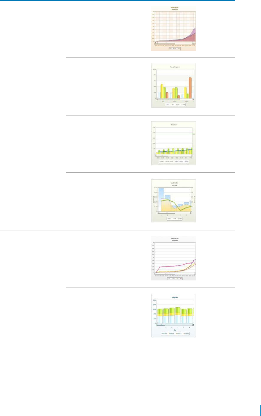
Table 1. Sample charts
Chart Group Chart Type Example
Scroll ScrollArea2D
ScrollColumn2D
ScrollCombination2D
ScrollCombination2DDualYAxis
ScrollLine2D
ScrollStackedColumn2D
www.agreeya.com
QuickApps for SharePoint
®
6.7
403
User Guide
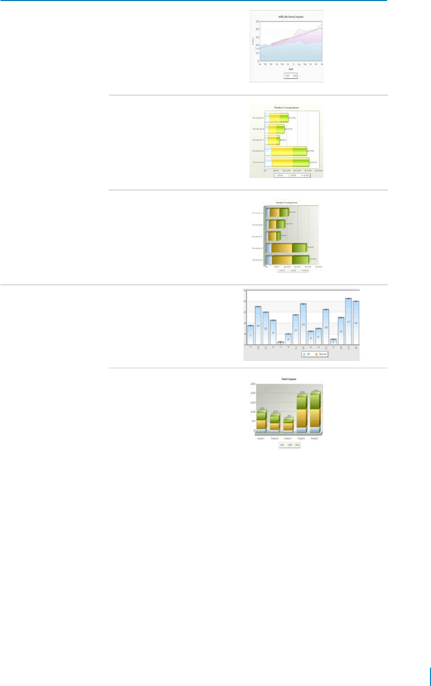
Table 1. Sample charts
Chart Group
Chart Type
Example
Stacked
StackedArea2D
StackedBar2D
StackedBar3D
StackedColumn2D
StackedColumn3DDualLineYAx
is
www.agreeya.com
QuickApps for SharePoint
®
6.7
404
User Guide

Index
A
about QuickApps, 8
adding a web app later in qDynamicLayout, 123
adding billions to default, 94, 95, 321
adding items to a list in SharePoint using
qListForm, 185
adding more web apps to the same tab in
qDynamicLayout, 123
adding number prefix and suffix, 93,
319 Advanced Mode, 19
AJAX, 155, 181, 228, 233, 240, 366
Application Templates, 394
CRM Template, 394
Dashboard Template, 396
Help Desk Template, 395
installing, 394
Project Workspace, 396 automatic
number formatting, 91, 317
C
CAML Filters, 19, 52, 106, 160, 200, 243,
262 using dynamic variables, 20
variables, 20
charts
multi-series, 400
scroll, 403
single series, 398
stacked, 404
Complex Filters, 21, 52, 200, 243, 262, 274,
354 Configuration Wizard
configuring advanced
settings qListView, 223
configuring basic settings
qListView, 223
qListView, 190
configuring a web app within qDynamicLayout, 123
configuring qCascadingMenu, 45
configuring qDynamicLayout, 123
configuring qManagement, 229
configuring qPanelMenu, 258
controlling decimal precision, 90, 316
creating and editing collapsible sections in
qListForm, 186
CRM Template, 394
Custom Action, 380
customactionex interface,
380 debugging, 389
deploying the custom action class, 390
icustomaction interface (deprecated),
386 using the custom action class, 390
Custom Action class, 390
deploying, 390
custom actions, 22, 167, 205, 277, 334,
358 Custom Layout, 148
custom layout manager class,
149 debugging, 152
deploying custom layout manager class,
154 Layout Manager, 148
using custom layout manager class,
153 Custom Layout Manager class, 149
deploying, 154
using, 153
customactionex interface, 380
D
debugging, 152, 389
defining links in qChartView, 88 defining
links in qSIChartView, 313 deploying the
custom action class, 390 dynamic
variables in CAML Filter, 20
E
exploring Web apps in qManagement, 230
ezLocalizer, 391
F
features of QuickApps, 8
form initialization actions, 171, 338
formatting links in qChartView, 87
formatting links in qSIChartView, 313
formatting y-axis values decimal in manual-div
line mode, 94, 320
H
Help Desk Template, 395
QuickApps for SharePoint® 6.7
405
User Guide

I
icustomaction interface (deprecated),
386 installing Application Templates, 394
L
Layout Manager, 148
linking to frames in qChartView, 89
linking to frames in qSIChartView,
315 Localization, 391
M
multi-series charts, 400
My First App, 393
using, 393
N
number formatting in qChartView, 90
adding number prefix and suffix, 93
automatic number formatting, 91
controlling decimal precision, 90
formatting y-axis values decimal in manual-div
lines mode, 94
setting custom thousand and decimal
separator character, 92
number formatting in qSIChartView, 315
adding number prefix and suffix, 319
automatic number formatting, 317
controlling decimal precision, 316
formatting y-axis values decimal in manual-div
lines mode, 320
setting custom thousand and decimal
separator character, 318
number scaling in qChartView, 94
adding billions to default, 94,
95 putting time in scale, 96
number scaling in qSIChartView,
320 adding billions to default,
321 putting time in scale, 322
O
opening links in a new window in qChartView, 88
opening links in a new window in qSIChartView, 314
opening links in a pop-up window in qChartView, 88
opening links in a pop-up window in qSIChartView, 314
P
Project Dashboard Template,
396 Project Workspace, 396
putting time in scale, 96, 322
Q
qCalendarView, 10
Pages, 10
Advanced Page, 32
Appearance Page, 28
Behavior Page, 22
Content Page, 11
qCaptionDisplay, 34
Pages, 35
Advanced Page, 37
Appearance Page, 35
Content Page, 35
qCascadingMenu, 39
configuring, 45
Pages, 40
Appearance Page, 42
Behavior Page, 41
Content Page, 40
qCascadingMenu Pages
Advanced Page, 43
qChartView, 47
adding billions to default, 95
defining links, 88
formatting links, 87
linking to frames, 89
number formatting, 90
adding number prefix and suffix, 93
automatic number formatting, 91
controlling decimal precision, 90
formatting y-axis values decimal in
manual-div line mode, 94
setting custom thousand and
decimal separator character, 92
number scaling, 94
adding billions to default, 94
putting time in scale, 96
opening links in a new window, 88
opening links in a pop-up window,
88 Pages, 47
Advanced Page, 85
Appearance Page, 55
Behavior Page, 55
Content Page, 47
qDiscussionView, 99
Pages, 99
Appearance Page, 109
Behavior Page, 109
Content Page, 99
qDiscussionView Pages
Advanced Page, 112
qDynamicLayout, 119
adding a web app later, 123
QuickApps for SharePoint® 6.7
406
User Guide

adding more web apps to the same tab, 123
configuring, 123
configuring a web app within qDynamicLayout,
123
Pages, 119
Advanced Page, 122
Appearance Page, 121
Content Page, 119
qExcelViewer, 124
qExcelViewer Pages, 124
Advanced Page, 127
Appearance Page, 126
Content Page, 124
qHelpLink, 130
qHelpLink Pages, 130
Advanced Page, 133
Behavior Page, 132
Content Page, 131
qItemDisplay, 135
qItemDisplay Pages, 135
Advanced Page, 139
Appearance Page, 137
Behavior Page, 137
Content Page, 135
qListForm, 141
adding items to a list in SharePoint, 185
creating and editing collapsible sections,
186 User Permissions, 143
qListForm Pages, 143
Advanced Page, 181
Appearance Page, 178
Behavior Page, 166
Content Page, 144
qListView, 189
Configuration Wizard, 190
configuring advanced settings,
223 configuring basic settings, 223
qListView Pages, 190
Advanced Page, 217
Appearance Page, 211
Behavior Page, 205
Content Page, 191
qManagement, 225
configuring, 229
exploring Web apps, 230
searching web apps, 230
setting new property values, 230
qManagement Pages, 225
Advanced Page, 228
Appearance Page, 226
Content Page, 225
qMediaView, 232
qMediaView Pages, 232
Advanced Page, 240
Appearance Page, 236
Content Page, 233
qMultiSelector, 241
qMultiSelector Pages, 241
Advanced Page, 245
Appearance Page, 244
Content Page, 241
qPageRedirector, 247
qPageRedirector Pages, 248
Advanced Page, 250
Appearance Page, 248
Content Page, 248
qPanelMenu, 252
configuring, 258
qPanelMenu Pages, 253
Advanced Page, 257
Appearance Page, 255
Behavior Page, 255
Content Page, 253
qSelector, 260
qSelector Pages, 261
Advanced Page, 265
Appearance Page, 263
Content Page, 261
qSIChartView, 267
adding billions to default,
321 defining links, 313
formatting links, 313 linking
to frames, 315 number
formatting, 315
adding number prefix and suffix, 319
automatic number formatting, 317
controlling decimal precision, 316
formatting y-axis values decimal in
manual-div line mode, 320
setting custom thousand and
decimal separator character, 318
number scaling, 320
putting time in scale, 322 opening
links in a new window, 314 opening
links in a pop-up window, 314
qSIChartView Pages, 267
Advanced Page, 311
Appearance Page, 282
Behavior Page, 277
Content Page, 268
qSIListForm, 324
qSIListForm Pages, 325
Advanced Page, 344
Appearance Page, 342
QuickApps for SharePoint® 6.7
407
User Guide

Behavior Page, 333
Content Page, 325
qSIListView, 346
qSIListView Pages, 347
Advanced Page, 366
Appearance Page, 362
Behavior Page, 358
Content Page, 347
qSISelector, 369
qSISelector Pages, 370
Advanced Page, 378
Appearance Page, 376
Content Page, 370
QuickApps
about, 8
features, 8
R
ribbon groups, 9
S
sample charts, 398
scroll charts, 403
searching web apps in qManagement, 230
setting custom thousand and decimal separator
character, 92, 318
setting new property values in qManagement, 230
single series charts, 398
stacked charts, 404
U
User Permissions
qListForm, 143
using My First App, 393
using the custom action class, 390
V
variables, 20
QuickApps for SharePoint® 6.7
408
User Guide

About AgreeYa
AgreeYa Solutions is a global provider of software, solutions, and services focused on deploying business-
driven, technology-enabled solutions that create next-generation competitive advantages for customers.
Headquartered in Folsom, California, AgreeYa is a growing and dynamic organization with 15 offices in 8
countries employing more than 1,300 professionals. Over the last 15 years, AgreeYa has worked with 200+
companies ranging from Fortune 100 firms to small and large businesses, delivering solutions for variety of
industries including telecommunications, BFSI, healthcare, high-tech, manufacturing, utility and government.
AgreeYa’s software portfolio includes SocialXtend (intranet and enterprise social collaboration), VDIXtend
(Desktop-on-Cloud), Onvelop (enterprise mobility productivity suite), Edvelop (single window collaboration
and communication solution for 21st century learning) and Cogent (comprehensive end-to-end case
management solution for collections agencies and law firms). As part of its solutions and services offerings,
AgreeYa provides intranet and enterprise collaboration on SharePoint, cloud and infrastructure, enterprise
mobility, product engineering, application development and management, independent software testing, and
staffing (IT and risk/compliance) solutions. For more information visit www.agreeya.com
Contacting AgreeYa
Technical support:
Online support
Product questions and sales:
1-800-AGREEYA
Email:
quickapps@agreeya.com
Technical support resources
Technical support is available to customers who have purchased AgreeYa software with a valid
maintenance contract and to customers who have trial versions. To access the Support Portal, go to
www.quickapps.agreeya.com/support.
The Support Portal provides self-help tools you can use to solve problems quickly and independently, 24 hours
a day, 365 days a year. In addition, the portal provides direct access to product support engineers through an
online Service Requests system.
The site enables you to:
• Create, update, and manage Service Requests (cases)
• View Knowledge Base articles
• Obtain product notifications
• Download software. For trial software, go to Trial Downloads.
• View how-to videos
• Engage in community discussions
• Chat with a support engineer
www.agreeya.com
QuickApps for SharePoint
®
6.7
409
User Guide
