Quick Start Guide
QuickStart_Guide
User Manual:
Open the PDF directly: View PDF  .
.
Page Count: 8
Grade UI kit
What is Grade UI kit?
Grade UI kit is a collection of UI elements for Desktop/Mobile Website Design and App design,
created specifically for use with Affinity Designer.
What’s included?
UI Sheets
Assets
Palettes
Sample
The above kit components are stored in folders of the same name in this ZIP file.
Installing fonts
The Grade UI kit uses two Google Font families called ‘Roboto’ and ‘Roboto Condensed’. We
recommend downloading these from Google Fonts (http://fonts.google.com) and installing them
before using the Grade UI kit.
If the Roboto fonts are unavailable when accessing the Grade UI kit, substitute fonts will be used
and the design might not look as intended. To indicate that text is using a font which is currently
unavailable, a question mark appears before the font name show on the context toolbar when text
is selected.
2
UI Sheets
UI Sheets are packed with pre-built page content made up of multiple elements. Page content is
stored in separate Designer files according to page content type (e.g., blogs, dashboards,
ecommerce, headers/footers, social and more).
How to use
1. Open the .afdesign file for the page content type you want.
2. Select, then copy and paste content to your design file.
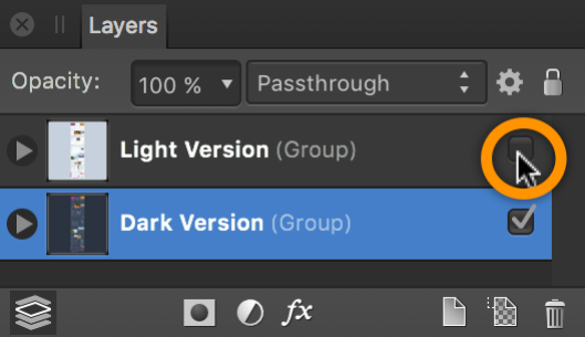
Choosing light or dark versions
On many of the UI sheets, you’ll have the choice of light or dark versions of each page content.
These versions are stored on separate layers. From the Layers panel, hide the Light Version
layer to work with the Dark Version layer (or vice versa).
3
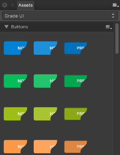
Assets
These are simpler elements compared to the page content on the UI sheets. They can be added
directly to your page by drag-and-drop from the Assets Panel. You can select buttons, inputs,
check boxes, text areas, switches, drop-downs, sliders, notifications icons, and more. Over 20
categories are available.
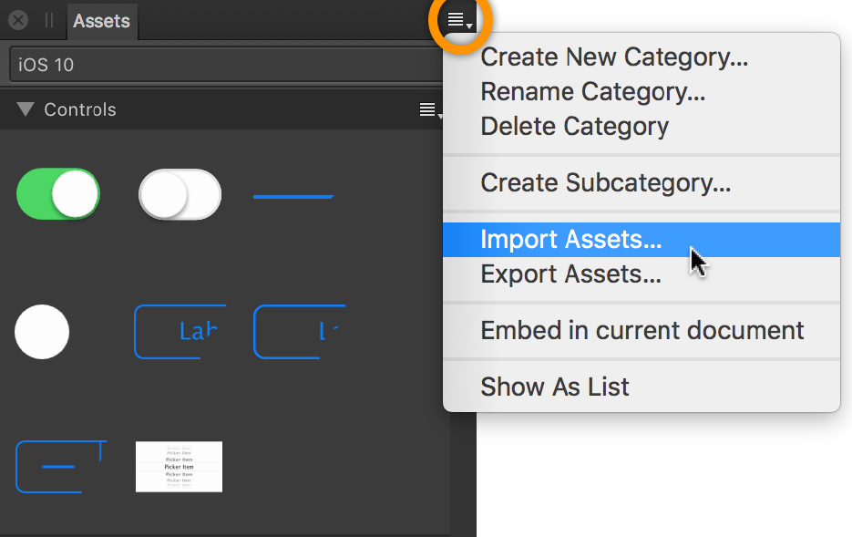
Installing assets
1. From the View menu, select Studio, then click Assets.
2. On the Assets Panel, click panel preferences, and select Import Assets from the pop-up
menu.
3. Navigate to your downloaded kit’s Assets folder and select Grade UI.afassets, then Open.
4
The Grade UI assets are imported as a new Grade UI category.
5
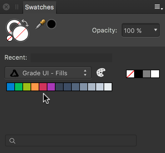
Palettes
A couple of palettes containing solid and gradient fill swatches can be used to recolour page
content or assets.
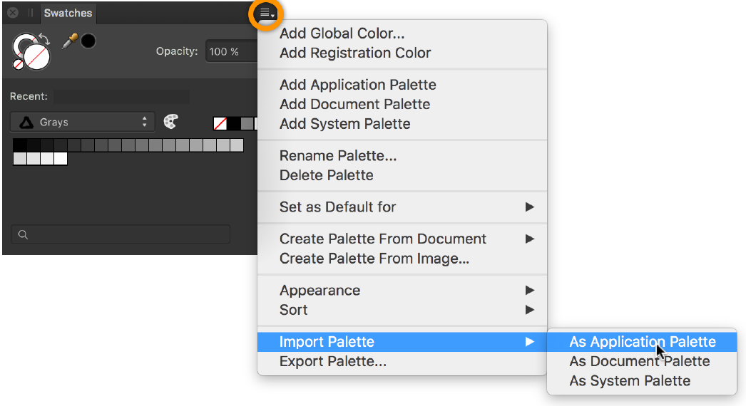
Installing palettes
1. On the Swatches Panel, click panel preferences, and select Import Palette > As
Application Palette from the pop-up menu.
6
2. Navigate to your downloaded kit’s Palettes folder and select Grade UI - Fills.afpalette, then
Open. The palette automatically appears in the Swatches panel.
3. Repeat for the Grade UI - Gradients.afpalette file.
7
Sample
The sample file (Grade UI Sample - Homepages.afdesign) showcases how a UI design has been
created using Grade UI kit. The designs are intended for both desktop and mobile websites.
What we did…
1. Created an iPad Air artboard.
2. Filled the artboard background with one of our solid fill swatch from the Grade UI - Fills
palette.
3. From the UI Sheets folder, opened the Headers.afdesign file, then copied Header #4 into
the empty artboard.
4. Applied a gradient fill swatch from the Grade UI - Gradients palette, across the Header page
content.
5. Used symbols for the company logo and Hire Me button.
6. Added constraints to Header elements.
7. Created an iPad Air//website and iPadPro//website artboard.
8. Copied and pasted iPad Air artboard content into newly created empty iPhone 6 and iPad
Pro artboards to auto-layout.
For more about symbols and constraints functionality, see Affinity Designer Help or visit
vimeo.com/macaffinity.
8
Copyrights
© Sergey Azovskiy
Roboto-Regular.ttf: © Christian Robertson.
