SETU02228A Product Setup Style Guide
User Manual:
Open the PDF directly: View PDF ![]() .
.
Page Count: 60
- 10.1 Communicators: Badges Continued
- 10.0 Communicators: Badges
- 9.2 Dialogs: Modal Dialogs Continued
- 9.1 Dialogs: Modal Dialogs
- 9.0 Dialogs: Inline Dialogs
- 8.10 Controls: Tabs
- 8.9 Controls: Secondary Content Containers
- 8.8 Controls: Primary Content Containers
- 8.7 Controls: Table Variations Continued
- 8.6 Controls: Table Variations
- 8.5 Controls: Basic Tables
- 8.4 Controls: Forms - Date Picker
- 8.3 Controls: Forms - Radio Buttons and Checkboxes
- 8.2 Controls: Forms - Labels and Input Fields
- 8.1 Controls: Secondary Buttons & Variations
- 8.0 Controls: Primary Buttons
- 7.2 Consistent Page Elements: Page Wrapper
- 7.1 Consistent Page Elements: Page Title Bar Continued
- 7.0 Consistent Page Elements: Page Title Bar
- 6.3 Navigation: Footer
- 6.2 Navigation: Main Menu Pulldown & Utilities
- 6.1 Navigation: Sub Menu
- 6.0 Navigation: Header & Main Navigation
- 5.0 Keyboard Shortcuts
- 4.0 Color Palette
- 3.0 Iconography
- 2.0 Typography
- 1.7 Lightboxes
- 1.6 Lower-level Page Single Column
- 1.5 Lower-level Page w/ Right Sidebar
- 1.4 List Page Template
- 1.3 Dashboard Template
- 1.2 LaunchPad Template
- 1.1 Global Page Structure
- 1.0 Templates
- Introduction
- Change Log
Date Created: 06/12/2013 | Date Modified: 03/27/2014 | Version 1.7 |
© 2013 Autodata Solutions, Inc. / Autodata Solutions Company
Page / 1
Southeast Toyota: Product Setup Application
Style Guide/Version 1.7
Prepared by Autodata Solutions for Southeast Toyota
Southeast Toyota
Date Created: 06/12/2013 | Date Modified: 03/27/2014 | Version 1.7 |
© 2013 Autodata Solutions, Inc. / Autodata Solutions Company
Page / 2
Change Log 3
Introduction 4
1.0 Templates 5
1.1 Global Page Structure 6
1.2 LaunchPad Template 7
1.3 Dashboard Template 8
1.4 List Page Template 9
1.5 Lower-level Page w/ Right Sidebar 10
1.6 Lower-level Page Single Column 11
1.7 Lightboxes 12
2.0 Typography 13
3.0 Iconography 14
4.0 Color Palette 15
5.0 Keyboard Shortcuts 16
6.0 Navigation: Header & Main Navigation 17
6.1 Navigation: Sub Menu 18
6.2 Navigation: Main Menu Pulldown & Utilities 19
6.3 Navigation: Footer 20
7.0 Consistent Page Elements: Page Title Bar 21
7.1 Consistent Page Elements: Page Title Bar Continued 22
7.2 Consistent Page Elements: Page Wrapper 23
8.0 Controls: Primary Buttons 24
8.1 Controls: Secondary Buttons & Variations 25
8.2 Controls: Forms - Labels and Input Fields 26
8.3 Controls: Forms - Radio Buttons and Checkboxes 27
8.4 Controls: Forms - Date Picker 28
8.5 Controls: Basic Tables 29
8.6 Controls: Table Variations 30
8.7 Controls: Table Variations Continued 31
8.8 Controls: Primary Content Containers 32
8.9 Controls: Secondary Content Containers 33
8.10 Controls: Tabs 34
9.0 Dialogs: Inline Dialogs 35
9.1 Dialogs: Modal Dialogs 36
9.2 Dialogs: Modal Dialogs Continued 37
10.0 Communicators: Badges 38
10.1 Communicators: Badges Continued 39
10.2 Communicators: Messages 40
10.2 Communicators: Messages Continues 41
10.3 Communicators: Spinners 42
10.4 Communicators: Tooltips 43
11.0 Patterns: Activity stream 44
11.1 Patterns: Product Release Status 45
11.2 Patterns: Media Widget 46
11.3 Patterns: Media Modal Dialog 47
11.4 Patterns: Entry Summary 48
11.5 Patterns: Approval Widget 49
11.6 Patterns: Action Toolbar 50
11.7 Patterns: AutoComplete 51
11.8 Patterns: Drag & Drop List Items 52
11.9 Patterns: Manage Categories 53
11.10 Patterns: Manage Categories - Overlay 54
11.11 Patterns: Tree Builder 55
11.12 Patterns: Audit History Modal Dialog 56
12.0 Reporting Template 57
13.0 Example Screen - Dashboard 58
13.0 Example Screen - Search 59
13.0 Example Screen - Details with Side Bar 60
Table of Contents
Southeast Toyota
Date Created: 06/12/2013 | Date Modified: 03/27/2014 | Version 1.7 |
© 2013 Autodata Solutions, Inc. / Autodata Solutions Company
Page / 3
Change Log
Version Date Notes
v1 02/25/2013 Document Creation
v1.1 10/01/2013 Updated document based on NewGen Living Style Guide review. Updates include new color on hover to tabs (p34), Badges line height property (p38 & 39), Table pagination padding (p29) and Grid star icon size (p30).
v1.2 10/17/2013 Added Manage Categories Pattern (Sections 11.09, 11.10 & 11.11)
v1.3 10/23/2013 Updated the Patterns: Media Widget based on Jira Ticket - SETU02322A-16
v1.4 10/29/2013 Added Pattern: Audit History - SETU02322A-81
v1.5 11/25/2013 Updated Main Navigation - SETU02322A-177
v1.6 01/27/2014 Removed brand logo from footer - SETU02322A-899
Southeast Toyota
Date Created: 06/12/2013 | Date Modified: 03/27/2014 | Version 1.7 |
© 2013 Autodata Solutions, Inc. / Autodata Solutions Company
Page / 4
This style guide outlines the principles and standards for the creation of the Product Setup
Application for Southeast Toyota. It is intended to be used by designers and developers. This
document does not set out to constrain how the application should or should not be implemented,
but aims instead to establish a consistent quality of treatment for fundamental elements across the
application.
Main areas covered
• Global Template Structure
• Typography, Iconography and Color Treatments
• Detailed visual styles and specification of screen elements
Design Principles
Structure
• Keep site map wide and shallow.
• Take into account the trade-off between having too many actions/links on a page and asking
the user to follow too many links to reach what they are looking for.
• Inform the user about his or her location in the application. This can be done with page titles,
informative link names and branding elements.
Navigation
• Offer consistent navigation across the application. This helps users orient themselves and
allows them to identify navigation more easily.
Interaction
• Input
• Keep the number of keystrokes to a minimum
• Avoid free text entry where possible
• Provide pre-selected default values where possible
• Arrange the page contents so that the order is logical when scrolling a page from top to
bottom. Remember that only a fraction of the page is visible on screen.
• Limit content to what the user has requested.
• Provide a short but descriptive page title to allow easy identification.
• Scrolling
• Only vertical page scrolling is allowed.
• Ensure that material that is central to the meaning of the page precedes material that is
not.
Approval process
These guidelines have been defined by the Autodata Solutions Creative team.
Approval for any alterations and/or additions sits with the ASC Creative team, and they should be
made aware of any updates before they go live. Creative team contacts are:
Willie Flamenco, Lead UI/UX Designer
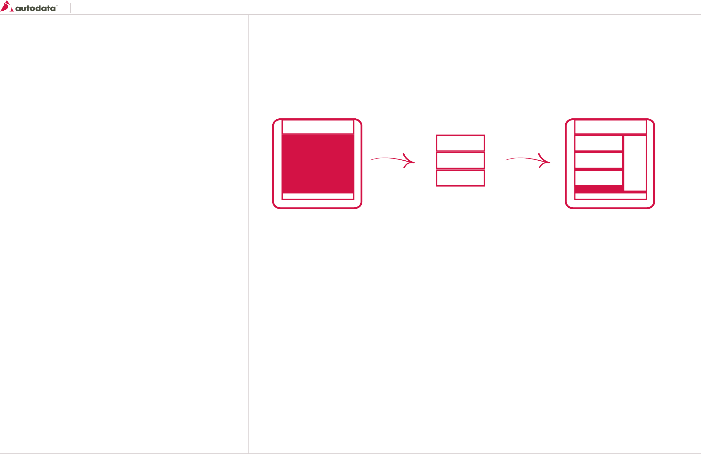
What are you designing?
Look at the page template section 1.0 and find the
template type that matches your design task.
Use the page template to structure your page and
content.
Where are the details?
Module contents and construction details can be found
starting in section 2.0
Put it all together
Using the Template and Module details you should be
able to build every page in the system.
Introduction How to use this document
Module A Module A
Module B Module B
Module C Module C
Southeast Toyota
Date Created: 06/12/2013 | Date Modified: 03/27/2014 | Version 1.7 |
© 2013 Autodata Solutions, Inc. / Autodata Solutions Company
Page / 5
Each of these areas can be made up of one or more modules. A module is composed of one or more
elements, and each of them has rules about interaction and visual design
Header
The header consists of the header module. The header will always be composed of the same ele-
ments, but this does not mean that it will always look identical.
Body
The body area is very flexible and made up of one or more modules, each of which will be detailed
later in this document.
Footer
The footer container similarly consists of the footer module. Footer module will always be composed
of the same elements.
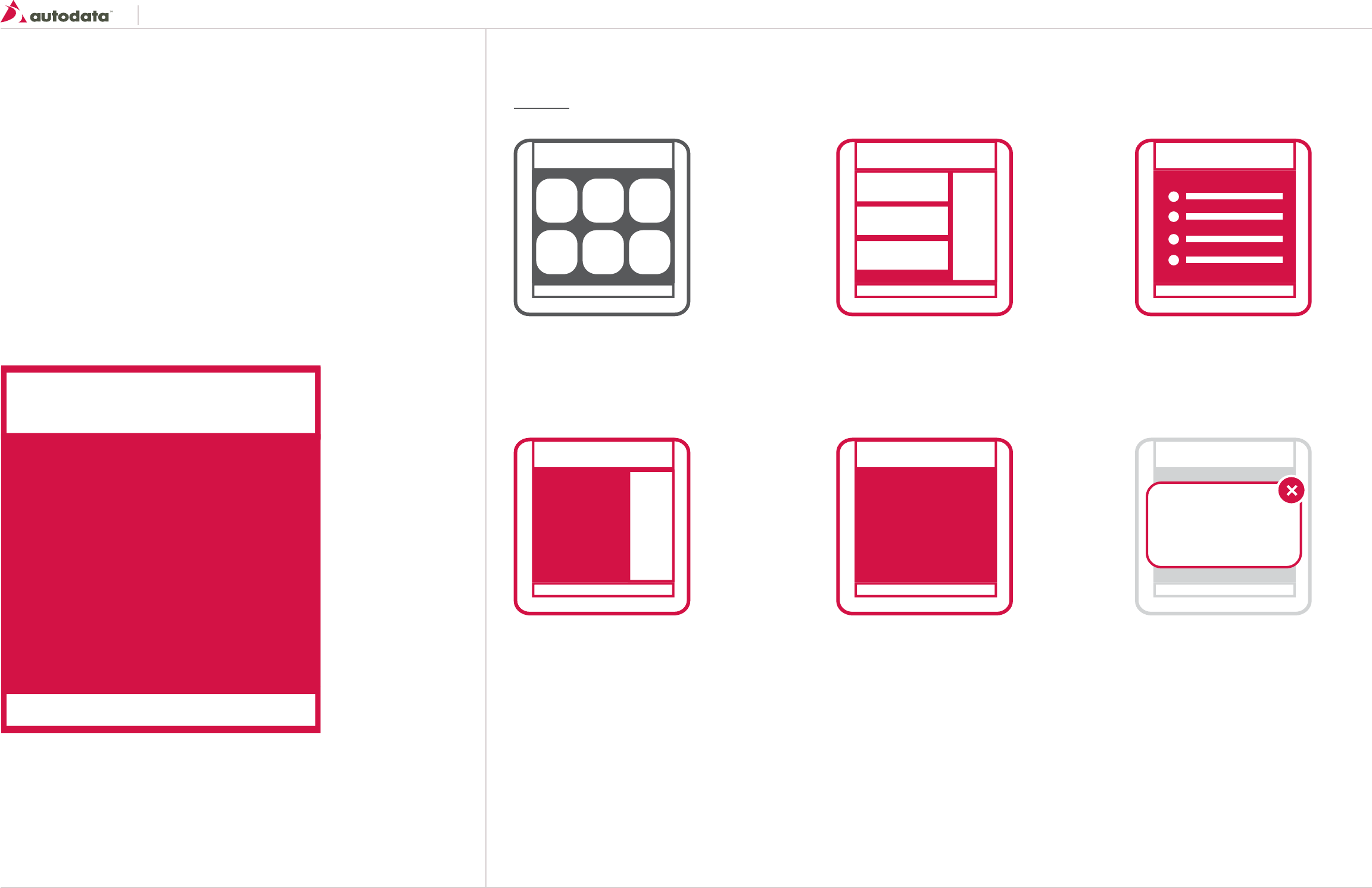
All pages on the Product Setup Application fall into the following page template categories.
LaunchPad No Longer Required Dashboard List Page
Lower-level Page w/ Right Sidebar Lower-level Page Single Column Lightbox
1.0 Templates
Header
Body
Footer
Southeast Toyota
Date Created: 06/12/2013 | Date Modified: 03/27/2014 | Version 1.7 |
© 2013 Autodata Solutions, Inc. / Autodata Solutions Company
Page / 6
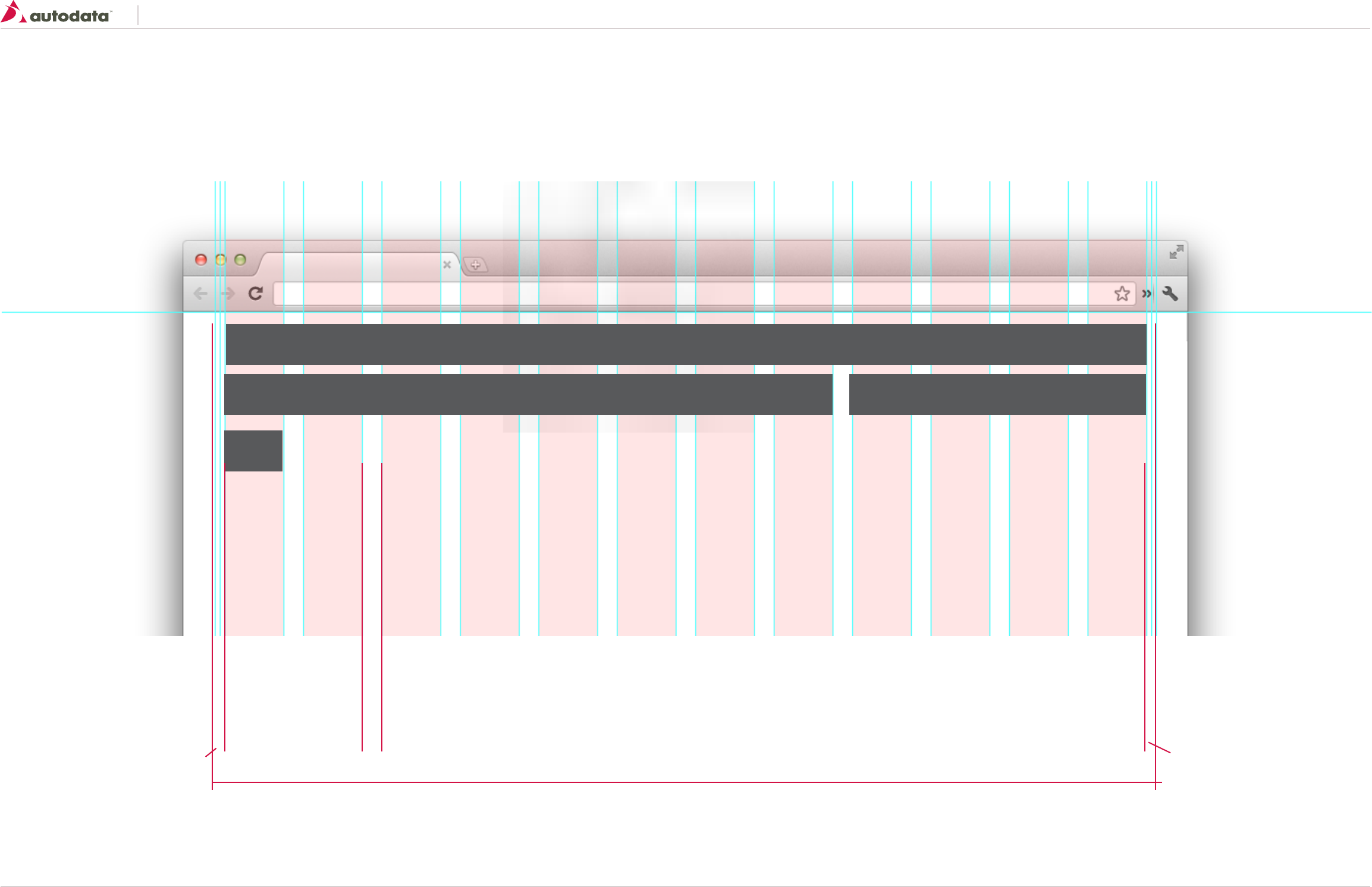
What are grids and why use them?
Grids are very important in web design. They help the designers structure the page visually and are very useful to developers who build templates and style sheets. The grid provides the foundation for a harmonious positioning of elements, while maintaining a consistent and coherent look of a page as
a whole.
The application design is based on a 960 Grid system with a 12 column grid. Units below are in Pixels.
1.1 Global Page Structure
Min-width 960
10 20 10
940
300620
60
Southeast Toyota
Date Created: 06/12/2013 | Date Modified: 03/27/2014 | Version 1.7 |
© 2013 Autodata Solutions, Inc. / Autodata Solutions Company
Page / 7
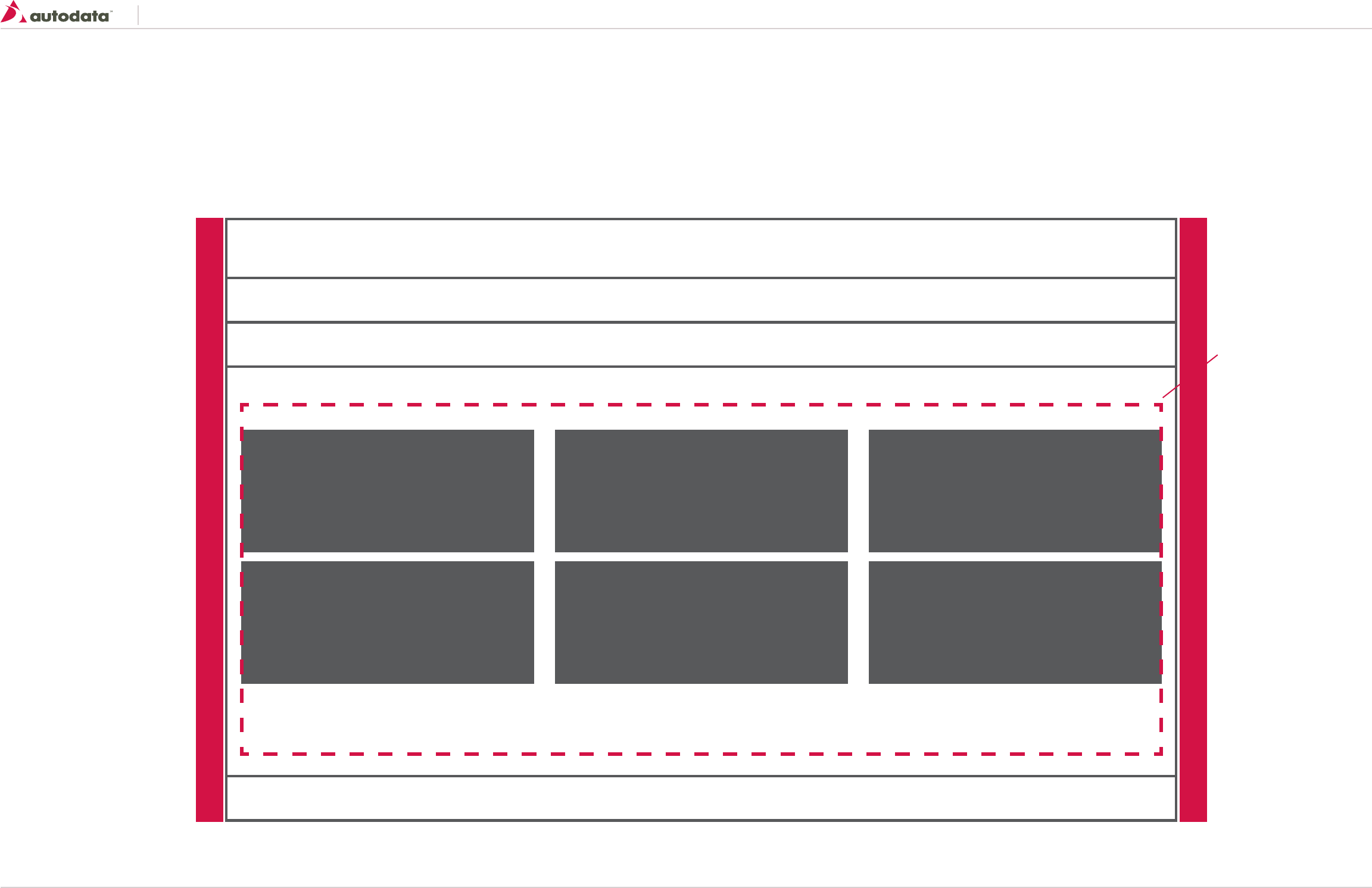
1.2 LaunchPad Template
Template consists of the following areas:
• Header
• Main Navigation
• Body
• Page Title
• Section Links
• Footer
Section Link - 300
(4 Grid)
Section Link - 300
(4 Grid)
Section Link - 300
(4 Grid)
Section Link - 300
(4 Grid)
Section Link - 300
(4 Grid)
Section Link - 300
(4 Grid)
Page Min-width 960
Fluid Layout
Content Area: 100% x Flexible Height (12 Grid)
SET Portal (Controlled by SET)
Navigation: 100% x 33 px or 56 px with Sub Navigation (12 Grid)
Page Title Bar: 100% x 47 (12 Grid)
Footer: 100% x 65 (12 Grid)
Left Padding: 4% Right Padding: 4%
Body Padding: 10px
Southeast Toyota
Date Created: 06/12/2013 | Date Modified: 03/27/2014 | Version 1.7 |
© 2013 Autodata Solutions, Inc. / Autodata Solutions Company
Page / 8
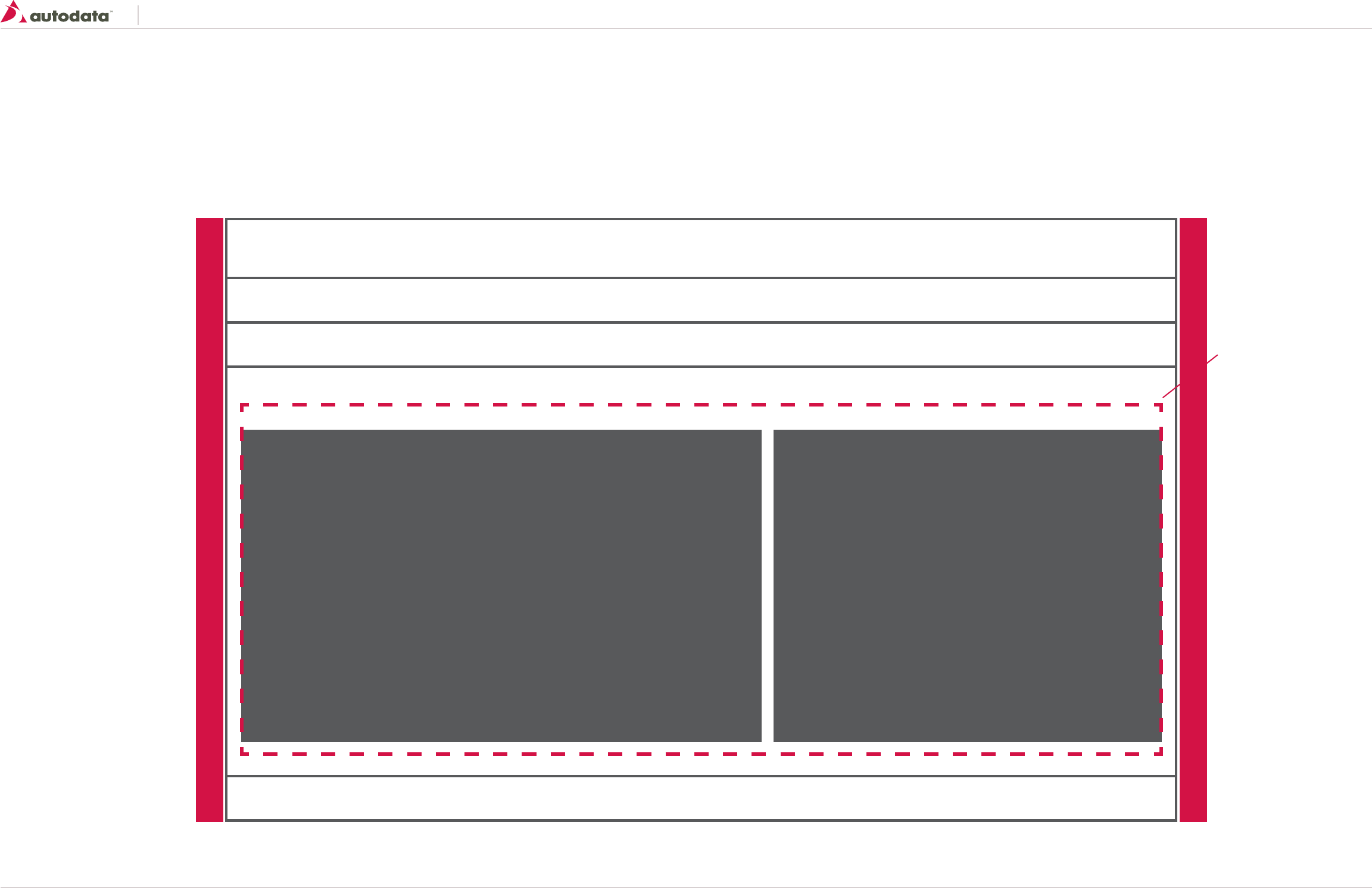
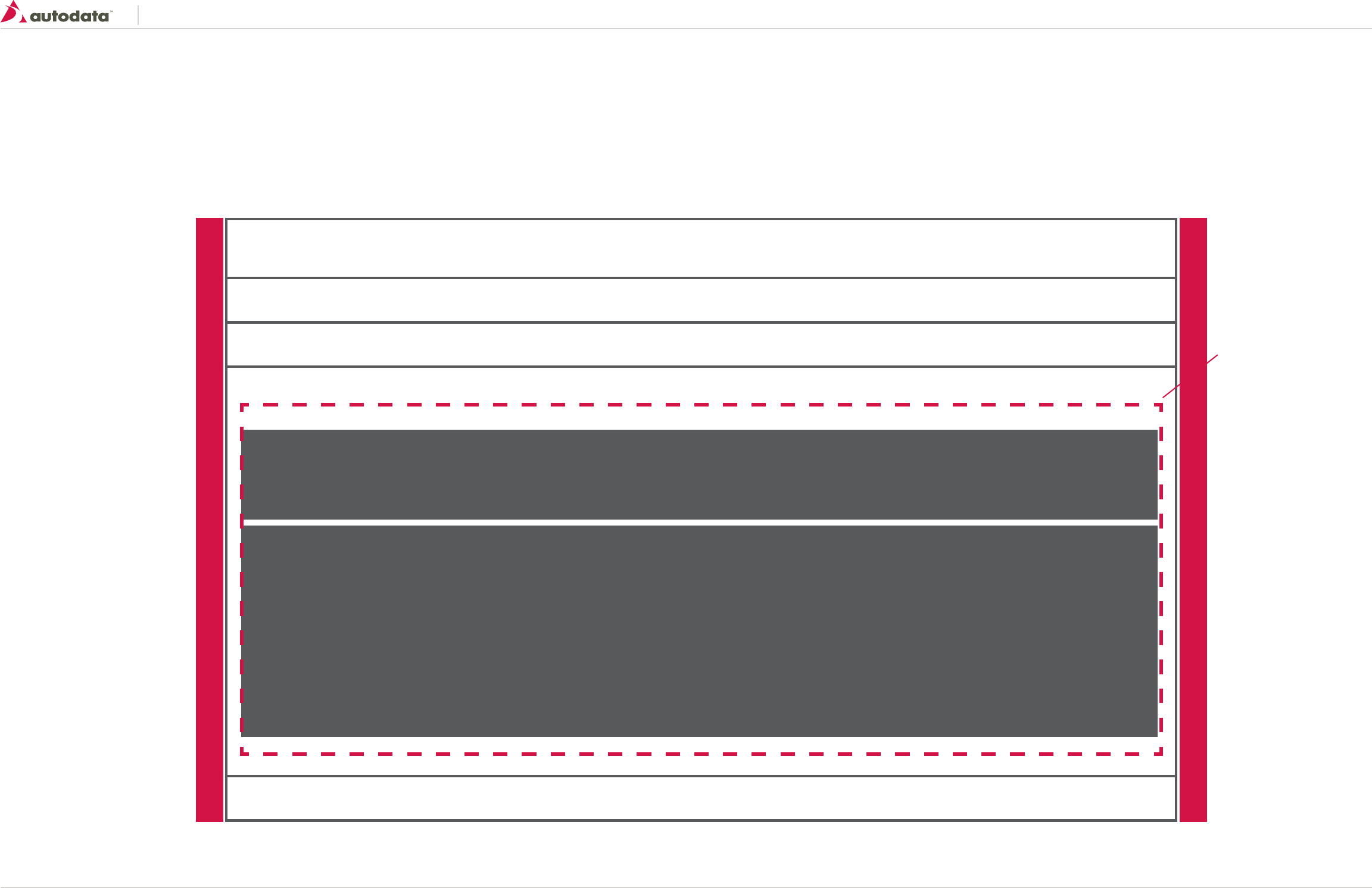
1.3 Dashboard Template
Template consists of the following areas:
• Header
• Main Navigation
• Body
• Page Title
• Content
• Activity Stream
• Footer
Content - 540
(7 Grid)
Activity Stream - 380
(5 Grid)
Page Min-width 960
Fluid Layout
Content Area: 100% x Flexible Height (12 Grid)
SET Portal (Controlled by SET)
Navigation: 100% x 33 px or 56 px with Sub Navigation (12 Grid)
Page Title Bar: 100% x 47 (12 Grid)
Footer: 100% x 65 (12 Grid)
Left Padding: 4% Right Padding: 4%
Body Padding: 10px
Southeast Toyota
Date Created: 06/12/2013 | Date Modified: 03/27/2014 | Version 1.7 |
© 2013 Autodata Solutions, Inc. / Autodata Solutions Company
Page / 9
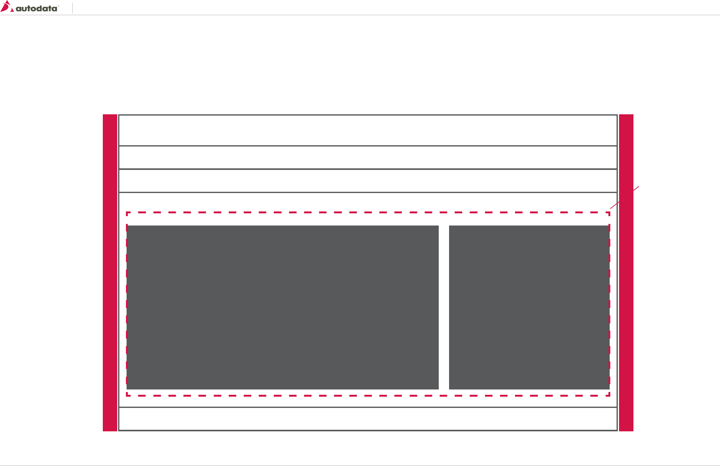
1.4 List Page Template
Template consists of the following areas:
• Header
• Main Navigation
• Body
• Page Title
• Search Filters
• Results List
• Footer
Search Filters - 100% x Height Varies (12 Grid)
Results List - 100% x Height Varies (12 Grid)
Page Min-width 960
Fluid Layout
Content Area: 100% x Flexible Height (12 Grid)
SET Portal (Controlled by SET)
Navigation: 100% x 33 px or 56 px with Sub Navigation (12 Grid)
Page Title Bar: 100% x 47 (12 Grid)
Footer: 100% x 65 (12 Grid)
Left Padding: 4% Right Padding: 4%
Body Padding: 10px
Southeast Toyota
Date Created: 06/12/2013 | Date Modified: 03/27/2014 | Version 1.7 |
© 2013 Autodata Solutions, Inc. / Autodata Solutions Company
Page / 10
1.5 Lower-level Page w/ Right Sidebar
Template consists of the following areas:
• Header
• Main Navigation
• Body
• Page Title
• Content
• Right Bar Content
• Footer
Page Min-width 960
Fluid Layout
Content Area: 100% x Flexible Height (12 Grid)
SET Portal (Controlled by SET)
Navigation: 100% x 33 px or 56 px with Sub Navigation (12 Grid)
Page Title Bar: 100% x 47 (12 Grid)
Footer: 100% x 65 (12 Grid)
Left Padding: 4% Right Padding: 4%
Body Padding: 10px
Content - 620
(8 Grid)
Right Bar - 300
(4 Grid)

Southeast Toyota
Date Created: 06/12/2013 | Date Modified: 03/27/2014 | Version 1.7 |
© 2013 Autodata Solutions, Inc. / Autodata Solutions Company
Page / 11
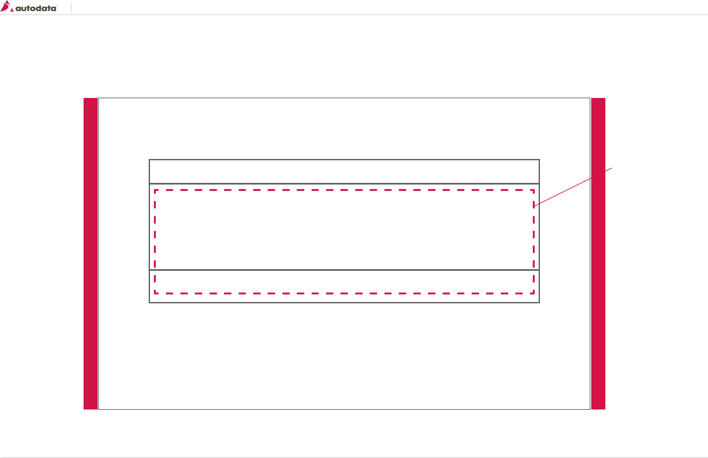
1.6 Lower-level Page Single Column
Template consists of the following areas:
• Header
• Main Navigation
• Body
• Page Title
• Content
• Footer
Page Min-width 960
Fluid Layout
Content Area: 100% x Flexible Height (12 Grid)
SET Portal (Controlled by SET)
Navigation: 100% x 33 px or 56 px with Sub Navigation (12 Grid)
Page Title Bar: 100% x 47 (12 Grid)
Footer: 100% x 65 (12 Grid)
Left Padding: 4% Right Padding: 4%
Body Padding: 10px
Content - 100%
(12 Grid)
Southeast Toyota
Date Created: 06/12/2013 | Date Modified: 03/27/2014 | Version 1.7 |
© 2013 Autodata Solutions, Inc. / Autodata Solutions Company
Page / 12
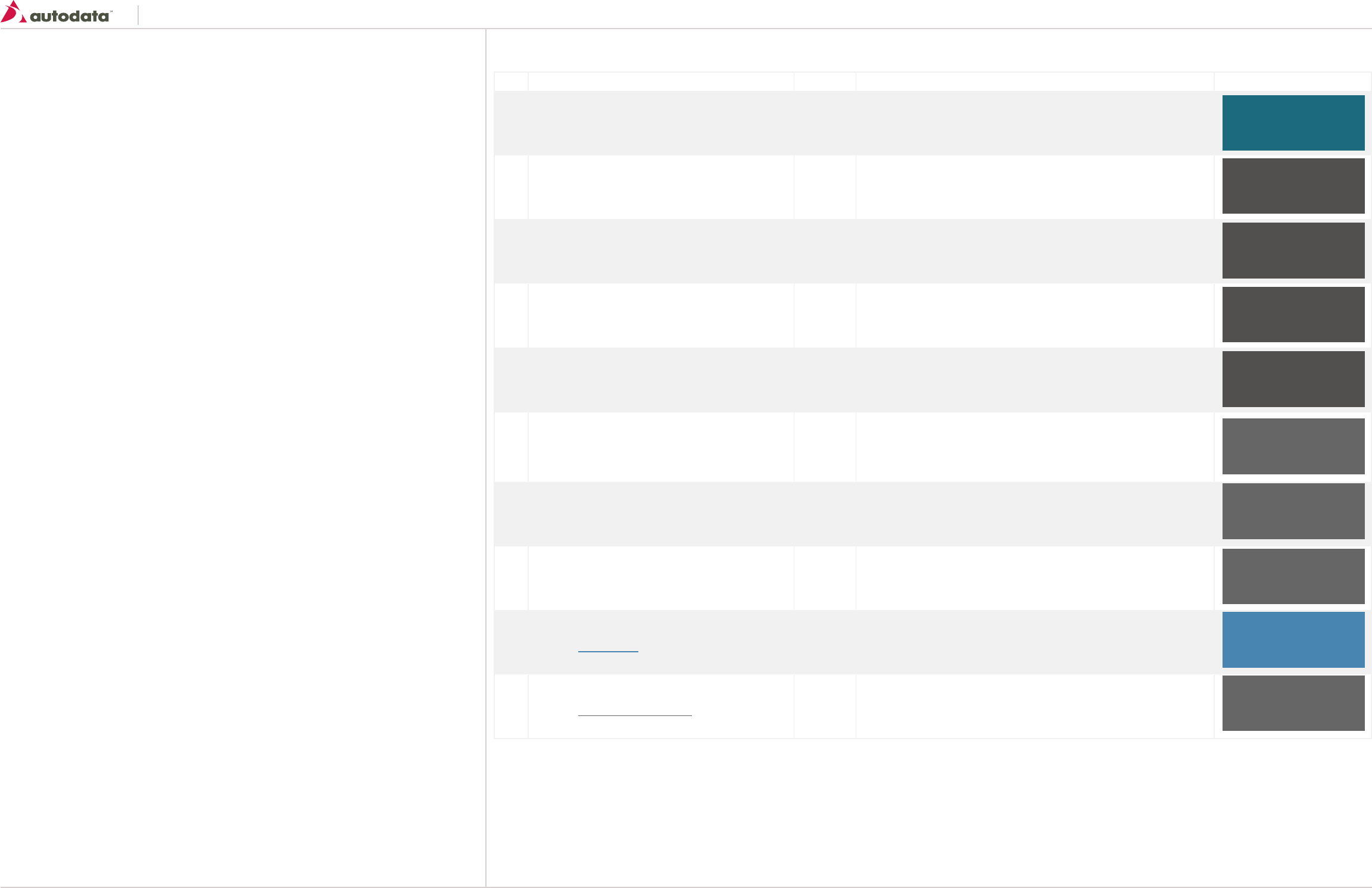
1.7 Lightboxes
When to use Lightboxes
Lightboxes can be used whenever the information they contain has a strong contextual link to the information already present on the page and is extending this information. Image enlargement or slideshow are examples of correct use of overlays.
Please note the width and height of the lightboxes will vary depending on the content.
Page Min-width 960
Fluid Layout
Content Area: width varies x Flexible Height
Header: width varies x 33
Footer : width varies x 26
Body Padding: 20px
Southeast Toyota
Date Created: 06/12/2013 | Date Modified: 03/27/2014 | Version 1.7 |
© 2013 Autodata Solutions, Inc. / Autodata Solutions Company
Page / 13
2.0 Typography
This definition provides appropriate fallback fonts for older versions and other major operating
systems.
It is very important to only use one global definition and to not override it with any local classes.
body {
font-family: ‘Segoe UI’, Helvetica, Arial, sans-serif;
}
Code Element Pixel Size Description Color
T1 Application Title 20px Bold • The main application heading
T2 Page Title 20px Bold • The main page heading is an <h1> element. You should only use it once per
page
T3 Heading 16xp bold • The secondary heading to the left is an <h2> element, which may be used
as a page-level heading. More than one may be used per page
T4 Third-level heading 14xp bold • The heading to the left is an <h3> element, which may be used after an
<h2> heading in the document hierarchy
T5 Fourth-level heading 12px bold • The heading to the left is an <h4> element, which may be used after an
<h3> heading in the document hierarchy
T6 This is a paragraph.
This is a paragraph.
This is a paragraph.
12px • Within our guidelines the paragraph <p> demonstrates the generic font,
color, and vertical rhythm. The paragraph is composed with a line height of
16px.
T7 Bold text 12px bold • Use the <strong> for bolding text
T8 Italic text 12px • Use the <em> for italic text
T9 Default: Hyperlink
Hover: Hyperlink
12px • Use the <a> for hyperlink text, not underlined except on hover
T10 Default: Footer Hyperlink
Hover: Footer Hyperlink
12px bold • Use the <a> for hyperlink text, not underlined except on hover
JM Teal
RGB 29R 107G 127B
HEX ID6B7F
Dark Gray
RGB 80R 80G 80B
HEX 505050
Dark Gray
RGB 80R 80G 80B
HEX 505050
Dark Gray
RGB 80R 80G 80B
HEX 505050
Dark Gray
RGB 80R 80G 80B
HEX 505050
Med Grey
RGB 102R 102G 102B
HEX 666666
Med Grey
RGB 102R 102G 102B
HEX 666666
Med Grey
RGB 102R 102G 102B
HEX 666666
Med Grey
RGB 102R 102G 102B
HEX 666666
Light Blue
RGB 73R 132G 175B
HEX 4984AF
Typographic Elements
Southeast Toyota
Date Created: 06/12/2013 | Date Modified: 03/27/2014 | Version 1.7 |
© 2013 Autodata Solutions, Inc. / Autodata Solutions Company
Page / 14
3.0 Iconography
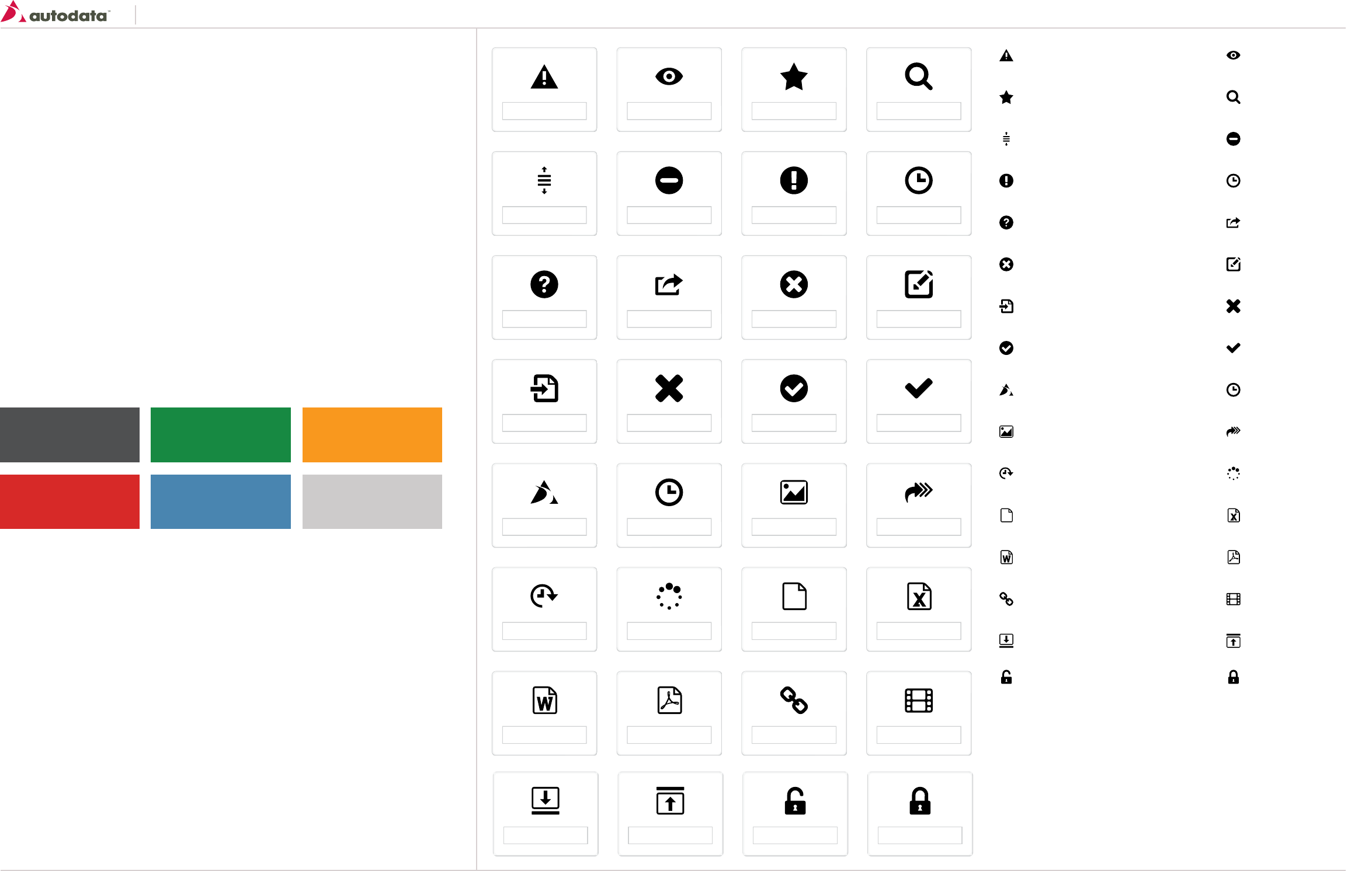
Icons are visual artifacts to communicate, guide and inform the user. They can help users find their
way through an interface, make the meaning of buttons clearer, and prepare users for what is
happening next. Icons work at their best when they’re consistent, familiar and recognizable to the
user.
When and how to use icons
An icon collection functions as a system and each new addition needs to be checked against the
existing icon set. If choosing an existing icon, consider where it is currently used and how it
compares metaphorically. Avoid repurposing an existing icon for a new/different action.
Acceptable Delivery Methods for Icons:
• ‘icon font’ - Recommended
• Sprite Images – Transparent PNG’s
• Individual Icon images (PNG or GIF) – Not recommended
Acceptable Icon Colors:
   
   
   
   
   
   
   
ivreS_evitaerC/:N///:elifshpylG/tnoF ruoY ces/2013/South_East_Toyota_US/SETU02228A...
1 of 3 18/09/2013 3:15 PM
   
Default - Grey
RGB 80R 81G 81B
HEX 505151
Red
RGB 215R 39G 39B
HEX d72727
Green
RGB 21R 138G 67B
HEX 158a43
Blue
RGB 73R 133G 176B
HEX 4985b0
Yellow
RGB 248R 152G 29B
HEX f8981d
Light Grey
RGB 204R 204G 204B
HEX CCCCCC
icon-warning icon-view
rats-noci icon-search
icon-reorder icon-rejected
icon-pending-release icon-pending
icon-help icon-export
icon-error icon-edit
icon-delta icon-delete
icon-complete icon-checkmark
icon-ASC icon-watch
icon-picture icon-queue
icon-scheduled icon-generate
icon-generic-document icon-excel
icon-word icon-pdf
knil-noci icon-video
icon-expand icon-collapse
icon-unlocked icon-locked
Southeast Toyota
Date Created: 06/12/2013 | Date Modified: 03/27/2014 | Version 1.7 |
© 2013 Autodata Solutions, Inc. / Autodata Solutions Company
Page / 15
4.0 Color Palette
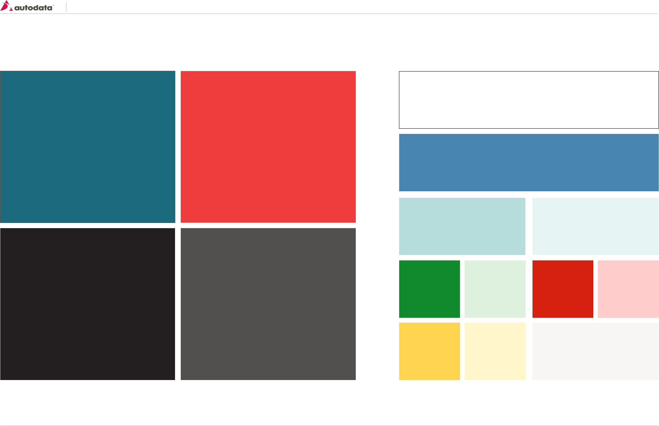
Primary Palette
The primary palette includes colors used in the main interface and interaction elements.
Accent Palette
The accent color is used to highlight information. It is used sparingly, in small areas such as Subheads, Call to Action
Buttons, and rules.
JM Teal (From SET Portal)
RGB 29R 107G 127B
HEX 1D6B7F
SET Black
RGB 35R 31G 32B
HEX 231F20
SET Red
RGB 239R 62G 66B
HEX EF3E42
White
RGB 255R 255G 255B
HEX FFF
Light Blue
RGB 73R 132G 175B
HEX 4984AF
Med Teal
RGB 184R 220G 220B
HEX B8DCDC
Green
RGB 20R 137G 44B
HEX 14892c
Yellow
RGB 255R 211G 81B
HEX FFD351
Red
RGB 214R 34G 17B
HEX D62211
Light Green
RGB 222R 239G 222B
HEX DEEFDE
Light Yellow
RGB 255R 246G 204B
HEX FFF6CC
Light Red
RGB 255R 204G 204B
HEX FFCCCC
Light Teal
RGB 230R 242G 242B
HEX E6F2F2
Light Gray
RGB 246R 246G 246B
HEX F6F6F6
Dark Gray
RGB 80R 80G 80B
HEX 505050
Southeast Toyota
Date Created: 06/12/2013 | Date Modified: 03/27/2014 | Version 1.7 |
© 2013 Autodata Solutions, Inc. / Autodata Solutions Company
Page / 16
5.0 Keyboard Shortcuts
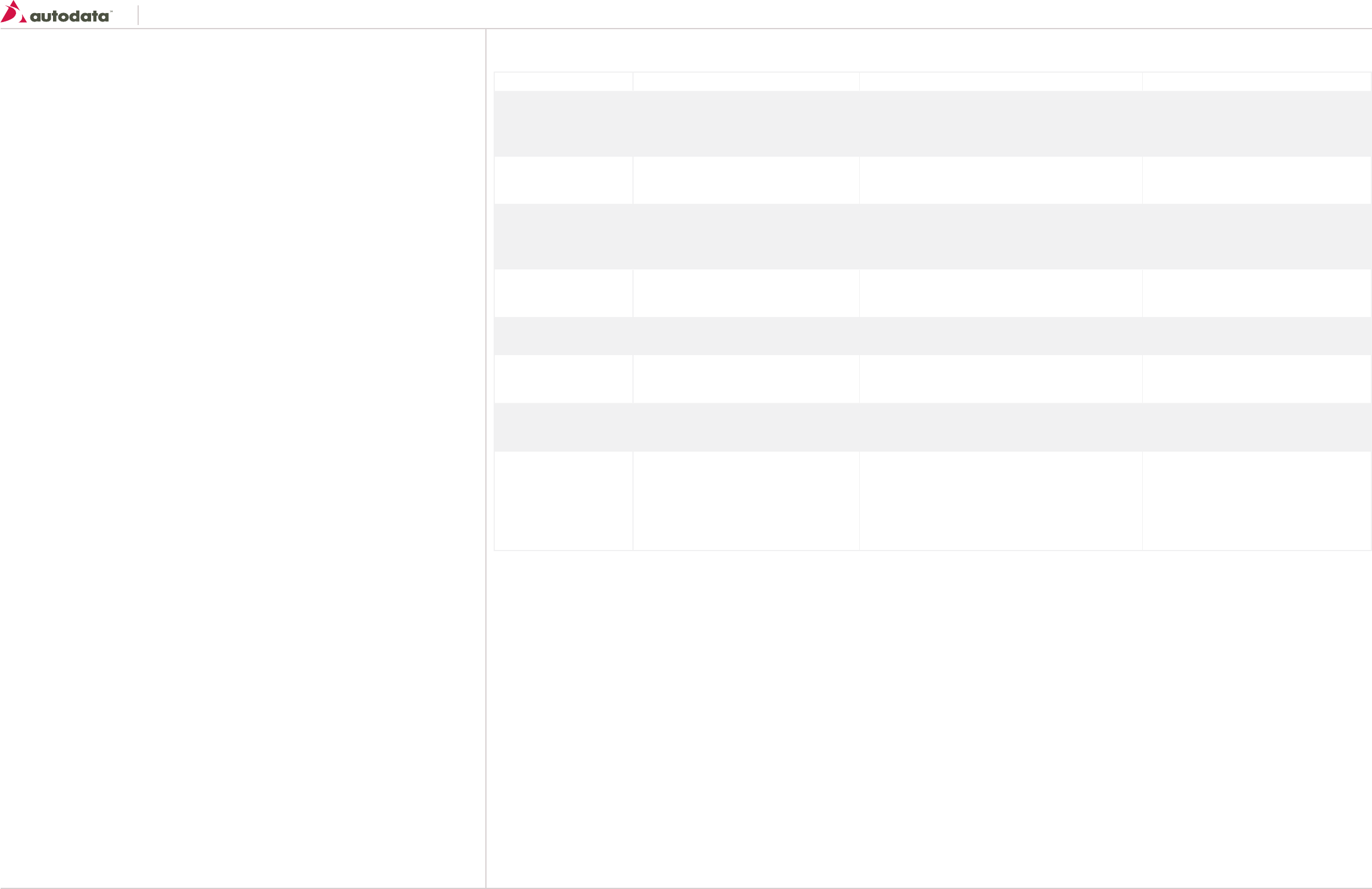
Keyboard shortcuts are accelerators that expose program functions to users through keypresses
rather than mouse clicks. This can greatly speed up task completion time as the user’s hands can stay
on the keyboard. Good candidates for keyboard shortcuts are commands that are part of frequent or
repetitive user tasks.
Constraints
There are potential conflicts with operating system keyboard shortcuts, as well as limitations to the
number of easily-memorable keyboard shortcuts and key combinations. We recommend restraint
when devising keyboard shortcuts – restrict them as much as possible only to the most common
actions.
Contexts
Keys can be re-used in different contexts (pages or screens) for different purposes, but try to use
closely-related functions for the keypress, as many different re-uses of the key will slow adoption
and successful usage.
Category Keyboard Shortcuts Meaning Notes
Global Actions Esc Close a modal dialog/menu The “escape” key is often used to back out of
any modal situation and return to the previous
state.
Global Actions Tab Set new field focus Allows the user to quickly jump between input
fields.
Global Actions G + D Go to Dashboard G is used globally as a navigation prefix for a set
of related keyboard sequences. G+D will take
the user to the Dashboard.
Global Actions / Global Search Allows the user to quickly set focus on the
Global Search area
Global Actions Shift + ? Help Allows the user to open the help section.
Page Actions Enter Submits a form On the search screen hitting the Enter key will
execute the “Search” action.
Page Actions Alt + Shift + S
Ctrl + S (Mac)
Submits a form Use to execute the Save action on the detail
screens.
Page Action Left Arrow Key
Right Arrow Key
or
J
K
Left Arrow Key or J - Previous action
Right Arrow Key or K - Next action
Search Results: Allows the user to navigate
between record sets (Pagination)
Media Widget: While in gallery mode, allows
the user to slide left/right between the media
list.
Southeast Toyota
Date Created: 06/12/2013 | Date Modified: 03/27/2014 | Version 1.7 |
© 2013 Autodata Solutions, Inc. / Autodata Solutions Company
Page / 17
6.0 Navigation: Header & Main Navigation
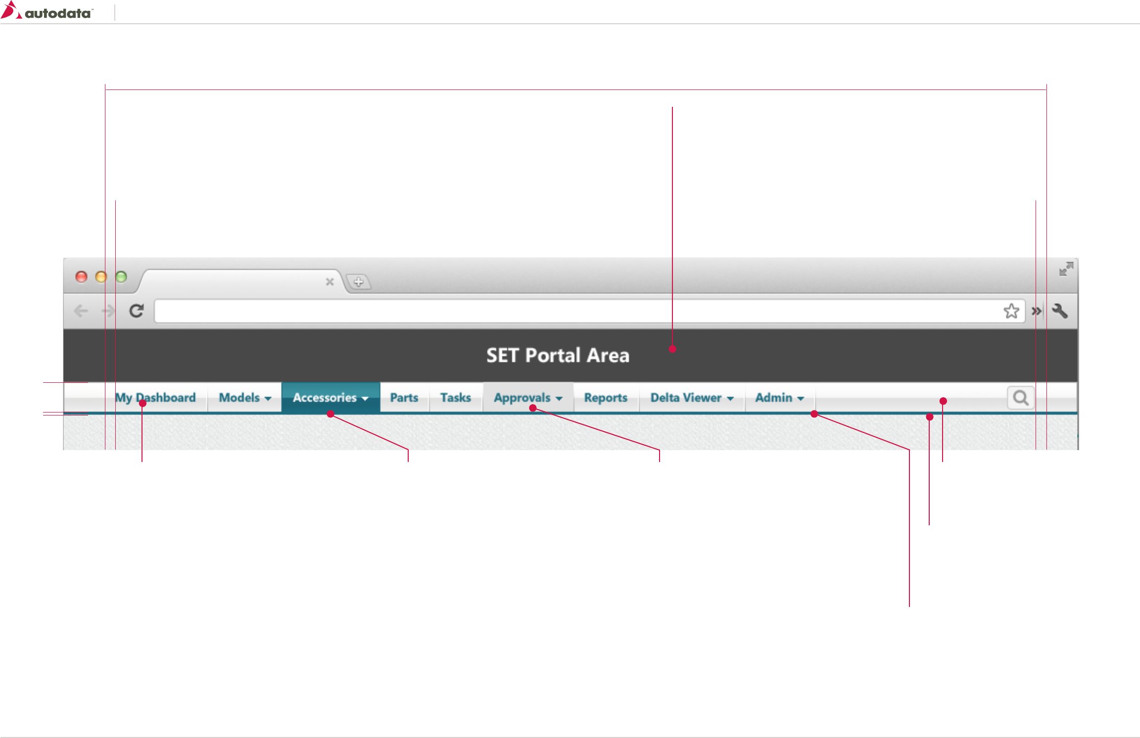
The header consists of branding area, top-level navigation, second-level navigation (where necessary), utility links and search box.
min-width 960
1010
30
3
SET Portal Area
SET will control the area above the application
Navigation Background
image: img_main_nav_bg.jpeg
Repeat-x
Menu Button: Default
Font Properties: See T7 section 2.0 Typography
color: #1d6b7f;
height: 30px;
padding: 0 10px 0 10px
verticle-align: middle
If button has sub menu add caret:
padding: 0 10px 0 5px
/*Note padding between text and caret should be 5px*/
border-left: 4px solid transparent;
border-right: 4px solid transparent;
border-top: 4px solid #1d6b7f;
height: 0;
width: 0;
Menu Button: Active
Same properties as default with the following
exceptions:
color: #FFF;
image: img_main_nav_active_bg.jpeg
Repeat-x
border-left-right: 1px solid #1d6b7f
If button has sub menu add caret:
padding: 0 10px 0 5px
/*Note padding between text and caret should be 5px*/
border-left: 4px solid transparent;
border-right: 4px solid transparent;
border-top: 4px solid #FFFFFF;
height: 0;
width: 0;
Menu Button: Hover
Same properties as default with the following
exceptions:
background-color: #e1e1e1; Navigation Bottom Accent
width:100%
height: 3px
background-color: #1d6b7f
Menu Divider
image: img_hdr_menu_divider.png
size: 2x 30;
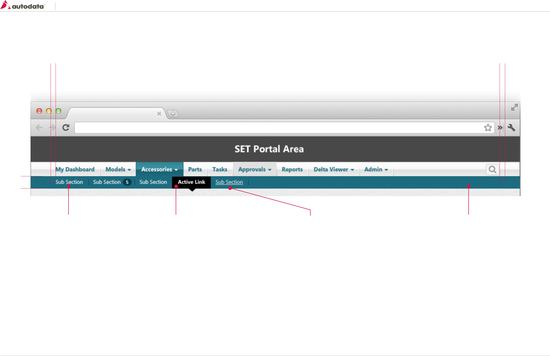
Southeast Toyota
Date Created: 06/12/2013 | Date Modified: 03/27/2014 | Version 1.7 |
© 2013 Autodata Solutions, Inc. / Autodata Solutions Company
Page / 18
6.1 Navigation: Sub Menu
1010
26
Sub Menu Button: Default
Font Properties: See T6 section 2.0 Typography
Font-size: 11px;
color: #FFFFFF;
line-height: 26px;
padding: 0 10px 0 10px
verticle-align: middle
Divider:
image: img_submenu_divider.gif
size: 2x13
margin-top: 7px;
background-color: #1d6b7f
Sub Menu Button: Active
Same properties as default with the following exceptions:
font-weight: bold;
background-color: #000;
Triangle:
margin-top: 26px;
width: 0px;
height: 0px;
border-style: solid;
border-width: 6px 7px 0 7px;
border-color: #000 transparent transparent transparent;
Sub Menu Button: Hover
Same properties as default with the following exceptions:
text-decoration: underline;
Southeast Toyota
Date Created: 06/12/2013 | Date Modified: 03/27/2014 | Version 1.7 |
© 2013 Autodata Solutions, Inc. / Autodata Solutions Company
Page / 19
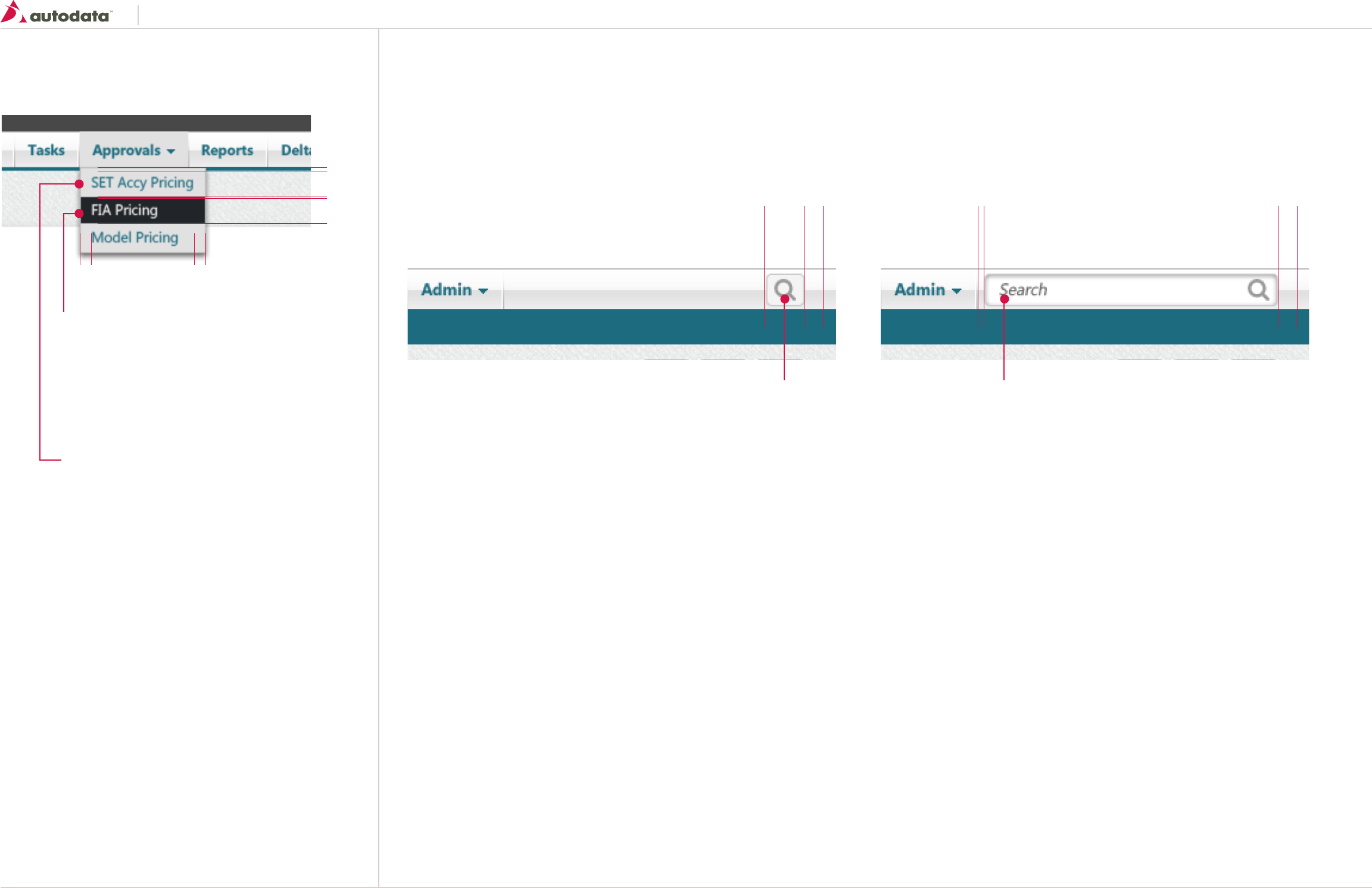
6.2 Navigation: Main Menu Pulldown & Global Search
22
22
10 10
- 1
- 3
Sub Menu Button: Hover
Font Properties: See T6 section 2.0 Typography
color: #FFF;
height: 22px;
padding: 0 10px 0 10px
verticle-align: middle
magin: 1px;
background-color: #212529;
Sub Menu Button: Default
Font Properties: See T6 section 2.0 Typography
color: #1d6b7f;
height: 22px;
padding: 0 10px 0 10px
verticle-align: middle
magin: 1px;
background-color: #e1e1e1;
Pulldown Menu Global Search Box
Input Fields
Font Properties: See T6 section 2.0 Typography
font: bold 11px
color: #666666;
padding: 4px 15px 4px 15px;
text-shadow: 0 2px 2px rgba(0, 0, 0, 0.3);
background: none repeat scroll 0 0 #FFF;
border: 1 solid #c9c9c9;
border-radius: 5px 5px 5px 5px;
box-shadow: inset 0px 0px 9px -2px rgba(0,0,0,0.75);
transition: all 0.7s ease 0s;
Vertical-align: middle;
User Interaction:
• The search box should be 30 pixel wide by default, when the user hovers over the area it
should animate out to 100% of the allowed space to a maximum width of 300 pixels. On
mouse out the search box should animate back to its original size of 30 pixels wide.
• When the search box is expanded it should display the words “Search”, when the user starts
typing the word “Search” should disappear, allowing the user to enter their search string.
• While the search box is in focus the user can hit the Enter button or click the search icon to
execute the search, taking the user to the search results page.
10
5
30 10
Icon
size: 16 x 16
image: icon-search
color: #999999
background-color: # f4f4f4;
border-radius: 5px 5px 5px 5px;
border-color: 1 solid #c9c9c9
Default “Search“text
Font Properties: See T6 section 2.0 Typography
font: bold 11px
font-style: italic;
color: #666666;
Southeast Toyota
Date Created: 06/12/2013 | Date Modified: 03/27/2014 | Version 1.7 |
© 2013 Autodata Solutions, Inc. / Autodata Solutions Company
Page / 20
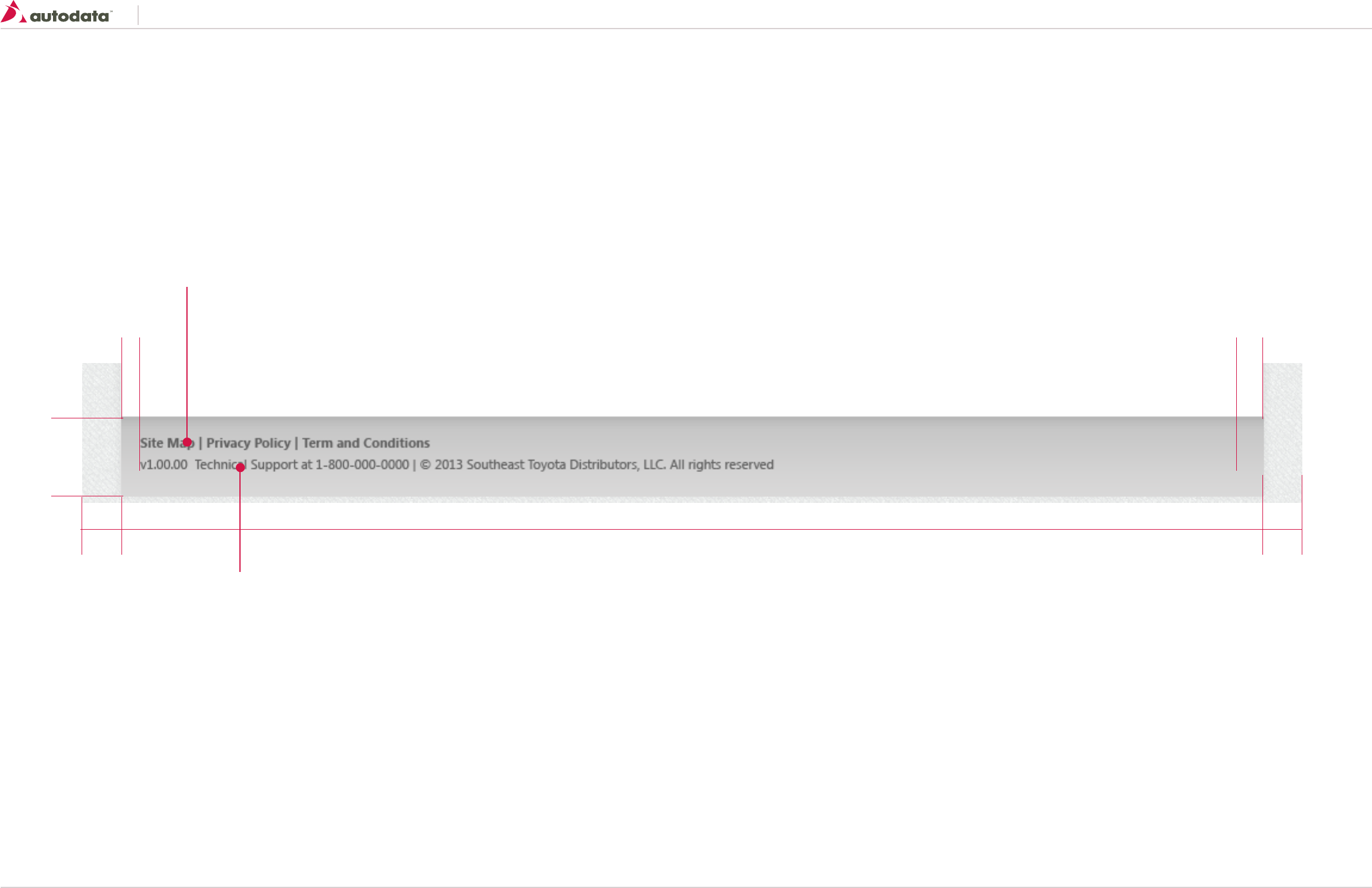
6.3 Navigation: Footer
The page footer is a base component and it appears at the end of every page. By default it contains the Site Map link, Privacy Policy link, Term and Conditions link, Product copyrights, JM logo, application version number and Support contact information.
Left Padding: 4%
65
20 20
100%
Right Padding: 4%
Footer Link:
Font Properties: See T10 section 2.0 Typography
Margin: 16px 10px 0 20px;
Footer Text:
Font Properties: See T6 section 2.0 Typography
Margin: 8px 10px 0 20px;
Southeast Toyota
Date Created: 06/12/2013 | Date Modified: 03/27/2014 | Version 1.7 |
© 2013 Autodata Solutions, Inc. / Autodata Solutions Company
Page / 21
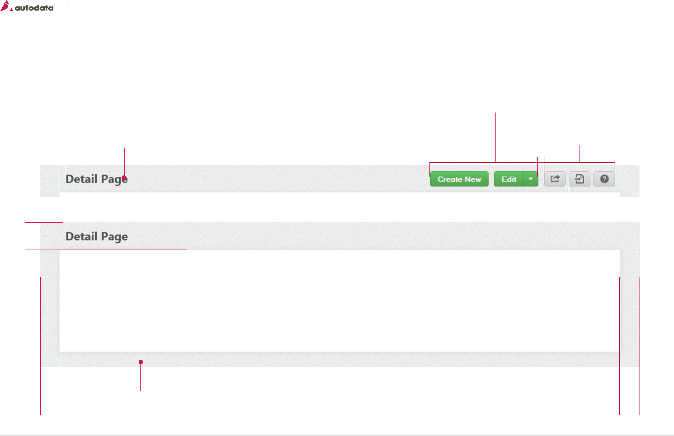
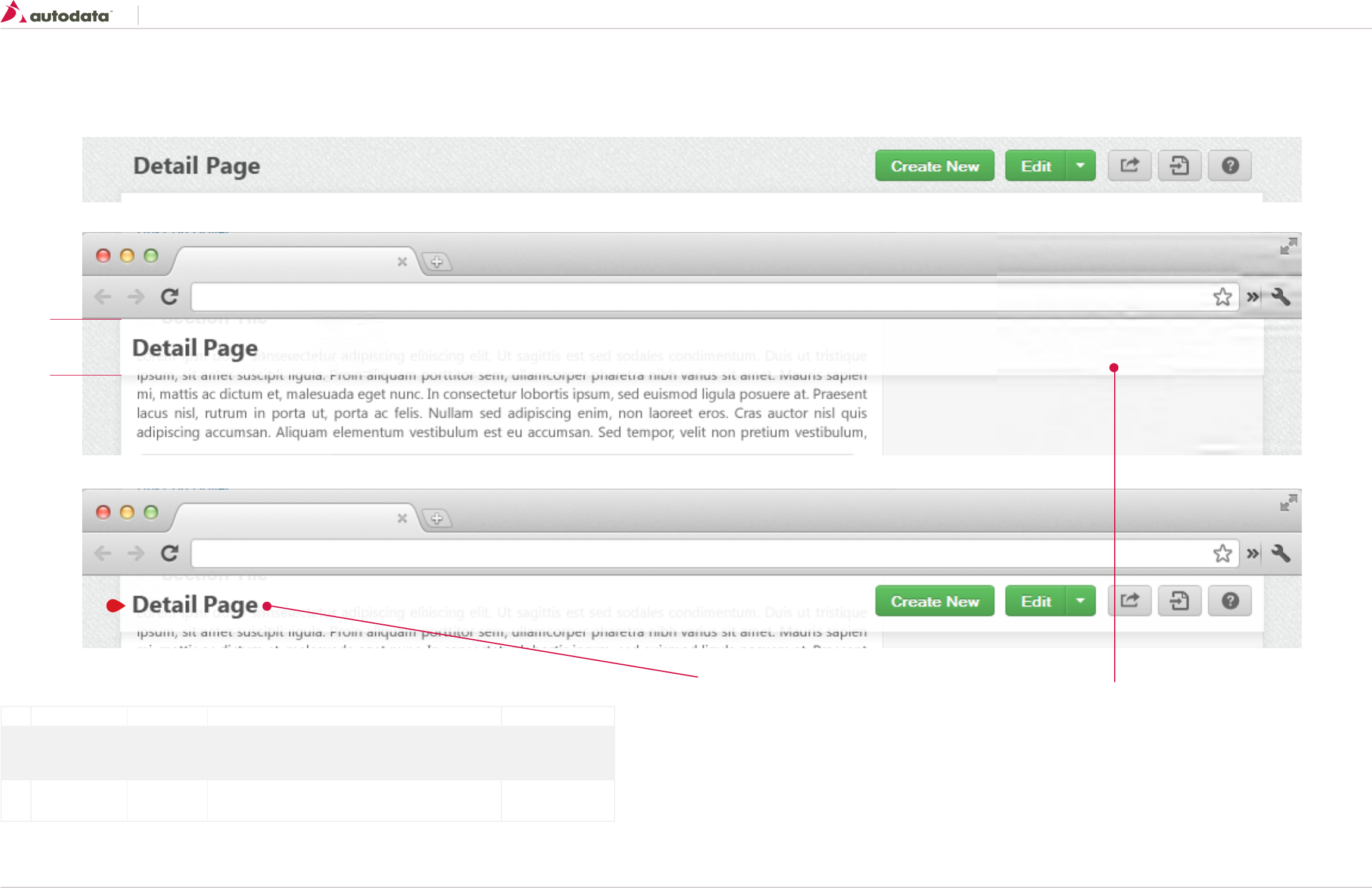
7.0 Consistent Page Elements: Page Title Bar
The title bar is located directly below the main navigation. The area displays the name of the page or product currently being viewed.
Besides giving the name of the current page, the title bar has several other useful features. Below is a list of some of the functions that can be displayed on the title bar.
• Create New
• Edit
• Copy
• Export
• Approve/Reject
• Delta Viewer Notification
• Help Link
Body:
background: url(“img_body_bg.png”) repeat scroll 0 0 transparent;
Page Title:
Font Properties: See T2 section 2.0 Typography
Margin: 16px 10px 0 10px;
Page Level Functions: Optional
See Primary and Secondary Buttons for more details
Margin-right: 10xp
Float: Right
Center buttons vertically Global Utility Functions
See Icon Buttons for more details
Margin-right: 10xp
Float: Right
Center buttons vertically
Left Padding: 4%
47px
Right Padding: 4%
10 px
5
10
10 px [Title bar with function buttons]
[Title bar with no function buttons]
Southeast Toyota
Date Created: 06/12/2013 | Date Modified: 03/27/2014 | Version 1.7 |
© 2013 Autodata Solutions, Inc. / Autodata Solutions Company
Page / 22
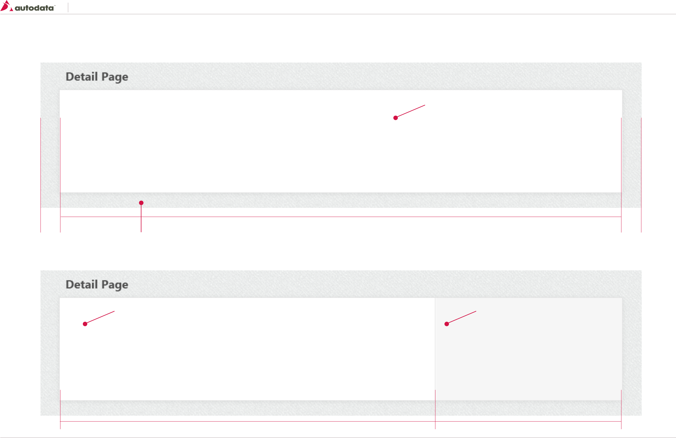
7.1 Consistent Page Elements: Page Title Bar Continued
On pages where the User must scroll down the Title Bar should remain visible. Keeping the Title bar visible will help the User keep context of what he/she is working on without having to scroll up.
User Interaction: Sticky Title Bar:
background: none repeat scroll 0 0 white;
opacity: 0.95;
/*Box Shadow Effect*/
-webkit-box-shadow: 0px 5px 5px rgba(50, 50, 50, 0.2);
-moz-box-shadow: 0px 5px 5px rgba(50, 50, 50, 0.2);
box-shadow: 0px 5px 5px rgba(50, 50, 50, 0.2);
[Default Title Bar State]
[Sticky Title Bar Visible]
[Sticky Title Bar Visible with Function Buttons]
ID Element User Action Behavior/Response Destination
1 Sticky Header On Scroll Down • Sticky Title Bar should animate in sliding from top to bottom revealing the Title
and Function Buttons if applicable.
• Live Example: http://codepen.io/demersdesigns/pen/esHmg
• This page
1 Sticky Header On Scroll Up • When the User scrolls back up the Title Bar should fade out once it reaches it’s
original state.
• This page
47px
Page Title:
Font Properties: See T2 section 2.0 Typography
Margin: 16px 10px 0 10px;
1
Southeast Toyota
Date Created: 06/12/2013 | Date Modified: 03/27/2014 | Version 1.7 |
© 2013 Autodata Solutions, Inc. / Autodata Solutions Company
Page / 23
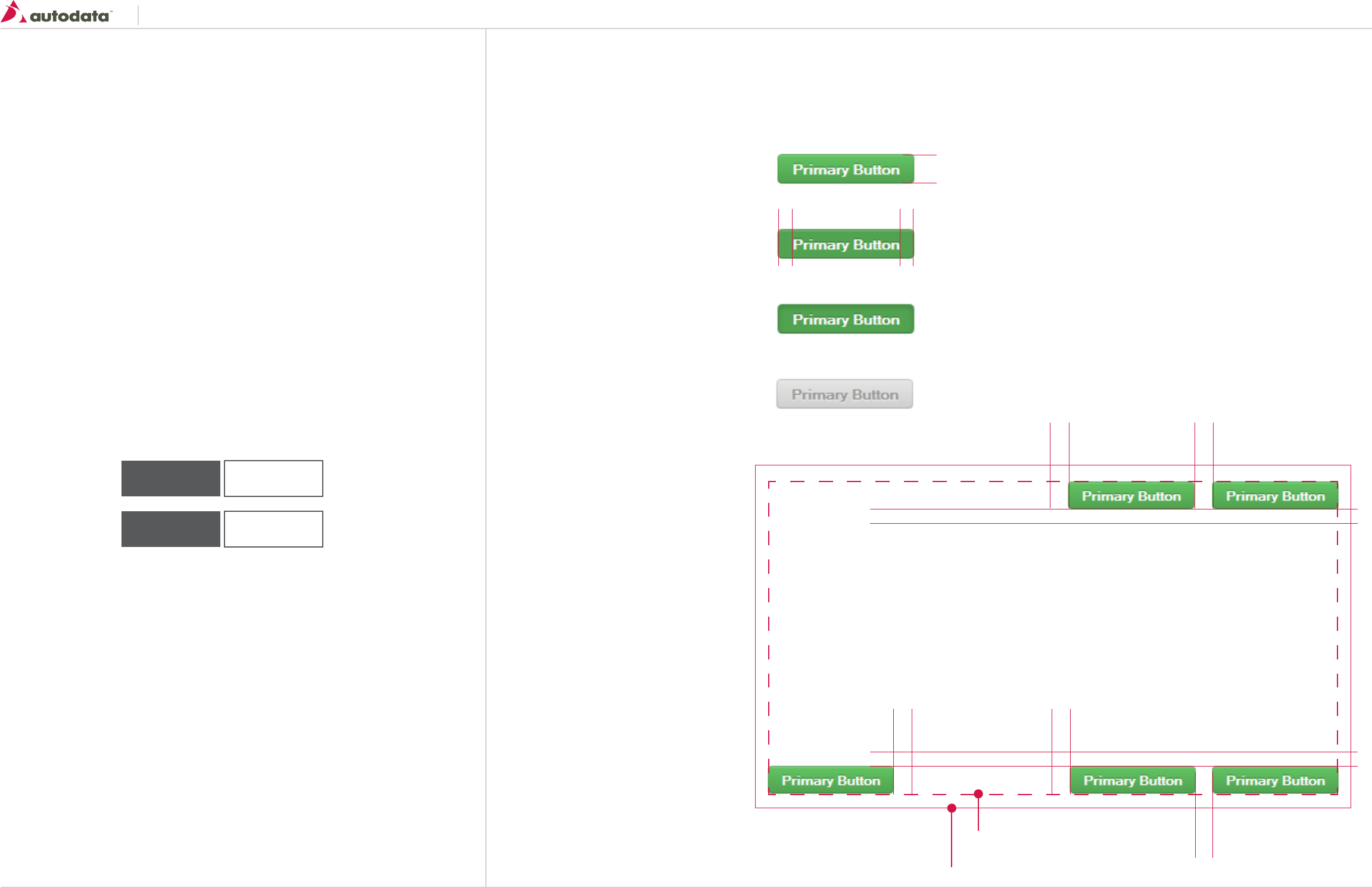
7.2 Consistent Page Elements: Page Wrapper
The Page Wrapper is located directly under the Title Bar and contains the body content of the application.
Body:
background: url(“img_body_bg.png”) repeat scroll 0 0 transparent;
Page Wrapper:
Min-width: 960px - Fluid Layout increase width with browser
Background-color: #FFF
Border: 1px Solid #E4E4E4;
Padding: 10 px;
/* Body wrapper shadow */
-webkit-box-shadow: 0px 1px 8px rgba(50, 50, 50, 0.7);
-moz-box-shadow: 0px 1px 8px rgba(50, 50, 50, 0.7);
box-shadow: 0px 1px 8px rgba(50, 50, 50, 0.7);
Content Area
Min-width: 640px - Fluid Layout increase width with browser
(8 Grid)
Right Side Bar
Min: 320px
Background-color: #f6f6f6
Padding: 10 px;
background: url(“img_body_rgtside_bg.jpg”) repeat-y
(4 Grid)
Left Padding: 4%
640 320
Right Padding: 4%
[Page wrapper one column]
[Page wrapper with right sidebar ]
Southeast Toyota
Date Created: 06/12/2013 | Date Modified: 03/27/2014 | Version 1.7 |
© 2013 Autodata Solutions, Inc. / Autodata Solutions Company
Page / 24
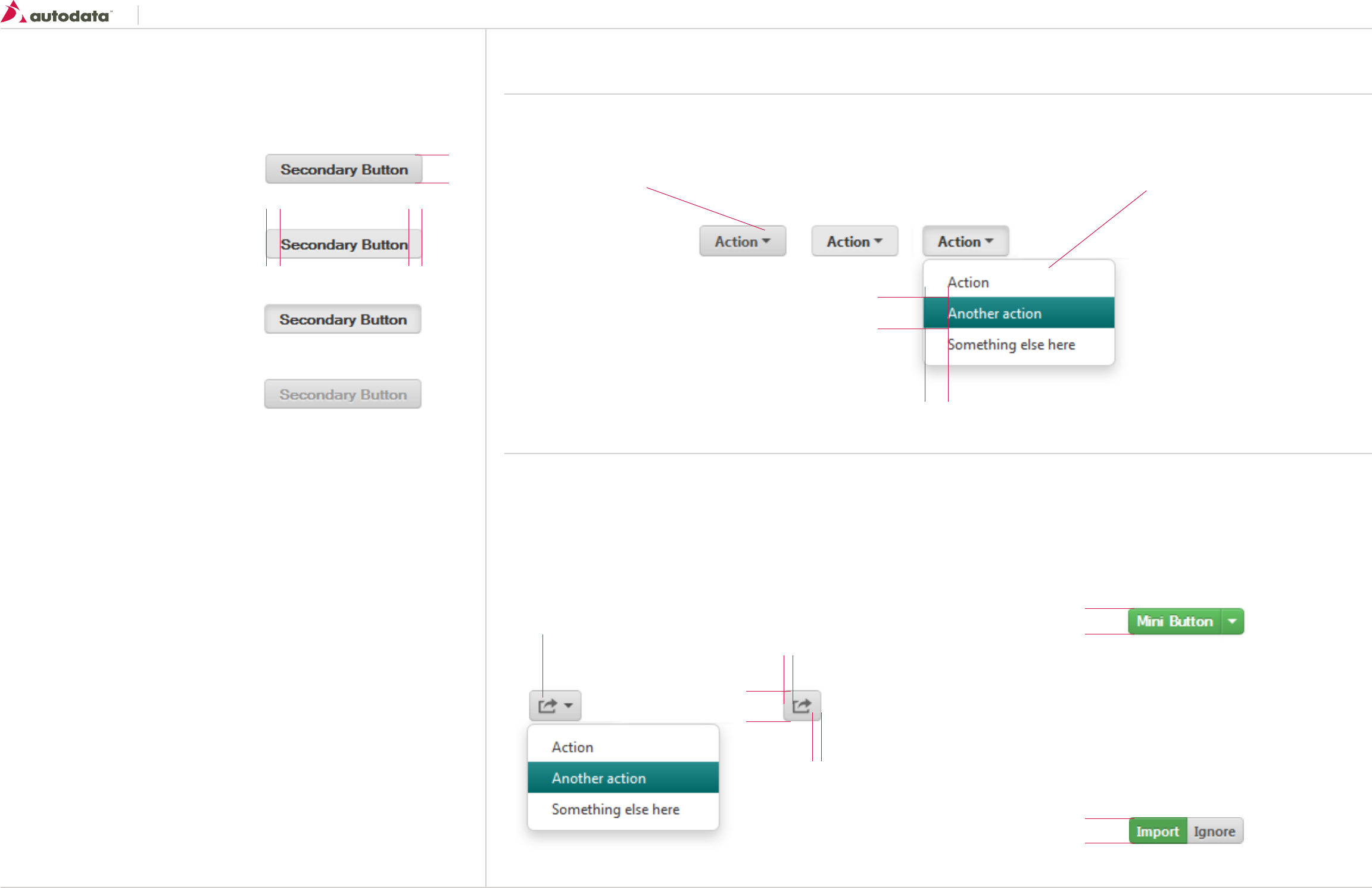
8.0 Controls: Primary Buttons
Buttons are used as triggers for actions. They are used in forms, toolbars, dialog footers and as
stand-alone action triggers. Buttons should rarely, if ever, be used for navigation.
General usage
Do:
• Standalone – when buttons appear by themselves use a standard button.
• Groups – buttons can appear in groups for a set of related actions.
• Dropdown buttons – only include useful actions in a dropdown menu, don’t hide unused actions
from the user just to unclutter the UI.
• Icons – use icons where needed.
• Keyboard equivalents – consider whether your action is important enough for a keyboard
shortcut.
• Button titles – use short sentence case titles on buttons to indicate the action.
Usage - Don’t:
• Use buttons for navigation links
• Use buttons in place of checkboxes or radio buttons in forms
• Use to display inactive text or page headers
Order of buttons on screen:
Primary actions should be displayed first, followed by the secondary action:
Primary Buttons
To be used as the happy path action on forms. If a strong call to action is needed on a page then this can also be used.
Active
background-color: #5BB75B;
linear-gradient(top #62C462, bottom #51A351);
border radius: 4px;
border-style: solid;
border-width: 1px;
Border-color: #448944;
line-height: 20px;
padding: 2px 12px;
Font-size: 12px;
font-weight: bold;
color: #FFFFFF;
text-shadow: 0 -1px 0 rgba(0, 0, 0, 0.25);
text-align: center;
Hover
background-color: #5BB75B;
linear-gradient(top #51A351, bottom #51A351);
Border-color: #3d7A3D;
Down
background-color: #5BB75B;
linear-gradient(top #4F9F4F, bottom #4F9F4F);
Border-color: #3d7A3D;
Disabled
background-color: #CFCFCF;
linear-gradient(top #E6E6E6 bottom #CFCFCF);
Border-color: #B3B3B3;
color: #999999;
text-shadow: 0 1px 1px rgba(255, 255, 255, 0.75);
Active
Hover
Down
Disabled
26
1212
1010
10
10 10
10
10
Primary
(Positive Action)
Save
Secondary
(Negative Action)
Cancel
Example of Margins based on button location.
Applies to all button types.
Top Right
Bottom RightBottom Left
Page Wrapper Padding 10px
Page Wrapper
Southeast Toyota
Date Created: 06/12/2013 | Date Modified: 03/27/2014 | Version 1.7 |
© 2013 Autodata Solutions, Inc. / Autodata Solutions Company
Page / 25
8.1 Controls: Secondary Buttons & Variations
Secondary Buttons
The generic button for actions on a page.
Button Variations
Dropdown Button
Dropdown buttons trigger menus with a set of related actions. The actions in the menu should be contextual to the button and be useful given the current task the user is performing. Menus
that are too long for the available space should scroll so all options can be accessed. The buttons will contain either the primary or secondary styling in addition to the following:
Icon Buttons
Icon only button. Use when space is constrained and the function of the button is
obvious. Using a label is preferred over icon only.
Mini Buttons
Use when space is constrained or if the button is placed inside a table grid. Same
styling as all previous buttons apply with the following exception:
font-size: 10.5px;
padding: 0 6px;
Toggle Buttons
Use when the User can toggle between two states or an actions.
Construct using the same properties as the Mini Buttons with a 0 pixel margin
between the two buttons and removing the corner radius of the two sides that
touch.
Active
background-color: #CFCFCF;
linear-gradient(top #E6E6E6, bottom #CFCFCF);
border radius: 4px;
border-style: solid;
border-width: 1px;
Border-color: #B3B3B3;
line-height: 20px;
padding: 2px 12px;
Font-size: 12px;
font-weight: bold;
color: #505050;
text-shadow: 0 1px 1px rgba(255, 255, 255, 0.75);
text-align: center;
Hover
background-color: #E6E6E6;
linear-gradient(top #E6E6E6, bottom #E6E6E6);
Down
background-color: #E6E6E6;
box-shadow: inset 0 2px 4px rgba(0, 0, 0, 0.15), 0
1px 2px rgba(0, 0, 0, 0.05);
Disabled
background-color: #E6E6E6;
linear-gradient(top #E6E6E6, bottom #CFCFCF);
color: #999999;
text-shadow: 0 1px 1px rgba(255, 255, 255, 0.75);
Active
Hover
Down
Disabled
26
26
20
Caret
border-left: 4px solid transparent;
border-right: 4px solid transparent;
border-top: 4px solid #505050;
content: “”;
display: inline-block;
height: 0;
vertical-align: top;
width: 0;
margin-top: 8px;
Dropdown Menu
background-color: #FFFFFF;
border: 1px solid rgba(0, 0, 0, 0.2);
border-radius: 6px 6px 6px 6px;
box-shadow: 0 5px 10px rgba(0, 0, 0, 0.2);
min-width: 160px;
Font properties See T6 section 2.0 Typography
On Hover:
background-color: #278d8d;
linear-gradient(top, #278d8d, #006666);
color: #FFFFF
text-decoration: none;
1212
10
10
26
22
Icon can be applied using an image but icon font is preferred.
Image size: 16x16
Example icon showing icon-export
22
Southeast Toyota
Date Created: 06/12/2013 | Date Modified: 03/27/2014 | Version 1.7 |
© 2013 Autodata Solutions, Inc. / Autodata Solutions Company
Page / 26
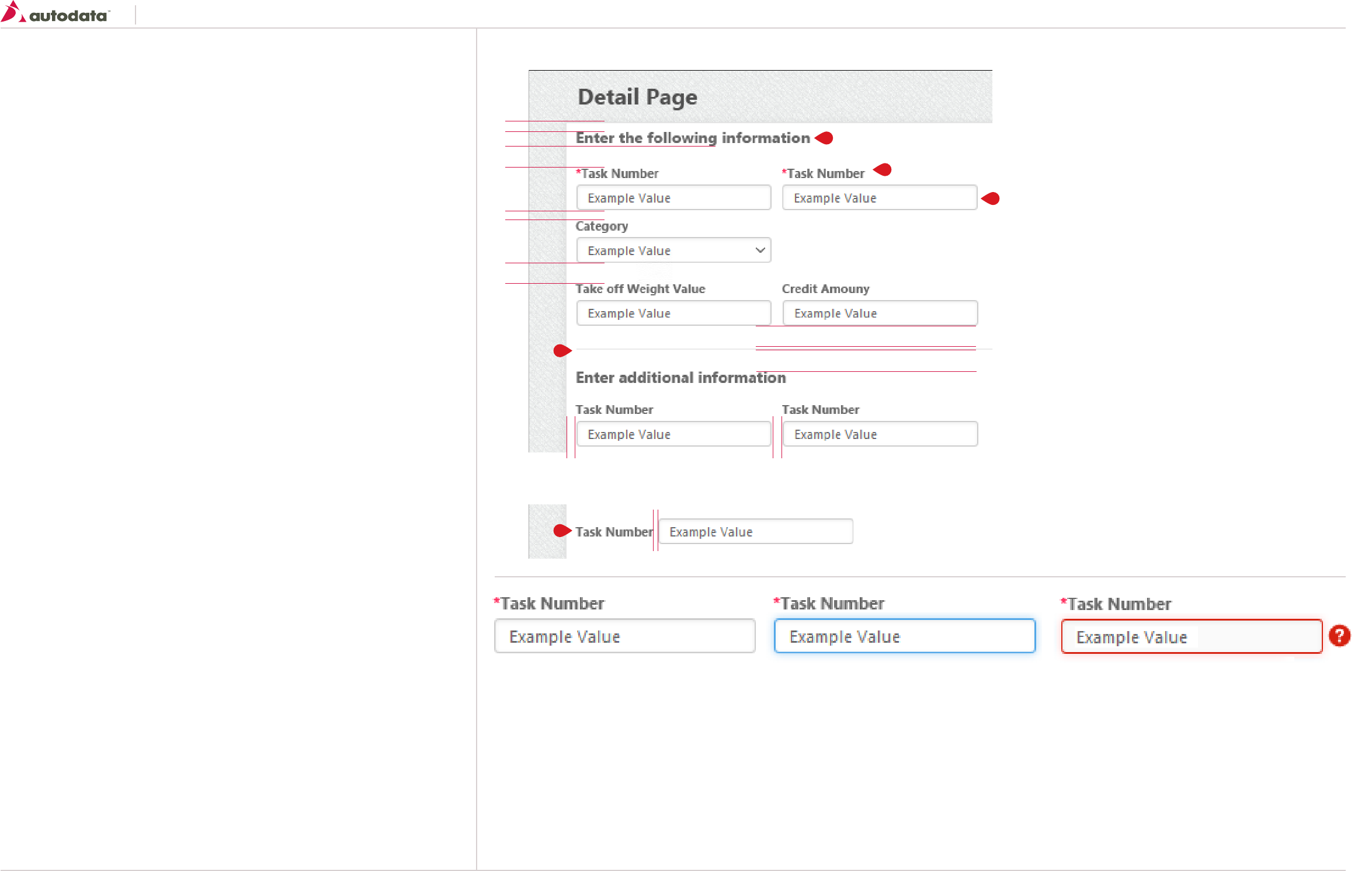
8.2 Controls: Forms - Labels and Input Fields
Forms are used to collect user input and configure options of a task the user is completing.
General usage
Do:
• Use an <h3> for a sub-heading inside of a form. See T4 section 2.0 Typography
• Use short descriptions for help text on a single line. If the description is long, disclose behind
the (?) icon for inline help expand
• Use sentence case for labels
• No colons (:) should be added to the labels
Don’t:
• Truncate field labels - long labels should wrap
• Have the full stop at the end of description text. If more than a single sentence is required use a
full on the first sentence or consider using the (?) icon for longer descriptions
Mandatory fields
Mandatory and optional fields should be marked according to the following guidelines:
• If the majority of your fields are mandatory, mark optional fields with “(optional)”
• If all your fields are either mandatory or optional, don’t mark any
Field length
Length of input fields should communicate the intended content.
• Fields don’t need to all be the same length. Mix long and short field length according to the
content it is used for
• Follow specific character length requirements for the field (e.g. Model Code, Zip Code)
Field label location
• Primarily all field labels should be placed above the input box.
• In certain instances the fields can be placed to the left of an input field
Default Entry Field
background-color: #FFFFFF;
border: 1px solid #CCCCCC;
border-radius: 3px 3px 3px 3px;
box-shadow: 0 1px 2px rgba(0, 0, 0, 0.075) inset;
min-height: 14px;
padding: 3px 8px;
vertical-align: middle;
1. Form Headings
Font Properties; See T4 section 2.0 Typography
margin-bottom: 20px;
2. Form Labels
Font Properties; See T7 section 2.0 Typography
margin-bottom: 6px;
mandatory field asterisk color: Red
3. Form Divider
width: 100%
height: 1px;
background-color: #E9E9E9
margin: 20px 0 20px 0;
4. Input Fields
Font Properties; See T6 section 2.0 Typography
5. Example of label left aligned
margin-right: 5px;
Input field must be vertically centered with the label
Active Entry Field
Same as Default with the following exception:
border: 1px solid #51A7E8;
box-shadow: 0 1px 2px rgba(0, 0, 0, 0.075) inset, 0 0 5px rbga (81, 167, 232, 0.5);
Error Entry Field
Same as Default with the following exception:
border: 1px solid #D62211;
box-shadow: 0 1px 2px rgba(0, 0, 0, 0.075) inset, 0 0 5px rbga (255, 204, 1, 0.5);
Help Icon: Icon: icon-help Size: 16 x 16 / margin: 4px / On Hover: Displays a tooltip with error instructions
10
10
20
20
20
20
10
5
10
1
3
5
2
4
Southeast Toyota
Date Created: 06/12/2013 | Date Modified: 03/27/2014 | Version 1.7 |
© 2013 Autodata Solutions, Inc. / Autodata Solutions Company
Page / 27
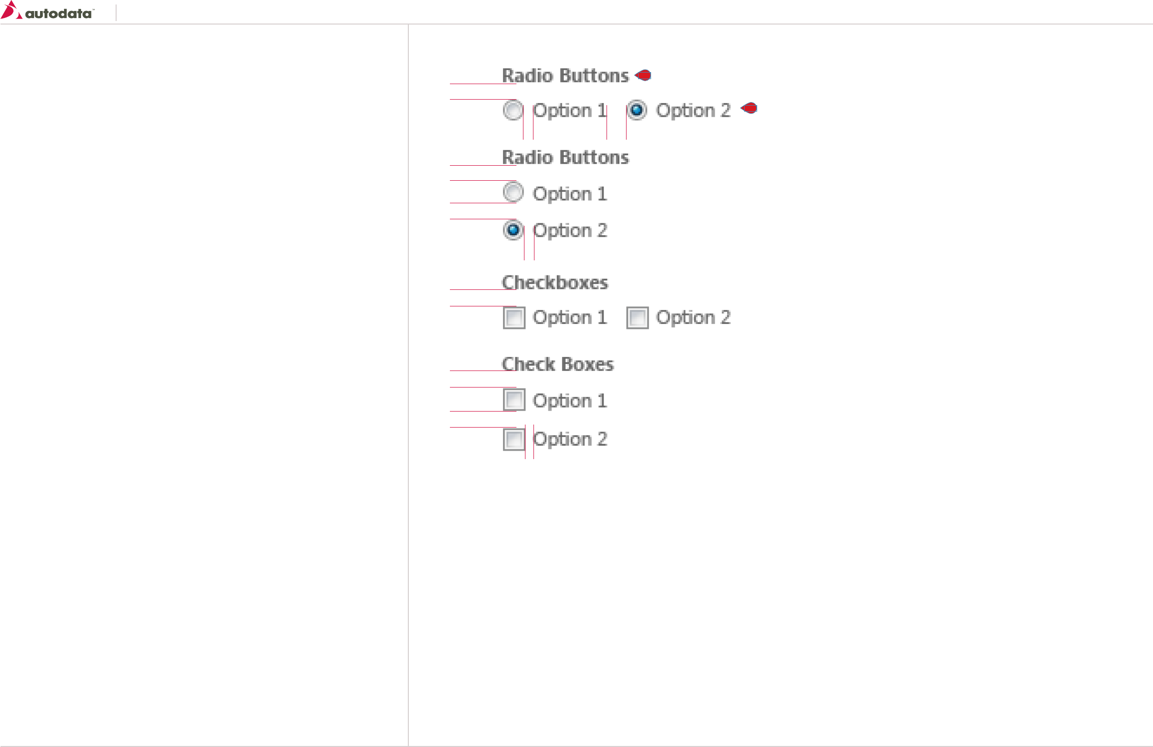
8.3 Controls: Forms - Radio Buttons and Checkboxes
Radio buttons
Radio buttons are often used incorrectly as a form control. The radio button group provides a set of
options that are mutually exclusive.
General usage
Do:
• Use strong labels on radio buttons that clearly notify the user what the option means
• Use sentence case for labels
• Radio buttons can be aligned vertically or horizontally
Don’t:
• Don’t use radio buttons to display a set of choices to a user. Instead you should use checkboxes
in cases where more than one of those options can be selected
• Don’t use radio buttons as actions, instead use the buttons guide for actions
Checkboxes
Checkboxes are used when there are multiple choices available for a single group of options. They
are used to describe the action or state of an item that can be turned on or off.
Do:
• Use labels that clearly inform the user that there are 2 states available
• Use sentence case for checkbox labels
• Align checkboxes vertically where possible to show that the checkboxes are part of a group
Don’t:
• Use checkboxes for mutually exclusive choices of a group. Instead use radio buttons
• Use checkboxes to perform an action
1. Form Label
Font Properties; See T7 section 2.0 Typography
margin-bottom: 10px;
2. Option Labels
Font Properties; See T6 section 2.0 Typography
margin-right: 5px
10
10
10
10
10
10
5
5
5
10
1
2
Southeast Toyota
Date Created: 06/12/2013 | Date Modified: 03/27/2014 | Version 1.7 |
© 2013 Autodata Solutions, Inc. / Autodata Solutions Company
Page / 28
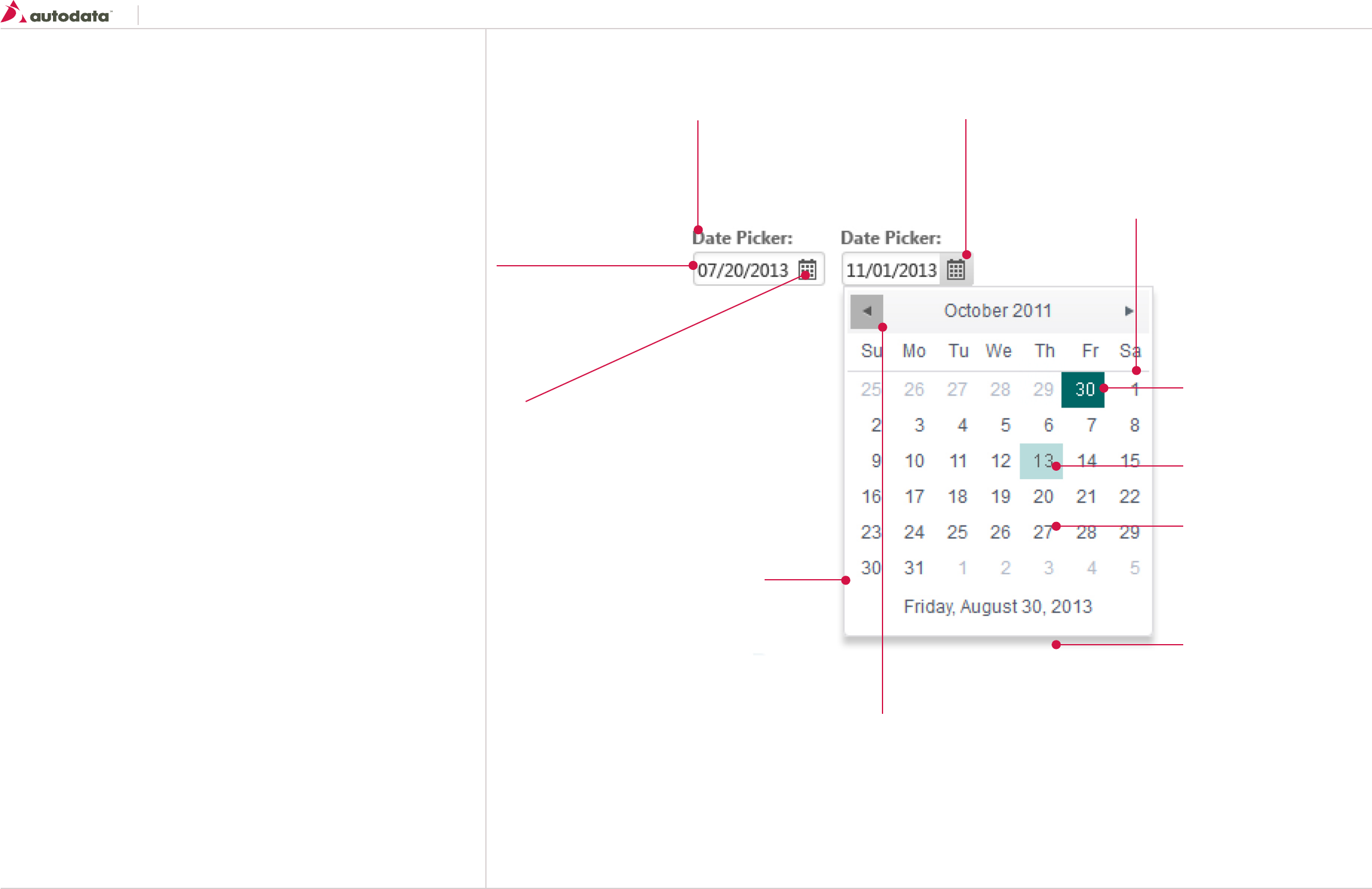
8.4 Controls: Forms - Date Picker
The date picker functionality allows user to select specific date to a form. This feature enhances the
usability and also helps prevent misformatted date values.
Input Field
See Controls: Forms - Labels
and Input Fields for more
details
Label
See Controls: Forms - Labels
and Input Fields for more
details
Icon
image: kendoUI_sprite.png
size: 16 x 16
background-position: -32px -176px;
Calendar Container
border: 1px solid # dbdbde;
background-color: #FFFFF;
padding: 4px;
Note: Calendar is based the KendoUI Date Picker widget: http://goo.gl/A6vVc9
Calendar Navigation
background on Hover: #b2b2b2;
Icon Previous: background-position: -16px -48px;
Icon Next: background-position: 0 -16px;
Selected Date
background-color: #006666;
color: #FFFFFF;
border: 1px solid #dbdbde
Selected Date
background-color: #B8DCDC;
Text
Font Properties; See T6 section 2.0
Typography
Shadow
box-shadow: 0 5px 10px rgba(0, 0, 0, 0.2);
Icon Active
linear-gradient(to bottom, #E3E3E3 0px, #BFBFBF 100%);
Southeast Toyota
Date Created: 06/12/2013 | Date Modified: 03/27/2014 | Version 1.7 |
© 2013 Autodata Solutions, Inc. / Autodata Solutions Company
Page / 29
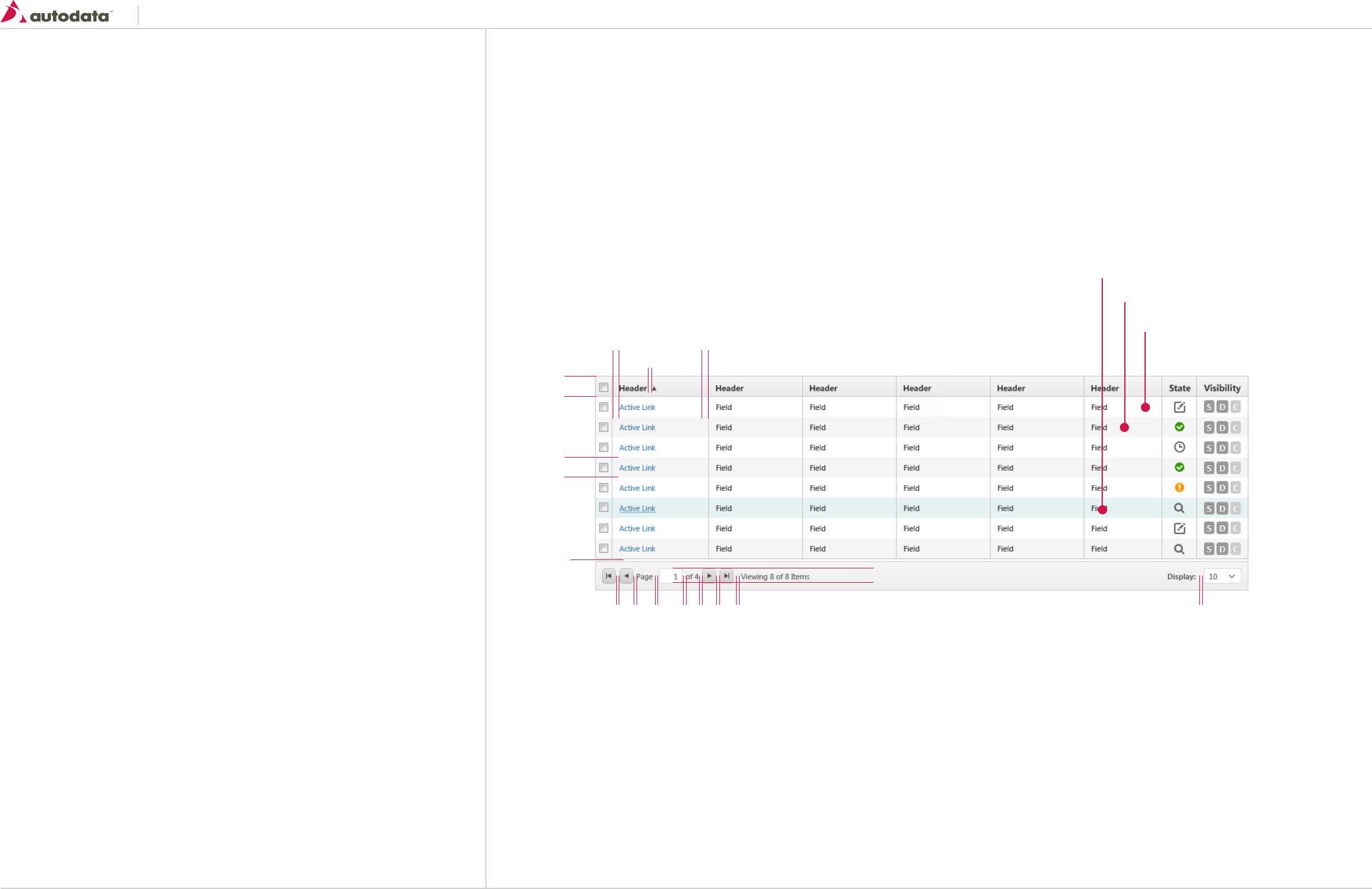
8.5 Controls: Basic Tables
Tables are used to make large volumes of data easy to understand and to access.
When and how to use table?
The use of tables can range from very simple use cases to extremely complex ones, and will need to
be decided on a case-by-case basis. Here are some guidelines to consider when designing:
• Make sure a table is the most appropriate format for your data to be displayed – the main task
of your table is to reveal data to your users so they can make decisions based on it.
• Balance speed of delivery with value of data – your users won’t need all available data at the
same time, especially not when providing the data can take a significant amount of time.
• Let your users adjust the data – particularly in high-usage tables, your users will appreciate
it if they can adjust the data in it, like resorting it, adding to or subtracting from it, etc. Your
initial design should cover the most common use cases, but make sure you cater for some of the
less frequent use cases via these customization options.
General usage
• Table width should always be 100% unless stated otherwise
• Ensure a minimum width of columns so content is displayed within a reasonable amount of
space
• A given table row may expose one or more links as part of the row content. These should be
links off to other locations, not actions. If a content link leads to an external page outside of the
application, open it in a new browser tab
• Left align cell content except where alternate alignment will aid comprehension. For example,
numeric data may be easier to understand when right aligned. Column headers should align to
their content.
• By default, tables should have table headings to make it easier for users. If the nature of the
content for each column is obvious, it can be decided to not display these headings. If in doubt,
use table headings.
• When sorting tables the user can click on one of the table column headings to sort the column
in ascending order. Clicking it again sorts the same column in descending order. Clicking on
another table column heading will sort the table again
• A static icon may be used to highlight a particular piece of content. Such icons are not to be
used as actions and should not link to another page. Icon buttons must appear in the right most
‘Actions’ column.
Headings
Font Properties; See T7 section 2.0 Typography
height: 30px;
font-weight: Bold;
color: # 393939;
background-color: #F6F6F6;
linear-gradient(top, #F6F6F6, #EAEAEA);
border: 1px solid #C5C5C5;
padding: 0 10px 0 10px;
Text should be vertically centered in cell
Sorting icon:
background-image: url(“kendoUI_sprite.png”);
Ascending: background-position: 0 0;
Descending: background-position: 0 -32px;
size: 16x16
Pagination Area
Font Properties; See T6 section 2.0
Text should be vertically centered
width: 100%
height: 42px;
padding: 5px;
background-color: #F6F6F6;
linear-gradient(top, #F6F6F6, #EDEDED);
border: 1px solid #C5C5C5;
*Section is optional and should be only
visible on search result screens.
Pagination - Control Buttons
See Secondary Button for additional details
height: 22px; (Mini Button)
Button Icons
Size: 16x16
background-image: url(“kendoUI_sprite.png”);
First page: background-position: 0 -112px;
Back page: background-position: 0 -48px;
Next page: background-position: 0 -16px;
Last page: background-position: 0 -80px;
Table Cells
Font Properties; See T6 section 2.0
Cell links: See T9 section 2.0
padding: 0 10px 0 10px;
border: 1px solid #C5C5C5;
height: 29px;
30
29
322
5 5 5 5 5 5 5 5
10
5
10
Alternate Row Color: #F5F5F5;
Row Color: #FFFFFF;
Highlight/Selected Row Color: #E6F2F2

Southeast Toyota
Date Created: 06/12/2013 | Date Modified: 03/27/2014 | Version 1.7 |
© 2013 Autodata Solutions, Inc. / Autodata Solutions Company
Page / 30
8.6 Controls: Table Variations
Tables with Checkboxes
Apply when multiple records need to be selected.
Should always be placed on the far left side of tables.
min-width: 25px;
6
25
6
Tables with Notifications or Indicators
Some cells may contain visual indicators to provide the User with additional information about
the record, i.e. Additional Descriptions indicator shown below.
These indicators should always be inside the data cell for which they related to and be right
aligned inside the cells.
105
Tables with State Column
Apply when records contain a states.
Should always be placed to the right of the table, except when visibility or actions are present.
min-width: 51px;
Tables with Pricing Approval Column
Apply when records contain a pricing approval status.
Should always be placed to the right of the table.
Tables with inline editing and actions
Apply when cell data is editable within the table.
Actions are used when the User can execute an action on a particular row.
Actions should always be placed to the right of the table.
Icons
size: 16x16
Center vertically
and horizontally in cells.
Acceptable Icons:
See Iconography for more details
In Draft: icon-edit - Grey
Ready for Review: icon-view - Grey
Ready Release: icon-pending-release - Yellow
Released: icon-complete - Green
Acceptable Icons:
See Iconography for more details
Pending Approval: icon-pending-release - Grey
Rejected: icon-rejected - Red
Approved: icon-complete - Green
Icons
size: 16x16
Center vertically
and horizontally in cells
Icons
Icon: icon-delete - Red
size: 16x16
Center vertically and horizontally in cells
Action Buttons
Mini Buttons should be used inside tables
See Mini Buttons for more details
Icons
Icon: con-star
color: Grey
size: 5px
Center vertically
and horizontally in cells
10
10
10
10
51
49
10 10 10
min-width: 63px
1010 10
Tables with Visibility Column
Apply when the records contain visibility dates.
Should always be placed on the right of the table, except when there is an action column.
min-width: 73px;
Visibility Icons Active:
border-radius: 3px 3px 3px 3px;
background-color: #999999;
color: #FFFFFF;
font-size: 11.844px;
font-weight: bold;
line-height: 14px;
padding: 2px 4px;
text-shadow: 0 -1px 0 rgba(0, 0, 0, 0.25);
display: inline-block;
Visibility Icons Inactive:
background-color: #CCCCCC;
text-shadow: 0 -1px 0 rgba(0, 0, 0, 0.15);
10 10
73
Southeast Toyota
Date Created: 06/12/2013 | Date Modified: 03/27/2014 | Version 1.7 |
© 2013 Autodata Solutions, Inc. / Autodata Solutions Company
Page / 31
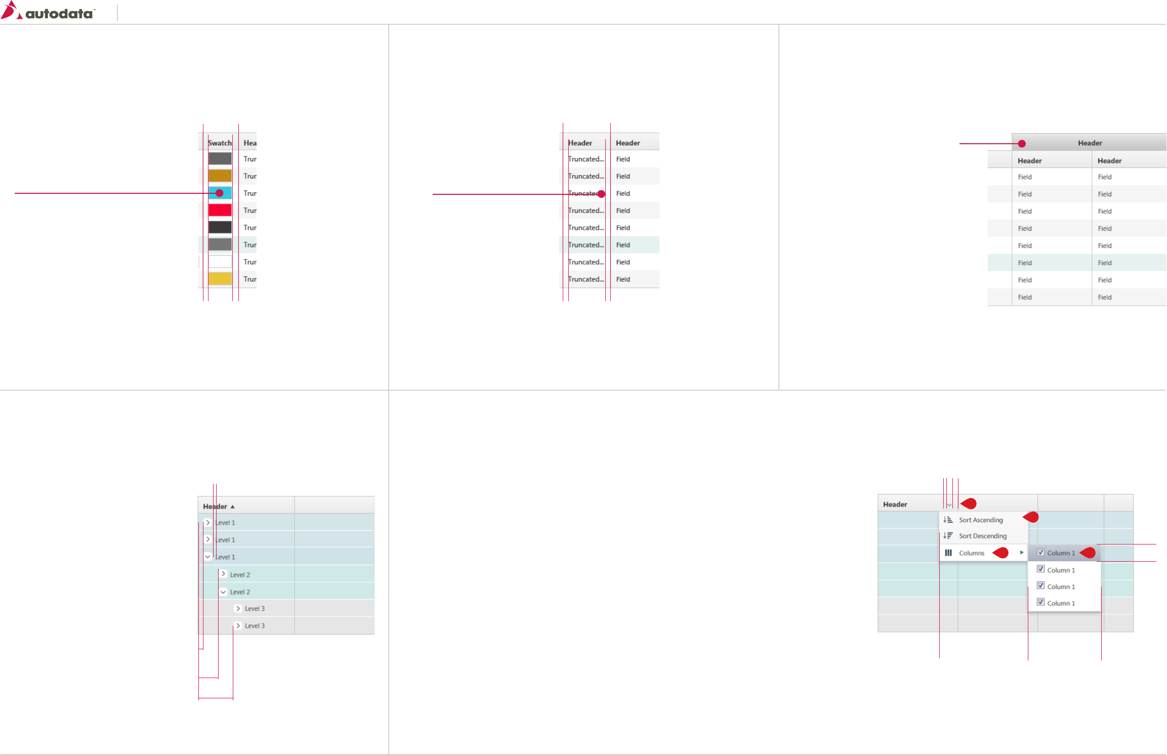
8.7 Controls: Table Variations Continued
Tables with swatch samples
Apply when color data is displayed on the table.
min-width: 60px;
10 10
60
Table with expandable/collapsible cells
Apply when the content in the table can be nested.
Up to 3 levels of nesting can be applied.
Tables with truncating text
Apply when text is too long for the table cell the text should be truncated.
Truncating text should be avoided if possible.
Tables with customizable columns
Apply when the User has the ability to customize the view of a table grid.
Should only apply on search results screens.
Ellipsis should be added at
text breaking point
Swatch
border: 1px solid #C5C5C5
size: 40x22
Center vertically
and horizontally in cells.
*If RGB values are used, color should be
generated dynamically, if no RGB values are
entered the uploaded image should display.
If the swatch image is used the area should be clickable, once clicked an
overlay should appear with the large version of the swatch image.
10 10
Tables with double headers
Apply when the table requires a header to be stacked over each other.
Double Header:
Properties are the same as the regular table
header with the following exceptions:
background-color: #F6F6F6;
linear-gradient(top, #E8E8E8, #C8C8C8);
Text should be centered aligned.
Level 1
Row color: # D4E5EA;
Level 2
Row color: #CFE8E8;
Level 3
Row color: #E6E6E6;
Icon:
size: 16x16
background-image: url(“sprite.png”);
Expand: background-position: 0px 0px;
Collapse: background-position: 0px 16px;
1. Menu - Default
Font Properties; See T6 section 2.0
background-color: #F8F8F8;
border: 1px solid #DBDBDE;
line-height: 27px
Icon - margin: 0 10px 0 8px;
2. Menu - Active/Selected
Same properties as Default menu with the
following exceptions:
background-color: #FFF;
border-top/bottom: 1px solid #DBDBDE;
3. Menu - Hover
Same properties as Default menu with the
following exceptions:
background-color: #F8F8F8;
linear-gradient(top, #B8B8B8, #999999);
4. Header Menu Icon
background-image: url(“kendoUI_sprite.png”);
background-position: 0 -288px;
vertical-align: middle;
Icons:
background-image: url(“kendoUI_sprite.png”);
Ascending: background-position: -112px -240px;
Descending: background-position: -112px -256px;
Columns: background-position: -112px -304px;
10
5
min-width 152 min-width 125
27
105
30
60
1
2 3
4
Southeast Toyota
Date Created: 06/12/2013 | Date Modified: 03/27/2014 | Version 1.7 |
© 2013 Autodata Solutions, Inc. / Autodata Solutions Company
Page / 32
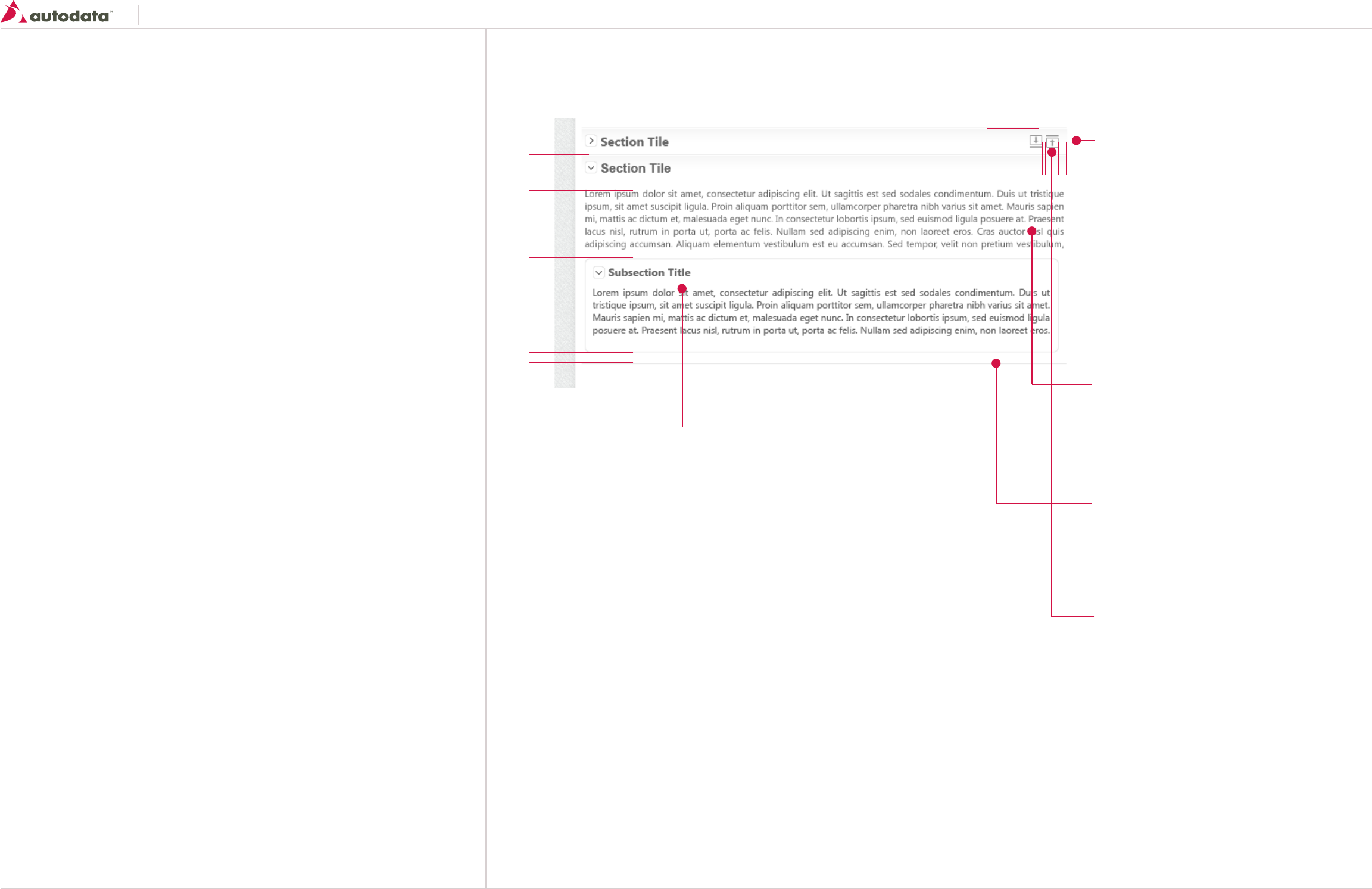
8.8 Controls: Primary Content Containers
Expandable container allows large sets of related content to become hidden from view by default.
This allows users to selectively drill down to the content the are looking for.
General usage
Any page that has lost of content that in most cases would cause end users to scroll. Note that
content must be able to be logically broken up by headers/titles.
When the page loads by default all the containers will be collapsed.
Do:
• Width should always be 100% unless stated otherwise
• Use sentence case for section titles
Don’t:
• Use a expandable container if it’s the only section/content on the screen
Expandable Containers - Primary
Container Header
Font Properties; See T3 section 2.0 Typography
vertical align: middle;
background-color: #FFF;
background-image: img_primary_container_hdr_bg.jpg
repeat-x;
width: 100%
Icon
size: 16x16
background-image: url(“sprite.png”);
Expand: background-position: 0px 0px;
Collapse: background-position: 0px 16px;
margin: 10px 5px 10px 5px;
Container Body
Font Properties; See T6 section 2.0 Typography
margin: 10px; 0 10px 0;
padding: 5px
Display bottom border on the last section in the group or
when only one section is displayed.
border-bottom: 1px solid #E9E9E9
Sub Container
border: 1px solid #E4E4E4;
background-color: #FFF;
padding: 10px;
width: 100%
margin: 0 0 10px 0;
Sub Container Title
Font Properties; See T4 section 2.0 Typography
Icon (optional)
size: 16x16
background-image: url(“sprite.png”);
Expand: background-position: 0px 0px;
Collapse: background-position: 0px 16px;
margin: 0 5px 0 0;
Sub Container Body
Font Properties; See T6 section 2.0 Typography
margin-top: 10px;
36 10
55
10
10
10
Icons
Icon: icon-expand/collapse - #999999
size: 16x16
Center vertically
Expand/Collapse Icons Interaction:
The icons will be hidden by default and will only be visible
when the user hovers over the section header.
Hovering over the icon will display a tooltip “Collapse All” or
“Expand All”.
Expand/Collapse icons will only be applied on the Primary
Containers.
Southeast Toyota
Date Created: 06/12/2013 | Date Modified: 03/27/2014 | Version 1.7 |
© 2013 Autodata Solutions, Inc. / Autodata Solutions Company
Page / 33
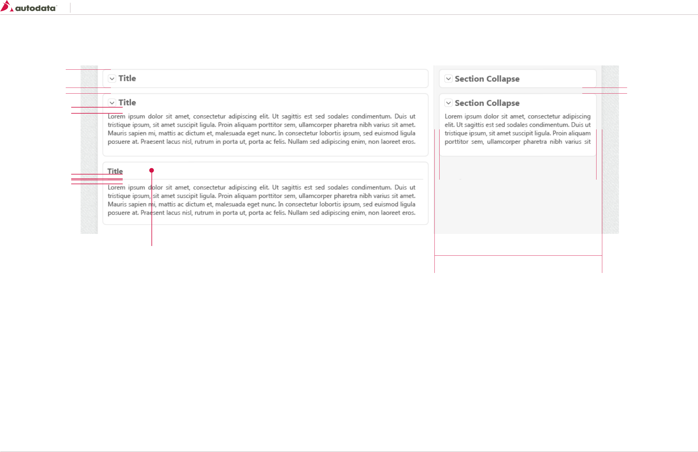
8.9 Controls: Secondary Content Containers
Expandable Containers - Secondary
Container on Right Bar
Only the secondary container should be displayed on the ride side bar.
Container
border: 1px solid #E4E4E4;
border-radius: 5px 5px 5px 5px;
background-color: #FFF;
padding: 10px;
width: 100%
margin: 10px 0 10px 0;
Container Title
Font Properties; See T3 section 2.0 Typography
Icon (optional)
size: 16x16
background-image: url(“sprite.png”);
Expand: background-position: 0px 0px;
Collapse: background-position: 0px 16px;
margin: 0 5px 0 0;
Container Body
Font Properties; See T6 section 2.0 Typography
Container Divider (optional)
border-bottom: 1px solid #E9E9E9
margin: 10px 0 10px 0;
36
320
10 10
10 10
10
10
10
Southeast Toyota
Date Created: 06/12/2013 | Date Modified: 03/27/2014 | Version 1.7 |
© 2013 Autodata Solutions, Inc. / Autodata Solutions Company
Page / 34
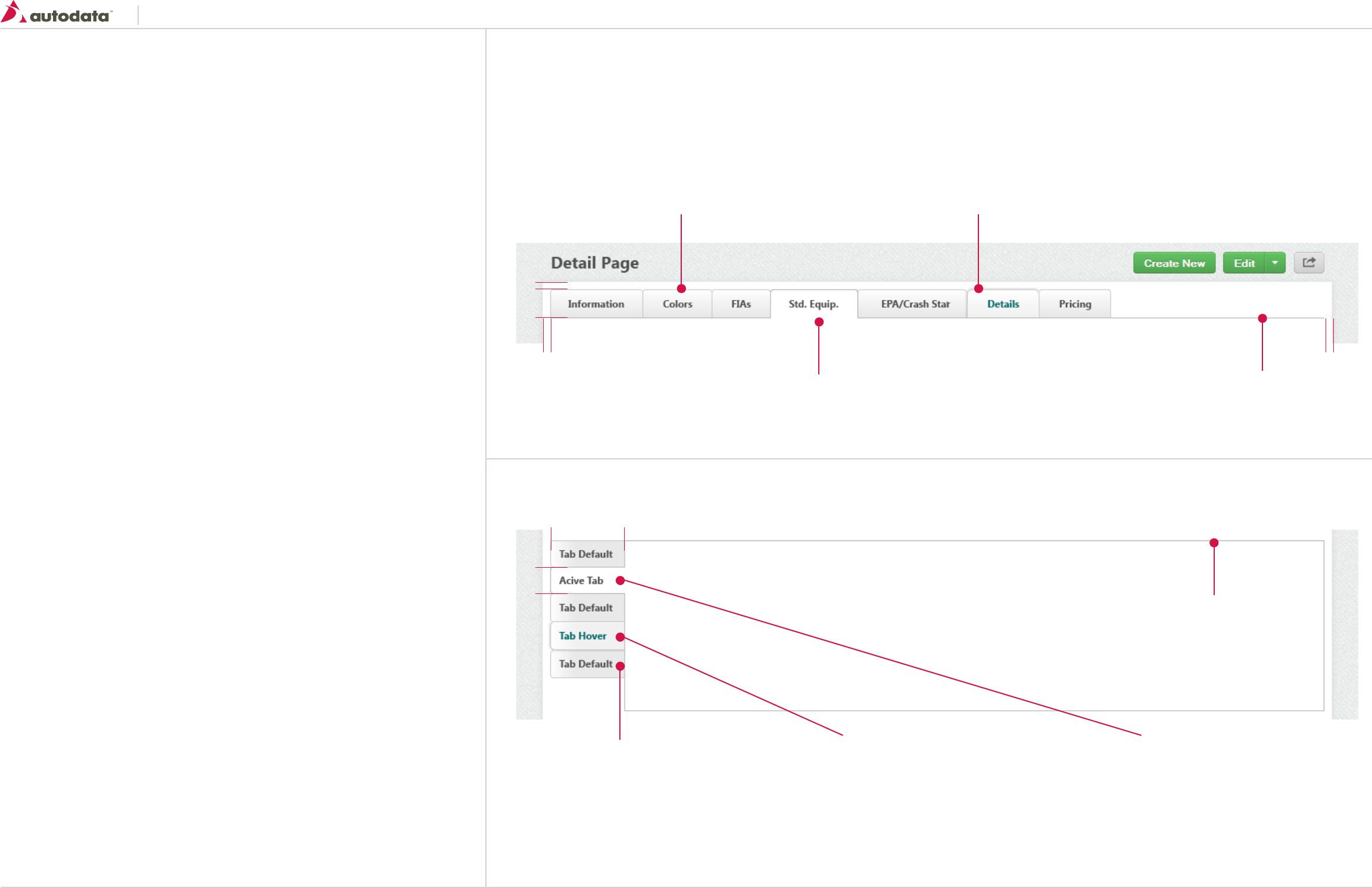
8.10 Controls: Tabs
Tabs are used for alternating between views within the same context, not to navigate to different
areas.
General usage
• The currently selected tab is always highlighted and is connected to the content area
• The unselected tabs are clearly visible but are faded in comparison
Do:
• Use tabs to alternate between view within the same context
• Use short labels on tabs to describe the content view
• Sentence case should always be used on tab items
Don’t:
• Use tabs across multiple rows
• Put a dropdown menu in a tab item, this is not navigation
Tab - Default
Font Properties; See T5 section 2.0
border-radius: 4px 4px 0 0;
padding-left/right: 22px
linear-gradient(to bottom, #FEFEFE 0px, #E7E7E7 100%);
line-height: 33px;
border: 1px solid #CCCCCC;
Tab - Default
Font Properties; See T5 section 2.0
border-radius: 4px 0 0 4px;
padding-left/right: 15px
linear-gradient(to right, #FEFEFE 0px, #E7E7E7 100%);
line-height: 33px;
border: 1px solid #CCCCCC;
Tab Hover
Same properties as Default with the following exceptions:
Font Properties; See T5 section 2.0
Color: #006666
box-shadow: 0 0 1px 1px rgba(255, 255, 255, 0.6) inset,
0 0 2px rgba(0, 0, 0, 0.3);
linear-gradient(to right, #E7E7E7 0px, #E7E7E7 100%);
Tab - Active/Selected
Same properties as Default menu with the following
exceptions:
background-color: #FFFFFF;
border: 1px solid #CCCCCC;
Tab - Active/Selected
Same properties as Default menu with the following exceptions:
background-color: #FFFFFF;
border: 1px solid #CCCCCC;
border: 1px solid #CCCCCC;
Tab Hover
Same properties as Default with the following exceptions:
Font Properties; See T5 section 2.0
Color: #006666
box-shadow: 0 0 1px 1px rgba(255, 255, 255, 0.6) inset, 0 0 2px rgba(0, 0, 0, 0.3);
linear-gradient(to bottom, #E7E7E7 0px, #E7E7E7 100%);
33
33
min-width 90
10
10 10
Horizontal Tabs
Vertical Tabs
The height of the body should be at a minimum the same height as all the tabs.
Body
border: 1px solid #CCCCCC;
background-color: #FFF;
width:100%
Southeast Toyota
Date Created: 06/12/2013 | Date Modified: 03/27/2014 | Version 1.7 |
© 2013 Autodata Solutions, Inc. / Autodata Solutions Company
Page / 35
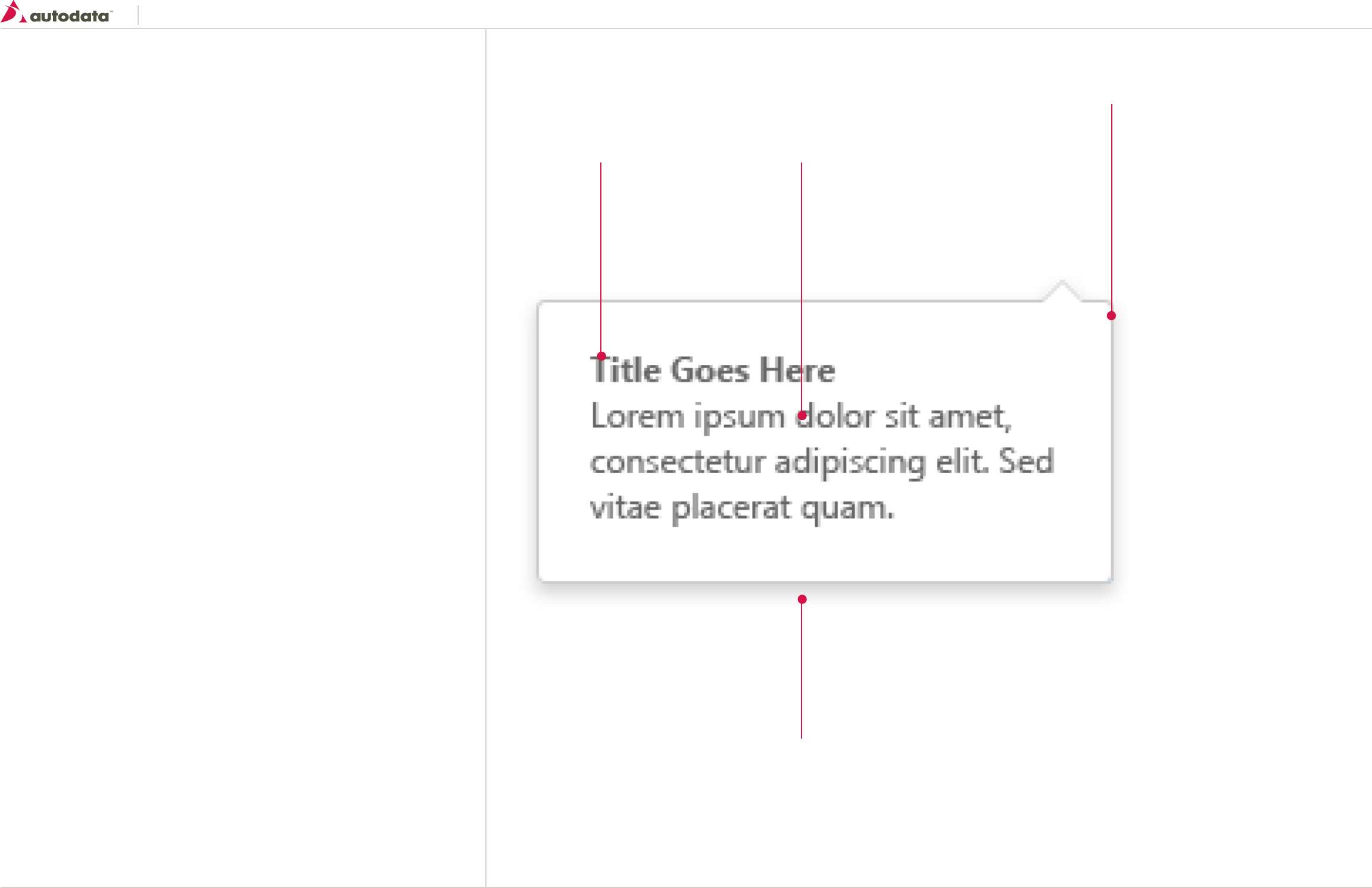
9.0 Dialogs: Inline Dialogs
The inline dialog is a wrapper for secondary content/controls to be displayed on user request.
Consider this component as displayed in context to the triggering control with the dialog overlaying
the page content.
General usage
A inline dialog should be preferred over a modal dialog when a connection between the action has a
clear benefit versus having a lower user focus.
Do:
• Use an action to trigger the inline dialog
• The notch position and direction should be centered and at the top of the inline dialog where
possible, but depending on the location it can be aligned left or right
• Dismiss the inline dialog automatically if the action taken by the user inside the dialog is
successful
Don’t:
• Show an inline dialog from within an inline dialog
• Use multiple inline dialogs at the same time
• Reset an inline dialog upon dismissal. Dismissing an inline dialog is easy so account for a user
error
• Use a the primary button style on inline dialogs
Body
.arrow_box {
background: #ffffff;
border: 1px solid #cccccc;
border-radius: 5px 5px 5px 5px;
padding: 20px;
}
.arrow_box:after, .arrow_box:before {
bottom: 100%;
border: solid transparent;
content: “ “;
height: 0;
width: 0;
position: absolute;
pointer-events: none; }
.arrow_box:after {
border-color: rgba(255, 255, 255, 0);
border-bottom-color: #ffffff;
border-width: 9px;
Right Align arrow: left: 94%;
Center Align arrow: left: 50%;
Left Align arrow: left: 8%;
margin-left: -9px; }
.arrow_box:before {
border-color: rgba(204, 204, 204, 0);
border-bottom-color: #cccccc;
border-width: 10px;
Right Align arrow: left: 94%;
Center Align arrow: left: 50%;
Left Align arrow: left: 8%;
margin-left: -10px; }
Shadow
-webkit-box-shadow: 0px 3px 5px rgba(50, 50, 50, 0.37);
-moz-box-shadow: 0px 3px 5px rgba(50, 50, 50, 0.37);
box-shadow: 0px 3px 5px rgba(50, 50, 50, 0.37);
Title (optional)
Font Properties; See T7 section 2.0
Text
Font Properties; See T6 section 2.0
Southeast Toyota
Date Created: 06/12/2013 | Date Modified: 03/27/2014 | Version 1.7 |
© 2013 Autodata Solutions, Inc. / Autodata Solutions Company
Page / 36
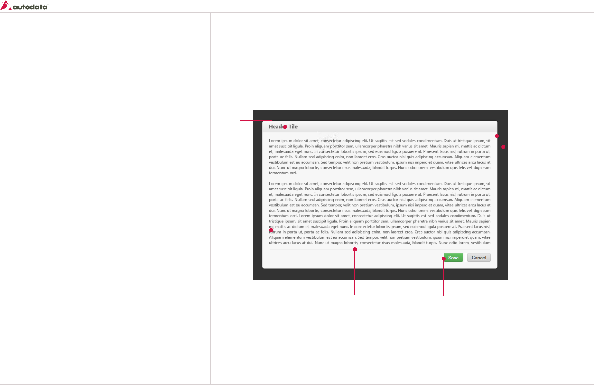
9.1 Dialogs: Modal Dialogs
Modal dialogs are used to get a response from a user or reveal critical information that cannot be
ignored. They are asynchronous which means that other interactions must wait for the dialog to
close before resuming.
General usage
• Modal dialogs should always appear over the 65% opacity black blanket and be centered on the
page both vertically and horizontally
• Wherever possible use one of the three standard widths, chosen to best represent different
forms of content:
- Small 400px
- Medium 600px
- Large 800px
- X-Large 980px dialog
Do:
• Include hint text to provide further information which may be useful.
• Always use the blanket to emphasize the modal nature of the dialogs and allow users to easily
differentiate them from the background
Don’t:
• Use a modal dialog when you are informing users of non-critical information. If it isn’t essential
that the user responds to the dialog, use a other messaging methods instead
Body
background-color: #FFFFFF;
border: 1px solid #D7D7D7;
border-radius: 5px 5px 5px 5px;
Header
Font Properties; See T3 section 2.0
Padding-left/right: 20px
Center text vertically
linear-gradient(to bottom, #F7F7F7 0px, #E5E5E5 100%);
Center text vertically
Content Area
Font Properties; See T6 section 2.0
Padding 20px 20px 10px 20px;
Divider
border: 1px solid #E9E9E9;
margin: 10px 20px 10px 20px;
Footer
Contains primary and secondary
buttons right aligned.
background-color: #000000;
opacity: 0.5;
33
10
10
20
20
Southeast Toyota
Date Created: 06/12/2013 | Date Modified: 03/27/2014 | Version 1.7 |
© 2013 Autodata Solutions, Inc. / Autodata Solutions Company
Page / 37
9.2 Dialogs: Modal Dialogs Continued
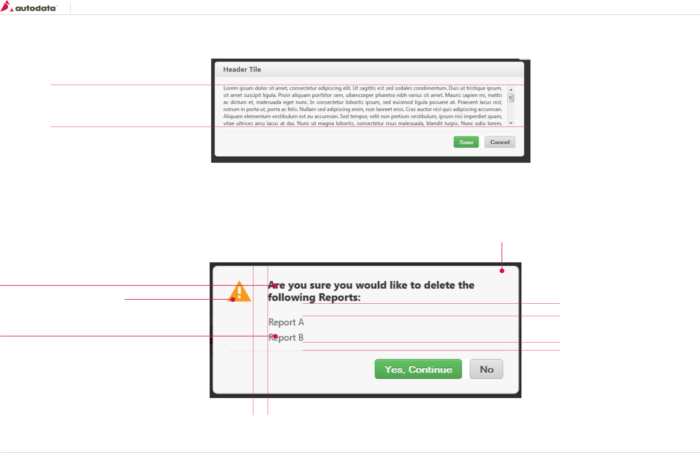
Avoid any horizontal scrolling.
If the content required additional vertical space a scroll bar should
appear in the body. The header and footer should always be visible.
Modal with scrolling content
Warning/Error Modal
Warning and Error modals should only be used when important information can’t be ignore or to ask the user to confirm an important action.
By Default all warning/Error modals should be 400 pixels wide, can be larger depending on the content.
Same properties as the standard dialog modal with the following exceptions:
20
10
20
Icon
size: 32 x 32
Acceptable Icons
Warning: icon-warning - Yellow
Error: icon-error - Red
Title
Font Properties; See T6 section 2.0
color: #333333
Title bar removed
Content
Font Properties; See T6 section 2.0
color: #333333
Southeast Toyota
Date Created: 06/12/2013 | Date Modified: 03/27/2014 | Version 1.7 |
© 2013 Autodata Solutions, Inc. / Autodata Solutions Company
Page / 38
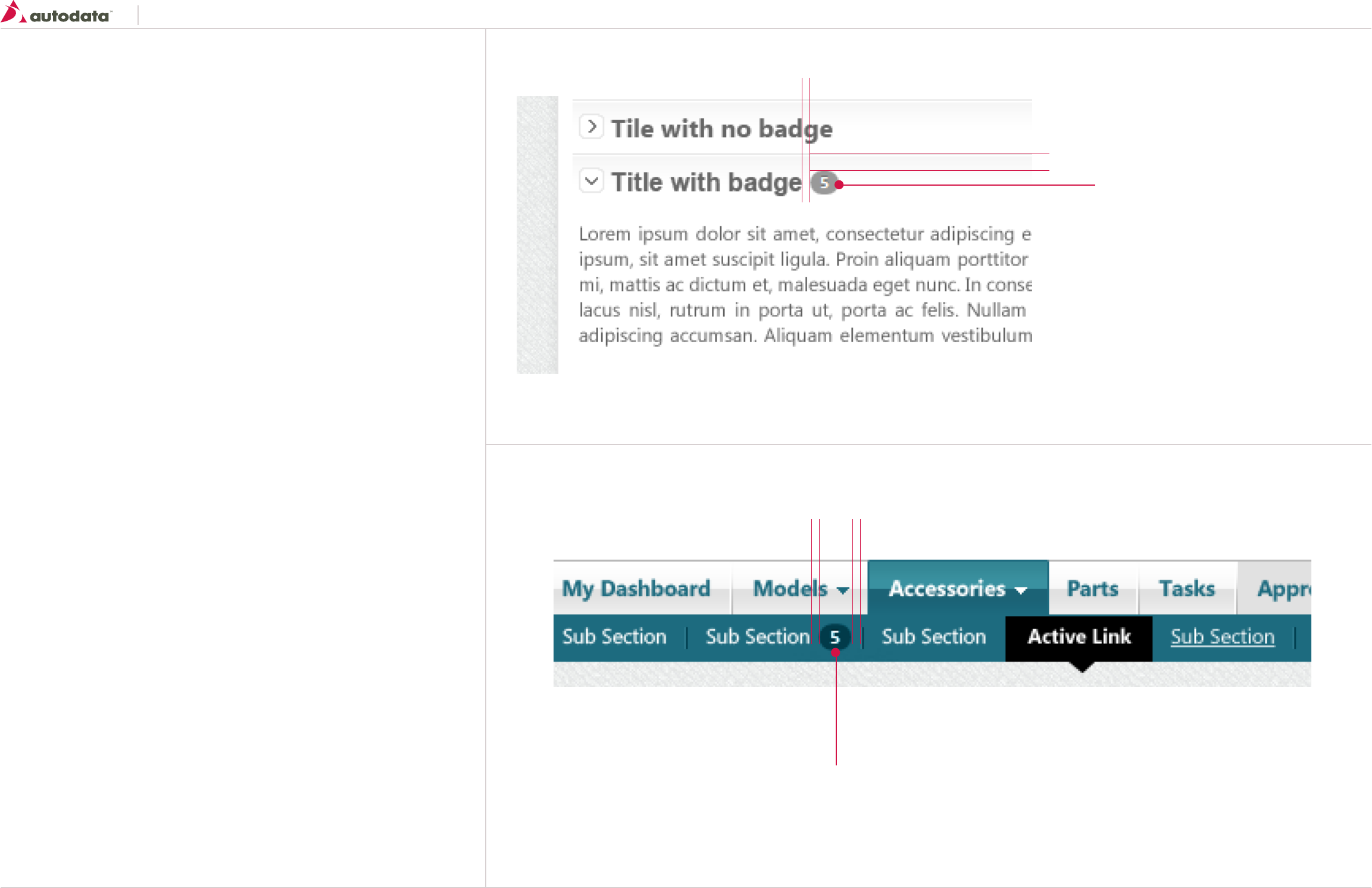
10.0 Communicators: Badges
Badges provide quick visual identification for numeric values such as tallies and other quantities.
They are not used for anything other than integers.
General usage
• Badges can be used before or after the name or label of the thing they quantify but the more
common pattern is after the object name
• Tooltips can be used to enhance user understanding – to indicate units, for example
• Badges are for counts, so should only contain numbers Badge
font-family: ‘Segoe UI’, Helvetica, Arial, sans-serif;
font-size: 10px;
font-weight: bold;
border-radius: 9px 9px 9px 9px;
padding-left: 6px;
padding-right: 6px;
background-color: #999999;
color: #FFFFFF;
line-height: 10px;
display: inline-block;
text-shadow: 0 -1px 0 rgba(0, 0, 0, 0.25);
vertical-align: baseline;
white-space: nowrap;
Badge
Same properties as the above badge in containers, with the following exceptions:
background-color: #013b4a;
5
5 5
22
Notification Badges in Containers
Notification Badges in Sub Navigation
Southeast Toyota
Date Created: 06/12/2013 | Date Modified: 03/27/2014 | Version 1.7 |
© 2013 Autodata Solutions, Inc. / Autodata Solutions Company
Page / 39
10.1 Communicators: Badges Continued
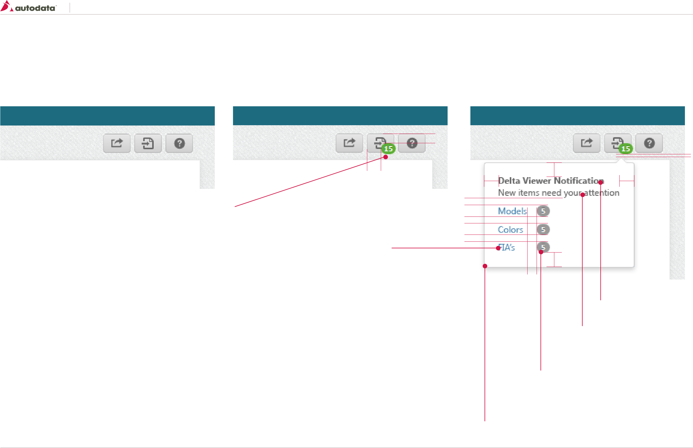
Notification Badges for Delta Viewer
Default View Active Notification Active Notification: Hover
Please see 7.0 Consistent Page Elements: Page Title Bar for additional details Please see 7.0 Consistent Page Elements: Page Title Bar for additional details.
Clicking the icon or notification will take the user to the Delta Viewer default screen.
Please see 7.0 Consistent Page Elements: Page Title Bar for additional details.
On Hover an inline dialog window will display the Delta Viewer items that require attention.
Clicking the links will take the user to that particular section in the Delta Viewer.
13
4
10
20 20
20
20
10
10
14
20
Delta Viewer Badge
font-family: ‘Segoe UI’, Helvetica, Arial, sans-serif;
font-size: 10px;
font-weight: bold;
border-radius: 9px 9px 9px 9px;
padding-left: 4px;
padding-right: 4px;
background-color: #5CAF36;
color: #FFFFFF;
line-height: 10px;
display: inline-block;
text-shadow: 0 -1px 0 rgba(0, 0, 0, 0.25);
vertical-align: baseline;
white-space: nowrap;
Inline Dialog
See Inline Dialogs for additional details
Notification Badges
See Notification Badges in Containers for
additional details
Heading
Font Properties; See T7 section 2.0
Body Text
Font Properties; See T6 section 2.0
Links
Font Properties; See T9section 2.0
Southeast Toyota
Date Created: 06/12/2013 | Date Modified: 03/27/2014 | Version 1.7 |
© 2013 Autodata Solutions, Inc. / Autodata Solutions Company
Page / 40
10.2 Communicators: Messages
Messages are the primary method for providing system feedback in the user interface. Messages
include notifications of various kinds: alerts, confirmations, notices, warnings, info and errors.
General usage
• Information: Use for supplementary information
• Confirmation: Use when you are responding to user actions
• Warning: Use this when there is a risk of data loss or system error
• Alert: Use this messages for inadvertent and unexpected destruction of data. Use this message
type sparingly, try to avoid error situations
Do:
• Use messages to provide system feedback for user actions, especially creation actions when the
created object does not appear on the current screen
• If the message is a warning or error message, state the problem in as non-technical terms as
possible and indicate a course of action for the user
• If possible, disable an invalid action rather than relying on messaging after the action is
attempted
Don’t:
• Don’t display more than two persistent messages at a time, per user view
• Don’t combine separate messages in a single message panel
• Don’t try to communicate abstract or highly technical concepts in a message
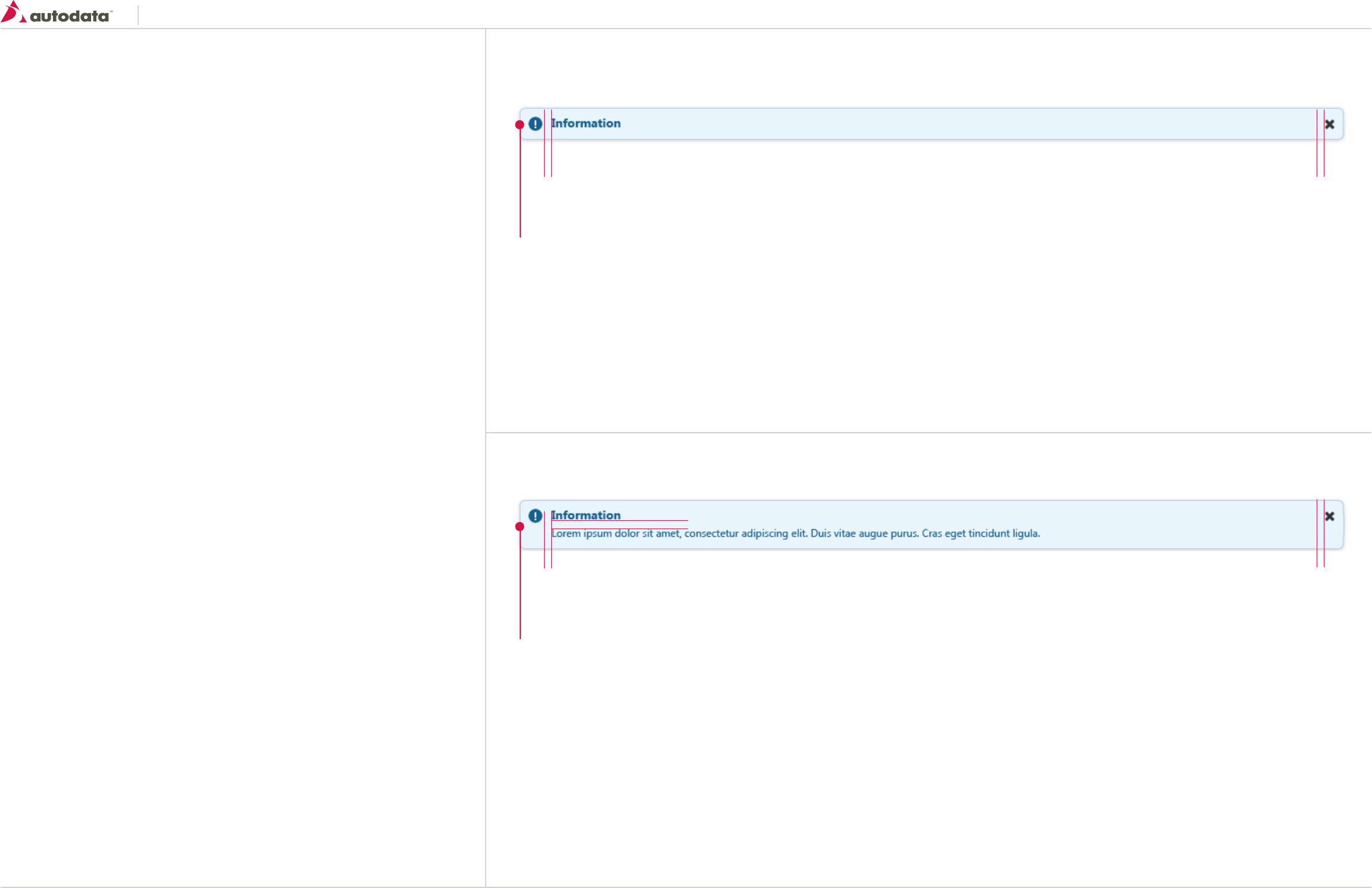
Message box Structure - Single Line
Message box Structure - Multiple Line
Message Box
width: 100%
border-radius: 5px 5px 5px 5px;
padding: 10px
box-shadow: 0px 2px 5px rgba(50, 50, 50, 0.52);
information icon: 16x16 always on the left
Close button icon: 16x16 always on the right
Font Properties; See T4 section 2.0
Message Box
width: 100%
border-radius: 5px 5px 5px 5px;
padding: 10px
margin: 10px 0 10px 0;
box-shadow: 0px 2px 5px rgba(50, 50, 50, 0.52);
information icon: 16x16 always on the left
Close button icon: 16x16 always on the right
Title Font Properties; See T4 section 2.0
Body Font Properties; See T6 section 2.0
10
10
10
10
10
Southeast Toyota
Date Created: 06/12/2013 | Date Modified: 03/27/2014 | Version 1.7 |
© 2013 Autodata Solutions, Inc. / Autodata Solutions Company
Page / 41
10.2 Communicators: Messages Continues
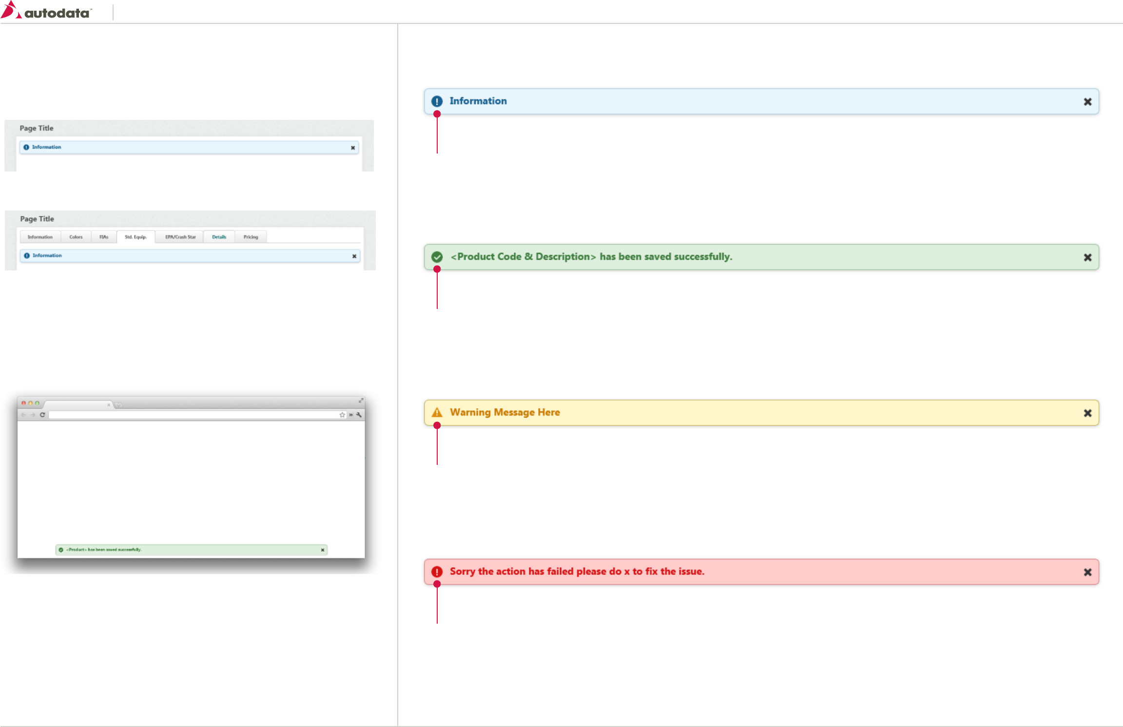
Information MessagesInformation Message Location
Information, Warning and Alert Messages should always be located above the content inside the page
wrapper:
Confirmation Messages should be pinned to the bottom of the browser (10 pixels from the bottom) and
should always be placed at the very top above all other content.
The width should be set to 100% of the page wrapper with 10px padding on the left and right.
The message should display for 10-15 seconds before it fades away. The User can manually close the
message by clicking the close icon on the right side.
Confirmation Message should be displayed anytime the following actions are performed:
• Save
• Save & Create New
• Save & Copy
• Submit to…
• Approved or Rejected
• Import Accepted
• Release Selected
Example with tabs:
Confirmation Message
Warning Message
Alert Message
Same properties as the structure with the following additions
border: 1x solid #ADCEE3;
Background-color: #E8F5FD;
Color: #17608E;
Icon: icon-pending-release #17608E;
Close icon: icon-delete #333333;
Same properties as the structure with the following additions
border: 1x solid #A2C3A2;
Background-color: #DEEFDE;
Color: #3E7D3E;
Icon: icon-complete #3E7D3E;
Close icon: icon-delete #333333;
Same properties as the structure with the following additions
border: 1x solid #C6B566;
Background-color: #FFF6CC;
Color: #DB8B0E;
Icon: icon-warning #DB8B0E;
Close icon: icon-delete #333333;
Same properties as the structure with the following additions
border: 1x solid #DA8C8C;
Background-color: #FFCCCC;
Color: #D41212;
Icon: icon-pending-release #D41212;
Close icon: icon-delete #333333;

Southeast Toyota
Date Created: 06/12/2013 | Date Modified: 03/27/2014 | Version 1.7 |
© 2013 Autodata Solutions, Inc. / Autodata Solutions Company
Page / 42
10.3 Communicators: Spinners
Spinners are used for showing a system process of unknown length going on that ends with the
system displaying results to the user.
General usage
Spinners give users feedback that one of their actions has triggered a system response that might
only become visible after a short period of time. However, the use of spinners should be kept to a
minimum as it still means wait time for the user.
• Display spinner on top of all other data and centered on the screen
• Only show a spinner if the expected wait time is more than a second
10
Body
background-color: #FFFFFF;
padding: 10px;
border: 1px solid #D7D7D7;
border-radius: 5px 5px 5px 5px;
-webkit-box-shadow: 0px 3px 5px rgba(50, 50, 50, 0.37);
-moz-box-shadow: 0px 3px 5px rgba(50, 50, 50, 0.37);
box-shadow: 0px 3px 5px rgba(50, 50, 50, 0.37);
Text
Font Properties; See T7 section 2.0
Vertically Centered
padding-right: 10px;
Spinner Icon
image: spinner.gif
size: 50 x 50
Loading Please Wait... 70
Southeast Toyota
Date Created: 06/12/2013 | Date Modified: 03/27/2014 | Version 1.7 |
© 2013 Autodata Solutions, Inc. / Autodata Solutions Company
Page / 43
10.4 Communicators: Tooltips
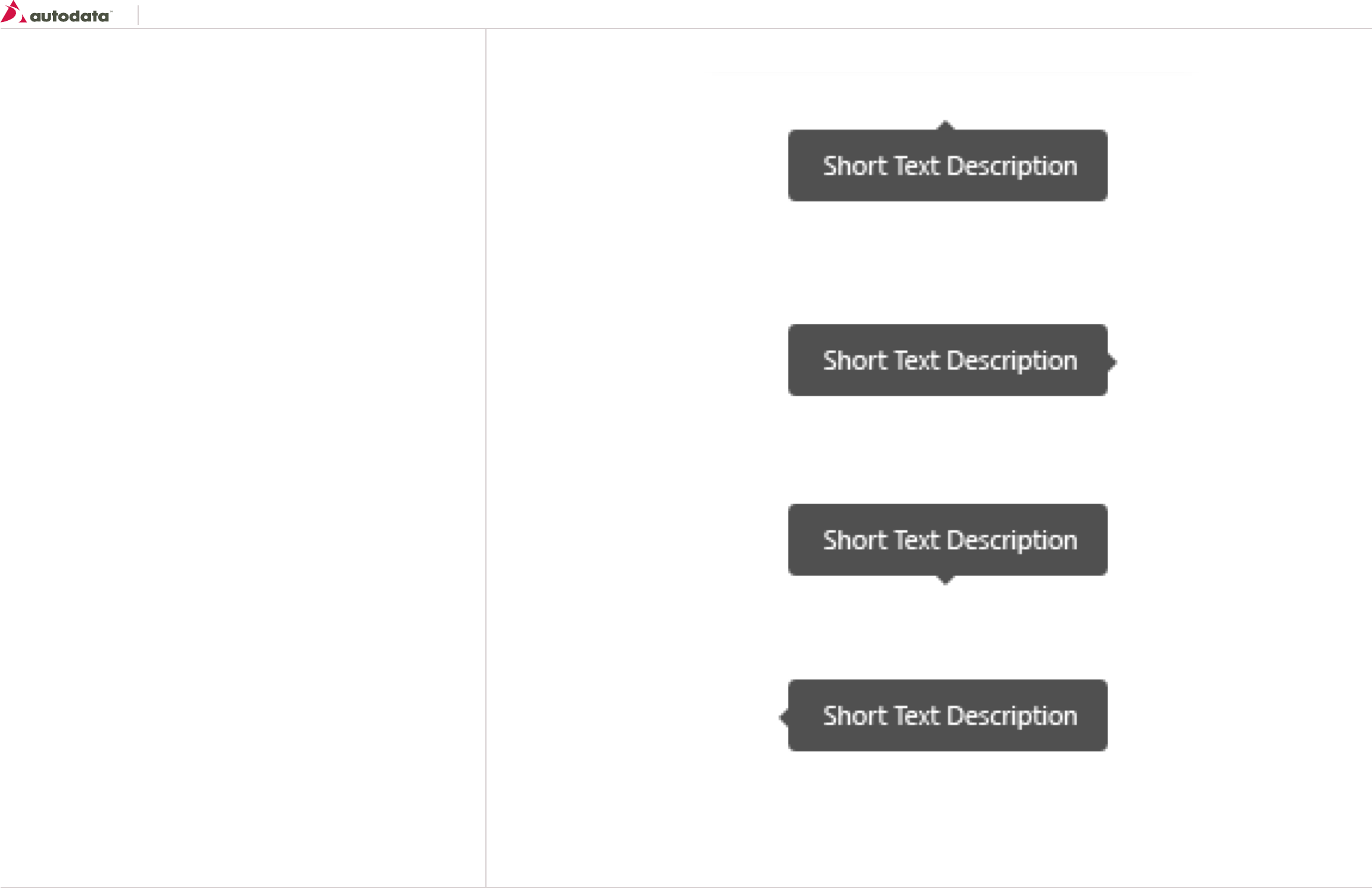
Tooltips can describe a UI element in a little bit more detail when users deliberately hover of the
element
General usage
Tooltips should be used when users might need a little bit more detail about a UI element, but the
space provided in the actual interface doesn’t allow a quick explanation.
The tooltip should be short and plain text-only.
If you need anything beyond plain text, Inline dialogs are more appropriate.
Tooltip Body
Font Properties; See T6 section 2.0
change font-size: 11px;
background: none repeat scroll 0 0 rgba(51, 51, 51, 0.9);
border-radius: 3px 3px 3px 3px;
color: #FFFFFF;
text-align: center;
line-height: 20px;
padding: 5px 10px;
Arrow Top
border-bottom-style: solid;
border-left-color: rgba(0, 0, 0, 0);
border-right-color: rgba(0, 0, 0, 0);
border-top: medium none;
left: 50%;
margin-left: -5px;
top: 0;
Arrow Right
border-bottom-color: rgba(0, 0, 0, 0);
border-left-style: solid;
border-right: medium none;
border-top-color: rgba(0, 0, 0, 0);
margin-top: -5px;
right: 0;
top: 50%;
Arrow Bottom
border-bottom: medium none;
border-left-color: rgba(0, 0, 0, 0);
border-right-color: rgba(0, 0, 0, 0);
border-top-style: solid;
bottom: 0;
left: 50%;
margin-left: -5px;
Arrow Left
border-bottom-color: rgba(0, 0, 0, 0);
border-left: medium none;
border-right-style: solid;
border-top-color: rgba(0, 0, 0, 0);
left: 0;
margin-top: -5px;
top: 50%;

Southeast Toyota
Date Created: 06/12/2013 | Date Modified: 03/27/2014 | Version 1.7 |
© 2013 Autodata Solutions, Inc. / Autodata Solutions Company
Page / 44
11.0 Patterns: Activity stream
Activity streams are used to show time-ordered activity in a context to help users understand
what’s currently happening in the system. Each activity stream entry is timestamped, and usually
has an actor, an action, and a subject or object of the action.
General usage
Activity streams typically surface links to the objects they reference, so users can click through to
the application for more information.
Location: Dashboard
20
10
10
380 10
66
66
Activity Stream Heading
See Basic Table Headings for more details
Activity Stream Cell
Font Properties; See T6 section 2.0
Cell links: See T9 section 2.0
padding: 10px;
border: 1px solid #C5C5C5;
min-height: 66px;
/* Height can grow based on content */
Time Stamp
Font Properties; See T6 section 2.0
font-size: 10px
color: #999999;
margin-top: 10px;
Row Color: #FFFFFF;
Border: 1px solid #C5C5C5;
Alternate Row Color: #F5F5F5;
Overall height is 556 pixels.
Activity Stream should hold a minimum of 8 rows (At 66
pixel per row). If the content requires additional vertical
space a vertical scroll bar should be added.
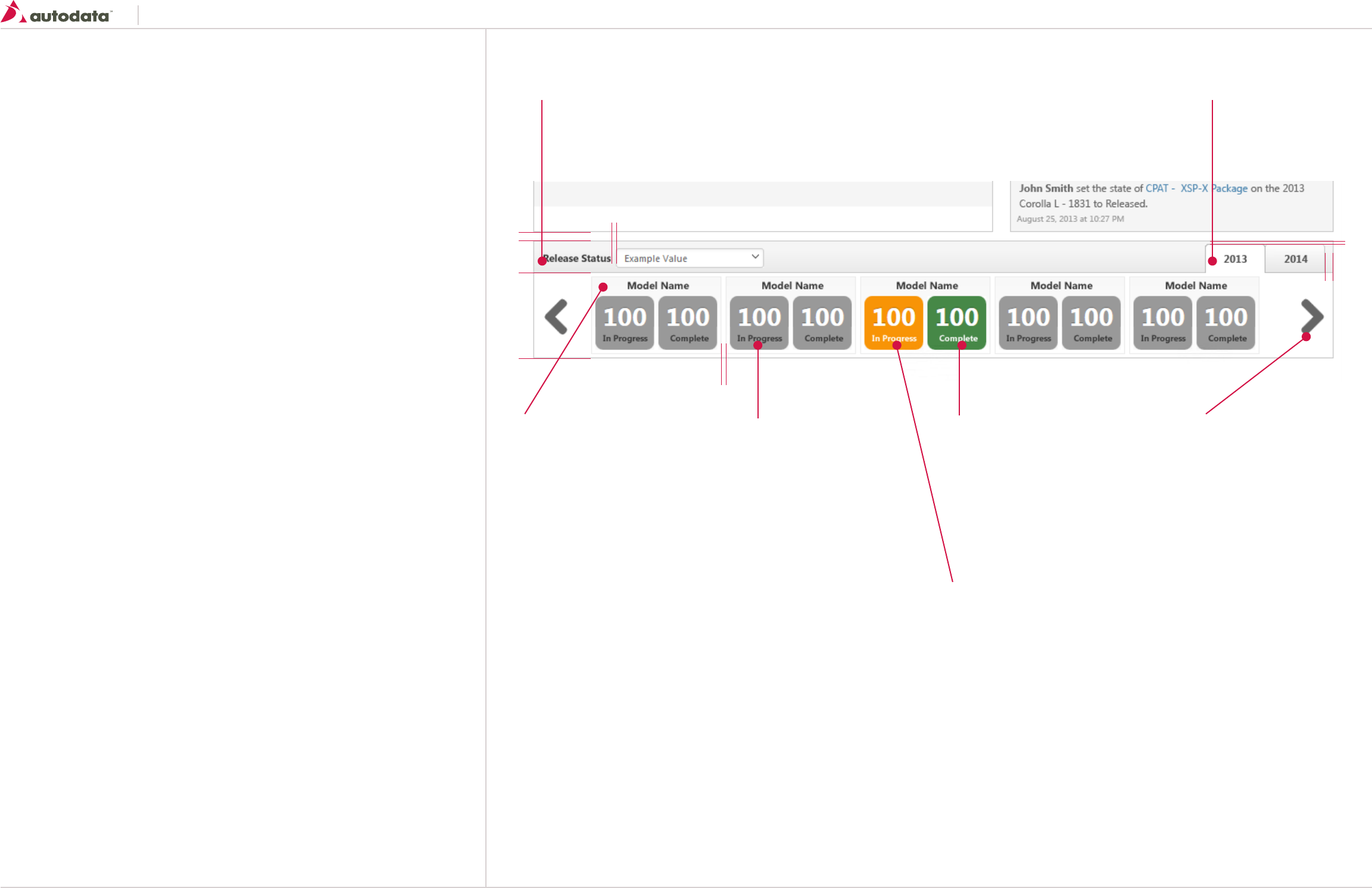
Southeast Toyota
Date Created: 06/12/2013 | Date Modified: 03/27/2014 | Version 1.7 |
© 2013 Autodata Solutions, Inc. / Autodata Solutions Company
Page / 45
11.1 Patterns: Product Release Status
Product Release Status widget will allows the user to get a quick glimpse on how much work has
been completed of a particular product.
General usage
Product Release will display the in progress and complete status of particular products, information
is high level and should allow the user to click through to the application for more information.
Location: Dashboard
10
5
5
4
10
38
100
Release Status Heading
See Basic Table Headings for more details
height: 38px
Release Status Tabs
See Controls: Tabs for more details
margin-top: 4px
Product Tiles
width: 153px
height: 90px
border: 1px solid #ECECEC;
linear-gradient(top, #F8F8F8, #FFFFFF);
padding: 5px;
/bottom: 5px;
Model Name Title:
Font Properties; See T7 section 2.0
color: #393939;
margin-bottom: 8px;
Notes:
At a minimum 5 product tiles should be displayed.
Additional tiles can be shown if the browser window width is increased.
User can scroll left or right by using the arrow icons.
Progress Container: Default
width: 69px
height: 63px
border-radius: 9px 9px 9px 9px;
padding-left: 9px;
padding-right: 9px;
background-color: #999999;
Number Values
color: #FFFFFF;
font-size: 30px;
font-weight: bold;
text-shadow: 0 -1px 0 rgba(0, 0, 0, 0.25);
margin-top: 13px;
margin-bottom: 10px
Progress Titles:
color: #393939;
font-size: 10px;
Progress Container: Hover
Same properties as default with the
following exceptions:
background-color: #468847;
Progress Titles:
color: #FFFFFF;
Arrows Left:
size: 27 x 42
background-image: url(“sprite.png”);
background-position: 16px 0px;
margin: 29px 0 29px 13px;
Arrows Right:
size: 27 x 42
margin: 29px 13px 29px 0;
background-image: url(“sprite.png”);
background-position: 16px 48px;
Progress Container: Hover
Same properties as default with the
following exceptions:
background-color: #F89406;
Progress Titles:
color: #FFFFFF;
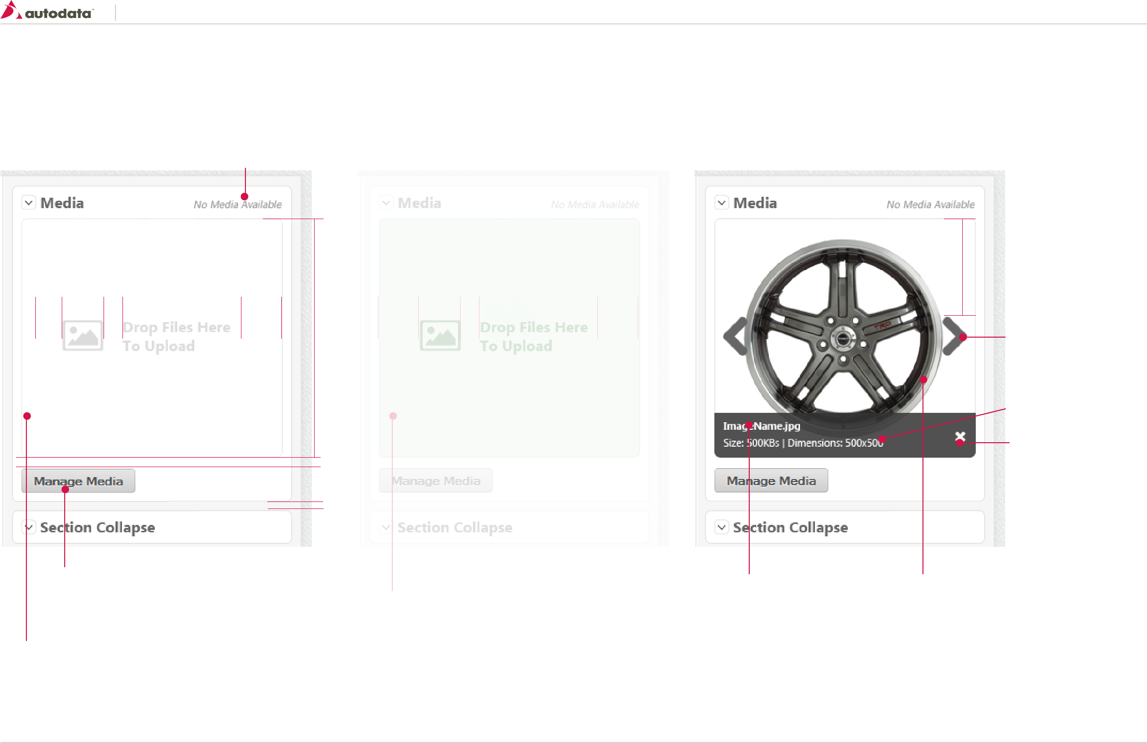
Southeast Toyota
Date Created: 06/12/2013 | Date Modified: 03/27/2014 | Version 1.7 |
© 2013 Autodata Solutions, Inc. / Autodata Solutions Company
Page / 46
11.2 Patterns: Media Widget
The media widget is display on the right side bar of most products.
Default View Default View With Media
See Secondary Buttons for more
details
Media Widget Container
See Secondary Content Containers for more details
font Properties; See T3 section 2.0
color: #DCDCDC;
icon: icon-picture - #DCDCDC;
icon size: 44 x 33
No images attached Widget will display a mini gallery of media that haves been attached. User can
scroll left/right to view more images.
Image Details
Background-color: # 333333
opacity: 0.81;
border-bottom-right-radius: 5px;
border-bottom-left-radius: 5px;
color: #FFFFFF;
padding: 10px
Image Name
font-size: 11px
font-weight: bold;
Delete Icon
size: 16x16
icon: icon-delete - #FFFFFF;
vertical-align: middle;
Arrows Left:
size: 27 x 42
background-image: url(“sprite.png”);
background-position: 16px 0px;
margin: 29px 0 29px 13px;
Arrows Right:
size: 27 x 42
margin: 29px 13px 29px 0;
background-image: url(“sprite.png”);
background-position: 16px 48px;
font-weight: normal;
Image
If no thumbnail can be generated please use the
appropriate icon to represent the media type.
Icons should be sized at 128x128 / color: #CCC
•WordDocument-icon-word
•PDF’s-icon-pdf
•Excelworksheets-icon-excel
•Videos-icon-video
•Image-icon-picture
•Link-icon-link
•Other-icon-generic-document
font-size: 11px;
color: #999999;
font-style:italic;
align: right;
10
256
2044 20
105
10
Hover View
Same properties as the Default View with
the following exceptions:
border: 1px solid #BBDBB
Background-color: #DEEFDE;
color: #4A854A;
icon: icon-picture - #4A854A;
icon size: 44 x 33
Highlight drag and drop zone on hover. The user can drop
media files on the green area to start uploads.
2044 20
Drag and Upload featured removed due to IE8 compatability issues.

Southeast Toyota
Date Created: 06/12/2013 | Date Modified: 03/27/2014 | Version 1.7 |
© 2013 Autodata Solutions, Inc. / Autodata Solutions Company
Page / 47
11.3 Patterns: Media Modal Dialog
The Media Modal Dialog is used to manage all attached media for a product. Can be viewed as a list or gallery mode.
See Modal Dialogs for more details
Use Large size (800 px wide)
Thumbnail
size: 76 x 56
margin: 2px;
If no thumbnail can be generated please use the
appropriate icon to represent the media type.
Icons should be sized at 32x32 / color: #CCC
•WordDocument-icon-word
•PDF’s-icon-pdf
•Excelworksheets-icon-excel
•Videos-icon-video
•Image-icon-picture
•Link-icon-link
•Other-icon-generic-document
File Name
Font Properties; See T9 section 2.0
font-weight: bold;
padding-bottom: 8px
File Specs
Font Properties; See T9 section 2.0
font-size: 10px;
File Name
Font Properties; See T9 section 2.0
font-weight: bold;
padding-top: 10px
File Specs
Font Properties; See T9 section 2.0
font-size: 10px;
Image Container
width: 100%
height: 273px
border: 1px solid #D7D7D7
Progress bar:
background-color: #62C462;
background-image: linear-gradient(45deg, rgba(255, 255, 255, 0.15) 25%, transparent 25%, transparent 50%,
rgba(255, 255, 255, 0.15) 50%, rgba(255, 255, 255, 0.15) 75%, transparent 75%, transparent);
Progress Bar Background
background-color: #F7F7F7;
background-image: linear-gradient(to bottom, #F5F5F5, #F9F9F9);
background-repeat: repeat-x;
border-radius: 4px 4px 4px 4px;
box-shadow: 0 1px 2px rgba(0, 0, 0, 0.1) inset;
height: 20px;
Icon
size: 16 x 16
icon: icon-warning - Yellow
Font Properties; See T7 section 2.0
and Italic
Icon
size: 16 x 16
icon: icon-delete - Red
6382 177
10 10
195 243
Arrows Left:
size: 27 x 42
background-image: url(“sprite.png”);
background-position: 16px 0px;
margin: 29px 0 29px 13px;
Arrows Right:
size: 27 x 42
margin: 29px 13px 29px 0;
background-image: url(“sprite.png”);
background-position: 16px 48px;
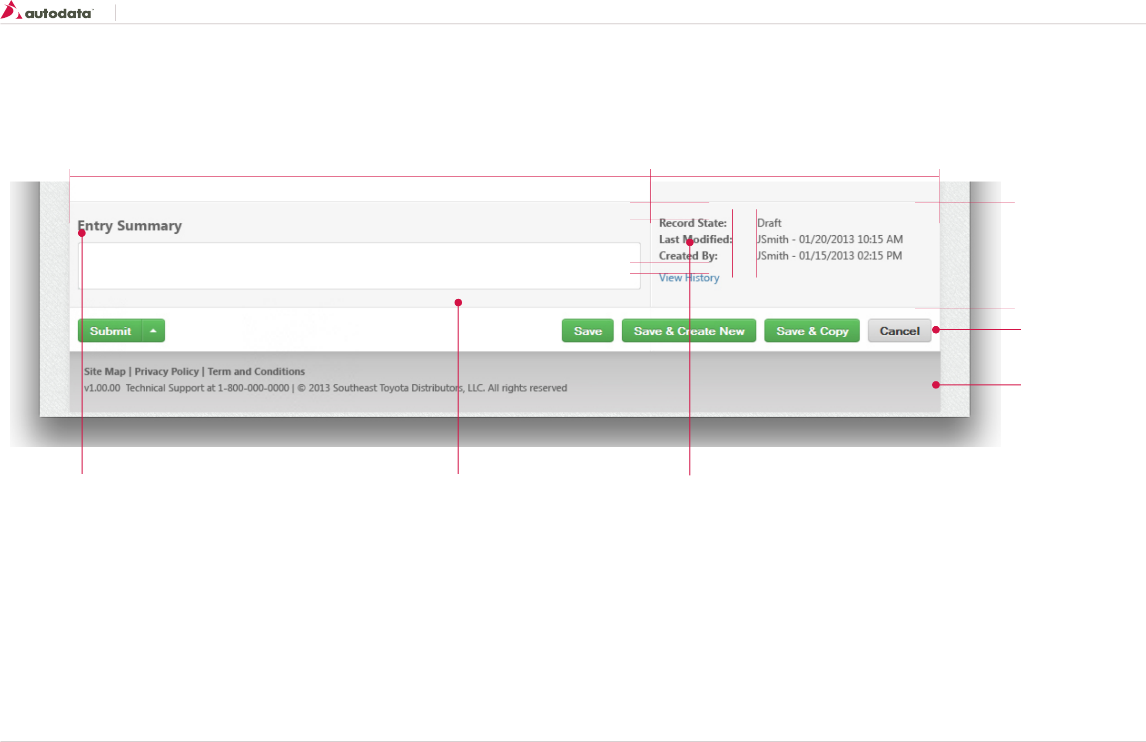
Southeast Toyota
Date Created: 06/12/2013 | Date Modified: 03/27/2014 | Version 1.7 |
© 2013 Autodata Solutions, Inc. / Autodata Solutions Company
Page / 48
11.4 Patterns: Entry Summary
Entry Summary is placed at the bottom of all product screens. Entry Summary allows the user to capture audit notes for any updates made to a record.
117
320
28
12
20
100%
See Action Toolbar
See Footer
Container
padding: 10px;
background-color: #F6F6F6;
border: 1px solid #E4E4E4;
box-shadow: 0 1px 0 1px #FFFFFF inset;
height: 117px
Labels
Font Properties; See T7 section 2.0
Values
Font Properties; See T6 section 2.0
Links
Font Properties; See T9 section 2.0
Heading
Font Properties; See T3 section 2.0
padding-top: 20px
padding-bottom: 10px
Entry Field
width: 100%
Height: 60px;
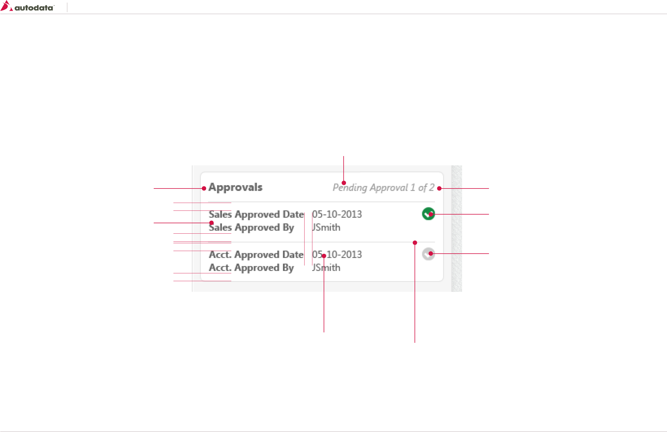
Southeast Toyota
Date Created: 06/12/2013 | Date Modified: 03/27/2014 | Version 1.7 |
© 2013 Autodata Solutions, Inc. / Autodata Solutions Company
Page / 49
11.5 Patterns: Approval Widget
Approval widget can be located on the right bar of any pricing screen or the body of a product screen.
10
10
10
10 10
See Secondary Content Containers
Font Properties; See T7 section 2.0
Font Properties; See T6 section 2.0
Font Properties; See T8 section 2.0
Additional Copy:
Not Approved: if no approvals have been set
Pending Approval 1 of 2: Sales has approved and waiting on Accounting Approval
Approved: both Sales and Accounting have approved the pricing
Approved Icon
icon: icon-complete - Green
size: 16 x16
float: right;
Approved Icon
icon: icon-complete
size: 16 x16
float: right;
color:#CCCCCC;
border: 1px solid #E4E4E4
width: 100%
margin-top/bottom: 10px;
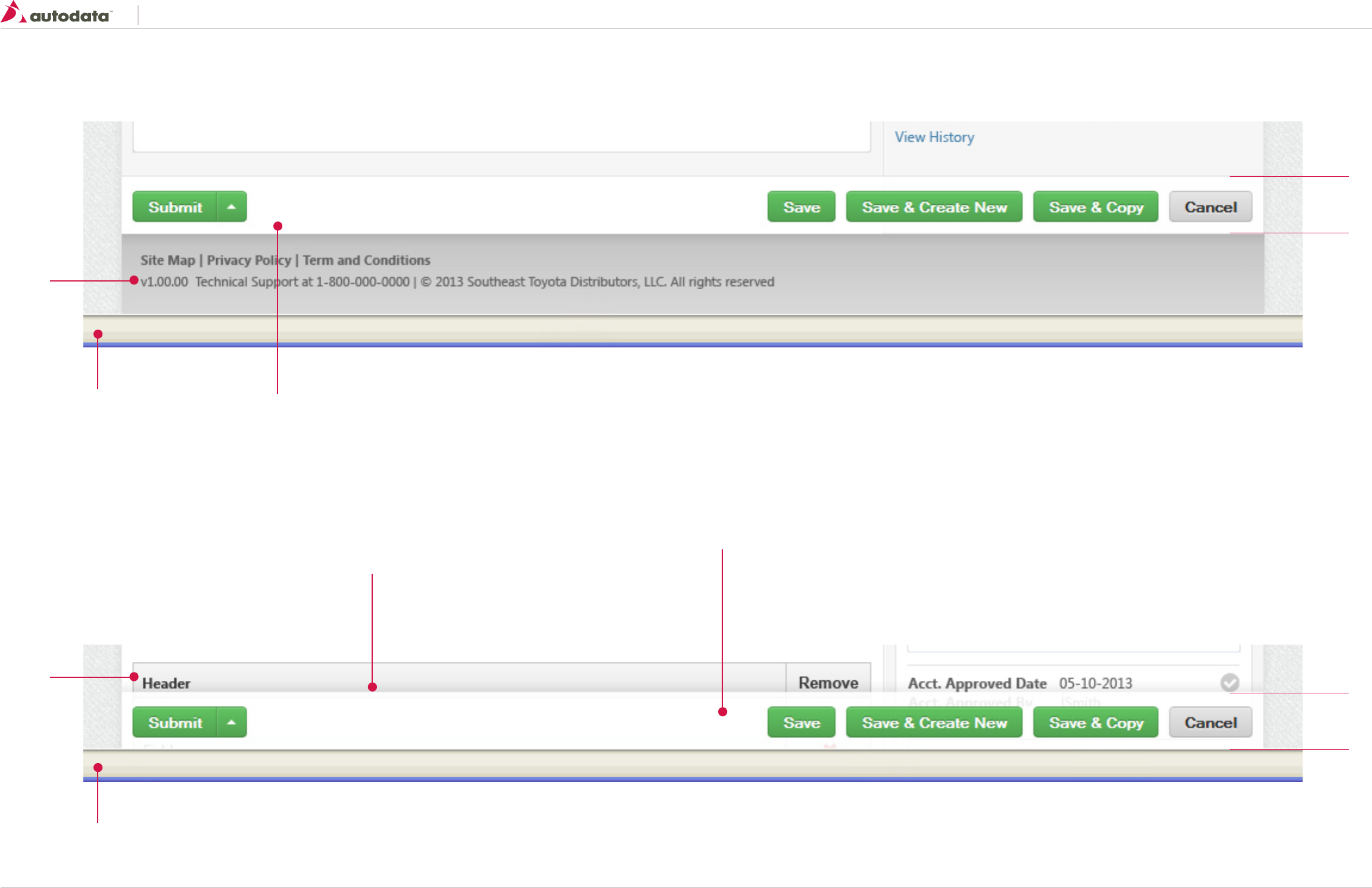
Southeast Toyota
Date Created: 06/12/2013 | Date Modified: 03/27/2014 | Version 1.7 |
© 2013 Autodata Solutions, Inc. / Autodata Solutions Company
Page / 50
11.6 Patterns: Action Toolbar
The toolbar is a group of buttons that give users access to specific actions of a focused task. Common toolbar placements can be found above the footer on the details screen of a product.
If the page requires vertical scrolling the toolbar should be pinned to the bottom of the browser, this ensures the user always has access to the actions.
Once the user reach the bottom of the page the toolbar should unlock to reveal the Footer.
46
46
Toolbar
width: 100%
height: 46 px
padding: 10px
background-color: #FFF;
Toolbar
width: 100%
height: 46 px
padding: 10px
background: none repeat scroll 0 0 white;
opacity: 0.95;
Shadow
/*Box Shadow Effect*/
-webkit-box-shadow: 0px -3px 6px rgba(50, 50, 50, 0.39);
-moz-box-shadow: 0px -3px 6px rgba(50, 50, 50, 0.39);
box-shadow: 0px -3px 6px rgba(50, 50, 50, 0.39);
Footer
Content
Browser window
Browser window
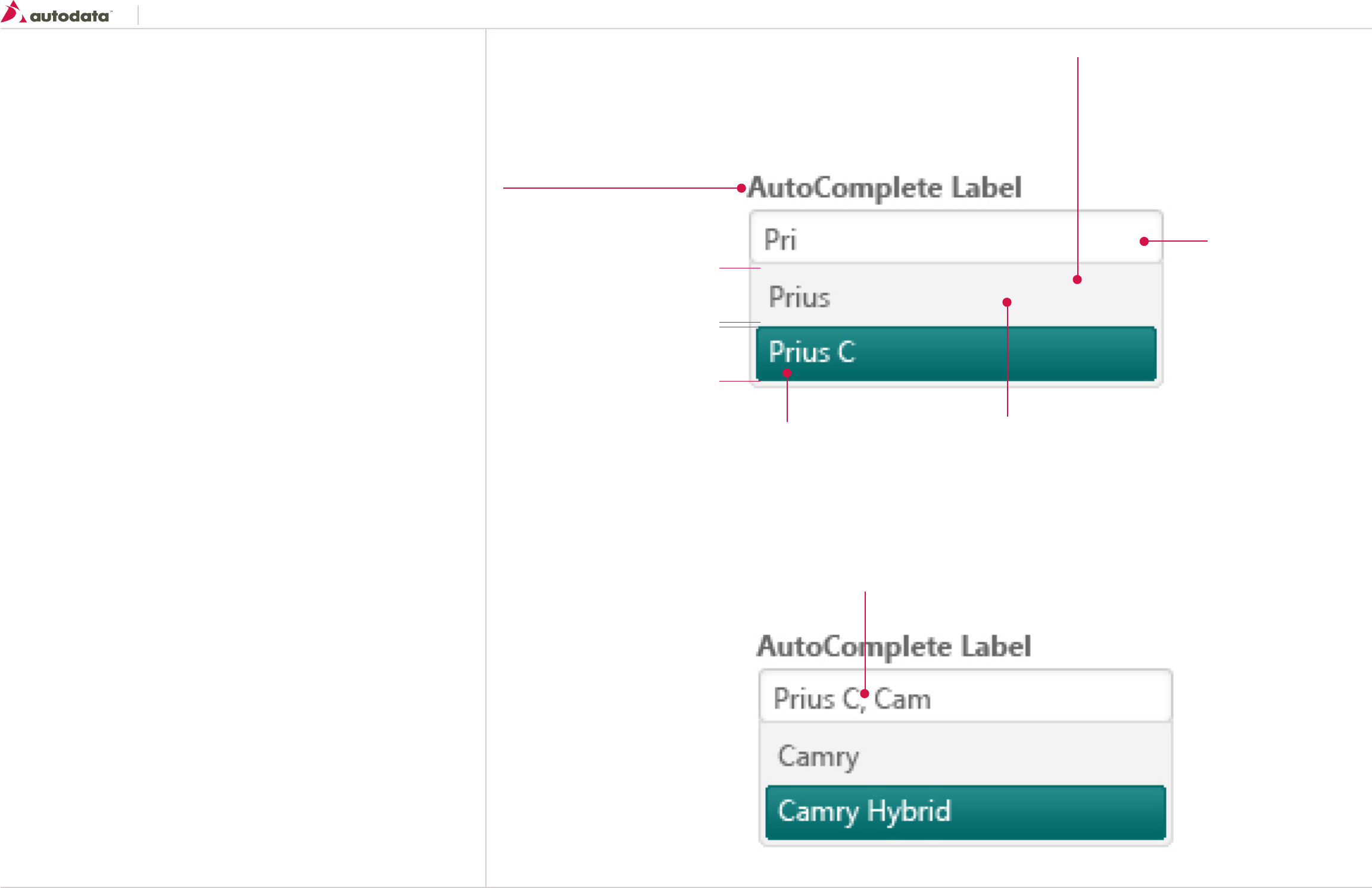
Southeast Toyota
Date Created: 06/12/2013 | Date Modified: 03/27/2014 | Version 1.7 |
© 2013 Autodata Solutions, Inc. / Autodata Solutions Company
Page / 51
11.7 Patterns: AutoComplete
The Autocomplete widgets provides suggestions while you type into the field.
General usage
Enables users to quickly find and select from a pre-populated list of values as they type, leveraging
searching and filtering.
keyboard navigation of AutoComplete list:
• Up Arrow - highlights previous item
• Down Arrow - highlights next item
• Enter - selects highlighted item
• ESC - closes the popup
23
23
1
Label
See Controls: Forms - Labels and Input Fields
for more details
AutoCompete Container
See Controls: Forms - Labels and Input Fields border-radius: 0
0 4px 4px;
background-color: #F3F3F4;
border: 1px Solid #DBDBDE;
padding: 3px
min-width: must be at a minimum the same as the input field
box-shadow: 0 2px 2px 0 rgba(82, 90, 104, 0.2);
List Item Hover
height: 23px;
Font Properties; See T6 section 2.0
color: #FFFFFF;
border-radius: 3px 3px 3px 3px;
linear-gradient(top, #278d8d, #006666);
border: 1px solid #006666;
vertical-align: middle;
When the user enters multiple items they should be separated by a comma
List Item Default
height: 23px;
Font Properties; See T6 section 2.0
margin-bottom: 1px;
vertical-align: middle;
Input Field
See Controls: Forms - Labels and Input Fields
for more details
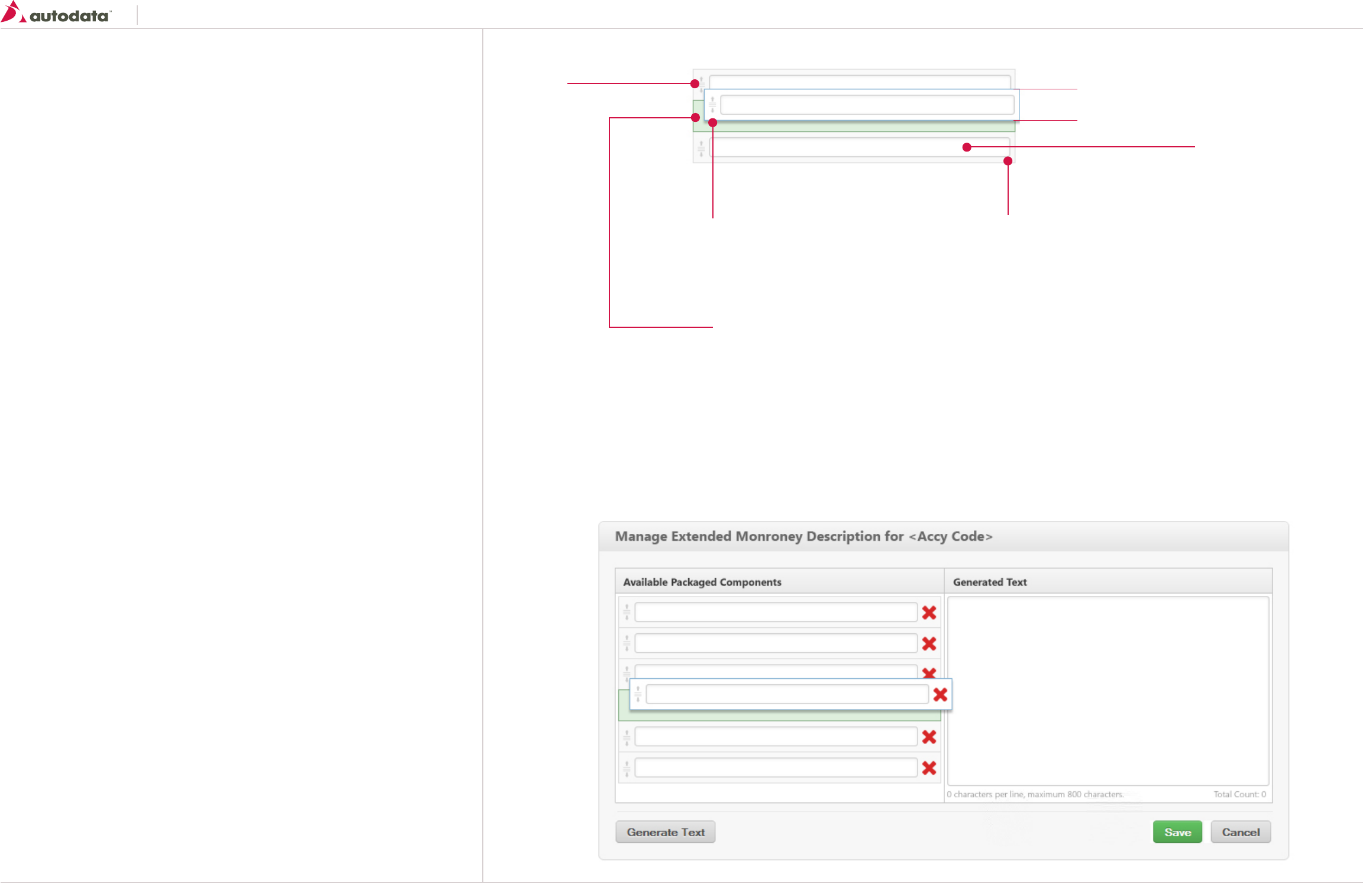
Southeast Toyota
Date Created: 06/12/2013 | Date Modified: 03/27/2014 | Version 1.7 |
© 2013 Autodata Solutions, Inc. / Autodata Solutions Company
Page / 52
11.8 Patterns: Drag & Drop List Items
Drag and drop is a very common feature. It is when you “grab” an object and drag it to a different
location.
General usage
The basic sequence involved in drag and drop is:
• Move the pointer to the object
• Press, and hold down, the button on the mouse or other pointing device, to “grab” the object
• “Drag” the object to the desired location by moving the pointer to this one
• “Drop” the object by releasing the button
Drag Icon
icon: icon-reorder Light Grey
size: 16 x16
Draggable Item: Default
width: 100%
height: 36
border: 1px solid #DDDDDD;
Background-color: #F9F9F9
padding: 4px;
Draggable Item: Active
Same properties as default with the following exceptions:
border: 1px solid #8BB6D5;
-webkit-box-shadow: 0px 3px 5px rgba(50, 50, 50, 0.37);
-moz-box-shadow: 0px 3px 5px rgba(50, 50, 50, 0.37);
box-shadow: 0px 3px 5px rgba(50, 50, 50, 0.37);
Drop Zone
To provide the user a visual to where the items can be
dragged into the drop zone should apply the following styles:
background: #DEEFDE;
border: 1px solid #86AE86
Draggable items should snap into the proper location
Sample shown below is of the re-ordering of descriptions on the Manage Extended Monroney Descriptions overlay.
36
Input Field
See Controls: Forms - Labels and Input Fields
for more details
*Input field is optional
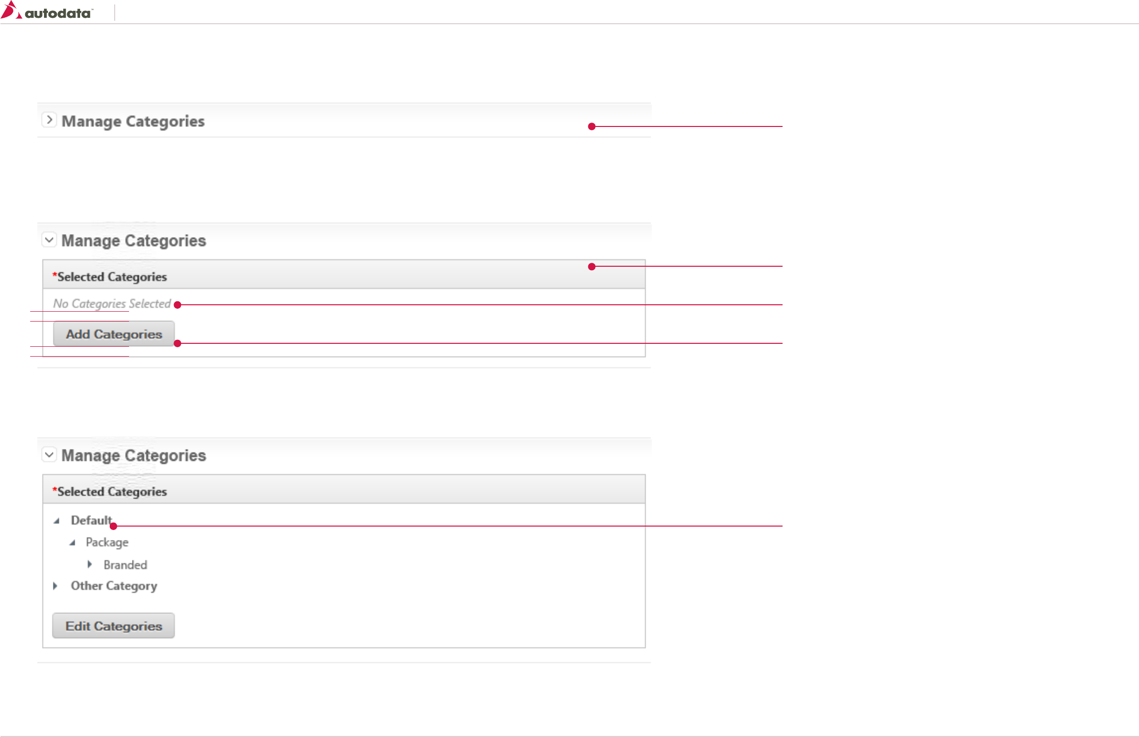
Southeast Toyota
Date Created: 06/12/2013 | Date Modified: 03/27/2014 | Version 1.7 |
© 2013 Autodata Solutions, Inc. / Autodata Solutions Company
Page / 53
11.9 Patterns: Manage Categories
Default Widget - Closed
Default widget - Open
Widget with selected values - Open
See Primary Content Containers
See Basic Tables
or 13.2 - A simple box from the Living Style guide
Standard Kendo UI TreeView
Font Properties; See T6 section 2.0
All root nodes should be bold
Font Properties; See T8 section 2.0
Color: # 999999;
See Secondary Buttons
10
10
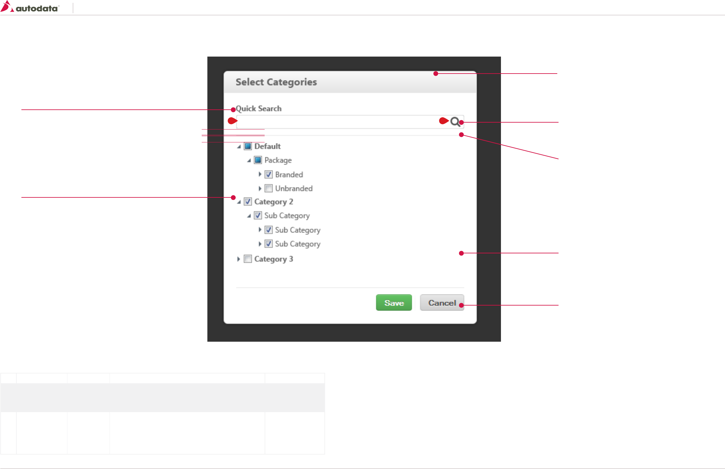
Southeast Toyota
Date Created: 06/12/2013 | Date Modified: 03/27/2014 | Version 1.7 |
© 2013 Autodata Solutions, Inc. / Autodata Solutions Company
Page / 54
11.10 Patterns: Manage Categories - Overlay
See Modal Dialogs
Size: 400px x 400 px
icon-search
Size: 16x16
Color: Default - Grey
TreeView Body
If values exceed the allowed height display a vertical scroll
bar between the two dividers
See Primary and Secondary Buttons
Form Divider
width: 100%
height: 1px;
background-color: #E9E9E9
margin: 10px 0 10px 0;
See Labels and Input Fields
10
10
Standard Kendo UI TreeView + Checkboxes
Font Properties; See T6 section 2.0
All root nodes should be bold
User Interaction:
ID Element User Action Behavior/Response Destination
1 Search Field OnFocus • Allows the user to enter a text string to filter down the list below
e.g. the user enters “Unbranded” in the search field, the list below should only
display Default > Package > Unbranded items
• This page
1 Search Button OnHover
OnClick
• Highlight icon
• Executes the search and updates list below
If no results are located display “no results found” text
• The user can also hit the Enter key to execute the search only if the Search input
field is in focus
• This page
1 2
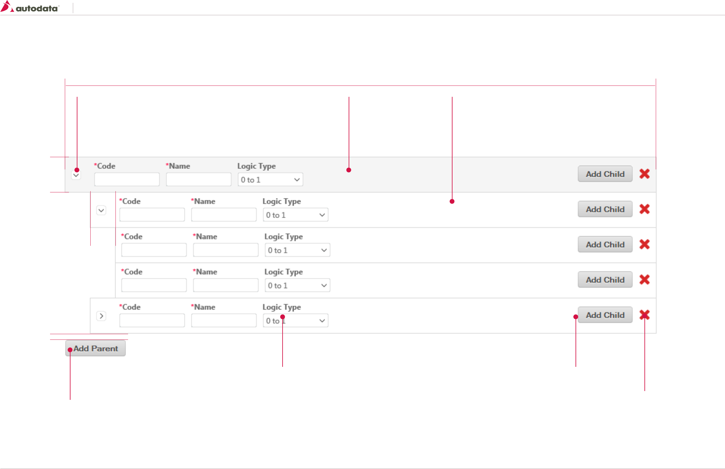
Southeast Toyota
Date Created: 06/12/2013 | Date Modified: 03/27/2014 | Version 1.7 |
© 2013 Autodata Solutions, Inc. / Autodata Solutions Company
Page / 55
11.11 Patterns: Tree Builder
Allows the user to build a Tree View structure by allowing the user to add parent and child rows.
See Secondary Button
See Secondary Button
See Labels and Input Fields
size: 16x16
background-image: url(“sprite.png”);
Expand: background-position: 0px 0px;
Collapse: background-position: 0px 16px;
margin: 0 20px 0 10px;
Parent Container
background: #f5f5f5;
border: 1px solid #d7d7d7
padding: 10px
Child Container
background: #ffffff;
border: 1px solid #d7d7d7
padding: 10px
icon-delete
Size: 16x16
Color: #d72727;
margin: 0 10px 0 10px
40
57
100%
10
40

Southeast Toyota
Date Created: 06/12/2013 | Date Modified: 03/27/2014 | Version 1.7 |
© 2013 Autodata Solutions, Inc. / Autodata Solutions Company
Page / 56
11.12 Patterns: Audit History Modal Dialog
Allows the user to view the Audit History for a Product.
See Modal Dialogs
Size: 800px x 500 px
See Basic Tables
Cell padding 10px
Original Value font properties:
Color: #ababab;
font Style: Italic
Divider
border-top: 2px solid #C5C5C5;
Note:
If the content exceeds the height of the overlay increase to as much space as the browser window will allows, otherwise add a vertical scroll bar to the grid. If a scroll bar is added the table header should always be visible.
background-color: #FFFFFF
background-color: #F5F5F5;
State change row color
background-color: #E6F2F2;
See Labels and Input Fields
See Secondary Button
Date/User/Type
background-color: #FFFFFF
10
10
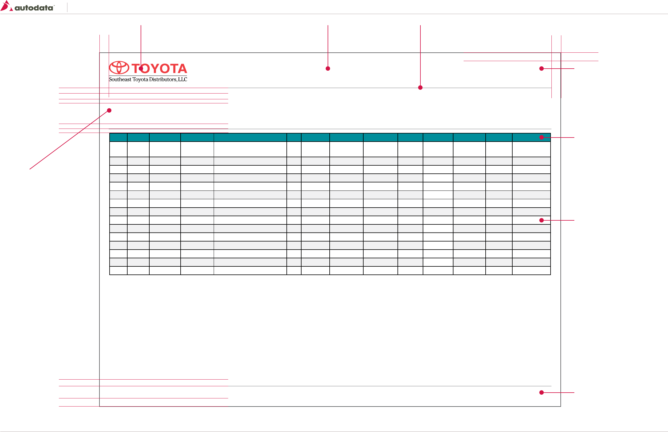
Southeast Toyota
Date Created: 06/12/2013 | Date Modified: 03/27/2014 | Version 1.7 |
© 2013 Autodata Solutions, Inc. / Autodata Solutions Company
Page / 57
12.0 Reporting Template
Year Series Model Accy Code Description Pkg. Dist. Cost SET GP ($) SET GP (%) Dlr. Cost Dlr. GP ($) Dlr. GP (%) MSRP Appr
2014 Sequoia 7929 AKKP20 Connectivity Package- (USB
Charger, Iphone Connector) $5.00 $25.00 50% $75.00 $45.00 60% $120.00 Pending
gnidneP00.572$%30100.401$00.531$%5300.53$00.001$elbaC dna regrahC BSU02SUAA9297aiouqeS3102
gnidneP00.031$%2500.54$00.58$%3100.01$00.57$piT tsuahxE emorhC09TC9297aiouqeS3102
gnidneP00.031$%2500.54$00.58$%3100.01$00.57$hsaD niarG dooW02MD9297aiouqeS3102
gnidneP00.031$%2500.54$00.58$%3100.01$00.57$DVD daehrevO "0107DE9297aiouqeS3102
gnidneP00.031$%2500.5
4$00.58$%3100.01$00.57$DVD daehrevO "5.809DE9297aiouqeS3102
gnidneP00.031$%2500.54$00.58$%3100.01$00.57$DVD tserdaeH lauD05HE9297aiouqeS3102
2013 Sequoia 7929 LANL80 Leather Seats-Bucket 190.00 -10.00 -0.06% $180.00 $119.00 40% $299.00 Pending
2013 Sequoia 7929 LHNL80 Heated Leather Seats- Bucket $75.00 $10.00 13% $85.00 $45.00 52% $130.00 Pending
gnidneP00.031$%2500.54$00.58$%3100.01$00.57$ hcneB -staeS rehtaeL09LNAL9297aiouqeS3102
2013 Sequoia 7929 LHNL90 Heated Leather Seats- Bench $75.00 $10.00 13% $85.00 $45.00 52% $130.00 Pending
gnidneP00.031$%2500.54$00.58$%3100.01$00.57$rorriM aremaC weivraeR09CM9297aiouqeS3102
2013 Sequoia 7929 PPCF20 Paint Protection Film- Doors Only $75.00 $10.00 13% $85.00 $45.00 52% $130.00 Pending
2013 Sequoia 7929 PPCF40 Paint Protection Film- Hood Only $75.00 $10.00 13% $85.00 $45.00 52% $130.00 Pending
2013 Sequoia 7929 XY70/XT70 Toyoguard- Plus 1 $75.00 $10.00 13% $85.00 $45.00 52% $130.00 Pending
Report Name Report ID
Generated Date: 10/24/13 8:12 PM 1 of 1
Report Criteria
Label: Value
Label: Value
Label: Value
Label: Value
5 mm
70
25
190
5 mm
40
30
40
25
5 mm 5 mm
Logo
image: img_report_logo.png
size: 565x157
Report Title
font: Tahoma Bold 14pt
color: black
Report Divider
Border: 2px solid #6d6e71;
Report ID
font: Tahoma Bold 8pt
color: black
Table Heading Level 1
font: Tahoma Bold 8pt
color: white
background: #138f9c;
border: 3px solid #231f20;
min-height: 55x
padding: 8px;
Table Cells
font: Tahoma Regular 8pt
color: black
background-color: #FFF;
Alternative background-color: #f3f3f4;
border: 3px solid #231f20;
min-height: 55x
padding: 8px;
Footer
font: Tahoma Regular 8pt
color: black
Report Criteria
Heading:
font: Tahoma Bold 10pt
color: black
Label:
font: Tahoma Bold 8pt
color: black
Values:
font: Tahoma Regular 8pt
color: black
Report Notes:
Minimum report size is 8.5 x 11
Maximum report size: 11 x 17
Report should be exported as landscape, however if content allows portrait can also be used.
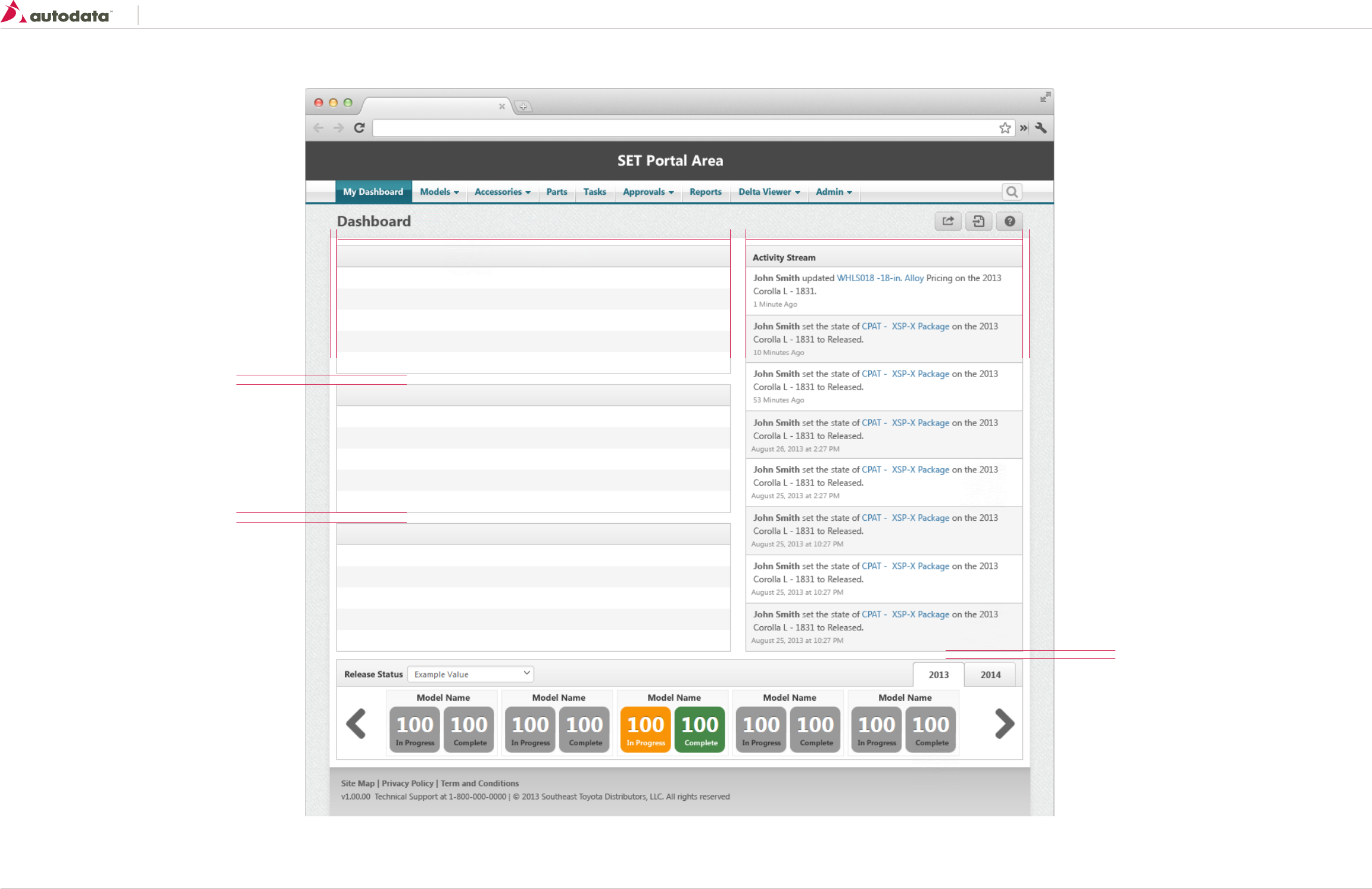
Southeast Toyota
Date Created: 06/12/2013 | Date Modified: 03/27/2014 | Version 1.7 |
© 2013 Autodata Solutions, Inc. / Autodata Solutions Company
Page / 58
13.0 Example Screen - Dashboard
10
10
10
380100% 20 1010
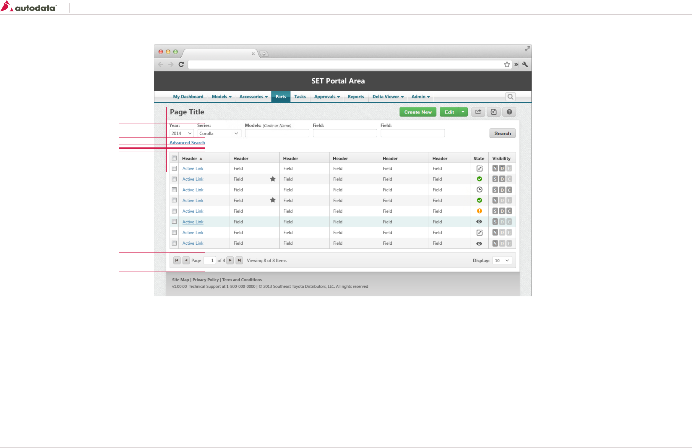
Southeast Toyota
Date Created: 06/12/2013 | Date Modified: 03/27/2014 | Version 1.7 |
© 2013 Autodata Solutions, Inc. / Autodata Solutions Company
Page / 59
13.0 Example Screen - Search
10
10
10
10
10
10
100% 1010
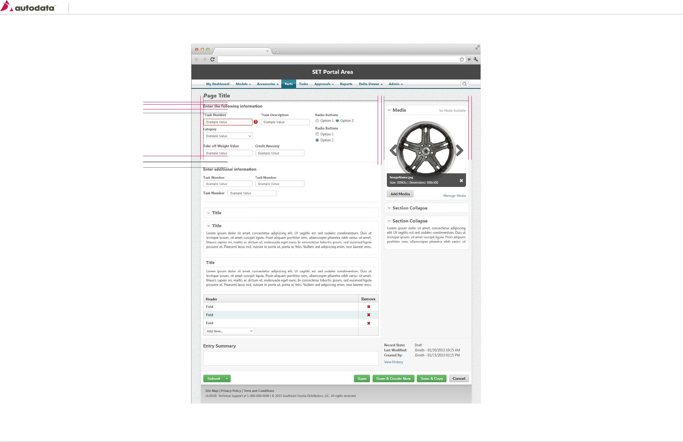
Southeast Toyota
Date Created: 06/12/2013 | Date Modified: 03/27/2014 | Version 1.7 |
© 2013 Autodata Solutions, Inc. / Autodata Solutions Company
Page / 60
13.0 Example Screen - Details with Side Bar
10
20
20
20
100% 1010
10
30010