Storytelling With Data: A Data Visualization Guide For Business Professionals (2015)
User Manual:
Open the PDF directly: View PDF ![]() .
.
Page Count: 284 [warning: Documents this large are best viewed by clicking the View PDF Link!]
- storytelling with data
- contents
- foreword
- acknowledgments
- about the author
- introduction
- Bad graphs are everywhere
- We aren’t naturally good at storytelling with data
- Who this book is written for
- How I learned to tell stories with data
- How you’ll learn to tell stories with data: 6 lessons
- Illustrative examples span many industries
- Lessons are not tool specific
- How this book is organized
- Chapter 1: the importance of context
- Chapter 2: choosing an effective visual
- Chapter 3: clutter is your enemy!
- Chapter 4: focus your audience’s attention
- Chapter 5: think like a designer
- Chapter 6: dissecting model visuals
- Chapter 7: lessons in storytelling
- Chapter 8: pulling it all together
- Chapter 9: case studies
- Chapter 10: final thoughts
- chapter one the importance of context
- chapter two choosing an effective visual
- chapter three clutter is your enemy!
- chapter four focus your audience’s attention
- chapter five think like a designer
- chapter six dissecting model visuals
- chapter seven lessons in storytelling
- chapter eight pulling it all together
- chapter nine case studies
- chapter ten final thoughts
- bibliography
- Index
- EULA
storytelling with data

storytelling
with data
a data visualization guide
for business professionals
cole nussbaumer knaic
Cover image: Cole Nussbaumer Knaic
Cover design: Wiley
Copyright © 2015 by Cole Nussbaumer Knaic. All rights reserved.
Published by John Wiley & Sons, Inc., Hoboken, New Jersey.
Published simultaneously in Canada.
No part of this publication may be reproduced, stored in a retrieval system, or
transmitted in any form or by any means, electronic, mechanical, photocopying,
recording, scanning, or otherwise, except as permitted under Section 107 or 108 of
the 1976 United States Copyright Act, without either the prior written permission of
the Publisher, or authorization through payment of the appropriate per-copy fee to
the Copyright Clearance Center, Inc., 222 Rosewood Drive, Danvers, MA 01923, (978)
750-8400, fax (978) 646-8600, or on the Web at www.copyright.com. Requests to the
Publisher for permission should be addressed to the Permissions Department, John
Wiley & Sons, Inc., 111 River Street, Hoboken, NJ 07030, (201) 748-6011, fax (201) 748-
6008, or online at www.wiley.com/go/permissions.
Limit of Liability/Disclaimer of Warranty: While the publisher and author have used
their best efforts in preparing this book, they make no representations or warranties
with respect to the accuracy or completeness of the contents of this book and
specically disclaim any implied warranties of merchantability or tness for a particular
purpose. No warranty may be created or extended by sales representatives or written
sales materials. The advice and strategies contained herein may not be suitable for
your situation. You should consult with a professional where appropriate. Neither
the publisher nor author shall be liable for any loss of prot or any other commercial
damages, including but not limited to special, incidental, consequential, or other
damages.
For general information on our other products and services or for technical support,
please contact our Customer Care Department within the United States at (800) 762-
2974, outside the United States at (317) 572-3993 or fax (317) 572-4002.
Wiley publishes in a variety of print and electronic formats and by print-on-demand.
Some material included with standard print versions of this book may not be included
in e-books or in print-on-demand. If this book refers to media such as a CD or DVD
that is not included in the version you purchased, you may download this material
at http://booksupport.wiley.com. For more information about Wiley products, visit
www.wiley.com.
Library of Congress Cataloging-in-Publication Data:
ISBN 9781119002253 (Paperback)
ISBN 9781119002260 (ePDF)
ISBN 9781119002062 (ePub)
Printed in the United States of America
10 9 8 7 6 5 4 3 2 1
To Randolph
vii
contents
foreword ix
acknowledgments xi
about the author xiii
introduction 1
chapter 1 the importance of context 19
chapter 2 choosing an effective visual 35
chapter 3 clutter is your enemy! 71
chapter 4 focus your audience’s attention 99
chapter 5 think like a designer 127
chapter 6 dissecting model visuals 151
chapter 7 lessons in storytelling 165
chapter 8 pulling it all together 187
chapter 9 case studies 207
chapter 10 nal thoughts 241
bibliography 257
index 261

ix
foreword
“Power Corrupts. PowerPoint Corrupts Absolutely.”
—Edward Tufte, Yale Professor Emeritus1
We’ve all been victims of bad slideware. Hit‐and‐run presentations
that leave us staggering from a maelstrom of fonts, colors, bullets,
and highlights. Infographics that fail to be informative and are only
graphic in the same sense that violence can be graphic. Charts and
tables in the press that mislead and confuse.
It’s too easy today to generate tables, charts, graphs. I can imagine
some old‐timer (maybe it’s me?) harrumphing over my shoulder that
in his day they’d do illustrations by hand, which meant you had to
think before committing pen to paper.
Having all the information in the world at our ngertips doesn’t make
it easier to communicate: it makes it harder. The more information
you’re dealing with, the more difcult it is to lter down to the most
important bits.
Enter Cole Nussbaumer Knaic.
I met Cole in late 2007. I’d been recruited by Google the year before
to create the “People Operations” team, responsible for nding, keep-
ing, and delighting the folks at Google. Shortly after joining I decided
1 Tufte, Edward R. ‘PowerPoint Is Evil.’ Wired Magazine, www.wired.com/wired/
archive/11.09/ppt2.html, September 2003.
x foreword
we needed a People Analytics team, with a mandate to make sure
we innovated as much on the people side as we did on the product
side. Cole became an early and critical member of that team, acting
as a conduit between the Analytics team and other parts of Google.
Cole always had a knack for clarity.
She was given some of our messiest messages—such as what exactly
makes one manager great and another crummy—and distilled them into
crisp, pleasing imagery that told an irrefutable story.Her messages of
“don’t be a data fashion victim” (i.e., lose the fancy clipart, graphics and
fonts—focus on the message) and “simple beats sexy” (i.e., the point is
to clearly tell a story, not to make a pretty chart) were powerful guides.
We put Cole on the road, teaching her own data visualization course
over 50 times in the ensuing six years, before she decided to strike
out on her own on a self‐proclaimed mission to “rid the world of bad
PowerPoint slides.” And if you think that’s not a big issue, a Google
search of “powerpoint kills” returns almost half a million hits!
In Storytelling with Data, Cole has created an of‐the‐moment
complement to the work of data visualization pioneers like Edward
Tufte. She’s worked at and with some of the most data‐driven
organizations on the planet as well as some of the most mission‐driven,
data‐free institutions. In both cases, she’s helped sharpen their
messages, and their thinking.
She’s written a fun, accessible, and eminently practical guide to
extracting the signal from the noise, and for making all of us better
at getting our voices heard.
And that’s kind of the whole point, isn’t it?
Laszlo Bock
SVP of People Operations, Google, Inc.
and author of Work Rules!
May 2015

xi
acknowledgments
My timeline of thanks
Thank you to…
2015
1980
2010−CURRENT My family, for your love and support. To my love,
my husband, Randy, for being my #1 cheerleader through it all;
I love you, darling. To my beautiful sons, Avery and Dorian, for
reprioritizing my life and bringing much joy to my world.
2010−CURRENT My clients, for taking part in my effort to rid the world of ineffective
graphs and inviting me to share my work with their teams and organizations through
workshops and other projects.
Thank you also to everyone who helped make this book possible. I value every bit of input and help along the way.
In addition to the people listed above, thanks to Bill Falloon, Meg Freeborn, Vincent Nordhaus, Robin Factor,
Mark Bergeron, Mike Henton, Chris Wallace, Nick Wehrkamp, Mike Freeland, Melissa Connors, Heather Dunphy,
Sharon Polese, Andrea Price, Laura Gachko, David Pugh, Marika Rohn, Robert Kosara, Andy Kriebel, John Kania,
Eleanor Bell, Alberto Cairo, Nancy Duarte, Michael Eskin, Kathrin Stengel, and Zaira Basanez.
2007−2012 The Google Years.Laszlo Bock, Prasad Setty, Brian Ong, Neal Patel,
Tina Malm, Jennifer Kurkoski, David Hoffman, Danny Cohen, and Natalie Johnson,
for giving me the opportunity and autonomy to research, build, and teach content
on effective data visualization, for subjecting your work to my often critical eye,
and for general support and inspiration.
2002−2007 The Banking Years.Mark Hillis and Alan Newstead, for recognizing and
encouraging excellence in visual design as I first started to discover and hone my data
viz skills (in sometimes painful ways, like the fraud management spider graph!).
1987−CURRENT My brother, for reminding me of the importance of balance in life.
1980−CURRENT My dad, for your design eye and attention to detail.
1980−2011 My mother,the single biggest influence on my life; I miss you, Mom.
xiii
about the author
Cole Nussbaumer Knaic tells stories with data. She specializes in
the effective display of quantitative information and writes the pop-
ular blog storytellingwithdata.com. Her well‐regarded workshops
and presentations are highly sought after by data‐minded individu-
als, companies, and philanthropic organizations all over the world.
Her unique talent was honed over the past decade through analyti-
cal roles in banking, private equity, and most recently as a manager
on the Google People Analytics team. At Google, she used a data‐
driven approach to inform innovative people programs and man-
agement practices, ensuring that Google attracted, developed, and
retained great talent and that the organization was best aligned to
meet business needs. Cole traveled to Google ofces throughout
the United States and Europe to teach the course she developed on
data visualization. She has also acted as an adjunct faculty member
at the Maryland Institute College of Art (MICA), where she taught
Introduction to Information Visualization.
Cole has a BS in Applied Math and an MBA, both from the University
of Washington. When she isn’t ridding the world of ineffective graphs
one pie at a time, she is baking them, traveling, and embarking on
adventures with her husband and two young sons in San Francisco.

1
introduction
Bad graphs are everywhere
I encounter a lot of less‐than‐stellar visuals in my work (and in my
life—once you get a discerning eye for this stuff, it’s hard to turn it
off). Nobody sets out to make a bad graph. But it happens. Again and
again. At every company throughout all industries and by all types
of people. It happens in the media. It happens in places where you
would expect people to know better. Why is that?
FIGURE 0.1 A sampling of ineffective graphs
16% 9%
7% 10%
10% 15%
10% 18%
10%
17%
32%
20%
15% 11%
US Population Our Customers
Our Customers
Segment 7
Segment 6
Segment 5
Segment 4
Segment 3
Segment 2
Segment 1 (1.50)
(1.00)
(0.50)
0.00
0.50
1.00
1.50
Weighted Performance Index
Our Business Competitor A Competitor B
Competitor C Competitor D Competitor E
0%
10%
20%
30%
40%
50%
60%
70%
80%
90%
100%
2010 2011 2012 2013 2014 2015
Non Profit Support
Arts & culture
Education
Health
Human services
Other
11%
5%
40%
25%
19%
Survey Results
Bored
Not great
OK
Kind of interested
Excited
8%
3%
9%
5%
4%
6%
5%
5%
6%
5%
14%
4%
4%
8%
14%
6%
11%
13%
24%
21%
23%
20%
15%
23%
17%
24%
17%
23%
25%
24%
15%
40%
36%
34%
37%
36%
35%
26%
32%
27%
27%
28%
27%
18%
17%
16%
47%
47%
33%
29%
28%
25%
33%
25%
27%
25%
21%
16%
13%
10%
11%
Featur…
Featur…
Featur…
Featur…
Featur…
Feature F
Featur…
Featur…
Feature I
Feature J
Featur…
Feature L
Featur…
Featur…
Featur…
User Satisfaction
Have not used Not satisfied at all Not very satisfied
Somewhat satisfied Very satisfied Completely satisfied
160
184
241
149
180
161
132
202
160
139
104
149
177
160
184
237
148
181
150
123
156
126
124
140
0.00
50.00
100.00
150.00
200.00
250.00
300.00
Ticket Trend
Ticket Volume Received Ticket Volume Processed
2 introduction
We aren’t naturally good at storytelling with data
In school, we learn a lot about language and math. On the language
side, we learn how to put words together into sentences and into
stories. With math, we learn to make sense of numbers. But it’s rare
that these two sides are paired: no one teaches us how to tell stories
with numbers. Adding to the challenge, very few people feel natu-
rally adept in this space.
This leaves us poorly prepared for an important task that is increas-
ingly in demand. Technology has enabled us to amass greater and
greater amounts of data and there is an accompanying growing
desire to make sense out of all of this data. Being able to visualize
data and tell stories with it is key to turning it into information that
can be used to drive better decision making.
In the absence of natural skills or training in this space, we often end
up relying on our tools to understand best practices. Advances in
technology, in addition to increasing the amount of and access to
data, have also made tools to work with data pervasive. Pretty much
anyone can put some data into a graphing application (for exam-
ple, Excel) and create a graph. This is important to consider, so I
will repeat myself: anyone can put some data into a graphing appli-
cation and create a graph. This is remarkable, considering that the
process of creating a graph was historically reserved for scientists or
those in other highly technical roles. And scary, because without a
clear path to follow, our best intentions and efforts (combined with
oft‐questionable tool defaults) can lead us in some really bad direc-
tions: 3D, meaningless color, pie charts.

We aren’t naturally good at storytelling with data 3
While technology has increased access to and prociency in tools
to work with data, there remain gaps in capabilities. You can put
some data in Excel and create a graph. For many, the process of
data visualization ends there. This can render the most interesting
story completely underwhelming, or worse—difcult or impossible
to understand. Tool defaults and general practices tend to leave
our data and the stories we want to tell with that data sorely lacking.
There is a story in your data. But your tools don’t know what that
story is. That’s where it takes you—the analyst or communicator of
the information—to bring that story visually and contextually to life.
That process is the focus of this book. The following are a few exam-
ple before‐and‐afters to give you a visual sense of what you’ll learn;
we’ll cover each of these in detail at various points in the book.
The lessons we will cover will enable you to shift from simply show-
ing data to storytelling with data.
Skilled in Microsoft Ofce? So is everyone else!
Being adept with word processing applications, spread-
sheets, and presentation software—things that used
to set one apart on a resume and in the workplace—has
become a minimum expectation for most employers. A
recruiter told me that, today, having “prociency in Microsoft
Ofce” on a resume isn’t enough: a basic level of knowledge
here is assumed and it’s what you can do above and beyond
that will set you apart from others. Being able to effectively
tell stories with data is one area that will give you that edge
and position you for success in nearly any role.
4 introduction
FIGURE 0.2 Example 1 (before): showing data
160
184
241
149
180 161
132
202
160
139 149
177
160
184
237
148
181
150
123
156
126
104 124
140
0.00
50.00
100.00
150.00
200.00
250.00
300.00
Ticket Trend
Ticket Volume Received Ticket Volume Processed
January
February
March
April
May
June
July
August
September
October
November
December
FIGURE 0.3 Example 1 (after): storytelling with data
Please approve the hire of 2 FTEs
to backf
ill those who quit in the past year
Ti
cket volume over time
Data source: XYZ Dashboard, as of 12/31/2014 | A detailed analysis on tickets processed per perso
n
and time to resolve issues was undertaken to inform this request and can be provided if needed
.
Received
Processed
202
160
139 149
177
156
126
104
124 140
0
50
100
150
200
250
300
Jan Feb Mar Apr May Jun Jul Aug Sep Oct Nov Dec
Number of tickets
2014
2 employees quit in May. We nearly kept up with incoming volume
in the following two months, but fell behind with the increase in Aug
and haven't been able to catch up since.
We aren’t naturally good at storytelling with data 5
FIGURE 0.4 Example 2 (before): showing data
Survey Results
11% 5%
40%
25%
19%
PRE: How do you feel
about doing science?
Bored Not great OK Kind of interested Excited
12% 6%
14%
30%
38%
POST: How do you feel
about doing science?
Bored Not great OK Kind of interested Excited
FIGURE 0.5 Example 2 (after): storytelling with data
Pilot program was a success
How do you feel about science?
Based on survey of 100 students conducted before and after pilot program (100% response rate on both surveys).
11%
5%
40%
25%
19%
12%
6%
14%
30%
38%
Bored Not great OK Kind of
interested
Excited
BEFORE program, the
majority of children felt
just OK about science. AFTER
program,
more children
were Kind of
interested &
Excited about
science.
6 introduction
FIGURE 0.7 Example 3 (after): storytelling with data
To be competitive, we recommend introducing our product below
the $223 average price point in the $150−$200 range
$0
$300
$400
$500
2008 2009 2010 2011 2012 2013 2014
Average price
Year
Retail price over time by product
A
B
CE
Recommended range
$200
$150
AVG
D
FIGURE 0.6 Example 3 (before): showing data
$0
$100
$200
$300
$400
$500
Product A Product B Product C Product D Product E
Average Retail Product Price per Year
2008 2009 2010 2011 2012 2013 2014

Who this book is written for 7
Who this book is written for
This book is written for anyone who needs to communicate some-
thing to someone using data. This includes (but is certainly not lim-
ited to): analysts sharing the results of their work, students visualizing
thesis data, managers needing to communicate in a data‐driven way,
philanthropists proving their impact, and leaders informing their
board. I believe that anyone can improve their ability to communi-
cate effectively with data. This is an intimidating space for many, but
it does not need to be.
When you are asked to “show data,” what sort of feelings does that
evoke?
Perhaps you feel uncomfortable because you are unsure where
to start. Or maybe it feels like an overwhelming task because you
assume that what you are creating needs to be complicated and
show enough detail to answer every possible question. Or perhaps
you already have a solid foundation here, but are looking for that
something that will help take your graphs and the stories you want
to tell with them to the next level. In all of these cases, this book is
written with you in mind.
“When I’m asked to show the data, I feel…”
An informal Twitter poll I conducted revealed the follow-
ing mix of emotions when people are asked to “show
the data.”
Frustrated because I don’t think I’ll be able to tell the
whole story.
Pressure to make it clear to whomever needs the data.
Inadequate. Boss: Can you drill down into that? Give me
the split by x, y, and z.
8 introduction
Being able to tell stories with data is a skill that’s becoming ever
more important in our world of increasing data and desire for data‐
driven decision making. An effective data visualization can mean
the difference between success and failure when it comes to com-
municating the ndings of your study, raising money for your non-
prot, presenting to your board, or simply getting your point across
to your audience.
My experience has taught me that most people face a similar chal-
lenge: they may recognize the need to be able to communicate
effectively with data but feel like they lack expertise in this space.
People skilled in data visualization are hard to come by. Part of the
challenge is that data visualization is a single step in the analytical
process. Those hired into analytical roles typically have quantita-
tive backgrounds that suit them well for the other steps (nding the
data, pulling it together, analyzing it, building models), but not nec-
essarily any formal training in design to help them when it comes to
the communication of the analysis—which, by the way, is typically
the only part of the analytical process that your audience ever sees.
And increasingly, in our ever more data‐driven world, those without
technical backgrounds are being asked to put on analytical hats and
communicate using data.
The feelings of discomfort you may experience in this space aren’t
surprising, given that being able to communicate effectively with
data isn’t something that has been traditionally taught. Those who
excel have typically learned what works and what doesn’t through
trial and error. This can be a long and tedious process. Through this
book, I hope to help expedite it for you.
How I learned to tell stories with data
I have always been drawn to the space where mathematics and
business intersect. My educational background is mathematics and
business, which enables me to communicate effectively with both
sides—given that they don’t always speak the same language—and
help them better understand one another. I love being able to take
How I learned to tell stories with data 9
the science of data and use it to inform better business decisions.
Over time, I’ve found that one key to success is being able to com-
municate effectively visually with data.
I initially recognized the importance of being skilled in this area dur-
ing my rst job out of college. I was working as an analyst in credit
risk management (before the subprime crisis and hence before any-
one really knew what credit risk management was). My job was to
build and assess statistical models to forecast delinquency and loss.
This meant taking complicated stuff and ultimately turning it into a
simple communication of whether we had adequate money in the
reserves for expected losses, in what scenarios we’d be at risk, and so
forth. I quickly learned that spending time on the aesthetic piece—
something my colleagues didn’t typically do—meant my work gar-
nered more attention from my boss and my boss’s boss. For me, that
was the beginning of seeing value in spending time on the visual
communication of data.
After progressing through various roles in credit risk, fraud, and oper-
ations management, followed by some time in the private equity
world, I decided I wanted to continue my career outside of bank-
ing and nance. I paused to reect on the skills I possessed that I
wanted to be utilizing on a daily basis: at the core, it was using data
to inuence business decisions.
I landed at Google, on the People Analytics team. Google is a data‐
driven company—so much so that they even use data and analytics
in a space not frequently seen: human resources. People Analytics is
an analytics team embedded in Google’s HR organization (referred
to at Google as “People Operations”). The mantra of this team is
to help ensure that people decisions at Google—decisions about
employees or future employees—are data driven. This was an amaz-
ing place to continue to hone my storytelling with data skills, using
data and analytics to better understand and inform decision mak-
ing in spaces like targeted hiring, engaging and motivating employ-
ees, building effective teams, and retaining talent. Google People
Analytics is cutting edge, helping to forge a path that many other

10 introduction
companies have started to follow. Being involved in building and
growing this team was an incredible experience.
Storytelling with data on what makes a great
manager via Project Oxygen
One particular project that has been highlighted in
the public sphere is the Project Oxygen research at
Google on what makes a great manager. This work has been
described in the New York Times and is the basis of a pop-
ular Harvard Business Review case study. One challenge
faced was communicating the ndings to various audiences,
from engineers who were sometimes skeptical on meth-
odology and wanted to dig into the details, to managers
wanting to understand the big‐picture ndings and how to
put them to use. My involvement in the project was on the
communication piece, helping to determine how to best
show sometimes very complicated stuff in a way that would
appease the engineers and their desire for detail while still
being understandable and straightforward for managers and
various levels of leadership. To do this, I leveraged many of
the concepts we will discuss in this book.
The big turning point for me happened when we were building an
internal training program within People Operations at Google and
I was asked to develop content on data visualization. This gave me
the opportunity to research and start to learn the principles behind
effective data visualization, helping me understand why some of the
things I’d arrived at through trial and error over the years had been
effective. With this research, I developed a course on data visualiza-
tion that was eventually rolled out to all of Google.
The course created some buzz, both inside and outside of Google.
Through a series of fortuitous events, I received invitations to speak
at a couple of philanthropic organizations and events on the topic of
data visualization. Word spread. More and more people were reach-
ing out to me—initially in the philanthropic world, but increasingly in
How you’ll learn to tell stories with data: 6 lessons 11
the corporate sector as well—looking for guidance on how to com-
municate effectively with data. It was becoming increasingly clear
that the need in this space was not unique to Google. Rather, pretty
much anyone in an organization or business setting could increase
their impact by being able to communicate effectively with data.
After acting as a speaker at conferences and organizations in my
spare time, eventually I left Google to pursue my emerging goal of
teaching the world how to tell stories with data.
Over the past few years, I’ve taught workshops for more than a hun-
dred organizations in the United States and Europe. It’s been interest-
ing to see that the need for skills in this space spans many industries
and roles. I’ve had audiences in consulting, consumer products, edu-
cation, nancial services, government, health care, nonprot, retail,
startups, and technology. My audiences have been a mix of roles and
levels: from analysts who work with data on a daily basis to those in
non‐analytical roles who occasionally have to incorporate data into
their work, to managers needing to provide guidance and feedback,
to the executive team delivering quarterly results to the board.
Through this work, I’ve been exposed to many diverse data visualiza-
tion challenges. I have come to realize that the skills that are needed
in this area are fundamental. They are not specic to any industry
or role, and they can be effectively taught and learned—as demon-
strated by the consistent positive feedback and follow‐ups I receive
from workshop attendees. Over time, I’ve codied the lessons that
I teach in my workshops. These are the lessons I will share with you.
How you’ll learn to tell stories with data: 6 lessons
In my workshops, I typically focus on ve key lessons. The big oppor-
tunity with this book is that there isn’t a time limit (in the way there
is in a workshop setting). I’ve included a sixth bonus lesson that I’ve
always wanted to share (“think like a designer”) and also a lot more
by way of before‐and‐after examples, step‐by‐step instruction, and
insight into my thought process when it comes to the visual design
of information.
12 introduction
I will give you practical guidance that you can begin using immedi-
ately to better communicate visually with data. We’ll cover content
to help you learn and be comfortable employing six key lessons:
1. Understand the context
2. Choose an appropriate visual display
3. Eliminate clutter
4. Focus attention where you want it
5. Think like a designer
6. Tell a story
Illustrative examples span many industries
Throughout the book, I use a number of case studies to illustrate the
concepts discussed. The lessons we cover will not be industry—or
role—specic, but rather will focus on fundamental concepts and
best practices for effective communication with data. Because my
work spans many industries, so do the examples upon which I draw.
You will see case studies from technology, education, consumer
products, the nonprot sector, and more.
Each example used is based on a lesson I have taught in my work-
shops, but in many cases I’ve slightly changed the data or general-
ized the situation to protect condential information.
For any example that doesn’t initially seem relevant to you, I encour-
age you to pause and think about what data visualization or commu-
nication challenges you encounter where a similar approach could
be effective. There is something to be learned from every exam-
ple, even if the example itself isn’t obviously related to the world in
which you work.

Lessons are not tool specic 13
Lessons are not tool specic
The lessons we will cover in this book focus on best practices that
can be applied in any graphing application or presentation software.
There are a vast number of tools that can be leveraged to tell effec-
tive stories with data. No matter how great the tool, however, it will
never know your data and your story like you do. Take the time to
learn your tool well so that it does not become a limiting factor when
it comes to applying the lessons we’ll cover throughout this book.
How do you do that in Excel?
While I will not focus the discussion on specic tools,
the examples in this book were created using
Microsoft Excel. For those interested in a closer look at how
similar visuals can be built in Excel, please visit my blog at
storytellingwithdata.com, where you can download the Excel
les that accompany my posts.
How this book is organized
This book is organized into a series of big‐picture lessons, with each
chapter focusing on a single core lesson and related concepts. We
will discuss a bit of theory when it will aid in understanding, but I
will emphasize the practical application of the theory, often through
specic, real‐world examples. You will leave each chapter ready to
apply the given lesson.
The lessons in the book are organized chronologically in the same
way that I think about the storytelling with data process. Because of
this and because later chapters do build on and in some cases refer
back to earlier content, I recommend reading from beginning to
end. After you’ve done this, you’ll likely nd yourself referring back
to specic points of interest or examples that are relevant to the cur-
rent data visualization challenges you face.
14 introduction
To give you a more specic idea of the path we’ll take, chapter sum-
maries can be found below.
Chapter 1: the importance of context
Before you start down the path of data visualization, there are a
couple of questions that you should be able to concisely answer:
Who is your audience? What do you need them to know or do? This
chapter describes the importance of understanding the situational
context, including the audience, communication mechanism, and
desired tone. A number of concepts are introduced and illustrated
via example to help ensure that context is fully understood. Creating
a robust understanding of the situational context reduces iterations
down the road and sets you on the path to success when it comes
to creating visual content.
Chapter 2: choosing an effective visual
What is the best way to show the data you want to communicate?
I’ve analyzed the visual displays I use most in my work. In this chap-
ter, I introduce the most common types of visuals used to commu-
nicate data in a business setting, discuss appropriate use cases for
each, and illustrate each through real‐world examples. Specic types
of visuals covered include simple text, table, heatmap, line graph,
slopegraph, vertical bar chart, vertical stacked bar chart, waterfall
chart, horizontal bar chart, horizontal stacked bar chart, and square
area graph. We also cover visuals to be avoided, including pie and
donut charts, and discuss reasons for avoiding 3D.
Chapter 3: clutter is your enemy!
Picture a blank page or a blank screen: every single element you
add to that page or screen takes up cognitive load on the part of
your audience. That means we should take a discerning eye to the
elements we allow on our page or screen and work to identify those
things that are taking up brain power unnecessarily and remove
How this book is organized 15
them. Identifying and eliminating clutter is the focus of this chap-
ter. As part of this conversation, I introduce and discuss the Gestalt
Principles of Visual Perception and how we can apply them to visual
displays of information such as tables and graphs. We also discuss
alignment, strategic use of white space, and contrast as important
components of thoughtful design. Several examples are used to
illustrate the lessons.
Chapter 4: focus your audience’s attention
In this chapter, we continue to examine how people see and how you
can use that to your advantage when crafting visuals. This includes
a brief discussion on sight and memory that will act to frame up the
importance of preattentive attributes like size, color, and position
on page. We explore how preattentive attributes can be used stra-
tegically to help direct your audience’s attention to where you want
them to focus and to create a visual hierarchy of components to help
direct your audience through the information you want to commu-
nicate in the way you want them to process it. Color as a strategic
tool is covered in depth. Concepts are illustrated through a num-
ber of examples.
Chapter 5: think like a designer
Form follows function. This adage of product design has clear appli-
cation to communicating with data. When it comes to the form and
function of our data visualizations, we rst want to think about what it
is we want our audience to be able to do with the data (function) and
create a visualization (form) that will allow for this with ease. In this
chapter, we discuss how traditional design concepts can be applied
to communicating with data. We explore affordances, accessibility,
and aesthetics, drawing upon a number of concepts introduced pre-
viously, but looking at them through a slightly different lens. We also
discuss strategies for gaining audience acceptance of your visual
designs.
16 introduction
Chapter 6: dissecting model visuals
Much can be learned from a thorough examination of effective visual
displays. In this chapter, we look at ve exemplary visuals and dis-
cuss the specic thought process and design choices that led to their
creation, utilizing the lessons covered up to this point. We explore
decisions regarding the type of graph and ordering of data within
the visual. We consider choices around what and how to empha-
size and de‐emphasize through use of color, thickness of lines, and
relative size. We discuss alignment and positioning of components
within the visuals and also the effective use of words to title, label,
and annotate.
Chapter 7: lessons in storytelling
Stories resonate and stick with us in ways that data alone cannot. In
this chapter, I introduce concepts of storytelling that can be lever-
aged for communicating with data. We consider what can be learned
from master storytellers. A story has a clear beginning, middle, and
end; we discuss how this framework applies to and can be used when
constructing business presentations. We cover strategies for effective
storytelling, including the power of repetition, narrative ow, con-
siderations with spoken and written narratives, and various tactics to
ensure that our story comes across clearly in our communications.
Chapter 8: pulling it all together
Previous chapters included piecemeal applications to demonstrate
individual lessons covered. In this comprehensive chapter, we follow
the storytelling with data process from start to nish using a single
real‐world example. We understand the context, choose an appro-
priate visual display, identify and eliminate clutter, draw attention
to where we want our audience to focus, think like a designer, and
tell a story. Together, these lessons and resulting visuals and narra-
tive illustrate how we can move from simply showing data to telling
a story with data.
How this book is organized 17
Chapter 9: case studies
The penultimate chapter explores specic strategies for tackling
common challenges faced in communicating with data through a
number of case studies. Topics covered include color considerations
with a dark background, leveraging animation in the visuals you pres-
ent versus those you circulate, establishing logic in order, strategies
for avoiding the spaghetti graph, and alternatives to pie charts.
Chapter 10: nal thoughts
Data visualization—and communicating with data in general—sits
at the intersection of science and art. There is certainly some sci-
ence to it: best practices and guidelines to follow. There is also an
artistic component. Apply the lessons we’ve covered to forge your
path, using your artistic license to make the information easier for
your audience to understand. In this nal chapter, we discuss tips on
where to go from here and strategies for upskilling storytelling with
data competency in your team and your organization. We end with
a recap of the main lessons covered.
Collectively, the lessons we’ll cover will enable you to tell stories with
data. Let’s get started!
19
chapter one
the importance of
context
This may sound counterintuitive, but success in data visualization
does not start with data visualization. Rather, before you begin down
the path of creating a data visualization or communication, atten-
tion and time should be paid to understanding the context for the
need to communicate. In this chapter, we will focus on understand-
ing the important components of context and discuss some strate-
gies to help set you up for success when it comes to communicating
visually with data.
Exploratory vs. explanatory analysis
Before we get into the specics of context, there is one important
distinction to draw, between exploratory and explanatory analysis.
Exploratory analysis is what you do to understand the data and gure
out what might be noteworthy or interesting to highlight to others.
When we do exploratory analysis, it’s like hunting for pearls in oysters.

20 the importance of context
We might have to open 100 oysters (test 100 different hypotheses
or look at the data in 100 different ways) to nd perhaps two pearls.
When we’re at the point of communicating our analysis to our audi-
ence, we really want to be in the explanatory space, meaning you
have a specic thing you want to explain, a specic story you want
to tell—probably about those two pearls.
Too often, people err and think it’s OK to show exploratory analysis
(simply present the data, all 100 oysters) when they should be show-
ing explanatory (taking the time to turn the data into information
that can be consumed by an audience: the two pearls). It is an under-
standable mistake. After undertaking an entire analysis, it can be
tempting to want to show your audience everything, as evidence of
all of the work you did and the robustness of the analysis. Resist this
urge. You are making your audience reopen all of the oysters! Con-
centrate on the pearls, the information your audience needs to know.
Here, we focus on explanatory analysis and communication.
Recommended reading
For those interested in learning more about exploratory
analysis, check out Nathan Yau’s book, Data Points. Yau
focuses on data visualization as a medium, rather than a tool,
and spends a good portion of the book discussing the data
itself and strategies for exploring and analyzing it.
Who, what, and how
When it comes to explanatory analysis, there are a few things to think
about and be extremely clear on before visualizing any data or creat-
ing content. First, To whom are you communicating? It is important
to have a good understanding of who your audience is and how they
perceive you. This can help you to identify common ground that will
Who 21
help you ensure they hear your message. Second, What do you want
your audience to know or do? You should be clear how you want your
audience to act and take into account how you will communicate to
them and the overall tone that you want to set for your communication.
It’s only after you can concisely answer these rst two questions that
you’re ready to move forward with the third: How can you use data
to help make your point?
Let’s look at the context of who, what, and how in a little more detail.
Who
Your audience
The more specic you can be about who your audience is, the better
position you will be in for successful communication. Avoid general
audiences, such as “internal and external stakeholders” or “anyone
who might be interested”—by trying to communicate to too many
different people with disparate needs at once, you put yourself in a
position where you can’t communicate to any one of them as effec-
tively as you could if you narrowed your target audience. Sometimes
this means creating different communications for different audi-
ences. Identifying the decision maker is one way of narrowing your
audience. The more you know about your audience, the better posi-
tioned you’ll be to understand how to resonate with them and form
a communication that will meet their needs and yours.
You
It’s also helpful to think about the relationship that you have with
your audience and how you expect that they will perceive you. Will
you be encountering each other for the rst time through this com-
munication, or do you have an established relationship? Do they
already trust you as an expert, or do you need to work to establish
credibility? These are important considerations when it comes to

22 the importance of context
determining how to structure your communication and whether and
when to use data, and may impact the order and ow of the overall
story you aim to tell.
Recommended reading
In Nancy Duarte’s book Resonate, she recommends thinking
of your audience as the hero and outlines specic strategies
for getting to know your audience, segmenting your
audience, and creating common ground. A free multimedia
version of Resonate is available at duarte.com.
What
Action
What do you need your audience to know or do? This is the point
where you think through how to make what you communicate rel-
evant for your audience and form a clear understanding of why
they should care about what you say. You should always want your
audience to know or do something. If you can’t concisely articulate
that, you should revisit whether you need to communicate in the
rst place.
This can be an uncomfortable space for many. Often, this discom-
fort seems to be driven by the belief that the audience knows better
than the presenter and therefore should choose whether and how
to act on the information presented. This assumption is false. If you
are the one analyzing and communicating the data, you likely know
it best—you are a subject matter expert. This puts you in a unique
position to interpret the data and help lead people to understanding
and action. In general, those communicating with data need to take
a more condent stance when it comes to making specic obser-
vations and recommendations based on their analysis. This will feel
outside of your comfort zone if you haven’t been routinely doing it.

What 23
Start doing it now—it will get easier with time. And know that even
if you highlight or recommend the wrong thing, it prompts the right
sort of conversation focused on action.
When it really isn’t appropriate to recommend an action explic-
itly, encourage discussion toward one. Suggesting possible next
steps can be a great way to get the conversation going because it
gives your audience something to react to rather than starting with
a blank slate. If you simply present data, it’s easy for your audience
to say, “Oh, that’s interesting,” and move on to the next thing. But
if you ask for action, your audience has to make a decision whether
to comply or not. This elicits a more productive reaction from your
audience, which can lead to a more productive conversation—one
that might never have been started if you hadn’t recommended the
action in the rst place.
Prompting action
Here are some action words to help act as thought starters
as you determine what you are asking of your audience:
accept | agree | begin | believe | change | collaborate | commence
| create | defend | desire | differentiate | do | empathize |
empower | encourage | engage | establish | examine | facilitate
| familiarize | form | implement | include | inuence | invest |
invigorate | know | learn | like | persuade | plan | promote
| pursue | recommend | receive | remember | report | respond |
secure | support | simplify | start | try | understand | validate
Mechanism
How will you communicate to your audience? The method you will
use to communicate to your audience has implications on a number
of factors, including the amount of control you will have over how
the audience takes in the information and the level of detail that
24 the importance of context
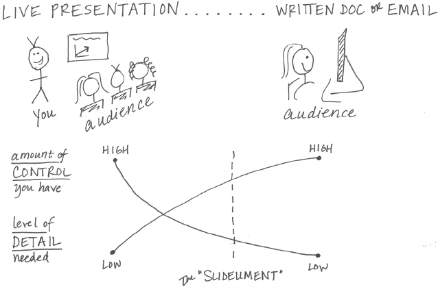
needs to be explicit. We can think of the communication mechanism
along a continuum, with live presentation at the left and a written
document or email at the right, as shown in Figure 1.1. Consider the
level of control you have over how the information is consumed as
well as the amount of detail needed at either end of the spectrum.
FIGURE1.1 Communication mechanism continuum
At the left, with a live presentation, you (the presenter) are in full
control. You determine what the audience sees and when they see
it. You can respond to visual cues to speed up, slow down, or go into
a particular point in more or less detail. Not all of the detail needs
to be directly in the communication (the presentation or slide deck),
because you, the subject matter expert, are there to answer any
questions that arise over the course of the presentation and should
be able and prepared to do so irrespective of whether that detail is
in the presentation itself.

What 25
For live presentations, practice makes perfect
Do not use your slides as your teleprompter! If you nd
yourself reading each slide out loud during a presenta-
tion, you are using them as one. This creates a painful audi-
ence experience. You have to know your content to give a
good presentation and this means practice, practice, and
more practice! Keep your slides sparse, and only put things
on them that help reinforce what you will say. Your slides can
remind you of the next topic, but shouldn’t act as your speak-
ing notes.
Here are a few tips for getting comfortable with your material
as you prepare for your presentation:
• Write out speaking notes with the important points you
want to make with each slide.
• Practice what you want to say out loud to yourself: this
ignites a different part of the brain to help you remember
your talking points. It also forces you to articulate the tran-
sitions between slides that sometimes trip up presenters.
• Give a mock presentation to a friend or colleague.
At the right side of the spectrum, with a written document or email,
you (the creator of the document or email) have less control. In this
case, the audience is in control of how they consume the information.
The level of detail that is needed here is typically higher because
you aren’t there to see and respond to your audience’s cues. Rather,
the document will need to directly address more of the potential
questions.
In an ideal world, the work product for the two sides of this contin-
uum would be totally different—sparse slides for a live presentation
(since you’re there to explain anything in more detail as needed), and
26 the importance of context
denser documents when the audience is left to consume on their
own. But in reality—due to time and other constraints—it is often
the same product that is created to try to meet both of these needs.
This gives rise to the slideument, a single document that’s meant to
solve both of these needs. This poses some challenges because of
the diverse needs it is meant to satisfy, but we’ll look at strategies
for addressing and overcoming these challenges later in the book.
At this point at the onset of the communication process, it is important
to identify the primary communication vehicle you’ll be leveraging:
live presentation, written document, or something else. Consider-
ations on how much control you’ll have over how your audience con-
sumes the information and the level of detail needed will become
very important once you start to generate content.
Tone
What tone do you want your communication to set? Another impor-
tant consideration is the tone you want your communication to con-
vey to your audience. Are you celebrating a success? Trying to light a
re to drive action? Is the topic lighthearted or serious? The tone you
desire for your communication will have implications on the design
choices that we will discuss in future chapters. For now, think about
and specify the general tone that you want to establish when you
set out on the data visualization path.
How
Finally—and only after we can clearly articulate who our audience
is and what we need them to know or do—we can turn to the data
and ask the question: What data is available that will help make my
point? Data becomes supporting evidence of the story you will build
and tell. We’ll discuss much more on how to present this data visu-
ally in subsequent chapters.

Who, what, and how: illustrated by example 27
Ignore the nonsupporting data?
You might assume that showing only the data that backs
up your point and ignoring the rest will make for a stron-
ger case. I do not recommend this. Beyond being misleading
by painting a one‐sided story, this is very risky. A discern-
ing audience will poke holes in a story that doesn’t hold up
or data that shows one aspect but ignores the rest. The right
amount of context and supporting and opposing data will
vary depending on the situation, the level of trust you have
with your audience, and other factors.
Who, what, and how: illustrated by example
Let’s consider a specic example to illustrate these concepts. Imagine
you are a fourth grade science teacher. You just wrapped up an exper-
imental pilot summer learning program on science that was aimed
at giving kids exposure to the unpopular subject. You surveyed the
children at the onset and end of the program to understand whether
and how perceptions toward science changed. You believe the data
shows a great success story. You would like to continue to offer the
summer learning program on science going forward.
Let’s start with the who by identifying our audience. There are a num-
ber of different potential audiences who might be interested in this
information: parents of students who participated in the program,
parents of prospective future participants, the future potential par-
ticipants themselves, other teachers who might be interested in
doing something similar, or the budget committee that controls the
funding you need to continue the program. You can imagine how
the story you would tell to each of these audiences might differ. The
emphasis might change. The call to action would be different for the
different groups. The data you would show (or the decision to show
data at all) could be different for the various audiences. You can
imagine how, if we crafted a single communication meant to address
28 the importance of context
all of these disparate audiences’ needs, it would likely not exactly
meet any single audience’s need. This illustrates the importance of
identifying a specic audience and crafting a communication with
that specic audience in mind.
Let’s assume in this case the audience we want to communicate to
is the budget committee, which controls the funding we need to
continue the program.
Now that we have answered the question of who, the what becomes
easier to identify and articulate. If we’re addressing the budget com-
mittee, a likely focus would be to demonstrate the success of the
program and ask for a specic funding amount to continue to offer it.
After identifying who our audience is and what we need from them,
next we can think about the data we have available that will act as
evidence of the story we want to tell. We can leverage the data col-
lected via survey at the onset and end of the program to illustrate
the increase in positive perceptions of science before and after the
pilot summer learning program.
This won’t be the last time we’ll consider this example. Let’s recap
who we have identied as our audience, what we need them to know
and do, and the data that will help us make our case:
Who: The budget committee that can approve funding for con-
tinuation of the summer learning program.
What: The summer learning program on science was a success;
please approve budget of $X to continue.
How: Illustrate success with data collected through the survey
conducted before and after the pilot program.
Consulting for context: questions to ask
Often, the communication or deliverable you are creating is at the
request of someone else: a client, a stakeholder, or your boss. This
means you may not have all of the context and might need to consult
The 3‐minute story & Big Idea 29
with the requester to fully understand the situation. There is some-
times additional context in the head of this requester that they may
assume is known or not think to say out loud. Following are some
questions you can use as you work to tease out this information. If
you’re on the requesting side of the communication and asking your
support team to build a communication, think about answering these
questions for them up front:
• What background information is relevant or essential?
• Who is the audience or decision maker? What do we know about
them?
• What biases does our audience have that might make them sup-
portive of or resistant to our message?
• What data is available that would strengthen our case? Is our audi-
ence familiar with this data, or is it new?
• Where are the risks: what factors could weaken our case and do
we need to proactively address them?
• What would a successful outcome look like?
• If you only had a limited amount of time or a single sentence to
tell your audience what they need to know, what would you say?
In particular, I nd that these last two questions can lead to insight-
ful conversation. Knowing what the desired outcome is before you
start preparing the communication is critical for structuring it well.
Putting a signicant constraint on the message (a short amount of
time or a single sentence) can help you to boil the overall com-
munication down to the single, most important message. To that
end, there are a couple of concepts I recommend knowing and
employing: the 3-minute story and the Big Idea.
The 3‐minute story & Big Idea
The idea behind each of these concepts is that you are able to boil
the “so‐what” down to a paragraph and, ultimately, to a single,
concise statement. You have to really know your stuff—know what
the most important pieces are as well as what isn’t essential in the
30 the importance of context
most stripped‐down version. While it sounds easy, being concise
is often more challenging than being verbose. Mathematician and
philosopher Blaise Pascal recognized this in his native French, with a
statement that translates roughly to “I would have written a shorter
letter, but I did not have the time” (a sentiment often attributed to
Mark Twain).
3‐minute story
The 3‐minute story is exactly that: if you had only three minutes
to tell your audience what they need to know, what would you
say? This is a great way to ensure you are clear on and can articu-
late the story you want to tell. Being able to do this removes you
from dependence on your slides or visuals for a presentation. This
is useful in the situation where your boss asks you what you’re
working on or if you nd yourself in an elevator with one of your
stakeholders and want to give her the quick rundown. Or if your
half‐hour on the agenda gets shortened to ten minutes, or to ve.
If you know exactly what it is you want to communicate, you can
make it t the time slot you’re given, even if it isn’t the one for
which you are prepared.
Big Idea
The Big Idea boils the so‐what down even further: to a single sen-
tence. This is a concept that Nancy Duarte discusses in her book,
Resonate (2010). She says the Big Idea has three components:
1. It must articulate your unique point of view;
2. It must convey what’s at stake; and
3. It must be a complete sentence.
Let’s consider an illustrative 3‐minute story and Big Idea, leveraging
the summer learning program on science example that was intro-
duced previously.
Storyboarding 31
3minute story: A group of us in the science department were
brainstorming about how to resolve an ongoing issue we have with
incoming fourth‐graders. It seems that when kids get to their rst
science class, they come in with this attitude that it’s going to be
difcult and they aren’t going to like it. It takes a good amount of
time at the beginning of the school year to get beyond that. So we
thought, what if we try to give kids exposure to science sooner?
Can we inuence their perception? We piloted a learning pro-
gram last summer aimed at doing just that. We invited elementary
school students and ended up with a large group of second‐ and
third‐graders. Our goal was to give them earlier exposure to sci-
ence in hopes of forming positive perception. To test whether we
were successful, we surveyed the students before and after the
program. We found that, going into the program, the biggest
segment of students, 40%, felt just “OK” about science, whereas
after the program, most of these shifted into positive perceptions,
with nearly 70% of total students expressing some level of inter-
est toward science. We feel that this demonstrates the success of
the program and that we should not only continue to offer it, but
also to expand our reach with it going forward.
Big Idea: The pilot summer learning program was successful at
improving students’ perceptions of science and, because of this
success, we recommend continuing to offer it going forward;
please approve our budget for this program.
When you’ve articulated your story this clearly and concisely, creat-
ing content for your communication becomes much easier. Let’s shift
gears now and discuss a specic strategy when it comes to planning
content: storyboarding.
Storyboarding
Storyboarding is perhaps the single most important thing you can
do up front to ensure the communication you craft is on point. The
storyboard establishes a structure for your communication. It is a
visual outline of the content you plan to create. It can be subject to
32 the importance of context
change as you work through the details, but establishing a structure
early on will set you up for success. When you can (and as makes
sense), get acceptance from your client or stakeholder at this step.
It will help ensure that what you’re planning is in line with the need.
When it comes to storyboarding, the biggest piece of advice I have
is this: don’t start with presentation software. It is too easy to go
into slide‐generating mode without thinking about how the pieces
t together and end up with a massive presentation deck that says
nothing effectively. Additionally, as we start creating content via our
computer, something happens that causes us to form an attachment
to it. This attachment can be such that, even if we know what we’ve
created isn’t exactly on the mark or should be changed or eliminated,
we are sometimes resistant to doing so because of the work we’ve
already put in to get it to where it is.
Avoid this unnecessary attachment (and work!) by starting low tech.
Use a whiteboard, Post‐it notes, or plain paper. It’s much easier to put
a line through an idea on a piece of paper or recycle a Post‐it note
without feeling the same sense of loss as when you cut something
you’ve spent time creating with your computer. I like using Post‐it
notes when I storyboard because you can rearrange (and add and
remove) the pieces easily to explore different narrative ows.
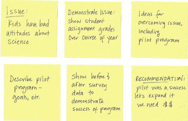
If we storyboard our communication for the summer learning pro-
gram on science, it might look something like Figure 1.2.
Note that in this example storyboard, the Big Idea is at the end, in
the recommendation. Perhaps we’d want to consider leading with
that to ensure that our audience doesn’t miss the main point and to
help set up why we are communicating to them and why they should
care in the rst place. We’ll discuss additional considerations related
to the narrative order and ow in Chapter 7.
In closing 33
FIGURE1.2 Example storyboard
In closing
When it comes to explanatory analysis, being able to concisely artic-
ulate exactly who you want to communicate to and what you want
to convey before you start to build content reduces iterations and
helps ensure that the communication you build meets the intended
purpose. Understanding and employing concepts like the 3‐minute
story, the Big Idea, and storyboarding will enable you to clearly and
succinctly tell your story and identify the desired ow.
While pausing before actually building the communication might feel
like it’s a step that slows you down, in fact it helps ensure that you
have a solid understanding of what you want to do before you start
creating content, which will save you time down the road.
With that, consider your rst lesson learned. You now understand
the importance of context.
35
chapter two
choosing an effective
visual
There are many different graphs and other types of visual displays of
information, but a handful will work for the majority of your needs.
When I look back over the 150+ visuals that I created for workshops
and consulting projects in the past year, there were only a dozen dif-
ferent types of visuals that I used (Figure 2.1). These are the visuals
we’ll focus on in this chapter.

36 choosing an effective visual
Simple text Scatterplot
Line
Category 2
Category 1 15% 22% 42%
40% 36% 20%
Category 3
Slopegraph
Table
Heatmap
Category 1 15%
Category 4 30% 29% 26%
22% 42%
Category 2 40% 36% 20%
Category 3 35% 17% 34%
B CA
Category 5 55% 30% 58%
Category 6 11% 25% 49%
Category 6 11% 25% 49%
Category 5 55% 30% 58%
A B C
Category 4 30% 29% 26%
35% 17% 34%
91%
FIGURE2.1 The visuals I use most

choosing an effective visual 37
Vertical bar Horizontal bar
Stacked vertical bar Stacked horizontal bar
Waterfall Square area

38 choosing an effective visual
Simple text
When you have just a number or two to share, simple text can be a
great way to communicate. Think about solely using the number—
making it as prominent as possible—and a few supporting words
to clearly make your point. Beyond potentially being misleading,
putting one or only a couple of numbers in a table or graph simply
causes the numbers to lose some of their oomph. When you have
a number or two that you want to communicate, think about using
the numbers themselves.
To illustrate this concept, let’s consider the following example. A
graph similar to Figure 2.2 accompanied an April 2014 Pew Research
Center report on stay‐at‐home moms.
FIGURE2.2 Stay‐at‐home moms original graph
41
20
1970 2012
Children with a
"Traditional" Stay-at-
Home Mother
% of children with a married
stay-at-home mother with a
working husband
Note: Based on children younger than 18.
Their mothers are categorized based on
employment status in 1970 and 2012.
Source: Pew Research Center analysis of
March Current Population Surveys
Integrated Public Use Microdata Series
(IPUMS-CPS), 1971 and 2013
Adapted from PEW RESEARCH CENTER
Simple text 39
The fact that you have some numbers does not mean that you need
a graph! In Figure 2.2, quite a lot of text and space are used for a
grand total of two numbers. The graph doesn’t do much to aid in
the interpretation of the numbers (and with the positioning of the
data labels outside of the bars, it can even skew your perception of
relative height such that 20 is less than half of 41 doesn’t really come
across visually).
In this case, a simple sentence would sufce: 20% of children had
a traditional stay‐at‐home mom in 2012, compared to 41% in 1970.
Alternatively, in a presentation or report, your visual could look some-
thing like Figure 2.3.
FIGURE2.3 Stay‐at‐home moms simple text makeover
20%
of children had a
traditional stay-at-home mom
in 2012, compared to 41% in 1970
As a side note, one consideration in this specic example might be
whether you want to show an entirely different metric. For example,
you could reframe in terms of the percent change: “The number of
children having a traditional stay‐at‐home mom decreased more
than 50% between 1970 and 2012.” I advise caution, however, any
time you reduce from multiple numbers down to a single one—think
about what context may be lost in doing so. In this case, I nd that
the actual magnitude of the numbers (20% and 41%) is helpful in
interpreting and understanding the change.

40 choosing an effective visual
When you have just a number or two that you want to communicate:
use the numbers directly.
When you have more data that you want to show, generally a table
or graph is the way to go. One thing to understand is that people
interact differently with these two types of visuals. Let’s discuss each
in detail and look at some specic varieties and use cases.
Tables
Tables interact with our verbal system, which means that we read
them. When I have a table in front of me, I typically have my index
nger out: I’m reading across rows and down columns or I’m com-
paring values. Tables are great for just that—communicating to a
mixed audience whose members will each look for their particular
row of interest. If you need to communicate multiple different units
of measure, this is also typically easier with a table than a graph.
Tables in live presentations
Using a table in a live presentation is rarely a good idea.
As your audience reads it, you lose their ears and atten-
tion to make your point verbally. When you nd yourself
using a table in a presentation or report, ask yourself: what
is the point you are trying to make? Odds are that there will
be a better way to pull out and visualize the piece or pieces
of interest. In the event that you feel you’re losing too much
by doing this, consider whether including the full table in the
appendix and a link or reference to it will meet your audi-
ence’s needs.
One thing to keep in mind with a table is that you want the design to
fade into the background, letting the data take center stage. Don’t
let heavy borders or shading compete for attention. Instead, think
Tables 41
of using light borders or simply white space to set apart elements
of the table.
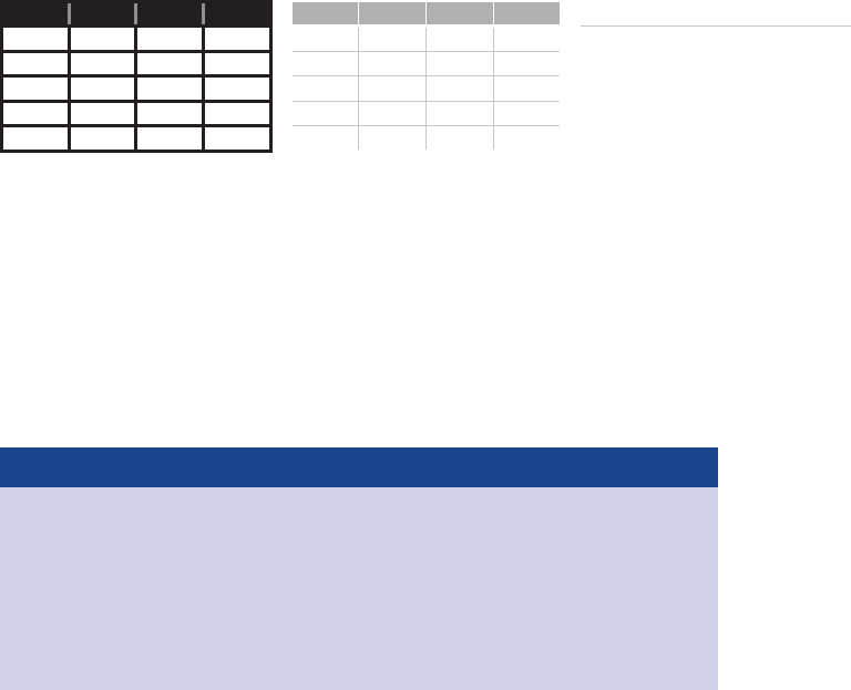
Take a look at the example tables in Figure 2.4. As you do, note how
the data stands out more than the structural components of the table
in the second and third iterations (light borders, minimal borders).
FIGURE2.4 Table borders
Heavy borders Light borders Minimal borders
Group Metric A Metric B Metric C Group Metric A Metric B Metric C Group Metric A Metric B Metric C
Group 1 $X.X Y% Z,ZZZ Group 1 $X.X Y% Z,ZZZ Group 1 $X.X Y% Z,ZZZ
Group 2 $X.X Y% Z,ZZZ Group 2 $X.X Y% Z,ZZZ Group 2 $X.X Y% Z,ZZZ
Group 3 $X.X Y% Z,ZZZ Group 3 $X.X Y% Z,ZZZ Group 3 $X.X Y% Z,ZZZ
Group 4 $X.X Y% Z,ZZZ Group 4 $X.X Y% Z,ZZZ Group 4 $X.X Y% Z,ZZZ
Group 5 $X.X Y% Z,ZZZ Group 5 $X.X Y% Z,ZZZ Group 5 $X.X Y% Z,ZZZ
Borders should be used to improve the legibility of your table. Think
about pushing them to the background by making them grey, or
getting rid of them altogether. The data should be what stands out,
not the borders.
Recommended reading
For more on table design, check out Stephen Few’s book,
Show Me the Numbers. There is an entire chapter dedi-
cated to the design of tables, with discussion on the struc-
tural components of tables and best practices in table
design.
Next, let’s shift our focus to a special case of tables: the heatmap.
42 choosing an effective visual
Heatmap
One approach for mixing the detail you can include in a table while
also making use of visual cues is via a heatmap. A heatmap is a way
to visualize data in tabular format, where in place of (or in addition
to) the numbers, you leverage colored cells that convey the relative
magnitude of the numbers.
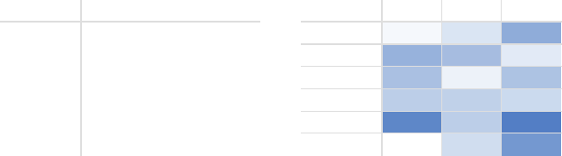
Consider Figure 2.5, which shows some generic data in a table and
also a heatmap.
FIGURE2.5 Two views of the same data
Table Heatmap
LOW-HIGH
A B C A B C
Category 1 15% 22% 42% Category 1 15% 22% 42%
Category 2 40% 36% 20% Category 2 40% 36% 20%
Category 3 35% 17% 34% Category 3 35% 17% 34%
Category 4 30% 29% 26% Category 4 30% 29% 26%
Category 5 55% 30% 58% Category 5 55% 30% 58%
Category 6 11% 25% 49% Category 6 11% 25% 49%
In the table in Figure 2.5, you are left to read the data. I nd myself
scanning across rows and down columns to get a sense of what I’m
looking at, where numbers are higher or lower, and mentally stack
rank the categories presented in the table.
To reduce this mental processing, we can use color saturation to
provide visual cues, helping our eyes and brains more quickly target
the potential points of interest. In the second iteration of the table
on the right entitled “Heatmap,” the higher saturation of blue, the
higher the number. This makes the process of picking out the tails
of the spectrum—the lowest number (11%) and highest number
(58%)—an easier and faster process than it was in the original table
where we didn’t have any visual cues to help direct our attention.
Graphing applications (like Excel) typically have conditional format-
ting functionality built in that allows you to apply formatting like

Graphs 43
that shown in Figure 2.5 with ease. Be sure when you leverage this
to always include a legend to help the reader interpret the data (in
this case, the LOW‐HIGH subtitle on the heatmap with color corre-
sponding to the conditional formatting color serves this purpose).
Next, let’s shift our discussion to the visuals we tend to think of rst
when it comes to communicating with data: graphs.
Graphs
While tables interact with our verbal system, graphs interact with
our visual system, which is faster at processing information. This
means that a well‐designed graph will typically get the information
across more quickly than a well‐designed table. As I mentioned at
the onset of this chapter, there are a plethora of graph types out
there. The good news is that a handful of them will meet most of
your everyday needs.
The types of graphs I frequently use fall into four categories: points,
lines, bars, and area. We will examine these more closely and discuss
the subtypes that I nd myself using on a regular basis, with specic
use cases and examples for each.
Chart or graph?
Some draw a distinction between charts and graphs.
Typically, “chart” is the broader category, with “graphs”
being one of the subtypes (other chart types include maps
and diagrams). I don’t tend to draw this distinction, since
nearly all of the charts I deal with on a regular basis are
graphs. Throughout this book, I use the words chart and
graph interchangeably.
44 choosing an effective visual
Points
Scatterplot
Scatterplots can be useful for showing the relationship between two
things, because they allow you to encode data simultaneously on a
horizontal x‐axis and vertical y‐axis to see whether and what relation-
ship exists. They tend to be more frequently used in scientic elds
(and perhaps, because of this, are sometimes viewed as complicated
to understand by those less familiar with them). Though infrequent,
there are use cases for scatterplots in the business world as well.
For example, let’s say that we manage a bus eet and want to under-
stand the relationship between miles driven and cost per mile. The
scatterplot may look something like Figure 2.6.
FIGURE2.6 Scatterplot
Cost per mile by miles driven
$0.00
$0.50
$1.00
$1.50
$2.00
$2.50
$3.00
0 1,000 2,000 3,000 4,000
Cost per mile
Miles driven per month
AVG
If we want to focus primarily on those cases where cost per mile is
above average, a slightly modied scatterplot designed to draw our
eye there more quickly might look something like what is shown in
Figure 2.7.
Lines 45
We can use Figure 2.7 to make observations such as cost per mile is
higher than average when less than about 1,700 miles or more than
about 3,300 miles were driven for the sample observed. We’ll talk
more about the design choices made here and reasons for them in
upcoming chapters.
Lines
Line graphs are most commonly used to plot continuous data.
Because the points are physically connected via the line, it implies
a connection between the points that may not make sense for cat-
egorical data (a set of data that is sorted or divided into different
categories). Often, our continuous data is in some unit of time: days,
months, quarters, or years.
Within the line graph category, there are two types of charts that I fre-
quently nd myself using: the standard line graph and the slopegraph.
FIGURE2.7 Modied scatterplot
Cost per mile by miles driven
$0.00
$0.50
$1.00
$1.50
$2.00
$2.50
$3.00
0 1,000 2,000 3,000 4,000
Cost per mile
Miles driven per month
AVG

46 choosing an effective visual
Line graph
The line graph can show a single series of data, two series of data,
or multiple series, as illustrated in Figure 2.8.
FIGURE2.8 Line graphs
A
0
1
2
3
4
5
6
7
8
0
1
2
3
4
5
6
7
8
0
1
2
3
4
5
6
7
8
Jan Feb Mar Apr May
Single series
B
A
Jan Feb Mar Apr May
Two series
B
C
D
A
Jan Feb Mar Apr May
Multiple series
Showing average within a range in a line graph
In some cases, the line in your line graph may represent a
summary statistic, like the average, or the point estimate of
a forecast. If you also want to give a sense of the range (or
condence level, depending on the situation), you can do
that directly on the graph by also visualizing this range. For
example, the graph in Figure 2.9 shows the minimum, aver-
age, and maximum wait times at passport control for an air-
port over a 13‐month period.
Note that when you’re graphing time on the horizontal x‐axis of a
line graph, the data plotted must be in consistent intervals. I recently
saw a graph where the units on the x‐axis were decades from 1900
forward (1910, 1920, 1930, etc.) and then switched to yearly after 2010
(2011, 2012, 2013, 2014). This meant that the distance between the
decade points and annual points looked the same. This is a mislead-
ing way to show the data. Be consistent in the time points you plot.
Lines 47
Slopegraph
Slopegraphs can be useful when you have two time periods or
points of comparison and want to quickly show relative increases
and decreases or differences across various categories between the
two data points.
The best way to explain the value of and use case for slopegraphs
is through a specic example. Imagine that you are analyzing and
communicating data from a recent employee feedback survey. To
show the relative change in survey categories from 2014 to 2015, the
slopegraph might look something like Figure 2.10.
Slopegraphs pack in a lot of information. In addition to the absolute
values (the points), the lines that connect them give you the visual
increase or decrease in rate of change (via the slope or direction)
without ever having to explain that’s what they are doing, or what
exactly a “rate of change” is—rather, it’s intuitive.
FIGURE2.9 Showing average within a range in a line graph
Passport control wait time
Past 13 months
21
0
5
10
15
20
25
30
35
40
Sep Oct Nov Dec Jan Feb Mar Apr May Jun Jul Aug Sep
2014 2015
Wait time (minutes)
MAX
AVG
MIN

48 choosing an effective visual
FIGURE2.10 Slopegraph
Employee feedback over time
Survey category | Percent favorable
80%
96%
85%
91%
76% 75%
59% 62%
41%
45%
33%
42%
49%
33%
2014 2015
Survey year
Peers
Culture
Work environment
Career development
Rewards & recognition
Perf management
Leadership
Slopegraph template
Slopegraphs can take a bit of patience to set up because
they often aren’t one of the standard graphs included in
graphing applications. An Excel template with an example
slopegraph and instructions for customized use can
be downloaded here: storytellingwithdata.com/
slopegraph-template.
Whether a slopegraph will work in your specic situation depends
on the data itself. If many of the lines are overlapping, a slopegraph
may not work, though in some cases you can still emphasize a single
series at a time with success. For example, we can draw attention

Lines 49
to the single category that decreased over time from the preced-
ing example.
Employee feedback over time
Survey category | Percent favorable
80%
96%
85%
91%
76% 75%
59% 62%
41% 45%
33%
42%
49%
33%
2014 2015
Survey year
Peers
Culture
Work environment
Career development
Rewards & recognition
Perf management
Leadership
FIGURE2.11 Modied slopegraph
In Figure 2.11, our attention is drawn immediately to the decrease
in “Career development,” while the rest of the data is preserved for
context without competing for attention. We will talk about the strat-
egy behind this when we discuss preattentive attributes in Chapter 4.
While lines work well to show data over time, bars tend to be my
go‐to graph type for plotting categorical data, where information is
organized into groups.

50 choosing an effective visual
Bars
Sometimes bar charts are avoided because they are common. This is
a mistake. Rather, bar charts should be leveraged because they are
common, as this means less of a learning curve for your audience.
Instead of using their brain power to try to understand how to read
the graph, your audience spends it guring out what information to
take away from the visual.
Bar charts are easy for our eyes to read. Our eyes compare the end
points of the bars, so it is easy to see quickly which category is the
biggest, which is the smallest, and also the incremental difference
between categories. Note that, because of how our eyes compare
the relative end points of the bars, it is important that bar charts
always have a zero baseline (where the x‐axis crosses the y‐axis at
zero), otherwise you get a false visual comparison.
Consider Figure 2.12 from Fox News.
FIGURE2.12 Fox News bar chart

Bars 51
For this example, let’s imagine we are back in the fall of 2012. We
are wondering what will happen if the Bush tax cuts expire. On the
left‐hand side, we have what the top tax rate is currently, 35%, and
on the right‐hand side what it will be as of January 1, at 39.6%.
When you look at this graph, how does it make you feel about the
potential expiration of the tax cuts? Perhaps worried about the huge
increase? Let’s take a closer look.
Note that the bottom number on the vertical axis (shown at the far
right) is not zero, but rather 34. This means that the bars, in theory,
should continue down through the bottom of the page. In fact, the way
this is graphed, the visual increase is 460% (the heights of the bars are
35 – 34 = 1 and 39.6 – 34 = 5.6, so (5.6 – 1) / 1 = 460%). If we graph the
bars with a zero baseline so that the heights are accurately represented
(35 and 39.6), we get an actual visual increase of 13% ((39.6 – 35) / 35).
Let’s look at a side‐by‐side comparison in Figure 2.13.
FIGURE2.13 Bar charts must have a zero baseline
Non-zero baseline
: as originally graphed
Zero baseline
: as it should be graphed
IF BUSH TAX CUTS EXPIRE IF BUSH TAX CUTS EXPIRE
TOP TAX RATE TOP TAX RATE
35%
39.6%
34%
36%
38%
40%
42%
NOW JAN. 1, 2013
35%
39.6%
0%
10%
20%
30%
40%
NOW JAN. 1, 2013
In Figure 2.13, what looked like a huge increase on the left is reduced
considerably when plotted appropriately. Perhaps the tax increase
isn’t so worrisome, or at least not as severe as originally depicted.
Because of the way our eyes compare the relative end points of the
bars, it’s important to have the context of the entire bar there in order
to make an accurate comparison.

52 choosing an effective visual
You’ll note that a couple of other design changes were made in the
remake of this visual as well. The y‐axis labels that were placed on
the right‐hand side of the original visual were moved to the left (so
we see how to interpret the data before we get to the actual data).
The data labels that were originally outside of the bars were pulled
inside to reduce clutter. If I were plotting this data outside of this spe-
cic lesson, I might omit the y‐axis entirely and show only the data
labels within the bars to reduce redundant information. However, in
this case, I preserved the axis to make it clear that it begins at zero.
Graph axis vs. data labels
When graphing data, a common decision to make is
whether to preserve the axis labels or eliminate the
axis and instead label the data points directly. In making this
decision, consider the level of specicity needed. If you want
your audience to focus on big‐picture trends, think about
preserving the axis but deemphasizing it by making it grey.
If the specic numerical values are important, it may be bet-
ter to label the data points directly. In this latter case, it’s usu-
ally best to omit the axis to avoid the inclusion of redundant
information. Always consider how you want your audience to
use the visual and construct it accordingly.
The rule we’ve illustrated here is that bar charts must have a zero
baseline. Note that this rule does not apply to line graphs. With line
graphs, since the focus is on the relative position in space (rather
than the length from the baseline or axis), you can get away with a
nonzero baseline. Still, you should approach with caution—make it
clear to your audience that you are using a nonzero baseline and
take context into account so you don’t overzoom and make minor
changes or differences appear signicant.

Bars 53
Ethics and data visualization
But what if changing the scale on a bar chart or other-
wise manipulating the data better reinforces the point
you want to make? Misleading in this manner by inaccurately
visualizing data is not OK. Beyond ethical concerns, it is risky
territory. All it takes is one discerning audience member to
notice the issue (for example, the y‐axis of a bar chart begin-
ning at something other than zero) and your entire argument
will be thrown out the window, along with your credibility.
While we’re considering lengths of bars, let’s also spend a moment
on the width of bars. There’s no hard‐and‐fast rule here, but in gen-
eral the bars should be wider than the white space between the bars.
You don’t want the bars to be so wide, however, that your audience
wants to compare areas instead of lengths. Consider the following
“Goldilocks” of bar charts: too thin, too thick, and just right.
We’ve discussed some best practices when it comes to bar charts
in general. Next let’s take a look at some different varieties. Having
a number of bar charts at your disposal gives you exibility when
FIGURE2.14 Bar width
0
1
2
3
4
5
6
7
8
A B C D E
Too thin
0
1
2
3
4
5
6
7
8
A B C D E
Too thick
0
1
2
3
4
5
6
7
8
A B C D E
Just right
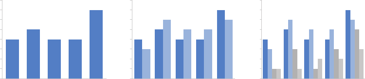
54 choosing an effective visual
facing different data visualization challenges. We’ll look at the ones
I think you should be familiar with here.
Vertical bar chart
The plain vanilla bar chart is the vertical bar chart, or column chart.
Like line graphs, vertical bar charts can be single series, two series, or
multiple series. Note that as you add more series of data, it becomes
more difcult to focus on one at a time and pull out insight, so use
multiple series bar charts with caution. Be aware also that there is
visual grouping that happens as a result of the spacing in bar charts
having more than one data series. This makes the relative order of
the categorization important. Consider what you want your audience
to be able to compare, and structure your categorization hierarchy
to make that as easy as possible.
FIGURE2.15 Bar charts
Cat 1 Cat 2 Cat 3 Cat 4 Cat 5
Single series
A
B
Cat 1 Cat 2 Cat 3 Cat 4 Cat 5
Two series
A
B
CD
0
1
2
3
4
5
6
7
8
0
1
2
3
4
5
6
7
8
0
1
2
3
4
5
6
7
8
Cat 1 Cat 2 Cat 3 Cat 4 Cat 5
Multiple series
Stacked vertical bar chart
Use cases for stacked vertical bar charts are more limited. They are
meant to allow you to compare totals across categories and also see
the subcomponent pieces within a given category. This can quickly
become visually overwhelming, however—especially given the var-
ied default color schemes in most graphing applications (more to
come on that). It is hard to compare the subcomponents across the
various categories once you get beyond the bottom series (the one
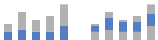
Bars 55
directly next to the x‐axis) because you no longer have a consistent
baseline to use to compare. This makes it a harder comparison for
our eyes to make, as illustrated in Figure 2.16.
FIGURE2.16 Comparing series with stacked bar charts
0
5
10
15
20
Cat 1 Cat 2 Cat 3 Cat 4 Cat 5
Comparing these is hardComparing these is easy
0
5
10
15
20
Cat 1 Cat 2 Cat 3 Cat 4 Cat 5
The stacked vertical bar chart can be structured as absolute num-
bers (where you plot the numbers directly, as shown in Figure 2.16),
or with each column summing to 100% (where you plot the percent
of total for each vertical segment; we’ll look at a specic example
of this in Chapter 9). Which you choose depends on what you are
trying to communicate to your audience. When you use the 100%
stacked bar, think about whether it makes sense to also include the
absolute numbers for each category total (either in an unobtrusive
way in the graph directly, or possibly in a footnote), which may aid
in the interpretation of the data.
Waterfall chart
The waterfall chart can be used to pull apart the pieces of a stacked
bar chart to focus on one at a time, or to show a starting point,
increases and decreases, and the resulting ending point.
The best way to illustrate the use case for a waterfall chart is through a
specic example. Imagine that you are an HR business partner and want
to understand and communicate how employee headcount has changed
over the past year for the client group you support.
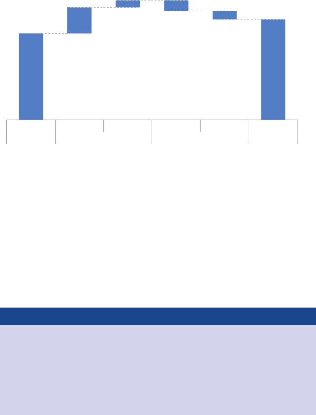
56 choosing an effective visual
A waterfall chart showing this breakdown might look something like
Figure 2.17.
FIGURE2.17 Waterfall chart
2014 Headcount math
Though more employees transferred out of the team than transferred in,
aggressive hiring means overall headcount (HC) increased 16% over the course of the year.
1/1/2014
100
+30
+8 −12
−10
116
Hires Transfers In Transfers Out Exits 12/31/2014
Beginning HC Additions Deductions Ending HC
On the left‐hand side, we see what the employee headcount for the
given team was at the beginning of the year. As we move to the right,
rst we encounter the incremental additions: new hires and employ-
ees transferring into the team from other parts of the organization.
This is followed by the deductions: transfers out of the team to other
parts of the organization and attrition. The nal column represents
employee headcount at the end of the year, after the additions and
deductions have been applied to the beginning of year headcount.
Bruteforce waterfall charts
If your graphing application doesn’t have waterfall chart
functionality built in, fret not. The secret is to leverage the
stacked bar chart and make the rst series (the one that
appears closest to the x‐axis) invisible. It takes a bit of math
to set up correctly, but it works great. A blog post on this

Bars 57
topic, along with an example Excel version of the above
chart and instructions on how to set one up for your own
purposes can be downloaded at storytellingwithdata.com/
waterfall-chart.
Horizontal bar chart
If I had to pick a single go‐to graph for categorical data, it would be
the horizontal bar chart, which ips the vertical version on its side.
Why? Because it is extremely easy to read. The horizontal bar chart is
especially useful if your category names are long, as the text is writ-
ten from left to right, as most audiences read, making your graph
legible for your audience. Also, because of the way we typically pro-
cess information—starting at top left and making z’s with our eyes
across the screen or page—the structure of the horizontal bar chart
is such that our eyes hit the category names before the actual data.
This means by the time we get to the data, we already know what it
represents (instead of the darting back and forth our eyes do between
the data and category names with vertical bar charts).
Like the vertical bar chart, the horizontal bar chart can be single
series, two series, or multiple series (Figure 2.18).
FIGURE2.18 Horizontal bar charts
Category 1 7
5
4
4
3
Category 2
Category 3
Category 4
Category 5
Single series
A
B
012345678
Category 1
Category 2
Category 3
Category 4
Category 5
Two series
A
B
C
012345678
Category 1
Category 2
Category 3
Category 4
Category 5
Multiple series

58 choosing an effective visual
The logical ordering of categories
When designing any graph showing categorical data,
be thoughtful about how your categories are ordered.
If there is a natural ordering to your categories, it may make
sense to leverage that. For example, if your categories are
age groups—0–10 years old, 11–20 years old, and so on—
keep the categories in numerical order. If, however, there
isn’t a natural ordering in your categories that makes sense to
leverage, think about what ordering of your data will make the
most sense. Being thoughtful here can mean providing a
construct for your audience, easing the interpretation process.
Your audience (without other visual cues) will typically look
at your visual starting at the top left and zigzagging in “z”
shapes. This means they will encounter the top of your graph
rst. If the biggest category is the most important, think
about putting that rst and ordering the rest of the catego-
ries in decreasing numerical order. Or if the smallest is most
important, put that at the top and order by ascending data
values.
For a specic example about the logical ordering of data,
check out case study 3 in Chapter 9.
Stacked horizontal bar chart
Similar to the stacked vertical bar chart, stacked horizontal bar charts
can be used to show the totals across different categories but also
give a sense of the subcomponent pieces. They can be structured
to show either absolute values or sum to 100%.
I nd this latter approach can work well for visualizing portions of a
whole on a scale from negative to positive, because you get a consis-
tent baseline on both the far left and the far right, allowing for easy
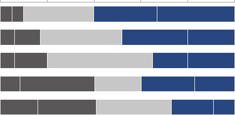
Area 59
comparison of the left‐most pieces as well as the right‐most pieces.
For example, this approach can work well for visualizing survey data
collected along a Likert scale (a scale commonly used in surveys that
typically ranges from Strongly Disagree to Strongly Agree), as shown
in Figure 2.19.
FIGURE2.19 100% stacked horizontal bar chart
Survey results
Strongly Disagree | Disagree | Neutral | Agree | Strongly Agree
Survey item A
Survey item B
Survey item C
Survey item D
Survey item E
0% 20% 40% 60% 80% 100%
Percent of total
Area
I avoid most area graphs. Humans’ eyes don’t do a great job of attrib-
uting quantitative value to two‐dimensional space, which can render
area graphs harder to read than some of the other types of visual
displays we’ve discussed. For this reason, I typically avoid them, with
one exception—when I need to visualize numbers of vastly different
magnitudes. The second dimension you get using a square for this
(which has both height and width, compared to a bar that has only
height or width) allows this to be done in a more compact way than
possible with a single dimension, as shown in Figure 2.20.

60 choosing an effective visual
FIGURE2.20 Square area graph
Interview breakdown
Out of every 100
phone screens...
we bring 25
candidates onsite
for interviews...
and
extend 9 offers.
Other types of graphs
What I’ve covered up to this point are the types of graphs I nd
myself commonly using. This is certainly not an exhaustive list. How-
ever, they should meet the majority of your everyday needs. Mas-
tering the basics is imperative before exploring novel types of data
visualization.
There are many other types of graphs out there. When it comes to
selecting a graph, rst and foremost, choose a graph type that will
enable you to clearly get your message across to your audience.
With less familiar types of visuals, you will likely need to take extra
care in making them accessible and understandable.
Infographics
Infographic is a term that is frequently misused. An info-
graphic is simply a graphical representation of informa-
tion or data. Visuals coined infographic run the gamut from
uffy to informative. On the inadequate end of the spectrum,

To be avoided 61
they often include elements like garish, oversized numbers
and cartoonish graphics. These designs have a certain visual
appeal and can seduce the reader. On second glance, how-
ever, they appear shallow and leave a discerning audience
dissatised. Here, the description of “information graphic”—
though often used—is not appropriate. On the other end of
the spectrum are infographics that live up to their name and
actually inform. There are many good examples in the area
of data journalism (for example, the New York Times and
National Geographic).
There are critical questions information designers must be
able to answer before they begin the design process. These
are the same questions we’ve discussed when it comes to
understanding the context for storytelling with data. Who is
your audience? What do you need them to know or do? It is
only after the answers to these questions can be succinctly
articulated that an effective method of display that will best
aid the message can be chosen. Good data visualization—
infographic or otherwise—is not simply a collection of facts
on a given topic; good data visualization tells a story.
To be avoided
We’ve discussed the visuals that I use most commonly to communi-
cate data in a business setting. There are also some specic graph
types and elements that you should avoid: pie charts, donut charts,
3D, and secondary y‐axes. Let’s discuss each of these.
Pie charts are evil
I have a well‐documented disdain for pie charts. In short, they are
evil. To understand how I arrived at this conclusion, let’s look at an
example.
62 choosing an effective visual
The pie chart shown in Figure 2.21 (based on a real example) shows
market share across four suppliers: A, B, C, and D. If I asked you to
make a simple observation—which supplier is the largest based on
this visual—what would you say?
FIGURE2.21 Pie chart
Supplier Market Share
Supplier A
Supplier B
Supplier C
Supplier D
Most people will agree that “Supplier B,” rendered in medium blue
at the bottom right, appears to be the largest. If you had to estimate
what proportion supplier B makes up of the overall market, what per-
cent might you estimate?
35%?
40%?
Perhaps you can tell by my leading questioning that something shy
is going on here. Take a look at what happens when we add the num-
bers to the pie segments, as shown in Figure 2.22.

To be avoided 63
“Supplier B”—which looks largest, at 31%—is actually smaller than
“Supplier A” above it, which looks smaller.
Let’s discuss a couple of issues that pose a challenge for accurately
interpreting this data. The rst thing that catches your eye (and sus-
picion, if you’re a discerning chart reader) is the 3D and strange per-
spective that’s been applied to the graph, tilting the pie and making
the pieces at the top appear farther away and thus smaller than they
actually are, while the pieces at the bottom appear closer and thus
bigger than they actually are. We’ll talk more about 3D soon, but for
now I’ll articulate a relevant data visualization rule: don’t use 3D! It
does nothing good, and can actually do a whole lot of harm, as we
see here with the way it skews the visual perception of the numbers.
Even when we strip away the 3D and atten the pie, interpretation
challenges remain. The human eye isn’t good at ascribing quantita-
tive value to two‐dimensional space. Said more simply: pie charts
are hard for people to read. When segments are close in size, it’s
difcult (if not impossible) to tell which is bigger. When they aren’t
close in size, the best you can do is determine that one is bigger
than the other, but you can’t judge by how much. To get over this,
you can add data labels as has been done here. But I’d still argue
the visual isn’t worth the space it takes up.
FIGURE2.22 Pie chart with labeled segments
Supplier Market Share
Supplier A
Supplier B
Supplier C
Supplier D
9% 31%
34%
26%

64 choosing an effective visual
What should you do instead? One approach is to replace the pie
chart with a horizontal bar chart, as illustrated in Figure 2.23, orga-
nized from greatest to least or vice versa (unless there is some nat-
ural ordering to the categories that makes sense to leverage, as
mentioned earlier). Remember, with bar charts, our eyes compare
the end points. Because they are aligned at a common baseline, it is
easy to assess relative size. This makes it straightforward to see not
only which segment is the largest, for example, but also how incre-
mentally larger it is than the other segments.
FIGURE2.23 An alternative to the pie chart
Supplier Market Share
Total 100%
34%
Supplier A
Supplier B
Supplier D
Supplier C
31%
26%
9%
One might argue that you lose something in the transition from pie
to bar. The unique thing you get with a pie chart is the concept of
there being a whole and, thus, parts of a whole. But if the visual is
difcult to read, is it worth it? In Figure 2.23, I’ve tried to address
this by showing that the pieces sum to 100%. It isn’t a perfect solu-
tion, but something to consider. For more alternatives to pie charts,
check out case study 5 in Chapter 9.
If you nd yourself using a pie chart, pause and ask yourself: why?
If you’re able to answer this question, you’ve probably put enough
thought into it to use the pie chart, but it certainly shouldn’t be the
rst type of graph that you reach for, given some of the difculties
in visual interpretation we’ve discussed here.

To be avoided 65
With pies, we are asking our audience to compare angles and areas.
With a donut chart, we are asking our audience to compare one arc
length to another arc length (for example, in Figure 2.24, the length
of arc A compared to arc B). How condent do you feel in your eyes’
ability to ascribe quantitative value to an arc length?
Not very? That’s what I thought. Don’t use donut charts.
Never use 3D
One of the golden rules of data visualization goes like this: never use
3D. Repeat after me: never use 3D. The only exception is if you are
actually plotting a third dimension (and even then, things get really
tricky really quickly, so take care when doing this)—and you should
never use 3D to plot a single dimension. As we saw in the pie chart
example previously, 3D skews our numbers, making them difcult
or impossible to interpret or compare.
Adding 3D to graphs introduces unnecessary chart elements like
side and oor panels. Even worse than these distractions, graphing
While we’re on the topic of pie charts, let’s look quickly at another
“dessert visual” to avoid: the donut chart.
FIGURE2.24 Donut chart
The donut chart
arc A
arc B

66 choosing an effective visual
Judging by Figure 2.25, how many issues were there in January and
February? I’ve plotted a single issue for each of these months. How-
ever, the way I read the chart, if I compare the bar height to the grid-
lines and follow it leftward to the y‐axis, I’d estimate visually a value
of maybe 0.8. This is simply bad data visualization. Don’t use 3D.
Secondary y‐axis: generally not a good idea
Sometimes it’s useful to be able to plot data that is in entirely differ-
ent units against the same x‐axis. This often gives rise to the second-
ary y‐axis: another vertical axis on the right‐hand side of the graph.
Consider the example shown in Figure 2.26.
applications do some pretty strange things when it comes to plotting
values in 3D. For example, in a 3D bar chart, you might think that your
graphing application plots the front of the bar or perhaps the back of
the bar. Unfortunately, it’s often even less straightforward than that.
In Excel, for example, the bar height is determined by an invisible
tangent plane intersecting the corresponding height on the y‐axis.
This gives rise to graphs like the one shown in Figure 2.25.
FIGURE2.25 3D column chart
Number of issues
0
0.5
1
1.5
2
2.5
3
3.5
4
Jan Feb Mar Apr May Jun
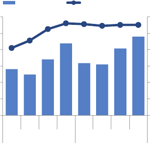
To be avoided 67
When interpreting Figure 2.26, it takes some time and reading to
understand which data should be read against which axis. Because
of this, you should avoid the use of a secondary or right‐hand y‐axis.
Instead, think about whether one of the following approaches will
meet your needs:
1. Don’t show the second y‐axis. Instead, label the data points that
belong on this axis directly.
2. Pull the graphs apart vertically and have a separate y‐axis for each
(both along the left) but leverage the same x‐axis across both.
Figure 2.27 illustrates these options.
FIGURE2.26 Secondary y‐axis
0
20
40
60
80
100
120
$0.0
$0.2
$0.4
$0.6
$0.8
$1.0
$1.2
Q1 Q2 Q3 Q4 Q1 Q2 Q3 Q4
2013 2014
# of Sales Employees
Revenue (Millions)
Secondary y-axis
Revenue Size of Salesforce
68 choosing an effective visual
A third potential option not shown here is to link the axis to the data
to be read against it through the use of color. For example, in the
original graph depicted in Figure 2.26, I could write the left y‐axis
title “Revenue” in blue and keep the revenue bars blue while at the
same time writing the right y‐axis title “# of Sales Employees” in
orange and making the line graph orange to tie these together visu-
ally. I don’t recommend this approach because color can typically
be used more strategically. We’ll spend a lot more time discussing
color in Chapter 4.
It is also worth noting that when you display two datasets against
the same axis, it can imply a relationship that may or may not exist.
This is something to be aware of when determining whether this is
an appropriate approach in the rst place.
When you’re facing a secondary y‐axis challenge and considering
which alternative shown in Figure 2.27 will better meet your needs,
think about the level of specicity you need. Alternative 1, where each
data point is labeled explicitly, puts more attention on the specic
numbers. Alternative 2, where the axes are shown at the left, puts
more focus on the overarching trends. In general, avoid a second-
ary y‐axis and instead employ one of these alternate approaches.
FIGURE2.27 Strategies for avoiding a secondary y‐axis
Alternative 1:
label directly
82
$0.6 $0.5
$0.7
$0.9
$0.6 $0.6
$0.8
$1.0
91
105 112 111 109 110 110
Q1 Q2 Q3 Q4 Q1 Q2 Q3 Q4
2013 2014
# of Sales
Employees
Revenue
(Millions)
$0.0
$0.2
$0.4
$0.6
$0.8
$1.0
Q1 Q2 Q3 Q4 Q1 Q2 Q3 Q4
2013 2014
Revenue (Millions)
Alternative 2:
pull apart vertically
60
80
100
120
# of Sales
Employees
In closing 69
In closing
In this chapter, we’ve explored the types of visual displays I nd myself
using most. There will be use cases for other types of visuals, but what
we’ve covered here should meet the majority of everyday needs.
In many cases, there isn’t a single correct visual display; rather, often
there are different types of visuals that could meet a given need.
Drawing from the previous chapter on context, most important is
to have that need clearly articulated: What do you need your audi-
ence to know? Then choose a visual display that will enable you to
make this clear.
If you’re wondering What is the right graph for my situation?, the
answer is always the same: whatever will be easiest for your audi-
ence to read. There is an easy way to test this, which is to create your
visual and show it to a friend or colleague. Have them articulate the
following as they process the information: where they focus, what
they see, what observations they make, what questions they have.
This will help you assess whether your visual is hitting the mark, or
in the case where it isn’t, help you know where to concentrate your
changes.
You now know the second lesson of storytelling with data: how to
choose an appropriate visual display.
71
chapter three
clutter is your enemy!
Picture a blank page or a blank screen: every single element you
add to that page or screen takes up cognitive load on the part of
your audience—in other words, takes them brain power to process.
Therefore, we want to take a discerning look at the visual elements
that we allow into our communications. In general, identify anything
that isn’t adding informative value—or isn’t adding enough informa-
tive value to make up for its presence—and remove those things.
Identifying and eliminating such clutter is the focus of this chapter.
Cognitive load
You have felt the burden of cognitive load before. Perhaps you were
sitting in a conference room as the person leading the meeting was
ipping through their projected slides and they paused on one that
looked overwhelmingly busy and complicated. Yikes, did you say
“ugh” out loud, or was that just in your head? Or maybe you were
reading through a report or the newspaper, and a graph caught
your eye just long enough for you to think, “this looks interesting

72 clutter is your enemy!
but I have no idea what I’m meant to get out of it”—and rather than
spend more time to decipher it, you turned the page.
In both of these instances, what you’ve experienced is excessive or
extraneous cognitive load.
We experience cognitive load anytime we take in information. Cog-
nitive load can be thought of as the mental effort that’s required to
learn new information. When we ask a computer to do work, we are
relying on the computer’s processing power. When we ask our audi-
ence to do work, we are leveraging their mental processing power.
This is cognitive load. Humans’ brains have a nite amount of this
mental processing power. As designers of information, we want to be
smart about how we use our audience’s brain power. The preceding
examples point to extraneous cognitive load: processing that takes
up mental resources but doesn’t help the audience understand the
information. This is something we want to avoid.
The dataink or signaltonoise ratio
A
number of concepts have been introduced over time
in an effort to explain and help provide guidance for
reducing the cognitive load we push to our audience through
our visual communications. In his book The Visual Display of
Quantitative Information, Edward Tufte refers to maximizing
the data‐ink ratio, saying “the larger the share of a graphic’s
ink devoted to data, the better (other relevant matters being
equal).” This can also be referred to as maximizing the signal‐
to‐noise ratio (see Nancy Duarte’s book Resonate), where the
signal is the information we want to communicate, and the
noise are those elements that either don’t add to, or in some
cases detract from, the message we are trying to impart to
our audience.
Clutter 73
What matters most when it comes to our visual communications is
the perceived cognitive load on the part of our audience: how hard
they believe they are going to have to work to get the information
out of your communication. This is a decision they likely reach with-
out giving it much (if any) conscious thought, and yet it can make the
difference between getting your message across or not.
In general, think about minimizing the perceived cognitive load (to
the extent that is reasonable and still allows you to get the informa-
tion across) for your audience.
Clutter
One culprit that can contribute to excessive or extraneous cognitive
load is something I refer to simply as clutter. These are visual ele-
ments that take up space but don’t increase understanding. We’ll
take a more specic look at exactly what elements can be consid-
ered clutter soon, but in the meantime I want to talk generally about
why clutter is a bad thing.
There is a simple reason we should aim to reduce clutter: because it
makes our visuals appear more complicated than necessary.
Perhaps without explicitly recognizing it, the presence of clutter in
our visual communications can cause a less‐than‐ideal—or worse—
uncomfortable user experience for our audience (this is that “ugh”
moment I referred to at the beginning of this chapter). Clutter can
make something feel more complicated than it actually is. When our
visuals feel complicated, we run the risk of our audience deciding
they don’t want to take the time to understand what we’re showing,
at which point we’ve lost our ability to communicate with them. This
is not a good thing.
74 clutter is your enemy!
Gestalt principles of visual perception
When it comes to identifying which elements in our visuals are signal
(the information we want to communicate) and which might be noise
(clutter), consider the Gestalt Principles of Visual Perception. The
Gestalt School of Psychology set out in the early 1900s to understand
how individuals perceive order in the world around them. What they
came away with are the principles of visual perception still accepted
today that dene how people interact with and create order out of
visual stimuli.
We’ll discuss six principles here: proximity, similarity, enclosure, clo-
sure, continuity, and connection. For each, I’ll show an example of
the principle applied to a table or graph.

Gestalt principles of visual perception 75
Proximity
We tend to think of objects that are physically close together as
belonging to part of a group. The proximity principle is demon-
strated in Figure 3.1: you naturally see the dots as three distinct
groups because of their relative proximity to each other.
FIGURE3.1 Gestalt principle of proximity
We can leverage this way that people see in table design. In Fig-
ure 3.2, simply by virtue of differentiating the spacing between the
dots, your eyes are drawn either down the columns in the rst case
or across the rows in the second case.
FIGURE3.2 You see columns and rows, simply due to dot spacing

76 clutter is your enemy!
Similarity
Objects that are of similar color, shape, size, or orientation are per-
ceived as related or belonging to part of a group. In Figure 3.3, you
naturally associate the blue circles together on the left or the grey
squares together on the right.
FIGURE3.3 Gestalt principle of similarity
This can be leveraged in tables to help draw our audience’s eyes in
the direction we want them to focus. In Figure 3.4, the similarity of
color is a cue for our eyes to read across the rows (rather than down
the columns). This eliminates the need for additional elements such
as borders to help direct our attention.
FIGURE3.4 You see rows due to similarity of color

Gestalt principles of visual perception 77
Enclosure
We think of objects that are physically enclosed together as belong-
ing to part of a group. It doesn’t take a very strong enclosure to do
this: light background shading is often enough, as demonstrated in
Figure 3.5.
FIGURE3.5 Gestalt principle of enclosure
One way we can leverage the enclosure principle is to draw a visual
distinction within our data, as is done in the graph in Figure 3.6.
FIGURE3.6 The shaded area separates the forecast from actual data
FORECASTACTUAL

78 clutter is your enemy!
Closure
The closure concept says that people like things to be simple and
to t in the constructs that are already in our heads. Because of this,
people tend to perceive a set of individual elements as a single, rec-
ognizable shape when they can—when parts of a whole are miss-
ing, our eyes ll in the gap. For example, the elements in Figure 3.7
will tend to be perceived as a circle rst and only after that as indi-
vidual elements.
FIGURE3.7 Gestalt principle of closure
It is common for graphing applications (for example, Excel) to
have default settings that include elements like chart borders and
background shading. The closure principle tells us that these are
unnecessary—we can remove them and our graph still appears as a
cohesive entity. Bonus: when we take away those unnecessary ele-
ments, our data stands out more, as shown in Figure 3.8.
FIGURE3.8 The graph still appears complete without the border and
background shading

Gestalt principles of visual perception 79
Continuity
The principle of continuity is similar to closure: when looking at
objects, our eyes seek the smoothest path and naturally create
continuity in what we see even where it may not explicitly exist. By
way of example, in Figure 3.9, if I take the objects (1) and pull them
apart, most people will expect to see what is shown next (2), whereas
it could as easily be what is shown after that (3).
FIGURE3.9 Gestalt principle of continuity
In the application of this principle, I’ve removed the vertical y‐axis
line from the graph in Figure 3.10 altogether. Your eyes actually still
see that the bars are lined up at the same point because of the con-
sistent white space (the smoothest path) between the labels on the
left and the data on the right. As we saw with the closure principle
in application, stripping away unnecessary elements allows our data
to stand out more.
FIGURE3.10 Graph with y‐axis line removed
A
B
C
D
E
80 clutter is your enemy!
Connection
The nal Gestalt principle we’ll focus on is connection. We tend to
think of objects that are physically connected as part of a group. The
connective property typically has a stronger associative value than
similar color, size, or shape. Note when looking at Figure 3.11, your
eyes probably pair the shapes connected by lines (rather than similar
color, size, or shape): that’s the connection principle in action. The
connective property isn’t typically stronger than enclosure, but you
can impact this relationship through thickness and darkness of lines
to create the desired visual hierarchy (we’ll talk more about visual
hierarchy when we discuss preattentive attributes in Chapter 4).
FIGURE3.11 Gestalt principle of connection
One way that we frequently leverage the connection principle is
in line graphs, to help our eyes see order in the data, as shown in
Figure 3.12.
FIGURE3.12 Lines connect the dots
As you have learned from this brief overview, the Gestalt principles
help us understand how people see, which we can use to identify
unnecessary elements and ease the processing of our visual
communications. We aren’t done with them yet. At the end of this
chapter, we’ll discuss how we can apply some of these principles to
a real‐world example.

Lack of visual order 81
But rst, let’s shift our focus to a couple of other types of visual clutter.
Lack of visual order
When design is thoughtful, it fades into the background so that
your audience doesn’t even notice it. When it’s not, however, your
audience feels the burden. Let’s look at an example to understand
the impact visual order—and lack thereof—can have on our visual
communications.
Take a moment to study Figure 3.13, which summarizes survey feed-
back about factors considered by nonprots in vendor selection.
Note specically any observations you may have regarding the
arrangement of elements on the page.
FIGURE3.13 Summary of survey feedback
Colleague recommendation
0%
20%
40%
60%
80%
Previous work together
Affordability of services
National reputation
Local knowledge
Content expertise
Demonstration of results
% selecting given attribute
In general, what attributes are the most important
to you in selecting a service provider?
(Choose up to 3)
Demonstrating effectiveness is most important consideration when
selecting a provider
Data source: xyz; includes N number of survey respondents. Note that
respondents were able to choose up to 3 options.
Survey shows that
demonstration of results is
the single most important
dimension when choosing a
service provider.
Affordability and experience
working together previously,
which were hypothesized to
be very important in the
decision making process,
were both cited less
frequently as important
attributes.
As you look over the information, you might be thinking, “this looks
pretty good.” I’ll concede: it’s not horrible. On the positive side, the
takeaway is clearly outlined, the graph is well ordered and labeled,
and key observations are articulated and tied visually to where we’re
meant to look in the graph. But when it comes to the overall design
of the page and placement of elements, I’d have to disagree with any
82 clutter is your enemy!
praise. To me, the aggregate visual feels disorganized and uncom-
fortable to look at, as if the various components were haphazardly
put there without regard for the structure of the overall page.
We can improve this visual markedly by making some relatively minor
changes. Take a look at Figure 3.14. The content is exactly the same;
only the placement and formatting of elements have been modied.
FIGURE3.14 Revamped summary of survey feedback
Data source: xyz; includes N number of survey respondents.
Note that respondents were able to choose up to 3 options.
In general, what attributes are the most important
to you in selecting a service provider?
(Choose up to 3)
80%60%40%20%0%
Colleague recommendation
Previous work together
Affordability of services
National reputation
Local knowledge
Content expertise
Demonstration of results
% selecting given attribute
Demonstrating effectiveness
is most important consideration
when selecting a provider
Survey shows that demonstration
of results is the single most
important dimension when
choosing a service provider.
Affordability and experience
working together previously,
which were hypothesized to be
very important in the decision
making process, were both cited
less frequently as important attributes.
Compared to the original visual, the second iteration feels somehow
easier. There is order. It is evident that conscious thought was paid
to the overarching design and arrangement of components. Spe-
cically, the latter version has been designed with greater attention
to alignment and white space. Let’s look at each of these in detail.
Alignment
The single change having the biggest impact in the preceding
before‐and‐after example was the shift from center‐aligned to left‐
justied text. In the original version, each block of text on the page
is center‐aligned. This does not create clean lines either on the left
or on the right, which can make even a thoughtful layout appear

Lack of visual order 83
sloppy. I tend to avoid center‐aligned text for this reason. The deci-
sion of whether to left‐ or right‐justify your text should be made in
context of the other elements on the page. In general, the goal is
to create clean lines (both horizontally and vertically) of elements
and white space.
Presentation software tips for aligning elements
To help ensure that your elements line up when you are
placing them on a page within your presentation soft-
ware, turn on the rulers or gridlines that are built into most
programs. This will allow you to precisely align your elements
to create a cleaner look and feel. The table functionality built
into most presentation applications can also be used as a
makeshift brute‐force method: create a table to give yourself
guidelines for the placement of discrete elements. When you
have everything lined up exactly like you want it, remove the
table or make the table’s borders invisible so that all that is
left is your perfectly arranged page.
Without other visual cues, your audience will typically start at the top
left of the page or screen and will move their eyes in a “z” shape (or
multiple “z” shapes, depending on the layout) across the page or
screen as they take in information. Because of this, when it comes to
tables and graphs, I like to upper‐left‐most justify the text (title, axis
titles, legend). This means the audience will hit the details that tell
them how to read the table or graph before they get to the data itself.
As part of our discussion on alignment, let’s spend a bit of time on
diagonal components. In the previous example, the original version
(Figure 3.13) had diagonal lines connecting the takeaways to the data
and diagonally oriented x‐axis labels; the former were removed and
the latter changed to horizontal orientation in the makeover (Figure
3.14). Generally, diagonal elements such as lines and text should be
84 clutter is your enemy!
avoided. They look messy and, in the case of text, are harder to read
than their horizontal counterparts. When it comes to the orienta-
tion of text, one study (Wigdor & Balakrishnan, 2005) found that the
reading of rotated text 45 degrees in either direction was, on aver-
age, 52% slower than reading normally oriented text (text rotated
90 degrees in either direction was 205% slower on average). It is best
to avoid diagonal elements on the page.
White space
I’ve never quite understood this phenomenon, but for some reason,
people tend to fear white space on a page. I use “white space” to
refer to blank space on the page. If your pages are blue, for exam-
ple, this would be “blue space”—I’m not sure why they would be
blue, but the use of color is a conversation we will have later. Per-
haps you’ve heard this feedback before: “there is still some space
left on that page, so let’s add something there,” or worse, “there
is still some space left on that page, so let’s add more data.” No!
Never add data just for the sake of adding data—only add data with
a thoughtful and specic purpose in mind!
We need to get more comfortable with white space.
White space in visual communication is as important as pauses in
public speaking. Perhaps you have sat through a presentation that
lacked pauses. It feels something like this: there is a speaker up in
front of you and possibly due to nerves or perhaps because they’re
trying to get through more material than they should in the allot-
ted time they are speaking a mile a minute and you’re wondering
how they’re even able to breathe you’d like to ask a question but
the speaker has already moved on to the next topic and still hasn’t
paused long enough for you to be able to raise your question. This
is an uncomfortable experience for the audience, similar to the dis-
comfort you may have felt reading through the preceding run‐on,
unpunctuated sentence.
Lack of visual order 85
Now imagine the effect if that same presenter were to make a single
bold statement: “Death to pie charts!”
And then pause for a full 15 seconds to let that statement resonate.
Go ahead—say it out loud and then count to 15 slowly.
That’s a dramatic pause.
And it got your attention, didn’t it?
That is the same powerful effect that white space used strategically
can have on our visual communications. The lack of it—like the lack
of pauses in a spoken presentation—is simply uncomfortable for
our audience. Audience discomfort in response to the design of our
visual communications is something we should aim to avoid. White
86 clutter is your enemy!
space can be used strategically to draw attention to the parts of the
page that are not white space.
When it comes to preserving white space, here are some minimal
guidelines. Margins should remain free of text and visuals. Resist the
urge to stretch visuals to take up the available space; instead, appro-
priately size your visuals to their content. Beyond these guidelines,
think about how you can use white space strategically for empha-
sis, as was illustrated with the dramatic pause earlier. If there is one
thing that is really important, think about making that the only thing
on the page. In some cases, this could be a single sentence or even
a single number. We’ll talk further about using white space strategi-
cally and look at an example when we discuss aesthetics in Chapter 5.
Non‐strategic use of contrast
Clear contrast can be a signal to our audience, helping them under-
stand where to focus their attention. We will further explore this
idea in greater detail in later chapters. The lack of clear contrast,
on the other hand, can be a form of visual clutter. When discussing
the critical value of contrast, there is an analogy I often borrow from
Colin Ware (Information Visualization: Perception for Design, 2004),
who said it’s easy to spot a hawk in a sky full of pigeons, but as the
variety of birds increases, that hawk becomes harder and harder to
pick out. This highlights the importance of the strategic use of con-
trast in visual design: the more things we make different, the lesser
the degree to which any of them stand out. To explain this another
way, if there is something really important we want our audience to
know or see (the hawk), we should make that the one thing that is
very different from the rest.
Let’s look at an example to further illustrate this concept.
Imagine you work for a U.S. retailer and want to understand how
your customers feel about various dimensions of their shopping
experience in your store compared to your competitors. You have
conducted a survey to collect this information and are now trying
Non‐strategic use of contrast 87
to understand what it tells you. You have created a weighted per-
formance index to summarize each category of interest (the higher
the index, the better the performance, and vice versa). Figure 3.15
shows the weighted performance index across categories for your
company and ve competitors.
Study it for a moment and make note of your thought process as
you take in the information.
FIGURE3.15 Original graph
(1.50)
(1.00)
(0.50)
0.00
0.50
1.00
1.50
Weighted Performance Index
Our Business Competitor A Competitor B Competitor C Competitor D Competitor E
Selection Convenience Service Relationship Price
If you had to describe Figure 3.15 in a single word, what would that
word be? Words like busy, confusing, and perhaps exhausting come
to mind. There is a lot going on in this graph. So many things are
competing for our attention that it is hard to know where to look.
Let’s review exactly what we’re looking at. As I mentioned, the data
graphed is a weighted performance index. You don’t need to worry
about the details of how this is calculated, but rather understand
that this is a summary performance metric that we’d like to com-
pare across various categories (shown across the horizontal x‐axis:
Selection, Convenience, Service, Relationship, and Price) for “Our
Business” (depicted by the blue diamond) compared to a number

88 clutter is your enemy!
of competitors (the other colored shapes). A higher index represents
better performance, and a lower index means lower performance.
Taking in this information is a slow process, with a lot of back and
forth between the legend at the bottom and the data in the graph
to decipher what is being conveyed. Even if we are very patient and
really want to get information out of this visual, it is nearly impossible
because “Our Business” (the blue diamond) is sometimes obscured
by other data points, making it so we can’t even see the comparison
that is most important to make!
This is a case where lack of contrast (as well as some other design
issues) makes the information much harder to interpret than it need
be.
Consider Figure 3.16, where we use contrast more strategically.
FIGURE3.16 Revamped graph, using contrast strategically
Weighted performance index | relative rank
1 of 6
2 of 6
4 of 6
6 of 6
6 of 6
Price
Convenience
Relationship
Service
Selection
Performance overview
Our business
Competitor A
Competitor B
Competitor C
Competitor D
Competitor E
Non‐strategic use of contrast 89
In the revised graph, I’ve made a number of changes. First, I chose a
horizontal bar chart to depict the information. In doing so, I rescaled
all the numbers to be on a positive scale—in the original scatterplot,
there were some negative values that complicated the visualization
challenge. This change works here since we’re more interested in rel-
ative differences than absolute values. In this remake, the categories
that were previously along the horizontal x‐axis now run down the
vertical y‐axis. Within each category, the length of the bar shows the
summary metric across “Our business” (blue) and the various com-
petitors (grey), with longer bars representing better performance.
The decision not to show the actual x‐axis scale in this case was a
deliberate one, which forces the audience to focus on relative dif-
ferences rather than get caught up in the minutiae of the specic
numbers.
With this design, it is easy to see two things quickly:
1. We can let our eyes scan across the blue bars to get a relative
sense of how “Our business” is doing across the various cate-
gories: we score high on Price and Convenience and lower on
Relationship, possibly because we’re struggling when it comes to
Service and Selection, as evidenced by low scores in these areas.
2. Within a given category, we can compare the blue bar to the
grey bars to see how our business is faring relative to competi-
tors: winning compared to the competition on Price, losing on
Service and Selection.
Competitors are distinguished from each other based on the order
in which they appear (Competitor A always appears directly after the
blue bar, Competitor B after that, and so on), which is outlined in
the legend at the left. If it were important to be able to quickly iden-
tify each competitor, this design doesn’t immediately allow for that.
But if that is a second‐ or third‐order comparison in terms of priority
and isn’t the most critical thing, this approach can work well. In the
makeover, I’ve also organized the categories in order of decreasing
weighted performance index for “Our business,” which provides a
construct for our audience to use as they take in the information,

90 clutter is your enemy!
and added a summary metric (relative rank) so it’s easy to know
quickly how “Our business” ranks in each category in relation to
our competition.
Note here how the effective use of contrast (and some other thought-
ful design choices) makes it a much faster, easier, and just more com-
fortable‐feeling process to get the information we’re after than it
was in the original graph.
When redundant details shouldn’t be considered
clutter
I’ve seen cases where the title of the visual indicates the val-
ues are dollars but the dollar signs aren’t included with the
actual numbers in the table or graph. For example, a graph
titled “Monthly Sales ($USD Millions)” with y‐axis labels of
10, 20, 30, 40, 50. I nd this confusing. Including the “$”
sign with each number eases the interpretation of the g-
ures. Your audience doesn’t have to remember they are look-
ing at dollars because they are labeled explicitly. There are
some elements that should always be retained with numbers,
including dollar signs, percent signs, and commas in large
numbers.
Decluttering: step‐by‐step
Now that we have discussed what clutter is, why it is important to
eliminate it from our visual communications, and how to recognize
it, let’s look at a real‐world example and examine how the process
of identifying and removing clutter improves our visual and the clar-
ity of the story that we’re ultimately trying to tell.
Scenario: Imagine that you manage an information technology (IT)
team. Your team receives tickets, or technical issues, from employees.
In the past year, you’ve had a couple of people leave and decided
Decluttering: step‐by‐step 91
at the time not to replace them. You have heard a rumbling of com-
plaints from the remaining employees about having to “pick up the
slack.” You’ve just been asked about your hiring needs for the com-
ing year and are wondering if you should hire a couple more people.
First, you want to understand what impact the departure of individ-
uals over the past year has had on your team’s overall productivity.
You plot the monthly trend of incoming tickets and those processed
over the past calendar year. You see that there is some evidence your
team’s productivity is suffering from being short‐staffed and now
want to turn the quick‐and‐dirty visual you created into the basis for
your hiring request.
Figure 3.17 shows your original graph.
FIGURE3.17 Original graph
0.00
January
February
March
April
May
June
July
August
September
October
November
December
50.00
100.00
150.00
200.00
250.00
300.00
Ticket Volume Received Ticket Volume Processed
Take another look at this visual with an eye toward clutter. Consider
the lessons we’ve covered on Gestalt principles, alignment, white
space, and contrast. What things can we get rid of or change? How
many issues can you identify?
I identied six major changes to reduce clutter. Let’s discuss each.
92 clutter is your enemy!
1. Remove chart border
Chart borders are usually unnecessary, as we covered in our discus-
sion of the Gestalt principle of closure. Instead, think about using
white space to differentiate the visual from other elements on the
page as needed.
FIGURE3.18 Remove chart border
0.00
50.00
100.00
150.00
200.00
250.00
300.00
Ticket Volume Received Ticket Volume Processed
January
February
March
April
May
June
July
August
September
October
November
December
Decluttering: step‐by‐step 93
2. Remove gridlines
If you think it will be helpful for your audience to trace their nger
from the data to the axis, or you feel that your data will be more
effectively processed, you can leave the gridlines. But make them
thin and use a light color like grey. Do not let them compete visually
with your data. When you can, get rid of them altogether: this allows
for greater contrast, and your data will stand out more.
FIGURE3.19 Remove gridlines
0.00
50.00
100.00
150.00
200.00
250.00
300.00
Ticket Volume Received Ticket Volume Processed
January
February
March
April
May
June
July
August
September
October
November
December
94 clutter is your enemy!
3. Remove data markers
Remember, every single element adds cognitive load on the part of
your audience. Here, we’re adding cognitive load to process data
that is already depicted visually with the lines. This isn’t to say that
you should never use data markers, but rather use them on purpose
and with a purpose, rather than because their inclusion is your graph-
ing application’s default.
FIGURE3.20 Remove data markers
0.00
50.00
100.00
150.00
200.00
250.00
300.00
Ticket Volume Received Ticket Volume Processed
January
February
March
April
May
June
July
August
September
October
November
December
Decluttering: step‐by‐step 95
4. Clean up axis labels
One of my biggest pet peeves is trailing zeros on y‐axis labels: they
carry no informative value, and yet make the numbers look more
complicated than they are! Get rid of them, reducing their unnec-
essary burden on the audience’s cognitive load. We can also abbre-
viate the months of the year so that they will t horizontally on the
x‐axis, eliminating the diagonal text.
FIGURE3.21 Clean up axis labels
0
50
100
150
200
250
300
DecNovOctSepAugJulJunMayAprMarFebJan
Ticket Volume Received Ticket Volume Processed
96 clutter is your enemy!
5. Label data directly
Now that we have eliminated much of the extraneous cognitive load,
the work of going back and forth between the legend and the data
is even more evident. Remember, we want to try to identify anything
that will feel like effort to our audience and take that work upon our-
selves as the designers of the information. In this case, we can lever-
age the Gestalt principle of proximity and put the data labels right
next to the data they describe.
FIGURE3.22 Label data directly
0
50
100
150
200
250
300
DecNovOctSepAugJulJunMayAprMarFebJan
Received
Processed

Decluttering: step‐by‐step 97
6. Leverage consistent color
While we leveraged the Gestalt principle of proximity in the prior
step, let’s also think about leveraging the Gestalt principle of sim-
ilarity and make the data labels the same color as the data they
describe. This is another visual cue to our audience that says, “these
two pieces of information are related.”
FIGURE3.23 Leverage consistent color
0
50
100
150
200
250
300
DecNovOctSepAugJulJunMayAprMarFebJan
Received
Processed
98 clutter is your enemy!
In closing
Any time you put information in front of your audience, you are creat-
ing cognitive load and asking them to use their brain power to pro-
cess that information. Visual clutter creates excessive cognitive load
that can hinder the transmission of our message. The Gestalt Prin-
ciples of Visual Perception can help you understand how your audi-
ence sees and allow you to identify and remove unnecessary visual
elements. Leverage alignment of elements and maintain white space
to help make the interpretation of your visuals a more comfortable
experience for your audience. Use contrast strategically. Clutter is
your enemy: ban it from your visuals!
You now know how to identify and eliminate clutter.
FIGURE3.24 Before‐and‐after
0.00
50.00
100.00
150.00
200.00
250.00
300.00
Ticket Volume Received Ticket Volume Processed
0
50
100
150
200
250
300
DecNovOctSepAugJulJunMayAprMarFebJan
Received
Processed
January
February
March
April
May
June
July
August
September
October
November
December
This visual is not yet complete. But identifying and eliminating the
clutter has brought us a long way in terms of reducing cognitive
load and improving accessibility. Take a look at the before‐and‐after
shown in Figure 3.24.
99
chapter four
focus your audience’s
attention
In the previous chapter, we learned about clutter and the importance
of identifying and removing it from our visuals. While we work to elim-
inate distractions, we also want to look at what remains and consider
how we want our audience to interact with our visual communications.
In this chapter, we further examine how people see and how you can
use that to your advantage when crafting visuals. We will talk briey
about sight and memory in order to highlight the importance of some
specic, powerful tools: preattentive attributes. We will explore how
preattentive attributes like size, color, and position on page can be
used strategically in two ways. First, preattentive attributes can be
leveraged to help direct your audience’s attention to where you want
them to focus it. Second, they can be used to create a visual hierarchy
of elements to lead your audience through the information you want
to communicate in the way you want them to process it.
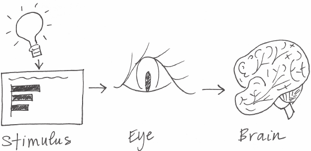
100 focus your audience’s attention
By understanding how our audience sees and processes informa-
tion, we put ourselves in a better position to be able to communi-
cate effectively.
You see with your brain
Let’s look at a simplied picture of how people see, depicted in
Figure 4.1. The process goes something like this: light reects off of
a stimulus. This gets captured by our eyes. We don’t fully see with
our eyes; there is some processing that happens there, but mostly
it is what happens in our brain that we think of as visual perception.
A brief lesson on memory
Within the brain, there are three types of memory that are important
to understand as we design visual communications: iconic memory,
short‐term memory, and long‐term memory. Each plays an impor-
tant and distinct role. What follows are basic explanations of highly
complex processes, covered simply to set the stage for what you
need to know when designing visual communications.
FIGURE4.1 A simplied picture of how you see
A brief lesson on memory 101
Iconic memory
Iconic memory is super fast. It happens without you consciously real-
izing it and is piqued when we look at the world around us. Why?
Long ago in the evolutionary chain, predators helped our brains
develop in ways that allowed for great efciency of sight and speed
of response. In particular, the ability to quickly pick up differences
in our environment—for example, the motion of a predator in the
distance—became ingrained in our visual process. These were sur-
vival mechanisms then; they can be leveraged for effective visual
communication today.
Information stays in your iconic memory for a fraction of a second
before it gets forwarded on to your short‐term memory. The impor-
tant thing about iconic memory is that it is tuned to a set of preat-
tentive attributes. Preattentive attributes are critical tools in your
visual design tool belt, so we’ll come back to those in a moment. In
the meantime, let’s continue our discussion on memory.
Short‐term memory
Short‐term memory has limitations. Specically, people can keep
about four chunks of visual information in their short‐term memory
at a given time. This means that if we create a graph with ten differ-
ent data series that are ten different colors with ten different shapes
of data markers and a legend off to the side, we’re making our audi-
ence work very hard going back and forth between the legend and
the data to decipher what they are looking at. As we’ve discussed
previously, to the extent possible, we want to limit this sort of cogni-
tive burden on our audience. We don’t want to make our audience
work to get at the information, because in doing so, we run the risk of
losing their attention. With that, we lose our ability to communicate.
In this specic situation, one solution is to label the various data
series directly (reducing that work of going back and forth between
the legend and the data by leveraging the Gestalt principle of prox-
imity that we covered in Chapter 3). More generally, we want to form
102 focus your audience’s attention
larger, coherent chunks of information so that we can t them into
the nite space in our audience’s working memory.
Long‐term memory
When something leaves short‐term memory, it either goes into obliv-
ion and is likely lost forever, or is passed into long‐term memory.
Long‐term memory is built up over a lifetime and is vitally impor-
tant for pattern recognition and general cognitive processing. Long‐
term memory is the aggregate of visual and verbal memory, which
act differently. Verbal memory is accessed by a neural net, where the
path becomes important for being able to recognize or recall. Visual
memory, on the other hand, functions with specialized structures.
There are aspects of long‐term memory that we want to make use
of when it comes to having our message stick with our audience. Of
particular importance to our conversation is that images can help us
more quickly recall things stored in our long‐term verbal memory. For
example, if you see a picture of the Eiffel Tower, a ood of concepts
you know about, feelings you have toward, or experiences you’ve
had in Paris may be triggered. By combining the visual and verbal,
we set ourselves up for success when it comes to triggering the for-
mation of long‐term memories in our audience. We’ll discuss some
specic tactics for this in Chapter 7 in the context of storytelling.
Preattentive attributes signal where to look
In the previous section, I introduced iconic memory and mentioned
that it is tuned to preattentive attributes. The best way to prove the
power of preattentive attributes is to demonstrate it. Figure 4.2 shows
a block of numbers. Taking note of how you process the information
and how long it takes, quickly count the number of 3s that appear
in the sequence.
Preattentive attributes signal where to look 103
The correct answer is six. In Figure 4.2, there were no visual cues to
help you reach this conclusion. This makes for a challenging exer-
cise, during which you have to hunt through four lines of text, look-
ing for the number 3 (a kind of complicated shape).
Check out what happens when we make a single change to the block
of numbers. Turn the page and repeat the exercise of counting the
3s using Figure 4.3.
FIGURE4.2 Count the 3s example
756395068473
658663037576
860372658602
846589107830
104 focus your audience’s attention
Note how much easier and faster the same exercise is using Figure
4.3. You don’t have time to blink, don’t really have time to think, and
suddenly there are six 3s in front of you. This is so apparent so quickly
because in this second iteration, your iconic memory is being lev-
eraged. The preattentive attribute of intensity of color, in this case,
makes the 3s the one thing that stands out as distinct from the rest.
Our brain is quick to pick up on this without our having to dedicate
any conscious thought to it.
This is remarkable. And profoundly powerful. It means that, if we
use preattentive attributes strategically, they can help us enable our
audience to see what we want them to see before they even
know they’re seeing it!
Note the multiple preattentive attributes I’ve used in the preceding
text to underscore its importance!
Figure 4.4 shows the various preattentive attributes.
FIGURE4.3 Count the 3s example with preattentive attributes
756395068473
658663037576
860372658602
846589107830

Preattentive attributes signal where to look 105
Note as you scan across the attributes in Figure 4.4, your eye is drawn
to the one element within each group that is different from the rest:
you don’t have to look for it. That’s because our brains are hardwired
to quickly pick up differences we see in our environment.
One thing to be aware of is that people tend to associate quanti-
tative values with some (but not all) of the preattentive attributes.
For example, most people will consider a long line to represent a
greater value than a short line. That is one of the reasons bar charts
are straightforward for us to read. But we don’t think of color in the
same way. If I ask you which is greater—red or blue?—this isn’t a
meaningful question. This is important because it tells us which of
the attributes can be used to encode quantitative information (line
length, spatial position, or to a more limited extent, line width, size,
and intensity can be used to reect relative value), and which should
be used as categorical differentiators.
When used sparingly, preattentive attributes can be extremely useful
for doing two things: (1) drawing your audience’s attention quickly
Motion Spatial position Intensity Hue
Line width Line length Shape Orientation
Enclosure Added marks Curvature Size
FIGURE4.4 Preattentive attributes
Source: Adapted from Stephen Few’s Show Me the Numbers, 2004.
106 focus your audience’s attention
to where you want them to look, and (2) creating a visual hierarchy
of information. Let’s look at examples of each of these, rst with text
and then in the context of data visualization.
Preattentive attributes in text
Without any visual cues, when we’re confronted with a block of text,
our only option is to read it. But preattentive attributes employed
sparingly can quickly change this. Figure 4.5 shows how you can uti-
lize some of the preattentive attributes introduced previously with
text. The rst block of text doesn’t employ any preattentive attri-
butes. This renders it similar to the count the 3s example: you have
to read it, put on the lens of what’s important or interesting, then
possibly read it again to put the interesting parts back into the con-
text of the rest.
Observe how leveraging preattentive attributes changes the way
you process the information. The subsequent blocks of text employ
a single preattentive attribute each. Note how, within each, the pre-
attentive attribute grabs your attention, and how some attributes
draw your eyes with greater or weaker force than others (for exam-
ple, color and size are attention grabbing, whereas italics achieve a
milder emphasis).

Preattentive attributes in text 107
FIGURE4.5 Preattentive attributes in text
No preattentive attributes Bold
scilatIroloC
yllaitaps etarapeSeziS
Outline (enclosure) Underline (added marks)
What are we doing well? Great Products. These
products are clearly the best in their class.
Replacement parts are shipped when needed. You
sent me gaskets without me having to ask. Problems
are resolved promptly. Bev in the billing office was
quick to resolve a billing issue I had. General
customer service exceeds expectations. The
account manager even called to check in after
normal business hours.
You have a great company – keep up the good work!
What are we doing well? Great Products. These
products are the best in their class. Replacement
parts are shipped when needed. You sent gaskets
without me having to
ask. Problems are resolved promptly. Bev in the
billing office was quick to resolve a billing issue I
had. General customer service exceeds
expectations. The account manager even called to
check in after normal business hours. You have a
great company – keep up the good work!
What are we doing well? Great Products. These
products are clearly the best in their class.
Replacement parts are shipped when needed. You
sent me gaskets without me having to ask.
Problems are resolved promptly.
Bev in the billing office was quick to resolve a billing
issue I had. General customer service exceeds
expectations. The account manager even called to
check in after normal business hours. You have a
great company – keep up the good work!
What are we doing well? Great Products. These
products are clearly the best in their class.
Replacement parts are shipped when needed. You
sent me gaskets without me having to ask. Problems
are resolved promptly. Bev in the billing office was
quick to resolve a billing issue I had. General
customer service exceeds expectations. The
account manager even called to check in after
normal business hours.
You have a great company – keep up the good work!

108 focus your audience’s attention
Beyond drawing our audience’s attention to where we want them
to focus it, we can employ preattentive attributes to create visual
hierarchy in our communications. As we saw in Figure 4.5, the vari-
ous attributes draw our attention with differing strength. In addition,
there are variances within a given preattentive attribute that will draw
attention with more or less strength. For example, with the preat-
tentive attribute of color, a bright blue will typically draw attention
more than a muted blue. Both will draw more attention than a light
grey. We can leverage this variance and use multiple preattentive
attributes together to make our visuals scannable, by emphasizing
some components and de‐emphasizing others.
Figure 4.6 illustrates how this can be done with the block of text from
the previous example.
What are we doing well?
Themes & example comments
Great products:"These products are clearly the best in class."
Replacement parts are shipped when needed:
"You sent me gaskets without me having to ask, and I really
needed them, too!"
Problems are resolved promptly:"Bev in the billing office was
quick to resolve a billing issue I had."
General customer service exceeds expectations:
"The account manager even called after normal business hours.
You have a great company - keep up the good work!"
FIGURE4.6 Preattentive attributes can help create a visual hierarchy of
information
Preattentive attributes have been used in Figure 4.6 to create a
visual hierarchy of information. This makes the information we pres-
ent more easily scannable. Studies have shown that we have about
3–8 seconds with our audience, during which time they decide
whether to continue to look at what we’ve put in front of them or
direct their attention to something else. If we’ve used our preattentive
Preattentive attributes in graphs 109
attributes wisely, even if we only get that initial 3–8 seconds, we’ve
given our audience the gist of what we want to say.
Leveraging preattentive attributes to create a clear visual hierarchy
of information establishes implicit instructions for your audience,
indicating to them how to process the information. We can signal
what is most important that they should pay attention to rst, what
is second most important that they should pay attention to next, and
so on. We can push necessary but non‐message‐impacting compo-
nents to the background so they don’t compete for attention. This
makes it both easier and faster for our audience to take in the infor-
mation that we provide.
The preceding example demonstrated the use of preattentive attri-
butes in text. Preattentive attributes are also very useful for commu-
nicating effectively with data.
Preattentive attributes in graphs
Graphs, without other visual cues, can become very much like the
count the 3s exercise or the block of text we’ve considered previ-
ously. Take the following example. Imagine you work for a car man-
ufacturer. You are interested in understanding and sharing insight
about the top design concerns (measured as the number of concerns
per 1,000 concerns) from customers for a particular vehicle make
and model. Your initial visual might look something like Figure 4.7.

110 focus your audience’s attention
Note how, without other visual cues, you are left to process all of the
information. With no clues about what’s important or should be paid
attention to, it’s the count the 3s exercise all over again.
Recall the distinction that was drawn early on in Chapter 1 between
exploratory and explanatory analysis. The visual in Figure 4.7 could
be one you create during the exploratory phase: when you’re looking
at the data to understand what might be interesting or noteworthy
to communicate to someone else. Figure 4.7 shows us that there are
ten design concerns that have more than eight concerns per 1,000.
When it comes to explanatory analysis and leveraging this visual to
share information with your audience (rather than just showing data),
thoughtful use of color and text is one way we can focus the story,
as illustrated in Figure 4.8.
Top 10 design concerns
concerns per 1,000
12.9
12.3
11.6
11.6
11.0
10.3
10.0
8.8
8.6
8.2
Engine power is less than expected
Tires make excessive noise while driving
Engine makes abnormal/excessive noise
Seat material concerns
Excessive wind noise
Hesitation or delay when shifting
Bluetooth system has poor sound quality
Steering system/wheel has too much play
Bluetooth system is difficult to use
Front seat audio/entertainment/navigation controls
FIGURE4.7 Original graph, no preattentive attributes
Preattentive attributes in graphs 111
We can go one step further, using the same visual but with modi-
ed focus and text to lead our audience from the macro to the micro
parts of the story, as demonstrated in Figure 4.9.
Top 10 design concerns concerns per 1,000
12.9
12.3
11.6
11.6
11.0
10.3
10.0
8.8
8.6
8.2
Engine power is less than expected
Tires make excessive noise while driving
Engine makes abnormal/excessive noise
Seat material concerns
Excessive wind noise
Hesitation or delay when shifting
Bluetooth system has poor sound quality
Steering system/wheel has too much play
Bluetooth system is difficult to use
7 of the top 10 design concerns have 10 or more concerns per 1,000
.
Discussion: is this an acceptable default rate?
Front seat audio/entertainment/navigation controls
FIGURE4.8 Leverage color to draw attention
Top 10 design concerns concerns per 1,000
12.9
12.3
11.6
11.6
11.0
10.3
10.0
8.8
8.6
8.2
Engine power is less than expected
Tires make excessive noise while driving
Engine makes abnormal/excessive noise
Seat material concerns
Excessive wind noise
Hesitation or delay when shifting
Bluetooth system has poor sound quality
Steering system/wheel has too much play
Bluetooth system is difficult to use
Front seat audio/entertainment/navigation controls
Of the top design concerns, three are noise-related.
Comments indicate that
noisy tire issues are
most apparent in the rain.
Complaints about engine
noise commonly cited
after the car had not
been driven for a while.
Excessive wind noise is
noted primarily in freeway
driving at high speeds.
FIGURE4.9 Create a visual hierarchy of information
Especially in live presentation settings, repeated iterations of the
same visual, with different pieces emphasized to tell different stories
or different aspects of the same story (as demonstrated in Figures 4.7,

112 focus your audience’s attention
4.8, and 4.9), can be an effective strategy. This allows you to familiar-
ize your audience with your data and visual rst and then continue to
leverage it in the manner illustrated. Note in this example how your
eyes are drawn to the elements of the visual you’re meant to focus
on due to strategic use of preattentive attributes.
Highlighting one aspect can make other things
harder to see
One word of warning in using preattentive attributes:
when you highlight one point in your story, it can actu-
ally make other points harder to see. When you’re doing
exploratory analysis, you should mostly avoid the use of pre-
attentive attributes for this reason. When it comes to explan-
atory analysis, however, you should have a specic story you
are communicating to your audience. Leverage preattentive
attributes to help make that story visually clear.
The previous example used mainly color to draw the viewer’s atten-
tion. Let’s look at another scenario using a different preattentive
attribute. Recall the example introduced in Chapter 3: you manage
an IT team and want to show how the volume of incoming tickets
exceeds your team’s resources. After decluttering the graph, we
were left with Figure 4.10.
Preattentive attributes in graphs 113
In the process of determining where I want to focus my audience’s
attention, one strategy I’ll often employ is to start by pushing every-
thing to the background. This forces me to make explicit decisions
regarding what to bring to the forefront or highlight. Let’s start by
doing this; see Figure 4.11.
Received
Processed
0
50
100
150
200
250
300
DecNovOctSepAugJulJunMayAprMarFebJan
FIGURE4.10 Let’s revisit the ticket example
Received
Processed
0
50
100
150
200
250
300
DecNovOctSepAugJulJunMayAprMarFebJan
FIGURE4.11 First, push everything to the background

114 focus your audience’s attention
Next, I want to make the data stand out. Figure 4.12 shows both
data series (Received and Processed) bolder and bigger than axis
lines and labels. It was an intentional decision to make the Processed
line darker than the Received line to draw emphasis to the fact that
the number of tickets being processed has fallen below the num-
ber being received.
FIGURE4.12 Make the data stand out
Received
Processed
0
50
100
150
200
250
300
DecNovOctSepAugJulJunMayAprMarFebJan
In this case, we want to draw our audience’s attention to the right
side of the graph, where the gap has started to form. Without other
visual cues, our audience will typically start at the top left of our visual
and do zigzagging “z’s” with their eyes across the page. The viewer
will eventually get to that gap on the right‐hand side, but let’s con-
sider how we can use our preattentive attributes to make that hap-
pen more quickly.
The added marks of data points and numeric labels are one preat-
tentive attribute we can leverage. Bear with me, though, as we take
a step in the wrong direction before we go in the right one. See
Figure 4.13.
Preattentive attributes in graphs 115
When we add data markers and numeric labels to every data point,
we quickly create a cluttered mess. But check out what happens in
Figure 4.14 when we’re strategic about which data markers and labels
we preserve and which we eliminate.
FIGURE4.13 Too many data labels feels cluttered
Received
Processed
160
184
241
149
180
161
132
202
160
139 149
177
160
184
237
148
181
150
123
156
126
104
124
140
0
50
100
150
200
250
300
DecNovOctSepAugJulJunMayAprMarFebJan
FIGURE4.14 Data labels used sparingly help draw attention
Received
Processed
202
160
139 149
177
156
126
104
124
140
0
50
100
150
200
250
300
DecNovOctSepAugJulJunMayAprMarFebJan
In Figure 4.14, the added marks act as a “look here” signal, drawing
our audience’s attention more quickly to the right side of the graph.
116 focus your audience’s attention
They provide for our audience the added benet of allowing them to
do some quick math in the event that they want to understand how
big the backlog is becoming (if we think that is something they’d
denitely want to do, we should consider doing it for them).
These are just a couple of examples of using preattentive attributes
to focus the audience’s attention. We will look at a number of addi-
tional examples that leverage this same broad strategy in different
ways throughout the rest of this book.
There are a few preattentive attributes that are so important from
a strategic standpoint when it comes to focusing your audience’s
attention that they warrant their own specic discussions: size, color,
and position on page. We’ll address each of these in the following
sections.
Size
Size matters. Relative size denotes relative importance. Keep this in
mind when designing your visual communications. If you’re show-
ing multiple things that are of roughly equal importance, size them
similarly. Alternatively, if there is one really important thing, leverage
size to indicate that: make it BIG!
The following is a real situation where size nearly caused unintended
repercussions.
Early in my career at Google, we were designing a dashboard to
help with a decision‐making process (I’m being intentionally vague
to preserve condentiality). In the design phase, there were three
main pieces of information we knew we wanted to include, only
one of which was readily available (the other data had to be chased
after). In the initial versions of the dashboard, the information we
had on hand took up probably 60% of the dashboard’s real estate,
with placeholders for the other information we were collecting. After
getting our hands on the other data, we plugged it into the existing
placeholders. Rather late in the game, we realized that the size of
Color 117
that initial data we had included was drawing undue attention com-
pared to the rest of the information on the page. Luckily, we caught
this before it was too late. We modied the layout to make the three
equally important things the same size. It’s interesting to think that
completely different conversations may have been had and deci-
sions reached as a result of this shift in design.
This was an important lesson for me (and one that we’ll highlight in
the next section on color as well): don’t let your design choices be
happenstance; rather, they should be the result of explicit decisions.
Color
When used sparingly, color is one of the most powerful tools you have
for drawing your audience’s attention. Resist the urge to use color
for the sake of being colorful; instead, leverage color selectively as
a strategic tool to highlight the important parts of your visual. The
use of color should always be an intentional decision. Never let your
tool make this important decision for you!
I typically design my visuals in shades of grey and pick a single
bold color to draw attention where I want it. My base color is grey,
not black, to allow for greater contrast since color stands out more
against grey than black. For my attention‐grabbing color, I often
use blue for a number of reasons: (1) I like it, (2) you avoid issues of
colorblindness that we’ll discuss momentarily, and (3) it prints well
in black‐and‐white. That said, blue is certainly not your only option
(and you’ll see many examples where I deviate from my typical blue
for various reasons).
When it comes to the use of color, there are several specic lessons
to know: use it sparingly, use it consistently, design with the color-
blind in mind, be thoughtful of the tone color conveys, and consider
whether to leverage brand colors. Let’s discuss each of these in detail.
118 focus your audience’s attention
Use color sparingly
It’s easy to spot a hawk in a sky full of pigeons, but as the variety of
birds increases, that hawk becomes harder and harder to locate.
Remember the adage from Colin Ware that we discussed in the last
chapter on clutter? The same principle applies here. For color to be
effective, it must be used sparingly. Too much variety prevents any-
thing from standing out. There needs to be sufcient contrast to
make something draw your audience’s attention.
When we use too many colors together, beyond entering rainbow‐
land, we lose their preattentive value. By way of example, I once
encountered a table that showed market rank for a handful of phar-
maceutical drugs across a number of different countries, similar to
the left‐hand side of Figure 4.15. Each rank (1, 2, 3, and so on) was
assigned its own color along a rainbow spectrum: 1 = red, 2 = orange,
3 = yellow, 4 = light green, 5 = green, 6 = teal, 7 = blue, 8 = dark blue,
9 = light purple, 10+ = purple. The cells within the table were lled
with the color that corresponded to the numerical ranking. Rainbow
Brite might have loved this table (for those unfamiliar, a quick Google
image search of Rainbow Brite will bring some understanding to this
statement), but I was not a fan. The power of the preattentive attri-
butes was lost: everything was different, which meant that nothing
stood out. We were back to the count the 3s example—only worse,
because the variance in colors was actually more distracting than
helpful. A better alternative would be to use varying color satura-
tion of a single color (a heatmap).
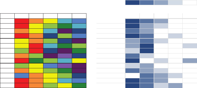
Color 119
Let’s consider Figure 4.15. Where are your eyes drawn in the version
on the left? Mine dart around quite a bit, trying to gure out what I
should pay attention to. They hesitate on the dark purple, then red,
then to the dark blue, probably because these have a higher satu-
ration of color than the others. However, when we consider what
these colors represent, it’s not necessarily where we want our audi-
ence to look.
In the version on the right‐hand side, varying saturation of a sin-
gle color is used. Note that our perception is more limited when it
comes to relative saturation, but one benet we get is that it does
carry with it some quantitative assumptions (that more heavily satu-
rated represents greater value than less or vice versa—something
you don’t get with the rainbow colors used originally as categorical
differentiators). This works well for our purpose here, where the low
numbers (market leaders) are denoted with the highest color satu-
ration. We are drawn to the dark blue rst—the market leaders. This
is a more thoughtful use of color.
Country Level Sales Rank Top 5 Drugs
Top 5 drugs
: country-level sales rank
RANK 1 2 3 4 5+
COUNTRY | DRUG
Country A B C D E A B C D E
AUS 1 2 3 6 7 Australia 1 2 3 6 7
BRA 1 3 4 5 6 Brazil 1 3 4 5 6
CAN 2 3 6 12 8 Canada 2 3 6 12 8
CHI 1 2 8 4 7 China 1 2 8 4 7
FRA 3 2 4 8 10 France 3 2 4 8 10
GER 3 1 6 5 4 Germany 3 1 6 5 4
IND 4 1 8 10 5 India 418 10 5
ITA 2 4 10 9 8 Italy 24 10 9 8
MEX 1 5 4 6 3 Mexico 15463
RUS 4 3 7 9 12 Russia 437 9 12
SPA 2 3 4 5 11 Spain 2 3 4 5 11
TUR 7 2 3 4 8 Turkey 72 3 4 8
UK12367 United Kingdom 1 2 3 6 7
US12435 United States 1 2 435
Rainbow distribution in color indicates sales rank in
given country from #1 (red) to #10 or higher (dark purple)
FIGURE4.15 Use color sparingly

120 focus your audience’s attention
Use color consistently
One question regularly raised in my workshops is around novelty.
Does it make sense to change up the colors or graph types so the
audience doesn’t get bored? My answer is a resounding No! The
story you are telling should be what keeps your audience’s attention
(we’ll talk about story more in Chapter 7), not the design elements of
your graphs. When it comes to the type of graph, you should always
use whatever will be easiest for your audience to read. When show-
ing similar information that can be graphed the same way, there can
be benet to keeping the same layout as you essentially train your
audience how to read the information, making the interpretation of
later graphs all the easier and reducing mental fatigue.
A change in colors signals just that—a change. So leverage this
when you want your audience to feel change for some reason,
but never simply for the sake of novelty. If you are designing your
communication in shades of grey and using a single color to draw
attention, leverage that same schematic throughout the communi-
cation. Your audience quickly learns that blue, for example, signals
where they are meant to look rst, and can use this understanding
Where are your eyes drawn?
There is an easy test for determining whether preattentive
attributes are being used effectively. Create your visual,
then close your eyes or look away for a moment and then
look back at it, taking note of where your eyes are drawn rst.
Do they immediately land where you want your audience to
focus? Better yet, seek the help of a friend or colleague—ask
them to talk you through how they process the visual: where
their eyes go rst, where they go next, and so on. This is a
great way to see things through your audience’s eyes and
conrm whether the visual you’ve created is drawing atten-
tion and creating a visual hierarchy of information in the way
that you desire.
Color 121
as they process subsequent slides or visuals. However, if you want
to signal a clear change in topic or tone, a shift in color is one way
to visually reinforce this.
There are some cases where use of color must be consistent. Your
audience will typically take time to familiarize themselves with what
colors mean once and then will assume the same details apply
throughout the rest of the communication. For example, if you are
displaying data across four regions in a graph, each having their
own color in one place within your presentation or report, be sure
to preserve this same schematic throughout the visuals in the rest
of your presentation or report (and avoid use of the same colors for
other purposes if possible). Don’t confuse your audience by chang-
ing your use of color.
Design with colorblind in mind
Roughly 8% of men (including my husband and a former boss) and
half a percent of women are colorblind. This most frequently mani-
fests itself as difculty in distinguishing between shades of red and
shades of green. In general, you should avoid using shades of red
and shades of green together. Sometimes, though, there is useful
connotation that comes with using red and green: red to denote the
double‐digit loss you want to draw attention to or green to highlight
signicant growth. You can still leverage this, but make sure to have
some additional visual cue to set the important numbers apart so you
aren’t inadvertently disenfranchising part of your audience. Consider
also using bold, varying saturation or brightness, or adding a simple
plus or minus sign in front of the numbers to ensure they stand out.
When I’m designing a visual and selecting colors to highlight both
positive and negative aspects, I frequently use blue to signal positive
and orange for negative. I feel that positive and negative associations
with these colors are still recognizable and you avoid the colorblind
challenge described above. When you face this situation, consider
whether you need to highlight both ends of the scale (positive and

122 focus your audience’s attention
negative) with color, or if drawing attention to one or the other (or
sequentially, one and then the other) might work to tell your story.
See your graphs and slides through colorblind eyes
There are a number of sites and applications with
colorblindness simulators that allow you to see what
your visual looks like through colorblind eyes. For example,
Vischeck (vischeck.com) allows you to upload images
or download the tool to use on your own computer.
Color Oracle (colororacle.org) offers a free download for
Windows, Linux, or Mac that applies a full‐screen color
lter independent of the software in use. CheckMyColours
(checkmycolours.com) is a tool for checking foreground
and background colors and determining if they provide
sufcient contrast when viewed by someone having
color‐sight deciency.
Be thoughtful of tone that color conveys
Color evokes emotion. Consider the tone you want to set with your
data visualization or broader communication and choose a color
(or colors) that help reinforce the emotion you want to arouse from
your audience. Is the topic serious or lighthearted? Are you mak-
ing a striking bold statement and want your colors to echo it, or is a
more circumspect approach with a muted color‐scheme appropriate?
Let’s discuss a couple specic examples of color and tone. I was once
told by a client that the visuals I had made over looked “too nice”
(as in friendly). I had created these particular visuals in my typical
color palette: shades of grey with a medium blue used sparingly to
draw attention. They were reporting the results of statistical analysis,
and were used to and wanted a more clinical look and feel. Taking
this into account, I reworked the visuals to leverage bold black to
draw attention. I also swapped some of the title text for all capital

Color 123
letters and changed the font throughout (we’ll discuss font in more
detail in Chapter 5 in the context of design).
The resulting visuals, though at the core were exactly the same, had a
completely different look and feel because of these simple changes.
As with many of the other decisions we make when communicat-
ing with data, the audience (in this case, my client) should be kept
top of mind and their needs and desires considered when making
design choices like these.
Cultural color connotations
When picking colors for communications to international
audiences, it may be important to consider the conno-
tations colors have in other cultures. David McCandless
created a visualization showing colors and what they mean
in different cultures, which can be found in his book The
Visual Miscellaneum: A Colorful Guide to the World’s
Most Consequential Trivia (2012) or on his website at
informationisbeautiful.net/visualizations/colours‐in‐cultures.
As another example on color and tone, I recall ipping through an air-
line magazine on a business trip and nding a uffy article on online
dating accompanied by graphs charting related data. The graphs
were almost entirely hot pink and teal. Would you choose this color
scheme for your quarterly business report? Certainly not. But given
the nature and lively tone of the article these visuals accompanied,
the peppy colors worked (and caught my attention!).
Brand colors: to leverage or not to leverage?
Some companies go through major undertakings to create their
branding and associated color palette. There may be brand colors
that you are required to work with or that make sense to leverage.
The key to success when that is the case is to identify one or maybe

124 focus your audience’s attention
two brand‐appropriate colors to use as your “audience‐look‐here”
cues and keep the rest of your color palette relatively muted with
shades of grey or black.
In some cases, it may make sense to deviate from brand colors
entirely. For example, I was once working with a client whose brand
color was a light shade of green. I originally wanted to leverage this
green as the standout color, but it simply wasn’t attention grabbing
enough. There wasn’t sufcient contrast, so the visuals I created had
a washed‐out feel. When this is the case, you can use bold black to
draw attention when everything else is in shades of grey, or choose
an entirely different color—just make sure it doesn’t clash with the
brand colors if they need to be shown together (for example, if the
brand logo will be on each page of the slide deck you are building).
In this particular case, the client favored the version where I used
an entirely different color. A sample of each of the approaches is
shown in Figure 4.16.
Levera
g
ebrand color Draw attention with blac
k
Use complementary color
7
5
4
4
3
Category 1
Category 2
Category 3
Category 4
Category 5
ClientLogo
7
5
4
4
3
Category 1
Category 2
Category 3
Category 4
Category 5
ClientLogo
7
5
4
4
3
Category 1
Category 2
Category 3
Category 4
Category 5
ClientLogo
FIGURE4.16 Color options with brand color
In short: be thoughtful when it comes to your use of color!
Position on page
Without other visual cues, most members of your audience will start
at the top left of your visual or slide and scan with their eyes in zig-
zag motions across the screen or page. They see the top of the page
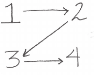
Position on page 125
rst, which makes this precious real estate. Think about putting the
most important thing here (see Figure 4.17).
If something is important, try not to make your audience wade
through other stuff to get to it. Eliminate this work by putting the
important thing at the top. On a slide, these may be words (the main
takeaway or call to action). In a data visualization, think about which
data you want your audience to see rst and whether rearranging the
visual accordingly makes sense (it won’t always, but this is one tool
you have at your disposal for signaling importance to your audience).
Aim to work within the way your audience takes in information, not
against it. Here is an example of asking the audience to work against
the way that comes naturally to them: I was once shown a process
ow diagram that started at the bottom right and you were meant to
read it upwards and to the left. This felt really uncomfortable (feel-
ings of discomfort are something we should aim to avoid in our audi-
ence!). All I wanted to do was read it from the top left to the bottom
right, irrespective of the other visual cues that were present to try to
encourage me to do the opposite. Another example I sometimes
see in data visualization is something plotted on a scale ranging from
negative to positive where the positive values are on the left (which
is more typically associated with negative) and the negative values
are on the right (which is more naturally associated with positive).
Again, in this example, the information is organized in a way that is
counter to the way the audience wants to take in the information,
rendering the visual challenging to decipher. We’ll look at a specic
example related to this in case study 3 in Chapter 9.
FIGURE4.17 The zigzag “z” of taking in information on a screen or page
126 focus your audience’s attention
Be mindful of how you position elements on a page and aim to do
so in a way that will feel natural for your audience to consume.
In closing
Preattentive attributes are powerful tools when used sparingly and
strategically in visual communication. Without other cues, our audi-
ence is left to process all of the information we put in front of them.
Ease this by leveraging preattentive attributes like size, color, and
position on page to signal what’s important. Use these strategic attri-
butes to draw attention to where you want your audience to look
and create visual hierarchy that helps guide your audience through
the visual in the way you want. Evaluate the effectiveness of preat-
tentive attributes in your visual by applying the “where are your eyes
drawn?” test.
With that, consider your fourth lesson learned. You now know how to
focus your audience’s attention where you want them to pay it.
127
chapter ve
think like a designer
Form follows function. This adage of product design has clear appli-
cation to communicating with data. When it comes to the form and
function of our data visualizations, we rst want to think about what
it is we want our audience to be able to do with the data (function)
and then create a visualization (form) that will allow for this with
ease. In this chapter, we will discuss how traditional design concepts
can be applied to communicating with data. We will explore affor-
dances, accessibility, and aesthetics, drawing on a number of con-
cepts introduced previously, but looking at them through a slightly
different lens. We will also discuss strategies for gaining audience
acceptance of your visual designs.
Designers know the fundamentals of good design but also how to
trust their eye. You may think to yourself, But I’m not a designer!
Stop thinking this way. You can recognize smart design. By becoming
familiar with some common aspects and examples of great design,
we will instill condence in your visual instincts and learn some con-
crete tips to follow and adjustments to make when things don’t feel
quite right.

128 think like a designer
Affordances
In the eld of design, experts speak of objects having “affordances.”
These are aspects inherent to the design that make it obvious how
the product is to be used. For example, a knob affords turning, a
button affords pushing, and a cord affords pulling. These character-
istics suggest how the object is to be interacted with or operated.
When sufcient affordances are present, good design fades into the
background and you don’t even notice it.
For an example of affordances in action, let’s look to the OXO brand.
On their website, they articulate their distinguishing feature as “Uni-
versal Design”—a philosophy of making products that are easy to
use for the widest possible spectrum of users. Of particular relevance
to our conversation here are their kitchen gadgets (which were once
marketed as “tools you hold on to”). The gadgets are designed in
such a way that there is really only one way to pick them up—the
correct way. In this way, OXO kitchen gadgets afford correct use,
without most users recognizing that this is due to thoughtful design
(Figure 5.1).
FIGURE5.1 OXO kitchen gadgets

Affordances 129
Let’s consider how we can translate the concept of affordances to
communicating with data. We can leverage visual affordances to
indicate to our audience how to use and interact with our visualiza-
tions. We’ll discuss three specic lessons to this end: (1) highlight
the important stuff, (2) eliminate distractions, and (3) create a clear
hierarchy of information.
Highlight the important stuff
We’ve previously demonstrated the use of preattentive attributes to
draw our audience’s attention to where we want them to focus: in
other words, to highlight the important stuff. Let’s continue to explore
this strategy. Critical here is to only highlight a fraction of the overall
visual, since highlighting effects are diluted as the percentage that
are highlighted increases. In Universal Principles of Design (Lidwell,
Holden, and Butler, 2003), it is recommended that at most 10% of
the visual design be highlighted. They offer the following guidelines:
• Bold, italics, and underlining: Use for titles, labels, captions, and
short word sequences to differentiate elements. Bolding is gener-
ally preferred over italics and underlining because it adds minimal
noise to the design while clearly highlighting chosen elements.
Italics add minimal noise, but also don’t stand out as much and
are less legible. Underlining adds noise and compromises legibil-
ity, so should be used sparingly (if at all).
• CASE and typeface: Uppercase text in short word sequences is
easily scanned, which can work well when applied to titles, labels,
and keywords. Avoid using different fonts as a highlighting tech-
nique, as it’s difcult to attain a noticeable difference without dis-
rupting aesthetics.
• Color is an effective highlighting technique when used sparingly
and generally in concert with other highlighting techniques (for
example, bold).
• Inversing elements is effective at attracting attention, but can add
considerable noise to a design so should be used sparingly.
• Size is another way to attract attention and signal importance.
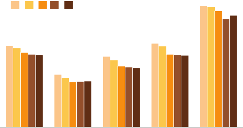
130 think like a designer
I’ve omitted “blinking or ashing” from the list above, which Lidwell
et al. include with instructions to use only to indicate highly critical
information that requires immediate response. I do not recommend
using blinking or ashing when communicating with data for explan-
atory purposes (it tends to be more annoying than helpful).
Note that preattentive attributes can be layered, so if you have some-
thing really important, you can signal this and draw attention by mak-
ing it large, colored, and bold.
Let’s look at a specic example using highlighting effectively in
data visualization. A graph similar to Figure 5.2 was included in a
February 2014 Pew Research Center article titled “New Census
Data Show More Americans Are Tying the Knot, but Mostly It’s the
College‐Educated.”
FIGURE5.2 Pew Research Center original graph
New Marriage Rate by Education
Number of newly married adults per 1,000 marriage eligible adults
Source: U.S. Census
Adapted from PEW RESEARCH CENTER
Note: Marriage eligible includes the newly married plus those widowed, divorced,
or never married at interview.
41.4
26.8
35.9
42.5
61.5
36.7
23.4
30.1
36.5
56.7
Less thanAll
high
school
High
school
graduate
Some
college
Bachelor's
degree or
more
'11 '12'08 '09 '10

Affordances 131
Based on the article that accompanied it, Figure 5.2 is meant to
demonstrate that the 2011 to 2012 increase observed in total new
marriages was driven primarily by an increase in those having a bach-
elor’s degree or more (there doesn’t actually appear to be an increase
based on the “All” trend shown, but let’s ignore this). The design of
Figure 5.2 does little to draw this clearly to our attention, however.
Rather, my attention is drawn to the 2012 bars within the various
groups because they are rendered in a darker color than the rest.
Changing the use of color in this visual can completely redirect our
focus. See Figure 5.3.
In Figure 5.3, the color orange has been used to highlight the data
points for those having a bachelor’s degree or more. By making
FIGURE5.3 Highlight the important stuff
New Marriage Rate by Education
Number of newly married adults per 1,000 marriage eligible adults
Source: U.S. Census
Adapted from PEW RESEARCH CENTER
Note: Marriage eligible includes the newly married plus those widowed, divorced,
or never married at interview.
41.4
26.8
35.9
42.5
61.5
36.7
23.4
30.1
36.5
56.7
Less thanAll
high
school
High
school
graduate
Some
college
Bachelor's
degree or
more
2008...2012
132 think like a designer
everything else grey, the highlighting provides a clear signal of where
we should focus our attention. We’ll come back to this example
momentarily.
Eliminate distractions
While we highlight the important pieces, we also want to eliminate
distractions. In his book Airman’s Odyssey, Antoine de Saint‐Exupery
famously said, “You know you’ve achieved perfection, not when you
have nothing more to add, but when you have nothing to take away”
(Saint‐Exupery, 1943). When it comes to the perfection of design with
data visualization, the decision of what to cut or de‐emphasize can
be even more important than what to include or highlight.
To identify distractions, think about both clutter and context. We’ve
discussed clutter previously: these are elements that take up space
but don’t add information to our visuals. Context is what needs to
be present for your audience in order for what you want to com-
municate to make sense. When it comes to context, use the right
amount—not too much, not too little. Consider broadly what infor-
mation is critical and what is not. Identify unnecessary, extraneous, or
irrelevant items or information. Determine whether there are things
that might be distracting from your main message or point. All of
these are candidates for elimination.
Here are some specic considerations to help you identify poten-
tial distractions:
• Not all data are equally important. Use your space and audience’s
attention wisely by getting rid of noncritical data or components.
• When detail isn’t needed, summarize. You should be familiar
with the detail, but that doesn’t mean your audience needs to be.
Consider whether summarizing is appropriate.
• Ask yourself: would eliminating this change anything? No? Take
it out! Resist the temptation to keep things because they are cute
or because you worked hard to create them; if they don’t support
the message, they don’t serve the purpose of communication.

Affordances 133
• Push necessary, but nonmessageimpacting items to the back-
ground. Use your knowledge of preattentive attributes to de‐
emphasize. Light grey works well for this.
Each step in reduction and de‐emphasis causes what remains to
stand out more. In cases where you are unsure whether you’ll need
the detail that you’re considering cutting, think about whether there
is a way to include it without diluting your main message. For exam-
ple, in a slide presentation, you can push content to the appendix
so it’s there if you need it but won’t distract from your main point.
Let’s look back at the Pew Research example discussed previously.
In Figure 5.3, we used color sparingly to highlight the important part
of our visual. We can further improve this graph by eliminating dis-
tractions, as illustrated in Figure 5.4.
FIGURE5.4 Eliminate distractions
Source: U.S. Census
Adapted from PEW RESEARCH CENTER
Note: Marriage eligible includes the newly married plus those widowed, divorced,
or never married at interview.
New marriage rate by education
Number of newly married adults per 1,000 marriage eligible adults
27 23
36
30
43
37
62
57
20122011201020092008
Bachelor's degree or more
Some college
High school grad
Less than high school
134 think like a designer
In Figure 5.4, a number of changes were made to eliminate distrac-
tions. The biggest shift was from a bar graph to a line graph. As
we’ve discussed, line graphs typically make it easier to see trends
over time. This shift also has the effect of visually reducing discrete
elements, because the data that was previously ve bars has been
reduced to a single line with the end points highlighted. When we
consider the full data being plotted, we’ve gone from 25 bars to 4
lines. The organization of the data as a line graph allows the use of a
single x‐axis that can be leveraged across all of the categories. This
simplies the processing of the information (rather than seeing the
years in a legend at the left and then having to translate across the
various groups of bars).
The “All” category included in the original graph was removed alto-
gether. This was the aggregate of all of the other categories, so
showing it separately was redundant without adding value. This
won’t always be the case, but here it didn’t add anything interest-
ing to the story.
The decimal points in the data labels were eliminated by rounding to
the nearest whole digit. The data being plotted is “Number of newly
married adults per 1,000,” and I nd it strange to discuss the number
of adults using decimal places (fractions of a person!). Additionally,
the sheer size of the numbers and visible differences between them
mean that we don’t need the level of precision or granularity that
decimal points provide. It is important to take context into account
when making decisions like this.
The italics in the subtitle were changed to regular font. There was
no reason to draw attention to these words. In the original, I found
that the spatial separation between the title and subtitle also caused
undue attention to be placed on the subtitle, so I removed the spac-
ing in the makeover.
Finally, the highlighting of the “Bachelor’s degree or more” category
introduced in Figure 5.3 was preserved and extended to include
the category name in addition to the data labels. As we’ve seen
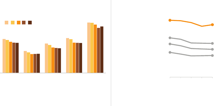
Affordances 135
previously, this is a way to tie components together visually for our
audience, easing the interpretation.
Figure 5.5 shows the before‐and‐after.
By highlighting the important stuff and eliminating distractions, we’ve
markedly improved this visual.
Create a clear visual hierarchy of information
As we discussed in Chapter 4, the same preattentive attributes we
use to highlight the important stuff can be leveraged to create a
hierarchy of information. We can visually pull some items to the fore-
front and push other elements to the background, indicating to our
audience the general order in which they should process the infor-
mation we are communicating.
FIGURE5.5 Before‐and‐after
New marriage rate by educationNew Marriage Rate by Education
Number of newly married adults per 1,000 marriage eligible adults
Number of newly married adults per 1,000 marriage eligible adults
Source: U.S. CensusSource: U.S. Census
Adapted from PEW RESEARCH CENTER Adapted from PEW RESEARCH CENTER
Note: Marriage eligible includes the newly married plus those widowed, divorced,
or never married at interview.
Note: Marriage eligible includes the newly married plus those widowed, divorced,
or never married at interview.
41.4
26.8
35.9
42.5
61.5
36.7
23.4
30.1
36.5
56.7
Less thanAll
high
school
High
school
graduate
Some
college
Bachelor's
degree or
more
'11 '12'08 '09 '10
27 23
36
30
43
37
62
57
20122011201020092008
Bachelor's degree or more
Some college
High school grad
Less than high school

136 think like a designer
The power of supercategories
In tables and graphs, it can sometimes be useful to lever-
age super‐categories to organize the data and help provide
a construct for your audience to use to interpret it. For exam-
ple, if you’re looking at a table or graph that shows a value
for 20 different demographic breakdowns, it can be useful to
organize and clearly label the demographic breakdowns into
groups or super‐categories like age, race, income level, and
education. These super‐categories provide a hierarchical orga-
nization that simplies the process of taking in the information.
Let’s look at an example where a clear visual hierarchy has been estab-
lished and discuss the specic design choices that were made to cre-
ate it. Imagine you are a car manufacturer. Two important dimensions
by which you judge the success of a particular make and model are
(1) customer satisfaction and (2) frequency of car issues. A scatter-
plot could be useful to visualize how the current year’s models com-
pare with the previous year’s average along these two dimensions,
as shown in Figure 5.6.
FIGURE5.6 Clear visual hierarchy of information
Issues vs. Satisfaction by Model
Satisfaction
Things Gone HIGHLOW
Wrong
FEW
MANY
0
200
400
600
800
1,000
1,200
1,400
90%85%80%75%70%65%60%
Number of Issues per 1,000
% satisfied or highly satisfied
Prior Year Avg.
(all models)
High Satisfaction,
Few Issues
High Satisfaction,
Many Issues
Model A
Model G
Model E
Model B
Model D
Model F
Model C
Affordances 137
Figure 5.6 lets us quickly see how this year’s various models compare
to last year’s average on the basis of both satisfaction and issues. The
size and color of font and data points alert us where to pay atten-
tion and in what general order. Let’s consider the visual hierarchy
of components and how they help us process the information pre-
sented. If I articulate the order in which I take in the information, it
looks something like the following:
First, I read the graph title: “Issues vs. Satisfaction by Model.”
The bolding of Issues and Satisfaction signals that those words
are important, so I have that context in mind as I process the rest
of the visual.
Next, I see the y‐axis primary label: “Things Gone Wrong.” I note
that these fall along a scale from few (at the top) to many (at the
bottom). After that, I note the details across the horizontal x‐axis:
Satisfaction, ranging from low (left) to high (right).
I am then drawn to the dark grey point and corresponding words
“Prior Year Average.” The lines drawing this point to the axes allow
me quickly to see that the prior year’s average was around 900
issues per 1,000 and 72% satised or highly satised. This provides
a useful construct for interpreting this year’s models.
Finally, I am drawn to all of the red in the bottom right quadrant.
The words tell me satisfaction is high, but there are many issues.
It’s clear because of how the visual is constructed that these are
cases where the level of issues is greater than it was for last year’s
average. The red color reinforces that this is a problem.
We previously discussed super‐categories for easing interpretation.
Here, the quadrant labels “High Satisfaction, Few Issues” and “High
Satisfaction, Many Issues” function in this manner. In absence of
these, I could spend time processing the axis titles and labels and
eventually gure out that’s what these quadrants represent, but it’s
a much easier process when the pithy titles are present, eliminating
the need for this processing altogether. Note that the left quadrants
aren’t labeled; labels are unnecessary since no values fall there.
138 think like a designer
Additional data points and details are there for context, but they
are pushed to the background to reduce the cognitive burden and
simplify the visual.
Upon sharing this visual with my husband, his reaction was “that’s
not the order I paid attention—I went straight to the red.” That got
me to thinking. First, I was surprised he started there, given that he’s
red‐green colorblind, but he said that the red was different enough
from everything else in the visual that it still grabbed his attention.
Second, I look at so many graphs that it’s ingrained in me to start
with the details: the titles and axis titles to understand what I’m look-
ing at before I get to the data. Others may look more quickly for the
“so what.” If we approach that way, we’re drawn rst to the bottom
right quadrant since the red signals importance and that attention
should be paid. After taking that in, perhaps we back up and read
some of the other detail of the graph.
In either case, the thoughtful and clear visual hierarchy establishes
order for the audience to use to process the information in a com-
plex visual without it feeling, well, complicated. For our audience, by
highlighting the important stuff, eliminating distractions, and estab-
lishing a visual hierarchy, the data visualizations we create afford
understanding.
Accessibility
The concept of accessibility says that designs should be usable by
people of diverse abilities. Originally, this consideration was for those
with disabilities, but over time the concept has grown more general,
which is the way in which I’ll discuss it here. Applied to data visual-
ization, I think of it as design that is usable by people of widely vary-
ing technical skills. You might be an engineer, but it shouldn’t take
someone with an engineering degree to understand your graph.
As the designer, the onus is on you to make your graph accessible.

Accessibility 139
For an example of accessibility in design, let’s consider the iconic
London underground tube map. Harry Beck produced a beautifully
simple design in 1933, recognizing that the above‐ground geog-
raphy is unimportant when navigating the lines and removing the
constraints it imposed. Compared to previous tube maps, Beck’s
accessible design rendered an easy‐to‐follow visual that became an
essential guide to London and a template for transport maps around
the world. It is that same map, with some minor modications, that
still serves London today.
We’ll discuss two specic strategies related to accessibility in commu-
nicating with data: (1) don’t overcomplicate and (2) text is your friend.
Don’t overcomplicate
“If it’s hard to read, it’s hard to do.” This was the nding of research
undertaken by Song and Schwarz at the University of Michigan in
2008. First, they presented two groups of students with instructions
for an exercise regimen. Half the students received the instructions
written in easy‐to‐read Arial font; the other half were given instruc-
tions in a cursive‐like font called Brushstroke. Students were asked
how long the exercise routine would take and how likely they were
Poor design: who is at fault?
Well‐designed data visualization—like a well‐designed
object—is easy to interpret and understand. When
people have trouble understanding something, such as
interpreting a graph, they tend to blame themselves. In most
cases, however, this lack of understanding is not the user’s
fault; rather, it points to fault in the design. Good design
takes planning and thought. Above all else, good design
takes into account the needs of the user. This is another
reminder to keep your user—your audience—top‐of‐mind
when designing your communications with data.
140 think like a designer
to try it. The nding: the fussier the font, the more difcult the stu-
dents judged the routine and the less likely they were to undertake
it. A second study using a sushi recipe had similar ndings.
Translation for data visualization: the more complicated it looks, the
more time your audience perceives it will take to understand and the
less likely they are to spend time to understand it.
As we’ve discussed, visual affordances can help in this area. Here
are some additional tips to keep your visuals and communications
from appearing overly complicated:
• Make it legible: use a consistent, easy‐to‐read font (consider both
typeface and size).
• Keep it clean: make your data visualization approachable by lever-
aging visual affordances.
• Use straightforward language: choose simple language over
complex, choose fewer words over more words, dene any spe-
cialized language with which your audience may not be familiar,
and spell out acronyms (at minimum, the rst time you use them
or in a footnote).
• Remove unnecessary complexity: when making a choice between
simple and complicated, favor simple.
This is not about oversimplifying, but rather not making things more
complicated than they need to be. I once sat through a presentation
given by a well‐respected PhD. The guy was obviously smart. When
he said his rst ve‐syllable word, I found myself impressed with his
vocabulary. But as his academic language continued, I started to
lose patience. His explanations were unnecessarily complicated. His
words were unnecessarily long. It took a lot of energy to pay attention.
I found it hard to listen to what he was saying as my annoyance grew.
Beyond annoying our audience by trying to sound smart, we run the
risk of making our audience feel dumb. In either case, this is not a
good user experience for our audience. Avoid this. If you nd it hard

Accessibility 141
to determine whether you are overcomplicating things, seek input
or feedback from a friend or colleague.
Text is your friend
Thoughtful use of text helps ensure that your data visualization is
accessible. Text plays a number of roles in communicating with data:
use it to label, introduce, explain, reinforce, highlight, recommend,
and tell a story.
There are a few types of text that absolutely must be present. Assume
that every chart needs a title and every axis needs a title (exceptions
to this rule will be extremely rare). The absence of these titles—no
matter how clear you think it may be from context—causes your audi-
ence to stop and question what they are looking at. Instead, label
explicitly so they can use their brainpower to understand the informa-
tion, rather than spend it trying to gure out how to read the visual.
Don’t assume that two different people looking at the same data
visualization will draw the same conclusion. If there is a conclusion
you want your audience to reach, state it in words. Leverage preat-
tentive attributes to make those important words stand out.
Action titles on slides
The title bar at the top of your PowerPoint slide is precious
real estate: use it wisely! This is the rst thing your audi-
ence encounters on the page or screen and yet so often it
gets used for redundant descriptive titles (for example,
“2015 Budget”). Instead use this space for an action title. If
you have a recommendation or something you want your
audience to know or do, put it here (for example, “Estimated
2015 spending is above budget”). It means your audience
won’t miss it and also works to set expectations for what will
follow on the rest of the page or screen.
142 think like a designer
When it comes to words in data visualization, it can sometimes be
useful to annotate important or interesting points directly on a graph.
You can use annotation to explain nuances in the data, highlight
something to pay attention to, or describe relevant external factors.
One of my favorite examples of annotation in data visualization is
Figure 5.7 by David McCandless, “Peak Break‐up Times According
to Facebook Status Updates.”
As we follow the annotations from left to right in Figure 5.7, we see
a small increase on Valentine’s Day, then large peaks in the weeks of
Spring Break (cleverly subtitled “Spring clean?”). There’s a spike on
April Fool’s Day. The trend of break-ups on Mondays is highlighted.
A gentle rise and fall in break-ups is observed over summer holiday.
Then we see a massive increase leading up to the holidays, but a
sharp drop‐off at Christmas, because clearly breaking up with some-
one then would simply be “Too Cruel.”
Note how a few choice words and phrases make this data so much
more quickly accessible than it otherwise would be.
FIGURE5.7 Words used wisely
Accessibility 143
As a side note, in Figure 5.7, the guidance I previously put forth
about always titling the axes has not been followed. In this case,
this is by design. Of more interest than the specic metric being
plotted are the relative peaks and valleys. By not labeling the vertical
axis (with either title or labels), you simply can’t get caught up in a
debate about it (What is being plotted? How is it being calculated?
Do I agree with it?). This was a conscious design choice and won’t
be appropriate in most situations but, as we see in this case,
can—in rare instances—work well.
In the context of accessibility via text, let’s revisit the ticket example
we examined in Chapters 3 and 4. Figure 5.8 shows where we left
off after eliminating clutter and drawing attention to where we want
our audience to focus via data markers and labels.
Figure 5.8 is a pretty picture, but it doesn’t mean much without words
to help us make sense of it. Figure 5.9 resolves this issue, adding
the requisite text.
FIGURE5.8 Let’s revisit the ticket example
Received
Processed
202
160
139 149
177
156
126
104
124
140
0
50
100
150
200
250
300
DecNovOctSepAugJulJunMayAprMarFebJan
144 think like a designer
In Figure 5.9, we’ve added the words that have to be there: graph
title, axis titles, and a footnote with the data source. In Figure 5.10,
we take it a step further by adding a call to action and annotation.
FIGURE5.9 Use words to make the graph accessible
Ticket volume over time
Data source: XYZ Dashboard, as of 12/31/2014
Received
Processed
202
160
139 149
177
156
126
104
124 140
0
50
100
150
200
250
300
DecNovOctSepAugJulJunMayAprMarFebJan
Number of tickets
2014
FIGURE5.10 Add action title and annotation
Please approve the hire of 2 FTEs
to backfill those who quit in the past year
Ticket volume over time
Data source: XYZ Dashboard, as of 12/31/2014 | A detailed analysis on tickets processed per person
and time to resolve issues was undertaken to inform this request and can be provided if needed.
Received
Processed
202
160
139 149
177
156
126
104
124 140
0
50
100
150
200
250
300
DecNovOctSepAugJulJunMayAprMarFebJan
Number of tickets
2014
2 employees quit in May. We nearly kept up with incoming
volume in the following two months, but fell behind with the
increase in Aug and haven't been able to catch up since.

Aesthetics 145
FIGURE5.11 Method liquid dishwashing soap
In Figure 5.10, thoughtful use of text makes the design accessible.
It’s clear to the audience what they are looking at as well as what
they should pay attention to and why.
Aesthetics
When it comes to communicating with data, is it really necessary to
“make it pretty?” The answer is a resounding Yes. People perceive
more aesthetic designs as easier to use than less aesthetic designs—
whether they actually are or not. Studies have shown that more aes-
thetic designs are not only perceived as easier to use, but also more
readily accepted and used over time, promote creative thinking and
problem solving, and foster positive relationships, making people
more tolerant of problems with designs.
A great example of the tolerance with problems that good aesthet-
ics can foster is a former bottle design of Method liquid dishwashing
soap, pictured in Figure 5.11. The anthropomorphic form rendered
the soap an art piece—something to be displayed, not hidden away
under the counter. This bottle design was wildly effective in spite of
leakage issues. People were willing to overlook the inconvenience
of the leaking bottle due to its appealing aesthetics.
146 think like a designer
In data visualization—and communicating with data in general—
spending time to make our designs aesthetically pleasing can mean
our audience will have more patience with our visuals, increasing our
chance of success for getting our message across.
If you aren’t condent in your ability to create aesthetic design, look
for examples of effective data visualization to follow. When you see a
graph that looks nice, pause to consider what you like about it. Per-
haps save it and build a collection of inspiring visuals. Mimic aspects
from effective designs to create your own.
More specically, let’s discuss a few things to consider when it comes
to aesthetic designs of data visualization. We’ve previously covered
the main lessons relevant to aesthetics, so I’ll touch on them here only
briey and then we’ll discuss a specic example to see how being
mindful of aesthetics can improve our data visualization.
1. Be smart with color. The use of color should always be an inten-
tional decision; use color sparingly and strategically to highlight
the important parts of your visual.
2. Pay attention to alignment. Organize elements on the page
to create clean vertical and horizontal lines to establish a sense
of unity and cohesion.
3. Leverage white space. Preserve margins; don’t stretch your
graphics to ll the space, or add things simply because you have
extra space.
Thoughtful use of color, alignment, and white space are components
of the design that you don’t even notice when they are done well.
But you notice when they aren’t: rainbow colors, and lacking align-
ment and white space, make for a visual that’s simply uncomfortable
to look at. It feels disorganized and like no attention was paid to
detail. This shows a lack of respect for your data and your audience.
Let’s look at an example: see Figure 5.12. Imagine you work for a
prominent U.S. retailer. The graph depicts the breakdown of the
U.S. Population and Our Customers by seven customer segments
(for example, age ranges).
Aesthetics 147
We can leverage the lessons covered to make smarter design choices.
Specically, let’s discuss how we can improve Figure 5.12 when it
comes to the use of color, alignment, and white space.
Color is overused. There are too many colors, and they compete for
our attention, making it difcult to focus on one at a time. Going
back to the lesson on affordances, we should think about what
we want to highlight to our audience and only use color there. In
this case, the red box around segments 3 through 5 on the right
signals that those segments are important, but there are so many
things competing for our attention that it takes some time to even
see that. We can make this a more obvious and easier process by
using color strategically.
Elements are not properly aligned. The center alignment of the graph
title makes it so it isn’t aligned with anything else in the visual. The
segment titles at the left aren’t aligned to create a clean line either
on the left or right. This looks sloppy.
FIGURE5.12 Unaesthetic design
Distribution by customer segment
16% 9%
7%
10%
10% 15%
10% 18%
10%
17%
32%
20%
15% 11%
Our CustomersUS Population
Segment 7
Segment 6
Segment 5
Segment 4
Segment 3
Segment 2
Segment 1
50%
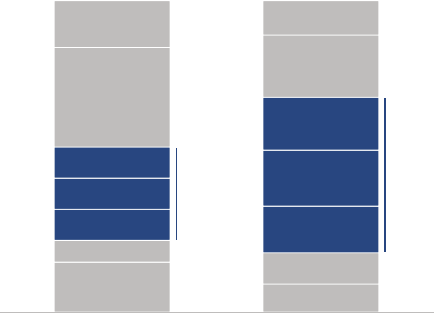
148 think like a designer
Finally, white space is misused. There is too much of it between the
segment titles and data, which makes it challenging to draw your eye
from the segment title to the data (I have an urge to use my index
nger to trace across: we can reduce white space between the titles
and data, so this work is unnecessary). The white space between the
columns of data is too narrow to optimally emphasize the data and
cluttered with unneeded dotted lines.
Figure 5.13 shows how the same information could look if we rem-
edy these design issues.
FIGURE5.13 Aesthetic design
Distribution by customer segment
16% 9%
7%
10%
10% 15%
10%
18%
10%
17%
32%
20%
15% 11%
Our CustomersUS Population
Segment 7
Segment 6
Segment 5
Segment 4
Segment 3
Segment 2
Segment 1
30% 50%
Aren’t you more likely to spend a little more time with Figure 5.13?
It is clear that attention to detail was paid to the design: it took the
designer time to get this result. This creates a sort of onus on the
part of the audience to spend time to understand it (this sort of con-
tract doesn’t exist with poor design). Being smart with color, aligning
objects, and leveraging white space brings a sense of visual organi-
zation to your design. This attention to aesthetics shows a general
respect for your work and your audience.
Acceptance 149
Acceptance
For a design to be effective, it must be accepted by its intended
audience. This adage is true whether the design in question is that
of a physical object or a data visualization. But what should you do
when your audience isn’t accepting of your design?
In my workshops, audience members regularly raise this dilemma:
I want to improve the way we look at things, but when I’ve tried to
make changes in the past, my efforts have been met with resistance.
People are used to seeing things a certain way and don’t want us
to mess with that.
It is a fact of human nature that most people experience some level
of discomfort with change. Lidwell et al. in Universal Principles of
Design (2010) describe this tendency of general audiences to resist
the new because of their familiarity with the old. Because of this,
making signicant changes to “the way we’ve always done it” may
require more work to gain acceptance than simply replacing the old
with the new.
There are a few strategies you can leverage for gaining acceptance
in the design of your data visualization:
• Articulate the benets of the new or different approach. Some-
times simply giving people transparency into why things will look
different going forward can help them feel more comfortable. Are
there new or improved observations you can make by looking at
the data in a different way? Or other benets you can articulate to
help convince your audience to be open to the change?
• Show the sidebyside. If the new approach is clearly superior to
the old, showing them side‐by‐side will demonstrate this. Couple
this with the prior approach by showing the before‐and‐after and
explaining why you want to shift the way you’re looking at things.
• Provide multiple options and seek input. Rather than prescribing
the design, consider creating several options and getting feedback
150 think like a designer
from colleagues or your audience (if appropriate) to determine
which design will best meet the given needs.
• Get a vocal member of your audience on board. Identify inu-
ential members of your audience and talk to them one‐on‐one in
an effort to gain acceptance of your design. Ask for their feedback
and incorporate it. If you can get one or a couple of vocal mem-
bers of your audience bought in, others may follow.
One thing to consider if you nd yourself met with resistance is whether
the root problem is that your audience is slow to change or if there
might be issues with the design you are proposing. Test this by get-
ting input from someone who doesn’t have a vested interest. Show
them your data visualization. If appropriate, also show the historical
or current visuals. Have them talk you through their thought process
as they review the visual. What do they like? What questions do they
have? Which visual do they prefer and why? Hearing these things from
a nonbiased third party may help you uncover issues with your design
that are leading to the adoption challenge you face with your audi-
ence. The conversation may also help you articulate talking points
that will help you drive the acceptance you seek from your audience.
In closing
By understanding and employing some traditional design concepts,
we set ourselves up for success in communicating with data. Offer
your audience visual affordances as cues for how to interact with
your communication: highlight the important stuff, eliminate distrac-
tions, and create a visual hierarchy of information. Make your designs
accessible by not overcomplicating and by leveraging text to label
and explain. Increase your audience’s tolerance of design issues by
making your visuals aesthetically pleasing. Employ the strategies
discussed for gaining audience acceptance for your visual designs.
Congratulations! You now know the 5th lesson in storytelling with
data: how to think like a designer.
151
chapter six
dissecting model
visuals
Up to this point, we’ve covered a number of lessons you can employ
to improve your ability to communicate with data. Now that you
understand the basics of what makes a visual effective, let’s consider
some additional examples of what “good” data visualization looks
like. Before covering our nal lesson, in this chapter we will look at
several model visuals and discuss the thought process and design
choices that led to their creation, utilizing the lessons we’ve covered.
You’ll notice some similar considerations being made across the vari-
ous examples. When creating each example, I thought about how I
want the audience to process the information and made correspond-
ing choices regarding what to emphasize and draw the audience’s
attention to as well as what to de‐emphasize. Because of this, you
will see common points raised around color and size. The choice of
visual, relative ordering of data, alignment and positioning of ele-
ments, and use of words are also discussed in a number of cases.
152 dissecting model visuals
This repetition is useful to reinforce the concepts I’m thinking about
and resulting design choices across the various examples.
Each visual highlighted was created to meet the need of a specic
situation. I’ll discuss the relevant scenarios briey, but don’t worry
too much about the details. Rather, spend time looking at and think-
ing about each model visual. Consider what data visualization chal-
lenges you face where the given approach (or aspects of the given
approach) could be leveraged.
Model visual #1: line graph
Company X runs an annual month‐long “giving campaign” to raise
money for charitable causes. Figure 6.1 shows this year’s progress to
date. Let’s consider what makes this example good and the deliber-
ate choices made in the course of its creation.
FIGURE6.1 Line graph
Annual giving campaign progress
$51,400
$33,967
$0
$10,000
$20,000
$30,000
$40,000
$50,000
$60,000
302520151050
Money raised
Days since campaign launch
Progress to date
Last year
GOAL
Model visual #1: line graph 153
Words are used appropriately. Everything is titled and labeled, so
there’s no question about what we are looking at. Graph title, vertical
axis title, and horizontal axis title are present. The various lines in the
graph are labeled directly, so there’s no work going back and forth
between a legend and the data to decipher what is being graphed.
Good use of text makes this visual accessible.
If we apply the “where are your eyes drawn?” test described in Chap-
ter 4, I briey scan the graph title, then I’m drawn to the “Progress to
date” trend (where we want the audience to focus). I almost always
use dark grey for the graph title. This ensures that it stands out, but
without the sharp contrast you get from pure black on white (rather,
I preserve the use of black for a standout color when I’m not using
any other colors). A number of preattentive attributes are employed
to draw attention to the “Progress to date” trend: color, thickness of
line, presence of data marker and label on the nal point, and the
size of the corresponding text.
When it comes to the broader context, a couple of points for compar-
ison are included but de‐emphasized so the graph doesn’t become
visually overwhelming. The goal of $50,000 is drawn on the graph for
reference, but is pushed to the background by use of a thin line; both
the line and text are the same grey as the rest of the graph details. Last
year’s giving over time is included but also de‐emphasized through the
use of a thinner line and lighter blue (to tie it visually with this year’s
progress, but without competing for attention).
A couple of deliberate decisions were made regarding axis labels.
On the vertical y‐axis, you could consider rounding the numbers to
thousands—so the axis would range from $0 to $60 and the axis title
would be changed to “Money raised (thousands of dollars).” If the
numbers were on the scale of millions, I probably would have done
this. For me, however, thinking about numbers in the thousands isn’t
as intuitive, so rather than mess with the scale here, I preserved the
zeros in the y‐axis labels.
On the horizontal x‐axis, we don’t need every single day labeled since
we’re more interested in the overall trend, not what happened on a

154 dissecting model visuals
specic day. Because we have data through the 10th day of a 30‐day
month, I chose to label every 5th day on the x‐axis (given that this is
days we’re talking about, another potential solution would be to label
every 7th day and/or add super‐categories of week 1, week 2, etc.).
This is one of those cases where there isn’t a single right answer: you
should think about the context, the data, and how you want your
audience to use the visual and make a deliberate decision in light
of those things.
Model visual #2: annotated line graph with
forecast
FIGURE6.2 Annotated line graph with forecast
Sales over time
Data source: Sales Dashboard; annual figures are as of 12/31 of the given year.
*Use this footnote to explain what is driving the 10% annual growth forecast assumption.
$108
$119
$131
$144
$158
$0
$20
$40
$60
$80
$100
$120
$140
$160
$180
2012201120102009200820072006 201820172016201520142013
FORECASTACTUAL
Sales ($BIllion)
2006−09:
annual sales
growth of
7−8%
2010: more
marked
increase of
22% sales
year over
year, driven
by a, b, and c
2011−14:
another period
of steady growth
of 8−9% annually
2015 & beyond: assumed
year 10% year over
increase in sales*
Model visual #2: annotated line graph with forecast 155
Figure 6.2 shows an annotated line graph of actual and forecast
annual sales.
I often see forecast and actual data plotted together as a single line,
without any distinguishing aspects to set the forecast numbers apart
from the rest. This is a mistake. We can leverage visual cues to draw
a distinction between the actual and forecast data, easing the inter-
pretation of the information. In Figure 6.2, the solid line represents
actual data and a thinner dotted line (which carries some connotation
of less certainty than a solid, bold line) represents the forecast data.
Clear labeling of Actual and Forecast under the x‐axis helps rein-
force this (written in all caps for easy scanning), with the forecast por-
tion set apart visually ever so slightly via light background shading.
In this visual, everything has been pushed to the background through
the use of grey font and elements except the graph title, dates within
the text boxes, data (line), select data markers, and numeric data
labels from 2014 forward. When we consider the visual hierarchy of
elements, my eye goes rst to the graph title at the top left (due to
both position and the preattentive larger dark grey text discussed in
the prior example), then to the blue dates in the text boxes, at which
point I can pause and read for a little context before moving my eye
downward to see the corresponding point or trend in the data. Data
markers are included only for those points referenced in the anno-
tation, making it a quick process to see what part of the data is rel-
evant to which annotation. (Originally, the data markers were solid
blue, but I changed to white with blue outline, which made them
stand out a little more in a way that I liked; the forecast data mark-
ers are smaller and solid blue, because white with blue outline there
looked overly cluttered against the dotted lines.)
The $108 numeric label is bold. This is emphasized intentionally, since
it is the last point of actual data and the anchor for the forecast. His-
torical data points are not labeled. Instead, the y‐axis is preserved
to give a general sense of magnitude, since we want the audience
to focus on relative trends rather than precise values. Numeric data
156 dissecting model visuals
labels are included for the forecast data points to give the audience
a clear understanding of forward‐looking expectations.
All text in the visual is the same size except where intentional deci-
sions were made to change it. The graph title is larger. The footnote
is de‐emphasized via smaller font and a low‐priority placement at
the bottom of the visual so that it is there to aid interpretation as
needed, but doesn’t draw attention.
Model visual #3: 100% stacked bars
The stacked bar chart in Figure 6.3 is an example visual from the
consulting world. Each consulting project has specic goals associ-
ated with it. Progress against those goals is assessed quarterly and
designated as “Miss,” “Meet,” or “Exceed.” The stacked bar chart
shows the percentage of total projects in each of these categories
over time. As with prior examples, don’t worry too much about the
FIGURE6.3 100% stacked bars
Goal attainment over time
Data source: XYZ Dashboard; the total number of projects has increased over time from 230 in early 2013 to nearly 270 in Q3 2015.
12% 15% 20%
33%
42%
0%
10%
20%
30%
40%
50%
60%
70%
80%
90%
100%
Q3Q2Q1Q4Q3Q2Q1Q4Q3Q2Q1
201520142013
% of total projects
ExceedMeetMiss As of Q3 2015, of more than 1/3
projects are missing goals
Model visual #3: 100% stacked bars 157
details here; instead, reect on what can be learned from the design
considerations that went into creating this data visualization.
Let’s rst consider the alignment of objects within this visual. The
graph title, legend, and vertical y‐axis title are all aligned in the
upper‐left‐most position. This means our audience encounters how
to read the graph before they get to the data. On the left‐hand side,
the graph title, legend, y‐axis title, and footnote are all aligned, cre-
ating a clean line on the left side of the visual. On the right‐hand
side, the text at the top is right‐justied and aligned with the nal
bar of data that contains the data point being described (leverag-
ing the Gestalt principle of proximity). This same text box is aligned
vertically with the graph legend.
When it comes to focusing the audience’s attention, red is used as
the single attention‐grabbing color (primary red tends to be too
loud for me, so I often opt instead for a burnt‐red shade as I did
here). Everything else is grey. Numeric data labels were used—an
additional visual cue signaling importance given the stark contrast
of white on red and large text—on the points we want the audience
to focus: the increasing percentage of projects missing goals. The
rest of the data is preserved for context, but pushed to the back-
ground so it doesn’t compete for attention. Slightly different shades
of grey were used so you can still focus on one or the other series
of data at a time, but it doesn’t distract from the clear emphasis on
the red series.
The categories fall along a scale from “Miss” to “Exceed,” and this
ordering is leveraged from bottom to top within the stacked bars.
The “Miss” category is closest to the x‐axis, making change over
time easy to see because of the alignment of the bars at the same
starting point (the x‐axis). Change over time in the “Exceed” cate-
gory is also easy because of the consistent alignment along the top
of the graph. The change over time in the percentage of projects
that meet their goals is harder to see because there is no consistent
baseline at either the top or bottom of the graph, but given that this
is a lower‐priority comparison, this is OK.
158 dissecting model visuals
Words make the visual accessible. The graph has a title, the y‐axis
has a title, and the x‐axis leverages super‐categories (years) to reduce
redundant labeling and make the data more easily scannable. The
words at the top right reinforce what we should be paying attention
to (we will talk about words much more in the context of storytelling
in Chapter 7). The footnote contains a note about the total number
of projects over time, which is helpful context that we don’t get from
the visual directly due to the use of 100% stacked bars.
Model visual #4: leveraging positive and negative
stacked bars
Figure 6.4 shows an example from the people analytics space. It can
be useful to look forward to understand expected needs for senior
FIGURE6.4 Leveraging positive and negative stacked bars
Expected director population over time
A footnote explaining relevant forecast assumptions and methodology would go here.
28 50 68 91 112
-100
-50
0
50
100
150
200
250
Today
9/30/15
FY16 FY17 FY18 FY19 FY20
# of directors
Unmet need (gap)
Directors from acquisitions
Promotions to director
Today's directors
Attrition
Model visual #4: leveraging positive and negative stacked bars 159
talent and identify any gaps so they can be proactively addressed.
In this example, there will be increasing unmet need for directors
given assumptions for expected additions to the director pool over
time through acquisitions and promotions and the decrease to the
pool over time due to attrition (directors leaving the company).
If we consider the path our eyes take with Figure 6.4, mine scan the
title, then go directly to the big, bold, black numbers and follow them
to the right to the text that tells me this represents “Unmet need
(gap).” My eye then goes downward, reading the text and glancing
back leftward to the data each describes, until I hit the nal series,
“Attrition,” at the bottom. At this point, my eyes sort of bounce back
and forth between “Attrition” and “Unmet need (gap)” portions of
the bars, noting that there is some increase in the total number of
directors over time as we look left to right (likely as the overall com-
pany grows and the need for senior leaders increases as a result),
but that the majority of the unmet need is due to attrition of the cur-
rent director pool.
Intentional choices were made when it comes to the use of color
throughout this visual. “Today’s directors” are shown in my stan-
dard medium blue. The exiting directors (“Attrition”) are shown in
a less saturated version of the same color to tie these together visu-
ally. Over time, you see less of the blue falling above the axis and an
increasing proportion falling below the axis as more and more direc-
tors attrite. The negative direction of the “Attrition” series reinforces
that this volume represents a decrease to the director pool. Direc-
tors added through acquisitions and promotions are shown in green
(which carries positive connotation). The unmet need is depicted by
an outline only, to visually show empty space, reinforcing that this
represents a gap. The text labels on the right are each written in the
same color as the given data series they describe, except “Unmet
need (gap),” which is written in the same big, bold, black text as the
data labels for this series.
The ordering of the various data series within the stacked bars is
deliberate. “Today’s directors” is the base, and as such is shown
beginning at the horizontal axis. As I mentioned previously, the
160 dissecting model visuals
negative “Attrition” series falls below that in a negative direction.
Above “Today’s directors” are the additions: promotions and acqui-
sitions. Finally, at the top (where our eye hits sooner than the subse-
quent data), we encounter the “Unmet need (gap).”
The y‐axis is preserved so the reader has a sense of total magnitude
(both in the positive and negative direction), but it is pushed to the
background via grey text. Only those specic points we should pay
attention to—the “Unmet need (gap)”—are labeled directly with
numerical values.
All text in the visual is the same size except where decisions were
made to further emphasize or de‐emphasize components. The graph
title is larger. The axis title “# of directors” is slightly larger to ease
the reading of the rotated text. The “Unmet need (gap)” text and
numbers are bigger and bolder than anything else in the visual, as
this is where we want the reader to pay attention. The footnote is
written in smaller text, so it is there as needed but does not draw
attention. By making it grey and in the lowest‐priority position at the
bottom of the visual, we further de‐emphasize the footnote.
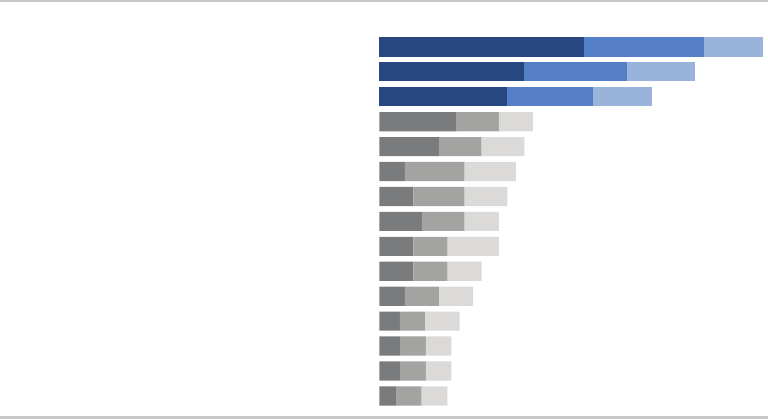
Model visual #5: horizontal stacked bars 161
Model visual #5: horizontal stacked bars
Figure 6.5 shows the results of survey questions on relative priori-
ties in a developing nation. This is a great deal of information, but
due to strategic emphasizing and de‐emphasizing of components,
it does not become visually overwhelming.
Stacked bars make sense here given the nature of what is being
graphed: top priority (in rst position in the darkest shade), 2nd pri-
ority (in second position and a slightly lighter shade of the same
color), and 3rd priority (in third position and an even lighter shade of
the same color). Orienting the chart horizontally means the category
names along the left are easy to read in horizontal text.
The categories are organized vertically in descending order of “Total
%,” giving the audience a clear construct to use as they interpret the
data. The biggest categories are at the top, so we see them rst.
The top three priorities are emphasized specically through the use
FIGURE6.5 Horizontal stacked bars
Top 15 development priorities, according to survey
45%Education
37%Agriculture & rural development
32%Poverty reduction
18%Reconstruction
17%Economic growth
16%Health
15%Job creation
14%Governanace
14%Anti-corruption
12%Transport
11%Energy
9%Law & Justice
8%Basic infrastructure
8%Public sector reform
7%Public financial management
PRIORITY TOTAL % Most important | 2nd Most Important | 3rd Most Important
N = 4,392. Based on responses to item, When considering development priorities, which one development priority is the most important? Which one is
the second most important priority? Which one is the third most important priority? Respondents chose from a list. Top 15 shown.
24%
17%
15%
9%
7%
3%
4%
5%
4%
4%
3%
2%
2%
2%
1%
14%
12%
10%
5%
5%
7%
6%
5%
4%
4%
4%
3%
3%
3%
3%
7%
8%
7%
4%
5%
6%
5%
4%
6%
4%
4%
4%
3%
3%
3%
162 dissecting model visuals
of color (the narrative that accompanied the original version of this
visual focused on these). This color is leveraged for the category
name, total % and stacked bars of data. This consistent color ties
the components together visually.
One decision point when graphing data is whether to preserve the
axis, label the data points (or some data points) directly, or both. In
this case, the numeric data labels within the bars have been pre-
served, but de‐emphasized with smaller text (oriented to the left,
which creates a clean line as you scan down the data labels for the
“Most important,” making it feel slightly less cluttered than right‐ or
center‐oriented text that would vary in position across each of the
bars). The data labels were further de‐emphasized through the color
they are written in: a light shade of blue or grey that doesn’t create
as stark a contrast as white labels on a colored bar. The x‐axis was
eliminated altogether. Here, we implicitly assume that the specic
values are important enough to label. Another scenario may call for
a different approach.
As we noted with a number of the previous examples, words are used
well in this visual. Everything is titled and labeled. The titles “Prior-
ity” and “Total %” are written all in caps for easy scanning. The leg-
end for the interpretation of the bars appears immediately above
the rst bar of data with the keywords “Most,” “2nd,” and “3rd”
bolded for emphasis. Additional detail is described in the footnote.
In closing
We can learn by examining effective visual displays and consider-
ing the design choices that were made to create them. Through
the examples in this chapter, we’ve reinforced a number of the les-
sons covered up to this point. We touched on the choice of graph
type and ordering of data. We considered where our eyes are drawn
and in what order due to strategies employed to emphasize and
de‐emphasize components through the use of color, thickness, and
size. We discussed the alignment and positioning of elements. We
In closing 163
considered the appropriate use of text that makes the visuals acces-
sible through clear titling, labeling, and annotation.
There is something to be learned from every example of data visu-
alization you encounter—both good and bad. When you see some-
thing you like, pause to consider why. Those who follow my blog
(storytellingwithdata.com) might be aware that I’m also an avid cook,
and I often parlay the following food metaphor into data analytics:
in data visualization, there is rarely (if ever) a single “right” answer;
rather, there are avors of good. The examples we’ve looked at in
this chapter are the haute cuisine of charts.
That said, different people will make different decisions when faced
with the same data visualization challenge. Because of this, inevita-
bly I’ve made some design choices in these visuals that you might
have handled differently. That’s OK. I hope by articulating my thought
process that you can understand why I made the design choices I
did. These are considerations to keep in mind in your own design
process. Of primary importance is that your design choices be just
that: intentional.
Now you’re ready for the nal storytelling with data lesson: tell a
story.
165
chapter seven
lessons in storytelling
In my workshops, the lesson on storytelling often begins with a
thought exercise. I ask participants to close their eyes and recall
the story of Red Riding Hood, considering specically the plot, the
twists, and the ending. This exercise sometimes generates some
laughs; people wonder about its relevance or gamely confuse it with
Three Little Pigs. But I nd that the majority of participants (typically
around 80–90% based on a show of hands) are able to remember
the high‐level story—often a modied version of Grimms’ maca-
bre original.
Indulge me for a moment, while I tell you the version that resides
in my head:
Grandma has fallen ill and Red Riding Hood sets out on a walk
through the woods with a basket of goodies to deliver to her. On her
way, she encounters a woodsman and a wolf. The wolf runs ahead,
eats Grandma, and dresses up in her clothes. When Red arrives, she
senses something is awry. She goes through a series of questions
with the wolf (posing as Grandma), culminating in the observation:
166 lessons in storytelling
“Oh, Grandma, how big your teeth are!”—to which the wolf replies,
“The better to eat you with!” and swallows Red whole. The woods-
man walks by, and, seeing the door to Grandma’s house ajar, decides
to investigate. Inside, he nds the wolf dozing after his meal. The
woodsman suspects what has happened and chops the wolf in half.
Grandma and Red Riding Hood emerge—safe and sound! It is a
happy ending for everyone (except the wolf).
Now let’s turn back to the question that may be on the tip of your
tongue: What could Red Riding Hood possibly have to do with com-
municating with data?
For me, this exercise is evidence of a couple of things. First is the power
of repetition. You likely have heard some version of Red Riding Hood
a number of times. Perhaps you’ve read or told a version of the story
a number of times. This process of hearing, reading, and saying things
numerous times helps to cement them in our long‐term memory. Sec-
ond, stories like Red Riding Hood employ this magical combination of
plot‐twists‐ending (or, as we’ll learn momentarily from Aristotle—begin-
ning, middle, and end), which works to embed things in our memory
in a way that we can later recall and retell the story to someone else.
In this chapter, we explore the magic of story and how we can use
concepts of storytelling to communicate effectively with data.
The magic of story
When you see a great play, watch a captivating movie, or read a fan-
tastic book, you’ve experienced the magic of story. A good story
grabs your attention and takes you on a journey, evoking an emo-
tional response. In the middle of it, you nd yourself not wanting to
turn away or put it down. After nishing it—a day, a week, or even a
month later—you could easily describe it to a friend.
Wouldn’t it be great if we could ignite such energy and emotion in our
audiences? Story is a time‐tested structure; humans have been commu-
nicating with stories throughout history. We can leverage this powerful
The magic of story 167
tool for our business communications. Let’s look to the art forms of
plays, movies, and books to understand what we can learn from mas-
ter storytellers that will help us better tell our own stories with data.
Storytelling in plays
The notion of narrative structure was rst described in ancient times
by Greek philosophers such as Aristotle and Plato. Aristotle intro-
duced a basic but profound idea: that story has a clear beginning,
middle, and end. He proposed a three‐act structure for plays. This
concept has been rened over time and is commonly referred to as
the setup, conict, and resolution. Let’s look briey at each of these
acts and what they contain, and then we’ll consider what we can
learn from this approach.
The rst act sets up the story. It introduces the main character, or pro-
tagonist, their relationships, and the world in which they live. After
this setup, the main character is confronted with an incident. The
attempt to deal with this incident typically leads to a more dramatic
situation. This is known as the rst turning point. The rst turning
point ensures that life will never be the same for the main charac-
ter and raises the dramatic question—framed in terms of the main
character’s call to action—to be answered in the climax of the play.
This marks the end of the rst act.
The second act makes up the bulk of the story. It depicts the main
character’s attempt to resolve the problem created through the rst
turning point. Often, the main character lacks the skills to deal with
the problem he faces, and, as a result, nds himself encountering
increasingly worsening situations. This is known as the character arc,
where the main character goes through major changes in his life as a
result of what is happening. He may have to learn new skills or reach
a higher sense of awareness of who he is and what he is capable of
in order to deal with his situation.
The third act resolves the story and its subplots. It includes a climax,
where the tensions of the story reach the highest point of intensity.
Finally, the dramatic question introduced in the rst act is answered,
168 lessons in storytelling
leaving the protagonist and other characters with a new sense of
who they really are.
There are a couple of lessons to be learned here. First, the three‐act
structure can serve as a model for us when it comes to communicat-
ing in general. Second, that conict and tension are an integral part
of story. We’ll come back to these ideas shortly and explore some
concrete applications. In the meantime, let’s see what we can learn
from an expert storyteller from the movies.
Storytelling and the cinema
Robert McKee is an award‐winning writer and director and a well‐
respected screenwriting lecturer (his former students include 63
Academy Award and 164 Emmy Award winners, and his book, Story,
is required reading in many university cinema and lm programs). In
an interview for Harvard Business Review, he discusses persuasion
through storytelling and examines how storytelling can be lever-
aged in a business setting. McKee says there are two ways to per-
suade people:
The rst is conventional rhetoric. In the business world, this typically
takes the form of PowerPoint slides lled with bulleted facts and sta-
tistics. It’s an intellectual process. But it is problematic, because while
you’re trying to persuade your audience, they are arguing with you
in their heads. McKee says, “If you do succeed in persuading them,
you’ve only done so on an intellectual basis. That’s not good enough,
because people are not inspired to act by reason alone” (Fryer, 2003).
Think about what Red Riding Hood would look like if we reduced
the story to conventional rhetoric. Libby Spears does an amusing
version of this in her slide deck, Little Red Riding Hood and the Day
PowerPoint Came to Town. Here is my take on it—bullets on a Power-
Point slide might look something like the following:
• Red Riding Hood (RRH) has to walk 0.54 mi from Point A (home)
to Point B (Grandma’s)
The magic of story 169
• RRH meets Wolf, who (1) runs ahead to Grandma’s, (2) eats her,
and (3) dresses in her clothes
• RRH arrives at Grandma’s at 2PM, asks her three questions
• Identied problem: after third question, Wolf eats RRH
• Solution: vendor (Woodsman) employs tool (ax)
• Expected outcome: Grandma and RRH alive, wolf is not
When reduced to the facts, it’s not so interesting, is it?
The second way to persuade, according to McKee, is through story.
Stories unite an idea with an emotion, arousing the audience’s atten-
tion and energy. Because it requires creativity, telling a compelling
story is harder than conventional rhetoric. But delving into your cre-
ative recesses is worth it because story allows you to engage your
audience on an entirely new level.
What exactly is story? At a fundamental level, a story expresses
how and why life changes. Stories start with balance. Then some-
thing happens—an event that throws things out of balance. McKee
describes this as “subjective expectation meets cruel reality.” This is
that same tension we discussed in the context of plays. The resulting
struggle, conict, and suspense are critical components of the story.
McKee goes on to say that stories can be revealed by asking a few
key questions: What does my protagonist want in order to restore
balance in his or her life? What is the core need? What is keeping
my protagonist from achieving his or her desire? How would my
protagonist decide to act in order to achieve his or her desire in the
face of those antagonistic forces? After creating the story, McKee
suggests leaning back to consider: Do I believe this? Is it neither an
exaggeration nor a soft‐soaping of the struggle? Is this an honest
telling, though heaven may fall?
What can we learn from McKee? The meta‐lesson is that we can
use stories to engage our audience emotionally in a way that goes
beyond what facts can do. More specically, we can use the questions
he outlines to identify stories to frame our communications. We’ll
170 lessons in storytelling
consider this further soon. First, let’s see what we can learn about sto-
rytelling from a master storyteller when it comes to the written word.
Storytelling and the written word
When asked about writing a captivating story by International Paper,
Kurt Vonnegut (author of novels such as Slaughterhouse‐Five and
Breakfast of Champions) outlined the following tips, which I’ve
excerpted from his short article, “How to Write with Style” (a great
quick read):
1. Find a subject you care about. It is this genuine caring, and not
your games with language, which will be the most compelling
and seductive element in your style.
2. Do not ramble, though.
3. Keep it simple. Great masters wrote sentences which were
almost childlike when their subjects were most profound. “To
be or not to be?” asks Shakespeare’s Hamlet. The longest word
is three letters.
4. Have the guts to cut. If a sentence, no matter how excellent,
does not illuminate your subject in some new and useful way,
scratch it out.
5. Sound like yourself. I myself nd that I trust my own writing
most, and others seem to trust it most, too, when I sound most
like a person from Indianapolis, which is what I am.
6. Say what you meant to say. If I broke all the rules of punctua-
tion, had words mean whatever I wanted them to mean, and
strung them together higgledy‐piggledy, I would simply not be
understood.
7. Pity the readers. Our audience requires us to be sympathetic
and patient teachers, ever willing to simplify and clarify.
This advice contains a number of gems that we can apply in the
context of storytelling. Keep it simple. Edit ruthlessly. Be authentic.
Constructing the story 171
Don’t communicate for yourself—communicate for your audience.
The story is not for you; the story is for them.
Now that we’ve learned some lessons from the masters, let’s con-
sider how we can construct our stories.
Constructing the story
We introduced the foundations of a narrative in Chapter 1 with the
Big Idea, 3‐minute story, and storyboarding to outline content to
include while starting to consider order and ow. We learned how
important it is to identify our audience—both who they are and what
we need them to do. In the interim, we also learned how to perfect
the data visualizations that we’ll include in our communication. Now
that we’re set on that front, it is time to turn back to the story. Story
is what ties together information, giving our presentation or com-
munication a framework for our audience to follow.
Perhaps Vonnegut appreciated Aristotle’s simple yet profound obser-
vation that a story has a clear beginning, middle, and end. For a
concrete example, think back to what we considered with Red Rid-
ing Hood: the magical combination of plot, twists, and ending. We
can use this idea of beginning, middle, and end—taking inspiration
from the three‐act structure—to set up the stories that we want to
communicate with data. Let’s discuss each of these pieces and the
specics to consider when crafting your story.
The beginning
The rst thing to do is introduce the plot, building the context for
your audience. Consider this the rst act. In this section, we set up
the essential elements of story—the setting, main character, unre-
solved state of affairs, and desired outcome—getting everyone on
common ground so the story can proceed. We should involve our
audience, piquing their interest and answering the questions that are
likely on their mind: Why should I pay attention? What is in it for me?

172 lessons in storytelling
In his book, Beyond Bullet Points, Cliff Atkinson outlines the follow-
ing questions to consider and address when it comes to setting up
the story:
1. The setting: When and where does the story take place?
2. The main character: Who is driving the action? (This should be
framed in terms of your audience!)
3. The imbalance: Why is it necessary, what has changed?
4. The balance: What do you want to see happen?
5. The solution: How will you bring about the changes?
Note the similarity between the questions above and those raised
by McKee that we covered earlier.
Using PowerPoint to tell stories
Cliff Atkinson uses PowerPoint to tell stories, leverag-
ing the basic architecture of the three‐act structure. His
book, Beyond Bullet Points, introduces a story template and
offers practical advice using PowerPoint to help users cre-
ate stories with their presentations. More on this and related
resources can be found at beyondbulletpoints.com.
Another way to think about the imbalance‐balance‐solution in your
communication is to frame it in terms of the problem and your rec-
ommended solution. If you nd yourself thinking, But I don’t have
a problem!—you may want to reconsider. As we’ve discussed, con-
ict and dramatic tension are critical components of a story. A story
where everything is rosy and is expected to continue to be is not so
interesting, attention‐grabbing, or action‐inspiring. Think of conict
and tension—between the imbalance and balance, or in terms of the
problem on which you are focusing—as the storytelling tools that
will help you to engage your audience. Frame your story in terms
Constructing the story 173
of their (your audience’s) problem so that they immediately have a
stake in the solution. Nancy Duarte calls this tension “the conict
between what is and what could be.” There is always a story to tell.
If it’s worth communicating, it’s worth spending the time necessary
to frame your data in a story.
The middle
Once you’ve set the stage, so to speak, the bulk of your communi-
cation further develops “what could be,” with the goal of convinc-
ing your audience of the need for action. You retain your audience’s
attention through this part of the story by addressing how they can
solve the problem you introduced. You’ll work to convince them why
they should accept the solution you are proposing or act in the way
you want them to.
The specic content will take different forms depending on your sit-
uation. The following are some ideas for content that might make
sense to include as you build out your story and convince your audi-
ence to buy in:
• Further develop the situation or problem by covering relevant
background.
• Incorporate external context or comparison points.
• Give examples that illustrate the issue.
• Include data that demonstrates the problem.
• Articulate what will happen if no action is taken or no change is
made.
• Discuss potential options for addressing the problem.
• Illustrate the benets of your recommended solution.
• Make it clear to your audience why they are in a unique position
to make a decision or drive action.
When considering what to include in your communication, keep your
audience top of mind. Think about what will resonate with them and
motivate them. For example, will your audience be motivated to act

174 lessons in storytelling
by making money, beating the competition, gaining market share,
saving a resource, eliminating excess, innovating, learning a skill, or
something else? If you can identify what motivates your audience,
consider framing your story and the need for action in terms of this.
Also think about whether and when data will strengthen your story
and integrate it as makes sense. Throughout your communication,
make the information specic and relevant to your audience. The
story should ultimately be about your audience, not about you.
Write the headlines rst
When it comes to structuring the ow of your overall pre-
sentation or communication, one strategy is to create
the headlines rst. Think back to the storyboarding that we
discussed in Chapter 1. Write each headline on a Post‐it note.
Play with the order to create a clear ow, connecting each
idea to the next in a logical fashion. Establishing this sort of
structure helps ensure that there is a logical order for your
audience to follow. Make each headline the title of your pre-
sentation slides or the section title in a written report.
The end
Finally, the story must have an end. End with a call to action: make
it totally clear to your audience what you want them to do with the
new understanding or knowledge that you’ve imparted to them.
One classic way to end a story is to tie it back to the beginning. At
the beginning of our story, we set up the plot and introduced the
dramatic tension. To wrap up, you can think about recapping this
problem and the resulting need for action, reiterating any sense of
urgency and sending your audience off ready to act.
When it comes to the order and telling of our story, another impor-
tant consideration is the narrative structure, which we’ll discuss next.
The narrative structure 175
The narrative structure
In order to be successful, a narrative has to be central to the com-
munication. These are words—written, spoken, or a combination of
the two—that tell the story in an order that makes sense and con-
vinces the audience why it’s important or interesting and attention
to it should be paid.
The most beautiful data visualization runs the risk of falling at with-
out a compelling narrative to go with it.
You’ve perhaps experienced this before if you’ve ever sat through
a great presentation that used run‐of‐the‐mill slides. A skilled pre-
senter can overcome mediocre materials. A strong narrative can
overcome less‐than‐ideal visuals. This is not to say that you shouldn’t
spend time making your data visualizations and visual communica-
tions great, but rather to underscore the importance of a compelling
and robust narrative. Nirvana in communicating with data is reached
when the effective visuals are combined with a powerful narrative.
Let’s discuss some specic considerations when it comes to both the
order of the story and the spoken and written narrative.
Narrative ow: the order of your story
Think about the order in which you want your audience to experi-
ence your story. Are they a busy audience who will appreciate if you
lead with what you want from them? Or are they a new audience,
with whom you need to establish credibility? Do they care about
your process or just want the answer? Is it a collaborative process
through which you need their input? Are you asking them to make
a decision or take an action? How can you best convince them to
act in the way you want them to? The answers to these questions
will help you to determine what sort of narrative ow will work best,
given your specic situation.
One important basic point here is that your story must have an order
to it. A collection of numbers and words on a given topic without

176 lessons in storytelling
structure to organize them and give them meaning is useless. The
narrative ow is the spoken and written path along which you take
your audience over the course of your presentation or communica-
tion. This path should be clear to you. If it isn’t, there certainly isn’t
a way to make it clear to your audience.
Help me turn this into a story!
When a client comes to me with a presentation deck
and asks for help, the rst thing I have them do is set
the deck aside. I walk them through exercises that help them
articulate the Big Idea and 3‐minute story that we discussed
in Chapter 1. Why? You have to have a solid understanding
of what you want to communicate before you craft the com-
munication. Once you have the Big Idea and 3‐minute story
articulated, you can start to think about what narrative ow
makes sense and how to organize your deck.
One way to do this is to include a slide at the beginning of
the deck that bullets the main points in your story. This will
become an executive summary that says to your audience
at the onset of the presentation, “here’s what we will cover
in our time together.” Then organize the remaining slides to
follow this same ow. Finally, at the end of the presentation,
you’ll repeat this (“here’s what we covered”) with emphasis
on any actions you need your audience to take, or any deci-
sions you need them to make. This helps to establish a struc-
ture to your presentation and make that structure clear to
your audience. It also leverages the power of repetition to
help your message stick with your audience.
One way to order the story—the one that typically comes most
naturally—is chronologically. By way of example, if we think about
the general analytical process, it looks something like this: we iden-
tify a problem, we gather data to better understand the situation,
we analyze the data (look at it one way, look at it another way, tie
The narrative structure 177
in other things to see if they had an impact, etc.), we emerge with
a nding or solution, and based on this we have a recommended
action. One way to approach the communication of this to our audi-
ence is to follow that same path, taking the audience through it in
the same way we experienced it. This approach can work well if you
need to establish credibility with your audience, or if you know they
care about the process. But chronological is not your only option.
Another strategy is to lead with the ending. Start with the call to
action: what you need your audience to know or do. Then back up
into the critical pieces of the story that support it. This approach can
work well if you’ve already established trust with your audience or
you know they are more interested in the “so what” and less inter-
ested in how you got there. Leading with the call to action has the
additional benet of making it immediately clear to your audience
what role they are meant to play or what lens they should have on as
they consider the rest of your presentation or communication, and
why they should keep listening.
As part of making the narrative ow clear, we should consider what
pieces of the story will be written and what will be conveyed through
spoken words.
The spoken and written narrative
If you’re giving a presentation—whether formally standing in front of
a room, or more informally seated around a table—a good portion
of the narrative will be spoken. If you’re sending an email or report,
the narrative is likely entirely written. Each format presents its own
opportunities and challenges.
With a live presentation, you have the benet of words on the screen
or page being reinforced by the words you are saying. In this man-
ner, your audience has the opportunity to both read and hear what
they need to know, strengthening the information. You can use your
voiceover to make the “so what” of each visual clear, make it relevant
to your audience, and tie one idea to the next. You can respond to
178 lessons in storytelling
questions and clarify as needed. One challenge with a live presen-
tation is that you must ensure what your audience needs to read on
a given slide or section isn’t so dense or consuming that their atten-
tion is focusing on that instead of listening to you.
Another challenge is that your audience can act unpredictably. They
can ask questions that are off topic, jump to a point later in the pre-
sentation, or do other things to push you off track. This is one reason
it’s important—especially in a live presentation setting—to articulate
clearly the role you want your audience to play and how your presen-
tation is structured. For example, if you’re anticipating an audience
who will want to go off track, start by saying something like, “I know
you are going to have a lot of questions. Write them down as they
come up and I will make sure to leave time at the end to address
any that aren’t answered. But rst, let’s take a look at the process
our team went through to reach our conclusion, which will lead us
to what we are asking of you today.”
As another example, if you’re planning to lead with the ending and
this differs from the typical approach—tell your audience that this is
what you’re doing. You might say something like, “Today, I’m going
to start with what we’re asking of you. The team did some robust
analysis that led us to this conclusion and we weighed several differ-
ent options. I will take you through all of this. But before I do, I want
to spotlight what we are asking of you today, which is …” By telling
your audience how you are going to structure your presentation, it
can make both you and them more comfortable. It helps your audi-
ence to know what to expect and what role they are meant to play.
In a written report (or a presentation deck that is sent around instead
of presented or also used as a “leave behind” to remind people of
the content after you’ve delivered the presentation), you don’t have
the benet of the voiceover to make the sections or slides relevant—
rather, they must do this on their own. The written narrative is what
will achieve this. Think about what words need to be present. In the
case when something will be sent around without you there to explain
it, it’s especially important to make the “so what” of each slide or
section clear. You’ve probably experienced when this has not been

The power of repetition 179
done well: you’re looking through a presentation and encounter a
slide of bulleted facts, or a graph or table packed with numbers,
and are thinking, “I have no idea what I’m meant to get out of this.”
Don’t let this happen to your work: make sure the words are present
to make your point clear and relevant to your audience.
Getting feedback from someone not as familiar with the topic can
be especially useful in this situation. Doing so will help you uncover
issues with clarity and ow, or questions your audience may have, so
you can address those proactively. In terms of benets of the written
report approach, if you make your structure clear, your audience can
turn directly to the parts that interest them.
While we establish narrative structure and ow, the power of rep-
etition is another strategy we can leverage within our storytelling.
The power of repetition
Thinking back to Red Riding Hood, one of the reasons I remember
the story is due to repetition. I was told and read the story countless
times as a little girl. As we discussed in Chapter 4, important infor-
mation is gradually transferred from short‐term memory into long‐
term memory. The more the information is repeated or used, the
more likely it is to eventually end up in long‐term memory, or to be
retained. That’s why the story of Red Riding Hood remains in my head
today. We can leverage this power of repetition in the stories we tell.
Repeatable sound bites
“If people can easily recall, repeat, and transfer your mes-
sage, you did a great job conveying it.” To help facilitate
this, Nancy Duarte recommends leveraging repeatable sound
bites: succinct, clear, and repeatable phrases. Check out her
book, Resonate, to learn more.
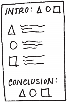
180 lessons in storytelling
When it comes to employing the power of repetition, let’s explore a
concept called Bing, Bang, Bongo. My junior high English teacher
introduced this idea to me when we were learning to write essays.
The concept stuck with me—perhaps due to the consonance of the
“Bing, Bang, Bongo” name and my teacher’s use of it as a repeat-
able sound bite—and it can be leveraged when we need to tell a
story with data.
The idea is that you should rst tell your audience what you’re going
to tell them (“Bing,” the introduction paragraph in your essay). Then
you tell it to them (“Bang,” the actual essay content). Then you sum-
marize what you just told them (“Bongo,” the conclusion). Applying
this to a presentation or report, you can start with an executive sum-
mary that outlines for your audience what you are going to cover,
then you can provide the detail or main content of your presenta-
tion, and nally end with a summary slide or section that reviews the
main points you covered (Figure 7.1).
If you’re the one preparing or giving the presentation or writing
the report, this may feel redundant, since you’re already familiar
with the content. But to your audience—who is not as close to the
FIGURE7.1 Bing, bang, bongo
Tactics to help ensure that your story is clear 181
content—it feels nice. You’ve set their expectations on what you’re
going to cover, then provided detail, and then recapped. The rep-
etition helps cement it in their memory. After hearing your message
three times, they should be clear on what they are meant to know
and do from the story you’ve just told.
Bing, Bang, Bongo is one strategy to leverage to help ensure that
your story is clear. Let’s consider some additional tactics.
Tactics to help ensure that your story is clear
There are a number of concepts I routinely discuss in my workshops
for helping to ensure that the story you’re telling in your commu-
nication comes across. These apply mainly to a presentation deck.
While not always the case, I nd that this is often the primary form of
communicating analytical results, ndings, and recommendations at
many companies. Some of the concepts we’ll discuss will be appli-
cable to written reports and other formats as well.
Let’s discuss four tactics to help ensure that your story is clear in your
presentation: horizontal logic, vertical logic, reverse storyboarding,
and a fresh perspective.
Horizontal logic
The idea behind horizontal logic is that you can read just the slide
title of each slide throughout your deck and, together, these snip-
pets tell the overarching story you want to communicate. It is impor-
tant to have action titles (not descriptive titles) for this to work well.
One strategy is to have an executive summary slide up front, with
each bullet corresponding to a subsequent slide title in the same
order (Figure 7.2). This is a nice way of setting it up so your audience
knows what to expect and then is taken through the detail (think
back to the Bing, Bang, Bongo approach we covered previously).
182 lessons in storytelling
Checking for horizontal logic is one approach to test whether the
story you want to tell is coming through clearly in your deck.
Vertical logic
Vertical logic means that all information on a given slide is self‐
reinforcing. The content reinforces the title and vice versa. The words
reinforce the visual and vice versa (Figure 7.3). There isn’t any extra-
neous or unrelated information. Much of the time, the decision on
what to eliminate or push to an appendix is as important (sometimes
more so) as the decision on what to retain.
FIGURE7.2 Horizontal logic
FIGURE7.3 Vertical logic
Tactics to help ensure that your story is clear 183
Employing horizontal and vertical logic together will help ensure that
the story you want to tell comes across clearly in your communication.
Reverse storyboarding
When you storyboard at the onset of building a communication, you
craft the outline of the story you intend to tell. As the name implies,
reverse storyboarding does the opposite. You take the nal commu-
nication, ip through it, and write down the main point from each
page (it’s a nice way to test your horizontal logic as well). The result-
ing list should look like the storyboard or outline for the story you
want to tell (Figure 7.4). If it doesn’t, this can help you understand
structurally where you might want to add, remove, or move pieces
around to create the overall ow and structure for the story that
you’re interested in conveying.
A fresh perspective
We’ve discussed the value of a fresh perspective to help see
through your audience’s lens when it comes to your data visu-
alization (Figure 7.5). Seeking this sort of input for your overall
FIGURE7.4 Reverse storyboarding

184 lessons in storytelling
There is incredible value in getting a fresh perspective when it
comes to communicating with data in general. As we become sub-
ject matter experts in our space, it becomes impossible for us to
take a step back and look at what we’ve created (whether a single
graph or a full presentation) through our audience’s eyes. But that
doesn’t mean you can’t see what they see. Leverage a friend or
colleague for their fresh perspective. Help ensure that your com-
munication hits the mark.
In closing
Stories are magical. They have the power of captivating us and
sticking with us in ways that facts alone cannot. They lend struc-
ture. Why wouldn’t you leverage this potential when crafting your
communications?
presentation can be immensely helpful as well. Once you’ve crafted
your communication, give it to a friend or colleague. It can be some-
one without any context (it’s actually helpful if it is someone without
any context, because this puts them in a much closer position to
your audience than you can be, given your intimate knowledge of
the subject matter). Ask them to tell you what they pay attention to,
what they think is important, and where they have questions. This will
help you understand whether the communication you’ve crafted is
telling the story you mean to tell or, in the case where it isn’t exactly,
help you identify where to concentrate your iterations.
FIGURE7.5 A fresh perspective
In closing 185
When we construct stories, we should do so with a beginning (plot),
middle (twists), and end (call to action). Conict and tension are key
to grabbing and maintaining your audience’s attention. Another cen-
tral component to story is the narrative, which we should consider
in terms of both order (chronological or lead with ending) and man-
ner (spoken, written, or a combination of the two). We can utilize the
power of repetition to help our stories stick with our audience. Tac-
tics such as horizontal and vertical logic, reverse storyboarding, and
seeking a fresh perspective can be employed to help ensure that our
stories come across clearly in our communications.
The main character in every story we tell should be the same: our
audience. It is by making our audience the protagonist that we can
ensure the story is about them, not about us. By making the data we
want to show relevant to our audience, it becomes a pivotal point
in our story. No longer will you just show data. Rather, you will tell a
story with data.
With that, you can consider your nal lesson learned. You now know
how to tell a story.
Next, let’s look at an example of the entire storytelling with data pro-
cess, from start to nish.
187
chapter eight
pulling it all together
Up to this point, we’ve focused on individual lessons that, together,
set you up for success when it comes to effectively visualizing and
communicating with data. To refresh your memory, we’ve covered
the following lessons:
1. Understand the context (Chapter 1)
2. Choose an appropriate display (Chapter 2)
3. Eliminate clutter (Chapter 3)
4. Draw attention where you want it (Chapter 4)
5. Think like a designer (Chapter 5)
6. Tell a story (Chapter 7)
In this chapter, we will look at the comprehensive storytelling with
data process from start to end—applying each of the preceding
lessons—using a single example.
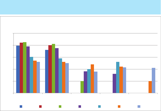
188 pulling it all together
Let’s begin by considering Figure 8.1, which shows average retail
price over time for ve consumer products (A, B, C, D, and E). Spend
a moment studying it.
When presented with this graph, it’s easy to start picking it apart.
But before we discuss the best way to visualize the data shown in
Figure 8.1, let’s take a step back and consider the context.
Lesson 1: understand the context
The rst thing to do when faced with a visualization challenge is to
make sure you have a robust understanding of the context and what
you need to communicate. We must identify a specic audience and
what they need to know or do, and determine the data we’ll use to
illustrate our case. We should craft the Big Idea.
FIGURE8.1 Original visual
$0
$100
$200
$300
$400
$500
Product CProduct BProduct A Product EProduct D
Average Retail Product Price Per Year
2008 2009 2010 2011 2012 2013 2014
Price has declined for all products on the market
since the launch of Product C in 2010
Lesson 2: choose an appropriate display 189
In this case, let’s assume we work for a startup that has created a
consumer product. We are starting to think about how to price the
product. One of the considerations in this decision‐making process—
the one we will focus on here—is how competitors’ retail prices for
products in this marketplace have changed over time. There is an
observation made with the original visual that may be important:
“Price has declined for all products on the market since the launch
of Product C in 2010.”
If we pause to consider specically the who, what, and how, let’s
assume following:
Who: VP of Product, the primary decision maker in establishing
our product’s price.
What: Understand how competitors’ pricing has changed over
time and recommend a price range.
How: Show average retail price over time for Products A, B, C,
D, and E.
The Big Idea, then, could be something like: Based on analysis of
pricing in the market over time, to be competitive, we recommend
introducing our product at a retail price in the range $ABC–$XYZ.
Next, let’s consider some different ways to visualize this data.
Lesson 2: choose an appropriate display
Once we’ve identied the data we want to show, next comes the
challenge of determining how to best visualize it. In this case, we
are most interested in the trend in price over time for each product.
If we look back to Figure 8.1, the variance in colors across the bars
distract from this, making the exercise more difcult than necessary.
Bear with me, as we’re going to go through more iterations of looking
at this data than you might typically. The progression is interesting
because it illustrates how different views of the data can inuence
what you pay attention to and the observations you can easily make.
190 pulling it all together
First, let’s remove the visual obstacle of the variance in color and
view the resulting graph, shown in Figure 8.2.
If you’re tempted to continue decluttering at this point, you are not
alone. I had to resist the urge since that’s something I typically do
as I go along. In this case, let’s refrain from doing so until the next
section, where we can address it all at once.
Since the emphasis in the original headline was on what happened
since Product C was launched in 2010, let’s highlight the relevant
pieces of data to make it easier to focus our attention there for a
moment. See Figure 8.3.
FIGURE8.2 Remove the variance in color
$0
$100
$200
$300
$400
$500
Product EProduct DProduct CProduct BProduct A
Average Retail Product Price Per Year
2008 2009 2010 2011 2012 2013 2014

Lesson 2: choose an appropriate display 191
Upon studying this, we see clear declines in the average retail price
for Products A and B in the time period of interest, but this doesn’t
appear to hold true for the products that were launched later. We
will denitely need to change the headline from the original visual
to reect this when we tell our comprehensive story.
If you’ve been thinking we should try a line graph here instead of a bar
chart—since we are primarily interested in the trend over time—you
are absolutely right. In doing so, we also eliminate the stairstep view
that bars create somewhat articially. Let’s see what lines would look
like with the same layout as above. This is illustrated in Figure 8.4.
FIGURE8.3 Emphasize 2010 forward
$0
$100
$200
$300
$400
$500
Product EProduct DProduct CProduct BProduct A
Average Retail Product Price per Year
2008 2009 2010 2011 2012 2013 2014
192 pulling it all together
The view in Figure 8.4 allows us to see what’s happening over time
more clearly for one product at a time. But it is hard to compare the
products at a given point in time to one another. Graphing all of
the lines against the same x‐axis will solve this. This will also reduce
the clutter and redundancy of the multiple year labels. The resulting
graph might look like Figure 8.5.
FIGURE8.4 Change to line graph
$0
$100
$200
$300
$400
$500
Product EProduct DProduct CProduct BProduct A
Average Retail Product Price per Year
2008
2014
2008
2014
2014
2010
2014
2011
2014
2013
Lesson 3: eliminate clutter 193
With the transition to the new graph setup, Excel added back the
color that we removed in an earlier step (tying the data to the accom-
panying legend at the bottom). Let’s ignore that for a moment while
we consider whether this view of the data will meet our needs. If we
revisit our purpose, it is to understand how competitors’ prices have
changed over time. The way the data is shown in Figure 8.5 allows for
this with relative ease. We can make taking in this information even
easier by eliminating clutter and drawing attention where we want it.
Lesson 3: eliminate clutter
Figure 8.5 shows what our visual looks like when we rely on the default
settings of our graphing application (Excel). We can improve this
with the following changes:
• Deemphasize the chart title. It needs to be present, but doesn’t
need to attract as much attention as it does when written in bold
black.
FIGURE8.5 Single line graph for all products
$0
$100
$200
$300
$400
$500
2014201320122011201020092008
Average Retail Product Price per Year
Product A Product B Product C Product D Product E
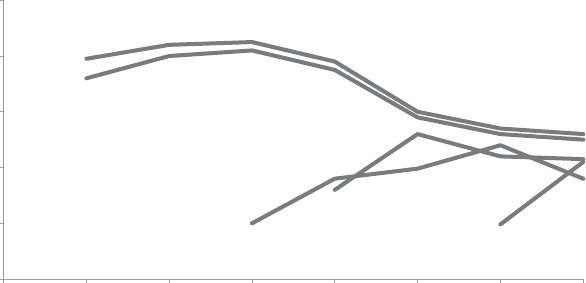
194 pulling it all together
• Remove chart border and gridlines, which take up space with-
out adding much value. Don’t let unnecessary elements distract
from your data!
• Push the x and yaxis lines and labels to the background by
making them grey. They shouldn’t compete visually with the data.
Modify the x‐axis tick marks so they align with the data points.
• Remove the variance in colors between the various lines.
We can use color more strategically, which we’ll discuss further
momentarily.
• Label the lines directly, eliminating the work of going back and
forth between the legend and the data to understand what is
being shown.
Figure 8.6 shows what the graph looks like after making these
changes.
Next, let’s explore how we can focus our audience’s attention.
FIGURE8.6 Eliminate clutter
$0
$100
$200
$300
$400
$500
2014201320122011201020092008
Average Retail Product Price per Year
A
B
C
D
E

Lesson 4: draw attention where you want your audience to focus 195
Lesson 4: draw attention where you want your
audience to focus
With the view shown in Figure 8.6, we can much more easily see and
comment on what’s happening over time. Let’s explore how we can
focus on different aspects of the data through strategic use of pre-
attentive attributes.
Consider the initial headline: “Price has declined for all products on
the market since the launch of Product C in 2010.” Upon a closer look
at the data, I might modify it to say something like, “After the launch
of Product C in 2010, the average retail price of existing products
declined.” Figure 8.7 demonstrates how we can tie the important
points in the data to these words through the strategic use of color.
$0
$100
$200
$300
$400
$500
2014201320122011201020092008
Average Retail Product Price per Year
A
B
C
D
E
FIGURE8.7 Focus the audience’s attention
In addition to the colored segments of the lines in Figure 8.7, atten-
tion is also drawn to the introduction of Product C in 2010 through
the addition of a data marker at that point. This is tied visually to
the subsequent decrease over time in Products A and B through the
consistent use of color.

196 pulling it all together
Changing components of a graph in Excel
Typically, you format a series of data (a line or a series of
bars) all at once. Sometimes, however, it can be useful
to have certain points formatted differently—for example, to
draw attention to specic parts, as illustrated in Figures 8.7,
8.8, and 8.9. To do this, click on the data series once to high-
light it, then click again to highlight just the point of interest.
Right‐click and select Format Data Point to open the menu
that will allow you to reformat the specic point as desired
(for example, to change the color or add a data marker).
Repeat this process for each data point you want to modify.
It takes time, but the resulting visual is easier to comprehend
for your audience. It is time well spent!
We can use this same view and strategy to concentrate on another
observation—one perhaps more interesting and noteworthy: “With
the launch of a new product in this space, it is typical to see an initial
average retail price increase, followed by a decline.” See Figure 8.8.
FIGURE8.8 Refocus the audience’s attention
$0
$100
$200
$300
$400
$500
2014201320122011201020092008
Average Retail Product Price per Year
A
B
C
D
E
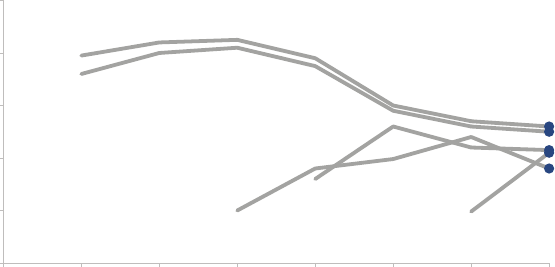
Lesson 5: think like a designer 197
It might also be interesting to note, “As of 2014, retail prices have
converged across products, with an average retail price of $223,
ranging from a low of $180 (Product C) to a high of $260 (Product
A).” Figure 8.9 uses color and data markers to draw our attention to
the specic points in the data that support this observation.
With each different view of the data, the use of preattentive attri-
butes allows you to more clearly see certain things. This strategy
can be used to highlight and tell different pieces of a nuanced story.
But before we continue thinking through how to best tell the story,
let’s put on our designer hats and perfect the visual.
Lesson 5: think like a designer
Though you may not have recognized it explicitly as such, we’ve
already been thinking like a designer through this process. Form
follows function: we chose a visual display (form) that will allow our
audience to do what we need them to do (function) with ease. When
it comes to using visual affordances to make it clear how our audi-
ence should interact with our visual, we’ve already taken steps to
FIGURE8.9 Refocus the audience’s attention again
$0
$100
$200
$300
$400
$500
201320122011201020092008
Average Retail Product Price per Year
A
B
C
D
E
2014
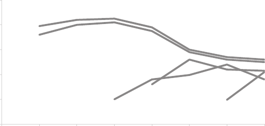
198 pulling it all together
cut clutter and de‐emphasize some elements of the graph, while
emphasizing and drawing attention to others.
We can further improve this visual by leveraging the lessons we cov-
ered in Chapter 5 with respect to accessibility and aesthetics. Spe-
cically, we can:
• Make the visual accessible with text. We can use simpler text in
the graph title and capitalize only the rst word to make it easier
to comprehend and quicker to read. We also need to add axis
titles to both the vertical and horizontal axes.
• Align elements to improve aesthetics: The center alignment of
the graph title leaves it hanging in space and doesn’t align it with
any other elements; we should upper‐left‐most align the graph
title. Align the y‐axis title vertically with the uppermost label and
the x‐axis title horizontally with the leftmost label. This creates
cleaner lines and ensures that your audience sees how to inter-
pret what they are looking at before they get to the actual data.
Figure 8.10 shows what the visual looks like after these changes have
been made.
FIGURE8.10 Add text and align elements
$0
$100
$200
$300
$400
$500
2014201320122011201020092008
Average price
Year
Retail price over time
A
B
C
D
E

Lesson 6: tell a story 199
Lesson 6: tell a story
Finally, it is time to think about how we can use the visual we’ve cre-
ated in Figure 8.10 as a foundation to walk our audience through the
story in the way that we want them to experience it.
Imagine we have ve minutes in a live presentation setting under
the agenda topic: “Competitive Landscape—Pricing.” The follow-
ing sequence (Figures 8.11–8.19) illustrates one path we could take
for telling a story with this data.
FIGURE8.11
A
B
C
D
E
In the next 5 minutes...
OUR GOAL:
Understand how prices have changed
over time in the competitive landscape.
Use this knowledge to inform the pricing
of our product.
We will end with a specific recommendation.

200 pulling it all together
FIGURE8.13
They have been priced similarly over time, with B consistently
slightly lower than
A
$0
$100
$200
$300
$400
$500
2014201320122011201020092008
Average price
Year
Retail price over time
A
B
C
D
E
FIGURE8.12
Products A and B were launched in 2008 at price points of $360+
$0
$100
$200
$300
$400
$500
2014201320122011201020092008
Average price
Year
Retail price over time
A
B
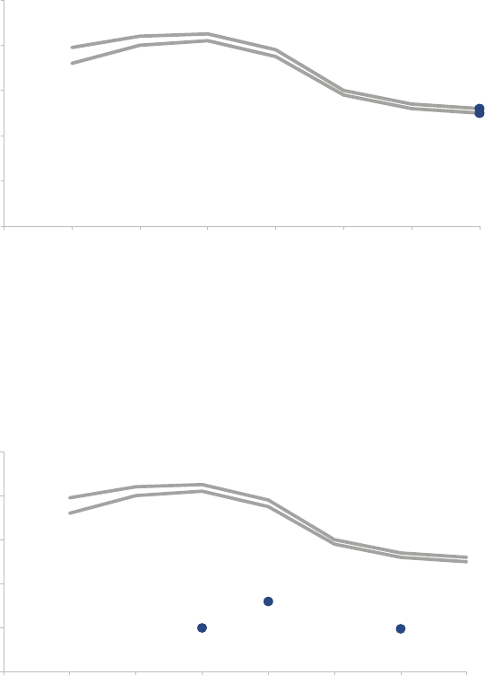
Lesson 6: tell a story 201
FIGURE8.14
In 2014, Products A and B were priced at $260 and $250,
respectively
$0
$100
$200
$300
$400
$500
2014201320122011201020092008
Average price
Year
Retail price over time
A
B
C
D
E
FIGURE8.15
Products C, D, and E were each introduced later
at much lower price points...
$0
$100
$200
$300
$400
$500
2014201320122011201020092008
Average price
Year
Retail price over time
A
B
C
D
E
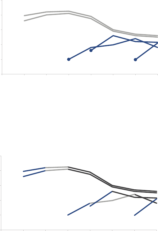
202 pulling it all together
FIGURE8.16
…but all have
increased in price
since their respective launches
$0
$100
$200
$300
$400
$500
2014201320122011201020092008
Average price
Year
Retail price over time
A
B
C
D
E
FIGURE8.17
In fact, with the launch of a new product in this space, we tend to
see an
initial price increase, followed by a decrease over time
$0
$100
$200
$300
$400
$500
2014201320122011201020092008
Average price
Year
Retail price over time
A
B
C
D
E
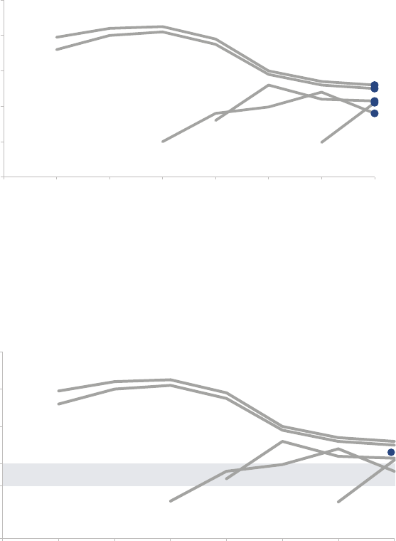
Lesson 6: tell a story 203
FIGURE8.18
As of 2014, retail prices have converged, with an average retail
price of $223, ranging from a low of $180 (C) to a high of $260 (A)
$0
$100
$200
$300
$400
$500
2014201320122011201020092008
Average price
Year
Retail price over time
A
B
C
D
E
FIGURE8.19
To be competitive, we recommend introducing our product below
the $223 average price point in the $150−$200 range
$0
$300
$400
$500
2014201320122011201020092008
Average price
Year
Retail price over time
A
B
C
D
E
Recommended range
$200
$150
AVG
204 pulling it all together
Let’s consider this progression. We started off by telling our audi-
ence the structure we would follow. I can imagine the voiceover in
the live presentation could further set the plot before moving to the
next slide: “As you all know, there are ve products that will be our
key competition in the marketplace,” then building the chronological
price path that those products followed. We can introduce tension
in the competitive landscape when Products C, D, and E signicantly
undercut existing price points at their respective launches. We can
then restore a sense of balance as the prices converge. We end with
a clear call to action: the recommendation for pricing our product.
By drawing our audience’s attention to the specic part of the story
we want to focus on—either by only showing the relevant points or
by pushing other things to the background and emphasizing only the
relevant pieces and pairing this with a thoughtful narrative—we’ve
led our audience through the story.
Here, we’ve looked at an example telling a story with a single visual.
This same process and individual lessons can be followed when you
have multiple visuals in a broader presentation or communication. In
that case, think about the overarching story that ties it all together.
Individual stories for a given visualization within that larger presenta-
tion, such as the one we’ve looked at here, can be considered sub-
plots within the broader storyline.
In closing
Through this example, we’ve seen the storytelling with data process
from start to nish. We began by building a robust understanding
of the context. We chose an appropriate visual display. We identi-
ed and eliminated clutter. We used preattentive attributes to draw
our audience’s attention to where we want them to focus. We put
on our designer hats, adding text to make our visual accessible and
employing alignment to improve the aesthetics. We crafted a com-
pelling narrative and told a story.
Consider the before‐and‐after shown in Figure 8.20.
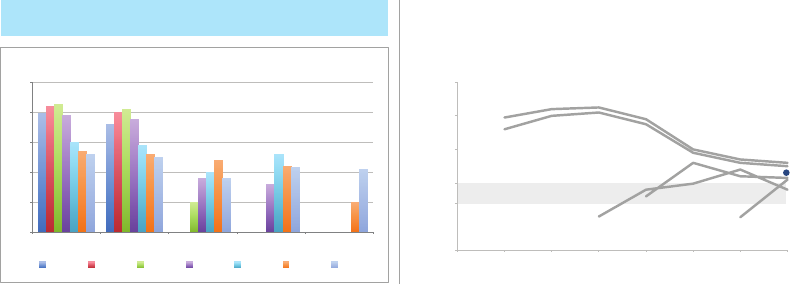
In closing 205
The lessons we’ve learned and employed help us move from simply
showing data to storytelling with data.
FIGURE8.20 Before‐and‐after
Price has declined for all products on the market
since the launch of Product C in 2010
To be competitive, we recommend introducing our product below
the $223 average price point in the $150−$200 range
$0
$100
$200
$300
$400
$500
Product A Product E Product D Product C Product B
Average Retail Product Price per Year
2008 2009 2010 2011 2012 2013 2014
$0
$300
$400
$500
2014201320122011201020092008
Average price
Year
Retail price over time
A
B
$200
$150
AVG
C
D
E
Recommended range
207
chapter nine
case studies
At this point, you should feel like you have a solid foundation for
communicating effectively with data. In this penultimate chapter, we
explore strategies for tackling common challenges faced when com-
municating with data through a number of case studies.
Specically, we’ll discuss:
• Color considerations with a dark background
• Leveraging animation in the visuals you present
• Establishing logic in order
• Strategies for avoiding the spaghetti graph
• Alternatives to pie charts
Within each of these case studies, I’ll apply the various lessons we’ve
covered when it comes to communicating effectively with data, but
will limit my discussion mainly to the specic challenge at hand.

208 case studies
CASE STUDY 1: Color considerations with a dark
background
When it comes to communicating data, I don’t typically recommend
anything other than a white background. Let’s take a look at what
a simple graph looks like on a white, blue, and black background.
See Figure 9.1.
If you had to describe in a single word how the blue and black back-
grounds in Figure 9.1 make you feel, what would that word be? For
me, it would be heavy. With the white background, I nd it easy to
focus on the data. The dark backgrounds, on the other hand, pull
my eyes there—to the background—and away from the data. Light
elements on a dark background can create a stronger contrast but
are generally harder to read. Because of this, I typically avoid dark
and colored backgrounds.
That said, sometimes there are considerations outside of the ideal
scenario for communicating with data that must be taken into account,
such as your company or client’s brand and corresponding standard
template. This was the challenge I faced in one consulting project.
I didn’t recognize this immediately. It was only after I had completed
my initial revamp of the client’s original visual that I realized it just
didn’t quite t with the look and feel of the work products I’d seen
from the client group. Their template was bold and in your face with
a mottled, black background spiked with bright, heavily saturated
FIGURE9.1 Simple graph on white, blue, and black background
0
1
2
3
4
5
MayAprMarFebJan
White background
0
1
2
3
4
5
MayAprMarFebJan
Blue background
0
1
2
3
4
5
MayAprMarFebJan
Black background

CASE STUDY 1: Color considerations with a dark background 209
colors. In comparison, my visual felt rather meek. Figure 9.2 shows
a generalized version of my initial makeover of a visual displaying
employee survey feedback.
In an endeavor to create something more in sync with the client’s
brand, I remade my own makeover, leveraging the same dark back-
ground I’d seen used in some of the other examples shared. In
doing so, I had to reverse my normal thought process. With a white
background, the further a color is from white, the more it will stand
out (so grey stands out less, whereas black stands out very much).
With a black background, the same is true, but black becomes the
baseline (so grey stands out less, and white stands out very much).
I also realized some colors that are typically verboten with a white
background (for example, yellow) are incredibly attention grabbing
against black (I didn’t use yellow in this particular example but did
in some others).
Figure 9.3 depicts how my “more in line with the client’s brand” ver-
sion of the visual looked.
FIGURE9.2 Initial makeover on white background
1%
5%
8%
11%
33%
12%
9%
9%
0% 20% 40% 60% 80% 100%
Percent of Total
Survey item A
ranked highest
for team X
Dissatisfaction
was greatest for
Survey item D
Strongly Disagree | Disagree | Neutral | Agree | Strongly Agree
Survey item A
Survey item B
Survey item C
Survey item D
Survey Results: Team X

210 case studies
While the content is exactly the same, note how different Figure 9.3
feels compared to Figure 9.2. This is a good illustration of how color
can impact the overall tone of a visualization.
CASE STUDY 2: Leveraging animation in the
visuals you present
One conundrum commonly faced when communicating with data
is when a single view of the data is used for both presentation and
report. When presenting content in a live setting, you want to be
able to walk your audience through the story, focusing on just the rel-
evant part of the visual. However, the version that gets circulated to
your audience—as a pre‐read or takeaway, or for those who weren’t
able to attend the meeting—needs to be able to stand on its own
without you, the presenter, there to walk the audience through it.
Too often, we use the exact same content and visuals for both pur-
poses. This typically renders the content too detailed for the live pre-
sentation (particularly if it is being projected on the big screen) and
sometimes not detailed enough for the circulated content. This gives
FIGURE9.3 Remake on dark background
1%
5%
8%
11%
33%
12%
9%
9%
0% 20% 40% 60% 80% 100%
Percent of Total
Survey item A
ranked highest
for team X
Dissatisfaction
was greatest for
Survey item D
Strongly Disagree | Disagree | Neutral | Agree | Strongly Agree
Survey item A
Survey item B
Survey item C
Survey item D
Survey Results: Team X
CASE STUDY 2: Leveraging animation in the visuals you present 211
rise to the slideument—part presentation, part document, and not
exactly meeting the needs of either—which we touched upon briey
in Chapter 1. In the following, we’ll look at a strategy for leveraging
animation coupled with an annotated line graph to meet both the
presentation and circulation needs.
Let’s assume that you work for a company that makes online social
games. You are interested in telling the story around how active users
for a given game—let’s call it Moonville—have grown over time.
You could use Figure 9.4 to talk about growth since the launch of
the game in late 2013.
The challenge, however, is that when you put this much data in front
of your audience, you lose control over their attention. You might
be talking about one part of the data while they are focusing some-
where else entirely. Perhaps you want to tell the story chronologi-
cally, but your audience may jump immediately to the sharp increase
in 2015 and wonder what drove that. When they do so, they stop
listening to you.
FIGURE9.4 Original graph
Moonville: active users over time
Data source: ABC Report. For purpose of analysis "active user" is defined as the number of unique users in the past 30 days.
0
10,000
20,000
30,000
40,000
50,000
60,000
70,000
80,000
90,000
100,000
MayAprMarFebJanDecNovOctSepAugJulJunMayAprMarFebJanDecNovOctSep
201520142013
Active users

212 case studies
Alternatively, you can leverage animation to walk your audience
through your visual as you tell the corresponding points of the story.
For example, I could start with a blank graph. This forces the audi-
ence to look at the graph details with you, rather than jump straight
to the data and start trying to interpret it. You can use this approach
to build anticipation within your audience that will help you to retain
their attention. From there, I subsequently show or highlight only the
data that is relevant to the specic point I am making, forcing the
audience’s attention to be exactly where I want it as I am speaking.
I might say—and show—the following progression:
Today, I’m going to talk you through a success story: the increase
in Moonville users over time. First, let me set up what we are look-
ing at. On the vertical y‐axis of this graph, we’re going to plot active
users. This is dened as the number of unique users in the past 30
days. We’ll look at how this has changed over time, from the launch
in late 2013 to today, shown along the horizontal x‐axis. (Figure 9.5)
FIGURE9.5
Moonville: active users over time
Data source: ABC Report. For purpose of analysis "active user" is defined as the number of unique users in the past 30 days.
50,604
94,250
0
10,000
20,000
30,000
40,000
50,000
60,000
70,000
80,000
90,000
100,000
MayAprMarFebJanDecNovOctSepAugJulJunMayAprMarFebJanDecNovOctSep
201520142013
Active users

CASE STUDY 2: Leveraging animation in the visuals you present 213
We launched Moonville in September 2013. By the end of that rst
month, we had just over 5,000 active users, denoted by the big blue
dot at the bottom left of the graph. (Figure 9.6)
FIGURE9.6
Moonville: active users over time
Data source: ABC Report. For purpose of analysis "active user" is defined as the number of unique users in the past 30 days.
0
10,000
20,000
30,000
40,000
50,000
60,000
70,000
80,000
90,000
100,000
MayAprMarFebJanDecNovOctSepAugJulJunMayAprMarFebJanDecNovOctSep
201520142013
Active users

214 case studies
Early feedback on the game was mixed. In spite of this—and our
practically complete lack of marketing—the number of active users
nearly doubled in the rst four months, to almost 11,000 active users
by the end of December. (Figure 9.7)
FIGURE9.7
Moonville: active users over time
Data source: ABC Report. For purpose of analysis "active user" is defined as the number of unique users in the past 30 days.
0
10,000
20,000
30,000
40,000
50,000
60,000
70,000
80,000
90,000
100,000
MayAprMarFebJanDecNovOctSepAugJulJunMayAprMarFebJanDecNovOctSep
201520142013
Active users

CASE STUDY 2: Leveraging animation in the visuals you present 215
In early 2014, the number of active users increased along a steeper
trajectory. This was primarily the result of the friends and family pro-
motions we ran during this time to increase awareness of the game.
(Figure 9.8)
FIGURE9.8
Moonville: active users over time
Data source: ABC Report. For purpose of analysis "active user" is defined as the number of unique users in the past 30 days.
0
10,000
20,000
30,000
40,000
50,000
60,000
70,000
80,000
90,000
100,000
MayAprMarFebJanDecNovOctSepAugJulJunMayAprMarFebJanDecNovOctSep
201520142013
Active users
216 case studies
Growth was pretty at over the rest of 2014 as we halted all marketing
efforts and focused on quality improvements to the game. (Figure 9.9)
FIGURE9.9
Moonville: active users over time
Data source: ABC Report. For purpose of analysis "active user" is defined as the number of unique users in the past 30 days.
0
10,000
20,000
30,000
40,000
50,000
60,000
70,000
80,000
90,000
100,000
MayAprMarFebJanDecNovOctSepAugJulJunMayAprMarFebJanDecNovOctSep
201520142013
Active users
CASE STUDY 2: Leveraging animation in the visuals you present 217
Uptake this year, on the other hand, has been incredible, surpass-
ing our expectations. The revamped and improved game has gone
viral. The partnerships we’ve forged with social media channels have
proven successful for continuing to increase our active user base. At
recent growth rates, we anticipate we’ll surpass 100,000 active users
in June! (Figure 9.10)
For the more detailed version that you circulate as a follow up or for
those who missed your (stellar) presentation, you can leverage a ver-
sion that annotates the salient points of the story on the line graph
directly, as shown in Figure 9.11.
FIGURE9.10
Moonville: active users over time
Data source: ABC Report. For purpose of analysis "active user" is defined as the number of unique users in the past 30 days.
0
10,000
20,000
30,000
40,000
50,000
60,000
70,000
80,000
90,000
100,000
MayAprMarFebJanDecNovOctSepAugJulJunMayAprMarFebJanDecNovOctSep
201520142013
Active users

218 case studies
This is one strategy for creating a visual (or, in this case, set of visuals)
that meets both the needs of your live presentation and the circu-
lated version. Note that with this approach, it is imperative that you
know your story well to be able to narrate without relying on your
visuals (something you should always aim for regardless).
If you’re leveraging presentation software, you can set up all of the
above on a single slide and use animation for the live presentation,
having each image appear and disappear as needed to form the
desired progression. Put the nal annotated version on top so it’s
all that shows on the printed version of the slide. If you do this, you
can use the exact same deck for the presentation and the commu-
nication that you circulate. Alternatively, you can put each graph on
a separate slide and ip through them; in this case, you’d only want
to circulate the nal annotated version.
FIGURE9.11
Moonville: active users over time
Data source: ABC Report. For purpose of analysis "active user" is defined as the number of unique users in the past 30 days.
5,680 10,931
28,746
39,214
94,255
0
10,000
20,000
30,000
40,000
50,000
60,000
70,000
80,000
90,000
100,000
MayAprMarFebJanDecNovOctSepAugJulJunMayAprMarFebJanDecNovOctSep
201520142013
Active users
Sep−Dec 2013
Moonville
launched with
5K active users
in Sep. Early
feedback was
mixed; still, the
number of
active users
nearly doubled
in the first four
months.
Jan−Mar 2014
The number of
active users
increased with
steeper
trajectory as a
result of friends
and family
promotions.
Mar−Dec 2014
Growth was marginal
through the rest of 2014 as
we halted marketing
efforts to focus on quality
improvements.
YTD 2015
The revamped game
plus partnerships
with social
media channels
have been very
successful. Given recent
growth rate, we
anticipate we will
surpass 100K active
users in June.

CASE STUDY 3: Logic in order 219
CASE STUDY 3: Logic in order
There should be logic in the order in which you display information.
The above statement probably goes without saying. Yet, like so
many things that seem logical when we read them or hear them or
say them out loud, too often we don’t put them into practice. This
is one such example.
While I would say my introductory sentence is universally true, I’ll
focus here on a very specic example to illustrate the concept: lever-
aging order for categorical data in a horizontal bar chart.
First, let’s set the context. Let’s say you work at a company that sells a
product that has various features. You’ve recently surveyed your users
to understand whether they are using each of the features and how
satised they’ve been with them and want to put that data to use.
The initial graph you create might look something like Figure 9.12.
FIGURE9.12 User satisfaction, original graph
8%
3%
9%
5%
4%
6%
5%
5%
6%
5%
14%
4%
4%
8%
14%
6%
11%
13%
24%
21%
23%
20%
15%
23%
17%
24%
17%
23%
25%
24%
15%
40%
36%
34%
37%
36%
35%
26%
32%
27%
27%
28%
27%
18%
17%
16%
47%
47%
33%
29%
28%
25%
33%
25%
27%
25%
21%
16%
13%
10%
11%
Feature A
Feature B
Feature C
Feature D
Feature E
Feature F
Feature G
Feature H
Feature I
Feature J
Feature K
Feature L
Feature M
Feature N
Feature O
How satisfied have you been with each of these features?
Have not used Not satisfied at all Not very satisfied Somewhat satisfied Very satisfied
Completely satisfied
220 case studies
This is a real example, and Figure 9.12 shows the actual graph that
was created for this purpose, with the exception that I’ve replaced
the descriptive feature names with Feature A, Feature B, and so on.
There is an order here—if we stare at the data for a bit, we nd that
it is arranged in decreasing order of the “Very satised” group plus
the “Completely satised” group (the teal and dark teal segments
on the right side of the graph). This may suggest that is where we
should pay attention. But from a color standpoint, my eyes are drawn
rst to the bold black “Have not used” segment. And if we pause
to think about what the data shows, it would perhaps be the areas
of dissatisfaction that would be of most interest.
Part of the challenge here is that the story—the “so what”—of this
visual is missing. We could tell a number of different stories and focus
on a number of different aspects of this data. Let’s look at a couple
of ways to do this, with an eye towards leveraging order.
First, we could think about highlighting the positive story: where our
users are most satised. See Figure 9.13.
FIGURE9.13 Highlight the positive story
Features A & B top user satisfaction
Product X User Satisfaction: Features
Responses based on survey question "How satisfied have you been with each of these features?".
Need more details here to help put this data into context: How many people completed survey? What proportion of users does this represent?
Do those who completed survey look like the overall population, demographic-wise? When was the survey conducted?
47%
47%
33%
29%
28%
25%
33%
25%
27%
25%
21%
16%
13%
10%
11%
40%
36%
34%
37%
36%
35%
26%
32%
27%
27%
28%
27%
18%
17%
16%
Feature A
Feature B
Feature C
Feature D
Feature E
Feature F
Feature G
Feature H
Feature I
Feature J
Feature K
Feature L
Feature M
Feature N
Feature O
Completely satisfied Very satisfied Somewhat satisfied Not very satisfied Not satisfied at all Have not used
CASE STUDY 3: Logic in order 221
In Figure 9.13, I’ve ordered the data clearly by putting “Completely
satised” plus “Very satised” in descending order—the same as in
the original graph—but I’ve made it much more obvious here through
other visual cues (namely, color, but also the positioning of the seg-
ments as the rst series in the graph, so the audience’s attention hits
it rst as they scan from left to right). I’ve also used words to help
explain why your attention is drawn to where it is via the action title
at the top, which calls out what you should be seeing in the visual.
We can leverage these same tactics—order, color, placement, and
words—to highlight a different story within this data: where users
are least satised. See Figure 9.14.
Or perhaps the real story here is in the unused features, which could
be highlighted as shown in Figure 9.15.
FIGURE9.14 Highlight dissatisfaction
Users least satisfied with Features N & J
Product X User Satisfaction: Features
Responses based on survey question "How satisfied have you been with each of these features?".
Need more details here to help put this data into context: How many people completed survey? What proportion of users does this represent?
Do those who completed survey look like the overall population, demographic-wise? When was the survey conducted?
9%
8%
3%
14%
14%
8%
5%
5%
5%
6%
6%
6%
5%
4%
4%
4%
Feature N
Feature J
Feature M
Feature C
Feature G
Feature I
Feature E
Feature H
Feature O
Feature F
Feature D
Feature K
Feature L
Feature B
Feature A
Not satisfied at all Not very satisfied Somewhat satisfied Very satisfied Completely satisfied Have not used
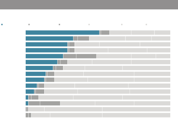
222 case studies
Note that in Figure 9.15, you can still get to the differing levels of satis-
faction (or lack thereof) within each bar, but they’ve been pushed back
to a second‐order comparison due to the color choices I’ve made,
while the relative rank ordering of the “Have not used” segment is
the clear primary comparison on which my audience is meant to focus.
If we want to tell one of the above stories, we can leverage order,
color, position, and words as I’ve shown to draw our audience’s atten-
tion to where we want them to pay it in the data. If we want to tell all
three stories, however, I’d recommend a slightly different approach.
It isn’t very nice to get your audience familiar with the data only to
completely rearrange it. Doing so creates a mental tax—the same
sort of unnecessary cognitive burden that we discussed in Chapter 3
that we want to avoid. Let’s create a base visual and preserve the
same order so our audience only has to familiarize themselves with
the detail once—highlighting the different stories one at a time
through strategic use of color.
FIGURE9.15 Focus on unused features
Feature O is least used
Product X User Satisfaction: Features
Responses based on survey question "How satisfied have you been with each of these features?".
Need more details here to help put this data into context: How many people completed survey? What proportion of users does this represent?
Do those who completed survey look like the overall population, demographic-wise? When was the survey conducted?
51%
33%
29%
29%
26%
22%
19%
14%
13%
8%
6%
2%
2%
Feature O
Feature M
Feature K
Feature L
Feature N
Feature I
Feature G
Feature F
Feature H
Feature D
Feature E
Feature C
Feature J
Feature A
Feature B
Have not used Not satisfied at all Not very satisfied Somewhat satisfied Very satisfied Completely satisfied

CASE STUDY 3: Logic in order 223
Figure 9.16 depicts our base visual, without anything highlighted.
If I were presenting this to an audience, I’d use this version to
walk them through what they are looking at: survey responses
to the question, “How satised have you been with each of these
features?”—ranging from the positive “Completely satised” at the
right to “Not satised at all” and, nally, “Have not used” at the far
left (leveraging the natural association of positive at the right and
negative at the left). Then I’d pause to tell each of the stories in
succession.
First comes a visual similar to what we started with in the last series
that highlights where users are the most satised. In this version, I’ve
leveraged different shades of blue to draw attention not only to the
proportion of users who are satised but specically to Features A
and B within those segments that rank highest, tying these bars visu-
ally to the text that illustrates my point. See Figure 9.17.
FIGURE9.16 Set up the graph
User satisfaction varies greatly by feature
Product X User Satisfaction: Features
Responses based on survey question "How satisfied have you been with each of these features?".
Need more details here to help put this data into context: How many people completed survey? What proportion of users does this represent?
Do those who completed survey look like the overall population, demographic-wise? When was the survey conducted?
Feature A
Feature B
Feature C
Feature D
Feature E
Feature F
Feature G
Feature H
Feature I
Feature J
Feature K
Feature L
Feature M
Feature N
Feature O
Have not used Not satisfied at all Not very satisfied Somewhat satisfied Very satisfied Completely satisfied

224 case studies
This is followed by a focus on the other end of the spectrum to where
users are least satised, again calling out and highlighting specic
points of interest. See Figure 9.18.
FIGURE9.17 Satisfaction
User satisfaction varies greatly by feature
Product X User Satisfaction: Features
Responses based on survey question "How satisfied have you been with each of these features?".
Need more details here to help put this data into context: How many people completed survey? What proportion of users does this represent?
Do those who completed survey look like the overall population, demographic-wise? When was the survey conducted?
40%
36%
34%
37%
36%
35%
26%
32%
27%
27%
28%
27%
18%
17%
16%
47%
47%
33%
29%
28%
25%
33%
25%
27%
25%
21%
16%
13%
10%
11%
Feature A
Feature B
Feature C
Feature D
Feature E
Feature F
Feature G
Feature H
Feature I
Feature J
Feature K
Feature L
Feature M
Feature N
Feature O
Have not used Not satisfied at all Not very satisfied Somewhat satisfied Very satisfied Completely satisfied
Features
A and B
continue
to top user
satisfaction
FIGURE9.18 Dissatisfaction
User satisfaction varies greatly by feature
Product X User Satisfaction: Features
Responses based on survey question "How satisfied have you been with each of these features?".
Need more details here to help put this data into context: How many people completed survey? What proportion of users does this represent?
Do those who completed survey look like the overall population, demographic-wise? When was the survey conducted?
2%
2%
2%
8%
3%
9%
5%
4%
6%
5%
5%
6%
5%
14%
4%
4%
8%
14%
6%
Feature A
Feature B
Feature C
Feature D
Feature E
Feature F
Feature G
Feature H
Feature I
Feature J
Feature K
Feature L
Feature M
Feature N
Feature O
Have not used Not satisfied at all Not very satisfied Somewhat satisfied Very satisfied Completely satisfied
Users are least
satisfied with
Features J and N;
what improvements
can we make here
for a better user
experience?
CASE STUDY 3: Logic in order 225
Note how it isn’t as easy to see the relative rank ordering of the
features highlighted in Figure 9.18 as it was when they were put in
descending order (Figure 9.14) because they aren’t aligned along
a common baseline to either the left or the right. We can still rel-
atively quickly see the primary areas of dissatisfaction (Features J
and N) since they are so much bigger than the other categories and
because of the color emphasis. I’ve added a callout box to highlight
this through text as well.
Finally, preserving the same order, we can draw our audience’s atten-
tion to the unused features. See Figure 9.19.
In Figure 9.19, it is easier to see the rank ordering (even though
the categories aren’t monotonically increasing from top to bottom)
because of the alignment to a consistent baseline at the left of the
graph. Here, we want our audience to focus mainly on the very bot-
tom feature in the graph—Feature O. Since we’re trying to preserve
the established order and can’t do this by putting it at the top (where
the audience would encounter it rst), the bold color and callout box
help draw attention to the bottom of the graph.
FIGURE9.19 Unused features
User satisfaction varies greatly by feature
Product X User Satisfaction: Features
Responses based on survey question "How satisfied have you been with each of these features?".
Need more details here to help put this data into context: How many people completed survey? What proportion of users does this represent?
Do those who completed survey look like the overall population, demographic-wise? When was the survey conducted?
2%
8%
6%
14%
19%
13%
22%
2%
29%
29%
33%
26%
51%
Feature A
Feature B
Feature C
Feature D
Feature E
Feature F
Feature G
Feature H
Feature I
Feature J
Feature K
Feature L
Feature M
Feature N
Feature O
Have not used Not satisfied at all Not very satisfied Somewhat satisfied Very satisfied Completely satisfied
Feature O is least
used. What steps can
we proactively take
with existing users to
increase utilization?
226 case studies
The preceding views show the progression I’d use in a live presenta-
tion. The sparing and strategic use of color lets me direct my audi-
ence’s attention to one component of the data at a time. If you are
creating a written document to be shared directly with your audi-
ence, you might compress all of these views into a single, compre-
hensive visual, as shown in Figure 9.20.
When I process Figure 9.20, my eyes do a number of zigzagging
“z’s” across the page. First, I see the bold “Features” in the graph
title. Then I’m drawn to the dark blue bars—which I follow across to
the dark blue text box that tells me what’s interesting about what
I’m looking at (you’ll note my text here is mostly descriptive, mainly
due to the anonymity of the example; ideally this space would be
used to provide greater insight). Next, I hit the orange text box, read
it, and glance back leftward to see the evidence in the graph that
supports it. Finally, I see the teal bar emphasized at the bottom and
look across to see the text that describes it. Strategic use of color
sets the various series apart from one another while also making it
clear where the audience should look for the specic evidence of
what is being described in the text.
FIGURE9.20 Comprehensive visual
User satisfaction varies greatly by feature
Product X User Satisfaction: Features
Responses based on survey question "How satisfied have you been with each of these features?".
Need more details here to help put this data into context: How many people completed survey? What proportion of users does this represent?
Do those who completed survey look like the overall population, demographic-wise? When was the survey conducted?
51%
8%
9%
14%
14%
40%
36%
47%
47%
Feature A
Feature B
Feature C
Feature D
Feature E
Feature F
Feature G
Feature H
Feature I
Feature J
Feature K
Feature L
Feature M
Feature N
Feature O
Have not used Not satisfied at all Not very satisfied Somewhat satisfied Very satisfied Completely satisfied
Features A and B
continue to top user
satisfaction
Users are least
satisfied with
Features J and N;
what improvements
can we make here
for a better user
experience?
Feature O is least
used. What steps
can we proactively
take with existing
users to increase
utilization?
CASE STUDY 4: Strategies for avoiding the spaghetti graph 227
Note that with Figure 9.20 it is harder for your audience to form other
conclusions with the data, since attention is drawn so strongly to the
particular points I want to highlight. But as we’ve discussed repeat-
edly, once you’ve reached the point of needing to communicate,
there should be a specic story or point that you want to highlight,
rather than let your audience draw their own conclusions. Figure 9.20
is too dense for a live presentation but could work well for the docu-
ment that will be circulated.
I’ve mentioned this previously but would feel remiss not to point
out that in some cases there is intrinsic order in the data you want
to show (ordinal categories). For example, instead of features, if the
categories were age ranges (0–9, 10–19, 20–29, etc.), you should keep
those categories in numerical order. This provides an important con-
struct for the audience to use as they interpret the information. Then
use the other methods of drawing attention (through color, position,
callout boxes with text) to direct the audience’s attention to where
you want them to pay it.
Bottom line: there should be logic in the order of the data you show.
CASE STUDY 4: Strategies for avoiding the
spaghetti graph
While I very much enjoy food, I have a distaste for any chart type
that has food in its title. My hatred of pie charts is well documented.
Donuts are even worse. Here is another to add to the list: the spa-
ghetti graph.
If you aren’t sure if you’ve seen a spaghetti graph before, I’ll bet that
you have. A spaghetti graph is a line graph where the lines overlap
a lot, making it difcult to focus on a single series at a time. They
look something like Figure 9.21.

228 case studies
Graphs like Figure 9.21 are known as spaghetti graphs because they
look like someone took a handful of uncooked spaghetti noodles
and threw them on the ground. And they are about as informative
as those haphazard noodles would be as well …
which is to say …
not at all.
Note how difcult it is to concentrate on a single line within that
mess, due to all of the crisscrossing and because so much is com-
peting for your attention.
There are a few strategies for taking the would‐be‐spaghetti graph
and creating more visual sense of the data. I’ll cover three such strat-
egies and show them applied in a couple of different ways to the
FIGURE9.21 The spaghetti graph
Types of non-profits supported by area funders
Data is self-reported by funders; percents sum to greater than 100 because respondents can make multiple selections.
0%
10%
20%
30%
40%
50%
60%
70%
80%
90%
100%
2010 2011 2012 2013 2014 2015
Percent of funders
Arts & culture Education Health Human services Other

CASE STUDY 4: Strategies for avoiding the spaghetti graph 229
data graphed in Figure 9.21, which shows types of nonprots sup-
ported by funders in a given area. First, we’ll look at an approach
you should be familiar with by now: using preattentive attributes to
emphasize a single line at a time. After that, we’ll look at a couple of
views that separate the lines spatially. Then nally, we’ll look at a com-
bined approach that leverages elements of these rst two strategies.
Emphasize one line at a time
One way to keep the spaghetti graph from becoming visually over-
whelming is to use preattentive attributes to draw attention to a sin-
gle line at a time. For example, we could focus our audience on the
increase in the percentage of funders donating over time to health
nonprots. See Figure 9.22.
Or we could use the same strategy to emphasize the decrease in
the percentage of funders donating to education‐related nonprof-
its. See Figure 9.23.
FIGURE9.22 Emphasize a single line
Types of non-profits supported by area funders
Data is self-reported by funders; percents sum to greater than 100 because respondents can make multiple selections.
75% Health
0%
10%
20%
30%
40%
50%
60%
70%
80%
90%
100%
201520142013201220112010
Percent of funders
230 case studies
In Figures 9.22 and 9.23, color, thickness of line, and added marks
(the data marker and data label) act as visual cues to draw attention
to where we want our audience to focus. This strategy can work well
in a live presentation, where you explain the details of the graph
once (as we’ve seen in the recent case studies), then cycle through
the various data series in this manner, highlighting what is interest-
ing or should be paid attention to with each and why. Note that we
need either this voiceover or the addition of text to make it clear
why we are highlighting the given data and provide the story for
our audience.
Separate spatially
We can untangle the spaghetti graph by pulling the lines apart either
vertically or horizontally. First, let’s look at a version where the lines
are pulled apart vertically. See Figure 9.24.
FIGURE9.23 Emphasize another single line
Types of non-profits supported by area funders
Data is self-reported by funders; percents sum to greater than 100 because respondents can make multiple selections.
60% Education
0%
10%
20%
30%
40%
50%
60%
70%
80%
90%
100%
201520142013201220112010
Percent of funders

CASE STUDY 4: Strategies for avoiding the spaghetti graph 231
In Figure 9.24, the same x‐axis (year, shown at the top) is leveraged
across all of the graphs. In this solution, I’ve created ve separate
graphs but organized them such that they appear to be a single
visual. The y‐axis within each graph isn’t shown; rather, the starting
and ending point labels are meant to provide enough context so
that the axis is unnecessary. Though they aren’t shown, it is important
that the y‐axis minimum and maximum are the same for each graph
so the audience can compare the relative position of each line or
point within the given space. If you were to shrink these down, they
would look similar to what Edward Tufte calls “sparklines” (a very
small line graph typically drawn without axis or coordinates to show
the general shape of the data; Beautiful Evidence, 2006).
This approach assumes that being able to see the trend for a given
category (Health, Education, etc.) is more important than comparing
FIGURE9.24 Pull the lines apart vertically
Types of non-profits supported by area funders
Health
Education
Human
services
Arts &
culture
Other
Data is self-reported by funders; percents sum to greater than 100 because respondents can make multiple selections.
67% 75%
73% 60%
60% 55%
20%
43%
53%
30%
2015 % of funders
20142013201220112010
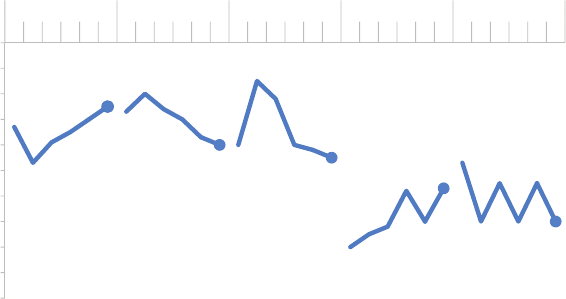
232 case studies
the values across categories. If that isn’t the case, we can consider
pulling the data apart horizontally, as illustrated in Figure 9.25.
Whereas in Figure 9.24 we leveraged the x‐axis (years) across the ve
categories, in Figure 9.25 we leverage the same y‐axis (percent of
funders) across the ve categories. Here, the relative height of the
various data series allows them to more easily be compared with each
other. We can quickly see that the highest percentage of funders in
2015 donate to Health, a lower percentage to Education, an even
lower percentage to Human Services, and so on.
Combined approach
Another option is to combine the approaches we’ve outlined so
far. We can separate spatially and emphasize a single line at a time,
while leaving the others there for comparison but pushing them to
the background. As was the case with the prior approach, we can
do this by separating the lines vertically (Figure 9.26) or horizontally
(Figure 9.27).
FIGURE9.25 Pull the lines apart horizontally
Types of non-profits supported by area funders
Data is self-reported by funders; percents sum to greater than 100 because respondents can make multiple selections.
75%
60% 55% 43%
30%
0%
10%
20%
30%
40%
50%
60%
70%
80%
90%
100%
'15'14'13'12'11'10'15'14'13'12'11'10'15'14'13'12'11'10'15'14'13'12'11'10'15'14'13'12'11'10
Percent of funders
Health Education Human services Arts & culture Other
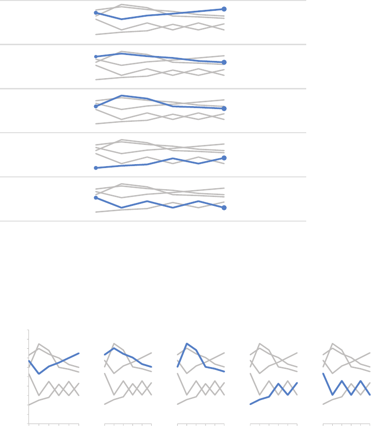
CASE STUDY 4: Strategies for avoiding the spaghetti graph 233
FIGURE9.26 Combined approach, with vertical separation
Types of non-profits supported by area funders
Health
Education
Human
services
Arts &
culture
Other
Data is self-reported by funders; percents sum to greater than 100 because respondents can make multiple selections.
67% 75%
73% 60%
60% 55%
20%
43%
53%
30%
2015 % of funders
20142013201220112010
FIGURE9.27 Combined approach, with horizontal separation
Types of non-profits supported by area funders
Data is self-reported by funders; percents sum to greater than 100 because respondents can make multiple selections.
0%
10%
20%
30%
40%
50%
60%
70%
80%
90%
100%
20152010
Percent of funders
Health
20152010
Education
20152010
Other
20152010
Human
services
20152010
Arts &
culture
234 case studies
Having a number of small graphs together, as shown in Figure 9.27,
is sometimes referred to as “small multiples.” As noted previously,
it’s imperative here that the details of each graph (the x‐ and y‐axis
minimum and maximum) are the same so that the audience can
quickly compare the highlighted series across the various graphs.
This approach, shown in Figures 9.26 and 9.27, can work well if the
context of the full dataset is important but you want to be able to
focus on a single line at a time. Because of the denseness of infor-
mation, this combined approach may work better for a report or
presentation that will be circulated rather than a live presentation,
where it will be more challenging to direct your audience where you
want them to look.
As is frequently the case, there is not a single “right” answer. Rather,
the solution that will work best will vary by situation. The meta‐lesson
is: if you nd yourself facing a spaghetti graph, don’t stop there. Think
about what information you want to most convey, what story you
want to tell, and what changes to the visual could help you accom-
plish that effectively. Note that in some cases, this may mean show-
ing less data altogether. Ask yourself: Do I need all categories? All
years? When appropriate, reducing the amount of data shown can
make the challenge of graphing data like that shown in this exam-
ple easier as well.
CASE STUDY 5: Alternatives to pies
Recall the scenario we discussed in Chapter 1 about the summer
learning program on science. To refresh your memory: you just com-
pleted a pilot summer program on science aimed at improving per-
ceptions of the eld among 2nd and 3rd grade elementary children.
You conducted a survey going into the program and at the end of
the program, and want to use this data as evidence of the success
of the pilot program in your request for future funding. Figure 9.28
shows a rst attempt at graphing this data.

CASE STUDY 5: Alternatives to pies 235
The survey data demonstrates that, on the basis of improved senti-
ment toward science, the pilot program was a great success. Going
into the program, the biggest segment of students (40%, the green
slice in Figure 9.28, left) felt just “OK” about science—perhaps they
hadn’t made up their minds one way or the other. However, after the
program (Figure 9.28, right), we see the 40% in green shrinks down
to 14%. “Bored” (blue) and “Not great” (red) went up a percentage
point each, but the majority of the change was in a positive direction.
After the program, nearly 70% of kids (purple plus teal segments)
expressed some level of interest toward science.
Figure 9.28 does this story a great disservice. I shared my less‐
than‐favorable view on pie charts in Chapter 2, so I hope this judg-
ment is not met with surprise. Yes, you can get to the story from
Figure 9.28, but you have to work for it and overcome the annoyance
of trying to compare segments across two pies. As we’ve discussed,
we want to limit or eliminate the work your audience has to do to
get at the information, and we certainly don’t want to annoy them.
We can avoid such challenges by choosing a different type of visual.
Let’s take a look at four alternatives for displaying this data—show
the numbers directly, simple bar graph, stacked horizontal bar graph,
and slopegraph—and discuss some considerations with each.
FIGURE9.28 Original visual
Survey results: summer learning program on science
11% 5%
40%
25%
19%
PRE: How do you feel
about doing science?
Bored Not great OK Kind of interested Excited
12% 6%
14%
30%
38%
POST: How do you feel
about doing science?
Bored Not great OK Kind of interested Excited

236 case studies
Alternative #1: show the numbers directly
If the improvement in positive sentiment is the main message we
want to impart to our audience, we can consider making that the
only thing we communicate. See Figure 9.29.
Too often, we think we have to include all of the data and overlook
the simplicity and power of communicating with just one or two num-
bers directly, as demonstrated in Figure 9.29. That said, if you feel
you need to show more, look to one of the following alternatives.
Alternative #2: simple bar graph
When you want to compare two things, you should generally put
those two things as close together as possible and align them along
a common baseline to make this comparison easy. The simple bar
graph does this by aligning the Before and After survey responses
with a consistent baseline at the bottom of the graph. See Figure 9.30.
FIGURE9.29 Show the numbers directly
Pilot program was a success
After the pilot program,
of kids expressed interest towards science,
compared to 44% going into the program.
Based on survey of 100 students conducted before and after pilot program (100% response rate on both surveys).
CASE STUDY 5: Alternatives to pies 237
I am partial to this view for this specic example because the layout
makes it possible to put the text boxes right next to the data points
they describe (note that other data is there for context but is slightly
pushed to the background through the use of lighter colors). Also,
by having Before and After as the primary classication, I’m able to
limit the visual to two colors—grey and blue—whereas three colors
will be used in the following alternatives.
Alternative #3: 100% stacked horizontal bar graph
When the part‐to‐whole concept is important (something you don’t
get with either Alternative #1 or #2), the stacked 100% horizontal
bar graph achieves this. See Figure 9.31. Here, you get a consistent
baseline to use for comparison at the left and at the right of the
graph. This allows the audience to easily compare both the negative
segments at the left and the positive segments at the right across
the two bars and, because of this, is a useful way to visualize survey
data in general.
FIGURE9.30 Simple bar graph
Pilot program was a success
How do you feel about science?
Based on survey of 100 students conducted before and after pilot program (100% response rate on both surveys).
11%
5%
40%
25%
19%
12%
6%
14%
30%
38%
Kind ofOKNot greatBored
interested
Excited
BEFORE program, the
majority of children felt
just OK about science. AFTER
program,
more children
were Kind of
interested &
Excited about
science.
238 case studies
In Figure 9.31, I chose to retain the x‐axis labels rather than put data
labels on the bars directly. I tend to do it this way when leveraging
100% stacked bars so that you can use the scale at the top to read
either from left to right or from right to left. In this case, it allows
us to attribute numbers to the change from Before to After on the
negative end of the scale (“Bored” and “Not great”) or from right
to left, doing the same for the positive end of the scale (“Kind of
interested” and “Excited”). In the simple bar graph shown previously
(Figure 9.30), I chose to omit the axis and label the bars directly. This
illustrates how different views of your data may lead you to different
design choices. Always think about how you want your audience to
use the graph and make your design choices accordingly: different
choices will make sense in different situations.
Alternative #4: slopegraph
The nal alternative I’ll present here is a slopegraph. As was the case
with the simple bar chart, you don’t get a clear sense of there being
a whole and thus pieces‐of‐a‐whole in this view (in the way that you
FIGURE9.31 100% stacked horizontal bar graph
Pilot program was a success
How do you feel about science?
Based on survey of 100 students conducted before and after pilot program (100% response rate on both surveys).
100%80%60%40%20%0%
BEFORE
AFTER
% of total
Bored |Not great |OK |Kind of interested Excited
|
AFTER program, more children
were Kind of interested (30%)
& Excited (38%) about science.
BEFORE program, the
majority of children (40%)
felt just OK about science.

CASE STUDY 5: Alternatives to pies 239
do with the initial pie or with the 100% horizontal stacked bar). Also,
if it is important to have your categories ordered in a certain way, a
slopegraph won’t always be ideal since the various categories are
placed according to the respective data values. In Figure 9.32 on the
right‐hand side, you do get the positive end of the scale at the top,
but note that “Bored” and “Not great” at the bottom are switched
relative to how they’d appear in an ordinal scale because of the val-
ues that correspond with these points. If you need to dictate the
category order, use the simple bar graph or the 100% stacked bar
graph, where you can control this.
With the slopegraph in Figure 9.32, you can easily see the visual per-
centage change from Before to After for each category via the slope
of the respective line. It’s easy to see quickly that the category that
increased the most was “Excited” (due to the steep slope) and the
category that decreased markedly was “OK.” The slopegraph also
provides clear visual ordering of categories from greatest to least
(via their respective points in space from top to bottom on the left
and right sides of the graph).
FIGURE9.32 Slopegraph
Pilot program was a success
How do you feel about science?
Based on survey of 100 students conducted before and after pilot program (100% response rate on both surveys).
11% 12%
5% 6%
40%
14%
25%
30%
19%
38%
BEFORE AFTER
Excited
Kind of
interested
OK
Bored
Not great
BEFORE program, the
majority of children felt
just OK about science.
AFTER program,
more children were
Kind of interested &
Excited about science.

240 case studies
Any of these alternatives might be the best choice given the specic
situation, how you want your audience to interact with the informa-
tion, and what point or points of emphasis you want to make. The
big lesson here is that you have a number of alternatives to pies that
can be more effective for getting your point across.
In closing
In this chapter, we discussed considerations and solutions for tack-
ling several common challenges faced when communicating visually
with data. Inevitably, you’ll face data visualization challenges that I
have not addressed. There is as much to be learned from the critical
thinking that goes into solving some of these scenarios as there is
from the “answer” itself. As we’ve discussed, when it comes to data
visualization, rarely is there a single correct path or solution.
Even more examples
For more case studies like the ones we’ve considered here,
check out my blog at storytellingwithdata.com, where
you’ll nd a number of before‐and‐after examples leveraging
the lessons that we’ve learned.
When you nd yourself in a situation where you are unsure how to
proceed, I nearly always recommend the same strategy: pause to
consider your audience. What do you need them to know or do?
What story do you aim to tell them? Often, by answering these ques-
tions, a good path for how to present your data will become clear.
If one doesn’t, try several views and seek feedback.
My challenge to you is to consider how you can apply all of the les-
sons we’ve learned and your critical thinking skills to the various and
varied data visualization challenges you face. The responsibility—
and the opportunity—to tell a story with data is yours.
241
chapter ten
nal thoughts
Data visualization—and communicating with data in general—sits at
the intersection of science and art. There is certainly some science
to it: best practices and guidelines to follow, as we’ve discussed
throughout this book. But there is also an artistic component. This
is one of the reasons this area is so much fun. It is inherently diverse.
Different people will approach things in varying ways and come up
with distinct solutions to the same data visualization challenge. As
we’ve discussed, there is no single “right” answer. Rather, there are
often multiple potential paths for communicating effectively with
data. Apply the lessons we’ve covered in this book to forge your
path, with the goal of using your artistic license to make the infor-
mation easier for your audience to understand.
You have learned a great deal over the course of this book that sets
you up for success when it comes to communicating effectively with
data. In this nal chapter, we’ll discuss some tips on where to go from
here and strategies for upskilling storytelling with data competency
in your team and organization. Finally, we will end with a recap of

242 nal thoughts
the main lessons we’ve covered and send you off eager and ready
to tell stories with data.
Where to go from here
Reading about effective storytelling with data is one thing. But how
do you translate what we’ve learned to practical application? The sim-
ple way to get good at this is to do it: practice, practice, and practice
some more. Look for opportunities in your work to apply the lessons
we’ve learned. Note that it doesn’t have to be all or nothing—one
way to make progress is through incremental improvements to exist-
ing or ongoing work. Consider also when you can leverage the entire
storytelling with data process that we’ve covered from start to nish.
Now I want to overhaul our entire monthly report!
You likely see graphs differently than you did at the onset
of our journey together. Rethinking the way you visual-
ize data is a great thing. But don’t let overambitious goals
overwhelm and hinder progress. Consider what incremental
improvements you can make as you work toward storytelling
with data nirvana. For example, if you’re considering over-
hauling your regular reports, an interim step could be to start
thinking of the report as the appendix. Leave the data there
for reference, but push it to the back so it doesn’t distract
from the main message. Insert a few slides or a cover note up
front and use this to pull out the interesting stories, leverag-
ing the storytelling with data lessons we’ve covered. This way
you can more easily focus your audience on the important
stories and resulting actions.
For some specic, concrete steps on where to go from here, I’ll out-
line ve nal tips: learn your tools well, iterate and seek feedback,
allow ample time for this part of the process, seek inspiration from
Where to go from here 243
others, and—last but not least—have some fun while you’re at it!
Let’s discuss each of these.
Tip #1: learn your tools well
For the most part, I’ve intentionally avoided discussion on tools
because the lessons we’ve covered are fundamental and can be
applied to varying degrees in any tool (for example, Excel or Tableau).
Try not to let your tools be a limiting factor when it comes to com-
municating effectively with data. Pick one and get to know it as best
you can. When you’re rst starting out, a course to become familiar
with the basics may be helpful. In my experience, however, the best
way to learn a tool is to use it. When you can’t gure out how to do
something, don’t give up. Continue to play with the program and
search Google for solutions. Any frustration you encounter will be
worth it when you can bend your tool to your will!
You don’t need fancy tools in order to visualize data well. The exam-
ples we’ve looked at in this book were all created with Microsoft
Excel, which I nd is the most pervasive when it comes to business
analytics.
While I use mainly Excel for visualizing data, this isn’t your only option.
There are a plethora of tools out there. The following is a very quick
rundown of some of the popular ones currently used for creating
data visualizations like the ones we’ve examined:
• Google spreadsheets are free, online, and sharable, allowing
multiple people to edit (as of this writing, there remain graph for-
matting constraints that make it challenging to apply some of the
lessons we’ve covered when it comes to decluttering and drawing
attention where you want it).
• Tableau is a popular out‐of‐the‐box data visualization solution
that can be great for exploratory analysis because it allows you to
quickly create multiple views and nice‐looking graphs from your
data. It can be leveraged for the explanatory via the Story Points

244 nal thoughts
feature. It is expensive, though a free Tableau Public option is
available if uploading your data to a public server isn’t an issue.
• Programming languages—like R, D3 (JavaScript), Processing, and
Python—have a steeper learning curve but allow for greater ex-
ibility, since you can control the specic elements of the graphs you
create and make those specications repeatable through code.
• Some people use Adobe Illustrator, either alone or together with
graphs created in an application like Excel or via a programming
language, for easier manipulation of graph elements and a pro-
fessional look and feel.
How I use PowerPoint
For me, PowerPoint is simply the mechanism that allows
me to organize a handout or present on the big screen.
I nearly always start from a totally blank slide and do not
leverage the built‐in bullets that too easily turn content from
presentation to teleprompter.
You can build graphs directly in PowerPoint; however, I tend
not to do this. There is greater exibility in Excel (where, in
addition to the graph, you can also have some elements of
a visual—for example, titles or axis labels—directly in the
cells, which is sometimes useful). Because of this, I create my
visuals in Excel, then copy and paste into PowerPoint as an
image. If I am using text together with a visual—for example,
to draw attention to a specic point—I typically do that via a
text box in PowerPoint.
The animation feature within PowerPoint can be useful for
progressing through a story with iterations of the same visual,
as shown in Chapter 8 or some of the case studies in Chap-
ter 9. When using animation in PowerPoint, use only simple
Appear or Disappear (in some instances, Transparency can
also be useful); steer clear of any animation that causes ele-
ments to y in or fade out—this is the presentation software
equivalent of 3D graphs—unnecessary and distracting!
Where to go from here 245
Another essential basic tool for visualizing data that I did not include
in the preceding list is paper—which brings me to my next tip.
Tip #2: iterate and seek feedback
I’ve presented the storytelling with data process as a linear path.
That’s not often the case in reality. Rather, it takes iterating to get
from early ideas to a nal solution. When the best course for visual-
izing certain data is unclear, start with a blank piece of paper. This
enables you to brainstorm without the constraints of your tools or
what you know how to do in your tools. Sketch out potential views
to see them side‐by‐side and determine what will work best for
getting your message across to your audience. I nd that we form
less attachment to our work product—which can make iterating
easier—when we are working on paper rather than on our comput-
ers. There is also something freeing about drawing on blank paper
that may make it easier to identify new approaches if you’re feeling
stuck. Once you have your basic approach sketched, consider what
you have at your disposal—tools, or internal or external experts—to
actually create the visual.
When creating your visual in your graphing application (for example,
Excel) and rening to get from good to great, you can leverage what
I call the “optometrist approach.” Create a version of the graph (let’s
call it A), then make a copy of it (B) and make a single change. Then
determine which looks better—A or B. Often, the practice of see-
ing slight variations next to each other makes it quickly clear which
view is superior. Progress in this manner, preserving the latest “best”
visual and continuing to make minor modications in a copy (so you
always have the prior version to go back to in case the modication
worsens it) to iterate toward your ideal visual.
At any point, if the best path is unclear, seek feedback. The fresh set
of eyes that a friend or colleague can bring to the data visualization
endeavor is invaluable. Show someone else your visual and have
them talk you through their thought process: what they pay atten-
tion to, what observations they make, what questions they have,
246 nal thoughts
and any ideas they may have for better getting your point across.
These insights will let you know if the visual you’ve created is on the
mark or, in the case when it isn’t, give you an idea of where to make
changes and focus continued iteration.
When it comes to iterating, there is one thing you need perhaps
more than anything else in order to be successful: time.
Tip #3: devote time to storytelling with data
Everything we’ve discussed throughout this book takes time. It takes
time to build a robust understanding of the context, time to under-
stand what motivates our audience, time to craft the 3‐minute story
and form the Big Idea. It takes time to look at the data in different
ways and determine how to best show it. It takes time to declutter
and draw attention and iterate and seek feedback and iterate some
more to create an effective visual. It takes time to pull it all together
into a story and form a cohesive and captivating narrative.
It takes even more time to do all of this well.
One of my biggest tips for success in storytelling with data is to allow
adequate time for it. If we don’t consciously recognize that this takes
time to do well and budget accordingly, our time can be entirely
eaten up by the other parts of the analytical process. Consider the
typical analytical process: you start with a question or hypothesis,
then you collect the data, then you clean the data, and then you ana-
lyze the data. After all of that, it can be tempting to simply throw the
data into a graph and call it “done.”
But we simply aren’t doing ourselves—or our data—justice with this
approach. The default settings of our graphing application are typi-
cally far from ideal. Our tools do not know the story we aim to tell.
Combine these two things and you run the risk of losing a great deal
of potential value—including the opportunity to drive action and
effect change—if adequate time isn’t spent on this nal step in the
analytical process: the communication step. This is the only part of
Where to go from here 247
the entire process that your audience actually sees. Devote time to
this important step. Expect it to take longer than you think to allow
sufcient time to iterate and get it right.
Tip #4: seek inspiration through good examples
Imitation really is the best form of attery. If you see a data visualiza-
tion or example of storytelling with data that you like, consider how
you might adapt the approach for your own use. Pause to reect on
what makes it effective. Make a copy of it and create a visual library
that you can add to over time and refer to for inspiration. Emulate
the good examples and approaches that you see.
Said more provocatively—imitation is a good thing. We learn by
emulating experts. That’s why you see people with their sketchpads
and easels at art museums—they are interpreting great works. My
husband tells me that while learning to play the jazz saxophone, he
would listen to the masters repeatedly—narrowing at times to a sin-
gle measure played at a slower speed that he would practice until
he could repeat the notes perfectly. This idea of using great exam-
ples as an archetype to learn applies to data visualization as well.
There are a number of great blogs and resources on the topic of data
visualization and communicating with data that contain many good
examples. Here are a few of my current personal favorites (includ-
ing my own!):
• Eager Eyes (eagereyes.org, Robert Kosara): Thoughtful content
on data visualization and visual storytelling.
• FiveThirtyEight’s Data Lab (vethirtyeight.com/datalab, various
authors): I like their typically minimalist graphing style on a large
range of news and current events topics.
• Flowing Data (owingdata.com, Nathan Yau): Membership gets
you premium content, but there are a lot of great free examples
of data visualization as well.
248 nal thoughts
• The Functional Art (thefunctionalart.com, Alberto Cairo): An intro-
duction to information graphics and visualization, with great con-
cise posts highlighting advice and examples.
• The Guardian Data Blog (theguardian.com/data, various authors):
News‐related data, often with accompanying article and visualiza-
tions, by the British news outlet.
• HelpMeViz (HelpMeViz.com, Jon Schwabish): “Helping people
with everyday visualizations,” this site allows you to submit a visual
to receive feedback from readers or scan the archives for exam-
ples and corresponding conversations.
• Junk Charts (junkcharts.typepad.com, Kaiser Fung): By
self‐proclaimed “web’s rst data viz critic,” focuses on what makes
graphics work and how to make them better.
• Make a Powerful Point (makeapowerfulpoint.com, Gavin
McMahon): Fun, easy‐to‐digest content on creating and giving
presentations and presenting data.
• Perceptual Edge (perceptualedge.com, Stephen Few): No‐
nonsense content on data visualization for sensemaking and
communication.
• Visualising Data (visualisingdata.com, Andy Kirk): Charts the
development of the data visualization eld, with great monthly
“best visualisations of the web” resource list.
• VizWiz (vizwiz.blogspot.com, Andy Kriebel): Data visualization
best practices, methods for improving existing work, and tips and
tricks for using Tableau Software.
• storytelling with data (storytellingwithdata.com): My blog focuses
on communicating effectively with data and contains many exam-
ples, visual makeovers, and ongoing dialogue.
This is just a sampling. There is a lot of great content out there. I
continue to learn from others who are active in this space and doing
great work. You can, too!

Where to go from here 249
You now have a discerning eye when it comes to the visual display
of information. You will never look at a graph the same. One work-
shop attendee told me that he is “ruined”—he can’t encounter a
data visualization without applying his new lens for assessing effec-
tiveness. I love hearing these stories, as it means I’m making progress
toward my goal of ridding the world of ineffective graphs. You have
been ruined in this same way, but this is actually a really good thing!
Continue to learn from and leverage the aspects of good examples
you see, while avoiding the pitfalls of the poor ones, as you start to
create your own data visualization style.
Tip #5: have fun and nd your style
When most people think about data, one of the furthest things from
their mind is creativity. But within data visualization, there is absolutely
space for creativity to play a role. Data can be made to be breath-
takingly beautiful. Don’t be afraid to try new approaches and play a
little. You’ll continue to learn what works and what doesn’t over time.
You may also nd that you develop a personal data visualization style.
For example, my husband says he can recognize visuals that I cre-
ated or inuenced. Unless a client brand calls for something else, I
Learn from the not‐so‐great examples, too
Often, you can learn as much from the poor examples of
data visualization—what not to do—as you can from
those that are effective. Bad graphs are so plentiful that
entire sites exist to curate, critique, and poke fun at them.
For an entertaining example, check out WTF Visualizations
(wtfviz.net), where content is described simply as “visual-
izations that make no sense.” I challenge you not only to
recognize when you encounter a poor example of data visu-
alization but also to pause and reect on why it isn’t ideal and
how it could be improved.
250 nal thoughts
tend to do everything in shades of grey and use blue sparingly in a
minimalist style, almost always in plain old Arial font (I like it!). That
doesn’t mean your approach must imitate these specics to be suc-
cessful. My own style has evolved based on personal preferences and
learning through trial and error—testing out different fonts, colors,
and graph elements. I can recall one particularly unfortunate example
that incorporated a grey‐to‐white shaded graph background and far
too many shades of orange. I’ve come a long way!
To the extent that it makes sense given the task at hand, don’t be
afraid to let your own style develop and creativity come through when
you communicate with data. Company brand can also play a role in
developing a data visualization style; consider your company’s brand
and whether there are opportunities to fold that into how you visual-
ize and communicate with data. Just make sure that your approach
and stylistic elements are making the information easier—not more
difcult—for your audience to consume.
Now that we’ve looked at some specic tips for you to follow, let’s
turn to some ideas for building storytelling with data competency
in others.
Building storytelling with data competency in your
team or organization
I am a strong believer that anyone can improve their ability to com-
municate with data by learning and applying the lessons we’ve cov-
ered. That said, some will have more interest and natural aptitude
than others in this space. When it comes to being effective at com-
municating with data in your team or your organization, there are a
few potential strategies to consider: upskill everyone, invest in an
expert, or outsource this part of the process. Let’s briey discuss
each of these.
Building storytelling with data competency in your team or organization 251
Upskill everyone
As we’ve discussed, part of the challenge is that data visualization
is a single step in the analytical process. Those hired into analytical
roles typically have quantitative backgrounds that suit them well for
the other steps (nding the data, pulling it together, analyzing it,
building models), but not necessarily any formal training in design
to help them when it comes to the communication of the analysis.
Also, increasingly those without analytical backgrounds are being
asked to put on analytical hats and communicate using data.
For both of these groups, nding ways to impart foundational knowl-
edge can make everyone better. Invest in training or use the lessons
covered here to generate momentum. On this latter note, here are
some specic ideas:
• Storytelling with data book club: read a chapter at a time and
then discuss it together, identifying examples specic to your work
where the given lesson can be applied.
• Do‐it‐yourself workshop: after nishing the book, conduct your
own workshop—soliciting examples of communicating with data
from your team and discussing how they can be improved.
• Makeover Monday: challenge individuals to a weekly makeover
of less‐than‐ideal examples employing the lessons we’ve covered.
• Feedback loop: set the expectation that individuals must share
work in progress and offer feedback to each other grounded in
the storytelling with data lessons.
• And the winner is: introduce a monthly or quarterly contest, where
individuals or teams can submit their own examples of effective
storytelling with data then start a gallery of model examples,
adding to it over time via contest winners.
Any of these approaches—alone or combined—can create and help
ensure continued focus on effective visualization and storytelling
with data.
252 nal thoughts
Invest in an internal expert or two
Another approach is to identify an individual or a couple of individuals
on your team or in your organization who are interested in data visu-
alization (even better if they’ve already displayed some natural apti-
tude) and invest in them so they can become your in‐house experts.
Make it an expectation of their role to be an internal data visualization
consultant to whom others on the team can turn for brainstorming
and feedback or to overcome tool‐specic challenges. This invest-
ment can take the form of books, tools, coaching, workshops, or
courses. Provide time and opportunities to learn and practice. This
can be a great form of recognition and career development for the
individual. As the individual continues to learn, they can share this
with others as a way to ensure continued team development as well.
Outsource
In some situations, it may make sense to outsource visual creation
to an external expert. If time or skill constraints are too great to
overcome for a specic need, turning to a data visualization or pre-
sentation consultant may be worth considering. For example, one
client contracted me to design an important presentation that they
would need to give a number of times in the upcoming year. Once
the basic story was in place, they knew they could make the minor
changes needed to make it t the various venues.
The biggest drawback of outsourcing is that you don’t develop the
skills and learn in the same way as if you tackle the challenge inter-
nally. To help overcome this, look for opportunities to learn from the
consultant during the process. Consider whether the output can also
provide a starting point for other work, or if it can be evolved over
time as you develop internal capability.
A combined approach
The teams and organizations I’ve seen become the most success-
ful in this space leverage a combined approach. They recognize
Recap: a quick look at all we’ve learned 253
the importance of storytelling with data and invest in training and
practice to give everyone the foundational knowledge for effective
data visualization. They also identify and support an internal expert,
to whom the rest of the team can turn for help overcoming specic
challenges. They bring in external experts to learn from as makes
sense. They recognize the value of being able to tell stories with
data effectively and invest in their people to build this competency.
Through this book, I’ve given you the foundational knowledge and
language to use to help your team and your organization excel
when it comes to communicating with data. Think about how you
can frame feedback in terms of the lessons we’ve covered to help
others improve their ability and effectiveness as well.
Let’s wrap up with a recap of the path we’ve taken to effective sto-
rytelling with data.
Recap: a quick look at all we’ve learned
We have learned a great deal over the course of this book, from
context to cutting clutter and drawing attention to telling a robust
story. We’ve worn our designer hats and looked at things through our
audience’s eyes. Here is a review of the main lessons we’ve covered:
1. Understand the context. Build a clear understanding of who
you are communicating to, what you need them to know or do,
how you will communicate to them, and what data you have to
back up your case. Employ concepts like the 3‐minute story, the
Big Idea, and storyboarding to articulate your story and plan the
desired content and ow.
2. Choose an appropriate visual display. When highlighting a
number or two, simple text is best. Line charts are usually best
for continuous data. Bar charts work great for categorical data
and must have a zero baseline. Let the relationship you want to
show guide the type of chart you choose. Avoid pies, donuts, 3D,
and secondary y‐axes due to difculty of visual interpretation.
254 nal thoughts
3. Eliminate clutter. Identify elements that don’t add informative
value and remove them from your visuals. Leverage the Gestalt
principles to understand how people see and identify candidates
for elimination. Use contrast strategically. Employ alignment of
elements and maintain white space to help make the interpreta-
tion of your visuals a comfortable experience for your audience.
4. Focus attention where you want it. Employ the power of pre-
attentive attributes like color, size, and position to signal what’s
important. Use these strategic attributes to draw attention to
where you want your audience to look and guide your audience
through your visual. Evaluate the effectiveness of preattentive
attributes in your visual by applying the “where are your eyes
drawn?” test.
5. Think like a designer. Offer your audience visual affordances as
cues for how to interact with your communication: highlight the
important stuff, eliminate distractions, and create a visual hier-
archy of information. Make your designs accessible by not over-
complicating and leveraging text to label and explain. Increase
your audience’s tolerance of design issues by making your visu-
als aesthetically pleasing. Work to gain audience acceptance of
your visual designs.
6. Tell a story. Craft a story with clear beginning (plot), middle
(twists), and end (call to action). Leverage conict and tension
to grab and maintain your audience’s attention. Consider the
order and manner of your narrative. Utilize the power of repeti-
tion to help your stories stick. Employ tactics like vertical and
horizontal logic, reverse storyboarding, and seeking a fresh per-
spective to ensure that your story comes across clearly in your
communication.
Together, these lessons set you up for success when communicat-
ing with data.
In closing 255
In closing
When you opened this book, if you felt any sense of discomfort or
lack of expertise when it comes to communicating with data, my
hope is that those feelings have been mitigated. You now have a
solid foundation, examples to emulate, and concrete steps to take
to overcome the data visualization challenges you face. You have a
new perspective. You will never look at data visualization the same.
You are ready to assist me with my goal of ridding the world of inef-
fective graphs.
There is a story in your data. If you weren’t convinced of that before
our journey together, I hope you are now. Use the lessons we’ve
covered to make that story clear to your audience. Help drive bet-
ter decision making and motivate your audience to act. Never again
will you simply show data. Rather, you will create visualizations that
are thoughtfully designed to impart information and incite action.
Go forth and tell your stories with data!
257
bibliography
Arheim, Rudolf. Visual Thinking. Berkeley, CA: University of California Press,
2004.
Atkinson, Cliff. Beyond Bullet Points: Using Microsoft PowerPoint to Create
Presentations that Inform, Motivate, and Inspire. Redmond, WA: Microsoft
Press, 2011.
Bryant, Adam. “Google’s Quest to Build a Better Boss.” New York Times,
March 13, 2011.
Cairo, Alberto. The Functional Art: An Introduction to Information Graph-
ics and Visualization. Berkeley, CA: New Riders, 2013.
Cohn, D’Vera, Gretchen Livingston, and Wendy Wang. “After Decades of
Decline, a Rise in Stay‐at‐Home Mothers.” Pew Research Center, April
8, 2014.
Cowan, Nelson. “The Magical Number Four in Short‐Term Memory:
A Reconsideration of Mental Storage Capacity.” Behavioral and Brain
Sciences 24 (2001): 87–114.
Duarte, Nancy. Resonate: Present Visual Stories that Transform Audiences.
Hoboken, NJ: John Wiley & Sons, 2010.
Duarte, Nancy. Slide:ology: The Art and Science of Creating Great Presen-
tations. Sebastopol, CA: O’Reilly, 2008.
Few, Stephen. Show Me the Numbers: Designing Tables and Graphs to
Enlighten. Oakland, CA: Analytics Press, 2004.
Few, Stephen. Now You See It: Simple Visualization Techniques for Quan-
titative Analysis. Oakland, CA: Analytics Press, 2009.
Fryer, Bronwyn. “Storytelling that Moves People.” Harvard Business Review,
June 2003.
258 bibliography
Garvin, David A., Alison Berkley Wagonfeld, and Liz Kind. “Google’s Project
Oxygen: Do Managers Matter?” Case Study 9–313–110, Harvard Busi-
ness Review, April 3, 2013.
Goodman, Andy. Storytelling as Best Practice, 6th edition. Los Angeles,
CA: The Goodman Center, 2013.
Grimm, Jacob, and Wilhelm Grimm. Grimms’ Fairy Tales. New York, NY:
Grosset & Dunlap, 1986.
Iliinsky, Noah, and Julie Steele. Designing Data Visualizations. Sebastopol,
CA: O’Reilly, 2011.
Klanten, Robert, Sven Ehmann, and Floyd Schulze. Visual Storytelling: Inspir-
ing a New Visual Language. Berlin, Germany: Gestalten, 2011.
Lidwell, William, Kritina Holden, and Jill Butler. Universal Principles of
Design. Beverly, MA: Rockport Publishers, 2010.
McCandless, David. The Visual Miscellaneum: A Colorful Guide to the
World’s Most Consequential Trivia. New York, NY: Harper Design, 2012.
Meirelles, Isabel. Design for Information. Beverly, MA: Rockport Publish-
ers, 2013.
Miller, G. A. “The Magical Number Seven, Plus or Minus Two: Some Limits
on Our Capacity for Processing Information.” The Psychological Review
63 (1956): 81–97.
Norman, Donald A. The Design of Everyday Things. New York, NY: Basic
Books, 1988.
Reynolds, Garr. Presentation Zen: Simple Ideas on Presentation Design and
Delivery. Berkeley, CA: New Riders, 2008.
Robbins, Naomi. Creating More Effective Graphs. Wayne, NJ: Chart House,
2013.
Saint‐Exupery, Antoine de. The Airman’s Odyssey. New York, NY: Harcourt,
1943.
Simmons, Annette. The Story Factor: Inspiration, Inuence, and Persua-
sion through the Art of Storytelling. Cambridge, MA: Basic Books, 2006.
Song, Hyunjin, and Norbert Schwarz. “If It’s Hard to Read, It’s Hard to Do:
Processing Fluency Affects Effort Prediction and Motivation.” Psycho-
logical Science 19 (10) (2008): 986–998.
Steele, Julie, and Noah Iliinsky. Beautiful Visualization: Looking at Data
Through the Eyes of Experts. Sebastopol, CA: O’Reilly, 2010.
Tufte, Edward. Beautiful Evidence. Cheshire, CT: Graphics Press, 2006.
Tufte, Edward. Envisioning Information. Cheshire, CT: Graphics Press, 1990.
bibliography 259
Tufte, Edward. The Visual Display of Quantitative Information. Cheshire,
CT: Graphics Press, 2001.
Tufte, Edward. Visual Explanations: Images and Quantities, Evidence and
Narrative. Cheshire, CT: Graphics Press, 1997.
Vonnegut, Kurt. “How to Write with Style.” IEEE Transactions on Profes-
sional Communication PC‐24 (2) (June 1985): 66–67.
Ware, Colin. Information Visualization: Perception for Design. San Fran-
cisco, CA: Morgan Kaufmann, 2004.
Ware, Colin. Visual Thinking for Design. Burlington, MA: Morgan Kaufmann,
2008.
Weinschenk, Susan. 100 Things Every Designer Needs to Know about Peo-
ple. Berkeley, CA: New Riders, 2011.
Wigdor, Daniel, and Ravin Balakrishnan. “Empirical Investigation into the
Effect of Orientation on Text Readability in Tabletop Displays.” Depart-
ment of Computer Science, University of Toronto, 2005.
Wong, Dona. The Wall Street Journal Guide to Information Graphics. New
York, NY: W. W. Norton & Company, 2010.
Yau, Nathan. Data Points: Visualization that Means Something. Indianapo-
lis, IN: John Wiley & Sons, 2013.
Yau, Nathan. Visualize This: The FlowingData Guide to Design, Visualiza-
tion, and Statistics. Indianapolis, IN: John Wiley & Sons, 2011.
261
Index
A
Accessibility, 138–145, 198
overcomplicating, 139–141
poor design, 139
text, thoughtful use of,
141–145
action titles on slides, 141
Action words, 23
Adobe Illustrator, 244
Aesthetics, 145–148, 198
Affordances, 128–138
creating a clear visual
hierarchy of information,
135–138
eliminating distractions,
132–135
highlighting effects, 129–132
Alignment, 82–84
diagonal components, 83–84
presentation software tips for,
83
Animation, leveraging in
visuals, 210–218
Annotated line graph with
forecast, 154
Area graphs, 59–60
Atkinson, Cliff, 172
Audience attention, focusing,
15, 99–126, 195–197
color, 117–124
brand colors, 123–124
considering tone
conveyed, 122–123
designing with colorblind
in mind, 121–122
position on page, 124–126
using consistently, 120–121
using sparingly, 118–120
memory, 100–102
iconic, 101
long-term, 102
short-term, 101–102
preattentive attributes,
102–116
in graphs, 109–116
in text, 106–109
sight, 100
size, 116–117
B
Bar charts, 50–59, 156–158,
161–162, 236–237
axis vs. data labels, 52
bar width, 53
262 Index
Bar charts (continued )
categories, logical ordering
of, 58
ethical concerns, 53
horizontal, 57
simple, 236–237
stacked
horizontal, 58–59, 161–162,
237–238
leveraging positive and
negative, 158
100%, 156–158
vertical, 54–55
vertical, 54
waterfall chart, 55–57
Beck, Harry, 139
Beyond Bullet Points (Atkinson),
172
Big Idea, 30–31, 189
Bing, Bang, Bongo, 180–181
C
Cairo, Alberto, 248
Case studies, 17, 207–240
alternatives to pie charts,
234–240
100% stacked horizontal
bar graph, 237–238
showing numbers directly,
236
simple bar graph, 236–237
slopegraph, 238–240
color considerations with a
dark background,
208–210
animation, leveraging in
visuals, 210–218
logic in order, 219–227
spaghetti graphs, avoiding,
227–234
combined approach,
232–234
emphasizing one line at a
time, 229–230
separating spatially,
230–232
Closure principle, 78, 92
Clutter, avoiding, 15, 71–98
cognitive load, 71–73
data-ink/signal-to-noise
ratio, 72
contrast, nonstrategic use of,
86–90
redundant details, use of,
90
decluttering, 90–97
cleaning up axis labels, 95
labeling data directly, 96
leveraging consistent color,
97
removing chart border, 92
removing data markers,
94
removing gridlines, 93
Gestalt Principles of Visual
Perception, 74–81
closure, 78, 92
connection, 80
continuity, 79
enclosure, 77
proximity, 75, 96
similarity, 76, 97
presence of, 73
visual order, lack of, 81–86
alignment, 82–84
white space, 84–86
Index 263
Cognitive load, 71–73
data-ink/signal-to-noise ratio,
72
Color considerations with a
dark background,
208–210
Color saturation, 42
Communication mechanism
continuum, 24
live presentation, 24–25
slideument, 26
written document or email,
25–26
Connection principle, 80
Context, importance of, 14,
19–33, 188–189
Big Idea, 30–31
consulting for, 28–29
exploratory vs. explanatory
analysis, 19–20
how, 26
illustrated by example,
27–28
supporting data, 27
storyboarding, 31–33
3-minute story, 30
understanding, 188–189
what, 22–26
action, 22–23
mechanism, 23–26
tone, 26
who, 21–22
audience, 21
you, 21–22
Continuity principle, 79
Contrast, nonstrategic use of,
86–90
redundant details, use of, 90
D
Data-ink ratio, 72
Data Points (Yau), 20
Distractions, eliminating,
132–135
Donut charts, 65
Duarte, Nancy, 22, 30, 72, 173
179
E
Eager Eyes (blog), 247
Effective visuals, choosing, 14,
35–69
graphs, 43–49
area graphs, 59–60
bar charts, 50–59
lines, 45–49
points, 44–45
slopegraph, 47–49
infographics, 60–61
simple text, 38–40
tables, 40–43
borders, 41
heatmap, 42–43
visuals to avoid, 61–68
3D charts, 65
donut charts, 65
pie charts, 61–65
secondary y-axis,
66–67
Enclosure principle, 77
Excel, 13, 42, 244
changing components of a
graph in, 196
slopegraph template, 48
Exploratory vs. explanatory
analysis, 19–20,
112
264 Index
F
Few, Stephen, 41, 105, 248
FiveThirtyEight’s Data Lab, 247
Flowing Data (blog), 247
The Functional Art (blog), 248
Fung, Kaiser, 248
G
Gestalt Principles of Visual
Perception, 74–81
closure, 78, 92
connection, 80
continuity, 79
enclosure, 77
proximity, 75, 96
similarity, 76, 97
Google
People Analytics, 9–10
Project Oxygen, 10
spreadsheets, 243
Graphs, 43–49
area graphs, 59–60
bar charts, 50–59
axis vs. data labels, 52
bar width, 53
categories, logical ordering
of, 58
ethical concerns, 53
horizontal, 57
stacked horizontal, 58–59
stacked vertical, 54–55
vertical, 54
waterfall chart, 55–57
lines, 45–49
line graph, 46–47
points, 44–45
scatterplots, 44–45
slopegraphs, 47–49
modied, 49
template, 48
The Guardian Data Blog, 248
H
Headlines, creating, 174
Heatmap, 42–43
HelpMeViz (blog), 248
Hierarchy of information,
135–138
super-categories, 136
Highlighting effects, 129–132
Horizontal logic, 181–182
“How to Write with Style”
(Vonnegut), 170
I
Iconic memory, 101
Ineffective graphs, examples
of, 1
Infographics, 60–61
Information Visualization:
Perception for Design
(Ware), 86
K
Kirk, Andy, 248
Kriebel, Andy, 248
L
Line graph, 46–47, 152–154
annotated with forecast, 154
Live presentation, 24–25
tables in, 40
Logic in order, 219–227
Long-term memory, 102, 179
Index 265
M
Make a Powerful Point (blog),
248
McCandless, David, 123, 142
McKee, Robert, 168
McMahon, Gavin, 248
Model visuals, dissecting, 16,
151–163
line graph, 152–154
annotated with forecast,
154
stacked bars
horizontal, 161–162
leveraging positive and
negative, 158
100%, 156–158
Moonville example, 211–218
P
Perceptual Edge (blog), 248
Pie charts, 61–65, 235
Points, 44–45
scatterplots, 44–45
PowerPoint, 244
Preattentive attributes, 102–116
in graphs, 109–116
in text, 106–109
Proximity principle, 75, 96
R
Resonate (Duarte), 22, 30, 72
Reverse storyboarding, 183
S
Scatterplots, 44–45
modied, 45
Schwabish, Jon, 248
Secondary y-axis, 66–67
Short-term memory, 101–102
Show Me the Numbers (Few),
41
Signal-to-noise ratio, 72
Similarity principle, 76, 97
Simple text, 36, 38–40
Slideument, 26, 211
Slopegraphs, 47–49, 238–240
modied, 49
template, 48
Spaghetti graphs, avoiding,
227–234
combined approach, 232–234
emphasizing one line at a
time, 229–230
separating spatially, 230–232
Spears, Libby, 168
Stacked bars
horizontal, 161–162
leveraging positive and
negative, 158
100%, 156–158
Storyboarding, 31–33
Storytelling, 16, 165–185
constructing the story,
171–174
beginning, 171–173
end, 174
middle, 173–174
lessons in, 16
magic of story, 166–171
in cinema, 168–170
in plays, 167–168
in written word, 170–171
narrative structure, 175–179
narrative ow, 175
266 Index
Storytelling (continued )
spoken and written,
177–179
repetition, 179–181
Bing, Bang, Bongo,
180–181
tactics to ensure the story is
clear, 181–184
horizontal logic, 181–182
reverse storyboarding, 183
vertical logic, 182–183
storytelling with data (blog),
248
Storytelling with data process,
187–205, 242–255
appropriate display,
choosing, 189–193, 253
audience attention, focusing,
195–197, 254
building competency in team
or organization, 250–253
combined approach,
252–253
investing in internal
experts, 252
outsourcing, 252
upskilling everyone, 251
clutter, eliminating, 193–194,
254
context, understanding,
188–189, 253
telling a story, 199–204, 254
thinking like a designer,
197–198, 254
tips for success with, 242–255
devoting time to, 246–247
having fun and nding your
style, 249–250
iterating and seeking
feedback, 245–246
seeking inspiration through
good examples, 247–249
tools, learning to use,
243–245
Super-categories, 136, 137
Survey feedback, 59, 81, 209, 219
T
Tableau, 243–244
Tables, 40–43
borders, 41
heatmap, 42–43
Thinking like a designer, 15–16,
127–150
acceptance, 149–150
accessibility, 138–145
overcomplicating, 139–141
poor design, 139
text, thoughtful use of,
141–145
aesthetics, 145–148
affordances, 128–138
creating a clear visual
hierarchy of information,
135–138
eliminating distractions,
132–135
highlighting effects, 129–132
3-minute story, 30
3D charts, 65
Tufte, Edward, ix, 72, 231
U
Universal Principles of Design
(Lidwell, Holden, and
Butler), 129, 149
Index 267
V
Vertical logic, 182–183
The Visual Display of
Quantitative Information
(Tufte), 72
The Visual Miscellaneum;
A Colorful Guide
to the World’s Most
Consequential Trivia
(McCandless), 123
Visual order, lack of, 81–86
alignment, 82–84
diagonal components,
83–84
presentation software tips
for, 83
white space, 84–86
Visualising Data (blog), 248
Visuals to avoid, 61–68
3D charts, 65
donut charts, 65
pie charts, 61–65
secondary y-axis, 66–67
VizWiz (blog), 248
Vonnegut, Kurt, 170
W
Ware, Colin, 86, 118
Waterfall chart, 55–57
brute-force, 56–57
White space, 84–86
Written document or email,
25–26
WTF Visualizations (wtfviz.net),
249
Y
Yau, Nathan, 20, 247
