Sunlight Style Guide Data Viz
User Manual:
Open the PDF directly: View PDF ![]() .
.
Page Count: 13

FORWARD
Data Visualization Style Guidelines
is guide is meant to be a starting point for
creating data visualizations for this organization.
“Data Series” like the 1% of the 1% may have their
own twist on these foundations. Visualizations that
pertain to a particular project, like the 5 year review
of Political Party Time, may also have variations on
these standards. Feel free to use these as a starting
point, and do what makes sense for your particular
data. Please remember to respect the data as you go
forth into the wonderful, but often confusing, world
of turning numbers into visuals.
This guide includes:
»basic graph structure
»bar graphs
»line graphs
»pie charts
»scatter plots
»maps
»graph or chart colors
»choropleth colors for maps
»network visualization colors
EXAMPLE
Title of the chart
For explanatory text that’s not very long.
Y Axis Title
30 units
20 units
10 units
0
Label 1 Label 2 Label 3 Label 4
X Axis Title
Source: www.fruitsperbushel.com
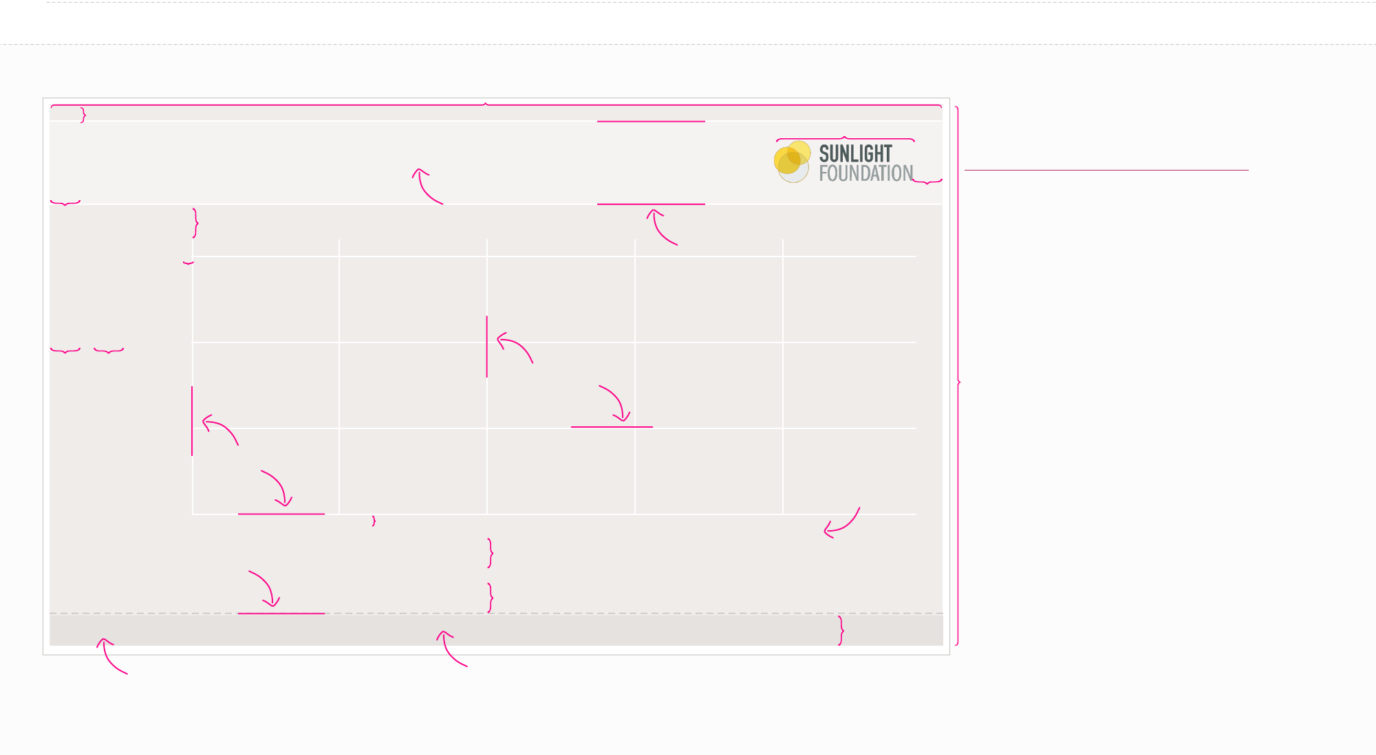
Basic Structure
650px max for a regular blog post (900px max for a feature post)
22px
100px
Download the sunlight logo @
http://sunlightfoundation.com/press/logos
Height is variable. Make them as long as you need
them to be since these are mainly web graphics.
Background color:
Background Light
(#F5F3F2)
12px
1px white (#FFFFFF)
1px white (#FFFFFF)
22px
22px 22px
5px
1px white (#FFFFFF)
5px
22px
22px
22px
ITC Franklin Gothic Demi
12px #635F5D
22px
Background color: Background Dark (#EFECEA)
Georgia bold and italic 8px
Left aligned text, vertically centered
Text light (#8E8883)
1px 4pt dash 4pt
gap Line Grey 80%
(#CDCDC9)

Header Title with emphasis
Header title explanatory text
Key labels
X axis & Y axis labels
X Axis & Y Axis Title
Source: www.fruitsperbushel.com
Callout text
Text Styles
Point Label
ITC Franklin Gothic Std | Book | 12px | centered | #635F5D (Text Main)
ITC Franklin Gothic Std | Book | 10px | left aligned | #635F5D (Text Main)
Georgia | italic| 10px | left aligned | #635F5D (Text Main)
ITC Franklin Gothic Std | Book | 10px | right aligned to point | #635F5D (Text Main)
Georgia | bold title with italic text | 8px | left aligned | #8E8883 (Text Light)
Georgia | italic | 12px | left aligned | #8E8883 (Text Light)
ITC Franklin Gothic Std | Demi | 12px | centered on line | #635F5D (Text Main)
ITC Franklin Gothic Std | Book Condensed with Demi Condensed emphasis | 20px | Left Aligned | #635F5D (Text Main)

CMYK: 5, 5, 5, 0
RGB: 239, 236, 234
Hex: #EFECEA
CMYK: 2, 2, 2, 0
RGB: 245, 243, 242
Hex: #F5F3F2
CMYK: 0, 0, 0, 0
RGB: 255, 255, 255
Hex: #FFFFFF
CMYK: 9, 8, 8, 0
RGB: 229, 226, 224
Hex: #E5E2E0
CMYK: 25, 19, 23, 0
RGB: 192, 192, 187
Hex: #C0C0BB
CMYK: 59, 54, 54, 25
RGB: 99, 95, 93
Hex: #635F5D
CMYK: 46, 41, 44, 5
RGB: 142, 136, 131
Hex: #8E8883
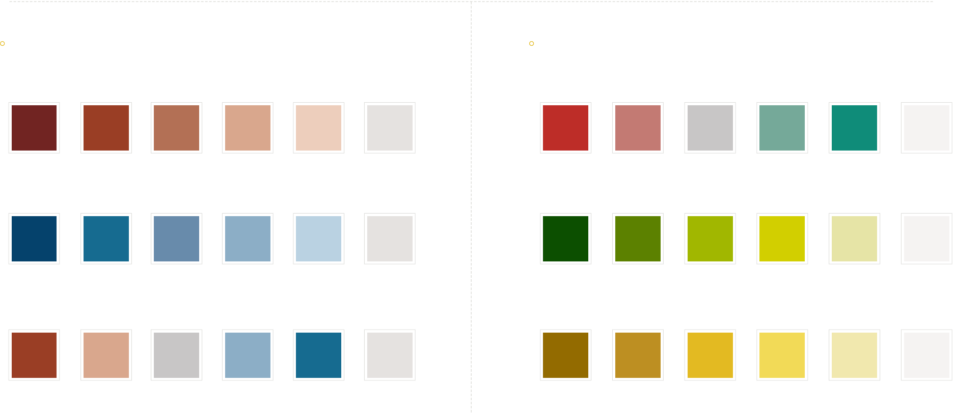
Base Colors
Background Background Light Accent
Line White
Background Dark Accent
Line Grey Accent
Text Main Text Light
Background Colors
CMYK: 12, 24, 100, 0
RGB: 227, 186, 34
Hex: #E3BA22
CMYK: 27, 84, 96, 22
RGB: 154, 62, 37
Hex: #9A3E25
CMYK: 6, 9, 78, 0
RGB: 242, 218, 87
Hex: #F2DA57
RGB: 189, 143, 34
Hex: #BD8F22
CMYK: 25, 60, 69, 8
RGB: 179, 112, 85
Hex: #B37055
CMYK: 7, 57, 97, 1
RGB: 230, 132, 42
Hex: #E6842A
CMYK: 89, 52, 27, 6
RGB: 21, 107, 144
Hex: #E6842A
CMYK: 86, 35, 46, 10
RGB: 19, 123, 128
Hex: #137B80
CMYK: 58, 34, 73, 13
RGB: 112, 130, 89
Hex: #708259
CMYK: 48, 61, 28, 4
RGB: 142, 109, 138
Hex: #8E6C8A
CMYK: 18, 95, 98, 8
RGB: 189, 45, 40
Hex: #BD2D28
CMYK: 42, 38, 49, 4
RGB: 151, 143, 128
Hex: #978F80
CMYK: 84, 24, 60, 5
RGB: 15, 140, 121
Hex: #0F8C79
CMYK: 67, 30, 100, 13
RGB: 92, 129, 0
Hex: #5C8100
CMYK: 2, 31, 76, 0
RGB: 246, 182, 86
Hex: #F6B656
RGB: 186, 95, 6
Hex: #BA5F06
CMYK: 64, 38, 20, 1
RGB: 104, 139, 171
Hex: #688BAB
CMYK: 70, 17, 28, 0
RGB: 66, 165, 179
Hex: #42A5B3
RGB: 0, 93, 110
Hex: #005D6E
CMYK: 44, 27, 57, 2
RGB: 149, 161, 126
Hex: #95A17E
CMYK: 31, 42, 18, 0
RGB: 179, 150, 173
Hex: #B396AD
RGB: 104, 70, 100
Hex: #684664
CMYK: 6, 79, 80, 1
RGB: 226, 90, 66
Hex: #E25A42
CMYK: 25, 22, 32, 0
RGB: 193, 186, 169
Hex: #C1BAA9
RGB: 124, 113, 94
Hex: #7C715E
CMYK: 58, 5, 45, 0
RGB: 107, 187, 161
Hex: #6BBBA1
CMYK: 43, 12, 100, 0
RGB: 160, 183, 0
Hex: #A0B700
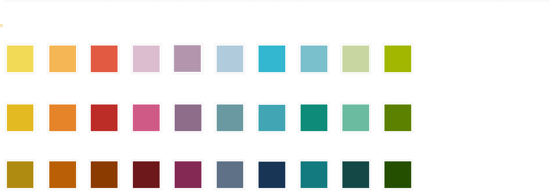
Main Colors
Specialty Colors
a thing
Republican
a subset of the thing
a subset of the thing
a subset of Republican
a different thing
Democrat
another different thing
Independent
another different thing
Con
neutral thing
Pro Money
a subset of the different thing
a subset of the different thing
a subset of Democrat
a subset of the other different thing
a subset of the other different thing
a subset of independent
a subset of the other different thing
a subset of the other different thing
a subset of Con
a subset of the neutral thing
a subset of the neutral thing
a subset of Pro a subset of Money
Data Colors
CMYK: 9, 8, 8, 0
RGB: 229, 226, 224
Hex: #E5E2E0
No Data
EXAMPLE
Title of the chart
For explanatory text that’s not very long.
Y Axis Title
30 units
20 units
10 units
0
X Axis Title
Source: www.fruitsperbushel.com
Honey Crisp
Apples
Granny Smith
Apples
Clementine
Oranges
Navel Oranges
Monday Tuesday Wednesday Thursday Friday
amount of unique
fruits needed to ll
a bushel
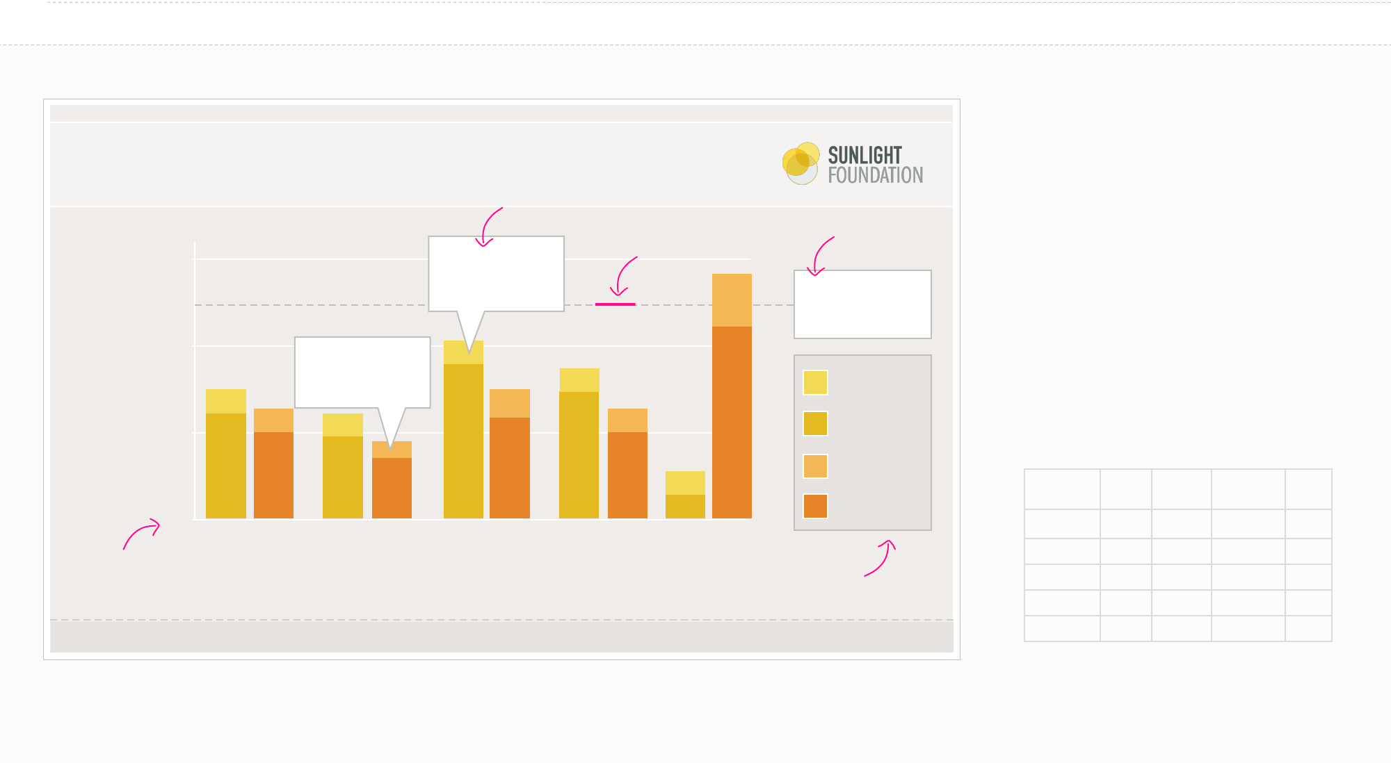
When to use a Bar or Column Chart
»Use mostly for one variable.
»Compares numerical values for dierent
observations. Shows relative amounts.
»Grouped or stacked bars or columns can break
that one numerical variable out into dierent
sub-groups.
Your data should look like:
Honey
Crisp
Granny
Smith
Clementine Navel
Monday 3 12 3 10
Tuesday 3 9 2 7
Wednesday 3 18 4 12
ursday 3 15 3 10
Friday 3 3 5 22
Bar Graph (categorical)
Day with the least
overall orange
production
Day with the most
Granny Smith
Apple production
Possible line:
1px 4pt dash 4pt gap
Line Grey
Possible label:
Fill: White (#FFF)
Line: Line Grey
(#C0C0BB)
Possible label:
Fill: White (#FFF)
Line: Line Grey
(#C0C0BB)
Possible Key:
Fill: Background dark
Accent (#E5E2E0)
Line: Line Grey
(#C0C0BB)
Starts at 0
EXAMPLE
Title of the chart
For explanatory text that’s not very long.
Y Axis Title
X Axis Title
Source: www.fruitsperbushel.com
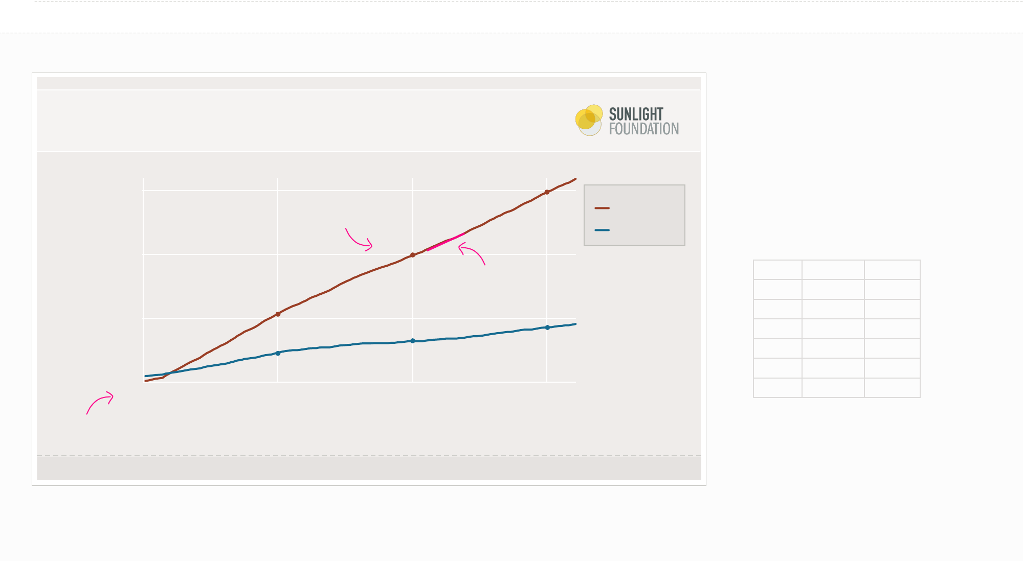
Republican
Democrat
Line Graph (political)
When to use a Line Graph
»Shows the trend in one variable usually over time.
»Multiple lines can show multiple variables (if they
are on the same scale).
»Multiple lines can also show the same variable for
multiple observations.
Your data should look like:
Time Republican Democrat
1990 1 2
1991 2 5
1992 4 9
1996 6 13
1994 7 15
1995 8 17
$3,000
$2,000
$1,000
0
2000 2010 2020
$3,030
$2,100
$710
$1,090
$590
$930
Starts at 0
2px of color
ITC Franklin Gothic book 10px
Text Light color
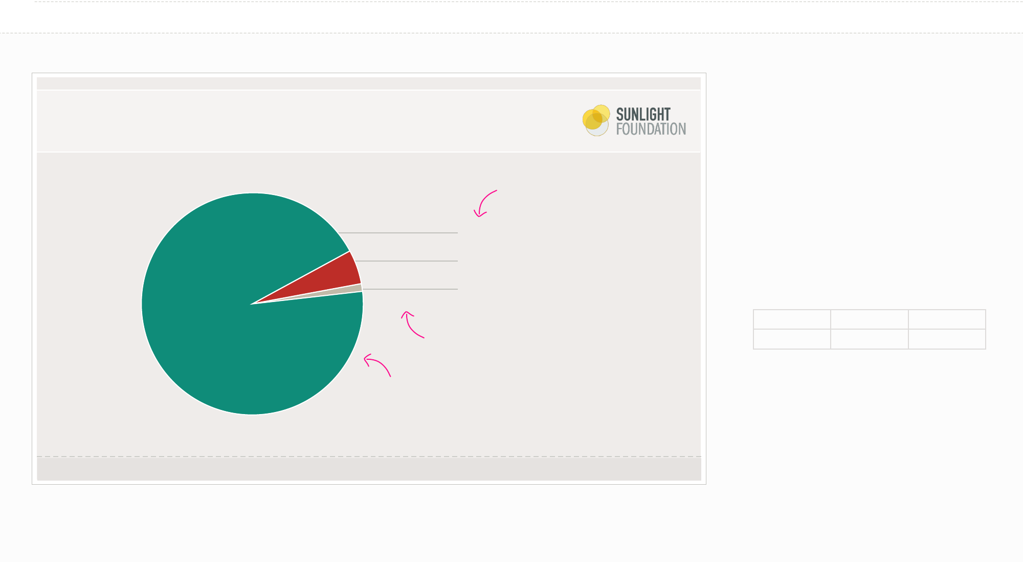
EXAMPLE
Title of the pie chart
For explanatory text that’s not very long.
Pie Chart (pro/con)
Pro (94%)
Con (5%)
Other (1%)
When to use a Pie Chart
»Use them very sparingly. Often a bar or column
chart is better. It is much more dicult to visually
judge the size of circles (or circle segments) vs.
rectangles.
»You want to show the relative relationship
between 2-3 things.
»ey add up to 100% (which may necessitate the
inclusion of a category such as “none”, “other”, etc.)
Your data should look like:
Pro Con Other
94 5 1
Source: www.fruitsperbushel.com
ITC Franklin Gothic Demi/Book
12px
1px line Line Grey
1px stroke
#FFFFFF white
Title of the chart
For explanatory text that’s not very long.
Y Axis Title
6,000
5,000
4,000
0
Label 1 Label 2 Label 3 Label 4
X Axis Title
Source: www.fruitsperbushel.com
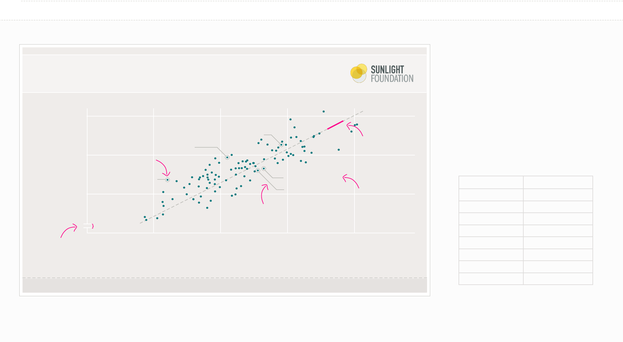
EXAMPLE
When to use a Scatter Plot
»Shows the relationship between two continuous
variables for your set of observations.
»Each point in the plot represents an object.
»You can change color or symbol to show groups.
»Sometimes it is nice to show a trend line
(regression).
Your data should look like:
variable 1 variable 2
7.560309668 48.87193277
8.569477057 57.70873996
5.178854559 35.50990599
5.044602676 31.94896911
7.629095533 49.76954493
6.631379 46.66529366
7.035723733 45.68632108
8.152163624 57.46279438
FirstName
LastName
FirstName LastName
FirstName
LastName
FirstName
LastName
Firstname LastName
Scatter Plot (single variable)
possible
trend line: 1px 4pt
dash 4pt gap Line
Grey
possible label: 1px stroke Line Grey.
Use only horizontal lines and 45
degree lines or just horizontal lines
ONLY for scatter plots. The
y axis CAN be alterted and
broken.
possible label: ITC
Franklin Gothic book
10px Text Main
1px Line Grey with
1px white line inside
5px
Title of the chart
For explanatory text that’s not very long.
Y Axis Title
6,000
5,000
4,000
0
Label 1 Label 2 Label 3
X Axis Title
Source: www.fruitsperbushel.com
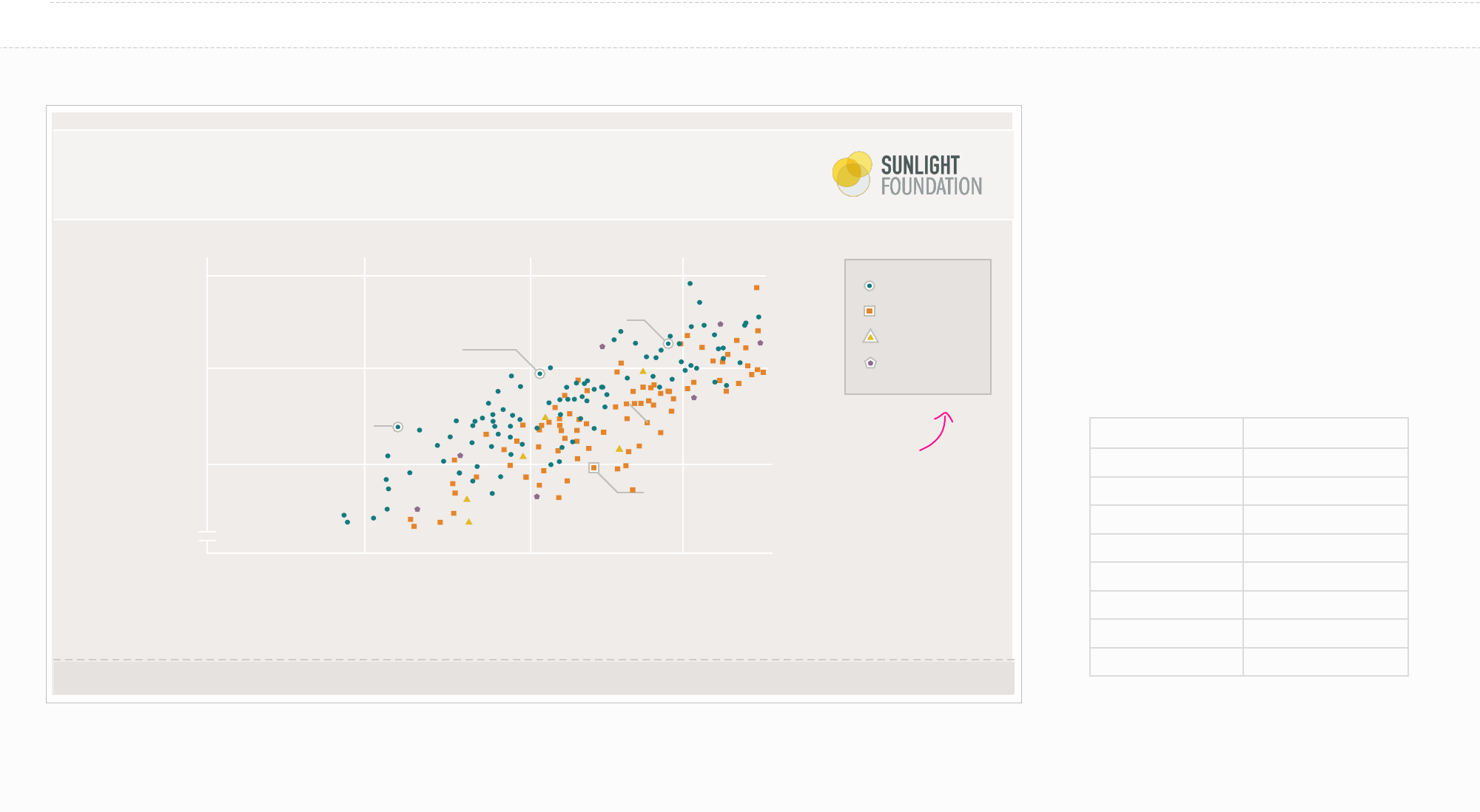
EXAMPLE
When to use a Scatter Plot
»Shows the relationship between two continuous
variables for your set of observations
»Each point in the plot represents an object.
»You can change color or symbol to show groups.
»Sometimes it is nice to show a trend line
(regression).
Your data should look like:
variable 1 variable 2
7.560309668 48.87193277
8.569477057 57.70873996
5.178854559 35.50990599
5.044602676 31.94896911
7.629095533 49.76954493
6.631379 46.66529366
7.035723733 45.68632108
8.152163624 57.46279438
FirstName
LastName
FirstName LastName
FirstName
LastName
FirstName
LastName
Scatter Plot (multi variable)
Apples
Oranges
Pear
Papaya
Possible Key:
Fill: Background dark
Accent (#E5E2E0)
Line: Line Grey
(#C0C0BB)
Change both color
and shape if possible
(helps with sight
issues)
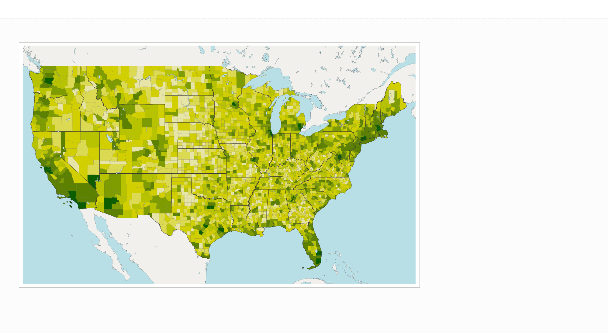
EXAMPLE
When to use a Map
»Be sure to only use a map if the primary
component of your data is geographical.
Sometimes a ranked list or bar chart is better if
you are just trying to compare a single value for
each state.
»Color scale comparisons are harder for humans
than size comparisons. Keep this in mind as you
choose between a map or another layout.
Map (sequential, single hue, money)
No DataAnti Pro
#BD2D28 #C37A73 #C8C6C6 #75A999 #0F8C79 #E5E2E0
50/50
No Data
#0C4E00 #5C8100 #A0B700 #D2CF00 #E6E4A6 #E5E2E0
More Money Less Money
No Data
#936B00 #BD8F22 #E3BA22 #F2DA57 #F1E8AE #E5E2E0
More Thing Less Thing
Political Colors (stick to choropleths of 5 or fewer colors for maximum readability) Non-political Colors (stick to choropleths of 5 or fewer colors for maximum readability)
Choropleth Colors (for maps)
#712422 #9A3E25 #B37055 #D9A78D #EDCEBC #E5E2E0
#05426C #E6842A #688BAB #8CAEC6 #BAD2E2 #E5E2E0
#9A3E25 #D9A78D #C8C6C6 #8CAEC6 #E6842A #E5E2E0
More Republican
More Democrat
More Republican 50/50
Less Republican
Less Democrat
More Democrat
No data
No data
No data
#F2DA57 #F6B656 #E25A42 #DCBDCF #B396AD #B0CBDB #33B6D0 #7ABFCC #C8D7A1 #A0B700
242, 218, 87 244, 182, 86 226, 90, 66 220, 189, 207 179, 150, 173 176, 203, 219 51, 182, 208 122, 191, 204 200, 215, 161 160, 183, 0
227, 186, 34 229, 132, 41 189, 45, 40 209, 90, 134 142, 108, 138 107, 153, 161 66, 165, 179 15, 140, 121 107, 187, 161 92, 129, 0
#E3BA22 #E58429 #BD2D28 #D15A86 #8E6C8A #6B99A1 #42A5B3 #0F8C79 #6BBBA1 #5C8100
#B08B12 #BA5F06 #8C3B00 #6D191B #842854 #5F7186 #193556 #137B80 #144847 #254E00
176, 139, 18 186, 95, 6 140, 59, 0 109, 25, 27 132, 40, 84 95, 113, 134 25, 53, 86 19, 123, 128 20, 72, 71 37, 78, 0
30 colors. TRY not to use them all.
Network Graph Colors
