SPSS Survival Manual 4th Edition A Step By Guide To Data Analysis Using The Program 2010
SPSS_Survival_Manual_4th_Edition_0335242391_ manual pdf -FilePursuit
User Manual: manual pdf -FilePursuit
Open the PDF directly: View PDF ![]() .
.
Page Count: 359 [warning: Documents this large are best viewed by clicking the View PDF Link!]
- Title Page
- Contents
- Preface
- Data files and website
- Introduction and overview
- Part One: Getting started
- Part Two: Preparing the data file
- Part Three: Preliminary analyses
- Part Four: Statistical techniques to explore relationships among variables
- Part Five: Statistical techniques to compare groups
- Appendix: Details of data files
- Recommended reading
- References
- Index
For the SPSS Survival Manual website, go to www.allenandunwin.com/spss
This is what readers from around the world say about the SPSS Survival Manual:
‘Best book ever written. My ability to work the maze of statistics and my sanity has been SAVED by this
book.’
Natasha Davison, Doctorate of Health Psychology, Deakin University, Australia
‘I just wanted to say how much I value Julie Pallant’s SPSS Survival Manual. It’s quite the best text on
SPSS I’ve encountered and I recommend it to anyone who’s listening!’
Professor Carolyn Hicks, Health Sciences, Birmingham University, UK
‘This book was responsible for an A on our educational research project. This is the perfect book for
people who are baffl ed by statistical analysis, but still have to understand and accomplish it.’
Becky, Houston, Texas, USA
‘Truly a survival manual. This was highly recommended to me and was well worth it. I had no diffi culty
following the steps as they were so well laid out and included screen shots. This book takes the majority
of the anxiety out of statistical analysis.’
C. Wright, amazon.com
‘Having perceived myself as one who was not confi dent in anything statistical, I worked my way through
the book and with each turn of the page gained more and more confi dence until I was running off
analyses with (almost) glee. I now enjoy using SPSS and this book is the reason for that.’
Dr Marina Harvey, Centre for Professional Development, Macquarie University, Australia
‘I have had several courses in advanced statistics, but unfortunately none of them went too “in depth”
into SPSS. This book does just that, in a clear “how to” format that gets right to the point and tells you
what you need to know.’
John Ryan, Atlanta, Georgia, USA
‘This book really lives up to its name . . . I highly recommend this book to any MBA student carrying
out a dissertation project, or anyone who needs some basic help with using SPSS and data analysis
techniques.’
Business student, UK
‘I must say how much I value SPSS Survival Manual. It is so clearly written and helpful. I fi nd myself
using it constantly and also ask any students doing a thesis or dissertation to obtain a copy.’
Associate Professor Sheri Bauman, Department of Educational Psychology, University of Arizona, USA
‘This book is simple to understand, easy to read and very concise. Those who have a general fear or dislike
for statistics or statistics and computers should enjoy reading this book.’
Lloyd G. Waller PhD, Jamaica
‘There are several SPSS manuals published and this one really does “do what it says on the tin” . . . Whether
you are a beginner doing your BSc or struggling with your PhD research (or beyond!), I wholeheartedly
recommend this book.’
British Journal of Occupational Therapy, UK
‘I love SPSS Survival Manual . . . I can’t imagine teaching without it. After seeing my copy and hearing me
talk about it many of my other colleagues are also utilising it.’
Wendy Close PhD, Psychology Department, Wisconsin Lutheran College, USA
‘. . . being an external student so much of the time is spent teaching myself. But this has been made easier
with your manual as I have found much of the content very easy to follow. I only wish I had discovered
it earlier.’
Anthropology student, Australia
‘This book is a “must have” introduction to SPSS. Brilliant and highly recommended.’
Dr Joe, South Africa
‘The strength of this book lies in the explanations that accompany the descriptions of tests and I predict
great popularity for this text among teachers, lecturers and researchers.’
Roger Watson, Journal of Advanced Nursing
‘This is the one. If you need to do statistics for a thesis, dissertation, course, etc. but aren’t quite sure
where to start or what to do, this is the book you have been looking for. I don’t know how I would’ve
completed my dissertation without this book. EXTREMELY helpful and easy to understand without
being “dumbed down”.’
Thomas A. Delaney, Eugene, Oregon, USA
‘This book is the absolute bible for SPSS users and the book’s cover picture says it all—a true life saver.
Without this book I would not be graduating with a doctoral degree.’
A. Preston, Hawaii
‘Pallant’s excellent book has all the ingredients to take interested students,including the statistically naive
and the algebraically challenged, to a new level of skill and understanding.’
Geoffrey N. Molloy, Behaviour Change journal
‘I have four SPSS manuals and have found that this is the only manual that explains the issues clearly
and is easy to follow. SPSS is evil and anything that makes it less so is fabulous.’
Helen Scott, Psychology Honours Student, University of Queensland, Australia
‘To any students who have found themselves faced with the horror of SPSS when they had signed up for
a degree in psychology—this is a god send.’
Psychology student, Ireland
‘This is the best SPSS manual I’ve had. It’s comprehensive and easy to follow. I really enjoy it.’
Norshidah Mohamed, Kuala Lumpur, Malaysia
‘Julie Pallant saved my life with this book. OK, slight exaggeration but this book really is a life saver . . . If
the mere thought of statistics gives you a headache, then this book is for you.’
Statistics student, UK
‘Simply the best book on introductory SPSS that exists. I know nothing about the author but having
bought this book in the middle of a statistics open assignment I can confi dently say that I love her and
want to marry her. There must be dozens of books that claim to be beginners’ guides to SPSS. This one
actually does what it says: totally brilliant.’
J. Sutherland, amazon.co.uk

SPSS
SURVIVAL MANUAL
A step by step guide to
data analysis using SPSS
4th edition
Julie Pallant
This fourth edition fi rst published in 2011
Copyright © Julie Pallant 2002, 2005, 2007, 2011
All rights reserved. No part of this book may be reproduced or transmitted in any form or by any
means, electronic or mechanical, including photocopying, recording or by any information storage
and retrieval system, without prior permission in writing from the publisher. The Australian Copyright
Act 1968 (the Act) allows a maximum of one chapter or 10 per cent of this book, whichever is the
greater, to be photocopied by any educational institution for its educational purposes provided that
the educational institution (or body that administers it) has given a remuneration notice to Copyright
Agency Limited (CAL) under the Act.
Allen & Unwin
83 Alexander Street
Crows Nest NSW 2065
Australia
Phone: (61 2) 8425 0100
Fax: (61 2) 9906 2218
Email: info@allenandunwin.com
Web: www.allenandunwin.com
Cataloguing-in-Publication details are available
from the National Library of Australia
www.librariesaustralia.nla.gov.au
ISBN 978 1 74237 392 8
Set in 11/13.5 pt Minion by Midland Typesetters, Australia
Printed in China at Everbest Printing Co
10 9 8 7 6 5 4 3 2 1
Contents
Preface vii
Data fi les and website viii
Introduction and overview x
Part One Getting started 1
1 Designing a study 3
2 Preparing a codebook 11
3 Getting to know SPSS 14
Part Two Preparing the data fi le 25
4 Creating a data fi le and entering data 27
5 Screening and cleaning the data 43
Part Three Preliminary analyses 51
6 Descriptive statistics 53
7 Using graphs to describe and explore the data 66
8 Manipulating the data 83
9 Checking the reliability of a scale 97
10 Choosing the right statistic 102
Part Four Statistical techniques to explore relationships among variables 121
11 Correlation 128
12 Partial correlation 143
13 Multiple regression 148
14 Logistic regression 168
15 Factor analysis 181
Part Five Statistical techniques to compare groups 203
16 Non-parametric statistics 213
17 T-tests 239
vi Contents
18 One-way analysis of variance 249
19 Two-way between-groups ANOVA 265
20 Mixed between-within subjects analysis of variance 274
21 Multivariate analysis of variance 283
22 Analysis of covariance 297
Appendix: Details of data fi les 319
Recommended reading 334
References 337
Index 341
Preface
For many students, the thought of completing a statistics subject, or using statistics
in their research, is a major source of stress and frustration. The aim of the original
SPSS Survival Manual (published in 2000) was to provide a simple, step-by-step guide
to the process of data analysis using SPSS. Unlike other statistical titles it did not
focus on the mathematical underpinnings of the techniques, but rather on the appro-
priate use of SPSS as a tool. Since the publication of the three editions of the SPSS
Survival Manual, I have received many hundreds of emails from students who have
been grateful for the helping hand (or lifeline).
The same simple approach has been incorporated in this fourth edition. Since
the last edition, however, SPSS has undergone a number of changes—including
a brief period when it changed name. During 2009 version 18 of the program was
renamed PASW Statistics, which stands for Predictive Analytics Software. The name
was changed again in 2010 to IBM SPSS. To prevent confusion I have referred to
the program as SPSS throughout the book, but all the material applies to programs
labelled both PASW and IBM SPSS. All chapters in this edition have been updated to
suit version 18 of the package (although most of the material is also suitable for users
of earlier versions).
I have resisted urges from students, instructors and reviewers to add too many
extra topics, but instead have upgraded and expanded the existing material. This
book is not intended to cover all possible statistical procedures available in SPSS, or
to answer all questions researchers might have about statistics. Instead, it is designed
to get you started with your research and to help you gain confi dence in the use of the
program to analyse your data. There are many other excellent statistical texts avail-
able that you should refer to—suggestions are made throughout each chapter in the
book. Additional material is also available on the book’s website (details in the next
section).
vii
Data fi les and website
Throughout the book, you will see examples of research that are taken from a number
of data fi les included on the website that accompanies this book. This website is at:
www.allenandunwin.com/spss
From this site you can download the data fi les to your hard drive or memory stick
by following the instructions on screen. Then you should start SPSS and open the data
fi les. These fi les can be opened only in SPSS.
The survey4ED.sav data fi le is a ‘real’ data fi le, based on a research project that
was conducted by one of my graduate diploma classes. So that you can get a feel for
the research process from start to fi nish, I have also included in the Appendix a copy
of the questionnaire that was used to generate this data and the codebook used to
code the data. This will allow you to follow along with the analyses that are presented
in the book, and to experiment further using other variables.
The second data fi le (error4ED.sav) is the same fi le as the survey4ED.sav, but I
have deliberately added some errors to give you practice in Chapter 5 at screening and
cleaning your data fi le.
The third data fi le (experim4ED.sav) is a manufactured (fake) data fi le, constructed
and manipulated to illustrate the use of a number of techniques covered in Part Five
of the book (e.g. Paired Samples t-test, Repeated Measures ANOVA). This fi le also
includes additional variables that will allow you to practise the skills learnt through-
out the book. Just don’t get too excited about the results you obtain and attempt to
replicate them in your own research!
The fourth fi le used in the examples in the book is depress4ED.sav. This is used
in Chapter 16, on non-parametric techniques, to illustrate some techniques used in
health and medical research.
Two other data fi les have been included, giving you the opportunity to complete
some additional activities with data from different discipline areas. The sleep4ED.sav
fi le is a real data fi le from a study conducted to explore the prevalence and impact of
sleep problems on aspects of people’s lives. The staffsurvey4ED.sav fi le comes from a
staff satisfaction survey conducted for a large national educational institution.
viii
Data fi les and websites ix
See the Appendix for further details of these fi les (and associated materials). Apart
from the data fi les, the SPSS Survival Manual website also contains a number of useful
items for students and instructors, including:
• guidelines for preparing a research report
• practice exercises
• updates on changes to SPSS as new versions are released
• useful links to other websites
• additional reading
• an instructor’s guide.
Introduction and overview
This book is designed for students completing research design and statistics courses
and for those involved in planning and executing research of their own. Hopefully this
guide will give you the confi dence to tackle statistical analyses calmly and sensibly, or
at least without too much stress!
Many of the problems that students experience with statistical analysis are due to
anxiety and confusion from dealing with strange jargon, complex underlying theories
and too many choices. Unfortunately, most statistics courses and textbooks encourage
both of these sensations! In this book I try to translate statistics into a language that
can be more easily understood and digested.
The SPSS Survival Manual is presented in a structured format, setting out step
by step what you need to do to prepare and analyse your data. Think of your data as
the raw ingredients in a recipe. You can choose to cook your ‘ingredients’ in different
ways—a fi rst course, main course, dessert. Depending on what ingredients you have
available, different options may, or may not, be suitable. (There is no point planning
to make beef stroganoff if all you have is chicken.) Planning and preparation are an
important part of the process (both in cooking and in data analysis). Some things you
will need to consider are:
• Do you have the correct ingredients in the right amounts?
• What preparation is needed to get the ingredients ready to cook?
• What type of cooking approach will you use (boil, bake, stir-fry)?
• Do you have a picture in your mind of how the end result (e.g. chocolate cake) is
supposed to look?
• How will you tell when it is cooked?
• Once it is cooked, how should you serve it so that it looks appetising?
The same questions apply equally well to the process of analysing your data. You
must plan your experiment or survey so that it provides the information you need,
in the correct format. You must prepare your data fi le properly and enter your
data carefully. You should have a clear idea of your research questions and how
x
Introduction and overview xi
you might go about addressing them. You need to know what statistical techniques
are available, what sort of variables are suitable and what are not. You must be
able to perform your chosen statistical technique (e.g. t-test) correctly and interpret
the output. Finally, you need to relate this ‘output’ back to your original research
question and know how to present this in your report (or in cooking terms, should
you serve your chocolate cake with cream or ice-cream, or perhaps some berries and
a sprinkle of icing sugar on top?).
In both cooking and data analysis, you can’t just throw in all your ingredients
together, shove it in the oven (or SPSS, as the case may be) and hope for the best.
Hopefully this book will help you understand the data analysis process a little better
and give you the confi dence and skills to be a better ‘cook’.
STRUCTURE OF THIS BOOK
This SPSS Survival Manual consists of 22 chapters, covering the research process from
designing a study through to the analysis of the data and presentation of the results.
It is broken into fi ve main parts. Part One (Getting started) covers the preliminar-
ies: designing a study, preparing a codebook and becoming familiar with SPSS. In
Part Two (Preparing the data fi le) you will be shown how to prepare a data fi le, enter
your data and check for errors. Preliminary analyses are covered in Part Three, which
includes chapters on the use of descriptive statistics and graphs; the manipulation of
data; and the procedures for checking the reliability of scales. You will also be guided,
step by step, through the sometimes diffi cult task of choosing which statistical tech-
nique is suitable for your data.
In Part Four the major statistical techniques that can be used to explore relation-
ships are presented (e.g. correlation, partial correlation, multiple regression, logistic
regression and factor analysis). These chapters summarise the purpose of each tech-
nique, the underlying assumptions, how to obtain results, how to interpret the output,
and how to present these results in your thesis or report.
Part Five discusses the statistical techniques that can be used to compare groups.
These include non-parametric techniques, t-tests, analysis of variance, multivariate
analysis of variance and analysis of covariance.
USING THIS BOOK
To use this book effectively as a guide to SPSS, you need some basic computer skills.
In the instructions and examples provided throughout the text I assume that you are
already familiar with using a personal computer, particularly the Windows functions.
I have listed below some of the skills you will need. Seek help if you have diffi culty
with any of these operations. You will need to be able to:
xii Introduction and overview
• use the Windows drop-down menus
• use the left and right buttons on the mouse
• use the click and drag technique for highlighting text
• minimise and maximise windows
• start and exit programs from the Start menu or from Windows Explorer
• move between programs that are running simultaneously
• open, save, rename, move and close fi les
• work with more than one fi le at a time, and move between fi les that are open
• use Windows Explorer to copy fi les from a memory stick to the hard drive, and
back again
• use Windows Explorer to create folders and to move fi les between folders.
This book is not designed to ‘stand alone’. It is assumed that you have been exposed to
the fundamentals of statistics and have access to a statistics text. It is important that
you understand some of what goes on ‘below the surface’ when using SPSS. SPSS is
an enormously powerful data analysis package that can handle very complex statis-
tical procedures. This manual does not attempt to cover all the different statistical
techniques available in the program. Only the most commonly used statistics are
covered. It is designed to get you started and to develop your confi dence in using the
program.
Depending on your research questions and your data, it may be necessary to tackle
some of the more complex analyses available in SPSS. There are many good books
available covering the various statistical techniques in more detail. Read as widely as
you can. Browse the shelves in your library, look for books that explain statistics in a
language that you understand (well, at least some of it anyway!). Collect this material
together to form a resource to be used throughout your statistics classes and your
research project. It is also useful to collect examples of journal articles where statisti-
cal analyses are explained and results are presented. You can use these as models for
your fi nal write-up.
The SPSS Survival Manual is suitable for use as both an in-class text, where you
have an instructor taking you through the various aspects of the research process,
and as a self-instruction book for those conducting an individual research project.
If you are teaching yourself, be sure to actually practise using SPSS by analysing the
data that is included on the website accompanying this book (see p. viii for details).
The best way to learn is by actually doing, rather than just reading. ‘Play’ with the data
fi les from which the examples in the book are taken before you start using your own
data fi le. This will improve your confi dence and also allow you to check that you are
performing the analyses correctly.
Sometimes you may fi nd that the output you obtain is different from that presented
in the book. This is likely to occur if you are using a different version of SPSS from that
Introduction and overview xiii
used throughout this book (SPSS Statistics 18). SPSS regularly updates its products,
which is great in terms of improving the program but it can lead to confusion for
students who fi nd that what is on the screen differs from what is in the book. Usually
the difference is not too dramatic, so stay calm and play detective. The information
may be there, but just in a different form. For information on changes to the SPSS
products you may like to go to the SPSS website (www.spss.com).
RESEARCH TIPS
If you are using this book to guide you through your own research project, there are a
few additional tips I would like to recommend.
• Plan your project carefully. Draw on existing theories and research to guide the
design of your project. Know what you are trying to achieve and why.
• Think ahead. Anticipate potential problems and hiccups—every project has them!
Know what statistics you intend to employ and use this information to guide the
formulation of data collection materials. Make sure that you will have the right
sort of data to use when you are ready to do your statistical analyses.
• Get organised. Keep careful notes of all relevant research, references etc. Work out
an effective fi ling system for the mountain of journal articles you will acquire and,
later on, the output from SPSS. It is easy to become disorganised, overwhelmed
and confused.
• Keep good records. When using SPSS to conduct your analyses, keep careful
records of what you do. I recommend to all my students that they buy a spiral-
bound exercise book to record every session they spend on SPSS. You should
record the date, new variables you create, all analyses you perform and the names
of the fi les where you have saved the output. If you have a problem or something
goes horribly wrong with your data fi le, this information can be used by your
supervisor to help rescue you!
• Stay calm! If this is your fi rst exposure to SPSS and data analysis, there may be
times when you feel yourself becoming overwhelmed. Take some deep breaths
and use some positive self-talk. Just take things step by step—give yourself
permission to make mistakes and become confused sometimes. If it all gets too
much then stop, take a walk and clear your head before you tackle it again. Most
students fi nd SPSS quite easy to use, once they get the hang of it. Like learning
any new skill, you just need to get past that fi rst feeling of confusion and lack of
confi dence.
• Give yourself plenty of time. The research process, particularly the data entry
and data analysis stages, always takes longer than expected, so allow plenty of time
for this.
• Work with a friend. Make use of other students for emotional and practical
support during the data analysis process. Social support is a great buffer against
stress!
ADDITIONAL RESOURCES
There are a number of different topic areas covered throughout this book, from
the initial design of a study, questionnaire construction, basic statistical techniques
(t-tests, correlation), through to advanced statistics (multivariate analysis of variance,
factor analysis). Further reading and resource material is recommended throughout
the different chapters in the book. You should try to read as broadly as you can, par-
ticularly if tackling some of the more complex statistical procedures.
xiv Introduction and overview
PART ONE
Getting started
Data analysis is only one part of the research process. Before you can use SPSS to
analyse your data, there are a number of things that need to happen. First, you have
to design your study and choose appropriate data collection instruments. Once you
have conducted your study, the information obtained must be prepared for entry into
SPSS (using something called a ‘codebook’). To enter the data you must understand
how SPSS works and how to talk to it appropriately. Each of these steps is discussed
in Part One.
Chapter 1 provides some tips and suggestions for designing a study, with the aim
of obtaining good-quality data. Chapter 2 covers the preparation of a codebook to
translate the information obtained from your study into a format suitable for SPSS.
Chapter 3 takes you on a guided tour of the program, and some of the basic skills that
you will need are discussed. If this is your fi rst time using SPSS, it is important that
you read the material presented in Chapter 3 before attempting any of the analyses
presented later in the book.
1
This page intentionally left blank
3
1
Designing a study
Although it might seem a bit strange to discuss research design in a book on SPSS, it is
an essential part of the research process that has implications for the quality of the data
collected and analysed. The data you enter must come from somewhere—responses to
a questionnaire, information collected from interviews, coded observations of actual
behaviour, or objective measurements of output or performance. The data are only
as good as the instrument that you used to collect them and the research framework
that guided their collection.
In this chapter a number of aspects of the research process are discussed that have
an impact on the potential quality of the data. First, the overall design of the study
is considered; this is followed by a discussion of some of the issues to consider when
choosing scales and measures; and fi nally, some guidelines for preparing a question-
naire are presented.
PLANNING THE STUDY
Good research depends on the careful planning and execution of the study. There
are many excellent books written on the topic of research design to help you
with this process—from a review of the literature, formulation of hypotheses,
choice of study design, selection and allocation of participants, recording of obser-
vations and collection of data. Decisions made at each of these stages can affect the
quality of the data you have to analyse and the way you address your research ques-
tions. In designing your own study I would recommend that you take your time
working through the design process to make it the best study that you can produce.
Reading a variety of texts on the topic will help. A few good, easy-to-follow titles
are Stangor (2006), Goodwin (2007) and, if you are working in the area of market
research, Boyce (2003). A good basic overview for health and medical research is
Peat (2001).
4 Getting Started
To get you started, consider these tips when designing your study:
• Consider what type of research design (e.g. experiment, survey, observation) is the
best way to address your research question. There are advantages and disadvan-
tages to all types of research approaches; choose the most appropriate approach
for your particular research question. Have a good understanding of the research
that has already been conducted in your topic area.
• If you choose to use an experiment, decide whether a between-groups design
(different cases in each experimental condition) or a repeated measures design
(same cases tested under all conditions) is the more appropriate for your research
question. There are advantages and disadvantages to each approach (see Stangor
2006), so weigh up each approach carefully.
• In experimental studies, make sure you include enough levels in your indepen-
dent variable. Using only two levels (or groups) means fewer participants are
required, but it limits the conclusions that you can draw. Is a control group necess-
ary or desirable? Will the lack of control group limit the conclusions that you
can draw?
• Always select more participants than you need, particularly if you are using a sample
of humans. People are notoriously unreliable—they don’t turn up when they are
supposed to, they get sick, drop out and don’t fi ll out questionnaires properly! So
plan accordingly. Err on the side of pessimism rather than optimism.
• In experimental studies, check that you have enough participants in each of
your groups (and try to keep them equal when possible). With small groups, it is
diffi cult to detect statistically signifi cant differences between groups (an issue of
power, discussed in the introduction to Part Five). There are calculations you can
perform to determine the sample size that you will need. See, for example, Stangor
(2006), or consult other statistical texts under the heading ‘power’.
• Wherever possible, randomly assign participants to each of your experimental
conditions, rather than using existing groups. This reduces the problem associated
with non-equivalent groups in between-groups designs. Also worth considering
is taking additional measurements of the groups to ensure that they don’t differ
substantially from one another. You may be able to statistically control for differ-
ences that you identify (e.g. using analysis of covariance).
• Choose appropriate dependent variables that are valid and reliable (see discussion
on this point later in this chapter). It is a good idea to include a number of differ-
ent measures—some measures are more sensitive than others. Don’t put all your
eggs in one basket.
• Try to anticipate the possible infl uence of extraneous or confounding variables.
These are variables that could provide an alternative explanation for your results.
Sometimes they are hard to spot when you are immersed in designing the study
Designing a study 5
yourself. Always have someone else (supervisor, fellow researcher) check over
your design before conducting the study. Do whatever you can to control for these
potential confounding variables. Knowing your topic area well can also help you
identify possible confounding variables. If there are additional variables that you
cannot control, can you measure them? By measuring them, you may be able to
control for them statistically (e.g. using analysis of covariance).
• If you are distributing a survey, pilot-test it fi rst to ensure that the instructions,
questions and scale items are clear. Wherever possible, pilot-test on the same type
of people who will be used in the main study (e.g. adolescents, unemployed youth,
prison inmates). You need to ensure that your respondents can understand the
survey or questionnaire items and respond appropriately. Pilot-testing should
also pick up any questions or items that may offend potential respondents.
• If you are conducting an experiment, it is a good idea to have a full dress rehearsal
and to pilot-test both the experimental manipulation and the dependent measures
you intend to use. If you are using equipment, make sure it works properly. If you
are using different experimenters or interviewers, make sure they are properly
trained and know what to do. If different observers are required to rate behaviours,
make sure they know how to appropriately code what they see. Have a practice run
and check for inter-rater reliability (i.e. how consistent scores are from different
raters). Pilot-testing of the procedures and measures helps you identify anything
that might go wrong on the day and any additional contaminating factors that
might infl uence the results. Some of these you may not be able to predict (e.g.
workers doing noisy construction work just outside the lab’s window), but try to
control those factors that you can.
CHOOSING APPROPRIATE SCALES AND MEASURES
There are many different ways of collecting ‘data’, depending on the nature of your
research. This might involve measuring output or performance on some objective
criteria, or rating behaviour according to a set of specifi ed criteria. It might also
involve the use of scales that have been designed to ‘operationalise’ some underly-
ing construct or attribute that is not directly measurable (e.g. self-esteem). There are
many thousands of validated scales that can be used in research. Finding the right one
for your purpose is sometimes diffi cult. A thorough review of the literature in your
topic area is the fi rst place to start. What measures have been used by other research-
ers in the area? Sometimes the actual items that make up the scales are included in
the appendix to a journal article; otherwise you may need to trace back to the original
article describing the design and validation of the scale you are interested in. Some
scales have been copyrighted, meaning that to use them you need to purchase ‘offi cial’
copies from the publisher. Other scales, which have been published in their entirety
6 Getting Started
in journal articles, are considered to be ‘in the public domain’, meaning that they
can be used by researchers without charge. It is very important, however, to properly
acknowledge each of the scales you use, giving full reference details.
In choosing appropriate scales there are two characteristics that you need
to be aware of: reliability and validity. Both of these factors can infl uence the
quality of the data you obtain. When reviewing possible scales to use, you should
collect information on the reliability and validity of each of the scales. You will
need this information for the ‘Method’ section of your research report. No matter
how good the reports are concerning the reliability and validity of your scales, it
is important to pilot-test them with your intended sample. Sometimes scales are
reliable with some groups (e.g. adults with an English-speaking background), but
are totally unreliable when used with other groups (e.g. children from non-English-
speaking backgrounds).
Reliability
The reliability of a scale indicates how free it is from random error. Two frequently
used indicators of a scale’s reliability are test-retest reliability (also referred to as
‘temporal stability’) and internal consistency. The test-retest reliability of a scale
is assessed by administering it to the same people on two different occasions, and
calculating the correlation between the two scores obtained. High test-retest corre-
lations indicate a more reliable scale. You need to take into account the nature of the
construct that the scale is measuring when considering this type of reliability. A scale
designed to measure current mood states is not likely to remain stable over a period
of a few weeks. The test-retest reliability of a mood scale, therefore, is likely to be low.
You would, however, hope that measures of stable personality characteristics would
stay much the same, showing quite high test-retest correlations.
The second aspect of reliability that can be assessed is internal consistency. This
is the degree to which the items that make up the scale are all measuring the same
underlying attribute (i.e. the extent to which the items ‘hang together’). Internal
consistency can be measured in a number of ways. The most commonly used statistic
is Cronbach’s coeffi cient alpha (available using SPSS, see Chapter 9). This statistic
provides an indication of the average correlation among all of the items that make up
the scale. Values range from 0 to 1, with higher values indicating greater reliability.
While different levels of reliability are required, depending on the nature and
purpose of the scale, Nunnally (1978) recommends a minimum level of .7. Cronbach
alpha values are dependent on the number of items in the scale. When there are a
small number of items in the scale (fewer than 10), Cronbach alpha values can be
quite small. In this situation it may be better to calculate and report the mean inter-
item correlation for the items. Optimal mean inter-item correlation values range from
.2 to .4 (as recommended by Briggs & Cheek 1986).
Designing a study 7
Validity
The validity of a scale refers to the degree to which it measures what it is supposed to
measure. Unfortunately, there is no one clear-cut indicator of a scale’s validity. The
validation of a scale involves the collection of empirical evidence concerning its use.
The main types of validity you will see discussed are content validity, criterion validity
and construct validity.
Content validity refers to the adequacy with which a measure or scale has sampled
from the intended universe or domain of content. Criterion validity concerns the
relationship between scale scores and some specifi ed, measurable criterion. Construct
validity involves testing a scale not against a single criterion but in terms of theoretically
derived hypotheses concerning the nature of the underlying variable or construct. The
construct validity is explored by investigating its relationship with other constructs,
both related (convergent validity) and unrelated (discriminant validity). An easy-to-
follow summary of the various types of validity is provided in Stangor (2006) and in
Streiner and Norman (2008).
If you intend to use scales in your research, it would be a good idea to read further
on this topic: see Kline (2005) for information on psychological tests, and Streiner and
Norman (2008) for health measurement scales. Bowling also has some great books on
health and medical scales.
PREPARING A QUESTIONNAIRE
In many studies it is necessary to collect information from your participants or respon-
dents. This may involve obtaining demographic information from participants prior
to exposing them to some experimental manipulation. Alternatively, it may involve the
design of an extensive survey to be distributed to a selected sample of the population. A
poorly planned and designed questionnaire will not give good data with which to address
your research questions. In preparing a questionnaire, you must consider how you intend
to use the information; you must know what statistics you intend to use. Depending on
the statistical technique you have in mind, you may need to ask the question in a particular
way, or provide different response formats. Some of the factors you need to consider in the
design and construction of a questionnaire are outlined in the sections that follow.
This section only briefl y skims the surface of questionnaire design, so I would
suggest that you read further on the topic if you are designing your own study. A really
great book for this purpose is De Vaus (2002) or, if your research area is business,
Boyce (2003).
Question types
Most questions can be classifi ed into two groups: closed or open-ended. A closed
question involves offering respondents a number of defi ned response choices. They are

8 Getting Started
asked to mark their response using a tick, cross, circle, etc. The choices may be a simple
Yes/No, Male/Female, or may involve a range of different choices. For example:
What is the highest level of education you have completed (please tick)?
❐ 1. Primary school
❐ 2. Some secondary school
❐ 3. Completed secondary school
❐ 4. Trade training
❐ 5. Undergraduate university
❐ 6. Postgraduate university
Closed questions are usually quite easy to convert to the numerical format required
for SPSS. For example, Yes can be coded as a 1, No can be coded as a 2; Males as 1,
Females as 2. In the education question shown above, the number corresponding to
the response ticked by the respondent would be entered. For example, if the respon-
dent ticked Undergraduate university, this would be coded as a 5. Numbering each of
the possible responses helps with the coding process. For data entry purposes, decide
on a convention for the numbering (e.g. in order across the page, and then down),
and stick with it throughout the questionnaire.
Sometimes you cannot guess all the possible responses that respondents might
make—it is therefore necessary to use open-ended questions. The advantage here is
that respondents have the freedom to respond in their own way, not restricted to the
choices provided by the researcher. For example:
What is the major source of stress in your life at the moment?
___________________________________________________________________
___________________________________________________________________
Responses to open-ended questions can be summarised into a number of different
categories for entry into SPSS. These categories are usually identifi ed after looking
through the range of responses actually received from the respondents. Some possi-
bilities could also be raised from an understanding of previous research in the area.
Each of these response categories is assigned a number (e.g. work=1, fi nances=2, rela-
tionships=3), and this number is entered into SPSS. More details on this are provided
in the section on preparing a codebook in Chapter 2.
Sometimes a combination of both closed and open-ended questions works best.
This involves providing respondents with a number of defi ned responses, and also
an additional category (other) that they can tick if the response they wish to give is
not listed. A line or two is provided so that they can write the response they wish to

Designing a study 9
give. This combination of closed and open-ended questions is particularly useful in
the early stages of research in an area, as it gives an indication of whether the defi ned
response categories adequately cover all the responses that respondents wish to give.
Response format
In asking respondents a question, you also need to decide on a response format. The
type of response format you choose can have implications when you come to do your
statistical analysis. Some analyses (e.g. correlation) require scores that are continuous,
from low through to high, with a wide range of scores. If you had asked respondents
to indicate their age by giving them a category to tick (e.g. less than 30, between 31
and 50 and over 50), these data would not be suitable to use in a correlational analysis.
So, if you intend to explore the correlation between age and, say, self-esteem, you
will need to ensure that you ask respondents for their actual age in years. Be warned
though, some people don’t like giving their exact age (e.g. women over 30!).
Try to provide as wide a choice of responses to your questions as possible. You can
always condense things later if you need to (see Chapter 8). Don’t just ask respondents
whether they agree or disagree with a statement—use a Likert-type scale, which can
range from strongly disagree to strongly agree:
strongly disagree 1 2 3 4 5 6 strongly agree
This type of response scale gives you a wider range of possible scores, and increases the
statistical analyses that are available to you. You will need to make a decision concern-
ing the number of response steps (e.g. 1 to 6) that you use. DeVellis (2003) has a good
discussion concerning the advantages and disadvantages of different response scales.
Whatever type of response format you choose, you must provide clear instructions. Do
you want your respondents to tick a box, circle a number, make a mark on a line? For
some respondents, this may be the fi rst questionnaire that they have completed. Don’t
assume they know how to respond appropriately. Give clear instructions, provide an
example if appropriate, and always pilot-test on the type of people that will make up
your sample. Iron out any sources of confusion before distributing hundreds of your
questionnaires. In designing your questions, always consider how a respondent might
interpret the question and all the possible responses a person might want to make.
For example, you may want to know whether people smoke or not. You might ask the
question:
Do you smoke? (please tick) ❐ Yes ❐ No
In trialling this questionnaire, your respondent might ask whether you mean ciga-
rettes, cigars or marijuana. Is knowing whether they smoke enough? Should you also
10 Getting Started
fi nd out how much they smoke (two or three cigarettes, versus two or three packs),
and/or how often they smoke (every day or only on social occasions)? The message
here is to consider each of your questions, what information they will give you and
what information might be missing.
Wording the questions
There is a real art to designing clear, well-written questionnaire items. Although there
are no clear-cut rules that can guide this process, there are some things you can do to
improve the quality of your questions, and therefore your data. Try to avoid:
• long complex questions
• double negatives
• double-barrelled questions
• jargon or abbreviations
• culture-specifi c terms
• words with double meanings
• leading questions
• emotionally loaded words.
When appropriate, you should consider including a response category for ‘Don’t
know’ or ‘Not applicable’. For further suggestions on writing questions, see De Vaus
(2002) and Kline (2005).
11
2
Preparing a codebook
Before you can enter the information from your questionnaire, interviews or experi-
ment into SPSS, it is necessary to prepare a ‘codebook’. This is a summary of the
instructions you will use to convert the information obtained from each subject or
case into a format that SPSS can understand. The steps involved will be demonstrated
in this chapter using a data fi le that was developed by a group of my graduate diploma
students. A copy of the questionnaire, and the codebook that was developed for this
questionnaire, can be found in the Appendix. The data fi le is provided on the website
that accompanies this book. The provision of this material allows you to see the whole
process, from questionnaire development through to the creation of the fi nal data fi le
ready for analysis. Although I have used a questionnaire to illustrate the steps involved
in the development of a codebook, a similar process is also necessary in experimental
studies, or when retrieving information from existing records (e.g. hospital medical
records).
Preparing the codebook involves deciding (and documenting) how you will go
about:
• defi ning and labelling each of the variables
• assigning numbers to each of the possible responses.
All this information should be recorded in a book or computer fi le. Keep this some-
where safe; there is nothing worse than coming back to a data fi le that you haven’t
used for a while and wondering what the abbreviations and numbers refer to.
In your codebook you should list all of the variables in your questionnaire, the
abbreviated variable names that you will use in SPSS and the way in which you will
code the responses. In this chapter simplifi ed examples are given to illustrate the various
steps. In the fi rst column of Table 2.1 you have the name of the variable (in English,
rather than in computer talk). In the second column you write the abbreviated name

12 Getting Started
for that variable that will appear in SPSS (see conventions below), and in the third
column you detail how you will code each of the responses obtained.
Variable names
Each question or item in your questionnaire must have a unique variable name. Some
of these names will clearly identify the information (e.g. sex, age). Other questions,
such as the items that make up a scale, may be identifi ed using an abbreviation (e.g.
op1, op2, op3 is used to identify the items that make up the Optimism Scale).
There are a number of conventions you must follow in assigning names to your
variables in SPSS. These are set out in the ‘Rules for naming of variables’ box. In
earlier versions of SPSS (prior to Version 12), you could use only eight characters
for your variable names. The later versions of the program allow you longer variable
names, but very long names can make the output rather hard to read so keep them as
concise as possible.
Rules for naming of variables
Variable names:
• must be unique (i.e. each variable in a data set must have a different name)
• must begin with a letter (not a number)
• cannot include full stops, spaces or symbols (! , ? * “)
• cannot include words used as commands by SPSS (all, ne, eq, to, le, lt, by,
or, gt, and, not, ge, with)
• cannot exceed 64 characters.
Variable SPSS variable name Coding instructions
Identifi cation number ID Number assigned to each survey
Sex Sex 1 = Males
2 = Females
Age Age Age in years
Marital status Marital 1 = single
2 = steady relationship
3 = married for the fi rst time
4 = remarried
5 = divorced/separated
6 = widowed
Optimism Scale op1 to op6 Enter the number circled from
items 1 to 6 1 (strongly disagree) to
5 (strongly agree)
Table 2.1
Example of a
codebook

Preparing a codebook 13
The fi rst variable in any data set should be ID—that is, a unique number that
identifi es each case. Before beginning the data entry process, go through and assign a
number to each of the questionnaires or data records. Write the number clearly on the
front cover. Later, if you fi nd an error in the data set, having the questionnaires or data
records numbered allows you to check back and fi nd where the error occurred.
CODING RESPONSES
Each response must be assigned a numerical code before it can be entered into SPSS.
Some of the information will already be in this format (e.g. age in years); other vari-
ables such as sex will need to be converted to numbers (e.g. 1=males, 2=females). If
you have used numbers in your questions to label your responses (see, for example,
the education question in Chapter 1), this is relatively straightforward. If not, decide
on a convention and stick to it. For example, code the fi rst listed response as 1, the
second as 2 and so on across the page.
What is your current marital status? (please tick)
❐ single ❐ in a relationship ❐ married ❐ divorced
To code responses to the question above: if a person ticked single, they would
be coded as 1; if in a relationship, they would be coded 2; if married, 3; and if
divorced, 4.
CODING OPEN-ENDED QUESTIONS
For open-ended questions (where respondents can provide their own answers), coding
is slightly more complicated. Take, for example, the question: What is the major source
of stress in your life at the moment? To code responses to this, you will need to scan
through the questionnaires and look for common themes. You might notice a lot of
respondents listing their source of stress as related to work, fi nances, relationships,
health or lack of time. In your codebook you list these major groups of responses under
the variable name stress, and assign a number to each (work=1, spouse/partner=2 and
so on). You also need to add another numerical code for responses that did not fall
into these listed categories (other=99). When entering the data for each respondent,
you compare his/her response with those listed in the codebook and enter the appro-
priate number into the data set under the variable stress.
Once you have drawn up your codebook, you are almost ready to enter your data.
First you need to get to know SPSS (Chapter 3), and then you need to set up a data fi le
and enter your data (Chapter 4).
14
3
Getting to know SPSS
SPSS operates using a number of different screens, or ‘windows’, designed to do differ-
ent things. Before you can access these windows, you need to either open an existing
data fi le or create one of your own. So, in this chapter we will cover how to open and
close SPSS; how to open and close existing data fi les; and how to create a data fi le from
scratch. We will then go on to look at the different windows SPSS uses.
STARTING SPSS
There are a number of different ways to start SPSS:
• The simplest way is to look for an SPSS icon on your desktop. Place your cursor
on the icon and double-click.
• You can also start SPSS by clicking on Start, move your cursor to All Programs,
and then across to the list of programs available. See if you have a folder labelled
SPSS Inc, which should contain the option SPSS Statistics 18. This may vary
depending on your computer and the SPSS licence that you have.
• SPSS will also start up if you double-click on an SPSS data fi le listed in Windows
Explorer—these fi les have a .sav extension.
When you open SPSS, you may encounter a front cover screen asking ‘What would
you like to do?’ It is easier to close this screen (click on the cross in the top right-hand
corner) and to use the menus.
OPENING AN EXISTING DATA FILE
If you wish to open an existing data fi le (e.g. survey4ED.sav, one of the fi les included
on the website that accompanies this book—see p. viii), click on File from the menu
Getting to know SPSS 15
across the top of the screen, and then choose Open, and then slide across to Data. The
Open File dialogue box will allow you to search through the various directories on
your computer to fi nd where your data fi le is stored.
You should always open data fi les from the hard drive of your computer. If you
have data on a memory stick or fl ash drive, transfer it to a folder on the hard drive
of your computer before opening it. Find the fi le you wish to use and click on Open.
Remember, all SPSS data fi les have a .sav extension. The data fi le will open in front of
you in what is labelled the Data Editor window (more on this window later).
WORKING WITH DATA FILES
In SPSS, you are allowed to have more than one data fi le open at any one time. This
can be useful, but also potentially confusing. You must keep at least one data fi le open
at all times. If you close a data fi le, SPSS will ask if you would like to save the fi le
before closing. If you don’t save it, you will lose any data you may have entered and
any recoding or computing of new variables that you may have done since the fi le was
opened.
Saving a data fi le
When you fi rst create a data fi le or make changes to an existing one (e.g. creating new
variables), you must remember to save your data fi le. This does not happen automati-
cally. If you don’t save regularly and there is a power blackout or you accidentally press
the wrong key (it does happen!), you will lose all of your work. So save yourself the
heartache and save regularly.
To save a fi le you are working on, go to the File menu (top left-hand corner) and
choose Save. Or, if you prefer, you can also click on the icon that looks like a fl oppy
disk, which appears on the toolbar at the top left of your screen. This will save your
fi le to whichever drive you are currently working on. This should always be the hard
drive—working from a fl ash drive is a recipe for disaster! I have had many students
come to me in tears after corrupting their data fi le by working from an external drive
rather than from the hard disk.
When you fi rst save a new data fi le, you will be asked to specify a name for the
fi le and to indicate a directory and a folder in which it will be stored. Choose the
directory and then type in a fi le name. SPSS will automatically give all data fi le names
the extension .sav. This is so that it can recognise it as a data fi le. Don’t change this
extension, otherwise SPSS won’t be able to fi nd the fi le when you ask for it again later.
Opening a different data fi le
If you fi nish working on a data fi le and wish to open another one, click on File, select
Open, and then slide across to Data. Find the directory where your second fi le is
16 Getting Started
stored. Click on the desired fi le and then click the Open button. This will open the
second data fi le, while still leaving the fi rst data fi le open in a separate window. It
is a good idea to close fi les that you are not currently working on—it can get very
confusing having multiple fi les open.
Starting a new data fi le
Starting a new data fi le is easy. Click on File, then, from the drop-down menu, click
on New and then Data. From here you can start defi ning your variables and entering
your data. Before you can do this, however, you need to understand a little about
the windows and dialogue boxes that SPSS uses. These are discussed in the next
section.
WINDOWS
The main windows you will use in SPSS are the Data Editor, the Viewer, the Pivot
Table Editor, the Chart Editor and the Syntax Editor. These windows are summarised
here, but are discussed in more detail in later sections of this book.
When you begin to analyse your data, you will have a number of these windows
open at the same time. Some students fi nd this idea very confusing. Once you get the
hang of it, it is really quite simple. You will always have the Data Editor open because
this contains the data fi le that you are analysing. Once you start to do some analyses,
you will have the Viewer window open because this is where the results of all your
analyses are displayed, listed in the order in which you performed them.
The different windows are like pieces of paper on your desk—you can shuffl e
them around, so that sometimes one is on top and at other times another. Each of
the windows you have open will be listed along the bottom of your screen. To change
windows, just click on whichever window you would like to have on top. You can also
click on Window on the top menu bar. This will list all the open windows and allow
you to choose which you would like to display on the screen.
Sometimes the windows that SPSS displays do not initially fi ll the screen. It is
much easier to have the Viewer window (where your results are displayed) enlarged
on top, fi lling the entire screen. To do this, look on the top right-hand area of your
screen. There should be three little buttons or icons. Click on the middle button to
maximise that window (i.e. to make your current window fi ll the screen). If you wish
to shrink it again, just click on this middle button.
Data Editor window
The Data Editor window displays the contents of your data fi le, and in this window
you can open, save and close existing data fi les, create a new data fi le, enter data, make
changes to the existing data fi le, and run statistical analyses (see Figure 3.1).
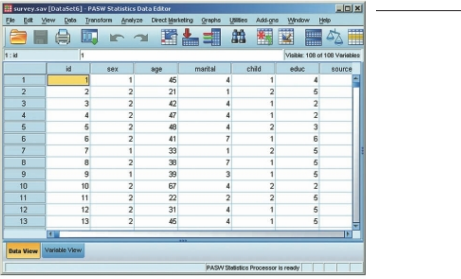
Getting to know SPSS 17
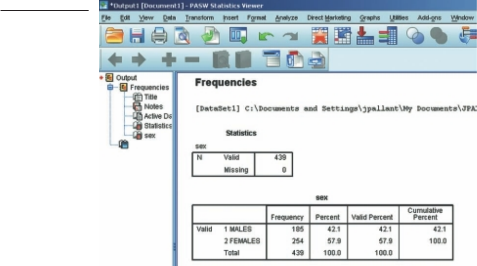
Viewer window
When you start to do analyses, the Viewer window should open automatically (see
Figure 3.2). If it does not open automatically, click on Window from the menu and this
should be listed. This window displays the results of the analyses you have conducted,
including tables and charts. In this window you can modify the output, delete it, copy
it, save it, or even transfer it into a Word document.
The Viewer screen consists of two parts. On the left is an outline or navigation
pane, which gives you a full list of all the analyses you have conducted. You can use
this side to quickly navigate your way around your output (which can become very
long). Just click on the section you want to move to and it will appear on the right-
hand side of the screen. On the right-hand side of the Viewer window are the results
of your analyses, which can include tables and graphs (also referred to as charts in
SPSS).
Saving output
When you save the output from SPSS, it is saved in a separate fi le with a .spv exten-
sion, to distinguish it from data fi les, which have a .sav extension. If you are using a
version of SPSS prior to version 18, your output will be given a .spo extension. To
Figure 3.1
Example of a Data
Editor window
18 Getting Started
read these older fi les in SPSS Statistics 18, you will need to download a Legacy Viewer
program from the SPSS website.
To save the results of your analyses, you must have the Viewer window open on
the screen in front of you. Click on File from the menu at the top of the screen. Click
on Save. Choose the directory and folder in which you wish to save your output,
and then type in a fi le name that uniquely identifi es your output. Click on Save. To
name my fi les, I use an abbreviation that indicates the data fi le I am working on and
the date I conducted the analyses. For example, the fi le survey8may2009.spv would
contain the analyses I conducted on 8 May 2009 using the survey data fi le. I keep a log
book that contains a list of all my fi le names, along with details of the analyses that
were performed. This makes it much easier for me to retrieve the results of specifi c
analyses. When you begin your own research, you will fi nd that you can very quickly
accumulate a lot of different fi les containing the results of many different analyses.
To prevent confusion and frustration, get organised and keep good records of the
analyses you have done and of where you have saved the results.
It is important to note that the output fi le (with a .spv extension) can only be
opened in SPSS. This can be a problem if you, or someone that needs to read the
output, does not have SPSS available. To get around this problem, you may choose to
‘export’ your SPSS results. If you wish to save the entire output, select File from the
Figure 3.2
Example of Viewer
window
Getting to know SPSS 19
menu and then choose Export. You can choose the format that you would like to use
(e.g. pdf, Word/rtf). Saving as a Word/rtf fi le means that you will be able to modify the
tables in Word. Use the Browse button to identify the folder you wish to save the fi le
into, specify a suitable name in the Save File pop-up box that appears and then click
on Save and then OK.
If you don’t want to save the whole fi le, you can select specifi c parts of the output
to export. Select these in the Viewer window using the left-hand navigation pane.
With the selections highlighted, select File from the menu and choose Export. In the
Export Output dialog box you will need to tick the box at the top labelled Selected
and then select the format of the fi le and the location you wish to save to.
Printing output
You can use the navigation pane (left-hand side) of the Viewer window to select
particular sections of your results to print out. To do this, you need to highlight the
sections that you want. Click on the fi rst section you want, hold down the Ctrl key
on your keyboard and then just click on any other sections you want. To print these
sections, click on the File menu (from the top of your screen) and choose Print. SPSS
will ask whether you want to print your selected output or the whole output.
Pivot Table Editor window
The tables you see in the Viewer window (which SPSS calls pivot tables) can be
modifi ed to suit your needs. To modify a table you need to double-click on it, which
takes you into what is known as the Pivot Table Editor. You can use this editor to
change the look of your table, the size, the fonts used and the dimensions of the
columns—you can even swap the presentation of variables around (transpose rows
and columns).
If you click the right mouse button on a table in the Viewer window, a pop-up
menu of options that are specifi c to that table will appear. If you double-click on a
table and then click on your right mouse button even more options appear, including
the option to Create Graph using these results. You may need to highlight the part
of the table that you want to graph by holding down the Ctrl key while you select the
parts of the table you want to display.
Chart Editor window
When you ask SPSS to produce a histogram, bar graph or scatterplot, it initially displays
these in the Viewer window. If you wish to make changes to the type or presentation
of the chart, you need to go into the Chart Editor window by double-clicking on your
chart. In this window you can modify the appearance and format of your graph, change
the fonts, colours, patterns and line markers (see Figure 3.3). The procedure to generate
charts and to use the Chart Editor is discussed further in Chapter 7.

20 Getting Started
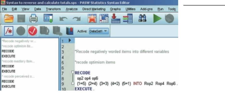
Syntax Editor window
In the ‘good old days’, all SPSS commands were given using a special command
language or syntax. SPSS still creates these sets of commands to run each of the
programs, but all you usually see are the Windows menus that ‘write’ the commands
for you. Although the options available through the SPSS menus are usually all that
most undergraduate students need to use, there are some situations when it is useful
to go behind the scenes and to take more control over the analyses that you wish to
conduct.
Syntax is a good way of keeping a record of what commands you have used,
particularly when you need to do a lot of recoding of variables or computing new
variables (demonstrated in Chapter 8). It is also useful when you need to repeat a lot
of analyses or generate a number of similar graphs.
You can use the normal SPSS menus to set up the basic commands of a partic-
ular statistical technique and then ‘paste’ these to the Syntax Editor using a Paste
button provided with each procedure (see Figure 3.4). It allows you to copy and paste
commands, and to make modifi cations to the commands generated by SPSS. Quite
complex commands can also be written to allow more sophisticated recoding and
manipulation of the data. SPSS has a Command Syntax Reference under the Help
menu if you would like additional information. (Warning: this is not for beginners—
it is quite complex to follow.)
The commands pasted to the Syntax Editor are not executed until you choose to
run them. To run the command, highlight the specifi c command (making sure you
include the fi nal full stop), or select it from the left-hand side of the screen, and then
click on the Run menu option or the arrow icon from the menu bar. Extra comments
can be added to the syntax fi le by starting them with an asterisk (see Figure 3.4).
Syntax is stored in a separate text fi le with a .sps extension. Make sure you have
the syntax editor open in front of you and then select File from the menu. Select the
Save option from the drop-down menu, choose the location you wish to save the fi le
to and then type in a suitable fi le name. Click on the Save button.
The syntax fi le (with the extension .sps) can only be opened using SPSS. Some-
times it may be useful to copy and paste the syntax text from the Syntax Editor into
a Word document so that you (or others) can view it even if SPSS is not available. To
Figure 3.3
Example of a Chart
Editor window
Getting to know SPSS 21
do this, hold down the left mouse button and drag the cursor over the syntax you wish
to save. Choose Edit from the menu and then select Copy from the drop-down menu.
Open a Word document and paste this material using the Edit, Paste option or hold
the Ctrl key down and press V on the keyboard.
MENUS
Within each of the windows described above, SPSS provides you with quite a bewilder-
ing array of menu choices. These choices are displayed in drop-down menus across the
top of the screen, and also as icons. Try not to become overwhelmed; initially, just learn
the key ones, and as you get a bit more confi dent you can experiment with others.
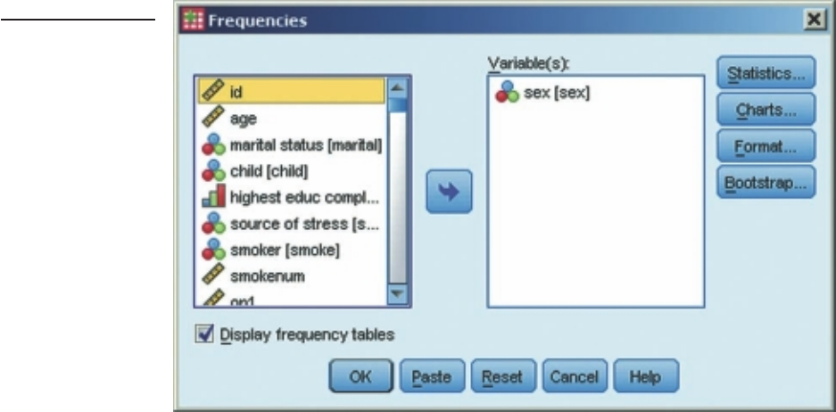
DIALOGUE BOXES
Once you select a menu option, you will usually be asked for further information. This
is done in a dialogue box. Figure 3.5 shows the dialogue box that appears when you
use the Frequencies procedure to get some descriptive statistics. To see this, click on
Analyze from the menu at the top of the screen, and then select Descriptive Statistics
and then slide across and select Frequencies. This will display a dialogue box asking
you to nominate which variables you want to use (see Figure 3.5).
Selecting variables in a dialogue box
To indicate which variables you want to use you need to highlight the selected vari-
ables in the list provided (by clicking on them), then click on the arrow button in
Figure 3.4
Example of a Syntax
Editor window
22 Getting Started
the centre of the screen to move them into the empty box labelled Variable(s). You
can select variables one at a time, clicking on the arrow each time, or you can select a
group of variables. If the variables you want to select are all listed together, just click
on the fi rst one, hold down the Shift key on your keyboard and press the down arrow
key until you have highlighted all the desired variables. Click on the arrow button and
all of the selected variables will move across into the Variable(s) box.
If the variables you want to select are spread throughout the variable list, you should
click on the fi rst variable you want, hold down the Ctrl key, move the cursor down to
the next variable you want and then click on it, and so on. Once you have all the desired
variables highlighted, click on the arrow button. They will move into the box.
To remove a variable from the box, you just reverse the process. Click on the
variable in the Variable(s) box that you wish to remove, click on the arrow button,
and it shifts the variable back into the original list. You will notice the direction of the
arrow button changes, depending on whether you are moving variables into or out of
the Variable(s) box.
Dialogue box buttons
In most dialogue boxes you will notice a number of standard buttons (OK, Paste,
Reset, Cancel and Help; see Figure 3.5). The uses of each of these buttons are:
• OK: Click on this button when you have selected your variables and are ready to
run the analysis or procedure.
Figure 3.5
Example of a
Frequencies
dialogue box
Getting to know SPSS 23
• Paste: This button is used to transfer the commands that SPSS has generated in
this dialogue box to the Syntax Editor. This is useful if you wish to keep a record
of the command or repeat an analysis a number of times.
• Reset: This button is used to clear the dialogue box of all the previous commands
you might have given when you last used this particular statistical technique or
procedure. It gives you a clean slate to perform a new analysis, with different
variables.
• Cancel: Clicking on this button closes the dialogue box and cancels all of the
commands you may have given in relation to that technique or procedure.
• Help: Click on this button to obtain information about the technique or
procedure you are about to perform.
Although I have illustrated the use of dialogue boxes in Figure 3.5 by using Frequen-
cies, all dialogue boxes work on the same basic principle. Each will have a series of
buttons with a variety of options relating to the specifi c procedure or analysis. These
buttons will open subdialogue boxes that allow you to specify which analyses you wish
to conduct or which statistics you would like displayed.
CLOSING SPSS
When you have fi nished your SPSS session and wish to close the program down, click
on the File menu at the top left of the screen. Click on Exit. SPSS will prompt you to
save your data fi le and a fi le that contains your output. You should not rely on the fact
that SPSS will prompt you to save when closing the program. It is important that you
save both your output and your data fi le regularly throughout your session. If SPSS
crashes or there is a power cut you will lose all your work.
GETTING HELP
If you need help while using SPSS or don’t know what some of the options refer to,
you can use the in-built Help menu. Click on Help from the menu bar and a number
of choices are offered. You can ask for specifi c topics, work through a Tutorial, or
consult a Statistics Coach. This takes you step by step through the decision-making
process involved in choosing the right statistic to use. This is not designed to replace
your statistics books, but it may prove a useful guide.
Within each of the major dialogue boxes there is an additional Help menu that
will assist you with the procedure you have selected.
This page intentionally left blank
PART TWO
Preparing the
data fi le
Preparation of the data fi le for analysis involves a number of steps. These include
creating the data fi le and entering the information obtained from your study in a
format defi ned by your codebook (covered in Chapter 2). The data fi le then needs to
be checked for errors, and these errors corrected. Part Two of this book covers these
two steps. In Chapter 4, the procedures required to create a data fi le and enter the
data are discussed. In Chapter 5, the process of screening and cleaning the data fi le is
covered.
25
This page intentionally left blank
27
4
Creating a data fi le and
entering data
There are a number of stages in the process of setting up a data fi le and analysing the
data. The fl ow chart shown on the next page outlines the main steps that are needed.
In this chapter I will lead you through the process of creating a data fi le and entering
the data.
To prepare a data fi le, three key steps are covered in this chapter:
• Step 1. The fi rst step is to check and modify, where necessary, the options that
SPSS uses to display the data and the output that is produced.
• Step 2. The next step is to set up the structure of the data fi le by ‘defi ning’ the
variables.
• Step 3. The fi nal step is to enter the data—that is, the values obtained from each
participant or respondent for each variable.
To illustrate these procedures I have used the data fi le survey4ED.sav, which is
described in the Appendix. The codebook used to generate these data is also provided
in the Appendix.
Data fi les can also be ‘imported’ from other spreadsheet-type programs (e.g.
Excel). This can make the data entry process much more convenient, particularly
for students who don’t have SPSS on their home computers. You can set up a basic
data fi le on Excel and enter the data at home. When complete, you can then import
the fi le into SPSS and proceed with the data manipulation and data analysis stages.
The instructions for using Excel to enter the data are provided later in this chapter.

28 Preparing the data fi le
CHANGING THE SPSS ‘OPTIONS’
Before you set up your data fi le, it is a good idea to check the SPSS options that govern
the way your data and output are displayed. The options allow you to defi ne how your
variables will be displayed, the type of tables that will be displayed in the output and
many other aspects of the program. Some of this will seem confusing at fi rst, but once
you have used the program to enter data and run some analyses you may want to refer
back to this section.
Flow chart of data analysis process
Prepare codebook (Chapter 2)
Set up structure of data fi le (Chapter 4)
Enter data (Chapter 4)
Screen data fi le for errors (Chapter 5)
Explore data using descriptive statistics and graphs (Chapters 6 and 7)
Modify variables for further analyses (Chapter 8)
Conduct statistical analyses to Conduct statistical analyses to
explore relationships (Part 4) compare groups (Part 5)
Correlation (Chapter 11) Non-parametric techniques (Chapter 16)
Partial correlation (Chapter 12) T-tests (Chapter 17)
Multiple regression (Chapter 13) Analysis of variance (Chapters 18, 19, 20)
Logistic regression (Chapter 14) Multivariate analysis of variance (Chapter 21)
Factor analysis (Chapter 15) Analysis of covariance (Chapter 22)
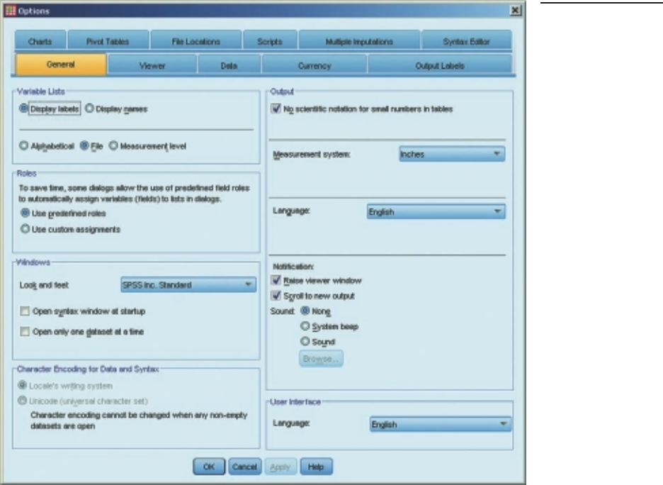
Creating a data fi le and entering data 29
If you are sharing a computer with other people (e.g. in a computer lab), it is worth
being aware of these options. Sometimes other students will change these options,
which can dramatically infl uence how the program appears. It is useful to know how
to change things back to the way you want them.
To open the Options screen, click on Edit from the menu at the top of the screen
and then choose Options. The screen shown in Figure 4.1 should appear. There are
a lot of choices listed, many of which you won’t need to change. I have described the
key ones below, organised by the tab they appear under. To move between the various
tabs, just click on the one you want. Don’t click on OK until you have fi nished all the
changes you want to make, across all the tabs.
General tab
When you come to do your analyses, you can ask for your variables to be listed in
alphabetical order or by the order in which they appear in the fi le. I always use the Figure 4.1
Example of an
Options screen
30 Preparing the data fi le
fi le order, because this is consistent with the order of the questionnaire items and the
codebook. To keep the variables in fi le order, just make sure the option File in
the Variable Lists section is selected.
In the Output section on the right-hand side, place a tick in the box No scientifi c
notation for small numbers in tables. This will stop you getting some very strange
numbers in your output for the statistical analyses. In the Notifi cation section, make
sure the options Raise viewer window and Scroll to new output are selected. This
means that when you conduct an analysis the Viewer window will appear, and the
new output will be displayed on the screen.
Data tab
Click on the Data tab to make changes to the way that your data fi le is displayed. If
your variables do not involve values with decimal places, you may like to change the
display format for all your variables. In the section labelled Display Format for New
Numeric Variables, change the Decimal Places value to 0. This means that all new
variables will not display any decimal places. This reduces the size of your data fi le and
simplifi es its appearance.
Output Labels tab
The options in this section allow you to customise how you want the variable names
and value labels displayed in your output. In the very bottom section under Variable
values in labels are shown as: choose Values and Labels from the drop-down options.
This will allow you to see both the numerical values and the explanatory labels in the
tables that are generated in the Viewer window.
Charts tab
Click on the Charts tab if you wish to change the appearance of your charts. You can
alter the Chart Aspect Ratio if you wish. You can also make other changes to the way
in which the chart is displayed (e.g. font, colour, lines).
Pivot Tables tab
SPSS presents most of the results of the statistical analyses in tables called pivot tables.
Under the Pivot Tables tab you can choose the format of these tables from an extensive
list. It is a matter of experimenting to fi nd a style that best suits your needs. When I am
fi rst doing my analyses, I use a style called CompactBoxed. This saves space (and paper
when printing). However, this style is not suitable for importing into documents that
are being sent for publication in a journal because it includes vertical lines. The styles
listed as ‘Academic’ may be more suitable here as they do not use vertical lines.
You can change the table styles as often as you like—just remember that you have
to change the style before you run the analysis. You cannot change the style of the
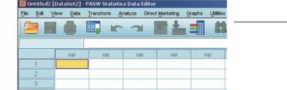
Creating a data fi le and entering data 31
tables after they appear in your output, but you can modify many aspects (e.g. font
sizes, column width) by using the Pivot Table Editor. This can be activated by double-
clicking on the table that you wish to modify.
Once you have made all the changes you wish to make on the various Options
tabs, click on OK. You can then proceed to defi ne your variables and enter your data.
DEFINING THE VARIABLES
Before you can enter your data, you need to tell SPSS about your variable names and
coding instructions. This is called ‘defi ning the variables’. You will do this in the Data
Editor window (see Figure 4.2). The Data Editor window consists of two different
views: Data View and Variable View. You can move between these two views using the
little tabs at the bottom left-hand side of the screen.
You will notice that in the Data View window each of the columns is labelled var.
These will be replaced with the variable names that you listed in your codebook (see
Figure 4.2). Down the side you will see the numbers 1, 2, 3 and so on. These are the
case numbers that SPSS assigns to each of your lines of data. These are not the same
as your ID numbers, and these case numbers change if you sort your fi le or split your
fi le to analyse subsets of your data.
Procedure for defi ning your variables
To de fi ne each of the variables that make up your data fi le, you fi rst need to click
on the Variable View tab at the bottom left of your screen. In this view (see
Figure 4.3) the variables are listed down the side, with their characteristics listed
along the top (name, type, width, decimals, label etc.).
Your job now is to defi ne each of your variables by specifying the required infor-
mation for each variable listed in your codebook. Some of the information you will
need to provide yourself (e.g. name); other bits are provided automatically using
Figure 4.2
Data Editor window
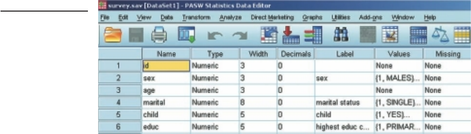
32 Preparing the data fi le
default values. These default values can be changed if necessary. The key pieces of infor-
mation that are needed are described below. The headings I have used correspond to
the column headings displayed in the Variable View. I have provided the simple step-
by-step procedures below; however, there are a number of shortcuts that you can use
once you are comfortable with the process. These are listed later, in the section headed
‘Optional shortcuts’. You should become familiar with the basic techniques fi rst.
Name
In this column, type in the brief variable name that will be used to identify each of the
variables in the data fi le (listed in your codebook). Keep these variable names as short as
possible, not exceeding 64 characters. They must follow the naming conventions speci-
fi ed by SPSS (listed in Chapter 2). Each variable name must be unique, must start with
a letter, and cannot contain spaces or symbols. For ideas on how to label your variables,
have a look at the codebooks provided in the Appendix. These list the variable names
used in data fi les that accompany this book (see p. viii for details of these fi les).
Type
The default value for Type that will appear automatically as you enter your fi rst variable
name is Numeric. For most purposes, this is all you will need to use. There are some
circumstances where other options may be appropriate. For example, if you need to enter
text information (e.g. a person’s surname), you need to change the type to String. A Date
option is also available if your data includes dates. To change the variable type, click in the
cell and a box with three dots should appear giving you the options available. You can also
use this window to adjust the width of the variable and the number of decimal places.
Width
The default value for Width is 8. This is usually suffi cient for most data. If your
variable has very large values (or you have requested a string variable), you may need
to change this default value; otherwise, leave it as is.
Figure 4.3
Variable View

Creating a data fi le and entering data 33
Decimals
The default value for Decimals is usually 2 (however, this can be changed using the
Options facility described earlier in this chapter). If your variable has decimal places,
change this to suit your needs.
Label
The Label column allows you to provide a longer description for your variable than
used in the Name column. This will be used in the output generated from the analyses
conducted by SPSS. For example, you may wish to give the label Total Optimism to
your variable TOPTIM.
Values
In the Values column you can defi ne the meaning of the values you have used to code
your variables. I will demonstrate this process for the variable Sex.
1. Click on the three dots on the right-hand side of the cell. This opens the
Value Label dialogue box.
2. Click in the box marked Value. Type in 1.
3. Click in the box marked Label. Type in Male.
4. Click on Add. You will then see in the summary box: 1=Male.
5. Repeat for Females: Value: enter 2, Label: enter Female. Add.
6. When you have fi nished defi ning all the possible values (as listed in your
codebook), click on OK.
Missing
Sometimes researchers assign specifi c values to indicate missing values for their data.
This is not essential—SPSS will recognise any blank cell as missing data. So if you
intend to leave a blank when a piece of information is not available, it is not necessary
to do anything with this Variable View column.
If you do intend to use specifi c missing value codes (e.g. 99=not applicable), you
must specify this value in the Missing section, otherwise SPSS will use the value as a
legitimate value in any statistical analyses. Click in the cell and then on the shaded box
with three dots that appears. Choose the option Discrete missing values and type the
value (e.g. 99) in the space provided. Up to three values can be specifi ed. Click on OK.
If you are using these special codes, it is also a good idea to go back and label these
values in the Values column.
Columns
The default column width is usually set at 8, which is suffi cient for most purposes.
Change it only if necessary to accommodate your values or long variable names.

34 Preparing the data fi le
Align
The alignment of the columns is usually set at ‘right’ alignment. There is no need to
change this.
Measure
The column heading Measure refers to the level of measurement of each of your vari-
ables. The default is Scale, which refers to continuous data measured at interval or ratio
level of measurement. If your variable consists of categories (e.g. sex), click in the cell and
then on the arrow key that appears. Choose Nominal for categorical data and Ordinal if
your data involve rankings or ordered values (e.g. level of education completed).
Optional shortcuts
The process described above can be rather tedious if you have a large number of
variables in your data fi le. There are a number of shortcuts you can use to speed up
the process. If you have a number of variables that have the same ‘attributes’ (e.g.
type, width, decimals), you can set the fi rst variable up correctly and then copy these
attributes to one or more other variables.
Copying variable defi nition attributes to one other variable
1. In Variable View, click on the cell that has the attribute you wish to copy
(e.g. Width).
2. From the menu, click on Edit and then Copy.
3. Click on the same attribute cell for the variable you wish to apply this to.
4. From the menu, click on Edit and then Paste.
Copying variable defi nition attributes to a number of other
variables
1. In Variable View, click on the cell that has the attribute you wish to copy
(e.g. Width).
2. From the menu, click on Edit and then Copy.
3. Click on the same attribute cell for the fi rst variable you wish to copy to
and then, holding your left mouse button down, drag the cursor down
the column to highlight all the variables you wish to copy to.
4. From the menu, click on Edit and then Paste.
Setting up a series of new variables all with the same attributes
If your data consists of scales made up of a number of individual items, you can
create the new variables and defi ne the attributes of all of these items in one go. The

Creating a data fi le and entering data 35
procedure is detailed below, using the six items of the Optimism Scale as an example
(optim1 to optim6). If you want to practise this as an exercise, you should start a new
data fi le (File, New, Data).
1. In Variable View, defi ne the attributes of the fi rst variable (optim1)
following the instructions provided earlier. This would involve defi ning
the value labels 1=strongly disagree, 2=disagree, 3=neutral, 4=agree,
5=strongly agree.
2. With the Variable View selected, click on the row number of this variable
(this should highlight the whole row).
3. From the menu, select Edit and then Copy.
4. Click on the row number of the next empty row.
5. From the menu, select Edit and then Paste Variables.
6. In the dialogue box that appears, enter the number of additional
variables you want to add (in this case, 5). Enter the prefi x you wish to
use (optim) and the number you wish the new variables to start on (in this
case, 2). Click on OK.
This will give you fi ve new variables (optim2, optim3, optim4, optim5 and optim6).
To set up all of the items in other scales, just repeat the process detailed above
(e.g. sest1 to sest10 for the self-esteem items). Remember, this procedure is suitable
only for items that have all the same attributes; it is not appropriate if the items have
different response scales (e.g. if some are categorical and others continuous), or if the
values are coded differently.
ENTERING DATA
Once you have defi ned each of your variable names and given them value labels (where
appropriate), you are ready to enter your data. Make sure you have your codebook ready.
Procedure for entering data
1. To enter data, you need to have the Data View active. Click on the Data
View tab at the bottom left-hand side of the screen of the Data Editor
window. A spreadsheet should appear with your newly defi ned variable
names listed across the top.
2. Click on the fi rst cell of the data set (fi rst column, fi rst row).
3. Type in the number (if this variable is ID, this should be 1).
4. Press the right arrow key on your keyboard; this will move the cursor into
the second cell, ready to enter your second piece of information for case
number 1.

36 Preparing the data fi le
5. Move across the row, entering all the information for case 1, making sure
that the values are entered in the correct columns.
6. To move back to the start, press the Home key on your keyboard (on some
computers you may need to hold the Ctrl key or the Fn key down and
then press the Home key). Press the down arrow to move to the second
row, and enter the data for case 2.
7. If you make a mistake and wish to change a value, click in the cell that
contains the error. Type in the correct value and then press the right
arrow key.
After you have defi ned your variables and entered your data, your Data Editor window
should look something like that shown previously in Figure 3.1.
If you have entered value labels for some of your variables (e.g. Sex: 1=male,
2=female), you can choose to have these labels displayed in the Data Editor window
instead of just the numbers. To do this, click on View from the menu and select the
option Va lu e Labels. This option can also be activated during the data entry process so
that you can choose an option from a drop-down menu, rather than typing a number
in each cell. This is slower, but does ensure that only valid numbers are entered. To
turn this option off, go to View and click on Value Labels again to remove the tick.
MODIFYING THE DATA FILE
After you have created a data fi le, you may need to make changes to it (e.g. to add,
delete or move variables, or to add or delete cases). Make sure you have the Data
Editor window open on the screen, showing Data View.
Delete a case
Move down to the case (row) you wish to delete. Position your cursor in the shaded
section on the left-hand side that displays the case number. Click once to highlight
the row. Press the Delete button on your computer keyboard. You can also click on the
Edit menu and click on Clear.
Insert a case between existing cases
Move your cursor to a cell in the case (row) immediately below where you would like
the new case to appear. Click on the Edit menu and choose Insert Cases. An empty
row will appear in which you can enter the data of the new case.
Delete a variable
Position your cursor in the shaded section (which contains the variable name) above the
column you wish to delete. Click once to highlight the whole column. Press the Delete
button on your keyboard. You can also click on the Edit menu and click on Clear.

Creating a data fi le and entering data 37
Insert a variable between existing variables
Position your cursor in a cell in the column (variable) to the right of where you would
like the new variable to appear. Click on the Edit menu and choose Insert Variable.
An empty column will appear in which you can enter the data of the new variable.
Move an existing variable(s)
In the Data Editor window, have the Variable View showing. Highlight the variable
you wish to move by clicking in the left-hand margin. Click and hold your left mouse
button and then drag the variable to the new position (a red line will appear as you
drag). Release the left mouse button when you get to the desired spot.
DATA ENTRY USING EXCEL
Data fi les can be prepared in the Microsoft Excel program and then imported into
SPSS for analysis. This is great for students who don’t have access to SPSS at
home. Excel usually comes as part of the Microsoft Offi ce package—check under All
Programs in your Start menu. The procedure for creating a data fi le in Excel and
then importing it into SPSS is described below. If you intend to use this option you
should have at least a basic understanding of Excel, as this will not be covered here.
Warning: Excel can cope with only 256 columns of data (or variables). If your data
fi le is likely to be larger than this, it is probably easier to set it up in SPSS rather than
convert from Excel to SPSS later. Alternatively, you can use different Excel spread-
sheets (each with the ID as the fi rst variable), convert each to SPSS separately, then
merge the fi les in SPSS later (see instructions in the next section).
Step 1: Set up the variable names
Set up an Excel spreadsheet with the variable names in the fi rst row across
the page. The variable names must conform to the SPSS rules for naming
variables (see Chapter 2).
Step 2: Enter the data
1. Enter the information for the fi rst case on one line across the page, using
the appropriate columns for each variable.
2. Repeat for each of the remaining cases. Don’t use any formulas or other
Excel functions. Remember to save your fi le regularly.
3. Click on File, Save. In the section marked Save as Type, make sure
Microsoft Excel Workbook is selected. Type in an appropriate fi le name.

38 Preparing the data fi le
Step 3: Converting to SPSS
1. After you have entered the data, save your fi le and then close Excel.
2. Start SPSS and select File, Open, Data from the menu at the top of the
screen.
3. In the section labelled Files of type, choose Excel. Excel fi les have a .xls or
.xlsx extension. Find the fi le that contains your data. Click on it so that it
appears in the File name section.
4. Click on the Open button. A screen will appear labelled Opening Excel
Data Source. Make sure there is a tick in the box Read variable names
from the fi rst row of data. Click on OK.
The data will appear on the screen with the variable names listed across the top. You
will then need to save this new SPSS fi le.
Step 4: Saving as an SPSS fi le
1. Choose File, and then Save As from the menu at the top of the screen.
2. Type in a suitable fi le name. Make sure that the Save as Type is set at
SPSS Statistics (*.sav). Click on Save.
3. In the Data Editor, Variable view, you will now need to defi ne each of
the Labels, Values and Measure information (see instructions presented
earlier). You may also want to reduce the width of the columns as they
often come in from Excel with a width of 11.
When you wish to open this fi le later to analyse your data using SPSS, make sure you
choose the fi le that has a .sav extension (not your original Excel fi le that has a .xls
extension).
MERGE FILES
There are times when it is necessary to merge different data fi les. SPSS allows you to
merge fi les by adding additional cases at the end of your fi le, or to merge additional
variables for each of the cases in an existing data fi le (e.g. when Time 2 data becomes
available). This second option is also useful when you have Excel fi les with infor-
mation spread across different spreadsheets that need to be merged by ID.
To merge fi les by adding cases
This procedure will allow you to merge fi les that have the same variables, but differ-
ent cases; for example, where the same information is recorded at two different sites

Creating a data fi le and entering data 39
(e.g. clinic settings) or entered by two different people. The two fi les should have the
same variable names for the data you wish to merge (although other non-equivalent
information can exist in each fi le).
If the ID numbers used in each fi le are the same (starting at ID=1, 2, 3), you will
need to change the ID numbers in one of the fi les before merging so that each case
is still uniquely identifi ed. To do this, open one of the fi les, choose Transform from
the menu, and then Compute Variable. Type ID in the Target Variable box, and then
ID + 1000 in the Numeric Expression box (or some number that is bigger than the
number of cases in the fi le). Click on the OK button, and then on OK in the dialogue
box that asks if you wish to change the variable. This will create new ID numbers
for this fi le starting at 1001, 1002 and so on. Note this in your codebook for future
reference. Then you are ready to merge the fi les.
1. Open the fi rst fi le that you wish to merge.
2. Go to the Data menu, choose Merge Files and then Add Cases.
3. In the dialogue box, click on An external SPSS data fi le and choose the
fi le that you wish to merge with. (If your second fi le is already open it will
be listed in the top box, An open dataset.)
4. Click on Continue and then on OK. Save the new data fi le using a
different name (File, Save As).
To merge fi les by adding variables
This option is useful when adding additional information for each case (with the
matching IDs). Each fi le must start with the ID number.
1. Sort each fi le in ascending order by ID by clicking on the Data menu,
choose Sort Cases and choose ID.
2. Go to the Data menu, choose Merge fi les and then Add Variables.
3. In the dialogue box, click on An external SPSS data fi le and choose the
fi le that you wish to merge with. (If your second fi le is already open it will
be listed in the top box, An open dataset.)
4. In the Excluded variables box, you should see the ID variable listed
(because it exists in both data fi les). (If you have any other variables listed
here, you will need to click on the Rename button to change the variable
name so that it is unique.)
5. Click on the ID variable, and then on the box Match cases on key variables
and on the arrow button to move ID into the Key Variables box. This means
that all information will be matched by ID. Click on Continue and then OK.
6. Save your merged fi le under a different name (File, Save As).

40 Preparing the data fi le
USEFUL SPSS FEATURES
There are many useful features of SPSS that can be used to help with analyses, and to
save you time and effort. I have highlighted a few of the main ones in the following
sections.
Sort the data fi le
You can ask SPSS to sort your data fi le according to values on one of your variables
(e.g. sex, age).
1. Click on the Data menu, choose Sort Cases and specify which variable will
be used to sort by. Choose either Ascending or Descending. Click on OK.
2. To return your fi le to its original order repeat the process, asking SPSS to
sort the fi le by ID.
Split the data fi le
Sometimes it is necessary to split your fi le and to repeat analyses for groups (e.g. males and
females) separately. This procedure does not physically alter your fi le in any permanent
manner. It is an option you can turn on and off as it suits your purposes. The order in
which the cases are displayed in the data fi le will change, however. You can return the data
fi le to its original order (by ID) by using the Sort Cases command described above.
1. Click on the Data menu and choose the Split File option.
2. Click on Compare groups and specify the grouping variable (e.g. sex).
Click on OK.
For the analyses that you perform after this split fi le procedure, the two groups (in this
case, males and females) will be analysed separately.
Important: when you have fi nished the analyses, you need to go back and turn the
Split File option off.
1. Click on the Data menu and choose the Split File option.
2. Click on the fi rst dot (Analyze all cases, do not create groups). Click on OK.
Select cases
For some analyses, you may wish to select a subset of your sample (e.g. only males).
1. Click on the Data menu and choose the Select Cases option.
2. Click on the If condition is satisfi ed button.
3. Click on the button labelled IF.

Creating a data fi le and entering data 41
4. Choose the variable that defi nes the group that you are interested in (e.g. sex).
5. Click on the arrow button to move the variable name into the box. Click
on the = key from the keypad displayed on the screen.
6. Type in the value that corresponds to the group you are interested in
(check with your codebook). For example, males in this sample are coded
1, therefore you would type in 1. The command line should read: sex=1.
7. Click on Continue and then OK.
For the analyses (e.g. correlation) that you perform after this Select Cases procedure,
only the group that you selected (e.g. males) will be included.
Important: when you have fi nished the analyses, you need to go back and turn the
Select Cases option off, otherwise it will apply to all analyses conducted.
1. Click on the Data menu and choose Select Cases option.
2. Click on the fi rst All cases option. Click on OK.
USING SETS
With large data fi les, it can be a pain to have to scroll through lots of variable names
in SPSS dialogue boxes to reach the ones that you want to analyse. SPSS allows you to
defi ne and use ‘sets’ of variables. This is particularly useful in the survey4ED.sav data
fi le, where there are lots of individual items that are added to give total scores, which
are located at the end of the fi le. In the following example, I will establish a set that
includes only the demographic variables and the scale totals.
1. Click on Utilities from the menu and choose Defi ne Variable Sets.
2. Choose the variables you want in your set from the list. Include ID, the
demographic variables (sex through to smoke number), and then all the
totals at the end of the data fi le from Total Optimism onwards. Move
these into the Variables in Set box.
3. In the box Set Name, type an appropriate name for your set (e.g. Totals).
4. Click on the Add Set button and then on Close.
To use the sets you have created, you need to activate them.
1. Click on Utilities and on Use Variable Sets.
2. In the list of variable sets, tick the set you have created (Totals) and then
go up and untick the ALLVARIABLES option, as this would display all
variables. Leave NEWVARIABLES ticked. Click on OK.

42 Preparing the data fi le
With the sets activated, only the selected variables will be displayed in the data fi le and
in the dialogue boxes used to conduct statistical analyses.
To turn the option off
1. Click on Utilities and on Use Variable Sets.
2. Tick the ALLVARIABLES option and click OK.
Data fi le comments
Under the Utilities menu, SPSS provides you with the chance to save descriptive
comments with a data fi le.
1. Select Utilities and Data File Comments.
2. Type in your comments, and if you would like them recorded in the
output fi le, click on the option Display comments in output. Comments
are saved with the date they were made.
Display values labels in data fi le
When the data fi le is displayed in the Data Editor window, the numerical values for
all variables are usually shown. If you would like the value labels (e.g. male, female)
displayed instead, go to the View menu and choose Value Labels. To turn this option
off, go to the View menu and click on Value Labels again to remove the tick.
43
5
Screening and
cleaning the data
Before you start to analyse your data, it is essential that you check your data set for errors.
It is very easy to make mistakes when entering data, and unfortunately some errors can
completely mess up your analyses. For example, entering 35 when you mean to enter 3
can distort the results of a correlation analysis. Some analyses are very sensitive to what
are known as ‘outliers’; that is, values that are well below or well above the other scores.
So it is important to spend the time checking for mistakes initially, rather than trying to
repair the damage later. Although boring, and a threat to your eyesight if you have large
data sets, this process is essential and will save you a lot of heartache later!
The data screening process involves a number of steps:
• Step 1: Checking for errors. First, you need to check each of your variables for
scores that are out of range (i.e. not within the range of possible scores).
• Step 2: Finding and correcting the error in the data fi le. Second, you need to fi nd
where in the data fi le this error occurred (i.e. which case is involved) and correct
or delete the value.
To give you the chance to practise these steps, I have created a modifi ed data fi le
(error4ED.sav) provided on the website accompanying this book (this is based on the
main fi le survey4ED.sav—see details on p. viii and in the Appendix). To follow along,
you will need to start SPSS and open the error4ED.sav fi le. In working through each of
the steps on the computer you will become more familiar with the use of menus, inter-
preting the output from SPSS analyses and manipulating your data fi le. For each of the
procedures, I have included the SPSS syntax. For more information on the use of the
Syntax Editor for recording and saving the SPSS commands, see Chapter 3.
Before you start, you should go to the Edit menu and choose Options. Under the
Output Labels tab, go down to the fi nal box (Variable values in labels shown as:) and
choose Values and Labels. This will allow you to display both the values and labels
used for each of your categorical variables—making identifi cation of errors easier.

44 Preparing the data fi le
STEP 1: CHECKING FOR ERRORS
When checking for errors, you are primarily looking for values that fall outside the
range of possible values for a variable. For example, if sex is coded 1=male, 2=female,
you should not fi nd any scores other than 1 or 2 for this variable. Scores that fall
outside the possible range can distort your statistical analyses—so it is very important
that all these errors are corrected before you start. To check for errors, you will need
to inspect the frequencies for each of your variables. This includes all of the individual
items that make up the scales. Errors must be corrected before total scores for these
scales are calculated. It is a good idea to keep a log book where you record any errors
that you detect and any changes that you make to your data fi le.
There are a number of different ways to check for errors using SPSS. I will illus-
trate two different ways, one that is more suitable for categorical variables (e.g. sex)
and the other for continuous variables (e.g. age).
Checking categorical variables
In this section, the procedure for checking categorical variables for errors is presented.
In the example shown below, I will illustrate the process using the error4ED.sav
data fi le (included on the website accompanying this book—see p. viii), checking for
errors on the variables Sex, Marital status and Highest education completed. Some
deliberate errors have been introduced in the error4ED.sav data fi le so that you
can get practice spotting them—they are not present in the main survey4ED.sav
data fi le.
Procedure for checking categorical variables
1. From the main menu at the top of the screen, click on Analyze, then click
on Descriptive Statistics, then Frequencies.
2. Choose the variables that you wish to check (e.g. sex, marital, educ.).
3. Click on the arrow button to move these into the Variable box.
4. Click on the Statistics button. Tick Minimum and Maximum in the
Dispersion section.
5. Click on Continue and then on OK (or on Paste to save to Syntax Editor).
The syntax generated from this procedure is:
FREQUENCIES
VARIABLES=sex marital educ
/STATISTICS=MINIMUM MAXIMUM
/ORDER= ANALYSIS .
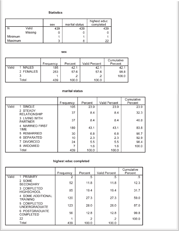
Screening and cleaning the data 45
Selected output generated using this procedure is displayed as follows.
There are two parts to the output. The fi rst table provides a summary of each of the
variables you requested. The remaining tables give you a breakdown, for each variable,
of the range of responses. (These are listed using the value label and the code number
that was used if you changed the Options as suggested earlier in this chapter.)

46 Preparing the data fi le
• Check your Minimum and Maximum values. Do they make sense? Are they
within the range of possible scores on that variable? You can see from the fi rst
table (labelled Statistics) that, for the variable Sex, the minimum value is 1 and
the maximum is 3. This value is incorrect, as the maximum value should only be
2 according to the codebook in the Appendix. For marital status, the scores are
within the appropriate range of 1 to 8. The maximum value for highest educ is 22,
indicating an error, as the maximum value should only be 6.
• Check the number of Valid and Missing cases. If there are a lot of missing cases, you
need to ask why. Have you made errors in entering the data (e.g. put the data in the
wrong columns)? Sometimes extra cases appear at the bottom of the data fi le, where
you may have moved your cursor too far down and accidentally created some ‘empty’
cases. If this occurs, open your Data Editor window, move down to the empty case
row, click in the shaded area where the case number appears and press Delete on your
keyboard. Rerun the Frequencies procedure again to get the correct values.
• Other tables are also presented in the output, corresponding to each of the vari-
ables that were investigated. In these tables, you can see how many cases fell into
each of the legitimate categories. It also shows how many cases have out-of-range
values. There is one case with a value of 3 for sex, and one person with a value of
22 for education. We will need to fi nd out where these errors occurred, but fi rst
we will demonstrate how to check for errors in some of the continuous variables
in the data fi le.
Checking continuous variables
Procedure for checking continuous variables
1. From the menu at the top of the screen, click on Analyze, then click on
Descriptive statistics, then Descriptives.
2. Click on the variables that you wish to check. Click on the arrow button to
move them into the Variables box (e.g. age).
3. Click on the Options button. You can ask for a range of statistics. The
main ones at this stage are mean, standard deviation, minimum and
maximum. Click on the statistics you wish to generate.
4. Click on Continue, and then on OK (or on Paste to save to Syntax Editor).
The syntax generated from this procedure is:
DESCRIPTIVES
VARIABLES=age
/STATISTICS=MEAN STDDEV MIN MAX .

Screening and cleaning the data 47
The output generated from this procedure is shown as follows.
• Check the Minimum and Maximum values. Do these make sense? In this case, the
ages range from 2 to 82. The minimum value suggests an error (given this was an
adult-only sample).
• Does the Mean score make sense? If there is an out-of-range value in the data fi le,
this will distort the mean value. If the variable is the total score on a scale, is the
mean value what you expected from previous research on this scale?
STEP 2: FINDING AND CORRECTING THE ERROR IN THE
DATA FILE
So what do we do if we fi nd some out-of-range responses (e.g. a value of 3 for sex)?
First, we need to fi nd the error in the data fi le. Don’t try to scan through your entire
data set looking for the error—there are a number of different ways to fi nd an error
in a data fi le. I will illustrate two approaches.
Method 1
1. Click on the Data menu and choose Sort Cases.
2. In the dialogue box that pops up, click on the variable that you know
has an error (e.g. sex) and then on the arrow to move it into the Sort By
box. Click on either ascending or descending (depending on whether you
want the higher values at the top or the bottom). For sex, we want to
fi nd the person with the value of 3, so we would choose descending.
3. Click on OK.
In the Data Editor window, make sure that you have selected the Data View tab
so that you can see your data values. The case with the error for your selected variable
(e.g. sex) should now be located at the top of your data fi le. Look across to the sex
variable column. In this example, you will see that the fi rst case listed (ID=103) has
a value of 3 for sex. If this was your data, you would need to access the original ques-
tionnaires and check whether the person with an identifi cation number of 103 was
a male or female. You would then delete the value of 3 and type in the correct value.
Record this information in your log book. If you don’t have access to the original data,

48 Preparing the data fi le
you should delete the value and let SPSS replace it with the system missing code (it
will show as a full stop—this happens automatically, don’t type a full stop).
When you fi nd an error in your data fi le, it is important that you check for other
errors in the surrounding columns. In this example, notice that the inappropriate
value of 2 for age is also for person ID=103.
Shown below is another way that we could have found the case that had an error
for sex.
Method 2
1. Make sure that the Data Editor window is open and on the screen with
the data showing.
2. Click on the variable name in which the error has occurred (e.g. sex).
3. Click once to highlight the column.
4. Click on Edit from the menu across the top of the screen. Click on Find.
5. In the Find box, type in the incorrect value that you are looking for (e.g. 3).
6. Click on Find Next. SPSS will scan through the fi le and will stop at the fi rst
occurrence of the value that you specifi ed. Take note of the ID number of
this case (from the fi rst column). You will need this to check your records
or questionnaires to fi nd out what the value should be.
7. Click on Find Next again if you need to continue searching for other
cases with the same incorrect value. In this example, we know from the
Frequencies output that there is only one incorrect value of 3.
8. Click on Close when you have fi nished searching.
After you have corrected your errors, it is essential to repeat Frequencies to double-
check. Sometimes, in correcting one error you may have accidentally caused another
error. Although this process is tedious, it is very important that you start with a clean,
error-free data set. The success of your research depends on it. Don’t cut corners!
CASE SUMMARIES
One other aspect of SPSS that may be useful in this data screening process is Sum-
marize Cases. This allows you to select and display specifi c pieces of information for
each case.
1. Click on Analyze, go to Reports and choose Case Summaries.
2. Choose the ID variable and other variables you are interested in (e.g. sex,
child, smoker). Remove the tick from the Limit cases to fi rst 100.
3. Click on the Statistics button and remove Number of cases from the Cell
Statistics box. Click on Continue.
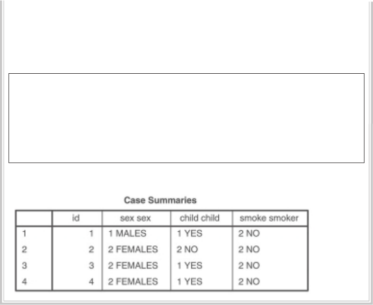
Screening and cleaning the data 49
4. Click on the Options button and remove the tick from Subheadings for
totals.
5. Click on Continue and then on OK (or on Paste to save to Syntax Editor).
The syntax from this procedure is:
SUMMARIZE
/TABLES=id sex child smoke
/FORMAT=VALIDLIST NOCASENUM NOTOTAL
/TITLE=‘Case Summaries’
/MISSING=VARIABLE
/CELLS=NONE.
Part of the output is shown below.
In this chapter, we have checked for errors in only a few of the variables in the data
fi le to illustrate the process. For your own research, you would obviously check every
variable in the data fi le. If you would like some more practice fi nding errors, repeat
the procedures described above for all the variables in the error4ED.sav data fi le. I
have deliberately included a few errors to make the process more meaningful. Refer
to the codebook in the Appendix for survey4ED.sav to fi nd out what the legitimate
values for each variable should be.
For additional information on the screening and cleaning process, I would strongly
recommend you read Chapter 4 in Tabachnick and Fidell (2007).
This page intentionally left blank
PART THREE
Preliminary
analyses
Once you have a clean data fi le, you can begin the process of inspecting your data fi le and
exploring the nature of your variables. This is in readiness for conducting specifi c statis-
tical techniques to address your research questions. There are fi ve chapters that make
up Part Three of this book. In Chapter 6, the procedures required to obtain descriptive
statistics for both categorical and continuous variables are presented. This chapter also
covers checking the distribution of scores on continuous variables in terms of normality
and possible outliers. Graphs can be useful tools when getting to know your data. Some
of the more commonly used graphs available through SPSS are presented in Chapter 7.
Sometimes manipulation of the data fi le is needed to make it suitable for specifi c
analyses. This may involve calculating the total score on a scale, by adding up the scores
obtained on each of the individual items. It may also involve collapsing a continuous
variable into a smaller number of categories. These data manipulation techniques are
covered in Chapter 8. In Chapter 9, the procedure used to check the reliability (internal
consistency) of a scale is presented. This is particularly important in survey research,
or in studies that involve the use of scales to measure personality characteristics, atti-
tudes, beliefs etc. Also included in Part Three is a chapter that helps you through the
decision-making process in deciding which statistical technique is suitable to address
your research question. In Chapter 10, you are provided with an overview of some of
the statistical techniques available in SPSS and led step by step through the process
of deciding which one would suit your needs. Important aspects that you need to con-
sider (e.g. type of question, data type, characteristics of the variables) are highlighted.
51
This page intentionally left blank
53
6
Descriptive statistics
Once you are sure there are no errors in the data fi le (or at least no out-of-range values
on any of the variables), you can begin the descriptive phase of your data analysis.
Descriptive statistics have a number of uses. These include to:
• describe the characteristics of your sample in the Method section of your report
• check your variables for any violation of the assumptions underlying the statisti-
cal techniques that you will use to address your research questions
• address specifi c research questions.
The two procedures outlined in Chapter 5 for checking the data will also give you
information for describing your sample in the Method section of your report.
In studies involving human participants, it is useful to collect information on the
number of people or cases in the sample, the number and percentage of males and
females in the sample, the range and mean of ages, education level, and any other
relevant background information. Prior to doing many of the statistical analyses (e.g.
t-test, ANOVA, correlation), it is important to check that you are not violating any
of the ‘assumptions’ made by the individual tests. (These are covered in detail in Part
Four and Part Five of this book.)
Testing of assumptions usually involves obtaining descriptive statistics on your
variables. These descriptive statistics include the mean, standard deviation, range
of scores, skewness and kurtosis. Descriptive statistics can be obtained a number of
different ways, providing a variety of information.
If all you want is a quick summary of the characteristics of the variables in your
data fi le, you can use a relatively new feature of SPSS (this may not be available if using
earlier versions of SPSS).
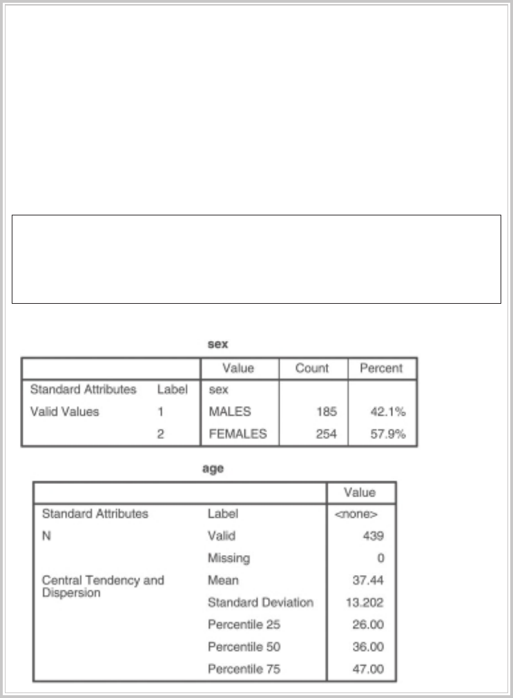
54 Preliminary analyses
Procedure for obtaining codebook
1. Click on Analyze, go to Reports and choose Codebook.
2. Select the variables you want and move them into the Codebook
Variables box.
3. Click on the Output tab and untick (by clicking on the box with a tick) all
the options except Label, Value Labels and Missing Values.
4. Click on the Statistics tab and make sure that all the options in both
sections are ticked.
5. Click on Continue, and then OK (or on Paste to save to Syntax Editor).
The syntax generated from this procedure is:
CODEBOOK sex [n] age [s]
/VARINFO LABEL VALUELABELS MISSING
/OPTIONS VARORDER=VARLIST SORT=ASCENDING MAXCATS=200
/STATISTICS COUNT PERCENT MEAN STDDEV QUARTILES.
The output is shown below.
The output from the procedure shown above gives you a quick summary of the
cases in your data fi le. Often, however, you need more detailed information. This
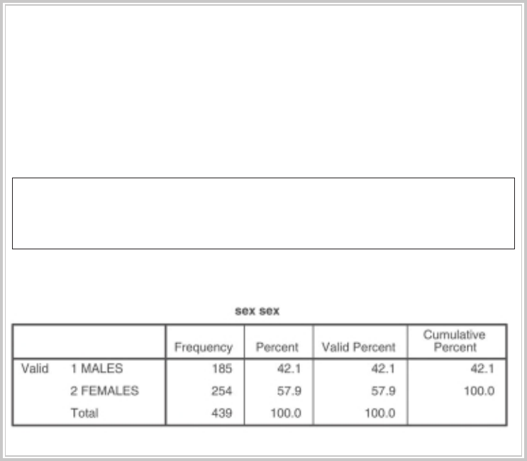
Descriptive statistics 55
can be obtained using the Frequencies, Descriptives or Explore procedures. These
are all procedures listed under the Analyze, Descriptive Statistics drop-down menu.
There are, however, different procedures depending on whether you have a categori-
cal or continuous variable. Some of the statistics (e.g. mean, standard deviation) are
not appropriate if you have a categorical variable. The different approaches to be
used with categorical and continuous variables are presented in the following two
sections. If you would like to follow along with the examples in this chapter, open the
survey4ED.sav fi le.
CATEGORICAL VARIABLES
To obtain descriptive statistics for categorical variables, you should use Frequencies.
This will tell you how many people gave each response (e.g. how many males, how
many females). It doesn’t make any sense asking for means, standard deviations etc.
for categorical variables, such as sex or marital status.
Procedure for obtaining descriptive statistics for categorical variables
1. From the menu click on Analyze, then click on Descriptive Statistics, then
Frequencies.
2. Choose and highlight the categorical variables you are interested in
(e.g. sex). Move these into the Variables box.
3. Click on OK (or on Paste to save to Syntax Editor).
The syntax generated from this procedure is:
FREQUENCIES
VARIABLES=sex
/ORDER= ANALYSIS .
The output is shown below.
56 Preliminary analyses
Interpretation of output from Frequencies
From the output shown above, we know that there are 185 males (42.1 per cent)
and 254 females (57.9 per cent) in the sample, giving a total of 439 respondents. It is
important to take note of the number of respondents you have in different subgroups
in your sample. For some analyses (e.g. ANOVA), it is easier to have roughly equal
group sizes. If you have very unequal group sizes, particularly if the group sizes are
small, it may be inappropriate to run some analyses.
CONTINUOUS VARIABLES
For continuous variables (e.g. age) it is easier to use Descriptives, which will provide
you with ‘summary’ statistics such as mean, median and standard deviation. You
certainly don’t want every single value listed, as this may involve hundreds of values
for some variables. You can collect the descriptive information on all your continu-
ous variables in one go; it is not necessary to do it variable by variable. Just transfer
all the variables you are interested in into the box labelled Variables. If you have a lot
of variables, however, your output will be extremely long. Sometimes it is easier to do
them in chunks and tick off each group of variables as you do them.
Procedure for obtaining descriptive statistics for continuous variables
1. From the menu click on Analyze, then select Descriptive Statistics, then
Descriptives.
2. Click on all the continuous variables that you wish to obtain descriptive
statistics for. Click on the arrow button to move them into the Variables
box (e.g. age, Total perceived stress: tpstress).
3. Click on the Options button. Make sure mean, standard deviation,
minimum, maximum are ticked and then click on skewness, kurtosis.
4. Click on Continue, and then OK (or on Paste to save to Syntax Editor).
The syntax generated from this procedure is:
DESCRIPTIVES
VARIABLES=age tpstress
/STATISTICS=MEAN STDDEV MIN MAX KURTOSIS SKEWNESS .
The output generated from this procedure is shown below.
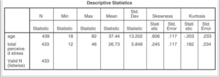
Descriptive statistics 57
Interpretation of output from Descriptives
In the output presented above, the information we requested for each of the vari-
ables is summarised. For example, for the variable age we have information from
439 respondents, ranging in age from 18 to 82 years, with a mean of 37.44 and
standard deviation of 13.20. This information may be needed for the Method section
of a report to describe the characteristics of the sample.
Descriptives also provides some information concerning the distribution of
scores on continuous variables (skewness and kurtosis). This information may
be needed if these variables are to be used in parametric statistical techniques
(e.g. t-tests, analysis of variance). The Skewness value provides an indication of
the symmetry of the distribution. Kurtosis, on the other hand, provides infor-
mation about the ‘peakedness’ of the distribution. If the distribution is perfectly
normal, you would obtain a skewness and kurtosis value of 0 (rather an uncommon
occurrence in the social sciences).
Positive skewness values indicate positive skew (scores clustered to the left at the
low values). Negative skewness values indicate a clustering of scores at the high end
(right-hand side of a graph). Positive kurtosis values indicate that the distribution is
rather peaked (clustered in the centre), with long thin tails. Kurtosis values below 0
indicate a distribution that is relatively fl at (too many cases in the extremes). With
reasonably large samples, skewness will not ‘make a substantive difference in the
analysis’ (Tabachnick & Fidell 2007, p. 80). Kurtosis can result in an underestimate of
the variance, but this risk is also reduced with a large sample (200+ cases: see Tabach-
nick & Fidell 2007, p. 80).
While there are tests that you can use to evaluate skewness and kurtosis values,
these are too sensitive with large samples. Tabachnick and Fidell (2007, p. 81) rec-
ommend inspecting the shape of the distribution (e.g. using a histogram). The proce-
dure for further assessing the normality of the distribution of scores is provided later
in this section.
58 Preliminary analyses
MISSING DATA
When you are doing research, particularly with human beings, it is rare that you will
obtain complete data from every case. It is important that you inspect your data fi le
for missing data. Run Descriptives and fi nd out what percentage of values is missing
for each of your variables. If you fi nd a variable with a lot of unexpected missing data,
you need to ask yourself why. You should also consider whether your missing values
are happening randomly, or whether there is some systematic pattern (e.g. lots of
women over 30 years of age failing to answer the question about their age!).
You also need to consider how you will deal with missing values when you come
to do your statistical analyses. The Options button in many of the SPSS statistical
procedures offers you choices for how you want to deal with missing data. It is impor-
tant that you choose carefully, as it can have dramatic effects on your results. This is
particularly important if you are including a list of variables and repeating the same
analysis for all variables (e.g. correlations among a group of variables, t-tests for a
series of dependent variables).
• The Exclude cases listwise option will include cases in the analysis only if they
have full data on all of the variables listed in your Variables box for that case. A
case will be totally excluded from all the analyses if it is missing even one piece of
information. This can severely, and unnecessarily, limit your sample size.
• The Exclude cases pairwise option, however, excludes the case (person) only
if they are missing the data required for the specifi c analysis. They will still be
included in any of the analyses for which they have the necessary information.
• The Replace with mean option, which is available in some SPSS statistical proce-
dures (e.g. multiple regression), calculates the mean value for the variable and
gives every missing case this value. This option should never be used, as it can
severely distort the results of your analysis, particularly if you have a lot of missing
values.
Always press the Options button for any statistical procedure you conduct, and check
which of these options is ticked (the default option varies across procedures). I would
suggest that you use pairwise exclusion of missing data, unless you have a pressing
reason to do otherwise. The only situation where you might need to use listwise ex-
clusion is when you want to refer only to a subset of cases that provided a full set of
results.
For more experienced users, there are more advanced and complex options avail-
able in SPSS for estimating missing values (e.g. imputation). These are included in
the Missing Value Analysis procedure. This can also be used to detect patterns within
missing data.

Descriptive statistics 59
ASSESSING NORMALITY
Many of the statistical techniques presented in Part Four and Part Five of this book
assume that the distribution of scores on the dependent variable is ‘normal’. Normal
is used to describe a symmetrical, bell-shaped curve, which has the greatest frequency
of scores in the middle with smaller frequencies towards the extremes (see Gravet-
ter & Wallnau 2004, p. 48). Normality can be assessed to some extent by obtaining
skewness and kurtosis values (as described in the previous section). However, other
techniques are also available in SPSS using the Explore option of the Descriptive
Statistics menu. This procedure is detailed below. In this example, I will assess the
normality of the distribution of scores for Total perceived stress for the sample as a
whole. You also have the option of doing this separately for different groups in your
sample by specifying an additional categorical variable (e.g. sex) in the Factor List
option that is available in the Explore dialogue box.
Procedure for assessing normality using Explore
1. From the menu at the top of the screen click on Analyze, then select
Descriptive Statistics, then Explore.
2. Click on the variable(s) you are interested in (e.g. Total perceived stress:
tpstress). Click on the arrow button to move them into the Dependent
List box.
3. In the Label Cases by: box, put your ID variable.
4. In the Display section, make sure that Both is selected.
5. Click on the Statistics button and click on Descriptives and Outliers. Click
on Continue.
6. Click on the Plots button. Under Descriptive, click on Histogram. Click on
Normality plots with tests. Click on Continue.
7. Click on the Options button. In the Missing Values section, click on
Exclude cases pairwise. Click on Continue and then OK (or on Paste to
save to Syntax Editor).
The syntax generated is:
EXAMINE
VARIABLES=tpstress
/ID= id
/PLOT BOXPLOT HISTOGRAM NPPLOT
/COMPARE GROUP
/STATISTICS DESCRIPTIVES EXTREME
/CINTERVAL 95
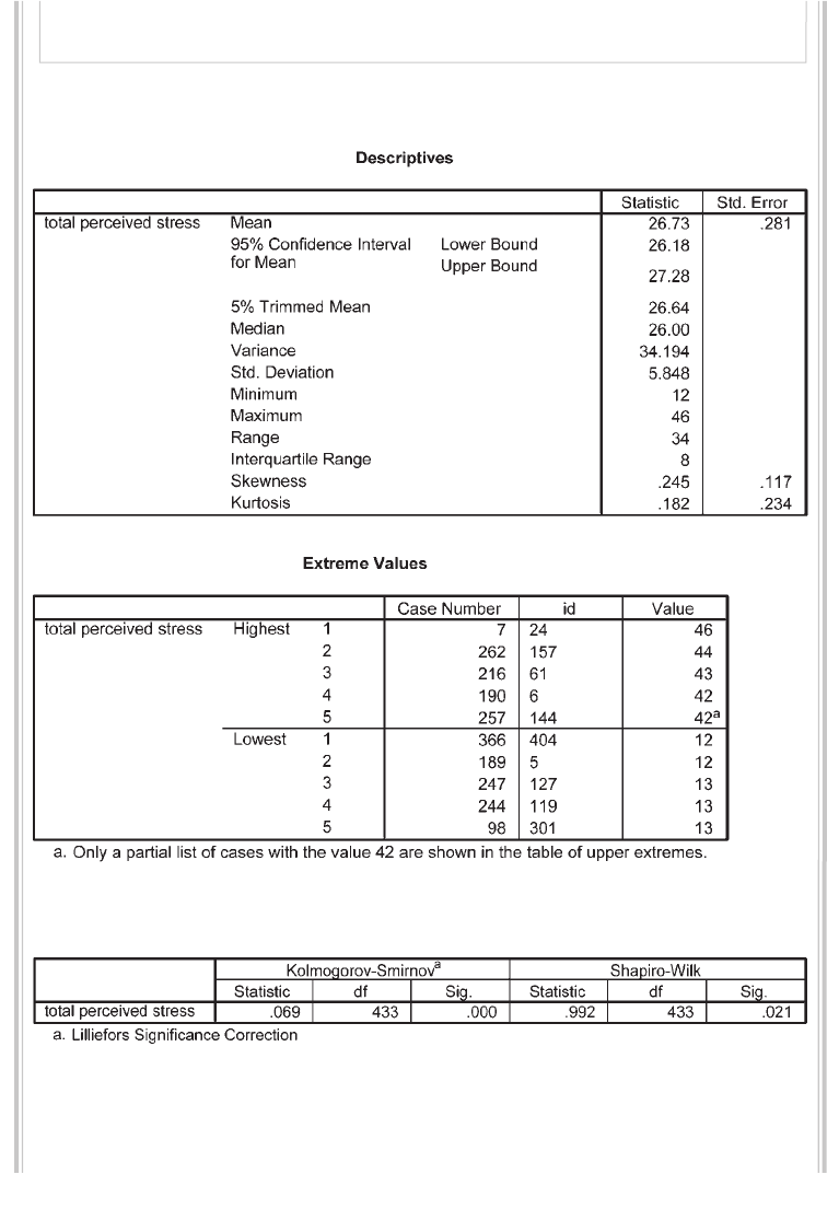
60 Preliminary analyses
/MISSING PAIRWISE
/NOTOTAL.
Selected output generated from this procedure is shown below.
Tests of normality
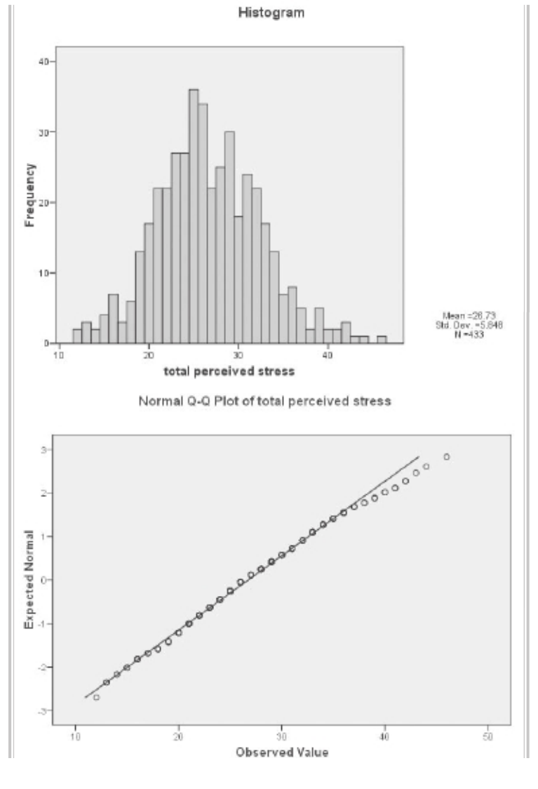
Descriptive statistics 61
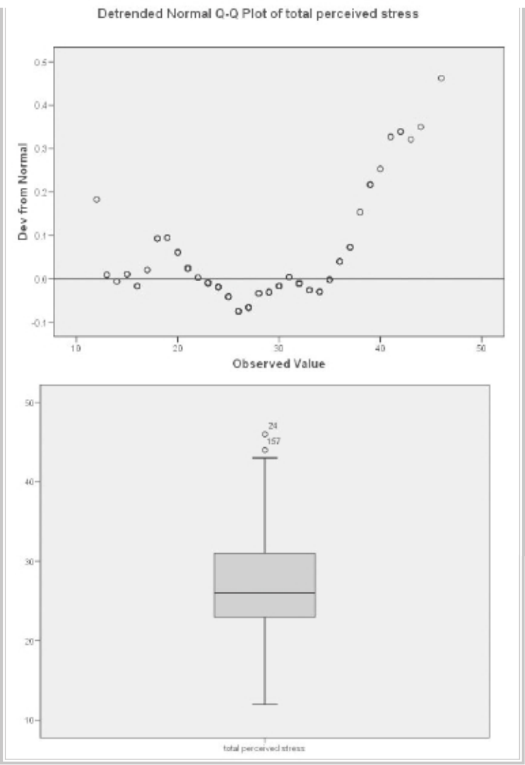
62 Preliminary analyses
Descriptive statistics 63
Interpretation of output from Explore
Quite a lot of information is generated as part of this output. This tends to be a bit
overwhelming until you know what to look for. I will take you through the output
step by step.
• In the table labelled Descriptives, you are provided with descriptive statistics and
other information concerning your variables. If you specifi ed a grouping variable
in the Factor List, this information will be provided separately for each group,
rather than for the sample as a whole. Some of this information you will recognise
(mean, median, std deviation, minimum, maximum etc.).
One statistic you may not know is the 5% Trimmed Mean. To obtain this
value, SPSS removes the top and bottom 5 per cent of your cases and calculates a
new mean value. If you compare the original mean (26.73) and this new trimmed
mean (26.64), you can see whether your extreme scores are having a strong infl u-
ence on the mean. If these two mean values are very different, you may need to
investigate these data points further. The ID values of the most extreme cases are
shown in the Extreme Values table.
• Skewness and kurtosis values are also provided as part of this output, giving
information about the distribution of scores for the two groups (see discussion of
the meaning of these values in the previous section).
• In the table labelled Tests of Normality, you are given the results of the
Kolmogorov-Smirnov statistic. This assesses the normality of the distribution of
scores. A non-signifi cant result (Sig. value of more than .05) indicates normal-
ity. In this case, the Sig. value is .000, suggesting violation of the assumption of
normality. This is quite common in larger samples.
• The actual shape of the distribution for each group can be seen in the Histograms.
In this example, scores appear to be reasonably normally distributed. This is also
supported by an inspection of the normal probability plots (labelled Normal Q-Q
Plot). In this plot, the observed value for each score is plotted against the expected
value from the normal distribution. A reasonably straight line suggests a normal
distribution.
• The Detrended Normal Q-Q Plots are obtained by plotting the actual deviation
of the scores from the straight line. There should be no real clustering of points,
with most collecting around the zero line.
• The fi nal plot that is provided in the output is a boxplot of the distribution of
scores for the two groups. The rectangle represents 50 per cent of the cases, with
the whiskers (the lines protruding from the box) going out to the smallest and
largest values. Sometimes you will see additional circles outside this range—these
are classifi ed by SPSS as outliers. The line inside the rectangle is the median value.
Boxplots are discussed further in the next section on detecting outliers.
64 Preliminary analyses
In the example given above, the distribution of scores was reasonably ‘normal’. Often this
is not the case. Many scales and measures used in the social sciences have scores that are
skewed, either positively or negatively. This does not necessarily indicate a problem with
the scale, but rather refl ects the underlying nature of the construct being measured. Life
satisfaction measures, for example, are often negatively skewed, with most people being
reasonably happy with their lot in life. Clinical measures of anxiety or depression are often
positively skewed in the general population, with most people recording relatively few
symptoms of these disorders. Some authors in this area recommend that, with skewed
data, the scores be ‘transformed’ statistically. This issue is discussed further in Chapter 8.
CHECKING FOR OUTLIERS
Many of the statistical techniques covered in this book are sensitive to outliers (cases
with values well above or well below the majority of other cases). The techniques
described in the previous section can also be used to check for outliers.
• First, have a look at the Histogram. Look at the tails of the distribution. Are there
data points sitting on their own, out on the extremes? If so, these are potential
outliers. If the scores drop away in a reasonably even slope, there is probably not
too much to worry about.
• Second, inspect the Boxplot. Any scores that SPSS considers are outliers appear
as little circles with a number attached (this is the ID number of the case). SPSS
defi nes points as outliers if they extend more than 1.5 box-lengths from the edge
of the box. Extreme points (indicated with an asterisk, *) are those that extend
more than three box-lengths from the edge of the box. In the example above there
are no extreme points, but there are two outliers: ID numbers 24 and 157. If you
fi nd points like this, you need to decide what to do with them.
• It is important to check that the outlier’s score is genuine, not just an error. Check
the score and see whether it is within the range of possible scores for that variable.
Sometimes it is worth checking back with the questionnaire or data record to see
if there was a mistake in entering the data. If it is an error, correct it, and repeat
the boxplot. If it turns out to be a genuine score, you then need to decide what
you will do about it. Some statistics writers suggest removing all extreme outliers
from the data fi le. Others suggest changing the value to a less extreme value, thus
including the person in the analysis but not allowing the score to distort the
statistics (for more advice on this, see Chapter 4 in Tabachnick & Fidell 2007).
• The information in the Descriptives table can give you an indication of how
much of a problem these outlying cases are likely to be. The value you are inter-
ested in is the 5% Trimmed Mean. If the trimmed mean and mean values are very
different, you may need to investigate these data points further. In this example,
the two mean values (26.73 and 26.64) are very similar. Given this, and the fact
Descriptive statistics 65
that the values are not too different from the remaining distribution, I will retain
these cases in the data fi le.
• If you wish to change or remove values in your fi le, go to the Data Editor window,
sort the data fi le in descending order (to fi nd the people with the highest values)
or ascending if you are concerned about cases with very low values. The cases you
need to look at in more detail are then at the top of the data fi le. Move across to
the column representing that variable and modify or delete the value of concern.
Always record changes to your data fi le in a log book.
ADDITIONAL EXERCISES
Business
Data fi le: staffsurveysav. See Appendix for details of the data fi le.
1. Follow the procedures covered in this chapter to generate appropriate descriptive
statistics to answer the following questions.
(a) What percentage of the staff in this organisation are permanent employees?
(Use the variable employstatus.)
(b) What is the average length of service for staff in the organisation? (Use the
variable service.)
(c) What percentage of respondents would recommend the organisation to others
as a good place to work? (Use the variable recommend.)
2. Assess the distribution of scores on the Total Staff Satisfaction Scale (totsatis) for
employees who are permanent versus casual (employstatus).
(a) Are there any outliers on this scale that you would be concerned about?
(b) Are scores normally distributed for each group?
Health
Data fi le: sleep4ED.sav. See Appendix for details of the data fi le.
1. Follow the procedures covered in this chapter to generate appropriate descriptive
statistics to answer the following questions.
(a) What percentage of respondents are female (gender)?
(b) What is the average age of the sample?
(c) What percentage of the sample indicated that they had a problem with their
sleep (probsleeprec)?
(d) What is the median number of hours sleep per weeknight (hourweeknight)?
2. Assess the distribution of scores on the Sleepiness and Associated Sensations Scale
(totSAS) for people who feel that they do/don’t have a sleep problem (probsleeprec).
(a) Are there any outliers on this scale that you would be concerned about?
(b) Are scores normally distributed for each group?
66
While the numerical values obtained in Chapter 6 provide useful information
concerning your sample and your variables, some aspects are better explored visually.
SPSS provides a number of different types of graphs (also referred to as charts). In this
chapter, I’ll cover the basic procedures to obtain the following graphs:
• histograms
• bar graphs
• line graphs
• scatterplots
• boxplots.
In SPSS there are a number of different ways of generating graphs, using the Graph
menu option. These include Chart Builder, Graphboard Template Chooser, and
Legacy Dialogs.
In this chapter I will demonstrate the Legacy Dialogs approach, which I fi nd the
easiest way to generate graphs. Spend some time playing with each of the different
graphs and exploring their possibilities. In this chapter only a brief overview is given
to get you started. To illustrate the various graphs I have used the survey4ED.sav
data fi le, which is included on the website accompanying this book (see p. viii and the
Appendix for details). If you wish to follow along with the procedures described in
this chapter, you will need to start SPSS and open the fi le labelled survey4ED.sav.
At the end of this chapter, instructions are also given on how to edit a graph
to better suit your needs. This may be useful if you intend to use the graph in your
research paper. The procedure for importing graphs directly into Microsoft Word is
also detailed.
7
Using graphs to describe
and explore the data
Using graphs to describe and explore the data 67
HISTOGRAMS
Histograms are used to display the distribution of a single continuous variable (e.g.
age, perceived stress scores).
Procedure for creating a histogram
1. From the menu click on Graphs, then select Legacy Dialogs. Choose
Histogram.
2. Click on your variable of interest and move it into the Variable box. This
should be a continuous variable (e.g. Total perceived stress: tpstress).
3. If you would like to generate separate histograms for different groups
(e.g. male/female), you could put an additional variable (e.g. sex) in the
Panel by: section. Choose Rows if you would like the two graphs on top
of one another, or Column if you want them side by side. In this example,
I will put the sex variable in the Column box.
4. Click on OK (or on Paste to save to Syntax Editor).
The syntax generated from this procedure is:
GRAPH
/HISTOGRAM=tpstress
/PANEL COLVAR=sex COLOP=CROSS .
The output generated from this procedure is shown below.
68 Preliminary analyses
Interpretation of output from Histogram
Inspection of the shape of the histogram provides information about the distribution
of scores on the continuous variable. Many of the statistics discussed in this manual
assume that the scores on each of the variables are normally distributed (i.e. follow the
shape of the normal curve). In this example the scores are reasonably normally distrib-
uted, with most scores occurring in the centre, tapering out towards the extremes. It is
quite common in the social sciences, however, to fi nd that variables are not normally
distributed. Scores may be skewed to the left or right or, alternatively, arranged in a
rectangular shape. For further discussion of the assessment of the normality of vari-
ables see Chapter 6.

Using graphs to describe and explore the data 69
BAR GRAPHS
Bar graphs can be simple or very complex, depending on how many variables you
wish to include. The bar graph can show the number of cases in particular categories,
or it can show the score on some continuous variable for different categories. Basi-
cally, you need two main variables—one categorical and one continuous. You can also
break this down further with another categorical variable if you wish.
Procedure for creating a bar graph
1. From the menu at the top of the screen, click on Graphs, then select
Legacy Dialogs. Choose Bar. Click on Clustered.
2. In the Data in chart are section, click on Summaries for groups of cases.
Click on Defi ne.
3. In the Bars represent box, click on Other statistic (e.g. mean).
4. Click on the continuous variable you are interested in (e.g. Total perceived
stress: tpstress). This should appear in the box listed as Mean (Total
perceived stress). This indicates that the mean on the Perceived Stress
Scale for the different groups will be displayed.
5. Click on your fi rst categorical variable (e.g. agegp3). Click on the arrow
button to move it into the Category axis box. This variable will appear
across the bottom of your bar graph (X axis).
6. Click on another categorical variable (e.g. sex) and move it into the
Defi ne Clusters by: box. This variable will be represented in the legend.
7. If you would like to display error bars on your graph, click on the Options
button and click on Display error bars. Choose what you want the bars to
represent (e.g. confi dence intervals).
8. Click on Continue and then OK (or on Paste to save to Syntax Editor).
The syntax generated from this procedure is:
GRAPH
/BAR(GROUPED)=MEAN(tpstress) BY agegp3 BY sex.
/INTERVAL CI(95.0).
70 Preliminary analyses
The output generated from this procedure is shown below.
Interpretation of output from Bar Graph
The output from this procedure gives you a quick summary of the distribution of
scores for the groups that you have requested (in this case, males and females from
the different age groups). The graph presented above suggests that females had higher
perceived stress scores than males, and that this difference is more pronounced among
the two older age groups. Among the 18 to 29 age group, the difference in scores
between males and females is very small.
Care should be taken when interpreting the output from Bar Graph. You should
always look at the scale used on the Y (vertical) axis. Sometimes what looks like a
dramatic difference is really only a few scale points and, therefore, probably of little
importance. This is clearly evident in the bar graph displayed above. You will see that
the difference between the groups is quite small when you consider the scale used to
display the graph. The difference between the smallest score (males aged 45 or more)
and the highest score (females aged 18 to 29) is only about three points.
To assess the signifi cance of any difference you might fi nd between groups, it is
necessary to conduct further statistical analyses. In this case, a two-way, between-
groups analysis of variance (see Chapter 19) would be conducted to fi nd out if the
differences are statistically signifi cant.

Using graphs to describe and explore the data 71
LINE GRAPHS
A line graph allows you to inspect the mean scores of a continuous variable across a
number of different values of a categorical variable (e.g. time 1, time 2, time 3). They are
also useful for graphically exploring the results of a one- or two-way analysis of variance.
Line graphs are provided as an optional extra in the output of analysis of variance (see
Chapters 18 and 19). The following procedure shows you how to generate a line graph
using the same variables as in the previous procedure for bar graphs.
Procedure for creating a line graph
1. From the menu at the top of the screen, select Graphs, then Legacy
Dialogs, then Line.
2. Click on Multiple. In the Data in Chart Are section, click on Summaries for
groups of cases. Click on Defi ne.
3. In the Lines represent box, click on Other statistic. Click on the
continuous variable you are interested in (e.g. Total perceived stress:
tpstress). Click on the arrow button. The variable should appear in
the box listed as Mean (Total perceived stress). This indicates that the
mean on the Perceived Stress Scale for the different groups will be
displayed.
4. Click on your fi rst categorical variable (e.g. agegp3). Click on the arrow
button to move it into the Category Axis box. This variable will appear
across the bottom of your line graph (X axis).
5. Click on another categorical variable (e.g. sex) and move it into the
Defi ne Lines by: box. This variable will be represented in the legend.
6. If you would like to add error bars to your graph, you can click on the
Options button. Click on the Display error bars box and choose what you
would like the error bars to represent (e.g. confi dence intervals).
7. Click on OK (or on Paste to save to Syntax Editor).
The syntax generated from this procedure is:
GRAPH
/LINE(MULTIPLE)MEAN(tpstress) BY agegp3 BY sex.
72 Preliminary analyses
The output generated from this procedure is shown below.
18-29 30-44 45+
age 3 groups
25
26
27
28
Mean total perceived stress
sex
MALES
FEMALES
Interpretation of output from Line Chart
• First, you can look at the impact of age on perceived stress for each of the sexes
separately. Younger males appear to have higher levels of perceived stress than
either middle-aged or older males. For females, the difference across the age
groups is not quite so pronounced. The older females are only slightly less stressed
than the younger group.
• You can also consider the difference between males and females. Overall, males
appear to have lower levels of perceived stress than females. Although the differ-
ence for the younger group is only small, there appears to be a discrepancy for
the older age groups. Whether or not these differences reach statistical signifi -
cance can be determined only by performing a two-way analysis of variance (see
Chapter 19).
Using graphs to describe and explore the data 73
The results presented above suggest that to understand the impact of age on
perceived stress you must consider the respondents’ gender. This sort of relationship
is referred to, when doing analysis of variance, as an interaction effect. While the use
of a line graph does not tell you whether this relationship is statistically signifi cant, it
certainly gives you a lot of information and raises a lot of additional questions.
Sometimes in interpreting the output it is useful to consider other questions. In
this case, the results suggest that it may be worthwhile to explore in more depth the
relationship between age and perceived stress for the two groups (males and females).
To do this I decided to split the sample, not just into three groups for age, as in the
above graph, but into fi ve groups to get more detailed information concerning
the infl uence of age.
After dividing the group into fi ve equal groups (by creating a new variable,
age5gp—instructions for this process are presented in Chapter 8), a new line graph
was generated. This gives us a clearer picture of the infl uence of age than the previous
line graph using only three age groups.
18-24 25-32 33-40 41-49 50+
age 5 groups
24
25
26
27
28
29
Mean total perceived stress
sex
MALES
FEMALES

74 Preliminary analyses
SCATTERPLOTS
Scatterplots are typically used to explore the relationship between two continuous
variables (e.g. age and self-esteem). It is a good idea to generate a scatterplot before
calculating correlations (see Chapter 11). The scatterplot will give you an indication
of whether your variables are related in a linear (straight-line) or curvilinear fashion.
Only linear relationships are suitable for correlation analyses.
The scatterplot will also indicate whether your variables are positively related
(high scores on one variable are associated with high scores on the other) or nega-
tively related (high scores on one are associated with low scores on the other). For
positive correlations, the points form a line pointing upwards to the right (that is,
they start low on the left-hand side and move higher on the right). For negative corre-
lations, the line starts high on the left and moves down on the right (see an example
of this in the output below).
The scatterplot also provides a general indication of the strength of the relationship
between your two variables. If the relationship is weak the points will be all over the
place, in a blob-type arrangement. For a strong relationship the points will form a vague
cigar shape, with a defi nite clumping of scores around an imaginary straight line.
In the example that follows, I request a scatterplot of scores on two of the scales
in the survey: the Total perceived stress and the Total Perceived Control of Internal
States Scale (PCOISS). I have asked for two groups in my sample (males and females)
to be represented separately on the one scatterplot (using different symbols). This not
only provides me with information concerning my sample as a whole but also gives
additional information on the distribution of scores for males and females.
If you would prefer to have separate scatterplots for each group, you can specify a
categorical variable in the Panel by: section instead of the Set Markers by: box shown
below. If you wish to obtain a scatterplot for the full sample (not split by group), just
ignore the instructions below in the section labelled Set Markers by:
Procedure for creating a scatterplot
1. From the menu at the top of the screen, click on Graphs, then Legacy
Dialogs and then on Scatter/Dot.
2. Click on Simple Scatter and then Defi ne.
3. Click on your fi rst variable, usually the one you consider is the dependent
variable (e.g. Total perceived stress: tpstress).
4. Click on the arrow to move it into the box labelled Y axis. This variable
will appear on the vertical axis.
5. Move your other variable (e.g. Total PCOISS: tpcoiss) into the box labelled
X axis. This variable will appear on the horizontal axis.
6. You can also have SPSS mark each of the points according to some other
Using graphs to describe and explore the data 75
categorical variable (e.g. sex). Move this variable into the Set Markers by:
box. This will display males and females using different markers.
7. Move the ID variable in the Label Cases by: box. This will allow you to
fi nd out the ID number of a case from the graph if you fi nd an outlier.
8. Click on OK (or on Paste to save to Syntax Editor).
The syntax generated from this procedure is:
GRAPH
/SCATTERPLOT(BIVAR)=tpcoiss WITH tpstress BY sex BY id (IDENTIFY)
/MISSING=LISTWISE .
The output generated from this procedure, modifi ed slightly for display
purposes, is shown below.
20 30 40 50 60 70 80 90
total PCOISS
10
20
30
40
50
total perceived stress
sex
MALES
FEMALES
76 Preliminary analyses
Interpretation of output from Scatterplot
From the output on the previous page, there appears to be a moderate, negative correla-
tion between the two variables (Perceived Stress and PCOISS) for the sample as a whole.
Respondents with high levels of perceived control (shown on the X, or horizontal, axis)
experience lower levels of perceived stress (shown on the Y, or vertical, axis). On the
other hand, people with low levels of perceived control have much greater perceived
stress.
Remember, the scatterplot does not give you defi nitive answers; you need to follow
it up with the calculation of the appropriate statistic. There is no indication of a curvi-
linear relationship, so it would be appropriate to calculate a Pearson product-moment
correlation for these two variables (see Chapter 11) if the distributions are roughly
normal (check the histograms for these two variables).
In the example above, I have looked at the relationship between only two vari-
ables. It is also possible to generate a matrix of scatterplots between a whole group
of variables. This is useful as preliminary assumption testing for analyses such as
MANOVA.
Procedure to generate a matrix of scatterplots
1. From the menu at the top of the screen, click on Graphs, then Legacy
Dialogs and then on Scatter/Dot.
2. Click on Matrix Scatter. Click on the Defi ne button.
3. Select all of your continuous variables (tnegaff, tposaff, tpstress) and
move them into the Matrix Variables box.
4. Select the sex variable and move it into the Rows box.
5. Click on the Options button and select Exclude cases variable by variable.
6. Click on Continue and then OK (or on Paste to save to Syntax Editor).
The syntax generated from this procedure is:
GRAPH
/SCATTERPLOT(MATRIX)=tposaff tnegaff tpstress
/PANEL ROWVAR=sex ROWOP=CROSS
/MISSING=VARIABLEWISE .

Using graphs to describe and explore the data 77
The output generated from this procedure is shown below.
BOXPLOTS
Boxplots are useful when you wish to compare the distribution of scores on variables.
You can use them to explore the distribution of one continuous variable (e.g. positive
affect) or, alternatively, you can ask for scores to be broken down for different groups
(e.g. age groups). You can also add an extra categorical variable to compare (e.g. males
and females). In the example below, I will explore the distribution of scores on the
Positive Affect scale for males and females.
78 Preliminary analyses
Procedure for creating a boxplot
1. From the menu at the top of the screen, click on Graphs, then select
Legacy Dialogs and then Boxplot.
2. Click on Simple. In the Data in Chart Are section, click on Summaries for
groups of cases. Click on the Defi ne button.
3. Click on your continuous variable (e.g. Total Positive Affect: tposaff). Click
on the arrow button to move it into the Variable box.
4. Click on your categorical variable (e.g. sex). Click on the arrow button to
move it into the Category axis box.
5. Click on ID and move it into the Label cases box. This will allow you to
identify the ID numbers of any cases with extreme values.
6. Click on OK (or on Paste to save to Syntax Editor).
The syntax generated from this procedure is:
EXAMINE
VARIABLES=tposaff BY sex
/PLOT=BOXPLOT/STATISTICS=NONE/NOTOTAL/ID=id.
The output generated from this procedure is shown as follows.
Using graphs to describe and explore the data 79
Interpretation of output from Boxplot
The output from Boxplot gives you a lot of information about the distribution of
your continuous variable and the possible infl uence of your other categorical variable
(and cluster variable if used).
• Each distribution of scores is represented by a box and protruding lines (called
whiskers). The length of the box is the variable’s interquartile range and contains
50 per cent of cases. The line across the inside of the box represents the median
value. The whiskers protruding from the box go out to the variable’s smallest and
largest values.
• Any scores that SPSS considers are outliers appear as little circles with a number
attached (this is the ID number of the case). Outliers are cases with scores that are
quite different from the remainder of the sample, either much higher or much
lower. SPSS defi nes points as outliers if they extend more than 1.5 box-lengths
from the edge of the box. Extreme points (indicated with an asterisk, *) are those
that extend more than three box-lengths from the edge of the box. For more
information on outliers, see Chapter 6. In the example above, there are a number
of outliers at the low values for Positive Affect for both males and females.
• In addition to providing information on outliers, a boxplot allows you to inspect
the pattern of scores for your various groups. It provides an indication of the
variability in scores within each group and allows a visual inspection of the differ-
ences between groups. In the example presented above, the distribution of scores
on Positive Affect for males and females is very similar.
EDITING A CHART OR GRAPH
Sometimes modifi cations need to be made to the titles, labels, markers etc. of a graph
before you can print it or use it in your report. For example, I have edited some of the
graphs displayed in this chapter to make them clearer (e.g. changing the patterns in the
bar graph, thickening the lines used in the line graph). To edit a chart or graph, you
need to open the Chart Editor window. To do this, place your cursor on the graph that
you wish to modify. Double-click and a new window will appear showing your graph,
complete with additional menu options and icons (see Figure 7.1).
You should see a smaller Properties window pop up, which allows you to make
changes to your graphs. If this does not appear, click on the Edit menu and select
Properties.
There are a number of changes you can make while in Chart Editor:
• To change the words used in labels, click once on the label to highlight it (a gold-
coloured box should appear around the text). Click once again to edit the text (a

80 Preliminary analyses
red cursor should appear). Modify the text and then press Enter on your keyboard
when you have fi nished.
• To change the position of the X and Y axis labels (e.g. to centre them), double-click
on the title you wish to change. In the Properties box, click on the Text Layout
tab. In the section labelled Justify, choose the position you want (the dot means
centred, the left arrow moves it to the left, and the right arrow moves it to the
right).
• To change the characteristics of the text, lines, markers, colours, patterns and scale
used in the chart, click once on the aspect of the graph that you wish to change.
The Properties window will adjust its options depending on the aspect you click
on. The various tabs in this box will allow you to change aspects of the graph. If
you want to change one of the lines of a multiple-line graph (or markers for a
group), you will need to highlight the specifi c category in the legend (rather than
on the graph itself). This is useful for changing one of the lines to dashes so that
it is more clearly distinguishable when printed out in black and white.
The best way to learn how to use these options is to experiment—so go ahead and
play!
IMPORTING CHARTS AND GRAPHS INTO WORD
DOCUMENTS
SPSS allows you to copy charts directly into your word processor (e.g. Microsoft
Word). This is useful when you are preparing the fi nal version of your report and
want to present some of your results in the form of a graph. Sometimes a graph will
present your results more simply and clearly than numbers in a box. Don’t go over-
board—use only for special effect. Make sure you modify the graph in SPSS to make
it as clear as possible before transferring it to Word.
Figure 7.1
Example of a Chart
Editor menu bar

Using graphs to describe and explore the data 81
Procedure for importing a chart into a Word document
Windows allows you to have more than one program open at a time. To
transfer between SPSS and Word, you will need to have both of these
programs open. It is possible to swap backwards and forwards between the
two just by clicking on the appropriate icon in the taskbar at the bottom of
your screen, or from the Window menu. This is like shuffl ing pieces of paper
around on your desk.
1. Start Word and open the fi le in which you would like the graph to appear.
Click on the SPSS icon on the bottom of your screen to return to SPSS.
2. In SPSS make sure you have the Viewer window on the screen in front of
you.
3. Click once on the graph that you would like to copy. A border should
appear around the graph.
4. Click on Edit (from the menu at the top of the page) and then choose
Copy. This saves the chart to the clipboard (you won’t be able to see it,
however).
5. From the list of minimised programs at the bottom of your screen, click
on your Word document.
6. In the Word document, place your cursor where you wish to insert the
chart.
7. Click on Edit from the Word menu and choose Paste. Or just click on the
Paste icon on the top menu bar (it looks like a clipboard).
8. Click on File and then Save to save your Word document.
9. To move back to SPSS to continue with your analyses just click on the
SPSS icon, which should be listed at the bottom of your screen. With both
programs open you can just jump backwards and forwards between the
two programs, copying charts, tables etc. There is no need to close either
of the programs until you have fi nished completely. Just remember to
save as you go along.
ADDITIONAL EXERCISES
Business
Data fi le: staffsurvey4ED.sav. See Appendix for details of the data fi le.
1. Generate a histogram to explore the distribution of scores on the Staff Satisfac-
tion Scale (totsatis).
82 Preliminary analyses
2. Generate a bar graph to assess the staff satisfaction levels for permanent versus
casual staff employed for less than or equal to 2 years, 3 to 5 years and 6 or more
years. The variables you will need are totsatis, employstatus and servicegp3.
3. Generate a scatterplot to explore the relationship between years of service and
staff satisfaction. Try fi rst using the service variable (which is very skewed)
and then try again with the variable towards the bottom of the list of variables
(logservice). This new variable is a mathematical transformation (log 10) of the
original variable (service), designed to adjust for the severe skewness. This pro-
cedure is covered in Chapter 8.
4. Generate a boxplot to explore the distribution of scores on the Staff Satisfaction
Scale (totsatis) for the different age groups (age).
5. Generate a line graph to compare staff satisfaction for the different age groups
(use the agerecode variable) for permanent and casual staff.
Health
Data fi le: sleep4ED.sav. See Appendix for details of the data fi le.
1. Generate a histogram to explore the distribution of scores on the Epworth
Sleepiness Scale (ess).
2. Generate a bar graph to compare scores on the Sleepiness and Associated Sen-
sations Scale (totSAS) across three age groups (agegp3) for males and females
(gender).
3. Generate a scatterplot to explore the relationship between scores on the Epworth
Sleepiness Scale (ess) and the Sleepiness and Associated Sensations Scale (totSAS).
Ask for different markers for males and females (gender).
4. Generate a boxplot to explore the distribution of scores on the Sleepiness and
Associated Sensations Scale (totSAS) for people who report that they do/don’t
have a problem with their sleep (probsleeprec).
5. Generate a line graph to compare scores on the Sleepiness and Associated Sen-
sations Scale (totSAS) across the different age groups (use the agegp3 variable) for
males and females (gender).
83
8
Manipulating the data
Once you have entered the data and the data fi le has been checked for accuracy, the
next step involves manipulating the raw data into a form that you can use to conduct
analyses and to test your hypotheses. Depending on the data fi le, your variables of
interest and the type of research questions that you wish to address, this process may
include:
• adding up the scores from the items that make up each scale to give an overall
score for scales such as self-esteem, optimism, perceived stress etc. SPSS does this
quickly, easily and accurately—don’t even think about doing this by hand for each
separate case
• transforming skewed variables for analyses that require normally distributed
scores
• collapsing continuous variables (e.g. age) into categorical variables (e.g. young,
middle-aged and old) to do some analyses such as analysis of variance
• reducing or collapsing the number of categories of a categorical variable (e.g.
collapsing the marital status into just two categories representing people ‘in a
relationship’/‘not in a relationship’).
When you make the changes to the variables in your data fi le, it is important that
you note this in your codebook. The other way that you can keep a record of all the
changes made to your data fi le is to use the SPSS Syntax option that is available in all
SPSS procedures. I will describe this process fi rst before demonstrating how to recode
and transform your variables.
Using Syntax to record procedures
As discussed previously in Chapter 3, SPSS has a Syntax Editor window that can
be used to record the commands generated using the Windows menus for each
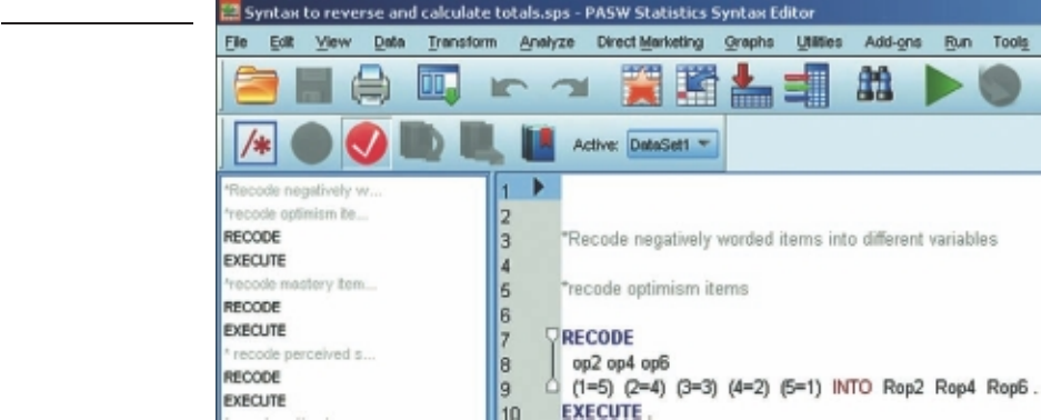
84 Preliminary analyses
procedure. To access the syntax, follow the instructions shown in the procedure sections
to follow but stop before clicking the fi nal OK button. Instead, click on the Paste button.
This will open a new window, the Syntax Editor, showing the commands you have
selected. Figure 8.1 shows part of the Syntax Editor window that was used to recode
items and compute the total scores used in survey4ED.sav. The complete syntax fi le
(surveysyntax.sps) can be downloaded from the SPSS Survival Manual website.
The commands pasted to the Syntax Editor are not executed until you choose to
run them. To run the command, highlight the specifi c command (making sure you
include the fi nal full stop) and then click on the Run menu option or the arrow icon
from the menu bar. Alternatively, you can select the name of the analysis you wish to
run from the left-hand side of the screen.
Extra comments can be added to the syntax fi le by starting them with an asterisk
(*). If you add comments, make sure you leave at least one line of space both before
and after syntax commands.
For each of the procedures described in the following sections, the syntax will also
be shown.
Figure 8.1
Example of a Syntax
Editor window
CALCULATING TOTAL SCALE SCORES
Before you can perform statistical analyses on your data set, you need to calculate total
scale scores for any scales used in your study. This involves two steps:
• Step 1: reverse any negatively worded items.
• Step 2: add together scores from all the items that make up the subscale or scale.

Manipulating the data 85
It is important that you understand the scales and measures that you are using for
your research. You should check with the scale’s manual or the journal article it was
published in to fi nd out which items, if any, need to be reversed and how to go about
calculating a total score. Some scales consist of a number of subscales that either can,
or alternatively should not, be added together to give an overall score. It is important
that you do this correctly, and it is much easier to do it right the fi rst time than to have
to repeat analyses later.
Important: you should do this only when you have a complete data fi le as SPSS
does not update these commands when you add extra data.
Step 1: Reversing negatively worded items
In some scales the wording of particular items has been reversed to help prevent
response bias. This is evident in the Optimism Scale used in the survey (see Appendix).
Item 1 is worded in a positive direction (high scores indicate high optimism): ‘In
uncertain times I usually expect the best.’ Item 2, however, is negatively worded (high
scores indicate low optimism): ‘If something can go wrong for me it will.’ Items 4 and
6 are also negatively worded. The negatively worded items need to be reversed before
a total score can be calculated for this scale. We need to ensure that all items are scored
so that high scores indicate high levels of optimism.
The procedure for reversing items 2, 4 and 6 of the Optimism Scale is shown in
the table that follows. A fi ve-point Likert-type scale was used for the Optimism Scale;
therefore, scores for each item can range from 1 (strongly disagree) to 5 (strongly
agree).
Although it is possible to rescore variables into the same variable name, we will
ask SPSS to create new variables rather than overwrite the existing data. This is a
much safer option, and it retains our original data unchanged.
If you wish to follow along with the instructions shown below, you should open
survey4ED.sav.
1. From the menu at the top of the screen, click on Transform, then click on
Recode Into Different Variables.
2. Select the items you want to reverse (op2, op4, op6). Move these into the
Input Variable—Output Variable box.
3. Click on the fi rst variable (op2) and type a new name in the Output
Variable section on the right-hand side of the screen and then click the
Change button. I have used Rop2 in the existing data fi le. If you wish to
create your own (rather than overwrite the ones already in the data fi le),
use another name (e.g. revop2). Repeat for each of the other variables
you wish to reverse (op4 and op6).
4. Click on the Old and new values button.

86 Preliminary analyses
In the Old value section, type 1 in the Value box.
In the New value section, type 5 in the Value box (this will change all
scores that were originally scored as 1 to a 5).
5. Click on Add. This will place the instruction (1 → 5) in the box labelled Old
> New.
6. Repeat the same procedure for the remaining scores. For example:
Old value—type in 2 New value—type in 4 Add
Old value—type in 3 New value—type in 3 Add
Old value—type in 4 New value—type in 2 Add
Old value—type in 5 New value—type in 1 Add
Always double-check the item numbers that you specify for recoding and
the old and new values that you enter. Not all scales use a fi ve-point scale;
some have four possible responses, some six and some seven. Check that
you have reversed all the possible values for your particular scale.
7. Click on Continue and then OK (or on Paste if you wish to paste this
command to the Syntax Editor window). To execute it after pasting to the
Syntax Editor, highlight the command and select Run from the menu.
The syntax generated for this command is:
RECODE
op2 op4 op6
(1=5) (2=4) (3=3) (4=2) (5=1) INTO Rop2 Rop4 Rop6 .
EXECUTE .
The new variables with reversed scores should be found at the end of the data fi le.
Check this in your Data Editor window, choose the Variable View tab and go down to
the bottom of the list of variables. In the survey4ED.sav fi le you will see a whole series
of variables with an R at the front of the variable name. These are the items that I have
reversed. If you follow the instructions shown above, you should see yours at the very
bottom with ‘rev’ at the start of each. It is important to check your recoded variables
to see what effect the recode had on the values. For the fi rst few cases in your data set,
take note of the scores on the original variables and then check the corresponding
reversed variables to ensure that it worked properly.
Step 2: Adding up the total scores for the scale
After you have reversed the negatively worded items in the scale, you will be ready to
calculate total scores for each subject.
Important: you should do this only when you have a complete data fi le as SPSS
does not update this command when you add extra data.

Manipulating the data 87
Procedure for calculating total scale scores
1. From the menu at the top of the screen, click on Transform, then click on
Compute Variable.
2. In the Target Variable box, type in the new name you wish to give to the
total scale scores. (It is useful to use a T prefi x to indicate total scores, as
this makes them easier to fi nd in the list of variables when you are doing
your analyses.)
Important: make sure you do not accidentally use a variable name that
has already been used in the data set. If you do, you will lose all the
original data—potential disaster—so check your codebook.
3. Click on the Type and Label button. Click in the Label box and type in a
description of the scale (e.g. total optimism). Click on Continue.
4. From the list of variables on the left-hand side, click on the fi rst item in
the scale (op1).
5. Click on the arrow button to move it into the Numeric Expression box.
6. Click on + on the calculator.
7. Repeat the process until all scale items appear in the box. In this example
we would select the unreversed items fi rst (op3, op5) and then the
reversed items (obtained in the previous procedure), which are located at
the bottom of the list of variables (Rop2, Rop4, Rop6).
8. The complete numeric expression should read as follows:
op1+op3+op5+Rop2+Rop4+Rop6.
9. Double-check that all items are correct and that there are + signs in the
right places. Click OK (or on Paste if you wish to paste this command
to the Syntax Editor window). To execute it after pasting to the Syntax
Editor, highlight the command and select Run from the menu.
The syntax for this command is:
COMPUTE toptim = op1+op3+op5+Rop2+Rop4+Rop6 .
EXECUTE .
This will create a new variable at the end of your data set called TOPTIM. Scores
for each person will consist of the addition of scores on each of the items op1 to op6
(with recoded items where necessary). If any items had missing data, the overall score
will also be missing. This is indicated by a full stop instead of a score in the data fi le.
You will notice in the literature that some researchers go a step further and divide the
total scale score by the number of items in the scale. This can make it a little easier to
88 Preliminary analyses
interpret the scores of the total scale because it is back in the original scale used for each
of the items (e.g. from 1 to 5 representing strongly disagree to strongly agree). To do this,
you also use the Transform, Compute menu of SPSS. This time you will need to specify
a new variable name and then type in a suitable formula (e.g. TOPTIM/6).
Always record details of any new variables that you create in your codebook.
Specify the new variable’s name, what it represents and full details of what was done
to calculate it. If any items were reversed, this should be specifi ed along with details
of which items were added to create the score. It is also a good idea to include the
possible range of scores for the new variable in the codebook (see the Appendix). This
gives you a clear guide when checking for any out-of-range values.
After creating a new variable, it is important to run Descriptives on this new scale
to check that the values are appropriate (see Chapter 5). It also helps you get a feel for
the distribution of scores on your new variable.
• Check back with the questionnaire—what is the possible range of scores that could
be recorded? For a ten-item scale, using a response scale from 1 to 4, the minimum
value would be 10 and the maximum value would be 40. If a person answered 1 to
every item, that overall score would be 10 × 1 = 10. If a person answered 4 to each
item, that score would be 10 × 4 = 40.
• Check the output from Descriptives to ensure that there are no out-of-range
cases (see Chapter 5).
• Compare the mean score on the scale with values reported in the literature. Is
your value similar to that obtained in previous studies? If not, why not? Have you
done something wrong in the recoding? Or is your sample different from that
used in other studies?
You should also run other analyses to check the distribution of scores on your new
total scale variable:
• Check the distribution of scores using skewness and kurtosis (see Chapter 6).
• Obtain a histogram of the scores and inspect the spread of scores. Are they
normally distributed? If not, you may need to consider ‘transforming’ the scores
for some analyses (this is discussed later in this chapter).
COLLAPSING A CONTINUOUS VARIABLE INTO GROUPS
For some analyses or when you have very skewed distributions, you may wish to divide
the sample into equal groups according to respondents’ scores on some variable (e.g.
to give low, medium and high scoring groups).
To illustrate this process, I will use the survey4ED.sav fi le that is included on the

Manipulating the data 89
website that accompanies this book (see p. viii and the Appendix for details). I will use
Visual Binning to identify suitable cut-off points to break the continuous variable age
into three approximately equal groups. The same technique could be used to create
a ‘median split’; that is, to divide the sample into two groups, using the median as
the cut-off point. Once the cut-off points are identifi ed, Visual Binning will create
a new categorical variable that has only three values corresponding to the three age
ranges chosen. This technique leaves the original variable age, measured as a continu-
ous variable, intact so that you can use it for other analyses.
Procedure for collapsing a continuous variable into groups
1. From the menu at the top of the screen, click on Transform and choose
Visual Binning.
2. Select the continuous variable that you want to use (e.g. age). Transfer it
into the Variables to Bin box. Click on the Continue button.
3. In the Visual Binning screen, a histogram showing the distribution of age
scores should appear.
4. In the section at the top labelled Binned Variable, type the name for the
new categorical variable that you will create (e.g. Agegp3). You can also
change the suggested label that is shown (e.g. age in 3 groups).
5. Click on the button labelled Make Cutpoints. In the dialogue box that
appears, click on the option Equal Percentiles Based on Scanned Cases.
In the box Number of Cutpoints, specify a number one less than the
number of groups that you want (e.g. if you want three groups, type in
2 for cutpoints). In the Width (%) section below, you will then see 33.33
appear. This means that SPSS will try to put 33.3 per cent of the sample in
each group. Click on the Apply button.
6. Click on the Make Labels button back in the main dialogue box. This will
automatically generate value labels for each of the new groups created.
7. Click on OK (or on Paste if you wish to paste this command to the Syntax
Editor window). To execute it after pasting to the Syntax Editor, highlight
the command and select Run from the menu.
The syntax generated by this command is:
RECODE age
( MISSING = COPY )
( LO THRU 29 =1 )
( LO THRU 44 =2 )
( LO THRU HI = 3 )
( ELSE = SYSMIS ) INTO agegp3.

90 Preliminary analyses
VARIABLE LABELS agegp3 ‘age in 3 groups’.
FORMAT agegp3 (F5.0).
VALUE LABELS agegp3
1 ‘<= 29’
2 ‘30—44’
3 ‘45+’.
MISSING VALUES agegp3 ( ).
VARIABLE LEVEL agegp3 ( ORDINAL ).
EXECUTE.
A new variable (Agegp3) should appear at the end of your data fi le. Go back
to your Data Editor window, choose the Variable View tab, and it should be
at the bottom. To check the number of cases in each of the categories of your
newly created variable (Agegp3), go to Analyze and select Descriptives, then
Frequencies.
COLLAPSING THE NUMBER OF CATEGORIES OF A
CATEGORICAL VARIABLE
There are some situations where you may want to reduce or collapse the number of
categories of a categorical variable. You may want to do this for research or theoretical
reasons (e.g. collapsing the marital status into just two categories representing people
‘in a relationship’/‘not in a relationship’), or you may make the decision after looking
at the nature of the data. For example, after running Descriptive Statistics you may
fi nd you have only a few people in your sample who fall into a particular category (e.g.
for our education variable, we only have two people in our fi rst category, ‘primary
school’). As it stands, this variable could not appropriately be used in many of the
statistical analyses covered later in the book. We could decide just to remove these
people from the sample, or we could recode them to combine them with the next
category (some secondary school). We would have to relabel the variable so that it
represented people who did not complete secondary school.
The procedure for recoding a categorical variable is shown below. It is very impor-
tant to note that here we are creating a new additional variable (so that we keep our
original data intact).
Procedure for recoding a categorical variable
1. From the menu at the top of the screen, click on Transform, then
on Recode into Different Variables. (Make sure you select ‘different
variables’, as this retains the original variable for other analyses.)
2. Select the variable you wish to recode (e.g. educ). In the Name box, type

Manipulating the data 91
a name for the new variable that will be created (e.g. educrec). Type in
an extended label if you wish in the Label section. Click on the button
labelled Change.
3. Click on the button labelled Old and New Values.
4. In the section Old Value, you will see a box labelled Value. Type in the fi rst
code or value of your current variable (e.g. 1). In the New Value section,
type in the new value that will be used (or, if the same one is to be used,
type that in). In this case I will recode to the same value, so I will type 1 in
both the Old Value and New Value sections. Click on the Add button.
5. For the second value, I would type 2 in the Old Value but in the New Value
I would type 1. This will recode all the values of both 1 and 2 from the
original coding into one group in the new variable to be created with a
value of 1.
6. For the third value of the original variable, I would type 3 in the Old
Value and 2 in the New Value. This is just to keep the values in the new
variable in sequence. Click on Add. Repeat for all the remaining values of
the original values. In the table Old > New, you should see the following
codes for this example: 1→1; 2→1; 3→2; 4→3; 5→4; 6→5.
7. Click on Continue and then on OK (or on Paste if you wish to paste this
command to the Syntax Editor window). To execute it after pasting to the
Syntax Editor, highlight the command and select Run from the menu.
8. Go to your Data Editor window and choose the Variable View tab. Type
in appropriate values labels to represent the new values (1=did not
complete high school, 2=completed high school, 3=some additional
training, 4=completed undergrad uni, 5=completed postgrad uni).
Remember, these will be different from the codes used for the original
variable, and it is important that you don’t mix them up.
The syntax generated by this command is:
RECODE
educ
(1=1) (2=1) (3=2) (4=3) (5=4) (6=5) INTO educrec .
EXECUTE .
When you recode a variable, make sure you run Frequencies on both the old
variable (educ) and the newly created variable (educrec:, which appears at the end of
your data fi le). Check that the frequencies reported for the new variable are correct.
For example, for the newly created educrec variable, we should now have 2+53=55 in
92 Preliminary analyses
the fi rst group. This represents the two people who ticked 1 on the original variable
(primary school) and the 53 people who ticked 2 (some secondary school).
The Recode procedure demonstrated here could be used for a variety of purposes.
You may fi nd later, when you come to do your statistical analyses, that you will need
to recode the values used for a variable. For example, in Chapter 14 (Logistic regres-
sion) you may need to recode variables originally coded 1=yes, 2=no to a new coding
system 1=yes, 0=no. This can be achieved in the same way as described in the previous
procedures section. Just be very clear before you start on what your original values are,
and what you want the new values to be.
TRANSFORMING VARIABLES
Often when you check the distribution of scores on a scale or measure (e.g. self-
esteem, anxiety) you will fi nd (to your dismay!) that the scores do not fall in a nice,
normally distributed curve. Sometimes scores will be positively skewed, where most
of the respondents record low scores on the scale (e.g. depression). Sometimes you
will fi nd a negatively skewed distribution, where most scores are at the high end (e.g.
self-esteem). Given that many of the parametric statistical tests assume normally
distributed scores, what do you do about these skewed distributions?
One of the choices you have is to abandon the use of parametric statistics (e.g.
Pearson correlation, analysis of variance) and instead choose to use non-parametric
alternatives (e.g. Spearman’s rho, Kruskal-Wallis). SPSS includes a number of useful
non-parametric techniques in its package. These are discussed in Chapter 16.
Another alternative, when you have a non-normal distribution, is to ‘transform’ your
variables. This involves mathematically modifying the scores using various formulas until
the distribution looks more normal. There are a number of different types of transfor-
mation, depending on the shape of your distribution. There is considerable controversy
concerning this approach in the literature, with some authors strongly supporting, and
others arguing against, transforming variables to better meet the assumptions of the
various parametric techniques. For a discussion of the issues and the approaches to
transformation, you should read Chapter 4 in Tabachnick and Fidell (2007).
In Figure 8.2 some of the more common problems are represented, along with
the type of transformation recommended by Tabachnick and Fidell (2007, p. 87). You
should compare your distribution with those shown, and decide which picture it most
closely resembles. I have also given a nasty-looking formula beside each of the suggested
transformations. Don’t let this throw you—these are just formulas that SPSS will use
on your data, giving you a new, hopefully normally distributed variable to use in your
analyses. In the procedures section to follow, you will be shown the SPSS procedure for
this. Before attempting any of these transformations, however, it is important that you
read Tabachnick and Fidell (2007, Chapter 4), or a similar text, thoroughly.
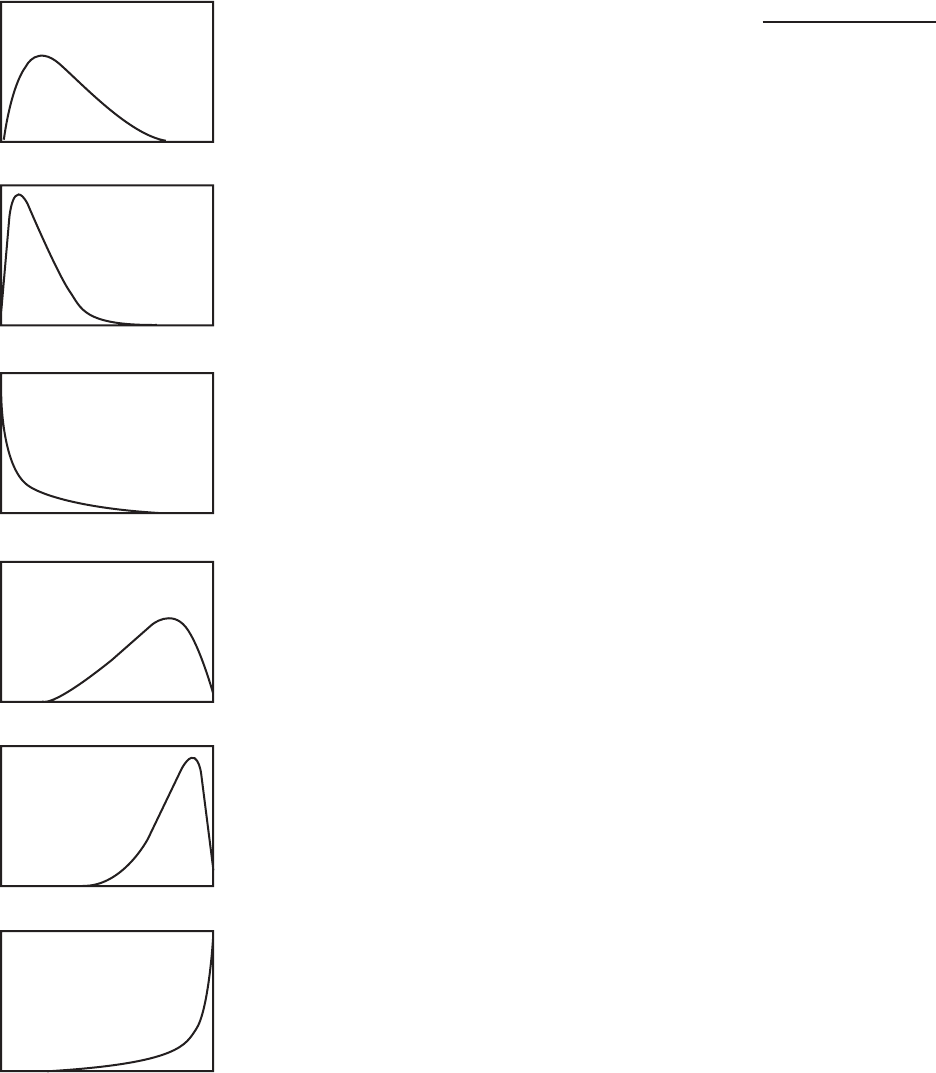
Manipulating the data 93
Figure 8.2
Distribution
of scores and
suggested
transformations
Square root
Formula: new variable = SQRT (old variable)
Logarithm
Formula: new variable = LG10 (old variable)
Inverse
Formula: new variable = 1 / (old variable)
Refl ect and square root
Formula: new variable = SQRT (K – old variable) where
K = largest possible value +1
Refl ect and logarithm
Formula: new variable = LG10 (K – old variable) where
K = largest possible value +1
Refl ect and inverse
Formula: new variable = 1 / (K – old variable) where
K = largest possible value +1

94 Preliminary analyses
Procedure for transforming variables
1. From the menu at the top of the screen, click on Transform, then click on
Compute Variable.
2. Target Variable. In this box, type in a new name for the variable. Try to
include an indication of the type of transformation and the original name
of the variable. For example, for a variable called tnegaff I would make this
new variable sqtnegaff, if I had performed a square root. Be consistent in
the abbreviations that you use for each of your transformations.
3. Functions. Listed are a wide range of possible actions you can use. You
need to choose the most appropriate transformation for your variable.
Look at the shape of your distribution; compare it with those in
Figure 8.2. Take note of the formula listed next to the picture that
matches your distribution. This is the one that you will use.
4. Transformations involving square root or logarithm. In the Function
group box, click on Arithmetic, and scan down the list that shows up in
the bottom box until you fi nd the formula you need (e.g. Sqrt or Lg10).
Highlight the one you want and click on the up arrow. This moves the
formula into the Numeric Expression box. You will need to tell it which
variable you want to recalculate. Find it in the list of variables and click
on the arrow to move it into the Numeric Expression box. If you prefer,
you can just type the formula in yourself without using the Functions or
Variables list. Just make sure you spell everything correctly.
5. Transformations involving Refl ect. You need to fi nd the value K for
your variable. This is the largest value that your variable can have (see
your codebook) + 1. Type this number in the Numeric Expression box.
Complete the remainder of the formula using the Functions box, or
alternatively type it in yourself.
6. Transformations involving Inverse. To calculate the inverse, you need to
divide your scores into 1. So, in the Numeric Expression box type in 1, then
type / and then your variable or the rest of your formula (e.g. 1/tslfest).
7. Check the fi nal formula in the Numeric Expression box. Write this down
in your codebook next to the name of the new variable you created.
8. Click on the button Type and Label. Under Label, type in a brief description
of the new variable (or you may choose to use the actual formula you used).
9. Check in the Target Variable box that you have given your new variable
a new name, not the original one. If you accidentally put the old variable
name, you will lose all your original scores. So, always double-check.
10. Click on OK (or on Paste if you wish to paste this command to the Syntax
Editor window). To execute it after pasting to the Syntax Editor, highlight

Manipulating the data 95
the command and select Run from the menu. A new variable will be
created and will appear at the end of your data fi le.
11. Run Analyze, Frequencies to check the skewness and kurtosis values for
your old and new variables. Have they improved?
12. Under Frequencies, click on the Charts button and select Histogram
to inspect the distribution of scores on your new variable. Has the
distribution improved? If not, you may need to consider a different type
of transformation.
If none of the transformations work, you may need to consider using non-para-
metric techniques to analyse your data (see Chapter 16). Alternatively, for very skewed
variables you may wish to divide your continuous variable into a number of discrete
groups. Instructions for doing this are presented earlier in this chapter.
ADDITIONAL EXERCISES
Business
Data fi le: staffsurvey4ED.sav. See Appendix for details of the data fi le.
1. Practise the procedures described in this chapter to add up the total scores for
a scale using the items that make up the Staff Satisfaction Survey. You will need
to add together the items that assess agreement with each item in the scale (i.e.
Q1a+Q2a+Q3a … to Q10a). Name your new variable staffsatis.
2. Check the descriptive statistics for your new total score (staffsatis) and compare
this with the descriptives for the variable totsatis, which is already in your data fi le.
This is the total score that I have already calculated for you.
3. What are the minimum possible and maximum possible scores for this new
variable? Tip: check the number of items in the scale and the number of response
points on each item (see Appendix).
4. Check the distribution of the variable service by generating a histogram. You will
see that it is very skewed, with most people clustered down the low end (with less
than 2 years’ service) and a few people stretched up at the very high end (with
more than 30 years’ service). Check the shape of the distribution against those
displayed in Figure 8.2 and try a few different transformations. Remember to
check the distribution of the new transformed variables you create. Are any of the
new variables more ‘normally’ distributed?
5. Collapse the years of service variable (service) into three groups using the Visual
Binning procedure from the Transform menu. Use the Make Cutpoints button
and ask for Equal Percentiles. In the section labelled Number of Cutpoints,
specify 2. Call your new variable gp3service to distinguish it from the variable
96 Preliminary analyses
I have already created in the data fi le using this procedure (service3gp). Run
Frequencies on your newly created variable to check how many cases are in each
group.
Health
Data fi le: sleep4ED.sav. See Appendix for details of the data fi le.
1. Practise the procedures described in this chapter to add up the total scores for a
scale using the items that make up the Sleepiness and Associated Sensations Scale.
You will need to add together the items fatigue, lethargy, tired, sleepy, energy. Call
your new variable sleeptot. Please note: none of these items needs to be reversed
before being added.
2. Check the descriptive statistics for your new total score (sleeptot) and compare
them with the descriptives for the variable totSAS, which is already in your data
fi le. This is the total score that I have already calculated for you.
3. What are the minimum possible and maximum possible scores for this new
variable? Tip: check the number of items in the scale and the number of response
points on each item (see Appendix).
4. Check the distribution (using a histogram) of the variable that measures the
number of cigarettes smoked per day by the smokers in the sample (smokenum).
You will see that it is very skewed, with most people clustered down the low end
(with less than 10 per day) and a few people stretched up at the very high end
(with more than 70 per day). Check the shape of the distribution against those
displayed in Figure 8.2 and try a few different transformations. Remember to
check the distribution of the new transformed variables you create. Are any of the
new transformed variables more ‘normally’ distributed?
5. Collapse the age variable (age) into three groups using the Visual Binning pro-
cedure from the Transform menu. Use the Make Cutpoints button and ask for
Equal Percentiles. In the section labelled Number of Cutpoints, specify 2. Call
your new variable gp3age to distinguish it from the variable I have already created
in the data fi le using this procedure (age3gp). Run Frequencies on your newly
created variable to check how many cases are in each group.
97
9
Checking the reliability
of a scale
When you are selecting scales to include in your study, it is important to fi nd scales
that are reliable. There are a number of different aspects to reliability (see discussion
of this in Chapter 1). One of the main issues concerns the scale’s internal consistency.
This refers to the degree to which the items that make up the scale ‘hang together’.
Are they all measuring the same underlying construct? One of the most commonly
used indicators of internal consistency is Cronbach’s alpha coeffi cient. Ideally, the
Cronbach alpha coeffi cient of a scale should be above .7 (DeVellis 2003). Cronbach
alpha values are, however, quite sensitive to the number of items in the scale. With
short scales (e.g. scales with fewer than ten items) it is common to fi nd quite low
Cronbach values (e.g. .5). In this case, it may be more appropriate to report the mean
inter-item correlation for the items. Briggs and Cheek (1986) recommend an optimal
range for the inter-item correlation of .2 to .4.
The reliability of a scale can vary depending on the sample. It is therefore necessary
to check that each of your scales is reliable with your particular sample. This infor-
mation is usually reported in the Method section of your research paper or thesis. If
your scale contains some items that are negatively worded (common in psychological
measures), these need to be ‘reversed’ before checking reliability. Instructions on how
to do this are provided in Chapter 8.
Make sure that you check with the scale’s manual (or the journal article in which it
is reported) for instructions concerning the need to reverse items and for information
on any subscales. Sometimes scales contain a number of subscales that may or may
not be combined to form a total scale score. If necessary, the reliability of each of the
subscales and the total scale will need to be calculated.
If you are developing your own scale for use in your study, make sure you read
widely on the principles and procedures of scale development. There are some good
easy-to-read books on the topic, including Streiner & Norman (2008), DeVellis (2003)
and Kline (2005).

98 Preliminary analyses
DETAILS OF EXAMPLE
To demonstrate this technique, I will be using the survey4ED.sav data fi le included on
the website accompanying this book. Full details of the study, the questionnaire and
scales used are provided in the Appendix. If you wish to follow along with the steps
described in this chapter, you should start SPSS and open the fi le survey4ED.sav. In
the procedure described below, I will explore the internal consistency of one of the
scales from the questionnaire. This is the Satisfaction with Life Scale (Pavot, Diener,
Colvin & Sandvik 1991), which is made up of fi ve items. In the data fi le these items are
labelled as lifsat1, lifsat2, lifsat3, lifsat4, lifsat5.
Procedure for checking the reliability of a scale
Important: before starting, you should check that all negatively worded items
in your scale have been reversed (see Chapter 8). If you don’t do this, you will
fi nd that you have very low (and incorrect) Cronbach alpha values. In this
case, none of the items needs to be rescored.
1. From the menu at the top of the screen, click on Analyze, select Scale,
then Reliability Analysis.
2. Click on all of the individual items that make up the scale (e.g. lifsat1,
lifsat2, lifsat3, lifsat4, lifsat5). Move these into the box marked Items.
3. In the Model section, make sure Alpha is selected.
4. In the Scale label box, type in the name of the scale or subscale (Life
Satisfaction).
5. Click on the Statistics button. In the Descriptives for section, select
Item, Scale, and Scale if item deleted. In the Inter-Item section, click on
Correlations. In the Summaries section, click on Correlations.
6. Click on Continue and then OK (or on Paste to save to Syntax Editor).
The syntax from this procedure is:
RELIABILITY
/VARIABLES=lifsat1 lifsat2 lifsat3 lifsat4 lifsat5
/SCALE(‘Life Satisfaction’) ALL/MODEL=ALPHA
/STATISTICS=DESCRIPTIVE SCALE CORR
/SUMMARY=TOTAL CORR .
The output generated from this procedure is shown below.
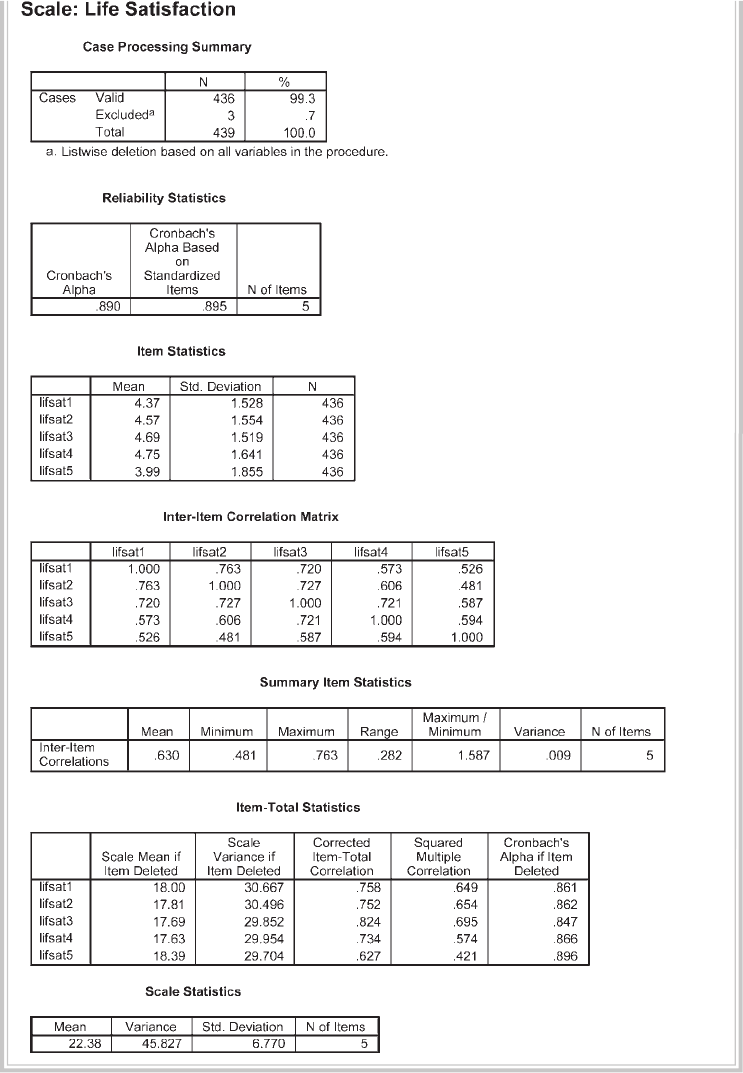
Checking the reliability of a scale 99
100 Preliminary analyses
INTERPRETING THE OUTPUT FROM RELIABILITY
• Check that the number of cases is correct (in the Case Processing Summary table)
and that the number of items is correct (in the Reliability Statistics table).
• Check the Inter-Item Correlation Matrix for negative values. All values should
be positive, indicating that the items are measuring the same underlying charac-
teristic. The presence of negative values could indicate that some of the items
have not been correctly reverse scored. Incorrect scoring would also show up in
the Item-Total Statistics table with negative values for the Corrected-Item Total
Correlation values. These should be checked carefully if you obtain a lower than
expected Cronbach alpha value. (Check what other researchers report for the
scale.)
• Check the Cronbach’s Alpha value shown in the Reliability Statistics table. In
this example the value is .89, suggesting very good internal consistency reliability
for the scale with this sample. Values above .7 are considered acceptable; however,
values above .8 are preferable.
• The Corrected Item-Total Correlation values shown in the Item-Total Statistics
table give you an indication of the degree to which each item correlates with the
total score. Low values (less than .3) here indicate that the item is measuring some-
thing different from the scale as a whole. If your scale’s overall Cronbach alpha is
too low (e.g. less than .7) and you have checked for incorrectly scored items, you
may need to consider removing items with low item-total correlations.
• In the column headed Alpha if Item Deleted, the impact of removing each item
from the scale is given. Compare these values with the fi nal alpha value obtained. If
any of the values in this column are higher than the fi nal alpha value, you may want
to consider removing this item from the scale. This is useful if you are developing a
scale, but if you are using established, validated scales, removal of items means that
you could not compare your results with other studies using the scale.
• For scales with a small number of items (e.g. less than 10), it is sometimes diffi cult
to get a decent Cronbach alpha value and you may wish to consider reporting the
mean inter-item correlation value, which is shown in the Summary Item Statis-
tics table. In this case the mean inter-item correlation is .63, with values ranging
from .48 to .76. This suggests quite a strong relationship among the items. For
many scales, this is not the case.
PRESENTING THE RESULTS FROM RELIABILITY
You would normally report the internal consistency of the scales that you are using in
your research in the Method section of your report, under the heading Measures, or
Materials. After describing the scale (number of items, response scale used, history of

Checking the reliability of a scale 101
use), you should include a summary of reliability information reported by the scale
developer and other researchers, and then a sentence to indicate the results for your
sample. For example:
According to Pavot, Diener, Colvin and Sandvik (1991), the Satisfaction with Life
Scale has good internal consistency, with a Cronbach alpha coeffi cient reported
of .85. In the current study, the Cronbach alpha coeffi cient was .89.
ADDITIONAL EXERCISES
Business
Data fi le: staffsurvey4ED.sav. See Appendix for details of the data fi le.
1. Check the reliability of the Staff Satisfaction Survey, which is made up of the
agreement items in the data fi le: Q1a to Q10a. None of the items of this scale
needs to be reversed.
Health
Data fi le: sleep4ED.sav. See Appendix for details of the data fi le.
1. Check the reliability of the Sleepiness and Associated Sensations Scale, which is
made up of items fatigue, lethargy, tired, sleepy, energy. None of the items of this
scale needs to be reversed.
102
10
Choosing the
right statistic
One of the most diffi cult (and potentially fear-inducing) parts of the research process
for most research students is choosing the correct statistical technique to analyse their
data. Although most statistics courses teach you how to calculate a correlation coef-
fi cient or perform a t-test, they typically do not spend much time helping students learn
how to choose which approach is appropriate to address particular research questions.
In most research projects it is likely that you will use quite a variety of different types of
statistics, depending on the question you are addressing and the nature of the data that
you have. It is therefore important that you have at least a basic understanding of the
different statistics, the type of questions they address and their underlying assumptions
and requirements.
So, dig out your statistics texts and review the basic techniques and the principles
underlying them. You should also look through journal articles on your topic and
identify the statistical techniques used in these studies. Different topic areas may make
use of different statistical approaches, so it is important that you fi nd out what other
researchers have done in terms of data analysis. Look for long, detailed journal articles
that clearly and simply spell out the statistics that were used. Collect these together in
a folder for handy reference. You might also fi nd them useful later when considering
how to present the results of your analyses.
In this chapter we will look at the various statistical techniques that are available,
and I will then take you step by step through the decision-making process. If the whole
statistical process sends you into a panic, just think of it as choosing which recipe you
will use to cook dinner tonight. What ingredients do you have in the refrigerator,
what type of meal do you feel like (soup, roast, stir-fry, stew), and what steps do you
have to follow? In statistical terms, we will look at the type of research questions you
have, which variables you want to analyse, and the nature of the data itself. If you take
this process step by step, you will fi nd the fi nal decision is often surprisingly simple.
Once you have determined what you have and what you want to do, there often is only
Choosing the right statistic 103
one choice. The most important part of this whole process is clearly spelling out what
you have and what you want to do with it.
OVERVIEW OF THE DIFFERENT STATISTICAL
TECHNIQUES
This section is broken into two main parts. First, we will look at the techniques used
to explore the relationship among variables (e.g. between age and optimism), followed
by techniques you can use when you want to explore the differences between groups
(e.g. sex differences in optimism scores). I have separated the techniques into these
two sections, as this is consistent with the way in which most basic statistics texts are
structured and how the majority of students will have been taught basic statistics. This
tends to somewhat artifi cially emphasise the difference between these two groups of
techniques. There are, in fact, many underlying similarities between the various statis-
tical techniques, which is perhaps not evident on initial inspection. A full discussion
of this point is beyond the scope of this book. If you would like to know more, I
would suggest you start by reading Chapter 17 of Tabachnick and Fidell (2007). That
chapter provides an overview of the General Linear Model, under which many of the
statistical techniques can be considered.
I have deliberately kept the summaries of the different techniques brief and simple,
to aid initial understanding. This chapter certainly does not cover all the different
techniques available, but it does give you the basics to get you started and to build
your confi dence.
Exploring relationships
Often in survey research you will not be interested in differences between groups, but
instead in the strength of the relationship between variables. There are a number of
different techniques that you can use.
Correlation
Pearson correlation or Spearman correlation is used when you want to explore the
strength of the relationship between two continuous variables. This gives you an indi-
cation of both the direction (positive or negative) and the strength of the relationship.
A positive correlation indicates that as one variable increases, so does the other. A
negative correlation indicates that as one variable increases, the other decreases. This
topic is covered in Chapter 11.
Partial correlation
Partial correlation is an extension of Pearson correlation—it allows you to control for
the possible effects of another confounding variable. Partial correlation ‘removes’ the
104 Preliminary analyses
effect of the confounding variable (e.g. socially desirable responding), allowing you to
get a more accurate picture of the relationship between your two variables of interest.
Partial correlation is covered in Chapter 12.
Multiple regression
Multiple regression is a more sophisticated extension of correlation and is used when
you want to explore the predictive ability of a set of independent variables on one
continuous dependent measure. Different types of multiple regression allow you to
compare the predictive ability of particular independent variables and to fi nd the best
set of variables to predict a dependent variable. See Chapter 13.
Factor analysis
Factor analysis allows you to condense a large set of variables or scale items down to a
smaller, more manageable number of dimensions or factors. It does this by summaris-
ing the underlying patterns of correlation and looking for ‘clumps’ or groups of closely
related items. This technique is often used when developing scales and measures, to
identify the underlying structure. See Chapter 15.
Summary
All of the analyses described above involve exploration of the relationship between
continuous variables. If you have only categorical variables, you can use the Chi Square
Test for Relatedness or Independence to explore their relationship (e.g. if you wanted
to see whether gender infl uenced clients’ dropout rates from a treatment program). In
this situation, you are interested in the number of people in each category (males and
females who drop out of/complete the program) rather than their score on a scale.
Some additional techniques you should know about, but which are not covered in this
text, are described below. For more information on these, see Tabachnick and Fidell
(2007). These techniques are as follows:
• Discriminant function analysis is used when you want to explore the predictive ability
of a set of independent variables, on one categorical dependent measure. That is,
you want to know which variables best predict group membership. The dependent
variable in this case is usually some clear criterion (passed/failed, dropped out of/
continued with treatment). See Chapter 9 in Tabachnick and Fidell (2007).
• Canonical correlation is used when you wish to analyse the relationship between
two sets of variables. For example, a researcher might be interested in how a
variety of demographic variables relate to measures of wellbeing and adjustment.
See Chapter 12 in Tabachnick and Fidell (2007).
• Structural equation modelling is a relatively new, and quite sophisticated, technique
that allows you to test various models concerning the interrelationships among a set
Choosing the right statistic 105
of variables. Based on multiple regression and factor analytic techniques, it allows you
to evaluate the importance of each of the independent variables in the model and to
test the overall fi t of the model to your data. It also allows you to compare alterna-
tive models. SPSS does not have a structural equation modelling module, but it does
support an ‘add on’ called AMOS. See Chapter 14 in Tabachnick and Fidell (2007).
Exploring differences between groups
There is another family of statistics that can be used when you want to fi nd out
whether there is a statistically signifi cant difference among a number of groups. The
parametric versions of these tests, which are suitable when you have interval-scaled
data with normal distribution of scores, are presented below, along with the non-
parametric alternative.
T-tests
T-tests are used when you have two groups (e.g. males and females) or two sets of
data (before and after), and you wish to compare the mean score on some continuous
variable. There are two main types of t-tests. Paired sample t-tests (also called repeated
measures) are used when you are interested in changes in scores for participants tested
at Time 1, and then again at Time 2 (often after some intervention or event). The
samples are ‘related’ because they are the same people tested each time. Independent
sample t-tests are used when you have two different (independent) groups of people
(males and females), and you are interested in comparing their scores. In this case,
you collect information on only one occasion but from two different sets of people.
T-tests are covered in Chapter 17. The non-parametric alternatives, Mann-Whitney
U Test and Wilcoxon Signed Rank Test, are presented in Chapter 16.
One-way analysis of variance
One-way analysis of variance is similar to a t-test, but is used when you have two or more
groups and you wish to compare their mean scores on a continuous variable. It is called
one-way because you are looking at the impact of only one independent variable on your
dependent variable. A one-way analysis of variance (ANOVA) will let you know whether
your groups differ, but it won’t tell you where the signifi cant difference is (gp1/gp3,
gp2/gp3 etc.). You can conduct post-hoc comparisons to fi nd out which groups are
signifi cantly different from one another. You could also choose to test differences between
specifi c groups, rather than comparing all the groups, by using planned comparisons.
Similar to t-tests, there are two types of one-way ANOVAs: repeated measures ANOVA
(same people on more than two occasions), and between-groups (or independent
samples) ANOVA, where you are comparing the mean scores of two or more different
groups of people. One-way ANOVA is covered in Chapter 18, while the non-parametric
alternatives (Kruskal-Wallis Test and Friedman Test) are presented in Chapter 16.
106 Preliminary analyses
Two-way analysis of variance
Two-way analysis of variance allows you to test the impact of two independent vari-
ables on one dependent variable. The advantage of using a two-way ANOVA is that it
allows you to test for an interaction effect—that is, when the effect of one indepen-
dent variable is infl uenced by another; for example, when you suspect that optimism
increases with age, but only for males.
It also tests for ‘main effects’—that is, the overall effect of each independent
variable (e.g. sex, age). There are two different two-way ANOVAs: between-groups
ANOVA (when the groups are different) and repeated measures ANOVA (when the
same people are tested on more than one occasion). Some research designs combine
both between-groups and repeated measures in the one study. These are referred to
as ‘Mixed Between-Within Designs’, or ‘Split Plot’. Two-way ANOVA is covered in
Chapter 19. Mixed designs are covered in Chapter 20.
Multivariate analysis of variance
Multivariate analysis of variance (MANOVA) is used when you want to compare
your groups on a number of different, but related, dependent variables; for example,
comparing the effects of different treatments on a variety of outcome measures (e.g.
anxiety, depression). Multivariate ANOVA can be used with one-way, two-way and
higher factorial designs involving one, two or more independent variables. MANOVA
is covered in Chapter 21.
Analysis of covariance
Analysis of covariance (ANCOVA) is used when you want to statistically control for
the possible effects of an additional confounding variable (covariate). This is useful
when you suspect that your groups differ on some variable that may infl uence the
effect that your independent variables have on your dependent variable. To be sure
that it is the independent variable that is doing the infl uencing, ANCOVA statistically
removes the effect of the covariate. Analysis of covariance can be used as part of a
one-way, two-way or multivariate design. ANCOVA is covered in Chapter 22.
THE DECISION-MAKING PROCESS
Having had a look at the variety of choices available, it is time to choose which tech-
niques are suitable for your needs. In choosing the right statistic, you will need to
consider a number of different factors. These include consideration of the type of
question you wish to address, the type of items and scales that were included in your
questionnaire, the nature of the data you have available for each of your variables and
the assumptions that must be met for each of the different statistical techniques. I
have set out below a number of steps that you can use to navigate your way through
the decision-making process.
Choosing the right statistic 107
Step 1: What questions do you want to address?
Write yourself a full list of all the questions you would like to answer from your
research. You might fi nd that some questions could be asked a number of different
ways. For each of your areas of interest, see if you can present your question in a
number of different ways. You will use these alternatives when considering the differ-
ent statistical approaches you might use. For example, you might be interested in the
effect of age on optimism. There are a number of ways you could ask the question:
• Is there a relationship between age and level of optimism?
• Are older people more optimistic than younger people?
These two different questions require different statistical techniques. The question of
which is more suitable may depend on the nature of the data you have collected. So,
for each area of interest, detail a number of different questions.
Step 2: Find the questionnaire items and scales that you will
use to address these questions
The type of items and scales that were included in your study will play a large part
in determining which statistical techniques are suitable to address your research
questions. That is why it is so important to consider the analyses that you intend to
use when fi rst designing your study. For example, the way in which you collected
information about respondents’ age (see example in Step 1) will determine which
statistics are available for you to use. If you asked people to tick one of two options
(under 35/over 35), your choice of statistics would be very limited because there
are only two possible values for your variable age. If, on the other hand, you asked
people to give their age in years, your choices are broadened because you can have
scores varying across a wide range of values, from 18 to 80+. In this situation, you
may choose to collapse the range of ages down into a smaller number of categories
for some analyses (ANOVA), but the full range of scores is also available for other
analyses (e.g. correlation).
If you administered a questionnaire or survey for your study, go back to the
specifi c questionnaire items and your codebook and fi nd each of the individual ques-
tions (e.g. age) and total scale scores (e.g. optimism) that you will use in your analyses.
Identify each variable, how it was measured, how many response options there were
and the possible range of scores.
If your study involved an experiment, check how each of your dependent and
independent variables was measured. Did the scores on the variable consist of the
number of correct responses, an observer’s rating of a specifi c behaviour, or the length
of time a subject spent on a specifi c activity? Whatever the nature of the study, just be
clear that you know how each of your variables was measured.
108 Preliminary analyses
Step 3: Identify the nature of each of your variables
The next step is to identify the nature of each of your variables. In particular, you need
to determine whether each of your variables is an independent variable or a dependent
variable. This information comes not from your data but from your understanding
of the topic area, relevant theories and previous research. It is essential that you are
clear in your own mind (and in your research questions) concerning the relationship
between your variables—which ones are doing the infl uencing (independent) and
which ones are being affected (dependent). There are some analyses (e.g. correlation)
where it is not necessary to specify which variables are independent and dependent.
For other analyses, such as ANOVA, it is important that you have this clear. Drawing
a model of how you see your variables relating is often useful here (see Step 4,
discussed next).
It is also important that you know the level of measurement for each of your vari-
ables. Different statistics are required for variables that are categorical and continuous,
so it is important to know what you are working with. Are your variables:
• categorical (also referred to as nominal level data, e.g. sex: male/females)?
• ordinal (rankings: 1st, 2nd, 3rd)?
• continuous (also referred to as interval level data, e.g. age in years, or scores on the
Optimism Scale)?
There are some occasions when you might want to change the level of measurement
for particular variables. You can ‘collapse’ continuous variable responses down into a
smaller number of categories (see Chapter 8). For example, age can be broken down
into different categories (e.g. under 35/over 35). This can be useful if you want to
conduct an ANOVA. It can also be used if your continuous variables do not meet
some of the assumptions for particular analyses (e.g. very skewed distributions).
Summarising the data does have some disadvantages, however, as you lose infor-
mation. By ‘lumping’ people together, you can sometimes miss important differences.
So you need to weigh up the benefi ts and disadvantages carefully.
Additional information required for continuous and categorical
variables
For continuous variables, you should collect information on the distribution of scores
(e.g. are they normally distributed or are they badly skewed?). What is the range of
scores? (See Chapter 6 for the procedures to do this.) If your variable involves cat-
egories (e.g. group 1/group 2, males/females), fi nd out how many people fall into each
category (are the groups equal or very unbalanced?). Are some of the possible cat-
egories empty? (See Chapter 6.) All of this information that you gather about your
variables here will be used later to narrow down the choice of statistics to use.

Choosing the right statistic 109
Step 4: Draw a diagram for each of your research questions
I often fi nd that students are at a loss for words when trying to explain what they
are researching. Sometimes it is easier, and clearer, to summarise the key points in a
diagram. The idea is to pull together some of the information you have collected in
Steps 1 and 2 above in a simple format that will help you choose the correct statistical
technique to use, or to choose among a number of different options.
One of the key issues you should be considering is: am I interested in the relation-
ship between two variables, or am I interested in comparing two groups of participants?
Summarising the information that you have, and drawing a diagram for each question,
may help clarify this for you. I will demonstrate by setting out the information and
drawing diagrams for a number of different research questions.
Question 1: Is there a relationship between age and level of optimism?
Variables:
• Age—continuous: age in years from 18 to 80.
• Optimism—continuous: scores on the Optimism Scale, ranging from 6 to 30.
From your literature review you hypothesise that older people are more optimistic
than younger people. This relationship between two continuous variables could be
illustrated as follows:
**
*
****
*
*****
*
***
*
Optimism
Age
If you expected optimism scores to increase with age, you would place the points
starting low on the left and moving up towards the right. If you predicted that
optimism would decrease with age, then your points would start high on the left-hand
side and would fall as you moved towards the right.
Question 2: Are males more optimistic than females?
Variables:
• Sex—independent, categorical (two groups): males/females.
• Optimism—dependent, continuous: scores on the Optimism Scale, ranging from
6 to 30.

110 Preliminary analyses
The results from this question, with one categorical variable (with only two groups)
and one continuous variable, could be summarised as follows:
Males Females
Mean optimism score
Question 3: Is the effect of age on optimism different for males and
females?
If you wished to investigate the joint effects of age and gender on optimism scores,
you might decide to break your sample into three age groups (under 30, 31–49 years
and 50+).
Variables:
• Sex—independent, categorical: males/females.
• Age—independent, categorical: participants divided into three equal groups.
• Optimism—dependent, continuous: scores on the Optimism Scale, ranging from
6 to 30.
The diagram might look like this:
Age
Under 30 31–49 50 years and over
Mean optimism
score
Males
Females
Question 4: How much of the variance in life satisfaction can be
explained by a set of personality factors (self-esteem, optimism,
perceived control)?
Perhaps you are interested in comparing the predictive ability of a number of differ-
ent independent variables on a dependent measure. You are also interested in how
much variance in your dependent variable is explained by the set of independent
variables.
Variables:
• Self-esteem—independent, continuous.
• Optimism—independent, continuous.
• Perceived control—independent, continuous.
• Life satisfaction—dependent, continuous.

Choosing the right statistic 111
Your diagram might look like this:
Self-esteem
Optimism
Perceived control
Life satisfaction
Step 5: Decide whether a parametric or a non-parametric
statistical technique is appropriate
Just to confuse research students even further, the wide variety of statistical techniques
that are available are classifi ed into two main groups: parametric and non-parametric.
Parametric statistics are more powerful, but they do have more ‘strings attached’; that
is, they make assumptions about the data that are more stringent. For example, they
assume that the underlying distribution of scores in the population from which you
have drawn your sample is normal.
Each of the different parametric techniques (such as t-tests, ANOVA, Pearson
correlation) has other additional assumptions. It is important that you check these
before you conduct your analyses. The specifi c assumptions are listed for each of the
techniques covered in the remaining chapters of this book.
What if you don’t meet the assumptions for the statistical technique that you want to
use? Unfortunately, in social science research this is a common situation. Many of the
attributes we want to measure are in fact not normally distributed. Some are strongly
skewed, with most scores falling at the low end (e.g. depression); others are skewed so
that most of the scores fall at the high end of the scale (e.g. self-esteem).
If you don’t meet the assumptions of the statistic you wish to use you have a
number of choices, and these are detailed below.
Option 1
You can use the parametric technique anyway and hope that it does not seriously
invalidate your fi ndings. Some statistics writers argue that most of the approaches are
fairly ‘robust’; that is, they will tolerate minor violations of assumptions, particularly
if you have a good size sample. If you decide to go ahead with the analysis anyway you
will need to justify this in your write-up, so collect together useful quotes from statis-
tics writers, previous researchers etc. to support your decision. Check journal articles
on your topic area, particularly those that have used the same scales. Do they mention
similar problems? If so, what have these other authors done? For a simple, easy-
to-follow review of the robustness of different tests, see Cone and Foster (2006).
Option 2
You may be able to manipulate your data so that the assumptions of the statistical
test (e.g. normal distribution) are met. Some authors suggest ‘transforming’ your
112 Preliminary analyses
variables if their distribution is not normal (see Chapter 8). There is some controversy
concerning this approach, so make sure you read up on this so that you can justify
what you have done (see Tabachnick & Fidell 2007).
Option 3
The other alternative when you don’t meet parametric assumptions is to use a
non-parametric technique instead. For many of the commonly used parametric
techniques, there is a corresponding non-parametric alternative. These still come
with some assumptions, but less stringent ones. These non-parametric alternatives
(e.g. Kruskal-Wallis, Mann-Whitney U, Chi-square) tend to be not as powerful;
that is, they may be less sensitive in detecting a relationship or a difference among
groups. Some of the more commonly used non-parametric techniques are covered
in Chapter 16.
Step 6: Making the fi nal decision
Once you have collected the necessary information concerning your research ques-
tions, the level of measurement for each of your variables and the characteristics
of the data you have available, you are fi nally in a position to consider your options.
In the text below, I have summarised the key elements of some of the major statisti-
cal approaches you are likely to encounter. Scan down the list, fi nd an example of the
type of research question you want to address and check that you have all the neces-
sary ingredients. Also consider whether there might be other ways you could ask your
question and use a different statistical approach. I have included a summary table at
the end of this chapter to help with the decision-making process.
Seek out additional information on the techniques you choose to use to ensure
that you have a good understanding of their underlying principles and their assump-
tions. It is a good idea to use a number of different sources for this process: different
authors have different opinions. You should have an understanding of the contro-
versial issues—you may even need to justify the use of a particular statistic in your
situation—so make sure you have read widely.
KEY FEATURES OF THE MAJOR STATISTICAL
TECHNIQUES
This section is divided into two sections:
1. techniques used to explore relationships among variables (covered in Part Four of
this book)
2. techniques used to explore differences among groups (covered in Part Five of this
book).

Choosing the right statistic 113
Exploring relationships among variables
Chi-square for independence
Example of research question: What is the relationship between gender and dropout
rates from therapy?
What you need:
• one categorical independent variable (e.g. sex: males/females)
• one categorical dependent variable (e.g. dropout: Yes/No).
You are interested in the number of people in each category (not scores on a scale).
Diagram:
Males Females
Dropout Yes
No
Correlation
Example of research question: Is there a relationship between age and optimism
scores? Does optimism increase with age?
What you need: two continuous variables (e.g. age, optimism scores).
Diagram:
**
*
*****
****
****
*
Optimism
Age
Non-parametric alternative: Spearman’s Rank Order Correlation.
Partial correlation
Example of research question: After controlling for the effects of socially desirable
responding, is there still a signifi cant relationship between optimism and life satisfac-
tion scores?
What you need: Three continuous variables (e.g. optimism, life satisfaction, socially
desirable responding).
Non-parametric alternative: None.
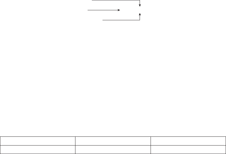
114 Preliminary analyses
Multiple regression
Example of research question: How much of the variance in life satisfaction scores
can be explained by the following set of variables: self-esteem, optimism and perceived
control? Which of these variables is a better predictor of life satisfaction?
What you need:
• one continuous dependent variable (e.g. life satisfaction)
• two or more continuous independent variables (e.g. self-esteem, optimism,
perceived control).
Diagram:
Self-esteem
Optimism
Perceived control
Life satisfaction
Non-parametric alternative: None.
Exploring differences between groups
Independent-samples t-test
Example of research question: Are males more optimistic than females?
What you need:
• one categorical independent variable with only two groups (e.g. sex: males/
females)
• one continuous dependent variable (e.g. optimism score).
Participants can belong to only one group.
Diagram:
Males Females
Mean optimism score
Non-parametric alternative: Mann-Whitney U Test.
Paired-samples t-test (repeated measures)
Example of research question: Does ten weeks of meditation training result in a
decrease in participants’ level of anxiety? Is there a change in anxiety levels from Time 1
(pre-intervention) to Time 2 (post-intervention)?
What you need:
• one categorical independent variable (e.g. Time 1/Time 2)
• one continuous dependent variable (e.g. anxiety score).

Choosing the right statistic 115
Same participants tested on two separate occasions: Time 1 (before intervention) and
Time 2 (after intervention).
Diagram:
Time 1 Time 2
Mean anxiety score
Non-parametric alternative: Wilcoxon Signed Rank Test.
One-way between-groups analysis of variance
Example of research question: Is there a difference in optimism scores for people
who are under 30, between 31–49 and 50 years and over?
What you need:
• one categorical independent variable with two or more groups (e.g. age: under
30/31–49/50+)
• one continuous dependent variable (e.g. optimism score).
Diagram:
Age
Under 30 31–49 50 years and over
Mean optimism score
Non-parametric alternative: Kruskal-Wallis Test.
Two-way between-groups analysis of variance
Example of research question: What is the effect of age on optimism scores for males
and females?
What do you need:
• two categorical independent variables (e.g. sex: males/females; age group: under
30/31–49/50+)
• one continuous dependent variable (e.g. optimism score).
Diagram:
Age
Under 30 31–49 50 years and over
Mean optimism
score
Males
Females
Non-parametric alternative: None.

116 Preliminary analyses
Note: analysis of variance can also be extended to include three or more independent
variables (usually referred to as Factorial Analysis of Variance).
Mixed between-within analysis of variance
Example of research question: Which intervention (maths skills/confi dence building)
is more effective in reducing participants’ fear of statistics, measured across three
periods (pre-intervention, post-intervention, three-month follow-up)?
What you need:
• one between-groups independent variable (e.g. type of intervention)
• one within-groups independent variable (e.g. time 1, time 2, time 3)
• one continuous dependent variable (e.g. scores on Fear of Statistics Test).
Diagram:
Time
Time 1 Time 2 Time 3
Mean score on Fear of
Statistics Test
Maths skills intervention
Confi dence-building intervention
Non-parametric alternative: None.
Multivariate analysis of variance
Example of research question: Are males better adjusted than females in terms of
their general physical and psychological health (in terms of anxiety and depression
levels and perceived stress)?
What you need:
• one categorical independent variable (e.g. sex: males/females)
• two or more continuous dependent variables (e.g. anxiety, depression, perceived
stress).
Diagram:
Males Females
Anxiety
Depression
Perceived stress
Non-parametric alternative: None.
Note: multivariate analysis of variance can be used with one-way (one independent
variable), two-way (two independent variables) and higher-order factorial designs.
Covariates can also be included.
Choosing the right statistic 117
Analysis of covariance
Example of research question: Is there a signifi cant difference in the Fear of Statis-
tics Test scores for participants in the maths skills group and the confi dence-building
group, while controlling for their pre-test scores on this test?
What you need:
• one categorical independent variable (e.g. type of intervention)
• one continuous dependent variable (e.g. Fear of Statistics Test scores at Time 2)
• one or more continuous covariates (e.g. Fear of Statistics Test scores at Time 1).
Non-parametric alternative: None.
Note: analysis of covariance can be used with one-way (one independent variable),
two-way (two independent variables) and higher-order factorial designs, and with
multivariate designs (two or more dependent variables).
FURTHER READINGS
The statistical techniques discussed in this chapter are only a small sample of all the
different approaches that you can take to data analysis. It is important that you are
aware of the existence, and potential uses, of a wide variety of techniques in order to
choose the most suitable one for your situation. Read as widely as you can.
For a coverage of the basic techniques (t-test, analysis of variance, correlation) go
back to your basic statistics texts, for example Cooper and Schindler (2003); Gravetter
and Wallnau (2004); Peat (2001); Runyon, Coleman and Pittenger (2000); Norman
and Streiner (2000). If you would like more detailed information, particularly on
multivariate statistics, see Hair, Black, Babin, Anderson and Tatham (2006) or Tabach-
nick and Fidell (2007).

118 Preliminary analyses
Summary table of the characteristics of the main statistical techniques
Purpose
Example of
question
Parametric
statistic
Non-parametric
alternative
Independent
variable
Dependent
variable
Essential
features
Exploring
relationships
What is the relationship
between gender and
dropout rates from
therapy
None Chi-square
Chapter 16
One categorical
variable
Sex: M/F
One categorical
variable
Dropout/complete
therapy: Yes/No
The number of cases
in each category is
considered, not scores
Is there a relationship
between age and
optimism scores?
Pearson product-
moment correlation
coeffi cient (r)
Chapter 11
Spearman’s
Rank Order
Correlation (rho)
Chapter 11
Two continuous
variables
Age, Optimism scores
One sample with
scores on two
different measures,
or same measure at
Time 1 and Time 2
After controlling for
the effects of socially
desirable responding
bias, is there still a
relationship between
optimism and life
satisfaction?
Partial correlation
Chapter 12
None Two continuous
variables and one
continuous variable
for which you wish to
control Optimism, life
satisfaction, scores on
a social desirability
scale
One sample with
scores on two
different measures,
or same measure at
Time 1 and Time 2
How much of the
variance in life
satisfaction scores can be
explained by self-esteem,
perceived control and
optimism?
Which of these variables
is the best predictor?
Multiple regression
Chapter 13
None Set of two or
more continuous
independent
variables
Self-esteem,
perceived control,
optimism
One continuous
dependent variable
Life satisfaction
One sample with
scores on all measures
What is the underlying
structure of the items
that make up the
Positive and Negative
Affect Scale? How many
factors are involved?
Factor analysis
Chapter 15
None Set of related
continuous variables
Items of the Positive
and Negative Affect
Scale
One sample, multiple
measures
Comparing
groups
Are males more likely to
drop out of therapy than
females?
None Chi-square
Chapter 16
One categorical
independent variable
Sex
One categorical
dependent variable
Dropout/complete
therapy
You are interested in
the number of people
in each catgegory,
not scores on a scale
Is there a change in
participants’ anxiety
scores from Time 1 to
Time 2?
Paired samples t-test
Chapter 17
Wilcoxon Signed
Rank Test
Chapter 16
One categorical
independent variable
(two levels)
Time 1/Time 2
One continuous
dependent variable
Anxiety score
Same people on two
different occasions

Choosing the right statistic 119
Purpose
Example of
question
Parametric
statistic
Non-parametric
alternative
Independent
variable
Dependent
variable
Essential
features
Is there a difference
in optimism scores for
people who are under 35
yrs, 36–49 yrs and
50+ yrs?
One-way between
groups ANOVA
Chapter 18
Kruskal-Wallis
Test
Chapter 16
One categorical
independent variable
(three or more levels)
Age group
One continuous
dependent variable
Anxiety score
Three or more
groups: different
people in each group
Is there a change in
participants’ anxiety
scores from Time 1,
Time 2 and Time 3?
Two-way repeated
measures ANOVA
Chapter 18
Friedman Test
Chapter 16
One categorical
independent variable
(three or more levels)
Time 1/ Time 2/Time 3
One continuous
dependent variable
Anxiety score
Three or more
groups: same people
on two different
occasions
Is there a difference in
the optimism scores for
males and females, who
are under 35 yrs,
36–49 yrs and 50+ yrs?
Two-way between
groups ANOVA
Chapter 19
None Two categorical
independent
variables (two or
more levels)
Age group, Sex
One continuous
dependent variable
Optimism score
Two or more groups
for each independent
variable: different
people in each group
Which intervention
(maths skills/confi dence
building) is more
effective in reducing
participants’ fear of
statistics, measured
across three time
periods?
Mixed between-
within ANOVA
Chapter 20
None One between-groups
independent variable
(two or more levels),
one within-groups
independent variable
(two or more levels)
Type of intervention,
Time
One continuous
dependent variable
Fear of Statistics Test
scores
Two or more groups
with different people
in each group, each
measured on two or
more occasions
Is there a difference
between males and
females, across three
different age groups, in
terms of their scores on
a variety of adjustment
measures (anxiety,
depression and perceived
stress)?
Multivariate
ANOVA (MANOVA)
Chapter 21
None One or more
categorical
independent
variables (two or
more levels)
Age group, Sex
Two or more
related continuous
dependent variables
Anxiety, depression
and perceived stress
scores
Is there a signifi cant
difference in the Fear
of Stats Test scores
for participants in the
maths skills group and
the confi dence building
group, while controlling
for their scores on this
test at Time 1?
Analysis of
covariance
(ANCOVA)
Chapter 22
None One or more
categorical
independent
variables (two or
more levels), one
continuous covariate
variable Type of
intervention, Fear of
Stats Test scores at
Time 1
One continuous
dependent variable
Fear of Stats Test
scores at Time 2
This page intentionally left blank
PART FOUR
Statistical
techniques
to explore
relationships
among variables
In the chapters included in this section, we will be looking at some of the techniques
available in SPSS for exploring relationships among variables. In this section, our
focus is on detecting and describing relationships among variables. All of the tech-
niques covered here are based on correlation. Correlational techniques are often used
by researchers engaged in non-experimental research designs. Unlike experimen-
tal designs, variables are not deliberately manipulated or controlled—variables are
described as they exist naturally. These techniques can be used to:
• explore the association between pairs of variables (correlation)
• predict scores on one variable from scores on another variable (bivariate
regression)
121
122 Statistical techniques to explore relationships among variables
• predict scores on a dependent variable from scores of a number of independent
variables (multiple regression)
• identify the structure underlying a group of related variables (factor analysis).
This family of techniques is used to test models and theories, predict outcomes and
assess reliability and validity of scales.
TECHNIQUES COVERED IN PART FOUR
There is a range of techniques available in SPSS to explore relationships. These vary
according to the type of research question that needs to be addressed and the type of
data available. In this book, however, only the most commonly used techniques are
covered.
Correlation (Chapter 11) is used when you wish to describe the strength and
direction of the relationship between two variables (usually continuous). It can also
be used when one of the variables is dichotomous—that is, it has only two values (e.g.
sex: males/females). The statistic obtained is Pearson’s product-moment correlation
(r). The statistical signifi cance of r is also provided.
Partial correlation (Chapter 12) is used when you wish to explore the relationship
between two variables while statistically controlling for a third variable. This is useful
when you suspect that the relationship between your two variables of interest may
be infl uenced, or confounded, by the impact of a third variable. Partial correlation
statistically removes the infl uence of the third variable, giving a cleaner picture of the
actual relationship between your two variables.
Multiple regression (Chapter 13) allows prediction of a single dependent continu-
ous variable from a group of independent variables. It can be used to test the predictive
power of a set of variables and to assess the relative contribution of each individual
variable.
Logistic regression (Chapter 14) is used instead of multiple regression when your
dependent variable is categorical. It can be used to test the predictive power of a set of
variables and to assess the relative contribution of each individual variable.
Factor analysis (Chapter 15) is used when you have a large number of related
variables (e.g. the items that make up a scale) and you wish to explore the underly-
ing structure of this set of variables. It is useful in reducing a large number of related
variables to a smaller, more manageable, number of dimensions or components. In
the remainder of this introduction to Part Four I will review some of the basic prin-
ciples of correlation that are common to all the techniques covered in Part Four. This
material should be reviewed before you attempt to use any of the procedures covered
in this section.
Statistical techniques to explore relationships among variables 123
REVISION OF THE BASICS
Correlation coeffi cients (e.g. Pearson product-moment correlation) provide a nu-
merical summary of the direction and the strength of the linear relationship between
two variables. Pearson correlation coeffi cients (r) can range from –1 to +1. The sign
in front indicates whether there is a positive correlation (as one variable increases,
so too does the other) or a negative correlation (as one variable increases, the other
decreases). The size of the absolute value (ignoring the sign) provides information
on the strength of the relationship. A perfect correlation of 1 or –1 indicates that the
value of one variable can be determined exactly by knowing the value on the other
variable. On the other hand, a correlation of 0 indicates no relationship between the
two variables. Knowing the value of one of the variables provides no assistance in
predicting the value of the second variable.
The relationship between variables can be inspected visually by generating
a scatterplot. This is a plot of each pair of scores obtained from the participants
in the sample. Scores on the fi rst variable are plotted along the X (horizontal) axis and
the corresponding scores on the second variable are plotted on the Y (vertical) axis.
An inspection of the scatterplot provides information on both the direction of the
relationship (positive or negative) and the strength of the relationship (this is demon-
strated in more detail in Chapter 11). A scatterplot of a perfect correlation (r=1 or –1)
would show a straight line. A scatterplot when r=0, however, would show a circle or
blob of points, with no pattern evident.
Factors to consider when interpreting a correlation
coeffi cient
There are a number of things you need to be careful of when interpreting the results
of a correlation analysis, or other techniques based on correlation. Some of the key
issues are outlined below, but I would suggest you go back to your statistics books and
review this material (see, for example, Gravetter & Wallnau 2004, pp. 520–76).
Non-linear relationship
The correlation coeffi cient (e.g. Pearson r) provides an indication of the linear
(straight-line) relationship between variables. In situations where the two variables
are related in non-linear fashion (e.g. curvilinear), Pearson r will seriously underesti-
mate the strength of the relationship. Always check the scatterplot, particularly if you
obtain low values of r.
Outliers
Outliers (values that are substantially lower or higher than the other values in the data set)
can have a dramatic effect on the correlation coeffi cient, particularly in small samples.
124 Statistical techniques to explore relationships among variables
In some circumstances outliers can make the r value much higher than it should be, and
in other circumstances they can result in an underestimate of the true relationship. A
scatterplot can be used to check for outliers—just look for values that are sitting out on
their own. These could be due to a data entry error (typing 11, instead of 1), a careless
answer from a respondent, or it could be a true value from a rather strange individual!
If you fi nd an outlier, you should check for errors and correct if appropriate. You may
also need to consider removing or recoding the offending value to reduce the effect it is
having on the r value (see Chapter 6 for a discussion on outliers).
Restricted range of scores
You should always be careful interpreting correlation coeffi cients when they come
from only a small subsection of the possible range of scores (e.g. using university
students to study IQ). Correlation coeffi cients from studies using a restricted range of
cases are often different from studies where the full range of possible scores is sampled.
In order to provide an accurate and reliable indicator of the strength of the relation-
ship between two variables, there should be as wide a range of scores on each of the
two variables as possible. If you are involved in studying extreme groups (e.g. clients
with high levels of anxiety), you should not try to generalise any correlation beyond
the range of the variable used in the sample.
Correlation versus causality
Correlation provides an indication that there is a relationship between two vari-
ables; it does not, however, indicate that one variable causes the other. The correlation
between two variables (A and B) could be due to the fact that A causes B, that B causes
A, or (just to complicate matters) that an additional variable (C) causes both A and
B. The possibility of a third variable that infl uences both of your observed variables
should always be considered. To illustrate this point, there is the famous story of the
strong correlation that one researcher found between ice-cream consumption and the
number of homicides reported in New York City. Does eating ice-cream cause people
to become violent? No. Both variables (ice-cream consumption and crime rate) were
infl uenced by the weather. During the very hot spells, both the ice-cream consump-
tion and the crime rate increased. Despite the positive correlation obtained, this did
not prove that eating ice-cream causes homicidal behaviour. Just as well—the ice-
cream manufacturers would very quickly be out of business!
The warning here is clear—watch out for the possible infl uence of a third,
confounding variable when designing your own study. If you suspect the possibility
of other variables that might infl uence your result, see if you can measure these at the
same time. By using partial correlation (described in Chapter 12) you can statistically
control for these additional variables, and therefore gain a clearer, and less contami-
nated, indication of the relationship between your two variables of interest.
Statistical techniques to explore relationships among variables 125
Statistical versus practical signifi cance
Don’t get too excited if your correlation coeffi cients are ‘signifi cant’. With large samples,
even quite small correlation coeffi cients (e.g. r=.2) can reach statistical signifi cance.
Although statistically signifi cant, the practical signifi cance of a correlation of .2 is very
limited. You should focus on the actual size of Pearson’s r and the amount of shared
variance between the two variables. The amount of shared variance can be calculated by
squaring the value of the correlation coeffi cient (e.g. .2 X .2 =.04 = 4% shared variance).
To interpret the strength of your correlation coeffi cient, you should also take into
account other research that has been conducted in your particular topic area. If other
researchers in your area have been able to predict only 9 per cent of the variance
(r=.3) in a particular outcome (e.g. anxiety), then your study that explains 25 per cent
(r=.5) would be impressive in comparison. In other topic areas, 25 per cent of the
variance explained may seem small and irrelevant.
Assumptions
There are a number of assumptions common to all the techniques covered in
Part Four. These are discussed below. You will need to refer back to these assumptions
when performing any of the analyses covered in Chapters 11, 12, 13, 14 and 15.
Level of measurement
The scale of measurement for the variables for most of the techniques covered in
Part Four should be interval or ratio (continuous). One exception to this is if you
have one dichotomous independent variable (with only two values e.g. sex) and one
continuous dependent variable. You should, however, have roughly the same number
of people or cases in each category of the dichotomous variable.
Spearman’s rho, which is a correlation coeffi cient suitable for ordinal or ranked
data, is included in Chapter 11, along with the parametric alternative Pearson corre-
lation coeffi cient. Rho is commonly used in the health and medical literature, and is
also increasingly being used in psychology research as researchers become more aware
of the potential problems of assuming that ordinal level ratings (e.g. Likert scales)
approximate interval level scaling.
Related pairs
Each subject must provide a score on both variable X and variable Y (related pairs).
Both pieces of information must be from the same subject.
Independence of observations
The observations that make up your data must be independent of one another. That
is, each observation or measurement must not be infl uenced by any other observation
or measurement. Violation of this assumption, according to Stevens (1996, p. 238), is
126 Statistical techniques to explore relationships among variables
very serious. There are a number of research situations that may violate this assump-
tion of independence. Examples of some such studies are described below (these are
drawn from Stevens 1996, p. 239; and Gravetter & Wallnau 2004, p. 251):
• Studying the performance of students working in pairs or small groups. The
behaviour of each member of the group infl uences all other group members,
thereby violating the assumption of independence.
• Studying the TV-watching habits and preferences of children drawn from the same
family. The behaviour of one child in the family (e.g. watching Program A) is likely
to affect all children in that family; therefore the observations are not independent.
• Studying teaching methods within a classroom and examining the impact
on students’ behaviour and performance. In this situation, all students could
be infl uenced by the presence of a small number of trouble-makers; therefore
individual behavioural or performance measurements are not independent.
Any situation where the observations or measurements are collected in a group
setting, or participants are involved in some form of interaction with one another,
should be considered suspect. In designing your study, you should try to ensure that all
observations are independent. If you suspect some violation of this assumption, Stevens
(1996, p. 241) recommends that you set a more stringent alpha value (e.g. p<.01).
There are more complex statistical techniques that can be used for data that
involve non-independent samples (e.g. children within different classrooms, within
different schools). This approach involves multilevel modelling, which is beyond the
scope of this book.
Normality
Scores on each variable should be normally distributed. This can be checked by
inspecting the histograms of scores on each variable (see Chapter 6 for instructions).
Linearity
The relationship between the two variables should be linear. This means that when you
look at a scatterplot of scores you should see a straight line (roughly), not a curve.
Homoscedasticity
The variability in scores for variable X should be similar at all values of variable Y.
Check the scatterplot (see Chapter 6 for instructions). It should show a fairly even
cigar shape along its length.
Missing data
When you are doing research, particularly with human beings, it is very rare that you
will obtain complete data from every case. It is thus important that you inspect your
Statistical techniques to explore relationships among variables 127
data fi le for missing data. Run Descriptives and fi nd out what percentage of values is
missing for each of your variables. If you fi nd a variable with a lot of unexpected missing
data, you need to ask yourself why. You should also consider whether your missing
values are happening randomly, or whether there is some systematic pattern (e.g. lots
of women failing to answer the question about their age). SPSS has a Missing Value
Analysis procedure that may help fi nd patterns in your missing values.
You also need to consider how you will deal with missing values when you come
to do your statistical analyses. The Options button in many of the SPSS statistical
procedures offers you choices for how you want SPSS to deal with missing data. It is
important that you choose carefully, as it can have dramatic effects on your results.
This is particularly important if you are including a list of variables and repeating the
same analysis for all variables (e.g. correlations among a group of variables, t-tests for
a series of dependent variables).
• The Exclude cases listwise option will include cases in the analysis only if it has
full data on all of the variables listed in your variables box for that case. A case will
be totally excluded from all the analyses if it is missing even one piece of infor-
mation. This can severely, and unnecessarily, limit your sample size.
• The Exclude cases pairwise option, however, excludes the cases (persons) only
if they are missing the data required for the specifi c analysis. They will still be
included in any of the analyses for which they have the necessary information.
• The Replace with mean option, which is available in some SPSS statistical proce-
dures (e.g. multiple regression), calculates the mean value for the variable and
gives every missing case this value. This option should never be used as it can
severely distort the results of your analysis, particularly if you have a lot of missing
values.
Always press the Options button for any statistical procedure you conduct and
check which of these options is ticked (the default option varies across procedures).
I would strongly recommend that you use pairwise exclusion of missing data, unless
you have a pressing reason to do otherwise. The only situation where you might
need to use listwise exclusion is when you want to refer only to a subset of cases that
provided a full set of results.
Strange-looking numbers
In your output, you may come across some strange-looking numbers that take the
form 1.24E-02. These small values are presented in scientifi c notation. To prevent
this happening, choose Edit from the main menu bar, select Options, and make sure
there is a tick in the box No scientifi c notation for small numbers in tables on the
General tab.
128
11
Correlation
Correlation analysis is used to describe the strength and direction of the linear re-
lationship between two variables. There are a number of different statistics available
from SPSS, depending on the level of measurement and the nature of your data. In
this chapter, the procedure for obtaining and interpreting a Pearson product-moment
correlation coeffi cient (r) is presented along with Spearman Rank Order Correlation
(rho). Pearson r is designed for interval level (continuous) variables. It can also be
used if you have one continuous variable (e.g. scores on a measure of self-esteem)
and one dichotomous variable (e.g. sex: M/F). Spearman rho is designed for use with
ordinal level or ranked data and is particularly useful when your data does not meet
the criteria for Pearson correlation.
SPSS will calculate two types of correlation for you. First, it will give you a simple
bivariate correlation (which just means between two variables), also known as zero-
order correlation. SPSS will also allow you to explore the relationship between two
variables while controlling for another variable. This is known as partial correlation.
In this chapter, the procedure to obtain a bivariate Pearson r and non-parametric
Spearman rho is presented. Partial correlation is covered in Chapter 12.
Pearson correlation coeffi cients (r) can only take on values from –1 to +1. The
sign out the front indicates whether there is a positive correlation (as one variable
increases, so too does the other) or a negative correlation (as one variable increases,
the other decreases). The size of the absolute value (ignoring the sign) provides an
indication of the strength of the relationship. A perfect correlation of 1 or –1 indi-
cates that the value of one variable can be determined exactly by knowing the value
on the other variable. A scatterplot of this relationship would show a straight line. On
the other hand, a correlation of 0 indicates no relationship between the two variables.
Knowing the value on one of the variables provides no assistance in predicting the
value on the second variable. A scatterplot would show a circle of points, with no
pattern evident.

Correlation 129
There are a number of issues associated with the use of correlation. These include
the effect of non-linear relationships, outliers, restriction of range, correlation versus
causality and statistical versus practical signifi cance. These topics are discussed in the
introduction to Part Four of this book. I would strongly recommend that you read
through that material before proceeding with the remainder of this chapter.
DETAILS OF EXAMPLE
To demonstrate the use of correlation, I will explore the interrelationships among
some of the variables included in the survey4ED.sav data fi le provided on the website
accompanying this book. The survey was designed to explore the factors that affect
respondents’ psychological adjustment and wellbeing (see the Appendix for a full
description of the study). In this example, I am interested in assessing the correlation
between respondents’ feelings of control and their level of perceived stress. Details of
the two variables I will be using are provided below. If you wish to follow along with
this example, you should start SPSS and open the survey4ED.sav fi le.
Example of research question: Is there a relationship between the amount of control
people have over their internal states and their levels of perceived stress? Do people
with high levels of perceived control experience lower levels of perceived stress?
What you need: Two variables: both continuous, or one continuous and the other
dichotomous (two values).
What it does: Correlation describes the relationship between two continuous
variables, in terms of both the strength of the relationship and the direction.
Assumptions: See the introduction to Part Four.
Non-parametric alternative: Spearman Rank Order Correlation (rho).
PRELIMINARY ANALYSES FOR CORRELATION
Before performing a correlation analysis, it is a good idea to generate a scatterplot.
This enables you to check for violation of the assumptions of linearity and homo-
scedasticity (see introduction to Part Four). Inspection of the scatterplots also gives
you a better idea of the nature of the relationship between your variables.
Procedure for generating a scatterplot
1. From the menu at the top of the screen, click on Graphs, then select
Legacy Dialogs.
2. Click on Scatter/Plot and then Simple Scatter. Click Defi ne.
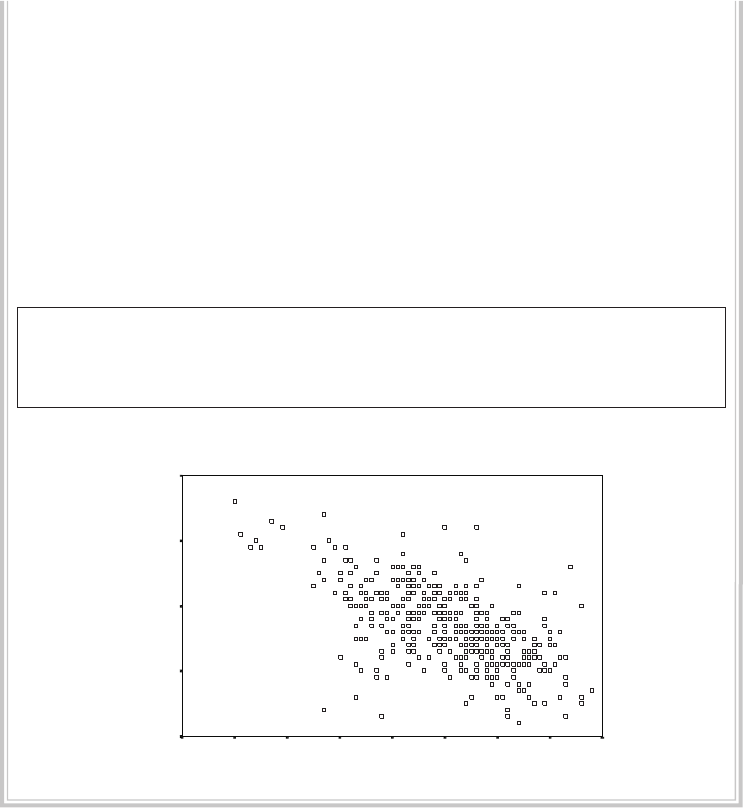
130 Statistical techniques to explore relationships among variables
3. Click on the fi rst variable and move it into the Y-axis box (this will run
vertically). By convention, the dependent variable is usually placed along
the Y-axis (e.g. Total perceived stress: tpstress).
4. Click on the second variable and move to the X-axis box (this will run
across the page). This is usually the independent variable (e.g. Total
PCOISS: tpcoiss).
5. In the Label Cases by: box, you can put your ID variable so that outlying
points can be identifi ed.
6. Click on OK (or on Paste to save to Syntax Editor).
The syntax from this procedure is:
GRAPH
/SCATTERPLOT(BIVAR)=tpcoiss WITH tpstress BY id (IDENTIFY)
/MISSING=LISTWISE .
The output generated from this procedure is shown below.
Total PCOISS
908070605040302010
T
otal per
ceiv
ed
s
tress
50
40
30
20
10
Interpretation of output from scatterplot
The scatterplot can be used to check a number of aspects of the distribution of these
two variables.
Step 1: Checking for outliers
Check your scatterplot for outliers—that is, data points that are out on their own,
either very high or very low, or away from the main cluster of points. Extreme outliers
are worth checking: was the information entered correctly? Could these values be
errors? Outliers can seriously infl uence some analyses, so this is worth investigating.
Correlation 131
Some statistical texts recommend removing extreme outliers from the data set. Others
suggest recoding them down to a value that is not so extreme (see Chapter 6).
If you identify an outlier and want to fi nd out the ID number of the case, you
can use the Data Label Mode icon in the Chart Editor. Double-click on the chart to
activate the Chart Editor window. Click on the icon that looks a bit like a bullseye
(or choose Data Label Mode from the Elements menu) and move your cursor to the
point on the graph you wish to identify. Click on it once and a number will appear—
this is the ID number if you selected ID in Step 5 of the instructions, otherwise the
Case number assigned by SPSS will be displayed. To turn the numbering off, just click
on the icon again.
Step 2: Inspecting the distribution of data points
The distribution of data points can tell you a number of things:
• Are the data points spread all over the place? This suggests a very low correlation.
• Are all the points neatly arranged in a narrow cigar shape? This suggests quite
a strong correlation.
• Could you draw a straight line through the main cluster of points, or would a
curved line better represent the points? If a curved line is evident (suggesting
a curvilinear relationship) Pearson correlation should not be used, as it assumes
a linear relationship.
• What is the shape of the cluster? Is it even from one end to the other? Or does it
start off narrow and then get fatter? If this is the case, your data may be violating
the assumption of homoscedasticity.
Step 3: Determining the direction of the relationship between the
variables
The scatterplot can tell you whether the relationship between your two variables is
positive or negative. If a line were drawn through the points, what direction would it
point—from left to right; upward or downward? An upward trend indicates a positive
relationship; high scores on X associated with high scores on Y. A downward line
suggests a negative correlation; low scores on X associated with high scores on Y. In
this example, we appear to have a negative correlation, of moderate strength.
Once you have explored the distribution of scores on the scatterplot and estab-
lished that the relationship between the variables is roughly linear and that the scores
are evenly spread in a cigar shape, you can proceed with calculating Pearson or
Spearman correlation coeffi cients.
Before you start the following procedure, choose Edit from the menu, select
Options, and on the General tab make sure there is a tick in the box No scientifi c
notation for small numbers in tables in the Output section.

132 Statistical techniques to explore relationships among variables
Procedure for requesting Pearson r or Spearman rho
1. From the menu at the top of the screen, click on Analyze, then select
Correlate, then Bivariate.
2. Select your two variables and move them into the box marked Variables
(e.g. Total perceived stress: tpstress, Total PCOISS: tpcoiss). If you wish
you can list a whole range of variables here, not just two. In the resulting
matrix, the correlation between all possible pairs of variables will be
listed. This can be quite large if you list more than just a few variables.
3. In the Correlation Coeffi cients section, the Pearson box is the default
option. If you wish to request the Spearman rho (the non-parametric
alternative), tick this box instead (or as well).
4. Click on the Options button. For Missing Values, click on the Exclude
cases pairwise box. Under Options, you can also obtain means and
standard deviations if you wish.
5. Click on Continue and then on OK (or on Paste to save to Syntax Editor).
The syntax generated from this procedure is:
CORRELATIONS
/VARIABLES=tpstress tpcoiss
/PRINT=TWOTAIL NOSIG
/MISSING=PAIRWISE .
NONPAR CORR
/VARIABLES=tpstress tpcoiss
/PRINT=SPEARMAN TWOTAIL NOSIG
/MISSING=PAIRWISE .
The output generated from this procedure (showing both Pearson and
Spearman results) is presented below.
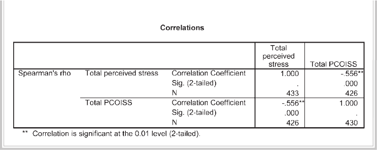
Correlation 133
Nonparametric correlations
INTERPRETATION OF OUTPUT FROM CORRELATION
For both Pearson and Spearman results, SPSS provides you with a table giving the
correlation coeffi cients between each pair of variables listed, the signifi cance level and
the number of cases. The results for Pearson correlation are shown in the section
headed Correlation. If you requested Spearman rho, these results are shown in the
section labelled Nonparametric Correlations. The way in which you interpret
the output from the parametric and non-parametric approaches is the same.
Step 1: Checking the information about the sample
The fi rst thing to look at in the table labelled Correlations is the N (number of cases). Is
this correct? If there are a lot of missing data, you need to fi nd out why. Did you forget to
tick the Exclude cases pairwise in the missing data option? Using listwise deletion (the
other option), any case with missing data on any of the variables will be removed from
the analysis. This can sometimes severely restrict your N. In the above example we have
426 cases that had scores on both of the scales used in this analysis. If a case was missing
information on either of these variables, it would have been excluded from the analysis.
Step 2: Determining the direction of the relationship
The second thing to consider is the direction of the relationship between the variables.
Is there a negative sign in front of the correlation coeffi cient value? If there is, this
means there is a negative correlation between the two variables (i.e. high scores on one
are associated with low scores on the other). The interpretation of this depends on the
way the variables are scored. Always check with your questionnaire, and remember to
take into account that for many scales some items are negatively worded and therefore
are reversed before scoring. What do high values really mean? This is one of the major
areas of confusion for students, so make sure you get this clear in your mind before
you interpret the correlation output.

134 Statistical techniques to explore relationships among variables
In the example given here, the Pearson correlation coeffi cient (–.58) and
Spearman rho value (–.56) are negative, indicating a negative correlation between
perceived control and stress. The more control people feel they have, the less stress they
experience.
Step 3: Determining the strength of the relationship
The third thing to consider in the output is the size of the value of the correlation
coeffi cient. This can range from –1.00 to 1.00. This value will indicate the strength of
the relationship between your two variables. A correlation of 0 indicates no relation-
ship at all, a correlation of 1.0 indicates a perfect positive correlation, and a value of
–1.0 indicates a perfect negative correlation.
How do you interpret values between 0 and 1? Different authors suggest different
interpretations; however, Cohen (1988, pp. 79–81) suggests the following guidelines:
small r=.10 to .29
medium r=.30 to .49
large r=.50 to 1.0
These guidelines apply whether or not there is a negative sign out the front of your r
value. Remember, the negative sign refers only to the direction of the relationship, not
the strength. The strength of correlation of r=.5 and r=–.5 is the same. It is only in a
different direction.
In the example presented above, there is a large correlation between the two vari-
ables (above .5), suggesting quite a strong relationship between perceived control and
stress.
Step 4: Calculating the coeffi cient of determination
To get an idea of how much variance your two variables share, you can also calculate
what is referred to as the coeffi cient of determination. Sounds impressive, but all you
need to do is square your r value (multiply it by itself). To convert this to ‘percentage
of variance’, just multiply by 100 (shift the decimal place two columns to the right).
For example, two variables that correlate r=.2 share only .2 × .2 = .04 = 4 per cent of
their variance. There is not much overlap between the two variables. A correlation
of r=.5, however, means 25 per cent shared variance (.5 ×.5 = .25).
In our example the Pearson correlation is .581, which when squared indicates
33.76 per cent shared variance. Perceived control helps to explain nearly 34 per cent
of the variance in respondents’ scores on the Perceived Stress Scale. This is quite a
respectable amount of variance explained when compared with a lot of the research
conducted in the social sciences.

Correlation 135
Step 5: Assessing the signifi cance level
The next thing to consider is the signifi cance level (listed as Sig. 2 tailed). This is a
frequently misinterpreted area, so care should be exercised here. The level of statisti-
cal signifi cance does not indicate how strongly the two variables are associated (this is
given by r or rho), but instead it indicates how much confi dence we should have in the
results obtained. The signifi cance of r or rho is strongly infl uenced by the size of the
sample. In a small sample (e.g. n=30), you may have moderate correlations that do not
reach statistical signifi cance at the traditional p<.05 level. In large samples (N=100+),
however, very small correlations (e.g. r=.2) may reach statistical signifi cance. While
you need to report statistical signifi cance, you should focus on the strength of the
relationship and the amount of shared variance (see Step 4).
PRESENTING THE RESULTS FROM CORRELATION
The results of the above example using Pearson correlation could be presented in a
research report as follows. If you need to report the results for Spearman’s, just replace
the r value with the rho value shown in the output.
The relationship between perceived control of internal states (as measured by
the PCOISS) and perceived stress (as measured by the Perceived Stress Scale)
was investigated using Pearson product-moment correlation coeffi cient.
Preliminary analyses were performed to ensure no violation of the assumptions
of normality, linearity and homoscedasticity. There was a strong, negative
correlation between the two variables, r = –.58, n = 426, p < .0005, with high
levels of perceived control associated with lower levels of perceived stress.
Correlation is often used to explore the relationship among a group of variables,
rather than just two as described above. In this case, it would be awkward to report
all the individual correlation coeffi cients in a paragraph; it would be better to present
them in a table. One way this could be done is as follows:
Table 1
Pearson Product-moment Correlations Between Measures of Perceived Control and Wellbeing
Scale 1 2 3 4 5
1. Total PCOISS – –.58 ** –.48 ** .46** .37 **
2. Total perceived stress – .67 ** –.44 ** –.49 **
3. Total negative affect – –.29 ** –.32 **
4. Total positive affect – .42 **
5. Total life satisfaction –
** p < .001 (2-tailed).

136 Statistical techniques to explore relationships among variables
OBTAINING CORRELATION COEFFICIENTS BETWEEN
GROUPS OF VARIABLES
In the previous procedures section, I showed you how to obtain correlation coeffi cients
between two continuous variables. If you have a group of variables and you wish to
explore the interrelationships among all of them, you can ask SPSS to do this all in one
procedure. Just include all the variables in the Variables box. This can, however, result in
an enormous correlation matrix that can be diffi cult to read and interpret.
Sometimes you want to look at only a subset of all these possible relationships.
For example, you might want to look at the relationship between control measures
(Mastery, PCOISS) and a number of different adjustment measures (positive affect,
negative affect, life satisfaction). You don’t want a full correlation matrix because this
would give you correlation coeffi cients among all the variables, including between
each of the various pairs of adjustment measures. There is a way that you can limit
the correlation coeffi cients that are displayed. This involves using Syntax Editor
(described in Chapter 3). The following procedure uses the Syntax Editor to limit the
correlation coeffi cients that are produced by SPSS.
Procedure for obtaining correlation coeffi cients between one group of
variables and another group of variables
1. From the menu at the top of the screen, click on Analyze, then select
Correlate, then Bivariate.
2. Move the variables of interest into the Variables box. Select the fi rst
group of variables (e.g. Total Positive Affect: tposaff, total negative affect:
tnegaff, total life satisfaction: tlifesat), followed by the second group (e.g.
Total PCOISS: tpcoiss, Total Mastery: tmast). In the output that is generated,
the fi rst group of variables will appear down the side of the table as rows
and the second group will appear across the table as columns. Put your
longer list fi rst; this stops your table being too wide to appear on one page.
3. Click on Paste. This opens the Syntax Editor window.
4. Put your cursor between the fi rst group of variables (e.g. tposaff, tnegaff,
tlifesat) and the other variables (e.g. tpcoiss and tmast). Type in the word
WITH (tposaff tnegaff tlifesat with tpcoiss tmast). This will ask SPSS to
calculate correlation coeffi cients between tmast and tpcoiss and each of
the other variables listed. The fi nal syntax should be:
CORRELATIONS
/VARIABLES=tposaff tnegaff tlifesat with tpcoiss tmast
/PRINT=TWOTAIL NOSIG
/MISSING=PAIRWISE.

Correlation 137
5. To run this new syntax, you need to highlight the text from
CORRELATIONS, down to and including the full stop at the end. It is
very important that you include the full stop in the highlighted section.
Alternatively, you can click on Correlations on the left-hand side of the
screen.
6. With this text highlighted, click on the green triangle or arrow-shaped
icon (>), or alternatively click on Run from the Menu, and then Selection
from the drop-down menu that appears. This tells SPSS that you wish to
run this procedure.
The output generated from this procedure is shown as follows.
Correlations
.456** .432**
.000 .000
429 436
-.484** -.464**
.000 .000
428 435
.373** .444**
.000 .000
429 436
Pearson
Correlation
Sig. (2-tailed)
N
Pearson
Correlation
Sig. (2-tailed)
N
Pearson
Correlation
Sig. (2-tailed)
N
Total Positive Affect
Total Negative Affect
To t a l L if e
Satisfaction
Total PCOISS Total Mastery
Correlation is significant at the 0.01 level (2-tailed).
**
Presented in this manner, it is easy to compare the relative strength of the correlations
for my two control scales (Total PCOISS, Total Mastery) with each of the adjustment
measures.
COMPARING THE CORRELATION COEFFICIENTS FOR
TWO GROUPS
Sometimes when doing correlational research you may want to compare the strength
of the correlation coeffi cients for two separate groups. For example, you may want to
look at the relationship between optimism and negative affect for males and females
separately. One way that you can do this is described below.

138 Statistical techniques to explore relationships among variables
Procedure for comparing correlation coeffi cients for two groups of
participants
Step 1: Split the sample
1. From the menu at the top of the screen, click on Data, then select Split
File.
2. Click on Compare Groups.
3. Move the grouping variable (e.g. sex) into the box labelled Groups based
on. Click on OK (or on Paste to save to Syntax Editor). If you use syntax,
remember to run the procedure by highlighting the command and
clicking on Run.
4. This will split the sample by sex and repeat any analyses that follow for
these two groups separately.
Step 2: Correlation
1. Follow the steps in the earlier section of this chapter to request the
correlation between your two variables of interest (e.g. Total optimism:
toptim, Total negative affect: tnegaff). The results will be reported
separately for the two groups.
The syntax for this command is:
CORRELATIONS
/VARIABLES=toptim tnegaff
/PRINT=TWOTAIL NOSIG
/MISSING=PAIRWISE .
Important: remember, when you have fi nished looking at males and females
separately you will need to turn the Split File option off. It stays in place until
you specifi cally turn it off. To do this, make sure that you have the Data Editor
window open on the screen in front of you. Click on Data, Split File and click
on the fi rst button: Analyze all cases, do not create groups.
The output generated from the correlation procedure is shown below.

Correlation 139
Correlations
1.000 -.220**
..003
184 184
-.220** 1.000
.003 .
184 185
1.000 -.394**
..000
251 250
-.394** 1.000
.000
250 250
Pearson
Correlation
Sig. (2-tailed)
N
Pearson
Correlation
Sig. (2-tailed)
N
Pearson
Correlation
Sig. (2-tailed)
N
Pearson
Correlation
Sig. (2-tailed)
N
To t a l O p t i mi sm
Total Negative
Affect
To t a l O p t i mi sm
Total Negative
Affect
SEX
MALES
FEMALES
To t a l O p timis m
Total Negative
Affect
Correlation is significant at the 0.01 level (2-tailed).
**
Interpretation of output from correlation for two groups
From the output given above, the correlation between Total optimism and Total
negative affect for males was r=–.22, while for females it was slightly higher, r=–.39.
Although these two values seem different, is this difference big enough to be consid-
ered signifi cant? Detailed in the next section is one way that you can test the statistical
signifi cance of the difference between these two correlation coeffi cients. It is impor-
tant to note that this process is different from testing the statistical signifi cance of
the correlation coeffi cients reported in the output table above. The signifi cance levels
reported above (for males: Sig. = .003; for females: Sig. = .000) provide a test of the
null hypothesis that the correlation coeffi cient in the population is 0. The signifi cance
test described below, however, assesses the probability that the difference in the corre-
lations observed for the two groups (males and females) would occur as a function
of a sampling error, when in fact there was no real difference in the strength of the
relationship for males and females.
TESTING THE STATISTICAL SIGNIFICANCE OF THE
DIFFERENCE BETWEEN CORRELATION COEFFICIENTS
In this section, I will describe the procedure that can be used to fi nd out whether the
correlations for the two groups are signifi cantly different. Unfortunately, SPSS will
not do this step for you, so it is back to the trusty calculator. This next section might
seem rather confusing, but just follow along with the procedure step by step. First we
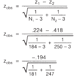
140 Statistical techniques to explore relationships among variables
will be converting the r values into z scores and then we use an equation to calculate
the observed value of z (zobs value). The value obtained will be assessed using a set
decision rule to determine the likelihood that the difference in the correlation noted
between the two groups could have been due to chance.
Assumptions
As always, there are assumptions to check fi rst. It is assumed that the r values for the
two groups were obtained from random samples and that the two groups of cases are
independent (not the same participants tested twice). The distribution of scores for
the two groups is assumed to be normal (see histograms for the two groups). It is also
necessary to have at least 20 cases in each of the groups.
Step 1: Convert each of the r values into z values
The fi rst step in the comparison process is to convert the two r values that you obtained
into a standard score form (referred to as z scores). This is done for a number of
mathematical reasons, primarily to ensure that the sampling distributions are approx-
imately normal.
From the SPSS output, fi nd the r value (ignore any negative sign out the front)
and N for Group 1 (males) and Group 2 (females).
Males: r1 = .22 Females: r2 = .394
N
1 = 184 N2 = 250
Using Table 11.1, fi nd the z value that corresponds with each of the r values.
Males: z1 = .224 Females: z2 = .418
Step 2: Put these values into the equation to calculate zobs
The equation that you need to use is given below. Just slot your values into the required
spots and then crunch away on your calculator. (It helps if you have set out your
information clearly and neatly.)
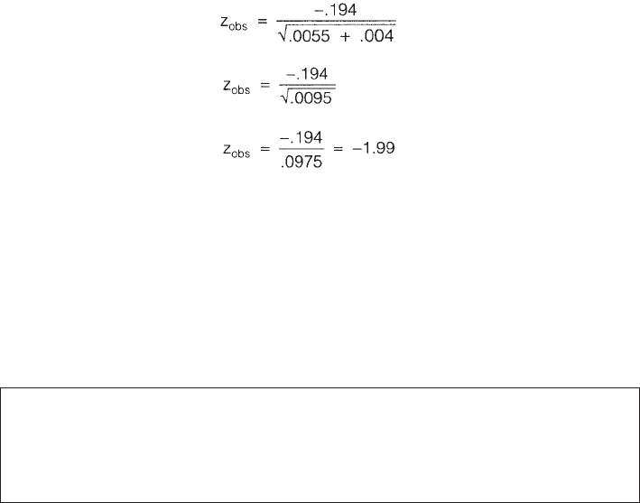
Correlation 141
Step 3: Determine if the zobs value is statistically signifi cant
If the zobs value that you obtained is between –1.96 and +1.96, you cannot say that
there is a statistically signifi cant difference between the two correlation coeffi cients.
In statistical language, you are able to reject the null hypothesis (no difference
between the two groups) only if your z value is outside these two boundaries.
The decision rule therefore is:
If –1.96 < zobs < 1.96: correlation coeffi cients are not statistically signifi cantly
different.
If zobs is less than or equal to –1.96 or zobs is greater than or equal to 1.96:
coeffi cients are statistically signifi cantly different.
In the example calculated above for males and females, we obtained a zobs value of
–1.99. This is outside the specifi ed bounds, so we can conclude that there is a statisti-
cally signifi cant difference in the strength of the correlation between optimism and
negative affect for males and females. Optimism explains signifi cantly more of the
variance in negative affect for females than for males.
ADDITIONAL EXERCISES
Health
Data fi le: sleep4ED.sav. See Appendix for details of the data fi le.
1. Check the strength of the correlation between scores on the Sleepiness and Asso-
ciated Sensations Scale (totSAS) and the Epworth Sleepiness Scale (ess).
2. Use Syntax to assess the correlations between the Epworth Sleepiness Scale (ess)
and each of the individual items that make up the Sleepiness and Associated
Sensations Scale (fatigue, lethargy, tired, sleepy, energy).
142 Statistical techniques to explore relationships among variables
Table 11.1
Transformation of
r to z

143
12
Partial correlation
Partial correlation is similar to Pearson product-moment correlation (described in
Chapter 11), except that it allows you to control for an additional variable. This is
usually a variable that you suspect might be infl uencing your two variables of interest.
By statistically removing the infl uence of this confounding variable, you can get a
clearer and more accurate indication of the relationship between your two variables.
In the introduction to Part Four, the infl uence of contaminating or confounding
variables was discussed (see section on correlation versus causality). This occurs when
the relationship between two variables (A and B) is infl uenced, at least to some extent,
by a third variable (C). This can serve to artifi cially infl ate the size of the correlation
coeffi cient obtained. This relationship can be represented graphically as:
A
B
C
In this case, A and B may look as if they are related, but in fact their apparent re-
lationship is due, to a large extent, to the infl uence of C. If you were to statistically
control for the variable C then the correlation between A and B is likely to be reduced,
resulting in a smaller correlation coeffi cient.
DETAILS OF EXAMPLE
To illustrate the use of partial correlation, I will use the same statistical example as
described in Chapter 11 but extend the analysis further to control for an additional
variable. This time I am interested in exploring the relationship between scores on

144 Statistical techniques to explore relationships among variables
the Perceived Control of Internal States Scale (PCOISS) and scores on the Perceived
Stress Scale, while controlling for what is known as socially desirable responding bias.
This variable simply refers to people’s tendency to present themselves in a positive
or ‘socially desirable’ way (also known as ‘faking good’) when completing question-
naires. This tendency is measured by the Marlowe-Crowne Social Desirability Scale
(Crowne & Marlowe 1960). A short version of this scale (Strahan & Gerbasi 1972) was
included in the questionnaire used to measure the other two variables.
If you would like to follow along with the example presented below, you should
start SPSS and open the fi le labelled survey4ED.sav, which is included on the website
accompanying this book.
Example of research question: After controlling for participants’ tendency to present
themselves in a positive light on self-report scales, is there still a signifi cant relation-
ship between perceived control of internal states (PCOISS) and levels of perceived
stress?
What you need: Three continuous variables:
• two variables that you wish to explore the relationship between (e.g. Total PCOISS,
Total perceived stress)
• one variable that you wish to control for (e.g. total social desirability: tmarlow).
What it does: Partial correlation allows you to explore the relationship between
two variables, while statistically controlling for (getting rid of) the effect of another
variable that you think might be contaminating or infl uencing the relationship.
Assumptions: For full details of the assumptions for correlation, see the introduction
to Part Four.
Before you start the following procedure, choose Edit from the menu, select Options,
and make sure there is a tick in the box No scientifi c notation for small numbers in
tables.
Procedure for partial correlation
1. From the menu at the top of the screen, click on Analyze, then select
Correlate, then Partial.
2. Click on the two continuous variables that you want to correlate (e.g.
Total PCOISS: tpcoiss, Total perceived stress: tpstress). Click on the arrow
to move these into the Variables box.
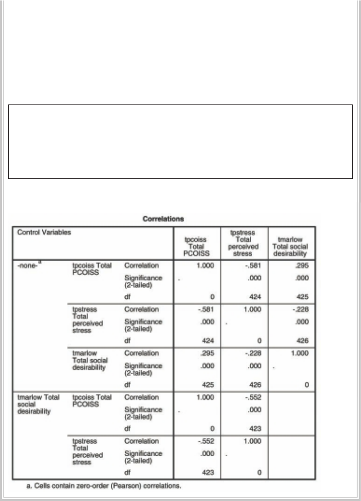
Partial correlation 145
3. Click on the variable that you wish to control for (e.g. total social
desirability: tmarlow). Move into the Controlling for box.
4. Click on Options.
• In the Missing Values section, click on Exclude cases pairwise.
• In the Statistics section, click on Zero order correlations.
5. Click on Continue and then OK (or on Paste to save to Syntax Editor).
The syntax from this procedure is:
PARTIAL CORR
/VARIABLES= tpcoiss tpstress BY tmarlow
/SIGNIFICANCE=TWOTAIL
/STATISTICS=CORR
/MISSING=ANALYSIS .
The output generated from this procedure is shown below.

146 Statistical techniques to explore relationships among variables
INTERPRETATION OF OUTPUT FROM PARTIAL
CORRELATION
The output provides you with a table made up of two sections:
1. In the top half of the table is the normal Pearson product-moment correlation
matrix between your two variables of interest (e.g. perceived control and perceived
stress), not controlling for your other variable. In this case, the correlation is –.581.
The word ‘none’ in the left-hand column indicates that no control variable is in
operation.
2. The bottom half of the table repeats the same set of correlation analyses, but this
time controlling for (taking out) the effects of your control variable (e.g. social
desirability). In this case, the new partial correlation is –.552. You should compare
these two sets of correlation coeffi cients to see whether controlling for the ad-
ditional variable had any impact on the relationship between your two variables.
In this example, there was only a small decrease in the strength of the corre-
lation (from –.581 to –.552). This suggests that the observed relationship between
perceived control and perceived stress is not due merely to the infl uence of socially
desirable responding.
PRESENTING THE RESULTS FROM PARTIAL
CORRELATION
The results of this analysis could be presented as:
Partial correlation was used to explore the relationship between perceived
control of internal states (as measured by the PCOISS) and perceived stress
(measured by the Perceived Stress Scale), while controlling for scores on
the Marlowe-Crowne Social Desirability Scale. Preliminary analyses were
performed to ensure no violation of the assumptions of normality, linearity
and homoscedasticity. There was a strong, negative, partial correlation
between perceived control of internal states and perceived stress, controlling
for social desirability, r = –.55, n = 425, p < .0005, with high levels of perceived
control being associated with lower levels of perceived stress. An inspection
of the zero order correlation (r = –.58) suggested that controlling for socially
desirable responding had very little effect on the strength of the relationship
between these two variables.
Partial correlation 147
ADDITIONAL EXERCISE
Health
Data fi le: sleep4ED.sav. See Appendix for details of the data fi le.
1. Check the strength of the correlation between scores on the Sleepiness and Asso-
ciated Sensations Scale (totSAS) and the impact of sleep problems on overall
wellbeing (impact6) while controlling for age. Compare the zero order correlation
(Pearson correlation) and the partial correlation coeffi cient. Does controlling for
age make a difference?
148
13
Multiple regression
In this chapter, I will briefl y outline how to use SPSS to run multiple regression
analyses. This is a very simplifi ed outline. It is important that you do more reading on
multiple regression before using it in your own research. A good reference is Chapter 5
in Tabachnick and Fidell (2007), which covers the underlying theory, the different
types of multiple regression analyses and the assumptions that you need to check.
Multiple regression is not just one technique but a family of techniques that can
be used to explore the relationship between one continuous dependent variable and a
number of independent variables or predictors (usually continuous). Multiple regres-
sion is based on correlation (covered in Chapter 11), but allows a more sophisticated
exploration of the interrelationship among a set of variables. This makes it ideal for
the investigation of more complex real-life, rather than laboratory-based, research
questions. However, you cannot just throw variables into a multiple regression and
hope that, magically, answers will appear. You should have a sound theoretical or
conceptual reason for the analysis and, in particular, the order of variables entering
the equation. Don’t use multiple regression as a fi shing expedition.
Multiple regression can be used to address a variety of research questions. It can
tell you how well a set of variables is able to predict a particular outcome. For example,
you may be interested in exploring how well a set of subscales on an intelligence test
is able to predict performance on a specifi c task. Multiple regression will provide you
with information about the model as a whole (all subscales) and the relative contri-
bution of each of the variables that make up the model (individual subscales). As an
extension of this, multiple regression will allow you to test whether adding a variable
(e.g. motivation) contributes to the predictive ability of the model, over and above
those variables already included in the model. Multiple regression can also be used
to statistically control for an additional variable (or variables) when exploring the
predictive ability of the model. Some of the main types of research questions that
multiple regression can be used to address are:
Multiple regression 149
• how well a set of variables is able to predict a particular outcome
• which variable in a set of variables is the best predictor of an outcome
• whether a particular predictor variable is still able to predict an outcome when the
effects of another variable are controlled for (e.g. socially desirable responding).
MAJOR TYPES OF MULTIPLE REGRESSION
There are a number of different types of multiple regression analyses that you can use,
depending on the nature of the question you wish to address. The three main types of
multiple regression analyses are:
• standard or simultaneous
• hierarchical or sequential
• stepwise.
Typical of the statistical literature, you will fi nd different authors using different terms
when describing these three main types of multiple regression—very confusing for an
experienced researcher, let alone a beginner to the area!
Standard multiple regression
In standard multiple regression, all the independent (or predictor) variables are
entered into the equation simultaneously. Each independent variable is evaluated in
terms of its predictive power, over and above that offered by all the other independent
variables. This is the most commonly used multiple regression analysis. You would use
this approach if you had a set of variables (e.g. various personality scales) and wanted
to know how much variance in a dependent variable (e.g. anxiety) they were able to
explain as a group or block. This approach would also tell you how much unique
variance in the dependent variable each of the independent variables explained.
Hierarchical multiple regression
In hierarchical regression (also called sequential regression), the independent vari-
ables are entered into the equation in the order specifi ed by the researcher based on
theoretical grounds. Variables or sets of variables are entered in steps (or blocks), with
each independent variable being assessed in terms of what it adds to the prediction
of the dependent variable after the previous variables have been controlled for. For
example, if you wanted to know how well optimism predicts life satisfaction, after the
effect of age is controlled for, you would enter age in Block 1 and then Optimism in
Block 2. Once all sets of variables are entered, the overall model is assessed in terms of
its ability to predict the dependent measure. The relative contribution of each block
of variables is also assessed.
150 Statistical techniques to explore relationships among variables
Stepwise multiple regression
In stepwise regression, the researcher provides a list of independent variables and
then allows the program to select which variables it will enter and in which order
they go into the equation, based on a set of statistical criteria. There are three differ-
ent versions of this approach: forward selection, backward deletion and stepwise
regression. There are a number of problems with these approaches and some
controversy in the literature concerning their use (and abuse). Before using these
approaches, I would strongly recommend that you read up on the issues involved
(see Tabachnick & Fidell 2007, p. 138). It is important that you understand what is
involved, how to choose the appropriate variables and how to interpret the output
that you receive.
ASSUMPTIONS OF MULTIPLE REGRESSION
Multiple regression is one of the fussier of the statistical techniques. It makes a
number of assumptions about the data, and it is not all that forgiving if they are
violated. It is not the technique to use on small samples, where the distribution of
scores is very skewed! The following summary of the major assumptions is taken
from Chapter 5, Tabachnick and Fidell (2007). It would be a good idea to read this
chapter before proceeding with your analysis.
You should also review the material covered in the introduction to Part
Four of this book, which covers the basics of correlation, and see the list of rec-
ommended references at the back of the book. The SPSS procedures for testing
these assumptions are discussed in more detail in the examples provided later in
this chapter.
Sample size
The issue at stake here is generalisability. That is, with small samples you may obtain
a result that does not generalise (cannot be repeated) with other samples. If your
results do not generalise to other samples, they are of little scientifi c value. So how
many cases or participants do you need? Different authors tend to give different
guidelines concerning the number of cases required for multiple regression. Stevens
(1996, p. 72) recommends that ‘for social science research, about 15 participants
per predictor are needed for a reliable equation’. Tabachnick and Fidell (2007,
p. 123) give a formula for calculating sample size requirements, taking into account
the number of independent variables that you wish to use: N > 50 + 8m (where
m = number of independent variables). If you have fi ve independent variables,
you will need 90 cases. More cases are needed if the dependent variable is skewed.
For stepwise regression, there should be a ratio of 40 cases for every independent
variable.
Multiple regression 151
Multicollinearity and singularity
This refers to the relationship among the independent variables. Multicollin-
earity exists when the independent variables are highly correlated (r=.9 and above).
Singularity occurs when one independent variable is actually a combination of other
independent variables (e.g. when both subscale scores and the total score of a scale
are included). Multiple regression doesn’t like multicollinearity or singularity and
these certainly don’t contribute to a good regression model, so always check for these
problems before you start.
Outliers
Multiple regression is very sensitive to outliers (very high or very low scores). Checking
for extreme scores should be part of the initial data screening process (see Chapter 6).
You should do this for all the variables, both dependent and independent, that you will
be using in your regression analysis. Outliers can either be deleted from the data set
or, alternatively, given a score for that variable that is high but not too different from
the remaining cluster of scores. Additional procedures for detecting outliers are also
included in the multiple regression program. Outliers on your dependent variable can
be identifi ed from the standardised residual plot that can be requested (described in the
example presented later in this chapter). Tabachnick and Fidell (2007, p. 128) defi ne
outliers as those with standardised residual values above about 3.3 (or less than –3.3).
Normality, linearity, homoscedasticity, independence of
residuals
These all refer to various aspects of the distribution of scores and the nature of the
underlying relationship between the variables. These assumptions can be checked
from the residuals scatterplots which are generated as part of the multiple regres-
sion procedure. Residuals are the differences between the obtained and the predicted
dependent variable (DV) scores. The residuals scatterplots allow you to check:
• normality: the residuals should be normally distributed about the predicted
DV scores
• linearity: the residuals should have a straight-line relationship with predicted
DV scores
• homoscedasticity: the variance of the residuals about predicted DV scores should
be the same for all predicted scores.
The interpretation of the residuals scatterplots generated by SPSS is discussed later in
this chapter; however, for a more detailed discussion of this rather complex topic, see
Chapter 5 in Tabachnick and Fidell (2007). Further reading on multiple regression
can be found in the recommended references at the end of this book.
152 Statistical techniques to explore relationships among variables
DETAILS OF EXAMPLE
To illustrate the use of multiple regression, I will be using a series of examples taken
from the survey4ED.sav data fi le that is included on the website with this book (see
p. viii). The survey was designed to explore the factors that affect respondents’ psycho-
logical adjustment and wellbeing (see the Appendix for full details of the study). For
the multiple regression example detailed below, I will be exploring the impact of
respondents’ perceptions of control on their levels of perceived stress. The literature
in this area suggests that if people feel that they are in control of their lives, they are
less likely to experience ‘stress’. In the questionnaire, there were two different measures
of control (see the Appendix for the references for these scales). These include the
Mastery Scale, which measures the degree to which people feel they have control over
the events in their lives; and the Perceived Control of Internal States Scale (PCOISS),
which measures the degree to which people feel they have control over their internal
states (their emotions, thoughts and physical reactions). In this example, I am inter-
ested in exploring how well the Mastery Scale and the PCOISS are able to predict
scores on a measure of perceived stress.
The variables used in the examples covered in this chapter are presented below. It
is a good idea to work through these examples on the computer using this data fi le.
Hands-on practice is always better than just reading about it in a book. Feel free to
‘play’ with the data fi le—substitute other variables for the ones that were used in the
example. See what results you get, and try to interpret them.
File name: survey4ED.sav
Variables:
• Total perceived stress (tpstress): total score on the Perceived Stress Scale. High
scores indicate high levels of stress.
• Total Perceived Control of Internal States (tpcoiss): total score on the Perceived
Control of Internal States Scale. High scores indicate greater control over internal
states.
• Total Mastery (tmast): total score on the Mastery Scale. High scores indicate
higher levels of perceived control over events and circumstances.
• Total Social Desirability (tmarlow): total scores on the Marlowe-Crowne Social
Desirability Scale, which measures the degree to which people try to present
themselves in a positive light.
• Age: age in years.
The examples included below cover only the use of Standard Multiple Regression
and Hierarchical Regression. Because of the criticism that has been levelled at the use

Multiple regression 153
of Stepwise Multiple Regression techniques, these approaches will not be illustrated
here. If you are desperate to use these techniques (despite the warnings!), I suggest
you read Tabachnick and Fidell (2007) or other more advanced multivariate statistics
books.
Example of research questions:
1. How well do the two measures of control (mastery, PCOISS) predict perceived
stress? How much variance in perceived stress scores can be explained by scores
on these two scales?
2. Which is the best predictor of perceived stress: control of external events (Mastery
Scale) or control of internal states (PCOISS)?
3. If we control for the possible effect of age and socially desirable responding, is
this set of variables still able to predict a signifi cant amount of the variance in
perceived stress?
What you need:
• one continuous dependent variable (Total perceived stress)
• two or more continuous independent variables (mastery, PCOISS). (You can also
use dichotomous independent variables, e.g. males=1, females=2.)
What it does: Multiple regression tells you how much of the variance in your depen-
dent variable can be explained by your independent variables. It also gives you an
indication of the relative contribution of each independent variable. Tests allow you
to determine the statistical signifi cance of the results, in terms of both the model itself
and the individual independent variables.
Assumptions: The major assumptions for multiple regression are described in an
earlier section of this chapter. Some of these assumptions can be checked as part of
the multiple regression analysis (these are illustrated in the example that follows).
STANDARD MULTIPLE REGRESSION
In this example, two questions will be addressed:
Question 1: How well do the two measures of control (mastery, PCOISS) predict
perceived stress? How much variance in perceived stress scores can be explained
by scores on these two scales?
Question 2: Which is the best predictor of perceived stress: control of external
events (Mastery Scale) or control of internal states (PCOISS)?

154 Statistical techniques to explore relationships among variables
To explore these questions, I will be using standard multiple regression. This involves
all of the independent variables being entered into the model at once. The results will
indicate how well this set of variables is able to predict stress levels, and it will also tell
us how much unique variance each of the independent variables (mastery, PCOISS)
explains in the dependent variable over and above the other independent variables
included in the set. For each of the procedures, I have included the syntax. For more
information on the use of the Syntax Editor for recording and saving the commands,
see Chapter 3.
Before you start the following procedure, choose Edit from the menu, select
Options, and make sure there is a tick in the box No scientifi c notation for small
numbers in tables.
Procedure for standard multiple regression
1. From the menu at the top of the screen, click on Analyze, then select
Regression, then Linear.
2. Click on your continuous dependent variable (e.g. Total perceived stress:
tpstress) and move it into the Dependent box.
3. Click on your independent variables (Total Mastery: tmast; Total PCOISS:
tpcoiss) and click on the arrow to move them into the Independent box.
4. For Method, make sure Enter is selected. (This will give you standard
multiple regression.)
5. Click on the Statistics button.
• Select the following: Estimates, Confi dence Intervals, Model
fi t, Descriptives, Part and partial correlations and Collinearity
diagnostics.
• In the Residuals section, select Casewise diagnostics and Outliers
outside 3 standard deviations. Click on Continue.
6. Click on the Options button. In the Missing Values section, select Exclude
cases pairwise. Click on Continue.
7. Click on the Plots button.
• Click on *ZRESID and the arrow button to move this into the Y box.
• Click on *ZPRED and the arrow button to move this into the X box.
• In the section headed Standardized Residual Plots, tick the Normal
probability plot option. Click on Continue.
8. Click on the Save button.
• In the section labelled Distances, select Mahalanobis box and Cook’s.
• Click on Continue and then OK (or on Paste to save to Syntax Editor).
The syntax generated from this procedure is:

Multiple regression 155
REGRESSION
/DESCRIPTIVES MEAN STDDEV CORR SIG N
/MISSING PAIRWISE
/STATISTICS COEFF OUTS CI(95) R ANOVA COLLIN TOL ZPP
/CRITERIA=PIN(.05) POUT(.10)
/NOORIGIN
/DEPENDENT tpstress
/METHOD=ENTER tmast tpcoiss
/SCATTERPLOT=(*ZRESID ,*ZPRED )
/RESIDUALS NORMPROB (ZRESID)
/CASEWISE PLOT(ZRESID) OUTLIERS(3)
/SAVE MAHAL COOK .
Selected output generated from this procedure is shown below.
Correlations
1.000 -.612 -.581
-.612 1.000 .521
-.581 .521 1.000
..000 .000
.000 . .000
.000 .000 .
433 433 426
433 436 429
426 429 431
To t a l p e rc e ive d
stress
To t a l Ma st er y
To t a l P C O I S S
To t a l p e rc e ive d
stress
To t a l Ma st er y
To t a l P C O I S S
To t a l p e rc e ive d
stress
To t a l Ma st er y
To t a l P C O I S S
Pearson
Correlation
Sig. (1-tailed)
N
To t a l p e rc e ive d
stress Total Mastery Total PCOISS
Model Summaryb
.684a.468 .466 4.27
Model
1
R R Square Adjusted R Square
Std. Error of
the Estimate
Predictors: (Constant), Total PCOISS, Total Mastery
a.
Dependent Variable: Total perceived stress
b.
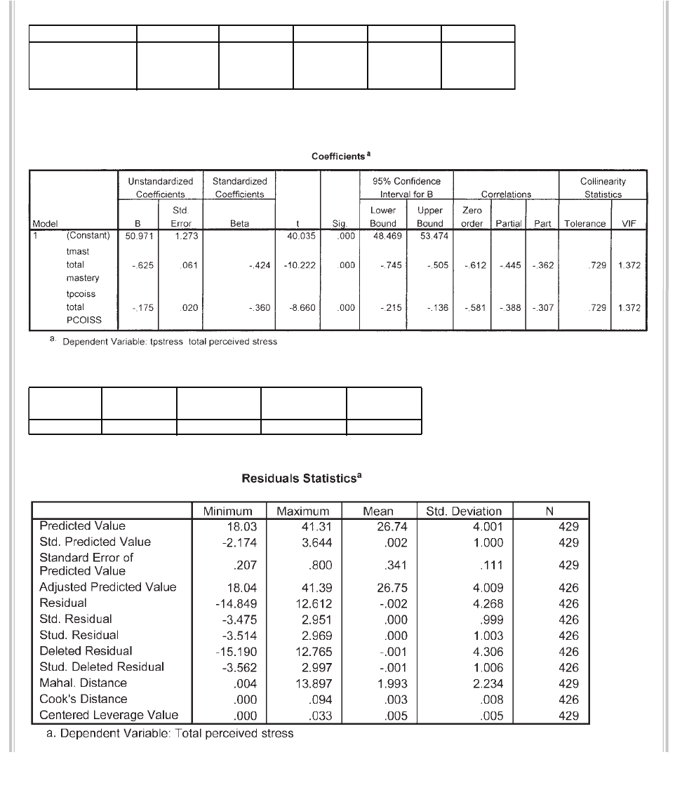
156 Statistical techniques to explore relationships among variables
ANOVAb
6806.728 2 3403.364 186.341 .000a
7725.756 423 18.264
14532.484 425
Regression
Residual
To t a l
Model
1
Sum of Squares df Mean Square F Sig.
Predictors: (Constant), Total PCOISS, Total Mastery
a.
Dependent Variable: Total perceived stress
b.
Casewise Diagnosticsa
-3.473 14 28.84 -14.84
Case
Number
152
Std. Residual
To t a l p e rc eive d
stress Predicted Value Residual
Dependent Variable: Total perceived stress
a.
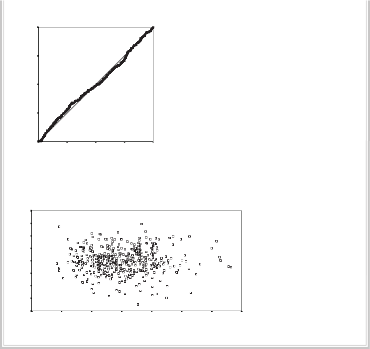
Multiple regression 157
Normal P-P Plot of Regression Standardized Residual
Dependent Variable : Total perce ive d stress
Observed Cum Prob
1.0.75.50.250.00
E
xpe
ct
e
d
Cum
P
rob
1.0 0
.75
.50
.25
0.0 0
Scatterplot
Dependent Variable: Total perceived stress
Regression Standardized Predict ed Value
43210-1-2-3
R
eg
res
sion Standa rdized Residual
4
3
2
1
0
-1
-2
-3
-4
INTERPRETATION OF OUTPUT FROM STANDARD
MULTIPLE REGRESSION
As with the output from most of the SPSS procedures, there are lots of rather con-
fusing numbers generated as output from regression. To help you make sense of this,
I will take you on a guided tour of some of the output that was obtained to answer
Question 1.
Step 1: Checking the assumptions
Multicollinearity
The correlations between the variables in your model are provided in the table labelled
Correlations. Check that your independent variables show at least some relationship
158 Statistical techniques to explore relationships among variables
with your dependent variable (above .3 preferably). In this case, both of the scales (Total
Mastery and Total PCOISS) correlate substantially with Total perceived stress (–.61 and
–.58 respectively). Also check that the correlation between each of your independent
variables is not too high. You probably don’t want to include two variables with a bivari-
ate correlation of .7 or more in the same analysis. If you fi nd yourself in this situation,
you may need to consider omitting one of the variables or forming a composite variable
from the scores of the two highly correlated variables. In the example presented here the
correlation is .52, which is less than .7; therefore all variables will be retained.
SPSS also performs ‘collinearity diagnostics’ on your variables as part of the
multiple regression procedure. This can pick up on problems with multicollinearity
that may not be evident in the correlation matrix. The results are presented in the
table labelled Coeffi cients. Two values are given: Tolerance and VIF. Tolerance is an
indicator of how much of the variability of the specifi ed independent is not explained
by the other independent variables in the model and is calculated using the formula
1–R squared for each variable. If this value is very small (less than .10) it indicates
that the multiple correlation with other variables is high, suggesting the possibility of
multicollinearity. The other value given is the VIF (Variance infl ation factor), which
is just the inverse of the Tolerance value (1 divided by Tolerance). VIF values above 10
would be a concern here, indicating multicollinearity.
I have quoted commonly used cut-off points for determining the presence of
multicollinearity (tolerance value of less than .10, or a VIF value of above 10). These
values, however, still allow for quite high correlations between independent variables
(above .9), so you should take them only as a warning sign and check the correlation
matrix. In this example the tolerance value for each independent variable is .729, which
is not less than .10; therefore, we have not violated the multicollinearity assumption.
This is also supported by the VIF value, which is 1.372, which is well below the cut-off
of 10. These results are not surprising, given that the Pearson correlation coeffi cient
between these two independent variables was only .52 (see Correlations table). If you
exceed the recommended values in your own results, you should seriously consider
removing one of the highly intercorrelated independent variables from the model.
Outliers, normality, linearity, homoscedasticity, independence of
residuals
One of the ways that these assumptions can be checked is by inspecting the Normal
Probability Plot (P-P) of the Regression Standardised Residual and the Scatterplot
that were requested as part of the analysis. These are presented at the end of the output.
In the Normal P-P Plot, you are hoping that your points will lie in a reasonably straight
diagonal line from bottom left to top right. This would suggest no major deviations from
normality. In the Scatterplot of the standardised residuals (the second plot displayed)
you are hoping that the residuals will be roughly rectangularly distributed, with most

Multiple regression 159
of the scores concentrated in the centre (along the 0 point). What you don’t want to see
is a clear or systematic pattern to your residuals (e.g. curvilinear, or higher on one side
than the other). Deviations from a centralised rectangle suggest some violation of the
assumptions. If you fi nd this to be the case with your data, I suggest you see Tabachnick
and Fidell (2007, p. 125) for a full description of how to interpret a residuals plot and
how to assess the impact that violations may have on your analysis.
The presence of outliers can also be detected from the Scatterplot. Tabachnick and
Fidell (2007) defi ne outliers as cases that have a standardised residual (as displayed
in the scatterplot) of more than 3.3 or less than –3.3. With large samples, it is not
uncommon to fi nd a number of outlying residuals. If you fi nd only a few, it may
not be necessary to take any action.
Outliers can also be checked by inspecting the Mahalanobis distances that are
produced by the multiple regression program. These do not appear in the output, but
instead are presented in the data fi le as an extra variable at the end of your data fi le
(Mah_1). To identify which cases are outliers, you will need to determine the critical
chi-square value using the number of independent variables as the degrees of freedom.
A full list of these values can be obtained from any statistics text (see Tabachnick &
Fidell 2007, Table C.4). Tabachnick and Fidell suggest using an alpha level of .001.
Using Tabachnick and Fidell’s (2007) guidelines, I have summarised some of the key
values for you in Table 13.1.
To use this table, you need to:
• determine how many independent variables will be included in your multiple
regression analysis
• fi nd this value in one of the shaded columns
• read across to the adjacent column to identify the appropriate critical value.
In this example, I have two independent variables; therefore the critical value is 13.82.
To fi nd out if any of the cases have a Mahalanobis distance value exceeding this value,
go to the Residuals Statistics table, go to the row Mahal. Distance and across to the
Table 13.1
Critical values
for evaluating
Mahalanobis
distance values
Number
of indep.
variables
Critical value Number
of indep.
variables
Critical value Number
of indep.
variables
Critical value
2 13.82 4 18.47 6 22.46
3 16.27 5 20.52 7 24.32
Source: extracted and adapted from a table in Tabachnick and Fidell (2007); originally from
Pearson, E.S. & Hartley, H.O. (eds) (1958). Biometrika tables for statisticians (vol. 1, 2nd edn). New York:
Cambridge University Press.
160 Statistical techniques to explore relationships among variables
Maximum column. The maximum value in my data fi le is 13.89, which just slightly
exceeds the critical value.
To fi nd which case has this value, go back to your Data Editor window, select Data
and then Sort Cases from the menu. Sort by the new variable at the bottom of your
data fi le (Mahalanobis Distance, MAH-1) in Descending order. In the Data View
window, the case with the largest Mahal Distance value will now be at the top of the
data fi le (ID=66). Given the size of the data fi le it is not unusual for a few outliers to
appear, so in this case I will not worry too much about this one case, which is only
very slightly outside the critical value. If you fi nd cases with much larger values in
your data, you may need to consider removing these cases from this analysis.
The other information in the output concerning unusual cases is in the table
titled Casewise Diagnostics. This presents information about cases that have stan-
dardised residual values above 3.0 or below –3.0. In a normally distributed sample, we
would expect only 1 per cent of cases to fall outside this range. In this sample, we have
found one case (case number 165) with a residual value of –3.48. You can see from the
Casewise Diagnostics table that this person recorded a Total perceived stress score of
14, but our model predicted a value of 28.85. Clearly, our model did not predict this
person’s score very well—they are much less stressed than we predicted.
To check whether this strange case is having any undue infl uence on the results
for our model as a whole, we can check the value for Cook’s Distance given towards
the bottom of the Residuals Statistics table. According to Tabachnick and Fidell
(2007, p. 75), cases with values larger than 1 are a potential problem. In our example,
the Maximum value for Cook’s Distance is .094, suggesting no major problems. In
your own data, if you obtain a maximum value above 1 you will need to go back
to your data fi le and sort cases by the new variable that SPSS created at the end of your
fi le (Cook’s Distance COO_1). Check each of the cases with values above 1—you may
need to consider removing the offending case(s).
Step 2: Evaluating the model
Look in the Model Summary box and check the value given under the heading
R Square. This tells you how much of the variance in the dependent variable (perceived
stress) is explained by the model (which includes the variables of Total Mastery and
Total PCOISS). In this case, the value is .468. Expressed as a percentage (multiply
by 100, by shifting the decimal point two places to the right), this means that our
model (which includes Mastery and PCOISS) explains 46.8 per cent of the variance in
perceived stress. This is quite a respectable result (particularly when you compare it to
some of the results that are reported in the journals!).
You will notice an Adjusted R Square value in the output. When a small sample
is involved, the R square value in the sample tends to be a rather optimistic over-
estimation of the true value in the population (see Tabachnick & Fidell 2007). The
Multiple regression 161
Adjusted R square statistic ‘corrects’ this value to provide a better estimate of the true
population value. If you have a small sample you may wish to consider reporting this
value, rather than the normal R Square value. To assess the statistical signifi cance
of the result, it is necessary to look in the table labelled ANOVA. This tests the null
hypothesis that multiple R in the population equals 0. The model in this example
reaches statistical signifi cance (Sig. = .000; this really means p<.0005).
Step 3: Evaluating each of the independent variables
The next thing we want to know is which of the variables included in the model
contributed to the prediction of the dependent variable. We fi nd this information in
the output box labelled Coeffi cients. Look in the column labelled Beta under Stan-
dardised Coeffi cients. To compare the different variables it is important that you look
at the standardised coeffi cients, not the unstandardised ones. ‘Standardised’ means that
these values for each of the different variables have been converted to the same scale
so that you can compare them. If you were interested in constructing a regression
equation, you would use the unstandardised coeffi cient values listed as B.
In this case, we are interested in comparing the contribution of each independent
variable; therefore we will use the beta values. Look down the Beta column and fi nd
which beta value is the largest (ignoring any negative signs out the front). In this
case the largest beta coeffi cient is –.42, which is for Total Mastery. This means that
this variable makes the strongest unique contribution to explaining the dependent
variable, when the variance explained by all other variables in the model is controlled
for. The Beta value for Total PCOISS was slightly lower (–.36), indicating that it made
less of a unique contribution.
For each of these variables, check the value in the column marked Sig. This tells
you whether this variable is making a statistically signifi cant unique contribution to
the equation. This is very dependent on which variables are included in the equation
and how much overlap there is among the independent variables. If the Sig. value is
less than .05 (.01, .0001, etc.), the variable is making a signifi cant unique contribution
to the prediction of the dependent variable. If greater than .05, you can conclude that
that variable is not making a signifi cant unique contribution to the prediction of your
dependent variable. This may be due to overlap with other independent variables in
the model. In this case, both Total Mastery and Total PCOISS made a unique, and
statistically signifi cant, contribution to the prediction of perceived stress scores.
The other potentially useful piece of information in the coeffi cients table is the
Part correlation coeffi cients. Just to confuse matters, you will also see these coef-
fi cients referred to in the literature as semipartial correlation coeffi cients (see Tabach-
nick & Fidell 2007, p. 145). If you square this value, you get an indication of the
contribution of that variable to the total R square. In other words, it tells you how
much of the total variance in the dependent variable is uniquely explained by that

162 Statistical techniques to explore relationships among variables
variable and how much R square would drop if it wasn’t included in your model. In
this example, the Mastery Scale has a part correlation co-effi cient of –.36. If we square
this (multiply it by itself) we get .13, indicating that Mastery uniquely explains 13
per cent of the variance in Total perceived stress scores. For the PCOISS the value is
–.31, which squared gives us .09, indicating a unique contribution of 9 per cent to the
explanation of variance in perceived stress.
Note that the total R square value for the model (in this case .47, or 47 per cent
explained variance) does not equal all the squared part correlation values added up (.13
+ .09 = .22). This is because the part correlation values represent only the unique contri-
bution of each variable, with any overlap or shared variance removed or partialled out.
The total R square value, however, includes the unique variance explained by each
variable and also that shared. In this case, the two independent variables are reasonably
strongly correlated (r = .52 as shown in the Correlations table); therefore there is a lot of
shared variance that is statistically removed when they are both included in the model.
The results of the analyses presented above allow us to answer the two questions
posed at the beginning of this section. Our model, which includes control of external
events (Mastery) and control of internal states (PCOISS), explains 47.2 per cent of the
variance in perceived stress (Question 1). Of these two variables, mastery makes
the largest unique contribution (beta = –.42), although PCOISS also made a statisti-
cally signifi cant contribution (beta = –.37) (Question 2).
The beta values obtained in this analysis can also be used for other more practi-
cal purposes than the theoretical model testing shown here. Standardised beta values
indicate the number of standard deviations that scores in the dependent variable
would change if there was a one standard deviation unit change in the predictor. In
the current example, if we could increase Mastery scores by one standard deviation
(which is 3.97, from the Descriptive Statistics table) the perceived stress scores would
be likely to drop by .42 standard deviation units.
HIERARCHICAL MULTIPLE REGRESSION
To illustrate the use of hierarchical multiple regression, I will address a question that
follows on from that discussed in the previous example. This time I will evaluate
the ability of the model (which includes Total Mastery and Total PCOISS) to predict
perceived stress scores, after controlling for a number of additional variables (age,
social desirability). The question is as follows:
Question 3: If we control for the possible effect of age and socially desirable
responding, is our set of variables (Mastery, PCOISS) still able to predict a signifi cant
amount of the variance in perceived stress?

Multiple regression 163
To address this question, we will be using hierarchical multiple regression (also
referred to as sequential regression). This means that we will be entering our variables
in steps or blocks in a predetermined order (not letting the computer decide, as would
be the case for stepwise regression). In the fi rst block, we will ‘force’ age and socially
desirable responding into the analysis. This has the effect of statistically controlling
for these variables.
In the second step we enter the other independent variables into the model as
a block, just as we did in the previous example. The difference this time is that the
possible effect of age and socially desirable responding has been ‘removed’ and we can
then see whether our block of independent variables are still able to explain some of
the remaining variance in our dependent variable.
Procedure for hierarchical multiple regression
1. From the menu at the top of the screen, click on Analyze, then select
Regression, then Linear.
2. Choose your continuous dependent variable (e.g. total perceived stress:
tpstress) and move it into the Dependent box.
3. Move the variables you wish to control for into the Independent box
(e.g. age, total social desirability: tmarlow). This will be the fi rst block of
variables to be entered in the analysis (Block 1 of 1).
4. Click on the button marked Next. This will give you a second independent
variables box to enter your second block of variables into (you should see
Block 2 of 2).
5. Choose your next block of independent variables (e.g. Total Mastery:
tmast, Total PCOISS: tpcoiss).
6. In the Method box, make sure that this is set to the default (Enter).
7. Click on the Statistics button. Select the following: Estimates, Model
fi t, R squared change, Descriptives, Part and partial correlations and
Collinearity diagnostics. Click on Continue.
8. Click on the Options button. In the Missing Values section, click on
Exclude cases pairwise. Click on Continue.
9. Click on the Plots button.
• Click on *ZRESID and the arrow button to move this into the Y box.
• Click on *ZPRED and the arrow button to move this into the X box.
• In the section headed Standardized Residual Plots, tick the Normal
probability plot option. Click on Continue.
10. Click on the Save button. Click on Mahalonobis and Cook’s. Click on
Continue and then OK (or on Paste to save to Syntax Editor).
The syntax from this procedure is:

164 Statistical techniques to explore relationships among variables
REGRESSION
/DESCRIPTIVES MEAN STDDEV CORR SIG N
/MISSING PAIRWISE
/STATISTICS COEFF OUTS R ANOVA COLLIN TOL CHANGE ZPP
/CRITERIA=PIN(.05) POUT(.10)
/NOORIGIN
/DEPENDENT tpstress
/METHOD=ENTER tmarlow age /METHOD=ENTER tmast tpcoiss
/SCATTERPLOT=(*ZRESID ,*ZPRED )
/RESIDUALS NORM(ZRESID)
/SAVE MAHAL COOK .
Some of the output generated from this procedure is shown below.
Model Summaryc
.238a.057 .052 5.69 .057 12.711 2 423 .000
.688b.474 .469 4.26 .417 166.873 2 421 .000
Model
1
2
R
R
Square
Adjusted R
Square
Std. Error of
the
Estimate
R Square
Change
F
Change df1 df2
Sig. F
Change
Change Statistics
Predictors: (Constant), AGE, Total social desirability
a.
Predictors: (Constant), AGE, Total social desirability, Total Mastery, Total PCOISS
b.
Dependent Variable: Total perceived stress
c.
ANOVAc
823.865 2 411.932 12.711 .000a
13708.620 423 32.408
14532.484 425
6885.760 4 1721.440 94.776 .000b
7646.724 421 18.163
14532.484 425
Regression
Residual
To t a l
Regression
Residual
To t a l
Model
1
2
Sum of Squares df Mean Square F Sig.
Predictors: (Constant), AGE, Total social desirability
a.
Predictors: (Constant), AGE, Total social desirability, Total Mastery, Total PCOISS
b.
Dependent Variable: Total perceived stress
c.
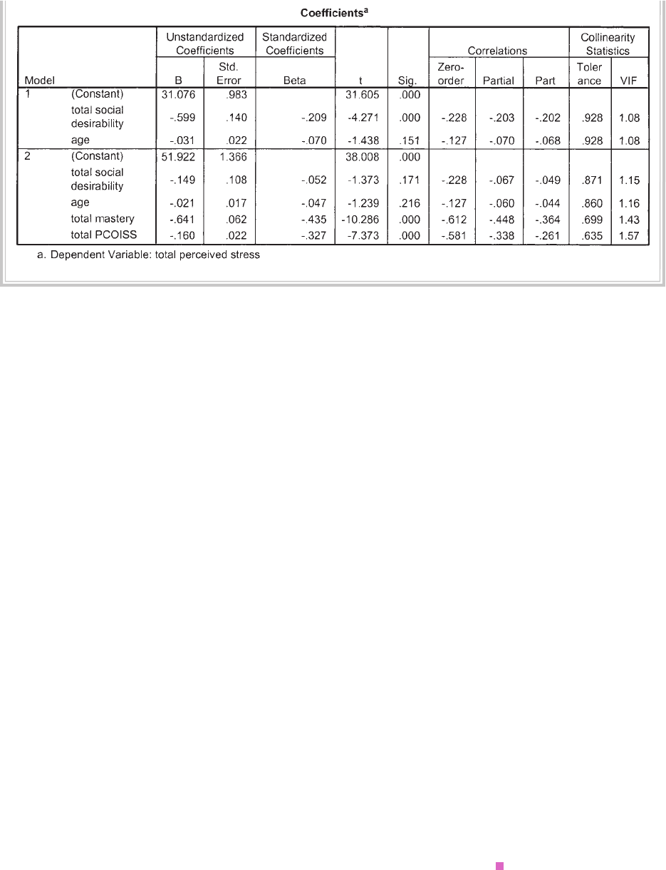
Multiple regression 165
INTERPRETATION OF OUTPUT FROM HIERARCHICAL
MULTIPLE REGRESSION
The output generated from this analysis is similar to the previous output, but with
some extra pieces of information. In the Model Summary box there are two models
listed. Model 1 refers to the fi rst block of variables that were entered (Total social
desirability and age), while Model 2 includes all the variables that were entered in
both blocks (Total social desirability, age, Total Mastery, Total PCOISS).
Step 1: Evaluating the model
Check the R Square values in the fi rst Model summary box. After the variables in
Block 1 (social desirability) have been entered, the overall model explains 5.7 per cent
of the variance (.057 × 100). After Block 2 variables (Total Mastery, Total PCOISS)
have also been included, the model as a whole explains 47.4 per cent (.474 × 100). It is
important to note that this second R square value includes all the variables from both
blocks, not just those included in the second step.
To fi nd out how much of this overall variance is explained by our variables of
interest (Mastery, POCISS) after the effects of age and socially desirable responding
are removed, you need to look in the column labelled R Square change. In the output
presented above you will see, on the line marked Model 2, that the R square change
value is .42. This means that Mastery and PCOISS explain an additional 42 per cent
(.42 × 100) of the variance in perceived stress, even when the effects of age and socially
desirable responding are statistically controlled for. This is a statistically signifi cant
166 Statistical techniques to explore relationships among variables
contribution, as indicated by the Sig. F change value for this line (.000). The ANOVA
table indicates that the model as a whole (which includes both blocks of variables) is
signifi cant (F (4, 421) = 94.78, p < .0005).
Step 2: Evaluating each of the independent variables
To fi nd out how well each of the variables contributes to the fi nal equation, we need to
look in the Coeffi cients table in the Model 2 row. This summarises the results, with all
the variables entered into the equation. Scanning the Sig. column, there are only two
variables that make a unique statistically signifi cant contribution (less than .05). In
order of importance (according to their beta values), they are: Mastery (beta = –.44)
and Total PCOISS (beta = –.33). Neither age nor social desirability made a unique
contribution. Remember, these beta values represent the unique contribution of each
variable, when the overlapping effects of all other variables are statistically removed.
In different equations, with a different set of independent variables, or with a different
sample these values would change.
PRESENTING THE RESULTS FROM MULTIPLE
REGRESSION
There are a number of different ways of presenting the results of multiple regression,
depending on the type of analysis conducted and the nature of the research question.
As a minimum, you should indicate what type of analysis was performed (standard
or hierarchical), standardised (beta) values if the study was theoretical, or unstan-
dardised (B) coeffi cients (with their standard errors) if the study was applied. If you
performed a hierarchical multiple regression, you should also provide the R square
change values for each step and associated probability values.
An example of how you might choose to present the results of the analyses
conducted in this chapter is presented below. If your own study involves a large number
of variables, it would be more appropriate to present the results in table format (see
American Psychological Association, 2009, pp. 128–50); or Tabachnick & Fidell 2007,
p. 177). If presenting these results in a thesis, additional material (e.g. table of corre-
lations) may need to be included in your appendix—check with your supervisor).
It would be a good idea to look for examples of the presentation of different
statistical analysis in the journals relevant to your topic area. Given the tight space
limitations, different journals have different requirements and expectations.

Multiple regression 167
Hierarchical multiple regression was used to assess the ability of two control measures
(Mastery Scale, Perceived Control of Internal States Scale: PCOISS) to predict levels of
stress (Perceived Stress Scale), after controlling for the infl uence of social desirability and
age. Preliminary analyses were conducted to ensure no violation of the assumptions of
normality, linearity, multicollinearity and homoscedasticity. Age and social desirability
were entered at Step 1, explaining 6% of the variance in perceived stress. After entry of
the Mastery Scale and PCOISS Scale at Step 2 the total variance explained by the model
as a whole was 47.4%, F (4, 421) = 94.78, p < .001. The two control measures explained
an additional 42% of the variance in stress, after controlling for age and socially
desirable responding, R squared change = .42, F change (2, 421) = 166.87, p < .001.
In the fi nal model, only the two control measures were statistically signifi cant, with
the Mastery Scale recording a higher beta value (beta = –.44, p < .001) than the PCOISS
Scale (beta = –.33, p < .001).
ADDITIONAL EXERCISES
Health
Data fi le: sleep4ED.sav. See Appendix for details of the data fi le.
1. Conduct a standard multiple regression to explore factors that impact on people’s
level of daytime sleepiness. For your dependent variable, use the Sleepiness and
Associated Sensations Scale total score (totSAS). For independent variables, use
sex, age, physical fi tness rating (fi trate) and scores on the HADS Depression Scale
(depress). Assess how much of the variance in total sleepiness scores is explained
by the set of variables (check your R square value). Which of the variables make a
unique signifi cant contribution (check your beta values)?
2. Repeat the above analysis, but this time use a hierarchical multiple regression
procedure entering sex and age in the fi rst block of variables and physical fi tness
and depression scores in the second block. After controlling for the demographic
variables of sex and age, do the other two predictor variables make a signifi cant
contribution to explaining variance in sleepiness scores? How much additional
variance in sleepiness is explained by physical fi tness and depression, after control-
ling for sex and age?
168
14
Logistic regression
In Chapter 13, on multiple regression, we explored a technique to assess the impact of
a set of predictors on a dependent variable (perceived stress). In that case, the depen-
dent variable was measured as a continuous variable (with scores ranging from 10
to 50). There are many research situations, however, when the dependent variable
of interest is categorical (e.g. win/lose; fail/pass; dead/alive). Unfortunately, multiple
regression is not suitable when you have categorical dependent variables. For multiple
regression your dependent variable (the thing that you are trying to explain or predict)
needs to be a continuous variable, with scores reasonably normally distributed.
Logistic regression allows you to test models to predict categorical outcomes with
two or more categories. Your predictor (independent) variables can be either categorical
or continuous, or a mix of both in the one model. There is a family of logistic regression
techniques available in SPSS that will allow you to explore the predictive ability of sets
or blocks of variables, and to specify the entry of variables. The purpose of this example
is to demonstrate just the basics of logistic regression. I will therefore be using a Forced
Entry Method, which is the default procedure available in SPSS. In this approach, all
predictor variables are tested in one block to assess their predictive ability while control-
ling for the effects of other predictors in the model. Other techniques—for example, the
stepwise procedures (e.g. forward and backward)—allow you to specify a large group of
potential predictors from which SPSS can pick a subset that provides the best predictive
power. These stepwise procedures have been criticised (in both logistic and multiple
regression) because they can be heavily infl uenced by random variation in the data, with
variables being included or removed from the model on purely statistical grounds (see
discussion in Tabachnick & Fidell 2007, p. 456).
In this chapter, I will demonstrate how to perform logistic regression with a dichot-
omous dependent variable (i.e. with only two categories or values). Here we will use
the procedure labelled Binary Logistic. If your dependent variable has more than two
categories, you will need to use the Multinomial Logistic set of procedures (not covered
Logistic regression 169
here, but available in SPSS—see the Help menu). Logistic regression is a complex tech-
nique, and I would strongly recommend further reading if you intend to use it (see
Hosmer & Lemeshow 2000; Peat 2001; Tabachnick & Fidell 2007; Wright 1995).
ASSUMPTIONS
Sample size
As with most statistical techniques, you need to consider the size and nature of your
sample if you intend to use logistic regression. One of the issues concerns the number of
cases you have in your sample and the number of predictors (independent variables) you
wish to include in your model. If you have a small sample with a large number of predic-
tors, you may have problems with the analysis (including the problem of the solution
failing to converge). This is particularly a problem when you have categorical predictors
with limited cases in each category. Always run Descriptive Statistics on each of your
predictors, and consider collapsing or deleting categories if they have limited numbers.
Multicollinearity
As discussed in Chapter 13, you should always check for high intercorrelations
among your predictor (independent) variables. Ideally, your predictor variables will
be strongly related to your dependent variable but not strongly related to each other.
Unfortunately, there is no formal way in the logistic regression procedure of SPSS
to test for multicollinearity, but you can use the procedure described in Chapter 13
to request collinearity diagnostics under the Statistics button. Ignore the rest of the
output, but focus on the Coeffi cients table and the columns labelled Collinearity
Statistics. Tolerance values that are very low (less than .1) indicate that the variable
has high correlations with other variables in the model. You may need to reconsider
the set of variables that you wish to include in the model, and remove one of the
highly intercorrelating variables.
Outliers
It is important to check for the presence of outliers, or cases that are not well explained
by your model. In logistic regression terms, a case may be strongly predicted by your
model to be one category but in reality be classifi ed in the other category. These
outlying cases can be identifi ed by inspecting the residuals, a particularly important
step if you have problems with the goodness of fi t of your model.
DETAILS OF EXAMPLE
To demonstrate the use of logistic regression, I will be using a real data fi le (sleep4ED.
sav) available from the website for this book (see web address on p. viii). These data
170 Statistical techniques to explore relationships among variables
were obtained from a survey I conducted on a sample of university staff to identify
the prevalence of sleep-related problems and their impact (see Appendix). In the
survey, respondents were asked whether they considered that they had a sleep-related
problem (yes/no). This variable will be used as the dependent variable in this analysis.
The set of predictors (independent variables) includes sex, age, the number of hours
of sleep the person gets per weeknight, whether they have trouble falling asleep, and
whether they have diffi culty staying asleep.
Each of the variables was subjected to recoding of their original scores to ensure
their suitability for this analysis. The categorical variables were recoded from their
original coding so that 0=no and 1=yes.
DATA PREPARATION: CODING OF RESPONSES
In order to make sense of the results of logistic regression, it is important that you set
up the coding of responses to each of your variables carefully. For the dichotomous
dependent variable, you should code the responses as 0 and 1 (or recode existing values
using the Recode procedure in SPSS—see Chapter 8). The value of 0 should be assigned
to whichever response indicates a lack or absence of the characteristic of interest. In
this example, 0 is used to code the answer No to the question ‘Do you have a problem
with your sleep?’ The value of 1 is used to indicate a Yes answer. A similar approach is
used when coding the independent variables. Here we have coded the answer Yes as 1,
for both of the categorical variables relating to diffi culty getting to sleep and diffi culty
staying asleep. For continuous independent variables (number of hours sleep per night),
high values should indicate more of the characteristic of interest.
File name: sleep4ED.sav
Variables:
• Problem with sleep recoded (probsleeprec): score recoded to 0=no, 1=yes.
• Sex: 0=female, 1=male.
• Age: age in years.
• Hours sleep/weeknight (hourweeknight): in hours.
• Problem getting to sleep recoded (getsleeprec): score recoded to: 0=no, 1=yes.
• Problem staying asleep recoded (staysleeprec): score recoded to: 0=no, 1=yes.
Example of research question: What factors predict the likelihood that respondents
would report that they had a problem with their sleep?
What you need:
• one categorical (dichotomous) dependent variable (problem with sleep: No/Yes,
coded 0/1)

Logistic regression 171
• two or more continuous or categorical predictor (independent) variables. Code
dichotomous variables using 0 and 1 (e.g. sex, trouble getting to sleep, trouble
staying asleep). Measure continuous variables so that high values indicate more
of the characteristic of interest (e.g. age, hours of sleep per night).
What it does: Logistic regression allows you to assess how well your set of predic-
tor variables predicts or explains your categorical dependent variable. It gives you
an indication of the adequacy of your model (set of predictor variables) by assessing
‘goodness of fi t’. It provides an indication of the relative importance of each predictor
variable or the interaction among your predictor variables. It provides a summary of
the accuracy of the classifi cation of cases based on the mode, allowing the calculation
of the sensitivity and specifi city of the model and the positive and negative predictive
values.
Assumptions: Logistic regression does not make assumptions concerning the distri-
bution of scores for the predictor variables; however, it is sensitive to high correlations
among the predictor variables (multicollinearity). Outliers can also infl uence the
results of logistic regression.
Before you start the following procedure, choose Edit from the menu, select
Options, and make sure there is a tick in the box No scientifi c notation for small
numbers in tables.
Procedure for logistic regression
1. From the menu at the top of the screen, click on Analyze, then click on
Regression and then Binary Logistic.
2. Choose your categorical dependent variable (e.g. problem sleep recoded
01: probsleeprec) and move it into the Dependent box.
• Click on your predictor variables (sex, age, problem getting sleep
recoded 01: getsleeprec, problem stay asleep recoded 01: staysleeprec,
hours sleep per weeknight: hourweeknight) and move them into the
box labelled Covariates.
• For Method, make sure that Enter is displayed.
3. If you have any categorical predictors (nominal or ordinal measurement),
you will need to click on the Categorical button. Highlight each of the
categorical variables (sex, getsleeprec, staysleeprec) and move them into
the Categorical covariates box.
• Highlight each of your categorical variables in turn and click on the
button labelled First in the Change contrast section. Click on the
Change button and you will see the word (fi rst) appear after the
variable name. This will set the group to be used as the reference as the
fi rst group listed. Repeat for all categorical variables. Click on Continue.
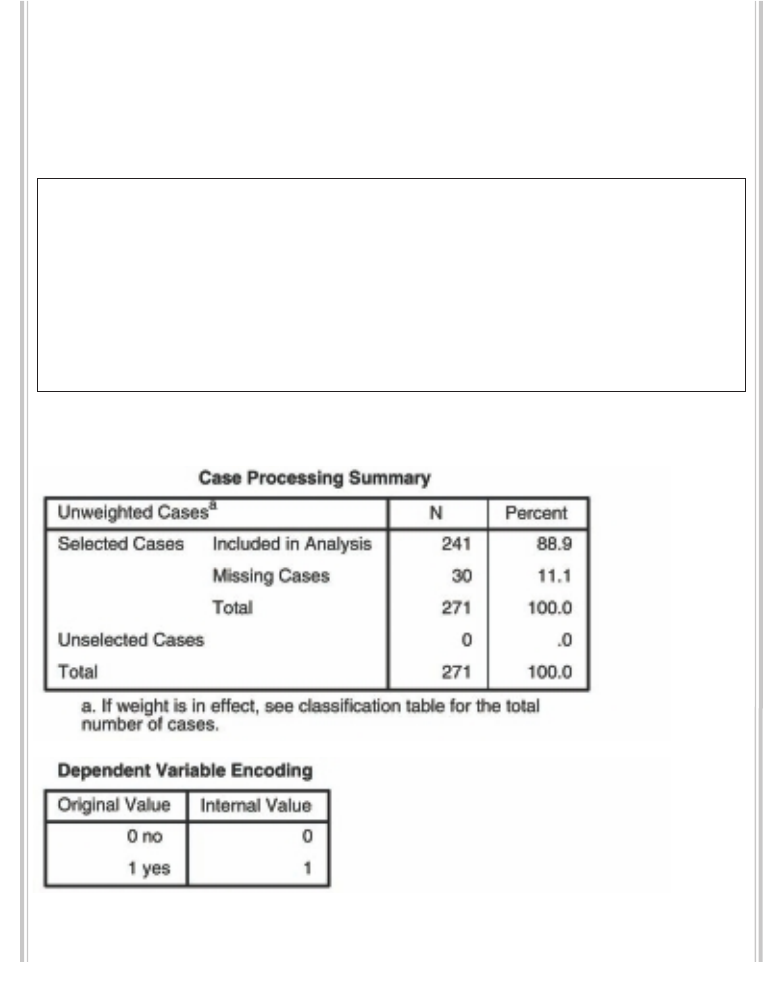
172 Statistical techniques to explore relationships among variables
4. Click on the Options button. Select Classifi cation plots, Hosmer-
Lemeshow goodness of fi t, Casewise listing of residuals, and CI for
Exp(B).
5. Click on Continue and then OK (or on Paste to save to Syntax Editor).
The syntax from this procedure is:
LOGISTIC REGRESSION VARIABLES probsleeprec
/METHOD = ENTER sex age getsleeprec staysleeprec hourweeknight
/CONTRAST (sex)=Indicator(1) /CONTRAST (getsleeprec)=Indicator(1)
/CONTRAST (staysleeprec)=Indicator(1)
/CLASSPLOT /CASEWISE OUTLIER(2)
/PRINT = GOODFIT CI(95)
/CRITERIA = PIN(.05) POUT(.10) ITERATE(20) CUT(.5) .
Some of the output generated from this procedure is shown below.
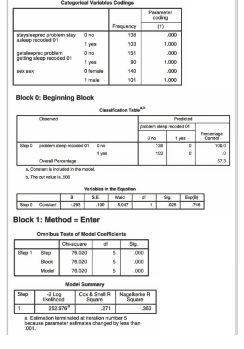
Logistic regression 173
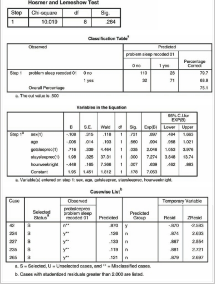
174 Statistical techniques to explore relationships among variables
Logistic regression 175
INTERPRETATION OF OUTPUT FROM LOGISTIC
REGRESSION
As with most SPSS output, there is an almost overwhelming amount of information
provided from logistic regression. I will highlight only the key aspects.
The fi rst thing to check is the details concerning sample size provided in the Case
Processing Summary table. Make sure you have the number of cases that you expect.
The next table, Dependent Variable Encoding, tells you how SPSS has dealt with the
coding of your dependent variable (in this case, whether people consider they have a
problem with their sleep). SPSS needs the variables to be coded using 0 and 1, but it will
do it for you if your own coding does not match this (e.g. if your values are 1 and 2).
We wanted to make sure that our ‘problem with sleep’ variable was coded so that 0=no
problem and 1=problem, so we created a new variable (using the Recode procedure—
see Chapter 8), recoding the original response of 1=yes, 2=no to the format preferred by
SPSS of 1=yes, 0=no. This coding of the existence of the problem being represented
by 1 and the lack of problem as 0 makes the interpretation of the output a little easier.
Check the coding of your independent (predictor) variables in the next table,
labelled Categorical Variables Codings. Also check the number of cases you have in
each category in the column headed Frequency. You don’t really want groups with
very small numbers.
The next section of the output, headed Block 0, is the results of the analysis without
any of our independent variables used in the model. This will serve as a baseline later
for comparing the model with our predictor variables included. In the Classifi cation
table, the overall percentage of correctly classifi ed cases is 57.3 per cent. In this case,
SPSS classifi ed (guessed) that all cases would not have a problem with their sleep
(only because there was a higher percentage of people answering No to the question).
We hope that later, when our set of predictor variables is entered, we will be able to
improve the accuracy of these predictions.
Skip down to the next section, headed Block 1. This is where our model (set of
predictor variables) is tested. The Omnibus Tests of Model Coeffi cients gives us an
overall indication of how well the model performs, over and above the results obtained
for Block 0, with none of the predictors entered into the model. This is referred to as
a ‘goodness of fi t’ test. For this set of results, we want a highly signifi cant value (the
Sig. value should be less than .05). In this case, the value is .000 (which really means
p<.0005). Therefore, the model (with our set of variables used as predictors) is better
than SPSS’s original guess shown in Block 0, which assumed that everyone would
report no problem with their sleep. The chi-square value, which we will need to report
in our results, is 76.02 with 5 degrees of freedom.
The results shown in the table headed Hosmer and Lemeshow Test also support
our model as being worthwhile. This test, which SPSS states is the most reliable test
176 Statistical techniques to explore relationships among variables
of model fi t available in SPSS, is interpreted very differently from the omnibus test
discussed above. For the Hosmer-Lemeshow Goodness of Fit Test poor fi t is indicated
by a signifi cance value less than .05, so to support our model we actually want a value
greater than .05. In our example, the chi-square value for the Hosmer-Lemeshow Test
is 10.019 with a signifi cance level of .264. This value is larger than .05, therefore indi-
cating support for the model.
The table headed Model Summary gives us another piece of information about
the usefulness of the model. The Cox & Snell R Square and the Nagelkerke R Square
values provide an indication of the amount of variation in the dependent variable
explained by the model (from a minimum value of 0 to a maximum of approximately
1). These are described as pseudo R square statistics, rather than the true R square
values that you will see provided in the multiple regression output. In this example,
the two values are .271 and .363, suggesting that between 27.1 per cent and 36.3 per
cent of the variability is explained by this set of variables.
The next table in the output to consider is the Classifi cation Table. This provides
us with an indication of how well the model is able to predict the correct category
(sleep problem/no sleep problem) for each case. We can compare this with the Clas-
sifi cation Table shown for Block 0, to see how much improvement there is when the
predictor variables are included in the model. The model correctly classifi ed 75.1 per
cent of cases overall (sometimes referred to as the percentage accuracy in classifi -
cation: PAC), an improvement over the 57.3 per cent in Block 0. The results displayed
in this table can also be used to calculate the additional statistics that you often see
reported in the medical literature.
The sensitivity of the model is the percentage of the group that has the characteristic
of interest (e.g. sleep problem) that has been accurately identifi ed by the model (the
true positives). In this example, we were able to correctly classify 68.9 per cent of
the people who did have a sleep problem. The specifi city of the model is the percentage of
the group without the characteristic of interest (no sleep problem) that is correctly iden-
tifi ed (true negatives). In this example, the specifi city is 79.7 per cent (people without a
sleep problem correctly predicted not to have a sleep problem by the model).
The positive predictive value is the percentage of cases that the model classifi es as
having the characteristic that is actually observed in this group. To calculate this for
the current example, you need to divide the number of cases in the predicted=yes,
observed=yes cell (71) by the total number in the predicted=yes cells (28 + 71 = 99)
and multiply by 100 to give a percentage. This gives us 71 divided by 99 × 100 =
71.7 per cent. Therefore the positive predictive value is 71.7 per cent, indicating that
of the people predicted to have a sleep problem our model accurately picked 71.7 per
cent of them. The negative predictive value is the percentage of cases predicted by the
model not to have the characteristic that is actually observed not to have the charac-
teristic. In the current example, the necessary values from the classifi cation table are:
Logistic regression 177
110 divided by (110 + 32) × 100 = 77.5 per cent. For further information on the use of
classifi cation tables see Wright (1995, p. 229) or, for a simple worked example, see Peat
(2001, p. 237).
The Variables in the Equation table gives us information about the contribution
or importance of each of our predictor variables. The test that is used here is known
as the Wald test, and you will see the value of the statistic for each predictor in the
column labelled Wald. Scan down the column labelled Sig. looking for values less
than .05. These are the variables that contribute signifi cantly to the predictive ability
of the model. In this case, we have three signifi cant variables (staysleeprec p = .000,
getsleeprec p = .035, hourweeknight p = .007). In this example, the major factors
infl uencing whether a person reports having a sleep problem are: diffi culty getting to
sleep, trouble staying asleep and the number of hours sleep per weeknight. Gender
and age did not contribute signifi cantly to the model.
The B values provided in the second column are equivalent to the B values
obtained in a multiple regression analysis. These are the values that you would use in
an equation to calculate the probability of a case falling into a specifi c category. You
should check whether your B values are positive or negative. This will tell you about
the direction of the relationship (which factors increase the likelihood of a yes answer
and which factors decrease it). If you have coded all your dependent and independent
categorical variables correctly (with 0=no, or lack of the characteristic; 1=yes, or the
presence of the characteristic), negative B values indicate that an increase in the inde-
pendent variable score will result in a decreased probability of the case recording a
score of 1 in the dependent variable (indicating the presence of sleep problems in this
case). In this example, the variable measuring the number of hours slept each week-
night showed a negative B value (–.448). This indicates that the more hours a person
sleeps per night, the less likely it is that they will report having a sleep problem. For
the two other signifi cant categorical variables (trouble getting to sleep, trouble staying
asleep), the B values are positive. This suggests that people saying they have diffi culty
getting to sleep or staying asleep are more likely to answer yes to the question whether
they consider they have a sleep problem.
The other useful piece of information in the Variables in the Equation table is
provided in the Exp(B) column. These values are the odds ratios (OR) for each of
your independent variables. According to Tabachnick and Fidell (2007), the odds
ratio represents ‘the change in odds of being in one of the categories of outcome when
the value of a predictor increases by one unit’ (p. 461). In our example, the odds of a
person answering Yes, they have a sleep problem is 7.27 times higher for someone who
reports having problems staying asleep than for a person who does not have diffi culty
staying asleep, all other factors being equal.
The hours of sleep a person gets is also a signifi cant predictor, according to the Sig.
value (p=.007). The odds ratio for this variable, however, is .639, a value less than 1.
178 Statistical techniques to explore relationships among variables
This indicates that the more sleep a person gets per night, the less likely he/she is to
report a sleep problem. For every extra hour of sleep a person gets, the odds of him/
her reporting a sleep problem decrease by a factor of .639, all other factors being
equal.
Note here that we have a continuous variable as our predictor; therefore we report
the increase (or decrease if less than 1) of the odds for each unit increase (in this case,
a year) in the predictor variable. For categorical predictor variables, we are comparing
the odds for the two categories. For categorical variables with more than two cat-
egories, each category is compared with the reference group (usually the group coded
with the lowest value if you have specifi ed First in the Contrast section of the Defi ne
Categorical Variables dialogue box).
For odds ratios less than 1, we can choose to invert these (1 divided by the value)
when we report these to aid interpretation. For example, in this case 1 divided by .639
equals 1.56. This suggests that for each hour less sleep per night a person gets the
odds of reporting a sleep problem increases by a factor of 1.56. If you do decide to
invert, you will also need to invert the confi dence intervals that you report (see next
paragraph).
For each of the odds ratios Exp(B) shown in the Variables in the Equation table,
there is a 95 per cent confi dence interval (95.0% CI for EXP(B)) displayed, giving
a lower value and an upper value. These will need to be reported in your results. In
simple terms, this is the range of values that we can be 95 per cent confi dent encom-
passes the true value of the odds ratio. Remember, the value specifi ed as the odds
ratio is only a point estimate or guess at the true value, based on the sample data. The
confi dence that we have in this being an accurate representation of the true value
(from the entire population) is dependent on the size of our sample. Small samples
will result in very wide confi dence intervals around the estimated odds ratio. Much
smaller intervals will occur if we have large samples. In this example, the confi dence
interval for our variable trouble staying asleep (staysleeprec OR = 7.27) ranges from
3.85 to 13.75. So, although we quote the calculated OR as 7.27, we can be 95 per cent
confi dent that the actual value of OR in the population lies somewhere between 3.85
and 13.75, quite a wide range of values. The confi dence interval in this case does not
contain the value of 1; therefore this result is statistically signifi cant at p < .05. If the
confi dence interval had contained the value of 1, the odds ratio would not be statisti-
cally signifi cant—we could not rule out the possibility that the true odds ratio was 1,
indicating equal probability of the two responses (yes/no).
The last table in the output, Casewise List, gives you information about cases in
your sample for whom the model does not fi t well. Cases with ZResid values above 2
are shown in the table (in this example, showing case numbers 42, 224, 227, 235, 265).
Cases with values above 2.5 (or less than –2.5) should be examined more closely, as
these are clear outliers (given that 99 per cent of cases will have values between –2.5

Logistic regression 179
and +2.5). You can see from the other information in the casewise list that one of the
cases (42) was predicted to be in the Yes (sleep problem) category, but in reality (in
the Observed column) was found to answer the question with a No. The remainder
of the outliers were all predicted to answer No, but instead answered Yes. For all these
cases (and certainly for ZResid values over 2.5), it would be a good idea to check the
information entered and to fi nd out more about them. You may fi nd that there are
certain groups of cases for which the model does not work well (e.g. those people on
shiftwork). You may need to consider removing cases with very large ZResid values
from the data fi le and repeating the analysis.
PRESENTING THE RESULTS FROM LOGISTIC
REGRESSION
The results of this procedure could be presented as follows:
Direct logistic regression was performed to assess the impact of a number of factors
on the likelihood that respondents would report that they had a problem with their
sleep. The model contained fi ve independent variables (sex, age, problems getting
to sleep, problems staying asleep and hours of sleep per weeknight). The full
model containing all predictors was statistically signifi cant, χ2 (5, N = 241) = 76.02,
p < .001, indicating that the model was able to distinguish between respondents
who reported and did not report a sleep problem. The model as a whole explained
between 27.1% (Cox and Snell R square) and 36.3% (Nagelkerke R squared) of the
variance in sleep status, and correctly classifi ed 75.1% of cases. As shown in Table
1, only three of the independent variables made a unique statistically signifi cant
contribution to the model (hours sleep per night, problems getting to sleep, and
problems staying asleep). The strongest predictor of reporting a sleep problem
was diffi culty staying asleep, recording an odds ratio of 7.27. This indicated that
respondents who had diffi culty staying asleep were over 7 times more likely to
report a sleep problem than those who did not have diffi culty staying asleep,
controlling for all other factors in the model. The odds ratio of .64 for hours sleep
per night was less than 1, indicating that for every additional hour of sleep per
night respondents were .64 times less likely to report having a sleep problem,
controlling for other factors in the model.

180 Statistical techniques to explore relationships among variables
Table 1
Logistic Regression Predicting Likelihood of Reporting a Sleep Problem
B S.E. Wald df p
Odds
Ratio
95.0% C.I. for
Odds Ratio
Lower Upper
Sex –.11 .31 .12 1 .73 .90 .48 1.66
Age –.01 .01 .19 1 .66 .99 .97 1.02
Getting to
sleep
.72 .34 4.46 1 .03 2.05 1.05 3.98
Staying
asleep
1.98 .32 37.31 1 .00 7.27 3.85 13.75
Hours
sleep per
night
–.45 .17 7.37 1 .01 .64 .46 .88
Constant 1.95 1.45 1.81 .18 7.05
181
15
Factor analysis
Factor analysis is different from many of the other techniques presented in this book.
It is not designed to test hypotheses or to tell you whether one group is signifi cantly
different from another. It is included in SPSS as a ‘data reduction’ technique. It takes
a large set of variables and looks for a way the data may be ‘reduced’ or summarised
using a smaller set of factors or components. It does this by looking for ‘clumps’ or
groups among the intercorrelations of a set of variables. This is an almost impossible
task to do ‘by eye’ with anything more than a small number of variables.
This family of factor analytic techniques has a number of different uses. It is used
extensively by researchers involved in the development and evaluation of tests and
scales. The scale developer starts with a large number of individual scale items and
questions and, by using factor analytic techniques, they can refi ne and reduce these
items to form a smaller number of coherent subscales. Factor analysis can also be used
to reduce a large number of related variables to a more manageable number, prior to
using them in other analyses such as multiple regression or multivariate analysis of
variance.
There are two main approaches to factor analysis that you will see described in the
literature—exploratory and confi rmatory. Exploratory factor analysis is often used in
the early stages of research to gather information about (explore) the interrelation-
ships among a set of variables. Confi rmatory factor analysis, on the other hand, is a
more complex and sophisticated set of techniques used later in the research process
to test (confi rm) specifi c hypotheses or theories concerning the structure underlying
a set of variables.
The term ‘factor analysis’ encompasses a variety of different, although related,
techniques. One of the main distinctions is between what is termed principal com-
ponents analysis (PCA) and factor analysis (FA). These two sets of techniques are
similar in many ways and are often used interchangeably by researchers. Both attempt
to produce a smaller number of linear combinations of the original variables in a way
182 Statistical techniques to explore relationships among variables
that captures (or accounts for) most of the variability in the pattern of correlations.
They do differ in a number of ways, however. In principal components analysis the
original variables are transformed into a smaller set of linear combinations, with all
of the variance in the variables being used. In factor analysis, however, factors are esti-
mated using a mathematical model, whereby only the shared variance is analysed (see
Tabachnick & Fidell 2007, Chapter 13, for more information on this).
Although both approaches (PCA and FA) often produce similar results, books
on the topic often differ in terms of which approach they recommend. Stevens (1996,
pp. 362–3) admits a preference for principal components analysis and gives a number of
reasons for this. He suggests that it is psychometrically sound and simpler mathemati-
cally, and it avoids some of the potential problems with ‘factor indeterminacy’ associated
with factor analysis (Stevens 1996, p. 363). Tabachnick and Fidell (2007), in their review
of PCA and FA, conclude: ‘If you are interested in a theoretical solution uncontaminated
by unique and error variability … FA is your choice. If, on the other hand, you simply
want an empirical summary of the data set, PCA is the better choice’ (p. 635).
I have chosen to demonstrate principal components analysis in this chapter. If you
would like to explore the other approaches further, see Tabachnick and Fidell (2007).
Note: although PCA technically yields components, many authors use the term
‘factor’ to refer to the output of both PCA and FA. So don’t assume, if you see the
term ‘factor’ when you are reading journal articles, that the author has used FA. Factor
analysis is used as a general term to refer to the entire family of techniques.
Another potential area of confusion involves the use of the word ‘factor’, which
has different meanings and uses in different types of statistical analyses. In factor
analysis, it refers to the group or clump of related variables; in analysis of variance
techniques, it refers to the independent variable. These are very different things,
despite having the same name, so keep the distinction clear in your mind when you
are performing the different analyses.
STEPS INVOLVED IN FACTOR ANALYSIS
There are three main steps in conducting factor analysis (I am using the term
in a general sense to indicate any of this family of techniques, including principal
components analysis).
Step 1: Assessment of the suitability of the data for factor
analysis
There are two main issues to consider in determining whether a particular data set is
suitable for factor analysis: sample size, and the strength of the relationship among
the variables (or items). While there is little agreement among authors concerning
how large a sample should be, the recommendation generally is: the larger, the better.
Factor analysis 183
In small samples, the correlation coeffi cients among the variables are less reliable,
tending to vary from sample to sample. Factors obtained from small data sets do not
generalise as well as those derived from larger samples. Tabachnick and Fidell (2007)
review this issue and suggest that ‘it is comforting to have at least 300 cases for factor
analysis’ (p. 613). However, they do concede that a smaller sample size (e.g. 150 cases)
should be suffi cient if solutions have several high loading marker variables (above
.80). Stevens (1996, p. 372) suggests that the sample size requirements advocated by
researchers have been reducing over the years as more research has been done on the
topic. He makes a number of recommendations concerning the reliability of factor
structures and the sample size requirements (see Stevens 1996, Chapter 11).
Some authors suggest that it is not the overall sample size that is of concern—
rather, the ratio of participants to items. Nunnally (1978) recommends a 10 to 1 ratio;
that is, ten cases for each item to be factor analysed. Others suggest that fi ve cases for
each item are adequate in most cases (see discussion in Tabachnick & Fidell 2007).
I would recommend that you do more reading on the topic, particularly if you have a
small sample (smaller than 150) or lots of variables.
The second issue to be addressed concerns the strength of the intercorrelations
among the items. Tabachnick and Fidell recommend an inspection of the correlation
matrix for evidence of coeffi cients greater than .3. If few correlations above this level
are found, factor analysis may not be appropriate. Two statistical measures are also
generated by SPSS to help assess the factorability of the data: Bartlett’s test of spheric-
ity (Bartlett 1954), and the Kaiser-Meyer-Olkin (KMO) measure of sampling adequacy
(Kaiser 1970, 1974). Bartlett’s test of sphericity should be signifi cant (p < .05) for the
factor analysis to be considered appropriate. The KMO index ranges from 0 to 1, with .6
suggested as the minimum value for a good factor analysis (Tabachnick & Fidell 2007).
Step 2: Factor extraction
Factor extraction involves determining the smallest number of factors that can be
used to best represent the interrelationships among the set of variables. There are a
variety of approaches that can be used to identify (extract) the number of underlying
factors or dimensions. Some of the most commonly available extraction techniques
(this always conjures up the image for me of a dentist pulling teeth!) are: principal
components; principal factors; image factoring; maximum likelihood factoring; alpha
factoring; unweighted least squares; and generalised least squares.
The most commonly used approach is principal components analysis. This will
be demonstrated in the example given later in this chapter. It is up to the researcher to
determine the number of factors that he/she considers best describes the underlying
relationship among the variables. This involves balancing two confl icting needs: the
need to fi nd a simple solution with as few factors as possible; and the need to explain
as much of the variance in the original data set as possible. Tabachnick and Fidell
184 Statistical techniques to explore relationships among variables
(2007) recommend that researchers adopt an exploratory approach, experimenting
with different numbers of factors until a satisfactory solution is found.
There are a number of techniques that can be used to assist in the decision concern-
ing the number of factors to retain: Kaiser’s criterion; scree test; and parallel analysis.
Kaiser’s criterion
One of the most commonly used techniques is known as Kaiser’s criterion, or the
eigenvalue rule. Using this rule, only factors with an eigenvalue of 1.0 or more are
retained for further investigation (this will become clearer when you see the example
presented in this chapter). The eigenvalue of a factor represents the amount of the
total variance explained by that factor. Kaiser’s criterion has been criticised, however,
as resulting in the retention of too many factors in some situations.
Scree test
Another approach that can be used is Catell’s scree test (Catell 1966). This involves
plotting each of the eigenvalues of the factors (SPSS does this for you) and inspecting
the plot to fi nd a point at which the shape of the curve changes direction and becomes
horizontal. Catell recommends retaining all factors above the elbow, or break in the plot,
as these factors contribute the most to the explanation of the variance in the data set.
Parallel analysis
An additional technique gaining popularity, particularly in the social science literature
(e.g. Choi, Fuqua & Griffi n 2001; Stober 1998), is Horn’s parallel analysis (Horn 1965).
Parallel analysis involves comparing the size of the eigenvalues with those obtained from
a randomly generated data set of the same size. Only those eigenvalues that exceed the
corresponding values from the random data set are retained. This approach to iden-
tifying the correct number of components to retain has been shown to be the most
accurate, with both Kaiser’s criterion and Catell’s scree test tending to overestimate the
number of components (Hubbard & Allen 1987; Zwick & Velicer 1986). If you intend
to publish your results in a journal article in the psychology or education fi elds you will
need to use, and report, the results of parallel analysis. Many journals (e.g. Educational
and Psychological Measurement, Journal of Personality Assessment) are now making
it a requirement before they will consider a manuscript for publication. These three
techniques are demonstrated in the worked example presented later in this chapter.
Step 3: Factor rotation and interpretation
Once the number of factors has been determined, the next step is to try to interpret them.
To assist in this process, the factors are ‘rotated’. This does not change the underlying
solution—rather, it presents the pattern of loadings in a manner that is easier to inter-
pret. SPSS does not label or interpret each of the factors for you. It just shows you which
Factor analysis 185
variables ‘clump together’. From your understanding of the content of the variables (and
underlying theory and past research), it is up to you to propose possible interpretations.
There are two main approaches to rotation, resulting in either orthogonal (uncor-
related) or oblique (correlated) factor solutions. According to Tabachnick and Fidell
(2007), orthogonal rotation results in solutions that are easier to interpret and to
report; however, they do require the researcher to assume (usually incorrectly) that
the underlying constructs are independent (not correlated). Oblique approaches
allow for the factors to be correlated, but they are more diffi cult to interpret, describe
and report (Tabachnick & Fidell 2007, p. 638). In practice, the two approaches (or-
thogonal and oblique) often result in very similar solutions, particularly when the
pattern of correlations among the items is clear (Tabachnick & Fidell 2007). Many
researchers conduct both orthogonal and oblique rotations and then report the
clearest and easiest to interpret. I always recommend starting with an oblique rotation
to check the degree of correlation between your factors.
Within the two broad categories of rotational approaches there are a number of
different techniques provided by SPSS (orthogonal: Varimax, Quartimax, Equamax;
oblique: Direct Oblimin, Promax). The most commonly used orthogonal approach
is the Varimax method, which attempts to minimise the number of variables that
have high loadings on each factor. The most commonly used oblique technique is
Direct Oblimin. For a comparison of the characteristics of each of these approaches,
see Tabachnick and Fidell (2007, p. 639). In the example presented in this chapter,
Oblimin rotation will be demonstrated.
Following rotation you are hoping for what Thurstone (1947) refers to as ‘simple
structure’. This involves each of the variables loading strongly on only one component,
and each component being represented by a number of strongly loading variables.
This will help you interpret the nature of your factors by checking the variables that
load strongly on each of them.
Additional resources
In this chapter, only a very brief overview of factor analysis is provided. Although
I have attempted to simplify it here, factor analysis is actually a sophisticated and
complex family of techniques. If you are intending to use factor analysis with your
own data, I suggest that you read up on the technique in more depth. For a thorough,
but easy-to-follow, book on the topic I recommend Pett, Lackey and Sullivan (2003).
For a more complex coverage, see Tabachnick and Fidell (2007).
DETAILS OF EXAMPLE
To demonstrate the use of factor analysis, I will explore the underlying structure of
one of the scales included in the survey4ED.sav data fi le provided on the website

186 Statistical techniques to explore relationships among variables
accompanying this book. One of the scales used was the Positive and Negative Affect
Scale (PANAS: Watson, Clark & Tellegen 1988) (see Figure 15.1). This scale consists
of twenty adjectives describing different mood states, ten positive (e.g. proud, active,
determined) and ten negative (e.g. nervous, irritable, upset). The authors of the
scale suggest that the PANAS consists of two underlying dimensions (or factors):
positive affect and negative affect. To explore this structure with the current commu-
nity sample the items of the scale will be subjected to principal components analysis
(PCA), a form of factor analysis that is commonly used by researchers interested in
scale development and evaluation.
If you wish to follow along with the steps described in this chapter, you should
start SPSS and open the fi le labelled survey4ED.sav on the website that accompanies
this book. The variables that are used in this analysis are labelled pn1 to pn20. The
scale used in the survey is presented in Figure 15.1. You will need to refer to these
individual items when attempting to interpret the factors obtained. For full details
and references for the scale, see the Appendix.
Example of research question: What is the underlying factor structure of the Positive
and Negative Affect Scale? Past research suggests a two-factor structure (positive
affect/negative affect). Is the structure of the scale in this study, using a community
sample, consistent with this previous research?
What you need: A set of correlated continuous variables.
What it does: Factor analysis attempts to identify a small set of factors that represents
the underlying relationships among a group of related variables.
Figure 15.1
Positive and
Negative Affect
Scale (PANAS)
This scale consists of a number of words that describe different feelings and emotions. For
each item indicate to what extent you have felt this way during the past few weeks. Write
a number from 1 to 5 on the line next to each item.
very slightly or not
at all
a little moderately quite a
bit
extremely
1234 5
1. interested________
2. upset________
3. scared________
4. proud________
5. ashamed________
6. determined_______
7. active________
8. distressed________
9. strong________
10. hostile________
11. irritable________
12. inspired________
13. attentive________
14. afraid________
15. excited________
16. guilty________
17. enthusiastic_______
18. alert________
19. nervous________
20. jittery________

Factor analysis 187
Assumptions:
1. Sample size. Ideally, the overall sample size should be 150+ and there should be a
ratio of at least fi ve cases for each of the variables (see discussion in Step 1 earlier
in this chapter).
2. Factorability of the correlation matrix. To be considered suitable for factor analysis,
the correlation matrix should show at least some correlations of r = .3 or greater.
Bartlett’s test of sphericity should be statistically signifi cant at p < .05 and the
Kaiser-Meyer-Olkin value should be .6 or above. These values are presented as
part of the output from factor analysis.
3. Linearity. Because factor analysis is based on correlation, it is assumed that
the relationship between the variables is linear. It is certainly not practical to
check scatterplots of all variables with all other variables. Tabachnick and Fidell
(2007) suggest a ‘spot check’ of some combination of variables. Unless there is
clear evidence of a curvilinear relationship, you are probably safe to proceed
provided you have an adequate sample size and ratio of cases to variables (see
Assumption 1).
4. Outliers among cases. Factor analysis can be sensitive to outliers, so as part of your
initial data screening process (see Chapter 6) you should check for these and either
remove or recode to a less extreme value.
PROCEDURE FOR FACTOR ANALYSIS
Before you start the following procedure, choose Edit from the menu, select Options,
and make sure there is a tick in the box No scientifi c notation for small numbers in
tables.
Procedure (Part 1)
1. From the menu at the top of the screen, click on Analyze, then select
Dimension Reduction, and then Factor.
2. Select all the required variables (or items on the scale). In this case, I
would select the items that make up the PANAS Scale (pn1 to pn20).
Move them into the Variables box.
3. Click on the Descriptives button.
In the Statistics section, make sure that Initial Solution is ticked.
In the section marked Correlation Matrix, select the options Coeffi cients
and KMO and Bartlett’s test of sphericity. Click on Continue.
4. Click on the Extraction button.
In the Method section, make sure Principal components is shown, or
choose one of the other factor extraction techniques (e.g. Maximum
likelihood).

188 Statistical techniques to explore relationships among variables
In the Analyze section, make sure the Correlation matrix option is
selected.
In the Display section, select Screeplot and make sure the Unrotated
factor solution option is also selected.
In the Extract section, select Based on Eigenvalue or, if you want to force
a specifi c number of factors, click on Fixed number of factors and type in
the number. Click on Continue.
5. Click on the Rotation button. Choose Direct Oblimin and press Continue.
6. Click on the Options button.
In the Missing Values section, click on Exclude cases pairwise.
In the Coeffi cient Display Format section, click on Sorted by size and
Suppress small coeffi cients. Type the value of .3 in the box next to
Absolute value below:. This means that only loadings above .3 will be
displayed, making the output easier to interpret.
7. Click on Continue and then OK (or on Paste to save to Syntax Editor).
The syntax from this procedure is:
FACTOR
/VARIABLES pn1 pn2 pn3 pn4 pn5 pn6 pn7 pn8 pn9 pn10 pn11 pn12 pn13
pn14 pn15 pn16 pn17 pn18 pn19 pn20
/MISSING PAIRWISE
/ANALYSIS pn1 pn2 pn3 pn4 pn5 pn6 pn7 pn8 pn9 pn10 pn11 pn12 pn13
pn14 pn15 pn16 pn17 pn18 pn19 pn20
/PRINT INITIAL CORRELATION KMO EXTRACTION ROTATION
/FORMAT SORT BLANK(.3)
/PLOT EIGEN
/CRITERIA MINEIGEN(1) ITERATE(25)
/EXTRACTION PC
/CRITERIA ITERATE(25) DELTA(0)
/ROTATION OBLIMIN
/METHOD=CORRELATION .
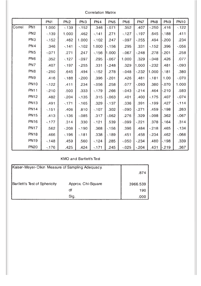
Factor analysis 189
Selected output generated from this procedure is shown below:
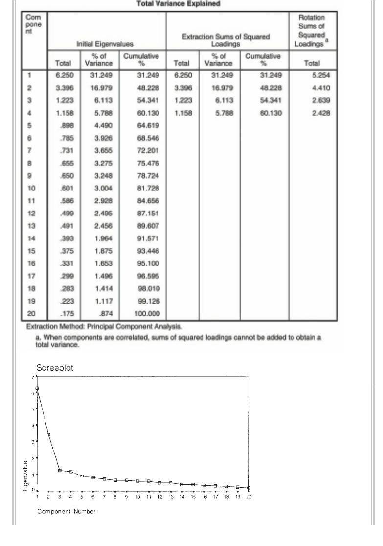
190 Statistical techniques to explore relationships among variables
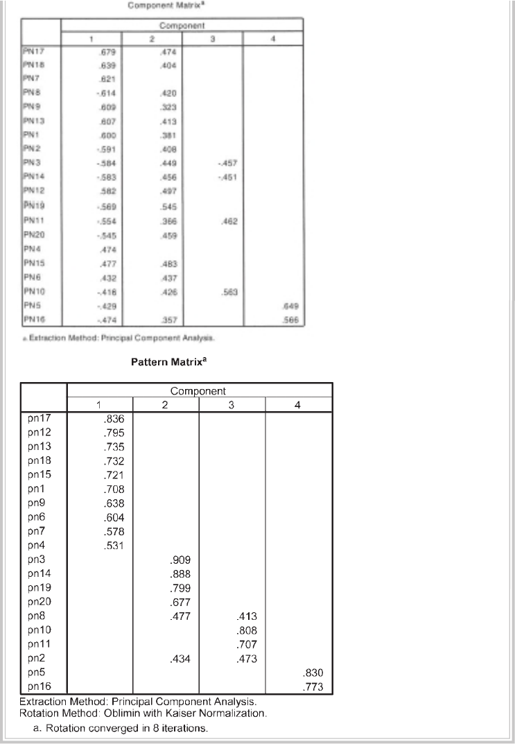
Factor analysis 191
192 Statistical techniques to explore relationships among variables
INTERPRETATION OF OUTPUT
As with most SPSS procedures, there is a lot of output generated. In this section,
I will take you through the key pieces of information that you need.
Interpretation of output—Part 1
Step 1
To verify that your data set is suitable for factor analysis, check that the Kaiser-Meyer-
Olkin Measure of Sampling Adequacy (KMO) value is .6 or above and that the Bartlett’s
Test of Sphericity value is signifi cant (i.e. the Sig. value should be .05 or smaller). In this
example the KMO value is .874 and Bartlett’s test is signifi cant (p = .000), therefore
factor analysis is appropriate. In the Correlation Matrix table (not shown here for space
reasons), look for correlation coeffi cients of .3 and above (see Assumption 2). If you
don’t fi nd many in your matrix, you should reconsider the use of factor analysis.
Step 2
To determine how many components (factors) to ‘extract’, we need to consider a few
pieces of information provided in the output. Using Kaiser’s criterion, we are interested
only in components that have an eigenvalue of 1 or more. To determine how many
components meet this criterion, we need to look in the Total Variance Explained table.
Scan down the values provided in the fi rst set of columns, labelled Initial Eigenval-
ues. The eigenvalues for each component are listed. In this example, only the fi rst four
components recorded eigenvalues above 1 (6.25, 3.396, 1.223, 1.158). These four compo-
nents explain a total of 60.13 per cent of the variance (see Cumulative % column).
Step 3
Often, using the Kaiser criterion, you will fi nd that too many components are extracted,
so it is important to also look at the Screeplot. What you look for is a change (or
elbow) in the shape of the plot. Only components above this point are retained. In
this example, there is quite a clear break between the second and third components.
Components 1 and 2 explain or capture much more of the variance than the remain-
ing components. From this plot, I would recommend retaining (extracting) only two
components. There is also another little break after the fourth component. Depend-
ing on the research context, this might also be worth exploring. Remember, factor
analysis is used as a data exploration technique, so the interpretation and the use you
put it to is up to your judgment rather than any hard and fast statistical rules.
Step 4
The third way of determining the number of factors to retain is parallel analysis (see
discussion earlier in this chapter). For this procedure, you need to use the list of eigen-
Factor analysis 193
values provided in the Total Variance Explained table and some additional information
that you must get from another little statistical program (developed by Marley Watkins,
2000) that is available from the website for this book. Follow the links to the Additional
Material site and download the zip fi le (parallel analysis.zip) onto your computer.
Unzip this onto your hard drive and click on the fi le MonteCarloPA.exe.
A program will start that is called Monte Carlo PCA for Parallel Analysis. You will
be asked for three pieces of information: the number of variables you are analysing
(in this case, 20); the number of participants in your sample (in this case, 435); and
the number of replications (specify 100). Click on Calculate. Behind the scenes, this
program will generate 100 sets of random data of the same size as your real data
fi le (20 variables × 435 cases). It will calculate the average eigenvalues for these 100
randomly generated samples and print these out for you. See Table 15.1.
Your job is to systematically compare the fi rst eigenvalue you obtained in SPSS
with the corresponding fi rst value from the random results generated by parallel
analysis. If your value is larger than the criterion value from parallel analysis, you
Table 15.1
Output from
parallel analysis
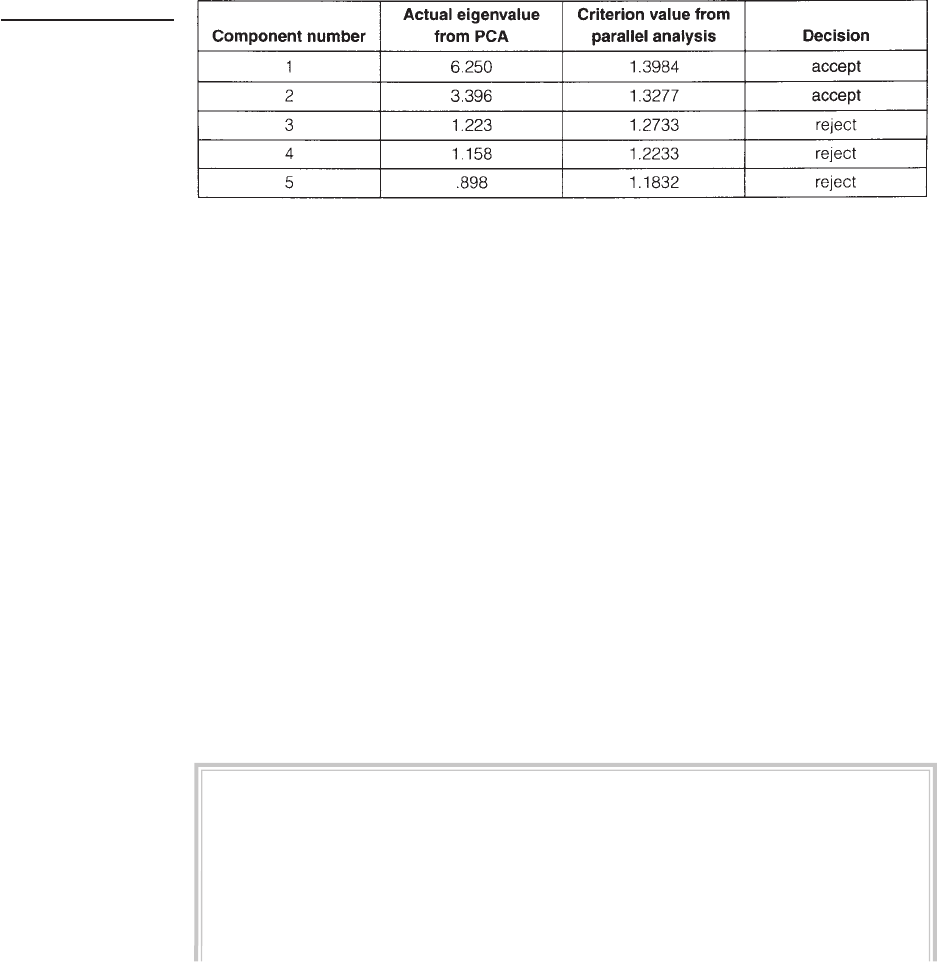
194 Statistical techniques to explore relationships among variables
retain this factor; if it is less, you reject it. The results for this example are summarised
in Table 15.2. The results of parallel analysis support our decision from the screeplot
to retain only two factors for further investigation.
Table 15.2
Comparison of
eigenvalues from
PCA and criterion
values from parallel
analysis
Step 5
Moving back to our SPSS output, the fi nal table we need to look at is the Com-
ponent Matrix. This shows the unrotated loadings of each of the items on the four
components. SPSS uses the Kaiser criterion (retain all components with eigenvalues
above 1) as the default. You will see from this table that most of the items load quite
strongly (above .4) on the fi rst two components. Very few items load on Components 3
and 4. This suggests that a two-factor solution is likely to be more appropriate.
Step 6
Before we make a fi nal decision concerning the number of factors, we should have
a look at the rotated four-factor solution that is shown in the Pattern Matrix table.
This shows the items loadings on the four factors with ten items loading above .3 on
Component 1, fi ve items loading on Component 2, four items on Component 3 and
only two items loading on Component 4. Ideally, we would like three or more items
loading on each component so this solution is not optimal, further supporting our
decision to retain only two factors.
Using the default options in SPSS, we obtained a four-factor solution. It is now
necessary to go back and ‘force’ a two-factor solution.
Procedure (Part 2)
1. Repeat all steps in Procedure (Part 1), but when you click on the Extraction
button click on Fixed number of factors. In the box next to Factors to
extract type in the number of factors you would like to extract (e.g. 2).
2. Click on Continue and then OK.
Some of the output generated is shown below.
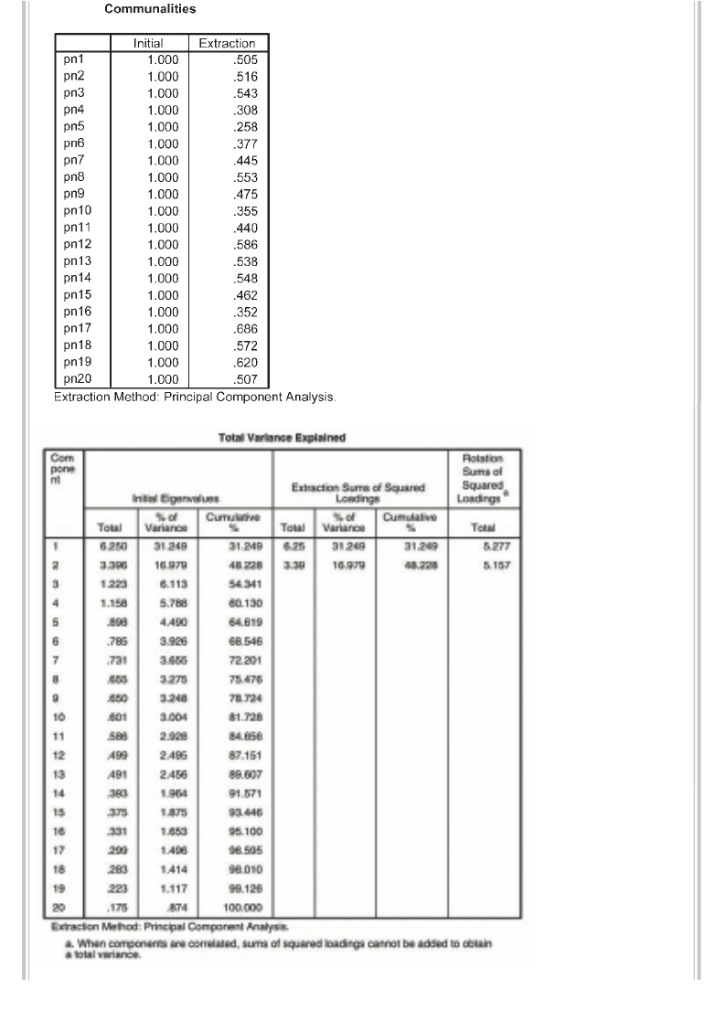
Factor analysis 195
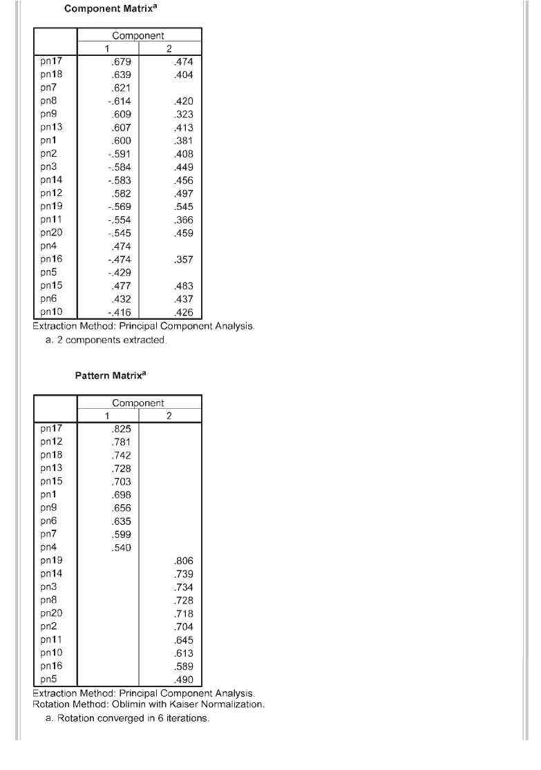
196 Statistical techniques to explore relationships among variables
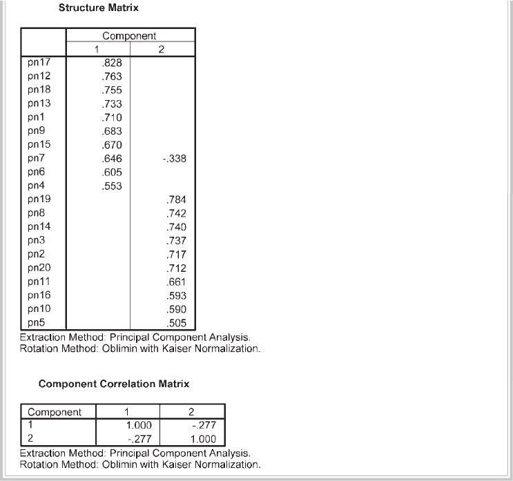
Factor analysis 197
Interpretation of output—Part 2: Oblimin rotation of
two-factor solution)
The fi rst thing we need to check is the percentage of variance explained by this two-
factor solution shown in the Total Variance Explained table. For the two-factor
solution only 48.2 per cent of the variance is explained, compared with over 60 per
cent explained by the four-factor solution.
After rotating the two-factor solution, there are three new tables at the end of the
output you need to consider. First, have a look at the Component Correlation Matrix
(at the end of the output). This shows you the strength of the relationship between the
two factors (in this case the value is quite low, at –.277). This gives us information to
decide whether it was reasonable to assume that the two components were not related
(the assumption underlying the use of Varimax rotation) or whether it is necessary to
use, and report, the Oblimin rotation solution shown here.
198 Statistical techniques to explore relationships among variables
In this case the correlation between the two components is quite low, so we would
expect very similar solutions from the Varimax and Oblimin rotation. If, however,
your components are more strongly correlated (e.g. above .3), you may fi nd discrep-
ancies between the results of the two approaches to rotation. If that is the case, you
need to report the Oblimin rotation.
Oblimin rotation provides two tables of loadings. The Pattern Matrix shows the
factor loadings of each of the variables. Look for the highest loading items on each
component to identify and label the component. In this example, the main loadings
on Component 1 are items 17, 12, 18 and 13. If you refer back to the actual items
themselves (presented earlier in this chapter), you will see that these are all positive
affect items (enthusiastic, inspired, alert, attentive). The main items on Component 2
(19, 14, 3, 8) are negative affect items (nervous, afraid, scared, distressed). In this case,
identifi cation and labelling of the two components is easy. This is not always the case,
however.
The Structure Matrix table, which is unique to the Oblimin output, provides
information about the correlation between variables and factors. If you need to
present the Oblimin rotated solution in your output, you must present both of these
tables.
Earlier in the output a table labelled Communalities is presented. This gives
information about how much of the variance in each item is explained. Low values
(e.g. less than .3) could indicate that the item does not fi t well with the other items in
its component. For example, item pn5 has the lowest communality value (.258) for
this two-factor solution, and it also shows the lowest loading (.49) on Component 2
(see Pattern Matrix). If you are interested in improving or refi ning a scale, you could
use this information to remove items from the scale. Removing items with low com-
munality values tends to increase the total variance explained. Communality values
can change dramatically depending on how many factors are retained, so it is often
better to interpret the communality values after you have chosen how many factors
you should retain using the screeplot and parallel analysis.
Warning: the output in this example is a very ‘clean’ result. Each of the variables
loaded strongly on only one component, and each component was represented by a
number of strongly loading variables (an example of ‘simple structure’). For a discus-
sion of this topic, see Tabachnick and Fidell (2007, p. 647). Unfortunately, with your
own data you will not always have such a straightforward result. Often you will fi nd
that variables load moderately on a number of different components, and some
components will have only one or two variables loading on them. In cases such as
this, you may need to consider rotating a different number of components (e.g. one
more and one less) to see whether a more optimal solution can be found. If you fi nd
that some variables just do not load on the components obtained, you may also need
to consider removing them and repeating the analysis. You should read as much as

Factor analysis 199
you can on the topic to help you make these decisions. An easy-to-follow book to get
you started is Pett, Lackey & Sullivan (2003).
PRESENTING THE RESULTS FROM FACTOR ANALYSIS
The information you provide in your results section is dependent on your discipline
area, the type of report you are preparing and where it will be presented. If you are
publishing in the areas of psychology and education particularly there are quite strict
requirements for what needs to be included in a journal article that involves the use
of factor analysis. You should include details of the method of factor extraction used,
the criteria used to determine the number of factors (this should include parallel
analysis), the type of rotation technique used (e.g. Varimax, Oblimin), the total
variance explained, the initial eigenvalues, and the eigenvalues after rotation.
A table of loadings should be included showing all values (not just those above .3).
For the Varimax rotated solution, the table should be labelled ‘pattern/structure coef-
fi cients’. If Oblimin rotation was used, then both the Pattern Matrix and the Structure
Matrix coeffi cients should be presented in full (these can be combined into one table
as shown below), along with information on the correlations among the factors.
The results of the output obtained in the example above could be presented as
follows:
The 20 items of the Positive and Negative Affect Scale (PANAS) were subjected to
principal components analysis (PCA) using SPSS version 18. Prior to performing PCA,
the suitability of data for factor analysis was assessed. Inspection of the correlation
matrix revealed the presence of many coeffi cients of .3 and above. The Kaiser-
Meyer-Olkin value was .87, exceeding the recommended value of .6 (Kaiser 1970,
1974) and Bartlett’s Test of Sphericity (Bartlett 1954) reached statistical signifi cance,
supporting the factorability of the correlation matrix.
Principal components analysis revealed the presence of four components with
eigenvalues exceeding 1, explaining 31.2%, 17%, 6.1% and 5.8% of the variance
respectively. An inspection of the screeplot revealed a clear break after the
second component. Using Catell’s (1966) scree test, it was decided to retain two
components for further investigation. This was further supported by the results of
Parallel Analysis, which showed only two components with eigenvalues exceeding
the corresponding criterion values for a randomly generated data matrix of the
same size (20 variables × 435 respondents).
The two-component solution explained a total of 48.2% of the variance, with
Component 1 contributing 31.25% and Component 2 contributing 17.0%. To aid in
the interpretation of these two components, oblimin rotation was performed. The

200 Statistical techniques to explore relationships among variables
rotated solution revealed the presence of simple structure (Thurstone 1947), with
both components showing a number of strong loadings and all variables loading
substantially on only one component. The interpretation of the two components
was consistent with previous research on the PANAS Scale, with positive affect
items loading strongly on Component 1 and negative affect items loading strongly
on Component 2. There was a weak negative correlation between the two factors
(r = –.28) The results of this analysis support the use of the positive affect items
and the negative affect items as separate scales, as suggested by the scale authors
(Watson, Clark & Tellegen 1988).
You will need to include both the Pattern Matrix and Structure Matrix in your report,
with all loadings showing. To get the full display of loadings, you will need to rerun
the analysis that you chose as your fi nal solution (in this case, a two-factor Oblimin
Table 1
Pattern and Structure Matrix for PCA with Oblimin Rotation of Two Factor Solution of PANAS Items
Item Pattern coeffi cients Structure coeffi cients Communalities
Component 1 Component 2 Component 1 Component 2
17. enthusiastic .825 –.012 .828 –.241 .686
12. inspired .781 .067 .763 –.149 .586
18. alert .742 –.047 .755 –.253 .572
13. attentive .728 –.020 .733 –.221 .538
15. excited .703 .119 .710 –.236 .462
1. interested .698 –.043 .683 –.278 .505
9. strong .656 –.097 .670 –.076 .475
6. determined .635 .107 .646 –.338 .377
7. active .599 –.172 .605 –.069 .445
4. proud .540 –.045 .553 –.195 .308
19. nervous .079 .806 –.144 .784 .620
14. afraid –.003 .739 –.253 .742 .548
3. scared –.010 .734 –.207 .740 .543
8. distressed –.052 .728 –.213 .737 .553
20. jittery .024 .718 –.242 .717 .507
2. upset –.047 .704 –.175 .712 .516
11. irritable –.057 .645 –.236 .661 .440
10. hostile .080 .613 –.176 .593 .355
16. guilty –.013 .589 –.090 .590 .352
5. ashamed –.055 .490 –.191 .505 .258
Note: major loadings for each item are bolded.
Factor analysis 201
rotation), but this time you will need to turn off the option to display only coeffi cients
above .3 (see procedures section). Click on Options, and in the Coeffi cient Display
Format section remove the tick from the box: Suppress small coeffi cients.
If you are presenting the results of this analysis in your thesis (rather than a
journal article), you may also need to provide the screeplot and the table of unrotated
loadings (from the Component Matrix) in the appendix. This would allow the reader
of your thesis to see if they agree with your decision to retain only two components.
Presentation of results in a journal article tends to be much briefer, given space
limitations. If you would like to see a published article using factor analysis, go to
http://www.hqlo.com/content/3/1/82 and select the pdf option on the right-hand side
of the screen that appears.
ADDITIONAL EXERCISES
Business
Data fi le: staffsurvey4ED.sav. See Appendix for details of the data fi le.
1. Follow the instructions throughout the chapter to conduct a principal compo-
nents analysis with Oblimin rotation on the ten agreement items that make up
the Staff Satisfaction Survey (Q1a to Q10a). You will see that, although two factors
record eigenvalues over 1, the screeplot indicates that only one component should
be retained. Run Parallel Analysis using 523 as the number of cases and 10 as
the number of items. The results indicate only one component has an eigenvalue
that exceeds the equivalent value obtained from a random data set. This suggests
that the items of the Staff Satisfaction Scale are assessing only one underlying
dimension (factor).
Health
Data fi le: sleep4ED.sav. See Appendix for details of the data fi le.
1. Use the procedures shown in Chapter 15 to explore the structure underlying the
set of questions designed to assess the impact of sleep problems on various aspects
of people’s lives. These items are labelled impact1 to impact7. Run Parallel Analysis
(using 121 as the number of cases and 7 as the number of items) to check how
many factors should be retained.
This page intentionally left blank
PART FIVE
Statistical
techniques to
compare groups
In Part Five of this book, we explore some of the techniques available in SPSS to assess
differences between groups or conditions. The techniques used are quite complex,
drawing on a lot of underlying theory and statistical principles. Before you start your
analysis using SPSS, it is important that you have at least a basic understanding of
the statistical techniques that you intend to use. There are many good statistical texts
available that can help you with this. (A list of some suitable books is provided in the
recommended reading section at the end of the book.) It would be a good idea to
review this material now. This will help you understand what SPSS is calculating for
you, what it means and how to interpret the complex array of numbers generated in
the output. In the following chapters, I have assumed that you have a basic grounding
in statistics and are familiar with the terminology used.
TECHNIQUES COVERED IN PART FIVE
There is a whole family of techniques that can be used to test for signifi cant differ-
ences between groups. Although there are many different statistical techniques
available in the SPSS package, only the main techniques are covered here. I have
included both parametric and non-parametric techniques in this section of the book.
203

204 Statistical techniques to compare groups
Parametric techniques make a number of assumptions about the population from
which the sample has been drawn (e.g. normally distributed scores) and the nature of
the data (interval level scaling). Non-parametric techniques do not have such strin-
gent assumptions, and are often the more suitable techniques for smaller samples or
when the data collected is measured only at the ordinal (ranked) level. A list of the
techniques covered in this chapter is shown in the table below.
List of parametric techniques and their non-parametric techniques covered in Part Five
Parametric technique Non-parametric technique
None Chi-square for goodness of fi t
None Chi-square for independence
None McNemar’ Test
None Cochran’s Q Test
None Kappa Measure of Agreement
Independent-samples t-test Mann-Whitney U Test
Paired-samples t-test Wilcoxon Signed Rank Test
One-way between-groups ANOVA Kruskal-Wallis Test
One-way repeated-measures ANOVA Friedman Test
Two-way analysis of variance (between groups) None
Mixed between-within groups ANOVA None
Multivariate analysis of variance (MANOVA) None
Analysis of covariance None
In Chapter 10, you were guided through the process of deciding which statis-
tical technique would suit your research question. This depends on the nature of
your research question, the type of data you have and the number of variables and
groups you have. (If you have not read through that chapter, you should do so before
proceeding any further.) Some of the key points to remember when choosing which
technique is the right one for you are as follows:
• T-tests are used when you have only two groups (e.g. males/females) or two time
points (e.g. pre-intervention, post-intervention).
• Analysis of variance techniques are used when you have two or more groups or
time points.
• Paired-samples or repeated measures techniques are used when you test the same
people on more than one occasion, or you have matched pairs.
• Between-groups or independent-samples techniques are used when the partici-
pants in each group are different people (or independent).
• One-way analysis of variance is used when you have only one independent variable
(e.g. gender).
Statistical techniques to compare groups 205
• Two-way analysis of variance is used when you have two independent variables
(gender, age group).
• Multivariate analysis of variance is used when you have more than one dependent
variable (anxiety, depression).
• Analysis of covariance (ANCOVA) is used when you need to control for an
additional variable that may be infl uencing the relationship between your inde-
pendent and dependent variable.
Before we begin to explore some of the techniques available, there are a number
of common issues that need to be considered. These topics will be relevant to many
of the chapters included in this part of the book, so you may need to refer back to this
section as you work through each chapter.
ASSUMPTIONS
There are some general assumptions that apply to all of the parametric techniques
discussed here (e.g. t-tests, analysis of variance), and additional assumptions associ-
ated with specifi c techniques. The general assumptions are presented in this section
and the more specifi c assumptions are presented in the following chapters, as appro-
priate. You will need to refer back to this section when using any of the techniques
presented in Part Five. For information on the procedures used to check for violation
of assumptions, see Tabachnick and Fidell (2007, Chapter 4). For further discussion
of the consequences of violating the assumptions, see Stevens (1996, Chapter 6) and
Glass, Peckham and Sanders (1972).
Level of measurement
Each of the parametric approaches assumes that the dependent variable is measured
at the interval or ratio level; that is, using a continuous scale rather than discrete cat-
egories. Wherever possible when designing your study, try to make use of continuous,
rather than categorical, measures of your dependent variable. This gives you a wider
range of possible techniques to use when analysing your data.
Random sampling
The parametric techniques covered in Part Five assume that the scores are obtained
using a random sample from the population. This is often not the case in real-life
research.
Independence of observations
The observations that make up your data must be independent of one another; that
is, each observation or measurement must not be infl uenced by any other observation
206 Statistical techniques to compare groups
or measurement. Violation of this assumption, according to Stevens (1996, p. 238), is
very serious. There are a number of research situations that may violate this assump-
tion of independence. Examples of some such studies are described below (these are
drawn from Stevens 1996, p. 239; and Gravetter & Wallnau 2004, p. 251):
• Studying the performance of students working in pairs or small groups. The
behaviour of each member of the group infl uences all other group members,
thereby violating the assumption of independence.
• Studying the TV-watching habits and preferences of children drawn from the
same family. The behaviour of one child in the family (e.g. watching Program A)
is likely to infl uence all children in that family; therefore the observations are not
independent.
• Studying teaching methods within a classroom and examining the impact
on students’ behaviour and performance. In this situation, all students could
be infl uenced by the presence of a small number of trouble-makers; therefore
individual behavioural or performance measurements are not independent.
Any situation where the observations or measurements are collected in a group
setting, or participants are involved in some form of interaction with one another,
may require more specialist techniques such as multilevel (or hierarchical) model-
ling. This approach is commonly being used now in studies involving children in
classrooms, within schools, within cities; or with patients, within different medical
specialists, within a practice, within a city or country. For more information, see
Chapter 15 in Tabachnick and Fidell 2007.
Normal distribution
For parametric techniques, it is assumed that the populations from which the
samples are taken are normally distributed. In a lot of research (particularly in the
social sciences), scores on the dependent variable are not normally distributed. Fortu-
nately, most of the techniques are reasonably ‘robust’ or tolerant of violations of this
assumption. With large enough sample sizes (e.g. 30+), the violation of this assump-
tion should not cause any major problems. The distribution of scores for each of your
groups can be checked using histograms obtained as part of the Graphs menu of SPSS
(see Chapter 7). For a more detailed description of this process, see Tabachnick and
Fidell (2007, Chapter 4).
Homogeneity of variance
Parametric techniques in this section make the assumption that samples are obtained
from populations of equal variances. This means that the variability of scores for each
of the groups is similar. To test this, SPSS performs Levene’s test for equality of vari-
Statistical techniques to compare groups 207
ances as part of the t-test and analysis of variance analyses. The results are presented
in the output of each of these techniques. Be careful in interpreting the results of
this test; you are hoping to fi nd that the test is not signifi cant (i.e. a signifi cance level
of greater than .05). If you obtain a signifi cance value of less than .05, this suggests
that variances for the two groups are not equal and you have therefore violated the
assumption of homogeneity of variance. Don’t panic if you fi nd this to be the case.
Analysis of variance is reasonably robust to violations of this assumption, provided
the size of your groups is reasonably similar (e.g. largest/smallest = 1.5; Stevens 1996,
p. 249). For t-tests, you are provided with two sets of results, for situations where the
assumption is not violated and for when it is violated. In this case, you just consult
whichever set of results is appropriate for your data.
TYPE 1 ERROR, TYPE 2 ERROR AND POWER
The purpose of t-tests and analysis of variance procedures is to test hypotheses. With
this type of analysis there is always the possibility of reaching the wrong conclusion.
There are two different errors that we can make. We may reject the null hypothesis
when it is, in fact, true (this is referred to as a Type 1 error). This occurs when we think
there is a difference between our groups, but there really isn’t. We can minimise this
possibility by selecting an appropriate alpha level (the two levels often used are .05
and .01).
There is also a second type of error that we can make (Type 2 error). This occurs
when we fail to reject a null hypothesis when it is, in fact, false (i.e. believing that
the groups do not differ, when in fact they do). Unfortunately, these two errors are
inversely related. As we try to control for a Type 1 error, we actually increase the
likelihood that we will commit a Type 2 error.
Ideally, we would like the tests that we use to correctly identify whether in fact
there is a difference between our groups. This is called the power of a test. Tests vary
in terms of their power (e.g. parametric tests such as t-tests, analysis of variance etc.
are potentially more powerful than non-parametric tests, if the assumptions are
met); however, there are other factors that can infl uence the power of a test in a given
situation:
• sample size
• effect size (the strength of the difference between groups, or the infl uence of the
independent variable)
• alpha level set by the researcher (e.g. .05/.01).
The power of a test is very dependent on the size of the sample used in the study.
According to Stevens (1996), when the sample size is large (e.g. 100 or more partici-
208 Statistical techniques to compare groups
pants) ‘power is not an issue’ (p. 6). However, when you have a study where the group
size is small (e.g. n=20), you need to be aware of the possibility that a non-signifi cant
result may be due to insuffi cient power. Stevens (1996) suggests that when small group
sizes are involved it may be necessary to adjust the alpha level to compensate (e.g. set a
cut-off of .10 or .15, rather than the traditional .05 level).
There are tables available (see Cohen 1988) that will tell you how large your sample
size needs to be to achieve suffi cient power, given the effect size you wish to detect.
There are also a growing number of software programs that can do these calculations
for you (e.g. G*Power: available from: http://www.psycho.uni-duesseldorf.de/abtei-
lungen/aap/gpower3/).
Some of the SPSS procedures also provide an indication of the power of the
test that was conducted, taking into account effect size and sample size. Ideally, you
would want an 80 per cent chance of detecting a relationship (if in fact one did exist).
If you obtain a non-signifi cant result and are using quite a small sample size, you
could check these power values. If the power of the test is less than .80 (80 per cent
chance of detecting a difference), you would need to interpret the reason for your
non-signifi cant result carefully. This may suggest insuffi cient power of the test, rather
than no real difference between your groups. The power analysis gives an indication
of how much confi dence you should have in the results when you fail to reject the null
hypothesis. The higher the power, the more confi dent you can be that there is no real
difference between the groups.
PLANNED COMPARISONS/POST-HOC ANALYSES
When you conduct analysis of variance, you are determining whether there are
signifi cant differences among the various groups or conditions. Sometimes you
may be interested in knowing if, overall, the groups differ (that your indepen-
dent variable in some way infl uences scores on your dependent variable). In other
research contexts, however, you might be more focused and interested in testing the
differences between specifi c groups, not between all the various groups. It is impor-
tant that you distinguish which applies in your case, as different analyses are used
for each of these purposes.
Planned comparisons (also known as a priori) are used when you wish to test
specifi c hypotheses (usually drawn from theory or past research) concerning the
differences between a subset of your groups (e.g. do Groups 1 and 3 differ signifi -
cantly?). These comparisons need to be specifi ed, or planned, before you analyse your
data, not after fi shing around in your results to see what looks interesting!
Some caution needs to be exercised with this approach if you intend to specify a
lot of different comparisons. Planned comparisons do not control for the increased
risks of Type 1 errors. A Type 1 error involves rejecting the null hypothesis (e.g. there
Statistical techniques to compare groups 209
are no differences among the groups) when it is actually true. In other words, there
is an increased risk of thinking that you have found a signifi cant result when in fact
it could have occurred by chance. If there are a large number of differences that you
wish to explore it may be safer to use the alternative approach (post-hoc compari-
sons), which is designed to protect against Type 1 errors.
The other alternative is to apply what is known as a Bonferroni adjustment to the
alpha level that you will use to judge statistical signifi cance. This involves setting a
more stringent alpha level for each comparison, to keep the alpha across all the tests
at a reasonable level. To achieve this, you can divide your alpha level (usually .05) by
the number of comparisons that you intend to make, and then use this new value as
the required alpha level. For example, if you intend to make three comparisons the
new alpha level would be .05 divided by 3, which equals .017. For a discussion on this
technique, see Tabachnick and Fidell (2007, p. 52).
Post-hoc comparisons (also known as a posteriori) are used when you want to
conduct a whole set of comparisons, exploring the differences between each of the
groups or conditions in your study. If you choose this approach, your analysis consists
of two steps. First, an overall F ratio is calculated that tells you whether there are
any signifi cant differences among the groups in your design. If your overall F ratio is
signifi cant (indicating that there are differences among your groups), you can then go
on and perform additional tests to identify where these differences occur (e.g. does
Group 1 differ from Group 2 or Group 3, do Group 2 and Group 3 differ).
Post-hoc comparisons are designed to guard against the possibility of an increased
Type 1 error due to the large number of different comparisons being made. This is
done by setting more stringent criteria for signifi cance, and therefore it is often harder
to achieve signifi cance. With small samples this can be a problem, as it can be very
hard to fi nd a signifi cant result even when the apparent difference in scores between
the groups is quite large.
There are a number of different post-hoc tests that you can use, and these vary in
terms of their nature and strictness. The assumptions underlying the post-hoc tests
also differ. Some assume equal variances for the two groups (e.g. Tukey); others do
not assume equal variance (e.g. Dunnett’s C test). Two of the most commonly used
post-hoc tests are Tukey’s Honestly Signifi cant Different test (HSD) and the Scheffe
test. Of the two, the Scheffe test is the most cautious method for reducing the risk
of a Type 1 error. However, the cost here is power. You may be less likely to detect a
difference between your groups using this approach.
EFFECT SIZE
All of the techniques discussed in this section will give you an indication of whether
the difference between your groups is ‘statistically signifi cant’ (i.e. not likely to have

210 Statistical techniques to compare groups
occurred by chance). It is typically a moment of great excitement for most researchers
and students when they fi nd their results are ‘signifi cant’! However, there is more to
research than just obtaining statistical signifi cance. What the probability values do not
tell you is the degree to which the two variables are associated with one another. With
large samples, even very small differences between groups can become statistically
signifi cant. This does not mean that the difference has any practical or theoretical
signifi cance.
One way that you can assess the importance of your fi nding is to calculate the
‘effect size’ (also known as ‘strength of association’). This is a set of statistics that
indicates the relative magnitude of the differences between means, or the amount of
the total variance in the dependent variable that is predictable from knowledge of the
levels of the independent variable (Tabachnick & Fidell 2007, p. 54).
There are a number of different effect size statistics. The most commonly used
to compare groups are partial eta squared and Cohen’s d. SPSS calculates partial eta
squared for you as part of the output from some techniques (e.g. analysis of variance).
It does not provide effect size statistics for t-tests, but you can use the information
provided in the SPSS to calculate whichever effect size statistic you need.
Partial eta squared effect size statistics indicate the proportion of variance of the
dependent variable that is explained by the independent variable. Values can range
from 0 to 1. Cohen’s d, on the other hand, presents difference between groups in terms
of standard deviation units. Be careful not to get the different effect size statistics
confused when interpreting the strength of the association. A useful website that
provides a quick and easy way to calculate both effect size statistics is: http://web.uccs.
edu/lbecker/Psy590/escalc3.htm.
To interpret the strength of the different effect size statistics, the following guide-
lines were proposed by Cohen (1988, p. 22) when assessing research involving the
comparison of different groups. Although Cohen specifi ed guidelines for eta squared,
they can be used to interpret the strength of partial eta squared. Partial eta squared
involves a slightly different formula, using a different denominator than for eta
squared. For further information, see Tabachnick and Fidell 2007, p. 55.
Size Eta squared
(% of variance explained)
Cohen’s d
(standard deviation units)
Small .01 or 1% .2
Medium .06 or 6% .5
Large .138 or 13.8% .8
Please note that Cohen gives different guidelines for correlational designs
(these are covered previously in Part Four). The values shown above are for group
comparisons.
Statistical techniques to compare groups 211
MISSING DATA
When you are doing research, particularly with human beings, it is very rare that
you will obtain complete data from every case. It is important that you inspect your
data fi le for missing data. Run Descriptives and fi nd out what percentage of values
is missing for each of your variables. If you fi nd a variable with a lot of unexpected
missing data, you need to ask yourself why. You should also consider whether your
missing values are happening randomly or whether there is some systematic pattern
(e.g. lots of women failing to answer the question about their age). SPSS has a Missing
Value Analysis procedure that may help fi nd patterns in your missing values (see the
bottom option under the Analyze menu). For more information on this, see Tabach-
nick and Fidell 2007, Chapter 4.
You also need to consider how you will deal with missing values when you come
to do your statistical analyses. The Options button in many of the SPSS statistical
procedures offers you choices for how you want SPSS to deal with missing data. It is
important that you choose carefully, as it can have dramatic effects on your results.
This is particularly important if you are including a list of variables and repeating the
same analysis for all variables (e.g. correlations among a group of variables, t-tests for
a series of dependent variables).
• The Exclude cases listwise option will include cases in the analysis only if it has
full data on all of the variables listed in your variables box for that case. A case will
be totally excluded from all the analyses if it is missing even one piece of infor-
mation. This can severely, and unnecessarily, limit your sample size.
• The Exclude cases pairwise (sometimes shown as Exclude cases analysis by
analysis) option, however, excludes the cases (persons) only if they are missing
the data required for the specifi c analysis. They will still be included in any of the
analyses for which they have the necessary information.
• The Replace with mean option, which is available in some SPSS statistical pro-
cedures, calculates the mean value for the variable and gives every missing case
this value. This option should never be used as it can severely distort the results of
your analysis, particularly if you have a lot of missing values.
Always press the Options button for any statistical procedure you conduct and
check which of these options is ticked (the default option varies across procedures).
I would strongly recommend that you use pairwise exclusion of missing data, unless
you have a pressing reason to do otherwise. The only situation where you might
need to use listwise exclusion is when you want to refer only to a subset of cases that
provided a full set of results.
212 Statistical techniques to compare groups
Strange-looking numbers
In your output, you may come across some strange-looking numbers that take the
form 1.24E-02. These are small values presented in scientifi c notation. To prevent
this happening, choose Edit from the main menu bar, select Options, and make sure
there is a tick in the box No scientifi c notation for small numbers in tables on the
General tab.
213
16
Non-parametric statistics
In statistics books you will often see reference to two different types of statistical
technique: parametric and non-parametric. What is the difference between these two
sets of techniques? Why is the distinction important? The word ‘parametric’ comes
from ‘parameter’, or characteristic of a population. The parametric tests (e.g. t-tests,
analysis of variance) make assumptions about the population from which the sample
has been drawn. This often includes assumptions about the shape of the population
distribution (e.g. normally distributed). Non-parametric techniques, on the other
hand, do not have such stringent requirements and do not make assumptions about
the underlying population distribution (which is why they are sometimes referred to
as distribution-free tests).
Despite being less ‘fussy’, non-parametric statistics do have their disadvantages.
They tend to be less sensitive than their more powerful parametric cousins, and may
therefore fail to detect differences between groups that actually exist. If you have the
‘right’ sort of data, it is always better to use a parametric technique if you can. So under
what circumstances might you want or need to use non-parametric techniques?
Non-parametric techniques are ideal for use when you have data that are measured
on nominal (categorical) and ordinal (ranked) scales. They are also useful when you
have very small samples and when your data do not meet the stringent assumptions of
the parametric techniques. Although SPSS provides a wide variety of non-parametric
techniques for a variety of situations, only the main ones will be discussed in this
chapter. The topics covered in this chapter are presented below, along with their para-
metric alternative (covered in later chapters).

214 Statistical techniques to compare groups
SUMMARY OF TECHNIQUES COVERED IN THIS
CHAPTER
Non-parametric technique Parametric alternative
Chi-square test for goodness of fi t None
Chi-square test for independence None
McNemar’s Test None
Cochran’s Q Test None
Kappa Measure of Agreement None
Mann-Whitney U Test Independent-samples t-test (Chapter 17)
Wilcoxon Signed Rank Test Paired-samples t-test (Chapter 17)
Kruskal-Wallis Test One-way between-groups ANOVA (Chapter 18)
Friedman Test One-way repeated-measures ANOVA (Chapter 18)
The techniques in this chapter are designed primarily for comparing groups. The non-
parametric alternative for correlation (Spearman rho) is presented in Chapter 11.
Assumptions for non-parametric techniques
Although the non-parametric techniques have less stringent assumptions, there are
some general assumptions that should be checked.
• Random samples.
• Independent observations. Each person or case can be counted only once, they
cannot appear in more than one category or group, and the data from one sub-
ject cannot infl uence the data from another. The exception to this is the repeated
measures techniques (McNemar’s Test, Wilcoxon Signed Rank Test, Friedman
Test), where the same participants are retested on different occasions or under
different conditions.
Some of the techniques discussed in this chapter have additional assumptions that
should be checked. These specifi c assumptions are discussed in the relevant sections.
Throughout this chapter, the various non-parametric techniques are illustrated
using examples from a number of data fi les on the website that accompanies this
book. Full details of these data fi les are provided in the Appendix. If you wish to
follow along with the steps detailed in each of these examples, you will need to start
SPSS and open the appropriate data fi le. This chapter provides only a brief summary
of non-parametric techniques. For further reading, see Daniel (1990), Gravetter and
Wallnau (2004), Siegel and Castellan (1988) and Peat (2001).

Non-parametric statistics 215
CHI-SQUARE
There are a number of different tests based on the chi-square statistic, all of which
involve categorical data. For a review of chi-square, see Chapter 17 in Gravetter and
Wallnau (2004).
Chi-square test for goodness of fi t
This test, which is also referred to as the one-sample chi-square, is often used to
compare the proportion of cases from a sample with hypothesised values or those
obtained previously from a comparison population. All that is needed in the data fi le
is one categorical variable and a specifi c proportion against which you wish to test the
observed frequencies. This may test that there is no difference in the proportion in
each category (50%/50%) or a specifi c proportion obtained from a previous study.
Example of research question: I will test whether the number of smokers in the
survey4ED.sav data fi le is equivalent to that reported in the literature from a previous
larger nationwide study (20%).
What you need:
• one categorical variable, with two or more categories: smoker (Yes/No)
• a hypothesised proportion (20% smokers; 80% non-smokers or .2/.8).
Procedure for chi-square test for goodness of fi t
To follow along with this example, open the survey4ED.sav data fi le.
1. From the menu at the top of the screen, click on Analyze, then select
Non-parametric Tests, then Legacy Dialogs and then Chi-Square.
2. Click on the categorical variable (smoker) and click on the arrow to move
it into the Test Variable List box.
3. In the Expected Values section, click on the Values option. In the Values
box, you need to type in two values.
• The fi rst value (.2) corresponds with the expected proportion for the
fi rst coded value for the variable (1=yes, smoker). Click on Add.
• Type in the second value (.8), which is the expected proportion for the
second coded value (2=no, non-smoker). Click on Add.
If your variable has more than two possible values, you would need to
type in as many proportions as appropriate.
4. Click on OK (or on Paste to save to Syntax Editor).
The syntax from this procedure is:
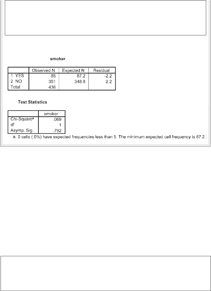
216 Statistical techniques to compare groups
NPAR TESTS
/CHISQUARE=smoke
/EXPECTED=.2 .8
/MISSING ANALYSIS.
The output generated from this procedure is shown below
Interpretation of output from chi-square for goodness of fi t
In the fi rst table the observed frequencies from the current data fi le are presented,
showing that 85 out of the 436 (19.5%) were smokers. The expected N from the
previously reported proportion specifi ed (20%) is given. In this case, 87 cases were
expected, while 85 were observed.
The Test Statistics table reports the results of the Chi-Square Test, which compares
the expected and observed values. In this case, the discrepancy is very small and not
statistically signifi cant (Asymp. Sig. = .79).
Reporting the results
In the results you need to report the chi-square value, the degrees of freedom (shown
as df in the output) and the p value (shown as Asymp. Sig.)
A chi-square goodness-of-fi t test indicates there was no signifi cant difference in
the proportion of smokers identifi ed in the current sample (19.5%) as compared
with the value of 20% that was obtained in a previous nationwide study, χ2
(1, n = 436) = .07, p < .79.

Non-parametric statistics 217
Chi-square test for independence
This test is used when you wish to explore the relationship between two categorical
variables. Each of these variables can have two or more categories. This test compares
the observed frequencies or proportions of cases that occur in each of the categories,
with the values that would be expected if there was no association between the two
variables being measured. It is based on a crosstabulation table, with cases classifi ed
according to the categories in each variable (e.g. male/female; smoker/non-smoker).
When a 2 by 2 table (two categories in each variable) is encountered by SPSS, the
output from chi-square includes an additional correction value (Yates’ Correction for
Continuity). This is designed to compensate for what some writers feel is an overesti-
mate of the chi-square value when used with a 2 by 2 table.
In the following procedure, using the survey4ED.sav data fi le, I will demonstrate
the use of chi-square using a 2 by 2 design. If your study involves variables with more
than two categories (e.g. 2 by 3, 4 by 4), you will notice some slight differences in the
output.
Example of research question: There are a variety of ways questions can be phrased:
is there an association between gender and smoking behaviour? Are males more likely
to be smokers than females? Is the proportion of males that smoke the same as the
proportion of females?
What you need: Two categorical variables, with two or more categories in each:
• gender (Male/Female)
• smoker (Yes/No).
Additional assumptions: The lowest expected frequency in any cell should be 5 or
more. Some authors suggest less stringent criteria: at least 80 per cent of cells should
have expected frequencies of 5 or more. If you have a 2 by 2 table, it is recommended
that the expected frequency be at least 10. If you have a 2 by 2 table that violates this
assumption, you should consider using Fisher’s Exact Probability Test instead.
This is generated automatically by SPSS and provided as part of the output from chi-
square.
Procedure for chi-square test for independence
To follow along with this example, open the survey4ED.sav data fi le.
1. From the menu at the top of the screen, click on Analyze, then
Descriptive Statistics, and then Crosstabs.
2. Click on one of your variables (e.g. sex) to be your row variable and click
on the arrow to move it into the box marked Row(s).
3. Click on the other variable to be your column variable (e.g. smoker) and
click on the arrow to move it into the box marked Column(s).
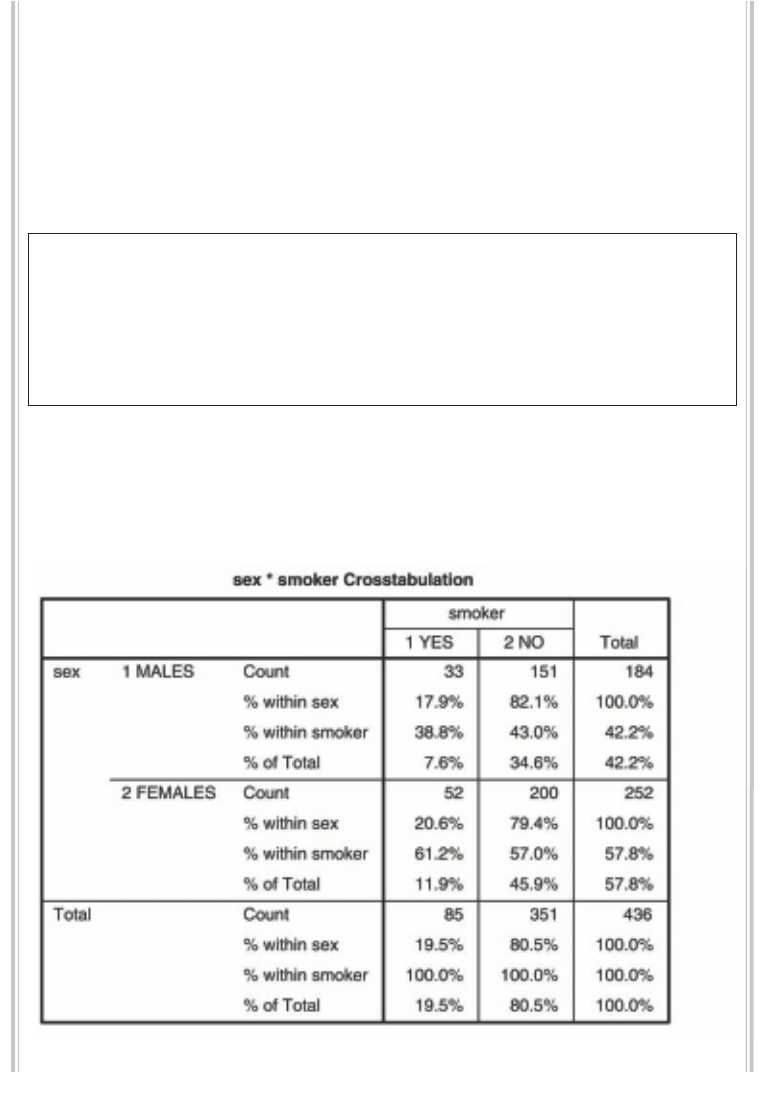
218 Statistical techniques to compare groups
4. Click on the Statistics button. Tick Chi-square and Phi and Cramer’s V.
Click on Continue.
5. Click on the Cells button.
In the Counts box, make sure there is a tick for Observed.
In the Percentage section, click on the Row, Column and Total boxes.
6. Click on Continue and then OK (or on Paste to save to Syntax Editor).
The syntax from this procedure is:
CROSSTABS
/TABLES=sex BY smoke
/FORMAT= AVALUE TABLES
/STATISTICS=CHISQ PHI
/CELLS= COUNT ROW COLUMN TOTAL
/COUNT ROUND CELL .
Selected output generated from this procedure for a 2 by 2 table is shown
below. If your variables have more than two categories the printout will look
a little different, but the key information that you need to look for in the
output is still the same.
Non-parametric statistics 219
Interpretation of output from chi-square for independence
Assumptions
The fi rst thing you should check is whether you have violated one of the assumptions
of chi-square concerning the ‘minimum expected cell frequency’, which should be 5
or greater (or at least 80 per cent of cells have expected frequencies of 5 or more). This
information is given in a footnote below the Chi-Square Tests table. The footnote in
this example indicates that ‘0 cells (.0%) have expected count less than 5’. This means
that we have not violated the assumption, as all our expected cell sizes are greater than
5 (in our case, greater than 35.87).
Chi-square tests
The main value that you are interested in from the output is the Pearson Chi-Square
value, which is presented in the Chi-Square Tests. If you have a 2 by 2 table (i.e. each
variable has only two categories), however, you should use the value in the second row
(Continuity Correction). This is Yates’ Correction for Continuity (which compen-
sates for the overestimate of the chi-square value when used with a 2 by 2 table). In
the example presented above the corrected value is .337, with an associated signifi -
cance level of .56—this is presented in the column labelled Asymp. Sig. (2-sided). To
be signifi cant, the Sig. value needs to be .05 or smaller. In this case the value of .56 is
larger than the alpha value of .05, so we can conclude that our result is not signifi cant.
This means that the proportion of males who smoke is not signifi cantly different from
220 Statistical techniques to compare groups
the proportion of females who smoke. There appears to be no association between
smoking status and gender.
Crosstabulation
To fi nd what percentage of each sex are smokers, you will need to look at the summary
information provided in the table labelled SEX*SMOKER Crosstabulation. This
table may look a little confusing to start with, with a fair bit of information presented
in each cell. To fi nd out what percentage of males are smokers you need to read across
the page in the fi rst row, which refers to males. In this case, we look at the values
next to % within sex. For this example 17.9 per cent of males were smokers, while
82.1 per cent were non-smokers. For females, 20.6 per cent were smokers, 79.4 per
cent non-smokers. To ensure that you are reading the correct values, make sure that
the two percentages add up to 100%.
If we wanted to know what percentage of the sample as a whole smoked we would
move down to the total row, which summarises across both sexes. In this case, we
would look at the values next to % of Total. According to these results, 19.5 per cent
of the sample smoked, 80.5 per cent being non-smokers.
Effect size
There are a number of effect size statistics available in the Crosstabs procedure. For 2 by
2 tables the most commonly used one is the phi coeffi cient, which is a correlation coef-
fi cient and can range from 0 to 1, with higher values indicating a stronger association
between the two variables. In this example the phi coeffi cient value (shown in the table
Symmetric Measures) is –.034, which is considered a very small effect using Cohen’s
(1988) criteria of .10 for small effect, .30 for medium effect and .50 for large effect.
For tables larger than 2 by 2 the value to report is Cramer’s V, which takes into
account the degrees of freedom. Slightly different criteria are recommended for
judging the size of the effect for larger tables. To determine which criteria to use,
fi rst subtract 1 from the number of categories in your row variable (R–1), and then
subtract 1 from the number of categories in your column variable (C–1). Pick
whichever of these values is smaller.
For R–1 or C–1 equal to 1 (two categories): small=.01, medium=.30, large=.50
For either R–1 or C–1 equal to 2 (three categories): small=.07, medium=.21,
large=.35
For either R–1 or C–1 equal to 3 (four categories): small=.06, medium=.17,
large=.29
For more information on the phi coeffi cient and Cramer’s V, see Gravetter and
Wallnau (2004, p. 605).

Non-parametric statistics 221
The results of this analysis could be presented as:
A Chi-square test for independence (with Yates Continuity Correction) indicated
no signifi cant association between gender and smoking status, χ2 (1, n = 436) = .34,
p = .56, phi = –.03.
McNEMAR’S TEST
When you have matched or repeated measures designs (e.g. pre-test/post-test), you
cannot use the usual chi-square test. Instead, you need to use McNemar’s Test. Your data
will also be different from that used for the chi-square test described in the previous
section. Here you will have two variables, the fi rst recorded at Time 1 (e.g. prior to an
intervention) and the second recorded at Time 2 (e.g. after an intervention). Both of
these variables are categorical (with only two response options) and assess the same
information. In the health and medical area this might be the presence or absence of
some health condition (0=absent; 1=present), while in a political context it might
be the intention to vote for a particular candidate (0=no, 1=yes) before and after a
campaign speech.
In the following example, using the experim4ED.sav data I will compare the
proportion of people who are diagnosed with clinical depression prior to, and follow-
ing, an intervention designed to help with statistics anxiety.
Example of research question: Is there a change in the proportion of the sample
diagnosed with clinical depression prior to, and following, the intervention?
What you need: Two categorical variables measuring the same characteristic (e.g.
presence or absence of the characteristic: 0=no, 1=yes) collected from each partici-
pant at different time points (e.g. prior to/following an intervention).
Procedure for McNemar’s Test
To follow along with this example, open the experim4ED.sav data fi le.
1. From the menu at the top of the screen, click on Analyze, then
Descriptive Statistics, and then Crosstabs.
2. Click on one of your variables (e.g. Time1 Clinical Depress: DepT1gp2) and
click on the arrow to move it into the box marked Row(s).
3. Click on the other variable (Time 2 Clinical Depress: DepT2gp2) and click
on the arrow to move it into the box marked Column(s).
4. Click on the Statistics button. Tick McNemar. Click on Continue.
5. Click on the Cells button.
222 Statistical techniques to compare groups
In the Counts box, make sure there is a tick for Observed.
In the Percentage section, click on the Row, Column boxes.
6. Click on Continue and then OK (or on Paste to save to Syntax Editor).
The syntax from this procedure is:
CROSSTABS
/TABLES=DepT1gp2 BY DepT2Gp2
/FORMAT=AVALUE TABLES
/STATISTICS=MCNEMAR
/CELLS=COUNT ROW COLUMN
/COUNT ROUND CELL.
The output from McNemar’s Test is shown below:
Non-parametric statistics 223
Interpretation of McNemar’s Test
As you can see from the output the p value (listed as Exact Sig.) is .625, which is not
less than p<.05. This suggests that there was no signifi cant change in the proportion
of participants diagnosed as clinically depressed following the program (26.7%) when
compared with the proportion prior to the program (33.3%).
COCHRAN’S Q TEST
The McNemar’s Test described in the previous section is suitable if you have only two
time points. If you have three or more time points, you will need to use Cochran’s Q
Test.
Example of research question: Is there a change in the proportion of participants
diagnosed with clinical depression across the three time points: (a) prior to the
program, (b) following the program and (c) three months post-program?
What you need: Three categorical variables measuring the same characteristic (e.g.
presence or absence of the characteristic 0=no, 1=yes) collected from each participant
at different time points.
Procedure for Cochran’s Q Test
To follow along with this example, open the experim4ED.sav data fi le.
1. From the menu at the top of the screen, click on Analyze, then on
Nonparametric Tests, then on Legacy Dialogs, and then on K Related
Samples.
2. Click on the three categorical variables that represent the different time
points (e.g. Time 1 Clinical Depress: DepT1gp2, Time 2 Clinical Depress:
DepT2Gp2, Time 3 Clinical Depress: DepT3gp2) and then on the arrow to
move them into the Test Variables box.
3. In the Test Type section, click on the Cochran’s Q option. Remove the tick
for Friedman test by clicking in the box.
4. Click on OK (or on Paste to save to Syntax Editor).
The syntax from this procedure is:
NPAR TESTS
/COCHRAN=DepT1gp2 DepT2Gp2 DepT3gp2
/MISSING LISTWISE.

224 Statistical techniques to compare groups
The output is shown below:
Interpretation of the output from Cochran’s Q Test
To determine if there was a signifi cant change in the proportion of participants who
were diagnosed with clinical depression across the three time points, you need to look
at the value listed as Asymp. Sig. (this is the p value). The value in this example is .018,
which is less than the cut point of p<.05; therefore the result is statistically signifi cant.
KAPPA MEASURE OF AGREEMENT
One of the other statistics for categorical data available within the Crosstabs pro-
cedure is the Kappa Measure of Agreement. This is commonly used in the medical
literature to assess inter-rater agreement (e.g. diagnosis from two different clinicians)
or the consistency of two different diagnostic tests (newly developed test versus an
established test or ‘gold standard’).
Example of research question: How consistent are the diagnostic classifi cations of the
Edinburgh Postnatal Depression Scale and the Depression, Anxiety and Stress Scale?
What you need: Two categorical variables with an equal number of categories (e.g.
diagnostic classifi cation from Rater 1 or Test 1: 0=not depressed, 1=depressed; and
the diagnostic classifi cation of the same person from Rater 2 or Test 2).
Assumptions: Assumes equal number of categories from Rater 1 and Rater 2.

Non-parametric statistics 225
Parametric alternative: None.
In the example below, we will test the degree of agreement between two measures
of depression in a sample of postnatal women. In the depress4ED.sav fi le, each
woman’s scores on the Edinburgh Postnatal Depression Scale (EPDS: Cox, Holden &
Sagovsky 1987) and the Depression, Anxiety and Stress Scales (DASS-Dep: Lovibond
& Lovibond 1995) were classifi ed according to the recommended cut points for each
scale. This resulted in two variables with scores of 0 (not depressed) and 1 (depressed).
The aim here was to see if the women identifi ed with depression on the EPDS were
also classifi ed as depressed on the DASS Depression Scale (DASS-Dep).
Procedure for Kappa Measure of Agreement
To follow along with this example, open the depress4ED.sav data fi le.
1. From the menu at the top of the screen, click on Analyze, then
Descriptive Statistics, and then Crosstabs.
2. Click on one of your variables (e.g. DASS Depress two groups:
DASSdepgp2) to be your row variable and click on the arrow to move it
into the box marked Row(s).
3. Click on the other variable to be your column variable (e.g. EPDS two
groups: EPDSgp2) and click on the arrow to move it into the box marked
Column(s).
4. Click on the Statistics button. Choose Kappa. Click on Continue.
5. Click on the Cells button.
6. In the Counts box, make sure that Observed is ticked.
7. In the Percentage section, click on Row. Click on Continue and then OK
(or on Paste to save to Syntax Editor).
The syntax from this procedure is:
CROSSTABS
/TABLES=DASSdepgp2 BY EPDSgp2
/FORMAT= AVALUE TABLES
/STATISTICS=KAPPA
/CELLS= COUNT ROW COLUMN TOTAL
/COUNT ROUND CELL .
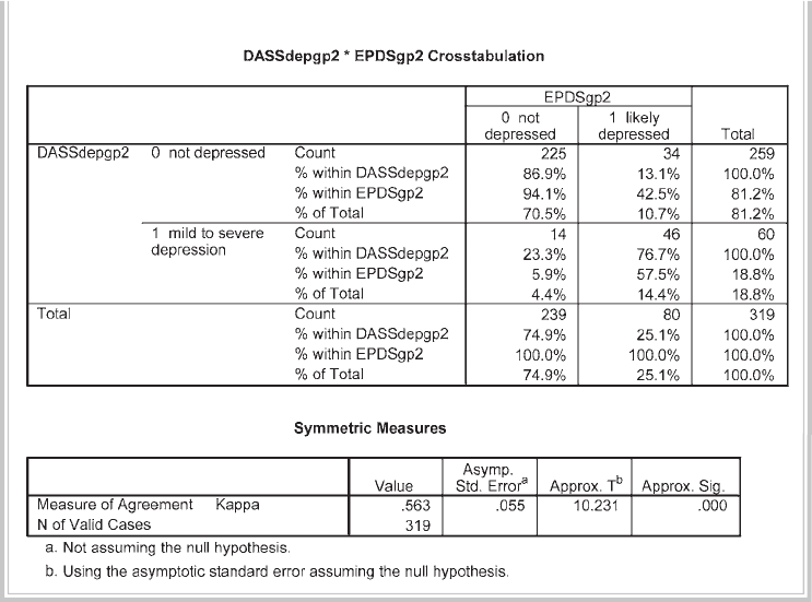
226 Statistical techniques to compare groups
The output generated is shown below:
Interpretation of output from Kappa
The main piece of information we are interested in is the table Symmetric Measures,
which shows that the Kappa Measure of Agreement value is .56, with a signifi cance
of p < .0005. According to Peat (2001, p. 228), a value of .5 for Kappa represents
moderate agreement, above .7 represents good agreement, and above .8 represents
very good agreement. So in this example the level of agreement between the classifi -
cation of cases as depressed using the EPDS and the DASS-Dep is good.
Sensitivity and specifi city
The frequencies and percentages provided in the Crosstabulation table can also be
used to calculate the sensitivity and specifi city of a measure or test. This is commonly
used in the medical literature to assess the accuracy of a diagnostic test in detecting
the presence or absence of disease, or to assess the accuracy of a new test against some
existing ‘gold standard’. Sensitivity refl ects the proportion of cases with the disease or
condition that were correctly diagnosed, while the specifi city represents the propor-
tion of cases without the condition that were correctly classifi ed. In this example, we
can test the consistency of the classifi cation of the DASS-Dep against the commonly
used screening test, the EPDS.

Non-parametric statistics 227
The sensitivity of the DASS-Dep can be determined by reading down the second
column of the table. Out of the 80 cases identifi ed as depressed by the EPDS (our
acting ‘gold standard’), 46 were also classifi ed depressed on the DASS-Dep. This
represents a sensitivity value of 57.5 per cent (46/80).
The specifi city is determined by reading down the fi rst column of people who
were classifi ed as not depressed by the EPDS. The DASS-Dep ‘correctly’ classifi ed 225
out of the 239, representing a specifi city rate of 94.1 per cent. The two scales are
quite consistent in terms of the cases classifi ed as not depressed; however, there is
some inconsistency between the cases that each scale considers depressed. For further
details of this study see the Appendix, and for a published article using this data go to:
http://www.biomedcentral.com/1471-244X/6/12. Click on pdf on the right-hand side
to download the fi le.
MANN-WHITNEY U TEST
The Mann-Whitney U Test is used to test for differences between two independent
groups on a continuous measure. For example, do males and females differ in terms
of their self-esteem? This test is the non-parametric alternative to the t-test for inde-
pendent samples. Instead of comparing means of the two groups, as in the case of the
t-test, the Mann-Whitney U Test actually compares medians. It converts the scores on
the continuous variable to ranks across the two groups. It then evaluates whether the
ranks for the two groups differ signifi cantly. As the scores are converted to ranks, the
actual distribution of the scores does not matter.
Example of research question: Do males and females differ in terms of their levels of
self-esteem? Do males have higher levels of self-esteem than females?
What you need: Two variables:
• one categorical variable with two groups (e.g. sex)
• one continuous variable (e.g. total self-esteem).
Assumptions: See general assumptions for non-parametric techniques presented at
the beginning of this chapter.
Parametric alternative: Independent-samples t-test.
Procedure for Mann-Whitney U Test
To follow along with this example, open the survey4ED.sav data fi le.
1. From the menu at the top of the screen, click on Analyze, select
Nonparametric Tests, then Legacy Dialogs and then 2 Independent Samples.
2. Click on your continuous (dependent) variable (e.g. total self-esteem:
tslfest) and move it into the Test Variable List box.
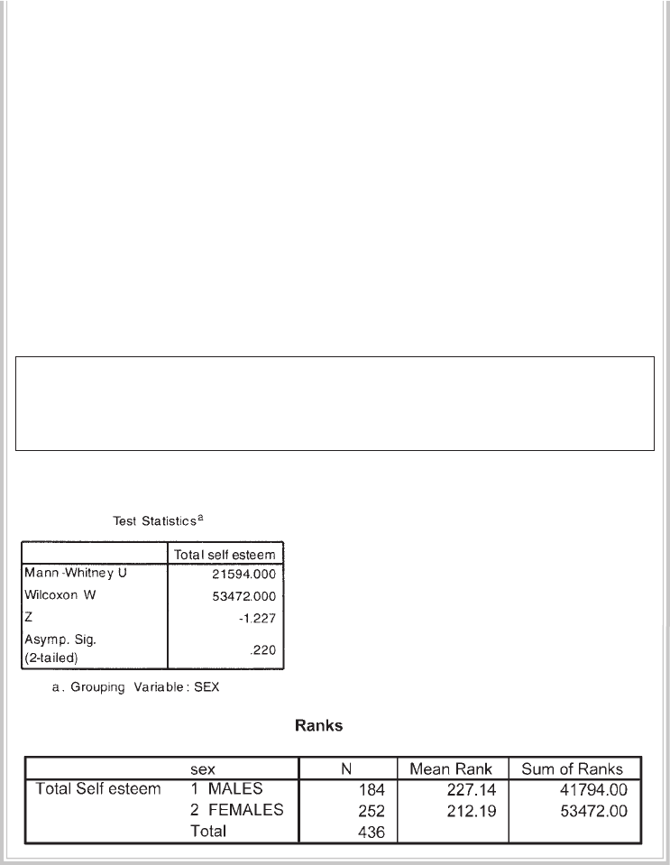
228 Statistical techniques to compare groups
3. Click on your categorical (independent) variable (e.g. sex) and move it
into the Grouping Variable box.
4. Click on the Defi ne Groups button. Type in the value for Group 1 (e.g. 1)
and for Group 2 (e.g. 2). These are the values that were used to code your
values for this variable (see your codebook).
If you cannot remember which values are used for each group, right click
on the Grouping Variable box and choose Variable Information. A pop-up
box will tell you the values and labels for this variable. After typing in the
two values, close the pop-up box and click on Continue.
5. Make sure that the Mann-Whitney U box is ticked under the section
labelled Test Type.
6. Click on Continue and then OK (or on Paste to save to Syntax Editor).
The syntax from this procedure is:
NPAR TESTS
/M-W= tslfest BY sex(1 2)
/MISSING ANALYSIS.
Selected output is shown below.
Interpretation of output from Mann-Whitney U Test
The main values that you need to look at in your output are the Z value and the
signifi cance level, which is given as Asymp. Sig. (2-tailed). If your sample size is larger
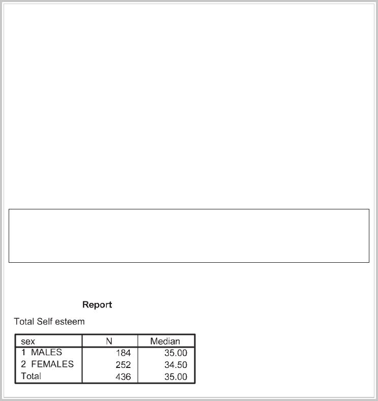
Non-parametric statistics 229
than 30, SPSS will give you the value for a z-approximation test, which includes a
correction for ties in the data. In the example given above, the z value is –1.23
(rounded) with a signifi cance level (p) of p=.22. The probability value (p) is not less
than or equal to .05, so the result is not signifi cant. There is no statistically signifi cant
difference in the self-esteem scores of males and females.
If you fi nd a statistically signifi cant difference between your groups, you will need
to describe the direction of the difference (which group is higher). You can see this
from the Ranks table under the column Mean Rank. When presenting your results,
however, it would be better to report the median values for each group. Unfortunately,
this is not available in this procedure—one more step is needed.
Procedure for obtaining median scores for each group
1. From the menu at the top of the screen, click on Analyze, then select
Compare means and choose Means.
2. Click on your continuous variable (e.g. total self-esteem: tslfest) and move
it into the Dependent List box.
3. Click on your categorical variable (e.g. sex) and move it into the
Independent List box.
4. Click on the Options button. Click on Median in the Statistics section and
move into the Cell Statistics box. Click on Mean and Standard Deviation
and remove from the Cell Statistics box.
5. Click on Continue.
6. Click on OK (or on Paste to save to Syntax Editor).
The syntax from this procedure is:
MEANS
TABLES=tslfest BY sex
/CELLS COUNT MEDIAN .
The output generated is shown below:

230 Statistical techniques to compare groups
Effect size
SPSS does not provide an effect size statistic, but the value of z that is reported in the
output can be used to calculate an approximate value of r.
r = z / square root of N where N = total number of cases.
In this example, z = –1.23 and N = 436; therefore the r value is .06. This would be
considered a very small effect size using Cohen (1988) criteria of .1=small effect,
.3=medium effect, .5=large effect.
The results of this analysis could be presented as:
A Mann-Whitney U Test revealed no signifi cant difference in the self-esteem levels
of males (Md = 35, n =184) and females (Md = 34.5, n = 252), U = 21594, z = –1.23,
p = .22, r = .06.
WILCOXON SIGNED RANK TEST
The Wilcoxon Signed Rank Test (also referred to as the Wilcoxon matched pairs signed
ranks test) is designed for use with repeated measures; that is, when your participants
are measured on two occasions, or under two different conditions. It is the non-
parametric alternative to the repeated measures t-test, but instead of comparing
means the Wilcoxon converts scores to ranks and compares them at Time 1 and at
Time 2. The Wilcoxon can also be used in situations involving a matched subject
design, where participants are matched on specifi c criteria.
To illustrate the use of this technique, I have used data from the experim4ED.sav
fi le included on the website accompanying this book (see p. viii and the Appendix for
details of the study). In this example, I will compare the scores on a Fear of Statistics
Test administered before and after an intervention designed to help students cope
with a statistics course.
Example of research question: Is there a change in the scores on the Fear of Statistics
Test from Time 1 to Time 2?
What you need: One group of participants measured on the same continuous scale
or measured on two different occasions. The variables involved are scores at Time 1 or
Condition 1, and scores at Time 2 or Condition 2.
Assumptions: See general assumptions for non-parametric techniques presented at
the beginning of this chapter.
Parametric alternative: Paired samples t-test.
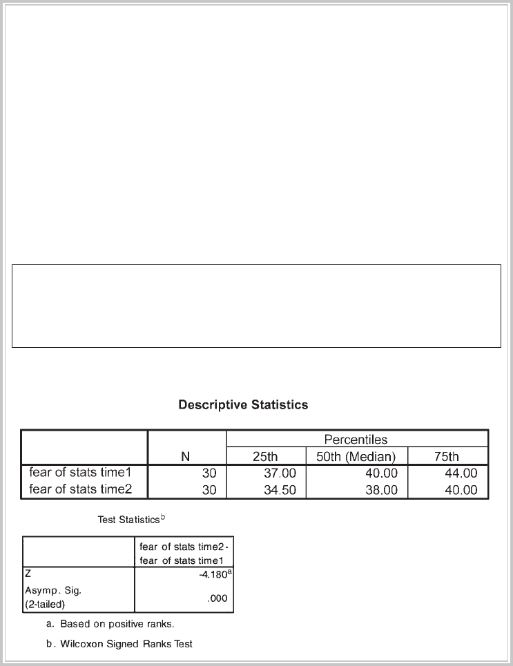
Non-parametric statistics 231
Procedure for Wilcoxon Signed Rank Test
To follow along with this example, open the experim4ED.sav data fi le.
1. From the menu at the top of the screen, click on Analyze, then select
Nonparametric Tests, then Legacy Dialogs and then 2 Related Samples.
2. Click on the variables that represent the scores at Time 1 and at Time 2
(e.g. fear of stats time1: fost1, fear of stats time2: fost2). Click on the
arrow to move these into the Test Pairs box.
3. Make sure that the Wilcoxon box is ticked in the Test Type section.
4. Click on the Options button. Choose Quartiles (this will provide the
median scores for each time point).
5. Click on Continue and then on OK (or on Paste to save to Syntax Editor).
The syntax from this procedure is:
NPAR TEST
/WILCOXON=fost1 WITH fost2 (PAIRED)
/STATISTICS QUARTILES
/MISSING ANALYSIS.
Selected output is displayed below:
Interpretation of output from Wilcoxon Signed Rank Test
The two things you are interested in in the output are the Z value and the associated signif-
icance levels, presented as Asymp. Sig. (2-tailed). If the signifi cance level is equal to or less

232 Statistical techniques to compare groups
than .05 (e.g. .04, .01, .001), you can conclude that the difference between the two scores is
statistically signifi cant. In this example, the Sig. value is .000 (which really means less than
.0005). Therefore we can conclude that the two sets of scores are signifi cantly different.
Effect size
The effect size for this test can be calculated using the same procedure as described for
the Mann-Whitney U Test; that is, by dividing the z value by the square root of N. For
this calculation you can ignore any negative sign out the front of the z value. In this
situation, N = the number of observations over the two time points, not the number
of cases. In this example, Z = 4.18, N = 60 (cases × 2); therefore r = .54, indicating a
large effect size using Cohen (1988) criteria of .1 = small effect, .3 = medium effect,
.5 = large effect.
The results of this analysis could be presented as:
A Wilcoxon Signed Rank Test revealed a statistically signifi cant reduction in fear of
statistics following participation in the training program, z = –4.18, p < .001, with a
large effect size (r = .54). The median score on the Fear of Statistics Scale decreased
from pre-program (Md = 40) to post-program (Md = 38).
KRUSKAL-WALLIS TEST
The Kruskal-Wallis Test (sometimes referred to as the Kruskal-Wallis H Test) is the
non-parametric alternative to a one-way between-groups analysis of variance. It allows
you to compare the scores on some continuous variable for three or more groups. It is
similar in nature to the Mann-Whitney U Test presented earlier in this chapter, but
it allows you to compare more than just two groups. Scores are converted to ranks
and the mean rank for each group is compared. This is a ‘between groups’ analysis, so
different people must be in each of the different groups.
Example of research question: Is there a difference in optimism levels across three
age levels?
What you need: Two variables:
• one categorical independent variable with three or more categories (e.g. agegp3:
18–29, 30–44, 45+)
• one continuous dependent variable (e.g. total optimism).
Assumptions: See general assumptions for non-parametric techniques presented at
the beginning of this chapter.
Parametric alternative: One-way between-groups analysis of variance.
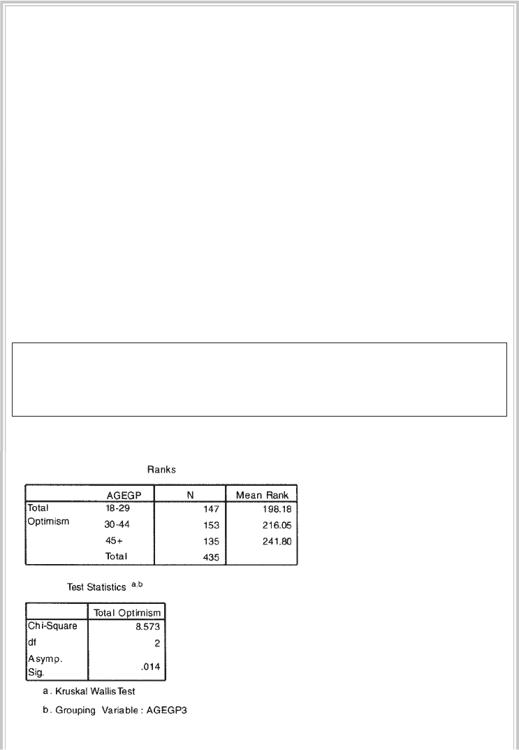
Non-parametric statistics 233
Procedure for Kruskal-Wallis Test
To follow along with this example, open the survey4ED.sav data fi le.
1. From the menu at the top of the screen, click on Analyze, select
Nonparametric Tests, then Legacy Dialogs and then K Independent
Samples.
2. Click on your continuous, dependent variable (e.g. total optimism:
toptim) and move it into the Test Variable List box.
3. Click on your categorical, independent variable (e.g. age 3 groups:
agegp3) and move it into the Grouping Variable box.
4. Click on the Defi ne Range button. Type in the fi rst value of your
categorical variable (e.g. 1) in the Minimum box. Type the largest value
for your categorical variable (e.g. 3) in the Maximum box. Click on
Continue.
5. In the Test Type section, make sure that the Kruskal-Wallis H box is ticked.
6. Click on Continue and then on OK (or on Paste to save to Syntax Editor).
The syntax from this procedure is:
NPAR TESTS
/K-W=toptim BY agegp3(1 3)
/MISSING ANALYSIS.
Selected output generated from this procedure is shown below.
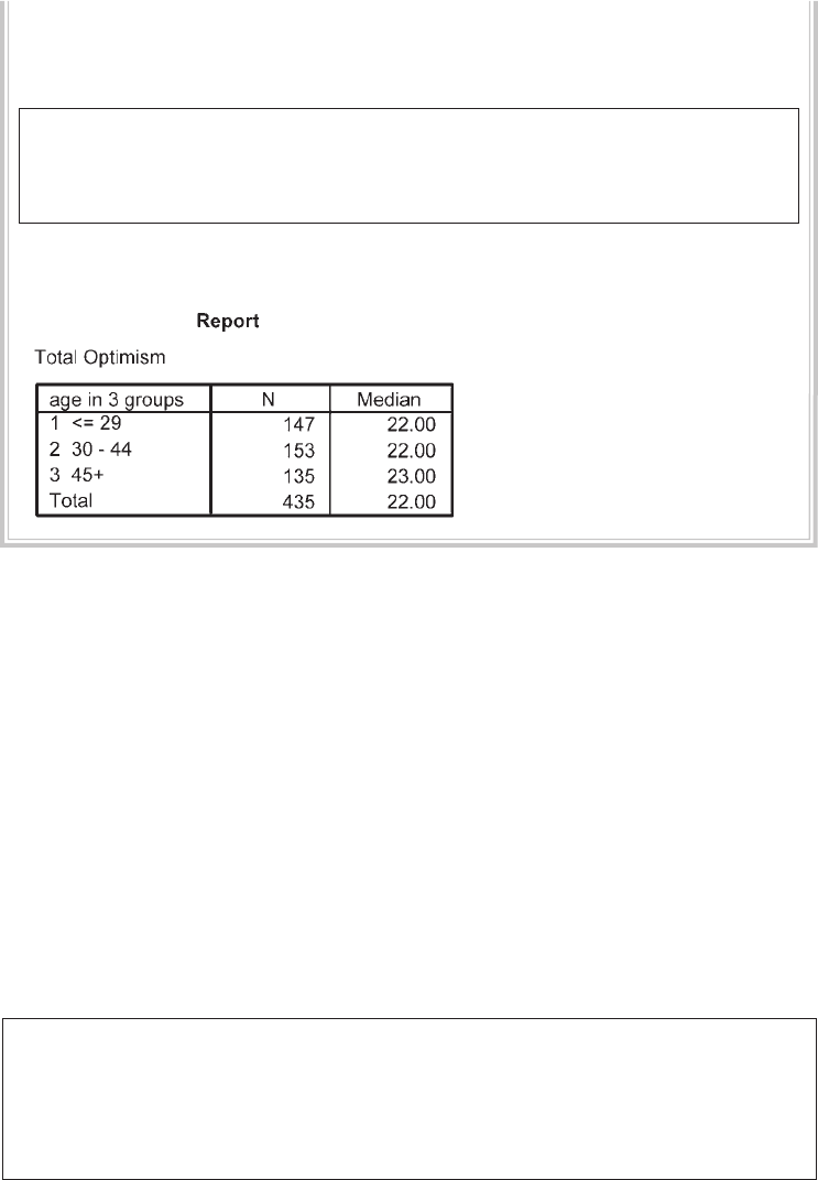
234 Statistical techniques to compare groups
You will also need to obtain the median optimism values for each age group.
Follow the same procedure for obtaining median values as described in the
Mann-Whitney U Test section. The syntax for this is:
MEANS
TABLES=toptim BY agegp3
/CELLS COUNT MEDIAN .
The output is shown below.
Interpretation of output from Kruskal-Wallis Test
The main pieces of information you need from this output are: Chi-Square value, the
degrees of freedom (df) and the signifi cance level (presented as Asymp. Sig.). If this
signifi cance level is less than .05 (e.g. .04, .01, .001), you can conclude that there is a
statistically signifi cant difference in your continuous variable across the three groups.
You can then inspect the Mean Rank for the three groups presented in your fi rst
output table. This will tell you which of the groups had the highest overall ranking
that corresponds to the highest score on your continuous variable.
In the output presented above, the signifi cance level was .01 (rounded). This is
less than the alpha level of .05, so these results suggest that there is a difference in
optimism levels across the different age groups. An inspection of the mean ranks
for the groups suggests that the older group (45+) had the highest optimism scores,
with the younger group reporting the lowest.
The results of this analysis could be presented as:
A Kruskal-Wallis Test revealed a statistically signifi cant difference in optimism
levels across three different age groups (Gp1, n = 147: 18–29yrs, Gp2, n = 153:
30–44yrs, Gp3, n = 135: 45+yrs), χ2 (2, n = 435) = 8.57, p = .014. The older age group
(45+ yrs) recorded a higher median score (Md = 23) than the other two age groups,
which both recorded median values of 22.

Non-parametric statistics 235
Post-hoc tests and effect size
If you obtain a statistically signifi cant result for your Kruskal Wallis Test, you still don’t
know which of the groups are statistically signifi cantly different from one another. To
fi nd this out, you will need to do some follow-up Mann-Whitney U tests between
pairs of groups (e.g. between the youngest and oldest age groups). To control for
Type 1 errors, you will need to apply a Bonferroni adjustment to the alpha values
(see introduction to Part Five) if you intend to compare each group with one another
(1 with 2, 1 with 3 and 2 with 3).
Bonferroni adjustment involves dividing the alpha level of .05 by the number
of tests that you intend to use and using the revised alpha level as your criteria for
determining signifi cance. Here this would mean a stricter alpha level of .05/3=.017.
Instead of doing every possible comparison, however, it is better to just select a few
key groups to compare, keeping your alpha level at a manageable level. For each of the
group comparisons, you can calculate an effect size statistic following the procedure
described in the Mann-Whitney U Test section.
FRIEDMAN TEST
The Friedman Test is the non-parametric alternative to the one-way repeated measures
analysis of variance (see Chapter 18). It is used when you take the same sample of
participants or cases and you measure them at three or more points in time, or under
three different conditions.
Example of research question: Is there a change in Fear of Statistics Test scores across
three time periods (pre-intervention, post-intervention and at follow-up)?
What you need: One sample of participants, measured on the same scale or measured
at three different time periods, or under three different conditions.
Assumptions: See general assumptions for non-parametric techniques presented at
the beginning of this chapter.
Parametric alternative: Repeated measures (within-subjects) analysis of variance.
Procedure for Friedman Test
To follow along with this example, open the experim4ED.sav data fi le.
1. From the menu at the top of the screen, click on Analyze, then select
Nonparametric Tests, then Legacy Dialogs, and then K Related Samples.
2. Click on the variables that represent the three measurements (e.g. fear of
stats time1: fost1, fear of stats time2: fost2, fear of stats time3: fost3).
3. In the Test Type section, check that the Friedman option is selected.
4. Click on the Statistics button. Tick Quartiles. Click on Continue.
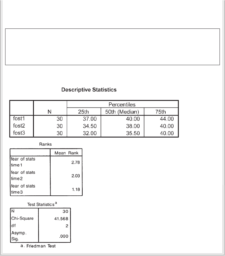
236 Statistical techniques to compare groups
5. Click on OK (or on Paste to save to Syntax Editor).
The syntax from this procedure is:
NPAR TESTS
/FRIEDMAN = fost1 fost2 fost3
/STATISTICS QUARTILES
/MISSING LISTWISE.
The output is shown below:
Interpretation of output from Friedman Test
The results of this test suggest that there are signifi cant differences in the Fear of
Statistics Test scores across the three time periods. This is indicated by a Sig. level
of .000 (which really means less than .0005). Comparing the Mean Ranks for the
three sets of scores, it appears that there was a decrease in Fear of Statistics Test scores
over time.

Non-parametric statistics 237
The results of this analysis could be presented as:
The results of the Friedman Test indicated that there was a statistically signifi cant
difference in Fear of Statistics Test scores across the three time points (pre-
intervention, post-intervention, 3-mth follow-up χ2 (2, n = 30) = 41.57, p < .005).
Inspection of the median values showed a decrease in fear of statistics from pre-
intervention (Md = 40) to post-intervention (Md = 38) and a further decrease at
follow-up (Md = 35.5).
Post-hoc tests and effect size
Having established that there is a statistically signifi cant difference somewhere among
the three time points, the next step would be to follow this up with post-hoc tests to
compare the time points you are interested in (see previous discussion on post-hoc
test in relation to the Kruskal Wallis Test). In this case, post-hoc testing would involve
individual Wilcoxon Signed Rank Tests (using a Bonferroni adjusted alpha value) to
control for Type 1 error. I would probably choose to compare Time 1 (pre-intervention)
with Time 2 (post-intervention) scores, and then compare Time 2 (post-intervention
with the Time 3 (follow-up scores). This involves two tests; therefore, my revised alpha
level for determining statistical signifi cance would be .05 divided by 2 = .025. Effect
size statistics should also be calculated for each specifi c comparison conducted using
the Wilcoxon Signed Rank Tests.
ADDITIONAL EXERCISES
Business
Data fi le: staffsurvey4ED.sav. See Appendix for details of the data fi le.
1. Use the chi-square test for independence to compare the proportion of perma-
nent versus casual staff (employstatus) who indicate they would recommend the
organisation as a good place to work (recommend).
2. Use the Mann-Whitney U Test to compare the staff satisfaction scores (totsatis)
for permanent and casual staff (employstatus).
3. Conduct a Kruskal-Wallis Test to compare staff satisfaction scores (totsatis) across
each of the length of service categories (use the servicegp3 variable).
Health
Data fi le: sleep4ED.sav. See Appendix for details of the data fi le.
1. Use a chi-square test for independence to compare the proportion of males and
females (gender) who indicate they have a sleep problem (probsleeprec).
238 Statistical techniques to compare groups
2. Use the Mann-Whitney U Test to compare the mean sleepiness ratings (Sleepi-
ness and Associated Sensations Scale total score: totSAS) for males and females
(gender).
3. Conduct a Kruskal-Wallis Test to compare the mean sleepiness ratings (Sleepi-
ness and Associated Sensations Scale total score: totSAS) for the three age groups
defi ned by the variable agegp3 (<=37, 38–50, 51+).
239
17
T-tests
There are a number of different types of t-tests available in SPSS. The two that will be
discussed here are:
• independent-samples t-test, used when you want to compare the mean scores of
two different groups of people or conditions
• paired-samples t-test, used when you want to compare the mean scores for the same
group of people on two different occasions, or when you have matched pairs.
In both cases, you are comparing the values on some continuous variable for two
groups or on two occasions. If you have more than two groups or conditions, you will
need to use analysis of variance instead.
For both of the t-tests discussed in this chapter there are a number of assumptions
that you will need to check before conducting these analyses. The general assump-
tions common to both types of t-test are presented in the introduction to Part Five.
The paired-samples t-test has an additional unique assumption that should also be
checked. This is detailed in the summary for paired-samples t-tests. Before proceed-
ing with the remainder of this chapter, you should read through the introduction to
Part Five of this book.
INDEPENDENT-SAMPLES T-TEST
An independent-samples t-test is used when you want to compare the mean score, on
some continuous variable, for two different groups of participants.
Details of example
To illustrate the use of this technique, the survey4ED.sav data fi le will be used. This
example explores sex differences in self-esteem scores. The two variables used are sex

240 Statistical techniques to compare groups
(with males coded as 1 and females coded as 2) and Total self esteem (tslfest), which
is the total score that participants recorded on a ten-item Self-esteem Scale (see the
Appendix for more details on the study, the variables and the questionnaire that was
used to collect the data). If you would like to follow along with the steps detailed
below, you should start SPSS and open the survey4ED.sav fi le now.
Example of research question: Is there a signifi cant difference in the mean self-esteem
scores for males and females?
What you need: Two variables:
• one categorical, independent variable (e.g. males/females)
• one continuous, dependent variable (e.g. self-esteem scores).
What it does: An independent-samples t-test will tell you whether there is a statisti-
cally signifi cant difference in the mean scores for the two groups (i.e. whether males
and females differ signifi cantly in terms of their self-esteem levels). In statistical terms,
you are testing the probability that the two sets of scores (for males and females) came
from the same population.
Assumptions: The assumptions for this test are covered in the introduction to
Part Five. You should read through that section before proceeding.
Non-parametric alternative: Mann-Whitney U Test (see Chapter 16).
Procedure for independent-samples t-test
1. From the menu at the top of the screen, click on Analyze, then select
Compare means, then Independent Samples T test.
2. Move the dependent (continuous) variable (e.g. total self-esteem: tslfest)
into the Test variable box.
3. Move the independent variable (categorical) variable (e.g. sex) into the
section labelled Grouping variable.
4. Click on Defi ne groups and type in the numbers used in the data set to
code each group. In the current data fi le, 1=males, 2=females; therefore,
in the Group 1 box, type 1, and in the Group 2 box, type 2. If you cannot
remember the codes used, right click on the variable name and then
choose Variable Information from the pop-up box that appears. This will
list the codes and labels.
5. Click on Continue and then OK (or on Paste to save to Syntax Editor).
The syntax generated from this procedure is:
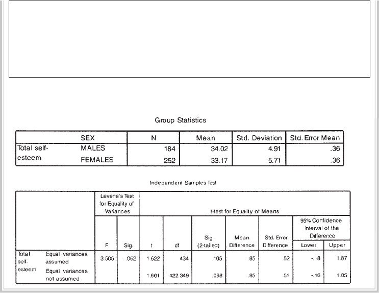
T-tests 241
T-TEST
GROUPS = sex(1 2)
/MISSING = ANALYSIS
/VARIABLES = tslfest
/CRITERIA = CI(.95) .
The output generated from this procedure is shown below.
Interpretation of output from independent-samples t-test
Step 1: Checking the information about the groups
In the Group Statistics box, SPSS gives you the mean and standard deviation for each
of your groups (in this case, male/female). It also gives you the number of people
in each group (N). Always check these values fi rst. Are the N values for males and
females correct? Or are there a lot of missing data? If so, fi nd out why. Perhaps you
have entered the wrong code for males and females (0 and 1, rather than 1 and 2).
Check with your codebook.
Step 2: Checking assumptions
The fi rst section of the Independent Samples Test output box gives you the results of
Levene’s test for equality of variances. This tests whether the variance (variation) of
scores for the two groups (males and females) is the same. The outcome of this test
determines which of the t-values that SPSS provides is the correct one for you to use.
• If your Sig. value for Levene’s test is larger than .05 (e.g. .07, .10) you should use
the fi rst line in the table, which refers to Equal variances assumed.
242 Statistical techniques to compare groups
• If the signifi cance level of Levene’s test is p=.05 or less (e.g. .01, .001), this means
that the variances for the two groups (males/females) are not the same. Therefore
your data violate the assumption of equal variance. Don’t panic—SPSS is very
kind and provides you with an alternative t-value which compensates for the fact
that your variances are not the same. You should use the information in the second
line of the t-test table, which refers to Equal variances not assumed.
In the example given in the output above, the signifi cance level for Levene’s test
is .06. This is larger than the cut-off of .05. This means that the assumption of equal
variances has not been violated; therefore, when you report your t-value, you will use
the one provided in the fi rst line of the table.
Step 3: Assessing differences between the groups
To fi nd out whether there is a signifi cant difference between your two groups, refer to
the column labelled Sig. (2-tailed), which appears under the section labelled t-test for
Equality of Means. Two values are given, one for equal variance, the other for unequal
variance. Choose whichever your Levene’s test result says you should use (see Step 2
above).
• If the value in the Sig. (2-tailed) column is equal or less than .05 (e.g. .03, .01, .001),
there is a signifi cant difference in the mean scores on your dependent variable for
each of the two groups.
• If the value is above .05 (e.g. .06, .10), there is no signifi cant difference between the
two groups.
In the example presented in the output above, the Sig. (2-tailed) value is .105. As
this value is above the required cut-off of .05, you conclude that there is not a statisti-
cally signifi cant difference in the mean self-esteem scores for males and females. The
Mean Difference between the two groups is also shown in this table, along with the
95% Confi dence Interval of the Difference showing the Lower value and the Upper
value.
Calculating the effect size for independent-samples t-test
In the introduction to Part Five of this book, the issue of effect size was discussed.
Effect size statistics provide an indication of the magnitude of the differences between
your groups (not just whether the difference could have occurred by chance). There
are a number of different effect size statistics, the most commonly used being eta
squared and Cohen’s d. Eta squared can range from 0 to 1 and represents the propor-
tion of variance in the dependent variable that is explained by the independent
(group) variable. SPSS does not provide eta squared values for t-tests. It can, however,

T-tests 243
be calculated using the information provided in the output. The procedure for calcu-
lating eta squared is provided below.
The formula for eta squared is as follows:
Eta squared = t
2
t
2 + (N1 + N2 – 2)
Replacing with the appropriate values from the example above:
Eta squared = 1.622
1.622 + (184 + 252 – 2)
Eta squared = .006
The guidelines (proposed by Cohen 1988, pp. 284–7) for interpreting this value are:
.01=small effect
.06=moderate effect
.14=large effect
For our current example, you can see that the effect size of .006 is very small. Expressed
as a percentage (multiply your eta square value by 100), only .6 per cent of the variance
in self-esteem is explained by sex.
In some literature areas (e.g. medicine), Cohen’s d is often reported as the effect
size statistic. A useful website that provides a quick and easy way to calculate effect size
statistics, including Cohen’s d, is http://web.uccs.edu/lbecker/Psy590/escalc3.htm.
Presenting the results for independent-samples t-test
The results of the analysis could be presented as follows:
An independent-samples t-test was conducted to compare the self-esteem scores
for males and females. There was no signifi cant difference in scores for males
(M = 34.02, SD = 4.91) and females (M = 33.17, SD = 5.71; t (434) = 1.62, p = .11,
two-tailed). The magnitude of the differences in the means (mean difference = .85,
95% CI: –1.80 to 1.87) was very small (eta squared = .006).
PAIRED-SAMPLES T-TEST
A paired-samples t-test (also referred to as repeated measures) is used when you have
only one group of people (or companies, or machines etc.) and you collect data from
them on two different occasions or under two different conditions. Pre-test/post-test
experimental designs are an example of the type of situation where this technique is
appropriate. You assess each person on some continuous measure at Time 1 and then
244 Statistical techniques to compare groups
again at Time 2, after exposing them to some experimental manipulation or interven-
tion. This approach is also used when you have matched pairs of participants (i.e.
each person is matched with another on specifi c criteria, such as age, sex). One of the
pair is exposed to Intervention 1 and the other is exposed to Intervention 2. Scores on
a continuous measure are then compared for each pair.
Paired-samples t-tests can also be used when you measure the same person in
terms of his/her response to two different questions (e.g. asking them to rate the
importance in terms of life satisfaction on two dimensions of life: health, fi nancial
security). In this case, both dimensions should be rated on the same scale (e.g. from
1=not at all important to 10=very important).
Details of example
To illustrate the use of the paired-samples t-test, I will be using the data from the fi le
labelled experim4ED.sav (included on the website accompanying this book). This is
a ‘manufactured’ data fi le—created and manipulated to illustrate a number of differ-
ent statistical techniques. Full details of the study design, the measures used etc. are
provided in the Appendix.
For the example below, I will explore the impact of an intervention designed to
increase students’ confi dence in their ability to survive a compulsory statistics course.
Students were asked to complete a Fear of Statistics Test (FOST) both before (Time 1)
and after the intervention (Time 2). The two variables from the data fi le that I will be
using are: FOST1 (scores on the Fear of Statistics Test at Time 1) and FOST2 (scores
on the Fear of Statistics Test at Time 2). If you wish to follow along with the following
steps, you should start SPSS and open the fi le labelled experim4ED.sav.
Example of research question: Is there a signifi cant change in participants’ Fear of
Statistics Test scores following participation in an intervention designed to increase
students’ confi dence in their ability to successfully complete a statistics course? Does
the intervention have an impact on participants’ Fear of Statistics Test scores?
What you need: One set of participants (or matched pairs). Each person (or pair)
must provide both sets of scores. Two variables:
• one categorical independent variable (in this case it is Time; with two different
levels Time 1, Time 2)
• one continuous, dependent variable (e.g. Fear of Statistics Test scores) measured
on two different occasions or under different conditions.
What it does: A paired-samples t-test will tell you whether there is a statistically
signifi cant difference in the mean scores for Time 1 and Time 2.
Assumptions: The basic assumptions for t-tests are covered in the introduction to
Part Five. You should read through that section before proceeding.
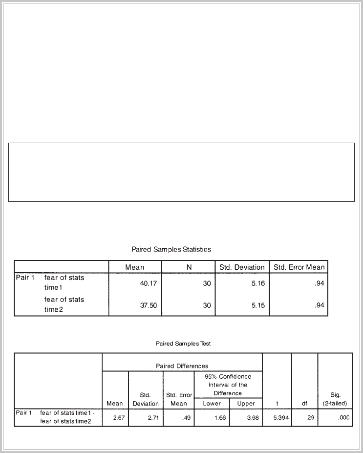
T-tests 245
Additional assumption: The difference between the two scores obtained for each
subject should be normally distributed. With sample sizes of 30+, violation of this
assumption is unlikely to cause any serious problems.
Non-parametric alternative: Wilcoxon Signed Rank Test (see Chapter 16).
Procedure for paired-samples t-test
1. From the menu at the top of the screen, click on Analyze, then select
Compare Means, then Paired Samples T test.
2. Click on the two variables that you are interested in comparing for each
subject (e.g. fost1: fear of stats time1, fost2: fear of stats time2) and move
them into the box labelled Paired Variables by clicking on the arrow
button. Click on OK (or on Paste to save to Syntax Editor).
The syntax for this is:
T-TEST
PAIRS = fost1 WITH fost2 (PAIRED)
/CRITERIA = CI(.95)
/MISSING = ANALYSIS.
The output generated from this procedure is shown below:
246 Statistical techniques to compare groups
Interpretation of output from paired-samples t-test
There are two steps involved in interpreting the results of this analysis.
Step 1: Determining overall signifi cance
In the table labelled Paired Samples Test you need to look in the fi nal column,
labelled Sig. (2-tailed)—this is your probability (p) value. If this value is less than
.05 (e.g. .04, .01, .001), you can conclude that there is a signifi cant difference between
your two scores. In the example given above, the probability value is .000. This has
actually been rounded down to three decimal places—it means that the actual prob-
ability value was less than .0005. This value is substantially smaller than our specifi ed
alpha value of .05. Therefore, we can conclude that there is a signifi cant difference
in the Fear of Statistics Test scores at Time 1 and at Time 2. Take note of the t value (in
this case, 5.39) and the degrees of freedom (df=29), as you will need these when you
report your results. You should also note that the Mean difference in the two scores
was 2.67, with a 95 per cent confi dence interval stretching from a Lower bound of
1.66 to an Upper bound of 3.68.
Step 2: Comparing mean values
Having established that there is a signifi cant difference, the next step is to fi nd out
which set of scores is higher (Time 1 or Time 2). To do this, look in the fi rst printout
box, labelled Paired Samples Statistics. This box gives you the Mean scores for each
of the two sets of scores. In our case, the mean Fear of Stats score at Time 1 was 40.17
and the mean score at Time 2 was 37.50. Therefore, we can conclude that there was a
signifi cant decrease in Fear of Statistics Test scores from Time 1 (prior to the interven-
tion) to Time 2 (after the intervention).
Caution: although we obtained a signifi cant difference in the scores before/after the
intervention, we cannot say that the intervention caused the drop in Fear of Statistics Test
scores. Research is never that simple, unfortunately! There are many other factors that
may have also infl uenced the decrease in fear scores. Just the passage of time (without
any intervention) could have contributed. Any number of other events may also have
occurred during this period that infl uenced students’ attitudes to statistics. Perhaps the
participants were exposed to previous statistics students who told them how great the
instructor was and how easy it was to pass the course. Perhaps they were all given an
illegal copy of the statistics exam (with all answers included!). There are many other
possible confounding or contaminating factors. Wherever possible, the researcher
should try to anticipate these confounding factors and either control for them or incor-
porate them into the research design. In the present case, the use of a control group that
was not exposed to an intervention but was similar to the participants in all other ways
would have improved the study. This would have helped to rule out the effects of time,
other events etc. that may have infl uenced the results of the current study.

T-tests 247
Calculating the effect size for paired-samples t-test
Although the results presented above tell us that the difference we obtained in the
two sets of scores was unlikely to occur by chance, it does not tell us much about the
magnitude of the intervention’s effect. One way to do this is to calculate an effect size
statistic (see the introduction to Part Five for more on this point). The procedure for
calculating and interpreting eta squared (one of the most commonly used effect size
statistics) is presented below.
Eta squared can be obtained using the following formula:
Eta squared = t
2
t
2 + (N – 1)
Eta squared = (5.39)2
(5.39)2 + 30 – 1
= 29.05
29.05 + 30 – 1
= .50
The guidelines (proposed by Cohen 1988, pp. 284–7) for interpreting this value are:
.01=small effect, .06=moderate effect, .14=large effect. Given our eta squared value of
.50 we can conclude that there was a large effect, with a substantial difference in the
Fear of Statistics Test scores obtained before and after the intervention.
Presenting the results for paired-samples t-test
The key details that need to be presented are the name of the test, the purpose of the
test, the t-value, the degrees of freedom (df), the probability value, and the means and
standard deviations for each of the groups or administrations. Most journals now
require an effect size statistic (e.g. eta squared) to be reported as well. The results of
the analysis conducted above could be presented as follows:
A paired-samples t-test was conducted to evaluate the impact of the intervention
on students’ scores on the Fear of Statistics Test (FOST). There was a statistically
signifi cant decrease in FOST scores from Time 1 (M = 40.17, SD = 5.16) to Time 2
(M = 37.5, SD = 5.15), t (29) = 5.39, p <. 0005 (two-tailed). The mean decrease in
FOST scores was 2.27 with a 95% confi dence interval ranging from 1.66 to 3.68.
The eta squared statistic (.50) indicated a large effect size.
248 Statistical techniques to compare groups
ADDITIONAL EXERCISES
Business
Data fi le: staffsurvey4ED.sav. See Appendix for details of the data fi le.
1. Follow the procedures in the section on independent-samples t-tests to compare
the mean staff satisfaction scores (totsatis) for permanent and casual staff (employs-
tatus). Is there a signifi cant difference in mean satisfaction scores?
Health
Data fi le: sleep4ED.sav. See Appendix for details of the data fi le.
1. Follow the procedures in the section on independent-samples t-tests to compare
the mean sleepiness ratings (Sleepiness and Associated Sensations Scale total
score: totSAS) for males and females (gender). Is there a signifi cant difference in
mean sleepiness scores?
249
18
One-way analysis of
variance
In the previous chapter, we used t-tests to compare the scores of two different groups
or conditions. In many research situations, however, we are interested in comparing
the mean scores of more than two groups. In this situation, we would use analysis of
variance (ANOVA). One-way analysis of variance involves one independent variable
(referred to as a factor) which has a number of different levels. These levels correspond
to the different groups or conditions. For example, in comparing the effectiveness of
three different teaching styles on students’ maths scores, you would have one factor
(teaching style) with three levels (e.g. whole class, small group activities, self-paced
computer activities). The dependent variable is a continuous variable (in this case,
scores on a maths test).
Analysis of variance is so called because it compares the variance (variability in
scores) between the different groups (believed to be due to the independent variable)
with the variability within each of the groups (believed to be due to chance). An
F ratio is calculated, which represents the variance between the groups divided by
the variance within the groups. A large F ratio indicates that there is more variability
between the groups (caused by the independent variable) than there is within each
group (referred to as the error term).
A signifi cant F test indicates that we can reject the null hypothesis, which states
that the population means are equal. It does not, however, tell us which of the groups
differ. For this we need to conduct post-hoc tests. The alternative to conducting
post-hoc tests after obtaining a signifi cant ‘omnibus’ F test is to plan your study to
conduct only specifi c comparisons (referred to as planned comparisons). A compari-
son of post-hoc versus planned comparisons is presented in the introduction to
Part Five of this book (other suggested reading is also provided). There are advan-
tages and disadvantages to each approach—you should consider your choice carefully
before beginning your analysis. Post-hoc tests are designed to help protect against the
likelihood of a Type 1 error but this approach is stricter, making it more diffi cult to
250 Statistical techniques to compare groups
obtain statistically signifi cant differences. Unless you have clear conceptual grounds
for wishing only to compare specifi c groups, then it may be more appropriate to use
post-hoc analysis.
In this chapter, two different types of one-way ANOVA are discussed:
• between-groups ANOVA, which is used when you have different participants or
cases in each of your groups (this is referred to as an independent groups design)
• repeated-measures analysis of variance, which is used when you are measuring
the same participants under different conditions (or measured at different points
in time) (this is also referred to as a within-subjects design).
In the between-groups ANOVA section that follows, the use of both post-hoc tests
and planned comparisons will be illustrated.
ONE-WAY BETWEEN-GROUPS ANOVA WITH POST-HOC
TESTS
One-way between-groups ANOVA is used when you have one independent (grouping)
variable with three or more levels (groups) and one dependent continuous variable.
The ‘one-way’ part of the title indicates there is only one independent variable, and
‘between-groups’ means that you have different participants in each of the groups.
Summary for one-way between-groups ANOVA with post-hoc
tests
Example of research question: Is there a difference in optimism scores for young,
middle-aged and old participants?
What you need: Two variables:
• one categorical independent variable with three or more distinct categories. This
can also be a continuous variable that has been recoded to give three equal groups
(e.g. age group: participants divided into three age categories, 29 and younger,
between 30 and 44, 45 or above)
• one continuous dependent variable (e.g. optimism scores).
What it does: One-way ANOVA will tell you whether there are signifi cant differences
in the mean scores on the dependent variable across the three groups. Post-hoc tests
can then be used to fi nd out where these differences lie.
Assumptions: See discussion of the general ANOVA assumptions presented in the
introduction to Part Five.
Non-parametric alternative: Kruskal-Wallis Test (see Chapter 16).

One-way analysis of variance 251
Details of example
To demonstrate the use of this technique, I will be using the survey4ED.sav data fi le
included on the website accompanying this book (see p. viii). The data come from
a survey that was conducted to explore the factors that affect respondents’ psycho-
logical adjustment, health and wellbeing. This is a real data fi le from actual research
conducted by a group of my graduate diploma students. Full details of the study, the
questionnaire and scales used are provided in the Appendix. If you wish to follow
along with the steps described in this chapter, you should start SPSS and open the fi le
survey4ED.sav.
Details of the variables used in this analysis are provided below.
File name: survey4ED.sav
Variables:
• Total optimism (Toptim): Total score on the Optimism Scale. Scores can range
from 6 to 30 with high scores indicating higher levels of optimism.
• Age 3 group (Agegp3): This variable is a recoded variable, dividing age into three
equal groups (see instructions for how to do this in Chapter 8): Group 1: 18–29 = 1,
Group 2: 30–44 = 2, Group 3: 45+ = 3.
Procedure for one-way between-groups ANOVA with post-hoc tests
1. From the menu at the top of the screen, click on Analyze, then select
Compare Means, then One-way ANOVA.
2. Click on your dependent (continuous) variable (e.g. Total optimism:
toptim). Move this into the box marked Dependent List by clicking on the
arrow button.
3. Click on your independent, categorical variable (e.g. age 3 groups:
agegp3). Move this into the box labelled Factor.
4. Click the Options button and click on Descriptive, Homogeneity of
variance test, Brown-Forsythe, Welch and Means Plot.
5. For Missing values, make sure there is a dot in the option marked Exclude
cases analysis by analysis. Click on Continue.
6. Click on the button marked Post Hoc. Click on Tukey.
7. Click on Continue and then OK (or on Paste to save to Syntax Editor).
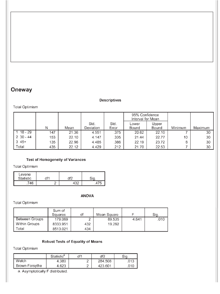
252 Statistical techniques to compare groups
The syntax from this procedure is:
ONEWAY
toptim BY agegp3
/STATISTICS DESCRIPTIVES HOMOGENEITY BROWNFORSYTHE WELCH
/PLOT MEANS
/MISSING ANALYSIS
/POSTHOC = TUKEY ALPHA(.05).
The output generated from this procedure is shown below:
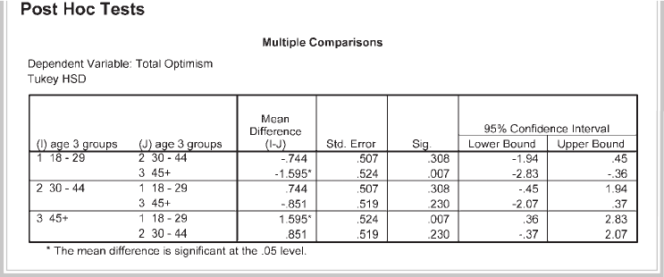
One-way analysis of variance 253
Interpretation of output from one-way between-groups
ANOVA with post-hoc tests
Descriptives
This table gives you information about each group (number in each group, means,
standard deviation, minimum and maximum, etc.). Always check this table fi rst. Are
the Ns for each group correct?
Test of homogeneity of variances
The homogeneity of variance option gives you Levene’s test for homogeneity of vari-
ances, which tests whether the variance in scores is the same for each of the three
groups. Check the signifi cance value (Sig.) for Levene’s test. If this number is greater
than .05 (e.g. .08, .28), you have not violated the assumption of homogeneity of
variance. In this example, the Sig. value is .475. As this is greater than .05, we have not
violated the homogeneity of variance assumption. If you have found that you violated
this assumption, you will need to consult the table in the output headed Robust Tests
of Equality of Means. The two tests shown there (Welch and Brown-Forsythe) are
preferable when the assumption of the homogeneity of variance is violated.
ANOVA
This table gives both between-groups and within-groups sums of squares, degrees of
freedom etc. You may recognise these from your statistics books. The main thing you
are interested in is the column marked Sig. (this is the p value). If the Sig. value is less
than or equal to .05 (e.g. .03, .001), there is a signifi cant difference somewhere among
the mean scores on your dependent variable for the three groups. This does not tell
you which group is different from which other group. The statistical signifi cance of
the differences between each pair of groups is provided in the table labelled Multiple
Comparisons, which gives the results of the post-hoc tests (described below). The

254 Statistical techniques to compare groups
means for each group are given in the Descriptives table. In this example the overall
Sig. value is .01, which is less than .05, indicating a statistically signifi cant result some-
where among the groups. Having received a statistically signifi cant difference, we can
now look at the results of the post-hoc tests that we requested.
Multiple comparisons
You should look at this table only if you found a signifi cant difference in your overall
ANOVA; that is, if the Sig. value was equal to or less than .05. The post-hoc tests in this
table will tell you exactly where the differences among the groups occur. Look down the
column labelled Mean Difference. Look for any asterisks (*) next to the values listed.
If you fi nd an asterisk, this means that the two groups being compared are signifi cantly
different from one another at the p<.05 level. The exact signifi cance value is given in the
column labelled Sig. In the results presented above, only group 1 and group 3 are statis-
tically signifi cantly different from one another. That is, the 18–29 age group and the 45+
age group differ signifi cantly in terms of their optimism scores.
Means plots
This plot provides an easy way to compare the mean scores for the different groups.
You can see from this plot that the 18–29 age group recorded the lowest optimism
scores, with the 45+ age group recording the highest.
Warning: these plots can be misleading. Depending on the scale used on the Y axis
(in this case, representing Optimism scores), even small differences can look dramatic.
In the above example, the actual difference in the mean scores between the groups is
very small (21.36, 22.10, 22.96), while on the graph it looks substantial. The lesson
here is: don’t get too excited about your plots until you have compared the mean
values (available in the Descriptives box) and the scale used in the plot.
Calculating effect size
Although SPSS does not generate it for this analysis, it is possible to determine the
effect size for this result (see the introduction to Part Five for a discussion on effect
sizes). The information you need to calculate eta squared, one of the most common
effect size statistics, is provided in the ANOVA table (a calculator would be useful
here). The formula is:
Eta squared = Sum of squares between groups
Total sum of squares
In this example, all you need to do is to divide the sum of squares for between-groups
(179.07) by the total sum of squares (8513.02). The resulting eta squared value is .02,
which in Cohen’s (1988, pp. 284–7) terms would be considered a small effect size.
Cohen classifi es .01 as a small effect, .06 as a medium effect and .14 as a large effect.

One-way analysis of variance 255
Warning: in this example we obtained a statistically signifi cant result, but the actual
difference in the mean scores of the groups was very small (21.36, 22.10, 22.96). This
is evident in the small effect size obtained (eta squared = .02). With a large enough
sample (in this case, N = 435) quite small differences can become statistically signifi -
cant, even if the difference between the groups is of little practical importance. Always
interpret your results carefully, taking into account all the information you have avail-
able. Don’t rely too heavily on statistical signifi cance—many other factors also need
to be considered.
Presenting the results from one-way between-groups ANOVA
with post-hoc tests
A one-way between-groups analysis of variance was conducted to explore the
impact of age on levels of optimism, as measured by the Life Orientation Test
(LOT). Participants were divided into three groups according to their age (Group
1: 29yrs or less; Group 2: 30 to 44yrs; Group 3: 45yrs and above). There was a
statistically signifi cant difference at the p < .05 level in LOT scores for the three
age groups: F (2, 432) = 4.6, p = .01. Despite reaching statistical signifi cance, the
actual difference in mean scores between the groups was quite small. The effect
size, calculated using eta squared, was .02. Post-hoc comparisons using the Tukey
HSD test indicated that the mean score for Group 1 (M = 21.36, SD = 4.55) was
signifi cantly different from Group 3 (M = 22.96, SD = 4.49). Group 2 (M = 22.10, SD
= 4.15) did not differ signifi cantly from either Group 1 or 3.
ONE-WAY BETWEEN-GROUPS ANOVA WITH PLANNED
COMPARISONS
In the example provided above, we were interested in comparing optimism scores across
each of the three groups. In some situations, however, researchers may be interested only
in comparisons between specifi c groups. For example, in an experimental study with fi ve
different interventions we may want to know whether Intervention 1 is superior to each
of the other interventions. In that situation, we may not be interested in comparing all
the possible combinations of groups. If we are interested in only a subset of the possible
comparisons it makes sense to use planned comparisons, rather than post-hoc tests,
because of ‘power’ issues (see discussion of power in the introduction to Part Five).
Planned comparisons are more ‘sensitive’ in detecting differences. Post-hoc tests,
on the other hand, set more stringent signifi cance levels to reduce the risk of a Type 1
error, given the larger number of tests performed. The choice of whether to use planned
comparisons versus post-hoc tests must be made before you begin your analysis. It is
256 Statistical techniques to compare groups
not appropriate to try both and see which results you prefer! To illustrate planned
comparisons I will use the same data as the previous example. Normally, you would
not conduct both analyses. In this case we will consider a slightly different question:
are participants in the older age group (45+yrs) more optimistic than those in the two
younger age groups (18–29yrs; 30–44yrs)?
Specifying coeffi cient values
In the following procedure, you will be asked by SPSS to indicate which particular
groups you wish to compare. To do this, you need to specify ‘coeffi cient’ values. Many
students fi nd this confusing initially, so I will explain this process here.
First, you need to identify your groups based on the different values of the
independent variable (agegp3):
• Group 1 (coded as 1): age 18–29
• Group 2 (coded as 2): age 30–44
• Group 3 (coded as 3): age 45+
Next, you need to decide which of the groups you wish to compare and which you
wish to ignore. I will illustrate this process using a few examples.
Example 1
To compare Group 3 with the other two groups, the coeffi cients would be as follows:
• Group 1: –1
• Group 2: –1
• Group 3: 2
The values of the coeffi cients should add up to 0. Coeffi cients with different values are
compared. If you wished to ignore one of the groups, you would give it a coeffi cient of 0.
You would then need to adjust the other coeffi cient values so that they added up to 0.
Example 2
To compare Group 3 with Group 1 (ignoring Group 2), the coeffi cients would be as
follows:
• Group 1: –1
• Group 2: 0
• Group 3: 1
This information on the coeffi cients for each of your groups will be required in the
Contrasts section of the SPSS procedure that follows.

One-way analysis of variance 257
Procedure for one-way between-groups ANOVA with planned
comparisons
1. From the menu at the top of the screen, click on Analyze, then select
Compare Means, then One-way ANOVA.
2. Click on your dependent (continuous) variable (e.g. total optimism:
toptim). Click on the arrow to move this variable into the box marked
Dependent List.
3. Click on your independent, categorical variable (e.g. agegp3). Move this
into the box labelled Factor.
4. Click the Options button and click on Descriptive, Homogeneity-of-
Variance and Means Plot.
5. For Missing Values, make sure there is a dot in the option marked Exclude
cases analysis by analysis. Click on Continue.
6. Click on the Contrasts button.
• In the Coeffi cients box, type the coeffi cient for the fi rst group (from
Example 1 above, this value would be –1). Click on Add.
• Type in the coeffi cient for the second group (–1). Click on Add.
• Type in the coeffi cient for the third group (2). Click on Add.
• The Coeffi cient Total down the bottom of the table should be 0 if you
have entered all the coeffi cients correctly.
7. Click on Continue and then OK (or on Paste to save to Syntax Editor).
The syntax from this procedure is:
ONEWAY
toptim BY agegp3
/CONTRAST= -1 -1 2
/STATISTICS DESCRIPTIVES HOMOGENEITY BROWNFORSYTHEWELCH
/PLOT MEANS
/MISSING ANALYSIS
/POSTHOC = TUKEY ALPHA(.05).
Selected output generated from this procedure is shown below.
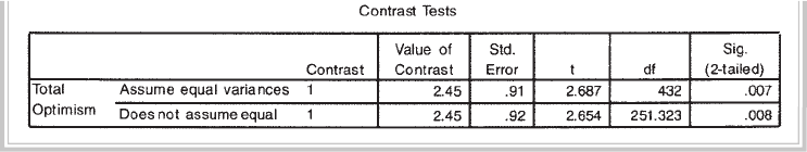
258 Statistical techniques to compare groups
Interpretation of output from one-way between-groups
ANOVA with planned comparisons
The Descriptives and Test of homogeneity of variances tables generated as part of
this output are the same as obtained in the previous example for one-way ANOVA
with post-hoc tests. Only the output relevant to planned comparisons will be discussed
here.
Step 1
In the table labelled Contrast Coeffi cients, the coeffi cients that you specifi ed for each
of your groups is provided. Check that this is what you intended.
Step 2
The main results that you are interested in are presented in the table labelled Contrast
Tests. As we can assume equal variances (our Levene’s test was not signifi cant), we
will use the fi rst row in this table. The Sig. level for the contrast that we specifi ed is
.007. This is less than .05, so we can conclude that there is a statistically signifi cant
difference between Group 3 (45+ age group) and the other two groups. Although
statistically signifi cant, the actual difference between the mean scores of these groups
is very small (21.36, 22.10, 22.96). Refer to the results of the previous section for
further discussion on this point.
You will notice that the result of the planned comparisons analysis is expressed
using a t statistic, rather than the usual F ratio associated with analysis of variance. To
obtain the corresponding F value, all you need to do is to square the t value. In this
example the t value is 2.687 which, when squared, equals 7.22. To report the results,
you also need the degrees of freedom. The fi rst value (for all planned comparisons) is
1; the second is given in the table next to the t value (in this example the value is 432).
Therefore, the results would be expressed as F (1, 432) = 7.22, p = .007.
ONE-WAY REPEATED MEASURES ANOVA
In a one-way repeated measures ANOVA design, each subject is exposed to two
or more different conditions, or measured on the same continuous scale on three
or more occasions. It can also be used to compare respondents’ responses to two or
One-way analysis of variance 259
more different questions or items. These questions, however, must be measured using
the same scale (e.g. 1=strongly disagree, to 5=strongly agree).
Example of research question: Is there a change in confi dence scores over the three
time periods?
What you need: One group of participants measured on the same scale on three dif-
ferent occasions or under three different conditions, or each person measured on three
different questions or items (using the same response scale). This involves two variables:
• one independent variable (categorical) (e.g. Time 1/Time 2/Time 3)
• one dependent variable (continuous) (e.g. scores on the Confi dence in Coping
with Statistics Test). The scores on the test for each time point will appear in the
data fi le in different columns.
What it does: This technique will tell you if there is a signifi cant difference somewhere
among the three sets of scores.
Assumptions: See discussion of the general ANOVA assumptions presented in the
introduction to Part Five.
Non-parametric alternative: Friedman Test (see Chapter 16).
Details of example
To demonstrate the use of this technique, the data fi le labelled experim4ED.sav
(included on the website) will be used. Details of this data fi le can be found in the
Appendix. A group of students were invited to participate in an intervention designed
to increase their confi dence in their ability to do statistics. Their confi dence levels
(as measured by a self-report scale) were measured before the intervention (Time 1),
after the intervention (Time 2) and again three months later (Time 3).
If you wish to follow along with the procedure, you should start SPSS and open
the fi le labelled experim4ED.sav. Details of the variable names and labels from the
data fi le are provided below.
File name: experim4ED.sav
Variables:
• Confi dence scores at Time 1 (Confi d1): Total scores on the Confi dence in Coping
with Statistics Test administered prior to the program. Scores range from 10 to 40.
High scores indicate higher levels of confi dence.
• Confi dence scores at time2 (Confi d2): Total scores on the Confi dence in Coping
with Statistics Test administered after the program.
• Confi dence scores at time3 (Confi d3): Total scores on the Confi dence in Coping
with Statistics Test administered three months later.

260 Statistical techniques to compare groups
Procedure for one-way repeated measures ANOVA
1. From the menu at the top of the screen, click on Analyze, then General
Linear Model, then Repeated Measures.
2. In the Within Subject Factor Name box, type in a name that represents
your independent variable (e.g. Time or Condition). This is not an actual
variable name, just a label you give your independent variable.
3. In the Number of Levels box, type the number of levels or groups (time
periods) involved (in this example, it is 3).
4. Click Add.
5. Click on the Defi ne button.
6. Select the three variables that represent your repeated measures variable
(e.g. confi dence time1: confi d1, confi dence time2: confi d2, confi dence
time3: confi d3). Click on the arrow button to move them into the Within
Subjects Variables box.
7. Click on the Options box.
8. Tick the Descriptive Statistics and Estimates of effect size boxes in
the area labelled Display. If you wish to request post-hoc tests, select
your independent variable name (e.g. Time) in the Factor and Factor
Interactions section and move it into the Display Means for box. Tick
Compare main effects. In the Confi dence interval adjustment section,
click on the down arrow and choose the second option Bonferroni.
9. Click on Continue and then OK (or on Paste to save to Syntax Editor).
The syntax generated from this procedure is:
GLM
confi d1 confi d2 confi d3
/WSFACTOR = time 3 Polynomial
/METHOD = SSTYPE(3)
/PLOT = PROFILE( time )
/EMMEANS = TABLES(time) COMPARE ADJ(BONFERRONI)
/PRINT = DESCRIPTIVE ETASQ
/CRITERIA = ALPHA(.05)
/WSDESIGN = time .
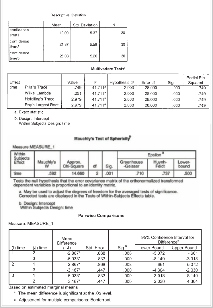
One-way analysis of variance 261
Some of the output generated from this procedure is shown below.
262 Statistical techniques to compare groups
Interpretation of output from one-way repeated measures
ANOVA
You will notice that this technique generates a lot of complex-looking output. This
includes tests for the assumption of sphericity, and both univariate and multivariate
ANOVA results. Full discussion of the difference between the univariate and multi-
variate results is beyond the scope of this book; in this chapter, only the multivariate
results will be discussed (see Stevens 1996, pp. 466–9, for more information). The
reason for interpreting the multivariate statistics provided by SPSS is that the univari-
ate statistics make the assumption of sphericity. The sphericity assumption requires
that the variance of the population difference scores for any two conditions are the
same as the variance of the population difference scores for any other two conditions
(an assumption that is commonly violated). This is assessed by SPSS using Mauchly’s
Test of Sphericity.
The multivariate statistics, however, do not require sphericity. You will see in our
example that we have violated the assumption of sphericity, as indicated by the Sig.
value of .001 in the box labelled Mauchly’s Test of Sphericity. Although there are
ways to compensate for this assumption violation, it is safer to inspect the multivari-
ate statistics provided in the output.
Let’s look at the key values in the output that you will need to consider.
Descriptive statistics
In the fi rst output box, you are provided with the descriptive statistics for your three
sets of scores (Mean, Standard deviation, N). It is a good idea to check that
these make sense. Is there the right number of people in each group? Do the mean
values make sense given the scale that was used? In the example above, you will see
that the lowest mean confi dence score was for Time 1 (before the intervention) and
the highest at Time 3 (after the statistics course was completed).
Multivariate tests
In this table, the value that you are interested in is Wilks’ Lambda, also the associated
probability value given in the column labelled Sig. All of the multivariate tests yield
the same result, but the most commonly reported statistic is Wilks’ Lambda. In this
example the value for Wilks’ Lambda is .25, with a probability value of .000 (which
really means p<.0005). The p value is less than .05; therefore we can conclude that
there is a statistically signifi cant effect for time. This suggests that there was a change
in confi dence scores across the three different time periods.
Effect size
Although we have found a statistically signifi cant difference between the three sets of
scores, we also need to assess the effect size of this result (see discussion on effect sizes in
One-way analysis of variance 263
the introduction to Part Five of this book). The value you are interested in is Partial Eta
Squared, given in the Multivariate Tests output box. The value obtained in this study
is .749. Using the commonly used guidelines proposed by Cohen (1988, pp. 284–7)
(.01=small, .06=moderate, .14=large effect), this result suggests a very large effect size.
Pairwise comparisons
If you obtain a statistically signifi cant result from the above analyses, this suggests that
there is a difference somewhere among your groups. It does not tell you which groups or
set of scores (in this case, Time 1, Time 2, Time 3) differ from one another. This informa-
tion is provided in the Pairwise Comparisons table, which compares each pair of time
points and indicates whether the difference between them is signifi cant (see Sig. column).
In this example, each of the differences is signifi cant (all Sig. values are less than .05).
Presenting the results from one-way repeated measures
ANOVA
The results of one-way repeated measures ANOVA could be presented as follows:
A one-way repeated measures ANOVA was conducted to compare scores on the
Confi dence in Coping with Statistics Test at Time 1 (prior to the intervention), Time 2
(following the intervention) and Time 3 (three-month follow-up). The means and
standard deviations are presented in Table 1. There was a signifi cant effect for time,
Wilks’ Lambda = .25, F (2, 28) = 41.17, p < .0005, multivariate partial eta squared = .75.
Table 1
Descriptive Statistics for Confi dence in Coping with Statistics Test Scores for Time
1, Time 2 and Time 3
ADDITIONAL EXERCISES
Business
Data fi le: staffsurvey4ED.sav. See Appendix for details of the data fi le.
1. Conduct a one-way ANOVA with post-hoc tests (if appropriate) to compare staff
satisfaction scores (totsatis) across each of the length of service categories (use the
servicegp3 variable).
264 Statistical techniques to compare groups
Health
Data fi le: sleep4ED.sav. See Appendix for details of the data fi le.
1. Conduct a one-way ANOVA with post-hoc tests (if appropriate) to compare the
mean sleepiness ratings (Sleepiness and Associated Sensations Scale total score:
totSAS) for the three age groups defi ned by the variable agegp3 (<=37, 38–50,
51+).
265
19
Two-way between-groups
ANOVA
In this chapter, we will explore two-way, between-groups analysis of variance.
Two-way means that there are two independent variables, and between-groups indi-
cates that different people are in each of the groups. This technique allows us to look
at the individual and joint effect of two independent variables on one dependent
variable. In Chapter 18, we used one-way between-groups ANOVA to compare the
optimism scores for three age groups (18–29, 30–44, 45+). We found a signifi cant
difference between the groups, with post-hoc tests indicating that the major differ-
ence was between the youngest and oldest groups. Older people reported higher levels
of optimism.
The next question we can ask is: is this the case for both males and females?
One-way ANOVA cannot answer this question—the analysis was conducted on the
sample as a whole, with males and females combined. In this chapter, I will take
the investigation a step further and consider the impact of gender on this fi nding. I
will therefore have two independent variables (age group and sex) and one dependent
variable (optimism).
The advantage of using a two-way design is that we can test the ‘main effect’ for
each independent variable and also explore the possibility of an ‘interaction effect’. An
interaction effect occurs when the effect of one independent variable on the depen-
dent variable depends on the level of a second independent variable. For example,
in this case we may fi nd that the infl uence of age on optimism is different for males
and females. For males optimism may increase with age, while for females it may
decrease. If that were the case, we would say that there is an interaction effect. In order
to describe the impact of age, we must specify which group (males/females) we are
referring to.
If you are not clear on main effects and interaction effects, I suggest you review
this material in any good statistics text (see Gravetter & Wallnau 2004; Harris 1994;
Runyon, Coleman & Pittenger 2000; Tabachnick & Fidell 2007). Before proceeding
266 Statistical techniques to compare groups
I would also recommend that you read through the introduction to Part Five of this
book, where I discuss a range of topics relevant to analysis of variance techniques.
DETAILS OF EXAMPLE
To demonstrate the use of this technique, I will be using the survey4ED.sav data fi le
included on the website accompanying this book (see p. viii). The data come from a
survey that was conducted to explore the factors that affect respondents’ psychological
adjustment, health and wellbeing. This is a real data fi le from actual research conducted
by a group of my graduate diploma students. Full details of the study, the questionnaire
and scales used are provided in the Appendix. If you wish to follow along with the steps
described in this chapter, you should start SPSS and open the fi le labelled survey4ED.
sav. Details of the variables used in this analysis are provided below.
File name: survey4ED.sav
Variables:
• Total optimism (Toptim): total score on the Optimism Scale. Scores can range
from 6 to 30, with high scores indicating higher levels of optimism.
• Age group (Agegp3): this variable is a recoded variable, dividing age into three
equal groups: Group 1: 18–29=1; Group 2: 30–44=2; Group 3: 45+=3 (see instruc-
tions for how to do this in Chapter 8).
• Sex: Males=1, Females=2.
Example of research question: What is the impact of age and gender on optimism?
Does gender moderate the relationship between age and optimism?
What you need: Three variables:
• two categorical independent variables (e.g. sex: males/females; age group: young,
middle, old)
• one continuous dependent variable (e.g. total optimism).
What it does: Two-way ANOVA allows you to simultaneously test for the effect of
each of your independent variables on the dependent variable and also identifi es any
interaction effect. For example, it allows you to test for (a) sex differences in optimism,
(b) differences in optimism for young, middle and old participants, and (c) the inter-
action of these two variables—is there a difference in the effect of age on optimism
for males and females?
Assumptions: See the introduction to Part Five for a discussion of the assumptions
underlying ANOVA.
Non-parametric alternative: None.

Two-way between-groups ANOVA 267
Procedure for two-way ANOVA
1. From the menu at the top of the screen, click on Analyze, then select
General Linear Model, then Univariate.
2. Click on your dependent, continuous variable (e.g. total optimism: toptim)
and click on the arrow to move it into the box labelled Dependent variable.
3. Click on your two independent, categorical variables (sex, agegp3) and
move these into the box labelled Fixed Factors.
4. Click on the Options button.
• Click on Descriptive Statistics, Estimates of effect size and
Homogeneity tests.
• Click on Continue.
5. Click on the Post Hoc button.
• From the Factors listed on the left-hand side, choose the independent
variable(s) you are interested in (this variable should have three or
more levels or groups: e.g. agegp3).
• Click on the arrow button to move it into the Post Hoc Tests for section.
• Choose the test you wish to use (in this case, Tukey).
• Click on Continue.
6. Click on the Plots button.
• In the Horizontal box, put the independent variable that has the most
groups (e.g. agegp3).
• In the box labelled Separate Lines, put the other independent
variable (e.g. sex).
• Click on Add.
• In the section labelled Plots, you should now see your two variables
listed (e.g. agegp3*sex).
7. Click on Continue and then OK (or on Paste to save to Syntax Editor).
The syntax from this procedure is:
UNIANOVA
toptim BY agegp3 sex
/METHOD = SSTYPE(3)
/INTERCEPT = INCLUDE
/POSTHOC = agegp3 ( TUKEY )
/PLOT = PROFILE( agegp3*sex )
/PRINT = DESCRIPTIVE ETASQ HOMOGENEITY
/CRITERIA = ALPHA(.05)
/DESIGN = agegp3 sex agegp3*sex .

268 Statistical techniques to compare groups
The output generated from this procedure is shown as follows.
Descriptive Statistics
Dependent Variable: Total Optimism
21.384.3360
21.344.7287
21.364.55147
22.383.5568
21.884.5885
22.10 4.15 153
22.234.0956
23.47 4.7079
22.964.49135
22.01 3.98184
22.204.73251
22.12 4.43435
SEX
MALES
FEMALES
T
otal
MALES
FEMALES
T
otal
MALES
FEMALES
To tal
MALES
FEMALES
T
otal
AGEGP
18-29
30-44
45+
Total
Mean Std. Deviation N
Levene's Test of Equality of Error Variances a
Dependent Variable: Total Optimism
1.083 5429 .369
F df1 df2 Sig.
Tests the null hypothe sis that the error variance of the
dependent variable is equal across groups.
Design: Intercept +AGEGP3 +SEX+A GEGP3 * SEX
a.
Two-way between-groups ANOVA 269
Multiple Comparisons
Dependent Variable : Total Optimism
Tuke y HSD
-.74 .51 .307 -1.93 .44
-1.60* .52 .007 -2.82 -.37
.74 .51 .307 -.44 1.93
-.85 .52 .228 -2.07 .36
1.60* .52 .007 .37 2.82
.85 .52 .228 -.36 2.07
(J)
AGEGP3
30- 44
45+
18-29
45 +
18-29
30-44
(I)
AGEGP3
18-29
30-44
45+
Mean
Differenc e (I-J) Std. Error Sig. Lower Bound Upper Bound
95% Co nfid enc e Interval
Based on observed means.
The mean difference is significant at the .05 level.
*
Profi le plots
Estimated Marginal Means of Total Optimism
AGEGP3
45+30-4418-29
E
stimated Marginal Means
24.0
23.5
23.0
22.5
22.0
21.5
21.0
SEX
MALES
FEMALES
INTERPRETATION OF OUTPUT FROM TWO-WAY ANOVA
Descriptive statistics
These provide the Mean scores, Std deviations and N for each subgroup. Check that
these values are correct. Inspecting the pattern of these values will also give you an
indication of the impact of your independent variables.
Levene’s Test of Equality of Error Variances
This test provides a test of one of the assumptions underlying analysis of variance.
The value you are most interested in is the Sig. level. You want this to be greater than
.05 and therefore not signifi cant. A signifi cant result (Sig. value less than .05) suggests
that the variance of your dependent variable across the groups is not equal. If you
270 Statistical techniques to compare groups
fi nd this to be the case in your study, it is recommended that you set a more stringent
signifi cance level (e.g. .01) for evaluating the results of your two-way ANOVA. That
is, you will consider the main effects and interaction effects signifi cant only if the
Sig. value is greater than .01. In the example displayed above, the Sig. level is .369. As
this is larger than .05, we can conclude that we have not violated the homogeneity of
variances assumption.
The main output from two-way ANOVA is a table labelled Tests of Between-
Subjects Effects. This gives you a number of pieces of information, not necessarily in
the order in which you need to check them.
Interaction effects
The fi rst thing you need to do is to check for the possibility of an interaction effect (e.g.
that the infl uence of age on optimism levels depends on whether you are male or female).
If you fi nd a signifi cant interaction effect, you cannot easily and simply interpret the main
effects. This is because, in order to describe the infl uence of one of the independent vari-
ables, you need to specify the level of the other independent variable. In the SPSS output,
the line we need to look at is labelled agegp3*sex. To fi nd out whether the interaction
is signifi cant, check the Sig. column for that line. If the value is less than or equal to .05
(e.g. .03, .01, .001), there is a signifi cant interaction effect. In our example, the interaction
effect is not signifi cant (agegp3*sex: sig. = .237). This indicates that there is no signifi cant
difference in the effect of age on optimism for males and females.
Warning: when checking signifi cance levels in this output, make sure you read the
correct column (the one labelled Sig.—a lot of students make the mistake of reading
the Partial Eta Squared column, with dangerous consequences!).
Main effects
We did not have a signifi cant interaction effect; therefore, we can safely interpret the
main effects. These are the simple effect of one independent variable (e.g. the effect of
sex with all age groups collapsed). In the left-hand column, fi nd the variable you are
interested in (e.g. agegp3). To determine whether there is a main effect for each inde-
pendent variable, check in the column marked Sig. next to each variable. If the value is
less than or equal to .05 (e.g. .03, .001), there is a signifi cant main effect for that inde-
pendent variable. In the example shown above, there is a signifi cant main effect for
age group (agegp3: Sig. = .021) but no signifi cant main effect for sex (sex: Sig. = .586).
This means that males and females do not differ in terms of their optimism scores, but
there is a difference in scores for young, middle and old participants.
Effect size
The effect size for the agegp3 variable is provided in the column labelled Partial Eta
Squared (.018). Using Cohen’s (1988) criterion, this can be classifi ed as small (see
Two-way between-groups ANOVA 271
introduction to Part Five). So, although this effect reaches statistical signifi cance, the
actual difference in the mean values is very small. From the Descriptives table we
can see that the mean scores for the three age groups (collapsed for sex) are 21.36,
22.10 and 22.96. The difference between the groups appears to be of little practical
signifi cance.
Post-hoc tests
Although we know that our age groups differ, we do not know where these differ-
ences occur: is gp1 different from gp2, is gp2 different from gp3, is gp1 different from
gp3? To investigate these questions, we need to conduct post-hoc tests (see descrip-
tion of these in the introduction to Part Five). Post-hoc tests are relevant only if
you have more than two levels (groups) to your independent variable. These tests
systematically compare each of your pairs of groups, and indicate whether there is
a signifi cant difference in the means of each. These post-hoc tests are provided as
part of the ANOVA output. You are, however, not supposed to look at them until you
fi nd a signifi cant main effect or interaction effect in the overall (omnibus) analysis of
variance test. In this example, we obtained a signifi cant main effect for agegp3 in our
ANOVA; therefore, we are entitled to dig further using the post-hoc tests for agegp.
Multiple comparisons
The results of the post-hoc tests are provided in the table labelled Multiple Compari-
sons. We have requested the Tukey Honestly Signifi cant Difference (HSD) test, as
this is one of the more commonly used tests. Look down the column labelled Sig. for
any values less than .05. Signifi cant results are also indicated by a little asterisk in the
column labelled Mean Difference. In the above example, only group 1 (18–29) and
group 3 (45+) differ signifi cantly from one another.
Plots
You will see at the end of your output a plot of the optimism scores for males and
females, across the three age groups. This plot is very useful for allowing you to
visually inspect the relationship among your variables. This is often easier than trying
to decipher a large table of numbers. Although presented last, the plots are often
useful to inspect fi rst to help you better understand the impact of your two indepen-
dent variables.
Warning: when interpreting these plots, remember to consider the scale used to
plot your dependent variable. Sometimes what looks like an enormous difference
on the plot will involve only a few points difference. You will see this in the current
example. In the fi rst plot, there appears to be quite a large difference in male and
female scores for the older age group (45+). If you read across to the scale, however,
the difference is only small (22.2 as compared with 23.5).

272 Statistical techniques to compare groups
PRESENTING THE RESULTS FROM TWO-WAY ANOVA
The results of the analysis conducted above could be presented as follows:
A two-way between-groups analysis of variance was conducted to explore the
impact of sex and age on levels of optimism, as measured by the Life Orientation
Test (LOT). Participants were divided into three groups according to their age
(Group 1: 18–29 years; Group 2: 30–44 years; Group 3: 45 years and above). The
interaction effect between sex and age group was not statistically signifi cant,
F (2, 429) = 1.44, p = .24. There was a statistically signifi cant main effect for age,
F (2, 429) = 3.91, p = .02; however, the effect size was small (partial eta squared =
.02). Post-hoc comparisons using the Tukey HSD test indicated that the mean score
for the 18–29 years age group (M = 21.36, SD = 4.55) was signifi cantly different
from the 45 + group (M = 22.96, SD = 4.49). The 30–44 years age group (M = 22.10,
SD = 4.15) did not differ signifi cantly from either of the other groups. The main
effect for sex, F (1, 429) = .30, p = .59, did not reach statistical signifi cance.
ADDITIONAL ANALYSES IF YOU OBTAIN A
SIGNIFICANT INTERACTION EFFECT
If you obtain a signifi cant result for your interaction effect, you may wish to conduct
follow-up tests to explore this relationship further (this applies only if one of your vari-
ables has three or more levels). One way that you can do this is to conduct an analysis
of simple effects. This means that you will look at the results for each of the subgroups
separately. This involves splitting the sample into groups according to one of your inde-
pendent variables and running separate one-way ANOVAs to explore the effect of the
other variable. If we had obtained a signifi cant interaction effect in the above example,
we might choose to split the fi le by sex and look at the effect of age on optimism sep-
arately for males and females. To split the sample and repeat analyses for each group, you
need to use the Split File option. This option allows you to split your sample according
to one categorical variable and to repeat analyses separately for each group.
Procedure for splitting the sample
1. From the menu at the top of the screen, click on Data, then click on Split File.
2. Click on Organize output by groups.
3. Move the grouping variable (sex) into the box marked Groups based on.
4. This will split the sample by sex and repeat any analyses that follow for
these two groups separately.
5. Click on OK.
Two-way between-groups ANOVA 273
After splitting the fi le, you then perform a one-way ANOVA (see Chapter 18),
comparing optimism levels for the three age groups. With the Split File in operation,
you will obtain separate results for males and females.
Important: Once you have completed the analysis remember to turn off the Split
File option, otherwise all subsequent analyses will be split for the two groups. To turn
it off, choose Data from the menu and select Split File. Tick the fi rst option Analyze
all cases, do not create groups and then click on OK.
ADDITIONAL EXERCISES
Business
Data fi le: staffsurvey4ED.sav. See Appendix for details of the data fi le.
1. Conduct a two-way ANOVA with post-hoc tests (if appropriate) to compare staff
satisfaction scores (totsatis) across each of the length of service categories (use the
servicegp3 variable) for permanent versus casual staff (employstatus).
Health
Data fi le: sleep4ED.sav. See Appendix for details of the data fi le.
1. Conduct a two-way ANOVA with post-hoc tests (if appropriate) to compare male
and female (gender) mean sleepiness ratings (Sleepiness and Associated Sen-
sations Scale total score: totSAS) for the three age groups defi ned by the variable
agegp3 (<=37, 38–50, 51+).
274
20
Mixed between-within
subjects analysis of
variance
In the previous analysis of variance chapters, we have explored the use of both
between-subjects designs (comparing two or more different groups) and within-
subjects or repeated measures designs (one group of participants exposed to two or
more conditions). Up until now, we have treated these approaches separately. There
may be situations, however, where you want to combine the two approaches in the
one study, with one independent variable being between-subjects and the other a
within-subjects variable. For example, you may want to investigate the impact of an
intervention on clients’ anxiety levels (using pre-test and post-test), but you would also
like to know whether the impact is different for males and females. In this case, you
have two independent variables: one is a between-subjects variable (gender: males/
females); the other is a within-subjects variable (time). In this case, you would expose
a group of both males and females to the intervention and measure their anxiety
levels at Time 1 (pre-intervention) and again at Time 2 (after the intervention).
SPSS allows you to combine between-subjects and within-subjects variables in the
one analysis. You will see this analysis referred to in some texts as a split-plot ANOVA
design (SPANOVA). I have chosen to use Tabachnick and Fidell’s (2007) term ‘mixed
between-within subjects ANOVA’ because I feel this best describes what is involved.
This technique is an extension to the repeated measures design discussed in Chapter
18. It would be a good idea to review that chapter before proceeding further.
This chapter is intended as a very brief overview of mixed between-within subjects
ANOVA. If you intend to use this technique in your own research, read more broadly
(e.g. Harris 1994; Keppel & Zedeck 2004; Stevens 1996; Tabachnick & Fidell 2007).
DETAILS OF EXAMPLE
To illustrate the use of mixed between-within subjects ANOVA, I will be using the
experim4ED.sav data fi le included on the website that accompanies this book (see
Mixed between-within subjects analysis of variance 275
p. viii). These data refer to a fi ctitious study that involves testing the impact of two
different types of interventions in helping students cope with their anxiety concern-
ing a forthcoming statistics course (see the Appendix for full details of the study).
Students were divided into two equal groups and asked to complete a Fear of Statistics
Test. One group was given a number of sessions designed to improve their math-
ematical skills; the second group participated in a program designed to build their
confi dence. After the program, they were again asked to complete the same test they
had done before the program. They were also followed up three months later. The
manufactured data fi le is included on the website that accompanies this book. If you
wish to follow the procedures detailed below, you will need to start SPSS and open the
experim4ED.sav fi le.
In this example, I will compare the impact of the Maths Skills class (Group 1)
and the Confi dence Building class (Group 2) on participants’ scores on the Fear of
Statistics Test across the three time periods. Details of the variable names and labels
from the data fi le are provided below.
File name: experim4ED.sav
Variables:
• Type of class (group): 1=Maths Skills, 2=Confi dence Building.
• Fear of Statistics Test scores at time1 (Fost1): administered before the program.
Scores range from 20 to 60. High scores indicate greater fear of statistics.
• Fear of Statistics Test scores at time2 (Fost2): administered at the end of the
program.
• Fear of Statistics Test scores at time3 (Fost3): administered three months after the
program was complete.
Example of research question: Which intervention is more effective in reducing
participants’ Fear of Statistics Test scores across the three time periods (pre-interven-
tion, post-intervention, three-month follow-up)? Is there a change in participants’
Fear of Statistics Test scores across the three time periods?
What you need: At least three variables are involved:
• one categorical independent between-subjects variable with two or more levels
(group1/group2)
• one categorical independent within-subjects variable with two or more levels
(time1/time2/ time3)
• one continuous dependent variable (scores on the Fear of Statistics Test measured
at each time period).
What it does: This analysis will test whether there are main effects for each of the
independent variables and whether the interaction between the two variables is

276 Statistical techniques to compare groups
signifi cant. In this example, it will tell us whether there is a change in Fear of Statis-
tics Test scores over the three time periods (main effect for time). It will compare the
two interventions (maths skills/confi dence building) in terms of their effectiveness
in reducing fear of statistics (main effect for group). Finally, it will tell us whether
the change in Fear of Statistics Test scores over time is different for the two groups
(interaction effect).
Assumptions: See the introduction to Part Five for a discussion of the general assump-
tions underlying ANOVA.
Additional assumption: Homogeneity of intercorrelations. For each of the levels of
the between-subjects variable, the pattern of intercorrelations among the levels
of the within-subjects variable should be the same. This assumption is tested as part
of the analysis, using Box’s M statistic. Because this statistic is very sensitive, a more
conservative alpha level of .001 should be used. You are hoping that the statistic is not
signifi cant (i.e. the probability level should be greater than .001).
Non-parametric alternative: None.
Procedure for mixed between-within ANOVA
1. From the menu at the top of the screen, click on Analyze, then select
General Linear Model, then Repeated measures.
2. In the box labelled Within-Subject Factor Name, type a name that
describes the within-subjects factor (e.g. time). This is not an actual
variable name, but a descriptive term that you choose.
3. In the Number of Levels box, type the number of levels that this factor
has (in this case there are three time periods; therefore, you would
type 3).
4. Click on the Add button. Click on the Defi ne button.
5. Click on the variables that represent the within-subjects factor (e.g. fear
of stats scores from Time 1, Time 2 and Time 3).
6. Click on the arrow to move these into the Within-Subjects Variables box.
You will see them listed (using only the short variable name: fost1, fost2,
fost3).
7. Click on your between-subjects variable (e.g. type of class: group). Click
on the arrow to move this variable into the Between-Subjects Factors
box.
8. Click on the Options button.
• In the Display section, make sure there is a tick for Descriptive
statistics, Estimates of effect size, Homogeneity tests.
• Click on Continue.

Mixed between-within subjects analysis of variance 277
9. Click on the Plots button.
• Click on the within-groups factor (e.g. time) and move it into the box
labelled Horizontal Axis.
• In the Separate Lines box, click on the between-groups variable (e.g.
group).
10. Click on Add. In the box, you should see your variables listed (e.g.
time*group).
11. Click on Continue and then OK (or on Paste to save to Syntax Editor).
The syntax from this procedure is:
GLM
fost1 fost2 fost3 BY group
/WSFACTOR = time 3 Polynomial
/METHOD = SSTYPE(3)
/PLOT = PROFILE( time*group )
/PRINT = DESCRIPTIVE ETASQ HOMOGENEITY
/CRITERIA = ALPHA(.05)
/WSDESIGN = time
/DESIGN = group .
Selected output generated from this procedure is shown below.
Descriptive Statistics
39.874.6015
40.475.8215
40.17 5.16 30
37.674.51 15
37.335.8815
37.505.15 30
36.07 5.4315
34.406.6315
35.236.0230
ype of c lass
maths skills
confidence
building
Total
maths skills
confidenc e
building
Total
maths skills
confidenc e
building
Total
fearof stats
time1
fear of stats
time2
fear of stats
time3
Mean Std. Deviation N
T

278 Statistical techniques to compare groups
Box's Test ofEquality of CovarianceMa trices a
1.5 20
.224
6
5680
.969
Box's M
F
df1
df2
Sig.
Tests the null hy pothesis that the observedcovariance
matrices of the dependent variables are equal across g roups .
Design: Intercept +GROUP
Within Subjects Design: TIME
a.
Mauchly's Test of Sphericity
b
Measure: MEASURE _1
.348 28.517 2 .000 .605 .640 .500
Within Subjects
Effect
TIME
Mauchly's W
Approx.
Chi-Square df Sig.
Greenhouse-
Geisser Huynh -Feldt Lower-bound
Epsilon a
Tests the null hypothesis that the error c ovariance matrix of the orthonormalized transformed dependent variables is proportional
to an identity matrix.
May be used to adjust the degrees of freedom for the averaged tests of significance. Corrected tests are displayed in
the Tests of Within- Subjec ts Effec ts ta ble.
a.
Design: Intercept +GROUP
Within Subjects Design: TIME
b.
Levene's Test of Equality of Error Var iances a
.893 1 28 .353
.767 1 28 .389
.770 1 28 .388
fear of stats
time1
fear of stats
time2
fear of stats
time3
F df1 df2 Sig.
Tests the null hypothesis that the error variance of the dependent variable is
equal across groups .
Design: Intercept +GROUP
Within Subjec ts Design: TIME
a.
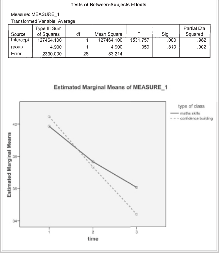
Mixed between-within subjects analysis of variance 279
Profi le plots
INTERPRETATION OF OUTPUT FROM MIXED BETWEEN-
WITHIN ANOVA
You will notice (once again) that this technique generates a good deal of rather
complex-looking output. If you have worked your way through the previous chapters,
you will recognise some of the output from other analysis of variance procedures.
This output provides tests for the assumptions of sphericity, univariate ANOVA
280 Statistical techniques to compare groups
results and multivariate ANOVA results. Full discussion of the difference between the
univariate and multivariate results is beyond the scope of this book; in this chapter,
only the multivariate results will be discussed (for more information see Stevens 1996,
pp. 466–9). The reason for interpreting the multivariate statistics is that the univari-
ate statistics make the assumption of sphericity. The sphericity assumption requires
that the variance of the population difference scores for any two conditions are the
same as the variance of the population difference scores for any other two conditions
(an assumption that is commonly violated). This is assessed using Mauchly’s Test of
Sphericity. The multivariate statistics do not require sphericity. You will see in our
example that we have violated the assumption of sphericity, as indicated by the Sig.
value of .000 in the box labelled Mauchly’s Test of Sphericity. Although there are
ways to compensate for this assumption violation, it is safer to inspect the multivari-
ate statistics provided in the output.
Let’s look at the key values in the output that you will need to consider.
Descriptive statistics
In the fi rst output box, you are provided with the descriptive statistics for your three
sets of scores (Mean, Std Deviation, N). It is a good idea to check that these make
sense. Are there the right numbers of people in each group? Do the Mean values make
sense given the scale that was used? In the example above, you will see that the highest
Fear of Statistics Test scores are at Time 1 (39.87 and 40.47), that they drop at Time 2
(37.67 and 37.33) and drop even further at Time 3 (36.07 and 34.40). What we don’t
know, however, is whether these differences are large enough to be considered statisti-
cally signifi cant.
Assumptions
Check the Levene’s Test of Equality of Error Variances box to see if you have violated
the assumption of homogeneity of variances. We want the Sig. value to be non-
signifi cant (bigger than .05). In this case, the value for each variable is greater than .05
(.35, .39, .39); therefore we are safe and can proceed.
The next thing to check is Box’s Test of Equality of Covariance Matrices. We
want a Sig. value that is bigger than .001. In this example the value is .97; therefore
we have not violated this assumption.
Interaction effect
Before we can look at the main effects, we need fi rst to assess the interaction effect. Is
there the same change in scores over time for the two different groups (maths skills/
confi dence building)? This is indicated in the second set of rows in the Multivariate
Tests table (time*group). The value that you are interested in is Wilks’ Lambda and
the associated probability value given in the column labelled Sig. All of the multivari-
Mixed between-within subjects analysis of variance 281
ate tests yield the same result; however, the most commonly reported statistic is Wilks’
Lambda. In this case, the interaction effect is not statistically signifi cant (the Sig. level
for Wilks’ Lambda is .15, which is greater than our alpha level of .05).
Main effects
Because we have shown that the interaction effect is not signifi cant, we can now move
on and assess the main effects for each of our independent variables. If the interac-
tion effect was signifi cant, we would have to be very careful in interpreting the main
effects. This is because a signifi cant interaction means that the impact of one variable
is infl uenced by the level of the second variable; therefore general conclusions (as in
main effects) are usually not appropriate. If you get a signifi cant interaction, always
check your plot to guide your interpretation.
In this example, the value for Wilks’ Lambda for time is .337, with a Sig. value
of .000 (which really means p<.0005). Because our p value is less than .05, we can
conclude that there is a statistically signifi cant effect for time. This suggests that there
was a change in Fear of Statistics Test scores across the three different time periods.
The main effect for time was signifi cant.
Although we have found a statistically signifi cant difference among the time
periods, we also need to assess the effect size of this result (see discussion on effect
sizes in the introduction to Part Five). The value you are interested in is Partial Eta
Squared, given in the Multivariate Tests output box. The value obtained for time in
this study is .663. Using the commonly used guidelines proposed by Cohen (1988,
pp. 284–7): .01=small effect, .06=moderate effect, .14=large effect, this result suggests
a very large effect size.
Now that we have explored the within-subjects effects, we need to consider the
main effect of our between-subjects variable (type of class: maths skills/confi dence
building).
Between-subjects effect
The results that we need to look at are in the table labelled Tests of Between-Subjects
Effects. Read across the row labelled group (this is the shortened SPSS variable
name for the type of class). The Sig. value is .81. This is not less than our alpha level
of .05, so we conclude that the main effect for group is not signifi cant. There was no
signifi cant difference in the Fear of Statistics Test scores for the two groups (those
who received maths skills training and those who received the confi dence building
intervention).
The effect size of the between-subject effect is also given in the Tests of Between-
Subject Effects table. The Partial Eta Squared value for group in this case is .002.
This is very small. It is therefore not surprising that it did not reach statistical
signifi cance.

282 Statistical techniques to compare groups
PRESENTING THE RESULTS FROM MIXED BETWEEN-
WITHIN ANOVA
The method of presenting the results for this technique is a combination of that used
for a between-groups ANOVA (see Chapter 19) and a repeated measures ANOVA
(see Chapter 18). Always report the interaction effect fi rst, as this will impact on your
ability to interpret the main effects for each independent variable.
A mixed between-within subjects analysis of variance was conducted to assess
the impact of two different interventions (Maths Skills, Confi dence Building)
on participants’ scores on the Fear of Statistics Test, across three time periods
(pre-intervention, post-intervention and three-month follow-up). There was no
signifi cant interaction between program type and time, Wilks’ Lambda = .87, F (2,
27) = 2.03, p = .15, partial eta squared = .13. There was a substantial main effect
for time, Wilks’ Lambda = .34, F (2, 27) = 26.59, p < .0005, partial eta squared =
.66, with both groups showing a reduction in Fear of Statistics Test scores across
the three time periods (see Table 1). The main effect comparing the two types of
intervention was not signifi cant, F (1, 28) = .059, p = .81, partial eta squared = .002,
suggesting no difference in the effectiveness of the two teaching approaches.
Table 1
Fear of Statistics Test Scores for the Maths Skills and Confi dence Building Programs
Across Three Time Periods
Maths Skills Confi dence Building
Time period n M SD n M SD
Pre-intervention 15 39.87 4.60 15 40.47 5.82
Post-intervention 15 37.67 4.51 15 37.33 5.88
3-mth follow-up 15 36.07 5.43 15 34.40 6.63
283
21
Multivariate analysis of
variance
In previous chapters, we explored the use of analysis of variance to compare groups
on a single dependent variable. In many research situations, however, we are interested
in comparing groups on a range of different characteristics. This is quite common in
clinical research, where the focus is on the evaluation of the impact of an intervention
on a variety of outcome measures (e.g. anxiety, depression).
Multivariate analysis of variance (MANOVA) is an extension of analysis of variance
for use when you have more than one dependent variable. These dependent variables
should be related in some way, or there should be some conceptual reason for consid-
ering them together. MANOVA compares the groups and tells you whether the mean
differences between the groups on the combination of dependent variables are likely
to have occurred by chance. To do this, MANOVA creates a new summary dependent
variable, which is a linear combination of each of your original dependent variables.
It then performs an analysis of variance using this new combined dependent variable.
MANOVA will tell you if there is a signifi cant difference between your groups on this
composite dependent variable; it also provides the univariate results for each of your
dependent variables separately.
Some of you might be thinking: why not just conduct a series of ANOVAs separately
for each dependent variable? This is in fact what many researchers do. Unfortunately,
by conducting a whole series of analyses you run the risk of an ‘infl ated Type 1 error’.
(See the introduction to Part Five for a discussion of Type 1 and Type 2 errors.) Put
simply, this means that the more analyses you run the more likely you are to fi nd a
signifi cant result, even if in reality there are no differences between your groups. The
advantage of using MANOVA is that it ‘controls’ or adjusts for this increased risk of a
Type 1 error; however, this comes at a cost. MANOVA is a much more complex set of
procedures, and it has a number of additional assumptions that must be met.
If you decide that MANOVA is a bit out of your depth just yet, all is not lost. If
you have a number of dependent variables, you can still perform a series of ANOVAs
284 Statistical techniques to compare groups
separately for each dependent variable. If you choose to do this, you might like to
reduce the risk of a Type 1 error by setting a more stringent alpha value. One way to
control for the Type 1 error across multiple tests is to use a Bonferroni adjustment.
To do this, you divide your normal alpha value (typically .05) by the number of tests
that you intend to perform. If there are three dependent variables, you would divide
.05 by 3 (which equals .017 after rounding) and you would use this new value as your
cut-off. Differences between your groups would need a probability value of less than
.017 before you could consider them statistically signifi cant.
MANOVA can be used in one-way, two-way and higher-order factorial designs
(with multiple independent variables) and when using analysis of covariance (control-
ling for an additional variable). In the example provided in this chapter, a simple
one-way MANOVA is demonstrated. Coverage of more complex designs is beyond
the scope of this book. If you intend to use MANOVA in your own research, I strongly
recommend that you read up on it and make sure you understand it fully. Suggested
reading includes Tabachnick and Fidell (2007), Hair, Black, Babin, Anderson and
Tatham (2006) and Stevens (1996).
DETAILS OF EXAMPLE
To demonstrate MANOVA, I have used the data fi le survey4ED.sav on the website that
accompanies this book. For a full description of this study, please see the Appendix.
In this example, the difference between males and females on a number of measures
of wellbeing is explored. These include a measure of negative mood (Negative Affect
Scale), positive mood (Positive Affect Scale) and perceived stress (Total perceived
stress Scale). If you wish to follow along with the procedures described below, you
should start SPSS and open the fi le labelled survey4ED.sav.
Example of research question: Do males and females differ in terms of overall well-
being? Are males better adjusted than females in terms of their positive and negative
mood states and levels of perceived stress?
What you need: One-way MANOVA:
• one categorical, independent variable (e.g. sex)
• two or more continuous, dependent variables that are related (e.g. negative affect,
positive affect, perceived stress).
MANOVA can also be extended to two-way and higher-order designs involving two
or more categorical, independent variables.
What it does: Compares two or more groups in terms of their means on a group of
dependent variables. Tests the null hypothesis that the population means on a set of
dependent variables do not vary across different levels of a factor or grouping variable.
Multivariate analysis of variance 285
Assumptions: MANOVA has a number of assumptions. These are discussed in more
detail in the next section. You should also review the material on assumptions in the
introduction to Part Five of this book.
1. Sample size.
2. Normality.
3. Outliers.
4. Linearity.
5. Homogeneity of regression.
6. Multicollinearity and singularity.
7. Homogeneity of variance-covariance matrices.
Non-parametric alternative: None.
Assumption testing
Before proceeding with the main MANOVA analysis, we will test whether our data
conform to the assumptions listed in the summary. Some of these tests are not strictly
necessary given our large sample size, but I will demonstrate them so that you can see
the steps involved.
1. Sample size
You need to have more cases in each cell than you have dependent variables. Ideally, you
will have more than this, but this is the absolute minimum. Having a larger sample can
also help you ‘get away with’ violations of some of the other assumptions (e.g. normal-
ity). The minimum required number of cases in each cell in this example is three (the
number of dependent variables). We have a total of six cells (two levels of our independent
variable: male/female, and three dependent variables for each). The number of cases in
each cell is provided as part of the MANOVA output. In our case, we have many more than
the required number of cases per cell (see the Descriptive statistics box in the Output).
2. Normality
Although the signifi cance tests of MANOVA are based on the multivariate normal
distribution, in practice it is reasonably robust to modest violations of normality
(except where the violations are due to outliers). According to Tabachnick and Fidell
(2007, p. 251), a sample size of at least 20 in each cell should ensure ‘robustness’. You
need to check both univariate normality (see Chapter 6) and multivariate normality
(using something called Mahalanobis distances). The procedures used to check for
normality will also help you identify any outliers (see Assumption 3).
3. Outliers
MANOVA is quite sensitive to outliers (i.e. data points or scores that are different
from the remainder of the scores). You need to check for univariate outliers (for each

286 Statistical techniques to compare groups
of the dependent variables separately) and multivariate outliers. Multivariate outliers
are participants with a strange combination of scores on the various dependent vari-
ables (e.g. very high on one variable, but very low on another). Check for univariate
outliers by using Explore (see Chapter 6). The procedure to check for multi-
variate outliers and multivariate normality is demonstrated below.
Checking multivariate normality
To test for multivariate normality, we will be asking SPSS to calculate Mahalanobis
distances using the Regression menu. Mahalanobis distance is the distance of a partic-
ular case from the centroid of the remaining cases, where the centroid is the point
created by the means of all the variables (Tabachnick & Fidell 2007). This analysis will
pick up on any cases that have a strange pattern of scores across the three dependent
variables.
The procedure detailed below will create a new variable in your data fi le (labelled
mah_1). Each person or subject receives a value on this variable that indicates the
degree to which their pattern of scores differs from the remainder of the sample. To
decide whether a case is an outlier, you need to compare the Mahalanobis distance
value against a critical value (this is obtained using a chi-square critical value table). If
an individual’s mah_1 score exceeds this value, it is considered an outlier. MANOVA
can tolerate a few outliers, particularly if their scores are not too extreme and you
have a reasonable size data fi le. With too many outliers, or very extreme scores,
you may need to consider deleting the cases or, alternatively, transforming the vari-
ables involved (see Tabachnick & Fidell 2007, p. 72).
Procedure for obtaining Mahalanobis distances
1. From the menu at the top of the screen, click on Analyze, then select
Regression, then Linear.
2. Click on the variable in your data fi le that uniquely identifi es each of your
cases (in this case, it is ID). Move this variable into the Dependent box.
3. In the Independent box, put the continuous dependent variables that
you will be using in your MANOVA analysis (e.g. Total Negative Affect:
tnegaff, Total Positive Affect: tposaff, Total perceived stress: tpstress).
4. Click on the Save button. In the section marked Distances, click on
Mahalanobis.
5. Click on Continue and then OK (or on Paste to save to Syntax Editor).
The syntax from this procedure is:

Multivariate analysis of variance 287
REGRESSION
/MISSING LISTWISE
/STATISTICS COEFF OUTS R ANOVA
/CRITERIA=PIN(.05) POUT(.10)
/NOORIGIN
/DEPENDENT id
/METHOD=ENTER tposaff tnegaff tpstress
/SAVE MAHAL .
Some of the output generated from this procedure is shown below.
Towards the bottom of this table, you will see a row labelled Mahal. distance.
Look across under the column marked Maximum. Take note of this value (in this
example, it is 18.1). You will be comparing this number to a critical value. This
critical value is determined by using a chi-square table, with the number of depen-
dent variables that you have as your degrees of freedom (df) value. The alpha
value that you use is .001. To simplify this whole process I have summarised the
key values for you in Table 21.1, for studies up to ten dependent variables.
Find the column with the number of dependent variables that you have in your
study (in this example, it is 3). Read across to fi nd the critical value (in this case, it
is 16.27). Compare the maximum value you obtained from your output (e.g. 18.1)
with this critical value. If your value is larger than the critical value, you have ‘multi-
variate outliers’ in your data fi le. In my example at least one of my cases exceeded the
critical value of 16.27, suggesting the presence of multivariate outliers. I will need
288 Statistical techniques to compare groups
to do further investigation to fi nd out how many cases are involved and just how
different they are from the remaining cases. If the maximum value for Mahalanobis
distance was less than the critical value, I could safely have assumed that there were no
substantial multivariate outliers and proceeded to check other assumptions.
The easiest way to fi nd out more about these outliers is to follow the instruc-
tions in Chapter 5 to sort the cases (descending) by the new variable that appears in
your data fi le (MAH_1). It is labelled MAH_2 in my data fi le because I already had
a MAH_1 from the earlier chapter on multiple regression. In the Data View window
the cases will be listed in order from largest to smallest MAH_2, with the largest value
of 18.1 at the top of the MAH_2 column.
In our example, only one person had a score that exceeded the critical value.
This was the person with ID=415 and a score of 18.10. Because we only have one
person and their score is not too high, I will leave this person in the data fi le. If
there had been a lot of outlying cases, I might have needed to consider transform-
ing this group of variables (see Chapter 8) or removing the cases from the data fi le.
If you fi nd yourself in this situation, make sure you read in more detail about these
options before deciding to take either of these courses of action (Tabachnick &
Fidell 2007, p. 72).
4. Linearity
This assumption refers to the presence of a straight-line relationship between each
pair of your dependent variables. This can be assessed in a number of ways, the most
straightforward of which is to generate a matrix of scatterplots between each pair of
your variables, separately for our groups (males and females).
Procedure to generate matrix of scatterplots
1. From the menu at the top of the screen, click on Graphs, then select
Legacy Dialogs and then Scatter/Dot.
2. Click on Matrix Scatter. Click on the Defi ne button.
3. Select all of your continuous variables (Total Negative Affect: tnegaff,
Table 21.1
Critical values
for evaluating
Mahalanobis
distance values
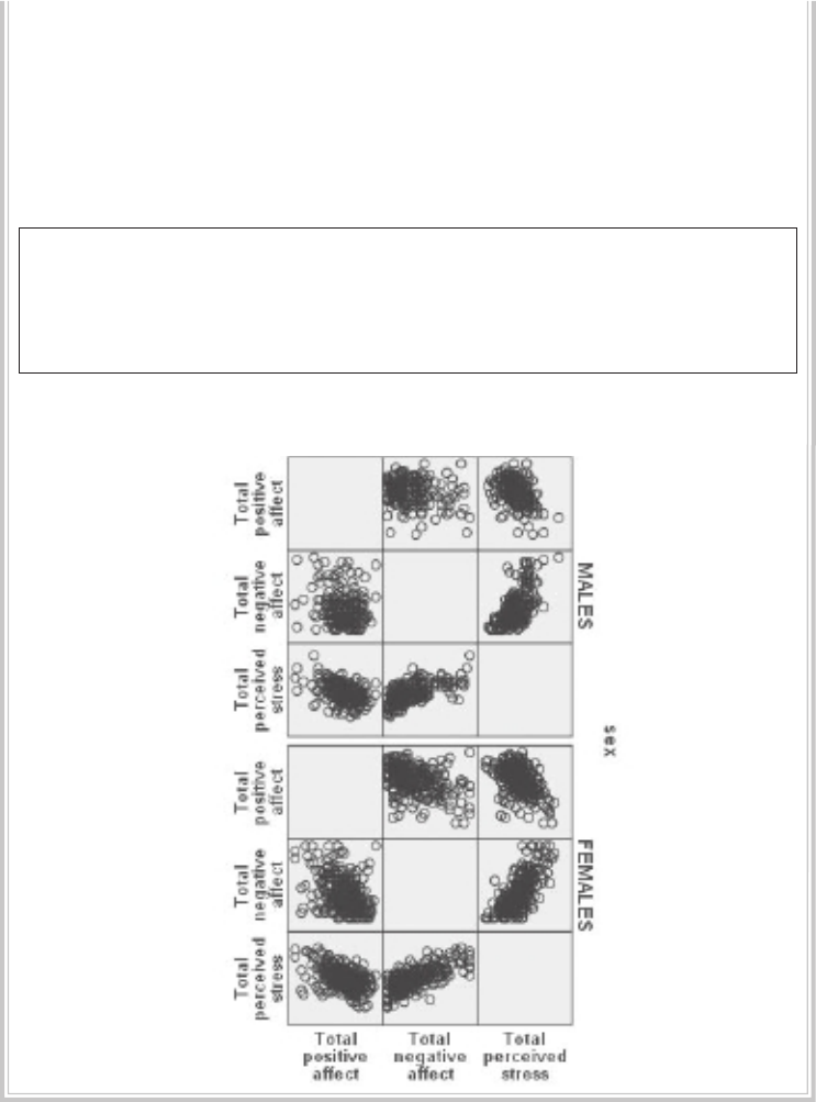
Multivariate analysis of variance 289
Total Positive Affect: tposaff, Total perceived stress: tpstress) and move
them into the Matrix Variables box.
4. Select the sex variable and move it into the Rows box.
5. Click on the Options button and select Exclude cases variable by variable.
6. Click on Continue and then OK (or on Paste to save to Syntax Editor).
The syntax from this procedure is:
GRAPH
/SCATTERPLOT(MATRIX)=tposaff tnegaff tpstress
/PANEL ROWVAR=sex ROWOP=CROSS
/MISSING=VARIABLEWISE .
The output generated from this procedure is shown below.
These plots do not show any obvious evidence of non-linearity; therefore, our
assumption of linearity is satisfi ed.
290 Statistical techniques to compare groups
5. Homogeneity of regression
This assumption is important only if you are intending to perform a stepdown
analysis. This approach is used when you have some theoretical or conceptual reason
for ordering your dependent variables. It is quite a complex procedure and is beyond
the scope of this book. If you are interested in fi nding out more, see Tabachnick and
Fidell (2007, p. 252).
6. Multicollinearity and singularity
MANOVA works best when the dependent variables are moderately correlated. With
low correlations, you should consider running separate univariate analysis of variance
for your various dependent variables. When the dependent variables are highly corre-
lated, this is referred to as multicollinearity. This can occur when one of your variables
is a combination of other variables (e.g. the total scores of a scale that is made up of
subscales that are also included as dependent variables). This is referred to as singu-
larity, and can be avoided by knowing what your variables are and how the scores are
obtained.
While there are quite sophisticated ways of checking for multicollinearity, the
simplest way is to run Correlation and to check the strength of the correlations among
your dependent variables (see Chapter 11). Correlations up around .8 or .9 are reason
for concern. If you fi nd any of these, you may need to consider removing one of the
strongly correlated pairs of dependent variables.
7. Homogeneity of variance-covariance matrices
Fortunately, the test of this assumption is generated as part of your MANOVA output.
The test used to assess this is Box’s M Test of Equality of Covariance Matrices. This is
discussed in more detail in the interpretation of the output presented below.
PERFORMING MANOVA
The procedure for performing a one-way multivariate analysis of variance to explore
sex differences in our set of dependent variables (Total Negative Affect, Total Positive
Affect, Total perceived stress) is described below. This technique can be extended to
perform a two-way or higher-order factorial MANOVA by adding additional indepen-
dent variables. It can also be extended to include covariates (see analysis of covariance
discussed in Chapter 22).

Multivariate analysis of variance 291
Procedure for MANOVA
1. From the menu at the top of the screen, click on Analyze, then select
General Linear Model, then Multivariate.
2. In the Dependent Variables box, enter each of your dependent variables
(e.g. Total Negative Affect, Total Positive Affect, Total perceived stress).
3. In the Fixed Factors box, enter your independent variable (e.g. sex).
4. Click on the Model button. Make sure that the Full factorial button is
selected in the Specify Model box.
5. Down the bottom in the Sum of squares box, Type III should be displayed.
This is the default method of calculating sums of squares. Click on
Continue.
6. Click on the Options button.
• In the section labelled Factor and Factor interactions, click on your
independent variable (e.g. sex). Move it into the box marked Display
Means for:.
• In the Display section of this screen, put a tick in the boxes for
Descriptive Statistics, Estimates of effect size and Homogeneity tests.
7. Click on Continue and then OK (or on Paste to save to Syntax Editor).
The syntax generated from this procedure is:
GLM
tposaff tnegaff tpstress BY sex
/METHOD = SSTYPE(3)
/INTERCEPT = INCLUDE
/EMMEANS = TABLES(sex)
/PRINT = DESCRIPTIVE ETASQ HOMOGENEITY
/CRITERIA = ALPHA(.05)
/DESIGN = sex .
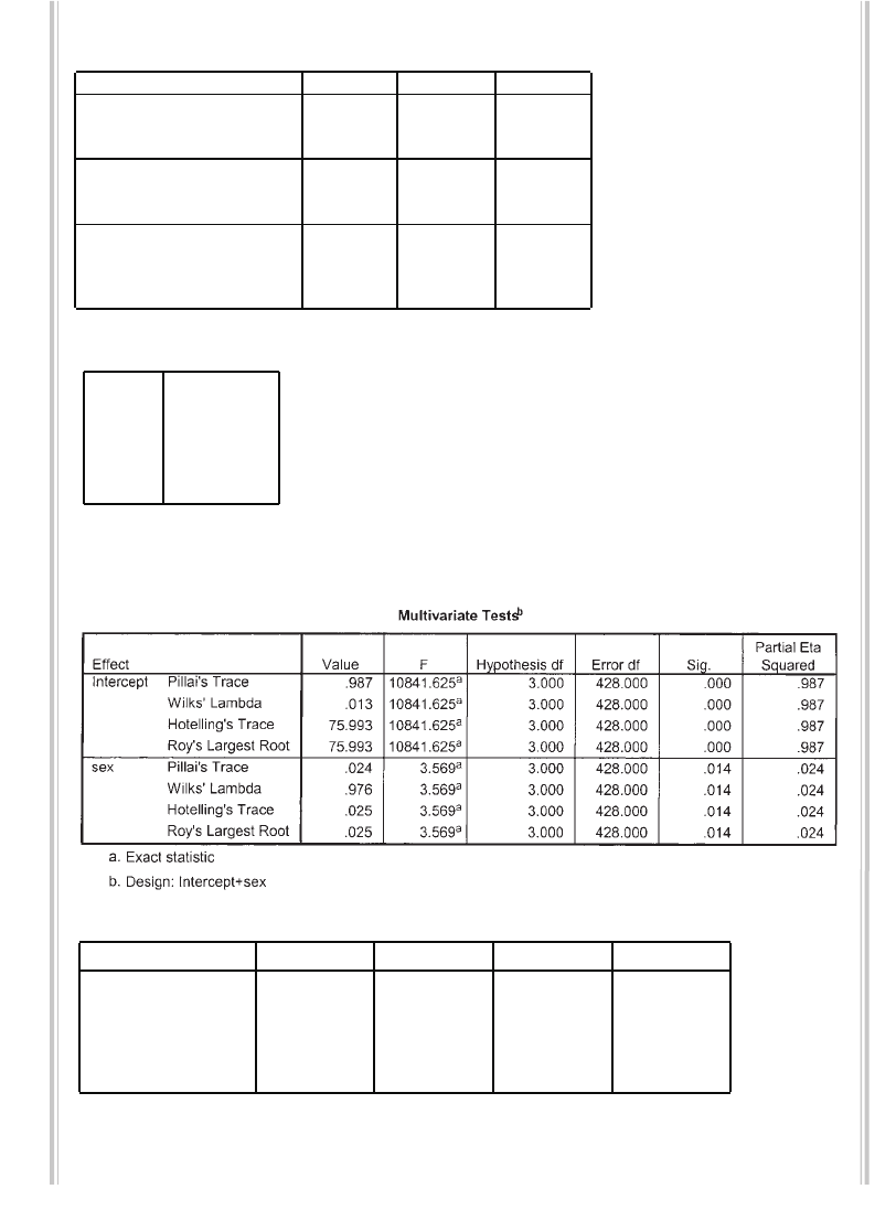
292 Statistical techniques to compare groups
Selected output generated from this procedure is shown below.
Descriptive Statistics
33.636.99184
33.697.44248
33.667.24432
18.716.90184
19.987.18248
19.447.08432
25.795.41184
27.426.08248
26.725.85432
SEX
MALES
FEMALES
Total
MALES
FEMALES
To t a l
MAL
ES
FEMALES
To t a l
T
otal Positive Affect
T
otal Negative
Affect
T
otal perceived
stress
Mean Std. Deviat ion N
Box's Test of Equality of CovarianceMatrices a
6. 9 4 2
1.148
6
1074772
.331
Box's M
F
df1
df2
Sig.
Tests the null hypothesis that the observed covariance matrices
of the dependent variables are equal across groups.
Design: Intercept+SEX
a.
Levene's Test of Equality of Error Variances a
1.065 1 430 .303
1.251 1 430 .264
2.074 1 430 .151
Total Positive Affect
Total Negative
Affect
To t a l p e r c e i v e d
stress
F d f1 d f2 Sig.
Tests the null hypothesis that the error variance of the d ependent variable is
equal across groups.
Design: Intercept +SEX
a.
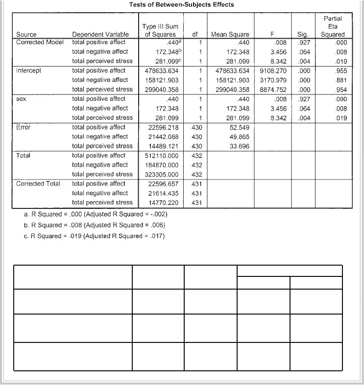
Multivariate analysis of variance 293
SEX
33.625.53432.57534.675
33.690 .460 32.785 34.594
18.707 .521 17.683 19.730
19.984 .448 19.103 20.865
25.788 .428 24.947 26.629
27.419 .369 26.695 28.144
SEX
MALES
FEMALE
S
MALES
FEMALES
MALES
FEMALES
Dep endent Variable
Total Positive Affect
Total Negative
Affect
Total perceived
stress
Mean Std. Error Lower Bound Upper Bound
95% Confidenc e Interval
INTERPRETATION OF OUTPUT FROM MANOVA
The key aspects of the output generated by MANOVA are presented below.
Descriptive statistics
Check that the information is correct. In particular, check that the N values corre-
spond to what you know about your sample. These N values are your ‘cell sizes’ (see
Assumption 1). Make sure that you have more cases in each cell than the number of
dependent variables. If you have over 30, then any violations of normality or equality
of variance that may exist are not going to matter too much.
294 Statistical techniques to compare groups
Box’s Test
The output box labelled Box’s Test of Equality of Covariance Matrices will tell you
whether your data violates the assumption of homogeneity of variance-covariance
matrices. If the Sig. value is larger than .001, you have not violated the assumption.
Tabachnick and Fidell (2007, p. 281) warn that Box’s M can tend to be too strict when
you have a large sample size. Fortunately, in our example the Box’s M Sig. value is .33;
therefore, we have not violated this assumption.
Levene’s Test
The next box to look at is Levene’s Test of Equality of Error Variances. In the Sig.
column, look for any values that are less than .05. These would indicate that you
have violated the assumption of equality of variance for that variable. In the current
example, none of the variables recorded signifi cant values; therefore, we can assume
equal variances. If you do violate this assumption of equality of variances, you will
need to set a more conservative alpha level for determining signifi cance for that
variable in the univariate F-test. Tabachnick and Fidell (2007) suggest an alpha of
.025 or .01 rather than the conventional .05 level.
Multivariate tests
This set of multivariate tests of signifi cance will indicate whether there are statis-
tically signifi cant differences among the groups on a linear combination of the
dependent variables. There are a number of statistics to choose from (Wilks’
Lambda, Hotelling’s Trace, Pillai’s Trace). One of the most commonly reported
statistics is Wilks’ Lambda. Tabachnick and Fidell (2007) recommend Wilks’
Lambda for general use; however, if your data have problems (small sample size,
unequal N values, violation of assumptions), then Pillai’s Trace is more robust (see
comparison of statistics in Tabachnick & Fidell 2007, p. 252). In situations where
you have only two groups, the F-tests for Wilks’ Lambda, Hotelling’s Trace and
Pillai’s Trace are identical.
Wilks’ Lambda
You will fi nd the value you are looking for in the second section of the Multivari-
ate Tests table, in the row labelled with the name of your independent or grouping
variable (in this case, SEX). Don’t make the mistake of using the fi rst set of fi gures,
which refers to the intercept. Find the value of Wilks’ Lambda and its associated
signifi cance level (Sig.). If the signifi cance level is less than .05, then you can conclude
that there is a difference among your groups. Here we obtained a Wilks’ Lambda
value of .976, with a signifi cance value of .014. This is less than .05; therefore, there is
a statistically signifi cant difference between males and females in terms of their overall
wellbeing.
Multivariate analysis of variance 295
Between-subjects effects
If you obtain a signifi cant result on this multivariate test of signifi cance, this gives you
permission to investigate further in relation to each of your dependent variables. Do
males and females differ on all of the dependent measures, or just some? This infor-
mation is provided in the Tests of Between-Subjects Effects output box. Because you
are looking at a number of separate analyses here, it is suggested that you set a higher
alpha level to reduce the chance of a Type 1 error (i.e. fi nding a signifi cant result when
there isn’t really one). The most common way of doing this is to apply what is known
as a Bonferroni adjustment. In its simplest form, this involves dividing your original
alpha level of .05 by the number of analyses that you intend to do (see Tabachnick &
Fidell 2007, p. 270, for more sophisticated versions of this formula). In this case, we
have three dependent variables to investigate; therefore, we would divide .05 by 3,
giving a new alpha level of .017. We will consider our results signifi cant only if the
probability value (Sig.) is less than .017.
In the Tests of Between-Subjects Effects box, move down to the third set of values
in a row labelled with your independent variable (in this case, SEX). You will see
each of your dependent variables listed, with their associated univariate F, df and Sig.
values. You interpret these in the same way as you would a normal one-way analysis
of variance. In the Sig. column, look for any values that are less than .017 (our new
adjusted alpha level). In our example, only one of the dependent variables (Total
perceived stress) recorded a signifi cance value less than our cut-off (with a Sig. value
of .004). In this study, the only signifi cant difference between males and females was
on their perceived stress scores.
Effect size
The importance of the impact of sex on perceived stress can be evaluated using the effect
size statistic provided in the fi nal column. Partial Eta Squared represents the proportion
of the variance in the dependent variable (perceived stress scores) that can be explained
by the independent variable (sex). The value in this case is .019 which, according to
generally accepted criteria (Cohen 1988, pp. 284–7), is considered quite a small effect
(see the introduction to Part Five for a discussion of effect size). This represents only
1.9 per cent of the variance in perceived stress scores explained by sex.
Comparing group means
Although we know that males and females differed in terms of perceived stress, we
do not know who had the higher scores. To fi nd this out, we refer to the output table
provided in the section labelled Estimated Marginal Means. For Total perceived
stress, the mean score for males was 25.79 and for females 27.42. Although statisti-
cally signifi cant, the actual difference in the two mean scores was very small, fewer
than 2 scale points.

296 Statistical techniques to compare groups
Follow-up analyses
In the example shown above, there were only two levels to the independent variable
(males, females). When you have independent variables with three or more levels, it
is necessary to conduct follow-up univariate analyses to identify where the signifi cant
differences lie (compare Group 1 with Group 2, and compare Group 2 with Group 3
etc.). One way to do this would be to use one-way ANOVA on the dependent vari-
ables that were signifi cant in the MANOVA (e.g. perceived stress). Within the one-way
ANOVA procedure (see Chapter 18), you could request post-hoc tests for your variable
with three or more levels. Remember to make the necessary adjustments to your alpha
level using the Bonferroni adjustment if you run multiple analyses.
PRESENTING THE RESULTS FROM MANOVA
The results of this multivariate analysis of variance could be presented as follows:
A one-way between-groups multivariate analysis of variance was performed to
investigate sex differences in psychological wellbeing. Three dependent variables
were used: positive affect, negative affect and perceived stress. The independent
variable was gender. Preliminary assumption testing was conducted to check for
normality, linearity, univariate and multivariate outliers, homogeneity of variance-
covariance matrices, and multicollinearity, with no serious violations noted.
There was a statistically signifi cant difference between males and females on
the combined dependent variables, F (3, 428) = 3.57, p = .014; Wilks’ Lambda =
.98; partial eta squared = .02. When the results for the dependent variables were
considered separately, the only difference to reach statistical signifi cance, using a
Bonferroni adjusted alpha level of .017, was perceived stress, F (1, 430) = 8.34, p
= .004, partial eta squared = .02. An inspection of the mean scores indicated that
females reported slightly higher levels of perceived stress (M = 27.42, SD = 6.08)
than males (M = 25.79, SD = 5.41).
ADDITIONAL EXERCISE
Health
Data fi le: sleep4ED.sav. See Appendix for details of the data fi le.
1. Conduct a one-way MANOVA to see if there are gender differences in each of the
individual items that make up the Sleepiness and Associated Sensations Scale. The
variables you will need as dependent variables are fatigue, lethargy, tired, sleepy,
energy.
297
22
Analysis of covariance
Analysis of covariance is an extension of analysis of variance (discussed in Chapter 18)
that allows you to explore differences between groups while statistically controlling
for an additional (continuous) variable. This additional variable (called a covariate)
is a variable that you suspect may be infl uencing scores on the dependent variable.
SPSS uses regression procedures to remove the variation in the dependent variable
that is due to the covariate(s), and then performs the normal analysis of variance
techniques on the corrected or adjusted scores. By removing the infl uence of these
additional variables, ANCOVA can increase the power or sensitivity of the F-test. That
is, it may increase the likelihood that you will be able to detect differences between
your groups.
Analysis of covariance can be used as part of one-way, two-way and multivariate
ANOVA techniques. In this chapter, SPSS procedures are discussed for analysis of
covariance associated with the following designs:
• one-way between-groups ANOVA (one independent variable, one dependent
variable)
• two-way between-groups ANOVA (two independent variables, one dependent
variable).
In the following sections, you will be briefl y introduced to some background on the
technique and assumptions that need to be tested; then a number of worked examples
are provided. Before running the analyses I suggest you read the introductory sections
in this chapter, and revise the appropriate ANOVA chapters (Chapters 18 and 19).
Multivariate ANCOVA is not illustrated in this chapter. If you are interested in this
technique, I suggest you read Tabachnick and Fidell (2007).
298 Statistical techniques to compare groups
USES OF ANCOVA
ANCOVA can be used when you have a two-group pre-test/post-test design (e.g.
comparing the impact of two different interventions, taking before and after measures
for each group). The scores on the pre-test are treated as a covariate to ‘control’ for
pre-existing differences between the groups. This makes ANCOVA very useful in
situations when you have quite small sample sizes and only small or medium effect
sizes (see discussion on effect sizes in the introduction to Part Five). Under these
circumstances (which are very common in social science research), Stevens (1996)
recommends the use of two or three carefully chosen covariates to reduce the error
variance and increase your chances of detecting a signifi cant difference between your
groups.
ANCOVA is also handy when you have been unable to randomly assign your
participants to the different groups, but instead have had to use existing groups (e.g.
classes of students). As these groups may differ on a number of different attributes
(not just the one you are interested in), ANCOVA can be used in an attempt to reduce
some of these differences. The use of well-chosen covariates can help reduce the
confounding infl uence of group differences. This is certainly not an ideal situation,
as it is not possible to control for all possible differences; however, it does help reduce
this systematic bias. The use of ANCOVA with intact or existing groups is a conten-
tious issue among writers in the fi eld. It would be a good idea to read more widely
if you fi nd yourself in this situation. Some of these issues are summarised in Stevens
(1996, pp. 324–7).
Choosing appropriate covariates
ANCOVA can be used to control for one or more covariates at the same time. These
covariates need to be chosen carefully, however (see Stevens 1996, p. 320; and Tabach-
nick & Fidell 2007, pp. 203, 211). In identifying possible covariates, you should ensure
you have a good understanding of the theory and previous research that has been
conducted in your topic area. The variables that you choose as your covariates should
be continuous variables, measured reliably (see Chapter 9), and should correlate
signifi cantly with the dependent variable. Ideally, you should choose a small set of
covariates that are only moderately correlated with one another, so that each contri-
butes uniquely to the variance explained. The covariate must be measured before the
treatment or experimental manipulation is performed. This is to prevent scores on
the covariate from also being infl uenced by the treatment.
Alternatives to ANCOVA
There are a number of assumptions or limitations associated with ANCOVA. Some-
times you will fi nd that your research design or your data are not suitable. Both
Analysis of covariance 299
Tabachnick and Fidell (2007, p. 221) and Stevens (1996, p. 327) suggest a number of
alternative approaches to ANCOVA. It would be a good idea to explore these alterna-
tives and to evaluate the best course of action, given your particular circumstances.
ASSUMPTIONS OF ANCOVA
There are a number of issues and assumptions associated with ANCOVA. These
are over and above the usual ANOVA assumptions discussed in the introduction to
Part Five. In this chapter, only the key assumptions for ANCOVA will be discussed.
Tabachnick and Fidell (2007, p. 200) have a good, detailed coverage of this topic,
including the issues of unequal sample sizes, outliers, multicollinearity, normality,
homogeneity of variance, linearity, homogeneity of regression and reliability of co-
variates (what an impressive and awe-inspiring list of statistical jargon!).
Infl uence of treatment on covariate measurement
In designing your study, you should ensure that the covariate is measured prior to the
treatment or experimental manipulation. This is to avoid scores on the covariate also
being infl uenced by the treatment. If the covariate is affected by the treatment con-
dition, this change will be correlated with the change that occurs in your dependent
variable. When ANCOVA removes (controls for) the covariate it will also remove
some of the treatment effect, thereby reducing the likelihood of obtaining a signifi -
cant result.
Reliability of covariates
ANCOVA assumes that covariates are measured without error, which is a rather unre-
alistic assumption in much social science research. Some variables that you may wish
to control, such as age, can be measured reasonably reliably; others that rely on a scale
may not meet this assumption. There are a number of things you can do to improve
the reliability of your measurement tools:
• Look for good, well-validated scales and questionnaires. Make sure they measure
what you think they measure (don’t just rely on the title—check the manual and
inspect the items), and that they are suitable for your sample.
• Check the internal consistency (a form of reliability) of your scale by calculating
Cronbach alpha (see Chapter 9). Values should be above .7 (preferably above .8)
to be considered reliable.
• If you have had to write the questions yourself, make sure they are clear, appropri-
ate and unambiguous. Make sure the questions and response scales are appropriate
for all of your groups. Always pilot-test your questions before conducting the full
study.
300 Statistical techniques to compare groups
• If you are using any form of equipment or measuring instrumentation, make sure
that it is functioning properly and calibrated appropriately. Make sure the person
operating the equipment is competent and trained in its use.
• If your study involves using other people to observe or rate behaviour, make sure
they are trained and that each observer uses the same criteria. Preliminary pilot-
testing to check inter-rater consistency would be useful here.
Correlations among covariates
There should not be strong correlations among the variables you choose for your
covariates. Ideally, you want a group of covariates that correlate substantially with
the dependent variable but not with one another. To choose appropriate covari-
ates, you will need to use the existing theory and research to guide you. Run some
preliminary correlation analyses (see Chapter 11) to explore the strength of the
relationship among your proposed covariates. If you fi nd that the covariates you
intend to use correlate strongly (e.g. r=.80), you should consider removing one or
more of them (see Stevens 1996, p. 320). Each of the covariates you choose should
pull its own weight—overlapping covariates do not contribute to a reduction in
error variance.
Linear relationship between dependent variable and
covariate
ANCOVA assumes that the relationship between the dependent variable and each
of your covariates is linear (straight-line). If you are using more than one covari-
ate, it also assumes a linear relationship between each of the pairs of your covariates.
Violations of this assumption are likely to reduce the power (sensitivity) of your test.
Remember, one of the reasons for including covariates was to increase the power of
your analysis of variance test.
Scatterplots can be used to test for linearity, but these need to be checked sep-
arately for each of your groups (i.e. the different levels of your independent variable).
If you discover any curvilinear relationships, these may be corrected by transforming
your variable (see Chapter 8), or alternatively you may wish to drop the offending
covariate from the analysis. Disposing of covariates that misbehave is often easier,
given the diffi culty in interpreting transformed variables.
Homogeneity of regression slopes
This impressive-sounding assumption requires that the relationship between the
covariate and dependent variable for each of your groups is the same. This is indi-
cated by similar slopes on the regression line for each group. Unequal slopes would
indicate that there is an interaction between the covariate and the treatment. If there
is an interaction then the results of ANCOVA are misleading, and therefore it should
Analysis of covariance 301
not be conducted (see Stevens 1996, pp. 323, 331; Tabachnick & Fidell 2007, p. 202).
The procedure for checking this assumption is provided in the examples presented
later in this chapter.
ONE-WAY ANCOVA
In this section, you will be taken step by step through the process of performing a
one-way analysis of covariance. One-way ANCOVA involves one independent,
categorical variable (with two or more levels or conditions), one dependent continu-
ous variable, and one or more continuous covariates. This technique is often used
when evaluating the impact of an intervention or experimental manipulation while
controlling for pre-test scores.
Details of example
To illustrate the use of one-way ANCOVA, I will be using the experim4ED.sav data
fi le included on the website that accompanies this book (see p. viii). These data
refer to a fi ctitious study that involves testing the impact of two different types
of interventions in helping students cope with their anxiety concerning a forth-
coming statistics course (see the Appendix for full details of the study). Students
were divided into two equal groups and asked to complete a number of scales (in-
cluding one that measures fear of statistics). One group was given a number of
sessions designed to improve their mathematical skills; the second group partici-
pated in a program designed to build their confi dence. After the program, they were
again asked to complete the same scales they completed before the program. The
manufactured data fi le is included on the disk provided with this book. If you wish
to follow the procedures detailed below, you will need to start SPSS and open the
data fi le experim4ED.sav.
In this example, I will explore the impact of the maths skills class (Group 1) and
the confi dence-building class (Group 2) on participants’ scores on the Fear of Statis-
tics Test, while controlling for the scores on this test administered before the program.
Details of the variable names and labels from the data fi le are provided below.
File name: experim4ED.sav
Variables:
• Type of class (group) 1=Maths Skills, 2=Confi dence Building.
• Fear of Statistics Test scores at time1 (Fost1): administered prior to the program.
Scores range from 20 to 60. High scores indicate greater fear of statistics.
• Fear of Statistics Test scores at time2 (Fost2): administered after the program.
• Fear of Statistics Test scores at time3 (Fost3): administered three months after the
program.
302 Statistical techniques to compare groups
Summary for one-way ANCOVA
Example of research question: Is there a signifi cant difference in the Fear of Statistics
Test scores for the maths skills group (group1) and the confi dence-building group
(group2) while controlling for their pre-test scores on this test?
What you need: At least three variables are involved:
• one categorical independent variable with two or more levels (group1/group2)
• one continuous dependent variable (scores on the Fear of Statistics Test at
Time 2)
• one or more continuous covariates (scores on the Fear of Statistics Test at Time 1).
What it does: ANCOVA will tell us if the mean Fear of Statistics Test scores at Time 2
for the two groups are signifi cantly different after the initial pre-test scores are
controlled for.
Assumptions: All normal one-way ANOVA assumptions apply (see the introduction
to Part Five). These should be checked fi rst. Additional ANCOVA assumptions (see
description of these presented earlier in this chapter):
1. Covariate is measured prior to the intervention or experimental manipulation.
2. Covariate is measured without error (or as reliably as possible).
3. Covariates are not strongly correlated with one another.
4. Linear relationship between the dependent variable and the covariate for all
groups (linearity).
5. The relationship between the covariate and dependent variable is the same for
each of the groups (homogeneity of regression slopes).
Non-parametric alternative: None.
Testing assumptions
Before you can begin testing the specifi c assumptions associated with ANCOVA,
you will need to check the assumptions for a normal one-way analysis of variance
(normality, homogeneity of variance). You should review the introduction to Part
Five and Chapter 18 before going any further here. To save space, I will not repeat that
material here; I will just discuss the additional ANCOVA assumptions listed in the
summary above.
Assumption 1: Measurement of the covariate
This assumption specifi es that the covariate should be measured before the treatment
or experimental manipulation begins. This is not tested statistically, but instead forms
part of your research design and procedures. This is why it is important to plan your
study with a good understanding of the statistical techniques that you intend to use.

Analysis of covariance 303
Assumption 2: Reliability of the covariate
This assumption concerning the reliability of the covariate is also part of your research
design, and involves choosing the most reliable measuring tools available. If you have
used a psychometric scale or measure, you can check the internal consistency reliabil-
ity by calculating Cronbach alpha using the Reliability procedures (see Chapter 9).
Given that I have ‘manufactured’ the data to illustrate this technique, I cannot test the
reliability of the Fear of Statistics Test. If they were real data, I would check that the
Cronbach alpha value was at least .70 (preferably .80).
Assumption 3: Correlations among the covariates
If you are using more than one covariate, you should check to see that they are not
too strongly correlated with one another (r=.8 and above). To do this, you will need
to use the Correlation procedure (this is described in detail in Chapter 11). As I have
only one covariate, I do not need to do this here.
Assumption 4: Linearity
There are a number of different ways you can check the assumption of a linear re-
lationship between the dependent variable and the covariates for all your groups. In
the procedure section below, I will show you a quick way.
Procedure for checking linearity for each group
To follow along with this example, open the experim4ED.sav fi le.
Step 1
1. From the menu at the top of the screen, click on Graphs, Legacy Dialogs
and then select Scatter/Dot.
2. Click on Simple Scatter. Click on the Defi ne button.
3. In the Y axis box, put your dependent variable (in this case, fear of stats
time2: fost2).
4. In the X axis box, put your covariate (e.g. fear of stats time1: fost1).
5. Click on your independent variable (e.g. group) and put in the Set
Markers by box.
6. Click on OK (or on Paste to save to Syntax Editor).
The syntax from this procedure is:
GRAPH
/SCATTERPLOT(BIVAR)=fost1 WITH fost2 BY group
/MISSING=LISTWISE

304 Statistical techniques to compare groups
Step 2
1. Once you have the scatterplot displayed, double-click on it to open the
Chart Editor window.
2. From the menu, click on Elements and select Fit line at Subgroups. Two
lines will appear on the graph representing line of best fi t for each group.
In the output below, I have modifi ed these to be clearer (dotted line for
one group) and modifi ed the markers (see instructions in Chapter 7 for
modifying a graph).
3. Click on File and then Close.
The output from this procedure is shown below.
30 35 40 45 50
fear of stats time1
25
30
35
40
45
50
fear of stats time2
type of class
maths skills
confidence
building
R Sq Linear = 0.725
R Sq Linear = 0.766

Analysis of covariance 305
Check the general distribution of scores for each of your groups. Does there appear
to be a linear (straight-line) relationship for each group? What you don’t want to see
is an indication of a curvilinear relationship. In the above example the relationship is
clearly linear, so we have not violated the assumption of a linear relationship. If you
fi nd a curvilinear relationship you may want to reconsider the use of this covariate,
or alternatively you could try transforming the variable (see Chapter 8) and repeating
the scatterplot to see whether there is an improvement.
Assumption 5: Homogeneity of regression slopes
This fi nal assumption concerns the relationship between the covariate and the depen-
dent variable for each of your groups. What you are checking is that there is no
interaction between the covariate and the treatment or experimental manipulation.
There are a number of different ways to evaluate this assumption.
Graphically, you can inspect the scatterplot between the dependent variable and
the covariate obtained when testing for Assumption 4 (see above). Are the two lines
(corresponding to the two groups in this study) similar in their slopes? In the above
example the two lines are very similar, so it does not appear that we have violated this
assumption. If the lines had been noticeably different in their orientation, this might
suggest that there is an interaction between the covariate and the treatment (as shown
by the different groups). This would mean a violation of this assumption.
This assumption can also be assessed statistically, rather than graphically.
This involves checking to see whether there is a statistically signifi cant interaction
between the treatment and the covariate. If the interaction is signifi cant at an alpha
level of .05, then we have violated the assumption. The procedure to check this is
described next.
Procedure to check for homogeneity of regression slopes
1. From the menu at the top of the screen, click on Analyze, then select
General Linear Model, then Univariate.
2. In the Dependent Variables box, put your dependent variable (e.g. fear of
stats time2: fost2).
3. In the Fixed Factor box, put your independent or grouping variable (e.g.
type of class: group).
4. In the Covariate box, put your covariate (e.g. fear of stats time1: fost1).
5. Click on the Model button. Click on Custom.
6. Check that the Interaction option is showing in the Build Terms box.
7. Click on your independent variable (group) and then the arrow button to
move it into the Model box.
8. Click on your covariate (fost1) and then the arrow button to move it into
the Model box.
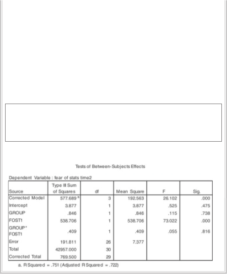
306 Statistical techniques to compare groups
9. Go back and click on your independent variable (group) again on the
left-hand side (in the Factors and Covariates section). While this is
highlighted, hold down the Ctrl key, and then click on your covariate
variable (fost1). Click on the arrow button to move this into the right-
hand side box labelled Model.
10. In the Model box, you should now have listed your independent variable
(group); your covariate (fost1); and an extra line of the form: covariate *
independent variable (group*fost1).
11. The fi nal term is the interaction that we are checking for.
12. Click on Continue and then OK (or on Paste to save to Syntax Editor).
The syntax from this procedure is:
UNIANOVA fost2 BY group WITH fost1
/METHOD = SSTYPE(3)
/INTERCEPT = INCLUDE /CRITERIA = ALPHA(.05)
/DESIGN = group fost1 fost1*group .
The output generated by this procedure is shown below.
In the output obtained from this procedure, the only value that you are interested
in is the signifi cance level of the interaction term (shown above as Group*Fost1).
You can ignore the rest of the output. If the Sig. level for the interaction is less than
or equal to .05 your interaction is statistically signifi cant, indicating that you have
violated the assumption. In this situation, we do not want a signifi cant result. We want
a Sig. value of greater than .05. In the above example the Sig. or probability value is

Analysis of covariance 307
.816, safely above the cut-off. We have not violated the assumption of homogeneity of
regression slopes. This supports the earlier conclusion gained from an inspection of
the scatterplots for each group.
Now that we have fi nished checking the assumptions, we can proceed with the
ANCOVA analysis to explore the differences between our treatment groups.
Procedure for one-way ANCOVA
1. From the menu at the top of the screen, click on Analyze, then select
General Linear Model, then Univariate.
2. In the Dependent Variables box, put your dependent variable (e.g. fear of
stats time2: fost2).
3. In the Fixed Factor box, put your independent or grouping variable (e.g.
type of class:group).
4. In the Covariate box, put your covariate (e.g. fear of stats time1: fost1).
5. Click on the Model button. Click on Full Factorial in the Specify Model
section. Click on Continue.
6. Click on the Options button.
7. In the top section labelled Estimated Marginal Means, click on your
independent variable (group).
8. Click on the arrow to move it into the box labelled Display Means for.
This will provide you with the mean score on your dependent variable for
each group, adjusted for the infl uence of the covariate.
9. In the bottom section of the Options dialogue box, choose Descriptive
statistics, Estimates of effect size and Homogeneity tests.
10. Click on Continue and then OK (or on Paste to save to Syntax Editor).
The syntax generated from this procedure is:
UNIANOVA
fost2 BY group WITH fost1
/METHOD = SSTYPE(3)
/INTERCEPT = INCLUDE
/EMMEANS = TABLES(group) WITH(fost1=MEAN)
/PRINT = DESCRIPTIVE ETASQ HOMOGENEITY
/CRITERIA = ALPHA(.05)
/DESIGN = fost1 group .
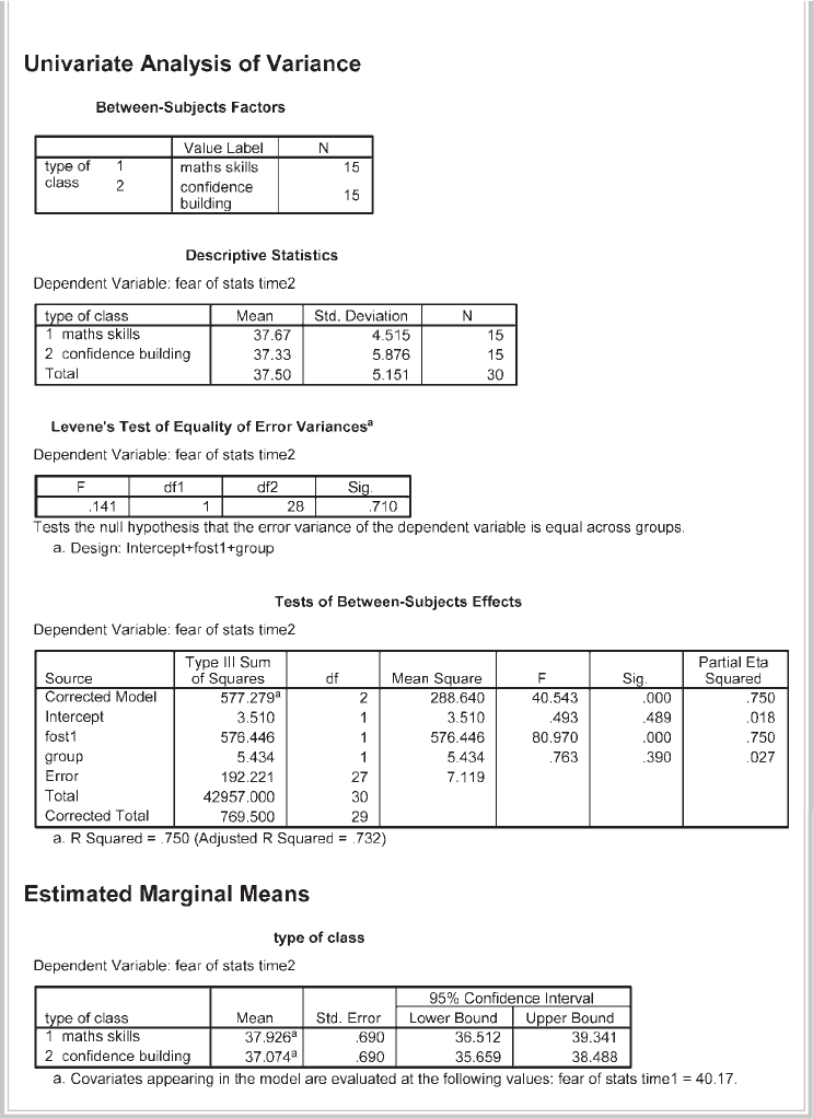
308 Statistical techniques to compare groups
The output generated from this procedure is shown below.
Analysis of covariance 309
Interpretation of output from one-way ANCOVA
There are a number of steps in interpreting the output from ANCOVA.
• Check that the details in the Descriptive Statistics table are correct.
• Check the Levene’s Test of Equality of Error Variances table to see if you violated
the assumption of equality of variance. You want the Sig. value to be greater than
.05. If this value is smaller than .05 (and therefore signifi cant), this means that
your variances are not equal and that you have violated the assumption. In this
case we have not violated the assumption because our Sig. value is .71, which is
much larger than our cut-off of .05.
• The main ANCOVA results are presented in the next table, labelled Test of Between-
Subjects Effects. We want to know whether our groups are signifi cantly different in
terms of their scores on the dependent variable (e.g. Fear of Statistics Time 2). Find
the line corresponding to your independent variable (Group) and read across to
the column labelled Sig. If the value in this column is less than .05 (or an alternative
alpha level you have set), your groups differ signifi cantly. In this example our value
is .39, which is greater than .05; therefore, our result is not signifi cant. There is not
a signifi cant difference in the Fear of Statistics Test scores for participants in the
maths skills group and the confi dence-building group after controlling for scores
on the Fear of Statistics Test administered prior to the intervention.
• You should also consider the effect size, as indicated by the corresponding Partial
Eta Squared value (see the introduction to Part Five for a description of what
an effect size is). The value in this case is only .027 (a small effect size according
to Cohen’s 1988 guidelines). This value also indicates how much of the variance
in the dependent variable is explained by the independent variable. Convert the
partial eta squared value to a percentage by multiplying by 100 (shift the decimal
point two places to the right). In this example, we are able to explain only 2.7 per
cent of the variance.
• The other piece of information that we can gain from this table concerns the
infl uence of our covariate. Find the line in the table that corresponds to the co-
variate (e.g. FOST1: Fear of Statistics at time1). Read across to the Sig. level. This
indicates whether there is a signifi cant relationship between the covariate and the
dependent variable while controlling for the independent variable (group). In
the line corresponding to Fost1 (our covariate), you will see that the Sig. value is
.000 (which actually means less than .0005). This is less than .05, so our covariate
is signifi cant. In fact, it explained 75 per cent of the variance in the dependent
variable (partial eta squared of .75 multiplied by 100).
• The fi nal table in the ANCOVA output (Estimated marginal means) provides us
with the adjusted means on the dependent variable for each of our groups. ‘Adjusted’
refers to the fact that the effect of the covariate has been statistically removed.

310 Statistical techniques to compare groups
Presenting the results from one-way ANCOVA
The results of this one-way analysis of covariance could be presented as follows:
A one-way between-groups analysis of covariance was conducted to compare the
effectiveness of two different interventions designed to reduce participants’ fear
of statistics. The independent variable was the type of intervention (maths skills,
confi dence building), and the dependent variable consisted of scores on the Fear
of Statistics Test administered after the intervention was completed. Participants’
scores on the pre-intervention administration of the Fear of Statistics Test were
used as the covariate in this analysis.
Preliminary checks were conducted to ensure that there was no violation of
the assumptions of normality, linearity, homogeneity of variances, homogeneity
of regression slopes, and reliable measurement of the covariate. After adjusting
for pre-intervention scores, there was no signifi cant difference between the two
intervention groups on post-intervention scores on the Fear of Statistics Test,
F (1, 27) = .76, p = .39, partial eta squared = .03. There was a strong relationship
between the pre-intervention and post-intervention scores on the Fear of Statistics
Test, as indicated by a partial eta squared value of .75.
In presenting the results of this analysis, you would also provide a table of means for
each of the groups. If the same scale is used to measure the dependent variable (Time 2)
and the covariate (Time 1), you will include the means at Time 1 and Time 2. You can
get these by running Descriptives (see Chapter 6).
If a different scale is used to measure the covariate, you will provide the ‘unad-
justed’ mean (and standard deviation) and the ‘adjusted’ mean (and standard error)
for the two groups. The unadjusted mean is available from the Descriptive Statistics
table. The adjusted mean (controlling for the covariate) is provided in the Estimated
Marginal Means table. It is also a good idea to include the number of cases in each of
your groups.
TWO-WAY ANCOVA
In this section, you will be taken step by step through the process of performing a
two-way analysis of covariance. Two-way ANCOVA involves two independent, cat-
egorical variables (with two or more levels or conditions), one dependent continuous
variable and one or more continuous covariates. It is important that you have a good
understanding of the standard two-way analysis of variance procedure and assump-
tions before proceeding further here. Refer to Chapter 19 in this book.
The example that I will use here is an extension of that presented in the one-way
ANCOVA section above. In that analysis, I was interested in determining which inter-
Analysis of covariance 311
vention (maths skills or confi dence building) was more effective in reducing students’
fear of statistics. I found no signifi cant difference between the groups.
Suppose that in reading further in the literature on the topic I found some
research that suggested there might be a difference in how males and females
respond to different interventions. Sometimes in the literature you will see this ad-
ditional variable (e.g. sex) described as a moderator. That is, it moderates or infl uences
the effect of the other independent variable. Often these moderator variables are
individual difference variables, characteristics of individuals that infl uence the way
in which they respond to an experimental manipulation or treatment condition.
It is important if you obtain a non-signifi cant result for your one-way ANCOVA
that you consider the possibility of moderator variables. Some of the most interest-
ing research occurs when a researcher stumbles across (or systematically investigates)
moderator variables that help to explain why some researchers obtain statistically
signifi cant results while others do not. In your own research always consider factors
such as gender and age, as these can play an important part in infl uencing the results.
Studies conducted on young university students often don’t generalise to broader
(and older) community samples. Research on males sometimes yields quite differ-
ent results when repeated using female samples. The message here is to consider the
possibility of moderator variables in your research design and, where appropriate,
include them in your study.
Details of example
In the example presented below I will use the same data that were used in the previous
section, but I will add an additional independent variable (gender: 1=male, 2=female).
This will allow me to broaden my analysis to see whether gender is acting as a moder-
ator variable in infl uencing the effectiveness of the two programs. I am interested in
the possibility of a signifi cant interaction effect between sex and intervention group.
Males might benefi t most from the maths skills intervention, while females might
benefi t more from the confi dence-building program.
Warning: the sample size used to illustrate this example is very small, particu-
larly when you break the sample down by the categories of the independent variables
(gender and group). If using this technique with your own research you should
really try to have a much larger data fi le overall, with a good number in each of the
categories of your independent variables.
If you wish to follow along with the steps detailed below, you will need to start
SPSS and open the data fi le labelled experim4ED.sav provided on the website accom-
panying this book.
Example of research question: Does gender infl uence the effectiveness of two
programs designed to reduce participants’ fear of statistics? Is there a difference in

312 Statistical techniques to compare groups
post-intervention Fear of Statistics Test scores between males and females in their
response to a maths skills program and a confi dence-building program?
What you need: At least four variables are involved:
• two categorical independent variables with two or more levels (sex: M/F; group:
maths skills/confi dence building)
• one continuous dependent variable (Fear of Statistics Test scores at Time 2)
• one or more continuous covariates (Fear of Statistics Test scores at Time 1).
What it does: ANCOVA will control for scores on your covariate(s) and then perform
a normal two-way ANOVA. This will tell you if there is a:
• signifi cant main effect for your fi rst independent variable (group)
• main effect for your second independent variable (sex)
• signifi cant interaction between the two.
Assumptions: All normal two-way ANOVA assumptions apply (e.g. normality,
homogeneity of variance). These should be checked fi rst (see the introduction to
Part Five).
Additional ANCOVA assumptions: See discussion of these assumptions, and the
procedures to test them, in the one-way ANCOVA section presented earlier.
Non-parametric alternative: None.
Procedure for two-way ANCOVA
1. From the menu at the top of the screen, click on Analyze, then select
General Linear Model, then Univariate.
2. Click on your dependent variable (e.g. fear of stats time2: fost2) and
move it into the Dependent Variables box.
3. Click on your two independent or grouping variables (e.g. sex; group).
Move these into the Fixed Factor box.
4. In the Covariate box, put your covariate(s) (e.g. fear of stats time1: fost1).
5. Click on the Model button. Click on Full Factorial in the Specify Model
section. Click on Continue.
6. Click on the Options button.
• In the top section, Estimated Marginal Means, click on your two
independent variables (e.g. sex, group). Click on the arrow to move
them into the Display means for box.
• Click on the extra interaction term (e.g. group*sex). Move this
into the box. This will provide you with the mean scores on your
dependent variable split for each group, adjusted for the infl uence of
the covariate.
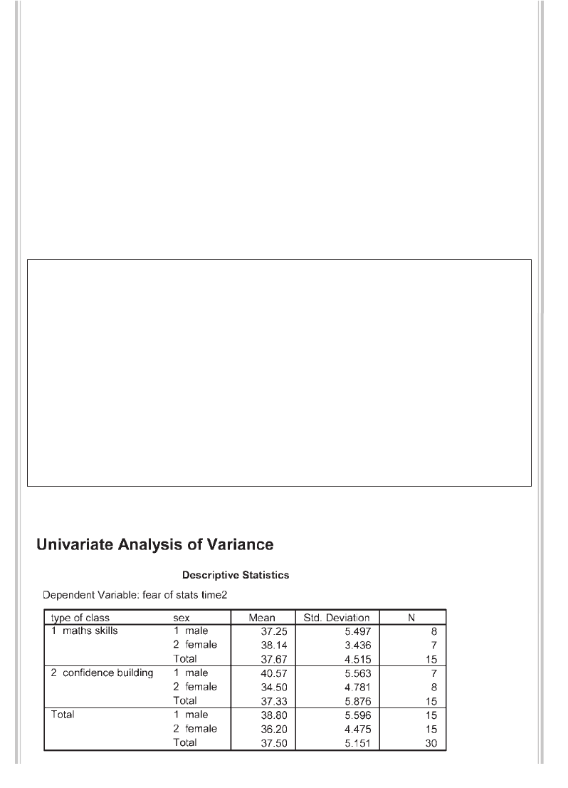
Analysis of covariance 313
• In the bottom section, click on Descriptive statistics, Estimates of
effect size and Homogeneity tests. Click on Continue.
7. Click on the Plots button.
• Highlight your fi rst independent variable (e.g. group) and move this
into the Horizontal box. This variable will appear across the bottom of
your graph.
• Click on your second independent variable (e.g. sex) and move this
into the Separate Lines box. This variable will be represented by
different lines for each group.
• Click on Add.
8. Click on Continue and then OK (or on Paste to save to Syntax Editor).
The syntax generated from this procedure is:
UNIANOVA
fost2 BY group sex WITH fost1
/METHOD = SSTYPE(3)
/INTERCEPT = INCLUDE
/PLOT = PROFILE( group*sex )
/EMMEANS = TABLES(group) WITH(fost1=MEAN)
/EMMEANS = TABLES(sex) WITH(fost1=MEAN)
/EMMEANS = TABLES(sex*group) WITH(fost1=MEAN)
/PRINT = DESCRIPTIVE ETASQ HOMOGENEITY
/CRITERIA = ALPHA(.05)
/DESIGN = fost1 group sex group*sex .
The output generated from this procedure is shown below.
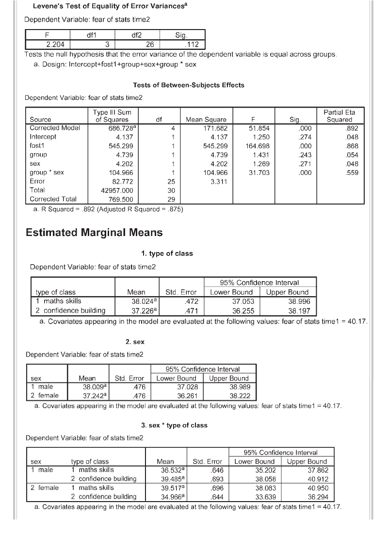
314 Statistical techniques to compare groups
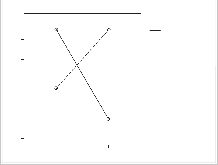
Analysis of covariance 315
maths skills confidence building
type of class
34
35
36
37
38
39
40
Estimated Marginal Means
sex
male
female
Estimated Marginal Means of fear of stats time2
Interpretation of output from two-way ANCOVA
There are a number of steps in interpreting the output from a two-way ANCOVA.
• In the box labelled Descriptive Statistics, check that the details are correct (e.g.
number in each group, mean scores).
• The details in the Levene’s Test of Equality of Error Variances table allow you
to check that you have not violated the assumption of equality of variance.
You want the Sig. value to be greater than .05. If this value is smaller than .05 (and
therefore signifi cant), this means that your variances are not equal and that you
have violated the assumption. In this case we have not violated the assumption
because our Sig. value is .11, which is much larger than our cut-off of .05.
• The main ANCOVA results are presented in the next table, labelled Test of Between-
Subjects Effects. We want to know whether there is a signifi cant main effect for
any of our independent variables (groups or sex) and whether the interaction
between these two variables is signifi cant. Of most interest is the interaction, so
we will check this fi rst. If the interaction is signifi cant the two main effects are
not important, because the effect of one independent variable is dependent on
the level of the other independent variable. Find the line corresponding to the
316 Statistical techniques to compare groups
interaction effect (group * sex in this case). Read across to the column labelled
Sig. If the value in this column is less than .05 (or an alternative alpha level you
have set), the interaction is signifi cant. In this case our Sig. (or probability) value
is .000 (read this as less than .0005), which is less than .05; therefore, our result
is signifi cant. This signifi cant interaction effect suggests that males and females
respond differently to the two programs. The main effects for Group and for Sex
are not statistically signifi cant (Group: p=.24; Sex: p=.27). We cannot say that one
intervention is better than the other, because we must consider whether we are
referring to males or females. We cannot say that males benefi t more than females,
because we must consider which intervention was involved.
• You should also consider the effect size, as indicated by the corresponding partial eta
squared value (see the introduction to Part Five for a description of what an effect
size is). The value in this case is .56 (a large effect size according to Cohen’s 1988
guidelines). This value also indicates how much of the variance in the dependent
variable is explained by the independent variable. Convert the partial eta squared
value to a percentage by multiplying by 100 (shift the decimal point two places to
the right). In this example, we are able to explain 56 per cent of the variance.
• The other piece of information that we can gain from this table concerns the
infl uence of our covariate. Find the line in the table that corresponds to the co-
variate (e.g. FOST1: Fear of Statistics at time1). Read across to the Sig. level. This
indicates whether there is a signifi cant relationship between the covariate and the
dependent variable, while controlling for the independent variable (group). In
the line corresponding to FOST1 (our covariate), you will see that the Sig. value
is .000 (which actually means less than .0005). This is less than .05; therefore, our
covariate was signifi cant. In fact, it explained 87 per cent of the variance in the
dependent variable (partial eta squared of .87 multiplied by 100).
• The fi nal table in the ANCOVA output (Estimated marginal means) provides
us with the adjusted means on the dependent variable for each of our groups,
split according to each of our independent variables separately and then jointly.
‘Adjusted’ refers to the fact that the effect of the covariate has been statistically
removed. Given that the interaction effect was signifi cant, our main focus is the
fi nal table labelled sex * type of class.
• As an optional extra, I requested a plot of the adjusted means for the Fear of
Statistics Test, split for males and females and for the two interventions. (Don’t
worry if your graph does not look the same as mine: I modifi ed my graph after it
was generated so that it was easier to read when printed out. For instructions on
modifying graphs, see Chapter 7.) It is clear to see from this plot that there is an
interaction between the two independent variables. For males, Fear of Statistics
Test scores were lowest (the aim of the program) in the maths skills intervention.
For females, however, the lowest scores occurred in the confi dence-building inter-

Analysis of covariance 317
vention. This clearly suggests that males and females appear to respond differently
to the programs and that in designing interventions you must consider the gender
of the participants.
Caution: don’t let yourself get too excited when you get a signifi cant result. You
must keep in mind what the analysis was all about. For example, the results here do not
indicate that all males benefi ted from the maths skills program—nor that all females
preferred the confi dence-building approach. Remember, we are comparing the mean
score for the group as a whole. By summarising across the group as a whole, we inevi-
tably lose some information about individuals. In evaluating programs, you may wish
to consider additional analyses to explore how many people benefi ted versus how
many people ‘got worse’.
While one hopes that interventions designed to ‘help’ people will not do any
harm, sometimes this does happen. In the fi eld of stress management, there have been
studies that have shown an unexpected increase in participants’ levels of anxiety after
some types of treatment (e.g. relaxation training). The goal in this situation is to fi nd
out why this is the case for some people and to identify what the additional moderator
variables are.
Presenting the results from two-way ANCOVA
The results of this analysis could be presented as follows:
A 2 by 2 between-groups analysis of covariance was conducted to assess the
effectiveness of two programs in reducing fear of statistics for male and female
participants. The independent variables were the type of program (maths skills,
confi dence building) and gender. The dependent variable was scores on the Fear
of Statistics Test (FOST), administered following completion of the intervention
programs (Time 2). Scores on the FOST administered prior to the commencement of the
programs (Time 1) were used as a covariate to control for individual differences.
Preliminary checks were conducted to ensure that there was no violation of
the assumptions of normality, linearity, homogeneity of variances, homogeneity of
regression slopes, and reliable measurement of the covariate. After adjusting for
FOST scores at Time 1, there was a signifi cant interaction effect. F (1, 25) = 31.7,
p < .0005, with a large effect size (partial eta squared = .56). Neither of the main
effects were statistically signifi cant, program: F (1, 25) = 1.43, p = .24; gender: F (1,
25) = 1.27, p = .27. These results suggest that males and females respond differently
to the two types of interventions. Males showed a more substantial decrease in
fear of statistics after participation in the maths skills program. Females, on the
other hand, appeared to benefi t more from the confi dence-building program.
318 Statistical techniques to compare groups
In presenting the results of this analysis, you would also provide a table of means
for each of the groups. If the same scale is used to measure the dependent variable
(Time 2) and the covariate (Time 1), you would include the means at Time 1 and
Time 2. You can get these easily by running Descriptives (see Chapter 6). If a different
scale is used to measure the covariate, you would provide the ‘unadjusted’ mean (and
standard deviation) and the ‘adjusted’ mean (and standard error) for the two groups.
The unadjusted mean is available from the Descriptive Statistics table. The adjusted
mean (controlling for the covariate) is provided in the Estimated marginal means
table. It is also a good idea to include the number of cases in each of your groups.
319
Appendix
Details of data fi les
This appendix contains information about the data fi les that are included on the
website accompanying this book (for details see p. viii):
1. survey4ED.sav
2. error4ED.sav
3. experim4ED.sav
4. depress4ED.sav
5. sleep4ED.sav
6. staffsurvey4ED.sav
The fi les are provided for you to follow along with the procedures and exercises
described in the different chapters of this book. To use the data fi les, you will need to
go to the website and download each fi le to your hard drive or to a memory stick by
following the instructions on screen. Then you should start SPSS and open the data
fi le you wish to use. These fi les can only be opened in SPSS. For each fi le, a codebook
is included in this Appendix providing details of the variables and associated coding
instructions.
survey4ED.sav
This is a real data fi le, condensed from a study that was conducted by my Graduate
Diploma in Educational Psychology students. The study was designed to explore the
factors that impact on respondents’ psychological adjustment and wellbeing. The
survey contained a variety of validated scales measuring constructs that the extensive
literature on stress and coping suggest infl uence people’s experience of stress. The scales
measured self-esteem, optimism, perceptions of control, perceived stress, positive and
negative affect, and life satisfaction. A scale was also included that measured people’s
tendency to present themselves in a favourable or socially desirable manner. The
320 Appendix Details of data fi les
survey was distributed to members of the general public in Melbourne, Australia, and
surrounding districts. The fi nal sample size was 439, consisting of 42 per cent males
and 58 per cent females, with ages ranging from 18 to 82 (mean=37.4).
error4ED.sav
The data in this fi le has been modifi ed from the survey4ED.sav fi le to incorporate
some deliberate errors to be identifi ed using the procedures covered in Chapter 5. For
information on the variables etc., see details on survey4ED.sav.
experim4ED.sav
This is a manufactured data set that was created to provide suitable data for the
demonstration of statistical techniques such as t-test for repeated measures and
one-way ANOVA for repeated measures. This data set refers to a fi ctitious study that
involves testing the impact of two different types of interventions in helping students
cope with their anxiety concerning a forthcoming statistics course. Students were
divided into two equal groups and asked to complete a number of scales (Time 1).
These included a Fear of Statistics Test, Confi dence in Coping with Statistics Scale and
Depression Scale. One group (Group 1) was given a number of sessions designed to
improve mathematical skills; the second group (Group 2) was subjected to a program
designed to build confi dence in the ability to cope with statistics. After the program
(Time 2), they were again asked to complete the same scales that they completed
before the program. They were also followed up three months later (Time 3). Their
performance on a statistics exam was also measured.
depress4ED.sav
This fi le has been included to allow the demonstration of some specifi c techniques in
Chapter 16. It includes just a few of the key variables from a real study conducted by
one of my postgraduate students on the factors impacting on wellbeing in fi rst-time
mothers. It includes scores from a number of different psychological scales designed
to assess depression (details in Chapter 16 on Kappa Measure of Agreement).
sleep4ED.sav
This is a real data fi le condensed from a study conducted to explore the preva-
lence and impact of sleep problems on various aspects of people’s lives. Staff from
a university in Melbourne, Australia, were invited to complete a questionnaire
containing questions about their sleep behaviour (e.g. hours slept per night), sleep
problems (e.g. diffi culty getting to sleep) and the impact that these problems have
on aspects of their lives (work, driving, relationships). The sample consisted of 271
respondents (55 per cent female, 45 per cent male) ranging in age from 18 to 84
years (mean=44yrs).
Appendix Details of data fi les 321
staffsurvey4ED.sav
This is a real data fi le condensed from a study conducted to assess the satisfac-
tion levels of staff from an educational institution with branches in a number of
locations across Australia. Staff were asked to complete a short, anonymous
questionnaire (shown later in this Appendix) containing questions about their
opinion of various aspects of the organisation and the treatment they have received
as employees.
322 Appendix Details of data fi les
PART A: MATERIALS FOR SURVEY4ED.SAV
Details of scales included in survey4ED.sav
The scales are listed in the order in which they appear in the survey.
Scale Reference
Life Orientation Test
(Optimism)
(six items)
Scheier, M.F. & Carver, C.S. (1985). Optimism, coping and health: An
assessment and implications of generalized outcome expectancies.
Health Psychology, 4, 219–47.
Scheier, M.F., Carver, C.S. & Bridges, M.W. (1994). Distinguishing
optimism from neuroticism (and trait anxiety, self-mastery and
self-esteem): A re-evaluation of the Life Orientation Test. Journal of
Personality and Social Psychology, 67, 6, 1063–78.
Mastery Scale
(seven items)
Pearlin, L. & Schooler, C. (1978). The structure of coping. Journal of
Health and Social Behavior, 19, 2–21.
Positive and Negative Affect Scale
(twenty items)
Watson, D., Clark, L.A. & Tellegen, A. (1988). Development and
validation of brief measures of positive and negative affect: The
PANAS scales. Journal of Personality and Social Psychology, 54,
1063–70.
Satisfaction with Life Scale
(fi ve items)
Diener, E., Emmons, R.A., Larson, R.J. & Griffi n, S. (1985). The
Satisfaction with Life Scale. Journal of Personality Assessment, 49,
71–6.
Perceived Stress Scale
(ten items)
Cohen, S., Kamarck, T. & Mermelstein, R. (1983). A global measure of
perceived stress. Journal of Health and Social Behavior, 24, 385–96.
Self-esteem Scale
(ten items)
Rosenberg, M. (1965). Society and the adolescent self image. Princeton,
NJ: Princeton University Press.
Social Desirability Scale
(ten items)
Crowne, D.P. & Marlowe, P. (1960). A new scale of social desirability
independent of psychopathology. Journal of Consulting Psychology,
24, 349–54.
Strahan, R. & Gerbasi, K. (1972). Short, homogeneous version of
the Marlowe-Crowne Social Desirability Scale. Journal of Clinical
Psychology, 28, 191–3.
Perceived Control of Internal
States Scale
(PCOISS)
(eighteen items)
Pallant, J. (2000). Development and validation of a scale to measure
perceived control of internal states. Journal of Personality Assessment,
75, 2, 308–37.

Appendix Details of data fi les 323
Codebook for survey4ED.sav
Full variable SPSS variable
name name Coding instructions
Identifi cation number id subject identifi cation number
Sex sex 1=males, 2=females
Age age in years
Marital marital 1=single, 2=steady relationship, 3=living
with a partner, 4=married for the fi rst time,
5=remarried, 6=separated, 7=divorced,
8=widowed
Children child 1=yes, 2=no
Highest level of education educ 1=primary, 2=some secondary,
3=completed high school, 4=some
additional training, 5=completed
undergraduate, 6=completed
postgraduate
Major source of stress source 1=work, 2=spouse or partner,
3=relationships, 4=children, 5=family,
6=health/illness, 7=life in general,
8=fi nances, 9=time (lack of, too much to do)
Do you smoke? smoke 1=yes, 2=no
Cigarettes smoked per week smokenum Number of cigarettes smoked per week
Optimism Scale op1 to op6 1=strongly disagree, 5=strongly agree
Mastery Scale mast1 to mast7 1=strongly disagree, 4=strongly agree
PANAS Scale pn1 to pn20 1=very slightly, 5=extremely
Life Satisfaction Scale lifsat1 to lifsat5 1 =strongly disagree, 7=strongly agree
Perceived Stress Scale pss1 to pss10 1=never, 5=very often
Self-esteem Scale sest1 to sest10 1=strongly disagree, 4=strongly agree
Marlowe-Crowne
Social Desirability Scale m1 to m10 1=true, 2=false
Perceived Control of
Internal States Scale pc1 to pc18 1=strongly disagree,
(PCOISS) 5=strongly agree
324 Appendix Details of data fi les
Total scale scores included in survey4ED.sav

Appendix Details of data fi les 325
Copy of questionnaire used in survey4ED.sav
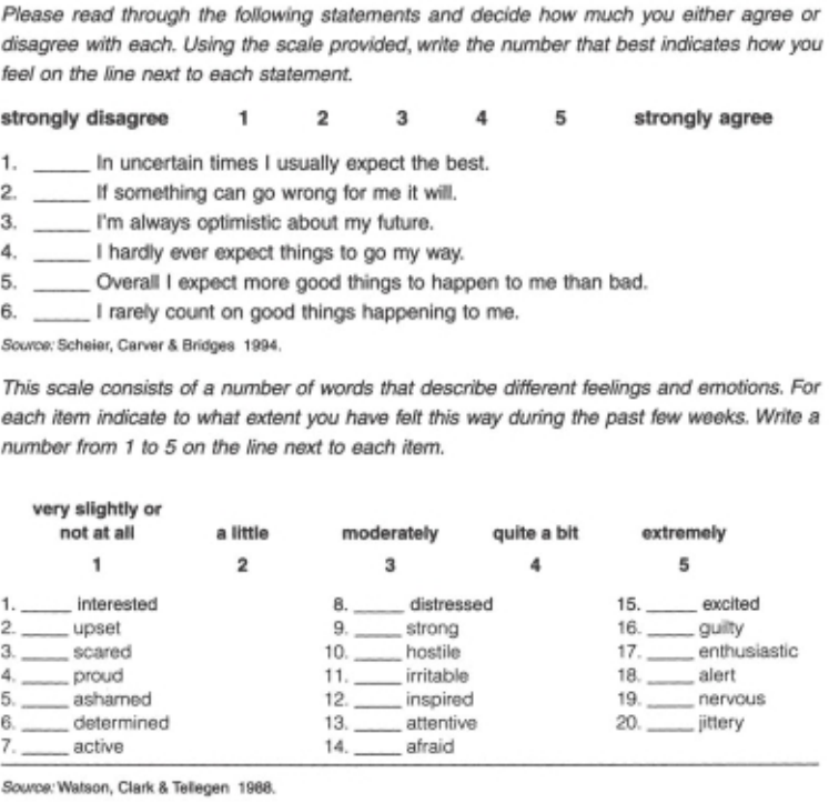
326 Appendix Details of data fi les
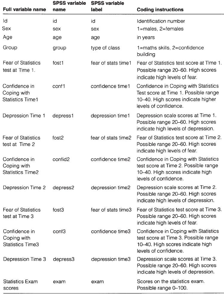
Appendix Details of data fi les 327
PART B: MATERIALS FOR EXPERIM4ED.SAV
Codebook for experim4ED.sav
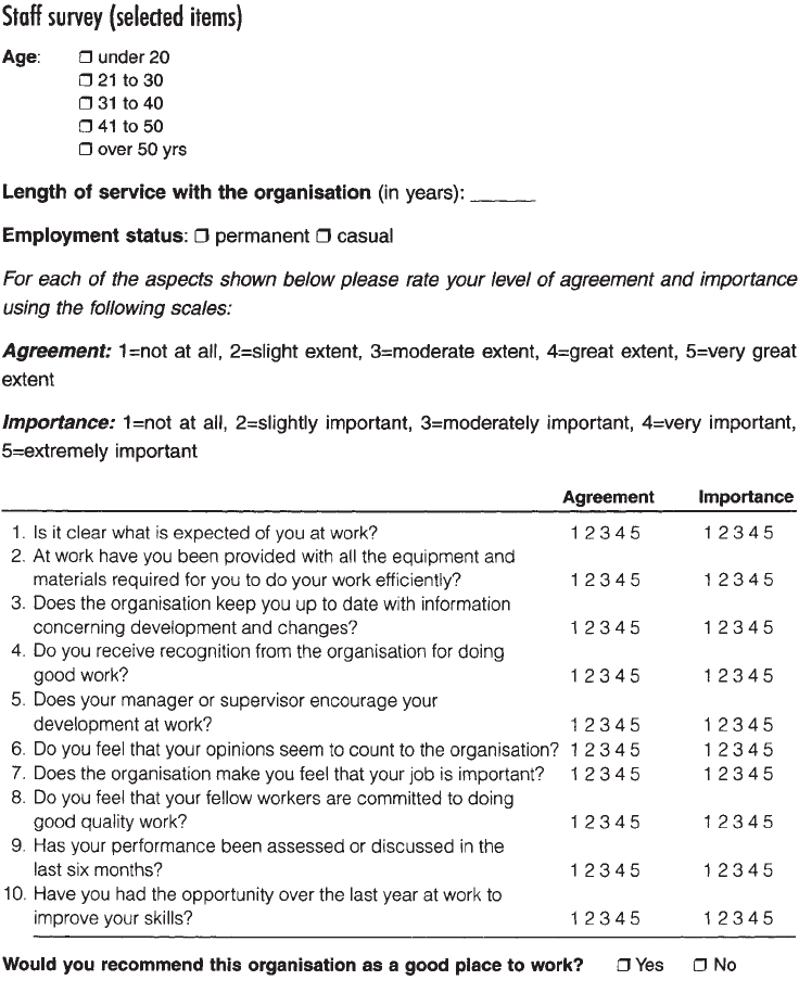
328 Appendix Details of data fi les
PART C: MATERIALS FOR STAFFSURVEY4ED.SAV
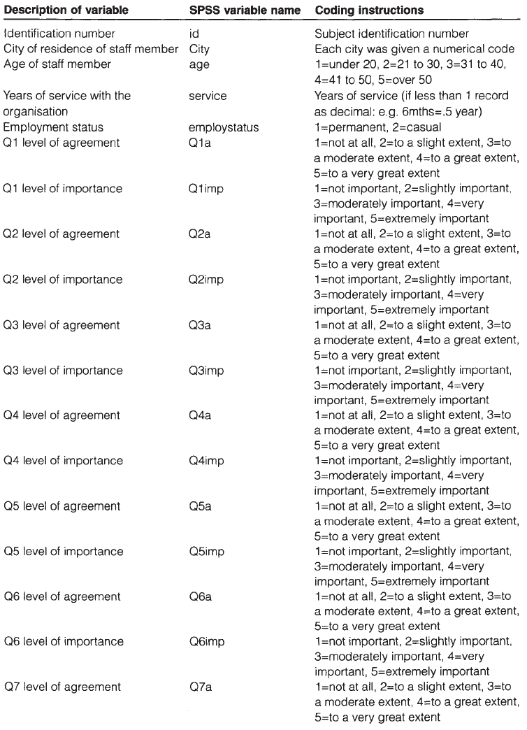
Appendix Details of data fi les 329
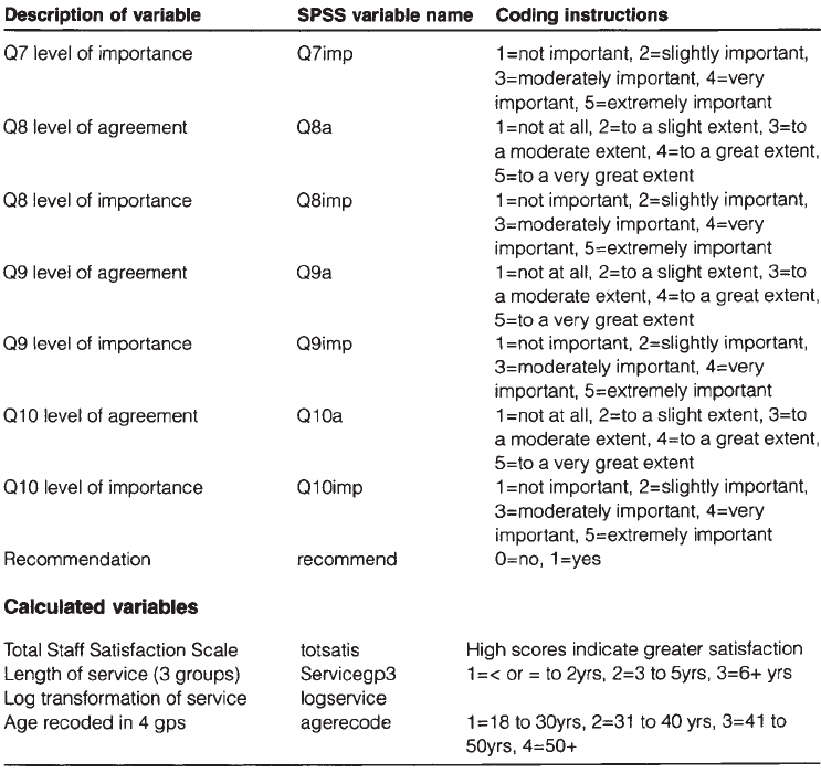
330 Appendix Details of data fi les

Appendix Details of data fi les 331
PART D: MATERIALS FOR SLEEP4ED.SAV
Codebook for sleep4ED.sav
Description of variable SPSS variable
name
Coding instructions
Identifi cation number id
Sex sex 0=female, 1=male
Age Age in years
Marital status marital 1=single, 2=married/defacto,
3=divorced, 4=widowed
Highest education level achieved edlevel 1=primary, 2=secondary, 3=trade,
4=undergrad, 5=postgrad
Weight (kg) weight in kg
Height (cm) height in cm
Rate general health healthrate 1=very poor, 10=very good
Rate physical fi tness fi trate 1=very poor, 10=very good
Rate current weight weightrate 1=very underweight,10=very overweight
Do you smoke? smoke 1=yes, 2=no
How many cigarettes per day? Smokenum Cigs per day
How many alcoholic drinks per
day?
alcohol Drinks per day
How many caffeine drinks per
day?
caffeine Drinks per day
Hours sleep/weekends hourwend Hrs sleep on average each weekend night
How many hours sleep needed? hourneed Hrs of sleep needed to not feel sleepy
Trouble falling asleep trubslep 1=yes, 2=no
Trouble staying asleep? trubstay 1=yes, 2=no
Wake up during night? wakenite 1=yes, 2=no
Work night shift? niteshft 1=yes, 2=no
Light sleeper? liteslp 1=yes, 2=no
Wake up feeling refreshed
weekdays?
refreshd 1=yes, 2=no
Satisfaction with amount of
sleep?
satsleep 1=very dissatisfi ed, 10=to a great extent
Rate quality of sleep qualslp 1=very poor, 2=poor, 3=fair 4=good,
5=very good, 6=excellent
Rating of stress over last month stressmo 1=not at all, 10=extremely
Medication to help you sleep? medhelp 1=yes, 2=no
Do you have a problem with your
sleep?
problem 1=yes, 2=no
Rate impact of sleep problem on
mood
Impact1 1=not at all, 10=to a great extent
Rate impact of sleep problem on
energy level
Impact2 1=not at all, 10=to a great extent

332 Appendix Details of data fi les
Description of variable SPSS variable
name
Coding instructions
Rate impact of sleep problem on
concentration
Impact3 1=not at all, 10=to a great extent
Rate impact of sleep problem on
memory
Impact4 1=not at all, 10=to a great extent
Rate impact of sleep problem on
life satisfaction
Impact5 1=not at all, 10=to a great extent
Rate impact of sleep problem on
overall wellbeing
Impact6 1=not at all, 10=to a great extent
Rate impact of sleep problem on
relationships
Impact7 1=not at all, 10=to a great extent
Stop breathing during your
sleep?
stopb 1=yes, 2=no
Restless sleeper? restlss 1=yes, 2=no
Ever fallen asleep while driving? drvsleep 1=yes, 2=no
Epworth Sleepiness Scale ess Total ESS score (range from 0=low to
24=high daytime sleepiness)
HADS Anxiety anxiety Total HADS Anxiety score (range from
0=no anxiety to 21=severe anxiety)
HADS Depression depress Total HADS Depression score (range from
0=no depression to 21=severe depression)
Rate level of fatigue over last
week
fatigue 1=not at all, 10=to a great extent
Rate level of lethargy over last
week
Lethargy 1=not at all, 10=to a great extent
Rate how tired over last week Tired 1=not at all, 10=to a great extent
Rate how sleepy over last week Sleepy 1=not at all, 10=to a great extent
Rate lack energy over the last
week
energy 1=not at all, 10=to a great extent
Quality of sleep recoded into 4
groups
qualsleeprec 1=very poor, poor; 2=fair; 3=good; 4=very
good, excellent
Number of cigs per day recoded
into 3 groups
cigsgp3 1=<=5, 2=6–15, 3=16+
Age recoded into 3 groups agegp3 1=<=37yrs, 2=38–50yrs, 3=51+yrs
Sleepiness and Associated
Sensations Scale
totsas Total Sleepiness and Associated
Sensations Scale score (5=low,
50=extreme sleepiness)
Problem with sleep recoded into
0/1
probsleeprec 0=no, 1=yes
Hours sleep/weeknight hourweeknight Hrs sleep on average each weeknight
Problem getting to sleep recoded getsleeprec 0=no, 1=yes
Problem staying asleep recoded staysleeprec 0=no, 1=yes
Appendix Details of data fi les 333
PART E: MATERIALS FOR DEPRESS4ED.SAV
In Chapter 16 I demonstrate how to test the degree of agreement between two measures
of depression in a sample of postnatal women using the depress4ED.sav fi le. The aim
here was to see if the women identifi ed with depression on the EPDS were also classi-
fi ed as depressed on the DASS Depression Scale (DASS-Dep).
The data provided in depress4ED.sav is a small part of a real data fi le that includes
each woman’s scores on the Edinburgh Postnatal Depression Scale (EPDS: Cox,
Holden & Sagovsky 1987) and the Depression, Anxiety and Stress scales (DASS-Dep:
Lovibond & Lovibond 1995). Scores were classifi ed according to the recommended
cut points for each scale. This resulted in two variables (DASSdepgp2, EPDSgp2) with
scores of 0 (not depressed) and 1 (depressed).
334
Recommended reading
Some of the articles and books I have found most useful for my own research and
my teaching are listed here. Keep an eye out for new editions of these titles; many are
updated every few years. I have classifi ed these according to different headings, but
many cover a variety of topics. The titles that I highly recommend have an asterisk
next to them.
Research design
Bowling, A. (2009). Research methods in health: Investigating health and health services
(3rd edn). Buckingham: Open University Press.
*Boyce, J. (2003). Market research in practice. Boston: McGraw-Hill.
*Cone, J. & Foster, S. (2006). Dissertations and theses from start to fi nish (2nd edn).
Washington: American Psychological Association.
Goodwin, C.J. (2007). Research in psychology: Methods and design (5th edn). New
York: John Wiley.
Harris, P. (2008). Designing and reporting experiments in psychology (3rd edn).
Maidenhead: Open University Press.
Polgar, S. & Thomas, S.A. (2007). Introduction to research in the health sciences
(5th edn). Edinburgh: Churchill Livingstone.
Stangor, C. (2006). Research methods for the behavioral sciences (3rd edn). Boston:
Houghton Miffl in.
*Tharenou, P., Donohue, R. & Cooper, B. (2007). Management research methods.
Cambridge: Cambridge University Press.
Questionnaire design
*De Vaus, D.A. (2002). Surveys in social research (5th edn). Sydney: Allen & Unwin.
Recommended reading 335
Scale selection and construction
Dawis, R.V. (1987). Scale construction. Journal of Counseling Psychology, 34, 481–9.
DeVellis, R.F. (2003). Scale development: Theory and applications (2nd edn). Thousand
Oaks, California: Sage.
Gable, R.K. & Wolf, M.B. (1993). Instrument development in the affective domain:
Measuring attitudes and values in corporate and school settings. Boston: Kluwer
Academic.
Kline, P. (1986). A handbook of test construction. New York: Methuen.
Robinson, J.P., Shaver, P.R. & Wrightsman, L.S. (eds). Measures of personality and social
psychological attitudes. Hillsdale, NJ: Academic Press.
*Streiner, D.L. & Norman, G.R. (2008). Health measurement scales: A practical guide to
their development and use (4th edn). Oxford: Oxford University Press.
Basic statistics
Cooper, D.R. & Schindler, P.S. (2008). Business research methods (10th edn). Boston:
McGraw-Hill.
Everitt, B.S. (1996). Making sense of statistics in psychology: A second level course.
Oxford: Oxford University Press.
*Gravetter, F.J. & Wallnau, L.B. (2007). Statistics for the behavioral sciences (7th edn).
Belmont, CA: Wadsworth.
Norman, G.R. & Streiner, D.L. (2008). Biostatistics: The bare essentials (3rd edn).
Hamilton: B.C. Decker Inc.
Pagano, R.R. (2008). Understanding statistics in the behavioral sciences (9th edn).
Pacifi c Grove, CA: Brooks/Cole.
*Peat, J. (2001). Health science research: A handbook of quantitative methods. Sydney:
Allen & Unwin.
Raymondo, J.C. (1999). Statistical analysis in the behavioral sciences. Boston: McGraw-
Hill College.
Runyon, R.P., Coleman, K.A. & Pittenger, D.J. (2000). Fundamentals of behavioral
statistics (9th edn). Boston: McGraw-Hill.
Smithson, M. (2000). Statistics with confi dence. London: Sage.
Advanced statistics
Hair, J.F., Black, W.C., Babin, B.J., Anderson, R.E. & Tatham, R.L. (2009). Multivariate
data analysis (7th edn). Upper Saddle River, NJ: Pearson Education.
Stevens, J. (2009). Applied multivariate statistics for the social sciences (5th edn).
Mahwah, NJ: Lawrence Erlbaum.
*Tabachnick, B.G. & Fidell, L.S. (2007). Using multivariate statistics (5th edn). Boston:
Pearson Education.
336 Recommended reading
Preparing your report
American Psychological Association (2009). Publication Manual of the American
Psychological Association (6th edn). Washington: American Psychological Asso-
ciation.
McInerney, D.M. (2001). Publishing your psychology research. Sydney: Allen &
Unwin.
Thomas, S.A. (2000). How to write health sciences papers, dissertations and theses.
Edinburgh: Churchill Livingstone.
337
References
Aiken, L.S. & West, S.G. (1991). Multiple regression: Testing and interpreting interac-
tions. Newbury Park, CA: Sage.
American Psychological Association (2009). Publication manual of the American
Psychological Association (6th edn). Washington: American Psychological Asso-
ciation.
Bartlett, M.S. (1954). A note on the multiplying factors for various chi square approx-
imations. Journal of the Royal Statistical Society, 16 (Series B), 296–8.
Berry, W.D. (1993). Understanding regression assumptions. Newbury Park, CA: Sage.
Bowling, A. (1997). Research methods in health: Investigating health and health services.
Buckingham: Open University Press.
—— (2001). Measuring disease (2nd edn). Buckingham: Open University Press.
—— (2004). Measuring health: A review of quality of life measurement scales. Bucking-
ham: Open University Press.
Boyce, J. (2003). Market research in practice. Boston: McGraw-Hill.
Briggs, S.R. & Cheek, J.M. (1986). The role of factor analysis in the development and
evaluation of personality scales. Journal of Personality, 54, 106–48.
Catell, R.B. (1966). The scree test for number of factors. Multivariate Behavioral
Research, 1, 245–76.
Choi, N., Fuqua, D.R. & Griffi n, B.W. (2001). Exploratory analysis of the structure of
scores from the multidimensional scales of perceived self effi cacy. Educational and
Psychological Measurement, 61, 475–89.
Cohen, J.W. (1988). Statistical power analysis for the behavioral sciences (2nd edn).
Hillsdale, NJ: Lawrence Erlbaum Associates.
Cohen, J. & Cohen, P. (1983). Applied multiple regression/correlation analysis for the
behavioral sciences (2nd edn). New York: Erlbaum.
Cohen, S., Kamarck, T. & Mermelstein, R. (1983). A global measure of perceived stress.
Journal of Health and Social Behavior, 24, 385–96.
338 References
Cone, J. & Foster, S. (2006). Dissertations and theses from start to fi nish (2nd edn).
Washington: American Psychological Association.
Cooper, D.R. & Schindler, P.S. (2003). Business research methods (8th edn). Boston:
McGraw-Hill.
Cox, J.L., Holden, J.M. & Sagovsky, R. (1987). Detection of postnatal depression.
Development of the 10-item Edinburgh Postnatal Depression Scale. Br J Psy-
chiatry, 150, 782–6.
Crowne, D.P. & Marlowe, D. (1960). A new scale of social desirability independent of
psychopathology. Journal of Consulting Psychology, 24, 349–54.
Daniel, W. (1990). Applied nonparametric statistics (2nd edn). Boston: PWS-Kent.
Dawis, R.V. (1987). Scale construction. Journal of Counseling Psychology, 34, 481–9.
De Vaus, D.A. (2002). Surveys in social research (5th edn). Sydney: Allen & Unwin.
DeVellis, R.F. (2003). Scale development: Theory and applications (2nd edn). Thousand
Oaks, California: Sage.
Diener, E., Emmons, R.A., Larson, R.J. & Griffi n, S. (1985). The Satisfaction with Life
scale. Journal of Personality Assessment, 49, 71–6.
Edwards, A.L. (1967). Statistical Methods (2nd edn). New York: Holt.
Everitt, B.S. (1996). Making sense of statistics in psychology: A second level course.
Oxford: Oxford University Press.
Fox, J. (1991). Regression diagnostics. Newbury Park, CA: Sage.
Gable, R.K. & Wolf, M.B. (1993). Instrument development in the affective domain: Measur-
ing attitudes and values in corporate and school settings. Boston: Kluwer Academic.
Glass, G.V., Peckham, P.D. & Sanders, J.R. (1972). Consequences of failure to meet the
assumptions underlying the use of analysis of variance and covariance. Review of
Educational Research, 42, 237–88.
Goodwin, C.J. (2007). Research in psychology: Methods and design (5th edn). New
York: John Wiley.
Gorsuch, R.L. (1983). Factor analysis. Hillsdale, NJ: Erlbaum.
Gravetter, F.J. & Wallnau, L.B. (2004). Statistics for the behavioral sciences (6th edn).
Belmont, CA: Wadsworth.
Greene, J. & d’Oliveira, M. (1999). Learning to use statistical tests in psychology
(2nd edn). Buckingham: Open University Press.
Hair, J.F., Black, W.C., Babin, B.J., Anderson, R.E. & Tatham, R.L. (2006). Multivariate
data analysis (6th edn). Upper Saddle River, NJ: Pearson Education.
Harris, R.J. (1994). ANOVA: An analysis of variance primer. Itasca, Ill.: Peacock.
Hayes, N. (2000). Doing psychological research: Gathering and analysing data. Bucking-
ham: Open University Press.
Horn, J.L. (1965). A rationale and test for the number of factors in factor analysis.
Psychometrika, 30, 179–85.
Hosmer, D.W. & Lemeshow, S. (2000). Applied logistic regression. New York: Wiley.
References 339
Hubbard, R. & Allen, S.J. (1987). An empirical comparison of alternative methods for
principal component extraction. Journal of Business Research, 15, 173–90.
Kaiser, H. (1970). A second generation Little Jiffy. Psychometrika, 35, 401–15.
—— (1974). An index of factorial simplicity. Psychometrika, 39, 31–6.
Keppel, G. & Zedeck, S. (1989). Data analysis for research designs: Analysis of variance
and multiple regression/correlation approaches. New York: Freeman.
—— (2004). Design and analysis: A researcher’s handbook (4th edn). New York:
Prentice Hall.
Kline, P. (1986). A handbook of test construction. New York: Methuen.
Kline, T.J.B. (2005). Psychological testing: A practical approach to design and evaluation.
Thousand Oaks, California: Sage.
Lovibond, S.H. & Lovibond, P.F. (1995). Manual for the Depression Anxiety Stress Scales
(2nd edn). Sydney: Psychology Foundation of Australia.
McCall, R.B. (1990). Fundamental Statistics for Behavioral Sciences (5th edn). Fort
Worth: Harcourt Brace Jovanovich College Publishers.
Norman, G.R. & Streiner, D.L. (2000). Biostatistics: The bare essentials (2nd edn).
Hamilton: B.C. Decker Inc.
Nunnally, J.O. (1978). Psychometric theory. New York: McGraw-Hill.
Pagano, R.R. (1998). Understanding statistics in the behavioral sciences (5th edn).
Pacifi c Grove, CA: Brooks/Cole.
Pallant, J. (2000). Development and validation of a scale to measure perceived control
of internal states. Journal of Personality Assessment, 75, 2, 308–37.
Pavot, W., Diener, E., Colvin, C.R. & Sandvik, E. (1991). Further validation of the
Satisfaction with Life scale: Evidence for the cross method convergence of well-
being measures. Journal of Personality Assessment, 57, 149–61.
Pearlin, L. & Schooler, C. (1978). The structure of coping. Journal of Health and Social
Behavior, 19, 2–21.
Peat, J. (2001). Health science research: A handbook of quantitative methods. Sydney:
Allen & Unwin.
Pett, M.A., Lackey, N.R. & Sullivan, J.J. (2003). Making sense of factor analysis: The
use of factor analysis for instrument development in health care research. Thousand
Oaks, California: Sage.
Raymondo, J.C. (1999). Statistical analysis in the behavioral sciences. Boston: McGraw-
Hill College.
Robinson, J.P., Shaver, P.R. & Wrightsman, L.S. (eds). Measures of personality and social
psychological attitudes. Hillsdale, NJ: Academic Press.
Rosenberg, M. (1965). Society and the adolescent self-image. Princeton, NJ: Princeton
University Press.
Runyon, R.P., Coleman, K.A. & Pittenger, D.J. (2000). Fundamentals of behavioral
statistics (9th edn). Boston: McGraw-Hill.
340 References
Scheier, M.F. & Carver, C.S. (1985). Optimism, coping and health: An assessment and
implications of generalized outcome expectancies. Health Psychology, 4, 219–47.
Scheier, M.F., Carver, C.S. & Bridges, M.W. (1994). Distinguishing optimism from
neuroticism (and trait anxiety, self-mastery, and self-esteem): A re-evaluation
of the Life Orientation Test. Journal of Personality and Social Psychology, 67, 6,
1063–78.
Siegel, S. & Castellan, N. (1988). Nonparametric statistics for the behavioral sciences
(2nd edn). New York: McGraw-Hill.
Smithson, M. (2000). Statistics with confi dence. London: Sage.
Stangor, C. (2006). Research methods for the behavioral sciences (3rd edn). Boston:
Houghton Miffl in.
Stevens, J. (1996). Applied multivariate statistics for the social sciences (3rd edn).
Mahwah, NJ: Lawrence Erlbaum.
Stober, J. (1998). The Frost multidimensional perfectionism scale revisited: More
perfect with four (instead of six) dimensions. Personality and Individual Differ-
ences, 24, 481–91.
Strahan, R. & Gerbasi, K. (1972). Short, homogeneous version of the Marlowe-Crowne
Social Desirability Scale. Journal of Clinical Psychology, 28, 191–3.
Streiner, D.L. & Norman, G.R. (2008). Health measurement scales: A practical guide to
their development and use (4th edn). Oxford: Oxford University Press.
Tabachnick, B.G. & Fidell, L.S. (2007). Using multivariate statistics (5th edn). Boston:
Pearson Education.
Thurstone, L.L. (1947). Multiple factor analysis. Chicago: University of Chicago
Press.
Watkins, M.W. (2000). Monte Carlo PCA for parallel analysis [computer software].
State College, PA: Ed & Psych Associates.
Watson, D., Clark, L.A. & Tellegen, A. (1988). Development and validation of brief
measures of positive and negative affect: The PANAS scales. Journal of Personality
and Social Psychology, 54, 1063–70.
Wright, R.E. (1995). Logistic regression. In L.G. Grimm & P.R. Yarnold (eds). Reading
and understanding multivariate statistics. Washington, DC: American Psychologi-
cal Association. Chapter 7.
Zwick, W.R. & Velicer, W.F. (1986). Comparison of fi ve rules for determining the
number of components to retain. Psychological Bulletin, 99, 432–42.
341
Index
Terms in bold indicate a specifi c SPSS procedures
adjusted R square 160
analysis of covariance 106, 117, 204, 205,
297–318
analysis of variance
assumptions 205–7
one-way 105, 249–64
one-way between—groups 115, 204,
250–8
one-way repeated measures 204,
258–64
mixed between-within groups 116,
204, 274–82
multivariate 106, 116, 204, 205,
283–96
two-way 106, 265–73
two-way between-groups 115, 204,
265–73
ANCOVA see analysis of covariance
ANOVA see analysis of variance
bar graphs 69–70
Bartlett’s Test of Sphericity 183, 187,
192, 199
beta coeffi cient 161–2, 166
Binary Logistic Regression 168–81
Bonferroni adjustment 209, 235, 284,
295, 296
boxplots 63–4, 77–9
Box’s Test of Equality of Covariance
Matrices 276, 280, 290, 292, 294
calculating total scores 84–8
canonical correlation 104
case summaries 48
causality 124
Chart Editor window 19, 79, 131
checking for errors 44–7
chi-square test for goodness of fi t 204,
215–6
chi-square test for independence 113,
204, 217–21
choosing appropriate scales 5–7
choosing the right statistic 102–19
classifi cation table 176
closing SPSS 23
Cochran’s Q test 223–4
codebook 11–3, 323–4, 327, 329, 331
coding responses 13
coeffi cient of determination 134
Cohen’s d 210, 242
342 Index
collapsing a continuous variable into
groups 88–90
collapsing the number of categories
90–2
Compare Means 229, 240, 245, 251, 257
comparing correlation coeffi cients for
two groups 137–9
Compute Variable 87–8
confounding variables 4–5, 143
construct validity 7
content validity 7
continuous variables 55, 56, 88–9,
103–4, 105, 108, 125, 128
contrast coeffi cients 256–8
convergent validity 7
corrected item-total correlation 100
correcting errors in the data fi le 47–8
Correlate 132, 144
correlation 6, 74, 76, 97, 100, 103, 113,
121–7, 128–42
correlation coeffi cients
between groups of variables 136–7
comparing two groups 137–9
Cox & Snell R Square 176
covariates 290, 298–312
Cramer’s V 218
creating a data fi le 27–42
criterion validity 7
Cronbach’s alpha 6, 97–101
Crosstabs 217–23, 224–5
Data Editor window 16–7
data entry using Excel 37–8
data fi les
creating 27–42
modifying 36
opening 14–5
saving 15
Data Reduction 181
data transformation 92–5
defi ning the variables 31–5
deleting a case 36
deleting a variable 36
descriptive statistics 51, 53–65
designing a study 3–10
dialogue boxes 21–3
Direct Oblimin 185, 197
discriminant function analysis 104
discriminant validity 7
editing a graph 79–80
effect size
analysis of covariance 298, 309, 316
independent-samples t-test 242–3
introduction 207, 209–10
mixed between-within subjects
analysis of variance 281
multivariate analysis of variance 295
non-parametric 220, 230, 232, 235,
237
one-way between-groups analysis of
variance 254–5
one-way repeated measures analysis of
variance 262–3
paired-samples t-test 247
two-way analysis of variance 270–1
eigenvalues 184, 192–4, 199
entering data 35–6
eta squared see effect size
Excel fi les, conversion to SPSS format
37–8
exp(B) 177–8
experim3ED.sav 320, 327
Explore 59–65
Factor 187
factor analysis
confi rmatory 181
exploratory 122, 181–201
factor extraction 183, 199
Index 343
factor rotation 184–5
fi nding errors in the data fi le 47–8
Frequencies 44, 46, 55–6, 91
Friedman Test 204, 235–7
General Linear Model 103, 260, 267,
276,291, 305, 307, 312
graphs 66–82
Help menu 20, 23
histogram 63, 64, 67–8
homogeneity of regression 285, 290, 299
homogeneity of regression slopes 300,
302, 305, 307, 310
homogeneity of variance 206–7, 253,
258, 270, 280, 299, 310
homogeneity of variance-covariance
matrices 285, 290, 294, 296
homoscedasticity 126, 129, 131, 135,
151, 158, 167
Hosmer-Lemeshow goodness of fi t
175–6
importing charts into Word documents
80–1
independence of observations 125–6,
206
Independent-Samples t-test 105, 239–43
inserting a case 36
inserting a variable 37
interaction effects 265, 270
internal consistency 6, 51, 97–8, 100–1,
299, 303,
Kaiser-Meyer-Olkin measure of
sampling adequacy 183, 187,
192,199
Kaiser’s criterion 184, 192, 194
Kappa Measure of Agreement 204,
224–7
KMO see Kaiser-Meyer-Olkin measure
of sampling adequacy
Kolmogorow-Smirnov 63
Kruskal-Wallis Test 232–5
kurtosis 57
lambda see Wilks’ Lambda
Levene’s test 206, 241–2 253, 258, 269,
280, 294, 309 315
line graphs 71–3
linearity 126, 129, 135, 146, 151, 158,
187, 285, 288, 289, 296, 299–300,
302, 303, 310
logistic regression 122, 168–80
Mahalanobis distance 154, 159–60,
285–8
main effects 106, 260, 265, 270, 275,
280–2, 315–6, 317
manipulating the data 83–96
Mann-Whitney U Test 105, 112, 114,
204, 227–30
MANOVA see multivariate analysis of
variance
Mauchly’s Test of Sphericity 262, 280
maximum scores 44–7
McNemar’s test 221–3
mean 53–5, 63
means plots 254
median 56, 63, 79, 89, 227, 229–32, 234
merging fi les 38–9
minimum scores 44–7
missing data 58, 87, 126–7, 133, 211
mixed between-within subjects analysis
of variance 106, 116, 204, 274–82
modifying a data fi le 36
moving an existing variable 37
multicollinearity 151, 157–8, 169, 285,
290, 296, 299
multiple comparisons 253–4, 271
344 Index
multiple regression 104–5, 114, 122,
148–67
hierarchical 149, 162–6
standard 149, 153–62
stepwise 150
multivariate analysis of variance 106,
116, 204–5, 283–96
multivariate normality 286
Nagelkerke R Square 176, 179
non-parametric statistics 204, 207,
213–37
normal distribution 63, 92, 105, 206,
285
Normal Q-Q plots 63
normality see normal distribution
oblique rotation 185
odds ratio 177–8
Omnibus Tests of Model Coeffi cients
175
one-way analysis of variance 105, 115,
204, 249–65
open-ended questions 8–9, 13
opening an existing data fi le 14–15
Options 28–31
orthogonal rotation 185
outliers 43, 63, 64–5, 79, 123–4, 130–1,
151, 158–60, 169, 171, 178–9, 187,
285–8, 296, 299
paired-samples t-test 114, 204, 239,
243–7
parallel analysis 184, 192–4
parametric techniques 92, 105, 111–2,
204–7, 213–4
part correlation coeffi cients 161–2
partial correlation 103, 113, 122, 124,
126, 143–7
partial eta squared see effect size
Pearson’s product-moment correlation
coeffi cient 111, 122, 123–4, 128–35,
143, 158, 219
Phi coeffi cient 220
Pivot Table Editor 19
planned comparisons 105, 208, 249
post-hoc tests 105, 208–9, 235, 237,
249–55 265, 271–2
power 207–8, 209, 255, 297, 300
preparing a questionnaire 7
principal components analysis 181–2,
183
printing output 19
questionnaire design 7–10
R square 160–61, 165, 176
R square change 165, 166
recode 85-6, 90–2
references 337–40
reliability 5–6, 97–101, 299, 303
residuals 151, 158–60
response format 9–10
restricted range of scores 124
reversing negatively worded items 85–6
saving a data fi le 15
saving output 17
scatterplots 74–7, 289, 300, 305
Scheffe test 209
scree test 184, 190
screening and cleaning the data 41–9
screeplot 192, 194, 198, 199, 201
Select Cases 40
selecting variables 21
sensitivity and specifi city 171, 176,
226–7
sets 41–2
signifi cance, practical versus statistical
125
Index 345
skewness 53, 57, 59, 63
sleep3ED.sav 320, 331–2
Sort Cases 39–40
sorting the data fi le 39–40
Spearman’s Rank Order Correlation
103,113, 125, 127–8, 132–5
Split File 40
splitting the data fi le 40
SPSS windows 16
Staffsurvey3ED.sav 321, 328–30
standard deviation 53–5, 56–7, 162, 210,
247
standardized regression coeffi cients 161
starting a new data fi le 16,
starting SPSS 14
structural equation modelling 104
survey3ED.sav 319–40, 322–6
Syntax Editor 20–1, 83–4
test-retest reliability 6
tolerance 158, 169
Transform 94
transforming variables 92–5
trimmed mean 63–4
t-tests 105, 204, 207, 239–48
assumptions 205–7
independent-samples 239–43
paired-samples 243–8
Tukey’s Honestly Signifi cant Difference
test (HSD) 209, 251, 255
two-way analysis of variance 106, 115,
204, 205, 265–73
type 1 error 207–6, 208–9, 235,237,249,
255, 283–4, 295
type 2 error 207
validity 5–7
value labels 33, 42
variable names 12–13, 32, 37, 38
variable type 32
Variable View 31–2
Varimax rotation 185, 196, 198,
199
Viewer window 17
Visual Binning 89–90
website viii
Wilcoxon Signed Rank Test 105, 204,
230–2
Wilks’ Lambda 262–3
Zero order correlation 145, 146
