The Essential Guide To User Interface Design: An Introduction GUI Design Principles And Techniques, 2nd Edition UI WILEY
User Manual:
Open the PDF directly: View PDF  .
.
Page Count: 786 [warning: Documents this large are best viewed by clicking the View PDF Link!]
- The Essential Guide to User Interface Design: An Introduction to GUI Design Principles and Techniques, Second Edition
- Contents
- Preface
- Acknowledgments
- About the Author
- Part 1 The User Interface—An Introduction and Overview
- Part 2 The User Interface Design Process
- Obstacles and Pitfalls in the Development Path
- Usability
- The Design Team
- Step 1 Know Your User or Client
- Step 2 Understand the Business Function
- Step 3 Understand the Principles of Good Screen Design
- Human Considerations in Screen Design
- How to Distract the Screen User
- What Screen Users Want
- What Screen Users Do
- Interface Design Goals
- The Test for a Good Design
- Screen Meaning and Purpose
- Organizing Screen Elements Clearly and Meaningfully
- Consistency
- Ordering of Screen Data and Content
- Upper-Left Starting Point
- Screen Navigation and Flow
- Visually Pleasing Composition
- Amount of Information
- Distinctiveness
- Focus and Emphasis
- Conveying Depth of Levels or a Three-Dimensional Appearance
- Presenting Information Simply and Meaningfully
- Organization and Structure Guidelines
- Reading, Browsing, and Searching on the Web
- Intranet Design Guidelines
- Extranet Design Guidelines
- Statistical Graphics
- Types of Statistical Graphics
- Flow Charts
- Technological Considerations in Interface Design
- Examples of Screens
- Human Considerations in Screen Design
- Step 4 Develop System Menus and Navigation Schemes
- Step 5 Select the Proper Kinds of Windows
- Step 6 Select the Proper Device-Based Controls
- Step 7 Choose the Proper Screen-Based Controls
- Step 8 Write Clear Text and Messages
- Step 9 Provide Effective Feedback and Guidance and Assistance
- Step 10 Provide Effective Internationalization and Accessibility
- Step 11 Create Meaningful Graphics, Icons and Images
- Step 12 Choose the Proper Colors
- Color—What Is It?
- Color Uses
- Possible Problems with Color
- Color—What the Research Shows
- Color and Human Vision
- Choosing Colors
- Choosing Colors for Categories of Information
- Colors in Context
- Usage
- Discrimination and Harmony
- Emphasis
- Common Meanings
- Location
- Ordering
- Foregrounds and Backgrounds
- Three-Dimensional Look
- Color Palette, Defaults, and Customization
- Gray Scale
- Text in Color
- Monochromatic Screens
- Consistency
- Cultural, Disciplinary, and Accessibility Considerations
- Choosing Colors for Textual Graphic Screens
- Choosing Colors for Statistical Graphics Screens
- Choosing Colors for Web Pages
- Uses of Color to Avoid
- Step 13 Organize and Layout Windows and Pages
- Step 14 Test, Test, and Retest
- References
- Index

The Essential Guide to
User Interface Design
Second Edition
An Introduction to GUI Design
Principles and Techniques
Wilbert O. Galitz
John Wiley & Sons, Inc.
NEW YORK • CHICHESTER • WEINHEIM • BRISBANE • SINGAPORE • TORONTO
Wiley Computer Publishing
3900 P- FM 4/24/02 2:36 PM Page i
3900 P- FM 4/24/02 2:36 PM Page xiv

The Essential Guide to
User Interface Design
Second Edition
An Introduction to GUI Design
Principles and Techniques
Wilbert O. Galitz
John Wiley & Sons, Inc.
NEW YORK • CHICHESTER • WEINHEIM • BRISBANE • SINGAPORE • TORONTO
Wiley Computer Publishing
3900 P- FM 4/24/02 2:36 PM Page i

To my wife and business partner, Sharon,
for many years of love and support in our
home and office.
To our grandchildren, Mitchell, Barry, Deirdra,
and Spencer Galitz, Lauren and Scott Roepel,
and Shane Watters. May one or more of them
pick up the writing torch.
Publisher: Robert Ipsen
Executive Editor: Robert Elliott
Assistant Editor: Emilie Herman
Associate Managing Editor: John Atkins
Text Design & Composition: Publishers’ Design and Production Services, Inc.
Designations used by companies to distinguish their products are often claimed as trade-
marks. In all instances where John Wiley & Sons, Inc., is aware of a claim, the product names
appear in initial capital or ALL CAPITAL LETTERS. Readers, however, should contact the appro-
priate companies for more complete information regarding trademarks and registration.
This book is printed on acid-free paper.
Copyright © 2002 by Wilbert O. Galitz. All rights reserved.
Published by John Wiley & Sons, Inc.
Published simultaneously in Canada.
Wiley also publishes its books in a variety of electronic formats. Some content that appears in
print may not be available in electronic books.
No part of this publication may be reproduced, stored in a retrieval system or transmitted in
any form or by any means, electronic, mechanical, photocopying, recording, scanning or
otherwise, except as permitted under Sections 107 or 108 of the 1976 United States Copyright
Act, without either the prior written permission of the Publisher, or authorization through
payment of the appropriate per-copy fee to the Copyright Clearance Center, 222 Rosewood
Drive, Danvers, MA 01923, (978) 750-8400, fax (978) 750-4744. Requests to the Publisher for
permission should be addressed to the Permissions Department, John Wiley & Sons, Inc., 605
Third Avenue, New York, NY 10158-0012, (212) 850-6011, fax (212) 850-6008, E-Mail:
PERMREQ @ WILEY.COM.
This publication is designed to provide accurate and authoritative information in regard to
the subject matter covered. It is sold with the understanding that the publisher is not en-
gaged in professional services. If professional advice or other expert assistance is required,
the services of a competent professional person should be sought.
Library of Congress Cataloging-in-Publication Data:
ISBN: 0-471-084646
Printed in the United States of America.
10987654321
3900 P- FM 4/24/02 2:36 PM Page ii

iii
Preface xv
Acknowledgments xxiii
About the Author xxiv
Part 1 The User Interface—An Introduction and
Overview 1
Chapter 1 The Importance of the User Interface 3
Defining the User Interface 4
The Importance of Good Design 4
The Benefits of Good Design 5
A Brief History of the Human-Computer Interface 6
Introduction of the Graphical User Interface 7
The Blossoming of the World Wide Web 9
A Brief History of Screen Design 11
The Purpose of This Book 13
What’s Next? 14
Chapter 2 Characteristics of Graphical and Web User Interfaces 15
The Graphical User Interface 15
The Popularity of Graphics 16
The Concept of Direct Manipulation 16
Graphical Systems: Advantages and Disadvantages 18
Characteristics of the Graphical User Interface 23
The Web User Interface 27
The Popularity of the Web 28
Characteristics of a Web Interface 29
Contents
3900 P- FM 4/24/02 2:36 PM Page iii

The Merging of Graphical Business Systems
and the Web 38
Characteristics of an Intranet versus the Internet 39
Extranets 39
Principles of User Interface Design 40
Principles for the Xerox STAR 40
General Principles 41
What’s Next? 51
Part 2 The User Interface Design Process 53
Obstacles and Pitfalls in the Development Path 53
Designing for People: The Five Commandments 54
Usability 55
Usability Assessment in the Design Process 55
Common Usability Problems 56
Some Practical Measures of Usability 58
Some Objective Measures of Usability 59
The Design Team 60
Step 1 Know Your User or Client 61
Understanding How People Interact with Computers 61
Why People Have Trouble with Computers 62
Responses to Poor Design 63
People and Their Tasks 64
Important Human Characteristics in Design 65
Perception 65
Memory 66
Sensory Storage 67
Visual Acuity 68
Foveal and Peripheral Vision 69
Information Processing 69
Mental Models 70
Movement Control 70
Learning 71
Skill 71
Individual Differences 72
Human Considerations in Design 72
The User’s Knowledge and Experience 72
The User’s Tasks and Needs 77
The User’s Psychological Characteristics 80
The User’s Physical Characteristics 81
Human Interaction Speeds 83
iv Contents
3900 P- FM 4/24/02 2:36 PM Page iv

Performance versus Preference 85
Methods for Gaining an Understanding of Users 85
Step 2 Understand the Business Function 87
Business Definition and Requirements Analysis 88
Direct Methods 89
Indirect Methods 93
Requirements Collection Guidelines 96
Determining Basic Business Functions 97
Understanding the User’s Mental Model 98
Developing Conceptual Models 98
The User’s New Mental Model 103
Design Standards or Style Guides 104
Value of Standards and Guidelines 104
Document Design 106
Design Support and Implementation 106
SYSTEM Training and Documentation Needs 107
Training 107
Documentation 107
Step 3 Understand the Principles of Good Screen Design 109
Human Considerations in Screen Design 109
How to Distract the Screen User 110
What Screen Users Want 111
What Screen Users Do 111
Interface Design Goals 112
The Test for a Good Design 113
Screen Meaning and Purpose 113
Organizing Screen Elements Clearly and Meaningfully 114
Consistency 114
Ordering of Screen Data and Content 115
Upper-Left Starting Point 117
Screen Navigation and Flow 117
Visually Pleasing Composition 119
Amount of Information 138
Distinctiveness 145
Focus and Emphasis 146
Conveying Depth of Levels or a Three-Dimensional Appearance 149
Presenting Information Simply and Meaningfully 151
Organization and Structure Guidelines 181
Reading, Browsing, and Searching on the Web 192
Intranet Design Guidelines 204
Extranet Design Guidelines 205
Statistical Graphics 205
Contents v
3900 P- FM 4/24/02 2:36 PM Page v

Types of Statistical Graphics 215
Flow Charts 225
Technological Considerations in Interface Design 226
Graphical Systems 226
Web Systems 229
The User Technology Profile Circa 2001 234
Examples of Screens 235
Step 4 Develop System Menus and Navigation Schemes 249
Structures of Menus 250
Single Menus 250
Sequential Linear Menus 251
Simultaneous Menus 251
Hierarchical Menus 253
Connected Menus 253
Event-Trapping Menus 255
Functions of Menus 255
Displaying Information 256
Navigation to a New Menu 256
Execute an Action or Procedure 256
Data or Parameter Input 256
Content of Menus 256
Menu Context 257
Menu Title 257
Choice Descriptions 257
Completion Instructions 257
Formatting of Menus 257
Consistency 258
Display 258
Presentation 258
Organization 259
Complexity 262
Item Arrangement 262
Ordering 263
Groupings 265
Phrasing the Menu 267
Menu Titles 268
Menu Choice Descriptions 269
Menu Instructions 271
Intent Indicators 272
Keyboard Equivalents 273
Keyboard Accelerators 274
vi Contents
3900 P- FM 4/24/02 2:36 PM Page vi

Selecting Menu Choices 276
Initial Cursor Positioning 276
Choice Selection 277
Defaults 278
Unavailable Choices 278
Mark Toggles or Settings 279
Toggled Menu Items 280
Navigating Menus 281
Web Site Navigation Problems 281
Navigation Goals 282
Web Site Navigation 284
Components of a Web Navigation System 286
Web Site Navigation Guidelines 293
Maintaining a Sense of Place 300
Kinds of Graphical Menus 302
Menu Bar 303
Pull-Down Menu 308
Cascading Menus 315
Pop-up Menus 318
Tear-off Menus 321
Iconic Menus 322
Pie Menus 322
Default Menu Items 323
Functions Not Represented by Default Items 325
Graphical Menu Examples 327
Step 5 Select the Proper Kinds of Windows 337
Window Characteristics 337
The Attraction of Windows 338
Constraints in Window System Design 340
Components of a Window 342
Frame 343
Title Bar 343
Title Bar Icon 343
Window Sizing Buttons 345
What’s This? Button 345
Menu Bar 346
Status Bar 346
Scroll Bars 346
Split Box 346
Toolbar 347
Command Area 347
Size Grip 348
Work Area 348
Contents vii
3900 P- FM 4/24/02 2:36 PM Page vii

Window Presentation Styles 348
Tiled Windows 348
Overlapping Windows 349
Cascading Windows 350
Picking a Presentation Style 351
Types of Windows 352
Primary Window 352
Secondary Windows 353
Dialog Boxes 358
Property Sheets and Property Inspectors 359
Message Boxes 362
Palette Windows 364
Pop-up Windows 364
Window Management 367
Single-Document Interface 367
Multiple-Document Interface 368
Workbooks 369
Projects 370
Organizing Window Functions 371
Window Organization 371
Number of Windows 372
Window Operations 372
Active Window 373
General Guidelines 373
Opening a Window 374
Sizing Windows 375
Window Placement 377
Window Separation 378
Moving a Window 378
Resizing a Window 379
Other Operations 380
Window Shuffling 380
Keyboard Control/Mouseless Operation 380
Closing a Window 381
Web Systems 381
Frames 381
Pop-Up Windows 383
Step 6 Select the Proper Device-Based Controls 385
Characteristics of Device-Based Controls 386
Trackball 387
Joystick 388
Graphic Tablet 389
Touch Screen 389
viii Contents
3900 P- FM 4/24/02 2:36 PM Page viii

Light Pen 391
Voice 391
Mouse 392
Keyboard 395
Selecting the Proper Device-Based Controls 397
Keyboard versus Mouse 397
Control Research 398
Guidelines for Selecting the Proper Device-Based Control 398
Pointer Guidelines 400
Step 7 Choose the Proper Screen-Based Controls 403
Operable Controls 405
Buttons 405
Text Entry/Read-Only Controls 420
Text Boxes 420
Selection Controls 426
Radio Buttons 426
Check Boxes 435
Palettes 445
List Boxes 450
List View Controls 459
Drop-down/Pop-up List Boxes 460
Combination Entry/Selection Controls 465
Spin Boxes 465
Combo Boxes 468
Drop-down/Pop-up Combo Boxes 470
Other Operable Controls 473
Slider 473
Tabs 477
Date-Picker 479
Tree View 481
Scroll Bars 482
Custom Controls 486
Presentation Controls 487
Static Text Fields 487
Group Boxes 488
Column Headings 489
ToolTips 490
Balloon Tips 492
Progress Indicators 494
Sample Box 495
Scrolling Tickers 496
Contents ix
3900 P- FM 4/24/02 2:36 PM Page ix

Selecting the Proper Controls 496
Entry versus Selection—A Comparison 496
Comparison of GUI Controls 499
Control Selection Criteria 502
Choosing a Control Form 502
Examples 506
Step 8 Write Clear Text and Messages 517
Words, Sentences, Messages, and Text 517
Words 517
Sentences and Messages 519
Messages 522
Text 530
Window Title 532
Text for Web Pages 534
Words 534
Error Messages 535
Instructions 535
Text 536
Links 538
Page Title 539
Headings and Headlines 540
Step 9 Provide Effective Feedback and Guidance and Assistance 541
Providing the Proper Feedback 542
Response Time 542
Dealing with Time Delays 544
Blinking for Attention 547
Use of Sound 548
Guidance and Assistance 549
Preventing Errors 549
Problem Management 550
Providing Guidance and Assistance 552
Instructions or Prompting 554
Help Facility 554
Contextual Help 559
Task-Oriented Help 562
Reference Help 564
Wizards 566
Hints or Tips 568
Step 10 Provide Effective Internationalization and Accessibility 569
International Considerations 569
Localization 570
Words and Text 571
xContents
3900 P- FM 4/24/02 2:36 PM Page x

Images and Symbols 574
Color, Sequence, and Functionality 576
Requirements Determination and Testing 577
Accessibility 578
Types of Disabilities 578
Accessibility Design 579
Step 11 Create Meaningful Graphics, Icons and Images 589
Icons 590
Kinds of Icons 590
Characteristics of Icons 591
Influences on Icon Usability 591
Choosing Icons 595
Choosing Images 596
Creating Images 597
Drawing Images 600
Icon Animation and Audition 601
The Design Process 603
Screen Presentation 604
Multimedia 605
Graphics 605
Images 607
Photographs/Pictures 611
Video 612
Diagrams 613
Drawings 613
Animation 614
Audition 615
Combining Mediums 617
Step 12 Choose the Proper Colors 621
Color—What Is It? 622
RGB 624
HSV 624
Dithering 624
Color Uses 625
Color as a Formatting Aid 625
Color as a Visual Code 625
Other Color Uses 626
Possible Problems with Color 626
High Attention-Getting Capacity 626
Interference with Use of Other Screens 626
Varying Sensitivity of the Eye to Different Colors 627
Color-Viewing Deficiencies 627
Cross-Disciplinary and Cross-Cultural Differences 628
Contents xi
3900 P- FM 4/24/02 2:36 PM Page xi

Color—What the Research Shows 629
Color and Human Vision 629
The Lens 629
The Retina 630
Choosing Colors 631
Choosing Colors for Categories of Information 631
Colors in Context 632
Usage 632
Discrimination and Harmony 633
Emphasis 634
Common Meanings 635
Location 636
Ordering 636
Foregrounds and Backgrounds 636
Three-Dimensional Look 638
Color Palette, Defaults, and Customization 639
Gray Scale 640
Text in Color 640
Monochromatic Screens 641
Consistency 641
Cultural, Disciplinary, and Accessibility Considerations 642
Choosing Colors for Textual Graphic Screens 642
Effective Foreground/Background Combinations 643
Choose the Background First 645
Maximum of Four Colors 645
Use Colors in Toolbars Sparingly 646
Test the Colors 646
Choosing Colors for Statistical Graphics Screens 646
Emphasis 646
Number of Colors 646
Backgrounds 647
Size 647
Status 647
Measurements and Area-Fill Patterns 647
Physical Impressions 648
Choosing Colors for Web Pages 649
Uses of Color to Avoid 651
Step 13 Organize and Layout Windows and Pages 655
Organizing and Laying Out Screens 655
General Guidelines 656
Organization Guidelines 657
Control Navigation 674
Window Guidelines 675
Web Page Guidelines 676
Screen Examples 684
xii Contents
3900 P- FM 4/24/02 2:36 PM Page xii

Step 14 Test, Test, and Retest 701
The Purpose of Usability Testing 702
The Importance of Usability Testing 702
Scope of Testing 703
Prototypes 703
Hand Sketches and Scenarios 704
Interactive Paper Prototypes 706
Programmed Facades 707
Prototype-Oriented Languages 708
Comparisons of Prototypes 709
Kinds of Tests 709
Guidelines Review 710
Heuristic Evaluation 710
Cognitive Walkthroughs 716
Think-Aloud Evaluations 717
Usability Test 718
Classic Experiments 719
Focus Groups 720
Choosing a Testing Method 721
Developing and Conducting the Test 721
The Test Plan 721
Test Participants 724
Test Conduct and Data Collection 725
Analyze, Modify, and Retest 727
Evaluate the Working System 728
Additional Reading 729
A Final Word 729
References 731
Index 743
Contents xiii
3900 P- FM 4/24/02 2:36 PM Page xiii
3900 P- FM 4/24/02 2:36 PM Page xiv

xv
This second edition of the Essential Guide to User Interface Design is about designing
clear, easy-to-understand-and-use interfaces and screens for graphical and Web systems.
It is the seventh in a long series of books by the author addressing screen and interface
design. Over the past two decades these books have evolved and expanded as interface
technology has changed and research knowledge has expanded.
The first book in the series, called The Handbook of Screen Format Design, was published
in 1981. It presented a series of screen design guidelines for the text-based technology
of that era. Through the 1980s and early 1990s the book’s content was regularly updated
to reflect current technology and published under different, but similar, titles. In 1994,
graphical user interface, or GUI, systems having assumed interface dominance, the
newest version of the book, which focused exclusively on graphical system interface
design, was released. It was titled It’s Time To Clean Your Windows. The follow-on and
updated version of It’s Time To Clean Your Windows was the first edition of this book,
The Essential Guide to User Interface Design. The impetus for this newest edition of The
Essential Guide to User Interface Design has been the impact of the World Wide Web on
interface and screen design. This new edition incorporates an extensive compilation of
Web interface design guidelines, and updates significant general interface findings
over the past several years.
Is Good Design Important?
Is good design important? It certainly is! Ask the users whose productivity improved
25–40 percent as a result of well-designed screens, or the company that saved $20,000
in operational costs simply by redesigning one window. (These studies are described
in Chapter 1.)
What comprises good design? To be truly effective, good screen design requires an
understanding of many things. Included are the characteristics of people: how we see,
understand, and think. It also includes how information must be visually presented to
Preface
3900 P- FM 4/24/02 2:36 PM Page xv
enhance human acceptance and comprehension, and how eye and hand movements
must flow to minimize the potential for fatigue and injury. Good design must also
consider the capabilities and limitations of the hardware and software of the human-
computer interface.
What does this book do? This book addresses interface and screen design from the
user’s perspective, spelling out hundreds of principles of good design in a clear and con-
cise manner. It blends the results of screen design research, knowledge concerning peo-
ple, knowledge about the hardware and software capabilities of the interface, and my
practical experience, which now spans 40 years in display-based systems.
Looking ahead, an example of what this book will accomplish for you is illustrated
in Figures P.1 through P.4. Figure P.1 is an actual existing interface screen. It looks bad
but you do not realize how really horrible it is until you look at Figure P.2, a redesigned
version. The same goes for Figure P.3, an original screen, and Figure P.4, a redesigned
version. This book will present the rules for the redesigned screens, and the rationale
and reasoning that explains why they are much friendlier. We’ll fully analyze these
screens later in this text. Sprinkled throughout the pages will also be many other exam-
ples of good and bad design.
How This Book Is Organized
This book is composed of two parts. Part 1, provides an introduction to the human-
computer interface. Chapter One examines what an interface is, its importance, and its
history. Chapter Two reviews the two dominant user interfaces today, the graphical user
interface (GUI) and the World Wide Web (WWW or Web). GUI interfaces are looked at
in terms of their components, characteristics, and advantages over the older text-based
systems. Web interfaces are compared to both GUI interfaces and conventional printed
documents. The differing characteristics of three distinct Web environments, the Internet,
xvi Preface
Figure P.1 An existing screen.
3900 P- FM 4/24/02 2:36 PM Page xvi
Preface xvii
Figure P.2 A redesigned screen.
Figure P.3 An existing screen.
3900 P- FM 4/24/02 2:36 PM Page xvii
intranet, and extranet are also summarized. The second chapter concludes with a state-
ment of the basic underlying principles for interface design.
Part 2 presents an extensive series of guidelines for the interface design process. It is
organized in the order of the development steps typically followed in creating a graph-
ical system’s or Web site’s screens and pages. The 14 steps presented are:
Step 1: Know Your User or Client. To begin, an understanding of the most impor-
tant system or Web site component, the user or client, must be obtained. Under-
standing people and what they do is a critical and often difficult and undervalued
process. The first step in the design process involves identifying people’s innate
and learned characteristics, and understanding how they affect design.
Step 2: Understand the Business Function. A system or Web site must achieve the
business objectives for which it is designed. To do so requires an understanding
of the goals of the system and the functions and tasks performed. Determining
basic business functions, describing user activities through task analysis, under-
standing the user’s mental model, and developing a conceptual model of the sys-
tem accomplish this. The system’s conceptual model must fit the user’s view of the
tasks to be performed. Step 2 also addresses the establishment of design standards
or style guides, and the definition of training and documentation needs.
Step 3: Understand the Principles of Good Screen Design. A well-designed screen
must reflect the needs and capabilities of its users, be developed within the physi-
xviii Preface
Figure P.4 A redesigned screen.
3900 P- FM 4/24/02 2:36 PM Page xviii

cal constraints imposed by the hardware on which it is displayed, and effectively
utilize the capabilities of its controlling software. Step 3 involves understanding
the capabilities of, and limitations imposed by, people, hardware, and software in
designing screens and Web pages. It presents an enormous number of general de-
sign principles for organizing and presenting information to people.
Step 4: Develop System Menus and Navigation Schemes. Graphical systems and
Web sites are heavily menu-oriented. Menus are used to designate commands,
properties that apply to an object, documents, and windows. To accomplish these
goals, a variety of menu styles are available to choose from. Step 4 involves under-
standing how menus are used, and selecting the proper kinds for specific tasks.
The principles of menu design are described, and the purpose and proper usage of
various menu types are detailed. In this step Web site navigation schemes are also
discussed.
Step 5: Select the Proper Kinds of Windows. Graphical screen design will consist of
a series of windows. Step 5 involves understanding how windows are used and
selecting the proper kinds for the tasks. The elements of windows are described,
and the purpose and proper usage of various types of windows are detailed.
Step 6: Select the Proper Device-Based Controls. In addition to the keyboard, a system
or Web site might offer the user a mouse, trackball, joystick, graphic tablet, touch
screen, light pen, or some other similar device. Step 6 consists of identifying the char-
acteristics and capabilities of these various control mechanisms and providing the
proper ones for users and their tasks.
Step 7: Choose the Proper Screen-Based Controls. The designer is presented an
array of screen-based controls to choose from. Selecting the right one for the user
and the task is often difficult. But, as with device-based controls, making the right
choice is critical to system success. A proper fit between user and control will lead
to fast, accurate performance. A poor fit will result in lower productivity, more er-
rors, and often user dissatisfaction. Step 7 consists of identifying the characteris-
tics and capabilities of these various screen-based controls and guidelines for
providing the proper ones for users and their tasks.
Step 8: Write Clear Text and Messages. Creating text and messages in a form the user
wants and understands is absolutely necessary for system acceptance and success.
Rules for writing text and messages for systems and Web sites are presented.
Step 9: Provide Effective Feedback and Guidance and Assistance. Effective feedback
and guidance and assistance are also necessary elements of good design. This step
presents the guidelines for presenting to the user feedback concerning the system
and its processing status. It also describes the system response times necessary to
meet user needs. Step 9 also describes the kinds of guidance and assistance that
should be included in a system, and presents important design guidelines for the
various kinds.
Step 10: Provide Effective Internationalization and Accessibility. People from dif-
ferent cultures, and people who speak different languages may use graphical
systems and Web sites. Guidelines for accommodating different cultures and lan-
guages in a design are presented. People with disabilities may also be users. Design
considerations for these kinds of users are also described.
Preface xix
3900 P- FM 4/24/02 2:36 PM Page xix

Step 11: Create Meaningful Graphics, Icons, and Images. Graphics, including icons
and images, are an integral part of design. Design guidelines for various types of
graphics are presented. Icons are also described, including a discussion of what
kinds of icons exist, what influences their usability, and how they should be de-
signed so they are meaningful and recognizable.
Step 12: Choose the Proper Colors. Color, if used properly, can emphasize the log-
ical organization of a screen, facilitate the discrimination of screen components,
accentuate differences, and make displays more interesting. If used improperly,
color can be distracting and cause visual fatigue, impairing a system’s usability.
Step 12 involves understanding color and how to use it effectively on textual and
statistical graphics screens, and in Web sites.
Step 13: Organize and Layout Windows and Pages. After determining all the com-
ponents of a screen or page, the screen or page must be organized and its elements
presented clearly and meaningfully. Proper presentation and organization will
encourage the quick and accurate comprehension of information and the fastest
possible execution of user tasks. Step 13 addresses the rules for laying out all screen
elements and controls in the most effective manner possible.
Step 14: Test, Test, and Retest. A host of factors must be considered in design and
numerous trade-offs will have been made. Indeed, the design of some parts of the
system may be based on skimpy data and simply reflect the most educated guess
possible. Also, the implications for some design decisions may not be fully
appreciated until the results can be seen. Waiting until after a system has been im-
plemented to uncover any deficiencies and make any design changes can be ag-
gravating, costly, and time-consuming. To minimize these kinds of problems,
interfaces and screens must be continually tested and refined as development
proceeds. Step 14 reviews the kinds of tests that can be performed, and discusses
creating, evaluating, and modifying prototypes in an iterative manner. It also re-
views final system testing and ongoing evaluations of working systems.
Because Part 2 is organized into what appear to be nonoverlapping linear tasks, this
does not mean to imply, however, that the actual design process will fall into such neat
categories—one step finishing and only then the next step starting. In reality, some
steps will run concurrently or overlap, and design iterations will cause occasional
movements backward as well as forward. If any of these steps are omitted, or carelessly
performed, a product’s foundation will be flawed. A flawed foundation is difficult to
correct afterwards.
The readers of the previous edition of this book will note that the order in which the
steps are presented has been slightly modified and the number of design steps has
increased from 12 to 14. The most notable reordering change is the repositioning of
the step “Organize and Layout Windows and Pages” to near the end of the develop-
ment process. This was done to accommodate the much greater importance of graphi-
cal components in Web site design. The increase in the number of steps resulted from
material previously covered in one step being separated into three steps. “Write Clear
Text and Messages,” “Provide Effective Feedback and Guidance and Assistance,” and
“Provide Effective Internationalization and Accessibility” are now addressed separately
in order to emphasize the importance of each of these activities.
xx Preface
3900 P- FM 4/24/02 2:36 PM Page xx

This book is both a reference book and a textbook. A set of related bulleted listings of
guidelines, many with illustrative examples, are first presented in checklist form. Each
checklist is then followed by more detailed explanatory text providing necessary ratio-
nale and any research upon which they are based. The reader can use the narrative to
gain an understanding of the reasoning behind the guidelines and use the bulleted list-
ings as a checklist for design.
Scattered throughout the book are many illustrations of design, both good and bad.
These illustrations have been made as generic as possible, without intending to reflect
any one graphical product or system. In view of the ever-changing interface landscape,
this seems the most practical approach. The screen examples, however, were created
using Microsoft’s Visual Basic, so an illustrative bias will exist in this direction.
Research citations have been confined to those in the last decade or so. Older cita-
tions have been included, however, when they are extremely relevant to a guideline or
a guideline’s discussion. Finally, also sprinkled throughout the book are a collection of
design myths to be discounted and maximums to be adhered to.
Who Should Read This Book
This book, while essentially an introduction to interface design, will be useful for any
GUI system or Web page developer. For the developer with limited experience, a read-
ing of its entire contents is appropriate. For the more experienced developer a perusal
of its extensive contents will undoubtedly identify topics of further interest. The expe-
rienced developer will also find a review of the bulleted guidelines useful in identify-
ing topics to be read more thoroughly. All readers will also find the bulleted checklists
a handy reference guide in their development efforts.
From Here
Thank you for your interest in interface and screen design. The reader with any thoughts
or comments is invited to contact me.
Bill Galitz
Wilbert O. Galitz, Inc.
P.O. Box 1477
Surprise, Arizona 85378
(623) 214-2944
wogalitz@earthlink.net
Preface xxi
3900 P- FM 4/24/02 2:36 PM Page xxi
3900 P- FM 4/24/02 2:36 PM Page xxii

xxiii
My gratitude to Bob Elliott of John Wiley & Sons, Inc. for guiding this book through two
editions. I would also like to thank Emilie Herman for editorial guidance and support
throughout the writing process and John Atkins for managing the production process.
My gratitude is also extended to the multitude of user interface researchers and de-
signers without whose work this book would not have been possible.
I would also like to acknowledge and thank for their contributions several people
who have been instrumental in the shaping of my long career. They are: Ralph Notto,
Gaithersburg, Maryland, who many, many, years ago, gave me my first job in the
not-then-widely-practiced field of business systems user interface design; Jack Endi-
cott, Chicago, Illinois, who provided me with the opportunity to write my first book;
Ed Kerr and Larry Grodman, Wellesley, Massachusetts, who made it feasible for me
to establish my own company; and Bob Bailey, Salt Lake City, Utah, and Michael
Patkin, Adelaide, SA, Australia, colleagues who have provided me with many useful
insights over the years. Thanks also to Rob and Trish Barnett, Canberra, ACT, Aus-
tralia, who provided important logistical support when it was sorely needed.
Finally, I would like to thank the many organizations and individuals who have
used my services over the past couple of decades. Without your support, this book, and
others, would not have been possible.
Acknowledgments
3900 P- FM 4/24/02 2:36 PM Page xxiii

xxiv
Wilbert (Bill) O. Galitz is an internationally respected consultant, author, and instructor
with a long and illustrious career in Human Factors and user-interface design. For many
years he has consulted, lectured, written about, and conducted seminars and work-
shops on these topics worldwide. Now the author of ten books, his first book, Human
Factors in Office Automation, published in 1980, was critically acclaimed internationally.
This book was the first to address the entire range of human factors issues involved in
business information systems. As a result, he was awarded the Administrative Manage-
ment Society’s Olsten Award. Other books have included User-Interface Screen Design
and It’s Time to Clean Your Windows. He has long been recognized as a world authority
on the topic of screen design.
Bill’s career now spans more than 40 years in information systems and he has been
witness to the amazing transformation of technology over this time span. Before form-
ing his own consulting company in 1981, he worked for CNA Insurance and the Insur-
ance Company of North America (now CIGNA) where he designed the user-interfaces
and developed screen design standards for a variety of business information systems.
His work experience also includes an appointment at South Africa’s National Institute
for Personnel Research, and a number of years with UNIVAC (now UNISYS), and the
System Develop Corporation. At UNIVAC he performed the human engineering of the
company’s first commercial display terminal, and completed a pioneering study on the
operational aspects of large-scale computer systems.
A native of Chicago, Bill possesses a B.A. in Psychology from Lake Forest College in
Illinois and an M.S. in Industrial Psychology from Iowa State University. He currently
resides in Surprise, Arizona.
About the Author
3900 P- FM 4/24/02 2:36 PM Page xxiv

1
The user interface is the most important part of any computer system. Why? It is the
system to most users. It can be seen, it can be heard, and it can be touched. The piles of
software code are invisible, hidden behind phosphor, keyboards, and the mouse. The
goals of interface design are simple, to make working with a computer easy, produc-
tive, and enjoyable.
This first part of this book, Part 1, provides an introduction to the human-computer
interface. Chapter One examines what an interface is, its importance, and its history.
Chapter 2 reviews the two dominant user interfaces, the graphical user interface (GUI)
and the World Wide Web (WWW or Web). GUI interfaces are looked at in terms of
their components, characteristics, and advantages over the older text-based systems.
Web interfaces are compared to both GUI interfaces and conventional printed docu-
ments. The differing characteristics of three distinct Web environments, the Internet, in-
tranet, and extranet are also summarized. The second chapter concludes with a
statement of the basic underlying principles for interface design.
Part 2 of this book presents and examines an extensive collection of interface design
guidelines. It is composed of 14 steps, beginning with “Know Your User or Client” and
concluding with guidelines for usability testing. A complete overview of Part 2 will be
found in the Part 2 Introduction.
The User Interface—
An Introduction
and Overview
Part
One
3900 P-00 (Part 1-ch.1&2) 4/24/02 1:48 PM Page 1
3900 P-00 (Part 1-ch.1&2) 4/24/02 1:48 PM Page 2

3
In these times of metaphors, mice, widgets/controls, links, applets, and usability, the
user interface is being scrutinized, studied, written about, and talked about like never
before. This welcome attention, along with the proliferation of usability laboratories
and product testing, has significantly raised the usability of products we are present-
ing to our users today. People’s voices have finally been heard above the din. Their
combined voices, frustrated, fed up with complicated procedures and incomprehensi-
ble screens, have finally become overwhelming. “We’re no longer going to peacefully
accept products that mess up our lives and put everything we work on at risk,” they are
saying. They’re also saying “That’s just the way it is” is no longer tolerable as an an-
swer to a problem. Examples of good design, when they have occurred, have been pre-
sented as vivid proof that good design is possible.
We developers have listened. Greatly improved technology in the late twentieth
century eliminated a host of barriers to good interface design and unleashed a variety
of new display and interaction techniques wrapped into a package called the graphical
user interface, or, as it is commonly called, GUI or “gooey.” Almost every graphical
platform now provides a style guide to assist in product design. Software to aid the
GUI design process proliferates. Hard on the heels of GUIs has come the amazingly fast
intrusion of the World Wide Web into the everyday lives of people. Web site design has
greatly expanded the range of users and introduced additional interface techniques
such as multimedia. (To be fair, in some aspects it has dragged interface design back-
wards as well, but more about that later.)
It is said that the amount of programming code devoted to the user interface now ex-
ceeds 50 percent. Looking backwards, we have made great strides in interface design.
Looking around today, however, too many instances of poor design still abound. Look-
ing ahead, it seems that much still remains to be done.
The Importance of
the User Interface
CHAPTER
1
3900 P-00 (Part 1-ch.1&2) 4/24/02 1:48 PM Page 3

Defining the User Interface
User interface design is a subset of a field of study called human-computer interaction
(HCI). Human-computer interaction is the study, planning, and design of how people
and computers work together so that a person’s needs are satisfied in the most effective
way. HCI designers must consider a variety of factors: what people want and expect,
what physical limitations and abilities people possess, how their perceptual and infor-
mation processing systems work, and what people find enjoyable and attractive. Tech-
nical characteristics and limitations of the computer hardware and software must also
be considered.
The user interface is the part of a computer and its software that people can see, hear,
touch, talk to, or otherwise understand or direct. The user interface has essentially two
components: input and output. Input is how a person communicates his or her needs
or desires to the computer. Some common input components are the keyboard, mouse,
trackball, one’s finger (for touch-sensitive screens), and one’s voice (for spoken in-
structions). Output is how the computer conveys the results of its computations and re-
quirements to the user. Today, the most common computer output mechanism is the
display screen, followed by mechanisms that take advantage of a person’s auditory ca-
pabilities: voice and sound. The use of the human senses of smell and touch output in
interface design still remain largely unexplored.
Proper interface design will provide a mix of well-designed input and output mech-
anisms that satisfy the user’s needs, capabilities, and limitations in the most effective
way possible. The best interface is one that it not noticed, one that permits the user to
focus on the information and task at hand, not the mechanisms used to present the in-
formation and perform the task.
The Importance of Good Design
With today’s technology and tools, and our motivation to create really effective and us-
able interfaces and screens, why do we continue to produce systems that are inefficient
and confusing or, at worst, just plain unusable? Is it because:
1. We don’t care?
2. We don’t possess common sense?
3. We don’t have the time?
4. We still don’t know what really makes good design?
I take the view that the root causes are Number 4, with a good deal of Number 3
thrown in. We do care. But we never seem to have time to find out what makes good de-
sign, nor to properly apply it. After all, many of us have other things to do in addition
to designing interfaces and screens. So we take our best shot given the workload and
time constraints imposed upon us. The result, too often, is woefully inadequate.
I discounted the “we don’t possess common sense” alternative years ago. If, as I
have heard thousands of times, interface and screen design were really a matter of com-
mon sense, we developers would have been producing almost identical screens for sim-
4Chapter 1
3900 P-00 (Part 1-ch.1&2) 4/24/02 1:48 PM Page 4

ilar applications and functions for many years. When was the last time you saw two de-
signers create almost identical screen solutions, based on the same requirements, with-
out the aid of design guidelines or standards (or with them as well)?
A well-designed interface and screen is terribly important to our users. It is their
window to view the capabilities of the system. To many, it is the system, being one of
the few visible components of the product we developers create. It is also the vehicle
through which many critical tasks are presented. These tasks often have a direct impact
on an organization’s relations with its customers, and its profitability.
A screen’s layout and appearance affect a person in a variety of ways. If they are con-
fusing and inefficient, people will have greater difficulty in doing their jobs and will
make more mistakes. Poor design may even chase some people away from a system
permanently. It can also lead to aggravation, frustration, and increased stress. I’ve
heard of one user who relieved his frustrations with his computer with a couple of
well-aimed bullets from a gun. I recently heard of another who, in a moment of ex-
treme exasperation and anger, dropped his PC out of his upper-floor office window.
The Benefits of Good Design
Imagine the productivity benefits we could gain through proper design. Based on an
actual system requiring processing of 4.8 million screens per year and illustrated in
Table 1.1, an analysis established that if poor clarity forced screen users to spend one
extra second per screen, almost one additional person-year would be required to
process all screens. Twenty extra seconds in screen usage time adds an additional 14
person-years.
The benefits of a well-designed screen have also been under experimental scrutiny
for many years. One researcher, for example, attempted to improve screen clarity and
readability by making screens less crowded. Separate items, which had been combined
on the same display line to conserve space, were placed on separate lines instead. The
result: screen users were about 20 percent more productive with the less-crowded ver-
sion. Other researchers reformatted a series of screens following many of the same
concepts to be described in this book. The result: screen users of the modified screens
completed transactions in 25 percent less time and with 25 percent fewer errors than
those who used the original screens.
Another researcher has reported that reformatting inquiry screens following good
design principles reduced decision-making time by about 40 percent, resulting in a sav-
The Importance of the User Interface 5
Table 1.1 Impact of Inefficient Screen Design on Processing Time
ADDITIONAL SECONDS REQUIRED ADDITIONAL PERSON-YEARS REQUIRED TO
PER SCREEN IN SECONDS PROCESS 4.8 MILLION SCREENS PER YEAR
1.7
5 3.6
10 7.1
20 14.2
3900 P-00 (Part 1-ch.1&2) 4/24/02 1:48 PM Page 5

ings of 79 person-years in the affected system. In a second study comparing 500
screens, it was found that the time to extract information from displays of airline or
lodging information was 128 percent faster for the best format than for the worst.
Other studies have also shown that the proper formatting of information on screens
does have a significant positive effect on performance. Cope and Uliano (1995) found
that one graphical window redesigned to be more effective would save a company
about $20,000 during its first year of use.
In recent years, the productivity benefits of well-designed Web pages have also been
scrutinized. Baca and Cassidy (1999) redesigned an organization’s home page because
users were complaining they were unable to find information they needed. These de-
signers established a usability objective specifying that after redesign users should be
able to locate the desired information 80 percent of the time. After one redesign, 73 per-
cent of the searches were completed with an average completion time of 113 seconds. Ad-
ditional redesigns eventually improved the success rate to 84 percent, and reduced the
average completion time to 57 seconds. The improvement in search success rate between
the first redesign and final redesign was 15 percent; the improvement in search time was
about 50 percent. (This study also points out the value of iterative testing and redesign.)
Fath and Henneman (1999) evaluated four Web sites commonly used for online
shopping. Participants performed shopping tasks at each site. In three of the Web sites
only about one-half of the shopping tasks could be completed, in the fourth 84 percent
were successful. (In the former, one-third of the shopping tasks could not be completed
at all.) The more successful, and more usable, site task completion rate was about 65
percent higher than that of the less successful sites. We can only speculate how this
might translate into dollars.
Other benefits also accrue from good design (Karat, 1997). Training costs are low-
ered because training time is reduced, support line costs are lowered because fewer as-
sist calls are necessary, and employee satisfaction is increased because aggravation
and frustration are reduced. Another benefit is, ultimately, that an organization’s cus-
tomers benefit because of the improved service they receive.
Identifying and resolving problems during the design and development process also
has significant economic benefits. Pressman (1992) has shown that for every dollar spent
fixing a problem during product design, $10 would be spent if the problem was fixed
during development, and $100 would be spent fixing it after the product’s release. A
general rule of thumb: every dollar invested in usability returns $10 to $100 (IBM, 2001).
How many screens are used each day in our technological world? How many
screens are used each day in your organization? Thousands? Millions? Imagine the
possible savings. Proper screen design might also, of course, lower the costs of replac-
ing “broken” PCs.
A Brief History of the Human-Computer Interface
The need for people to communicate with each other has existed since we first walked
upon this planet. The lowest and most common level of communication modes
we share are movements and gestures. Movements and gestures are language-
6Chapter 1
3900 P-00 (Part 1-ch.1&2) 4/24/02 1:48 PM Page 6

independent, that is, they permit people who do not speak the same language to deal
with one another.
The next higher level, in terms of universality and complexity, is spoken language.
Most people can speak one language, some two or more. A spoken language is a very
efficient mode of communication if both parties to the communication understand it.
At the third and highest level of complexity is written language. While most people
speak, not all can write. But for those who can, writing is still nowhere near as efficient
a means of communication as speaking.
In modern times, we have the typewriter, another step upward in communication
complexity. Significantly fewer people type than write. (While a practiced typist can
find typing faster and more efficient than handwriting, the unskilled may not find this
the case.) Spoken language, however, is still more efficient than typing, regardless of
typing skill level.
Through its first few decades, a computer’s ability to deal with human communica-
tion was inversely related to what was easy for people to do. The computer demanded
rigid, typed input through a keyboard; people responded slowly using this device and
with varying degrees of skill. The human-computer dialog reflected the computer’s
preferences, consisting of one style or a combination of styles using keyboards, com-
monly referred to as Command Language, Question and Answer, Menu Selection,
Function Key Selection, and Form Fill-In. For more details on the screens associated
with these dialogs see Galitz (1992).
Throughout the computer’s history, designers have been developing, with varying
degrees of success, other human-computer interaction methods that utilize more gen-
eral, widespread, and easier-to-learn capabilities: voice and handwriting. Systems that
recognize human speech and handwriting now exist, although they still lack the uni-
versality and richness of typed input.
Introduction of the Graphical User Interface
Finally, in the 1970s, another dialog alternative surfaced. Research at Xerox’s Palo Alto
Research Center provided an alternative to the typewriter, an interface using a form of
human gesturing, the most basic of all human communication methods. The Xerox sys-
tems, Altus and STAR, introduced the mouse and pointing and selecting as the primary
human-computer communication method. The user simply pointed at the screen,
using the mouse as an intermediary. These systems also introduced the graphical user
interface as we know it today. Ivan Sutherland at the Massachusetts Institute of Tech-
nology (MIT) is given credit for first introducing graphics with his Sketchpad program
in 1963. Lines, circles, and points could be drawn on a screen using a light pen. Xerox
worked on developing handheld pointing devices in the 1960s and patented a mouse
with wheels in 1970. In 1974, Xerox patented today’s ball mouse, after a researcher was
suddenly inspired to turn a track ball upside down.
Xerox was never able to market the STAR successfully, but Apple quickly picked up
the concept and the Macintosh, released in 1984, was the first successful mass-market
system. A new concept was born, revolutionizing the human-computer interface. A
chronological history of GUIs is found in Table 1.2.
The Importance of the User Interface 7
3900 P-00 (Part 1-ch.1&2) 4/24/02 1:48 PM Page 7

8Chapter 1
Table 1.2 Chronological History of Graphical User Interfaces
1973 Pioneered at the Xerox Palo Alto Research Center.
—First to pull together all the elements of the modern GUI.
1981 First commercial marketing as the Xerox STAR.
—Widely introduced pointing, selection, and mouse.
1983 Apple introduces the Lisa.
— Features pull-down menus and menu bars.
1984 Apple introduces the Macintosh.
— Macintosh is the first successful mass-marketed system.
1985 Microsoft Windows 1.0 released.
Commodore introduces the Amiga 1000.
1987 X Window System becomes widely available.
IBM’s System Application Architecture released.
— Including Common User Access (CUA).
IBM’s Presentation Manager released.
— Intended as graphics operating system replacement for DOS.
Apple introduces the Macintosh II.
— The first color Macintosh.
1988 NeXT’s NeXTStep released.
— First to simulate three-dimensional screen.
1989 UNIX-based GUIs released.
— Open Look by AT&T and Sun Microsystems.
— Innovative appearance to avoid legal challenges.
— Motif, for the Open Software Foundation by DEC and
Hewlett-Packard.
— Appearance and behavior based on Presentation Manager.
Microsoft Windows 3.0 released.
1992 OS/2 Workplace Shell released.
Microsoft Windows 3.1 released.
1993 Microsoft Windows NT released.
1995 Microsoft Windows 95 released.
1996 IBM releases OS/2 Warp 4.
Microsoft introduces NT 4.0.
1997 Apple releases the Mac OS 8.
1998 Microsoft introduces Windows 98.
1999 Apple releases Mac OS X Server.
— A UNIX-based OS.
2000 Microsoft Windows 2000 released.
Microsoft Windows ME released
2001 Microsoft Windows XP released
3900 P-00 (Part 1-ch.1&2) 4/24/02 1:48 PM Page 8

The Blossoming of the World Wide Web
The seeds of the Internet were planted in the early 1960s. J. C. R. Licklider of MIT pro-
posed a global network of computers in 1962 and moved to the Defense Advanced Pro-
jects Research Agency (DARPA) to lead the development work. In 1969 the Internet,
then known as ARPANET, was brought online, connecting the computers at four major
universities. Over the next few years, additional universities and research institutions
were added to the network. One major goal of the Internet was to provide a communi-
cations network that would still function if some of the sites were destroyed by a nu-
clear attack.
Then, in 1974, Bolt, Beranek and Newman released Telenet, the first commercial ver-
sion of ARPANET, and the public was exposed to how computers could be used in
daily life. The early Internet was not user-friendly, being used by computer experts, en-
gineers, scientists, and librarians. The Internet continued to develop, mature, and ex-
pand throughout the 1970s. Through the late 1970s and into the 1980s, the common
language of all Internet computers, TCP/IP, was created. The Internet, as it is known
today, came in to existence, and in 1982 the term Internet was coined. During the mid-
1980s the increasing availability of PCs and super-minicomputers allowed many com-
panies to also attach to the Internet. In 1990 ARPANET was decommissioned, leaving
only the vast network of networks called the Internet. In 1991, Gopher, the first really
friendly interface, was developed at the University of Minnesota. While designed to
ease campus communications, it was freely distributed on the Internet.
In 1989 another significant event took place when Tim Berners-Lee and others at the
European Laboratory for Particle Physics (CERN) proposed a new protocol for distrib-
uting information. This protocol was based upon hypertext, a system of embedding
links in text to go to other text. The language created in conjunction with the protocol
was the Hypertext Markup Language (HTML). In 1991, it was released on the Internet.
HTML presented a limited set of objects and interaction styles and in many ways was
a step backwards for interface design, especially when compared to the growth of in-
teractive computing over the previous four decades. It was never, however, intended
to be as flexible as the GUI interface, and users were expected to be more technical,
more interested in function than form.
The hypertext concept was first presented in 1945 by Vannear Bush, and the term it-
self was coined in 1965. The first hypertext system released to the user community was
the University of Vermont’s PROMIS in 1976. Apple’s HyperCard helped bring the
idea to a wider audience in 1988. Berners-Lee’s work is credited with hatching the
World Wide Web in 1991.
In 1992, Delphi was the first to provide commercial online Internet access to sub-
scribers. The first popular graphics-based hypertext browser was Mosaic, created by the
National Center for Supercomputing Applications (NCSA) at the University of Illinois
in 1993. Mosaic was one of the ingredients contributing to the initial overwhelming suc-
cess of the Web, and it provided the basis for browsers to follow, including Netscape
and Microsoft’s Internet Explorer. (NCSA halted development of Mosaic in 1997.)
The Netscape Navigator browser, first released in 1994, was the product of some of
those who left the University of Illinois’ NCSA project to work for a newly founded com-
pany called Mosaic Communications. (Mosaic was later renamed Netscape Communi-
cations.) The potential for Web browsing software such as Mosaic had become obvious,
The Importance of the User Interface 9
3900 P-00 (Part 1-ch.1&2) 4/24/02 1:48 PM Page 9

and a need was waiting to be fulfilled. Netscape Navigator was the most successful
browser until Microsoft declared war and entered the market with its Internet Explorer,
also based upon Mosaic, in 1995. That year also saw the coming online of AOL, Com-
puServe, Prodigy, Yahoo, and Lycos. The Internet’s shift to a commercial entity was now
complete. The National Science Foundation (NSF) which had been sponsoring the Inter-
net, also ended its the support that year. In 1994, The World Wide Web Consortium
(W3C) was formed to promote and develop standards for the Web. Today, the Web is the
nation’s superhighway.
A chronological history of the Internet is found in Table 1.3. This table, and the above
discussion, is based upon Howe (2001) and PBS’s “Life on the Internet” timeline. The
reader seeking more detailed historical information is referred to these Web documents.
10 Chapter 1
Table 1.3 Chronological History of the Internet
1945 Hypertext concept presented by Vannear Bush.
1960 J. C. R. Licklider of MIT proposes a global network of computers.
1962 Design and development begins on network called ARPANET
1969 ARPANET is brought online.
— Connects computers at four major universities.
— Additional universities and research institutions soon added to the network.
1973 ARPANET goes international.
1974 Bolt, Beranek and Newman releases Telenet.
— The first commercial version of ARPANET.
1976 University of Vermont’s PROMIS released.
— The first hypertext system released to the user community.
1982 The term Internet is coined.
1983 TCP/IP architecture now universally adopted.
1988 Apple’s HyperCard released.
—Presents the hypertext idea to a wider audience.
—The first Internet worm unleashed.
1989 Tim Berners-Lee and others at the European Laboratory for Particle Physics
(CERN) propose a new protocol for distributing information.
— Based upon hypertext.
1990 HTML created.
— In conjunction with Berners-Lees protocol.
ARPANET is decommissioned
1991 HTML code released on the Internet by Tim Berners-Lee.
Berners-Lee’s work is credited with hatching the World Wide Web.
Gopher developed at the University of Minnesota.
— First really friendly interface.
3900 P-00 (Part 1-ch.1&2) 4/24/02 1:48 PM Page 10

A Brief History of Screen Design
While developers have been designing screens since a cathode ray tube display was
first attached to a computer, more widespread interest in the application of good de-
sign principles to screens did not begin to emerge until the early 1970s, when IBM in-
troduced its 3270 cathode ray tube text-based terminal. The 3270 was used in myriad
ways in the office, and company-specific guidelines for good screen design occasion-
ally began to surface (e.g., Galitz and DiMatteo, 1974). Typically, however, design at
this time period had little to guide it, being driven by hardware and telephone line
transmission issues. A 1970s screen often resembled the one pictured in Figure 1.1. It
usually consisted of many fields (more than are illustrated here) with very cryptic and
often unintelligible captions. It was visually cluttered, and often possessed a command
field that challenged the user to remember what had to be keyed into it. Ambiguous
messages often required referral to a manual to interpret. Effectively using this kind of
screen required a great deal of practice and patience. Most early screens were mono-
chromatic, typically presenting green text on black backgrounds.
The Importance of the User Interface 11
Table 1.3 (Continued)
1992 Delphi released.
— First to provide commercial online Internet access to subscribers.
Mosaic created by the National Center for Supercomputing Applications
(NCSA) at the University of Illinois.
— The first popular graphic-based hypertext browser.
1994 Netscape Navigator Version 1.0 released.
World Wide Web Consortium founded.
— To promote and develop Web standards.
1995 Microsoft Internet Explorer Versions 1.0 and 2.0 released.
AOL, CompuServe, Prodigy, Yahoo, and Lycos come online.
National Science Foundation ends Internet support.
HTML 2.0 approved as proposed Web standard.
Netscape Navigator Versions 2.0 and 3.0 released.
Microsoft Internet Explorer Version 3.0 released.
Opera Version 2.1 released.
— Browser for computers with small resources.
— Written from scratch (not based upon Mosaic).
— Version 2.1 the first widely available.
HTML 3.2 draft released.
NCSA halts development of Mosaic.
Netscape Navigator Version 4.0 released.
Microsoft Internet Explorer Version 4.0 released.
Opera Version 3.0 released.
HTML 4.0 certified as proposed standard.
Microsoft Internet Explorer Version 5.0 released.
XHTML 1.0 first working draft released.
3900 P-00 (Part 1-ch.1&2) 4/24/02 1:48 PM Page 11
At the turn of the decade guidelines for text-based screen design were finally made
widely available (Galitz, 1980, 1981) and many screens began to take on a much less
cluttered look through concepts such as grouping and alignment of elements, as illus-
trated in Figure 1.2. User memory was supported by providing clear and meaningful
field captions and by listing commands on the screen, and enabling them to be applied
through function keys. Messages also became clearer. These screens were not entirely
clutter-free, however. Instructions and reminders to the user had to be inscribed on the
screen in the form of prompts or completion aids such as the codes PR and SC. Not all
1980s screens looked like this, however. In the 1980s, 1970s-type screens were still being
designed, and many still reside in systems today.
The advent of graphics yielded another milestone in the evolution of screen design,
as illustrated in Figure 1.3. While some basic design principles did not change, group-
ings and alignment, for example, borders were made available to visually enhance
12 Chapter 1
Figure 1.1 A 1970s screen.
Figure 1.2 A 1980s screen.
3900 P-00 (Part 1-ch.1&2) 4/24/02 1:48 PM Page 12
groupings, and buttons and menus for implementing commands replaced function
keys. Multiple properties of elements were also provided, including many different
font sizes and styles, line thicknesses, and colors. The entry field was supplemented by
a multitude of other kinds of controls, including list boxes, drop-down combination
boxes, spin boxes, and so forth. These new controls were much more effective in sup-
porting a person’s memory, now simply allowing for selection from a list instead of re-
quiring a remembered key entry. Completion aids disappeared from screens, replaced
by one of the new listing controls. Screens could also be simplified, the much more
powerful computers being able to quickly present a new screen.
In the 1990s, our knowledge concerning what makes effective screen design contin-
ued to expand. Coupled with ever-improving technology, the result was even greater
improvements in the user-computer screen interface as the new century dawned.
The Purpose of This Book
This book’s first objective is to present the important practical guidelines for good in-
terface and screen design. It is intended as a ready reference source for all graphical
and Web systems. The guidelines reflect a mix of human behavior, science, and art, and
are organized within the context of the GUI design process. The specific objectives are
to enable the reader to do the following:
Understand the many considerations that must be applied to the interface and
screen design process.
Understand the rationale and rules for an effective interface design methodology.
The Importance of the User Interface 13
Figure 1.3 A 1990s and beyond screen.
3900 P-00 (Part 1-ch.1&2) 4/24/02 1:48 PM Page 13

Identify the components of graphical and Web interfaces and screens, including
windows, menus, and controls.
Design and organize graphical screens and Web pages to encourage the fastest
and most accurate comprehension and execution of screen features.
Choose screen colors and design screen icons.
Perform the User Interface design process, including interface development and
testing.
The book’s other objective is to provide materials that, when applied, will allow our
users to become more productive—and more satisfied—using the interfaces we pro-
duce. A satisfied user also means, of course, a satisfied designer.
What’s Next?
The next chapter reviews the two dominant user interfaces today, GUI and Web. GUI
interfaces are looked at in terms of their components, characteristics, and advantages
over the older text-based systems. Web interfaces are compared to both GUI interfaces
and conventional printed documents. The differing characteristics of three distinct Web
environments, the Internet, intranet, and extranet are also summarized. The next chap-
ter concludes with a statement of the basic underlying principles for interface design.
14 Chapter 1
3900 P-00 (Part 1-ch.1&2) 4/24/02 1:48 PM Page 14

15
The graphical user interface differed significantly from its text-based forefather. The Web
interface differs from a GUI interface in significant ways also, not all differences, how-
ever, can be considered interface advancements. In this chapter, the characteristics of a
GUI interface will be reviewed, including the concept it introduced: direct manipulation.
Then, Web characteristics will be reviewed, including the differences between GUI and
Web interface design, and the differences between printed page and Web design.
The Graphical User Interface
In brief, a graphical user interface can be defined as follows. A user interface, as recently
described, is a collection of techniques and mechanisms to interact with something. In
agraphical interface, the primary interaction mechanism is a pointing device of some
kind. This device is the electronic equivalent to the human hand. What the user inter-
acts with is a collection of elements referred to as objects. They can be seen, heard,
touched, or otherwise perceived. Objects are always visible to the user and are used to
perform tasks. They are interacted with as entities independent of all other objects. Peo-
ple perform operations, called actions, on objects. The operations include accessing and
modifying objects by pointing, selecting, and manipulating. All objects have standard
resulting behaviors.
Characteristics of Graphical
and Web User Interfaces
CHAPTER
2
3900 P-00 (Part 1-ch.1&2) 4/24/02 1:48 PM Page 15

The Popularity of Graphics
Graphics revolutionized design and the user interface. A graphical screen bore scant
resemblance to its earlier text-based colleagues. Whereas the older text-based screen
possessed a one-dimensional, text-oriented, form-like quality, graphic screens assumed
a three-dimensional look. Information floated in windows, small rectangular boxes
seemed to rise above the background plane. Windows could also float above other win-
dows. Controls appeared to rise above the screen and move when activated. Lines ap-
peared to be etched into the screen. Information could appear, and disappear, as
needed, and in some cases text could be replaced by graphical images called icons.
These icons could represent objects or actions.
Screen navigation and commands are executed through menu bars and pull-downs.
Menus “pop up” on the screen. In the screen body, selection fields such as radio but-
tons, check boxes, list boxes, and palettes coexisted with the reliable old text entry
field. More sophisticated text entry fields with attached or drop-down menus of alter-
natives also became available. Screen objects and actions were selected through use
of pointing mechanisms, such as the mouse or joystick, instead of the traditional
keyboard.
Increased computer power and the vast improvement in the display enable the
user’s actions to be reacted to quickly, dynamically, and meaningfully. This new inter-
face is characterized as representing one’s “desktop” with scattered notes, papers, and
objects such as files, trays, and trashcans arrayed around the screen. It is sometimes re-
ferred to as the WIMP interface: windows, icons, menus, and pointers.
Graphic presentation of information utilizes a person’s information-processing ca-
pabilities much more effectively than other presentation methods. Properly used, it re-
duces the requirement for perceptual and mental information recoding and
reorganization, and also reduces the memory loads. It permits faster information trans-
fer between computers and people by permitting more visual comparisons of amounts,
trends, or relationships; more compact representation of information; and simplifica-
tion of the perception of structure. Graphics also can add appeal or charm to the inter-
face and permit greater customization to create a unique corporate or organization
style.
The Concept of Direct Manipulation
The term used to describe this style of interaction for graphical systems was first used
by Shneiderman (1982). He called them “direct manipulation” systems, suggesting that
they possess the following characteristics:
The system is portrayed as an extension of the real world. It is assumed that a per-
son is already familiar with the objects and actions in his or her environment of in-
terest. The system simply replicates them and portrays them on a different
medium, the screen. A person has the power to access and modify these objects,
among which are windows. A person is allowed to work in a familiar environ-
ment and in a familiar way, focusing on the data, not the application and tools.
The physical organization of the system, which most often is unfamiliar, is hidden
from view and is not a distraction.
16 Chapter 2
3900 P-00 (Part 1-ch.1&2) 4/24/02 1:48 PM Page 16

Continuous visibility of objects and actions. Like one’s desktop, objects are con-
tinuously visible. Reminders of actions to be performed are also obvious, labeled
buttons replacing complex syntax and command names. Cursor action and mo-
tion occurs in physically obvious and intuitively natural ways. Nelson (1980) de-
scribed this concept as “virtual reality,” a representation of reality that can be
manipulated. Hatfield (1981) is credited with calling it “WYSIWYG” (what you
see is what you get). Rutkowski (1982) described it as “transparency,” where
one’s intellect is applied to the task, not the tool. Hutchins, Hollan, and Norman
(1986) considered it direct involvement with the world of objects rather than com-
municating with an intermediary.
One problem in direct manipulation, however, is that there is no direct anal-
ogy on the desk for all necessary windowing operations. A piece of paper on
one’s desk maintains a constant size, never shrinking or growing. Windows can
do both. Solving this problem required embedding a control panel, a familiar
concept to most people, in a window’s border. This control panel is manipulated,
not the window itself.
Actions are rapid and incremental with visible display of results. Since tactile
feedback is not yet possible (as would occur with one’s hand when one touches
something), the results of actions are immediately displayed visually on the
screen in their new and current form. Auditory feedback may also be provided.
The impact of a previous action is quickly seen, and the evolution of tasks is con-
tinuous and effortless.
Incremental actions are easily reversible. Finally, actions, if discovered to be incor-
rect or not desired, can be easily undone.
Earlier Direct Manipulation Systems
Using the above definition, the concept of direct manipulation actually preceded the
first graphical system. The earliest full-screen text editors possessed similar character-
istics. Screens of text resembling a piece of paper on one’s desk could be created (ex-
tension of real world) and then reviewed in their entirety (continuous visibility).
Editing or restructuring could be easily accomplished (through rapid incremental ac-
tions) and the results immediately seen. Actions could be reversed when necessary. It
took the advent of graphical systems to crystallize the direct manipulation concept,
however.
Indirect Manipulation
In practice, direct manipulation of all screen objects and actions may not be feasible be-
cause of the following:
The operation may be difficult to conceptualize in the graphical system.
The graphics capability of the system may be limited.
The amount of space available for placing manipulation controls in the window
border may be limited.
Characteristics of Graphical and Web User Interfaces 17
3900 P-00 (Part 1-ch.1&2) 4/24/02 1:48 PM Page 17

It may be difficult for people to learn and remember all the necessary operations
and actions.
When this occurs, indirect manipulation is provided. Indirect manipulation substi-
tutes words and text, such as pull-down or pop-up menus, for symbols, and substitutes
typing for pointing. Most window systems are a combination of both direct and indi-
rect manipulation. A menu may be accessed by pointing at a menu icon and then se-
lecting it (direct manipulation). The menu itself, however, is a textual list of operations
(indirect manipulation). When an operation is selected from the list, by pointing or typ-
ing, the system executes it as a command.
Which style of interaction—direct manipulation, indirect manipulation, or a combi-
nation of both—is best, under what conditions and for whom, remains a question
whose answer still eludes us.
Graphical Systems: Advantages and Disadvantages
Graphical systems burst upon the office with great promise. The simplified interface
they presented was thought to reduce the memory requirements imposed on the user,
make more effective use of one’s information-processing capabilities, and dramatically
reduce system learning requirements. Experience indicates that for many people they
have done all these things.
Advantages
The success of graphical systems has been attributed to a host of factors. The following
have been commonly referenced in literature and endorsed by their advocates as ad-
vantages of these systems.
Symbols recognized faster than text. Research has found that symbols can be rec-
ognized faster and more accurately than text, and that the graphical attributes of
icons, such as shape and color, are very useful for quickly classifying objects, ele-
ments, or text by some common property. An example of a good classification
scheme that speeds up recognition are the icons developed for indicating the kind
of message being presented to the user of the system. The text of an informational
message is preceded by an “i” in a circle, a warning message by an exclamation
point, and a critical message by another unique symbol. These icons allow speedy
recognition of the type of message being presented.
Faster learning. Research has also found that a graphical, pictorial representation
aids learning, and symbols can also be easily learned.
Faster use and problem solving. Visual or spatial representation of information has
been found to be easier to retain and manipulate and leads to faster and more suc-
cessful problem solving. Symbols have also been found to be effective in convey-
ing simple instructions.
Easier remembering. Because of greater simplicity, it is easier for casual users to re-
tain operational concepts.
18 Chapter 2
3900 P-00 (Part 1-ch.1&2) 4/24/02 1:48 PM Page 18

More natural. Graphic representations of objects are thought to be more natural and
closer to innate human capabilities. In human beings, actions and visual skills
emerged before languages. It has also been suggested that symbolic displays are
more natural and advantageous because the human mind has a powerful image
memory.
Exploits visual/spatial cues. Spatial relationships are usually found to be under-
stood more quickly than verbal representations. Visually thinking is believed to
be better than logical thinking.
Fosters more concrete thinking. Displayed objects are directly in the high-level task
domain, or directly usable in their presented form. There is no need mentally to
decompose tasks into multiple commands with complex syntactic form. The need
for abstract thinking is therefore minimized.
Provides context. Displayed objects are visible, providing a picture of the current
context.
Fewer errors. More concrete thinking affords fewer opportunities for errors. Re-
versibility of actions reduces error rates because it is always possible to undo the
last step. Error messages are less frequently needed.
Increased feeling of control. The user initiates actions and feels in control. This in-
creases user confidence and hastens system mastery.
Immediate feedback. The results of actions furthering user goals can be seen im-
mediately. Learning is quickened. If the response is not in the desired direction,
the direction can be changed quickly.
Predictable system responses. Predictable system responses also speed learning.
Easily reversible actions. The user has more control. This ability to reverse un-
wanted actions also increases user confidence and hastens system mastery.
Less anxiety concerning use. Hesitant or new users feel less anxiety when using the
system because it is so easily comprehended, is easy to control, and has pre-
dictable responses and reversible actions.
More attractive. Direct-manipulation systems are more entertaining, cleverer, and
more appealing. This is especially important for the cautious or skeptical user.
May consume less space. Icons may take up less space than the equivalent in words.
More information can often be packed in a given area of the screen. This, how-
ever, is not always the case.
Replaces national languages. Language-based systems are seldom universally ap-
plicable. Language translations frequently cause problems in a text-based sys-
tem. Icons possess much more universality than text and are much more easily
comprehended worldwide.
Easily augmented with text displays. Where graphical design limitations exist,
direct-manipulation systems can easily be augmented with text displays. The re-
verse is not true.
Low typing requirements. Pointing and selection controls, such as the mouse or
trackball, eliminate the need for typing skills.
Characteristics of Graphical and Web User Interfaces 19
3900 P-00 (Part 1-ch.1&2) 4/24/02 1:48 PM Page 19

Smooth transition from command language system. Moving from a command lan-
guage to a direct-manipulation system has been found to be easy. The reverse is
not true.
Disadvantages
The body of positive research, hypotheses, and comment concerning graphical systems
is being challenged by some studies, findings, and opinions that indicate that graphi-
cal representation and interaction may not necessarily always be better. Indeed, in
some cases, it may be poorer than pure textual or alphanumeric displays. Trying to
force all system components into a graphical format may be doing a disservice to the
user. Some also feel that, as graphical systems are becoming increasingly sophisticated
and continue to expand, interfaces have become increasingly more complex, some-
times arcane, and even bizarre. Among the disadvantages put forth are these:
Greater design complexity. The elements and techniques available to the graphical
screen designer far outnumber those that were at the disposal of the text-based
screen designer. Controls and basic alternatives must be chosen from a pile of
choices numbering in excess of 50. (Conversely, alternatives available to the text-
based screen designer numbered about 15.) This design potential may not neces-
sarily result in better design, unless the choices are thoughtfully selected and
consistently and simply applied. Proper window types must also be chosen and
colors selected from a seemingly unending rainbow of alternatives. With graph-
ics, the skill of the designer is increasingly challenged. Poor design can undermine
acceptance.
Learning still necessary. The first time one encounters many graphical systems, what
to do is not immediately obvious. The meanings of many words and icons may not
be known. It is not often possible to guess their meanings, especially the more ar-
bitrary symbols. How to use a pointing device may also have to be learned. A se-
vere learning and remembering requirement is imposed on many users, and it
takes a while to get up to speed. A text-based system could easily be structured to
incorporate a set of clear instructions: (1) Do this, (2) now do this, and so on.
System providers estimate that becoming accustomed to a graphical interface
should require about eight hours of training. Other experts say the learning time
is closer to 20 or 30 hours.
Lack of experimentally-derived design guidelines. The graphical interface is still
burdened today by a lack of widely available experimentally-derived design
guidelines. Early on, more developer interest existed in solving technical rather
than usability issues, so few studies to aid in making design decisions were per-
formed. Today, studies being performed in usability laboratories are rarely pub-
lished. This occurs because of a number of factors. First, builders of platforms and
packages will not publish their study results because they want to maintain a
competitive advantage. If a better way is found to do something, or present some-
thing, why tell the competition? Let them make the same mistake, or find the an-
swer themselves.
20 Chapter 2
3900 P-00 (Part 1-ch.1&2) 4/24/02 1:48 PM Page 20

Second, the studies are often specific to a particular function or task. They
may not be generally applicable. Third, it takes time and effort to publish some-
thing. The developer in today’s office seldom has the time. Finally, it is also diffi-
cult to develop studies evaluating design alternatives because of increased GUI
complexity. Too many variables that must be controlled make meaningful cause-
and-effect relationships very difficult to uncover.
Consequently, there is too little understanding of how most design aspects re-
late to productivity and satisfaction.
Inconsistencies in technique and terminology. Many differences in technique, ter-
minology, and look and feel exist among various graphical system providers, and
even among successive versions of the same system. These inconsistencies occur
because of copyright and legal implications, product differentiation considera-
tions, and our expanding knowledge about the interface. The result is that learn-
ing, and relearning, for both designers and users is much more difficult than it
should be.
Working domain is the present. While direct-manipulation systems provide con-
text, they also require the user to work in the “present.” Hulteen (1988), in a par-
ody of “WYSIWYG,” suggests “What you see is all you get.” Walker (1989)
argued that language takes you out of the here and now and the visually present.
Language, she continues, makes it easier to find things.
Not always familiar. Symbolic representations may not be as familiar as words or
numbers. We have been exposed to words and numbers for a long time. Research
has found that numeric symbols elicit faster responses than graphic symbols in a
visual search task. One developer had to modify a new system during testing by
replacing iconic representations with a textual outline format. The users, lawyers,
were unfamiliar with icons and demanded a more familiar format.
Human comprehension limitations. Human limitations may also exist in terms of
one’s ability to deal with the increased complexity of the graphical interface. The
variety of visual displays can still challenge all but the most sophisticated users.
The number of different icons that can be introduced is also restricted because of
limitations in human comprehension. Studies continually find that the number of
different symbols a person can differentiate and deal with is much more limited
than text. Some researchers note that claims for the easy understanding of pic-
tograms are exaggerated, and that recognizing icons requires much perceptual
learning, abstracting ability, and intelligence.
The motor skills required may also challenge all but the most sophisticated
users. Correctly double-clicking a mouse, for example, is difficult for some people.
Window manipulation requirements. Window handling and manipulation times
are still excessive and repetitive. This wastes time and interrupts the decision-
making needed to perform tasks and jobs.
Production limitations. The number of symbols that can be clearly produced using
today’s technology is still limited. A body of recognizable symbols must be pro-
duced that are equally legible and equally recognizable using differing technolo-
gies. This is extremely difficult today.
Characteristics of Graphical and Web User Interfaces 21
3900 P-00 (Part 1-ch.1&2) 4/24/02 1:48 PM Page 21

Few tested icons exist. Icons, like typefaces, must appear in different sizes, weights,
and styles. As with text, an entire font of clearly recognizable symbols must be de-
veloped. It is not simply a question of developing an icon and simply enlarging or
reducing it. Changing an icon’s size can differentially affect symbol line widths,
open areas, and so forth, dramatically affecting its recognizability. Typeface de-
sign is literally the product of 300 years of experimentation and study. Icons must
be researched, designed, tested, and then introduced into the marketplace. The
consequences of poor or improper design will be confusion and lower productiv-
ity for users.
Inefficient for touch typists. For an experienced touch typist, the keyboard is a very
fast and powerful device. Moving a mouse or some other pointing mechanism
may be slower.
Inefficient for expert users. Inefficiencies develop when there are more objects and
actions than can fit on the screen. Concatenation for a command language is im-
possible.
Not always the preferred style of interaction. Not all users prefer a pure iconic in-
terface. A study comparing commands illustrated by icons, icons with text, or
text-only, found that users preferred alternatives with textual captions.
Not always fastest style of interaction. Another study has found that graphic in-
structions on an automated bank teller machine were inferior to textual instructions.
Increased chances of clutter and confusion. A graphical system does not guarantee
elimination of clutter on a screen. Instead, the chance for clutter is increased,
thereby increasing the possibility of confusion. How much screen clutter one can
deal with is open to speculation. The possibility that clutter may exist is evidenced
by the fact that many people, when working with a window, expand it to fill the
entire display screen. This may be done to reduce visual screen clutter. Mori and
Hayashi (1993) found that visible windows, not the focus of attention, degraded
performance in the window being worked on.
The futz and fiddle factor. With the proliferation of computer games, computer
usage can be wasteful of time. Stromoski (1993) estimates that five hours a week
in the office are spent playing and tinkering. Experts have said that the most used
program in Microsoft Windows is Solitaire! Tinkering includes activities such as
creating garish documents reflecting almost every object property (font size, style,
color, and so on.) available.
Futzing and fiddling does have some benefits, however. It is a tool for learn-
ing how to use a mouse, for example, and it is a vehicle for exploring the
system and becoming familiar with its capabilities. It is of value when done in
moderation.
May consume more screen space. Not all applications will consume less screen
space. A listing of names and telephone numbers in a textual format will be more
efficient to scan than a card file.
Hardware limitations. Good design also requires hardware of adequate power, pro-
cessing speed, screen resolution, and graphic capability. Insufficiencies in these
areas can prevent a graphic system’s full potential from being realized.
22 Chapter 2
3900 P-00 (Part 1-ch.1&2) 4/24/02 1:48 PM Page 22

Some Studies and a Conclusion
The many benefits of one interaction style versus another are anecdotal. This has often
made the debate between advocates of graphical and other styles of interaction more
emotional than scientific. This is certainly true for many of the arguments. Over the
past couple of decades a variety of studies have been performed comparing graphical
systems with other interaction styles. In some usability studies graphical systems were
found superior, in other studies other interaction techniques were found superior, and
in some cases no differences were found. Perhaps the best conclusion was drawn by
Whiteside, Jones, Levy, and Wixon (1985) who compared the usability characteristics of
seven systems, including the direct-manipulation, menu, and command language
styles of interaction. They found that user performance did not depend on the type of
system. There were large differences in learnability and usability among all. How well
the system was designed was the best indicator of success, not the style of interaction.
Research and experience have shown that different interface styles also have differ-
ent strengths and weaknesses. Some concepts and tasks are very hard to convey sym-
bolically and do not seem to be suited for a pure graphical presentation. Other concepts
and tasks, however, may be well suited to such an approach. Which tasks are best
suited for which styles still needs continuing study. Finally, all users may not like all as-
pects of a graphical system. The design should reflect this. In summary, the following
is clear:
The design of an interface, and not its interaction style, is the best determinant of
ease of use.
User preferences must be considered in choosing an interaction style.
In the overwhelming majority of cases, words are more meaningful to users than
icons.
The content of a graphic screen is critical to its usefulness. The wrong presenta-
tion or a cluttered presentation may actually lead to greater confusion, not less.
The success of a graphical system depends on the skills of its designers in fol-
lowing established principles of usability.
Characteristics of the Graphical User Interface
A graphical system possesses a set of defining concepts. Included are sophisticated vi-
sual presentation, pick-and-click interaction, a restricted set of interface options, visu-
alization, object orientation, extensive use of a person’s recognition memory, and
concurrent performance of functions.
Sophisticated Visual Presentation
Visual presentation is the visual aspect of the interface. It is what people see on the
screen. The sophistication of a graphical system permits displaying lines, including
drawings and icons. It also permits the displaying of a variety of character fonts, in-
cluding different sizes and styles. The display of 16 million or more colors is possible
Characteristics of Graphical and Web User Interfaces 23
3900 P-00 (Part 1-ch.1&2) 4/24/02 1:48 PM Page 23

on some screens. Graphics also permit animation and the presentation of photographs
and motion video.
The meaningful interface elements visually presented to the user in a graphical sys-
tem include windows (primary, secondary, or dialog boxes), menus (menu bar, pull-
down, pop-up, cascading), icons to represent objects such as programs or files, assorted
screen-based controls (text boxes, list boxes, combination boxes, settings, scroll bars,
and buttons), and a mouse pointer and cursor. The objective is to reflect visually on the
screen the real world of the user as realistically, meaningfully, simply, and clearly as
possible.
Pick-and-Click Interaction
Elements of a graphical screen upon which some action is to be performed must first be
identified. The motor activity required of a person to identify this element for a pro-
posed action is commonly referred to as pick, the signal to perform an action as click.
The primary mechanism for performing this pick-and-click is most often the mouse
and its buttons. The user moves the mouse pointer to the relevant element (pick) and
the action is signaled (click). Pointing allows rapid selection and feedback. The eye,
hand, and mind seem to work smoothly and efficiently together.
The secondary mechanism for performing these selection actions is the keyboard.
Most systems permit pick-and-click to be performed using the keyboard as well.
Restricted Set of Interface Options
The array of alternatives available to the user is what is presented on the screen or what
may be retrieved through what is presented on the screen, nothing less, nothing more.
This concept fostered the acronym WYSIWYG.
Visualization
Visualization is a cognitive process that allows people to understand information that
is difficult to perceive, because it is either too voluminous or too abstract. It involves
changing an entity’s representation to reveal gradually the structure and/or function
of the underlying system or process. Presenting specialized graphic portrayals facili-
tates visualization. The best visualization method for an activity depends on what peo-
ple are trying to learn from the data. The goal is not necessarily to reproduce a realistic
graphical image, but to produce one that conveys the most relevant information. Ef-
fective visualizations can facilitate mental insights, increase productivity, and foster
faster and more accurate use of data.
Object Orientation
A graphical system consists of objects and actions. Objects are what people see on the
screen. They are manipulated as a single unit. A well-designed system keeps users fo-
cused on objects, not on how to carry out actions. Objects can be composed of subobjects.
24 Chapter 2
3900 P-00 (Part 1-ch.1&2) 4/24/02 1:48 PM Page 24

For example, an object may be a document. The document’s subobjects may be a para-
graph, sentence, word, and letter.
IBM’s System Application Architecture Common User Access Advanced Interface
Design Reference (SAA CUA) (IBM, 1991) breaks objects into three meaningful
classes: data, container, and device. Data objects present information. This information,
either text or graphics, normally appears in the body of the screen. It is, essentially, the
screen-based controls for information collection or presentation organized on the
screen.
Container objects are objects to hold other objects. They are used to group two or more
related objects for easy access and retrieval. There are three kinds of container objects:
the workplace, folders, and workareas. The workplace is the desktop, the storage area
for all objects. Folders are general-purpose containers for long-term storage of objects.
Workareas are temporary storage folders used for storing multiple objects currently
being worked on.
Device objects represent physical objects in the real world, such as printers or trash
baskets. These objects may contain others for acting upon. A file, for example, may be
placed in a printer for printing of its contents.
Microsoft Windows specifies the characteristics of objects depending upon the rela-
tionships that exist between them. Objects can exist within the context of other objects,
and one object may affect the way another object appears or behaves. These relation-
ships are called collections, constraints, composites, and containers.
Acollection is the simplest relationship—the objects sharing a common aspect. A col-
lection might be the result of a query or a multiple selection of objects. Operations can
be applied to a collection of objects.
Aconstraint is a stronger object relationship. Changing an object in a set affects some
other object in the set. A document being organized into pages is an example of a
constraint.
Acomposite exists when the relationship between objects becomes so significant that
the aggregation itself can be identified as an object. Examples include a range of cells
organized into a spreadsheet, or a collection of words organized into a paragraph.
Acontainer is an object in which other objects exist. Examples include text in a doc-
ument or documents in a folder. A container often influences the behavior of its con-
tent. It may add or suppress certain properties or operations of objects placed within it,
control access to its content, or control access to kinds of objects it will accept.
These relationships help define an object’s type. Similar traits and behaviors exist in
objects of the same object type.
Another important object characteristic is persistence. Persistence is the maintenance
of a state once it is established. An object’s state (for example, window size, cursor lo-
cation, scroll position, and so on) should always be automatically preserved when the
user changes it.
Properties or Attributes of Objects
Objects also have properties or attributes.Properties are the unique characteristics of an
object. Properties help to describe an object and can be changed by users. Examples of
properties are text styles (such as normal or italics), font sizes (such as 10 or 12 points),
or window background colors (such as black or blue).
Characteristics of Graphical and Web User Interfaces 25
3900 P-00 (Part 1-ch.1&2) 4/24/02 1:48 PM Page 25

Actions
In addition to objects are actions. People take actions on objects. They manipulate ob-
jects in specific ways (commands) or modify the properties of objects (property or at-
tribute specification).
Commands are actions that manipulate objects. They may be performed in a variety
of ways, including by direct manipulation or through a command button. They are ex-
ecuted immediately when selected. Once executed, they cease to be relevant. Examples
of commands are opening a document, printing a document, closing a window, and
quitting an application.
Property/attribute specification actions establish or modify the attributes or properties
of objects. When selected, they remain in effect until deselected. Examples include se-
lecting cascaded windows to be displayed, a particular font style, or a particular color.
The following is a typical property/attribute specification sequence:
1. The user selects an object—for example, several words of text.
2. The user then selects an action to apply to that object, such as the action BOLD.
3. The selected words are made bold and will remain bold until selected and
changed again.
A series of actions may be performed on a selected object. Performing a series of ac-
tions on an object also permits and encourages system learning through exploration.
Application versus Object or Data Orientation
Earlier graphical systems were usually application-oriented, a continuation of the phi-
losophy that enveloped text-based systems. When a text-based system was developed,
it was called an application. As graphical systems evolved, developers usually thought
in terms of applications as well. When a real picture of the user began to emerge, it fi-
nally became evident that people thought in terms of tasks, not applications. They
choose objects and then act upon them.
An application-oriented approach takes an action:object approach, like this:
Action> 1. An application is opened (for example, word processing).
Object> 2. A file or other object selected (for example, a memo).
An object-oriented object:action approach does this:
Object> 1. An object is chosen (a memo).
Action> 2. An application is selected (word processing).
The object-action approach permits people to more easily focus on their task and
minimizes the visibility of the operating system and separate applications. Many ex-
perienced users may have difficulty in switching from one approach to another since
an old interaction behavior must be unlearned and a new one learned. New users
should not experience these problems, since it more accurately reflects a person’s think-
ing. In any one interface, it is critical that a consistent orientation be maintained, either
an object:action or an action:object approach.
26 Chapter 2
3900 P-00 (Part 1-ch.1&2) 4/24/02 1:48 PM Page 26

Views
Views are ways of looking at an object’s information. IBM’s SAA CUA describes four
kinds of views: composed, contents, settings, and help.
Composed views present information and the objects contained within an object. They
are typically associated with data objects and are specific to tasks and products being
worked with. Contents views list the components of objects. Settings views permit see-
ing and changing object properties. Help views provide all the help functions.
Use of Recognition Memory
Continuous visibility of objects and actions encourages use of a person’s more power-
ful recognition memory. The “out of sight, out of mind” problem is eliminated.
Concurrent Performance of Functions
Graphic systems may do two or more things at one time. Multiple programs may run
simultaneously. When a system is not busy on a primary task, it may process back-
ground tasks (cooperative multitasking). When applications are running as truly sep-
arate tasks, the system may divide the processing power into time slices and allocate
portions to each application (preemptive multitasking). Data may also be transferred
between programs. It may be temporarily stored on a “clipboard” for later transfer or
be automatically swapped between programs.
The Web User Interface
The expansion of the World Wide Web since the early 1990s has been truly amazing.
Once simply a communication medium for scientists and researchers, its many and per-
vasive tentacles have spread deeply into businesses, organizations, and homes around
the world. Unlike earlier text-based and GUI systems that were developed and nurtured
in an organization’s Data Processing and Information Systems groups, the Web’s roots
were sown in a market-driven society thirsting for convenience and information.
Web interface design is essentially the design of navigation and the presentation of
information. It is about content, not data. Proper interface design is largely a matter of
properly balancing the structure and relationships of menus, content, and other linked
documents or graphics. The design goal is to build a hierarchy of menus and pages that
feels natural, is well structured, is easy to use, and is truthful. The Web is a navigation
environment where people move between pages of information, not an application en-
vironment. It is also a graphically rich environment.
Web interface design is difficult for a number of reasons. First, its underlying design
language, HTML, was never intended for creating screens to be used by the general
population. Its scope of users was expected to be technical. HTML was limited in ob-
jects and interaction styles and did not provide a means for presenting information in
the most effective way for people. Next, browser navigation retreated to the pre-GUI
era. This era was characterized by a “command” field whose contents had to be
Characteristics of Graphical and Web User Interfaces 27
3900 P-00 (Part 1-ch.1&2) 4/24/02 1:48 PM Page 27

learned, and a navigational organization and structure that lay hidden beneath a
mostly dark and blank screen. GUIs eliminated the absolute necessity for a command
field, providing menus related to the task and the current contextual situation. Browser
navigation is mostly confined to a “Back” and “Forward” concept, but “back-to-where”
and “forward-to-where” is often unremembered or unknown. Ill-timed use of the Back
button can destroy many minutes worth of work. Remaining navigation was willed to
Web pages themselves, where the situation only worsened. Numerous links were pro-
vided to destinations unknown, invisible navigation buttons lay unrecognizable on
the screen, and linked jumps two paragraphs down the page were indistinguishable
from those that went to the Ukraine. Also, form completion and submission was es-
sentially a form of batch processing. Forms were completed, transmitted, and then
edited instead of the editing being interactive, occurring as the entry process was ac-
complished. Web interface design is now struggling to recover from these giant steps
backward.
Web interface design is also more difficult because the main issues concern infor-
mation architecture and task flow, neither of which is easy to standardize. It is more
difficult because of the availability of the various types of multimedia, and the desire
of many designers to use something simply because it is available. It is more difficult
because users are ill defined, and the user’s tools so variable in nature.
Today, then, the Web interface is a victim of its poor foundation. It is also a victim of
its explosive and haphazard growth. Looking forward, interface design tools will ma-
ture, research-based design guidelines will become increasingly available (and will be
applied), and knowledge of users and their needs will expand. Then, the ultimate goal
of a Web that feels natural, is well structured, and is easy to use will reach fruition.
The Popularity of the Web
While the introduction of the graphical user interface revolutionized the user interface,
the Web has revolutionized computing. It allows millions of people scattered across the
globe to communicate, access information, publish, and be heard. It allows people to
control much of the display and the rendering of Web pages. Aspects such as typogra-
phy and colors can be changed, graphics turned off, and decisions made whether or not
to transmit certain data over nonsecure channels or whether to accept or refuse cook-
ies. Nowhere in the history of computing has the user been given so much control.
Web usage has reflected this popularity. The number of Internet hosts has risen dra-
matically. In 1984, hosts online exceeded 1,000; in 1987, 10,000; in 1989, 100,000, in 1990,
300,000; in 1992 hosts exceeded one million. Commercialization of the Internet saw
even greater expansion of the growth rate. In 1993, Internet traffic was expanding at a
341,634 percent annual growth rate. In 1996, there were nearly 10 million hosts online
and 40 million connected people (PBS Timeline).
User control has had some decided disadvantages for some Web site owners as well.
Users have become much more discerning about good design. Slow download times,
confusing navigation, confusing page organization, disturbing animation, or other un-
desirable site features often results in user abandonment of the site for others with a
more agreeable interface. People are quick to vote with their mouse, and these warn-
ings should not go unheeded.
28 Chapter 2
3900 P-00 (Part 1-ch.1&2) 4/24/02 1:48 PM Page 28

Characteristics of a Web Interface
A Web interface possesses a number of characteristics, some similar to a GUI interface,
and, as has already been shown, some different. In the following paragraphs many of
these specific commonalities and differences will be examined. Also, the differing char-
acteristics of printed page design and Web page design will be compared.
GUI versus Web Page Design
GUI and Web interface design do have similarities. Both are software designs, they are
used by people, they are interactive, they are heavily visual experiences presented
through screens, and they are composed of many similar components. Significant dif-
ferences do exist, however. The following paragraphs highlight the other most signifi-
cant differences. Table 2.1 provides a summary listing. Parts of this discussion are
based upon Berry (2000) and Nielsen (1997a).
Devices. In GUI design, the characteristics of interface devices such as monitors and
modems are well defined, and design variations tend to be restricted. Monitor
display capabilities, such as installed fonts and screen size, are established and
easily considered in the design process. In Web design, no assumptions about the
user’s interface devices can be made. User devices may range from handheld
mechanisms to high-end workstations. (In GUI design, the difference in screen
area between a laptop and a high-end workstation is a factor of six, in Web page
design this difference may be as high as 100.) Connection speed bandwidths may
also vary by a factor of 1,000. Consequently, WYSIWYG no longer exists in page
design. In GUI design, the layout of a screen will look exactly as specified, Web
page look will be greatly influenced by both the hardware and software. With the
Web, the designer has to relinquish full control and share responsibility for the in-
terface with users and their hardware and software.
User focus. GUI systems are about well-defined applications and data, about trans-
actions and processes. Thorough attention must usually be addressed to tasks in
need of completion. The Web is about information and navigation, an environ-
ment where people move back and forth in an unstructured way among many
pages of information. Web use is most often characterized browsing and visual
scanning of information to find what information is needed.
Data/information. GUI data is typically created and used by known and trusted
sources, people in the user’s organization or reputable and reliable companies
and organizations. The properties of the system’s data are generally known, and
the information is typically organized in an understandable and meaningful fash-
ion. A notion of shared data exists, as does a notion of data privacy. The Web is full
of unknown content typically placed there by others unknown to the user. Typi-
cal users don’t put information on the Web (except for publishing their own
pages). The reliability and truthfulness of found information cannot always be as-
certained and trusted. Web content is usually highly variable in organization, and
the privacy of the information is often suspect.
User tasks. GUI system users install, configure, personalize, start, use, and upgrade
programs. They open, use, and close data files. Fairly long times are spent within
Characteristics of Graphical and Web User Interfaces 29
3900 P-00 (Part 1-ch.1&2) 4/24/02 1:48 PM Page 29

30
Table 2.1 GUI versus Web Design
GUI WEB
Devices User hardware variations limited. User hardware variations enormous.
User hardware characteristics well defined. Screen appearance influenced by hardware being used.
Screens appear exactly as specified.
User Focus Data and applications. Information and navigation.
Data/ Typically created and used by known and trusted Full of unknown content.
Information sources. Source not always trusted.
Properties generally known. Often not placed onto the Web by users or known
Typically placed into system by users or known people and organizations.
people and organizations. Highly variable organization.
Typically organized in a meaningful fashion. Privacy often suspect.
A notion of private and shared data exists.
User Tasks Install, configure, personalize, start, use, and Link to a site, browse or read pages, fill out forms,
upgrade programs. register for services, participate in transactions,
Open, use, and close data files. download and save things.
Fairly long times spent within an application. Movement between pages and sites very rapid.
Familiarity with applications often achieved. Familiarity with many sites not established.
User’s Conceptual Controlled and constrained by program. Infinite and generally unorganized.
Space
Presentation Windows, menus, controls, data, toolbars, Two components, browser and page.
Elements messages, and so on. Within page, any combination of text, images, audio,
Many transient, dynamically appearing and video, and animation.
disappearing. May not be presented as specified by the designer—
Presented as specified by designer. dependent on browser, monitor, and user
Generally standardized by toolkits and style specifications.
guides. Little standardization.
3900 P-00 (Part 1-ch.1&2) 4/24/02 1:48 PM Page 30

31
Navigation Through menus, lists, trees, dialogs, and wizards. Through links, bookmarks, and typed URLs.
Not a strong and visible concept. Significant and highly visible concept.
Constrained by design. Few constraints, frequently causing a lost “sense
Generally standardized by toolkits and of place.”
style guides. Few standards.
Typically part of page design, fostering a lack of
consistency.
Context Enables maintenance of a better sense of context. Poorer maintenance of a sense of context.
Restricted navigation paths. Single-page entities.
Multiple viewable windows. Unlimited navigation paths.
Contextual clues become limited or are difficult to find.
Interaction Interactions such as clicking menu choices, pressing Basic interaction is a single click. This
buttons, selecting list choices, and cut/copy/paste can cause extreme changes in context,
occur within context of active program. which may not be noticed.
Response Time Nearly instantaneous. Quite variable, depending on transmission speeds,
page content, and so on. Long times can upset the
user.
Visual Style Typically prescribed and constrained by toolkit. Fosters a more artistic, individual, and unrestricted
Visual creativity allowed but difficult. presentation style. Complicated by differing browser
Little significant personalization. and display capabilities, and bandwidth limitations.
Limited personalization available.
System Capability Unlimited capability proportional to Limited by constraints imposed by the hardware,
sophistication of hardware and browser, software, client support, and user
software. willingness to allow features because of response
time, security, and privacy concerns.
Task Efficiency Targeted to a specific audience with specific tasks. Limited by browser and network capabilities.
Only limited by the amount of programming Actual user audience usually not well understood.
undertaken to support it. Often intended for anyone and everyone.
(continues)
3900 P-00 (Part 1-ch.1&2) 4/24/02 1:48 PM Page 31

Table 2.1 (Continued)
GUI WEB
Consistency Major objective exists within and across applications. Sites tend to establish their own identity.
Aided by platform toolkit and design guidelines. Frequently standards set within a site.
Universal consistency in GUI products generally Frequent ignoring of GUI guidelines for identical
created through toolkits and design guidelines. components, especially controls.
User Assistance Integral part of most systems and applications. No similar help systems.
Accessed through standard mechanisms. The little available help is built into the page.
Documentation, both online and offline, Customer service support, if provided,
usually provided. oriented to product or service offered.
Personal support desk also usually provided.
Integration Seamless integration of all applications Apparent for some basic functions
into the platform environment a within most Web sites (navigation,
major objective. printing, and so on.)
Toolkits and components are key elements Sites tend to achieve individual
in accomplishing this objective. distinction rather than integration.
Security Tightly controlled, proportional to degree of Renowned for security exposures.
willingness to invest resources and effort. Browser-provided security options typically not
Not an issue for most home PC users. understood by average users.
When employed, may have function-limiting
side effects.
Reliability Tightly controlled in business systems, Susceptible to disruptions caused by user, telephone
proportional to degree of willingness line and cable providers, Internet service providers,
to invest resources and effort. hosting servers, and remotely accessed sites.
32
3900 P-00 (Part 1-ch.1&2) 4/24/02 1:48 PM Page 32

an individual application, and people become familiar with many of its features
and its design. Web users do things like linking to sites, browsing or reading
pages, filling out forms, registering for services, participating in transactions, and
downloading and saving things. Movement between pages and sites is often a
very rapid activity, with people not gaining familiarity with many sites. The typ-
ical Web user has no notion of programs and tends to be much less aware of com-
puter mechanics. Most GUI and Web users to not want to spend the effort
required to set up or install anything.
User’s conceptual space. In a GUI environment the user’s conceptual space is con-
trolled by the program and application. A user’s access to data is constrained, and
space is made available where their data can be stored and managed. A Web
user’s space is infinite and generally unorganized. Little opportunity for mean-
ingful organization of personal information exists.
Presentation elements. The main presentation elements for GUIs are various kinds
of windows, menus, controls, toolbars, messages, and data. Many elements are
transient, dynamically appearing and disappearing based upon the current con-
text of the interaction. They are also generally standardized as a result of the
toolkits and style guides used. Elements are presented on screens exactly as spec-
ified by the designer. Web systems possess two components: the browser and
page. Many browsers are substantially GUI applications with traditional GUI pre-
sentation elements. Within a page itself, however, any combination of text, im-
ages, audio, video, and animation may exist. Complex, cluttered, and visually
distracting pages are easy to generate and often exist. This occurs because many
designers have focused on implementing that which is new, pretty, or attention
getting, with little thought given to usability. The availability of interface style
guides and guidelines to aid the design process is not known (or they are ig-
nored). Common toolkits and industry conventions, however, are now being pro-
posed and will be slowly adopted. Also contributing to page design problems is
the fact that a page may not be presented exactly as specified by the designer. The
exact look of a page is dependent on browser and monitor used. Extreme varia-
tions in screen sizes for presenting pages can and do exist. Finally, the user can
change the look of a page by modifying its properties.
Navigation. GUI users navigate through structured menus, lists, trees, dialogs, and
wizards. Paths are constrained by design (grayed out menu choices, for example),
and the navigation mechanisms standardized by toolkits and style guides. Navi-
gation is a weakly established concept, a supplement to more important task func-
tions and actions. Some aspects of a GUI do provide a strong sense of navigation,
the ellipsis on “to another window” intent indicators such as “Open...,” command
buttons such as “OK” and “Cancel” that direct the user’s focus to another win-
dow, and wizards. Others aspects of GUI design do not provide a strong sense of
navigation—button pressing, for example, that does not result in something visi-
ble happening (for example, pressing an Apply button).
Web users control their own navigation through links, bookmarks, and typed
URLs. Navigation is a significant and highly visible concept with few constraints.
The immense size of the Web, and the user’s ability to easily wander just about
anywhere, frequently causes a lost “sense of place,” or “Where am I right now?”
Characteristics of Graphical and Web User Interfaces 33
3900 P-00 (Part 1-ch.1&2) 4/24/02 1:48 PM Page 33

feeling. Web navigation has few standards beyond the browser’s Back button and
underlined links. Typically most navigation is part of page design that fosters a
lack of consistency, and often confuses users. Establishing a continual sense of
place for the user is a critical aspect of Web page design.
Context. GUI systems enable the user to maintain a better sense of context. Paths are
restricted, and multiple overlapping windows may be presented and be visible,
enabling users to remember how what they are doing fits into the overall task pic-
ture. Web pages are single entities with almost unlimited navigation paths. They
do not bring up separate dialog boxes to ask questions, provide or request sup-
plemental information, or present messages. Contextual clues become limited or
are hard to find.
Interaction. GUI interactions consist of such activities as clicking menu choices,
pressing buttons, selecting choices from list, keying data, and cutting, copying, or
pasting within context established by an open window and an active program.
The basic Web interaction is a single click. This click can cause extreme changes in
context such as moving to another site or changing the displayed information
within a site. The user may not notice subtle changes when they occur. Addition-
ally, the browser provides parallel mechanisms like the Back button that may
function differently depending on context. The distinction between an action and
a navigation link is not always obvious.
Response time. Compared to the Web, response times with a GUI system are fairly
stable, if not nearly instantaneous. Web response times can be quite variable, and
often aggravatingly slow. Line transmission speeds, system loads, and page content
can have a dramatic impact. Long response times can upset and frustrate users.
Visual style. In GUI systems, the visual style is typically prescribed and constrained
by toolkit. (Exceptions are entertainment and multimedia applications.) Visual
creativity in screen design is allowed but it is difficult to do. While some user op-
tions and style choices do exist, little opportunity exists for screen personalization.
In Web page design, a more artistic, individual, and unrestricted presentation
style is allowed and encouraged. Much design freedom exists, but differing
browser and display capabilities, multiple screen sizes, and bandwidth limita-
tions, often complicate and restrict this freedom. Limited personalization of the
system is available, at a browser or site level, for users.
System capability. GUI system capabilities are only limited in proportion to the ca-
pability of the hardware in terms of speed, memory, and configuration, and the
sophistication of the software. The Web is more constrained, being limited by con-
straints imposed by the hardware, browser, and software. It is also limited by the
willingness of the page owner to provide certain functions and elements, and the
willingness of the user to allow features because of response time, security, and
privacy issues and concerns.
Task efficiency. GUI systems are targeted to a specific audience performing specific
tasks. Generally, the efficiency of performing a task is only limited by the amount
of programming undertaken to support it. Browser and network capabilities limit
Web task efficiency. The actual user audience is usually not well understood, since
many Web sites are intended for anyone and everyone.
34 Chapter 2
3900 P-00 (Part 1-ch.1&2) 4/24/02 1:48 PM Page 34

Consistency. Consistency in GUI system design is a major objective in most devel-
opment efforts. While they are far from perfect, an attempt is made to be consis-
tent both within applications and across applications. Many organizations
possess interface and screen design standards and toolkits to aid in the standard-
ization process. Toolkits and guidelines also allow a certain degree of universal
consistency in GUI products. In Web page design, the heavy emphasis on graph-
ics, a lack of design standards, and the desire of Web sites to establish their own
identities results in very little consistency across sites. Web sites often establish
standards within a site, but in too many instances developers ignore guidelines
existing for GUI components used in Web pages. These problems are especially
found in the presentation of screen controls on pages.
User assistance. User assistance is an integral part of most GUI systems applications.
This assistance is accessed through standard mechanisms such as the F1 key and
Help menus. Message and status areas are also provided on the screen. Docu-
mentation, both online and offline, is normally provided, as is a support desk to
answer user questions and provide guidance and assistance. Web pages do not yet
provide similar help systems. What little help that is available is built into the
page. Customer service support, if provided, is generally oriented to the product
or service offered. GUI browsers may provide GUI-type assistance, so the user
sees two different assistance approaches. Deficiencies in Web page help then be-
come more obvious.
Integration. A primary goal of most GUI applications is the seamless integration of
all pieces. Common functions are supported across applications and import/ex-
port capabilities exist. Again, toolkits and their components are key elements in
accomplishing this objective. In Web design, some integration is apparent within
a site for basic functions such as navigation and printing. But because sites strive
for individual distinction, interoperability between sites is almost nonexistent.
Security. In a GUI environment, security and data access can be tightly controlled, in
proportion to the degree of willingness of an organization to invest resources and
effort. For home applications, security is not an issue for most PC users. The Web is
renowned for security exposures. This is a major inhibitor of Web use for both busi-
nesses and consumers. Browser-provided security options have typically not been
well understood by average Web users. When employed, these security options
often have function-limiting side effects. (Disabled cookies, for example.) Attempts
to create a more trustworthy appearance are being made through the use of secu-
rity levels and passwords to assure users that the Web is a secure environment.
Reliability. Like security, reliability in GUI systems is established and controlled in
proportion to the degree of willingness of an organization to invest resources and
effort. The computer being used influences reliability as does, if applicable, the
local area network. Both are in the control of the using organization. Web reliabil-
ity is susceptible to disruptions from many directions. Telephone line and cable
providers, Internet service providers, hosting servers, and remotely accessed sites
all can contribute to the problem. Accessed applications and user mistakes may
also cause reliability problems. A lack of reliability can be a great inhibitor of
Web use.
Characteristics of Graphical and Web User Interfaces 35
3900 P-00 (Part 1-ch.1&2) 4/24/02 1:48 PM Page 35

In conclusion, from a design implication perspective, GUI and Web differences can
be extensive. Today, these differences must be considered in any Web page design, al-
though many GUI interface design techniques and guidelines are applicable in page
design. Tomorrow, many of these GUI-Web differences will diminish or disappear as
the discrepancies are addressed by technology.
In developing a Web system, always evaluate each GUI guideline for direct applic-
ability in any development effort. Also, do not simply transport a GUI application or
design “en toto” to the Web without evaluating it in terms of the implications de-
scribed above. Some applications or designs may require significant changes, others a
simple “fine-tuning.” One so far unmentioned aspect that both GUI and Web systems
do have in common, is “know your user.” Involving them throughout the redesign
process will ensure the best transition to the Web. (More about knowing your users fol-
lows in Step 1 “Know Your User or Client.”)
Printed Pages versus Web Pages
While Internet history spans but a few years, that of the printed page measures more
than five and one-half centuries. Research and experience with printed pages through
these centuries has created a fundamental and accepted set of guidelines for editorial
style, element presentation, and text organization. Many of the basic guidelines, clear,
comprehensive, and consistent, can and are being applied to Web page design. Web
page design, however, is different in many aspects from the design of books, docu-
ments, newspapers, and other similar materials. These differences require a rethinking,
researching, and reformulating of a number of these guidelines for use in Web page de-
sign. Many of these differences have already been identified. Others will surface as
Web experience grows and research is conducted. In the following paragraphs, the
major differences between print and Web page design are briefly described. Implica-
tions for Web page design are also summarized.
Page size. Printed pages are generally larger than their Web counterparts. They are
also fixed in size, not variable like Web pages. A printed page can be designed as
one entity, the designer being assured that the completed final product will pos-
sess an integrated and complete look. Web pages, while usually designed as a
complete entity, are presented in pieces, pieces whose dimensions differ depend-
ing on the user’s technology (browser, monitor, and so on). The visual impact of
the printed page is maintained in hard-copy form, while on the Web all that usu-
ally exists are snapshots of page areas. The visual impact of a Web page is sub-
stantially degraded, and the user may never see some parts of the page because
their existence is not known or require scrolling to bring into view. The design im-
plications: the top of a Web page is its most important element, and signals to the
user must always be provided that parts of a page lie below the surface.
Page rendering. Printed pages are immensely superior to Web pages in rendering.
Printed pages are presented as complete entities, and their entire contents are
available for reading or review immediately upon appearance. Web pages ele-
ments are often rendered slowly, depending upon things like line transmission
speeds and page content. Dozens of seconds may be consumed waiting for a page
36 Chapter 2
3900 P-00 (Part 1-ch.1&2) 4/24/02 1:48 PM Page 36

to completely appear. Impatient users may not wait, moving on to somewhere
else. Design implications: Provide page content that downloads fast, and give
people elements to read immediately so the sense of passing time is diminished.
(The ultimate goal: a bandwidth fast enough to download a Web page as fast as
one can turn a paper page.)
Page layout. With the printed page, layout is precise with much attention given to
it. With Web pages layout is more of an approximation, being negatively influ-
enced by deficiencies in design toolkits and the characteristics of the user’s
browser and hardware, particularly screen sizes. Design implication: Understand
the restrictions and design for the most common user tools.
Page resolution. Today, the resolution of displayed print characters still exceeds that
of screen characters, and screen reading is still slower than reading from a docu-
ment. Design implication: Provide an easy way to print long Web documents.
(The ultimate goal: a screen resolution sharp enough to render type crisply
enough so that screen reading speed reaches that of newspaper reading.)
User focus. Printed pages present people with entire sets of information. Estima-
tions of effort needed to deal with the document are fairly easily made, size and
the nature of the material being strong contributors. Some printed pages may be
read sequentially (a novel) and others (a newspaper) partially and somewhat se-
quentially (the sports section first, perhaps?). Others forms of printed material
may simply be skimmed (a sales brochure), but this skimming is usually system-
atic in some way. Web pages present people with individual snapshots of infor-
mation, often with few clues as to structure and sequence, and rarely with a few
cues as to length and depth. People also have a sense that the body of Web infor-
mation potentially available is almost unlimited, and that information paths can
lead everywhere and anywhere. With few content size cues available and a huge
information base, a common resulting behavior of Web users is to skim the infor-
mation presented, looking for what is most relevant to their task or need. This is
done for personal efficiency and so as not to tax one’s patience. Design implica-
tions: Create easy to scan pages and limit the word count of textual content. Also,
provide overviews of information organization schemes, clear descriptions of
where links lead, and estimations of sizes of linked pages and materials.
Page navigation. Navigating printed materials is as simple as page turning. It is a
motor skilled learned early in life and never thought of as navigation or a design el-
ement. Substantial interaction between pages is rare, since the process is essentially
sequential. Navigating the Web requires innumerable decisions concerning which
of many possible links should be followed. It requires asking oneself questions such
as these: What is at the end of this link? Where is it? Will it address my need or solve
my problem? Design implications are similar to the above—provide overviews of
information organization schemes and clear descriptions of where links lead.
Sense of place. With paper documents you derive a sense of where you are through
a mixture of graphic and editorial organization, and size cues supplied by the de-
sign of the document. The document is an object with physical characteristics.
Paging through printed material is an orderly process, sequential and under-
standable. Electronic documents provide none of these physical cues. All that is
Characteristics of Graphical and Web User Interfaces 37
3900 P-00 (Part 1-ch.1&2) 4/24/02 1:48 PM Page 37

visible is a small collection of text, graphics, and links hinting that much else lies
somewhere underneath. Moving through the Web links can cause radical shifts in
location and context. Paging using the browser’s Back button steps one back
through links visited and may involve passing through different documents.
Fixed locations that provide cues to support one’s memory concerning the loca-
tion of things are nonexistent. All these factors cause a person to easily lose a
sense of place and lead to confusion. Design implication: Build cues into Web
pages to aid the user in maintaining a sense of place.
Interactivity. Printed page design involves letting the eyes traverse static informa-
tion, selectively looking at information and using spatial combinations to make
page elements enhance and explain each other. Web design involves letting the
hands move the information (scrolling, pointing, expanding, clicking, and so on) in
conjunction with the eyes. Information relationships, static or dynamic, are ex-
pressed chronologically as part of the interaction and user movements. Doing is
more memorable and makes a stronger impact than simply seeing. No print prece-
dents exist for this style of interaction. A better understanding of this process (as
well as better hardware and software) is needed to enhance interactivity.
Page independence. Because moving between Web pages is so easy, and almost any
page in a site can be accessed from anywhere else, pages must be made freestand-
ing. Every page is independent, and its topic and contents must be explained with-
out assumptions about any previous page seen by the user. Printed pages, being
sequential, fairly standardized in organization, and providing a clear sense of
place, are not considered independent. Specific types of content (table of contents,
author, index, and so on) are easily found in well-established document locations.
Design implication: Provide informative headers and footers on each Web page.
In conclusion, many of the basic print guidelines can be applied to Web page design.
As shown above, however, printed material design differs from Web page design in
many aspects. New guidelines must continue to be developed, implemented, and mod-
ified as necessary as technology advances and our understanding of Web interaction
increases. For the moment, apply existing guidelines where relevant, and new guide-
lines as necessary. Part 2 of this book describes many of these guidelines. What must be
avoided are things that made sense in the print world, but do not meets today’s needs
in Web interface design.
The Merging of Graphical Business
Systems and the Web
Another strength of the Web lies in its ability to link databases and processing occur-
ring on a variety of machines within a company or organization. Within a closed sys-
tem, queries against databases can be made, internal communication performed, and
information useful for employees can be made available. Current systems can also be
implemented with more traditional GUI interfaces. The graphical business system and
the Web will merge into a common entity. These Web systems are called intranets.
38 Chapter 2
3900 P-00 (Part 1-ch.1&2) 4/24/02 1:48 PM Page 38

Characteristics of an Intranet versus the Internet
An intranet has many of the same characteristics as the Internet. They differ, however,
in some important ways. The following discussion is partly based upon Nielsen
(1997b).
Users. The users of intranets, being organization employees, know a lot about the or-
ganization, its structure, its products, its jargon, and its culture. Internet sites are
used by customers and others who know much less about the organization, and
often care less about it. The intranet user’s characteristics and needs can be much
more specifically defined then can those of the general Internet user.
Tasks. An intranet is used for an organization’s everyday activities, including com-
plex transactions, queries, and communications. The Internet is mainly used to
find information, with a supplementary use being simple transactions.
Type of information. An intranet will contain detailed information needed for or-
ganizational functioning. Information will often be added or modified. The Inter-
net will usually present more stable information: marketing and customer or
client information, reports, and so forth.
Amount of information. Typically, an intranet site will be much larger than an or-
ganization’s Internet site. Massive amounts of information and processes seem to
be needed to make an organization function. It has been estimated that an intranet
site can be ten to one hundred times larger than its corresponding public site.
Hardware and software. Since intranets exist in a controlled environment, the kinds
of computers, monitors, browsers, and other software can be restricted or stan-
dardized. The need for cross-platform compatibility is minimized or eliminated,
permitting more predictable design. Upgraded communications also permit in-
tranets to run from a hundred to a thousand times faster than typical Internet ac-
cess can. This allows the use of rich graphics and multimedia, screen elements
that contribute to very slow download times for most Internet users.
Design philosophy. Implementation on the intranet of current text-based and GUI
applications will present a user model similar to those that have existed in other
domains. This will cause a swing back to more traditional GUI designs—designs
that will also incorporate the visual appeal of the Web, but eliminate many of its
useless, promotional, and distracting features. The resulting GUI hybrids will be
richer and much more effective.
Some specific intranet design guidelines will be found in Part 2 of this book.
Extranets
An extranet is a special set of intranet Web pages that can be accessed from outside an
organization or company. Typical examples include those for letting customers check
on an order’s status or letting suppliers view requests for proposals. An extranet is a
blend of the public Internet and the intranet, and its design should reflect this. Some
specific extranet design guidelines will also be found in Part 2.
Characteristics of Graphical and Web User Interfaces 39
3900 P-00 (Part 1-ch.1&2) 4/24/02 1:48 PM Page 39

Principles of User Interface Design
An interface must really be just an extension of a person. This means that the system
and its software must reflect a person’s capabilities and respond to his or her specific
needs. It should be useful, accomplishing some business objectives faster and more ef-
ficiently than the previously used method or tool did. It must also be easy to learn, for
people want to do, not learn to do. Finally, the system must be easy and fun to use,
evoking a sense of pleasure and accomplishment not tedium and frustration.
The interface itself should serve as both a connector and a separator: a connector in
that it ties the user to the power of the computer, and a separator in that it minimizes
the possibility of the participants damaging one another. While the damage the user in-
flicts on the computer tends to be physical (a frustrated pounding of the keyboard), the
damage caused by the computer is more psychological (a threat to one’s self-esteem).
Throughout the history of the human-computer interface, various researchers and
writers have attempted to define a set of general principles of interface design. What fol-
lows is a compilation of these principles. They reflect not only what we know today, but
also what we think we know today. Many are based on research, others on the collective
thinking of behaviorists working with user interfaces. These principles will continue to
evolve, expand, and be refined as our experience with GUIs and the Web increases. We
will begin with the first set of published principles, those for the Xerox STAR.
Principles for the Xerox STAR
The design of the Xerox STAR was guided by a set of principles that evolved over its
lengthy development process (Smith, Harslem, Irby, Kimball, and Verplank, 1982; Ver-
plank, 1988). These principles established the foundation for graphical interfaces.
The illusion of manipulable objects. Displayed objects that are selectable and ma-
nipulable must be created. A design challenge is to invent a set of displayable ob-
jects that are represented meaningfully and appropriately for the intended
application. It must be clear that these objects can be selected, and how to select
them must be self-evident. When they are selected should also be obvious, be-
cause it should be clear that the selected object will be the focus of the next action.
Verplank calls this “graphics with handles on it.” Standalone icons easily fulfilled
this requirement. The handles for windows were placed in the borders (window-
specific commands, pop-up menus, scroll bars, and so on).
Visual order and viewer focus. Attention must be drawn, at the proper time, to the
important and relevant elements of the display. Effective visual contrast between
various components of the screen is used to achieve this goal (STAR was mono-
chromatic so color was not used). Animation is also used to draw attention, as is
sound. Feedback must also be provided to the user. Since the pointer is usually
the focus of viewer attention, it is a useful mechanism for providing this feedback
(by changing shapes).
Revealed structure. The distance between one’s intention and the effect must be
minimized. Most often, the distance between intention and effect is lengthened as
system power increases. The relationship between intention and effect must be
40 Chapter 2
3900 P-00 (Part 1-ch.1&2) 4/24/02 1:48 PM Page 40

tightened and made as apparent as possible to the user. The underlying structure
is often revealed during the selection process.
Consistency. Consistency aids learning. Consistency is provided in such areas as el-
ement location, grammar, font shapes, styles, and sizes, selection indicators, and
contrast and emphasis techniques.
Appropriate effect or emotional impact. The interface must provide the appropri-
ate emotional effect for the product and its market. Is it a corporate, professional,
and secure business system? Should it reflect the fantasy, wizardry, and bad puns
of computer games?
A match with the medium. The interface must also reflect the capabilities of the de-
vice on which it will be displayed. Quality of screen images will be greatly af-
fected by a device’s resolution and color-generation capabilities.
General Principles
The design goals in creating a user interface are described below. They are fundamen-
tal to the design and implementation of all effective interfaces, including GUI and Web
ones. These principles are general characteristics of the interface, and they apply to all
aspects. Specific guidelines on how to implement many of these goals will be presented
in Part 2. The compilation is presented alphabetically, and the ordering is not intended
to imply degree of importance. They are derived from the various principles described
in Galitz (1992), IBM (1991, 2001), Mayhew (1992), Microsoft (1992, 1995, 2001), Open
Software Foundation (1993), and Verplank (1988).
Aesthetically Pleasing
■
Provide visual appeal by following these presentation and graphic design principles:
— Provide meaningful contrast between screen elements.
— Create groupings.
— Align screen elements and groups.
— Provide three-dimensional representation.
— Use color and graphics effectively and simply.
A design aesthetic, or visually pleasing composition, is attractive to the eye. It draws
attention subliminally, conveying a message clearly and quickly. Visual appeal makes
a computer system accessible and inviting. A lack of visually pleasing composition is
disorienting, obscures the intent and meaning, and slows down and confuses the user.
Visual appeal is terribly important today because most human-computer communica-
tion occurs in the visual realm.
Visual appeal is provided by following the presentation and graphic design princi-
ples to be discussed, including providing meaningful contrast between screen elements,
creating spatial groupings, aligning screen elements, providing three-dimensional rep-
resentation, and using color and graphics effectively. Good design combines power,
functionality, and simplicity with a pleasing appearance.
Characteristics of Graphical and Web User Interfaces 41
3900 P-00 (Part 1-ch.1&2) 4/24/02 1:48 PM Page 41

Clarity
■
The interface should be visually, conceptually, and linguistically clear, including:
— Visual elements
— Functions
— Metaphors
— Words and text
The interface must be clear in visual appearance, concept, and wording. Visual ele-
ments should be understandable, relating to the user’s real-world concepts and func-
tions. Metaphors, or analogies, should be realistic and simple. Interface words and text
should be simple, unambiguous, and free of computer jargon.
Compatibility
■
Provide compatibility with the following:
— The user
— The task and job
— The product
■
Adopt the user’s perspective.
User compatibility. Design must be appropriate and compatible with the needs of
the user or client. Effective design starts with understanding the user’s needs and
adopting the user’s point of view. One very common error among designers is
to assume that users are all alike. A glance around the office should quickly put
this assumption to rest. Another common error is to assume that all users think,
feel, and behave exactly like the developer. Studies have proven otherwise. Users
have quite different needs, aspirations, and attitudes than developers. A system
reflecting only the knowledge and attitudes of its designers cannot be successful.
“Know the user” is the fundamental principle in interface design. User com-
patibility can only happen if understanding truly occurs.
Task and job compatibility. The organization of a system should match the tasks a
person must do to perform the job. The structure and flow of functions should
permit easy transition between tasks. The user must never be forced to navigate
between applications or many screens to complete routine daily tasks.
Product compatibility. The intended user of a new system is often the user of other
systems or earlier versions of the new system. Habits, expectations, and a level of
knowledge have been established and will be brought to bear when learning the
new system. If these habits, expectations, and knowledge cannot be applied to the
new system, confusion results and learning requirements are greatly increased.
While compatibility across products must always be considered in relation to im-
proving interfaces, making new systems compatible with existing systems will
take advantage of what users already know and reduce the necessity for new
learning.
42 Chapter 2
3900 P-00 (Part 1-ch.1&2) 4/24/02 1:48 PM Page 42

Comprehensibility
■
A system should be easily learned and understood. A user should know the following:
— What to look at
— What to do
— When to do it
— Where to do it
— Why to do it
— How to do it
■
The flow of actions, responses, visual presentations, and information should be in a
sensible order that is easy to recollect and place in context.
A system should be understandable, flowing in a comprehensible and meaningful
order. Strong clues to the operation of objects should be presented. The steps to com-
plete a task should be obvious. Reading and digesting long explanations should never
be necessary.
Configurability
■
Permit easy personalization, configuration, and reconfiguration of settings.
— Enhances a sense of control.
— Encourages an active role in understanding.
Easy personalization and customization through configuration and reconfiguration
of a system enhances a sense of control, encourages an active role in understanding,
and allows for personal preferences and differences in experience levels. It also leads to
higher user satisfaction.
Some people will prefer to personalize a system to better meet their preferences.
Other people will not, accepting what is given. Still others will experiment with recon-
figuration and then give up, running out of patience or time. For these latter groups of
users a good default configuration must be provided.
Consistency
■
A system should look, act, and operate the same throughout. Similar components
should:
— Have a similar look.
— Have similar uses.
— Operate similarly.
■
The same action should always yield the same result.
■
The function of elements should not change.
■
The position of standard elements should not change.
Characteristics of Graphical and Web User Interfaces 43
3900 P-00 (Part 1-ch.1&2) 4/24/02 1:48 PM Page 43

Design consistency is the common thread that runs throughout these guidelines. It
is the cardinal rule of all design activities. Consistency is important because it can re-
duce requirements for human learning by allowing skills learned in one situation to be
transferred to another like it. While any new system must impose some learning re-
quirements on its users, it should avoid encumbering productive learning with non-
productive, unnecessary activity. Consistency also aids learning of the system’s mental
model.
In addition to increased learning requirements, inconsistency in design has a number
of other prerequisites and by-products, including:
More specialization by system users.
Greater demand for higher skills.
More preparation time and less production time.
More frequent changes in procedures.
More error-tolerant systems (because errors are more likely).
More kinds of documentation.
More time to find information in documents.
More unlearning and learning when systems are changed.
More demands on supervisors and managers.
More things to do wrong.
Inconsistencies in design are caused by differences in people. Several designers might
each design the same system differently. Inconsistencies also occur when those per-
forming design activities are pressured by time constraints. All too often the solutions
in those cases are exceptions that the user must learn to handle. People, however, per-
ceive a system as a single entity. To them, it should look, act, and feel similar through-
out. Excess learning requirements become a barrier to users achieving and maintaining
high performance and can ultimately influence user acceptance of the system.
Can consistency make a big difference? One study found that user thinking time
nearly doubled when the position of screen elements, such as titles and field captions,
was varied on a series of menu screens.
Design consistency is achieved by developing and applying design standards or
guidelines. In the late 1980s the computer industry and many using organizations fi-
nally awakened to the need for them, and a flurry of graphical user interface guideline
documents were developed and published. These guidelines specify the appearance
and behavior of the GUI user interface. They describe the windows, menus, and vari-
ous controls available, including what they look like and how they work. They also
provide some guidance on when to use the various components.
Examples of industry-produced guidelines include Apple’s Macintosh Human Inter-
face Guidelines (1992b), Digital Equipment Corporation’s XUI Style Guide (1988), IBM’s
System Application Architecture Common User Access (1987, 1989a, 1989b, 1991, 1992),
Sun Microsystem’s OPEN LOOK Graphical User Interface Application Style Guidelines
44 Chapter 2
3900 P-00 (Part 1-ch.1&2) 4/24/02 1:48 PM Page 44

(1990), Open Software Foundation’s OSF/MOTIF Style Guide (1993), and Microsoft’s
The Windows Interface (1992) and The Windows Interface Guidelines for Software Design
(1995).
The Web has burst upon the scene with few standards and guidelines to direct de-
sign. Many GUI and printed material principles are applicable but they have been ap-
plied in a haphazard manner. New research-based guidelines are desperately needed.
Organizations working on traditional interface guidelines or standards include the
International Standards Organization (ISO), the American National Standards Institute
(ANSI), and the Human Factors and Ergonomics Society (Billingsley, 1996). The devel-
opment of Web design guidelines has been one focus of the World Wide Web Consor-
tium (2001).
Control
■
The user must control the interaction.
— Actions should result from explicit user requests.
— Actions should be performed quickly.
— Actions should be capable of interruption or termination.
— The user should never be interrupted for errors.
■
The context maintained must be from the perspective of the user.
■
The means to achieve goals should be flexible and compatible with the user’s skills,
experiences, habits, and preferences.
■
Avoid modes since they constrain the actions available to the user.
■
Permit the user to customize aspects of the interface, while always providing a
proper set of defaults.
Control is feeling in charge, feeling that the system is responding to your actions.
Feeling that a machine is controlling you is demoralizing and frustrating. The inter-
face should present a tool-like appearance. Control is achieved when a person, work-
ing at his or her own pace, is able to determine what to do, how to do it, and then is
easily able to get it done. Simple, predictable, consistent, flexible, customizable, and
passive interfaces provide control. Lack of control is signaled by unavailable systems,
long delays in system responses, surprising system actions, tedious and long pro-
cedures that cannot be circumvented, difficulties in obtaining necessary informa-
tion, and the inability to achieve the desired results. The feeling of control has been
found to be an excellent mitigator of the work stress associated with many automated
systems
In general, avoid modes since they restrict the actions available to the user at any
given time. If modes must be used, they should be visually obvious (for example, a
changed mouse pointer shape). Existing modes must also be easy to learn and easy to
remove.
Characteristics of Graphical and Web User Interfaces 45
3900 P-00 (Part 1-ch.1&2) 4/24/02 1:48 PM Page 45

Directness
■
Provide direct ways to accomplish tasks.
— Available alternatives should be visible.
— The effect of actions on objects should be visible.
Tasks should be performed directly. Available alternatives should be visible, reduc-
ing the user’s mental workload. Directness is also best provided by the object-action
sequence of direct-manipulation systems. Tasks are performed by directly selecting
an object, then selecting an action to be performed, and then seeing the action being
performed.
Efficiency
■
Minimize eye and hand movements, and other control actions.
— Transitions between various system controls should flow easily and freely.
— Navigation paths should be as short as possible.
— Eye movement through a screen should be obvious and sequential.
■
Anticipate the user’s wants and needs whenever possible.
Eye and hand movements must not be wasted. One’s attention must be captured by
relevant elements of the screen when needed. Sequential eye movements between
screen elements should be predictable, obvious, and short. Web pages must be easily
scannable. All navigation paths should be as short as possible. Manual transitions be-
tween various system controls should also be as short as possible. Avoid frequent tran-
sitions between input devices such as the keyboard and mouse.
Always try to anticipate the user’s wants and needs. At each step in a process, pre-
sent to the user all the information and tools needed to complete the process. Do not re-
quire user to search for and gather necessary information and tools.
Familiarity
■
Employ familiar concepts and use a language that is familiar to the user.
■
Keep the interface natural, mimicking the user’s behavior patterns.
■
Use real-world metaphors.
Build on the user’s existing knowledge. Build into the interface concepts, terminol-
ogy, workflows, and spatial arrangements already familiar to the user. Operations
should mimic one’s behavior patterns; dialogs should mimic one’s thought processes
and vocabulary. Familiar concepts enable people to get started and become productive
quickly.
46 Chapter 2
3900 P-00 (Part 1-ch.1&2) 4/24/02 1:48 PM Page 46

Flexibility
■
A system must be sensitive to the differing needs of its users, enabling a level and
type of performance based upon:
— Each user’s knowledge and skills.
— Each user’s experience.
— Each user’s personal preference.
— Each user’s habits.
— The conditions at that moment.
Flexibility is the system’s ability to respond to individual differences in people. Per-
mit people to choose the method of interaction that is most appropriate to their situa-
tion. People should be able to interact with a system in terms of their own particular
needs, including knowledge, experience, and personal preference. Flexibility is accom-
plished by providing multiple ways to access application functions and perform tasks.
It is also accomplished through permitting system customization. Another benefit of
flexibility is that it contributes to increased user control. A flexible system is a versatile
system.
Flexibility is not without dangers. Highly flexible systems can confuse inexperienced
people, causing them to make more errors. For this reason, flexibility appears desirable
only for experienced users. The novice user should not be exposed to system flexibility
at the start, but only as experience is gained. The concept of “progressive disclosure,”
to be discussed in the simplicity guideline to follow, is also applicable here.
Another problem with flexibility is that it may not always be used, some people pre-
fer to continue doing things in the way they first learned. A variety of factors may ac-
count for this, including an unwillingness to invest in additional learning, or, perhaps,
new ways may not be obvious. The former problem may be addressed by making the
new ways as easy and safe to learn as possible, the latter by including in training and
reference materials not only information about how to do things, but when they are
likely to be useful.
Forgiveness
■
Tolerate and forgive common and unavoidable human errors.
■
Prevent errors from occurring whenever possible.
■
Protect against possible catastrophic errors.
■
When an error does occur, provide constructive messages.
It is often said “to err is human.” The corollary to that statement, at least in computer
systems, might be “to forgive is good design.” People will make mistakes; a system
should tolerate those that are common and unavoidable. A forgiving system keeps
people out of trouble.
Characteristics of Graphical and Web User Interfaces 47
3900 P-00 (Part 1-ch.1&2) 4/24/02 1:48 PM Page 47

People like to explore and learn by trial and error. A system oversensitive to erro-
neous inputs will discourage users from exploring and trying new things. Learning
will be inhibited, and people will be overcautious, working slowly and carefully to
avoid mistakes. Productivity will then suffer. A fear of making a mistake and not being
able to recover from it has always been a primary contributor to fear of dealing with
computers.
Prevent errors from occurring by anticipating where mistakes may occur and de-
signing to prevent them. Permit people to review, change, and undo actions whenever
necessary. Make it very difficult to perform actions that can have tragic results. When
errors do occur, present clear instructions on how to correct them.
Predictability
■
The user should be able to anticipate the natural progression of each task.
— Provide distinct and recognizable screen elements.
— Provide cues to the result of an action to be performed.
■
All expectations should be fulfilled uniformly and completely.
Tasks, displays, and movement through a system should be anticipatable based on
the user’s previous knowledge or experience. All actions should lead to results the
user expects. Screen elements should be distinct and recognizable. Current operations
should provide clues as to what will come next. Anticipation, or predictability, reduces
mistakes and enables tasks to be completed more quickly. All expectations possessed
by the user should be fulfilled uniformly and completely. Predictability is greatly en-
hanced by design consistency.
Recovery
■
A system should permit:
— Commands or actions to be abolished or reversed.
— Immediate return to a certain point if difficulties arise.
■
Ensure that users never lose their work as a result of:
— An error on their part.
— Hardware, software, or communication problems.
A person should be able to retract an action by issuing an undo command. Knowing
that an action can be reversed reduces much of the distress of new users, who often
worry about doing something wrong. The return point could be the previous action,
previous screen, a recent closure point, or the beginning of some predetermined pe-
riod, such as back 10 screens or some number of minutes. Reversing or abolishing an
action is analogous to using an eraser to eliminate a pencil mark on a piece of paper.
The goal is stability, or returning easily to the right track when a wrong track has been
taken. Recovery should be obvious, automatic, and easy and natural to perform. In short,
48 Chapter 2
3900 P-00 (Part 1-ch.1&2) 4/24/02 1:48 PM Page 48

it should be hard to get into deep water or go too far astray. Easy recovery from an action
greatly facilitates learning by trial and error and exploration. If an action is not reversible,
and its consequences are critical, it should be made difficult to accomplish. Always en-
sure that users never lose their work as a result of their own errors or technical glitches.
Responsiveness
■
The system must rapidly respond to the user’s requests.
■
Provide immediate acknowledgment for all user actions:
— Visual.
— Textual.
— Auditory.
A user request must be responded to quickly. Knowledge of results, or feedback, is
a necessary learning ingredient. It shapes human performance and instills confidence.
All requests to the system must be acknowledged in some way. Feedback may be vi-
sual, the change in the shape of the mouse pointer, or textual, taking the form of a mes-
sage. It may also be auditory, consisting of a unique sound or tone.
Never leave the screen blank for more than a moment, because the user may think
the system has failed. If a request requires an unusually long processing time, or one
that is longer than customary, provide an interim “in-progress” message. Also provide
some unique form of communication if a user action results in a problem or possible
problem.
Substantial or more informative feedback is most important for the casual or new
system user. Expert users are often content to receive more modest feedback.
Simplicity
■
Provide as simple an interface as possible.
■
Five ways to provide simplicity:
— Use progressive disclosure, hiding things until they are needed.
• Present common and necessary functions first.
• Prominently feature important functions.
• Hide more sophisticated and less frequently used functions.
— Provide defaults.
— Minimize screen alignment points.
— Make common actions simple at the expense of uncommon actions being made
harder.
— Provide uniformity and consistency.
Simplicity is the opposite of complexity. Complexity is a measure of the number of
choices available at any point in the human-computer interaction. A great deal of func-
tionality and power is usually associated with high complexity. Complexity most often
Characteristics of Graphical and Web User Interfaces 49
3900 P-00 (Part 1-ch.1&2) 4/24/02 1:48 PM Page 49

overwhelms and confuses new and casual users of systems. Complex systems are often
not fully used, or used ineffectively, because a person may follow known but more
cumbersome methods instead of easier but undiscovered or unfamiliar methods.
A system lacking complexity may have a different set of faults. It may be tedious to
use or not accomplish much. It is better, however, to provide less functionality that will
get effectively used than to provide too much functionality, yielding an interface hope-
lessly complex and extremely difficult to use. Complexity, then, is a two-edged sword.
To effectively solve problems, it must be present without being apparent. The goal,
then, is to provide a complex system while masking the complexity through a simple
interface. There are several ways to minimize this complexity.
Progressive disclosure. Introduce system components gradually so the full com-
plexity of the system is not visible at first encounter. Teach fundamentals first.
Then, slowly introduce advanced or more sophisticated functions. This is called
the layered, or spiral, approach to learning. Such an approach was first described
by Carroll and Carrithers (1984) who called it the “Training-Wheels System.”
They found that by disabling portions of the system that were not needed and
could lead to errors and confusion, improved system learning efficiency was
achieved.
Provide defaults. Providing defaults is another form of system layering. When a
system is first presented, provide a set of defaults for all system-configurable
items. The new user will not be burdened with these decisions and can concen-
trate on the fundamentals first. Defaults can later be changed, if desired, as expe-
rience increases.
Minimize screen alignment points. A larger number of alignment points of ele-
ments displayed on a screen are associated with greater screen visual complexity.
Minimizing these alignment points minimizes visual complexity. This concept
will be discussed more fully later.
Make common actions simple. Make common actions within a system easier to
accomplish than uncommon actions. The benefit will be greater overall system
efficiency.
Provide uniformity and consistency. Inconsistency is really a foolish form of com-
plexity. It forces a person to learn that things that appear different are not different.
Transparency
■
Permit the user to focus on the task or job, without concern for the mechanics of the
interface.
— Workings and reminders of workings inside the computer should be invisible to
the user.
Never force the user to think about the technical details of the system. One’s
thoughts must be directed to the task, not the computer communication process. Re-
minders of the mechanics of the interface occur through the use of technical jargon, the
heavy use of codes, and the presentation of computer concepts and representations.
50 Chapter 2
3900 P-00 (Part 1-ch.1&2) 4/24/02 1:48 PM Page 50

Trade-Offs
■
Final design will be based on a series of trade-offs balancing often-conflicting design
principles.
■
People’s requirements always take precedence over technical requirements.
Design guidelines often cover a great deal of territory and often conflict with one an-
other or with technical requirements. In such conflicts the designer must weigh the al-
ternatives and reach a decision based on trade-offs concerning accuracy, time, cost, and
ease of use. Making these trade-offs intelligently requires a thorough understanding of
the user and all design considerations. The ultimate solution will be a blend of experi-
mental data, good judgment, and the important user needs.
This leads to a second cardinal rule of graphical system development: Human re-
quirements always take precedence over technical requirements. It may be easier for the de-
signer to write a program or build a device that neglects user ease, but final system
judgment will always come down to one simple fact: How well does the system meet
the needs of the user?
What’s Next?
Let’s now move ahead to Part 2, the interface design process. Specific guidelines for
good interface design will be presented within the context of GUI and Web character-
istics and the general principles just described.
Characteristics of Graphical and Web User Interfaces 51
3900 P-00 (Part 1-ch.1&2) 4/24/02 1:48 PM Page 51
3900 P-00 (Part 1-ch.1&2) 4/24/02 1:48 PM Page 52

53
Part 2 presents an extensive series of guidelines for the interface design process. It is or-
ganized in the order of the development steps typically followed in creating a graphi-
cal system’s or Web site’s screens and pages. In total, 14 steps are presented, beginning
with “Know Your User or Client” and ending with a discussion of testing. Other top-
ics addressed include considerations in screen design, navigation, screen-based con-
trols, writing messages, and text, color, and graphics. This organization scheme enables
all the interface design activities to be addressed easily, clearly, and sequentially.
Let us first look at several critical general aspects of the design the process. “Obsta-
cles and Pitfalls in the Development Path” points out the realities of designing for peo-
ple, and some reasons why design may not live up to expectations. “Designing for
People: The Five Commandments” lists the guidelines that are the cornerstones of the
entire design process. Then, the concept of usability, the primary objective on any de-
velopment effort, is defined and discussed. Finally, the desired composition of the in-
terface development design team is described.
Obstacles and Pitfalls in the Development Path
Developing a computer system is never easy. The path is littered with obstacles and
traps, many of them human in nature. Gould (1988) has made these general observa-
tions about design:
The User Interface
Design Process
Part
Two
3900 P-00 (Part 2) 4/24/02 1:50 PM Page 53

Nobody ever gets it right the first time.
Development is chock-full of surprises.
Good design requires living in a sea of changes.
Making contracts to ignore change will never eliminate the need for change.
Even if you have made the best system humanly possible, people will still make
mistakes when using it.
Designers need good tools.
You must have behavioral design goals like performance design goals.
The first five conditions listed will occur naturally because people are people, both
as users and as developers. These kinds of behavior must be understood and accepted
in design. User mistakes, while they will always occur, can be reduced. Guidelines in
the various design steps address this problem. Behavioral design goals are reviewed in
Step 2 “Understand the Business Function.”
Pitfalls in the design process exist because of a flawed design process, including a
failure to address critical design issues, an improper focus of attention, or development
team organization failures. Common pitfalls are:
No early analysis and understanding of the user’s needs and expectations.
A focus on using design features or components that are “neat” or “glitzy.”
Little or no creation of design element prototypes.
No usability testing.
No common design team vision of user interface design goals.
Poor communication between members of the development team.
“Know Your User or Client” is addressed in Step 1, prototypes and testing are ad-
dressed in Step 14 “Test, Test, and Retest.” The development team is discussed shortly.
Designing for People: The Five Commandments
The complexity of a graphical or Web interface will always magnify any problems that
do occur. While obstacles to design will always exist, pitfalls can be eliminated if the
following design commandments remain foremost in the designer’s mind.
Gain a complete understanding of users and their tasks. The users are the cus-
tomers. Today, people expect a level of design sophistication from all interfaces,
including Web sites. The product, system or Web site must be geared to people’s
needs, not those of the developers. A wide gap in technical abilities, goals, and at-
titudes often exists between users and developers. A failure to understand the dif-
ferences will doom a product or system to failure.
Solicit early and ongoing user involvement. Involving the users in design from the
beginning provides a direct conduit to the knowledge they possess about jobs,
tasks, and needs. Involvement also allows the developer to confront a person’s re-
sistance to change, a common human trait. People dislike change for a variety of
reasons, among them fear of the unknown and lack of identification with the sys-
54 Part 2
3900 P-00 (Part 2) 4/24/02 1:50 PM Page 54

tem. Involvement in design removes the unknown and gives the user a stake in
the system or identification with it. One caution, however: user involvement
should be based on job or task knowledge, not status or position. The boss seldom
knows what is really happening out in the office.
Perform rapid prototyping and testing. Prototyping and testing the product will
quickly identify problems and allow you to develop solutions. The design process
is complex and human behavior is still not well understood. While the design
guidelines that follow go a long way toward achieving ease of use, all problems
cannot possibly be predicted. Prototyping and testing must be continually per-
formed during all stages of development to uncover all potential defects.
If thorough testing is not performed before product release, the testing will
occur in the user’s office. Encountering a series of problems early in system use
will create a negative first impression in the customer’s mind, and this may
harden quickly, creating attitudes that may be difficult to change.
It is also much harder and more costly to fix a product after its release. In
many instances, people may adapt to, or become dependent upon, a design, even
if it is inefficient. This also makes future modifications much more difficult.
Modify and iterate the design as much as necessary. While design will proceed
through a series of stages, problems detected in one stage may force the developer
to revisit a previous stage. This is normal and should be expected. Establish user
performance and acceptance criteria and continue testing and modifying until all
design goals are met.
Integrate the design of all the system components. The software, the documenta-
tion, the help function, and training needs are all important elements of a graph-
ical system or Web site and all should be developed concurrently. A system is
being constructed, not simply software. Concurrent development of all pieces
will point out possible problems earlier in the design process, allowing them to be
more effectively addressed. Time will also exist for design trade-offs to be thought
out more carefully.
Usability
Bennett (1979) was the first to use the term usability to describe the effectiveness of
human performance. In the following years a more formal definition was proposed by
Shackel (1981) and modified by Bennett (1984). Finally, Shackel (1991) simply defined
usability as “the capability to be used by humans easily and effectively, where,
easily = to a specified level of subjective assessment,
effectively = to a specified level of human performance.”
Usability Assessment in the Design Process
Usability assessment should begin in the early stages of the product development cycle
and should be continually applied throughout the process. The assessment should
The User Interface Design Process 55
3900 P-00 (Part 2) 4/24/02 1:50 PM Page 55

include the user’s entire experience, and all the product’s important components. Us-
ability assessment methods are discussed more fully in Step 14 “Test, Test, and Retest.”
Common Usability Problems
Mandel (1994) lists the 10 most common usability problems in graphical systems as re-
ported by IBM usability specialists. They are:
1. Ambiguous menus and icons.
2. Languages that permit only single-direction movement through a system.
3. Input and direct manipulation limits.
4. Highlighting and selection limitations.
5. Unclear step sequences.
6. More steps to manage the interface than to perform tasks.
7. Complex linkage between and within applications.
8. Inadequate feedback and confirmation.
9. Lack of system anticipation and intelligence.
10. Inadequate error messages, help, tutorials, and documentation.
The Web, with its dynamic capabilities and explosive entrance into our lives, has un-
leashed what seems like more than its own share of usability problems. Many are sim-
ilar to those outlined above. Web usability characteristics particularly wasteful of
people’s time, and often quite irritating, are:
Visual clutter. A lack of “white space,” meaningless graphics, and unnecessary and
wasteful decoration often turn pages into jungles of visual noise. Meaningful con-
tent lies hidden within the unending forest of vines and trees, forcing the user to
waste countless minutes searching for what is relevant. Useless displayed ele-
ments are actually a form of visual noise.
Impaired information readability. Page readability is diminished by poor devel-
oper choices in typefaces, colors, and graphics. Use of innumerable typefaces and
kaleidoscopic colors wrestle meaning from the screen. A person’s attention is di-
rected towards trying to understand why the differences exist, instead of being fo-
cused toward identifying and understanding the page’s content. Backgrounds
that are brightly colored or contain pictures or patterns greatly diminish the legi-
bility of the overwritten text.
Incomprehensible components. Some design elements give the user no clue as to
their function, leaving their purpose not at all obvious. Some icons and graphics,
for example, are shrouded in mystery, containing no text to explain what they do.
Some buttons don’t look at all like command buttons, forcing the user to “mine-
sweep” the screen with a mouse to locate the objects that can be used to do
something. Command buttons or areas that give no visual indication that they are
clickable often won’t be clicked. Language is also often confusing, with the de-
veloper’s terminology being used, not that of the user.
56 Part 2
3900 P-00 (Part 2) 4/24/02 1:50 PM Page 56

Annoying distractions. Elements constantly in motion, scrolling marquees or text,
blinking text, or looping continually running animations compete with meaning-
ful content for the user’s eye’s and attention—and destroy a page’s readability.
Automatically presented music or other sounds interrupt one’s concentration, as
do nonrequested pop-up widows, which must be removed, wasting more of the
user’s time. A person’s senses are under constant attack, and the benefits afforded
by one’s peripheral vision are negated.
Confusing navigation. A site’s structure often resembles a maze of twisting pages
into which the user wanders and is quite soon lost. Poor, little, or no organization
exists among pages. The size and depth of many Web sites can eventually lead to
a “lost in space” feeling as perceived site structure evaporates as one navigates.
Embarking on a side trip can lead to a radical change in context or a path with no
signposts or landmarks. Navigation links lead to dead-ends from which there is
no return, or boomerang you right back to the spot where you are standing with-
out you being aware of it. Some navigation elements are invisible. (See mystery
icons and minesweeping above.) Confusing navigation violates expectations and
results in disturbing unexpected behavior.
MYTH Usability is nothing but common sense.
Inefficient navigation. A person must transverse content-free pages to find what is
meaningful. One whole screen is used to point to another. Large graphics waste
screen space and add to the page count. The path through the navigation maze is
often long and tedious. Reams of useless data must be sifted through before a
need can be fulfilled. Massive use of short pages with little content often creates
the feeling that one is “link drunk.”
Inefficient operations. Time is wasted doing many things. Page download times
can be excessive. Pages that contain, for example, large graphics and maps, large
chunky headings, or many colors, take longer to download than text. Excessive
information fragmentation can require navigation of long chains of links to reach
relevant material, also accelerating user disorientation.
Excessive or inefficient page scrolling. Long pages requiring scrolling frequently
lead to the user’s losing context as related information’s spatial proximity increases
and some information entirely disappears from view and, therefore, from mem-
ory. Out of sight is often out of mind. If navigation elements and important content
are hidden below the page top, they may be missed entirely. To have to scroll to do
something important or complete a task can be very annoying; especially if the
scrolling is caused by what the user considers is an irrelevancy or noise.
Information overload. Poorly organized or large amounts of information taxes one’s
memory and can be overwhelming. Heavy mental loads can result from making de-
cisions concerning which links to follow and which to abandon, given the large
number of choices available. Or from trying to determine what information is im-
portant, and what is not. Or from trying to maintain one’s place in a huge forest of
information trees. One easily becomes buried in decisions and information. Requir-
ing even minimal amounts of learning to use a Web site adds to the mental load.
The User Interface Design Process 57
3900 P-00 (Part 2) 4/24/02 1:50 PM Page 57

Design inconsistency. Design inconsistency has not disappeared with the Web. It
has been magnified. The business system user may visit a handful of systems in
one day, the Web user may visit dozens, or many more. It is expected that site dif-
ferences will and must exist because each Web site owner strives for its own iden-
tity. For the user’s sake, however, some consistency must exist to permit a
seamless flow between sites. Consistency is needed in, for example, navigation el-
ement location on a page and the look of navigation buttons (raised). The indus-
try is diligently working on this topic and some “common practices” are already
in place. The learning principle of rote memorization, however, is still being re-
quired within many sites. For example, the industry practice of using different
standard link colors for unvisited sites (blue) and visited sites (purple) is often vi-
olated. This forces users to remember different color meanings in different places,
and this also causes confusion between links and underlined text. Design guide-
lines for graphical user interfaces have been available for many years. Too often
they are ignored (or the designer is unaware of them). Examples of inappropriate
uses abound in design. The use of check boxes instead of radio buttons for mutu-
ally exclusive options, for example. Or the use of drop-down list boxes instead of
combination boxes when the task mostly requires keyboard form fill-in. The Web
is a form of the graphical user interface, and GUI guidelines should be followed.
Outdated information. One important value of a Web site is its “currentness.” Out-
dated information destroys a site’s credibility in the minds of many users, and
therefore its usefulness. A useless site is not very usable.
Stale design caused by emulation of printed documents and past systems. The Web
is a new medium with expanded user interaction and information display possibil-
ities. While much of what we have learned in the print world and past information
systems interface design can be ported to the Web, all of what we know should not
be blindly moved from one to the other. Web sites should be rethought and re-
designed using the most appropriate and robust design techniques available.
Some of these usability problems are a result of the Web’s “growing pains.” For
other problems developers themselves can only be blamed, for they too often have cre-
ated a product to please themselves and “look cool,” not to please their users. Symp-
toms of this approach include overuse of bleeding edge technology, a focus on sparkle,
and jumping to implement the latest Internet technique or buzzword. These problems,
of course, did not start with the Web. They have existed since designers began build-
ing user interfaces.
Some Practical Measures of Usability
Usability, or the lack thereof, can often be sensed by a simple observation of, or talking
to, people using an interface. While these measures lack scientific rigor, they do pro-
vide an indication that there may be usability problems.
Are people asking a lot of questions or often reaching for a manual? Many ques-
tions or frequent glances at manuals are signs that things are not as clear and in-
tuitive as they should be. When in doubt, the first reaction of many people is to
ask someone for assistance. When no one is around, then we look in a manual.
58 Part 2
3900 P-00 (Part 2) 4/24/02 1:50 PM Page 58

Are frequent exasperation responses heard? “Oh damn!” or similar reactions are
usually used to express annoyance or frustration. Their frequency, and loudness,
may foretell a strong rejection of a product. The absence of exasperation, however,
may not represent acceptance. Some people are not as expressive in their lan-
guage, or are better able to smother their feelings.
Are there many irrelevant actions being performed? Are people doing things the
hard way? Are there incidental actions required for, but not directly related to,
doing a job? These include excessive mouse clicks or keyboard strokes to accom-
plish something, or going through many operations to find the right page in a
manual or the right window or page in the display.
Are there many things to ignore? Are there many elements on the screen that
the user must disregard? Are there many “doesn’t pertain to me” items? If so,
remember, they still consume a portion of a person’s visual or information-
processing capacities, detracting from the capacities a person could devote to rel-
evant things.
Do a number of people want to use the product? None of us goes out of our way to
make our own lives more difficult. (Unfortunately, other people may, however.)
We tend to gravitate to things easy to work with or do. If a lot of people want to
use it, it probably has a higher usability score. Attitudes may be a very powerful
factor in a system’s or Web site’s acceptance.
Some Objective Measures of Usability
Shackel (1991) presents the following more objective criteria for measuring usability.
How effective is the interface? Can the required range of tasks be accomplished:
At better than some required level of performance (for example, in terms of
speed and errors)?
By some required percentage of the specified target range of users?
Within some required proportion of the range of usage environments?
How learnable is the interface? Can the interface be learned:
Within some specified time from commissioning and start of user training?
Based on some specified amount of training and user support?
Within some specified relearning time each time for intermittent users?
How flexible is the interface? Is it flexible enough to:
Allow some specified percentage variation in tasks and/or environments be-
yond those first specified?
What are the attitudes of the users? Are they:
Within acceptable levels of human cost in terms of tiredness, discomfort, frus-
tration, and personal effort?
Such that satisfaction causes continued and enhanced usage of the system?
The User Interface Design Process 59
3900 P-00 (Part 2) 4/24/02 1:50 PM Page 59

Human performance goals in system use, like any other design goal, should be
stated in quantitative and measurable ways. Without performance goals you will never
know if you have achieved them, or how successful the system really is. Clear and con-
crete goals also provide objectives for usability testing and ensure that a faulty or un-
satisfactory product will not be released.
Values for the various criteria should be specified in absolute terms. An absolute
goal might be “Task A must be performed by a first-time user in 12 minutes with no er-
rors with 30 minutes of training and without referring to a manual.” Goals may also be
set in relative terms. For example, “Task B must be performed 50 percent faster than it
was using the previous system.”
The level of established goals will depend on the capabilities of the user, the capabil-
ities of the system, and the objectives of the system. In addition to providing commit-
ments to a certain level of quality, goals become the foundation for the system test plan.
The Design Team
Provide a balanced design team, including specialists in:
Development
Human factors
Visual design
Usability assessment
Documentation
Training
Effective design and development requires the application of very diverse talents.
No one person possesses all the skills to perform all the necessary tasks; the best that
can be hoped for is that one person may possess a couple of skills. A balanced design
team with very different talents must be established. Needed are specialists in devel-
opment to define requirements and write the software, human factors specialists to de-
fine behavioral requirements and apply behavioral considerations, and people with
good visual design skills. Also needed are people skilled in testing and usability as-
sessment, documentation specialists, and training specialists.
Also, select team members who can effectively work and communicate with one an-
other. To optimize communication, locate the team members in close proximity to one
another.
60 Part 2
3900 P-00 (Part 2) 4/24/02 1:50 PM Page 60

61
The journey into the world of interface design and the screen design process must
begin with an understanding of the system user, the most important part of any com-
puter system. It is the user whose needs a system is built to serve. Understanding peo-
ple and what they do is a difficult and often undervalued process but very critical
because of the gap in knowledge, skills, and attitudes existing between system users
and developers that build them. To create a truly usable system, the designer must al-
ways do the following:
Understand how people interact with computers.
Understand the human characteristics important in design.
Identify the user’s level of knowledge and experience.
Identify the characteristics of the user’s needs, tasks, and jobs.
Identify the user’s psychological characteristics.
Identify the user’s physical characteristics.
Employ recommended methods for gaining understanding of users.
Understanding How People Interact
with Computers
We will start by looking at some characteristics of computer systems, past and present,
that have caused, and are causing, people problems. We will then look at the effect
these problems have.
Know Your
User or Client
STEP
1
3900 P-01 (step 1) 4/24/02 1:51 PM Page 61

Why People Have Trouble with Computers
Although system design and its behavioral implications have come under intense
scrutiny in the last decade or so, as we have seen, this has not always been the case. His-
torically, the design of business computer systems has been the responsibility of pro-
grammers, systems analysts, and system designers, many of whom possess extensive
technical knowledge but little behavioral training. In recent years the blossoming of the
Web, with its extensive graphical capabilities, has found graphic artists being added to
design teams. Like those who have come before them, most graphical artists also pos-
sess extensive technical knowledge in their profession but little training in usability.
Design decisions, therefore, have rested mostly on the designers’ intuition concerning
the user’s capabilities and the designer’s wealth of specialized knowledge. Conse-
quently, poorly designed interfaces have often gone unrecognized.
The intuition of designers or of anyone else, no matter how good or bad they may be
at what they do, is error-prone. It is much too shallow a foundation on which to base
design decisions. Specialized knowledge lulls one into a false sense of security. It en-
ables one to interpret and deal with complex or ambiguous situations on the basis of
context cues not visible to users, as well as a knowledge of the computer system that
users do not possess. The result is a system that appears perfectly useful to its design-
ers but one that the user is unable or unwilling to face up to and master.
What makes a system difficult to use in the eyes of its user? Listed below are several
contributing factors that apply to traditional business systems.
Use of jargon. Systems often speak in a strange language. Words that are completely
alien to the office or home environment or used in different contexts, such as file-
spec,abend,segment, and boot, proliferate. Learning to use a system often requires
learning a new language.
Non-obvious design. Complex or novel design elements are not obvious or intu-
itive, but they must nevertheless be mastered. Operations may have prerequisite
conditions that must be satisfied before they can be accomplished, or outcomes
may not always be immediate, obvious, or visible. The overall framework of the
system may be invisible, with the effect that results cannot always be related to
the actions that accomplish them.
Fine distinctions. Different actions may accomplish the same thing, depending
upon when they are performed, or different things may result from the same ac-
tion. Often these distinctions are minute and difficult to keep track of. Critical dis-
tinctions are not made at the appropriate time, or distinctions having no real
consequence are made instead, as illustrated by the user who insisted that prob-
lems were caused by pressing the Enter key “in the wrong way.”
Disparity in problem-solving strategies. People learn best by doing. They have
trouble following directions and do not always read instructions before taking an
action. Human problem solving can best be characterized as “error-correcting” or
“trial and error,” whereby a tentative solution is formulated based on the avail-
able evidence and then tried. This tentative solution often has a low chance of suc-
cess, but the action’s results are used to modify one’s next attempt and so increase
the chance of success. Most early computer systems, however, have enforced an
62 Step 1
3900 P-01 (step 1) 4/24/02 1:51 PM Page 62

“error-preventing” strategy, which assumes that a person will not take an action
until a high degree of confidence exists in its success. The result is that when peo-
ple head down wrong one-way paths, they often get entangled in situations diffi-
cult, or impossible, to get out of. The last resort action? Turn off the computer and
start again.
Design inconsistency. The same action may have different names: for example,
“save” and “keep,” “write” and “list.” The same command may cause different
things to happen. The same result may be described differently: for example, “not
legal” and “not valid.” Or the same information may be ordered differently on
different screens. The result is that system learning becomes an exercise in rote
memorization. Meaningful or conceptual learning becomes very difficult.
Responses to Poor Design
Unfortunately, people remember the one thing that went wrong, not the many that go
right, so problems are ascribed an abnormal level of importance. Errors are a symptom
of problems. The magnitude of errors in a computer-based system has been found to be
as high as 46 percent for commands, tasks, or transactions. Errors, and other problems
that befuddle one, lead to a variety of psychological and physical user responses.
Psychological
Typical psychological responses to poor design are:
Confusion. Detail overwhelms the perceived structure. Meaningful patterns are dif-
ficult to ascertain, and the conceptual model or underlying framework cannot be
understood or established.
Annoyance. Roadblocks that prevent a task being completed, or a need from being
satisfied, promptly and efficiently lead to annoyance. Inconsistencies in design,
slow computer reaction times, difficulties in quickly finding information, out-
dated information, and visual screen distractions are a few of the many things
that may annoy users.
Frustration. An overabundance of annoyances, an inability to easily convey one’s in-
tentions to the computer, or an inability to finish a task or satisfy a need can cause
frustration. Frustration is heightened if an unexpected computer response cannot
be undone or if what really took place cannot be determined. Inflexible and un-
forgiving systems are a major source of frustration.
Panic or stress. Unexpectedly long delays during times of severe or unusual pres-
sure may introduce panic or stress. Some typical causes are unavailable systems
or long response times when the user is operating under a deadline or dealing
with an irate customer.
Boredom. Boredom results from improper computer pacing (slow response times or
long download times) or overly simplistic jobs.
These psychological responses diminish user effectiveness because they are severe
blocks to concentration. Thoughts irrelevant to the task at hand are forced to the user’s
Know Your User or Client 63
3900 P-01 (step 1) 4/24/02 1:51 PM Page 63

attention, and necessary concentration is impossible. The result, in addition to higher
error rates, is poor performance, anxiety, and dissatisfaction.
Physical
Psychological responses frequently lead to, or are accompanied by, the following phys-
ical reactions.
Abandonment of the system. The system is rejected and other information sources
are relied upon. These sources must, of course, be available and the user must
have the discretion to perform the rejection. In business systems this is a common
reaction of managerial and professional personnel. With the Web, almost all users
can exercise this option.
Partial use of the system. Only a portion of the system’s capabilities are used, usu-
ally those operations that are easiest to perform or that provide the most benefits.
Historically, this has been the most common user reaction to most computer sys-
tems. Many aspects of many systems often go unused.
Indirect use of the system. An intermediary is placed between the would-be user
and the computer. Again, since this requires high status and discretion, it is an-
other typical response of managers or others with authority.
Modification of the task. The task is changed to match the capabilities of the system.
This is a prevalent reaction when the tools are rigid and the problem is unstruc-
tured, as in scientific problem solving.
Compensatory activity. Additional actions are performed to compensate for system
inadequacies. A common example is the manual reformatting of information to
match the structure required by the computer. This is a reaction common to work-
ers whose discretion is limited, such as clerical personnel.
Misuse of the system. The rules are bent to shortcut operational difficulties. This re-
quires significant knowledge of the system and may affect system integrity.
Direct programming. The system is reprogrammed by its user to meet specific
needs. This is a typical response of the sophisticated worker.
These physical responses also greatly diminish user efficiency and effectiveness.
They force the user to rely upon other information sources, to fail to use a system’s
complete capabilities, or to perform time-consuming “work-around” actions.
People and Their Tasks
The user in today’s office is usually overworked, fatigued, and continually interrupted.
The home user may also experience these same conditions, and often the pressures as-
sociated with children and family life as well. All computer users do tend to share the
following: they tend not to read documentation, they do not understand well the prob-
lems the computer can aid in solving, and they know little about what information is
available to meet their needs. Moreover, the users’ technical skills have often been
greatly overestimated by the system designer, who is usually isolated psychologically
64 Step 1
3900 P-01 (step 1) 4/24/02 1:51 PM Page 64

and physically from the users’ situation. Unlike the users, the designer is capable of re-
solving most system problems and ambiguities through application of experience and
technical knowledge. Often the designer cannot really believe that anyone is incapable
of using the system created.
The user, while being subjected to the everyday pressures of the office and home,
frequently does not care about how technically sophisticated a system or Web site is.
The user may even be computer illiterate, and possibly even antagonistic. He or she
wants to spend time using a computer, not learning to use it. His or her objective is sim-
ply to get some work done, a task performed, or a need satisfied. Today, many users
have also learned to expect certain level of design sophistication. It is in this environ-
ment our system will be placed.
Important Human Characteristics in Design
We are complex organisms with a variety of attributes that have an important influence
on interface and screen design. Of particular importance in design are perception,
memory, visual acuity, foveal and peripheral vision, sensory storage, information pro-
cessing, learning, skill, and individual differences.
Perception
Perception is our awareness and understanding of the elements and objects of our en-
vironment through the physical sensation of our various senses, including sight,
sound, smell, and so forth. Perception is influenced, in part, by experience. We classify
stimuli based on models stored in our memories and in this way achieve understand-
ing. In essence, we tend to match objects or sensations perceived to things we already
know. Comparing the accumulated knowledge of the child with that of an adult in in-
terpreting the world is a vivid example of the role of experience in perception.
Other perceptual characteristics include the following:
Proximity. Our eyes and mind see objects as belonging together if they are near
each other in space.
Similarity. Our eyes and mind see objects as belonging together if they share a com-
mon visual property, such as color, size, shape, brightness, or orientation.
Matching patterns. We respond similarly to the same shape in different sizes. The
letters of the alphabet, for example, possess the same meaning, regardless of phys-
ical size.
Succinctness. We see an object as having some perfect or simple shape because per-
fection or simplicity is easier to remember.
Closure. Our perception is synthetic; it establishes meaningful wholes. If something
does not quite close itself, such as a circle, square, triangle, or word, we see it as
closed anyway.
Unity. Objects that form closed shapes are perceived as a group.
Continuity. Shortened lines may be automatically extended.
Know Your User or Client 65
3900 P-01 (step 1) 4/24/02 1:51 PM Page 65

Balance. We desire stabilization or equilibrium in our viewing environment. Vertical,
horizontal, and right angles are the most visually satisfying and easiest to look at.
Expectancies. Perception is also influenced by expectancies; sometimes we perceive
not what is there but what we expect to be there. Missing a spelling mistake in
proofreading something we write is often an example of a perceptual expectancy
error; we see not how a word is spelled, but how we expect to see it spelled.
Context. Context, environment, and surroundings also influence individual percep-
tion. For example, two drawn lines of the same length may look the same length
or different lengths, depending on the angle of adjacent lines or what other peo-
ple have said about the size of the lines.
Signals versus noise. Our sensing mechanisms are bombarded by many stimuli,
some of which are important and some of which are not. Important stimuli are
called signals; those that are not important or unwanted are called noise. Signals
are more quickly comprehended if they are easily distinguishable from noise in
our sensory environment. Noise interferes with the perception of signals to the ex-
tent that they are similar to one another. Noise can even mask a critical signal. For
example, imagine a hidden word puzzle where meaningful words are buried in a
large block matrix of alphabetic characters. The signals, alphabetic characters con-
stituting meaningful words, are masked by the matrix of meaningless letters.
The elements of a screen assume the quality of signal or noise, depending on
the actions and thought processes of the user. Once a screen is first presented and
has to be identified as being the correct one, the screen’s title may be the signal,
the other elements it contains simply being noise. When the screen is being used,
the data it contains becomes the signal, and the title now reverts to noise. Other el-
ements of the screen rise and fall in importance, assuming the roles of either sig-
nals or noise, depending on the user’s needs of the moment. The goal in design is
to allow screen elements to easily assume the quality of signal or noise, as the
needs and tasks of the user change from moment to moment.
The goal in design, then, is to utilize our perceptual capabilities so a screen can be
structured in the most meaningful and obvious way.
Memory
Memory is not the most stable of human attributes, as anyone who has forgotten why
they walked into a room, or forgotten a very important birthday, can attest. Today,
memory is viewed as consisting of two components, long-term and short-term (or
working) memory. This has not always been the case. In the 1950s, most researchers be-
lieved there was only one memory system; the short-term component was not recog-
nized or accepted. It was in this era that the classic memory study was published
(Miller, 1956) indicating that memory limit is 7 ± 2 “chunks” of information. Shortly
after this the concept of a short-term memory was identified and, in the 1970s, the view
of short-term memory was broadened and called “working memory.”
Short-term, or working, memory receives information from either the senses or long-
term memory, but usually cannot receive both at once, the senses being processed sep-
arately. Within short-term memory a limited amount of information processing takes
place. Information stored within it is variously thought to last from 10 to 30 seconds,
66 Step 1
3900 P-01 (step 1) 4/24/02 1:51 PM Page 66

with the lower number being the most reasonable speculation. Based upon research
over the years, estimates of working memory storage capacity has gradually been low-
ered from Miller’s 7 ± 2 items to a size of 3–4 items today.
Knowledge, experience, and familiarity govern the size and complexity of the infor-
mation that can be remembered. To illustrate, most native English-speaking people
would find remembering English words much easier than remembering an equal num-
ber of words in Russian. For a Russian-speaking person the opposite would be true.
Short-term memory is easily overloaded. It is highly susceptible to the interference of
such distracting tasks as thinking, reciting, or listening, which are constantly erasing
and overwriting it. Remembering a telephone number long enough to complete the di-
aling operation taxes the memory of many people.
In performance, research indicates that a greater working memory is positively re-
lated to increased reading comprehension, drawing inferences from text, reasoning skill,
and learning technical information (Baddeley, 1992). Research indicates, as well, that
when performing complex tasks, working memory can be increased through applying
two senses, vision and audition, rather than one (Williams, 1998). Research also indi-
cates that performance can be degraded when a person must attend to multiple infor-
mation sources, and then must integrate the information before understanding occurs.
Long-term memory contains the knowledge we possess. Information received in
short-term memory is transferred to it and encoded within it, a process we call learn-
ing. It is a complex process requiring some effort on our part. The learning process is
improved if the information being transferred from short-term memory has structure
and is meaningful and familiar. Learning is also improved through repetition. Unlike
short-term memory, with its distinct limitations, long-term memory capacity is thought
to be unlimited. An important memory consideration, with significant implications for
interface design, is the difference in ability to recognize or recall words. The human ac-
tive vocabulary (words that can be recalled) typically ranges between 2,000 and 3,000
words. Passive vocabulary (words that can be recognized) typically numbers about
100,000. Our power of recognition, therefore, is much greater than our power of recall,
and this phenomenon should be utilized in design. To do this, one should present,
whenever possible, lists of alternatives to remind people of the choices they have.
MAXIM Minimize the need for a mighty memory.
Other general ways to reduce user memory loads, reduce the need for mental inte-
gration, and expand working memory, thus enhancing system usability include:
Presenting information in an organized, structured, familiar, and meaningful
way.
Placing all required information for task performance in close physical proximity.
Giving the user control over the pace of information presentation.
Sensory Storage
Sensory storage is the buffer where the automatic processing of information collected
from our senses takes place. It is an unconscious process, large, attentive to the envi-
ronment, quick to detect changes, and constantly being replaced by newly gathered
Know Your User or Client 67
3900 P-01 (step 1) 4/24/02 1:51 PM Page 67

stimuli. In a sense, it acts like radar, constantly scanning the environment for things
that are important to pass on to higher memory.
Though seemingly overwhelmed at times by noise, it can occasionally detect,
proverbially, a tree through a forest. One good example is what is sometimes called the
“cocktail party affect.” Have you ever been at a party when, across the room, through
the din of voices, someone mentions your name, and you hear it? In spite of the noise,
your radar was functioning.
Repeated and excessive stimulation can fatigue the sensory storage mechanism,
making it less attentive and unable to distinguish what is important (called habituation).
Avoid unnecessarily stressing it. Design the interface so that all aspects and elements
serve a definite purpose. Eliminating interface noise will ensure that important things
will be less likely to be missed.
Visual Acuity
The capacity of the eye to resolve details is called visual acuity. It is the phenomenon
that results in an object becoming more distinct as we turn our eyes toward it and
rapidly losing distinctness as we turn our eyes away—that is, as the visual angle from
the point of fixation increases. It has been shown that relative visual acuity is approxi-
mately halved at a distance of 2.5 degrees from the point of eye fixation (Bouma, 1970).
Therefore, a five-degree diameter circle centered around an eye fixation character on a
display has been recommended as the area near that character (Tullis, 1983) or the
maximum length for a displayed word (Danchak, 1976).
If one assumes that the average viewing distance of a display screen is 19 inches (475
mm), the size of the area on the screen of optimum visual acuity is 1.67 inches (41.8
mm) in diameter. Assuming “average” character sizes and character and line spacings,
the number of characters on a screen falling within this visual acuity circle is 88, with
15 characters being contained on the widest line, and seven rows being consumed, as
illustrated in Figure 1.1.
The eye’s sensitivity increases for those characters closest to the fixation point (the
“0”) and decreases for those characters at the extreme edges of the circle (a 50/50
chance exists for getting these characters correctly identified). This may be presumed
to be a visual “chunk” of a screen and will have implications for screen grouping
guidelines to be presented later. (Remember, it is the physical size of the circle, five de-
grees, that is critical, not the number of characters. A larger or smaller character size
will decrease or increase the number of viewable characters.)
68 Step 1
3213123
54321212345
6543211123456
765432101234567
6543211123456
54321212345
3213123
Figure 1.1 Size of area of optimum visual acuity on a screen.
3900 P-01 (step 1) 4/24/02 1:51 PM Page 68

The eye is also never perfectly steady as it sees; it trembles slightly. This tremor im-
proves the detection of edges of objects being looked at, thus improving acuity. This
tremor, however, can sometimes create problems. Patterns of closely spaced lines or
dots are seen to shimmer. This movement can be distracting and disturbing. Patterns
for fill-in areas of screens (bars, circles, and so on.) must be carefully chosen to avoid
this visual distraction.
Foveal and Peripheral Vision
Foveal vision is used to focus directly on something; peripheral vision senses anything in
the area surrounding the location we are looking at, but what is there cannot be clearly
resolved because of the limitations in visual acuity just described. Foveal and periph-
eral vision maintain, at the same time, a cooperative and a competitive relationship. Pe-
ripheral vision can aid a visual search, but can also be distracting.
In its cooperative nature, peripheral vision is thought to provide clues to where the
eye should go next in the visual search of a screen. Patterns, shapes, and alignments pe-
ripherally visible can guide the eye in a systematic way through a screen.
In its competitive nature, peripheral vision can compete with foveal vision for atten-
tion. What is sensed in the periphery is passed on to our information-processing system
along with what is actively being viewed foveally. It is, in a sense, visual noise. Mori and
Hayashi (1993) experimentally evaluated the effect of windows in both a foveal and pe-
ripheral relationship and found that performance on a foveal window deteriorates when
there are peripheral windows, and the performance degradation is even greater if the in-
formation in the peripheral is dynamic or moving. Care should be exercised in design to
utilize peripheral vision in its positive nature, avoiding its negative aspects.
Information Processing
The information that our senses collect that is deemed important enough to do some-
thing about then has to be processed in some meaningful way. Recent thinking (Lind,
Johnson, and Sandblad, 1992) is that there are two levels of information processing
going on within us. One level, the highest level, is identified with consciousness and
working memory. It is limited, slow, and sequential, and is used for reading and un-
derstanding. You are utilizing this higher level now reading this book.
In addition to this higher level, there exists a lower level of information processing,
and the limit of its capacity is unknown. This lower level processes familiar informa-
tion rapidly, in parallel with the higher level, and without conscious effort. We look
rather than see, perceive rather than read. Repetition and learning results in a shift of
control from the higher level to the lower level.
Both levels function simultaneously, the higher level performing reasoning and
problem solving, the lower level perceiving the physical form of information sensed.
You’ve probably experienced this difference in working with screens. When a screen
is displayed, you usually will want to verify that it is the one you want. If you’re new
to a system, or if a screen is new to you, you rely on its concrete elements to make that
determination, its title, the controls and information it contains, and so forth. You
consciously look at the screen and its components using this higher-level processing.
Know Your User or Client 69
3900 P-01 (step 1) 4/24/02 1:51 PM Page 69

As you become experienced and familiar with screens, however, a newly presented
screen can be identified very quickly with just a momentary glance. Just its shape and
structure adequately communicate to you that it is the correct screen for the context in
which you are working. Your reasoning and problem solving continues unhindered;
your lower-level information processing has assumed the screen identity task.
What assists this lower-level information processing? Visual distinctiveness of a
screen is a strong contributor. If a screen is jammed with information and cluttered, it
loses its uniqueness and can only be identified through the more time-consuming, and
thought-interrupting, reading process.
Mental Models
As a result of our experiences and culture, we develop mental models of things and peo-
ple we interact with. A mental model is simply an internal representation of a person’s
current understanding of something. Usually a person cannot describe this mental
mode and most often is unaware it even exists. Mental models are gradually developed
in order to understand something, explain things, make decisions, do something, or in-
teract with another person. Mental models also enable a person to predict the actions
necessary to do things if the action has been forgotten or has not yet been encountered.
When confronting a new computer system, people will bring their own expectations
and preconceptions based upon mental models they have formed doing things in their
daily life. If the system conforms to the mental models a person has developed, the
model is reinforced and the system’s use feels more “intuitive.” If not, difficulties in
learning to use the system will be encountered. This is why in design it is critical that a
user’s mental models be to identified and understood.
A person already familiar with one computer system will bring to another system a
mental model containing specific visual and usage expectations. If the new system
complies with already-established models, it will be much easier to learn and use. The
key to forming a transferable mental model of a system is design consistency and de-
sign standards.
Movement Control
Once data has been perceived and an appropriate action decided upon, a response
must be made; in many cases the response is a movement. In computer systems, move-
ments include such activities as pressing keyboard keys, moving the screen pointer by
pushing a mouse or rotating a trackball, or clicking a mouse button. Particularly im-
portant in screen design is Fitts’ Law (1954). This law states that:
The time to acquire a target is a function of the distance to and size of the target.
This simply means that the bigger the target is, or the closer the target is, the faster
it will be reached. The implications in screen design are:
Provide large objects for important functions.
Take advantage of the “pinning” actions of the sides, top, bottom, and corners of
the screen.
70 Step 1
3900 P-01 (step 1) 4/24/02 1:51 PM Page 70

Big buttons are better than small buttons. They provide a larger target for the user to
access with the screen pointer. Create toolbar icons that “bleed” into the edges of a dis-
play, rather than those leaving a one-pixel non-clickable edge along the display bound-
ary. The edge of the screen will stop or “pin” the pointer’s movement at a position over
toolbar, permitting much faster movement to the toolbar. A one-pixel edge will require
more careful positioning of the pointer over the toolbar.
Learning
Learning, as has been said, is the process of encoding in long-term memory informa-
tion that is contained in short-term memory. It is a complex process requiring some ef-
fort on our part. Our ability to learn is important—it clearly differentiates people from
machines. Given enough time people can improve their performance in almost any
task. Too often, however, designers use our learning ability as an excuse to justify com-
plex design. Because people can be taught to walk a tightrope is no excuse for incor-
porating tightropes in a design when walkways are feasible.
A design developed to minimize human learning time can greatly accelerate human
performance. People prefer to stick with what they know, and they prefer to jump in
and get started. Unproductive time spent learning is something frequently avoided.
Regarding the learning process, evidence derived from studies of people learning a
computer system parallels that found in studies of learning in other areas. People pre-
fer to be active, to explore, and to use a trial-and-error approach. There is also evidence
that people are very sensitive to even minor changes in the user interface, and that such
changes may lead to problems in transferring from one system to another. Moreover,
just the “perception” of having to learn huge amounts of information is enough to
keep some people from even using a system. Learning can be enhanced if it:
Allows skills acquired in one situation to be used in another somewhat like it.
Design consistency accomplishes this.
Provides complete and prompt feedback.
Is phased, that is, it requires a person to know only the information needed at
that stage of the learning process.
Skill
The goal of human performance is to perform skillfully. To do so requires linking in-
puts and responses into a sequence of action. The essence of skill is performance of ac-
tions or movements in the correct time sequence with adequate precision. It is
characterized by consistency and economy of effort. Economy of effort is achieved by
establishing a work pace that represents optimum efficiency. It is accomplished by in-
creasing mastery of the system through such things as progressive learning of short-
cuts, increased speed, and easier access to information or data.
Skills are hierarchical in nature, and many basic skills may be integrated to form in-
creasingly complex ones. Lower-order skills tend to become routine and may drop out
of consciousness. System and screen design must permit development of increasingly
skillful performance.
Know Your User or Client 71
3900 P-01 (step 1) 4/24/02 1:51 PM Page 71

Individual Differences
In reality, there is no average user. A complicating but very advantageous human char-
acteristic is that we all differ—in looks, feelings, motor abilities, intellectual abilities,
learning abilities and speed, and so on. In a keyboard data entry task, for example, the
best typists will probably be twice as fast as the poorest and make 10 times fewer errors.
Individual differences complicate design because the design must permit people with
widely varying characteristics to satisfactorily and comfortably learn the task or job, or
use the Web site. In the past this has usually resulted in bringing designs down to the
level of lowest abilities or selecting people with the minimum skills necessary to per-
form a job. But technology now offers the possibility of tailoring jobs to the specific
needs of people with varying and changing learning or skill levels. Multiple versions of
a system can easily be created. Design must provide for the needs of all potential users.
Human Considerations in Design
The human characteristics described above are general qualities we all possess. There
are also a host of other human aspects in which people may vary greatly. These are also
important and must be identified in the design process. The kinds of user/task char-
acteristics that must be established are summarized in Table 1.1 and more fully de-
scribed in the following paragraphs. A number of these considerations are derived
from Mayhew (1992).
The User’s Knowledge and Experience
The knowledge possessed by a person, and the experiences undergone, shape the de-
sign of the interface in many ways. The following kinds of knowledge and experiences
should be identified.
Computer Literacy
Are the users highly technical such as programmers or experienced data entry clerks?
Do they have moderate computer experience or none at all? Will they be familiar with
computer concepts and terms, the keyboard and its keys, and a mouse or other input
mechanisms? If familiar, how familiar?
System Experience
Are users already familiar with the interaction requirements of the new system, some-
what familiar, or not familiar at all? Have users worked with similar systems? If so,
what kind? What are the similarities? The differences? The same questions can be
asked for Web systems.
At one time or another, various schemes have been proposed to classify the differ-
ent and sometimes changing characteristics of people as they become more experi-
enced using a system. Words to describe the new, relatively new, or infrequent user
72 Step 1
3900 P-01 (step 1) 4/24/02 1:51 PM Page 72

Know Your User or Client 73
Table 1.1 Important User/Task Considerations
KNOWLEDGE/EXPERIENCE
Computer Literacy Highly technical or experienced, moderate computer experience,
or none.
System Experience High, moderate, or low knowledge of a particular system and its
methods of interaction.
Application Experience High, moderate, or low knowledge of similar systems.
Task Experience Level of knowledge of job and job tasks.
Other Systems Use Frequent or infrequent use of other systems in doing job.
Education High school, college, or advanced degree.
Reading Level Less than 5th grade, 5th–12th, more than 12th grade.
Typing Skill Expert (135 WPM), skilled (90 WPM), good (55 WPM), average
(40 WPM), or "hunt and peck" (10 WPM).
Native Language or Culture English, another, or several.
JOB/TASK/NEED
Type of System Use Mandatory or discretionary use of the system.
Frequency of Use Continual, frequent, occasional, or once-in-a-lifetime use of system.
Task or Need Importance High, moderate, or low importance of the task being performed.
Task Structure Repetitiveness or predictability of tasks being automated, high,
moderate, or low.
Social Interactions Verbal communication with another person required or not required.
Primary Training Extensive or formal training, self-training through manuals, or no
training.
Turnover Rate High, moderate, or low turnover rate for jobholders.
Job Category Executive, manager, professional, secretary, clerk.
Lifestyle For Web e-commerce systems, includes hobbies, recreational
pursuits, and economic status.
PSYCHOLOGICAL CHARACTERISTICS
Attitude Positive, neutral, or negative feeling toward job or system.
Motivation Low, moderate, or high due to interest or fear.
Patience Patience or impatience expected in accomplishing goal.
Expectations Kinds and reasonableness.
Stress Level High, some, or no stress generally resulting from task performance.
Cognitive Style Verbal or spatial, analytic or intuitive, concrete or abstract.
PHYSICAL CHARACTERISTICS
Age Young, middle aged, or elderly.
Gender Male or female.
Handedness Left, right, or ambidextrous.
Disabilities Blind, defective vision, deafness, motor handicap.
Derived from Mayhew, 1992.
3900 P-01 (step 1) 4/24/02 1:51 PM Page 73
have included naive, casual, inexperienced, or novice. At the other end of the experience
continuum lie terms such as experienced, full-time, frequent,power, or expert. In between
these extremes is a wide range of intermediate or intermittent users. The words describ-
ing these categories are less important than the behavioral characteristics they imply.
Experience to date has uncovered some basic differences in the feelings of ease of use
based upon proficiency level. What is easy for the new user is not always perceived as
easy for the “old hand,” and vice versa. For simplicity in this discussion, the term
novice will be used for the new user, the term intermediate for those in between, and the
term expert, for the most proficient.
In business systems, novice users have been found to:
Depend on system features that assist recognition memory: menus, prompting
information, and instructional and help screens.
Need restricted vocabularies, simple tasks, small numbers of possibilities, and
very informative feedback.
View practice as an aid to moving up to expert status.
For years novice users have been told they are stupid and have been conditioned to
accept the blame for their failure to understand and use a system or product. (Note the
popularity of the manuals with “dummy” in the title.) These novice users have been
forced to struggle through their “dumbness” to achieve mastery, because they had few
other choices. If people cannot effectively use a system, then, who is to blame? It would
seem the fault lies in the design of the system, for people cannot be redesigned.
Experts, on the other hand:
Rely upon free recall.
Expect rapid performance.
Need less informative feedback.
Seek efficiency by bypassing novice memory aids, reducing keystrokes, chunk-
ing and summarizing information, and introducing new vocabularies.
The needs of the intermediate user fall somewhere in between these extremes.
In Web systems, in addition to the above, novice users have been found to need
overviews, buttons to select actions, and guided tours; intermediate users want an or-
derly structure, obvious landmarks, reversibility, and safety as they explore; and ex-
perts like smooth navigation paths, compact but in-depth information, fast page
downloads, extensive services to satisfy their varied needs, and the ability to change or
rearrange the interface.
In actuality, the user population of most systems is spread out along the continuum
anchored by these two extremes. And, equally important, the behavior of any one user
at different times may be closer to one extreme or the other. A person may be very pro-
ficient—an expert—in one aspect of a system and ignorant—a novice—in other aspects
at the same time. Becoming an expert in use of the Web is particularly challenging. The
faces of Web sites are continually changing, and individual sites are rarely used enough
for expert competence to be established.
Microsoft has identified the problems that novice and intermediate users have in
using their Windows systems. Novice users often have difficulties:
74 Step 1
3900 P-01 (step 1) 4/24/02 1:51 PM Page 74

Dragging and double-clicking using the mouse. Distinguishing between double-
clicks and two separate clicks is particularly confusing
In window management. That overlapping windows represent a three-dimensional
space is not always realized. Hidden windows are assumed to be gone and no
longer exist.
In file management. The organization of files and folders nested more than two
levels deep is difficult to understand. Structure is not as apparent as with phys-
ical files and folders.
Intermediate Windows users may understand the file hierarchy but often have dif-
ficulties with other aspects of file management such as moving or copying. These kinds
of problems must be considered in design.
Exactly how experts and novices actually differ from one another in terms of knowl-
edge, problem-solving behavior, and other human characteristics has been the subject
of some research in recent years. Summarizing some of the findings, experts possess
the following traits:
They possess an integrated conceptual model of a system.
They possess knowledge that is ordered more abstractly and more procedurally.
They organize information more meaningfully, orienting it toward their task.
They structure information into more categories.
They are better at making inferences and relating new knowledge to their objec-
tives and goals.
They pay less attention to low-level details.
They pay less attention to surface features of a system.
Novices exhibit these characteristics:
They possess a fragmented conceptual model of a system.
They organize information less meaningfully, orienting it toward surface fea-
tures of the system.
They structure information into fewer categories.
They have difficulty in generating inferences and relating new knowledge to
their objectives and goals.
They pay more attention to low-level details.
They pay more attention to surface features of the system.
A well-designed system, therefore, must support at the same time novice and expert
behavior, as well as all levels of behavior in between. The challenge in design is to pro-
vide for the expert’s needs without introducing complexity for those less experienced.
In general, the following graphical system aspects are seen as desirable expert shortcuts:
Mouse double-clicks.
Pop-up menus.
Tear-off or detachable menus.
Command lines.
Microsoft Windows expert shortcuts are summarized in Table 1.2.
Know Your User or Client 75
3900 P-01 (step 1) 4/24/02 1:51 PM Page 75

Application Experience
Have users worked with a similar application (for example, word processing, airline
reservation, and so on)? Are they familiar with the basic application terms? Or does lit-
tle or no application experience exist?
Task Experience
Are users experienced with the task being automated? If it is an insurance claim sys-
tem, do users have experience with paying claims? If it is a banking system, do users
have experience in similar banking applications? Or do users possess little or no knowl-
edge of the tasks the system will be performing?
Other System Use
Will the user be using other systems while using the new system? If so, they will bring
certain habits and expectancies to the new system. The more compatibility between
systems, the lower the learning requirements for the new system and the higher the
productivity using all systems.
MYTH Developers have been working with users for a long time. They always
know everything users want and need.
Education
What is the general educational level of users? Do they generally have high school de-
grees, college degrees, or advanced degrees? Are the degrees in specialized areas re-
lated to new system use?
Reading Level
For textual portions of the interface, the vocabulary and grammatical structure must be
at a level that is easily understood by the users. Reading level can often be inferred
from one’s education level.
76 Step 1
Table 1.2 Microsoft Windows Expert Aids
• The Windows Explorer For easy file management and information browsing.
• Shortcuts For quickly accessing all objects.
• Property Sheets All objects carry context-sensitive properties that can be easily
accessed and customized.
• Pop-up Menus Commands to perform common actions.
(Right-Clicking)
• Quick Viewers To review a file without opening the application that created it.
3900 P-01 (step 1) 4/24/02 1:51 PM Page 76

Typing Skill
Is the user a competent typist or of the hunt-and-peck variety? Is he or she familiar with
the standard keyboard layout or other newer layouts? A competent typist may prefer
to interact with the system exclusively through the keyboard, whereas the unskilled
typist may prefer the mouse.
Native Language and Culture
Do the users speak English, another language, or several other languages? Will the
screens be in English or in another language? Other languages often impose different
screen layout requirements. Are there cultural or ethnic differences between users?
Will icons, metaphors, and any included humor or clichés be meaningful for all the
user cultures?
In conclusion, most of these kinds of user knowledge and experience are indepen-
dent of one another, so many different user profiles are possible. It is also useful to look
ahead, assessing whether future users will possess the same qualities.
The User’s Tasks and Needs
The user’s tasks and needs are also important in design. The following should be
determined:
Mandatory or Discretionary Use
Users of the earliest computer systems were mandatory or nondiscretionary. That is, they
required the computer to perform a task that, for all practical purposes, could be per-
formed no other way. Characteristics of mandatory use can be summarized as follows:
The computer is used as part of employment.
Time and effort in learning to use the computer are willingly invested.
High motivation is often used to overcome low usability characteristics.
The user may possess a technical background.
The job may consist of a single task or function.
The mandatory user must learn to live comfortably with a computer, for there is re-
ally no other choice. Examples of mandatory use today include a flight reservations
clerk booking seats, an insurance company employee entering data into the computer
so a policy can be issued, and a programmer writing and debugging a program. The
toll exacted by a poorly designed system in mandatory use is measured primarily by
productivity, for example, errors and poor customer satisfaction.
In recent years, as technology and the Web has expanded into the office, the general
business world, and the home, a second kind of user has been more widely exposed to
the benefits, and problems, of technology. In the business office this other kind of user
is much more self-directed than the mandatory user, not being told how to work but
being evaluated on the results of his or her efforts. For him or her, it is not the means but
Know Your User or Client 77
3900 P-01 (step 1) 4/24/02 1:51 PM Page 77
the results that are most important. In short, this user has never been told how to work
in the past and refuses to be told so now. This newer kind of user is the office executive,
manager, or other professional, whose computer use is completely discretionary.
In the general business world and at home, discretionary users also include the peo-
ple who are increasingly being asked to, or want to, interact with a computer in their
everyday lives. Examples of this kind of interaction include library information sys-
tems, bank automated teller machines (ATMs), and the Internet. Common general
characteristics of the discretionary user are as follows:
Use of the computer or system is not absolutely necessary.
Technical details are of no interest.
Extra effort to use the system may not be invested.
High motivation to use the system may not be exhibited.
May be easily disenchanted.
Voluntary use may have to be encouraged.
Is from a heterogeneous culture.
For the business system discretionary user, the following may also be appropriate:
Is a multifunction knowledge worker.
The job can be performed without the system.
May not have expected to use the system.
Career path may not have prepared him or her for system use.
Quite simply, this discretionary user often judges a system on the basis of expected
effort versus results to be gained. If the benefits are seen to exceed the effort, the sys-
tem will be used. If the effort is expected to exceed the benefits, it will not be used. Just
the perception of a great effort to achieve minimal results is often enough to completely
discourage system use, leading to system rejection, a common discretionary reaction.
The discretionary user, or potential user, exhibits certain characteristics that vary. A
study of users of ATMs identified five specific categories. Each group was about equal
in size, encompassing about 20 percent of the general population. The groups, and
their characteristics, are the following:
People who understand technology and like it. They will use it under any and all
circumstances.
People who understand technology and like it, but will only use it if the benefits
are clear.
People who understand technology but do not like it. They will use it only if the
benefits are overwhelming.
People who do not understand anything technical. They might use it if it is very
easy.
People who will never use technology of any kind.
Again, clear and obvious benefits and ease of learning to use a system dominate
these usage categories.
78 Step 1
3900 P-01 (step 1) 4/24/02 1:51 PM Page 78

Frequency of Use
Is system use a continual, frequent, occasional, or once-in-a-lifetime experience? Fre-
quency of use affects both learning and memory. People who spend a lot of time using
a system are usually willing to spend more time learning how to use it in seeking effi-
ciency of operation. They will also more easily remember how to do things. Occasional
or infrequent users prefer ease of learning and remembering, often at the expense of
operational efficiency.
Task or Need Importance
How important is the task or need for the user? People are usually willing to spend
more time learning something if it makes the task being performed or need being ful-
filled more efficient. For less important things, ease of learning and remembering are
preferred, because extensive learning time and effort will not be tolerated.
Task Structure
How structured is the task being performed? Is it repetitive and predictable or not so?
In general, the less structure, the more flexibility should exist in the interface. Highly
structured tasks require highly structured interfaces.
Social Interactions
Will the user, in the normal course of task performance, be engaged in a conversation
with another person, such as a customer, while using the system? If so, design should
not interfere with the social interaction. Neither the user nor the person to whom the
user is talking must be distracted in any way by computer interaction requirements.
The design must accommodate the social interaction. User decision-making required
by the interface should be minimized and clear eye-anchors built into the screen to fa-
cilitate eye-movements by the user between the screen and the other person.
Primary Training
Will the system training be extensive and formal, will it be self-training from manuals,
or will training be impossible? With less training, the requirement for system ease of
use increases.
Turnover Rate
In a business system, is the turnover rate for the job high, moderate, or low? Jobs with
high turnover rates would not be good candidates for systems requiring a great deal of
training and learning. With low turnover rates, a greater training expense can be justi-
fied. With jobs possessing high turnover rates, it is always useful to determine why.
Perhaps the new system can restructure monotonous jobs, creating more challenge
and thereby reducing the turnover rate.
Know Your User or Client 79
3900 P-01 (step 1) 4/24/02 1:51 PM Page 79

Job Category
In a business system, is the user an executive, manager, professional, secretary, or
clerk? While job titles have no direct bearing on design per se, they do enable one to
predict some job characteristics when little else is known about the user. For example,
executives and managers are most often discretionary users, while clerks are most
often mandatory ones. Secretaries usually have typing skills, and both secretaries and
clerks usually have higher turnover rates than executives and managers.
Lifestyle
For Web e-commerce systems, user information to be collected includes hobbies, recre-
ational pursuits, economic status, and other similar more personal information.
The User’s Psychological Characteristics
A person’s psychological characteristics also affect one’s performance of tasks requir-
ing motor, cognitive, or perceptual skills.
Attitude and Motivation
Is the user’s attitude toward the system positive, neutral, or negative? Is motivation
high, moderate, or low? While all these feelings are not caused by, and cannot be con-
trolled by, the designer, a positive attitude and motivation allows the user to concen-
trate on the productivity qualities of the system. Poor feelings, however, can be
addressed by designing a system to provide more power, challenge, and interest for the
user, with the goal of increasing user satisfaction.
Patience
Is the user patient or impatient? Recent studies of the behavior of Web users indicate
they are becoming increasingly impatient. They are exhibiting less tolerance for Web
use learning requirements, slow response times, and inefficiencies in navigation and lo-
cating desired content.
Stress Level
Will the user be subject to high levels of stress while using the system? Interacting with
an angry boss, client, or customer, can greatly increase a person’s stress level. High lev-
els of stress can create confusion and cause one to forget things one normally would
not. System navigation or screen content may have to be redesigned for extreme sim-
plicity in situations that can become stressful.
Expectations
What are user’s expectations about the system or Web site? Are they realistic? Is it im-
portant that the user’s expectations be realized?
80 Step 1
3900 P-01 (step 1) 4/24/02 1:51 PM Page 80

Cognitive Style
People differ in how they think about and solve problems. Some people are better at
verbal thinking, working more effectively with words and equations. Others are better
at spatial reasoning—manipulating symbols, pictures, and images. Some people are
analytic thinkers, systematically analyzing the facets of a problem. Others are intuitive,
relying on rules of thumb, hunches, and educated guesses. Some people are more con-
crete in their thinking, others more abstract. This is speculative, but the verbal, analytic,
concrete thinker might prefer a textual style of interface. The spatial, intuitive, abstract
thinker might feel more at home using a multimedia graphical interface.
The User’s Physical Characteristics
The physical characteristics of people can also greatly affect their performance with a
system.
Age
Are the users children, young adults, middle-aged, senior citizens, or very elderly? Age
can have an affect on both computer and system usage. Older people may not have the
manual dexterity to accurately operate many input devices. A double-click on a mouse,
for example, is increasingly more difficult to perform as dexterity declines. With age, the
eye’s capability also deteriorates, affecting screen readability. Memory ability also dimin-
ishes. Recent research on the effects of age and system usability has found the following:
Young adults (aged 18–36), in comparison to older adults (aged 64–81) (Mead et al.,
1997; Piolat et al., 1998):
Use computers and ATMs more often.
Read faster.
Possess greater reading comprehension and working memory capacity.
Possess faster choice reaction times.
Possess higher perceptual speed scores.
Complete a search task at a higher success rate.
Use significantly less moves (clicks) to complete a search task.
Are more likely to read a screen a line at a time.
Older adults, as compared to young adults:
Are more educated.
Possess higher vocabulary scores.
Have more difficulty recalling previous moves and location of previously
viewed information.
Have more problems with tasks that require three or more moves (clicks).
Are more likely to scroll a page at a time
Respond better to full pages rather than long continuous scrolled pages.
Know Your User or Client 81
3900 P-01 (step 1) 4/24/02 1:51 PM Page 81

Hearing
As people age, they require louder sounds to hear, a noticeable attribute in almost any
everyday activity. Cohen (1994) found the following preferred levels for listening to
speech at various age levels:
Age in Years Sound Level in dB
25 57
45 65
65 74
85 85
Vision
Older adults read prose text in smaller type fonts more slowly than younger adults
(Charness and Dijkstra, 1999). For older adults they recommend:
14-point type in 4-inch wide columns.
12-point type in 3-inch wide columns.
Ellis and Kurniawan (2000) recommend the following fonts for older users:
San serif (Arial, Helvetica, and Verdana).
Black type on a white background.
Ellis and Kurniawan (2000) and Czaja (1997) suggest Web links should be:
Distinct and easy to see.
Large (at least 180 ×22 pixels for a button).
Surrounded by a large amount of white space.
Cognitive Processing
Brain processing also appears to slow with age. Working memory, attention capacity,
and visual search appear to be degraded. Tasks where knowledge is important show
the smallest age effect and tasks dependent upon speed show the largest effect (Sharit
and Czaja, 1994).
Other age-related studies have compared people’s performance with their time-of-
day preferences (Intons-Peterson et al., 1998; Intons-Peterson et al., 1999). Older people
were found to prefer to perform in the morning; younger people had no significant
time of day preferences. In a memory test, younger users were able to perform well at
all times in the day, older users, however, performed best during their preferred times.
The above research conclusions should be considered preliminary. They do illus-
trate, however, the kinds of differences age can play in making design decisions.
Gender
A user’s sex may have an impact on both motor and cognitive performance. Women
are not as strong as men, so moving heavy displays or controls may be more difficult.
Women also have smaller hands than men, so controls designed for the hand size of
82 Step 1
3900 P-01 (step 1) 4/24/02 1:51 PM Page 82

one may not be used as effectively by the other. Significantly more men are color-blind
than women, so women may perform better on tasks and screens using color-coding.
Handedness
A user’s handedness, left or right, can affect ease of use of an input mechanism, de-
pending on whether it has been optimized for one or the other hand. Research shows
that for adults:
87 percent are right-handed.
13 percent are left-handed or can use both hands without a strong preference for
either one.
No gender or age differences exist.
There is a strong cultural bias, in China and Japan only 1 percent of people are
left-handed.
MAXIM Ease of use promotes use.
Disabilities
Blindness, defective vision, color-blindness, poor hearing, deafness, and motor handi-
caps can affect performance on a system not designed with these disabilities in mind.
People with special needs must be considered in design. This is especially true for sys-
tems like the Web that permit unlimited user access.
Human Interaction Speeds
The speed at which people can perform using various communication methods has
been studied by a number of researchers. The following, as summarized by Bailey
(2000), have been found to be typical interaction speeds for various tasks. These speeds
are also summarized in Table 1.3.
Reading. The average adult, reading English prose in the United States, has a read-
ing speed in the order of 250–300 words per minute. Proofreading text on paper
has been found to occur at about 200 words per minute, on a computer monitor,
about 180 words per minute (Ziefle, 1998).
Nontraditional reading methods have also been explored in research labora-
tories. One technique that has dramatically increased reading speeds is called
Rapid Serial Visual Presentation, or RSVP. In this technique single words are pre-
sented one at a time in the center of a screen. New words continually replace old
words at a rate set by the reader. Bailey (1999a) tested this technique with a sam-
ple of people whose paper document reading speed was 342 words per minute.
(With a speed range of 143 to 540 words per minute.) Single words were pre-
sented on a screen in sets at a speed sequentially varying ranging from 600 to
1,600 words per minute. After each set a comprehension test was administered.
Know Your User or Client 83
3900 P-01 (step 1) 4/24/02 1:51 PM Page 83

For measured comprehension scores of 75 percent or higher, the average reading
speed was 1,212 words per minute. This is about 3.5 times faster than reading in
the traditional way. Bailey concludes that computer technology can help improve
reading speeds, but nontraditional techniques must be used.
Listening. Words can be comfortably heard and understood at a rate of 150 to 160
words per minute. This is generally the recommended rate for audio books and
video narration (Williams, 1998). Omoigui, et al, (1999) did find, however, that
when normal speech is speeded up using compression, a speed of 210 words per
minute results in no loss of comprehension.
Speaking. Dictating to a computer occurs at a rate of about 105 words per minute
(Karat, et al., 1999; Lewis, 1999). Speech recognizer misrecognitions often occur,
however, and when word correction times are factored in, the speed drops sig-
nificantly, to an average of 25 words per minute. Karat, et al. (1999) also found
that the speaking rate of new users was 14 words per minute during transcription
and 8 words per minute during composition.
Keying. Fast typewriter typists can key at rates of 150 words per minute and higher.
Average typing speed is considered to be about 60–70 words per minute. Com-
puter keying has been found to be much slower, however. Speed for simple tran-
scription found by Karat, et al. (1999) was only 33 words per minute and for
composition only 19 words per minute. In this study, the fastest typists typed at
only 40 words per minute, the slowest at 23 words per minute. Brown (1988) re-
84 Step 1
Table 1.3 Average Human Interaction Speeds
Reading
Prose text: 250–300 words per minute.
Proofreading text on paper: 200 words per minute.
Proofreading text on a monitor: 180 words per minute.
Listening: 150–160 words per minute.
Speaking to a computer: 105 words per minute.
After recognition corrections: 25 words per minute.
Keying
Typewriter
Fast typist: 150 words per minute and higher.
Average typist: 60–70 words per minute.
Computer
Transcription: 33 words per minute.
Composition: 19 words per minute.
Two finger typists
Memorized text: 37 words per minute.
Copying text: 27 words per minute.
Hand printing
Memorized text: 31 words per minute.
Copying text: 22 words per minute.
3900 P-01 (step 1) 4/24/02 1:51 PM Page 84

ports that two-finger typists can key memorized text at 37 words per minute and
copied text at 27 words per minute. Something about the computer, its software,
and the keyboard does seem to significantly degrade the keying process. (And
two-finger typists are not really that bad off after all.)
Hand printing. People hand print memorized text at about 31 words per minute.
Text is copied at about 22 words per minute (Brown, 1988).
Performance versus Preference
Occasionally, when asked, people may prefer an interface design feature that actually
yields poorer performance than another feature. Numerous instances of perfor-
mance/preference differences have been reported in the literature (Andre and Wick-
ens, 1995). Examples include pointing with a mouse or cursor, alternative menu
interaction techniques, use of color, two-dimensional versus three-dimensional dis-
plays, and prototype fidelity.
Preferences are influenced by a number of things, including familiarity, aesthetics,
novelty, and perceived effort in feature use. Rarely are people aware of the many
human mechanisms responsible for the speed and accuracy of human-computer inter-
action. Ideally, in design, always augment preferences with performance measures and
try to achieve an optimized solution. Where optimization is impossible, however, im-
plement the feature that provides the best performance, and, very importantly, explain
to the user why this is being done. In these cases the user may not always be right.
Methods for Gaining an Understanding of Users
Gould (1988) suggests using the following kinds of techniques to gain an understand-
ing of users, their tasks and needs, the organization where they work, and the envi-
ronment where the system may be used.
Visit user locations, particularly if they are unfamiliar to you, to gain an under-
standing of the user’s work environment.
Talk with users about their problems, difficulties, wishes, and what works well
now. Establish direct contact; avoid relying on intermediaries.
Observe users working or performing a task to see what they do, their difficul-
ties, and their problems.
Videotape users working or performing a task to illustrate and study problems
and difficulties.
Learn about the work organization where the system may be installed.
Have users think aloud as they do something to uncover details that may not
otherwise be solicited.
Try the job yourself. It may expose difficulties that are not known, or expressed,
by users.
Know Your User or Client 85
3900 P-01 (step 1) 4/24/02 1:51 PM Page 85

Prepare surveys and questionnaires to obtain a larger sample of user opinions.
Establish testable behavioral target goals to give management a measure for
what progress has been made and what is still required.
These techniques will be addressed in a more detailed basis in the next step, “Un-
derstand the Business Function.”
In conclusion, this chapter has addressed the most important principle in interface
and screen design. Simply stated, it is this: Know your user, client, or customer.
86 Step 1
3900 P-01 (step 1) 4/24/02 1:51 PM Page 86

87
A thorough understanding of the user has been obtained, and the focus now shifts to
the business function being addressed. Requirements must be determined and user ac-
tivities being performed must be described through task analysis. From these, a con-
ceptual model of the system will be formulated. Design standards must also be created
(if not already available), usability goals established, and training and documentation
needs determined.
A detailed discussion of all of these topics is beyond the scope of this book. The
reader in need of more detail is referred to books exclusively addressing systems analy-
sis, task analysis, usability, training, and documentation. The general steps to be per-
formed are:
Perform a business definition and requirements analysis.
Determine basic business functions.
Describe current activities through task analysis.
Develop a conceptual model of the system.
Establish design standards or style guides.
Establish system usability design goals.
Define training and documentation needs.
Understand the
Business Function
STEP
2
3900 P-02 (step 2) 4/24/02 1:52 PM Page 87

Business Definition and Requirements Analysis
The objective of this phase is to establish the need for a system. A requirement is an
objective that must be met. A product description is developed and refined, based on
input from users or marketing. There are many techniques for capturing information
for determining requirements. Keil and Carmel (1995), Popowicz (1995), and Fuccella
et al. (1999) described many of the methods summarized in Table 2.1 and discussed
shortly. They have also provided insights into their advantages and disadvantages.
The techniques listed are classified as direct and indirect. Direct methods consist of
face-to-face meetings with, or actual viewing of, users to solicit requirements. Indirect
methods impose an intermediary, someone or something, between the users and the
developers
Before beginning the analysis, the developer should be aware of the policies and
work culture of the organization being studied. He or she should also be familiar with
any current system or process the new system is intended to supplement or replace.
Table 2.1 Some Techniques for Determining Requirements
DIRECT METHODS
Individual Face-to-Face Interview
• A one-on-one visit with the user to obtain information. It may be structured or
somewhat open-ended.
Telephone Interview or Survey
• A structured interview conducted via telephone.
Traditional Focus Group
• A small group of users and a moderator brought together to verbally discuss the
requirements.
Facilitated Team Workshop
• A facilitated, structured workshop held with users to obtain requirements
information. Similar to the Traditional Focus Group.
Observational Field Study
• Users are observed and monitored for an extended time to learn what they do.
Requirements Prototyping
• A demo, or very early prototype, is presented to users for comments concerning
functionality.
User-Interface Prototyping
• A demo, or early prototype, is presented to users to uncover user-interface issues
and problems.
Usability Laboratory Testing
• Users at work are observed, evaluated, and measured in a specially constructed
laboratory.
Card Sorting for Web Sites
• A technique to establish groupings of information for Web sites.
88 Step 2
3900 P-02 (step 2) 4/24/02 1:52 PM Page 88

INDIRECT METHODS
MIS Intermediary
• A company representative defines the user’s goals and needs to designers and
developers.
Paper Survey or Questionnaire
• A survey or questionnaire is administered to a sample of users using traditional mail
methods to obtain their needs.
Electronic Survey or Questionnaire
• A survey or questionnaire is administered to a sample of users using e-mail or the
Web to obtain their needs.
Electronic Focus Group
• A small group of users and a moderator discuss the requirements online using
workstations.
Marketing and Sales
• Company representatives who regularly meet customers obtain suggestions or
needs, current and potential.
Support Line
• Information collected by the unit that helps customers with day-to-day problems is
analyzed (Customer Support, Technical Support, Help Desk, etc.).
E-Mail or Bulletin Board
• Problems, questions, and suggestions from users posted to a bulletin board or
through e-mail are analyzed.
User Group
• Improvements are suggested by customer groups who convene periodically to
discuss software usage.
Competitor Analyses
• A review of competitor’s products or Web sites is used to gather ideas, uncover
design requirements and identify tasks.
Trade Show
• Customers at a trade show are presented a mock-up or prototype and asked for
comments.
Other Media Analysis
• An analysis of how other media, print or broadcast, present the process, information,
or subject matter of interest.
System Testing
• New requirements and feedback are obtained from ongoing product testing
Direct Methods
The significant advantage of the direct methods is the opportunity they provide to
hear the user’s comments in person and firsthand. Person-to-person encounters permit
multiple channels of communication (body language, voice inflections, and so on) and
Understand the Business Function 89
3900 P-02 (step 2) 4/24/02 1:52 PM Page 89
provide the opportunity to immediately follow up on vague or incomplete data. Here
are some recommended direct methods for getting input from users.
Individual Face-to-Face Interview
A one-on-one visit is held with the user. It may be structured or more open-ended. The
interview must have focus and topics to be covered must be carefully planned so data
is collected in a common framework, and to ensure that all important aspects are thor-
oughly covered. A formal questionnaire should not be used, however. Useful topics to
ask the user to describe in an interview include:
The activities performed in completing a task or achieving a goal or objective.
The methods used to perform an activity.
What interactions exist with other people or systems.
It is also very useful to also uncover any:
Potential measures of system usability
Unmentioned exceptions to standard policies or procedures.
Relevant knowledge the user must possess to perform the activity.
If designing a Web site, the following kinds of interview questions are appropriate
for asking potential users:
Present a site outline or proposal and then solicit comments on the thoroughness
of content coverage, and suggestions for additional content.
Ask users to describe situations in which the proposed Web site might be
useful.
Ask users to describe what is liked and disliked about the Web sites of potential
competitors.
Ask users to describe how particular Web site tasks should be accomplished.
Time must also be allowed for free conversation in interviews. Recording the session
for playback to the entire design team provides all involved with some insights into
user needs.
Advantages of a personal interview are that you can give the user your full attention,
can easily include follow-up questions to gain additional information, will have more
time to discuss topics in detail, and will derive a deeper understanding of your users,
their experiences, attitudes, beliefs, and desires. Disadvantages of interviews are that
they can be costly and time-consuming to conduct, and someone skilled in interview-
ing techniques should perform them.
The interviewer must establish a positive relationship with the user, ask questions
in a neutral manner, be a good listener, and know when and how to probe for more
information.
90 Step 2
3900 P-02 (step 2) 4/24/02 1:52 PM Page 90

Telephone Interview or Survey
This interview is conducted using the telephone. It must have structure and be well
planned. Arranging the interview in advance allows the user to prepare for it. Tele-
phone interviews are less expensive and less invasive than personal interviews. They
can be used much more frequently and are extremely effective for very specific infor-
mation. Telephone interviews have some disadvantages. It is impossible to gather con-
textual information, such as a description of the working environment, replies may be
easily influenced by the interviewer’s comments, and body language cues are missing.
Also, it may be difficult to contact the right person for the telephone interview.
MAXIM Know thy users, for they are not you.
Traditional Focus Group
A small group of users (8 to 12) and a moderator are brought together to discuss the re-
quirements. While the discussion is loosely structured, the range of topics must be de-
termined beforehand. A typical session lasts about two hours. The purpose of a focus
group is to probe user’s experiences, attitudes, beliefs, and desires, and to obtain their
reactions to ideas or prototypes. Focus groups are not usually useful for establishing
how users really work or what kinds of usability problems they really have. Focus
group discussion can be influenced by group dynamics, for good or bad. Recording of
the session, either video or audio, will permit later detailed analysis of participants
comments. Again, the recording can also be played for the entire design team, pro-
viding insights into user needs for all developers. Setting up focus group involves the
following:
Establish the objectives of the session.
Select participants representing typical users, or potential users.
Write a script for the moderator to follow.
Find a skilled moderator to facilitate discussion, to ensure that the discussion re-
mains focused on relevant topics, and to ensure that everyone participates.
Allow the moderator flexibility in using the script.
Take good notes, using the session recording for backup and clarification.
Facilitated Team Workshop
A facilitated team workshop is similar in structure and content to a traditional focus
group but is slightly less formal. A common technique used in system requirements de-
termination for many years, it is now being replaced (at least in name) by focus groups.
Team workshops have had the potential to provide much useful information. Like
focus groups, they do require a great deal of time to organize and run.
Understand the Business Function 91
3900 P-02 (step 2) 4/24/02 1:52 PM Page 91

Observational Field Study
To see and learn what users actually do, they are watched and followed in their own
environment, office, or home, in a range of contexts for a period of time. Observation
provides good insight into tasks being performed, the working environment and con-
ditions, the social environment, and working practices. It is more objective, natural,
and realistic. Observation, however, can be time-consuming and expensive. Video
recording of the observation sessions will permit detailed task analysis. Playing the
recording for the entire design team again provides all involved with some insights
into user tasks.
Requirements Prototyping
A demonstration model, or very early prototype, is presented to users for their com-
ments concerning functionality. Prototypes are discussed more fully in Step 14, “Test,
Test, and Retest.”
User-Interface Prototyping
A demonstration model, or early prototype, is presented to users to uncover user-
interface issues and problems. Again, prototypes are discussed more fully in Step 14.
Usability Laboratory Testing
A special laboratory is constructed and users brought in to perform actual newly de-
signed tasks. They are observed and results measured, and evaluated to establish the
usability of the product at that point in time. Usability tests uncover what people actu-
ally do, not what they think they do, a common problem with verbal descriptions. The
same scenarios can be presented to multiple users, providing comparative data from
several users. Problems uncovered may result in modification of the requirements. Us-
ability labs can generate much useful information but are expensive to create and op-
erate. Usability labs are also discussed in Step 14.
Card Sorting for Web Sites
This is a technique used to establish hierarchical groupings of information for Web
sites. It is normally used only after gathering substantial site content information using
other analysis techniques. Potential content topics are placed on individual index cards
and users are asked to sort the cards into groupings that are meaningful to them. Card
sorting assists in building the site’s structure, map, and page content. Briefly, the
process is as follows:
From previous analyses, identify about 50 content topics and inscribe them on
index cards. Limit topics to no more than 100.
92 Step 2
3900 P-02 (step 2) 4/24/02 1:52 PM Page 92

Provide blank index cards for names of additional topics the participant may
want to add, and colored blank cards for groupings that the participant will be
asked to create.
Number the cards on the back.
Arrange for a facility with large enough table for spreading out cards.
Select participants representing a range of users. Use one or two people at a time
and 5 to 12 in total.
Explain the process to the participants, saying that you are trying to determine
what categories of information will be useful, what groupings make sense, and
what the groupings should be called.
Ask the participants to sort the cards and talk out loud while doing so. Advise
the participants that additional content cards may be named and added as they
think necessary during the sorting process.
Observe and take notes as the participants talk about what they are doing. Pay
particular attention to the sorting rationale.
Upon finishing the sorting, if a participant has too many groupings ask that they
be arranged hierarchically.
Ask participants to provide a name for each grouping on the colored blank cards,
using words that the user would expect to see that would lead them to that par-
ticular grouping.
Make a record of the groupings using the numbers on the back of each card.
Reshuffle the cards for the next session.
When finished, analyze the results looking for commonalities among the differ-
ent sorting sessions.
The sorting can also be accomplished on the Web. The National Institute of Standards
and Technology (NIST, 2001) has developed a card-sorting tool. The designer sets up the
cards and names the categories. The user then sorts by dragging and dropping.
Indirect Methods
An indirect method of requirements determination is one that places an intermediary
between the developer and the user. This intermediary may be electronic or another
person. Using an intermediary can certainly provide useful information. Working
through an intermediary, however, takes away the multichannel communication ad-
vantages of face-to-face user-developer contact. Some electronic intermediaries do pro-
vide some advantages, as will be described. Imposition of a human intermediary can
also create these additional problems. First, there may be a filtering or distortion of the
message, either intentional or unintentional. Next, the intermediary may not possess a
complete, or current, understanding of user’s needs, passing on an incomplete or in-
correct message. Finally, the intermediary may be a mechanism that discourages direct
user-developer contact for political reasons. Indirect methods include the following.
Understand the Business Function 93
3900 P-02 (step 2) 4/24/02 1:52 PM Page 93

MIS Intermediary
A company representative who defines the user’s goals and needs to designers and de-
velopers fulfills this intermediary role. This representative may come from the Infor-
mation Services department itself, or he or she may be from the using department.
While much useful information can be provided, all too often this person does not
have the breadth of knowledge needed to satisfy all design requirements.
Paper Survey or Questionnaire
A paper questionnaire or survey is administered to a sample of users to obtain their
needs. Questionnaires have the potential to be used for a large target audience located
most anywhere, and are much cheaper than customer visits. They generally, however,
have a low return rate, often generating responses only from those “very happy” or
“very unhappy.” They may take a long time to collect and may be difficult to analyze.
Questionnaires are useful for determining a user’s attitudes, experiences and desires,
but not for determining actual tasks and behaviors. Questionnaires should be com-
posed mostly of closed questions (yes/no, multiple choice, short answer, and so on).
Open-ended questions require much more analysis. Questionnaires should be rela-
tively short and created by someone experienced in their design.
Electronic Survey or Questionnaire
A questionnaire or survey is administered to a sample of users via e-mail or the Web.
Characteristics, advantages, and disadvantages are similar to paper surveys and ques-
tionnaires. They are, however, significantly less expensive then mailed surveys. The
speed of their return can also be much faster than those distributed in a paper format.
In creating an electronic survey:
Determine the survey objectives.
Determine where you will find the people to complete the survey.
Create a mix of multiple choice and open-ended questions requiring short an-
swers addressing the survey objectives.
Keep it short, about 10 items or less is preferable.
Keep it simple, requiring no more than 5–10 minutes to complete.
Also consider a follow-up more detailed survey, or surveys, called iterative surveys.
Ask people who complete and return the initial survey if they are willing to answer
more detailed questions. If so, create and send the more detailed survey. Among other
things, the detailed survey content can address questions the initial survey raises. A
useful follow-up survey goal is to ask the participant to prioritize their needs and to
rank expected user tasks according to their importance. A third follow-up survey can
also be designed to gather additional information about the most important require-
ments and tasks. Iterative surveys, of course, take a longer time to complete. Don’t for-
get to thank participants for their help and time.
94 Step 2
3900 P-02 (step 2) 4/24/02 1:52 PM Page 94

Electronic Focus Group Similar
An electronic focus group is similar to a traditional focus group except that the discus-
sion is accomplished electronically using specialized software on a workstation, e-mail,
or a Web site. As with the direct methods, the opportunity to immediately follow up on
vague or incomplete data exists. All comments, ideas, and suggestions are available in
hard-copy form for easier analysis. Specialized software can provide ratings or rank-
ings of items presented in lists, a task requiring much more effort in a traditional focus
group.
Other advantages of electronic focus groups over traditional focus groups are that
the discussion is less influenced by group dynamics; has a smaller chance of being
dominated by one or a few participants; can be anonymous, leading to more honest
comments and less caution in proposing new ideas; can generate more ideas in a
shorter time since all participants can communicate at once; and can lead to longer ses-
sions since the participant is in a more comfortable “home environment” and not con-
fined to a conference room. Among the disadvantages are that the depth and richness
of verbal discussions does not exist and the communication enhancement aspects of
seeing participant’s body language are missing.
Marketing and Sales
Company representatives who regularly meet customers obtain suggestions or needs,
current and potential. This information is collected inexpensively, since the represen-
tative is going to visit the company anyway. Business representatives do have knowl-
edge of the nature of customers, the business, and the needs that have to be met. Some
dangers: the information may be collected from the wrong people, the representative
may unintentionally bias questions, there may be many company “filters” between the
representative’s contact and the end user, and quantities may sometimes be exagger-
ated. (“Lots of people are complaining about . . .” may mean only one or two.) The de-
velopers should know the interests and bias of the representatives collecting the
information.
Support Line
Information is collected by the unit that helps customers with day-to-day problems
(Customer Support, Technical Support, Help Desk, and so on). This is fairly inexpen-
sive and the target user audience is correct. The focus of this method is usually only on
problems, however.
E-Mail, Bulletin Boards or Guest Book
Problems, questions, and suggestions by users posted to a bulletin board, a guest book,
or through e-mail are gathered and evaluated. Again, the focus of this method is usually
only on problems. The responsibility is on the user to generate the recommendations,
but this population often includes unhappy users. This is a fairly inexpensive method.
Understand the Business Function 95
3900 P-02 (step 2) 4/24/02 1:52 PM Page 95

User Group
Improvements suggested by customer groups who convene periodically to discuss
system and software usage are evaluated. User groups have the potential to provide a
lot of good information, if organized properly. They require careful planning, however.
Competitor Analysis
Reviews of competitor’s products, or Web sites, can also be used to gather ideas, un-
cover design requirements, and identify tasks. The designers can perform this evalua-
tion or, even better, users can be asked to perform the evaluation.
Trade Show
Customers at a trade show can be exposed to a mock-up or prototype and asked for
comments. This method is dependent on the knowledge level of the customers and
may provide only a superficial view of most prominent features.
Other Media Analysis
Analyze how other media, print or broadcast, present the process, information, or sub-
ject matter of interest. Findings can be used to gather ideas, uncover design require-
ments, and identify better ways to accomplish or show something.
System Testing
New requirements and feedback stemming from ongoing system testing can be accu-
mulated, evaluated, and implemented as necessary.
Requirements Collection Guidelines
■
Establish 4 to 6 different developer-user links.
■
Provide most reliance on direct links.
Keil and Carmel (1995) evaluated the suitability and effectiveness of various re-
quirements-gathering methods by collecting data on 28 projects in 17 different compa-
nies. Fourteen of the projects were rated as relatively successful, 14 as relatively
unsuccessful. Each requirements collection method was defined as a developer-user
link. Their findings and conclusions:
Establish 4 to 6 Different Developer-User Links
The more successful projects had utilized a greater number of developer-user links
than the less successful projects. The mean number of links for the successful projects:
96 Step 2
3900 P-02 (step 2) 4/24/02 1:52 PM Page 96

5.4; the less successful: 3.2. This difference was statistically significant. Few projects
used more than 60 percent of all possible links. Keil and Carmel recommend, based
upon their data, that, at minimum, four different developer-user links must be estab-
lished in the requirements-gathering process. They also concluded that the law of di-
minishing returns begins to set in after six links.
Effectiveness ratings of the most commonly used links in their study were also ob-
tained. (Not all the above-described techniques were considered in their study.) On a
1 to 5 scale (1 = ineffective, 5 = very effective) the following methods had the highest
ratings:
Custom projects (software developed for internal use and usually not for sale):
Facilitated Teams 5.0
User-Interface Prototype 4.0
Requirements Prototype 3.6
Interviews 3.5
Package projects (software developed for external use and usually for sale):
Support Line 4.3
Interviews 3.8
User-Interface Prototype 3.3
User Group 3.3
Provide the Most Reliance on Direct Links
The problems associated with the less successful projects resulted, at least in part, from
too much reliance on indirect links, or using intermediaries. Ten of the 14 less success-
ful projects had used none, or only one, direct link. The methods with the highest ef-
fectiveness ratings listed above were mostly direct links.
Keil and Carmel caution that number of links is only a partial measure of user par-
ticipation. How well the link is employed in practice is also very important.
Determining Basic Business Functions
A detailed description of what the product will do is prepared. Major system func-
tions are listed and described, including critical system inputs and outputs. A flow-
chart of major functions is developed. The process the developer will use is
summarized as follows:
Gain a complete understanding of the user’s mental model based upon:
The user’s needs and the user’s profile.
A user task analysis.
Develop a conceptual model of the system based upon the user’s mental model.
This includes:
Defining objects.
Developing metaphors.
Understand the Business Function 97
3900 P-02 (step 2) 4/24/02 1:52 PM Page 97

The user interface activities described in Steps 1 and 3 are usually performed con-
currently with these steps.
Understanding the User’s Mental Model
The next phase in interface design is to thoroughly describe the expected system user
or users and their current tasks. The former will be derived from the kinds of informa-
tion collected in Step 1 “Understand the User or Client,” and the requirements analy-
sis techniques described above. A goal of task analysis, and a goal of understanding the
user, is to gain a picture of the user’s mental model. A mental model is an internal rep-
resentation of a person’s current conceptualization and understanding of something.
Mental models are gradually developed in order to understand, explain, and do some-
thing. Mental models enable a person to predict the actions necessary to do things if the
actions have been forgotten or have not yet been encountered.
Performing a Task Analysis
User activities are precisely described in a task analysis. Task analysis involves break-
ing down the user’s activities to the individual task level. The goal is to obtain an un-
derstanding of why and how people currently do the things that will be automated.
Knowing why establishes the major work goals; knowing how provides details of ac-
tions performed to accomplish these goals. Task analysis also provides information
concerning workflows, the interrelationships between people, objects, and actions, and
the user’s conceptual frameworks. The output of a task analysis is a complete descrip-
tion of all user tasks and interactions.
Work activities are studied and/or described by users using the techniques just re-
viewed; direct observation, interviews, questionnaires, or obtaining measurements of
actual current system usage. Measurements, for example, may be obtained for the fre-
quency with which tasks are performed or the number of errors that are made.
One result of a task analysis is a listing of the user’s current tasks. This list should be
well documented and maintained. Changes in task requirements can then be easily in-
corporated as design iteration occurs. Another result is a list of objects the users see as
important to what they do. The objects can be sorted into the following categories:
Concrete objects—things that can be touched.
People who are the object of sentences—normally organization employees, cus-
tomers, for example.
Forms or journals—things that keep track of information.
People who are the subject of sentences—normally the users of a system.
Abstract objects—anything not included above.
Developing Conceptual Models
The output of the task analysis is the creation, by the designer, of a conceptual model
for the user interface. A conceptual model is the general conceptual framework
98 Step 2
3900 P-02 (step 2) 4/24/02 1:52 PM Page 98

through which the system’s functions are presented. Such a model describes how the
interface will present objects, the relationships between objects, the properties of ob-
jects, and the actions that will be performed. A conceptual model is based on the user’s
mental model. Since the term mental model refers to a person’s current level of knowl-
edge about something, people will always have them. Since mental models are influ-
enced by a person’s experiences, and people have different experiences, no two user
mental models are likely to be exactly the same. Each person looks at the interface
from a slightly different perspective.
The goal of the designer is to facilitate for the user the development of useful mental
model of the system. This is accomplished by presenting to the user a meaningful concep-
tual model of the system. When the user then encounters the system, his or her existing
mental model will, hopefully, mesh well with the system’s conceptual model. As a per-
son works with a system, he or she then develops a mental model of the system. The sys-
tem mental model the user derives is based upon system’s behavior, including factors
such as the system inputs, actions, outputs (including screens and messages), and its
feedback and guidance characteristics, all of which are components of the conceptual
model. Documentation and training also play a formative role. Mental models will be
developed regardless of the particular design of a system, and then they will be modi-
fied with experience. What must be avoided in design is creating for the user a con-
ceptual model that leads to the creation of a false mental model of the system, or that
inhibits the user from creating a meaningful or efficient mental model.
Guidelines for Designing Conceptual Models
■
Reflect the user’s mental model, not the designer’s.
■
Draw physical analogies or present metaphors.
■
Comply with expectancies, habits, routines, and stereotypes.
■
Provide action-response compatibility.
■
Make invisible parts and process of a system visible.
■
Provide proper and correct feedback.
■
Avoid anything unnecessary or irrelevant.
■
Provide design consistency.
■
Provide documentation and a help system that will reinforce the conceptual model.
■
Promote the development of both novice and expert mental models.
Unfortunately, little research is available to assist the software designer in creating
conceptual models. Development of a user’s mental model can be aided, however, by fol-
lowing these general guidelines for conceptual model development.
Reflect the user’s mental model, not the designer’s. A user will have different ex-
pectations and levels of knowledge than the designer. So, the mental models of
the user and designer will be different. The user is concerned with the task to be
performed, the business objectives that must be fulfilled. The designer’s model is
Understand the Business Function 99
3900 P-02 (step 2) 4/24/02 1:52 PM Page 99

focused on the design of the interface, the kinds of objects, the interaction meth-
ods, and the visual representations on the screen. Objects must be defined, along
with their relationships, behaviors, and properties. Interaction methods must also
be defined, such as input mechanisms, interaction techniques, and the contents of
menus. Visual screen representations must also be created, including functional-
ity and appearance.
Draw physical analogies or present metaphors. Replicate what is familiar and well
known. Duplicate actions that are already well learned. The success of graphical
systems can be attributed, in part, to their employing the desktop metaphor. A
metaphor, to be effective, must be widely applicable within an interface.
Metaphors that are only partially or occasionally applicable should not be used.
In the event that a metaphor cannot be explicitly employed in a new interface,
structure the new interface in terms of familiar aspects from the manual world.
Comply with expectancies, habits, routines, and stereotypes. Create a system that
builds on knowledge, habits, routines, and expectancies that already exist. Use fa-
miliar associations, avoiding the new and unfamiliar. With color, for example, ac-
cepted meanings for red, yellow, and green are already well established. Use
words and symbols in their customary ways. Replicate the language of the user,
and create icons reflecting already known images.
Provide action-response compatibility. All system responses should be compatible
with the actions that elicit them. Names of commands, for example, should reflect
the actions that will occur. The organization of keys in documentation or help
screens should reflect the ordering that actually exists on the keyboard.
Make invisible parts of the system visible. Systems are composed of parts and
processes, many of which are invisible to the user. In creating a mental model, a
person must make a hypothesis about what is invisible and how it relates to what
is visible. New users of a system often make erroneous or incomplete assump-
tions about what is invisible and develop a faulty mental model. As more experi-
ence is gained, their mental models evolve to become more accurate and
complete. Making invisible parts of a system visible will speed up the process of
developing correct mental models.
An example of a process being made visible can be illustrated by moving a
document between files. In a command language interface, the document must be
moved through a series of typed commands. The file is moved invisibly, and the
user assumes correctly, unless an error message is received. In a graphical direct-
manipulation system, the entire process is visible, with the user literally picking
up the file in one folder by clicking on it, and dragging it to another folder.
Provide Proper and Correct Feedback. Be generous in providing feedback. Keep
a person informed of what is happening, and what has happened, at all times,
including:
Provide a continuous indication of status. Mental models are difficult to develop
if things happen, or are completed, unknown to the user. During long pro-
cessing sequences, for example, interim status messages such as loading,
“opening . . .” or “searching . . .” reassure the user and enable him or her to
100 Step 2
3900 P-02 (step 2) 4/24/02 1:52 PM Page 100

understand internal processes and more accurately predict how long some-
thing will take. Such messages also permit the pinpointing of problems if they
occur.
Provide visible results of actions. For example, highlight selected objects, display
new locations of moved objects, and show files that are closed.
Display actions in progress. For example, show a window that is being changed
in size actually changing, not simply the window in its changed form. This
will strengthen cause-and-effect relationships in the mental model.
Present as much context information as possible. To promote contextual under-
standing, present as much background or historical information as possible.
For example, on a menu screen or in navigation, maintain a listing of the
choices selected to get to the current point. On a query or search screen, show
the query or search criteria when displaying the results.
Provide clear, constructive, and correct error messages. Incomplete or misleading
error messages may cause false assumptions that violate and weaken the
user’s mental model. Error messages should always be structured to reinforce
the mental model. For example, error messages addressing an incomplete ac-
tion should specify exactly what is missing, not simply advise a person that
something is incomplete.
Avoid the unnecessary or irrelevant. Never display irrelevant information on the
screen. People may try to interpret it and integrate it into their mental models,
thereby creating a false one. Irrelevant information might be unneeded data
fields, screen controls, system status codes, or error message numbers. If poten-
tially misleading information cannot be avoided, point this out to the user.
Also, do not overuse display techniques, or use them in meaningless ways.
Too much color, for example, may distract people and cause them to make erro-
neous assumptions as they try to interpret the colors. The result will be a faulty
and unclear mental model.
Provide design consistency. Design consistency reduces the number of concepts to
be learned. Inconsistency requires the mastery of multiple models. If an occa-
sional inconsistency cannot be avoided, explain it to the user. For example, if an
error is caused by a user action that is inconsistent with other similar actions, ex-
plain in the error message that this condition exists. This will prevent the user
from falsely assuming that the model he or she has been operating under is
incorrect.
Provide documentation and a help system that will reinforce the conceptual
model. Consistencies and metaphors should be explicitly described in the user
documentation. This will assist a person in learning the system. Do not rely on the
people to uncover consistencies and metaphors themselves. The help system
should offer advice aimed at improving mental models.
Promote the development of both novice and expert mental models. Novices
and experts are likely to bring to bear different mental models when using a sys-
tem. It will be easier for novices to form an initial system mental model if they are
Understand the Business Function 101
3900 P-02 (step 2) 4/24/02 1:52 PM Page 101

protected from the full complexity of a system. Employ levels of functionality that
can be revealed through progressive disclosure.
Defining Objects
■
Determine all objects that have to be manipulated to get work done. Describe:
— The objects used in tasks.
— Object behavior and characteristics that differentiate each kind of object.
— The relationship of objects to each other and the people using them.
— The actions performed.
— The objects to which actions apply.
— State information or attributes that each object in the task must preserve, display,
or allow to be edited.
■
Identify the objects and actions that appear most often in the workflow.
■
Make the several most important objects very obvious and easy to manipulate.
All objects that have to be manipulated to get work done must be clearly described.
Their behavioral characteristics must be established and the attributes that differenti-
ate each kind of object must be identified. Relationships of objects to each other and the
people using them must be determined. The actions people take on objects must also be
described. State information or attributes that each object in the task must preserve, dis-
play, or allow to be edited must be defined.
The most important objects must be made very obvious and easy to manipulate.
Weinschenk (1995) suggests that if the most important objects are not obvious in the
workflow, go through the workflow document highlighting all nouns and verbs asso-
ciated with nouns. Frequently appearing nouns are possible major objects. Frequently
appearing verbs are actions pointing to possible major objects.
Developing Metaphors
■
Choose the analogy that works best for each object and its actions.
■
Use real-world metaphors.
■
Use simple metaphors.
■
Use common metaphors.
■
Multiple metaphors may coexist.
■
Use major metaphors, even if you can’t exactly replicate them visually.
■
Test the selected metaphors.
Ametaphor is a concept where one’s body of knowledge about one thing is used to
understand something else. Metaphors act as building blocks of a system, aiding un-
derstanding of how a system works and is organized. Select a metaphor or analogy for
the defined objects. Choose the analogy that works best for the objects and their actions.
102 Step 2
3900 P-02 (step 2) 4/24/02 1:52 PM Page 102

Real-world metaphors are most often the best choice. Replicate what is familiar and
well known. Duplicate actions that are already well learned. If a faster or better way ex-
ists to do something, however, use it. Use simple metaphors, as they are almost always
the most powerful. Use common metaphors; uniqueness adds complexity. Multiple
metaphors may coexist. Use major metaphors even if you can’t exactly replicate them
visually on the screen. Exactly mimicking the real world does not always aid under-
standing. It can lead a person to expect behavioral limitations that do not actually exist.
A representation will be satisfactory. Finally, test the selected metaphors. Do they
match one’s expectations and experiences? Are they easily understood or quickly
learned? Change them, if testing deems it necessary.
A common metaphor in a graphical system is the desktop and its components, items
such as folders and a trash bin. The Web utilizes a library metaphor for the activities of
browsing and searching. Browsing in a library occurs when you wander around book
stacks looking for something interesting to read. When searching you devise an active
plan to find some specific information. For example, first, check the topic in the card
catalog. Next, ask the librarian, and so forth.
A word of caution in creating metaphors, however. Today’s technology permits
doing a lot of things, many not even thinkable in the old manual world (or even the old
computer world). Do not constrain yourself from developing a more powerful interface
because a current metaphor just happens to exist. If you do limit yourself, you may find
yourself in the position of the farm tractor designers of the early last century. In devel-
oping a new tractor, the metaphor was the horse and plow. Reins controlled the horse,
so reins were installed on the tractor for controlling it as well. Needless to say it was not
successful. We do not want to read about you sometime later this century.
The User’s New Mental Model
When the system is implemented, and a person interacts with the new system and its
interface, an attempt will be made by the person to understand the system based upon
the existing mental model brought to the interaction. If the designer has correctly re-
flected the user’s mental model in design, the user’s mental model is reinforced and a
feeling that the interface is intuitive will likely develop. Continued interaction with the
system may influence and modify the user’s concept of the system, and his or her men-
tal model may be modified as well. Refinement of this mental model, a normal process,
is aided by well-defined distinctions between objects and being consistent across all as-
pects of the interface.
What happens, however, if the new system does not accurately reflect the user’s ex-
isting mental model? The results include breakdowns in understanding, confusion, er-
rors, loss of trust, and frustration. Another result is an inability to perform the task or job.
Historically, when system designers have known in advance there was a gap be-
tween their conceptual model and the mental model the user would bring to the new
system, designers have tried to bridge this gap through extensive documentation and
training. The problems with this approach are: people are unproductive while being
trained, people rarely read the documentation and training materials, and, even if the
training material is read, the material is presented out of context. This creates difficul-
ties for the users in understanding the material’s relevance to their needs and goals.
Understand the Business Function 103
3900 P-02 (step 2) 4/24/02 1:52 PM Page 103

Design Standards or Style Guides
A design standard or style guide documents an agreed-upon way of doing something.
In interface design it describes the appearance and behavior of the interface and pro-
vides some guidance on the proper use of system components. It also defines the in-
terface standards, rules, guidelines, and conventions that must be followed in detailed
design. It will be based on the characteristics of the system’s hardware and software,
the principles of good interface and screen design, the needs of system users, and any
unique company or organization requirements that may exist.
Value of Standards and Guidelines
Developing and applying design standards or guidelines achieves design consistency.
This is valuable to users because the standards and guidelines:
Allow faster performance.
Reduce errors.
Reduce training time.
Foster better system utilization.
Improve satisfaction.
Improve system acceptance.
They are valuable to system developers because they:
Increase visibility of the human-computer interface.
Simplify design.
Provide more programming and design aids, reducing programming time.
Reduce redundant effort.
Reduce training time.
Provide a benchmark for quality control testing.
Business System Interface Standards and Guidelines
While some businesses and organizations developed and implemented human-
computer interface design standards as far back as the 1970s (for example, see Galitz
and DiMatteo, 1974), it was not until the late 1980s the computer industry in general
and other end-user organizations, fully awakened to their need. Then, a flurry of guide-
line documents began to appear. Some were for internal company or organization use
only; others were published for general consumption by companies such as IBM (1987),
Sun Microsystems (1990), Apple Computer (1992b), and Microsoft (1992). These guide-
lines have been updated over the last decade, and today many of these interface guide-
lines are published on the Web as well.
Concurrently government and trade organizations also began working on develop-
ing interface guidelines and standards. Organizations addressing these issues have in-
104 Step 2
3900 P-02 (step 2) 4/24/02 1:52 PM Page 104

cluded the International Standards Organization (ISO), the American National Stan-
dards Institute (ANSI), and the Human Factors and Ergonomics Society.
Unfortunately, past research on guideline utilization in business systems has hardly
been encouraging. Standards conformance problems identified include difficulties in
finding information being sought, difficulties in interpreting information, and numer-
ous rules violations. Thovtrup and Nielsen (1991), for example, reported that designers
were only able to achieve a 71 percent compliance with a two-page standard in a labo-
ratory setting. In an evaluation of three real systems, they found that the mandatory
rules of the company’s screen design standard were violated 32 to 55 percent of the time.
Thovtrup and Nielsen, in analyzing why the rules in the screen design standard
were broken, found a very positive designer attitude toward the standard, both in
terms of its value and content. Rules were not adhered to, however, for the following
reasons:
An alternative design solution was better than that mandated by the standard.
Available development tools did not allow compliance with the standard.
Compliance with the standard was planned, but time was not yet available to
implement it.
The rule that was broken was not known or was overlooked.
Web Guidelines and Style Guides
Web interface design issues have also unleashed a plethora of Web-specific design
guidelines and style guides, many of which are found on the Web itself. These guide-
lines can be seen on the sites of the various computer companies and interface consult-
ing firms, in newsletters, and even on personal Web sites. While many of the traditional
interface guidelines are applicable in a Web environment, the Web does impose a host
of additional considerations.
The haste to publish Web design guidelines has been fueled by the explosive growth
of the Web and a corresponding explosive growth in the number of developers creat-
ing sites for public access. In the brief existence of the Web, there has not been an op-
portunity for conventions and style guides to be properly developed and then accepted
by the development community. This situation is made worse by the fact that many
Web developers have had limited knowledge of traditional interface issues and con-
cerns, and many are unfamiliar with the traditional interface design guidelines. Web
guideline documents have attempted to fill this void.
Since a Web user can freely move among a seemingly endless supply of sites, no site
will be seen in isolation. Commonality is of even greater importance than in business
systems, where movement occurs between small numbers of applications. Today,
many uniquely Web standards and guidelines are evolving by trial and error. Things
are being tried to see what works best. De facto standards are being established when
an overwhelming majority of big sites focus on one way to do something. An example
is a menu bar that now frequently appears down the left side of the page. Standards
and conventions will continue to evolve with experience and as the results of usability
research become available. Worldwide standards are also being looked at by organi-
zations such as the World Wide Web Consortium (2001).
Understand the Business Function 105
3900 P-02 (step 2) 4/24/02 1:52 PM Page 105

Document Design
■
Include checklists to present principles and guidelines.
■
Provide a rationale for why the particular guidelines should be used.
■
Provide a rationale describing the conditions under which various design alterna-
tives are appropriate.
■
Include concrete examples of correct design.
■
Design the guideline document following recognized principles for good document
design.
■
Provide good access mechanisms such as a thorough index, a table of contents, glos-
saries, and checklists.
Checklists and rationale. Provide checklists for presenting key principles and guide-
lines. Checklists permit ease in scanning, ease in referring to key points, and make
a document more readable by breaking up long sequences of text. Also provide a
rationale for why the particular guidelines should be used. Understanding the
reasoning will increase guideline acceptance. This is especially important if the
guideline is a deviation from a previous design practice. Also, when two or
more design alternatives exist, provide a rationale describing the conditions
under which the alternatives are appropriate. It may not be easy for designers to
infer when various alternatives are appropriate. You have probably noticed that
this book uses a checklist format to present key guidelines and thoughts, and
guideline rationale is described in the text.
Concrete examples. To be effective, a guideline must include many concrete exam-
ples of correct design. Learning by imitation is often a way we learn.
Document design and access. Always design the document, be it paper or elec-
tronic, by following recognized principles for good document design. This greatly
enhances readability. Provide good access mechanisms such as a thorough index,
a table of contents, glossaries, and checklists. An unattractive or hard to use doc-
ument will not be inviting and consequently will not be used.
Design Support and Implementation
■
Use all available reference sources in creating the guidelines.
■
Use development and implementation tools that support the guidelines.
■
Begin applying the guidelines immediately.
Available Reference Sources. Use all the available reference design sources in cre-
ating your guidelines. References include this text, other books on user interface
design, project-specific guidelines, and the style guides for interface design and
Web design created by companies such as Apple, IBM, Microsoft, and Sun. Other
reference sources that meet your needs should also be utilized.
106 Step 2
3900 P-02 (step 2) 4/24/02 1:52 PM Page 106

Tools. Use tools that support implementation of the guidelines you have estab-
lished. Development tools make the design process much easier. If the design
tools cannot support the guideline, it cannot be adhered to.
Applying the Guidelines. Two questions often asked are, “Is it too late to develop
and implement standards?” and “What will be the impact on systems and screens
now being used?” To address these questions, researchers reformatted several al-
phanumeric inquiry screens to improve their comprehensibility and readability.
When these reformatted screens were presented to expert system users, decision-
making time remained the same but errors were reduced. For novice system
users, the reformatted screens brought large improvements in learning speed and
accuracy. Therefore, it appears, that changes that enhance screens will benefit
both novice and expert users already familiar with the current screens. It is never
too late to begin to change.
System Training and Documentation Needs
Training and documentation are also an integral part of any development effort.
Training
System training will be based on user needs, system conceptual design, system learn-
ing goals, and system performance goals. Training may include such tools as formal or
video training, manuals, online tutorials, reference manuals, quick reference guides,
and online help. (Various types of training methods are more fully addressed in Step 9.)
Training needs must be established and training components developed as the design
process unfolds. This will ensure that the proper kinds of training are defined, properly
integrated with the design, and developed correctly. This will also assure that the de-
sign is not imposing an unreasonable learning and training requirement on the user.
Any potential problems can also be identified and addressed earlier in the design
process, reducing later problems and modification costs.
MYTH That problems can be handled with documentation and training.
Documentation
System documentation is a reference point, a form of communication, and a more con-
crete design—words that can be seen and understood. It will also be based on user
needs, system conceptual design, and system performance goals. Creating documen-
tation during the development progress will uncover issues and reveal omissions that
might not otherwise be detected until later in the design process. As with training, any
potential problems can be identified and addressed earlier in the design process, again
reducing later problems and modification costs.
Understand the Business Function 107
3900 P-02 (step 2) 4/24/02 1:52 PM Page 107
3900 P-02 (step 2) 4/24/02 1:52 PM Page 108

109
A well-designed screen:
Reflects the capabilities, needs, and tasks of its users.
Is developed within the physical constraints imposed by the hardware on which
it is displayed.
Effectively utilizes the capabilities of its controlling software.
Achieves the business objectives of the system for which it is designed.
To accomplish these goals, the designer must first understand the principles of good
screen design. What follows is an extensive compilation of general screen design guide-
lines for the user interface. It begins with a detailed series of guidelines dealing with
user considerations, including the test for a good design, organizing screen elements,
screen navigation and flow, visually pleasing composition, typography, and reading,
browsing, and searching on the Web. The step concludes with considerations imposed
by a system’s hardware and software.
Human Considerations in Screen Design
Use of a screen, and a system, is affected by many factors. These include: how much in-
formation is presented on a screen, how a screen is organized, the language used on the
screen, the distinctiveness of the screen’s components, its aesthetics, and a screen’s
consistency with other screens. First, let’s look at what aspects of poor screen design
can be distracting to the user, what a user is looking for in good design, and the kinds
Understand the Principles
of Good Screen Design
STEP
3
3900 P-03 (step 3) 4/24/02 1:53 PM Page 109

of things screen users do interacting with a system or Web site. Then, we’ll address the
principles of good design.
How to Distract the Screen User
Barnett (1993) has compiled a list of factors that, when poorly designed, hinder the use
of paper forms. These factors certainly apply to electronic forms and screens as well,
and include:
Unclear captions and badly worded questions. These cause hesitation, and
rereading, in order to determine what is needed or must be provided. They may
also be interpreted incorrectly, causing errors.
Improper type and graphic emphasis. Important elements are hidden. Emphasis
is drawn away from what is important to that which is not important.
Misleading headings. These also create confusion and inhibit one’s ability to see
existing relationships.
Information requests perceived to be irrelevant or unnecessary. The value of
what one is doing is questioned, as is the value of the system.
Information requests that require one to backtrack and rethink a previous an-
swer, or look ahead to determine possible context. Inefficiency results, and mis-
takes increase.
Cluttered, cramped layout.Poor layout creates a bad initial impact and leads to
more errors. It may easily cause system rejection.
Poor quality of presentation, legibility, appearance, and arrangement. Again,
this degrades performance, slowing the user down and causing more errors.
Howlett (1995) based upon her experiences at Microsoft suggests the most common
problems in visual interface design are:
Visual inconsistency in screen detail presentation and with the operating system.
Lack of restraint in the use of design features and elements.
Overuse of three-dimensional presentations.
Overuse of too many bright colors.
Poorly designed icons.
Bad typography
Metaphors that are either overbearing or too cute, or too literal thereby restrict-
ing design options.
These kinds of problems, she concludes, lead to screens that can be chaotic, confus-
ing, disorganized, distracting, or just plain ugly.
Web screens, as were recently described, also present to the user a variety of dis-
tractions. Summarized below, these distractions include:
Numerous visual and auditory interruptions.
Extensive visual clutter.
110 Step 3
3900 P-03 (step 3) 4/24/02 1:53 PM Page 110

Poor information readability.
Incomprehensible screen components.
Confusing and inefficient navigation.
Inefficient operations and extensive waste of user time.
Excessive or inefficient page scrolling.
Information overload.
Design inconsistency.
Outdated information.
Stale design caused by emulation of printed documents and past systems.
Poor design is not a new phenomenon. It has existed since people began interacting
with media used for presenting and collecting information. Some of the distractions
have been around a long time; others are fairly new, the byproduct of technological ad-
vances. Interface distractions cause a person to think about things they shouldn’t have
to think about, and divert one’s attention from performing a task or satisfying a need.
All distractions must be eliminated in design.
What Screen Users Want
What are people looking for in the design of screens? One organization asked a group
of screen users and got the following responses:
An orderly, clean, clutter-free appearance.
An obvious indication of what is being shown and what should be done with it.
Expected information located where it should be.
A clear indication of what relates to what, including options, headings, captions,
data, and so forth.
Plain, simple English.
A simple way of finding out what is in a system and how to get it out.
A clear indication of when an action can make a permanent change in the data or
system.
The desired direction is toward simplicity, clarity, and understandability—qualities
lacking in many of today’s screens.
What Screen Users Do
When interacting with a computer, a person:
1. Identifies a task to be performed or need to be fulfilled. The task may be very
structured, including activities such as: enter this data from this form into the sys-
tem, answer a specific question regarding the status of an order, or collect the nec-
essary information from a customer to make a reservation. Alternatively, the task
may have some structure but also include more free-form activities, including
Understand the Principles of Good Screen Design 111
3900 P-03 (step 3) 4/24/02 1:53 PM Page 111

answering questions such as: what is the best local rehabilitation program in
which to enroll my client, or what are my customer’s exact needs and then which
of our products features are best suited for him or her. Finally, the need may be
very general or even vague. Where should I take an exotic vacation near a beau-
tiful beach? Where can I get the best price on a new PC?
2. Decides how the task will be completed or the need fulfilled. For a structured
or semi-structured task a set of transaction screens will be available. The proper
transaction is identified and the relevant screen series retrieved. To satisfy a gen-
eral or vague need will require browsing or searching through screens that might
possibly have relevance.
3. Manipulates the computer’s controls. To perform the task or satisfy the need,
the keyboard, mouse, and other similar devices are used to select choices from
lists, choose commands to be performed, key data into text boxes, and so forth.
MAXIM People will spend many, many, hours staring at your screens.
4. Gathers the necessary data. Using structured and semi-structured transaction
screens information is collected from its source: a form, a coworker, or a cus-
tomer. This information is identified on the screen, or placed on the screen,
through control manipulation. To satisfy a general or vague need may require
following Web site links down many paths. Path activities may also require other
kinds of control manipulation as well.
5. Forms judgments resulting in decisions relevant to the task or need. Struc-
tured transactions will require minimal decision-making. Has all the data been
collected and is the data valid? Has the transaction been successfully accepted by
the system? If not accepted, why not? Semi-structured transactions, in addition,
may require decisions such as: Which set of screens, from all available, should I
use to complete this process? How much information is needed to complete the
sale of this particular product, make a reservation in this hotel, or complete the
enrollment process for a specific program? To satisfy a general or vague need
will require decisions like: Where should I look to get my answer? Which link
should I follow? Is this all the information I need? How do I order it?
Interface Design Goals
To make an interface easy and pleasant to use, then, the goal in design is to:
Reduce visual work.
Reduce intellectual work.
Reduce memory work.
Reduce motor work.
Minimize or eliminate any burdens or instructions imposed by technology.
The result will always be improved user productivity and increased satisfaction.
Let’s begin our review of the principles of good design by applying the following sim-
ple test to all screens.
112 Step 3
3900 P-03 (step 3) 4/24/02 1:53 PM Page 112

The Test for a Good Design
■
Can all screen elements be identified by cues other than by reading the words that
make them up?
A simple test for good screen design does exist. A screen that passes this test will
have surmounted the first obstacle to effectiveness. The test is this: Can all screen ele-
ments (field captions, data, title, headings, text, types of controls, and so on) be identi-
fied without reading the words that identify or comprise them? That is, can a
component of a screen be identified through cues independent of its content? If this is
so, a person’s attention can quickly be drawn to the part of the screen that is relevant
at that moment. People look at a screen for a particular reason, perhaps to locate a piece
of information such as a customer name, to identify the name of the screen, or to find
an instructional or error message. The signal at that moment is that element of interest
on the screen. The noise is everything else on the screen. Cues independent of context
that differentiate the components of the screen will reduce visual search times and
minimize confusion.
Try this test on the front page of your morning newspaper. Where is the headline?
A story heading? The weather report? How did you find them? The headline was iden-
tified probably by its large and bold type size; story headings, again by a type size vi-
sually different than other page components; the weather report, probably by its
location (bottom right? top left?). Imagine finding the headline on the front page of the
newspaper if the same type size and style were used for all components and their po-
sitions changed from day to day. If this is true of a screen, screen scanning will be a
lengthy and cumbersome process, and the screen will not be appealing to use.
Unfortunately, many of today’s screens cannot pass this simple test and are unnec-
essarily difficult to use. Almost all the tools available to the creator of the newspaper’s
front page are now available to the screen designer. Technology has added some addi-
tional weapons. An effective solution can be achieved. It simply involves the thought-
ful use of display techniques, consistent location of elements, the proper use of “white
space” and groupings, and an understanding of what makes visually pleasing compo-
sition. The best interfaces make everything on the screen obvious.
Screen Meaning and Purpose
■
Each screen element...
— Every control
— All text
— The screen organization
— All emphasis
— Each color
— Every graphic
— All screen animation
— Each message
— All forms of feedback
Understand the Principles of Good Screen Design 113
3900 P-03 (step 3) 4/24/02 1:53 PM Page 113

■
Must . . .
— Have meaning to screen users.
— Serve a purpose in performing tasks.
All elements of a screen must have meaning to users and serve a purpose in per-
forming tasks or fulfilling needs. If an element does not have meaning, do not include
it on the screen because it is noise. Noise is distracting, competes for the screen user’s at-
tention, and contributes to information overload. That which is important will be more
difficult to find.
Organizing Screen Elements Clearly
and Meaningfully
Visual clarity is achieved when the display elements are organized and presented in
meaningful and understandable ways. A clear and clean organization makes it easier
to recognize screen’s essential elements and to ignore its secondary information when
appropriate. Clarity is influenced by a multitude of factors: consistency in design, a vi-
sually pleasing composition, a logical and sequential ordering, the presentation of the
proper amount of information, groupings, and alignment of screen items. What must
be avoided is visual clutter created by indistinct elements, random placement, and
confusing patterns.
Consistency
■
Provide real-world consistency. Reflect a person’s experiences, expectations, work
conventions, and cultural conventions.
■
Provide internal consistency. Observe the same conventions and rules for all as-
pects of an interface screen, and all application or Web site screens, including:
— Operational and navigational procedures.
— Visual identity or theme.
— Component.
• Organization.
• Presentation.
• Usage.
• Locations.
■
Follow the same conventions and rules across all related interfaces.
■
Deviate only when there is a clear benefit for the user.
Quite simply, consistency greatly aids learning. It establishes an expectation and
permits a person to employ conceptual learning and transfer training. Inconsistency
forces one to memorize, and remember, a variety of different ways to do something or
interpret what is presented on the screen. Inconsistency makes it difficult for a coher-
ent structure to emerge. It can also be distracting, causing a person to wonder why
114 Step 3
3900 P-03 (step 3) 4/24/02 1:53 PM Page 114

things are different. Inconsistency also creates a screen variation that makes it difficult
to notice another variation that may be important for a person’s task or need.
In Web site design consistency greatly enhances visual scanning, a common user ac-
tivity. It also fosters a sense of place, reassuring a person that he or she is rooted in a
certain location. This provides stability and reduces navigation confusion.
MYTH Users can get used to anything!
So, be consistent with the real world in which a person already exists. This world will
already have been well learned and possess an established mental model. Generaliza-
tion to the system interface will most easily occur. Provide internal consistency so that
learning may be focused on the task or job, not on irrelevancies. As far as consistent lo-
cation of screen elements, people do tend to have good memories for the locations of
things. Take advantage of this phenomenon. The graphical system products and style
guides have established consistent locations for most screen elements, as well as nu-
merous other conventions. In Web site design location and presentation consistency is
slowly evolving. Follow all current conventions and new conventions as they are estab-
lished. Also be consistent across user interfaces for all the reasons already mentioned.
If an inconsistency will benefit the user, such as calling attention to something ex-
tremely critical, consider deviating from consistency. Be wary of too many deviations,
though, as the impact of each inconsistency will be diminished screen usability.
Ordering of Screen Data and Content
■
Divide information into units that are logical, meaningful, and sensible.
■
Organize by the degree interrelationship between data or information.
■
Provide an ordering of screen units of information and elements that is prioritized
according to the user’s expectations and needs.
■
Possible ordering schemes include:
— Conventional.
— Sequence of use.
— Frequency of use.
— Function.
— Importance.
— General to specific.
■
Form groups that cover all possibilities.
■
Ensure that information that must be compared is visible at the same time.
■
Ensure that only information relative to the users tasks or needs is presented on the
screen.
An organizational scheme’s goal is to keep to a minimum the number of information
variables the user must retain in short term memory. A logical, meaningful, and sensi-
ble arrangement of screen data and content will lower this memory requirement. In
Understand the Principles of Good Screen Design 115
3900 P-03 (step 3) 4/24/02 1:53 PM Page 115

ordering screens or pages, units of information and screen elements should be priori-
tized according to the user’s needs and expectations. People develop expectations on
how to accomplish certain tasks and find different types of information. A meaningful
organization permits faster graphical system or Web site learning. In Web site design
it is also easier to develop a clear navigation system if the site is meaningfully orga-
nized. Clear organization also makes it easier for Web users to find what they need,
and to predict where a navigation link will take them.
The nature of the information should suggest ways to divide and organize informa-
tion. A technique to aid in organizing Web sites is that of Card Sorting described in
Step 2 “Understand the Business Function.” Common information ordering schemes
include the following:
Conventional. Through convention and custom, some ordering schemes have
evolved for certain elements. Examples are by days of the week, by months of the
year, by one’s name and address, or along a timeline. These elements should al-
ways be ordered in the customary way.
Sequence of use. Sequence of use grouping involves arranging information items in
the order in which they are commonly received or transmitted, or in natural
groups. An address, for example, is normally given by street, city, state, and zip
code. Another example of natural grouping is the league standings of football
teams, appearing in order of best to worst records.
Frequency of use. Frequency of use is a design technique based on the principle that
information items used most frequently should be grouped at the beginning, the
second most frequently used items grouped next, and so forth.
Function or category. Information items are grouped according to their purpose or
by some common parameter. All items pertaining to insurance coverage, for ex-
ample, may be placed in one location. Transportation vehicles may be grouped
within the categories of planes, trains, and automobiles. Such grouping also al-
lows convenient group identification using headings for the user. Sub-categories
with sub-headings may also be established.
Importance. Importance grouping is based on the information’s importance to the
user’s task or need. Important items are placed first or in the most prominent po-
sition. Items may be organized from best to worst or largest to smallest.
General to specific. If some data is more general than others, the general elements
should precede the specific elements. This will usually occur when there is a hi-
erarchical relationship among data elements. This is a common Web site organi-
zation scheme.
Screen layout normally reflects a combination of these techniques. Information may
be organized functionally but, within each function, individual items may be arranged
by sequence or importance. Numerous permutations are possible. The ordering
scheme established must encompass all the information.
Ensure that information that must be compared is always visible to the user at the
same time. A common problem in design is forcing the user to remember things located
on different screens, or within a screen but scrolled out of sight. The corollary is ensure
that only information relative to the tasks or needs at hand is presented on a screen. Ir-
relevant information is noise.
116 Step 3
3900 P-03 (step 3) 4/24/02 1:53 PM Page 116

Upper-Left Starting Point
■
Provide an obvious starting point in the screen’s upper-left corner.
Eyeball fixation studies indicate that in looking at displays of information, usually
one’s eyes move first to the upper-left center of the display, and then quickly move
through the display in a clockwise direction. Streveler and Wasserman (1984) found
that visual targets located in the upper-left quadrant of a screen were found fastest and
those located in the lower- right quadrant took longest to find.
Provide an obvious starting point in the upper-left corner of the screen. This is near
the location where visual scanning begins and will permit a left-to-right, top-to-bottom
reading of information or text as is common in Western cultures.
Screen Navigation and Flow
■
Provide an ordering of screen information and elements that:
— Is rhythmic, guiding a person’s eye through the display.
— Encourages natural movement sequences.
— Minimizes pointer and eye movement distances.
■
Locate the most important and most frequently used elements or controls at the top
left.
■
Maintain a top-to-bottom, left-to-right flow.
■
Assist in navigation through a screen by:
— Aligning elements.
— Grouping elements.
— Using of line borders.
■
Through focus and emphasis, sequentially, direct attention to items that are:
1. Critical.
2. Important.
3. Secondary.
4. Peripheral.
■
Tab through window in logical order of displayed information.
■
Locate command buttons at end of the tabbing order sequence.
■
When groups of related information must be broken and displayed on separate
screens, provide breaks at logical or natural points in the information flow.
Screen navigation should be obvious and easy to accomplish. Navigation can be
made obvious by grouping and aligning screen controls, and judiciously using line bor-
ders to guide the eye. Sequentially, direct a person’s attention to elements in terms of
their importance. Using the various display techniques, focus attention on the most im-
portant parts of a screen. Always tab through a screen in the logical order of the infor-
mation displayed, and locate command buttons at the end of the tab order sequence.
Guidelines for accomplishing all of these general objectives will be found in subsequent
pages.
Understand the Principles of Good Screen Design 117
3900 P-03 (step 3) 4/24/02 1:53 PM Page 117

The direction of movement between screen items should be obvious, consistent, and
rhythmic. The eye, or pointer, should not be forced or caused to wander long distances
about the display seeking the next item. The eye can be guided through the screen with
lines formed through use of white space and display elements. More complex move-
ments may require the aid of display contrasts. Sequence of use can be made more ob-
vious through the incorporation of borders around groupings of related information or
screen controls. Borders provide visual cues concerning the arrangement of screen el-
ements, because the eye will tend to stay within a border to complete a task. Aligning
elements will also minimize screen scanning and navigation movements. In establish-
ing eye movement through a screen, also consider that the eye tends to move sequen-
tially, for example:
From dark areas to light areas.
From big objects to little objects.
From unusual shapes to common shapes.
From highly saturated colors to unsaturated colors.
These techniques can be used initially to focus a person’s attention to one area of the
screen and then direct it elsewhere.
For screens containing data, locate the most important or frequently used screen
controls to the top left of the screen where initial attention is usually directed. This will
also reduce the overall number of eye and manual control movements needed to work
with a screen.
Then, maintain a top-to-bottom, left-to-right flow through the screen. This is con-
trary to the older text-based screen cursor movement direction that precedes left to
right, then top to bottom. This top-to-bottom orientation is recommended for informa-
tion entry for the following reasons:
Eye movements between items will be shorter.
Control movements between items will be shorter.
Groupings are more obvious perceptually.
When one’s eye moves away from the screen and then back, it returns to about
the same place it left, even if it is seeking the next item in a sequence (a visual an-
chor point remains).
Unfortunately, most product style guides recommend a left-to-right orientation.
This orientation is based upon the presumption that since people read left-to-right, a
screen must be organized in this way. Many screens, however, do not present text but
listings of small pieces of information that must be scanned. All the research on human
scanning finds a top-to-bottom presentation of information is best.
Why do we persist in this left-to-right orientation for nontextual screens? A common
screen metaphor applied in today’s systems is that of the paper form. We often see a
paper form exactly replicated on a screen. Unfortunately, the left-to-right orientation of
the typical form is poorly suited to the needs and characteristics of its user. Its com-
plexity is generally higher than it should be, and its sequentiality is often not as obvi-
ous as it should be and certainly not at all efficient.
118 Step 3
3900 P-03 (step 3) 4/24/02 1:53 PM Page 118

The left-to-right orientation of paper forms was not dictated by human needs but by
mechanical considerations. The metaphor for earliest display screens five decades ago
(although this term was not used then) was the typewriter. The left-to-right orientation
of the typewriter was developed to permit one to type text on paper, a significant en-
hancement over handwriting as a medium of human communication. At some point
early in the typewriter’s life, however, its ability to be used to complete paper forms
also became evident. So, we started designing forms to be completed by typewriter.
They had to be filled out left-to-right because the design of the typewriter made any
other completion method very difficult for a person to do.
Our earliest display screens reflected this left-to-right entry orientation and have
done so for many years. Today, in our display-based world, the typewriter’s mechani-
cal limitations no longer exist. Let’s shed the artificial constraints we have imposed
upon ourselves and get rid of the left-to-right orientation for nontextual screens. A top-
to-bottom orientation has many more advantages for the screen user.
Top-to-bottom orientation is also recommended for presenting displays of read-only
information that must be scanned. This will be described shortly.
Visually Pleasing Composition
■
Provide visually pleasing composition with the following qualities:
— Balance.
— Symmetry.
— Regularity.
— Predictability.
— Sequentiality.
— Economy.
— Unity.
— Proportion.
— Simplicity.
— Groupings.
Eyeball fixation studies also indicate that during the initial scanning of a display in
a clockwise direction, people are influenced by the symmetrical balance and weight of
the titles, graphics, and text of the display. The human perceptual mechanism seeks
order and meaning, trying to impose structure when confronted with uncertainty.
Whether a screen has meaningful and evident form or is cluttered and unclear is im-
mediately discerned. A cluttered or unclear screen requires that some effort be ex-
pended in learning and understanding what is presented. The screen user who must
deal with the display is forced to spend time to learn and understand. The user who
has an option concerning whether the screen will or will not be used may reject it at this
point if the perceived effort in understanding the screen is greater than the perceived
gain in using it.
An entity’s design composition communicates to a person nonverbally, but quite
powerfully. It is an unconscious process that attracts, motivates, directs, or distracts.
Meaningfulness and evident form are significantly enhanced by a display that is
Understand the Principles of Good Screen Design 119
3900 P-03 (step 3) 4/24/02 1:53 PM Page 119
pleasing to one’s eye. Visually pleasing composition draws attention subliminally, con-
veying a positive message clearly and quickly. A lack of visually pleasing composition
is disorienting, obscures the intent and meaning, slows one down and confuses one.
The notion of what is artistic has evolved throughout history. Graphic design ex-
perts have, through perceptual research, derived a number of principles for what con-
stitutes a visually pleasing appearance. These include: balance, symmetry, regularity,
predictability, economy, unity, sequentiality, proportion, simplicity, and groupings.
Keep in mind that this discussion of visually pleasing composition does not focus on
the words on the screen, but on the perception of structure created by such qualities as
spacing, shapes, intensities, and colors, and the relationship of screen elements to one
another. It is as if the screen were viewed through “squinted eyes,” causing the words
themselves to become a blur.
Balance
■
Create screen balance by providing an equal weight of screen elements, left and
right, top and bottom.
Balance, illustrated in Figure 3.1, is stabilization or equilibrium, a midway center of
suspension. The design elements have an equal weight, left to right, top to bottom. The
opposite of balance is instability; the design elements seemingly ready to topple over.
120 Step 3
Figure 3.1 Balance (versus instability).
Balance
Instability
3900 P-03 (step 3) 4/24/02 1:53 PM Page 120
Our discomfort with instability, or imbalance, is reflected every time we straighten a
picture hanging askew on the wall. Balance is most often informal or asymmetrical,
with elements of different colors, sizes and shapes being positioned to strike the proper
relationships.
Dark colors, unusual shapes, and larger objects are “heavier,” whereas light colors,
regular shapes, and small objects are “lighter.” Balance on a screen is accomplished
through centering the display itself, maintaining an equal weighting of components on
each side of the horizontal and vertical axis, and centering titles and illustrations
In Web page design, vertical, or left-to-right balance is usually the most important
concept. Web pages are often scrollable thereby shifting the horizontal, or top-to-
bottom, balance point as the screen is scrolled. Horizontal balance is therefore more dif-
ficult to maintain.
Symmetry
■
Create symmetry by replicating elements left and right of the screen centerline.
Symmetry, illustrated in Figure 3.2, is axial duplication: A unit on one side of the cen-
terline is exactly replicated on the other side. This exact replication creates formal bal-
ance, but the difference is that balance can be achieved without symmetry. Symmetry’s
Understand the Principles of Good Screen Design 121
Symmetry
As
y
mmetr
y
Figure 3.2 Symmetry (versus asymmetry).
3900 P-03 (step 3) 4/24/02 1:53 PM Page 121
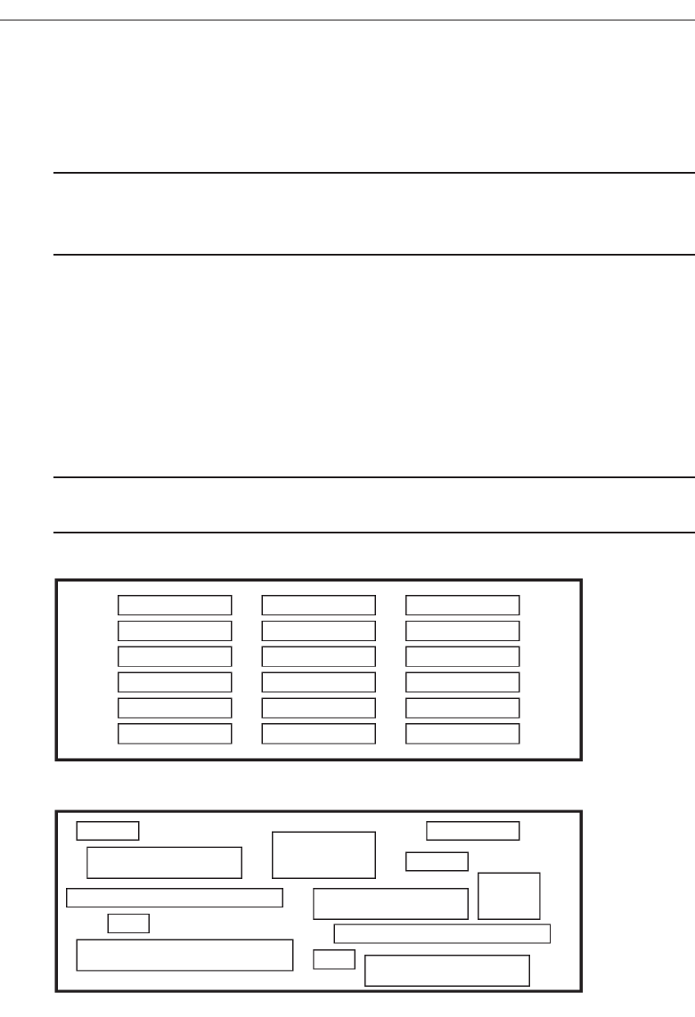
opposite is asymmetry. Our eye tends to perceive something as more compressed or
compact when it is symmetric. Asymmetric arrays are perceived as larger.
Regularity
■
Create regularity by establishing standard and consistently spaced horizontal and
vertical alignment points.
■
Also, use similar element sizes, shapes, colors, and spacing.
Regularity, illustrated in Figure 3.3, is a uniformity of elements based on some prin-
ciple or plan. Regularity in screen design is achieved by establishing standard and con-
sistently spaced column and row starting points for screen elements. It is also achieved
by using elements similar in size, shape, color, and spacing. The opposite of regularity,
irregularity, exists when no such plan or principle is apparent. A critical element on a
screen will stand out better, however, if it is not regularized
Predictability
■
Create predictability by being consistent and following conventional orders or
arrangements.
122 Step 3
Regularity
Irregularity
Figure 3.3 Regularity (versus irregularity).
3900 P-03 (step 3) 4/24/02 1:53 PM Page 122
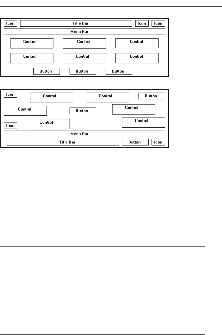
Predictability, illustrated in Figure 3.4, suggests a highly conventional order or plan.
Viewing one screen enables one to predict how another will look. Viewing part of a
screen enables one to predict how the rest of the screen will look. The opposite of pre-
dictability—spontaneity—suggests no plan and thus an inability to predict the struc-
ture of the remainder of a screen or the structure of other screens. In screen design
predictability is also enhanced through design consistency.
Sequentiality
■
Provide sequentiality by arranging elements to guide the eye through the screen in
an obvious, logical, rhythmic, and efficient manner.
■
The eye tends to be attracted to:
— A brighter element before one less bright.
— Isolated elements before elements in a group.
— Graphics before text.
— Color before black and white.
— Highly saturated colors before those less saturated.
— Dark areas before light areas.
— A big element before a small one.
— An unusual shape before a usual one.
— Big objects before little objects.
Understand the Principles of Good Screen Design 123
Predictability
Spontaneity
Figure 3.4 Predictability (versus spontaneity).
3900 P-03 (step 3) 4/24/02 1:53 PM Page 123
Sequentiality, illustrated in Figure 3.5, is a plan of presentation to guide the eye
through the screen in a logical, rhythmic order, with the most important information
significantly placed. Sequentiality can be achieved by alignment, spacing, and group-
ing as illustrated. The opposite of sequentiality is randomness, whereby an arrange-
ment and flow cannot be detected.
The eye tends to move first to the elements listed above, and then from one to the
other. For example, it moves from highly saturated colors to unsaturated colors, from
dark to light areas, from big to little objects, and from unusual to usual shapes.
Economy
■
Provide economy by using as few styles, display techniques, and colors as possible.
Economy, illustrated in Figure 3.6, is the frugal and judicious use of display elements
to get the message across as simply as possible. The opposite is intricacy, the use of
many elements just because they exist. The effect of intricacy is ornamentation, which
often detracts from clarity. Economy in screen design means mobilizing just enough
display elements and techniques to communicate the desired message, and no more.
Historically, the use of color in screens has often violated this principle, with screens
sometimes taking on the appearance of Christmas trees.
124 Step 3
Randomness
Sequentiality
Figure 3.5 Sequentiality (versus randomness).
3900 P-03 (step 3) 4/24/02 1:53 PM Page 124
Unity
■
Create unity by:
— Using similar sizes, shapes, or colors for related information.
— Leaving less space between elements of a screen than the space left at the
margins.
Unity, illustrated in Figure 3.7, is coherence, a totality of elements that is visually all
one piece. With unity, the elements seem to belong together, to dovetail so completely
that they are seen as one thing. The opposite of unity is fragmentation, each piece re-
taining its own character. In screen design similar sizes, shapes, and colors promote
unity, as does white space—borders at the display boundary. Unity should exist be-
tween related screens, and Web site screens, as well.
Proportion
■
Create windows and groupings of data or text with aesthetically pleasing
proportions.
Down through the ages, people and cultures have had preferred proportional rela-
tionships. What constitutes beauty in one culture is not necessarily considered the same
Understand the Principles of Good Screen Design 125
Intricacy
Economy
Figure 3.6 Economy (versus intricacy).
3900 P-03 (step 3) 4/24/02 1:53 PM Page 125
by another culture, but some proportional shapes have stood the test of time and are
found in abundance today.
Marcus (1992) describes the following shapes, illustrated in Figure 3.8, as aestheti-
cally pleasing.
Square (1:1). The simplest of proportions, it has an attention-getting quality and
suggests stability and permanence. When rotated it becomes a dynamic diamond,
expressing movement and tension.
Square root of two (1:1.414). A divisible rectangle yielding two pleasing propor-
tional shapes. When divided equally in two along its length, the two smaller
shapes that result are also both square roots of two rectangles. This property only
occurs with this proportion and is often used in book design. An open book has
the same outside proportion as the individual pages within it. The square root of
two has been adopted as a standard paper size in many countries of the world
(the United States excluded).
Golden rectangle (1:1.618). An old (fifth century B.C.) proportion is the golden rec-
tangle. Early Greek architecture used this proportion, and a mathematical rela-
tionship exists between this number and growth patterns in plant and animal life.
This “divine division of a line” results when a line is divided such that the smaller
part is to the greater part as the greater part is to the whole. The golden rectangle
also has another unique property. A square created from part of the rectangle
leaves a remaining area with sides also in the golden rectangle proportion.
Square root of three (1:1.732). Used less frequently than the other proportions, its
narrowness gives it a distinctive shape.
126 Step 3
Unity
Fragmentation
Figure 3.7 Unity (versus fragmentation).
3900 P-03 (step 3) 4/24/02 1:53 PM Page 126
Double square (1:2). In Japan, the tatami mat used for floor covering usually comes
in this proportion. Rectangles more elongated than this one have shapes whose
distinctiveness is more difficult to sense.
While these pleasing shapes have passed the test of time, not everything we en-
counter conforms to these principles. The American letter paper size has a ratio of
1:1.29, a typical American television screen has a ratio of 1:1.33, and CRT screens typi-
cally have ratios in the range of about 1:1.33 to 1:1.50.
In screen design, aesthetically pleasing proportions should be considered for major
components of the screen, including window sizes, Web page sizes, graphics, and
groupings of data or text.
Simplicity (Complexity)
■
Optimize the number of elements on a screen, within limits of clarity.
■
Minimize the alignment points, especially horizontal or columnar.
— Provide standard grids of horizontal and vertical lines to position elements.
Simplicity, illustrated in Figure 3.9, is directness and singleness of form, a combina-
tion of elements that results in ease of comprehending the meaning of a pattern. The
opposite pole on the continuum is complexity. The scale created may also be consid-
ered a scale of complexity, with extreme complexity at one end and minimal complex-
ity (simplicity) at the other. While the graphics designer usually considers this concept
as simplicity, we will address it as complexity since it has been addressed by this term in
the screen design literature, where an objective measure of it has been derived.
Understand the Principles of Good Screen Design 127
Square
1:1
Square-root of two
1:1.414
Square-root of three
1:1.732
Double square
1:2
Golden rectangle
1:1.618
Figure 3.8 Pleasing proportions.
3900 P-03 (step 3) 4/24/02 1:53 PM Page 127
This measure of complexity was derived by Tullis (1983) based on the work of Bon-
siepe (1968), who proposed a method of measuring the complexity of typographically
designed pages through the application of information theory (Shannon and Weaver,
1949). To illustrate, this measure involves the following steps:
1. Draw a rectangle around each element on a screen, including captions, controls,
headings, data, title, and so on.
2. Count the number of elements and horizontal alignment points (the number of
columns in which a field, inscribed by a rectangle, starts).
3. Count the number of elements and vertical alignment points (the number of
rows in which an element, inscribed by a rectangle, starts).
This has been done for the text-based screens illustrated in Figures 3.10 and 3.11.
These screens are examples from the earlier study by Tullis (1981) described in the in-
troduction. They are an original read-only inquiry screen (Figure 3.10) from the screens
whose mean search time was 8.3 seconds, and a redesigned screen (Figure 3.11) from
the screens whose mean search time was 5.0 seconds.
A complexity calculation using information theory for each screen is as follows:
Figure 3.10 (original):
22 fields with 6 horizontal (column) alignment points = 41 bits.
22 fields with 20 vertical (row) alignment points = 93 bits.
Overall complexity = 134 bits.
128 Step 3
Simplicity
Complexity
Figure 3.9 Simplicity (versus complexity).
3900 P-03 (step 3) 4/24/02 1:53 PM Page 128
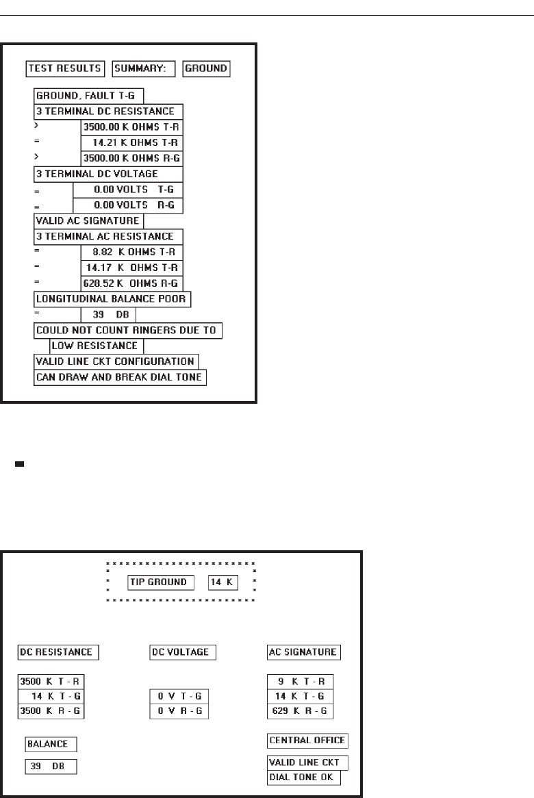
Figure 3.11 (redesigned):
18 fields with 7 horizontal (column) alignment points = 43 bits.
18 fields with 8 vertical (row) alignment points = 53 bits.
Overall complexity = 96 bits.
Understand the Principles of Good Screen Design 129
Figure 3.10 Original screen, from Tullis (1981), with title, captions, and data inscribed by rectangles.
Figure 3.11 Redesigned screen, from Tullis (1981), with title, captions, and data inscribed by rectangles.
3900 P-03 (step 3) 4/24/02 1:53 PM Page 129

The redesigned screen is, thus, about 28 percent simpler, or less complex, than the
original screen.
An easier method of calculation, however, yielding similar results, is to count the
following: (1) the number of elements on the screen, (2) the number of horizontal (col-
umn) alignment points, and (3) the number of vertical (row) alignment points. The
sums for the original and redesigned screens by this measure are:
Figure 3.10 (original):
22 elements.
6 horizontal (column) alignment points.
20 vertical (row) alignment points.
48 = complexity.
Figure 3.11 (redesigned):
18 elements.
7 horizontal (column) alignment points.
8 vertical (row) alignment points.
33 = complexity.
By this calculation the redesigned screen is about 31 percent simpler, or less com-
plex, than the original screen.
By both calculations the redesigned screen has a lower complexity measure than the
original screen. In the Tullis (1981) study, the redesigned and faster-to-use screens had
lower complexity measures. This leads to the following complexity guidelines:
Optimize the number of elements on a screen, within limits of clarity.
Minimize the alignment points, especially horizontal or columnar.
Obviously, the way to minimize screen complexity is to reduce the number of con-
trols displayed. Fewer controls will yield lower complexity measures. This is unrealis-
tic, however, since ultimate simplicity means nothing is there, which obviously does
not accomplish very much. Indeed, Vitz (1966) has found that people have subjective
preferences for the right amount of information, and too little is as bad as too much.
The practical answer, then, is to optimize the amount of information displayed, within
limits of clarity. What is optimum must be considered in light of guidelines to follow,
so a final judgment must be postponed.
Alignment. What can be done, however, is to minimize alignment points, most im-
portantly horizontal or columnar alignment points. Fewer alignment points will
have a strong positive influence on the complexity calculation. Tullis (1983) has
also found, in a follow-up study of some other screens, that fewer alignment
points were among the strongest influences creating positive viewer feelings of
visually pleasing composition. Grose, Partush, Nadir, and Shtub (1998) also per-
formed a study examining various screen factors and usability. They found that
good alignment was related to shorter screen search times and higher viewer
preferences for a screen.
Misalignments and uneven spacing, no matter how slight, can create bothersome
unconscious disruptions to our perceptual systems. When things don’t align, a sense of
130 Step 3
3900 P-03 (step 3) 4/24/02 1:53 PM Page 130

clutter and disorganization often results. In addition to reducing complexity, alignment
helps create balance, regularity, sequentiality, and unity. Alignment also reduces vari-
ation on a screen. Common alignments are associated with a group identity of their
own. Anything that breaks that alignment is quickly seen as an exception.
In laying out a screen, imagine a grid of horizontal and vertical lines beneath it. Use
these grids to position elements and to achieve common alignment points.
Groupings
■
Provide functional groupings of associated elements.
■
Create spatial groupings as closely as possible to five degrees of visual angle (1.67
inches in diameter or about 6 to 7 lines of text, 12 to 14 characters in width).
■
Evenly space controls within a grouping, allowing 1/8 to 1/4 inch between each.
■
Visually reinforce groupings:
— Provide adequate separation between groupings through liberal use of white space.
— Provide line borders around groups.
■
Provide meaningful titles for each grouping.
Grouping screen elements aids in establishing structure, meaningful relationships, and
meaningful form. In addition to providing aesthetic appeal, past research has found that
grouping aids in information recall and results in a faster screen search. The study by
Grose, Parush, Nadir, and Shtub (1998) found that providing groupings of screen ele-
ments containing meaningful group titles was also related to shorter screen search times.
In this study groupings also contributed to stronger viewer preferences for a screen.
The perceptual principles of proximity, closure, similarity, and matching patterns
foster visual groupings. But the search for a more objective definition of what constitutes
a group has gone on for years. Tullis, in his 1981 study, described an objective method
for establishing groups based on the work of Zahn (1971) using the Gestalt psycholo-
gists’ law of proximity. For the Tullis (1981) screens shown in Figures 3.12 and 3.13:
1. Compute the mean distance between each character and its nearest neighbor.
Use a character distance of 1 between characters adjacent horizontally and 2
between characters adjacent vertically (between rows).
2. Multiply the mean distance derived by 2.
3. Connect with a line any character pair that is closer than the distance established
in step 2.
This has been done for these inquiry screens and the results illustrated in Figures
3.12 and 3.13. Boxes have been included around the derived groupings.
Figure 3.12 (original):
Mean distance between characters = 1.05.
Twice the mean distance = 2.10.
A line is drawn between characters 1 or 2 apart, not 3 or more.
Resulting number of groups = 3.
Understand the Principles of Good Screen Design 131
3900 P-03 (step 3) 4/24/02 1:53 PM Page 131
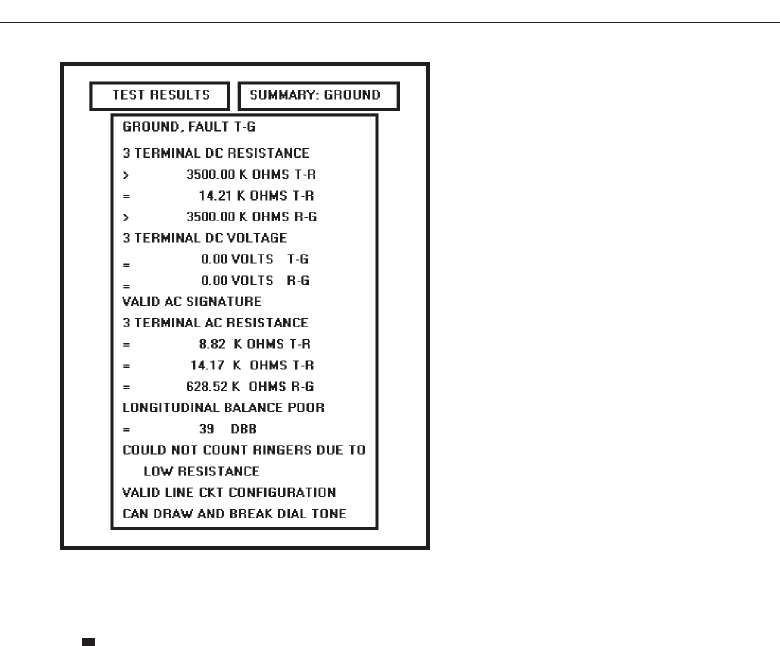
Figure 3.13 (redesigned):
Mean distance between characters = 1.09.
Twice the mean distance = 2.18.
A line is drawn between characters 1 or 2 apart, not 3 or more.
Resulting number of groups = 13.
Tullis found that the redesigned screens had more groupings than the originals.
To use a simplified version of this formula, connect with a line all characters on the
screen separated by no more than one space horizontally and no blank lines vertically.
Groupings will become immediately obvious.
Tullis also calculated another grouping measure: the average size of each screen’s
group. The average size of the three groups in the original screen is 13.3 degrees in
visual angle, whereas the 13 groups on the redesigned screen average 5.2 degrees vi-
sual angle. The redesigned screen group size, interestingly, closely matches the 5 de-
gree visual acuity screen chunk described in Step 1 “Know Your User or Client” It
seems that groups 5 degrees or less in size can be scanned with one eye fixation per
group. Therefore, screens with these size groupings can be searched faster. Groupings
larger than five degrees require more eye fixations per grouping, slowing down screen
scanning time. So, in addition to complexity, the Tullis redesigned screens differ from
the original screens by some grouping measures. The more effective redesigned screens
have a greater number of smaller size groups.
Tullis, in his 1983 follow-up study, also found that groupings were the strongest de-
terminant of a screen’s visual search time. If the size of a group on a screen increased,
or the number of groups increased, search time also increased. Number and size of
132 Step 3
Figure 3.12 Original screen, from Tullis (1981), with grouping indicated by bold boxes.
3900 P-03 (step 3) 4/24/02 1:53 PM Page 132
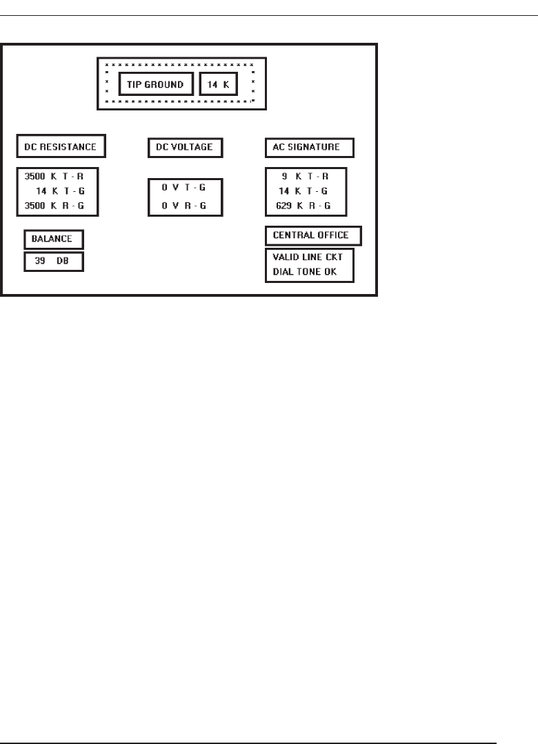
groups have an opposite relationship, however; if the number of groups increases,
their size usually decreases. If the size increases, the number of groups usually de-
creases. What proves to be most effective is a middle-ground solution, a medium num-
ber of medium-sized groups. The grouping guidelines described above are based upon
this and other research presented.
Functional, semantic groups are those that make sense to the user. Related information
should be displayed together. A logical place to “break” a screen is between functional
groups of information, but a massive grouping of information should be broken up into
smaller groups. The most reasonable point is every five rows. A six- or seven-row group-
ing may be displayed without a break, if necessary, but do not exceed seven rows.
The 11- to 15-character width limitation must take into consideration the data to be
displayed. Confining data to this width makes no sense if it thus suffers a reduction in
comprehensibility. Legibility and comprehension are most important.
To give unity to a display, the space between groups should be less than that of the
margins. The most common and obvious way to achieve spacing is through white or
blank space, but there are other ways. Alternatives include: contrasting display fea-
tures such as differing intensity levels, image reversals (white characters on a black
background versus black characters on a white background), borders, and color. Spac-
ing, however, appears to be stronger than color. Two studies (Haubner and Benz, 1983;
Haubner and Neumann, 1986) found that adequate spacing, not color, is a more im-
portant determinant of ease of use for uncluttered, highly structured inquiry screens.
Perceptual Principles and Functional Grouping
■
Use visual organization to create functional groupings.
— Proximity: 000 000 000
— Similarity: AAABBBCCC
— Closure: [ ] [ ] [ ]
— Matching patterns: >> < >
Understand the Principles of Good Screen Design 133
Figure 3.13 Redesigned screen, from Tullis (1981), with grouping indicated by bold boxes.
3900 P-03 (step 3) 4/24/02 1:53 PM Page 133

■
Combine visual organization principles in logical ways.
— Proximity and similarity: AAA BBB CCC
— Proximity and closure: [ ] [ ] [ ]
— Matching patterns and closure: ( ) < > { }
— Proximity and ordering: 1234 1 5
5678 2 6
37
48
■
Avoid visual organization principles that conflict.
— Proximity opposing similarity: AAA ABB BBC CCC
— Proximity opposing closure: ] [ ] [ ] [
— Proximity opposing ordering: 1357 1 2
2468 3 4
56
78
Perceptual principles can be used to aid screen functional groupings.
Use visual organization to create functional grouping. The most common percep-
tual principle used in screen design to aid visual groupings has been the proxim-
ity principle. The incorporation of adequate spacing between groups of related
elements enhances the “togetherness” of each grouping. Space should always be
considered a design component of a screen. The objective should never be to get
rid of it. The similarity principle can be used to call attention to various groupings
by displaying them in a different intensity, font style, or color. The closure and
matching patterns principles involve using lines, borders, and unique symbols to
identify and relate common information.
Combine visual organization principles in logical ways. Visual organization prin-
ciples can be combined to enhance groupings. Proximity, a very strong perceptual
principle, can guide the eye through an array of information to be scanned in a
particular direction. Scanning direction can also be made obvious through simi-
larity (color, intensity, and so on) or matching patterns (lines or borders).
Avoid visual organization principles that conflict. Principles may not always be
compatible, however. When the viewer encounters incompatibilities, confusion
results. In the examples above, proximity destroys similarity, proximity over-
whelms closure, and proximity overwhelms logical ordering.
Grouping Using White Space
■
Provide adequate separation between groupings through liberal use of white space.
■
For Web pages, carefully consider the trade-off between screen white space and the
requirement for page scrolling.
134 Step 3
3900 P-03 (step 3) 4/24/02 1:53 PM Page 134

Today, the term white space is a misnomer, a carry-over from the white paper of
printed forms. It might more appropriately simply be called space, reflecting the vari-
ety of colors capable of being displayed by today’s screens. Whatever we call it, space
should be considered a screen element of equal importance to all others. It is not
wasted space. It defines and separates screen elements, and gives a screen proportion
and meaningful form, thus assisting in providing the distinctiveness that is so desired.
Space is also used to direct attention to adjacent areas that do contain important infor-
mation. Remember, if a screen is perceived as a homogeneous, cluttered mass, infor-
mation will only be found through an exhaustive search of the entire screen.
In Web page design, the “provide white space” principle directly confronts another
principle, “minimize the need for scrolling” (to be discussed shortly). Web pages are
typically longer than the maximum visible area of the display on which they are pre-
sented. To see the entire page requires screen scrolling. An abundance of white space,
therefore, creates a need for excessive scrolling. It also makes page scanning more dif-
ficult and moves information further apart spatially, making the determination of in-
formation relationships more difficult.
Web page guideline information addressing this problem is somewhat contradic-
tory. Recommendations include “use white space sparingly” (Usability.gov), “mini-
mize the use of white space in search tasks” (Bailey, 1999c), and users rating poorly
sites with large amounts of white space and sparse text (Festa, 1998). On the other
hand, a characteristic of the top 100 Web sites is “lots of white space” (Grok.com). The
most practical recommendation at the moment is that for longer pages the use of white
space should be reduced, but certainly not at the expense of page clarity. Each page
must be evaluated in terms of its specific content, the relationships existing between the
various pieces of content, and the page’s scanning and visual search requirements. A
trade-off that best meets all these needs must then be established and implemented.
Grouping Using Borders
■
Incorporate line borders for:
— Focusing attention on groupings or related information.
— Guiding the eye through a screen.
■
Do not exceed three line thicknesses or two line styles on a screen, however.
— Use a standard hierarchy for line presentation.
■
Create lines consistent in height and length.
■
Leave sufficient padding space between the information and the surrounding borders.
■
For adjacent groupings with borders, whenever possible, align the borders left,
right, top, and bottom.
■
Use rules and borders sparingly.
■
In Web page design:
— Be cautious in using horizontal lines as separators between page sections.
— Reserve horizontal lines for situations in which the difference between adjacent
areas must be emphasized.
Understand the Principles of Good Screen Design 135
3900 P-03 (step 3) 4/24/02 1:53 PM Page 135
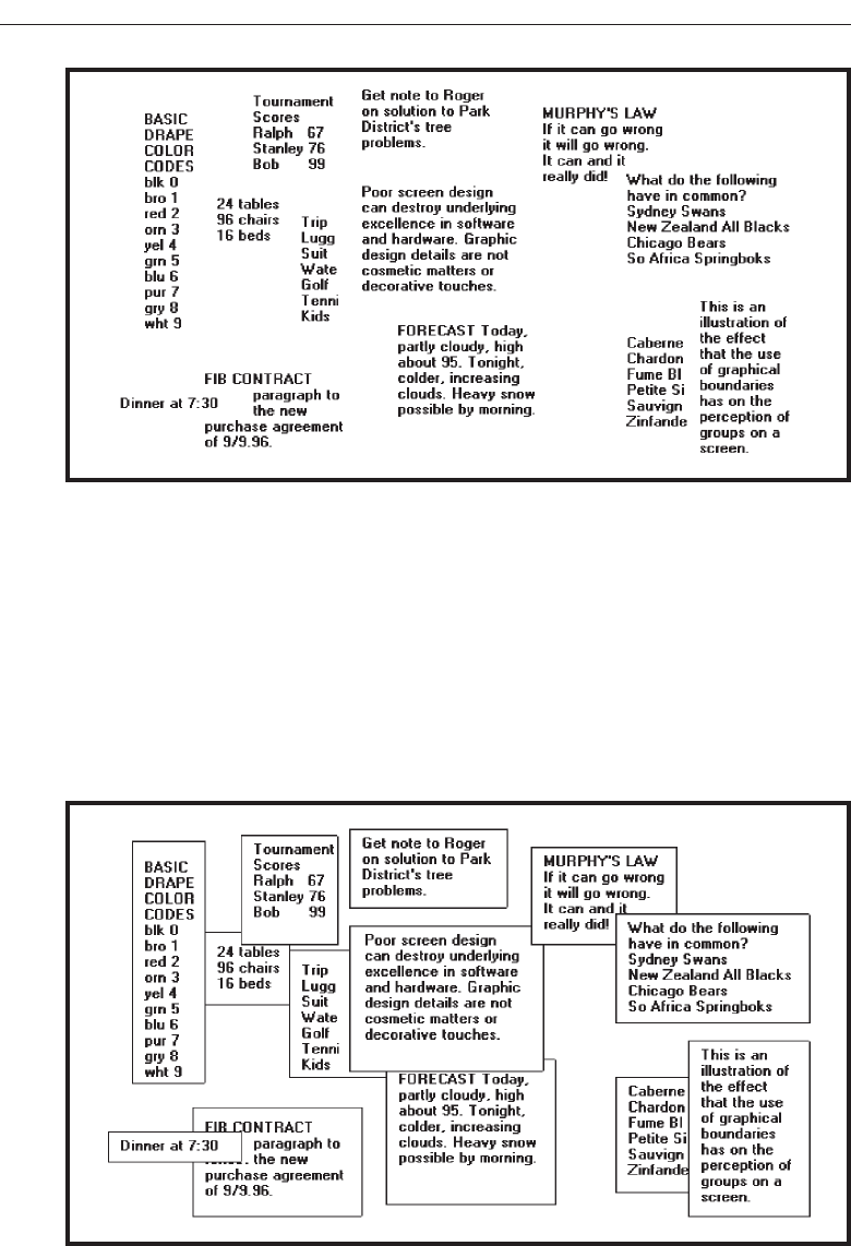
Line borders. Line borders, or rules, can greatly enhance a screen. Research has
found that information displayed with a border around it is easier to read, better
in appearance, and preferable. Figures 3.14 and 3.15 illustrate identical screens
with and without borders around groupings. While many groupings are obvious
without borders, borders certainly reinforce their existence.
Lines or rules assist in focusing attention on related information. They also aid
in separating groupings of information from one another. Draw borders around
elements to be grouped. Microsoft Windows provides a control called the Group
136 Step 3
Figure 3.14 The effect of line or graphical borders. Groupings without borders.
Figure 3.15 The effect of line or graphical borders. Groupings with borders.
3900 P-03 (step 3) 4/24/02 1:53 PM Page 136

Box to establish a frame around a group of related controls (see Step 7 “Choose the
Proper Screen-Based Controls”). Rules also serve to guide the viewer’s eye in the
desired direction. Use vertical rulings to convey to the screen viewer that a screen
should be scanned from top to bottom.
Line thickness variations. Too many variations in line thickness on a screen create
clutter and are distracting. Use no more than three line weights at one time, or two
different styles. Use a standard hierarchy for rules, the thickest to differentiate
major components, the thinnest for minor separation. Consider a thin border for
individual controls, a slightly thicker border for groupings, and the thickest bor-
ders for windows themselves.
Consistent line widths and heights. Similarly, variations in line widths and heights
are distracting. Create horizontal lines of equal widths across the screen and ver-
tical lines of equal height whenever possible. This will provide better balance.
Sufficient space padding. When placing information within borders leave “breath-
ing room,” sufficient space between the information and the borders themselves.
Avoid looking like you are trying to stuff 6 pounds into a 5-pound sack.
Alignment. For adjacent groupings with borders, whenever possible, align the bor-
ders left, right, top, and bottom. The most important alignment points are left and
top. Do not create right and bottom alignment by leaving excessive white space
within the area encompassed by the border. This is not visually appealing.
Use lines and borders sparingly. Too many lines and borders on a screen also cre-
ate clutter and can be distracting. Like any display technique, lines and borders
must be used sparingly.
Web pages. In Web page design be cautious in using horizontal lines as separators
between page sections. Users may assume they have reached the bottom of the
page, missing what follows. Separator lines may also make the screen look more
cluttered. In general, reserve horizontal lines for situations where the difference
between adjacent areas must be emphasized.
Grouping Using Backgrounds
■
Consider incorporating a contrasting background for related information.
— The background should not have the “emphasis” of the screen component that
should be attended to. Consider about a 25 percent gray screening.
— Reserve higher contrast or “emphasizing” techniques for screen components to
which attention should be drawn.
Information can also be visually tied together through using a background that contrasts
with the remainder of the screen. The background should just be a background, however; vi-
sual emphasis should be directed toward foreground material. A common failing of many
screens is that the background is too highly emphasized. Consider about a 25 percent gray
screening. Always reserve the higher contrast or emphasizing techniques for screen com-
ponents in need of attention. Be very conservative in the variety of different backgrounds
used. Background colors may also be used to relate or separate screen groupings. Color by
Understand the Principles of Good Screen Design 137
3900 P-03 (step 3) 4/24/02 1:53 PM Page 137

itself is a poor separator of screen elements, however. A border is always needed to properly
set off adjacent areas of different colors. Colors should also be used with caution since the
user may have the ability to change them. This may result in undesirable effects. Finally, less
variation is always better than more. An additional discussion on color screen backgrounds
is found in Step 12 “Choose the Proper Colors.”
MAXIM Working with a system should never be painful; instead it should be
so painless you forget what you are doing!
Visual Style in Web Page Design
■
Maintain a consistent and unified visual style throughout the pages of an entire
Web site.
■
Base the visual style on:
— The profile and goals of the Web site owner.
— The profile, tastes, and expectations of the Web site user.
The style of a Web site, its visual characteristics, including color, typography, and
graphics; the shape of its design elements; and the relationship of its components to one
another, including their locations, should be maintained throughout the entire Web
site. This will provide unity and harmony to the Web site and give it a consistent iden-
tity. Unity and consistency will also aid users in navigation, reinforcing for them that
they are anchored in a specific place within the universe of information space. It will
also enable the users to become comfortable and familiar with the Web site.
Visual style must reflect the needs and goals of the Web site owner and will vary de-
pending upon the Web site’s purpose; presenting facts, marketing, entertainment, and
so forth. The tastes and expectations of the Web site’s users are also critically important.
It must be appealing to its expected viewers, motivating them to explore its entire con-
tents. Sun Microsystems (1998) in a redesign of their Web site reported that a great vi-
sual appearance made users think more highly of their site. The visual design style
must always be evaluated along with other components of the system. (See Step 14
“Test, Test, and Retest.”)
Amount of Information
■
Present the proper amount of information for the task.
— Too little is inefficient.
— Too much is confusing.
■
Present all information necessary for performing an action or making a decision on
one screen, whenever possible.
— People should not have to remember things from one screen to the next.
■
Restrict screen or window density levels to no more than about 30 percent.
138 Step 3
3900 P-03 (step 3) 4/24/02 1:53 PM Page 138

Proper amount of information. Presenting too much information on a screen is con-
fusing; there will be greater competition among a screen’s components for a per-
son’s attention. Visual search times will be longer, and meaningful structure will
be more difficult to perceive. Presenting too little information is inefficient and
may tax a person’s memory as information contained on multiple screens may
have to be remembered.
Present all necessary information. In general; present all information necessary for
performing an action or making a decision on one screen. If information located
on different screens must be remembered, a person’s memory will again be taxed.
Developing a screen with all the necessary information requires careful analysis
of the user’s tasks.
Screen density. One objective measure of “how much” should go on a screen has
been developed: “density.” Density, by definition, is a calculation of the propor-
tion of display character positions on the screen, or an area of the screen contain-
ing something. Density is clearly related to complexity, since both measure “how
much is there.” Complexity looks at elements, density at characters, so they
should rise and fall together.
In general, studies show that increasing the density of a display increases the time
and errors in finding information. There are two types of density to be calculated on a
screen: overall and local.
Overall density is a measure of the percentage of character positions on the entire
screen containing data. Danchak (1976) stated that density (loading, as he called it)
should not exceed 25 percent. Reporting the results of a qualitative judgment of
“good” screens, he found their density was on the order of 15 percent. Tullis, in his
1981 study, reported that the density of screens from an up and running successful
system ranged from 0.9 to 27.9 percent, with a mean of 14.2 percent. Using this and
other research data, he concluded that the common upper density limit appears to be
about 25 percent.
Thacker (1987) compared screens with densities of 14 percent, 29 percent, and 43
percent. Response time increased significantly as screen density increased. He found,
however, that the time increase between 14 percent and 29 percent was much smaller
than the time increase between 29 percent and 43 percent. He also found increased
error rates with greater density, the 43 percent density screens showing significantly
more errors.
Local density is a measure of how “tightly packed” the screen is. A measure of local
density, derived by Tullis, is the percentage of characters in the 88-character visual acu-
ity circle described in Step 1, modified by the weighting factors illustrated below.
012222210
0123445443210
023456777654320
01235679+97653210
023456777654320
0123445443210
012222210
Understand the Principles of Good Screen Design 139
3900 P-03 (step 3) 4/24/02 1:53 PM Page 139
For every character on the screen, a local density is calculated using the above
weighting factors, and then an average for all characters on the screen is established.
Figures 3.16 and 3.17 are the original and redesigned screens from the 1981 Tullis
study. Density measures for these screens are:
Figure 3.16 (original):
Overall density = 17.9 percent.
Local density = 58.0 percent.
Figure 3.17 (redesigned):
Overall density = 10.8 percent.
Local density = 35.6 percent.
In both cases, the more effective redesigned screen had lower density measures. In
his 1983 follow-up study, Tullis found a lower local density to be the most important
characteristic, creating a positive “visually pleasing” feeling.
The research does suggest some density guidelines for screens. Maintain overall
density levels no higher than about 30 percent. This upper overall density recommen-
dation should be interpreted with extreme care. Density, by itself, does not affect
whether or not what is displayed “makes sense.” This is a completely different ques-
tion. Density can always be reduced through substituting abbreviations for whole
140 Step 3
Figure 3.16 Original screen, from Tullis (1981).
3900 P-03 (step 3) 4/24/02 1:53 PM Page 140
words. The cost of low density in this case may be illegibility and poorer comprehen-
sion. Indeed, poorly designed screens have been redesigned to achieve greater clarity
and have actually ended up with higher density measures than the original versions.
How it all “hangs together” can never be divorced from how much is there.
In conclusion, all this density research was performed using text-based screens. With
many boxed or specialized controls found on graphical screens, such as list boxes or
sliders, it is much more difficult to calculate density as has just been illustrated. Is it
necessary to do so on graphical screens? Not really. The research was described to
show the value of reducing density in screen design. From a practical standpoint, if the
guidelines for alignment and groupings are adhered to, screen density will usually be
reduced to an acceptable level.
Web Page Size
■
Minimize page length.
— Restrict to two or three screens of information.
■
Place critical or important information at the very top so it is always viewable when
the page is opened.
— Locate it within the top 4 inches of page.
Understand the Principles of Good Screen Design 141
Figure 3.17 Redesigned screen, from Tullis (1981).
3900 P-03 (step 3) 4/24/02 1:53 PM Page 141

The answer to the question “What should be the maximum length of a Web page?”
has no precise answer. Maximum length recommendations in the literature vary, run-
ning from “short” to “1–2” to “3” to “5” to even more. One serious problem in estab-
lishing an exact page size is that the multitudes of Web viewers use a variety of different
browsers and monitors. Another problem is that font types and sizes can vary, impact-
ing how much of a page is visible at any one time. What is viewable on one person’s
screen, then, may not be entirely visible on another. Another problem is that the view-
able depth of a Web screen is somewhat less than the typical business information
screen. Very few Web users have screens large enough that enable them to view an en-
tire letter-size page all at once. A business information system, conversely, usually con-
tains standardized applications, consistent size screens, and standard monitors.
In Web page design, what is generally agreed upon is the following:
Minimize page length Given the scarcity of Web page screen real estate, and its
screen size variability, it is not practical to confine a page to the least common de-
nominator display screen size. To fulfill the “Amount of Information” guidelines
just described will often require a page length to exceed a “screenfull.” Deter-
mining an optimum page length will require balancing these factors. Arguments
for shorter pages and against longer pages are that longer pages:
Tax the user’s memory, as related information is more scattered and not al-
ways visible.
Can lead to a lost sense of context as navigation buttons and major links dis-
appear from view.
Display more content and a broader range of navigation links making it more
difficult for users to find and then decide upon what path to follow.
Require excessive page scrolling, which may become cumbersome and
inefficient.
Are less conducive to the “chunking” information organization scheme com-
monly employed in Web sites.
Arguments for longer pages are that they:
Resemble the familiar structure of paper documents.
Require less “clicks” for navigating through a Web site.
Are easier to download and print for later reading.
Are easier to maintain because they possess fewer category navigation links to
other pages.
Critical or important information at the very top. Critical or important information
should be placed where it will be immediately visible when the page is displayed.
In Web page design, this is referred to as “above the fold,” a term borrowed from
newspaper page layout. Above the fold is about the top 4 inches of a page. “Below
the fold” will usually require scrolling to access and may not always be seen.
Deciding on Long versus Short Pages
■
To find specific information quickly:
— Create many links to short pages.
142 Step 3
3900 P-03 (step 3) 4/24/02 1:53 PM Page 142

■
To understand an entire concept without interruption:
— Present the entire concept in one page with internal links to subtopics.
■
To print all or most of the content to read offline:
— Use one long page or prepare a version that uses one page.
■
If page will be loading over slow modems and all pages are not needed:
— Create a comprehensive contents page with links to many short pages.
Page size will also vary, depending upon the user’s task and motivation, the page’s
purpose, and the Web page provider’s objectives. If the user is interested and moti-
vated, a longer page may be warranted, reducing the user’s effort in reloading pages.
If the user is being “sold” a product, advertising practices should be employed, in-
cluding keeping pages short. If the page’s purpose is strictly navigation, then one
screen is most practical so that all navigation choices are visible. What must be deter-
mined in establishing page length, then, is the user’s reading “rhythm” (Levine, 1995).
Weinschenk (2001) provides the above page length recommendations based upon dif-
fering user needs.
Scrolling and Paging
■
Scrolling:
— Avoid scrolling to determine a page’s contents.
— Minimize vertical page scrolling.
— When vertical scrolling is necessary to view an entire page:
• Provide contextual cues within the page that it must be scrolled to view its en-
tire contents.
• Provide a unique and consistent “end of page” structure.
— Avoid horizontal page scrolling.
■
Paging:
— Encourage viewing a page through “paging.”
— Create a second version of a Web site, one consisting of individual screens that
are viewed through “paging.”
In screen design over the past couple of decades the favored method of asking the
user to move between screens of information has been through paging. A full screen of
information is presented, the user does what is necessary to do to the screen, and then
the entire screen is transmitted through a key action. If other user actions are then nec-
essary to accomplish an objective, another full screen is presented and the process con-
tinues until an ending is reached. This method of interaction was practical and efficient
for computer and monitor technology existing at that time, and it presented the user
consistent and meaningful “chunks” of information to work on. Screen scrolling as an
interaction method was also used over this time period but on a much more limited
basis.
User performance using paging and scrolling has been the subject of occasional re-
search efforts. One early study found that for novice users, paging through screens
Understand the Principles of Good Screen Design 143
3900 P-03 (step 3) 4/24/02 1:53 PM Page 143

yielded better performance and was preferred. Dillon (1992), however, in a review of
the research literature found no reliable differences using either method.
The scrolling technique used today in viewing screens was also established through
research. There are two possible ways to control and view a scrolling screen, the tele-
scope and the microscope approaches. In the telescope method, the model is that of a
telescope, the window moves around the screen data much as a telescope scans the
stars in the night sky. In the microscope approach, the screen data appears to move
under a fixed viewing window, the way an object placed under a microscope is manu-
ally moved around to see it in its entirety. The research found that the telescope ap-
proach is more natural and causes fewer errors, and it was implemented. This is why,
when scrolling today, clicking the up arrow on the scroll bar causes the data displayed
on a screen to move downward. The data is not actually moving, the telescope through
which the data is being viewed is moving upward.
Web technological requirements have tilted the scale toward scrolling as the favored
method of page viewing. Early in it’s popular life scrolling seemed to cause some dif-
ficulties for Web users, Nielsen (1996) reporting that only 10 percent of users went be-
yond what was visible on the screen by using scrolling. Apparently in 1996 paging was
a well-ingrained habit. As user familiarity with the Web increased, so did scrolling fa-
miliarity, and in 1999 Nielsen (1999b) reported that most users were now used to
scrolling, having gained the understanding that things were often hidden from view.
In spite of its seeming acceptance, excessive page scrolling can be cumbersome and
slow. It also can disrupt the user’s perception of spatial location within a page, espe-
cially while the text is scrolling. To minimize these problems, do the following.
Avoid scrolling to determine page contents. A page’s subject should be immedi-
ately recognizable. Elements crucial to identifying a page’s contents must be
viewable without requiring page scrolling. If not visible when the page is first dis-
played, these elements may never be seen. Place these content-identifying ele-
ments “above the fold,” or in the top 4 inches of the page.
Minimize vertical scrolling. Some scrolling may be necessary to view the entire con-
tents of a page. Minimize the requirement for vertical scrolling when defining, or-
ganizing, and laying out a page’s components. For example, avoid large graphics
and excessive amounts of white space. Place closest to the page’s top the infor-
mation most likely to be needed.
Provide contextual scrolling cues and a unique end-of-page structure. Lower parts
of a page may be overlooked, especially if the visible portion appears to satisfy the
user’s needs and the user erroneously concludes that no more can be done. For
pages exceeding one screen in length, provide contextual cues to the user that part
of the page is hidden and that viewing the entire page will necessitate scrolling.
Organize the information, for example, so that it is obvious there is more to fol-
low. An incomplete alphabetical arrangement of information would be one such
clue. Also, be cautious in placing screen-wide horizontal lines between groupings
of content. This could convey to a causal user that the page’s bottom has been
reached. To identify the page bottom, provide a visually unique and consistent
ending on all pages. A row of navigation links and other elements such as copy-
rights, e-mail address, and other contact information can signify “The End.” Do
144 Step 3
3900 P-03 (step 3) 4/24/02 1:53 PM Page 144

not place these ending elements in other locations within the page or other pages.
They will convey falsely to the user that the end has been reached.
Avoid horizontal scrolling. While some vertical scrolling is now acceptable in Web
page design, horizontal scrolling must be avoided. A page too wide to be com-
pletely displayed within the confines of a screen will require continuous scrolling
as reading is performed. This is extremely cumbersome and inefficient.
Encourage use of paging. Full-screen paging on the Web can be done by using the
page-up and page-down keys or clicking on the scroll bar page-up or page-down
icons. Text is then moved by the number of lines equaling screen size. This is al-
most always faster than scrolling a line at a time. Some recent studies have ad-
dressed the issue of Web page scrolling and paging.
Piolat, Roussey, and Thunin (1998) found, as in past studies, no significant dif-
ferences between paging and scrolling in text reading. Paging users, however,
were better at: building mental representations of the text, finding relevant infor-
mation, and remembering the main ideas. Blinn and Biers (1999) found that, when
searching Web sites with shorter pages, information was found faster using pag-
ing as opposed to scrolling. Mead, Spaulding, Sit, and Walker (1997) addressed
the effects of an inexperienced user’s age on paging and scrolling. Older users
(64–81) were more likely to use a page at a time while reading; younger users
(19–36) tended to scroll a line at a time. Older users also performed best when
using short full pages of information rather than continuous long pages. Paging
navigation, it seems, does have advantages for users. Encourage its use.
Paging version. Ensure the availability of full pages for reading and searching on
the Web and, by creating a second version of a Web site, one consisting of indi-
vidual screens that are viewed through “paging.”
Distinctiveness
■
Individual screen controls, and groups of controls, must be perceptually distinct.
— Screen controls:
• Should not touch a window border.
• Should not touch each other.
— Field and group borders:
• Should not touch a window border.
• Should not touch each other.
— Buttons:
• Should not touch a window border.
• Should not touch each other.
■
A button label should not touch the button border.
■
Adjacent screen elements must be displayed in colors or shades of sufficient contrast
with one another.
Elements of screen must be distinct, clearly distinguished from one another. Dis-
tinctiveness can be enhanced through separation and contrast.
Understand the Principles of Good Screen Design 145
3900 P-03 (step 3) 4/24/02 1:53 PM Page 145

All screen elements must be perceptually distinct. Distinctiveness is achieved by
providing adequate separation between adjacent elements and screen boundaries and
providing adequate separation between parts of an element. Screen controls, field and
group borders, and buttons should not touch window borders or each other. Colors or
shades used for adjacent screen elements must also contrast well with one another.
Guidelines for color and shading are described in Step 12.
Focus and Emphasis
■
Visually emphasize the:
— Most prominent element.
— Most important elements.
— Central idea or focal point.
■
To provide emphasis use techniques such as:
— Higher brightness.
— Reverse polarity or inverse video.
— Larger and distinctive font.
— Underlining.
— Blinking.
— Line rulings and surrounding boxes or frames.
— Contrasting color.
— Larger size.
— Positioning.
— Isolation.
— Distinctive or unusual shape.
— White space.
■
De-emphasize less important elements.
■
To ensure that emphasized screen elements stand out, avoid:
— Emphasizing too many screen elements.
— Using too many emphasis techniques.
— Screen clutter.
■
In Web page design:
— Call attention to new or changed content.
— Ensure that page text is not overwhelmed by page background.
Apply a visual emphasis technique to highlight the most important or prominent
parts of a screen. An emphasized element should contrast with the rest of the screen,
calling the user’s eyes to it.
Brightness. A brighter element has a good attention-getting quality and no disturb-
ing features. It may be used to indicate items in error, and increased brightness is
the best vehicle for calling attention to data on inquiry screens. Do not use more
than two brightness levels on a screen. If brightness has a fault, it is that displays
with improperly set manual screen contrast controls can diminish its effective-
ness, even causing it to disappear. This can be a major problem for displays
placed in exceptionally bright viewing conditions.
146 Step 3
3900 P-03 (step 3) 4/24/02 1:53 PM Page 146

Reverse polarity. Inverse video reverses an element’s polarity. For example, on a
screen with a specific level of dark text and a specific level of light background,
certain elements can be emphasized by displaying them in the reverse: a text of
the same lightness as that used on the regular screen on a background of the same
darkness as is used on the regular screen.
For old text-based screens, reverse polarity meant displaying dark text on a
light background, or reversing the standard light text on dark background. Dur-
ing the 1980s several studies comparing this reverse were performed and, in gen-
eral, no differences in performance, eye-scanning behavior, or feelings of visual
fatigue were uncovered. One study, however, did find reverse polarity more vi-
sually fatiguing, while another found green and orange phosphor reverse polar-
ity screens easier to read but found no differences in white phosphor readability.
These studies contributed to the popularity of orange phosphor screens at that
time. In those days, it was generally found that people preferred dark background
screens to white background screens because of the harshness and excessive
brightness of backgrounds. There was one benefit to light background screens,
however. Dark background screens can create a viewing problem, their mirror-
like surfaces reflecting light from other outside sources back into the screen
viewer’s eyes. Light background screens absorb most of this light, instead of re-
flecting it back to the screen viewer.
For elements of screens—pieces of data, messages, and so on—reverse polarity
has a very high attention-getting quality. It can be effectively used for items
selected, items in error, information being acted upon, or information of current
relevance.
Some cautions should be taken with reverse polarity. If reverse polarity is
used to identify one kind of element, such as a text box or other boxed control,
avoid what can best be described as the crossword puzzle effect—the haphazard
arrangement of elements on the screen creating an image that somewhat resem-
bles a typical crossword puzzle. An arrangement of elements might be created
that tries to lead the eye in directions that the designer has not intended or causes
elements to compete for the viewer’s attention. The cause of this problem is using
reverse polarity for too many purposes or by poor alignment and columnization
of elements selected for this emphasis. Conservative use and alignment and
columnization rules will minimize this effect.
If reverse polarity is used to highlight information such as messages or actions
to be taken, allow an extra reversed character position on each side of the infor-
mation. This will leave a margin around the information, improving legibility
and giving it a more pleasing look. Last, reverse polarity can make text harder to
read if the screen resolution and character sizes are not sufficient. A light screen
background can actually bleed into its dark characters, reducing their legibility.
This is a phenomenon called iridescence.
Fonts. Differences in fonts have a moderate attention-getting capability. Their vary-
ing sizes and shapes can be used to differentiate screen components. Larger, bolder
letters can be used to designate higher-level screen pieces, such as different levels
of headings, if the headings are used to search for something. Do not use larger
fonts, however, for entry/modification (conversational) and display/read-only
screens, because this will place too much emphasis in the headings themselves.
Understand the Principles of Good Screen Design 147
3900 P-03 (step 3) 4/24/02 1:53 PM Page 147

Emphasis should go to the screen data. If you are using multiple fonts, never use
more than two styles or weights, and three sizes, on a screen.
Underlining. Underlining is a moderate attention-getting mechanism but it can re-
duce legibility, so it should be used conservatively and carefully. In graphical
systems it is commonly used to designate keyboard equivalents or mnemonics. In
Web pages it is used to designate navigation links.
Blinking. Blinking has a very high attention-getting capability, but it reduces text
readability and is disturbing to most people. It often causes visual fatigue if used
excessively. Therefore, it should be reserved for urgent situations and times when
a quick response is necessary. A user should be able to turn off the blinking once
his or her attention has been captured. The recommended blink rate is 2–5 Hz,
with a minimum “on” time of 50 percent. An alternative to consider is creating an
“on” cycle considerably longer than the “off,” a wink rather than a blink.
Line rulings and surrounding boxes or frames. Use lines to emphasize and guide the
user’s eye through the screen. Use horizontal rulings as a substitute for spaces when
breaking a screen into pieces. Use vertical rulings to convey to the screen viewer that
a screen should be scanned from top to bottom. Use rules to surround radio button
and check box controls, and other groupings of controls or important single controls.
While many groupings are obvious without borders, borders certainly reinforce
their existence. Use no more than three line thicknesses or two line styles on a screen.
Colors. Use color to emphasize and assist in the identification of screen components.
Some colors appear brighter than others. Display no more than four colors at one
time on a screen essentially alphanumeric in nature, six on a statistical graphics
screen. Color considerations will be extensively reviewed in Step 12.
Other emphasis techniques. Other emphasis techniques include: displaying the el-
ement in a larger size, placing an element in a position where the eye first meets the
screen, isolating the element from the remainder of the screen, presenting the ele-
ment in a distinctive or unusual shape, and using white space to emphasize blocks of
text. One’s eyes will also be drawn to the start of any text following white space.
De-emphasize less important elements. To designate an element as not applicable
or not active, dim it or gray it out.
Avoid too much emphasis. An emphasized element must, of course, attract the
user’s eye to it. The attraction capability of a mechanism is directly related to how
well it stands out from its surroundings. Emphasis will loose it attracting value if
too many different items on a screen are emphasized. A few hands raised for at-
tention are much easier to deal with than many hands raised. Focus problems will
also be created if too many emphasizing techniques are used within a screen. The
user’s attention will be drawn to the differences in techniques, and his or her in-
formation processing system will try to understand why the differences exist, in-
stead focusing on the information itself. Minimization of clutter also assists a user
in focusing on the most crucial part of a screen. In using emphasis, conservatism
and simplicity is the key.
Web page emphasis. The dynamic nature of the Web and its available screen design
tools raise some other emphasis considerations. New or changed Web page con-
tent should be emphasized to immediately call the user’s attention to it when a
148 Step 3
3900 P-03 (step 3) 4/24/02 1:53 PM Page 148

page is presented. Inappropriate page backgrounds may degrade an emphasis
technique’s usability. Background graphics, pictures, patterns, or textures may re-
duce the technique’s attention-getting quality, as well as reduce text legibility.
Conveying Depth of Levels or a
Three-Dimensional Appearance
■
Use perspective, highlighting, shading, and other techniques to achieve a three-
dimensional appearance.
■
Always assume that a light source is in the upper-left corner of the screen.
■
Display command buttons above the screen plane.
■
Display screen-based controls on, or etched or lowered below, the screen plane.
■
Do not overdo things, and avoid:
— Using perspective for noninteractive elements.
— Providing too much detail.
The spatial composition of a screen can also be communicated by using perspective,
highlighting, shading, and other techniques to achieve a three-dimensional appear-
ance. In creating shadows, always assume that the light source is in the upper-left cor-
ner of the screen. To visually communicate function, consider displaying command
buttons raised above the screen. Conversely, display screen-based controls on, or
etched or lowered below, the screen plane. Consistently follow this concept on all
screens. One caution, do not overdo things or the effect will be lost and visual clutter
will emerge. Avoid using perspective for noninteractive elements, and do not provide
too much detail.
Techniques used to achieve a three-dimensional appearance include overlapping,
drop shadows, highlighting and lowlighting, growing and shrinking, and beveled
edges (Marcus, 1992).
Overlapping. Fully display the window or screen element of current relevance and
partially hide beneath it other screen windows or elements, as illustrated in Fig-
ure 3.18. The completeness or continuity of outline of the relevant element will
make it appear nearer than those partially covered.
Drop shadows. To further aid in the perception of the placement of a pull-down
above a screen, or a window above a screen or another window, locate a heavier
Understand the Principles of Good Screen Design 149
Figure 3.18 Overlapping screen elements.
3900 P-03 (step 3) 4/24/02 1:53 PM Page 149

line along the bottom and right edges of the pull-down or window. This creates
the impression of a shadow caused by a light source in the upper-left corner of the
screen, reinforcing the nearness of the important element. The light source should
always appear to be upper left, the shadow lower right.
Highlighting and lowlighting. Highlighted or brighter screen elements appear to
come forward, while lowlighted or less bright elements recede. Attention will be
directed to the highlighted element.
Shrinking and growing. Important elements can be made to grow in size, while less
important elements remain small or shrink. An icon, for example, should expand
to a window when it is selected. The movement, as it expands, will focus attention
upon it.
Beveled edges. A beveled edge (lines that are not at right angles to the screen ele-
ment borders) will also give the impression of depth. With beveled edges, win-
dows, buttons, and menu bar choices will appear to rise from the screen. To
strengthen the three-dimensional aspect of the screen element, give it a drop
shadow by shading the bottom and right sides with either a tone of gray or a
darker shade of the basic screen color.
Texture change. Texture is the surface quality of an object. Varying the object’s pat-
tern of light and dark areas creates it. Increased density of an object implies a fur-
ther distance. Increase the density of nonapplicable screen elements, and display
currently relevant elements less densely. If textures are used as a code on screens,
Shurtleff (1993) recommends using no more than six or seven. Also, a texture
change should convey information that is not immediately apparent from name,
shape, or other physical characteristic of an object. Finally, provide consistency;
establish only one meaning for a texture.
Color change. Objects farther away appear hazy and less saturated. Increase hazi-
ness as screen element importance diminishes; display currently relevant ele-
ments more vividly.
Size change. Objects farther away appear smaller. Decrease the size of nonapplica-
ble screen elements; display currently relevant elements as larger.
Clarity change. Objects not at the eye’s focus distance appear fuzzy or blurred. Dis-
play nonapplicable elements as blurred, and currently relevant screen elements as
clear.
Vertical location. The horizon appears higher, objects up close lower. Present cur-
rently applicable screen elements at the bottom of the screen, present nonapplic-
able elements at the screen’s top.
Spacing change. Faraway objects appear more closely spaced, closer objects more
widely spaced. Display nonapplicable elements as more closely spaced, currently
applicable screen elements as more widely spaced.
Receding lines. Parallel lines converging and receding to a vanishing point imply
depth.
Motion change. Objects moving at uniform speeds appear to be moving more
slowly the farther away they are.
150 Step 3
3900 P-03 (step 3) 4/24/02 1:53 PM Page 150

Presenting Information Simply and Meaningfully
■
Provide legibility.
— Information is noticeable and distinguishable.
■
Provide readability.
— Information is identifiable, interpretable, and attractive.
■
Present information in usable form.
— Translations, transpositions, and references to documentation should not be re-
quired to interpret and understand information.
■
Utilize contrasting display features.
— To attract and call attention to different screen elements.
■
Create visual lines.
— Implicit and explicit, to guide the eye.
■
Be consistent.
— In appearance and procedural usage.
Following are guidelines for presenting information on screens. The fundamental
goals are clarity and simplicity in form, comprehensibility in organization, efficient in-
formation assimilation, and pleasantness in tone.
Legibility. Legibility is distinguishableness. Is the type of the proper kind and of ad-
equate size and clarity for viewers of all ages? Is the contrast between text and its
background adequate? In general, the legibility of screen text still does not match
that of text presented on paper.
Readability. Is the information written at an understandable level for all users? Is it
direct, simple, and easy to comprehend? Is visual interference minimized? When
we read, we use the shape of a word as a strong aid in comprehension; often we
do not read individual letters but recognize word shapes. Words are given more
distinctive shapes by letter “ascenders” and “descenders.” A lowercase letter’s
height is called its “x” height (the height of the letter x). Other letters are identical
in height to the “x,” such as the “e,” “a,” and “n” in the word “explain.” Ascen-
ders are letter strokes that rise above the x—the tops of the “l” and “i” in “ex-
plain,” for example. Descenders are letter strokes that drop below the x—the
bottom of the “p” in “explain.” Research indicates that in the reading process the
top half of a letter is the most important part of a word in comprehension. The top
halves of letters are more distinctive than their bottom halves.
Usability. Screen information should be presented in a directly usable form. Refer-
ence to documentation or other extra steps for interpretation should never be re-
quired. In graphical system design, content consisting of words and text is much
faster to comprehend and use than content in a graphical form.
Contrasting display features. Use contrasting display features to call attention to
different screen components, items being operated upon, or urgent items. Usable
features include such things as letter style, size, and color. Features chosen should
provide perceptual cues to aid in screen component identification so that atten-
tion may be quickly and accurately focused. Perceptual cues clarify structure and
Understand the Principles of Good Screen Design 151
3900 P-03 (step 3) 4/24/02 1:53 PM Page 151

relationships, and give hints to the reader. Good readers make great use of the ty-
pographic and semantic cues found in well-presented text.
Visual lines. The eye should be guided vertically or horizontally implicitly through
the screen through the use of white space and content, typefaces, and control
alignments. In situations where a large amount of information must be presented
on one screen, eye movement direction may also be communicated to the viewer
explicitly, through the drawing of actual vertical or horizontal rules. Purposeless,
unfettered wandering of the eye should be discouraged.
Consistency. Methods chosen to present information must, of course, always be
consistent in visual appearance and procedural usage.
Typography
In typography, by definition a typeface is the name of a type, such as Times New
Roman, Arial, Verdana, or Helvetica. A font is a typeface of a particular size, such as
Times Roman 16 point or Arial 12 point. In screen design, the terms have become some-
what interchangeable. In this discussion, the term font will be used to encompass both
types and sizes.
In screen design, different fonts are used to organize information, establish impor-
tance, establish a reading order, and create a particular mood. A seemingly unending
supply of typefaces, styles, and sizes are available for these purposes. Operating sys-
tem and Web browser providers have also provided default fonts for various system
components. Many screen users also have the ability to change fonts to suit their own
liking, although many rarely do.
As these guidelines are presented, note the limits in the number of font variations
recommended. Using too many techniques at one time only leads to screen clutter and
the impression of confusion.
Font Types and Families
■
Use simple, common, readable fonts.
— Any sans serif such as Helvetica or Verdana.
— Times Roman.
■
Use no more than two families, compatible in terms of line thicknesses, capital let-
ter height, and so on.
— Assign a separate purpose to each family.
— Allow one family to dominate.
Visually simple, common, readable fonts are needed for clarity on most screens, in-
cluding business system applications and the text content of Web pages. Ornate, spe-
cialty, or “cool” fonts should be avoided because they are not familiar and may
degrade on the screen, reducing legibility. Helvetica and Verdana, designed especially
for use on screens, are sans serif typefaces, and they are considered more contempo-
152 Step 3
3900 P-03 (step 3) 4/24/02 1:53 PM Page 152

rary. Times Roman possesses very small serifs, and it is considered more conservative
and traditional.
Generally, sans serif typefaces are recommended (serifs are the small cross strokes
that appear on the arms of some letters) if the type is 10 or fewer points in size, if the
display environment is less than ideal, or if the screen is of low resolution. The serifs
can wash out under these conditions. Fonts with serifs, it is felt, provide better links be-
tween letters in a word, provide a horizontal guideline for the eye, and help in distin-
guishing one letter from another. Recent research (Boyarski, Neuwirth, Forlizzi, and
Regli, 1998) compared reading speeds for the 10-point serif fonts Georgia and Times
Roman with the 10-point sans serif font Verdana. Monitor resolution was 640 by 480
pixels. No significant differences in reading speed were found.
All typefaces are named, some after their designers (for example, Garamond), some
after locations where they originated (Helvetica after Switzerland), and other for the
publications for which they were designed (Times). Within each typeface are style vari-
ations: regular, italics, boldface, outlines, and shadows. These groupings are called
families.
A family of styles is designed to complement one another, creating unity in design.
An example of a family is that of Times illustrated in Figure 3.19.
Similar typefaces are grouped into what are called races. One kind of race is called
roman, which contains the Times typeface illustrated here as well as the Bookman,
Schoolbook, and Palatino typefaces. A second race is sans serif, where the typefaces Hel-
vetica and Avant Garde reside. Another race is named Old English. An effective design
can almost always be achieved by staying within one typeface race. If it is necessary to
mix typeface families on a screen do the following:
Never mix families within the same race. Typographic noise is created.
Assign a separate purpose to each family. A sans serif typeface for the title and
headings and a roman typeface for the body is a good combination. The opposite
is also acceptable.
Allow one family to dominate.
Understand the Principles of Good Screen Design 153
Times Roman
Times Italic
Times Bold
Times Bold Italic
TTiimmeess OOuuttlliinnee
Times Shadow
Times Shadow
Figure 3.19 The Times family of type.
3900 P-03 (step 3) 4/24/02 1:53 PM Page 153

Professional designers rarely use anything but the traditional, simple typefaces.
These fonts have been crafted through centuries of use. When in doubt, use the same
font and its variants for all design needs. This better than a risky aesthetic decision.
Font Size
■
Use no more than three sizes.
— Consider “X” height.
■
For graphical systems use:
— 12 point for menus.
— 10 point for windows.
■
For Web pages use:
— 12–14 points for body text.
— 18–36 points for titles and headings.
■
For line spacing use one to one and one-half times font size.
■
Never change established type sizes to squeeze in more text.
Font sizes are described by points—the distance between the top of a letter’s ascen-
der and the bottom of its descender. One point equals 1/12 inch. Font sizes should be
large enough to be legible on standard monitors. Also, a typeface displayed on a per-
sonal computer will look 2–3 points larger than the same typeface on a Macintosh.
Variations in type sizes should also be minimized, no more than three being the
maximum to be displayed at one time on a screen. In selecting a typeface it is impor-
tant to consider its x-height, or the height of its lowercase x and other similar letters.
Two typefaces may share the same point size but one may appear significantly larger
because its x-height is larger, as illustrated in Figure 3.20. Legibility can be affected by
x-height.
Many systems use a 12-point type for menus and 10-point for windows. Dropping
below eight points significantly degrades legibility. In Web page design larger type
sizes are recommended, 12–14 points for body text and 18–36 points for titles and head-
ings. Line spacing should be one to one and one-half times font size. For comparison
purposes, recommended paper document type sizes and styles are as follows:
Chapter headings: 24-point bold
Section headings: 18-point bold
Subsection headings: 14-point bold
Paragraph headings: 12-point bold
Body text: 10-point
Annotations/footnotes: 8-point
Never change a selected type size for a screen component to squeeze something in.
The differences in size will be noticeable and very disturbing.
154 Step 3
3900 P-03 (step 3) 4/24/02 1:53 PM Page 154

Font Styles and Weight
■
Use no more than:
— Two styles of the same family.
• Standard and italic.
•Italic is best presented in a serif font.
— Two weights.
• Regular and bold.
•Bold is best presented in a sans serif font.
■
Use italics when you want to call attention.
■
Use bold when you want to call attention or create a hierarchy.
■
In Web pages, use an underline only to indicate a navigation link.
Styles. Italics may be used to emphasize something or attract attention on a screen.
Because it may be hard to read on many monitors, it should be used sparingly. Bo-
yarski, Neuwirth, Forlizzi, and Regli (1998) in their study did compare Verdana
Standard with Verdana Italic, but found no differences in reading speed. (Tech-
nically, a sans serif type is slanted, not truly “italics”.) For the Verdana font, larger
use seems justified. Italic is best presented in a serif font. In general, though, re-
strict italics to words or short phrases; don’t use it for large blocks of text. Never
use more than two styles at one time. A standard font and its italics is a good com-
bination. Because of degraded legibility, outline and shadow style variations
should be used only with extreme caution on screens
Boldface. Use bold when you want to call attention to something. Typically, screens
will be used again and again, and something bold often becomes too visually heavy.
Use of too much bold is considered shouting, and nothing stands out. Like italics,
use bold sparingly, restricting it to words or short phrases. Don’t use it for large
blocks of text. Bold’s most effective use is for titles, headings, and key items. Restrict
a font to two weights, regular and bold, although in Web page design, use of more
weights is acceptable. Bold is best presented in a sans serif font. The differing stroke
widths of serif fonts cause presentation problems over different font sizes.
Understand the Principles of Good Screen Design 155
abcdefghijklmnopqrstuvwxyz
abcdefghijklmnopqrstuvwxyz
abcdefghijklmnopqrstuvwxyz
Figure 3.20 Types with same point size and different x heights (from top to bottom, Gatsby, Times
Roman, and Avant Garde).
3900 P-03 (step 3) 4/24/02 1:53 PM Page 155

Underline. In Web pages, an underline is used to designate a navigation link. It
should only be used for this purpose. Its use in any other way will be confusing
to the user.
Font Case
■
Use mixed-case for:
— Control captions.
— Data.
— Control choice descriptions.
— Text.
— Informational messages.
— Instructional information.
— Menu descriptions.
— Button descriptions.
■
Consider using upper case or capitalization for:
— Title.
— Section headings.
— Subsection headings.
— Caution and warning messages.
— Words or phrases small in point size.
■
Use all lower case with caution.
The screen designer often has the choice of whether to display screen components in
mixed case or upper case. Upper case means all capital letters. Mixed case usually im-
plies a predominance of lowercase letters with occasional capitalization as needed (ini-
tial letter of first word, acronyms, abbreviations, proper nouns, and so on).
The research on textual material is clear. One of the earliest studies, Tinker (1955), in
a study of reading from hard-copy materials, found that mixed-case text is signifi-
cantly faster to read than uppercase text. Subsequent studies also found large advan-
tages in reading speed and reading comprehension for mixed-case text. The advantage
of mixed-case over uppercase text is that it gives a word a more distinctive shape. Up-
percase letters are all the same height; lowercase letters have different heights. These
height differences aid comprehension.
The research on screen captions and menu choice descriptions, however, leans in an-
other direction. Studies have found that captions and menu choice descriptions using
uppercase characters are searched faster than those using mixed-case characters.
Why this difference? The materials giving better results for mixed-case text appear
to be of a longer, textual nature. The caption materials appear to be single words or
short phrases. It may be that the superiority of mixed-case text does not exhibit itself
until text of an extended nature is read. Why short uppercase captions were actually
superior to mixed-case ones is unknown. In light of this research, the following is
recommended.
Mixed case. Always use mixed case for anything textual in nature, including text it-
self, messages, instructional information, figure and table descriptions, and so
156 Step 3
3900 P-03 (step 3) 4/24/02 1:53 PM Page 156

forth. Text, messages, and instructions reflect the years of research on readability.
Also use mixed case for most other screen components, including control cap-
tions, data, control choice descriptions, and menu descriptions. These mixed-case
recommendations also reflect what is becoming a de facto standard, found in var-
ious product style guides.
One choice in using mixed case is whether to use the sentence style or headline
style of presentation. Sentence style is what you are reading now, the initial sen-
tence letter is capitalized and the remainder of the sentence is lower case (except
for acronyms, abbreviations, proper nouns, and so on). For anything more than
one sentence in length, the sentence style must be followed in presenting textual
information. For short phrases, such as control captions and headings, the more
declarative headline style may be used.
Upper case. Unfortunately, most style guides, such as IBM’s SAA CUA and Micro-
soft’s Windows Interface Guidelines, recommend presenting everything on a screen
in mixed case. That this is an extrapolation of the textual reading research to all
written words can only be assumed.
Contrary to style guide recommendations, on screens capitalization can and
should be judiciously used. Consider using uppercase text for the screen title
and, most importantly, for all screen headings. Capitalization will set headings
off from the many other screen components described above, which are dis-
played in mixed case. Headings on screens are a learning aid. They enable
the user to become familiar with screen organization and relationships. With ex-
perience, the screen user finds headings less important. Capitalization will set
them off from the remaining screen elements, making them easier to ignore
when they are no longer needed. Screen design research does not discount using
upper case.
On Web screens, the endless variety of display techniques (different fonts,
font sizes, font weights, and so on) makes the use of capitalization for component
differentiation much less necessary. On all screens, however, do consider using
capitalization to call attention to important things, including caution and warning
messages. Also, capitalization may be substituted for mixed case when a small
font size is necessary within a screen component, and the small size degrades
word legibility.
All lower case. In an attempt to be different, text or sentences in all lower case have
begun to appear, that is, there is no initial capital letter on the first sentence word.
Be cautious in using this approach; it does not conform to the mental model con-
cerning sentence structure we have well ingrained within us. The visual begin-
ning of a sentence anchor point has disappeared, it looks out of context, and it
looks very casual. This style is rarely appropriate for a business application.
Defaults
■
For graphical operating systems, use the standard system fonts.
■
For Web pages design for the default browser fonts.
■
Consider that the user may change the fonts.
Understand the Principles of Good Screen Design 157
3900 P-03 (step 3) 4/24/02 1:53 PM Page 157

A system’s default fonts should be used to ensure usability and consistency. They
must be known in the design process. Unfortunately, defaults may vary by operating
system and browser.
Graphical systems. Use the standard system fonts. For example, with Microsoft
Windows 98 and NT 4.0 the default is MS Sans Serif 8 point. For Windows 2000 it
is Tahoma 8 point, although it must be set.
Web pages. Not all browsers provide the same typographic operations. If a page is
designed using a font that the user does not have installed, the browser displays
its default fonts. Many older browsers support only two fonts, Times Roman and
Courier. Newer browsers support more fonts but they must be installed on the
machine doing the browsing. Default fonts may include Times New Roman,
Arial, Helvetica, and Verdana. It is best to stick with the fonts installed on the
users’ computers. Available options must be known before beginning the design
process.
Consistency
■
Establish a consistent hierarchy and convention for using typefaces, styles, and
sizes.
— Decide on a font for each different level of importance in the hierarchy.
— Communicate hierarchy with changes in:
• Size.
• Weight.
• Color.
To aid screen learning and improve screen scanning and readability, apply typeface
size and style conventions in a consistent manner to all screen components. First, de-
termine the hierarchy or levels of importance to be presented within an application or
Web site, then, decide on a font for each level of the hierarchy. In a graphical business
system, screen elements include the title, section headings, subsection headings, con-
trol captions, data, instructional information, and so forth. In Web site design impor-
tant elements include the page heading, section headings, body text, icon captions,
lists of navigation links, and so forth. Finally, communicate the hierarchy through vari-
ations is font size, weight, and color. Ensure that there is adequate visual contrast be-
tween elements composing the hierarchy. (Do not forget, however, that screen element
location and its positional relationship to other screen elements also aid in the ele-
ments identification.)
Some cautionary reminders: Choose and combine font families with care, and too
many font variations will only create visual clutter.
Other
■
Always consider the visual capabilities of the user.
■
Always verify that the design has succeeded using the selected fonts.
158 Step 3
3900 P-03 (step 3) 4/24/02 1:53 PM Page 158

Age considerations. Unfortunately, as we all know, the eye’s capability begins to di-
minish as we age. The eye begins it aging process in our early thirties. At 40 the
process accelerates, and by age 50 most people need 50 percent more light to read
by than they did when they were in their twenties. Failing to be able to read a
menu in a dimly lit restaurant is often the first time we become aware of this prob-
lem. Smaller type sizes and text with insufficient background contrast may be
more difficult for older people to use. Type sizes, styles backgrounds should al-
ways be chosen considering the ages of the screen users.
Font selection verification. Always check that the design has succeeded using the
selected fonts. Ensure that the screens are legible and readable from all viewing
distances and angles.
Paper versus Screen Reading
■
Provide a facility for printing out a hard copy of documents.
Printing technology has been evolving for several centuries. Factors such as type size
and style, character and line spacing, and column and margin widths have been the
focus of research for a good part of that time. The product of this research is highly
readable and attractive printed material. Conversely, CRT-based characters are a rela-
tively new innovation, with many technical limitations. The result is a displayed char-
acter that often lacks the high quality a paper medium can provide. This disparity in
quality has resulted in performance differences when paper and screen reading of
materials have been compared. Various researchers over the years have found screen
reading speeds as much as 40 percent slower, and more error prone.
More recent research indicates that, as display resolution improves, the reading
speed differences are being reduced, if not eliminated. Reading performance, using
both hard-copy paper documents and monitors at different resolutions, was the sub-
ject of two studies by Ziefle (1998). In the first study she compared paper printed at
255 dots per inch (dpi) and monitors whose resolutions were 832×600 pixels (60 dpi)
and 1664×1200 pixels (120 dpi). A 19-inch monitor showing black characters on a light
background was used, and reading speeds and proofreading accuracy were com-
pared. Ziefle found no difference in performance between the monitors with different
resolutions. There was, however, a significant advantage for hard-copy over moni-
tor usage. Reading from paper was faster, 200 words per minute to 180 wpm, and
proofreading accuracy was higher. Reading from paper was also preferred by 80
percent of the users. The remaining 20 percent preferred the higher resolution screen
(1664×1200).
Gujar, Harrison, and Fishkin (1998), however, compared text written on paper with
text presented on screens and found no statistically significant differences in reading
time and detected errors. Participants, though, rated reading from paper significantly
better than reading from screens.
For extended reading, the hard-copy display of material still appears to have signif-
icant advantages, however, and will probably continue to for some time. People prefer
reading from paper. Necessary screen-reading motor activities (scrolling, paging, and
Understand the Principles of Good Screen Design 159
3900 P-03 (step 3) 4/24/02 1:53 PM Page 159

so on) are more cumbersome than the page-turning task of reading from a paper. Paper
reading also offers much more convenience, the reader being much less constrained
physically and environmentally. (Paper reading can be performed by the pool, in bed,
or any place else where significant light exists.) Always provide a facility for printing
hard copies of documents.
Screen Elements
Elements of a screen include control captions, the data or information displayed on the
screen, headings and headlines, instructional information, and the screen’s title. The
following guidelines address these screen components.
Captions/Labels
■
Identify controls with captions or labels.
■
Fully spell them out in a language meaningful to the user.
■
Display them in normal intensity.
■
Use a mixed-case font.
■
Capitalize the first letter of each significant word.
■
End each caption with a colon (:).
■
Choose distinct captions that can be easily distinguished from other captions.
— Minimal differences (one letter or word) cause confusion.
Identify controls with captions. All screen controls should have captions or labels
that identify the content of the control. The context in which information is found
in the world at large provides cues to the information’s meaning. A number on a
telephone dial is readily identifiable as a telephone number; the number on a
metal plate affixed to the back of an automobile is readily identified as a license
number. The same information displayed on a screen, being out of context, may
not be readily identifiable.
There are, however, some exceptions to this rule on read-only or inquiry
screens. The structure of the data itself in some cases may be enough to identify
its meaning. The most obvious example is name, street, city, state, and zip code.
Date may be another possibility. Elimination of these common captions will serve
further to clean up read-only screens. Before eliminating them, however, it should
be determined that all screen users will be able to identify these fields all the time.
Structure and size. Captions on screens must clearly and concisely describe the in-
formation displayed. They are very important for inexperienced screen users. As
one becomes more experienced, their importance diminishes. Therefore, captions
should be fully spelled out in the natural language of the user. In general, abbre-
viations and contractions should not be used. To achieve the alignment recom-
mendations to be discussed shortly, an occasional abbreviation or contraction
may be necessary, but choose those that are common in the everyday language of
160 Step 3
3900 P-03 (step 3) 4/24/02 1:53 PM Page 160

the application or those that are meaningful and easily learned. Also, display cap-
tions in a moderate brightness or intensity. Visual emphasis will be directed to the
screen data or information.
Significant word capitalization. With mixed-case field captions, capitalize the first
letter of each significant word using the headline style previously described. A
caption is not a sentence but the name for an area into which information will be
keyed. This makes it a proper noun. In situations in which a caption is phrased as
a question, it is a sentence, and then only its initial letter should be capitalized.
Never begin a caption or sentence with a lowercase letter. A capital letter makes
it easier for the eye to identify the start of each caption.
Unfortunately, IBM’s SAA CUA and Microsoft’s Windows style guides do not
follow the headline style of using a capital letter for the initial letter of each sig-
nificant word of the caption. They prefer and recommend the sentence style, cap-
italization of the initial letter of the first word only (except for acronyms,
abbreviations, proper nouns, and so on).
Designate with a colon. A caption should be ended with a colon (:) to clearly iden-
tify it as such. The colon is unobtrusive, does not physically resemble a letter or
number, and is grammatically meaningful, since it is used chiefly to direct atten-
tion to matter that follows. Unfortunately, many graphical systems do not follow
this convention, and captions visually blend with other screen elements. The Win-
dows style guide does recommend using a colon after captions.
Since the recommended entry area for an entry control will be a box, ade-
quately distinguishing the caption from the entry field itself, the inclusion of a
colon may seem redundant. However, read-only, display, and inquiry screens
are most effective if the data displayed is not presented in a box, making a colon
to distinguish caption from data absolutely necessary. Including a colon after all
captions, therefore, will provide consistency across all screens.
Distinctiveness. Captions that are similar often repeat the same word or words over
and over again. This directs a viewer’s attention to the pattern created by the
repetitive word, increases the potential for confusion, adds to density, and adds
to screen clutter. A better solution is to incorporate the common words into head-
ings, subheadings, or group identifiers, as illustrated in Figure 3.21.
Data Fields
■
For entry or modifiable data fields, display data within:
— A line box.
— A reverse polarity box.
■
For inquiry or display/read-only screens, display data on the normal screen
background.
■
Visually emphasize the data fields.
Understand the Principles of Good Screen Design 161
3900 P-03 (step 3) 4/24/02 1:53 PM Page 161
Two kinds of data fields are found on screens, those into which data may be entered
or that contain data that may be modified, and those that only present data that cannot
be changed. The design rules for each kind differ.
Entry/modifiable fields. An entry or modifiable field must possess the following
qualities:
Draw a person’s attention to the fact that information must be keyed or selected
in it.
Not detract from the legibility of characters being keyed into it.
Permit easy designation of the kind or structure of the entry required, such as in-
corporation of slashes (/) in a date field.
Indicate the maximum size of the entry required.
In an early study using text-based screens, it was found that people overwhelm-
ingly preferred that something displayed on a screen indicate where data must
be entered. In another study, it was found that the best alternatives for defining
an entry field were a broken line underscore or a box. An underscore was tradi-
tionally used on text-based screens; the box is now recommended for, and
should be used on, graphical screens.
Display/read-only screens. For inquiry or display/read-only screens, it is best for
the data to be presented on the background of the screen. This permits easier
scanning and information location; the reasoning will be discussed in the “Dis-
play/Read-Only” screen organization section following shortly.
Visual emphasis. Data or information is the most important part of any screen. It
should be highlighted in some manner, either through higher intensity, boldness,
162 Step 3
Figure 3.21 Providing better control caption discrimination. (The redundant word “amount” is in-
corporated into a heading.)
3900 P-03 (step 3) 4/24/02 1:53 PM Page 162
or a brighter color. Headings and captions are most important for the new or ca-
sual user. As people become familiar with a system and screens, their attention is
immediately drawn to the data when a screen is presented. An experienced user
will often work with a screen just perusing the data, ignoring captions and head-
ings. Highlight the data so it will attract the user’s eyes. Other screen elements
will be easier to ignore.
Control Captions/Data Fields
■
Differentiate captions from data fields by using:
— Contrasting features, such as different intensities, separating columns, boxes, and
so forth.
— Consistent physical relationships.
Figure 3.22
■
For single data fields:
— Place the caption to left of the data field.
Figure 3.23
— Align the caption with the control’s data.
— Alternately, place the caption above the data field.
—Align captions justified, upper left to the data field.
Figure 3.24
— Maintain consistent positional relations within a screen, or within related screens,
whenever possible.
■
For multiple listings of columnar-oriented data, place the caption above the colum-
nized data fields.
Figure 3.25
Captions must be complete, clear, easy to identify, easy to scan, and distinguishable
from other captions and data fields.
Differentiating captions from data. Captions and data should be visually distin-
guishable in some manner so that they do not have to be read in context to deter-
mine which is which. A common failing of many past screens is that the captions
and data have the same appearance and blend into one another when the screen
is filled. This makes differentiation difficult and increases caption and field data
Understand the Principles of Good Screen Design 163
3900 P-03 (step 3) 4/24/02 1:53 PM Page 163
search time. Methods that can be used to accomplish differentiation, in addition
to designating captions with a colon, are using contrasting display features and
consistent positional relationships.
Single data fields. The recommended location for the caption is to the left of the data
field and horizontally aligned with the field data. Alternately, the caption for a
single data field may be positioned left-aligned above the data field. Maintain
consistent positional relationships within a screen, and between multiple related
screens whenever possible.
Columnar-oriented listings. For multiple listings of columnar data, place the cap-
tion above the data fields. Left/justify the caption above the data fields. Use hor-
izontal caption formats for single fields and a columnar caption orientation for
repeating fields to provide better discrimination between single and repeating
fields. The single-field caption will always precede the data, and captions for re-
peating columnar fields will always be above the top data field. Figures 3.28
through 3.44 illustrate common caption-data field discrimination problems and
the recommended solutions for displaying both entry/modifiable fields and dis-
play/read-only/inquiry fields.
Control Caption/Data Field Justification
■
1. First Approach
— Left-justify both captions and data fields.
— Leave one space between the longest caption and the data field column.
Figure 3.26
■
2. Second Approach
— Left-justify data fields and right-justify captions to data fields.
— Leave one space between each.
Figure 3.27
Figures 3.28 through 3.44 contain a series of screens in a variety of formats contain-
ing either entry/modification fields or display/read-only fields. The author’s com-
ments are found with each screen. What are your thoughts?
164 Step 3
3900 P-03 (step 3) 4/24/02 1:53 PM Page 164
Understand the Principles of Good Screen Design 165
Figure 3.28 Entry screen with captions above single data fields. Captions distinct
from data but with poor alignment and organization of fields. Left-to-right orientation
and no groupings. Fair readability.
Figure 3.29 Display/read-only inquiry screen maintaining same structure as 3.22.
Extremely poor differentiation of captions and data. Crowded look and extremely poor
readability.
Figure 3.30 Entry screen in 3.28 with colons attached to captions. Captions some-
what more distinctive but still with poor alignment and organization of fields, left-to-
right orientation and no groupings. Fair readability.
3900 P-03 (step 3) 4/24/02 1:53 PM Page 165
Figure 3.32 Entry/modification screen with captions to left of single data fields.
Captions distinct from data but with poor alignment and organization of fields. Left-
to-right orientation and no groupings. Fair readability.
Figure 3.33 Display/read-only screen maintaining same structure as 3.32. Extremely
poor differentiation of captions and data. Less crowded look than previous display/in-
quiry screens but still poor readability.
166 Step 3
Figure 3.31 Display/read-only screen maintaining same structure as 3.30. Some-
what better differentiation of captions and data than 3.29 but still with a crowded look
and poor readability.
3900 P-03 (step 3) 4/24/02 1:53 PM Page 166
Understand the Principles of Good Screen Design 167
Figure 3.34 Entry/modification screen in 3.32 with colons attached to captions.
Captions somewhat more distinctive but still poor alignment and organization of
fields, left-to-right orientation and no groupings. Fair readability.
Figure 3.35 Display/read-only screen maintaining same structure as 3.34. Some-
what better differentiation of captions and data than 3.33 but still poor readability.
Figure 3.36 Entry/modification screen with much better alignment and readabil-
ity than previous screens. Captions crowd data fields, however. Also, has no group-
ings and does not maintain post office suggested format for City, State, and Zip.
3900 P-03 (step 3) 4/24/02 1:53 PM Page 167
168 Step 3
Figure 3.38 Entry/modification screen with the better alignment and readability of
3.36. Caption positioned to left, however, resulting in more distinctive data fields. Still
no groupings, though, and does not maintain post office suggested format for City,
State, and Zip.
Figure 3.37 Display/read-only screen maintaining same aligned structure as 3.36.
Captions not very distinctive and poor readability. Again, it looks very dense and
crowded.
3900 P-03 (step 3) 4/24/02 1:53 PM Page 168
Understand the Principles of Good Screen Design 169
Figure 3.40 Entry/modification screen providing alignment, groupings, and the sug-
gested and familiar post office address format. Data fields also segmented to enhance
readability (Number and Telephone).
Figure 3.39 Display/read-only screen maintaining same alignment and positioning
of captions of 3.38. Captions and data much more distinctive. Still no groupings
though, and does not maintain post office suggested format for City, State, and Zip.
3900 P-03 (step 3) 4/24/02 1:53 PM Page 169
170 Step 3
Figure 3.42 Entry/modification screen identical to 3.40 except that captions for
State and Zip are stacked with City, enhancing distinctiveness and readability of the
data fields. The screen also achieves a more compact and balanced look. The recom-
mended style for this kind of entry screen.
Figure 3.41 Display/read-only screen maintaining same item alignment and posi-
tioning, and data field segmentation as 3.40. Some data distinctiveness is lost and
minor crowding occurs, however, because of the location of the captions for State and
Zip between data fields.
3900 P-03 (step 3) 4/24/02 1:53 PM Page 170
Understand the Principles of Good Screen Design 171
Figure 3.44 Display/read-only screen identical to 3.43 except that the captions
Street and City/State/Zip have been eliminated to improve data field distinctiveness.
The content of the data should make the identity of these fields obvious. The recom-
mended style for this kind of display/read-only screen.
Figure 3.43 Display/read-only screen maintaining same alignment, item position-
ing, and data segmentation as 3.42. Good readability but the lengthy caption
City/State/Zip does impinge upon the distinctiveness for the data.
3900 P-03 (step 3) 4/24/02 1:53 PM Page 171
Justification of single captions and data fields can be accomplished in several ways.
These include:
A. Left-justifying captions; data field immediately follows caption.
Figure 3.45
B. Left-justifying captions; left-justifying data fields; colon (:) associated with cap-
tions.
Figure 3.46
C. Left-justifying captions; left-justifying data fields; colon (:) associated with data
field.
Figure 3.47
D. Right-justifying captions; left-justifying data fields.
Figure 3.48
Alternatives A and C are not recommended. Alternative A, left-justified aligned
captions with data fields immediately following, results in poor alignment of data
fields and increases the screen’s complexity. It is more difficult to find data when
searching data fields. Alternative C, while structurally sound, associates the colon pri-
marily with the data field. The strongest association of the colon should be with the
caption.
The two most desirable alternatives are B and D. Alternative B, left-justified captions
and data fields, is the first approach illustrated in these guidelines. Alternative D, right-
justified captions and left-justified data fields, is the second approach illustrated in
these guidelines.
Left-justified captions and data (B). A disadvantage to this approach is that the cap-
tion beginning point is usually farther from the entry field than the right-justified
caption approach. A mix of caption sizes can cause some captions to be far re-
moved from their corresponding data field, greatly increasing eye movements be-
tween the two and possibly making it difficult to accurately tie caption to data
172 Step 3
3900 P-03 (step 3) 4/24/02 1:53 PM Page 172
field. Tying the caption to the data field by a line of dots (.....) solves the associ-
ation problem but adds a great deal of noise to the screen. This does not solve the
eye movement problem. Eye movement inefficiencies can be addressed by abbre-
viating the longer captions. The cost is reduced caption clarity.
An advantage to this approach is that section headings using location posi-
tioning as the key element in their identification do stand out nicely from the
crisp left-justified captions.
Right-justified captions and left-justified entry fields (D). A disadvantage here is
that section headings using location positioning as the identification element do
not stand out as well. They tend to get lost in the ragged left edge of the captions.
Advantages are that captions are always positioned close to their related data
fields, thereby minimizing eye movements between the two, and that the screen
takes on a more balanced look.
There is no universal agreement as to which is the better approach. Experimental
studies have not provided any answers, although most style guides recommend, and
illustrate, the left-aligned caption approach. IBM’s SAA CUA does discuss and permit
both alignment styles.
Examples to follow in this and succeeding chapters reflect both styles. This is done
to enable the reader to see and evaluate each. Whichever method is chosen, however,
should be consistently followed, through a series of related screens.
MYTH All we really have to do is make the interface look glitzy.
Special Symbols
■
Consider special symbols for emphasis.
■
Separate symbols from words by a space.
Figure 3.49
Special symbols can be considered to emphasize or call attention to elements on a
screen. An icon, for example, can precede an error message, or the greater than sign can
be used to direct attention (DELEGATES >>). Symbols should be separated from words
by one space.
Headings
Used with related controls, headings are primarily incorporated to create a common
identity. In addition to providing meaning, they foster the concept of grouping, create
visual appeal, and aid screen learning. Used with Web page text, headings are used to
break up large textual blocks; they also create visual appeal and aid in page scanning.
For controls, three kinds of headings may be incorporated on screens: section, subsec-
tion or row, and field group.
Understand the Principles of Good Screen Design 173
3900 P-03 (step 3) 4/24/02 1:53 PM Page 173
Control Section Headings
■
Provide a meaningful heading that clearly describes the relationship of the grouped
controls.
■
Locate section headings above their related screen controls, separated by one space
line.
Figure 3.50
— Alternately, headings may be located within a border surrounding a grouping,
justified to the upper-left corner.
Figure 3.51
■
Indent the control captions to the right of the start of the heading.
■
Fully spell out in an uppercase font.
■
Display in normal intensity.
— Alternately, if a different font size or style exists, the heading may be displayed
in mixed case, using the headline style.
Figure 3.52
Sections headings should be visually distinguishable through a combination of lo-
cation and font style. They should not be overly emphasized, however. Displaying
them in upper case and positioning them to the left will provide the moderate empha-
sis needed. Many products display headings in the same type size and style as control
captions. This provides very poor differentiation between captions and headings, each
174 Step 3
3900 P-03 (step 3) 4/24/02 1:53 PM Page 174
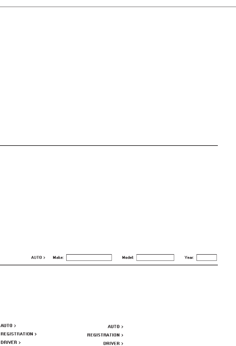
equally competing for the viewer’s attention. This should be avoided. IBM’s SAA CUA
gives visual emphasis to section headings through higher intensity in a mixed-case
font. This is not recommended. Higher intensity should be reserved for the more im-
portant screen data.
If right-aligned or justified captions are used, an indention greater than five spaces
may be necessary to set off the heading from the captions properly. Section headings
may also be positioned to the right of a group of controls, as is illustrated in the fol-
lowing section, “Subsection or Row Headings.”
Techniques other than positional cues may be used to set off section headings.
Choices may include different kind of fonts, underlining, and so on. If this is done, the
heading may be displayed in mixed case using the Headline style (capitalization of all
significant words). The method employed should always permit easy, but subtle, dis-
crimination of the section headings from other components of the screen. It should also
be visually compatible with other screen components. Whatever styles are chosen, they
should be consistently followed throughout a family of screens or a system.
Control Subsection or Row Headings
■
Provide a meaningful heading that clearly describes the relationship of the grouped
controls.
■
Locate to the left of the:
— Row of associated fields.
— Topmost row of a group of associated fields.
■
Separate from the adjacent caption through the use of a unique symbol, such as one
or two greater than signs or a filled-in arrow.
■
Separate the symbol from the heading by one space and from the caption by a min-
imum of three spaces.
■
Subsection or row headings may be left- or right-aligned.
■
Fully spell out in an uppercase font.
■
Display in normal intensity.
— Alternately, if a different font size or style exists, the heading may be displayed
in mixed-case using the headline style.
Figure 3.53
Row or subsection headings may be positioned to the left of a group of related controls.
A meaningful convention to designate subsection or row headings is a filled-in arrow
or greater than sign. It directs the viewer’s attention to the right and indicates that
everything that follows refers to this category. Space lines should separate subsections.
They may also be right-aligned instead of left-aligned, as shown in Figure 3.54.
Understand the Principles of Good Screen Design 175
Figure 3.54 Left-aligned and right-aligned row headings.
3900 P-03 (step 3) 4/24/02 1:53 PM Page 175
Field Group Headings
■
Provide a meaningful heading that clearly describes the relationship of the grouped
controls.
■
Center the field group heading above the captions to which it applies.
■
Relate it to the captions by a solid line.
■
Fully spell it out in an uppercase font.
■
Display it in normal intensity.
— Alternately, if a different font size or style exists and is used, the heading may be
displayed in mixed-case, using the headline style.
Figure 3.55
Occasionally a group heading above a series of multiple-occurring captions may be
needed. It should be centered above the captions to which it applies and related to
them through a solid line extending to each end of the grouping. This will provide clo-
sure to the grouping.
Web Page Headings
■
Control Headings:
— For groupings of controls, follow the control heading guidelines.
■
Page and Text Headings:
— Provide a meaningful page heading that clearly describes the content and nature
of the page that follows.
— Provide meaningful text headings and subheadings that clearly describe the con-
tent and nature of the text that follows.
— Establish a hierarchy of font styles, sizes, and weights dependent upon the orga-
nization created and the importance of the text content.
— Settle on as few sizes and styles as necessary to communicate page content and
organization to the user.
— Do not randomly mix heading levels or skip heading levels.
Headings for controls positioned on Web pages will follow the guidelines for controls
described above. Headings for pages and text should be meaningful, clearly describing
the content that follows. The guidelines for creating meaningful heading text will be
addressed in Step 8 “Writing Clear Text and Messages.”
In general, the presentation of page and text headings on Web pages will follow the
practices used for paper documents. A hierarchy of fonts styles, sizes, and weights will
AUTOMOBILE
176 Step 3
3900 P-03 (step 3) 4/24/02 1:53 PM Page 176
be developed based upon the Web page’s organization and the contents’ importance. The
guidelines presented earlier in the “Typography” section can be used for this purpose. To
avoid clutter, only use as few sizes and styles as necessary to communicate page content
and organization to the user. Do not randomly mix or skip heading levels. The page’s or-
ganization will be more difficult to ascertain, and user confusion may result.
Instructions
■
Incorporate instructions on a screen, as necessary:
— In a position just preceding the part, or parts, of a screen to which they apply.
— In a manner that visually distinguishes them, such as:
• Displaying them in a unique type style.
• Displaying them in a unique color.
— In a position that visually distinguishes them by:
• Left-justifying the instruction and indenting the related field captions, head-
ings, or text a minimum of three spaces to the right.
• Leaving a space line, if possible, between the instructions and the related con-
trol, heading, or text.
Figure 3.56
— Using a mixed-case font.
Instructions to the screen user on what to do with, or how to work with, the screen
presented are occasionally necessary. Whether or not to include them will be depen-
dent upon the experience of the user, the frequency of screen use, and the nature of the
information itself. Inexperienced or occasional users may need instructions; data that is
complex or unfamiliar may also require them. For experienced and frequent screen
users, instructions can quickly become visual noise. When you are deciding whether or
not to include instructions on a screen, other techniques, such as using Help or the mes-
sage area should also be considered.
When it is necessary to place instructions on a screen, they must be positioned at the
screen point where they are applicable. Instructions placed at the bottom of a screen
will probably not be seen. Instructions placed on one screen but applying to another
will never be remembered.
When it is necessary to place instructions on a screen, they must be visually recog-
nized as instructions. This will allow them to be easily ignored by the user when they
are not needed. Therefore, some visual aspect of the instruction must indicate that it is
an instruction. Designers of paper forms do this by presenting instructions in a differ-
ent font kind or font style such as italics. The form user then immediately recognizes
them as instructions, and they can be read or ignored as desired.
Understand the Principles of Good Screen Design 177
3900 P-03 (step 3) 4/24/02 1:53 PM Page 177

To make instructions immediately recognizable on a screen, they may also be pre-
sented in a unique font or color. If one of these methods is used, however, cautions con-
cerning the excessive use of different font styles (and colors, as will be shown in Step
12) must be heeded. Another, but less visually strong, technique is to identify the tech-
nique simply by its location. Begin the instruction to the left of the screen elements to
which it applies; the left-justification identifies it as an instruction.
Try to leave a space line between the instruction and the elements to which it relates,
whenever possible. Screen space constraints may not always permit a space line, how-
ever. The instruction should be presented in the normal mixed-case sentence style.
Guidelines for writing text, including instructions, will be found in Step 8.
Completion Aids
■
Incorporate completion aids on a screen, as necessary:
— In a position to the right of the text entry control to which they apply.
— In a manner that visually distinguishes them, including:
• Displaying them within a parentheses ( ).
• Possibly displaying them in a unique font style.
— If the controls are arrayed on the screen in a columnar format, position the com-
pletion aid, or aids:
• Far enough to the right so as to not detract from the readability of the entry con-
trols within the column.
• But close enough to the related control so that they easily maintain an associa-
tion with the related control.
— Left-alignment of completion aids in a column of controls is desirable but not ab-
solutely necessary.
Figure 3.57
Completion aids are a form of instruction but they are directed to the contents of a
specific entry field control and the content’s format. A date, for example, may require
entry of a specified number of characters in a specific order, and it may be necessary to
present on the screen a reminder of this format for key entry.
As with instructions, the decision whether or not to include text entry control com-
pletion aids will be dependent upon the experience of the user, the frequency of screen
use, and the nature of the information itself. Inexperienced or occasional users may
need aids; data that is complex or unfamiliar may also require them. For experienced
and frequent screen users, however, aids can quickly become visual noise. In deciding
whether or not to include completion aids on a screen, other techniques, such as using
Help or the message area should also be considered.
When it is necessary to place entry control completion aids on a screen, they must be
recognized as such. This will allow them to be easily ignored when they are not
Completion Date:
■■■
■
■
178 Step 3
3900 P-03 (step 3) 4/24/02 1:53 PM Page 178

needed. Therefore, some visual aspect of the completion aid must indicate that it is
an aid.
To make completion aids immediately recognizable on a screen, display them within
parentheses ( ). A distinguishing font may also be used but parentheses are visually
strong enough to stand by themselves, providing an adequate indication that what is
contained within is a completion aid.
The best location for a completion aid is to the right of the entry control that it ap-
plies to. Right positioning optimizes the screen layout for the expert user by placing the
aid outside of the “working area” of a group of columnized controls. Alternate posi-
tioning, such as placing the aid within the caption itself, pushes the caption farther
away from the entry control, and for the expert this is less efficient and also creates vi-
sual noise. Placing the aid above or below the entry control detracts from the readabil-
ity of the entry control fields, creates an association problem (Is the aid related to the
field above or below?), and yields a less efficient screen organization. For the novice or
infrequent user, positioning the aid to the right of the entry field is less efficient because
his or her eyes must move right to read it, but these kinds of users will be less efficient,
anyway.
In a columnized group of controls, position completion aids far enough to the right
so as not to detract from the readability of all the entry controls contained in the col-
umn. Positioning, however, must be close enough to the related control so that the aid
easily maintains an association with its related control. Left-alignment of completion
aids in a column of controls is desirable but not absolutely necessary, since the sizes of
entry fields may vary significantly. Final positioning of the completion aid must bal-
ance all the above factors.
Keying Procedures
For large-volume data entry applications substantial keying may still be required. The
following must be considered in establishing keying procedures.
Keystrokes
■
Do not focus on minimizing keystrokes without considering other factors such as:
— The keying rhythm.
— The goals of the system.
A sought-after goal in many past data entry applications has always been to mini-
mize keystrokes. Fewer keystrokes have been synonymous with faster keying speeds
and greater productivity in the minds of many practitioners. But this is not always true.
Fewer keystrokes may actually decrease keying speeds and reduce productivity in
many cases.
One research study compared manual tabbing with auto skip in a data entry appli-
cation. Auto skip, while requiring fewer keystrokes, was found to result in longer key-
ing times and more errors than manual tabbing because it disrupted the keying
rhythm. This study is described in more detail in the following section.
Understand the Principles of Good Screen Design 179
3900 P-03 (step 3) 4/24/02 1:53 PM Page 179
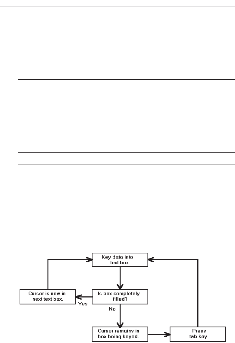
Another study, in an information retrieval task, compared input keystrokes to the
time needed to evaluate the system output. They found that more keystrokes yielded
more meaningful inputs. This yielded more precise and informative outputs, which re-
sulted in faster problem-solving.
So the number of keystrokes, and selections, must be considered in light of keying
rhythms and the objectives of the system. Fewer are not necessarily always better.
Tabbing
■
Initially, position the cursor in the first field or control in which information can be
entered.
■
Tab in the order in which the screen’s information is organized.
When a screen is first presented, the cursor must be positioned in the first field or
control in which information can be entered. Tabbing order must then follow the flow
of information as it is organized on the screen.
Manual Tab versus Auto Skip
■
Define fields to permit manual tabbing.
Auto skip is a feature that causes a cursor to automatically move to the beginning of
the next text entry control field once the previous field is completely filled. Auto skip
obviates manual tabbing and requires fewer keystrokes to complete a screen. Theoret-
ically, keying speeds should increase with auto skip. In practice, they do not always do
so.
Rarely are many text entry screen fields completely filled to their maximum length
with data. When an entry field is not full, the user must still press the tab key to move
the cursor to the next entry field. Figure 3.58 illustrates auto skip functioning.
180 Step 3
Figure 3.58 Text entry using auto skip.
3900 P-03 (step 3) 4/24/02 1:53 PM Page 180
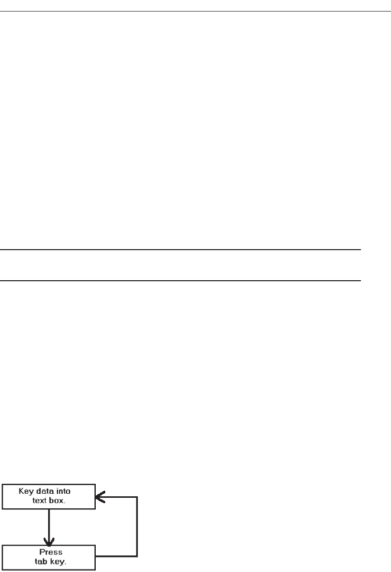
Auto skip, therefore, imposes decision-making and learning requirements. After
keying text into each field, one must determine where the cursor is and whether to
press the tab key or not to go to the next field. Only then can the next keying action be
performed. As illustrated in Figure 3.59, manual tabbing requires extra keystrokes but
no decisions must be made. The keying task is rhythmic. One study, comparing auto
skip with manual tabbing, found that manual tabbing resulted in faster keying perfor-
mance and fewer keying errors.
Auto skip can delay detection of one particular kind of error. If an extra character is
inadvertently keyed into a field, the cursor will automatically move to the next field
while keying continues. The error may not be immediately detected, and spacing in
subsequent fields may also be one position off, at least until the tab key is pressed.
Were this situation to occur while using manual tabbing, the keyboard would lock as
soon as the entry field was full. The error would be immediately detected.
Auto skip, despite its limitations, can be useful if a system’s screens are easily
learned or if all screen fields are always completely filled. Nevertheless, most large-
volume data entry applications would not appear to meet this criterion.
Keying Rules
■
Do not require recoding, changing, omitting, or including data based on special
rules or logical transformations.
In large-volume entry applications, decisions that must be made during the keying
process impose learning requirements and greatly slow down the entry process. The
fewer rules and decisions involved in keying, the faster and more accurate entry will
be. Coding, omitting, changing, and including data by special rules or transformations
as a group represent probably the greatest single decrement to data entry speed.
Organization and Structure Guidelines
What follows is a series of organization and structure guidelines for specific kinds of
screens. They are: Information Entry and Modification (Conversational), Entry from a
Dedicated Source Document, and Display/Read-Only screens.
Understand the Principles of Good Screen Design 181
Figure 3.59 Text entry using manual tabbing.
3900 P-03 (step 3) 4/24/02 1:53 PM Page 181

Information Entry and Modification
(Conversational) Screens
■
Organization:
— Logical and clear.
— Most frequently used information:
• On the earliest screens.
• At the top of screens.
— Required information:
• On the earliest screens.
• At the top of screens.
■
Captions:
— Meaningful.
— Consistently positioned in relation to data field controls.
— Left- or right-aligned.
— Mixed case using headline style.
■
Text boxes/selection controls:
— Designate by boxes.
■
Spacing and groupings:
— Create logical groupings.
— Make them medium in size, about 5 to 7 lines.
■
Headings:
— Upper case or headline-style mixed case.
— Set off from related controls.
■
Control arrangement:
— Align into columns.
— Organize for top-to-bottom completion.
■
Required and optional input:
— Consider distinguishing between required and optional data input through:
• Placing required and optional information within different screens, windows,
or groups.
• Identifying information as required or optional in a completion aid.
• Identifying required information with a unique font or symbol.
■
Instructions and completion aids:
— Include as necessary.
• Position instructions before the controls to which they apply.
• Position completion aids to the right of the controls to which they apply.
Information entry and modification (conversational) screens are used to collect and
modify information, either by entry or selection. These screens are sometimes referred
to as conversational screens. They guide a person through a task or process. The screen
itself is the user’s focal point for working with information. The viewer is driven by
what is presented on the screen in the information collection and designation process.
The information needed to complete a screen may be collected from, but is not limited
to, these kinds of sources:
182 Step 3
3900 P-03 (step 3) 4/24/02 1:53 PM Page 182

A person being interviewed or queried at a desk or workstation.
A person being queried or interviewed over a telephone.
A collection of notes and written materials.
An unstructured form.
The mind of the user.
These guidelines, with the exception of “Required and optional input,” have been
presented earlier in this chapter.
Organization. Organize these screens logically and clearly, reflecting the exact in-
formation needs of the user for the task being performed. In general, place the
most frequently used information, or required information, on the earliest screens
and at the top of screens.
Captions. Provide meaningful captions, clearly identifying the information to be
entered or selected. Use the headline style to display them (all significant words
capitalized). Consistently position all captions in relation to their associated con-
trols. They may be left- or right-aligned.
Text boxes/selection controls. Designate by boxes, using either a line border or po-
larity reversal.
Spacing and groupings. Create logical medium-size groupings of from 5 to 7
elements.
Headings. Provide headings to identify groupings. Set off from their related controls
using upper case or mixed-case headline style.
Control arrangement. Align controls into columns. Maintain a top-to-bottom, then
left-to-right arrangement.
Required and optional input. Distinguishing between required and optional data
input may or may not be necessary on these screens. The decision on whether or
not to distinguish these types of data should be based on the experience of the
user doing the key entry, and the information’s familiarity. When a technique to
distinguish them is included on a screen, it is a form of completion aid so the ar-
guments for and against completion aids are applicable here as well.
When it is necessary to differentiate required and optional data, consider the
following alternatives. First, determine the feasibility of placing the two kinds of
data on separate screens or within separate screen windows or groupings. This is
the best and cleanest solution. If a meaningful screen organization of information
will not permit this, then, describe the individual pieces of data as required or op-
tional within a completion aid. The last choice is identify required information
with a unique font or symbol. This alternative, however, requires the user to learn
the convention in order to use it effectively. Displaying a unique font might also
lead to screen clutter, if too many different fonts and styles are used on the screen.
Instructions and completion aids. Include these on screens as necessary. Locate in-
structions so they precede the controls to which they apply. Locate completion
aids to the right of the controls to which they apply.
Understand the Principles of Good Screen Design 183
3900 P-03 (step 3) 4/24/02 1:53 PM Page 183

Grids
■
Usage:
— To enter large amounts of related data or information.
■
Design guidelines:
— Provide descriptive headings and, where appropriate, subheadings for columns
and rows.
• Do not include colons (:) after the headings.
— Justify column headings according to the data presented in the table cells.
• Left-justify headings for columns containing text.
• Right-justify headings for columns containing numbers.
— Left-justify row headings.
— Organize the data or information to be entered logically and clearly.
• Place similar information together.
• Place most important or frequently used information at the top.
• Arrange information chronologically or sequentially.
— Use light backgrounds.
— Provide consistent spacing between columns and rows.
— If more than seven rows are presented, insert white space after every fifth row.
Usage. Large amounts of related data that must be entered can be collected in grids.
Like a table, a grid is a matrix of entry fields arranged in columns and rows. Grids
usually consume less screen space than do individual data elements.
Headings. Provide descriptive headings and, where necessary and appropriate, sub-
headings for columns and rows. Do not include colons (:) after the headings. Jus-
tify column headings according to the data presented in the table cells. Use
left-justification for columns containing text, right-justification for columns con-
taining numbers. Row headings should be left-justified.
Organization. The organization of grid data or information will follow the same
general organizational guidelines previously described. Organize table data log-
ically and clearly. Place most important or frequently used information at the top
and arrange it meaningfully.
Backgrounds. For legibility, present table data on light backgrounds, either off-
white or light gray. Use black for the data or information.
Spacing. For balance, provide consistent spacing between columns and rows. For
readability, if more than seven rows are presented, insert white space after every
fifth row.
Text Entry from a Source Document
Occasionally, it may be necessary to key information directly from a source document
or paper form into a screen. The document may take the form of an application for in-
surance, an application for a bank loan, a request for service, and so forth. The key issue
for this function is that the document should be dedicated to the screen, and permit
“head down” entry of data from the document to the screen, with the screen seldom
184 Step 3
3900 P-03 (step 3) 4/24/02 1:53 PM Page 184

being the point of the user’s attention. An entire screen should be capable of being com-
pleted without the keyer ever looking at the screen. The design guidelines are based
upon this assumption. Ideally, the document and screen should be created together so
that a document-screen image relationship can be easily achieved. Creating them to-
gether permits trade-offs between the document and the screen to achieve this fit.
Sometimes, but not often, an existing document will allow the creation of a screen in
its exact image. When this happens, this document can also be considered as dedicated
and will follow these rules. Most documents, however, because they were not designed
with a screen in mind, cannot be easily matched to a screen. In this case their corre-
sponding screens should be considered as entry/modification (conversational) screens
and should be designed accordingly because the screen will drive the keying process,
not the document. The required information on the screen must be searched for and
found on the form.
If an existing document or form is being converted to a screen format, and the exist-
ing document will no longer be used, its screens should also be designed following the
entry/modification (conversational) guidelines. This is a much more effective ap-
proach for information collection, as discussed earlier in this chapter.
Dedicated Source Document Screens
■
Organization:
— Image of associated source document.
■
Captions:
— Abbreviations and contractions.
— Consistently positioned in relation to data fields.
— Right-aligned.
■
Text boxes:
— Designate by boxes.
■
Spacing and grouping:
— Logical groupings found on source document.
■
Headings:
— Include if on source document.
— Upper case or headline-style mixed case.
— Set off from related controls.
■
Control arrangement:
— As arranged on source document.
— Left-to-right completion.
■
Keying procedure:
— Use manual tabbing.
■
Required and optional input:
— Not necessary to differentiate.
■
Instructions and completion aids:
— None needed.
For more detailed information concerning document screen design, see Galitz
(1992).
Understand the Principles of Good Screen Design 185
3900 P-03 (step 3) 4/24/02 1:53 PM Page 185

Organization. The screen must be an exact image of its associated source document.
Skipping around a source document to locate information adds a significant
amount of time to the keying process. It also imposes a learning requirement on
people, since the order and location of screen fields must be mastered. Having the
source document and screen in the same image eliminates these problems. Cursor
position on the screen is always known because it corresponds with a person’s
eye position on the source document.
Captions. To allow the screen to be in the image of a source document, screen cap-
tions usually must consist of abbreviations and contractions. The document will
always be available to assist in identifying unclear captions. Because text boxes fit
fairly tightly on these kinds of screens, captions must be right-aligned so they are
associated with the proper box.
Text boxes. Designate by boxes, using either a line border or polarity reversal.
Spacing and grouping. Create the same groupings as exist on the document. Set off
groupings as this is done on the form, through use of either white space and/or
borders.
Headings. Include the same headings as are found on the source document. Capi-
talize or use mixed-case headline style (all significant words capitalized) to set
them off from the remainder of the screen.
Control arrangement. Control positioning and alignment on the screen should
match that of the source document. Position controls in the same manner, or as
close to the same manner as possible, to facilitate eye movements between the
document and screen. (A well-designed document should have aligned ele-
ments, too. If not, still follow the form alignment.) Maintain a left-to-right entry
arrangement, if the form is organized for completion in this direction. If, per
chance, the document is organized top-to-bottom, then follow this top-to-bottom
scheme.
Keying procedure. Use manual tabbing, not auto skip, to permit a rhythmic keying
process. Keying will be faster and less error prone.
Required and optional input. Distinguishing between required and optional data
input is not necessary on these screens. This information will have been included
within the source document design.
Instructions and completion aids. These will not be necessary. Instructions and
completion aids will be located on the source document.
Display/Read-Only Screens
Display/read-only screens are used to display the results of an inquiry request or the
contents of computer files. Their design objective is human ease in locating data or in-
formation. Thus, they should be developed to optimize human scanning. Scanning is
made easier if eye movements are minimized, required eye movement direction is ob-
vious, and a consistent viewing pattern is established. Next is a guideline summary.
186 Step 3
3900 P-03 (step 3) 4/24/02 1:53 PM Page 186

■
Organization:
— Logical and clear.
— Limit to what is necessary.
■
Most frequently used information:
— On earliest screens.
— At the top of screens.
■
Captions:
— Meaningful.
— Consistently positioned in relation to data fields.
— Left- or right-aligned.
■
Text boxes:
— Do not include a surrounding border or box.
■
Spacing and grouping:
— Create logical groupings.
— Make them medium-sized, about 5 to 7 lines.
■
Headings:
— Upper case or headline-style mixed case.
— Set off from related controls.
■
Data presentation:
— Visually emphasize the data.
— Give the data a meaningful structure.
■
Data arrangement:
— Align into columns.
— Organize for top-to-bottom scanning.
■
Data justification:
— For text and alphanumeric data, left-justify.
— For numeric data, right-justify.
— Create a data “ladder.”
■
Data display:
— Consider not displaying no, or null, data.
— Consider “data statements.”
More detailed guidelines for screen organization, and data presentation, arrange-
ment, justification, and display are included in the following discussion.
Organization
■
Only display information necessary to perform actions, make decisions, or answer
questions.
■
Group information in a logical or orderly manner, with the most frequently re-
quested information in the upper-left corner.
■
For multiscreen functions, locate the most frequently requested information on the
earliest screens.
■
Do not pack the screen. Use spaces and lines to balance the screen perceptually.
Understand the Principles of Good Screen Design 187
3900 P-03 (step 3) 4/24/02 1:53 PM Page 187

Information contained on a display/read-only screen should consist of only what is
relevant to the question for which an answer is sought. Forcing a person to wade
through volumes of data is time consuming, costly, and error-prone. Unfortunately,
relevance is most often situation-specific. An item that is relevant one time a screen is
displayed may be irrelevant another time it is recalled.
Organization should be logical, orderly, and meaningful. When information is struc-
tured in a manner that is consistent with a person’s organizational view of a topic, in-
formation is comprehended better and faster.
Finding information on a display/read-only screen can be speeded up by a number
of factors. First, if information is never used, do not display it. Limit a screen to only
what is necessary to perform actions, make decisions, or answer questions. Second, for
multiple-window functions, locate the most frequently sought information on the ear-
liest screens and the most frequently sought information on a screen in the upper-left
corner. Never pack a display/read-only screen with information.
Captions. Provide meaningful captions clearly identifying the information dis-
played, unless the identity of data is obvious by its shape or structure (for exam-
ple, an address). Use the headline style (all significant words capitalized), and
consistently position all captions in relation to their associated data. Captions
may be left- or right-aligned.
Text boxes. Do not place a border around display/read-only information; inscribe
the data so that it appears on the normal window background. It will be much
more readable presented in this manner.
Spacing and grouping. Provide easily scanned and identifiable logical groupings of
information. Create groupings of a medium size (5 to 7 lines) and set them off
through liberal use of white space and conservative use of line borders.
Headings. Provide headings to identify groupings. Set off from their related controls
using upper case or mixed-case headline style.
Data Presentation
■
Provide visual emphasis to the data.
■
Give the data a meaningful structure.
— Spell out any codes in full.
— Include natural splits or predefined breaks in displaying data.
Figure 3.60
■
For data strings of five or more numbers or alphanumeric characters with no natural
breaks, display in groups of three or four characters with a blank between each
group.
Figure 3.61
188 Step 3
3900 P-03 (step 3) 4/24/02 1:53 PM Page 188
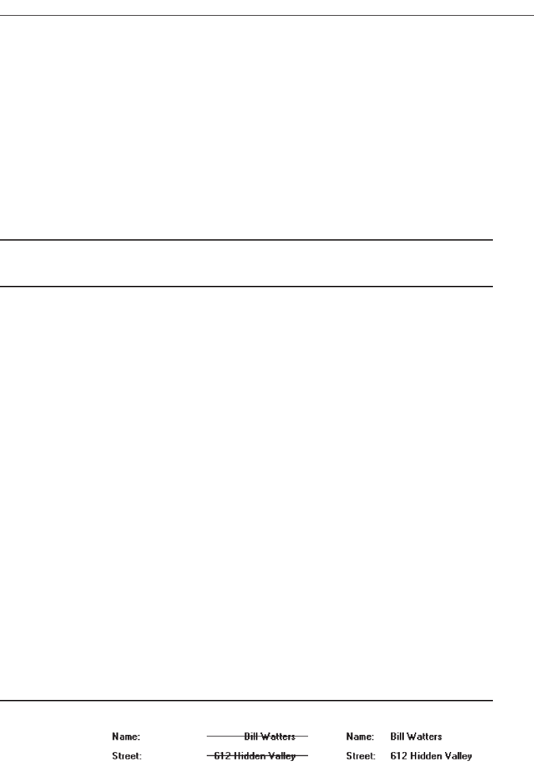
Data should be visually emphasized to attract attention. This will enable the viewer
to quickly isolate the data and begin scanning the display for the needed information.
A higher-intensity or brighter color is recommended to accomplish this. Also, fully
spell out any codes and include natural splits or predefined breaks in displaying com-
mon pieces of data such as telephone numbers and dates.
A data display should also reinforce the human tendency to break things into
groups. People handle information more easily when it is presented in chunks. Display
data strings of five or more alphanumeric characters with no natural breaks in groups
of three or four, with a blank space between each group.
Data Arrangement
■
Align data into columns.
■
Organize for top-to-bottom scanning.
To aid scanning, align data into columns with a top-to-bottom, left-to-right orienta-
tion. This means permitting the eye to move down a column from top to bottom, then
move to another column located to the right, and again move from top to bottom. This
also means, if the situation warrants it, permitting the eye to move easily left to right
across the top of columns to the proper column, before beginning the vertical scanning
movement.
Top-to-bottom scanning will minimize eye movements through the screen and en-
able human perceptual powers to be utilized to their fullest. Display/read-only screens
are often visually scanned not through the captions but through the data fields them-
selves. A search for a customer name in a display of information frequently involves
looking for a combination of characters that resembles the picture of a name that we
have stored in our memory. The search task is to find a long string of alphabetic char-
acters with one or two gaps (first name, middle initial, last name, perhaps). A date
search might have the viewer seeking a numeric code broken up by slashes. Other
kinds of information also have recognizable patterns and shapes. Control captions
usually play a minor role in the process, being necessary only to differentiate similar-
looking data fields, or for new screen users.
Vertical scanning has led to two key requirements in the design of display/read-
only screens: call attention to data fields, and make the structural differences between
data fields as obvious as possible. Differences are most noticeable in a columnar field
structure, since it is easier to compare data when one piece is above the other.
Data Justification
■
Left-justify text and alphanumeric formats.
Figure 3.62
■
Right-justify lists of numeric data.
Understand the Principles of Good Screen Design 189
3900 P-03 (step 3) 4/24/02 1:53 PM Page 189
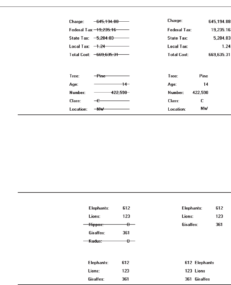
Figure 3.63
■
Create a data “ladder.”
Figure 3.64
In general, columnized text and alphanumeric data should be left-justified, and nu-
meric data should be right-justified. In aligning data fields, keep in mind how the
pieces of data will look in relation to one another when they contain typical informa-
tion. The visual scan should flow relatively straight from top to bottom. This may re-
quire that some data fields be right-justified in the column that is created, not
left-justified, or vice versa. The objective is to create what looks like a ladder of data
down the screen.
Data Display
■
Consider not displaying data whose values are none, zero, or blank.
Figure 3.65
■
Consider creating “data statements,” in which the caption and data are combined.
Figure 3.66
Consider not displaying fields containing no data. When displayed on a
display/read-only screen, some data fields may be blank or contain a value such as
zero or none. In many situations it may not be important to the screen viewer to know
that the field contains no data. In these cases consider not displaying these screen ele-
ments at all. Present on the screen only the fields containing data, thereby creating less
cluttered screens.
If this alternative is chosen, space on the screen must be left for situations in which
all fields contain data. In order to avoid large blank screen areas, a useful rule of thumb
190 Step 3
3900 P-03 (step 3) 4/24/02 1:53 PM Page 190

is to allow enough space to display clearly all data for about 90 percent of all possible
screens. For situations in which screens must contain more data than this, going to an
additional screen will be necessary.
This nondisplay alternative should only be considered if it is not important that the
viewer know something is “not there.” If it is important that the viewer know that the
values in a field are zero or none, or that the field is blank, then the fields must be dis-
played on the screen.
You may also want to consider displaying data statements. The traditional way to
display data on an inquiry screen is the “caption: data” format, for example, “Autos:
61.” Another alternative is to create data statements where the caption and data are
combined: “61 Autos.” This format improves screen readability and slightly reduces a
screen’s density. If this data statement format is followed, consider the statement as
data and highlight it entirely.
Tables
■
Usage:
— To present and/or compare large amounts of data or information.
■
Design guidelines:
— Provide descriptive headings and, where appropriate, subheadings for columns
and rows.
• Do not include colons (:) after the headings.
— Justify column headings according to the data presented in the table cells.
• Left-justify for columns containing text.
• Right-justify for columns containing numbers.
— Left-justify row headings.
— Organize the presented data or information logically and clearly.
• Place similar information together.
• Place most important or frequently used at the top.
• Arrange chronologically or sequentially.
— Justify the data presented in a column according to its content.
• Left-justify textual data.
• Right-justify numeric data.
— Length should not exceed the depth of a screen.
— Use light backgrounds.
• Highlight a particular cell, column, or row using a contrasting display
technique.
— Provide consistent spacing between columns and rows.
— If more than seven rows are presented, insert white space after every fifth row.
— Use caution in placing borders around cells.
Usage. Large amounts of information, or information that must be compared, can be
arrayed in tables. Like a grid, a table is a matrix of information arranged in
columns and rows. Tables usually consume less screen space than do individual
data elements.
Understand the Principles of Good Screen Design 191
3900 P-03 (step 3) 4/24/02 1:53 PM Page 191

Headings. Provide descriptive headings and, where necessary and appropriate, sub-
headings for columns and rows. Do not include colons (:) after the headings. Jus-
tify column headings according to the data presented in the table cells. Use
left-justification for columns containing text, right-justification for columns con-
taining numbers. Row headings should be left-justified.
Organization and justification. Organization of table data or information will fol-
low the general organization guidelines previously described. Organize table data
logically and clearly so it can be quickly identified, scanned, and compared. Place
most important or frequently used information at the top, place together infor-
mation that must be directly compared, and arrange it chronologically or se-
quentially. Justify the data presented in a column according to its content. For
textual data use left-justification, for numeric data, use right-justification.
Length. Avoid long vertical tables. A table should be entirely visible for readability
and making data comparisons. Length should not exceed depth of a screen
Backgrounds. For legibility, present table data on light backgrounds, either off-
white or light gray. Use black for the data or information. If highlighting a cell or
cells is necessary, use a contrasting display technique that does not diminish the
legibility of the displayed data.
Spacing. For balance, provide consistent spacing between columns and rows. For
readability, if more than seven rows are presented, insert white space after every
fifth row. Also, use caution in placing borders around table cells. Borders interfere
scanning and readability.
Reading, Browsing, and Searching on the Web
The Web has an almost unlimited supply of information—for those who can find it.
The dilemma for the user is how to navigate within the Web, deal with the over-
whelming amount of information presented, and locate the elusive answer. The mag-
nitude and structure of the Web seems to be creating a user interaction pattern with
these characteristics:
The most sought-after Web commodity is content.
Behavior is often goal-driven.
Reading is no longer a linear activity.
Impatience.
Frequent switching of purpose.
Web users access a site for different reasons: a focused search for a piece of infor-
mation or an answer, a less focused browsing, or simply to surf. But content is what
most users comes to see. High-tech capabilities, fancy graphics, and a rainbow of col-
ors do not compensate for insufficient or poor content. All innovations are judged by
how well they support the presented content. Users are also strongly goal-driven; often
looking only for the thing they have in mind. In foraging through the Web, reading is
no longer a linear activity, instead information is acquired in scattered bits and pieces.
Easy content scanning is very important. The user is also impatient, with little time to
192 Step 3
3900 P-03 (step 3) 4/24/02 1:53 PM Page 192

waste. Things like a slow download, content that is not easily scannable, and confusing
navigation will quickly drive users away from a site. The user also frequently switches
purpose and direction, browsing one moment, searching the next, now in one site, then
in another, then back again, and on and on. Design must accommodate people who
change directions, and leave a site and return frequently to it.
Recently, the specific activities of Web users have come under closer scrutiny. Byrne,
John, Wehrle, and Crow (1999) looked at what people do when browsing, Morrison,
Pirolli, and Card (2001) analyzed the methods people reported they used to arrive at in-
formation they needed for important tasks, and their reasons for the use of the Web.
The results are summarized in Table 3.1.
In the Byrne et al., study a significant amount of time was spent waiting and
scrolling. This percentage was actually greater than reported above because waiting
time between successive page presentations was not reported. In the Morrison et al.
study, 96 percent of the activities were goal-driven, that is, users were addressing a spe-
cific need. It is also interesting to note that more than two-thirds of the time people
were looking for multiple pieces of information, not single pieces. Browsing is now op-
timized for accessing information in single locations. As our experience with the Web
continues, more useful usage information for design should continue to emerge.
Understand the Principles of Good Screen Design 193
Table 3.1 Reported User Web Activities
APPROXIMATE
BROWSING ACTIVITIES (Byrne et al., 1999) PERCENTAGES
Using information, including reading, printing, and downloading 58
Visually searching for information on pages 12
Providing requested information 18
Waiting or scrolling 12
PRIMARY REASONS FOR IMPORTANT USES OF THE WEB (Morrison et al., 2001)
Evaluate multiple products or answers in order to make a decision
(Comparing or Choosing) 51
Get a fact or document, find out something, or download something
(Finding) 25
Gain understanding of some topic, including locating it (Understanding) 24
METHODS USED TO ARRIVE AT INFORMATION FOR IMPORTANT WEB USES (Morrison et al., 2001)
Searching for multiple pieces of information, not looking for one
particular answer (Collecting) 71
Searching for something specific (Finding) 25
Looking around or browsing without a particular goal (Exploring) 2
Visiting the same Web site looking for updated information (Monitoring) 2
3900 P-03 (step 3) 4/24/02 1:53 PM Page 193

Initial Focus of Attention
When a Web page is presented, like most screens, it will be scanned in a clockwise di-
rection, people being influenced by its balance and the weight of its title, graphics,
headings, and text. The page will be seen as large masses of shape, including its text
and graphics, and color. Studies of Web users indicate that attention is then immedi-
ately directed to the page’s content. Usually ignored are the peripheral parts of the
screen, the navigation areas, logos, slogans, advertising, or anything else considered
superfluous or fluff.
Page Perusal
Focusing on the page’s content, the user’s eyes are first drawn to the page’s text, par-
ticularly headings, captions, summaries, and notes. Individual words and phrases are
read for meaning and relevance. At this point the page’s graphics are generally ig-
nored. Studies find that the most frequent method used in perusing a page is scanning
or skimming, concentrating less on detail and word for word reading. Three-quarters
of Web page readers appear to prefer scanning to reading. Design features that enhance
scanning are critically important in page design. As the scanning continues, the user’s
attention becomes progressively more detailed; page components begin to take on
meaning. Shallow reading is combined with selective depth. Rarely are articles read
fully. If page does not appear to be relevant to a user’s needs or goals quickly, it will be
removed.
Scanning Guidelines
■
Organization:
— Minimize eye movement.
— Provide groupings of information.
— Organize content in a logical and obvious way.
■
Writing:
— Provide a meaningful title.
— Provide meaningful headings and subheadings.
— Concisely write the text.
— Write short paragraphs containing only one idea.
— Use the inverted pyramid style of writing.
— Use bulleted and numbered lists.
— Array information in tables.
— Provide concise summaries.
■
Presentation:
— Highlight:
• Key information-carrying words or phrases.
• Important concepts.
A Web page must be structured to facilitate scanning, its key points made very ob-
vious. Use of the techniques described in this step, and in other steps (organization,
194 Step 3
3900 P-03 (step 3) 4/24/02 1:53 PM Page 194

layout, location, typography, color, and so forth), will serve to make the page easily
scannable. Some important reminders, and several unique Web guidelines, follow.
Organization. Minimize eye movement through the page through alignment and
columnizing of page elements. Order the page’s content in an obvious way and
provide a logical progression of links and pages. More easily learned pages will
be easier to scan. Group information using white space as a primary grouping
tool.
Writing. Provide a meaningful page title. The purpose and message of a page should
be identifiable from its title. Provide meaningful headings and subheadings. Most
users read headings, not all read further. Headings help users determine whether
to continue or ignore large chunks of information. Headings should be simple, not
clever or cute. Subheadings break up larger blocks of text, making it easier to find
the portions of interest. Typeface variations should be used to establish a heading
hierarchy.
Concisely write the page text. Users prefer written text, says research, because
words reduce one’s cognitive load, resulting in faster and more efficient in-
formation processing. To aid scanning, Web page text should be very succinct,
containing fewer words than conventional writing. Half the word count or
less is recommended. Create narrow text columns that minimize the eye’s
horizontal scan. Write short paragraphs, restricting each to only one idea.
People tend to skip additional important points in a paragraph as they scan,
or if they are not caught by the first few words in paragraph. Also use the in-
verted pyramid style of writing. This style starts with the conclusion and fol-
lows with expanded detail, either within the paragraph or at the end of a link.
The conclusion first allows the user to quickly determine whether it is worth-
while to continue reading.
Bulleted and numbered lists break up long expanses of text. They also draw at-
tention to important points that may be entirely missed if buried within a
paragraph. Vertically align the lists so they are easy to skim. Lists also lend
themselves to linking. Array information in tables for easier scanning, com-
prehension, and comparing. Provide concise content summaries to give the
user a snapshot of the text content before reading. Link to full-length treat-
ments where relevant and useful information can be presented.
Presentation. Important information-carrying words, phrases, or concepts should be
highlighted. Keywords, words that differentiate a page from others, or words that
symbolize what a page is all about are candidates for highlighting. About three
times as many words as writing for print can usually be effectively highlighted on
a Web page. Possible highlighting techniques include boldness, increased bright-
ness, or a different color. The standard link designation, an underline, is consid-
ered a highlighting technique. Do not highlight entire sentences or long phrases.
The eye picks up only 2 to 3 words at a time, and the screen may become too busy.
MAXIM When the visual design clarifies the functional intent... the interface
becomes intuitive.
Understand the Principles of Good Screen Design 195
3900 P-03 (step 3) 4/24/02 1:53 PM Page 195

Browsing
Web site browsing is analogous to shopping. A person walks into a store (Web site),
looks around (the page), gets a feel for the place (presentation style, layout, and so on),
looks for clues or signs of interest (headings, summaries, and so on), wanders at whim
(follows a link), and then decides to stay and linger for a while, or leave. The person
may leave empty-handed, or have picked up various products (or scattered bits and
pieces of information) during these wanderings. Upon leaving, the person’s destination
may be another store (Web site) in the mall from which he or she may soon return after
doing some “comparison shopping.” In the shopping bag may now be other products
(or scattered bits and pieces of information) that have been picked up. This sort of “in-
terlaced” browsing behavior must be supported in Web site design.
Browsing Guidelines
■
Facilitate scanning.
■
Provide multiple layers of structure.
■
Make navigation easy.
■
Respect the user’s desire to leave.
■
Upon returning, help the users reorient themselves.
The scanning guidelines recently presented also facilitate browsing behavior. The or-
ganization of information and the writing and presentation of content are critical to the
process. Provide multiple layers of structure with high-level summaries so users can de-
cide if they want to browse deeper or simply move on. (Imagine a multilevel store
without a floor layout sign with department locations.) Navigation through the struc-
ture must be very easy so the user can concentrate on content, not on how to get around
and the frustrations resulting from being continually lost. (Now, imagine this multi-
level store without elevators or escalators, only stairways.) Respect the user’s desire to
leave, even though you may want them to stay. (Imagine this multilevel store with only
one exit on a single floor, an exit whose location is unknown to the shopper.) Now
imagine this shopper getting very annoyed and never returning.
Should the user return (your Web site design will not have chased them away per-
manently, of course) provide guidance to help in reorientation. (Perhaps they also reen-
tered on a different floor from which they last exited.) Never assume that the user will
remember the entire previous browsing session. Provide signposts, meaningful page ti-
tles, headings, and summaries. Place keywords at the start of all page titles. This will
help users pick out pages if they are minimized in the window task bar.
Provide consistency in all aspects of Web site design. Maintain the “viewed” link
colors so pages already visited may be recognized. Use standard terms to minimize the
need for users to switch context and try to remember what things are called.
Searching
People search on the Web when they have a specific goal or need for which they seek
an answer. Their focus may be directed toward something specific, a fact, document, or
196 Step 3
3900 P-03 (step 3) 4/24/02 1:53 PM Page 196

product; toward gaining an understanding of some more general topic; or the search
may be directed toward collecting multiple pieces of information (not necessarily look-
ing for one particular piece), or to evaluate multiple products or answers in order to
make a decision. The searching strategy a person employs may, based upon knowledge
possessed, involve focused browsing, reviewing site maps and indexes, and reviewing
and following site links. A person’s strategy may also involve using a search engine.
Currently, the design of a Web site is the most effective searching tool, not a search
facility itself. Experience and studies have shown that using a search engine can actu-
ally reduce a user’s chance of success. Browsing and following links are more likely to
lead to the desired result. Most users turn to a search facility only when all else fails. So,
the first tool in facilitating user search is a well-designed site, one that is well organized,
is easy to scan, and possesses clear navigation links, including a site map and links.
Problems with Search Facilities
Many sites seem to deal with their search facilities engines in a haphazard way. A sur-
vey has found that 71 percent of users are frustrated by Web searches, and 46 percent
find them nerve-racking. Why? The answer can be gleamed from three search compo-
nents: the user, the search formulation, and the presented search results.
Not understanding the user. With so much variation among users there can never
be a single ideal search interface. Too often, however, the level of searching ex-
pertise of the user is not determined. The nature of every possible query or the
type of information being searched for is not anticipated. Not considered, as well,
are some basic human traits. Few people read instructions, preferring to “try it.”
Instructions may not even be seen or simply ignored. People do not remember
things very well. The existence of a search engine on another page, and/or the
page’s location is easily forgotten. Lots of people misspell words, 3 percent of all
queries in one study contained misspellings, most off by only one letter. Mis-
spelling may be caused by unfamiliarity with technical terms or the English lan-
guage, by spelling difficulties, or simply by one’s finger straying in the keying
process. If the search engine does not accept misspelled variations, the chance of
a search success is very slim.
Difficulties in formulating the search. One study found that the average Web shop-
per does not know how to use a search function. Another study found that the
users did not know what to type in or how to format the query. These problems
can occur because of the diversity in user search needs. They may also occur due
to numerous interface differences that create inconsistencies in layout and opera-
tion. Finally, too often the user is asked to think like the programming behind the
search engine, a fruitless task. If the wrong search parameters are chosen, no re-
sults will appear.
Difficulties in presenting meaningful results. Users are often frustrated with pre-
sented results because they do not know what the results mean, why they were pre-
sented, or what their relevance is to their query. If the chosen search parameters are
too narrowly defined, no results or irrelevant results may appear. If too broadly de-
fined, the user is inundated with results and the right answer is buried within. The
user must then sift through all the useless data to try and determine where to go.
Understand the Principles of Good Screen Design 197
3900 P-03 (step 3) 4/24/02 1:53 PM Page 197

Users often cannot tell that a “No Matches Found” result occurred because of a
simple keying typographical error. The wrong key was pressed. Result descriptions
consisting of a few words often make no sense, as do URLs displayed in the results
for novice users. Displayed search accuracy ratings are seldom relevant to any one
particular user. Goal-oriented users don’t care how relevant results are for someone
else; their only concern is the information they need.
Search Facility Guidelines
Search services on the Web will be judged on how well they enable the user to easily
find what is needed in the galaxy of information space. These services will also be
judged on how well the user confusion and frustration existing in current the process is
reduced. At this moment, human beings are better search instruments than machines.
The purpose of a search facility, then, is to bring back information, not data. Specif-
ically, answers to questions, the shortest, clearest, possible are what really matter. It is
currently recommended that large Web sites, those containing more than 100 pages,
should have a local search facility.
The following sections address guidelines for a search facility. It begins with “Know
Your User” and continues with “Expressing the Search,” “Launching the Search,” and
“Presenting Meaningful Results.” Guidelines for making pages “locatable” conclude
the discussion.
Know Your Search User
■
Identify the level of expertise of the user.
■
Anticipate:
— The nature of every possible query.
— The kind of information desired.
— The type of information being searched.
— How much information will result from the search.
■
Plan for the user’s switching purposes during the search process.
■
Plan for flexibility in the search process.
In designing search features, knowing your search users is just as important as it is
in every other aspect of interface design. The more that is known about users, what
they are looking for, and how they may search, the better the search facility can be de-
signed to help them.
Expertise. Identify the level of the users’ expertise in computer usage and in the
function or application being designed. Do they need a simple or high-powered
interface? A natural language or constrained and guided selection using check
boxes and list boxes? Are they comfortable with Boolean operators? Will a help
function be necessary?
Anticipate. Find out what the users’ questions may be so every possible result can
be included in the engine. Find out what kind of information is desired, a taste, a
summary, or extensive detail. Present the proper amount in the results. Determine
198 Step 3
3900 P-03 (step 3) 4/24/02 1:53 PM Page 198

the type of information being searched, structured fields or full text, navigation
pages or destination pages, so the searching function can be properly structured.
Estimate how much information will result from the search. Will users be over-
whelmed by the results? Should the search be qualified in more ways?
Switching purposes. Plan for the users’ switching purposes during the search
process. Searching may be a temporary interlude during a lengthy browsing
process, or vice versa. What else might the users want to do coincidental with the
search? Will it be easy to switch back and forth?
Flexibility. Searching strategies may vary. A person may want to search narrowly at
one time, broadly the next. Can different user searching strategies be easily han-
dled? Can changing the strategies also be easily handled?
Express the Search
■
What:
— For insite facilities, structure the searching function to the Web site’s information
and the user’s needs.
— Integrate searching and browsing.
■
Where:
— Make the search facility prominent on the home page.
— Include a search facility on every page.
■
How:
— Permit users to specify the extent of searches.
• Within a section.
• Across a site.
• Within specified sources.
• Globally.
— Provide methods of specifying search parameters, including:
• Keywords.
– For large sites include an internal glossary of terms and a thesaurus.
• Phrases.
• Variants.
– Case insensitivity.
– Partial matches.
– Synonyms.
— Provide a spell checker.
— Provide search controls, including:
• A text box
– Size: Large enough to enter a minimum of 20 characters.
– Font: Arial.
– Font size: 10 points.
• Structured controls.
– Check boxes.
– List boxes or drop-down list boxes
• A command button.
– Label: Search.
Understand the Principles of Good Screen Design 199
3900 P-03 (step 3) 4/24/02 1:53 PM Page 199

– Location: to right of search text box.
— Provide separate interfaces for simple and advanced search.
• Place “Advanced Search” link under text search box.
— Provide guidance and assistance.
• Present clear instructions.
• Offer online help.
• Offer a search wizard.
What. For insite facilities, structure the searching function to the Web site, the infor-
mation it contains, and the user’s anticipated needs. Don’t use generic applica-
tions. A well-structured and organized content is a key factor in achieving good
search results. Searching and browsing should also be closely integrated. Upon
arriving a user may not know whether he or she wants to browse or search.
Where. Make the search option prominent on the home page. No matter how well
one supports navigation, a user may still want to search immediately after ac-
cessing a site. Include a search facility on every page, as well. Where a user is
when a decision is made to search can never be predicted. Also, permitting a
search from any Web site point facilitates a new user, or a user who wanders into
the Web site at that point. These users do not have to first learn the conceptual or-
ganization of the site before they find something of interest to them.
How. Studies show that users perform better and have higher subjective satisfaction
when they can view and control a search (Koenemann and Belkin, 1996). Search
options should be clear. Permit users to specify and control the extent of their
searches, either confining them to within a section, across a site, within specified
sources (such as libraries, educational institutions, particular kinds of businesses
or industries, a particular language or geographical area, and so on), or globally
across the Web. Specifying extent will also help the user maintain orientation. For
insite facilities, the initial target should be the Web site’s contents. Offer different
ways to search, including by parameters such as keywords, phrases and variants.
Do assist in identifying keywords in large sites and provide an internal glossary
of terms and a thesaurus. Variants allow relaxation of or qualify search con-
straints, such as allowing case insensitivity, phonetic variations, abbreviations, or
synonyms. Providing a spell checker will reduce typing and spelling errors that
prevent matches from being found.
Provide search controls, including a text box, structured controls, and a com-
mand button. The search text box should be large enough to enter a minimum of
20 characters. Arial is the suggested font because it is narrow and permits entry of
more characters. A 10-point size is best for entry legibility. Never, however, use a
font smaller than 8 points. To constrain searches or designate variants use struc-
tured controls, including check boxes, list boxes, or drop-down list boxes. Default
to the most likely selection. (Use of either list boxes or drop-down list boxes will
be determined by screen space constraints, see Step 7.) Provide a command button
labeled “Search” to the right of search text box. For a grouping of search controls,
position the search command button at the end of the field completion sequence.
(See Step 7 for detailed command button size and location guidelines.)
200 Step 3
3900 P-03 (step 3) 4/24/02 1:53 PM Page 200

Provide separate interfaces for simple search and advanced search. A simple
search will normally consist of a text box for entering keywords and phrases. If
advanced search is included, place an “Advanced Search” link under the search
box. Also provide guidance and assistance. Present clear instructions, offer online
help, and offer a search wizard. Guidance and assistance are addressed in more
detail in Step 9 “Provide Effective Feedback and Guidance and Assistance.”
Progressive Search Refinement
■
Allow the user to control the size of the result set by providing a simple mechanism to:
— First perform a rapid rough search that reports only:
• The number of items in the result set, or
• A preliminary list of topical matches.
— Then perform a refinement phase to narrow the search and retrieve the desired
result set.
To help narrow the field for large searches, and avoid overwhelming the user with
hundreds of items to search through, support progressive search refinement. A pro-
gressive search consists of two phases. The first is a quick search using specified crite-
ria. For the second phase, two alternatives are possible. The first alternative is to simply
report back the number of matches found based upon the search. For example, a mes-
sage might say, “A search on ‘Automobiles’ found 977 matches.” If the number is too
large, the user can continue to refine the search until a manageable number is found. If
too small, the search criteria can be relaxed. In the second alternative is to present a list
of topical matches. The user can then select the relevant topic and continue further re-
finement. For example, the search may be for “automobiles.” Returned topics may in-
clude such items as “New,” “Used,” “Purchase,” or “Lease.” Designating “New” might
then result in “American,” “European,” or “Japanese.”
Selection of variations and changing of parameters should be easy and convenient to
do. Also, provide messages with suggestions to guide users in the refinement process.
Suggesting possible similar words, or word spellings, would be helpful. So would
guidance concerning whether the search involves looking for whole words such as
“tire,” or should include partial words such as “entire” or “tired.” While the search pa-
rameters may allow specification of such criteria, the user may have neglected to set
them properly.
Launch the Search
■
Permit search activation by clicking on the command button or pressing the Return
key.
■
In search refinement, permit changes to a parameter to automatically produce a
new set of results.
Activate the search with an explicit action—clicking the command button or press-
ing the return key. This will indicate that the parameter specification process is
Understand the Principles of Good Screen Design 201
3900 P-03 (step 3) 4/24/02 1:53 PM Page 201

completed. In search refinement, permit changes to a parameter to automatically pro-
duce a new set of results. This will speed the refinement process.
Present Meaningful Results
■
Goal:
— Provide exactly the information or answer the user is looking for.
— Present it in a language and format that is easy to understand and use.
■
Criteria summary:
— Present a summary of the search criteria with the search results.
■
Explanatory message:
— Provide a meaningful message to explain search outcomes.
— Indicate how many items compose the search result set.
■
Results presentation:
• Present a textual listing that is:
– Concise.
– Arrayed in order of relevance.
– Clear.
– Easily scannable.
■
Permit the user to:
— Modify the result set sequencing.
— Cluster the result set by an attribute or value.
■
For multipage listings, make obvious the link to the next search result page. For re-
sults with only one item, immediately present the result page.
Goal. In presenting meaningful results, the objective is to provide exactly the infor-
mation or answer the user is looking for. Presenting information or data in great
quantities will test the user’s patience and likely “hide the tree in the forest.” Pre-
senting irrelevant results often leads to abandonment of the search. To speed the
search results review process, present information in a language and format that
is easy to understand and use.
Criteria summary. Present a summary of the search criteria with the search results.
Never assume that the user will remember what the search parameters were.
Explanatory messages. Provide meaningful messages explaining search outcomes
that aid progressive refinement. Include how many items compose the search re-
sult set.
Results set presentation. Result listings should be concise, arrayed in order of rele-
vance, clear, and easily scannable. A concise listing is one that displays the least
possible amount of descriptive information for determining that a match meets
the user’s search need. Display the results in the most useful way possible. A
relevance-ordered list places exact or best matches first and follows with those less
close. A relevance-ordered list may also be sorted by a criterion reflecting the
users need—alphabetically, chronologically, by date, and so forth. A clear listing
provides enough information for the user to determine whether to proceed. Tex-
tual listings are usually much clearer than graphical listings. Consider graphical
202 Step 3
3900 P-03 (step 3) 4/24/02 1:53 PM Page 202

listings, such as maps, however, if the information will be more clearly presented
in a graphical format. While being concise, a 1 to 3 word description, in most
cases, will not provide the necessary clarity. URLs should not be presented be-
cause they tend to confuse more than help. Page upload dates should be pre-
sented only if they are of relevance to the searching user. A news site date, for
example, is usually important to the user. For most other kinds of sites, including
the date would not be relevant. Present an easily scannable results listing. A ver-
tical array with highlighted keywords is best.
Allow the user to modify the result set by changing its sequencing; from al-
phabetical to chronological, for example. Allow the user to cluster the result set by
an attribute or value, or by presented topics. For multiple-page listings, the link to
the next search page should be clearly presented at the end of the listing currently
being displayed. This link should not be displayed when no more listing pages
follow. For results that find only one item to link to, immediately present the item
page instead of presenting a one-item listing.
Destination Pages
■
Describe how the page relates to the search query.
— Provide page summary.
— Highlight keywords.
When linked to a page through a search facility, the user should know why the page
was found. Start the page with summary of its contents. Also highlight the words in the
page that were keywords used in the search.
Locatability
■
Provide text-based content.
■
Repeat keywords frequently throughout the text.
■
Provide a page title:
— That possesses meaningful keywords.
— Whose first word is its most important descriptor.
— That makes sense when viewed completely out of context.
— Is different from other page titles.
— Is written in mixed-case, headline style, with no highlighting.
A Web site must be easily found by search a facility. To ensure locatability, use the
following guidelines.
Text content and keywords. Text-based content is easily accessible to search engines.
Provide text-based content as much as possible. Include as keywords on the page
all possible query terms that can be used to search for the topic presented on the
page. Repeat the keywords frequently throughout the text. Do not add keywords
only peripherally related to the page’s contents. Consider using a professional in-
dexer to create keywords for full-text searches.
Understand the Principles of Good Screen Design 203
3900 P-03 (step 3) 4/24/02 1:53 PM Page 203

Titles. Page titles must be carefully designed to provide useful information. They
should contain as many keywords as possible. While a title may contain 60 char-
acters, ensure that the first 40 characters adequately describe the page topic. Titles
are often truncated in navigation menus and by search facilities. The title’s first
word should be its most important descriptor. This word is most easily noticed in
the scanning of long lists. Never begin a title with a generic term such as “Wel-
come” or “Page,” or with an article such as “The.” Give different titles to differ-
ent pages. If page titles addressing the same topic must begin with same word,
end the title with words that explain the differences between them.
A title must also make sense when viewed completely out of context, with no
supporting content, or arrayed in a listing with other titles. Write titles in mixed
case using the headline style. Do not use highlighting for keywords. A single key-
word might be emphasized by putting it in upper case, but be conservative in this
regard. Never use upper case for the first word in a title, its position is sufficient
emphasis.
Intranet Design Guidelines
■
Provide a single home page containing at least:
— A directory hierarchy.
— A search facility.
— Current news.
■
Present a visual style that is:
— Different.
— Distinguishing.
— Unified.
■
Orient the intranet Web site toward tasks.
■
Include many options and features.
■
Develop a strong navigational system.
Intranets are internal closed systems that use the capabilities of the Internet. Most in-
tranets suffer in comparison to their Internet siblings because of poor navigation and a
lack of design standards (Nielsen, 1997a). Too many are chaotic collections of docu-
ments that cannot be navigated because the organization’s departments essentially “do
their own thing,” and few organization-wide guidelines exist to create unity. Lack of
usability for an intranet translates into a significant loss of employee productivity.
Nielsen (1997b and 1999a) suggests the following intranet design guidelines:
Home page. Provide a single home page containing at least a directory hierarchy, a
search facility, and a current news segment. The directory will provide a struc-
tured overview of the sites content. The search facility will provide a means of
quickly accessing the site’s index. Unlike a generic facility, this local facility can
present information about the importance of the item or topic of interest to the or-
ganization. The news segment can include information about the company and
things that are of interest to employees.
204 Step 3
3900 P-03 (step 3) 4/24/02 1:53 PM Page 204

Visual style. Since the Internet and an intranet are different information spaces, a
complementary but distinguishing look will quickly inform the users should they
wander outside of the closed internal net to the public site. The style should also
be unified and consistent throughout its entire structure.
Task-oriented. An intranet will be more task-oriented and less promotional.
Options and features. Since the site will be frequently used by employees, it will be
understood and learned faster (if unified in design). More options and features
can exist since feelings of intimidation and being overwhelmed are much less
likely to occur.
Navigational system. A stronger navigational system will be necessary because the
intranet will encompass a much larger amount of information. Movement be-
tween servers may be necessary.
Extranet Design Guidelines
■
To distinguish the extranet from the Internet, provide a subtle difference in:
— Visual style.
— Navigation.
■
Provide links to the public Internet site.
An extranet is part of an organization’s intranet that may be accessed from the Internet.
Since it is a mixture of the Internet and the intranet, its design should reflect this. Since its
users will access it from the Internet, its visual style and navigation should be similar to
the Internet site to indicate companionship but subtly different to connote its indepen-
dence. Links to locations on the public Internet site may be included (Nielsen, 1997b).
Statistical Graphics
Astatistical graphic is data presented in a graphical format. A well-designed statistical
graphic, also referred to as a chart or graph, consists of complex ideas communicated
with clarity, precision, and efficiency. It gives its viewer the greatest number of ideas,
in the shortest time, and in the smallest space, and with least possible clutter. It will also
induce the viewer to think of substance, not techniques or methodology. It will provide
coherence to large amounts of information by tying them together in a meaningful
way, and it will encourage data comparisons of its different pieces by the eye. A well-
designed statistical graphic display also avoids distortions by telling the truth about the
data. Much of this material on statistical graphics is based upon Tufte (1983), Smith and
Mosier (1986), and Fowler and Stanwick (1995).
Use of Statistical Graphics
■
Reserve for material that is rich, complex, or difficult.
Understand the Principles of Good Screen Design 205
3900 P-03 (step 3) 4/24/02 1:53 PM Page 205
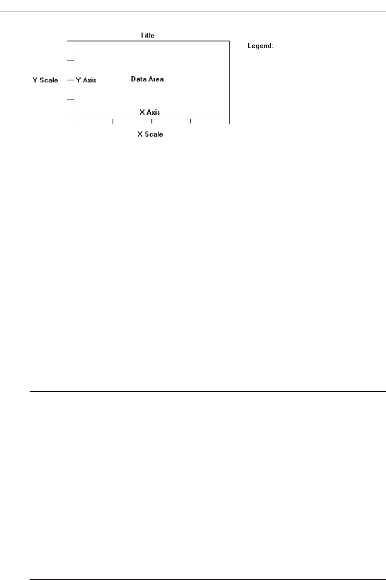
Statistical graphics should be reserved for large sets of data with real variability. The
power of graphics should not be wasted on simple linear changes or situations in
which one or two numbers would summarize the result better. Tufte (1983) says that ta-
bles usually outperform graphics on small data sets of 20 or fewer numbers, or when
data sets are noncomparative or highly labeled. Tables are also better if the data must
be studied or very specific information must be retrieved (Coll, Coll, and Thakur, 1994).
Components of a Statistical Graphic
Most statistical graphics have at least two axes, two scales, an area to present the data,
a title, and sometimes a legend or key, as illustrated in Figure 3.67. Pie charts are the ex-
ception to this general rule. Guidelines for graphic components include the following.
Data Presentation
■
Emphasize the data.
■
Minimize the nondata elements.
■
Minimize redundant data.
■
Show data variation, not design variation.
■
Provide the proper context for data interpretation.
■
Restrict the number of information-carrying dimensions depicted to the number of
data dimensions being illustrated.
■
Employ data in multiple ways, whenever possible.
■
Maximize data density.
■
Employ simple data-coding schemes.
■
Avoid unnecessary embellishment of:
— Grids.
— Vibration.
— Ornamentation.
■
Fill the graph’s available area with data.
206 Step 3
Figure 3.67 Components of a statistical graphic.
3900 P-03 (step 3) 4/24/02 1:53 PM Page 206
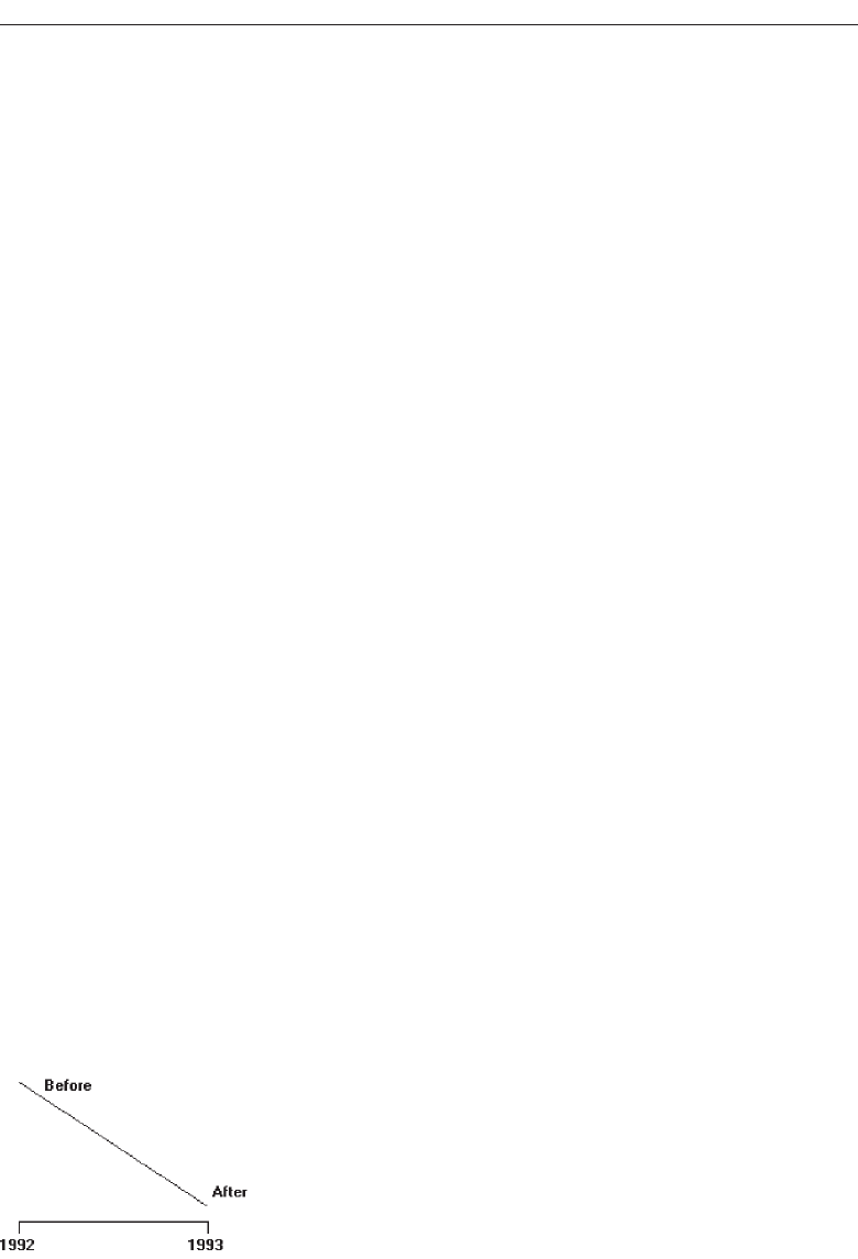
The most important part of a graphics display, as with an alphanumeric display, is
the data itself.
Emphasize the data, minimize the nondata elements. A person’s attention should
be drawn to the measured quantities. The largest share of the graphic’s “ink”
should present data. Nondata elements—such as elaborate grid lines, gratuitous
decoration, and extensive, detailed, and wordy labels—draw attention to them-
selves and mask the data. So, nondata elements should be minimized, or elimi-
nated entirely.
Redundant data. Information that depicts the same value over and over should also
be minimized or eliminated. Redundancy, on occasion, can be useful, however. It
may aid in providing context and order, facilitating comparisons, and creating an
aesthetic balance. Use redundancy only if necessary.
Data variation. Show data variation, not design variation. Each part of a graphic
generates visual expectations about its other parts. The expectancies created in
one part should be fulfilled in other parts so the viewer does not confuse changes
in design with changes in data. Scales should move in regular intervals; propor-
tions should be consistent for all design elements. If the viewer confuses changes
in design with changes in data, ambiguity and deception result.
Proper context. Provide the proper context for data interpretation. Graphics often lie
by omission. Data for making comparisons or establishing trends must always be
included to provide a proper reference point. “Thin” data must be viewed with
suspicion. The graphic in Figure 3.68, for example, might have a number of pos-
sible interpretations, as illustrated in Figure 3.69. All important questions must be
foreseen and answered by the graphic.
Restrict information-carrying dimensions. Restrict the number of information-
carrying dimensions depicted to the number of data dimensions being illustrated.
Displaying one-dimensional data in a multidimensional format is perceptually
ambiguous. With multidimensional data, changes in the physical area of the
surface of the graphic do not produce an appropriate proportional change in the
perceived area. Examples of multidimensional formats used to display one-
dimensional data would be different-sized human bodies to indicate populations
or different-sized automobiles to indicate the number of cars. Often the impres-
sion on the viewer is that the change is actually much greater than it really is. This
problem can be avoided if the number of information-carrying dimensions on the
graphic is restricted to the number of data dimensions being illustrated.
Understand the Principles of Good Screen Design 207
Figure 3.68 A change between 1992 and 1993 without proper context for interpretation.
3900 P-03 (step 3) 4/24/02 1:53 PM Page 207
Employ data in multiple ways. Whenever possible, employ data in multiple ways.
Parts of a graph can be designed to serve more than one purpose. A piece of data
may at the same time convey information and also perform a design function usu-
ally left to a nondata element. Some examples are:
A grid to aid readability of a bar chart, instead of being inscribed on the
graphic background, may be positioned within the bars themselves, as illus-
trated in Figure 3.70.
The size of what is being measured can be conveyed through the size of the
graphical element, the intensity through color or level of shading.
Graphics can be designed to have multiple viewing depths. The top level provides
an overall view, each succeeding level an ever-increasing closer view. They may be also
designed to have different viewing angles or lines of sight.
The danger in employing data in multiple ways is that it can generate a graphical
puzzle. A sign of a puzzle is that the graphic, instead of being interpreted visually,
must be interpreted verbally. Symptoms of a puzzle are frequent references to a legend
208 Step 3
Figure 3.69 Changes between 1992 and 1993 with proper contexts for interpretation.
Figure 3.70 A piece of data (line in the bars) performing a nondata function.
3900 P-03 (step 3) 4/24/02 1:53 PM Page 208

to interpret what is presented and extensive memorization of design rules before one
can comprehend what is presented. By contrast, a well-designed multiple-function
graphic permits a quick and implicit transition of the visual to the verbal.
Maximize data density. In graphics more is better than less—the greater amount of
information displayed, the larger the number of visual comparisons that can be
made, improving comprehension. This is true because the eye can detect large
amounts of information in a small space. Simple things belong in a table or in the
text.
Data density of a graphic can be maximized in two ways: enlarging the data
matrix or shrinking the graphic. Enlarging the data matrix involves displaying as
much information as possible. If the graphic becomes overcrowded, techniques
such as averaging, clustering, smoothing, or providing summaries can reduce the
number of elements to be displayed. Shrinking the graphic means reducing it in
size, but screen resolution may impose limitations on how much shrinking can be
performed.
If visual differentiation in the types of data being displayed is necessary, use
simple coding methods in the areas being depicted. Elaborate schemes or patterns
can be eye straining and can actually impede the flow of information from the
graphic to the viewer. Some possible coding alternatives include:
Varying shades or densities.
Labeling with words.
Varying colors.
Avoid unnecessary embellishment. All pieces of a graphic must tell the viewer
something new. An unnecessary embellishment is “chartjunk.” It does not add
anything new to the graphic’s meaning. It is decoration or noise that hinders as-
similation of the message being communicated. Nondata elements and redundant
data are forms of chartjunk. Three other kinds are vibration, heavy grids, and
ornamentation.
A grid carries no information, contributes noise, and focuses attention away
from the data. An excessively heavy grid can even mask the data. Grids should be
suppressed or eliminated so they do not compete with the data. When a grid
serves as an aid in reading or extrapolating, it should, of course, be included. Its
tendency to overwhelm can be reduced by constructing it with delicate lines or
muted colors and placing it behind the data.
The eye is never absolutely still; it produces continuous slight tremors that aid
visual acuity. The result is that, when small patterns lines, boxes, or dots are
viewed, they shimmer or vibrate. This vibration can be distracting; examples
are illustrated in Figure 3.71. Although eye-catching, vibrations can also strain
the eye. Simple data-coding schemes, such as using shades of color, are much
more effective.
When the graphic is overwhelmed by decoration, it is very ineffective. Orna-
mentation can take many forms: extensive use of color when it is not necessary;
creating multidimensional graphics when single dimensional will do; pointless
use of vibrating patterns, or forcing data into a graphic when a table would work
Understand the Principles of Good Screen Design 209
3900 P-03 (step 3) 4/24/02 1:53 PM Page 209
much better. Ornamentation is more effective as a piece of art hanging on a wall.
It is a symptom of “See what I can do with my computer” rather than an effort to
provide the user with the data in the most comprehensible way possible. The best
graphic display is the simplest graphic display.
Fill the display area. For ease of interpretation and efficiency, the graphic’s data
should fill up the entire display area within the axes. If it does not, the scale or the
graphic is too large.
210 Step 3
Figure 3.71 Examples of patterns creating vibrations.
3900 P-03 (step 3) 4/24/02 1:53 PM Page 210

Axes
■
Values on an axis should increase as they move away from the origin.
■
Use the horizontal axis (X) to show time or cause of an event (the independent vari-
able).
■
Use the vertical axis (Y) to show a caused effect (the dependent variable).
Values on an axis should increase as they move away from the origin. If the numeric
values displayed are positive, the origin point will be the lower-left point of the
graphic. If the data includes negative values and the axes must extend in both direc-
tions from the zero point, position the origin in the center of the graph.
Use the horizontal axis (X) to show time or cause of an event (the independent vari-
able). Use the vertical axis (Y) to show a caused effect (the dependent variable). When
the X-axis plots time intervals, the labeled points should represent the end of each time
interval. The X-axis may also be called abscissa or category axis, the Y-axis the ordinal or
value axis. If the graphic possesses three dimensions, the third axis is called the Z-axis,
reflecting the graph’s plane.
Scales and Scaling
■
Place ticks to marks scales on the outside edge of each axis.
■
Employ a linear scale.
■
Mark scales at standard or customary intervals.
■
Start a numeric scale at zero (0).
■
Keep the number of digits in a scale to a minimum.
■
Display only a single scale on each axis.
■
For large data matrices, consider displaying duplicate axes.
■
Provide aids for scale interpretation.
■
Provide scaling consistency across two or more related graphics.
■
Clearly label each axis in a left-to-right reading orientation.
A scale is a set of measurement points or markers. Scaling is the positioning of data
in relation to these points or markers. Choose an appropriate scale for both graph axes.
If the scale is too expanded, the effect may be exaggerated, if too small, the effect may
be underreported. Standard scaling practices are these:
Tick marks. Place ticks to mark scales on the outside edge of each axis. Placing them
outside will prevent a tick from interfering with data located near the axis.
Linear scale. Employ a linear scale. Most people are more familiar with linear scales
than with logarithmic or other nonlinear scales. These latter kinds are often inter-
preted inaccurately.
Scale markings. Mark scales at standard or customary intervals to aid comprehen-
sion. Familiar standard intervals are 1, 2, 5, 10, and multiples of 10. Familiar cus-
tomary intervals include the days of the week and the months of the year.
Understand the Principles of Good Screen Design 211
3900 P-03 (step 3) 4/24/02 1:53 PM Page 211

Construct scales with tick marks at these intervals. To aid visual comprehension,
it may be necessary to provide intermediate marks as well. Intermediate marks
should be consistent with the scale intervals shown.
Start a numeric scale at zero. Start a numeric scale at zero. Using zero as the start-
ing point on a scale aids visual comparisons since zero is an expected starting
point. If a zero point is omitted because of the nature of the data, this omission
should be clearly indicated in the graphic.
Minimization of scale digits. Keep the number of digits in a scale to a minimum.
Smaller numbers aid understanding. Round off all numbers to two digits or less.
However, place zeros in front of decimal numbers so the decimal point is not
missed.
Single scale on each axis. Display only a single scale on each axis. Avoid multiple
scales associated with a single axis. For all but the most experienced people, mul-
tiple scales can be confusing and can lead to interpretation errors. Meanings can
also be greatly distorted. If multiscale graphs must be used, permit the user to se-
lect any data curve individually and have the computer highlight its correspond-
ing scale.
Duplicate axes for large matrices. For large data matrices, consider displaying du-
plicate axes. The readability of large data matrices is improved if the X-axis scale
appears at the top as well as the bottom of the graph, and the Y-axis scale at the
right as well as the left side.
Scale interpretation. Provide aids for scale interpretation. When reading accuracy is
extremely critical, provide computer aids for interpretation, such as the following:
Displaying a fine grid upon request.
Vertical and horizontal rules that the user can move to the intersection point.
Letting the user point at a data item and having the computer then provide
the exact values.
Consistency. Provide scaling consistency across two or more related graphics. If
comparisons must be made between multiple graphs or charts, use the same scale
for each. Data sets scaled differently lead to interpretation errors.
Labeling. Each scale axis should be clearly labeled in a conventional left-to-right
reading orientation. A complete description of the values, with measurement
units, should be provided.
Proportion
■
Provide accurate proportion of the displayed surfaces to the data they represent.
■
Provide proper proportion by:
— Conforming to the shape of the data.
— Making the width greater than the height.
The displayed surfaces on graphics should be directly proportional to the numeric
qualities they represent. Failure to display the correct proportions can create false im-
212 Step 3
3900 P-03 (step 3) 4/24/02 1:53 PM Page 212

pressions of magnitudes of differences in sizes or changes. This kind of graphical dis-
tortion can be eliminated through clear, detailed, and thorough labeling, a topic to be
addressed shortly.
Provide proper proportion. When the relative proportions of a graphic are in bal-
ance, it looks better. Graphics should tend toward the horizontal, assuming a greater
length than height. There are a number of reasons for this recommendation. First, peo-
ple prefer this shape. Second, it is easier to read words arrayed left-to-right. Third,
many graphics plot cause and effect relationships, with effect on the vertical axis and
cause on the horizontal. An elongated horizontal axis helps describe the causal variable
in more detail. If, however, the data being displayed suggests a shape either square or
higher than wide, conform to the shape suggested by the data.
Lines
■
Data lines should be the heaviest.
■
Axes lines should be of medium weight.
— Extend the lines entirely around the graphic.
■
Grid lines should be very thin or absent.
The most important part of the graphic is the data. Emphasize the data by making
the data lines the heaviest. Of secondary importance are the axes lines. Display them in
a medium thickness. Axes lines should be extended entirely around the graphic to cre-
ate a rectangle (or box). This will define the graphic area and help focus attention on the
data itself. Grid lines should be avoided if at all possible, unless absolutely needed for
accurate data interpretation.
Labeling
■
Employ clear, detailed and thorough labeling.
■
Maintain a left-to-right reading orientation.
■
Integrate the labeling with the drawing.
— Do not curve letters to match the shape of curved lines.
■
Use only one typeface, font, and weight.
— For emphasis, use different type sizes.
■
Do not separate labeling from the data through ruled lines.
■
Provide information about the source of the data.
■
Use a legend for complicated graphs.
Clear and detailed. Employ clear, detailed, and thorough labeling. Words should be
fully spelled out. Follow standard capitalization schemes, using both upper and
lower case, with lower case used for textual information. Use the simplest and
shortest word forms possible.
Understand the Principles of Good Screen Design 213
3900 P-03 (step 3) 4/24/02 1:53 PM Page 213

Left-to-right. Maintain a left-to-right reading orientation. Display all labels hori-
zontally. Avoid words that are organized vertically or words that run in different
directions. Whereas non-horizontal words on hard-copy graphics can easily be
read by turning the paper, this screen capability is not available, nor yet easy to
accomplish.
Integrate. Integrate the labeling with the drawing. Explanations on graphics help the
viewer and should be incorporated as much as possible. Words are data, and
they can occupy space freed up by nondata elements or redundant data. Inte-
grating words and captions with the graphic eliminates the need for a legend and
the eye movements back and forth required to read it. Also, incorporate mes-
sages to explain the data, and label interesting or important points. Never curve
letters to match the shape of curved lines. This is terribly distracting. Run all text
horizontally.
One typeface. Use only one typeface, font, and weight. Using the same type style for
graphics and text aids the visual integration of the two. If text needs to be em-
phasized, use different type sizes.
Separation. Do not separate labeling from the data through ruled lines. Again, this
creates visual noise and impairs proper associations.
Source. Provide information about the source of the data. This information can be
placed, in small type, below the X-axis label or in a caption. It can also be made
available through online help.
Legends. If a graph is complicated, containing a lot of data and a lot of visual cod-
ing, use a legend. A legend, while not as easy to comprehend as integrated label-
ing, is better than cluttering up a graph with too much integrated labeling, or
presenting illegible labels.
Title
■
Create a short, simple, clear, and distinctive title describing the purpose of the
graphic.
■
Position the title above, centered, or left-aligned to the rectangle formed by the ex-
tended axes.
■
Spell it out fully, using a mixed-case or uppercase font.
A title should be brief and descriptive of the graphic. A title may be centered or flush
left to the rectangle formed by the extended axes. Marcus (1992) feels that left-aligning
it yields a stronger composition. Titles should be spelled out fully, and may be dis-
played larger, bolder, and in mixed- or uppercase font.
Aiding Interpretation of Numbers
■
Display a grid on request.
■
Permit the viewer to click on a data point to display actual values.
214 Step 3
3900 P-03 (step 3) 4/24/02 1:53 PM Page 214

■
Show numeric values automatically for each point or bar.
■
Permit the viewer to zoom in on an area of the graphic.
■
Permit the user to change the scale values.
■
Permit toggling between a graphic and a table.
Computer graphics, unlike paper graphics, can be easily manipulated. Fowler and
Stanwick (1995) suggest that the interpretation of numbers in graphical displays can be
aided by permitting the above actions.
Types of Statistical Graphics
Statistical graphics take many forms. There are curves and line graphs, surface charts,
scatterplots, bar graphs, histograms, segmented or stacked bars, and pie charts.
Curve and Line Graphs
■
Display data curves or lines that must be compared in a single graph.
■
Display no more than four or five curves in a single graph.
■
Identify each curve or line with an adjacent label whenever possible.
■
If a legend must be included, order the legend to match the spatial ordering of the
lines.
■
For tightly packed curves or lines, provide data differentiation with a line-coding
technique, such as different colors or different line composition types.
■
Highlight curves or lines representing important or critical data.
■
When comparing actual to projected data:
— Use solid curves or lines for actual data.
— Use broken curves or lines for projected data.
■
Display a reference index if the displayed data must be compared to a standard or
critical value.
■
Display differences between two data sets as a curve or line itself.
Curves and line graphs can be used to show relationships between sets of data defined
by two continuous variables. They are especially useful showing data changes over
time, being superior to other graphic methods for speed and accuracy in determining
data trends. With a curve, the data relations are summarized by a smoothed line. With
a line, straight line segments connect the data plots. A line graph is illustrated in Fig-
ure 3.72. This kind of graph implies a continuous function. If the data point elements
are discrete, it is better to use a bar graph.
Single graph. If several curves must be compared, display them in one combined
graph to facilitate their comparison.
Four or five maximum. Display no more than four or five curves in a single graph.
As more curves or lines are added to a graph, visually discriminating among
them becomes more difficult. The maximum number of lines presented should be
Understand the Principles of Good Screen Design 215
3900 P-03 (step 3) 4/24/02 1:53 PM Page 215
limited to four or five. If one particular curve or line must be compared to several
others, consider multiple graphs where the line of interest is compared separately
with each other line.
Label identification. Identify each curve or line with an adjacent label whenever
possible. A label is preferable to a separate legend. If direct labeling is impossible
due to the tightness of the lines, a legend may be the only alternative. If a legend
is used, visually differentiate the lines (colors, line types, and so on), and include
the coding scheme in the legend.
Legend. If a legend must be included, order the legend to match the spatial order-
ing of the lines. If legends are to be used on a series of graphs, however, maintain
one consistent order for the legends on all graphs.
Tightly packed curves or Lines. For tightly packed curves or lines, provide data dif-
ferentiation through a line coding technique. Common coding techniques include
different colors and line types. Do not exceed the maximum number of alterna-
tives for the method selected, as shown in Table 11.1 in Step 11 “Create Meaning-
ful Graphics, Icons, and Images.” If color-coding is used, choose colors on the
basis of the considerations described in Step 12 “Select the Proper Colors.” Line
width and dot size coding should be avoided because of their similarity to grids
and scatterpoints. If a series of related graphs are line coded, be consistent in the
selection of techniques for corresponding data.
Important or critical data. Highlight curves or lines representing important or criti-
cal data. If one curve or line in a multiple-line graph is of particular significance,
highlight that curve (high intensity, different color, and so on) to call attention to
it. The coding scheme selected should be different from that used for spatial dif-
ferentiation. Use solid curves or lines for actual data; use broken curves or lines
for projected data.
Comparing actual and projected data. When a curve or line must be compared to a
standard or critical value, display a reference curve or line reflecting that value.
Data differences. If the difference between two sets of data must be determined, dis-
play the difference itself as a curve or line. This is preferable to requiring the user
to visually compare the two values and calculate the difference between them. If
the difference between the related curves is of interest, consider a band chart
216 Step 3
Figure 3.72 A line graph.
3900 P-03 (step 3) 4/24/02 1:53 PM Page 216
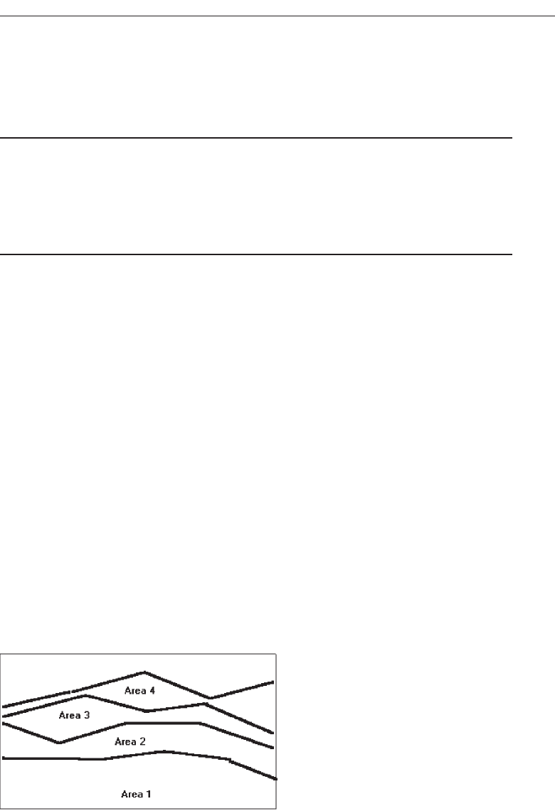
where both lines and curves are displayed and the area between them coded
through use of a texture, shading, or color.
Surface Charts
■
Order the data categories so that:
— The least variable is at the bottom, and the most variable at the top.
— The largest is at the bottom and the smallest at the top.
■
Use different texture or shading coding schemes to differentiate the areas below
each curve or line.
■
Incorporate labels within the bands of data.
If the data being depicted by a curve or line represents all the parts of a whole, con-
sider developing a surface chart, as illustrated in Figure 3.73. In this kind of graph, the
curves or lines are stacked above one another to indicate individual amounts or aggre-
gated amounts. Each boundary height is determined by the height of the line below it,
and the area between each line or curve is differently coded, usually by textures or
shading. A surface chart is similar to a segmented bar chart
Ordering. In ordering the data categories, place the least variable at the bottom and
the most variable at the top.Irregularities in the bottom curve or line will affect
those above it. This makes it difficult for a viewer to determine whether the ir-
regularity in the upper curves reflect real data differences or is the result of this
style of graph. Displaying the least variable data at the bottom will minimize this
effect. Alternately, place the widest area at the bottom and the narrowest at the
top. Wide bands look like they belong at the bottom, narrow at the top.
If the data itself implies that some logical organization must be followed, and
the resulting organization creates confusing distortions in the curves, this kind of
graph should not be used.
Coding schemes. Use different texture or shading coding schemes. Ensure that the
coding scheme chosen for each area is visually distinguishable from all the others.
Place darker shades or colors toward the bottom.
Understand the Principles of Good Screen Design 217
Figure 3.73 A surface chart.
3900 P-03 (step 3) 4/24/02 1:53 PM Page 217
Labels. Labels with a left-to-right reading orientation should be included within
textured or shaded bands, if possible. Legends showing individual percentages,
or cumulative percentages, should only be incorporated where space constraints
exist within the bands.
Scatterplots
■
Limit use to two-dimensional displays of data.
■
Maintain consistent scale size intervals.
■
Provide distinguishable, equal-sized plot points.
■
If there is more than one set of data on the plot, use different symbols for each data
set’s points.
■
Visually distinguish points of particular significance through a highlighting tech-
nique.
Scatterplots can be used to show relationships among individual data points in a
two-dimensional array. A point is displayed on the plot where the X-axis and Y-axis
variables intersect, as illustrated in Figure 3.74. Correlations and trends on scatterplots
can be indicated by the superimposition of curves (thus combining the scatterplot with
another kind of graphic display).
Two dimensions. Limit scatterplots to two dimensions. Three-dimensional scatter-
plots, while possible, do not yield clear, unambiguous displays.
Consistent intervals. Maintain consistent scale size intervals. Inconsistent spacing
size between scale ticks on the two axes will distort the displayed data.
Distinguishable plots. Construct the plot points of distinguishable, equal-sized cir-
cles, squares, rectangles, or diamonds. These symbols may be filled in or empty.
Color may also be used to designate the points. Keep in mind that, when using
color, different colors can look different in size, and some people using the
graphic may be colorblind.
Multiple data sets. If there is more than one set of data on the plot, use different
symbols for each data set’s points. Choose distinguishable symbols from those
described above.
218 Step 3
Figure 3.74 A scatterplot.
3900 P-03 (step 3) 4/24/02 1:53 PM Page 218

Significant points. Visually distinguish significant points. Points of particular sig-
nificance on scatterplots can be made distinctive through highlighting techniques
such as the use of high intensity, different colors, or different shapes.
Bar Graphs
■
Orient bars consistently, either horizontally or vertically.
■
Use vertical bars when the item being counted is of greatest interest.
■
Use horizontal bars:
— When the data labels are long.
— To highlight the information rather than the count.
■
Use a meaningful organizing principle.
— If none exists, arrange the bars so that the length of bars is in ascending or de-
scending order.
■
Make the spacing between bars equal to one-half the width of the bars or less.
— If groupings of bars are presented, leave space between the groupings only.
■
If different kinds of bars must be easily distinguished, provide differentiation
through a coding technique.
— If possible, use a pattern or color that reinforces the data.
■
Highlight bars representing important or critical data.
■
Provide a consistent ordering for related groups of bars.
■
Display a reference index if displayed data must be compared to a standard or crit-
ical value.
■
Identify each bar with an adjacent label.
— Place labels below, or to the left of, the baseline.
■
When a great many pieces of data must be compared, consider using histograms or
step charts.
Bar graphs can be used to show a few differences between separate entities or to
show differences in a variable at a few discrete intervals. A bar graph consists of a se-
ries of bars extending from a common origin or baseline, as illustrated in Figure 3.75,
or they may extend between separately plotted high and low points, as illustrated in
Figure 3.76, having only one axis. Bar graphs may be arrayed horizontally or vertically.
Vertical bar graphs are sometimes called column charts.
Understand the Principles of Good Screen Design 219
Figure 3.75 A bar graph with a common origin point.
3900 P-03 (step 3) 4/24/02 1:53 PM Page 219
Consistent orientation. While bars may be oriented either horizontally or vertically,
a consistent orientation should be maintained for bars displaying similar infor-
mation. In general, frequency counts are best displayed in vertical bars. Also, use
vertical bars when the values or count being displayed are of greatest interest. Use
horizontally arrayed bars for time durations. Also use this orientation when the
data labels are long and room is needed to present them, and when the informa-
tion categories must be highlighted, rather than the count.
Meaningful organization. Use a meaningful organizing principle, such as volumes,
dates, or alphabetical. If no meaningful principle exists, arrange the bars so that
the length of bars are in ascending or descending order.If the information is being
compared to a baseline or other comparative data, place the baseline bar to the far
left or at the top.
Bar spacing. Space the bars for ease of visual comparison. Comparison of bars
should be accomplishable without eye movement. Generally, the spacing be-
tween bars should be one-half or less of the bar width. If many bars are to be dis-
played, the alternating pattern of bright and dark bands that results can be
visually disturbing to some viewers. In this case it is better to completely elimi-
nate the spacing between bars. (The graph is then called a histogram.) If groupings
of bars are presented, leave the space between the groupings.
Differentiation. If different kinds of bars must be easily distinguished, provide dif-
ferentiation through a coding technique such as the use of color, texture, or shad-
ing. If possible, use a meaningful pattern or color that reinforces the differences.
Important or critical data. Highlight important or critical data. If one bar represents
data of unusual significance, call attention to that bar through a different coding
technique. Related groups of bars should be ordered in a consistent manner.
Related bar ordering. Provide a consistent ordering for related groups of bars.
Reference index. When bars must be compared to some standard or critical value,
display a reference line to aid that comparison.
Labeling. A label associated with each bar, in left-to-right reading orientation, is
preferable to a separate legend. Place labels below, or to the left of, the baseline. If
the labels on a horizontal bar chart are short, left-align them. If they are long,
right-align them to the axis. If groups of bars are repeated, it is only necessary to
label one group rather than all bars in all groups.
220 Step 3
Figure 3.76 A bar graph with separately plotted high and low points.
3900 P-03 (step 3) 4/24/02 1:53 PM Page 220

Histograms or step charts. When a great many pieces of data must be compared,
consider histograms or step charts. These are bar graphs without spaces between
each of the bars, as illustrated in Figure 3.77. The area of a bar in a histogram re-
flects the amount of the value; so all bars should be of equal width.
Segmented or Stacked Bars
■
Order the data categories in the same sequence.
■
Order the data categories so that:
— The least variable is at the bottom.
— The most variable is at the top.
■
Limit the number of segments to those that are large enough to be seen and labeled.
■
Use different texture or coding schemes to differentiate the areas within each bar.
■
Clearly associate labels with bars or segments.
— Place segment labels to the right on a vertical chart or above on a horizontal
chart.
If both the total measure of a value and its component portions are of interest, con-
sider using segmented or stacked bars. These bars are similar to bar graphs except that the
bar is segmented into two or more pieces reflecting the component values, as illus-
trated in Figure 3.78. In this way they are similar to surface graphs and pie charts. De-
sign guidelines are similar to stacked bars, except for the following:
Data category ordering. To provide consistency, order the data categories in the
same sequence for all bars. Order data categories to show least variable at bottom
and most variable at top. Irregularities in the bottom segment will affect those
above it. This can make it difficult for a person to determine whether the irregu-
larity in the upper segments reflects real data differences or is the result of this
style of graph. Displaying least variable data at the bottom will minimize this ef-
fect. Also consider displaying the least variable values at the bottom, as is done
with surface charts, unless the data itself dictates that some other logical organi-
zation must be followed.
Understand the Principles of Good Screen Design 221
Figure 3.77 A histogram or step chart.
3900 P-03 (step 3) 4/24/02 1:53 PM Page 221
Large segments. Limit the number of segments to those that are big enough to be
seen and labeled. If small segment components exist, group them into an “other”
category.
Coding schemes. Use different texture or shading coding schemes. Ensure that the
coding scheme chosen for each segment is visually distinguishable from all oth-
ers. Place darker shades or colors toward the bottom or toward the left.
Labeling. Associate labels with bars and segments. Labels, with a left-to-right read-
ing orientation, are preferable to legends. Do not place labels within segments, as
they most often will not fit. Legends should only be used if space does not allow
labels.
Pie Charts
■
Pie charts should be used with caution.
■
If pie charts are used:
— They must add up to 100 percent.
— Use five segments or fewer.
— Each segment should take up at least 5 percent (18 degrees) of the circle.
— Place the largest segment starting at 12:00.
— Directly label each segment in the normal reading orientation.
• If leaders for labels in small segments are necessary, orient them in as few an-
gles as possible.
— Include numbers with segment labels to indicate percentages of absolute values.
— Texture- or color-coding selected for segments should not emphasize one seg-
ment over another (unless it is intended).
— Highlight segments requiring particular emphasis through a contrasting display
technique or by “exploding” it.
— Never tilt a pie.
222 Step 3
Figure 3.78 A segmented, or stacked, bar graph.
3900 P-03 (step 3) 4/24/02 1:53 PM Page 222
Pie charts, a circle broken up into pie-shaped pieces, can be used to show an appor-
tionment of a total into its component parts, as illustrated in Figure 3.79. Bar graphs,
however, usually permit more accurate estimates of proportions. Experts caution
against the use of pie charts because:
They provide no means of absolute measurement.
They cannot represent totals greater than 100 percent.
They can only represent a fixed point in time.
Human estimation of relationships is more accurate with linear than with angu-
lar representations.
If pie charts are used, the guidelines below should be followed.
Total 100 percent. The parts must add up to 100 percent. To convert from percent-
ages to degrees, multiply the percentage by 3.6.
Five segments or fewer. To minimize confusion, restrict pies to five segments or
fewer. This permits adequate differentiation of its pieces and accurate labeling.
Minimum five percent. Avoid very small segments. Segments should take up at
least 5 percent (18 degrees) of the circle in order to provide adequate segment dif-
ferentiation. If small portions exist, combine the pieces into an “other” category
and list them in a caption or note.
Start at 12:00. Start with the largest wedge at 12:00 (or a quarter hour) and order
from largest to smallest in a clockwise order.
Labeling. To provide maximum association of the label with data, and for reading
clarity, use a left-to-right reading orientation. If it is impossible to include the
label within the segment, it may be placed outside and tied to the segment with a
leader line. Place the labels in one or two columns (one on each side). If multiple
outside labels and leader lines are necessary, orient the lines in as few angles as
possible.
Understand the Principles of Good Screen Design 223
Figure 3.79 A pie chart.
3900 P-03 (step 3) 4/24/02 1:53 PM Page 223

Numbers with segment labels. Include numbers with the segment labels to indicate
percentages or absolute values. Only by including numbers with segment labels
can numeric values be accurately established. Alternately, make actual percent-
ages available when requested.
Segment coding. The kinds of textures or colors selected for segments should not
emphasize one segment over another, unless this emphasis is intended.
Highlighting. Highlight segments requiring emphasis. Use a contrasting display
technique or explode segments requiring emphasis. Exploding is accomplished by
slightly displacing a segment from the remainder of the pie.
Tilting. Never tilt a pie. Distortion will occur with tilting. Small wedges at the front
will look larger than they actually are.
Choosing a Graph Type
■
Determine what kind of information is most important for the viewer to extract.
■
Choose the type of graph best suited for presenting that kind of information.
The types of graphics just described have rarely been experimentally studied to
determine their most effective use. Some studies addressing this issue, however,
are those of Hollands and Spence (1992) and Simkin and Hastie (1987). These re-
searchers collected data on three tasks: (1) determining a proportion of a whole
where the proportion was a part of the whole (proportion), (2) determining a pro-
portion of a whole where the proportion was not a part of the whole (comparison),
and (3) determining a change over time (change). The results are summarized in
Table 3.2.
In estimating proportion, if a scale is not included on the graph, pie charts and
segmented bars were found to be best. If a scale is included, line graphs and bar
224 Step 3
Table 3.2 Tasks and Best Types of Graphs
PROPORTION
WITH SCALE WITHOUT SCALE COMPARISON CHANGE
Best Line Graphs Segmented Bars Bar Graphs Line Graphs
Bar Graphs Pie Charts Segmented Bars Bar Graphs
Segmented Bars
Pie Charts
Poorest — Bar Graphs Pie Charts Segmented Bars
Line Graphs Pie Charts
Source: Spence (1992) and Simkin and Hastie (1987).
3900 P-03 (step 3) 4/24/02 1:53 PM Page 224

graphs are also usable, both actually having a slight edge in speed over pie charts
and bar graphs. In the comparison task, bar graphs and segmented bars were su-
perior to pie charts. In estimating change over time, line graphs and bar graphs
were both very effective, and pie charts and segmented bars the poorest.
In choosing a graph to display information, the kind of information important to the
viewer must always be determined first. This will point to the kind of graphic most ef-
fective for the task.
Flow Charts
■
Displayed steps should be designed to:
— Follow some logical order.
— Minimize path link.
■
Orient the chart following common flowchart reading conventions such as left-to-
right and top-to-bottom.
■
Follow common flowchart coding conventions to distinguish elements.
■
Use arrows in conventional ways to indicate directional relationships.
■
Highlight elements requiring particular attention through a contrasting display
technique.
■
Require only one decision at each step.
■
Be consistent in all option ordering and wording.
If the data to be displayed flows in a complex, yet sequential, process, consider using
aflowchart to schematically represent it. Flowcharts can also be used to aid problem
solving in which a solution can be reached by answering a series of questions. They are
not useful when trade-offs must be made.
Order of steps. One logical ordering scheme is to follow a sequence of operations or
processes from start to finish. Other potential ordering schemes include placing
the most important decisions first or the decisions that can be made with the most
certainty. If no logical order is apparent, order the flowchart to minimize the
length of the path through it. If some decision paths are more likely to occur than
others, minimize the length of the most likely path.
Orientation. Follow a left-to-right and top-to-bottom orientation.
Coding conventions. Follow existing shape coding conventions for the kinds of
boxes being displayed. Adhere to standards and people’s expectations.
Arrows. Use arrows to indicate directional relations and sequential links.
Highlighting. Contrasting display techniques, such as high intensity or color,
should be used to call attention to relevant paths or elements. Color is particularly
effective in this regard.
Only one decision at each step. Multiple decisions reduce flowchart size. However,
requiring multiple decisions such as “Is A true and B false?” can be confusing. Re-
quire that only single decisions be made.
Consistently order and word all choices. Consistency always aids learning.
Understand the Principles of Good Screen Design 225
3900 P-03 (step 3) 4/24/02 1:53 PM Page 225

Technological Considerations
in Interface Design
Interface design is also affected by the physical characteristics of the display device it-
self and the characteristics of the interfaces controlling software.
Graphical Systems
■
Screen design must be compatible with the capabilities of the system, including:
— System power.
— Screen size.
— Screen resolution.
— Display colors.
— Other display features.
■
Screen design must be compatible with the capabilities of the:
— System platform being used.
— Development and implementation tools being used.
— Platform style guide being used.
Graphical system design must be compatible with the system’s power, screen size,
screen resolution, and displayable colors, fonts and other features. Designs for Web
systems must also take into consideration the characteristics of the browsers being
used and the bandwidth of the communication medium. The design must also be com-
patible with the system platform and any development and implementation tools
being used. The design must also take into consideration any available platform style
guide.
System Power
A slow processing speed and small memory may inhibit effective use of a system.
Feedback and animation capabilities may be limited, reducing the system’s usability.
Slow responses can be error prone, grossly inefficient, and very aggravating. A slow
screen refresh rate will increase the user’s chances of perceiving screen flicker, which
can be visually fatiguing. A system must be powerful enough to perform all necessary
actions promptly, responsively, and meaningfully.
Screen Size
Through the years, the physical size of an available monitor’s screen area has been
gradually increasing. Current typical monitor sizes range from 13 to 21 inches (mea-
sured diagonally), with 17 inches being most common.
Many of today’s screens are not large enough in size to take full advantage of win-
dowing capabilities. As a result, many windows are still of Post-It dimensions. There
is some evidence, from studies and personal observation, that many users of window-
226 Step 3
3900 P-03 (step 3) 4/24/02 1:53 PM Page 226

ing systems expand their windows to cover a full screen. Either seeing all the contents
of one window is preferable to seeing small parts of many windows, the operational
complexity of multiple windows is not wanted, or visual noise is being eliminated.
Whatever the case, these actions indicate a shortcoming in windowing systems, as they
exist today.
Best monitor size was the focus of a study by Simmons and Manaham (1999). They
compared monitors of 15, 17, 19, and 21 inches for search activities using Microsoft’s
Word and Excel, and for browsing the Web. The 21-inch monitor resulted in fastest task
completion. Users, however, preferred using the 19-inch monitor. DiPierro, Nachman,
and Raderman (2000) compared Web navigation performance using small, medium,
and large screens. No performance difference was found between small and medium
screens, but the large screen elicited a 26 percent faster performance.
Clearly, these studies point out that bigger screens may be better. One typical-sized
screen today hardly approximates one standard-sized piece of paper. Comparisons be-
tween information contained on separate pieces of paper are still difficult using current
monitor sizes. The answer to this problem may lie in providing multiple monitors for
doing one’s work or performing other activities. Multiple monitors reflect more closely
the “cluttered desk” metaphor, for better or worse.
Continually expanding monitor and screen size as a solution, though, may create
other problems. A large display area will require longer control movements to reach all
locations on the screen, and more head and eye movements. Even with today’s rela-
tively small screens many activities in the peripheries of vision still go unnoticed.
Larger screens will compound this problem. The effect on user’s physical comfort, and
the possibility of needing an expanded working area must be considered. Clearly, the
screen size/multiple monitor usability trade-off must be studied further.
Screen Resolution
Screen resolution is the horizontal and vertical height of a screen in pixels. It is a func-
tion of the monitor’s capabilities and its video card. Most common display resolutions
currently are 640×480 (pixels width and height), 800×600, and 1024×768. Higher reso-
lutions are also available. Poor screen resolution may deter effective use of a graphical
system by not permitting sharp and realistic drawings and shapes. Window structure
and icon design may be severely affected.
In a study mentioned previously, Ziefle (1998) evaluated reading performance,
using both hard-copy paper documents and monitors at different resolutions. In the
first study, she compared paper printed at 255 dots per inch (dpi) and monitors whose
resolutions were 832×600 pixels (60 dpi) and 1664×1200 pixels (120 dpi). A 19-inch
monitor showing black characters on a light background was used, and reading speeds
and proofreading accuracy were compared. Ziefle found no difference in performance
between the monitors with different resolutions. In the second Ziefle study, partici-
pants performed a continuous visual search task. Performance was compared using
screens of lower resolution, 720×540 (62 dpi), and higher, 1024×768 (89 dpi). She found
that the higher resolution screen was searched significantly faster. Using the lower res-
olution, she found that after 30 minutes the participants began to search more slowly,
made more errors, and had more and longer eye fixations.
Understand the Principles of Good Screen Design 227
3900 P-03 (step 3) 4/24/02 1:53 PM Page 227

In conclusion, looking just at the differences between the monitors of different reso-
lutions, both studies found advantages for the higher resolution screens in terms of
both preference and performance. Adequate screen resolution then, is a necessity to
achieve meaningful representations. Higher resolution screens also appear to be better
for one’s eyes.
Colors
The color palette must be of a variety large enough to permit establishment of a family
of discriminable colors. The colors used must be accurately and clearly presented in all
situations. The contextual effect of colors must also be considered, because hues may
change based on factors such as size and one color’s location in relation to other colors.
Color is thoroughly discussed in Step 12.
Other Display Features
A wide range screen attributes or properties are available to aid the screen design
process. Included are such techniques as higher brightness, reverse polarity, different
font sizes and styles, underlining, blinking, line rules and boxes, color, and white space.
Before beginning design, the designer must be aware of what capabilities exist, how
they may be most effectively used, and what their limitations are. All of these tech-
niques are described in other sections in this text.
The design must be compatible with the system platform and any development and
implementation tools being used. The design may also take into consideration any
available platform style guide. Finally, the design must effectively utilize the various
available display features or attributes.
Platform Compatibility
The design must be compatible with the windowing platform being used—Apple
Computer’s Macintosh, Microsoft Windows or any other.
Development and Implementation Tool Compatibility
More that half of software code is now devoted to user interface design. To use a very
old cliché, the tail is now beginning to wag the dog. Available tools include toolkits, in-
terface builders, and user interface management systems.
Atoolkit is a library of controls or widgets such as menus, buttons, and scroll bars.
Toolkits have a programmatic interface and must be used by programmers. They are
usually for a specific windowing platform. Examples of toolkits include those for Motif,
OpenLook, and the Macintosh.
An interface builder is a graphical tool that helps a programmer create dialog boxes,
menus, and other controls. It provides a palette to select and position controls, and to
set properties. Interface builders are limited to use in laying out the static parts of the
interface. They cannot handle the parts of the interface that involve graphical objects
228 Step 3
3900 P-03 (step 3) 4/24/02 1:53 PM Page 228

moving around. A user interface management system (UIMS) extends the features of a
builder by also providing assistance with creating and managing the insides of win-
dows. Examples include HyperCard and Visual Basic.
MAXIM Software should be seen and not heard.
Style Guide Compatibility
A thrust for commonality in graphical system application design has emerged as
providers have finally come to realize that design consistency is a virtue that has been
ignored too long. To achieve this consistency in interface design, most providers have
developed style guidelines for system developers. These guidelines specify the ap-
pearance and behavior of the user interface. They describe the windows, menus, and
various controls available, including what they look like and how they work. They also
provide some guidance on when to use the various components.
Examples of industry-produced guidelines include Apple’s Macintosh Human Inter-
face Guidelines, IBM’s System Application Architecture Common User Access (SAA CUA)
and Microsoft’s The Windows Interface Guidelines for Software Design. Product style
guides vary in their ability to control compliance with the guidelines they present.
Some present strict requirements, leading to excellent consistency across applications;
others provide little guideline compliance control. The design should comply with the
relevant platform style guide.
Web Systems
■
Understand the current level of Web technology.
■
Design for system configuration used by most users.
■
Refrain from haphazard use of leading-edge technology.
The Web is truly a Web, a Web of users whose only consistency is inconsistency in
the variety of the technologies they possess. Old PCs with few features must coexist
with new PCs possessing the latest technological advances. Monitors with small
screens must coexist with large screens. Color must coexist with monochrome dis-
plays. High-resolution displays must coexist with those of low resolution. High-speed
information transmission must coexist with low speed. New browsers that contain and
support many different and desirable features must coexist with old browsers that
support little. To make matters worse for the designer, users can reconfigure their own
PCs, further changing some of its characteristics.
The designer must be capable of handling these various demands while creating us-
able Web pages accessible through different browsers, operating systems, and com-
puter platforms. To do this requires having an awareness of system configurations that
satisfy the needs of the majority of users, and then designing for these users. To utilize
the Web’s richest features, however, the designer must understand the current level of
technology and apply it in a meaningful and usable way, especially for those users at
Understand the Principles of Good Screen Design 229
3900 P-03 (step 3) 4/24/02 1:53 PM Page 229

the high end of the technological spectrum. The temptation, though, to apply technol-
ogy simply for technology’s sake must be resisted. The goal in design is to satisfy the
user’s need or want, not the designer’s. The following sections address technological
considerations affecting Web site design.
Browsers
■
Compatibility:
— Make the Web site accessible to all users’ browsers.
— Use browser defaults as much as possible.
■
Monitor size and resolution:
— Design within the boundaries of an image-safe area for all browsers.
— Present images at a resolution appropriate for all users’ monitors.
■
Fonts:
— Use fonts that can be displayed on a variety of browsers.
■
Colors:
— Use colors that succeed on a variety of browsers and platforms.
• A palette of 216 colors.
■
Bandwidth:
— Design for the most commonly used bandwidth.
• A 56-kbps modem is most common for home users.
■
Versions
— Create multiple versions that support multiple browsers.
• Always provide a text-only version.
• Make use of browser sniffers.
The pressure for lowest-common-denominator design is often outweighed by the
designer’s desire to create larger displays and employ the latest display and browser
features. The needs of all users must be considered in design.
Compatibility
The entire Web page content should be accessible from the browsers of all users, pre-
senting content as consistently and predictable as possible. Avoid fancy technology;
many people still use old browsers that do not support such things as frames or
JavaScript. Newer browsers will interpret Java applets. In general, use browser de-
faults as much as possible, designing for what everyone can see. Save the newer and
more exotic features for supplements to the basic page content, or for another page ver-
sion (see below).
Never assume that the designed page will look exactly the same to users as it does
to the designer. Test the design on all browsers, operating systems, computer plat-
forms, and all versions of the each.
Monitor Size and Resolution
Designed page content should always be restricted to the boundaries of an “image-
safe” area horizontally, and perhaps vertically, depending upon whether vertical
230 Step 3
3900 P-03 (step 3) 4/24/02 1:53 PM Page 230

scrolling is determined as necessary to see the page’s entire content. Exceeding the
horizontal safe area will require horizontal scrolling to see the page’s entire width. Be-
cause some information will not always be visible, content usability and interpretation
will be severely degraded, and the user inconvenienced. Exceeding the safe area length
will require vertical scrolling to see the entire page, and could push important infor-
mation out of the user’s view.
A display’s safe area will be dependent upon the monitor’s size and the resolution
at which it is set. It must be established based upon the anticipated or known range of
monitor sizes and their set resolutions. Current typical monitor sizes range from 13 to
21 inches (measured diagonally) with 17 inches being most common.
Most common display resolutions are 640×480 (pixels width and height), 800×600
pixels and 1024×768 pixels. Some users choose to use the highest resolution (1024×768)
permitting more to be displayed on a screen. Users at 800×600 may maximize their
browser to a full screen, but those displaying 640×480 may see additional scroll bars if
the screen content does not fit.
The browser safe width for the 640×480 pixels screen is 600 pixels or less, the safe
height about 350 pixels. An area of about 760×430 is safe for an 800×600 pixel screen.
Smaller monitors will have smaller safe areas. Some browsers permit setting of an
image as a percentage of the browser window, such as 80 percent for width. The height
can also be set but it is best to leave this dimension unspecified. This scaling feature
may also be used to establish safe areas. All browser elements, including scroll bars and
command buttons, must be contained within this safe area
Few monitors display images at greater than 72 dots per inch (dpi). Because of this,
the resolution of images displayed on screens should also be restricted to 72 dpi. Using
a higher dpi ratio will not produce a better image, but will increase file size, causing
longer download times. If higher-resolution monitors exist for most users, the dpi may
be increased. Printable versions of page content may use a higher dpi, since most low-
end printers are 300 dpi. A higher dpi means the printing will take longer, however.
Fonts
Not all browsers provide the same typographic operations. Different default font types
and sizes may exist, depending on the type of browser, browser version, and operating
system the browser runs on. If a page is designed using a font the user does not have
installed, the browser displays its default fonts. Many older browsers support only two
fonts, Times Roman and Courier. Newer browsers support more fonts but they must be
installed on the machine doing the browsing. Default fonts may include Times New
Roman, Arial, Helvetica, and Verdana. Type displayed on a Windows browser may
look 2 to 3 points larger than that on a Macintosh.
It is best to stick with the default fonts installed on the user’s computers. All avail-
able options must be known before beginning the design process. Then ensure that the
text is readable and legible in all usage environments.
Color
The color palette must be of a variety large enough to permit establishment of a family
of discriminable colors. The colors used must be accurately and clearly presented in
all situations, but be aware that colors may appear slightly differently on different
Understand the Principles of Good Screen Design 231
3900 P-03 (step 3) 4/24/02 1:53 PM Page 231

monitors, and all users may not default their palettes to high color settings. Use colors
that will succeed on a variety of platforms and monitors. Design using a browser-safe,
cross-platform palette of 216 colors. It is sometimes referred to as a “Web safe” color
palette. Color is discussed in more detail in Step 12.
Bandwidth
The amount of data that can travel through a communication channel in a given
amount of time is called bandwidth. Currently, the typical Web user is dialing in at 56
kilobytes per second (kbps) through a regular telephone line. Many users, however, are
still dialing in at 28.8 kbps. While a cable modem is currently the most reliable high-
speed connection to the Web for home users, only a small percentage of Americans
have access to them. Other kinds of high-speed connection technologies include Inte-
grated Services Digital Network (ISDN) and Digital Subscriber Line (DSL). ISDN offers
good speed but is more common in urban areas. It is primarily used by business. DSL
is also very fast but to work well, a local telephone switching office must be nearby.
At the other end of the bandwidth scale are users with low-cost devices, users want-
ing low-bandwidth wireless access, users with small personal display devices, and
users in developing countries with poor communication infrastructures. All must be
supported in Web page design.
In design, the bandwidths of users’ devices must be considered. Now, as mentioned
above, the typical Web user is dialing in at 56 kbps, with many still at 28.8 kbps. Fail-
ure to consider these modem speed limitations will lead to long download times and
can result in user frustration and Web site avoidance. The biggest influence on down-
load speed is the number and size of graphics on Web pages. Other speed-inhibiting
factors will be described shortly in the section titled “Downloading.”
If the site being designed possesses users with high bandwidth capabilities, an in-
tranet site with ISDN, for example, large graphics can be used quite freely. Always test
download speeds on the slowest communication channel available to the users.
Versions
To provide universal access to a Web site, provide multiple versions that support mul-
tiple browsers. To limit the site to one browser may deny access to, and alienate, users
who do not have the proper one. Make use of browser “sniffers,” programs on the
server that detect the user’s browser type and determine which version should then be
downloaded.
Always provide a text-only version of the Web site. This will be necessary as long as
users with small displays and low bandwidths exist. Vision-impaired users with read-
ers will also require a text-only version, as will users with text-only browsers, and
those who turn off image display.
Other Web Considerations
■
Downloading:
— Provide fast page download times, no more than 8 to 10 seconds per page.
232 Step 3
3900 P-03 (step 3) 4/24/02 1:53 PM Page 232

• Minimize the use of design techniques that cause longer download times.
– Long pages.
– Large chunky headings.
– Numerous or large graphics and images.
– Animation.
– Excessive amount of color.
– Excess use of frames.
— Provide enough information to the user so that whether or not to request a down-
load can be determined, including:
• Program or document description.
• Type of download.
• Size of download.
• Download version.
• Estimated loading time.
• Special operating requirements.
■
Currency:
— Keep Web site information current.
■
Page printing:
— Provide a means to print:
• Groups of related pages.
• Individual pages.
• Sections of pages.
■
Maintainability:
— Ensure easy Web site maintainability.
Downloading
Slow download speeds are an ongoing complaint of Web users. Download times of 8
to 10 seconds per page should not be exceeded, even for bandwidths of 28.8 kbps. In
general, keep graphics and page size as small as possible. Specifically, use text instead
of graphics whenever possible. When graphics are desirable, keep the graphic as small
as possible. Also, repeatedly use a graphic so it may be stored in the browser’s cache.
The cache is a temporary storage area for Web pages and images. There are two
types: memory and hard drive. Once a graphic is downloaded, it is placed in the cache
and remains there for a prescribed period of time. Download times, then, are longest
when a site is visited and downloaded for the first time. After the first download, the
graphic is in the cache. It is retrieved from there, reducing the time it takes to display
the page.
In addition to graphics, other design elements that slow download times include
large and chunky headings, the use of many colors, animation, excessive use of frames,
and the use of Java and JavaScript. Limit the use of these elements that require a long
time to download. Create graphics that load quickly. Limit an individual image to 5K,
the images on a page to 20K. Use Graphics Interchange Format (GIF) files because they
are smaller than Joint Photographic Experts Group (JPEG) files. GIFs and JPEGs are de-
scribed more fully in Step 11.
Understand the Principles of Good Screen Design 233
3900 P-03 (step 3) 4/24/02 1:53 PM Page 233

Also, because few monitors display images at greater than 72 dpi, restrict the reso-
lution of downloaded images to 72 dpi. Using a higher dpi ratio will not produce a bet-
ter image, but will increase file size, causing longer download times. All images should
also contain alternate text (alt text). This will give the user something to read while the
image downloads, and is necessary for text-only viewers.
Always provide enough information to let the users know whether it is worth their
time and trouble to download something of apparent interest described on a Web page.
Provide a program or document description, type, size, version, estimated loading time,
and any special operating requirements, including such things as hardware needed, the
required operating system, special software needed, and memory requirements.
Currency
Update the Web site regularly to keep information current. The nature of the Web im-
plies timeliness. Outdated information casts doubts on a Web site’s credibility. Cur-
rency means trustworthiness to many users.
Page Printing
Some people prefer to read hard copy, especially anything longer than half a page.
Make printing easy for users, including the capability to print sections, pages, or
groups of related pages with minimal effort. Since most low-end printers print at 300
dpi, pages may be printed at this resolution. This higher resolution will result in a
longer printing time, however.
Maintainability
Provide easy Web site maintainability to sustain its currency. Change must be easily ac-
commodated as the Web site grows, evolves, and matures. Web site maintenance is, in
reality, Web site enhancement. Remove outdated information and expired links, link
old pages to those newly created. Properly designed, modular system pages covering
specific topics can be updated quickly without needing to change and reformat large
amounts of information.
The User Technology Profile Circa 2001
While a great variety does exist in the technological tools people use to interact with the
Internet, the dominance of certain platforms and monitor characteristics is quite evi-
dent. Bailey (2001), in summarizing recently reported data (thecounter.com, 2001) says
that the following operating systems, browsers, screen resolutions, and color depths
each account for more than 90 percent of a user’s technological capabilities.
OPERATING SYSTEMS
Windows 95 10%
Windows 98 72%
Windows 2000 6%
Windows NT 5%
93%
234 Step 3
3900 P-03 (step 3) 4/24/02 1:53 PM Page 234

BROWSERS
Internet Explorer 4 9%
Internet Explorer 5 77%
Netscape 4 9%
95%
SCREEN RESOLUTION IN PIXELS
640×480 5%
800×600 53%
1024×768 31%
1280×1024 3%
98%
COLOR IN BITS
85%
16 55%
24 and 32 38%
92%
Assuming that these four elements are independent, the probability of a person hav-
ing on his or her computer elements found in each listing above is .80. This means that
designing for the above technological characteristics will satisfy the needs of four out
of five Web users. Bailey suggests that when it is impossible to design for all users, be-
cause of cost, schedule, or personnel considerations, designing for the above computer
characteristics will at least satisfy the needs of most users.
Examples of Screens
What follows are examples of poor and proper design. The problems of the poorly de-
signed screens will be described in the discussion to follow. Redesigned versions of
these poorly designed screens will be presented at the end of Step 8. Examples of other,
properly designed, screens will also be presented as models of good design.
Example 1
Here are three information entry/modification dialog boxes from a popular drawing
program, PRINT MERGE, PAGE SETUP, and EXPORT. Analyze them for problems,
including inconsistencies between them.
Screen 1.1
The controls on the PRINT MERGE screen are very poorly aligned. The File text box is
located quite far from its associated list box. What does the Up button do? It is actually
Understand the Principles of Good Screen Design 235
3900 P-03 (step 3) 4/24/02 1:53 PM Page 235
related to the Directories list box. This is certainly not clear. Look at the required se-
quence of eye movements through this screen, as illustrated by the line drawn between
successive controls. This is very inefficient.
236 Step 3
Screen 1.1A
Screen 1.1B
3900 P-03 (step 3) 4/24/02 1:53 PM Page 236
Screen 1.2
The controls on the PAGE SETUP screen are very poorly grouped. Are the nine radio
buttons beginning at the Page Size caption one or three groupings? The horizontal ori-
entation of the radio buttons necessitates a less efficient horizontal scanning and makes
visual comparison of the alternatives more difficult. Why is the Orientation caption not
right-aligned with the other captions? What are the controls inscribed with Inches?
Understand the Principles of Good Screen Design 237
Screen 1.2A
Screen 1.2B
3900 P-03 (step 3) 4/24/02 1:53 PM Page 237
They are actually nonstandard controls but this is not clear until one discovers how to
operate them (clicking on the rectangular bar changes the value [inches] now dis-
played). Nonstandard controls increase learning requirements and add to the com-
plexity of the interface. Again, look at the required sequence of eye movements
through this screen, as illustrated by the line drawn between successive controls. This
is very inefficient.
Screen 1.3
The check boxes and radio buttons on the EXPORT screen are again very poorly
grouped. Their horizontal orientation necessitates a less efficient horizontal scanning
and makes visual comparison of the alternatives more difficult. Can the check boxes be
grouped? The list box has no caption with it. Screen balance is also poor, with the large
open area in the upper-right part of the screen. Again, look at the required eye scan
through this screen.
Now, look at the inconsistencies between these three screens. The PRINT MERGE
title is in mixed case; PAGE SETUP and EXPORT are capitalized. The PRINT MERGE
command buttons are on the right side; the PAGE SETUP and EXPORT ones are on the
bottom. PRINT MERGE uses the action being accomplished as the button label (Merge);
the others use the standard OK. This will certainly cause user confusion. PRINT MERGE
and EXPORT appear to use left-aligned captions, PAGE SETUP right-alignment.
238 Step 3
Screen 1.3A
3900 P-03 (step 3) 4/24/02 1:53 PM Page 238
Example 2
Two information entry/modification dialog boxes from a popular word-processing
program, FOOTNOTE OPTIONS and LOCATION OF FILES. Some design enhance-
ments are immediately obvious. The command buttons are consistently positioned in
the lower-right corner and group boxes or borders are included to visually strengthen
information groupings.
Screen 2.1
This screen’s main problem is poor alignment of controls. The standalone check boxes
tend to get lost. The centered headings in the group boxes are not a severe problem but
they do somewhat compete with the control captions for the screen viewer’s attention.
The Position and Separator control borders are placed around single elements. This is
not recommended but it does help to provide screen balance, which is quite good. The
sequentiality of this screen, as illustrated by one’s required eye scan, is quite poor, as
illustrated.
Understand the Principles of Good Screen Design 239
Screen 1.3B
3900 P-03 (step 3) 4/24/02 1:53 PM Page 239
240 Step 3
Screen 2.1B
Screen 2.1A
Screen 2.2
Note the improved alignment of this screen’s controls. It is excellent, except for the sin-
gle check box in the lower-left corner. Again, this check box can get lost here. This
screen does have two problems. First, the headings, in mixed case and centered in the
group boxes, visually compete with the information within the boxes for the viewer’s
attention. It would be much better if they were positioned away from the important
3900 P-03 (step 3) 4/24/02 1:53 PM Page 240
Understand the Principles of Good Screen Design 241
Screen 2.2A
Screen 2.2B
3900 P-03 (step 3) 4/24/02 1:53 PM Page 241
screen information and capitalized to set them off visually from the captions and data.
Second, for completeness and closure, a group box around the top five controls should
also be included.
Example 3
This is an information entry/modification screen from a banking system. The major
problem is very poor alignment of the controls, as illustrated by the eye scan require-
242 Step 3
Screen 3.1A
Screen 3.1B
3900 P-03 (step 3) 4/24/02 1:53 PM Page 242
ments. There are some other problems. There are no groupings. Does the name control
have a caption? Are the labels above the Name text box intended as captions? Are they
intended as prompts? This is not clear. Is the prompt (dd/mm/yyyy) in the proper lo-
cation? In its current position, it is set up as an aid to a novice or casual user of the sys-
tem. For an expert user of the system, who does not need the prompt, it is positioned
where it is visual noise. For the expert it should be to the right side of the text box.
Example 4
This is a properly designed information entry/modification screen. It contains group-
ings reinforced by group boxes, alignment of controls, right-alignment of all captions
(in this case) located consistently to the left of each control, capitalized section headings
aligned to the upper-right of the group boxes, and command buttons centered at the
bottom. Scanning of the columns of information is simplified by the control alignment.
Headings do not compete with control captions for the viewer’s attention. The screen
also possesses balance.
Understand the Principles of Good Screen Design 243
Screen 4.1A
3900 P-03 (step 3) 4/24/02 1:53 PM Page 243
Example 5
This is a read-only/display screen from the drawing program. It possesses good bal-
ance and nice groupings reinforced through use of group boxes. The problems are
these: There are no colons with the captions. Other screens from this system have
colons included with captions, violating the viewer’s mental model of a caption pos-
sessing a colon. Which caption style is used, headline (all significant word initial caps)
or sentence (capitalization of the first word only)? If you examine the screen you’ll find
many instances of both styles. The section headings are mixed case just like the control
captions, competing with each other visually for the viewer’s attention. The numeric
data fields are not properly right-aligned although fairly good top-to-bottom scanning
does exist. Units in the Image Size/Resolution groupings are at the bottom of listing.
They would more appropriately be placed at the top because they appear to be column
headings. In the Image Resolution grouping the use of “res” is redundant, since it al-
ready appears in the section heading.
244 Step 3
Screen 4.1B
3900 P-03 (step 3) 4/24/02 1:53 PM Page 244
Example 6
Here is a pair of similar read-only/display screens from another system. Both are
poorly aligned, the data getting buried among the captions. See the illustration of how
TEXTBLOCK INFO will be scanned. Why abbreviate INFO; there is plenty of room to
spell it out. The groupings are not very strong, either. Notice the inconsistencies in cap-
tions, Character count versus Char count, Area versus Total area, and Depth versus
Total depth. Again, there is room to spell them out fully. Otherwise, the viewer has to
establish two mental models for the same element. Why establish this learning
requirement?
Understand the Principles of Good Screen Design 245
Screen 5.1
3900 P-03 (step 3) 4/24/02 1:53 PM Page 245
246 Step 3
Screen 6.1A
Screen 6.1B
Screen 6.1C
3900 P-03 (step 3) 4/24/02 1:53 PM Page 246
Understand the Principles of Good Screen Design 247
Example 7
Here are two properly designed read-only/inquiry screens, both possessing good
alignment, grouping, and balance. The data is displayed on the screen background for
ease of identification and comprehension.
Screen 7.1
From an insurance system, this screen summarizes some of the most important kinds
of information a policyholder would want to know about an insurance policy. Captions
are omitted in the POLICY NUMBER/INSURED section at the top. Contextually, this
information is self-explanatory. The information presented in the ENDORSEMENTS
section reflects the principle of displaying something only if it is present or applicable.
If one or more of these endorsements were not included with another similar policy,
they would not be displayed at all. In that case, the applicable endorsements would fill
this section beginning at its top. The descriptive information included with the top
three endorsements reflects the conversion of the more customary “caption: data” for-
mat into simple data statements. The data statements are self-explanatory, captions are
not required.
Screen 7.1
3900 P-03 (step 3) 4/24/02 1:53 PM Page 247
Screen 7.2
This screen from a shoe manufacturer is similar to the insurance screen in structure.
248 Step 3
Screen 7.2
3900 P-03 (step 3) 4/24/02 1:53 PM Page 248

249
A system contains large amounts of information and performs a variety of functions.
Regardless of its purpose, the system must provide some means to tell people about the
information it possesses or the things it can do. This is accomplished by displaying list-
ings of the choices or alternatives the user has at appropriate points while using the
system, or creating a string of listings that lead a person from a series of general de-
scriptors through increasingly specific categories on following listings until the lowest
level listing is reached. This lowest level listing provides the desired choices. These list-
ings of choices are commonly called menus. Menus are a major form of navigation
through a system and, if properly designed, assist the user in developing a mental
model of the system. In this step, the following menu topics will be addressed.
The structures of menus.
The functions of menus.
The content of menus.
Formatting menus.
Writing menus.
Navigation using menus.
Web site navigation and links.
Types of graphical menus.
Menus are effective because they utilize the more powerful human capability of recog-
nition rather than the weaker capability of recall. Working with menus reminds people
of available options and information that they may not be aware of or have forgotten.
Develop System Menus
and Navigation Schemes
STEP
4
3900 P-04 (step 4) 4/24/02 1:55 PM Page 249

Menus are not without problems, however. New and inexperienced system users
might find learning large systems difficult. Menu information must often be remem-
bered and integrated across a series of screens. If each menu is viewed in isolation, re-
lationships between menus may be difficult to grasp. Words and phrases with multiple
meanings may also be wrongly interpreted because of the user’s inability to see rela-
tionships between menus. Ambiguities, also, may not be correctly resolved if the user
makes incorrect assumptions about menu structure. The frequent result is that people
make mistakes and can get lost in the hierarchical structure.
Experienced system users, while finding menus helpful at first, may find them te-
dious as they learn the system. Continually having to step through a series of menus to
achieve the desired objective can be time-consuming and frustrating. Therefore, the de-
sign of menu systems must consider the conflicting needs of both inexperienced and
experienced users.
Graphical and Web systems are heavily menu-oriented. They vary in form and are
applied in diverse ways. In graphical systems they are used to designate commands,
properties that apply to an object, documents, and windows. When selected, a graphi-
cal menu item may lead to another menu, cause a window to be displayed, or directly
cause an action to be performed. To accomplish these goals, a graphical system pre-
sents a variety of menu styles to choose from. Included are entities commonly called
menu bars, and menus called pull-downs, pop-ups, cascades, tearoffs, and iconic. In
Web site design, common menus include textual links to other pages, command but-
tons, and both graphical and textual toolbars.
In this chapter, graphical and Web system menus will be addressed. It will begin
with a description of the kinds of menu structures available and their content, and then
present a series of general menu design guidelines for formatting, phrasing, selecting
choices, and navigating menus. Next, Web-specific navigation issues and guidelines
will be discussed. Finally, specific types of graphical menus will be described, recom-
mendations for proper usage given, and relevant specific guidelines summarized.
Structures of Menus
Menus vary in form from very simple to very complex. They may range from small di-
alog boxes requesting the user to choose between one of two alternatives, to hierarchi-
cal tree schemes with many branches and level of depth. A menu’s structure defines the
amount of control given to the user in performing a task. The most common structures
are the following.
Single Menus
In this simplest form of menu, a single screen or window is presented to seek the user’s
input or request an action to be performed, as illustrated in Figure 4.1. In using the In-
ternet, for example, at a point in the dialog people may be asked if they wish to “Stay
Connected” or “Disconnect.” In playing a game, choices presented may be “novice,”
“intermediate,” or “expert.” Single menus conceptually require choices from this sin-
250 Step 4
3900 P-04 (step 4) 4/24/02 1:55 PM Page 250

gle menu only, and no other menus will follow necessitating additional user choices.
The user need only consider the immediate consequences of the item being chosen and
need not be concerned with any other additional system menus. While other single
menus may exist in the system and might be encountered later, these other menus are
not perceived by the user as comprising a series of choices.
A single menu may be iterative if it requires data to be entered into it and this data
input is subject to a validity check that fails. The menu will then be represented to the
user with a message requesting reentry of valid data.
Sequential Linear Menus
Sequential linear menus are presented on a series of screens possessing only one path.
The menu screens are presented in a preset order, and, generally, their objective is for
specifying parameters or for entering data. The length of the path may be short, or long,
depending upon the nature of the information being collected. All the menus are im-
portant to the process at hand and must be answered in some manner by the user. A se-
quential linear menu is illustrated in Figure 4.2.
Sequential path menus have several shortcomings. A long sequence may become te-
dious as menu after menu is presented. The user may not remember an answer to a
previous question, a question important to the currently presented choices. The user
may also want to return to a previous menu to change an answer or look at an answer,
an awkward process that must be allowed. Finally, the user may, conceptually, want to
complete the menus in a different order than which they are being presented.
Simultaneous Menus
Instead of being presented on separate screens, all menu options are available simulta-
neously, as illustrated in Figure 4.3. The menu may be completed in the order desired
by the user, choices being skipped and returned to later. All alternatives are visible for
reminding of choices, comparing choices, and changing answers. The tedium associ-
ated with a long series of sequential menus is greatly reduced.
Develop System Menus and Navigation Schemes 251
❍ Choice 1
❍ Choice 2
❍ Choice 3
Figure 4.1 Single menu.
3900 P-04 (step 4) 4/24/02 1:55 PM Page 251
Problems with simultaneous menus are that for large collections of menu alterna-
tives screen clutter can easily occur, and screen paging or scrolling may still be neces-
sary to view all the choices. This type of menu must also clearly indicate menu choice
relationships and dependencies, something better accomplished in a linear menu
string, or a hierarchical menu described next. Presenting many menu dependencies
and relationships on a screen, especially if poorly indicated, can also be very confusing
for a novice user.
252 Step 4
ALTERNATIVE 3
❍Choice 1
❍ Choice 2
❍ Choice 3
ALTERNATIVE 1
❍Choice 1
❍ Choice 2
❍ Choice 3
ALTERNATIVE 4
❍Choice 1
❍ Choice 2
❍ Choice 3
❍ Choice 3
ALTERNATIVE 2
❍Choice 1
❍ Choice 2
❍ Choice 3
❍ Choice 3
Figure 4.3 Simultaneous menus.
❍ Choice 1
❍ Choice 2
❍ Choice 3
MENU 1
MENU 2
MENU 3
MENU 4
Figure 4.2 Sequential linear menus.
3900 P-04 (step 4) 4/24/02 1:55 PM Page 252

Hierarchical Menus
When many relationships exist between menu alternatives, and some menu options are
only appropriate depending upon a previous menu selection, a hierarchical structure
is the best solution. A hierarchical structure results in an increasing refinement of
choice as menus are stepped through, for example, from options, to suboptions, from
categories to subcategories, from pages to sections to subsections, and so on. A hierar-
chical structure can best be represented as an inverse tree, leading to more and more
branches as one moves downward through it. Hierarchical structures are characterized
by depth and breadth, depth being the number of choice levels one must traverse to
reach the destination, breadth being the number of alternatives found at each level.
Menu depth and breadth has been a well-researched topic and will be fully discussed
in succeeding pages. Common examples of hierarchical design today are found in
menu bars with their associated pull-downs, and in Web sites with their navigation
links.
The order and structure of branching in a hierarchy is preset and the normal order
of flow one-way, top down. A disadvantage of a hierarchical scheme is that the defined
branching order may not fit the users conception of the task flow. If users are not fa-
miliar with the hierarchical menu, or are unable to predict what suboptions lie below
a particular choice, they may go down wrong paths and find it necessary to go back up
the tree to change a choice, or perhaps even return to the top-level menu. It is impor-
tant, then, that hierarchies be consistent with user expectations, and that choice uncer-
tainties be reduced as much as possible. It must also be easy to back upward through
the tree to facilitate exploration of the tree.
A hierarchical menu is illustrated in Figure 4.4. Note that the top level of the tree is
considered level 0 with subsequent levels numbered sequentially beginning with num-
ber 1. Starting at the top, level 0, two selections, or mouse clicks, are required to reach
level 2.
Connected Menus
Connected menus are networks of menus all interconnected in some manner. Move-
ment through a structure of menus is not restricted to a hierarchical tree, but is per-
mitted between most or all menus in the network. From the user’s perspective there is
no top-down traversal of the menu system but an almost unhindered wandering be-
tween any two menus of interest. A connected menu system may be cyclical, with
movement permitted in either direction between menus, or acyclical, with movement
permitted in only one direction. These menus also vary in connectivity, the extent to
which menus are linked by multiple paths. (In a hierarchical menu system, the ability
to go back to a previous menu or to return to the top-level menu are also examples, al-
though restricted, of connected menus.)
The biggest advantage of a connected menu network is that it gives the user full con-
trol over the navigation flow. Its disadvantage is its complexity, and its navigation
may be daunting for an inexperienced user. An example connected menu structure is
represented in Figure 4.5.
Develop System Menus and Navigation Schemes 253
3900 P-04 (step 4) 4/24/02 1:55 PM Page 253
254
Menu 1
Menu 3
Menu 8
Level 0
level 1
Level 2
Menu 13 Menu 14Menu 12
Level 3
Menu 2 Menu 4
Menu 11Menu 10Menu 9Menu 7Menu 6Menu 5
Figure 4.4 Hierarchical menus.
3900 P-04 (step 4) 4/24/02 1:55 PM Page 254
Event-Trapping Menus
Event Trapping menus provide an ever-present background of control over the sys-
tem’s state and parameters while the user is working on a foreground task. They are,
in essence, a set of simultaneous menus imposed on hierarchical menus. In a graphical
system, for example, existing together are a simultaneous menu, the menu bar, and a
hierarchy—the menu bar and its pull-downs. Event-trapping menus generally serve
one of three functions. (1) They may immediately change some parameter in the cur-
rent environment (bold a piece of text), (2) they may take the user out of the current en-
vironment to perform a function without leaving the current environment (perform a
spell check), or (3) they may exit the current environment and allow the user to move
to a totally new environment (Exit).
These menus can also change content based upon the system state, or an event, ex-
isting at that moment. A Paste option in a word-processing application, for example,
will only function if there is something in a clipboard to paste. A Grid option on a pull-
down, as another example, will toggle between a “Hide Grid” or “Show Grid” state,
depending upon whether or not a grid is displayed on the screen at that moment.
Event-Trapping menus such as menu bars are constantly available to aid in establish-
ing a sense of context, or where one is, while things may be changing in the foreground.
Functions of Menus
From the user’s perspective, a menu can be used to perform several functions, to navi-
gate to a new menu, to execute an action or procedure, to display information, or to input
data or parameters.
Develop System Menus and Navigation Schemes 255
Menu 1
Menu 4
Menu 7
Menu 2
Menu 5
Menu 8
Menu 3
Menu 6
Menu 9
Figure 4.5 Connected menus.
3900 P-04 (step 4) 4/24/02 1:55 PM Page 255

Navigation to a New Menu
Each user selection causes another menu in a hierarchical menu tree to be displayed.
The purpose of each selection is to steer the user toward an objective or goal. Selection
errors may lead the user down wrong paths, and cost time and, perhaps, aggravation,
but these errors are nondestructive and usually undoable.
Execute an Action or Procedure
A user selection directs the computer to implement an action or perform a procedure.
The action may be something like opening or closing a file, copying text, or sending a
message. In some cases execution may only occur after a hierarchical menu tree is nav-
igated. In other cases actions may be performed as successive hierarchical menus are
encountered and traversed. Selection errors may or may not have serious conse-
quences, depending upon the nature of the action. Accidental selection of critical irre-
versible actions must be prevented in interface design.
Displaying Information
The main purpose of selecting a menu choice may simply be to display information. The
user may be searching for specific information in a database or browsing the Web.
The user’s focus is primarily on the information desired and less on the selection func-
tion. In many cases, information retrieval may occur only after a hierarchical menu tree
is navigated. The content material and the user’s interests will determine the paths fol-
lowed. Users may spend considerable time and effort understanding and processing
uncovered information in order to evaluate subsequently displayed menu choices.
Wrong turns in the process will again cost time and perhaps aggravation, but these er-
rors are nondestructive and usually undoable.
Data or Parameter Input
Each selection specifies a piece of input data for the system or provides a parameter
value. Data or values may be input on a single menu or spread over a hierarchy of
menus. The user’s focus is primarily on the information being provided and, again,
less on the selection function. Selection errors can easily be corrected if detected by the
system.
Content of Menus
A menu consists of four elements, its context, its title, its choice descriptions, and its com-
pletion instructions. These concepts are introduced here and will be expanded in de-
tailed guidelines to follow on succeeding pages.
256 Step 4
3900 P-04 (step 4) 4/24/02 1:55 PM Page 256

Menu Context
A menu’s context provides information to keep the user oriented. This kind of infor-
mation is critical in complex or hierarchical menu systems, where loss of position or
disorientation can easily occur. Feedback is necessary that tells users where they are in
a process, what their past choices were, and possibly how much farther they still have
to navigate. Human memory being what it is, where one is and how one got there all
too easily slip from consciousness.
Verbal linkage, spatial linkage, or both may be used to provide navigation feedback.
Verbal linkage involves providing, on the current menu screen, a listing of choices made
on previous menus that have led to this position. It also involves assuring the user that
the displayed menu is the menu desired. Its title should mirror the option selected on
the previous menu, and its content should reflect its title. Spatial linkage can be accom-
plished by graphic methods. Each succeeding menu screen can be displayed overlap-
ping the previous menu screen so a succession of choices can be seen in a single view.
A sense of progress and distance can then be easily ascertained.
Menu Title
A menu’s title provides the context for the current set of choices. The title must reflect
the choice selected on the previously displayed menu.
Choice Descriptions
Choice descriptions are the alternatives available to the user. These descriptions can
range from a mnemonic, numeric, or alphabetized listing of choices to single words or
phrases to full sentences or more. The style chosen will reflect the experience of the user
(novice or expert), the nature of the choices (well-learned alternatives or not), the na-
ture of the selection mechanism (keyboard or mouse), and the nature of the system
(business system application or Web page).
Completion Instructions
Completion instructions tell users how to indicate their choices. They may include the
rationale for why the user is being asked to make this choice and the impact the choice
will have on subsequent processes. Explicit instructions may be needed for first time or
casual users of a system. Experienced users will find overly verbose instructions un-
necessary. The needs of all system users, and the nature of the system, must again be
considered in creating this kind of on-screen guidance.
Formatting of Menus
The human-computer interface has a rich history of experimental studies with menus,
the results of which can and have been applied to graphical screen and Web page
Develop System Menus and Navigation Schemes 257
3900 P-04 (step 4) 4/24/02 1:55 PM Page 257

menu design and presentation. What follows is a series of guidelines for formatting
menus.
Consistency
■
Provide consistency with the user’s expectations.
■
Provide consistency in menu:
— Formatting, including organization, presentation, and choice ordering.
— Phrasing, including titles, choice descriptions, and instructions.
— Choice selection methods.
— Navigation schemes.
Like all aspects of screen design, menu design consistency is an integral component
of system usability. Menu formatting, phrasing, choice selection, and navigation must
be consistent throughout a graphical system or Web site.
Display
■
If continual or frequent references to menu options are necessary, permanently dis-
play the menu in an area of the screen that will not obscure other screen data.
■
If only occasional references to menu options are necessary, the menu may be pre-
sented on demand.
— Critical options should be continuously displayed, however.
Whether to display a menu continually, or on demand, is determined by the menu’s
frequency of use. Always permanently display menus that are frequently referenced.
This will provide memory support and immediate access to what is needed most. Oc-
casionally needed menus may be presented on request via pop-ups or pull-downs.
Critical options, however, should always be continuously displayed. Wright, Lickorish,
and Milroy (1994) found superior performance for permanently displayed menus as
opposed to menus that had to be retrieved through mouse clicks. They speculate that
because retrieving a menu for display requires more actions, this may also impair peo-
ple’s memory for other tasks being performed.
Presentation
■
Ensure that a menu and its choices are obvious to the user by presenting them with
a unique and consistent structure, location, and/or display technique.
■
Ensure that other system components do not possess the same visual qualities as
menu choices.
258 Step 4
3900 P-04 (step 4) 4/24/02 1:55 PM Page 258

A menu and its choices should be immediately recognizable by the user as being a
menu of choices. This can be accomplished through giving the menu a distinctive and
consistent structure and presenting it in a consistent screen or page location. Presenta-
tion techniques must, of course, be compatible with those used for other purposes on
the remainder of the screen. A good way to set a menu off from the remainder of the
screen is to enclose it in a box or display it using a background that contrasts with the
remainder of the screen Techniques chosen should be consistent throughout the sys-
tem. Web page navigation links, which may be scattered throughout a page, are dis-
played underlined and in a unique color to differentiate and identify them.
Ensure that other system elements do not possess qualities that allow users to con-
fuse them with menu choices. In Web page design, for example, the underlining of any
system component other than navigation links is not recommended because of the pos-
sibility that they may be confused with links.
Organization
■
Provide a general or main menu.
■
Display:
— All relevant alternatives.
— Only relevant alternatives.
• Delete or gray-out inactive choices.
■
Match the menu structure to the structure of the task.
— Organization should reflect the most efficient sequence of steps to accomplish a
person’s most frequent or most likely goals.
■
Minimize number of menu levels within limits of clarity.
— For Web sites, restrict it to two levels (requiring two mouse clicks) for fastest per-
formance.
■
Be conservative in the number of menu choices presented on a screen:
— Without logical groupings of elements, limit choices to 4 to 8.
— With logical groupings of elements, limit choices to 18 to 24.
■
Provide decreasing direction menus, if sensible.
■
Never require menus to be scrolled.
■
Provide users with an easy way to restructure a menu according to how work is ac-
complished.
In organizing a menu, the goal is to simply and effectively reveal its structure, while
also reducing the number of actions needed to locate the target item.
General menu. The top-level menu in a hierarchical menu scheme should be a gen-
eral or main menu, consisting of basic system options. This will provide a consis-
tent starting point for all system activities and a “home base” to which the user
may always return.
Relevant alternatives. A menu should provide all relevant alternatives, and only
relevant alternatives, at the point at which it is displayed. Including irrelevant
choices on a menu screen increases learning requirements and has been found to
Develop System Menus and Navigation Schemes 259
3900 P-04 (step 4) 4/24/02 1:55 PM Page 259

interfere with performance. There are two exceptions to this rule, however. Al-
ternatives that are conditionally inactive may be displayed along with the condi-
tionally active choices, if the active choices can be visually highlighted in some
manner (such as through bolding or reverse video), or the inactive choices can be
visually subdued (perhaps as through graying them out). One study, however,
found that completely eliminating inactive alternatives on a menu resulted in
faster choice access time, when compared to leaving inactive alternatives on a
menu but displayed in a subdued manner. This study concludes that eliminating
conditionally inactive choices from a menu appears to be the best approach. May-
hew (1992) suggests that while deletion does provide an advantage to expert
users of keyboard-driven menus, graying out seems to be advantageous to
novices in systems using pointer-driven selection devices. She concludes that
since menus are geared toward novices, graying appears to be the best overall
choice. In general, today’s graphical systems follow the gray-out approach for in-
active menu choices. Whatever method is chosen should be consistently followed
throughout a system.
Options to be implemented in the future may also be displayed if they can
be visually marked in some way (through a display technique or some other
annotation).
Matching menu structure to the tasks. Menus should be organized according to
how people structure their tasks. They should reflect the most efficient sequence
of steps to accomplish a person’s most frequent or likely goals.
Minimize number of levels. The issue that must be addressed in creating a multi-
level menu structure is determining how many items will be placed on one menu
(its breadth) and how many levels it will consume (its depth). In general, the
more choices contained on a menu (greater breadth), the less will be its depth; the
fewer choices on a menu (less breadth), the greater will be its depth.
The advantages of a menu system with greater breadth and less depth are:
Fewer steps and shorter time to reach one’s objective.
Fewer opportunities to wander down wrong paths.
Easier learning by allowing the user to see relationships of menu items.
A broad menu’s disadvantages are:
A more crowded menu that may reduce the clarity of the wording of
choices.
Increased likelihood of confusing similar choices because they are seen
together.
The advantages of greater depth are:
Less crowding on the menu.
Fewer choices to be scanned.
Easier hiding of inappropriate choices.
Less likelihood of confusing similar choices since there is less likelihood
that they will be seen together.
260 Step 4
3900 P-04 (step 4) 4/24/02 1:55 PM Page 260

Greater depth disadvantages are:
More steps and longer time to reach one’s objective.
More difficulties in learning since relationships between elements cannot
always be seen.
More difficulties in predicting what lies below, resulting in increased likeli-
hood of going down wrong paths or getting lost.
Higher error rates.
In text-based and graphical systems, a good number of studies have looked at the
breadth-depth issue in recent years. Some have concluded that breadth is preferable
to depth in terms of either greater speed or fewer errors, that a low number of levels
(two to three) and an intermediate number of choices (4 to 8) results in faster, more
accurate performance as opposed to fewer or greater numbers of levels and choices,
and that 4 to 8 choices per menu screen is best. Another study found that one level
was easiest to learn, and a couple of studies have concluded that a menu could con-
tain up to 64 items if it were organized into logical groups. The least desirable alter-
native in almost all cases was deep-level menus that simply presented the user with
a binary choice (select one of two alternatives) on each menu.
In Web site design, two recent studies have also looked at the breadth-depth
issue (Zaphiris and Mtei, 1998; Larson and Czerwinski 1998). Both found that a
two-level (two mouse click) Web site was searched faster than those containing
more levels.
The conclusion that one might derive from these studies is this: Fewer levels
of menus aid the decision-making process, but trying to put too many choices on
a single menu also has a negative impact. The final solution is a compromise: Min-
imize the number of levels within limits of clarity. What is clarity? The studies
seem to indicate that, if the choices to be displayed cannot be segmented into log-
ical categories, then confine the number of alternatives displayed to 4 to 8 per
menu. If logical categorization is possible, and meaningful, logical category
names can be established, and then a larger number of choices can be presented.
The maximum number of alternatives will, however, be dependent upon the size
of the words needed to describe the alternatives to the user. Wordy captions will
greatly restrict the number of alternatives capable of being displayed. There is one
exception to these basic principles. Large linearly ordered, well-learned listings,
such as months of the year, or numbers, would be better presented in a one-level
menu, rather than by breaking them into multiple levels.
Limit the number of choices. Be conservative in the number of menu choices pre-
sented on a screen. If the choices cannot be logically grouped, restrict the number
to 4 to 8. If the choices can be grouped, 18 to 24 can be displayed, with no more
than 10 items within a group.
Mayhew (1992) suggests that if the menu choices are complex and/or there are
no groupings of items, choices presented should be restricted to 10 or fewer. This
recommendation is similar to the eight or fewer recommendations above. If the
menu choices are not complex, items on the menu can be grouped, and the users
are infrequent or casual, she recommends 20 or fewer choices. If the menu choices
are not complex, items on the menu can be grouped, and the users are frequent or
expert, she suggests 21 or more choices can be provided.
Develop System Menus and Navigation Schemes 261
3900 P-04 (step 4) 4/24/02 1:55 PM Page 261

MAXIM The best journey is the one with the fewest steps.
Provide decreasing direction menus. In addition to breadth and depth, direction
has been found to affect menu choice selection performance. In a multilevel menu,
adecreasing direction structure presents successively fewer choices as each lower
level is traversed. An increasing direction structure presents successively more
choices as each lower level is traversed. Bishu and Zhan (1992) in a study of 16
and 32 item iconic menus found that decreasing direction menus were signifi-
cantly faster and more accurate than increasing menus.
Scrolling. Never require menus to be scrolled. Keep all choices visible at all times.
Easy to restructure. Menus should be capable of being restructured by a user. Not
everyone works the same way.
Complexity
■
Provide both simple and complex menus.
■
Simple: a minimal set of actions and menus.
■
Complex: a complete set of actions and menus.
Providing two sets of menus will more effectively satisfy the differing needs of the
novice and expert user. The novice or casual user often only requires a minimal set of
actions and menus to accomplish tasks. The expert may prefer a full set of options.
Make selection, and changing, between simple and complex menus easy to accom-
plish, preferably through a menu bar choice. IBM’s SAA CUA refers to these menus as
short and full
Item Arrangement
■
Align alternatives or choices into single columns whenever possible.
— Orient for top-to-bottom reading.
— Left-justify descriptions.
■
If a horizontal orientation of descriptions must be maintained:
— Organize for left-to-right reading.
For scanning ease, menu choices should be left-justified and aligned vertically into
columns. Research has found that columnar menus and listings are searched much
faster than horizontally-oriented menus. Do not array a menu in multiple columns.
When menus are included on other screens, space constraints often exist, and the
menu must be arrayed horizontally. If a single-row (horizontal) orientation is neces-
sary organize for left-to-right reading. If two or more rows are available for display-
ing choices, organize for top-to-bottom, then left-to-right reading to facilitate visual
scanning.
262 Step 4
3900 P-04 (step 4) 4/24/02 1:55 PM Page 262

Ordering
■
Order lists of choices by their natural order, or
■
For lists associated with numbers, use numeric order.
■
For textual lists with a small number of options (seven or less), order by:
— Sequence of occurrence.
— Frequency of occurrence.
— Importance.
— Semantic similarity.
■
Use alphabetic order for:
— Long lists (eight or more options).
— Short lists with no obvious pattern or frequency.
■
Separate potentially destructive actions from frequently chosen items.
■
If option usage changes, do not reorder menus.
■
Maintain a consistent ordering of options on all related menus.
— For variable-length menus, maintain consistent relative positions.
— For fixed-length menus, maintain consistent absolute positions.
Within information categories included on a menu, or in menus in which categories
are not possible, options must be ordered in meaningful ways. When a menu contains
multiple categories of information, the ordering of categories will follow these same
principles. A meaningful ordering is necessary to:
Facilitate search for an item.
Provide information about the structure and relationships among items.
Provide compatibility with the user’s mental model of the item structure.
Enhance the user’s ability to anticipate a choice’s location.
When items are organized along some dimension or characteristic, the user can use
that information to locate items faster. An alphabetized list, for example, provides an
indication of approximately where in the listing an item beginning with a particular let-
ter will be found. Understanding structure and relationships, item similarities and dis-
similarities, can also aid in focusing attention on that which is relevant. Any
incompatibility with the user’s mental model will disrupt searching as the user tries to
make sense of something that had been well understood, but now is now being pre-
sented in a way that has not been well learned. Months of the year presented in alpha-
betic order, for example, would be very disrupting.
Experienced users often anticipate the location of a desired choice within a familiar
menu. Hornof and Kieras (1999), in studying how items are selected from pull-down
menus, found that people often make an initial eye and mouse-positioning movement
toward the expected choice location before the pull-down even appeared on the screen.
They also found that choices in the top three positions of the pull-down were selected
faster then those in other positions. This may have been caused by users’ ability to bet-
ter predict a choice’s location at the top, and/or the shorter mouse movement required
Develop System Menus and Navigation Schemes 263
3900 P-04 (step 4) 4/24/02 1:55 PM Page 263

from the menu bar to the pull-down. Observational studies also reveal that experienced
users also anticipate the location of command buttons appearing within a window.
While waiting for a window to appear upon which a command button will be imme-
diately “clicked,” the pointer is often positioned at the button’s expected location be-
fore the window appears.
Another study, Byrne, John, Wehrle, and Crow, 1999, studied how people search un-
familiar pull-down menus. They found that the search primarily flowed from menu
top to bottom, and that the initial eye fixation was usually the focused on the choice in
the topmost menu position. Almost all recorded eye fixations were on one of the first
three items.
Both of the studies point out the importance of presenting important menu items at
the top of menu arrays, and providing consistency in menu organization schemes and
menu locations. Common ordering schemes for menus, then, are the following:
Natural ordering. If items have a natural sequence, such as chapters in a book, days
in a week, or months in the year, the ordering scheme should follow this natural
sequence. The screen viewer will have learned these ordering schemes very well.
Numeric ordering. Use numeric ordering for choices associated with numbers, for
example, type size, baud rate, or number of pixels.
Small number of options. For groupings with a small number of options (about
seven or fewer), sequence of use, frequency of use, or importance are good ordering
schemes. Also consider ordering by semantic similarity, along a semantic dimen-
sion such as impact, potency, or emphasis. Type style, for example, may be or-
dered by emphasis from least to most: regular, underlined, italicized, and bold.
Alphabetic order. For a large number of options, alphabetic ordering of alternatives
is desirable. Alphabetic ordering is also recommended for small lists where no
frequency or sequence pattern is obvious.
It has been found that alphabetically ordered menus can be searched much
faster than randomly ordered menus. One study, for example, found that an 18-
item alphabetic menu was visually searched four times faster than a randomly or-
ganized menu. Search time was a function of saccadic eye movements through
the display. Search patterns were random, but fewer eye movements were re-
quired with the alphabetic arrangement. After 20 trials, however, only one eye
movement was required for all conditions, and search time was the same. An-
other study has found that the longer the list, the greater the value of an alpha-
betic ordering scheme. As list length increased, the time to find items in longer
random lists increased significantly faster than the time to find items in longer al-
phabetic lists.
Learning of a randomly ordered menu will eventually take place, but this
learning will be greatly aided by a meaningful choice-ordering scheme.
Separate destructive choices. Destructive menu choices, such as delete or clear,
should be positioned as far away from frequently chosen choices as possible to
minimize the chance of accidental selection.
Do not reorder menus. Adaptivity is thought to be a desirable quality of a computer
system. This may not be so for menu option ordering. A study compared static or
fixed menus with dynamic menus whose options were continually reordered
264 Step 4
3900 P-04 (step 4) 4/24/02 1:55 PM Page 264

based upon the frequency in which they were chosen. Dynamic menus were
slower to use and less preferred than static menus. The continual reordering in-
terfered with menu order learning.
Consistency between menus. Options found on more than one menu should be
consistently positioned on all menus. If menus are of variable length, maintain rel-
ative positioning of all item options (for example, always place Exit at the bottom
or end of the list). If menus are of fixed length, place options in the same physical
position within the list.
Groupings
■
Create groupings of items that are logical, distinctive, meaningful, and mutually ex-
clusive.
■
Categorize them in such a way as to:
— Maximize the similarity of items within a category.
— Minimize the similarity of items across categories.
■
Present no more than six or seven groupings on a screen.
■
Order categorized groupings in a meaningful way.
■
If meaningful categories cannot be developed and more than eight options must be
displayed on a screen, create arbitrary visual groupings that:
— Consist of about four or five but never more than seven options.
— Are of equal size.
■
Separate groupings created through either:
— Wider spacing, or
— A thin ruled line.
■
Provide immediate access to critical or frequently chosen items.
Create groupings. Items displayed on menus should be logically grouped to aid
learning and speed up the visual search process. Studies have demonstrated that
logically categorized menus are easier to learn and result in faster and more ac-
curate performance. Categorical organization may facilitate the transition from
novice to expert user because information is visually represented in the way peo-
ple think about it.
Categorizing. Groupings should also cover all the possibilities and contain items
that are non-overlapping. While some collections of information will be easily
partitioned into logical groups, others may be very difficult to partition. Some
users may not understand the designer’s organizational framework, and there
may be differences among users based on experience. Thus, no perfect solution
may exist for all, and extensive testing and refinement may be necessary to create
the most natural and comprehensible solution.
Number. Limit the number of groupings on a screen to six or seven. The total num-
ber of items within all the groupings should not exceed about 18 to 24.
Develop System Menus and Navigation Schemes 265
3900 P-04 (step 4) 4/24/02 1:55 PM Page 265
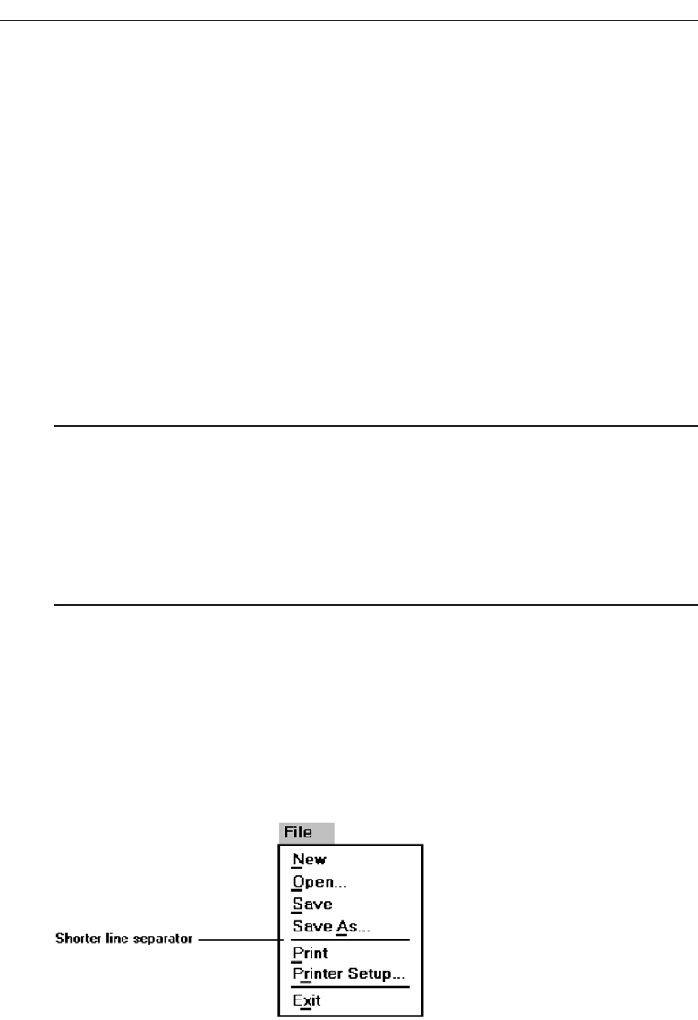
Ordering. Groupings of menu items may be ordered following the guidelines de-
scribed in “Ordering” above. Ordering alternatives include alphabetic, sequence
of use, frequency of use, importance, and semantic similarity.
Arbitrary visual groupings. Uncategorized menus should be broken in arbitrary vi-
sual groupings through the use of space or lines. Groups should be as equal in
size as possible and consist of about four or five options. Groupings should never
exceed more than seven options.
Separation. Perceptually separate groupings by a leaving a wider spacing between
groupings, or by inscribing line separators between groupings. Guidelines for
displaying line separators follow.
Critical choices. Choices that are critical or frequently chosen should be accessible as
quickly and through as few steps as possible. Place them on the highest-level menu,
whenever possible.
Line Separators
■
Separate vertically arrayed groupings with subtle solid lines.
■
Separate vertically arrayed subgroupings with subtle dotted or dashed lines.
■
For subgroupings within a category:
— Left-justify the lines under the first letter of the columnized choice descriptions.
— Right-justify the lines under the last character of the longest choice description.
■
For independent groupings:
— Extend the line to the left and right menu borders.
Inscribing subtle solid or dashed lines between groupings can reinforce groupings
and subgroupings of vertically arrayed related choices. For breaking subgroupings
within one category, the line or lines should only extend from the first character of the
descriptions to the end of the longest description, as shown in Figure 4.6. Many graph-
ical platforms always extend the line from menu border to border, as illustrated in
266 Step 4
Figure 4.6 Partial line separators.
3900 P-04 (step 4) 4/24/02 1:55 PM Page 266
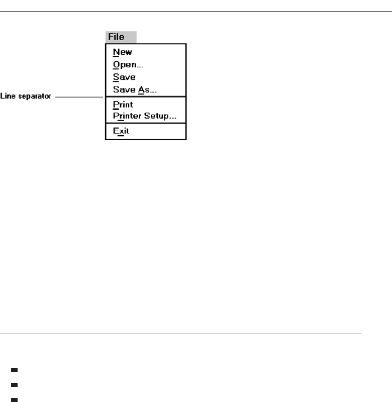
Figure 4.7. This extended line results in too strong a visual separation between what
are related menu parts. Visual separation should exist, but it should not be too over-
powering.
For independent groups of choices, extend the horizontal line from menu border to
border. This will indicate to the user that the groupings are independent of one an-
other. In summary, use a partial line for separating related choices; use an extended
line for separating unrelated or independent choices.
Phrasing the Menu
A menu must communicate to the user information about:
The nature and purpose of the menu itself.
The nature and purpose of each presented choice.
How the proper choice or choices may be selected.
Writing the content of menu components, the menu’s title, the choice descriptions,
and instructions, is often made difficult because of the varying experience levels of the
menu users. At one extreme, there is the desire to explain, on the screen, everything in
great detail. On the other hand, brevity is also important because of screen space con-
straints and limits on what people want to read. These conflicting goals often cause a
trade-off between thoroughness and brevity. Also important in hierarchical menu sys-
tems is the role menus play in enabling a person to maintain a sense of place, or “Where
am I now?” Also very important is a menu’s ability to enable the user to accurately pre-
dict where a choice will lead, or what it will cause to happen, preventing user tedium
and frustration. So, the menu content must be informative, but not intrusive. And it
must balance the needs of all its expected users.
Following are guidelines for creating menu titles, choice descriptions, Web naviga-
tion links, and menu instructions. The standard graphical system conventions in-
scribed on menus, intent indicators, keyboard equivalents, and keyboard accelerators,
are also described.
Develop System Menus and Navigation Schemes 267
Figure 4.7 Extended line separators.
3900 P-04 (step 4) 4/24/02 1:55 PM Page 267

Menu Titles
■
Main menu:
— Create a short, simple, clear, and distinctive title, describing the purpose of the
entire series of choices.
■
Submenus:
— Submenu titles must be worded exactly the same as the menu choice previously
selected to display them.
■
General:
— Locate the title at the top of the listing of choices.
— Spell out the title fully using either an:
• Uppercase font.
• Mixed-case font in the headline style.
— Superfluous titles may be omitted.
A meaningful menu title aids in defining the context of the menu and increases
menu comprehension. An experimental study has demonstrated the value of titles to
comprehension. Study participants were presented the detailed steps to perform a
function. A descriptive title for the steps was (A) not included, (B) presented at the start
of the steps, and (C) presented at the end of the steps. Participants given a title at the
start of the steps (B), reported higher comprehension and recalled twice as many items
as those who were not given a title (A), or who were presented the title at the end (C).
The title established the context of the task, and knowing this context greatly aided
comprehension.
Main menu. The menu title should immediately orient the viewer to the menu’s
content and purpose. It should be a short, clear, distinctive, and descriptive title,
representing the entire series of choices. It’s an important contextual and naviga-
tion component. A title such as MAIN MENU OPTIONS provides no information
except that the user is probably at the top of a hierarchical menu tree.
Submenus. Submenu titles must be worded exactly the same way as the menu choice
previously selected to display them. This will provide structural continuity and as-
sure users that they are progressing as expected through a menu hierarchy.
General. Locate the title at the top of a listing of choices, in the title bar if one is avail-
able. Display the title in uppercase or in a mixed-case font using the headline style
of presentation. When using the headline style, capitalize the first letter of each
significant title word. The case style chosen should be consistently used on all
menus. Superfluous titles, titles that add nothing to the understanding of menu
content and context, may be omitted. A pop-up menu requested during a text-
editing task, for example, is displayed within the context of the task being per-
formed. The presented choice descriptions by themselves (Copy, Font, and so on)
provide the necessary context. Message windows do not need a title either; the
text of the message provides the context.
268 Step 4
3900 P-04 (step 4) 4/24/02 1:55 PM Page 268

Menu Choice Descriptions
■
Create meaningful choice descriptions that are familiar, fully spelled out, concise,
and distinctive.
■
Descriptions may be single words, compound words, or multiple words or phrases.
— Exception: Menu bar items should be a single word (if possible).
■
Place the keyword first, usually a verb.
■
Use the headline style, capitalizing the first letter of each significant word in the
choice description.
■
Use task-oriented not data-oriented wording.
■
Use parallel construction.
■
A menu choice must never have the same wording as its menu title.
■
Identical choices on different menus should be worded identically.
■
Choices should not be numbered.
— Exception: If the listing is numeric in nature, graphic, or a list of varying items, it
may be numbered.
■
If menu options will be used in conjunction with a command language, the
capitalization and syntax of the choices should be consistent with the command
language.
■
Word choices as commands to the computer.
Meaningful. Menu item descriptions should be composed of familiar and fully
spelled out words. While abbreviations may occasionally be necessary, they
should be kept to a minimum. If you are using an abbreviation, only use those
that are standard or well known. Descriptions should also be concise, containing
as few words as possible, and distinctive, constructed of words that make each
choice clearly different from all others. Repeated use of the same word or words
in multiple choice descriptions hinders distinctiveness and signals the necessity
for creating a grouping whose title is based upon the repeated word.
Use high-imagery keywords, words that elicit a mental image of the object or
action. Avoid low-imagery words that have more general connotations. For ex-
ample, when obtaining a printout of a screen, the term “print” is much more de-
scriptive than “list.”
In creating menu item descriptions, never assume that the description chosen
by the designer will have the same meaning to the user. A study has found that the
probability of two people choosing the same name or description for something
ranged from 8 to 18 percent. Names chosen by experts were no better than those
chosen by nonexperts. Therefore, iteratively test and refine the choices to achieve
as much agreement in meaning by users as possible.
Develop System Menus and Navigation Schemes 269
3900 P-04 (step 4) 4/24/02 1:55 PM Page 269

Size. Item descriptions may be single words, compound words, multiple words, or
phrases. Menu bar items should be a single word, if possible. If a menu bar item
must be a multiple word, visually tie the two words together by incorporating a
hyphen between them. Web page content links will typically be phrases. Link
writing guidelines will be thoroughly described in Step 8.
Keyword first. Arrange multi-item descriptions so that the descriptive and unique
words appear at its beginning. This optimizes scanning and recognition while the
user is learning the menu. Description phrasing and wording should also be con-
sistent across all menus to aid learning further.
Capitalization. Use the headline style of presentation. Capitalize the first letter of
each significant choice description word.
Task-oriented wording. Task-oriented wording is preferable to data-oriented word-
ing. Task-oriented wording usually positions a verb first, such as Manage Cus-
tomer Information. An example of data-oriented wording would be to simply say
Customers. What is being done with, for, or to customers is unclear in the latter.
Parallel construction. When choices are composed of phrases, use a parallel word
construction in creating descriptions for related choices. Parallel construction
would be: Print a File, Execute a Program, and Eject a Disk. An example of non-
parallel construction is: Print;Execute a Program, and Disk Eject.
Relationship to title. A menu choice must never have the same wording as the title
of the menu on which it is presented.
Consistency across menus. Identical choices on different menus should be worded
the same.
Numbering. Items should not be numbered unless the listing is numeric in nature,
graphic, or a list of varying items.
Command language. If menu options will be used in conjunction with a command
language, the capitalization and syntax of the captions should be consistent with
those of the command language.
Word as a command to computer. Phrase all menu choices as commands to the
computer whenever possible. For example, say:
Choose one:
Save and exit
Exit without saving
rather than:
Do you want to save and exit?
Yes
No
Wording a choice as a command to the computer more clearly describes the action
of what the command accomplishes. The Yes/No alternatives shown above must be
comprehended in conjunction with the question being asked. Wording a choice as a
270 Step 4
3900 P-04 (step 4) 4/24/02 1:55 PM Page 270

command also provides choice phrasing that is consistent with other system com-
mands. A system, for example, often contains the standard commands Save and Exit.
In addition, command wording enhances the learning of command mnemonics. Fi-
nally, this wording implies that the initiative is with the user in the dialog, not with the
computer.
Menu Instructions
■
For novice or inexperienced users, provide menu completion instructions.
— Place the instructions in a position just preceding the part, or parts, of the menu
to which they apply.
• Left-justify the instruction and indent the related menu choice descriptions a
minimum of three spaces to the right.
• Leave a space line, if possible, between the instructions and the related menu
choice descriptions.
— Present instructions in a mixed-case font in sentence style.
■
For expert users, make these instructions easy to ignore by:
— Presenting them in a consistent location.
— Displaying them in a unique type style and/or color.
People not familiar with a system and its menus may need guidance on how to com-
plete a menu. Their needs may, however, have to be balanced against the needs of ex-
perienced users who may not want or desire such assistance. To satisfy the needs of all
kinds of users at the same time necessitates that menu instructions be included on a
menu, but that these instructions be easily ignored by those who do not need them.
Novice or inexperienced users. Provide explicit menu completion instructions for
novice or inexperienced menu users. Place the instructions in a position just pre-
ceding the part, or parts, of the menu to which they apply. Left-justify the in-
struction and indent the related menu choice descriptions a minimum of three
spaces to the right. Leave a space line, if possible, between the instructions and the
choice descriptions. Present the instructions in a mixed-case, sentence-style font.
Expert users. When instructions are included on menus, they must be visually rec-
ognized as instructions. This will allow them to be easily ignored by the expert
user when they are not needed, or no longer needed. Therefore, some visual as-
pect of the instruction must indicate that it is an instruction. As mentioned in Step
3 “Understand the Principles of Good Screen Design,” designers of paper forms
do this by presenting instructions in a different font or font style such as italics.
The form user then immediately recognizes them as instructions, and they can be
read or ignored as is desired.
To make instructions immediately recognizable as instructions on a menu, then,
present them in a unique font or color. If one of these methods is used, however, cau-
tions concerning the excessive use of different font styles (and colors, as will be shown
in Step 12 “Choose the Proper Colors”) must be heeded. Another, but less visually
Develop System Menus and Navigation Schemes 271
3900 P-04 (step 4) 4/24/02 1:55 PM Page 271
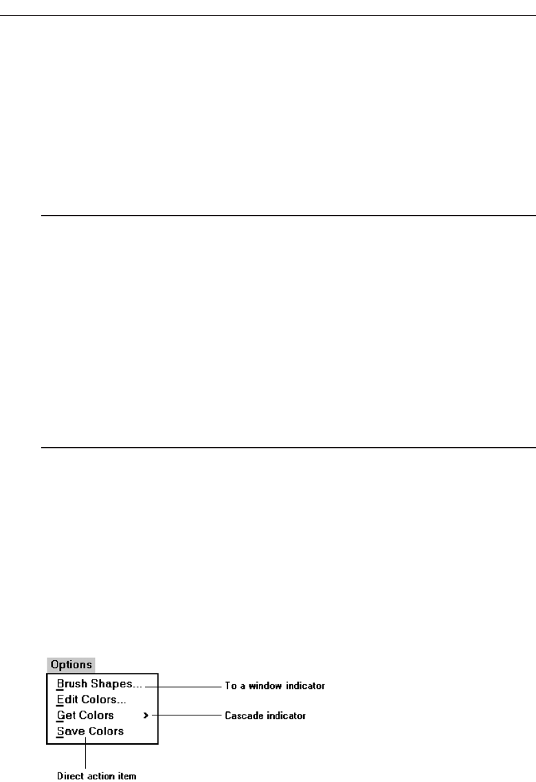
strong, technique is to identify the technique simply by its location. Begin the instruc-
tion to the left of the screen elements to which it applies, the left-justification identify-
ing it as an instruction.
Try to leave a space line between the instruction and the elements to which it relates,
whenever possible. Screen space constraints may not always permit a space line, how-
ever. Guidelines for writing text, including instructions, will be found in Step 8 “Writ-
ing Clear Text and Messages.”
Intent Indicators
■
Cascade indicator:
— To indicate that selection of an item will lead to a submenu, place a triangle or
right-pointing solid arrow following the choice.
— A cascade indicator must designate every cascaded menu.
■
To a window indicator:
— For choices that result in displaying a window to collect more information, place
an ellipsis (. . .) immediately following the choice.
• Exceptions—do not use when an action:
– Causes a warning window to be displayed.
– May or may not lead to a window.
■
Direct action items:
— For choices that directly perform an action, no special indicator should be placed
on the menu.
Providing an indication of what will happen when a menu item is selected can en-
hance predictability and exploration of a graphical system. If a choice leads to another
lower-level menu, include a cascade indicator, a right-pointing arrow, following the item
description. If a choice leads to a window, include an ellipsis following the item de-
scription. Items causing a direct action will have no indicator. These intent indicators
are illustrated in Figure 4.8.
IBM’s SAA CUA designates choices leading to submenus or windows as routing
choices, and items causing direct actions as action choices. A Microsoft Windows intent
indicator simply implies that additional information is needed. This additional infor-
272 Step 4
Figure 4.8 Intent indicators.
3900 P-04 (step 4) 4/24/02 1:55 PM Page 272
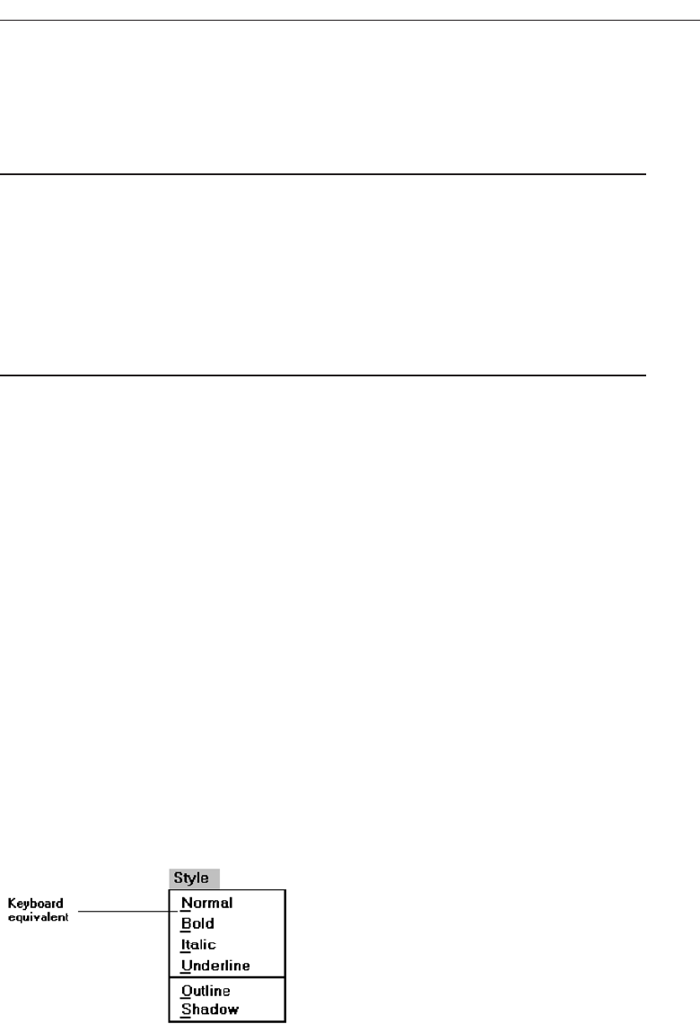
mation request is usually presented in a window, but it need not necessarily be re-
stricted to a window.
Keyboard Equivalents
■
To facilitate keyboard selection of a menu choice, each menu item should be as-
signed a keyboard equivalent mnemonic.
■
The mnemonic should be the first character of the menu item’s description.
— If duplication exists in first characters, use another character in the duplicated
item’s description.
— Preferably choose the first succeeding consonant.
■
Designate the mnemonic character by underlining it.
■
Use industry-standard keyboard access equivalents when they exist.
Keyboard selection. The ability to select a menu alternative through the keyboard
should always be provided. This is accomplished by providing a keyboard equiv-
alent for each menu alternative.
Mnemonics. Keyboard equivalents that have meaningful associations with their
corresponding choices will be more easily learned and remembered. Studies have
found that simple truncation is a good method for creating mnemonics. There-
fore, the first letter of the item description is the recommended mnemonic. Un-
fortunately, in following this method, duplications easily occur, so an alternative
principle must also be provided. A simple scheme is to use the second consonant
for duplicate items. This duplication-breaking scheme need not always be faith-
fully followed, however. Occasionally another letter in the menu item may be
more meaningful to the user. In these cases, it should be selected.
Designation. Mnemonic codes can be visually indicated in a number of ways. The
recommended method is an underline beneath the proper character within the
choice. Other methods—a different character color, different character intensity,
or a contrasting color bar through the relevant character—are visually more com-
plex and should be avoided. Underlined keyboard equivalents are illustrated in
Figure 4.9.
Develop System Menus and Navigation Schemes 273
Figure 4.9 Keyboard equivalents.
3900 P-04 (step 4) 4/24/02 1:55 PM Page 273
Industry standards. Standard industry keyboard equivalents have been established
for many common system menu choices. Where these standard equivalents have
been established, they should be followed. Microsoft Windows calls keyboard
equivalents access keys. Standard keyboard equivalents are shown in Table 4.1.
Keyboard Accelerators
■
For frequently used items, provide a keyboard accelerator to facilitate keyboard se-
lection.
■
The accelerator may be one function key or a combination of keys.
— Function key shortcuts are easier to learn than modifier plus letter shortcuts.
■
Pressing no more than two keys simultaneously is preferred.
— Do not exceed three simultaneous keystrokes.
■
Use a plus (+) sign to indicate that two or more keys must be pressed at the same
time.
■
Accelerators should have some associative value to the item.
■
Identify the keys by their actual key top engraving.
■
If keyboard terminology differences exist, use:
— The most common keyboard terminology.
— Terminology contained on the newest PCs.
274 Step 4
Table 4.1 Standard Keyboard Equivalents
About Help Print Send To
Apply Help Topics Print Preview Show
Back Insert Properties Size
Browse Maximize Redo Split
Close Minimize Repeat Stop
Copy Move Restore Undo
Cut New Resume View
Delete Next Retry Yes
Edit NoRerun
Exit Open Save
File Paste Save As
Find Page Setup Select All
A great deal of commonality exists among these equivalents since they represent a wide variety of
functions, many of which will rarely appear together on a single menu. If two actions with the same
equivalents will be used within the same menu, one equivalent will have to be modified to make it
unique.
3900 P-04 (step 4) 4/24/02 1:55 PM Page 274
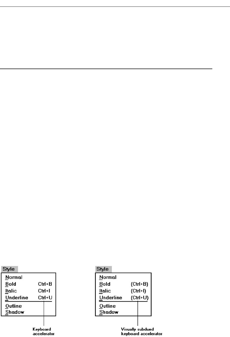
■
Separate the accelerator from the item description by three spaces.
■
Right-align the key descriptions.
■
Do not use accelerators for:
— Menu items that have cascaded menus.
— Pop-up menus.
■
Use industry-standard keyboard accelerators when they exist.
Accelerators are keys, or combinations of keys, that invoke an action regardless of cursor
or pointer position. They are most commonly used to activate a menu item without open-
ing the menu. They are most useful for frequent activities performed by experienced users.
IBM’s SAA CUA and Microsoft Windows calls these keys shortcut keys. They may also be
called hot keys. Many products have, within their guidelines, standard accelerator key rec-
ommendations as well as rules for creating new accelerator keys.
For frequently used items, assign a key, or combination of keys, to accomplish an ac-
tion. Function key shortcuts are usually easier to learn than modifier plus letter short-
cuts. Pressing no more than two keys simultaneously is preferred; three keystrokes is
the maximum. Use a plus (+) sign to indicate on the screen menu that two or more keys
must be pressed at the same time.
Accelerators should have some associative value to the item and be identified by
their actual key-top engraving. In situations where multiple kinds of keyboards exist,
and there are keyboard terminology differences, use the term most commonly found
on the keyboards or use the term contained on the newest PC, if evolution to the new
PCs is expected.
Display the accelerator right-aligned and enclosed in parentheses to the right of the
choice. Incorporating these key names within parentheses indicates that they are
prompts (which they actually are) and that they may easily be ignored when not being
used. Most graphic systems do not place them within parentheses, giving them much
too strong a visual emphasis. See Figure 4.10.
Do not use accelerators for menu items that lead to cascaded menus. Also, do not
use accelerators on pop-up menus, because they are mouse driven. Use standard
keyboard accelerators when they exist. Standard industry accelerators are shown in
Table 4.2.
Develop System Menus and Navigation Schemes 275
Figure 4.10 Keyboard accelerators.
3900 P-04 (step 4) 4/24/02 1:56 PM Page 275

Selecting Menu Choices
Menu items can be selected by pointing at the choice with a mechanical pointer, by
pointing at the choice through the keyboard, or by keying a value designating the
choice.
Initial Cursor Positioning
■
If one option has a significantly higher probability of selection, position the cursor
at that option.
■
If repeating the previously selected option has the highest probability of occurrence,
position the cursor at this option.
■
If no option has a significantly higher probability of selection, position the cursor at
the first option.
When a menu is first displayed, position the cursor at the option most likely to be
chosen, or at the first option in the list if no option has a significantly higher probabil-
ity of selection. If repeating the previously selected option has the highest probability
of occurrence, position the cursor at this option.
276 Step 4
Table 4.2 Standard Keyboard Accelerators
THIS ACCELERATOR: DESIGNATES THIS ACTION:
Ctrl+C Copy
Ctrl+N New
Ctrl+0 Open
Ctrl+P Print
Ctrl+S Save
Ctrl+V Paste
Ctrl+X Cut
Ctrl+Z Undo
F1 Display contextual help window
Shift+F1 Activate context-sensitive help
Shift+F10 Display pop-up menu
Spacebar Select (single mouse click)
Esc Cancel
Alt Activate a menu bar
3900 P-04 (step 4) 4/24/02 1:56 PM Page 276

Choice Selection
■
Pointers:
— Select the choice by directly pointing at it with a mechanical device such as a
mouse or trackball pointer, or light pen, or pointing with one’s finger.
— Visually indicate:
• Which options can be selected.
• When the option is directly under the pointer and can be selected.
— Visually distinguish single- and multiple-choice menu alternatives.
— If pointing with a mechanical device is the selection method used:
• The selectable target area should be at least twice the size of the active area of
the pointing device or displayed pointer. In no case should it be less than 6 mil-
limeters square.
• Adequate separation must be provided between adjacent target areas.
— If finger pointing is the selection method used:
• The touch area must be a minimum of 20 to 30 millimeters square.
• The touch area must encompass the entire caption plus one character around it.
■
Keyboard:
— If moving the cursor to a menu choice:
• The up and down arrow keys should move the cursor up or down vertically
oriented menu options.
• The left and right cursor keys should move the cursor left or right between hor-
izontally oriented menu options.
— If keying a choice identifier value within an entry field:
• Locate the entry field at the bottom of the last choice in the array of choices.
• Uppercase, lowercase, and mixed -case typed entries should all be acceptable.
■
Selection/execution:
— Provide separate actions for selecting and executing menu options.
— Indicate the selected choice through either:
• Highlighting it with a distinctive display technique.
• Modifying the shape of the cursor.
— Permit unselecting choice before execution.
• If a menu is multiple choice, permit all options to be selected before execution.
■
Combining techniques:
— Permit alternative selection techniques, to provide flexibility.
Pointers. Items can be selected by being pointed at using a mechanical device such
as a mouse, trackball, or light pen, or through touch pointing using one’s finger
(for touch-sensitive screens). Pressing a key, such as Transmit or Enter, or a mouse
button, signals the choice to the computer. Always visually indicate in a distinc-
tive manner which options are selectable and when the option is under the
pointer and can be selected. Visually distinguish single- and multiple-choice ar-
rays of menu choices.
An adequate pointing target area should be provided. This area should be at
least twice the size of the active area of the displayed pointer of the pointing de-
vice. In no case should it be less than 6 millimeters square. To avoid unintended
Develop System Menus and Navigation Schemes 277
3900 P-04 (step 4) 4/24/02 1:56 PM Page 277

activation of the wrong option, provide adequate separation between selectable
areas. Highlighting of the area when selected will also provide indication of an in-
correct choice.
If finger pointing is the selection method used, an even larger touch area must
be provided, a minimum of 20 to 30 millimeters. Single-character positions on a
screen make poor targets for most fingers. Also, keep in mind that using a finger
to signify a choice can be taxing on arm muscles, so this approach should only be
used in casual or infrequent use situations.
Keyboard. If the user is moving the screen cursor to a menu choice, the up and
down arrow keys should move the cursor up and down a vertical column of
menu options. The left and right arrow keys should move the cursor left and right
across a horizontal array of options. If the user is keying a choice identifier value
within an entry field, locate the entry field at the bottom of the last choice in the
array of choices. If the user is keying a mnemonic value, the entry should be ac-
ceptable in any case (upper, lower, and mixed).
Selection/execution. Provide separate actions for selecting and executing menu op-
tions. For example, require typing the mnemonic to select, and then a press of the
Enter or Return key to execute. Or, with a mouse, require moving the pointer to
the option to select, and then clicking to execute. Always permit erroneous selec-
tions to be unselected and, in a multiple-choice menu, permit all options to be se-
lected before execution.
The item selected should be highlighted in some way through a distinctive
display technique such as bolding or changing its color. An alternative is to
change the shape of the pointer itself. These methods provide direct visual feed-
back that the proper choice has been selected, reducing the probability of errors in
choice selection.
Combining techniques. Permit alternative selection techniques to provide flexibil-
ity. If a pointing method is used, also provide a keyboard alternative to accom-
plish the same task. Pointing will probably be easier for the novice, but many
experts prefer the keyboard alternative.
Defaults
■
Provide a default whenever possible.
■
Display as bold text.
Defaults aid system learning and enhance efficiency. Provide as many as possible.
Indicate a default by displaying it in a bold text.
Unavailable Choices
■
Unavailable choices should be dimmed or “grayed out.”
■
Do not add or remove items from a menu unless the user takes explicit action to add
or remove them through the application.
278 Step 4
3900 P-04 (step 4) 4/24/02 1:56 PM Page 278
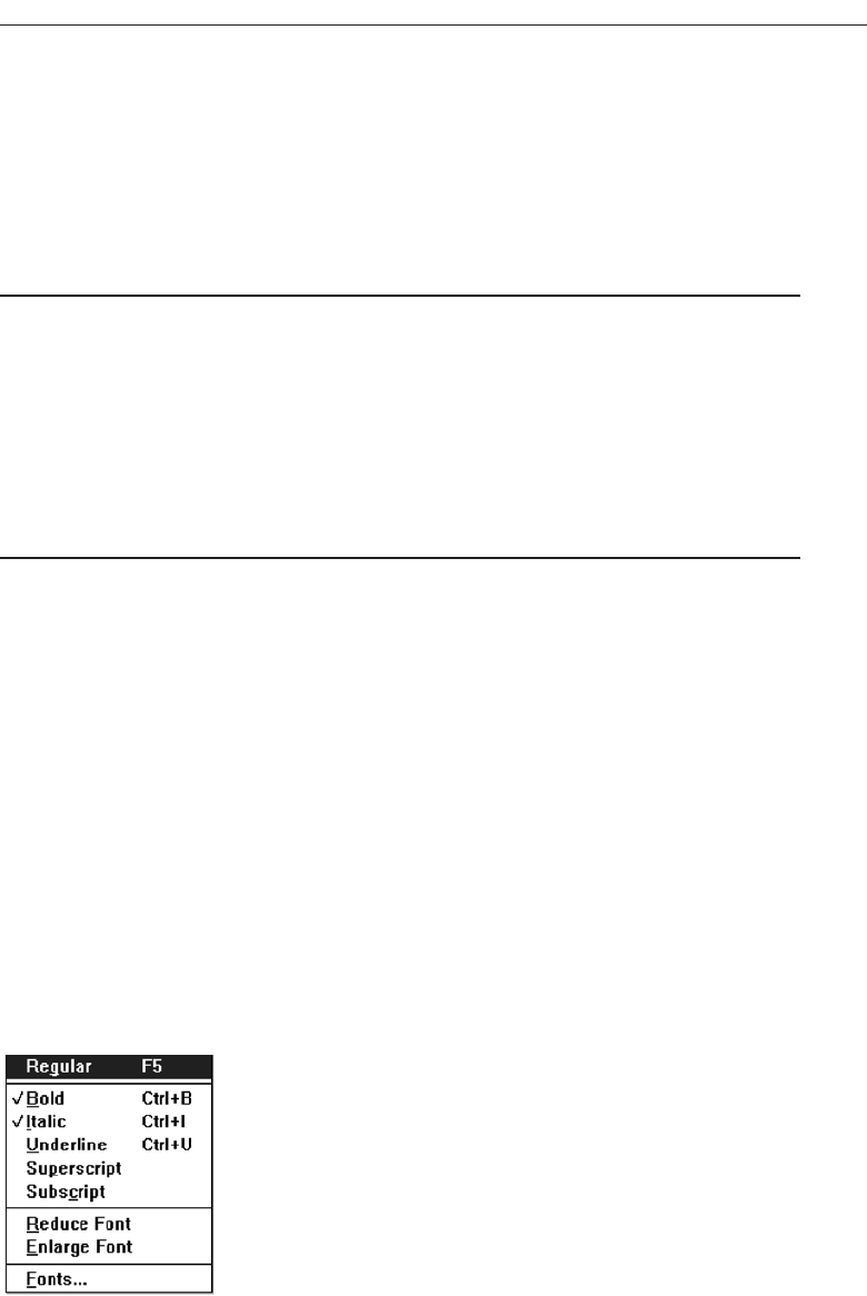
Choices not available to the user should be made visually distinctive by dimming
them or graying them out. They must not compete with active items for the user’s at-
tention. Items should not be added or removed from a menu unless the user takes ex-
plicit action to do so. Allowing the system to change menu items takes control away
from the user and can also lead to user confusion.
Mark Toggles or Settings
■
Purpose:
— Use to designate that an item or feature is active or inactive over a relatively long
period of time.
— Use to provide a reminder that an item or feature is active or inactive.
■
Guidelines:
— Position the indicator directly to the left of the option.
— For situations where several nonexclusive choices may be selected, consider in-
cluding one alternative that deselects all the items and reverts the state to the
“normal” condition.
Purpose. Mark toggles or settings, illustrated in Figure 4.11, are menu items that tog-
gle between active and not active. When it is active, an indicator is displayed ad-
jacent to the item description. For nonexclusive choices, a check mark is
displayed; for mutually exclusive choices, another distinctive symbol, such as a
diamond or circle, is displayed. When the item is not active, no mark or symbol
will appear.
Examples of items using mark toggles are: having a specific application automatically
loaded after the system is loaded, having windows automatically reduced to icons when
they are made inactive, or making a setting without requiring a dialog box. The purpose
of mark toggles is to activate or deactivate an attribute by setting one menu item.
Advantages/disadvantages. Mark toggles provide a visual indication of the state of
an item. They are accessed quickly but may not always be visible. Mark toggles
are best suited to items or features that remain active or inactive over relatively
long periods of time. They provide good reminders of the state that exists.
Develop System Menus and Navigation Schemes 279
Figure 4.11 Mark toggles.
3900 P-04 (step 4) 4/24/02 1:56 PM Page 279
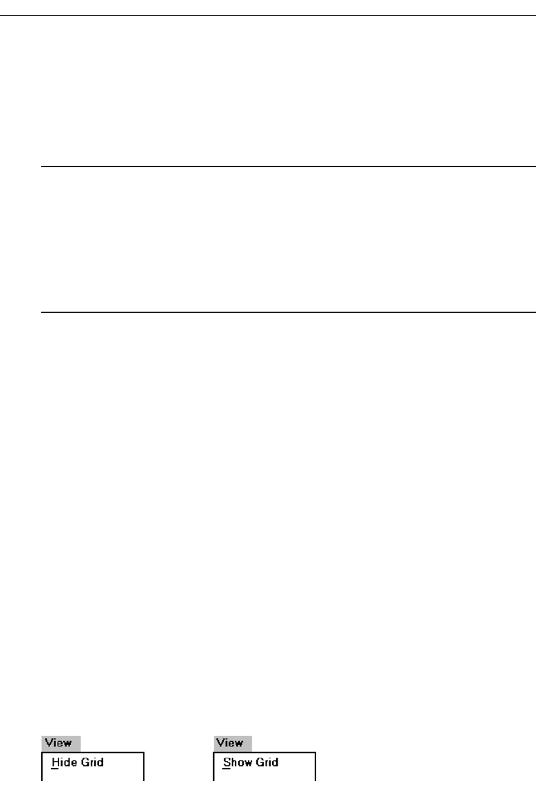
Guidelines. Position the mark toggle indicator directly to the left of the menu op-
tion. In situations where several nonexclusive choices may be selected on one
menu, consider including one alternative that deselects all the items and reverts
the state to the normal condition, as illustrated by “Regular” in Figure 4.11.
Toggled Menu Items
■
Purpose:
— Use to designate two opposite commands that are accessed frequently.
— Use when the menu item displayed will clearly indicate that the opposite condi-
tion currently exists.
■
Guidelines:
— Provide a meaningful, fully spelled-out description of the action.
— Begin with a verb that unambiguously represents the outcome of the command.
— Use mixed-case letters, with the first letter of each word capitalized.
Purpose. A toggled menu item is a one menu item command that toggles back and
forth between the current state and its alternative state. When the menu item is
first displayed, it reflects the alternative state to the condition that currently exists.
For example, in Figure 4.12, if a background grid is currently being displayed, the
menu item reads Hide Grid. When Hide Grid is selected, the grid is removed from
the window, and the menu item dynamically changes to reflect the opposite ac-
tion. It will now read Show Grid. When a grid is again requested, it will change
back to Hide Grid. The purpose of toggled menu item is to use a single menu item
to designate and activate the one, opposite, alternative of a two-state command
setting.
Advantages/disadvantages. Toggled menu items shorten menus, decrease visual
clutter, provide quicker access, and foster faster comprehension of the command
action. When they are located on a pull-down menu, however, the actions them-
selves are not always visible. The opposite action reflecting the current state of the
attribute, since it too is not visible, can cause uncertainty for novice users con-
cerning what the state actually is. Toggled menu items are also limited in use to
commands only.
Guidelines. Use toggled menu items to designate two opposite commands that are
accessed frequently. The menu item displayed must be one that clearly indicates
that the opposite condition currently exists. The menu captions should clearly
state what would happen if the menu item action were requested. It is most mean-
ingful to begin the command with a verb.
280 Step 4
Figure 4.12 Toggled menu item.
3900 P-04 (step 4) 4/24/02 1:56 PM Page 280

Navigating Menus
Navigation, and an efficient navigational structure, is the most important element in
system usability. A simple and clear navigational structure is the backbone upon which
all system features are draped. In Web site design, the most successful sites have been
found to be those with easy to use and understand navigational systems. No amount
of graphical “sparkle” has yet been able to overcome a poor navigational design. A sys-
tem’s organizational structure and its navigational tools, including elements such as
menus, links, toolbars, and command buttons influence the system’s navigational ease
of use. So, of course, does the size of the system, as well as the navigational aids avail-
able, including site maps and indexes. In Web site navigation design, the unique, often
incompatible, relationship the browser has to the Web site application being presented
can also strain navigation ease.
Web Site Navigation Problems
To fully understand what comprises good navigation, let’s first look at some Web site
navigational issues and problems, both technical and usage-related. The Web and its
navigation is undoubtedly the most complex interface facing people today.
Technical issues. Unlike a graphical system application, whose screens tend to flow
in an orderly and predictable manner, a Web application is composed of pages,
each of which can, theoretically, be linked to any other page in the application.
The graphical application user normally begins a process at a prescribed starting
point and proceeds sequentially until a process or task is finished. Web users can
perform tasks or satisfy needs at will, easily moving between most screens in the
application “spider web” in any order desired, and even jumping to other spider
webs when the urge arises. In an analogy to driving a car, the graphical system
user is essentially following a freeway in Nevada. The Web user is wandering
around in downtown Boston without a road map and, encountering a road link (a
bridge over the Charles River), suddenly finds himself in Cambridge.
The graphical system user must deal with only one operating system whose
navigational characteristics are standard and fairly consistent. The Web user must
confront two navigational systems, that of the browser being used and that of the
Web site being viewed. A click of the browser Back button, for example, simply
redisplays the page that was previously displayed on the screen. This page may
have been in another Web site, and the user is transported there. Neither Web site
application is aware of this change. Nothing that might have been done on the
page “moved back from” is changed. To move around within a Web site requires
links within the Web site, either in the form of textual links or command buttons.
The data must always be thought of as separate from the controls used to display
it, not as being seamless, as occurs in graphical systems. Web users, especially
novices, often do not recognize where the browser ends and the Web site appli-
cation begins.
Another problem: Because of the rapidly evolving and expanding nature of
the Web, Web sites also have a tendency to grow and grow. As more and more is
Develop System Menus and Navigation Schemes 281
3900 P-04 (step 4) 4/24/02 1:56 PM Page 281

added, what may have been initially a reasonable structure and menu scheme
slowly dissolves into a confusing mass of listings and linked pages. The result is
unrelated information that is presented in no particular order.
Usage problems. The two most serious user problems in Web navigation are the
heavy mental loads imposed to use the Web and the feeling of spatial disorienta-
tion that often occurs. This problem may also occur in hierarchically structured
graphical systems. The cognitive or mental overhead the user must expend in mak-
ing decisions concerning which links to follow, or to abandon, can be over-
whelming. Often, there are too many links presented on a page, many of whose
meanings are not clear. Links frequently offer few clues to where they lead, how
much information will be found at the other end, and how this information relates
to the currently displayed page. For the user to reach a goal, each link’s relevance
to the task at hand must be determined. Another problem is that not all links on
a page are always obvious. This often leads to much trial-and-error behavior; the
user aimlessly clicking to see what happens.
Feelings of disorientation are easily experienced when one becomes “lost in Web
space.” Studies have shown that most people do not seem to become familiar with
the layout of sites or develop useful mental models of their structure (Spool, Scan-
lon, Schroeder, Snyder, and DeAngelo, 1997). Many people also don’t understand
where they are in a Web site’s information structure (Nielsen, 2000). A scrolling
page can lead to loss of local context when the basic navigational elements, such as
links to other local pages in the Web site disappear. There are then no familiar
landmarks to then navigate by. Long chains of links to reach relevant material can
be tedious and also lead to loss of context, and a “Where Am I?” reaction.
A recent research paper found that 39 percent of users of shopping sites failed
in their buying attempts because the sites were too difficult to navigate. If people
get buried in information, or lost on a side trip with no signposts or landmarks in
sight, the most frequently implemented solution to the problem is to abandon the
entire process.
Navigation Goals
A well-designed navigation system facilitates quick and easy navigation between com-
ponents whose structure and relationship are easily comprehendible. For the user, an-
swers to the following questions must be obvious at all times during an interaction:
Where am I now?
Where did I come from?
Where can I go from here?
How can I get there quickly?
Sometimes referred to as “wayfinding,” a good navigational scheme, and the proper
navigational tools, will minimize, if not eliminate, the problems associated with cogni-
tive or mental overload and feelings of disorientation. General system navigation
guidelines include the following.
282 Step 4
3900 P-04 (step 4) 4/24/02 1:56 PM Page 282

Control
■
For multilevel menus, provide one simple action to:
— Return to the next higher-level menu.
— Return to the main menu.
■
Provide multiple pathways through a menu hierarchy whenever possible.
Navigation through menu levels should be accomplished through simple actions. It
should always be very easy to return to the next higher-level menu and the main, gen-
eral, or top menu. Provide multiple pathways, whenever possible, through a hierar-
chical menu structure.
Menu Navigation Aids
■
To aid menu navigation and learning, provide an easily accessible:
— Menu map or overview of the menu hierarchy.
— A “look ahead” at the next level of choices, alternatives that will be presented
when a currently viewed choice is selected.
— Navigation history.
Menu maps. As has been discussed, as one wanders deeper into a multilevel menu
system, it is increasingly difficult to maintain a sense of position or orientation The
result is that getting lost in the menu maze is quite easy to do. The value of a menu
map in reducing disorientation has been demonstrated in some studies. In these
studies, providing a graphic representation of the menu structure in map form, ei-
ther in hard copy or online, resulted in fewer errors or wrong choices, faster navi-
gation, and greater user satisfaction when compared to providing no guides or
simply providing indexes or narrative descriptions of the menu structure. So,
menu maps or graphic representations of the menu structure are desirable and
should be included on top-level menu screens. They should also be included in the
system documentation where available, and through Help function.
Look-aheads. Menu navigation and learning will be assisted if a person is able to
browse the next level of choices before the currently displayed choice is selected.
As the cursor moves across a menu bar, for example, the pull-down menu may be
automatically dropped, permitting review of the choices available if that menu
bar item is selected. Such look-aheads are useful if ambiguity exists at higher-level
choice points. They have been found to decrease errors and improve satisfaction.
Menu search time may be longer, however.
Navigation history. It has been found that being able to view, on the screen, the path
one is following improves learning and performance, and reduces feelings of dis-
orientation. Provide a navigation history that summarizes the menu choices made
leading to the currently displayed menu or screen.
Develop System Menus and Navigation Schemes 283
3900 P-04 (step 4) 4/24/02 1:56 PM Page 283

Web Site Navigation
Understanding a Web site’s navigational scheme is made more difficult because Web
sites usually have much less perceived structure than typical graphical system applica-
tions. Web pages can be of any length and possess any number of links to any number
of other pages. The user can wander at will or whim through multitudes of links,
pages, and Web sites, and any meaningful structure a Web site design does possess can
easily disappear from one’s memory in the maze of directional twists and turns being
made. The potential for getting lost is extremely high, unless numerous, obvious, and
understandable landmarks are available as a guide.
The section focuses specifically on Web site navigation design. It will review typical
Web site organizational schemes; the navigational components of a site, including the
browser command buttons, links, Web site toolbars, and Web site command buttons;
and the characteristics and components of a Web site that contribute to maintaining a
“sense of place.” In designing a Web site navigation scheme there are two things to
always remember. Never assume that users know as much about a site as the site
designers do (this has been said before), and, any page can be an entry point into the
Web site.
Web Site Organization
■
Divide content into logical fragments, units, or chunks.
■
Establish a hierarchy of generality or importance.
■
Structure the relationships among content fragments, units, or chunks.
— Establish global or site-wide navigation requirements.
■
Create a well-balanced hierarchical tree.
— Restrict to two levels requiring no more than two clicks to reach deepest content,
whenever possible.
It is easier to develop a clear and comprehendible navigation scheme if the Web site
is organized and structured in a meaningful way. The design goal is a proper balance
of menus and pages that can be easily and efficiently moved between.
Logical fragments, units, or chunks. Because of limitations in short-term human
memory, smaller discrete fragments or chunks of information are often easier to
navigate than long, undifferentiated units. The concept employed in Web site de-
sign, in reaction to this human memory frailty, is called hypertext. Hypertext is a
nonlinear way of organizing information based upon the following principles:
A large body of information exists that can be organized into fragments.
The fragments relate to one another.
The user needs only a small fraction of the fragments at any one time.
In organizing a Web site, information is first divided into logical fragments,
units, or chunks. Coherent chunks that focus on a single topic is the desired goal.
284 Step 4
3900 P-04 (step 4) 4/24/02 1:56 PM Page 284

These small chunks of related information are easier to organize into the modular
groups of information that will compose the organization scheme, and form the
basis for hypertext links to be described shortly. A design-organizing aid, card
sorting, was described in Step 2 “Understanding the Business Function.”
Hierarchy of generality or importance. Having identified the information units, in-
formation is now organized in according to importance or generality, from gen-
eral to specific. A hierarchical tree is the most recommended organization scheme,
Sun Microsystems (1998) suggests that whenever possible:
State conclusions and link to supporting details.
Enumerate categories of information and link them to detailed listings.
Summarize information and link to full-length treatments.
A document organizational tree structure, (table of contents, chapters, sec-
tions, and subsections) is a good scheme, since people are very familiar with, and
have an excellent mental model of this organization. Such a structure provides in-
formation about information sequence, information quantity, and the relation-
ships existing between components. Other organizational schemes include topics
followed by subtopics, or prioritization from most to least important. The objec-
tive is to allow the user to scan the page and then select relevant and useful con-
tent for further review. Excessive fragmentation of a long, sequential story,
however, should be avoided. Reading will be impeded and printing made more
difficult.
Structure the relationships. Identify the relationships that exist between various el-
ements in the hierarchical tree. In a large Web site, two levels of navigation will
exist. The first is movement within the subject area. This navigation includes mov-
ing within a branch—up to a parent page or down to a child page. It also involves
navigating across branches to sibling pages or other sections of a site. What other
points on other tree branches it will be beneficial to go directly to then, must be es-
tablished. The second navigation type is global or site-wide. What other site fea-
tures, such as search a facility, site maps, and other major content areas should be
mentioned on each page? Do not mention all features on all pages. Restrict the
number presented to the several most useful features.
To unveil the Web site’s structure, use progressive disclosure. Heading levels,
shown in varying type sizes (as on paper), will be helpful in aiding understand-
ing of site organization.
Hierarchical tree. Web sites pages should be organized as offshoots of a single home
page. If a site has a large number of information categories, and each category
contains a lot of content, create submenus to aid navigation. The design goal: a
well-balanced hierarchical tree that facilitates quick access to all information and
also helps people understand how the site is organized. The so-called spoke de-
sign, where every page is linked to every other page, has been found to lead to
lower usability.
Hierarchical breadth has been found by many research studies to be greatly
preferable to hierarchy depth. A few menus with a larger number of choices are
better than a large number of menus each with a smaller amount of choices.
Develop System Menus and Navigation Schemes 285
3900 P-04 (step 4) 4/24/02 1:56 PM Page 285

When menu levels go to four, five, or more, the chance of users becoming lost or
disoriented is greatly increased. As studies have found (Zaphiris and Mtei, 1998;
Larson and Czerwinski, 1998), restrict, whenever possible, the hierarchical tree to
two levels requiring no more than two clicks to reach the deepest content. A two-
level structure encompasses a home page and two additional levels below it.
Components of a Web Navigation System
To move between Web site information fragments necessitates the creation of naviga-
tion links. They are contained within a framework of tools or controls, including the
browser’s command buttons, textual phrases, Web site navigation bars, and Web
site command buttons. Collectively, these are all referred to as links. Links are one of
the most discussed issues in Web site design.
A link functions as a menu choice that, when selected, results in the connected in-
formation being displayed, or results in a file being opened or downloaded. A move-
ment link may transport the user to another location within a page, to a new site page,
or to another Web site. Originally, due to the nature of technology at the time hypertext
was employed in computer systems, links consisted of textual or binary files. Utiliza-
tion of hypertext on the Web allowed links to by created using images as well as text,
so the term hypermedia was coined to reflect this expanded nature.
In addition to being the critical component in Web navigation, links give the user an
idea of what a Web site, document, or page is all about. The wording of a textual link
should enable a person to predict what lies submerged below, or what will happen if
it is activated. This lets the user determine whether a link should be followed, reading
the page continued, reading the page ended, or a retreat to an earlier point initiated.
This is a complex cost-benefit calculation that the user makes many times in a Web in-
teraction session.
Providing an extensive collection of link navigation tools will focus the user on the
Web site itself and its content, drawing attention away from the general-purpose
browser links. Making these tools consistent and predictable will help the user create
an understandable mental model of the site and its organization. To begin, several gen-
eral link guidelines are:
■
All navigation controls must:
— Make sense in the absence of site context.
— Be continually available.
— Be obvious and distinctive.
— Be consistent in appearance, function, and ordering.
— Possess a textual label or description.
— Offer multiple navigation paths.
Sensible. All navigation controls, in the absence of site context, must make sense to
the user. The user may have “lost” the context, or the page or Web site may have
been entered from almost anywhere.
286 Step 4
3900 P-04 (step 4) 4/24/02 1:56 PM Page 286

Available. All navigational controls must be easy to access. If they are not readily
available, the full advantages of hypermedia may not be achieved.
Obvious and distinctive. A navigation link or control must look like a navigation
control. Its appearance to the user must immediately suggest that it is an entity to
be clicked or otherwise selected. This is accomplished through a tool’s appearance
as well as its location. Non-obvious control choices lead to aimless and tedious
page clicking and ultimately confusion and frustration. Conversely, do not make
any other screen element look like a navigation tool if it is not one.
The obviousness of a link is called its affordance. A control with high affordance
will be quickly identified as a control. Bailey (2000) in a study compared the link
affordances of the home pages for two large Web sites. Each page contained 29
links. The link affordance rate for one site was 97 percent (participants, on the av-
erage, identified 28.2 page links). The rate for the other site was only 76 percent
(the average link identification rate being 21.9 per page). This difference was sta-
tistically significant. Because of the non-obviousness of one-quarter of the poorer
sites links, its users would have spent longer times searching for links, and would
probably not have even discovered some links.
Techniques to create the necessary affordance and distinctiveness differ de-
pending upon the kind of link. Guidelines enabling the various controls to
achieve distinctiveness are described in the following control-specific sections.
Consistent. Like all elements of the interface, navigation links, toolbars, and com-
mand buttons must be consistent in appearance and behavior.
Textual. All navigation must have a textual label or description. Navigation using
textual descriptions is much preferable to graphical-only navigation because the
purpose and function of graphic images are often unclear. They also take longer
to download. Textual links are also necessary for users who do not have graphics,
or who have chosen not to display graphics.
Provide multiple navigation paths. Offer multiple paths or ways to move around
the Web. Provide structural components such as site maps, a table of contents,
and indexes to go directly to a point of interest, provide content links to move
around nonsequentially, and provide command buttons, such as Next and Previ-
ous, to move sequentially.
Browser Command Buttons
■
Hide the split between the browser and the Web site application by including navi-
gational controls within the application.
The browser being used in interacting with the Web provides its own command but-
tons. As discussed earlier, pressing the browser Back and Forward buttons can create
confusion because they can transport a user in and out of a Web site. Novice users often
do not recognize where browser control ends and application control starts, and vice
versa. Rather then relying on the browser’s buttons, provide navigation controls within
the application for movement within the application. They can take the form of links or
command buttons such as Next and Previous.
Develop System Menus and Navigation Schemes 287
3900 P-04 (step 4) 4/24/02 1:56 PM Page 287

Web Site Navigation Bars
■
Provide a global navigation bar at the top of each page.
■
Provide a local category or topical links navigation bar on the left side of a page.
■
Place minor illustrative, parenthetical, or footnote links at the end of the page.
■
For long pages, provide a navigation bar repeating important global or local links at
the page bottom.
A Web site navigation bar is a menu, an array of textual phrases, graphical images
or icons, or command buttons, as illustrated in Figures 4.13, 4.14, and 4.15. A Web site
contains at least three levels of navigation links, global, or site-wide, links, indicating the
site’s total scope or categories of available information; local specific navigation links
within the category or topical area being displayed; and minor illustrative, parentheti-
cal, or footnote links. An evolving standard in design is to locate the global links at the
page top, the categorical links in a columnar array down the pages left side, and the
minor links at the page bottom. This structure, illustrated in Figure 4.16, separates nav-
igation from content, making it easy for users to find each.
Locating the global links at the page top makes sense if one considers the logical flow
of information through a screen. A selection from this global area eventually results in
display of a page and its content, a top-to-bottom sequential eye flow. The left-justified
category navigation area would, however, have been better positioned on the right.
Given the common cultural left-to-right reading sequence, upon completion of reading
of a page’s content the eyes will be flowing right toward the right side of the screen.
Finding the navigation links next needed would be more efficient. A right positioning
of these links would also place them next to a scroll bar, a common focus of the user’s
attention on screens being scrolled. This vertically arrayed category navigation listing,
while optimizing visual scanning of alternatives, is quite wasteful of screen space, con-
suming about 20 percent of a screen’s pixels. Its space-consuming orientation is a us-
ability trade-off, ease of scanning being enhanced at the expense of screen efficiency.
All in all, navigation consistency reduces learning and avoids user confusion, so to now
change its location would probably unleash greater problems.
For long scrolling pages, repeat important global or local links at the page bottom.
When finishing a page, the user, then, will not have to scroll upward to locate impor-
tant navigation links.
288 Step 4
Figure 4.13 Textual explicit listing navigation bars.
3900 P-04 (step 4) 4/24/02 1:56 PM Page 288
Develop System Menus and Navigation Schemes 289
Figure 4.14 Graphical or iconic navigation bars.
Figure 4.15 Command button navigation bar.
Global Links
Minor Links
Local
Links
Figure 4.16 Web navigation component locations.
3900 P-04 (step 4) 4/24/02 1:56 PM Page 289

Textual Phrases
■
Provide a mix of textual phrase links:
— In explicit menus.
— Embedded within page text.
Textual phrases are words, or short pieces of highlighted text, serving as links. Tex-
tual phrase links possess two distinct structures, explicit and embedded. An explicit
menu is a listing of textual phrase links set apart from the main page content, often in
a toolbar. These listings usually include links to various Web site topics, links to site
global features such as the site map or search facility, and perhaps links to other related
sites. These listings closely resemble typical screen menu arrays in their structure and
presentation. A typical explicit menu is shown in Figure 4.13. An embedded menu is a
link contained within the textual content of a page. Certain words or phrases are des-
ignated as links, highlighted, and when selected display the linked component for the
user. An embedded menu is illustrated in Figure 4.17. Web sites usually contain both
explicit link listings and embedded links in various mixes.
Lai and Waugh (1995) studied the effect of explicit listing hierarchical menus and
embedded menus on a search task. They compared the three menu structures, menus
composed solely of explicit listings, solely embedded menus, and mixed explicit and
embedded menus. They found that the best menu structure was determined by the
kind of search task performed. Explicit listings worked better for straightforward
search tasks, while menus containing embedded links worked best for complex and not
fully known searches. The embedded menus improved search accuracy but not search
efficiency.
Providing a mix of explicit listings and embedded menus in Web site design will
best satisfy the needs of all site users. The writing of meaningful links is described in
Step 8.
Graphical Images or Icons
Graphical images or icons may appear in an array in the form of a navigation bar, or be
individually located at relevant points in a page. Guidelines for creating and display-
ing graphics and icons are found in Step 11 “Create Meaningful Graphics, Icons, and
Images.”
Command Buttons
Command buttons may appear in an array in the form of a navigation bar, or be indi-
vidually located at relevant points in a page. Guidelines for creating and displaying
command buttons are found in Step 7 “Select the Proper Screen-Based Controls.”
290 Step 4
Figure 4.17 Embedded link menu.
3900 P-04 (step 4) 4/24/02 1:56 PM Page 290

Other Web Site Navigation Elements
In addition to Navigation bars, a number of other Web site elements are also important
components of the Web navigation system. Among these are overviews, including ex-
ecutive summaries, site maps, indexes, and tables of contents. Other elements are his-
torical trails and search engines.
Overviews
■
Provide:
— An executive summary that provides a preview of the site and contains links to
all major concepts.
— A site map illustrating the site’s hierarchical structure and the relationships of
components.
— Both global and local maps.
— An alphabetized site index.
— A table of contents.
■
Allow accessibility from any point in the Web site.
Overviews provide a top-level view of a site’s organization and content. Having an
understanding of how a site is organized, the landmarks available within it, and the
content it contains, assists the navigation process. In driving an automobile, referring
to a road map before embarking on trip usually results in reaching one’s destination
faster, easier recovery from inadvertent wrong turns, a better ability to handle any un-
expected detours that may be encountered, and a less stressful trip.
Overviews are most useful if provided in several forms. They may be needed dur-
ing a Web interaction as well as before starting into a site. A graphical system help
function, for example, may be available in tutorial form, be accessible by topics, or be
organized in alphabetic form for easy scanning. It is difficult to predict the user’s exact
need at any moment in a session.
An executive summary will provide an overview of the site in narrative form and con-
tain links to all major concepts. A site map will illustrate the site’s hierarchical structure
in either graphical or textual form. These elements provide a prospective on one’s posi-
tion in the spatial hierarchy. Maps may be made available at both a global or local level
within the site, depending upon the site’s complexity. An alphabetized site index will
permit quick access through keywords and specific topics. A table of contents, structured
as in a printed book, will permit review of major topics and the subtopics within. All of
a Web site’s overview elements should be accessible from any point within the site.
Historical Trails
■
Provide:
— Breadcrumb Trails.
• Locate at the top of the page below the navigation links.
— History Lists.
Develop System Menus and Navigation Schemes 291
3900 P-04 (step 4) 4/24/02 1:56 PM Page 291
— History Trees.
— Footprints.
— Bookmarks.
Historical navigation aids try to show the user’s position in an information space by
showing where they have come from, or where they have been. Seeing a navigation
path enables a user to better understand the context of the currently displayed page.
Displayed paths also provide a means to easily return to places of interest. A bread-
crumb trail in a hierarchical Web site structure is a sequential textual listing of pages tra-
versed from the parent page to the page currently being displayed. A trail, illustrated
in Figure 4.18, is also a series of links that permit the user to go back to any page in the
sequence with one click. At this moment no standard exists for how to separate the
page names in a trail. Symbols used include an arrow (->), a colon ( : ), a greater than
sign ( > ), and a slash ( / ). Until a standard evolves, any of the above symbols remain
acceptable. Do not use anything else, however. Position a breadcrumb trail at the top
of the page below any existing navigation links.
Ahistory list is a sequential textual listing of sites or pages visited over a specific time
period, a session, a day, or some other time period. A history tree is an overview map of
a site’s structure with pages already visited marked by an indicator such as a plus sign,
check mark, or asterisk. The markings serve as footprints, guiding the user back to pages
of interest, and/or signaling which have already been seen and may no longer be of in-
terest. A bookmark is similar to a history list except that it is designated by the user to
mark locations of continuing interest.
Search Facility
■
Provide a search facility.
Another form of navigation support is provided by a site search facility. Provide
such a facility within larger sites. Search facilities were addressed in Step 3.
Web Site Navigation Guidelines
How many links should exist on a page? How should textual links be presented to
make them obvious? What kinds of links should be included on a page? These and sim-
ilar questions are addressed next.
292 Step 4
Figure 4.18 Breadcrumb trails.
3900 P-04 (step 4) 4/24/02 1:56 PM Page 292

Scrolling
■
Do not require scrolling of navigation-only pages.
■
Minimize the need for scrolling to view all links on pages containing content.
■
Never require horizontal scrolling.
Never require scrolling of navigation-only pages. Besides being tedious, not being
able to see all links at the same time makes comparison of the alternatives for selection
purposes much more difficult. For scrollable content pages, minimize the need to scroll
to see all links. Also, ensure that all related links on a screen are seen together to facil-
itate comparison. Never require horizontal scrolling. It makes text reading difficult
and users dislike it.
Number of Links
■
Every page should contain at least one link.
■
Be conservative in the total number of links presented on a screen:
— Without logical groupings of elements, limit links to 4 to 8.
— With logical groupings of elements, limit links to 18 to 24.
■
Restrict embedded links to those most important, pertinent, and interesting.
— Place less relevant links in a listing.
One link. At a minimum, every page should contain at least one link. To follow a
path and then reach a dead end is frustrating. Also, a dead-end page, if accessed
from another Web site, provides no means for the user to navigate to other site
pages.
Conservative number. How many links presented on a page is ultimately deter-
mined by the complexity of the site and its content. Menu research indicates that
without choice groupings, links should be limited to 4 to 8, with groupings, lim-
ited to 18 to 24. Some experts in Web design recommend even fewer, a maximum
of 8 to 12 links. In general, the more links contained on a page, the more decisions
concerning which link to follow are imposed on the user. Where any link ambi-
guity exists, the odds of guessing correctly which link to follow diminish. A
smaller number of links also increases the likelihood that those being looked for
will be noticed. It is not necessary to mention all features of a site on all pages. To
reduce the number of links, restrict those presented to the most important site
content or useful features.
Embedded links. The trade-off that must be addressed in creating embedded links is
linkability versus readability. Embedded links can be a distraction and reduce page
readability, especially if used in abundance. They may also be overlooked in text
scanning, especially if the scanning is not carefully done. Embedded links, however,
can provide more meaningful context, adjacent phrases or sentence words being
useful in understanding the link’s purpose. The best trade-off is to incorporate em-
bedded links in moderation. Reserve them for the most important, pertinent, and
Develop System Menus and Navigation Schemes 293
3900 P-04 (step 4) 4/24/02 1:56 PM Page 293

interesting document points. If other relevant content exists, present it in an explicit
link listing.
Presenting Links
■
Link text:
— Underline all link text, including that:
• Embedded in page content.
• Contained in explicit menu listings.
• Contained in headings.
• Used as graphical labels.
— Distinguish between unselected/unvisited links and selected/visited links.
• Make unselected/unvisited links blue.
• Make selected/visited links purple.
■
Kinds of links:
— Distinguish links leading to different Web destinations through a differentiating
symbol:
• Precede links to content within the same page with a pound sign (#).
– For links moving downward in the page, use: #The principles of design.
– For links moving upward in the page use: #^ Principles introduction.
• Precede links to external or foreign sites with another unique symbol such as
an asterisk (*): * Additional information.
• Do not precede links to other site pages with any symbol:
– More principles of design.
— Also distinguish links leading to different Web destinations by presenting them
in consistent locations.
■
Graphical links:
— Distinguish graphical links from decorative graphics through:
• Underlining graphical text labels.
■
Links in toolbars:
— Distinguish links contained in toolbars through:
• Presenting in consistent locations.
• Using different colored backgrounds.
Links must be easy to find. They must not be confused with other screen graphics or
textual content. Having to search for links can be a tedious and frustrating process.
Whether a link has been navigated before must also be obvious. When looking for some-
thing new, continually embarking down a path already traveled can also be frustrating.
Link text. To identify a link, the well-established convention is to underline the link
text. All link text must be underlined, including that embedded in page content,
that presented in explicit listings, that contained in headings, and that taking the
form of labels in graphical images.
Unselected/unvisited links must be distinguishable from selected/visited
links. The ability to understand what links have been followed is one of the few
standard navigational aids available in browsers. Stick with the default colors of
294 Step 4
3900 P-04 (step 4) 4/24/02 1:56 PM Page 294

blue for links already followed and purple for links not yet ventured down. While
the choice of blue as a text color was poor because of its degraded reading abil-
ity it is now well learned. Its use is recommended because it is now very famil-
iar. Using nonstandard link colors can lead to severe problems. It is difficult to
remember what color means what, increasing link selection errors. It can also
lead to confusion with normal underlined text in a document.
Kinds of links. Visually distinguish links leading to different Web destinations. A
link that simply moves within a page, if unknown to the user, can be confusing,
leading people to follow a link prematurely. A link that moves to another Web
site can be aggravating if the user was not ready to move on. A link’s destination
should be as predictable as the content at the other end. One way to distinguish
these different kinds of links is to precede the link text with a unique symbol if it
does not simply lead to a new page within a Web site being viewed. To create dis-
tinctiveness, precede links to content within the same page with a pound sign (#).
For links moving to content downward in the page, use the pound sign by itself.
For links moving to content upward in the page use, the pound sign with an up-
ward pointing arrow (#^). For links to external or foreign sites, precede the text
with another unique symbol such as an asterisk (*). For links to other site pages, do
not adorn the text with any symbol. A destination convention has yet to be estab-
lished in Web site design. When one is established, it should be applied.
Designation of different destinations can also be accomplished by grouping
links by kind, giving them a descriptive heading, and placing them in unique and
consistent locations on a page. In the margins, for example, or at the page’s top or
bottom. Locating within-page links at the page’s top would make most sense; lo-
cating links to other or foreign sites at the page bottom would be the most logical
choice.
Graphical links. If care is not exercised, graphical links may be confused with dec-
orative graphics. A principle of graphical or icon design is to always provide a
text label. (See Step 11.) Distinguish graphical links by underlining the graphical
text labels, as is done with plain link text.
Links in toolbars. Distinguish links contained in toolbars from page content by pre-
senting the toolbars in consistent locations, and/or displaying them in back-
grounds of a contrasting color to the page content. Global toolbars, most often in
iconic or button form, are becoming consistently arrayed across the top of a page.
Category or topical toolbars are now commonly arrayed down the left side of the
page. Toolbars containing textual listings that contrast less with textual page con-
tent, can be emphasized and differentiated through presenting them with a back-
ground that contrasts with the content.
Some kinds of links to avoid are summarized in Table 4.3.
Other Link Guidelines
In general, many of the principles in menu design presented earlier in this Step, and to
be presented in Step 7,also apply to presenting and organizing links. These guidelines
should be reviewed in conjunction with this brief summary that follows.
Develop System Menus and Navigation Schemes 295
3900 P-04 (step 4) 4/24/02 1:56 PM Page 295

■
Writing:
— Provide links to satisfy a range of user needs.
— Create descriptive links clearly indicating their destination or resulting action.
■
Grouping:
— Group links by the most relevant menu-grouping scheme.
— Separate visually the following types of navigation:
• Upward to the immediate parent page.
• Upward to the beginning of the section or category of information.
• Across to main sections or categories of information.
• To basic utilities.
■
Ordering:
— Order links by the most relevant menu choice-ordering scheme.
■
Heading:
— Where appropriate, provide a listing heading describing the organizing category,
principle, or theme.
■
Size:
— Provide graphical images and command buttons of sufficient and equal size.
■
Spacing:
— Create equal spacing between choices graphical image and textual listing tool-
bars.
■
Inapplicability:
— Disable and display dimmed links conditionally not applicable.
296 Step 4
Table 4.3 Links to Avoid (or Links to Aggravate the User)
Orphan Link A link leading to a page that does not possess any navigation
options.
Boomerang Link A links that returns to the exact same spot.
Gotcha Link A link that leads to little or no content.
False Alarm Link A warning to not follow a link you really should follow.
Mystery Link A link that does not look like a link because it is not properly
labeled or does not possess a raised appearance.
Link-mania Linking every time the same keyword is mentioned in a page.
Link-drunk A long succession of links that must be followed to reach the
destination.
Stairmaster Links No Next link in a series of pages, necessitating continual
return to a table of contents.
Gratuitous Link A link to other sites to return a favor.
Missed opportunities For useful links.
3900 P-04 (step 4) 4/24/02 1:56 PM Page 296

Writing. People with a broad range of needs and interests will use Web sites. Create
links to satisfy disparate goals. Redundant links (different links to the same page)
may be useful in satisfying these varied needs. A link should be descriptive, clearly
indicating its destination or resulting action. The success of the link will be depen-
dent on how well the user can predict where the link will lead. Descriptiveness
aids prediction. Complete guidelines for writing link text will be found in Step 8.
Grouping. Place links of a similar purpose and function together. Develop group-
ings using the most relevant grouping scheme. In Web navigation, it useful to vi-
sually separate the following types of links: upward to the immediate parent
page, upward to the beginning of the presented section or category of informa-
tion, across to main sections or categories of information, and to basic utilities.
People make better link choices when they can readily eliminate wrong links.
Grouping helps this process.
Ordering. Arrange the links by the most relevant menu-choice-ordering scheme,
such as importance, frequency of use, or sequence of use, as previously described.
Headings. When appropriate, provide an introductory word or phrase at top of the
link list as a heading. Inform viewers about the list’s organizing category, princi-
ple, or theme. Establishing list context will aid users in selecting the correct link.
Size. To achieve balance, create a visually pleasing composition, make all links read-
ily identifiable as links, create icons and command buttons of equal size. The size
of any text inscribed on icons or buttons should also be consistent in size. In ad-
dition, explicit listings of textual links should be of the same size.
Spacing. To also achieve balance, and a visually pleasing composition, all groups of
links composed of icons, command buttons, listings of textual links should be
equally spaced.
Inapplicability. Links that are irrelevant in a given situation should be disabled and
displayed dimmed out.
Kinds of Links
■
Within a page:
— For long pages, include links to internal page content.
■
Within a Web site:
— On all pages include links to:
• The Web site home page.
• Global Web site features.
• Other main pages, navigation points, or categories.
• The likely Web site starting point.
• Main pages with links to the page.
— On sequential pages, include links to the:
• Next page.
• Previous page.
— Also consider including links to:
• Places of related interest.
• Important pages.
Develop System Menus and Navigation Schemes 297
3900 P-04 (step 4) 4/24/02 1:56 PM Page 297

• Background or explanatory information.
• Supplemental information.
• New or changed content.
• Web site Quit or Exit.
■
External links:
— Most appropriate for informational sites.
— Provide links to relevant information on other Web sites.
• Related content.
• Reference information.
• Background reading.
— Place external links on a separate page.
— Provide an indication when a link goes outside the current site.
Within a page. For long pages, include links to for important content within the
page. Place these links at the top of the page and identify them, by a heading or
symbol (see discussion above), as internal links.
Within a Web site, on all pages include the following links:
Home page. A home link will transport the user directly to the site’s home page, a
stable and safe anchor point to escape to in times of difficulty. Easy access is also
achieved when the user is ready to start over, or ready to commence a new navi-
gation. A home link eliminates the necessity for sequential backward movement
up through a series of pages.
Global features. Provides links to a site’s global features, including the highest level
of information categories and utilities such as the Search facility.
Other main pages, navigation points, sections, or categories. Do not link to all sec-
tions of the site from all pages; to do so will be overwhelming. To provide easy nav-
igation throughout a site, provide links to a site’s major navigation points, sections,
or categories of information. Pages linked to must possess substantive content.
MYTH Why do users need a road map of a Web site. They’ll know where to go.
The likely Web site starting point. Provide links to the site’s likely starting point,
the home page, a site map, or an index.
Main pages with links to page. Provide links back to the main pages that have links
to the displayed page. A return link describing the page one is going back to pro-
vides better predictability and much clearer context. It also provides escapability.
While the browser’s Back button will accomplish the same thing, it does not say
what it is going back too, in case the user has forgotten where arrival was from. It
also keeps navigation within the application itself (as opposed to the browser).
For sequential pages, provide easily accessible links to adjacent pages:
Next. To allow sequential movement downward through pages, place a Next link at
the end of each page. Explain, whenever possible, what will happen or where one
298 Step 4
3900 P-04 (step 4) 4/24/02 1:56 PM Page 298

will go when the link is selected. Without this link, the user will have to continu-
ally refer to a table of contents or menu listing to continue navigation. This link
will also allow users, should they choose, to leaf through the site as they would a
printed book.
Previous. Also include Previous link returning the user to the prior page in the
Web site structure, thereby reversing direction in screen navigation. The browser
Back button will only return the user to the last page viewed. This will facilitate
movement through a site for those entering from another Web site into the page.
Leafing backward through the page hierarchy will also be easy. Locate this link
at the end of the page. For long pages, also include a Previous link at the page
top.
Also consider including links such as the following:
Places of related interest. Provide links to other pages with related content. Wher-
ever the user’s attention is likely to be captured, provide a direct link to related
places. Also, during a search, especially when using a search facility, people rarely
land directly on the desired page. Often, however, they get close. Provide links to
the answers they are most likely looking for.
Important pages. Provide links to important or high-priority areas or pages you
want to make sure the user sees.
Background or explanatory information. Provide links to background or explana-
tory information to aid users who do not have the necessary knowledge to un-
derstand or use the page. Every page must be considered independent, and its
content must be understood based upon the assumption that the user has seen no
other related pages.
Supplemental information. Use links to provide supplemental information like de-
finitions of terms and abbreviations
New or changed content. Draw attention to new or changed content by making it
easy to notice and go directly to. A prominently placed What’s New? link can be
used for this purpose.
Quit or Exit. The Web has no way to stop running an application without closing the
browser or leaving by a link. Non-Web platforms have clearly marked exit paths,
including a Quit or Exit on the File Menu. Provide this command so the users can
confirm that an application is finished and any entered data should be saved. This
command may be included on a special exit page showing external links and
other useful information.
Provide external links to other relevant Web sites and information sources.
There is some evidence that the inclusion of outbound links increases a site’s cred-
ibility. It indicates that the site authors have done their homework, and they are
not afraid to let users visit other sites.
Informational sites. Links to external or foreign sites are most appropriate for in-
formational sites, where browsing is a primary usage purpose. In applications,
where a task must be completed, focusing on the task is the most important aspect
of design.
Develop System Menus and Navigation Schemes 299
3900 P-04 (step 4) 4/24/02 1:56 PM Page 299

Related content. Provide links to relevant information on other Web sites, including
sites with similar content to that mentioned in your Web site. Also provide links
to other resources, repositories, reference information, and background reading.
Separate page. Whenever possible, locate links that go outside of the Web site on a
separate page. To accomplish this, use a See Also link to this additional page. Plac-
ing these links on a separate page will not disrupt the flow of the displayed pages,
and not tempt people to leave the site before they have adequately reviewed it.
Outside indication. Identify links leading away from the site by a heading or a
unique symbol (see discussion above). Also inform users that they are leaving the
displayed site for another Web site.
Link Maintenance
■
Maintain correct internal links.
■
Frequently check and correct external links.
As sites are modified, internal links may have to be revised. Carefully check se-
quential pages if Next and Previous links are used within the site. External links should
also be checked and corrected frequently. Due to the volatile nature of the Web, a
linked site’s content may change, its location may change, or a site may cease to exist.
The credibility of a site’s entire content suffers if it is not properly maintained.
Maintaining a Sense of Place
As has been said several times, a sense of place—where one currently is in the labyrinth
of the Web—is often difficult to maintain. A site’s organizational structure is often
complex, and the boundaries between sites often seem nonexistent. Navigation links
can transport a person from anywhere to anywhere, as does the Star Trek spaceship
transporter machine. (While this machine moves humanoids to a new environment, the
Web moves the new environment to the humanoid.) These radical shifts in context cre-
ated by jumping around information space through links can be extremely confusing.
It is important that one’s location be continually reinforced, because people desire sta-
bility and assurance that they are where they think they are. They also need a sense of
exactly where they can go from their current location.
Paper documents create a sense of where one is located through a mixture of graph-
ical and textual cues supplied by the design of the book, including the varying fonts
and images used. Cues are also provided by the organizational scheme outlined in the
table of contents, and the physical sensation of the entire book itself. Looking at where
a bookmark is placed in a novel provides an excellent indication of one’s location in the
reading space. The answers to questions like “Can I finish before the aircraft lands and
the business conference starts?” are capable of being predicted with some reliability.
Electronic documents provide few of these physical cues. To provide a sense of place,
plentiful and explicit cues relating to site context and organization must be provided.
These cues are provided by the site’s overall design characteristics and the specific ori-
entation elements included within the Web site.
300 Step 4
3900 P-04 (step 4) 4/24/02 1:56 PM Page 300

Design Characteristics That Aid in Maintaining
a Sense of Place
■
To assist maintaining a sense of place within a Web site:
— Provide a simple hierarchical tree structure.
— Provide ease of movement to important site features.
■
To assist maintaining a sense of place across multiple Web sites:
— Provide consistency in all Web site design elements, including:
• Graphical identity schemes.
• Component presentation.
• Component organization and location.
Within a Web site. A simple hierarchical tree structure with obvious and linked
major categories is an easily understood organization scheme. Easy identification
of important site features, and ease of movement to them, is also important.
Across multiple Web sites. Design consistency contributes significantly to main-
taining one’s sense of place when one is moving between multiple sites. Design
consistency gives a site a unique look and feel that becomes obvious as links are
followed within it. Moving to a new site will be clearly evident when the design
scheme changes. Consistency in the graphical identity scheme, use of colors, pat-
terns, graphics, font styles, and so forth, will be the most noticeable aspects. Con-
sistency in component presentation, organization, and location are also very
important.
Design Elements That Aid in Maintaining a Sense of Place
■
Provide a home base.
■
Use recurring navigation tools on all pages.
■
Use recurring elements on all pages.
■
Provide page numbers for sequential pages.
■
Provide ongoing feedback that shows where users are in a site.
■
Provide on-demand aids that illustrate the user’s location within a site.
— Site maps.
— Table of contents.
■
Provide clearly written link labels.
Home base. As previously mentioned, a site’s home page is a stable, concrete, and
safe anchor point to escape to in times of difficulty.
Recurring navigation tools. Standard navigation tools should appear on every page.
In addition to creating uniformity in sight appearance, recurring tools create a
more stable page environment, enhance navigation learning, and increase the
user’s control of the dialog.
Develop System Menus and Navigation Schemes 301
3900 P-04 (step 4) 4/24/02 1:56 PM Page 301

Recurring page elements. Repeated page elements, such as titles, banners, logos,
and icons, also create site uniformity. Omanson, Cline, Kilpatrick, and Dunkerton
(1998) found that the page element that most significantly aided user orientation
was the site logo.
Page numbers. For a long series of sequential pages provide page numbers on each
page to indicate where in the page string one is located. Another useful feature is
to convert page numbers into links and present them on each page. A search, for
example, may return a dozen pages of matches. At the bottom of each page in-
scribe, in link form, page numbers, as follows:
123456789101112
An estimation of document length is obtained, and the pages need not be viewed
in sequential order.
Ongoing feedback showing location in Web site. Provide an historical trail, such as
a breadcrumb trail, that shows where the user is located within a branch of a site.
In addition to providing context for the displayed page, the trail permits easy re-
turn to any page up the trail.
On-demand aids illustrating location. Navigation aids, such as a site map or table
of contents, when retrieved should show exactly where the user’s current location
fits within the structure of the site. The current position should be highlighted
within the presented information structure. Ideally, in a site map, the complete
navigation path from the home page through intermediate pages to the current
page should be presented.
Clearly written links. Labels that clearly indicate the function of the link, its desti-
nation, or its resulting action, reduce disorientation. Bad links are less likely to be
followed and aimless wandering reduced.
Kinds of Graphical Menus
Providing the proper kinds of graphical menus to perform system tasks is also critical
to system success. The best kind of menu to use in each situation depends on several
factors. The following must be considered:
The number of items to be presented in the menu.
How often the menu is used.
How often the menu contents may change.
Each kind of common graphical menu will be described in terms of purpose, ad-
vantages, disadvantages, and suggested proper usage. Design guidelines for each kind
are also presented. A proper usage summary for the various kinds of menus will be
found in Table 4.4 at the end of the menu discussion.
302 Step 4
3900 P-04 (step 4) 4/24/02 1:56 PM Page 302
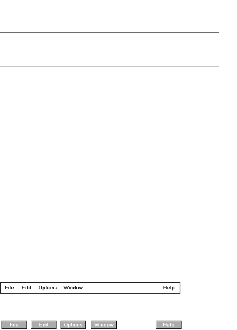
Menu Bar
■
Proper usage:
— To identify and provide access to common and frequently used application ac-
tions that take place in a wide variety of different windows.
— A menu bar choice by itself should not initiate an action.
The highest-level graphical system menu is commonly called the menu bar. A menu
bar consists of a collection of descriptions that serve as headings or titles for a series of
actions on an associated pull-down menu. A menu bar choice by itself should not ini-
tiate an action.
The menu is typically arrayed in a horizontal row at the top of a window. Occasion-
ally a menu bar is referred to as a collection of menu titles. In reality it is a menu in it-
self, and it is appropriate to simply refer to it as a menu. A menu bar is the starting point
for many dialogs. Consistency in menu bar design and use will present to the user a
stable, familiar, and comfortable starting point for all interactions. Menu bars are most
effectively used for presenting common, frequent, or critical actions used on many
windows in a variety of circumstances.
Menu bars often consist of a series of textual words, as represented in Figure 4.19.
Macintosh, Presentation Manager, and Microsoft Windows illustrate examples of this
textual approach. Some products have placed the choices within buttons, as repre-
sented in Figure 4.20. An example of this approach is Sun Microsystems’ Open Look,
which calls them menu buttons. There are also combinations of both. OSF/Motif pre-
sents a list of textual choices, but when one is selected, it resembles a button. Motif
refers to these as cascade buttons.
Each menu bar item is the top level of a hierarchical menu. It will have a pull-down
menu associated with it, detailing the specific actions that may be performed. Some
products have tried to circumvent this pull-down rule and have included items in
menu bars that are direct actions themselves. These direct action items have frequently
been designated by an exclamation point (!) following the menu bar description. The
inclusion of direct items in a menu bar should be avoided. It creates inconsistency in
menu bar use and may easily cause an action to be erroneously selected. Menu bars
should always possess an associated pull-down menu.
Develop System Menus and Navigation Schemes 303
Figure 4.19 Menu bar composed of text.
Figure 4.20 Menu bar composed of buttons.
3900 P-04 (step 4) 4/24/02 1:56 PM Page 303

Menu bars are used to present application alternatives or choices to the screen user.
Typically, each system provides a default set of menu bar commands (for example, File,
Edit, View, Window, Help).
The advantages of menu bars are that they:
Are always visible, reminding the user of their existence.
Are easy to browse through.
Are easy to locate consistently on the screen.
Usually do not obscure the screen working area.
Usually are not obscured by windows and dialog boxes.
Allow for use of keyboard equivalents.
The disadvantages of menu bars are that:
They consume a full row of screen space.
They require looking away from the main working area to find.
They require moving pointer from the main working area to select.
The menu options are smaller than full-size buttons, slowing selection time.
Their horizontal orientation is less efficient for scanning.
Their horizontal orientation limits number of choices that can be displayed.
Display
■
All primary windows must have a menu bar.
■
All menu bars must have an associated pull-down menu containing at least two
choices.
■
Do not allow the user to turn off the display of the menu bar.
■
If all the items in its associated pull-down menu are disabled, then disable the menu
bar item.
— Display the disabled item in a visually subdued manner.
— However, the disabled pull-down menu must always be capable of being pulled-
down so that the choices may be seen.
All primary windows must have a menu bar. Because a menu bar choice should not
initiate an action, all menu bars must have an associated pull-down menu with at least
two choices. If a planned menu bar choice has one or no choices, combine it within an-
other menu bar category. Do not leave it as a separate category. Secondary windows
may use their primary window bar. (Window types are described in Step 5 “Select the
Proper Kinds of Windows.”)
Never permit the menu bar to be turned off, because reminders of system actions
will be eliminated and possibly forgotten by inexperienced users. If all the items in its
associated pull-down menu are disabled, then disable the menu bar item but continue
to display it in a visually subdued manner. The disabled pull-down menu must always
be capable of being pulled down so that the choices may be seen. This will facilitate sys-
tem exploration and learning.
304 Step 4
3900 P-04 (step 4) 4/24/02 1:56 PM Page 304

Location
■
Position choices horizontally over the entire row at the top of the screen, just below
the screen title.
■
A large number of choices may necessitate display over two rows.
Choices should be positioned horizontally across the top of the screen below the
screen title. A typical bar is composed of no more than about seven or eight choices.
Due to screen space constraints, and limitations in human information-processing ca-
pabilities, a maximum of seven or eight is reasonable. In the event that more are
needed, a second line of choices may be added. Try to avoid a second line, however.
Title
■
The window title will be the menu bar title.
The window title will serve as the menu bar title.
Item Descriptions
■
The menu item descriptions must clearly reflect the kinds of choices available in the
associated pull-down menus.
■
Menu item descriptions will be the “titles” for pull-down menus associated with
them.
■
Use mixed-case letters to describe choices.
■
Use single-word choices whenever possible.
■
Do not display choices that are never available to the user.
The menu item descriptions must clearly reflect alternatives available in the associ-
ated pull-down menus. Choices should be composed of mixed-case single words. Typ-
ically, only the first letter of the choice is capitalized. Acronyms, abbreviations, or
proper nouns that are normally capitalized may be capitalized. Choices should never
be numbered.
If a multiple-word item must be used for clarity, consider including a hyphen be-
tween the multiple words to associate the words and differentiate them from other
items. Do not display choices that are never available to the user.
Organization
■
Follow standard platform ordering schemes where they exist.
— Place application-specific choices where they fit best.
Develop System Menus and Navigation Schemes 305
3900 P-04 (step 4) 4/24/02 1:56 PM Page 305
■
Order choices left-to-right with:
— Most frequent choices to the left.
— Related information grouped together.
■
Choices found on more than one menu bar should be consistently positioned.
■
Left-justify choices within the line.
■
When choices can be logically grouped, provide visual logical groupings, if possible.
■
Help, when included, should be located at the right side of the bar.
Figure 4.21
Follow standard platform ordering schemes where they exist. Place application-
specific choices where they fit best. Order all choices left-to-right, with the most fre-
quently elected choices to the left and related information grouped together. Choices
found on more than one menu bar should be consistently positioned.
Left-justify all choices within the line (as opposed to centering them when there are
not enough choices to completely fill the line). However, always locate Help, when in-
cluded, at the far right side. Right side positioning will always keep Help in a consis-
tent location within the bar. Also, provide visual groupings of all related choices, if
space on the bar permits.
Layout
■
Indent the first choice one space from the left margin.
■
Leave at least three spaces between each of the succeeding choices (except for Help
which will be right-justified).
■
Leave one space between the final choice and the right margin.
Figure 4.22
The spacing recommendations above are intended to provide clear delineation of
choices, leave ample room for the selection cursor, provide a legible selected choice,
and provide efficiency in bar design.
Separation
■
Separate the bar from the remainder of the screen by:
— A different background, or
— Solid lines above and below.
In addition to being identified by its location at the top, the bar should be identifiable
by a contrasting display technique. The most effective way to do this is through the use
306 Step 4
3900 P-04 (step 4) 4/24/02 1:56 PM Page 306
of a different background, either reversed polarity (black on white for the bar, con-
trasted with white on black for the screen body), or a color different from the adjacent
title and screen body. When a color is used, it must be chosen in conjunction with good
color principles in Step 12. Affecting the background color choice will be the fore-
ground or choice description color, the selection indicator to be described next, and the
screen body background color. The contrast of the bar to the remainder of the screen
should be moderate, neither too vivid nor too subtle.
Other Components
■
Keyboard equivalent mnemonics should be included on menu bars.
■
Keyboard accelerators, to a window indicators, and cascade indicators need not be
included.
While keyboard mnemonics should be included on menu bars, keyboard accelera-
tors and other intent indicators should not because a menu bar selection will always
lead to a pull-down menu.
Selection Indication
■
Keyboard cursor:
— Use a reverse video, or reverse color, selection cursor to surround the choice.
— Cover the entire choice, including one blank space before and after the choice
word.
Figure 4.23
■
Pointer:
— Use reverse video, or reverse color, to highlight the selected choice.
When using the keyboard, the selection cursor should be indicated by a contrasting
reverse video or reverse color bar surrounding the choice. The cursor should extend at
least one space to each side of the choice word. When using a pointer, use a reverse
video or reverse color to highlight the choice when it is selected.
The recommended reverse color combination is simply to reverse the foreground
and background colors of the unselected choices. Colors chosen must be those that are
completely legible in either polarity. Some good combinations would include: black-
white, blue-white, and black-cyan. Other contrasting color combinations may, of
course, also be used. Since limitations exist in the number of colors that may be used on
a screen, however, the colors chosen for menu bars must be selected in conjunction
with the colors of other screen components. Since a menu bar can be identified by its lo-
cation, the use of a completely different color to identify it can be redundant and un-
necessary. It is more practical to reserve the use of color for other less identifiable
screen components.
Develop System Menus and Navigation Schemes 307
3900 P-04 (step 4) 4/24/02 1:56 PM Page 307
Pull-Down Menu
■
Proper usage:
— To initiate frequently used application actions that take place on a wide variety of
different windows.
— A small number of items.
— Items best represented textually.
— Items whose content rarely changes.
Selection of an alternative from the menu bar results in the display of the exact ac-
tions available to the user. These choices are displayed in a vertically arrayed listing
that appears to pull down from the bar. Hence, these listings, as illustrated in Figure
4.24, are typically referred to as pull-downs. Other identification terms may be used,
such as drop-downs.
Pull-downs are first-level menus used to provide access to common and frequently
used application actions that take place on a wide variety of different windows. They
are most useful for a small number of rarely changing items, usually about 5 to 10.
Larger numbers of choices become awkward to use, being best handled by incorporat-
ing cascade menus (see discussion that follows). Pull-downs are best suited for items
represented textually, but graphical presentations, such as colors, patterns, and shades,
may also be used.
The advantages of pull-down menus are:
The menu bar cues a reminder of their existence.
They may be located relatively consistently on the screen.
No window space is consumed when they are not used.
They are easy to browse through.
Their vertical orientation is most efficient for scanning.
Their vertical orientation is most efficient for grouping.
Their vertical orientation permits more choices to be displayed.
They allow for display of both keyboard equivalents and accelerators.
The disadvantages of pull-down menus are:
They require searching and selecting from another menu before seeing options.
They require looking away from main working area to read.
308 Step 4
Figure 4.24 Menu bar pull-down.
3900 P-04 (step 4) 4/24/02 1:56 PM Page 308
The require moving the pointer out of working area to select (unless using key-
board equivalents).
The items are smaller than full-size buttons, slowing selection time.
The may obscure the screen working area.
Display
■
Display all possible alternatives.
■
Gray-out or dim items that cannot be chosen due to the current state of an applica-
tion.
Display all possible alternatives on a pull-down. Gray-out or dim items that cannot
be chosen due to the current state of an application. If all items are, at any one point, not
applicable, they must still be capable of being retrieved for perusal through the menu
bar.
Location
■
Position the pull-down directly below the selected menu bar choice.
The pull-down will be located directly below the menu bar choice by which it is
selected.
Size
■
Must contain a minimum of two choices.
■
Restrict to no more than 5 to 10 choices, preferably 8 or less.
A typical pull-down consists of about 5 to 10 choices, although more or less are
sometimes seen. A pull-down should always contain more than one choice. Because of
their vertical orientation, there is space for more choices containing longer descriptions
than on a menu bar, and they can easily be positioned on one screen.
Title
■
Not necessary on a pull-down menu. The title will be the name of the menu bar item
chosen.
The name of the item chosen on the menu bar serves as the title of a pull-down
menu.
Develop System Menus and Navigation Schemes 309
3900 P-04 (step 4) 4/24/02 1:56 PM Page 309

Item Descriptions
■
Use mixed-case, headline-style words to describe choices.
— If the choices can be displayed graphically, for example, as fill-in patterns,
shades, or colors, textual descriptions are not necessary.
■
Do not:
— Identify a menu item by the same wording as its menu title.
— Change the meaning of menu items through use of the Shift key.
— Use scrolling in pull-downs.
— Place instructions in pull-downs.
Choices should be composed of mixed-case, headline-style words. For multiword
choice descriptions, capitalize the first letter of each significant word. Acronyms, ab-
breviations, or proper nouns that are normally capitalized may be capitalized. If the
choices can be displayed graphically, such as fill-in patterns, shades, or colors, textual
descriptions are not necessary.
Never identify a pull-down menu item by the same wording as its menu bar title.
The menu bar title must reflect all the items within the pull-down. Never change the
meaning of items through use of the Shift key. Shift key activations are extremely error-
prone, and their use should be reserved for key accelerators. Also, do not use scrolling
in, or place instructions within, a pull-down.
Organization
■
Follow standard platform ordering schemes when they exist.
— Place application-specific choices where they fit best.
■
Place frequent or critical items at the top.
■
Separate destructive choices from other choices.
■
Align choices into columns, with:
— Most frequent choices toward the top.
— Related choices grouped together.
— Choices found on more than one pull-down consistently positioned.
■
Left-align choice descriptions.
■
Multicolumn menus are not desirable. If necessary, organize top-to-bottom, then
left-to-right.
Follow standard platform ordering schemes when they exist. Place application-spe-
cific choices where they fit best. Place frequent or critical items at the top of the listing,
and separate destructive choices from other choices. Align all pull-down choices into
columns with their descriptions left-aligned. Locate most frequently chosen alterna-
tives toward the top, and group related choices together. Choices found on more than
310 Step 4
3900 P-04 (step 4) 4/24/02 1:56 PM Page 310
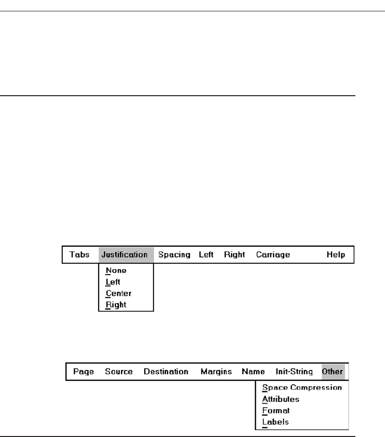
one pull-down should be consistently positioned. Multicolumn menus are not desir-
able; if necessary, organize pull-downs from top-to-bottom, then left-to-right.
Layout
■
Leave the menu bar choice leading to the pull-down highlighted in the selected
manner (reverse video or reverse color).
■
Physically, the pull-down menu must be wide enough to accommodate the longest
menu item description and its cascade or accelerator indicator.
■
Align the first character of the pull-down descriptions under the second character of
the applicable menu bar choice.
■
Horizontally, separate the pull-down choice descriptions from the pull-down bor-
ders by two spaces on the left side and at least two spaces on the right side.
— The left-side border will align with the left side of the highlighted menu bar choice.
— The right-side border should extend, at minimum, to the right side of its high-
lighted menu bar choice.
Figure 4.25
— Pull-downs for choices on the far right side of the menu bar, or long pull-down
descriptions, may require alignment to the left of their menu bar choice to main-
tain visibility and clarity.
Figure 4.26
The menu bar choice leading to the pull-down should remain highlighted in the se-
lected manner. Columnized pull-down descriptions should be aligned beginning
under the second character position of the applicable bar choice. Pull-down borders
should be positioned for balance and for maximum legibility and clarity of the choice
descriptions. Leave two spaces to the left of the descriptions to align the left pull-down
border with the left border of the selected menu bar choice. Leave a minimum of two
spaces after the longest description and the right pull-down border. At the minimum,
the right pull-down border should extend to the right border of the highlighted menu
bar choice. Menu bar choices located at the far right, or long pull-down choice de-
scriptions, may require alignment to the left of the applicable choice, however.
Develop System Menus and Navigation Schemes 311
3900 P-04 (step 4) 4/24/02 1:56 PM Page 311
Groupings
■
Provide groupings of related pull-down choices:
— Incorporate a solid line between major groupings.
— Incorporate a dotted or dashed line between subgroups.
— Left-justify the lines under the first letter of the columnized choice descriptions.
— Right-justify the lines under the last character of the longest choice description.
— Display the solid line in the same color as the choice descriptions.
Figure 4.27
Indicate groupings of related choices by inscribing a line between each group. The
line, or lines, should only extend from the first character of the descriptions to the end
of the longest description, as shown above.
Some common style guides recommend that the line extend from pull-down border
to border. Many other system pull-downs also follow this border-to-border approach.
This extended line, however, results in too strong a visual separation between pull-
down parts. The parts should be separated but not too strongly.
Mark Toggles or Settings
■
If a menu item establishes or changes the attributes of data or properties of the in-
terface, mark the pull-down choice or choices whose state is current or active “on.”
— For nonexclusive items, display a check mark to the left of the item description.
• If the two states of a setting are not obvious opposites, a pair of alternating
menu item descriptions should be used to indicate the two states.
— For exclusive choices, precede the choice with a contrasting symbol such as a di-
amond or circle.
If a menu item is made permanently active or “on” when selected, this can be made
clear to the user by providing a mark by the item. For nonexclusive or independent
items, display a check mark to the left of the item description. For exclusive or interde-
pendent choices, precede the choice with a different and contrasting symbol such as a
diamond or circle. Microsoft Windows indicates active choices of this nature with an
option button mark.
If a setting containing two states does not consist of clear and obvious opposites, a
pair of alternating menu item descriptions should be used to indicate the two states.
312 Step 4
3900 P-04 (step 4) 4/24/02 1:56 PM Page 312
Pull-Downs Leading to Another Pull-Down
■
If a pull-down choice leads to another pull-down, provide a cascade indicator as fol-
lows:
— Place an arrow or right-pointing triangle after the choice description.
— Align the triangles to the right side of the pull-down.
— Display the triangle in the same color as the choice descriptions.
Figure 4.28
Occasionally a secondary or second level pull-down (or cascading pull-down, as it
is frequently called) may be desirable if the first pull-down leads to another short series
of choices. Or, it may be desirable if the first pull-down has a large number of choices
that are capable of being logically grouped. The existence of this second-level, hidden
pull-down should be indicated to the user on the first pull-down in a consistent man-
ner. A simple way to do this is to include a right-pointing triangle to the right of the ap-
plicable choice description. These triangles should be aligned to the right side of the
pull-down.
Pull-Downs Leading to a Window
■
For pull-down choices leading to a window:
— Place an ellipsis (three dots) after the choice description.
— Do not separate the dots from the description by a space.
— Display the ellipsis in the same color as the choice descriptions.
Figure 4.29
When a window results from the selection of a pull-down choice, a visual indication
of this fact is desirable. An ellipsis inscribed after the choice description is a good indi-
cator that a window will appear.
Keyboard Equivalents and Accelerators
■
Provide unique mnemonic codes by which choices may be selected through the
typewriter keyboard.
— Indicate the mnemonic code by underlining the proper character.
Develop System Menus and Navigation Schemes 313
3900 P-04 (step 4) 4/24/02 1:56 PM Page 313
■
Provide key accelerators for choice selection.
— Identify the keys by their actual key-top engravings.
— Use a plus (+) sign to indicate that two or more keys must be pressed at the same
time.
— Enclose the key names within parentheses ( ).
— Right-align the key names, beginning at least three spaces to the right of the
longest choice description.
— Display the key alternatives in the same color as the choice descriptions.
Figure 4.30
Enabling the user to select pull-down choices through the keyboard provides flexi-
bility and efficiency in the dialogue. One method of doing this is to provide single-char-
acter mnemonic codes that, when typed, will also cause the choice to be invoked.
Mnemonic codes can be visually indicated in a number of ways. The recommended
method is an underline beneath the proper character within the choice. Standard
mnemonic codes for common commands were listed in Table 4.1.
Another method is to assign accelerators (one key, or a combination of keys) to ac-
complish the action. Identify these keys exactly as they are engraved on the keyboard;
indicate simultaneous depression through use of a plus sign, and right-align the accel-
erator description and position it to the right of the choice description. Accelerators
should be reserved for the most common commands. Standard accelerators are listed
in Table 4.2.
Separation
■
Separate the pull-down from the remainder of the screen, but visually relate it to the
menu bar by:
— Using a background color the same as the menu bar.
— Displaying choice descriptions in the same color as the menu bar.
— Incorporating a solid-line border completely around the pull-down in the same
color as the choice descriptions.
■
A drop shadow (a heavier shaded line along two borders that meet) may also be in-
cluded.
In addition to being identified by its position below the menu bar, the pull-down
should visually relate to the menu bar and also visually contrast with the screen body.
The most effective way to do this is to use the same foreground and background colors
that are used on the menu bar but ensure that these colors adequately contrast with the
screen body background. Because good contrasting background colors are often lim-
314 Step 4
3900 P-04 (step 4) 4/24/02 1:56 PM Page 314
ited, a solid-line border of the same color as the choice descriptions will clearly delin-
eate the pull-down border. A drop shadow, when included, will give the pull-down a
three-dimensional effect.
Selection Cursor
■
Use a reverse video, or reverse color, selection cursor the same color as the menu bar
to surround the choice.
■
Create a consistently sized cursor as wide as the pull-down menu.
Figure 4.31
The selection cursor should be a contrasting reverse video or reverse color bar of a
consistent size encompassing the selected choice. The reverse color combination should
be the same as the one that appears within the menu bar. Create a consistently sized
cursor as wide as the pull-down menu.
Cascading Menus
■
Proper usage:
— To reduce the number of choices presented together for selection (reduce menu
breadth).
— When a menu specifies many alternatives and the alternatives can be grouped in
meaningful related sets on a lower-level menu.
— When a choice leads to a short, fixed list of single-choice properties.
— When there are several fixed sets of related options.
— To simplify a menu.
— Avoid using for frequent, repetitive commands.
A cascading menu is a submenu derived from a higher-level menu, most typically a
pull-down. Cascades may also be attached to other cascades or pop-up menus, how-
ever. Cascading menus are located to the right of the menu item on the previous menu
to which they are related, as illustrated in Figure 4.32. Menu items that lead to cascad-
ing menus are typically indicated by a right-pointing triangle.
Cascading menus are developed to simplify menus by reducing the number of
choices that appear together on one menu. Cascades can be used when many alterna-
tives exist that can be grouped meaningfully. The top-level menu may contain the
grouping category headings and the cascaded menu the items in each group. Any
menu choices with a fixed set of related options may utilize cascades.
The advantages of cascading menus are that:
Develop System Menus and Navigation Schemes 315
3900 P-04 (step 4) 4/24/02 1:56 PM Page 315
The top-level menus are simplified because some choices are hidden.
More first-letter mnemonics are available because menus possess fewer alternatives.
High-level command browsing is easier because subtopics are hidden.
The disadvantages of cascading menus are:
Access to submenu items requires more steps.
Access to submenu items requires a change in pointer movement direction.
Exhaustive browsing is more difficult; some alternatives remain hidden as pull-
downs become visible.
Changing pointer movement from a vertically oriented menu such as a pull-down to
an adjacent cascade is an error-prone manual movement. Sliding the mouse and its
pointer horizontally is not a very precise hand movement. As the pointer moves hori-
zontally across the menu from which the cascade is selected it has a tendency to move
vertically as well, sometimes exiting the menu over an item above or below the desired
choice. When this occurs in Microsoft Windows the cascade displayed is not the one
desired, but the cascade for the adjacent choice over which the pointer exited. The
wrong cascade is then presented to the user, and the selection process must be re-
peated. Apple minimizes this problem by presenting a movement “cone” for the se-
lected choice. This cone gradually widens as it approaches the cascade, extending
somewhat over the adjacent choices. If the mouse and pointer exit the menu within an
adjacent choice, but still within this cone, the originally designated cascade is still pre-
sented. The Apple solution is much more understanding of human motor limitations.
316 Step 4
Figure 4.32 Cascading menu.
3900 P-04 (step 4) 4/24/02 1:56 PM Page 316
Cascade Indicator
■
Place an arrow or right-pointing triangle to the right of each menu choice descrip-
tion leading to a cascade menu.
■
Separate the indicator from the choice description by one space.
■
Display the indicator in the same color as the choice descriptions.
Figure 4.33
To indicate that another lower-level menu will appear when a menu item is selected,
place an arrow or right-pointing triangle immediately to its right. Display the cascade
indicator in the same color as the choice descriptions.
Location
■
Position the first choice in the cascading menu immediately to the right of the se-
lected choice.
■
Leave the choice leading to the cascading menu highlighted.
Figure 4.34
Cascading menus should be positioned so that the first choice in the cascading menu
is immediately to the right of the selected choice. The choice leading to the cascade
should remain highlighted in some way so that the cascade path is obvious.
Levels
■
Do not exceed three menu levels (two cascades).
— Only one cascading menu is preferred.
Each additional cascade level presented reduces ease of access and increases visual
clutter. The number of cascade levels presented should represent a balance between
menu simplification, ease in menu comprehension, and ease in item selection. When-
ever possible, do not exceed three levels of menus (original and two cascades). Try to
Develop System Menus and Navigation Schemes 317
3900 P-04 (step 4) 4/24/02 1:56 PM Page 317
limit cascades to one. If too many cascade levels are derived, create additional pull-
down menus, or provide a window for some alternatives. A window is useful for es-
tablishing independent settings or the setting of multiple options. A toolbar may also
be used to eliminate the necessity for traversing cascades.
Title
■
Not necessary on the cascading menu.
— The title will be the name of the higher-level menu item chosen.
The title of the cascading menu will be the choice selected on the menu from which
it cascades.
Other Guidelines
■
Follow the organization, content, layout, separation, and selection cursor guidelines
for the kind of menu from which the menu cascades.
The design of a cascade menu should follow all relevant guidelines for the family of
menus to which it belongs. Included are organization, content, layout, and selection
cursor.
Pop-up Menus
■
Use to present alternatives or choices within the context of the task.
Choices may also be presented to the user on the screen through pop-up menus, ver-
tically arrayed listings that only appear when specifically requested. Pop-up menus
may be requested when the mouse pointer is positioned over a designated or hot area
of the screen (a window border or text, for example) or over a designated icon. In look,
they usually resemble pull-down menus, as shown in Figure 4.35.
318 Step 4
Figure 4.35 Pop-up menu.
3900 P-04 (step 4) 4/24/02 1:56 PM Page 318

The kinds of choices displayed in pop-up menus are context sensitive, depending on
where the pointer is positioned when the request is made. They are most useful for pre-
senting alternatives within the context of the user’s immediate task. If positioned over
text, for example, a pop-up might include text-specific commands.
The advantages of pop-up menus are:
They appear in the working area.
They do not use window space when not displayed.
No pointer movement is needed if selected by button.
Their vertical orientation is most efficient scanning.
Their vertical orientation most efficient for grouping.
Their vertical orientation allows more choices to be displayed.
They may be able to remain showing (“pinned”) when used frequently.
They allow for display of both keyboard equivalents and accelerators.
The disadvantages of pop-up menus are:
Their existence must be learned and remembered.
Means for selecting them must be learned and remembered.
They require a special action to see the menu (mouse click).
Items are smaller than full-size buttons, slowing selection time.
They may obscure the screen working area.
Their display locations may not be consistent.
For experienced users, pop-up menus are an alternative to retrieve frequently used
contextual choices in pull-down menus. Choices should be limited in number and sta-
ble or infrequently changing in content.
Windows contains many contextual pop-up menus. They are also referred to as con-
text menus or shortcut menus. Examples include the window pop-up and an icon pop-up,
which presents operations of the objects represented by icons.
Display
■
Provide a pop-up menu for common, frequent, contextual actions.
— If the pointer is positioned over an object possessing more than one quality (for
example, both text and graphics), at minimum present actions common to all ob-
ject qualities.
■
Items that cannot be chosen due to the current state of an application should not be
displayed.
■
Continue to display a pop-up until:
— A choice is selected.
— An action outside the pop-up is initiated.
— The user removes the pop-up.
Develop System Menus and Navigation Schemes 319
3900 P-04 (step 4) 4/24/02 1:56 PM Page 319

Provide a pop-up menu for common, frequent, contextual actions. If the pointer is
positioned over an object possessing more than one quality (for example, both text and
graphics), at minimum present actions common to all object qualities. Items that can-
not be chosen due to the current state of an application should not be displayed.
Continue to display a pop-up until the user selects a choice, initiates an action out-
side the pop-up, or requests that the pop-up be removed.
Location
■
Position the pop-up:
— Centered and to the right of the object from which it was requested.
— Close enough to the pointer so that the pointer can be easily moved onto the
menu.
— But not so close that the pointer is positioned on an item, possibly leading to ac-
cidental selection.
■
If the pointer is positioned in such a manner that the pop-up would appear off-
screen or clipped, position the menu:
— As close as possible to the object, but not covering the object.
— So that it appears fully on the screen.
Position a pop-up menu in a consistent location relative to the object from which it
is requested. The preferable location is centered to the right. Locate the pop-up close
enough to the pointer so that the pointer can be easily moved onto the menu. Position-
ing of the pointer on the menu itself could lead to accidental selection of an action.
If the pointer is positioned in such a manner that a right-centered position would
force the pop-up partially or fully off the screen, locate the pop-up fully on the screen
as close as possible to the object. Do not move the pointer to make a menu fit in the
most desirable location.
Size
■
Restrict the pop-up to no more than 5 to 10 choices, preferably 8 or less.
Limit pop-up menus to about eight choices or fewer. If a large number of choices are
needed, consider creating cascading menus. Minimize the number of levels of cas-
cades, however, to provide ease of access and prevent visual clutter.
Title
■
Not necessary on a pop-up menu.
■
If included, clearly describe the menu’s purpose.
■
Locate in a centered position at the top.
320 Step 4
3900 P-04 (step 4) 4/24/02 1:56 PM Page 320

■
Display in uppercase or mixed-case letters.
■
Separate it from the menu items by a line extending from the left menu border to the
right border.
A title is not necessary on a pop-up menu, since it is an expert feature. Some graph-
ical platforms include titles, others do not. Microsoft Windows does not. If a title is in-
cluded, it should clearly reflect the menu’s purpose. This will avoid any possible
confusion that may occur if the wrong menu is accidentally selected and displayed. The
title should be set off from the item descriptions by using uppercase letters or mixed-
case letters in the headline style.
Other Guidelines
■
Arrange logically organized and grouped choices into columns.
■
If items are also contained in pull-down menus, organize pop-up menus in the same
manner.
■
Left-align choice descriptions.
■
Use mixed-case headline-style words to describe choices.
■
Separate groups with a solid line the length of the longest choice description.
■
If the choice leads to a pop-up window, place an ellipsis after the choice description.
■
To separate the pop-up from the screen background:
— Use a contrasting, but complementary background.
— Incorporate a solid line border around the pull-down.
Follow the same menu guidelines as for pull-down menus regarding organization,
content, layout, separation, and selection cursor.
Tear-off Menus
■
Follow all relevant guidelines for pull-down menus.
A tear-off menu is a pull-down menu that can be positioned anywhere on the screen
for constant referral. As such, it possesses all the characteristics of a pull-down. It may
also be called a pushpin, detachable, or roll-up menu. Its purpose is to present alternatives
or choices to the screen user that are needed infrequently at some times and heavily at
other times.
Advantages/disadvantages. No space is consumed on the screen when the menu is
not needed. When needed, it can remain continuously displayed. It does require
extra steps to retrieve, and it may obscure the screen working area.
Tear-off menus are most useful for expert users. Use these menus in situations where
the items are sometimes frequently selected and other times infrequently selected. Items
Develop System Menus and Navigation Schemes 321
3900 P-04 (step 4) 4/24/02 1:56 PM Page 321
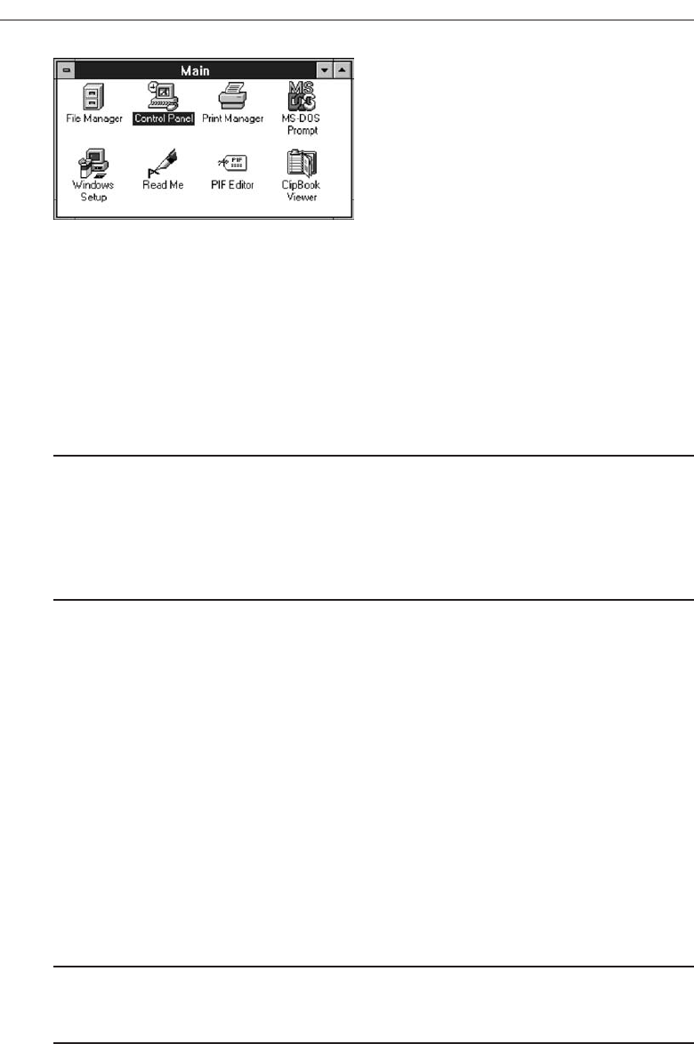
should be small in number and rarely change in content. A typical use would be to detach
and permanently leave displayed a pull-down menu when it must be frequently used.
Since a tear-off menu is a pull-down style, all pull-down guidelines should be
followed.
Iconic Menus
■
Use to remind users of the functions, commands, attributes, or application choices
available.
■
Create icons that:
— Help enhance recognition and hasten option selection.
— Are concrete and meaningful.
— Clearly represent choices.
An iconic menu is the portrayal of menu items or objects in a graphic or pictorial
form, as illustrated in Figure 4.36.
The purpose of an iconic menu is to remind users of the functions, commands, at-
tributes, or application choices available.
Advantages/disadvantages. Pictures help facilitate memory of applications, and
their larger size increases speed of selection. Pictures do, however, consume con-
siderably more screen space than text, and they are difficult to organize for scan-
ning efficiency. To create meaningful icons requires special skills and an extended
amount of time. Iconic menus should be used to designate applications or special
functions within an application. Icons must be meaningful and clear. They should
help enhance recognition and hasten option selection. See Step 11 for a complete
review of icon design guidelines.
Pie Menus
■
Consider using for:
— Mouse-driven selections, with one- or two-level hierarchies, short lists, and
choices conducive to the format.
322 Step 4
Figure 4.36 Iconic menu (from Microsoft Windows).
3900 P-04 (step 4) 4/24/02 1:56 PM Page 322

A pie menu is a circular representation of menu items, as illustrated in Figure 4.37,
that can be used as an alternative to a pull-down or pop-up menu. Research has found
that this style of menu yields higher performance than the typical vertical array, espe-
cially when the menu tasks are unrelated. Their basic advantage is that, when pre-
sented with the mouse pointer positioned in the pie’s center, average movement to any
pie wedge is shorter. Mayhew (1992) concludes that pie menus might work well for
mouse-driven selections with one- or two-level hierarchies, short choice listings, and
data conducive to the format. Performance advantages for keyboard selection are
doubtful, however.
Default Menu Items
Every system will provide a set of standard menu items. Using the default items will
reduce design time and encourage interface consistency. System learning time will also
be reduced. Microsoft Windows, for example, provides the following standard and op-
tional menu bar items and pull-down actions. Always follow industry standards for
naming, menu bar choices, ordering, and keyboard equivalents and accelerators.
File
A standard element, the File menu provides all the commands needed to open, create,
and save files. Some standard File functions are:
New
Open
Close
Save
Save As
Print Preview
Print
Exit
Develop System Menus and Navigation Schemes 323
North
South
EastWest
Figure 4.37 Pie menu.
3900 P-04 (step 4) 4/24/02 1:56 PM Page 323

Edit
A standard element, the Edit menu provides commands that affect the state of selected
objects. Some standard Edit functions are:
Undo
Cut
Copy
Paste
Select All
Find
Replace
View
An optional element, the View menu provides commands that affect the perspective,
details, and appearance of the application. They affect the view, not the data itself. The
view functions are application-specific and include the following:
Toolbars
Status Bar
Magnify
Zoom In
Zoom Out
Grid Points
Window
The Window menu, an optional element, provides commands to manipulate entire
windows. Included are items such as:
New Window
Arrange All
Hide
Show
Help
The Help menu, a standard element, provides Help commands, including:
Contents
Search for Help On
How to Use Help
About (Application)
324 Step 4
3900 P-04 (step 4) 4/24/02 1:56 PM Page 324

These standard menu items also have a prescribed order on the menu bar: File, Edit,
View, Window, and Help. Items on their related pull-down menus also follow stan-
dard orders.
Standard menus and items should always be used when creating an application.
Refer to a system’s design documentation for exact details concerning what menu
items are available and how they are used.
Functions Not Represented by Default Items
Having established the usability of the standard menu functions, additional system
functions must be identified. Commands to accomplish these functions must be
created and added to the pertinent menus. Command design guidelines include the
following.
Develop System Menus and Navigation Schemes 325
Table 4.4 Menu Proper Usage Summary
Menu Bar To identify and provide access to:
• Common and frequently used application actions.
• Actions that take place in a wide variety of different windows.
Pull-Down Menu For frequently used application actions that take place in a wide
variety of different windows:
• A small number of items (5–10).
• Items rarely changing in content.
Cascading Menu To simplify a higher-level menu.
To provide easier browsing of a higher-level menu.
For mutually exclusive choices.
Restrict to 1–2 cascades.
Pop-Up Menu For:
• Frequent users.
• Frequently used contextual commands.
• A small number of items (5–10).
• Items rarely changing in content.
• Items that require a small amount of screen space.
Tear-Off Menu For items:
• Sometimes frequently selected.
• Sometimes infrequently selected.
• Small in number (5–10).
• Rarely changing in content.
Iconic Menu To designate applications available.
To designate special functions within an application.
3900 P-04 (step 4) 4/24/02 1:56 PM Page 325

Labels
■
General:
— Provide a label for each command.
— Use labels that indicate:
• The purpose of the command, or
• The result of what happens when the command is selected.
— Use familiar, short, clear, concise words.
— Use distinctive wording.
— Use mixed case, with the first letter capitalized.
— Begin commands with verbs or adjectives, not nouns.
— Preferably, use only one word.
• If multiple words are required for clarity, capitalize the first letter of each sig-
nificant word.
• Do not use sentences as labels.
— Provide an ellipsis (. . .) to indicate that another window will result from selection
of a command.
• Do not use the ellipsis when the following window is a confirmation or warning.
■
Dynamic labels:
— As contexts change, dynamically change the label wording to make its meaning
clearer in the new context.
• For example, after a cut operation, Undo may be changed to Undo Cut.
Provide a clear label for each command, indicating the purpose of the command or the
result of what happens when the command is selected. Preferably, use single-word com-
mands. If multiple words are required for clarity, capitalize the first letter of each signif-
icant word. Provide an ellipsis to indicate that another window will result from selection
of a command, but do not use the ellipsis when the resulting window is a confirmation
or warning. As contexts change, the label wording may be dynamically changed to make
its meaning clearer in the new context. For example, after a cut operation, Undo may be
changed to Undo Cut. This is called a toggled menu item and was previously described.
Disabled Commands
■
When a command is not available, indicate its disabled status by displaying it
grayed out or subdued.
■
If selection of a disabled command is attempted, provide a message in the informa-
tion area that the “Help” function will explain why it is disabled.
When a command is not available, indicate its disabled status by displaying it
grayed out or subdued. If selection of a disabled command is attempted, provide a
message in the information area that the Help function will explain why it is disabled.
Help, of course, must provide the proper explanation.
326 Step 4
3900 P-04 (step 4) 4/24/02 1:56 PM Page 326

Navigation and Selection
■
General:
— Permit multiple methods for selecting commands.
■
Keyboard equivalents:
— Assign a mnemonic for each command.
— A mnemonic should be as meaningful as possible. Use:
• The first letter of the command, or if duplications exist,
• The first letter of another word in the command, or
• Another significant consonant in the command.
— For standard commands, use mnemonics provided by the tool set.
■
Keyboard accelerators:
— Assign keyboard accelerators for frequently used commands.
— For standard commands, use keyboard accelerators provided by the tool set.
Permit commands to be implemented through the keyboard as well. Provide key-
board equivalents or accelerators. Finally, the menus needed must be designed fol-
lowing principles of effective menu design earlier in this chapter.
Graphical Menu Examples
What follows are examples of poor and proper menu design.
Example 1
An improperly presented menu bar and pull-down.
Menu 1.1
What are the problems in the way this menu bar and pull-down menu are presented?
(1) Keyboard mnemonics are designated by capital letters. Note the uncommon shape
of “foRmat,” “cuT,” and “clEar” when the mnemonic is not the first letter of the word.
(2) Item groupings do not exist in the pull-down. The differences in basic functions are
not obvious, and the more destructive operations (Undo, Clear, and Delete) are posi-
tioned close to standard actions, increasing the potential for accidental selection. (3)
The keyboard accelerators are adjacent to the choice descriptions and not set off in any
way. Therefore, these alternate, and supplemental, actions visually compete with
choice descriptions for the viewer’s attention.
Develop System Menus and Navigation Schemes 327
3900 P-04 (step 4) 4/24/02 1:56 PM Page 327
Menu 1.2
Keyboard mnemonics are designated by underlines, not capital letters. Choice descrip-
tions now assume more common and recognizable shapes. Groupings, through use of
white space, are established for choices in the pull-down. The different functions are
much more obvious and separation is provided for the destructive actions. The differ-
ent groupings are visually reinforced through use of separating lines. The lines are not
extended to the pull-down border so as not to completely disassociate the choices. Key-
board alternatives are right-aligned to move them further from the choice descriptions.
They are also enclosed in parentheses to visually deemphasize them, thereby reducing
their visual competition with the choices. Choice descriptions are now more obvious.
328 Step 4
Menu 1.2
Menu 1.1
3900 P-04 (step 4) 4/24/02 1:56 PM Page 328
Develop System Menus and Navigation Schemes 329
Example 2
An improperly organized menu bar and pull-down.
Menu 2.1
A very poor menu bar—all alternatives are presented creating a very crowded series of
choices in a difficult-to-scan horizontal array. No groupings are provided and an al-
phabetic order causes intermixing of what appear to be different functions. While menu
breadth is preferred to excessive menu depth, too many choices are presented here.
Menu 2.1
Menus 2.2 and 2.3
A better, but still poor menu bar—while File, Function, and Help are now presented
separately, the cascading Function menu requires an excessive number of steps to
complete selection. Note the number of levels needed to access the Address or Tele-
phone book. Excessive levels of depth are difficult to scan and lead to one’s getting lost.
Some have referred to this problem as cascade confusion.
Menu 2.2
Menu 2.3
3900 P-04 (step 4) 4/24/02 1:56 PM Page 329
Menus 2.4, 2.5, and 2.6
A much more reasonable solution—Application and Tool menu bar items are created
and all alternatives now exist on one pull-down menu. The number of steps necessary
to reach any alternative is minimized and easier scanning of all items is permitted.
330 Step 4
Menu 2.4
Menu 2.5
Menu 2.6
3900 P-04 (step 4) 4/24/02 1:56 PM Page 330
Menu 2.7A through 2.7J
Illustrated is a collection of textual Web site global navigation bars showing various pre-
sentation styles. Menu A is horizontally arrayed with good separation between alternate
choices. No delimiters between the choices are included. Menu B uses the symbol >> to
designate the choices. Menus C, D, E, and F use a vertical line to separate the choices, a
very common technique used today in textual navigation presentation. All choices are
arrayed horizontally, with Menu F comprising two lines. Menu G is composed of four
columns. This menu would be scanned horizontally between columns and vertically
within a column. Spacing and choice content make this obvious. Menus H and I are
composed of fewer choices than Menu G and are arrayed for vertical scanning.
The vertical menu arrangements do make scanning of the choices much easier.
Whenever possible, orient menus in the manner illustrated by Menus G, H, and I. If a
horizontal array is used, a separation delimiter is recommended. A vertical line sepa-
rator is recommended. This will give the choices a more “button-like” appearance, and
this style commonly appears on Web pages.
Develop System Menus and Navigation Schemes 331
Menu 2.7A
Menu 2.7B
Menu 2.7C
Menu 2.7D
Menu 2.7E
Menu 2.7F
Menu 2.7G
3900 P-04 (step 4) 4/24/02 1:56 PM Page 331
Menus A, B, E, F, G, H, and I, use the headline style of presentation (all significant
words capitalized). The remaining menus (C, D) use sentence style (only the initial
word is capitalized). The recommendation in this book, for reasons previously de-
scribed, is for captions and menu choices is to be displayed in the headline style. For
another reason, look at the illustration in Menu 2.7J. A menu choice, when underlined,
can have letters with descenders degraded, destroying the shape of the word. This is
especially critical if the letter is the first word. Capitalization of a letter avoids this
problem.
Menus 2.8A through 2.8E
Illustrated is a collection of local Web site global navigation bars. All are arrayed in the
desired vertical format.
Menu A is a listing comprised of 20 choices. While it is alphabetized, no groupings
of choices exist. It would have been much better presented with groupings related by
topic. If topical grouping was not possible, visual grouping of the menu choices should
have been accomplished either by leaving a space line after every five choices, or by
providing a bolder or distinctively different line after every fifth choice.
Menu B, composed of nine choices, is grouped, with separation of groups by hori-
zontal lines. Ordering appears to be by frequency of use. It is a simple and well-
constructed menu.
332 Step 4
Menu 2.7I
Menu 2.7H
Menu 2.7J
3900 P-04 (step 4) 4/24/02 1:56 PM Page 332
Develop System Menus and Navigation Schemes 333
Menu 2.8A Menu 2.8B Menu 2.8C
Menu 2.8D Menu 2.8E
3900 P-04 (step 4) 4/24/02 1:56 PM Page 333
Menu C is composed of two groups, with headings for each group. The headings,
being capitalized, stand out well. The orderings schemes within groupings are not im-
mediately obvious, however. In the MARKETS section, subgroupings of choices are de-
sirable.
Menu D contains a heading (In City of London) with five subheadings. A larger size
makes the heading stand out, and boldness makes all headings stand out. Sections are
grouped and visually separated. Why, however, is the subheading “Search for in the
map” positioned over two lines? It would appear to easily fit on one line. What is the
purpose of the horizontal lines separating the bottom three groupings? Since these
groupings all relate to “map” perhaps it was to separate the three map components.
The horizontal line extending to each end of the box implies too great a separation and
no relationship, however. It would have been better to inscribe a shorter line extending
no wider than the choices themselves.
Also worth considering, if these lines were shortened, would be to include two lines
the entire width of the box to separate the three major menu sections. This recommen-
dation is illustrated in Menu 2.8E.
Menus 2.9A through 2.9C
Illustrated is a collection of global navigation bars containing icons.
Do these icons add to screen usability? When searching through these menu arrays
do you look at the icons or words? Menu C is particularly wasteful of screen space,
forcing below the screen and out of sight content that might otherwise be visible if the
navigation bar were more reasonably sized.
334 Step 4
Menu 2.9A
Menu 2.9B
Menu 2.9C
3900 P-04 (step 4) 4/24/02 1:56 PM Page 334
Menu 2.10
Menu 2.10 is an interesting menu, combining a two-level menu with an historical trail.
The top level, individual pages, has led to the selection of layout on the submenu. The
path followed exists within the displayed menu. All lowercase letters for menu choices
is not recommended, however. Headline-style presentation would have been much
better.
Develop System Menus and Navigation Schemes 335
Menu 2.10
3900 P-04 (step 4) 4/24/02 1:56 PM Page 335
3900 P-04 (step 4) 4/24/02 1:56 PM Page 336

337
A window is an area of the screen, usually rectangular in shape, defined by a border
that contains a particular view of some area of the computer or some portion of a per-
son’s dialog with the computer. It can be moved and rendered independently on the
screen. A window may be small, containing a short message or a single field, or it may
be large, consuming most or all of the available display space. A display may contain
one, two, or more windows within its boundaries. In this step the following is addressed:
A window’s characteristics.
A window’s components.
A window’s presentation styles.
The types of windows available.
Organizing window system functions.
A window’s operations.
Web system frames and pop-up windows.
Window Characteristics
A window is seen to possess the following characteristics:
A name or title,allowing it to be identified.
A size in height and width (which can vary).
Select the Proper Kinds
of Windows
STEP
5
3900 P-05 (step 5) 4/24/02 2:02 PM Page 337

A state, accessible or active, or not accessible. (Only active windows can have
their contents altered.)
Visibility—the portion that can be seen. (A window may be partially or fully hid-
den behind another window, or the information within a window may extend
beyond the window’s display area.)
A location, relative to the display boundary.
Presentation, that is, its arrangement in relation to other windows. It may be
tiled, overlapping, or cascading.
Management capabilities, methods for manipulation of the window on the screen.
Its highlight, that is, the part that is selected.
The function, task, or application to which it is dedicated.
The Attraction of Windows
The value of windowing is best seen in the context of a task or job. A person performs
a variety of tasks, often in a fairly unstructured manner. A person is asked to monitor
and manipulate data from a variety of sources, synthesize information, summarize in-
formation, and reorganize information. Things are seldom completed in a continuous
time frame. Outside events such as telephone calls, supervisor or customer requests, and
deadlines force shifts in emphasis and focus. Tasks start, stop, and start again. Materials
used in dealing with the tasks are usually scattered about one’s desk, being strategically
positioned in the workspace to make handling the task as efficient as possible. This spa-
tial mapping of tools helps people organize their work and provides reminders of un-
completed tasks. As work progresses and priorities change, materials are reorganized
to reflect the changes.
Single-screen technology supports this work structure very poorly. Since only one
screen of information can be viewed at one time, comparing or integrating information
from different sources and on different screens often requires extensive use of one’s
memory. To support memory, a person is often forced to write notes or obtain printed
copies of screens. Switching between tasks is difficult and disruptive, and later return-
ing to a task requires an extensive and costly restructuring of the work environment.
The appeal of windowing is that it allows the display workspace to mirror the desk
workspace much more closely. This dramatically reduces one’s short-term memory
load. One’s ability to do mental calculations is limited by how well one keeps track of
one’s place, one’s interim conclusions and products, and, finally, the results. Windows
act as external memories that are an extension of one’s internal memory. Windows also
make it much easier to switch between tasks and to maintain one’s context, since one
does not have to reestablish one’s place continually. In addition, Windows provide ac-
cess to more information than would normally be available on a single display of the
same size. Overwriting, or placing more important information on top of that of less
importance at that moment, does this.
While all the advantages and disadvantages of windows are still not completely un-
derstood, windows do seem to be useful in the following ways.
338 Step 5
3900 P-05 (step 5) 4/24/02 2:02 PM Page 338

Presentation of Different Levels of Information
Information can be examined in increasing levels of detail. A document table of con-
tents can be presented in a window. A chapter or topic selected from this window can
be simultaneously displayed in more detail in an adjoining window. Deeper levels are
also possible in additional windows.
Presentation of Multiple Kinds of Information
Variable information needed to complete a task can be displayed simultaneously in ad-
jacent windows. An order-processing system window could collect a customer account
number in one window and retrieve the customer’s name and shipping address in an-
other window. A third window could collect details of the order, after which another
window could present factory availability of and shipping dates for the desired items.
Significant windows could remain displayed so that details may be modified as needed
prior to order completion. Low inventory levels or delayed shipping dates might re-
quire changing the order.
Sequential Presentation of Levels or Kinds of Information
Steps to accomplish a task can be sequentially presented through windows. Successive
windows are presented until all the required details are collected. Key windows may
remain displayed, but others appear and disappear as necessary. This sequential prepa-
ration is especially useful if the information-collection process leads down various
paths. An insurance application, for example, will include different types of coverage.
A requested type of coverage might necessitate the collection of specific details about
that type of coverage. This information can be entered into a window presented to col-
lect the unique data. The windows disappear after data entry, and additional windows
appear when needed.
Access to Different Sources of Information
Independent sources of information may have to be accessed at the same time. This in-
formation may reside in different host computers, operating systems, applications,
files, or areas of the same file. It may be presented on the screen alongside the problem,
greatly facilitating its solution. For instance, a writer may have to refer to several parts
of a text being written at the same time. Or, a travel agent may have to compare several
travel destinations for a particularly demanding client.
Combining Multiple Sources of Information
Text from several documents may have to be reviewed and combined into one. Pertinent
information is selected from one window and copied into another.
Select the Proper Kinds of Windows 339
3900 P-05 (step 5) 4/24/02 2:02 PM Page 339

Performing More Than One Task
More than one task can be performed at one time. While waiting for a long, complex
procedure to finish, another can be performed. Tasks of higher priority can interrupt
less important ones. The interrupted task can then be resumed without the necessity to
“close down” and “restart.”
Reminding
Windows can be used to remind the viewer of things likely to be of use in the near fu-
ture. Examples might be menus of choices available, a history of the path followed or
the command choices to that point, or the time of an important meeting.
Monitoring
Changes, both internal and external, can be monitored. Data in one window can be
modified and its effect on data in another window can be studied. External events, such
as changes in stock prices, out of normal range conditions, or system messages can be
watched while another major activity is carried out.
Multiple Representations of the Same Task
The same thing can be looked at in several ways—for example, alternate drafts of a
speech, different versions of a screen, or different graphical representations of the same
data. A maintenance procedure may be presented in the form of textual steps and il-
lustrated graphically at the same time.
Constraints in Window System Design
Windowing systems, in spite of their appeal and obvious benefits, have failed to com-
pletely live up to their expectations. In the past, a windows user interface has been de-
scribed as “chaotic” because of the great amount of time users must spend doing such
things as pointing at tiny boxes in window borders, resizing windows, moving win-
dows, closing windows, and so forth. The problems with windowing systems can be
attributed to three factors: historical considerations, hardware limitations, and human
limitations.
Historical Considerations
Historically, system developers have been much more interested in solving hardware
problems than in user considerations. Since technical issues abound, they have re-
ceived the most attention. There has been very little research addressing design issues
and their impact on the usability of window systems. Therefore, there are few concrete
window design guidelines to aid designers.
340 Step 5
3900 P-05 (step 5) 4/24/02 2:02 PM Page 340

This lack of guidelines makes it difficult to develop acceptable and agreeable window
standards. While many companies have developed style guides, they are very general
and limited in scope to their products. Standardization is also made more difficult by
the complexity and range of alternatives available to the designer. Without user perfor-
mance data, it is difficult to compare realistically the different alternatives, and design
choices become a matter of preference.
Standardization of the interface is also inhibited by other factors. Some software de-
velopers, who are proud of their originality, see standards as a threat to creativity and
its perceived monetary rewards. Some companies are wary of standards because they
fear that other companies are promoting standards that reflect their own approach. Fi-
nally, some companies have threatened, or brought, legal action against anyone who
adopts an approach similar to their own.
The result is that developers of new systems create another new variation each time
they design a product, and users must cope with a new interface each time they en-
counter a new windowing system.
Hardware Limitations
Many of today’s screens are not large enough to take full advantage of windowing ca-
pabilities. As a result, many windows are still of “Post-It” dimensions. As already men-
tioned, there is some evidence that many users of personal computers expand their
windows to cover a full screen. Either seeing all the contents of one window is prefer-
able to seeing small parts of many windows or the operational and visual complexity
of multiple windows is not wanted.
Also, the slower processing speeds and smaller memory sizes of some computers may
inhibit the use of windows. A drain on the computer’s resources may limit feedback
and animation capabilities, thereby reducing the system’s usability. Poor screen reso-
lution and graphics capability may also deter effective use of windows by not permit-
ting sharp and realistic drawings and shapes.
Human Limitations
A windowing system, because it is more complex, requires the learning and using of
more operations. Much practice is needed to master them. These window management
operations are placed on top of other system operations, and window management can
become an end in itself. This can severely detract from the task at hand. In one study
comparing full screens with screens containing overlapping windows, task comple-
tion times were longer with the window screens, but the non-window screens gener-
ated more user errors. After eliminating screen arrangement time, however, task
solution times were shorter with windows. The results suggest that advantages for
windows do exist, but they can be negated by excessive window manipulation
requirements.
It is also suggested that to be truly effective, window manipulation must occur im-
plicitly as a result of user task actions, not as a result of explicit window management
actions by the user.
Select the Proper Kinds of Windows 341
3900 P-05 (step 5) 4/24/02 2:02 PM Page 341
Other Limitations
Other possible window problems include the necessity for window borders to consume
valuable screen space, and that small windows providing access to large amounts of in-
formation can lead to excessive, bothersome scrolling.
Where To?
In spite of their problems, windows do have enormous benefits and are here to stay. So,
we must cope with their constraints for now and, in the meantime, enjoy the benefits
they possess.
Components of a Window
A typical window may be composed of up to a dozen or so elements. Some appear on
all windows; others only on certain kinds of windows, or under certain conditions. For
consistency purposes, these elements should always be located in the same position
within a window. Most windowing systems provide consistent locations for elements
in their own windows. Some inconsistencies do exist in element locations between dif-
ferent systems, however, as do some differences in what the elements are named, or
what graphic images or icons are chosen to identify them. What follows is a description
of typical window components and their purposes, with emphasis on the most popu-
lar windowing system, Microsoft Windows. Specifically reviewed will be primary win-
dows, secondary windows, and a form of secondary window called the dialog box.
An illustration of a primary window is found in Figure 5.1. Illustrations of secondary
342 Step 5
Figure 5.1 Microsoft Windows primary window.
3900 P-05 (step 5) 4/24/02 2:02 PM Page 342

windows and dialog boxes are illustrated in Figures 5.8 and 5.13. How these different
types of windows are used will be described in a later section in this chapter. A sum-
mary of window components for these types of windows is also found in Table 5.1.
Frame
A window will have a frame or border, usually rectangular in shape, to define its bound-
aries and distinguish it from other windows. While a border need not be rectangular,
this shape is a preferred shape for most people. Also, textual materials, which are usu-
ally read from left to right, fit most efficiently within this structure. The border comprises
a line of variable thickness and color. This variation can be used as an aid in identify-
ing the type of window being displayed. Windows filling an entire screen may use
the screen edge as the border. If a window is resizable, it may contain control points
for sizing it. If the window cannot be resized, the border coincides with the edge of the
window.
Title Bar
The title bar is the top edge of the window, inside its border and extending its entire
width. This title bar is also referred to by some platforms as the caption, caption bar, or title
area. The title bar contains a descriptive title identifying the purpose or content of the
window. In Microsoft Windows, the title bar may also possess, at the extreme left and
right ends, control buttons (described below) for retrieving the system menu and per-
forming window resizing. The title bar also serves as a control point for moving the
window and as an access point for commands that apply to a window. For example, as
an access point, when a user clicks on the title bar using the secondary mouse button, the
pop-up or shortcut menu for the window appears. Pressing the Alt-Spacebar key com-
bination also displays the shortcut menu for the window. Title bars are included on all
primary and secondary windows. Title bar text writing guidelines are described in
Step 8 “Write Clear Text and Messages.”
Microsoft recommends that one never place application commands or other controls
in the title bar. Doing so may conflict with the special user controls Windows adds for
configurations that support multiple languages.
Title Bar Icon
Located at the left corner of the title bar in a primary window, this button is used in
Windows to retrieve a pull-down menu of commands that apply to the object in the
window. It is 16 ×16 version of the icon of the object being viewed. When clicked with
the secondary mouse button, the commands applying to the object are presented. Mi-
crosoft suggests that:
If the window contains a tool or utility (that is, an application that does not create,
load, and save its own data files), a small version of the application’s icon should
be placed there instead.
Select the Proper Kinds of Windows 343
3900 P-05 (step 5) 4/24/02 2:02 PM Page 343

344 Step 5
Table 5.1 Microsoft Windows Components
WINDOWS CONTAINING COMPONENT
COMPONENT PRIMARY SECONDARY DIALOG BOX
Frame or Border XX X
• Boundary to define shape.
• If sizable, contains control points
for resizing.
Title Bar Text XX X
• Name of object being viewed in window.
• Control point for moving window.
Title Bar Icon X
• Small version of icon for object
being viewed.
• Access point for commands that apply
to the object.
Title Bar Buttons XX X
• Shortcuts to specific commands.
Close XX X
Minimize/Maximize/Restore X
What’s This? XX
— Displays context-sensitive
Help about any object displayed
on window.
Menu Bar X
• Provides basic and common application
commands.
Status Bar X
• An area used to display status
information about what is displayed
in window.
Scroll Bar X
• Standard control to support scrolling.
Size Grip X
• Control to resize window, located at
right side of status bar.
3900 P-05 (step 5) 4/24/02 2:02 PM Page 344

If the application creates, loads, and saves documents or data files and the window
represents the view of one of its files, a small version of the icon that represents
its document or data file type should be placed there.
Even if the user has not yet saved the file, display the data file icon rather than the
application icon, and again display the data file icon after the user saves the file.
Window Sizing Buttons
Located at the right corner of the title bar, these buttons are used to manipulate the size
of a window. The leftmost button, the minimize button— inscribed with a short horizon-
tal line toward the bottom of the button—is used to reduce a window to its minimum
size, usually an icon. It also hides all associated windows. The maximize button—typically
inscribed with a large box—enlarges a window to its maximum size, usually the en-
tire screen. When a screen is maximized, the restore button replaces the maximize but-
ton, since the window can no longer be increased in size. The restore button—typically
inscribed with a pair overlapping boxes—returns a window to the size it had before a
minimize or maximize action was performed. A close button—typically inscribed with
an X—closes the window. Minimize, maximize, and close buttons are shown in Figure
5.1. These command buttons are graphical equivalents to the actions available through
the Title Bar icon.
Sizing buttons are included on primary windows only. All buttons on a primary
window’s title bar must have equivalent commands on the pop-up or shortcut menu
for that window.
When these buttons are displayed, use the following guidelines:
When a window does not support a command, do not display its command
button.
The Close button always appears as the rightmost button. Leave a gap between it
and any other buttons.
The Minimize button always precedes the Maximize button.
The Restore button always replaces the Maximize button or the Minimize button
when that command is carried out.
What’s This? Button
The What’s This? Button, which appears on secondary windows and dialog boxes, is
used to invoke the What’s This? Windows command to provide contextual Help about
objects displayed within a secondary window. When provided, it is located in the
upper-right corner of the title bar, just to the left of the close button. It is inscribed with
a question mark, as illustrated in Figure 5.2.
On a primary window this command is accessed from the Help drop-down menu.
This command may also be included as a button on a toolbar or as a command on a pop-
up menu for a specific object. This command is described more fully in Step 9 “Provide
Effective Feedback and Guidance and Assistance.”
Select the Proper Kinds of Windows 345
3900 P-05 (step 5) 4/24/02 2:02 PM Page 345

Menu Bar
A menu bar is used to organize and provide access to actions. It is located horizontally
at the top of the window, just below the title bar. A menu bar contains a list of topics or
items that, when selected, are displayed on a pull-down menu beneath the choice. A
system will typically provide a default set of menu actions that can be augmented by
an application. In the past, some platforms have called the menu bar an action bar.
Menu bar design guidelines were presented in Step 4 “Develop System Menus and
Navigation Schemes.” The contents of the menu bar and its pull-downs are determined
by the application’s functionality and the context in which the user is interacting with it.
Status Bar
Information of use to the user can be displayed in a designated screen area or areas. They
may be located at the top of the screen in some platforms and called a status area, or at
the screen’s bottom. Microsoft recommends the bottom location and refers to this area
as the status bar. It is also referred to by other platforms as a message area or message bar.
Microsoft Windows suggests using the status bar to display information about the
current state of what is being viewed in the window, descriptive messages about a se-
lected menu or toolbar button, or other noninteractive information. It may also be used
to explain menu and control bar items as the items are highlighted by the user.
Scroll Bars
When all display information cannot be presented in a window, the additional infor-
mation must be found and made visible. This is accomplished by scrolling the display’s
contents through use of a scroll bar. A scroll bar is an elongated rectangular container
consisting of a scroll area or shaft, a slider box or elevator, and arrows or anchors at each
end. For vertical scrolling, the scroll bar is positioned at the far right side of the work
area, extending its entire length. Horizontal scrolling is accomplished through a scroll
bar located at the bottom of the work area. Scroll bars are more fully described in Step
7 “Choose the Proper Screen-Based Controls.”
Split Box
A window can be split into two or more pieces or panes by manipulating a split box lo-
cated above a vertical scroll bar or to the left of a horizontal scroll bar. A split box is some-
times referred to as a split bar. A window can be split into two or more separate viewing
areas that are called panes. Splitting a window permits multiple views of an object. A split
window allows the user to:
346 Step 5
Figure 5.2 What’s This? button.
3900 P-05 (step 5) 4/24/02 2:02 PM Page 346
Examine two parts of a document at the same time.
Display different, yet simultaneous, views of the same information.
To support the splitting of a window that is not presplit by design, include a split box.
The split box should be just large enough for the user to successfully target it with the
pointer; the default size of a size handle, such as the window’s sizing border, is a good
guideline.
Toolbar
Toolbars, illustrated in Figure 5.3, are permanently displayed panels or arrays of choices
or commands that must be accessed quickly. They are sometimes called command bars.
Toolbars are designed to provide quick access to specific commands or options. Spe-
cialized toolbars are sometimes referred to as ribbons, toolboxes, rulers, or palettes. Each
toolbar band includes a single-grip handle to enable the user to resize or rearrange the
toolbars. When the user moves the pointer over the grip, it changes to a two-headed
arrow. When the user drags the grip, the pointer changes to a split move pointer. To re-
size the toolbar to its maximum or minimum size, the user clicks the grip.
Toolbars may occupy a fixed position or be movable. The design of toolbars is dis-
cussed in Step 7.
Command Area
In situations where it is useful for a command to be typed into a screen, a command area
can be provided. The desired location of the command area is at the bottom of the win-
dow. If a horizontal scroll bar is included in the window, position the command area
just below it. If a message area is included on the screen, locate the command area just
above it.
Select the Proper Kinds of Windows 347
Figure 5.3 Toolbars.
3900 P-05 (step 5) 4/24/02 2:02 PM Page 347

Size Grip
A size grip is a Microsoft Windows special handle included in a window to permit it to
be resized. When the grip is dragged the window resizes, following the same conven-
tions as the sizing border. Three angled parallel lines in the lower-right corner of a win-
dow designate the size grip. If the window possesses a status bar, the grip is positioned
at the bar’s right end. Otherwise, it is located at the bottom of a vertical scroll bar, the
right side of a horizontal scroll bar, or the junction point of the two bars. A size grip is
shown in the lower-right corner of Figure 5.2.
Work Area
The work area is the portion of the screen where the user performs tasks. It is the open
area inside the window’s border and contains relevant peripheral screen components
such as the menu bar, scroll bars, or message bars. The work area may consist of an open
area for typing, or it may contain controls (such as text boxes and list boxes) or cus-
tomized forms (such as spreadsheets). The work area may also be referred to as the
client area.
Window Presentation Styles
The presentation style of a window refers to its spatial relationship to other windows.
There are two basic styles, commonly called tiled or overlapping. In early windowing
days, most systems commonly used one or the other style exclusively, seldom using
both at the same time. Now, the user is usually permitted to select the style to be pre-
sented on the display.
Tiled Windows
Tiled windows, illustrated in Figure 5.4, derive their name from common floor or wall
tile. Tiled windows appear in one plane on the screen and expand or contract to fill
up the display surface, as needed. Most systems provide two-dimensional tiled win-
dows, adjustable in both height and width. Some less-powerful systems, however, are
only one-dimensional, the windows being adjustable in only one manner (typically
the height). Tiled windows, the first and oldest kind of window, are felt to have these
advantages:
The system usually allocates and positions windows for the user, eliminating the
necessity to make positioning decisions.
Open windows are always visible, eliminating the possibility of them being lost
and forgotten.
Every window is always completely visible, eliminating the possibility of infor-
mation being hidden.
They are perceived as less complex than overlapping windows, possibly because
there are fewer management operations or they seem less “magical.”
348 Step 5
3900 P-05 (step 5) 4/24/02 2:02 PM Page 348
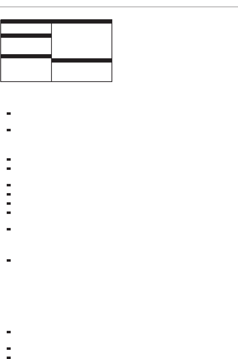
They are easier, according to studies, for novice or inexperienced people to learn
and use.
They yield better user performance for tasks where the data requires little win-
dow manipulation to complete the task.
Perceived disadvantages include the following:
Only a limited number can be displayed in the screen area available.
As windows are opened or closed, existing windows change in size. This can be
annoying.
As windows change in size or position, the movement can be disconcerting.
As the number of displayed windows increases, each window can get very tiny.
The changes in sizes and locations made by the system are difficult to predict.
The configuration of windows provided by the system may not meet the user’s
needs.
They are perceived as crowded and more visually complex because window
borders are flush against one another, and they fill up the whole screen. Crowd-
ing is accentuated if borders contain scroll bars or control icons. Viewer attention
may be drawn to the border, not the data.
They permit less user control because the system actively manages the windows.
Overlapping Windows
Overlapping windows, illustrated in Figure 5.5, may be placed on top of one another
like papers on a desk. They possess a three-dimensional quality, appearing to lie on dif-
ferent planes. Users can control the location of these windows, as well as the plane in
which they appear. The sizes of some types of windows may also be changed. Most
systems today normally use this style of window. They have the following advantages:
Visually, their look is three-dimensional, resembling the desktop that is familiar
to the user.
Greater control allows the user to organize the windows to meet his or her needs.
Windows can maintain larger sizes.
Select the Proper Kinds of Windows 349
Figure 5.4 Tiled windows.
3900 P-05 (step 5) 4/24/02 2:02 PM Page 349
Windows can maintain consistent sizes.
Windows can maintain consistent positions.
Screen space conservation is not a problem, because windows can be placed on
top of one another.
There is less pressure to close or delete windows no longer needed.
The possibility exists for less visual crowding and complexity. Larger borders
can be maintained around window information, and the window is more clearly
set off against its background. Windows can also be expanded to fill the entire
display.
They yield better user performance for tasks where the data requires much win-
dow manipulation to complete the task.
Disadvantages include the following:
They are operationally much more complex than tiled windows. More control
functions require greater user attention and manipulation.
Information in windows can be obscured behind other windows.
Windows themselves can be lost behind other windows and be presumed not to
exist.
That overlapping windows represent a three-dimensional space is not always re-
alized by the user.
Control freedom increases the possibility for greater visual complexity and
crowding. Too many windows, or improper offsetting, can be visually over-
whelming.
Cascading Windows
A special type of overlapping window has the windows automatically arranged in a
regular progression. Each window is slightly offset from others, as illustrated in Figure
5.6. Advantages of this approach include the following:
350 Step 5
Figure 5.5 Overlapping windows.
3900 P-05 (step 5) 4/24/02 2:02 PM Page 350
No window is ever completely hidden.
Bringing any window to the front is easier.
It provides simplicity in visual presentation and cleanness.
Picking a Presentation Style
■
Use tiled windows for:
— Single-task activities.
— Data that needs to be seen simultaneously.
— Tasks requiring little window manipulation.
— Novice or inexperienced users.
■
Use overlapping windows for:
— Switching between tasks.
— Tasks necessitating a greater amount of window manipulation.
— Expert or experienced users.
— Unpredictable display contents.
Tiled windows. Tiled windows seem to be better for single-task activities and data
that must be seen simultaneously. A study found that tasks requiring little window
manipulation were carried out faster using tiled windows. They also found that
novice users performed better with tiled windows, regardless of the task.
Overlapping windows. Overlapping windows seem to be better for situations that ne-
cessitate switching between tasks. A research study concluded that tasks requiring
much window manipulation could be performed faster with overlapping windows
but only if user window expertise existed. For novice users, tasks requiring much
window manipulation were carried out faster with tiled windows. Therefore, the
advantage to overlapping windows comes only after a certain level of expertise is
achieved. Overlapping windows are the preferred presentation scheme.
Select the Proper Kinds of Windows 351
Figure 5.6 Cascading windows.
3900 P-05 (step 5) 4/24/02 2:02 PM Page 351

Types of Windows
People’s tasks must be structured into a series of windows. The type of window used
will depend on the nature and flow of the task. Defining standard window types is
again difficult across platforms because of the varying terminology and definitions
used by different windowing systems, and changes in terminology for new versions of
systems. For simplicity, the Microsoft Windows windowing scheme will be described.
Summarized are a description of the window, its purpose, and its proper usage. Any
other platform’s windows may not behave exactly as presented, and some platform
windows may exhibit characteristics common to more than one of the described win-
dow types.
Primary Window
■
Proper usage:
— Should represent an independent function or application.
— Use to present constantly used window components and controls.
• Menu bar items that are:
—
Used frequently.
—
Used by most, or all, primary or secondary windows.
• Controls used by dependent windows.
—
Use for presenting information that is continually updated.
• For example, date and time.
—
Use for providing context for dependent windows to be created.
— Do not:
• Divide an independent function into two or more primary windows.
• Present unrelated functions in one primary window.
The primary window is the first one that appears on a screen when an activity or action
is started. It is required for every function or application, possessing a menu bar and
some basic action controls, as previously described. It should present the framework
for the function’s commands and data, and provide top-level context for dependent
windows. It has also been variously referred to as the application window or the main
window. In addition, it may be referred to as the parent window if one or more child win-
dows exist. A Microsoft Windows primary window is shown in Figure 5.7.
The primary window is the main focal point of the user’s activities and should rep-
resent an independent function. Avoid dividing an independent function into two or
more primary windows, and avoid presenting unrelated functions in a single primary
window. This tends to confuse people.
Independent functions should begin in a primary window. A primary window
should contain constantly used window components such as frequently used menu bar
items and controls (for example, control bars) used by dependent windows. Also in-
clude in a primary window continually updated information such as the date and time.
The components of a primary window are summarized in Table 5.2.
352 Step 5
3900 P-05 (step 5) 4/24/02 2:02 PM Page 352
Secondary Windows
■
Proper usage:
— For performing subordinate, supplemental, or ancillary actions that are:
• Extended or more complex in nature.
• Related to objects in the primary window.
— For presenting frequently or occasionally used window components.
■
Important guidelines:
— Should typically not appear as an entry on the taskbar.
— A secondary window should not be larger than 263 dialog units x 263 dialog
units.
Secondary windows are supplemental windows. Secondary windows may be depen-
dent upon a primary window or displayed independently of the primary window. They
structurally resemble a primary window, possessing some of the same action controls
(Close button) and possibly a What’s This? button.
Adependent secondary window is one common type. It can only be displayed from
a command on the interface of its primary window. It is typically associated with a sin-
gle data object, and appears on top of the active window when requested. It is movable,
and scrollable. If necessary, it uses the primary window’s menu bar. Most systems per-
mit the use of multiple secondary windows to complete a task. In general, dependent
secondary windows are closed when the primary window closes, and hidden when their
primary window is hidden or minimized.
An independent secondary window can be opened independently of a primary
window—for example, a property sheet displayed when the user clicks the Properties
command on the menu of a desktop icon. An independent secondary window can typ-
ically be closed without regard to the state of any primary window unless there is an
obvious relationship to the primary window.
A Microsoft Windows secondary Window is illustrated in Figure 5.8.
Proper usage. Although secondary windows share many characteristics with primary
windows, they also differ from primary windows in behavior and use. Secondary
Select the Proper Kinds of Windows 353
Figure 5.7 Microsoft Windows primary window.
3900 P-05 (step 5) 4/24/02 2:02 PM Page 353
windows are used to perform supplemental or subordinate tasks, or tasks that are
extended in nature. Frequently and occasionally used window components should
also be presented in secondary windows. Microsoft Windows possesses several
types of secondary windows called dialog boxes, property sheets, property inspectors,
message boxes, palette windows, and pop-up windows.
Guidelines. A secondary window should typically not appear as an entry on the
taskbar. Secondary windows obtain or display supplemental information that is
usually related to the objects that appear in a primary window.
A secondary window is typically smaller than its associated primary window and
smaller than the minimum display resolution. Microsoft recommends not displaying
any secondary window larger than 263 dialog units ×263 dialog units. Microsoft de-
fines size and location of user-interface elements not in pixels but in dialog units (DLUs),
a device-independent unit of measure.
One horizontal DLU is equal to one-fourth of the average character width for the
current system font.
One vertical DLU is equal to one-eighth of the average character height for the
current system font.
These sizes keep the window from becoming too large to display at most resolu-
tions. However, they still provide reasonable space to display supportive information,
such as Help information, that applies.
The components of a secondary window are summarized in Table 5.2.
Modal and Modeless
■
Modal:
— Use when interaction with any other window must not be permitted.
— Use for:
• Presenting information.
— For example, messages (sometimes called a message box).
354 Step 5
Figure 5.8 Microsoft Windows secondary window.
3900 P-05 (step 5) 4/24/02 2:02 PM Page 354

• Receiving user input.
— For example, data or information (sometimes called a prompt box).
• Asking questions.
— For example, data, information, or directions (sometimes called a question
box).
— Use carefully because it constrains what the user can do.
■
Modeless:
— Use when interaction with other windows must be permitted.
— Use when interaction with other windows must be repeated.
A secondary window can be modal or modeless.
Modal. Most secondary windows will be modal. Modal windows will not permit in-
teraction with another window until the current dialog is completed. It remains
displayed until the appropriate action is taken, after which it is removed from the
screen. Modal dialog boxes typically request critical information or actions that
must be reacted to before the dialog can continue. Since modal dialog boxes con-
strain what the user can do, limit their use to situations in which additional in-
formation is required to complete a command or when it is important to prevent
any further interaction until satisfying a condition.
Modeless. Amodeless dialog box permits the user to engage in parallel dialogs.
Switching between the box and its associated window is permitted. Other tasks
may be performed while a modeless dialog box is displayed, and it may be left on
the screen after a response has been made to it. Actions leading to a modeless di-
alog box can be canceled, causing the box to be removed from the screen.
Use a modeless dialog box when interaction with a primary window or an-
other secondary window must be permitted, for example, during the accessing of
the Help function. Also, use a modeless dialog box when interaction with other
windows must be repeated; for example, in a word search operation.
Cascading and Unfolding
■
Cascading:
— Purpose:
• To provide advanced options at a lower level in a complex dialog.
— Guidelines:
• Provide a command button leading to the next dialog box with a “To a Win-
dow” indicator, an ellipsis (...).
• Present the additional dialog box in cascaded form.
• Provide no more than two cascades in a given path.
• Do not cover previous critical information.
— Title Bar.
— Relevant displayed information.
• If independent, close the secondary window from which it was opened.
Select the Proper Kinds of Windows 355
3900 P-05 (step 5) 4/24/02 2:02 PM Page 355
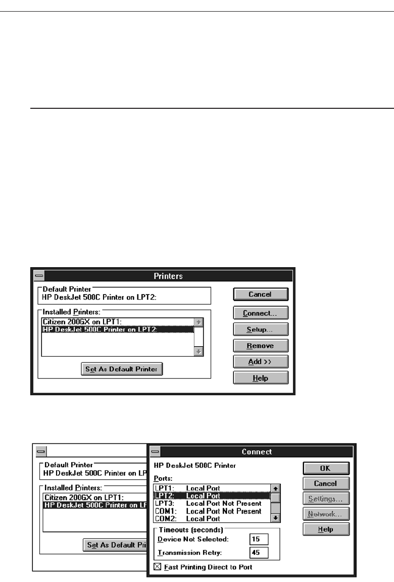
■
Unfolding:
— Purpose:
• To provide advanced options at the same level in a complex dialog.
— Guidelines:
• Provide a command button with an expanding dialog symbol (>>).
• Expand to right or downward.
Access to additional options can be accomplished by inclusion of a command button
that opens another secondary window. These multiple secondary windows needed to
complete a task may be presented in two forms, cascading or expanding.
Cascading. Acascading window keeps the original window displayed, with the de-
pendent window displayed on top, offset slightly to the right and below the orig-
inal secondary window. A cascade, illustrated in Figures 5.9 and 5.10, is generally
used when advanced options at a lower level in a complex dialog must be pre-
sented. An indication that the dialog will be cascading is signaled by an ellipsis
placed in the command button used to display the additional dialog box. Because
of the confusion that can develop with too many cascades, restrict the number of
356 Step 5
Figure 5.9 Printers secondary window with Connect... cascade button.
Figure 5.10 Cascading Connect secondary window.
3900 P-05 (step 5) 4/24/02 2:02 PM Page 356
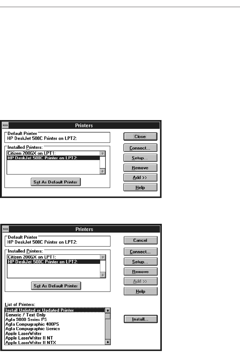
cascades to no more than two in a given path. Do not cover information on the
upper-level dialog boxes that may have to be referred to, such as box title bars and
other critical or relevant information. If the cascaded window is independent in
its operation, close the secondary window from which it was opened and display
only the new window.
Unfolding. An unfolding secondary window expands to reveal additional options, a
form of progressive disclosure. Unfolding windows, sometimes called expanding
windows, are generally used to provide advanced options at the same level in a
complex dialog. They are good alternatives when the interface contains a fixed set
of options or controls that seldom need to be accessed. An unfolding window is
illustrated in Figures 5.11 and 5.12. An indication that the dialog will be expanding
is signaled by a double arrow (>>) placed in the command button used to display
Select the Proper Kinds of Windows 357
Figure 5.11 Printers secondary window with Add >> unfolding button.
Figure 5.12 Unfolded Printers secondary window.
3900 P-05 (step 5) 4/24/02 2:02 PM Page 357
the additional dialog box. Expand the box to right, preferably, or downward if
screen space constraints exist. As an option, the same button can be used to “refold”
the additional part of the window.
Dialog Boxes
■
Use for presenting brief messages.
■
Use for requesting specific, transient actions.
■
Use for performing actions that:
— Take a short time to complete.
— Are not frequently changed.
■
Command buttons to include:
— OK.
— Cancel.
— Others as necessary.
Dialog boxes are used to extend and complete an interaction within a limited context.
Dialog boxes are always displayed from another window, either primary or secondary,
or another dialog box. They may appear as a result of a command button being acti-
vated or a menu choice being selected, or they may be presented automatically by the
system when a condition exists that requires the user’s attention or additional input.
They may possess some basic action controls (Close button and possibly a What’s This?
button), but do not have a menu bar. A Microsoft Windows dialog box is illustrated in
Figure 5.13.
358 Step 5
Figure 5.13 Microsoft Windows dialog box.
3900 P-05 (step 5) 4/24/02 2:02 PM Page 358

Most windowing systems provide standard dialog boxes for common functions,
some examples being Open, Save As, and Print. Many platforms also recommend a set
of standard command buttons for use in the various kinds of dialog boxes, such as OK,
Cancel,and so on. Dialog boxes are of two types, modal and modeless, as recently de-
scribed. They may also cascade or unfold.
Uses. Dialog boxes are used for presenting brief amounts of information or to request
specific transient actions. Dialog box actions will usually be those that do not
occur frequently.
Command buttons. Dialog boxes commonly include OK and Cancel command but-
tons. OK and Cancel buttons work best in dialog boxes that allow the user to set
the parameters for a particular command. OK is typically defined as the default
command button when the dialog box window opens. Other command buttons
may be included in a dialog box in addition to or instead of the OK and Cancel
buttons. Follow the design conventions for command buttons found in Step 7.
Property Sheets and Property Inspectors
The properties of an object in an interface can be displayed in a variety of ways. For ex-
ample, the image and name of an icon on the desktop reflect specific properties of that
object, as do other interface components such as toolbars, status bars, and even scroll
bars. Secondary windows provide two other techniques for displaying properties, prop-
erty sheets and property inspectors.
Property Sheets
■
Use for presenting the complete set of properties for an object.
■
Categorize and group within property pages, as necessary.
— Use tabbed property pages for grouping peer-related property sets.
— The recommended sizes for property sheets are:
• 252 DLUs wide x 218 DLUs high
• 227 DLUs wide x 215 DLUs high
• 212 DLUs wide x 188 DLUs high
— Command buttons to include:
• OK.
• Cancel.
• Apply.
• Reset.
• Others as necessary.
— For single property sheets, place the commands on the sheet.
— For tabbed property pages, place the commands outside the tabbed pages.
Use. A property sheet is the most common way to present an object’s complete set
of properties in a secondary window. A property sheet is a modeless secondary
window that displays the user-accessible properties of an object, properties that
Select the Proper Kinds of Windows 359
3900 P-05 (step 5) 4/24/02 2:02 PM Page 359
may be viewed but not necessarily edited. A single page property sheet is illus-
trated in Figure 5.14.
Property pages. Because there can be many properties for an object and the object’s
context, the categorization and grouping of properties within sets may be neces-
sary. A technique for supporting navigation to groups of properties in a property
sheet is a tabbed property page, where each set of properties is presented within the
window as a separate page. Each page tab is labeled with the name of the set, as
shown in Figure 5.15. Use tabbed property pages for grouping peer-related prop-
erty sets, tabs are described in Step 7.
Size. The sizes recommended for property sheets by Microsoft are shown above.
These will create a window smaller than its associated window and smaller than
the minimum display resolution.
Command buttons. Property sheets typically allow the values for a property to be
changed, and then applied. Include the following common command buttons for
handling the application of property changes. For common property sheet trans-
action buttons, use OK, Cancel, and Apply.A Reset command button to cancel
pending changes without closing the window can also be included. Other com-
mand buttons can be included in property sheets. Avoid including a Help com-
mand button. If a Help button seems necessary, the best solution is to simplify the
window.
Command buttons on tabbed property pages should be located outside of the
tabbed page but still within the window. Buttons placed on a page imply that the
action being performed applies only to that page. Buttons outside the pages imply
360 Step 5
Figure 5.14 Microsoft Windows property sheet.
3900 P-05 (step 5) 4/24/02 2:02 PM Page 360
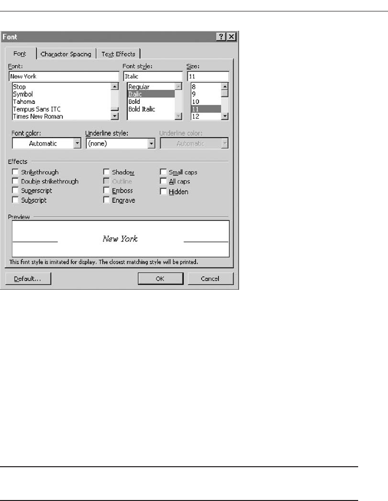
the action performed applies to all pages. This is the desired positioning because,
most often, the tabs are considered by the user as simple grouping or navigation
techniques. If the properties are to be applied on a page-by-page basis, however,
then place the command and buttons on the property pages, and always in the
same location on each page. When the user switches pages without selecting a
command button, any property value changes for that page are applied. In these
situations, it is useful to prompt the user by displaying a message box that asks
whether to apply or discard any changes made.
Property Inspectors
■
Use for displaying only the most common or frequently accessed object properties.
■
Make changes dynamically.
Use. Display only the most common or frequently accessed properties in a property
inspector. Properties of an object are displayed by using a dynamic viewer or
browser that reflects the properties of the current selection. A property inspector
differs from a property sheet. Even when a property sheet window is modeless,
the window is typically modal with respect to the object for the properties being
displayed. If the user selects another object, the property sheet continues to display
Select the Proper Kinds of Windows 361
Figure 5.15 Microsoft Windows property sheet tabbed pages.
3900 P-05 (step 5) 4/24/02 2:02 PM Page 361
the properties of the original object. A property inspector, on the other hand, al-
ways reflects the current selection.
A palette window (described shortly) or a toolbar is used to create a property in-
spector, as shown in Figure 5.16. An even better alternative is to use a palette window
that the user can also configure. Another control in a property inspector can be used to
enable the user to display the properties of various objects in the primary window. For
example, as the first control in the property inspector, include a drop-down list box that
displays the name of the object being viewed. To view another object’s properties
within the inspector, the object is selected in the drop-down list box.
Dynamic changes. Changes a user makes in a property inspector should be made
dynamically. That is, the property value in the selected object should be changed
as soon as the user makes the change in the related property control.
Property inspectors and property sheets are not exclusive interfaces. Both can be in-
cluded in an interface. The most common or frequently accessed properties can be dis-
played in a property inspector and the complete set in the property sheet. Multiple
property inspectors can also be included, each optimized for managing certain types of
objects. An interface’s behavior can also be changed between that of a property sheet
and that of a property inspector. A control can be provided that “locks” its view, mak-
ing it modal to the current object, rather than tracking the entire selection.
Message Boxes
■
Use for displaying a message about a particular situation or condition.
■
Command buttons to include:
— OK.
— Cancel.
— Help.
— Yes and No.
— Stop.
— Buttons to correct the action that caused the message box to be displayed.
■
Enable the title bar close box only if the message includes a cancel button.
■
Designate the most frequent or least destructive option as the default command
button.
Use. A message box, as illustrated in Figure 5.17, is a secondary window that dis-
plays a message about a particular situation or condition.
362 Step 5
Figure 5.16 Microsoft Windows property inspector.
3900 P-05 (step 5) 4/24/02 2:02 PM Page 362
Command buttons. Typically, message boxes contain only command buttons with
the appropriate responses or choices offered to the user. The command buttons
used should allow the message box interaction to be simple and efficient. Microsoft
suggests providing the following:
If a message requires no choices to be made but only acknowledgment, in-
clude an OK button and, optionally, a Help button.
If the message requires the user to make a choice, include a command button
for each option.
Include OK and Cancel buttons only when the user has the option of contin-
uing or stopping the action.
Use Yes and No buttons when the user must decide how to continue.
If these choices are too ambiguous, label the command buttons with the
names of specific actions, for example, Save and Delete.
Command buttons to correct the action that caused the message box to be dis-
played can also be included in a message box. For example, if the message box in-
dicates that the user must switch to another application window to take corrective
action, a button that opens that application window can also be included.
Stop. If Cancel is used as a command button in a message box, remember that to
users, cancel implies that the state of the process or task that started the message
is being restored. If you use Cancel to interrupt a process and the state cannot be
restored, use Stop instead.
Help. A Help button can be included in a message box for messages needing more
detail. This allows the message text to be more succinct.
If other command buttons are needed, consider the potential increase in complexity
that their inclusion will cause.
Close box. Enable the title bar Close box only if the message includes a Cancel but-
ton. Otherwise, the meaning of the Close operation may be ambiguous.
Default. Designate the most frequent or least destructive option as the default com-
mand button.
A definition of message types, and guidelines for writing message, are found in
Step 8.
Select the Proper Kinds of Windows 363
Figure 5.17 Microsoft Windows message box.
3900 P-05 (step 5) 4/24/02 2:02 PM Page 363
Palette Windows
■
Use to present a set of controls.
■
Design as resizable.
— Alternately, design them as fixed in size.
Use. Palette windows are modeless secondary windows that present a set of controls,
as shown in Figure 5.18. Palette windows are distinguished by their visual ap-
pearance, a collection of images, colors or patterns. The title bar for a palette win-
dow is shorter and includes only a close button.
Sizing. A palette window can be defined as fixed in size, or, more typically, resizable
by the user. Two techniques should indicate when the window is resizable, chang-
ing the pointer image to the size pointer, and placing a size command in the win-
dow’s shortcut menu. Preserve the window’s size and position so the window can
be restored if it, or its associated primary window, is closed and then reopened.
Pop-up Windows
■
Use pop-up windows to display:
— Additional information when an abbreviated form of the information is the main
presentation.
— Textual labels for graphical controls.
— Context-sensitive Help information.
Pop-up windows can be used to display additional information when an abbrevi-
ated form of the information is the main presentation technique, as illustrated in Figure
5.19. Other examples of pop-up windows used to display contextual information are
ToolTips and balloon tips that provide the names for controls in graphical toolbars. Pop-
up windows are also used to provide context-sensitive Help information. Pop-up win-
dows do not contain standard secondary window components such as a title bar and
close button.
364 Step 5
Figure 5.18 Microsoft Windows palette window.
3900 P-05 (step 5) 4/24/02 2:02 PM Page 364
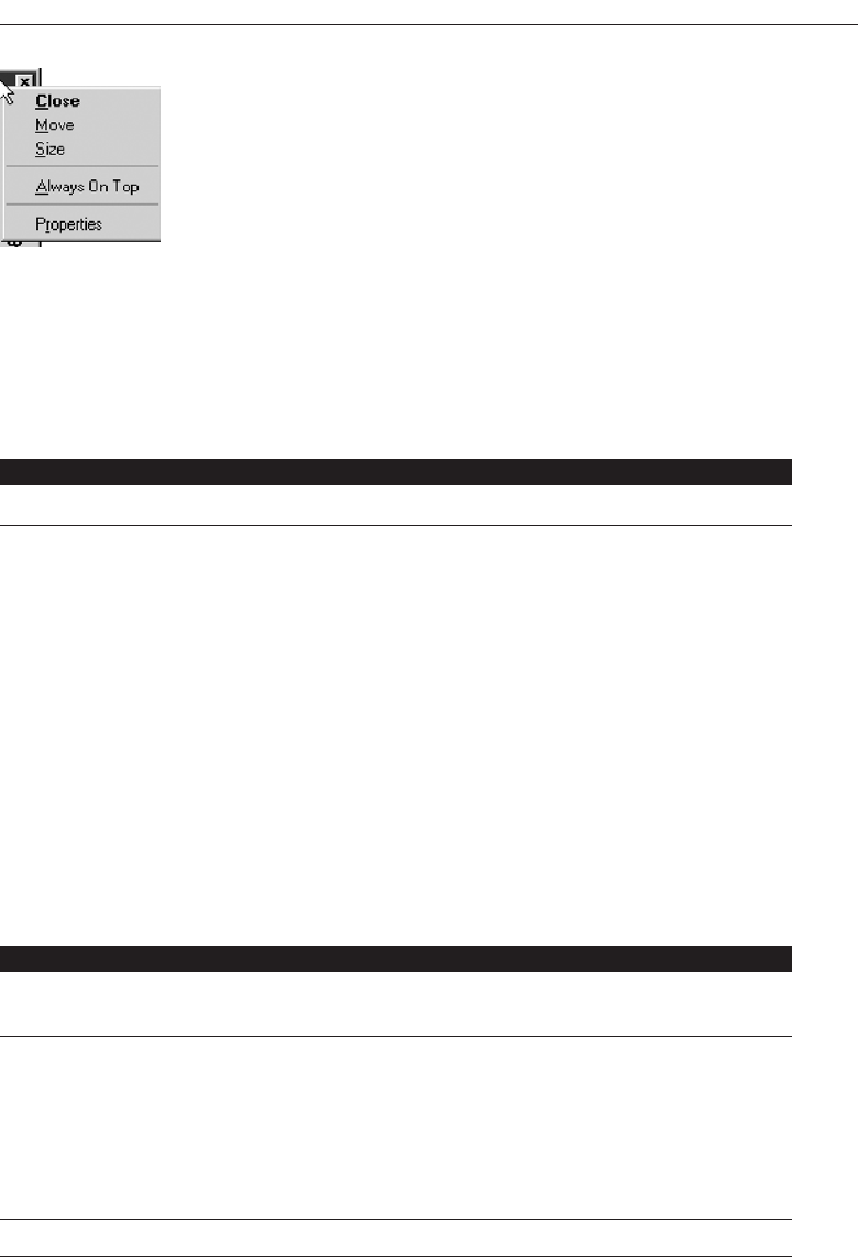
Select the Proper Kinds of Windows 365
Figure 5.19 Microsoft Windows pop-up window.
Table 5.2 Microsoft Windows Window Types and Components
PRIMARY WINDOW
Purpose: To perform a major interaction.
Components: Frame or border.
Title bar.
—Access point for commands that apply to the window, with
commands displayed in a pop-up menu.
Title Bar icon.
—Small version of the icon of the object being viewed.
—Access point for commands that apply to the object being
displayed in the window, with commands displayed in a
pop-up window.
Title bar text.
Title bar buttons to: close/minimize/maximize /restore a
window.
Menu bar.
Status bar.
Scroll bar.
Size grip.
SECONDARY WINDOWS
Purpose: To obtain or display supplemental information related to the
objects in the primary window.
Components: Frame or border.
Title bar.
Title bar text.
Close button.
What’s This? button.
—Context-sensitive Help about components displayed in the
window; this is optional.
Kinds: Modal and modeless.
(continues)
3900 P-05 (step 5) 4/24/02 2:02 PM Page 365
Table 5.2 Continued
SECONDARY WINDOWS
Dialog Boxes
Dialog Boxes
Purpose: To obtain additional information needed to carry out a
particular command or task.
Description: Secondary window.
Contains the following common dialog box interfaces:
— Open/Replace/Find.
— Save As /Print/Print Setup.
— Page Setup/Font/Color.
Property Inspectors
Purpose: To display the most common or frequently accessed
properties of a current selection, usually of a particular type
of object.
Description: A modeless secondary window.
Typically modal with respect to the object for which it
displays properties.
Usage: Displayed when requested from selected object.
Property Sheets
Purpose: For presenting the complete set of properties for an object.
Description: A modeless secondary window.
Typically modal with respect to the object for which it
displays properties.
Usage: Displayed when requested from selected object.
Message Boxes
Purpose: To provide information about a particular situation or
condition.
Description: Secondary window.
Types of message boxes:
— Information/Warning/Critical.
Palette Windows
Purpose: To present a set of controls such as palettes or toolbars.
Description: Modeless secondary window.
366 Step 5
3900 P-05 (step 5) 4/24/02 2:02 PM Page 366

Window Management
Microsoft Windows also provides several window management schemes, a single-
document interface, a multiple-document interface, workbooks, and projects. To choose the
right scheme to present an application’s collection of related tasks or processes, con-
sider a number of design factors, including: the intended users and their skill level, the
application and its objects or tasks, and the most effective use of display space. These
window management schemes are not exclusive design techniques. They may be com-
bined, or others developed. These techniques, however, are the most frequently used
schemes. Each is briefly described below. For greater detail, see Microsoft (2001).
Single-Document Interface
■
Description:
— A single primary window with a set of secondary windows.
■
Proper usage:
— Where object and window have a simple, one-to-one relationship.
— Where the object’s primary presentation or use is as a single unit.
— To support alternate views with a control that allows the view to be changed.
— To support simultaneous views by splitting the window into panes.
■
Advantages:
— Most common usage.
— Window manipulation is easier and less confusing.
— Data-centered approach.
■
Disadvantage:
— Information is displayed or edited in separate windows.
Table 5.2 Continued
SECONDARY WINDOWS
Pop-Up Windows
Purpose: To display additional information when an
abbreviated form of the information is the main
presentation.
Description: Secondary window.
Does not contain standard secondary window
components such as title bar and close button.
Example: ToolTip.
Select the Proper Kinds of Windows 367
3900 P-05 (step 5) 4/24/02 2:02 PM Page 367

Often, the window interface can be established using a single primary window. A
single-document window design is sufficient when the object’s primary presentation or
use is as a single unit, such as a folder or document, even when the object contains dif-
ferent types. In a single-document window design, the primary window provides the
primary view or work area. Secondary windows can be used for supplemental forms
of input, and to view information about objects presented in the primary window.
Multiple-Document Interface
■
Description:
— A technique for managing a set of windows where documents are opened into
windows.
— Contains:
• A single primary window, called the parent.
• A set of related document or child windows, each also essentially a primary
window.
— Each child window is constrained to appear only within the parent window.
— The child windows share the parent window’s operational elements.
— The parent window’s elements can be dynamically changed to reflect the re-
quirements of the active child window.
■
Proper usage:
— To present multiple occurrences of an object.
— To compare data within two or more windows.
— To present multiple parts of an application.
— Best suited for viewing homogeneous object types.
— To clearly segregate the objects and their windows used in a task.
■
Advantages:
— The child windows share the parent window’s interface components (menus,
toolbars, and status bars), making it a very space-efficient interface.
— Useful for managing a set of objects.
— Provides a grouping and focus for a set of activities within the larger environ-
ment of the desktop.
■
Disadvantages:
— Reinforces an application as the primary focus.
— Containment for secondary windows within child windows does not exist, ob-
scuring window relationships and possibly creating confusion.
— Because the parent window does not actually contain objects, context cannot al-
ways be maintained on closing and opening.
— The relationship between files and their windows is abstract, making an MDI ap-
plication more challenging for beginning users to learn.
— Confining child windows to the parent window can be inconvenient or inappro-
priate for some tasks.
— The nested nature of child windows may make it difficult for the user to distin-
guish a child window in a parent window from a primary window that is a peer
with the parent window but is positioned on top.
368 Step 5
3900 P-05 (step 5) 4/24/02 2:02 PM Page 368

A multiple-document interface (MDI) may be used when multiple views of an ob-
ject, or multiple documents, must be looked at simultaneously. The purpose of this
scheme of windows is to provide multiple views of the same object, to permit compar-
isons among related objects, and to present multiple parts of an application. An MDI
interface consists of multiple document windows that are easy to move between, es-
sentially primary windows constrained to appear only within the parent windows
boundary (instead of on the desktop). These windows may be referred to by a name
that describes their contents, such as “Main” in Windows Program Manager. When
minimized, they are displayed at the bottom of their parent window in iconic form.
They are also resizable, movable, and scrollable. The primary window menu bar con-
tent may change dynamically, depending on the MDI window with the focus.
MAXIM The information to make a decision must be there when the
decision is needed.
With MDI, the parent window provides a visual and operational framework for its
child windows. Child windows typically share the menu bar of the parent window and
can also share other parts of the parent’s interface, such as a toolbar or status bar. These
components can be changed to reflect the commands and attributes of the child win-
dow active at that moment. Secondary windows displayed as a result of interaction
within the MDI parent or child window (dialog boxes, message boxes, or property
sheets, for example), typically are not contained or clipped by the parent window.
These windows should activate and display content according to the conventions for
secondary windows associated with a primary window.
If an MDI document is opened, the MDI parent window opens first, and then the
child window for the document opens within it. When the user closes the parent win-
dow, all of its child windows are closed. Where possible, the state of a child window,
such as its size and position within the parent window, should be preserved and re-
stored when the user reopens the file.
Workbooks
■
Description:
— A window or task management technique that consists of a set of views orga-
nized like a tabbed notebook.
— It is based upon the metaphor of a book or notebook.
— Views of objects are presented as sections within the workbook’s primary win-
dows; child windows do not exist.
— Each section represents a view of data.
— Tabs can be included and used to navigate between sections.
— Otherwise, its characteristics and behavior are similar to those of the multiple-
document interface with all child windows maximized.
■
Proper usage:
— To manage a set of views of an object.
— To optimize quick navigation of multiple views.
— For content where the order of the sections is significant.
Select the Proper Kinds of Windows 369
3900 P-05 (step 5) 4/24/02 2:02 PM Page 369

■
Advantages:
— Provides a grouping and focus for a set of activities within the larger environ-
ment of the desktop.
— Conserves screen real estate.
— Provides the greater simplicity of the single-document window interface.
— Provides greater simplicity by eliminating child window management.
— Preserves some management capabilities of the multiple-document interface.
■
Disadvantage:
— Cannot present simultaneous views.
A workbook is a scheme for managing a set of views that uses the metaphor of a
book or notebook. Within the workbook, views of objects, in the form of sections, are
presented within the workbook’s primary window, rather than in individual child
windows. Tabs are used as a navigational interface to move between different sections.
(Tabs are described in Step 7.) Order the tabs to fit the content and organization of the
presented information. Each tabbed section represents a view of data. One section can
be used to list the workbook’s table of contents.
Projects
■
Description:
— A technique that consists of a container: a project window holding a set of objects.
— The objects being held within the project window can be opened in primary win-
dows that are peers with the project window.
— Visual containment of the peer windows within the project window is not
necessary.
— Each opened peer window must possess its own menu bar and other interface
elements.
— Each opened peer window can have its own entry on the task bar.
— When a project window is closed, all the peer windows of objects also close.
— When the project window is opened, the peer windows of the contained objects
are restored to their former positions.
— Peer windows of a project may be restored without the project window itself being
restored.
■
Proper usage:
— To manage a set of objects that do not necessarily need to be contained.
— When child windows are not to be constrained.
■
Advantages:
— Provides a grouping and focus for a set of activities within the larger environ-
ment of the desktop.
— Preserves some management capabilities of the multiple document interface.
— Provides the greatest flexibility in the placement and arrangement of windows.
370 Step 5
3900 P-05 (step 5) 4/24/02 2:02 PM Page 370

■
Disadvantage:
— Increased complexity due to difficulty in differentiating peer primary windows
of the project from windows of other applications.
A project is similar to a multiple-document interface (MDI), but does not visually
contain the child windows. Objects represented by icons contained within it can be
opened into primary windows that are peers with the parent window. Opened peer
windows in the project do not share the menu bar or other areas contained with the
parent window. Each opened peer window within the project must possess its own
menu bar and other interface elements. (A palette window can be developed for shar-
ing by all project windows, however.) Each peer child window can have its own entry
on the taskbar.
Organizing Window Functions
Information and functions must be presented to people when and where they need
them. Proper organization and support of tasks by windows will only be derived
through a thorough and clear analysis of user tasks.
Window Organization
■
Organize windows to support user tasks.
■
Support the most common tasks in the most efficient sequence of steps.
■
Use primary windows to:
— Begin an interaction and provide a top-level context for dependent windows.
— Perform a major interaction.
■
Use secondary windows to:
— Extend the interaction.
— Obtain or display supplemental information related to the primary window.
■
Use dialog boxes for:
— Infrequently used or needed information.
— “Nice-to-know” information.
People most often think in terms of tasks, not functions or applications. Windows
must be organized to support this thinking. The design goal is to support the most com-
mon user tasks in the most efficient manner or fewest steps. Less frequently performed
tasks are candidates for less efficiency or more steps.
Mayhew (1992) suggests that poor functional organization usually occurs because of
one of, or a combination of, these factors:
Emphasis on technical ease of implementation rather than proper analysis of
user tasks.
Select the Proper Kinds of Windows 371
3900 P-05 (step 5) 4/24/02 2:02 PM Page 371

Focus on applications, features, functions, or data types instead of tasks.
Organization of the design team into applications, with little cross-team
communication.
Blindly mimicking the manual world and carrying over manual inefficiencies to
the computer system.
Emphasis on implementation ease puts the needs of the designer before the needs of
the customer. Focusing on tasks conforms to the model of how people think. Application
orientation imposes an unnatural boundary between functions, and lack of cross-team
communication seldom yields consistent task procedures. Mimicking “what is” will
never permit the capabilities of the computer system to be properly exploited.
Recommended usages for the various window types are summarized in the above
guidelines. These recommendations were discussed more fully earlier in this chapter.
Number of Windows
■
Minimize the number of windows needed to accomplish an objective.
A person does not work with windows simply for the joy of working with windows.
Windows are a means to an end, a method of accomplishing something. Multiple win-
dows on a display, as discussed elsewhere in this text, can be confusing, can increase
the load on the human visual system, or may be too small to effectively present what
needs to be contained within them.
Guidelines that appeared in early stages of window evolution concerning the maxi-
mum number of windows that a person could deal with were quite generous, a limit of
seven or eight being suggested. As experience with windows has increased, these num-
bers have gradually fallen. One study found the mean number of windows maintained
for experienced users was 3.7. Today, based on expressions of window users, a recom-
mendation of displaying no more than two or three at one time seems most realistic.
The guidelines on limitations for items like cascades (1–2) reflect today’s feelings. The
exact number of windows a person can effectively deal with at one time will ultimately
depend on both the capabilities of the user and the characteristics of the task. Some
users and situations may permit handling of more than three windows; for other users
and situations, three windows may be two too many.
The general rule: Minimize the number of windows used to accomplish an objective.
Use a single window whenever possible. Consider, however, the user’s task. Don’t clut-
ter up a single window with rarely used information when it can be placed on a second,
infrequently used, window.
Window Operations
Guidelines for windows operations are still evolving. Because of the paucity of pub-
lished research data, many of the guidelines are still more anecdotal and intuitive than
scientific. Guidelines will continue to develop and change as our understanding of, and
372 Step 5
3900 P-05 (step 5) 4/24/02 2:02 PM Page 372

experiences with, the windows interface continue to increase. Today, the following op-
erational guidelines seem appropriate.
Active Window
■
A window should be made active with as few steps as possible.
■
Visually differentiate the active window from other windows.
While a system supports the display of multiple windows, the user generally works
within a single window at one. This window, called the active window, may be desig-
nated either by the system or the user. Many systems make a window active when it is
the object of another windowing operation. It is assumed that if users wish to change
one aspect of a window’s structure, they also wish to change its contents. They should
also be permitted to move to and make any window active with as few steps as possi-
ble. This can be accomplished by simply allowing the user to move the selection cursor
to the window’s interior and then signal by pressing a key or button. For hidden win-
dows, a menu of open windows might be presented from which the user selects a new
open window.
In some situations, it may be desirable to allow multiple open windows. One re-
search study compared a single open window with multiple open windows in perform-
ing queries and found that multiple open windows were described by people as more
“natural.” Performance was slower with multiple open windows, however. The study
concluded that if user acceptance is important, multiple open windows might be the
better alternative. If speed of task handling is critical, a single active window is more
desirable.
Visually differentiate the active window from other windows. It is important that
the user be able to quickly identify the active window. Methods to do this include a
contrasting window title bar, border, or background color. An “active” indicator in the
window border, which is turned on or off, may also be used. A combination of two or
more of these visual cues may be used as well. The visual cue selected should be of mod-
erate intensity, neither too powerful nor too subtle. Powerful cues will be distracting;
subtle cues will be easily overlooked.
General Guidelines
■
Design easy to use and learn windowing operations.
— Direct manipulation seems to be a faster and more intuitive interaction style than
indirect manipulation for many windowing operations.
■
Minimize the number of window operations necessary to achieve a desired effect.
■
Make navigating between windows particularly easy and efficient to do.
■
Make the setting up of windows particularly easy to remember.
■
In overlapping systems, provide powerful commands for arranging windows on the
screen in user-tailorable configurations.
Select the Proper Kinds of Windows 373
3900 P-05 (step 5) 4/24/02 2:02 PM Page 373

Easy to use. Design easy to use and learn window operations. The complexity of a
windowing system should not cancel out its potential advantages. Operations
must be carefully designed to achieve simplicity. As has been suggested, the ideal
is that window manipulations should occur implicitly as a result of the user’s task
actions, not as a result of explicit, conscious, window management actions.
Minimize number. Minimize the number of window operations needed to achieve
a desired effect. Establish the kinds of window operations that people are likely to
want, and minimize the number of operations that must be performed to attain
these configurations.
Easy navigation. Make navigating between windows easy and efficient. A study
found that navigation between windows was the most frequent manipulation ac-
tivity performed. High-frequency operations should always be easy to do.
Setting up. Make the process of setting up windows easy to remember. A study found
that window arrangement (opening, resizing, moving, and so on) was a less fre-
quent activity. Low-frequency operations should always be easy to learn.
User-tailorable configurations. In overlapping systems, provide powerful commands
for arranging windows in user-tailorable configurations. When an overlapping
window system is used, provide easy operations to achieve desired windowing
configurations. Specific configurations should be capable of being created, named,
and recalled.
Opening a Window
■
Provide an iconic representation or textual list of available windows.
— If opening with an expansion of an icon, animate the icon expansion.
■
When opening a window:
— Position the opening window in the most forward plane of the screen.
— Adapt the window to the size and shape of the monitor on which it will be
presented.
— Designate it as the active window.
— Set it off against a neutral background.
— Ensure that its title bar is visible.
■
When a primary window is opened or restored, position it on top.
— Restore all secondary windows to the states that existed when the primary window
was closed.
■
When a dependent secondary window is opened, position it on top of its associated
primary window.
— Position a secondary window with peer windows on top of its peers.
— Present layered or cascaded windows with any related peer secondary windows.
■
When a dependent secondary window is activated, its primary window and related
peer windows should also be positioned at the top.
■
If more than one object is selected and opened, display each object in a separate win-
dow. Designate the last window selected as the active window.
374 Step 5
3900 P-05 (step 5) 4/24/02 2:02 PM Page 374

■
Display a window in the same state as when it was last accessed.
— If the task, however, requires a particular sequence of windows, use a fixed or
consistent presentation sequence.
■
With tiled windows, provide an easy way to resize and move newly opened
windows.
Typically, when windows are opened, they are designated as active and positioned in
the most forward plane of the screen so that they can be used immediately. When open-
ing a window one should not assume a fixed monitor size, but reflect the size of the mon-
itor on which the window will actually be displayed. The window’s title bar must be
visible. To focus attention on the newly opened window, display the screen background
behind the window in a neutral or subdued manner. When opening windows from an
iconic representation, gradually expand the window so that the movement is visible. This
will aid association of the icon with the window in the mind of the viewer.
When a primary window is opened or restored, position it at the top. Restore all sec-
ondary windows to the states that existed when the primary window was closed. When
a dependent secondary window is opened, position it on top of its associated primary
window. If a secondary windows has peers, position it on top of its peers. Present layered
or cascaded windows with any related peer secondary windows.
When a dependent secondary window is activated, its primary window and related
peer windows should also be positioned at the top. If more than one object is selected
and opened, display each object in a separate window. Designate the last window se-
lected as the active window. Always display a window in the same state as when it was
last accessed. If the task, however, requires a particular sequence of windows, use a fixed
or consistent presentation sequence.
The first opened tiled window will consume the entire screen. Subsequent windows
are usually positioned by defaults in the system. The system positioning of these sub-
sequent windows may not always be consistent with the user’s needs. The system should
allow the user to change the default positions, or provide a way for the user to move and
resize the system-provided windows easily.
Sizing Windows
■
Provide large-enough windows to:
— Present all relevant and expected information for the task.
— Avoid hiding important information.
— Avoid crowding or visual confusion.
— Minimize the need for scrolling.
• But use less than the full size of the entire screen.
■
If a window is too large, determine:
— Is all the information needed?
— Is all the information related?
■
Otherwise, make the window as small as possible.
— Optimum window sizes:
Select the Proper Kinds of Windows 375
3900 P-05 (step 5) 4/24/02 2:02 PM Page 375
• For text, about 12 lines.
• For alphanumeric information, about seven lines.
Larger windows seem to have these advantages:
They permit displaying of more information.
They facilitate learning: Data relationships and groupings are more obvious.
Less window manipulation requirements exist.
Breadth is preferred to depth (based on menu research).
More efficient data validation and data correction can be performed.
Disadvantages include:
Longer pointer movements are required.
Windows are more crowded.
More visual scanning is required.
Other windows more easily obscure parts of the window.
It is not as easy to hide inappropriate data.
Always provide large enough windows to present all the relevant and expected in-
formation for the task. Never hide important or critical information, and minimize the
need for scrolling. A study has found that very small windows requiring a significant
amount of scrolling appear to increase decision-making time. Scrolling is also a cum-
bersome operation. To avoid scrolling, consider using unfolding dialog boxes, cas-
cading windows, or a tab control. Avoid, however, making a window’s default size the
full size of the display. Doing so leads to any underlying windows being completely
hidden from the user’s view. The option to maximize primary and secondary windows
always exists.
If, through analysis and design, a window appears to be too large, determine:
Is all the information needed?
Is all the information related?
Important, critical, or frequently used information must be maintained on a screen,
but perhaps information exists that is needed or used infrequently, for example. only
10 to 20 percent of the time. This kind of information is a good candidate for placement
on another window or dialog box. Perhaps information is included on a screen that is
not related to the task being performed. This kind of information should be located
with the information to which it is related. As a last resort, consider shortening some
window control captions or other included window text to achieve a proper fit.
At least two studies have looked at optimum window sizes. Procedural text in win-
dow sizes of 6, 12, and 24 lines were evaluated by one study. Fastest and most accurate
completion occurred with the 12-line window. The retrieval of alphanumeric informa-
tion was compared in 7-, 13-, and 19-line windows in another study. A seven-line win-
dow was found to be more than adequate.
376 Step 5
3900 P-05 (step 5) 4/24/02 2:02 PM Page 376

Window Placement
■
Considerations:
— In placing a window on the display, consider:
• The use of the window.
• The overall display dimensions.
• The reason for the window’s appearance.
■
General:
— Position the window so it is entirely visible.
— If the window is being restored, place the window where it last appeared.
— If the window is new, and a location has not yet been established, place it:
• At the point of the viewer’s attention, usually the location of the pointer or
cursor.
• In a position convenient to navigate to.
• So that it is not obscuring important or related underlying window information.
— For multiple windows, give each additional window its own unique and dis-
cernible location.
• A cascading presentation is recommended.
— In a multiple-monitor configuration, display the secondary window on the same
monitor as its primary window.
— If none of the above location considerations apply, then:
• Horizontally center a secondary window within its primary window just
below the title bar, menu bar, and any docked toolbars.
— If the user then moves the window, display it at this new location the next time
the user opens the window.
• Adjust it as necessary to the current display configuration.
— Do not let the user move a window to a position where it cannot be easily
repositioned.
■
Dialog boxes:
— If the dialog box relates to the entire system, center it on screen.
— Keep key information on the underlying screen visible.
— If one dialog box calls another, make the new one movable whenever possible.
Considerations. In placing a window on the display, consider how the window is
used in relation to other windows, the overall dimensions of the display, and the
reason that the window is being presented.
General. First, locate the window so it is fully visible. If the window is being re-
stored, locate it where it last appeared. If the window is new and the location has
not yet been established, place it at the point of the viewer’s attention. This will
usually be the location of the pointer or cursor. Also, place the window in a posi-
tion where it will be convenient to navigate to, and where it will not obscure im-
portant underlying screen information. Preferred positions are essentially below
and right. The suggested order of placement is below right, below, right, top right,
below left, top, left, top left.
Select the Proper Kinds of Windows 377
3900 P-05 (step 5) 4/24/02 2:02 PM Page 377

In a multiple-monitor configuration, display the secondary window on the same
monitor as its primary window. If none of these situations applies, horizontally center
a secondary window within the primary window, just below the title bar, menu bar,
and any docked toolbars. Give each additional window its own unique location. A cas-
cading presentation, from upper left to lower right is recommended. If the user then
moves the window, display it at this new location the next time the user opens the win-
dow, adjusted as necessary for the current display configuration. Do not let the user
move a window to a position where it cannot be easily repositioned.
Dialog boxes. If a dialog box relates to the entire system, center it on display, keep-
ing key information on an underlying window visible. If one dialog box calls an-
other, make the new one movable whenever possible.
Window Separation
■
Crisply, clearly, and pleasingly demarcate a window from the background of the
screen on which it appears.
— Provide a surrounding solid line border for the window.
— Provide a window background that sets the window off well against the overall
screen background.
— Consider incorporating a drop shadow beneath the window.
Component separation is especially critical in a graphics environment because of the
spatial layering that can occur. All windows must be clearly set off from the underly-
ing screen or windows. The demarcation must be crisp and visually pleasing. A solid
single-line border is recommended for this purpose. Also provide a window back-
ground that sets the window off well against the overall screen background. If color is
used, exercise caution and choose compatible colors. (See Step 12 “Choose the Proper
Colors.”) Another alternative is to use for the window a lighter shade of the color used
for the screen background. Changes in the density of shades are often more visually
pleasing than different colors. To emphasize the three-dimensional aspects of graphic
windows, incorporate a drop shadow beneath each window.
Moving a Window
■
Permit the user to change the position of all windows.
■
Change the pointer shape to indicate that the move selection is successful.
■
Move the entire window as the pointer moves.
— If it is impossible to move the entire window, move the window outline while
leaving the window displayed in its original position.
■
Permit the moving of a window without its being active.
An indication that the move operation has been successfully selected and that the
move may begin should be indicated to the user by changing the pointer’s shape. This
378 Step 5
3900 P-05 (step 5) 4/24/02 2:02 PM Page 378

will provide feedback indicating that it is safe to begin the move operation and will
avoid false starts. Ideally, the entire window should move along with the pointer. If the
entire window cannot be moved, move the window outline while leaving the full win-
dow displayed on the screen. Displaying only the window’s outline during the move
operation, and not the window itself, may make it harder for the user to decide when
the window has been repositioned correctly. It may be necessary for a window to be
moved without being active. This should be possible. The action of moving the window
may implicitly activate it, however.
Resizing a Window
■
Permit the user to change the size of primary windows.
— Unless the information displayed in the window is fixed or cannot be scaled to
provide more information.
■
Change the pointer shape to indicate that the resizing selection is successful.
■
The simplest operation is to anchor the upper-left corner and resize from the lower-
right corner.
— Also permit resizing from any point on the window.
■
Show the changing window as the pointer moves.
— If it is impossible to show the entire window being resized, show the window’s
outline while leaving the window displayed in its original position.
■
When window size changes and content remains the same:
— Change image size proportionally as window size changes.
■
If resizing creates a window or image too small for easy use, do one of the following:
— Clip (truncate) information arranged in some logical structure or layout when
minimum size is attained, or
— When no layout considerations exist, format (restructure) information as size is
reduced, or
— Remove less useful information (if it can be determined), or
— When minimum size is attained, replace information with a message that indi-
cates that the minimum size has been reached and that the window must be en-
larged to continue working.
■
Permit resizing a window without its being active.
Make your primary windows resizable unless the information displayed in the win-
dow is fixed or cannot be scaled to provide the user with more information. (For ex-
ample, a calculator window.)
An indication that the resize operation has been successfully selected, and that the
move may begin, should be indicated to the user by changing the pointer’s shape. This
will provide the necessary feedback that it is safe to begin the resizing and will avoid
false starts. The simplest operation for the user, conceptually, is always to resize from
the lower-right corner and anchor the window in the upper-left corner. Flexibility can be
provided by permitting resizing to occur from any point on the border (the anchor is
always opposite the pulling point), but conceptually this is more complex. Some people
Select the Proper Kinds of Windows 379
3900 P-05 (step 5) 4/24/02 2:02 PM Page 379

may have difficulty predicting which window sides or corners will be resized from spe-
cific pulling points.
Ideally, the entire window should move along with the pointer. If the entire window
cannot be moved, move the window outline while leaving the full window displayed
on the screen. Displaying only the window’s outline during the move operation, and
not the window itself, may make it harder for the user to decide when the window has
been repositioned correctly.
The effect of a resizing operation on the window’s contents usually depends on the
application. In enlarging, more data may be displayed, a larger image may be created,
or blank space may be added around the image. In reducing, less data may be displayed,
the image may be made smaller, blank space may be eliminated, or the data may be re-
formatted. If resizing creates a window or image too small for easy use, clip or truncate
information arranged in some logical structure, format, or layout. When no layout con-
siderations exist, as is the case for text, format or restructure the displayed information.
Also consider removing less useful information, if it can be determined. When the min-
imum size has been attained and any additional attempts to reduce window size occur,
replace the information with a message that indicates that the minimum size has been
reached and that the window must be enlarged to continue working.
It may be necessary for a window to be resized without being active. This should be
possible. The action of moving the window may implicitly activate it, however.
Other Operations
■
Permit primary windows to be maximized, minimized, and restored.
Maximizing. Maximizing a window increases the size of the window to its largest
optimum size. The system default setting for the maximum size is as large as the
display. This should be adjustable, as necessary.
Minimizing. Minimizing a window reduces it to its smallest size.
Restoring. Restoring returns a window to its previous size and position after the
user has maximized or minimized it.
Window Shuffling
■
Window shuffling must be easy to accomplish.
Window shuffling should be easy to perform in as few steps as possible. One method
is to permit the toggling of the two most recently displayed windows. Another is to
permit rapid window shuffling and the swapping of the front window and the second
or back window.
Keyboard Control/Mouseless Operation
■
Window actions should be capable of being performed through the keyboard as
well as with a mouse.
380 Step 5
3900 P-05 (step 5) 4/24/02 2:02 PM Page 380

■
Keyboard alternatives should be designated through use of mnemonic codes as
much as possible.
■
Keyboard designations should be capable of being modified by the user.
All window actions should be capable of being performed using the keyboard as
well as the mouse. This will provide a more efficient alternative for applications that
contain tasks that are primarily keyboard-oriented, for users skilled in touch typing,
and for any other situations in which frequent movement between keyboard and
mouse may be required. The use of mnemonic codes to reflect window mouse actions
will greatly aid user learning of the keyboard alternatives. To provide the user flexibil-
ity, all keyboard designations should be capable of being user modified.
Closing a Window
■
Close a window when:
— The user requests that it be closed.
— The user performs the action required in the window.
— The window has no further relevance.
■
If a primary window is closed, also close all of its secondary windows.
■
When a window is closed, save its current state, including size and position, for use
when the window is opened again.
Close a window when the user requests it to be closed, when the action required in
the window is performed, or when the window has no further relevance to the task
being performed. If the closed window is a primary window, also close its associated
secondary windows. When a window is closed, it is important that its current state, in-
cluding size and position, be saved for use when the window is again opened.
Web Systems
Web systems have limited windowing capabilities. The frame concept does provide
window-like ability, and JavaScript does provide pop-up windows.
Frames
■
Description:
— Multiple Web screen panes that permit the displaying of multiple documents on
a page.
— These documents can be independently viewed, scrolled, and updated.
— The documents are presented in a tiled format.
■
Proper usage:
— For content expected to change frequently.
— To allow users to change partial screen content.
— To permit users to compare multiple pieces of information.
Select the Proper Kinds of Windows 381
3900 P-05 (step 5) 4/24/02 2:02 PM Page 381

■
Guidelines:
— Use only a few frames (three or less) at a given time.
— Choose sizes based upon the type of information to be presented.
— Never force viewers to resize frames to see information.
— Never use more than one scrolling region on a page.
Description. The Web is, historically, essentially a single page (or, by analogy, a sin-
gle window) entity. While providing significant interface benefits, it is also a re-
versal of the interface evolution process that led from single-screen technology to
windowing. To counteract this shortcoming, frames were created. A frame is an in-
dependent pane of information presented in a Web page, or, again by analogy, as
multiple windows. Frames, however, are presented as tiled, with no overlapping
capability. The interaction richness, support, and contextual cues provided by over-
lapping windows are lacking. Frames, then, allow the displaying of multiple doc-
uments on a single Web page. These multiple documents can be independently
viewed, scrolled, and updated.
Proper usage. Frames are useful in situations where portions of the page content are
expected to change frequently. The volatile information can be separated from other
page content and placed within a frame, thereby requiring only a portion of the
page’s content to be modified. Frames are also useful for allowing the user to
change page content; navigation links can be placed in one frame and the resulting
content displayed within another frame. As different links are selected, the content
in the related frame changes. Finally, frames more effectively allow users to com-
pare multiple pieces of related information displayed within the different frames.
Advantages and disadvantages. Frames, like most interface entities, have advan-
tages and disadvantages. At this moment in their existence, the disadvantages
seem to outweigh the advantages. These disadvantages, however, are being whit-
tled away as Web technology advances.
Frames advantages mostly cluster around their ability to reduce the user’s con-
tent comprehension mental load. These include the following:
They decrease the user’s need to jump back and forth between screens,
thereby reducing navigation-related cognitive overhead.
They increase the user’s opportunity to request, view, and compare multiple
sources of information.
They allow content pages to be developed independently of navigation
pages.
The disadvantages mostly cluster around navigational shortcomings, including:
The difference between a single Web page and a page with frames is not al-
ways obvious to the user.
They suffer some of the shortcomings of tiled screens:
— Only a limited number can be displayed in the available screen area.
— They are perceived as crowded and more visually complex because frame
borders are flush against one another and they fill up the whole screen.
382 Step 5
3900 P-05 (step 5) 4/24/02 2:02 PM Page 382

Crowding is accentuated if the borders contain scroll bars and/or control
icons. Viewer attention may be drawn to the border, not the data.
Frames-based pages behave differently from regular Web pages.
— Page-printing difficulties and problems can exist.
— Page interaction can be clumsy.
— URLs cannot be e-mailed to other users.
Frames will not work on older browsers.
Past problems, now being addressed and mostly solved, have included difficulties in
bookmarking pages, difficulties in creating browser history lists, and inconsistencies in
behavior of the browser’s Back button. So, while no longer an interface disaster, frames
do make a page clumsy to work with. One study has found that well-designed frames
didn’t hinder users, but they didn’t help, either. A review of the top 100 Web sites (in
1999) found that one common characteristic they all shared was no use of frames.
Guidelines. Guidelines to consider in using frames are the following: Use no more
than three frames at a time. Using more will shrink each frame’s usable area to the
point where little space will be available for presenting content. Then, users will not
be able to see much and be forced to scroll. Choose frame sizes based upon the type
of information you want to present. Navigational links, for example, should be
presented in a small frame and the corresponding information in a larger adjacent
frame. Never force people to resize frames to see information. If people feel they
must resize frames, the page design is poor. Finally, do not use more than one
scrolling region in frames contained on a page. This may be confusing to many
users.
Technological advances in frames will continue to occur. Knowledge related to
frame usability will also advance. Always be aware of the latest developments.
Pop-Up Windows
■
Be extremely cautious in the use of pop-up windows.
JavaScript pop-up windows began appearing on the Web in 1996. Their use is multi-
plying and, in the view of almost all Web users, polluting screens. Because they are most
frequently used in advertising, they have become a source of great aggravation to almost
every user. Anecdotal evidence suggests that when a pop-up window begins to appear,
most people close them before they are rendered. So, if a pop-up window is used, it may
never be completely seen or read by the user. Use them with extreme caution.
Select the Proper Kinds of Windows 383
3900 P-05 (step 5) 4/24/02 2:02 PM Page 383
3900 P-05 (step 5) 4/24/02 2:02 PM Page 384

385
Device-based controls, often called input devices, are the mechanisms through which
people communicate their desires to the system. The evolution of graphical systems has
seen a whole new family of devices provided to assist and enhance this communica-
tion. These new mechanisms are most commonly referred to as pointing devices. In this
step, we will:
Identify the characteristics and capabilities of various device-based controls:
Trackball
Joystick
Graphic tablet
Light pen
Touch screen
Voice
Mouse
Keyboard
Select the proper controls for the user and tasks.
For years the device of choice in display-based systems was the standard keyboard
and some human-engineered variations. As graphical systems evolved, emphasis shifted
to another device, the mouse and some of its cousins: the trackball and joystick. A few
other devices have also been around and have seen extended service through the years:
the light pen and the graphic tablet. Some uniquely human devices also exist, touch
and voice. A finger has been used in conjunction with touch-sensitive screens. Our vocal
Select the Proper
Device-Based Controls
STEP
6
3900 P-06 (step 6) 4/24/02 2:03 PM Page 385

chords are being harnessed to speak meaningfully to the computer, not simply to shout
words of exasperation. These various alternatives have both strengths and weaknesses.
Selecting the proper device-based control to do the required job is critical to system
success. A good fit between user and control will lead to fast, accurate performance. A
poor fit will result in lower productivity, produce more errors, and increase user fatigue.
We’ll begin by reviewing the kinds of tasks being performed using graphical systems.
We’ll discuss each device and identify its advantages and disadvantages. Then, we’ll
focus on the most popular control, the mouse, describing it in more detail and present-
ing a series of design guidelines for its use. The keyboard, because of its versatility and
usefulness for text entry tasks, will also be examined in more detail. Finally, pertinent re-
search will be reviewed and guidelines presented to aid in selecting the proper device.
Characteristics of Device-Based Controls
Several specific tasks are performed using graphical systems.
To point at an object on the screen.
To select the object or identify it as the focus of attention.
To drag an object across the screen.
To draw something free form on the screen.
To track or follow a moving object.
To orient or position an object.
To enter or manipulate data or information.
The various devices vary in how well they can perform these actions. Among the
considerations to be reviewed are two very important factors. First, is the mechanism a
direct or indirect pointing device? Direct devices are operated on the screen itself. Ex-
amples include the light pen, the finger, and voice. Indirect devices are operated in a lo-
cation other than the screen, most often on the desktop. Examples include the mouse,
trackball, and keyboard. The psychomotor skills involved in learning to use, and using,
a direct device are much simpler than those required for an indirect device. Most of
these direct device skills were instilled in our formative years.
Second, in terms of direction, distance, and speed, what is the relationship between
movement of the hand-operated device and the corresponding pointer movement on
the screen?Does the pointer movement track control movement exactly or does it not?
The mouse achieves a coupled relationship in all three aspects of direction, distance,
and speed: The pointer on the screen moves in the direction the mouse is pushed, at the
speed the mouse is pushed, and the distance the mouse is pushed (there may be some
ratios applied). A trackball does not achieve this relationship in all three aspects. The
pointer moves the direction the trackball is turned and the speed the ball is turned, but
not the distance the ball is moved because the ball does not move forward or backwards;
its socket is stationary. Devices possessing coupled relationships in these three aspects
require less psychomotor skill learning than those not possessing a coupled relationship
in all three aspects.
386 Step 6
3900 P-06 (step 6) 4/24/02 2:03 PM Page 386

Trackball
■
Description:
— A spherical object (ball) that rotates freely in all directions in its socket.
— Direction and speed is tracked and translated into cursor movement.
■
Advantages:
— Direct relationship between hand and pointer movement in terms of direction
and speed.
— Does not obscure vision of screen.
— Does not require additional desk space (if mounted on keyboard).
■
Disadvantages:
— Movement is indirect, in a plane different from the screen.
— No direct relationship exists between hand and pointer movement in terms of
distance.
— Requires a degree of eye-hand coordination.
— Requires hand to be removed from keyboard keys.
— Requires different hand movements.
— Requires hand to be removed from keyboard (if not mounted on keyboard).
— Requires additional desk space (if not mounted on keyboard).
— May be difficult to control.
— May be fatiguing to use over extended time.
Description. Commonly used with notebook PCs, the trackball is a ball that rotates
freely in all directions in its socket. The ball is rotated with one’s fingertips, and
its direction and speed are tracked and translated into equivalent screen cursor
movement. Trackballs are well suited for navigational control, as in video games
or exploration of 3-D environments. In these tasks, smooth movement is more im-
portant than fine target acquisition.
Advantages. In terms of direction and speed, a trackball possesses a direct relation-
ship between how it is rolled and how the cursor moves on the screen. The cursor
moves in the same direction and speed ratio as the ball is rotated. Many trackballs
are mounted on the keyboard itself, permitting the user’s hands to remain close to
the keys. Trackballs on the keyboard do not require additional desk space, although
the keyboard must often be expanded to allow for their inclusion.
Disadvantages. Trackballs share a common problem with several other controls:
control movement is in a different plane from the screen, or indirect. The cursor,
or pointer, is separated from the control itself—the pointer being on the screen, the
control on the keyboard. To effectively use a trackball requires learning the proper
psychomotor skills, fine finger movements for accurate pointing, and gross hand
movements for moving longer distances. The fine finger movements necessary
to use them can be difficult to perform. Over longer periods of use, they can be
fatiguing. When paired with keyboard tasks, they require a shift in motor activity
from keystrokes to finger/hand movement.
Select the Proper Device-Based Controls 387
3900 P-06 (step 6) 4/24/02 2:03 PM Page 387

Joystick
■
Description:
— A stick or bat-shaped device anchored at the bottom.
— Variable in size, smaller ones being operated by fingers, larger ones requiring the
whole hand.
— Variable in cursor direction movement method, force joysticks respond to pres-
sure, movable ones respond to movement.
— Variable in degree of movement allowed, from horizontal-vertical only to
continuous.
■
Advantages:
— Direct relationship between hand and pointer movement in terms of direction.
— Does not obscure vision of screen.
— Does not require additional desk space (if mounted on keyboard).
■
Disadvantages:
— Movement indirect, in plane different from screen.
— Indirect relationship between hand and pointer in terms of speed and distance.
— Requires a degree of eye-hand coordination.
— Requires hand to be removed from keyboard keys.
— Requires different hand movements to use.
— Requires hand to be removed from keyboard (if not mounted on keyboard).
— Requires additional desk space (if not mounted on keyboard).
— May be fatiguing to use over extended time.
— May be slow and inaccurate.
Description. A joystick, like its aircraft namesake, is a stick or bat-shaped device usu-
ally anchored at the bottom. They come in variable sizes, smaller ones being oper-
ated by fingers, larger ones requiring the whole hand. The smaller joysticks require
fine motor coordination, the larger ones more gross coordination. Some, called
force joysticks, are immovable, responding to pressure exerted against them. The
direction and amount of pressure is translated into pointer movement direction
and speed. Others, called movable joysticks, can be moved within a dish-shaped
area. The direction and distance of the movements create a similar pointer move-
ment on the screen. Some kinds of joysticks permit continuous movements, others
only horizontal and vertical movements. Joysticks may also be mounted on the
keyboard. Joysticks are also well suited for navigational control where smooth
movement is most important.
Advantages. Joysticks typically possess a direct relationship between hand and cur-
sor movement in terms of direction. They do not obscure vision of the screen and,
when mounted on the keyboard, do not require additional desk space.
Disadvantages. Joysticks are also indirect devices, the control and its result being
located in different planes. They require developing a skill to use and can be
slow and inaccurate. Use over extended time, they may also be fatiguing. When
388 Step 6
3900 P-06 (step 6) 4/24/02 2:03 PM Page 388

paired with keyboard tasks, they require a shift in motor activity from keystrokes
to finger/hand movement.
Graphic Tablet
■
Description:
— Pressure-, heat-, light-, or light-blockage-sensitive horizontal surfaces that lie on
the desktop or keyboard.
— May be operated with fingers, light pen, or objects like a stylus or pencil.
— Pointer imitates movements on tablet.
■
Advantages:
— Direct relationship between touch movements and pointer movements in terms
of direction, distance, and speed.
— More comfortable horizontal operating plane.
— Does not obscure vision of screen.
■
Disadvantages:
— Movement is indirect, in a plane different from screen.
— Requires hand to be removed from keyboard.
— Requires hand to be removed from keyboard keys.
— Requires different hand movements to use.
— Requires additional desk space.
— Finger may be too large for accuracy with small objects
Description. A graphic tablet, also called a touch tablet, is a device with a horizontal
surface sensitive to pressure, heat, light, or the blockage of light. It may lie on the
desk or may be incorporated on a keyboard, and it is operated with fingers, light
pen, or objects like a pencil or stylus. The screen pointer imitates movement on the
tablet.
Advantages. With graphic tablets, a direct relationship exists between touch move-
ments and pointer movements in terms of direction, distance, and speed. The screen
mimics the tablet. When used with objects like styluses, light pens, or pencils, the
operational angle, horizontal, is more comfortable than those vertically oriented.
Disadvantages. Tablets are also indirect controls, creating coordination problems.
To use them requires moving one’s hand from the keyboard and, if using another
device, picking it up. If the finger is the tablet-activation object, accuracy with small
objects is difficult. Tablets also require desk space.
Touch Screen
■
Description:
— A special surface on the screen sensitive to finger or stylus touch.
Select the Proper Device-Based Controls 389
3900 P-06 (step 6) 4/24/02 2:03 PM Page 389

■
Advantages:
— Direct relationship between hand and pointer location in terms of direction, dis-
tance, and speed.
— Movement is direct, in the same plane as screen.
— Requires no additional desk space.
— Stands up well in high-use environments.
■
Disadvantages:
— Finger may obscure part of screen.
— Finger may be too large for accuracy with small objects.
— Requires moving the hand far from the keyboard to use.
— Very fatiguing to use for extended period of time.
— May soil or damage the screen.
■
Design Guidelines:
— Screen objects should be at least 3/4″×3/4″in size.
— Object separation should be at least 1/8″.
— Provide visual feedback in response to activation. Auditory feedback may also be
appropriate.
— When the consequences are destructive, require confirmation after selection to
eliminate inadvertent selection.
— Provide an instructional invitation to begin using.
Description. A touch screen is a screen that consists of a special surface sensitive to fin-
ger or stylus touch. Objects on the screen are pointed to and touched to select them.
Advantages. Touch screens possess a direct relationship between hand and pointer
movement in terms of direction, distance, and speed. This relationship is direct,
not indirect, because the control (finger or stylus) is on the same plane as the
pointer. Another significant advantage of a touch screen is that it does not require
any additional desk space.
Disadvantages. A disadvantage of touch screens is that they are fatiguing to use over
an extended period of time. If a finger is the touch mechanism, it may obscure part
of the screen and be too large to be accurate with small objects. A stylus is usually
more accurate than the finger. Fingers may also soil the screen, and a stylus may
damage it. Both finger and stylus require moving a hand from the keyboard, and
if a stylus is used, it must also be picked up.
Guidelines. When using touch screens, larger screen objects should always be pro-
vided to foster accuracy in use. Objects should be 3/4″square at a minimum and
separated by at least 1/8″. Visual, and perhaps auditory, feedback should be pro-
vided in response to activation. When the consequences of selection are destruc-
tive, require a confirmation to avoid inadvertent selection. Observational research
indicates that touch screen devices placed in public places, for use by the general
public, should possess an instructional invitation to begin their use.
Today, other forms of touch screen devices are being used. One type allows placement
of a finger on the screen without item selection, selection being accomplished by lifting
390 Step 6
3900 P-06 (step 6) 4/24/02 2:03 PM Page 390

the finger off the screen. This may allow more accurate item selection. Another method
involves placing a cursor on the screen directly above one’s finger and moving the cur-
sor as the finger is moved. The cursor permits better target visibility, as well as the de-
tection of smaller targets.
Light Pen
■
Description:
— A special surface on a screen sensitive to the touch of a special stylus or pen.
■
Advantages:
— Direct relationship between hand and pointer movement in terms of direction,
distance, and speed.
— Movement is direct, in the same plane as screen.
— Requires minimal additional desk space.
— Stands up well in high-use environments.
— More accurate than finger touching.
■
Disadvantages:
— Hand may obscure part of screen.
— Requires picking it up to use.
— Requires moving the hand far from the keyboard to use.
— Very fatiguing to use for extended period of time.
Description. A light pen also utilizes a touch screen, but one that is sensitive in a
specific way to one kind of pen or stylus. Advantages and disadvantages are sim-
ilar to those of the touch screen.
Advantages. Light pens possess a direct relationship between hand and pointer
movement in terms of direction, distance, and speed, and are also classified as di-
rect pointing devices because the control (pen or stylus) is on the same plane as
the pointer. Another advantage of a light pen is that it does not require any addi-
tional desk space, except for a place for the pen to rest. A light pen is usually more
accurate than the finger.
Disadvantages. A disadvantage is that they are also fatiguing to use over an ex-
tended period of time. Light pens require moving a hand from the keyboard to
pick up and use.
Voice
■
Description:
— Automatic speech recognition by the computer.
■
Advantages:
— Simple and direct.
— Useful for people who cannot use a keyboard.
— Useful when the user’s hands are occupied.
Select the Proper Device-Based Controls 391
3900 P-06 (step 6) 4/24/02 2:03 PM Page 391

■
Disadvantages:
— High error rates due to difficulties in:
• Recognizing boundaries between spoken words.
• Blurred word boundaries due to normal speech patterns.
— Slower throughput than with typing.
— Difficult to use in noisy environments.
— Impractical to use in quiet environments.
Description. Automatic speech recognition technology has been under development
for more than a quarter of a century. Its progress has been hindered by the disad-
vantages listed below.
Advantages. Speech is a simple and direct communication medium. It is very useful
for people who cannot use a keyboard, or whose hands are otherwise occupied.
Disadvantages. Speech recognition errors are fundamentally different from keying
errors. Most keying errors result from a user’s inability to always press the correct
key. Most speech recognition errors result from the computer speech recognizers’
inability to correctly recognize words. People can dictate to a computer at a fairly
fast rate, about 105 words per minute (Karat, Halverson, Horn, & Karat, 1999 and
Lewis, 1999). After making the required corrections, the input rate becomes about
25 words per minute when transcribing the input. New users had even lower tran-
scribing rates. As summarized in Step 2 “Understand the User or Client,” typists,
even those of the two-finger variety, have much higher keying rates. Error correc-
tion also takes much longer with a speech recognition system. The most commonly
used correction methods are: deleting and repeating the last phrase, deleting and
repeating a specific word, deleting and selecting a correct word from a list of alter-
native words, and retyping the selection.
Several research studies have shown that correcting voice recognition errors
using a method other than additional voice recognition speeds up the correction
process. Suhm, Myers, and Waibel (1999) found that fast typists made almost three
times more corrections per minute than people who made corrections by voice
only. Lewis (1999) and Karat et al. (1999) uncovered very similar results.
Speech recognition is also, of course, difficult to utilize in an improper environment.
Noise can hinder the process, and it is very impractical, and disturbing, to try and use
it in a very quiet location such as a library.
Mouse
■
Description:
— A rectangular or dome-shaped, movable, desktop control containing from one to
three buttons used to manipulate objects and information on the screen.
— Movement of screen pointer mimics the mouse movement.
■
Advantages:
— Direct relationship between hand and pointer movement in terms of direction,
distance, and speed.
392 Step 6
3900 P-06 (step 6) 4/24/02 2:03 PM Page 392

— Permits a comfortable hand resting position
— Selection mechanisms are included on mouse.
— Does not obscure vision of the screen.
■
Disadvantages:
— Movement is indirect, in a plane different from screen.
— Requires hand to be removed from keyboard.
— Requires additional desk space.
— May require long movement distances.
— Requires a degree of eye-hand coordination.
Description. A mouse is a rectangular or dome-shaped, movable, desktop control
containing from one to three buttons used to manipulate objects and information
on the screen. The movement of the screen pointer mimics the mouse movement.
In 1968, Doug Engelbart, a researcher at the Stanford Research Institute, invented
what became the mouse. While using a trackball, he was inspired to turn it upside
down and let the ball become the bottom of a control that, attached to a cord, was
moved across the desk. It was patented as the “x-y position indicator,” and finally
christened the “mouse” by a colleague of Engelbart’s (a colleague whose name is
lost in time). In 1997, Engelbart was at long last rewarded for his invention when
he received the annual Lemelson-Mit Prize for American Innovation, including a
well-deserved and very substantial monetary reward (cnn.com, 1997).
Advantages. There is a direct relationship between hand and pointer movement in
terms of direction, distance, and speed. The mouse itself contains some basic
controls (buttons) useful for manipulating screen objects. The hand position when
using the mouse is generally fairly comfortable, and the mouse does not obscure
the screen.
Disadvantages. Disadvantages are that they are also indirect devices, the control and
its result being located in different planes. They require developing a skill to use
and, when paired with keyboard tasks, they require movement away from the key-
board and a shift in motor activity from keystrokes to finger/hand movement.
The mouse also requires extensive additional desk space and long positioning
movements. The mouse comes in a variety of configurations, performs some basic
functions, and is operated in several ways.
Configurations. A mouse may possess one, two, or three buttons. Most, but not
all, windowing systems permit operation using all configurations. Buttons are
used to perform three functions to be described. When three mouse buttons are
not available, the pointer location or keyboard qualifiers must be used to deter-
mine the function to be performed. A multibutton mouse permits a more effi-
cient operation, but a person must remember which button to use to perform
each function. A multibutton mouse may usually be configured for left- or right-
hand use.
Functions. The functions performed by a mouse are Select, Menu, and Adjust. The
Select function is used to manipulate controls, to select alternatives and data,
and to select objects that will be affected by actions that follow. Select is a mouse’s
Select the Proper Device-Based Controls 393
3900 P-06 (step 6) 4/24/02 2:03 PM Page 393

most important function and is the function assigned to a one-button mouse. For a
multibutton mouse, it is usually assigned to the leftmost button (assuming a right-
handed operation).
The Menu function is typically used to request and display a pop-up menu on
a screen. A menu appears when the button is depressed within a particular de-
fined area of the screen. This area may be, for example, the entire screen, within a
window, or on a window border. This button eliminates the need for a control
icon, which must be pointed at and selected. The user, however, must remember
that a menu is available. The Adjust function extends or reduces the number of
items selected. It is the least used of the three functions and is usually assigned
last and given the least prominent location on a mouse.
Operations. Several operations can be performed with a mouse. The first, point, is
the movement and positioning of the mouse pointer over the desired screen ob-
ject. It prepares for a selection or control operation. To press is to hold the button
down without releasing it. It identifies the object to be selected.
To click is to press and immediately release a button without moving the
mouse. This operation typically selects an item or insertion point, operates a con-
trol, or activates an inactive window or control. To double-click is to perform two
clicks within a predefined time limit without moving the mouse. It is used as a
shortcut for common operations such as activating an icon or opening a file.
To drag is to press and hold the button down, and then move the pointer in the
appropriate direction. It identifies a range of objects or moves or resizes items. To
double-drag is to perform two clicks and hold the button down, and then move the
pointer in the appropriate direction. It identifies a selection by a larger unit, such
as a group of words.
Mouse Usage Guidelines
■
Provide a “hot zone” around small or thin objects that might require extremely fine
mouse positioning.
■
Never use double-clicks or double-drags as the only means of carrying out essential
operations.
■
Do not use mouse plus keystroke combinations.
■
Do not require a person to point at a moving target.
If an object is very small and might require fine mouse positioning, provide a large
“hot zone” around it. This will increase target size and speed selection. Do not require
double-clicks or double-drags as the only way to carry out essential operations. Rapid
double-pressing is difficult for some people. Do not use mouse plus keystroke combi-
nations to accomplish actions. This can be awkward. One exception: multiple selections
of items in a list. Do not require a person to point at a moving target, except, of course,
for a game.
394 Step 6
3900 P-06 (step 6) 4/24/02 2:03 PM Page 394

Keyboard
■
Description:
— Standard typewriter keyboard and cursor movement keys.
■
Advantages:
— Familiar.
— Accurate.
— Does not take up additional desk space.
— Very useful for:
• Entering text and alphanumeric data.
• Inserting in text and alphanumeric data.
• Keyed shortcuts—accelerators.
• Keyboard mnemonics—equivalents.
— Advantageous for:
• Performing actions when less than three mouse buttons exist.
• Use with very large screens.
• Touch typists.
■
Disadvantages:
— Slow for non-touch-typists.
— Slower than other devices in pointing.
— Requires discrete actions to operate.
— No direct relationship between finger or hand movement on the keys and cursor
movement on screen in terms of speed and distance.
Description. Christopher Latham Sholes invented the standard typewriter keyboard
in 1870. Commonly called the QWERTY layout, Sholes’ placement of letters was
intended to slow down a typist’s keying movements so that the potential for key
jams was minimized. From a strictly human-engineering perspective, its layout
inadequacies included a dominance of the left hand in making keystrokes, frequent
successive keystrokes with the same hand, frequent movement between keyboard
key rows, and frequently used letter pairs being placed far from each other. In
1936, August Dvorak created a revised and well-human-engineered keyboard
that overcame many of these deficiencies. The advantages of the DVORAK layout,
as it came to be called, included a right-hand dominance in keying, much less
frequent row changes, and more systematic alternation between the right and left
hand. With this new layout, finger travel distances were reduced by at least one
order of magnitude. Acceptance of this new keyboard was, and continues, to be
slow. Most users have seemed unwilling to invest the time and effort to change.
In the 1980s, IBM performed a series of studies comparing the QWERTY key-
board with various sequential key layouts such as ABCDEF or JIHGFE (starting
from the upper left or QWERTY location). IBM wanted to determine if a sequen-
tial layout was better for users who professed to be non-touch-typists. Their find-
ings were surprising. Non-touch-typist performance results were as good, or
better, using the QWERTY layout as using the various systematic layouts. IBM’s
conclusion: Why change? So they didn’t. IBM researchers could only speculate as
Select the Proper Device-Based Controls 395
3900 P-06 (step 6) 4/24/02 2:03 PM Page 395

to why the new systematic layouts fared so poorly. Perhaps, they said, while non-
touch-typists profess no knowledge of the QWERTY layout, through experience
they have learned the layout, at least well enough to permit effective two-finger
typing to be accomplished. Another possibility, they said, was that perhaps some
characteristic of the QWERTY layout makes it easy to scan and find needed keys.
Speculation number one seems to be the most reasonable explanation, but we
may never know for sure.
Advantages. The standard keyboard is familiar, accurate, and does not consume
additional desk space. It is useful and efficient for entering or inserting text or
alphanumeric data. For tasks requiring heavy text or data entry, shifting the hands
between a keyboard and an alternative control, such as a mouse, can be time-
consuming and inefficient, especially for a touch typist. The keyboard is flexible
enough to accept keyed shortcuts, either keyboard accelerators or mnemonic
equivalents. Some systems also permit navigation across a screen through use of
keyboard keys such as the space bar, arrows, Tab, and Enter.
Inefficiencies in using other graphical device-based controls can occur, making
it advantageous to use a keyboard. A mouse with a limited number of buttons
will require use of the keyboard to accomplish some functions, possibly causing
frequent shifting between devices. When operations are being performed on very
large screens, the user may also find keyboard window management preferable to
the long mouse movements frequently required. Therefore, to compensate for
these possible inefficiencies, many windowing systems provide alternative key-
board operations for mouse tasks.
Disadvantages. Disadvantages of a keyboard include its requiring discrete finger ac-
tions to operate instead of the more fine positioning movements. As a result, no
direct relationship exists in terms of speed and distance between finger or hand
movement on the keys and cursor movement on the screen. Depending on the
layout of the keyboard cursor control keys, direct-relationship direction problems
may also exist, because fingers may not move in the same direction as the cursor.
Keyboards will also be slower for non-touch-typists and slower than other controls
in pointing tasks.
Keyboard Guidelines
■
Provide keyboard accelerators.
— Assign single keys for frequently performed, small-scale tasks.
— Use standard platform accelerators.
— Assign Shift-key combinations for actions that extend or are complementary to
the actions of the key or key combination used without the Shift-key.
— Assign Ctrl-key combinations for:
• Infrequent actions.
• Tasks that represent larger-scale versions of the task assigned to the unmodi-
fied key.
■
Provide keyboard equivalents.
— Use standard platform equivalents.
396 Step 6
3900 P-06 (step 6) 4/24/02 2:03 PM Page 396

— Use the first letter of the item description.
— If first letter conflicts exist, use:
• Another distinctive consonant in the item description.
• A vowel in the item description.
■
Provide window navigation through use of keyboard keys.
Keyboard accelerators. Accelerators provide a way to access menu elements without
displaying a menu. They are useful for frequent tasks performed by experienced
users. Keys assigned for accelerators should foster efficient performance and be
meaningful and conceptually consistent to aid learning. Use standard accelerators as
shown in Table 4.7 in Step 4 “Develop System Menus and Navigation Schemes.”
Microsoft suggests that frequently performed, small-scale tasks should be as-
signed single keys as the keyboard alternative. Actions that extend or are com-
plementary to the actions of a key (or key combination) should be assigned a Shift
key in conjunction with the original action. Microsoft, for example, uses a single
key, F6, as the key to move clockwise to the next pane of an active window. To
move counterclockwise to the next pane, use Shift-F6.
Infrequent actions, or tasks that represent larger-scale versions of the task as-
signed to the unmodified key, should be assigned Ctrl-key combinations. The left
arrow key in Microsoft Windows, for example, moves the cursor one character;
Ctrl-left arrow moves it one word.
Keyboard equivalents. Keyboard mnemonics enable the selection of a menu choice
through the keyboard instead of by pointing. This enables a person’s hands to re-
main on the keyboard during extensive keying tasks. Keyboard mnemonics should
be chosen in a meaningful way to aid memorability and foster predictability of
those things that may be forgotten. Mnemonics need only be unique within a menu.
A simple rule is always to use the first letter of a menu item description. If the first
letter of one item conflicts with that of another, choose another distinctive conso-
nant in the item description, preferably, but not always necessarily, the second in
the item word (occasionally another consonant may be more meaningful). The last
choice would be a vowel in the item description. If standard platform equivalents
are available, use them. Standard equivalents were shown in Table 4.6 in Step 4.
Window navigation. Also provide ways of navigating through windows by the use
of keyboard keys.
Selecting the Proper Device-Based Controls
A number of studies have been performed comparing the various controls for assorted
office tasks. Significant findings include the following.
Keyboard versus Mouse
Why do many skilled typists prefer a keyboard to a mouse? Speed is obviously one rea-
son. An experienced typist, through kinesthetic memory, has memorized the location
Select the Proper Device-Based Controls 397
3900 P-06 (step 6) 4/24/02 2:03 PM Page 397

of keyboard keys. The keying process becomes exceptionally fast and well learned. The
mouse is slower, and it has a tendency to move about the desk. Its location cannot be
memorized. The keyboard keys always remain in the same spot.
Consider the following: When using the mouse, the time to move one’s hand from
the keyboard, grasp the mouse, and point at a screen object ranges from 1.5 to 2 seconds.
A very skilled typist can type 13 to 15 characters in that amount of time; an average typ-
ist can type 4 to 6 characters. No wonder the keyboard is often preferred.
Control Research
Which devices work better for which tasks and under what conditions has been ad-
dressed by a number of investigators. A survey of the research literature comparing
and evaluating different devices yields the following summarization concerning tasks
involving pointing and dragging:
The fastest tools for pointing at stationary targets on screens are the devices that
permit direct pointing: the touch screen and light pen. This is most likely due to
their high level of eye-hand coordination and because they use an action famil-
iar to people.
In terms of positioning speed and accuracy for stationary targets, the indirect
pointing devices—the mouse, trackball, and graphic tablet, do not differ greatly
from one another. The joystick is the slowest, although it is as accurate as the
others. Of most importance in selecting one of these devices will be its fit to the
user’s task and working environment.
A separate confirmation action that must follow pointer positioning increases
pointing accuracy but reduces speed. The mouse offers a very effective design
configuration for tasks requiring this confirmation.
For tracking small, slowly moving targets, the mouse, trackball, and graphic tablet
are preferred to the touch screen and light pen because the latter may obscure the
user’s view of the target.
Another common manipulation task is dragging an object across the screen. Using a
mouse, graphic tablet, and trackball for this task, as well as pointing, was studied by
MacKenzie, Sellen, and Buxton (1991). They report the following:
The graphic tablet yielded best performance during pointing.
The mouse yielded best performance during dragging.
The trackball was a poor performer for both pointing and dragging, and it had a
very high error rate in dragging.
Guidelines for Selecting the Proper
Device-Based Control
■
Consider the characteristics of the task.
— Provide keyboards for tasks involving:
• Heavy text entry and manipulation.
• Movement through structured arrays consisting of a few discrete objects.
398 Step 6
3900 P-06 (step 6) 4/24/02 2:03 PM Page 398

— Provide an alternative pointing device for graphical or drawing tasks. The follow-
ing are some suggested best uses:
• Mouse—pointing, selecting, drawing, and dragging.
• Joystick—selecting and tracking.
• Trackball—pointing, selecting and tracking.
• Touch screen—pointing and selecting.
• Graphic tablet—pointing, selecting, drawing, and dragging.
— Provide touch screens under the following conditions:
• The opportunity for training is minimal.
• Targets are large, discrete, and spread out.
• Frequency of use is low.
• Desk space is at a premium.
• Little or no text input requirement exists.
■
Consider user characteristics and preferences.
— Provide keyboards for touch typists.
■
Consider the characteristics of the environment.
■
Consider the characteristics of the hardware.
■
Consider the characteristics of the device in relation to the application.
■
Provide flexibility.
■
Minimize eye and hand movements between devices.
Selection of the proper device for an application, then, depends on a host of factors.
Task characteristics. Is the device suited to the task? Standard typewriter keyboards
are always necessary for tasks requiring text entry and manipulation; Keyboards
(cursor control keys) are usually faster when moving through structured arrays
consisting of a few discrete objects.
For graphical and drawing tasks, alternative pointing devices are easier and
faster. Use a mouse, joystick, trackball, or graphic tablet for pointing, selecting,
drawing, dragging, or tracking. The devices best suited for each kind of task are
summarized above.
Provide touch screens when the opportunity for training is minimal; targets
are large, discrete, and spread out; frequency of use is low; desk space is at a pre-
mium; and little or no text input requirement exists. Touch screens also work
well when the usage environment is dirty.
User characteristics and preferences. Will the user be able to easily and comfortably
operate the control? Are the fine motor movements required by some devices ca-
pable of being performed? Is the user familiar with the standard keyboard? What
are the user’s preferences? While preferences do not always correspond to per-
formance, it is important that the user be comfortable with the selected device.
Environmental characteristics. Will the device fit easily into the work environment?
If desk space is necessary, does it exist and is it large enough?
Hardware characteristics. Is the device itself of a quality that permits easy perfor-
mance of all the necessary tasks? Joysticks, for example, are quite variable in their
movement capabilities.
Select the Proper Device-Based Controls 399
3900 P-06 (step 6) 4/24/02 2:03 PM Page 399

The device in relation to the application. Is the device satisfactory for the application?
Flexibility. Often task and user needs will vary within an application. Providing
more than one kind of device will give the user choices in how to most efficiently
accomplish whatever tasks must be performed. A keyboard paired with another
kind of pointing device is almost always necessary.
Minimizing eye and hand movements. When multiple devices are used, eye and
hand movements between them must be minimized. Structure the task, if possible,
to permit the user to stay in one working area. If shifts must be made, they should
be as infrequent as possible. It is estimated that, for a good typist, it costs 3 to 8 key-
strokes for each jump between the keyboard and a mouse. The general rule is that
more than 80 percent of the tasks should be doable using only one device.
Pointer Guidelines
■
The pointer:
— Should be visible at all times.
— Should contrast well with its background.
— Should maintain its size across all screen locations and during movement.
— The hotspot should be easy to locate and see.
— Location should not warp (change position).
■
The user should always position the pointer.
■
The shape of a pointer:
— Should clearly indicate its purpose and meaning.
— Should be constructed of already defined shapes.
— Should not be used for any other purpose other than its already defined meaning.
— Do not create new shapes for already defined standard functions.
■
Use only as many shapes as necessary to inform the user about current location and
status. Too many shapes can confuse a person.
■
Be conservative in making changes as the pointer moves across the screen.
— Provide a short “time-out” before making noncritical changes on the screen.
■
Animation should not:
— Distract.
— Restrict one’s ability to interact.
Pointer. The focus of the user’s attention in most device operations is most often the
pointer. Therefore, the pointer image should be used to provide feedback con-
cerning the function being performed, the mode of operation, and the state of the
system. For example, the pointer shape image can be changed when it is positioned
over a selectable object, signaling to the user that a button action may be per-
formed. When an action is being performed, the pointer can assume the shape of
a progress indicator such as a sand timer, providing an indication of processing
status.
400 Step 6
3900 P-06 (step 6) 4/24/02 2:03 PM Page 400

A pointer should contrast well with its background and be visible at all times. The
user should always be in control of its location on the screen. The shape of a pointer
should clearly indicate its purpose and meaning. Always use predefined shapes pro-
vided by graphical systems. Microsoft Windows, for example, provides about two dozen
standard shapes. To aid learning and avoid user confusion, never create new shapes for
already defined standard functions or use a shape for any purpose other than its pre-
viously defined meaning. Also, use only as many shapes as absolutely necessary to keep
the user informed about current position and status. Too many shapes can also confuse
a person.
Be conservative in making changes as the pointer moves across the screen. Excessive
changes can be distracting to a person. To avoid frequent changes while crossing the
screen, establish a short time-out before making noncritical pointer changes. Any pointer
animation should not distract the viewer or restrict one’s ability to interact with the
system.
Select the Proper Device-Based Controls 401
3900 P-06 (step 6) 4/24/02 2:03 PM Page 401
3900 P-06 (step 6) 4/24/02 2:03 PM Page 402

403
Screen-based controls, often simply called controls and sometimes called widgets, are the
elements of a screen that constitute its body. By definition, they are graphic objects that
represent the properties or operations of other objects. A control may:
Permit the entry or selection of a particular value.
Permit the changing or editing of a particular value.
Display only a particular piece of text, value, or graphic.
Cause a command to be performed.
Possess a contextual pop-up window.
In the last decade, some platforms have expanded the definition of a control to include
all specifiable aspects of a screen, including screen text, headings, and group boxes. For
the purposes of this discussion, this broader definition of a screen-based control will be
assumed. In this step we will:
Identify the characteristics and capabilities of the various screen-based controls,
including:
Buttons.
Text entry/read-only controls.
Selection controls.
Combination entry/selection controls.
Specialized operable controls.
Custom controls.
Choose the Proper Screen-
Based Controls
STEP
7
3900 P-07 (step 7) 4/24/02 2:04 PM Page 403

Presentation controls.
Web controls.
Select the proper controls for the user and tasks.
The screen designer is presented with an array of screen-based controls to choose
from. Selecting the right one for the user and the task is often difficult. But, as with
device-based controls, making the right choice is critical to system success. A proper fit
between user and control will lead to fast, accurate performance. A poor fit will result
in lower productivity, more errors, and dissatisfaction.
We’ll start by describing the types of controls and identifying their advantages, dis-
advantages, and proper usage. Relevant control design guidelines will also be presented.
Not all toolkits or platforms will necessarily possess all the kinds of controls to be de-
scribed. After describing the controls, we’ll look at several research studies addressing
the way to choose the best control or controls for particular situations. By the time we
look at these studies, their findings will have been incorporated into the control usage
and design guidelines already presented. This organization has been chosen because it
is more meaningful to first clearly describe each control before discussing it in a research
context. We’ll finish by providing some general guidance in choosing the proper kind
of control to enable tasks to be performed quickly and efficiently by the user.
In describing the controls, we’ll break them down into categories that reflect the way
they are used. We’ll begin with operable controls, those that are manipulable, change-
able, or settable. We’ll then review presentation controls, those used to inscribe perma-
nent information on a screen or used to give the screen structure. Before starting this
review, three extremely important principles regarding controls should be noted:
A control must:
Look the way it works.
Work the way it looks.
A control must be used exactly as its design intended.
A control must be presented in a standard manner.
The look of a control should make it obvious that it is a control. Its design charac-
teristics should signal “enterability” or “clickability.” Microsoft Windows, for example,
presents the following simple rules:
Raised elements can be pressed.
Recessed elements cannot be pressed.
Elements on a flat white background can be opened, edited, or moved.
A control must also be presented in a standard and consistent manner, and used ex-
actly as its design intended. The nonstandard design use of controls destroys consistency
and aggravates and frustrates users, who have developed expectations based upon
their past experiences. Using standard controls allows people to focus on their tasks or
the content of the screens with which they are interacting, instead of having to figure
out what to do.
Web page design has unleashed and exposed thousands of instances where these
basic principles (and others to be described) have been violated. Page designers, all to
404 Step 7
3900 P-07 (step 7) 4/24/02 2:04 PM Page 404

often it seems, have been placing greater value on personal creativity than on interface
usability. Some examples will be presented throughout the following pages.
Operable Controls
Operable controls are those that permit the entry, selection, changing, or editing of a
particular value, or cause a command to be performed. Classes include buttons, text
entry/read-only, selection, combination entry/selection, and other specialized controls.
Buttons
■
Description:
— A square or rectangular-shaped control with a label inside that indicates action to
be accomplished.
— The label may consist of text, graphics, or both.
■
Purpose:
— To start actions.
— To change properties.
— To display a pop-up menu.
■
Advantages:
— Always visible, reminding one of the choices available.
— Convenient.
— Can be logically organized in the work area.
— Can provide meaningful descriptions of the actions that will be performed.
— Larger size generally provides faster selection target.
— Can possess 3-D appearance:
• Adds an aesthetically pleasing style to the screen.
• Provides visual feedback through button movement when activated.
— May permit use of keyboard equivalents and accelerators.
— Faster than using a two-step menu bar/pull-down sequence.
■
Disadvantages:
— Consumes screen space.
— Size limits the number that may be displayed.
— Requires looking away from main working area to activate.
— Requires moving the pointer to select.
■
Proper usage:
— Use for frequently used actions that are specific to a window.
• To cause something to happen immediately.
• To display another window.
• To display a menu of options.
• To set a mode or property value.
Choose the Proper Screen-Based Controls 405
3900 P-07 (step 7) 4/24/02 2:04 PM Page 405
A button comes in three styles. The first resembles the control commonly found on
electrical or mechanical devices and is sometimes called a pushbutton. These are most
often rectangular, with text that indicates the action to be taken when they are selected
or pressed. These buttons are usually placed within a window, and activating them
causes the action or command described on them to be performed immediately. This
kind of button may take a variety of forms, some of which are illustrated in Figure 7.1.
They are often referred to as command buttons.
The second style is square or rectangular in shape with an icon or graphic inside. It
may have an associated label. This kind of button is illustrated in Figure 7.2. The label
may be permanently affixed to the screen within the button, adjacent to it, or only ap-
pear when the pointer is moved to the button (called ToolTip, to be discussed). These
buttons may appear singly or be placed in groupings commonly called button bars or
toolbars. We’ll refer to them as toolbars in this text. They are most frequently used to
quickly access commands, many of which are normally accessed through the menu
bar, or to initiate other actions or functions. These button groupings are usually placed
at the screen’s top or side. They are usually relocatable and removable by the user.
The third style is square or rectangular in shape with a symbol inscribed inside, as
illustrated in Figure 7.3. The symbol, when learned, identifies the button and the action
to be performed when the button is selected. These buttons, specific to a platform and
provided by it, are located in the borders of windows and are used to do such things as
obtaining a system menu or resizing a window. They have already been described in
more detail in Step 5 “Select the Proper Kinds of Windows” and will not be addressed
in this Step. This chapter will focus on command and toolbar buttons.
Command button advantages. An advantage of a command button is that it is always
visible, providing a reminder of its existence. Command buttons are conveniently
and logically located in the work area and can be inscribed with meaningful de-
scriptions of what they do. Their ability to assume a fairly large size speeds selec-
tion, and their three-dimensional appearance is aesthetically pleasing. Buttons can
also provide meaningful visual feedback through the movement of the button
when activated. Their activation is much easier and faster than using a two-step
menu bar/pull-down sequence.
406 Step 7
Figure 7.1 Command buttons.
Figure 7.2 Toolbar buttons without labels.
Figure 7.3 A symbol button.
3900 P-07 (step 7) 4/24/02 2:04 PM Page 406

Command button disadvantages. Among the disadvantages of command buttons is
their larger size, which consumes considerable screen space and limits the num-
ber that can be displayed.
Toolbar advantages. Advantages of toolbar buttons include their continuous visibil-
ity and ease and speed of use. They also, individually, consume a relatively small
amount of space.
Toolbar disadvantages. Disadvantages include their location being away from the
main work area and their small size, which slows down selection. Another disad-
vantage is that when a large number of buttons are grouped in a bar, they consume
a great deal of screen space, and they can easily create screen clutter. In circum-
stances where they do not possess a label, the necessity of learning and remember-
ing what they are used for can also cause problems.
Proper usage. Buttons are best for frequently used actions in a window. They can be
used to cause actions to occur immediately, such as saving a document, quitting
a system, or deleting text. They can be used to display a menu of options, such as
colors or fonts. Windows calls a button that leads to a menu a menu button. Buttons
can also be used to display other secondary windows or dialog boxes, and to ex-
pand the dialog or invoke dialog features. Windows calls a button that expands
the dialog an unfolding button.Buttons may also be used to reflect a mode or prop-
erty value setting similarly to the use of radio buttons or check boxes. In some kinds
of windows, command buttons may be the only command method available to
the user.
Web browsers also provide a series of command and toolbar buttons that vary
from platform to platform. These buttons are not addressed in this Step.
Command Buttons
Command button guidelines include the following.
Usage
■
For windows with a menu bar:
— Use to provide fast access to frequently used or critical commands.
■
For windows without a menu bar:
— Use to provide access to all necessary commands.
For fast access to commands contained in a menu bar, especially those frequently used
or critical, also provide access by command buttons. Buttons must also be provided for
situations where a command is not available through the menu bar. For windows with-
out menu bars, buttons must be provided to provide access to all window commands.
Structure
■
Provide a rectangular shape with the label inscribed within it.
■
Give the button a raised appearance.
■
Maintain consistency in style throughout an application.
Choose the Proper Screen-Based Controls 407
3900 P-07 (step 7) 4/24/02 2:04 PM Page 407

The shape of a button can vary. Generally, rectangular-shaped buttons are pre-
ferred because they provide the best fit for horizontally arrayed textual captions.
Square-cornered rectangles are found in some platforms including Microsoft Win-
dows, while rounded-corner rectangles are found in others. The button style chosen
must reflect the three cornerstone principles presented at the beginning of this Step,
including giving it a raised appearance to make it obvious that it is a command but-
ton. To do this, drop shadows are used in some platforms, beveled edges in others.
“Invisible” buttons must never exist. Web command button styles are noted for their
variety in shape and size. The button style chosen is mostly a matter of preference.
Web-specific button styles should be consistently designed and maintained through-
out the Web site.
Labels
■
Use standard button labels when available.
■
Provide meaningful descriptions of the actions that will be performed.
■
Use single-word labels whenever possible.
— Use two-three words for clarity, if necessary.
■
Use mixed-case letters with the first letter of each significant label word capitalized.
■
Display labels:
— In the regular system font.
— In the same size font.
■
Do not number labels.
■
Center the label within the button borders, leaving at least two pixels between the
text and the button border.
■
Provide consistency in button labeling across all screens.
Labels. Button labels should be clearly spelled out, with meaningful descriptions of
the actions they will cause to be performed. Choices should be composed of
mixed-case single words. Multiple words are preferred, however, to single words
lacking clarity in their intent. If multiple-word labels are used, capitalize the first
letter of each word (headline style). Use the same size and style of font in all but-
tons. The regular system font is preferred. Never change font style or size within
buttons; these kinds of changes can be very distracting to the viewer. Center each
label within the button borders, leaving at least two pixels between the text and
the border.
Common button functions should have standard names and uses. Microsoft win-
dows, for example, provides these standard names and definitions:
OK—Any changed information in the window is accepted and the window is
closed.
Cancel—Closes window without implementing unsubmitted changes.
Reset—Resets defaults and cancels any changed information that has not been
submitted.
408 Step 7
3900 P-07 (step 7) 4/24/02 2:04 PM Page 408
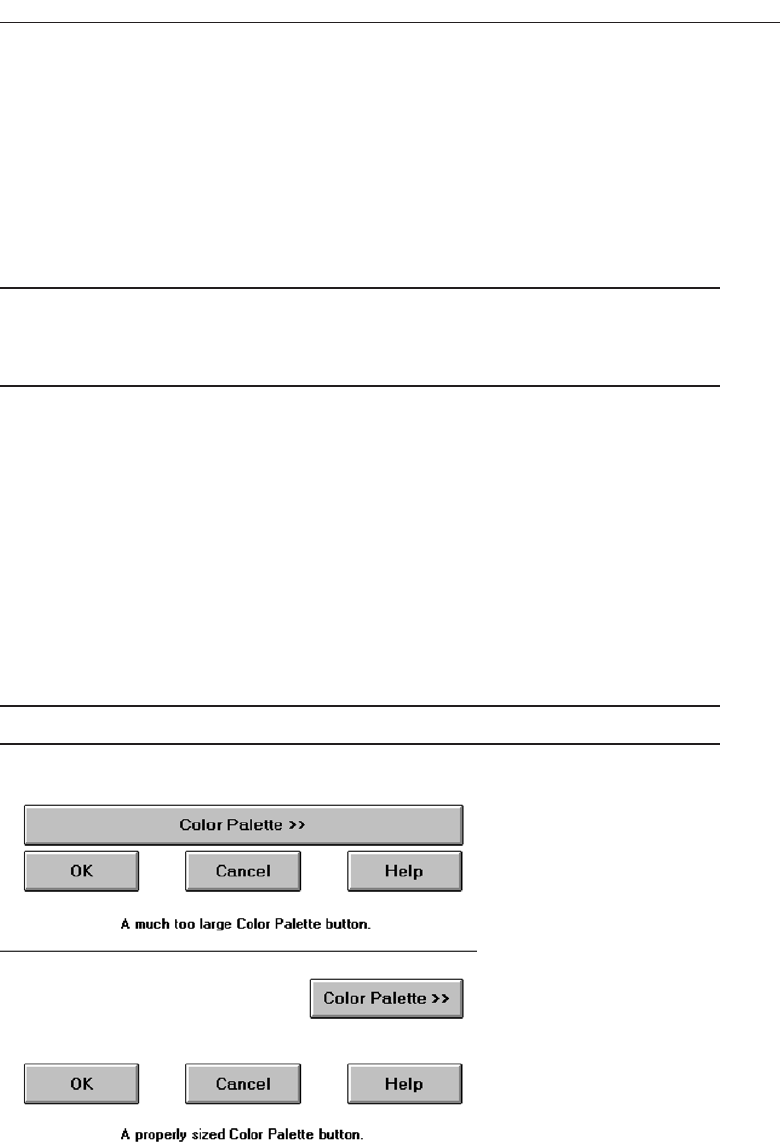
Apply—Any changed information in the window is accepted and again displayed
in the window that remains open.
Close—Closes the window.
Help—Opens online Help.
Always follow all platform presentation and usage guidelines for standard button
functions.
Size
■
Provide as large a button as feasible.
■
Maintain consistent button heights and widths.
❷
Exception: Buttons containing excessively long labels may be wider.
Provide as large a button as possible, consistent with Fitts’ Law (see Step 1 “Know
Your User or Client ”). Buttons must, at minimum, be wide enough to accommodate
the longest label. Leave at least two pixels between labels and button borders. A com-
mand button’s minimum height should be 25 pixels. Create, however, standard, equal-
sized buttons encompassing the majority of system functions. When a button’s label will
not fit within the standard size, expand the button’s size to achieve a proper label fit.
Never reduce the font size of some labels to create equal-sized buttons. In this case, but-
tons of different widths are preferable. Also, do not create an unnecessarily wide button
for aesthetic balance purposes, as illustrated by the Color Palette button in Figure 7.4.
The perceptual model we possess in our memory for a button will be lost.
Number
■
Restrict the number of buttons on a window to six or fewer.
Choose the Proper Screen-Based Controls 409
Figure 7.4 Improper and proper button sizes.
3900 P-07 (step 7) 4/24/02 2:04 PM Page 409

The maximum number of buttons on a window must reflect a balance between ef-
fectiveness, real estate efficiency, and operational simplicity. Having no more than six
buttons per window or dialog box seems to appropriately balance these issues. If an
extra button or two is necessary and space is available, they may be included.
Location and Layout
■
Maintain consistency in button location between windows.
■
Never simply “fit” buttons in available space.
■
If buttons are for exiting the dialog:
— Position them centered and aligned horizontally at the bottom.
■
If buttons are used for invoking a dialog feature or expanding the dialog:
— Position them centered and aligned vertically on the right side.
■
If a button has a contingent relationship to another control:
— Position it adjacent to the related control.
■
If a button has a contingent relationship to a group of controls:
— Position it at the bottom or to right of related controls.
■
If, due to space constraints, exiting and expanding/invoking feature buttons must
be placed together:
— If at the bottom, place exiting buttons to the right, separating the groupings by
one button’s width.
— If along the right side, place exiting buttons at the bottom, separating the group-
ings by one button’s height.
■
For exiting and expanding/invoking feature buttons, do not:
— Align with the other screen controls.
— Present displayed within a line border.
■
Provide equal and adequate spacing between adjacent buttons.
■
Provide adequate spacing between buttons and the screen body controls.
Command buttons should be positioned in consistent positions within a window.
This enables a person to memorize button locations and predict where they will appear
when a window is presented. For an experienced user this permits faster pointing and
activation because a button may be identified simply by its location without its label
having to be read, and a mouse movement to that location may be commenced before
a window is even displayed. Consistent locations also aid in quickly discriminating the
different kinds of buttons described below. A common failing of many windows is that
buttons are positioned within windows after locations for the other window controls
are established. When this occurs, buttons are positioned where there is space available.
The result is usually a hodgepodge of locations. Never simply “fit” buttons in available
space. Allocate a space for buttons before the other control locations are established.
Button location within a window is dependent upon the type of button. Buttons ex-
iting a dialog, and usually closing the window, should be positioned horizontally and
centered across the lower part of the window. This positioning places the buttons at the
end of the dialog. A study of Web pages (Spool et al., 1997) found that people preferred
410 Step 7
3900 P-07 (step 7) 4/24/02 2:04 PM Page 410
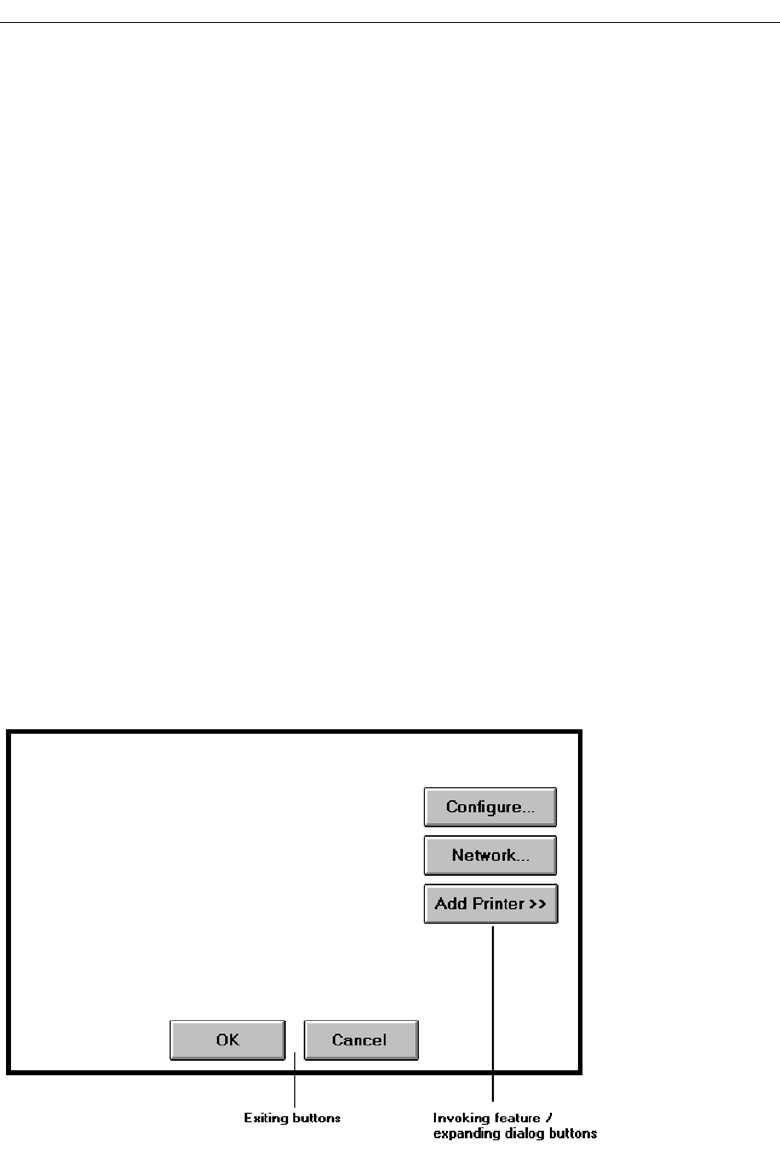
to scroll to the bottom of a page to press the final buttons. If a button invokes a dialog
feature or expands the dialog, position it centered and aligned vertically along the right
side of the window. Maintaining these consistent locations will enable a person to
quickly identify what general kind of button it is, and what kind of action will occur if
the button is activated. The location of the exiting buttons across the bottom will also
allow more efficient use of window real estate when invoking/expanding buttons are
not included within a window. Exiting and expanding/invoking feature button locations
are illustrated in Figure 7.5. If, due to screen space constraints, exiting and expanding/
invoking feature buttons must be positioned together at the screen bottom, place the
exiting buttons to the right, separating the groupings by one standard button’s width.
If they are located together along the right side, place exiting buttons at the bottom,
separating the groupings by one button’s height.
If a button has a contingent relationship to another control, position it adjacent to the
related control in the order in which the controls are usually operated, as illustrated in
Figure 7.6. If a button possesses a contingent relationship to a group of controls, posi-
tion it at the bottom or to the right of the grouping, again in logical flow order, as illus-
trated in Figure 7.7.
For exiting and expanding/invoking feature buttons, do not provide alignment with
the other screen controls. Maintain alignment and spacing only within the buttons
themselves. Trying to align the buttons to other screen controls will most often create
variable spacing between the buttons themselves, which is visually distracting. Also,
do not display buttons within a line border; instead present them on the background of
the window itself. The unique physical look of the buttons is strong enough for them
to create their own visual grouping. Reserve line borders for individual controls or
groups of controls that are in greater need of closure. Too many borders can also cre-
ate visual clutter.
Choose the Proper Screen-Based Controls 411
Figure 7.5 Exiting and invoking feature/expanding dialog buttons.
3900 P-07 (step 7) 4/24/02 2:04 PM Page 411
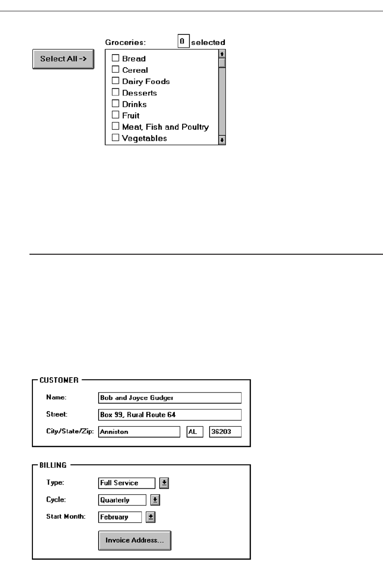
Provide equal and consistent spacing between adjacent buttons, and groups of but-
tons. Also, maintain adequate separation between screen buttons and other screen
controls.
Organization
■
Organize standard buttons in the manner recommended by the platform being
used.
■
For other buttons, organize them in common and customary grouping schemes.
— For buttons ordered left to right, place those for most frequent actions to the left.
— For buttons ordered top to bottom, place those for most frequent actions at the top.
■
Keep related buttons grouped together.
■
Separate potentially destructive buttons from frequently chosen selections.
412 Step 7
Figure 7.6 Button with contingent relationship to a control.
Figure 7.7 Button with contingent relationship to a grouping.
3900 P-07 (step 7) 4/24/02 2:04 PM Page 412
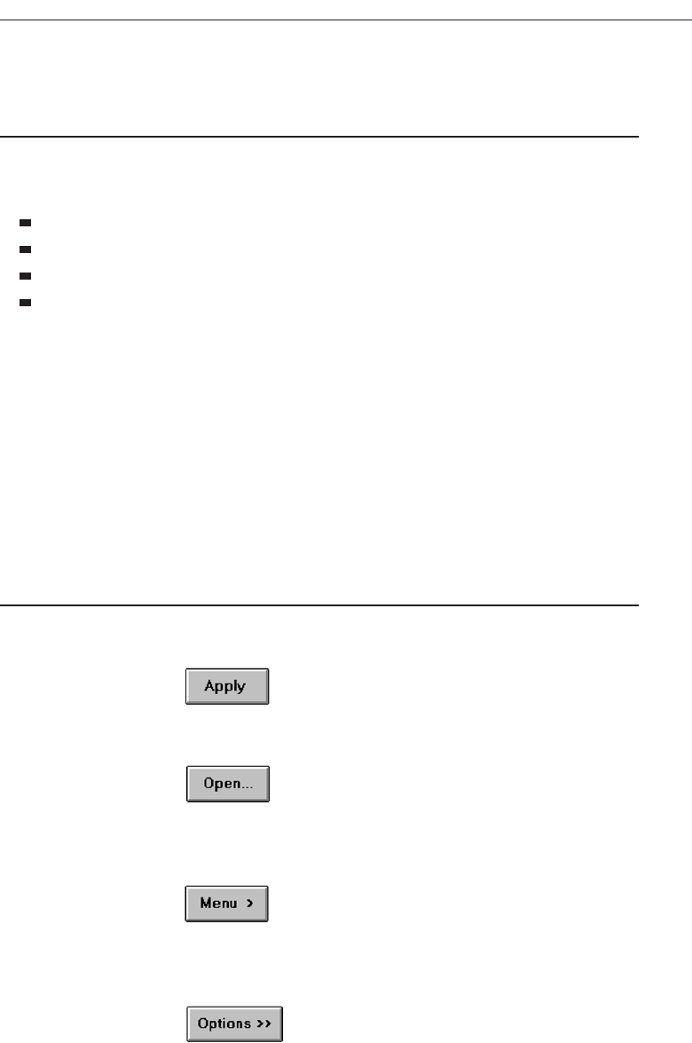
■
Buttons found on more than one window should be consistently positioned.
■
The order should never change.
■
For mutually exclusive actions, use two buttons; do not dynamically change the text.
Follow the standard, consistent ordering schemes recommended by the platform
being used. Windows recommends the following:
An affirmative action to the left (or above).
The default first.
OK and Cancel next to each other.
Help last, if supported.
Other platforms may suggest a different ordering. If differences exist, and people may
be using more than one platform, some organizational compromises may be necessary.
Buttons should be ordered logically, such as by frequency of use, sequence of use, or
importance. For buttons arrayed left to right, start the ordering from left to right. For
buttons arrayed top to bottom, start the ordering from top to bottom.
Keep related buttons grouped together. Separate potentially destructive buttons
from frequently chosen selections to avoid inadvertent activation and potentially cata-
strophic results. Always locate the same buttons that appear on different windows in
consistent positions. For mutually exclusive actions, avoid using one button that toggles
changing text. This can be confusing. Use two buttons with labels that clearly describe
the two actions.
Intent Indicators
■
When a button causes an action to be immediately performed, no intent indicator is
necessary.
Figure 7.8
■
When a button leads to a cascading dialog, include an ellipsis (...) after the label.
Figure 7.9
■
When a button leads to a menu, include a triangle pointing in the direction the
menu will appear after the label.
Figure 7.10
■
When a button leads to an expanding dialog, include a double arrow (>>) with the
label.
Figure 7.11
Choose the Proper Screen-Based Controls 413
3900 P-07 (step 7) 4/24/02 2:04 PM Page 413
■
When a button has a contingent relationship to another control that must be indi-
cated, include a single arrow (->) pointing at the control.
Figure 7.12
Button intent indicators will follow, where applicable, the same conventions used
for menu items. When a button causes a command to be performed immediately, no
special intent indicator is necessary on the button. When a button leads to a cascading
dialog box, include an ellipsis with the label. When a button leads to a menu of choices,
include a triangle after the label; point the triangle in the direction the menu will appear.
If a button expands the dialog, include a double arrow with the label. When a button has
a contingent relationship to another control, include a single arrow pointing at the con-
trol. Intent indicators are very useful because they enable the user to predict the con-
sequences of an intended action.
Expansion Buttons
■
Gray them out after expansion.
■
Provide a contraction button, if necessary.
— Locate it beneath, or to right of, the expansion button.
— Gray it out when not applicable.
When a button that expands a dialog is activated, and the dialog is expanded, dis-
play the button dimmed or grayed out. If the dialog can again be contracted, provide a
contraction button beneath the expansion button or to the right of it. Gray this button
out when the dialog is contracted; display it at normal intensity when the dialog is
expanded.
Defaults
■
Intent:
— When a window is first displayed, provide a default action, if practical.
■
Selection:
— A default should be the most likely action:
• A confirmation.
• An application of the activity being performed.
• A positive action such as OK, unless the result is catastrophic.
— If a destructive action is performed (such as a deletion), the default should be
Cancel.
■
Presentation:
— Indicate the default action by displaying the button with a bold or double border.
■
Procedures:
— The default can be changed as the user interacts with the window.
— When the user navigates to a button, it can temporarily become the default.
414 Step 7
3900 P-07 (step 7) 4/24/02 2:04 PM Page 414
— Use the Enter key to activate a default button.
— If another control requires use of the Enter key, temporarily disable the default
while the focus is on the other control.
— Permit double-clicking on a single selection control in a window to also carry out
the default command.
When a window with buttons is first displayed, provide a default action whenever
practical. The default action should be the most likely action within the window. It may
be a confirmation, an application of the activity being performed, or a positive response
such as OK. If the default is irreversible or destructive (such as Delete), the default should
be Cancel, requiring a person to change the selection in order to perform the destructive
action. If none of the buttons is destructive in nature, the default button should be the one
most frequently selected.
The default can be changed as the user interacts with a window. When the user nav-
igates to a button, it can temporarily become the default. Return the button to its orig-
inal state when the focus leaves a button. Permit use of the Enter key to activate a default
button. If another control requires use of the Enter key, temporarily disable the default
while the focus is on the other control. Permit double-clicking on a single selection con-
trol in a window to also carry out the default command.
Unavailable Choices
■
Temporarily unavailable choices should be dimmed or grayed out.
A button should visually indicate whether it is available for activation. Dim or gray-
out buttons for actions that are not available.
Keyboard Equivalents and Accelerators
■
Equivalents:
— Assign a keyboard equivalent mnemonic to each button to facilitate keyboard
selection.
— The mnemonic should be the first character of the button’s label.
• If duplication exists in first characters, for duplicate items, use another character
in the label.
• Preferably, choose the first succeeding consonant.
— Designate the mnemonic character by underlining it.
— Maintain the same mnemonic on all identical buttons on other screens.
Figure 7.13
■
Accelerators:
— Assign a keyboard accelerator to each button to facilitate keyboard selection.
Choose the Proper Screen-Based Controls 415
3900 P-07 (step 7) 4/24/02 2:04 PM Page 415

Enabling the user to select button actions through the typewriter keyboard pro-
vides flexibility and efficiency in the dialog. To do this, provide keyboard equivalent,
single-character mnemonic codes that, when typed, will cause the action to be per-
formed. The suggested method is to indicate the accelerator by underlining the proper
character in the button label.
Keyboard accelerators, a keyboard key or combination of keys, may also be assigned
to buttons to facilitate keyboard activation.
Keyboard equivalents and accelerators, including Microsoft Windows standard
ones, were more fully described in Step 4 “Develop Navigation Schemes and Menus.”
Scrolling
■
If a window can be scrolled, do not scroll the command buttons.
— Exception: if the screen cannot scroll independently of the buttons.
■
Use buttons to move between multipage forms, not scroll bars.
— Label buttons Next and Previous.
If scrolling the contents of a window, never scroll the buttons. They should be avail-
able at all times. Web page screens, whose content cannot be scrolled independently of
buttons, are exceptions to this rule at the moment. Use buttons to move between mul-
tipage forms, not scroll bars. Paging is, conceptually, easier for people to use and under-
stand, and was discussed in detail in Step 3 “Understand the Principles of Good Screen
Design.” Label the buttons Next and Previous.
Button Activation
■
Pointing:
— Highlight the button in some visually distinctive manner when the pointer is rest-
ing on it and the button is available for selection.
■
Activation:
— Call attention to the button in another visually distinctive manner when it has
been activated or pressed.
— If a button can be pressed continuously, permit the user to hold the mouse button
down and repeat the action.
Highlight the button in some visually distinctive manner when the pointer is rest-
ing on it and it is available for selection. This will provide the user with feedback indi-
cating that the selection process may be performed. Some platforms display a brighter
button.
Highlight the button in another visually distinctive manner when it has been activated
or pressed, to indicate that the action is successful. One platform subdues or grays out
the button. Another has raised beveled buttons that appear to sink into the screen when
selected. Another alternative is to move the button slightly as if it has been depressed.
416 Step 7
3900 P-07 (step 7) 4/24/02 2:04 PM Page 416

If a button can be pressed continuously, permit the mouse button to be held down and
the action repeated.
Toolbars
Toolbars are compilations of commands, actions, or functions, usually graphical in struc-
ture but sometimes textual, grouped together for speedy access. Microsoft Windows
defines a toolbar as a panel that contains a set of controls. Toolbars may also be called
button bars,control bars, or access bars. Specialized toolbars may also be referred to as rib-
bons,toolboxes, or palettes. Toolbars may also appear in palette windows.
Usage
•To provide easy and fast access to most frequently used commands or options across
multiple screens.
•To invoke a subapplication within an application.
•To use in place of certain menu items.
Provide toolbars to allow fast and easy access to a system’s most frequently used com-
mands, functions, or options. Also provide toolbars for easily invoking subapplications
within an application. Toolbars are considered “fast paths” or expert aids. All toolbar
functions must also be obtainable by normal textual menu means, including through
use of the menu bar. One exception: if menu text cannot clearly explain an item and a
graphical toolbar representation can, the toolbar item may replace the menu item.
Structure
■
Images:
— Provide buttons of equal size.
— Create a meaningful and unique icon.
• Design them using icon design guidelines.
— Center the image within the button.
— Give the button a raised appearance.
— Ensure that toolbar images are discernible from Web page graphical images.
■
Text:
— Create a meaningful label, adhering to label guidelines for command buttons.
— Create toolbar buttons of equal size, following the size guidelines recently
described.
■
Consistency:
— Use the same icon throughout an application and between applications.
Create meaningful and unique images and icons utilizing the icon design guidelines
in Step 11 “Create Meaningful Graphics, Icons, and Images.” Center the image within
the button and provide an associated textual label. A label is always necessary to
Choose the Proper Screen-Based Controls 417
3900 P-07 (step 7) 4/24/02 2:04 PM Page 417

ensure button comprehensibility. One study has found that placing graphics and words
on buttons, makes them more usable than including graphics only. Create the label
following the guidelines for command buttons. The label may be located within the but-
ton, positioned beneath it, or presented on demand through a ToolTip control. Labels
beneath toolbar button images will provide a larger pointing target. If the label is located
within the button and the system will be translated into one or more other languages,
allow extra space for the label. See International Translation in Step 10 “Provide Effective
Internationalization and Accessibility” for further important considerations. A ToolTip
control is discussed later in this chapter. Give the button a raised appearance to convey
that it is a screen navigation element to be pressed. Ensure that toolbar images are dis-
cernible from all Web page graphical images.
For text-only toolbar buttons, create a meaningful label, adhering to the label guide-
lines for command buttons. Provide consistent icons throughout all applications.
Size
■
Button:
— 24 (w) by 22 (h) pixels, including border.
— 32 (w) by 30 (h) pixels, including border.
— Larger buttons can be used on high-resolution displays.
■
Label:
— 16 (w) by 16 (h) pixels.
— 14 (w) by 24 (h) pixels.
■
Default:
— Provide the smaller size as the default size with a user option to change it.
■
Image:
— Center the image in the button.
A toolbar button should be large but not too large because of the number that may
need to be displayed. Microsoft provides the above guidelines. Other sizing guidelines
and much more detailed image guidelines are presented in Step 11.
Organization
■
Order the buttons based on common and customary grouping schemes.
— For buttons ordered left to right, place those for the most frequently used actions
to the left.
— For buttons ordered top to bottom, place those for the most frequently used ac-
tions at the top.
■
Keep related buttons grouped together.
■
Separate potentially destructive buttons from frequently chosen selections.
■
Permit user reconfiguration of button organization.
Toolbar buttons should be ordered logically, such as by frequency of use, sequence
of use, or importance. If the buttons reflect a quality on a continuum such as colors or
418 Step 7
3900 P-07 (step 7) 4/24/02 2:04 PM Page 418

shades, follow standard and expected ordering schemes. For buttons arrayed left to
right, start the ordering from left to right. For buttons arrayed top to bottom, start the
ordering from top to bottom.
Keep related buttons grouped together. Separate potentially destructive buttons
from frequently chosen selections to avoid inadvertent activation and potentially cata-
strophic results. Permit the user to reconfigure the button organizational structure to
better meet his or her unique needs.
Location
■
Position main features and functions bar horizontally across top of window just
below menu bar.
■
Position subtask and subfeatures bars along sides of window.
■
Permit the location of the bar to be changed by the user.
■
Permit display of the bar to be turned on or off by the user.
— Also provide access through standard menus.
Locate the main features and functions tool bar horizontally across the top of the
window just below the menu bar. Locate subtask and subfeature tool bars along sides
of window. Permit the location of the toolbar to be changed by the user. Since a toolbar
can create visual noise, permit its display to be turned on or off. Always also provide
access to the toolbar actions through standard menus.
Active Items
■
Make only currently available toolbar items available.
■
Temporarily not available items may be displayed grayed out.
As the user moves around through an application, items at various points that are not
applicable do not have to be displayed. Temporarily unavailable items may be grayed
out.
Customization
■
Permit toolbars to be turned off by the user.
■
Allow the customizing of toolbars.
— Provide a default, however.
Permit the toolbars to be turned off by the user, should their use not be necessary or
should more screen space be desired. Also, allow users to customize the toolbar, deter-
mining what they would like to add or remove. Many users do not customize them,
however, so a default set should always be provided.
Choose the Proper Screen-Based Controls 419
3900 P-07 (step 7) 4/24/02 2:04 PM Page 419

Keyboard Equivalents and Accelerators
■
Equivalents:
— Assign keyboard equivalents to facilitate keyboard selection.
— Maintain the same mnemonic on all identical buttons on all screens.
■
Accelerators:
— Assign a keyboard accelerator to facilitate keyboard selection.
Provide keyboard equivalents and accelerators to facilitate keyboard selection.
Maintain the same mnemonic on all identical buttons on all screens. One caution, if a
particular mnemonic is being used somewhere else in the window; it may not be avail-
able for use on the toolbar.
Button Activation
■
Pointing:
— Highlight the button in some visually distinctive manner when the pointer is
resting on it and the button is available for selection.
■
Activation:
— Call attention to the button in another visually distinctive manner when it has
been activated or pressed.
Highlight the button in some visually distinctive manner when the pointer is resting
on it and the button is available for selection. This will provide the user with feedback
indicating that the selection process may be performed. Highlight the button in another
visually distinctive manner when it has been activated or pressed, to indicate that the
action is successful.
Text Entry/Read-Only Controls
A Text Entry/Read-Only control contains text that is exclusively entered or modified
through the keyboard. It may also contain entered text being presented for reading or
display purposes only.
Text Boxes
■
Description:
— A control, usually rectangular in shape, in which:
• Text may be entered or edited.
• Text may be displayed for read-only purposes.
— Usually possesses a caption describing the kind of information contained within it.
— An outline field border:
• Is included for enterable/editable text boxes.
• Is not included for read-only text boxes.
420 Step 7
3900 P-07 (step 7) 4/24/02 2:04 PM Page 420

— Two types exist:
• Single line.
• Multiple line.
— When first displayed, the box may be blank or contain an initial value.
■
Purpose:
— To permit the display, entering, or editing of textual information.
— To display read-only information.
■
Advantages:
— Very flexible.
— Familiar.
— Consumes little screen space.
■
Disadvantages:
— Requires use of typewriter keyboard.
— Requires user to remember what must be keyed.
■
Proper usage:
— Most useful for data that is:
• Unlimited in scope.
• Difficult to categorize.
• Of a variety of different lengths.
— When using a selection list is not possible.
Two types of text boxes exist. One consists of a rectangular box into which informa-
tion is typed. It may also be referred to as an edit control. The second is also rectangular
in shape but contains text displayed purely for read-only purposes. The former type
has historically been referred to as an entry field, the latter as an inquiry or display field.
While display-only text boxes are not operable in the true sense of the word, the infor-
mation contained within them is capable of being modified by other controls. Hence,
they will be reviewed as an operable control since their characteristics, and the charac-
teristics of an entry field, are very similar. Some platforms classify both as text boxes.
Text boxes almost always possess a separate caption describing the kind of information
to be keyed. An enterable text box is visually presented on the screen, its shape being
defined by an outline border, a reversal in screen polarity, a white background, or vari-
ous combinations of these features. The information in a read-only text field is most
effectively displayed on the screen background, not in a box. Therefore, a box does not
surround the information contained in read-only text boxes.
Single-Line and Multiple-Line Text Boxes
■
Single line:
— Description:
• A control consisting of no more than one line of text.
— Purpose:
• To make textual entries when the information can be contained within one line
of the screen.
Choose the Proper Screen-Based Controls 421
3900 P-07 (step 7) 4/24/02 2:04 PM Page 421
— Typical uses:
• Typing the name of a file to save.
• Typing the path of a file to copy.
• Typing variable data on a form.
• Typing a command.
■
Multiple line:
— Description:
• A control consisting of a multiline rectangular box for multiple lines of text.
— Purpose:
• To type, edit, and read passages of text.
— Typical uses:
• Creating or reading an electronic mail message.
• Displaying and editing text files.
Text boxes exist in two forms: single line and multiple line. A single-line box is used
when the information contained within it can be confined to one screen line. Multiple-
line boxes are used when the information exceeds a single line. When first displayed, a
text box may be blank or contain an initial value. Text boxes are illustrated in Figure
7.14.
Text boxes are familiar, flexible, and consume little screen space. They do require a
typewriter keyboard, which, depending upon one’s skill with a keyboard may be an
advantage or a disadvantage. A disadvantage to all is that what is keyed into an entry
field must often be remembered. They are most useful for data that is difficult to cate-
gorize or unlimited in scope, or when use of a selection field is not possible.
Captions
■
Structure and size:
— Provide a descriptive caption to identify the kind of information to be typed, or
contained within, the text box.
— Use a mixed-case font.
— Display the caption in normal intensity or in a color of moderate brightness.
422 Step 7
Figure 7.14 Text boxes.
3900 P-07 (step 7) 4/24/02 2:04 PM Page 422
■
Formatting:
— Single fields:
• Position the field caption to the left of the text box.
— Place a colon (:) immediately following the caption.
— Separate the colon from the text box by one space.
Figure 7.15
• Alternately, the caption may be placed above the text box.
— Place a colon (:) immediately following the caption.
— Position above the upper-left corner of the box, flush with the left edge.
Figure 7.16
— Multiple occurrence fields:
• For entry/modification text boxes:
— Position the caption left-justified one line above the column of entry fields.
Figure 7.17
• For display/read-only boxes:
— If the data field is long and fixed-length, or the displayed data is about the
same length, center the caption above the displayed text box data.
Figure 7.18
— If the data displayed is alphanumeric, short, or quite variable in length,
left-justify the caption above the displayed text box data.
Figure 7.19
Choose the Proper Screen-Based Controls 423
3900 P-07 (step 7) 4/24/02 2:04 PM Page 423

— If the data field is numeric and variable in length, right-justify the caption
above the displayed text box data.
Figure 7.20
Structure and size. Captions are usually added to text boxes using static text fields,
to be described shortly. Many toolsets do not include captions with text box con-
trols. Captions must be understandable and fully spelled out in a language mean-
ingful to the user. In general, abbreviations and contractions should not be used.
To achieve the alignment recommendations (to be discussed shortly), however,
an occasional abbreviation or contraction may be necessary. If so, choose those
that are common in the everyday language of the user or those that are meaning-
ful or easily learned. Use mixed-case text in the headline style, capitalizing only
the first letter of each word (except for articles, conjunctions, and prepositions—
a, the, and, for, and so on). Acronyms, abbreviations, or proper nouns that are
normally capitalized, however, may be capitalized. If the caption is of a sentence-
style nature, sentence-style capitalization should be followed. In this case, capital-
ize only the first letter of the first word of the caption.
In relation to the text box, the caption should be of normal intensity or consist
of a moderately bright color. Visual emphasis should always be given to the infor-
mation in the text box.
Single fields. For single fields, it is recommended that the caption precede the text
box. Place a colon (:) directly following the caption to visually separate the caption
from the data; separate the colon from the text box by one space.
Multiple occurrence fields. For multiple-occurrence fields, the caption should be
positioned above the columnized text boxes. The exact location of the caption will
depend on the kind of screen and the kind of data displayed. For entry screens,
the caption should be left-justified above the columnized entry fields. This will
signal the starting point of the text box and ensure that the caption is positioned
directly above the keyed data.
For display/read-only or inquiry screens in which text box information already ex-
ists, the positioning of the caption depends on the kind of information displayed
within the box. The objective is to center the caption over the information. If the box is
fixed-length, or the information to be displayed within it usually fills, or almost fills,
the box, center the caption above the data. If the information is alphanumeric and can
be quite variable in length, left-justify the caption. This will keep the caption directly
above the data when it appears in the box. Similarly, for numeric fields, right-justify the
caption to keep it above the data that will be right-justified when it appears.
424 Step 7
3900 P-07 (step 7) 4/24/02 2:04 PM Page 424
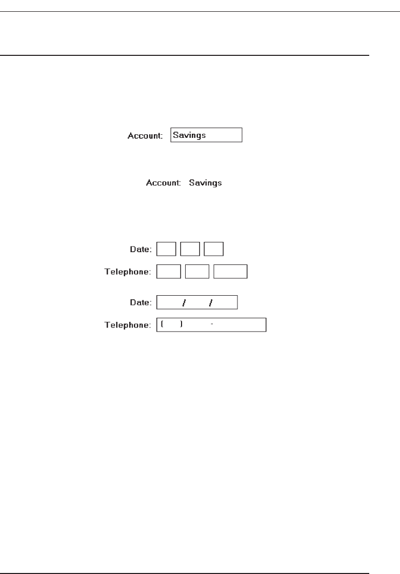
Fields
■
Structure:
— Identify entry/modification text boxes with a line border or reverse polarity rec-
tangular box.
• To visually indicate that it is an enterable field, present the box in a recessed
manner.
Figure 7.21
• Present display/read-only text boxes on the window background.
Figure 7.22
— Break up long text boxes through incorporation of slashes ( / ), dashes (-), spaces,
or other common delimiters.
Figure 7.23
■
Size:
— Size to indicate the approximate length of the field.
— Text boxes for fixed-length data must be large enough to contain the entire entry.
— Text boxes for variable-length data must be large enough to contain the majority
of the entries.
— Where entries may be larger than the entry field, scrolling must be provided to
permit keying into, or viewing, the entire field.
— Employ word wrapping for continuous text in multiple-line text boxes.
■
Highlighting:
— Call attention to text box data through a highlighting technique.
• Higher intensity.
• If color is used, choose one that both complements the screen background and
contrasts well with it.
■
Unavailable fields:
— Gray-out temporarily unavailable text boxes.
■
Fonts:
— To support multiple fonts, use a Rich-Text Box.
Choose the Proper Screen-Based Controls 425
3900 P-07 (step 7) 4/24/02 2:04 PM Page 425

Structure. A text box should attract attention, but not detract from the legibility of
the data contained within it, be capable of allowing an indication of the structure
of the data contained within it, and indicate the appropriate number of characters
to be keyed into it. An early study found that, in meeting these objectives, a bro-
ken underscore and an outlined box were the best delimiters for screen entry
fields. The older text-based screens traditionally have used the underscore as the
delimiter; graphical screens, the outlined box. Interestingly, both resemble the
coding areas most frequently found on paper forms. To visually indicate that it is
an enterable field, present the box in a recessed manner, as is done by Microsoft
Windows.
Present display/read-only text boxes on the window background. To make text
boxes more readable, it is desirable to break them up into logical pieces. Slashes,
dashes, and spaces should be inserted into the entry fields as illustrated.
Size. The size of a field must give an approximate indication of the data length. Text
boxes for fixed-length data must be long enough to contain the entry. Variable-
length text boxes should be large enough to contain the majority of the entries.
The size of a variable-length text box will be dependent on field alignment, space
utilization, and aesthetics. If a text box is not large enough to key or view the en-
tire entry, it must be scrollable. Scrolling, however, should be avoided whenever
possible.
Highlighting. Text box data (as opposed to captions) is the most important part
of a screen. Call attention to it through highlighting techniques. With mono-
chrome screens, display it bright or in high intensity. With color, use the bright-
est colors. If a box is the delimiter, choose a background color that complements
the screen body background and provides good contrast with the color chosen
for the data.
Temporarily unavailable. For fields temporarily unavailable for entry, gray-out the
box and its associated label. This temporary graying out implies, however, that
the user can perform some action that will again make the field enterable.
Rich-Text Boxes. Most text boxes typically support only the standard system font. A
Microsoft Windows rich-text box is similar to a text box but provides, in addition,
font properties, such as typeface, size, color, bold, and italics. It also supports
character and paragraph alignment, tabs, indents, and numbering, as well as
printing.
Selection Controls
A selection control presents on the screen all the possible alternatives, conditions, or
choices that may exist for an entity, property, or value. The relevant item or items are
selected from those displayed. Some selection controls present all the alternatives to-
gether, visibly on a screen; others may require an action to retrieve the entire listing and/
or scrolling to view all the alternatives. Selection controls include radio buttons, check
boxes, list boxes, drop-down/pop-up list boxes, and palettes.
426 Step 7
3900 P-07 (step 7) 4/24/02 2:04 PM Page 426

Radio Buttons
■
Description:
— A two-part control consisting of the following:
• Small circles, diamonds, or rectangles.
• Choice descriptions.
— When a choice is selected:
• The option is highlighted.
• Any existing choice is automatically unhighlighted and deselected.
■
Purpose:
— To set one item from a small set of mutually exclusive options (2 to 8).
■
Advantages:
— Easy-to-access choices.
— Easy-to-compare choices.
— Preferred by users.
■
Disadvantages:
— Consume screen space.
— Limited number of choices.
■
Proper usage:
— For setting attributes, properties, or values.
— For mutually exclusive choices (that is, only one can be selected).
— Where adequate screen space is available.
— Most useful for data and choices that are:
• Discrete.
• Small and fixed in number.
• Not easily remembered.
• In need of a textual description to meaningfully describe the alternatives.
• Most easily understood when the alternatives can be seen together and com-
pared to one another.
• Never changed in content.
— Do not use:
• For commands.
• Singly to indicate the presence or absence of a state.
Structure. Controls of this type take several different physical forms. They are most
often called radio buttons because of their resemblance to similar controls on ra-
dios. Microsoft Windows, however, refers to these controls as option buttons. One
common display method consists of a circle associated with each choice descrip-
tion. When an alternative is selected, the center of the circle is partially or fully
filled in to provide a visual indication that it is the active choice. Other styles of
radio buttons have also been implemented. Microsoft Windows uses a small de-
pressed circle that contains a small dot when selected. Other presentation meth-
ods include small circular buttons that look recessed when not selected and are
raised when selected, and small diamond-shaped buttons that look raised when
Choose the Proper Screen-Based Controls 427
3900 P-07 (step 7) 4/24/02 2:04 PM Page 427
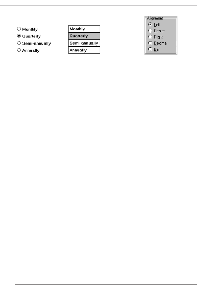
not selected and depressed when selected. Another method for presenting exclu-
sive choices is the butted box or button where the alternatives are inscribed in hor-
izontally arrayed adjoining rectangles resembling command buttons. The selected
alternative is highlighted in some way. Examples of radio buttons are illustrated
in Figures 7.24 and 7.25. Deciding on which style to use seems to be more a mat-
ter of preference than performance. No published comparison studies are avail-
able for guidance.
Purpose. Radio buttons are used to designate one of a small set of options, no more
than about eight. As with a radio, the choices are mutually exclusive, only one fre-
quency or setting is permitted at one time in the presented array.
Advantages/disadvantages. With radio buttons, all alternatives are always visible.
Therefore, it is easy to access and compare choices. Two recent studies (Johnsgard,
Page, Wilson, and Zeno, 1995; Tullis and Kodimer, 1992) have found radio buttons
a preferred and very effective control for presenting mutually exclusive choices.
These studies will be described later in this chapter. On the negative side, radio
buttons do consume a certain amount of screen real estate, limiting the number of
alternatives that can reasonably be displayed.
Proper usage. Radio buttons are useful for setting attributes, properties, or values
where adequate screen space is available. The alternatives should be discrete,
small in number, and in need of a textual description to identify them meaning-
fully. Radio buttons are helpful in situations where the alternatives cannot always
be easily remembered or where displaying the alternatives together facilitates un-
derstanding and selecting the proper choice. The radio button choices displayed
should be stable, never changing in content.
Never use radio buttons for implementing commands, such as causing a dia-
log box to immediately appear based upon a button setting. Commands to the
system should result from direct user command actions, such as pressing a com-
mand button. This allows control to remain with the user. Unfortunately, use of a
radio button to perform an action is a common Web page design problem. Also,
do not use one radio button by itself to indicate the presence or absence of a state.
A single check box is recommended for this purpose.
Choice Descriptions
■
Provide meaningful, fully spelled-out choice descriptions clearly describing the val-
ues or effects set by the radio buttons.
428 Step 7
Figure 7.24 Radio buttons. Figure 7.25 Radio buttons.
3900 P-07 (step 7) 4/24/02 2:04 PM Page 428

■
Display in a single line of text.
■
Display using mixed-case letters, using the sentence style.
■
Position descriptions to the right of the button. Separate them by at least one space
from the button.
■
When a choice is conditionally unavailable for selection, display the choice descrip-
tion grayed out or dimmed.
■
Include a None choice if it adds clarity.
Choice descriptions must be clear, meaningful, fully spelled out, and displayed in a
mixed-case text. For multiword descriptions, capitalize the first letter of the description
and use the sentence style for the remainder of the description. Small button-type in-
dicators should be located to the left of the choice description; rectangular boxes that
resemble a command button will find the description within the box. Small buttons as-
sociated with text are advantageous when the choice description must be lengthy. De-
scriptions in boxes impose restrictions on the number of words that can be inscribed
within them. When a choice is unavailable for selection in the present condition, display
the choice selection grayed out or dimmed. Where a “None” alternative clarifies the al-
ternatives presented, provide it in the listing.
Size
■
Show a minimum of two choices, a maximum of eight.
Generally, selection fields of this style should not present more than eight choices.
Displaying more than eight is usually not efficient, wasting screen space. If the number
of choices exceeds this maximum, consider using a single selection list box or a drop-
down list box. Johnsgard, Page, Wilson and Zeno (1995) have found, however, that even
for as many as thirty choices, radio buttons were preferred by users, and performed bet-
ter, than these other controls.
Defaults
■
When the control possesses a state or affect that has been predetermined to have a
higher probability of selection than the others, designate it as the default and display
its button filled in.
■
When the control includes choices whose states cannot be predetermined, display
all the buttons without setting a dot, or in the indeterminate state.
■
When a multiple selection includes choices whose states vary, display the buttons in
another unique manner, or in the mixed value state.
Provide a default setting for a radio button whenever possible. In some situations,
however, a default setting may be difficult to predetermine, or inappropriate to
Choose the Proper Screen-Based Controls 429
3900 P-07 (step 7) 4/24/02 2:04 PM Page 429
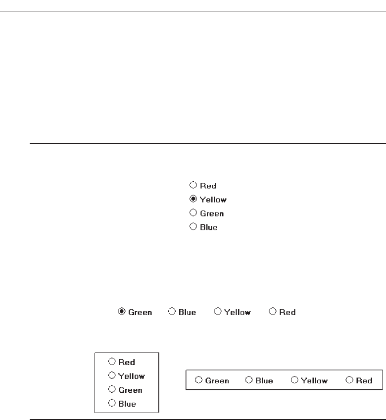
predetermine (sex: male or female?). Microsoft Windows provides for additional set-
tings called the indeterminate or mixed value states. When a default setting cannot be
preestablished because of the nature of the information, leave all the buttons blank or
not filled in. If a multiple selection on an object is performed and the values in the se-
lection are mixed or differ, display the applicable radio buttons in another distinctive
manner, such as a gray shadow.
Structure
■
A columnar orientation is the preferred manner of presentation.
■
Left-align the buttons and choice descriptions.
Figure 7.26
■
If vertical space on the screen is limited, orient the buttons horizontally.
■
Provide adequate separation between choices so that the buttons are associated with
the proper description.
— A distance equal to three spaces is usually sufficient.
Figure 7.27
■
Enclose the buttons in a border to visually strengthen the relationship they possess.
Figure 7.28
The preferred orientation of radio buttons is columnar. This aids visual scanning
and choice comparison. Controls with small button indicators usually fit best in this
manner because choice descriptions do not have to be restricted in size. Left-align the
buttons and choice descriptions. Provide adequate separation—about three spaces—
between choices if they must be presented horizontally. Enclose the buttons in a bor-
der. Rectangular boxes should be of equal height and/or width and be butted up
against one another. This will distinguish them from nonexclusive choice fields (check
boxes) that will be separated from one another. Figure 7.29 illustrates the best ways to,
and not to, present radio buttons.
430 Step 7
3900 P-07 (step 7) 4/24/02 2:04 PM Page 430
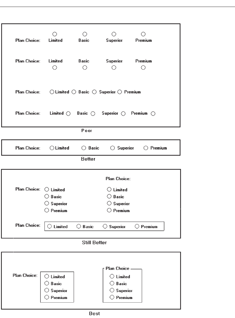
Choose the Proper Screen-Based Controls 431
Figure 7.29 Ways to, and not to, present radio buttons.
3900 P-07 (step 7) 4/24/02 2:04 PM Page 431
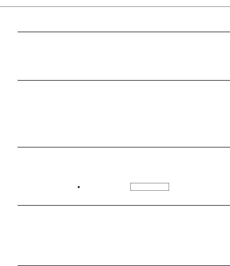
Organization
■
Arrange selections in expected order or follow other patterns such as frequency of
occurrence, sequence of use, or importance.
— For selections arrayed top to bottom, begin ordering at the top.
— For selections arrayed left to right, begin ordering at the left.
■
If, under certain conditions, a choice is not available, display it subdued or less
brightly than the available choices.
Selection choices should be organized logically. If the alternatives have an expected
order, follow it. Other ordering schemes such as frequency of use, sequence of use, or
importance may also be considered. Always begin ordering at the top or left. If, under
certain conditions, a choice is not available, display the nonselectable choice subdued
or less brightly than the available choices.
Related Control
■
Position any control related to a radio button immediately to the right of the choice
description.
■
If the radio button choice description also acts as the label for the control that follows
it, end the label with an arrow (>).
Figure 7.30
Position any control related to a check box immediately to the right of the choice de-
scription. If a the check box label also acts as the label for the control that follows it, pre-
sent it in mixed case, sentence style text, and end the label with an arrow (>) to relate
the choice description to the control.
Captions
■
Structure:
— Provide a caption for each radio button control.
• Exception: In screens containing only one radio button control, the screen title
may serve as the caption.
■
Display:
— Fully spelled out.
— In mixed-case letters, capitalizing the first letter of all significant words.
■
Columnar orientation:
— With a control border, position the caption:
• Upper-left-justified within the border.
❍Responsible Person > Grandfather
❍No Resposible Party
432 Step 7
3900 P-07 (step 7) 4/24/02 2:04 PM Page 432
Figure 7.31
• Alternately, the caption may be located to the left of the topmost choice
description.
Figure 7.32
— Without an enclosing control border, position the caption:
• Left-justified above the choice descriptions, separated by one space line.
Figure 7.33
• Alternately, the caption may be located to the left of the topmost choice
description.
Figure 7.34
■
Horizontal orientation:
— Position the caption to the left of the choice descriptions.
Figure 7.35
• Alternately, with an enclosing control border, left-justified within the border.
Figure 7.36
— Be consistent in caption style and orientation within a screen.
Choose the Proper Screen-Based Controls 433
3900 P-07 (step 7) 4/24/02 2:04 PM Page 433
Structure. Using a static text or group box control field, display the caption fully spelled
out, using mixed-case letters in the headline style. Some occasional common abbre-
viations may be used, however, to achieve the alignment goals to be specified.
Columnar orientation. The preferred location of a radio button control caption within
a screen can vary. Ideally, the caption is placed upper-left-justified within a line
border or group box that surrounds columnar-oriented radio buttons, as shown in
the example in the above guideline summary. If other controls on a screen possess
captions positioned to the left, and the radio button control is aligned with these
controls, position the caption to the left of the control. This will help achieve
screen efficiency, minimize viewer eye movements, and provide caption and
choice distinctiveness. Without an enclosing control border, position the caption
left-justified above the choice descriptions, or to the left of the topmost choice
description.
Horizontal orientation. In a horizontal orientation, position the caption to the left of
the choice descriptions, or left-justified within an enclosing control border. If the
screen contains only one radio button control, the screen title may serve as the
control caption. Be consistent in caption style and orientation within a screen.
Keyboard Equivalents
■
Assign a keyboard mnemonic to each choice description.
■
Designate the mnemonic by underlining the applicable letter in the choice description.
Figure 7.37
Assign unique keyboard mnemonics for each alternative in the standard way, choos-
ing the first letter (or another) and designating it by character underlining.
Selection Method and Indication
■
Pointing:
— The selection target area should be as large as possible.
• Include the button and the choice description text.
— Highlight the selection choice in some visually distinctive way when the cursor’s
resting on it and the choice is available for selection.
• This cursor should be as long as the longest choice description plus one space
at each end. Do not place the cursor over the small button.
Figure 7.38
434 Step 7
3900 P-07 (step 7) 4/24/02 2:04 PM Page 434

■
Activation:
— When a choice is selected, distinguish it visually from the unselected choices.
• A radio button should be filled in with a solid dark dot or made to look de-
pressed or higher through use of a shadow.
— When a choice is selected, any other selected choice must be deselected.
■
Defaults:
— If a radio button control is displayed that contains a choice previously selected or
a default choice, display the selected choice as set in the control
Pointing. The selection target area should be as large as possible in order to make it
easy to move to. If a small button is the selection indication method used, the tar-
get area should include the button and the choice description text. If the rectan-
gular box selection method is used, the entire box should be the target. Highlight
the selection choice in some visually distinctive way when the pointer is resting
on it and the choice is available for selection. If a small button is the selection indi-
cation method used, a distinctive reverse video, reverse color, or dotted or dashed
box selection cursor or bar may be used to surround the selected choice description.
This cursor should be as long as the longest description plus one space at each
end. The cursor should not cover the small button.
Activation. When a choice is selected, distinguish it visually from the unselected
choices. A radio button should be filled in with a solid dark dot or other similar
marking (for example, making the button look depressed or higher than the oth-
ers through the use of a drop shadow). A rectangular box can be highlighted in a
manner different from when it is pointed at, or a bolder border can be drawn
around it. When a choice is selected, any other selected choice must be deselected
or made inactive.
Defaults. If a selection field is displayed with a choice previously selected or a de-
fault choice, display the currently active choice in the same manner as when it is
selected.
MYTH Our software is highly usable—it includes all the latest interface
widgets.
Check Boxes
■
Description:
— A two-part control consisting of a square box and choice description.
— Each option acts as a switch and can be either “on” or “off.”
• When an option is selected (on), a mark such as an “X” or “check” appears
within the square box, or the box is highlighted in some other manner.
• Otherwise the square box is unselected or empty (off).
— Each box can be:
• Switched on or off independently.
• Used alone or grouped in sets.
Choose the Proper Screen-Based Controls 435
3900 P-07 (step 7) 4/24/02 2:04 PM Page 435

■
Purpose:
— To set one or more options as either on or off.
■
Advantages
— Easy-to-access choices.
— Easy-to-compare choices.
— Preferred by users.
■
Disadvantages:
— Consume screen space.
— Limited number of choices.
— Single check boxes difficult to align with other screen controls.
■
Proper usage:
— For setting attributes, properties, or values.
— For nonexclusive choices (that is, more than one can be selected).
— Where adequate screen space is available.
— Most useful for data and choices that are:
• Discrete.
• Small and fixed in number.
• Not easily remembered.
• In need of a textual description to describe meaningfully.
• Most easily understood when the alternatives can be seen together and com-
pared to one another.
• Never changed in content.
— Can be used to affect other controls.
— Use only when both states of a choice are clearly opposite and unambiguous.
Description. Check box controls differ from radio buttons in that they permit selec-
tion of more than one alternative. Each option acts as a switch and can be either
“on” or “off.” When an option is selected (on), an X or check appears within the
square box, or it is highlighted in some other manner. When not selected, the square
box is unselected or empty (off). Each box can be switched on or off independently.
Check boxes may be used alone or grouped in sets.
Check boxes, too, may take different physical forms and be called by different names.
The most common name is check boxes, the name used by Microsoft Windows. Others
names include: toggle buttons,switches, and two state nonexclusive settings. Not only their
names differ; differences also exist in the way these fields are presented on screens. One
very common display method is a check box, which, resembling its namesake, consists
of a square placed adjacent to each alternative. When the choice is selected, some systems
place an X in the square to provide a visual indication that it is active. Others, including
Microsoft Windows, place a check mark in the square, or fill in the selected square or
make it look depressed when selected.
Interestingly, in the past decade, Microsoft Windows and others have switched from
Xs to checks as the “on” mark in a check box. This has occurred because of possible con-
fusion concerning Xs that have existed in some using communities. In an engineering
environment, for example, an X marked in a box means not applicable or not set, while
436 Step 7
3900 P-07 (step 7) 4/24/02 2:04 PM Page 436
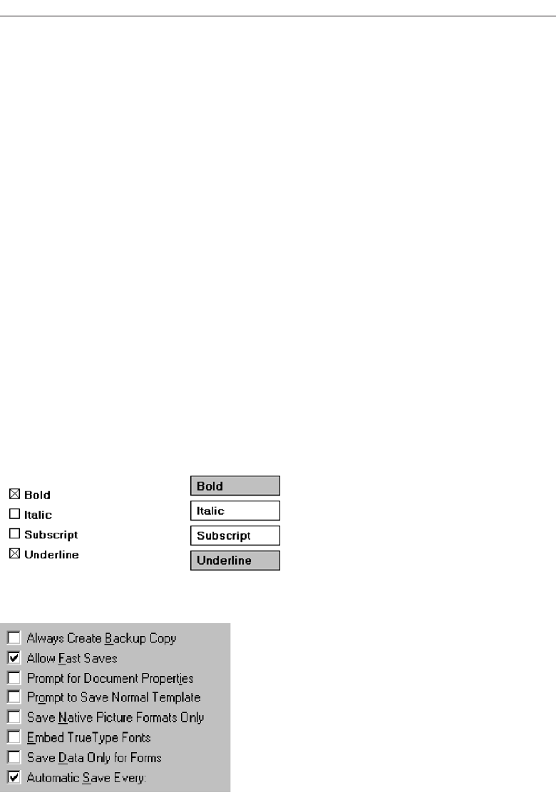
a check mark customarily means active or set. Internationally, also, an X is not univer-
sally recognized. (This control is called a check box, isn’t it?)
Another style for this type of field is a button or box with the choice description in-
scribed inside. When selected, the alternative is highlighted in some way. To distinguish
these fields visually from similarly constructed fields presenting mutually exclusive
choices, the buttons are not adjacent to, or butted up against, one another. Check boxes
are illustrated in Figures 7.39 and 7.40. Again, deciding on which style to use seems to
be more a matter of preference than performance (other than for the possible confusion
of Xs and checks). No published comparison studies are available for guidance.
Purpose. The purpose of a check box, then, is to set one or more options either on
or off.
Advantages/disadvantages. With check boxes, all alternatives are always visible.
Therefore, it is easy to access and compare choices. Like radio buttons, check boxes
were the preferred, and fastest to use, controls in the Johnsgard et al. (1995) study.
One disadvantage is the large amount of screen real estate they consume, limiting
the number of alternatives that can be efficiently displayed. Another potential dis-
advantage is that it can be difficult to align a single check box with other arrayed
screen controls because they often possess long descriptions for clarity purposes.
Proper usage. Check boxes are useful for setting attributes, properties, or values where
adequate screen space is available. The alternatives should be discrete, small in
number, and in need of a textual description to identify meaningfully. Check boxes
are helpful in situations where the alternatives cannot always be easily remem-
bered and the displaying of the alternatives together aids in understanding and
Choose the Proper Screen-Based Controls 437
Figure 7.39 Check boxes.
Figure 7.40 Check boxes.
3900 P-07 (step 7) 4/24/02 2:04 PM Page 437

selecting the proper choice. The choices displayed should be stable, never chang-
ing in content.
Check boxes can be used to affect other controls. The contents of a list can, for ex-
ample, be filtered by setting check boxes. Use a check box only when both states of a
choice are clearly opposite and unambiguous. If opposite states are not clear, use two
radio buttons, clearly stating the opposite states.
Choice Descriptions
■
Provide meaningful, fully spelled-out choice descriptions clearly describing the val-
ues or effects set by the check boxes.
■
Display them in a single line of text.
■
Display them using mixed-case letters in sentence style.
■
Position descriptions to the right of the check box. Separate by at least one space
from the box.
■
When a choice is unavailable for selection under a certain condition, display the
choice description visually dimmed.
Choice descriptions must be clear, meaningful, fully spelled out, and displayed in a
mixed-case text. For multiword descriptions, capitalize the first letter and present the
description in the sentence style. Small box-type indicators should be located to the left
of the choice description; rectangular boxes that resemble a command button will find
the description within the box. Small boxes associated with text are advantageous
when the choice description must be lengthy. Descriptions in boxes impose restrictions
on the number of words that can be inscribed within them. When a choice is condi-
tionally unavailable for selection, display it grayed out or dimmed.
Size
■
Show a minimum of one choice, a maximum of eight.
Generally, selection fields of this style should not offer more than eight choices. Dis-
playing more than eight is usually not efficient because it wastes screen space. If the
number of choices exceeds this maximum, consider using a multiple selection list box.
Johnsgard et al. (1995) have found, however, that even for as many as 30 choices, check
boxes were preferred by users and performed better than other nonexclusive controls.
Defaults
■
When the control possesses a state or affect that has been preset, designate it as the
default and display its check box marked.
438 Step 7
3900 P-07 (step 7) 4/24/02 2:04 PM Page 438
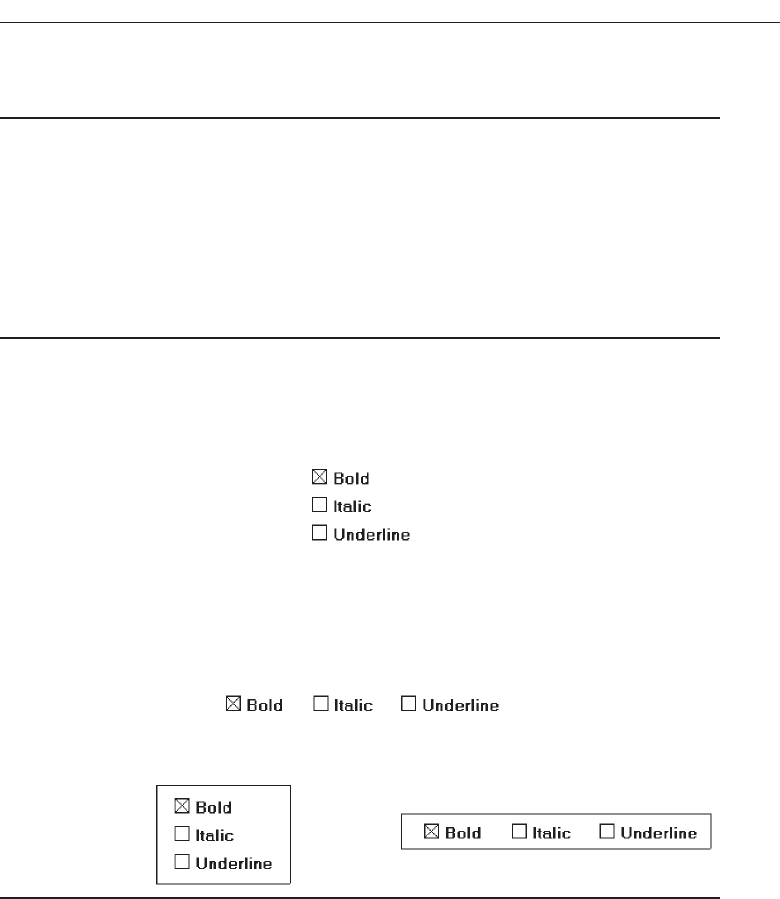
■
When a multiple selection includes choices whose states vary, display the buttons in
another unique manner, or the mixed value state.
Provide a default setting for a check box whenever possible. If a multiple selection
is performed and the values in the selection differ, display the applicable check boxes
in the mixed value state, or in another distinctive manner such as with a gray shadow.
Structure
■
Provide groupings of related check boxes.
■
A columnar orientation is the preferred manner of presentation for multiple related
check boxes.
■
Left-align the check boxes and choice descriptions.
Figure 7.41
■
If vertical space on the screen is limited, orient the boxes horizontally.
■
Provide adequate separation between boxes so that the buttons are associated with
the proper description.
— A distance equal to three spaces is usually sufficient.
Figure 7.42
■
Enclose the boxes in a border to visually strengthen the relationship they possess.
Figure 7.43
Provide groupings of related check boxes. The preferred check box orientation is
columnar. This aids scanning and choice comparison. Controls with small box indica-
tors usually fit best in this manner because choice descriptions are not restricted in size.
Left-align the check boxes and choice descriptions. Rectangular boxes should be of equal
width and separated from one another by small and equidistant spaces. This will dis-
tinguish them from mutually exclusive choices that will be butted up against one an-
other. If the boxes must be horizontally oriented, provide adequate separation between
them. Enclose the boxes in a border to emphasize their relationship. Figure 7.44 illustrates
ways to, and not to, present groupings of check boxes.
Choose the Proper Screen-Based Controls 439
3900 P-07 (step 7) 4/24/02 2:04 PM Page 439
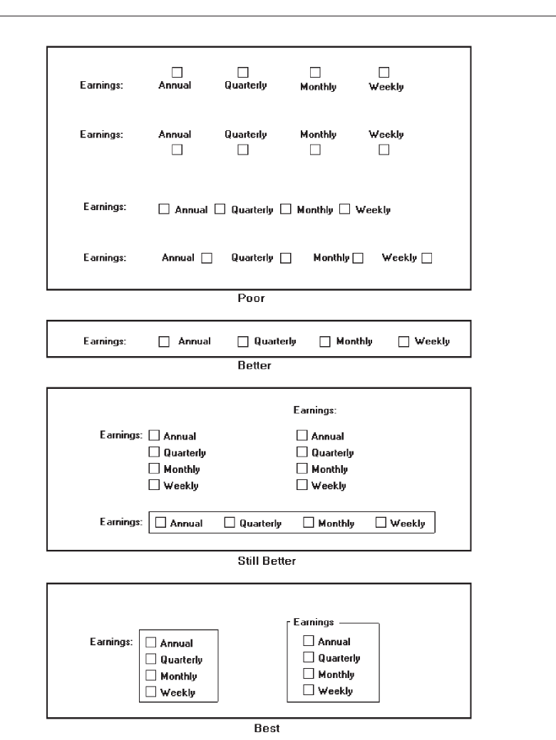
440 Step 7
Figure 7.44 Ways to, and not to, present check boxes.
3900 P-07 (step 7) 4/24/02 2:04 PM Page 440
Organization
■
Arrange selections in logical order or follow other patterns such as frequency of
occurrence, sequence of use, or importance.
— For selections arrayed top to bottom, begin ordering at the top.
— For selections arrayed left to right, begin ordering at the left.
■
If, under certain conditions, a choice is not available, display it subdued or less
brightly than the available choices.
Selection choices should be organized logically. If the alternatives have an expected
order, follow it. Other ordering schemes such as frequency of use, sequence of use, or
importance may also be considered. Always begin the ordering at the top or left. If,
under certain conditions, a choice is not available, display the unavailable choice sub-
dued or less brightly than the available choices.
Related Control
■
Position any control related to a check box immediately to the right of the choice
description.
— If a the check box choice description also acts as the label for the control that fol-
lows it , end the label with an arrow (>).
Figure 7.45
Position any control related to a check box immediately to the right of the choice de-
scription. If a the check box label also acts as the label for the control that follows it, pre-
sent it mixed case, sentence style text and end the label with an arrow (>) to relate the
choice description to the control.
Captions
■
Structure:
— Provide a caption for each grouping of related check boxes.
• Exception: In screens containing only one check box grouping, the screen title
may serve as the caption.
— Display:
• Fully spelled out.
• In mixed-case letters capitalizing the first letter of all significant words.
■
Columnar orientation:
— With a control border, position the caption:
• Upper-left-justified within the border.
❍Day of Week > Saturday
❍Month of Year >
✔
Choose the Proper Screen-Based Controls 441
3900 P-07 (step 7) 4/24/02 2:04 PM Page 441
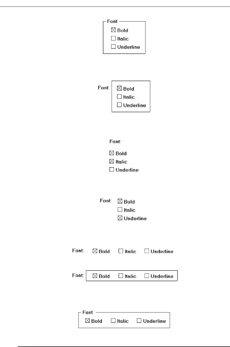
Figure 7.46
• Alternately, the caption may be located to the left of the topmost choice
description.
Figure 7.47
— Without an enclosing control border, position the caption:
• Left-justified above the choice descriptions separated by one space line.
Figure 7.48
• Alternately, the caption may be located to the left of the topmost choice
description.
Figure 7.49
■
Horizontal orientation
— Position the caption to the left of the choice descriptions.
Figure 7.50
• Alternately, with an enclosing control border, it should be left-justified within
the border.
Figure 7.51
— Be consistent in caption style and orientation within a screen.
442 Step 7
3900 P-07 (step 7) 4/24/02 2:04 PM Page 442
Structure. Using a static text or group box control, provide a caption for each group-
ing of related check boxes. Display the caption fully spelled out using mixed-case
letters. Some occasional common abbreviations may be used, however, to achieve
the alignment goals to be specified.
Columnar orientation. The preferred location of a check box control caption within
a screen can vary. Ideally, the caption is placed upper-left-justified within a line
border, or group box, surrounding columnar-oriented check boxes as shown in
the first example in the above guideline summary. If other controls on a screen
possess captions positioned to the left, and the check box control is aligned with
these controls, position the caption to the left of the control. This is the second ex-
ample illustrated above. This will help achieve screen efficiency, minimize viewer
eye movements, and provide caption and choice distinctiveness. Without an en-
closing border, position the caption left-justified above the choice descriptions, or
to the left of the topmost choice.
Horizontal orientation. If horizontal orientation is necessary, position the caption to
the left of the choice descriptions, or left-justified within an enclosing control bor-
der. If the screen contains only one related grouping of check boxes, the screen title
may serve as the control caption. Be consistent in caption style and orientation
within a screen.
Keyboard Equivalents
■
Assign a keyboard mnemonic to each check box.
■
Designate the mnemonic by underlining the applicable letter in the choice description.
Figure 7.52
Assign unique keyboard mnemonics for each check box in the standard way, choos-
ing the first letter (or another) and designating it by character underlining.
Selection Method and Indication
■
Pointing:
— The selection target area should be as large as possible.
• Include the check box and the choice description text.
— Highlight the selection choice in some visually distinctive way when the cursor’s
resting on it and the choice is available for selection.
• This cursor should be as long as the longest choice description plus one space
at each end. Do not place the cursor over the check box.
Figure 7.53
Choose the Proper Screen-Based Controls 443
3900 P-07 (step 7) 4/24/02 2:04 PM Page 443
■
Activation:
— When a choice is selected, distinguish it visually from the non-selected choices.
• A check box should be filled in or made to look depressed or higher through
use of a shadow.
■
Defaults:
— If a check box is displayed that contains a choice previously selected or default
choice, display the selected choice as set in the control.
■
Select/deselect all:
— Do not use Select All and Deselect All check boxes.
■
Mixed-value state:
— When a check box represents a value, and a multiple selection encompasses mul-
tiple value occurrences set in both the on and off state, display the check box in a
mixed value state.
• Fill the check box with another easily differentiable symbol or pattern.
Figure 7.54
— Toggle the check box as follows:
• Selection 1: Set the associated value for all elements. Fill the check box with an
“X” or “check.”
• Selection 2: Unset the value for all associated elements. Blank-out the check box.
• Selection 3: Return all elements to their original state. Fill the check box with
the mixed value symbol or pattern.
Pointing. The selection target area should be as large as possible in order to make it
easy to move to. If a small check box is the selection indication method used, the
target area should include the box and the choice description text. If the rectan-
gular box selection method is used, the entire box should be the target. Highlight
the selection choice in some visually distinctive way when the pointer is resting
on it and the choice is available for selection. If a check box is the selection indi-
cation method used, a distinctive reverse video, reverse color, or dotted or dashed
box selection cursor or bar may be used to surround the selected choice descrip-
tion. This cursor should be as long as the longest description plus one space at
each end. The cursor should not cover the check box.
Activation. When a choice is selected, distinguish it visually from the unselected
choices. A check box may be marked with an X or check or filled in. Other meth-
ods include making the button look depressed or raised through appropriate use
of drop shadows. A rectangular box can be highlighted in a manner different from
when it is pointed at, or a bolder border can be drawn around it. The style chosen
must be consistently applied throughout an application or system.
Defaults. If a selection field is displayed with a choice previously selected or a de-
fault choice, display the currently active choice in the same manner as when it is
selected.
444 Step 7
3900 P-07 (step 7) 4/24/02 2:04 PM Page 444

Select/deselect all. Do not use Select All and Deselect All check boxes. If this option
is necessary, consider using a multiple selection list box with command buttons to
accomplish these actions.
Mixed-value state. A check box can have three states.
Checked—the associated property or value is set.
Cleared—the associated value or property is not set.
Mixed value—the associated value is set for some, but not all elements of the
selection.
An example of the mixed value state would be when a sentence is selected and
the selected text is partly bold and partly normal. So, when a check box represents
a value, and a selection encompasses multiple value occurrences set in both the on
and off state, display the check box in the mixed value state. Fill the check box with
another easily differentiable symbol or pattern. Toggle the check box through
clicking as described in the above guidelines.
Palettes
■
Description:
— A control consisting of a series of graphical alternatives. The choices themselves
are descriptive, being composed of colors, patterns, or images.
— In addition to being a standard screen control, a palette may also be presented on
a pull-down or pop-up menu or a toolbar.
■
Purpose:
— To set one of a series of mutually exclusive options presented graphically or
pictorially.
■
Advantages:
— Pictures aid comprehension.
— Easy-to-compare choices.
— Usually consume less screen space than textual equivalents.
■
Disadvantages:
— A limited number of choices can be displayed.
— Difficult to organize for scanning efficiency.
— Requires skill and time to design meaningful and attractive graphical
representations.
■
Proper usage:
— For setting attributes, properties, or values.
— For mutually exclusive choices (that is, only one can be selected).
— Where adequate screen space is available.
— Most useful for data and choices that are:
• Discrete.
• Frequently selected.
• Limited in number.
• Variable in number.
Choose the Proper Screen-Based Controls 445
3900 P-07 (step 7) 4/24/02 2:04 PM Page 445

• Not easily remembered.
• Most easily understood when the alternatives may be seen together and com-
pared to one another.
• Most meaningfully represented pictorially or by example.
• Can be clearly represented pictorially.
• Rarely changed in content.
— Do not use:
• Where the alternatives cannot be meaningfully and clearly represented
pictorially.
• Where words are clearer than images.
• Where the choices are going to change.
Description. Like radio buttons, palettes can also be used to present two or more
mutually exclusive alternatives. The choices presented, however, are visually de-
scriptive within themselves, no choice descriptions being needed to identify them.
Examples of palettes might be fill-in colors, patterns, or different shades of a color.
A palette may also be referred to as value set or well. A palette is illustrated in
Figure 7.55. In addition to being a standard screen control, a palette may also be
presented on a pull-down or pop-up menu, included in a toolbar, or be contained
in a Palette window.
Purpose. A palette’s purpose is to set one of a series of mutually exclusive options
presented in a graphic or pictorial form.
Advantages/disadvantages. Palettes are preferable to radio buttons in that they take
up less space and allow the viewer to focus on the visual characteristics of the
choice itself, instead of having to read the choice text and cross-reference it to a
radio button. Some qualities, such as colors, patterns, and shades, are much more
easily comprehended when they are actually seen. While a larger number of choices
can be presented than with radio buttons, there is still a limit to how many can be
practically displayed. Because of their larger size, palettes are also more difficult
to organize for scanning efficiency. Palettes also require skill and time to design
meaningful and attractive graphical representations.
Proper usage. Palettes are used for setting attributes, properties, or values of mutually
exclusive choices where adequate screen space is available. Consider using a
palette when the choices have qualities that can be best described by actual illus-
tration. They are useful for data and choices that are discrete and limited in num-
ber. They are most useful when the choices’ being seen together and compared to
446 Step 7
Figure 7.55 Palette.
3900 P-07 (step 7) 4/24/02 2:04 PM Page 446

one another aids identification and selection of the proper alternative. They are
also most useful when the alternatives can be meaningfully and clearly repre-
sented pictorially or by example. Palettes should rarely change in content.
Palettes should be displayed in the proper manner. If the attributes on a palette
must be available at all times, place them on a standard control or fixed palette. If
the attributes on the palette are sometimes used frequently and other times used
infrequently, place them on a pop-up or tear-off menu. Do not place frequently
used palettes on pull-down menus.
Also, from a presentation perspective, do not use a palette if the alternatives
cannot be meaningfully and clearly represented pictorially. In addition, do not use
one where words are clearer than images, or in situations where the choices are
going to change.
Graphical Representations
■
Provide meaningful, accurate, and clear illustrations or representations of choices.
■
Create images large enough to:
— Clearly illustrate the available alternatives.
— Permit ease in pointing and selecting.
■
Create images of equal size.
■
Always test illustrations before implementing them.
Provide meaningful, accurate, and clear illustrations of alternative choices. Create
equal size images large enough to illustrate clearly the available alternatives and permit
ease in pointing and selecting. Always test illustrations with users before implementing
them, to ensure that they will work satisfactorily. While most palettes will not possess
textual choice descriptions, under certain circumstances textual descriptions may be
needed. For example, a choice might require selection of a style of font. The palette may
contain the names of the available styles (such as Roman) with the text displayed as the
font style would actually appear.
Size
■
Present all available alternatives within the limits imposed by:
— The size of the graphical representations.
— The screen display’s capabilities.
Since palettes will consume less screen space, more choices can be displayed in a given
area of a screen than can be displayed when using textual descriptions. Present all
available alternatives within the limits imposed by how big the graphical representations
must be and the capabilities of the display hardware in creating clear illustrations.
Limitations in people’s ability to accurately differentiate the kinds of graphical represen-
tations being presented must also be considered.
Choose the Proper Screen-Based Controls 447
3900 P-07 (step 7) 4/24/02 2:04 PM Page 447

Layout
■
Create boxes large enough to:
— Effectively illustrate the available alternatives.
— Permit ease in pointing and selecting.
■
Create boxes of equal size.
■
Position the boxes adjacent to, or butted up against, one another.
■
A columnar orientation is the preferred manner.
■
If vertical space on the screen is limited, orient the choices horizontally.
Palette boxes must be large enough to illustrate effectively the available alternatives
and to maximize ease in selecting. Created boxes should be of equal size and positioned
adjacent to, or butted up against one another, since they are mutually exclusive choices.
Columns are preferred, but horizontal rows can be used if space constraints exist on the
screen.
Organization
■
Arrange palettes in expected or normal order.
— For palettes arrayed top to bottom, begin ordering at the top.
— For palettes arrayed left to right, begin ordering at the left.
■
If an expected or normal order does not exist, arrange choices by frequency of occur-
rence, sequence of use, importance, or alphabetically (if textual).
■
If, under certain conditions, a choice is not available, display it subdued or less
brightly than the other choices.
Palettes should be organized logically. If the alternatives have an expected order, fol-
low it. Colors, for example, should be ordered from the right or top by their spectral
position: red, orange, yellow, green, blue, indigo, and violet. If an expected or normal
order does not exist, arrange choices by frequency of occurrence, sequence of use, or
importance. Palettes with text may be arranged alphabetically. If, under certain condi-
tions, a choice is not available, display the unavailable choice subdued or less brightly
than the available choices.
Captions
■
Provide a caption for each palette.
— On screens containing only one palette, the screen title may serve as the caption.
■
Display the caption fully spelled out using mixed-case letters.
■
Columnar orientation:
— The field caption may be positioned left-aligned above the palette.
448 Step 7
3900 P-07 (step 7) 4/24/02 2:04 PM Page 448
Figure 7.56
— Alternately, the caption may be positioned to the left of the topmost alternative.
Figure 7.57
■
Horizontal orientation:
— The field caption may be positioned above the palette.
Figure 7.58
— Alternately, the caption may be positioned to the left of the alternatives.
Figure 7.59
Using a static text control, provide a caption for each palette. In screens containing only
one palette, the screen title may serve as the caption. Display the caption fully spelled
out using mixed-case letters, although some abbreviations may be used to achieve the
alignment goals to be specified. Captions may be located above or to the left of the
palette, as shown above. With a horizontal orientation, the caption may be positioned
above the palette or to the left of the alternatives. Positioning on any one screen will be
dependent on other caption-control relationships within the screen.
Selection Method and Indication
■
Pointing:
— Highlight the choice in some visually distinctive way when the pointer or cursor
is resting on it and the choice is available for selection.
■
Activation:
— When a choice is selected, distinguish it visually from the unselected choices by
highlighting it in a manner different from when it is pointed at, or by placing a bold
border around it.
Choose the Proper Screen-Based Controls 449
3900 P-07 (step 7) 4/24/02 2:04 PM Page 449

■
Defaults:
— If a palette is displayed with a choice previously selected or a default choice, dis-
play the currently active choice in the manner used when it was selected.
Pointing. The selection target should be as large as possible in order to make it easy
to move to. Highlight the selection choice in some visually distinctive way when
the pointer or cursor is resting on it and the choice is available for selection.
Activation. When a choice is selected, distinguish it visually from the unselected
choices by highlighting it in a manner different from when it is pointed at, or by
placing a bolder border around it.
Defaults. If a palette is displayed with a choice previously selected or a default choice,
display the currently active choice in the manner used when it was selected.
List Boxes
■
Description:
— A permanently displayed box-shaped control containing a list of attributes or ob-
jects from which:
• A single selection is made (mutually exclusive), or
• Multiple selections are made (non-mutually-exclusive).
— The choice may be text, pictorial representations, or graphics.
— Selections are made by using a mouse to point and click.
— Capable of being scrolled to view large lists of choices.
— No text entry field exists in which to type text.
— A list box may be may be associated with a summary list box control, which allows
the selected choice to be displayed or an item added to the list.
■
Purpose:
— To display a collection of items containing:
• Mutually exclusive options.
• Non-mutually-exclusive options.
■
Advantages:
— Unlimited number of choices.
— Reminds users of available options.
— Box always visible.
■
Disadvantages:
— Consumes screen space.
— Often requires an action (scrolling) to see all list choices.
— The list content may change, making it hard to find items.
— The list may be ordered in an unpredictable way, making it hard to find items.
■
Proper usage:
— For selecting values or setting attributes.
— For choices that are:
• Mutually exclusive (only one can be selected).
• Non-mutually-exclusive (one or more may be selected).
450 Step 7
3900 P-07 (step 7) 4/24/02 2:04 PM Page 450
— Where screen space is available.
— For data and choices that are:
• Best represented textually.
• Not frequently selected.
• Not well known, easily learned, or remembered.
• Ordered in an unpredictable fashion.
• Frequently changed.
• Large in number.
• Fixed or variable in list length.
— When screen space or layout considerations make radio buttons or check boxes
impractical.
Description. Alist box is a permanently displayed rectangular box control that con-
tains a list of values or attributes from which single or multiple selections are
made. It can also be referred to as a fixed list box because it is fixed on the screen.
In Java, they are called lists, and in HTML, selection lists/scrolling lists. The choices
are usually text, but they may be pictorial representations or graphics as well. A
list box may be scrollable to view large lists, and the user uses a mouse to point and
click to make selections. No text entry field exists in which to type text, but a
single-selection list box may be associated with a text box where the selected
choice is displayed or an item may be added to the list. Examples of single-selection
list boxes are illustrated in Figure 7.60.
Purpose. The purpose of a list box is display a collection of items. The choices may
be mutually exclusive (single-selection) or not mutually exclusive (multiple-
selection).
Advantages/disadvantages. List boxes are always visible, reminding users of the
choices available. They permit an unlimited number of options to be displayed.
Among their disadvantages are the excessive screen space they consume and the
possible necessity for time-consuming scrolling to see all items. Since the list con-
tent can change, and items can be ordered in an unpredictable way, it can be hard
to find items.
Proper usage. List boxes are used for selecting objects or values or setting attrib-
utes, either mutually exclusive or not, where sufficient screen space is available
to display 6 to 8 choices. Their best use is for data and choices that are textual;
large in number; fixed or variable in list length; not well known, easily learned or
Choose the Proper Screen-Based Controls 451
Figure 7.60 List boxes.
3900 P-07 (step 7) 4/24/02 2:04 PM Page 451

remembered; and ordered in an unpredictable fashion. List box items should not
have to be selected or changed frequently. List boxes may be used when screen
space, list size, and data volatility considerations make use of radio buttons and
check boxes impractical. The content of a list box is easier to change than that of
radio buttons and check boxes.
List Box General Guidelines
First, general list box guidelines will be presented. Then, specific guidelines for single-
and multiple-selection lists will be reviewed.
Selection Descriptions
■
Clearly and meaningfully describe the choices available. Spell them out as fully as
possible.
— Graphical representations must clearly represent the options.
■
Present in mixed case, using the sentence style structure.
■
Left-align into columns.
Selection descriptions will reflect the selection alternatives available. They should
be meaningful, fully spelled out, and follow the sentence style of presentation. Array
the descriptions into columns. Meaningful ordering schemes include logical order, fre-
quency of use, sequence of use, and importance. If no such pattern exists, arrange the
list alphabetically. Display the list of choices using mixed-case letters.
List Size
■
Not actual limit in size.
■
Present all available alternatives.
■
Require no more than 40 page-downs to search a list.
— If more are required, provide a method for using search criteria or scoping the
options.
A list being displayed in a fixed list box has no actual size limit. All available alter-
natives should be capable of being displayed. Searching a very long list, however, can
be very time-consuming. A list should not require more than 40 page-downs to com-
pletely search it. If more are necessary, provide a method for using search criteria or
scoping the options, perhaps through a first-letter search.
Box Size
■
Must be long enough to display 6 to 8 choices without requiring scrolling.
— Exceptions:
• If screen space constraints exist, the box may be reduced in size to display at
least three items.
• If it is the major control within a window, the box may be larger.
452 Step 7
3900 P-07 (step 7) 4/24/02 2:04 PM Page 452
— If more items are available than are visible in the box, provide vertical scrolling
to display all items.
■
Must be wide enough to display the longest possible choice.
Figure 7.61
— When box cannot be made wide enough to display the longest entry:
• Make it wide enough to permit entries to be distinguishable, or,
• Break the long entries with an ellipsis (...) in the middle, or,
• Provide horizontal scrolling.
The exact size of a fixed list box will depend on its function and screen space con-
straints. Generally, boxes should be restricted to displaying no more than eight choices
at one time. Slightly larger boxes that eliminate the need for scrolling, however, are
preferable to list boxes that require a little scrolling. If screen space constraints exist, the
box may be reduced in size to display at least three items. If scrolling is necessary, include
a scroll bar on the right side of the box.
The list box should be wide enough to display fully all item wording. When a box can-
not be made wide enough to display the longest entry, make it wide enough to permit
entries to be distinguishable, or, break the long entries with an ellipsis in the middle. If
breaking long entries, preserve the important characteristics needed to distinguish
them. When shortening an item’s name in this way, include a ToolTip that displays the
item’s full name.
As a last resort, provide horizontal scrolling and a scroll bar at the bottom of the list
box. Many people dislike horizontal scrolling, however.
Organization
■
Order in a logical and meaningful way to permit easy browsing.
— Consider using separate controls to enable the user to change the sort order or fil-
ter items displayed in the list.
■
If a particular choice is not available in the current context, omit it from the list.
— Exception: If it is important that the existence and unavailability of a particular
list item be communicated, display the choice dimmed or grayed out instead of
deleting it.
Choices should be organized logically to permit easy browsing. If the alternatives have an
expected order, follow it. Other ordering schemes such as frequency of use, sequence of use,
or importance may also be considered. When no obvious scheme exists, use alphabetic
Choose the Proper Screen-Based Controls 453
3900 P-07 (step 7) 4/24/02 2:04 PM Page 453
order. You can provide separate controls to enable the user to change the sort order or
filter items displayed in the list.
If a particular choice is not available in the current context, it should be omitted from the
list. If it is important that the existence and unavailability of a list item be communicated,
however, display the choice dimmed or grayed out instead of deleting it.
Layout and Separation
■
Enclose the choices in a box with a solid border.
— The border should be the same color as the choice descriptions.
■
Leave one blank character position between the choice descriptions and the left
border.
■
Leave one blank character position between the longest choice description in the list
and the right border, if possible.
Enclose the box in a solid border in the color of the choice descriptions. To provide
adequate legibility, leave one space between the choice descriptions and the left border,
and one space between the longest choice description and the right border.
Captions
■
Use mixed-case letters.
■
The preferred position of the control caption is above the upper-left corner of the list
box.
Figure 7.62
•Alternately, the caption may be located to the left of the topmost choice description.
Figure 7.63
• Be consistent in caption style and orientation within a screen, and related screens.
454 Step 7
3900 P-07 (step 7) 4/24/02 2:04 PM Page 454
To identify the list box, a field caption in mixed-case letters, with each significant word
capitalized is necessary. A list box does not have a caption, so create one using a static
text control. Place this caption either above the upper-left corner of the box or to the left
of the first choice description. The caption style chosen will again be dependent upon
caption-control relationships in other controls included within the screen. It should be
consistently oriented with the other control captions.
Disabling
■
When a list box is disabled, display its caption and show its entries as grayed out or
dimmed.
Display a list box’s caption and entries as dimmed or grayed when the list box is en-
tirely disabled.
Selection Method and Indication
■
Pointing:
— Highlight the selection choice in some visually distinctive way when the pointer
or cursor is resting on it and the choice is available for selection.
■
Selection:
— Use a reverse video or reverse color bar to surround the choice description when
it is selected.
— The cursor should be as wide as the box itself.
Figure 7.64
— Mark the selected choice in a distinguishing way.
■
Activation:
— Require the pressing of a command button when an item, or items, is selected.
Pointing. Highlight the selection choice in some visually distinctive way when the
pointer or cursor is resting on it and the choice is available for selection. One
method used for this is to place a bold border around the choice.
Selection. Indicate the selected choice through use of a reverse video or reverse color
bar, as wide as the box itself. Visually differentiate multiple-choice (nonexclusive)
from single-choice (mutually exclusive) fixed list boxes, as described in the follow-
ing sections.
Choose the Proper Screen-Based Controls 455
3900 P-07 (step 7) 4/24/02 2:04 PM Page 455
Activation. Require the pressing of a command button when an item, or items, is se-
lected. Double-clicking is difficult for many people. Always provide for a single
click followed by a button press.
Single-Selection List Boxes
■
Purpose:
— To permit selection of only one item from a large listing.
■
Design guidelines:
— Related text box
• If presented with an associated text box control:
— Position the list box below and as close as possible to the text box.
— The list box caption should be worded similarly to the text box caption.
Figure 7.65
— If the related text box and the list box are very close in proximity, the cap-
tion may be omitted from the list box.
Figure 7.66
— Use the same background color for the text box as is used in the list box.
— Defaults:
• When the list box is first displayed:
— Present the currently active choice highlighted or marked with a circle or
diamond to the left of the entry.
— If a choice has not been previously selected, provide a default choice and
display it in the same manner that is used in selecting it.
456 Step 7
3900 P-07 (step 7) 4/24/02 2:04 PM Page 456
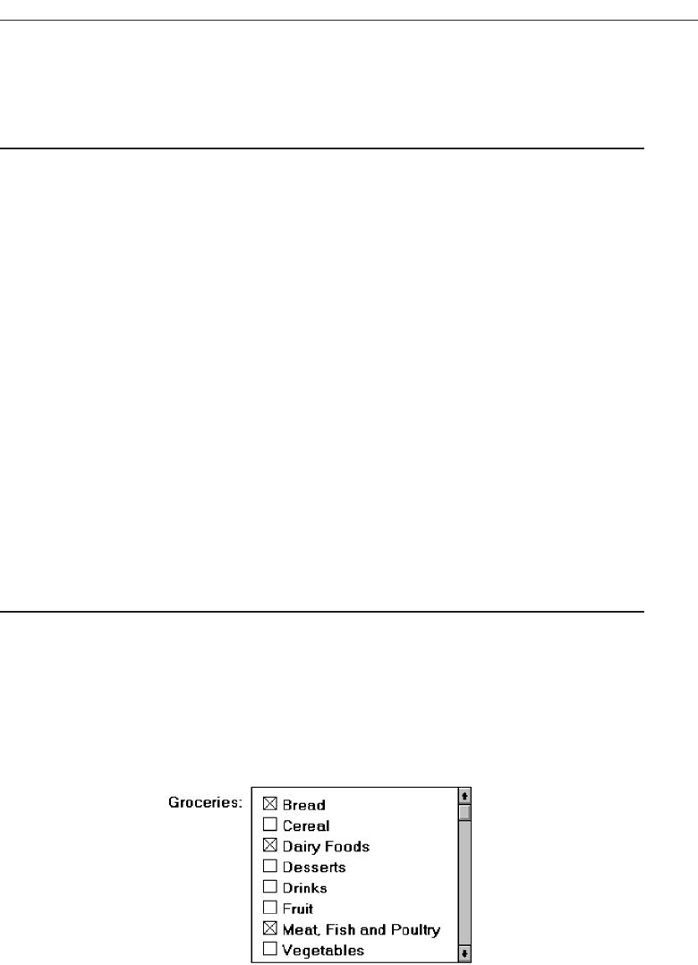
— If the list represents mixed values for a multiple selection, do not highlight
an entry.
— Other:
• Follow other relevant list box guidelines.
Purpose. Asingle-selection list box is used for selecting only one item in a list. It
provides a mutually exclusive operation similar to a group of radio or option
buttons. This kind of list box, however, can handle a large number of items more
efficiently.
Related text box. If the list box is associated with a text field, position the list box
below and as close as possible to the related text box. If this cannot be accom-
plished, position the text box to the left. Captions of related text boxes and list
boxes must be worded similarly. If, however, the text box and the list box are lo-
cated in close physical proximity, the caption may be omitted from the list box.
Visually relate a list box to a text box by using the same background color for both
boxes.
For single-selection fixed list boxes, indicate an active choice by highlighting it or
marking it with a circle or diamond to the left of the choice description. If the list rep-
resents mixed values for a multiple selection, do not highlight any entry.
Extended and Multiple-Selection List Boxes
■
Purpose:
— To permit selection of more than one item in a long listing.
• Extended list box: Optimized for individual item or range selection.
• Multiple-selection list box: Optimized for independent item selection.
■
Design guidelines:
— Selection indication:
• Mark the selected choice with an X or check mark to the left of the entry.
Figure 7.67
• Consider providing a summary list box.
— Position it to the right of the list box.
— Use the same colors for the summary list box as are used in the list box.
Choose the Proper Screen-Based Controls 457
3900 P-07 (step 7) 4/24/02 2:04 PM Page 457
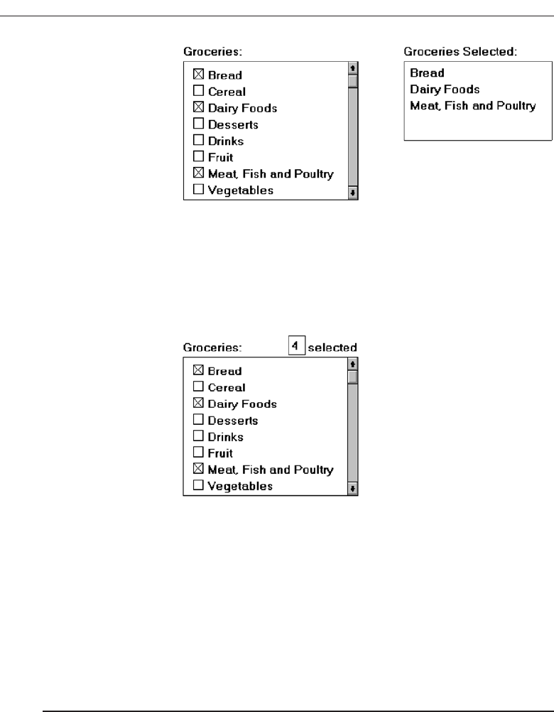
Figure 7.68
— Provide command buttons to Add (one item) or Add All (items) to the sum-
mary list box, and Remove (one item) or Remove All (items) from the summary
list box.
• Consider providing a display-only text control indicating how many choices
have been selected.
— Position it justified upper-right above the list box.
Figure 7.69
— Select All and Deselect All buttons
• Provide command buttons to accomplish fast Select All and Deselect All actions,
when these actions must be frequently or quickly performed.
— Defaults:
• When the list box is first displayed:
— Display the currently active choices highlighted.
— Mark with an X or check mark to the left of the entry.
— If the list represents mixed values for a multiple selection, do not highlight
an entry.
— Other:
• Follow other relevant list box guidelines.
Purpose. Multiple-selection list boxes permit selection of multiple items from a long
listing. They provide a nonexclusive operation similar to a group of check boxes.
This kind of list box, however, can handle a large number of items more effi-
ciently. Extended list boxes are optimized for individual item or range selection.
Multiple-selection list boxes are optimized for independent item selection.
Selection indication. For choice selections, mark them with an X or check mark to
the left of the entry. Also consider providing a summary list box, another list box
458 Step 7
3900 P-07 (step 7) 4/24/02 2:04 PM Page 458

containing a compilation of the active selections from the multiple-selection list
box. This will permit quick scanning and comparison of these active choices and
greatly reduce the need for scrolling if the selectable list is lengthy. The summary
list box can be made scrollable, if necessary. Position the summary list adjacent to,
and to the right of, the multiple-selection list box. Use the same colors for the sum-
mary list box and the multiple-selection list box. Include command buttons to Add
(one item) or Add All (items) to the summary list box, and Remove (one item) or Re-
move All (items) from the summary list box.
Also consider providing a display-only text box control indicating how many
choices have been selected in the multiple-selection list box. This text box can be as-
sociated with either the multiple-selection or summary list box. It is useful in situ-
ations where the multiple selections may be numerous and all the choices cannot
be seen without scrolling. It is also useful when the user must know exactly how
many choices have been selected. Position this text box justified upper-right above
the list box.
Select All and Deselect buttons. Provide command buttons to accomplish fast “se-
lect all” and “deselect” actions, when these actions must be frequently or quickly
performed.
Defaults. When the list box is first displayed, the active selection will depend on pre-
vious activities. If a choice has been previously selected, display the currently ac-
tive choice in the same manner used when it was selected. If the list represents
mixed values for a multiple selection, do not highlight any list entries.
List View Controls
■
Description:
— A special extended-selection list box that displays a collection of items, consisting
of an icon and a label.
— The contents can be displayed in four different views:
• Large Icon: Items appear as a full-sized icon with a label below.
• Small Icon: Items appear as a small icon with label to the right.
• List: Items appear as a small icon with label to the right.
— Arrayed in a columnar, sorted layout.
• Report: Items appear as a line in a multicolumn format.
— Leftmost column includes icon and its label.
— Subsequent columns include application-specific information.
■
Purpose and usage:
— Where the representation of objects as icons is appropriate.
— To represent items with multiple columns of information.
Description. Alist view control is a special extended-selection list box that displays
a collection of items, each consisting of an icon and a label. List view controls can
display content in four different views, large icon,small icon,list, and report. The
control also supports options for aligning, selecting, and sorting icons, and for edit-
ing icon labels.
Choose the Proper Screen-Based Controls 459
3900 P-07 (step 7) 4/24/02 2:04 PM Page 459

Purpose and usage. Use list views when the representation of objects as icons is ap-
propriate, or to represent items with multiple columns of information.
Drop-down/Pop-up List Boxes
■
Description
— A single rectangular control that shows one item with a small button to the right
side.
• The button provides a visual cue that an associated selection box is available
but hidden.
— When the button is selected, a larger associated box appears, containing a list of
choices from which one may be selected.
— Selections are made by using the mouse to point and click.
— Text may not be typed into the control.
■
Purpose:
— To select one item from a large list of mutually exclusive options when screen
space is limited.
■
Advantages:
— Unlimited number of choices.
— Reminds users of available options.
— Conserves screen space.
■
Disadvantages:
— Requires an extra action to display the list of choices.
— When displayed, all choices may not always be visible, requiring scrolling.
— The list may be ordered in an unpredictable way, making it hard to find items.
■
Proper usage:
— For selecting values or setting attributes.
— For choices that are mutually exclusive (only one can be selected).
— Where screen space is limited.
— For data and choices that are:
• Best represented textually.
• Infrequently selected.
• Not well known, easily learned, or remembered.
• Ordered in a unpredictable fashion.
• Large in number.
• Variable or fixed in list length.
— Use drop-down/pop-up lists when:
• Screen space or layout considerations make radio buttons or single-selection
list boxes impractical.
• The first, or displayed, item will be selected most of the time.
— Do not use a drop-down list if it important that all options be seen together.
Description. Adrop-down/pop-up list box is a single rectangular field with a small but-
ton to the side and an associated hidden list of options. In Java, they are called
460 Step 7
3900 P-07 (step 7) 4/24/02 2:04 PM Page 460
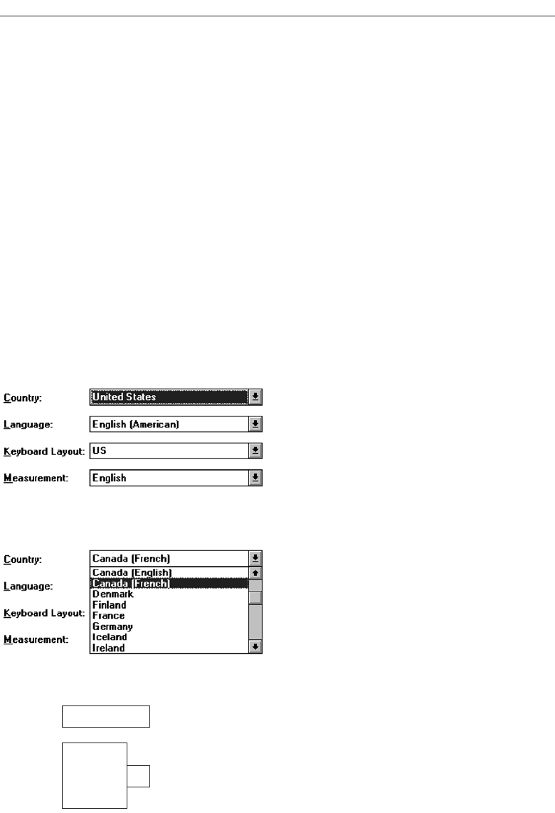
choice/pop-up lists, in HTML, selection lists/pop-up menus. The button provides a vi-
sual cue to the user that an associated selection box of choices is hidden but avail-
able on demand. When requested, a larger associated rectangular box appears
containing a scrollable list of choices from which one is selected. Selections are
made by using the mouse to point and click. No text field exists in which to type
text.
Fields of this nature go by many different names. They are called drop-down
lists because they appear to drop down from the single-selection field. Microsoft
Windows calls them drop-down list boxes. Other common names are pull-down lists,
option menus, and simply list boxes. Other list boxes of this type seem to pop-up on
the screen, either next to or over the selection field. Even a Microsoft Windows
“drop-down” will “pop-up” if it is opened near the bottom of the screen. In this
discussion, these variously named controls will be given the generic name of drop-
down/pop-up list boxes. A drop-down list is illustrated in Figures 7.70 and 7.71. Fig-
ure 7.72 shows a pop-up list.
Purpose. The purpose of these list boxes is to permit selection from a large set of mu-
tually exclusive choices when screen space is scarce.
Choose the Proper Screen-Based Controls 461
Figure 7.70 Drop-down list boxes. There are four unopened boxes, Country, Language, Keyboard
Layout, and Measurement.
Figure 7.71 Drop-down list box opened for Country.
Horizontal: Left
▼
▲
▼
▲
Set
Right
Centered
Left
Full
Horizontal:
Figure 7.72 Pop-up list box, closed and opened.
3900 P-07 (step 7) 4/24/02 2:04 PM Page 461

Advantages/disadvantages. The most useful feature of drop-down/pop-up list boxes
is that they conserve screen space. They may be retrieved on demand, reminding
users of the choices available. They permit an unlimited number of options to be
displayed.
A significant disadvantage of these lists is that they necessitate an extra step to
display the available options. Scrolling may also be necessary to see all items.
Since items can be ordered in an unpredictable way, they can be hard to find oc-
casionally. Generally, drop-down/pop-up list boxes require more work on the part
of the user than many other screen-based controls because of the activation step
and the possible need for scrolling. A study comparing drop-down/pop-up lists
to other similar controls will be described later in this Step.
Proper usage. Drop-down/pop-up list boxes are used much like regular list boxes,
except that the choices are not visible at all times. They are used for selecting val-
ues or setting attributes when sufficient screen space is not available to display the
choices permanently. Their best use is for data and choices that are textual; large
in number; fixed or variable in list length; not well known, easily learned or re-
membered; and ordered in an unpredictable fashion. Items should not have to be
selected frequently.
Drop-down/ pop-up lists are most useful when screen space or layout consid-
erations make radio buttons or single-selection list boxes impractical. It is also de-
sirable that most users select the first, or displayed, item in the listing so the box
does not have to be opened. Never use a drop-down/pop-up list if it is important
that all options be seen together at one time.
Prompt Button
■
Provide a visual cue that a box is hidden by including a downward pointing arrow,
or other meaningful image, to the right side of the selection field.
— Position the button directly against, or within, the selection field.
Figure 7.73
Most systems indicate the presence of a drop-down or pop-up list by associating a
meaningful icon with the applicable field. This icon can be seen positioned to the left of
the selection field, within the selection field as is done by Microsoft Windows, or to the
right of the selection field. Other platforms do not provide any visual indication that a
hidden list is available. An indication to the user that a drop-down or pop-up list is avail-
able should be indicated on the screen. This is especially critical if not all fields have
associated hidden lists. The best location is to the right of the selection field where it
is out of the way until needed. To visually differentiate it from another control—the
drop-down/pop-up combination box—position the button abutting or within the se-
lection field. (A drop-down/pop-up combination box button will be separated by a
space.) The indicator should be large enough to provide a good pointing target.
462 Step 7
3900 P-07 (step 7) 4/24/02 2:04 PM Page 462

Selection Descriptions
■
Clearly and meaningfully describe the choices available. Spell them out as fully as
possible.
— Graphical representations must clearly represent the options.
— Left-align them in columns.
— Display the descriptions using mixed-case letters.
Selection descriptions will reflect what choices exist in the control. They should be
meaningful, fully spelled out, and organized in columns. Display the list of choices
using mixed-case letters. Box descriptions should be displayed in the same color as the
selection field text. If a particular choice is not available in the current context, it should
be omitted from the list.
List Size
■
Not limited in size.
■
Present all available alternatives.
A list being displayed in a drop-down/pop-up list box has no size limit. All avail-
able alternatives should be capable of being displayed. It would seem practical that for
large scrollable lists, the same rules as presented for list boxes should also be applied.
Restrict page-downs to no more than 40 and provide a method to scope actions.
Box Size
■
Long enough to display 6 to 8 choices without scrolling.
— If more than eight choices are available, provide vertical scrolling to display all
items.
■
Wide enough to display the longest possible choice.
■
When a box cannot be made wide enough to display the longest entry:
— Make it wide enough to permit entries to be distinguishable, or,
— Break long entries with ellipses (...) in the middle, or,
— Provide horizontal scrolling.
Drop-down/pop-up list boxes should be restricted to eight or fewer choices. If more
must be displayed, permit scrolling and include a scroll bar on the right side of the box.
The list box should be wide enough to fully display all selection choice wording. When
a box cannot be made wide enough to display the longest entry, make it wide enough
to permit entries to be distinguishable, or break the long entries, inserting an ellipsis in
the middle. If breaking entries, preserve the important characteristics needed to dis-
tinguish them. When shortening an item’s name in this way, include a ToolTip that dis-
plays the item’s full name.As a last resort, provide horizontal scrolling and a scroll bar
at the bottom of the list box. Avoid horizontal scrolling whenever possible, however.
Choose the Proper Screen-Based Controls 463
3900 P-07 (step 7) 4/24/02 2:04 PM Page 463

Organization
■
Order in a logical and meaningful way to permit easy browsing.
■
If a particular choice is not available in the current context, omit it from the list.
— Exception: If it is important that the existence and unavailability of a particular
list item be communicated, display the choice dimmed or grayed out instead of
deleting it.
Selection choices should be organized logically. If the alternatives have an expected
order, follow it. Other ordering schemes such as frequency of use, sequence of use, or
importance, may also be considered. Always begin ordering at the top or left. If, under
certain conditions, a choice is not available, display the unavailable choice subdued or
less brightly than the available choices.
Layout and Separation
■
Enclose the choices in a box composed of a solid line border.
— The border should be the same color as the choice descriptions.
— Leave one blank character position between the choices and the left border.
— Leave one blank character position between the longest choice description in the
list and the right border, if possible.
To provide adequate legibility, leave one space between the choice descriptions and
the left border, and one space between the longest choice description and the right bor-
der. Extending the listing box to the right edge of the prompt button allows the user to
move easily from the button to the list. To set off the box from the screen body back-
ground, use the same color background for the box as is used in the entry field. Also in-
corporate a solid line border around the box in the same color as the choice descriptions.
Captions
■
Display using mixed-case letters.
■
Position the caption to the left of the box.
— Alternately, it may be positioned left-justified above the box.
To identify the drop-down/pop-up list box, a field caption in mixed-case letters, with
each significant word capitalized is necessary. Use a static text control to create the cap-
tion. The recommended position is to the box’s left. Select a positioning consistent with
other controls presented on the window.
Defaults
■
When the drop-down/pop-up listing is first presented, display the currently set value.
■
If a choice has not been previously selected, provide a default choice.
464 Step 7
3900 P-07 (step 7) 4/24/02 2:04 PM Page 464

When the drop-down/pop-up listing is first presented, display the currently set value.
If a choice has not been previously selected, provide a default choice. The list must be
opened to change the choice.
Disabling
■
When a drop-down/pop-up list box is disabled, display its caption and entries as
disabled or dimmed.
Display a drop-down/pop-up list box’s caption and entries as dimmed or grayed out
when the list box is entirely disabled.
Selection Method and Indication
■
Pointing:
— Highlight the selection choice in some visually distinctive way when the pointer
or cursor is resting on it and the choice is available for selection.
■
Activation:
— Close the drop-down/pop-up list box when an item is selected.
Highlight the selection choice in some visually distinctive way when the pointer or
cursor is resting on it and the choice is available for selection. Close the listing when an
item is selected.
Combination Entry/Selection Controls
It is possible for a control to possess the characteristics of both a text field and a selection
field. In this type of control, information may either be keyed into the field or selected
and placed within it. The types of combination entry/selection fields are spin boxes, at-
tached combination boxes, and drop-down/pop-up combination boxes.
Spin Boxes
■
Description:
— A single-line field followed by two small, vertically arranged buttons.
• The top button has an arrow pointing up.
• The bottom button has an arrow pointing down.
— Selection/entry is made by:
• Using the mouse to point at one of the directional buttons and clicking. Items
will change by one unit or step with each click.
• Keying a value directly into the field itself.
Choose the Proper Screen-Based Controls 465
3900 P-07 (step 7) 4/24/02 2:04 PM Page 465
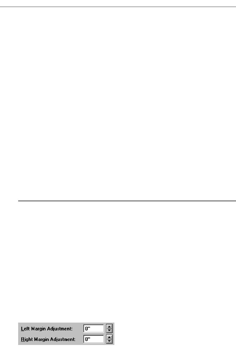
■
Purpose:
— To make a selection by either scrolling through a small set of meaningful prede-
fined choices or typing text.
■
Advantages:
— Consumes little screen space.
— Flexible, permitting selection or typed entry.
■
Disadvantages:
— Difficult to compare choices.
— Can be awkward to operate.
— Useful only for certain kinds of data.
■
Proper usage:
— For setting attributes, properties, or values.
— For mutually exclusive choices (only one can be selected).
— When the task requires the option of either key entry or selection from a list.
— When the user prefers the option of either key entry or selection from a list.
— Where screen space is limited.
— Most useful for data and choices that are:
• Discrete.
• Infrequently selected.
• Well known, easily learned or remembered, and meaningful.
• Ordered in a predictable, customary, or consecutive fashion.
• Infrequently changed.
• Small in number.
• Fixed or variable in list length.
Description. Aspin box, also called a spin button, is a single-line field followed by two
small, vertically arranged buttons inscribed with up and down arrows. These but-
tons may also be referred to as up-down buttons. Selection of an item is accom-
plished using the mouse to point at one of the buttons and clicking. Items in a
listing in the display field will change by one unit or step in the direction selected
with each click. The list is searched as the ring or circle of alternatives “spins” by.
Keying a value directly into the field itself may also complete a spin box. A spin
box is illustrated in Figure 7.74.
Advantages/disadvantages. Spin boxes are flexible, permitting either selection or
typed entry. They also consume little screen space. On the other hand, spin boxes
are useful only for certain kinds of data, that which is predictable or consecutive.
Because only one item is displayed at a time, it is difficult to compare choices. Spin
466 Step 7
Figure 7.74 Spin boxes.
3900 P-07 (step 7) 4/24/02 2:04 PM Page 466

boxes may also be awkward to operate, often requiring several back and forth it-
erations to bring the desired value into view.
Proper usage. Spin boxes are used for setting attributes, properties, or values that are
mutually exclusive. They are useful when the task requires, or the user prefers,
the option of either key entry or selection from a list. Spin boxes are useful for data
and choices that are discrete and small in number. The choices themselves should
be well known, easily learned or remembered, and meaningful. Choices should
be ordered in a predictable, customary, or consecutive fashion so people can an-
ticipate the next not-yet-visible choice. Items in spin boxes should not require fre-
quent selection, and the array of items listed should be stable.
List Size
■
Keep the list of items relatively short.
■
To reduce the size of potentially long lists, break the listing into subcomponents, if
possible.
Since the list must be manipulated to display its contents, it should be as short as fea-
sible. To reduce the size of potentially long lists, break the listing into subcomponents
whenever possible. A date, for example, may be broken into its components of month,
day, and year.
List Organization
■
Order the list in the customary, consecutive, or expected order of the information
contained within it.
— Ensure that the user can always anticipate the next (not-yet-visible) choice.
■
When first displayed, present a default choice in the box.
Spin boxes are most effective when the values they contain have a customary or con-
secutive order that is predictable. Information can be letters or numbers. Examples are
days of the week, months of the year, shoe sizes, and so on. The user must always be
able to anticipate the next choice before it is displayed. The control should always con-
tain a default value when first displayed.
Other Spin Box Guidelines
■
Box size:
— The spin box should be wide enough to display the longest entry or choice.
■
Caption:
— Display it using mixed-case letters.
— Position the caption to the left of the box.
• Alternately, it may be positioned left-justified above the box.
Choose the Proper Screen-Based Controls 467
3900 P-07 (step 7) 4/24/02 2:04 PM Page 467

■
Entry and selection methods:
— Permit completion by:
• Typing directly into the box.
• Scrolling and selecting with a mouse.
• Scrolling and selecting with the up/down arrow keys.
— For alphabetical values:
• Move down the order using the down arrow.
• Move up the order using the up arrow.
•For numeric values or magnitudes:
• Show a larger value using the up arrow.
• Show a smaller value using the down arrow.
Box size. Fully display all alternatives within the spin box. The box should be wide
enough to display the longest entry or choice.
Caption. To identify the spin box, use a static text field to provide a field caption in
mixed-case letters, with each significant word capitalized. The recommended po-
sition is to the box’s left. Select a positioning consistent with other controls pre-
sented on the window.
Entry and selection. Spin box completion should be possible by typing directly into
the field or by scrolling and selecting options with a mouse or keyboard keys. When
spinning alphabetical values, move down the order using the down arrow and up
the order using the up arrow. For numeric values or magnitudes, display a larger
value using the up arrow and a smaller value using the down arrow.
Combo Boxes
■
Description:
— A single rectangular text box entry field, beneath which is a larger rectangular list
box (resembling a drop-down list box) displaying a list of options.
— The text box permits a choice to be keyed within it.
— The larger box contains a list of mutually exclusive choices from which one may
be selected for placement in the entry field.
• Selections are made by using a mouse to point and click.
— As text is typed into the text box, the list scrolls to the nearest match.
— When an item in the list box is selected, it is placed into the text box, replacing the
existing content.
— Information keyed may not necessarily have to match the list items.
■
Purpose:
— To allow either typed entry in a text box or selection from a list of options in a per-
manently displayed list box attached to the text box.
■
Advantages:
— Unlimited number of entries and choices.
— Reminds users of available options.
— Flexible, permitting selection or typed entry.
468 Step 7
3900 P-07 (step 7) 4/24/02 2:04 PM Page 468

— Entries not necessarily restricted to items selectable from list box.
— List box always visible.
■
Disadvantages:
— Consumes some screen space.
— All list box choices not always visible, requiring scrolling.
— Users may have difficulty recalling sufficient information to type entry, making
text box unusable.
— The list may be ordered in an unpredictable way, making it hard to find items.
■
Proper usage:
— For entering or selecting objects or values or setting attributes.
— For information that is mutually exclusive (only one can be entered or selected).
— When users may find it practical to, or prefer to, type information rather than se-
lecting it from a list.
— When users can recall and type information faster than selecting it from a list.
— When it is useful to provide the users a reminder of the choices available.
— Where data must be entered that is not contained in the selection list.
— Where screen space is available.
— For data and choices that are:
• Best represented textually.
• Somewhat familiar or known.
• Ordered in an unpredictable fashion.
• Frequently changed.
• Large in number.
• Variable or fixed in list length.
Description. Acombo box, also known as an attached combination box, is a single rec-
tangular entry field, beneath which is a larger rectangular box (resembling a drop-
down list box) displaying a list of options. In Java combo boxes are called editable
choice pop-up lists. The entry field permits a choice to be keyed within it, while the
larger box contains a list of mutually exclusive choices, from which one may be se-
lected for placement in the entry field. A combo box combines the capabilities of
both a text box and a list box. It visually resembles a drop-down list box or drop-
down combo box (to be described). The text box and its associated list box have a
dependent relationship. As text is typed into the text box, the list scrolls to the
nearest match. Also, when an item in the list box is selected, that item is placed
within the text box, replacing the existing content. When typing into the field, the
information keyed does not have to match the list items. Combo boxes are illus-
trated in Figure 7.75.
Advantages/disadvantages. Combo boxes are flexible, permitting selection or typed
entry. Alternatives are always visible, or retrievable, reminding people of the avail-
able options. An unlimited variety of entries and choices are possible. Entries are
not necessarily restricted to items selectable from a box.
Combo boxes do consume quite a bit of screen space. Because all box choices
may not be visible, some scrolling may be required. It is always possible that peo-
ple may have difficulty recalling sufficient information to type, making the text
Choose the Proper Screen-Based Controls 469
3900 P-07 (step 7) 4/24/02 2:04 PM Page 469
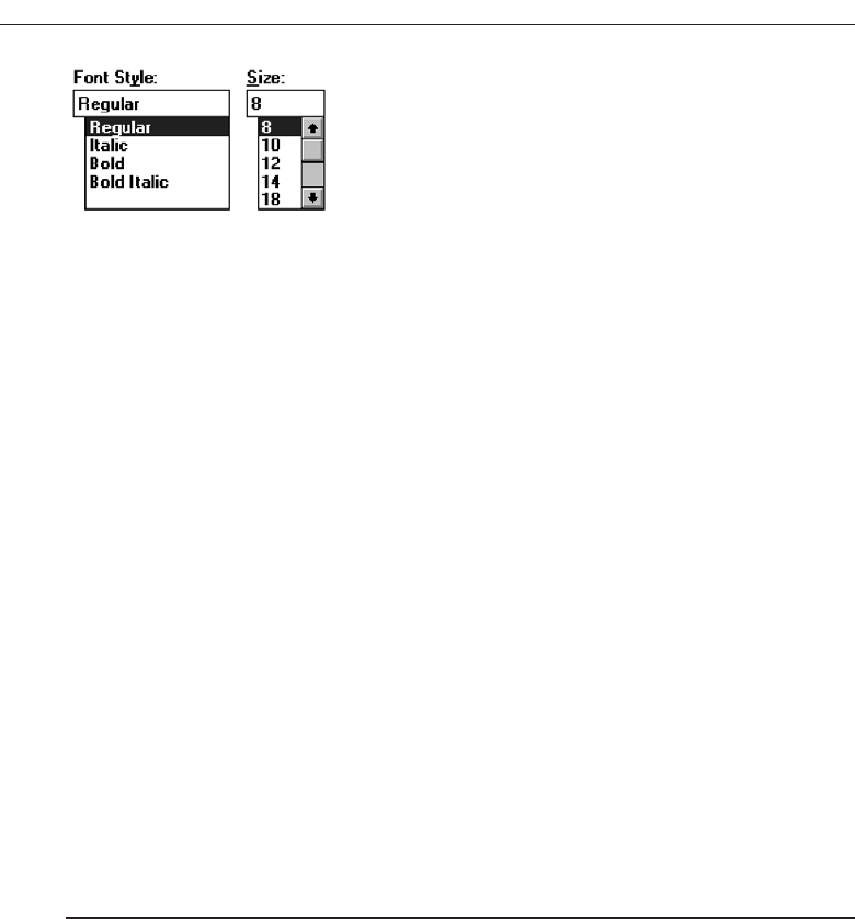
box unusable. The list may also be ordered in an unpredictable way, making it
hard to find items. Additional work is required of the user if selection scrolling
must be performed.
Proper usage. Combo boxes are useful for entering or selecting objects or values or
setting attributes that are mutually exclusive. They are most valuable when users
may find it practical to, or prefer to, type information rather than selecting it from
a list, but where reminders of alternatives available must occasionally be provided.
They are also useful when the listings are dynamic and changeable, permitting
the user to key items not contained on the list in the box. They do require that
screen space be available to display them, but they eliminate the extra steps in-
volved in retrieving drop-down lists.
Combo boxes are useful for textual data and choices that are frequently
changed and somewhat familiar or known, fostering keyed entry. The lists may
be long, variable, and ordered in an unpredictable fashion.
Combo Box Guidelines
For the text box entry field, see “Text Box/Single Line” guidelines. For the list box, see
“Drop-down/Pop-up List Box” guidelines.
Drop-down/Pop-up Combo Boxes
■
Description:
— A single rectangular text box with a small button to the side and an associated
hidden list of options.
• The button provides a visual cue that an associated selection box is available
but hidden.
— When requested, a larger associated rectangular box appears, containing a scrol-
lable list of choices from which one is selected.
— Selections are made by using the mouse to point and click.
— Information may also be keyed into the field.
— As text is typed into the text box, the list scrolls to the nearest match.
— When an item in the list box is selected, it is placed into the text box, replacing the
existing content.
— The information keyed does not necessarily have to match list items.
— Combines the capabilities of both a text box and a drop-down/pop-up list box.
470 Step 7
Figure 7.75 Combo boxes.
3900 P-07 (step 7) 4/24/02 2:04 PM Page 470

■
Purpose:
— To allow either typed entry or selection from a list of options in a list box that may
be closed and retrieved as needed.
■
Advantages:
— Unlimited number of entries and choices.
— Reminds users of available options.
— Flexible, permitting selection or typed entry.
— Entries not restricted to items selectable from list box.
— Conserves screen space.
■
Disadvantages:
— Requires an extra step to display the list of choices.
— When displayed, all box choices may not always be visible, requiring scrolling.
— User may have difficulty in recalling what to type.
— The list content may change, making it hard to find items.
— The list may be ordered in an unpredictable way, making it hard to find items.
■
Proper usage:
— For entering or selecting objects or values or setting attributes.
— For information that is mutually exclusive (only one can be entered or selected).
— When users may find it practical to, or prefer to, type information rather than se-
lecting it from a list.
— When users can recall and type information faster than selecting from a list.
— When it is useful to provide the users with an occasional reminder of the choices
available.
— Where data must be entered that is not contained in the selection list.
— Where screen space is limited.
— For data and choices that are:
• Best represented textually.
• Somewhat familiar or known.
• Ordered in an unpredictable fashion.
• Frequently changed.
• Large in number.
• Variable or fixed in list length.
Description. Adrop-down/pop-up combo box is a single rectangular field with a small
button to the side and an associated hidden list of options. The button provides
a visual cue to the user that an associated selection box of choices is available
but hidden. When requested, a larger associated rectangular box appears, con-
taining a scrollable list of choices from which one can be selected. One makes se-
lections by using the mouse to point and click. The text box and its associated list
box have a dependent relationship. As text is typed into the text box, the list
scrolls to the nearest match. Also, when an item in the list box is selected, that item
is placed within the text box, replacing the existing content. It closely resembles a
drop-down/pop-up list box.
Information, however, may also be keyed into the field. The information
keyed does not necessarily have to match items in the list. A drop-down/pop-up
Choose the Proper Screen-Based Controls 471
3900 P-07 (step 7) 4/24/02 2:04 PM Page 471
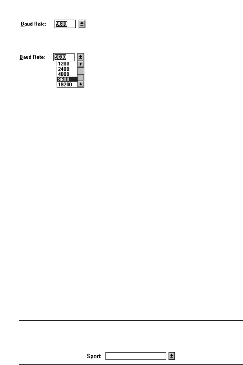
combination box, therefore, combines the capabilities of both a text box and a se-
lection field. A drop-down combo box is illustrated in Figures 7.76 and 7.77.
Advantages/disadvantages. Drop-down/pop-up combo boxes are flexible, permit-
ting selection or typed entry. They conserve screen space, but alternatives are al-
ways retrievable, reminding people of the available options. An unlimited variety
of entries and choices are possible. Entries are not restricted to items selectable
from a box.
In terms of disadvantages, they necessitate an extra step to display the avail-
able options. Scrolling may also be necessary to see all items. Since the list content
can change, and items can be ordered in an unpredictable way, it can be hard to
find items. It is always possible also that people may have difficulty recalling suf-
ficient information to type, making the entry field unusable. Generally drop-
down/pop-up combination boxes require more work on the part of the user than
many other screen-based controls.
Proper usage. Drop-down/pop-up combo boxes are useful for entering or selecting
objects or values or setting attributes that are mutually exclusive. They are most
valuable when users may find it practical to, or prefer to, type information rather
than selecting from a list but where reminders of alternatives available must occa-
sionally be provided. The box may only be retrieved as needed, thereby conserving
screen space. They are also useful when the listings are dynamic and changeable,
permitting the user to key items not contained on the list in the box.
Drop-down/pop-up combo boxes are useful for textual data and choices that
are frequently changed and somewhat familiar or known, fostering keyed entry.
The list may be long, variable, and ordered in an unpredictable fashion.
Prompt Button
■
Provide a visual cue that a list box is hidden by including a downward-pointing
arrow to the right of the text box.
■
Separate the button from the text box by a small space.
Figure 7.78
472 Step 7
Figure 7.76 Windows 3.1 Drop-down combo box, closed.
Figure 7.77 Windows 3.1 Drop-down combo box, opened.
3900 P-07 (step 7) 4/24/02 2:04 PM Page 472

Provide a visual cue that a list box is hidden by including a downward-pointing arrow
to the right of the entry field. Unfortunately, Microsoft Windows has provided drop-
down list boxes and combo boxes that are visually almost identical. The only way to
differentiate the two types is to click and see whether a box can be typed into. This is
extremely poor design. Each unique control should be identifiable by the way it looks
so trial and error behavior can be avoided. Microsoft, in Windows 3.1, did provide this
distinction. The prompt button was slightly separated from the text box, as shown in
Figures 7.76 and 7.77. Ideally, then, position the prompt button separated by a space
from the associated text box.
Other Guidelines
For the text box entry field, see the “Text Box/Single Line” guidelines. For the box and
selection components, see the “Drop-down/Pop-up List Box” guidelines.
Other Operable Controls
Other more specialized operable controls also exist. Among them are sliders, tabs, date-
pickers, and scroll bars.
Slider
■
Description:
— A scale exhibiting degrees of a quality on a continuum.
— Includes the following:
• A shaft or bar.
• A range of values with appropriate labels.
• An arm indicating relative setting through its location on the shaft.
• Optionally, a pair of buttons to permit incremental movement of the slider
arm.
• Optionally, a text box for typing or displaying an exact value.
• Optionally, a detent position for special values.
— May be oriented vertically or horizontally.
— Selected by using the mouse to:
• Drag a slider across the scale until the desired value is reached.
• Point at the buttons at one end of the scale and clicking to change the value.
• Keying a value in the associated text box.
■
Purpose:
— To make a setting when a continuous qualitative adjustment is acceptable, it is
useful to see the current value relative to the range of possible values.
■
Advantages:
— Spatial representation of relative setting.
— Visually distinctive.
Choose the Proper Screen-Based Controls 473
3900 P-07 (step 7) 4/24/02 2:04 PM Page 473
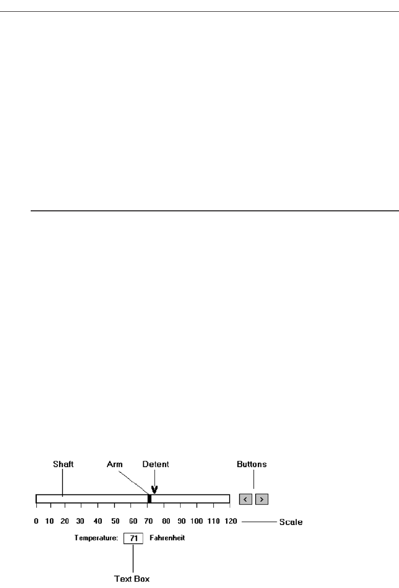
■
Disadvantages:
— Not as precise as an alphanumeric indication.
— Consumes screen space.
— Usually more complex than other controls.
■
Proper usage:
— To set an attribute.
— For mutually exclusive choices.
— When an object has a limited range of possible settings.
— When the range of values is continuous.
— When graduations are relatively fine.
— When the choices can increase or decrease in some well-known, predictable, and
easily understood way.
— When a spatial representation enhances comprehension and interpretation.
— When using a slider provides sufficient accuracy.
Description. Aslider is a scale that exhibits the amount or degree of a quantity or
quality on a continuum (see Figure 7.79). It is sometimes called a track bar control.
A slider incorporates the range of possible values and includes a shaft or bar rep-
resenting the range, the values themselves with appropriate labels, and a visual
indication of the relative setting through the location of a sliding arm. Optionally,
sliders also may include a pair of buttons to permit incremental movement of
the slider arm, an entry/display text box for typing and displaying an exact
value, and a detent position for special values. A slider may be oriented vertically
or horizontally.
Slider values can be set by using the mouse to drag a slider across the scale
until the desired value is reached. A visual indication of the relative setting is seen
as the setting movement is made. In addition, some sliders may also be set by
pointing at slider buttons located at one end of the scale and incrementally mov-
ing the arm through button clicks. Finally, keying a value in an associated text box
may also set some sliders.
A slider is used to make a setting when a continuous qualitative adjustment is
acceptable, and it is advantageous to see the current value relative to all possible
values.
474 Step 7
Figure 7.79 Slider.
3900 P-07 (step 7) 4/24/02 2:04 PM Page 474

Advantages/disadvantages. A slider displays a spatial representation of a relative
setting, providing an excellent indication of where a value exists within a range of
values. They are also visually distinctive and very recognizable. Sliders, however,
are not as precise as an alphanumeric indication, unless a display field is provided.
They also consume more screen space than other kinds of fields, and they can be
more complex to operate.
Proper usage. Sliders are used to set an attribute when a limited range of continuous,
relatively fine, possible settings exist. The choices must increase or decrease in
some well-known, predictable, and easily understood way. Spatial representation
of the attribute should enhance comprehension and interpretation and be suffi-
ciently accurate.
General
■
Use standard sliders whenever available.
Use of standard system sliders will speed learning
Caption and Labels
■
Caption:
— Provide meaningful, clear, and consistent captions.
— Display them using mixed-case letters.
— Position the caption to the left of the box.
• Alternately, it may be positioned left-justified above the slider.
■
Labels:
— Provide meaningful and descriptive labels to aid in interpreting the scale.
Caption. The slider caption must clearly reflect the quality being displayed. Use a sta-
tic text or group box control to provide a field caption in mixed-case letters with
each significant word capitalized. Use a static text field; the recommended posi-
tion is to the box’s left. Alternately, captions may be positioned above the slider,
aligned with the left edge. Select a positioning consistent with other controls pres-
ented in the window.
Labels. Provide meaningful and descriptive labels to aid in interpreting the scale. A
temperature slider will necessitate the inclusion of numeric temperature values. A
volume slider may be labeled low and high. Create the labels using static text fields.
Scale
■
Show a complete range of choices.
■
Mark the low, intermediate, and high ends of the scale.
■
Provide scale interval markings, where possible.
Choose the Proper Screen-Based Controls 475
3900 P-07 (step 7) 4/24/02 2:04 PM Page 475

■
Provide consistent increments.
■
Permit the user to change the units of measure.
■
If the precise value of a quantity represented is important, display the value set in an
adjacent text box.
Provide a complete range of choices on the scale. Mark the low, intermediate, and
high ends of the scale. For example, volumes may be indicated by low and high. Provide
scale interval markings at consistent increments. Allow the user to change the units of
measure, for example, changing a temperature from Fahrenheit to centigrade. If the
precise value of a quantity represented is critical, display the set value in an adjacent
entry/display text box control. This will also permit typed entry of the desired value.
Slider Arm
■
If the user cannot change the value shown in a slider, do not display a slider arm.
Do not display a slider arm if the user cannot change the value shown in a slider. Fill
in the shaft in a distinctive way to indicate the relative setting, as illustrated in the
guideline for proportions.
Slider Buttons
■
Provide slider buttons to permit movement by the smallest increment.
■
If the user cannot change the value shown in a slider, do not display slider buttons.
Provide slider buttons to permit movement by the smallest increment. Movement is
achieved by pointing and clicking. If the user cannot change the value shown in a
slider, do not display slider buttons.
Detents
■
Provide detents to set values that have special meaning.
■
Permit the user to change the detent value.
For values that have special meaning, provide detents that can be changed by the
user.
Proportions
■
To indicate the proportion of a value being displayed, fill the slider shaft in some vi-
sually distinctive way.
— Fill horizontal sliders from left to right.
— Fill vertical sliders from bottom to top.
476 Step 7
3900 P-07 (step 7) 4/24/02 2:04 PM Page 476

When the proportion of a value is also important, provide proportional indicators
by filling in the slider shaft in a distinctive way. Fill it from left to right and bottom
to top.
Tabs
■
Description:
— A window containing tabbed dividers that create pages or sections.
— Navigation is permitted between the pages or sections.
■
Purpose:
— To present information that can be logically organized into pages or sections
within the same window.
■
Advantages:
— Resembles their paper-based cousins.
— Visually distinctive.
— Effectively organize repetitive, related information.
■
Disadvantages:
— Visually complex.
■
Proper usage:
— To present discrete, logically structured, related, information.
— To present the setting choices that can be applied to an object.
— When a short tab label can meaningfully describe the tab’s contents.
— When the order of information use varies.
Description. Atab control is a window containing tabbed dividers that create pages
or sections. Also referred to as a notebook, the tabs are analogous to dividers in a
file cabinet or notebook. Navigation is permitted between the tabbed pages or sec-
tions. Microsoft Windows has a window organization scheme called a workbook
(See Step 4) that is similar to the notebook control. Tabs from Microsoft Windows
are illustrated in Figure 7.80.
Advantages/disadvantages. Tabs resemble their paper-based cousins, entities that
are familiar to almost everyone. They are very meaningful electronic metaphors.
Tabs are visually distinctive, and they permit effective organization of repetitive
and related information. One drawback: They may result in a visually more com-
plex screen.
Proper usage. Tabs can be used to present data that can be logically structured into
discrete and meaningful pages or sections. They are most useful for presenting
the choices that can be applied to an object, for example, a person and the person’s
descriptive data such as address, employment, family, and so forth. When the in-
formation on one tab is heavily dependent on information found on another tab,
tabs are a poor choice because the user will have to keep flipping between tabs.
Tabs are useful only if a brief tab label can identify their contents. Tabs are also
useful when the order in which information is used varies.
Choose the Proper Screen-Based Controls 477
3900 P-07 (step 7) 4/24/02 2:04 PM Page 477
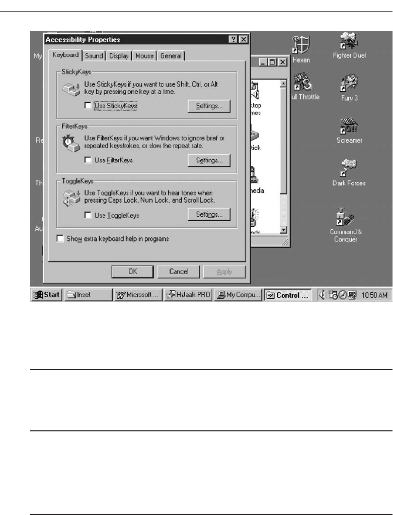
Sections and Pages
■
Place related information within a page or section.
■
Order them meaningfully.
■
Arrange pages so they appear to go deeper, left to right and top to bottom.
■
Provide pages of equal size.
Place related information within a page or section. Order the pages in a meaningful
way, based upon the window’s content. Arrange the pages so they appear to go deeper,
left to right and top to bottom. Provide pages of equal size.
Location, Size, and Labels
■
Place the tabs at the top of the page or section.
■
Provide fixed-width tabs for pages or sections of related information.
■
Provide textual labels.
— Use system fonts.
— Keep information brief and the same general length.
• Nouns are usually better than verbs.
478 Step 7
Figure 7.80 Tabs from Microsoft Windows.
3900 P-07 (step 7) 4/24/02 2:04 PM Page 478

— Use mixed case, capitalizing each significant word.
— Assign a keyboard equivalent for keyboard access.
■
Center the labels within the tabs.
■
Restrict tabs to only one row.
■
Arrange tabs so that they appear to go deeper, left to right and top to bottom.
Place tabs at the top of the page or section. This is the most customary location. Tabs
may be capable of being located at all four points of the compass but these positions are
not as common. Left and right tabs will provide label readability problems. Fixed-
width tabs are preferred but variable-width tabs may be used if screen space con-
straints exist. For labels, use the standard system fonts in mixed case, capitalizing each
significant word. Keep tab text labels brief and of the same general length. Nouns are
usually better than verbs. Assign each tab a keyboard equivalent to facilitate keyboard
access. Center the labels within the tabs and restrict them to only one row.
Avoid multiple rows of tab or scrolling a single row of tabs. This adds complexity to
the interface and makes it harder for the user to read and access a particular tab. As an
alternative, consider separating the tabbed pages into sets and using another control to
move between sets, or use subordinate dialog boxes. Arrange tabs so that they appear
to go deeper, left to right and top to bottom.
Command Buttons
■
If they affect only a page or section, locate the buttons on the page or section.
■
If they affect the entire tabbed control, locate the buttons outside the tabbed pages.
For command buttons that affect only the tabbed page being displayed, locate the
buttons on that page. If they affect the entire tabbed control, position the buttons out-
side the pages but within the window holding the pages. Tab users often have trouble
understanding that command buttons actions within a tab page only affect that page,
but that command buttons outside all the pages affect the entire tab window. The users
may not always be aware that when the window is closed, actions taken within a win-
dow are not “activated” until the window’s OK button is pressed. Guidance may have
to be provided to the users to ensure that all expected user actions are actually per-
formed. Alternatives include providing instructions on the window or providing a
confirming message box if the window is closed.
Date-Picker
■
Description:
— A drop-down list box that displays a 1-month calendar in the drop-down list box.
— The displayed month can be changed through pressing command buttons with
left- and right-pointing arrows.
Choose the Proper Screen-Based Controls 479
3900 P-07 (step 7) 4/24/02 2:04 PM Page 479

• The left arrow moves backward through the monthly calendars.
• The right arrow moves forward through the monthly calendars.
— A date for the list box can be selected from the drop-down calendar.
■
Purpose:
— To select a date for inscribing in a drop-down list box.
■
Advantages:
— Provides a representation of a physical calendar, a meaningful entity.
— The calendar listing is ordered in a predictable way.
— Visually distinctive.
■
Disadvantages:
— Requires an extra step to display the calendar.
— When displayed, all month choices are not visible, requiring a form of scrolling
to access the desired choice.
■
Proper usage:
— To select and display a single date in close monthly proximity to the default
month presented on the drop-down list box.
Adate-picker, illustrated in Figure 7.81,is a drop-down list box that displays a 1-month
calendar in the drop-down. The displayed month can be changed by pressing com-
mand buttons with left- and right-pointing arrows. A relevant date to be entered in the
list box is selected from the calendar drop-down list box. Advantages and disadvan-
tages are similar to drop-down list boxes. Its structure as a calendar is a meaningful
representation for most users. Like drop-down list boxes, the date-picker requires ex-
posing the list before the date can be chosen. If the date desired as not within the de-
fault month’s calendar presented, the calendar must be scrolled to the proper month.
If the date is far away in time, excessive scrolling may be required to obtain it. There-
fore, it is most useful for dates close in time to the default month presented. A wide range
of dates would best be collected through a text box.
480 Step 7
Figure 7.81 A date-picker control.
3900 P-07 (step 7) 4/24/02 2:04 PM Page 480
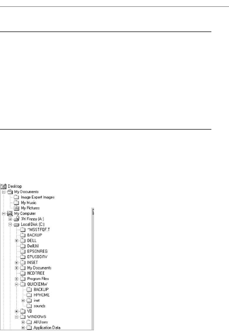
Tree View
■
Description:
— A special list box control that displays a set of objects as an indented outline,
based on the objects’ logical hierarchical relationship.
— Includes, optionally, buttons that expand and collapse the outline.
• A button inscribed with a plus ( + ) expands the outline.
• A button inscribed with a minus ( - ) collapses the outline.
— Elements that can optionally be displayed are:
• Icons.
• Graphics, such as a check box.
• Lines to illustrate hierarchical relationships.
■
Purpose and proper usage:
— To display a set of objects as an indented outline to illustrate their logical hierar-
chical relationship.
Atree view control, as illustrated in Figure 7.82, is a special list box control that dis-
plays a set of objects as an indented outline, based on their logical hierarchical rela-
tionship. The control is used to display the relationship between a set of containers or
other hierarchical elements, and, optionally, includes buttons to expand or collapse the
Choose the Proper Screen-Based Controls 481
Figure 7.82 A tree view control.
3900 P-07 (step 7) 4/24/02 2:04 PM Page 481

hierarchy. Icons can be included with the text label for each item in the tree. Different
icons can be displayed when the tree expands or collapses. A graphic, such as a check
box, can be used to reflect state information about the item. The tree view control also
supports an optional display of lines to illustrate the hierarchical relationship of the
items in the list.
Scroll Bars
■
Description:
— An elongated rectangular container consisting of:
• A scroll area.
• A slider box or elevator inside.
• Arrows or anchors at either end.
— Available, if needed, in primary and secondary windows, some controls, and
Web pages.
— May be oriented vertically or horizontally at the window or page edge.
■
Purpose:
— To find and view information that takes more space than the allotted display
space.
■
Advantages:
— Permits viewing data of unlimited size.
■
Disadvantages:
— Consumes screen space.
— Can be cumbersome to operate.
■
Proper use:
— When more information is available than the window space for displaying it.
— Do not use to set values.
Description. Ascroll bar is an elongated rectangular container consisting of a scroll
area, a slider box, or elevator inside the scroll bar, and arrows or anchors at either
end. They may be placed, if needed, in windows, in some controls, and in Web
pages. They may be oriented vertically or horizontally at the right or bottom of a
screen. Historically, scroll bars have been designed in a variety of styles; a typical
one is illustrated in Figure 7.83.
Purpose. Scroll bars are used to find and view information that occupies more space
than the allotted display space.
Advantages/disadvantages. While they permit viewing data of unlimited size, they
do consume screen space and can be cumbersome to operate.
Proper usage. Use a scroll bar, or bars, when more information is available than the
window space for displaying it. Do not use scroll bars to set values. If a value must
be set or adjusted, use a slider or another control such as a spin box. Because scroll
bars are designed for scrolling through information, using a scroll bar to set values
may confuse the user about the purpose or interaction of the control.
482 Step 7
3900 P-07 (step 7) 4/24/02 2:04 PM Page 482
Scroll Bar Design Guidelines
■
General:
— Provide a scroll bar when invisible information must be seen.
■
Scroll area or container:
— To indicate that scrolling is available, a scroll area or container should be provided.
• Construct it of a filled-in bar displayed in a technique that visually contrasts
with the window and screen body background.
■
Scroll slider box or handle:
— To indicate the location and amount of information being viewed, provide a
slider box or handle.
• Constructed of a movable and sizable open area of the scroll area, displayed in
a technique that contrasts with the scroll area.
• By its position, spatially indicate the relative location in the file of the informa-
tion being viewed.
• By its size, indicate, proportionately, the percentage of the available informa-
tion in the file being viewed.
■
Scroll directional arrows:
— To indicate the direction in which scrolling may be performed, directional arrows
should be provided.
• Construct them as arrows in small boxes, with backgrounds that contrast with
the scroll area.
■
Selection:
— When the slider box/handle has been selected, highlight it in some visually dis-
tinctive way.
■
Location:
— Position a vertical (top-to-bottom) scroll bar to the right of the window.
— Position a horizontal (left-to-right) scroll bar at the bottom of the window.
■
Size:
— A vertical scroll bar should be the height of the scrollable portion of the window
body.
— A horizontal scroll bar should be at least one-half the width of the scrollable por-
tion of the window body.
■
Current state indication:
— Whenever the window’s size or the position of the information changes, the scroll
bar components must also change, reflecting the current state.
Choose the Proper Screen-Based Controls 483
Figure 7.83 Scroll bar.
3900 P-07 (step 7) 4/24/02 2:04 PM Page 483

— Include scroll bars in all sizable windows.
• If no information is currently available by scrolling in a particular direction, the
relevant directional arrow should be subdued or grayed out.
General. Ascroll bar provides a method to permit the displaying of information that
may not always fit within a window on a screen. A scroll bar should only be in-
cluded when scrolling may be necessary.
In today’s systems, scroll bars come in a variety of styles. Scroll bars consist of
three elements: a scroll area or container, a slider box or handle that moves within
a track made by the scroll area/container, and directional or scroll arrows.
Scroll area or container. The scroll area or, as it is sometimes called, the scroll con-
tainer, is an elongated rectangular-shaped bar. Its presence indicates scrolling is
available. It usually is constructed of a filled-in area displayed in a technique that vi-
sually contrasts with the window and screen body background. The chosen display
technique should be of moderate intensity, neither too powerful nor too subtle. A
powerful technique will be distracting; a subtle technique may be overlooked.
Slider box or handle. To indicate the location and amount of information being
viewed, a slider box or, as it is sometimes called, a scroll handle, is included
within the scroll area/container. It is constructed of a movable and sizable portion
of the scroll area displayed in a technique that contrasts with the scroll area. It
should indicate, by its position, the relative spatial location in the file of the infor-
mation being viewed. It should indicate by its size, proportionately, the percent-
age of the available information in the file being viewed. Displaying, within a
scrollable screen, the page number of page-organized material being viewed can
further enhance the usability of the slider box or handle.
Directional or scroll arrows. To indicate the direction in which scrolling may be per-
formed, directional or scroll arrows are also included. They are constructed of
variously shaped arrows in small boxes with backgrounds that contrast with the
scroll area/container. They are most often located at each end of the scroll bar, but
some systems locate them adjacent to one another within the scroll area/container
itself.
Placing directional arrows at opposite ends of the scroll bar is conceptually the
clearest. The mouse pointer is moved in the same direction, away from the current
position, when either the scroll arrow or scroll handle is manipulated. The dis-
tance that the directional arrows are separated by, however, causes increased ef-
fort when a window’s contents must be adjusted by scrolling in opposite
directions.
One platform solved the direction-switching problem by positioning the di-
rectional arrows adjacent to one another at one end of the scroll bar. While the for-
ward-backward scrolling is made more efficient, the spatial correspondence
between the beginning, middle, and end of the data is lost.
Another platform took another approach, placing the directional arrows at
opposite ends of the slider box/handle to maintain the desirable spatial corre-
spondence while at the same time minimizing their separation. Since during a
continuous scrolling operation the directional arrows move as the slider
484 Step 7
3900 P-07 (step 7) 4/24/02 2:04 PM Page 484

box/handle moves, this platform automatically moves the mouse pointer to keep
it aligned with the scroll arrow. This eliminates the need for the user to move the
pointer during the continuous scrolling operation, but it requires that the user re-
linquish control of the mouse operation, and may be disorienting.
Using a scroll bar, the scrolling movement can be performed in several ways.
The most common actions involve grabbing the slider box/handle and moving
it in the desired direction, or selecting the proper directional arrow. Clicking a
mouse button while selecting a directional arrow moves the contents of a window
one line. Pressing the mouse button scrolls the window’s contents continuously
until the button is released. One platform provides another more efficient process.
A region of the scroll area/container can also be selected, automatically moving
the slider box/handle to that point and displaying the proper window contents.
Based upon early scrolling research (Bury, Boyle, Evey, and Neal, 1982),
movement of the window data usually follows the window-up or telescope ap-
proach, whereby the window moves around over data that appears fixed in loca-
tion. This causes the data in a window to move in the direction opposite the one
indicated by the directional arrow or the direction of movement of the scroll con-
tainer/handle. Scrolling using window systems, however, seems to be especially
mistake-prone, users often assuming the arrows will move the data in the same
direction as the directional arrow or scroll container/handle. In other words, it is
sensed that the data moves under the window, not the window over the data
(Billingsley, 1988). Why this happens is open to conjecture. Billingsley speculates
that, because windows seem to move on screens, when data scrolls or moves in a
window, people may conclude the data must be moving because the window re-
mains still during the scrolling operation. Or, because of the close physical prox-
imity of the directional arrows in scroll bars to the data, people may feel that the
arrows are acting on the data, not the window. The implication is that the
scrolling procedure should be rethought and restudied. Some recent applications
have devised scrolling methods through actually point at the window data.
Selection. When the slider box/handle has been selected, highlight it in some visu-
ally distinctive way. Most systems do provide some visual feedback of this kind.
Location. While, again, no universal agreement exists, the majority of systems locate
the vertical (top-to-bottom) scroll bar to the right of the window and the horizon-
tal (left-to-right) scroll bar at the bottom of the window.
Size. A vertical scroll bar should be the height of the scrollable portion of the
window body. A horizontal scroll bar should be at least one-half the width of
the scrollable portion of the window body.
Current state indication. Whenever the window’s size or the position of information
changes, the scroll bar components must also change, reflecting the current state
of the scrolling process. Providing accurate information about the scrolling location
facilitates user navigation and makes it easier to reposition the slider box/container.
Include scroll bars in all sizable windows.
If scrolling cannot be performed in a particular direction, the relevant arrow
box should be reduced in contrast or grayed out. If all the information in a win-
dow is displayed and no information is available for scrolling, both directional ar-
rows should be reduced in contrast or grayed out.
Choose the Proper Screen-Based Controls 485
3900 P-07 (step 7) 4/24/02 2:04 PM Page 485

Scroll Bar Usage Guidelines
■
Scroll bar style:
— Stick with standard, proven design styles.
■
Directional preference:
— Use vertical (top-to-bottom) scrolling.
— Avoid horizontal (left-to-right) scrolling.
Style. The standard, well-known, proven design style used in graphical systems
works best. A scroll bar is complex enough that presenting a new style to the user
will focus attention away from the screen content as the user struggles to learn how
to deal with the new style. This is a form of “senseless” learning and must be
avoided.
Directional preferences. Where the choice exists, people prefer and deal better with
vertical (top-to-bottom) scrolling rather than horizontal (left-to-right) scrolling.
Avoid horizontal scrolling whenever possible.
The usability aspects of scrolling, and paging were thoroughly reviewed in Step 3
“Understand the Principles of Good Screen Design.”
Media Controls
■
For all playable files provide the following controls.
— Play.
— Pause/Resume.
— Stop.
— Rewind.
— Fast Forward.
— Volume.
Some media products provide their own controls. For others, controls may have to
be designed. Always provide the above standard media controls.
Custom Controls
■
Implement custom controls with caution.
■
If used, make the look and behavior of custom controls different from that of stan-
dard controls.
Many toolkits and interface builders provide the ability to create custom controls;
implement them with caution. The user is currently presented with a multitude of con-
trols whose usage and operation must be learned and remembered. The addition of
486 Step 7
3900 P-07 (step 7) 4/24/02 2:04 PM Page 486
custom controls adds to this learning and increases system complexity. If custom con-
trols must be developed and implemented, make their look and behavior as different
as possible from the standard controls. This will avoid confusion between the various
controls.
MAXIM Fewer is usually better.
Presentation Controls
Presentation controls are purely informational. They provide details about other screen
elements or controls, or assist in giving the screen structure. Common presentation con-
trols are static text fields, group boxes column headings, ToolTips, balloon tips, and progress
indicators.
Static Text Fields
■
Description:
— Read-only textual information.
■
Purpose:
— To identify a control by displaying a control caption.
— To clarify a screen by providing instructional or prompting information.
— To present descriptive information.
■
Proper usage:
— To display a control caption.
— To display instructional or prompting information.
— To display descriptive information.
Description. Astatic text field, as illustrated in Figure 7.84, provides read-only textual
information. It is a standard Microsoft Windows control.
Purpose/proper usage. Use static text fields to create and present read-only infor-
mation, including all control captions. Also using static text fields clarify screen
usage by providing prompting or instructional information. Other descriptive
screen information can also be provided through static text fields. Examples are
headings, subheadings, slider scales, progress indicator text, and so on. In Mi-
crosoft Windows, static text cannot be selected, so avoid using it for any text the
user might want to copy to the clipboard.
Choose the Proper Screen-Based Controls 487
Figure 7.84 Static text field.
3900 P-07 (step 7) 4/24/02 2:04 PM Page 487

Static Text Field Guidelines
■
Captions:
— Include a colon (:) as part of the caption.
— Include a mnemonic for keyboard access.
— When the associated control is disabled, display it dimmed.
— Follow all other presented guidelines for caption presentation and layout.
■
Instructional or prompting information:
— Display it in a unique and consistent font style for easy recognition and
differentiation.
— Follow all other presented guidelines for prompting and instructional information.
■
Descriptive information:
— Follow all other guidelines for required screen or control descriptive information.
Captions. Always include a colon as part of the caption. The colon immediately
identifies the element as a caption. In Microsoft Windows the colon is also used by
screen review utilities. Include a keyboard equivalent (mnemonic) for all captions
to provide keyboard access to its associated control. Captions may also provide a
means of indicating that their associated controls are disabled. Follow all the rules
for caption display presented throughout these guidelines.
Instructional or prompting information. Display in a unique and consistent font style
for easy recognition and differentiation. Follow all other presented guidelines for
prompting and instructional information. Guidelines for writing instructional or
prompting information are found in Step 8 “Write Clear Text and Messages.”
Descriptive information. Other descriptive information includes headings, subhead-
ings, slider scales, progress indicator text, and so forth. Also, follow all the rules for
these other kinds of screen information presented throughout these guidelines.
Group Boxes
■
Description:
— A rectangular frame that surrounds a control or group of controls.
— An optional caption may be included in the frame’s upper-left corner.
■
Purpose:
— To visually relate the elements of a control.
— To visually relate a group of related controls.
■
Proper usage:
— To provide a border around radio button or check box controls.
— To provide a border around two or more functionally related controls.
■
Guidelines:
— Label or heading:
• Typically, use a noun or noun phrase for the label or heading.
• Provide a brief label or heading, preferably one or two words.
488 Step 7
3900 P-07 (step 7) 4/24/02 2:04 PM Page 488
• Relate label or heading’s content to the group box’s content.
• Capitalize the first letter of each significant word.
• Do not include and ending colon ( : ).
— Follow all other guidelines presented for control and section borders.
Description. Agroup box is a standardized rectangular frame that surrounds a con-
trol or group of controls.An optional caption may be included in the frame’s upper-
left corner. Standard Microsoft Windows Group boxes are illustrated in Figure
7.85.
Purpose/proper usage. The purpose of a group box is to visually relate the elements
of a single control or a grouping of related controls. Group boxes should be used
to provide a border around a radio button control, a grouping of related check
boxes, or two or more functionally related controls.
Guidelines. Typically, use a noun or noun phrase for group box labels or headings.
Keep the text brief, one or two words. Consider the group box content and relate the
control captions inside the group box to the label or heading being created. Use
headline-style capitalization, but do not include any ending colon. Refer to all the
guidelines presented for control and section borders, in designing group boxes.
Column Headings
■
Description:
— Read-only textual information that serves as a heading above columns of text or
numbers.
— Can be divided into two or more parts.
■
Purpose:
— To identify a column of information contained in a table.
■
Proper usage:
— To display a heading above a column of information contained in a table.
■
Guidelines:
— Heading:
• Provide a brief heading.
• Can include text and a graphic image.
• Capitalize the first letter of each significant word.
• Do not include an ending colon ( : ).
— The width of the column should fit the average size of the column entries.
— Does not support keyboard access.
Choose the Proper Screen-Based Controls 489
Figure 7.85 Group boxes.
3900 P-07 (step 7) 4/24/02 2:04 PM Page 489
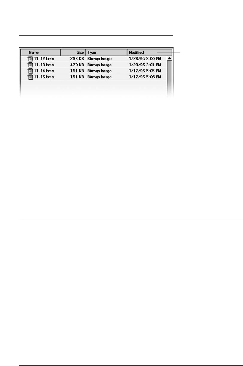
Description. Acolumn heading control, also known as a header control, is used to dis-
play a heading above columns of text or numbers. A column heading is illustrated
in Figure 7.86. It can be divided into two or more parts.
Purpose/proper usage. To identify and display a heading above a column of infor-
mation contained in a table.
Guidelines. Provide a brief heading. Headings can include text as well as a graphic
image. Use the headline style of capitalization, without an ending colon. The width
of each column should fit the average size of the column entries. Column heading
controls do not support keyboard access.
ToolTips
■
Description:
— A small pop-up window containing descriptive text that appears when a pointer
is moved over a control or element either:
• Not possessing a label.
• In need of additional descriptive or status information.
■
Purpose:
— To provide descriptive information about a control or screen element.
■
Advantages:
— Identifies an otherwise unidentified control.
— Reduces possible screen clutter caused by control captions and descriptive
information.
— Enables control size to be reduced.
■
Disadvantages:
— Not obvious, must be discovered.
— Inadvertent appearance can be distracting.
■
Proper usage:
— To identify a control that has no caption.
— To provide additional descriptive or status information about a screen element.
490 Step 7
Column heading
Column part
Figure 7.86 Column heading control.
3900 P-07 (step 7) 4/24/02 2:04 PM Page 490

Description. AToolTip, sometimes called a Screen Tip, is a standard Microsoft Win-
dows control, a small pop-up window that displays descriptive text when the
pointer is moved over a control that does not possess a caption, or that possesses
only an abbreviated caption. A ToolTip is illustrated in Figure 7.87.
Purpose/proper usage. The purpose of a ToolTip is to simply provide thorough de-
scriptive information about a control when its function must be quickly identified.
It is also used to provide additional descriptive or status information about a
screen element.
Advantages/disadvantages. A ToolTip provides an easy way to identify an other-
wise unidentifiable control, or a control with a cryptic caption. It reduces possible
screen clutter caused by control captions, enabling the control size to be reduced.
A ToolTip, however, is not obvious and must be discovered. Its appearance when
the pointer is positioned incorrectly, or is slowly passing over it, can be distract-
ing to the screen viewer.
ToolTip Guidelines
■
Display after a short time-out.
■
For toolbars, provide a brief word as a label.
— Use mixed case in the headline style of presentation with no ending punctuation.
■
For other elements, provide a brief phrase presenting descriptive or status
information.
— Use mixed case in the sentence style of presentation.
■
Present ToolTips at the lower-right edge of the pointer.
— Display them fully on the screen.
— For text boxes, display ToolTips centered under the control.
■
Display them in the standard system ToolTip colors.
■
Remove the ToolTip when the control is activated or the pointer is moved away.
■
Don’t substitute ToolTips for good design.
Display the ToolTip on the screen after a short pause, ideally three-quarters of a sec-
ond. This avoids its appearing briefly as the pointer is just being moved over a control
or element that possesses a ToolTip. When used to provide descriptions of toolbar but-
tons, keep ToolTips brief, usually one or two words that identify the button’s action.
Use the headline style of capitalization with no ending punctuation. For other elements,
Choose the Proper Screen-Based Controls 491
Figure 7.87 ToolTip
3900 P-07 (step 7) 4/24/02 2:04 PM Page 491

descriptive or status information may be provided. In this case, use a short phrase, in
sentence-style capitalization, which briefly describes the item or status. Position the
ToolTip to the lower-right of the pointer, but fully on the screen. Always adjust the lo-
cation for a full fit. For text boxes, present the ToolTip centered under the control it re-
lates to. Display it in the system’s standard ToolTip colors so it will be immediately
recognized as a ToolTip. Remove the ToolTip when the control is clicked or the pointer
is moved away.
Don’t substitute ToolTips for good design. Presented screen elements should always
be designed for maximum comprehension. ToolTips are supplements.
Balloon Tips
■
Description:
— A small pop-up window that contains information in a word balloon.
— Components can include:
• Title.
• Body text.
• Message Icons.
— Appear adjacent to the item to which they apply, generally above or to left.
— Only one tip, the last posted, is visible at any time.
— Tips are removed after a specified time period.
■
Purpose:
— To provide additional descriptive or status information about a screen element.
■
Advantages:
— Provides useful reminder and status information.
■
Disadvantages:
— If overused they lose their attention-getting value.
— If overused in situations the user considers not very important, their continual
appearance can be aggravating.
■
Proper usage:
— To display noncritical:
• Reminder information.
• Notification information.
— Do not use tips to display critical information.
Description. Aballoon tip, illustrated in Figure 7.88, is a small pop-up window that
contains information presented in a word balloon. Its components can include a
title, body text, and informational, warning, or critical icons. (These icons are de-
scribed in the Step 8.) Custom icons are not supported. Balloon tips appear adja-
cent to the item to which they apply, generally, above or to the left of the item.
However, the system automatically adjusts their position so they remain on-screen.
Although a tip can be posted at any time, only one, the last posted, will be visible
at any time. Balloon tips used for the taskbar are presented for a specified, within
minimum and maximum limits.
492 Step 7
3900 P-07 (step 7) 4/24/02 2:04 PM Page 492
Purpose. To provide additional descriptive or status information about a screen
element.
Advantages/disadvantages. Balloon tips can provide useful reminder and status in-
formation to the user. Their sudden appearance can at some times be distracting,
and perhaps aggravating, however, especially if overused in situations the user
considers not very important. If overused the also lose their attention-getting value.
Proper usage. For noncritical reminder or notification information, special condi-
tions, or status information that would otherwise require a message box. They are
very useful for informing the user of unexpected system behaviors. Due to their
brief nature and frequent out-of-the-way location, never rely on balloon tips to
display critical information.
Balloon Tip Guidelines
■
General:
— Use a notification tip to inform the user about state changes.
— Use a reminder tip for state changes that the user might not usually notice.
— Point the tip of the balloon to the item it references.
— Do not use them to replace ToolTips.
— Do not overuse balloon tips.
■
Content:
— Restrict them to a length of 100 characters, including title and body text.
— Title text should:
• If the tip refers to an icon or other image representing a specific object, include:
— The object’s name, using its normal capitalization.
— The object’s status, using sentence-style presentation without ending
punctuation.
• Be presented in bold.
— Body text should:
• Include a description of the situation in one or two brief sentences.
• Include a brief suggestion for correcting the situation.
• Be presented using mixed-case in the sentence style.
General. Balloon tips can provide either notifications or reminders. The notification
balloon is displayed and then times out. This tip style should be used to notify the
Choose the Proper Screen-Based Controls 493
Figure 7.88 Balloon tip.
3900 P-07 (step 7) 4/24/02 2:04 PM Page 493

user about state changes. The reminder balloon appears at regular intervals. The
default interval is 60 minutes. Use the reminder balloon only for state changes
that the user might not usually notice. Notification and reminder styles are sup-
ported for taskbar components. Other screen elements are only supported by the
notification style. Tips are automatically removed when the user clicks it or clicks
elsewhere.
Always point the tip of the balloon to the item it references. Balloon tips are not
intended to replace standard ToolTips. ToolTips and balloon tips are mutually ex-
clusive; if a ToolTip is currently displayed and a balloon tip is presented, the bal-
loon tip will automatically cause the ToolTip to be removed. ToolTips will not
appear until the balloon tip is dismissed. Finally, be careful not to overuse balloon
tips. The user may ignore them if they appear too frequently.
Content. The notification balloon tip has a maximum length of 100 characters, in-
cluding the title and body text. Title text automatically appears as bold text. Body
text uses the text style and size of standard ToolTips. For the title text, if the bal-
loon tip refers to an icon or other image representing a specific object, include the
object’s name using its normal capitalization and its status using sentence-style
capitalization without ending punctuation. Otherwise, just display the status text.
The body text should include a statement of the problem in one or two brief sen-
tences, followed by a brief suggestion for correcting the problem. Use sentence-
style capitalization and appropriate punctuation.
Progress Indicators
■
Description:
— A rectangular bar that fills as a process is being performed, indicating the per-
centage of the process that has been completed.
■
Purpose:
— To provide feedback concerning the completion of a lengthy operation.
■
Proper usage:
— To provide an indication of the proportion of a process completed.
Aprogress indicator is a rectangular bar that fills as a process is being performed. The
filled-in area indicates the percentage of a process that has been completed. A progress
indicator, sometimes called a progress bar, is illustrated in Figure 7.89.
Progress Indicator Guidelines
■
When filling the indicator:
— If horizontally arrayed, fill it from left to right.
— If vertically arrayed, fill it from bottom to top.
■
Fill it with a color or a shade of gray.
■
Include descriptive text for the process, as necessary.
■
Place text outside of the control.
494 Step 7
3900 P-07 (step 7) 4/24/02 2:04 PM Page 494
Fill horizontally arrayed progress indicators from left to right; fill vertically arrayed
progress indicators from bottom to top. Fill them with a color or a shade of gray. Cre-
ate necessary descriptive text using a static text control. Position the text outside of the
control. Progress indicators are also discussed in the Step 9 “Provide Effective Feed-
back and Guidance and Assistance.”
Sample Box
■
Description:
— A box illustrating what will show up on the screen based upon the parameter or
parameters selected.
— May include text, graphics, or both.
■
Purpose:
— To provide a representation of actual screen content based upon the parameter or
parameters selected.
■
Guidelines:
— Include a brief label.
— Use mixed case in the headline style.
— Locate it adjacent to the controls upon which it is dependent.
Description. A sample box is a box illustrating what will show up on the screen based
upon the parameter or parameters currently selected. A common example, shown
in Figure 7.90, illustrates a font selected for display on a screen. Sample boxes may
include text, graphics, or both.
Purpose. To provide a representation of actual screen content based upon the para-
meter or parameters selected so that the choice may actually be seen.
Choose the Proper Screen-Based Controls 495
Figure 7.89 Progress indicator.
Figure 7.90 Sample box.
3900 P-07 (step 7) 4/24/02 2:04 PM Page 495

Guidelines. Include a brief label using mixed case in the headline style. Position the
sample box immediately adjacent to the control or controls affecting its content.
Scrolling Tickers
■
Description:
— Text that scrolls horizontally through a container window.
■
Advantages:
— Consume less screen space than full text.
■
Disadvantages:
— Hard to read.
— Time-consuming to interpret.
— Distracting.
■
Guideline:
— Do not use.
Description. Ascrolling ticker is a window that contains text scrolling horizontally.
Advantages/disadvantages. The biggest advantage of a scrolling ticker is its efficient
use of screen space. Disadvantages include scrolling text being hard to read and
time-consuming to interpret. Human memory being what it is, information scrolled
out of sight is difficult to remember, and longer messages may not be understood.
Scrolling screen elements are also visually distracting.
Guideline. The most prudent guideline at the moment is: do not use scrolling tickers.
Selecting the Proper Controls
Providing the proper control, or mix of controls, is critical to a system’s success. The
proper control will enable a person to make needed selections, entries, and changes
quickly, efficiently, and with fewer mistakes. Improper selection most often leads to the
opposite result.
This section will begin with a survey of several research studies addressing control
selection. Studies such as these, while few in number, appear in the research literature.
The results of these studies have already been incorporated within the control usage
guidelines just discussed. Next, the criteria that must be considered in control selection
will be summarized. Finally, some selection guidelines will be presented.
Entry versus Selection—A Comparison
The first studies to be described are a series performed by IBM. These studies (Gould,
Boies, Meluson, Rasamny, and Vosburgh, 1988; Greene, Gould, Boies, Meluson, and
Rasamny, 1988; Greene, Gould, Boies, Rasamny, and Meluson, 1992) looked at the
advantages and disadvantages of using either entry fields or selection fields for data
collection. Entry involved keying text; selection was performed by pointing at a choice
496 Step 7
3900 P-07 (step 7) 4/24/02 2:04 PM Page 496

Choose the Proper Screen-Based Controls 497
SOME THOUGHTS ON POOR SCREEN DESIGN
Following is a collection of control design inadequacies whose most endearing qualities
are they really, really aggravate the author.
Why do interface designers insist on collecting state codes through drop-down list
boxes when all other name and address details are collected through text boxes?
I’m merrily typing away my “mentally programmed” name and address when I encounter
the state field and come to a screeching halt. Do I reach for the mouse? Open the drop-
down list box with the keyboard? I stumble, grumble, open the drop-down list box, find
my home state, Arizona, and select it, thinking all the while how glad I am I live in a state
whose name is near the top of the alphabetized list. My condolences go out to friends in
places like Illinois and Texas who’ll have to scroll to their state name. I return my hands
to the keyboard and forge ahead to zip code. Why, I’m now thinking, do they need my zip
code? They now have enough information to determine it—but that’s another story.
Why am I often penalized by American systems for living in the United States?
Back to the name and address again; now I must indicate country. Can I type USA? Nope,
back to a drop-down list box. Opening it, I stare at an alphabetized list of countries
within which, I quickly realize, the United States of America lies well submerged. I look at
the system’s owner (a large hotel chain) and, since 95 percent of their hotels are in the
USA, I estimate that the overwhelming majority of guests must be American. Have these
people ever thought of another sequence like, perhaps, frequency of use? Or a combina-
tion of frequency and alphabetical with the several most frequent possibilities at the top?
I guess not, I think, wondering if I should move to Australia to avoid this nonsense.
“They’re getting even with you for living in Arizona,” you may be thinking, and this may
be true. My friends in Illinois and Texas are double-whammed, however.
Why do they clear one critical piece of information when they re-present a screen?
With another hotel system, I encounter a “sorry, no room at this inn” for the days I’d like
to be there. I select a different hotel and glance at the booking screen. The dates I previ-
ously entered are still there as well as well as the room type. I click “send.” You didn’t tell
us whether your trip was for business or pleasure, their error message sternly advises.
(Can’t I also have pleasure on a business trip, I wonder?) I glance at the top of the screen.
The radio buttons designating business or pleasure have magically been cleared, but
nothing else on the reservation screen has changed. If I’m looking for another hotel on
the same dates as just a moment ago, would I now be doing it for business instead of
pleasure (or vice versa), I wonder. Perhaps some hotels are only for business, others only
for pleasure—a worthwhile subject for usability research…
Why do they give me a small command button and surround it by acres of white space?
Are they afraid it might be too easy to find? Don’t they really want it pressed? Are they
testing my perceptual-motors skills? Is an anorexic button beautiful? Have they ever
heard of Fitts’ Law? Undoubtedly not!
3900 P-07 (step 7) 4/24/02 2:04 PM Page 497

through the keyboard using the cursor control keys (not a mouse). The information
compared was of three kinds: dates, text, and data. The first conclusion:
Choosing a Type of Control
■
For familiar, meaningful data choose the technique that, in theory, requires the
fewest number of keystrokes to complete.
■
If the data is unfamiliar or prone to typing errors, choose a selection technique.
The studies found that if the data to be entered was familiar, the technique that re-
quired the minimum theoretical number of keystrokes to complete the task was the
fastest. Theoretical keystrokes are the minimum number possible, excluding mis-keys,
and erroneous cursor or selection movements. However, as the information became
less familiar or became subject to spelling or typing errors, the minimum keystroke
principle broke down. Selection techniques, and the reminders and structure they pro-
vide for unfamiliar items, hard to spell words, and items prone to typing errors be-
comes advantageous. The point at which the changeover occurs is not known. It would
be influenced by the nature of the task and the nature of the user.
These studies point out the advantages of the techniques that permit both typed
entry and selection to enter the data (spin box, drop-down/pop-up combination box,
and attached combination box).
Aided versus Unaided Entry
■
Provide aided entry whenever possible.
— Absorb any extra and unnecessary keystrokes.
— Provide an auditory signal that autocompletion has been performed.
The studies also compared unaided typed entry (the entire field had to be keyed)
with aided entry (the system automatically and immediately completed the field when
enough characters were keyed to make the desired data known). They found that aided
entry, also known as autocompletion, was preferred over unaided entry methods, and
it was also the fastest. Autocompletion was also preferable to, and faster than, many se-
lection methods. Greene et al. (1992) found that, for keying of difficult to spell words,
aided entry was much faster, and significantly reduced errors, when compared to un-
aided entry.
The result is that, when possible, autocompletion of text entry fields should be pro-
vided. Autocompletion will minimize the user’s effort by reducing input time and
keystrokes. It should also enhance the user’s opinion of the system. If aided entry is pro-
vided, extra keystrokes must be absorbed by the system. The software will finish spelling
a word much faster than a person’s fingers are capable of stopping movement. Also, pro-
vide some kind of auditory signal that autocompletion has begun. A person may not be
looking directly at the control when the completion is performed.
498 Step 7
3900 P-07 (step 7) 4/24/02 2:04 PM Page 498

Comparison of GUI Controls
Tullis and Kodimer (1992) compared seven controls used for direct manipulation, se-
lection, and data entry. The task was to reorder four items in a table (Filename, Num-
ber, Size, and Date). The controls studied were the following. Complete descriptions of
control usage methods are summarized in Table 7.1.
Direct Manipulation.
1. Drag and drop on.
2. Drag and drop between.
Selection.
3. Icons.
4. Radio buttons.
5. Menus (drop-down list boxes).
Entry.
6. One entry area.
7. Four entry areas.
The direct manipulation methods reflected the perceived strength of graphical sys-
tems, namely manipulation of objects on the screen. The selection methods utilized in-
direct manipulation and illustrated the types of controls available in graphical screen
design. The entry methods are a carryover from text-based screens, the only way the task
could be accomplished for many years. Study participants were experienced Microsoft
Windows users. No instructions were provided on how to carry out the item reorgani-
zation tasks. Users had to rely on their experience.
The two fastest methods were radio buttons and the one entry field. The methods
most preferred by participants were radio buttons, drop-down list boxes, and one entry
field. The direct manipulation methods fared rather poorly, ending midlist in the speed
and preference rankings. The surprise, perhaps, was the good showing of an old con-
trol: the one entry field, or text box.
Tullis (1993) performed a follow-up to this study by asking a group of programmers
to predict the study results (without, of course, being privy to its results). For both re-
ordering speeds and subjective preferences, their predictions were way off the mark.
They anticipated that the direct manipulation methods would be the fastest and most
preferred. This, of course, was not at all the case. They predicted that radio buttons
would be midway in the speed and preference ordering and that one entry field would
be near the bottom. Again, they were quite mistaken. The correlation between their pre-
dictions and actual reordering speed was a dismal .07. They did slightly better on pre-
dicting preferences, the correlation being .31.
Based on these studies, Tullis concludes that control selection decisions made accord-
ing to convention and intuition may not necessarily yield the best results. We might
modify that conclusion to say, with a great deal of justification, that such decisions made
using common sense may not even yield good results. Just because a control or process is
new does not necessarily make it better. Just because the control has been around a
long time does not necessarily make it poorer. Controls should be selected on the basis
Choose the Proper Screen-Based Controls 499
3900 P-07 (step 7) 4/24/02 2:04 PM Page 499

of the objectives they are to achieve, and they should be subjected to the same rigorous
testing as all other parts of the system.
Another control comparison study was conducted by Johnsgard et al. (1995). They
evaluated a variety of controls including check boxes, drop-down list boxes, drop-down
combination boxes, text boxes, list boxes, radio buttons, sliders, and spin boxes. Speeds,
errors, and preferences were obtained for the various controls under various conditions.
Mutually Exclusive Choice Controls
For a small set of options (5), a medium set (12), and a large set (30), radio buttons were
significantly faster than the other mutually exclusive controls. They were also the most
500 Step 7
Table 7.1 Controls Evaluated by Tullis and Kodimer (1992)
DIRECT MANIPULATION
1. Drag and Drop On
• The items are arrayed horizontally. An item is dragged to a new location above
another item and released. The item in that position moves to the old location of
the arriving item.
2. Drag and Drop Between
•The items are arrayed horizontally. An item is dragged to a new location between
two other items and released. The items are readjusted into new positions, including,
when necessary, automatic wrap-around for items located at the end of the line.
SELECTION
3. Icons
•The items are arrayed horizontally. Icons are positioned between each pair of items.
Selecting an icon switches the positions of each adjacent item.
4. Radio Buttons
•The items are presented in a matrix, item name along the left side, item position
numbers across the top. Radio buttons in the matrix are selected to represent each
item’s position.
5. Menus (Drop-down List Boxes)
•Items are positioned horizontally. A drop-down listing is activated, and the item for
that location selected.
ENTRY
6. One Entry Area
•A single text entry field is provided. A one-character mnemonic (F,N,S,D) is provided
for each choice. The mnemonics are keyed in the order in which the items are to be
arrayed.
7. Four Entry Areas
• Four text entry fields, labeled with the item names are arranged vertically. A number
(1-4) is keyed into each field, indicating the manner in which the items are to be
ordered.
3900 P-07 (step 7) 4/24/02 2:04 PM Page 500

accurate and most preferred by the study participants. This result is consistent with the
results of the Tullis and Kodimer (1992) study. Among other findings: as control set
sizes increased, control activation speeds significantly increased (took longer), and sets
organized in a meaningful way were searched significantly faster than those in random
orders.
The medium and large set sizes (12 and 30) are larger than generally recommended
for radio buttons (8 or less). The results indicate that radio buttons may effectively be
used for these larger quantities, if sufficient screen space exists for their presentation.
Controls requiring scrolling to see all the choices, or require an action to display a list-
ing of choices (drop-downs), seem to significantly impede selection speeds.
Nonexclusive Choice Controls
For a small set of options (5) with two selected choices, a medium set (12) with three se-
lected choices, and a large set (30) with eight selected choices, check boxes were signifi-
cantly faster than the other nonexclusive controls. Check boxes were also the most
preferred by the study participants. Among other findings: like radio buttons, as control
set sizes increased, control activation speeds increased (took longer), and sets organized
in a meaningful way were searched significantly faster than those in random order.
The medium and large set sizes (12 and 30) are also larger than generally recom-
mended for check boxes (8 or less). The results also seem to indicate that check boxes may
effectively be used for these larger quantities, if sufficient screen space exists for their
presentation. Again scrolling and retrieving lists slow one down.
Combination Selection and Entry Controls
Two controls were compared: a drop-down combination box and an array of radio but-
tons, including an “other” choice with an associated text entry field for keying the
“other” value. The fastest, most accurate, and preferred: radio buttons with the text entry
field.
Controls for Selecting a Value within a Range
Setting range values included indicating a time, a percentage, or the transmission fre-
quency of a radio station. Controls evaluated were the spin button, text entry field, and
the slider. The spin button was the most accurate, and the text entry field fastest and
most preferred. The slider finished last in all three measurement categories.
The study’s general conclusions are:
Making all options always visible will enhance performance.
Requiring additional actions to make further options visible slows performance.
For longer lists, scrolling tends to degrade performance more than the action as-
sociated with retrieving a hidden list.
As set size increases, performance times increase more for controls that require
scrolling than for those that do not. For a large set size (30 options) scrolling slowed per-
formance more than the action to retrieve a list.
Choose the Proper Screen-Based Controls 501
3900 P-07 (step 7) 4/24/02 2:04 PM Page 501
Control Selection Criteria
Selection of the proper control, then, depends on several factors. The first is the struc-
ture and characteristics of the property or data itself. Other considerations include the
nature of the task, the nature of the user, and the limitations of the display screen itself.
Property or data considerations reflect the characteristics of the data itself. Some
kinds of controls are very restrictive in that they permit only specific kinds of informa-
tion with specific qualities to be presented within them. Other kinds of controls may
not be as restrictive concerning a data’s qualities, but they are not well suited to the
kind of data being used. Data considerations include the following:
Is the property or data mutually exclusive or nonexclusive? Does entry/selection
require single or multiple items?
Is the property or data discrete or continuous? Discrete data can be meaningfully
specified and categorized, while continuous data cannot.
Is the property or data limited or unlimited in scope? If limited, how many items
will the data normally not exceed?
Is the property or data fixed or variable in list length? Are there always a fixed
number of items, or will it vary?
Is the property or data ordered in a predictable or unpredictable fashion? If pre-
dictable, will the user be able to anticipate the next, unseen, item?
Can the property or data be represented pictorially? Will a picture or graphic be as
meaningful as a textual description?
Task considerations reflect the nature of the job. Considerations include the following:
How often is an item entered or selected?
How often is an item changed?
How precisely must the item be entered or selected?
User considerations reflect the characteristics of the user. Important considerations:
How much training in control operation will be provided?
How meaningful or known is the property or data to the user?
How easily remembered or learned by the user is the property or data?
How frequently used will the system be?
Is the user an experienced typist?
Display considerations reflect the characteristics of the screen and hardware.
How much screen space is available to display the various controls?
Choosing a Control Form
In light of the above research and considerations, and the known characteristics of the
various controls, some guidance in control selection can be presented.
502 Step 7
3900 P-07 (step 7) 4/24/02 2:04 PM Page 502

When to Permit Text Entry
■
Permit text entry if any of the following questions can be answered Yes:
— Is the data unlimited in size and scope?
— Is the data familiar?
— Is the data not conducive to typing errors?
— Will typing be faster than choice selection?
— Is the user an experienced typist?
Permit text entry when any of the above conditions exist. The use of combination con-
trols is almost always the best alternative, permitting the user to choose when to type and
when to point and select.
What Kind of Control to Choose
Next are two tables providing some control recommendations based upon a control’s
known advantages, disadvantages, and proper usage characteristics. Table 7.2 is a sim-
ple decision chart for small listings, based upon Johnsgard et al. (1995). Table 7.3 is more
thorough and is based upon the known characteristics of the controls described in this
chapter.
The recommendations presented by Johnsgard et al., in these tables are based upon
their research study. The names of some controls have been modified to reflect the con-
trol classification scheme found in this text. It would seem worth considering for controls
containing a small number of choices. All controls in their study, except setting a value
within a range, were limited to 30 options. For more than 30 choices, the use of radio but-
tons or check boxes still seems inappropriate at this time. More research is needed in this
area.
Choose the Proper Screen-Based Controls 503
Table 7.2 Best Controls for Certain Tasks and Screen Conditions
TASK BEST CONTROL IF SCREEN SPACE CONSTRAINTS EXIST
Mutually Exclusive Radio Buttons Drop-down/Pop-up List Box
Not Mutually Exclusive Check Boxes Multiple-Selection List Box
Select or Type a Value Text Radio Buttons with Drop-down Combo Box
Entry Field “Other”
Setting a Value within Spin Button Text Box
a Range
From Johnsgard et al., 1995
3900 P-07 (step 7) 4/24/02 2:04 PM Page 503

504 Step 7
Table 7.3 Suggested Uses for Graphical Controls
1. IF: USE:
•Mutually exclusive alternatives.
•Discrete data.
•Best represented verbally.
•Very limited in number (2 to 8).
AND:
•Typed entry is never necessary. Radio Buttons
•Content can never change.
•Adequate screen space is available.
OR:
•Typed entry is never necessary. Drop-down/Pop-up List Box
•Content can never change.
•Adequate screen space is not available.
OR:
•Typed entry may be necessary. Combo box
•Content can change.
•Adequate screen space is available.
OR:
•Typed entry may be necessary. Drop-down/Pop-up Combo Box
•Content can change.
•Adequate screen space is not available.
2. IF: USE:
•Mutually exclusive alternatives.
•Discrete data.
•Best represented verbally.
•Potentially large in number (9 or more).
AND:
•Typed entry is never necessary. Single-Selection List Box
•Content can never change.
•Adequate screen space is available.
OR:
•Typed entry is never necessary. Drop-down/Pop-up List Box
•Content can never change.
•Adequate screen space is not available.
OR:
•Typed entry may be necessary. Combo Box
•Content can change.
•Adequate screen space is available.
OR:
•Typed entry may be necessary. Drop-down/Pop-up Combo Box
•Content can change.
•Adequate screen space is not available.
3900 P-07 (step 7) 4/24/02 2:04 PM Page 504

Choose the Proper Screen-Based Controls 505
Table 7.3 Continued
3. IF: USE:
•Mutually exclusive alternatives. Palette
•Discrete data.
•Best represented graphically.
•Content rarely changes.
•Small or large number of items.
4. IF: USE:
•Mutually exclusive alternatives.
•Not frequently selected.
•Content does not change.
•Well-known, easily remembered data.
•Predictable, consecutive data.
•Typed entry sometimes desirable.
AND:
•Adequate screen space is not available. Spin Box
OR:
•Adequate screen space is available. Combo Box
5. IF: USE:
•Mutually exclusive alternatives. Slider
•Continuous data with a limited range
of settings.
•Value increases/decreases in a well-known,
predictable way.
•Spatial representation enhances comprehension.
6. IF: USE:
•Nonexclusive alternatives.
•Discrete data.
•Best represented verbally.
•Typed entry is never necessary.
•Content can never change.
•Adequate screen space is available.
AND:
•Very limited in number (2 to 8). Check Boxes
OR:
• Potentially large in number (9 or more). Multiple-Selection List Box
3900 P-07 (step 7) 4/24/02 2:04 PM Page 505
Choosing between Buttons and Menus for Commands
Determining the proper way to present a command also depends on several factors.
The following considerations are involved in choosing the correct command form:
Whether or not the command part of a standard tool set.
The total number of commands in the application.
The complexity of the commands.
The frequency with which commands are used.
Whether or not the command is used in association with another control.
Guidelines for choosing the proper command form are presented in Table 7.4.
Examples
Improper and proper usage of several controls are illustrated and discussed.
Example 1
This is an instance of improper and proper presentation of command buttons.
Screen 1.1
Here the design and display of buttons is poor. Problems include: (1) The buttons are
split between the left and right side of the screen, causing a wide separation. Positioning
buttons to the left, from a screen usage and flow standpoint, is illogical. (2) Differences
506 Step 7
Table 7.4 Choosing a Command Form
IF THE COMMANDS: USE:
Are standard commands provided by a tool set. Commands provided by the tool set
Total seven or more, and can be arranged Menu bar and pull-downs
hierarchically into groups.
Total six or fewer, are selected frequently, Buttons in a window
and affect an entire window.
Total seven or more, are selected frequently, Buttons in a toolbar
and affect an entire window.
Are used with other controls, or are complicated Buttons in a dialog box
commands and need to be simplified.
Are sometimes used frequently and are Buttons in a dialog box
sometimes used infrequently.
Are frequently accessed and have only Toggled menu item
two conditions.
3900 P-07 (step 7) 4/24/02 2:04 PM Page 506
in sizes exist between buttons. OK, a very frequently used button is the smallest, slow-
ing down selection speed if a pointer is used. (3) Different size labels also exist (OK and
Search). (4) There appears to be redundancy in button use and purpose. How does OK
differ from Save? What does Edit do? (5) From an organization standpoint, standard
and application buttons appear to be intermixed. (6) The Back and Next actions are
widely separated, making fast reversal of actions more difficult.
Screen 1.2
This shows a much better button design and presentation. Enhancements include: (1)
The buttons are located at the bottom of the screen, in a position following the screen
usage flow. (2) Button size is standardized, presenting generally larger targets. (3) But-
ton label size is standardized. (4) The seemingly redundant buttons are eliminated. (5)
Function-specific buttons are grouped separately from standard buttons, and button
groupings are created through a larger spacing between Print and OK. (6) Back, now
called Previous, and Next are positioned together for fast paging reversal.
Choose the Proper Screen-Based Controls 507
Screen 1.1
Screen 1.2
3900 P-07 (step 7) 4/24/02 2:04 PM Page 507
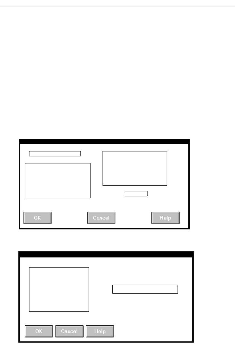
508 Step 7
Screen 2.1
Screen 2.2
Example 2
Here we are dealing with inconsistent location of command buttons.
Screens 2.1 to 2.4
These are the button locations found on four windows within a graphical system. Po-
sitions include spread out across the window’s bottom (Screen 2.1), left-justified at the
bottom (Screen 2.2), centered along the right side (Screen 2.3), and top-justified along
the right side (Screen 2.4). Memorization and prediction of button location will be very
difficult, slowing down the experienced user.
Screen 2.5
Proper positioning would have found all the command buttons consistently positioned,
as at the bottom center as illustrated in Screen 2.5.
3900 P-07 (step 7) 4/24/02 2:04 PM Page 508
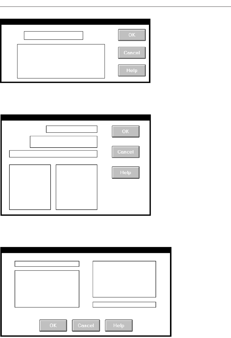
Choose the Proper Screen-Based Controls 509
Screen 2.3
Screen 2.4
Screen 2.5
3900 P-07 (step 7) 4/24/02 2:04 PM Page 509
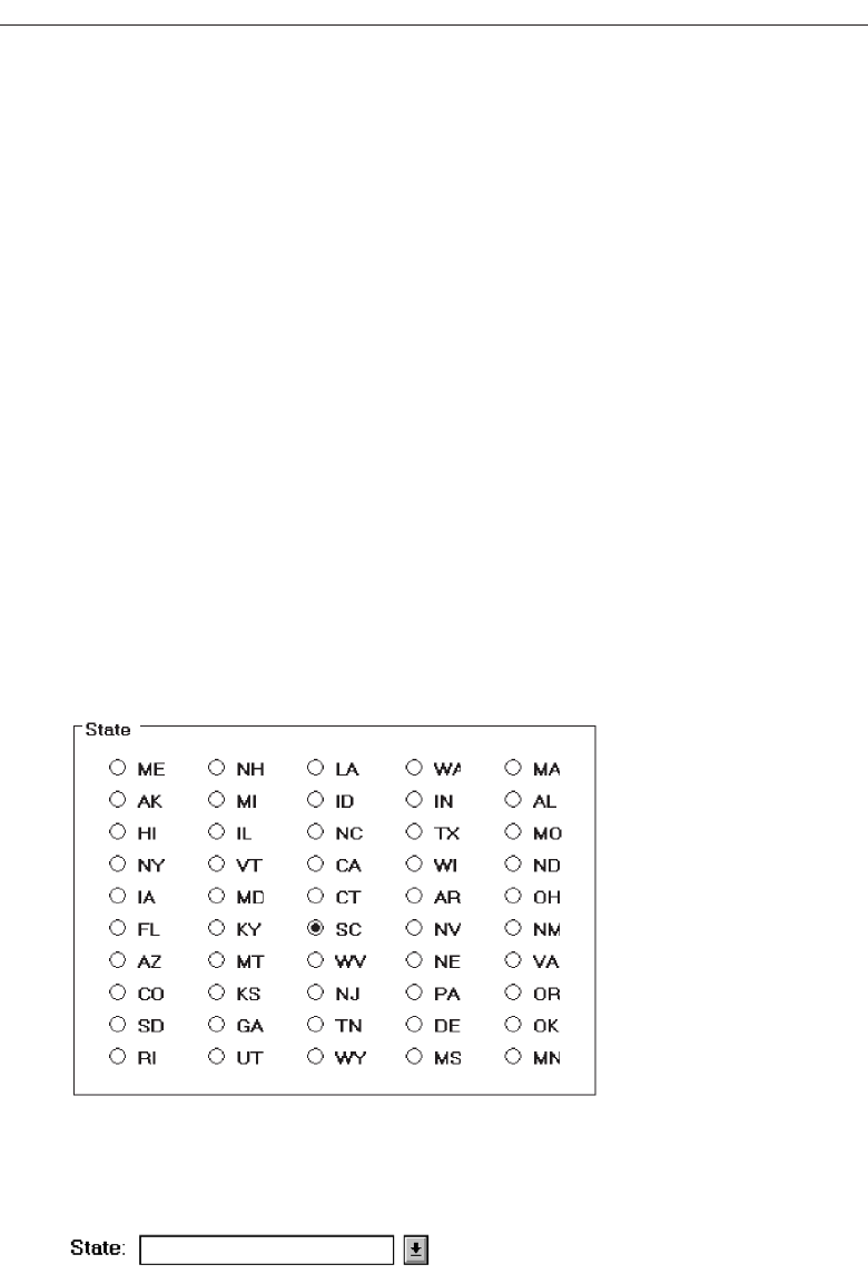
Example 3
This is an example of improper and proper use of a control.
Control 3.1
The names of states must be selected using radio buttons. Problems include: (1) The large
number of choices presented makes scanning very difficult. (2) Are all the state abbre-
viations familiar to you, and all users? (3) The organization of states must have been es-
tablished by a lottery. The name of the state I want is Mississippi. How do I find it in the
array?
Control 3.2
This shows a much better alternative, a drop-down/pop-up combination box. If the
state name is known, it can be typed in the field. Ideally, typing the state code, if known,
will also be acceptable. If the name of a particular state is unknown, or if its spelling un-
clear, the drop-down/pop-up can be retrieved and the state name selected from the list
presented. Ideally, also, a misspelled keyed state name will still be correctly identified
by the system and displayed properly.
510 Step 7
Control 3.1
Control 3.2
3900 P-07 (step 7) 4/24/02 2:04 PM Page 510
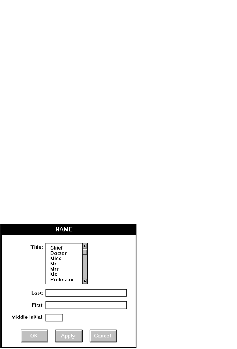
Example 4
Here is another instance of improper and proper use of a control.
Screen 4.1
A listing of names is being collected. A courtesy title is selected through list box; last
name, first name, and middle initial are typed. The problem: The task is heavily key-
board intensive. To select a title requires shifting to an alternative device control, such
as a mouse, or tabbing through the list box listing to find the proper title. This slows
down the keying process and may be awkward. The list box also consumes a great deal
of space on the screen.
Screen 4.2
A solution: Collect the courtesy title using a pop-up/drop-down combination box. Fa-
miliar titles may be quickly typed, along with the remainder of the name data. Rare or
unusual titles may be identified by selecting, displaying, and searching the listing of all
alternatives. The title may then be entered in the field by selecting from the list or key-
ing it into the field.
Choose the Proper Screen-Based Controls 511
Screen 4.1
3900 P-07 (step 7) 4/24/02 2:04 PM Page 511
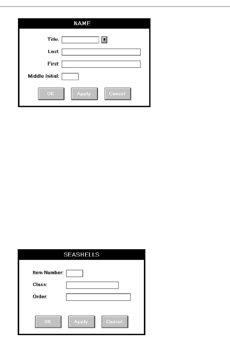
Example 5
Again, improper and proper use of controls.
Screen 5.1
A collection of seashells is being cataloged by class and order. Text boxes are provided
for the task. The catalog process includes typing words such as “Cephalopoda” and
“Eulamellibranchia.” The process is slow and conducive to spelling errors.
Screen 5.2
A solution: Present Class and Order in list boxes from which the proper varieties are se-
lected. This will speed up the cataloguing process and eliminate the possibility of
spelling errors. To make the entire procedure a selection task, also make Item Number
a selectable and incrementable spin box.
512 Step 7
Screen 4.2
Screen 5.1
3900 P-07 (step 7) 4/24/02 2:04 PM Page 512
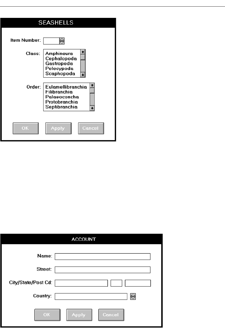
Example 6
Again, improper and proper use of a control.
Screen 6.1
An international corporation is setting up a worldwide account database. Names from
dozens of different countries are added each day. Country is collected though a spin box.
Is this proper usage for a spin box?
Choose the Proper Screen-Based Controls 513
Screen 5.2
Screen 6.1
3900 P-07 (step 7) 4/24/02 2:04 PM Page 513
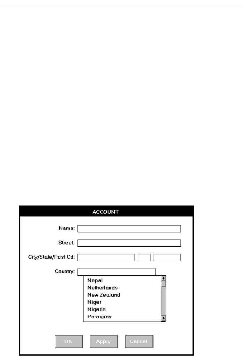
Screens 6.2 and 6.3
With a spin box, the next unseen choice must be capable of being anticipated. If not, te-
dious clicking and searching to find the correct choice might have to be performed.
(What country follows Greece in the worldwide alphabetical listing of countries today?
Guatemala—at least at this writing.) The data in spin boxes should be stable, not often
changing. This quality does not accurately reflect the state of countries in the world
today.
The best choice would really depend on the variability of the information being col-
lected. If the account information being collected tended to be quite variable in flow,
that is, successive account entries were usually from different countries, a better choice
would be a combo box (Screen 6.2). Well-known country names can be typed and less
well-known ones found in the listing. Because of the dynamic nature of country names,
frequent reference to the list can be expected. Permanently displaying the list avoids
the step of retrieving it when needed. The attached listing also permits scanning several
names at one time, alleviating the predictability problem. Names can also be easily
added or changed as needed. The combo box is also at the bottom of the window where
it tends to be out of the way.
If successive account entries tended to be from the same country, that is, the infor-
mation is batched, a pop-up/drop-down combination would be more appropriate
(Screen 6.3). The box can remain closed through successive same country entries and
only need be opened occasionally when actually needed.
514 Step 7
Screen 6.2
3900 P-07 (step 7) 4/24/02 2:04 PM Page 514
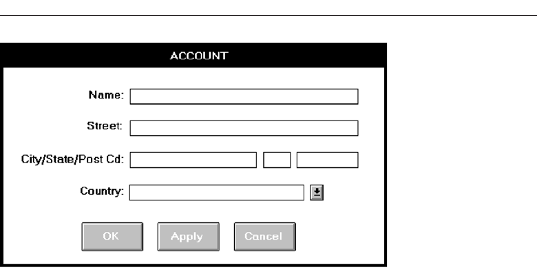
Choose the Proper Screen-Based Controls 515
Screen 6.3
3900 P-07 (step 7) 4/24/02 2:04 PM Page 515
3900 P-07 (step 7) 4/24/02 2:04 PM Page 516

517
The wording of the interface and its screens is the basic form of communication with
the user. Clear and meaningfully crafted words, messages, and text lead to greatly en-
hanced system usability and minimize user confusion that leads to errors and possibly
even system rejection. In this step, general guidelines for choosing the proper words
and writing clear messages and text will be presented. These general guidelines will be
followed by a discussion of some Web-specific guidelines.
Words, Sentences, Messages, and Text
All communications should simply, clearly, and politely provide the information one
must have to effectively use a system. The design of these communications must take
into account the user’s experience and knowledge of the system topic, and how much
information the user actually needs to efficiently interact with the system. Like all as-
pects of interface design, knowing the user is the first step in choosing the proper words
and creating acceptable messages and text.
Words
■
Do not use:
— Jargon, words, or terms:
• Unique to the computer profession.
• With different meanings outside of the computer profession.
• Made up to describe special functions or conditions.
Write Clear Text
and Messages
STEP
8
3900 P-08 (step 8) 4/24/02 2:05 PM Page 517

— Abbreviations or acronyms.
• Unless the abbreviation or acronym is as familiar as a full word or phrase.
— Word contractions, suffixes, and prefixes.
■
Use:
— Short, familiar words.
— Standard alphabetic characters.
— Complete words.
— Positive terms.
— Simple action words; avoid noun strings.
— The “more” dimension when comparing.
— Consistent words.
■
Do not:
— Stack words.
— Hyphenate words.
— Include punctuation for abbreviations, mnemonics, and acronyms.
Jargon. Jargon may take several forms. It may be words or terms that are unique to
the computer profession such as filespec, abend, or spool; words with different mean-
ing outside of information systems such as boot or abort; or made-up words used
to describe special functions or actions such as ungroup or dearchive. Avoid jargon
because it will have to be learned, and it may be interpreted incorrectly.
Abbreviations or acronyms. Avoid using abbreviations and acronyms unless they
are as familiar as the fully spelled-out word or phrase. (An example of a familiar
acronym is IBM for International Business Machines.) The reason again, it must be
understood and learned. Familiar abbreviations and acronyms, if legal to use,
may be used following these guidelines:
Always use the fully spelled-out form the first time it is encountered in the
interface. Present the abbreviation or acronym in parentheses following the
fully spelled-out form.
Use the abbreviation or acronym in any subsequent locations in the dialog
reached directly, and only directly, from the place where it is defined. If
these subsequent locations can be reached from places in the dialog other
than the location where the abbreviation or acronym was defined (as in Web
page design), then do not use the abbreviation or acronym alone.
Contractions or short forms. While contractions (won’t instead of will not) save space
and lend an informal tone to the interface, be cautious in their use. Never form a
contraction from a subject and it’s verb, he’ll instead of he will. Words can also be
more difficult to understand if they contain prefixes and suffixes, like “un-,” or
“-ness.” A study found that word comprehension often involves a person decom-
posing more complex terms to establish their basic root meaning and then modi-
fying the meaning to account for the various prefixes and suffixes. Structural
complexity hinders comprehension.
Short, familiar words. Shorter words tend to be used more often in everyday con-
versation, so they are more familiar and easier to understand. The most important
518 Step 8
3900 P-08 (step 8) 4/24/02 2:05 PM Page 518

factor, however, is familiarity, not length. A longer but familiar word is better than
a short, unfamiliar word.
Standard alphabetic characters. Standard alphabetic characters are most familiar to
screen viewers. Never use restricted alphabetic sets. Symbols should be used only
if they are familiar to all who are using the screen. Common symbols that may be
considered as substitutes for alphabetic characters are # for number, % for percent,
and $ for dollar. Again, all potential screen users must be familiar with a symbol if
it is used as a substitute for alphabet characters.
Complete words. Instead of contractions or short forms, use complete words. Com-
plete words are understood better and faster.
Positive terms. It is generally easier to understand positive, affirmative information
than the same information expressed in a negative way. Therefore, avoid the pre-
fixes “ir-,” “in-,” “dis-,” and “un-.” Implicitly negative terms, such as “decrease,”
should be replaced with positive terms, such as “increase.”
Simple action words. Replace noun strings with simple action words. Instead of
saying, for example, “Project Status Listing” say “List Project Status.”
“More” dimension. When using comparative terms, the “more” dimension is easier
to deal with. The opposite of the “more” is usually considered the “negative.” So,
use “longer” rather than “shorter,” “bigger” rather than “smaller.”
Consistency. Words chosen for use in an interface should be used consistently
throughout the interface. Never use different words to describe identical functions.
Stacking words. Multiple-word phrases are more readable if the entire phrase is on
one line, not stacked vertically.
Hyphenating words. Again, for better readability, never break a word between two
lines. Hyphenation was created for ease in production, not ease in comprehension.
Punctuation. Abbreviations, mnemonics, and acronyms should not include punctu-
ation. This permits better readability and avoids confusion between the punctua-
tion and other screen elements.
Some words to forget. Words should be meaningful to, understandable by, and ac-
ceptable to, all users. As mentioned above, words perceived as “computerese”
may confuse or place an unnecessary intellectual demands on the user. Other
words may have a particularly harsh meaning or invoke unpleasant associations
(abort, execute, kill), or have vague meanings (abend, boot). These problem words,
summarized in Table 8.1, should be avoided in communications whenever possi-
ble. Suggested alternative words are presented.
Sentences and Messages
■
Sentences and messages must be:
— Brief and simple.
— Directly and immediately usable.
— An affirmative statement.
— In an active voice.
Write Clear Text and Messages 519
3900 P-08 (step 8) 4/24/02 2:05 PM Page 519

— In the temporal sequence of events.
— Structured so that the main topic is near the beginning.
— Of parallel construction.
■
Sentences and messages must be of the proper tone:
— Nonauthoritarian.
— Nonthreatening.
— Nonanthropomorphic.
— Nonpatronizing.
— Nonpunishing.
— Cautious in the use of humor.
A sentence, and a message, must minimize ambiguity and confusion, allowing easy,
correct, and fast interpretation. It must also have the proper tone, reflecting the needs of
the users. Threatening, rude, or impolite messages most often evoke negative responses.
The following guidelines will lead to easy, correct, and fast message interpretation and
acceptance. A study restructuring error messages along such guidelines has found higher
success rates in problem resolution, lower error rates, and improved user satisfaction.
Brief and simple. A message that has to be explained does not communicate. It fails
as a message. Brief, simple sentences are more readily understood than longer sen-
520 Step 8
Table 8.1 Some Words to Forget
AVOID USE
Abend End, Cancel, Stop
Abort End, Cancel, Stop
Access Get, Ready, Display
Available Ready
Boot Start, Run
Error —
Execute Complete
Hit Press, Depress
Implement Do, Use, Put Into
Invalid Not Correct, Not Good, Not Valid
Key Type, Enter
Kill End, Cancel
Output Report, List, Display
Return Key Enter, Transmit
Terminate End, Exit
3900 P-08 (step 8) 4/24/02 2:05 PM Page 520

tences containing multiple clauses. Research indicates that sentences over 20 words
in length cause a loss in reading comprehension with each additional sentence
word. Another research study created messages at three levels of reading ability
(fifth, tenth, and fifteenth grade) and tested them on people of varying verbal abil-
ities. The fifth-grade version was found to be best for all levels. People of high ver-
bal ability did not perceive the fifth-grade version as insulting, as some had feared.
So, break long sentences into two or more simple sentences if this can be done with-
out changing the meaning. Always write at the eighth grade level, or less.
Directly and immediately usable. Searching through reference material to translate
a message is unacceptable, as are requirements for transposing, computing, in-
terpolating, or mentally translating messages into other units.
Affirmative statement. Affirmative statements are easier to understand than nega-
tive statements. For example, “Complete entry before returning to menu.” is easier to
grasp than “Do not return to menu before completing entry.” Tell a person what to do
rather than what to avoid. There is an exception, of course. The user may be told
how to avoid a situation with disastrous consequences.
Active voice. The active voice is usually easier to understand than passive voice. For
example, “Send the message by depressing TRANSMIT” is more understandable
than “The message is sent by depressing TRANSMIT.”
Temporal sequence. If a sentence describes a temporal sequence of events, the order
of words should correspond to this sequence. A prompt should say, “Complete ad-
dress and page forward” rather than “Page forward after completing address.”
Main topic at beginning. Information that must be remembered should be placed at
the beginning of a message or sentence. A person can remember something longer
if it appears at the start. Items in the middle of a sentence or message are hardest
to remember.
Parallel construction. Use the same grammatical structure for elements of sentences
or messages that provide the same kind of information. For example, say, “Use this
control to select one choice” and “Use this menu to select one option.” Not, “To select one
choice use this control,” and “This menu is used to select one option.”
Nonauthoritarian. Imply that the system is awaiting the user’s direction, not that the
system is directing the user. For example, phrase a message as “Ready for the next
command,” not “Enter the next command.”
Nonthreatening. Negative tones or actions, or threats, are not very friendly. Since
errors are often the result of a failure to understand, mistakes, or trial-and-error
behavior, the user may feel confused, inadequate, or anxious. Blaming the user for
problems can heighten anxiety, making error correction more difficult and increas-
ing the chance of more errors. Therefore, harsh words like “illegal,” “bad,” or
“fatal” should be avoided.
Also, avoid using the word “error” in messages when it implies a user error.
“Error” tends to focus the attention on the person involved rather than on the
problem. For example, instead of saying “Error—Numbers are illegal,” say,
“Months must be entered by name.” Since the computer does not have an ego to be
bruised, an excellent design approach would be to have it assume the blame for
all miscommunications.
Write Clear Text and Messages 521
3900 P-08 (step 8) 4/24/02 2:05 PM Page 521

Nonanthropomorphic. Having the computer “talk” like a person should be avoided
for several reasons. An attribution of knowledge or intelligence will, first, imply
a much higher level of computer “knowledge” than actually exists, creating shat-
tered user expectations. Second, this attribute eliminates the distinction that actu-
ally exists between people and computers. People “control” computers; they
“respect the desires” of other human beings. Third, many people express anxiety
about using computers by saying things like “they make you feel dumb.” The
feeling of interacting with another person who is evaluating your proficiency can
heighten this anxiety. There is also some research evidence that a nonanthropo-
morphic approach is best, being seen as more honest, preferred, and easier to use.
The best advice at this moment is do not give a human personality to a machine.
Imply that the system is awaiting the user’s direction, not vice versa. Say, for ex-
ample, “What do you need?” not “How can I help you?”
Nonpatronizing. Patronizing messages can be embarrassing. “Very good, you did it
right” may thrill a fourth-grader, but would be somewhat less than thrilling to an
adult. Being told “You forgot again” once may be acceptable, but being told three
or four times in one minute is another story. In a commonly available video golf
game, after a player makes a high score on a golf hole, the program returns with
the suggestion to the player to “Try another sport.” A golf professional that played
this game took great offense to this advice and walked away. Would Tiger Woods
appreciate this kind of suggestion? A person may disagree with patronizing con-
clusions, so why risk the offense?
Punishment and humor. Until an optimal computer personality is developed, mes-
sages should remain factual and informative, and should not attempt humor or
punishment. Humor is a transitory and changeable thing. What is funny today
may not be funny tomorrow, and what is funny to some may not be to others. Pun-
ishment is never a desirable way to force a change in behavior, especially among
adults.
Messages
Messages are communications provided on the screen to the screen viewer. Several dif-
ferent types of messages exist, and they may be displayed in different forms and loca-
tions. A message should possess the proper tone and style and be consistent within itself
and with other messages.
Screen messages fall into two broad categories: system and instructional. System mes-
sages are generated by the system to keep the user informed of the system’s state and
activities. They are customarily presented within message boxes. They reflect the system
state, as it exists at that moment in time. Instructional messages, sometimes referred to as
prompting messages, are messages that tell the user how to work with, or complete, the
screen displayed. They may be provided in messages boxes and also within the screen
itself.
System messages. System messages are of several types, each reflecting a different
purpose. The various platforms have developed standard message boxes, with
standard components, for these different types. Message box elements include a
522 Step 8
3900 P-08 (step 8) 4/24/02 2:05 PM Page 522
standard icon to assist in fast recognition of message kind, the message itself, and
standard command buttons. The types of message boxes in Microsoft Windows
are illustrated in Figures 8.1, 8.2, and 8.3.
Common message types are:
Status messages. A status message is used for providing information concerning the
progress of a lengthy operation. It usually contains a progress indicator and a
short message describing the kind of operation being performed. It typically only
possesses a Cancel button, to stop the operation being performed. Pause and Re-
sume buttons may also be included, if desired.
Informational messages. Informational messages, also called notification messages,
provide information about the state of the system when it is not immediately ob-
vious to the user. They may confirm that non-obvious processing is taking place
or is completed. They may also be used to provide intermediate feedback when
normal feedback is delayed. This kind of message is usually identified by an “I”
icon to the left of the message. In Microsoft Windows “I” is in a balloon. No user
actions are normally necessary with these kinds of messages, although confirma-
tion that the message has been seen can be requested. A Microsoft Windows in-
formational message box is illustrated in Figure 8.1
Warning messages. Warning messages call attention to a situation that may be un-
desirable. They are usually identified by an “!” icon to the left of the message. The
user must determine whether the situation is in fact a problem and may be asked
to advise the system whether or not to proceed. A deletion request by a user is an
action that commonly generates a warning message. When a user requests a dele-
tion, a message asking for confirmation of the deletion is usually presented. A
warning message can also be used for field edit error messages. A Microsoft Win-
dows warning message box is illustrated in Figure 8.2
Write Clear Text and Messages 523
Figure 8.1 Informational message box from Microsoft Windows with icon, text, and button.
Figure 8.2 Warning message box from Microsoft Windows with icon, text, and button.
3900 P-08 (step 8) 4/24/02 2:05 PM Page 523

Critical messages. Critical messages, sometimes called action messages, call attention
to conditions that require a user action before the system can proceed. A message
describing an erroneous situation is usually presented as a critical message. Some
inconsistency currently exists in the icons used to designate this kind of message.
Some products use a “Do Not” symbol while others use a “Stop” sign. An X in a
circle is used by Microsoft Windows. Additionally, one platform provides the op-
tion of using a “?” icon if the user’s attention to the problem may not be immedi-
ately needed (for example, Printer is out of paper). Critical messages require a user
action to continue. A Microsoft Windows critical message box is illustrated in
Figure 8.3.
Question messages. Question messages are another kind of message type some-
times seen. A question message asks a question and offers a choice of options for
selection. It is designated by a “?” icon preceding the message text. This type may
be used when there is a question to be asked and the message does not appear to
be suited to the above types. Before using a question message, remember that one
platform uses the “?” icon for certain kinds of critical messages. Also, Microsoft
Windows no longer recommends the “?” icon because of possible confusion with
help dialogs.
Messages that are too generic or poorly written frustrate users, increase support costs,
and ultimately reflect poorly on the quality of the product. Therefore, it is worthwhile
to design effective message boxes. It is even better to avoid creating situations that re-
quire displaying such a message. For example, if the user does not have sufficient disk
space to perform an operation, check for available disk space before the user attempts
the operation and disable the command if necessary. A balloon tip or status bar message
can be used to notify the user about why the command is unavailable.
MYTH If the users need an explanation they’ll always read the documentation.
Writing Message Box Text
■
Title bar:
— Clearly identify the source of the message.
• The name of the object to which it refers.
• The name of the application to which it refers.
524 Step 8
Figure 8.3 Critical message box from Microsoft Windows with icon, text, and button.
3900 P-08 (step 8) 4/24/02 2:05 PM Page 524

— Do not include an indication of message type.
— Use mixed case in the headline style.
■
Message box:
— Provide a clear and concise description of the condition causing the message box
to be displayed.
• Use complete sentences with ending punctuation.
• State the problem, its probable cause (if known), and what the user can do
about it.
• Avoid contractions.
• Avoid technical jargon and system-oriented information.
• Provide only as much background information as necessary for the message to
be understood.
• Show only one message box about the cause of condition in a single message.
• Make the solution an option offered in the message.
• Avoid multistep solutions.
• Use consistent words and phrasing for similar situations.
• Use the word “please” conservatively.
— Do not exceed two or three lines.
— Include the relevant icon identifying the type of message to the left of the text.
— Center the message text in window.
Microsoft recommends these message box guidelines.
Title Bar Text
Clearly identify the source of the message in the message box title bar. This may be the
name of the object to which it refers, or the name of the application to which it refers.
A clear title is particularly important in the Windows multitasking environment be-
cause message boxes that appear might not always be the result of current user inter-
action. In addition, because objects supported by different applications can be embedded
in the same document, different application code may be running when the user acti-
vates the object for editing. Therefore, the title of a message box plays a vital role in
communicating the source of a message.
Do not include in the title an indication of message type. (Warning or caution, for ex-
ample.) The icon contained within the message box conveys the nature of the message.
Never include the word “error” in the title, for reasons previously mentioned. Use mixed
case in the headline style to present the message box title.
Message Box Text
Provide a clear and concise description of the condition causing the message box to be
displayed, in terminology the user understands. Use complete sentences with ending
punctuation. State the problem, its probable cause (if known), and what the user can do
about it, no matter how obvious the solution. To aid user comprehension, avoid con-
tractions, technical jargon, and system-oriented information.
Provide only as much background information as necessary for the message to be
understood. To supplement the amount of information in the message box text, include
aHelp button to access more complete descriptive information.
Write Clear Text and Messages 525
3900 P-08 (step 8) 4/24/02 2:05 PM Page 525

Make messages as specific as possible. Show only one message box regarding a con-
dition in a single message; avoid combining two or more conditions in a single mes-
sage. For example, if something cannot be done for several reasons, provide a specific
message describing each reason.
Make the solution an option offered in the message. For example, if an object such as
a string of text will not fit within a certain boundary, and another boundary is available
within which it will fit, provide the option to switch to the larger boundary. Do not
simply say “The text will not fit.”
Avoid multistep solutions. People have difficulty remembering more than two or
three simple steps after a message box closes. If multiple steps are necessary, provide
general instructions or add a Help button that displays a relevant Help topic. Always
present the steps in the order they should be completed. Use consistent words and
phrasing for similar situations.
Use the word please conservatively. Overuse will diminish its effectiveness. Consider
using it in the following situations:
When the user is asked to wait while the program completes an action.
When the user is asked to retype information that is required before the user can
continue.
When the user is inconvenienced in some other way.
Do not exceed two or three lines of text. Include the relevant icon identifying the
type of message to the left of the text, and center the message text in window.
Message Box Controls
■
Command buttons:
— If a message requires no choices to be made but only acknowledgment:
• Include an OK button.
— If a message requires a choice be made, provide a command button for each option:
• Include OK and Cancel buttons only when the user has the option of continu-
ing or stopping the action.
• Include Yes and No buttons when the user must decide how to continue.
• If these choices are too ambiguous, label the command buttons with the names
of specific actions.
— If a message allows initiation of an action to correct the situation described:
• Include a properly labeled button initiating the corrective action.
— If a message describes an interrupted process whose state cannot be restored:
• Provide a Stop button.
— If a message offers an opportunity to cancel a process as well as to perform or not
perform an action:
• Provide a Cancel button.
— If more details about a message topic must be presented:
• Provide a Help button.
— Designate the most frequent or least destructive option as the default.
526 Step 8
3900 P-08 (step 8) 4/24/02 2:05 PM Page 526

— Display a message box only when the window of an application is active.
— Display only one message box for a specific condition.
■
Close box:
— Enable the title bar Close box only if the message includes a Cancel button.
Command buttons. A user response to a message box is usually accomplished though
a command button. The kind, or kinds, of command buttons included depend upon
the reason the message box was presented. If a message requires no user choices
to be made but only an acknowledgment of the message, include an OK button. If
the message requires the user to make a choice, include a command button for each
option. Include OK and Cancel buttons only when the user has the option of con-
tinuing or stopping the action. Use Yes and No buttons when the user must decide
how to continue. If these choices are too ambiguous, label the command buttons
with the names of specific actions to be performed, Save and Delete for example.
If a message allows initiation of a user action to correct the situation described,
include a properly labeled button initiating the corrective action. If, for example,
the message indicates that the user must switch to another application window to
take corrective action, include a button that opens that application window. Be
sure to clearly label the button and the results the user can expect from pressing
it. If a message describes an interrupted process whose state cannot be restored,
provide a Stop button. (Cancel implies restoring the state of the process or task
that initiated the message.) If a message offers an opportunity to cancel a process
as well as to perform or not perform an action, provide a Cancel button. Clearly
label the button and the results the user can expect from selecting it. If more details
about a message topic must be presented, provide a Help button. This enables the
message text to be succinctly presented.
Designate the most frequent or least destructive command option as the de-
fault. Because a message box disrupts the user’s current task, it is best to display
a message box only when the window of the application to which the message
refers is active. If the application’s window is not active, use the application’s but-
ton entry on the taskbar to alert the user. After the user activates the application,
the message box can be displayed. Display only one message box for a specific con-
dition. Displaying a sequential set of message boxes tends to confuse users.
Command buttons allow the message box interaction to be simple and efficient.
If other types of controls are considered, always be aware of the potential increase
in interface complexity.
Close box. Enable the title bar Close box only if the message includes a Cancel button.
To leave it available in other situations can confuse users.
Message Location
■
Use the message line for messages that must not interfere with screen information.
■
Pop-up windows may be used for all kinds of messages, if available.
■
Pop-up windows should always be used for critical messages.
Write Clear Text and Messages 527
3900 P-08 (step 8) 4/24/02 2:05 PM Page 527

Messages may also be displayed either in the message line as well as within pop-up
windows, with pop-up windows being recommended location. All critical messages
should be displayed in a pop-up window. A research study compared locating mes-
sages in pop-up windows with messages presented in permanently displayed fixed lo-
cations, such as at the screen’s bottom or top. The study found pop-up windows were
detected more often, and faster, than those permanently affixed in standard locations
on the screen.
Other Message Considerations
■
Abbreviated, more concise versions of messages should be available.
■
Something that must be remembered should be at the beginning of the text.
■
Do not include code numbers with messages.
Abbreviated versions. People are impatient with uninformative or redundant com-
puter messages. A problem, however, is that the degree of computer-to-person
message redundancy depends on the person’s experience with the system. And it
may vary with different parts of a system. So the availability of abbreviated and
detailed messages allows the tailoring of the system to the needs of each user.
During system training and early implementation stages, detailed versions can be
used. Individuals can switch to abbreviated versions as their familiarity with the
system increases. People using abbreviated messages should, however, be able to
request detailed messages at any time.
Important at beginning of text. One can remember something longer if it appears
at the beginning of a message. Items in the middle of a message are hardest to
remember.
Code numbers. Messages that begin with a strange code number do not meet the user’s
needs. A code number, if needed at all, is only necessary after reading the message
and should, therefore, be placed in parentheses at the end of the message.
Instructional Messages
■
Provide instructional information at the depth of detail needed by the user.
■
Locate it at strategic positions on the screen.
■
Display it in a manner that visually differentiates it from other screen elements.
■
In writing, follow all relevant writing guidelines for words, sentences, and messages.
The second categories of messages, instructional or prompting messages, are guid-
ance messages that tell the user how to work with, or complete, the screen displayed.
They may be permanently affixed to a screen, or they may appear as the result of a help
request.
Depth of detail. Instructional messages are of most benefit to the novice or casual
system user. Instructions for these kinds of users must be more detailed than for
528 Step 8
3900 P-08 (step 8) 4/24/02 2:05 PM Page 528

experienced users. Experienced users usually require only cryptic reminders. To
balance the needs of a wide range of users with varying experience levels, access-
ing instructions through a Help function is the best solution.
Location. Locate instructions at strategic points on screens. They should be placed at
spots just preceding the controls or elements to which they apply. Never, however,
place an instruction on one screen that applies to elements on a following screen.
They will not be remembered.
Visual differentiation. Display instructions in a manner that visually differentiates
them from all other screen elements. This will allow them to be easily ignored by
users who do not need them.
Writing. In writing instructions, follow all relevant writing guidelines recently de-
scribed for words, sentences, and messages. Also refer to Table 8.2 for the proper
terms to use when interacting with a screen control. Guidelines for instruction
presentation on a screen were also outlined in Step 3 “Understand the Principles
of Good Screen Design.”
In conclusion, the following “error message” was recently encountered using the
Web site of a popular cable TV channel:
ERROR!
PLEASE HIT YOUR BACK BUTTON AND ENTER A SEARCH.
In this brief 10-word message, the message writer managed to use three nonrecom-
mended words (error, hit, and enter). Wouldn’t the following have been much more
agreeable?
THE SEARCH FIELD DID NOT CONTAIN AN ENTRY.
PLEASE CLICK THE BACK BUTTON AND TYPE A SEARCH VALUE.
The original message writer gets one point for including Please, however.
Write Clear Text and Messages 529
Table 8.2 Instructional Interaction Terms
TO INTERACT WITH THIS CONTROL: USE THIS TERM:
For a command button, to activate. Click
For a text box, to type or paste information. Type
For a list box, to select an item, or items. Select
To either type or select an option. Enter
For a check box:
To add a component. Select
To clear a component. Clear
For a radio button. Select
For a slider interaction. Move
For a tab interaction. Click
3900 P-08 (step 8) 4/24/02 2:05 PM Page 529

Text
Text, by a very general definition, is any textual element that appears on a screen, in-
cluding field captions, headings, words, sentences, messages, and instructions. Text, in
the following discussion, refers to body text, a large compilation of words whose small-
est element is a paragraph and whose maximum length is unlimited, its size being gov-
erned by the reason for its existence.
Presenting Text
■
Fonts:
— Use plain and simple fonts.
— Choose a minimum point size of 12 to 14.
— Use proportional fonts.
■
Width:
— Include no more than 40 to 60 characters on each line.
• A double column of 30 to 35 characters separated by five spaces is also
acceptable.
— Do not right-justify.
— Do not hyphenate words.
■
Content:
— Use headings to introduce a new topic.
— Separate paragraphs by at least one blank line.
— Start a fresh topic on a new page.
— Use lists to present facts.
— Emphasize important things by:
• Positioning.
• Boxes.
• Bold typefaces.
• Indented margins.
■
Miscellaneous:
— Use paging (not scrolling).
— Provide a screen design philosophy consistent with other parts of the system.
Fonts. Fonts chosen for text should be plain and simple and of adequate size for easy
reading, either 12 or 14 points. Proportional spacing (width governed by actual let-
ter size, when an lis narrower than an m) is preferred to nonproportional spacing.
Width. A typical screen is a little too wide for comfortable reading of text. It is diffi-
cult for the eye to keep its place as it moves from the end of one line to the begin-
ning of the next line. Studies find that a line of text should contain no more than
40 to 60 characters, or be confined to 1.5 lowercase alphabets or 39 characters. For
greater screen efficiency, consider using two columns of text, each about 30 or 35
characters wide. Confine double-columns to one screen of information, however.
Never require scrolling up and down multiple times to read all the text.
530 Step 8
3900 P-08 (step 8) 4/24/02 2:05 PM Page 530

Studies also find that non-right-justified (or ragged-right edge) text lines are
just as legible as justified text lines. Large spaces left in right-justified text inter-
rupt eye movement and impede reading. The reading speed of right-justified text
was actually found to be 8 to 10 percent slower than non-right-justified text in one
study. Non-right-justified text has another advantage in that word hyphenation is
not required. Experts also say that non-right-justified text creates more visual in-
terest, and is best for very narrow columns of text. Full left- and right-justification,
may be considered for long works that require continuous reading and concen-
tration, such as long text, newspapers, and novels.
Content. Headings to introduce new topics provide breaks or pause points for the
reader. They provide obvious closure points. Starting new topics on new pages re-
inforces the needed breaks. Separating paragraphs by a blank line will result in
more cohesive groupings and alleviate the impression of a dense screen.
Use lists to present facts. Lists are convenient, simple, and uncluttered and can
effectively break up long strings of text. Designate items in a list with a “bullet”
or other simple symbol. Emphasize important points by placing them in unusual
places, drawing boxes around them, using bold typefaces, or providing indented
left and right margins. In addition to their emphasizing capabilities, they also
make the screen more visually interesting.
Miscellaneous. Paging through screens, rather than scrolling, has been found to
yield better performance and to be preferred by many system users, as was dis-
cussed in Step 3. A severe disadvantage of scrolling for novices is loss of orienta-
tion. While experts can handle scrolling, the best choice if all users are considered
is paging.
If scrolling is going to be used, the preferred approach is telescoping, in which the
window moves around the data. This method is more natural and causes fewer errors
than the microscope approach, in which the data appears to move under a fixed view-
ing window. These concepts were also discussed in Step 3.
MAXIM Clear communication is not shouting VERY, VERY LOUD.
Writing Text
■
Sentences and paragraphs:
— Use short sentences composed of familiar, personal words.
• Cut the excess words.
• Try to keep the number of words in a sentence to 20 or less.
— Cut the number of sentences.
— Use separate sentences for separate ideas.
— Keep the paragraphs short.
— Restrict a paragraph to only one idea.
■
Style:
— Use the active writing style.
— Use the personal writing style, if appropriate.
Write Clear Text and Messages 531
3900 P-08 (step 8) 4/24/02 2:05 PM Page 531

— Write as you talk.
— Use subjective opinion.
— Use specific examples.
— Read it out loud.
Sentences and paragraphs. Simple words and short sentences are the cornerstones
of good writing. As mentioned above, research indicates that sentences over 20
words in length cause a loss in reading comprehension with each additional sen-
tence word. Long sentences often result from trying to express more than one
idea in the sentence, or from using unnecessary words. Table 8.3, derived from Mi-
crosoft (2001), lists some common “wordy” phrases to avoid and their replace-
ment words. It also describes some redundant word pairings to avoid. These
redundancies are also known as baby puppies, a concept that was graciously ex-
plained to me by the editor of my first book many years ago. Use separate sentences
for separate ideas. Place multiple items in a list format, and delete all unnecessary
words. Short paragraphs are less threatening to the user and more frequently read.
They also provide visual breaking points in a screen or page.
Style. The style chosen should reflect the needs and characteristics of the user. The
style will affect the readability and comprehensibility of the text. The active writing
style is easier to read and understand. It almost always uses fewer words and leaves
no unanswered questions (contrast the passive “The customer name should be
typed” with the active “Type the customer name”). The personal style, the use of
“you” and “I” (“Now you must press the Enter key”), keeps the writing active,
makes writing directly relevant to the reader, and is more interesting. Materials
read by a wide variety of people for informational purposes only, however, should
not use the personal style.
Write in the way you would say something to the reader. Also, use subjective
opinion (“This screen is not used very often”) to reinforce the users’ understand-
ing of what they are reading. It does not tell anything specific, but reinforces facts
already read or about to be read. Do not overuse subjective opinion, however, and
make sure it is correct. Overuse makes facts harder to find, and an incorrect opin-
ion casts suspicion on all the facts being presented.
The best way to explain a general rule is to show how it applies through ex-
amples. Examples should be short, relevant, and easy for the reader to relate to.
They should also be made visually different from the main text, either through in-
dentation, boxing, or some other technique. Finally, read what you have written
out loud to yourself. If it sounds wordy, stilted, or difficult, it will sound this way
to the reader, too. Rewrite it.
Window Title
■
All windows must have a title located in a centered position at the top.
— Exception: Windows containing messages.
■
Clearly and concisely describe the purpose of the window.
■
Spell it out fully using an uppercase or mixed-case font.
532 Step 8
3900 P-08 (step 8) 4/24/02 2:05 PM Page 532

■
If title truncation is necessary, truncate it from right to left.
■
If presented above a menu bar, display it with a background that contrasts with the bar.
The window title should be positioned at the top center and fully spelled out using
either uppercase letters or mixed case in the headline style. Using an uppercase font
will give it the needed moderate emphasis, aiding in setting it off from the screen body
(IBM’s SAA CUA and Microsoft’s Windows guidelines display the title, like all screen
components, in mixed-case letters). Windows containing messages, however, need not
have a title. The title should clearly and concisely describe the screen’s purpose. If the
window appears as a result of a previous selection, the title should clearly reflect the
wording of the selection made to retrieve it. For small windows, where title truncation
is necessary, truncate from right to left.
If the title appears above the menu bar, the title’s background should contrast with
that of the bar. A recommendation is to use the same background color and caption color
as the screen body. A title can always be identified by its topmost location on the screen,
so using a color different from other screen components may add to visual confusion.
Conventions
■
Establish conventions for referring to:
— Individual keyboard keys.
— Keys to be pressed at the same time.
— Field captions.
— Names supplied by users or defined by the system.
— Commands and actions.
Write Clear Text and Messages 533
Table 8.3 Wordy Phrases and Word Redundancies
INSTEAD OF THIS PHRASE: SAY THIS: WORD REDUNDANCIES
By means of By Surrounding Environment
For the purposes of For Absolutely Complete
In many cases Often Exactly identical
In the event that If Repeat again
Is able to Can Final conclusion
The way in which The way, how Knowledge and awareness
In order to To Each and every
Prior to Before Complete overview
Is required to Must Advance planning
Full and complete
Derived from Microsoft (2001)
3900 P-08 (step 8) 4/24/02 2:05 PM Page 533

In messages and text it is often necessary to refer to keyboard keys, field captions, file-
names, commands, or actions. These components should be described in the same man-
ner whenever referenced. Keyboard keys should always be referenced as they are
inscribed on the keyboard. (They usually appear in a mixed-case text format.) A useful
convention for referring to keys that should be pressed at the same time is a plus (+) sign
between the key descriptions (Alt+F10). Names may be enclosed in quotes (“Pending”).
Sequence Control Guidance
■
Consider providing a guidance message telling how to continue at points in the di-
alog when:
— A decision must be made.
— A response needs to be made to continue.
■
Consider indicating what control options exist at points in the dialog where several
alternatives may be available.
■
Permit these prompts to be turned on or off by the user.
Consider providing prompts telling the user how to continue when a decision and
response must be made to continue. For example, it might be indicated that:
INFORMATION IS CURRENT THROUGH AUGUST 26, 2001.
PRESS ENTER TO CONTINUE.
Where several control options exist, consider providing a prompt such as:
PRESS STO SAVE, D TO DELETE,OR PTO PRINT.
TYPE CTO CREATE A NEW FILE,OR ETO EDIT A NEW FILE: _
For experienced users, these kinds of prompts can become visual noise. Allow users
to turn them on or off as needed.
Text for Web Pages
Text for Web pages will generally follow the aforementioned guidelines for words, sen-
tences, messages, instructions, and text. The unique characteristics of the Web, however,
require a separate set of supplemental guidelines for several Web topics, including,
word usage, error message presentation, and text, heading, and title writing. Addition-
ally, the writing of links must be addressed. This section focuses on these topics.
Words
■
Minimize the use of words that call attention to the Web.
Generally, avoid using words that are specific to the Web. A few Web-specific terms
are “This Web site,” “Click here,” and “Follow this link.” A good test of this guideline
534 Step 8
3900 P-08 (step 8) 4/24/02 2:05 PM Page 534

is to print out a page, read it, and see if it makes as much sense on paper as it does on
the screen.
Error Messages
■
Provide helpful error messages for:
— Incomplete or incorrectly keyed, entered, or selected data.
— Requests for documents that do not exist or cannot be found.
■
Redisplay a message on the page to which it relates.
■
Present them in a visually distinctive and noticeable manner.
Provide helpful error messages for data that has been incompletely or incorrectly en-
tered. Also provide messages for requested documents that do not exist or cannot be found.
In a graphical interface, an error message is displayed in a message box overlaying the
error-causing screen. The underlying screen is visible and can be viewed in conjunction
with the error-correction instructions. The message box remains displayed until the user
acknowledges its presence. In Web page design, displaying the error message on a sep-
arate page is accomplished at the expense of the error-causing page disappearing from
view. Human memory being what it is, a possible solution now exists to a problem whose
details are now vague. Problem resolution typically involves paging back and forth be-
tween the error message and the related Web page, an inefficient operation.
The alternate solution is to present the error message on the page where the error ex-
ists. This is the recommended choice. Context is maintained, and both elements can be
viewed in fairly close proximity to each other. The error message must be displayed in
a visually distinctive manner as close to the problem as possible. Visual distinctiveness
can be achieved through displaying the message in a larger, bolder, and distinctive
font. The user’s attention will probably be directed to the part of the page on which ac-
tions can be performed, so the message should be made as obvious as possible. A mes-
sage in the same font style as the page will be less likely to be noticed.
Keep in mind, however, that it is better to prevent errors than handle them. This
topic will be addressed next in Step 9 “Provide Effective Feedback and Guidance and
Assistance.”
Instructions
■
Do not use phrasing that indicates a certain page order or flow.
■
Explain where “Up” leads too.
■
Phrase them in a browser-independent manner.
■
Minimize “Click here” instructions.
— Say “Select this link.”
Do not use phrasing that indicates a certain page order or flow. How the visitor ar-
rived at the site is unknown. Do not use “Return to” instructions; it cannot be assumed
Write Clear Text and Messages 535
3900 P-08 (step 8) 4/24/02 2:05 PM Page 535

that the term is meaningful in the new context. Describe where an “Up” button leads,
where the user will go, and what will be found there. Make sure instructions are de-
tailed enough to be understood without being specific to one browser version or brand.
Don’t use the phrase “click here.” Some users will not use a mouse and may feel alien-
ated. A more proper instruction for all users is “Select this link.”
Text
Web page text must be legible and properly written for the medium.
Presentation
■
Provide text that contrasts highly with the background.
Text legibility can be a severe problem if insufficient contrast exists between the text
and its background. Patterned backgrounds can severely impact legibility, as do many
colors. A common characteristic of the best Web sites is they contain text highly con-
trasting with its background. Overall, the best combination is black text on a white
background.
Writing
■
Style:
— Use a style reflecting the needs of the site users.
— Write objectively.
— Use the inverted pyramid organization.
— Be concise, using only about half the number of words of conventional text.
— Each paragraph should:
• Be short.
• Contain only one main idea.
■
Links:
— Minimize within-text links.
— Place them at the beginning or end of paragraphs or sections of text.
■
Scanning:
— Make text scannable by using:
• Bulleted listings.
• Tables.
• Headings.
• Bold type.
■
Testing:
— Test for legibility and readability.
536 Step 8
3900 P-08 (step 8) 4/24/02 2:05 PM Page 536

Style. Web users can be characterized as being multicultural with multi-interests,
multi-needs, and multi-just about everything else. Writing styles will vary, de-
pending on the needs of the target audience. Establishing the proper style depends
on who the viewers are, what they know, where they normally get similar infor-
mation, and the nature of the material. A business application will be written dif-
ferently than an entertainment site. A product sales site differently than that of a
business application or entertainment site. Writing style depends less on medium
differences than on answers to the above questions. Writing style, then, should re-
flect the tone of similar copy published for the target audience in other media.
Generally speaking, writing that strays too far from what is conventional for the
target audience draws attention to itself at the expense of content. If Web writing
does have one quality that sets it apart from print writing, however, it is its infor-
mality. Users seem to prefer a more informal writing style.
Users also prefer writing, says research, that is objective rather than filled with
overly hyped or boastful promotional claims or sprinkled with “marketese-isms.”
Subjective adjectives, such as outstanding, experienced, reliable, and dynamic,
have been shown to inspire mistrust on the part of the user, and also to increase
the user’s cognitive load as the “irrelevant stuff “ must first be comprehended and
then discarded. So, always be objective in writing style.
The inverted pyramid organization starts with a conclusion or summary of key
points and follows with the supporting details or background information. This
organization scheme, also commonly found in newspaper articles, lets the user
quickly identify an article’s content and assess whether continued reading is
warranted.
Be concise, succinct, and to the point, using only about half the number of
words of conventional text. Pack the maximum meaning into minimum text, so
users will get the message in the shortest possible time. Keep the writing tight and
nonverbose. Use short sentences and the shortest form of a word or an idea. Min-
imize “fluff,” useless, and inessential information, or words that do not add
meaning to what is being said. Avoid words with three syllables. Research shows
that concise and short writing reduces the user’s cognitive load, resulting in faster
and more efficient information processing.
Each paragraph should contain only one main thought. Make the paragraph’s
intentions plain in the first sentence. For additional ideas or points use additional
paragraphs. Users tend to skip over more than one point or ideas in a paragraph
as they scan. Keep paragraphs short, no longer than five sentences encompassing
no more than 75 words. Provide clear paragraph breaks.
Links. Too many links embedded within text can disrupt reading continuity and
content understanding. Minimize within-text links and, where possible and ap-
propriate, place them at the beginning or end of paragraphs or sections of text.
Scanning. Make texts more scannable by using bulleted listings, tables, headings,
and bold type. Key information will be found faster.
Testing. Test for readability. Print out text to carefully proofread it; errors will be
more easily caught. Also, write and edit with international readers in mind.
Write Clear Text and Messages 537
3900 P-08 (step 8) 4/24/02 2:05 PM Page 537

Links
■
Create wording that makes links:
— Descriptive.
— Differentiable.
— Predictive.
■
Create concisely worded links.
■
Integrate embedded links smoothly into the text.
— Make only a few words the active link.
— Do not spread links over two lines.
■
Standalone links should not exceed one sentence in length.
Descriptive, differentiable, and predictive. The success of a link is determined by
how well the user can predict where the link leads. Link differentiability and de-
scriptiveness aids prediction. Understanding of a link’s purpose reduces disori-
entation, because irrelevant links are less likely to be followed. Link text should
clearly communicate the link’s nature and purpose, and contain enough informa-
tion to let users decide whether or not to follow it. The links of the best-rated Web
sites are textual and descriptive, letting the user know what to expect
Concise. Create links that are brief and to the point, avoiding wordiness. Generally,
a link has to strike a proper balance between enough words to make it descriptive
and differentiable, and few enough words to make it most easily readable and
legible. Underlining does slow reading of text.
Embedded links. Write text containing embedded links as if there were no links in
it. The links must integrate smoothly and continuously into the text. Choose the
most relevant words or phrase as the active link. Embedded links must not be
continued over two lines. They may be mistaken for two links.
Standalone links. Standalone links should not exceed one sentence in length.
Examples of proper link writing are shown in Figure 8.4. Placing links in headings
always make them easier to find.
538 Step 8
Figure 8.4 Writing links.
POOR > Paragraphs with embedded links are sometimes useful for a variety of
reasons.
BETTER > Paragraphs with embedded links are sometimes useful for a variety of
reasons.
BEST > Embedded Links
Paragraphs with embedded links are sometimes useful for a variety of
reasons.
3900 P-08 (step 8) 4/24/02 2:05 PM Page 538

Link Titles
■
Provide link titles that describe:
— The name of site the link will lead to (if different from current site).
— The name of subsection the link will lead to (if staying within current site).
— The kind of information to be found at the destination.
— How the linked information relates to the anchor link and the current page
content.
— How large the linked information is.
— Warnings about possible problems to be encountered at the other end.
■
Restrict them to no more than 60 characters.
Some Web browsers have added the ability to pop up a short explanation of a link
before the user selects the link. This explanation, called a link title, gives a more thor-
ough preview of where the link goes, greatly enhancing predictiveness. Types of in-
formation that may be included in a link title are summarized above. Link titles should
be reserved for supplementary information to help clarify the link’s purpose. They do
not eliminate need for a link and its surrounding text to be understandable. Generally,
a link title should not exceed 60 characters in length.
Page Title
■
Provide a page title:
— That possesses meaningful keywords.
— Whose first word is its most important descriptor.
— That makes sense when viewed completely out of context.
— That is different from other page titles.
— Is written in mixed case using the headline style.
■
Do not highlight keywords.
Page titles must be carefully designed to provide useful information. They should
contain as many keywords as possible. While a title may contain 60 characters, ensure
that the first 40 characters adequately describe the page topic. Titles are often truncated
in navigation menus and by search facilities. The title’s first word should be its most im-
portant descriptor. This word is most easily noticed in the scanning of long lists. Never
begin a title with a generic term such as “Welcome” or “Page,” or with an article such
as “The.” Give different titles to different pages. If page titles addressing the same topic
must begin with same word, end the title with words that explain the differences be-
tween them.
A title must also make sense when viewed completely out of context, with no sup-
porting content or arrayed in a listing with other titles. Write titles in mixed case using
the headline style. Do not use highlighting for keywords. A single keyword might be
emphasized through putting it in upper case, but be conservative in this regard. Never
use upper case for the first word in a title; its position is sufficient emphasis.
Write Clear Text and Messages 539
3900 P-08 (step 8) 4/24/02 2:05 PM Page 539

Headings and Headlines
■
Create meaningful headings and headlines that quickly communicate the content of
what follows.
— Make the first word an important information-carrying one.
— Skip leading articles (the and a).
■
Create meaningful subheadings to break up large blocks of text.
Headings and headlines are often scanned to find screen content of interest. Their
wording must provide a strong clue as to the content they relate to. Headings should
be descriptive and straightforward. Headlines must often be made sense of out of con-
text. Clever, cute or funny headlines or headings, or teasers to entice, should be avoided.
A study has found that users prefer straightforward headlines to funny or cute ones.
The first word in a heading or headline is the most important information-carrying one.
Make it as distinctive as possible, especially if the heading or headline will be contained
in an alphabetized listing. Skip leading articles (the and a) to also achieve distinctive-
ness. Distinctive first words will be easier to find in scanning. Use subheads to break up
large blocks of text for visual appeal and ease of scanning.
540 Step 8
3900 P-08 (step 8) 4/24/02 2:05 PM Page 540

541
All user actions must be reacted to in some way. Feedback, as has been noted, shapes
human performance. Without it, we cannot learn. To aid user learning and avoid frus-
tration, it is also important to provide thorough and timely guidance and assistance. In
this step, the following feedback topics are addressed:
Acceptable response times.
Dealing with time delays.
Blinking for attention.
The use of sound.
This will be followed by a review of guidance and assistance, including:
Preventing errors and problem management.
The types of guidance and assistance to provide.
Instructions or prompting.
A Help facility.
Contextual Help.
Task-oriented Help.
Reference Help.
Wizards.
Hints or tips.
Provide Effective Feedback and
Guidance and Assistance
STEP
9
3900 P-09 (step 9) 4/24/02 2:05 PM Page 541

Providing the Proper Feedback
To be effective, feedback to the user for an action must occur within certain time lim-
its. Excessive delays can be annoying, interrupt concentration, cause the user concern,
and impair productivity as one’s memory limitations begin to be tested.
Response Time
■
System responsiveness should match the speed and flow of human thought
processes.
— If continuity of thinking is required and information must be remembered through-
out several responses, response time should be less than one or two seconds.
— If human task closures exist, high levels of concentration are not necessary, and
moderate short-term memory requirements are imposed; response times of 2 to
4 seconds are acceptable.
— If major task closures exist, minimal short-term memory requirements are im-
posed; responses within 4 to 15 seconds are acceptable.
— When the user is free to do other things and return when convenient, response
time can be greater than 15 seconds.
■
Constant delays are preferable to variable delays.
What the ideal system response time is has been the subject of numerous studies.
Unfortunately, there still does not exist definitive time or times that are acceptable
under all conditions. What is clear is that dissatisfaction with response time is very de-
pendent on user expectations. It is also clear that expectations can vary, depending on
the task as well as the situation. The ideal condition is one in which a person perceives
no delays. Generally, a response time is too long for a person when one notices that some-
thing is taking too long. The following paragraphs summarize some study conclusions
and some tentative findings.
The optimum response time is dependent upon the task. There is an optimum
work pace that depends on the task being performed. Longer or shorter response
times than the optimum lead to more errors. In general, response times should be
geared to the user’s short-term memory load and to the way he or she has grouped
the activities being performed. Intense short-term memory loads necessitate short
response times. While completing chunks of work at task closures, users can with-
stand longer response delays.
The human now, or psychological present, is under 2 to 3 seconds. This is why
continuity of thinking requires a response time within this limit. Research indi-
cates that for many creative tasks, response times under one second, in the range
of four-tenths to nine-tenths of a second, can yield dramatic increases in produc-
tivity, even greater in proportion to the decrease in response time. The probable
reason is the elimination of restrictions caused by short-term memory limitations.
For data entry tasks, research has found no advantages for having response times
less than 1 second.
542 Step 9
3900 P-09 (step 9) 4/24/02 2:05 PM Page 542

If human task closures exist, high levels of concentration are not necessary, and
moderate short-term memory requirements are imposed; response times of two to
four seconds are acceptable. If major task closures exist, minimal short-term mem-
ory requirements are imposed, and responses within 4 to 15 seconds are accept-
able. As the response-time interval increases beyond 10 to 15 seconds, however,
continuity of thought becomes increasingly difficult to maintain. It has been sug-
gested that this happens because the sequence of actions stored in short-term
memory becomes badly disrupted and must be reloaded.
The response time guidelines above, then, relate to the general tasks being per-
formed. Their applicability to every situation can never be guaranteed.
Satisfaction with response time is a function of expectations. Expectations are
based, in part, on past experiences. These experiences may be derived from work-
ing with a computer, from the world in general, or from the perceived complex-
ity of the task the computer is performing. These expectations vary enormously
across individuals and tasks.
Dissatisfaction with response time is a function of one’s uncertainty about delay.
The degree of frustration with delay may depend on such psychological factors as
a person’s uncertainty concerning how long the delay will be, the extent to which
the actual delay contradicts those expectations, and what the person thinks is
causing the delay. Such uncertainty concerning how long a wait there will be for
a computer’s response may in some cases be a greater source of annoyance and
frustration than the delay itself.
People will change work habits to conform to response time. As response time in-
creases, so does think time. People also work more carefully with longer response
times because the time penalty for each error made increases. In some cases, more
errors have been found with very short response times. This may not necessarily
be bad if the errors are the result of trial-and-error learning that is enhanced by
very fast response times.
Constant delays are preferable to variable delays. It is the variability of delays, not
their length, that most frequently distresses people. From a consistency stand-
point, a good rule of thumb is that response-time deviations should never exceed
half the mean response time. For example, if the mean response time is 4 seconds,
a 2-second deviation is permissible. Variations should range from 3 to 5 seconds.
Variation should never exceed 20 percent, however, because lower response time
variability has been found to yield better performance, but small variations may
be tolerated.
More experienced people prefer shorter response times. People work faster as they
gain experience, a fact that leads Shneiderman (1987) to conclude that it may be
useful to let people set their own pace of interaction. He also suggests that in the
absence of cost or technical feasibility constraints, people will eventually force re-
sponse time to well under 1 second. In general, the longer people interact with a
system, the less delay they will tolerate.
Very fast or slow response times can lead to symptoms of stress. There is a point
at which a person can be overwhelmed by information presented more quickly
than it can be comprehended. There is also some evidence indicating that when a
Provide Effective Feedback and Guidance and Assistance 543
3900 P-09 (step 9) 4/24/02 2:05 PM Page 543

system responds too quickly, there is subconscious pressure on users to respond
quickly also, possibly threatening their overall comfort, increasing their blood
pressure, or causing them to exhibit other signs of anxious behavior. Symptoms of
job burnout have been reported after substantial reductions in response time.
Slow and variable response times have also been shown to lead to a significant
build-up of mood disturbances and somatic discomfort over time, culminating in
symptoms of work stress, including frustration, impatience, and irritation.
Web response time. Bouch, Kuchinsky, and Bhatti (2000) performed three related
studies. Web pages were presented at preestablished delays ranging from 2 to 73
seconds. Delay was defined as the time between a page’s request and its complete
displaying on the screen. Test participants rated the response times with the fol-
lowing results:
High (Good): Up to 5 seconds.
Average: From 6 to 10 seconds.
Low (Poor): Over 10 seconds.
In the second study, test participants were presented a button labeled “Increase
Quality” and asked to press it when response time became unacceptable. The av-
erage button-pressing time was 8.6 seconds. In the third study, the Web pages
were loaded incrementally, the banner first, the text second, and the graphics last.
The test participants were much more tolerant of delays under these conditions.
Response times up to 39 seconds were rated as “good,“ and response times over
56 seconds were rated as “poor.”
Selvidge, Chaparro, and Bender (2000) studied the effect of downloading de-
lays on user performance. For delays of 1, 30, and 60 seconds they examined task
success, task efficiency, and participant frustration. They found that participants
were less frustrated with the 1-second delay, but task success and efficiency were
not affected by any of the response times. Ramsay, Barbesi, and Preece (1998)
evaluated people’s reactions to a Web page’s quality in relation to downloading
times ranging between 2 and 120 seconds. Pages with longer delays, over 41 sec-
onds, were rated as less interesting and more difficult to scan.
In general, these studies seem to indicate that the same factors affecting opti-
mum computer response times in general also operate in the world of the Web, al-
though longer downloading times may be more readily accepted due to the
graphical nature of the Web’s content. Slower response times, from a practical
standpoint, however, would appear to reduce the amount of work that can be per-
formed, and probably lead to increased user frustration.
Dealing with Time Delays
■
Button click acknowledgement:
— Acknowledge all button clicks by visual or aural feedback within one-tenth of a
second.
544 Step 9
3900 P-09 (step 9) 4/24/02 2:05 PM Page 544

■
Waits up to 10 seconds:
— If an operation takes 10 seconds or less to complete, present a “busy” signal until
the operation is complete.
• Display, for example, an animated hourglass pointer.
■
Waits of 10 seconds to 1 minute:
— If an operation takes longer than 10 seconds to complete, display:
• A rolling barber’s pole or other large animated object.
• Additionally, a progress indicator, percent complete message, or elapsed time
message.
■
Waits over 1 minute:
— Present an estimate of the length of the wait.
— Display a progress indicator, percent complete message, or elapsed time message.
— When a long operation is completed, present an acknowledgment that it is
completed.
• A significantly changed screen appearance.
• An auditory tone.
— If an operation is very time-consuming:
• Consider breaking the operation into subtasks and providing progress indica-
tors for each subtask.
• Allow users to start a new activity while waiting.
■
Long, invisible operations:
— When an operation not visible to the user is completed, present an acknowledg-
ment that it is completed.
• A message.
• An auditory tone.
■
Progress indicator:
— A long rectangular bar that is initially empty but filled as the operation proceeds.
• Dynamically fill the bar.
• Fill it with a color or shade of gray.
• Fill it from left to right or bottom to top.
■
Percent complete message:
— A message that indicates the percent of the operation that is complete.
— Useful if a progress indicator takes too long to update.
■
Elapsed time message:
— A message that shows the amount of elapsed time that the operation is consuming.
— Useful if:
• The length of the operation is not known in advance.
• A particular part of the operation will take an unusually long time to complete.
■
Web page downloads:
— For pages requiring download times greater that 5 seconds, give the user some-
thing to do while waiting.
• Quickly present, at the top of the downloading page, some text or links.
Provide Effective Feedback and Guidance and Assistance 545
3900 P-09 (step 9) 4/24/02 2:05 PM Page 545

Elapsing time is in the eye of the beholder. What is important is perceived passing
time, not actual time as measured by a clock. Dealing with time delays involves pro-
viding feedback that the system is truly working, and that the system’s processing will
be completed at some foreseeable and predictable time. Dealing with time delays also
involves diverting people’s attention away from a delay by engaging them in some
meaningful interim activities.
Button clicks. Acknowledge all button clicks by visual or aural feedback within one-
tenth of a second. This assures the user that a requested action has been received
by the system.
Waits up to 10 seconds. If an operation takes 10 seconds or less to complete, present
a “busy” signal until the operation is finished. An hourglass pointer is the custom-
ary signal. A “Please wait...” message can be presented to indicate that more com-
plex processing is occurring or has been delayed. When the process is finished,
provide an indication that the user may precede.
Waits of 10 seconds to 1 minute. If an operation takes longer than 10 seconds to com-
plete, display a rolling barber’s pole or other large animated object. Additionally,
present a progress indicator, percent complete message, or elapsed time message.
When the process is finished, provide an indication that the user may precede.
Waits over 1 minute. For waits exceeding one minute, present an estimate of the
length of the wait. If the length is unknown, an educated guess is better than a
“Don’t Know” or no estimate at all. A time estimate allows the user to decide what
to do next—wait, go to lunch, or start some other task. For these waits, display a
progress indicator, percent complete message, or elapsed time message. If an op-
eration is very time-consuming, consider breaking the operation into subtasks
and providing progress indicators for each subtask. Also allow users to start a new
activity while waiting so a delay will not be unproductive. Also, consider offering
engaging text messages to keep users informed and entertained while they are
waiting for process completion. Provide a clear indication of when the process is
finished, significantly changing the screen’s appearance so the change may be rec-
ognized from some distance away. Also include an auditory tone to attract the
user’s attention back to the screen.
Long, invisible operations. When a long operation not visible to the user is com-
pleted, present an acknowledgment message that it is completed. For example,
upon completion of a search with no positive results, “Search complete, Jones not
found” might be displayed. Also provide an auditory signal, since the user’s at-
tention may be directed to another part of the screen, or entirely away from the
screen.
Progress indicator. Aprogress indicator is a long rectangular bar that is initially
empty but filled as the operation proceeds. Dynamically fill the bar with a color
or shade of gray. Fill all bars from left to right or bottom to top. A progress indi-
cator is illustrated in Figure 9.1.
Percent complete message. Apercent complete message provides an indication of the
percent of an operation that is complete. It is useful if a progress indicator takes
too long to update. An indication of the percentage of processing that has been ac-
546 Step 9
3900 P-09 (step 9) 4/24/02 2:05 PM Page 546
complished can also be given through a message such as “22 of 27 transactions
have been processed.”
Elapsed time message. An elapsed time message shows the amount of elapsed time
the operation has consumed. It is useful if the length of the operation is not known
in advance, or if a particular part of the operation will take an unusually long time
to complete.
Web page downloads. For pages requiring download times greater that 5 seconds,
give the user something to do while waiting. Quickly provide at the downloading
page top some text to hold one’s interest, or some links to act upon. These diver-
sions will reduce impatience while images load.
Blinking for Attention
■
Attract attention by flashing an indicator when an application is inactive but must
display a message to the user.
— If a window, flash the title bar.
— If minimized, flash its icon.
■
To provide an additional message indication, also provide an auditory signal (one
or two beeps).
— Very useful if:
• The window or icon is hidden.
• The user’s attention is frequently directed away from the screen.
■
Display the message:
— When the application is activated.
— When requested by the user.
Attention. Flashing an element on the screen will usually capture a person’s attention.
If a window is displayed on the screen, flash its title bar. If the window is mini-
mized, flash its icon.
Auditory signal. To provide an additional indication that a message is waiting, also
provide an auditory signal (one or two beeps). This will be useful if the window
or icon is hidden or the user’s attention is frequently directed away from the screen.
Provide Effective Feedback and Guidance and Assistance 547
Figure 9.1 Processing progress indicator.
3900 P-09 (step 9) 4/24/02 2:05 PM Page 547

Message display. Display the message when an application is activated or when the
user requests it. Displaying it when the user requests it preserves the user’s con-
trol over the work environment and ensures that the message is not accidentally
closed through an inadvertent key press. Finally, blinking is annoying to many
people, so it should not be overused on a screen.
Use of Sound
■
Always use in conjunction with a visual indication.
■
Use no more than six different tones.
— Ensure that people can discriminate among them.
■
Do not use:
— Jingles or tunes.
— Loud signals.
■
Use tones consistently.
— Provide unique but similar tones for similar situations.
■
Provide signal frequencies between 500 and 1,000 Hz.
■
Allow the user to adjust the volume or turn the sound off altogether.
■
Test the sounds with users over extended trial periods.
■
Use sounds sparingly because they:
— Are annoying to many people, including other users and nonusers in the vicinity.
— Can easily be overused, increasing the possibility that they will be ignored.
— Are not reliable because:
• Some people are hard of hearing.
• If they are not heard, they leave no permanent record of having occurred.
• The user can turn them off.
Sounds, sometimes called earcons, are useful for alerting the user:
To minor and obvious mistakes.
When something unexpected happens.
Where visual attention is directed away from the screen and immediate attention
is required.
When a long process is finished.
Tones used must be discriminable, nonannoying, and consistently used. Therefore,
they must be thoroughly tested for discrimination and effectiveness. Brewster, Wright,
and Edwards (1993) have found that high levels of recognition can be achieved by care-
ful use of earcon pitch, rhythm, and timbre. They recommend:
Timbre: Use synthesized musical instrument timbres, where possible with mul-
tiple harmonics.
Pitch: Do not use on its own unless there are very big differences between the
pitches used.
548 Step 9
3900 P-09 (step 9) 4/24/02 2:05 PM Page 548

Register: Acceptable to use alone to differentiate earcons; otherwise large differ-
ences of three or more octaves should be used.
Rhythm: Make rhythms as different as possible. Including a different number of
notes in each rhythm is very effective.
Intensity: 10dB to 20dB above threshold. Since sound level will be under control
of the user, it should be kept in a close range.
Combinations: Leave a delay of 0.01 second between successively played earcons.
Since sounds can be annoying to some people, they should be capable of being
turned down or off by the user. Playing jingles or tunes, or loud sounds, focuses atten-
tion on the sound itself, which is distracting. Loud sounds can also be irritating, espe-
cially to those with sensitive hearing.
Never consider sounds reliable; because they can be turned off, they leave no per-
manent record of their existence, and not all users will be able to hear all tones because
of hearing defects. Sounds should always be used in conjunction with a visual indica-
tion of some kind.
Guidance and Assistance
We’ll begin by first looking at ways to prevent errors from occurring in the first place.
Then, we will look at how to gracefully handle them when they do occur. Finally, we’ll
look at guidance and assistance and its components, including the various forms of
Help typically available in a system.
Preventing Errors
In spite of our lofty design goals, people will make errors using even the most well-
designed system. When errors occur they must be properly managed. The magnitude
of errors in computer systems is astounding. Studies have found error rates in com-
mands, tasks, or transactions as high as 46 percent. In addition to stranding the user
and wasting time, errors interrupt planning and cause deep frustration.
Errors can be classified as slips or mistakes. A slip is automatic behavior gone awry.
One’s hands navigate the keyboard improperly and the wrong key is accidentally
pressed. The wrong menu bar item is chosen because of inattentiveness. An inference
error is made due to carelessness. A person often detects a slip because it is usually no-
ticeable. The wrong letter appears within a word or the expected action is not performed.
Slips are usually, but not always, corrected fairly easily. Slips can be reduced through
proper application of human factors in design (for example, by providing adequate
separation between elements to be selected).
Amistake results from forming a wrong model or goal and then acting on it. A mis-
take may not be easily detected because the action may be proper for the perceived
goal—it is the goal that is wrong. Anticipating a mistake in design is also more difficult.
Mistakes can be reduced, however, by eliminating ambiguity from design. Doing us-
ability testing and watching for nonsensical (to the designer) requests and actions can
also detect mistake-conducive situations.
Provide Effective Feedback and Guidance and Assistance 549
3900 P-09 (step 9) 4/24/02 2:05 PM Page 549

Some experts have argued that there is no such thing as an “error” in using a system;
they are simply iterations toward a goal. There is much truth to that statement. It is also
said “to err is human.” The corollary to that statement, at least in computer systems,
might be, “. . . to forgive is good design.” Whatever we call them, errors will occur. Peo-
ple should be able to correct them as soon as they are detected, as simply and easily as
they were made.
MAXIM Everyone makes mistakes, so every mistake should be fixable.
Problem Management
■
Prevention:
— Disable inapplicable choices.
— Use selection instead of entry controls.
— Use aided entry.
— Accept common misspellings, whenever possible.
— Before an action is performed:
• Permit it to be reviewed.
• Permit it to be changed or undone.
— Provide a common action mechanism.
— Force confirmation of destructive actions.
• Let expert users disable this.
— Provide an automatic and continuous Save function.
■
Detection:
— For conversational dialogs, validate entries as close to point of entry as possible.
• At character level.
• At control level.
• When the transaction is completed or the window closed.
— For high speed, head-down data entry.
• When the transaction is completed or the window closed.
— Leave window open.
— Maintain the item in error on the screen.
— Visually highlight the item in error.
— Display an error message in a window.
• Do not obscure item in error.
— Handle errors as gracefully as possible.
• The greater the error, the more dramatic should be the warning.
— Use auditory signals conservatively.
■
Correction:
— Preserve as much of the user’s work as possible.
— At window-level validation, use a modeless dialog box to display an error list.
• Highlight first error in the list.
• Place cursor at first control with error.
• Permit fixing one error and continuing to next error.
— Always give a person something to do when an error occurs.
550 Step 9
3900 P-09 (step 9) 4/24/02 2:05 PM Page 550

• Something to enter/save/reverse.
• A Help button.
• Someone to call.
— Provide a constructive correction message saying:
• What problem was detected.
• Which items are in error.
• What corrective action is necessary.
— Initiate a clarification dialog if necessary.
Preventing, detecting, and correcting errors involves doing the following.
Prevention. It is always better to prevent errors than handle them. Errors can be re-
duced in a number of ways. First, disable all choices that are not applicable at any
one moment. Make improper alternatives impossible to select or activate. Next,
after considering the task and user, if practical, design screens using selection in-
stead of entry controls. Selection error rates tend to be lower than entry error rates.
Use aided entry if at all possible. The computer has been found to be a better
speller than most people. When entry is performed, human misspellings of com-
mands and requests should be accepted by the system. Person-to-person commu-
nication does not require perfection. Person-to-computer communication should
impose no more rigor than that imposed between people. Use of the Shift key
should also be discouraged, since it is such a large cause of keying errors. Actions
about to be performed should also be reviewable and changeable. Keying or se-
lection slips will occasionally occur.
A common send mechanism should be provided to transmit an action to the
system. The existence of two or more keys to accomplish the same purpose, espe-
cially if their use is mandated by different conditions, can be confusing and more
prone to error. Finally, if an action causes an irreversible change and the change
is critical, the user should be requested to confirm the change. A separate key
should be used for this purpose, not the Send key. Let expert users disable the
confirmation request, if the action is recoverable. Finally, provide an automatic
continuous Save function so that users never lose their work due to a system (or
user) malfunction.
Detection. Errors should be detected quickly, but without disrupting a person’s
thought patterns and actions if this can be avoided. Generally, the longer the wait
before editing is performed, the longer the time to accomplish the editing. So, val-
idate according to how important accuracy is to the user, and the characteristics
of the task being performed. It is also preferable to wait for a closure point in the
dialog. For conversational dialogs, accuracy is usually more important than speed,
actions are slower paced, and more closure points usually exist. In these situa-
tions, validate as close to the point of input as possible: at the character level or at
the control level, and when the transaction is completed or the window closed.
High-speed, head-down data entry is generally fast paced. Constant interruptions
for errors can be a great speed detriment. In this situation, validate when the trans-
action is completed or the window closed. This is usually the only task closure
point.
Provide Effective Feedback and Guidance and Assistance 551
3900 P-09 (step 9) 4/24/02 2:05 PM Page 551

All errors should be maintained on the screen and identified to the user through
a highlighting display technique (for example, high intensity or contrasting color).
Display an error message in a dialog box and position it on the screen so it does
not obscure the item in error. Handle all errors as gracefully as possible, avoiding
discouraging, embarrassing, or alarming words. Words with such intent can com-
pound the frustration a person already feels in having made an error. For minor
problems, provide less intrusive warnings. The greater the error, the more dra-
matic may be the warning.
Be cautious in using auditory signals to notify of an error. Many people, espe-
cially those with status or position, do not want their inefficiencies advertised, es-
pecially to peers and subordinates.
Correction. Preserve as much of the user’s work as possible. It can be irritating to have
to reenter an entire screen when only one field is in error. At the window level of
validation, use a modeless dialog box to display a list of errors. Highlight the first
error in the list and place the cursor at the first control with error. Permit fixing
one error, and then continuing on to the next error. If multiple errors occur, and
it is impossible to display messages about all of them at one time, provide an in-
dication that there are additional messages. Say, for example, “+ 2 other prob-
lems.” Also, provide a distinct visual difference if the same error message is
displayed more than once, because the first attempt to correct the problem failed.
A person may not notice a repeated message that looks identical to the previous
one. Always give a person something to do when an error occurs: something to
enter, save, or reverse, or someone to call. Also provide a Help button. The Help
button must be helpful, though.
Explicit and constructive error messages should be provided. These messages
should describe what error occurred, and how it should be corrected. Corrective
actions will be clearer if phrased with words like “must be” or “must have.” A
study addressing restructuring messages following guidelines such as these, and
others previously described, found improved success rates in fixing errors, lower
overall error rates, and improved user satisfaction.
Any error ambiguities should be resolved by having the system query the user.
Errors should be corrected with minimal typing. Another important error control
measure is to have the system identify and store errors. This will allow tracking of
common errors so that appropriate prevention programs can be implemented.
Providing Guidance and Assistance
New users must go through a learning process that involves developing a conceptual
or mental model to explain the system’s behavior and the task being performed. Guid-
ance in the form of the system’s hard-copy, online documentation, computer-based train-
ing, instructional or prompting messages, and system messages serves as a cognitive
development tool to aid this process. So does assistance provided by another form of
online documentation, the Help function. Broadly speaking, online documentation is
every communication provided online to help people to do their work effectively.
While it is desirable that the human-computer interface be so “self-evident” and “in-
telligent” that people never experience difficulties, this goal will not be achieved in the
552 Step 9
3900 P-09 (step 9) 4/24/02 2:05 PM Page 552

foreseeable future. So a great deal of emphasis should be placed on creating good guid-
ance and assistance, and managing the trouble that does occur. Indeed one survey found
that documentation was the second most important factor influencing the decision to
purchase something. (Quality was first.)
Useful guidance and assistance answers the following questions:
What is this?
What does it do?
How do I make it do it?
What is its role in the overall scheme of things?
Technical information, unlike works of fiction, is seldom read for pleasure. People
turn to it only when a question has to be answered. Failure to provide the guidance and
assistance needed in learning, answering questions, and problem solving makes it very
difficult for the user to recover from trouble on his or her own and to avoid future trou-
ble by learning from his or her mistakes. The result is most often more errors and great
frustration.
Problems with Documentation
Wright (1991) feels that poor documentation is usually not the result of stupid and care-
less writing. Most writers, professional or not, she says, try to communicate their ideas
as well as they can. Poor products, however, suggest that being a native speaker of the
language is not a sufficient qualification to ensure communicative success. Rather, four
other factors contribute to bad design.
Organizational factors. First are organizational factors including management de-
cisions concerning who does the writing: product developers or specialist technical
authors. Product developers, by their nature, are more interested in the technical
aspects and seldom have time to focus on writing. Another organizational factor
is the frequency and nature of the contact between writers and developers. Suc-
cessful writing requires that frequent contact be maintained between writers and
developers. If not, modifications may go undocumented, and functionality may
occur that is difficult to explain.
Time scale. Second is the time scale allocated for the writing process. Successful writ-
ing also involves detailed early planning, drafting, testing, and considerable re-
vising. Without adequate time being made available for the writing process, the
planning, testing, and revising processes are limited, thereby increasing the po-
tential for a mismatch between the final product and its documentation.
Theoretical rationale. Third, there is not yet a clear theoretical rationale about what
content should be included in documentation and how this information should be
presented. Until this is developed, one cannot be sure that the documentation
being developed is the most effective that it can be.
Resources. Finally, Wright concludes, there are the resources. Adequate resources
are needed to include people with different skills in the documentation develop-
ment process. Required are people good at visual layout, writing, and test and
Provide Effective Feedback and Guidance and Assistance 553
3900 P-09 (step 9) 4/24/02 2:05 PM Page 553

evaluation. Rarely does the same person possess more than one of these skills.
Without the proper expertise, documentation will also suffer.
Another problem with documentation is created by the need for translation in our
shrinking world. The following is found in a current user guide: “The color deviation
from the original is thus resulted.” (KYE Systems, 1995) The product manufacturer is
guilty of Wright’s sins number two and four above. International considerations will be
presented in detail in Step 10 “Provide Effective Internationalization and Accessibility.”
How Users Interact with Documentation
There are three broad stages through which a reader interacts with documentation:
finding information that is relevant, understanding what the documentation says, and
applying that understanding to the current task in order to solve the problem that
prompted turning to the documentation in the first place.
Finding information is enhanced through use of contents pages and index lists. It is
also enhanced if browsing is made easy through clearly visible page headings and sub-
headings. Pictures and symbols can also be used to draw the reader’s attention to par-
ticular kinds of information. Understanding information is achieved through a variety
of factors. Included are following good writing principles. Understanding can also be
maximized through testing and revision of materials as necessary.
Instructions or Prompting
Instructional or prompting information is placed within the body of a screen. It may take
the form of messages or other advice, such as the values to be keyed into a field.
Prompting is provided to assist a person in providing what is necessary to complete a
screen.
Inexperienced users find prompting a valuable aid in learning a system. Experienced
users, however, often find prompting undesirable. It slows them down, then adds
“noise” to the screen, and may reduce the amount of working information that can be
displayed at one time.
Since instructions or prompting can easily create screen noise, be cautious in placing
it on a screen. Use it only if all screen usage will be casual or infrequent. If people with
a wide range of experience will be using a screen, it should be selectable, capable of
being turned on or off as needed. As an alternative, two separate sets of screens could
be made available, one with prompts and the other without. Guidelines for writing in-
structions and prompts were covered in Step 8 “Write Clear Text and Messages.”
Help Facility
The most common form of online documentation is the Help system. The overall objec-
tive of a Help facility is to assist people in remembering what to do. Its benefits include
improving the usability of a system, providing insurance against design flaws that may
develop, and accommodating user differences that may exist (novice versus expert). Typ-
ical methods of invoking Help include: through a typed command, by pressing a Help
554 Step 9
3900 P-09 (step 9) 4/24/02 2:05 PM Page 554

key or button, or by selecting a Help option from a multiple-item menu. Help may also
automatically appear on the screen.
Some studies have found a Help system can aid performance, others have concluded
that a Help function can impair performance if it is not task-oriented, and if it makes
the interface more complex. One potential danger of the Help facility, as one study
found, is that a person’s recall of command operations is related to frequency of Help
facility access; fewer Help requests were associated with better command recall. The re-
searchers speculate that the availability of Help may become a crutch and lead to less
effective retention. People may implement a passive cognitive strategy. A Help facility,
then, may influence performance in systematic and subtle ways.
The specific design characteristics that enhance an online Help are still being identi-
fied. Three broad areas of Help that must be addressed in creating Help are: its content,
its presentation, and its access mechanisms. Of these, presentation and access are best
understood.
Elkerton and Palmiter (1991) propose that the content (and structure) of an effective
online Help can be specified using the GOMS (goals, operators, methods, selection rules)
model (Card, Moran, and Newell, 1983). Using GOMS, information is provided to the
user on goals for meaningful tasks, on operators for actions required to be performed, on
methods for accomplishing the goals, and where multiple interface methods exist, and
on selection rules for choosing a specific method. Gugerty, Halgren, Gosbee, and Rudisill
(1991) found that this structure was useful in remembering medical procedures. Elker-
ton (1988) presents a set of suggested principles for online assistance (which he calls on-
line aiding). These principles are reproduced in Table 9.1.
Next, we’ll look at some general Help guidelines. Then, we’ll address some specific
considerations for contextual Help, task-oriented Help, reference Help, and wizards.
Help Facility Guidelines
■
Kind:
— Collect data to determine what types of Help are needed.
■
Training:
— Inform users of availability and purpose of Help.
■
Availability:
— Provide availability throughout the dialog.
— If no Help is available for a specific situation, inform the user of this and provide
directions to where relevant Help may exist.
■
Structure:
— Make them as specific as possible.
— Provide a hierarchical framework.
• Brief operational definitions and input rules.
• Summary explanations in text.
• Typical task-oriented examples.
■
Interaction:
— Provide easy accessibility.
Provide Effective Feedback and Guidance and Assistance 555
3900 P-09 (step 9) 4/24/02 2:05 PM Page 555
556 Step 9
Table 9.1 Suggested Design Principles for Providing Online Advice Based on the GOMS
Model
USE GOALS IN ONLINE AIDING TO DO THE FOLLOWING:
1. Describe what can be done in task-oriented terms (interface actions and objects) for
improved initial skill learning.
2. Provide an adjustable level of detail on interface procedures for accommodating the
information needs of a wide range of users.
3. Provide procedurally incomplete advice so that users can actively learn for improved
long-term performance with and understanding of the interface.
4. Provide feedback to users that may help in reminding them of appropriate procedures
to use, particularly when recovering from errors.
5. Develop modular assistance and instructional dialogs that can be used to describe
similar and dissimilar procedural elements of the interface.
USE OPERATORS IN ONLINE AIDING TO DO THE FOLLOWING:
1. Describe simple actions, such as pressing specific keys or finding specific objects on
the display, that are common to many interface procedures, to assist the user in
current task performance.
2. Provide detailed information on interface procedures that inexperienced users can
actively learn and that more skilled users can combine with other procedural
knowledge to improve long-term performance and understanding of the interface.
3. Monitor users’ actions to provide context-sensitive Help or to diagnose user problems
actively.
USE METHODS IN ONLINE AIDING TO DO THE FOLLOWING:
1. Present step-by-step interface procedures to assist the user with specific problems.
2. Improve user understanding and acceptance of online advice.
3. Decrease the cognitive load of users who are learning a new interface task by
providing an explicit procedure for users to follow.
4. Provide procedural demonstrations of interface procedures so that users can quickly
learn simple operations.
5. Map sequences of users’ actions to a reduced set of interface goals to help provide
context-sensitive advice to users.
USE SELECTION RULES IN ONLINE AIDING TO DO THE FOLLOWING:
1. Help users choose between multiple interface methods.
2. Provide users with an understanding of representative tasks to increase their
knowledge of when to apply specific interface skills.
From Elkerton (1988)
3900 P-09 (step 9) 4/24/02 2:05 PM Page 556

— Leave the Help displayed until:
• The user exits.
• The action eliminating the need for Help is performed.
— Provide instructions for exiting.
— Return to original position in dialog when Help is completed.
■
Location:
— Minimize the obscuring of screen content.
— If in a window, position priorities are: right, left, above, and below.
■
Content:
— Minimize the Help’s length.
— Develop modular dialogs that can be used to describe similar and dissimilar pro-
cedural elements of the interface.
— Provide step-by-step interface procedures to assist the user with specific problems.
— Provide procedural demonstrations of interface procedures to aid quick learning
of simple operations.
— Provide information to help users select between multiple interface methods.
— Provide users with an understanding of representative tasks to increase their
knowledge of when to apply specific skills.
■
Style:
— Provide easy browsing and a distinctive format.
• Contents screens and indexes.
• Screen headings and subheadings.
• Location indicators.
• Descriptive words in the margin.
• Visual differentiation of screen components.
• Emphasized critical information.
— Use concise, familiar, action-oriented wording.
— Refer to other materials, when necessary.
— Never use Help to compensate for poor interface design.
■
Consistency:
— Provide a design philosophy consistent with other parts of the system.
■
Title:
— Place the word “Help” in all Help screen titles.
Kind. The two most common reasons people use Help are: (1) Confusion exists about
something located on the screen, and (2) information about a specific function is
needed. All system usability problems should be systematically identified through
testing and evaluation. Monitoring users’ actions can also be a useful tool in identi-
fying user problems. Online Help can then be developed to address these problems.
Training. Inform users of the availability and purpose of various types of Help.
Never assume that this will be obvious.
Availability. Make Help available at all points in the dialog. It is especially critical
that Help be available consistently in all similar situations. For example, if one
particular system menu has Help, ensure that all menus provide Help. If no Help
Provide Effective Feedback and Guidance and Assistance 557
3900 P-09 (step 9) 4/24/02 2:05 PM Page 557

is available for a specific situation, inform the user of this and provide directions
to where relevant Help may exist, including hard-copy materials.
Structure. The Help response should be as specific as possible, tailored to the task
and the user’s current position. When accessed, the Help facility should be aware
of the kind of difficulties a person is having and respond with relevant informa-
tion. Only the information necessary to solve the immediate problem or to answer
the immediate question should be presented. If the Help facility is unsure of the
request, it should work with the user through prompts and questions to resolve
the problem.
A Help facility should be multilevel, proceeding from very general to succes-
sively more detailed and specific explanations to accommodate a wide range of
users. The first level should provide brief definitions and rules, simple reminders,
and memory joggers sufficient for skilled users. The second level should incorpo-
rate more detailed explanations in a textual format. The final, and deepest, level
should provide guidance in the form of task-oriented examples.
Interaction. A Help facility should be retrievable simply, quickly, and consistently
by a key action, selection, or command. Leave the Help displayed until the user
explicitly exits the Help, or performs the action eliminating the need for Help. In-
structions for exiting the Help process should always be provided. These may
take the form of displayed pushbuttons, function keys, or something similar.
Help should not disrupt processing. Easy return to the point of the problem
should be permitted. Ideally, the problem or work should be retained on the screen
when Help is accessed, but this will not always be possible unless the system pro-
vides a windowing capability.
Location. When Help is displayed, minimize the obscuring of relevant screen con-
tent. If Help is displayed within a window, position priorities are right, left, above,
and below.
Content. Minimize the Help’s length, whenever possible. Carroll, Smith-Kerker,
Ford, and Mazur (1986) recommend the development of Help text in the form of
“minimal manuals.” These manuals are explicit and focus on real tasks and ac-
tivities, and they have been found to be significantly better than traditional Help
texts (Black, Carroll, and McGuigan, 1987; Carroll, et al., 1986).
Elkerton (1988) suggests that few Help users want detailed, fact-oriented knowledge
such as a hierarchical list showing the syntax of a command. Instead, they want to know
the methods to complete a task. Without knowledge of how to do things, users are left
to browse through a wealth of information with little understanding of what may be
useful. Hence, he recommends, among other things, providing the following:
Step-by-step interface procedures to assist the user with specific problems.
Procedural demonstrations of interface procedures to aid quick learning of sim-
ple operations.
Information to help users choose between multiple interface methods.
Users with an understanding of representative tasks to increase their knowledge
of when to apply specific skills.
558 Step 9
3900 P-09 (step 9) 4/24/02 2:05 PM Page 558

When procedural steps are presented, consecutive numbering will make them easy
to follow.
Style. Provide easy browsing and a distinctive format. Often the exact location of in-
formation needed to answer a question cannot be definitely established. Provid-
ing information in a format that can be easily skimmed aids the search process
and also helps the user become familiar with the information being presented.
The following techniques enhance the skimming process:
Contents screens and indexes.
Screen headings and subheadings.
Location indicators.
Descriptive words in the margin.
Visual differentiation of screen components.
Emphasized critical information.
An index has been found to be one of the first place users turn when they have
a problem. Help wording should also be concise, familiar, and action oriented.
Reference to outside material may be included in the Help text, especially if the
Help information cannot be provided in a concise way. Never use Help to com-
pensate for poor interface design.
Consistency. The Help design philosophy should be consistent with the philosophy
used in other parts of the system. This includes presentation techniques, style,
procedures, and all other aspects.
Title. For easy identification, place the word “Help” in all Help screen titles.
Contextual Help
Contextual Help provides information within the context of a task being performed, or
about a specific object being operated upon. Common kinds of contextual Help include
Help command buttons, status bar messages, and ToolTips. Microsoft Windows has also
introduced what is called the What’s This? Command.
Help Command Button
■
Description:
— A command button.
■
Purpose:
— To provide an overview of, summary assistance for, or explanatory information
about the purpose or contents of a window being displayed.
■
Design guidelines:
— Present the Help in a secondary window or dialog box.
Description and purpose. The proper usage of a command button labeled Help, il-
lustrated in Figure 9.2, is to provide supplemental Help for a secondary window,
Provide Effective Feedback and Guidance and Assistance 559
3900 P-09 (step 9) 4/24/02 2:05 PM Page 559

dialog box, or message box. It should provide an overview of, summary assistance
for, or explanatory information about, the purpose or contents of a window.
Design guideline. Present this form of Help in a secondary window or dialog box.
Microsoft Windows considers this Help an optional secondary form of contextual
assistance, and not a substitute for the What’s This? command to be described
shortly. The guidance and assistance provided by a Help command button differs
from the “What’s This?” In that more general assistance is provided rather than
information specific to the control that has the current input focus.
Status Bar Message
■
Description:
— An abbreviated, context-sensitive message related to the screen item with the focus.
— Appears in window’s status bar when the primary mouse button is pressed over
an item (or keyboard focus is achieved).
■
Purpose:
— To provide explanatory information about the object with the focus.
— Use to:
• Describe the use of a control, menu item, button, or toolbar.
• Provide the context of activity within a window.
• Present a progress indicator or other forms of feedback when the view of a win-
dow must not be obscured.
— Do not use for information or access to functions essential to basic system opera-
tions unless another form of Help is provided elsewhere in the Help system.
— If extended Help is available and must be presented, place “Press F1 for Help” in
bar.
■
Writing guidelines:
— Be constructive, not simply descriptive.
— Be brief, but not cryptic.
— Begin with a verb in the present tense.
— If a command has multiple functions, summarize them.
— If a command is disabled, explain why.
Description. An abbreviated, context-sensitive message related to the screen item with
focus. The message appears in the screen’s status bar, as shown in Figure 9.3 when
the primary mouse button is pressed over an item (or keyboard focus achieved).
Purpose. A status bar message’s purpose is to provide explanatory information
about the screen object with focus. Because the user may not always notice a mes-
560 Step 9
Figure 9.2 Help command button.
3900 P-09 (step 9) 4/24/02 2:05 PM Page 560
sage displayed in the bar, or the bar may be turned off and not displayed, it must
be considered a form of secondary or supplemental assistance.
Use a status bar message to provide context for the activity being performed
in window, or to describe the use of toolbars, menu items, or buttons being dis-
played. When the primary mouse button is clicked over one of these items (or key-
board focus achieved) display a short message describing the use of the associated
command.
The bar may also be used for presentation of a progress indicator, or other
forms of feedback, when the view of a window must not be obscured. Never use
the bar for information or access to functions essential to basic system operations,
unless another form of Help for this operation is provided elsewhere in the inter-
face. If extended Help must be provided, and displaying it in the bar is not possi-
ble, place “Press F1 for Help” in the bar.
Writing. Do not simply describe something but explain it in a constructive manner Be
as brief as possible so the text can be read easily, but do not make the text so short
that it is cryptic Begin all messages with a verb in the present tense. If a command
with multiple functions has focus, summarize its multiple uses. If a command is
disabled, explain why.
ToolTip
■
Description:
— A small pop-up window that appears adjacent to control.
— Presented when the pointer remains over a control a short period of time.
■
Purpose:
— Use to display the name of a control when the control has no text label.
■
Design guidelines:
— Make application-specific ToolTips consistent with system-supplied ToolTips.
— Use system color setting for ToolTips above to distinguish them.
Description. A ToolTip is a small pop-up window with a label that appears adjacent
to a control without a label (such as a toolbar) when the pointer is positioned over
the control. It is displayed after the pointer remains over the control for a short pe-
riod of time. This avoids the distracting effect of a ToolTip appearing when a
pointer is simply being moved past a control.
Purpose. To display the name of a control when the control has no text label.
Provide Effective Feedback and Guidance and Assistance 561
Figure 9.3 Status bar message.
3900 P-09 (step 9) 4/24/02 2:05 PM Page 561

Design guidelines. Make application-specific ToolTips consistent in size and struc-
ture with system-supplied ToolTips, including using the system’s color setting to
distinguish them. ToolTips were also described in Step 7 “Choose the Proper
Screen-Based Controls.”
What’s This? Command
■
Description:
— A command located on the Help drop-down menu on a primary window.
— A button on the title bar of a secondary window.
— A command on a pop-up menu for a specific object.
— A button on a toolbar.
■
Purpose:
— Use to provide contextual information about any screen object.
■
Design guidelines:
— Phrase to answer the question “What is this?”
— Indicate the action associated with the item.
— Begin the description with a verb.
— Include “why,” if helpful.
— Include “how to,” if task requires multiple steps.
— For command buttons, use an imperative form: “Click this to.…”
Description and purpose. AWhat’s This command may take the form of a command
in a menu or a button, as summarized above. It’s purpose is to provide contextual
information about any screen object, including controls, dialog boxes, and prop-
erty sheets.
Design guidelines. Phrase the label or caption to answer the question “What is this?”
Indicate the action associated with the item and begin description with a verb. If
helpful, include an answer to “Why?” as well. Include a “how to” if the task re-
quires multiple steps. For command buttons, use an imperative form, “Click this
to....”
The guidance and assistance provided by “What’s This? differs from that of a
command button. With command button Help, more general assistance is provided
rather than information specific to the control that has the current input focus.
Task-Oriented Help
■
Description:
— A primary window typically accessed through the Help Topics browser.
— Includes a set of command buttons at the top; at minimum:
• A button to display the Help Topics browser dialog box.
• A Back button to return to the previous topic.
• Buttons that provide access to other functions such as Copy or Print.
562 Step 9
3900 P-09 (step 9) 4/24/02 2:05 PM Page 562

■
Purpose:
— To describe the procedural steps for carrying out a task.
— Focuses on how to do something.
■
Design guidelines:
— Provide one procedure to complete a task, the simplest and most common.
— Provide an explanation of the task’s goals and organizational structure at the
start.
— Divide procedural instructions into small steps.
— Present each step in the order to be executed.
— Label each step.
— Explicitly state information necessary to complete each step.
— Provide visuals that accurately depict the procedural steps.
— Accompany visuals with some form of written or spoken instructions.
— Begin any spoken instructions simultaneously with or slightly after a visual is
presented.
— Segment any animation to focus attention on specific parts.
— Segment instructions.
— Delay the opportunity to perform the procedure until all the procedure’s steps
have been illustrated.
■
Presentation guidelines:
— The window should consume a minimum amount of screen space, but be large
enough to present the information without scrolling.
— Normally, do not exceed four steps per window.
— Use a different window color to distinguish task-oriented Help windows from
other windows.
■
Writing guidelines:
— Write simply and clearly, following all previously presented guidelines.
— Focus on how information, rather than what or why.
— Do not include introductory, conceptual, or reference material.
— Limit steps to four or fewer to avoid scrolling or multiple windows.
— If a control is referred to by its label, bold the label to set it off.
— Include the topic title as part of the body.
Description. Task-oriented Help, sometimes called procedural Help is presented on a
primary window accessed through the Help Topics browser dialog box in Mi-
crosoft Windows. It includes a set of command buttons at the top, minimally, a
button to display the Help Topics browser dialog box, a Back button to return to
the previous topic. And buttons that provide access to other functions such as
Copy or Print.
Purpose. Task-oriented Help details the procedural steps for carrying out a task.
People prefer task-oriented Help to product-oriented Help, and research evidence
shows a productivity gain using it. It is not surprising that task-oriented Help has
such a preference and benefits, because people think in terms of tasks, not func-
tions. This form of Help focuses on how to do something, rather than the what or
why. Its purpose is not to document everything there is to know about a subject.
Provide Effective Feedback and Guidance and Assistance 563
3900 P-09 (step 9) 4/24/02 2:05 PM Page 563

Design guidelines. The following guidelines are mostly derived from Harrison
(1995). First, present only one procedure to complete a task, the simplest and most
common. (If information about alternate methods is included, place it in a Notes
or Related Topic section.)
At the beginning, provide an explanation of the task’s goals and organizational
structure. Divide procedural instructions into small steps and present them in the
order they are to be executed. Clearly label each step. Explicitly state what infor-
mation is necessary in order to complete each step, presenting the most important
information first.
Provide visuals that accurately depict the procedural steps. People prefer to
follow visual examples rather than instructions, and visuals minimize orientation
errors. Accompany the visuals with some form of written or, if possible, spoken
instructions. Instructions provide cues as to most important aspects of the proce-
dure. Begin any spoken instructions simultaneously with or slightly after a visual
is presented. If animation is included, segment it to focus attention on specific
parts. Segment the instructions to reinforce the concept of chunks or steps. Fi-
nally, delay the opportunity to perform the procedure until all the procedure’s
steps have been illustrated.
Presentation guidelines. A task-oriented Help window should consume a minimum
amount of screen space, but be large enough to cover all the necessary informa-
tion without requiring cumbersome scrolling. Normally, this means do not exceed
four steps per window. To distinguish task-oriented Help windows from other
windows, use a different window color to present them.
Writing guidelines. Write simply and clearly, following all previously presented text
guidelines. Focus on how information, rather than what or why. Do not include in-
troductory, conceptual, or reference material. If a control is referred to by its label,
bold the label to set it off. Include the topic title as part of the body.
Reference Help
■
Description:
— An online reference book.
— Typically accessed through a:
• Command in a Help drop-down menu.
• Toolbar button.
■
Purpose:
— To present reference Help information, either:
• Reference oriented.
• User guide oriented.
■
Design guidelines:
— Provide a consistent presentation style, following all previously presented
guidelines.
— Include a combination of contextual Help, and task-oriented Help, as necessary.
— Include text, graphics, animation, video, and audio effects, as necessary.
— Make displayed toolbar buttons contextual to the topic being viewed.
564 Step 9
3900 P-09 (step 9) 4/24/02 2:05 PM Page 564

— Provide jumps, a button or interactive area that triggers an event when it is se-
lected, such as:
• Moving from one topic to another.
• Displaying a pop-up window.
• Carrying out a command.
— Visually distinguish a jump by:
• Displaying it as a button.
• Using a distinguishing color or font to identify it.
• Changing the pointer image when it is over it.
■
Presentation guidelines:
— Provide a nonscrolling region for long topics to keep the topic title and other key
information visible.
■
Writing guidelines:
— Write simply and clearly, following all previously presented guidelines.
— Provide meaningful topic titles.
Description and purpose. Reference Help is another form of online documentation. Its
purpose is to present Help information that may be reference-oriented, document-
ing the features of a product, or it may serve as a user’s guide to a product. It is typ-
ically accessed through a command in a Help drop-down menu, or a toolbar button.
Reference-oriented Help is usually organized by functions and features and in-
cludes more text than other types of Help. User-guide-oriented Help is usually or-
ganized by tasks and may include more illustrations than other types of Help.
Design guidelines. Provide a consistent presentation style, following all previously
presented guidelines. Include a combination of contextual Help, and task-oriented
Help, as necessary. Include text, graphics, animation, video, and audio effects, as
necessary and as available. Make toolbar buttons contextual to the topic being
viewed in the Help window.
Provide jumps, a button or interactive area that triggers an event when it is se-
lected. The action may be to move from one topic to another, to display a pop-up
window, or to carry out a command. Jumps, when in button form are called short-
cut buttons in Microsoft Windows. They automatically perform a task, thereby
providing efficiency by reducing the amount of information necessary to present
for reading by the viewer. Do not use a jump, however, if the goal is to enable the
user to perform the task. Consider a balance for common tasks. Provide informa-
tion that explains how to perform a task and also provide a shortcut button to ac-
complish the task, making stepping through the task easier. Visually distinguish
a jump by displaying it as a unique style button or using a distinguishing color or
font to identify it. The system default for a textual jump in Microsoft Windows is
green underlined text. Also, change the pointer image when the pointer is posi-
tioned over the jump.
Presentation guidelines. If scrolling is necessary, provide a nonscrolling region for
long topics to keep the topic title and other key information visible.
Writing guidelines. Write simply and clearly, following all previously presented
guidelines. Also, provide meaningful topic titles.
Provide Effective Feedback and Guidance and Assistance 565
3900 P-09 (step 9) 4/24/02 2:05 PM Page 565

Wizards
■
Description:
— A series of presentation pages displayed in a secondary window.
— Include:
• Controls to collect input.
• Navigation command buttons.
— Typically accessed through:
• Toolbar buttons.
• Icons.
■
Purpose:
— To perform a complex series of steps.
— To perform a task that requires making several critical decisions.
— To enter critical data and for use when the cost of errors is high.
— To perform an infrequently accomplished task.
— The necessary knowledge or experience to perform a task is lacking.
— Not suited to teaching how to do something.
■
Design guidelines:
— Provide a greater number of simple screens with fewer choices, rather than a
smaller number of more complex screens with too many options or too much text.
— Provide screens of the exact same size.
— Include on the first page:
• A graphic on the left side to establish a reference point or theme.
• A welcoming paragraph on the right side to explain what the wizard does.
— Include on subsequent pages:
• A graphic for consistency.
• Instructional text.
• Controls for user input.
— Maintain consistent the locations for all elements.
— Make it visually clear that the graphic is not interactive.
• Vary from normal size or render it as an abstract representation.
— Include default values or settings for all controls when possible.
— For frequently used wizards, place a check box with the text “Do not show this
Welcome page again” at the bottom of the Welcome page.
— Include a Finish button at the point where the task can be completed.
— Do not require the user to leave a wizard to complete a task.
— Make sure the design alternatives offered yield positive results.
— Make certain it is obvious how to proceed when the wizard has completed its
process.
■
Presentation guidelines:
— Display the wizard window so it is immediately recognized as the primary point
of input.
— Present a single window at one time.
— Do not advance pages automatically.
566 Step 9
3900 P-09 (step 9) 4/24/02 2:05 PM Page 566

■
Writing guidelines:
— Clearly identify the wizard’s purpose in title bar.
— At the top right of the wizard window, title the Welcome page “Welcome to the
Wizard Name Wizard.”
• Use mixed case in headline style and no ending punctuation.
— Write simply, concisely, and clearly, following all previously presented guidelines.
— Use a conversational rather than instructional style.
— Use words like “you” and “your.”
— Start most questions with phrases like “Which option do you want . . .” or
“Would you like...”
Description. AWizard is a structured set of screens that guides the user through a
decision-making or data entry process. Wizards are displayed in a secondary
window. The screens include controls to collect input, and navigation command
buttons located at the page bottom (Back, Next, Finish, and Cancel). A wizard is
typically accessed through toolbar buttons or icons.
Purpose. A wizard’s purpose is to assist a user by automating a task and walking the
user through the process. It may not appear as an explicit part of the Help inter-
face. Wizards are useful for complex or infrequently occurring tasks that people
may have difficulty learning or doing. Wizards are designed to hide many of the
steps and much of the complexity in doing something. They are not suited to
teaching how to do something, and should be considered a supplement to the ac-
tual performance of the task. An experienced user who knows a process will usu-
ally find a wizard inefficient or lacking access to all necessary functionality. A
wizard can be accessed through toolbar buttons or icons. Microsoft (2001) suggests
the following guidelines.
Design guidelines. Provide a greater number of simple pages with fewer choices,
rather than a smaller number of more complex pages with too many options or
too much text. Fewer pages will make it easier to understand the wizard and the
process. Create screens of the exact same size. Include on the first page a graphic
on the left side to establish a reference point or theme and a welcoming paragraph
on the right side to explain what the wizard does. The graphic’s purpose is to es-
tablish a reference point, or theme, or present a preview of the wizard’s result. In-
clude on subsequent pages a graphic for consistency, instructional text, and the
necessary controls for user input. (If screen space is critical, graphics on subsequent
pages may be omitted.)
Make it visually clear that the graphic is not interactive by varying it from nor-
mal size or rendering it as an abstract representation. Do not require the user to
leave a wizard to complete a task. The user, often a novice, may lose context if
asked to leave. Everything must be done from within the wizard. Make sure the
design alternatives offered to the user yield positive results.
For frequently used wizards, place a check box with the text “Do not show this
Welcome page again” at the bottom of the Welcome page. Include a Finish button
at the point where the task can be completed. Make certain it is obvious how to
Provide Effective Feedback and Guidance and Assistance 567
3900 P-09 (step 9) 4/24/02 2:05 PM Page 567

proceed when the wizard has completed its process by including proper closing
text on the last page.
Presentation guidelines. Display the wizard window so it is immediately recognized
as the primary point of input. Present a single window at one time, overlaying un-
derlying windows so they are not visible. Do not advance pages automatically.
The viewer may be unable to read all the information, and control of the dialog is
removed from the user and placed in the hands of the computer.
Writing guidelines. Clearly identify the wizard’s purpose in the title bar. At the top
right of the wizard window, title the Welcome page “Welcome to the Wizard Name
Wizard.” Use mixed case in the headline style of presentation, and no ending
punctuation. Write simply, concisely, and clearly, following all previously pres-
ented guidelines. Use a conversational rather than instructional style, and words
like “you” and “your.” Start most questions with phrases like “Which option do
you want?” or “Would you like . . .?” People react better to phrasing that implies
they are in control, rather than phrasing telling them what to do.
Hints or Tips
■
Description:
— A command button labeled Hints or Tips.
■
Purpose:
— To provide a few important contextual, but specific, items of information related
to a displayed screen.
■
Design guidelines:
— Provide guidance on only two or three important points.
— Locate the button near where its guidance applies.
— Write concisely and to the point.
Description. AHint or Tip is a command button placed on a screen and labeled as
such.
Purpose. To provide a few important contextual, but specific, items of information
related to a displayed screen. It is a supplement to the standard Help facility, but
more easily accessible and relevant to the current situation. The objective is to
quickly get the user back on track when disorientation or confusion occurs.
Design guidelines. Provide guidance on only two or three important points. Locate
the button near the location where its guidance applies and write concisely and to
the point.
For more information on Hints and Tips, see User Interface Engineering (2001).
568 Step 9
3900 P-09 (step 9) 4/24/02 2:05 PM Page 568

569
Today the Internet and the market for software are global. It crosses endless cultural
and language boundaries, each with its own requirements, conventions, customs, and
definitions of acceptability. To be accepted, and used, a screen’s text and images must
reflect the needs and sensibility of each partner in the worldwide community where it
is used. To make a product acceptable worldwide, it must be internationalized. A sys-
tem must also be designed to be usable by an almost unlimited range of people, being
accessible to anyone who desires to use it. The design concepts used to achieve these
goals are called internationalization and accessibility. This step addresses these design
issues.
International Considerations
To create a product for use internationally may involve two steps, internationalization
and localization (Russo and Boor, 1993). Internationalization is the process of isolating
culturally specific elements from a product. The German text of a program developed
in Germany, for example, is isolated from the program itself. This occurs in the coun-
try where the product is developed. Localization is the process of infusing a specific cul-
tural context into a previously internationalized product. Translating German screen
components and messages into English for American users is an example of localization.
Creating a product that has been properly localized and speaks fluently to another
culture requires addressing a number of factors. These include text; formats for elements
such as number, date, and time; images; symbols; colors; flow; and functionality.
Provide Effective
Internationalization
and Accessibility
STEP
10
3900 P-10 (step 10) 4/24/02 2:06 PM Page 569

Localization
■
When to do it:
— When the market includes few or no English speakers.
— When translation is required by law or by custom.
— When the widest possible market is desired.
■
When not to do it:
— When the audience already reads English.
— When the cost of retrofitting or rewriting the software is prohibitive.
This discussion of when, and when not, to internationalize and localize a product, is
mostly based on Fowler and Stanwick (1995). Considerations include the prospective
users and their English capabilities, local laws and customs, and costs associated with
translation.
English is the most widely used language in the world. The current estimate for its
speakers ranges from 700 million to 2 billion (Tripathi, 1992). Although many speakers
of English have been taught it as a second language and may not all be facile readers
and writers, they can communicate using it. The first consideration, then, is the English
capabilities of the prospective user. This must be ascertained. Toward this end, both
IBM (National Language Technical Center, 1991) and Apple (1992a) have documents
listing the official language requirements of countries, and regions or political divi-
sions. In addition, within some international business and scientific communities, En-
glish is the accepted language of communication. For example, the air transportation
industry uses English as the language of communication between airline pilots and
flight controllers worldwide. Scientists and engineers in Japan also prefer to commu-
nicate their research findings in English because of its greater precision (Kohl, Barclay,
Pinelli, Keene, and Kennedy, 1993). If English is accepted in the using body, then con-
cerns are only cultural.
Legal requirements may also mandate translation. For example, Canada, being com-
posed of both English and French speakers, requires bilingual materials. The European
Economic Community (ECC) will, at some point, mandate that all documentation
shipped with imported products be written in all of the ECC languages. Whether the
product will actually be used in all the countries will be immaterial.
Cost will also, of course, dictate whether a translation can, or will, be performed. Soft-
ware translation rates can range from $40–80 dollars an hour or more, documentation
translation $50–150 or more per page. These rates are presented for illustrative purposes
only. Actual costs will be driven by many factors, including the local cost of living. For
readers in need of a translation, one will be best served by getting a quote reflecting the
time and locale of the translation. A translation performed in the target country often
results in better quality than a translation by those who are native speakers of the pro-
ducing country.
570 Step 10
3900 P-10 (step 10) 4/24/02 2:06 PM Page 570

Words and Text
■
Use very simple English.
— Develop a restricted vocabulary.
— Restrict the sentence structure using: noun-verb-object.
■
Avoid:
— Acronyms and abbreviations.
— Stringing three nouns together.
— Local or computer jargon.
— A telegraphic writing style.
— An over-friendly writing style.
— Culturally specific examples.
— References to national, racial, religious, and sexist stereotypes.
■
Adhere to local user language idioms and cultural contexts.
■
Keep the original term for words that cannot be translated.
■
Allow additional screen space for the translation.
— Horizontally, using Table 10.1.
— Vertically.
■
When translating to other languages, first do:
— European: German.
— Middle East: Arabic.
— Far East: Japanese.
■
Position icon captions outside of the graphic.
■
Modify mnemonics for keyboard access.
■
Adhere to local formats for date, time, money, measurements, addresses, and tele-
phone numbers.
Text translation is simplified, and user interpretation errors reduced, if these guide-
lines, many of which are derived from del Galdo (1990), Russo and Boor (1993) and
Fowler and Stanwick (1995) are followed.
Simple English. Simple English text will be easier and less expensive to translate.
Simple English is achieved by using a restricted vocabulary. Create a dictionary of
approved terms and prohibit all synonyms, and different meanings for the same
word as well. A restricted sentence structure is also necessary. Sentences meaning
the same thing can be written in many ways in English. This makes text more in-
teresting to look at and read. In other languages, however, word order affects the
meaning. Multiple structures cause translation problems and foster errors. Follow
anoun-verb-object structure. Another benefit of simple English: translation may not
always be necessary. The number of non-native English-speaking people capable of
understanding the language will increase as screen English is simplified.
Provide Effective Internalization and Accessibility 571
3900 P-10 (step 10) 4/24/02 2:06 PM Page 571

Avoid. Do not use acronyms and abbreviations. They are difficult, and often confus-
ing, to translate. A translated acronym may not be as concise, or may possess neg-
ative associations. Abbreviations may also not be as concise, and they may not be
understandable.
Avoid stringing three nouns together. Relationships between nouns become
very explicit in many other languages, and it is difficult to determine what terms
are modifying one another when three are strung together. The use of preposi-
tions, such as at,in, by, and on, can help to clarify nouns’ relationships. Avoid local
or computer jargon. Jargon is not universal and probably will not be understood.
Do not use telegraphic writing. This means a terse style where words such as,
“and,” “the,” and “is” are left out. Again, translation problems can easily occur.
An overly friendly style, in which the reader is addressed in the first person or in
a childish manner, should also be avoided. It can be considered condescending
and irritating to readers in non-English-speaking countries. Finally, avoid refer-
ences to national, racial, religious, and sexist stereotypes and do not use culturally
specific examples. The latter must be recreated by the translator so they are suit-
able for the language and culture.
Local Language’s Idioms. Adhere to local language’s idioms and cultural contexts.
Some words have different meanings in other languages. This is of special concern
for product names. Automakers have been particular victims of this problem.
Italy’s Fiat had an auto named “Uno.” They could not sell it by that name in Fin-
land because uno in Finnish means “garbage.” England’s Rolls Royce planned to
name a new car “Silver Mist.” Then, someone discovered that mist in German
means “manure” (Taylor, 1992). Proper attention to localization can avoid some
embarrassing, and costly, problems.
Some languages are not read from left to right, as English is. Arabic, for ex-
ample, is read from right to left. Chinese is read from top to bottom, right to left.
Original Terms. Keep the original terms for words that cannot be translated. Some
words do not exist in other languages. “Disk drive” and “zooming” do not exist in
Thai, for example. It has been found that people often prefer the original term to
a created word. Never invent words; keep the original term for nontranslatable
words (Sukaviriya and Moran, 1990).
Additional Screen Space. Allow additional screen space for the translation. English
is very concise. It usually takes less space to communicate the same word, phrase,
or text than most other languages. Listed below are words with the same mean-
ing from four languages. Can you translate them?
Besturingselement (Dutch)
Olvadaci prvek (Czech)
Ohjausobjekti (Finnish)
Steuerelement (German)
Here is a clue. This word in English is seven characters long and has already
been mentioned many, many times in this book. The Dutch version is 17 char-
572 Step 10
3900 P-10 (step 10) 4/24/02 2:06 PM Page 572

acters in length, or 143 per cent longer than the English version. The others are
composed of 13 characters and are 85 per cent longer. The answer will follow
shortly.
Objects whose sizes are affected by translation include captions, entry areas,
menu options, prompting message boxes, areas of text, and icon labels. Expan-
sion room must be allowed for translation. Generally, the shorter the text the
more additional room is needed. Table 10.1 (National Language Technical Center,
1991) provides some additional horizontal space guidelines. Extra vertical spac-
ing may also have to be allowed. In many languages, accents and descenders
fall above and below the usual ascender and descender lines. What is the English
version of the above words? Control. Were you able to translate one or more of
them?
Translating. When translating, start from a translator’s point of view. The language
world is divided into three parts: Europe, the Middle East, and the Far East.
Fowler and Stanwick (1995) report that Microsoft addresses translation in the fol-
lowing manner. In Europe, where problems involve changes in words caused by
gender, accented letters, and text expansion, translation begins with German. This
is done because German solves for accent, gender, and expansion issues. In the
Middle East difficulties in translation include bidirectional and cursive letters.
To address these, Microsoft recommends starting with Arabic. When this is done,
localization is accomplished for Hebrew, Farsi, Dari Persian, Pashto, and the
Indian languages Sindhi and Urdu. In the Far East the main difficulty is double-
byte character sets. One of the most difficult Asian languages, with ten thou-
sand ideograms divided into four character sets, is Japanese. So Microsoft starts
with it.
Icon Captions. Place icon captions outside of the graphic. Text placed within an
icon may cause the icon to have to be redrawn when translation occurs. Text po-
sitioned outside the icon will negate the need for redrawing.
Provide Effective Internalization and Accessibility 573
Table 10.1 Translation Expansion Requirements
NUMBER OF CHARACTERS IN TEXT ADDITIONAL SPACE
Field labels and menu options
Up to 10 100–200%
11–20 80–100%
Messages and on-screen instructions
21–30 60–80%
31–50 40–60%
Online help and documentation
51–70 31–40%
Over 70 30%
From National Language Technical Center, IBM (1991)
3900 P-10 (step 10) 4/24/02 2:06 PM Page 573

Mnemonics. Modify mnemonics used for keyboard access. Because mnemonics are
established for ease of memorization, and because they are based upon a letter in
a text object, when the text changes, so must the mnemonic. Attempting to create
unique mnemonics may constrain the translation, but this must be addressed.
Maintaining the old mnemonics will severely affect users’ ability to learn them.
They will no longer be mnemonics.
Local Formats. Adhere to local formats for date, time, money, measurements, ad-
dresses, and telephone numbers. A nearly infinite variety of these various units
exist worldwide. They must also be localized to the exact needs of the user.
Images and Symbols
■
Adhere to local cultural and social norms.
■
Use internationally accepted symbols.
■
Develop generic images.
■
Be particularly careful with:
— Religious symbols (crosses and stars).
— The human body.
— Women.
— Hand gestures.
— Flags.
— The cross and check for check boxes.
■
Review proposed graphical images early in the design cycle.
Images are the visible language of a culture and must be recognizable, meaningful,
and acceptable. Like text, improper use of images, symbols, and icons can create prob-
lems internationally. Social norms vary, so great variations exist in what is recognizable
and acceptable throughout the world. What one culture recognizes may have no mean-
ing in another. What is acceptable in one country may not be in another. The images
created for graphical interfaces are particularly susceptible to these problems. To be
successful internationally, images must be carefully selected and designed. The follow-
ing guidelines are also derived from del Galdo (1990), Russo and Boor (1993), and Fowler
and Stanwick (1995).
Local Norms. Adhere to local cultural and social norms. Few world travelers have
not suffered embarrassment caused by failure to understand, and adhere to, local
customs and mores. On an early trip to Australia, I pulled in to a service station
to replenish my auto’s “petrol.” I communicated my need to the attendant
through a “thumbs-up” sign, an American convention (when there were still at-
tendants) meaning “fill-it-up.” The Australian attendant’s response was a
stunned look and a frown. Sensing something was wrong, I hastily lowered the
window and communicated my need verbally. He smiled, replying, “Ah, you’re
574 Step 10
3900 P-10 (step 10) 4/24/02 2:06 PM Page 574

American, eh, OK.” It wasn’t until much later I discovered I had made a gesture
considered obscene in Australia.
Examples abound in the computer literature of images that have created prob-
lems internationally. The mailbox and trashcan are two examples of objects whose
shape, and resulting recognizability, vary substantially around the world. A cock-
tail glass used to signify an after-work appointment is a poor image to use in
countries where alcohol is not associated with social activities. In the United States,
a black cat is usually associated with bad luck; in the United Kingdom it means
good luck. In the United States, the number 13 is considered unlucky; in Japan the
number 4 is.
Images that are culturally specific must be isolated during the international-
ization process. Then, proper images must be developed for use in the culture
where the product will be used.
Internationally Accepted Symbols. Use internationally accepted symbols. Before
developing an image, first determine if any international images have already been
created by trade or standards organizations. The ISO (International Standards Or-
ganization), for example, has developed standard shapes for a variety of pur-
poses. Always consult all relevant reference books before inventing new images
or modifying existing ones.
Generic Images. Whenever possible, create generic images that are usable in multi-
ple cultures. Having different images can confuse people who may use more than
one language version of a product.
Where Caution Is Necessary. Some topics are more susceptible to acceptability
problems than others. Inappropriate presentation can result in the viewer’s being
offended or insulted. Be particularly careful when using religious symbols such as
crosses or stars. Also be wary of images depicting a human body, particularly the
female. In some cultures simply revealing a woman’s arms and legs is unaccept-
able. During the World Cup soccer tournament in the United States in 1994, one
Middle East country televised the soccer games using a several-second tape delay.
This was done so that stadium crowd pictures potentially containing pictures of
women dressed to accommodate the USA’s summer heat would not be shown on
local television. What crowd scenes were substituted instead? Pictures of people
attending an American football game in December in a northern city (like Green
Bay, Wisconsin) when the temperature hovered around zero degrees Fahrenheit.
Needless to say, all the fans were well covered from toes to top of head. While tele-
vision viewers in this middle-eastern country saw spectators with skin barely visi-
ble, the soccer players cavorted in shorts and jerseys.
Also, be wary of hand gestures, as my Australian experience illustrates. Actu-
ally, I’m in pretty good company in committing this kind of faux pas. A former
American president departed Air Force One on a visit to Germany exhibiting his
customary hand wave to the welcoming people. Unfortunately, his Protocol Offi-
cer neglected to inform him that his wave had a vulgar connotation in Germany.
We can only hope that German viewers of this action interpreted what he felt in
is heart, not what he indicated with his hands. Also exercise caution in using a
Provide Effective Internalization and Accessibility 575
3900 P-10 (step 10) 4/24/02 2:06 PM Page 575

country’s flag for a language icon. Many countries are multilingual, Canada, South
Africa, and Switzerland, for example. Their flags may not be associated with any
one language. Be more generic in nature, a word (such as French, Spanish, Italian)
encompasses many countries and cultures.
Last, the X and check mark used for check boxes do not have meaning uni-
versally. It has also been found that they do not have universal meaning in the
United States. In recent years, various graphical systems have moved away from
X to the check mark as the symbol to indicate an active or set check box control.
Why? In an engineering environment an X in a check box means the choice is not
applicable or not set, a check means it is applicable, or it is set. Thus, an “X” was
found to be confusing to some people when it meant active or set. Research has
also indicated that when people complete a form with check boxes, the symbol
most often used is the check mark.
MAXIM Perception = Reality!
Review Images Early. Review proposed graphical images early in the design cycle.
Creating acceptable images can be a time-consuming process.Start developing
them early so ample time exists for extensive testing and modification.
Color, Sequence, and Functionality
■
Adhere to local color connotations and conventions.
■
Provide the proper information sequence.
■
Provide the proper functionality.
■
Remove all references to features not supported.
Other international considerations include the following.
Local Color Connotations. Color associations also differ among cultures. In the
United States mailboxes are blue; in England they are red; in Greece they are yel-
low. In the United States red is associated with danger or stop, green with OK or
go. This red-green association does not exist everywhere in the world. Table 10.2,
derived from Russo and Boor (1993), lists some common cultural color associations.
Colors used on screens must also reflect the color expectancies of its viewers.
Information Sequence. Information within a screen will be arranged to reflect the
logical flow of information. In many cultures, including those we are most famil-
iar with, it will be from left to right for text and from top to bottom, left to right
for ease of scanning. Some cultures, however, read from right to left. For these, in-
formation sequence must be reorganized to reflect this right-to-left sequence. Sim-
ilarly, cascaded windows for left-to-right readers are usually presented in an
upper-left to lower-right structure. These will have to be reorganized to reflect dif-
ferent reading patterns.
576 Step 10
3900 P-10 (step 10) 4/24/02 2:06 PM Page 576

Proper Functionality. Product features developed for one culture may not be ap-
propriate for all cultures. Nielsen (1990), for example, describes a school hypertext
product developed in France. During requirements determination it was estab-
lished that only the schoolteacher should be able to add comments and view-
points to the screens, not the students. This was a socially acceptable practice in
France. Later, when the product was marketed in Sweden this aspect created
problems. In Sweden independent discovery is greatly valued, and the inability of
the students to add comments and viewpoints was unacceptable. All interna-
tional products have to be reviewed for functionality as well and may require
multiple versions to reflect the individual needs of cultures.
Features Not Supported. All aspects of a product not supported internationally
should be removed from the system. Any references to features not supported
should also be eliminated from all documentation. To leave this information in cre-
ates visual noise and will be confusing.
Requirements Determination and Testing
■
Establish international requirements at the beginning of product development.
■
Establish a relationship within the target culture.
■
Test the product as if it were new.
Provide Effective Internalization and Accessibility 577
Table 10.2 Some Cultural Color Associations
RED YELLOW GREEN BLUE WHITE
China Happiness Birth Ming Dynasty Heavens Death
Wealth Heavens Clouds Purity
Power Clouds
Egypt Death Happiness Fertility Virtue Joy
Prosperity Strength Faith
Truth
France Aristocracy Temporary Criminality Freedom Neutrality
Peace
India Life Success Prosperity Death
Creativity Fertility Purity
Japan Anger Grace Future Villainy Death
Danger Nobility Youth
Energy
United Danger Cowardice Safety Masculinity Purity
States Stop Caution Go
3900 P-10 (step 10) 4/24/02 2:06 PM Page 577

When a product is translated for a new culture, it becomes a new product. Russo and
Boor (1993) suggest the following should be accomplished.
Establish Requirements at Beginning. Developers must establish in what cultures
the product will be used in at the start of the development cycle. Then, differing
product requirements must be established, reflecting the differing needs of the
various users. This permits localization issues to be addressed throughout the de-
velopment process.
Relationship with Target Culture. A close working relationship with natives from all
using cultures during requirements and development will permit local, culturally
specific feedback to be obtained in a timely manner. A close working relationship
will also educate the designers about the culture where their product will be used.
Testing. When a product is translated for a new culture, it is a new product and it
should be subjected to a normal testing during the development cycle. If interna-
tional testing is delayed until after the product is released to the domestic market,
problems may be difficult, if not impossible, to address.
Accessibility
Accessibility, in a general sense, means a system must be designed to be usable by an al-
most unlimited range of people, essentially anyone who desires to use it. In a narrower
sense, accessibility can be defined as providing easy access to a system for people with
disabilities. We’ll focus on this aspect of accessibility in the following paragraphs. De-
sign objectives in creating accessibility for users with disabilities are:
Minimize all barriers that make a system difficult, or impossible, to use.
Provide compatibility with installed accessibility utilities.
Many governments have passed laws requiring that most employers provide rea-
sonable accommodation for workers with disabilities. In the United States, one piece of
legislation with this intent is the Americans with Disabilities Act. Accessible system de-
sign, then, seeks to ensure that no one with a disability is denied access to computer
technology.
Types of Disabilities
Worldwide, a significant number of people have disabilities of one form or another.
Disabilities may be temporary or permanent, or simply the result of aging. Disabilities
can be grouped into several broad categories: visual, hearing, physical movement,
speech or language impairments, cognitive disorders, and seizure disorders.
Visual disabilities can range from slightly reduced visual acuity to total blindness.
Hearing disabilities range from an inability to detect certain sounds to total deafness.
578 Step 10
3900 P-10 (step 10) 4/24/02 2:06 PM Page 578

Physical movement disabilities include difficulties in, or an inability to, perform certain
physical tasks such as moving a mouse, pressing two keyboard keys simultaneously, or
accurately striking a single keyboard key. People with speech or language disabilities
may find it difficult to read and write (as with dyslexia). Cognitive disabilities include
memory impairments and perceptual problems. People with seizure disorders are sen-
sitive to visual flash rates, certain rates triggering seizures.
Accessibility Design
■
Consider accessibility issues during system planning, design, and testing.
■
Provide compatibility with installed accessibility utilities.
■
Provide a customizable interface.
■
Follow standard Windows conventions.
■
Use standard Windows controls.
Accessibility issues should be considered throughout the entire system development
cycle. Costs of retrofitting after the design is completed are always much higher than
costs associated proper design itself. Unlike internationalization, where design costs
are weighed against potential benefits, designing for accessibility may be required
because of federal laws. All accessibility issues and requirements must be understood
in system planning so that they may be incorporated within the design and testing
processes.
Provide compatibility with accessibility utilities installed by users (screen review and
voice input, for example). Also provide a customizable interface to accommodate the
widest variety of user needs and preferences. Users are then free to choose an array of
properties most satisfying to their viewing and usage needs. Whenever possible follow
standard Windows conventions and use standard Windows controls in design. Most
accessibility aids work best with applications that follow standard system conventions.
Custom controls may not be usable by screen-review utilities.
Visual Disabilities
■
Utilities:
— Ensure compatibility with screen-review utilities.
— Ensure compatibility with screen-enlargement utilities.
■
Screen components:
— Include meaningful screen and window titles.
— Provide associated captions or labels for all controls, objects, icons, and graphics.
• Including graphical menu choices.
— Provide a textual summary for each statistical graphic.
— Allow for screen element scalability.
Provide Effective Internalization and Accessibility 579
3900 P-10 (step 10) 4/24/02 2:06 PM Page 579

— Support system settings for high contrast for all user interface controls and client
area content.
• When a “high contrast” setting is established, hide any images drawn behind
the text to maintain screen information legibility.
— Avoid displaying or hiding information based on the movement of the pointer.
• Exception: Unless it’s part of the standard interface (Example: ToolTips).
■
Keyboard:
— Provide a complete keyboard interface.
— Provide a logical order of screen navigation.
■
Color:
— Use color as an enhancing design characteristic.
— Provide a variety of color selections capable of producing a range of contrast
levels.
• Create the color combinations based on the system colors for window
components.
• Do not define specific colors.
Visual disabilities range from impaired visual acuity, often resulting from aging; de-
creased sensitivity to a specific color or colors; partial blindness, or total blindness. Mod-
erately impaired vision may simply require the availability of larger fonts or restrictions
in the use of colors. Severe impairments, such as blindness, may require compatibility
with speech or Braille utilities.
Utilities. For people who cannot use a screen’s visual content, a screen-review utility
will be necessary. These utilities, also called screen-reader programs or speech access
utilities, take the displayed information being focused on and direct it through
another medium. Alternate media include synthesized speech and refreshable
Braille displays. Screen enlargement utilities enable the user to enlarge a portion of
the screen, the monitor becoming a viewport that displays only a section of an en-
larged display. These programs, also referred to as screen magnification utilities or
large-print programs, track the user’s use of a keyboard or mouse, moving the view-
port to different areas of the screen as the user navigates within it.
Screen components. Meaningful, specific, and unique screen and window titles will
assist the user in differentiating between these, especially when using a screen-
review review utility. When using a reader, content must be addressed sepa-
rately, so it will not be available with the title to aid in comprehension of what is
presented. Provide associated labels or captions for all controls, objects, icons, and
graphics, since all screen information must be presented as text by a screen re-
viewer. These labels must also be located in close proximity to the screen elements
they refer to. A screen reviewer will relate the label to its associated screen ele-
ment by its physical proximity, if it is not related programmatically. In rare situ-
ations, where the caption may be visually distracting (display-only data on
inquiry screens, for example), provide a label but do not make it visible. Follow all
the conventions presented in Step 3 “Understand the Principles of Good Screen
580 Step 10
3900 P-10 (step 10) 4/24/02 2:06 PM Page 580

Design” for caption and label placement. Graphical menu choices, such as illus-
trated colors, shades, and patterns, must also possess textual labels.
Also provide a textual summary for each statistical graphic. Statistical graphics
are images containing detailed information and, because of their graphic nature,
their contents cannot be conveyed by a screen reader. The textual summary
should include all information available to a sighted user.
Support screen element scalability, the presentation of larger text and graphics
for people with only slight or moderate vision impairment. Also consider pro-
viding a “Zoom” command that scales the information displayed within a win-
dow. Support system settings for high contrast for all user interface controls and
client area content. Users with visual impairments require a high contrast be-
tween foreground and background elements for best text legibility. Poor contrasts
may result severely degraded legibility because the background may “bleed” into
the foreground. When a “high contrast” setting is established, hide any images
drawn behind text (watermarks, logos, patterns, and so on) to maintain screen in-
formation legibility. Monochrome versions of graphics and icons can also be pre-
sented using an appropriate foreground color for the displayed background color.
In general, use black text on a white background to achieve the best foreground-
background contrast. While some softer colors may be more attractive to look at,
black on white always yields the best legibility.
Finally, avoid displaying or hiding information based on the movement of the
pointer, unless it is part of the standard interface (a ToolTip, for example). These
techniques may not be available to screen-review utilities. If these techniques are
used, however, allow them to be turned on or off if a screen-review utility is
used.
Keyboard. Provide a thorough and complete keyboard interface. Blind users cannot use
a mouse to navigate because the pointer’s location is unknown. All mouse actions,
therefore, must be available through the keyboard using keyboard equivalents
and keyboard accelerators. A logical order of screen element navigation is also a re-
quirement for blind users. While this principle is standard for all screen users, a
failure to adhere to it can be especially confusing for the blind because, when using
a screen-review utility, they must navigate a screen sequentially in the predeter-
mined navigation order. Their ability to scan the entire contents of a control or
screen to establish context is simply not possible.
Color. Color must always be used as a supplemental or enhancing design charac-
teristic. Users with a color-viewing deficiency may not be able to discriminate
certain colors, and, consequently, they may be unable to understand that an ac-
tion is required if the action is based upon an element’s color alone. Provide a
variety of color selections capable of producing a range of contrast levels. Create
these combinations based on the system colors for window components. Never
define and use specific colors. With a selection variety, the user may then cus-
tomize the interface, choosing the best combination for his or her visual needs.
Use of color is much more thoroughly described in Step 12 “Select the Proper
Colors.”
Provide Effective Internalization and Accessibility 581
3900 P-10 (step 10) 4/24/02 2:06 PM Page 581

Hearing Disabilities
■
Provide captions or transcripts of important audio content.
■
Provide an option to display a visual cue for all audio alerts.
■
Provide an option to adjust the volume.
■
Use audio as an enhancing design characteristic.
■
Provide a spell-check or grammar-check utility.
Hearing disabilities range from an inability to detect or interpret auditory output at
normal or maximum levels certain sounds, to total deafness. A noisy work environment
may also disrupt hearing, or sound may be turned off to avoid annoying neighboring
workers.
Because audio may be missed or not understood, provide captions or transcripts of all
important audio content. Also provide an option to display a visual cue for all audio
alerts. Methods include displaying the alert in a message box or within the status bar.
Provide an option to adjust the volume so that auditory content may be turned louder or
off as necessary. A volume control may also benefit the vision-impaired user, who re-
lies on a speech access utility to understand the screen. Like color, always use audio as
an enhancing design characteristic; never rely on it as the sole means of communicating
with the user.
Many people who are deaf, and whose language is American Sign Language, can be
helped by a spell- or grammar-check utility. Uses of and problems with sound were de-
scribed more fully in Step 9 “Provide Effective Feedback and Guidance and Assistance.”
Physical Movement Disabilities
■
Provide voice-input systems.
■
Provide a complete and simple keyboard interface.
■
Provide a simple mouse interface.
■
Provide on-screen keyboards.
■
Provide keyboard filters.
Voice input. People who have difficulty typing should have the option of using a
voice-input system. Voice-input systems, also called speech recognition systems,
permit the user to control software by voice instead of by mouse or keyboard. In
a voice-input system, captions or labels are used to identify manipulable screen
objects. Speaking the object’s label then activates the object.
Keyboard interface. People with limited use of their hands may not be able to effec-
tively use a mouse because of the fine motor movements necessary to control it.
All mouse actions, therefore, must also be available through the keyboard using
keyboard equivalents and keyboard accelerators for people with this physical
movement disability. Accessibility Options in the Windows Control Panel also pro-
582 Step 10
3900 P-10 (step 10) 4/24/02 2:06 PM Page 582

vide a setting to allow the mouse pointer to be controlled through the numeric key-
pad. Some people may have difficulty pressing two keys at the same time. This can
be remedied by ensuring that the keyboard interface is simple.
Mouse interface. Pointing devices may actually be more efficient for some users
with physical movement disabilities. Therefore, a simple mouse interface is also
important. As is done for the entire range of system users, do not require basic
system functions to be performed through double-clicks, drag-and-drop manipu-
lation, and keyboard-modified mouse actions. These are shortcut techniques for
advanced users.
On-screen keyboards. Some people cannot even use a standard keyboard. Keyboards
can be presented on the screen and activated through special switches, a special
mouse, or a headpointer, a device used to manipulate a pointer through head
motion.
Keyboard filters. People with erratic motion, tremors, or slow responses often make
incorrect keystrokes. Keyboard filters can be used to ignore brief or repeated key-
strokes. Accessibility Options in the Windows Control Panel provide a range of
keyboard filtering options.
Speech or Language Disabilities
■
Provide a spell-check or grammar-check utility.
■
Limit the use of time-based interfaces.
— Never briefly display critical feedback or messages and then automatically re-
move them.
— Provide an option to permit the user to adjust the length of the time-out.
Spell-checker. People with language disabilities, such as dyslexia, find it difficult to
read and write. A spell-checker or grammar-checker can help these users, as well
as or people with writing impairments, and people whose first language is not
English.
Time-based interfaces. Limit the use of interface techniques that “time-out” and are
removed after a prescribed period of time. People with some speech and lan-
guage disabilities may not be able to react, either by reading text or pressing keys,
within the allotted time period. Again, it is helpful to provide an option to permit
the user to adjust and extend the time-out period.
Cognitive Disabilities
■
Permit modification and simplification of the interface.
■
Limit the use of time-based interfaces.
— Do not briefly display critical feedback or messages and then automatically re-
move them.
— Provide an option to permit the user to adjust the length of the time-out.
Provide Effective Internalization and Accessibility 583
3900 P-10 (step 10) 4/24/02 2:06 PM Page 583

Interface modification and simplification. People with memory or perceptual prob-
lems can often be aided by a simplified interface. Allowing modification of the in-
terface, customization of menus, customization of dialog boxes, or hiding graphics,
for example, should be permitted. Conversely, some people with cognitive diffi-
culties can be assisted by more extensive use of icons and graphics to illustrate ob-
jects and choices. Permitting modifications of this sort is also beneficial.
Time-based interfaces. People with cognitive impairments may also not be able to
react to some situations in a timely manner. Again, for these people limit use of
interface techniques that “time-out” and are removed after a prescribed period of
time. It is also helpful to provide an option to permit the user to adjust and extend
the time-out period.
Seizure Disorders
■
Use elements that do not blink or flicker at rates between frequency ranges of 2 Hz
and 55 Hz.
■
Minimize the area of the screen that is flashing.
■
Avoid flashing that has a high level of contrast between states.
■
Provide an option to enable users to slow down or disable screen flashing.
People with seizure disorders may experience photosensitive epileptic seizures when
exposed to certain visual flicker or flash rates of screen elements. In general, the higher
the intensity of the flash, the larger area of the flash, or the faster the frequency of the
flash, the greater the problem may be. Screen elements particularly susceptible to this
phenomenon are flashing text, graphics that repeatedly turn on and off, and screen im-
ages that repeatedly change.
2Hz to 55Hz flicker. Use screen elements that do not blink or flicker at rates between
2Hz and 55Hz.
Flashing area. Smaller areas of flicker are less likely to cause seizures than larger
areas. Minimize the area of the screen that is flashing.
High contrast. Avoid flashing that has a high level of contrast between states. Some
people are more susceptible to high-intensity flashing.
Slow down or disable. Provide an option to enable users to slow down or disable
screen flashing. In Windows, the Keyboard option in the Control Panel permits
adjustment of the cursor blink rate. When set to slow, the cursor will flash 1.2 times
per second. The rate increases 100 milliseconds for each notch up to a maximum
of five times per second.
Web Page Accessibility Design
■
Provide a “Skip to Main Content” link at the top of each page.
■
Structure articles with two or three levels of headings.
584 Step 10
3900 P-10 (step 10) 4/24/02 2:06 PM Page 584

■
For all images provide associated text.
— For lengthy descriptions, provide a link to a separate page.
■
For all audio content include one or more of the following:
— A caption or pop-up text window.
— A textual transcript.
— A textual description.
• For lengthy transcripts or descriptions, provide a link to a separate page.
■
For all video content include one or more of the following in both a textual and
audio format:
— A transcript.
— A description.
• For lengthy transcripts or descriptions, provide a link to a separate page.
■
For image maps, provide equivalent text menus.
■
Provide alternate ways to access items contained within tables.
■
For online forms that cannot be read by screen utilities, provide alternate methods
of communication.
■
Provide an option to display animation in a nonanimated presentation mode.
■
If accessibility cannot be accomplished in any other way, provide a text-only page
with equivalent information and functionality.
■
Follow the standards set by the World Wide Web Consortium for accessibility of
Web content.
In addition to the previously described guidelines, Web applications require some
additional considerations.
Skip to Main Content link. When a navigation bar is located at the top or left side
of a page, a user using speech synthesis must listen to all navigation links before
arriving at the main page content. This can become especially cumbersome if
the links are consistently repeated on successive pages. (A sighted user can eas-
ily ignore the links.) To by-pass these links, and other elements such as tables of
contents, provide a “Skip to Main Content” link attached to an unimportant
image at the beginning of each page. The user can activate this link when it is
presented, and the focus will move directly to the start of the page’s content. (The
user always has the choice to pass over this link and continue through the nav-
igation links.)
Headings. Structure articles with two or three levels of headings. Nested headings
facilitate access using screen-review utilities.
Images. Screen-review utilities cannot reveal images to visually impaired users. There-
fore it is important to associate text with active images, particularly links or com-
mand buttons. When an image is not active, whether to provide associated text
must be determined based upon the situation. The visually impaired user will not
be able to ignore this audio text as a sighted user can if text is included. Include,
then, short textual description for all important images. To include a lengthy text
description, provide a link to a separate page that contains a complete description.
Provide Effective Internalization and Accessibility 585
3900 P-10 (step 10) 4/24/02 2:06 PM Page 585

Audio. For hearing-impaired users, include one of the following textual alternatives.
For short audio pieces, provide a caption or small pop-up window describing the
audio. For longer audio, consider providing a textual transcript, an exact word-for-
word version of the audio. Give the user the choice of reading the transcript, lis-
tening to the audio, or both reading and listening. Also consider a textual description,
a longer and more extensive audio presentation than a transcript. This kind of de-
scription can be both subjective and artistic, depending on the needs of the use.
Governmental legislation in some countries requires that these textual alternatives
be synchronized with the audio presentation. For a very lengthy transcript or de-
scription, consider providing a link to a separate page containing a complete tran-
script or description.
Video. For all video content include a transcript or description in both a textual and
audio format. As mentioned above, a transcript is an exact word-for-word version
of the video. A description, also both subjective and artistic,is a longer and more
extensive summarization of the video. It generally includes actions, settings, body
language, and scene changes necessary to fully understand the video. Again, gov-
ernmental legislation in some countries requires that these alternatives be syn-
chronized with the video presentation.
Image maps. For content embedded in image maps provide equivalent textual
menus because their content may not be accessible to screen-review utilities.
Tables. For tables, provide alternate ways to access their content. It may be difficult
for sight-impaired users to navigate within a table using screen-review utilities.
Online forms. For online forms that cannot be read by screen utilities, provide alter-
nate methods of communication. For example, provide instructions for supplying
needed information by telephone, regular mail, or e-mail.
Animation. Screen reviewers cannot read information that is animated. Provide an
option that enables users to stop animation. Also, ensure that the information
conveyed by the animation is available in an alternate format.
Text-only pages. If accessibility cannot be accomplished in any other way, provide
a text-only page with equivalent information and functionality. These pages must
be maintained and updated in conjunction with the primary Web page.
WWW Consortium. The World Wide Web Consortium (www.w3.org) is establish-
ing guidelines for Web content accessibility. Follow the existing guidelines, and
new guidelines as they are approved and become available.
Other useful and thorough references for creating accessible systems are found
in the Web sites of Microsoft (www.msdn.microsoft.com/library/books) and
IBM (www-3.ibm.com).
Documentation
■
Provide documentation on all accessible features.
■
Provide documentation in alternate formats.
■
Provide online documentation for people who have difficulty reading or handling
printed material.
586 Step 10
3900 P-10 (step 10) 4/24/02 2:06 PM Page 586

All accessibility features must be documented for the user. Much standard documen-
tation does not address keyboard access as thoroughly as is required by disabled people.
Also, some people have difficulties in reading or handling printed material. Documen-
tation in alternate formats, such as audio or Braille, may be required.
Testing
■
Test all aspects of accessibility as part of the normal system testing process.
Testing for accessibility must be part of the normal testing process. Test is reviewed
in Step 14 “Test, Test, and Retest.”
Provide Effective Internalization and Accessibility 587
3900 P-10 (step 10) 4/24/02 2:06 PM Page 587
3900 P-10 (step 10) 4/24/02 2:06 PM Page 588

589
The graphics era in interface and screen design began with the Xerox Star computer in
the 1970s and fully blossomed with the advent of Apple’s Lisa and Macintosh in the
mid-1980s. GUI systems rapidly began to supplement the earlier text-based systems
that had been in existence for three decades. When Microsoft finally entered the picture
with their Windows system, GUI systems quickly became the dominant user interface.
The significant graphical feature of a GUI system is the use of icons (the symbolic rep-
resentation of objects, such as applications, office tools, and storage locations) and the
symbolic representation of actions that could be applied to objects. The faces of many
1990s and beyond GUI screens scarcely resembled their older text-based siblings of the
mid- to late-twentieth century.
The graphical evolution in interface design was further expanded in the 1990s with
the maturing of the World Wide Web. The Web permitted easy inclusion of other media
on a screen, including images, photographs, video, diagrams, drawings, and spoken
audio. Since these media, including icons, could be combined in various ways, the term
multimedia was coined to describe these combinations. A Web interface, then, has its
foundation in GUI systems, but it has added its own unique elements to screen design.
Screen graphics, if used properly, can be a powerful communication and attention-
getting technique. They can hold the user’s attention, add interest to a screen, and quickly
convey information. Improperly used graphics, however, can confuse the user, lead to
navigation inefficiencies, and be distracting. Screen graphics must always serve a use-
ful purpose.
This step will provide design guidelines for the various graphical techniques avail-
able in GUI and Web screen design. It will begin with a discussion of icons,the kinds
available, their characteristics, and their usability influences. It will then address how
Create Meaningful Graphics,
Icons and Images
STEP
11
3900 P-11 (step 11) 4/24/02 2:06 PM Page 589

icons are chosen and the icon design process. Finally, design guidelines for the various
other graphical media will be presented.
Icons
Icons are most often used to represent objects and actions with which users can interact
with or that they can manipulate. These types of icons may stand alone on a desktop or
in a window, or be grouped together in a toolbar. A secondary use of an icon is to re-
inforce important information, a warning icon in a dialog message box, for example.
Kinds of Icons
The use of icons to reflect objects, ideas, and actions is not new to mankind. We’ve been
there before. Early humans (100,000 years or so ago) used pictographs and then ideo-
graphs to communicate. Some of these early communications can still be found today
on rock walls and in caves around the world. Until recent times, this was also the only
way to communicate in some cultures (Native Americans and Australian aborigines,
for example).
Word writing is traced back to Chinese writing from about 6000 BC and Egyptian hi-
eroglyphics from about 3000 BC. This was followed by cuneiform (Babylonia and Assyria)
from about 1900 BC, and the contemporary Chinese vocabulary (numbering about
50,000) around 1500 BC. In 1000 BC the Phoenicians developed a 22-sign alphabet that the
Greeks adopted about 800–600 BC. The Greeks passed this alphabet on to the Romans
about 400 BC, who then developed a 23-character alphabet. This alphabet has been
modified and embellished but has remained essentially the same for the last 2000 years.
Pictorial representations, then, have played a prominent role in mankind’s history.
Word writing, however, unleashed much more flexibility and richness in communica-
tion. This has caused some skeptics to wonder why, after taking 2500 years to get rid
of iconic shapes, we have now revived them on screens.
Whatever the past, today, objects or actions are depicted on screens by icons. The term
icon by itself, however, is not very specific and can actually represent very different
things. An attempt has been made by some to define the actual types of icons that do
exist. Marcus (1984) suggests icons fall into these categories:
Icon. Something that looks like what it means.
Index. A sign that was caused by the thing to which it refers.
Symbol. A sign that may be completely arbitrary in appearance.
He states that what are commonly referred to as icons may really be indexes or sym-
bols. A true icon is something that looks like what it means. It is representational and
easy to understand. A picture of a telephone or a clock on a screen is a true icon. An index
is a sign caused by the thing to which it refers. An open door with a broken window in-
dicates the possible presence of a burglar. The meaning of an index may or may not be
clear, depending upon one’s past experiences. A symbol is a sign that may be completely
arbitrary in appearance and whose meaning must be learned. The menu and sizing icons
590 Step 11
3900 P-11 (step 11) 4/24/02 2:06 PM Page 590

on screens are examples of symbols. From this perspective, strictly speaking, so-called
icons on screens are probably a mixture of true icons, signs, and indexes.
Rogers (1989) provided an expanded definition for icon kinds.
Resemblance—An image that looks like what it means.
Symbolic—An abstract image representing something.
Exemplar—An image illustrating an example or characteristic of something.
Arbitrary—An image completely arbitrary in appearance whose meaning must
be learned.
Analogy—An image physically or semantically associated with something.
She suggests that an icon is used in a number of different ways: for objects such as a
document, object attributes such as a color or fill pattern, actions such as to paste, system
states such as ready or busy, and message types like critical or warning.
The different ways icons are used may then be represented by different design
schemes. A resemblance icon is an image that looks like what it means—a book, for ex-
ample, to represent a dictionary. This is equivalent to Marcus’s icon. A symbolic icon is an
abstract image that represents something. A cracked glass, for example, can represent
something fragile. Marcus’s symbol would be similar. An exemplar icon represents an
example or characteristic of something. A sign at a freeway exit picturing a knife and fork
has come to indicate a restaurant. An arbitrary icon is not directly related in any way
and must be learned. Marcus’s symbol would be an equivalent. Finally, an analogy icon
is an image physically or semantically associated with something—a wheelbarrow full
of bricks for the move command, for example. Marcus’s symbol would also be similar.
In a study looking at various kinds of icons, Rogers found that those depicting both
an action and an object were quite effective. For example, a drawing of a page and an
arrow pointing up means “go to the top of the page.” She also found that arbitrary icons
were only meaningful in very small sets, and that icons based on analogies were rela-
tively ineffective.
Characteristics of Icons
An icon possesses the technical qualities of syntactics, semantics, and pragmatics (Mar-
cus, 1984). Syntactics refers to an icon’s physical structure. Is it square, round, red, green,
big, small? Are the similarities and differences obvious? Similar shapes and colors can
be used to classify a group of related icons, communicating a common relationship. Se-
mantics is the icon’s meaning. To what does it refer—a file, a wastebasket, or some other
object? Is this clear? Pragmatics is how the icons are physically produced and depicted.
Is the screen resolution sufficient to illustrate the icon clearly? Syntactics, semantics,
and pragmatics determine an icon’s effectiveness and usability.
Influences on Icon Usability
Simply providing an icon on a screen does the user no particular favor, unless it is care-
fully designed to present a natural and meaningful association between the icon itself
and what it stands for. Unfortunately, a sampling of many current systems finds icons
Create Meaningful Graphics, Icons and Images 591
3900 P-11 (step 11) 4/24/02 2:06 PM Page 591
that do not achieve this objective. Icons are included because “this is the thing to do”
in a graphical system today. Little concern is given to effectiveness. The result is too
often a cluttered and confusing screen that is visually overwhelming. So, proper icon
design is important from an acceptance, learning, and productivity perspective. The
following factors influence an icon’s usability:
■
Provide icons that are:
— Familiar.
— Clear and Legible.
— Simple.
— Consistent.
— Direct.
— Efficient.
— Discriminable.
■
Also consider the:
— Context in which the icon is used.
— Expectancies of users.
— Complexity of task.
Familiarity. How familiar is the object being depicted? Familiarity will reduce learn-
ing time. How familiar are the commonly seen icons in Figure 11.1? Lack of famil-
iarity requires learning the icons’ meanings. Very unfamiliar icons require a great
deal of learning.
Experience often makes words and numbers more familiar to a person than symbols.
Confusion matrices have been developed through extensive research for alphanumeric
data (0 versus O, 1 versus I). Graphic symbols may be more visually similar to each other.
592 Step 11
Figure 11.1 Some common icons. What do they stand for? Answers are on the next page.
From Micro Switch (1984)
3900 P-11 (step 11) 4/24/02 2:06 PM Page 592

Clarity. Is the icon legible? Does the shape, structure, and formation technique on
the screen permit a clear and unambiguous depiction of what it is? Screen resolu-
tion should be sufficiently fine to establish clear differences of form at the normal
working distance. The resolution and pixel shapes for screens differ from one an-
other. Icons must appear correctly and consistently no matter what kind of screen
is used. If color is used, it should contrast well with the background. Poor clarity
will lead to identification errors and slower performance.
Simplicity. Is the icon simple? Is the shape clean and devoid of unnecessary em-
bellishments? Too many parts will only confuse the screen viewer.
Consistency. Are families of icons consistent in structure and shape? Are the same
icons displayed on different screens consistent in shape and structure? Are the
same icons displayed in different sizes also consistent in structure and shape?
Directness. How “sign-like” is the icon; how well does it convey its intended meaning?
For concrete objects and actions, direct links are more easily established. Adjectives,
adverbs, conjunctions, and prepositions can cause problems, however. Also, how
does one easily convey concepts such as bigger, smaller, wider, or narrower?
Efficiency. In some situations, a graphics screen may be less efficient, consuming more
screen display space than a word or requiring more physical actions by the user than
text. A telephone directory of 50 names and numbers listed on an alphanumeric
screen may consume the same screen space required for, and manipulation of, 15 file
cards. Raising an arm or moving a mouse may be slower than simply typing. In
other situations, icons can be more effective than words in communicating concepts
in a smaller area of space. Icons’ strength lies in situations where this occurs.
Discriminability. The symbols chosen must be visually distinguishable from other
symbols. A person’s powers of differentiation for shapes and other forms of codes
have been experimentally determined over the years. The maximum number of
codes that can be effectively differentiated by a human being, including geomet-
ric shapes, is summarized in Table 11.1. A person’s ability to discriminate alpha-
betic or alphanumeric information is much more potent.
Context. The context of a symbol may change its meaning. Does the rabbit symbol
illustrated in Figure 11.1, if seen on a road sign in a national park, mean, “go
faster”? From this contextual perspective, icons are similar to words.
Expectancies. The symbol may be comprehended, but a false conclusion may be
reached about the desired action because of an incorrect expectancy. A study of
international road signs found that eight percent of all drivers never saw the “do
not do” slash through a symbol on a road sign. Their expectancy was that they
could do it, not “not do it.”
Create Meaningful Graphics, Icons and Images 593
The icons depicted in Figure 11.1 have the following meanings:
Hot Cold Fast Slow
Engine Oil Ammeter/Generator Straight Turn
Automatic Variable Regulation Plus/Positive Minus/Negative
(Increase/Decrease)
3900 P-11 (step 11) 4/24/02 2:06 PM Page 593

594 Step 11
Table 11.1 Maximum Number of Codes for Effective Human Differentiation
ENCODING RECOMMENDED COMMENTS
METHOD MAXIMUM
Alphanumerics Unlimited Highly versatile.
Meaning usually self-evident.
Location time may be longer than for
graphic coding.
Geometric Shapes 10–20 High mnemonic value.
Very effective if shape relates to object
or operation being represented.
Size 3–5 Fair.
Considerable space required.
Location time longer than for colors and
shapes.
Line Length 3–4 Will clutter the display if many are used.
Line Width 2–3 Good.
Line Style 5–9 Good.
Line Angle 8–11 Good in special cases (such as wind
direction).
Solid and Broken Lines 3–4 Good.
Number of Dots or Marks 5 Minimize number for quick assimilation.
Brightness 2–3 Creates problems on screens with poor
contrast.
Flashing/Blinking 2–3 Confusing for general encoding but the
best way to attract attention.
Interacts poorly with other codes.
Annoying if overused.
Limit to small fields.
Underlining No data Useful but can reduce text legibility.
Reverse Video No data Effective for making data stand out.
Flicker easily perceived in large areas,
however.
Orientation (location on 4–8 —
display surface)
Color 6–8 Attractive and efficient.
Short location time.
Excessive use confusing.
Poor for the color blind.
Combinations of Codes Unlimited Can reinforce coding but complex
combinations can be confusing.
Data derived from Martin, 1973; Barmack and Sinaiko, 1966; Mallory et al., 1980; Damodaran et al.,
1980; and Maguire, 1985.
3900 P-11 (step 11) 4/24/02 2:06 PM Page 594

Complexity of task. The more abstract or complex the symbol, the more difficult it is
to extract or interpret its intended meaning. It has been found that more concrete
graphic messages are easier to comprehend than the more abstract. Icons, there-
fore, cannot completely replace words in more complex situations.
Choosing Icons
Icon design is an important process. Meaningful and recognizable icons will speed learn-
ing and recall and yield a much more effective system. Poor design will lead to errors,
delays, and confusion. While the art of icon design is still evolving, it is agreed that the
usability of a system is aided by adhering to the following icon design guidelines.
A Successful Icon
■
Looks different from all other icons.
■
Is obvious what it does or represents.
■
Is recognizable when no larger than 16 pixels square.
■
Looks as good in black and white as in color.
Fowler and Stanwick (1995) provide these general guidelines. An icon must look dif-
ferent from all other product icons, making it discriminable and differentiable. What it
does or represents must also be obvious so it is interpretable. It must be recognizable
when no larger than 16 pixels square. Finally, it must look as good in black and white
as in color. Color is always an enhancing quality of an icon.
Size
■
Supply in all standard sizes.
— 16 ×16 pixels.
• 16- and 256-color versions.
— 32 ×32 pixels
• 16- and 256-color versions.
• Effective: 24 ×24 or 26 ×26 in 32 ×32 icon.
— 48 ×48 pixels
• 16- and 256-color versions.
■
Use colors from the system palette.
■
Use an odd number of pixels along each side.
— Provides center pixel around which to focus design.
■
Minimum sizes for easy selection:
— With stylus or pen: 15 pixels square.
— With mouse: 20 pixels square.
— With finger: 40 pixels square.
■
Provide as large a hot zone as possible.
Create Meaningful Graphics, Icons and Images 595
3900 P-11 (step 11) 4/24/02 2:06 PM Page 595

Size. Typically, icons come in three standard sizes, 16, 32 and 48 pixels square. For
clarity, 16 x 16 should be an icon’s minimum size. An effective combination for an
image is a 24 ×24 or 26 ×26 in a 32-pixel square icon.
Colors. Microsoft suggests that while 256 colors may be used in the smaller sizes
than 48 ×48 pixels, to do so increases icon storage requirements, and they may not
be displayable on all computer configurations. If 256 colors are used for icons,
they suggest that the standard 16-color format should always be provided. Also,
use colors from the system palette to ensure that the icons look correct in all color
configurations.
Odd number of pixels. Horton (1994) recommends using an odd number of pixels
along each side of the matrix. This provides a center pixel around which to focus,
thus simplifying the design process.
Icon selection. For easy selection the following are minimum icon sizes: with a sty-
lus or pen, 15 pixels square; with a mouse, 20 pixels square; with one’s finger, 40
pixels square.
Hot zone. An icon’s hot zone, the area within it that allows it to be selected, should
be as large as possible, preferably the entire size of the icon. This allows easier
selection.
Choosing Images
■
Use existing icons when available.
■
Use images for nouns, not verbs.
■
Use traditional images.
■
Consider user cultural and social norms.
Existing icons. Many standard icons have already been developed for graphical sys-
tems. Use these standard icons where they are available. This will promote con-
sistency across systems, yielding all the performance benefits that consistency
provides. Where standard icons are not available, determine if any applicable icons
have already been developed by industries and trade or standards organizations.
The International Standards Organization (ISO), for example, has developed stan-
dard shapes for a variety of purposes. Always consult all relevant reference books
before inventing new symbols or modifying existing ones.
Nouns. An object, or noun, is much easier to represent pictorially than an action or
verb. Choose nouns for icons whenever possible.
Traditional images. Old-fashioned, traditional images often work better than newer
ones. They have been around longer, and more people recognize them.
Cultural and social norms. Consider users’ cultural and social norms. Improper de-
sign of icons can create problems internationally. Social norms vary, so great vari-
ations exist in what is recognizable and acceptable throughout the world. What
one culture recognizes may have no meaning in another. What is acceptable in one
596 Step 11
3900 P-11 (step 11) 4/24/02 2:06 PM Page 596
country may not be in another. International considerations were thoroughly de-
scribed in Step 10 “Provide Acceptable Internationalization and Accessibility.”
Creating Images
■
Create familiar and concrete shapes.
■
Create visually and conceptually distinct shapes.
— Incorporate unique features of an object.
— Do not display within a border.
■
Clearly reflect objects represented.
■
Simply reflect objects represented, avoiding excessive detail.
■
Create as a set, communicating relationships to one another through common shapes.
■
Provide consistency in icon type.
■
Create shapes of the proper emotional tone.
Concrete and familiar shapes. Ideally, an icon’s meaning should be self-evident. This
is enhanced when concrete shapes are provided, those that look like what they are.
An icon should also be intuitive or obvious, based upon a person’s preexisting
knowledge. Familiar shapes are those images that are well learned. Figure 11.2 il-
lustrates concrete and familiar icons for a file folder, book, and telephone as well as
images for the same objects that are more abstract and unfamiliar. A study found
that concrete, familiar icons were preferred to abstract, unfamiliar ones.
Keep in mind, however that familiarity is in the eye of the viewer. The concrete
images pictured may be familiar to us, readers of this book, but not to a tribal chief
living in a remote area of the world where these objects do not exist. Similarly,
items familiar to those working on the factory floor may not be at all familiar in
the office or in the home, and vice versa. Mayhew (1992) also cautions that some
Create Meaningful Graphics, Icons and Images 597
Concrete/Familiar
File Folder
Book
T
elephone
Abstract/Unfamiliar
Figure 11.2 Concrete and familiar shapes.
3900 P-11 (step 11) 4/24/02 2:06 PM Page 597
abstract images should not be discounted because they have become familiar, in
spite of their being abstract. On a road sign, for example, an angled red bar in-
scribed over an object means do not do what is pictured beneath (at least to most
people, as described earlier). While abstract, it is a very familiar shape today. If an
abstract image must be used, it should be capable of being learned quickly and eas-
ily recalled. Familiarity can only be determined through knowing one’s user.
Visually and conceptually distinct shapes. It must be easy to tell icons apart so the
chances of confusing them are minimized. Differentiation is aided when icons are
visually different from one another. It is also aided when icons are conceptually
different—that is, when they portray specific features of an object that are rela-
tively unique within the entire set of objects to be displayed. Figure 11.3, based
upon Mayhew (1992), illustrates how distinctiveness may be achieved for two sim-
ilar items, a dictionary and a telephone book. Visual distinctiveness is achieved by
incorporating unique features of each: for the dictionary, it is its content of letters
and words, for the telephone book, numbers and the telephone bell.
Visual distinctiveness is degraded when borders are placed around icons, as
illustrated in Figure 11.4. Borders tend to obscure the shape of the object being
displayed.
Clearly reflect objects. The characteristics of the display itself should permit drawings
of adequate quality. Poorly formed or fuzzy shapes will inhibit recognition.
598 Step 11
Conceptually Visually
Similar Distinct
Distinct Similar
Distinct Distinct
DICTIONARY TELEPHONE BOOK
Figure 11.3 Visually and conceptually distinct shapes.
Figure 11.4 Borders degrading icon distinctiveness.
3900 P-11 (step 11) 4/24/02 2:06 PM Page 598
Simply reflect objects. Construct icons with as few graphical components as neces-
sary, using no more than two or three, if possible. Also, use simple, clean lines,
avoiding ornamentation. Byrne (1993) found that simple icons, icons containing
fewer graphical elements, were located faster in a visual search task than complex
icons, icons with more components. He concluded that complex icons seemed to
clutter a screen with information that people were unable to employ to their ad-
vantage. Too much detail inhibits rather than facilitates perception, as illustrated
in Figure 11.5. For real-world objects, use only enough detail to permit recognition
and recall.
Design as a set. Do not design icons in isolation, but as a family considering their re-
lationships to each other and the user’s tasks. Provide a common style. When icons
are part of an overall related set, create shapes that visually communicate these re-
lationships. Objects within a class, for example, may possess the same overall shape
but vary in their other design details, as illustrated in Figure 11.6. Color may also
be used to achieve this design goal. In creating sets, always avoid repeating un-
related elements.
Create Meaningful Graphics, Icons and Images 599
POOR GOOD
Figure 11.5 Avoid excessive detail in icon design.
Chart in
Document
Chart in
File
Letter in
Document
Letter in
File
Chart Letter Document File
Figure 11.6 Communication relationships in icons.
3900 P-11 (step 11) 4/24/02 2:06 PM Page 599

Consistency in icon type. As previously noted, there are many different kinds of de-
sign schemes for icons (resemblance, symbolic, arbitrary, and so on). All these
schemes might be used to create a meaningful family of icons for an application.
Learning the meaning of icons and searching for the right icon, however, will be
aided if the same design scheme is used for all icons within a family. In present-
ing a series of icons for actions such as paint, cut, and so on, one could, for exam-
ple, (1) depict a before-after representation of the action, (2) depict the action itself
being performed, or (3) picture the tool to perform the action. While a series of
meaningful icons could be developed using each scheme, the best approach would
be to use only one of these schemes to develop the entire family of icons.
Proper emotional tone. The icon should appropriately reflect the environment in
which it is used. A sewage disposal system would be an inappropriate metaphor
for an electronic mail system wastebasket.
Drawing Images
■
Provide consistency in shape over varying sizes.
■
Do not use triangular arrows in design to avoid confusion with other system symbols.
■
When icons are used to reflect varying attributes, express these attributes as mean-
ingfully as possible.
■
Provide proper scale and orientation.
■
Use perspective and dimension whenever possible.
■
Accompany icon with a label to assure intended meaning.
Consistency. When drawing images, create consistency in shapes for identical icons
of differing sizing. Preserve the general shape and any distinctive detail. Consis-
tency is achieved through limiting the variations of angles, line thicknesses, shapes,
and amount of empty space.
Triangular arrows. Avoid using a triangular graphic similar to that used as a cascade
symbol for menus, a drop-down button for controls, and scroll arrows. The simi-
larity may cause confusion.
Meaningful attributes. When an icon is also used to express an attribute of an object,
do this as meaningfully as possible. The status of a document, for example, might
be represented by displaying it in a different shade, but would be more effectively
illustrated by filling it in, as illustrated in Figure 11.7. Shading requires remem-
bering what each specific type of shading stands for; the filled-in proportion is
more intuitively obvious.
Scale and orientation. Ensure that the size and orientation are consistent with other
related objects. Also ensure that they fit well on the screen.
Perspective and dimension. Use lighting and shadow to more accurately reflect the
real-world experiences of people. When a light source is used, it must be located
upper left, as is done with other screen elements.
600 Step 11
3900 P-11 (step 11) 4/24/02 2:06 PM Page 600
Caption or label. Since icons may not be used often, the ability to comprehend, learn,
and recall an icon’s meaning can be greatly improved by attaching textual cap-
tions or labels to them The preferred label location is directly beneath the icon, not
within it, because of the international considerations discussed in Step 10. Labels
beneath the icon also provide a larger target, speeding selection. Labels should al-
ways be related to icons in a consistent positional way. “Mystery icons,” icons
with no caption or label to explain them, lead to a user guessing game and many
errors. While ToolTips can be used to present labels, they are time-consuming to
present, taking about two-thirds of a second to appear and be comprehended.
Scanning an entire row of 15 icons with ToolTips, therefore, will consume about
10 extra seconds.
MAXIM If people must remember hieroglyphics, they won’t stick around long.
Icon Animation and Audition
■
Animation:
— Use:
• To provide feedback.
• For visual interest.
— Make it interruptible or independent of user’s primary interaction.
— Do not use it for decoration.
— Permit it to be turned off by the user.
— For fluid animation, present images at 16 or more frames per second.
■
Audition:
— Consider auditory icons.
Create Meaningful Graphics, Icons and Images 601
Report Finished
Report Mostly Completed
Report Started
Report Planned
POOR GOOD
Figure 11.7 Expressing attributes in icon design.
3900 P-11 (step 11) 4/24/02 2:06 PM Page 601

Animation. Recent research has explored the use of bringing to life on screens the
icons representing objects and actions. An animated icon appears to move instead
of maintaining a static position on the screen. Animation can take two forms, best
described as static and dynamic. A static icon’s appearance is unchanged over a
period of time and changes only at the moment that a system event occurs. An ex-
ample would be the open door of a mailbox shutting when an electronic message
is received. A dynamic icon’s movement is independent of a system event, chang-
ing appearance to represent functions, processes, states, and state transitions. An
example is an icon that begins movement to illustrate an action when a pointer is
moved close to it.
Animation can be used to provide feedback and to create visual interest. Re-
searchers caution, however, that there are many outstanding issues. Among them
are that few animation creation rules exist, prototyping is difficult, a scheme for
how they fit into a larger system is lacking, and whether they can be made useful
for more complex and abstract concepts is not known. Morimoto, Kurokawa, and
Nishimura, (1993) found that dynamic animation of the type in the example above
did not increase the comprehensibility of icons. Its only advantage was its enter-
tainment value.
Some general guidelines, however, seem appropriate. First, do not prevent
the user from interacting with the system while the animation is performed. Un-
less the animation is part of a process, it should be independent of what the user is
doing. It should also be interruptible. Be conservative in its use; do not use ani-
mation simply for decoration. It can be very distracting or annoying. Finally, pro-
vide the user with the option of turning it on or off, as desired
Microsoft recommends that to achieve fluidity in movement, images should
be presented at a speed of at least 16 frames per second. The reader interested in
more information on animation is referred to Baecker and Small (1990).
Audition. Objects make sounds as they are touched, dragged, bumped against one
another, opened, activated, and thrown away. Auditory icons are computer
sounds replicating everyday sound-producing events. When a printer near one’s
desk begins printing, the sound of the printing mechanism is heard. This provides
auditory feedback that a print operation one has just asked for has successfully
started. An auditory icon would be the same sound, generated by the computer.
Another example would be to convey information about an object’s dimensions.
If a file is large, it can sound large. If an object is dragged over a new surface, the
new surface is heard. If an ongoing process starts running more quickly, it sounds
quicker.
Sounds can convey information about many events in computer systems, per-
mitting people to listen to computers as we do in the everyday world. It may be
well suited to providing information:
About previous and possible interactions.
Indicating ongoing processes and modes.
Useful for navigation.
To support collaboration.
602 Step 11
3900 P-11 (step 11) 4/24/02 2:06 PM Page 602

Auditory icons are distinct from earcons, abstract synthetic tones used in struc-
tured combinations to create sound messages. Auditory icons may also be sus-
ceptible to the distracting influences that sounds can cause to listeners, especially
others. The use of sound was more fully discussed in Step 9 “Provide Effective
Feedback and Guidance and Assistance.” The reader in need of more information
on auditory icons is referred to Garver (1993).
The Design Process
■
Define the icon’s purpose and use.
■
Collect, evaluate, and sketch ideas.
■
Draw in black and white.
■
Draw using an icon-editing utility or drawing package.
■
Test for user:
— Expectations.
— Recognition.
— Learning.
■
Test for legibility.
■
Register new icons in the system’s registry.
Define purpose. To begin the design process, first define the icon’s purpose and use.
Have the design team brainstorm about possible ideas, considering real-world
metaphors. Simple metaphors, analogies, or models with a minimal set of con-
cepts are the best places to start in developing icons.
Collect, evaluate, and sketch ideas. Start by designing on paper, not on the computer
(Fowler and Stanwick, 1995). Ask everyone to sketch his or her ideas. Do not worry
about too much detail; exact pixel requirements are not necessary at this time.
Draw in black and white. Many icons will be displayed in monochrome. Color is an
enhancing property; consider it as such.
Test for expectation, recognition, and learning. Choosing the objects and actions,
and the icons to represent them, is not a precise process, and will not be easy. So,
as in any screen design activity, adequate testing and possible refinement of de-
veloped images must be built into the design process. Icon recognition and learn-
ing should both be measured as part of the normal testing process.
Test for legibility. Verify the legibility and clarity of the icons in general. Also, ver-
ify the legibility of the icons on the screen backgrounds chosen. White or gray
backgrounds may create difficulties. An icon mapped in color, then displayed on
a monochrome screen, may not present itself satisfactorily. Be prepared to re-
draw it in black and white, if necessary.
Register new icons in the system’s registry. Create and maintain a registry of all
system icons. Provide a detailed and distinctive description of all new icons.
Create Meaningful Graphics, Icons and Images 603
3900 P-11 (step 11) 4/24/02 2:06 PM Page 603

Screen Presentation
■
Follow all relevant general guidelines for screen design.
■
Limit the number of symbols to 12, if possible, and at most 20.
■
Arrange icons:
— In a meaningful way, reflecting the organization of the real world.
— To facilitate visual scanning.
— Consistently.
■
Place object and action icons in different groups.
■
Present an interactive icon as a raised screen element.
■
Ensure that a selected icon is differentiable from unselected icons.
■
Permit arrangement of icons by the user.
■
Permit the user to choose between iconic and text display of objects and actions.
In designing, or establishing, screen layout rules; adhere to the following presenta-
tion rules.
General guidelines. Follow all relevant general guidelines for screen design. Icons
are but one part of a larger picture.
Number of icons. A person’s ability to identify shapes is limited (see Figure 11.1). A
literature review, suggest using no more than eight to twelve or so functions that
require icons at one time. At most, present no more than 20. If labels are attached
to icons, however, the meaning of the icon is greatly clarified. Too many icons on
a screen, though, will greatly increase screen clutter and create confusion. In gen-
eral, fewer are better.
Arranging icons. Organize icons in a way that reflects the real-world organization of
the user. Place object icons and action icons within different groupings. Visual
scanning studies, in a non-iconic world, universally find that a top-to-bottom scan
of columnar-oriented information is fastest. Generalization of these findings to an
icon screen may not necessarily be warranted if icons have attached labels.
Columnar orientation icons (with labels below the icons) will separate the labels
from one another by the icons themselves. The labels will be farther apart and
fewer icons will fit in a column than in a horizontal or row orientation. A row ori-
entation would seem to be more efficient in many cases, as adjacent icons will be
in closer physical proximity. Until research evidence is established to the contrary,
organizing icons either in a column or a row seems appropriate. In either case, a
consistent straight eye movement must be maintained through the icons.
Object and action icons. Conceptually similar items should always be arrayed to-
gether. Locating them will be easier.
Interactive icons. To provide a visual indication that an icon is interactive or “click-
able,” present it in a three-dimensional state raised from the screen background.
604 Step 11
3900 P-11 (step 11) 4/24/02 2:06 PM Page 604

Selected icon. Ensure a selected icon is visually differentiable from unselected icons.
One common method to achieve this is to present the selected icon in a three-
dimensional “pressed” state.
User arrangement. Allow the user to arrange the icons in a manner that is meaning-
ful for the task. A default arrangement should be provided, however.
Iconic or text display. In some situations, and for some users, pure text labels may
be more meaningful than icons. The option to display text only should always be
provided.
Multimedia
The graphical flexibility of the Web permits inclusion of other media on a screen, in-
cluding images, photographs, video, diagrams, drawings, and spoken audio. The avail-
ability of these additional interface elements has, however, been a double-edged
sword. On the one hand, the various media can be powerful communication and
attention-getting techniques. Multimedia can hold the user’s attention, add interest to
a screen, entertain, and quickly convey information that is more difficult to present tex-
tually. It can also make the Web much more accessible to people with disabilities. On
the other hand, effective use of multimedia in design has been hindered by a lack of
knowledge concerning how the various media may best be used, and a scarcity of ap-
plied design guidelines. (GUI guidelines relevant to Web page design have been avail-
able for years, but their existence was either unknown or ignored.) Effective
multimedia use has also been hindered by the “let’s use it because we have it” attitude
exhibited by many designers. (To be fair, early GUI design has suffered from the same
problem.) The resulting usability problems, user confusion and frustration, poor screen
legibility, and slow downloads, and so on have created situations where the user was
too often denied an efficient and meaningful Web experience.
As a result, recent studies (Spool et al., 1997, for example) have found that the most
difficult to use Web sites were those that were graphically intense, and the top Web
sites were characterized by little, if any, multimedia. Studies have also found that for
users, text is currently a much more important Web site component than graphics. (At
least at this stage in Web evolution.) Today, consequently, good interface design em-
ploys multimedia in a conservative and appropriate manner. The objective is good in-
teraction design, not “sparkle.” In the future, experts say, multimedia elements will be
much better integrated with browsers, alleviating many of today’s usability problems.
Graphics
■
Use graphics to:
— Supplement the textual content, not as a substitute for it.
— Convey information that can’t be effectively accomplished using text.
Create Meaningful Graphics, Icons and Images 605
3900 P-11 (step 11) 4/24/02 2:06 PM Page 605

— Enhance navigation through:
• Presenting a site overview
• Identifying site pages.
• Identifying content areas.
■
Limit the use of graphics that take a long time to load.
■
Coordinate the graphics with all other page elements.
Graphics contained in Web pages serve several distinct purposes, which can be clas-
sified as follows:
Navigational. To identify links that may be followed.
Representational. To illustrate items mentioned in the text.
Organizational. To depict relationships among items mentioned in text.
Explanative. To show how things or processes work.
Decorative. To provide visual appeal and emphasis.
Graphics must always be used for a specific purpose. This purpose must be deter-
mined before designing or choosing the graphic itself. Graphics should only be used
when they add to a Web site’s message. Graphics that do not relate to a Web site’s pur-
pose, and do not strengthen the Web site’s message should never be used.
Supplement textual content. Use graphics to supplement text, not as a substitute for
it. Graphics are not easily accessible to search facilities and screen reviewers, and
are slower to download than text. As studies have shown, people prefer textual
page content to graphical content. So, never use graphics when text will do the job.
If a graphic will help people understand the text they are reading, then certainly
use it.
Convey information not possible using text. Use graphics to convey information
that can’t be effectively conveyed using text. In some cases the old adage “a pic-
ture is worth a thousand words” is indeed true. Photographs, for example, can be
used to communicate the exact appearance of objects. Video is useful for showing
objects or things that move. Diagrams can be used to present an object’s structure.
Drawings are useful when selected parts of an object need to be emphasized or
represented. If a graphic does a better job of communicating an idea or concept
than text, then use it. (Remember, however, text descriptions or transcripts of the
graphic will always be necessary for accessibility reasons.)
Enhance navigation. Graphics can be used to enhance navigation. A graphical
overview of a site’s organizational scheme will enable the user to conceptualize
and learn the site’s structure faster than can be done through textual overviews.
Site pages can be related through a consistent graphical theme carried from page
to page. This will reinforce the browsing user’s sense of place. Graphics can also
be used to identify and represent major site content areas. The experienced user
will locate and identify the content areas faster using meaningful graphical iden-
tifiers rather than text.
606 Step 11
3900 P-11 (step 11) 4/24/02 2:06 PM Page 606

Limit long-loading graphics. Limit the use of graphics that take a long time to load
In general, all graphics must be smaller on the Web than on the printed page. Large
graphics take longer to download testing the user’s patience. If a large graphic is
needed, present a small version and link it to a page containing the large version.
Richly colored graphics and pages containing numerous graphics are also slower
to load.
Coordinate graphics. Graphics are only one component of a Web page. The graph-
ics must fit in with the style of typography used, the colors used, and the page lay-
out itself. Use of plain and simple fonts are best coordinated with simple graphics.
Realistic graphics work best with elements like three-dimensional effects and
more complex typography.
Images
■
General:
— Use standard images.
— Use images consistently.
— Produce legible images.
— Provide descriptive text or labels with all images.
— Distinguish navigational images from decorative images.
— Minimize:
• The number of presented images.
• The size of presented images.
— Restrict single images to 5K.
— Restrict page images to 20K.
— Provide thumbnail size images.
•Image animation.
— Avoid extraneous or gratuitous images.
■
Color:
— Minimize the number of colors in an image.
■
Format:
— Produce images in the most appropriate format.
• GIF.
• JPEG.
■
Internationalization:
— Provide for image internationalization.
■
Screen design:
— Reuse images on multiple pages.
Standard images. Whenever possible, use standard images that have already been
developed and tested. This will promote consistency across systems, yielding all
the performance benefits that consistency provides. These standard images may
be found in guideline books, company or organizational documentation, or in
Create Meaningful Graphics, Icons and Images 607
3900 P-11 (step 11) 4/24/02 2:06 PM Page 607

industry, trade, or standards organizations’ documentation. The International
Standards Organization (ISO), for example, has developed standard image shapes
for a variety of purposes. Always consult all relevant reference books before in-
venting new images or modifying existing ones.
Consistency. Use an image consistently throughout an application or Web site. Mul-
tiple images with the same meaning will be difficult to learn.
Legibility. Create legible images, images that are easy to identify from a variety of
viewing distances and angles. Legibility is affected by a number of factors, in-
cluding contrast with the background, image complexity, and image size. Images
with a minimum amount of detail are usually easier to comprehend and faster to
load. If an image with more detail is needed, provide a link to a page containing
the detailed version. An image that is perfectly legible when it is drawn or ren-
dered large may, when shrunk for placing on a page, become incomprehensible.
Descriptive text or labels. Many images are not immediately clear, even if well de-
signed. The ability to comprehend, learn, and recall an image’s meaning, espe-
cially if it is used for navigation, can be greatly improved by providing images
with descriptive text or labels. Also, many people browse the Web with their
graphics turned off. Without alternate, text an image’s purpose and function will
not be known. Alternate text for an image also provides the following benefits:
It provides vision-impaired users with access to content through a screen-
review utility.
It helps sighted users determine whether they want to wait for the image to
fully load.
It enables users to read a description of a linked image and activate the link
before image fully loads.
Navigational and decorative images. Clearly indicate which graphical images on
the screen are used for navigation by providing a visual indication that an image
is interactive or “clickable.” Possibilities include giving the image a raised or three-
dimensional appearance (like a navigational icon) or underlining any descriptive
text contained within it (like a textual link). Navigational images that cannot be dis-
tinguished from decorative images force users to “mouse over” each image to de-
termine which are interactive. (Once they are over their initial state of confusion.)
This is time-consuming, and important navigation links may be missed.
Minimize number of images. The more images presented on a Web page, the slower
the download time. Use text whenever possible
Minimize size of images. Oversized images also take a long time to load. Slow-
loading graphics rarely add value to text, and people often don’t bother to stick
around for them. The design goal is to produce images that load quickly. Make
the graphic as small as possible while still retaining sufficient image quality. In
general, restrict single images to 5K, page images to no more than 20K. A 200K file can
take several minutes to load. Never put borders around an image with a drawing
program because this also adds to the file size.
Thumbnail size. A thumbnail is a small version of an image, usually fairly low in
quality. This small image will load quickly because of its small file size. Link this
608 Step 11
3900 P-11 (step 11) 4/24/02 2:06 PM Page 608

thumbnail image to a large high-quality version of the image. Users can then de-
cide whether or not they want to retrieve and view the full-size version. Always
let the user know the size of the full-size image. Thumbnails are especially useful
when several images, or a collection of images, must be displayed on a Web page.
Minimize animation. Animated images take a long time to load and are distracting
to many people. Only use animation when it serves a useful purpose.
Extraneous or gratuitous images. Similarly, do not present extraneous or gratuitous
images. Images take longer to load than text, and Web users prefer text. Images
must always serve a useful purpose.
Minimize the number of colors. To reduce the size of image files, reduce the size of
the color palette and the number of colors in the image. Color-rich images tend to
be large. If the image color palette is too small, however, the image will be de-
graded. The objective is to retain sufficient image quality while making the file as
small as possible. To create images of sufficient color quality while at the same
time reducing file size, begin with a high-quality image and create versions using
successively smaller color palettes. Stop when the image degradation becomes ap-
parent. (Guidelines for the use of color in screen design are addressed in Step 12
“Choose the Proper Colors.”)
Appropriate format. Produce images in the most appropriate format, GIF or JPEG.
CompuServe developed the GIF format (Graphics Interchange Format) in 1987.
The JPEG (Joint Photographic Experts Group) was developed for the transfer of
photographic images over the Internet.
GIF. Most Web color images and backgrounds are GIF files. They are usually smaller
and load faster than JPEGs. They are particularly useful for images that contain
flat areas of color. Since GIFs are limited to 256 colors, they are ideal for graphics
that use only a few colors. GIFs exist in either a dithered or nondithered format.
Dithering is the color-mixing process a computer goes through when it encounters
a color not in its palette. In this process palette colors are mixed to approximate
the appearance of the desired color. The resulting color may be grainy or unac-
ceptable. The dithering will be most apparent in gradations, shadows, and feath-
ered edges. A nondithered GIF attempts to match the closest colors from the palette
to the image. This is referred to as banding. This banding may also create an un-
acceptable image.
One way to control the dithering process is to create images that only use non-
dithering colors. The 216 colors that are shared by PCs and Macintoshes are called
the Web palette or browser-safe colors. These colors display properly across all
platforms without dithering.
GIFs may also be interlaced. Interlacing is the gradual display of an image in a
series of passes on the screen. The first pass displays a low-resolution out-of focus
image and each succeeding pass creates a clearer view until finally a complete
image is displayed. With interlacing, users see a complete, although not clear, image
much more quickly. An impression that the image is loading much faster is
achieved, and users can quickly determine if they are interested in the image.
With a noninterlaced GIF, the graphic unfolds more slowly one row at a time. Use
interlaced GIFs to give users a preview of graphics while they unfold.
Create Meaningful Graphics, Icons and Images 609
3900 P-11 (step 11) 4/24/02 2:06 PM Page 609

Most Web servers call up to four GIFs at a time for display. Limiting GIF im-
ages on a page to four will allow pages to load much faster.
JPEG. JPEG formats are superior for images such as photographs that contain nu-
merous changes in color tonality. They look best on monitors capable of display-
ing 16 million colors. A JEPG’s range of colors cannot be produced in monitors
displaying 256 or fewer colors. Images that contain flat areas of color may also
find that JEPGs introduce unwanted artifacts. JPEGs usually take longer to down-
load than GIFs.
JPEGs may be displayed as progressive or standard. Progressive images gradu-
ally fade into view like interlaced GIFs, each pass an increasingly higher quality
scan. Standard images are drawn from top to bottom like noninterlaced GIFs. Use
progressive JPEGs to give users a preview of the graphics while they are unloaded.
Internationalization. When designing for international or multilingual users, using
images may eliminate the need for translating words. All images, however, must
comply with the internationalization design guidelines covered in Step 10.
Reuse images. Repeat the same images on multiple pages. Repeated images will be
stored in a cache, the browser’s temporary storage area. Loading an image from
cache significantly reduces an image’s downloading time.
Image Maps
■
Use:
— To provide navigation links to other content.
■
Advantages:
— Can be arrayed in a meaningful and obvious structure.
— Faster to load than separate images.
■
Disadvantages:
— Consume a significant amount of screen space.
— “Hot spots” not always obvious.
— One’s location within image map is not always obvious.
■
Guidelines:
— Use with caution.
— Provide effective visual cues and emphasis to make it easy to identify link
boundaries.
— Ensure image maps are accessible to the vision impaired.
Use. An image map is a complete image containing individual segments with naviga-
tion links to other content. It primary use is to present a meaningfully structured
image within which the links are contained.
Advantages/disadvantages. An advantage of an image map is its meaningful and ob-
vious structure. It can reflect the user’s mental model of an object, minimizing or-
ganizational learning requirements. An image map may be a map of a country, for
610 Step 11
3900 P-11 (step 11) 4/24/02 2:06 PM Page 610

example, with areas reflecting regions that can be selected as links to more detailed
content. An image map can also be an image reflecting a site’s organization. Image
maps, because of their graphical nature, can aid conceptualization of a Web site
and how it is organized. Another image map advantage is that they are faster to
load than individual images, at least for users accessing the Web through a modem.
There are several disadvantages of image maps. First, they are quite wasteful of
screen space. Providing large enough “hot spots” or “clickable” areas for each ele-
ment often necessitates creating very large maps. Within the maps, clickable re-
gions are also not always obvious because they cannot be seen. Whether to click
on the map, or where to click, is not always known. This can be confusing for the
new user. Unclear or poorly designed image maps can cost users a great deal of
time when they make erroneous navigation selections. Selected image map links
are also not obvious to the user. A link just selected may be again selected, direct-
ing the user right back to the page displayed with no indication that anything has
changed. User confusion can again exist. Another disadvantage is that search fa-
cilities may not be able to index an image map.
MYTH Cool = Usable
Guidelines. Because of these disadvantages, be cautious in the use of image maps.
Some experts recommend not using them at all. If used, provide effective visual
cues and emphasis to make it easy to identify individual selectable segments and
where link boundaries exist. Consider supplementing the image map graphic
with text to inform users what they will see when they select a particular area. Fi-
nally, ensure that image maps are accessible to vision-impaired users.
Photographs/Pictures
■
Use:
— When every aspect of the image is relevant.
■
Guidelines:
— Use JPEG format.
— On the initial page:
• Display a small version.
— A thumbnail size image.
— Zoom-in on most relevant detail.
• Link to larger photos showing as much detail as needed.
Use. When every aspect of an image or object is relevant, present a picture or pho-
tograph of it. A photo or picture will capture all visible aspects.
Guidelines. The JPEG format was developed for presenting photographs that con-
tain numerous changes in color tonality. Pictures or photos look best on monitors
capable of displaying 16 million colors.
Create Meaningful Graphics, Icons and Images 611
3900 P-11 (step 11) 4/24/02 2:06 PM Page 611

A large photo will have an excessively long downloading time. To minimize this
time, on the initial page display a small version of the photo and provide a link to
a larger, high-quality, complete photo on another page. The small version may be
athumbnail image, a complete miniature photograph, usually fairly low in quality.
Because of the complexity of a photographic image, a thumbnail may not always
be legible. When legibility is a problem, instead of resizing the image to a minia-
ture photo, provide a zoom-in on the most relevant photo detail, cropping and re-
sizing as necessary to provide a meaningful and legible image.
For linked full-size photographs provide as much detail as the users need and
always inform the users of the image’s size. Also, if necessary, provide a zoom or
rotation capability for the photograph on the linked page.
Video
■
Uses:
— To show things that move or change over time.
— To show the proper way to perform a task.
— To provide a personal message.
— To grab attention.
■
Disadvantages:
— Expensive to produce.
— Slow to download.
— Small and difficult to discern detail.
■
Guidelines:
— Never automatically download a video into a page.
— Create short segments.
— Provide controls, including those for playing, pausing, and stopping.
— Consider using:
• Existing video.
• Audio only.
• A slide show with audio.
Uses. Video is especially suited to showing things that move or change over time.
Examples include product demonstrations, how to repair a piece of equipment, or
how to perform a dance step. Videos can also be used to present personal messages,
although the speaker’s “presence” may not always have the desired emotional ef-
fect. Because of their animation, videos can also be used to grab attention.
Disadvantages. Videos are expensive to produce and slow to download and play. They
are also small and limited in the detail they can present. Always inform the user of
a video’s size so a choice of whether or not to download it can be made. Depend-
ing on a video’s purpose, its animation may also be distracting to the user.
Guidelines. Do not automatically download a video into a loading Web page. Create
short segments. There are many distractions people may encounter while using a
video (the telephone or interruptions by people, and so on), so long segments
612 Step 11
3900 P-11 (step 11) 4/24/02 2:06 PM Page 612

should be avoided. A 60 to 90 second video is considered long so keep a video’s
length well within these limits. For all playable files provide the following controls:
Play, Pause/Resume, Stop, Rewind, Fast Forward, and Volume.
Because of a video’s disadvantages consider using existing videos, audio alone,
or a slide show with audio. Reusing an existing video will save production time and
money. A new voice-over may be all that is necessary. Audio alone may be as pow-
erful a tool as a video, since the human voice is an important aspect of all videos.
Determine whether audio alone will accomplish the video’s objectives. An audio
slide show may also be a good substitute for a video. The impression of movement
is still achieved as the slides change, but they are quicker and easier to create and
download.
Diagrams
■
Uses:
— To show the structure of objects.
— To show the relationship of objects.
— To show the flow of a process or task.
— To reveal a temporal or spatial order.
■
Guidelines:
— Provide simple diagrams.
— Provide cutaway diagrams or exploded views to illustrate key points.
Uses. Diagrams are useful for illustrating the structure of an object, its key parts and
how they are related to each other. Diagrams are also useful for illustrating the re-
lationships of objects, the structure of an organization, or the structure of a Web
site. Other uses are to illustrate the flow of a process or task, a software program, or
an airline passenger check-in sequence, for example. (Guidelines for displaying
flow charts were presented in Step 3 “Understand the Principles of Good Screen
Design.”) Diagrams can also be used to reveal temporal or spatial order, includ-
ing activities such as the sequence in which an object’s parts should be assembled.
Guidelines. Provide simple diagrams showing only as much detail as necessary to
clearly illustrate the diagram’s objective. Simpler diagrams will also load faster on
a Web page. To illustrate key points, provide cutaway diagrams or exploded dia-
gram views.
Drawings
■
Use:
— When selective parts need to be emphasized or represented.
■
Guidelines:
— Provide simple drawings showing minimal detail.
— Provide a link to a complete drawing.
Create Meaningful Graphics, Icons and Images 613
3900 P-11 (step 11) 4/24/02 2:06 PM Page 613

Use. Use a drawing when only certain parts of an image are of relevance, and these
parts must be emphasized or clearly represented. If the working of a specific ob-
ject is to be described, a diagram illustrating its relevant parts should be used.
Guidelines. Provide simple drawings showing minimal detail. They are easier to
view and understand and they also load more quickly. Photographs are likely to
be less effective since they contain information that is not relevant, they lack clar-
ity, and they take longer to load on a Web page. If the user is also in need of a de-
tailed drawing, provide a link to a page containing a complete drawing.
Animation
■
Uses:
— To explain ideas involving a change in:
• Time.
• Position.
— To illustrate the location or state of a process.
— To show continuity in transitions.
— To enrich graphical representations.
— To aid visualization of three-dimensional structures.
— To attract attention.
■
Disadvantages:
— Very distracting.
— Slow loading.
■
Guidelines:
— Use only when an integral part of the content.
— Create short segments.
— Provide a freeze frame and stop mode.
— Avoid distracting animation.
Uses. Only use animation when it serves a useful purpose. Animations can be used
to enhance textual explanations of objects changing over time. A map illustrating
population growth can be animated to illustrate population densities and patterns
over a sequence of years or centuries. Proper sequential body positions needed to
skillfully perform a sport can also be illustrated as they are textually described.
The current location within, or the state of, a process can be highlighted through
animating flow arrows or process steps.
Continuity in transitions can also be illustrated. The changing of states of an el-
ement with two or more states will be easier to understand if the transitions are
animated instead of being instantaneous. In Windows, actually seeing an icon mov-
ing as it is dragged from a desktop to the Recycle Bin or the My Documents file
strengthens one’s understanding of the task and the results. Graphical representa-
tions can also be enriched. Some kinds of information are easier to visualize with
movement rather than with still pictures. Visualization of three-dimensional struc-
tures can also be aided. While a two-dimensional screen can never provide a full
understanding of a three-dimensional element, animating the element by slowly
614 Step 11
3900 P-11 (step 11) 4/24/02 2:06 PM Page 614

turning it aids in understanding its structure. Animation can also be used to at-
tract attention. The user’s attention can be directed to an important screen element
or alerted to an important condition.
MAXIM Content is always more important than graphics.
Disadvantages. Any discussion of screen image animation includes a strong caution
concerning animation’s side effects. Screen animation is difficult to ignore, often
overpowering a person’s peripheral vision. As was discussed in Step 1 “Know
Your User or Client,” peripheral vision competes with foveal vision for a person’s
attention. That sensed in the periphery is passed on to our information-processing
system along with what is actively being viewed foveally. It is, in a sense, visual
noise. Mori and Hayashi (1993) experimentally evaluated the effect of windows in
both a foveal and peripheral relationship and found that performance on a foveal
window deteriorates when there are peripheral windows, and the performance
degradation is even greater if the information in the peripheral is dynamic or mov-
ing. Reeves and Nass (1996) measured brain waves with an EEG and found that at-
tention increased every time motion appeared on a screen. Permanently moving
animation on a screen makes it very hard for people to concentrate on reading text,
if the brain wants to attend to the motion. Animation can also be very annoying.
Another current negative side effect of Web page animation is its close associa-
tion with advertising. Animation, including scrolling text, is frequently being used
by advertisers to try and gather the users’ attention. Studies suggest that people
have started equating animation with advertising, so animation as a screen element
is being routinely ignored. Important animation may, therefore, be missed. Ani-
mated images also take longer to load.
Guidelines. Use animation sparingly. Only use it when it is an integral part of the
textual content, or reinforces the content. Create short segments. There are many
distractions people may encounter while watching animation, so long segments
should be avoided. Animation, when used, should be capable of being stopped by
the user so an image may be studied in detail. It should also be capable of being
ended entirely so it is eliminated as a visual distraction. In conclusion, always
avoid animation or special effects that detract from the screen’s message.
Audition
■
Uses:
— As a supplement to text and graphics.
— To establish atmosphere.
— To create a sense of place.
— To teach.
— To sample.
■
Advantages:
— Does not obscure information on the screen.
— Shorter downloading time than video.
Create Meaningful Graphics, Icons and Images 615
3900 P-11 (step 11) 4/24/02 2:06 PM Page 615

■
Disadvantages:
— Is annoying to many people, including users and nonusers in the vicinity.
— Can easily be overused, increasing the possibility that it will be ignored.
— Is not reliable because:
• Some people are hard of hearing.
• If it is not heard, it may leave no permanent record of having occurred.
• The user can turn it off.
• Audio capability may not exist for the user.
■
Guidelines:
— When words are spoken:
• The content should be simple.
• The speed of narration should be about 160 words per minute.
— When used to introduce new ideas or concepts the narration should be slowed.
— Off-screen narration should be used rather than on-screen narration.
• Unless the narrator is a recognized authority on the topic.
— Create short segments.
— Provide segments of high quality.
— Provide audio controls.
— Play background audio softly.
This discussion of audition focuses on sound as a communication medium for pres-
enting meaningful information, words, music, and so on A discussion of sounds used
to alert the user is found in Step 9.
Uses. Use audio as a supplement to text and graphics and only to reinforce visual con-
tent. Audio should never be used alone because of the disadvantages listed above.
Audio can also be used to establish atmosphere. A particular type of music reflect-
ing a Web site’s content can be played to establish ambience and also to create ori-
entation signposts fostering a sense of place. Audio can also be used to teach word
pronunciation or to provide samples of music.
Advantages. An advantage of audio is its ability to offering commentary or help for
a visual display. Audio does not obscure information on the screen, and it down-
loads faster than most other types of graphics.
Disadvantages. Audio’s disadvantages are similar to those of sounds described in
Step 9. Audio can be annoying to many people, including users and nonusers in the
vicinity. It can easily be overused, increasing the possibility that it will be ignored.
Audio is also not reliable because some people are hard of hearing, it may leave
no permanent record of having occurred, it may not be available to the user, or it
may be turned off. Loud audio can also be irritating, especially to those with sen-
sitive hearing.
Guidelines. Williams (1998) in a multimedia literature review extracted most of the
following guidelines. When words are spoken, the content should be simple, and
the speed of narration should be about 160 words per minute. When the narration
is used to introduce new ideas or new concepts the narration should be slowed.
Off-screen (invisible) narration should be used rather than on-screen narration.
616 Step 11
3900 P-11 (step 11) 4/24/02 2:06 PM Page 616

On-screen narration is acceptable, however if the narrator is a recognized author-
ity on the topic being presented.
Other audition guidelines include these: Create short segments. There are many
distractions people may encounter while listening to audio, so long segments
should be avoided. Always provide audio segments of high quality. Research has
found (Reeves and Nass, 1996) that while people will accept poor video, they are
very affected by poor audio. Let users control the playing of audio. Provide the fol-
lowing controls: Play, Pause/Resume, Stop, Rewind, Fast Forward, and Volume.
Any background audio should be subdued so it does not interfere with main in-
formation being presented on the screen.
Combining Mediums
■
Combinations:
— Use sensory combinations that work best together:
• Auditory text with visual graphics.
• Screen text with visual graphics.
■
Integration:
— Closely integrate screen text with graphics.
■
Relevance:
— Both the visual and auditory information should be totally relevant to the task
being performed.
■
Presentation:
— Visual and auditory textual narrative should be presented simultaneously, or the
visuals should precede the narrative by no more than 7 seconds.
— To control attention, reveal information systematically.
• Limit elements revealed to one item at a time and use sequential revelations for
related elements.
— Animation must show action initiation as well as the action’s result.
— Avoid animation that distracts from other more important information.
■
Downloading times:
— Consider downloading times when choosing a media.
■
Testing:
— Thoroughly test all graphics for:
• Legibility.
• Comprehensibility.
• Acceptance.
Interface technology encourages inclusion of the various graphical media (images,
photos, video, diagrams, drawings, and audio) along with text on a screen. The design
issue is which mediums work best with other mediums, and which mediums should
not be employed together. Before reviewing research on this topic, which does find per-
formance advantages for certain combinations of multimedia, theories for why this may
happen will be summarized.
Create Meaningful Graphics, Icons and Images 617
3900 P-11 (step 11) 4/24/02 2:06 PM Page 617

The first theory is called the dual code theory. It proposes that people store informa-
tion in two ways in memory: verbally and pictorially. This theory postulates that, be-
cause of this dual-storage capability, information communicated to a person in both a
verbal and pictorial manner has a greater likelihood of being remembered than infor-
mation arriving in only one format. Also postulated is that too much information ar-
riving in one format can overtax that particular memory. Combining verbal audio with
displayed text is one such overtaxing combination.
The second theory also proposes two independent working memories, but is slightly
different in concept. The first type of memory is a visual-spatial sketchpad in which in-
formation accumulated visually is stored. This visual information may be graphical or
textual in nature. The second type of working memory is a phonological loop for deal-
ing with and storing auditory information. This theory postulates that performance
may be improved for certain more complex tasks because working memory is expanded
through the application of two senses. The general conclusion is that combining visual
and verbal auditory information can lead to enhanced comprehension, when com-
pared to relying on one sense alone.
The two theories diverge on the storage of audio. The former suggests that verbal audio
and displayed text is stored together; the latter suggests that they are stored separately.
Combinations and integration. Williams (1998) in a literature review found that
combining visual and verbal auditory information in multimedia design can lead
to enhanced comprehension, when compared to use of these medias alone. Sev-
eral recent studies have also explored the effects of various media, or combina-
tions of media, on user performance. One such study is that of Lee and Bowers
(1997). These researchers evaluated various mediums to see which yielded the best
learning. The results, summarized in Table 11.2, compared a control group to
groups learning material by the various methods described.
Another series of three studies were those of Tindall-Ford, Chandler, and Sweller
(1997). They compared combinations of the following multimedia conditions for
learning and performance:
618 Step 11
Table 11.2 Learning Improvements for Various Media
MEDIUM PERCENT MORE LEARNING
Hearing spoken text and viewing graphics 91%
Viewing graphics alone 63%
Viewing text and viewing graphics 56%
Hearing spoken text, viewing text, and viewing graphics 46%
Hearing spoken text and viewing text 32%
Viewing text alone 12%
Hearing spoken text alone 7%
From Lee and Bowers (1997).
3900 P-11 (step 11) 4/24/02 2:06 PM Page 618

■
A visual diagram or table and separated visual text.
■
A visual diagram and integrated visual text.
■
A visual diagram or table and spoken instructions.
They found that the visual-audio combinations yielded reliably better perfor-
mance for complex tasks, but no differences were found for easy tasks. They also
found that visual text integrated into a diagram yielded better performance than
separated visual text. They attributed the better results for the audiovisual combi-
nation and the integrated text and diagram alternative to reduced demands on
working memory.
What can we conclude from these studies?
■
The proper multimedia combinations can improve learning and perfor-
mance. Hearing spoken text combined with a visual graphic is an espe-
cially useful combination, especially for complex tasks. All studies found
this pairing useful.
■
Visual graphics do enhance learning and performance. In the Bowers and
Lee study, the various graphical combinations yielded the higher learning
rates.
■
Single-dimensional textual media are not as successful when used alone.
In the Bowers and Lee study, viewing text or hearing spoken text alone
yielded the lowest learning rates.
■
Hearing spoken text and viewing text at the same time may not be great,
but it may not be terrible, either. This combination yielded “middle-of-
the-road” results in the Bowers and Lee study. The dual code theory would
suggest, however, that its use be minimized. Exercise caution in this area.
■
Visual text should always be integrated with related visual graphics.
Tindall-Ford et al. found much better user performance when visual text
was closely integrated with, or adjacent to, related visual graphics. It will be
much easier for user to coordinate and integrate the visual materials. Pre-
senting spatially separated text and related graphics places greater de-
mands on working memory.
Relevance. Both the visual and auditory information should be totally relevant to the
task being performed. All spoken text should reinforce presented graphics.
Presentation. Faraday and Sutcliffe (1997) also conducted a series of studies address-
ing multimedia design. Like the above-mentioned studies, they found displayed
graphics (images and animation) improved user performance, specifically the
recall of information. Based upon these studies, they developed the following
guidelines. Provide sufficient time for reading screen graphic captions. Present si-
multaneously all visual and auditory narrative information to the user, or have the
visual information precede the auditory narrative by no more than 7 seconds. To
control the users’ attention, reveal or expose information systematically on the
screen, either from left to right or from top to bottom. Limit the information re-
vealed to one item at a time, and sequentially reveal related elements. Finally, any
animation must show an action being initiated as well as the action’s result, and
avoid any animation that distracts from other more important screen information.
Create Meaningful Graphics, Icons and Images 619
3900 P-11 (step 11) 4/24/02 2:06 PM Page 619

Downloading times. Consider times in choosing a graphical medium. In general,
downloading times range from the fastest, audio, to the slowest, video.
Testing. Thoroughly test all graphics for legibility. Make sure visual graphics are
easy to see from a variety of viewing distances. Also test them for comprehensibil-
ity. Are visual graphics and related audio clear and understandable? Are the
graphics acceptable to the using audience? This is especially critical if the users are
multicultural. Always test graphics with all representative user groups. Testing
methods are described more fully in Step 14 “Test, Test, and Retest.”
620 Step 11
3900 P-11 (step 11) 4/24/02 2:06 PM Page 620

621
Color adds dimension, or realism, to screen usability. Color draws attention because it
attracts a person’s eye. If used properly, it can emphasize the logical organization of in-
formation, facilitate the discrimination of screen components, accentuate differences
among elements, and make displays more interesting. If used improperly, color can be
distracting and possibly visually fatiguing, impairing the system’s usability. In this
step we will:
Come to understand color’s characteristics.
What color is.
The uses of color.
Possible problems and cautions when working with color.
The results of color research.
Color and human vision.
Come to understand how to use color.
Choose the proper colors for textual graphic screens.
Choose the proper colors for statistical graphics screens.
Choose the proper color for Web screen text and images.
Effective use of color in screen design has taken great steps forward in the last four
decades. Earlier text-based displays could only present a few colors, and many of the
colors were not very legible. Color was often overused in combinations that reminded
one more of a Christmas tree than of an effective source of communication. The evolu-
tion to graphical screens expanded the use of color, but did not immediately eliminate
Choose the
Proper Colors
STEP
12
3900 P-12 (step 12) 4/24/02 2:07 PM Page 621

some of the color problems. Today, because technology has improved, as well as our
understanding of what constitutes good design, colors in screens are being used much
more effectively. Pastels have replaced bright reds and dark blues, and the number of
colors presented at one time on a screen has been reduced, dramatically in some cases.
This is not to say, however, that all the problems have been solved. A tour around the
office will usually uncover some questionable, or awful, uses of color. Two of two most
common problems are screen backgrounds being more attention-grabbing than the
screen data (which is the most important element of a screen), and overuse of color as
a graphic language or code (the color itself meaning something to the screen viewer).
This latter kind of use forces the user to interpret a color’s meaning before the message
it is communicating can be reacted to.
In recent years, the development of the Web and the availability of monitors with
significantly expanded color capability have initiated a replay of the early color-use prob-
lems that surfaced in both text-based and graphical systems. Infatuated with the almost
unlimited supply of available colors, developers have eagerly raced to include a multi-
tude of colors on Web pages, with too little thought given to the consequences for
users. The “Christmas tree effect” has lived on as users struggled with illegible text and
numerous visual distractions. Today, the use of color in Web pages has improved some-
what. Too many site designers still, however, associate good design with “splashy” color.
The discussion to follow begins by defining color. Next is a review of how color may
be used in screen design and some critical cautions on its use. Then, the human visual
system and its implications for color are discussed. Continuing, a series of general
screen guidelines are presented for choosing and using colors. This is followed by a
compilation of guidelines for specific kinds of screens: textual and graphical, statistical
graphics, and Web screens and their associated graphical elements.
Color—What Is It?
Wavelengths of light themselves are not colored. What is perceived as actual color re-
sults from the stimulation of the proper receptor in the eye by a received light wave.
The name that a color is given is a learned phenomenon, based on previous experiences
and associations of specific visual sensations with color names. Therefore, a color can
only be described in terms of a person’s report of his or her perceptions. The visual
spectrum of wavelengths to which the eye is sensitive ranges from about 400 to 700 mil-
limicrons. Objects in the visual environment often emit or reflect light waves in a lim-
ited area of this visual spectrum, absorbing light waves in other areas of the spectrum.
The dominant wavelength being “seen” is the one that we come to associate with a spe-
cific color name. The visible color spectrum and the names commonly associated with
the various light wavelengths are shown in Table 12.1.
To describe a color, it is useful to refer to the three properties it possesses: hue, chroma
or saturation, and value or intensity, as illustrated in Figure 12.1. Hue is the spectral wave-
length composition of a color. It is to this we attach a meaning such as green or red.
Chroma or saturation is the purity of a color in a scale from gray to the most vivid version
of the color. The more saturated a hue is, the more visible it is at a distance. The less
622 Step 12
3900 P-12 (step 12) 4/24/02 2:07 PM Page 622
Choose the Proper Colors 623
Table 12.1 The Visible Spectrum
APPROXIMATE COLOR WAVELENGTHS IN MILLIMICRONS
Red 700
Orange 600
Yellow 570
Yellow-green 535
Green 500
Blue-green 493
Blue 470
Violet 400
Light
VALUE
Dark Red
Violet
Blue
Green
Yellow
Orange
CHROMA HighLow
HUE HUE
Figure 12.1 The relationship of hue, chroma, and value.
3900 P-12 (step 12) 4/24/02 2:07 PM Page 623

saturated, the less visible it is. Value or intensity is the relative lightness or darkness of
a color in a range from black to white. Two-word descriptors, such as light red or dark
blue, are usually used to describe lightness differences. Some hues are inherently lighter
or darker than others, for example, yellow is very light and violet is very dark.
The primary colors of illuminated light are red, green, and blue, whose wavelengths
additively combine in pairs to produce magenta, cyan, and yellow, and all the other
visible colors in the spectrum. The three primary colors additively combine to produce
white. The long-wavelength colors (red) are commonly referred to as warm, and short-
wavelength colors (blue) as cool.
Color, then, is a combination of hue, chroma, and value. In any one instance what we
call “blue” may actually be one of several hundred thousand “blues.” This problem has
confounded color research over the years. A “blue” may be unacceptable in one situation
because it is highly saturated and dark, but perfectly acceptable in another, being less sat-
urated and light. The exact measures of a color are rarely reported in the literature.
RGB
Many color monitors use the three primary colors of light, in various combinations, to
create the many colors we see on screens. By adjusting the amounts of red, green, and
blue light presented in a pixel, millions of colors can be generated. Hence, color palette
editors exist with labels R, G, and B (or the words spelled out).
HSV
Some palette editors use a convention based on the Munsell method of color notation
called HSV, for hue, saturation, and value (or HSL for hue, saturation, and lightness).
Again, various combinations produce different colors.
Dithering
The eye is never steady, instead trembling slightly as we see. If pixels of different colors
are placed next to each other, this tremor combines the two colors into a third color. This
is referred to as dithering, and sometimes texture mapping. Taking advantage of this
phenomena, an optical illusion, a third color can be created on a screen. Dithering is
often used to create a gray scale when only black and white pixels are available to work
with. A difference of opinion exists on whether dithering should, or should not, be used
on a screen. The Macintosh Human Interface Guidelines (Apple Computer, 1992b) discour-
age its use, stating it creates unnecessary visual clutter.
In systems containing large palettes of colors, the color-mixing process a computer
goes through when it encounters a color not in its palette is also called dithering. In this
process palette colors are mixed to approximate the appearance of the desired color.
624 Step 12
3900 P-12 (step 12) 4/24/02 2:07 PM Page 624

Color Uses
■
Use color to assist in formatting a screen:
— Relating or tying elements into groupings.
— Breaking apart separate groupings of information.
— Associating information that is widely separated on the screen.
— Highlighting or calling attention to important information by setting it off from
the other information.
■
Use color as a visual code to identify:
— Screen components.
— The logical structure of ideas, processes, or sequences.
— Sources of information.
— Status of information.
■
Use color to:
— Realistically portray natural objects.
— Increase screen appeal.
Color may be used as a formatting aid in structuring a screen, or it may be used as a
visual code to categorize and identify information or data. It may also be used to por-
tray objects naturally and make a screen more appealing to look at.
Color as a Formatting Aid
As a formatting aid, color can provide better structure and meaning to a screen. It is es-
pecially useful when large amounts of information must be included on a screen and
spacing to differentiate components is problematic. For example, displaying groupings
of information in different colors can enhance differentiation of the groupings. Spa-
tially separated but related fields can also be tied together through a color scheme.
Color can also replace highlighting as a means of calling attention to information.
Color is much more flexible than other techniques because of the number of colors that
are available. Color, as an attention-getting mechanism must, however, be chosen in
light of the psychological and physiological considerations to be described shortly.
Color as a Visual Code
A color code indicates what category the information being displayed falls into. It has
meaning to the screen’s user. A properly selected color-coding scheme permits a per-
son to identify a relevant information category quickly, without having to read its con-
tents first. This permits focusing on this category, while the remaining information is
excluded from attention.
One common color-coding scheme used to differentiate screen components is to dis-
play screen captions and data in different colors. Another is to identify information from
different sources—information added to a process from different locations, or text added
Choose the Proper Colors 625
3900 P-12 (step 12) 4/24/02 2:07 PM Page 625

to a message from different departments, may be colored differently. Using color-coding
to convey status might involve displaying, in a different color, information that passed
or failed system edits. Color can also be used as a prompt, guiding a person through a
complex transaction.
To be effective, color as a visual code must be relevant and known. Relevance is
achieved when the color enables a person to attend to only the information that is
needed, and easily exclude that which is not needed. A relevant code, however, will be
useless unless its meaning is also understood by the person who must use it. If a color’s
meaning is not known, one must first interpret its meaning. This can place burdens on
a person’s memory. It can also impede performance, requiring one to consult a manual
or a legend in order to understand it.
Other Color Uses
Color can also be used to more realistically portray objects in the world around us that
must be displayed on a screen. It is also thought that the addition of color increases a
screen’s appeal and makes working with a display more pleasant.
Possible Problems with Color
The simple addition of color to a screen will not guarantee improved performance.
What may have been a poorly designed product will simply become a colorful poorly
designed product. When used improperly, color may even impair performance by dis-
tracting the viewer and interfering with the handling of information. Possible problems
may be caused by the perceptual system itself or the physiological characteristics of the
human eye.
High Attention-Getting Capacity
Color has an extremely high attention-getting capacity. This quality causes the screen
viewer to associate, or tie together, screen elements of the same color, whether or not
such an association should be made. A person might search for relationships and dif-
ferences that do not exist, or that are not valid. The result is often bewilderment, con-
fusion, and slower reading. The effect achieved is often described as the Christmas tree
mentioned earlier.
Interference with Use of Other Screens
Indiscriminate or poor use of color on some screens will diminish the effectiveness of
color on other screens. The rationale for color will be difficult to understand and its
attention-getting capacity severely restricted.
626 Step 12
3900 P-12 (step 12) 4/24/02 2:07 PM Page 626

Varying Sensitivity of the Eye to Different Colors
All colors are not equal in the eye of the viewer. The eye is more sensitive to those in
the middle of the visual spectrum (yellow and green), which appear brighter than those
at the extremes (blue and red). Thus, text composed of colors at the extremes is thought
to be more difficult to read. Research evidence on this topic is mixed. Several studies
have found that acuity, contrast sensitivity, target recognition, legibility, and perfor-
mance were not influenced by color. On the other hand, other studies have found ad-
vantages for central spectral colors in reaction times, resolution, and error rates.
Also, it is thought that some combinations of screen colors can strain the eye’s ac-
commodation mechanism. The wavelengths of light that produce blue are normally
focused in front of the eye’s retina, the red wavelengths behind it. Simultaneous or se-
quential viewing of red and blue causes the eye to continually refocus to bring the
image directly onto the retina, thereby increasing the potential for eye fatigue. Again,
the research evidence is mixed. Some studies have found this a problem while others
have not.
What does one conclude after looking at the research addressing the above prob-
lems? The reasonable assumption is that they have neither been proved nor disproved.
We have not properly defined all the terminal-based tasks being performed, and the
exact qualities of the colors being studied. Also, the studies have used only a few of the
many devices in existence. And, a firm definition of “visual fatigue” remains elusive.
Finally, none of the studies have addressed extended terminal viewing. The prudent
course is to be cautious and avoid using colors and combinations that color theory sug-
gests can create problems.
The perceived appearance of a color is also affected by a variety of other factors, in-
cluding the size of the area of color, the ambient illumination level, and other colors in
the viewing area. Also, larger changes in wavelength are needed in some areas of the vi-
sual spectrum for a color change to be noticed by the eye. Small changes in extreme reds
and purples are more difficult to detect than small changes in yellow and blue-green.
Failure to consider the eye and how it handles color, then, can also lead to mistakes in
color identification, misinterpretations, slower reading, and, perhaps, visual fatigue.
Color-Viewing Deficiencies
Another disadvantage of color is that about 8 percent of males and 0.4 percent of females
have some form of color-perception deficiency—color blindness, as it is commonly
called. In actuality, very few people are truly color-blind; most of those with problems
simply have difficulties discriminating certain colors. A red viewing deficiency is called
protanopia, a green deficiency is called deuteranopia, and a blue deficiency is called tri-
tanopia. These common color deficiencies, their results, and the percentage of people
who experience these problems, are summarized in Table 12.2. Total color blindness af-
fects no more than 0.005 percent of both sexes. For an individual with color-perception
deficiency, all the normal colors may not be discernible, but often differences in light-
ness or intensity can be seen. The important point: a person experiencing any form of
color deficiency must not be prohibited from effectively using a screen.
Choose the Proper Colors 627
3900 P-12 (step 12) 4/24/02 2:07 PM Page 627

Cross-Disciplinary and Cross-Cultural Differences
Colors can have different meanings in different situations to different people. A color
used in an unexpected way can cause confusion. An error signaled in green would con-
tradict the expected association of red with stop or danger. The same color may also
have a different connotation, depending upon its viewer. The color blue has the follow-
ing quite different meanings:
For financial managers—Corporate qualities or reliability.
For health care professionals—Death.
For nuclear reactor monitors—Coolness or water.
For American movie audiences—Tenderness or pornography.
Differences in color connotations also exist between cultures. Red, for example, in the
United States is associated with danger, in Egypt with death, and in India with life. In-
correct use in a different culture may cause severe problems. A listing of some common
cultural associations with color was found in Table 10.2 in Step 10 “Provide Effective
Internationalization and Accessibility.”
Color appeal is also subjective. People have different tastes in color, what is pleasing
to one person may be distasteful or unusable by someone else.
The proper use of color, then, requires an analysis of the expectations and experiences
of the screen viewer. The use of color in design must always keep these possible prob-
lems clearly in focus. The designer must work to minimize their disruptive and destruc-
tive effects.
MAXIM Poor use of color is worse than not using it at all.
628 Step 12
Table 12.2 Results of Color-Defective Vision
COLOR SEEN WITH:
ACTUAL RED-VIEWING GREEN-VIEWING BLUE-VIEWING
COLOR DEFICIENCY (2.04%) DEFICIENCY (6.39%) DEFICIENCY (0.003%)
Red Brown — —
Yellow Greenish-Yellow Orange Deeper Yellow
Purple Dark Blue Red Deep Red
Green — Light Brown —
Brown — Reddish-Brown —
Blue — — Green
From Barnett (1993); Fowler and Stanwick (1995).
3900 P-12 (step 12) 4/24/02 2:07 PM Page 628

Color—What the Research Shows
The effectiveness of color in improving the usability of a display has been studied for
many years. The research results have been mixed. To illustrate, on a positive note,
color has been shown to improve performance (Kopala, 1981; Nagy and Sanchez, 1992;
Sidorsky, 1982), to improve visual search time (Christ, 1975; Carter, 1982), to be useful
for organizing information (Engel, 1980), to aid memory (Marcus, 1986b), and to demar-
cate a portion of a screen (as opposed to lines or type font, Wopking, Pastoor, and
Beldie 1985). Color has also created positive user reactions (Tullis, 1981), was preferred
to monochromatic screens for being less monotonous and reducing eyestrain and fa-
tigue (Christ, 1975), and is more enjoyable (Marcus, 1986b).
On the other hand, it has also been shown that color does not improve performance
(Tullis, 1981), does not have much of an effect on reading text (Legge and Rubin, 1986),
may impair performance (Christ and Teichner, 1973; Christ, 1975), and is less important
than display spacing (Haubner and Benz, 1983). It has also been demonstrated that poor
character-background color combinations lead to poorer performance (McTyre and
Frommer, 1985). Finally, no evidence has been produced that color, as compared to black
and white, can significantly improve aesthetics or legibility or reduce eyestrain (Pas-
toor, 1990).
Research has found, moreover, that as the number of colors on a display increases, the
time to respond to a single color increases, and the probability of color confusion in-
creases (Luria, Neri, and Jacobsen 1986). Many studies have found that the maximum
number of colors that a person can handle is in the range of 4 to 10, with emphasis on
the lower numbers (for example, Brooks, 1965; Halsey and Chapanis, 1951; Luria, Neri,
and Jacobsen, 1986).
The conclusion to be derived from these studies is that for simple displays, color may
have no dramatic impact. Indeed, a monochromatic display may serve the purpose just
as well. As display complexity increases, however, so does the value of color. A second
conclusion is that people like using color and think it has a positive influence on their
productivity, even though it may not.
To be effective, color must be properly used. Poor use of color will actually impair
performance, not help it. When using color, keep in mind its value will be dependent
upon the task being performed, the colors selected, the number of colors used, and the
viewing environment.
Color and Human Vision
To understand how color should be used on a screen, it is helpful to know something
of the physiology of the human eye.
The Lens
Muscles control the lens of the eye. These muscles focus received wavelengths of light
on the retina. The lens itself is not color corrected. The wavelengths of light that create
Choose the Proper Colors 629
3900 P-12 (step 12) 4/24/02 2:07 PM Page 629

different colors are focused at different distances behind the lens, the longer wavelengths
(red) being focused farther back than the shorter wavelengths (blue). The result is that
colors of a different wavelength from the color actually being focused by the lens will
appear out of focus. To create a sharp image of the out-of-focus colors requires a refo-
cusing of the eye. Excessive refocusing (such as between red and blue) can lead to eye
fatigue.
The effect of this focusing for most people is that blues appear more distant and reds
appear closer. This can give a three-dimensional appearance to what is being viewed.
A critical problem is that the wavelength of light that creates blues can never be brought
into focus on the retina but is always focused in front of it. A sharp blue image is im-
possible to obtain. Very pure or saturated colors require more refocusing than less pure
or unsaturated colors. Therefore, a color with a large white component will require less
refocusing.
The lens does not transmit all light wavelengths equally. It absorbs more wavelengths
in the blue region of the spectrum than those in the other regions. Additionally, as the
lens ages, it tends to yellow, filtering out the shorter blue wavelengths. Thus, as people
get older, their sensitivity to blue decreases. The lens also refocuses for light waves of
different brightness. Sharp contrasts in brightness in things being viewed can lead to
visual fatigue as the eye continually makes muscular adjustments. Driving an auto-
mobile through a forest of trees on a bright sunny day illustrates this effect. The eye con-
tinually adjusts as the auto sequentially moves through areas of bright sunlight and
patches of shadows.
The Retina
The retina is the light-sensitive surface of the eye. It comprises two kinds of receptors,
rods and cones, which translate the incoming light into nervous impulses. Rods are
sensitive to lower light levels and function primarily at night. Cones are stimulated by
higher light levels and react to color. The sensitivity of cones to colors varies, different
cones possessing maximum sensitivity to different wavelengths of light. About two-
thirds (64 percent) of the cones are maximally sensitive to longer light wavelengths,
showing a peak response at about 575 millimicrons. These cones have traditionally been
referred to as “red” sensitive cones. In actuality, however, the peak sensitivity is in the
yellow portion of the visual spectrum (see Table 12.1). About one-third (32 percent) of
the cones achieve maximum sensitivity at about 535 millimicrons and are commonly
referred to as “green” sensitive cones. The remainder (2 percent) primarily react to short
light wavelengths, achieving maximum sensitivity at about 445 millimicrons. These are
known as “blue” sensitive cones. Any light wave impinging on the retina evokes a re-
sponse, to a greater or lesser degree, from most or all of these cones. A perceived “color”
results from the proportion of stimulation of the various cone kinds.
Rods and cones vary in distribution across the retina. The center is tightly packed
with cones and has no rods. Toward the periphery of the retina, rods increase and cones
decrease. Thus, color sensitivity does not exist at the retina’s outer edges, although yel-
lows and blues can be detected further into the periphery than reds and greens. The
very center of the retina is devoid of blue cones, creating a “blue-blindness” for small
objects being looked at.
630 Step 12
3900 P-12 (step 12) 4/24/02 2:07 PM Page 630

The receptors in the eye also adjust, or adapt, their level of sensitivity to the overall
light level and the color being viewed. Adaptation to increases in brightness improves
color sensitivity. Color adaptation “softens” colors.
The brightness sensitivity of the eye to different colors also varies. It is governed by
output from the red and green cones. The greater the output, the higher the brightness,
which results in the eye being most sensitive to colors in the middle of the visual spec-
trum and less sensitive to colors at the extremes. A blue or red must be of a much
greater intensity than a green or yellow even to be perceived.
The ability of the eye to detect a form is accomplished by focusing the viewed image
on the body of receptors to establish edges. Distinct edges yield distinct images. Edges
formed by color differences alone cannot be accurately brought into focus and thus cre-
ate fuzzy and indistinct images. A clear, sharp image requires a difference in brightness
between adjacent objects, as well as differences in color.
The components of the eye—the lens and retina—govern the choices, and combina-
tions, of colors to be displayed on a screen. The proper colors will enhance performance;
improper colors will have the opposite effect, as well as increase the probability of vi-
sual fatigue.
MYTH If we can’t do it right, do it big. If we can’t do it big, do it in color.
Choosing Colors
When choosing colors for display, one must consider these factors: the human visual
system, the possible problems that the colors’ use may cause, the viewing environment
in which the display is used, the task of the user, how the colors will be used, and the
hardware on which the colors will be displayed. The primary objective in using color
is communication, to aid the transfer of information from the screen to the user.
Choosing Colors for Categories of Information
■
Choosing colors for categories of information requires a clear understanding of how
the information will be used.
■
Some examples:
— If different parts of the screen are attended to separately, color-code the different
parts to focus selective attention on each in turn.
— If decisions are made based on the status of certain types of information on the
screen, color-code the types of status that the information may possess.
— If screen searching is performed to locate information of a particular kind or qual-
ity, color-code these kinds or qualities for contrast.
— If the sequence of information use is constrained or ordered, use color to identify
the sequence.
— If the information displayed on a screen is packed or crowded, use color to pro-
vide visual groupings.
■
Use color as a redundant screen code.
Choose the Proper Colors 631
3900 P-12 (step 12) 4/24/02 2:07 PM Page 631

Categories. Color chosen to organize information or data on a screen must aid the
transfer of information from the display to the user. This requires a clear under-
standing of how the information is selected and used. The examples above describe
some common ways of classifying information for color-coding purposes.
Redundancy. Never rely on color as the only way of identifying a screen element or
process. Users with a color-viewing deficiency may not be able identify a specific
color when it is important. It is also important to remember that information on
one screen may be used in more than one way. What is useful in one context may
not be in another and may only cause interference. Therefore, when developing a
color strategy, always consider how spatial formatting, highlighting, and mes-
sages may also be useful and employ these structural and coding methods as well.
Colors in Context
Colors are subject to contextual effects. The size of a colored image, the color of images
adjacent to it, and the ambient illumination all exert an influence on what is actually
perceived. At the normal viewing distance for a screen, maximal color sensitivity is not
reached until the size of a colored area exceeds about a 3-inch square. Smaller images
become desaturated (having a greater white component) and change slightly in color.
Also, small differences in actual color may not be discernible. Blues and yellows are
particularly susceptible to difficulties in detecting slight changes. Finally, small adja-
cent colored images may appear to the eye to merge or mix. Red and green, for example,
might appear as yellow.
Adjacent images can influence the perceived color. A color on a dark background
will look lighter and brighter than the same color on a light background, for example.
A color can be induced into a neutral foreground area (gray) by the presence of a colored
background. A red background can change a gray into a green. Induced colors are the
complement of the inducing color. Looking at a saturated color for a period of time can
also induce complementary afterimages. Colors also change as light levels change.
Higher levels of ambient light tend to desaturate colors. Saturated colors will also ap-
pear larger than desaturated colors.
Usage
■
Design for monochrome first.
■
Use colors conservatively.
— Do not use color where other identification techniques, such as location, are avail-
able.
Monochrome. Design for monochrome first, or in shades of black, white and gray.
A screen should be as capable of being effectively used as if it were located in a
monochrome environment. Spatial formatting, consistent locations, and display
techniques such as highlighting and multiple font styles, should all be utilized to
give information a structure independent of the color. Doing this will permit the
screen to be effectively used:
632 Step 12
3900 P-12 (step 12) 4/24/02 2:07 PM Page 632
By people with a color-viewing deficiency.
On monochrome displays.
In conditions where ambient lighting distorts the perceived color.
If the color ever fails.
Conservative Use. Use color sparingly since it has such a high attention-getting qual-
ity. Only enough colors to achieve the design objective should be used. More col-
ors increase response times, increase the chance of errors due to color confusion,
and increase the chance of the Christmas tree effect. If two colors serve the need,
use two colors. If three colors are needed, by all means use three. A way to mini-
mize the need for too many colors is not to use color in situations where other
identification methods are available. A menu bar, for example, will always be lo-
cated at the top of the screen. Its position and structure will identify it as a menu
bar. To color-code it would be redundant.
Discrimination and Harmony
■
For best absolute discrimination, select no more than four or five colors widely
spaced on the color spectrum.
— Good colors: red, yellow, green, blue, and brown.
■
For best comparative discrimination, select no more than six or seven colors widely
spaced on the color spectrum.
— Other acceptable colors: orange, yellow-green, cyan, violet, and magenta.
■
Choose harmonious colors.
— One color plus two colors on either side of its complement.
— Three colors at equidistant points around the color circle.
■
For extended viewing or older viewers, use brighter colors.
Absolute discrimination. The population of measurable colors is about 7.5 million.
From this vast number, the eye cannot effectively distinguish many more than a
handful. If color memorization and absolute discrimination is necessary (a color
must be correctly identified while no other color is in the field of vision), select no
more than 4 to 5 colors widely spaced along the color spectrum. Selecting widely
spaced colors will maximize the probability of their being correctly identified.
Good choices are red, yellow, green, blue, and brown.
Two good color opponent pairs are red/green and yellow/blue. All of these
colors except blue are easy to resolve visually. Again, be cautious in using blue for
data, text, or small symbols on screens because it may not always be legible. If the
meaning for each of more than five colors is absolutely necessary, a legend should
be provided illustrating the colors and describing their associated meanings.
Comparative discrimination. If comparative discrimination will be performed (a
color must be correctly identified while other colors are in the field of vision), se-
lect no more than six or seven colors widely spaced along the visual spectrum. In
Choose the Proper Colors 633
3900 P-12 (step 12) 4/24/02 2:07 PM Page 633

addition to those above, other colors could be chosen from orange, yellow-green,
cyan, violet, and magenta. Again, be cautious of using blue for data, text, or small
symbols. If the intent is to portray natural objects realistically, the use of more col-
ors is acceptable.
Harmony. Choose harmonious colors. Harmonious colors are those that work well
together or meet without sharp contrast. Harmony is most easily achieved with a
monochromatic palette. For each background color, different lightness or values
are established through mixing it with black and white. Marcus (1986a) suggests
a minimum of three values should be obtained.
Harmonious combinations in a multicolor environment are more difficult to
obtain. Marcus recommends avoiding complementary colors—those at opposite
sides of the circle of hues in the Munsell color system, a standard commercial
color system. He suggests using split complements, one color plus two colors on
either side of its complement, or choosing three colors at equidistant points
around the color circle.
Extended viewing. For older viewers or extended viewing, use bright colors. As eye
capacity diminishes with age, data, text, and symbols in the less bright colors may
be harder to read. Distinguishing colors may also become more difficult. For any
viewer, long viewing periods result in the eye adapting to the brightness level.
Brighter colors will be needed if either of these conditions exists.
Emphasis
■
To draw attention or to emphasize elements, use bright or highlighted colors. To
deemphasize elements, use less bright colors.
— The perceived brightness of colors from most to least is white, yellow, green,
blue, red.
■
To emphasize separation, use contrasting colors.
— Red and green, blue and yellow.
■
To convey similarity, use similar colors.
— Orange and yellow, blue and violet.
Drawing attention. To draw attention or emphasize, use bright colors. The eye is
drawn to brighter or highlighted colors, so use them for the more important screen
components. The data or text is the most important component on most screens, so
it is a good candidate for highlighting or the brightest color. Danger signals should
also be brighter or highlighted. The perceived brightness of colors, from most to
least, is white, yellow, green, blue, and red.
Keep in mind, however, that under levels of high ambient illumination, colors
frequently appear washed out or unsaturated. If some means of light attenuation
is not possible, or if the colors chosen are not bright enough to counter the illu-
mination, color should be used with caution.
634 Step 12
3900 P-12 (step 12) 4/24/02 2:07 PM Page 634

Emphasizing separation. Use contrasting colors to emphasize separation. The greater
the contrast, the better the visibility of adjacent elements. To emphasize the sepa-
ration of screen components, use contrasting colors. Possible pairs would be red/
green and blue/yellow.
Similarity. Use similar colors to convey similarity. Displaying elements in a similar
color can bring related screen components together. Blue and green, for example,
are more closely related than red and green.
Common Meanings
■
To indicate that actions are necessary, use warm colors.
— Red, orange, yellow.
■
To provide status or background information, use cool colors.
— Green, blue, violet, purple.
■
Conform to human expectations.
— In the job.
— In the world at large.
Actions. The warm colors, red, yellow, and orange, imply active situations or that
actions are necessary. Warm colors advance, forcing attention.
Status or background. The cool colors, green, blue, violet, and purple, imply back-
ground or status information. Cool colors recede or draw away.
Expectations. Conform to human expectations. Use color meanings that already
exist in a person’s job or the world at large. They are ingrained in behavior and
difficult to unlearn. Some common color associations are the following:
Red—Stop, fire, hot, danger.
Yellow—Caution, slow, test.
Green—Go, OK, clear, vegetation, safety.
Blue—Cold, water, calm, sky, neutrality.
Gray—Neutrality.
White—Neutrality.
Warm colors—Action, response required, spatial closeness.
Cool colors—Status, background information, spatial remoteness.
Some typical implications of color with dramatic portrayal are:
High illumination—Hot, active, comic situations.
Low illumination—Emotional, tense, tragic, melodramatic, romantic situations.
High saturation—Emotional, tense, hot, melodramatic, comic situations.
Warm colors—Active, leisure, recreation, comic situations.
Cool colors—Efficiency, work, tragic and romantic situations.
Choose the Proper Colors 635
3900 P-12 (step 12) 4/24/02 2:07 PM Page 635

Proper use of color also requires consideration of the experiences and expec-
tations of the screen viewers.
Location
■
In the center of the visual field, use red and green.
■
For peripheral viewing, use blue, yellow, black, and white.
■
Use adjacent colors that differ by hue and value or lightness.
Central vision. The eye is most sensitive to red and green in the center of the visual
field. The edges of the retina are not sensitive to these colors. If used in the view-
ing periphery, some other attention-getting method such as blinking must also be
used.
Peripheral vision. For peripheral viewing, use blue, yellow, black, or white. The
retina is most sensitive to these colors at its periphery.
Adjacent colors. Colors that appear adjacent to one another should differ in hue and
lightness for a sharp edge and maximum differentiation. Also, adjacent colors
that differ only in their blue component should not be used so that differentiation
is possible. The eye is poorly suited for dealing with blue.
Ordering
■
Order colors by their spectral position.
— Red, orange, yellow, green, blue, indigo, violet.
If an ordering of colors is needed, such as from high to low, by levels of depth, and
so on, arrange colors by their spectral position. There is evidence that people see the
spectral order as a natural one. The spectral order is red, orange, yellow, green, blue, in-
digo, and violet, most easily remembered as “ROY G. BIV.”
Foregrounds and Backgrounds
■
Foregrounds:
— Use colors that highly contrast with the background color.
— For text or data, use:
• Black.
• Desaturated or spectrum center colors such as white, yellow, or green.
• Warmer more active colors.
— Use colors that possess the same saturation and lightness.
— To emphasize an element, highlight it in a light value of the foreground color,
pure white, or yellow.
— To deemphasize an element, lowlight it in a dark value of the foreground color.
636 Step 12
3900 P-12 (step 12) 4/24/02 2:07 PM Page 636

■
Backgrounds:
— Use a background color to organize a group of elements into a unified whole.
— Use colors that do not compete with the foreground.
— Use:
• Light-colored backgrounds of low intensity: Off-white or light gray.
• Desaturated colors.
• Cool, dark colors such as blue or black.
• Colors on the spectral extremes.
Foregrounds
Foreground colors should be as different as possible from background colors. A widely
different foreground will maximize text legibility. With today’s high-resolution moni-
tors, the most recommended text color is black presented on a light-colored background
of low intensity, either off-white or light gray. Bright white backgrounds should be
avoided because of the harsh contrast between the dark text and the background.
Desaturated spectrum center colors, such white, yellow, or green, on dark back-
grounds also work well. These colors do not excessively stimulate the eye and appear
brighter to the eye. Saturated colors excessively stimulate the eye. Color theory also sug-
gests using warmer, more active colors for foregrounds. Warmer colors advance, forc-
ing attention. Exercise caution in using more fully saturated red and orange, however.
They may be difficult to distinguish from one another.
Use foreground colors that possess the same saturation and lightness. Highlight el-
ements in a light value of the foreground color. If off-white is the foreground color, high-
light elements in pure white. Yellow can also be used to highlight elements. To
deemphasize an element, lowlight it in a darker value of the foreground color. When
lowlighting, a strong enough contrast with both the background and the non-
lowlighted element must be maintained so that legibility and visual differentiation is
possible.
The simultaneous use of highlighting and lowlighting should be avoided. Used to-
gether they may confuse the viewer. Also, as with other display techniques, be conserv-
ative in using highlighting and lowlighting, so that simplicity and clarity are maintained.
Backgrounds
A background color should organize a group of elements into a unified whole, isolating
them from the remainder of the screen. Use colors that do not compete with the fore-
ground. A background must be subtle and subservient to the data, text, or symbols on
top of it.
As mentioned above, with today’s high-resolution monitors, the most recommended
background color is a low-intensity off-white or gray with black text. Pastoor (1990), in
a study to be described shortly, also found that desaturated backgrounds in almost any
color work well. Foreground colors must be chosen with consideration of the back-
ground color, however.
Choose the Proper Colors 637
3900 P-12 (step 12) 4/24/02 2:07 PM Page 637

For dark backgrounds, use the cool, dark colors. Cool, dark colors visually recede,
providing good contrast to the advancing lighter, foreground colors. Blue is especially
good because of the eye’s lack of sensitivity to it in the retina’s central area and in-
creased sensitivity to it in the periphery. Lalomia and Happ (1987), also in a study to be
described shortly, found the best background colors to be black and blue. In a similar
study, Pastoor (1990) found that cool colors, blue and bluish cyan, were preferred for
dark background screens.
Also consider colors at the extreme end of the color spectrum. Marcus (1986a) recom-
mends, in order of priority, the following background colors: blue, black, gray, brown,
red, green, and purple.
Three-Dimensional Look
■
Use at least five colors or color values to create a 3-D look on a screen.
— Background: The control itself and the window on which it appears.
— Foreground: Captions and lines for buttons, icons, and other objects.
• Usually black or white.
— Selected mode: The color used when the item is selected.
— Top shadow: The bezel on the top and left of the control.
— Bottom shadow: The bezel on the bottom and right of the control.
At least five colors or color values are needed to create a three-dimensional look on
a screen (Fowler and Stanwick, 1995): the backgrounds of the control and the surface on
which it is placed, the foreground (captions, lines, and so on), the selected mode, and
the top and bottom shadows of the controls. These shadows assume an upper-left light
source. Motif has created an algorithm to automatically calculate the top and bottom
shadows, and the select color based upon the background (Kobara, 1991). Briefly, it rec-
ommends the following:
Background. Midrange colors, 155–175 on the RGB scale.
Foreground. Black or white, depending on the lightness or darkness of the back-
ground.
Selected mode. About 15 percent darker than the background color, halfway be-
tween the background and bottom shadow. (Calculate this by multiplying the
background color’s RGB value by 0.85.)
Top shadow. About 40 to 50 percent brighter than the background color. (Cal-
culate this by multiplying the background color’s RGB by 1.50.)
Bottom shadow. About 45 to 60 percent darker than the background color. (Cal-
culate this by multiplying the background’s RGB values by 0.50.)
One reminder: A raised look should only be used on operable controls.
638 Step 12
3900 P-12 (step 12) 4/24/02 2:07 PM Page 638

Color Palette, Defaults, and Customization
■
Permit users to customize their colors.
■
Provide a default set of colors for all screen components.
■
Provide a palette of six or seven foreground colors.
— Provide 2 to 5 values or lightness shades for each foreground color.
■
Provide a palette of six or seven background colors.
■
Never refer to a screen element by its color.
Customization. Because color preference is subjective, permit users to customize their
displayed colors. While little research has been performed on color customization,
Familant and Detweiler (1995) have measured the frequency of color changes by
users. Compared were displayed color combinations that were judged to be “good”
or “poor.” They found that users with the poorer color combinations changed
their screen colors more often than those with good combinations. Color satis-
faction for those with “poor” color combinations must be fleeting. When color
customization is permitted, whenever possible allow users to see the results of
their color choices before they are applied. Include a sample screen in a preview
function within the customization process.
Default set. While some users experiment with different color combinations, many
others take what is provided them and never attempt to change it. Actually, many
people do not know how to apply color to create a clear and appealing screen.
Others may have the talent and skills but not the time to choose a proper combina-
tion. For these users, a preselected set of default colors should be developed for all
screen elements.
Both the Macintosh and Microsoft Windows provide standard, well thought
out color schemes. While thousands of colors may be available for display on a
screen, most platforms recommend the use of restricted palettes. This is actually
a good thing, reducing the probability of very poor color combinations and
Christmas trees. Most Macintosh colors are subdued to avoid a “circus” effect on
the screen (Apple, 1992b). Microsoft offers a number of predefined schemes such
as “Arizona.”
Do not provide the color spectrum; limit the number of choices available. A
maximum of six or seven foreground and background colors will provide the
necessary variety. It is also worthwhile to note that 2 to 5 values or lightnesses for
each foreground color be developed.
With these palettes, however, some sort of guidance concerning maximum
number of colors to use and what are good and poor combinations should be pro-
vided. Macintosh, for example, suggests that, if you create your own color
schemes, colors compatible with the ones on the Color Control Panel be used.
Guidelines will make the color selection process more efficient and reduce the
likelihood of visually straining conditions developing.
Color reference. Finally, never refer to a screen element by its designed color. What
was originally on the screen in yellow may not now be so on some users’ screens.
Choose the Proper Colors 639
3900 P-12 (step 12) 4/24/02 2:07 PM Page 639

Gray Scale
■
For fine discriminations use a black-gray-white scale.
— Recommended values are white, light gray, medium gray, dark gray, black.
The perception of fine detail is poor with color. The eye resolves fine detail much
better on a black-white scale. Marcus (1986b) recommends five tonal values for black
and white, higher-resolution screens: black, dark gray, medium gray, light gray, and
white. He suggests the following general uses:
White: Screen background.
Text located in any black area.
Light Gray: Pushbutton background area.
Medium Gray: Icon background area.
Menu drop shadow.
Window drop shadow.
Inside area of system icons.
Filename bar.
Dark gray: Window border.
Black: Text.
Window title bar.
Icon border.
Icon elements.
Ruled lines.
Motif presents the following scheme for designing windows in a gray scale (Kobara,
1991).
Background: A 30 percent light gray (RGB 79, 79, 79).
Foreground: White (RGB 0, 0, 0).
Selected mode: A 70 percent dark gray (RGB 181, 181, 181).
Top Shadow: White.
Bottom Shadow: Black (RGB 255, 255, 255).
Gray scale values must differ by at least 20 to 30 percent (White, 1990).
Text in Color
■
When switching text from black to color:
— Double the width of lines.
— Use bold or larger type:
— If originally 8 to 12 points, increase by 1 to 2 points.
— If originally 14 to 24 points, increase by 2 to 4 points.
■
Check legibility by squinting at text.
— Too-light type will recede or even disappear.
640 Step 12
3900 P-12 (step 12) 4/24/02 2:07 PM Page 640

Text in color is not as visible as it is in black. Fowler and Stanwick (1995) report that
the size of text has to be increased to maintain legibility when the text is switched from
black to color. Lines should be doubled in width and type made larger or bolder. If the
existing type ranges from 8 to 12 points, increase it one or two points. If the existing
type ranges from 14 to 24 points, increase it by 2 to 4 points. They suggest that by
squinting at it, you can check the legibility of type. A type that is too light will recede,
or even disappear, from view.
Monochromatic Screens
■
At the standard viewing distance, white, orange, or green are acceptable colors.
■
At a far viewing distance, white is the best choice.
■
Over all viewing distances, from near to far, white is the best choice.
Monochromatic, or one-color, screens are still found in graphical systems, most fre-
quently on notebook PCs. In a study by Hewlett-Packard (Wichansky, 1986) white, or-
ange, and green monochrome desktop display device screens were evaluated for
performance and readability at various viewing distances. At the standard screen view-
ing distance (18 to 24 inches), no performance differences were found between white, or-
ange, and green phosphor in either polarity (light characters on a dark background, or
dark characters on a light background). Subjective ratings of ease of reading were high-
est for green and orange light background screens as compared to dark background
screens, while no differences in ease of reading were found for either polarity with
white phosphor at this distance. At a far viewing distance (4 to 5 feet), orange and green
light background screens could be seen more clearly than dark background screens,
while white screens were equally legible in either polarity. More errors were found with
green than the other two colors.
A green screen yielded red or pink afterimages for 35 percent of the screen viewers;
orange, blue afterimages for 20 percent; white yielded afterimages for 5 percent. A 35
percent pink afterimage rate for green screen viewing was also found by Galitz (1968).
Some conclusions:
At standard viewing distances, no significant performance differences exist for
white, orange, or green. All are acceptable. Subjective preferences may vary,
however, so providing the viewer a choice of any of these colors is desirable.
At far viewing distances, white is the more legible color and therefore the best
choice.
Over all viewing distances, white is the best choice.
White has the lowest probability for creating visual afterimages.
Consistency
■
Be consistent in color use.
Choose the Proper Colors 641
3900 P-12 (step 12) 4/24/02 2:07 PM Page 641

Consistency in color usage should exist within a screen, a set of screens, and a system.
A person can sense the relatedness of color in space and over time, thereby linking el-
ements not seen immediately together. An identical background color in windows on
different screens, for example, will be seen as related. Changing specific color meanings
must be avoided. It will lead to difficulties in interpretation, confusion, and errors. In
general, broadly defined meanings (such as red indicating a problem) permit more
scope for variations without inconsistency.
Cultural, Disciplinary, and Accessibility
Considerations
■
Consider the impact of specific colors on:
— Users of various cultures.
— Users of various disciplines.
— Users with color-viewing deficiencies.
— Users relying on accessibility utilities.
As previously described, colors may possess different meanings and interpretations
in different cultures and disciplines. Where applicable, color choices for screen elements
should reflect these differences and not be offensive. See Table 10.2 in Step 10 for a sum-
mary of some cultural color differences. Also consider users with a color-viewing defi-
ciency. If color is used as a code, it must be recognizable by all users. It is best to use
color as a supplement to other coding methods such as location, size, or element orien-
tation. See Table 12.2 for a summary of problem-creating colors for people with defective
color vision. Colors chosen should also consider the impact of users relying on accessi-
bility utilities. Some utilities, such as the Magnifier accessory included with Windows,
alter the colors displayed on a screen.
Choosing Colors for Textual Graphic Screens
For displaying data, text, and symbols on a textual graphical screen (as opposed to sta-
tistical graphics screens to be described shortly) colors selected should have adequate
visibility, meaning, contrast, and harmony.
Use effective foreground/background combinations.
Use effective foreground combinations.
Choose the background color first.
Display no more than four colors at one time.
Use colors in toolbars sparingly.
Test the chosen colors.
642 Step 12
3900 P-12 (step 12) 4/24/02 2:07 PM Page 642
Effective Foreground/Background Combinations
Lalomia and Happ (1987) established effective foreground/background color combi-
nations for the IBM 5153 Color Display. From a color set of 16 different foregrounds
and 8 different backgrounds, 120 color combinations were evaluated for (1) response
time to identify characters, and (2) subjective preferences of users. The results from
each measure were ranked and combined to derive an overall measure of color combi-
nation effectiveness. The best and poorest color combinations are summarized in Table
12.3. In this table “Best” means the specified combination was in the top 20 percent for
overall effectiveness; “Poor” means it was in the bottom 20 percent. Those combina-
tions composing the “middle” 60 percent are not marked.
The results yield some interesting conclusions:
The majority of good combinations possess a bright or high-intensity color as the
foreground color.
The majority of poor combinations are those with low contrast.
The best overall color is black.
Choose the Proper Colors 643
Table 12.3 Effective Foreground/Background Combinations
BACKGROUND
FOREGROUND BLACK BLUE GREEN CYAN RED MAGENTA BROWN WHITE
BLACK x Good Good Good
BLUE x Poor Good
H.I. BLUE Poor Poor Poor Poor
CYAN Good Poor x Poor
H.I. CYAN Good Good Good Good Good
GREEN Good Good x Poor Good Poor Poor
H.I. GREEN Good
YELLOW Good Good Good Good
RED Poor x Poor Poor
H.I. RED Poor
MAGENTA Poor Poor x Poor
H.I. MAGENTA Good Good Poor
BROWN Poor Poor x
GRAY Poor Poor Poor
WHITE Good Poor x
H.I. WHITE Good Good Good
(H.I. = High Intensity)
From Lalomia and Happ (1987).
3900 P-12 (step 12) 4/24/02 2:07 PM Page 643

The poorest overall color is brown.
Maximum flexibility and variety in choosing a foreground color exists with black
or blue backgrounds. (These backgrounds account for almost one-half of the
good combinations.)
Brown and green are the poorest background choices.
Bailey and Bailey (1989), in their screen creation utility Protoscreens, have a table
summarizing research-derived good foreground/background combinations. This table,
which uses the results of the Lalomia and Happ study plus some others, is shown in
modified form in Table 12.4.
The studies referenced above did not control character-background luminance-
contrast ratios. Because of the characteristics of the eye, some colors appear brighter to
it than others. A conclusion of the Lalomia and Happ study was that good combina-
tions usually possessed a bright or high-intensity foreground color.
644 Step 12
Table 12.4 Preferred Foreground/Background Combinations from Protoscreens
BACKGROUNDS ACCEPTABLE FOREGROUNDS
Black Dark Cyan Light Green
Dark Yellow Light Cyan
Dark White Light Magenta
Light Yellow
Light White
Blue Dark Green Light Green
Dark Yellow Light Cyan
Dark White Light Yellow
Light White
Green Black Light Yellow
Dark Blue Light White
Cyan Black Light Yellow
Dark Blue Light White
Red Light Green
Light Cyan
Light Yellow
Light White
Magenta Black Light Cyan
Light Yellow
Light White
Yellow Black
Dark Blue
Dark Red
White Black
Dark Blue
3900 P-12 (step 12) 4/24/02 2:07 PM Page 644

Pastoor (1990) equalized luminance-contrast ratios at preoptimized levels for about
800 foreground/background color combinations. For light foregrounds and dark back-
grounds, the ratio was 10:1; for light backgrounds and dark foregrounds, 1:6.5. He
then had the combinations rated with the following results:
For dark on light polarity:
Any foreground color is acceptable if the background color is chosen properly.
Increased saturation of the foreground only marginally affected ratings, im-
plying that any dark, saturated, foreground color is satisfactory.
Saturated backgrounds yield unsatisfactory ratings.
Less saturated backgrounds generally receive high ratings with any fore-
ground color.
For light on dark polarity:
Combinations involving saturated colors tend to be unsatisfactory.
As foreground color saturation increases, the number of background colors
yielding high ratings diminishes.
Generally, desaturated foreground/background color combinations yielded
the best ratings.
Short wavelength, cool colors were preferred for backgrounds (blue, bluish
cyan, cyan).
In general, Pastoor concluded that: (1) there was no evidence suggesting a differential
effect of color on subjective ratings or performance (except that for light on dark polar-
ity, blue, bluish cyan, or cyan were preferred as backgrounds), and (2) overall, desatu-
rated color combinations yielded the best results.
Choose the Background First
When choosing colors to display, it is best to select the background color first. Then,
choose acceptable foreground colors.
Maximum of Four Colors
While not experimentally verified, experience indicates that displaying more than four
colors at one time on a textual screen gives rise to a feeling of “too much.” Marcus (1986a)
suggests an even more conservative approach, a maximum of three foreground colors
and, even better, only two. An application of good use of color can often be viewed in
one’s living room. Note the use of color by the television networks when textual or tab-
ular information is presented (for example, sport scores, news highlights, and so on).
The use of only two, or sometimes three, colors is most commonly seen.
So, while more than four colors may be displayed over a period of time or on a se-
ries of screens, do not display more than four colors at one time on a single screen. For
most cases, restrict the number of colors to two or three.
Choose the Proper Colors 645
3900 P-12 (step 12) 4/24/02 2:07 PM Page 645

Use Colors in Toolbars Sparingly
Toolbar icons are usually small in size. Presenting them in color is rarely useful, most
often disrupting legibility. Use color in toolbar icons simply and conservatively, and
only if the color aids icon identification, makes it easier to distinguish icons, or adds
meaning. A file folder in yellow or a “stop” icon in red are examples of good uses of
color.
Test the Colors
Because color is such a complex phenomenon, because definitions of a color can vary,
and because the hardware on which a color is used can affect its look, always test all
chosen colors as part of the system testing process (see Step 14 “Test, Test, and Retest”).
Choosing Colors for Statistical Graphics Screens
The visual, spatial, or physical representation of information—as opposed to numeric,
alphanumeric, textual, or symbol representation—is known as statistical or data graph-
ics. Common kinds of statistical graphics include bar graphs, line graphs, scatterplots,
and pie charts. Color can also be used to render a statistical graphic screen more legi-
ble and meaningful.
Emphasis
■
Emphasize the graphic’s data.
The main emphasis of color in a statistical graphics screen should be in the data area.
Brighter colors and highlighting should attract the eye to the presented data so that
trends and conclusions can be quickly perceived. Supporting text, numbers, and legends
should receive slightly less emphasis. Aids in data interpretation such as grids should
receive the least emphasis.
Number of Colors
■
Use no more than six colors at one time.
■
Use one color of five values or lightness.
Experience indicates that displaying more than six colors at one time on statistical
graphics screens is “too much.” Even five or six colors, however, may be distracting
or confusing if they are not properly chosen or are not harmonious. Marcus (1986a)
suggests a more pleasing arrangement can often be achieved for graphics with five or
less segments by using one color and displaying each segment in a different value or
lightness.
646 Step 12
3900 P-12 (step 12) 4/24/02 2:07 PM Page 646

Backgrounds
■
Surround images:
— In a neutral color.
— In a color complementary to the main image.
A neutral background will help set off a full color. A background in the comple-
mentary color of the main image will minimize visual afterimages.
Size
■
Provide images of an adequate size for the task.
■
If the image changes in size, use colors that exhibit a minimum shift in hue or
lightness.
— White, yellow, and red on dark backgrounds.
As color areas decrease in size, they appear to change in lightness and saturation.
Similar colors may look different, and different colors may look similar. Interactions with
the background color also increase. Thin gray images (lines or borders, for example)
appear as a desaturated color complement of their background.
Provide adequately sized images. Where color identification is important, an image
should be large enough to eliminate these distortions. For images changing in size, use
colors that exhibit minimal hue or lightness shifts. Marcus (1986b) recommends that
white, yellow, and red be used for light text, thin lines, and small shapes on dark back-
grounds (blue, green, red, light gray).
Status
■
To indicate a status, use the following colors:
—Proper, normal, or OK: Green, white, or blue.
—Caution: Yellow or gold.
—Emergency or abnormal: Red.
To indicate a status, use green, white, or blue to indicate OK; yellow or gold for cau-
tion; and red for emergency or abnormal. The use of red, yellow, and green are well-
learned color conventions.
Measurements and Area-Fill Patterns
■
Display measurements in the following colors:
— Grids: Gray
— Data points: Yellow
Choose the Proper Colors 647
3900 P-12 (step 12) 4/24/02 2:07 PM Page 647

— Variance or error bars: Blue
— Out of specified range data: Red
— Captions and labels: Lavender, lime green, or cyan
■
Display area-fill patterns in the following colors:
— Widely spaced dots: Red
— Closely spaced dots: Green
— Wide dashed lines: Magenta
— Narrow dashed lines: Cyan
— Wide crosshatch: Blue
— Narrow crosshatch: Yellow
For measurements, Smith (1986) recommends the above. They balance emphasis con-
siderations (gray for grids, yellow for data points, lavender, lime green, or cyan for labels)
and human expectations (red for out-of-specified range). Marcus (1986a) recommends
that all text and the horizontal and vertical axis lines of a statistical graphic should be
off-white. This will aid in focusing users’ main attention on the colored data. To ensure
that fill-in area patterns are identifiable, discriminable, and free from unintended
brightness effects, Smith (1988) recommends the above.
Physical Impressions
■
Size:
— To convey an impression of:
• Larger: Use bright or saturated colors.
• Smaller: Use dark or desaturated colors.
• Similar: Use colors of equal lightness.
■
Weight:
— To convey an impression of:
• Heavy: Use dark, saturated colors.
• Light: Use light, desaturated colors.
■
Distance:
— To convey an impression of:
• Close: Use saturated, bright, long-wavelength (red) colors.
• Far: Use saturated, dark, short-wavelength (blue) colors.
■
Height:
— To convey an impression of height, use desaturated, light colors.
■
Depth:
— To convey an impression of depth, use saturated, dark colors.
■
Concentration level:
— To convey an impression of concentration level, use:
• High: Saturated colors.
• Low: Desaturated colors.
648 Step 12
3900 P-12 (step 12) 4/24/02 2:07 PM Page 648

■
Magnitude of change:
— To convey an impression of magnitude of change, use:
• Lowest: Short-wavelength (blue) colors.
• Highest: Long-wavelength (red) colors.
■
Actions:
— To convey an impression of action, use:
• Required: Long-wavelength (red) colors.
• Not required: Short-wavelength (blue) colors.
■
Order:
— To convey an impression of order with color, use:
• Low end of a continuum: Short-wavelength (blue) colors.
• High end of a continuum: Long-wavelength (red) colors.
— When displaying an array of ordered colors, position:
• Short-wavelength colors at the left side or at the bottom.
• Long-wavelength colors at the right side or at the top.
— To convey an impression of order with value or lightness, use the lightness order
of a color (darkest to lightest or vice versa).
■
Neutrality:
— To convey an impression of neutrality, use black, gray, and white.
Colors yield different physical impressions. Bright, saturated colors convey a feeling
of large and close. Dark, saturated colors mean heavy, far, and impression of depth. De-
saturated, light colors indicate a light weight and height. Desaturated dark colors mean
smaller. Long-wavelength (red) colors are associated with high rate of change, action
required, and the high end of a continuum. Short-wavelength (blue) colors are associ-
ated with low rate of change, no actions required, and the low end of a continuum.
Neutrality is best indicated by black, gray, or white.
Choosing Colors for Web Pages
■
Purpose:
— Color must always have a meaningful purpose.
■
Palette:
— Use the browser 216-color palette.
■
Presentation:
— Minimize the number of presented colors.
— Always consider color in context.
— Use similar or the same color schemes throughout.
• For foregrounds: Use black or strong colors for text and headings.
— For backgrounds: Use weaker contrasting colors such as off-white or light gray.
— Use a uniform color in large areas.
Choose the Proper Colors 649
3900 P-12 (step 12) 4/24/02 2:07 PM Page 649

— The smaller the element, the more contrast is required between it and its back-
ground.
— Larger images should use:
• Flat, Web-safe colors.
• Fewer colors than small images.
— Select colors that can be easily reproduced in black and white.
■
Links:
— Use default colors for links.
• Make unselected/unvisited links blue.
• Make selected/visited links purple.
— Do not display non-link text in link colors.
■
Testing:
— Test all colors.
Purpose. Color should always be used for a meaningful purpose. Acceptable uses
include highlighting or calling attention to information, grouping related infor-
mation, designating selected links, giving a site an identity, or communicating re-
alism for images. Color without a purpose is gratuitous and visually distracting.
Palette. Use colors that succeed on a variety of platforms or browsers. There are 216 col-
ors (out of the standard 256 colors) that will always look the same on any monitor at
any resolution. This is called the browser-safe palette, and it is illustrated on several
Web sites. A search on “color palette” or a similar term will lead to these Web sites.
Presentation. Colors should be carefully chosen to aid users in understanding con-
tent, to keep a page well balanced, and to keep it graphically simple. Always min-
imize the number of presented colors. Too much color makes it difficult for people
to notice something that might be really important, and makes it difficult to com-
prehend how color is being used to aid in understanding the screen’s content.
Christmas trees should be reserved for December 25; the “Las Vegas effect” (as
the gratuitous use of color is also sometimes called) should be confined to a region
in southern Nevada. Minimizing the use of color will also have page download
benefits. Fewer colors means faster downloads.
Always consider color in context, never in isolation. One background color in-
teracts with other background colors. Foreground text colors and graphics inter-
act with background colors. When choosing colors, consider these interactions
and use colors that work well together. Use similar or the same color schemes
throughout a Web site. This will give the site an identity and help the user main-
tain a sense of place.
Foreground colors should be as different as possible from background colors. A
contrasting foreground will maximize text legibility. A background color should
organize a group of elements into a unified whole, isolating them from the re-
mainder of the screen. Use background colors that do not compete with the fore-
ground. A background must be subtle and subservient to the data, text, or
symbols on top of it. With today’s high-resolution monitors, the most recom-
mended foreground text color is black presented on a light-colored background of
low intensity, either off-white or light gray. Most other pastel colors, especially
spectrum center colors, have also been found to be acceptable as backgrounds
650 Step 12
3900 P-12 (step 12) 4/24/02 2:07 PM Page 650

(Pastoor, 1990). Use dark backgrounds only when establishing contrast between
an area of the screen and the main screen body. High intensity colors as back-
grounds (such as red, magenta and bright green) must be avoided as they can be
visually fatiguing when viewed for a period of time. Short wavelength, cool col-
ors (blue and black) have been found to be preferred for dark backgrounds (Lalo-
mia and Happ, 1987). Cool, dark colors visually recede, providing good contrast
to the advancing lighter, foreground colors. Blue is especially good because of the
eye’s lack of sensitivity to it in the retina’s central area and increased sensitivity to
it in the periphery.
When choosing foreground and background colors, ensure that contrasting
combinations are selected. See Tables 12-3 and 12-4 for color selection guidance.
Also, always test all selected foreground and background colors. What may look
good in theory may not always look as good in reality.
Use a uniform color in large screen areas. Large areas of the same color down-
load faster. They compress well and are an efficient use of the GIF format. The
smaller the element, the more contrast is required between it and its background.
To reduce image file sizes for larger images, use flat Web-safe colors. Also use
fewer colors with smaller images. Finally, select colors that can be easily repro-
duced in black and white on a screen or printer. This ensures that those who use a
monochrome display or print in black and white will have a faithful reproduction
of the intended screen.
MAXIM Content is always more important than color.
Links. Unselected/unvisited links must be distinguishable from selected/visited
links. Stick with the default colors of blue for links already followed and purple
for links not yet ventured down. While the choice of blue as a text color was poor
because of its degraded reading ability, it is well learned, its use is recommended
because it is now very familiar. Using nonstandard link colors can lead to severe
problems. It is difficult to remember what color means what, increasing link se-
lection errors. It can also lead to confusion with normal underlined text in a doc-
ument. Never display general screen text in the link colors of blue and purple.
This will create confusion between linked and non-linked text. It is acceptable,
however, to use these colors in text that is large and decorative in nature and act-
ing as a graphic and not plain text.
Testing. The possibility always exists that identical colors may appear differently on
different monitors and platforms. Color choices should be tested on a variety of
displays.
Uses of Color to Avoid
■
Relying exclusively on color.
■
Too many colors at one time.
■
Highly saturated, spectrally extreme colors together:
— Red and blue, yellow and purple.
■
Low-brightness colors for extended viewing or older viewers.
Choose the Proper Colors 651
3900 P-12 (step 12) 4/24/02 2:07 PM Page 651

■
Colors of equal brightness.
■
Colors lacking contrast:
— For example, yellow and white; black and brown; reds, blues, and browns against
a light background.
■
Fully saturated colors for text or other frequently read screen components.
■
Pure blue for text, thin lines, and small shapes.
■
Colors in small areas.
■
Color for fine details.
■
Non-opponent colors.
■
Red and green in the periphery of large-scale displays.
■
Adjacent colors that only differ in the amount of blue they possess.
■
Single-color distinctions for color-deficient users.
■
Using colors in unexpected ways.
■
Using color to improve legibility of densely packed text.
The proper use of color in screen design also suggests some things to avoid.
Relying exclusively on color. Consider the needs of color-blind viewers and the ef-
fects of ambient lighting on color perception. Do not underestimate the value and
role of other techniques such as spatial formatting and component locations in
good screen design.
Too many colors at one time. Using too many colors at one time can eliminate the ben-
efits of color. Response times are increased, erroneous associations made, the han-
dling of information is interfered with, and confusion is created. The objective is
a screen that communicates; a colorful screen is not the objective. Use just enough
colors to create effective communication. Again, consider the value of other tech-
niques such as spatial formatting and consistent component locations in good
design.
Highly saturated, spectrally extreme colors together. Spectrally extreme combina-
tions can create eye focus problems, vibrations, illusions of shadows, and afterim-
ages. In addition to red/blue and yellow/purple, other combinations that might
cause problems are yellow/blue, green/blue, and red/green.
Low-brightness colors for extended viewing or older viewers. The eye adapts to
color during extended viewing. The eye’s capability also diminishes with age as
the amount of light passing through the lens decreases. All colors will look less
bright, and colors that are dim to begin with may not be legible. Brighter colors
are needed to prevent reading problems.
Colors of equal brightness. Colors of equal brightness cannot be easily distinguished.
A brightness difference must exist between adjacent colors.
Colors lacking contrast. Colors lacking contrast also cannot be easily distinguished.
Similar foreground and background colors often do not have sufficient contrast
with each other.
652 Step 12
3900 P-12 (step 12) 4/24/02 2:07 PM Page 652

Fully saturated colors for frequently read screen components. Fully saturated col-
ors excessively stimulate the eye, possibly causing visual confusion and fatigue.
Pure blue for text, thin lines, and small shapes. Because of its physical make-up, the
eye has difficulty creating a clear and legible image of small blue shapes. They
will look fuzzy.
Colors in small areas. Distortions in color, lightness, and saturation may occur for
small areas of color.
Colors for fine details. Black, gray, and white will provide much better resolution.
Reserve other colors for large areas or attracting attention.
Non-opponent colors. Non-opponent colors, red/yellow or green/blue, produce
poorer images. Opponent colors, red/green or yellow/blue are good combinations
for simple displays.
Red and green in the periphery of large-scale displays. The edges of the retina are
not particularly sensitive to red and green. Avoid these colors in the periphery,
especially for small symbols and shapes. Yellow and blue are much better periph-
eral colors.
Adjacent colors only differing in the amount of blue they possess. Because of the
eye’s difficulty in dealing with blue, differences in color based upon varying
amounts of blue in the color’s mixture will not be noticed.
Single color distinctions for color-deficient users. For those people with color-
viewing deficiencies, distinguishing certain colors may be difficult or impossible.
Always provide a redundant coding scheme.
Using colors in unexpected ways. Colors have become associated with certain
meanings. Red, for example, is always associated with stop or danger. To display
a critical or error message in green would violate an ingrained association and
cause confusion. Always use colors in the way people expect them to be used.
Using color to improve legibility of densely packed text. Space lines between para-
graphs of text or after about every five lines of data will work much better.
Too many colors at one time (again). Never overuse color (again, this is important).
Too many colors at one time may make a screen confusing or unpleasant to look
at. Use only enough color to fulfill the system’s objectives.
Choose the Proper Colors 653
3900 P-12 (step 12) 4/24/02 2:07 PM Page 653
3900 P-12 (step 12) 4/24/02 2:07 PM Page 654

655
During the design process to this point, the individual elements, or building blocks, of
screens will have been identified, and each element’s content and wording established.
A logical flow of information will also have been determined. The next step is to orga-
nize and lay out individual windows and Web pages clearly and meaningfully. Proper
screen presentation and structure will encourage quick and correct information com-
prehension, the fastest possible execution of tasks and functions, and enhanced user ac-
ceptance. In this step, we will address:
Organizing and laying out graphical and Web screens to encourage quick and
accurate information comprehension and control execution.
Organizing for meaningfulness and efficiency.
Creating groupings.
Providing alignment and balance.
In graphical user interfaces, components to be included on windows include a title,
screen controls, headings, other screen content, and possibly instructional messages. On
Web pages, components to be included consist of elements such as the page title, textual
content, graphics, headings, screen controls, links, and other necessary components.
Organizing and Laying Out Screens
How a screen is organized and how its information is actually presented are crucial to
achieving the design goals of fast and accurate comprehension and control execution.
Organize and Layout
Windows and Pages
STEP
13
3900 P-13 (step 13) 4/24/02 2:07 PM Page 655

Following is a summary of numerous design principles that can be applied toward
these ends. They have all been fully addressed in earlier chapters but are restated here
for quick referral and as a reminder of their importance.
General Guidelines
■
Amount of information:
— Present the proper amount of information on each screen.
• Too little is inefficient.
• Too much is confusing.
— Present all information necessary for performing an action or making a decision
on one screen, whenever possible.
■
Organization:
— Provide an ordering that:
• Is logical and sequential.
• Is rhythmic, guiding a person’s eye through the display.
• Encourages natural movement sequences.
• Minimizes pointer and eye movement distances.
■
Control placement:
— Position the most important and frequently used controls at the top left.
— Maintain a top-to-bottom, left-to-right flow.
— If one control enables or affects another, the enabling control should be above or
to the left of the enabled control.
— Place the command buttons that affect the entire window horizontally, and cen-
tered, at the window’s bottom.
■
Navigation:
— The flow of interaction should:
• Require as little cursor and pointer travel as possible.
• Minimize the number of times a person’s hand has to travel between the key-
board and the mouse.
— Assist users in navigating through a screen by:
• Aligning elements.
• Grouping elements.
• Using line borders.
■
Aesthetics:
— Provide a visually pleasing composition through:
• Adequate use of white space.
• Balance.
• Groupings.
• Alignment of elements.
■
Visual clutter:
— Avoid visual clutter by:
• Maintaining low screen density levels.
• Maintaining distinctiveness of elements.
656 Step 13
3900 P-13 (step 13) 4/24/02 2:07 PM Page 656

■
Focus and emphasis:
— Provide visual emphasis to the most important screen elements, its data or infor-
mation.
— Sequentially, direct attention to items that are:
1. Critical.
2. Important.
3. Secondary.
4. Peripheral.
■
Consistency:
— Provide consistency.
• With a person’s experiences and cultural conventions.
• Internally within a system.
• Externally across systems.
These guidelines, along with many others, were fully addressed in Step 3 “Under-
stand the Principles of Good Screen Design.” In brief, present the proper amount of in-
formation in each window. Never cram information into it. Keep the proportion of the
window devoted to information or “ink” to no more than 30 to 40 percent of the win-
dow’s entire area. Always leave a sufficient margin around all screen elements and be-
tween elements and the screen border. The window will look much more appealing to
the viewer. Provide an ordering that is logical, sequential, and rhythmic to guide a per-
son’s eye through the display. Other important factors include maintaining a top-to-
bottom, left-to-right flow; efficiency in navigation; a visually pleasing composition,
achieved by means of balance, groupings, and alignment; the proper emphasis of ele-
ments; and being consistent.
Organization Guidelines
Organizational guidelines to be addressed include those relating to groupings, borders,
dependent controls, alignment, and balance.
Creating Groupings
■
General:
— Provide groupings of associated elements.
• Elements of a radio button or check box control.
• Two or more related fields or controls.
— Create groupings as close as possible to 5 degrees of visual angle.
■
White space:
— Provide adequate separation of groupings through the liberal use of white space.
— Leave adequate space:
• Around groups of related controls.
• Between groupings and window borders.
— The space between groupings should be greater than the space between fields
within a grouping.
Organize and Layout Windows and Pages 657
3900 P-13 (step 13) 4/24/02 2:07 PM Page 657

■
Headings:
— Provide section headings and subsection headings for multiple control group-
ings.
— Provide headings that meaningfully and concisely describe the nature of the
group of related fields.
■
Borders:
— Enhance groupings through incorporation of borders around:
• Elements of a single control.
• Groups of related controls or fields.
— Individual control borders should be visually differentiable from borders delin-
eating groupings of fields or controls.
• Provide a border consisting of a thin line around single controls.
• Provide a border consisting of a slightly thicker line around groups of fields or
controls.
— Do not place individual field or control borders around:
• Single entry fields.
• Single list boxes.
• Single combination boxes.
• Single spin boxes.
• Single sliders.
— Do not place borders around command buttons.
Individual controls with multiple parts, such as radio buttons or check boxes, should
be identifiable as a single entity. A series of related controls should also be presented
as related. Create groupings to do this as often as possible. Groupings aid learning and
provide visual appeal. The optimum group size is five degrees of visual angle. At the
normal viewing distance of a screen this is a circle 1.67 inches in diameter. On a text-
based screen this is equivalent to about six to seven lines at a width of 12 to 14 charac-
ters. Examples of groupings are shown in Figure 13.1.
Groupings can be made visually obvious through liberal use of white space. Suffi-
cient space should be left between all groupings of controls, and groupings and the
window borders, as illustrated in Figure 13.2.
Headings should also be used to give groupings of controls or information an iden-
tity. This aids comprehension and learning of what is presented. See Figure 13.3.
Borders
Groupings can be further enhanced through the use of borders. Inscribe line borders
around elements of a single control such as a radio button or check box and/or groups
of related controls or fields. Individual control borders should be visually differentiable
from borders delineating groupings of fields or controls. Provide a border consisting of
a thin line around single controls and a slightly thicker line around groups of fields or
controls.
658 Step 13
3900 P-13 (step 13) 4/24/02 2:07 PM Page 658
Organize and Layout Windows and Pages 659
Figure 13.1 Groupings.
Figure 13.2 Groupings using white space.
3900 P-13 (step 13) 4/24/02 2:07 PM Page 659
Control Borders
■
Incorporate a thin single-line border around the elements of a selection control.
■
For spacing:
— Vertically, leave one line space above and below the control elements.
— Horizontally:
• Leave at least two character positions between the border and the left side of
the control elements.
• Leave at least two character positions between the border and the right side of
the longest control element.
— Locate the control caption in the top border, indented one character position from
the left border.
• Alternately, locate the caption at the upper left of the box.
Figure 13.4
660 Step 13
Figure 13.3 Groupings with section headings.
3900 P-13 (step 13) 4/24/02 2:07 PM Page 660
— If the control caption exceeds the length of the choice descriptions, extend the
border two character positions to the right of the caption.
Figure 13.5
Thin line borders may be used to surround some boxed-in controls, particularly
radio buttons and check boxes. Control captions should be located upper left within the
border itself, or to the left of the box. The spacing guidelines are to prevent cramping
the text within the border. Some examples of control borders are illustrated in Figures
13.6 and 13.7.
Organize and Layout Windows and Pages 661
Figure 13.6 Examples of vertically arrayed controls without and with borders.
3900 P-13 (step 13) 4/24/02 2:07 PM Page 661
Section Borders
■
Incorporate a thicker single-line border around groups of related entry or selection
controls.
■
For spacing:
— Vertically, leave one line space between the top and bottom row of the entry or
selection control elements.
— Horizontally, leave at least four character positions to the left and right of the
longest caption and/or entry field.
■
Locate the section heading in the top border, indented two character positions from
the left border.
Line borders may be used to surround groupings of related controls. Section head-
ings should be located at the upper left within the border itself. Display section head-
ings in capital letters to differentiate them easily from individual control captions. The
spacing guidelines are to prevent cramping the text within the border. Examples of sec-
tion borders are illustrated in Figure 13.8.
If both control borders and section borders are included on the same screen, make
the section border slightly thicker, as illustrated in Figure 13.9.
Be conservative in the use of borders because too many can lead to screen clutter. Do
not place individual field borders around the individual controls previously listed, and
illustrated in Figure 13.10. The nature of their design provides them with a border. Also,
because of the potential for clutter, do not place a border around groups of pushbuttons.
662 Step 13
Figure 13.7 Examples of horizontally arrayed controls without and with borders.
3900 P-13 (step 13) 4/24/02 2:07 PM Page 662
Organize and Layout Windows and Pages 663
Figure 13.8 Grouping of sections using borders.
Figure 13.9 Differentiable control and section borders.
3900 P-13 (step 13) 4/24/02 2:07 PM Page 663
Dependent Controls
■
Position a conditional control, or controls:
— To the right of the control to which it relates.
Figure 13.11
— Alternately, position it below the control to which it relates.
Figure 13.12
■
Either:
— Display these conditional controls in a subdued or grayed out manner.
• When a control is relevant, return it to a normal intensity.
— Do not display a conditional control until the information to which it relates is set.
■
Inscribe a filled-in arrow between the selected control and its dependent controls to
visually relate them to each other.
In some circumstances, a control may be active only under certain conditions. Only
when a particular response is made is this additional information needed. For example,
664 Step 13
Figure 13.10 Kinds of borders to avoid using.
3900 P-13 (step 13) 4/24/02 2:07 PM Page 664

a question such as “Do you have any children?” might necessitate knowing their names.
If this question is answered affirmatively, a field requesting their names can be dis-
played at that point on the screen. If a “No” response is given, the tab will cause the cur-
sor to move to the next field, and the children’s names field will not appear.
Locate a dependent or conditional control to the right of or below the field or choice
that necessitates it. Exact positioning will depend upon the flow of eye movement
through the screen and screen space constraints. The displayed arrow serves to tie the
dependent control to the triggering control. The control field may either be shown in a
grayed out or subdued manner, or not displayed at all until it is needed.
Displaying a control as grayed out or subdued allows the user to be aware of its ex-
istence but reduces the visual competition between it and other needed information on
the screen. Not displaying dependent fields until they are triggered reduces screen
clutter. Hiding their existence, however, does not give the screen user a full picture of
all the possibly needed data and the relationships that may exist. Hiding them, then,
may result in a slight learning price, depending upon the complexity of the needed
data. The recommendation is to display them grayed out.
One caution: Place dependent controls within a window only when their frequency
of use is moderate or high. Infrequently used dependent information is best located in a
dialog box. The extra step needed to occasionally obtain the dialog box is more then
compensated for by the additional screen space made available and the reduction in
screen clutter.
Aligning Screen Elements
■
Minimize alignment points on a window.
— Vertically.
— Horizontally.
Fewer screen alignment points reduce a screen’s complexity and make it more visu-
ally appealing. Aligning elements will also make eye and pointer movement through
the screen much more obvious and reduce the distance both must travel. Screen orga-
nization will also be more consistent and predictable. Alignment is achieved by creating
vertical columns of screen fields and controls and also horizontally aligning the tops of
screen elements.
MAXIM Designers work hard so users don’t have to.
Fields or controls vertically columnized may be oriented in two directions, vertically
or horizontally. Vertical orientation, a top-to-bottom flow through controls and control
components, is the recommended structure.
Vertical Orientation and Vertical Alignment
■
Radio buttons/check boxes:
— Left-align choice descriptions, selection indicators, and borders.
— Captions:
• Those inscribed within borders must be left-aligned.
Organize and Layout Windows and Pages 665
3900 P-13 (step 13) 4/24/02 2:07 PM Page 665
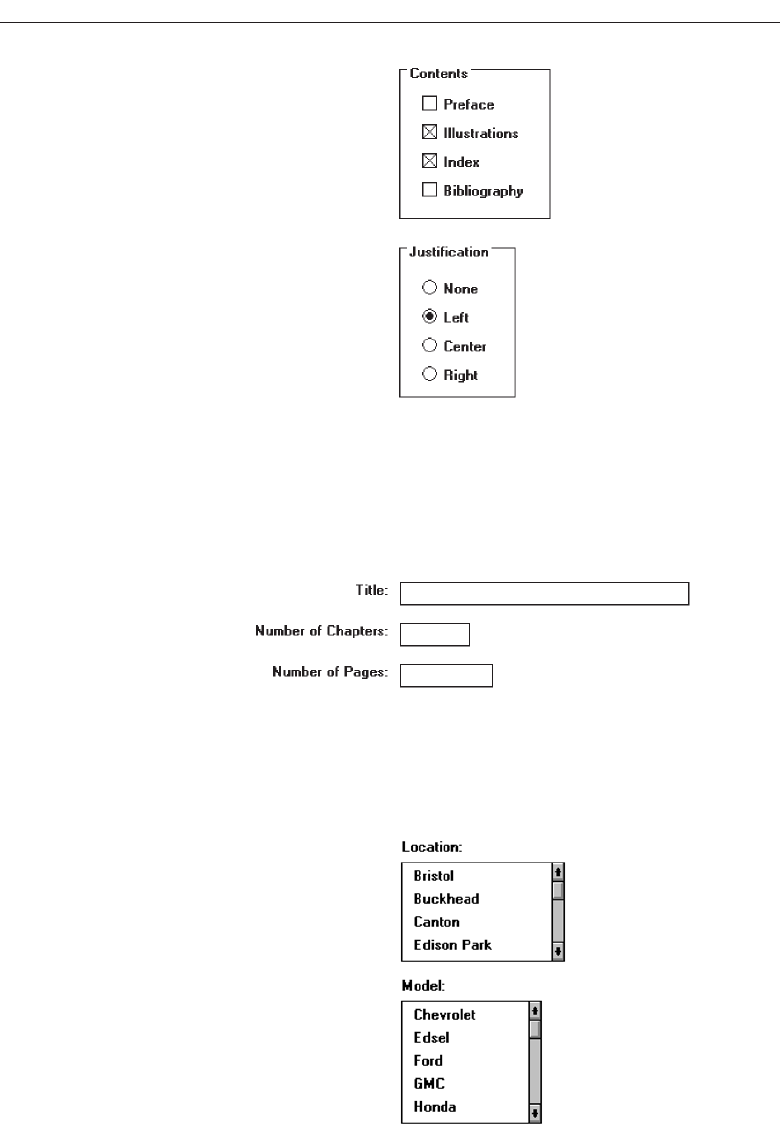
Figure 13.13
• Those located at the left may be left- or right-aligned.
■
Text boxes:
— Left-align the boxes. If the screen will be used for inquiry or display purposes,
numeric fields should be right-aligned.
— Captions may be left- or right-aligned.
Figure 13.14
■
List boxes:
— Left-align fixed list boxes.
— Captions:
• Those located above the boxes must be left-aligned.
Figure 13.15
• Those located at the left may be left- or right-aligned.
666 Step 13
3900 P-13 (step 13) 4/24/02 2:07 PM Page 666
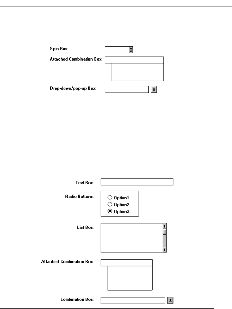
■
Drop-down/pop-up boxes, spin boxes, combo boxes:
— Left-align control boxes.
— Field captions may be left- or right-aligned.
Figure 13.16
■
Mixed controls
— Left-align vertically arrayed:
• Text boxes.
• Radio buttons.
• Check box boxes.
• Drop-down/pop-up list boxes.
• Spin boxes.
• Combination control boxes.
• List boxes.
— Captions may be left- or right-aligned.
Figure 13.17
Elements and information should be organized vertically (top to bottom) as well.
Two, and sometimes three, columns of controls and fields may occasionally be created.
When multiple columns are presented and no section borders are used, column sepa-
ration and downward flow may be emphasized through line borders, as illustrated in
Figure 13.18.
Organize and Layout Windows and Pages 667
3900 P-13 (step 13) 4/24/02 2:07 PM Page 667
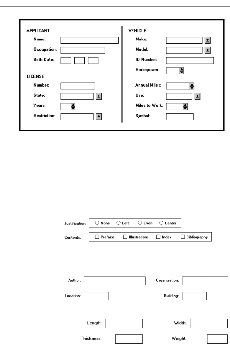
In some cases, window space constraints may dictate a horizontal orientation of
controls, most noticeably radio buttons and check boxes. Again the pattern created
must be consistent, predictable, and distinct.
Horizontal Orientation and Vertical Alignment
■
Radio buttons/check boxes selection controls:
— Align leftmost radio buttons and/or check boxes.
— Field captions may be left- or right-aligned.
Figure 13.19
■
Text boxes:
— Left-align text boxes into columns.
— Captions may be left- or right-aligned.
Figure 13.20
• Numeric data should be right-aligned.
Figure 13.21
668 Step 13
Figure 13.18 Multicolumn controls with a separation border.
3900 P-13 (step 13) 4/24/02 2:07 PM Page 668
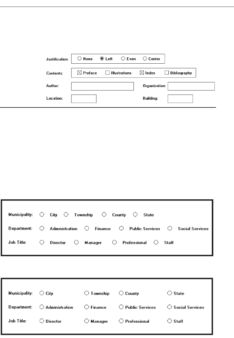
■
Mixed text boxes and selection controls:
— Align leftmost radio buttons and/or check boxes.
— Align the leftmost text box under the leftmost choice description button or box.
— Captions may be left- or right-aligned.
Figure 13.22
For horizontally oriented controls, indistinctiveness can be caused if the item descrip-
tions are positioned as close to a following button or box as they are to the button or box
they relate to, as illustrated in Figure 13.23. While the objective is to create as few vertical
alignment points as possible, this is usually not practical. For check boxes and radio but-
tons, most often the result will be inconsistently spaced item descriptions, as illustrated
in Figure 13.24. Vertical alignment of items in several adjacent controls can also create a
false vertical orientation perception, which is also illustrated in Figure 13.24. Final posi-
tioning will be a compromise between alignment and providing clear item distinctive-
ness, as illustrated in Figure 13.25. With a vertical orientation of radio buttons and check
boxes, all these problems are avoided. With a horizontal orientation, borders aid
Organize and Layout Windows and Pages 669
Figure 13.23 Horizontally arrayed radio buttons with poor item differentiation.
Figure 13.24 Horizontally arrayed control items with inconsistent spacing and a false vertical
orientation.
3900 P-13 (step 13) 4/24/02 2:07 PM Page 669
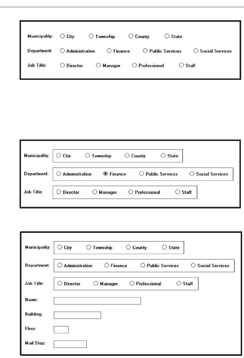
discrimination and separation, as illustrated in Figure 13.26. Although the examples in
the previous guidelines illustrate text boxes structured left to right, every attempt should
be made to maintain a top-to-bottom orientation of single entry and selection fields. The
fields in the example will be more effectively structured as illustrated in Figure 13.27.
670 Step 13
Figure 13.25 Horizontally arrayed control items possessing alignment and distinctiveness.
Figure 13.26 Horizontally arrayed control items with borders to improve readability.
Figure 13.27 Vertical orientation of text boxes.
3900 P-13 (step 13) 4/24/02 2:07 PM Page 670
Horizontal Alignment
■
Text boxes:
— Align by their tops horizontally adjacent text boxes.
■
Radio buttons/check boxes:
— Align by their tops horizontally adjacent radio button and/or check box controls.
■
Fixed list boxes:
— Align by their tops horizontally adjacent fixed list boxes.
■
Drop-down/pop-up list box, spin box, combo boxes:
— Align by their tops horizontally adjacent entry/selection fields.
Figure 13.28
■
Mixed text boxes and selection controls:
— Align by their tops:
• Text boxes.
• Radio buttons.
— If a control border exists, align by top border.
• Check boxes.
— If a control border exists, align by top border.
• Drop-down/pop-up list boxes.
• Spin boxes.
• Combination boxes.
• List boxes.
Arrangement of controls horizontally always consists of aligning them by their
tops. Since controls may be of different heights, screen efficiency occasionally dictates
that a control must be positioned in an area where it does not align horizontally with
another control. When this occurs, attempt to align it horizontally with the bottom of
an adjacent control, as illustrated by the list box and adjacent combo box in the above
example. Do not cramp a control, however, to achieve bottom alignment.
Organize and Layout Windows and Pages 671
3900 P-13 (step 13) 4/24/02 2:07 PM Page 671
Section Alignment
■
Align by their left side vertically arrayed groupings containing section borders.
■
Align by their top horizontally arrayed groupings containing section borders.
Figure 13.29
Groupings with borders should also be aligned vertically by their left border and
horizontally by their top border. Controls within a grouping will, of course, be aligned
following the alignment principles previously discussed.
Balancing Elements
■
General:
— Create balance by:
• Equally distributing controls, spatially, within a window.
• Aligning borders whenever possible.
■
Individual control borders:
— If more than one control with a border is incorporated within a column on a
screen:
• Align the controls following the guidelines for multiple-control alignment.
• Align the left and right borders of all groups.
• Establish the left and right border positions according to the spacing required
for the widest element within the groups.
Figure 13.30
672 Step 13
3900 P-13 (step 13) 4/24/02 2:07 PM Page 672
— With multiple groupings and multiple columns, create a balanced screen by:
• Maintaining equal column widths as much as practical.
• Maintaining equal column heights as much as practical.
Figure 13.31
■
Section borders:
— If more than one section with borders is incorporated within a column on a
screen:
• Align the left and right borders of all groups.
• Establish the left and right border positions according to the spacing required
by the widest element within the groups.
Figure 13.32
— With multiple groupings and multiple columns, create a balanced screen by:
• Maintaining equal column widths as much as practical.
• Maintaining equal column heights as much as practical.
Organize and Layout Windows and Pages 673
3900 P-13 (step 13) 4/24/02 2:07 PM Page 673
Figure 13.33
Screen balance should be attained as much as possible. Do not sacrifice screen func-
tionality to achieve balance, however. Never rearrange controls to simply make the
screen “look nice.” A meaningful order of elements is most important. The “look” will
be the best that can be achieved within the limits imposed by functionality.
One additional point about alignment. While these guidelines suggest aligning sec-
tion, radio button, and check box borders on the right side as well as the left, a glance
back at Figure 13.9 will reveal an instance where this was not done. The Justification and
Contents borders were not right-aligned because the text boxes within that grouping
created a ragged right edge. Aligning just these two controls would have served no pur-
pose. So, all alignment and balancing must occur within the context of the whole screen.
Control Navigation
■
Tab/arrow keys:
— Use the tab key to move between operable window controls, in the logical order
of the controls.
• Do not tab to field captions/labels.
— Radio buttons:
• Use arrow keys to move through radio buttons within a single control.
— Check boxes:
• Use the Tab key to move between, when they are independent controls.
• Within a border or group box, use arrow keys to move between the check
boxes since they appear as a logical group.
— List boxes:
• Use arrow keys to navigate within list box choices.
■
Command buttons
— For exiting or expanding/feature dialog command buttons:
• Tab to them at the end of the screen control tabbing sequence.
— For a command button with a contingent relationship to a control in the window
body:
• Tab to it at the logical point in the tabbing sequence within the window.
674 Step 13
3900 P-13 (step 13) 4/24/02 2:07 PM Page 674

■
Keyboard equivalents:
— Use keyboard equivalents (mnemonics) for direct access to each control, when-
ever possible.
• Mnemonic designations must be unique within a window.
Use the tab key to move between operable window controls, in the logical order that
the controls are organized. Do not tab to control captions but the control itself. For a
grouping of radio buttons, use the arrow keys to move through an array of buttons. For
check boxes, use the tab key to move between them when they are arrayed as inde-
pendent controls. When check boxes are located within a border or group box, use the
arrow keys to move between the boxes since they appear as a logical group. Always use
arrow keys to navigate within a listing of choices.
Tab to exiting or expanding/feature dialog buttons at the end of the screen control
tabbing sequence. If a button has a contingent relationship to a control in the window
body, tab to it at the logical point in the tabbing sequence within the window.
Use keyboard equivalents (mnemonics) for direct access to each window control,
whenever possible. Mnemonic designations must be unique within a window. The com-
mand buttons OK and Cancel are not typically assigned mnemonics, the Enter and Esc
keys being used instead.
Window Guidelines
■
Organization:
— Organize windows to support user tasks.
— Present related information in a single window whenever possible.
— Support the most common tasks in the most efficient sequence of steps.
— Use:
• Primary windows to:
— Begin an interaction and provide top-level context for dependent windows.
— Perform a major interaction.
• Secondary windows to:
— Extend the interaction.
— Obtain or display supplemental information related to the primary window.
• Dialog boxes for:
— Infrequently used or needed information.
— “Nice-to-know” information.
■
Number:
— Minimize the number of windows needed to accomplish an objective.
■
Size:
— Provide large enough windows to:
• Present all relevant and expected information for the task.
• Not hide important information.
• Not cause crowding or visual confusion.
• Minimize the need for scrolling.
• Less than the full size of the entire screen.
Organize and Layout Windows and Pages 675
3900 P-13 (step 13) 4/24/02 2:07 PM Page 675

— If a window is too large, determine:
• Is all the information needed?
• Is all the information related?
These guidelines, and many others, were presented and fully discussed, in Step 5
“Select the Proper Kinds of Windows.” In summary, always organize windows to sup-
port user tasks. Support the most common tasks in the most efficient sequence of steps.
Minimize the number of windows needed to accomplish an objective. In general, pre-
sent all related information in a single window whenever it is possible to do so. A win-
dow should be large enough to accommodate the amount of data a person would
typically expect to see. The needed information can only be determined through thor-
ough task analysis.
The necessity for window scrolling should also be avoided whenever possible. If all
the relevant controls or data cannot be placed within the confines of a single window,
place that which is less frequently needed on another window. Do not make the default
size of a window the full screen. The option to maximize a window always exists.
Finally, use primary windows, secondary windows, and dialog boxes consistently
and in the manner they are intended to be used.
Web Page Guidelines
The following specific Web page layout principles must also be considered in page
design.
Page Layout
■
General:
— Provide a layout that is:
• Efficient
• Logical.
• Consistent.
• Self-explanatory.
• Scannable.
— Strike a proper balance between:
• Textual information.
• Graphics.
• Links.
■
Layout Grid:
— Create and use a layout grid.
■
Elements:
— Include no more than seven distinct elements per page.
■
Size:
— Minimize page length.
• Restrict it to two or three screens of information.
676 Step 13
3900 P-13 (step 13) 4/24/02 2:07 PM Page 676

— Anticipate page breaks.
— Avoid horizontal scrolling.
■
Organization:
— Place critical or important information at the very top so it is always viewable
when the page is opened.
• Locate it within the top 4 inches of page.
— Position remaining elements according to importance.
— Reduce graphic complexity and textual density toward the page bottom.
■
Formatting:
— Provide sufficient white space.
• A minimum of 30 percent.
— Keep the length of textual lines short.
• A maximum of two alphabets.
— Keep text and related graphics close to each other.
— Provide adequate horizontal spacing.
— Use horizontal rules sparingly.
■
Other:
— Use frames with caution.
• Consider them for global elements.
— Change the organization and structure only when significant benefits exist.
Well-organized, thoughtfully laid out, and consistent Web pages will permit people
to easily learn a site’s structure, allow users to effectively and quickly scan its pages,
and will foster interest in its content. A well-designed page will possess the following
qualities.
General
Efficient. A page will be more powerful if more is said with less. Every element of
the design must support the goal of the message being presented. Eliminate all su-
perfluous elements. Avoid clutter that prevents people from finding what they
want. Exercise extreme care in using decorative elements.
Logical and consistent. A logical and consistent layout of the site and its pages will
enable people to quickly find what they are looking for. As said earlier in this book,
people develop expectations for how to find different types of information and
how to perform particular tasks. A layout that matches a person’s expectations
speeds learning and enables prediction of where to find things and how to do
things. Illogical and inconsistent structures lead only to user frustration.
Self-explanatory. Each page should be self-explanatory, giving a clear indication of
what Web site it belongs to and where it fits within the structure of the Web site’s
information space. Present the proper information, and arrange it, so users always
know where they are. Remember, most pages can be accessed from outside the site.
Scannable. Allow people to easily scan a page and select relevant and useful infor-
mation. To foster scannability, include headings that accurately reflect the content
of text. Also create short paragraphs and use simple bulleted lists (complex bullets,
Organize and Layout Windows and Pages 677
3900 P-13 (step 13) 4/24/02 2:07 PM Page 677

such as diamonds and fingers, may create unnecessary visual noise). Avoid the
use of too many links and use plenty of white space.
Proper balance. Always strike a proper balance between textual information, graph-
ics and navigation links. A page’s elements must balance, interact with, and sup-
port each other. As mentioned earlier, studies show people prefer textual content,
so do not clutter up the page with too many graphics, particularly at the top. A
large top graphic may push important textual content and navigation links off the
bottom of the page where they cannot be seen. Always make sure text is visible
first so people can start reading right away. Conversely, densely packed text will
be difficult to read. Long and detailed textual information can usually be rele-
gated to secondary pages.
MYTH This way of doing it must be right because (fill in the blank) does it
that way.
Layout Grid
To provide both structure and consistency to a Web site, establish a standard layout
grid, or grids, for each of the site’s pages. Multiple, but similar, grids may be necessary
for site pages with different purposes or varying complexity. These design grids will be
composed of rectangular sections into which the page’s navigation components (head-
ings, text, and graphics) will be placed. To develop the grids:
Gather representative samples of the contents of site pages. Include all types of
pages: navigation pages, content pages, simple pages, and complex pages.
Experiment with various arrangements for all kinds of pages, painting or sketch-
ing patterns of organization on sample pages.
Follow all layout guidelines (alignment, balance, and so on) and evolving page
organizational standards in the sketching process.
Maintaining as much consistency between pages types as possible, establish a
design grid (or grids) for the identified page types.
Plug in content (navigational components, text, and graphics) for each page.
Ideally, one standard design grid may satisfy the needs of many Web sites. Larger
sites with more content may require multiple grids. Keep in mind that fewer grids are
better, and, if you use multiple grids, maintain as much consistency as possible be-
tween the grids’ layouts.
The use of the grids on all pages will provide a unifying character within and be-
tween pages, a standard look and feel. Regular and repeating organizational patterns
help readers to understand site’s organization and aid them maintaining a sense of
place. Grids allow pages to be laid out without the designer having to stop and rethink
the basic design approach for every new page. Pressing needs of the moment will also
have much less of an influence on design. Examples of page layout grids, both poor
and good, are illustrated in Figure 13.34. The poor grid is haphazard in design, and
there is little connection of the elements. The good grid reflects much greater alignment
and better visual connection of elements. It is structured and more consistent. The good
678 Step 13
3900 P-13 (step 13) 4/24/02 2:07 PM Page 678
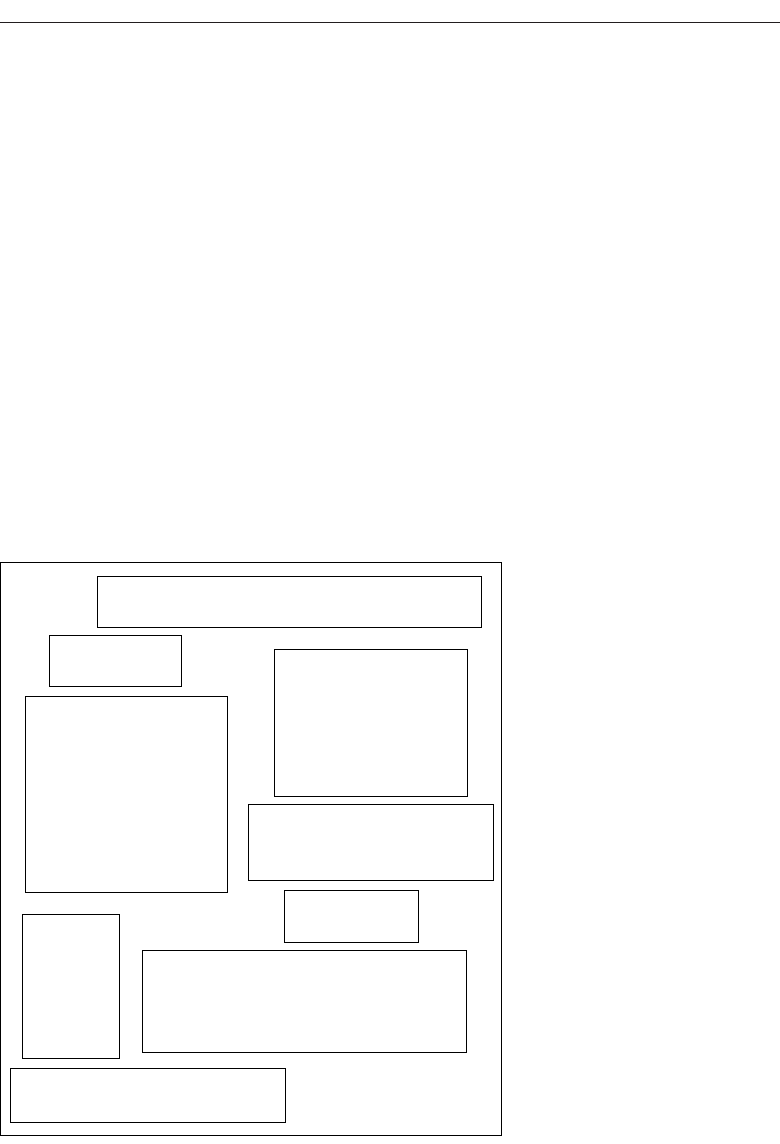
grid has a visual complexity measure, as described in Step 3, 47 percent lower than the
poor grid.
Elements
To keep pages simple, restrict the number of distinct functional elements on a page to
seven or fewer. Elements include such things as the title, the navigation bar, the textual
link listing to major site areas, textual content, graphics, and the page footer. The more
elements on a page, the greater the competition between the elements for a person’s at-
tention. To many elements will eventually overwhelm the user’s information-processing
system.
Size
Page length. The many issues associated with page length were thoroughly described
in Step 3 (Vertical scrolling, user memory requirements, user tasks, and monitor
sizes, for example.) so optimum page length must balance all these factors. In gen-
eral, the best approach seems to be to minimize a page’s length, restricting it to
two or three screens of information.
Organize and Layout Windows and Pages 679
Navigation
Heading
Text
Graphic
Navigation
Text
Heading
Navigation
Graphic
Figure 13.34 Page layout grids.
(continues)
POOR GRID
3900 P-13 (step 13) 4/24/02 2:07 PM Page 679
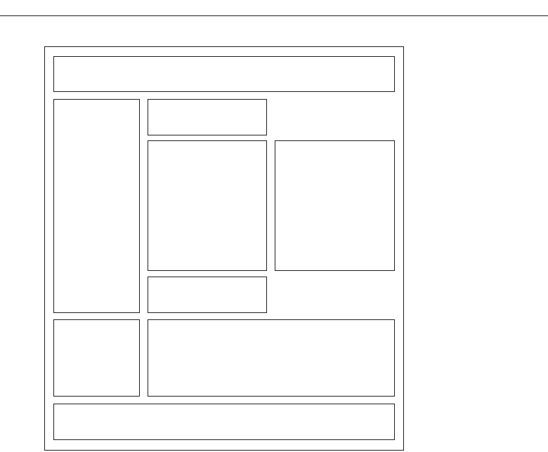
Anticipate page breaks. In laying out pages exceeding one screen in length, always
consider where the browser window will cut off a page when it loads. If the break
occurs at a logical point on the page, and the page appears to fit totally on the
screen, people may assume that it ends at that point and look no further down.
Where potential screen cut-offs can occur, present a design element (textual or
graphical) that, by its appearance, is obviously not completed or finished. This
will signal to the user that there is more below and indicate a need to scroll down.
Horizontal scrolling. While people can accept some vertical scrolling, horizontal
scrolling is cumbersome and disliked. Lay out a page so that horizontal scrolling
is never necessary.
Organization
Important elements at the top. Critical or important information should be placed
where it will be immediately visible when the page is displayed. As described ear-
lier, in Web page design this is referred to as “above the fold,” a term borrowed
from newspaper page layout. Above the fold is about the top 4 inches of a page
and is the area of the page most users are assured of seeing. Information “below
the fold” will usually require scrolling to access and may not always be seen.
680 Step 13
Figure 13.34 Continued
GOOD GRID
3900 P-13 (step 13) 4/24/02 2:07 PM Page 680

Generally, the top of the page should be more dense and packed with more
useful and interesting information than the area lower down. Include in this area
the page title, links to other important content and pages, and summary informa-
tion so the user can determine whether continued reading is desirable.
Positioning. The effect of presented information drops very quickly as one moves
lower down the page. Visually prioritize the page information space by estab-
lishing an information hierarchy, using contrast, size, location pattern, and other
concepts discussed in Step 3.
Reduced complexity. Reduce graphic complexity and textual density as one moves
lower down a page or to interior site pages. Produce diminishing or thinning ver-
tical gradients of complexity, providing quieter and less-distracting design ele-
ments. This will allow people to focus on the content, which must have some
interest since they have navigated that far. To be distracted by irrelevant infor-
mation or useless animation at that point can be very irritating.
Formatting
White space. To enhance readability and organization, and make the page more
inviting, allow a sufficient amount of white space on each page. According to many
experts, white space should consume at least 30 percent of a page. (Remember,
white space is a design element, not something to always be consumed.) Of the re-
maining 70 percent of space, restrict text to no more than another 30 percent. The
remaining 40 percent may be used for graphics. If the entire 40 percent is not used
for graphics, use it for more white space, not additional text.
Textual line length. For easier reading, restrict textual lines to no more than the
length of two alphabets, or 52 characters.
Text and related graphics. Keep text and any related graphics close to each other.
The viewer will assume a connection between elements located in close proxim-
ity. Also, keep chunks of related text in closer proximity than unrelated text, to en-
sure a connection.
Horizontal spacing. Provide sufficient horizontal spacing so that groupings of in-
formation are obvious. A chunk of text, its heading, and any related graphic
should be readily discernible as a grouping.
Horizontal rules. Use horizontal rules sparingly on pages. These rules can break up
page flow and signal a page’s end when it is not intended. Use horizontal rules
only if the objective is break the flow. Uses might be, for example, to separate
standard header and footer information from basic page content.
Other
Frames. Use frames with caution. As was discussed in Step 4 “Develop System
Menus and Navigation Schemes,” frames can be confusing for many users. They
may cause problems with scrolling, bookmarking, and printing. They also reduce
the content window size. Frames, however, may be useful for global page ele-
ments such as navigation links or corporate/organization information. If a person
arrives at a framed page from a search facility, the page is seen without the
Organize and Layout Windows and Pages 681
3900 P-13 (step 13) 4/24/02 2:07 PM Page 681

accompanying frames. The site name and a link to the home page must always be
provided on the content page so the user does not reach a dead-end.
Change. In an environment as volatile and changing as the Web, the urge to try the
newest and latest concepts in design and layout always exists. Use restraint. A
Web site’s fashion should be evident in its content, not its design. Fashion changes
all the time, and constant changes in design will continually antagonize users
who have invested time and effort in understanding a site’s structure and orga-
nization. Change the organization and structure only when significant benefits for
the user and the Web site owner are perceived to exist.
Home Page
■
Limit to one screen.
■
Clearly identify the Web site’s content and purpose.
■
Elements to include:
— Site overview or map.
— Navigation links to most (if not all) of the site or major sections.
— Some useful content.
A site’s home page is a concrete and visual anchor point; a safe haven to return
to when one is confused or decides to do something else. The home page also
gives people a first impression of a site, and first impressions can create a positive
or negative feeling, or a feeling somewhere in between. A negative first impres-
sion can lead to rejection, a positive first impression create an urge for further ex-
ploration. In many ways, the home page is a site’s most important page.
One screen. Keep the home page to one screen. All important elements should be
viewable without scrolling so they will not be missed. Elements of less impor-
tance and those not vital to site use (corporate or organizational identification in-
formation or e-mail links, for example) may be included below the visible area,
however.
Content and purpose. The home page should clearly identify the Web site’s content
and purpose. Assume that potential users know nothing about the site and what
is presented within it. Describe who the site is intended for or of interest to. De-
scribe the kinds of information available. The home page must convince users to
stay by telling them what they will find within the site.
Elements. Elements to include on the home page include a site overview or map,
navigational links to most (if not all) of the site or its major sections, and a small
amount of useful content. The home page may also be used to promote site areas
that should be seen, and new or changed content.
Page Elements
A large number of items might be included within any Web site’s pages. Table 13.1 pro-
vides a summary of possible components.
682 Step 13
3900 P-13 (step 13) 4/24/02 2:07 PM Page 682
Organize and Layout Windows and Pages 683
Table 13.1 Possible Web Page Components
PAGE
COMPONENT PURPOSE FREQUENCY LOCATION
Page title. To clearly identify and describe Every page. Top
page.
Navigation bar. To allow global site navigation. Every page. Top
Table of contents. To list page contents. If longer than Top
2 to 3 screens.
Site identifier To identify page’s owner. Every page. Top
(trademark, logo, or A strong navigational and
organizational orientation cue.
identification).
Search facility. To provide a means for Every page. Top
locating content of interest.
Page’s author or To identify page’s author, or to Every page. Footer
contact person. indicate page’s contact person.
Contact e-mail address. To solicit queries or comments. Every page. Footer
Comment facility. To solicit queries or comments. As necessary. Footer
Other contact details To identify other methods for As necessary. Footer
(telephone number, soliciting queries or comments.
mailing address, etc.).
Copyright information. To identify page’s legal Every page. Footer
ownership.
To caution against unauthorized
use.
Date of creation To indicate currency of Every page. Footer
or update. information.
Links to:
Skip to main content. An accessibility consideration. Every page. Top
Other major sections To provide easy access to all Every page. Top, footer
of site. major site content. also for
long pages
Home page. To return to home page. Every page. Top, footer
also for
long pages
Index page. To return to index. Every page. Top,
footer also
for long
pages
(continues)
3900 P-13 (step 13) 4/24/02 2:07 PM Page 683
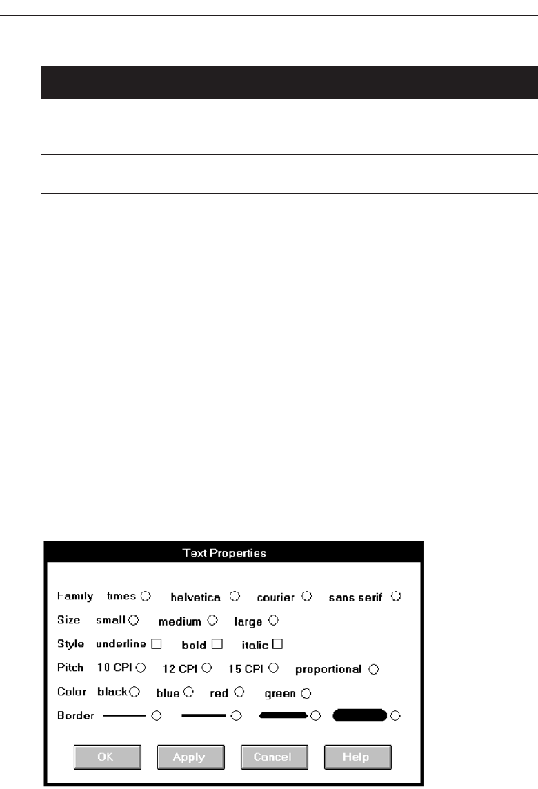
Screen Examples
Following are more examples of good and poor design. Included are redesigns of the
screens critiqued in Step 3.
Example 1
Here is a poorly designed screen and its redesigned version.
Screen 1.1
A very poor screen: Captions are not discernible from choice descriptions, and the ini-
tial choice descriptions are not left-aligned. The radio buttons and check boxes are not
strongly associated with their respective descriptions, and they also follow their respec-
684 Step 13
Table 13.1 Continued
PAGE
COMPONENT PURPOSE FREQUENCY LOCATION
Site map or directory. To return to site map or Every page. Top, footer
directory. also for
long pages
Next page. To go to next page in a Every page Bottom
sequence. (if applicable).
Previous page. To return to previous page. Every page Bottom
(if applicable).
Screen 1.1
3900 P-13 (step 13) 4/24/02 2:07 PM Page 684
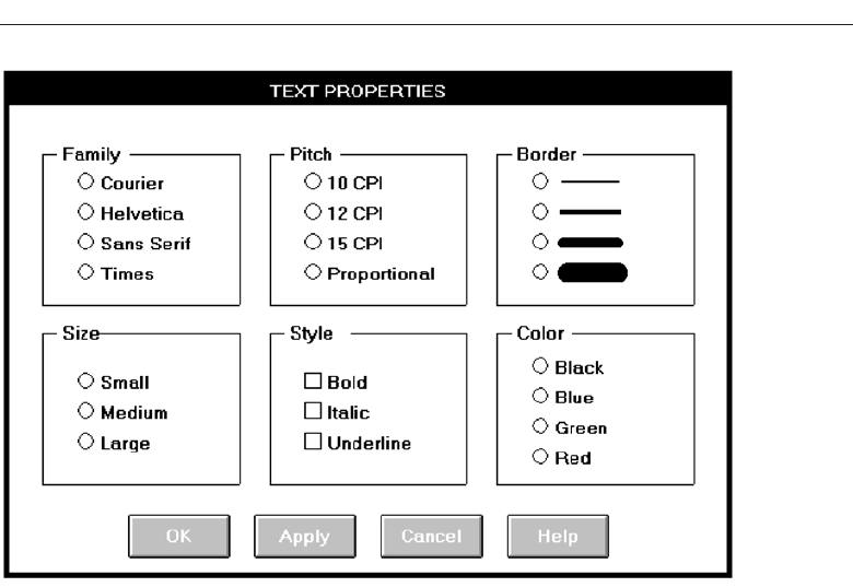
tive descriptions, certainly causing selection confusion. The horizontal orientation of
choices is not efficient for human scanning. No perception of groupings exists. The or-
dering scheme of Family, Style, and Color is questionable. Alphabetic ordering would
seem to be more appropriate.
Screen 1.2
A much better screen. The title is capitalized to set it off from the remainder of the screen.
The radio buttons and check boxes are arrayed vertically to facilitate scanning and
comparison of alternatives. All controls are enclosed in borders to focus the viewer’s at-
tention to them. While the overall organization does not assist the viewer in establish-
ing a scanning direction (horizontal or vertical), the kind of information presented does
not make this critical. The screen can be effectively used from left to right or from top
to bottom. Family, Style, and Color are alphabetized. Using the complexity measure
discussed in Step 3, this redesigned screen is 42 percent less complex than the original.
Example 2
This is a representation of an actual screen from Microsoft Windows. Two alternate de-
signs are presented.
Organize and Layout Windows and Pages 685
Screen 1.2
3900 P-13 (step 13) 4/24/02 2:07 PM Page 685
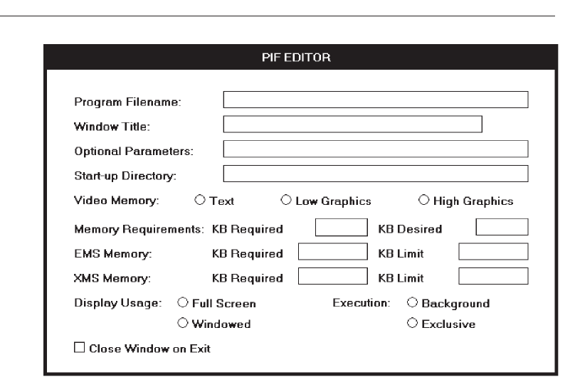
Screen 2.1
This is a screen with several faults. On a positive note, the captions on the left side are
nicely aligned, as are the top four text boxes. The box alignment, however, breaks down
in the middle of the screen. Also, what appear to be captions (because they possess an
ending colon) are really headings, communicating a false message to the viewer (Mem-
ory Requirements, EMS Memory, and XMS Memory). The word “memory” repeated
four times in succession seems redundant, indicating the potential for a heading. One
radio button field (Video Memory) is arrayed horizontally, the others (Display Usage
and Execution) are arrayed vertically. The control “Close Window on Exit” seems lost.
Screen 2.2
This is a much-improved alternative. Groupings of elements are provided. Section bor-
ders, with titles, are included in the upper part of the screen to strengthen the percep-
tion of groupings. Control borders in the lower part of the screen serve the same purpose.
Proper alignment of data fields is achieved in the top two sections of the screen. The re-
dundant word “memory” is incorporated as a section heading. Section headings are
displayed capitalized to distinguish them from control captions. Subsection headings
are created in the Memory section where the heading-caption confusion previously ex-
isted. Subsection headings are set off by capitalization and arrows.
686 Step 13
Screen 2.1
3900 P-13 (step 13) 4/24/02 2:07 PM Page 686
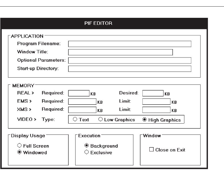
The radio buttons/check boxes at the bottom of the screen are arrayed horizontally
to provide screen balance. The “Close Window on Exit” control field is given an (admit-
tedly redundant) caption to allow a control border consistent with its neighbors and to
create screen balance. The Video (Memory) control remains, as a trade-off, arrayed
horizontally. It would have been desirable to organize its choices vertically, but the best
overall fit within the screen is achieved by horizontal orientation. This redesigned ver-
sion of the screen is actually 4 percent more complex than the original. The addition of
headings and subheadings added to its complexity measure. In spite of this, it is a bet-
ter screen. Additional information added to a screen to aid understanding can some-
times increase its complexity. So, use the complexity measure as a guide, not as an
absolute and final measure of a screen’s effectiveness.
Screen 2.3
Here is another redesigned version of this screen. The Memory section has been restruc-
tured to maintain a top-to-bottom flow. The trade-off is that two columns are now re-
quired to present the information. This version is 8 percent more complex than the
original, again because of the added information. Which version do you prefer, 2.2 or 2.3?
Organize and Layout Windows and Pages 687
Screen 2.2
3900 P-13 (step 13) 4/24/02 2:07 PM Page 687
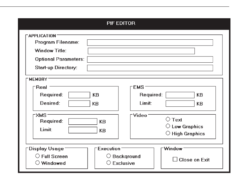
Example 3
These are redesigned versions of the banking screen presented in Step 3.
Screen 3.1
The original screen.
Screen 3.2
The Name field is given a caption and a single alignment point is established for both
captions and data. Captions and data are now much more readable. Name format in-
structions (1st, 2nd, and so on) are established as prompts. This prompt designation is
signaled by placing them in italics to subdue them visually. The prompt for Date of
Birth is placed to the right of its text box, out of the way but still easily viewable. This
also permits the alignment point for the text boxes to be moved closer to the captions.
Date is also segmented into its component pieces. The command buttons are posi-
tioned at the bottom. No groupings are established, however. This screen is 9 percent
less complex than the original.
688 Step 13
Screen 2.3
3900 P-13 (step 13) 4/24/02 2:07 PM Page 688
Organize and Layout Windows and Pages 689
Screen 3.1
Screen 3.2
3900 P-13 (step 13) 4/24/02 2:07 PM Page 689
Screen 3.3
This screen is identical to the above version except that Sex and Marital Status are ar-
rayed vertically. This screen is 17 percent less complex than the original.
Screen 3.4
The elements are now grouped with group boxes and section headings. Name is seg-
mented into its three components. Address details are moved closer to the customer’s
name. Sex and Marital Status must be arrayed horizontally because of space constraints
caused by the groupings. This screen is 4 percent less complex than the original. Which
of these do you prefer, 3.2, 3.3, or 3.4?
Example 4
These are redesigned versions of the drawing program screens presented in Step 3.
Screen 4.1
The original PRINT MERGE screen.
690 Step 13
Screen 3.3
3900 P-13 (step 13) 4/24/02 2:07 PM Page 690
Organize and Layout Windows and Pages 691
Screen 3.4
Screen 4.1
3900 P-13 (step 13) 4/24/02 2:07 PM Page 691
Screen 4.2
The redesigned PRINT MERGE screen. Elements are aligned and the File text box is po-
sitioned by its related list box. The Up command is placed in the proper contingent re-
lationship to the Directories list box. The command buttons are moved to the bottom of
the screen and Merge is changed to OK for consistency with the other screens. The title
is capitalized for consistency with the other screens. This redesigned screen is 29 per-
cent less complex than the original.
Screen 4.3
The original PAGE SETUP screen.
Screen 4.4
The redesigned PAGE SETUP screen. The radio buttons are aligned for vertical scanning
and placed within borders. The “inches” control is changed to a standard drop-down/
pop-up list box. This redesigned screen is 19 percent less complex than the original.
Screen 4.5
The original EXPORT screen.
692 Step 13
Screen 4.2
3900 P-13 (step 13) 4/24/02 2:07 PM Page 692
Organize and Layout Windows and Pages 693
Screen 4.3
Screen 4.4
3900 P-13 (step 13) 4/24/02 2:07 PM Page 693
Screen 4.6
The redesigned EXPORT screen. The radio buttons and check boxes are aligned for ver-
tical scanning and placed within borders. The check boxes are given a caption, as is the
list box. For balance purposes, the controls are arrayed in two columns. This redesigned
screen is 5 percent less complex than the original.
Example 5
Here are redesigned versions of the word-processing screens presented in Step 3.
Screen 5.1
The original FOOTNOTE OPTIONS screen.
Screen 5.2
The redesigned FOOTNOTE OPTIONS screen. Elements are aligned, including the sin-
gle check boxes. Headings are capitalized and left-justified within the borders. “Posi-
tion” and “Separator” are combined into one grouping called “LOCATION.” This
redesigned screen is 13 percent less complex than the original.
694 Step 13
Screen 4.5
3900 P-13 (step 13) 4/24/02 2:07 PM Page 694
Organize and Layout Windows and Pages 695
Screen 4.6
Screen 5.1
3900 P-13 (step 13) 4/24/02 2:07 PM Page 695
Screen 5.3
The original LOCATION OF FILES screen.
Screen 5.4
The redesigned LOCATION OF FILES screen. The section headings are capitalized
and left-justified in the borders. Visual competition with the text box information is
now minimized. A grouping called FILES is created at the screen’s top for consistency
and balance. The single check box is aligned under the text boxes. This redesigned screen
is 2 percent more complex than the original, again due to the added heading.
Example 6
Here is a redesigned version of the drawing program read-only/display screen pres-
ented in Step 3.
Screen 6.1
The original screen.
696 Step 13
Screen 5.2
3900 P-13 (step 13) 4/24/02 2:07 PM Page 696
Organize and Layout Windows and Pages 697
Screen 5.3
Screen 5.4
3900 P-13 (step 13) 4/24/02 2:07 PM Page 697
Screen 6.2
The redesigned screen. Headings are capitalized to set them off from the control cap-
tions. The headline style of presentation is consistently applied to all captions. The
data fields are aligned and the Units in the IMAGE sections are moved to the top. This
redesigned screen is 12 percent less complex than the original.
Example 7
Here are redesigned versions of the other read-only/display screen presented in Step 3.
Screen 7.1
The original STORY INFO screen.
Screen 7.2
The redesigned STORY INFO screen. Elements are aligned and incorporated within
borders. Note that headings are not included within the borders. The command re-
mains positioned in the upper-right corner, as is standard for this graphical system.
This redesigned screen is 8 percent less complex than the original.
698 Step 13
Screen 6.1
3900 P-13 (step 13) 4/24/02 2:07 PM Page 698
Organize and Layout Windows and Pages 699
Screen 6.2
Screen 7.1
Screen 7.3
Another version of the redesigned STORY INFO screen. Then only difference is that the
command button is positioned at the bottom rather than at the side, creating a better bal-
anced screen. On less complex screens this is another advantage of bottom positioning
of command buttons.
3900 P-13 (step 13) 4/24/02 2:07 PM Page 699
700 Step 13
Screen 7.2
Screen 7.3
3900 P-13 (step 13) 4/24/02 2:07 PM Page 700

701
The design of graphical systems and Web pages, and their screens, is a complicated
process. As has been shown, in both a host of factors must be considered. In graphical
systems among the many design elements are the types of windows used, the way the
windows are organized, what controls are selected to collect and present information,
and the way the controls are organized within one window and between several win-
dows. Web page design factors include the proper integration of text, graphics, naviga-
tion links, and controls, page size, writing for simplicity and clarity, the characteristics
of browsers and monitors, and accessibility requirements. In both design processes nu-
merous design trade-offs will be made. Also, some design decisions may be based on
skimpy data and reflect the most educated guess possible at the moment. Finally, the
implications for some design decisions may not be fully appreciated until the results
can be seen.
To wait until after a system has been implemented to uncover and correct any system
usability deficiencies can be aggravating, costly, and time-consuming for both users
and developers. Indeed, after implementation many problems may never be corrected
because of time constraints and costs. To minimize these kinds of problems, and ensure
usability, interfaces must be continually tested and refined before they are implemented.
What follows is an overview of the testing process and the role it plays in design. Its
purpose is to provide an awareness of the testing procedures and methods, and to
summarize some basic testing guidelines. Testing steps to be reviewed are:
Identifying the purpose and scope of testing.
Understanding the importance of testing.
Developing a prototype.
Test, Test,
and Retest
STEP
14
3900 P-14 (step 14) 4/24/02 2:08 PM Page 701

Developing the right kind of test plan.
Designing a test to yield relevant data.
Soliciting, selecting, and scheduling users to participate.
Providing the proper test facility.
Conducting tests and collecting data.
Analyzing the data and generating design recommendations.
Modifying the prototype as necessary.
Testing the system again.
Evaluating the working system.
The Purpose of Usability Testing
Usability testing serves a twofold purpose. First, it establishes a communication bridge
between developers and users. Through testing, the developer learns about the user’s
goals, perceptions, questions, and problems. Through testing, the user is exposed to the
capabilities of the system early on, before design is solidified.
Second, testing is used to evaluate a product. It validates design decisions. It also can
identify potential problems in design at a point in the development process where they
can be more easily addressed. Testing also enables comparison of alternate versions of
a design element, when a clear direction is not immediately evident. How well the in-
terface and screens meet user needs and expectations can also be assessed.
Thorough testing also has one other benefit for the developer. It can prevent the
massive embarrassment that often results from letting things “slip through the cracks.”
The Importance of Usability Testing
A thorough usability testing process is important for many reasons, including all of the
following.
Developers and users possess different models. As discussed earlier, developers
and users have different expectations and levels of knowledge. Specialized knowl-
edge possessed by the developers enables them to deal with complex or ambigu-
ous situations on the basis of context cues not visible to the users. Developers also
frequently use terminology that does not always match that of the users.
Developer’s intuitions are not always correct. The intuition of designers, or anyone
for that matter, no matter how good or bad they may be at what they do, is error
prone. This is illustrated by the previously reported Tullis and Kodimer (1992)
study evaluating several screen-based controls. They found that programmers’
predictions of control usage speed correlated only .07 with actual measured speeds.
They also found that programmers’ predictions of user control preferences corre-
lated only .31 with actuality. Intuition is too shallow a foundation on which to base
design decisions.
702 Step 14
3900 P-14 (step 14) 4/24/02 2:08 PM Page 702

There is no average user. We all differ—in looks, feelings, motor abilities, intellectual
abilities, learning abilities and speeds, device-based control preferences, and so
forth. In a keyboard data entry task, for example, the best operators will probably
be twice as fast as the poorest and make 10 times fewer errors. The design must
permit people with widely varying characteristics to satisfactorily and comfort-
ably learn and perform the task or job.
It’s impossible to predict usability from appearance. Just as it is impossible to judge
a person’s personality from his or her looks, it’s impossible to predict a system’s
usability from its appearance.
Design standards and guidelines are not sufficient. Design standards and guidelines
are an important component of good design, laying the foundation for consis-
tency. But design standards and guidelines often fall victim to trade-offs. They also
cannot address all the countless design element interactions that occur within a
completed system.
Informal feedback is inadequate. Informal feedback is a hit-and-miss proposition.
Parts of the system may be completely overlooked; significant problems in other
parts may never be documented.
Products’ built-in pieces almost always have system-level inconsistencies. This is a
normal and expected result when different developers work on different aspects of
a system. We might also say that developers differ—there is no average developer.
Problems found late are more difficult and expensive to fix. Unless they’re really
severe, they may never be fixed.
Problems fixed during development mean reduced support costs later. Support
costs are directly proportional to the usability problems that remain after develop-
ment. The more problems, the higher the support costs.
Advantages over a competitive product can be achieved. Many products can do
something. The most successful products are those that permit doing something
easily.
Scope of Testing
Testing should begin in the earliest stages of product development and continue
throughout the development process. It should include as many of the user’s tasks, and
as many of the product’s components, as reasonably possible. Always involve all mem-
bers of the design team in the testing to ensure a common reference point for all. Involv-
ing all also permits multiple insights into the test results from the different perspectives
of team members.
Prototypes
A prototype is primarily a vehicle for exploration, communication, and evaluation. Its
purpose is to obtain user input in design, and to provide feedback to designers. Its major
Test, Test, and Retest 703
3900 P-14 (step 14) 4/24/02 2:08 PM Page 703

function is the communicative role it plays, not accuracy or thoroughness. A prototype
enables a design to be better visualized and provides insights into how the software
will look and work. It also aids in defining tasks, their flow, the interface itself, and its
screens.
A prototype is a simulation of an actual system that can be quickly created. A proto-
type may be a rough approximation, such as a simple hand-drawn sketch, or it may be
interactive, allowing the user to key or select data using controls, navigate through
menus, retrieve displays of data, and perform basic system functions. A prototype need
not be perfectly realistic, but it must be reasonably accurate and legible. A prototype
also need not be functionally complete, possessing actual files or processing data. Today,
many software support tools for prototyping are available that permit the prototype to
be integrated directly into the application code.
A prototype may have great breadth, including as many features as possible to pre-
sent concepts and overall organization, or it might have more depth, including more
detail on a given feature or task to focus on individual design aspects. By nature, a pro-
totype cannot be used to exercise all of a system’s functions, just those that are notable
in one manner or another.
Particularly useful early in design, a prototype should be capable of being rapidly
changed as testing is performed. A prototype is characterized by its fidelity, the exact-
ness and thoroughness of its replication of a system’s screens and user interaction.
Prototypes range in fidelity from low to high, from rough hand-drawn sketches to
fully functioning software (Microsoft, 1995; Weinschenk, 1995; Winograd, 1995). Various
kinds of prototypes, in general order of increased fidelity, are as follows.
Hand Sketches and Scenarios
■
Description:
— Screen sketches created by hand.
— Focus is on the design, not the interface mechanics.
— A low-fidelity prototype.
■
Advantages:
— Can be used very early in the development process.
— Suited for use by entire design team.
— No large investment of time and cost.
— No programming skill needed.
— Easily portable.
— Fast to modify and iterate.
— A rough approximation often yields more substantive critical comments.
— Easier to comprehend than functional specifications.
— Can be used to define requirements.
■
Disadvantages:
— Only a rough approximation.
— Limited in providing an understanding of navigation and flow.
— A demonstration, not an exercise.
— Driven by a facilitator, not the user.
704 Step 14
3900 P-14 (step 14) 4/24/02 2:08 PM Page 704

— Limited usefulness for a usability test.
— A poor detailed specification for writing the code.
— Usually restricted to most common tasks.
Description. The first, and simplest, prototype is a low-fidelity rough hand-drawn
sketch, or mock-up, of the screens. These can start early in the design process and
before any attempt is made to create a prototype using an available toolkit or in-
terface builder. With sketches, the focus is on the design of individual screens, not
the interface mechanics. The hand sketch should be an entity that has enough of
a general look to suggest the functionality, interaction, and layout of screens. The
goal is a rough vision, not a polished work of art. This sketch will be useful in defin-
ing and refining task organization, conceptual ideas, and the general layout of
screens.
MYTH The design is finished.
Advantages. Hand-drawn sketches of screens can be easily developed and used very
early in the development process. Many usability problems can then be identified
and corrected quickly. Sketches are also suitable for use by the entire develop-
ment team, giving everyone a sense of what the real design issues are. Sketches re-
quire no large investment of time and money, and they are portable, placing few
restrictions on where the testing may occur. Sketches can also be quickly modified
and iterated, as many times as necessary. Because there has been no emotional
investment in “code” and the status quo, there is no necessity for team members
to defend something already created from hard work. Screen sketches are rough
approximations, and rough approximations often yield more substantive sugges-
tions or critical comments than actual screen-drawn versions. Their “draft” or “un-
polished” look greatly softens the attitude that everything is cast in concrete.
Sketches can also be used to define a system’s requirements.
Disadvantages. Since hand-drawn sketches are rough approximations, they can only
suggest the final layout of the interface. They are limited in helping understand
system navigation and flow, and are a demonstration device driven by a facilita-
tor, with the user assuming a more passive role. They are usually restricted to the
most common user tasks. As a result, they possess limited usefulness for usability
testing.
Sketch Creation Process*
■
Sketch (storyboard) the screens while determining:
— The source of the screen’s information.
— The content and structure of individual screens.
— The overall order of screens and windows.
Test, Test, and Retest 705
* Based on Weinschenk (1995).
3900 P-14 (step 14) 4/24/02 2:08 PM Page 705

■
Use an erasable medium.
■
Sketch the screens needed to complete each workflow task.
■
Try out selected metaphors and change them as necessary.
■
First, storyboard common/critical/frequent scenarios.
— Follow them from beginning to end.
— Then, go back and build in exceptions.
■
Don’t get too detailed; exact control positioning is not important, just overall order
and flow.
■
Storyboard as a team, including at least one user.
■
Only develop online prototypes when everyone agrees that a complete set of screens
has been satisfactorily sketched.
Sketch the screens while determining the source of the screen’s information, the con-
tent and structure of the individual screens, and the overall flow of the screens. Use an
erasable medium so that as ideas are explored and changed, the modifications will be
easy to make. Sketch the screens needed to complete each task in the workflow. First,
sketch the most common, critical, or frequent activities, following them from beginning
to end. Then, go back and build in the exceptions. Try out all selected metaphors and
modify them as necessary. Make sure the major user objects are very obvious. Avoid get-
ting too detailed. Most important is the overall screen flow, order, and structure. Ap-
proximate the positioning of controls simply to verify fit. Exact positioning will come
later. Sketch the screens as a team, including at least one user. To avoid solidifying the
product too soon, develop online prototypes only when everyone agrees a complete set
of screens have been satisfactorily sketched.
Interactive Paper Prototypes
■
Description:
— Interface components (menus, windows, and screens) constructed of common
paper technologies (Post-It notes, transparencies, and so on).
— The components are manually manipulated to reflect the dynamics of the software.
— A low-fidelity prototype.
■
Advantages:
— More illustrative of program dynamics than sketches.
— Can be used to demonstrate the interaction.
— Otherwise, generally the same as for hand-drawn sketches and scenarios.
■
Disadvantages:
— Only a rough approximation.
— A demonstration, not an exercise.
— Driven by a facilitator, not the user.
— Limited usefulness for usability testing.
706 Step 14
3900 P-14 (step 14) 4/24/02 2:08 PM Page 706

Description. Another simple low-fidelity prototype involves use of common office
supplies such as Post-It notes, transparencies, markers, and scissors. Menu bars,
pull-down menus, pop-up windows, screen bodies, and so on reflecting system
tasks are created using these media. Then, the components are manually manip-
ulated to illustrate the dynamics of the software. The purpose of this kind of pro-
totype is to provide a sense of the dynamics of a program without actually having
to build a functional version of it. The objective, again, is to create a rough vision,
not a polished piece of art, in order to elicit substantive suggestions and critical
comments. The goal is not to show how the system or Web site will look, but to as-
sess if people can easily use it.
Advantages. Interactive paper prototypes are more illustrative of program dynam-
ics than simple screen sketches. System components can be manipulated to
demonstrate the interactive nature of the system. The other paper prototype ad-
vantages are generally the same as those described for hand-drawn sketches and
scenarios.
Disadvantages. The disadvantages are similar to those for hand-drawn sketches. They
are only rough approximations, are demonstrations and not exercises, are driven
by a facilitator not the user, and possess limited usefulness for usability testing.
Programmed Facades
■
Description:
— Examples of finished dialogs and screens for some important aspects of the system.
— Created by prototyping tools.
— Medium-fidelity to high-fidelity prototypes.
■
Advantages:
— Provide a good detailed specification for writing code.
— A vehicle for data collection.
■
Disadvantages:
— May solidify the design too soon.
— May create the false expectation that the “real thing” is only a short time away.
— More expensive to develop.
— More time-consuming to create.
— Not effective for requirements gathering.
— Not all of the functions demonstrated may be used because of cost, schedule lim-
itations, or lack of user interest.
— Not practical for investigating more than two or three approaches.
Description. To provide a realistic surface view of a real program and to illustrate
some of the program’s functioning, a programmed facade can be created. Using
prototyping tools such as Hypercard, Supercard, and Toolbook, examples of fin-
ished dialogs and screens for some important aspects of the system are con-
structed and viewed. A facade is very shallow, duplicating only a small portion of
Test, Test, and Retest 707
3900 P-14 (step 14) 4/24/02 2:08 PM Page 707

what is ultimately intended in both depth and breadth. Because of this shallow
nature, it is best described as a medium-fidelity to high-fidelity prototype.
Advantages. While much is missing underneath, what is visible can provide a good
impression of finished design. Programmed facades also provide a good detailed
specification for writing code, and can be a vehicle for the actual collection of data.
Disadvantages. First, a highly polished product can foster a sense of finality because
of its appearance. Significant reorganization or restructuring suggestions may be
inhibited, with the focus simply being on screen cosmetics. Second, the false ex-
pectation that the real thing is only a short time away may easily be created, even
though much work still remains to be done. Programmed facades are also much
more expensive to develop than paper-based prototypes, and they take much
longer to create. Also not all of the functions demonstrated may eventually be
used because of cost, schedule limitations, or lack of user interest, and they are not
practical for investigating more than two or three alternate design approaches.
Prototype-Oriented Languages
■
Description:
— An example of finished dialogs and screens for some important aspects of the
system.
— Created through programming languages that support the actual programming
process.
— A high-fidelity prototype.
■
Advantages:
— May include the final code.
— Otherwise, generally the same as those of programmed facades.
■
Disadvantages:
— Generally the same as for programmed facades.
Description. To present an example of completed dialogs and screens for some parts
of the system, prototypes can be constructed using programming languages that
support the actual programming process. Examples include Power Builder, Visual
Basic, and so on. Using these tools, a high-fidelity, real program can be created to
illustrate some of the program’s functioning and the mechanics of the interface.
One consideration to be decided up front: Will the prototype software be a “throw-
away,” or the actual system software? This will have implications concerning the
amount of programming effort expended on the prototype.
Advantages. The greatest advantage of this kind of prototype is that it may include
the actual code needed for the system. Otherwise, advantages are generally the
same as those of programmed facades.
Disadvantages. Like a programmed facade, a danger is that the highly polished prod-
uct can foster a sense of finality because of its appearance, inhibiting reorganization
or restructuring suggestions, the focus simply being on screen cosmetics. Other
disadvantages are also similar to those of programmed facades.
708 Step 14
3900 P-14 (step 14) 4/24/02 2:08 PM Page 708

Comparisons of Prototypes
The fidelity of the prototypes described above varies from low to high. Does fidelity af-
fect a prototype’s usefulness as a testing tool? Two recent studies have addressed this
issue. The first study, by Catani and Biers (1998), examined prototypes created at three
fidelity levels: low (paper), (medium) screen shots, and high (using a prototype-oriented
language—Visual Basic). There were no significant differences in the number and sever-
ity of problems identified with each kind of prototype. There was also a high degree of
commonality in the specific problems uncovered.
The second study, reported by Uceta, Dixon, and Resnick (1998), compared a paper-
based prototype with a computer-based prototype. Both interfaces were identical except
for the medium of presentation. Most of the usability problems were found using both
approaches, the results being statistically comparable. Identifying problems using the
paper prototype, however, took about 30 percent longer than using the computer-based
prototypes.
The results of these studies indicate that prototype fidelity seems to have no impact
on the identification of usability problems. Other prototyping issues (prototype creation
time and cost, testing time, and so on) remain important issues in usability testing, how-
ever. It seems reasonable that any system development effort should use combinations
of these prototyping techniques throughout the entire design cycle in order to visualize
the design, solicit users’ input, and obtain needed feedback for the developers. Succes-
sively increasing the complexity of the prototypes as development moves toward the
final solution, allows users to continually get a better idea of how the system will actu-
ally look and work. This will give them greater and greater insights into how the system
may be improved.
Kinds of Tests
A test is a tool that is used to measure something. The “something” may be:
Conformance with a requirement.
Conformance with guidelines for good design.
Identification of design problems.
Ease of system learning.
Retention of learning over time.
Speed of task completion.
Speed of need fulfillment.
Error rates.
Subjective user satisfaction.
A test is usually formal; it is created and applied intentionally and with a purpose.
It is usually based upon some kind of criteria, an understanding of what a good result
would be. Several testing techniques, at varying levels of sophistication and cost, are
available to exercise the system.
Test, Test, and Retest 709
3900 P-14 (step 14) 4/24/02 2:08 PM Page 709

Guidelines Review
■
Description:
— A review of the interface in terms of an organization’s standards and design
guidelines.
■
Advantages:
— Can be performed by developers.
— Low cost.
— Can identify general and recurring problems
— Particularly useful for identifying screen design and layout problems.
■
Disadvantages:
— May miss severe conceptual, navigation, and operational problems.
Description. Aguidelines review is an inspection of an interface’s navigation and screen
design and layout in the context of an organization’s standards and design guide-
lines. A checklist summarizing a system’s standard or guideline document is
prepared and is used as the basis for the comparison. Failure to comply with a
guideline or standard indicates that a design modification may be necessary.
Advantages. Software developers can perform this kind of test. Its advantages in-
clude its low cost and its ability to identify recurring and general problems. It is
particularly useful in identifying screen design and layout problems.
Disadvantage. Because this review tends to be static in nature, it may miss severe
conceptual, navigation, and operational problems.
Heuristic Evaluation
■
Description:
— A detailed evaluation of a system by interface design specialists to identify
problems.
■
Advantages:
— Easy to do.
— Relatively low cost.
— Does not waste user’s time.
— Can identify many problems.
■
Disadvantages:
— Evaluators must possess interface design expertise.
— Evaluators may not possess an adequate understanding of the tasks and user
communities.
— Difficult to identify systemwide structural problems.
— Difficult to uncover missing exits and interface elements.
— Difficult to identify the most important problems among all problems uncovered.
— Does not provide any systematic way to generate solutions to the problems
uncovered.
710 Step 14
3900 P-14 (step 14) 4/24/02 2:08 PM Page 710

■
Guidelines:
— Use 3 to 5 expert evaluators.
— Choose knowledgeable people:
• Familiar with the project situation.
• Possessing a long-term relationship with the organization.
Description. In a heuristic evaluation, interface specialists study a system in depth and
look for properties they know, from experience, will lead to problems. The interface
is judged for its compliance with recognized usability principles, the heuristics.
Advantages. A heuristic evaluation is relatively easy to do and its cost is fairly low
(See “Heuristic Evaluation Process” below). It does not waste the user’s valuable
time. It also can identify many usability problems (See the research studies below).
Disadvantages. The evaluators should possess user interface expertise; this greatly re-
stricts the population from which evaluators can be are chosen. Because of the small
size of this available group, evaluators may not possess an adequate understanding
of the system tasks and the user communities. (Even expert reviewers have great
difficulty knowing how typical users, especially first-time users, will really behave.)
With this method of evaluation, it is difficult to identify deeper design prob-
lems, including systemwide structural problems, missing exits, and missing inter-
face elements or features. It is also difficult to identify the most important problems
among those documented. Finally, this method does not provide any systematic
way to generate solutions to the problems uncovered.
Guidelines. Based upon a study, Nielsen (1992) suggests that the optimum expert
group size to satisfactorily perform a heuristic evaluation is 3 to 5 people. He found
that different evaluators tend to find different problems, and one person will
never be able to find the number of usability problems that several people will.
Nielsen also found that including more than five evaluators does not gain enough
additional usability information for the extra cost involved. Ideally, evaluators used
should be familiar with the project situation and possess a long-term relationship
with the developing organization. This suggestion is often difficult to achieve,
however.
Heuristic Evaluation Process
■
Preparing the session:
— Select evaluators.
— Prepare or assemble:
• A project overview.
• A checklist of heuristics.
— Provide briefing to evaluators to:
• Review the purpose of the evaluation session.
• Preview the evaluation process.
• Present the project overview and heuristics.
• Answer any evaluator questions.
• Provide any special evaluator training that may be necessary.
Test, Test, and Retest 711
3900 P-14 (step 14) 4/24/02 2:08 PM Page 711

■
Conducting the session:
— Have each evaluator review the system alone.
— The evaluator should:
• Establish own process or method of reviewing the system.
— Provide usage scenarios, if necessary.
• Compare his or her findings with the list of usability principles.
• Identify any other relevant problems or issues.
• Make at least two passes through the system.
— Detected problems should be related to the specific heuristics they violate.
— Comments are recorded either:
• By the evaluator.
• By an observer.
— The observer may answer questions and provide hints.
— Restrict the length of the session to no more than 2 hours.
■
After the session:
— Hold a debriefing session including observers and design team members where:
• Each evaluator presents problems detected and the heuristic it violated.
• A composite problem listing is assembled.
• Design suggestions for improving the problematic aspects of the system are
discussed.
— After the debriefing session:
• Generate a composite list of violations as a ratings form.
• Request evaluators to assign severity ratings to each violation.
• Analyze results and establish a program to correct violations and deficiencies.
Preparing the session. First, as described above, select 3 to 5 evaluators. Ideally, the
evaluators used should be familiar with the project situation and possess a long-
term relationship with the developing organization. Then, prepare or assemble a proj-
ect overview and a checklist of heuristics. A useful checklist may be available from
one or more of the evaluators. Examples of checklists are found in Tables 14.2 and
14.3. Finally, provide a briefing to the evaluators to review the purpose of the eval-
uation session, to preview the entire evaluation process that is being undertaken, to
present the project overview and heuristics, and to answer any questions the eval-
uators may have. Any special evaluator training that may be necessary can also be
provided at this time. This briefing session will normally consume 45 to 60 minutes.
Conducting the session. Each evaluator should inspect the system alone, not with or
in the presence of other evaluators. This is to ensure independent and unbiased
evaluations from each evaluator. Allow the evaluators to establish their own
process or method of reviewing the system. Ideally, let the evaluator use the system
without procedural assistance, browsing as is felt necessary. If, however, the eval-
uators are not familiar with the system’s content and purpose, they may be pro-
vided with scenarios listing the steps a user would take to perform a sample set
of realistic user tasks.
During the session, the evaluators will compare their findings with the list of
usability principles. Detected problems should be related to the specific heuristics
712 Step 14
3900 P-14 (step 14) 4/24/02 2:08 PM Page 712

they violate. Multiple heuristics can be linked to any one identified problem. Other
relevant problems or issues can also be noted. Two or more passes should be made
through the system.
Evaluator comments can be recorded either by the evaluator or by an observer.
Evaluator-written comments require additional effort by the evaluator during the
review process and can break the continuity of the evaluation process. Having an
observer record the evaluator’s verbal comments adds to the overhead of the ses-
sion, but reduces the evaluator’s workload and allows greater focusing on the
review process. If the same observer is used for all evaluation sessions, session re-
sults should be available faster since the observer only needs to understand and
organize one set of personal notes, not multiple reports or reviews written by all
session participants. The observer may answer questions and provide hints to
the evaluator, as necessary. Evaluators not familiar with the system’s content will
occasionally need advice. Also precious time will not be wasted by the evaluator’s
struggling with the interface’s mechanics. Observer comments should be restricted
to situations where the evaluator is clearly confused or in trouble.
MAXIM Not even the most brilliantly conceived and ingenious computer
system can do all that it was designed to do—or even a small part of what it was
designed to do—unless the brilliance of its operation and purpose is matched by
the cunning simplicity of its user interface. (Hicks and Essinger, 1991)
Finally, to minimize evaluator fatigue, restrict the length of a session to about 2
hours. For large or complicated interfaces that require more time to evaluate, it is
better to split the session into several sessions, each concentrating on a part of the
interface.
After the session. When all evaluator and/or observer notes have been complied,
hold a debriefing session, no more than 2 hours in length. Include all observers and
design team members. Have each evaluator present the problems detected and
the heuristic each violated. Assemble a composite list of usability problems (if one
has not yet been compiled). Solicit and discuss design suggestions for improving
the problematic aspects of the system.
After the debriefing session, form the composite list of violations into a ratings
form. Request the evaluators to assign severity ratings to each violation on a scale
ranging from “usability catastrophe” to “not a usability problem,” as shown in
Table 14.1. It is difficult to obtain these estimates during the evaluation process,
where the focus is on finding problems. Then, analyze the results and establish a
program to correct the necessary violations and deficiencies. The ratings will
identify the most serious problems, the first in need of attention.
Heuristic Evaluation Effectiveness
One of the earliest papers addressing the effectiveness of heuristic evaluations was by
Nielsen (1992). He reported that the probability of finding a major usability problem av-
eraged 42 percent for single evaluators in six case studies. The corresponding probabil-
ity for uncovering a minor problem was only 32 percent. He also found that the actual
Test, Test, and Retest 713
3900 P-14 (step 14) 4/24/02 2:08 PM Page 713

number of located minor problems exceeded the number of major problems uncovered by
about a 3:1 ratio (152 minor problems versus 59 major problems). Minor design problems
are normally more prevalent in design (for example, inconsistent use of typefaces) and,
consequently, show up in greater numbers in this kind of evaluation. Minor problems,
such as inconsistencies, are more susceptible to identification by inspection, and may not
be noticed in testing with actual users, who are focusing on a task or procedure. Nielsen
suggests that severity ratings are especially useful in prioritizing minor problems.
For a number of years, Bailey (2001) has questioned the effectiveness of heuristic
evaluations, as now conducted. In a 1992 article (Bailey, Allan, and Raiello, 1992) he sug-
gested that many of the “problems” identified by heuristic evaluations were really not
problems at all. He recently bolstered his argument by reporting on three studies look-
ing at their effectiveness (Catani and Biers, 1998; Rooden, Green, and Kanis, 1999; Stan-
ton and Stevenage, 1998). In each study, he determined what the heuristic evaluators
thought the problems were, and then he compared these determinations with the prob-
lems users actually had in performance testing. The results showed that about one-third
(36 percent) of identified problems were actually usability problems, and almost one-
half (43 percent) of the problems identified by evaluators did not turn out to be problems
at all. The evaluators also missed about one-fifth (21 percent) of the problems users ac-
tually had. He concluded that when a heuristic evaluation is conducted, about one-half
of the problems identified will be problems, and one-half will not be problems.
Bailey ends his article not by suggesting that heuristic evaluations are bad, but that
the heuristics themselves must be greatly improved. (The messenger is all right—the
problem is the message.) He recommends establishing more solidly research-based
heuristics. The most used set of heuristics can be traced back to a paper by Molich and
Nielsen in 1990, and revised by Nielsen in 1994 (Bailey, 1999b). The research foundation
of these papers is somewhat suspect. Bailey suggests a better research-based set of
heuristics will lead to improved evaluation results, for example, those proposed by
Gerhardt-Powals (1996). This set of heuristics is summarized in Table 14.2.
Web heuristics are still an evolving entity and must also be validated through re-
search. The set proposed by Levi and Conrad (1996), and summarized in Table 14.3,
seem a good place to start.
In conclusion, heuristic evaluations are useful in identifying many usability prob-
lems and should be part of the testing arsenal. Performing this kind of evaluation before
beginning actual testing with users will eliminate a number of design problems, and is
but one step along the path toward a very usable system.
714 Step 14
Table 14.1 Severity Ratings in Heuristic Evaluation
0 = I don’t agree that this is a usability problem at all.
1 = A cosmetic problem only. Need not be fixed unless extra time is available.
2 = A minor usability problem. Fixing should be given a low priority.
3 = A major usability problem. Important to fix and should be given a high priority.
4 = A usability catastrophe. Imperative to fix before the product can be released.
From useit.com
3900 P-14 (step 14) 4/24/02 2:08 PM Page 714

Test, Test, and Retest 715
Table 14.2 Research-Based Set of Heuristics
1. Automate unwanted workload.
• Free cognitive resources for high-level tasks.
• Eliminate mental calculations, estimations, comparisons, and unnecessary thinking.
2. Reduce uncertainty.
• Display data in a manner that is clear and obvious.
3. Fuse data.
• Reduce cognitive load by bringing together lower-level data into a higher-level
summation.
4. Present new information with meaningful aids to interpretation.
• Use a familiar framework, making it easier to absorb.
• Use everyday terms, metaphors, and so on.
5. Use names that are conceptually related to functions.
• Context-dependent.
• Attempt to improve recall and recognition.
6. Group data in consistently meaningful ways to decrease search time.
7. Limit data-driven tasks.
• Reduce the time needed to assimilate raw data.
• Make appropriate use of color and graphics.
8. Include in the displays only that information needed by a user at a given time.
• Allow users to remain focused on critical data.
• Exclude extraneous information that is not relevant to current tasks.
9. Provide multiple coding of data where appropriate.
10. Practice judicious redundancy.
•To resolve the conflict between heuristics 6 and 8.
From Gerhardt-Powals (1996).
Table 14.3 Possible Web Page Heuristics
1. Speak the user’s language.
• Use familiar words, phrases, and concepts.
• Present information in a logical and natural order.
2. Be consistent.
• Indicate similar concepts through identical terminology and graphics.
• Adhere to uniform conventions for layout, formatting, typefaces, labeling, and so on.
3. Minimize the user’s memory load.
• Take advantage of recognition rather than recall.
• Do not force users to remember key information across documents.
4. Build flexible and efficient systems.
• Accommodate a range of user sophistication and diverse user goals.
• Provide instructions where useful.
• Lay out screens so that frequently accessed information is easily found.
(continues)
3900 P-14 (step 14) 4/24/02 2:08 PM Page 715

Cognitive Walkthroughs
■
Description:
— Reviews of the interface in the context of tasks users perform.
■
Advantages:
— Allow a clear evaluation of the task flow early in the design process.
— Do not require a functioning prototype.
— Low cost.
— Can be used to evaluate alternate solutions.
— Can be performed by developers.
— More structured than a heuristic evaluation.
— Useful for assessing “exploratory learning.”
■
Disadvantages:
— Tedious to perform.
— May miss inconsistencies and general and recurring problems.
■
Guidelines:
— Needed to conduct the walkthrough are:
• A general description of proposed system users and what relevant knowledge
they possess.
• A specific description of one or more core or representative tasks to be
performed.
• A list of the correct actions required to complete each of the tasks.
716 Step 14
Table 14.3 Continued
5. Design aesthetic and minimalist systems.
• Create visually pleasing displays.
• Eliminate information that is irrelevant or distracting.
6. Use chunking.
• Write materials so that documents are short and contain only one topic.
• Do not force the user to access multiple documents to complete a single thought.
7. Provide progressive levels of detail.
• Organize information hierarchically, with more general information appearing
before more specific detail.
• Encourage the user to delve as deeply as needed, but to stop whenever sufficient
information has been obtained.
8. Give navigational feedback.
• Facilitate jumping between related topics.
• Allow the user to determine his/her current position in the document structure.
• Make it easy to return to an initial state.
9. Don’t lie to the user.
• Eliminate erroneous or misleading links.
• Do not refer to missing information.
From Levi and Conrad (1996).
3900 P-14 (step 14) 4/24/02 2:08 PM Page 716

— Review:
• Several core or representative tasks across a range of functions.
• Proposed tasks of particular concern.
— Developers must be assigned roles of:
• Scribe to record results of the action.
• Facilitator to keep the evaluation moving.
— Start with simple tasks.
— Don’t get bogged down demanding solutions.
— Limit session to 60 to 90 minutes.
Description. In a cognitive walkthrough, developers walk through an interface in the
context of representative user tasks. Individual task actions are examined and
the evaluators try to establish a logical reason why the user would perform each
examined action. Actions are compared to the user’s goals and knowledge. Dis-
crepancies and problems are noted and analyzed and the tasks modified as neces-
sary. Walkthroughs require that the task definition methodology must have been
properly accomplished in the system requirements stage. The user’s goals and as-
sumptions must also be clearly defined before the walkthrough is performed.
Advantages. Walkthroughs permit a clear evaluation of the task flow early in the de-
sign process, before empirical user testing is possible. The earlier a design flaw
can be detected, the easier it is to fix it. They can also be used to evaluate alternate
design solutions. Walkthroughs are of low cost and can be performed by develop-
ers. They are also more structured than a heuristic evaluation, being less likely to
suffer from subjectivity because of the emphasis on user tasks. Walkthroughs are
very useful for assessing “exploratory learning,” first-time use of a system without
formal training.
Disadvantages. A cognitive walkthrough is tedious to perform, and it may miss in-
consistencies and general and recurring problems.
Guidelines. Needed to conduct the walkthrough are a general description of pro-
posed system users and what relevant knowledge they possess, a specific descrip-
tion of one or more core or representative tasks to be performed, and a listing of the
correct actions required to complete each of the tasks. The walkthrough should
review several core or representative tasks across a range of functions, as well as
proposed tasks of particular concern to the developers. Start with simple tasks to
get the brain juices flowing. Don’t get bogged down looking for solutions to prob-
lems. Avoid detailed screen designs; they often inhibit assessment of the big pic-
ture. Limit a session to 60 to 90 minutes.
Think-Aloud Evaluations
■
Description:
— Users perform specific tasks while thinking out load.
— Comments are recorded and analyzed.
Test, Test, and Retest 717
3900 P-14 (step 14) 4/24/02 2:08 PM Page 717

■
Advantages:
— Utilizes actual representative tasks.
— Provides insights into the user’s reasoning.
■
Disadvantages:
— May be difficult to get users to think out loud.
■
Guidelines:
— Develop:
• Several core or representative tasks.
• Tasks of particular concern.
— Limit session to 60 to 90 minutes.
Description. In a think-aloud evaluation, users perform specific tasks while thinking
out load. The objective is to get the user to talk continuously. All comments are
recorded so all thoughts are captured and subtle points are not missed when
analysis occurs.
Advantages. This kind of evaluation utilizes actual representative tasks. Valuable in-
sights into why the user does things are obtained.
Disadvantages. It may be difficult to get all people to think out loud.
Guidelines. Develop core or representative task scenarios, or scenarios of proposed
tasks of particular concern. Limit a session to 60 to 90 minutes.
Usability Test
■
Description:
— An interface evaluation under real-world or controlled conditions.
— Measures of performance are derived for specific tasks.
— Problems are identified.
■
Advantages:
— Utilizes an actual work environment.
— Identifies serious or recurring problems.
■
Disadvantages:
— High cost for establishing facility.
— Requires a test conductor with user interface expertise.
— Emphasizes first-time system usage.
— Poorly suited for detecting inconsistency problems.
Description. Ausability test evaluates an interface under real-world or controlled con-
ditions. Specific tasks are performed by users, measures of performance taken, and
the results compared with the previously defined performance goals. Evaluators
also gather data on problems that arise. Errors, confusion, frustrations, and com-
plaints can be noted and discussed with the user. It is also useful to have the user
talk aloud about what he or she is doing. Failure to meet these usability design ob-
jectives will indicate that redesign is necessary.
718 Step 14
3900 P-14 (step 14) 4/24/02 2:08 PM Page 718

Advantages. Usability tests incorporate a realistic work environment. Tasks are per-
formed in an actual work setting, either a usability laboratory or another controlled
setting. A usability test can identify serious or recurring problems, avoiding low-
priority items
Disadvantages. Its most serious problem is the high cost associated with establishing
a facility to perform the testing. To effectively perform usability test also requires a
test conductor with user interface expertise. A usability test also emphasizes first-
time or early system use, collecting little data concerning use of a system by expe-
rienced system users. These tests are also poorly suited to detecting problems with
consistency.
Classic Experiments
■
Description:
— An objective comparison of two or more prototypes identical in all aspects except
for one design issue.
■
Advantages:
— Objective measures of performance are obtained.
— Subjective measures of user satisfaction may be obtained.
■
Disadvantages:
— Requires a rigorously controlled experiment to conduct the evaluation.
— The experiment conductor must have expertise in setting up, running, and ana-
lyzing the data collected.
— Requires creation of multiple prototypes.
■
Guidelines:
— State a clear and testable hypothesis.
— Specify a small number of independent variables to be manipulated.
— Carefully choose the measurements.
— Judiciously select study participants and carefully or randomly assign them to
groups.
— Control for biasing factors.
— Collect the data in a controlled environment.
— Apply statistical methods to data analysis.
— Resolve the problem that led to conducting the experiment.
Description. When two or more design alternatives exist, either of which may ap-
pear possible, a classic experiment may be developed to compare them directly.
Two or more prototypes are constructed, identical in all aspects except for the de-
sign issue (type of control, wording of an instruction, and so forth). Speed and ac-
curacy measures are collected and user preferences solicited.
Advantages. Objective measures of performance and subjective measures of user
satisfaction are obtained, thereby permitting a better-informed selection of the
best alternative.
Test, Test, and Retest 719
3900 P-14 (step 14) 4/24/02 2:08 PM Page 719

Disadvantages. A rigorously controlled experiment, and experimental environment,
is required to conduct the evaluation. The experiment conductor must have exper-
tise in setting up, running, and analyzing the data collected. Multiple prototypes
reflecting the design issues must also be created.
Guidelines. General steps to be followed in conducting an experiment are the fol-
lowing. First, state a clear and testable hypothesis (screen background color will
affect screen readability). Specify a small number of independent variables to be
manipulated (five screen background colors). Carefully choose the measurements
(screen reading time and reading errors). Judiciously select study participants and
carefully or randomly assign them to groups (ascertain reading speeds and equal-
ize mean speeds for groups). Control for biasing factors (ensure that the same
monitor is used for all experimental sessions). Collect the data in a controlled envi-
ronment (within a usability laboratory). Apply statistical methods to data analysis,
and resolve the problem that led to conducting the experiment (choose the best
screen background color for the system).
Focus Groups
■
Description:
— A discussion with users about interface design prototypes or tasks.
■
Advantages:
— Useful for:
• Obtaining initial user thoughts.
• Trying out ideas.
— Easy to set up and run.
— Low cost.
■
Disadvantages:
— Requires experienced moderator.
— Not useful for establishing:
• How people really work.
• What kinds of usability problems people have.
■
Guidelines:
— Restrict group size to 8 to 12.
— Limit to 90 to 120 minutes in length.
— Record session for later detailed analysis.
Description. In a focus group, a small group of knowledgeable users and a modera-
tor are brought together to discuss an interface design prototype or proposed de-
sign tasks. The discussion is loosely structured but must be focused on a specific
topic or topics.
Advantages. A focus group is a useful method for obtaining initial thoughts or try-
ing out ideas. They are easy to set up and run and have a fairly low cost.
720 Step 14
3900 P-14 (step 14) 4/24/02 2:08 PM Page 720

Disadvantages. Focus groups do require an experienced moderator. Also, they are
not useful for establishing how people really work and what kinds of usability
problems people have.
Guidelines. A focus group should be restricted in size to 8 to 12 people. An indi-
vidual session should consume no more than 90 to 120 minutes. Recording of the
session, either by video or audio, will permit later detailed analysis of participants
comments. The recording can also be played for the entire design team again, pro-
viding insights into user needs for all developers.
Choosing a Testing Method
Unfortunately, there is little published detailed advice on which tests to use, when to
use them, and which tests work best together. Beer, Anodenko, and Sears (1997) suggest
a good pairing is cognitive walkthroughs followed by think-aloud evaluations. Using
cognitive walkthroughs early in the development process permits the identification and
correction of the most serious problems. Later, when a functioning prototype is avail-
able, the remaining problems can be identified using a think-aloud evaluation.
A substantial leap forward in the testing process would be the creation of a software
tool simulating the behavior of people. This will allow usability tests to be performed
without requiring real users to perform the necessary tasks. One such example is a
system, described by Hornof and Kieras (1997), called Executive Process Interactive
Control (EPIC). Formal evaluations by a tool such as this have the potential to greatly
improve the quality of many user interfaces.
In conclusion, each testing method has strengths and weaknesses. A well-rounded
testing program will use a combination of some, or all, of these methods to guarantee
the usability of its created product. It is very important that testing start as early as pos-
sible in the design process and, continue through all developmental stages.
Developing and Conducting the Test
A usability test requires developing a test plan, selecting test participants, conducting
the test, and analyzing the test results.
The Test Plan
■
Define the scope of the test.
■
Define the purpose of the test.
— Performance goals.
— What the test is intended to accomplish.
Test, Test, and Retest 721
3900 P-14 (step 14) 4/24/02 2:08 PM Page 721

■
Define the test methodology.
— Type of test to be performed.
— Test limitations.
— Developer participants.
■
Identify and schedule the test facility or location.
■
Develop scenarios to satisfy the test’s purpose.
An inadequately planned test can waste time and money, and provide flawed or
misleading information.
Scope. How extensive and detailed will the test be? A test’s scope will be influenced
by a variety of factors. Determinants include the following issues: (1) The design
stage: early, middle, or late—the stage of design influences the kinds of prototypes
that may exist for the test, (2) the time available for the test—this may range from
just a few days to a year or more, (3) finances allocated for testing—money allocated
may range from one percent of a project’s cost to more than 10 percent, (4) the
project’s novelty (well defined or exploratory)—this will influence the kinds of tests
feasible to conduct, (5) expected user numbers (few or many) and interface criticality
(life-critical medical system or informational exhibit)—much more testing depth
and length will be needed for systems with greater human impact, and (6) finally,
the development team’s experience and testing knowledge will also affect the kinds
of tests that can be conducted.
Purpose. Define the purpose of the test in simple statements, including performance
goals, what the test is expected to accomplish in system learning, use of screens,
system navigation, and efficiency of operation. Learning issues will center on ef-
fectiveness in starting to use the system, recognizing system features, and explor-
ing system features. Screen issues will be directed toward general screen layout,
including efficiency and aesthetics, and recognition and understanding of screen-
based controls, icons, and messages. Navigational issues involve use of system
navigation methods, including menus, buttons, and icons. Operational issues in-
clude how many steps are needed to accomplish a task, system responsiveness,
and forms of system feedback provided.
Methodology. Define the specific type of test to be carried out. Also identify any test
limitations. Set reasonable expectations. If the test is measuring only a part of a sys-
tem or its behavior, the results must be interpreted with this limitation in mind.
Identify all participants from the development team.
Test Facility or Location. Select the location where the test will be conducted, in a
usability lab, a conference room, or some other location. The location should be
away from distractions and disturbances. If the test is being held in a usability lab-
oratory, the test facility should resemble the location where the system will be
used. It may be an actual office designated for the purpose of testing, or it may be
a laboratory specially designed and fitted for conducting tests. The advantage of
a laboratory from a data collection perspective is that it can be designed with one-
way mirrors for observers and easily equipped with recording devices such as
video cameras. The physical environment—lighting, temperature, and so on—can
also be more precisely controlled.
722 Step 14
3900 P-14 (step 14) 4/24/02 2:08 PM Page 722

MYTH Testing would be nice, but it is costly and we don’t have time for it.
Scenarios. Task scenarios to adequately satisfy the test’s purpose must be identified
and constructed. Ideally, the entire system will be tested, but time and costs often
limit what can actually be done. When time or cost constraints exist, good candi-
dates for testing include the user’s most important tasks or the most representa-
tive tasks. Always test the functions or features whose design foundation is not as
solid as desired. These are features where the trade-off issues were not clear-cut,
not strongly pointing to one design alternative over other possible alternatives.
After preparing task scenarios, try them out and refine them as necessary.
Make sure they are clearly written and capable of being performed in the allo-
cated testing time.
The testing of Web sites will follow the same methodology as that for graphical sys-
tems. Web sites, however, present some unique issues that must also be addressed. Many
of these important issues are summarized in Table 14.4. This listing is not intended to be
all-inclusive. It is simply presented as a reminder of “what not to forget to do.”
Test, Test, and Retest 723
Table 14.4 Some Things to Remember to Test in Web Site Design
TEST: ENSURE THAT:
All the browsers, servers, and monitors Different servers and browsers don’t
used. introduce adverse new behaviors.
Different monitors don’t negatively affect
color appearance, legibility, and page size.
At different dial-up speeds. Download times are satisfactory for all
users.
The navigation design. Users know how to find information.
The navigation sequence through related
information makes sense.
Users know where they are in the Web
site’s structure.
Users know how to return to visited points
when they are browsing.
All links are working properly.
Unnecessary links are found and removed.
The visual design style. The style reflects the site’s purpose.
The style creates a positive and proper
impression of the organization owning
the site.
The style is compatible with user tasks
and needs.
Content legibility and readability. The design succeeds for all default fonts.
All grammar and spelling is correct.
(continues)
3900 P-14 (step 14) 4/24/02 2:08 PM Page 723
Test Participants
■
Assemble the proper people to participate in the test.
Assembling the proper people to participate in the test is critical to its success. Al-
ways recruit participants with the proper qualifications, those currently performing the
job where the product will ultimately be used. While the “boss” may profess to be
knowledgeable, he or she is too far removed from the grind of daily activities and sel-
dom knows exactly what is going on. Also, recruit participants covering the spectrum
of user characteristics, including age, gender, and experience, in order to allow general
conclusions based on the test results. Recruit strangers, not friends. A stranger is less
likely to withhold comments that might possibly hurt the tester’s feelings. There will
also be less embarrassment if problems are uncovered.
Nielsen (2000) recommends that the optimum number of users for a usability test is
five. He states that research indicates about 85 percent of a system’s usability problems
will be identified with five participants, and the law of diminishing returns sets in at
this point. It is much better, he reasons, to conduct more types of tests with fewer par-
ticipants, than to conduct fewer tests with more participants. All in all, this is a very rea-
sonable recommendation. One caveat—if a system like a Web site has several highly
distinct groups of users (children, parents, and senior citizens, for example) then their
interface behaviors may differ. In this case, each different group must be tested. He rec-
ommends using 3 to 4 users from each category if one is testing two groups of users,
and three users from each category if one is testing three or more user groups. Also, do
not forget to include users with disabilities.
Always advise selected test participants of what to expect in the test. They will ap-
proach the test with less apprehension. Finally, never refer to test participants as “sub-
724 Step 14
Table 14.4 Continued
TEST: ENSURE THAT:
Backgrounds and color. Backgrounds are compatible with
foregrounds.
Backgrounds are not distracting.
Monitor color rendering differences do
not negatively affect site usability.
Graphics and icons. Graphics are meaningful and efficient.
Graphics are not distracting to the user.
Page breaks. Actual page breaks are obvious.
False signals for page breaks do not exist.
Page printing. The page prints completely and does not
bleed off the page.
Accessibility. Compatibility with accessibility utilities.
Compatibility with accessibility guidelines.
3900 P-14 (step 14) 4/24/02 2:08 PM Page 724

jects.” While many of us, including myself, have been conditioned to use this term, and
have used it for very many years, the correct term today is “evaluator” or “participant.”
Test Conduct and Data Collection
To collect usable data, the test should begin only after the proper preparation. Then, the
data must be properly and accurately recorded. Finally, the test must be concluded and
followed up properly. Following are guidelines for conducting a usability test. Many
are from Schrier (1992).
Usability Test Guidelines
■
Before starting the test:
— Explain that the objective is to test the software, not the participants.
— Explain how the test materials and records will be used.
— If a consent agreement is to be signed, explain all information on it.
— If verbal protocols will be collected, let participants practice thinking aloud.
— Ensure that all participants’ questions are answered and that participants are
comfortable with all procedures.
■
During the test:
— Minimize the number of people who will interact with the participants.
— If observers will be in the room, limit them to two or three.
— Provide a checklist for recording:
• Times to perform tasks.
• Errors made in performing tasks.
• Unexpected user actions.
• System features used/not used.
• Difficult/easy-to-use features.
• System bugs or failures.
— Record techniques and search patterns that participants employ when attempting
to work through a difficulty.
— If participants are thinking aloud, record assumptions and inferences being made.
— Record the session with a tape recorder or video camera.
— Do not interrupt participants unless absolutely necessary.
— If participants need help, provide some response.
• Provide encouragement or hints.
• Give general hints before specific hints.
• Record the number of hints given.
— Watch carefully for signs of stress in participants:
• Sitting for long times doing nothing.
• Blaming themselves for problems.
• Flipping through documentation without really reading it.
— Provide short breaks when needed.
— Maintain a positive attitude, no matter what happens.
Test, Test, and Retest 725
3900 P-14 (step 14) 4/24/02 2:08 PM Page 725

■
After the test:
— Hold a final interview with participants; tell participants what has been learned
in the test.
— Provide a follow-up questionnaire that asks participants to evaluate the product
or tasks performed.
— If videotaping, use tapes only in proper ways.
• Respect participants’ privacy.
• Get written permission to use tapes.
Before Starting the Test
Most people participating in a test will approach it with some anxiety. Fears may exist
that they themselves are being judged, or apprehension may be caused by a general
fear of the unknown, a common human trait. These fears must be put to rest. Before the
test begins, all participants must be told exactly what will happen in the test. Explain
that the test objective is to evaluate the software, not the participants themselves. Also
explain how the test materials and records will be used. If participants will be signing
a consent agreement, review and explain all information on it before it is signed. If ver-
bal protocols will be collected, that is, if the participants are going to be asked to think
aloud, let participants practice this process. For most people this is not a common ex-
perience, and it may require getting used to. Finally, do not start the test session until
all participants’ questions are answered and people are comfortable with all of the test
procedures. Providing this kind of information, and preparation, will enable partici-
pants to relax faster at the start of the test.
During the Test
Minimize the number of people who will interact with participants. Many and strange
voices must be avoided because they can be very distracting and disturbing. If observers
will be in the room during the test, limit their number to two or three. Observers must
never talk during the test.
For data recording, provide observers with a checklist reminding them what to record
and for use in actually recording data. Useful information to collect includes the time
needed to perform each of the test tasks, errors made, any unexpected actions taken by
the participants, how often system features are used, those features that are not used,
difficulties in using features, features that are particularly easy to use, and system bugs
or system failures. When participants encounter a difficulty, record the techniques and
search patterns they employ when attempting to work through the difficulty. If partic-
ipants are thinking aloud, record the assumptions and inferences they make as they
proceed. If practical, record the test with a tape recorder or video camera. This will per-
mit more leisurely review of the test session later. Details missed during the session
will be uncovered, and comparisons can be made between the approaches and activi-
ties of the different participants. The entire design team will also be allowed to later re-
view and evaluate the test results.
Never interrupt a test participant unless it is absolutely necessary. If, however, it is
sensed that participants need help, provide a response of some kind, first through en-
726 Step 14
3900 P-14 (step 14) 4/24/02 2:08 PM Page 726

couragement and then through hints. Provide general hints before specific hints, and
record the number of hints given. Watch carefully for signs of stress. If it is detected,
again give encouragement or provide hints, or provide a break. Signs of stress include
a participant’s sitting for a long time doing nothing, blaming him- or herself for prob-
lems, and flipping through documentation without really reading it. Provide short
breaks when they are needed, and maintain a positive attitude no matter what happens
(everything probably will). A tester with a negative attitude will influence the partici-
pants in the same way, and the data collected will be contaminated.
After the Test
At the test’s conclusion, hold a closing interview with the participants. During this inter-
view, questions that occurred to the tester during the actual test can be asked; the partic-
ipants can also ask questions, and the tester can tell the participants some of what has
been learned. This will make the participants feel that their effort was worthwhile. Also
provide follow-up questionnaires that ask participants to evaluate the product or tasks
performed. Finally, if videotaping is performed, respect the participant’s privacy when
the tape is later shown. If necessary, obtain the participant’s written permission to later
use the tape.
Analyze, Modify, and Retest
■
Compile the data from all test participants.
■
List the problems the participants had.
■
Sort the problems by priority and frequency.
■
Develop solutions for the problems.
■
Modify the prototype as necessary.
■
Test the system again, and again.
Data analysis. Compile all the data collected from all test participants by listing the
problems the participants had, sorting the problems by priority and frequency.
See Table 14.1 for a problem-rating scheme. Make the results available to the en-
tire design team for analysis, again to provide multiple insights into problem so-
lutions. Then, develop solutions for the problems. Get expert advice if the solutions
are not obvious.
Prototype modification. Prototypes must, of course, be modified based on the design
recommendations made during testing, and the solutions decided upon.
Test again. The testing process continues in an iterative manner until all problems
are satisfactorily solved and all criteria are met. After the prototyping is complete
and all code written, a final system test must be performed to assure no software
bugs exist and performance meets all specifications. The screens and interface
must also be again tested to assure all established usability criteria are being met.
The design steps and methods are identical to those for prototype testing.
Test, Test, and Retest 727
3900 P-14 (step 14) 4/24/02 2:08 PM Page 727

Evaluate the Working System
■
Collect information on actual system usage through:
— Interviews and focus group discussions.
— Surveys.
— Support line.
— Online suggestion box or trouble reporting.
— Online bulletin board.
— User newsletters and conferences.
— User performance data logging.
■
Respond to users who provide feedback.
Testing never stops with system implementation. The interface, like any part of a sys-
tem, must be continually evaluated to ensure that it is achieving its design objectives.
Problems detected can be corrected in system enhancements and new releases. This type
of evaluation is necessary for a variety of reasons.
Problems will have slipped through the cracks. In spite of all the preimplementa-
tion testing performed, problems will still exist. It is impossible to exercise all as-
pects of a system in a testing environment as thoroughly as is done in actual system
use. Also, actual use can capture the experiences of all users, not simply those used
in the various testing phases.
Initially impressive features may later be regarded as frustrating or completely
ignored. Initial impressions may change over time. Some parts of a system, which
in the testing process were seen as neat or helpful, may, in everyday use, be found
to have little or no value.
Experienced users are more sensitive to time delays. Response times that seemed
adequate in the testing process may, as users become experienced, become a source
of great irritation.
Customizable interfaces may change. Over a period of time customization may
change the interface so much that original features are lost and tasks become more
difficult to perform.
The external environment may have changed. The original system hardware used in
the testing process may change over time. Added elements or features may affect
the system’s usability in a negative way, or allow enhancement of the interface.
Many of the techniques used in requirements determination and prototype
evaluation can also be applied in this evaluation phase.
Interviews and focus group discussions. Individual user interviews can identify
specific areas of concern. These can be pursued to the level of detail needed.
Focus groups can then be conducted to determine the generality of the identified
problems.
Surveys. A survey or questionnaire is administered to users to obtain feedback on
usability problems. These surveys can use e-mail, the Web, or traditional mail.
728 Step 14
3900 P-14 (step 14) 4/24/02 2:08 PM Page 728

Support line. Information collected by the unit that helps customers with day-to-
day problems can be analyzed (Customer Support, Technical Support, Help Desk,
and so on).
Online suggestion box or trouble reporting. An online suggestion box can be im-
plemented to solicit comments or enhancement suggestions.
Online bulletin board. An electronic bulletin board can be implemented to solicit
comments, questions, or enhancement suggestions.
User newsletters and conferences. Improvements can be solicited from customer
groups who publish newsletters or convene periodically to discuss software usage.
User performance data logging. The system software can capture users’ usage pat-
terns and problems doing real tasks. When one uses log data, however, a user’s
goals and needs can only be surmised.
Respond to users who provide feedback. When feedback is received, respond in an
appreciative manner to the person providing it. A positive relationship will be es-
tablished, and the person will be more likely to provide additional feedback. A
failure to respond will discourage future suggestions and indicate to the user that
his or her needs are not important. Finally, if a system change is made based upon
a suggestion, inform the user or users making the suggestion of the change.
Additional Reading
For the reader who needs much more detailed information on usability testing, the fol-
lowing are recommended. For a demonstration of the importance of usability testing to
the success of a software development project, see Bias and Mayhew’s Cost-Justifying
Usability (1994). For a step-by step guide, including checklists and insights, see Dumas
and Redish’s A Practical Guide to Usability Testing (1993). For a practical handbook, see
Nielsen’s Usability Engineering (1993). For discussions of usability testing methods, see
Nielsen and Mack’s Usability Inspection Methods (1994). Extensive accessibility testing
guidelines will be found in the Web sites of IBM and Microsoft. An accessibility vali-
dation tool is contained in the Web site of Cast Bobby www.cast.org/bobby/.
A Final Word
Enjoy your journey through the wonderful world of graphical interface and Web page
development. Application of these many principles in design will aid greatly in creating
a product that satisfies all your client’s needs. A happy and satisfied client, of course,
also means a happy and satisfied developer. Good luck!
Test, Test, and Retest 729
3900 P-14 (step 14) 4/24/02 2:08 PM Page 729
3900 P-14 (step 14) 4/24/02 2:08 PM Page 730

731
Andre, A.D. and Wickeans, C.D. (1995). “When users want what’s NOT best for them.”
Ergonomics in Design. October.
Apple Computer, Inc. (1992a). Guide to Macintosh Software Localization. Reading, MA:
Addison-Wesley.
Apple Computer, Inc. (1992b). Macintosh Human Interface Guidelines. Reading, MA:
Addison-Wesley.
Baca, B. and Cassidy, A. (1999). “Intranet development and design that works,” Pro-
ceedings of the Human Factors and Ergonomics Society—1999, 777–790.
Baddeley, A. (1992). “Working memory.” Science, 255, 556–559.
Baecker, R., and Small, I. (1990). “Animation at the interface.” In The Art of Human-
Computer Interface Design, B. Laurel (ed.). Reading, MA: Addison-Wesley.
Bailey and Bailey Software Corporation. (1989). Protoscreens. Ogden, UT: Bailey and
Bailey Software Corporation.
Bailey, Bob. (1999a) UI Design Update Newsletter. http://www.humanfactors.com/
library/feb992.htm. February.
Bailey, Bob. (1999b) UI Design Update Newsletter. http://www.humanfactors.com/
library/may992.htm, May.
Bailey, Bob. (1999c) UI Design Update Newsletter. http://www.humanfactors.com/
library/dec992.htm, December.
Bailey, Bob. (2000) UI Design Update Newsletter. http://www.humanfactors.com/
library/aug002.htm, August.
Bailey, Bob. (2001) UI Design Update Newsletter. http://www.humanfactors.com/
library/jan012.htm, January.
Bailey, R.W., Allan, R.W., and Raiello, P. (1992). “Usability testing vs. heuristic evalua-
tion: A head-to-head comparison.” Proceedings of the Human Factors Society 36th An-
nual Meeting, Santa Monica, CA: Human Factors Society.
Barmack, J.E. and Sinaiko, H.W. (1966). Human Factors Problems in Computer-Generated
Graphic Displays. Institute for Defense Analysis (AD-636170).
References
3900 P-15 (refs) 4/24/02 2:09 PM Page 731

Barnett, R. (1993). Forms Analysis and Design. Belconnen ACT, Australia: Robert Barnett
and Associates Pty. Ltd.
Beasley, R. and Waugh, M. (1997). “Predominant Initial and Review Pattern Navigation
in a Fully Constrained Hypermedia Hierarchy: An Empirical Study” (11 Aug. 1997)
Retrieved via Netscape. http://aace.virginia.edu/aacr/pubs/jemh/v6n2.html#
Predominant.
Beer, T., Anodenko, T., and Sears, A. (1997). “A Pair of Techniques for Effective Interface
Evaluation: Cognitive Walkthroughs and Think-Aloud Evaluations,” Proceedings of
the Human Factors and Ergonomics Society 41st Annual Meeting, 380–384.
Bennett, J.L. (1979). “The commercial impact of usability in interactive systems.” Man-
Computer Communication, Infotech State-of-the-Art, Vol. 2. B. Schackel, ed. Maidenhead:
Infotech International.
Bennett, J.L. (1984). “Managing to meet usability requirements.” In Visual Display Ter-
minals: Usability Issues and Health Concerns. J.L. Bennett, D. Case, J. Sandelin, and
M. Smith, eds. Englewood Cliffs, NJ: Prentice Hall.
Berry, Dick. (2000) “The user experience #2 It’s a matter of style—GUI versus the
Web,” User Experience Design, IBM Ease of Use Team, http://www-106.ibm.om/
developerworks/library/w-berry2.html, October.
Bias, Randolph G. and Mayhew, Deborah J. (Eds.). (1994). Cost-Justifying Usability. Boston
Academic Press.
Billingsley, P. (1988). “Taking panes: Issues in the design of windowing systems.” In
Handbook of Human-Computer Interactions, M. Helander, ed. Amsterdam: Elsevier
Science Publishers.
Billingsley, P. (1996). “Standards: Simplifying conformance.” SIGCHI Bulletin. 28:
36–38.
Bishu, Ram R. and Zhan, P. (1992). “Increasing or decreasing? The menu direction ef-
fect on user performance.” Proceedings of the Human Factors Society 36th Annual Meeting,
Santa Monica, CA: Human Factors Society.
Black, J.B., Carroll, J.M., and McGuigan, S.M. (1987). “What kind of minimal instruction
manual is most effective?” Proceedings of CHI+GI. 1987. New York.
Blinn, B. and Biers, D.W. (1999). “Searching hard-copy (paper) vs. electronic (CRT)
documents: Role of experience, amount of text displayed, and the book metaphor.”
Proceedings of the Human Factors and Ergonomics Society, 447-451.
Bonsiepe, G. (1968). “A method of quantifying order in typographic design.” Journal of
Typographic Research, 2, 203–220.
Bouch, A., Kuchinsky, A., and Bhatti, N. (2000). “Quality is in the eye of the beholder:
Meeting users’ requirements for Internet quality of service,” CHI 2000, 297–304.
Bouma, H. (1970). “Interaction effects in parafoveal letter recognition.” Nature. 226:
177–178.
Boyarski, D., Neuwirth, C., Forlizzi, J., and Regli, S.H. (1998). “A study of fonts designed
for screen display.” CHI 98 Conference Proceedings, 87–94.
Brewster, S.A., Wright, P.C., and Edwards, A.D.N. (1993). “An evaluation of earcons
for use in auditory human-computer interfaces.” INTERCHI 93. Amsterdam.
Brooks, R. (1965). “Search time and color coding.” Psychonomic Science. 2: 281–282.
Brown, C.M. (1988). Human-Computer Interface Design Guidelines. Norwood, NJ: Ablex
Publishing Co.
732 References
3900 P-15 (refs) 4/24/02 2:09 PM Page 732

Bury, K.F., Boyle, M. , Evey, R.J., and Neal, A.S. (1982). “Windowing versus scrolling on
a visual display terminal.” Human Factors 24: 385–394.
Byrne, M.D. (1993). “Using icons to find documents: simplicity is critical.” INTERCHI
93. Amsterdam, April 24–29.
Byrne, M.D., John, B.E., Wehrle, N.S., and Crow, D.C. (1999). “The tangled web we wove:
A taskonomy of WWW use.” CHI 99 Conference Proceedings, 544–551.
Card, S.K., Moran, T.P., and Newell, A. (1983). The Psychology of Human-Computer In-
teraction. Hillsdale, NJ: Lawrence Erlbaum.
Carroll, J.M., and Carrithers, C. (1984). “Blocking learner error states in a training-
wheels system.” Human Factors 26: (4)377–389.
Carroll, J.M., Smith-Kerker, P.L., Ford, J.R., and Mazur, S.A. (1986). The Minimal Man-
ual (Research Report RC 11637). Yorktown Heights, NY: IBM T.J. Watson Research
Center.
Carter, R.L. (1982). “Visual search with color.” Journal of Experimental Psychology:
Human Perception and Performance. 8: 127–136.
CAST.org. “Welcome to Bobby Worldwide (2001),” http://www.cast.org/bobby/.
Catani, M.B. and Biers, D.W. (1998). “Usability evaluation and prototype fidelity: Users
and usability professionals,” Proceedings of the Human Factors and Ergonomics Society
42nd Annual Meeting, 1331–1335.
Charness, N. and Dijkstra, K. (1999). “Age, luminance, and print legibility in homes, of-
fices, and public places.” Human Factors, 41 (2)173–193.
Christ, R.E., and Teichner, W.H. (1973). “Color research for visual displays.” JANAIR
(Report No. 730703), New Mexico: New Mexico State University.
Christ, R.E. (1975). “Review and analysis of color coding research for visual displays.”
Human Factors 17: (6)542–570.
CNN. (April 9, 1997). “Inventor of Computer ‘Mouse’ Finally Cashes a Big Check.”
www.cnn.com/TECH/9704/09/mouse.inventor/.
Cohen, S. (1994). “Most comfortable listening level as a function of age,” Ergonomics, 37
(7)1269–1274.
Coll, R.A., Coll, J.H., and Thakur, G. (1994). “Graphs and tables: A four-factor experi-
ment.” Communications of the ACM. l77–85.
Cope, M.E. and Uliano, K.C. (1995). “Cost-justifying usability engineering: A real world
example.” Proceedings of the Human Factors Society 39th Annual Meeting, Santa Mon-
ica, CA: Human Factors Society.
Czaja, S.J. (1997) “Computer technology and older adults,” In Handbook of Human-
Computer Interaction (2nd Edition), M.E. Helander, T.K. Landauer and P. Prabhu
(eds.) New York: Elsevier, 797–812.
Damodaran, L., Simpson, A., and P. Wilson. (1980). “Designing systems for people.”
NCC. Manchester and Loughborough University of Technology.
Danchak, M.M. (1976). “CRT displays for power plants.” Instrumentation Technology. 23:
(10)29–36.
del Galdo, E. (1990). “Internationalization and translation: Some guidelines for the de-
sign of human-computer interfaces.” Designing User Interfaces for International Use, J.
Nielsen, (ed.). Amsterdam: Elsevier Science Publishers.
Digital Equipment Corp. (1988). XUI Style Guide (Order No. AA-MG20A-TE). Maynard,
MA.
References 733
3900 P-15 (refs) 4/24/02 2:09 PM Page 733

Dillon, A. (1992). “ Reading from paper versus screen: A critical review of the empiri-
cal litereature,” Ergonomics, 35 (10)1297–1326.
DiPierro, C., Nachman, G., and Raderman, (2000) “Screen Size and Web Browsing.”UI
Design Update Newsletter, February.
Dumas, Joseph S. and Redish, Janice C. (1993) A Practical Guide to Usability Testing.
Norwood, NJ: Ablex Publishing.
Dvorak, A., Merrick N.F., Dealey, W.L., and Ford, G.C. (1936) “Typewriting Behavior:
Psychology Applied to Teaching and Learning Typewriting.” New York: American
Book Co.
Eberts, R. (1997). “Cognitive modeling.” In Handbook of Human Factors and Ergonomics,
Second Edition, G. Salvendy (ed.). New York: John Wiley and Sons.
Elkerton, J. (1988). “Online aiding for human-computer interfaces.” In Handbook of
Human-Computer Interaction. M. Helander, ed. Amsterdam: Elsevier Science
Publishers.
Elkerton, J. and Palmiter, S.L. (1991). “Designing help using a GOMS model: An infor-
mation retrieval evaluation.” Human Factors 33: (2)185–204.
Ellis, R.D. and Kurniawan, S.H. (2000). “Increasing the usability of online information
for older users: A case study in participatory design,” International Journal of Human-
Computer Interaction, 12 (2)263–276.
Engel, F.L. (1980). “Information selection from visual displays.” In Ergonomic Aspects of
Visual Display Terminals, E. Grandjean and E. Vigliani (eds.). London: Taylor and
Francis Ltd.
Faraday, P. and Sutcliffe, A. (1997). “Designing Effective Multimedia Presentations,”
Proceedings of CHI’97, 272–278.
Fath, J.L. and Henneman, R. L. (1999). “On the development of user interface design
guidelines for electronic commerce.” Proceedings of the Human Factors and Ergonom-
ics Society—1999, 192–198.
Familant, M.E., and M.C. Detweiler. (1995). “Do human factors color recommenda-
tions have any practical value?” Proceedings of the Human Factors and Ergonomics Soci-
ety 39th Annual Meeting, Santa Monica, CA: Human Factors Society.
Festa, P. (1998). Web design not what you pay for. http://www.news.com/News/Item/
0,4,21150,00.html.
Fitts, P.M. (1954). “The information capacity of the human motor system in controlling
the amplitude of movement.” Journal of Experimental Psychology, 47, 381–391.
Fowler, S.L., and Stanwick, V.R. (1995). The GUI Style Guide, Cambridge, MA: Acade-
mic Press.
Fuccella, Jeanette, Pizzolato, Jack, and Franks, Jack. (1999). “Finding out what users
want from your Web site: Techniques for gathering requirements and tasks.” June.
Galitz, W.O. (1968). “CRT viewing and visual aftereffects.” UNIVAC Internal Report.
Roseville, MN.
Galitz, W.O. (1980). Human Factors in Office Automation. Atlanta, GA: Life Office Man-
agement Association.
Galitz, W.O. (1981). Handbook of Screen Format Design. Wellesley, MA: QED Publishing
Group.
Galitz, W.O. (1992). User-Interface Screen Design. Wellesley, MA: QED Publishing
Group.
734 References
3900 P-15 (refs) 4/24/02 2:09 PM Page 734

Galitz, W.O. and DiMatteo, A. (1974). “EIS forms and screens design manual.” Interna-
tional Report. Philadelphia, PA: INA Corporation.
Garver, W.W. (1993). “Synthesizing auditory icons.” INTERCHI 93. April 24–29,
Amsterdam.
Gerhardt-Powals, J. (1996). “Cognitive engineering principles for enhancing human-
computer performance,” International Journal of Human-Computer Interaction, 8 (2),
189–211.
Gould, J.D. (1988). “How to design usable systems.” Handbook of Human-Computer In-
teraction, M. Helander (ed.). Amsterdam: Elsevier Science Publishers.
Gould, J.D., Boies, S.J., Meluson, M., Rasamny, M., and Vosburgh, A.M. (1988). “Em-
pirical evaluation of entry and selection methods for specifying dates.” Proceedings
of the Human Factors Society 32nd Annual Meeting, Santa Monica, CA: Human Factors
Society.
Greene, S.L., Gould, J.D., Boies, S.JU., Meluson, A., and Rasamny, M. (1988). “Entry-
based versus selection-based interaction methods.” Proceedings of the Human Factors
Society 32nd Annual Meeting, Santa Monica, CA: Human Factors Society.
Greene, S.L., Gould, J.D., Boies, M.R., Rasamny, M., and Meluson, A. (1992). “Entry and
selection based methods of human-computer interaction.” Human Factors 34:
(1)97–113.
Grose, E., Parush, A., Nadir, R., and Shtub, A. (1998). “Evaluating the layout of graph-
ical user interface screens: validation of a numerical computerized model.” Interna-
tional Journal of Human-Computer Interaction, 10 (4)343–360.
Grok Dot Com, www.grokdot.com.com
Guastello, S.J., Traut, M., and Korienek, G. (1989). “Verbal versus pictorial representa-
tion of objects in a human-computer interface.” International Journal of Man-Machine
Studies. 31: 99–120.
Gugerty, L., Halgren, S., Gosbee, J., and Rudisill, M. (1991). “Using GOMS models and
hypertext to create representations of medical procedures for online display.” Pro-
ceedings of the Human Factors Society 35th Annual Meeting, Santa Monica, CA: Human
Factors Society.
Gujar, A.U., Harrison, B.L., and Fishkin, K.P. (1998). “A comparative evaluation of
display technologies for reading.” Proceedings of the Human Factors and Ergonomics So-
ciety 42nd Annual Meeting, 527–531.
Halsey, R.M. and Chapanis, A. (1951). “On the number absolutely identifiable spectral
hues.” Journal of Optical Society of America. 41: 1057–1058.
Harrison, S.M. (1995). “A comparison of still, animated, or nonillustrated on-line help
with written or spoken instructions in a graphical user interface.” Proceedings of CHI
95. May 7–11, Denver, CO.
Hatfield, D. (1981). Conference on Easier and More Productive Use of Computer Systems.
Ann Arbor, MI. (In Shneiderman, 1986).
Haubner, P., and Benz, C. (1983). “Information display on monochrome and colour
screens.” Abstracts: International Scientific Conference on Ergonomic and Health Aspects
in Modern Offices. November 7–9, Turin, Italy.
Haubner, P. and Neumann, F. (1986). “Structuring alphanumerically coded informa-
tion on visual display units.” Proceedings: International Scientific Conference: Work with
Display Units. May 12–15, Stockholm, Sweden.
References 735
3900 P-15 (refs) 4/24/02 2:09 PM Page 735

Hicks, R. and Essinger, J. (1991). Making Computers More Human: Designing for Human-
Computer Interaction. Oxford: Elsevier Advanced Technology.
Hollands, J.G. and Spence, I. (1992). “Judgments of Change and Proportion in Graphi-
cal Perception.” Human Factors, 34: (3)313–334.
Hornof, A.J., and Kieras, D.E. (1997). “Cognitive Modeling Reveals Menu Search Is
Both Random and Systematic,” Proceedings of CHI ’97, 107–114.
Hornof, A.J. and Kieras, D.E. (1999). “Cognitive modeling demonstrates how people
use and anticipate location knowledge of menu items.” CHI 99 Conference Proceedings,
410–417.
Horton, W. (1994). The Icon Book. New York: John Wiley and Sons.
Howe, Walt. (2001). “A Brief History of the Internet.” http://www.walthowe.com/
navnet/history.html.
Howlett, V. (1995). Visual Interface Design for Windows. John Wiley and Sons.
Hulteen, Eric, (1988) in Walker, 1989.
Hutchins, E.L., Hollan, J.D., and Norman, D.A. (1986). “Direct manipulation inter-
faces.” In User Centered System Design: New Perspectives on Human-Computer Interac-
tion. Hillsdale, NJ: Lawrence Erlbaum Associates.
International Business Machines Corporation (IBM). (1987). Systems Application Architec-
ture Common User Access, Panel Design and User Interaction (SC26-4351-0). Boca Raton,
FL: IBM.
International Business Machines Corporation (IBM). (1989a). System Application Architec-
ture Common User Access, Advanced Interface Design Guide (SC26-4582). Cary, NC: IBM.
International Business Machines Corporation (IBM). (1989b). Systems Application Archi-
tecture Common User Access, Basic Interface Design Guide (SC26-4583). Cary, NC: IBM.
International Business Machines Corporation (IBM). (1991). Systems Application Archi-
tecture Common User Access Advanced Interface Design Reference (SC34-4289).
International Business Machines Corporation (IBM). (1992). Object-Oriented Interface
Design: IBM Common User Access Guidelines. Carmel, IN: Que Corporation.
International Business Machines (IBM). (2001). “Cost Justifying Ease of Use.”
http://www-3.ibm.com/ibm/easy/eou_ext.nsf/Publish/23.
Intons-Peterson, M.J., Rocchi, P., West. T., McLellan, K., and Hackney, A. (1998). “Aging,
optimal testing times, and negative priming.” Journal of Experimental Psychology:
Learning, Memory, and Cognition, 24 (2)362–376.
Intons-Peterson, M.J., Rocchi, P., West. T., McLellan, K., and Hackney, A. (1999).
“Age, testing at preferred or nonpreferred times (testing optimality), and false
memory.” Journal of Experimental Psychology: Learning, Memory, and Cognition, 25 (1)
23-40.
Johnsgard, T.J., Page, S.R., Wilson, R.D., and Zeno, R.J. (1995). “A comparison of graph-
ical user interface widgets for various tasks.” Proceedings of the Human Factors and Er-
gonomics Society 39th Annual Meeting, Santa Monica, CA: Human Factors Society.
Karat, C. (1997). “Cost-justifying usability engineering in the software life cycle.” In
Handbook of Human-Computer Interaction, M. Helander, T. Landauer, and P. Prabhu
(eds.).Elsevier Science, Amsterdam.
Karat, C.M., Halverson, C., Horn, D., and Karat, J. (1999). “Patterns of Entry and Cor-
rection in Large Vocabulary Continuous Speech Recognition Systems,” CHI 99 Con-
ference Proceedings, 568–575.
736 References
3900 P-15 (refs) 4/24/02 2:09 PM Page 736

Karat, C.M., Halverson, C., Horn, D., and Karat, J. (1999). “Patterns of entry and cor-
rection in large vocabulary continuous speech recognition systems, CHI99 Conference
Proceedings, 568–175.
Keil, M., and Carmel, E. (1995). “Customer-developer links.” Communications of the
ACM. 38: (5)33–34.
Kobara, S. (1991). Visual Design with OSF/Motif. Reading, MA: Hewlett-Packard/
Addison-Wesley.
Koenemann, J. and Belkin, N. (1996). “A case for interaction: a study of interactive in-
formation retrieval behavior and effectiveness.” Proceedings CHI 96: Human Factors in
Computing Systems, ACM Press, New York, NY, 205–212.
Kohl, J.R., Barclay, R.O., Pinelli, T.E., Keene, M.L., and Kennedy, J.M. (1993). “The
impact of language and culture on technical communication in Japan.” Technical
Communication.
Kopala, C.J. (1981). “The use of color coded symbols in a highly dense situation dis-
play.” Proceedings of the Human Factors Society 23rd Annual Meeting, Santa Monica,
CA: Human Factors Society.
KYE Systems Corp. (1995). Genius EasyScan/Color PRO User’s Guide.
Lai, Y. and Waugh, M.L. (1995). “Effects of three different hypertextual menu designs
on various information searching activities.” Journal of Multimedia and Hypermedia, 4:
(1)25–52.
Lalomia, M.J. and Happ, A.J. (1987). “The effective use of color for text on the IBM 5153
color display. Proceedings of the Human Factors Society 31st Annual Meeting, Santa
Monica, CA: Human Factors Society.
Larson, K., and Czerwinski, M. (1998). “Web page design: Implications for memory,
structure and scent for information retrieval.” CHI 98 Conference Proceedings, 25–32.
Lee, A.Y. and Bowers, A.N. (1997). “The Effect of Multimedia Components on Learning,”
Proceedings of the Human Factors and Ergonomics Society 41st Annual Meeting, 340–344.
Legge, G.E. and Rubin, G.S. (1986). “Psychophysics of reading IV. Wavelengths effects
in normal and low vision.” Journal of the Optical Society of America. 3: 40–51.
Levi, Michael D. and Conrad, Frederick G. (1996). “Usability Testing of World Wide
Web Sites,” http://stats.bls.gov/ore/htm_papers/st960150.htm.
Levine, R. (1995) “Guide to Web Style.” Sun Microsystems, Inc.http://www.sun.com/
styleguide.
Lewis, J.R. (1999). “Effect of Error Correction Strategy on Speech Dictation Through-
put.” Proceedings of the Human Factors and Ergonomics Society, 457–461.
Lind, N.E., Johnson, M., and Sandblad, B. (1992). “The art of the obvious.” CHI 95. May
3–7, Monterey, CA.
Luria, S.M., Neri, D.F., and Jacobsen, A.R. (1986). “The effects of set size on color match-
ing using CRT displays.” Proceedings of the Human Factors Society 30th Annual Meet-
ing, Santa Monica, CA: Human Factors Society.
MacKenzie, J.S., Sellen, A., and Buxton, W. (1991). “A comparison of input devices in
elemental pointing and dragging tasks.” CHI 91.
Maguire, M.C. (1985). “A review of human factors guidelines and techniques for the
design of graphical human-computer interfaces.” Comput and Graphics 9: (3)25.
Mallory, K., et al. (1980). “Human engineering guide to control room evaluation. Essex
Corporation.” Technical Report NUREG/CR-1580. Alexandria, VA.
References 737
3900 P-15 (refs) 4/24/02 2:09 PM Page 737

Mandel, T. (1994). The GUI-OOUI War: Windows vs. OS/2, the Designer’s Guide to Human-
Computer Interfaces. New York: Van Nostrand Reinhold.
Marcus, A. (1984). “Icon design requires clarity, consistency.” Computer Graphics
Today.
Marcus, A. (1986a). “Proper color, type use improve instruction.” Computer Graphics
Today.
Marcus, A. (1986b). “Ten commandments of color.” Computer Graphics Today.
Marcus, A. (1992). Graphic Design for Electronic Documents and User Interfaces. New York:
ACM Press.
Martin, J. (1973). Design of Man-Computer Dialogues. Englewood Cliffs, NJ: Prentice Hall.
Mayhew, D.J. (1992). Principles and Guidelines in Software User Interface Design. Engle-
wood Cliffs, NJ: Prentice Hall.
McTyre, J.H. and Frommer, W.D. (1985). “Effects of character/background color com-
binations on CRT character legibility.” Proceedings of the Human Factors Society 29th
Annual Meeting, Santa Monica, CA: Human Factors Society.
Mead, S.E., Spaulding, R.A., Sit, B.M., and Walker, N. (1997). “Effects of age and train-
ing on World Wide Web navigation strategies.” Proceedings of the Human Factor and
Ergonomics Society 41st Annual Meeting, 152–156.
Microsoft Corporation. (1992). The Windows Interface: An Application Design Guide. Red-
mond, WA: Microsoft Press.
Microsoft Corporation. (1995). The Windows Interface Guidelines for Software Design. Red-
mond, WA: Microsoft Press.
Microsoft 2001, msdn.Microsoft.com.library, 2001.
Microswitch (A Honeywell Division). (1984). Applying Manual Controls and Displays: A
Practical Guide to Panel Design. Freeport, IL: Microswitch.
Miller, G.A. (1956). “The magical number seven, plus or minus two: Some limits on our
capability for processing information.” Psychological Science. 63: 87–97.
Molich, R. and Nielsen, J. (1990). “Improving a human-computer dialogue,” Communi-
cations of the ACM, 33 (3)338–348.
Mori, H. and Hayashi, Y. (1993). “Visual interference with user’s tasks on multi-
window system.” Proceedings of the Fifth International Conference on Human-Computer
Interaction. 80–85.
Morimoto, K., Kurokawa, T., and Nishimura, T. (1993). “Dynamic representation of
icons in human-computer interaction.” Proceedings of the Fifth International Conference
on Human-Computer Interaction.
Morrison, J.B., Pirolli, P., and Card, S.K. (2001). “A Taxonomic Analysis of What World
Wide Web Activities Significantly Impact People’s Decisions and Actions.” Interac-
tive poster, presented at the Association for Computing Machinery’s Conference on
Human Factors in Computing Systems, Seattle, March 31–April 5, 2001.
Nagy, A.L. and Sanchez, R.R. (1992). “Chromaticity and luminance as coding dimen-
sions in visual search.” Human Factors 34: 601–614.
National Language Technical Center. (1991). National Language Design Guide: Designing
Enabled Products. Vol. 1. Canada: National Language Technical Center.
Nelson, T. (1980). “Interactive systems and the design of virtuality.” Creative Comput-
ing. l6 (11)56 ff., and 6 (12)94 ff.
738 References
3900 P-15 (refs) 4/24/02 2:09 PM Page 738

Nielsen, J. (1990). “Usability testing of international interfaces.” In Designing User In-
terfaces for International Use, J. Nielson (ed.). New York: Elsevier.
Nielsen, J. (1992). “Finding usability problems through heuristic evaluation.” Proceed-
ings: CHI 95. May 3–7, Monterey, CA.
Nielsen, J. (1994). “Enhancing the explanatory power of usability heuristics,” CHI’94
Conference Proceedings.
Nielsen, Jakob (1993). “Usability Engineering.” Boston, MA: Academic Press .
Nielsen, Jakob (1996). “Top Ten Mistakes in Web Design.” Jakob Nielsen’s Alertbox for
May 1996. www.useit.com/alertbox/9605.html.
Nielsen, Jakob (1997a). “The Difference Between Web Design and GUI Design.” Jakob
Nielsen’s Alertbox for May 1, 1997. www.useit.com/alertbox/9705a.html.
Nielsen, Jakob (1997b). “The Difference Between Intranet and Internet Design.” Jakob
Nielsen’s Alertbox for September 15, 1997. www.useit.com/alertbox/9709b.html.
Nielsen, Jakob (1999a). “Intranet Portals: The Corporate Information Infrastructure,”
Jakob Nielsen’s Alertbox. www.useit.com/alertbox/990404.html, April 4.
Nielsen, Jakob (1999b). “‘Top Ten Mistakes’ Revisited Three Years Later.” Jakob
Nielsen’s Alertbo. www.useit.com/alertbox/990502.html, May 2.
Nielsen, Jakob (2000). “Is Navigation Useful?” Jakob Nielsen’s Alertbox. www.useit.com/
alertbox/20000109.html, January 9.
Nielsen, Jacob, and Mack, Robert L. (Eds.) (1994). Usability Inspection Methods. New
York: John Wiley and Sons.
NIST, 2001, www.nist.gov/webmetrics.
Omanson, R. C., Cline, J.A., Kilpatrick. C.E., and Dunkerton, M.C. (1998). “Dimensions
affecting Web site identity.” Proceedings of the Human Factors and Ergonomics Society
42nd Annual Meeting, 429–433.
Omoigui, N., He, L., Gupta, A., Grudin, J. and Sanocki, E. (1999). “Time-compression:
Systems, concerns, usage, and benefits, CHI 99 Conference Proceedings, 136–143.
Open Software Foundation. (1993). OSF/Motif Style Guide. Englewood Cliffs, NJ: Pren-
tice Hall.
Ozok, A.A. and Salvendy, G. (2000). “Measuring consistency of Web page design and
its effects on performance and satisfaction, Ergonomics, Vol. 43, No. 4, 443–460.
PBS Life on the Internet, http://www.pbs.org/internet/timeline/timeline-txt.html.
Pastoor, S. (1990). “Legibility and subjective preference for color combinations in text.”
Human Factors 32: (2)157–171.
Piolat, A., Roussey, J.Y., and Thunin, O. (1998). “Effects of screen presentation on text
reading and revising.” International Journal of Human Computer Studies, 47, 585–589.
Popowicz, A. (1995). “Collecting user information on a limited budget.” SIGCHI Bul-
letin. 27: (4)23–28.
Pressman, R.S. (1992). “Software Engineering: A Practitioner’s Approach.” New York:
McGraw Hill.
Ramsay, J., Barbesi, A., and Preece, J. (1998). “A psychological investigation of long re-
trieval times on the World Wide Web,” Interacting with Computers, 10, 77–86.
Reeves, B., and Nass, C. (1996). “The media equation: How people treat computers,
television, and new media like real people and places.” New York: Cambridge Uni-
versity Press.
References 739
3900 P-15 (refs) 4/24/02 2:09 PM Page 739

Rogers, Y. (1989). “Icons at the interface: Their usefulness.” Interacting with Computers:
The Interdisciplinary Journal of Human-Computer Interaction. 1: (1)105–117.
Rooden, M.J., Green, W.S., and Kanis, H. (1999). “Difficulties in usage of a coffeemaker
predicted on the basis of design models,” Proceedings of the Human Factors and Er-
gonomics Society, 476–480.
Russo, P., and S. Boor. (1993). “How fluent is your interface? Designing for interna-
tional users.” INTER 93. April 24–29, Amsterdam.
Rutkowski, C. (1982). “An introduction to the human applications standard computer
interface, part 1: Theory and principles,” BYTE 7. 11: 291–310.
Schrier, J.R. (1992). “Reducing stress associated with participating in a usability test.”
Proceedings of the Human Factors Society 36th Annual Meeting, Santa Monica, CA:
Human Factors Society.
Selvidge, P.R., Chaparro, B., and Bender, G.T. (2000). “The world wide wait: Effects of
delays on user performance,” Proceedings of the IEA 2000/HGES 2000 Congress, 1-416
to 1-419.
Shackel, B. (1981). “The concept of usability.” Proceedings of IBM Software and Informa-
tion Usability Symposium. September 15–18, Poughkeepsie, NY.
Shackel, B. (1991). “Usability—context, framework, definition, design and evaluation.”
In Human Factors for Informatics Usability, B. Schackel and S.J. Richardson (eds.).
Cambridge, U.K.: Cambridge University Press.
Shannon, C.E. and Weaver, W. (1949). The Mathematical Theory of Communication. Urbana,
IL: The University of Illinois Press.
Sharit, J. and Czaja, S.J. (1994). “Ageing, computer-based task performance, and stress:
Issues and challenges,” Ergonomics, 37 (4)559–577.
Shneiderman, B. (1982). “The future of interactive systems and the emergence of direct
manipulation.” Behaviour and Information Technology, I. 237–256.
Shneiderman, B. (1987). Designing the User Interface: Strategies for Effective Human-
Computer Interaction. Reading, MA: Addison-Wesley.
Shurtleff, M. (1993). “Say cheese! Guidelines for the use of photorealism in graphical
user interfaces.” CSTG Bulletin. 15–17.
Sidorsky, R.C. (1982). “Color coding in tactical displays: Help or hindrance.” Army Re-
search Institute Research Report.
Simkin, D. and Hastie, R. (1987). “An information-processing analysis of graph per-
ception.” Journal of the American Statistical Association. 82: 454–465.
Simmons, T. and Manahan, M. (1999). “The Effects of Monitor Size on User Perfor-
mance and Preference,” Proceedings of the Human Factors and Ergonomics Society.
Smith, D.C., Harslem, E.F., Irby, C.H., Kimball, R.B., and Verplank, W.L. (1982). “De-
signing the star user interface.” Byte.
Smith, S.L., and J.N. Mosier. (1986). Guidelines for Designing User-Interface Software
(Mitre ESD-TR-86-278 MTR 10090). Hanscom AFB, MA.
Smith, W. (1986). “Computer color: Psychophysics, task application, and aesthetics.”
Proceedings: International Scientific Conference: Work with Display Units. May 12–15,
Stockholm, Sweden.
Smith, W. (1988). “Standardizing colors for computer screens.” Proceedings of the
Human Factors Society 32nd Annual Meeting, Santa Monica, CA: Human Factors
Society.
740 References
3900 P-15 (refs) 4/24/02 2:09 PM Page 740

Spool, J.M., Scanlon, T., Schroeder, W., Snyder, C., and DeAngelo, T. (1997). “Web Site
Usability: A Designer’s Guide.” North Andover, MA: User Interface Engineering.
Stanton, N.A. and Stevenage, S.V. (1998). “Learning to predict human error: Issues of
acceptability, reliability and validity,” Ergonomics, 41 (11)1737–1747.
Streveler, D.J. and Wasserman, A.I. (1984). “Quantitative measures of the spatial prop-
erties of screen designs.” INTERACT ‘95. Human-Computer Interaction. England.
Stromoski, R. (1993). “Fighting the futz factor.” Information Week. February 15: 55.
Suhm, B., Myers, B., and Waibel, A. (1999). “Model-Based and Evaluation of Multi-
modal Interactive Error Correction.” CHI 99 Conference Proceedings, 584–591.
Sukaviriya, P. and Moran, L. (1990). “User interfaces for Asia.” In Designing User Inter-
faces for International Use, J. Nielsen (ed.). New York: Elsevier.
Sun Microsystems, Inc. (1990). Open Look Graphical User Interface Application Style Guide-
lines. Reading, MA: Addison-Wesley.
Sun Microsystems, Inc. (1998), www.sun.com/sunonnet/.
Taylor, D. (1992). Global Software. New York: Springer Verlag.
Thacker, P. (1987). “Tabular displays: A human factors study.” CSTG Bulletin. 14: (1)13.
Thecounter.com. (2001) www.thecounter.com/stats/.
Thovtrup, H., and Nielsen, J. (1991). “Assessing the usability of a user interface stan-
dard.” Proceedings: CHI 91. 335–342.
Tindall-Ford, S., Chandler, P., and Sweller, J. (1997). “When two sensory modes are bet-
ter than one,” Journal of Experimental Psychology; Applied, 3 (4)257–287.
Tinker, M.A. (1955). “Prolonged reading tasks in visual research.” Journal of Applied
Psychology, 39: 444–446.
Tripathi, P.D. (1992). “English: ‘The Chosen Tongue,’” English Today. 8 (4)3–11.
Tufte, E.R. (1983). The Visual Display of Quantitative Information. Cheshire, CT: Graphics
Press.
Tullis, T. (1981). “An evaluation of alphanumeric, graphic, and color information dis-
plays.” Human Factors 23: 541–550.
Tullis, T. (1983). “Predicting the usability of alphanumeric displays.” Ph.D. diss., Rice
University.
Tullis, T. (1993). “Is user interface design just common sense?” Proceedings of the Fifth In-
ternational Conference on Human-Computer Interaction. 9–14.
Tullis, T. and Kodimer, M.L. (1992). “A comparison of direct-manipulation, selection,
and data-entry techniques for reordering fields in a table.” Proceedings of the Human
Factors Society 36th Annual Meeting, Santa Monica, CA: Human Factors Society.
Uceta, F.A., Dixon, M.A., and Resnick. M.L. (1998). “Adding Interactivity to Paper Pro-
totypes,” Proceedings of the Human Factors and Ergonomics Society 42nd Annual Meet-
ing, 506–511.
Usability.gov/guidelines.
useit.com, “Severity Ratings for Usability Problems,” http://www.useit.com/papers/
heuristic/severityrating.html.
User Interface Engineering. (2001) http://world.std.com/~uieweb/tips.htm.
Verplank, B. (1988). “Designing graphical user interfaces.” Proceedings: CHI 88. May 15.
Vitz, P.C. (1966). “Preference for different amounts of visual complexity.” Behavioral
Science, 2: 105–114.
References 741
3900 P-15 (refs) 4/24/02 2:09 PM Page 741

Walker, M.A. (1989). “Natural language in a desktop environment.” In Designing and
Using Human-Computer Interfaces and Knowledge Based Systems, G. Salvendy and M.J.
Smith (eds.). Amsterdam: Elsevier Science Publishers.
Weinschenk, S. (1995). “Storyboarding the information process.” Session Proceedings,
BFMA The 26th International Symposium on Forms and Information Systems. May 7–11,
St. Louis, MO.
Weinschenk, S. (2001). “Page Design for Web Documents.” http://www.wein
schenk.com/guidelinesdemo/presweb.html.
White, J.V. (1990). Color for the Electronic Age. New York: Watson-Guptill Publications.
Whiteside, J., Jones, S., Levy, P.S., and Wixon, D. (1985). “User performance with com-
mand, menu, and iconic interfaces.” Proceedings CHI 85.
Wichansky, A.M. (1986). “Legibility and user acceptance of monochrome display phos-
pher colors.” Proceedings: International Scientific Conference: Work with Display Units.
May 12–15, Stockholm, Sweden.
Williams, J.R. (1998). “Guidelines for the Use of Multimedia in Instruction.” Proceedings
of the Human Factors and Ergonomics Society 42nd Annual Meeting, 1447–1451.
Winograd, T. (1995). “From programming environments to environments for design-
ing.” Communications of the ACM. 38: (10)65–74.
Wopking, M., Pastoor, S., and Beldie, I.O. (1985). “Design of user guidance in videotex
systems.” Proceedings of the 11th International Symposium on Human Factors in Telecom-
munications. Boston: Information Gatekeepers.
World Wide Web Consortium. (2001). www.w3.org.
Wright, P. (1991). “Designing and evaluating documentation for I.T. users.” In Human
Factors for Informatics Usability, B. Shackel and S.J. Richardson (eds.). Cambridge
U.K.: Cambridge University Press.
Wright, P., Lickorish, A., and Milroy, R. (1994). “Remember while mousing: The cog-
nitive cost of mouse clicks.” SIGCHI Bulletin, 26: (1)41–45.
Zahn, C.T. (1971). “Graph-theoretical methods for detecting and describing gestalt
clusters.” IEEE Transactions on Computers, X-20. 68–86.
Zaphiris, P. and Mtei, L. (1998). “Depth versus breadth in the arrangement of Web
links.” www.otal.umd.edu/Shore/bs04/.
Zhan, P., Bishu, R.R., and Riley, M.W. (1993). “Screen layout and semantic structure in
iconic menu design.” Proceedings of the Fifth International Conference on Human-
Computer Interaction.
Ziefle, M. (1998). “Effects of display resolution on visual performance.” Human Factors,
40 (4)555–568.
742 References
3900 P-15 (refs) 4/24/02 2:09 PM Page 742

743
A
Abbreviations or acronyms usage, 518
Accessibility, 578–587
cognitive disabilities, 583–584
design, 579–587
design considerations, 73, 83
documentation, 586–587
hearing disabilities, 582
physical movement disabilities, 582–583
seizure disorders, 584
speech or language disabilities, 583
types of disabilities, 578–579
visual disabilities, 579–581
Web page design, 584–586
Aesthetically pleasing design, 41
Animation
icons, 601, 602
multimedia, 609, 614–615
Application versus object or data
orientation, 26
ARPANET, 9, 10
Assistance. See Guidance and assistance
Auditory
icons, 601, 602–603
multimedia, 615–617
Axes, 211
B
Balance, 120–121
Balloon tips, 492–494
Bar graphs, 219–221
Borders, 658, 660–664
control borders, 660–662, 672–673
section borders, 662–664, 673–674
Browsers, 230–232, 287
Browsing, 192, 193, 196
Business function. See Understand business
function
Buttons, 405–420
activation, 416–417, 420
advantages, 405
command, 406, 407–417, 674
customization, 419
defaults, 414–415
description, 405
disadvantages, 405
expansion, 414
help command, 559–560
intent indicators, 413–414
keyboard equivalents and accelerators,
415–416, 420
labels, 408–409
location, 410–411, 419
number of, 409–410
organization, 412–413, 418–419
purpose, 405
radio, 427–435
size, 409, 418
structure, 417–418
styles, 406
toolbars, 406, 417–420
usage, 405, 407, 417
Index
3900 P-16 (ind) 4/24/02 2:10 PM Page 743

C
Captions/labels, 160–173
Card sorting for Web sites, 88, 92–93
Cascading menus, 315–318
advantages, 315–316
disadvantages, 316
indicator, 317
levels, 317–318
location, 317
title, 318
usage, 315, 325
Cascading windows, 350–351
Characteristics of graphical and Web user
interfaces, 15–51
Check boxes, 435–445
advantages, 436, 437
captions, 441–443
choice descriptions, 438
defaults, 438–439
description, 435, 436–437
disadvantages, 436, 437
keyboard equivalents, 443
organization, 441
purpose, 436, 437
related control, 441
selection method and indication, 443–445
size, 438
structure, 439–440
usage, 436, 437, 438
Choose proper colors. See Colors, choosing
Choose proper screen-based controls,
403–515
balloon tips, 492–494
buttons, 405–419
check boxes, 435–445
column headings, 489–490
combination entry/selection controls,
465–473
combo boxes, 468–470
control form choosing, 502–506
criteria for selection, 502
custom controls, 486–487
date-picker, 479–480
definition, 403
drop-down/pop-up combo boxes,
470–473
drop-down/pop-up list boxes, 460–465
entry versus selection, 496, 498
examples, 506–515
group boxes, 488
GUI controls comparison, 499–501
job of, 403
list boxes, 450–459, 460–489
list view controls, 459–460
operable controls, 405–419
palettes, 445–450
presentation controls, 487–496
principles of, 404
progress indicators, 494–496
radio buttons, 427–435
rules for, 404
scroll bars, 482–486
scrolling tickers, 496
selection controls, 426–465, 496–506
slider, 473–477
spin boxes, 465–468
static text fields, 487–488
text boxes, 420–426
text entry/read-only controls, 420–426
ToolTips, 490–492
tree view, 481–482
Clarity in design, 42
Cognitive disabilities, 583–584
Color
attention-getting capacity, 626
choosing, 631–653
Christmas tree effect, 622
defining, 622–624
describing, 622, 623, 624
dithering, 624
as formatting aid, 625
HSV (hue, saturation, value), 624
human vision and, 629–631
interference with use of other screens,
626
international usage, 576–577
lens of eye and, 629–630
primary, 624
problems with, 626–628
relationship of hue, chroma, and value,
623
research on, 629
retina of eye and, 630–631
RGB (red, green, blue), 624
sensitivity of eye to, 627
uses, 625
uses to avoid, 651–653
viewing deficiencies, 627–628
as visual code, 625–626
visual spectrum, 623
744 Index
3900 P-16 (ind) 4/24/02 2:10 PM Page 744

Colors, choosing, 631–653
background/foreground combinations,
643–645
backgrounds, 637–638, 647
for categories of information, 631
common meanings, 635–636
consistency, 641–642
in context, 632
cross-disciplinary and cross-cultural
differences, 628
cultural, disciplinary, and accessibility
considerations, 642
customization, 639
default set, 639
discrimination and harmony, 633–634
emphasis, 634–635, 646
expectations, 635–636
foreground/background combinations,
643–645
foregrounds, 636, 637
graphical systems, 228
gray scale, 640
for icons, 596, 603
for images, 609
location, 636
measurements and area-fill patterns,
647–648
monochromatic screens, 641
monochrome, 632–633
number of, 645, 646
ordering, 636
palette, defaults, and customization, 639
physical impressions, 648–649
size, 647
statistical graphic screens, 646–649
status, 647
testing, 646
text in color, 640–641
textual graphic screens, 642–646
three-dimensional look, 638
toolbars, 646
usage, 632–633
uses to avoid, 651–653
visual disabilities, 581
Web pages, 649–651
Web systems, 231–232
Column headings, 489, 490
Combination entry/selection controls,
465–473
combo boxes, 468–470
drop-down/pop-up combo boxes,
470–473
spin boxes, 465–468
Combo boxes, 468–473
Commands, defining, 26
Compatibility in design, 42
Competitor analysis, 89, 96
Completion aids designing, 178–179
Comprehensibility in design, 43
Conceptual models, developing,
98–103
defining objects, 102
design guidelines, 99–102
metaphors, developing, 102–103
Configurability in design, 43
Considerations in design. See Human
considerations in design
Consistency
design, 43–45
screen elements, 114–115
Contractions or short form usage, 518
Control in design, 45
Controls, selecting proper, 496–506
aided versus unaided entry, 498
choosing type of control, 498
criteria for, 502
command form choosing, 506
entry versus selection, 496, 498
evaluation, 500
form of control, 502–506
GUI controls comparison, 499–501
screen conditions and, 503
tasks and, 503
users, 504–505
Create meaningful graphics, icons and
images, 589–620
Cursor
initial positioning, 276
pull-down menu and, 315
Custom controls, 486–487
D
Date-picker, 479–480
Default menu items, 323–327
Depth of levels, conveying, 149–150
Design importance, 4–6
benefits, 5–6
impact on processing time, 5
Design principles. See Principles of user
interface design
Index 745
3900 P-16 (ind) 4/24/02 2:10 PM Page 745

Design process, 53–729
design team, 60
five commandments of designing for
people, 54–55
know your user or client, 61–86
obstacles and pitfalls in development
path, 53–55
understand business function, 87–107
usability, 55–60
Design standards or style guides, 104–107
Design team, 60
Designing for people: five commandments,
54–55
Develop system menus and navigation
schemes, 249–335
cascading menus, 315–318
choice selection, 277–278
complexity, 262
components of Web navigation system,
286–292
consistency, 258
content of menus, 256–257
cursor positioning, initial, 276
default menu items, 323–325
defaults, 278
display, 258
examples, 327–335
formatting of menus, 257–267
function of menus, 255–256
functions not represented by default
items, 325–327
groupings, 265–267
iconic menus, 322
intent indicators, 272–273
item arrangement, 262
keyboard accelerators, 274–276
keyboard equivalents, 273–274
kinds of graphical menus, 302–327
maintaining sense of place, 300–302
mark toggles or settings, 279–280
menu bar, 303
menu choice descriptions, 269–271
menu instructions, 271–272
menu titles, 268
navigating menus, 281–302
navigation goals, 282–283
ordering, 263–265
organization, 259–262
phrasing menu, 267–276
pie menus, 322–323
pop-up menus, 318–321
presentation, 258–259
pull-down menu, 308–315
selecting menu choices, 276–280
structure of menus, 250–255
tear-off menus, 321, 322
toggled menu items, 280
unavailable choices, 278–279
Web site navigation, 284–286
Web site navigation guidelines, 292–300
Web site navigation problems, 281–282
Device-based controls. See Select proper
device-based controls
Dialog boxes, 358–359, 366
Direct manipulation concept, 16–18
actions rapid and incremental with
visible display of results, 17
characteristics, 16–17
continuous visibility of objects and
actions, 17
earlier systems, 17
as extension of real world, 16
incremental actions easily reversible, 17
indirect versus, 17–18
problem with, 17
Directness in design, 46
Disabilities. See Accessibility
Discretionary or mandatory computer use,
77–78
Display/read only screens, 186–192
data arrangement, 189
data display, 190–191
data justification, 189–190
data presentation, 188–189
organization, 187–188
tables, 191–192
Distinctiveness and screen design, 145–146
Distracting screen user, 110–111
Drop-down/pop-up list boxes, 460–465
advantages, 460, 462
captions, 464
defaults, 464–465
description, 460, 461
disabling, 465
disadvantages, 460, 462
layout and separation, 464
organization, 464
prompt button, 462
purpose, 460, 461
selection descriptions, 463
746 Index
3900 P-16 (ind) 4/24/02 2:10 PM Page 746

selection method and indication, 465
size of box, 463
size of list, 463
usage, 460, 462
E
Economy in design, 124–125
Efficiency in design, 46
Electronic survey or questionnaires, 89, 94
Errors, preventing, 549–550
Extranet design guidelines, 205
Extranets, 39, 205
F
Face-to-face interview, 88, 90
Familiarity in design, 46
Feedback, providing, 542–549
blinking for attention, 547–548
response time, 542–544
sound usage, 548–549
time delays, dealing with, 544–547
Field study, observational, 88, 92
Flexibility in design, 47
Flow charts, 225
Focus and emphasis in screen design,
146–149
Focus groups
electronic, 89, 95
traditional, 88, 91
Fonts, 152–159
case, 156–157
consistency with, 158
size, 154–155
styles and weight, 155–156
text presentation, 530
types and families, 152–154
Web systems and, 231
Forgiveness in design, 47–48
Foveal and peripheral vision in design, 69
Frames, 381–383
G
Gender and computer users, 73, 82–83
GIF. See Graphics Interchange Format
Goals of interface design, 112
Gooey. See Graphical user interface
Graphic tablet, 389
Graphical controls, uses for, 504–505
Graphical systems considerations, 226–229
colors, 228
development and implementation tool
compatibility, 228–229
platform compatibility, 228
screen resolution, 227–228
screen size, 226–227
style guide compatibility, 229
system power, 226
Graphical user interface, 15–27
advantages, 18–20
characteristics, 24–27
consistency, 32, 35
context, 31, 34
data/information, 29, 30
definition, 15
devices, 29, 30
direct manipulation concept, 16–18
disadvantages, 20–22
functions, concurrent performance of, 27
history, chronological, 8
integration, 32, 35
navigation, 31, 33–34
object orientation, 24–27
popularity of graphics, 16
presentation elements, 30, 33
recognition memory use, 27
reliability, 32, 35
response time, 31, 34
security, 32, 35
studies on, 23
system capability, 31, 34
task efficiency, 31, 34
user assistance, 32, 35
users conceptual space, 30, 33
visual presentation, sophisticated, 23–24
visual style, 31, 34
visualization, 24
Web page design versus, 29–36
Graphics
multimedia use of, 605–607
popularity of, 16
Graphics Interchange Format, 609–610
Graphs
bar, 219–221
choosing type of, 224–225
curve and line, 215–217
flow charts, 225
pie charts, 222–224
scatterplots, 218–219
segmented or stacked bars, 221–222
surface, 217–218
Index 747
3900 P-16 (ind) 4/24/02 2:10 PM Page 747

Group boxes, 488–489
Groupings in design, 131–138
backgrounds usage, 137–138
borders usage, 135–137
categorizing, 265
creating, 265, 657–658, 659–660
line separators, 266–267
navigation, 265–267
ordering, 266
perceptual principles and, 133–134
white space, 134–135
GUI. See Graphical user interface
Guidance and assistance, 549–568
contextual help, 559–562
design principles for providing online
advice, 556
documentation problems, 553–554
help facility, 554–559
hints or tips, 568
instructions or prompting, 554
preventing errors, 549–550
problem management, 550–552
providing, 552–554
reference help, 564–565
status bar message, 560–561
task-oriented help, 562–564
users interact with documentation, how,
554
wizards, 566–568
H
Hand printing speeds, 84, 85
HCI. See Human-computer interface
Headings, 173–177
Hearing disabilities, 582
Help
command buttons, 559–560
contextual, 559–562
facility, 554–555, 557–559
hints or tips, 568
reference, 564–565
status bar message, 560–561
task-oriented, 562–564
ToolTip, 561–562
What’s This? command, 562
wizards, 566–568
Human characteristics in design, 65–72
foveal and peripheral vision, 69
individual differences, 72
information processing, 69–70
learning, 71
memory, 66–67
mental models, 70
movement control, 70–71
perception, 65–66
sensory storage, 67–68
skill, 71
visual acuity, 68–69
Human-computer interface, 4
history, brief, 6–13
methods, 7
Human considerations in design, 72–83
age, 73, 81
application experience, 73,76
attitude and motivation, 73, 80
cognitive processing, 82
cognitive style, 73, 81
computer literacy, 72, 73
disabilities, 73, 83
education, 73, 76
expectations, 73, 80
frequency of use, 73, 79
gender, 73, 82–83
handedness, 73, 83
hearing, 82
job category, 73, 80
knowledge and experience of user, 72–77
life style, 73, 80
mandatory or discretionary use, 77–78
native language and culture, 73, 77
patience, 73, 80
physical characteristics of user, 73, 81–83
primary training, 73, 79
psychological characteristics of user, 73,
80–81
reading level, 73, 76
social interactions, 73, 79
stress level, 73, 80
system experience, 72, 73, 74–76
task experience, 73, 76
task or need importance, 73, 79
task structure, 73, 79
tasks and needs of user, 77–80
turnover rate, 73, 79
typing skill, 73, 77
user/task considerations, 73
vision, 82
Human considerations in screen design,
109–225
amount of information, 138–141
balance, 120–121
completion aids, 178–179
748 Index
3900 P-16 (ind) 4/24/02 2:10 PM Page 748

consistency, 114–115
conveying depth of level or three
dimension appearance, 149–150
distinctiveness, 145–146
distracting screen user, 110–111
economy, 124–125
extranet design guidelines, 205
flow charts, 225
focus and emphasis, 146–149
grouping using backgrounds, 137–138
grouping using borders, 135–137
grouping using white space, 134–135
groupings, 131–138
headings, 173–177
instructions, 177–178
interface design goals, 112
intranet design guidelines, 204–205
keying procedures, 179–181
navigation and flow, 117–119
ordering of screen design and content,
115–116
organization and structure guidelines,
181–192
organizing elements, 114–181
perceptual principles and functional
grouping, 133–134
predictability, 122, 123
presenting information simply and
meaningfully, 151–180
proportion, 125, 126–127
purpose and meaning of screen,
113–114
reading, browsing, and searching on
Web, 192–204
regularity, 122
screen elements, 160–173
scrolling and paging, 143–145
sequentiality, 123–124
simplicity/complexity, 127–131
special symbols, 173
statistical graphics, 205–225
symmetry, 121–122
test for good design, 113
typography, 152–160
unity, 125–126
upper-left starting point, 117
visual style in Web page design, 138
visually pleasing composition, 119–138
wants, 111
Web page size, 141–143
what screen users do, 111–112
Human interaction speeds, 83–85
hand printing, 84, 85
keying, 84–85
listening, 84
reading, 83, 84
speaking, 84
Hypertext Markup Language (HTML),
start of, 9
I
Iconic menus, 322, 325
Icons, 590–605
animation and audition, 601–603
arranging, 604, 605
attributes, meaningful, 600, 601
caption or label, 601
characteristics, 591
choosing, 595–596
choosing images, 596–597
clarity, 593
colors, 596, 603
complexity of task, 595
concrete and familiar shapes,
597–598
consistency, 593, 600
context, 593
creating images, 597–600
definitions, 590–591
design as set, 599
design process, 603
detail, 599
directness, 593
disadvantages, 22
discrimability, 593, 594
drawing images, 600–601
efficiency, 593
emotional tone, 600
existing, 596
expectancies, 593
familiarity, 592
function, 590
guidelines, 595
history of, 590
influences on usability, 591–595
kinds, 590–591
number of, 604
programming code devoted to, 14
screen presentation, 604–605
simplicity, 593
size, 595–596, 600
testing, 603
Index 749
3900 P-16 (ind) 4/24/02 2:10 PM Page 749

Icons (cont.)
visually and conceptually distinct
shapes, 598
Images
icons, 596–600
maps, image, 610–611
multimedia, 607–611
Importance of user interface, 3–14
components, 4
defining, 4
design and 4–6
Indirect manipulation, 17–18
Individual differences and design, 72
Information
amount and screen design, 138–141
processing in design, 69–70
simply and meaningfully, present. See
Presenting information simply and
meaningfully
Input
components, 4
definition, 4
Instructions, designing, 177–178
Interface design goals, 112
International considerations, 569–578
color, sequence, and functionality,
576–577
icon captions, 573
idioms, 572
images and symbols, 574–576
legal requirements, 570
local formats, 574
localization, 570
mnemonics, 574
requirements determination and testing,
577–578
simple English, 571
symbols and images, 574–576
translation costs, 570
translation expansion requirements, 573
words and text, 571–574
Internet. See also World Wide Web
chronological history, 10–11
goal of, 9
hosts, 28
intranet versus, 39
Intranet
characteristics versus Internet, 39
definition, 38
design guidelines, 204–205
Introduction and overview, 1–51
J
Jargon usage, 62, 517, 518
Joystick, 388–389
K
Keyboard, 395–397
accelerators, 274–276, 313–314, 397
advantages, 395, 396
buttons and, 415–416, 420
check boxes and, 443
control, 380–381
description, 395–396
disadvantages, 395, 396
equivalents, 273–274, 313–314, 397, 675
guidelines, 396–397
mouse versus, 397–398
radio buttons, 434
Keying procedures, 179–181
keystrokes, 179–180
manual tab versus auto skip, 180–181
rules, 181
tabbing, 180
Keying speeds, 84–85
Know your user or client, 61–86
human characteristics in design, 65–72
human considerations in design, 72–83
human interaction speeds, 83–85
jargon use, 62
performance versus preference, 85
responses to poor design, 63–64
understanding how people interact with
computers, 61–65
understanding of users methods, 85–86
L
Laboratory testing, usability, 88, 92
Layout and organize windows and pages.
See Organize and layout windows and
pages
Learning characteristic in design, 71
Light pen, 391
Links
guidelines, 296–297
kinds, 297–300
maintenance, 300
number of, 293–294
presenting, 294–295
types to avoid, 296
List boxes, 450–489
advantages, 450, 451
captions, 454–455
750 Index
3900 P-16 (ind) 4/24/02 2:10 PM Page 750

description, 450, 451
disabling, 455
disadvantages, 450, 451
drop-down/pop-up list boxes, 460–465
extended and multiple-selection list
boxes, 457–459
guidelines, general, 452–456
layout and separation, 454
organization, 453–454
purpose, 450, 451, 452
selection descriptions, 452
selection method and indication, 455–456
single-selection list boxes, 456–457
size of box, 452–453
size of list, 452
usage, 450–451
view controls, 459–460
Listening speeds, 84
M
Marketing and sales, 89, 95
Meaning and purpose of screen, 113–114
Memory and design, 66–67
Mental models in design, 70
Menu bar, 303–307, 346
advantages, 304
disadvantages, 304
display, 304
item descriptions, 305
layout, 306
location, 305
organization, 305–306
selection indicator, 307
separation, 306–307
title, 305
usage, 303, 325
Menu maps, 283
Menus, developing system, 249–280
choice descriptions, 257
completion instructions, 257
connected, 253, 255
content of menus, 256–257
context, 257
data or parameter input, 256
defaults, 278
displaying information, 256
event-trapping, 255
execute action or procedure, 256
formatting, 257–267
functions of menus, 255–256
hierarchical, 253, 254
initial cursor positioning, 276
mark toggle or settings, 279–280
navigating, 281–302
navigation to new menu, 256
phrasing, 267–276
selecting menu choices, 276–280
sequential linear, 251, 252
simultaneous, 251, 252
single, 250–251
structures, 250–255
title, 257
toggled menu items, 280
unavailable choices, 278–279
Menus, formatting, 257–267
choice limiting, 261
complexity, 262
consistency, 258
display, 258
groupings, 265–267
item arrangement, 262
levels, minimizing number of, 260–261
line separators, 266–267
ordering, 263–265
organization, 259–262
presentation, 258–259
scrolling, 262, 293
users experience and instructions, 271
Menus, kinds of graphical, 302–327
bar, 303–307, 325
cascading, 315–318, 325
default menu items, 323–325
examples, 327–335
functions not represented by default
items, 325–327
iconic, 322, 325
pie, 322–323
pop-up, 318–321, 325
pull-down, 308–315, 325
tear-off, 321, 322, 325
Menus, navigating, 281–302
aids, 283
bars, navigation, 288–290
browser command buttons, 287
components, 286–292
control, 283
goals, 282–283
guidelines, 292–300
hierarchical tree, 285–286
hierarchy of generality or importance,
285
historical trails, 291–292
Index 751
3900 P-16 (ind) 4/24/02 2:10 PM Page 751

Menus, navigating (cont.)
history, 283
links, 293–300
maintaining sense of place, 300–302
organization, 284–286
overviews, 291
problems, 281–282
relationship structure, 285
scrolling, 293
search facility, 292
Menus, phrasing, 267–276
choice descriptions, 269–271
instructions, 271–272
intent indicators, 272–273
keyboard accelerators, 274–276
keyboard equivalents, 273–274
keyword first, 270
meaningful, 269
size, 270
textual, 290
titles, 268
word as command to computer, 270
Menus, system
content, 256–257
formatting, 257–267
function, 255–256
kinds of graphical menus, 302–327
navigating, 281–302
phrasing, 267–276
selecting menu choices, 276–280
usage summary, proper, 325
Merging graphical business systems and
Web, 38–39
Message boxes, 362–363, 366
Messages, writing, 519–529
box controls, 526–528
box text, 524–526
considerations, 528
critical messages, 524
informational messages, 523
instructional, 528–529
location, 527–528
question messages, 524
status messages, 523
system messages, 522–523
warning measures, 523
Metaphors, developing, 102–103
MIS intermediary, 89, 94
Mosaic, 9, 10
Mouse, 392–394
keyboard versus, 397–398
usage guidelines, 394
Movement control in design, 70–71
Multimedia, 605–620
animation, 609, 614–615
audition, 615–617
colors, 609
combining mediums, 617–620
diagrams, 613
downloading times, 620
drawings, 613–614
GIF, 609–610
graphics, 605–607
image maps, 610–611
images, 607–611
internationalization, 610
JPEG format, 610, 611
learning improvements for various
media, 618
photographs/pictures, 611–612
testing, 620
video, 612–613
N
Navigating menus. See Menus, navigating
Navigation and flow of screen, 117–119
Netscape Navigator browser first released,
9–10
O
Object orientation, 24–27
actions, 26
application versus, 26
characteristics, 25
classes of objects, 25
container objects, 25
data objects, 25
device objects, 25
properties or attributes, 25
views, 27
Operable controls, 405–419
Ordering of screen data and content,
115–116
Organization and structure guidelines,
181–192
display/read-only screens, 186–192
information entry and modification
(conventional) screens, 182–184
text entry from source document,
184–186
Organize and layout windows and pages,
655–700
aesthetics, 656
aligning screen elements, 665–672
752 Index
3900 P-16 (ind) 4/24/02 2:10 PM Page 752

balancing elements, 672–674
borders, 658, 660–664, 672
command buttons, 674
components of Web page, 683–684
consistency, 657
control navigation, 674–675
control placement, 656
creating groupings, 657–658, 659–660
dependent controls, 664–665
examples, 684–700
focus and emphasis, 657
groupings, creating, 657–658, 659–660
guidelines, general, 656–657
home page, 682
horizontal alignment, 671
horizontal orientation and vertical
alignment, 668–670
information amount, 656
navigation, 656
organization guidelines, 657, 675, 677
page elements, 682–684
page layout, 676–682
section alignment, 672
screens, 655–684
size, 675–676
tab/arrow keys, 674, 675
vertical orientation and alignment,
665–668
visual clutter, 656
Web page guidelines, 676–684
window guidelines, 675–676
Organizing screen elements, 114–181
Organizing window functions, 371–372
Output definition and mechanisms, 4
Overlapping elements in screen design, 149
Overlapping windows, 349–350, 351
P
Palette windows, 364, 366
Palettes, 445–450
advantages, 445, 446
captions, 448–449
description, 445, 446
disadvantages, 445, 446
graphical representations, 447
layout, 448
organization, 448
purpose, 445, 446
selection method and indication, 449–450
size, 447
usage, 445–446, 447
Paper survey or questionnaire, 89, 94
Paper versus screen reading, 159–160
People interact with computers,
understanding how, 61–65
responses to poor design, 63–64
tasks, people and their, 64–65
why people have trouble, 62–63
Perception and design, 65–66
Performance versus preference, 85
Peripheral and foveal vision in design, 69
Photographs/pictures, 611–612
Physical movement disabilities, 582–583
Physical responses to poor design, 64
Pie charts, 222–224
Pie menus, 322–323
Pointer guidelines, 400–401
Pop-up menus, 318–321
advantages, 319
disadvantages, 319
display, 319–320
location, 320
size, 320
title, 320–321
usage, 318, 325
Pop-up windows, 364, 365, 367, 383
Predictability in design, 48, 122, 123
Presentation controls, 487–496
balloon tips, 492–494
column headings, 489, 490
group boxes, 488–489
progress indicators, 494–495
sample box, 495–496
scrolling tickers, 496
static text fields, 487–488
ToolTips, 490–492
Presentation style, picking, 351
Presenting information simply and
meaningfully, 151–158
completion aids, 178–179
headings, 173–177
instructions, 177–178
keying procedures, 179–181
screen elements, 160–173
special symbols, 173
typography, 152–160
Primary window, 352, 365
Principles of good screen design,
understanding, 109–248
Principles of user interface design, 40–51
aesthetically pleasing, 41
clarity, 42
compatibility, 42
comprehensibility, 43
Index 753
3900 P-16 (ind) 4/24/02 2:10 PM Page 753

Principles of user interface design (cont.)
configurability, 43
consistency, 43–45
control, 45
directness, 46
efficiency, 46
familiarity, 46
flexibility, 47
forgiveness, 47–48
predictability, 48
recovery, 48–49
responsiveness, 49
simplicity, 49–50
transparency, 50
trade-offs, 51
Xerox STAR, 40–41
Printed pages versus Web pages, 36–38
independence, 38
interactivity, 38
layout, 37
navigation, 37
rendering, 36–37
resolution, 37
sense of place, 37–38
size, 36
user focus, 37
Problem management, 550–552
Progress indicators, 494–495
Property inspectors, 361–362, 366
Property sheets, 359–361, 366
Proportion in design, 125, 126–127
Prototypes, 703–709
comparisons, 709
hand sketches and scenarios, 704–706
interactive paper prototypes, 706–707
languages, prototype-oriented, 708
modification, 727
programmed facades, 707–708
requirements, 88, 92
sketch creation process, 705–706
user-interface, 88, 92
Provide effective feedback and guidance
and assistance, 541–568
Provide effective internationalization and
accessibility, 569–587
Psychological responses to poor design,
63–64
Pull-down menu, 308–315, 325
advantages, 308
disadvantages, 308, 309
display, 309
groupings, 312
item descriptions, 310
keyboard equivalents and accelerators,
313–314
layout, 311
leading to another pull-down, 313
leading to window, 313
location, 309
mark toggles or settings, 312
organization, 310–311
selection cursor, 315
separation, 314–315
size, 309
title, 309
usage, 308, 325
Purpose and meaning of screen, 113–114
R
Radio buttons, 427–435
advantages, 427,428
captions, 432–434
choice descriptions, 428–429
defaults, 429–430
description, 427
disadvantages, 427, 428
keyboard equivalents, 434
organization, 432
purpose, 427, 428
related control, 432
selection method and indication, 434–435
size, 429
structure, 427, 428, 430–431
usage, 427, 428
Reading, browsing, and searching on Web,
192–204
browsing guidelines, 196
initial focus of attention, 194
page perusal, 194–195
problems with search facilities, 197–198
scanning guidelines, 194–195
search facilities guidelines, 198–204
Reading speeds, 83, 84
Recovery in design, 48–49
Regularity, 122
Requirements analysis, 88–97
collection guidelines, 96–97
techniques, 88–89
Responses to poor design, 63–64
Responsiveness in design, 49
754 Index
3900 P-16 (ind) 4/24/02 2:10 PM Page 754

S
Sample box, 495–496
Scales and scaling, 211–212
Scatterplots, 218–219
Screen design
accomplishing good, 109
components, 109
history, brief, 11–13
poor, thoughts on, 497
Screen design, human considerations in.
See Human considerations in screen
design
Screen design, understanding principles of
good, 109–248
examples of screens, 235–248
human considerations, 109–225
technical considerations, 226–235
Screen elements, 160–173
captions/labels, 160–161, 162
control captions/data fields, 163–173
data fields, 161, 162–163
Screen examples, 235–248
Screen navigation and flow, 117–119
Screen users
distracting, 110–111
wants of, 111
what they do, 111–112
Screen versus paper reading, 159–160
Screen-based controls. See Choose proper
screen-based controls
Scroll bars, 346, 482–486
advantages, 482
descriptions, 482
design guidelines, 483–486
disadvantages, 482
media controls, 486
purpose, 482
usage, 482
usage guidelines, 486
Scrolling, 262
navigating Web sites and, 293
paging and screen design, 143–145
tickers, 496
Searching on Web, 192–193, 196–204
destination pages, 203
expressing the search, 199–201
guidelines, 198–204
know your search user, 198–199
launching, 201
locatability, 203–204
present meaningful results, 202–203
problems with search facilities,
197–198
progress search refinement, 201
Secondary windows, 353–358, 365
cascading and unfolding, 355–358
components, 365
guidelines, 353, 354
modal and modeless, 354–355
purpose, 365
usage, 353, 354
Seizure disorders, 584
Select proper device-based controls,
385–401
characteristics, 386
control research, 398
graphic tablet, 389
guidelines, 398–401
joystick, 388–389
keyboard, 395–397
keyboard versus mouse, 397–398
light pen, 391
mouse, 392–394
pointer guidelines, 400–401
touch screen, 389–391
trackball, 387
voice, 391–392
Select proper kinds of windows, 337–383
attraction of, 338–340
characteristics, 337–342
components, 342–348
constraints in system design, 340–342
management, 367–371
operations, 372–381
organizing functions, 371–372
presentation styles, 348–351
types, 352–367
Web systems, 381–383
Selection controls, 426–465
check boxes, 435–445
definition, 426
drop-down/pop-up list boxes, 460–465
list boxes, 450–459, 460–489
list view controls, 459–460
palettes, 445–450
radio buttons, 427–435
Sensory storage and design, 67–68
Sequentiality, 123–124
Simplicity in design, 49–50, 127–131
Skill characteristic in design, 71
Index 755
3900 P-16 (ind) 4/24/02 2:10 PM Page 755

Slider, 473–477
advantages, 473, 475
arm, 476
buttons, 476
captions and labels, 475
description, 473, 474
detents, 476
disadvantages, 474, 475
proportions, 476–477
purpose, 473
scale, 475–476
usage, 474, 475
Speaking speeds, 84
Special symbols, 173
Speech or language disabilities, 583
Speech recognition, 391–392
Spin boxes, 465–468
Split box, 346–347
Standards and guidelines, value of,
104–105
Static text fields, 487–488
Statistical graphics, 205–225
aiding interpretation of numbers,
214–215
axes, 211
bar graphs, 219–221
choosing graph type, 224–225
components, 206–212
curve and line graphs, 215–217
data presentation, 206–211
flow charts, 225
labeling, 213–214
lines, 213
pie charts, 222–224
proportion, 212–213
scales and scaling, 211–212
scatterplots, 218–219
segmented or stacked bars, 221–222
surface charts, 217–218
title, 214
types of, 215–225
use of, 205, 206
Status bar, 346
Structure and organization guidelines. See
Organization and structure guidelines
Style guides or design standards, 104–107
Support line, 89, 95
Survey or questionnaire, 89, 94
Symmetry, 121–122
System experience consideration in design,
72, 73, 74–76
expert aids, 76
novice users difficulties, 74–75
traits of experts, 75
System menus development. See
Development system menus and
navigation schemes; Menus,
developing
System testing, 89, 96
System training and documentation needs,
107
T
Tabs, 477–479
Team workshop, facilitated, 88, 91
Tear-off menus, 321, 322
advantages/disadvantages, 321
usage, 325
Technological considerations in interface
design, 226–235
graphical systems, 226–229
user technology profile, 234–235
Web systems, 229–234
Telephone interview or survey, 88, 91
Test, test, and retest, 701–729
analyze, modify, retest, 727
choosing testing method, 721
classic experiments, 719–720
cognitive walkthroughs, 716–717
conduct and data collection, 725
data analysis, 727
definition of tests, 709
developing and conducting tests,
721–727
evaluate working system, 728–729
focus groups, 720–721
for graphics, 620
guidelines review, 710
hand sketches and scenarios, 704–706
heuristic evaluation, 710–716
importance of usability testing, 702–703
interactive paper prototypes, 706–707
kinds of tests, 709–721
participants, 724–725
plan, 721–724
programmed facades, 707–708
prototype-oriented languages, 708
prototypes, 703–709, 727
purpose of usability testing, 702
scope, 703
sketch creation process, 705–706
think-aloud evaluations, 717–718
756 Index
3900 P-16 (ind) 4/24/02 2:10 PM Page 756

usability test, 718–719
usability test guidelines, 725–727
working system evaluation, 728–729
Test for good design, 113
Test plan, 721–724
facility or location, 722
methodology, 722
purpose, 721, 722
scenarios, 723
scope, 722
Web site design items to test, 723–724
Tests, kinds of, 709–721
choosing, 721
classic experiments, 719–720
cognitive walkthroughs, 716–717
focus groups, 720–721
guidelines review, 710
heuristic evaluation, 710–716
heuristic evaluation process, 711–713
heuristic evaluation effectiveness,
713–716
think-aloud evaluations, 717–718
usability test, 702–703, 718–719,
725–727
Text boxes, 420–426
advantages, 421
captions, 422–424
description, 420–421
disadvantages, 421
fields, 425–426
purpose, 421
single-line and multiple line, 421–422
types, 421
usage, proper, 421
Text entry/read only controls, 420–426
Text writing, 530–532
presenting text, 530–531
for Web pages, 534–540
Three-dimensional appearance in screen
design, 149–150
Tiled windows, 348–349, 351
Title bar
icon, 343, 344, 345
window, 343, 344
Toggles
mark or setting, 279–280
menu items, 280
Toolbars, 347, 406, 417–420
activation, 420
active items, 419
customization, 419
keyboard equivalents and accelerators,
420
location, 417
organization, 418–419
size, 418
structure, 417–418
usage, 417
ToolTips, 490–492, 561–562
Touch screen, 389–391
Trackball, 387
Trade show, 89, 96
Trade-offs in design, 51
Transparency in design, 50
Tree view, 481–482
Trouble with computers, why people have,
62–63
Typography, 162–160
consistency, 158
defaults, 157–158
font case, 156–157
font size, 154–155
font styles and weight, 155–156
font types and families, 152–154
paper versus screen reading, 159–160
U
Understand business function, 87–107
card sorting for Web sites, 88, 92–93
collection guidelines for requirements,
96–97
competitor analysis, 89, 96
conceptual models, developing, 98–103
definition and requirements analysis,
88–97
design standards or style guides, 104–107
design support and implementation,
106–107
determining, 97–103
direct methods, 88, 89–93
document design, 106
e-mail, bulletin boards, or guest book, 89,
95
electronic focus group, 89, 95
electronic survey or questionnaire, 89, 94
facilitated team workshop, 88, 91
focus group, traditional, 88, 91
indirect methods, 89, 93–96
individual face-to-face interview, 88, 90
marketing and sales, 89, 95
mental model of user, 98, 103
metaphors, developing, 102–103
Index 757
3900 P-16 (ind) 4/24/02 2:10 PM Page 757

Understand business function (cont.)
MIS intermediary, 89, 94
objects, defining, 102
observational field study, 88, 92
paper survey or questionnaire, 89, 94
requirements prototyping, 88, 92
steps to be performed, 87
support line, 89, 95
system testing, 89, 96
task analysis, 98
telephone interview or survey, 88, 91
trade show, 89, 96
training and documentation needs, 107
usability laboratory testing, 88, 92
user group, 89, 96
user-interface prototyping, 88, 92
Web guidelines and style guides, 105
Understand principles of good screen
design, 109–248
Understanding of users, methods for
gaining, 85–86
Unity in design, 125
Upper-left starting point, 117
Usability, 55–60
assessment in design process, 55–56
definition, 55
measures of, 58–60
problems, 56–58
testing, 702–703, 718–719, 725–727
User group, 89, 96
User interface
components of, 4
defining, 4
importance of, 3–14
introduction and overview, 1–51
User interface design
design team, 60
obstacles and pitfalls in development
path, 53–55
principles, 40–51
process, 53–729
User technology profile, 234–235
User understanding, methods for gaining,
85–86
V
Video, 612–613
Views, defining, 27
Virtual reality, 17
Visual acuity and design, 68–69
Visual disabilities, 579–581
Visual presentation, 23–24
Visual style in Web page design, 138
Visually pleasing composition, 119–138
balance, 120–121
economy, 124–125
groupings, 131–138
predictability, 122, 123
proportion, 125, 126–127
regularity, 122
sequentiality, 123–124
simplicity, 127–131
symmetry, 121–122
unity, 125, 126
Voice recognition, 391–392
W
Wants of screen users, 111
Web page
accessibility design, 584–586
choosing colors for, 549–651
graphics, 606–607
size, 141–143
Web page layout guidelines, 676–684
changes, 677, 682
components, 683–684
elements, 676, 679, 682–684
formatting, 677, 681
frames, 677, 681–682
general, 676, 677–678
grid for layout, 676, 678–679, 680
home page, 682
organization, 677, 680–681
size, 676–677, 679, 680
Web pages text, 534–540
error messages, 535
headings and headlines, 540
instructions, 535–536
links, 538–539
text, 536–537
title, 539
words, 534–540
Web site design items to test, 723–724
Web site navigation. See Menus,
navigating
Web systems and window selection,
381–383
Web systems consideration, 229–234
bandwidth, 232
browsers, 230–232
color, 231–232
compatibility, 230
currency, 234
downloading, 233–234
758 Index
3900 P-16 (ind) 4/24/02 2:10 PM Page 758

fonts, 231
maintainability, 234
monitor size and resolution, 230–231
page printing, 234
versions, 232
Web user activities, reported, 193
Web user interface, 27–38
characteristics, 29–38
consistency, 32, 35
context, 31, 34
data information, 29, 30
definition, 27
design goal, 27
devices, 29, 30
GUI versus Web page design, 29–36
integration, 32, 35
interaction, 31, 34
navigation, 31, 33–34
popularity of Web, 28
presentation elements, 30, 33
printed pages versus Web pages, 36–38
reliability, 32, 35
response time, 31, 34
security, 32, 35
system capability, 31, 34
task efficiency, 31, 34
user assistance, 32, 35
user control, 28
user focus, 29, 30
user tasks, 29, 30, 33
users conceptual space, 30, 33
visual style, 31, 34
What’s This?
button, 345–346
command, 562
WIMP interface, 16
Window characteristics, 337–342
attraction of windows, 338–340
constraints in design, 340–342
Window components, 342–348
command area, 347
frame, 343
listing of, 344
menu bar, 346
scroll bars, 346
size grip, 348
split box, 346–347
status bar, 346
title bar, 343
title bar icon, 343
toolbar, 347
What’s This? button, 345–346
window sizing buttons, 345
work area, 348
Window management, 367–371
multiple-document interface, 368–369
projects, 370–371
single-document interface, 367–368
workbooks, 369–370
Window operations, 372–381
active window, 373
closing, 381
general guidelines, 373–374
keyboard control/mouseless operation,
380–381
moving, 378–379
opening, 374–375
placement, 377–378
resizing, 379
separation, 378–380
shuffling, 380
sizing, 345, 375–376
Window presentation styles, 348–351
cascading windows, 350–351
overlapping windows, 349–350
picking, 351
tiled windows, 348–349
Window sizing buttons, 345
Window types, 352–367
cascading and unfolding, 355–358
components, 365–367
dialog boxes, 358–359
message boxes, 362–364
modal and modeless, 354–355
palette, 364
pop-up, 364–365
primary, 352–353
property inspectors, 361–362
property sheets, 359–361
secondary, 353–358
Windows. See also Select proper kinds of
windows
attraction of, 338–340
characteristics, 337–342
command area, 347
components, 342–348
constraints, 340–342
management, 367–371
number of, 372
operations, 372–381
organizing functions, 371–372
presentation styles, 348–351
types, 352–367
Wizards, 566–568
Index 759
3900 P-16 (ind) 4/24/02 2:10 PM Page 759

World Wide Web. See also Internet
blossoming of, 9–11
popularity of, 28
World Wide Web Consortium (W3C), 10
Write clear text and messages, 517–540
box text, message, 524–526
controls, message box, 526–528
error messages, 535
instructional messages, 528–529
messages, 522–529
sentences and messages, 519–529
system messages, 522–523
text, 530–532
text for Web pages, 534–540
title bar text, 525
types of messages, 523–524
window title, 532–534
words, 517–519, 534–535
words to forget, 520
wordy phrases and word redundancies,
533
WYSIWYG, 17, 24
760 Index
3900 P-16 (ind) 4/24/02 2:10 PM Page 760
