TMS TAdv String Grid Developers Guide
User Manual:
Open the PDF directly: View PDF ![]() .
.
Page Count: 194 [warning: Documents this large are best viewed by clicking the View PDF Link!]

TMS SOFTWARE
TADVSTRINGGRID
DEVELOPERS GUIDE
2 | P a g e
Table of contents
TABLE OF CONTENTS ........................................................................................................................................ 2
WELCOME ........................................................................................................................................................ 4
TADVSTRINGGRID AVAILABILITY ...................................................................................................................... 5
TADVSTRINGGRID DESCRIPTION ...................................................................................................................... 6
TADVSTRINGGRID MAIN FEATURES ................................................................................................................. 7
TADVSTRINGGRID USE ..................................................................................................................................... 8
TADVSTRINGGRID IMPORT & EXPORT CAPABILITIES ........................................................................................ 9
TADVSTRINGGRID SORTING CAPABILITIES ..................................................................................................... 18
TADVSTRINGGRID INPLACE EDITING .............................................................................................................. 26
TADVSTRINGGRID MOUSE AND NAVIGATION CONTROL ................................................................................ 51
TADVSTRINGGRID COLUMN SIZING ................................................................................................................ 59
TADVSTRINGGRID STYLES............................................................................................................................... 60
TADVSTRINGGRID CELL AND CELL PROPERTIES ACCESS .................................................................................. 62
TADVSTRINGGRID ROW & COLUMN METHODS ............................................................................................. 65
TADVSTRINGGRID CELL GRAPHICS ................................................................................................................. 66
USING A VERTICAL SCROLLBAR PER CELL IN TADVSTRINGGRID ...................................................................... 82
TADVSTRINGGRID HTML FORMATTED CELLS .................................................................................................. 85
TADVSTRINGGRID HTML FORMS .................................................................................................................... 90
TADVSTRINGGRID MISCELLANEOUS DISPLAY CONTROL ................................................................................. 92
TADVSTRINGGRID ROW HOVER BUTTONS ..................................................................................................... 99
TADVSTRINGGRID NODES ............................................................................................................................ 100
TADVSTRINGGRID FILTERING ....................................................................................................................... 103
TADVSTRINGGRID GROUPING ...................................................................................................................... 112
TADVSTRINGGRID PRINTING CAPABILITIES .................................................................................................. 119
TADVSTRINGGRID CLIPBOARD HANDLING ................................................................................................... 126
TADVSTRINGGRID FLOATING FOOTER USE ................................................................................................... 128
DIRECT COLUMN CALCULATIONS ................................................................................................................. 130
ADVSTRINGGRID SEARCH PANE ................................................................................................................... 131
TADVSTRINGGRID CELL MERGING ................................................................................................................ 134
TADVSTRINGGRID OLE DRAG & DROP .......................................................................................................... 136
TADVSTRINGGRID HIDDEN COLUMNS AND ROWS ....................................................................................... 139
TADVSTRINGGRID CELL FORMATTING .......................................................................................................... 141
TADVSTRINGGRID VIRTUAL CELLS ................................................................................................................ 144

TMS SOFTWARE
TADVSTRINGGRID
DEVELOPERS GUIDE
3 | P a g e
TADVSTRINGGRID HINTS .............................................................................................................................. 146
TADVSTRINGGRID SEARCH & REPLACE TEXT ................................................................................................ 148
TADVSTRINGGRID DISJUNCT ROW, COLUMN AND CELL SELECTION ............................................................. 151
TADVSTRINGGRID CELL CHECK ARCHITECTURE ............................................................................................ 153
TADVSTRINGGRID ADD-ON DIALOGS ........................................................................................................... 155
TADVSTRINGGRID UNICODE SUPPORT ......................................................................................................... 156
TADVSTRINGGRID UNDO/REDO ADD-ON COMPONENT ............................................................................... 158
TADVSTRINGGRID COLUMN STATE PERSISTENCE ......................................................................................... 159
TADVSTRINGGRID IMPORT/EXPORT TO XLS FILES VIA TADVGRIDEXCELIO ................................................... 161
TADVSTRINGGRID EXPORT TO RTF FILES VIA TADVGRIDRTFIO ..................................................................... 166
USING THE ICELLGRAPHIC INTERFACE FOR CELLS ......................................................................................... 168
USING THE COMPONENT TADVGRIDDROPDOWN ........................................................................................ 172
CUSTOMIZING THE ITEM CLASS IN TADVGRIDDROPDOWN .......................................................................... 176
USING THE TADVGRIDHEADERLIST & TADVGRIDHEADERLISTPOPUP ........................................................... 179
TADVSTRINGGRID TIPS AND FAQ ................................................................................................................. 181

TMS SOFTWARE
TADVSTRINGGRID
DEVELOPERS GUIDE
4 | P a g e
Welcome
Welcome to the TAdvStringGrid Developer's Guide, created by tmssoftware.com.
At tmssoftware.com, we strive to produce world class software components that enable developers
to produce quality software for the most demanding of environments.
Our innovative component suites are designed to be extensible, easy to use and design time rich.
We provide full source code to enable seamless integration of our components with our customers'
projects.
All rights reserved. No parts of this work may be reproduced in any form or by any means - graphic,
electronic, or mechanical, including photocopying, recording, taping, or information storage and
retrieval systems - without the written permission of the publisher.
Products that are referred to in this document may be either trademarks and/or registered
trademarks of the respective owners. The publisher and the author make no claim to these
trademarks. While every precaution has been taken in the preparation of this document, the
publisher and the author assume no responsibility for errors or omissions, or for damages resulting
from the use of information contained in this document or from the use of programs and source
code that may accompany it. In no event shall the publisher and the author be liable for any loss of
profit or any other commercial damage caused or alleged to have been caused directly or indirectly
by this document.
TMS SOFTWARE
TADVSTRINGGRID
DEVELOPERS GUIDE
5 | P a g e
TAdvStringGrid availability
TAdvStringGrid is available as VCL component.
VCL versions:
TAdvStringGrid is available for Delphi 7, 2007,2009,2010,XE,XE2,XE3,XE4,XE5,XE6,XE7,XE8,10
Seattle, 10.1 Berlin, 10.2 Tokyo and C++Builder
2007,2009,2010,XE,XE2,XE3,XE4,XE5,XE6,XE7,XE8,10 Seattle, 10.1 Berlin, 10.2 Tokyo
TAdvStringGrid has been designed for and tested with: Windows 2008, XP, Vista, Windows 7,
Windows 8, Windows 10.
TAdvStringGrid supports 32bit and 64bit platform types when compiled with Delphi
XE2/XE3/XE4/XE5/XE6/XE7/XE8/10 Seattle/10.1 Berlin/10.2 Tokyo

TMS SOFTWARE
TADVSTRINGGRID
DEVELOPERS GUIDE
6 | P a g e
TAdvStringGrid description
High productivity & feature-packed grid control.

TMS SOFTWARE
TADVSTRINGGRID
DEVELOPERS GUIDE
7 | P a g e
TAdvStringGrid main features
• Built-in flexible printing
• Extensive capabilities for controlling display in cells
• Easy & fine control over editing & navigation
• Various file formats supported for import & export
• Wide range of built-in inplace editors
• Many types of graphics supported
• Clipboard, drag&drop and OLE drag&drop to exchange data
• 3rd party support like spell checking, scripting, …
• And much more...

TMS SOFTWARE
TADVSTRINGGRID
DEVELOPERS GUIDE
8 | P a g e
TAdvStringGrid use
The TMS TAdvStringGrid component is designed to be used in the most broad types of applications
needing to display or handle data in rows and columns. TAdvStringGrid is designed as drop-in
replacement for the Borland TStringGrid component. As such, it is fully compatible with TStringGrid
and inherits all functionality of the base class TStringGrid. For documentation on this base
functionality, we refer to the Borland documentation. This manual therefore assumes the developer
is familiar with the functionality of TStringGrid. For example, a grid cell value can be set with
grid.Cells[col,row]: string just like in TStringGrid. The focused cell can be set with grid.Row:
integer & grid.Col: integer properties, also just like TStringGrid.
TMS SOFTWARE
TADVSTRINGGRID
DEVELOPERS GUIDE
9 | P a g e
TAdvStringGrid import & export capabilities
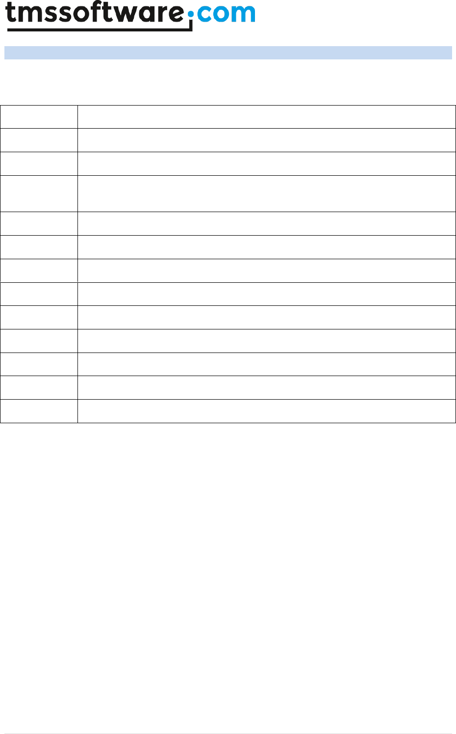
The TMS TAdvStringGrid component can save and load its data in many different formats explained
here:
internal
Saves and loads grid cell data and column widths in a proprietary format
CSV
Saves and loads grid cell data in comma separated file
DOC
Saves the cell data to a Word document through OLE automation
XLS
Saves and loads grid cell data to an Excel file through OLE automation or directly
without requiring Excel to be installed on the machine with TAdvGridExcelIO
XML
Saves and loads the grid cell data to XML file
MDB
Load the grid data from MDB file through OLE automation*
ASCII
Saves cell data to ASCII file
Fixed
Saves and loads the cell data to fixed length column text files
BIN
Saves and loads cell data and properties to a proprietary binary format
HTML
Saves the cell data to a HTML file
stream
Saves and loads cell data to a stream
Binary stream
Saves and loads cell data and properties to a stream
RTF
Saves the grid as rich text file
Properties that have effect on grid saving and loading are:
SaveFixedCells: Boolean
When true, the contents of fixed cells are also saved and loaded. Default value is true. This applies
to both fixed columns and fixed rows.
SaveFixedRows: Boolean
When true, the contents of fixed rows are also saved and loaded. Default value is true.
SaveFixedCols: Boolean
When true, the contents of fixed columns are also saved and loaded. Default value is true.
SaveHiddenCells: Boolean
When true, the contents of hidden cells are saved. Default value is false.
SaveWithHTML: Boolean
When false, all HTML tags are removed from cell contents if these have HTML tags. Default value is
true.

TMS SOFTWARE
TADVSTRINGGRID
DEVELOPERS GUIDE
10 | P a g e
SaveWithRTF: Boolean
When true, RTF information is saved along the cell value. When false, all text formatting is removed
before saving the cell value.
SaveVirtCells: Boolean
When true, the displayed value of a cell is save. When false, the real grid cell value is saved. As
explained further in this guide, a grid cell value can be dynamically altered for display using the
OnGetDisplText event. With this public property SaveVirtCells, it can be choosen which value will be
saved.
OnFileProgress: TGridProgressEvent(Sender:TObject;progress: smallint);
This event is triggered to return the percentage of completion during save and load operations.
Overview of methods
Files
procedure SaveToFile(FileName: String);
procedure LoadFromFile(FileName: String);
SaveToFile saves cell data and column widths to a proprietary file format. LoadFromFile loads cell
data and column widths from a proprietary file format.
Binary files
procedure SaveToBinFile(FileName: String);
procedure LoadFromBinFile(FileName: String);
SaveToBinFile saves cell data and cell properties to a proprietary file format. LoadFromBinFile loads
cell data and cell properties from a proprietary file format.
Streams
procedure SaveToStream(Stream: TStream);
procedure LoadFromStream(Stream: TStream);
SaveToStream saves cell data and column widths to a stream. LoadFromStream loads cell data and
column widths from a stream.
Example: copying grid information from grid 1 to grid 2 through a memorystream:
var
ms: TMemoryStream;
begin
ms := TMemoryStream.Create;
Grid1.SaveToStream(ms);
ms.Position := 0; // reset stream pointer to first position
Grid2.LoadFromStream(ms);
ms.Free;

TMS SOFTWARE
TADVSTRINGGRID
DEVELOPERS GUIDE
11 | P a g e
end;
Binary streams
procedure SaveToBinStream(Stream: TStream);
procedure LoadFromBinStream(Stream: TStream);
procedure SaveRectToBinStream(Rect: TRect; Stream: TStream);
procedure LoadAtPointFromBinStream(Point: TPoint; Stream: TStream);
SaveToStream saves cell data and cell properties to a binary stream. LoadFromStream loads cell
data and cell properties from a binary stream. SaveRectToBinStream saves only cells with in
rectangle coordinates specified through the Rect parameter. Finally, the method
LoadAtPointFromBinStream loads cell data and cell properties from the binary stream starting from
the specified cell coordinate as first top left cell of the data loaded.
CSV files
procedure SaveToCSV(FileName: String);
procedure LoadFromCSV(FileName: String; MaxRows: integer= -1; IgnoreRows:
integer=-1);
procedure LoadFromStream(AStream: TStream; MaxRows: integer= -1;
IgnoreRows: integer=-1);
procedure AppendToCSV(FileName: String);
procedure InsertFromCSV(FileName: String; MaxRows: integer= -1; IgnoreRows:
integer=-1);
SaveToCSV saves cell data to a CSV file. LoadFromCSV loads cell data from a CSV file. The method
LoadFromCSVStream loads cell data from a stream as if the stream contains data structured as in a
CSV file. AppendToCSV appends cell data to an existing CSV file. InsertFromCSV inserts cell data
loaded from the CSV file as extra rows in the grid. Note that LoadFromCSV & InsertFromCSV have a
default parameter MaxRows. Without this parameter, all rows in the CSV file are loaded in the grid.
When the 2nd parameter MaxRows is used, this sets the maximum number of rows that will be
loaded. Finally, the last parameter IgnoreRows can be used to define the number of first rows in the
CSV file that can be skipped or ignored for import.
Several properties affect the CSV methods:
Grid.Delimiter: Char;
This specifies the delimiter to use for saving and loading with CSV files. By default the Delimiter is
set to #0. With Delimiter equal to #0, an automatic delimiter guess is used to load data from the
CSV file. To save to a CSV file, the ; character is used as separator when delimiter is #0. Setting the
delimiter to another character than #0 forces the CSV functions to operate with this delimiter only.
Grid.QuoteEmptyCells: Boolean;
When true, an empty cell in the CSV file is saved as “”, otherwise no characters are written to the
CSV file.
Grid.AlwaysQuotes: Boolean;
When true, every cell value is saved with prefix and suffix quotes, otherwise quotes are only used if
the cell data contains the delimiter character. Note that when the cell data contains quotes, the
data is written with doubled quotes to the file.

TMS SOFTWARE
TADVSTRINGGRID
DEVELOPERS GUIDE
12 | P a g e
Grid.CSVTrimspaces: Boolean;
When true as default, spaces before or after values in the CSV file are trimmed. Otherwise, the
spaces are kept as-is in the grid during import.
Fixed files
procedure SaveToFixed(FileName: string;positions: TIntList);
procedure LoadFromFixed(FileName:string;positions:TIntList; DoTrim: boolean
= true; MaxRows: integer = -1);
SaveToFixed saves cell data and column widths to a text file with fixed column lengths.
LoadFromFixed loads cell data and column widths from a text file with fixed column lengths. The
TIntList parameter is a list of integer values specifying the character offsets where a column starts
in the file. TintList is defined in the AdvObj unit, so to use this, include AdvObj in the uses clause of
your form .PAS file.
Example: loading from a fixed file
var
Il: TintList;
begin
Il := TintList.Create(0,0);
Il.Add(0); // first column offset
Il.Add(15); // second column offset
Il.Add(30); // third column offset
Il.Add(40); // fourth column offset
Grid.LoadFromFixedFile(‘myfile.txt’,il);
Il.Free;
end;
Note that LoadFromFixed has two additional default parameters: DoTrim & MaxRows. When DoTrim
is false, spaces before or after words are not removed. Without MaxRows, all rows in the text file
are loaded in the grid. When the last parameter MaxRows is used, this sets the maximum number of
rows that will be loaded.
HTML files
procedure SaveToHTML(FileName: String);
procedure AppendToHTML(FileName: String);
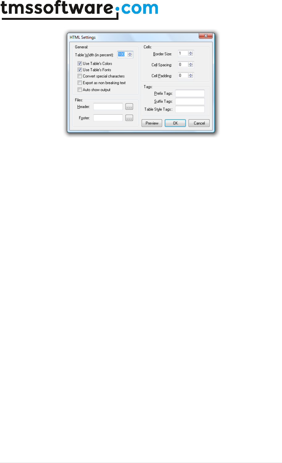
SavetoHTMLFile saves the cell data to a HTML file and uses the grid.HTMLSettings to control the
method for saving. The cell data is saved to a HTML table. AppendToHTML appends the cell data to
an existing HTML file.
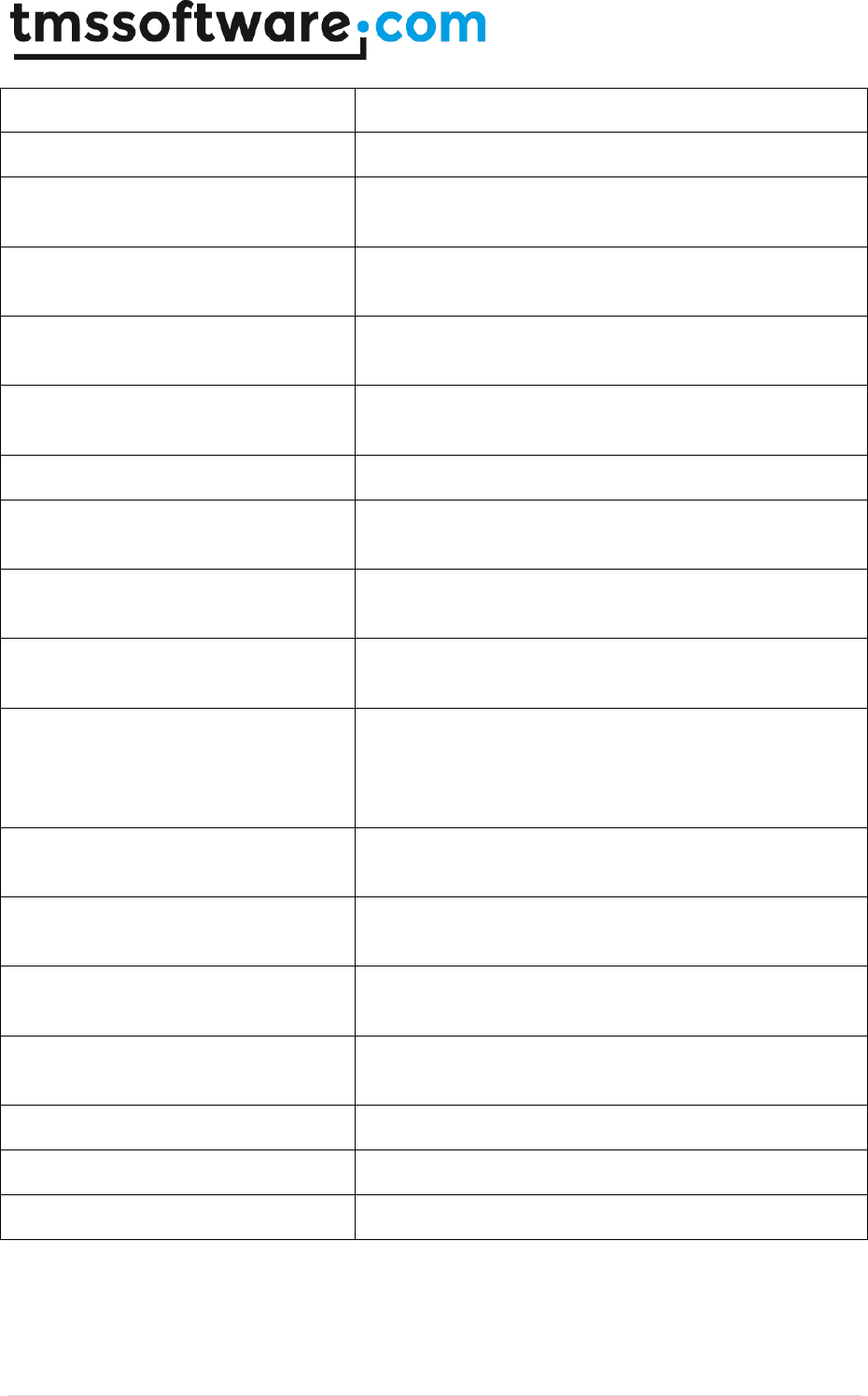
With HTMLSettings, following settings can be done:
property BorderSize: Integer
Sets the border size for the HTML table
TMS SOFTWARE
TADVSTRINGGRID
DEVELOPERS GUIDE
13 | P a g e
property CellSpacing: Integer
Sets the cellspacing value for the HTML table
property CellPadding: Integer
Sets the cellpadding value for the HTML table
property SaveColor: Boolean
If true, grid color information is written to the HTML table
cells
property SaveFonts: Boolean
If true, grid font information is written to the HTML table
cells
property FooterFile: string
File that is to be appended after the HTML table in the
final HTML file
property HeaderFile: string
File that is inserted before the HTML table in the final
HTML file
property TableStyle: string
Sets additional HTML table style properties
property PrefixTag: string
Sets any text that should be written in the HTML file
before the table is output
property SuffixTag: string
Sets any text that should be written in the HTML file after
the table is output
property ConvertSpecialChars: Boolean
When true, special characters as >, <, & … are exported
as respectively > , < , & …
property ImageBaseName: string;
Stes the identifier prefix for images in HTML. It is
important that, when exporting multiple different grids to
a single HTML file, that each grid uses a unique
ImageBaseName.
Property ImageFolder: string;
Specifies the folder where images that belong in the HTML
export are stored
property NonBreakingText: Boolean
When true, all text is exported as non breaking text, ie.
all spaces are exported as
property Summary: string
Sets the HTML TABLE summary attribute for the exported
grid
property AutoPreview: Boolean
When true, the exported HTML file is automatically
previewed in an instance of the default browser
property ExportImages: Boolean
When true, images in the grid are also exported
property Width: Integer
Sets the width percentage of the HTML table
property XHTML: Boolean
When true, the output is xHTML compatible
TMS SOFTWARE
TADVSTRINGGRID
DEVELOPERS GUIDE
14 | P a g e
XML files
procedure SaveToXML(FileName: String; ListDescr,
RecordDescr:string;FieldDescr:TStrings);
Saves the cell data in an XML file with following structure:
<ListDescr>
<RecordDescr>
<FieldDescr[0]>Cell 0,0</FieldDescr[0]>
<FieldDescr[1]>Cell 1,0</FieldDescr[1]>
<FieldDescr[2]>Cell 2,0</FieldDescr[2]>
</RecordDescr>
<RecordDescr>
<FieldDescr[0]>Cell 0,1</FieldDescr[0]>
<FieldDescr[1]>Cell 1,1</FieldDescr[1]>
<FieldDescr[2]>Cell 2,1</FieldDescr[2]>
</RecordDescr>
</ListDescr>
procedure LoadFromXML(FileName: String; LevelToRow: Boolean = false);
Loads the grid data from an XML file. When the optional LevelToRow parameter is true, a new row
is used for every new XML node level, otherwise, XML nodes are added in additional columns.
Example:
This code snippet save a grid with 5 columns to XML and uses the text in the column headers as field
descriptors in the XML file:
var
sl: TStringList;
i: integer;
begin
sl := TStringList.Create;
for i := 0 to grid.ColCount – 1 do
sl.Add(grid.Cells[I,0]);
grid.SaveToXML(‘mygrid.xml’, ‘xmllist’, ‘xmlrecord’, sl);

TMS SOFTWARE
TADVSTRINGGRID
DEVELOPERS GUIDE
15 | P a g e
sl.Free;
end;
A public property that is used for exporting to XML file is XMLEncoding that defaults to 'ISO-8859-1'.
This property can be used to set a different XML encoding attribute that is saved to the XML file.
JSON files
procedure SaveToJSON(FileName: String;
RecordDescr:string;FieldDescr:TStrings);
Saves the cell data in an JSON file with following structure:
{"grid":[{"row":[{"col1":"1:1"},{"col2":"2:1"},{"col3":"3:1"},{"col4":"4:1"}]}
,{"row":[{"col1":"1:2"},{"col2":"2:2"},{"col3":"3:2"},{"col4":"4:2"}]}
,{"row":[{"col1":"1:3"},{"col2":"2:3"},{"col3":"3:3"},{"col4":"4:3"}]}
,{"row":[{"col1":"1:4"},{"col2":"2:4"},{"col3":"3:4"},{"col4":"4:4"}]}
,{"row":[{"col1":"1:5"},{"col2":"2:5"},{"col3":"3:5"},{"col4":"4:5"}]}
,{"row":[{"col1":"1:6"},{"col2":"2:6"},{"col3":"3:6"},{"col4":"4:6"}]}
,{"row":[{"col1":"1:7"},{"col2":"2:7"},{"col3":"3:7"},{"col4":"4:7"}]}
,{"row":[{"col1":"1:8"},{"col2":"2:8"},{"col3":"3:8"},{"col4":"4:8"}]}
,{"row":[{"col1":"1:9"},{"col2":"2:9"},{"col3":"3:9"},{"col4":"4:9"}]}
]}
Where “row” is the record descriptor and col1, col2, col3, col4 are the field descriptors for column
1,2,3 and 4.
This is the sample code snippet that would product this JSON file:
var
SL: TStringList;
i: integer;
begin
AdvStringGrid1.LinearFill(false);
AdvStringGrid1.SaveFixedCells := false;
SL := TStringList.Create;
try
for i := AdvStringGrid1.FixedCols to AdvStringGrid1.ColCount - 1 do
SL.Add('col'+inttostr(i));
AdvStringGrid1.SaveToJSON('myfile.json','row',SL);
finally
SL.Free;
end;
end;

TMS SOFTWARE
TADVSTRINGGRID
DEVELOPERS GUIDE
16 | P a g e
ASCII files
procedure SaveToASCII(FileName: String);
SaveToASCII saves the cell data to an ASCII file, automatically using column widths to fit the widest
data in cells available. A difference with fixed column width files is also that SaveToAscii will
correctly split cell contents across multiple lines when MultiLineCells is set True.
procedure AppendToASCII(FileName: String);
This procedure is identical to SaveToASCII, except that it appends the data to an existing file. Note
that TAdvStringGrid also comes with a component TAdvGridImportDialog. This dialog can be used to
allow the user to set the fixed column widths at runtime. From a preview dialog, this is done by
clicking to set the fixed column widths. The use of this dialog is explained further in this guide.
Access files
procedure LoadFromMDB(FileName:string; Table: string);
procedure LoadFromMDBSQL(FileName:string; SQL: string);
LoadFromMDB loads data from a table in an Access MDB file. All rows and columns are loaded in the
grid. LoadFromMDB relies on ADO and as such requires that ADO is installed on the machine.
LoadFromMDBSQL loads data from an Access table with a SQL SELECT command. Note that
LoadFromMDB is equivalent to LoadFromMDBSQL with the SELECT statement:
SELECT * from TABLE
Microsoft Word files
procedure SaveToDoc(FileName: string; CreateNewDocument: boolean = true);
This procedure saves the grid data as a table in a MS Word document. By default, this is in a new
document. When the parameter CreateNewDocument is true, a new document is explicitely
created, when false, the table will be saved in the default active Word document.
procedure AppendToDoc(FileName, Bookmark: string);
Call grid.AppendToDoc(FileName) to add the grid data to an existing MS Word document at the end
of a document. To insert the grid data at a specific bookmark present in the MS Word document,
call grid.SaveToDoc(FileName, BookmarkName);
Microsoft Excel files
TAdvStringGrid supports importing & exporting Microsoft Excel files in two ways. With the methods
grid.LoadFromXLS, grid.SaveToXLS, the grid imports & exports XLS files using OLE automation.
Secondly, a separate component TAdvGridExcelIO offers native import & export without requiring
that Excel is installed on the machine. It is highly recommended to use TAdvGridExcelIO as it is
significantly faster, has more features and does not require Microsoft Excel to be installed.

TMS SOFTWARE
TADVSTRINGGRID
DEVELOPERS GUIDE
17 | P a g e
Using SaveToXLS / LoadFromXLS
procedure SaveToXLS(Filename:string; CreateNewSheet: boolean = true);
procedure SaveToXLSSheet(Filename,Sheetname:string);
Using these methods, the grid contents are saved to a worksheet in the XLS file, either a default
worksheet when SaveToXLS(filename) is used, forced to a new worksheet with SaveToXLS(filename,
true) or saved to a specific named worksheet when calling SaveToXLSSheet(Filename, Sheetname);
procedure LoadFromXLS(Filename:string);
procedure LoadFromXLSSheet(Filename, SheetName:string);
LoadFromXLS loads data from the default worksheet in the grid. With LoadFromXLSSheet, data from
the named worksheet is loaded.
Using TAdvGridExcelIO
This is explained in a separate chapter: TAdvStringGrid import/export to XLS via TAdvGridExcelIO
RTF files
Via a separate component TAdvGridRTFIO, it is possible to save contents of the grid as RTF file. This
is a Microsoft Word compatible RTF file with a table that contains the grid data. Using
TAdvGridRTFIO is explained in the separate chapter: TAdvStringGrid export to RTF files via
TAdvGridRTFIO.
Advanced topics on exporting & importing
To apply transformations on cell data for loading and saving it is easy to create a descendent class
from TAdvStringGrid and override the SaveCell and LoadCell methods. In these overridden methods
a transformation such as encryption or decryption can be applied. The basic technique is:
TEncryptedGrid = class(TAdvStringGrid)
protected
function SaveCell(ACol,ARow: Integer):string; override;
procedure LoadCell(ACol,ARow: Integer; Value: string); override;
end;
function TEncryptedGrid.SaveCell(ACol,ARow: Integer): string;
begin
Result := Encrypt(GridCells[ACol,ARow]);
end;
procedure TEncryptedGrid.LoadCell(ACol,ARow: Integer; Value: string);
begin
GridCells[ACol,ARow] := Decrypt(Value);
end;
As such, when using methods like SaveToCSV, SaveToXLS, … the information will be exported in
encrypted format automatically.
TMS SOFTWARE
TADVSTRINGGRID
DEVELOPERS GUIDE
18 | P a g e
TAdvStringGrid PDF Export
The TMS Component Pack also contains a component for exporting the TAdvStringGrid content to
PDF file.
Drop a TAdvGridPDFIO component on the form and connect the TAdvStringGrid to this non-visual
component’s Grid property.
Then simply call:
AdvGridPDFIO.Save(FileName);
TAdvGridPDFIO comes with settings for header and footer as well as metadata. Header and footer
can as such be optionally generated for the PDF file independently from the TAdvStringGrid
content.
TAdvStringGrid sorting capabilities
TAdvStringGrid supports various ways to sort data inside the grid. Sorting can be triggered by a
mouse click on a column header or programmatically with various methods. The settings that
control the behaviour of sorting in the grid are grouped in the SortSettings property. In addition, the
OnGetFormat event is used to dynamically instruct the grid to the data type to use for the sort. By
default, sorting on a given column starts comparing cells for the sort for the given column but upon
finding equal cells, will use columns right from the main sort index column to do further comparing.
SortSettings
The settings that control the various sorting capabilities of TAdvStringGrid can be found under the
property SortSettings. This contains following subproperties:
AutoColumnMerge: Boolean;
When true, merged cells in multiple columns are taken
into account for sorting. Cell merging is explained in
detail later.
AutoFormat: Boolean;
When true, the grid tries to automatically guess the
format of the data in cells for the compare method
AutoSortForGrouping: Boolean
When true, the grid is automatically sorted first before
a grouping is performed. The sorting is performed on
the column for which the grouping will be applied.
BlankPos: TSortBlankPosition;
Sets the position empty cells get after sorting. This can
be either blFirst or blLast, specifying empty cells
should always come first or come last after sorting
Column: Integer;
Specifies the main sort index column
Direction: TSortDirection;
Sets the sort direction to either ascending or
descending
TMS SOFTWARE
TADVSTRINGGRID
DEVELOPERS GUIDE
19 | P a g e
DownGlyph: TBitmap;
Specifies the glyph to use for indicating a descending
sort. If no glyph is specified a triangle is drawn.
FixedCols: Boolean;
When true, fixed columns are affected by the sort,
otherwise, fixed columns remain in the original
sequence after the sort.
Full: Boolean;
When true, all columns are taken into account for
comparing from left to right, starting from the main
sort index column
HeaderColor: TColor;
When different from clNone, the fixed column header
cell can be painted in a different color for the column
that is sorted. HeaderColor sets the top gradient start
color.
HeaderColorTo: TColor;
Idem as HeaderColor but sets the top gradient end
color.
HeaderMirrorColor: TColor;
Idem as HeaderColor but sets the bottom gradient start
color.
HeaderMirrorColorTo: TColor;
Idem as HeaderColor but sets the bottom gradient end
color.
IgnoreBlanks: Boolean;
When true, empty cells are ignored during the sort and
can be positioned in the sort either at top or at bottom
IgnoreCase: Boolean;
When true, case sensitivity is automatically ignored
when performing the sort.
IndexColor: TColor;
Sets the color of the indexed sort indicators
IndexDownGlyph: TBitmap;
Specifies the glyph to use for indicating an descending
indexed sort. If no glyph is specified a triangle is
drawn.
IndexShow: Boolean;
When true, sorting on an arbitrary column sequence is
enabled and the indexes of this sequence displayed
IndexUpGlyph: TBitmap;
Specifies the glyph to use for indicating an ascending
indexed sort. If no glyph is specified a triangle is
drawn.
InitSortDirection: TSortDirection
Specifies the initial sort direction. The initial sort
direction is the direction of the sort upon the first
column header click on an unsorted column. After the
first sort, the sort direction toggles for every click.
NormalCellsOnly: Boolean;
When true, sorting is applied to normal, i.e. non fixed
cells only.
Row: Integer;
Sets the fixed row where the sort indicator is displayed
and from where a column header click triggers the

TMS SOFTWARE
TADVSTRINGGRID
DEVELOPERS GUIDE
20 | P a g e
sort. Maximum value for row is the number of fixed
rows in the grid.
Show: Boolean;
When true, the sort indicator is shown in the column
header cell
SingleColumn: Boolean;
When true, only a single column is sorted. All other
columns are not affected
SortOnVirtualCells: Boolean;
When true, the sorting is performed on cell text set by
OnGetDisplText instead of the internal grid data. This
is the default setting as the sort will correspond to
what can be visibly seen in the grid.
UndoSort: Boolean;
When true, a sort undo is possible. This means that
upon clicking on the header, the sorting toggles
between ascending, descending and back to unsorted.
The unsorted sequence is considered as the sequence
before the first sort was performed.
UpGlyph: TBitmap;
Specifies the glyph to use for indicating an ascending
sort. If no glyph is specified a triangle is drawn.
Specifying the dataformat with OnGetFormat
The OnGetFormat event is used to instruct the grid which compare method it should use during the
sorts for each column in the grid. By default, the grid is using an automatic format guess. This
means that the grid checks if the data in a cell is numeric, a floating point, a date, a date + time or
just alphabetic data and applies the appropriate compare methods accordingly. Although this auto
format guess can be convenient, for sorting large and complex amounts of data it is not
recommended. When mixed numeric and alphabetic data is available in a column, this auto format
guess is easily confused and the extra checks for guessing the format take extra time. With the
OnGetFormat event, the compare methods to use can be specified for each column. The event is
declared as:
TGridFormatEvent = procedure(Sender : TObject; ACol: Integer;
var AStyle:TSortStyle; var aPrefix,aSuffix:string) of object;
The TSortStyle can be:
ssAlphabetic
Use alphabetic compare
ssAlphaCase
Use case sensitive alphabetic compare
ssAlphaNoCase
Use case insensitive alphabetic compare
ssAlphaNumeric
Use combined alphabetic & numeric compare, ie. 1,5,100,A,M,K,a,r,z…
ssAlphaNumericNoCase
Use combined alphabetic & numeric compare without case sensitivity
ssAnsiAlphaCase
Use Ansi case sensitive alphabetic compare
TMS SOFTWARE
TADVSTRINGGRID
DEVELOPERS GUIDE
21 | P a g e
ssAnsiAlphaNoCase
Use Ansi case insensitive alphabetic compare
ssAutomatic
Let grid automatically determine the format of data for comparing
ssCheckBox
Use checkbox value compare
ssCustom
Use custom compare method (explained later)
ssDate
Use date compare
ssDateTime
Use both date & time compare
ssFinancial
Use floating point with optionally thousand separator compare
ssHTML
Use HTML compare, ignoring HTML tags in text for compare
ssImages
Use image index compare
ssNumeric
Use numeric compare
ssRaw
Use raw compare method (explained later)
ssShortDateEU
Use fixed date format dd/mm/yyyy compare
ssShortDateUS
Use fixed date format mm/dd/yyyy compare
ssTime
Use time compare
ssUnicode
Use Unicode string compare (pre Delphi 2009 only)
The last parameters aPrefix and aSuffix, are use to instruct the grid to ignore fixed prefix or suffix
text for cell data for the compare. As such, the sort format can be ssNumeric while a cell contains
numeric data with some characters before or after the number as in the following example:
1234 USD
5678 USD
Setting aSuffix to ‘ USD’ will let the compare ignore this suffix and perform a compare only on
1234
5678
Example: setting sort formats with OnGetFormat
Supposing a grid contains following data:
Abc
123
1/1/1980
$ 1.025,36
Def
456
12/10/1990
$ 958,14
Ghi
789
15/4/200
$ 2.175,00

TMS SOFTWARE
TADVSTRINGGRID
DEVELOPERS GUIDE
22 | P a g e
The OnGetFormat event is used to instruct the grid to use an alphabetic compare for the first
column, a numeric compare for the second column, a date compare (based on regional settings for
date format) for the third column and finally the fourth column to ignore the ’$ ‘ prefix and sort on
floating point data with optional thousand separator.
procedure TForm1.AdvStringGrid1GetFormat(Sender: TObject; ACol: Integer;
var AStyle: TSortStyle; var aPrefix, aSuffix: String);
begin
case ACol of
0: AStyle := ssAlphabetic;
1: AStyle := ssNumeric;
2: AStyle := ssDate;
3: begin
AStyle := ssFinancial;
APrefix := '$ ';
end;
end;
end;
Sort events
Two events are triggered when sorting is started by a click on a column header. Before the sort
starts, the OnCanSort event is triggered. By setting the parameter DoSort to false, a sort after a
column header click can be disabled. After the sort is completed, the OnClickSort event is
triggered, informing the completion of the sort for a given column. As OnCanSort is triggered before
the sort and OnClickSort after the sort, these two events are often used to specify an hourglass
cursor during lengthy sort processes:
procedure TForm1.AdvStringGrid1CanSort(Sender: TObject; ACol: Integer;
var DoSort: Boolean);
begin
Cursor := crHourGlass;
end;
procedure TForm1.AdvStringGrid1ClickSort(Sender: TObject; ACol: Integer);
begin
Cursor := crDefault;
end;
Custom sorts
Two events, OnCustomCompare and OnRawCompare are used to allow implementing custom
compare routines when the sort format style is specified as ssCustom or ssRaw. The
OnCustomCompare is triggered for each compare of two string values and expects the result to be
set through the Res parameter with values :
-1
Str1 < Str2
0
Str1 = Str2
1
Str1 > Str2

TMS SOFTWARE
TADVSTRINGGRID
DEVELOPERS GUIDE
23 | P a g e
The OnRawCompare event is defined as:
TRawCompareEvent = procedure(Sender:TObject; ACol,Row1,Row2: Integer;
var Res: Integer) of object;
It allows comparing grid cells [ACol,ARow1] and [ACol,ARow2] in any custom way and returning the
result in the Res parameter in the same way as for the OnCustomCompare event.
Example: comparing cell objects instead of cell text with OnRawCompare
As for each cell, an object can be assigned with the grid.Objects[Col,Row]: TObject property, it is
easy to associate a number with each cell through:
Grid.Cells[Col,Row] := ‘I am text’; // cell text
Grid.Objects[Col,Row] := TObject(1234); // associated number
Through the OnRawCompare event, a sort can be done on this associated number instead of the cell
text.
procedure TForm1.AdvStringGrid1RawCompare(Sender: TObject; ACol, Row1,
Row2: Integer; var Res: Integer);
var
c1,c2: Integer;
Begin
c1 := integer(AdvStringGrid1.Objects[ACol,Row1]);
c2 := integer(AdvStringGrid1.Objects[ACol,Row2]);
if (c1 = c2) then
Res := 0
else
if (c1 > c2) then
Res := 1
else
Res := -1;
end;
Sort independent cell access
TAdvStringGrid has the capability to access cell contents with a row index irrespective of sort order.
In order to use this functionality, three methods are available:
procedure InitSortXRef;
function SortedRowIndex(Row: Integer): Integer;
function UnsortedRowIndex(Row: Integer): Integer;
The InitSortXRef method initializes the current row indexing as reference. This means that if value
“ABC” is on row 10, after sorting the grid in whatever sort sequence, you can access the cell with
contents “ABC” on reference row 10. After calling grid.InitSortXRef, sorting can be applied
programmatically or from user interface and conversion between displayed row index an reference
row index can be done by the methods: SortedRowIndex and UnsortedRowIndex.
SortedRowIndex converts the reference row index to the displayed row index.
UnsortedRowIndex converts the displayed row index to the reference row index.

TMS SOFTWARE
TADVSTRINGGRID
DEVELOPERS GUIDE
24 | P a g e
In addition, the following property also provide direct access to the reference row indexed cells:
Grid.UnSortedCells[Col,Row]: string;
Example: using SortedRowIndex and UnsortedRowIndex
// loading, initializing & sorting
Grid.SaveFixedCells := False;
Grid.LoadFromCSV(‘sample.csv’);
Grid.InitSortXRef;
Grid.SortSettings.Column := 1;
Grid.QSort;
// shows the contents of cell 1,1 before sorting
ShowMessage(Grid.UnsortedCells[1,1]);
// shows the display index for the reference row indexed cell 1,1
ShowMessage(IntToStr(Grid.SortedRowIndex(1));
Programmatic sorting control
Programmatically invoking a sort is possible with the method grid.QSort. First set the properties for
the sort through the property SortSettings and call grid.QSort. Calling grid.QSort performs the sort
on column set by grid.SortSettings.Column for all normal rows in the grid. Note there is a method
grid.SortSettings.ToggleDirection that makes it easy to automatically change the sort direction
before calling grid.QSort. In addition TAdvStringGrid also supports grouped sorting. Grouped sorting
will sort only rows that belong to the same group. It is invoked by first setting the column in
SortSettings.Column and calling grid.QSortGroup. More information on grouping can be found in the
paragraph for grouping specifically. Finally, it is also possible to programmatically undo a sort. This
is done with the method grid.QUnSort.
Programmatic control of custom sort column sequences
With TAdvStringGrid, it is possible to apply programmatic sorts in any column order. This is
achieved through the property grid.SortIndexes (which is a list of column indexes to be sorted) and
the method grid.QSortIndexed. SortIndexes is a list of column indexes. Column indexes can be
added with methods: grid.SortIndexes.Add(ColIndex: Integer) or
grid.SortIndexes.AddIndex(ColIndex: Integer; Ascending: Boolean); It is important that when
applying a new column sort order, to clear the previous list of indexes (if assigned) with
grid.SortIndexes.Clear;
Example: using QSortIndexed
Grid.SortIndexes.Clear;
// first column to sort is column 5 in ascending order
Grid.SortIndexes.AddIndex(5,true);
// second column to sort is column 2 in descending order
Grid.SortIndexes.AddIndex(2,false);
// third column to sort is column 4 in ascending order
Grid.SortIndexes.Add(4,true);
Grid.QSortIndexed;
Note: when grouping is enabled in the grid, use the methods QSortGroup and QSortGroupIndexed
which are further explained under grouping.

TMS SOFTWARE
TADVSTRINGGRID
DEVELOPERS GUIDE
25 | P a g e
Ignoring columns during sorting
By default, when grid.SortSettings.Full = true, all columns are possibly taken in account to perform
the sort, ie. when two values in a column are equal, the values in the next column are compared to
determine the order. It is possible to define one or more columns that should be ignored for
comparing during a sort. This is simply done by setting column indexes in the list
grid.IgnoreColumns.
Example:
grid.IgnoreColumns.Clear; // clear any previous set ignored columns
grid.IgnoreColumns.Add(2); // ignore column 2 during sort
grid.IgnoreColumns.Add(5); // ignore column 5 during sort
Persisting sort settings
Often it is desirable to persist the sorting a user has applied during execution of the application to
be able restore this last sort setting when the application restarts. TAdvStringGrid provides a
convenient way to handle this. The TSortSettings class features for this the methods:
TSortSettings.SaveToString: string;
TSortSettings.LoadFromString(const Value: string);
This way, when the application closes, the result of grid.SortSettings.SaveToString can stored in the
registry, an INI file, XML file or other storage and when the application starts, the last sort sequence
is restored by loading this value and applying it with:
var
s: string;
begin
s := IniFile.ReadString(‘GRID’,’SORT’,’’);
Grid.SortSettings.LoadFromString(s);
end;

TMS SOFTWARE
TADVSTRINGGRID
DEVELOPERS GUIDE
26 | P a g e
TAdvStringGrid inplace editing
TAdvStringGrid not only offers a huge range of built-in inplace editor types but can be extended to
use any TWinControl based component as inplace editor.
By default, when setting goEditing = true in grid.Options, the editing is enabled and the default
inplace editor is used (Note that the event OnCanEditCell can override this setting). In code,
editing can be enabled with:
Delphi:
advstringgrid1.Options := advstringgrid1.Options + [goEditing];
C++
advstringgrid1->Options << goEditing;
The normally used editor is set by grid.DefaultEditor and is by default a normal TEdit like inplace
edit with no special features. Additional inplace editors are specified through the OnGetEditorType
event. If goEditing is set true, all non fixed cells in the grid can be edited. To set some cells as
read-only in this case, the OnCanEditCell event is used. The OnCanEditCell event is triggered before
editing should start and editing can be stopped by setting the CanEdit parameter to false.
Example: setting a column to read-only
This event handler sets column 2 and 4 as read-only:
procedure TForm1.AdvStringGrid1CanEditCell(Sender: TObject; ARow,
ACol: Integer; var CanEdit: Boolean);
begin
CanEdit := not (ACol in [2,4]);
end;
Alternatively, a cell can also be set as readonly with properties. To do this, following code can be
used:
Delphi:
advstringgrid1.ReadOnly[col,row] := true;
C++
advstringgrid1->ReadOnly[col][row] = true;
Example: using the OnGetEditorType event
This event specifies which inplace editor to use for columns 1-4.
procedure TForm1.AdvStringGrid1GetEditorType(Sender: TObject; ACol,
ARow: Integer; var AEditor: TEditorType);
begin
case ACol of
1: AEditor := edNumeric;
2: AEditor := edComboEdit;
3: AEditor := edSpinEdit;
TMS SOFTWARE
TADVSTRINGGRID
DEVELOPERS GUIDE
27 | P a g e
4: AEditor := edRichEdit;
end;
end;
TEditorType is defined as :
TEditorType = (edNormal, edSpinEdit, edComboEdit, edComboList, edEditBtn, edMaskEditBtn,
edCheckBox, edDateEdit, edDateTimeEdit, edDateEditUpDown, edTimeEdit,edButton,
edDataCheckBox, edNumeric, edPositiveNumeric, edFloat, edCapital, edMixedCase, edPassword,
edUnitEditBtn, edLowerCase, edUpperCase, edFloatSpinEdit, edTimeSpinEdit, edDateSpinEdit,
edNumericEditBtn, edFloatEditBtn, edCustom, edRichEdit, edUniEdit, edUniEditBtn,
edUniComboEdit, edUniComboList, edUniMemo,edValidChars,edCalculatorDropDown,
edTrackBarDropDown, edColorPickerDropDown, edImagePickerDropDown, edMemoDropDown,
edDetailDropDown, edGridDropDown, edTimePickerDropDown, edControlDropDown,
edNumericUnitEditBtn, edFloatUnitEditBtn);
With:
edButton
Button
edCapital
Edit with all capitalized text only
edCheckBox
Checkbox
edComboEdit
Editable combobox
edComboList
Non-editable combobox
edCustom
Custom edit control (see advanced topics for editing)
edDataCheckBox
Checkbox with check value dependent on cell text
edDateEdit
Datepicker
edDateEditUpDown
Date edit with up/down buttons
edDateSpinEdit
Date spin edit control
edDateTimeEdit
Date + time edit
edEditBtn
Edit control with button attached
edMaskEditBtn
Edit control with mask and button attached
edFloat
Edit allowing floating point data only
edFloatEditBtn
Floating point only edit control with button attached
edFloatSpinEdit
Floating point spin edit control
edLowerCase
Edit with all lowercase entry
edMixedCase
Edit with automatic first capital letter
edNormal
Normal inplace edit
TMS SOFTWARE
TADVSTRINGGRID
DEVELOPERS GUIDE
28 | P a g e
edNumeric
Edit allowing signed numeric data only
edNumericEditBtn
Numeric only edit control with button attached
edPassword
Edit in password style
edPositiveNumeric
Edit allowing unsigned numeric data only
edRichEdit
Rich text editor
edSpinEdit
Spin edit control
edTimeEdit
Time edit
edTimeSpinEdit
Time spin edit control
edUniComboEdit
Unicode editable combobox
edUniComboList
Unicode non editable combobox
edUniEdit
Unicode edit
edUniEditBtn
Unicode edit with button attached
edUniMemo
Unicode multiline edit
edUnitEditBtn
Edit control with unit selection and button attached
edNumericUnitEditBtn
Edit control that only allows numeric input with unit selection and
button attached
edFloatUnitEditBtn
Edit control that only allows floating point input with unit selection and
button attached
edPositiveFloat
Edit allowing positive floating point data only
edUpperCase
Edit with all uppercase entry
edValidChars
Accept only keys that are part of the value set with property
grid.ValidChars:string or also grid.ValidCharSet: TCharSet
edColorPickerDropDown
Color picker with 3 color selection methods: dropdown list of colors,
colorcube or color spectrum
edImagePickerDropDown
Image picker inplace edit control
edTimePickerDropDown
Inplace editor with watch in dropdown to select a time value
edTrackbarDropDown
Numeric only edit control with dropdown trackbar to select an integer
value
edDetailDropDown
Combobox style inplace editor where each item in the dropdown can
have an image and combination of a caption text and notes.
edGridDropDown
Edit control with grid as dropdown. Value is selected from the grid from
TMS SOFTWARE
TADVSTRINGGRID
DEVELOPERS GUIDE
29 | P a g e
the lookup column
edMemoDropDown
Edit control with dropdown memo
edCalculatorDropDown
Edit control with dropdown calculator
edAdvGridDropDown
Edit control with TAdvStringGrid as dropdown control
Normal editor
With a normal cell edit control, any characters can be entered. If grid.MaxEditLength > 0, then the
length of the characters to enter in a cell is limited to grid.MaxEditLength. With
grid.MaxEditLength, the string length of a cell is limited only by the length of a string type. The
maximum input length can be set different from different columns using the OnGetEditorProp event
that is triggered before editing starts, ie:
procedure TForm1.AdvStringGrid1GetEditorProp(Sender: TObject; ACol,
ARow: Integer; AEditor: TEditorType);
begin
case ACol of
1: AdvStringGrid1.MaxEditLength := 8;
2: AdvStringGrid1.MaxEditLength := 16;
else
AdvStringGrid1.MaxEditLength := 0;
end;
end;
For column 1, max. length of input is 8 characters, for column 2 it is 16 characters and other
columns do not have length limitations.
Masked editors
TAdvStringGrid inherits the behaviour to be able to work with masked inplace editors from
TStringGrid. The edit mask is set through the OnGetEditMask event triggered before editing starts.
This allows to set the edit mask for a given cell through the Value parameter.
Example: setting an edit mask for time editing in column 1
procedure TForm1.AdvStringGrid1GetEditMask(Sender: TObject; ACol,
ARow: Integer; var Value: String);
begin
if (ACol = 1) then
Value := '!90:00;1;_';
end;
Spin editors
The inplace spin edit control is exposed through the property grid.SpinEdit. This allows access to
additional spin edit properties that control its behaviour. The most useful properties are:
property EditorEnabled: Boolean;

TMS SOFTWARE
TADVSTRINGGRID
DEVELOPERS GUIDE
30 | P a g e
When false, the value is only editable by using the spin up & down buttons.
property Increment: LongInt;
Sets the increment step for integer values.
property IncrementFloat: Double;
Sets the increment step for floating point values.
property MaxLength;
Sets the maximum length (in characters) of the value that can be entered.
property MaxValue: LongInt;
property MinValue: LongInt;
property MinFloatValue: Double;
property MaxFloatValue: Double;
property MinDateValue: TDateTime;
property MaxDateValue: TDateTime;
Sets the minimum & maximum values that can be entered in the various modes.
Example: setting spin editors with two different ranges in two different columns
procedure TForm1.AdvStringGrid1GetEditorType(Sender: TObject; ACol,
ARow: Integer; var AEditor: TEditorType);
begin
case ACol of
1:begin
AEditor := edSpinEdit;
AdvStringGrid1.SpinEdit.MinValue := 1;
AdvStringGrid1.SpinEdit.MaxValue := 100;
AdvStringGrid1.SpinEdit.Increment := 2;
end;
2:begin
AEditor := edSpinEdit;
AdvStringGrid1.SpinEdit.MinValue := 1;
AdvStringGrid1.SpinEdit.MaxValue := 1000;
AdvStringGrid1.SpinEdit.Increment := 10;
end;
end;
end;
The spin edit controls trigger following events when the up/down buttons are clicked:
OnSpinClick: TSpinClickEvent;
OnFloatSpinClick: TFloatSpinClickEvent;
OnTimeSpinClick: TDateTimeSpinClickEvent;
OnDateSpinClick: TDateTimeSpinClickEvent;
The spin click events return the current value of the spin edit control and whether the up or down

TMS SOFTWARE
TADVSTRINGGRID
DEVELOPERS GUIDE
31 | P a g e
button was pressed.
TSpinClickEvent = procedure(Sender:TObject;ACol,ARow,
AValue: Integer; UpDown: Boolean) of object;
Note: by default, spin editor up/down buttons are visible when the inplace editor is active, ie. for
only one spin editor at a time. If it is desirable that spin editor buttons are continuously visible, this
can be enabled by setting : grid.ControlLook.SpinButtonsAlwaysVisible = true.
Combobox editors
Two types of comboboxes can be used: an editable combobox and not-editable combobox. While
the inplace combobox is exposed by grid.Combobox, additional methods are defined to control the
items displayed in the combobox dropdown list and selected item:
procedure ClearComboString;
Removes all items from the inplace combobox editor.
procedure AddComboString(const s: string);
Adds a single item to the inplace combobox editor.
procedure AddComboStringObject(const s: string; AObject: TObject);
Adds a string + object to the inplace combobox editor.
function RemoveComboString(const s: string): Boolean;
Removes a single string value from the inplace combobox editor.
function SetComboSelectionString(const s: string): Boolean;
Sets the selected item of the combobox by string value.
procedure SetComboSelection(idx: Integer);
Sets the selected item of the combobox by index.
function GetComboCount: Integer;
Returns the number of items in the combobox.
Through these methods, combobox items can be preset in different ways for different cells.
Example: presetting combobox items for different columns

TMS SOFTWARE
TADVSTRINGGRID
DEVELOPERS GUIDE
32 | P a g e
In this example, an editable combobox is set for column1 with values Berlin,Paris,London,New York
and in the second column a non-editable combobox with countries is used. The OnGetEditorProp
event is used to set the values of the combobox while the OnGetEditorType event is used to set the
editor type itself:
procedure TForm1.gridGetEditorProp(Sender: TObject; ACol,
ARow: Integer; AEditLink: TEditLink);
begin
case ACol of
1:begin
grid.ClearComboString;
grid.AddComboString('Berlin');
grid.AddComboString('Paris');
grid.AddComboString('London');
grid.AddComboString('New York');
end;
2:begin
grid.ClearComboString;
grid.AddComboString('Germany');
grid.AddComboString('France');
grid.AddComboString('United Kingdom');
grid.AddComboString('United States');
end;
end;
end;
procedure TForm1.gridGetEditorType(Sender: TObject; ACol,
ARow: Integer; var AEditor: TEditorType);
begin
case ACol of
1: AEditor := edComboEdit;
2: AEditor := edComboList;
end;
end;
As the grid also exposes the ComboBox inplace editor directly, an alternative approach to specify
the combobox items could be:
procedure TForm1.gridGetEditorProp(Sender: TObject; ACol,
ARow: Integer; AEditLink: TEditLink);
begin
case ACol of
1: grid.Combobox.Items.Assign(StringList1);
2: grid.Combobox.Items.Assign(StringList2);
end;
end;
procedure TForm1.gridGetEditorType(Sender: TObject; ACol,
ARow: Integer; var AEditor: TEditorType);
begin
case ACol of
1: AEditor := edComboEdit;

TMS SOFTWARE
TADVSTRINGGRID
DEVELOPERS GUIDE
33 | P a g e
2: AEditor := edComboList;
end;
end;
with StringList1 and StringList2 two string list objects that hold the items that should be displayed
in the combobox when editing respectively column 1 and column 2.
Note that when the combobox inplace editor is displayed for the first time, its selected item is set
to the item that matches the content of the cell being edited. If the cell is empty before being
edited for the first time, the combobox editor will start with the first item in the list for the type
edComboList and it will start with an empty value for the edComboEdit type. To override this
behavior and ensure that a specific value is set by default, use the OnGetEditText event that is
triggered to query the value used by the inplace editor.
In this sample code, the OnGetEditText is used in combination with the OnGetEditorType event to
ensure that when the combobox editor is started, it is preset to value “Paris” when the cell is
empty:
procedure TForm1.gridGetEditorProp(Sender: TObject; ACol,
ARow: Integer; AEditLink: TEditLink);
begin
grid.ClearComboString;
grid.AddComboString('Berlin');
grid.AddComboString('Paris');
grid.AddComboString('London');
grid.AddComboString('New York');
end;
end;
procedure TForm1.AdvStringGrid1GetEditorType(Sender: TObject; ACol,
ARow: Integer; var AEditor: TEditorType);
begin
AEditor := edComboEdit;
end;
procedure TForm1.AdvStringGrid1GetEditText(Sender: TObject; ACol, ARow:
Integer;
var Value: string);
begin
if Value = '' then
Value := 'Paris';
end;
Something similar can be achieved by using the grid methods SetComboSelection() or
SetComboSelectionString() to set the default selection of the combobox when inplace editing starts.
The code that can be used for this is:
procedure TForm1.gridGetEditorProp(Sender: TObject; ACol,
ARow: Integer; AEditLink: TEditLink);
begin
grid.ClearComboString;
grid.AddComboString('Berlin');

TMS SOFTWARE
TADVSTRINGGRID
DEVELOPERS GUIDE
34 | P a g e
grid.AddComboString('Paris');
grid.AddComboString('London');
grid.AddComboString('New York');
grid.SetComboSelectionString('Paris');
end;
end;
procedure TForm1.AdvStringGrid1GetEditorType(Sender: TObject; ACol,
ARow: Integer; var AEditor: TEditorType);
begin
AEditor := edComboEdit;
end;
The combobox triggers following events:
OnComboDropDown: TClickCellEvent;
Event triggered when the combobox dropdown is opened.
OnComboCloseUp: TClickCellEvent;
Event triggered when the combobox dropdown is closed.
OnComboChange: TComboChangeEvent;
Event triggered when combo selection changes and returning the new selection index and value.
OnComboObjectChange: TComboObjectChangeEvent;
Event triggered when combo selection changes and returning the new selection index, value and
associated object.
For a combobox, it is also possible to control the width of the dropdown list. The width can
automatically adapt to the width of the largest text in the list when
grid.Navigation.AutoComboDropSize is set to true or a custom width can be set through the
property: grid.ComboBox.DropWidth: integer;
Note that a combobox editor selects a string from the dropdown list and the selected value is stored
as a string in the grid cell. In some cases, it is desirable to get the index of the selected combobox
item. You can do this using:
index := grid.ComboBox.Items.IndexOf(grid.Cells[col,row]);
or alternatively, you can use
index := grid.ComboIndex[ACol,ARow];
Additional options with using comboboxes:
By default, comboboxes are only visible when the inplace editing has started. In some situations, it
might be helpful that the user can see through the dropdown image that a cell has a combobox.

TMS SOFTWARE
TADVSTRINGGRID
DEVELOPERS GUIDE
35 | P a g e
With TAdvStringGrid this is possible by using one property and one event handler. To enable the
display of comboboxes for any cell that has a combobox inplace editor whether the cell is in edit
mode or not, set grid.ControlLook.DropDownAlwaysVisible = true.
Fine control is also present to configure whether a combobox should immediately display its
dropdownlist when the editor is activated in a cell. This can be enabled with the property
grid.MouseActions.DirectComboDrop = true
If a cell with a combobox should automatically stop the editing after a combobox item is selected,
this can be enabled by setting grid.MouseActions.DirectComboClose = true. Otherwise, the
combobox inplace editor just remains visible after selecting an item and only disappears when a
new cell is selected.
Edit with button attached
edEditBtn, edNumericEditBtn, edFloatEditBtn are three types of inplace edit controls with a button
attached. This inplace edit control is exposed as grid.BtnEdit. Some additional properties available
this way to control the behaviour of this inplace editor are:
property EditorEnabled: Boolean;
When false, the editor value can only be programmatically changed from the OnEllipsClick event
that is triggered when the button in the edit control is clicked.
property Glyph: TBitmap;
Sets the glyph that can be used on the inplace editor button.
property ButtonCaption: string;
Sets the caption that can be used on the inplace editor button.
property ButtonWidth: integer;
Sets the width of the inplace editor button.
property RightAlign: Boolean;
When true, the inplace editor is right-aligned.
Example: different edit controls with button
In this example a left and right aligned edit with button with different button caption are used:
procedure TForm1.AdvStringGrid1GetEditorType(Sender: TObject; ACol,
ARow: Integer; var AEditor: TEditorType);
begin
case ACol of
1:begin
AEditor := edEditBtn;
grid.BtnEdit.RightAligned := True;

TMS SOFTWARE
TADVSTRINGGRID
DEVELOPERS GUIDE
36 | P a g e
grid.BtnEdit.EditorEnabled := False;
grid.BtnEdit.ButtonCaption := '+';
end;
2:begin
AEditor := edComboList;
grid.BtnEdit.RightAligned := False;
grid.BtnEdit.EditorEnabled := True;
grid.BtnEdit.ButtonCaption := '...';
end;
end;
end;
When the attached button is pressed, the OnEllipsClick event is triggered. To set a value from this
event, modify the parameter Value. This example uses an InputQuery call to set the value:
procedure TForm1.AdvStringGrid1EllipsClick(Sender: TObject; ACol, ARow:
Integer;
var S: string);
begin
InputQuery('Enter new value','Text',s);
end;
procedure TForm1.AdvStringGrid1GetEditorType(Sender: TObject; ACol,
ARow: Integer; var AEditor: TEditorType);
begin
AEditor := edEditBtn;
AdvStringGrid1.BtnEdit.EditorEnabled := false;
end;
Edit with unit selection and button attached
This special inplace editor to do a split edit of a physical value and a physical unit, is based on the
fact that such a value is always written as <value><unit> and that value contains numeric data only,
while the unit is a non numeric string or symbol. So, if a cell contains some string like : 100µA the
inplace unit editor will automatically allow split editing of value 100 and unit µA.
Only two things are required to get this working. First, you need to specify the inplace editor
through the OnGetEditorType event. Secondly, all properties of this inplace editor can be accessed
through the grid.BtnUnitEdit property. This BtnUnitEdit has a stringlist property that contains all
possible units.
Example: editing currents and currencies unit edit button
procedure TForm1.AdvStringGrid1GetEditorType(Sender: TObject; ACol,
ARow: Integer; var AEditor: TEditorType);
begin
if (aCol = 1) then
begin
grid.BtnUnitEdit.Units.Clear;
grid.BtnUnitEdit.Units.Add(‘µA’);
grid.BtnUnitEdit.Units.Add(‘mA’);
grid.BtnUnitEdit.Units.Add(‘A’);
AEditor := edUnitEditBtn;

TMS SOFTWARE
TADVSTRINGGRID
DEVELOPERS GUIDE
37 | P a g e
end;
if (aCol = 2) then
begin
grid.BtnUnitEdit.Units.Clear();
grid.BtnUnitEdit.Units.Add(‘$’);
grid.BtnUnitEdit.Units.Add(‘£’);
grid.BtnUnitEdit.Units.Add(‘EU’);
AEditor := edUnitEditBtn;
end;
end;
Date picker, time and date + time selection
edDateEdit, edDateEditUpDown and edTimeEdit invoke the standard Windows TDateTimePicker
control as inplace editor for date & time editing. This control is exposed as grid.DateTimePicker.
Through this control additional properties such as colors for the inplace datepicker can be
controlled. If a cell contains both date and time, using edDateTimeEdit allows to edit both the date
& time part in the cell with a special purpose editor that has a datepicker & time edit part.
Dropdown edit controls
For an even more rich user experience, TAdvStringGrid has a set of inplace editors for choosing
colors, images, time, edit numbers via a calculator, pick values from a combobox with detail notes
per item or pick values from a dropdown grid. This set of inplace editors shares a common
structure. The dropdown has a header and footer. Both header and footer can contain HTML
formatted informational text about the editor and can feature buttons as well. The settings for the
dropdown control header and footer are exposed via grid.ControlLook.DropDownHeader and
grid.ControlLook.DropDownFooter. Note that the dropdown header and footer are optional and can
be turned off by setting the respective Visible property to false. When the SizeGrid property is set
to true on the footer, the dropdown can be resized by dragging from the bottom-right corner. Using
the time picker, memo, trackbar and calculator dropdown is straightforward. Just like with all other
edit controls, use the OnGetEditorType event and set the editor to the correct editor type. For the
color picker and image picker, some more detailed interaction with the grid is available. By default,
the color picker will set the cell color to the color choosen and will trigger the event
OnColorSelected. If we have added a shape in the cell though, it is just the color of the shape that
the color picker will set. To demonstrate this, add following code:
procedure TForm2.AdvStringGrid1GetEditorType(Sender: TObject; ACol, ARow:
Integer; var AEditor: TEditorType);
begin
// set this editor just for cell 1,1
if (Acol = 1) and (ARow = 1) then
begin
AEditor := edColorPickerDropDown;
// select the colorcube as color selector
AdvStringGrid1.ColorPickerDropDown.ColorSelectionStyle := csColorCube;
end;
end;

TMS SOFTWARE
TADVSTRINGGRID
DEVELOPERS GUIDE
38 | P a g e
procedure TForm2.FormCreate(Sender: TObject);
begin
AdvStringGrid1.Options := AdvStringGrid1.Options + [goEditing];
AdvStringGrid1.AddShape(1,1,csRectangle, clWhite, clBlack, haBeforeText,
vaCenter);
end;
Similar to a color picker, an image picker dropdown can also be used to edit an imagelist image set
in a cell. By default, it will just trigger the OnImageSelected event when editing is done, but when
a cell has an imagelist image, it will also automatically update this image. Again, with very little
code this can be achieved. Drop an ImageList on the form and assign it to grid.GridImages and add
the code:
procedure TForm2.AdvStringGrid1GetEditorType(Sender: TObject; ACol, ARow:
Integer; var AEditor: TEditorType);
begin
if (Acol = 1) and (ARow = 1) then
begin
AEditor := edImagePickerDropDown;
// will automatically load all images from the imagelist in the image
picker
AdvStringGrid1.ImagePickerDropDown.AddImagesFromImageList;
// forces the imagepicker to display images in 2 columns
AdvStringGrid1.ImagePickerDropDown.Columns := 2;
end;
end;
procedure TForm2.FormCreate(Sender: TObject);
begin
AdvStringGrid1.Options := AdvStringGrid1.Options + [goEditing];
AdvStringGrid1.AddDataImage(1,1,0,haBeforeText, vaCenter);
end;
The detail picker dropdown can be considered as a combobox with an optional extra image per item
and additional notes text for each item. Its use is straightforward and becomes clear with following
code:
procedure TForm2.AdvStringGrid1GetEditorType(Sender: TObject; ACol,
ARow: Integer; var AEditor: TEditorType);
begin
AEditor := edDetailDropDown;
end;
procedure TForm2.FormCreate(Sender: TObject);
var
di: TDetailItem;
begin
AdvStringGrid1.DetailPickerDropDown.Images := ImageList1;
AdvStringGrid1.DetailPickerDropDown.ItemHeight := 40;
AdvStringGrid1.DetailPickerDropDown.Items.Clear;
di := AdvStringGrid1.DetailPickerDropDown.Items.Add;

TMS SOFTWARE
TADVSTRINGGRID
DEVELOPERS GUIDE
39 | P a g e
di.ImageIndex := 0;
di.Caption := 'Delphi';
di.Notes := 'Most productive IDE for Win32 development';
di := AdvStringGrid1.DetailPickerDropDown.Items.Add;
di.ImageIndex := 1;
di.Caption := 'Delphi Prism';
di.Notes := 'Take your Pascal skills to .NET';
di := AdvStringGrid1.DetailPickerDropDown.Items.Add;
di.ImageIndex := 2;
di.Caption := 'Delphi PHP';
di.Notes := 'RAD development for PHP';
end;
Finally it is possible to have a grid as inplace editor. The value that will be displayed in the cell is
the value from the column in the grid on the selected row that is set as lookup column with
property GridDropdown.LookupColumn. To set the properties for each column in the grid, the
grid.Columns collection is available. Via this column of type TDropDownColumn, it can be defined
whether a column contains text or an imagelist image. The items in the grid can be added via
grid.Items which is a collection of TDropDownItem objects. How everything falls into place is made
clear with the sample code to initialize a dropdown grid:
var
dc: TDropDownColumn;
di: TDropDownItem;
begin
AdvStringGrid1.GridDropDown.Images := ImageList1;
dc := AdvStringGrid1.GridDropDown.Columns.Add;
dc.Header := '';
dc.ColumnType := ctImage;
dc.Width := 30;
dc := AdvStringGrid1.GridDropDown.Columns.Add;
dc.Header := 'Brand';
dc.ColumnType := ctText;
dc := AdvStringGrid1.GridDropDown.Columns.Add;
dc.Header := 'Type';
dc.ColumnType := ctText;
di := AdvStringGrid1.GridDropDown.Items.Add;
di.ImageIndex := 0;
di.Text.Add('');
di.Text.Add('BMW');
di.Text.Add('7 series');
di := AdvStringGrid1.GridDropDown.Items.Add;
di.ImageIndex := 1;
di.Text.Add('');
di.Text.Add('Mercedes');
di.Text.Add('S class');
di := AdvStringGrid1.GridDropDown.Items.Add;
di.ImageIndex := 2;
TMS SOFTWARE
TADVSTRINGGRID
DEVELOPERS GUIDE
40 | P a g e
di.Text.Add('');
di.Text.Add('Porsche');
di.Text.Add('911');
di := AdvStringGrid1.GridDropDown.Items.Add;
di.ImageIndex := 3;
di.Text.Add('');
di.Text.Add('Audi');
di.Text.Add('A8');
AdvStringGrid1.GridDropDown.LookupColumn := 1;
end;
Edit controls with lookup and auto history
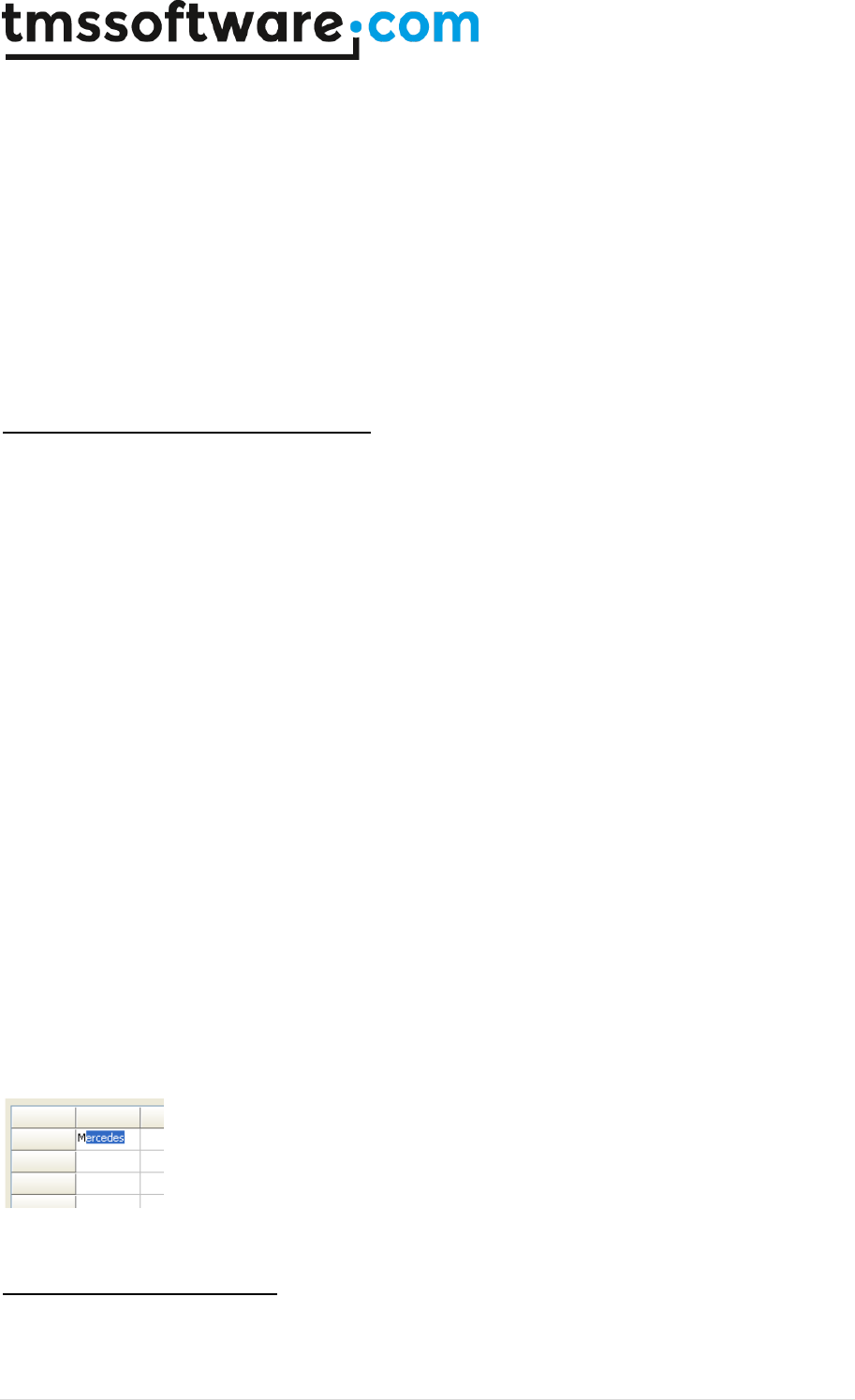
The normal inplace edit and comboboxes have the capability to do lookup on predefined values and
as such perform auto completion while typing. This feature is enabled by setting grid.Lookup to
True. The values to lookup for are set in the stringlist LookupItems. Auto completion can be case
sensitive or not and this is controlled by grid.LookupCaseSensitive. With LookupHistory set True, the
lookup item list automatically grows with items typed in the grid that are not yet in the
LookupItems list.
Example: Using lookup for inplace editors
This code initializes the built-in lookup with some predefined value:
begin
with AdvStringGrid1 do
begin
Options := Options + [goEditing];
LookupItems.Clear;
LookupItems.Add('BMW');
LookupItems.Add('Mercedes');
LookupItems.Add('Audi');
LookupItems.Add('Porsche');
LookupItems.Add('Ferrari');
Lookup := true;
end;
end;
Typing ‘M’ in a cell, results in automatic lookup to ‘Mercedes’
Direct access to inplace editors

TMS SOFTWARE
TADVSTRINGGRID
DEVELOPERS GUIDE
41 | P a g e
All inplace editors can also be directly accessed. This allows controlling additional inplace editor
properties that might not be exposed by the grid. The inplace editors are exposed as public
properties and listed here:
Grid.NormalEdit: normal basic inplace edit control
Grid.SpinEdit: inplace spin edit control
Grid.BtnEdit: inplace edit with embedded button
Grid.BtnUnitEdit: inplace edit with embedded unit selection and button
Grid.ComboBox: inplace combobox
Grid.DateTimePicker: inplace datetimepicker
Grid.InplaceRichEdit: inplace rich editor
Grid.UniEdit: inplace Unicode editor
Grid.UniEditBtn: inplace Unicode editor with button attached
Grid.UniCombo: inplace Unicode combobox
Grid.UniMemo: inplace Unicode memo
Grid.ColorPickerDropDown: color picker inplace editor
Grid.CalculatorDropDown: calculator inplace editor
Grid.GridDropDown: grid inplace editor
Grid.DetailDropDown: detail list inplace editor
Grid.MemoDropDown: dropdown memo control inplace editor
Grid.TrackBarDropDown: trackbar dropdown inplace editor
Grid.TimePickerDropDown: time picker inplace editor
Grid.ImagePickerDropDown: image picker inplace editor
Note: the NormalEdit inplace editor is only created upon need for the first inplace edit. This means
that the property Grid.NormalEdit it is not assigned as long as no inplace editing is started.
Advanced topic: rich text inplace editor
With a minimum effort, TAdvStringGrid allows rich text inplace editing. Only 2 event handlers and
one property open the way to rich text editing in every cell or selected cells of TAdvStringGrid.
Specifying the rich text editing
As with all editor types, rich text inplace editing for a cell is set with the OnGetEditorType event.
For the cells that need to be edited with an inplace rich text editor, just specify the edRichEdit as
inplace editor :
procedure TForm1.GridGetEditorType(Sender:TObject; ACol, ARow: Integer; var
AEditor: TEditorType);
begin
AEditor := edRichEdit
end;
Rich Text formatting in inplace rich text editor
TAdvStringGrid exposes its rich text inplace editor through the property Grid.InplaceRichEdit.
Through this property the selection attributes of the inplace editor can be set just as if it was a
normal standalone richedit control. The button that sets the font bold style therefore is
implemented in the following way:
procedure TForm1.BoldBtnClick(Sender: TObject);
begin

TMS SOFTWARE
TADVSTRINGGRID
DEVELOPERS GUIDE
42 | P a g e
if Grid.InplaceRichEdit.Visible then
if fsBold in Grid.InplaceRichEdit.SelAttributes.Style then
Grid.InplaceRichEdit.SelAttributes.Style :=
Grid.InplaceRichEdit.SelAttributes.Style - [fsBold]
else
Grid.InplaceRichEdit.SelAttributes.Style :=
Grid.InplaceRichEdit.SelAttributes.Style + [fsBold];
end;
Other settings are done in a similar way.
Updating toolbar settings from the inplace rich text editor
An event is used to let toolbar settings for selected characters in the rich text editor reflect the
current selected style such as fontstyle, fontname etc.. This event OnRichEditSelectionChange is
triggered whenever the user changes the selection in the inplace rich editor. In this event, the
toolbar button style can then set to reflect the setting of the selected text.
For example, the BoldBtn style is set in this event handler in the following way:
procedure TForm1.GridInplaceRichEditSelectionChange(Sender:TObject);
begin
BoldBtn.Down := fsBold in Grid.InplaceRichEdit.SelAttributes.Style;
end;
Special focus considerations
Normally, whenever another control gains focus, the TAdvStringGrid inplace editor is hidden and the
inplace editor text is set in the grid's cell. However, with rich text inplace editing this behaviour is
not wanted. If the inplace editor would be hidden, the selection would disappear and no longer
available to apply changes such as font changes. Therefore, for a rich text inplace editor the editor
remains visible even when another control on the form gains focus. Some controls, such as a font
selection combobox can then be used to set the selected font name. However, for other control
that perform something like a grid print or preview, the rich text inplace editor should be hidden
and the cell contents should be updated before doing the print. This can be done with the
grid.HideInplaceEdit method.
Example: changing fontname through fontname combobox:
procedure TForm1.FontNameChange(Sender:TObject);
begin
if Grid.InplaceRichEdit.Visible then
Grid.InplaceRichEdit.SelAttributes.Name :=
Fontname.Items[Fontname.ItemIndex];
end;
For the print button this is:
procedure TForm1.PrintBtnClick(Sender:TObject);
begin
grid.HideInplaceEdit;
grid.Print;
end;
Advanced topic: custom inplace editors

TMS SOFTWARE
TADVSTRINGGRID
DEVELOPERS GUIDE
43 | P a g e
TAdvStringGrid allows using other inplace editors than those built-in. This is achieved through a
component TEditLink which takes care of the communication of your edit control and the grid. In
order to use another inplace editor, it is sufficient to write an EditLink descendant with some
methods that do the specific communication with the edit control. The only requirement is that the
edit control is descendant from TWinControl which should not be a problem since almost all are.
In depth look at the TEditLink component:
TEditLink = class(TComponent)
public
constructor Create(aOwner:TComponent); override;
destructor Destroy; override;
procedure EditKeyDown(Sender: TObject; var Key: Word; Shift:
TShiftState);
property EditCell:TPoint;
property Grid:TAdvStringGrid;
procedure HideEditor;
function GetCellValue:string;
procedure SetCellValue(s:string);
procedure CreateEditor(aParent:TWinControl); virtual;
procedure DestroyEditor; virtual;
procedure SetFocus(value:boolean); virtual;
procedure SetRect(r:trect); virtual;
procedure SetVisible(value:boolean); virtual;
procedure SetProperties; virtual;
function GetEditControl:TWinControl; virtual;
function GetEditorValue:string; virtual;
procedure SetEditorValue(s:string); virtual;
published
property EditStyle:TEditStyle;
property PopupWidth:integer;
property PopupHeight:integer;
property WantKeyLeftRight:boolean;
property WantKeyUpDown:boolean;
property WantKeyHomeEnd:boolean;
property WantKeyPriorNext:boolean
property WantKeyReturn:boolean;
property WantKeyEscape:boolean;
property Tag:integer;
end;
The EditLink presents a series of virtual methods, properties and helper functions that can be used
to communicate with the edit control. You can override these virtual methods where the default
behaviour of the TEditLink must be changed. Below is a discussion of each of these virtual methods :
procedure CreateEditor(aParent:TWinControl);
Override this method to create an instance of your edit control. Assign the aParent parameter to its
Parent property. In this stage, the edit control should still be invisible. It is necessary to override
this method.
procedure DestroyEditor;
Override this method to free the instance of your inplace editor after editing. It is necessary to
override this method.
procedure SetFocus(value:boolean);
Override this method only if a special action is required at the time your edit control receives or

TMS SOFTWARE
TADVSTRINGGRID
DEVELOPERS GUIDE
44 | P a g e
looses focus. Overriding this method is normally not required.
procedure SetRect(r:trect);
With this method the coordinates and size is set for the inplace edit control to fit in the cell where
inplace editing happens. An override of this method should only be necessary when your inplace edit
control does not fit into the cell itself, like for example a combobox that drops out of the cell. In
this case, you can just set the height of the edit control in the SetRect method.
procedure SetVisible(value:boolean);
Override this method only if a special action is required at the time your edit control is made visible
or is hidden again. Overriding this method is normally not required.
procedure SetProperties(value:boolean);
Override this method if properties of the edit control must be set after it is visible. Some edit
control properties only work properly when set when the edit control is visible. In this case, the
SetProperties method is the ideal place.
function GetEditControl:TWinControl;
Override this method to return your edit control as TWinControl. Your edit control should be
descendant of TWinControl so you can cast it to a TWinControl. For example :
result:=TWinControl(myEdit); It is necessary to override this method.
function GetEditorValue:string;
Override this function to return the value of your edit control as a string to put into the cell after
editing. It is necessary to override this method.
procedure SetEditorValue(s:string);
Override this method to set the value of your edit control from the current cell value before
editing. It is necessary to override this method.
Further, there are some helper functions:
procedure HideEditor;
Hides the inplace edit control. This method should be called when your edit control looses focus. It
is typically called from your edit control OnExit event.
procedure EditKeyDown;
Default key handler for special keys that are used inside the grid, such as arrow keys, return key
etc..
function GetCellValue:string;
Retrieves the cell value of the cell being edited. Normally this is not used, but done through the
SetEditorValue method.
procedure SetCellValue(s:string);
Sets the cell value of the cell being edited. Normally this is not used, but done through the
GetEditorValue method.
The EditLink properties are:

TMS SOFTWARE
TADVSTRINGGRID
DEVELOPERS GUIDE
45 | P a g e
property EditStyle:TEditStyle;
Determines if your edit control is esInplace or esPopup style. Specify esPopup style only for inplace
edit control that can fully overlap the grid, for example when using a TMemo that could hang out of
the grid during editing. All other edit control, including a combobox should be declared as esInplace
since their main editing part stays inside the grid's cell.
property PopupWidth:integer;
Defines the width of the overlapping edit control in esPopup style.
property PopupHeight:integer;
Defines the height of the overlapping edit control in esPopup style.
property PopupLeft: integer;
Defines the left position of the popup edit control. By default when zero this is automatically
positioned under the cell being edited.
property PopupTop: integer;
Defines the top position of the popup edit control. By default when zero this is automatically
positioned under the cell being edited.
property WantKeyXXXX:boolean;
Defines if the edit control handles the key itself or the grid's default key handler should handle the
key. For multiline inplace editors for example, it might be necessary to let your edit control handle
the return key itself instead of the grid.
property Tag:integer;
Property that can be used to further identify your EditLink descendant.
property Grid:TAdvStringGrid;
Returns the grid being edited.
property EditCell:TPoint;
Returns the coordinates of the cell being edited.
Using the TEditLink with TAdvStringGrid
After the TEditLink descendant has been written to communicate with your edit control, it is
necassary to tell TAdvStringGrid to use this EditLink component and thus also your edit control. To
achieve this, the TAdvStringGrid's EditLink property is used with the OnGetEditorType event. In the
OnGetEditorType event, the inplace editor is defined as edCustom and either globally or in this
event, the EditLink property of TAdvStringGrid can be set to your descendant TEditLink. Of course,
when the grid's EditLink property is set globally, only one custom inplace editor type can be used,
but when it is set from the OnGetEditorType event, nothing prevents you from writing multiple
TEditLink descendant components and assign them dependent on which cells you want to edit in the
grid. As such, a typical OnGetEditorType event could look like :
procedure TForm1.AdvStringGrid1GetEditorType(Sender: TObject; aCol,
aRow: Integer; var aEditor: TEditorType);

TMS SOFTWARE
TADVSTRINGGRID
DEVELOPERS GUIDE
46 | P a g e
begin
case acol of
2: advstringgrid1.EditLink := EditLink1;
3: advstringgrid1.EditLink := EditLink2;
4: advstringgrid1.EditLink := EditLink3;
5: advstringgrid1.EditLink := EditLink4;
6: advstringgrid1.EditLink := EditLink5;
end;
if acol in [2,3,4,5,6] then
aEditor := edCustom;
end;
Here, 5 different EditLink types have been used to use a different inplace editor for 5 different
columns. As your edit control will not have been constructed yet in the OnGetEditorType event, this
is not a good place to specify properties of your edit control dependent of the position of the edit
control in the grid. Although this is usually not necessary, it can be interesting for example to
change your edit control's color or font depending on the color or font of the cell being edited. This
can be achieved in the OnGetEditorProp event which is called after your edit control has been
constructed with help of the EditLink specified. In the example below, a TAdvEdit control is used as
inplace editor and the focus color is adapted to the banding color used in the grid:
procedure TForm1.AdvStringGrid1GetEditorProp(Sender: TObject; aCol, aRow:
Integer; aEditLink: TEditLink);
begin
if Assigned(aEditLink) then
begin
if acol = 2 then
begin
if odd(arow) then
(aEditLink.GetEditControl as TAdvEdit).FocusColor:=clInfoBk
else
(aEditLink.GetEditControl as TAdvEdit).FocusColor:=clWhite;
end;
end;
end;
Example: TEditLink to use TAdvEdit in TAdvStringGrid (minimal implementation)
type
TAdvEditEditLink = class(TEditLink)
private
FEdit:TAdvEdit;
protected
procedure EditExit(Sender:TObject);
public
procedure CreateEditor(aParent:TWinControl); override;
procedure DestroyEditor; override;
function GetEditorValue:string; override;
procedure SetEditorValue(s:string); override;
function GetEditControl:TWinControl; override;
end;
To link TAdvEdit with TAdvStringGrid, only a miminum set of TEditLink methods are used :
In the CreateEditor method, the TAdvEdit instance is created, its parent is set, the OnKeyDown
event is assigned to the default EditKeyDown handler, size is set to 0 to make sure it is always
invisible, some properties like ModifiedColor, ShowModified and BorderStyle are set. Finally, since

TMS SOFTWARE
TADVSTRINGGRID
DEVELOPERS GUIDE
47 | P a g e
TAdvEdit should handle the the Left, Right arrow keys as well as Home & End keys, the properties
WantKeyLeftRight and WantKeyHomeEnd are set accordingly :
{ TAdvEditEditLink }
procedure TAdvEditEditLink.CreateEditor(AParent:TWinControl);
begin
FEdit := TAdvEdit.Create(Grid);
FEdit.BorderStyle := bsNone;
FEdit.OnKeydown := EditKeyDown;
FEdit.OnExit := EditExit;
FEdit.Width := 0;
FEdit.Height := 0;
FEdit.Parent := AParent;
WantKeyLeftRight := True;
WantKeyHomeEnd := True;
end;
The DestroyEditor simply frees the instance of the inplace editor:
procedure TAdvEditEditLink.DestroyEditor;
begin
if Assigned(FEdit) then
FEdit.Free;
FEdit := nil;
end;
Since the TAdvEdit component works with strings as well to edit, the GetEditorValue and
SetEditorValue methods are simply setting and getting the cell contents to and from the TAdvEdit
component's Text property:
function TAdvEditEditLink.GetEditorValue:string;
begin
Result := FEdit.Text;
end;
procedure TAdvEditEditLink.SetEditorValue(s: string);
begin
FEdit.Text := s;
end;
In order to hide the editor when it looses focus, the EditExit procedure for the OnExit event, calls
the HideEditor method :
procedure TAdvEditEditLink.EditExit(Sender: TObject);
begin
HideEditor;
end;
Finally, much of the magic behind the TEditLink works because TAdvStringGrid treats the inplace
editor as a TWinControl descendant, and therefore the grid must be able to obtain it as such with
the GetEditControl method :
function TAdvEditEditLink.GetEditControl: TWinControl;
begin
Result := FEdit;
end;

TMS SOFTWARE
TADVSTRINGGRID
DEVELOPERS GUIDE
48 | P a g e
Making more edit control properties available at design time
This was the minimal implementation of the TEditLink that uses the TAdvEdit component with its
default properties. To make the TAdvEdit properties accessible at design time, the TAdvEdit
properties can be added to the TEditLink component and transferred from the TEditLink component
to the TAdvEdit component in the SetProperties method. In the TAdvEditEditLink component
provided this is done in following way:
TAdvEditEditLink = class(TEditLink)
public
procedure SetProperties; override;
published
property EditAlign:TEditAlign read FEditAlign write FEditAlign;
property EditColor:TColor read FEditColor write FEditColor;
property ModifiedColor:TColor read FModifiedColor write FModifiedColor;
property EditType:TAdvEditType read FEditType write FEditType;
property Prefix:string read FPrefix write FPrefix;
property ShowModified:boolean read FShowModified write FShowModified;
property Suffix:string read FSuffix write FSuffix;
property Precision:integer read FPrecision write FPrecision;
end;
The set of properties that is exposed with the TEditLink is used for TAdvEdit in the SetProperties
method :
procedure TAdvEditEditLink.SetProperties;
begin
inherited;
FEdit.Color := FEditColor;
FEdit.FocusColor := FEditColor;
FEdit.EditAlign := FEditAlign;
FEdit.ModifiedColor := FModifiedColor;
FEdit.Prefix := FPrefix;
FEdit.Suffix := FSuffix;
FEdit.ShowModified := FShowModified;
FEdit.Precision := FPrecision;
end;
Using the TFormControlEditLink class
An easier way to use a custom TWinControl descendent component as inplace editor is by using the
TFormControlEditLink class. To start using this component, drop a TFormControlEditLink on the
form and the edit control you want to use as inplace editor. Assign the control to
TFormControlEditLink.Control. Implement the grid's OnGetEditorType event as:
procedure TForm1.AdvStringGrid1GetEditorType(Sender: TObject; ACol,
ARow: Integer; var AEditor: TEditorType);
begin
case ACol of
1: begin
AEditor := edCustom;
AdvStringGrid1.EditLink := FormControlEditLink1;
end;
end;
end;

TMS SOFTWARE
TADVSTRINGGRID
DEVELOPERS GUIDE
49 | P a g e
From now, starting editing in the grid will show the control as inplace editor and leaving focus hides
this inplace editor. Only thing left is to implement two events for TFormControlEditLink that will
transfer the value of the control to the grid and vice versa. In this example, this is achieved with:
procedure TForm1.FormControlEditLink1GetEditorValue(Sender: TObject;
Grid: TAdvStringGrid; var AValue: string);
begin
AValue := MyControl.Text;
end;
procedure TForm1.FormControlEditLink1SetEditorValue(Sender: TObject;
Grid: TAdvStringGrid; AValue: string);
begin
MyControl.Text := AValue;
end;
Validating editing
An important part of editing is its validation. While the grid includes many capabilies to force that
only desired values can be entered, in many cases an extra validation is required. TAdvStringGrid
triggers the event OnCellValidate when editing in a cell ends. The event can be triggered in all
cases the editing of a cell ends or only when the editing ends with the value of the cell effectively
changed. This can be choosen with the public property grid.AlwaysValidate: Boolean. By default,
grid.AlwaysValidate is set to False. Through the parameters Value: string and Valid: Boolean, it can
be returned whether the edited value is valid or not and the value can be optionally automatically
restored or auto-corrected.
In this sample, the OnCellValidate event is used to force entering a value with a length of minimum
3 characters and maximum 5 characters. When the entry is incorrect, the original cell value is
restored:
procedure TForm1.AdvStringGrid1CellValidate(Sender: TObject; ACol,
ARow: Integer; var Value: string; var Valid: Boolean);
begin
valid := (length(value) >= 3) and (length(value) <= 5);
if not valid then
Value := AdvStringGrid1.OriginalCellValue;
end;
The grid provides a mechanism to notify the user of the reason the entry is not valid by showing a
balloon.
When the Valid parameter of the OnCellValidate event is set to false the balloon will show when
grid.InvalidEntryTitle, grid.InvalidEntryText are a non empty text. Additionally, the icon can be set
via grid.InvalidEntryIcon. The OnCellValidate event handler here shows how a different balloon
invalid entry text is set when the length of the input is smaller than 3 or larger than 5:
procedure TForm2.AdvStringGrid1CellValidate(Sender: TObject; ACol,
ARow: Integer; var Value: string; var Valid: Boolean);
begin
if length(value) < 3 then
begin
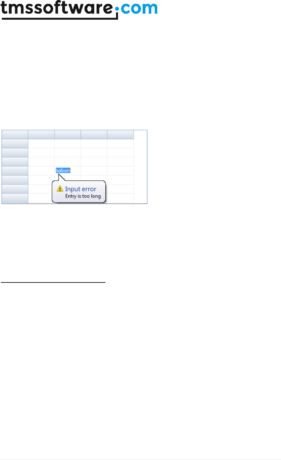
TMS SOFTWARE
TADVSTRINGGRID
DEVELOPERS GUIDE
50 | P a g e
Advstringgrid1.InvalidEntryTitle := 'Input error';
Advstringgrid1.InvalidEntryText := 'Entry not sufficiently long';
Valid := false;
end;
if length(value) > 5 then
begin
Advstringgrid1.InvalidEntryTitle := 'Input error';
Advstringgrid1.InvalidEntryText := 'Entry is too long';
Valid := false;
end;
end;
This results in:
Note 1: in order to display balloons in the grid, it is required to set grid.Balloon.Enable = true.
Note 2: when reparenting the grid, it is required to set grid.Balloon.Enable = false before changing
the parent programmatically and set grid.Balloon.Enable = true again after the new parent is set.
Further balloon settings are available under grid.Balloon and discussed in the paragraph about
adding balloons to the grid.
Programmatically controlling editing
Normally, editing is started by clicking on a selected cell or pressing F2. It is also possible to start
the inplace editor by code. To do this following functions are available:
Grid.ShowInplaceEdit;
Starts the inplace editor at the currently selected cell
Grid.HideInplaceEdit;
Stops inplace editing. If the inplace editing is aleady stopped, calling this method cannot harm.
Grid.EditCell(Col,Row: integer);
Start the inplace editor on cell Col,Row
Grid.FocusCell(Col,Row: integer);
Just set the focused cell to Col,Row but do not start inplace editing.

TMS SOFTWARE
TADVSTRINGGRID
DEVELOPERS GUIDE
51 | P a g e
TAdvStringGrid mouse and navigation control
Extensive control is available for controlling navigation with keyboard and mouse in the grid and
control of automatic key triggered actions such as clipboard handling. These settings are available
through the grid.Navigation and grid.MouseActions properties.
Navigation properties
AdvanceAuto: Boolean;
When true, editing with masked inplace edit
automatically advances to the next cell when the
mask has been completed.
AdvanceAutoEdit: Boolean;
When true, after pressing return to advance the
inplace editor to the next cell, this cell is
automatically put into editing mode.
AdvanceDirection: TAdvanceDirection;
Sets the directorion of the auto advance upon
pressing Enter or Return to following values:
adTopBottom: move from top row to bottom row
and then move to next column.
adTopBottomInCol: move from top row to bottom
row and then move to top row again in same
column.
adLeftRight: move from left to right and then
move to next row.
adLeftRightInRow: move from left to right and
then move to back to first cell in same row.
AdvanceInsert: Boolean;
When true, pressing enter on the last cell of the
last row automatically inserts a new row or a new
column (depending on AdvanceDirection). When a
new row is inserted, the OnCanAddRow event is
triggered first followed by the event
OnAutoInsertRow. When a new column is inserted,
the OnCanAddCol event is triggered followed by
OnAutoInsertCol.
AdvanceOnEnter: Boolean;
When true, pressing Return or Enter automatically
advances to the next cell. The direction of the
auto advance is controlled by the
AdvanceDirection property
AdvanceOnEnterLoop: Boolean;
When true, the grid will automatically advance
back to the first (top/left) normal cell of the grid
when Enter is pressed on the last (bottom/right)
cell.
AdvanceSkipReadOnlyCells: Boolean;
When AdvanceEnter = true and the Enter key is
pressed, by default readonly cells are skipped and
the next editable cell is focused and set in edit
mode. When AdvanceSkipReadOnlyCells is false,
when the next logical cell is readonly, focus just

TMS SOFTWARE
TADVSTRINGGRID
DEVELOPERS GUIDE
52 | P a g e
moves to the readonly cell.
AllowClipboardAlways: Boolean;
Allows clipboard actions irrespective of cells being
read-only
AllowClipboardColGrow: Boolean;
When true, the number of columns in the grid can
grow if more columns are pasted than already
present in the grid
AllowClipboardRowGrow: Boolean;
When true, the number of rows in the grid can
grow if more rows are pasted than already
present in the grid
AllowClipboardShortCuts: Boolean;
When true, pressingCtrl-Ins, Shift-Ins, Shift-Del,
Ctrl-X, Ctrl-V, Ctrl-C automatically triggers the
clipboard handling. Unless AllowClipboardAlways
is set true, clipboard actions are only applied on
editable cells.
AllowCtrlEnter: Boolean;
When true, pressing Ctrl-Enter will add a line
break in an inplace editor.
AllowDeleteRow: Boolean;
When true, pressing the Del key removes a row.
The OnAutoDeleteRow event is triggered.
AllowFmtClipboard: Boolean;
Allows copy and paste of both cell text and cell
properties in TAdvStringGrid or between multiple
TAdvStringGrid controls.
AllowInsertRow: Boolean;
When true, pressing the Ins key inserts a new row.
The OnAutoInsertRow event is triggered. The
position of the inserted row is controlled by the
InsertPosition property.
AllowRTFClipboard: Boolean;
Allows copy and paste of rich text in the grid
AllowSmartClipboard: Boolean;
When true, pasting automatically completes
ranges in selected cells. If for example 2 cells are
copied on the clipboard with values ‘1’ and ‘2’,
pasting this in 10 cells will paste as
‘1’,’2’,’3’…’10’
AlwaysEdit: Boolean;
When true, the inplace editor is always visible.
When this behaviour is wanted, this needs to be
set true instead of the TStringGrid
goAlwaysShowEditor in grid.Options
AppendOnArrowDown: Boolean;
When true, pressing the down arrow on the last
row of the grid will automatically insert a new
row.
AutoComboDropSize: Boolean;
When true, the combobox dropdown size
automatically adapts to the largest string in the

TMS SOFTWARE
TADVSTRINGGRID
DEVELOPERS GUIDE
53 | P a g e
combobox
AutoComboSelect: Boolean;
Determines whether the combobox used as
inplace editor for a cell is shown with the cell
value immediately as selected item in the
dropdown or not.
AutoGotoIncremental: Boolean;
Can be used combined with AutoGotoWhenSorted
where the lookup for text is incremental, i.e. the
search refines with each character typed.
AutoGotoWhenSorted: Boolean;
When true, typing a character automatically
moves the current cell to the first cell that starts
with character typed. This applies for pressing
characters in sorted columns only.
ClipboardCutAction: TClipboardCutAction;
Value can be set to caClear to just clear the cells
where a cut is performed or caRemove to remove
rows completely from the grid (in case row
selection is enabled).
ClipboardPasteAction: TClipboardPasteAction;
Value can be set to paReplace or paInsert. When
ClipboardPasteAction is paReplace, cells are
replaced from the top left corner with pasted cell
values. When ClipboardPasteAction is paInsert,
cells are inserted in the grid from the top, left
selected cell.
CopyHTMLTagsToClipboard: Boolean;
When true, HTML tags are also copied on the
clipboard
CursorAdvance: TCursorAdvance;
This can be any of the following 3 values:
caDefault, caSnaak, caLoop.
caDefault: This is the default setting, this means
that when the arrow keys are pressed and the
first/last row/column of the grid is reached,
navigation stops.
caLoop: This means that when the arrow key is
pressed on first/last cells of a column/row, the
active cells moves to the last/first cell of this
column/row.
caSnake: This means that when the arrow key is
pressed on first/last cells of a column/row, the
active cells moves to the last/first cell of the next
column/row.
CursorMoveRows: Boolean;
When true, pressing Ctrl and arrow up or down
moves the selected row or rows up or down.
CursorWalkAlwaysEdit: Boolean;
Controls whether the inplace editor of the next
TMS SOFTWARE
TADVSTRINGGRID
DEVELOPERS GUIDE
54 | P a g e
cell after pressing left / right is automatically put
in edit mode or not
CursorWalkEditor: Boolean;
When true, pressing cursor left key if caret is on
first character position moves to previous cell,
pressing cursor right key when caret is on last
character position moves to the next cell
EditSelectAll: Boolean;
When true, all text is selected when the inplace
editor starts. Otherwise, no text is selected and
the caret is after the last character position.
HomeEndKey: THomeEndAction;
Defines the behaviour of Home and End key as
either going to top/bottom row or left rightmost
column
ImproveMaskSel: Boolean;
Automatically positions entry on first editable
character of the mask edit instead of selecting
the full mask
InsertPosition: TInsertPosition;
Determines if a row is inserted before or after the
current row when Ins is pressed and
AllowInsertRow is True
KeepHorizScroll: Boolean;
When true, navigating up or down in the grid with
a horizontally scrolled grid keeps this horizontal
scroll instead of scrolling back to leftmost position
KeepScrollOnSort: Boolean;
When true, the horizontal scroll position is not
changed when the grid is sorted by clicking on a
column header. When false, the horizontal scroll
position is reset to the leftmost position.
LeftRightRowSelect: Boolean;
When true, the default behaviour applies and if
row selection is enabled, pressing left/right arrow
keys change the selected row. When false,
left/right arrow keys change the horizontal scroll
LineFeedOnEnter: Boolean;
When true, pressing Ctrl-Enter adds a linefeed in
the cell instead of stopping the inplace edit
MoveRowOnSort: Boolean;
When true, the current selected row remains in
focus after sort
MoveScrollOnly: Boolean;
When true, only the scroll position in the grid
changes when pressing keys
Up,Down,Next,Prior,Home,End. When false, it is
the selection that changes in the grid for these
keys.
SkipFixedCells: Boolean;
When true, using the arrow keys to move the
selected cell will let the selection jump over fixed
(non-selectable) cells in the grid.
TMS SOFTWARE
TADVSTRINGGRID
DEVELOPERS GUIDE
55 | P a g e
TabAdvanceDirection: TAdvanceDirection;
Sets the directorion of the auto advance upon
pressing Tab to either adTopLeft or adLeftRight.
Note that goTabs must be set true in grid.Options
to allow tab keys in the grid.
TabToNextAtEnd: Boolean;
When true and goTabs is set True in grid.Options,
after tabbing inside the grid to the last cell, the
focus moves to the next control
MouseActions properties
AllColumnSize: Boolean;
When true, resizing one column resizes all columns
proportionally. Note that goColSizing needs to be set
to True in grid.Options for this
AllRowSize: Boolean;
When true, resizing one row resizes all rows
proportionally. Note that goRowSizing needs to be
set to True in grid.Options for this
AllSelect: Boolean;
When true, all cells can be selected by clicking in
the topleft fixed cell
AutoFocus: Boolean;
When true, the grid automatically gains focus when
the mouse hovers the grid
AutoSizeColOnDblClick: Boolean;
When true, a double click on the column edge will
autosize the column to the text width.
CaretPositioning: Boolean;
When true, clicking a cell to start inplace editing
automatically positions the caret on the position
where the mouse click happened to start editing
CheckAllCheck: Boolean;
When true, a checkbox click in the top fixed row will
automatically set all checkboxes in the column
below to the same setting as the top checkbox.
ColSelect: Boolean;
When true, a full column can be selected by clicking
a column header cell
DirectComboClose: Boolean;
When true, the combobox inplace editing
automatically ends when its dropdown is closed.
DirectComboDrop: Boolean;
When true, clicking on a cell with combobox inplace
editor immediately causes a dropdown of the
combobox
DirectDateClose: Boolean;
When true, the datepicker inplace editing
automatically ends when its dropdown calendar is
closed.
DirectDateDrop: Boolean;
When true, clicking on a cell with datepicker inplace
editor immediately causes a dropdown of the
TMS SOFTWARE
TADVSTRINGGRID
DEVELOPERS GUIDE
56 | P a g e
calendar.
DirectEdit: Boolean;
When true, clicking a cell immediately starts editing
instead of first selecting the cell and entering edit
mode after another mouse click.
DisjunctCellSelect: Boolean;
When true, allows selection of disjunct cells through
Ctrl + left mouse click. The list of disjunct selected
cells can be obtained with the SelectedCell[Index:
Integer]: TGridCoord property where
SelectedCellCount is returning the number of
selected cells.
DisjunctColSelect: Boolean;
When true, allows selection of disjunct columns
through Ctrl + left mouse click. The selectionstate of
columns can be obtained through
grid.ColSelect[ARow: Integer]: Boolean
DisjunctRowSelect: Boolean;
When true, allows selection of disjunct rows through
Ctrl + left mouse click. The selectionstate of rows
can be obtained through grid.RowSelect[ARow:
Integer]: Boolean
DisjunctRowSelectNoCtrl: Boolean;
When true and combined with DisjunctRowSelect =
true, disjunct row selection is possible without
keeping the Ctrl key down.
EditOnDblClickOnly: Boolean;
When true, the inplace editing is only started when
double clicking on a cell. Otherwise, the editing is
started by default upon a single click in a selected
cell.
FixedColsEdit: TGridFixedCellEdit;
Selects the type of action needed to start the editor
for the fixed column
FixedColsEditor: TGridFixedCellEditor;
Sets the type of fixed cell editor: a normal editor,
editable combobox or combobox list
FixedRowsEdit: TGridFixedCellEdit;
Selects the type of action needed to start the editor
for the fixed row
FixedRowsEditor: TGridFixedCellEditor;
Sets the type of fixed cell editor: a normal editor,
editable combobox or combobox list
HotmailRowSelect: Boolean;
When true, row selection can be done through clicks
on the checkbox in the first fixed column.
MoveRowOnNodeClick: Boolean;
When true, clicking on a node also moves the
selected cell or row to the row where the node is
positioned.
NoAutoRangeScroll: Boolean;
When true, scrolling range selection is not
automatically started when clicking a half visible
TMS SOFTWARE
TADVSTRINGGRID
DEVELOPERS GUIDE
57 | P a g e
cell at bottom or right side of the grid
NodeAllExpandContract: Boolean;
When true, a node in the top fixed row will expand
or collaps all nodes in the column below the fixed
cell.
NoScrollOnPartialCol: Boolean;
When true, the grid is not automatically scroll to
bring a partially visible column in view that is
clicked.
NoScrollOnPartialRow: Boolean;
When true, the grid is not automatically scroll to
bring a partially visible row in view that is clicked.
PartialScrollDelta: Integer;
Sets the nr. of rows / columns to scroll when the
user clicks on a partially visible column or row.
PreciseCheckBoxCheck: Boolean;
When true, a checkbox will only toggle when the
mouse is over the checkbox, otherwise the checkbox
will toggle for a click anywhere in the cell.
RangeSelectAndEdit: Boolean;
When true, range selection and editing style
(goRangeSelect and goEditing in grid.Options) can be
combined
RowSelect: Boolean;
When true, a full row can be selected by clicking a
row header cell
RowSelectPersistent: Boolean;
When true, in a grid with disjunct selected rows
with nodes, the selection of rows is persisted when
nodes collaps or expand.
SelectOnRightClick: Boolean;
When true, the mouse right-click button operates
just like the left button to select a cell
SizeFixedCol: Boolean;
Allows sizing with mouse of the first fixed column(s)
which otherwise cannot be sized when goColSizing is
True in grid.Options
SizeFixedRow: Boolean;
Allows sizing with mouse of the first fixed row(s)
which otherwise cannot be sized when goRowSizing
is True in grid.Options
ToggleNodeOnDblClick: Boolean;
When true, a double click on cells in a row that has
a node will open / close the node.
TouchScroll: Boolean;
When true, scrolling can be done by touch and drag
and inertia scrolling will be performed upon
mouse/touch release
WheelAction: TWheelAction
Selects whether a mouse wheel move will scroll the
grid or move the selection in the grid.
WheelActive: TWheelActive
Sets whether the mouse wheel affects grid scrolling
when the grid has focus (waFocus) or only when the

TMS SOFTWARE
TADVSTRINGGRID
DEVELOPERS GUIDE
58 | P a g e
mouse is over the grid when it has focus
(waMouseOver).
WheelIncrement: integer
Selects the number of rows to move for a mouse
wheel movement. When zero, the default number as
configured in Windows is used.
TMS SOFTWARE
TADVSTRINGGRID
DEVELOPERS GUIDE
59 | P a g e
TAdvStringGrid column sizing
When goColSizing is set to true in grid.Options, the columns can be resized by dragging the
separators between column header cells. The column size can be programmatically set & retrieved
via grid.ColWidths[ColumnIndex]: integer;
Various other options exist that relate to column size and control its behavior. Options are grouped
under grid.ColumnSize class property:
grid.ColumnSize.Key: string;
Sets either the registry key or the INI file name where
column widths can be persisted.
grid.ColumnSize.Location:
TColumnSizeLocation;
Specifies whether column sizes will be persisted in the
registry or an INI file.
grid.ColumnSize.Rows: TAutoSizeRows;
Specifies what rows of a column to take in account for
auto column size calculation. This can be all rows
(arAll: i.e. normal rows + fixed rows), only normal rows
(arNormal) or only fixed rows (arFixed).
grid.ColumnSize.Save
When true, column widths are automatically persisted
in either the INI file or the registry.
grid.ColumnSize.Section:
Specifies the INI file section or registry node name
where values are persisted
grid.ColumnSize.Stretch:
When true, the width of one or more columns is
automatically adapted to fill the entire grid client
rectangle. When the total column widths already
exceed the client width, nothing will change. By
default, grid.ColumnSize.StretchColumn = -1 and this
means that the rightmost column will be the column
that is stretched.
grid.ColumnSize.StretchAll:
When true, all columns are stretched to fill the grid
client width in an equidistant way
grid.ColumnSize.StretchColumn:
Sets the index of the column to be stretched. By
default this is -1 to let the rightmost column stretch.
grid.ColumnSize.SynchWithGrid:
When true, the columns are proportionally sized with
the grid when the grid’s client width changes.
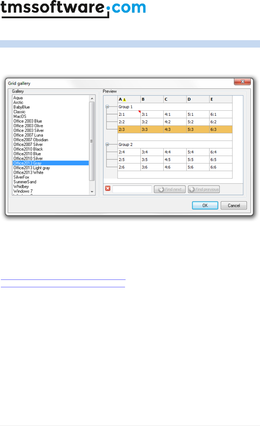
TMS SOFTWARE
TADVSTRINGGRID
DEVELOPERS GUIDE
60 | P a g e
TAdvStringGrid styles
The grid has various built-in options to define its style. There is a design-time gallery of styles that
is available from the design-time context menu:
From here, a wide range of Office, Windows and custom styles are available. Styles can also be set
at runtime. The TAdvStringGrid is compliant to the TMS styles interface. This means that with a
TAdvFormStyler on the form, setting the style on this component will automatically change the style
of all TMS components on the form that are TMS style interface compliant and thus also
TAdvStringGrid. This means that with a single property, all TMS components on the form can adapt
to the same consistent style. (TAdvFormStyler/TAdvAppStyler are part of the TMS Component Pack:
http://www.tmssoftware.com/site/tmspack.asp and the style mechanism is explained at
http://www.tmssoftware.com/site/atbdev3.asp) Also without this TAdvFormStyler, it is easy to
programmatically set the style for TAdvStringGrid. Add the unit AdvStyleIF to the uses list and the
style can be set via:
grid.SetComponentStyle(AStyle: TTMSStyle);
TTMSStyle is defined as:
// color schemes consistent with Office 2003
tsOffice2003Blue,
tsOffice2003Silver,
tsOffice2003Olive,
tsOffice2003Classic,
// color schemes consistent with Office 2007
tsOffice2007Luna,
tsOffice2007Obsidian,
tsOffice2007Silver,
// color schemes consistent with Office 2010
tsOffice2010Blue,

TMS SOFTWARE
TADVSTRINGGRID
DEVELOPERS GUIDE
61 | P a g e
tsOffice2010Silver,
tsOffice2010Black,
// color schemes consistent with Office 2013
tsOffice2013White,
tsOffice2013LightGray,
tsOffice2013Gray,
// color schemes consistent with Windows editions
tsWindowsXP,
tsWindowsVista,
tsWindows7,
tsWindows8,
// color scheme without gradients for use on terminals
tsTerminal,
// custom color scheme
tsCustom
Note that a custom color scheme means that the style will not affect color settings of the grid, i.e.
the grid will keep its colors as defined at design-time or as configured programmatically at run-
time.
It is possible to make custom extensions for the grid gallery or load & save styles at run-time. To do
this, the functions
Grid.SaveVisualProps(FileName: string);
Grid.LoadVisualProps(FileName: string);
can be used.
To add a new style for the TAdvStringGrid style gallery, set colors of the grid and call
grid.SaveVisualProps(FileName) and choose a filename with extension .GP. Put this file in the \My
Documents folder and the grid will recognize and use this file for the gallery. The .GP files provided
with TAdvStringGrid can also be deployed and loaded at runtime via
grid.LoadVisualProps(FileName);
TMS SOFTWARE
TADVSTRINGGRID
DEVELOPERS GUIDE
62 | P a g e
TAdvStringGrid cell and cell properties access
Various properties enable handling cell data. The most simple way is to use the
grid.Cells[ACol,ARow]: string property. In addition TAdvStringGrid provides:
grid.AllCells[ACol,ARow]: string;
Access the grid cell as string irrespective of hidden
columns or rows. grid.AllCells returns the cell as
displayed, ie. after possible processing of the real cell
text by the event OnGetDisplText
grid.AllFloats[ACol,ARow]: Double;
Access the grid cell as float irrespective of hidden
columns or rows
grid.AllGridCells[ACol,ARow]: string;
Access the grid cell as string irrespective of hidden
columns or rows. grid.AllGridCells returns the cell as
stored, ie. before possible processing by the event
OnGetDisplText
grid.AllObjects[ACol,ARow]: TObject;
Access the TObject that can be associated with each
cell irrespective of hidden columns or rows
grid.AllWideCells[ACol,ARow]: widestring
Access the grid cell as widestring irrespective of
hidden columns or rows
grid.Dates[ACol,ARow]: TDateTime;
Access the grid cell as date
grid.Floats[ACol,ARow]: Double;
Access the grid cell as double. If no floating point data
is in the cell, the value 0.0 is returned. When setting
the cell data through grid.Floats, the grid.FloatFormat
property is used to format the floating point data as
text.
grid.GridCells[ACol,ARow]: string;
Access the grid cell as string. grid.GridCells returns the
cell as stored, ie. before possible processing by the
event OnGetDisplText
grid.Ints[ACol,ARow]: Integer;
Access the grid cell as integer. If no integer is in the
cell, the value 0 is returned.
grid.Objects[ACol,ARow]: TObject;
Access the TObject that can be associated with each
cell
grid.Times[ACol,ARow]: TDateTime;
Access the grid cell as time
grid.WideCells[ACol,ARow]: widestring
Access the grid cell as widestring
grid.OriginalCells[ACol,ARow]: string
Provides access to cells irrespective of column
ordering. The cells can be accessed with the original
column index before a user started to move columns
(when goColMoving is true in grid.Options)
grid.StrippedCells[ACol,ARow]: string
Read-only property returning the plain text of a grid
well with all possible HTMLformatting tags or RTF

TMS SOFTWARE
TADVSTRINGGRID
DEVELOPERS GUIDE
63 | P a g e
formatting removed
grid.GetSelectionAsText: string
Returns all text in one or multiple selected cells as
text. The text format is compatible with how Excel
puts multiple cell content on the clipboard.
Grid.SetSelectionAsText(Value:string)
Sets the contents of the selected cells with text that is
formatted in the same way that Excel formats multiple
cell text on the clipboard.
Two ways exist to apply colors, fonts & alignment to grid cells. A dynamic way exists that allows
setting these properties through events. The dynamic cell settings through events is a flexible and
memory friendly way to apply colors, alignment etc.. to grid cells as no additional storage is
required per cell for storing these cell properties.
Dynamic cell properties
The events to handle these settings are:
OnGetCellColor:
TGridColorEvent = procedure(Sender: TObject; ARow, ACol: Integer;
AState: TGridDrawState; ABrush: TBrush; AFont: TFont ) of object;
This event is triggered when painting a cell and queries for the background brush of the cell and the
font.
OnGetAlignment:
TGridAlignEvent = procedure (Sender: TObject; ARow, ACol: Integer;
var HAlign: TAlignment;var VAlign: TAsgVAlignment) of object;
The grid align event is also triggered when painting a cell and queries for horizontal and vertical
text alignment in a cell. Note that the default grid alignment is set via the property
grid.DefaultAlignment. When grid.AutoNumAlign is set to true, the grid will automatically right-
justify cells that contain numbers.
OnGetCellGradient:
TGridGradientEvent = procedure(Sender: TObject; ARow, ACol: Integer;
var Color, ColorTo, ColorMirror, ColorMirrorTo: TColor) of object;
This event is triggered to dynamically set a dual (mirrored) gradient. The upper half rectangular
gradient is from Color to ColorTo, the bottom half rectangular gradient is from ColorMirror to
ColorMirrorTo.
Example: setting font color and alignment depending on cell values
procedure TForm1.AdvStringGrid1GetCellColor(Sender: TObject; ARow,
ACol: Integer; AState: TGridDrawState; ABrush: TBrush; AFont: TFont);

TMS SOFTWARE
TADVSTRINGGRID
DEVELOPERS GUIDE
64 | P a g e
begin
if grid.Ints[ACol,ARow] > 0 then
AFont.Color := clBlack
else
AFont.Color := clRed;
end;
procedure TForm1.AdvStringGrid1GetAlignment(Sender: TObject; ARow,
ACol: Integer; var HAlign: TAlignment; var VAlign: TVAlignment);
begin
if (grid.Ints[ACol,ARow] >= 1000) then
HAlign := taRightJustify
else
HAlign := taLeftJustify;
end;
Static cell properties
Cell properties can also be set directly. Using this approach of course requires more memory as the
properties are stored with each cell. Possible properties are:
property Alignments[Col,Row: Integer]: TAlignment;
property Colors[Col,Row: Integer]: TColor;
property ColorsTo[Col,Row: Integer]: TColor;
property FontColors[Col,Row: Integer]: TColor;
property FontStyles[Col,Row: Integer]: TFontStyles;
property FontSizes[Col,Row: Integer]: Integer;
property FontNames[Col,Row: Integer]: string;
Example: setting a cell 2,3 to red background, bold Tahoma font and right aligned
Grid.Colors[2,3] := clRed;
Grid.FontStyles[2,3] := Grid.FontStyles[2,3] + [fsBold];
Grid.FontNames[2,3] := ‘Tahoma’;
Grid.Alignments[2,3] := taRightJustify;
Note: the property grid.ColorsTo[Col,Row: Integer]: TColor is used for specifying vertical gradients
in cells from color set by Colors[] to color set by ColorsTo[].
This sets a vertical gradient from red to white in cell 1,1:
Grid.Colors[1,1] := clRed;
Grid.ColorsTo[1,1] := clWhite;

TMS SOFTWARE
TADVSTRINGGRID
DEVELOPERS GUIDE
65 | P a g e
TAdvStringGrid row & column methods
TAdvStringGrid provides several methods to access, insert, remove, move, swap rows and columns.
Grid.InsertRows(RowIndex, RCount: integer);
Inserts RCount rows in the grid at position RowIndex
Grid.RemoveRows(RowIndex, RCount: integer);
Deletes RCount rows in the grid at position RowIndex
Grid.MoveRow(FromIndex, ToIndex: integer);
Moves one row at position FromIndex to the new positon ToIndex
Grid.MoveRows(FromIndex, ToIndex, RCount: integer);
Moves RCount rows starting from index FromIndex to ToIndex
Grid.SwapRows(Row1, Row2: integer);
Swaps rows Row1 and Row2
Grid.AddRow;
Adds one row to the grid
Grid.InsertCols(ColIndex, CCount: integer);
Inserts CCount rows in the grid at position ColIndex
Grid.RemoveCols(ColIndex, CCount: integer);
Deletes CCount columns in the grid at position ColIndex
Grid.MoveColumn(FromIndex, ToIndex: integer);
Moves one column at positon FromIndex to the new position ToIndex
Grid.SwapColumns(Col1, Col2: integer);
Swaps columns Col1 and Col2
Grid.DistinctValues(Col: integer): TStrings;
Returns a stringlist of distinct values in column Col.

TMS SOFTWARE
TADVSTRINGGRID
DEVELOPERS GUIDE
66 | P a g e
TAdvStringGrid cell graphics
TAdvStringGrid has support to add all kinds of graphics to a cell. These include:
Bitmap Windows bitmap
Icon Windows icon
ImageList Imagelist element
DataImage Cell data dependent imagelist element
Images Multiple imagelist elements
Picture Picture
FilePicture Picture file reference
Rotated Rotated text
Comment Comment indicator
CheckBox Checkbox
DataCheckBox Cell data dependent checkbox
Radiogroup Radiobuttons
Radiobutton Radiobutton
XP Progress XP style Progressbar
Progress Progressbar
ProgressPie Progress pie
RangeIndicator Bi-color range indicator
Button Button
BitButton BitButton
Balloon Balloon
Shapes Series of graphic shapes
Rating Rating control
Interface Custom graphics via interface
Bitmaps
The functions available to handle bitmaps in cells are:
function CreateBitmap(ACol,ARow: Integer;transparent: Boolean;
hal:TCellHalign; val:TCellValign):TBitmap;
procedure AddBitmap(ACol,ARow: Integer;ABmp:TBitmap;Transparent: Boolean;
hal:TCellHalign; val:TCellValign);
procedure RemoveBitmap(ACol,ARow: Integer);
function HasBitmap(ACol,ARow: Integer): Boolean;
function GetBitmap(ACol,ARow: Integer): TBitmap;
The difference between CreateBitmap and AddBitmap is that with CreateBitmap, the bitmap
instance is created, maintained and destroyed by the grid while with AddBitmap it is the
responsibility of the programmer to create the instance and destroy it.
In code this difference becomes clear:
// add bitmap from resource to the grid
Grid.CreateBitmap(2,3,True,haBeforeText,vaTop).LoadFromResourceName(HInstan
ce,’TEST’);

TMS SOFTWARE
TADVSTRINGGRID
DEVELOPERS GUIDE
67 | P a g e
var
Bmp: TBitmap;
Bmp := TBitmap.Create;
Bmp.LoadFromResourceName(HInstance,’TEST’);
Grid.AddBitmap(2,3,True,haBeforeText,vaTop);
// at the end of the application, the bitmap needs to be destroyed
Bmp.Free;
Icons
The functions available to handle icons in cells are:
function CreateIcon(ACol,ARow: Integer; hal:TCellHalign;
val:TCellValign):TIcon;
procedure AddIcon(ACol,ARow: Integer;AIcon:TIcon; hal:TCellHalign;
val:TCellValign);
procedure RemoveIcon(ACol,ARow: Integer);
The same logic applies for Icons as for Bitmaps for the difference between CreateIcon and AddIcon.
Imagelist elements
An image from the imagelist assigned the the grid.GridImages property can be inserted in a cell.
The following methods are available for this:
procedure AddImageIdx(ACol,ARow,Aidx:
Integer;hal:TCellHalign;val:TCellValign);
procedure RemoveImageIdx(ACol,ARow: Integer);
function GetImageIdx(ACol,ARow: Integer;var idx: Integer): Boolean;
The Idx parameter is the index of the image in the imagelist. The GetImageIdx returns false if
GetImageIdx was called for a cell that does not contain an imagelist element.
It is also possible to add an imagelist element with an index that is set through the cell text with
these methods:
procedure AddDataImage(ACol,ARow,Aidx: Integer; hal:TCellHalign;
val:TCellValign);
procedure RemoveDataImage(ACol,ARow: Integer);
function HasDataImage(ACol,ARow: Integer): Boolean;
To set image 2 from the imagelist in a cell 2,3, this requires:
Grid.AddDataImage(2,3,2,haBeforeText,vaTop);
TMS SOFTWARE
TADVSTRINGGRID
DEVELOPERS GUIDE
68 | P a g e
This sets the cell text to ‘2’. If later the cell text is changed to ‘3’, the image will automatically
change to image 3 of the imagelist.
Multiple imagelist elements
To add multiple images in a cell, two methods are defined:
procedure AddMultiImage(ACol,ARow,Dir: Integer; hal:TCellHalign;
val:TCellValign);
procedure RemoveMultiImage(ACol,ARow: Integer);
The Dir parameter sets the direction of the images, with 0 = horizontal and 1 = vertical.
After calling AddMultiImage, the indexes of the images can be set with the property
Grid.CellImages[ACol,ARow]: TIntList;
Example: setting 3 imagelist based images in a cell
Grid.AddMultiImage(2,3,0,haBeforeText,vaTop);
Grid.CellImages[2,3].Add(2); // index of first image
Grid.CellImages[2,3].Add(0); // index of second image
Grid.CellImages[2,3].Add(5); // index of third image
Pictures
Adding pictures is very similar to adding bitmaps to a cell. The CreatePicture and AddPicture are
available to add a picture that is either created, maintained and destroyed by the grid or a picture
that is created, maintained and destroyed by the application. An extra parameter for adding
pictures is the stretch mode. This controls how the picture is stretched in the cell and can be:
TStretchMode =
(noStretch,Stretch,StretchWithAspectRatio,Shrink,ShrinkWithAspectRatio);
noStretch
the picture is not stretched
Stretch
stretch horizontally & vertically to fit in the cell
StretchWithAspectRatio
stretch horizontally & vertically with aspect ratio to fit in the cell
Shrink
only shrink the image when it is too large for the cell
ShrinkWithAspectRatio
shrink with aspect ratio when image is too large
function CreatePicture(ACol,ARow:Integer; transparent:Boolean;
stretchmode:TStretchMode; padding:Integer; hal:TCellHalign;
val:TCellValign):TPicture;
procedure AddPicture(ACol,ARow: Integer;APicture:TPicture;transparent:
Boolean; stretchmode:TStretchMode; padding: Integer; hal:TCellHalign;
val:TCellValign);

TMS SOFTWARE
TADVSTRINGGRID
DEVELOPERS GUIDE
69 | P a g e
procedure RemovePicture(ACol,ARow: Integer);
function HasPicture(ACol,ARow: Integer): Boolean;
function GetPicture(ACol,ARow: Integer): TPicture;
With normal pictures, once the pictures are created or added, the picture requires memory
necessary for holding the picture. When holding a large amount of large pictures, this can quickly
become a problem. Therefore, a TFilePicture can be created and inserted. A TFilePicture only
contains a reference to the file picture and does not require memory to hold the picture. The
TFilePicture will load and display the picture only for the visible cells.
function CreateFilePicture(ACol,ARow: Integer;Transparent: Boolean;
StretchMode:TStretchMode; padding:Integer; hal:TCellHalign;
val:TCellValign): TFilePicture;
procedure AddFilePicture(ACol,ARow:
Integer;AFilePicture:TFilePicture;Transparent:
Boolean;stretchmode:TStretchMode;padding:
Integer;hal:TCellHalign;val:TCellValign);
procedure RemoveFilePicture(ACol,ARow: Integer);
function GetFilePicture(ACol,ARow: Integer): TFilePicture;
Example: adding a picture with normal picture methods and file picture methods
Grid.CreatePicture(2,3,True,Shrink,0,haLeft,vaTop).LoadFromFile(‘TST.JPG’);
Grid.CreateFilePicture(2,3,True,Shrink,0,haLeft,vaTop).Filename :=
‘TST.JPG’;
Rotated text
Text rotated in any angle can be added in a cell. Note that it is required that font used for the cell
is a TrueType font. Non truetype fonts are not guaranteed to work with text rotation. Following
methods are available to help with handling rotated text in cells:
procedure AddRotated(ACol,ARow: Integer; AAngle: Smallint; s: string);
procedure SetRotated(ACol,ARow: Integer; AAngle: SmallInt);
procedure RemoveRotated(ACol,ARow: Integer);
function IsRotated(ACol,ARow: Integer;var aAngle: Integer): Boolean;
Adding 90 degrees rotated text is as such easy:
Grid.AddRotated(2,3,90,’This is rotated’);
Comments
A comment indicator is a little triangle in the right top corner of the cell that indicates a comment
text is available for the cell. When the mouse is over the comment indicator, this comment is
displayed as a hint. The color of the little triangle comment indicator is red by default but can be
set in another color with the property grid.ControlLook.CommentColor: TColor or it can be set as
parameter of the method AddColorComment.

TMS SOFTWARE
TADVSTRINGGRID
DEVELOPERS GUIDE
70 | P a g e
This is an overview of comment related methods & properties:
procedure AddComment(ACol,ARow: Integer; Comment:string);
Adds a comment with default color to cell ACol,ARow.
procedure AddColorComment(ACol,ARow: Integer; Comment:string; Color:
TColor);
Adds a comment with color to cell ACol,ARow.
procedure RemoveComment(ACol,ARow: Integer);
Removes the comment from cell ACol,ARow.
procedure RemoveAllComments;
Removes comments from all cells in the grid.
function IsComment(ACol,ARow: Integer;var comment:string): Boolean;
The IsComment method returns true when the specified cell effectively contains a comment and it
returns this comment text in the comment parameter.
property CellComment[ACol,ARow: integer]: string;
Provides access to cell comments as property.
Checkbox and DataCheckbox
Three types of checkboxes exist. A normal checkbox can be added to a cell with some text. The
checkbox state is set through the SetCheckBoxState method. A normal checkbox can have two
states: checked and not checked. When checked, its state is true, when unchecked, its state is
false. The second type checkbox is a tri-state checkbox. Notice the overrides for the methods
AddCheckBox, GetCheckBoxState, SetCheckBoxState. When used with Boolean parameters, this
applies to normal two state checkboxes. When used with the TCheckBoxState parameter, this
applies to tri-state checkboxes that can have the states: cbChecked, cbUnchecked, cbGrayed. A
third checkbox type is the data checkbox. A data checkbox is added to a cell and the checkbox
state reflects the cell text. If the cell text is equal to the grid.CheckTrue property, the checkbox is
displayed as checked, if the cell text is equal to the grid.CheckFalse property, the checkbox is
displayed as not checked. The checkbox is displayed grayed when the cell is set to readonly with
the OnCanEditCell event. If it is not desirable that a checkbox looks disabled for readonly cells, set
grid.NoDisabledCheckRadioLook = true. If a data checkbox is used, clicking the checkbox will cause
the cell text to change from grid.CheckFalse to grid.CheckTrue or vice versa.
This is an overview of methods that can be used with checkboxes:
procedure AddCheckBox(ACol,ARow: Integer;State,Data: Boolean); overload;
procedure AddCheckBox(ACol,ARow: State: TCheckBoxState); overload;
procedure RemoveCheckBox(ACol,ARow: Integer);
function HasCheckBox(ACol,ARow: Integer): Boolean;
function HasDataCheckBox(ACol,ARow: Integer): Boolean;

TMS SOFTWARE
TADVSTRINGGRID
DEVELOPERS GUIDE
71 | P a g e
function GetCheckBoxState(ACol,ARow: Integer;var state: Boolean): Boolean;
function GetCheckBoxState(ACol,ARow: Integer;var state: TCheckBoxState):
Boolean;
function SetCheckBoxState(ACol,ARow: Integer;state: Boolean): Boolean;
function SetCheckBoxState(ACol,ARow: Integer;state: TCheckBoxState):
Boolean;
function ToggleCheckBox(ACol,ARow: Integer): Boolean;
procedure AddCheckBoxColumn(ACol: Integer);
procedure AddTriStateCheckBoxColumn (ACol: Integer);
procedure RemoveCheckBoxColumn(ACol: Integer);
Example: counting the number of checked checkboxes in a column
var
I,Num: integer;
State: Boolean;
begin
Num := 0;
for I := grid.FixedRows to grid.RowCount – 1 do
begin
if grid.GetCheckboxState(Col,I,State) then
if State then inc(Num);
end;
end;
Example: alternative to count checked data checkboxes
Supposing the checkboxes have been added with grid.AddCheckBox(Col,Row,False,True);
var
I,Num: integer;
begin
Num := 0;
for I := grid.FixedRows to grid.RowCount – 1 do
begin
if grid.Cells[Col,I] = grid.CheckTrue then
inc(Num);
end;
end;
Three events can be triggered from the checkbox, the OnCheckboxClick, OnCheckboxMouseUp and
the OnCheckBoxChange event. The OnCheckBoxChange event is triggered whenever the state of a
checkbox changes as a result from a click of the user on the grid. Note that the OnCheckBoxChange
event will also be triggered for each checkbox changing its state by a click on a column header
checkbox.
Sometimes, it is desirable to have a checkbox in a fixed column header cell that can immediately
check or uncheck all checkboxes in the column. It is easy to have this type of functionality in
TAdvStringGrid:
with AdvStringGrid1 do
Begin
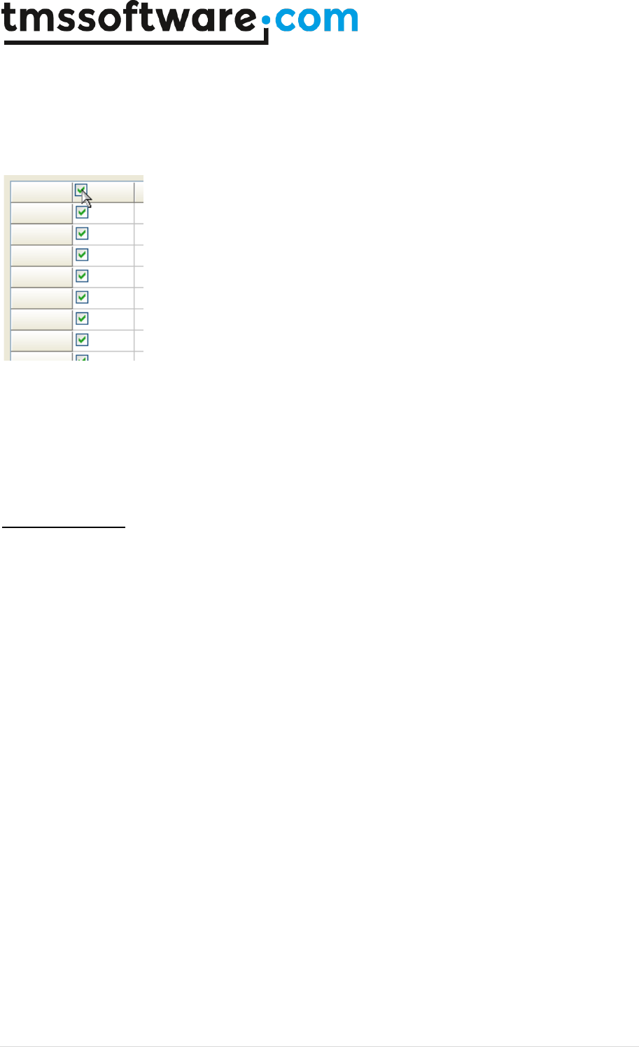
TMS SOFTWARE
TADVSTRINGGRID
DEVELOPERS GUIDE
72 | P a g e
Options := Options + [goEditing];
AddCheckBoxColumn(1);
AddCheckBox(1,0,false,false);
MouseActions.CheckAllCheck := true;
end;
Programmatically, the entire column of checkboxes can be checked or unchecked with the methods:
procedure CheckAll(Col: Integer);
procedure UnCheckAll(col: Integer);
Radiobuttongroups
To add a radiobuttongroup to the grid, a stringlist is used for the text associated with each
radiobutton. With the AddRadio and CreateRadio methods the same logic is applied to a stringlist
maintained by the grid and a stringlist maintained by the application as for a bitmap with the
AddBitmap and CreateBitmap methods. The direction of the radiobuttons in the grid cell is set with
the DirRadio parameter and can be horizontal (DirRadio = 0) or vertical (DirRadio = 1).
procedure AddRadio(ACol,ARow,DirRadio,IdxRadio: Integer; sl:TStrings);
function CreateRadio(ACol,ARow,DirRadio,IdxRadio: Integer): TStrings;
procedure RemoveRadio(ACol,ARow: Integer);
function IsRadio(ACol,ARow: Integer): Boolean;
function GetRadioIdx(ACol,ARow: Integer;var IdxRadio: Integer): Boolean;
function SetRadioIdx(ACol,ARow,IdxRadio: Integer): Boolean;
function GetRadioStrings(ACol,ARow: Integer): TStrings;
Example: adding radiobuttons maintained by the application
var
i:integer;
begin
radopt1 := TStringList.Create;
radopt1.Add('Delphi');
radopt1.Add('C++Builder');
radopt1.Add('JBuilder');
radopt2 := TStringList.Create;
radopt2.Add('Std');
radopt2.Add('Prof');
radopt2.Add('C/S');

TMS SOFTWARE
TADVSTRINGGRID
DEVELOPERS GUIDE
73 | P a g e
with AdvStringGrid1 do
begin
for I := 1 to RowCount - 1 do
begin
AddRadio(1,i,0,-1,radopt1);
AddRadio(2,i,1,-1,radopt2);
end;
end;
end;
To get the radiobutton index, the GetRadioIdx can be used which returns in the RadioIdx parameter
the value of the selected radiobutton or -1 if no radiobutton is selected.
Example: getting the selected radiobutton
var
Idx: Integer;
if Grid.GetRadioIdx(2,3,idx) then
ShowMessage(‘Radiobutton ‘+inttostr(idx)+’ selected’);
The radiobuttongroups trigger two events : OnRadioClick and OnRadioMouseUp
RadioButton columns
Instead of having a radiogroup in a single cell, it is also possible to add a radiogroup in a column of
the grid. Following methods are provided to handle radio button groups in grid columns:
procedure AddRadioButton(ACol,ARow: integer; State:Boolean = false);
procedure AddRadioButtonGroup(ACol,ARow: integer; Group: TRadioButtonGroup;
State:Boolean = false);
procedure RemoveRadioButton(ACol,ARow: integer);
function HasRadioButton(ACol,ARow: integer): boolean;
function HasRadioButtonGroup(ACol,ARow: integer): boolean;
function IsRadioButtonChecked(ACol,ARow: integer): boolean;
function SetRadioButtonState(ACol, ARow: integer; State: boolean): boolean;
procedure AddRadioButtonColumn(ACol: integer);
procedure RemoveRadioButtonColumn(ACol: integer);
procedure SetRadioButtonColumnIndex(ACol, Index: integer);
function GetRadioButtonColumnIndex(ACol: integer): integer;
The radiobutton in a cell triggers the event : OnRadioButtonClick
In this sample code, two columns of 3 radiobutton cells are created:
procedure TForm1.FormCreate(Sender: TObject);
begin
AdvStringGrid1.Options := AdvStringGrid1.Options + [goEditing];
AdvStringGrid1.AddRadioButton(1,1,true);
AdvStringGrid1.AddRadioButton(1,2);
AdvStringGrid1.AddRadioButton(1,3);
AdvStringGrid1.Cells[1,1] := 'France';
AdvStringGrid1.Cells[1,2] := 'Germany';
AdvStringGrid1.Cells[1,3] := 'United Kingdom';
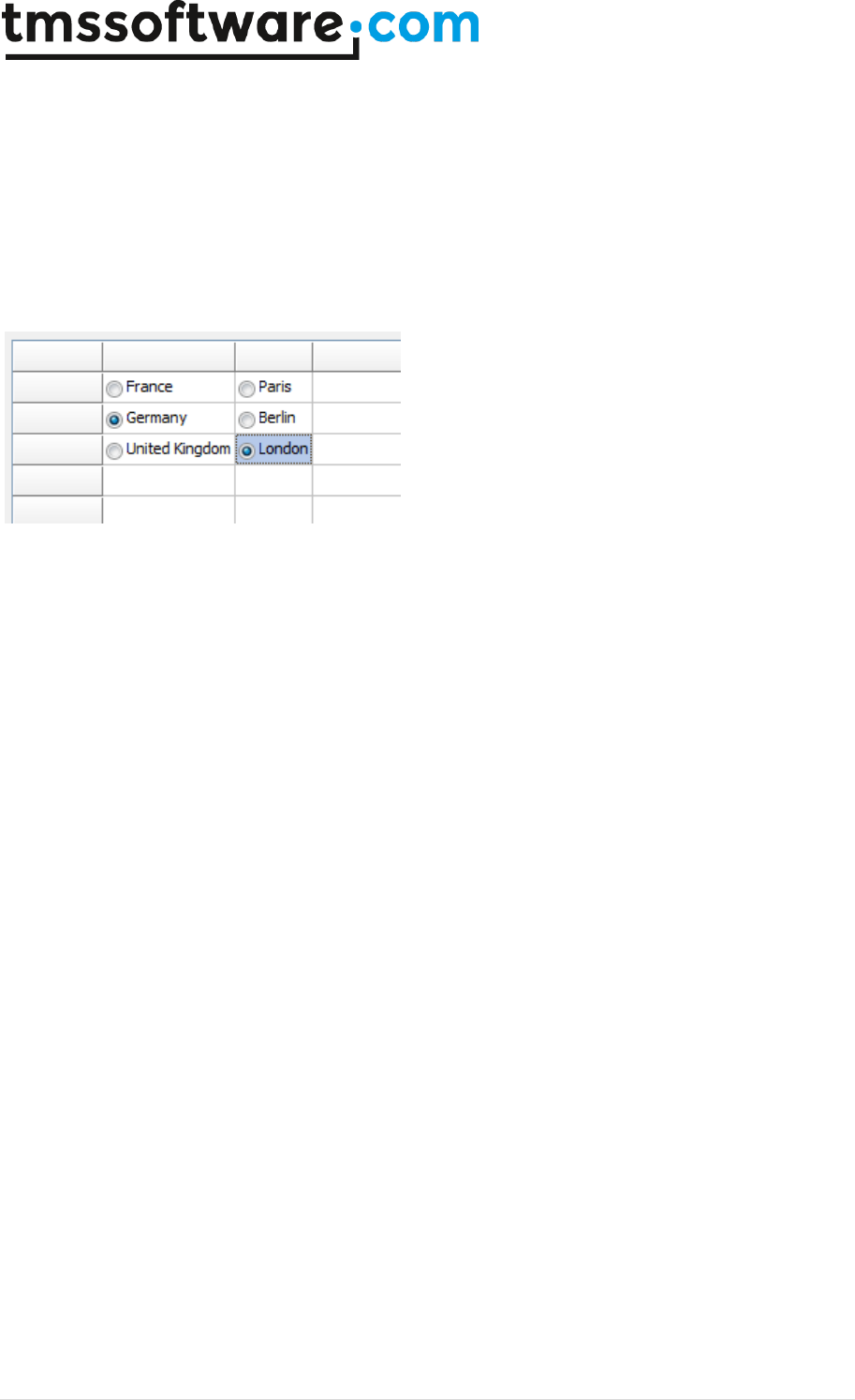
TMS SOFTWARE
TADVSTRINGGRID
DEVELOPERS GUIDE
74 | P a g e
AdvStringGrid1.AddRadioButton(2,1,true);
AdvStringGrid1.AddRadioButton(2,2);
AdvStringGrid1.AddRadioButton(2,3);
AdvStringGrid1.Cells[2,1] := 'Paris';
AdvStringGrid1.Cells[2,2] := 'Berlin';
AdvStringGrid1.Cells[2,3] := 'London';
AdvStringGrid1.AutoSizeCol(1);
AdvStringGrid1.AutoSizeCol(2);
end;
To create small groups of cells that form a radiogroup, the method AddRadioButtonGroup can be
used. This method has an extra parameter with which it can be defined whether adjacent cells form
a row of radiobuttons or column of radiobuttons. Note that in groups each radiobutton remains
individually accessible and its state can be individually checked or unchecked.
This code snippet demonstrates how 3 groups of 2 radiobuttons can be created:
begin
AdvStringGrid1.AddRadioButtonGroup(1,1,rgRow);
AdvStringGrid1.AddRadioButtonGroup(2,1,rgRow);
AdvStringGrid1.Cells[1,1] := 'Group A1';
AdvStringGrid1.Cells[2,1] := 'Group A2';
AdvStringGrid1.AddRadioButtonGroup(4,1,rgRow);
AdvStringGrid1.AddRadioButtonGroup(5,1,rgRow);
AdvStringGrid1.Cells[4,1] := 'Group B1';
AdvStringGrid1.Cells[5,1] := 'Group B2';
AdvStringGrid1.AddRadioButtonGroup(3,4,rgCol);
AdvStringGrid1.AddRadioButtonGroup(3,5,rgCol);
AdvStringGrid1.Cells[3,4] := 'Group C1';
AdvStringGrid1.Cells[3,5] := 'Group C2';
end;
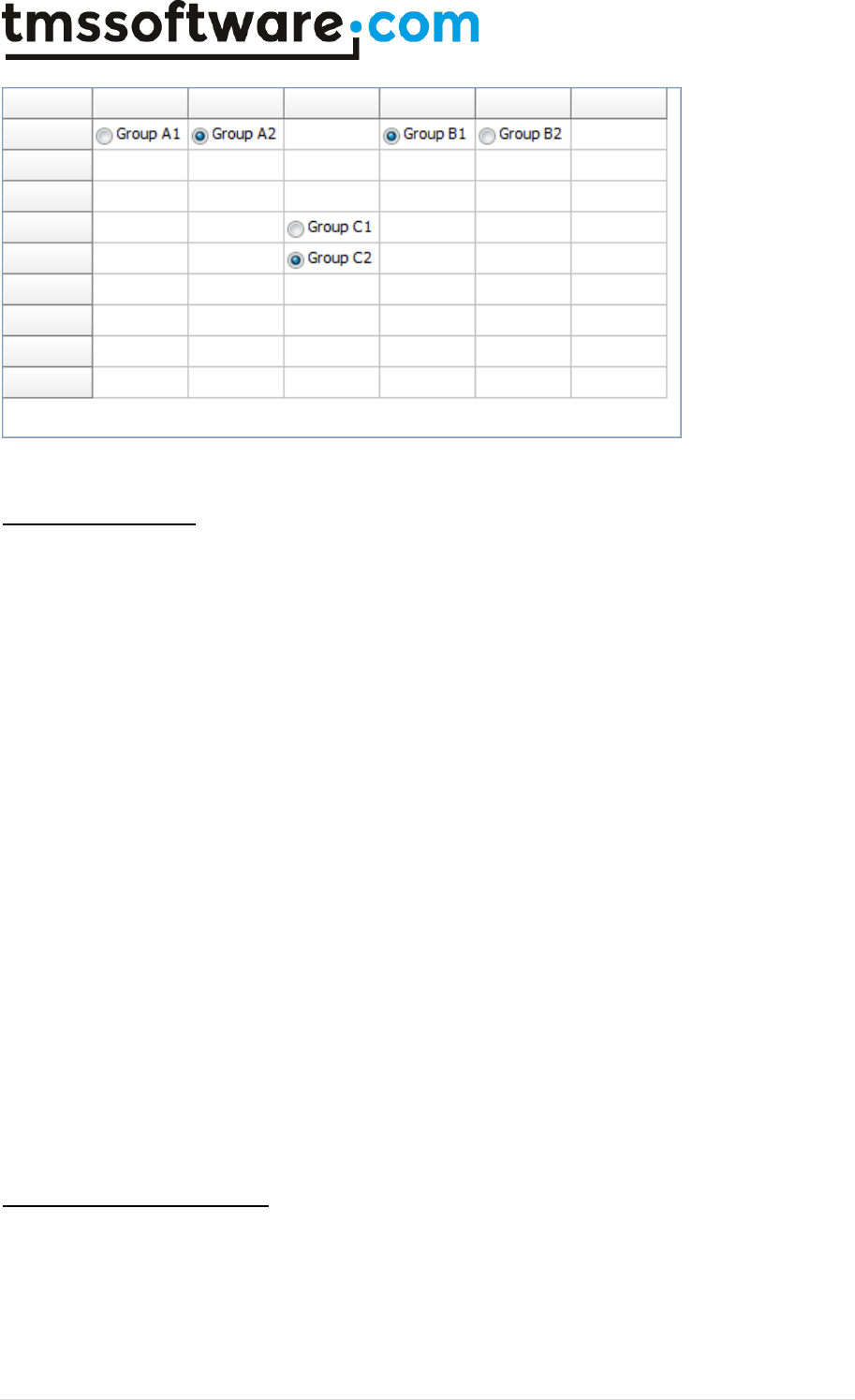
TMS SOFTWARE
TADVSTRINGGRID
DEVELOPERS GUIDE
75 | P a g e
Button and BitButtons
Always visible buttons and buttons with a bitmap can be added to cells in the grid. The width and
height of these buttons can be set as well as the caption and/or glyph. This is achieved through
following methods:
procedure AddButton(ACol,ARow, bw, bh:
Integer;Caption:string;hal:TCellHalign;val:TCellValign);
procedure SetButtonText(ACol,ARow: Integer; Caption: string);
procedure PushButton(ACol,ARow: Integer;push: Boolean);
procedure RemoveButton(ACol,ARow: Integer);
function HasButton(ACol,ARow: Integer): Boolean;
procedure AddBitButton(ACol,ARow,bw,bh:Integer; Caption:string;
Glyph:TBitmap; hal:TCellHalign; val:TCellValign);
function CreateBitButton(ACol,ARow,bw,bh: Integer; Caption:string;
hal:TCellHalign; val:TCellValign): TBitmap;
Again the same approach for adding buttons with a bitmap maintained by the grid and one by the
application is provided with the AddBitButton and CreateBitButton method. For the first method
AddBitButton, the application needs to create, maintain and destroy the bitmap, for the
CreateBitButton method the grid creates, maintains and eventually destroys the bitmap.
The buttons fire the OnButtonClick event when clicked.
Note: by design, a button in a read-only cell is disabled. If this behavior is not desired, set
grid.ControlLook.NoDisabledButtonLook = True.
Expanding and collapsing rows
When cells contain more data than you want to have always visible, adding a row expand/collaps
button can be convenient. This is a small button in the top right corner of a cell. When clicked, it
will increase the row height, making more data visible and when clicked again, it reduces the row
height back to the normal height. Adding expand/collaps buttons in the grid is easy. Five functions
controls the expand/collaps behavior in the grid:

TMS SOFTWARE
TADVSTRINGGRID
DEVELOPERS GUIDE
76 | P a g e
procedure AddExpandButton(ACol,ARow, ExpandedHeight: Integer);
function HasExpand(ACol,ARow: Integer): Boolean;
procedure RemoveExpand (ACol,ARow: Integer);
procedure ToggleExpand(ACol,ARow: Integer);
function GetExpandState(ACol,ARow: Integer): Boolean;
function GetExpandHeight(ACol,ARow:Integer; Expand:Boolean): Integer;
The AddExpandButton() function will add an expander button to a cell. The ExpandedHeight
parameter sets the height of the row in expanded state. The collapsed row height is by default the
height of the row before the row gets expanded. The function HasExpand() will return true when a
grid has such expand/collaps button and RemoveExpand() will remove any existing expand/collaps
button from the cell. ToggleExpand() will simply toggle the state of the row from collaps to expand
and vice versa. Finally, the function GetExpandState() will return true when the row is in expanded
state or false when not. The GetExpandHeight() function will return the height of an expanded row
when the Expand parameter is true and the normal height of the row when Expand parameter is
false.
Progressbars and ProgressPie
Two types of progress indicators can be displayed in a grid cell: a rectangular progress bar and a
circular pie type progress indicator. The AddProgress method provides two color parameters, one
for the zero to current position part of the progress bar and one for the current position to end part
of the bar. With the AddProgressEx method, additional color settings for font color in both parts is
possible. The progress bar fills the complete cell and as such the position of the progress bar
reflects a value between 0 and 100 set in the cell text.
procedure AddProgress(ACol,ARow: Integer;FGColor,BKColor: TColor);
procedure AddProgressEx(ACol,ARow:
Integer;FGColor,FGTextColor,BKColor,BKTextColor: TColor);
procedure AddProgressFormatted(ACol,ARow:
Integer;FGColor,FGTextColor,BKColor,BKTextColor: TColor; Fmt: string; Min,
Max: Integer);
procedure RemoveProgress(ACol,ARow: Integer);
procedure AddAdvProgress(ACol,ARow: Integer;Min:integer=0;Max:integer=100);
procedure RemoveAdvProgress(ACol,ARow: Integer);
Example: adding progressbar and setting position to 50
Grid.AddProgress(2,3,clRed,clWhite);
Grid.Ints[2,3] := 50;
A method is available AddProgressFormatted that allows to include the numeric formatting of the
value in the progressbar, as shown in this code snippet:
begin
AdvStringGrid1.AddProgressFormatted(1,1,clRed,clBlack,clInfoBk,clBlue,'%d
kb/sec',0,1000);
AdvStringGrid1.Ints[1,1] := 565;
end;
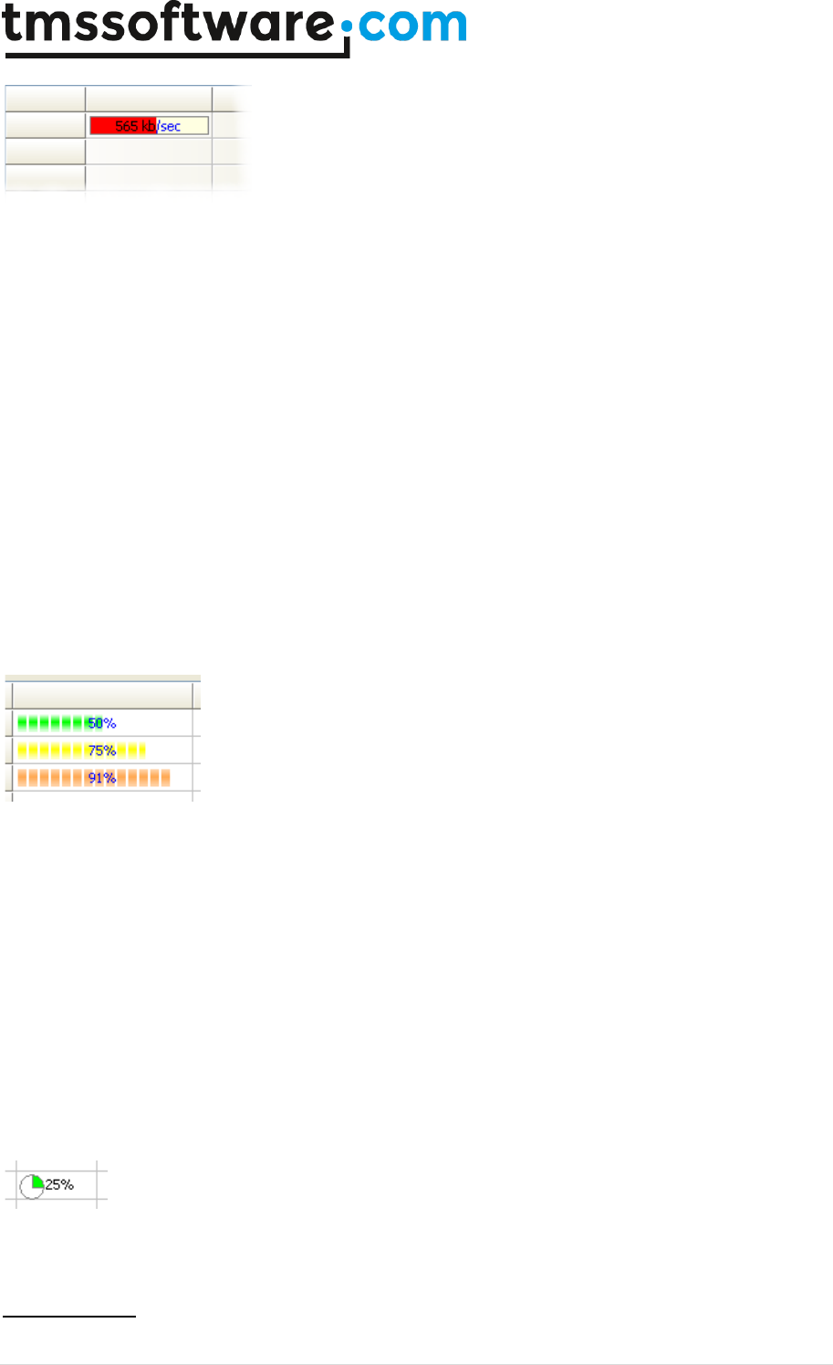
TMS SOFTWARE
TADVSTRINGGRID
DEVELOPERS GUIDE
77 | P a g e
Adding an advanced progress bar:
Using grid.AddAdvProgress, it is possible to add a Windows themed style progressbar (available from
Windows XP or higher) with many additional options. The settings for the progressbar appearance
can be found under Grid.ProgressAppearance. This allows to have progressbars with colors
dependent on level of progress. This sample code adds three XP style progressbars to the grid with
default progress level color settings:
with AdvStringGrid1 do
begin
ProgressAppearance.CompletionSmooth := false;
AddAdvProgress(1,1);
Ints[1,1] := 50;
AddAdvProgress(1,2);
Ints[1,2] := 75;
AddAdvProgress(1,3);
Ints[1,3] := 91;
end;
The circular pie type progress bar allows a compact visual progress indication in a cell that can
contain text as well. The value of the progress pie is set with the method SetProgressPie.
procedure AddProgressPie(ACol,ARow: Integer; Color: TColor; Value:
Integer);
procedure SetProgressPie(ACol,ARow: Integer; Value: Integer);
procedure RemoveProgressPie(ACol,ARow: Integer);
Example: adding progress pie with text and position 25
Grid.AddProgressPie(2,3,clLime,25);
Grid.Cells[2,3] := ‘25% completion’;
The progress pie is always left aligned in the cell and before the optional text in the cell.
Note: the style of the progress bar is also affected by the ControlLook property. This is discussed in
detail for the ControlLook property.
Range Indicator
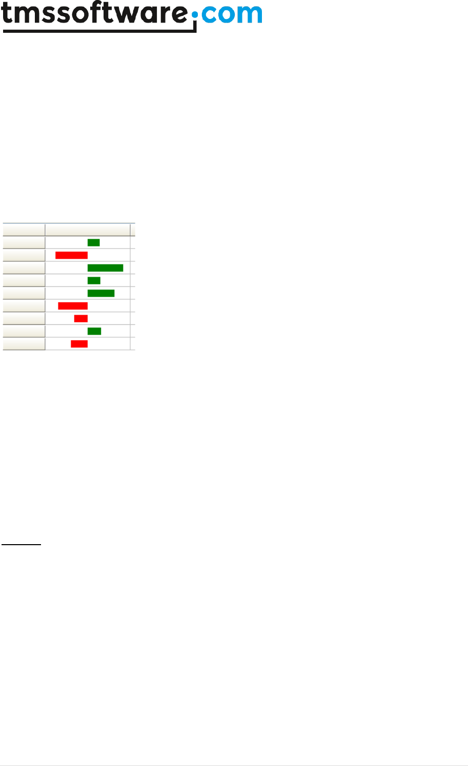
TMS SOFTWARE
TADVSTRINGGRID
DEVELOPERS GUIDE
78 | P a g e
A range indicator can show negative and positive ranges of value visually as bars in 2 different
colors, a color for negative range and a color for a positive range. The method to add a range
indicator is:
AddRangeIndicator(Col,Row,Range,NegColor,PosColor,ShowValue);
with:
Col,Row: cell where to add range indicator
Range: min/max boundaries of range, ie. From –Range to +Range (default 100)
NegColor: color of negative range bar (default Red)
PosColor: color of positive range bar (default Black)
ShowValue: when true shows value (default False)
Such range indicator is added with:
procedure TForm1.FormCreate(Sender: TObject);
var
i: integer;
begin
for i := 1 to AdvStringGrid1.RowCount - 1 do
begin
AdvStringGrid1.AddRangeIndicator(1,i,100,clRed,clGreen,false);
AdvStringGrid1.Ints[1,i] := -100 + Random(200);
end;
end;
Balloons
A balloon appears when the mouse hovers over a cell. A balloon features 3 elements: a title, a text
and an icon. To add and remove balloons, following methods are available:
procedure AddBalloon(ACol,ARow: Integer; Title, Text:string; Icon:
TBalloonIcon);
procedure RemoveBalloon(ACol, ARow: integer);
function HasBalloon(ACol, ARow: integer): boolean;
function IsBalloon(ACol, ARow: integer; var Title, Text: string; var Icon:
TBalloonIcon): boolean;
TBalloonIcon is defined as:
biNone: no icon
biInfo: information icon
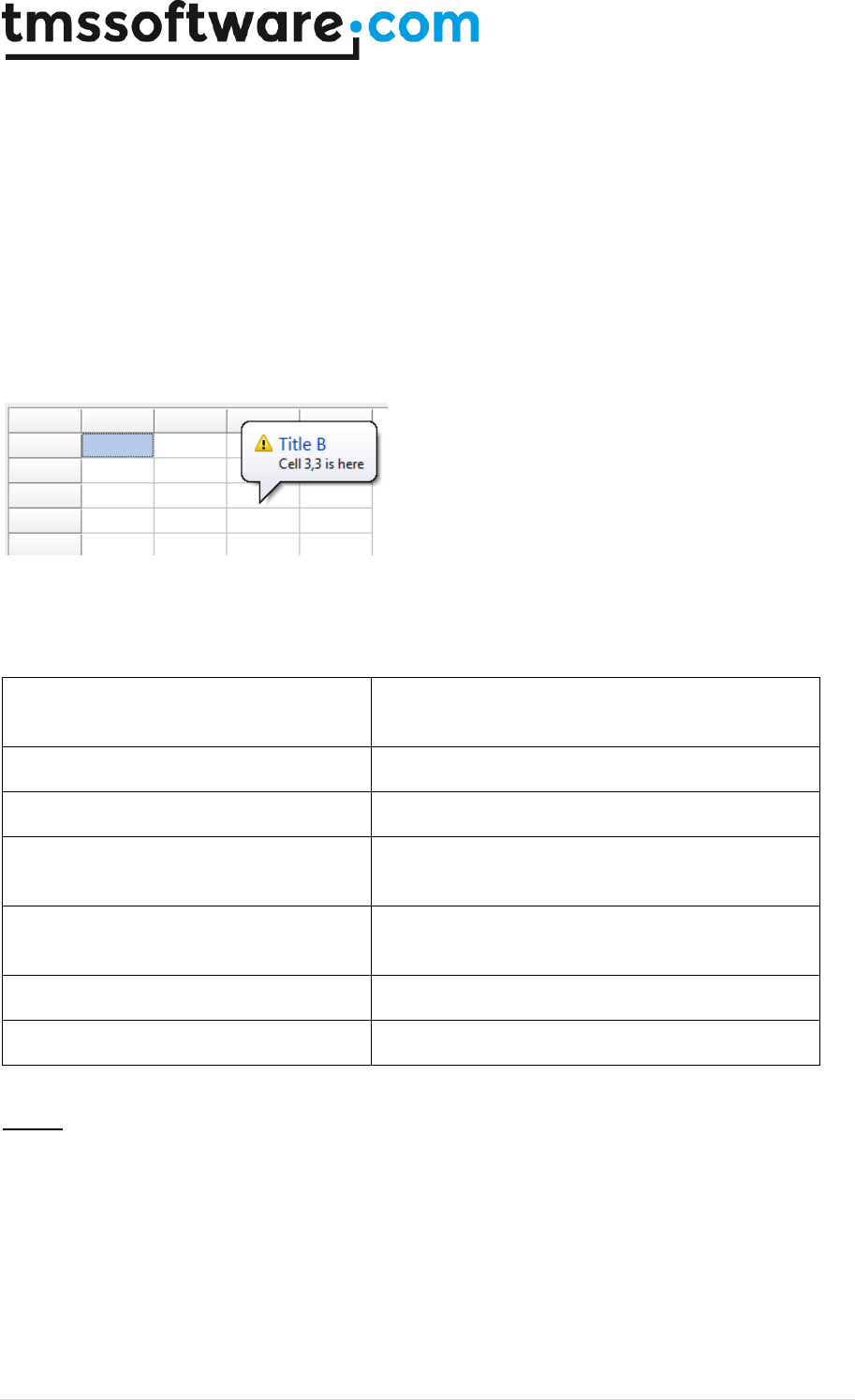
TMS SOFTWARE
TADVSTRINGGRID
DEVELOPERS GUIDE
79 | P a g e
biWarning: warning icon
biError: error icon
Adding a balloon can be done with:
procedure TForm2.FormCreate(Sender: TObject);
begin
AdvStringGrid1.Balloon.Enable := true;
AdvStringGrid1.AddBalloon(2,2,'Title A','Cell 2,2 is here', biError);
AdvStringGrid1.AddBalloon(3,3,'Title B','Cell 3,3 is here', biWarning);
end;
Note: in order to display a balloon, either via method AddBalloon or dynamically via the event
OnCellBalloon, grid.Balloon.Enable must be set to true. Further settings for the balloon tooltips are
available through grid.Balloon with properties:
AutoHideDelay: integer;
Sets the delay in milliseconds to auto hide the
balloon.
BackgroundColor: TColor;
Sets the background color of the balloon tooltip.
Enable: Boolean;
When true, displaying balloon tooltips is enabled.
InitialDelay: integer;
Sets the delay in milliseconds to wait before the
first balloon tooltip is shown.
ReshowDelay: integer;
Sets the delay in milliseconds to wait before a
new balloon tooltip is shown.
TextColor: TColor;
Sets the text color of the balloon tooltip.
Transparency: integer;
Sets the transparency of the balloon tooltip.
Shapes
Often it is desirable to have a little graphic representation and not having to resort to image
resources for this makes it easy to have graphics in many colours and many shapes in a resource
friendly way. The grid offers a range of such shapes that can be added via the method
grid.AddShape(ACol,ARow: integer; Shape: TCellShape; FillColor,LineColor: TColor; hal:
TCellHAlign; val: TCellVAlign);
The type TCellShape is defined in the unit AdvUtil and the supported shapes are:
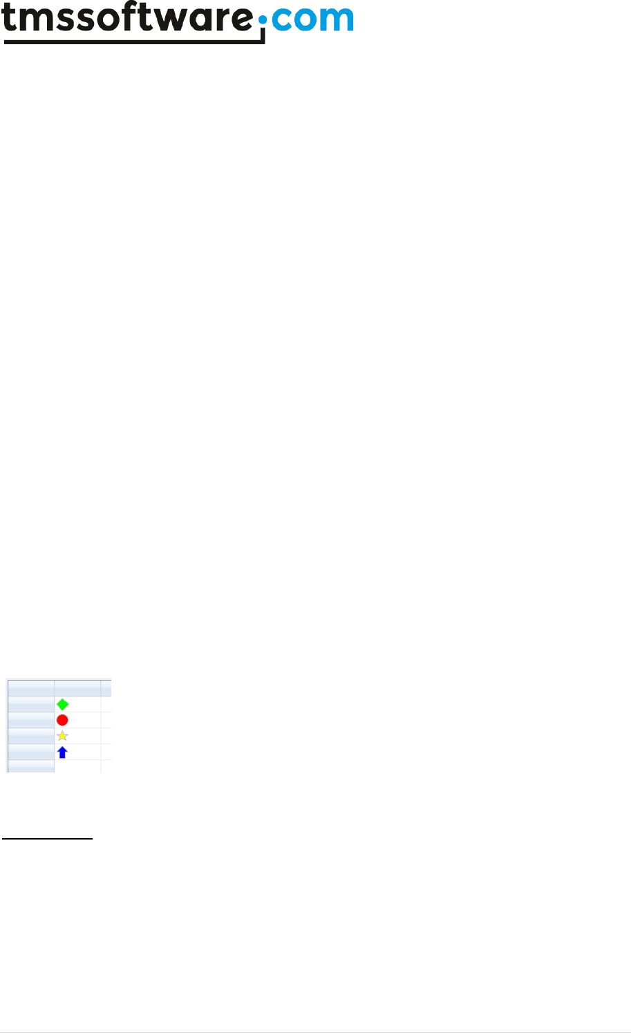
TMS SOFTWARE
TADVSTRINGGRID
DEVELOPERS GUIDE
80 | P a g e
csRectangle rectangular
csCircle circle
csTriangleLeft left oriented triangle
csTriangleRight right oriented triangle
csTriangleUp up oriented triangle
csTriangleDown down oriented triangle
csDiamond diamond shape
csLineVert single vertical line
csLineHorz single horizontal line
csRoundRect rounded rectangle
csEllips ellips
csSquare square
csRoundSquare rounded square
csStar star
csArrowUp arrow up
csArrowDown arrow down
csArrowLeft arrow left
csArrowRight arrow right
csHalfStar half star
To demonstrate this, following code adds 4 different shapes to the grid:
begin
AdvStringGrid1.AddShape(1,1,csDiamond,clLime, clSilver,
haBeforeText,vaTop);
AdvStringGrid1.AddShape(1,2,csCircle,clRed, clSilver,
haBeforeText,vaTop);
AdvStringGrid1.AddShape(1,3,csStar,clYellow, clSilver,
haBeforeText,vaTop);
AdvStringGrid1.AddShape(1,4,csArrowUp,clBlue, clSilver,
haBeforeText,vaTop);
end;
Rating control
As commonly seen in many web interfaces, the grid provides a specific graphic type to add a rating
control to a cell. The rating control consists of a number of star shapes. The number of fully or half
coloured stars represents the value. To add a rating control to a cell, call
grid.AddRating(ACol,ARow,Scale: integer; FullColor,EmtpyColor: TColor). The parameters
ACol,ARow set the cell where to add the rating control. The Scale parameter sets the number of
stars to use in the rating control and the parameters FullColor,EmptyColor set the color for fully
coloured stars and non coloured stars. When the grid cell is not read-only, the value of the rating
control can be change by clicking on the cell. The value can also be programmatically set and

TMS SOFTWARE
TADVSTRINGGRID
DEVELOPERS GUIDE
81 | P a g e
retrieved with grid.Floats[Col,Row]: double. This example code adds 3 rating controls in the grid
and presets its values:
begin
AdvStringGrid1.AddRating(1,1,5,clLime,clSilver);
AdvStringGrid1.Floats[1,1] := 2.0;
AdvStringGrid1.AddRating(1,2,5,clLime,clSilver);
AdvStringGrid1.Floats[1,2] := 3.6;
AdvStringGrid1.AddRating(1,3,5,clLime,clSilver);
AdvStringGrid1.Floats[1,3] := 1.1;
end;

TMS SOFTWARE
TADVSTRINGGRID
DEVELOPERS GUIDE
82 | P a g e
Using a vertical scrollbar per cell in TAdvStringGrid
When text is too large to fit in a cell, you could increase the cell size, ie. increase the row height,
the column width or both. This is not always practical, as the higher the row height is, the less rows
can be displayed. The same applies for the column width. The text could also be displayed cut-off
but this solution is also far from ideal. Now, an alternative solution is available with the capability
to add a vertical scrollbar to a cell. Any cell can as such have its own scrollbar and scroll separately
the cell's text or HTML formatted text. This feature is made available with the grid.AddScrollbar()
method. With this method a scrollbar is added to a cell. The scrollbar range and pagesize can either
be automatically set according to the size of the text in a cell or can be programmatically set. <br>
This is an overview of the methods available:
grid.AddScrollbar(col,row: integer; AutoRange: Boolean);
Adds a scrollbar to cell col,row and when AutoRange is true, the scrollbar range and pagesize is
automatically calculated.
grid.RemoveScrollbar(col,row: integer);
Removes the scrollbar again from the cell
grid.HasScrollBar(col,row: integer): Boolean
Returns true when the cell col,row has a scrollbar
grid.HasAutoRangeScrollBar(col,row: integer): Boolean
Returns true when the cell col,row has an autorange scrollbar
grid.SetScrollPosition(col,row,position: integer);
Programmatically sets the position of the scrollbar in cell col,row
grid.GetScrollPosition(col,row,position: integer): integer;
Programmatically gets the position of the scrollbar in cell col,row
grid.SetScrollProp(col,row: integer; Prop: TScrollProp);
Sets the scrollbar range & pagesize
grid.GetScrollProp(col,row: integer): TScrollProp;
Gets the scrollbar range & pagesize
In the sample, these capabilities are demonstrated by adding very long HTML formatted text in 3
cells of the grid. In these cells, first an autorange scrollbar was added with:
AdvStringGrid1.AddScrollBar(2,1,true);
AdvStringGrid1.AddScrollBar(2,2,true);
AdvStringGrid1.AddScrollBar(2,3,true);

TMS SOFTWARE
TADVSTRINGGRID
DEVELOPERS GUIDE
83 | P a g e
When text is set in a cell, the scrollbar will then appear when necessary. In this sample, it is also
demonstrated how the scrollbar position can be programmatically set. This is done from an UpDown
control for the cell that is selected. Upon cell selection, the UpDown control is initialized to the
cell's scrollbar range:
procedure TForm2.AdvStringGrid1SelectCell(Sender: TObject; ACol, ARow:
Integer;
var CanSelect: Boolean);
var
sp: TScrollProp;
begin
if AdvStringgrid1.HasScrollBar(Acol,ARow) then
begin
sp := AdvStringgrid1.GetScrollProp(ACol,ARow);
updown1.Min := 0;
updown1.Max := sp.Range;
updown1.Position := sp.Range -
AdvStringgrid1.GetScrollPosition(ACol,ARow);
end;
end;
procedure TForm2.UpDown1Changing(Sender: TObject; var AllowChange:
Boolean);
var
sp: TScrollProp;
begin
if AdvStringGrid1.HasScrollBar(AdvStringgrid1.Col, AdvStringGrid1.Row)
then
begin
AdvStringGrid1.SetScrollPosition(AdvStringgrid1.Col,
AdvStringGrid1.Row, updown1.Max - updown1.Position);

TMS SOFTWARE
TADVSTRINGGRID
DEVELOPERS GUIDE
84 | P a g e
end;
end;
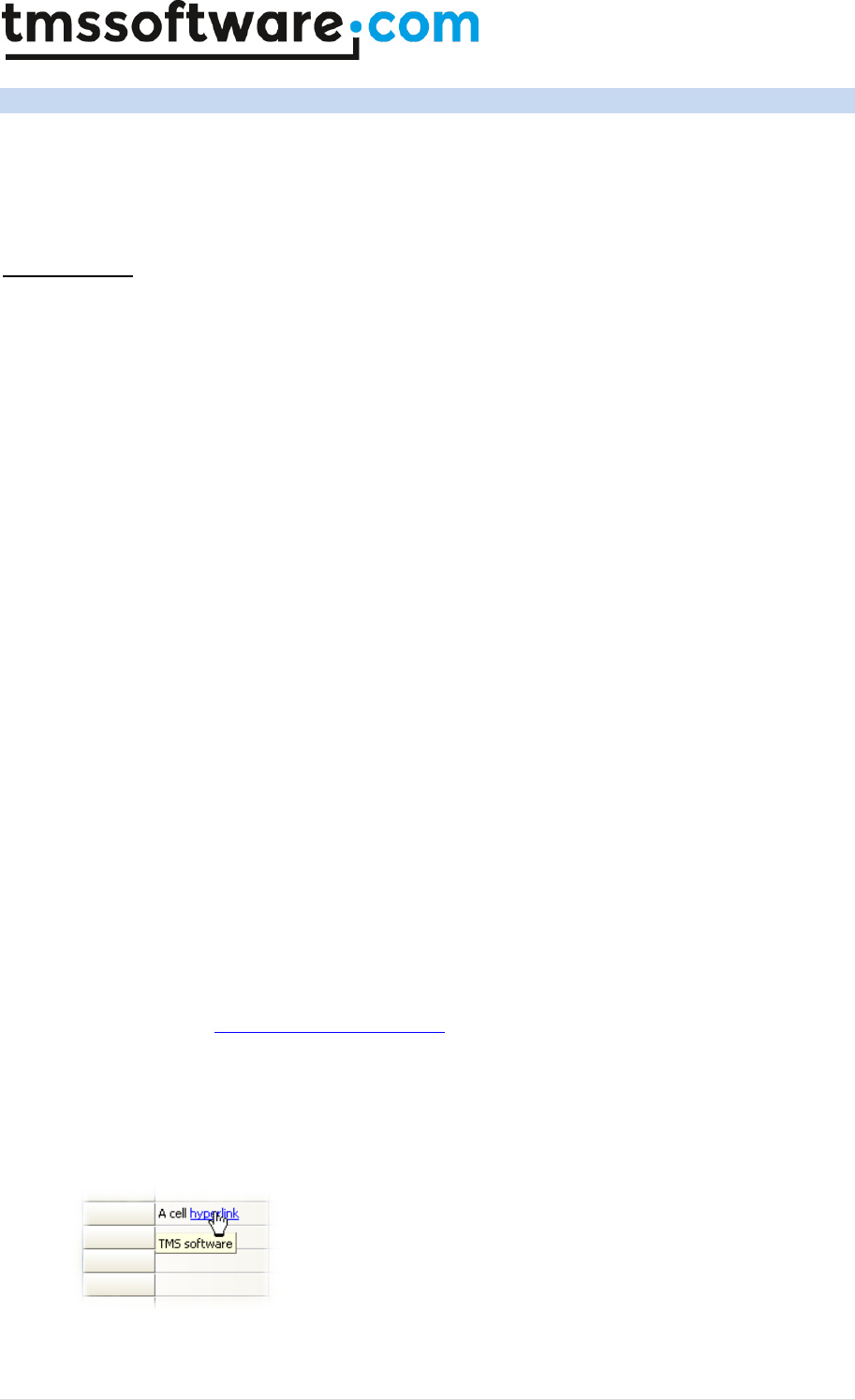
TMS SOFTWARE
TADVSTRINGGRID
DEVELOPERS GUIDE
85 | P a g e
TAdvStringGrid HTML formatted cells
The cells in TAdvStringgrid have support for various HTML tags through which fine control of the
display is possible. The HTML formatting support is by default enabled but can be turned off by
setting the property EnableHTML to False. The supported tags form a subset of the HTML tags and
are further named as mini html
Supported tags
• B : Bold tag
<B> : start bold text
</B> : end bold text
Example : This is a <B>test</B>
• U : Underline tag
<U> : start underlined text
</U> : end underlined text
Example : This is a <U>test</U>
• I : Italic tag
<I> : start italic text
</I> : end italic text
Example : This is a <I>test</I>
• S : Strikeout tag
<S> : start strike-through text
</S> : end strike-through text
Example : This is a <S>test</S>
• A : anchor tag
<A href="value" title=”HintValue”> : text after tag is an anchor. The 'value' after the href
identifier is the anchor. This can be an URL (with ftp,http,mailto,file identifier) or any text.
If the value is an URL, the shellexecute function is called, otherwise, the anchor value can
be found in the OnAnchorClick event
</A> : end of anchor
Examples :
This is a <A href="mailto:myemail@mail.com">test</A>
This is a <A href="http://www.tmssoftware.com">test</A>
This is a <A href="somevalue">test</A>
Hints for hyperlinks defined in HTML can also be directly be set with the Title attribute. If
no Title attribute is specified, the HREF value is used as hint value. Hyperlink hints are
enabled when grid.AnchorHint is set to true and grid.ShowHint is set to true.
Example:

TMS SOFTWARE
TADVSTRINGGRID
DEVELOPERS GUIDE
86 | P a g e
The hint for this cell is set by:
advstringgrid1.Cells[1,3] := 'A cell <a href="http://www.tmssoftware.com"
title="TMS software">hyperlink</a>';
• FONT : font specifier tag
<FONT face='facevalue' size='sizevalue' color='colorvalue' bgcolor='colorvalue'> : specifies
font of text after tag.
with
- face : name of the font
- size : HTML style size if smaller than 5, otherwise pointsize of the font
- color : font color with either hexidecimal color specification or Borland style color name,
ie clRed,clYellow,clWhite ... etc
- bgcolor : background color with either hexidecimal color specification or Borland style
color name
</FONT> : ends font setting
Examples :
This is a <FONT face="Arial" size="12" color="clRed">test</FONT>
This is a <FONT face="Arial" size="12" color="#FF0000">test</FONT>
• P : paragraph
<P align="alignvalue" [bgcolor="colorvalue"]> : starts a new paragraph, with left, right or
center alignment. The paragraph background color is set by the optional bgcolor parameter.
</P> : end of paragraph
Example : <P align="right">This is a test</P>
Example : <P align="center">This is a test</P>
Example : <P align="left" bgcolor="#ff0000">This has a red background</P>
Example : <P align="right" bgcolor="clYellow">This has a yellow background</P>
• HR : horizontal line
<HR> : inserts linebreak with horizontal line
• BR : linebreak
<BR> : inserts a linebreak
• BODY : body color / background specifier
<BODY bgcolor="colorvalue" background="imagefile specifier"> : sets the background color of
the HTML text or the background bitmap file
Example :
<BODY bgcolor="clYellow"> : sets background color to yellow
<BODY background="file://c:\test.bmp"> : sets tiled background to file test.bmp
• IND : indent tag
This is not part of the standard HTML tags but can be used to easily create multicolumn text
<IND x="indent"> : indents with "indent" pixels
Example :
This will be <IND x="75">indented 75 pixels.
• IMG : image tag
<IMG src="specifier:name" [align="specifier"] [width="width"] [height="height"]
[alt="specifier:name"] > : inserts an image at the location
specifier can be :

TMS SOFTWARE
TADVSTRINGGRID
DEVELOPERS GUIDE
87 | P a g e
idx : name is the index of the image in the associated imagelist
ssys : name is the index of the small image in the system imagelist or a filename for which
the corresponding system imagelist is searched
lsys : same as ssys, but for large system imagelist image
file : name is the full filename specifier
res : name of a resource bitmap (not visible at design time)
no specifier : name of image in an PictureContainer
Optionally, an alignment tag can be included. If no alignment is included, the text
alignment with respect to the image is bottom. Other possibilities are : align="top" and
align="middle"
The width & height to render the image can be specified as well. If the image is embedded
in anchor tags, a different image can be displayed when the mouse is in the image area
through the Alt attribute.
Examples :
This is an image <IMG src="idx:1" align="top">
This is an image <IMG src="ssys:1"> and another one <IMG src="ssys:worfile.doc">
This is an image <IMG src="file://c:\my documents\test.bmp">
This is an image <IMG src="res://BITMAP1">
This is an image <IMG src="name">
• SUB : subscript tag
<SUB> : start subscript text
</SUB> : end subscript text
Example : This is <SUP>9</SUP>/<SUB>16</SUB> looks like 9/16
• SUP : superscript tag
<SUP> : start superscript text
</SUP> : end superscript text
• BLINK : blink tag (the EnableBlink needs to be set to true to enable this)
<BLINK> : start blinking text
</BLINK> : stop blinking text
Example : This is <FONT color="clred"><BLINK>blinking red</BLINK></FONT>text.
• UL : list tag
<UL> : start unordered list tag
</UL> : end unordered list
Example :
<UL>
<LI>List item 1
<LI>List item 2
<UL>
<LI> Sub list item A
<LI> Sub list item B
</UL>
<LI>List item 3
</UL>

TMS SOFTWARE
TADVSTRINGGRID
DEVELOPERS GUIDE
88 | P a g e
• LI : list item
<LI [type="specifier"] [color="color"] [name="imagename"]> : new list item
specifier can be "square" or "circle" or "image" bullet color sets the color of the square or
circle bullet imagename sets the PictureContainer image name for image to use as bullet
• SHAD : text with shadow
<SHAD> : start text with shadow
</SHAD> : end text with shadow
• Z : hidden text
<Z> : start hidden text
</Z> : end hidden text
• HI : hilight
<HI> : start text hilighting
</HI> : stop text hilighting
• E : Error marking
<E> : start error marker
</E> : stop error marker
• Special characters
Following standard HTML special characters are supported :
< : less than : <
> : greater than : >
& : &
" : "
: non breaking space
™ : trademark symbol
€ : euro symbol
§ : section symbol
© : copyright symbol
¶ : paragraph symbol
HTML formatting related events
The hyperlinks that can be added inside a cell cause following events when the mouse is over or
clicked on hyperlink. The events are :
OnItemAnchorClick : triggered when a hyperlink is clicked in a cell
OnItemAnchorEnter : triggered when the mouse enters a hyperlink
OnItemAnchorExit : triggered when the mouse leaves a hyperlink
OnItemAnchorHint : triggered when the mouse is over a hyperlink to query the hint for the link
(this is enabled if the property grid.AnchorHint is set true)
Example: Handling hyperlink clicks in TAdvStringGrid

TMS SOFTWARE
TADVSTRINGGRID
DEVELOPERS GUIDE
89 | P a g e
A hyperlink is added with
grid.Cells[0,0] :=
‘This is a <a href=”myhyperlink”>hyperlink<a>’;
When the mouse clicked on the hyperlink, the OnItemAnchorClick is called with a reference to
the cell coordinates and the Anchor parameter is ‘myhyperlink’. The AutoHandle parameter is
by default true and causes that the grid will automatically open the default application for the
hyperlink. Setting this parameter AutoHandle allows custom handling of the hyperlink click.
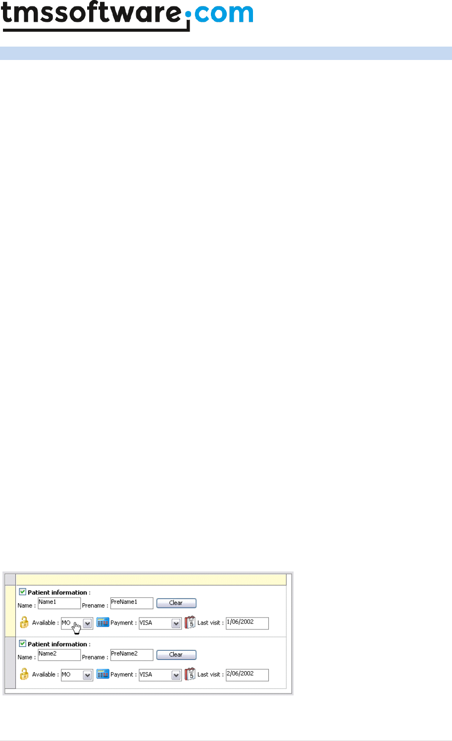
TMS SOFTWARE
TADVSTRINGGRID
DEVELOPERS GUIDE
90 | P a g e
TAdvStringGrid HTML forms
Combining multiple buttons in a cell, adding more than one checkbox in a cell, editing different
items in a cell, it is possible with TAdvStringGrid and its mini HTML forms. Mini HTML forms bring a
solution allowing unlimited capabilities to specify cell contents and behaviour.
TAdvStringgrid, controls can be specified through a the tag <CONTROL>
The CONTROL tag takes following parameters:
<CONTROL ID="ControlID" VALUE="ControlValue" TYPE="ControlType" WIDTH="ControlWidth"
MAXLEN=”ControlMaxLenValue”>
with:
ControlID = unique ID string per cell for the control
ControType = "EDIT" or "CHECK" or "RADIO" or "COMBO" or "BUTTON"
ControlWidth = width of the control in pixels
ControlValue = value of the control depending on the type :
ControlMaxLenValue = optional maximum edit length of edit control. When MAXLEN attribute is not
specified or value of ControlMaxLenValue is 0, string length is not limited.
"TRUE", "FALSE" for checkboxes and radiobuttons
Button caption for button control
Text value for edit and combobox controls
With this information, forms can be specified like:
with AdvStringGrid1 do
begin
Cells[1,ARow] := '<CONTROL TYPE="CHECK" WIDTH="15" ID="CK1"> <b>Patient
information</b> :<BR>' +
'Name : <CONTROL TYPE="EDIT" WIDTH="80" VALUE="" ID="ED1"> '+
'Prename : <CONTROL TYPE="EDIT" WIDTH="80" VALUE="" ID="ED2"> ' +
'<CONTROL TYPE="BUTTON" WIDTH="80" VALUE="Clear" ID="BTN1"><BR><BR>' +
'<IMG src="idx:0" align="middle"> Available : <CONTROL TYPE="COMBO"
WIDTH="60" ID="CO1"> ' +
'<IMG src="idx:1" align="middle"> Payment : <CONTROL TYPE="COMBO"
WIDTH="80" VALUE="" ID="CO2"> '+
'<IMG src="idx:2" align="middle"> Last visit : <CONTROL TYPE="EDIT"
WIDTH="80" VALUE="" ID="ED3">';
end;
Getting and setting control values is done with the property grid.ControlValues[Col,Row,ID]: string;

TMS SOFTWARE
TADVSTRINGGRID
DEVELOPERS GUIDE
91 | P a g e
Example: setting form values through the control ID and ControlValues property:
with AdvStringGrid1 do
begin
ControlValues[1,ARow,'CK1'] := 'TRUE';
ControlValues[1,ARow,'ED1'] := 'Name'+IntToStr(ARow);
ControlValues[1,ARow,'ED2'] := 'PreName'+IntToStr(ARow);
ControlValues[1,ARow,'CO1'] := 'MO';
ControlValues[1,ARow,'CO2'] := 'VISA';
ControlValues[1,ARow,'ED3'] := DateToStr(Now + ARow);
end;
The events that are used for handling form controls are :
OnControlClick : event triggered when a mini HTML form control is clicked
OnControlComboList : event querying the values for a combobox as well as its style
OnControlEditDone : event triggered when editing of the mini HTML form control starts
All events return the cell for the control, the control ID, type and value. For the
OnControlComboList event, a stringlist is passed as parameter where the values that need to be
displayed in the combobox can be added. With the Edit parameter, the combobox can be set as
either dropdownlist (Edit = False) or as editable combobox (Edit = true).
Example: Using the OnControlComboList event for setting combobox items in a form:
procedure TForm1.AdvStringGrid1ControlComboList(Sender: TObject; ARow,
ACol: Integer; CtrlID, CtrlType, CtrlVal: String; Values: TStringList;
var Edit: Boolean; var DropCount: Integer);
begin
Values.Clear;
if CtrlID = 'CO1' then
begin
Values.Add('MO');
Values.Add('TU');
Values.Add('WE');
Values.Add('TH');
Values.Add('FR');
Values.Add('SA');
Values.Add('SU');
Edit := False; // combo dropdownlist
end;
if CtrlID = 'CO2' then
begin
Values.Add('VISA');
Values.Add('AMEX');
Values.Add('MASTERCARD');
Values.Add('CASH');
Values.Add('N/A');
Edit := True; // combo dropdown edit
end;
end;
TMS SOFTWARE
TADVSTRINGGRID
DEVELOPERS GUIDE
92 | P a g e
TAdvStringGrid miscellaneous display control
Showing active cell in fixed cells
With the property ActiveCellShow set true, it is possible to indicate the fixed row and column cell
for column and row where the focus cell is found, in a different color and different font. The
background color of the fixed cell is set with ActiveCellColor, the font is set with the ActiveCellFont
property. For normal display, the fixed cell uses the FixedColor background color and FixedFont for
text.
Note: when active cell display is activated and multiple fixed columns or fixed rows are shown in
the grid, the active cells are displayed on the innermost fixed columns/rows.
Background gradient or bitmap
TAdvStringGrid can show a bitmap or gradient as background in fixed cells only, normal cells only or
for all cells. The background bitmap is set with the grid.BackGround.Bitmap property. The selection
for which cells the background should be displayed is set with grid.BackGround.Cells. This
background bitmap can be tiled (grid.BackGround.Display = bdTile) or displayed at a fixed
(grid.BackGround.Display = bdFixed) position (set with grid.BackGround.Top and
grid.BackGround.Left)
To show a background gradient, set grid.Background.Display to bdGradientVert or bdGradientHorz
and select gradient start and end color with grid.Background.Color and grid.Background.ColorTo.
Bands
Banding of alternate colors is enabled in TAdvStringGrid with setting grid.Bands.Active = True.
The alternating colors are set with grid.Bands.PrimaryColor and grid.Bands.SecondaryColor. The
number of rows to display in primary color is set with grid.Bands.PrimaryLength, the number of rows
to display in secondary color is set with grid.Bands.SecondaryLength. Finally, it can be selected
whether the banding should be printed or not with the grid.Bands.Print property.
Note: when using a descendent class such as TAdvColumnGrid or TDBAdvGrid, it is required to set
the property ShowBands = true for the columns where bands should be displayed.
Control look
Various settings are combined here that control how inplace controls look in the grid. The
ControlLook property has following subproperties:
ButtonPrefix: Boolean;
When true, a & character is treated as shortcut prefix
and makes the next letter shortcut character that is
displayed underlined. When ButtonPrefix = false, the
& character is displayed literally in the button
control.
CheckAlwaysActive: Boolean;
When true, a checkbox is always displayed as active,
irrespective of the readonly state of the cell
CheckedGlyph: TBitmap;
Sets the glyph for a custom checked checkbox
CheckSize: Integer;
Sets the size of a checkbox

TMS SOFTWARE
TADVSTRINGGRID
DEVELOPERS GUIDE
93 | P a g e
Color: TColor;
Sets the color for Borland style checkbox and
radiobuttons
CommentColor: TColor;
Sets the default comment triangle indicator color
ControlStyle: TControlStyle;
See below
DropDownAlwaysVisible: Boolean;
When true, the combobox dropdown button is always
displayed, irrespective of the editing mode
DropDownCount: integer;
Sets the nr. of items displayed in the dropdown of
inplace combobox editors
FixedDropDownButton: Boolean;
When true, a fixed cell has an additional right side
dropdown button when the mouse hovers the cell
FixedGradient*: TColor;
Series of properties that control the top & bottom
gradient of the fixed cell in normal, hot & down
state.
FlatButton: Boolean;
When true, inplace buttons are displayed in flat style
NoDisabledButtonLook: Boolean;
By default, buttons added in the grid in read only
cells are shown as disabled. To override this, set this
property to true.
NoDisabledCheckRadioLook: Boolean
By default, checkboxes and radiobuttons added in the
grid in read only cells are shown as disabled. To
override this, set this property to true.
ProgressBorderColor: TColor;
Sets the color of a progress bar border
ProgressHeight: integer;
Default value is -1 and with this default value, the
progressbar height is equal to the cell height. When a
different value is specified, this is used as height for
the progressbars in grid cells.
ProgressMarginX: Integer;
Horizontal margin on left and right for the
progressbar in a cell
ProgressMarginY: Integer;
Vertical margin on top and below for the progressbar
in a cell
ProgressXP: Boolean;
When true, the progressbar is drawn with the
Windows XP visual style
RadioAlwaysActive: Boolean;
When true, a radiobutton is always displayed as
active, irrespective of the readonly state of the cell
RadioOffGlyph: TBitmap;
Sets the glyph for a custom unchecked radiobutton
RadioOnGlyph: TBitmap;
Sets the glyph for a custom checked radiobutton
RadioSize: Integer;
Sets the size of a radiobutton
TMS SOFTWARE
TADVSTRINGGRID
DEVELOPERS GUIDE
94 | P a g e
SpinButtonsAlwaysVisible: Boolean;
When true, buttons of spin editor inplace editors are
always visible, irrespective of the editing state of a
cell.
UnCheckedGlyph: TBitmap;
Sets the glyph for a custom unchecked checkbox
The ControlStyle can have following values:
TControlStyle = (csClassic,csFlat,csWinXP,csBorland,csTMS,csGlyph,csTheme);
With:
csBorland
Borland style checkboxes and radiobuttons
csClassic
Normal Windows control look
csFlat
Flat control look
csGlyph
Use glyphs defined in ControlLook for checkboxes and radiobuttons
csTheme
Use Windows theme API (available in Windows XP or later) to draw checkboxes,
radiobuttons, buttons, …
csTMS
TMS style checkboxes and radiobuttons
csWinXP
Fixed Luna style control look (works on all Windows versions)
Row indicator
With the property grid.RowIndicator: TBitmap a bitmap can be set that is shown in the first fixed
column for the active row. A small arrow bitmap can be set for example to show the active row in a
similar way as the DB cursor is shown in a DB grid.
Global cell text appearance settings
Several grid properties affect global look of cell text which are:
AutoNumAlign
When true, automatically selects right alignment for cells containing numeric data
only
EnhTextSize
When true, text that does not fit in the grid cell is displayed with end ellipsis
MultiLineCells
When true, cell text containing line feeds is displayed on multiple lines
URLFull
When true, the protocol specifier is displayed along with the hyperlink, otherwise
it is used internally but not displayed
URLShow
When true, cell text starting with protocol specifiers http://, ftp://, nntp://,
mailto: is displayed in the URLColor and underlined
TMS SOFTWARE
TADVSTRINGGRID
DEVELOPERS GUIDE
95 | P a g e
URLShowInText
When true, any hyperlink of the type http://, http://, ftp://, nntp://, mailto:
that occurs in the text of a cell is displayed in the URLColor and underlined and
will act as a hyperlink when clicked. This means that if the cell content is “Visit
http://www.tmssoftware.com for details”, the hyperlink will be automatically
underlined without any need to write HTML <A> tags. This is different from using
just URLShow = true, where the entire cell text is treated as hyperlink or not.
WordWrap
When true, cell text is wordwrapped. This can be dynamically set for individual
cells by using the event OnGetWordWrap. Note that when WordWrap is enabled,
text in the cell is always vertically top aligned. The Windows wordwrap text
drawing API can only display wordwrapped text top aligned.
Cell selection
By default, selected cells are displayed in the clHighLight background color and clHightLightText
font color. Set grid.ShowSelection = false if the grid should not display selected cells. Settings that
control display of selected cells are:
SelectionColor: TColor;
Sets the background color of selected cells
SelectionColorTo: TColor;
When different from clNone, sets the gradient end color of a
selected cell.
SelectionColorMixer: boolean;
When true, the color of a selected cell is X% of color value of the
cell and 100-X% of the selectioncolor. X is the
SelectionColorMixerFactor and defaults to 50.
SelectionColorMixerFactor:
integer;
Selects the ratio of the color mixer between cell color and
selection color.
SelectionMirrorColor: TColor;
When different from clNone, sets the bottom gradient start color
of a selected cell.
SelectionMirrorColorTo: TColor;
When different from clNone, sets the bottom gradient end color
of a selected cell.
SelectionRectangle: Boolean;
When true, a wide border rectangle is displayed around selected
cells
SelectionResizer: Boolean;
When true, the selection rectangle is displayed with rectangular
grip in bottom right corner to resize the selection
SelectionRTFKeep: Boolean;
When true, RTF text colors are not affected by selection text
color in selected cells
SelectionTextColor: TColor;
Sets the text color of selected cells
ShowSelection: Boolean;
When true, selected cells are displayed in SelectionColor and
SelectionTextColor
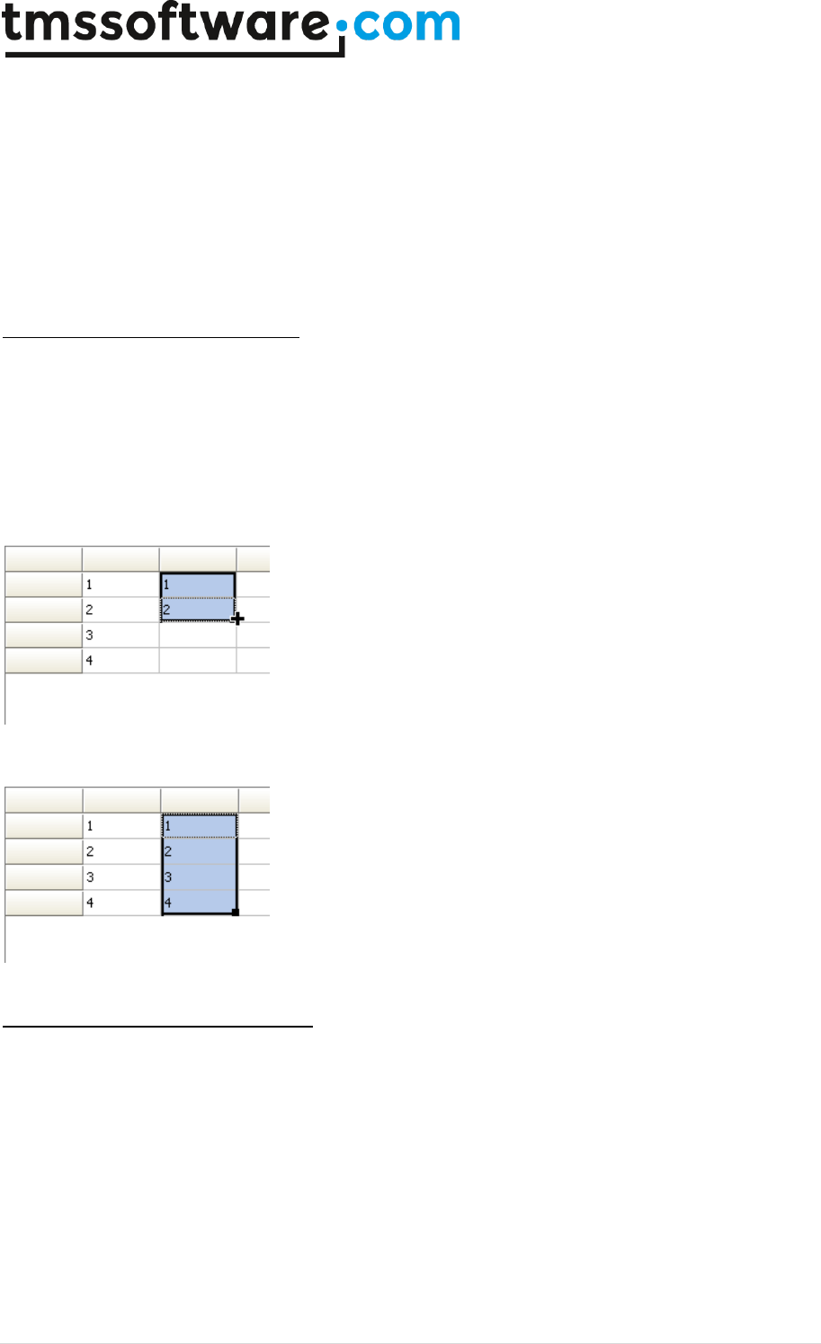
TMS SOFTWARE
TADVSTRINGGRID
DEVELOPERS GUIDE
96 | P a g e
The selection in the grid can be hidden temporarily by the method grid.HideSelection and unhidden
later with grid.UnHideSelection.
Note: by default, when the SelectionTextColor is set to a color different from clNone, the
SelectionTextColor has priority over the font color of the cell itself. This is to ensure that for the
combination SelectionColor/SelectionTextColor, the cell text is always guaranteed to be visible. If it
is not desirable that the selection text color is different from the cell font color, set
grid.SelectionTextColor to clNone. With this setting, the cell text color will be always used.
Advanced topic: Smart cell resizing
With SelectionResizer and SelectionRectangle set true, the selection can be resized by dragging the
bottom left corner. If the property grid.Navigation.AllowSmartClipboard is set true as well, the
resizing of the selection will cause the smart clipboard operation to try to fill the new selection
based on the information found in the first selected cells. It will try to guess the data format of the
cells of the original selection and try to find the delta between 2 or more cells of the original
selection and apply this delta for completion for the new selection.
Example: original selection
Resized to new selection
Hilighting and marking errors in cells
With the <HI> tag and <E> tag an arbitrary part of the text can be highlighted or underlined with
error lines. TAdvStringGrid has a range of methods that allow to automatically highlight or
unhighlight text in cells or mark or unmark text in cells. The following set of methods is available
for this:
function HilightText(DoCase: Boolean; S,Text: string):string;
function UnHilightText(S:string):string;
procedure HilightInCell(DoCase: Boolean; Col,Row: Integer; HiText: string);
procedure HilightInCol(DoFixed,DoCase: Boolean; Col: Integer; HiText:
string);

TMS SOFTWARE
TADVSTRINGGRID
DEVELOPERS GUIDE
97 | P a g e
procedure HilightInRow(DoFixed,DoCase: Boolean; Row: Integer; HiText:
string);
procedure HilightInGrid(DoFixed,DoCase: Boolean; HiText: string);
procedure UnHilightInCell(Col,Row: Integer);
procedure UnHilightInCol(DoFixed: Boolean; Col: Integer);
procedure UnHilightInRow(DoFixed: Boolean; Row: Integer);
procedure UnHilightInGrid(DoFixed: Boolean);
function MarkText(DoCase: Boolean; S,Text: string):string;
function UnMarkText(S:string):string;
procedure MarkInCell(DoCase: Boolean; Col,Row: Integer; HiText: string);
procedure MarkInCol(DoFixed,DoCase: Boolean; Col: Integer; HiText: string);
procedure MarkInRow(DoFixed,DoCase: Boolean; Row: Integer; HiText: string);
procedure MarkInGrid(DoFixed,DoCase: Boolean; HiText: string);
procedure UnMarkInCell(Col,Row: Integer);
procedure UnMarkInCol(DoFixed: Boolean; Col: Integer);
procedure UnMarkInRow(DoFixed: Boolean; Row: Integer);
procedure UnMarkInGrid(DoFixed: Boolean);
procedure RemoveMarker(ACol,ARow: Integer);
procedure RemoveAllMarkers;
Example: highlighting TMS in a cell
Grid.Cells[2,3] := ‘This is TMS software’;
Grid.HilightInCell(False,2,3,’TMS’);
This will display the cell as :
This is TMS software
Later the highlighting can be removed by calling grid.UnHiLightInGrid(False). This will remove
highlighting in any cell of the grid.
Trimming cells
Following functions are defined to perform trimming of values in a rectangle of grid cells, in a row,
in a column or in the entire grid:
procedure TrimRect(ACol1,ARow1,ACol2,ARow2: Integer);
procedure TrimCol(ACol: Integer);
procedure TrimRow(ARow: Integer);
procedure TrimAll;
Automatic sizing and numbering of columns and rows
TAdvStringGrid has several built-in methods to let the grid automatically adapt the column width or
row height to fit the text of cells.
Methods:
procedure AutoSizeCol(Col: integer);
Adapts the width of column Col to have all text in cells in this column fit.

TMS SOFTWARE
TADVSTRINGGRID
DEVELOPERS GUIDE
98 | P a g e
procedure AutoSizeColumns(DoFixedCols: Boolean; Padding: integer);
Adapts the width of all columns (including fixed columns when DoFixedCols = true) to the width of
the text. An additional parameter Padding can be used to add some extra padding width to the
column’s width.
procedure AutoGrowCol(Col: integer);
Adapts the width of column Col to have all text in cells in this column fit. The width of the column
can only increase when the text is too large, it will never shrink.
procedure AutoGrowColumns(DoFixedCols: Boolean; Padding: integer);
Adapts the width of all columns (including fixed columns when DoFixedCols = true) to the width of
the text. An additional parameter Padding can be used to add some extra padding width to the
column’s width. Equivalent to AutoGrowCol(), the width of the column can only increase when the
text is larger than the column width. The width will never decrease though when calling
AutoGrowColumns().
procedure AutoFitColumns(DoFixedCols: Boolean = true);
Changes the width of all columns proportionally to ensure all columns fill the entire width of the
grid. When DoFixedCols = false, the size of the fixed columns is not affected, only the size of the
normal columns is proportionally changed.
procedure AutoSizeRow(Row: integer);
Adapts the height of row Row to have all text in cells in this row fit.
procedure AutoSizeRows(DoFixedRows: Boolean; Padding: integer);
Adapts the height of all rows (including fixed rows when DoFixedRows = true) to the height of the
text. An additional parameter Padding can be used to add some extra padding width to the row’s
height.
procedure AutoNumberCol(Col: integer);
Fills the rows of a column with a series of numbers, incrementing from first row to total number of
rows. The grid public property AutoNumberOffset sets the value of the first row and the property
AutoNumberStart sets the first row index from where auto numbering should be applied.
procedure AutoNumberRow(Row: integer);
Fills the columns of a row with a series of numbers, incrementing from first column to total number
of columns. The grid public property AutoNumberOffset sets the value of the first column and the
property AutoNumberStart sets the first column index from where auto numbering should be
applied.
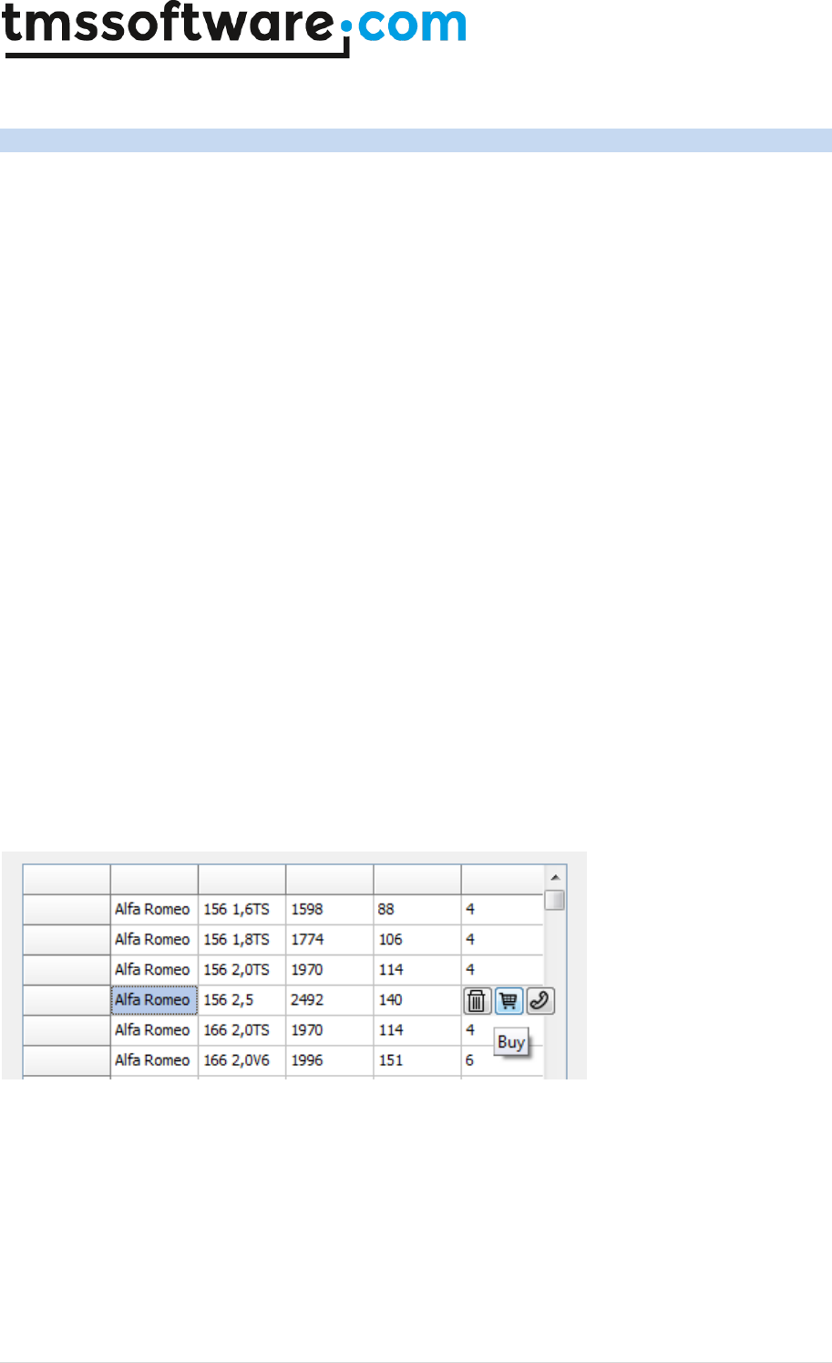
TMS SOFTWARE
TADVSTRINGGRID
DEVELOPERS GUIDE
99 | P a g e
TAdvStringGrid row hover buttons
With TAdvStringGrid it is possible to have a series of buttons automatically hover over the active
row of the grid. This customizable series of buttons can be used for some quick actions such as
clearing the row, inserting preset values etc…
The feature is exposed via grid.HoverButtons that has following properties:
grid.HoverButtons.Buttons: THoverButtonsCollection : collection of buttons
grid.HoverButtons.Column: integer : sets the column where the hover buttons should appear
grid.HoverButtons.Enabled: Boolean : set true to enable this feature
grid.HoverButtons.Position: position where the buttons should be displayed in the selection column
grid.HoverButtons.Rows: selects whether the hover buttons appear for normal rows only or both
normal & fixed rows.
A button on the hover buttons can have:
THoverButton.Caption: string : caption of the button
THoverButton.Enabled: Boolean : enabled state of the button
THoverButton.Flat: Boolean : selects between regular & flat button style
THoverButton.Hint: string : sets the hint for the button
THoverButton.ImageIndex: integer : sets the image from the grid.GridImages imagelist to use on the
button.
THoverButton.Picture: TPicture : sets a picture for use on the hover button
THoverButton.Tag: integer
Below is a sample where 3 hover buttons were added via grid.HoverButtons.Buttons and a PNG
image was set on each button. The grid.HoverButtons.Column was set to column 4, so the
hoverbuttons appear on the row where the mouse hovers on the left side of column 4.
When a hover button is clicked, the event OnHoverButtonClick is triggered, returning the row where
the action happened as well as the button that triggered it.

TMS SOFTWARE
TADVSTRINGGRID
DEVELOPERS GUIDE
100 | P a g e
TAdvStringGrid nodes
A multi-level hierarchy row expand/contract functionality can be added to TAdvStringGrid through
Nodes. Working with nodes involves three topics:
• putting nodes in the grid
• node appearance
• reacting to node click events
Following functions are available to work with nodes in the grid:
procedure AddNode(aRow,Span:integer);
Adds a node in the grid spanning Span rows
procedure RemoveNode(aRow:integer);
Removes a node at row aRow.
function IsNode(aRow:integer):boolean;
Returns true if the row contains a node
function GetNodeState(ARow:integer):boolean;
Returns true if the node is in contracted state
procedure SetNodeState(ARow:integer;value:boolean);
Sets the state of node
procedure ExpandNode(ARow:integer);
Expands the node at row ARow.
procedure ContractNode(ARow:integer);
Contracts the node at row ARow
procedure ExpandAll;
Expands all nodes
procedure ContractAll;
Contracts all nodes
function GetNodeSpan(aRow: Integer): Integer:
Retrieves the number of rows a node spans
function GetNodeLevel(aRow: Integer): Integer;
Retrieves the depth level of a node
function GetParentRow(aRow: Integer): Integer;

TMS SOFTWARE
TADVSTRINGGRID
DEVELOPERS GUIDE
101 | P a g e
Returns the index of the parent row of any given row. If the row is not a child of a node, -1 is
returned.
procedure InsertChildRow(ARow: Integer);
Inserts a new row within the span of a node
procedure RemoveChildRow(ARow: Integer);
Removes a child row from a node
Everything starts by adding a node to a grid and this is done with the AddNode method. The first
parameter is what we call the visible row position in the grid where you want to add a node. When
working with hidden rows, there is a difference between visible row position and real row position
which takes the hidden rows into account. (Whenever you wan to map the visible row position to a
real row position, use the RealRowIndex method) The second parameter in the AddNode method is
the span of the node, that is, the number of rows to expand or contract when clicking this node. If
this span parameter is zero, the node will automatically expand or contract to the next found node
in the grid.
The RemoveNode and IsNode methods are simply doing what their names refer to. Also notice in this
case, that the row refers to the visible row position!
With these function, you can start adding simple row expand/contract functionality to your grid. In
the example procedure below, nodes are inserted to allow expansion or contracting of equal cells in
column 1:
var
i,j:integer;
begin
with advstringgrid1 do
begin
I := 1;
J := 1;
while (I < RowCount - 1) do
begin
while (Cells[1,J] = Cells[1,J + 1]) and (J < RowCount - 1) do
Inc(j);
if (I <> J) then
AddNode(I,J – I + 1);
I := J + 1;
J := I;
end;
Row := 1;
Col := 1;
end;
end;
In order to programmatically expand or contract nodes, either the function GetNodeState,
SetNodeState or ExpandNode and ContractNode are available. The difference is the used row
mapping. GetNodeState and SetNodeState work with this visible row index, while ExpandNode and
ContractNode work with the real row index. Often, you will want to maintain the exact real row
position of the node to expand and use the ExpandNode or ContractNode method. This is because
the visible row position can change all the time by user interaction, while the real row position is
under program control:
procedure TForm1.Button3Click(Sender: TObject);
begin
AdvStringGrid1.ExpandNode(RealRow);
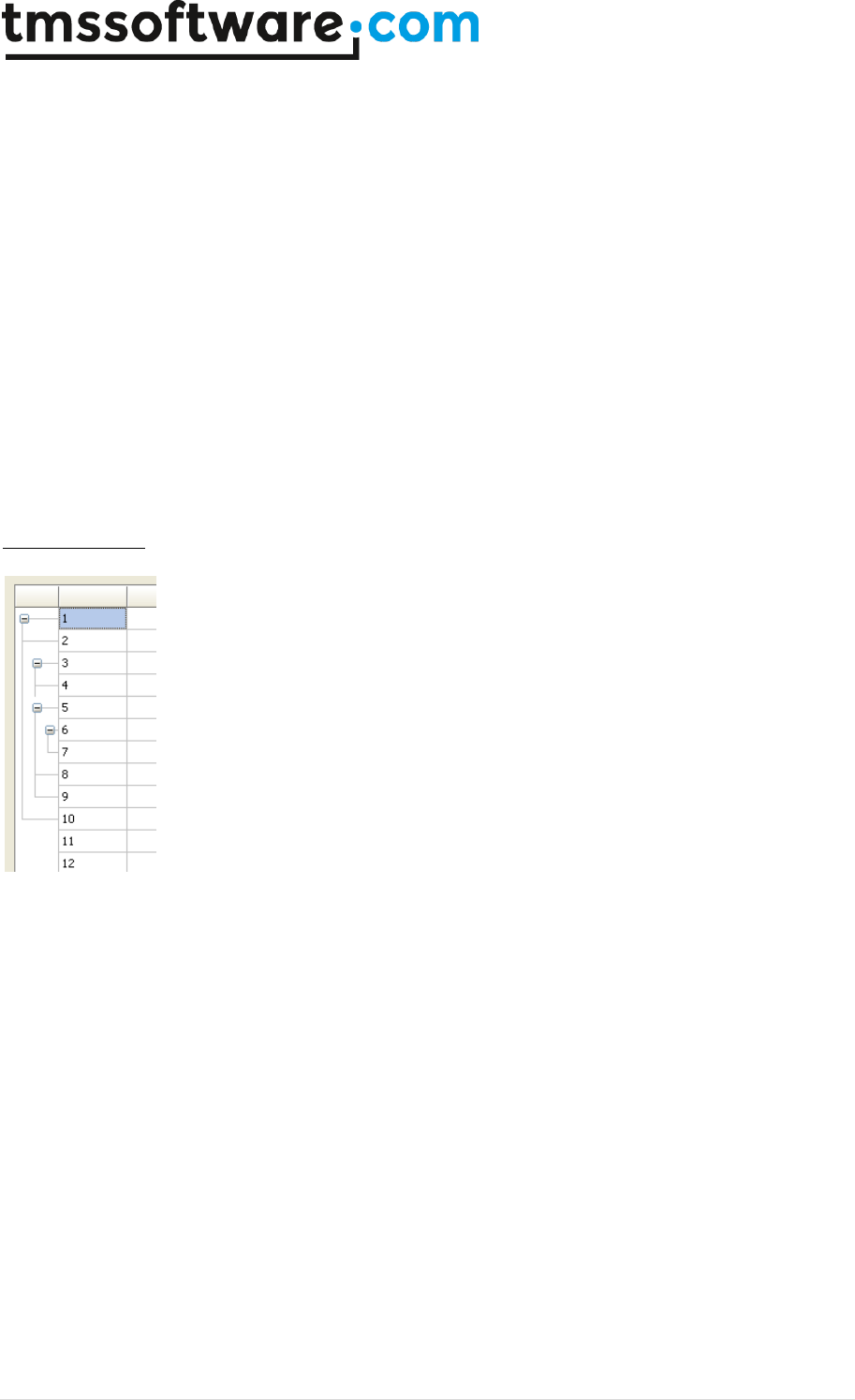
TMS SOFTWARE
TADVSTRINGGRID
DEVELOPERS GUIDE
102 | P a g e
end;
procedure TForm1.Button4Click(Sender: TObject);
begin
AdvStringGrid1.ContractNode(RealRow);
end;
A second topic involved in using nodes, is the node appearance. Nodes always appear in the first
column (index 0) and can be one of 4 types : cnflat, cn3D, cnglyph or cnXP. A flat node is simply a
rectangle with the well known + / - sign in it. The 3D node type is a raised or sunken rectangle
while you can also specify your own glyph for the expand or contract state. The appearance of the
node is controlled through the CellNode property of TAdvStringGrid. You can speficy here the glyphs
as well as the color of the flat and 3D node.
Further properties of CellNode are:
ShowTree: Boolean; when true, a tree connecting the nodes is drawn
ShowTreeFull: Boolean; when true, a tree is draw horizontally till the right side of the cell
TreeColor: TColor; sets the color of the tree lines.
Multilevel nodes
TAdvStringGrid supports multi level nodes. This is done by inserting nodes within the span of an
existing (parent) node. It is required that the span of a child node is within the span of the parent
node. If this is not the case, the multi-level node setup is incorrect and will not work properly. The
above node scheme is obtained by following code:
advstringgrid1.AutoNumberCol(1);
advstringgrid1.AddNode(1,10); // main node
advstringgrid1.AddNode(3,2); // child node 1
advstringgrid1.AddNode(5,5); // child node 2
advstringgrid1.AddNode(6,2); // child node of child node 2
Last but not least, four event handlers give feedback on user node expansion or contraction through
the OnExpandNode, OnContractNode and OnBeforeExpandNode and OnBeforeContractNode events.
For the OnExpandNode, OnContractNode, two additional parameters come with this event handler:
the visible row index of the node clicked as well as the real row index of this node:
procedure TForm1.AdvStringGrid1ExpandNode(Sender: TObject; ARow,
ARowReal: Integer);
begin
ShowMessage(‘Expand : ' + IntToStr(ARow) + '-' + IntToStr(ARowReal));
end;

TMS SOFTWARE
TADVSTRINGGRID
DEVELOPERS GUIDE
103 | P a g e
For the OnBeforeExpandNode and OnBeforeContractNode and additional parameter Allow by
reference is available with which it can be dynamically controlled whether the node can
contract/expand or not.
TAdvStringGrid filtering
Basic filtering
With the filtering capabilities in TAdvStringGrid, showing only a filtered set of rows in the grid is
easy. Two properties are used for filtering. First there is the FilterData property, which is a
TCollection of filter conditions for each column and second is the property FilterActive through
which filtering is performed when set true.
Taking a closer look at the FilterData collection, this is a TCollection of elements with following
properties:
Column: Integer; integer value, setting the column for which to apply the filter condition
Condition: string; this is a string setting the filtering condition
CaseSensitive: Boolean; sets whether the filter is case sensitive or not
Data: TFilterCells: controls what specific cell data the filter should apply to (see below)
Suffix: string; sets the suffix string to ignore for the filtering condition
Prefix: string; sets the prefix string to ignore for the filtering condition
Operation: TFilterOperation; sets the logical operation between multiple filters
Method: TFilterMethod: when set to default value fmExpression, the condition is treated as an
expression that can contain wildchars like *,?,!,>,<. When it is set to fmLiteral, a direct string
comparison will be done between condition and cell content, i.e. a special symbol like ‘*’ will not
be treated as wildchar.
RemoveAccented: Boolean; when this is set to true, the filtering ignores accented characters. This
means that when the filter condition is set to “eya” and RemoveAccented is true, it will accept
values like “éyâ” or “ëyà” etc…
The Condition property can contain a condition in following formats:
substring filtering:
S*, S? : * or ? denote multi or single character matches
>, < , >=, =< : larger than, less than, larger or equal, less or equal (when data is numeric or a date,
comparison take place based on numeric data or date based, otherwise on alphabetic comparisons)
= , ! : equal or not equal
& , ^ : logical AND , logical OR
Thus, an expression : >20 & <30 is a valid filtering expression as well as !A*
The filter can also detect dates, ie. It can use something like : >10/4/2003 & <10/5/2003
Note: when the filter condition includes a space character or logical expression character, use
quotes, for example, this filter condition filters on ‘C&A’ (and not C and A) by setting
Condition := ‘”C&A”’;
When the Prefix or Suffix property is set, this string is ignored as start or end string part of the cell
to perform the match with. For example, if cells display a value as currency (ie. 150$), setting the
Suffix to ‘$’ will allow to ignore the end ‘$’ character and enable to specify a numeric based filter
condition (ie. >100)

TMS SOFTWARE
TADVSTRINGGRID
DEVELOPERS GUIDE
104 | P a g e
By default, setting multiple filter conditions is a logical AND operation (the Operation property is by
default foNone). For speed reasons, by default a short-circuit evaluation is done. When choosing
another logical operation, an extensive evaluation is done applying the choosen operation between
each successive filter.
Example:
To apply a filter on 2 columns where rows should be accepted when the condition for column A
matches or the condition for column B matches, setup is:
with Filter.Add do
begin
Condition := ConditionForA;
Column := A;
Operation := foAND; // perform AND with default True result
end;
with Filter.Add do
begin
Condition := ConditionForB;
Column := B;
Operation := foOR; // perform OR with previous filter
end;
To start the actual filtering, the property FilterActive is first set to False to disable all filtering.
After this, the FilterDate collection is setup and then FilterActive is set to True to apply the filter.
If the filter condition is set in the first row for each column, setting up and applying the filter
becomes:
var
i:integer;
begin
with AdvStringGrid1 do
begin
FilterActive := False;
Filter.Clear; // clearing any previous filter settings
for I := FixedCols to ColCount - 1 do
begin
if (Cells[i,0]<>'') then // add filter for column if filter present
with Filter.Add do
begin
Condition := Cells[i,0];
Column := i;
CaseSensitive := False; // filter is not case sensitive
end;
end;
FilterActive := True; // applying the filter
end;
end;
By default, filtering is based on displayed cell text, ie. the value that was possible dynamically set
with the event OnGetDisplText. That means that when virtual cells are used, the filtering will be
based by default on the virtual cell text. To enable the filtering to happen for the actual cell data,
set FilterData.Data to fcNormal. Other than virtual or normal cell text, it is also possible to specify:

TMS SOFTWARE
TADVSTRINGGRID
DEVELOPERS GUIDE
105 | P a g e
fcStripHTML: filtering is based on displayed cell text but with HTML tags removed
fcCalculated: this applies in first place to TadvSpreadGrid to enable filtering on formula itself or the
formula result.
fcRow: a row matches the filter when the string set in the condition is found in any of the cells of a
row.
This filter will show all rows where any of its columns contains the word “text”:
with grid.Filter.Add do
begin
Condition := ‘text’;
Data := fcRow;
end;
grid.FilterActive := true;
Persisting filters
The grid provides two methods that can be used to load & save the state of the filter to a file:
grid.LoadFilter(Filename: string);
grid.SaveFilter(FileName: string);
Filter dropdown in column header
To make filtering in the grid available from the UI, each column header can display a filter
dropdown button from where a filter can be choosen. Upon selection of a filter from the dropdown,
it is applied to the grid. The settings that control the display of the filter are grouped under
grid.FilterDropDown. Following settings are available via the grid.FilterDropdown property:
grid.FilterDropDown.AutoSize: Boolean
When true, the size of the dropdown adapts to the text in the list
grid.FilterDropDown.Color: TColor
Sets the background color of the dropdown list
grid.FilterDropDown.ColumnWidth: Boolean
When true, the filter dropdown with is equal to the column width
grid.FilterDropDown.Font: TFont
Sets the font of the filter dropdown list
grid.FilterDropDown.Glyph: TBitmap
Sets the glyph displayed in the column header indicating a filter is available
grid.FilterDropDown.Height: integer
Sets the height of the dropdown list

TMS SOFTWARE
TADVSTRINGGRID
DEVELOPERS GUIDE
106 | P a g e
grid.FilterDropDown.Width: integer
Sets the width of the dropdown list
Additional filter options:
grid.FilterDropDownAuto: Boolean
When true, the value list in the dropdown is automatically filled with the distinct column values.
grid.FilterDropDownCheck: Boolean
When true, the filter dropdown consists of a checklist. This allows to simultaneously select multiple
filter conditions (multiple conditions are applied with an OR function)
grid.FilterDropDownCheckUnCheckAll: Boolean
When true, the option is added to the filter dropdown to immediately check or uncheck all items in
the filter dropdown.
grid.FilterDropDownClear: string
Sets the text value to represent clearing the filtering in the dropdown. When this value is selected
from the dropdown, the filtering is not longer active.
grid.FilterDropDownColumns: TFilterDropDownColumns
Selects whether the filter dropdown appears for all columns or only for normal columns (excluding
fixed columns). Values are fdAll or fdNormal.
grid.FilterDropDownRow: integer
Sets the fixed row index where the filter dropdown should appear. This is by default the last fixed
row. This property can be used when grid.FixedRows is larger than 1 and the filter dropdown can be
set to another row than the last fixed row.
grid.FilterNormalCellsOnly: Boolean
When true, rows that have a node will not be filtered.
The content of the filter dropdown list is set via the event grid.OnGetColumnFilter. This event
passes a TStringList that can be filled with filter specifiers. Note that the filter specifiers can be
friendly names. It is only from the OnFilterSelect event that the real filtercondition must be
applied. The code snippet below shows how the filter is set for different columns in the grid:<br>
procedure TForm2.AdvStringGrid1GetColumnFilter(Sender: TObject; Column:
Integer; Filter: TStrings);
begin
case Column of
1:
begin
Filter.Add('Clear');
Filter.Add('Within range');
Filter.Add('Exceptions');
end;
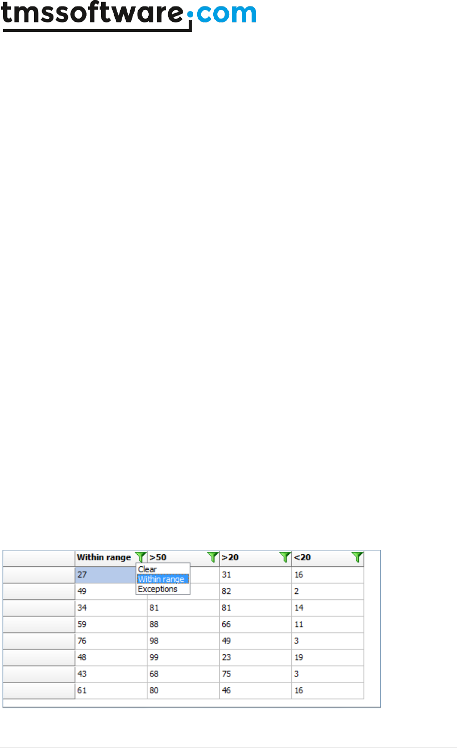
TMS SOFTWARE
TADVSTRINGGRID
DEVELOPERS GUIDE
107 | P a g e
2:
begin
Filter.Add('Clear');
Filter.Add('>50');
Filter.Add('<50');
end;
3:
begin
Filter.Add('Clear');
Filter.Add('>20');
Filter.Add('<20');
end;
4:
begin
Filter.Add('Clear');
Filter.Add('>20');
Filter.Add('<20');
end;
end;
end;
When a selection is made from the filter dropdown list, the event OnFilterSelect is triggered. This
returns the column, the index of the filter and the friendlyname of the filter. Via the parameter
FilterCondition, the real filter condition can be set. In the code shown here, the OnFilterSelect
converts the filter friendlyname "Clear" to an empty filter condition and it also sets a filter
condition for column 1 for friendly names "Within range" and "Exceptions". It also updates the
column header to show the filter that is applied.
procedure TForm2.AdvStringGrid1FilterSelect(Sender: TObject; Column,
ItemIndex: Integer; FriendlyName: string; var FilterCondition: string);
begin
if FilterCondition = 'Clear' then
FilterCondition := '';
if (Column = 1) then
begin
case ItemIndex of
1: FilterCondition := '>20 & <80';
2: FilterCondition := '<20 | >80';
end;
end;
AdvStringgrid1.Cells[Column, 0] := FriendlyName;
end;

TMS SOFTWARE
TADVSTRINGGRID
DEVELOPERS GUIDE
108 | P a g e
By default, the filter is displayed in the first fixed row of the grid. If the grid has multiple fixed
rows, it possible to control on what fixed row the filter dropdown is displayed with the property
grid.FilterDropDownRow.
When the option is chosen to have a filter dropdown with checkboxes, the event OnFilterCheck is
triggered when a checkbox in the filter dropdown is clicked.
Auto filters
The grid has a built-in capability to automatically create the filter consisting of an alphabetically
sorted list of unique column values. To enable this feature, set grid.FilterDropDownAuto to true. In
addition to the list of unique values, an entry is optionally added that can be used to clear the
filter. The value of this entry is set by grid.FilterDropDownClear: string and defaults to ‘(All)’. When
the auto filter capability is enabled, every column header automatically gets the filter dropdown
icon. When the auto filter is only needed for some specific columns, the OnGetColumnFilter event
can be used to remove the filter by simply clearing the prefilled filter list. This sample code shows
how the auto filter can be set to only columns 1 and 2:
procedure TForm13.AdvStringGrid1GetColumnFilter(Sender: TObject;
Column: Integer; Filter: TStrings);
begin
if not (Column in [1,2]) then
Filter.Clear;
end;
Incremental filters
Incrementally applying filters can be done by calling grid.ApplyFilter several times after each other.
To remove the last filter or to remove all filters call grid.RemoveLastFilter or grid.RemoveAllFilters
respectively. In the code snippet below, two filters are applied after each other and finally the last
filter operation is removed, leaving the result of the first applied filter:
procedure TForm2.Button1Click(Sender: TObject);
begin
with advstringgrid1.Filter.Add do
begin
condition := '>50';
column := 1;
end;
advstringgrid1.ApplyFilter;
with advstringgrid1.Filter.Add do
begin
condition := '<75';
column := 1;
end;
advstringgrid1.ApplyFilter;
advstringgrid1.RemoveLastFilter;
end;
Narrow down filtering
Another filtering the Narrow-Down capability. With this method, the grid can filter in incremental
steps to find all rows with a specific word or all rows that have a specific word in one column. In the
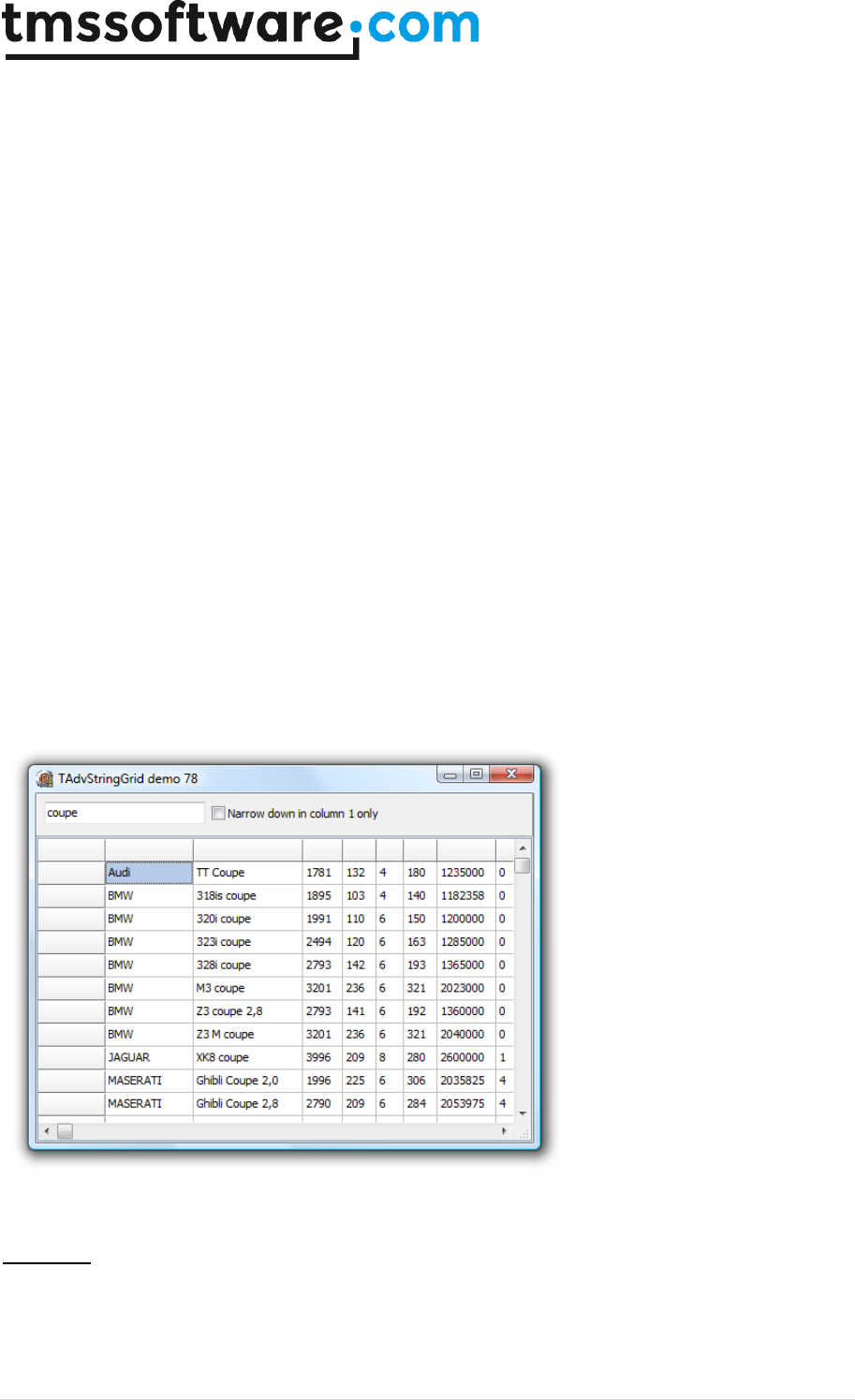
TMS SOFTWARE
TADVSTRINGGRID
DEVELOPERS GUIDE
109 | P a g e
demo, the edit control's OnChange method event handler just calls grid.NarrowDown(searchvalue).
This causes that the grid will always show all rows containing the word in the edit control as the
user types the search specification in the edit control. The checkbox controls whether the search
for a word in a row is done for the full row or restricted to one column only (column 1 in this case):
procedure TForm1.Edit1Change(Sender: TObject);
begin
if Checkbox1.Checked then
AdvStringGrid1.NarrowDown(Edit1.Text, 1)
else
AdvStringGrid1.NarrowDown(Edit1.Text);
end;
Overloads for NarrowDown:
procedure NarrowDown(ACondition: string; AColumn: integer = -1);
procedure NarrowDown(ACondition: string; DoRemoveAccented: boolean;
AColumn: integer = -1);
The second overload has an extra parameter: DoRemoveAccented. When this is set to true, this
means that accented characters will be ignored, i.e. treated as non accented character in the filter
condition.
Example: When performing a narrowdown on “eya”, it will accept rows with values “éyä” or “ëyà”
etc…
Filter edit
Another method to perform filtering via the UI of the grid is by activating filter editing. This is
basically an extra row or fixed row where the filter values can be set and edited and the filter
method can be selected via a context menu.
To activate filter editing, set grid.FilterEdit.Enabled = true. By default, the fixed row becomes

TMS SOFTWARE
TADVSTRINGGRID
DEVELOPERS GUIDE
110 | P a g e
editable and an icon appears left in each column header cell from where a click selects the filter
method.
The grid.FilterEdit class property exposes:
Color: TColor : Sets the background color of the editable filter condition cells
Columns: TFilterDropDownColumns : Specifies for what columns the filter edit should appear. This
can be for all columns (fdAll) or for non-fixed columns only (fdNormal)
Enabled: Boolean : When true, the filter bar with edit filters appears
Row: integer: Selects the fixed row where the filter bar appears. By default this is the first fixed
row.
The filter types that can be selected from the context menu are:
- text in cell starts with value of filter condition
- text in cell ends with value of filter condition
- text in cell contains value of filter condition
- text in cell does not contain value of filter condition
- text in cell is equal to value of filter condition
- text in cell is not equal to value of filter condition
By defaulf, the filter edit appears for each column. To override this and exclude a specific column
for filter editing, the event OnHasFilterEdit can be used.

TMS SOFTWARE
TADVSTRINGGRID
DEVELOPERS GUIDE
111 | P a g e
In this sample code snippet, only the first 4 columns have a filter edit:
procedure TForm4.AdvStringGrid1HasFilterEdit(Sender: TObject; ACol:
Integer;
var HasFilter: Boolean);
begin
HasFilter := ACol <= 3;
end;
When a new filter value is set and filter edit focus leaves, the filter is automatically updated and
applied. Before it is effectively applied, the event OnFilterEditUpdate is triggered. From there, the
new filter condition value, the column and filter method can be retrieved:
procedure TForm4.AdvStringGrid1FilterEditUpdate(Sender: TObject; ACol:
Integer;
Condition: string; FilterType: TFilterType);
begin
//
end;
Note that the filter edit uses underlying the grid.Filter collection. So, when the filter is edited, this
will be reflected in the grid.Filter collection. As such, it is possible to further customize the
filtering from the OnFilterEditUpdate event by directly manipulating the grid.Filter collection.
TMS SOFTWARE
TADVSTRINGGRID
DEVELOPERS GUIDE
112 | P a g e
TAdvStringGrid grouping
TAdvStringGrid has built-in single level automatic grouping and grouped sorting. This makes it easy
to add grouping features with a few lines of code. Grouping means that identical cells within the
same column are removed and shown as a grouping row for the other cells in the rows.
Example:
United States
New York
205000
United States
Chicago
121200
United States
Detroit
250011
Germany
Köln
420532
Germany
Frankfurt
122557
Germany
Berlin
63352
Grouped on the first column this becomes:
- United states
New York
205000
Chicago
121200
Detroit
250011
- Germany
Köln
420532
Frankfurt
122557
Berlin
63352
Grouped sorting on the first column becomes:
- United states
Chicago
121200
Detroit
250011
New York
205000
- Germany
Berlin
63352
Frankfurt
122557
Köln
420532
This is an overview of the grouping methods:
procedure Group(ColIndex:integer);
procedure UnGroup;
property GroupColumn:integer;
procedure SubGroup(ColIndex:integer);
The Group method groups based on the column ColIndex. It automatically adds the expand /
contract nodes. When expand / contract nodes are available, the normal sort when a column header
is clicked changes to inter group sorting.
The Group method is equivalent to assignment of the GroupColumn property, ie :
AdvStringGrid.Group(5) has the same effect as AdvStringGrid.GroupColumn := 5;
Note that the column for grouping can only start from column 1, since column 0 is the placeholder
for the expand / contract nodes. The GroupColumn property has the additional benefit that it
returns -1 when grouping is not active. Otherwise it returns the current grouped column.
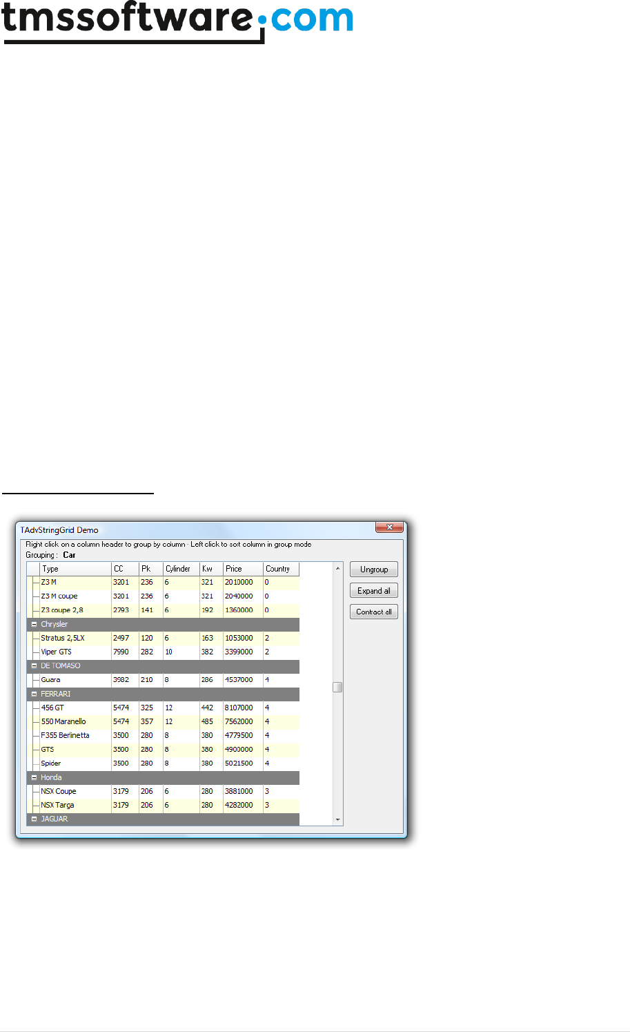
TMS SOFTWARE
TADVSTRINGGRID
DEVELOPERS GUIDE
113 | P a g e
To undo the effect of grouping, the UnGroup method can be used, or as an alternative, the
GroupColumn property can be set to -1.
Example: loading a CSV file, applying grouping and performing a grouped sort
// loading CSV file in normal cells
AdvStringGrid1.SaveFixedCells := False;
AdvStringGrid1.LoadFromCSV('cars.csv');
// automatically adapt column width to max. text width in columns
AdvStringGrid1.AutoSizeColumns(False,10);
// insert column as placeholder for nodes
AdvStringGrid1.InsertCols(0,1);
// setting width of node column to fixed width of 20
AdvStringGrid1.ColWidths[0] := 20;
// do grouping on column 1
AdvStringGrid1.GroupColumn := 1;
// apply grouped sorting on (new) column 1
AdvStringGrid1.SortSettings.Column := 1;
AdvStringGrid1.QSortGroup;
When a grouped view is no longer necessary, it can be removed by:
AdvStringGrid.UnGroup;
Extra grouping features
Some extra capabilities for more visually appealing grouping can be set through the property
grid.Grouping. Through this property it can be enabled that group headers are automatically set in a
different color and that cells from a group header are automatically merged. In addition, a group
can also have a summary line. A summary line is an extra row below items that belong to the same
group. This summary line can be used to put calculated group values in. The color for this summary
line can also be automatically set as well as cell merging performed on this.
Grouping property:
TMS SOFTWARE
TADVSTRINGGRID
DEVELOPERS GUIDE
114 | P a g e
AutoCheckGroup: Boolean
When true, when a checkbox column is set for the group column,
clicking on the checkbox of the group header will check/uncheck all
checkboxes of items within the group. Simultanously, the group
checkbox will reflect the state of checkboxes of the group items and
will display in cbGrayed state when not all checkboxes in the group
have the same state.
AutoSelectGroup: Boolean
When true, clicking on the group header automatically selects all
rows within the group (when goRowSelect = true)
GroupCountFormat: string
Specifies the display format for the group count in the group header
HeaderColor: TColor
When different from clNone, sets the background color for group
header rows
HeaderColorTo: TColor
When different from clNone, set the gradient end color for a merged
group header
HeaderLineColor: TColor
Sets the line color for the header underline
HeaderLineWidth: Integer
Sets the line width for the header underline
HeaderTextColor: TColor
When different from clNone, sets the font color for group header
rows
HeaderUnderline: Boolean
When true, an extra line under a header is displayed
MergeHeader: Boolean
When true, the group headers are automatically merged
MergeSummary: Boolean
When true, the group summary row is automatically merged
ShowGroupCount: Boolean
When true, the number of rows within each group is shown in the
group header. The property GroupCountFormat controls the display
format of the group count
Summary: Boolean
When true, a summary line is automatically added for each group
SummaryColor: TColor
When different from clNone, sets the background color for group
summary rows
SummaryColorTo: TColor
When different from clNone, set the gradient end color for a merged
group summary row
SummaryLine: Boolean;
When true, an extra line in a summary row is displayed
SummaryLineColor: TColor;
Sets the line color for the summary line
SummaryLineWidth: Integer;
Sets the line width for the summary line
SummaryTextColor: TColor
When different from clNone, sets the font color for group summary
rows
Group calculations

TMS SOFTWARE
TADVSTRINGGRID
DEVELOPERS GUIDE
115 | P a g e
TadvStringGrid has built-in function to automatically calculate group sums, average, min, max,
count. The group results are set in the group header row if no summary row is shown, otherwise the
group summary row is used by default. Group calculations are performed per column.
Available functions:
grid.GroupSum(AColumn: Integer);
Calculates column sums per group
grid.GroupAvg(AColumn: Integer);
Calculates column averages per group
Grid.GroupMin(AColumn: Integer);
Calculates column minimum per group
Grid.GroupMax(AColumn: Integer);
Calculates column minimum per group
Grid.GroupCount(AColumn: Integer);
Calculates number of rows in a group for each group
Grid.GroupDistinct(AColumn: Integer);
Calculates number of distinct rows in a group for each group
Grid.GroupStdDev(AColumn: Integer);
Calculates standard deviation of values in column AColumn within a group for each group
Grid.GroupCustomCalc(AColumn: Integer);
Allows to perform a custom calculation of group data with the event OnGroupCalc
If there is a need for a special group calculation that is not available in the standard group
calculation functions, the method grid.GroupCustomCalc can be used. For each group in the grid,
this will trigger the event
grid.OnGroupCalc(Sender: TObject; ACol, FromRow, ToRow: Integer; var Res:
Double);
The meaning of the parameters is:
ACol : column to perform calculation for
FromRow: first row in the group
ToRow: last row in the group
Res: variable parameter to use to set the result
In this sample, the grid is initialized with random number, is grouped on column 1 and for the first
column in the grouped grid the standard deviation is calculated:

TMS SOFTWARE
TADVSTRINGGRID
DEVELOPERS GUIDE
116 | P a g e
procedure TForm1.AdvStringGrid1GroupCalc(Sender: TObject; ACol, FromRow,
ToRow: Integer; var Res: Double);
var
i: integer;
d, m, sd: double;
begin
// calculate mean
m := 0;
for i := FromRow to ToRow do
begin
m := m + advstringgrid1.Floats[ACol,i];
end;
m := m / (ToRow - FromRow + 1);
// calculate standard deviation
sd := 0;
for i := FromRow to ToRow do
begin
sd := sd + sqr(advstringgrid1.Floats[ACol,i] - m);
end;
sd := sd / (ToRow - FromRow);
Res := sqrt(sd);
end;
procedure TForm1.FormCreate(Sender: TObject);
var
i: integer;
begin
AdvStringGrid1.RowCount := 100;
AdvStringGrid1.RandomFill(false,100);
for i := 1 to AdvStringGrid1.RowCount - 1 do
AdvStringGrid1.Ints[1,i] := random(5);
AdvStringGrid1.Grouping.Summary := true;
AdvStringGrid1.Grouping.MergeHeader := true;
AdvStringGrid1.Grouping.ShowGroupCount := true;
Advstringgrid1.Group(1);
Advstringgrid1.GroupCustomCalc(1);
end;
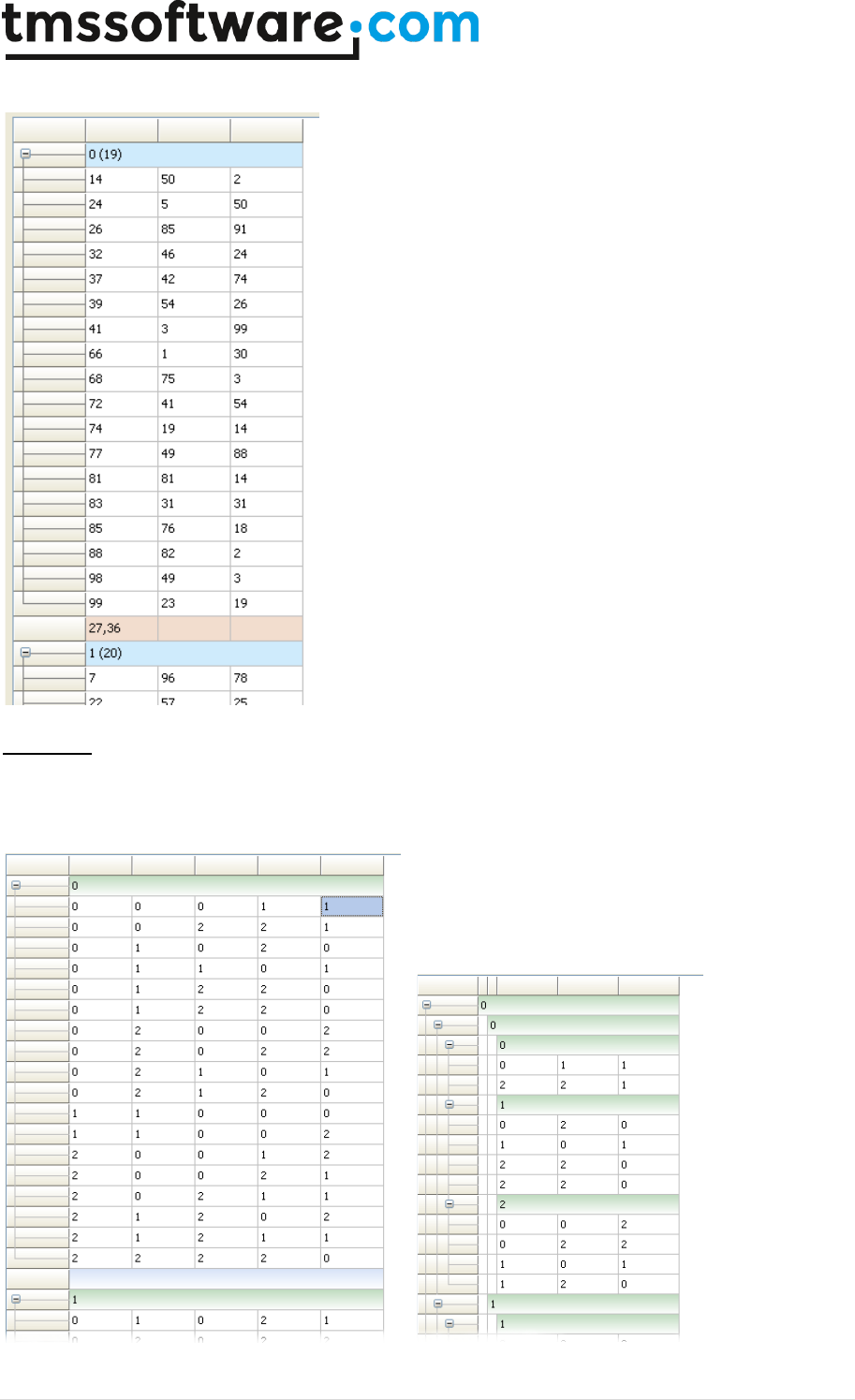
TMS SOFTWARE
TADVSTRINGGRID
DEVELOPERS GUIDE
117 | P a g e
This results in:
Subgroups
With the SubGroup (and corresponding SubUnGroup) it is possible to create subgroups in a grouped
grid. Adding a subgroup to a grouped grid is done starting from the leftmost normal column.
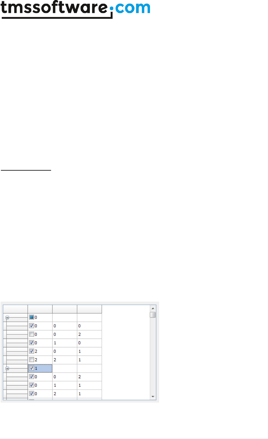
TMS SOFTWARE
TADVSTRINGGRID
DEVELOPERS GUIDE
118 | P a g e
In this example, a first group is created by calling grid.Group(1). Two additional subgroups are
added by calling grid.SubGroup(1) and grid.SubGroup(2);
The full code used to create this starting from a default grid is:
procedure TForm1.Button1Click(Sender: TObject);
begin
AdvStringGrid1.RowCount := 100;
AdvStringGrid1.Randomfill(false,3);
AdvStringGrid1.Group(1);
AdvStringGrid1.SubGroup(1);
AdvStringGrid1.SubGroup(2);
AdvStringGrid1.ColWidths[1] := 10;
AdvStringGrid1.ColWidths[2] := 10;
end;
Group checkboxes
When grid.Grouping.AutoCheckGroup is set to true, clicking on the checkbox in a group header will
automatically check/uncheck all checkboxes of rows within the group. To see this in action,
following code initializes a default grid for this:
begin
advstringgrid1.Options := advstringgrid1.Options + [goEditing];
advstringgrid1.RowCount := 20;
advstringgrid1.RandomFill(false,3);
advstringgrid1.Group(1);
advstringgrid1.AddCheckBoxColumn(1);
advstringgrid1.Grouping.AutoCheckGroup := true;
end;
Here is shown how partially selected rows within group 0 set the group node checkbox of group 0 to
cbGrayed state and a click on the group check node of group 1 set all checkboxes in group 1 to
cbChecked.
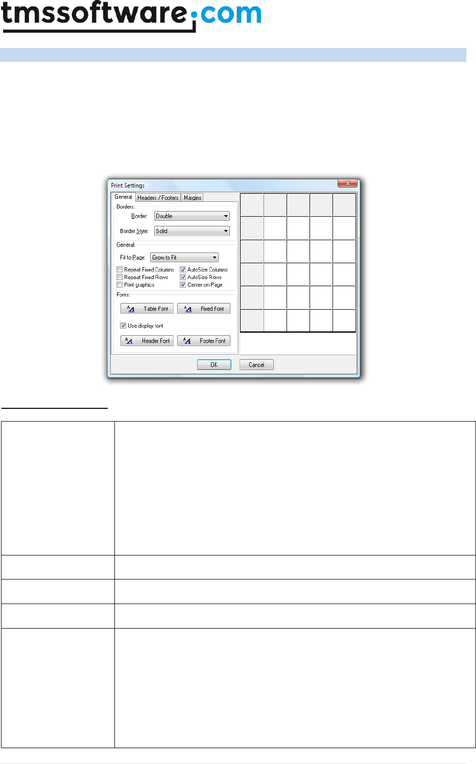
TMS SOFTWARE
TADVSTRINGGRID
DEVELOPERS GUIDE
119 | P a g e
TAdvStringGrid printing capabilities
TAdvStringGrid has built-in support to print its contents. Several methods exist to start printing the
grid or a selection of cells from the grid. In addition to the methods, the PrintSettings property
controls the various options for printing the grid.
PrinterSettings details
Borders
The Borders property can be:
pbNoborder : no border is printed
pbSingle : single line width border is printed
pbDouble : double line width border is printed
pbVertical : only vertical single line borders are printed
pbHorizontal : only horizontal single line borders are printed
pbAround : only border around the grid is printed
pbAroundVertical : only outer vertical borders of the grid are printed
pbAroundHorizontal : only outer horizontal borders of the grid are printed
BorderStyle
Line drawing style for border of type TPenStyle
Centered
When true, printout is centered on the page.
ColumnSpacing
Controls distance to skip between 2 columns in units of 1/10mm.
Date
The position has the type TPrintPosition with following values
ppNone : no date is printed
ppTopLeft : data is printed in top left corner
ppTopRight : date is printed in top right corner
ppTopCenter : date is printed centered on top
TMS SOFTWARE
TADVSTRINGGRID
DEVELOPERS GUIDE
120 | P a g e
ppBottomLeft : date is printed in bottom left corner
ppBottomCenter : date is printed centered at bottom
ppBottomRight : date is printed in bottom right corner
DateFormat
Holds the date formatting parameter. Default value is dd/mm/yyyy.
FitToPage
FitToPage controls what method is used for fitting grid data on a page:
fpNever : never use page fitting.
fpAlways : always fit to page, no matter what the scalefactor is
fpGrow : only fit to page by increasing font size / column widths
fpShrink : only fit to page by decreasing font size / column widths
fpCustom : call the OnFitToPage event, to query for allowing pagefit with
calculated scalefactor.
FixedFont
Sets the font for fixed cells for printout
FixedHeight
Height of rows for printout in 0.1mm. Overrules the auto calculated row
height if UseFixedHeight is true
FixedWidth
Width of columns for printout in 0.1mm. Overrules the auto calculated
column width if UseFixedWidth is true
Font
Sets font of printout
FooterFont
Sets font for the footer
FooterSize
Controls distance to skip at end of page in units of 1/10mm.
HeaderFont
Sets font for the header
HeaderSize
Controls distance to skip at start of page in units of 1/10mm.
JobName
Sets title for print job in printer spooler
LeftSize
Controls distance to skip at left side of page in units of 1/10mm.
MaxPagesOffset
Sets the offset of the total nr. of pages printed.
NoAutoSize
If true, disables the automatic column sizing to optimize paper use and
retain full column text visibility but uses column sizes proportional to
column sizes on display and prints using wordwrapping if wordwrap
property is true
NoAutoSizeRow
When true, no automatic row height calculation is performed and the row
height of the printed grid is proportional to the on screen row height.
Orientation
Sets printer orientation to landscape or portrait (defined in the Printers
unit)
PageNr
The position has the type TPrintPosition with following values
ppNone : no page number is printed
ppTopLeft : page number is printed in top left corner
ppTopRight : page number is printed in top right corner
TMS SOFTWARE
TADVSTRINGGRID
DEVELOPERS GUIDE
121 | P a g e
ppTopCenter : page number is printed centered on top
ppBottomLeft : page number is printed in bottom left corner
ppBottomCenter : page number is printed centered at bottom
ppBottomRight : page number is printed in bottom right corner
PageNumberOffset
Sets the offset of the page numbers printed.
PageNumSep
Sets the separator between actual printed page and total nr. of pages. If
PageNumSep is a zero length string, total number of pages is not printed.
Default value is '/'
PagePrefix
Sets the prefix for page numbering for printout
PageSuffix
Sets the suffix for page numbering for printout
PrintComments
When true, the comment triangles in cells are printed
PrintGraphics
When true, graphics are printed
RepeatFixedCols
When true, printout of fixed columns is repeated on each page.
RepeatFixedRows
When true, printout of fixed rows is repeated on each page.
RightSize
Controls distance to skip at right side of page in units of 1/10mm.
RowSpacing
Controls distance to skip between 2 columns in units of 1/10mm.
Time
Sets the position where time of printout needs to be printed. The position
is of the type TPrintPosition and can be:
ppNone : no time is printed
ppTopLeft : time is printed in top left corner
ppTopRight : time is printed in top right corner
ppTopCenter : time is printed centered on top
ppBottomLeft : time is printed in bottom left corner
ppBottomCenter : time is printed centered at bottom
ppBottomRight : time is printed in bottom right corner
Title
Defines where the title is printed. This is of the type TPrintPosition with
equal settings as for Time
TitleLines
TitleLines is a stringlist that can be used instead of TitleText to hold a
multiple title lines
TitleSpacing
Controls the space between the grid title and the actual grid data in 0.1mm
units
TitleText
TitleText holds a single line title only. When using multiline titles, use the
TitleLines property
UseFixedHeight
If true, uses value FixedHeight, else auto calculation is done
UseFixedWidth
If true, uses value FixedWidth, else auto calculation is done

TMS SOFTWARE
TADVSTRINGGRID
DEVELOPERS GUIDE
122 | P a g e
UseDisplayFont
When true, the PrintSettings.Font and PrintSettings.FixedFont properties
are ignored and the grid’s display fonts are used for printing
UseDefaultOrientation
When true, the default printer orientation is used as opposed to forcing the
orientation to the PrintSettings.Orientation setting.
Print methods
The methods available for printing are listed here. Two categories exist: the methods that print to
the currently selected default printer and equivalent methods that just draw on the selected
canvas. Printing can be done for: full grid, programmatically choosen rectangle of cells, selected
cells, disjunct selected rows or disjunct selected columns.
procedure Print;
procedure PrintRect(Gridrect:TGridRect);
procedure PrintSelection;
procedure PrintSelectedRows;
procedure PrintSelectedCols;
procedure PrintPreview(Canvas:TCanvas;Displayrect:TRect);
procedure PrintPreviewRect(Canvas:TCanvas; Displayrect:TRect;
Gridrect:TGridRect);
procedure PrintPreviewSelection(Canvas:TCanvas; Displayrect:TRect);
procedure PrintPreviewSelectedRows(Canvas:TCanvas; Displayrect:TRect);
procedure PrintPreviewSelectedCols(Canvas:TCanvas; Displayrect:TRect);
Print related events
OnPrintPage
Event triggered at start of each page
OnPrintPageDone
Event triggered after printing of a page completes
OnPrintStart
Event triggered before starting printing pages. This event returns the
number of pages that will be required for the print and through
parameters FromPage, ToPage it is possible to select a subset of pages
to be printed
OnPrintCancel
Event triggered after printing each page with parameter Cancel that can
be set true to cancel further printing
OnFitToPage
Event triggered after fit to page calculations have been done. This
allows to override the calculated scale factor
OnPrintNewPage
Event triggered after each row is printed allowing to force a page break
on an arbitrary row in the grid
OnPrintSetColumnWidth
Event triggered after calculation of required column widths, allowing to
override the calculated column width
OnPrintSetRowHeight
Event triggered after calculation of required row heights, allowing to
override the calculated row height
TMS SOFTWARE
TADVSTRINGGRID
DEVELOPERS GUIDE
123 | P a g e
Using the helper dialog components TAdvPreviewDialog and TAdvGridPrintSettingsDialog
Using these dialogs is straightforward. Both dialogs have a property Grid. Put the component on the
same form as the grid’s form and assign the grid to the AdvPreviewDialog.Grid or
AdvGridPrintSettingsDialog.Grid property.
For the printsettings dialog following configurations are possible:
Caption
Sets the caption text of the printsettings dialog
INIFile
Sets the filename where to load/store printsettings
Options
Selects which parts of the print settings are enabled for changing. By default
all settings are enabled for changing
PrintDimensions
Selects which dimensions are used in the settings dialog. This can be inches
or millimetres
PrintPreview
When true, a small preview rectangle is displayed in the print settings dialog
For the print preview dialog following configurations are possible:
CloseAfterPrint
When true, if the Print button is pressed on the preview dialog to start a
print, the dialog is automatically closed after printing has finished
DialogCaption
Sets the caption text of the preview dialog
DialogCloseBtn
Sets the close button text
DialogNextBtn
Sets the text of the next page button
DialogPrevBtn
Sets the text of the previous page button
DialogPrintBtn
Sets the text of the print button
PreviewCenter
Positions the preview dialog always in the screencenter
PreviewFast
Shows a preview without doing page number calculation resulting in a faster
display
PreviewHeight
PreviewWidth
PreviewLeft
PreviewTop
Sets the dimensions and position of the preview dialog
PrinterSetupDialog
When true, choosing Print from the preview dialog will first show the printer
setup dialog before starting the print
PrintSelectedCols
Shows only selected columns in the preview. Mutually exclusive with
PrintSelectedRows and PrintSelection
PrintSelectedRows
Shows only selected rows in the preview. Mutually exclusive with
PrintSelectedCols and PrintSelection
TMS SOFTWARE
TADVSTRINGGRID
DEVELOPERS GUIDE
124 | P a g e
PrintSelection
Shows only selected cells in the preview. Mutually exclusive with
PrintSelectedRows and PrintSelectedCols
ShowMaximized
When true, the preview dialog is started in maximized state
Public print related properties
A series of additional public read-only properties are available that return information during the
printing process:
PrintPageRect:TRect;
Returns the physical dimensions (in logical coordinates) of
the currently printed page
PrintPageWidth: Integer;
Returns the page width in logical coordinates
PrintColWidth[ACol: Integer]: Integer;
Returns the width of the column on paper in logical
coordinates
PrintColOffset[ACol: Integer]: Integer;
Returns the indent from left of the column on paper in
logical coordinates
PrintColStart: Integer;
Position from left in logical coordinates of the first column
left border
PrintColEnd: Integer;
Position from right in logical coordinates of the last
column right border
PrintNrOfPages: Integer;
Returns number of pages required
Example: printing a company logo in the page header
The OnPrintPage event is used to print a custom header on each page. This event is triggered for
each page and thus allows to add any custom information on the printout. In this example, the
space allocated for the custom header is set through the PrintSettings.HeaderSize property. It is
important to know that printing is happening in MM_LOMETRIC mode, meaning a positive X-axis used
but a negative Y-axis.
procedure TForm1.AdvStringGrid1PrintPage(Sender: TObject; Canvas: TCanvas;
pagenr, pagexsize, pageysize: Integer);
var
bmp: TBitmap;
r: TRect;
ratio: double;
begin
bmp := TBitmap.Create;
bmp.LoadFromFile('athena.bmp');
ratio := bmp.Width/bmp.Height;
r.Left := AdvStringGrid1.PrintColOffset[1];
r.Top := -0;
r.Right := r.Left + Round(AdvStringGrid1.PrintSettings.Headersize*ratio);

TMS SOFTWARE
TADVSTRINGGRID
DEVELOPERS GUIDE
125 | P a g e
r.Bottom := r.Top - AdvStringGrid1.PrintSettings.Headersize;
Canvas.StretchDraw(r,bmp);
bmp.Free;
r.Left := r.Right;
r.Top := 0;
Canvas.TextOut(r.Left,r.Top,'Printed with TAdvStringGrid');
r.Top := r.Top - Canvas.TextHeight('gh');
Canvas.TextOut(r.left,r.top,'showing how to add a bitmap in the header');
r.Left := AdvStringGrid1.PrintColOffset[1];
r.Right := AdvStringgrid1.PrintColOffset[8];
r.Top := -AdvStringgrid1.PrintSettings.HeaderSize+2;
Canvas.MoveTo(r.left,r.top);
Canvas.LineTo(r.right,r.top);
end;

TMS SOFTWARE
TADVSTRINGGRID
DEVELOPERS GUIDE
126 | P a g e
TAdvStringGrid clipboard handling
Handling standard keyboard shortcuts for clipboard is enabled by setting the property
grid.Navigation.AllowClipboardShortCuts to True. Note that by default clipboard cut and paste
operations only apply on editable cells. This can be overridden by setting the property
Grid.Navigation.AllowClipboardAlways to true. When clipboard actions are performed by keyboard
shortcuts in the grid, the following events are triggered:
OnClipboardPaste
OnClipboardPasteDone
OnClipboardBeforePasteCell
OnClipboardAfterPasteCell
OnClipboardBeforePasteWideCell
OnClipboardAfterPasteWideCell
OnClipboardCopy
OnClipboardCopyDone
OnClipboardCut
OnClipboardCutDone
These events have a parameter Allow, through which the clipboard operation can be cancelled by
setting it to false. These clipboard events are called one time before the clipboard action happens
and thus affect multiple cells in case multiple cells are involved in the clipboard operation.
In addition, the event OnClipboardBeforePasteCell is triggered before each cell value is replaced by
its new value, allowing programmatic control whether the pasted values can be accepted or
automatic replacement of pasted values. The OnClipboardBeforePasteWideCell is the equivalent
event in case a Unicode text value is pasted in a cell.
The OnClipboardAfterPasteCell and OnClipboardAfterPasteWideCell are triggered after the actual
paste for the cell was performed.
Finally, following clipboard methods are available to do programmatic clipboard operations:
procedure CutToClipboard;
procedure CutSelectionToClipboard;
procedure CopyToClipBoard;
procedure CopyToClipBoardAsHTML;
procedure CopySelectionToClipboard;
procedure PasteFromClipboard;
procedure PasteSelectionFromClipboard;
TAdvStringgrid supports following clipboard formats:
1) Standard text format (Unicode text for Delphi 2009, ANSI text for older versions)
This mode performs a copy & paste of just unformatted text. This mode is compatible with tables in
many other applications such as Microsoft Excel, Microsoft Word or any text editor.
2) Rich text format
This mode performs a copy & paste of cell text including cells with rich text formatting
3) Binary format (proprietary format)

TMS SOFTWARE
TADVSTRINGGRID
DEVELOPERS GUIDE
127 | P a g e
This mode performs a copy & paste of cells including cell properties such as color, alignment, font,
… This clipboard format can only be pasted within TAdvStringGrid.
By default, standard text format is enabled. To allow rich text clipboard format, set
grid.Navigation.AllowRTFClipboard to true. To allow also formatted text copy & paste, set
grid.Navigation.AllowFmtClipboard to true.
A paste operation will by default always overwrite the cells starting from the top/left cell of the
selection in the grid. A paste operation can also insert cells instead. This mode is selected with
grid.Navigation.ClipboardPasteAction.
In this sample code snippet, pasting in the grid will automatically insert new cells. By implementing
the OnClipboardBeforePasteCell, it is ensured in code that no cell text will be longer than 4
characters when pasting text:
procedure TForm1.AdvStringGrid1ClipboardBeforePasteCell(Sender: TObject;
ACol, ARow: Integer; var Value: string; var Allow: Boolean);
begin
if length(Value) > 4 then
Value := copy(Value,1,4);
end;
procedure TForm1.FormCreate(Sender: TObject);
begin
AdvStringGrid1.Navigation.AllowClipboardShortCuts := true;
AdvStringGrid1.Navigation.ClipboardPasteAction := paInsert;
end;

TMS SOFTWARE
TADVSTRINGGRID
DEVELOPERS GUIDE
128 | P a g e
TAdvStringGrid floating footer use
With the floating footer (for which the settings are organised in the property grid.FloatingFooter) an
always visible fixed footer can be displayed in the grid. This footer is always visible independent of
vertical scrolling in the grid. The floating footer can currently be organised in 3 different ways set
by the FooterStyle property:
fsFixedLastRow
fsColumnPreview
fsCustomPreview
With the fsFixedLastRow style, the last row is always displayed in the fixed floating footer instead
of in regular grid cells. With the fsFixedLastRow style, all columns are displayed in the fixed footer
in the same way these would be displayed normally in the last row. This means that all settings that
affect display of row with index RowCount - 1 (= last row) apply to the display of the fixed floating
footer.
In fsColumnPreview mode, the fixed floating footer displays the column set by
grid.FloatingFooter.Column: Integer for the current focused row. This can be used as a convenient
way to display cell contents that would not fit in a small column, in the full grid width of the fixed
floating footer for the selected row.
Finally, the fsCustomPreview mode enables combined column previewing through the
CustomTemplate. With the custom template, different column contents can be shown by a
referencing HTML tag. Suppose column 1 contains the name of a person, column 2 the prename and
column 3 the address. This can be combined in a convenient preview of full name and address
through a CustomTemplate like :
'Person : <B><#1> <#2></B> Address : <i><#3>';
Example: using fsFixedLastRow style to display always visible last row of the grid
The fsFixedLastRow style is choosen in the FloatingFooter settings and the last row is used to display
the column sums. The following method puts the column sums into the last row :
procedure TForm1.UpdateSums;
var
i: Integer;
begin
for i := 1 to AdvStringGrid1.ColCount - 1 do
AdvStringGrid1.Floats[i,AdvStringGrid1.RowCount - 1] :=
AdvStringGrid1.ColumnSum(i,1,AdvStringGrid1.RowCount - 2);
AdvStringGrid1.FloatingFooter.Invalidate;
end;
To synchronise updating the floating footer whenever a cell value changes through editing, the
UpdateSums method is called from the OnCellValidate event which is triggered whenever editing
changes a cell.
procedure TForm1.AdvStringGrid1CellValidate(Sender: TObject; Col,
Row: Integer; var Value: String; var Valid: Boolean);
begin
UpdateSums;
end;
TMS SOFTWARE
TADVSTRINGGRID
DEVELOPERS GUIDE
129 | P a g e
While the above example shows how displaying custom calculated values in the floating footer can
be achieved, TAdvStringGrid already provides some predefined column calculation methods. The
predefined column calculations can be set with:
Grid.FloatingFooter.ColumnCalc[ColumnIndex: Integer]: TColumnCalcType;
Where TColumnCalcType is:
TColumnCalcType = (acNONE,acSUM,acAVG,acCOUNT,acMIN,acMAX,acCUSTOM);
acAVG
Auto calculated column average
acCOUNT
Auto calculated column row count
acCUSTOM
Whenever a floating footer value needs to be updated, the event
OnFooterCalc is triggered
acMAX
Auto calculated column maximum value
acMIN
Auto calculated column minimum value
acNONE
No automatic calculation done
acSUM
Auto calculated column sum
acDISTINCT
Returns the nr. of distinct values in the column
acSTDDEV
Calculates the standard deviation of values in a column
Default type is acNone, thus by default the value in the floating footer in fsFixedLastRow style is
the contents of the last row cell.
Example: setting up column 2 with auto calculated sum and colum 4 with auto calculated average
Grid.FloatingFooter.ColumnCalc[2] := acSum;
Grid.FloatingFooter.ColumnCalc[4] := acAverage;
Example: using custom footer calculation to calculate standard deviation
This code initializes a default grid with a visible floating footer and calculation acCUSTOM for the
first editable column. The OnFooterCalc event calculates the standard deviation while the sum is
automatically calculated for the 2nd editable column:
procedure TForm1.FormCreate(Sender: TObject);
begin
with AdvStringGrid1 do
begin
ColCount := 20;
RandomFill(false,100);
Options := Options + [goEditing];
FloatingFooter.Visible := true;
FloatingFooter.ColumnCalc[1] := acCUSTOM;
FloatingFooter.ColumnCalc[2] := acSUM;
end;
end;

TMS SOFTWARE
TADVSTRINGGRID
DEVELOPERS GUIDE
130 | P a g e
procedure TForm1.AdvStringGrid1FooterCalc(Sender: TObject; ACol, ARow:
Integer; var Value: string);
var
i: integer;
d, m, sd: double;
begin
// calculate mean
m := 0;
for i := advstringgrid1.FixedRows to ARow do
begin
m := m + advstringgrid1.Floats[ACol,i];
end;
m := m / (ARow - advstringgrid1.FixedRows + 1);
// calculate standard deviation
sd := 0;
for i := advstringgrid1.FixedRows to ARow do
begin
sd := sd + sqr(advstringgrid1.Floats[ACol,i] - m);
end;
sd := sd / (ARow - advstringgrid1.FixedRows);
Value := Format(advstringgrid1.FloatFormat,[sqrt(sd)]);
end;
Direct column calculations
Other than automatically perform calculation on column values and display the result in the floating
footer, these functions can also be called directly to display the result on other controls. Available
column calculation functions. The FromRow, ToRow parameters are default parameters and when
not used, it returns the result of the values in all normal cells in a column (excluding fixed cell
values)
grid.ColumnSum(AColumn: Integer; FromRow, ToRow: integer default -1);
Calculates column sums
grid.ColumnAvg(AColumn: Integer; FromRow, ToRow: integer default -1);
Calculates column averages
Grid.ColumnMin(AColumn: Integer; FromRow, ToRow: integer default -1);
Calculates column minimum
Grid.ColumnMax(AColumn: Integer; FromRow, ToRow: integer default -1);
Calculates column minimum
Grid.ColumnCount(AColumn: Integer; FromRow, ToRow: integer default -1);
Calculates number of rows in a column
Grid.ColumnDistinct(AColumn: Integer; FromRow, ToRow: integer default -1);
TMS SOFTWARE
TADVSTRINGGRID
DEVELOPERS GUIDE
131 | P a g e
Calculates number of distinct values in a column
Grid.ColumnStdDev(AColumn: Integer; FromRow, ToRow: integer default -1);
Calculates standard deviation of values in column AColumn
Grid.ColumnCustomCalc(AColumn: Integer; FromRow, ToRow: integer default -
1);
Allows to perform a custom calculation on column values. Whenever the calculation needs to be
performed again, the event OnColumnCalc will be triggered.
AdvStringGrid search pane
TAdvStringGrid has a built-in Firefox style search pane. The settings for this Search pane can be
found under SearchFooter. This has properties for setting colors, button texts and hints. When the
Search pane is set visible with setting SearchFooter.Visible = true, text to search for can be typed in
the edit control and when a matching cell is found, the grid will automatically move the focus to
the first matching cell. From there, other matching cells can be found with the Forward/Backward
buttons.
SearchFooter options:
AlwaysHighlight
When true, the search function will always perform
highlighting of the matching text, irrespective of the
highlight button state.
AutoSearch: boolean
When true, search starts while typing in the search edit
control
Color: TColor
Sets the search panel background start gradient
ColorTo: TColor
Sets the search panel background end gradient
FindNextCaption: string
Sets the text for the forward search button
TMS SOFTWARE
TADVSTRINGGRID
DEVELOPERS GUIDE
132 | P a g e
FindPrevCaption: string
Sets the text for the backward search button
Font: TFont
Sets the search panel font
HighlightCaption: string
Sets the text for the highlight button
HintClose: string
Sets the hint text for the close button
HintFindNext: string
Sets the hint text for the forward search button
HintFindPrev: string
Sets the hint text for the backward search button
HintHighlight: string
Sets the hint text for the highlight
MatchCaseCaption: string
Sets the text of the checkbox caption that selects case
sensitivity
SearchActiveColumnOnly: boolean
When true, search is limited to the column that has the
focused cell
SearchColumn: integer
Sets the column index where search should happen. When
SearchColumn is -1, all columns are searched
SearchFixedCells: boolean
When true, a search is also performed in fixed cells of the
grid.
SearchMatchStart: boolean
When true, match must start from beginning of the cell text
ShowClose: boolean
When true, the close button is shown
ShowFindNext: boolean
When true, the forward search button is shown
ShowFindPrev: boolean
When true, the backward search button is shown
ShowHighlight: boolean
When true, the highlight button is shown
ShowMatchCase: boolean
When true, the case sensitive selection checkbox is shown
Visible: boolean
Sets the SearchFooter visible or hidden
Note that the highlighting feature is mutually exclusive with HTML formatted text cells. This is
because the highlighting function also uses HTML tags to show the highlighted text and this can
conflict with HTML tags already applied in the cell text.
The grid exposes following search footer events:
OnSearchEditChange: event is triggered when text changes in the search footer edit control.
OnSearchFooterAction: event is triggered during the search, action indicates saFindFirst,
saFindPrevious, saFindNext.
OnSearchFooterClose: event is triggered when the search footer is closed by clicking the close
button.

TMS SOFTWARE
TADVSTRINGGRID
DEVELOPERS GUIDE
133 | P a g e
OnSearchFooterSearchEnd: event is triggered when the entire grid has been searched and no more
matching items are found.
OnCreatedSearchFooter: event is triggered after the search footer was internally created.
The search footer in the grid can also be directly accessed, for example to preset the search edit
control text or to directly change properties of the controls in the search footer. This can be done
using:
grid.SearchPanel.EditControl: TEdit; exposes the search edit control
grid.SearchPanel.MatchCase: TCheckBox; exposes the case sensitivity checkbox
grid.SearchPanel.HiliteButton: TAdvGridButton; exposes the highlight button
grid.SearchPanel.ForwardButton: TAdvGridButton; exposes the forward search button
grid.SearchPanel.BackwardButton: TAdvGridButton; exposes the backward search button
grid.SearchPanel.ExitButton: TAdvGridButton; exposes the search footer close button
In following sample code snippet, the search footer is programmatically made visible, the search
edit control is preset with a value and focus is set on this edit control:
AdvStringGrid1.SearchFooter.Visible := true;
AdvStringGrid1.SearchPanel.EditControl.Text := 'Preset';
AdvStringGrid1.SearchPanel.EditControl.SetFocus;
AdvStringGrid1.SearchPanel.EditControl.SelStart := 0;
AdvStringGrid1.SearchPanel.EditControl.SelLength :=
Length(AdvStringGrid1.SearchPanel.EditControl.Text);
TMS SOFTWARE
TADVSTRINGGRID
DEVELOPERS GUIDE
134 | P a g e
TAdvStringGrid cell merging
TAdvStringGrid supports cell merging. This means that multiple cells can be merged and appear as if
they are only one cell in the grid. The contents and properties of a merged cells are always
controlled by the top left cell, ie. to set the text and properties such as cell color, cell font, set the
text via grid.Cells[leftcell,topcell] or grid.Colors[leftcell, topcell]. An important note is that in the
current version hidden cells cannot be combined with merged cells. If hidden cells are required,
allocate these outside the merged cell area in the rightmost cells.
Example: a grid with a merged cell
Following methods are available to handle cell merging:
function IsBaseCell(ACol,ARow: Integer): Boolean;
Returns true if the cell is the topleft cell of a merged cell. For a cell that is not merged, IsBaseCell
always returns true.
function IsMergedCell(ACol,ARow: Integer): Boolean;
Returns true if the cell is part of a merged cell
function IsXMergedCell(ACol,ARow: Integer): Boolean;
Returns true if the cell is part of a horizontally merged cell
function IsYMergedCell(ACol,ARow: Integer): Boolean;
Returns true if the cell is part of a vertically merged cell
function BaseCell(ACol,ARow: Integer): TPoint;
Returns the cell coordinates of the topleft cell of a merged cell
function FullCell(c,r: Integer): TRect;
Returns the rectangle a merged cell is using
function CellSpan(ACol,ARow: Integer): TPoint;
Returns the number of horizontal and vertical cells a merged cell is using
procedure MergeCells(c,r,spanx,spany: Integer);

TMS SOFTWARE
TADVSTRINGGRID
DEVELOPERS GUIDE
135 | P a g e
Merges cell c,r with spanx number of horizontal cells and spany of vertical cells
procedure SplitCells(c,r: Integer);
Splits cells again merged with cell c,r
procedure MergeColumnCells(ColIndex: Integer; MainMerge: Boolean);
Automatically merges all cells with identical cell contents in the column ColIndex. If MainMerge is
false, cells are not merged if cells on left of the ColIndex column are not merged.
procedure SplitColumnCells(ColIndex: Integer);
Splits all cells in column ColIndex
procedure MergeRowCells(RowIndex: Integer; MainMerge: Boolean);
Automatically merges all cells with identical cell contents in the row RowIndex. If MainMerge is
false, cells are not merged if cells on top of the RowIndex row are not merged.
procedure SplitRowCells(RowIndex: Integer);
Splits all cells in row RowIndex
procedure SplitAllCells;
Splits all cells in the grid
Example: cell merging and setting properties for merged cells
To set a long text in 10 horizontally merged cells you can :
AdvStringGrid1.MergeCells(1,6,10,1);
AdvStringGrid1.Cells[1,6] := 'This another one that is long too';
The background color of this merged cell can be set by changing the background color of the base
cell, ie :
AdvStringGrid.Colors[1,6] := clLime;
To reapply the default color, use :
AdvStringGrid.Colors[1,6] := clNone;
If you want to use the OnGetCellColor event to set colors, it is sufficient to handle the base cell
color setting, for example in this way :
procedure AdvStringGrid1GetCellColor(Sender: TObject; ACol,ARow: Integer;
AState: TGridDrawState; ABrush: TBrush; AFont: TFont);
begin
if ACol = 1 then
begin
AFont.Color := clBlue
AFont.Style := [fsBold];
end;
end;
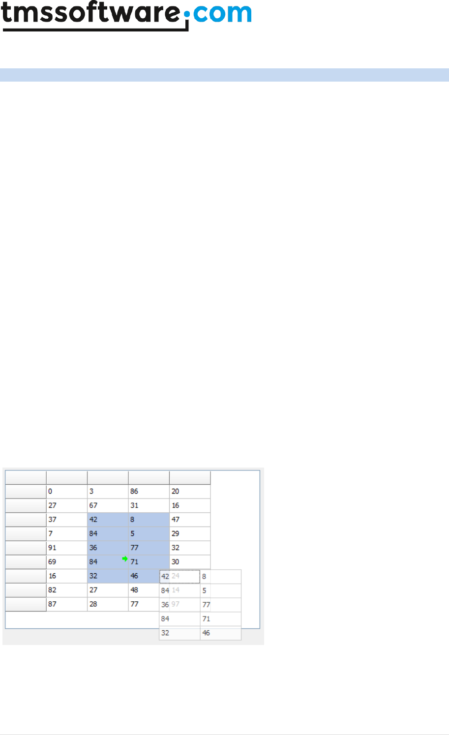
TMS SOFTWARE
TADVSTRINGGRID
DEVELOPERS GUIDE
136 | P a g e
TAdvStringGrid OLE drag & drop
Extensive support for automatic drag & drop is included in TAdvStringGrid. Because drag & drop
conforms to OLE based drag & drop, this makes drag & drop possible not only within your
application but also between applications that conform to this standard such as Excel, Word or even
other applications with TAdvStringGrid.
Making use of these capabilities is done through several properties and events :
Properties under grid.DragDropSettings:
OleAcceptFiles: when true, files can be dropped on the grid.
OleAcceptText: when true, text from an OLE drag & drop source (such as Microsoft Word, Microsoft
Excel) can be dropped on the grid.
OleAcceptURLs: when true, a hyperlink from an OLE drag & drop source can be dropped on the grid.
OleColumnDragDrop: when true, the grid can drag & drop entire columns by dragging from the
column header.
OleColumnsOnly: when true, only columns can be dragged by means of the column header.
OleColumnReorder: when true, OLE drag & drop of columns will be used to reorder columns.
OleCopyAlways: when true, drag & drop always performs a copy as otherwise a Ctrl-drag performs a
copy and a simple drag performs a move.
OleDropRTF: when true, the grid can accept richt text formatted text.
OleDropSource: make the grid act as a source for drag & drop.
OleDropTarget : make the grid act as a target for drag & drop.
OleEntireRows : make sure that entire row (including fixed row) is handled during drag & drop in
RowSelect mode.
OleInsertRows : perform automatic row insertion when rows are dropped on the grid.
OleRemoveRows : perform automatic row removal if drag & drop move operation is done, otherwise
the move will result in empty rows.
ShowCells: when true, a semi transparent image of cells dragged is shown during drag & drop.
Screenshot of drag & drop with image showing cells being dragged. The little green arrow indicates
in what cell the drop will occur.
Some other properties that are relevant for drag & drop are :
In Navigation:
Navigation.AllowClipboardAlways : will allow drop on a grid where editing is disabled. Otherwise,
only editable cells could change through the drop operation.

TMS SOFTWARE
TADVSTRINGGRID
DEVELOPERS GUIDE
137 | P a g e
Navigation.AllowClipboardRowGrow : will allow automatic adding of rows if more rows are dropped
on the grid than present
Navigation.AllowClipboardColGrow : will allow automatic adding of columns if more columns are
dropped on the grid than present
Public property:
ExcelClipboardFormat:boolean : use clipboard format compatible with Excel
Events:
OnOleDrag : event triggered when drag starts. Through the Allow parameter, the drag can be
enabled or not.
OnOleDragOver : event triggered during the drag operation when the mouse is over the grid.
Through the Allow parameter, the place where data can be dropped can be set.
OnOleDragStart : event triggered when drag has started.
OnOleDragStop : event triggered when drag has stopped. Indicates whether it was a move, copy or
cancelled drag & drop operation.
OnOleDrop : event triggered when succesfull drop of cells was performed on the grid.
OnOleDropCol : event triggered when succesfull drop of a column was performed on the grid.
Row drag & drop
Enabling row drag and drop is simple. OleDropSource and OleDropTarget properties are set true. In
addition OleEntireRows, OleRemoveRows and OleInsertRows are set true to enable full row drag &
drop. The only event used further is OnOleDrag where Allow is set true whenever the origin row of
the drag operation is not a fixed row. This is necessary, as drag & drop from a fixed row starts a
column drag & drop. Notice that drag & drop between grids as well as in the grid itself (to allow row
rearranging is possible)
To allow only drag & drop between grids, use the OnOleDragStart event to set the source grid in a
variable. In the OnOleDragOver event, set Allow to false if the Sender is equal to this source. Finally
reset the source on the OnOleDragStop event.
Example: row drag & drop
ddsource: TObject;
procedure Form1.OnOleDragStart(Sender:TObject; Arow,Acol: integer);
begin
ddsource := Sender;
end;
procedure Form1.OnOleDragOver(Sender:TObject; Arow,Acol: integer;
var Allow: boolean);
begin
Allow := ddsource <> Sender;
end;
procedure Form1.OnOleDragStop(Sender:TObject; Arow,Acol: integer; var
Allow: boolean);
begin
ddsource := nil;
end;
Cell drag & drop
Everything under row drag & drop applies to cell drag & drop, except that OleEntireRows,
OleRemoveRows and OleInsertRows are set false here.

TMS SOFTWARE
TADVSTRINGGRID
DEVELOPERS GUIDE
138 | P a g e
Column drag & drop
Column drag & drop is a little more involved. This is because the interface allows for more than just
inter grid column drag & drop but allows the implementation for something like a field chooser (see
example project 29) as well.
Where the previous examples disabled column drag & drop by setting Allow=false when the drag
started from the fixed row, this example only enables drag & drop when the drag starts from the
fixed row. (Nothing prevents enabling both in the same grid though)
The OnOleDragOver event is used to allow a drop of a column only when the mouse cursor is over a
fixed row. Except when the grid has no columns, a drop on the fixed column is not allowed:
procedure TForm1.OnOleDragOver(Sender: TObject; Arow, Acol: integer; var
Allow: boolean);
begin
with Sender as TAdvStringGrid do
Allow := (Sender<>ColSource) and (Arow=0) and ((Acol>0) or
(ColCount=1));
end;
The event OnOleDropCol is triggered when a column is dropped. It indicates the index of the
original column dropped as well as the index of the column where it is dropped. It is in this event
that the column data of the source grid is inserted in the target grid:
procedure TForm1.AdvStringGrid5OleDropCol(Sender: TObject; Arow, Acol,
DropCol: Integer);
var
sl: TStringList;
begin
coltarget := Sender as TAdvStringGrid;
sl := TStringList.Create;
sl.Assign(colsource.Cols[DropCol]);
if (acol = 0) then inc(acol);
coltarget.insertcols(acol,1);
coltarget.Cols[acol].Assign(sl);
sl.Free;
end;
Finally the OnOleDragStop event is used to remove the column from the source grid if the drag &
drop was a move operation:
procedure TForm1.AdvStringGrid5OleDragStop(Sender: TObject;
OLEEffect: Integer);
begin
if OLEEffect = DROPEFFECT_MOVE then
begin
colsource.RemoveCols(colsourceidx,1);
end;
end;

TMS SOFTWARE
TADVSTRINGGRID
DEVELOPERS GUIDE
139 | P a g e
TAdvStringGrid hidden columns and rows
It can be convenient to put data in cells that are not visible for the user but accessible by the
application. TAdvStringGrid therefore supports hidden columns or hidden rows. Great care must be
taken into account when using both at the same time. The recommended way is to first apply all
row hiding and then apply column hiding and unhide the columns again before unhiding the rows.
Methods available for handling columns hiding are:
procedure HideColumn(ColIndex: Integer);
procedure UnHideColumn(ColIndex: Integer);
procedure HideColumns(FromCol,ToCol: Integer);
procedure UnHideColumns(FromCol,ToCol: Integer);
procedure UnHideColumnsAll;
function IsHiddenColumn(Colindex: Integer): Boolean;
function NumHiddenColumns: Integer;
function AllColCount: Integer;
Methods available for handling row hiding are:
procedure HideRow(Rowindex: Integer);
procedure HideRows(FromRow,ToRow: Integer);
procedure HideRowList(RowList: TIntList);
procedure UnHideRow(Rowindex: Integer);
procedure UnHideRows(FromRow,ToRow: Integer);
procedure UnHideRowsAll;
procedure UnHideRowsList;
procedure HideSelectedRows;
procedure HideUnSelectedRows;
function IsHiddenRow(Rowindex: Integer): Boolean;
function NumHiddenRows: Integer;
function AllRowCount: Integer;
The use of these methods is straightforward as the name of the method implies with the exception
of HideRowList & UnHideRowList. With HideRowList, it is possible to hide multiple consecutive or
non consecutive rows with one call. This will be much faster than calling HideRow multiple times.
To use HideRowList, build a TIntList with the indexes of rows to hide (TIntList is defined in the
AdvObj unit). Make sure to call UnHideRowList after calling HideRowList.
Example: hiding multiple non consecutive rows with HideRowList
var
il: TIntList;
begin
il := TIntList.Create(-1,-1);
il.Add(5);
il.Add(6);
il.Add(7);
il.Add(15);
il.Add(16);
il.Add(17);
AdvStringGrid.HideRowList(il); // hides rows 5,6,7,15,16,17

TMS SOFTWARE
TADVSTRINGGRID
DEVELOPERS GUIDE
140 | P a g e
end;
When cells are hidden, it is still possible to access these hidden cells. Two cell addressing schemes
are available: one with visible column and row indexes and one with real column and row indexes.
With real column or row indexes, cells can be accessed as if these were not hidden. With visible
column or row indexes cells are accessed with the index as appearing on the screen.
The property grid.Cells[Col,Row]: string is using the column indexes as if all columns were visible
while the property grid.RealCells[Col,Row]: string provides access to cells with real display
coordinates.
Example: mixing visible and real column index access
// initializing the grid
Grid.Cells[1,1] := ‘Col 1’;
Grid.Cells[2,1] := ‘Col 2’;
Grid.Cells[3,1] := ‘Col 3’;
// hiding column 2
Grid.HideColumn(2);
Grid.Cells[2,1] := ‘A’; // updates cell “Col 2”;
Grid.UnHideColumn(2);
The result is : “Col 1”, “A”, “Col 3”
TAdvStringGrid also provides a set of functions to allow performing the mapping of real cell indexes
to visible cells indexes and vice versa. This is provided through:
function RealRowIndex(ARow: Integer): Integer;
function RealColIndex(ACol: Integer): Integer;
Returns the real column or row index for a given visible column or row index
function DisplRowIndex(ARow: Integer): Integer;
function DisplColIndex(ACol: Integer): Integer;
Returns the visible column or row index for a given real column or row index
In the example above, changing the code in:
// initializing the grid
Grid.Cells[1,1] := ‘Col 1’;
Grid.Cells[2,1] := ‘Col 2’;
Grid.Cells[3,1] := ‘Col 3’;
// hiding column 2
Grid.HideColumn(2);
Grid.RealCells[2,1] := ‘A’;
Grid.UnHideColumn(2);
Results in : “Col 1”, “Col 2”, “A”
as the visible column index of the real column index 3 is now 2.

TMS SOFTWARE
TADVSTRINGGRID
DEVELOPERS GUIDE
141 | P a g e
TAdvStringGrid cell formatting
Two types of cell formatting are available. The first method is format at the time of adding
information to a cell, the second method is by applying a format when a cell is being displayed.
The first method is the most simple. The format is set with the property grid.FloatFormat and is
string specifier that is also used for the Borland Format() function.
Example:
grid.FloatFormat := ‘%.3m’;
selects a money type floating point format with currency symbol, thousand separator and three
decimals. When assigning a float to the grid with:
var d: double;
begin
d := 1234567,8912;
advstringgrid1.Floats[1,1] := d;
end;
this will be displayed in the grid as:
1,234,567.891 $
When the FloatFormat property is changed, a new float format will be applied for all new
assignments to grid.Floats[col,row]
Dynamic float formatting
Dynamic float formatting is done through the event OnGetFloatFormat. This example event handler
specifies that the first 3 columns have float data and sets a different format for the three columns.
procedure TForm1.AdvStringGrid1GetFloatFormat(Sender: TObject; ACol,
ARow: Integer; var IsFloat: Boolean; var FloatFormat: String);
begin
IsFloat := ACol in [1,2,3];
case ACol of
1: FloatFormat := '%.0n';
2: FloatFormat := '%.2m';
3: FloatFormat := '%d';
end;
end;
An important difference between static & dynamic float formatting is that for static formatting, the
precision of the cell data is determined by the FloatFormat property at the time of assigning the
grid.Floats[col,row] property. For dynamic float formatting, the float can be set with full precision
in the grid and only for display purposes have a lower precision.
For completeness, the full capabilities of a float format specifier can be found here:
Format specifiers have the following form:

TMS SOFTWARE
TADVSTRINGGRID
DEVELOPERS GUIDE
142 | P a g e
"%" [index ":"] ["-"] [width] ["." prec] type
A format specifier begins with a % character. After the % come the following, in this order:
An optional argument zero-offset index specifier (that is, the first item has index 0), [index ":"]
An optional left justification indicator, ["-"]
An optional width specifier, [width]
An optional precision specifier, ["." prec]
The conversion type character, type
The following table summarizes the possible values for type:
d Decimal. The argument must be an integer value. The value is converted to a string of
decimal digits. If the format string contains a precision specifier, it indicates that the
resulting string must contain at least the specified number of digits; if the value has
less digits, the resulting string is left-padded with zeros.
u Unsigned decimal. Similar to 'd' but no sign is output.
e Scientific. The argument must be a floating-point value. The value is converted to a
string of the form "-d.ddd...E+ddd". The resulting string starts with a minus sign if the
number is negative. One digit always precedes the decimal point.The total number of
digits in the resulting string (including the one before the decimal point) is given by the
precision specifier in the format string—a default precision of 15 is assumed if no
precision specifier is present. The "E" exponent character in the resulting string is
always followed by a plus or minus sign and at least three digits.
f Fixed. The argument must be a floating-point value. The value is converted to a string
of the form "-ddd.ddd...". The resulting string starts with a minus sign if the number is
negative.The number of digits after the decimal point is given by the precision specifier
in the format string—a default of 2 decimal digits is assumed if no precision specifier is
present.
g General. The argument must be a floating-point value. The value is converted to the
shortest possible decimal string using fixed or scientific format. The number of
significant digits in the resulting string is given by the precision specifier in the format
string—a default precision of 15 is assumed if no precision specifier is present.Trailing
zeros are removed from the resulting string, and a decimal point appears only if
necessary. The resulting string uses fixed point format if the number of digits to the
left of the decimal point in the value is less than or equal to the specified precision,
and if the value is greater than or equal to 0.00001. Otherwise the resulting string uses
scientific format.
n Number. The argument must be a floating-point value. The value is converted to a
string of the form "-d,ddd,ddd.ddd...". The "n" format corresponds to the "f" format,
except that the resulting string contains thousand separators.
m Money. The argument must be a floating-point value. The value is converted to a string
that represents a currency amount. The conversion is controlled by the CurrencyString,
CurrencyFormat, NegCurrFormat, ThousandSeparator, DecimalSeparator, and
CurrencyDecimals global variables or their equivalent in a TFormatSettings data

TMS SOFTWARE
TADVSTRINGGRID
DEVELOPERS GUIDE
143 | P a g e
structure. If the format string contains a precision specifier, it overrides the value given
by the CurrencyDecimals global variable or its TFormatSettings equivalent.
p Pointer. The argument must be a pointer value. The value is converted to an 8
character string that represents the pointers value in hexadecimal.
s String. The argument must be a character, a string, or a PChar value. The string or
character is inserted in place of the format specifier. The precision specifier, if present
in the format string, specifies the maximum length of the resulting string. If the
argument is a string that is longer than this maximum, the string is truncated.
x Hexadecimal. The argument must be an integer value. The value is converted to a
string of hexadecimal digits. If the format string contains a precision specifier, it
indicates that the resulting string must contain at least the specified number of digits;
if the value has fewer digits, the resulting string is left-padded with zeros.
Conversion characters may be specified in uppercase as well as in lowercase—both produce the
same results.
For all floating-point formats, the actual characters used as decimal and thousand separators are
obtained from the DecimalSeparator and ThousandSeparator global variables or their
TFormatSettings equivalent.
Index, width, and precision specifiers can be specified directly using decimal digit string (for
example "%10d"), or indirectly using an asterisk character (for example "%*.*f"). When using an
asterisk, the next argument in the argument list (which must be an integer value) becomes the
value that is actually used.
In addition to standard Delphi number formatting, TAdvStringGrid supports an additional formatting
mode, i.e. the Excel formatting mode. The format mode is selected via grid.FormatType = (ftVCL,
ftExcel). In Excel for example, the number formatting string “$0.00” can be used to format a
number with 2 decimals and a $ prefix.
More information on the Microsoft Excel number formatting can be found at:
http://office.microsoft.com/en-001/excel-help/number-format-codes-HP005198679.aspx

TMS SOFTWARE
TADVSTRINGGRID
DEVELOPERS GUIDE
144 | P a g e
TAdvStringGrid virtual cells
Through virtual cells, the grid can not only display content that does not have to be stored in grid
Cells but can also apply dynamic transformations of cell contents for display. Virtual cells are
achieved through the OnGetDisplText event that is triggered just before a cell needs to be displayed
or its contents need to be retrieved (like during a print or export) As the cell text is only requested
when it is needed, virtual cells are very fast and efficient. The OnGetDisplText is declared as:
TGetDisplTextEvent = procedure(Sender: TObject; ACol,ARow: Integer; var
Value: string) of object;
The text that needs to be displayed in a cell with coordinates ACol, ARow is set in the Value
parameter.
Example: dynamic HTML formatting of cell text
As it is often inconvenient to set text with HTML tags in the grid itself (for later editing / saving
etc...), the OnGetDisplText is an ideal way for setting only the desired text in the grid cell and
apply formatting only separately for displaying. In this simple example, text is set bold for the first
column by :
procedure TForm1.AdvStringGrid1GetDisplText(Sender: TObject; ACol,ARow:
Integer; var Value: string);
begin
if ACol = 1 then
Value := '<B>' + Value + '</B>';
end;
Example: dynamic number formatting
Suppose that numeric info is stored in the grid cells with a higher precision than required to display.
In this case, the data can be reformatted dynamically with a routine such as :
procedure TForm1.AdvStringGrid1GetDisplText(Sender: TObject; ACol,ARow:
Integer; var Value: string);
var
f: Double;
Err: Integer;
begin
Val(Value,f,Err);
Value := Format('%.2f',[f]);
end;
To display virtual Unicode text in the grid, an equivalent event OnGetDisplWideText is available.
This works identical to OnGetDisplText except that its value parameter is a widestring.

TMS SOFTWARE
TADVSTRINGGRID
DEVELOPERS GUIDE
145 | P a g e
TAdvStringGrid cell access with column moving
When the option goColMoving is set to true in grid.Options, the user is able to move columns around
at runtime via drag & drop. If programmatic access to cells is necessary in the application, this can
get complex to know in what column a cell can be accessed. Therefore, the grid has built-in
facilities to know the position of a column at any time or to access cells irrespective of the moving
of columns. It is assumed that at startup of the application, the grid has a reference column
ordering. This is the column ordering before a user could have moved columns. Whenever at some
point the grid is reconfigured and a new reference column order should be set, the method
grid.SetColumnOrder can be called. Two functions are provided to find at any time what the
position is of a column or what the original column index is of some column:
Grid.ColumnPosition(OriginalColumnIndex: integer): integer
This function returns the visual column position index of a column that was at startup at index
OriginalColumnIndex.
Grid.ColumnAtPosition(VisualColumnIndex: integer): integer
Returns the original column index of a column found at position VisualColumnIndex.
To access cells irrespective of column moving, the property grid.OriginalCells[Col,Row]: string can
be used. Assuming that the code needs to access information in column 1 and row 1, you can use at
any time grid.OriginalCells[1,1], even when the user moved column 1 to another position in the
grid, the value of the cell can always be set or retrieved with grid.OriginalCells[1,1].
TMS SOFTWARE
TADVSTRINGGRID
DEVELOPERS GUIDE
146 | P a g e
TAdvStringGrid hints
TAdvStringGrid features a lot of built-in capabilities to display various types of hints.
Regular hints
The hints are enabled by the property grid.ShowHint set to true. The color of the hint window can
be set with the property grid.HintColor. The main hint text is set through the grid.Hint property and
behaves like all hints for VCL components. In addition to this, following hint properties exist:
AnchorHint
When true, the event OnAnchorHint is triggered when the mouse is over a
hyperlink in HTML formatted text. Unless the OnAnchorHint specifies another
hint text, the hint text is by default the value of the anchor.
HintShowCells
When true, a hint is displayed for each cell showing the cell contents. For
each cell, the event OnGridHint is triggered with which a hint text can be set
for the grid cell which coordinates are in the OnGridHint parameter list
HintShowLargeText
When true, a hint is displayed for cells containing text that is wider than the
cell width. The hint displays the full text when the mouse is over the cell
HintShowSizing
When true, a hint is displayed during column or row sizing in the grid, showing
the size in pixels of the column or row
ScrollHints
When true, the row index or column index of the scroll position is displayed in
a hint over the scrollbar
For all hints used in the grid, the HTMLHint property setting determines whether HTML tags are
rendered in the hint window or not. By default this is false meaning that any HTML tags in a hint
text are stripped before being displayed.
Example: using hidden cell data to add to a HTML formatted hint text
The grid is filled with flight information in separate cells and in the OnGridHint event, the full flight
information is displayed in the hint whenever the mouse is over the row:
Grid.Cells[0,1] := ‘AA709’;
Grid.Cells[1,1] := ‘American Airlines’;
Grid.Cells[2,1] := ‘New York’;
Grid.Cells[3,1] := ’USA’;
Grid.Cells[4,1] := ’2:00 AM’;
Grid.HideColumn(4);
Grid.ShowHint := True;
Grid.HTMLHint := True;
procedure TForm1.AdvStringGrid1GridHint(Sender: TObject; ARow,
ACol: Integer; var hintstr: String);
begin
hintstr := ‘<B>’+Grid.Cells[0,ARow] +’</B> : ’+ Grid.Cells[1,ARow] +’,
(’+ Grid.Cells[2,ARow]+’ – ‘ + Grid.Cells[3,ARow] + ‘)’ + ‘<FONT
color=”clred”><B>’+ Grid.Cells[4,ARow]+’</B></FONT>’;
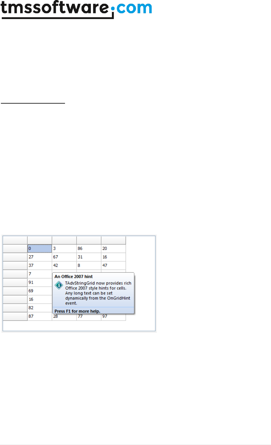
TMS SOFTWARE
TADVSTRINGGRID
DEVELOPERS GUIDE
147 | P a g e
end;
To display a hint with Unicode text, an equivalent event OnGridWideHint is available. This works
identical to OnGridHint except that its hintstr parameter is a widestring.
Important note: in order to have the hint with HTML tags rendered as HTML, it is required to put the
THTMLHint component on the form. The THTMLHint component is included in the TMS Component
Pack Pro and is responsible for the actual HTML formatted rendering of hints.
Office 2007/2010 hints
The grid can also display the richer Office 2007 style hints. This hint consists of a hint title, a hint
picture, multiline hint text and optionally hint help information. The settings for the OfficeHint are
found under grid.OfficeHint. Note that in order to have Office hints with TAdvStringGrid, the
TAdvOfficeHint (available separately or in TMS Component Pack) must be added on the form. The
hint title can be set at design-time via grid.OfficeHint.Title or it can be set dynamically from the
OnGridHint event. In this code snippet, a generic long text is set to show an Office hint like in the
screenshot below:
procedure TForm1.AdvStringGrid1GridHint(Sender: TObject; ARow, ACol:
Integer; var hintstr: string);
begin
AdvStringGrid1.OfficeHint.Title := 'An Office 2007 hint';
hintstr := 'TAdvStringGrid now provides rich Office 2007 style hints for
cells. Any long text can be set dynamically from the OnGridHint
event.';
end;
TMS SOFTWARE
TADVSTRINGGRID
DEVELOPERS GUIDE
148 | P a g e
TAdvStringGrid search & replace text
Locating in which cell some text can be found is done with the method Find:
function Find(StartCell:TPoint; s:string; FindParams: TFindParams): TPoint;
StartCell contains the cell coordinates where to start the search for the text. If StartCell is equal to
-1,-1 this means the search should start in the first cell of the grid. The parameter s contains the
text to search for and the options for the search are set in the FindParams. When text is found, the
Find function returns the grid coordinates of the cell found, if not the function returns (-1,-1)
FindParams is a set of options that can include:
TFindParameters = (fnMatchCase,fnMatchFull,fnMatchRegular,fnDirectionLeftRight,
fnMatchStart,fnFindInCurrentRow,fnFindInCurrentCol,fnIncludeFixed,fnAutoGoto,
fnIgnoreHTMLTags,fnBackward,fnIncludeHiddenColumns,fnFindInPresetCol,fnFindInPresetRow,fnSel
ectedCells,fnIncludeHiddenRows);
fnAutoGoto
When included, the Find method automatically focuses the cell where
the text is found
fnBackward
When included, search is backwards, i.e. from right to left or from
bottom to top
fnDirectionLeftRight
When included, search is going from left to right cells instead of going
from top to bottom cells first
fnFindInCurrentCol
When included, search happens only in current selected column
fnFindInCurrentRow
When included, search happens only in current selected row
fnFindInPresetCol
When included, search is limited to the column set by public property
grid.FindCol
fnFindInPresetRow
When included, search is limited to the row set by public property
grid.FindRow
fnIgnoreHTMLTags
When included, HTML tags are ignored during the search
fnIncludeFixed
When included, search is also done in the fixed columns
fnIncludeHiddenColumns
When included, search is performed in hidden columns as well
fnIncludeHiddenRows
When included, search is performed in rows hidden by closed nodes as
well. When text is found in a row in a closed node and fnAutoGoto is set,
the node will be opened automatically
fnMatchCase
When included, the search is case sensitive
fnMatchFull
When included, the full cell text must be equal to the text searched for
fnMatchRegular
When included, a match expression can be used containing *, ? as well as
greater than or less than specifiers and multiple expressions can be
TMS SOFTWARE
TADVSTRINGGRID
DEVELOPERS GUIDE
149 | P a g e
combined with AND, OR, NOT
Example:
A* ^ >M : Searches for text starting with A or greater than M
!?A : Text does not have a letter A on second position
fnMatchStart
When included, text searched for needs to match from first character
fnSelectedCells
When included, search is limited to selected cells
Example: searching for all occurrences of a text in the grid
var
Loc: TPoint;
Fp: TFindParams;
begin
Loc := Point(-1,-1);
Fp := [fnMatchRegular, fnAutoGoto];
repeat
Loc := Grid.Find(loc, ‘A*’,fp);
if not ((loc.X = -1) or (loc.Y = -1)) then
ShowMessage(‘Text found at : ‘+IntToStr(loc.x)+’:’+IntToStr(loc.y));
until (loc.X = -1) or (loc.Y = -1);
ShowMessage(‘No more occurrences of text found’);
end;
Note 1:
For searching an empty cell in the grid, the search string that can be used is “”.
Note 2:
For searching a Unicode string, the equivalent method FindWide() is available. In the FindWide
method, the option fnMatchRegular is not supported.
Replacing text can be done in a similar way. The grid provides the method Replace for this with:
grid.Replace(origStr, newStr, FindParams: TFindParams);
The same parameters as for the Find() function are available for the replace. This code snippet will
perform a replace of any cell starting with ‘3’ by ‘A’ in column 2:
AdvStringGrid1.Col := 2;
AdvStringgrid1.Replace('3','A',[fnFindInCurrentCol, fnMatchStart]);
Performing search on multiple columns
Where the Find() function has a single search condition that can be searched for in the entire grid or
part of the grid, an additional function exists: grid.FindMulti(). With grid.FindMulti() a search can be
performed with multiple conditions set for multiple columns.

TMS SOFTWARE
TADVSTRINGGRID
DEVELOPERS GUIDE
150 | P a g e
The functions to do this are declared as:
function FindMulti(Conditions: array of string; Columns: array of integer;
Searchtypes: array of TSearchType; CaseSensitive: array of boolean;
AutoGoto: boolean = false): integer;
function FindMultiNext: integer;
The parameters of FindMulti() are:
Conditions: array of conditions for selected columns
Columns: array of column index values
SearchTypes: array of search condition specifiers
CaseSensitive: array of Boolean values indicating whether the search is case sensitive or not
AutoGoto: when true, the focused row of the grid is automatically set to the first row found
SearchTypes can be:
stStartsWith: cell value starts with search condition
stEndsWith: cell value ends with search condition
stContains: cell value contains search text
stEqual: : cell value is equal to search text
stNotEqual: : cell value is not equal to search text
stNotContains: : cell value does not contain search text
Example:
Assume that a search is needed on value “BMW” in column 1 and value “6” in column 4, then
FindMulti can be used in following way:
AdvstringGrid1.FindMulti(['BMW','6'], [1,4], [stEqual, stEqual],
[false,false], True);
Further matching rows can be searched by calling grid.FindMultiNext: Boolean until this function
returns false.
TMS SOFTWARE
TADVSTRINGGRID
DEVELOPERS GUIDE
151 | P a g e
TAdvStringGrid disjunct row, column and cell selection
In normal circumstances, setting goRangeSelect to true in grid.Options enables selecting multiple
cells in the grid but all selected cells are within a rectangle. With TAdvStringGrid, it is possible to
select disjunct rows, columns or cells. This is enabled by setting either DisjunctRowSelect,
DisjunctColSelect or DisjunctCellSelect in grid.MouseActions to true. Note that the use of these
selection methods is mutually exclusive. Where the selected cells can normally be retrieved using
the grid.Selection: TGridRect property, new properties are introduced to get or set the disjunct
selected rows, columns or cells.
Disjunct row selection
To enable disjunct row selection, set grid.MouseActions.DisjunctRowSelect to true as well as
goRowSelect in grid.Options. Disjunct row selection is done by Ctrl + left mouse click on the rows to
toggle the selection.
Programmatical row selection control is done with following methods:
procedure ClearRowSelect;
Removes selection from all rows
procedure SelectRows(RowIndex, RCount: Integer);
Selects RCount rows starting from RowIndex
property RowSelect[RowIndex]: Boolean;
Property with which row selection can be get
or set for row RowIndex
property RowSelectCount: Integer;
Retrieves the total number of selected rows
procedure RemoveSelectedRows
Removes all selected rows in the grid
procedure RemoveUnSelectedRows
Removes all not selected rows in the grid
function SelectedRowCount: integer
Returns the number of disjunct selected rows
in the grid
property SelectedRow[n: integer]: integer
Returns the row index of the n’th selected
row
Example: Looping through all disjunct selected rows:
With this code, a cell in the row is marked with ‘*’ when the row is selected:
var
i,idx: integer;
begin
for i := 0 to AdvStringGrid1.SelectedRowCount - 1 do
begin
idx := AdvStringGrid1.SelectedRow[i];
AdvStringGrid1.Cells[0,i] := AdvStringGrid1.Cells[0,i] + '*';
end;
end;
Disjunct column selection
To enable disjunct column selection, set grid.MouseActions.DisjunctColSelect to true. Disjunct
column selection is done by Ctrl + left mouse click on the columns to toggle the selection.
Programmatical column selection control is done with following methods:
procedure ClearColSelect;
Removes selection from all columns
procedure SelectCols(ColIndex, CCount: Integer);
Selects CCount rows starting from ColIndex
property ColSelect[ColIndex]: Boolean;
Property with which column selection can be
get or set for column ColIndex

TMS SOFTWARE
TADVSTRINGGRID
DEVELOPERS GUIDE
152 | P a g e
property ColSelectCount: Integer;
Retrieves the total number of selected columns
procedure RemoveSelectedCols
Removes all selected columns in the grid
Procedure RemoveUnselectedCols
Removes all unselected columns in the grid
Disjunct cell selection
The methods and properties to be used for this are:
Grid.MouseActions.DisjunctCellSelect: Boolean; Setting this true enables disjunct cell selection with
Ctrl mouse clicks
Grid.SelectedCells[col,row: Integer]: Boolean; Property to allow setting or clearing selection on a
single cell
Grid.SelectedCellsCount: Integer; Returns the number of disjunct selected cells (read-only)
Grid.SelectedCell[i: Integer]: TGridCoord; Returns the i'th selected cell grid coordinates (read-only)
Grid.ClearSelectedCells; Clears all disjunct selected cells in the grid
Example: checkerboard cell selection
To make a checkerboard disjunct cell selection, following code was written :
var
i,j: Integer;
begin
AdvStringGrid1.ClearSelectedCells;
with AdvStringGrid1 do
for i := 1 to ColCount - 1 do
for j := 1 to RowCount - 1 do
SelectedCells[i,j] := (odd(i) and odd(j)) or (not odd(i) and not
odd(j));
end;
This is the method to show a list of selected cells in a listbox :
var
i: Integer;
gc: TGridCoord;
begin
listbox1.Items.Clear;
listbox1.Items.Add('Nr. of cells : ' +
IntToStr(AdvStringGrid1.SelectedCellsCount));
for i := 1 to AdvStringGrid1.SelectedCellsCount do
begin
gc := AdvStringGrid1.SelectedCell[i - 1];
listbox1.Items.Add(IntToStr(gc.X)+':'+IntToStr(gc.Y));
end;
end;

TMS SOFTWARE
TADVSTRINGGRID
DEVELOPERS GUIDE
153 | P a g e
TAdvStringGrid cell check architecture
A mechanism is available to provide cell value checking, error marking and cell autocorrecting
components with TAdvStringGrid. This opens the capability to add spell checking components to
TAdvStringGrid as in this case an interface is provided to use the Addict Spell Checking product with
TAdvStringGrid.
The main concept is that a TAdvStringGridCheck derived component can be attached to the
CellChecker property of TAdvStringGrid. When a Checker component is attached, TAdvStringGrid
will call its base methods MarkError and Correct at the right time to make checking and correcting
possible after inplace editing is finished or when a programmatic call to the various new Check
methods is made.
This is the base class for the Checker component from which all custom checker components must
be derived :
TAdvStringGridCheck = class(TComponent)
public
function MarkError(ACol,ARow: Integer; s:string):string; virtual;
function Correct(ACol,ARow: Integer; s:string):string; virtual;
procedure StartCheck; virtual;
procedure StopCheck; virtual;
published
property AutoCorrect: Boolean read FAutoCorrect write FAutoCorrect;
property AutoMarkError: Boolean read FAutoMarkError write FAutoMarkError;
property GotoCell: Boolean read FGotoCell write FGotoCell;
property UseCorrect: Boolean read FUseCorrect write FUseCorrect;
property UseMarkError: Boolean read FUseMarkError write FUseMarkError;
end;
The purpose of the properties AutoCorrect and AutoMarkError is to set whether the Checker
component should be used to perform auto correction or auto error marking after editing each cell.
The UseCorrect and UseMarkError properties control whether the correction or error marking is used
when calling the grid's various Check methods, ie. CheckCell, CheckCells, CheckCol, CheckRow and
CheckGrid. Optionally, the GotoCell is used to activate each cell when doing multiple cell checks
with the various Check methods to give a visual indication to the user which cell is being checked.
In this base class, the methods Correct and MarkError do nothing. They simply return the cell
content as is. With a real checker, these methods should either return the corrected cell's value or
the cell's value with markers for words with errors. Error Markers (ie. red line under words with
errors) can be applied by using the built-in HiLight function in the base TAdvStringGridCheck
component.
As a sample implementation, a Checker component has been provided that does nothing more than
capitalize each first letter of a string. The TCapitalCheck component is thus derived from
TAdvStringGridCheck and implements only one method, ie. the Correct method in following way:
function TCapitalCheck.Correct(ACol,ARow: Integer;s: string): string;
var
Prev,PrevPrev:Char;
i: Integer;
begin
Prev := ' ';
PrevPrev := '.';
for i := 1 to Length(s) do
begin

TMS SOFTWARE
TADVSTRINGGRID
DEVELOPERS GUIDE
154 | P a g e
if (Prev = ' ') and (PrevPrev in ['!','?','.']) and (s[i] <>
Upcase(s[i])) then
s[i] := UpCase(s[i]);
PrevPrev := Prev;
Prev := s[i];
end;
Result := s;
end;
It will auto-correct an entered value of "this is a test. i should start with a capital" to "This is a test.
I should start with a capital"
Based on this architecture, a component TAddictCheck is provided that uses the Addict Spell
Checker to perform spell checking in TAdvStringGrid or other TAdvStringGrid based products. Again
this is all possible without writing any code, just drop the Addict Spell Checker components on your
form, set all Addict properties to your preferences, add a TAddictCheck component on the form and
assign the TAddictSpell component to the TAddictCheck's AddictSpell property. Next, assign the
TAddictSpell component to the TAdvStringGrid's CellChecker property. Control with the
AutoCorrect, AutoMarkError, GotoCell, UseCorrect, UseMarkError and ShowDialog properties how
the Addict Spell Checker should be used with TAdvStringGrid.
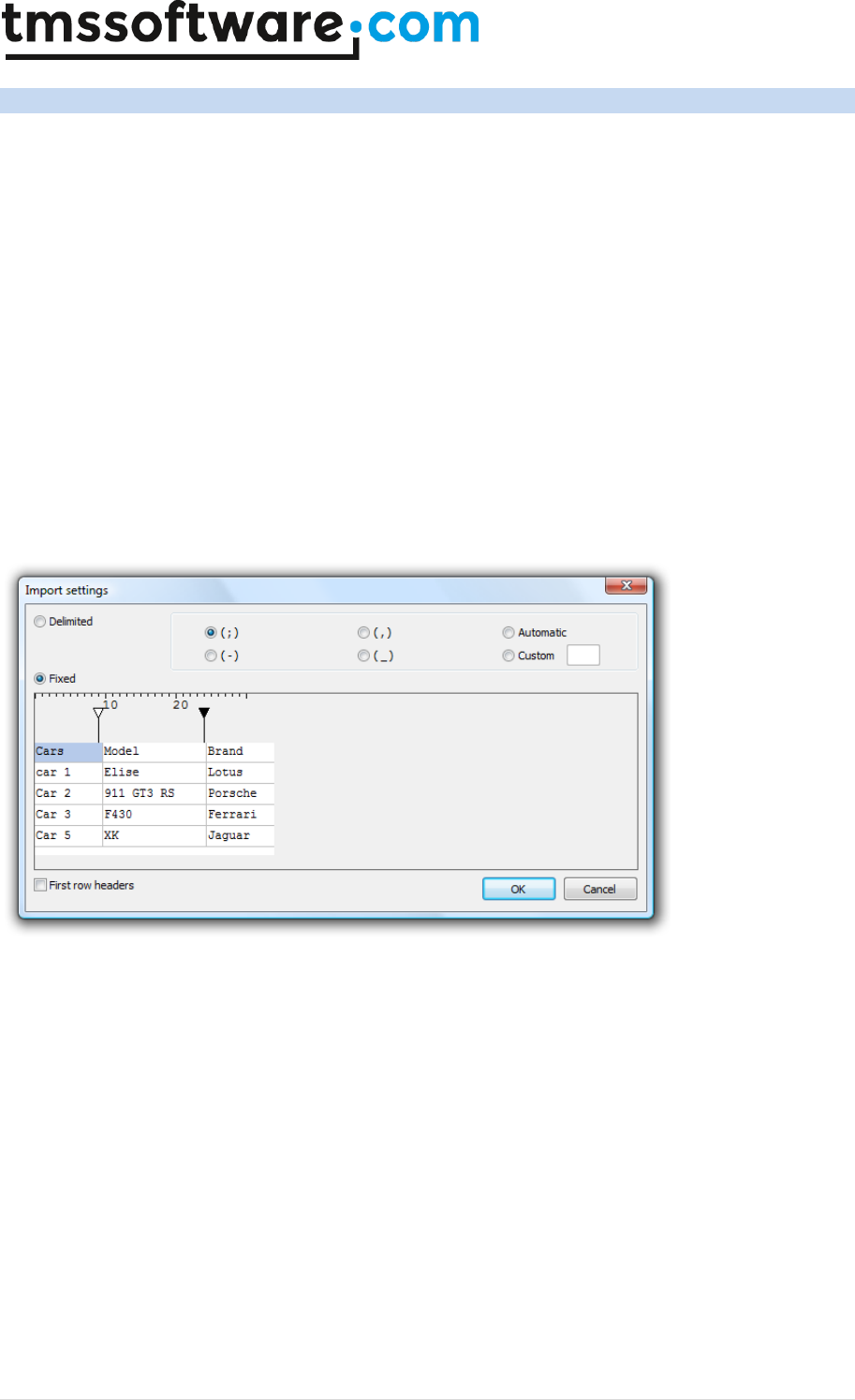
TMS SOFTWARE
TADVSTRINGGRID
DEVELOPERS GUIDE
155 | P a g e
TAdvStringGrid add-on dialogs
TAdvStringGrid comes with a number of add-on dialogs:
TAdvGridPrintSettingsDialog: dialog to configure the various printsettings of the grid
TAdvGridHTMLSettingsDialog: dialog to configure the various HTML export settings of the grid
TAdvPreviewDialog: dialog to show a print preview
TAdvGridReplaceDialog: find & replace dialog
TAdvGridFindDialog: find dialog
TAdvGridImportDialog: CSV/text file import dialog
The concept of the add-on dialogs is simple. The dialog components can be dropped on the form
and their Grid property is assigned to the TAdvStringGrid instance on the form. The dialogs are
displayed with the Execute method.
The TAdvGridImportDialog has two methods : OpenAndExecute and Execute. When calling
OpenAndExecute, it will first show a file open dialog to pick a .TXT or .CSV file and preview the file
in the dialog. From there, the delimiter or column positions can be set. Choosing OK will load the
file in the associated grid.
TMS SOFTWARE
TADVSTRINGGRID
DEVELOPERS GUIDE
156 | P a g e
TAdvStringGrid Unicode support
TAdvStringGrid has built-in support to display, print, edit and sort Unicode strings on Windows NT,
2000, XP and Vista on Delphi versions prior to Delphi 2009. From Delphi 2009 all strings in
TAdvStringGrid are by default Unicode and the specific Unicode support is therefore deprecated in
Delphi 2009. Note that in order to use Unicode, a font that supports the full Unicode character set is
required. The Microsoft “Arial Unicode MS” is such a font. The interface to put Unicode strings in a
grid cell is done through the property:
Grid.WideCells[Col,Row]: widestring;
Unicode editing
TAdvStringGrid has support for inplace editing of Unicode cells with a normal edit control and a
dropdown combobox and dropdownlist combobox. The inplace editors are specified with the
OnGetEditorType event where these 3 types are defined:
edUniEdit: Unicode inplace editor
edUniEditBtn: Unicode inplace editor with attached button
edUniComboEdit: Unicode dropdown combobox
edUniComboList: Unicode dropdownlist combobox
edUniMemo: Unicode memo editor
The Unicode inplace editors can be directly accessed with
Grid.UniEdit : the instance of the inplace Unicode edit control
Grid.UniCombo : the instance of the inplace Unicode combobox control
Grid.UniMemo: the instance of the inplace Unicode memo control
Example: using 3 different Unicode inplace editors in TAdvStringGrid
procedure TForm1.AdvStringGrid1GetEditorType(Sender: TObject; ACol,
ARow: Integer; var AEditor: TEditorType);
begin
case ACol of
1:AEditor := edUniEdit;
2:begin
AEditor := edUniComboEdit;
AdvStringGrid1.UniCombo.Items.Clear;
AdvStringGrid1.UniCombo.Items.Add(‘London’);
AdvStringGrid1.UniCombo.Items.Add(‘New York’);
AdvStringGrid1.UniCombo.Items.Add(‘Paris’);
end;
3:begin
AEditor := edUniComboList;
AdvStringGrid1.UniCombo.Items.Clear;
AdvStringGrid1.UniCombo.Items.Add(‘United Kingdom’);
AdvStringGrid1.UniCombo.Items.Add(‘United States’);
AdvStringGrid1.UniCombo.Items.Add(‘France’);
end;
end;
end;
TMS SOFTWARE
TADVSTRINGGRID
DEVELOPERS GUIDE
157 | P a g e
Unicode sorting
Enabling sorting in TAdvStringGrid that takes Unicode into account is done by instructing the sort
function to use Unicode for the selected columns. This is done through the OnGetFormat event with
the Unicode sort style: ssUnicode
Example: setting sort style for selected columns to Unicode
procedure TForm1.AdvStringGrid1GetFormat(Sender: TObject; ACol: Integer;
var AStyle: TSortStyle; var aPrefix, aSuffix: String);
begin
if (ACol in [2,4]) then
AStyle := ssUnicode;
end;
Please note that this is deprecated when used with Delphi 2009 / C++Builder 2009 or later versions
as the default string type is always Unicode in these versions.
Unicode virtual cell text
The event OnGetDisplWideText can be used to set virtual cell Unicode text in grid cells.
Unicode hints
The event OnGridWideHint can be used to set a Unicode hint text for a cell

TMS SOFTWARE
TADVSTRINGGRID
DEVELOPERS GUIDE
158 | P a g e
TAdvStringGrid Undo/Redo add-on component
To facilitate Undo/Redo handling of editing in cells, the TAdvGridUndoRedo component can be
used. Drop this component on the form and assign it to the TAdvStringGrid UndoRedo property. If
the property MaxLevel of the Undo/Redo component is 0, this means it will store all values for an
unlimited Undo/Redo otherwise it will only remind the latest changes for Undo/Redo.
To perform the undo and redo actions, the methods
TAdvGridUndoRedo.Undo
and
TAdvGridUndoRedo.Redo
are available.
The public property TAdvGridUndoRedo.Level normally points to the latest performed editing action
in the grid. Upon calling Undo, the Level property is decremented to point to the previous action.
With a Redo, the Level is incremented again until it has reached the last action.
Note: Undo/Redo applies to cell editing only. Other changes like setting cell properties for example
is not maintained in the TadvGridUndoRedo component.

TMS SOFTWARE
TADVSTRINGGRID
DEVELOPERS GUIDE
159 | P a g e
TAdvStringGrid column state persistence
Often it is desirable to allow that the user can resize columns, move columns, hide columns of a
grid. After a user customizes the view of the grid this way, it is convenient to persist this setting
and when the application is restarted, these customizations of the user are restored exactly as the
user left the application. TAdvStringGrid offers saving column sizes with grid.SaveColSizes and
offers saving positions of columns with grid.SaveColPositions. With these 2 methods, it is possible to
save column widths & column positions either to registry or to an INI file. The location where the
settings are persisted is defined in grid.ColumnSize.
An even easier and more convenient method to persist column size, column position and column
visibility is available through two methods: grid.ColumnStatesToString:string and
grid.StringToColumnStates(s: string). This way, the full column state can be persisted in a registry
key, INI file value or database field. One key function for persisting column order is to set a
reference column order. The method ColumnStatesToString saves the column ordering relative to
the reference order so it is important that during grid initialization, the reference order is set by
calling grid.SetColumnOrder.
Example: grid with column sizing & moving enabled and two buttons to save & restore state
procedure TForm1.FormCreate(Sender: TObject);
var
i: integer;
begin
{no fixed columns in grid}
advstringgrid1.FixedCols := 0;
advstringgrid1.ColCount := 10;
advstringgrid1.RowCount := 50;
{fill grid with easy to recognize data for this demo}
advstringgrid1.LinearFill(false);
advstringgrid1.AutoNumberRow(0);
{enable column moving & column sizing}
advstringgrid1.Options := advstringgrid1.Options + [goColSizing,
goColMoving];
{add buttons in the column header cells that will allow column hiding}
for i := 0 to AdvStringGrid1.ColCount - 1 do
advstringgrid1.AddButton(i,0,16,16,'X',haRight,vaTop);
{make sure that buttons on a readonly cell are not disabled}
advstringgrid1.ControlLook.NoDisabledButtonLook := true;
{important call to set the reference column order of the grid}
advstringgrid1.SetColumnOrder;
end;
procedure TForm1.SaveBtnClick(Sender: TObject);
var
inifile: TInifile;
begin
inifile := TIniFile.Create('.\grid.ini');
inifile.WriteString('GRID','SETTINGS',advstringgrid1.ColumnStatesToStri
ng);
inifile.Free;
end;
procedure TForm1.LoadBtnClick(Sender: TObject);
var
inifile: TInifile;
s: string;

TMS SOFTWARE
TADVSTRINGGRID
DEVELOPERS GUIDE
160 | P a g e
begin
inifile := TIniFile.Create('.\grid.ini');
s := inifile.ReadString('GRID','SETTINGS','');
inifile.Free;
if s <> '' then
AdvStringGrid1.StringToColumnStates(s);
end;
Note: the grid has methods SetColumnOrder and ResetColumnOrder. As explained, a reference
column order can be set by calling grid.SetColumnOrder, for example during grid initialization. If
column moving is allowed (by setting goColMoving = true in grid.Options) you can automatically
reset the column to the original reference column order by calling grid.ResetColumnOrder.
TMS SOFTWARE
TADVSTRINGGRID
DEVELOPERS GUIDE
161 | P a g e
TAdvStringGrid import/export to XLS files via TAdvGridExcelIO
With the component TAdvGridExcelIO directly reading and writing Excel 97, 2000, 2003 files without
the need to have Excel installed on the machine is possible.
With these quick steps, you are up and running:
1) drop TAdvStringGrid on a form as well as the component TAdvGridExcelIO
2) Assign the instance of TAdvStringGrid to the AdvStringGrid property of the TAdvGridExcelIO
component
3) You can set TAdvGridExcelIO properties to control the Excel file read / write behaviour but in
most cases default settings will be ok.
4) To read Excel files, use
advgridexcelio.XLSImport(FileName);
or
advgridexcleio.XLSImport(FileName,SheetName);
5) To write the contents of TAdvStringGrid to an XLS file use
advgridexcelio.XLSExport(filename);
Properties of TAdvGridExcelIO
Many properties are available in TAdvGridExcelIO to customize importing & exporting of Excel files
in the grid.
AutoResizeGrid: Boolean;
When true, the dimensions of the grid (ColCount, RowCount) will adapt to the number of imported
cells.
DateFormat: string;
Sets the format of dates to use for imported dates from the Excel file. When empty, the default
system date formatting is applied.
GridStartCol, GridStartRow: integer;
Specifies from which top/left column/row the import/export happens
Options.ExportCellFormats: Boolean;
When true, cell format (string, integer, date, float) is exported, otherwise all cells are exported as
strings.
Options.ExportCellMargings: Boolean;
When true, the margins of the cell are exported
Options.ExportCellProperties: Boolean;

TMS SOFTWARE
TADVSTRINGGRID
DEVELOPERS GUIDE
162 | P a g e
When true, cell properties such as color, font, alignment are exported
Options.ExportCellSizes: Boolean;
When true, the size of the cells is exported
Options.ExportFormulas: Boolean;
When true, the formula is exported, otherwise the formula result is exported
Options.ExportHardBorders: Boolean;
When true, cell borders are exported as hard borders for the Excel sheet
Options.ExportHiddenColumns: Boolean;
When true, hidden columns are also exported
Options.ExportHTMLTags: Boolean;
When true, HTML tags are also exported, otherwise all HTML tags are stripped during export
Options.ExportImages: Boolean;
When true, images in the grid are also exported
Options.ExportOverwrite: Boolean;
Controls if existing files should be overwritten or not during export
Options.ExportOverwriteMessage: Boolean;
Sets the message to show warning to overwrite existing files during export
Options.ExportPrintOptions: Boolean;
When true, the print options are exported to the XLS file
Options.ExportShowGridLines: Boolean;
When true, grid line setting as set in TAdvStringGrid is exported to the XLS sheet
Options.ExportShowInExcel: Boolean;
When true, the exported file is automatically shown in the default installed spreadsheet after
export.
Options.ExportSummaryRowBelowDetail: Boolean;
When true, summary rows are shown below detail rows in the exported XLS sheet
Options.ExportWordWrapped: Boolean;
When true, cells are exported as wordwrapped cells

TMS SOFTWARE
TADVSTRINGGRID
DEVELOPERS GUIDE
163 | P a g e
Options.ImportCellFormats: Boolean;
When true, cells are imported with formatting as applied in the XLS sheet
Options.ImportCellProperties: Boolean;
When true, cell properties such as color, font, alignment are imported
Options.ImportCellSizes: Boolean;
When true, the size of cells is imported
Options.ImportClearCells: Boolean;
When true, it will clear all existing cells in the grid before the import is done
Options.ImportFormulas: Boolean;
When true, the formula is imported, otherwise only a formula result is imported
Options.ImportImages: Boolean;
When true, images from the XLS sheet are imported
Options.ImportLockedCellsAsReadOnly: Boolean;
When true, cells that are locked in the XLS sheet will be imported as read-only cells
Options.ImportPrintOptions: Boolean;
When true, print settings as defined in the XLS sheet will be imported as grid.PrintSettings
Options.UseExcelStandardColorPalette: Boolean;
When true, colors will be mapped using the standard Excel color palette, otherwise a custom
palette will be included in the XLS sheet.
TimeFormat: string;
Sets the format of cells with a time. When no format is specified, the default system time format is
applied.
UseUnicode: Boolean;
When true, cells will be exported / imported as Unicode cells (for versions older than Delphi 2009,
from Delphi 2009, all cells are Unicode by default)
XlsStartCol, XlsStartRow: integer;
Sets the top/left cell from where the import/export should start
Zoom: integer;
Sets the zoom level to set for the exported XLS file

TMS SOFTWARE
TADVSTRINGGRID
DEVELOPERS GUIDE
164 | P a g e
ZoomSaved: Boolean;
When true, the zoom factor set with AdvGridExcel.Zoom is saved to the XLS file.
Formatting Excel cells when exporting from with TAdvGridExcelIO
By default there is no automatic conversion between the numeric formats in AdvStringGrid and
Excel since they use different notations.
Imagine you have the number 1200 in the grid, formatted as "$1,200" .
If you set TAdvGridExcelIO.Options.ExportCellFormat to true, the cell will be exported as the string
"$1,200" to Excel. It will look fine, but it will not be a "real" number, and can not be used in Excel
formulas.
If you set TAdvGridExcelIO.Options.ExportCellFormat to false, the cell will be exported as the
number 1200. It will be a real number, that can be added later in Excel, but it will look like "1200"
and not "$1,200"
To get a real number that is also formatted in Excel you need to set ExportCellFormat := false, and
use the OnCellFormat event in AdvGridExcelIO, and set the desired format for the cell there.
For example, to have 1200 look like "$1,200" for the numbers in the third column, you could use this
event:
procedure TMainForm.AdvGridExcelIO1CellFormat(Sender: TAdvStringGrid;
const GridCol, GridRow, XlsCol, XlsRow: Integer; const Value: WideString;
var Format: TFlxFormat);
begin
if (GridCol = 3) then Format.Format:='$ #,##0';
end;
The string you need to write in "Format.Format" is a standard Excel formatting string. It is
important to note that this string must be in ENGLISH format, even if your Windows or Excel is
not in English.
This means that you must use "." as decimal separator and "," as thousands separator, even if they
are not the ones in your language.
For information on the available Formatting string in Excel you can consult the Excel
documentation, but there is normally a simple way to find out:
Let's imagine that we want to find out the string for a number with thousands separator and 2
decimal places. So the steps are:
1) Open an empty Excel file, right click a cell and choose "Format Cells"
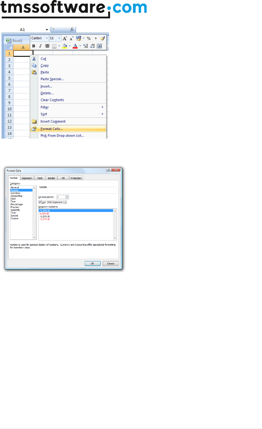
TMS SOFTWARE
TADVSTRINGGRID
DEVELOPERS GUIDE
165 | P a g e
Once the window opens, choose the numeric format you want. Here we will choose a numeric
format with 2 decimal places and a thousands separator
Once we have the format we want, we choose "Custom" in the left listbox. There is no need to close
the dialog.
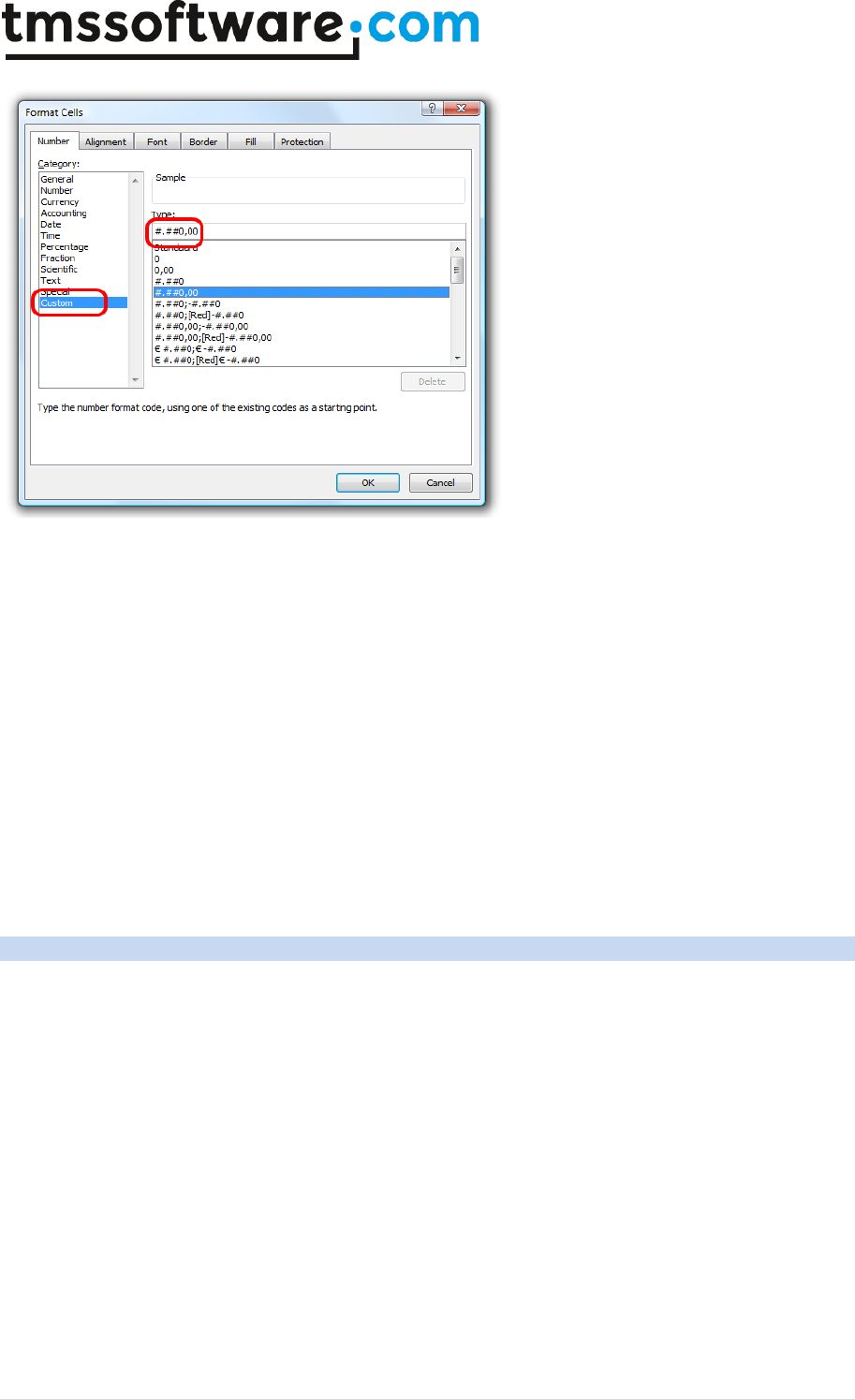
TMS SOFTWARE
TADVSTRINGGRID
DEVELOPERS GUIDE
166 | P a g e
The string that shows in the "Type:" editbox is the one we need to use, converted to English
notation. In this example, since our decimal separator is "," and the thousands "." we need to switch
them in the final string.
So, the string showing is "#.##0,00", and we need to switch "," and ".", so the final string is
"#,##0.00"
and the event is:
procedure TMainForm.AdvGridExcelIO1CellFormat(Sender: TAdvStringGrid;
const GridCol, GridRow, XlsCol, XlsRow: Integer; const Value: WideString;
var Format: TFlxFormat);
begin
if (GridCol = 3) then
Format.Format := '#,##0.00';
end;
TAdvStringGrid export to RTF files via TAdvGridRTFIO
With the TAdvGridRTFIO component it is possible to export a grid to a RTF file without the need to
have any other software installed such as MS Word. TAdvGridRTFIO is an add-on component that is
included with TAdvStringGrid. It is a separate component and as such, when not used, the RTF
capabilities do not increase your application executable size unnecessarily.
Using TAdvGridRTFIO is very simple. Drop the component on the form and assign your
TAdvStringGrid or descendent component to the TAdvGridRTFIO.AdvStringGrid property. Call
TAdvGridRTFIO.ExportRTF(FileName) to do the actual export.
Options for the export are controlled by various TAdvGridRTFIO properties:
GridStartCol, GridStartRow: sets the top left row from where the export should start. With this
property you can control whether fixed cells are exported or not.
Options:
TMS SOFTWARE
TADVSTRINGGRID
DEVELOPERS GUIDE
167 | P a g e
ConvertHTML
When true, HTML formatted cell text is automatically converted
to rich text formatting otherwise the cell text is exported
without any attributes
ExportBackground
When true, grid cell background colors are exported
ExportCellProperties
When true, grid cell properties such as font style, name, size &
alignment are exported
ExportHiddenColumns
When true, hidden cells are also exported
ExportImages
When true, images are exported
ExportMSWordFeatures
When true, MS Word specific rich text features are exported such
as column merging
ExportOverwrite
Sets the mode for
ExportOverwriteMessage
Sets the message to be displayed as warning to overwrite a file
ExportRTFCell
When true, grid cells with rich text are also exported as rich text,
otherwise the cell text is exported without the rich text
attributes.
ExportShowInWord
When true, MS Word is automatically opened with the exported
RTF file

TMS SOFTWARE
TADVSTRINGGRID
DEVELOPERS GUIDE
168 | P a g e
Using the ICellGraphic interface for cells
Interfaces are a powerful way to remove code dependencies and as a result allow to better tailer
code size to feature use. In TAdvStringGrid it is possible to add an interfaced object to a cell and
have the interface paint the cell. This way, all kinds of small or large code can be used to paint a
cell without forcing any user who is not interested in a particular graphical feature in the grid to
link the code.
To achieve this, the interface ICellGraphic was created. This interface currently has only four
methods:
ICellGraphic = Interface
procedure Draw(Canvas: TCanvas;R: TRect; Col,Row: integer; Selected:
boolean; Grid: TAdvStringGrid);
function CellWidth: integer;
function CellHeight: integer;
function IsBackground: boolean;
end;
The first method Draw() is called to draw the cell Col,Row within rectangle R on the canvas Canvas.
An extra parameter Selected indicates the selection state of the cell. Two functions return the
desired size of the graphic in the cell. These functions are used for autosizing in the grid to adapt
the cell size automatically to the size of the graphic. A function IsBackground is used to inform the
grid whether text still needs to be drawn on top of the graphic or not.
To start using this interface, we need to create a class that implements the interface. In this
sample, we propose 3 classes that implement the interface: TSimpleGraphicCell,
TComplexGradientCell and TImageCell. TSimpleGraphicCell just demonstrates the concept.
TComplexGradient & TImageCell allow to use specific GDI+ features in the grid. Note that by
implementing the GDI+ features in the interfaced class, TAdvStringGrid remains completely
independent of GDI+ code. So, users who prefer not to include a GDI+ dependency can keep using
TAdvStringGrid as-is while users who want to exploit the extra GDI+ features can benefit from this
now.
The TSimpleGraphicCell class code is:
TSimpleGraphicCell = class(TInterfacedPersistent, ICellGraphic)
procedure Draw(Canvas: TCanvas;R: TRect; Col,Row: integer; Selected:
boolean; Grid: TAdvStringGrid);
function CellWidth: integer;
function CellHeight: integer;
end;
function TSimpleGraphicCell.CellHeight: integer;
begin
Result := 0; // by returning zero, this graphic cell has no minimum cell
height requirement
end;
function TSimpleGraphicCell.CellWidth: integer;
begin
Result := 0; // by returning zero, this graphic cell has no minimum cell
width requirement
end;
procedure TSimpleGraphicCell.Draw(Canvas: TCanvas; R: TRect; Col, Row:
integer;
Selected: boolean; Grid: TAdvStringGrid);
begin
Canvas.Pen.Color := clRed; // draw a simple diagonal line in the cell

TMS SOFTWARE
TADVSTRINGGRID
DEVELOPERS GUIDE
169 | P a g e
Canvas.Pen.Width := 2;
Canvas.MoveTo(R.Left, R.Top);
Canvas.LineTo(R.Right, R.Bottom);
end;
function TSimpleGraphicCell.IsBackground: boolean;
begin
Result := true;
end;
To use the interface in a cell, this can be done with the code:
var
sg:TSimpleGraphicCell;
begin
sg := TSimpleGraphicCell.Create;
AdvStringGrid1.AddInterfacedCell(2,2,sg);
end;
We have created two additional interfaced classes that now open up GDI+ capabilities for use in the
grid, ie. adding complex diagonal gradients for example or draw antialiased PNG images in cells
(this uses TGDIPicture & AdvGDIP, two units available in the TMS Component Pack):
TComplexGradientCell = class(TInterfacedPersistent, ICellGraphic)
private
FStartColor, FEndColor: TColor;
FGradientMode: TLinearGradientMode;
public
procedure Draw(Canvas: TCanvas;R: TRect; Col,Row: integer; Selected:
boolean; Grid: TAdvStringGrid);
function CellWidth: integer;
function CellHeight: integer;
property StartColor: TColor read FStartColor write FStartColor;
property EndColor: TColor read FEndColor write FEndColor;
property GradientMode: TLinearGradientMode read FGradientMode write
FGradientMode;
end;
TImageCell = class(TInterfacedPersistent, ICellGraphic)
private
FPicture: TGDIPPicture;
procedure SetPicture(const Value: TGDIPPicture);
public
{ Interface }
procedure Draw(Canvas: TCanvas;R: TRect; Col,Row: integer; Selected:
boolean; Grid: TAdvStringGrid);
function CellWidth: integer;
function CellHeight: integer;
constructor Create;
destructor Destroy; override;
property Picture: TGDIPPicture read FPicture write SetPicture;
end;
{ TComplexGradientCell }
function TComplexGradientCell.CellHeight: integer;

TMS SOFTWARE
TADVSTRINGGRID
DEVELOPERS GUIDE
170 | P a g e
begin
Result := 0;
end;
function TComplexGradientCell.CellWidth: integer;
begin
Result := 0;
end;
procedure TComplexGradientCell.Draw(Canvas: TCanvas; R: TRect; Col,
Row: integer; Selected: boolean; Grid: TAdvStringGrid);
var
graphics : TGPGraphics;
linGrBrush: TGPLinearGradientBrush;
begin
// Create GDI+ canvas
graphics := TGPGraphics.Create(Canvas.Handle);
linGrBrush := TGPLinearGradientBrush.Create(MakeRect(r.Left,r.Top,r.Right
- r.Left,r.Bottom - r.Top),ColorToARGB(FStartColor),ColorToARGB(FEndColor),
FGradientMode);
graphics.FillRectangle(linGrBrush, MakeRect(r.Left , r.Top, r.Right -
r.Left , r.Bottom - r.Top));
linGrBrush.Free;
graphics.Free;
end;
function TComplexGradientCell.IsBackground: boolean;
begin
Result := true;
end;
{ TImageCell }
function TImageCell.CellHeight: integer;
begin
Result := FPicture.Height;
end;
function TImageCell.CellWidth: integer;
begin
Result := FPicture.Width;
end;
constructor TImageCell.Create;
begin
inherited Create;
FPicture := TGDIPPicture.Create;
end;
destructor TImageCell.Destroy;
begin
FPicture.Free;
inherited;
end;
procedure TImageCell.Draw(Canvas: TCanvas; R: TRect; Col, Row: integer;
Selected: boolean; Grid: TAdvStringGrid);
begin
Canvas.Draw(R.Left, R.Top, FPicture);
end;

TMS SOFTWARE
TADVSTRINGGRID
DEVELOPERS GUIDE
171 | P a g e
function TImageCell.IsBackground: boolean;
begin
Result := false;
end;
procedure TImageCell.SetPicture(const Value: TGDIPPicture);
begin
FPicture.Assign(Value);
end;
The use of the TImageCell and TComplexGradientCell is done with following code:
cg := TComplexGradientCell.Create;
cg.StartColor := clBlue;
cg.EndColor := clAqua;
cg.GradientMode := LinearGradientModeHorizontal;
AdvStringGrid1.AddInterfacedCell(1,3,cg);
ig := TImageCell.Create;
ig.Picture.LoadFromFile('.\personal.png');
AdvStringGrid1.AddInterfacedCell(2,4,ig);
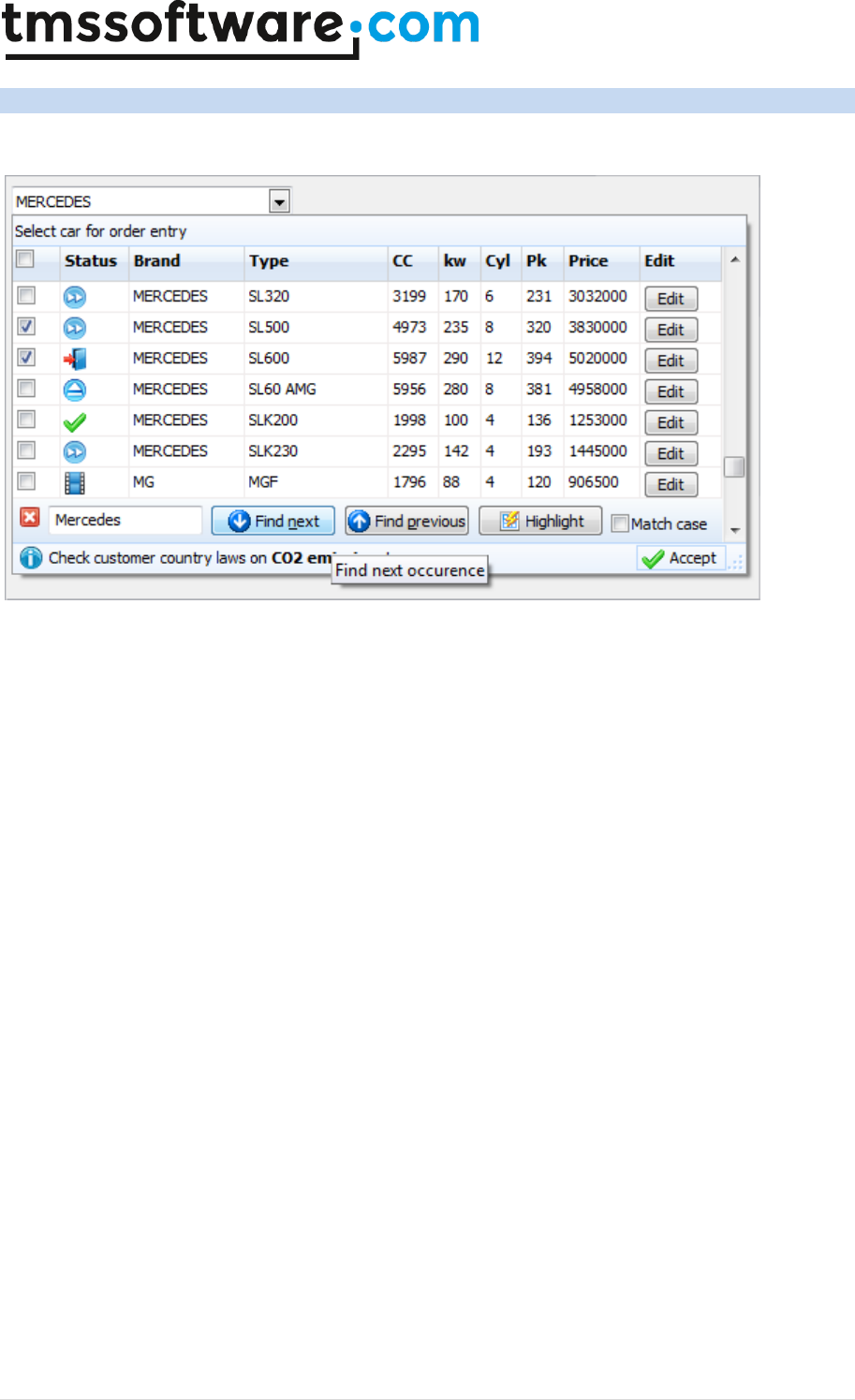
TMS SOFTWARE
TADVSTRINGGRID
DEVELOPERS GUIDE
172 | P a g e
Using the component TAdvGridDropDown
Introduction
TAdvGridDropDown is an edit control with dropdown button showing a TAdvStringGrid control in its
dropdown window. This means that the full feature set of TAdvStringGrid is available to present
information in the dropdown list. This goes from all graphic capabiilites in TAdvStringGrid to its
search, edit, narrow down, sort, column sizing, column moving, controls in cells etc...
You can easily see TAdvGridDropwn as a multi column combobox on steroids. TAdvGridDropDown
descends from TAdvCustomDropDown. This means that the control's dropdown inherits the optional
header and footer and that you can set text, image & buttons in the header and the footer, just like
with all other dropdown controls. This is configurable in a straightforward and intuitive way via the
AdvGridDropDown.DropDown* properties.
Access to the grid
The grid on the dropdown is accessible via AdvGridDropDown.Grid: TAdvStringGrid. This way, you
can access all properties, events and methods of the grid via code. Note that the most important
and useful events of TAdvStringGrid are exposed on TAdvGridDropDown level, for example events
like OnGridGetAlignment, OnGridGetCellColor and many more. The equivalent events on
TAdvStringGrid level are OnGetAlignment, OnGetCellColor. For full details on the functionality of
these events, please refer to the TAdvStringGrid developers guide.
Data in the dropdown
The data displayed in the dropdown grid can be setup in two ways. This is selected with the
AdvGridDropDown.UseItems property. When this is false, data is directly set in the grid, ie. via
AdvGridDropDown.Grid.Cells[col,row]: string or the many functions TAdvStringGrid exposes like
using AdvGridDropDown.Grid.LoadFromCSV() or also setting number of columns and rows via
AdvGridDropDown.Grid.ColCount / AdvGridDropDown.Grid.RowCount. Alternatively, when
AdvGridDropDown.UseItems is true, all data displayed in the dropdown is configured by adding the
number of required columns via the collection AdvGridDropDown.Columns and adding the data for
the rows in the grid via AdvGridDropDown.Items. Following code snippet fills the grid with 5
columns and 50 rows:

TMS SOFTWARE
TADVSTRINGGRID
DEVELOPERS GUIDE
173 | P a g e
var
i,j: integer;
begin
AdvGridDropDown1.Columns.Clear;
for i := 1 to 5 do
begin
with AdvGridDropDown1.Columns.Add do
begin
Header := 'Header ' + inttostr(i);
end;
end;
AdvGridDropDown1.Items.Clear;
for i := 1 to 50 do
begin
with AdvGridDropDown1.Items.Add do
begin
for j := 1 to 5 do
begin
Text.Add('C'+IntToStr(i)+ ' row '+inttostr(i));
end;
end;
end;
end;
Data lookup relationship
The relationship between the text in the edit control and the data dislayed in the dropdown grid is
set with AdvGridDropDown.LookupColumn. The LookupColumn determines what column in the grid
the text in the edit control corresponds to and vice versa. By default, the lookup method is
lmLookup. This means when the dropdown grid is displayed, the grid performs a lookup on the
(partial) text typed in the column set via AdvGridDropDown.LookupColumn. Note that case
sensitivity for this lookup is set with AdvGridDropDown.CaseSensitive.
Following example demonstrates simple lookup:
begin
AdvGriddropDown1.Columns.Clear;
AdvGriddropDown1.Columns.Add.Header := 'Number';
AdvGriddropDown1.Columns.Add.Header := 'Name';
AdvGridDropDown1.Grid.FloatFormat := '%.0f';
AdvGridDropDown1.LookupMethod := lmLookup;
AdvGridDropDown1.Items.Clear;
AdvGridDropDown1.BeginUpdate;
AdvGridDropDown1.Items.Add.Text.CommaText := '1,Monday';
AdvGridDropDown1.Items.Add.Text.CommaText := '2,Tuesday';
AdvGridDropDown1.Items.Add.Text.CommaText := '3,Wednesday';
AdvGridDropDown1.Items.Add.Text.CommaText := '4,Thursday';

TMS SOFTWARE
TADVSTRINGGRID
DEVELOPERS GUIDE
174 | P a g e
AdvGridDropDown1.Items.Add.Text.CommaText := '5,Friday';
AdvGridDropDown1.Items.Add.Text.CommaText := '6,Saturday';
AdvGridDropDown1.Items.Add.Text.CommaText := '7,Sunday';
AdvGridDropDown1.EndUpdate;
AdvGridDropDown1.LookupColumn := 1;
end;
When typing 'T', the dropdown grid selects the first day with 'T', ie. 'Tuesday'. When typing 'h' next,
the grid automatically selects 'Thursday';
An alternative lookup method is the lmNarrowDown method. With this method, the content of the
dropdown grid narrows down to rows that match the entered values. It is important to note that in
order to use the lmNarrowDown method, the data in the grid must be filled via
AdvGridDropDown.Grid and not via Items. To setup the same sample but with narrow down lookup,
following code can be used:
AdvGriddropDown1.Columns.Clear;
AdvGriddropDown1.Columns.Add.Header := 'Number';
AdvGriddropDown1.Columns.Add.Header := 'Name';
AdvGridDropDown1.Grid.FloatFormat := '%.0f';
AdvGridDropDown1.UseItems := false;
AdvGridDropDown1.Grid.RowCount := 8;
AdvGridDropDown1.Grid.ColCount := 2;
AdvGridDropDown1.Grid.Cells[0,0] := 'Number';
AdvGridDropDown1.Grid.Cells[1,0] := 'Name';
AdvGridDropDown1.Grid.Rows[1].CommaText := '1,Monday';
AdvGridDropDown1.Grid.Rows[2].CommaText := '2,Tuesday';
AdvGridDropDown1.Grid.Rows[3].CommaText := '3,Wednesday';
AdvGridDropDown1.Grid.Rows[4].CommaText := '4,Thursday';
AdvGridDropDown1.Grid.Rows[5].CommaText := '5,Friday';
AdvGridDropDown1.Grid.Rows[6].CommaText := '6,Saturday';
AdvGridDropDown1.Grid.Rows[7].CommaText := '7,Sunday';
AdvGridDropDown1.LookupColumn := 1;
AdvGridDropDown1.LookupMethod := lmNarrowDown;
Accessing grid and setting up grid properties
TAdvGridDropDown exposes 3 configuration class properties directly, ie:
AdvGridDropDown.MouseActions, AdvGridDropDown.Navigation, AdvGridDropDown.SearchFooter.
With these properties, the dropdown grid's mouse interaction, keyboard interaction and search
footer can be directly configured. This affects the dropdown grid's behavior in exactly the same way
as in the TAdvStringGrid. The TAdvStringGrid documentation can as such be consulted for all
information concerning these properties. Further detailed configuration can be done by directly
accessing the TAdvStringGrid in the dropdown via AdvGridDropDown.Grid. Some further commonly
used grid properties are exposed on AdvGridDropDown level:
• ColumnMoving: When true, columns can be reordered with drag & drop
• ColumnSizing: When true, column sizes can be changed by dragging
• GridEditable: When true, inplace editing in the grid is enabled

TMS SOFTWARE
TADVSTRINGGRID
DEVELOPERS GUIDE
175 | P a g e
• RowMoving: When true, rows can be reordered with drag & drop
• RowSizing: When true, row sizes can be changed by dragging
• RowSelect: When true, unit of Selection in the grid is per row, otherwise, per cell
• SelectionColor, SelectionColorTo,SelectionTextColor: Color of selected cell or row in the
grid
• Sorting: Set to gsSingleColumn, gsMultiColumn to enable sorting on single column / multi
column by click on the header in the grid

TMS SOFTWARE
TADVSTRINGGRID
DEVELOPERS GUIDE
176 | P a g e
Customizing the item class in TAdvGridDropDown
TAdvGridDropDown can hold the information shown in the dropdown grid in the Items collection.
The component TAdvGridDropDown was designed to offer a customizable item collection. With a
customizable item collection, additional properties can be added that control for example
appearance or behavior of cells in the grid dropdown.
TAdvGridDropDown has by default a collection of items of the type TDropDownItems. The item class
in the TDropDownItems collection is TDropDownItem. By creating a new class TAdvGridDropDownEx,
descending from TAdvGridDropDown, the virtual method CreateItems can be overridden to create a
custom collection. At the same time, the override of the GetItemClass function in the items
collection class can be used to return a new class, descending from TDropDownItem. Summarized,
in code this looks like:
TDropDownItemEx = class(TDropDownItem)
end;
TDropDownItemsEx = class(TDropDownItems)
protected
function GetItemClass: TDropDownItemClass; override;
end;
TAdvGridDropDownEx = class(TAdvGridDropDown)
protected
function CreateItems(AOwner: TComponent): TDropDownItems; override;
end;
In this sample, we apply this technique to create a TDropDownItem descending class where a Color
and FontStyle property is added. This Color and FontStyle will be used to control the appearance of
the items in the dropdown grid.
Adding the Color and FontStyle property in TDropDownItemEx is done with:
TDropDownItemEx = class(TDropDownItem)
private
FTag: integer;
FColor: TColor;
FFontStyle: TFontStyles;
public
constructor Create(Collection: TCollection);
published
property Color: TColor read FColor write FColor;
property FontStyle: TFontStyles read FFontStyle write FFontStyle;
property Tag: integer read FTag write FTag;
end;
{ TDropDownItemEx }
constructor TDropDownItemEx.Create(Collection: TCollection);
begin
inherited;
FTag := 0;
FColor := clWindow;

TMS SOFTWARE
TADVSTRINGGRID
DEVELOPERS GUIDE
177 | P a g e
FFontStyle := [];
end;
Then, in TAdvGridDropDownEx, the virtual method DoGridGetCellColor is overridden to use the
extra information in the item class to set a background color and font style:
TAdvGridDropDownEx = class(TAdvGridDropDown)
protected
procedure DoGridGetCellColor(Sender: TObject; ARow, ACol: Integer;
AState: TGridDrawState; ABrush: TBrush; AFont: TFont); override;
function CreateItems(AOwner: TComponent): TDropDownItems; override;
end;
procedure TAdvGridDropDownEx.DoGridGetCellColor(Sender: TObject; ARow,
ACol: Integer; AState: TGridDrawState; ABrush: TBrush; AFont: TFont);
begin
inherited;
if (ARow >= Grid.FixedRows) then
begin
ABrush.Color := (Items[ARow - Grid.FixedRows] as
TDropDownItemEx).Color;
AFont.Style := (Items[ARow - Grid.FixedRows] as
TDropDownItemEx).FontStyle;
end;
end;
From application code, the items are initialized with the code:
begin
AdvGridDropDownEx1.Items.Clear;
with (AdvGridDropDownEx1.Items.Add as TDropDownItemEx) do
begin
Color := clInfoBk;
FontStyle := [fsBold];
Text.Add('Row 1 C1');
Text.Add('Row 1 C2');
Text.Add('Row 1 C3');
end;
with (AdvGridDropDownEx1.Items.Add as TDropDownItemEx) do
begin
Color := clWhite;
FontStyle := [fsItalic];
Text.Add('Row 2 C1');
Text.Add('Row 2 C2');
Text.Add('Row 2 C3');
end;
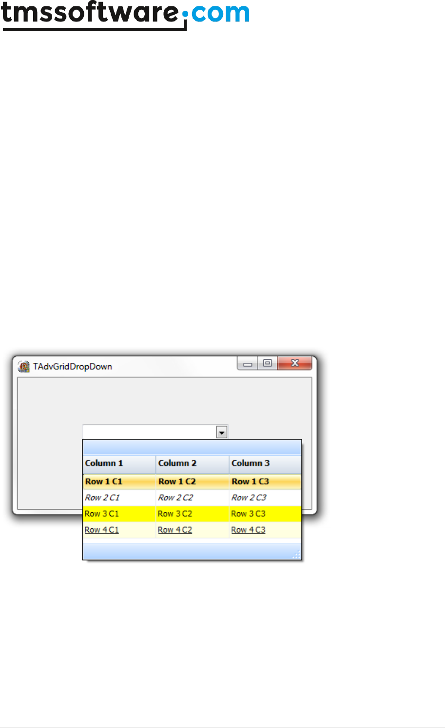
TMS SOFTWARE
TADVSTRINGGRID
DEVELOPERS GUIDE
178 | P a g e
with (AdvGridDropDownEx1.Items.Add as TDropDownItemEx) do
begin
Color := clYellow;
FontStyle := [];
Text.Add('Row 3 C1');
Text.Add('Row 3 C2');
Text.Add('Row 3 C3');
end;
with (AdvGridDropDownEx1.Items.Add as TDropDownItemEx) do
begin
Color := clInfoBk;
FontStyle := [fsUnderline];
Text.Add('Row 4 C1');
Text.Add('Row 4 C2');
Text.Add('Row 4 C3');
end;
end;
And this results at runtime in the dropdown grid:

TMS SOFTWARE
TADVSTRINGGRID
DEVELOPERS GUIDE
179 | P a g e
Using the TAdvGridHeaderList & TAdvGridHeaderListPopup
To allow an easy customization of what columns to show in a grid by the user, an often used user
interface is a list holding the available columns and allowing the user to drag & drop from the grid
the columns that should be hidden or drag columns that should be displayed from the list to the
grid. To achieve this functionality, two components are offered that integrate much of this
functionality: TAdvGridHeaderList and TAdvGridHeaderListPopup. The TAdvGridHeaderList is a
listbox-style control that holds indexes of available (hidden) columns. TAdvGridHeaderPopupList is a
popup form with this TAdvGridHeaderList. By means of drag & drop from the column header to the
list and vice versa, it is possible to define what columns to show or not show in the grid.
Steps needed to setup the TAdvGridHeaderList or TAdvGridHeaderListPopup with TAdvStringGrid
are:
1) Drop the component on the form.
2) Assign TAdvStringGrid to TAdvGridHeaderList.Grid.
3) Enable OLE drag & drop on TAdvStringGrid level, in particular also OleColumnDragDrop.
Initially, the TAdvGridHeaderList or TAdvGridHeaderPopupList is an empty list. This can be
programmatically initialized to hold desired columns. Following methods are available for this:
procedure MoveFromGridToList(ColumnIndex: integer);
Move column ColumnIndex from the grid to the TAdvGridHeaderList.
procedure MoveFromListToGrid(ItemIndex: integer);
Show the column represented by item ItemIndex in the list to the grid.
procedure MoveAllFromGridToList;
Move all columns from the grid to the list.
procedure MoveAllFromListToGrid;
Show all columns in the grid, making the list empty.
Example:
Following code snippet shows the setup of a TAdvStringGrid with 6 normal columns of which the last
two columns are initially hidden and available in the TAdvGridHeaderPopupList. The list is shown
when the header of the grid is right-clicked. From there the user can drag the 2 columns 5 and 6
from the list to the grid or drag columns from the grid to the list.
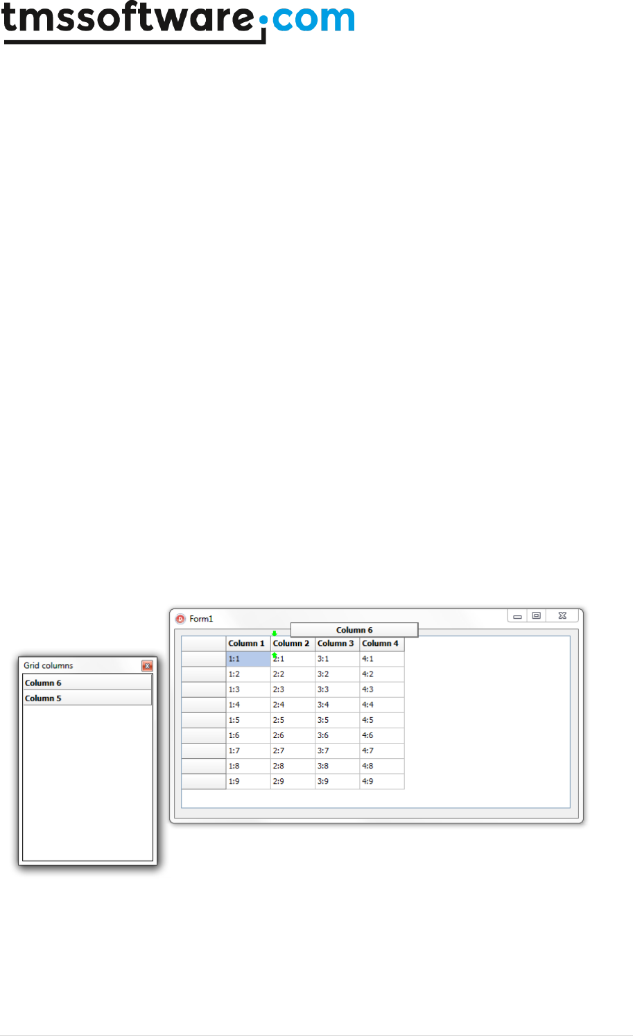
TMS SOFTWARE
TADVSTRINGGRID
DEVELOPERS GUIDE
180 | P a g e
var
i: integer;
begin
AdvGridHeaderPopupList1.Grid := AdvStringGrid1;
AdvGridHeaderPopupList1.Caption := 'Grid columns';
AdvStringGrid1.ColCount := 7;
AdvStringGrid1.LinearFill(False);
for i := 1 to AdvStringGrid1.ColCount - 1 do
begin
AdvStringGrid1.Cells[i,0] := 'Column ' + inttostr(i);
end;
AdvStringGrid1.SetColumnOrder;
AdvStringGrid1.DragDropSettings.OleDropSource := true;
AdvStringGrid1.DragDropSettings.OleDropTarget := true;
AdvStringGrid1.DragDropSettings.OleColumnDragDrop := true;
AdvStringGrid1.DragDropSettings.OleColumnsOnly := true;
AdvStringGrid1.DragDropSettings.OleColumnReorder := true;
AdvStringGrid1.EnhRowColMove := false;
AdvGridHeaderPopupList1.MoveFromGridToList(6);
AdvGridHeaderPopupList1.MoveFromGridToList(5);
end;
The resulting behavior is:

TMS SOFTWARE
TADVSTRINGGRID
DEVELOPERS GUIDE
181 | P a g e
TAdvStringGrid tips and FAQ
Delphi can't find definition for TFlxFormat when using TAdvGridExcelIO
This type is defined in the unit tmsUFlxFormats. Add the unit tmsUFlxFormats to the uses clause and
the problem should be solved.
Using TAdvStringGrid printer settings dialog combined with printer selection.
This code snippet shows how you can show the print setup dialog for users after which the printer
selection is done.
procedure TForm1.PrintGrid;
begin
AdvGridPrintSettings.Form.Caption := 'Print overview';
AdvStringGrid.PrintSettings.FitToPage := fpAlways;
AdvStringGrid.PrintSettings.Orientation := poLandscape; // initialize to
default poLandscape
if AdvGridPrintSettings.Execute then
begin
Printer.Orientation := AdvStringGrid.PrintSettings.Orientation;
if PrinterSetupDialog.Execute then
begin
AdvStringGrid.PrintSettings.Orientation := Printer.Orientation;
AdvStringgrid.Print;
end;
end;
end;
Vertical bottom or center alignment in the grid
Vertical alignment and wordwrap are mutually exclusive. This is due to a limitation in the Microsoft
Windows text drawing API that does not allow to have wordwrapped text with other vertical
alignment than top alignment. To enable vertically centered or bottom alignment, make sure to set
grid.WordWrap to false.
Using TAdvStringGrid with Multilizer
In order to automatically translate applications that use TAdvStringGrid with Multilizer, exclude the
class TAdvRichEdit in Multilizer. TAdvRichEdit is an internal class only used in TAdvStringGrid as
inplace editor for rich text editing.
Copying a grid as image on the clipboard
Following code copies TAdvStringGrid as an image on the clipboard:

TMS SOFTWARE
TADVSTRINGGRID
DEVELOPERS GUIDE
182 | P a g e
var
bmp: TBitmap;
clip: TClipboard;
begin
bmp := tbitmap.create;
bmp.Width := advstringgrid1.Width;
bmp.Height := advstringgrid1.Height;
AdvStringGrid1.PaintTo(bmp.Canvas,0,0);
clip := TClipboard.Create;
clip.Assign(bmp);
bmp.Free;
clip.Free;
end;
Saving TAdvStringGrid to a JPEG file
With code below, the output of TAdvStringGrid is sent to a JPEG file:
var
pBitmap: TBitmap;
jp: TJPEGImage;
R: TRect;
begin
pBitmap := TBitmap.Create; //create a new instance of a bitmap
jp := TJPEGImage.Create; //create new instance of a jpg file
R := Rect(0,0,950,760); //parameters for rectangle
pBitmap.Height := 622; //set bmp height
pBitmap.Width := 812; //set bmp width
AdvStringGrid1.PrintPreview(pBitmap.Canvas,R); //call Preview to paint to
BMP canvas
jp.Assign(pBitmap); //get picture from bitmap for JPG Image
jp.SaveToFile('c:\temp\Grid.jpg'); //save picture as JPG File
pBitmap.Free;
jp.Free;
end;
Setting different max. edit lengths for the inplace editor
If the max. number of characters for editing should be limited, this can be done with then
LengthLimit property of the inplace editor. When LengthLimit is 0, there is no limitation to the nr.
of characters that can be typed in the editor. To set a different max. nr of characters per column,
following code can be used in the OnGetCellEditor event :
procedure TForm1.AdvStringGrid1GetEditorType(Sender: TObject; ACol,
ARow: Integer; var AEditor: TEditorType);
begin
if Assigned(AdvStringGrid1.NormalEdit) then
begin
case acol of
1:AdvStringGrid1.NormalEdit.LengthLimit := 4;
2:AdvStringGrid1.NormalEdit.LengthLimit := 8;
else

TMS SOFTWARE
TADVSTRINGGRID
DEVELOPERS GUIDE
183 | P a g e
AdvStringGrid1.NormalEdit.LengthLimit := 0
end;
end;
end;
This sets the max. edit length for column 1 to 4 characters, for column 2 to 8 eight characters and
unlimited for all other columns.
Printing only selected rows in disjunct row select mode
The disjunct row select mode is flexible to let the user select several non contiguous rows in a grid.
When you want to print only the selected rows, the Print functions do not provide a possibility these
rows. Thanks to the grid's row hiding capabilities this can be easily done by temporarily hide the
non-selected rows, print the grid and then unhide these rows again. The code to hide only the not
selected rows is :
var
i,j: Integer;
begin
i := 1;
with AdvStringGrid do
begin
j := RowCount;
while (i < j) do
if not RowSelect[DisplRowIndex(i)] then
HideRow(i);
Inc(i);
end;
end;
To unhide the rows again after the print, the method UnHideRowsAll can be called.
Setting an hourglass cursor during lengthy sort operations
Before the sort starts, the OnCanSort event is called. In this event, the crHourGlass cursor can
specified either for the grid or for your application.
When sorting is completed, the OnClickSort event is called, where you can set the cursor back to
normal.
Forcing a visible cell editor when the form is displayed in the grid
In the FormShow event, add these 2 methods :
grid.SetFocus;
grid.ShowInplaceEdit;
Problems with FILECTRL.OBJ when installing in C++Builder

TMS SOFTWARE
TADVSTRINGGRID
DEVELOPERS GUIDE
184 | P a g e
In C++Builder 6 : Add following line to the package CPP file : USEPACKAGE("vclx.bpi");
In C++Builder 5 : Add following line to the package CPP file : USEPACKAGE("vclx50.bpi");
Also, never choose a package filename equal to any of the component filenames used.
When using RowSelect, the first cell of the row is not highlighted as the other cells.
This can be easily solved by setting the option goDrawFocusSelect to true in the Options property.
Use a different inplace editor color than the cell color
Normally, the inplace edit control gets the same color as the cell color. Sometimes this behaviour is
not wanted, especially when the cell that is edited must be highlighted. This can be down in the
following way :
procedure TForm1.FormCreate(Sender: TObject);
begin
AdvStringGrid1.Color := clSilver;
end;
procedure TForm1.AdvStringGrid1GetCellColor(Sender: TObject; ARow,
ACol: Integer; AState: TGridDrawState; ABrush: TBrush; AFont: TFont);
begin
if (acol = AdvStringGrid1.Col) and
(arow = AdvStringGrid1.Row) then
begin
if Assigned(AdvStringGrid1.NormalEdit) then
if (AdvStringGrid1.NormalEdit.Visible) then
ABrush.Color := clWhite;
end;
end;
Still using the 3D style inplace combobox editor
Use following code in the OnGetCellEditor :
grid.ComboBox.Flat := false;
I use OnGetEditorType to specify a checkbox but it only displays when editing
Use a permanently visible checkbox that can be added with the AddCheckBox method
I use row selection, but the first column has a different color
Set goDrawFocusSelected = true in the Options property

TMS SOFTWARE
TADVSTRINGGRID
DEVELOPERS GUIDE
185 | P a g e
Why do rotated fonts do not print correct ?
Toggle the value of the public property PrinterDriverFix: Boolean
I want to use rotated font but the font does not show rotated
Make sure to use a truetype font. Only truetype font can be rotated.
Why do my printouts do not have colors or fonts set as displayed ?
Assign the OnGetCellColor event to the OnGetCellPrintColor event as well.
Copy and paste does not seem to work ?
Make sure that Navigation.AllowClipboardShortCuts is true and the grid is either editable or
Navigation.AllowClipboardAlways is true.
I want to select multiple rows with Ctrl - mouseclick and Shift - mouse click
In the Options property set goRowSelect = true and set MouseActions.DisjunctRowSelect = true. The
desired selection capabilities are enabled now.
How can the copyright notice be removed from the grid ?
The registered version of TAdvStringGrid does not show this copyright notice.
I am not sure if the latest version of TAdvStringGrid is installed. How can I check this ?
At design time, right click on the grid and select About. At runtime, show the version with :
ShowMessage(Grid.GetVersionString);
When I try to install the trial version of TAdvStringGrid in a trial version of Delphi or C++Builder,
it asks for ADVGRID.PAS ?
The Delphi or C++Builder trial edition does not allow to install binary component distributions. The
registered source version of TAdvStringGrid will work with the full Delphi or C++Builder versions.
With the registered version of TAdvStringGrid, do we need to pay additional royalties for
application distribution ?

TMS SOFTWARE
TADVSTRINGGRID
DEVELOPERS GUIDE
186 | P a g e
With license for commercial use of the registered version, no additional royalties need to be paid.
How can I set text in a cell ? How do I programmatically change a column width or row height ?
Setting text in a cell is done with the grid.Cells[col,row]: string propert. Setting the column width is
done with grid.ColWidths[col]: Integer and setting a row height with grid.RowHeights[row]: Integer.
Note that TAdvStringGrid inherits ALL methods and properties of TStringGrid. As such, refer to the
Borland documentation for TStringGrid for help on the basic grid functions.
How can I get the state of a checkbox added with grid.AddCheckBox ?
var
state: Boolean;
grid.GetCheckBoxState(col,row,state);
if state then
ShowMessage('CheckBox is checked')
else
ShowMessage('CheckBox is not checked');
I get an exception 'invalid column' during export to Excel
The maximum number of columns supported in Excel itself is 255. As such, it is not possible to
export more columns than the Excel limit.
I have added a button on the grid with AddButton but the OnButtonClick event is not triggered ?
If you add a button to a non editable cell (or grid without editing enabled) the button is treated as
disabled by default. To override this behaviour, set grid.ControlLook.NoDisabledButtonLook = true
I try to set VAlignment to vtaCenter or vtaBottom but this is not working
By default, wordwrap is enabled in the grid and it is a limitation of the Microsoft text drawing API's
that wordwrapped text is always top aligned. To use the VAlignment capability, set WordWrap =
false
Can I load a gallery file programmatically at runtime ?
Yes, call grid.LoadVisualProps(GalleryFileName);
I am having problems with grid.SortByColumn, it is slow or behaves incorrect

TMS SOFTWARE
TADVSTRINGGRID
DEVELOPERS GUIDE
187 | P a g e
SortByColumn is a deprecated method, use grid.QSort instead with settings as defined under
grid.SortSettings
Users of older operating systems have an error message on application startup related to a
missing gdiplus.dll
Either redistribute the Microsoft GDIPLUS.DLL (explained in README.TXT) or remove the gdiplus.dll
dependency by commenting the line {$DEFINE TMSGDIPLUS} in TMSDEFS.INC
All operating systems from Windows XP have GDIPLUS.DLL by default installed.
When exporting to Excel file with the method grid.SaveToXLS() I get the error : "Excel OLE
server not found"
The method grid.SaveToXLS() uses OLE automation to export to Excel file and thus requires Excel to
be installed on the machine. To avoid this requirement, you can use the component
TAdvGridExcelIO to export to Excel.
When try to install TAdvStringGrid, I get an error that TAdvStringGrid is compiled with a
different version of PictureContainer
Most likely another TMS component has been installed that is also using the PictureContainer. Due
to strict binary compatibility checks of Delphi & C++Builder, it is causing problems to install
multiple binary distributed components that share a unit. For using the binary versions, the only
workaround is to install the packages alternatingly for evaluation. Registered versions that come
with full source do not have this problem.
When I run my application I get an error "property does not exist"
An older version of ADVGRID.DCU might be in your library path. When upgrading from an older
version, make sure to first open all forms in your application that use the grid, ignore property
errors on opening, save form files and then rebuild your application.
When I try to install the package, it asks for AdvGrid.pas
Make sure the correct version of ADVGRID.DCU and other DCU files are in your library path, that
your library path contains the directory where ADVGRID.DCU is installed and that no other versions
of ADVGRID.DCU are in your library path. Note that the binary version of TAdvStringGrid cannot be
used with Delphi or C++Builder trial versions.
I want to override the popup menu of the default grid inplace editor
You can assign a custom popup menu to the default grid inplace editor with following code:
procedure TForm2.AdvStringGrid1GetEditText(Sender: TObject; ACol, ARow:
Integer;
var Value: string);

TMS SOFTWARE
TADVSTRINGGRID
DEVELOPERS GUIDE
188 | P a g e
begin
AdvStringGrid.NormalEdit.PopupMenu :=PopupMenu1;
end;
Exporting numbers as text with TAdvGridExcelIO
By default, when a cell contains text like "000123" and exporting this to Excel, Excel will display this
as "123". This is because by default, "000123" is recognized as a number and Excel will be default
show numbers without any zero prefixes. If it is required that similar text is shown in the Excel as-
is, it should be specified that TAdvGridExcelIO should export the number as text. This can be done
with: 1) global setting: AdvGridExcelIO.Options.ExportCellFormats = false 2) dynamically by using
the OnExportColumnFormat event Example:
procedure TForm1.AdvGridExcelIO1ExportColumnFormat(Sender: TObject;
GridCol,
GridRow, XlsCol, XlsRow: Integer; const Value: WideString;
var ExportCellAsString: Boolean);
begin
if GridCol = 2 then
ExportCellAsString := true;
end;
This will treat all cells in column 2 as text cells for the generated Excel sheet.
How to change the size of the find next / previous / highlight buttons in the search bar
The text of the buttons is exposed via grid.SearchFooter and the recommended way is to use the
grid.SearchFooter.* properties. The button width is not exposed, therefore it should be set via
grid.SearchPanel.
You can access the buttons in code with:
advstringgrid.SearchPanel.ForwardButton: TButton
advstringgrid.SearchPanel.BackwardButton: Tbutton
Make sure to set this after the searchfooter was created.
Persisting grids with images to file
The functions grid.SaveToBinFile / grid.LoadFromBinFile persist grid cell data including cell
properties. This can also include objects created in cells. If you want to persist an image set in a
cell, make sure to use grid.CreatePicture() as this creates the object managed by the grid. All
objects managed by the grid will also be saved when calling grid.SaveToBinFile().
Example:
begin
AdvStringGrid1.CreatePicture(1,1,false,noStretch,4,haLeft,vaTop).Assign(ima
ge1.Picture);
AdvStringGrid1.SaveToBinFile('.\advgrid.bin');
end;

TMS SOFTWARE
TADVSTRINGGRID
DEVELOPERS GUIDE
189 | P a g e
This will save the image created in cell 1,1 to the file and this image will be reloaded when calling
grid.LoadFromBinFile()
How to use TAdvGridReplaceDialog
Drop a TAdvGridReplaceDialog on the form and a TAdvStringGrid.
Add the code:
begin
AdvGridReplaceDialog1.Grid := AdvStringGrid1;
AdvGridReplaceDialog1.Execute;
end;
Fill in the dialog a value that can be found in a grid cell and a value it should replace and press
"Replace All".
TAdvGridReplaceDialog is not applicable for TDBAdvGrid, only for TAdvStringGrid. This is because,
to change values in the TDBAdvGrid, values should be changed on dataset level, via DBField, not
just with grid.Cells[].
Allowing multiline text & using the Enter key to start a new line
To allow to enter multiline text in a cell, set grid.MultiLineCells := true.
By default the key to start a new line in the inplace editor is Ctrl-Enter ('Enter' stops editing).
If you want to use the Enter key to start a new line instead, set grid.Navigation.LineFeedOnEnter =
true
Importing data with AdvGridExcelIO in a grid that already contains data
With AdvGridExcelIO.GridStartCol / AdvGridExcelIO.GridStartRow, you can set the top left corner
from where the import starts.
Show inplace editor in a special color
By design, the background color of the inplace editor is shown in the same color as the cell
background color. This way, the inplace editor looks transparent wrt the grid. If there is a need to
show the inplace editor with a different background color, to draw attention for example, following
code can be used:
procedure TForm4.AdvStringGrid1GetCellColor(Sender: TObject; ARow,
ACol: Integer; AState: TGridDrawState; ABrush: TBrush; AFont: TFont);
begin
if (AdvStringGrid1.EditMode) and (ARow = AdvStringGrid1.Row) and (ACol =
AdvStringGrid1.Col) then
ABrush.Color := clRed
else
ABrush.Color := clWhite;
end;
Customizing the TAdvStringGrid Find Dialog
A customization of this dialog have to be done by opening & editing ASGREPLACE.PAS.
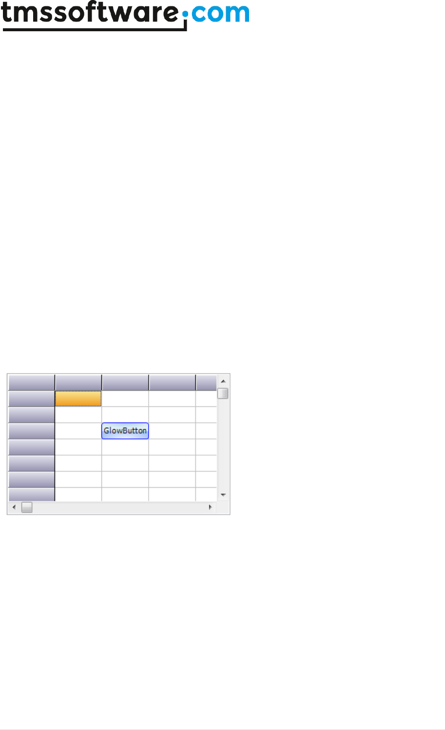
TMS SOFTWARE
TADVSTRINGGRID
DEVELOPERS GUIDE
190 | P a g e
This is where the dialog is defined.
Specifying a filter in C++
Follow code specifies a filter in C++ code:
TFilterData *fd;
AdvStringGrid->Filter->Clear();
fd = AdvStringGrid->Filter->Add();
fd->Condition = “BMW”;
fd->Column = 1;
AdvStringGrid->FilterActive = true;
How to add a TAdvGlowButton in a grid
Any TWinControl descendent can be hosted inside TAdvStringGrid. This is done by assigning the
control to the grid.CellControls[col,row]: TWinControl property.
Example: to have a TadvGlowButton displayed in cell 2,3 you can use:
AdvStringGrid1.CellControls[2,3] := AdvGlowButton1;
Result:
If you want to move the control to another place on the form, destroy it, etc... that should happen
from application code.
To destroy the control, use following code:
var
ctrl: TControl;
ctrl := grid.CellControls[x,y];
if Assigned(ctrl) then
begin
FreeAndNil(ctrl);
grid.CellControls[x,y] := nil;
end;
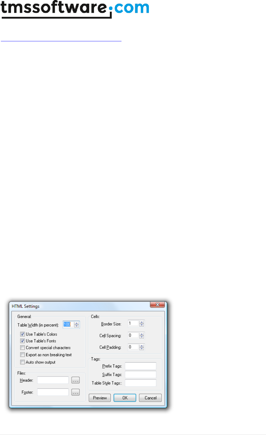
TMS SOFTWARE
TADVSTRINGGRID
DEVELOPERS GUIDE
191 | P a g e
The article that discusses cell controls can be found here:
http://www.tmssoftware.com/site/asg57.asp
Creating a grid at runtime in C++
Creating a grid at runtime in C++ is done with:
{
TAdvStringGrid *asg;
asg = new TAdvStringGrid(this);
asg->Parent = this;
}
Using the grid gallery picker at runtime
This code snippet demonstrates how you can invoke the TAdvStringGrid gallery picker at runtime:
uses
AsgGallery;
procedure TForm1.Button1Click(Sender: TObject);
var
gg: TGridGallery;
begin
gg := TGridGallery.Create(Application);
if gg.ShowModal = mrOK then
AdvStringGrid1.LoadVisualProps(gg.GalleryFile);
gg.Free;
end;
Using the HTMLSettings dialog at runtime
Drop AdvGridHTMLSettingsDialog on the form , assign the grid and call
AdvGridHTMLSettingsDialog1.execute;
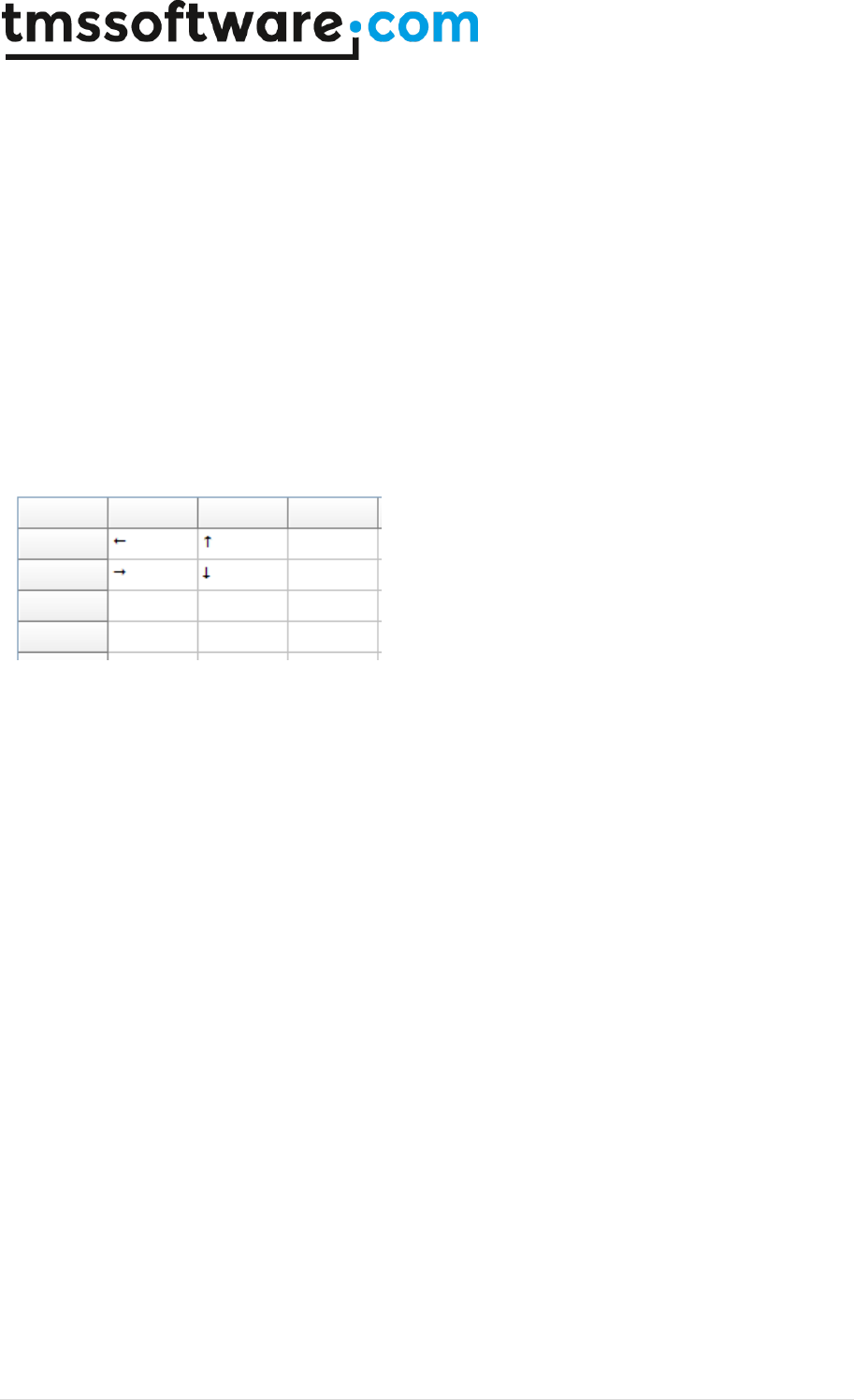
TMS SOFTWARE
TADVSTRINGGRID
DEVELOPERS GUIDE
192 | P a g e
How to display special chars in a cell
Example: to have arrows displayed in a cell, you can use:
begin
advstringgrid1.FontNames[1,1] := 'Wingdings 3';
advstringgrid1.Cells[1,1] := #33;
advstringgrid1.FontNames[1,2] := 'Wingdings 3';
advstringgrid1.Cells[1,2] := #34;
advstringgrid1.FontNames[2,1] := 'Wingdings 3';
advstringgrid1.Cells[2,1] := #35;
advstringgrid1.FontNames[2,2] := 'Wingdings 3';
advstringgrid1.Cells[2,2] := #36;
end;
Result:
How to change the TadvGridPrintSettingsDialog to another language
Open ASGPREV.PAS and you can edit the DFM file to change it to the desired language.
How to use TadvColumnSetter
TadvColumnSetter is a component that is used in TAdvGridImportDialog. Please drop this component
on a form, assign a grid and a filename and you'll see this component appear on top of the grid. It is
used to interactively set where columns start/end in an ASCII file.
How to set the dropdown width
You can set the width of the dropdown with:
grid.DropDownControlName.DropDownWidth
Example for memo dropdown:
procedure TForm4.FormCreate(Sender: TObject);
begin
advstringgrid1.DefaultEditor := edMemoDropDown;
advstringgrid1.Options := advstringgrid1.Options + [goEditing];
advstringgrid1.MemoDropDown.DropDownWidth := 400;
end;
How to filter on checkbox state

TMS SOFTWARE
TADVSTRINGGRID
DEVELOPERS GUIDE
193 | P a g e
If you wish to filter rows that have the checkbox selected, use a datacheckbox, i.e. a checkbox
representing its state depending on the value of the cell being grid.CheckTrue / grid.CheckFalse.
You can perform the filter on these grid.CheckTrue / grid.CheckFalse values.
Printing tips
- How to print colored, bold, italic, ... text:
Assign your OnGetCellColor event handler also to grid.OnGetCellPrintColor()
-How to print images, a company logo, ...:
Set grid.PrintSettings.PrintGraphics = true
-How to print a particular row in bold:
You can do this via the event OnGetCellPrintColor, for example:
procedure TForm2.AdvStringGrid1GetCellPrintColor(Sender: TObject; ARow,
ACol: Integer; AState: TGridDrawState; ABrush: TBrush; AFont: TFont);
begin
if arow = 7 then
afont.Style := [fsBold]
else
afont.Style := [];
end;
-How to print multiple grids on a page:
Please see sample 25: http://www.tmssoftware.com/site/asg25.asp
How to programmatically start inplace editing
Make sure to FIRST set the grid.col/grid.row to the cell that must be edited and make sure the grid
has focus. Then you can programmatically start inplace editing with grid.ShowInplaceEdit;
grid.Col := yourcolumn;
grid.Row := yourrow;
grid.SetFocus;
grid.ShowInplaceEdit;
How to force the user to edit an empty cell.
Implement the OnCellValidate event like:
procedure TForm4.AdvStringGrid1CellValidate(Sender: TObject; ACol,
ARow: Integer; var Value: string; var Valid: Boolean);
begin
Valid := Value <> '';
end;

TMS SOFTWARE
TADVSTRINGGRID
DEVELOPERS GUIDE
194 | P a g e
Using balloons
- Only when theming is enabled in the project options, the balloon will be visible.
- If you reparent the grid, the balloon should only be enabled AFTER the final grid's parent is set.
- Balloon hints are an API from Microsoft Windows and this does not support HTML formatted text.
This is a limitation of the Microsoft Windows balloon API.
- There is a limitation to the number of characters in a balloon. This is also a limitation of the
Microsoft Windows balloon API that we cannot workaround. For a regular cell comment, there is no
such length limitation.
- From TAdvStringGrid version v4.5, several new balloon notification capabilities have been added.
See example 76: http://www.tmssoftware.com/site/asg76.asp
How to prevent navigation to specific cells
If you want to prevent navigation to specific cells, please implement the OnSelectCell event and set
the parameter CanSelect = false for cells you want to prevent to be selected.
