The Data Science Design Manual
The%20Data%20Science%20Design%20Manual
User Manual:
Open the PDF directly: View PDF ![]() .
.
Page Count: 453 [warning: Documents this large are best viewed by clicking the View PDF Link!]

Steven S. Skiena
The Data Science Design Manual
Steven S. Skiena
Computer Science Department
Stony Brook University
Stony Brook, NY
USA
ISSN 1868-0941 ISSN 1868-095X (electronic)
Texts in Computer Science
ISBN 978-3-319-55443-3 ISBN 978-3-319-55444-0 (eBook)
DOI 10.1007/978-3-319-55444-0
Library of Congress Control Number: 2017943201
© The Author(s) 2017
This Springer imprint is published by Springer Nature
The registered company is Springer International Publishing AG
The registered company address is: Gewerbestrasse 11, 6330 Cham, Switzerland
Preface
Making sense of the world around us requires obtaining and analyzing data from
our environment. Several technology trends have recently collided, providing
new opportunities to apply our data analysis savvy to greater challenges than
ever before.
Computer storage capacity has increased exponentially; indeed remembering
has become so cheap that it is almost impossible to get computer systems to for-
get. Sensing devices increasingly monitor everything that can be observed: video
streams, social media interactions, and the position of anything that moves.
Cloud computing enables us to harness the power of massive numbers of ma-
chines to manipulate this data. Indeed, hundreds of computers are summoned
each time you do a Google search, scrutinizing all of your previous activity just
to decide which is the best ad to show you next.
The result of all this has been the birth of data science, a new field devoted
to maximizing value from vast collections of information. As a discipline, data
science sits somewhere at the intersection of statistics, computer science, and
machine learning, but it is building a distinct heft and character of its own.
This book serves as an introduction to data science, focusing on the skills and
principles needed to build systems for collecting, analyzing, and interpreting
data.
My professional experience as a researcher and instructor convinces me that
one major challenge of data science is that it is considerably more subtle than it
looks. Any student who has ever computed their grade point average (GPA) can
be said to have done rudimentary statistics, just as drawing a simple scatter plot
lets you add experience in data visualization to your resume. But meaningfully
analyzing and interpreting data requires both technical expertise and wisdom.
That so many people do these basics so badly provides my inspiration for writing
this book.
To the Reader
I have been gratified by the warm reception that my book The Algorithm Design
Manual [Ski08] has received since its initial publication in 1997. It has been
recognized as a unique guide to using algorithmic techniques to solve problems
that often arise in practice. The book you are holding covers very different
material, but with the same motivation.
In particular, here I stress the following basic principles as fundamental to
becoming a good data scientist:
•Valuing doing the simple things right: Data science isn’t rocket science.
Students and practitioners often get lost in technological space, pursuing
the most advanced machine learning methods, the newest open source
software libraries, or the glitziest visualization techniques. However, the
heart of data science lies in doing the simple things right: understanding
the application domain, cleaning and integrating relevant data sources,
and presenting your results clearly to others.
Simple doesn’t mean easy, however. Indeed it takes considerable insight
and experience to ask the right questions, and sense whether you are mov-
ing toward correct answers and actionable insights. I resist the temptation
to drill deeply into clean, technical material here just because it is teach-
able. There are plenty of other books which will cover the intricacies of
machine learning algorithms or statistical hypothesis testing. My mission
here is to lay the groundwork of what really matters in analyzing data.
•Developing mathematical intuition: Data science rests on a foundation of
mathematics, particularly statistics and linear algebra. It is important to
understand this material on an intuitive level: why these concepts were
developed, how they are useful, and when they work best. I illustrate
operations in linear algebra by presenting pictures of what happens to
matrices when you manipulate them, and statistical concepts by exam-
ples and reducto ad absurdum arguments. My goal here is transplanting
intuition into the reader.
But I strive to minimize the amount of formal mathematics used in pre-
senting this material. Indeed, I will present exactly one formal proof in
this book, an incorrect proof where the associated theorem is obviously
false. The moral here is not that mathematical rigor doesn’t matter, be-
cause of course it does, but that genuine rigor is impossible until after
there is comprehension.
•Think like a computer scientist, but act like a statistician: Data science
provides an umbrella linking computer scientists, statisticians, and domain
specialists. But each community has its own distinct styles of thinking and
action, which gets stamped into the souls of its members.
In this book, I emphasize approaches which come most naturally to com-
puter scientists, particularly the algorithmic manipulation of data, the use
of machine learning, and the mastery of scale. But I also seek to transmit
the core values of statistical reasoning: the need to understand the appli-
cation domain, proper appreciation of the small, the quest for significance,
and a hunger for exploration.
No discipline has a monopoly on the truth. The best data scientists incor-
porate tools from multiple areas, and this book strives to be a relatively
neutral ground where rival philosophies can come to reason together.
Equally important is what you will not find in this book. I do not emphasize
any particular language or suite of data analysis tools. Instead, this book pro-
vides a high-level discussion of important design principles. I seek to operate at
a conceptual level more than a technical one. The goal of this manual is to get
you going in the right direction as quickly as possible, with whatever software
tools you find most accessible.
To the Instructor
This book covers enough material for an “Introduction to Data Science” course
at the undergraduate or early graduate student levels. I hope that the reader
has completed the equivalent of at least one programming course and has a bit
of prior exposure to probability and statistics, but more is always better than
less.
I have made a full set of lecture slides for teaching this course available online
at http://www.data-manual.com. Data resources for projects and assignments
are also available there to aid the instructor. Further, I make available online
video lectures using these slides to teach a full-semester data science course. Let
me help teach your class, through the magic of the web!
Pedagogical features of this book include:
•War Stories: To provide a better perspective on how data science tech-
niques apply to the real world, I include a collection of “war stories,” or
tales from our experience with real problems. The moral of these stories is
that these methods are not just theory, but important tools to be pulled
out and used as needed.
•False Starts: Most textbooks present methods as a fait accompli, ob-
scuring the ideas involved in designing them, and the subtle reasons why
other approaches fail. The war stories illustrate my reasoning process on
certain applied problems, but I weave such coverage into the core material
as well.
•Take-Home Lessons: Highlighted “take-home” lesson boxes scattered
through each chapter emphasize the big-picture concepts to learn from
each chapter.
•Homework Problems: I provide a wide range of exercises for home-
work and self-study. Many are traditional exam-style problems, but there
are also larger-scale implementation challenges and smaller-scale inter-
view questions, reflecting the questions students might encounter when
searching for a job. Degree of difficulty ratings have been assigned to all
problems.
In lieu of an answer key, a Solution Wiki has been set up, where solutions to
all even numbered problems will be solicited by crowdsourcing. A similar
system with my Algorithm Design Manual produced coherent solutions,
or so I am told. As a matter of principle I refuse to look at them, so let
the buyer beware.
•Kaggle Challenges: Kaggle (www.kaggle.com) provides a forum for data
scientists to compete in, featuring challenging real-world problems on fas-
cinating data sets, and scoring to test how good your model is relative to
other submissions. The exercises for each chapter include three relevant
Kaggle challenges, to serve as a source of inspiration, self-study, and data
for other projects and investigations.
•Data Science Television: Data science remains mysterious and even
threatening to the broader public. The Quant Shop is an amateur take
on what a data science reality show should be like. Student teams tackle
a diverse array of real-world prediction problems, and try to forecast the
outcome of future events. Check it out at http://www.quant-shop.com.
A series of eight 30-minute episodes has been prepared, each built around
a particular real-world prediction problem. Challenges include pricing art
at an auction, picking the winner of the Miss Universe competition, and
forecasting when celebrities are destined to die. For each, we observe as a
student team comes to grips with the problem, and learn along with them
as they build a forecasting model. They make their predictions, and we
watch along with them to see if they are right or wrong.
In this book, The Quant Shop is used to provide concrete examples of
prediction challenges, to frame discussions of the data science modeling
pipeline from data acquisition to evaluation. I hope you find them fun, and
that they will encourage you to conceive and take on your own modeling
challenges.
•Chapter Notes: Finally, each tutorial chapter concludes with a brief notes
section, pointing readers to primary sources and additional references.
Dedication
My bright and loving daughters Bonnie and Abby are now full-blown teenagers,
meaning that they don’t always process statistical evidence with as much alacrity
as I would I desire. I dedicate this book to them, in the hope that their analysis
skills improve to the point that they always just agree with me.
And I dedicate this book to my beautiful wife Renee, who agrees with me
even when she doesn’t agree with me, and loves me beyond the support of all
creditable evidence.
Acknowledgments
My list of people to thank is large enough that I have probably missed some.
I will try to do enumerate them systematically to minimize omissions, but ask
those I’ve unfairly neglected for absolution.
First, I thank those who made concrete contributions to help me put this
book together. Yeseul Lee served as an apprentice on this project, helping with
figures, exercises, and more during summer 2016 and beyond. You will see
evidence of her handiwork on almost every page, and I greatly appreciate her
help and dedication. Aakriti Mittal and Jack Zheng also contributed to a few
of the figures.
Students in my Fall 2016 Introduction to Data Science course (CSE 519)
helped to debug the manuscript, and they found plenty of things to debug. I
particularly thank Rebecca Siford, who proposed over one hundred corrections
on her own. Several data science friends/sages reviewed specific chapters for
me, and I thank Anshul Gandhi, Yifan Hu, Klaus Mueller, Francesco Orabona,
Andy Schwartz, and Charles Ward for their efforts here.
I thank all the Quant Shop students from Fall 2015 whose video and mod-
eling efforts are so visibly on display. I particularly thank Jan (Dini) Diskin-
Zimmerman, whose editing efforts went so far beyond the call of duty I felt like
a felon for letting her do it.
My editors at Springer, Wayne Wheeler and Simon Rees, were a pleasure to
work with as usual. I also thank all the production and marketing people who
helped get this book to you, including Adrian Pieron and Annette Anlauf.
Several exercises were originated by colleagues or inspired by other sources.
Reconstructing the original sources years later can be challenging, but credits
for each problem (to the best of my recollection) appear on the website.
Much of what I know about data science has been learned through working
with other people. These include my Ph.D. students, particularly Rami al-Rfou,
Mikhail Bautin, Haochen Chen, Yanqing Chen, Vivek Kulkarni, Levon Lloyd,
Andrew Mehler, Bryan Perozzi, Yingtao Tian, Junting Ye, Wenbin Zhang, and
postdoc Charles Ward. I fondly remember all of my Lydia project masters
students over the years, and remind you that my prize offer to the first one who
names their daughter Lydia remains unclaimed. I thank my other collaborators
with stories to tell, including Bruce Futcher, Justin Gardin, Arnout van de Rijt,
and Oleksii Starov.
I remember all members of the General Sentiment/Canrock universe, partic-
ularly Mark Fasciano, with whom I shared the start-up dream and experienced
what happens when data hits the real world. I thank my colleagues at Yahoo
Labs/Research during my 2015–2016 sabbatical year, when much of this book
was conceived. I single out Amanda Stent, who enabled me to be at Yahoo
during that particularly difficult year in the company’s history. I learned valu-
able things from other people who have taught related data science courses,
including Andrew Ng and Hans-Peter Pfister, and thank them all for their help.
If you have a procedure with ten parameters, you probably missed
some.
– Alan Perlis
Caveat
It is traditional for the author to magnanimously accept the blame for whatever
deficiencies remain. I don’t. Any errors, deficiencies, or problems in this book
are somebody else’s fault, but I would appreciate knowing about them so as to
determine who is to blame.
Steven S. Skiena
Department of Computer Science
Stony Brook University
Stony Brook, NY 11794-2424
http://www.cs.stonybrook.edu/~skiena
skiena@data-manual.com
May 2017
Contents
1 What is Data Science? 1
1.1 Computer Science, Data Science, and Real Science . . . . . . . . 2
1.2 Asking Interesting Questions from Data . . . . . . . . . . . . . . 4
1.2.1 The Baseball Encyclopedia . . . . . . . . . . . . . . . . . 5
1.2.2 The Internet Movie Database (IMDb) . . . . . . . . . . . 7
1.2.3 GoogleNgrams........................ 10
1.2.4 New York Taxi Records . . . . . . . . . . . . . . . . . . . 11
1.3 PropertiesofData .......................... 14
1.3.1 Structured vs. Unstructured Data . . . . . . . . . . . . . 14
1.3.2 Quantitative vs. Categorical Data . . . . . . . . . . . . . 15
1.3.3 Big Data vs. Little Data . . . . . . . . . . . . . . . . . . . 15
1.4 Classification and Regression . . . . . . . . . . . . . . . . . . . . 16
1.5 Data Science Television: The Quant Shop . . . . . . . . . . . . . 17
1.5.1 Kaggle Challenges . . . . . . . . . . . . . . . . . . . . . . 19
1.6 About the War Stories . . . . . . . . . . . . . . . . . . . . . . . . 19
1.7 War Story: Answering the Right Question . . . . . . . . . . . . . 21
1.8 ChapterNotes ............................ 22
1.9 Exercises ............................... 23
2 Mathematical Preliminaries 27
2.1 Probability .............................. 27
2.1.1 Probability vs. Statistics . . . . . . . . . . . . . . . . . . . 29
2.1.2 Compound Events and Independence . . . . . . . . . . . . 30
2.1.3 Conditional Probability . . . . . . . . . . . . . . . . . . . 31
2.1.4 Probability Distributions . . . . . . . . . . . . . . . . . . 32
2.2 Descriptive Statistics . . . . . . . . . . . . . . . . . . . . . . . . . 34
2.2.1 Centrality Measures . . . . . . . . . . . . . . . . . . . . . 34
2.2.2 Variability Measures . . . . . . . . . . . . . . . . . . . . . 36
2.2.3 Interpreting Variance . . . . . . . . . . . . . . . . . . . . 37
2.2.4 Characterizing Distributions . . . . . . . . . . . . . . . . 39
2.3 Correlation Analysis . . . . . . . . . . . . . . . . . . . . . . . . . 40
2.3.1 Correlation Coefficients: Pearson and Spearman Rank . . 41
2.3.2 The Power and Significance of Correlation . . . . . . . . . 43
2.3.3 Correlation Does Not Imply Causation! . . . . . . . . . . 45
2.3.4 Detecting Periodicities by Autocorrelation . . . . . . . . . 46
2.4 Logarithms .............................. 47
2.4.1 Logarithms and Multiplying Probabilities . . . . . . . . . 48
2.4.2 Logarithms and Ratios . . . . . . . . . . . . . . . . . . . . 48
2.4.3 Logarithms and Normalizing Skewed Distributions . . . . 49
2.5 War Story: Fitting Designer Genes . . . . . . . . . . . . . . . . . 50
2.6 ChapterNotes ............................ 52
2.7 Exercises ............................... 53
3 Data Munging 57
3.1 Languages for Data Science . . . . . . . . . . . . . . . . . . . . . 57
3.1.1 The Importance of Notebook Environments . . . . . . . . 59
3.1.2 Standard Data Formats . . . . . . . . . . . . . . . . . . . 61
3.2 CollectingData............................ 64
3.2.1 Hunting............................ 64
3.2.2 Scraping............................ 67
3.2.3 Logging ............................ 68
3.3 CleaningData ............................ 69
3.3.1 Errors vs. Artifacts . . . . . . . . . . . . . . . . . . . . . 69
3.3.2 Data Compatibility . . . . . . . . . . . . . . . . . . . . . . 72
3.3.3 Dealing with Missing Values . . . . . . . . . . . . . . . . . 76
3.3.4 Outlier Detection . . . . . . . . . . . . . . . . . . . . . . . 78
3.4 War Story: Beating the Market . . . . . . . . . . . . . . . . . . . 79
3.5 Crowdsourcing ............................ 80
3.5.1 The Penny Demo . . . . . . . . . . . . . . . . . . . . . . . 81
3.5.2 When is the Crowd Wise? . . . . . . . . . . . . . . . . . . 82
3.5.3 Mechanisms for Aggregation . . . . . . . . . . . . . . . . 83
3.5.4 Crowdsourcing Services . . . . . . . . . . . . . . . . . . . 84
3.5.5 Gamification ......................... 88
3.6 ChapterNotes ............................ 90
3.7 Exercises ............................... 90
4 Scores and Rankings 95
4.1 The Body Mass Index (BMI) . . . . . . . . . . . . . . . . . . . . 96
4.2 Developing Scoring Systems . . . . . . . . . . . . . . . . . . . . . 99
4.2.1 Gold Standards and Proxies . . . . . . . . . . . . . . . . . 99
4.2.2 Scores vs. Rankings . . . . . . . . . . . . . . . . . . . . . 100
4.2.3 Recognizing Good Scoring Functions . . . . . . . . . . . . 101
4.3 Z-scores and Normalization . . . . . . . . . . . . . . . . . . . . . 103
4.4 Advanced Ranking Techniques . . . . . . . . . . . . . . . . . . . 104
4.4.1 EloRankings ......................... 104
4.4.2 Merging Rankings . . . . . . . . . . . . . . . . . . . . . . 108
4.4.3 Digraph-based Rankings . . . . . . . . . . . . . . . . . . . 109
4.4.4 PageRank...........................111
4.5 War Story: Clyde’s Revenge . . . . . . . . . . . . . . . . . . . . . 111
4.6 Arrow’s Impossibility Theorem . . . . . . . . . . . . . . . . . . . 114
4.7 War Story: Who’s Bigger? . . . . . . . . . . . . . . . . . . . . . . 115
4.8 ChapterNotes ............................118
4.9 Exercises ............................... 119
5 Statistical Analysis 121
5.1 Statistical Distributions . . . . . . . . . . . . . . . . . . . . . . . 122
5.1.1 The Binomial Distribution . . . . . . . . . . . . . . . . . . 123
5.1.2 The Normal Distribution . . . . . . . . . . . . . . . . . . 124
5.1.3 Implications of the Normal Distribution . . . . . . . . . . 126
5.1.4 Poisson Distribution . . . . . . . . . . . . . . . . . . . . . 127
5.1.5 Power Law Distributions . . . . . . . . . . . . . . . . . . . 129
5.2 Sampling from Distributions . . . . . . . . . . . . . . . . . . . . . 132
5.2.1 Random Sampling beyond One Dimension . . . . . . . . . 133
5.3 Statistical Significance . . . . . . . . . . . . . . . . . . . . . . . . 135
5.3.1 The Significance of Significance . . . . . . . . . . . . . . . 135
5.3.2 The T-test: Comparing Population Means . . . . . . . . . 137
5.3.3 The Kolmogorov-Smirnov Test . . . . . . . . . . . . . . . 139
5.3.4 The Bonferroni Correction . . . . . . . . . . . . . . . . . . 141
5.3.5 False Discovery Rate . . . . . . . . . . . . . . . . . . . . . 142
5.4 War Story: Discovering the Fountain of Youth? . . . . . . . . . . 143
5.5 Permutation Tests and P-values . . . . . . . . . . . . . . . . . . . 145
5.5.1 Generating Random Permutations . . . . . . . . . . . . . 147
5.5.2 DiMaggio’s Hitting Streak . . . . . . . . . . . . . . . . . . 148
5.6 Bayesian Reasoning . . . . . . . . . . . . . . . . . . . . . . . . . 150
5.7 ChapterNotes ............................151
5.8 Exercises ............................... 151
6 Visualizing Data 155
6.1 Exploratory Data Analysis . . . . . . . . . . . . . . . . . . . . . . 156
6.1.1 Confronting a New Data Set . . . . . . . . . . . . . . . . 156
6.1.2 Summary Statistics and Anscombe’s Quartet . . . . . . . 159
6.1.3 Visualization Tools . . . . . . . . . . . . . . . . . . . . . . 160
6.2 Developing a Visualization Aesthetic . . . . . . . . . . . . . . . . 162
6.2.1 Maximizing Data-Ink Ratio . . . . . . . . . . . . . . . . . 163
6.2.2 Minimizing the Lie Factor . . . . . . . . . . . . . . . . . . 164
6.2.3 Minimizing Chartjunk . . . . . . . . . . . . . . . . . . . . 165
6.2.4 Proper Scaling and Labeling . . . . . . . . . . . . . . . . 167
6.2.5 Effective Use of Color and Shading . . . . . . . . . . . . . 168
6.2.6 The Power of Repetition . . . . . . . . . . . . . . . . . . . 169
6.3 ChartTypes ............................. 170
6.3.1 TabularData.........................170
6.3.2 Dot and Line Plots . . . . . . . . . . . . . . . . . . . . . . 174
6.3.3 ScatterPlots .........................177
6.3.4 Bar Plots and Pie Charts . . . . . . . . . . . . . . . . . . 179
6.3.5 Histograms ..........................183
6.3.6 DataMaps ..........................187
6.4 Great Visualizations . . . . . . . . . . . . . . . . . . . . . . . . . 189
6.4.1 Marey’s Train Schedule . . . . . . . . . . . . . . . . . . . 189
6.4.2 Snow’s Cholera Map . . . . . . . . . . . . . . . . . . . . . 191
6.4.3 New York’s Weather Year . . . . . . . . . . . . . . . . . . 192
6.5 ReadingGraphs............................192
6.5.1 The Obscured Distribution . . . . . . . . . . . . . . . . . 193
6.5.2 Overinterpreting Variance . . . . . . . . . . . . . . . . . . 193
6.6 Interactive Visualization . . . . . . . . . . . . . . . . . . . . . . . 195
6.7 War Story: TextMapping the World . . . . . . . . . . . . . . . . 196
6.8 ChapterNotes ............................198
6.9 Exercises ............................... 199
7 Mathematical Models 201
7.1 Philosophies of Modeling . . . . . . . . . . . . . . . . . . . . . . . 201
7.1.1 Occam’s Razor . . . . . . . . . . . . . . . . . . . . . . . . 201
7.1.2 Bias–Variance Trade-Offs . . . . . . . . . . . . . . . . . . 202
7.1.3 What Would Nate Silver Do? . . . . . . . . . . . . . . . . 203
7.2 A Taxonomy of Models . . . . . . . . . . . . . . . . . . . . . . . 205
7.2.1 Linear vs. Non-Linear Models . . . . . . . . . . . . . . . . 206
7.2.2 Blackbox vs. Descriptive Models . . . . . . . . . . . . . . 206
7.2.3 First-Principle vs. Data-Driven Models . . . . . . . . . . . 207
7.2.4 Stochastic vs. Deterministic Models . . . . . . . . . . . . 208
7.2.5 Flat vs. Hierarchical Models . . . . . . . . . . . . . . . . . 209
7.3 BaselineModels............................210
7.3.1 Baseline Models for Classification . . . . . . . . . . . . . . 210
7.3.2 Baseline Models for Value Prediction . . . . . . . . . . . . 212
7.4 Evaluating Models . . . . . . . . . . . . . . . . . . . . . . . . . . 212
7.4.1 Evaluating Classifiers . . . . . . . . . . . . . . . . . . . . 213
7.4.2 Receiver-Operator Characteristic (ROC) Curves . . . . . 218
7.4.3 Evaluating Multiclass Systems . . . . . . . . . . . . . . . 219
7.4.4 Evaluating Value Prediction Models . . . . . . . . . . . . 221
7.5 Evaluation Environments . . . . . . . . . . . . . . . . . . . . . . 224
7.5.1 Data Hygiene for Evaluation . . . . . . . . . . . . . . . . 225
7.5.2 Amplifying Small Evaluation Sets . . . . . . . . . . . . . 226
7.6 War Story: 100% Accuracy . . . . . . . . . . . . . . . . . . . . . 228
7.7 Simulation Models . . . . . . . . . . . . . . . . . . . . . . . . . . 229
7.8 War Story: Calculated Bets . . . . . . . . . . . . . . . . . . . . . 230
7.9 ChapterNotes ............................233
7.10Exercises ............................... 234
8 Linear Algebra 237
8.1 The Power of Linear Algebra . . . . . . . . . . . . . . . . . . . . 237
8.1.1 Interpreting Linear Algebraic Formulae . . . . . . . . . . 238
8.1.2 Geometry and Vectors . . . . . . . . . . . . . . . . . . . . 240
8.2 Visualizing Matrix Operations . . . . . . . . . . . . . . . . . . . . 241
8.2.1 Matrix Addition . . . . . . . . . . . . . . . . . . . . . . . 242
8.2.2 Matrix Multiplication . . . . . . . . . . . . . . . . . . . . 243
8.2.3 Applications of Matrix Multiplication . . . . . . . . . . . 244
8.2.4 Identity Matrices and Inversion . . . . . . . . . . . . . . . 248
8.2.5 Matrix Inversion and Linear Systems . . . . . . . . . . . . 250
8.2.6 MatrixRank .........................251
8.3 Factoring Matrices . . . . . . . . . . . . . . . . . . . . . . . . . . 252
8.3.1 Why Factor Feature Matrices? . . . . . . . . . . . . . . . 252
8.3.2 LU Decomposition and Determinants . . . . . . . . . . . 254
8.4 Eigenvalues and Eigenvectors . . . . . . . . . . . . . . . . . . . . 255
8.4.1 Properties of Eigenvalues . . . . . . . . . . . . . . . . . . 255
8.4.2 Computing Eigenvalues . . . . . . . . . . . . . . . . . . . 256
8.5 Eigenvalue Decomposition . . . . . . . . . . . . . . . . . . . . . . 257
8.5.1 Singular Value Decomposition . . . . . . . . . . . . . . . . 258
8.5.2 Principal Components Analysis . . . . . . . . . . . . . . . 260
8.6 War Story: The Human Factors . . . . . . . . . . . . . . . . . . . 262
8.7 ChapterNotes ............................263
8.8 Exercises ............................... 263
9 Linear and Logistic Regression 267
9.1 LinearRegression........................... 268
9.1.1 Linear Regression and Duality . . . . . . . . . . . . . . . 268
9.1.2 Error in Linear Regression . . . . . . . . . . . . . . . . . . 269
9.1.3 Finding the Optimal Fit . . . . . . . . . . . . . . . . . . . 270
9.2 Better Regression Models . . . . . . . . . . . . . . . . . . . . . . 272
9.2.1 Removing Outliers . . . . . . . . . . . . . . . . . . . . . . 272
9.2.2 Fitting Non-Linear Functions . . . . . . . . . . . . . . . . 273
9.2.3 Feature and Target Scaling . . . . . . . . . . . . . . . . . 274
9.2.4 Dealing with Highly-Correlated Features . . . . . . . . . . 277
9.3 War Story: Taxi Deriver . . . . . . . . . . . . . . . . . . . . . . . 277
9.4 Regression as Parameter Fitting . . . . . . . . . . . . . . . . . . 279
9.4.1 Convex Parameter Spaces . . . . . . . . . . . . . . . . . . 280
9.4.2 Gradient Descent Search . . . . . . . . . . . . . . . . . . . 281
9.4.3 What is the Right Learning Rate? . . . . . . . . . . . . . 283
9.4.4 Stochastic Gradient Descent . . . . . . . . . . . . . . . . . 285
9.5 Simplifying Models through Regularization . . . . . . . . . . . . 286
9.5.1 Ridge Regression . . . . . . . . . . . . . . . . . . . . . . . 286
9.5.2 LASSO Regression . . . . . . . . . . . . . . . . . . . . . . 287
9.5.3 Trade-Offs between Fit and Complexity . . . . . . . . . . 288
9.6 Classification and Logistic Regression . . . . . . . . . . . . . . . 289
9.6.1 Regression for Classification . . . . . . . . . . . . . . . . . 290
9.6.2 Decision Boundaries . . . . . . . . . . . . . . . . . . . . . 291
9.6.3 Logistic Regression . . . . . . . . . . . . . . . . . . . . . . 292
9.7 Issues in Logistic Classification . . . . . . . . . . . . . . . . . . . 295
9.7.1 Balanced Training Classes . . . . . . . . . . . . . . . . . . 295
9.7.2 Multi-Class Classification . . . . . . . . . . . . . . . . . . 297
9.7.3 Hierarchical Classification . . . . . . . . . . . . . . . . . . 298
9.7.4 Partition Functions and Multinomial Regression . . . . . 299
9.8 ChapterNotes ............................300
9.9 Exercises ............................... 301
10 Distance and Network Methods 303
10.1 Measuring Distances . . . . . . . . . . . . . . . . . . . . . . . . . 303
10.1.1 Distance Metrics . . . . . . . . . . . . . . . . . . . . . . . 304
10.1.2 The LkDistance Metric . . . . . . . . . . . . . . . . . . . 305
10.1.3 Working in Higher Dimensions . . . . . . . . . . . . . . . 307
10.1.4 Dimensional Egalitarianism . . . . . . . . . . . . . . . . . 308
10.1.5 Points vs. Vectors . . . . . . . . . . . . . . . . . . . . . . 309
10.1.6 Distances between Probability Distributions . . . . . . . . 310
10.2 Nearest Neighbor Classification . . . . . . . . . . . . . . . . . . . 311
10.2.1 Seeking Good Analogies . . . . . . . . . . . . . . . . . . . 312
10.2.2 k-Nearest Neighbors . . . . . . . . . . . . . . . . . . . . . 313
10.2.3 Finding Nearest Neighbors . . . . . . . . . . . . . . . . . 315
10.2.4 Locality Sensitive Hashing . . . . . . . . . . . . . . . . . . 317
10.3 Graphs, Networks, and Distances . . . . . . . . . . . . . . . . . . 319
10.3.1 Weighted Graphs and Induced Networks . . . . . . . . . . 320
10.3.2 Talking About Graphs . . . . . . . . . . . . . . . . . . . . 321
10.3.3 Graph Theory . . . . . . . . . . . . . . . . . . . . . . . . 323
10.4PageRank...............................325
10.5Clustering............................... 327
10.5.1 k-means Clustering . . . . . . . . . . . . . . . . . . . . . . 330
10.5.2 Agglomerative Clustering . . . . . . . . . . . . . . . . . . 336
10.5.3 Comparing Clusterings . . . . . . . . . . . . . . . . . . . . 341
10.5.4 Similarity Graphs and Cut-Based Clustering . . . . . . . 341
10.6 War Story: Cluster Bombing . . . . . . . . . . . . . . . . . . . . 344
10.7ChapterNotes ............................ 345
10.8Exercises ............................... 346
11 Machine Learning 351
11.1NaiveBayes..............................354
11.1.1 Formulation..........................354
11.1.2 Dealing with Zero Counts (Discounting) . . . . . . . . . . 356
11.2 Decision Tree Classifiers . . . . . . . . . . . . . . . . . . . . . . . 357
11.2.1 Constructing Decision Trees . . . . . . . . . . . . . . . . . 359
11.2.2 Realizing Exclusive Or . . . . . . . . . . . . . . . . . . . . 361
11.2.3 Ensembles of Decision Trees . . . . . . . . . . . . . . . . . 362
11.3 Boosting and Ensemble Learning . . . . . . . . . . . . . . . . . . 363
11.3.1 Voting with Classifiers . . . . . . . . . . . . . . . . . . . . 363
11.3.2 Boosting Algorithms . . . . . . . . . . . . . . . . . . . . . 364
11.4 Support Vector Machines . . . . . . . . . . . . . . . . . . . . . . 366
11.4.1 LinearSVMs .........................369
11.4.2 Non-linear SVMs . . . . . . . . . . . . . . . . . . . . . . . 369
11.4.3 Kernels ............................371
11.5 Degrees of Supervision . . . . . . . . . . . . . . . . . . . . . . . . 372
11.5.1 Supervised Learning . . . . . . . . . . . . . . . . . . . . . 372
11.5.2 Unsupervised Learning . . . . . . . . . . . . . . . . . . . . 372
11.5.3 Semi-supervised Learning . . . . . . . . . . . . . . . . . . 374
11.5.4 Feature Engineering . . . . . . . . . . . . . . . . . . . . . 375
11.6DeepLearning ............................ 377
11.6.1 Networks and Depth . . . . . . . . . . . . . . . . . . . . . 378
11.6.2 Backpropagation . . . . . . . . . . . . . . . . . . . . . . . 382
11.6.3 Word and Graph Embeddings . . . . . . . . . . . . . . . . 383
11.7 War Story: The Name Game . . . . . . . . . . . . . . . . . . . . 385
11.8ChapterNotes ............................ 387
11.9Exercises ............................... 388
12 Big Data: Achieving Scale 391
12.1WhatisBigData? .......................... 392
12.1.1 Big Data as Bad Data . . . . . . . . . . . . . . . . . . . . 392
12.1.2 TheThreeVs......................... 394
12.2 War Story: Infrastructure Matters . . . . . . . . . . . . . . . . . 395
12.3 Algorithmics for Big Data . . . . . . . . . . . . . . . . . . . . . . 397
12.3.1 Big Oh Analysis . . . . . . . . . . . . . . . . . . . . . . . 397
12.3.2 Hashing............................399
12.3.3 Exploiting the Storage Hierarchy . . . . . . . . . . . . . . 401
12.3.4 Streaming and Single-Pass Algorithms . . . . . . . . . . . 402
12.4 Filtering and Sampling . . . . . . . . . . . . . . . . . . . . . . . . 403
12.4.1 Deterministic Sampling Algorithms . . . . . . . . . . . . . 404
12.4.2 Randomized and Stream Sampling . . . . . . . . . . . . . 406
12.5Parallelism .............................. 406
12.5.1 One, Two, Many . . . . . . . . . . . . . . . . . . . . . . . 407
12.5.2 Data Parallelism . . . . . . . . . . . . . . . . . . . . . . . 409
12.5.3 GridSearch..........................409
12.5.4 Cloud Computing Services . . . . . . . . . . . . . . . . . . 410
12.6MapReduce .............................. 410
12.6.1 Map-Reduce Programming . . . . . . . . . . . . . . . . . 412
12.6.2 MapReduce under the Hood . . . . . . . . . . . . . . . . . 414
12.7 Societal and Ethical Implications . . . . . . . . . . . . . . . . . . 416
12.8ChapterNotes ............................ 419
12.9Exercises ............................... 419
13 Coda 423
13.1GetaJob!...............................423
13.2 Go to Graduate School! . . . . . . . . . . . . . . . . . . . . . . . 424
13.3 Professional Consulting Services . . . . . . . . . . . . . . . . . . 425
14 Bibliography 427
Chapter 1
What is Data Science?
The purpose of computing is insight, not numbers.
– Richard W. Hamming
What is data science? Like any emerging field, it hasn’t been completely defined
yet, but you know enough about it to be interested or else you wouldn’t be
reading this book.
I think of data science as lying at the intersection of computer science, statis-
tics, and substantive application domains. From computer science comes ma-
chine learning and high-performance computing technologies for dealing with
scale. From statistics comes a long tradition of exploratory data analysis, sig-
nificance testing, and visualization. From application domains in business and
the sciences comes challenges worthy of battle, and evaluation standards to
assess when they have been adequately conquered.
But these are all well-established fields. Why data science, and why now? I
see three reasons for this sudden burst of activity:
•New technology makes it possible to capture, annotate, and store vast
amounts of social media, logging, and sensor data. After you have amassed
all this data, you begin to wonder what you can do with it.
•Computing advances make it possible to analyze data in novel ways and at
ever increasing scales. Cloud computing architectures give even the little
guy access to vast power when they need it. New approaches to machine
learning have lead to amazing advances in longstanding problems, like
computer vision and natural language processing.
•Prominent technology companies (like Google and Facebook) and quan-
titative hedge funds (like Renaissance Technologies and TwoSigma) have
proven the power of modern data analytics. Success stories applying data
to such diverse areas as sports management (Moneyball [Lew04]) and elec-
tion forecasting (Nate Silver [Sil12]) have served as role models to bring
data science to a large popular audience.
2CHAPTER 1. WHAT IS DATA SCIENCE?
This introductory chapter has three missions. First, I will try to explain how
good data scientists think, and how this differs from the mindset of traditional
programmers and software developers. Second, we will look at data sets in terms
of the potential for what they can be used for, and learn to ask the broader
questions they are capable of answering. Finally, I introduce a collection of
data analysis challenges that will be used throughout this book as motivating
examples.
1.1 Computer Science, Data Science, and Real
Science
Computer scientists, by nature, don’t respect data. They have traditionally
been taught that the algorithm was the thing, and that data was just meat to
be passed through a sausage grinder.
So to qualify as an effective data scientist, you must first learn to think like
a real scientist. Real scientists strive to understand the natural world, which
is a complicated and messy place. By contrast, computer scientists tend to
build their own clean and organized virtual worlds and live comfortably within
them. Scientists obsess about discovering things, while computer scientists in-
vent rather than discover.
People’s mindsets strongly color how they think and act, causing misunder-
standings when we try to communicate outside our tribes. So fundamental are
these biases that we are often unaware we have them. Examples of the cultural
differences between computer science and real science include:
•Data vs. method centrism: Scientists are data driven, while computer
scientists are algorithm driven. Real scientists spend enormous amounts
of effort collecting data to answer their question of interest. They invent
fancy measuring devices, stay up all night tending to experiments, and
devote most of their thinking to how to get the data they need.
By contrast, computer scientists obsess about methods: which algorithm
is better than which other algorithm, which programming language is best
for a job, which program is better than which other program. The details
of the data set they are working on seem comparably unexciting.
•Concern about results: Real scientists care about answers. They analyze
data to discover something about how the world works. Good scientists
care about whether the results make sense, because they care about what
the answers mean.
By contrast, bad computer scientists worry about producing plausible-
looking numbers. As soon as the numbers stop looking grossly wrong,
they are presumed to be right. This is because they are personally less
invested in what can be learned from a computation, as opposed to getting
it done quickly and efficiently.

1.1. COMPUTER SCIENCE, DATA SCIENCE, AND REAL SCIENCE 3
•Robustness: Real scientists are comfortable with the idea that data has
errors. In general, computer scientists are not. Scientists think a lot about
possible sources of bias or error in their data, and how these possible prob-
lems can effect the conclusions derived from them. Good programmers use
strong data-typing and parsing methodologies to guard against formatting
errors, but the concerns here are different.
Becoming aware that data can have errors is empowering. Computer
scientists chant “garbage in, garbage out” as a defensive mantra to ward
off criticism, a way to say that’s not my job. Real scientists get close
enough to their data to smell it, giving it the sniff test to decide whether
it is likely to be garbage.
•Precision: Nothing is ever completely true or false in science, while every-
thing is either true or false in computer science or mathematics.
Generally speaking, computer scientists are happy printing floating point
numbers to as many digits as possible: 8/13 = 0.61538461538. Real
scientists will use only two significant digits: 8/13 ≈0.62. Computer
scientists care what a number is, while real scientists care what it means.
Aspiring data scientists must learn to think like real scientists. Your job is
going to be to turn numbers into insight. It is important to understand the why
as much as the how.
To be fair, it benefits real scientists to think like data scientists as well. New
experimental technologies enable measuring systems on vastly greater scale than
ever possible before, through technologies like full-genome sequencing in biology
and full-sky telescope surveys in astronomy. With new breadth of view comes
new levels of vision.
Traditional hypothesis-driven science was based on asking specific questions
of the world and then generating the specific data needed to confirm or deny
it. This is now augmented by data-driven science, which instead focuses on
generating data on a previously unheard of scale or resolution, in the belief that
new discoveries will come as soon as one is able to look at it. Both ways of
thinking will be important to us:
•Given a problem, what available data will help us answer it?
•Given a data set, what interesting problems can we apply it to?
There is another way to capture this basic distinction between software en-
gineering and data science. It is that software developers are hired to build
systems, while data scientists are hired to produce insights.
This may be a point of contention for some developers. There exist an
important class of engineers who wrangle the massive distributed infrastructures
necessary to store and analyze, say, financial transaction or social media data
4CHAPTER 1. WHAT IS DATA SCIENCE?
on a full Facebook or Twitter-level of scale. Indeed, I will devote Chapter 12
to the distinctive challenges of big data infrastructures. These engineers are
building tools and systems to support data science, even though they may not
personally mine the data they wrangle. Do they qualify as data scientists?
This is a fair question, one I will finesse a bit so as to maximize the poten-
tial readership of this book. But I do believe that the better such engineers
understand the full data analysis pipeline, the more likely they will be able to
build powerful tools capable of providing important insights. A major goal of
this book is providing big data engineers with the intellectual tools to think like
big data scientists.
1.2 Asking Interesting Questions from Data
Good data scientists develop an inherent curiosity about the world around them,
particularly in the associated domains and applications they are working on.
They enjoy talking shop with the people whose data they work with. They ask
them questions: What is the coolest thing you have learned about this field?
Why did you get interested in it? What do you hope to learn by analyzing your
data set? Data scientists always ask questions.
Good data scientists have wide-ranging interests. They read the newspaper
every day to get a broader perspective on what is exciting. They understand that
the world is an interesting place. Knowing a little something about everything
equips them to play in other people’s backyards. They are brave enough to get
out of their comfort zones a bit, and driven to learn more once they get there.
Software developers are not really encouraged to ask questions, but data
scientists are. We ask questions like:
•What things might you be able to learn from a given data set?
•What do you/your people really want to know about the world?
•What will it mean to you once you find out?
Computer scientists traditionally do not really appreciate data. Think about
the way algorithm performance is experimentally measured. Usually the pro-
gram is run on “random data” to see how long it takes. They rarely even look
at the results of the computation, except to verify that it is correct and efficient.
Since the “data” is meaningless, the results cannot be important. In contrast,
real data sets are a scarce resource, which required hard work and imagination
to obtain.
Becoming a data scientist requires learning to ask questions about data, so
let’s practice. Each of the subsections below will introduce an interesting data
set. After you understand what kind of information is available, try to come
up with, say, five interesting questions you might explore/answer with access to
this data set.
1.2. ASKING INTERESTING QUESTIONS FROM DATA 5
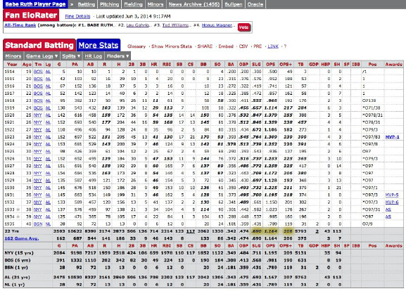
Figure 1.1: Statistical information on the performance of Babe Ruth can be
found at http://www.baseball-reference.com.
The key is thinking broadly: the answers to big, general questions often lie
buried in highly-specific data sets, which were by no means designed to contain
them.
1.2.1 The Baseball Encyclopedia
Baseball has long had an outsized importance in the world of data science. This
sport has been called the national pastime of the United States; indeed, French
historian Jacques Barzun observed that “Whoever wants to know the heart and
mind of America had better learn baseball.” I realize that many readers are not
American, and even those that are might be completely disinterested in sports.
But stick with me for a while.
What makes baseball important to data science is its extensive statistical
record of play, dating back for well over a hundred years. Baseball is a sport of
discrete events: pitchers throw balls and batters try to hit them – that naturally
lends itself to informative statistics. Fans get immersed in these statistics as chil-
dren, building their intuition about the strengths and limitations of quantitative
analysis. Some of these children grow up to become data scientists. Indeed, the
success of Brad Pitt’s statistically-minded baseball team in the movie Moneyball
remains the American public’s most vivid contact with data science.
This historical baseball record is available at http://www.baseball-reference.
com. There you will find complete statistical data on the performance of every
player who even stepped on the field. This includes summary statistics of each
season’s batting, pitching, and fielding record, plus information about teams

6CHAPTER 1. WHAT IS DATA SCIENCE?
Figure 1.2: Personal information on every major league baseball player is avail-
able at http://www.baseball-reference.com.
and awards as shown in Figure 1.1.
But more than just statistics, there is metadata on the life and careers of all
the people who have ever played major league baseball, as shown in Figure 1.2.
We get the vital statistics of each player (height, weight, handedness) and their
lifespan (when/where they were born and died). We also get salary information
(how much each player got paid every season) and transaction data (how did
they get to be the property of each team they played for).
Now, I realize that many of you do not have the slightest knowledge of or
interest in baseball. This sport is somewhat reminiscent of cricket, if that helps.
But remember that as a data scientist, it is your job to be interested in the
world around you. Think of this as chance to learn something.
So what interesting questions can you answer with this baseball data set?
Try to write down five questions before moving on. Don’t worry, I will wait here
for you to finish.
The most obvious types of questions to answer with this data are directly
related to baseball:
•How can we best measure an individual player’s skill or value?
•How fairly do trades between teams generally work out?
•What is the general trajectory of player’s performance level as they mature
and age?
•To what extent does batting performance correlate with position played?
For example, are outfielders really better hitters than infielders?
These are interesting questions. But even more interesting are questions
about demographic and social issues. Almost 20,000 major league baseball play-
1.2. ASKING INTERESTING QUESTIONS FROM DATA 7
ers have taken the field over the past 150 years, providing a large, extensively-
documented cohort of men who can serve as a proxy for even larger, less well-
documented populations. Indeed, we can use this baseball player data to answer
questions like:
•Do left-handed people have shorter lifespans than right-handers? Handed-
ness is not captured in most demographic data sets, but has been diligently
assembled here. Indeed, analysis of this data set has been used to show
that right-handed people live longer than lefties [HC88]!
•How often do people return to live in the same place where they were
born? Locations of birth and death have been extensively recorded in this
data set. Further, almost all of these people played at least part of their
career far from home, thus exposing them to the wider world at a critical
time in their youth.
•Do player salaries generally reflect past, present, or future performance?
•To what extent have heights and weights been increasing in the population
at large?
There are two particular themes to be aware of here. First, the identifiers
and reference tags (i.e. the metadata) often prove more interesting in a data set
than the stuff we are supposed to care about, here the statistical record of play.
Second is the idea of a statistical proxy, where you use the data set you have
to substitute for the one you really want. The data set of your dreams likely
does not exist, or may be locked away behind a corporate wall even if it does.
A good data scientist is a pragmatist, seeing what they can do with what they
have instead of bemoaning what they cannot get their hands on.
1.2.2 The Internet Movie Database (IMDb)
Everybody loves the movies. The Internet Movie Database (IMDb) provides
crowdsourced and curated data about all aspects of the motion picture industry,
at www.imdb.com. IMDb currently contains data on over 3.3 million movies and
TV programs. For each film, IMDb includes its title, running time, genres, date
of release, and a full list of cast and crew. There is financial data about each
production, including the budget for making the film and how well it did at the
box office.
Finally, there are extensive ratings for each film from viewers and critics.
This rating data consists of scores on a zero to ten stars scale, cross-tabulated
into averages by age and gender. Written reviews are often included, explaining
why a particular critic awarded a given number of stars. There are also links
between films: for example, identifying which other films have been watched
most often by viewers of It’s a Wonderful Life.
Every actor, director, producer, and crew member associated with a film
merits an entry in IMDb, which now contains records on 6.5 million people.

8CHAPTER 1. WHAT IS DATA SCIENCE?
Figure 1.3: Representative film data from the Internet Movie Database.
Figure 1.4: Representative actor data from the Internet Movie Database.

1.2. ASKING INTERESTING QUESTIONS FROM DATA 9
These happen to include my brother, cousin, and sister-in-law. Each actor
is linked to every film they appeared in, with a description of their role and
their ordering in the credits. Available data about each personality includes
birth/death dates, height, awards, and family relations.
So what kind of questions can you answer with this movie data?
Perhaps the most natural questions to ask IMDb involve identifying the
extremes of movies and actors:
•Which actors appeared in the most films? Earned the most money? Ap-
peared in the lowest rated films? Had the longest career or the shortest
lifespan?
•What was the highest rated film each year, or the best in each genre?
Which movies lost the most money, had the highest-powered casts, or got
the least favorable reviews.
Then there are larger-scale questions one can ask about the nature of the
motion picture business itself:
•How well does movie gross correlate with viewer ratings or awards? Do
customers instinctively flock to trash, or is virtue on the part of the cre-
ative team properly rewarded?
•How do Hollywood movies compare to Bollywood movies, in terms of rat-
ings, budget, and gross? Are American movies better received than foreign
films, and how does this differ between U.S. and non-U.S. reviewers?
•What is the age distribution of actors and actresses in films? How much
younger is the actress playing the wife, on average, than the actor playing
the husband? Has this disparity been increasing or decreasing with time?
•Live fast, die young, and leave a good-looking corpse? Do movie stars live
longer or shorter lives than bit players, or compared to the general public?
Assuming that people working together on a film get to know each other,
the cast and crew data can be used to build a social network of the movie
business. What does the social network of actors look like? The Oracle of
Bacon (https://oracleofbacon.org/) posits Kevin Bacon as the center of
the Hollywood universe and generates the shortest path to Bacon from any
other actor. Other actors, like Samuel L. Jackson, prove even more central.
More critically, can we analyze this data to determine the probability that
someone will like a given movie? The technique of collaborative filtering finds
people who liked films that I also liked, and recommends other films that they
liked as good candidates for me. The 2007 Netflix Prize was a $1,000,000 com-
petition to produce a ratings engine 10% better than the proprietary Netflix
system. The ultimate winner of this prize (BellKor) used a variety of data
sources and techniques, including the analysis of links [BK07].
10 CHAPTER 1. WHAT IS DATA SCIENCE?
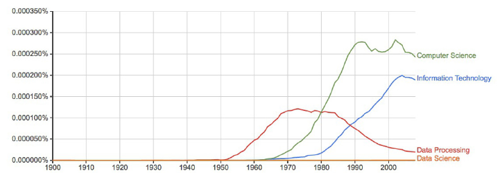
Figure 1.5: The rise and fall of data processing, as witnessed by Google Ngrams.
1.2.3 Google Ngrams
Printed books have been the primary repository of human knowledge since
Gutenberg’s invention of movable type in 1439. Physical objects live somewhat
uneasily in today’s digital world, but technology has a way of reducing every-
thing to data. As part of its mission to organize the world’s information, Google
undertook an effort to scan all of the world’s published books. They haven’t
quite gotten there yet, but the 30 million books thus far digitized represent over
20% of all books ever published.
Google uses this data to improve search results, and provide fresh access
to out-of-print books. But perhaps the coolest product is Google Ngrams, an
amazing resource for monitoring changes in the cultural zeitgeist. It provides
the frequency with which short phrases occur in books published each year.
Each phrase must occur at least forty times in their scanned book corpus. This
eliminates obscure words and phrases, but leaves over two billion time series
available for analysis.
This rich data set shows how language use has changed over the past 200
years, and has been widely applied to cultural trend analysis [MAV+11]. Figure
1.5 uses this data to show how the word data fell out of favor when thinking
about computing. Data processing was the popular term associated with the
computing field during the punched card and spinning magnetic tape era of the
1950s. The Ngrams data shows that the rapid rise of Computer Science did not
eclipse Data Processing until 1980. Even today, Data Science remains almost
invisible on this scale.
Check out Google Ngrams at http://books.google.com/ngrams. I promise
you will enjoy playing with it. Compare hot dog to tofu,science against religion,
freedom to justice, and sex vs. marriage, to better understand this fantastic
telescope for looking into the past.
But once you are done playing, think of bigger things you could do if you
got your hands on this data. Assume you have access to the annual number
of references for all words/phrases published in books over the past 200 years.

1.2. ASKING INTERESTING QUESTIONS FROM DATA 11
Google makes this data freely available. So what are you going to do with it?
Observing the time series associated with particular words using the Ngrams
Viewer is fun. But more sophisticated historical trends can be captured by
aggregating multiple time series together. The following types of questions
seem particularly interesting to me:
•How has the amount of cursing changed over time? Use of the four-
letter words I am most familiar with seem to have exploded since 1960,
although it is perhaps less clear whether this reflects increased cussing or
lower publication standards.
•How often do new words emerge and get popular? Do these words tend
to stay in common usage, or rapidly fade away? Can we detect when
words change meaning over time, like the transition of gay from happy to
homosexual?
•Have standards of spelling been improving or deteriorating with time,
especially now that we have entered the era of automated spell check-
ing? Rarely-occurring words that are only one character removed from a
commonly-used word are likely candidates to be spelling errors (e.g. al-
gorithm vs. algorthm). Aggregated over many different misspellings, are
such errors increasing or decreasing?
You can also use this Ngrams corpus to build a language model that captures
the meaning and usage of the words in a given language. We will discuss word
embeddings in Section 11.6.3, which are powerful tools for building language
models. Frequency counts reveal which words are most popular. The frequency
of word pairs appearing next to each other can be used to improve speech
recognition systems, helping to distinguish whether the speaker said that’s too
bad or that’s to bad. These millions of books provide an ample data set to build
representative models from.
1.2.4 New York Taxi Records
Every financial transaction today leaves a data trail behind it. Following these
paths can lead to interesting insights.
Taxi cabs form an important part of the urban transportation network. They
roam the streets of the city looking for customers, and then drive them to their
destination for a fare proportional to the length of the trip. Each cab contains
a metering device to calculate the cost of the trip as a function of time. This
meter serves as a record keeping device, and a mechanism to ensure that the
driver charges the proper amount for each trip.
The taxi meters currently employed in New York cabs can do many things
beyond calculating fares. They act as credit card terminals, providing a way
12 CHAPTER 1. WHAT IS DATA SCIENCE?
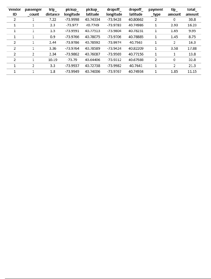
Figure 1.6: Representative fields from the New York city taxi cab data: pick up
and dropoff points, distances, and fares.
for customers to pay for rides without cash. They are integrated with global
positioning systems (GPS), recording the exact location of every pickup and
drop off. And finally, since they are on a wireless network, these boxes can
communicate all of this data back to a central server.
The result is a database documenting every single trip by all taxi cabs in
one of the world’s greatest cities, a small portion of which is shown in Figure
1.6. Because the New York Taxi and Limousine Commission is a public agency,
its non-confidential data is available to all under the Freedom of Information
Act (FOA).
Every ride generates two records: one with data on the trip, the other with
details of the fare. Each trip is keyed to the medallion (license) of each car
coupled with the identifier of each driver. For each trip, we get the time/date
of pickup and drop-off, as well as the GPS coordinates (longitude and latitude)
of the starting location and destination. We do not get GPS data of the route
they traveled between these points, but to some extent that can be inferred by
the shortest path between them.
As for fare data, we get the metered cost of each trip, including tax, surcharge
and tolls. It is traditional to pay the driver a tip for service, the amount of which
is also recorded in the data.
So I’m talking to you. This taxi data is readily available, with records of
over 80 million trips over the past several years. What are you going to do with
it?
Any interesting data set can be used to answer questions on many different
scales. This taxi fare data can help us better understand the transportation
industry, but also how the city works and how we could make it work even
better. Natural questions with respect to the taxi industry include:

1.2. ASKING INTERESTING QUESTIONS FROM DATA 13
Figure 1.7: Which neighborhoods in New York city tip most generously? The
relatively remote outer boroughs of Brooklyn and Queens, where trips are
longest and supply is relatively scarce.
•How much money do drivers make each night, on average? What is the
distribution? Do drivers make more on sunny days or rainy days?
•Where are the best spots in the city for drivers to cruise, in order to pick
up profitable fares? How does this vary at different times of the day?
•How far do drivers travel over the course of a night’s work? We can’t
answer this exactly using this data set, because it does not provide GPS
data of the route traveled between fares. But we do know the last place
of drop off, the next place of pickup, and how long it took to get between
them. Together, this should provide enough information to make a sound
estimate.
•Which drivers take their unsuspecting out-of-town passengers for a “ride,”
running up the meter on what should be a much shorter, cheaper trip?
•How much are drivers tipped, and why? Do faster drivers get tipped
better? How do tipping rates vary by neighborhood, and is it the rich
neighborhoods or poor neighborhoods which prove more generous?
I will confess we did an analysis of this, which I will further describe in
the war story of Section 9.3. We found a variety of interesting patterns
[SS15]. Figure 1.7 shows that Manhattanites are generally cheapskates
relative to large swaths of Brooklyn, Queens, and Staten Island, where
trips are longer and street cabs a rare but welcome sight.
14 CHAPTER 1. WHAT IS DATA SCIENCE?
But the bigger questions have to do with understanding transportation in
the city. We can use the taxi travel times as a sensor to measure the level of
traffic in the city at a fine level. How much slower is traffic during rush hour
than other times, and where are delays the worst? Identifying problem areas is
the first step to proposing solutions, by changing the timing patterns of traffic
lights, running more buses, or creating high-occupancy only lanes.
Similarly we can use the taxi data to measure transportation flows across
the city. Where are people traveling to, at different times of the day? This tells
us much more than just congestion. By looking at the taxi data, we should
be able to see tourists going from hotels to attractions, executives from fancy
neighborhoods to Wall Street, and drunks returning home from nightclubs after
a bender.
Data like this is essential to designing better transportation systems. It is
wasteful for a single rider to travel from point ato point bwhen there is another
rider at point a+who also wants to get there. Analysis of the taxi data enables
accurate simulation of a ride sharing system, so we can accurately evaluate the
demands and cost reductions of such a service.
1.3 Properties of Data
This book is about techniques for analyzing data. But what is the underlying
stuff that we will be studying? This section provides a brief taxonomy of the
properties of data, so we can better appreciate and understand what we will be
working on.
1.3.1 Structured vs. Unstructured Data
Certain data sets are nicely structured, like the tables in a database or spread-
sheet program. Others record information about the state of the world, but in
a more heterogeneous way. Perhaps it is a large text corpus with images and
links like Wikipedia, or the complicated mix of notes and test results appearing
in personal medical records.
Generally speaking, this book will focus on dealing with structured data.
Data is often represented by a matrix, where the rows of the matrix represent
distinct items or records, and the columns represent distinct properties of these
items. For example, a data set about U.S. cities might contain one row for each
city, with columns representing features like state, population, and area.
When confronted with an unstructured data source, such as a collection of
tweets from Twitter, our first step is generally to build a matrix to structure
it. A bag of words model will construct a matrix with a row for each tweet, and
a column for each frequently used vocabulary word. Matrix entry M[i, j] then
denotes the number of times tweet icontains word j. Such matrix formulations
will motivate our discussion of linear algebra, in Chapter 8.
1.3. PROPERTIES OF DATA 15
1.3.2 Quantitative vs. Categorical Data
Quantitative data consists of numerical values, like height and weight. Such data
can be incorporated directly into algebraic formulas and mathematical models,
or displayed in conventional graphs and charts.
By contrast, categorical data consists of labels describing the properties of
the objects under investigation, like gender, hair color, and occupation. This
descriptive information can be every bit as precise and meaningful as numerical
data, but it cannot be worked with using the same techniques.
Categorical data can usually be coded numerically. For example, gender
might be represented as male = 0 or f emale = 1. But things get more com-
plicated when there are more than two characters per feature, especially when
there is not an implicit order between them. We may be able to encode hair
colors as numbers by assigning each shade a distinct value like gray hair = 0,
red hair = 1, and blond hair = 2. However, we cannot really treat these val-
ues as numbers, for anything other than simple identity testing. Does it make
any sense to talk about the maximum or minimum hair color? What is the
interpretation of my hair color minus your hair color?
Most of what we do in this book will revolve around numerical data. But
keep an eye out for categorical features, and methods that work for them. Clas-
sification and clustering methods can be thought of as generating categorical
labels from numerical data, and will be a primary focus in this book.
1.3.3 Big Data vs. Little Data
Data science has become conflated in the public eye with big data, the analysis of
massive data sets resulting from computer logs and sensor devices. In principle,
having more data is always better than having less, because you can always
throw some of it away by sampling to get a smaller set if necessary.
Big data is an exciting phenomenon, and we will discuss it in Chapter 12. But
in practice, there are difficulties in working with large data sets. Throughout
this book we will look at algorithms and best practices for analyzing data. In
general, things get harder once the volume gets too large. The challenges of big
data include:
•The analysis cycle time slows as data size grows: Computational opera-
tions on data sets take longer as their volume increases. Small spreadsheets
provide instantaneous response, allowing you to experiment and play what
if? But large spreadsheets can be slow and clumsy to work with, and
massive-enough data sets might take hours or days to get answers from.
Clever algorithms can permit amazing things to be done with big data,
but staying small generally leads to faster analysis and exploration.
•Large data sets are complex to visualize: Plots with millions of points on
them are impossible to display on computer screens or printed images, let
alone conceptually understand. How can we ever hope to really understand
something we cannot see?

16 CHAPTER 1. WHAT IS DATA SCIENCE?
•Simple models do not require massive data to fit or evaluate: A typical
data science task might be to make a decision (say, whether I should offer
this fellow life insurance?) on the basis of a small number of variables:
say age, gender, height, weight, and the presence or absence of existing
medical conditions.
If I have this data on 1 million people with their associated life outcomes, I
should be able to build a good general model of coverage risk. It probably
wouldn’t help me build a substantially better model if I had this data
on hundreds of millions of people. The decision criteria on only a few
variables (like age and martial status) cannot be too complex, and should
be robust over a large number of applicants. Any observation that is so
subtle it requires massive data to tease out will prove irrelevant to a large
business which is based on volume.
Big data is sometimes called bad data. It is often gathered as the by-product
of a given system or procedure, instead of being purposefully collected to answer
your question at hand. The result is that we might have to go to heroic efforts
to make sense of something just because we have it.
Consider the problem of getting a pulse on voter preferences among presi-
dential candidates. The big data approach might analyze massive Twitter or
Facebook feeds, interpreting clues to their opinions in the text. The small data
approach might be to conduct a poll, asking a few hundred people this specific
question and tabulating the results. Which procedure do you think will prove
more accurate? The right data set is the one most directly relevant to the tasks
at hand, not necessarily the biggest one.
Take-Home Lesson: Do not blindly aspire to analyze large data sets. Seek the
right data to answer a given question, not necessarily the biggest thing you can
get your hands on.
1.4 Classification and Regression
Two types of problems arise repeatedly in traditional data science and pattern
recognition applications, the challenges of classification and regression. As this
book has developed, I have pushed discussions of the algorithmic approaches
to solving these problems toward the later chapters, so they can benefit from a
solid understanding of core material in data munging, statistics, visualization,
and mathematical modeling.
Still, I will mention issues related to classification and regression as they
arise, so it makes sense to pause here for a quick introduction to these problems,
to help you recognize them when you see them.
•Classification: Often we seek to assign a label to an item from a discrete
set of possibilities. Such problems as predicting the winner of a particular
1.5. DATA SCIENCE TELEVISION: THE QUANT SHOP 17
sporting contest (team Aor team B?) or deciding the genre of a given
movie (comedy, drama, or animation?) are classification problems, since
each entail selecting a label from the possible choices.
•Regression: Another common task is to forecast a given numerical quan-
tity. Predicting a person’s weight or how much snow we will get this year
is a regression problem, where we forecast the future value of a numerical
function in terms of previous values and other relevant features.
Perhaps the best way to see the intended distinction is to look at a variety
of data science problems and label (classify) them as regression or classification.
Different algorithmic methods are used to solve these two types of problems,
although the same questions can often be approached in either way:
•Will the price of a particular stock be higher or lower tomorrow? (classi-
fication)
•What will the price of a particular stock be tomorrow? (regression)
•Is this person a good risk to sell an insurance policy to? (classification)
•How long do we expect this person to live? (regression)
Keep your eyes open for classification and regression problems as you en-
counter them in your life, and in this book.
1.5 Data Science Television: The Quant Shop
I believe that hands-on experience is necessary to internalize basic principles.
Thus when I teach data science, I like to give each student team an interesting
but messy forecasting challenge, and demand that they build and evaluate a
predictive model for the task.
These forecasting challenges are associated with events where the students
must make testable predictions. They start from scratch: finding the relevant
data sets, building their own evaluation environments, and devising their model.
Finally, I make them watch the event as it unfolds, so as to witness the vindi-
cation or collapse of their prediction.
As an experiment, we documented the evolution of each group’s project
on video in Fall 2014. Professionally edited, this became The Quant Shop, a
television-like data science series for a general audience. The eight episodes of
this first season are available at http://www.quant-shop.com, and include:
•Finding Miss Universe – The annual Miss Universe competition aspires
to identify the most beautiful woman in the world. Can computational
models predict who will win a beauty contest? Is beauty just subjective,
or can algorithms tell who is the fairest one of all?

18 CHAPTER 1. WHAT IS DATA SCIENCE?
•Modeling the Movies – The business of movie making involves a lot of
high-stakes data analysis. Can we build models to predict which film will
gross the most on Christmas day? How about identifying which actors
will receive awards for their performance?
•Winning the Baby Pool – Birth weight is an important factor in assessing
the health of a newborn child. But how accurately can we predict junior’s
weight before the actual birth? How can data clarify environmental risks
to developing pregnancies?
•The Art of the Auction – The world’s most valuable artworks sell at auc-
tions to the highest bidder. But can we predict how many millions a
particular J.W. Turner painting will sell for? Can computers develop an
artistic sense of what’s worth buying?
•White Christmas – Weather forecasting is perhaps the most familiar do-
main of predictive modeling. Short-term forecasts are generally accurate,
but what about longer-term prediction? What places will wake up to a
snowy Christmas this year? And can you tell one month in advance?
•Predicting the Playoffs – Sports events have winners and losers, and book-
ies are happy to take your bets on the outcome of any match. How well can
statistics help predict which football team will win the Super Bowl? Can
Google’s PageRank algorithm pick the winners on the field as accurately
as it does on the web?
•The Ghoul Pool – Death comes to all men, but when? Can we apply
actuarial models to celebrities, to decide who will be the next to die?
Similar analysis underlies the workings of the life insurance industry, where
accurate predictions of lifespan are necessary to set premiums which are
both sustainable and affordable.
Figure 1.8: Exciting scenes from data science television: The Quant Shop.
1.6. ABOUT THE WAR STORIES 19
•Playing the Market – Hedge fund quants get rich when guessing right
about tomorrow’s prices, and poor when wrong. How accurately can we
predict future prices of gold and oil using histories of price data? What
other information goes into building a successful price model?
I encourage you to watch some episodes of The Quant Shop in tandem with
reading this book. We try to make it fun, although I am sure you will find
plenty of things to cringe at. Each show runs for thirty minutes, and maybe
will inspire you to tackle a prediction challenge of your own.
These programs will certainly give you more insight into these eight specific
challenges. I will use these projects throughout this book to illustrate important
lessons in how to do data science, both as positive and negative examples. These
projects provide a laboratory to see how intelligent but inexperienced people not
wildly unlike yourself thought about a data science problem, and what happened
when they did.
1.5.1 Kaggle Challenges
Another source of inspiration are challenges from Kaggle (www.kaggle.com),
which provides a competitive forum for data scientists. New challenges are
posted on a regular basis, providing a problem definition, training data, and
a scoring function over hidden evaluation data. A leader board displays the
scores of the strongest competitors, so you can see how well your model stacks
up in comparison with your opponents. The winners spill their modeling secrets
during post-contest interviews, to help you improve your modeling skills.
Performing well on Kaggle challenges is an excellent credential to put on your
resume to get a good job as a data scientist. Indeed, potential employers will
track you down if you are a real Kaggle star. But the real reason to participate
is that the problems are fun and inspiring, and practice helps make you a better
data scientist.
The exercises at the end of each chapter point to expired Kaggle challenges,
loosely connected to the material in that chapter. Be forewarned that Kaggle
provides a misleading glamorous view of data science as applied machine learn-
ing, because it presents extremely well-defined problems with the hard work
of data collection and cleaning already done for you. Still, I encourage you to
check it out for inspiration, and as a source of data for new projects.
1.6 About the War Stories
Genius and wisdom are two distinct intellectual gifts. Genius shows in discover-
ing the right answer, making imaginative mental leaps which overcome obstacles
and challenges. Wisdom shows in avoiding obstacles in the first place, providing
a sense of direction or guiding light that keeps us moving soundly in the right
direction.
20 CHAPTER 1. WHAT IS DATA SCIENCE?
Genius is manifested in technical strength and depth, the ability to see things
and do things that other people cannot. In contrast, wisdom comes from ex-
perience and general knowledge. It comes from listening to others. Wisdom
comes from humility, observing how often you have been wrong in the past and
figuring out why you were wrong, so as to better recognize future traps and
avoid them.
Data science, like most things in life, benefits more from wisdom than from
genius. In this book, I seek to pass on wisdom that I have accumulated the hard
way through war stories, gleaned from a diverse set of projects I have worked
on:
•Large-scale text analytics and NLP: My Data Science Laboratory at Stony
Brook University works on a variety of projects in big data, including sen-
timent analysis from social media, historical trends analysis, deep learning
approaches to natural language processing (NLP), and feature extraction
from networks.
•Start-up companies: I served as co-founder and chief scientist to two
data analytics companies: General Sentiment and Thrivemetrics. General
Sentiment analyzed large-scale text streams from news, blogs, and social
media to identify trends in the sentiment (positive or negative) associated
with people, places, and things. Thrivemetrics applied this type of analysis
to internal corporate communications, like email and messaging systems.
Neither of these ventures left me wealthy enough to forgo my royalties
from this book, but they did provide me with experience on cloud-based
computing systems, and insight into how data is used in industry.
•Collaborating with real scientists: I have had several interesting collab-
orations with biologists and social scientists, which helped shape my un-
derstanding of the complexities of working with real data. Experimental
data is horribly noisy and riddled with errors, yet you must do the best
you can with what you have, in order to discover how the world works.
•Building gambling systems: A particularly amusing project was building
a system to predict the results of jai-alai matches so we could bet on them,
an experience recounted in my book Calculated Bets: Computers, Gam-
bling, and Mathematical Modeling to Win [Ski01]. Our system relied on
web scraping for data collection, statistical analysis, simulation/modeling,
and careful evaluation. We also have developed and evaluated predictive
models for movie grosses [ZS09], stock prices [ZS10], and football games
[HS10] using social media analysis.
•Ranking historical figures: By analyzing Wikipedia to extract meaningful
variables on over 800,000 historical figures, we developed a scoring func-
tion to rank them by their strength as historical memes. This ranking
does a great job separating the greatest of the great (Jesus, Napoleon,
Shakespeare, Mohammad, and Lincoln round out the top five) from lesser
1.7. WAR STORY: ANSWERING THE RIGHT QUESTION 21
mortals, and served as the basis for our book Who’s Bigger?: Where His-
torical Figures Really Rank [SW13].
All this experience drives what I teach in this book, especially the tales that
I describe as war stories. Every one of these war stories is true. Of course, the
stories improve somewhat in the retelling, and the dialogue has been punched
up to make them more interesting to read. However, I have tried to honestly
trace the process of going from a raw problem to a solution, so you can watch
how it unfolded.
1.7 War Story: Answering the Right Question
Our research group at Stony Brook University developed an NLP-based system
for analyzing millions of news, blogs and social media messages, and reducing
this text to trends concerning all the entities under discussion. Counting the
number of mentions each name receives in a text stream (volume) is easy, in
principle. Determining whether the connotation of a particular reference is
positive or negative (sentiment analysis) is hard. But our system did a pretty
good job, particularly when aggregated over many references.
This technology served as the foundation for a social media analysis company
named General Sentiment. It was exciting living through a start-up starting up,
facing the challenges of raising money, hiring staff, and developing new products.
But perhaps the biggest problem we faced was answering the right question.
The General Sentiment system recorded trends about the sentiment and volume
for every person, place, and thing that was ever mentioned in news, blogs, and
social media: over 20 million distinct entities. We monitored the reputations of
celebrities and politicians. We monitored the fates of companies and products.
We tracked the performance of sports teams, and the buzz about movies. We
could do anything!
But it turns out that no one pays you to do anything. They pay you to do
something, to solve a particular problem they have, or eliminate a specific pain
point in their business. Being able to do anything proves to be a terrible sales
strategy, because it requires you to find that need afresh for each and every
customer.
Facebook didn’t open up to the world until September 2006. So when Gen-
eral Sentiment started in 2008, we were at the very beginning of the social media
era. We had lots of interest from major brands and advertising agencies which
knew that social media was ready to explode. They knew this newfangled thing
was important, and that they had to be there. They knew that proper analysis
of social media data could give them fresh insights into what their customers
were thinking. But they didn’t know exactly what it was they really wanted to
know.
One aircraft engine manufacturer was very interested in learning how much
the kids talked about them on Facebook. We had to break it to them gently
that the answer was zero. Other potential customers demanded proof that we
22 CHAPTER 1. WHAT IS DATA SCIENCE?
were more accurate than the Nielsen television ratings. But of course, if you
wanted Nielsen ratings then you should buy them from Nielsen. Our system
provided different insights from a completely different world. But you had to
know what you wanted in order to use them.
We did manage to get substantial contracts from a very diverse group of
customers, including consumer brands like Toyota and Blackberry, governmental
organizations like the Hawaii tourism office, and even the presidential campaign
of Republican nominee Mitt Romney in 2012. Our analysts provided them
insights into a wide variety of business issues:
•What did people think about Hawaii? (Answer: they think it is a very
nice place to visit.)
•How quickly would Toyota’s sentiment recover after news of serious brake
problems in their cars? (Answer: about six months.)
•What did people think about Blackberry’s new phone models? (Answer:
they liked the iPhone much better.)
•How quickly would Romney’s sentiment recover after insulting 47% of the
electorate in a recorded speech? (Answer: never.)
But each sale required entering a new universe, involving considerable effort
and imagination on the part of our sales staff and research analysts. We never
managed to get two customers in the same industry, which would have let us
benefit from scale and accumulated wisdom.
Of course, the customer is always right. It was our fault that we could not
explain to them the best way to use our technology. The lesson here is that the
world will not beat a path to your door just for a new source of data. You must
be able to supply the right questions before you can turn data into money.
1.8 Chapter Notes
The idea of using historical records from baseball players to establish that left-
handers have shorter lifespans is due to Halpern and Coren [HC88, HC91],
but their conclusion remains controversial. The percentage of left-handers in
the population has been rapidly growing, and the observed effects may be a
function of survivorship bias [McM04]. So lefties, hang in there! Full disclosure:
I am one of you.
The discipline of quantitative baseball analysis is sometimes called sabermet-
rics, and its leading light is a fellow named Bill James. I recommend budding
data scientists read his Historical Baseball Abstract [Jam10] as an excellent ex-
ample of how one turns numbers into knowledge and understanding. Time
Magazine once said of James: “Much of the joy of reading him comes from the
extravagant spectacle of a first-rate mind wasting itself on baseball.” I thank
http://sports-reference.com for permission to use images of their website
in this book. Ditto to Amazon, the owner of IMDb.
1.9. EXERCISES 23
The potential of ride-sharing systems in New York was studied by Santi et.
al. [SRS+14], who showed that almost 95% of the trips could have been shared
with no more than five minutes delay per trip.
The Lydia system for sentiment analysis is described in [GSS07]. Methods
to identify changes in word meaning through analysis of historical text corpora
like Google Ngram are reported in [KARPS15].
1.9 Exercises
Identifying Data Sets
1-1. [3] Identify where interesting data sets relevant to the following domains can be
found on the web:
(a) Books.
(b) Horse racing.
(c) Stock prices.
(d) Risks of diseases.
(e) Colleges and universities.
(f) Crime rates.
(g) Bird watching.
For each of these data sources, explain what you must do to turn this data into
a usable format on your computer for analysis.
1-2. [3] Propose relevant data sources for the following The Quant Shop prediction
challenges. Distinguish between sources of data that you are sure somebody must
have, and those where the data is clearly available to you.
(a) Miss Universe.
(b) Movie gross.
(c) Baby weight.
(d) Art auction price.
(e) White Christmas.
(f) Football champions.
(g) Ghoul pool.
(h) Gold/oil prices.
1-3. [3] Visit http://data.gov, and identify five data sets that sound interesting to
you. For each write a brief description, and propose three interesting things you
might do with them.
Asking Questions
1-4. [3] For each of the following data sources, propose three interesting questions
you can answer by analyzing them:
(a) Credit card billing data.
24 CHAPTER 1. WHAT IS DATA SCIENCE?
(b) Click data from http://www.Amazon.com.
(c) White Pages residential/commercial telephone directory.
1-5. [5] Visit Entrez, the National Center for Biotechnology Information (NCBI)
portal. Investigate what data sources are available, particularly the Pubmed
and Genome resources. Propose three interesting projects to explore with each
of them.
1-6. [5] You would like to conduct an experiment to establish whether your friends
prefer the taste of regular Coke or Diet Coke. Briefly outline a design for such
a study.
1-7. [5] You would like to conduct an experiment to see whether students learn better
if they study without any music, with instrumental music, or with songs that
have lyrics. Briefly outline the design for such a study.
1-8. [5] Traditional polling operations like Gallup use a procedure called random digit
dialing, which dials random strings of digits instead of picking phone numbers
from the phone book. Suggest why such polls are conducted using random digit
dialing.
Implementation Projects
1-9. [5] Write a program to scrape the best-seller rank for a book on Amazon.com.
Use this to plot the rank of all of Skiena’s books over time. Which one of these
books should be the next item that you purchase? Do you have friends for whom
they would make a welcome and appropriate gift? :-)
1-10. [5] For your favorite sport (baseball, football, basketball, cricket, or soccer)
identify a data set with the historical statistical records for all major partici-
pants. Devise and implement a ranking system to identify the best player at
each position.
Interview Questions
1-11. [3] For each of the following questions: (1) produce a quick guess based only on
your understanding of the world, and then (2) use Google to find supportable
numbers to produce a more principled estimate from. How much did your two
estimates differ by?
(a) How many piano tuners are there in the entire world?
(b) How much does the ice in a hockey rink weigh?
(c) How many gas stations are there in the United States?
(d) How many people fly in and out of LaGuardia Airport every day?
(e) How many gallons of ice cream are sold in the United States each year?
(f) How many basketballs are purchased by the National Basketball Associa-
tion (NBA) each year?
(g) How many fish are there in all the world’s oceans?
(h) How many people are flying in the air right now, all over the world?
(i) How many ping-pong balls can fit in a large commercial jet?
(j) How many miles of paved road are there in your favorite country?
1.9. EXERCISES 25
(k) How many dollar bills are sitting in the wallets of all people at Stony Brook
University?
(l) How many gallons of gasoline does a typical gas station sell per day?
(m) How many words are there in this book?
(n) How many cats live in New York city?
(o) How much would it cost to fill a typical car’s gas tank with Starbuck’s
coffee?
(p) How much tea is there in China?
(q) How many checking accounts are there in the United States?
1-12. [3] What is the difference between regression and classification?
1-13. [8] How would you build a data-driven recommendation system? What are the
limitations of this approach?
1-14. [3] How did you become interested in data science?
1-15. [3] Do you think data science is an art or a science?
Kaggle Challenges
1-16. Who survived the shipwreck of the Titanic?
https://www.kaggle.com/c/titanic
1-17. Where is a particular taxi cab going?
https://www.kaggle.com/c/pkdd-15-predict-taxi-service-trajectory-i
1-18. How long will a given taxi trip take?
https://www.kaggle.com/c/pkdd-15-taxi-trip-time-prediction-ii
Chapter 2
Mathematical Preliminaries
A data scientist is someone who knows more statistics than a com-
puter scientist and more computer science than a statistician.
– Josh Blumenstock
You must walk before you can run. Similarly, there is a certain level of mathe-
matical maturity which is necessary before you should be trusted to do anything
meaningful with numerical data.
In writing this book, I have assumed that the reader has had some degree
of exposure to probability and statistics, linear algebra, and continuous math-
ematics. I have also assumed that they have probably forgotten most of it, or
perhaps didn’t always see the forest (why things are important, and how to use
them) for the trees (all the details of definitions, proofs, and operations).
This chapter will try to refresh your understanding of certain basic math-
ematical concepts. Follow along with me, and pull out your old textbooks if
necessary for future reference. Deeper concepts will be introduced later in the
book when we need them.
2.1 Probability
Probability theory provides a formal framework for reasoning about the likeli-
hood of events. Because it is a formal discipline, there are a thicket of associated
definitions to instantiate exactly what we are reasoning about:
•An experiment is a procedure which yields one of a set of possible out-
comes. As our ongoing example, consider the experiment of tossing two
six-sided dice, one red and one blue, with each face baring a distinct inte-
ger {1,...,6}.
•Asample space Sis the set of possible outcomes of an experiment. In our
28 CHAPTER 2. MATHEMATICAL PRELIMINARIES
dice example, there are 36 possible outcomes, namely
S={(1,1),(1,2),(1,3),(1,4),(1,5),(1,6),(2,1),(2,2),(2,3),(2,4),(2,5),(2,6),
(3,1),(3,2),(3,3),(3,4),(3,5),(3,6),(4,1),(4,2),(4,3),(4,4),(4,5),(4,6),
(5,1),(5,2),(5,3),(5,4),(5,5),(5,6),(6,1),(6,2),(6,3),(6,4),(6,5),(6,6)}.
•An event Eis a specified subset of the outcomes of an experiment. The
event that the sum of the dice equals 7 or 11 (the conditions to win at
craps on the first roll) is the subset
E={(1,6),(2,5),(3,4),(4,3),(5,2),(6,1),(5,6),(6,5)}.
•The probability of an outcome s, denoted p(s) is a number with the two
properties:
–For each outcome sin sample space S, 0 ≤p(s)≤1.
–The sum of probabilities of all outcomes adds to one: Ps∈Sp(s) = 1.
If we assume two distinct fair dice, the probability p(s) = (1/6) ×(1/6) =
1/36 for all outcomes s∈S.
•The probability of an event Eis the sum of the probabilities of the out-
comes of the experiment. Thus
p(E) = X
s∈E
p(s).
An alternate formulation is in terms of the complement of the event ¯
E,
the case when Edoes not occur. Then
P(E)=1−P(¯
E).
This is useful, because often it is easier to analyze P(¯
E) than P(E) di-
rectly.
•Arandom variable Vis a numerical function on the outcomes of a proba-
bility space. The function “sum the values of two dice” (V((a, b)) = a+b)
produces an integer result between 2 and 12. This implies a probabil-
ity distribution of the values of the random variable. The probability
P(V(s) = 7) = 1/6, as previously shown, while P(V(s) = 12) = 1/36.
•The expected value of a random variable Vdefined on a sample space S,
E(V) is defined
E(V) = X
s∈S
p(s)·V(s).
All this you have presumably seen before. But it provides the language we
will use to connect between probability and statistics. The data we see usually
comes from measuring properties of observed events. The theory of probability
and statistics provides the tools to analyze this data.

2.1. PROBABILITY 29
2.1.1 Probability vs. Statistics
Probability and statistics are related areas of mathematics which concern them-
selves with analyzing the relative frequency of events. Still, there are funda-
mental differences in the way they see the world:
•Probability deals with predicting the likelihood of future events, while
statistics involves the analysis of the frequency of past events.
•Probability is primarily a theoretical branch of mathematics, which studies
the consequences of mathematical definitions. Statistics is primarily an
applied branch of mathematics, which tries to make sense of observations
in the real world.
Both subjects are important, relevant, and useful. But they are different, and
understanding the distinction is crucial in properly interpreting the relevance
of mathematical evidence. Many a gambler has gone to a cold and lonely grave
for failing to make the proper distinction between probability and statistics.
This distinction will perhaps become clearer if we trace the thought process
of a mathematician encountering her first craps game:
•If this mathematician were a probabilist, she would see the dice and think
“Six-sided dice? Each side of the dice is presumably equally likely to land
face up. Now assuming that each face comes up with probability 1/6, I
can figure out what my chances are of crapping out.”
•If instead a statistician wandered by, she would see the dice and think
“How do I know that they are not loaded? I’ll watch a while, and keep
track of how often each number comes up. Then I can decide if my ob-
servations are consistent with the assumption of equal-probability faces.
Once I’m confident enough that the dice are fair, I’ll call a probabilist to
tell me how to bet.”
In summary, probability theory enables us to find the consequences of a
given ideal world, while statistical theory enables us to measure the extent to
which our world is ideal. This constant tension between theory and practice is
why statisticians prove to be a tortured group of individuals compared with the
happy-go-lucky probabilists.
Modern probability theory first emerged from the dice tables of France in
1654. Chevalier de M´er´e, a French nobleman, wondered whether the player or
the house had the advantage in a particular betting game.1In the basic version,
the player rolls four dice, and wins provided none of them are a 6. The house
collects on the even money bet if at least one 6 appears.
De M´er´e brought this problem to the attention of the French mathematicians
Blaise Pascal and Pierre de Fermat, most famous as the source of Fermat’s Last
Theorem. Together, these men worked out the basics of probability theory,
1He really shouldn’t have wondered. The house always has the advantage.
30 CHAPTER 2. MATHEMATICAL PRELIMINARIES
A
S
A
S
A\B
A B
S
A[B
Figure 2.1: Venn diagrams illustrating set difference (left), intersection (middle),
and union (right).
along the way establishing that the house wins this dice game with probability
p= 1 −(5/6)4≈0.517, where the probability p= 0.5 would denote a fair game
where the house wins exactly half the time.
2.1.2 Compound Events and Independence
We will be interested in complex events computed from simpler events Aand B
on the same set of outcomes. Perhaps event Ais that at least one of two dice
be an even number, while event Bdenotes rolling a total of either 7 or 11. Note
that there exist certain outcomes of Awhich are not outcomes of B, specifically
A−B={(1,2),(1,4),(2,1),(2,2),(2,3),(2,4),(2,6),(3,2),(3,6),(4,1),
(4,2),(4,4),(4,5),(4,6),(5,4),(6,2),(6,3),(6,4),(6,6)}.
This is the set difference operation. Observe that here B−A={}, because
every pair adding to 7 or 11 must contain one odd and one even number.
The outcomes in common between both events Aand Bare called the in-
tersection, denoted A∩B. This can be written as
A∩B=A−(S−B).
Outcomes which appear in either Aor Bare called the union, denoted A∪B.
With the complement operation ¯
A=S−A, we get a rich language for combining
events, shown in Figure 2.1. We can readily compute the probability of any of
these sets by summing the probabilities of the outcomes in the defined sets.
The events Aand Bare independent if and only if
P(A∩B) = P(A)×P(B).
This means that there is no special structure of outcomes shared between events
Aand B. Assuming that half of the students in my class are female, and half
the students in my class are above average, we would expect that a quarter of
my students are both female and above average if the events are independent.

2.1. PROBABILITY 31
Probability theorists love independent events, because it simplifies their cal-
culations. But data scientists generally don’t. When building models to predict
the likelihood of some future event B, given knowledge of some previous event
A, we want as strong a dependence of Bon Aas possible.
Suppose I always use an umbrella if and only if it is raining. Assume that
the probability it is raining here (event B) is, say, p= 1/5. This implies the
probability that I am carrying my umbrella (event A) is q= 1/5. But even
more, if you know the state of the rain you know exactly whether I have my
umbrella. These two events are perfectly correlated.
By contrast, suppose the events were independent. Then
P(A|B) = P(A∩B)
P(B)=P(A)P(B)
P(B)=P(A)
and whether it is raining has absolutely no impact on whether I carry my pro-
tective gear.
Correlations are the driving force behind predictive models, so we will discuss
how to measure them and what they mean in Section 2.3.
2.1.3 Conditional Probability
When two events are correlated, there is a dependency between them which
makes calculations more difficult. The conditional probability of Agiven B,
P(A|B) is defined:
P(A|B) = P(A∩B)
P(B)
Recall the dice rolling events from Section 2.1.2, namely:
•Event Ais that at least one of two dice be an even number.
•Event Bis the sum of the two dice is either a 7 or an 11.
Observe that P(A|B) = 1, because any roll summing to an odd value must
consist of one even and one odd number. Thus A∩B=B, analogous to the
umbrella case above. For P(B|A), note that P(A∩B)=9/36 and P(A) =
25/36, so P(B|A)=9/25.
Conditional probability will be important to us, because we are interested in
the likelihood of an event A(perhaps that a particular piece of email is spam)
as a function of some evidence B(perhaps the distribution of words within the
document). Classification problems generally reduce to computing conditional
probabilities, in one way or another.
Our primary tool to compute conditional probabilities will be Bayes theorem,
which reverses the direction of the dependencies:
P(B|A) = P(A|B)P(B)
P(A)
Often it proves easier to compute probabilities in one direction than another, as
in this problem. By Bayes theorem P(B|A) = (1·9/36)/(25/36) = 9/25, exactly

32 CHAPTER 2. MATHEMATICAL PRELIMINARIES
Figure 2.2: The probability density function (pdf) of the sum of two dice con-
tains exactly the same information as the cumulative density function (cdf), but
looks very different.
what we got before. We will revisit Bayes theorem in Section 5.6, where it will
establish the foundations of computing probabilities in the face of evidence.
2.1.4 Probability Distributions
Random variables are numerical functions where the values are associated with
probabilities of occurrence. In our example where V(s) the sum of two tossed
dice, the function produces an integer between 2 and 12. The probability of a
particular value V(s) = Xis the sum of the probabilities of all the outcomes
which add up to X.
Such random variables can be represented by their probability density func-
tion, or pdf. This is a graph where the x-axis represents the range of values
the random variable can take on, and the y-axis denotes the probability of that
given value. Figure 2.2 (left) presents the pdf of the sum of two fair dice. Ob-
serve that the peak at X= 7 corresponds to the most frequent dice total, with
a probability of 1/6.
Such pdf plots have a strong relationship to histograms of data frequency,
where the x-axis again represents the range of value, but ynow represents the
observed frequency of exactly how many event occurrences were seen for each
given value X. Converting a histogram to a pdf can be done by dividing each
bucket by the total frequency over all buckets. The sum of the entries then
becomes 1, so we get a probability distribution.
Histograms are statistical: they reflect actual observations of outcomes. In
contrast, pdfs are probabilistic: they represent the underlying chance that the
next observation will have value X. We often use the histogram of observations
h(x) in practice to estimate the probabilities2by normalizing counts by the total
2A technique called discounting offers a better way to estimate the frequency of rare events,
and will be discussed in Section 11.1.2.

2.1. PROBABILITY 33
Figure 2.3: iPhone quarterly sales data presented as cumulative and incremental
(quarterly) distributions. Which curve did Apple CEO Tim Cook choose to
present?
number of observations:
P(k=X) = h(k=X)
Pxh(x=X)
There is another way to represent random variables which often proves use-
ful, called a cumulative density function or cdf. The cdf is the running sum of
the probabilities in the pdf; as a function of k, it reflects the probability that
X≤kinstead of the probability that X=k. Figure 2.2 (right) shows the
cdf of the dice sum distribution. The values increase monotonically from left
to right, because each term comes from adding a positive probability to the
previous total. The rightmost value is 1, because all outcomes produce a value
no greater than the maximum.
It is important to realize that the pdf P(V) and cdf C(V) of a given random
variable Vcontain exactly the same information. We can move back and forth
between them because:
P(k=X) = C(X≤k+δ)−C(X≤k),
where δ= 1 for integer distributions. The cdf is the running sum of the pdf, so
C(X≤k) = X
x≤k
P(X=x).
Just be aware of which distribution you are looking at. Cumulative distribu-
tions always get higher as we move to the right, culminating with a probability
of C(X≤ ∞) = 1. By contrast, the total area under the curve of a pdf equals
1, so the probability at any point in the distribution is generally substantially
less.

34 CHAPTER 2. MATHEMATICAL PRELIMINARIES
An amusing example of the difference between cumulative and incremental
distributions is shown in Figure 2.3. Both distributions show exactly the same
data on Apple iPhone sales, but which curve did Apple CEO Tim Cook choose to
present at a major shareholder event? The cumulative distribution (red) shows
that sales are exploding, right? But it presents a misleading view of growth
rate, because incremental change is the derivative of this function, and hard to
visualize. Indeed, the sales-per-quarter plot (blue) shows that the rate of iPhone
sales actually had declined for the last two periods before the presentation.
2.2 Descriptive Statistics
Descriptive statistics provide ways of capturing the properties of a given data
set or sample. They summarize observed data, and provide a language to talk
about it. Representing a group of elements by a new derived element, like
mean, min, count, or sum reduces a large data set to a small summary statistic:
aggregation as data reduction.
Such statistics can become features in their own right when taken over natu-
ral groups or clusters in the full data set. There are two main types of descriptive
statistics:
•Central tendency measures, which capture the center around which the
data is distributed.
•Variation or variability measures, which describe the data spread, i.e. how
far the measurements lie from the center.
Together these statistics tell us an enormous amount about our distribution.
2.2.1 Centrality Measures
The first element of statistics we are exposed to in school are the basic centrality
measures: mean, median, and mode. These are the right place to start when
thinking of a single number to characterize a data set.
•Mean: You are probably quite comfortable with the use of the arithmetic
mean, where we sum values and divide by the number of observations:
µX=1
n
n
X
i=1
xi
We can easily maintain the mean under a stream of insertions and dele-
tions, by keeping the sum of values separate from the frequency count,
and divide only on demand.
The mean is very meaningful to characterize symmetric distributions with-
out outliers, like height and weight. That it is symmetric means the num-
ber of items above the mean should be roughly the same as the number

2.2. DESCRIPTIVE STATISTICS 35
below. That it is without outliers means that the range of values is rea-
sonably tight. Note that a single MAXINT creeping into an otherwise
sound set of observations throws the mean wildly off. The median is a
centrality measure which proves more appropriate with such ill-behaved
distributions.
•Geometric mean: The geometric mean is the nth root of the product of n
values:
n
Y
i=1
ai!1/n
=n
√a1a2. . . an
The geometric mean is always less than or equal to the arithmetic mean.
For example, the geometric mean of the sums of 36 dice rolls is 6.5201, as
opposed to the arithmetic mean of 7. It is very sensitive to values near
zero. A single value of zero lays waste to the geometric mean: no matter
what other values you have in your data, you end up with zero. This is
somewhat analogous to having an outlier of ∞in an arithmetic mean.
But geometric means prove their worth when averaging ratios. The ge-
ometric mean of 1/2 and 2/1 is 1, whereas the mean is 1.25. There is
less available “room” for ratios to be less than 1 than there is for ratios
above 1, creating an asymmetry that the arithmetic mean overstates. The
geometric mean is more meaningful in these cases, as is the arithmetic
mean of the logarithms of the ratios.
•Median: The median is the exact middle value among a data set; just as
many elements lie above the median as below it. There is a quibble about
what to take as the median when you have an even number of elements.
You can take either one of the two central candidates: in any reasonable
data set these two values should be about the same. Indeed in the dice
example, both are 7.
A nice property of the median as so defined is that it must be a genuine
value of the original data stream. There actually is someone of median
height to you can point to as an example, but presumably no one in the
world is of exactly average height. You lose this property when you average
the two center elements.
Which centrality measure is best for applications? The median typically
lies pretty close to the arithmetic mean in symmetrical distributions, but
it is often interesting to see how far apart they are, and on which side of
the mean the median lies.
The median generally proves to be a better statistic for skewed distribu-
tions or data with outliers: like wealth and income. Bill Gates adds $250
to the mean per capita wealth in the United States, but nothing to the
median. If he makes you personally feel richer, then go ahead and use the
mean. But the median is the more informative statistic here, as it will be
for any power law distribution.

36 CHAPTER 2. MATHEMATICAL PRELIMINARIES
3000
P(H)
3000
1
Hours Hours
P(H)
0.01
Figure 2.4: Two distinct probability distributions with µ= 3000 for the lifespan
of light bulbs: normal (left) and with zero variance (right).
•Mode: The mode is the most frequent element in the data set. This is 7
in our ongoing dice example, because it occurs six times out of thirty-six
elements. Frankly, I’ve never seen the mode as providing much insight
as centrality measure, because it often isn’t close to the center. Samples
measured over a large range should have very few repeated elements or
collisions at any particular value. This makes the mode a matter of hap-
penstance. Indeed, the most frequently occurring elements often reveal
artifacts or anomalies in a data set, such as default values or error codes
that do not really represent elements of the underlying distribution.
The related concept of the peak in a frequency distribution (or histogram)
is meaningful, but interesting peaks only get revealed through proper buck-
eting. The current peak of the annual salary distribution in the United
States lies between $30,000 and $40,000 per year, although the mode pre-
sumably sits at zero.
2.2.2 Variability Measures
The most common measure of variability is the standard deviation σ, which
measures sum of squares differences between the individual elements and the
mean:
σ=sPn
i=1(ai−¯a)2
n−1
A related statistic, the variance V, is the square of the standard deviation,
i.e. V=σ2. Sometimes it is more convenient to talk about variance than
standard deviation, because the term is eight characters shorter. But they
measure exactly the same thing.
As an example, consider the humble light bulb, which typically comes with
an expected working life, say µ= 3000 hours, derived from some underlying dis-
tribution shown in Figure 2.4. In a conventional bulb, the chance of it lasting
longer than µis presumably about the same as that of it burning out quicker,
and this degree of uncertainty is measured by σ. Alternately, imagine a “printer
2.2. DESCRIPTIVE STATISTICS 37
cartridge bulb,” where the evil manufacturer builds very robust bulbs, but in-
cludes a counter so they can prevent it from ever glowing after 3000 hours of
use. Here µ= 3000 and σ= 0. Both distributions have the same mean, but
substantially different variance.
The sum of squares penalty in the formula for σmeans that one outlier value
dunits from the mean contributes as much to the variance as d2points each
one unit from the mean, so the variance is very sensitive to outliers.
An often confusing matter concerns the denominator in the formula for stan-
dard deviation. Should we divide by nor n−1? The difference here is technical.
The standard deviation of the full population divides by n, whereas the standard
deviation of the sample divides by n−1. The issue is that sampling just one
point tells us absolutely nothing about the underlying variance in any popu-
lation, where it is perfectly reasonable to say there is zero variance in weight
among the population of a one-person island. But for reasonable-sized data sets
n≈(n−1), so it really doesn’t matter.
2.2.3 Interpreting Variance
Repeated observations of the same phenomenon do not always produce the
same results, due to random noise or error. Sampling errors result when our
observations capture unrepresentative circumstances, like measuring rush hour
traffic on weekends as well as during the work week. Measurement errors reflect
the limits of precision inherent in any sensing device. The notion of signal
to noise ratio captures the degree to which a series of observations reflects a
quantity of interest as opposed to data variance. As data scientists, we care
about changes in the signal instead of the noise, and such variance often makes
this problem surprisingly difficult.
I think of variance as an inherent property of the universe, akin to the speed
of light or the time-value of money. Each morning you weigh yourself on a scale
you are guaranteed to get a different number, with changes reflecting when you
last ate (sampling error), the flatness of the floor, or the age of the scale (both
measurement error) as much as changes in your body mass (actual variation).
So what is your real weight?
Every measured quantity is subject to some level of variance, but the phe-
nomenon cuts much deeper than that. Much of what happens in the world is
just random fluctuations or arbitrary happenstance causing variance even when
the situation is unchanged. Data scientists seek to explain the world through
data, but distressingly often there is no real phenomena to explain, only a ghost
created by variance. Examples include:
•The stock market: Consider the problem of measuring the relative “skill”
of different stock market investors. We know that Warren Buffet is much
better at investing than we are. But very few professional investors prove
consistently better than others. Certain investment vehicles wildly out-
perform the market in any given time period. However, the hot fund one
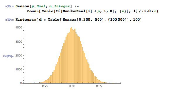
38 CHAPTER 2. MATHEMATICAL PRELIMINARIES
Figure 2.5: Sample variance on hitters with a real 30% success rate results in a
wide range of observed performance even over 500 trials per season.
year usually underperforms the market the year after, which shouldn’t
happen if this outstanding performance was due to skill rather than luck.
The fund managers themselves are quick to credit profitable years to their
own genius, but losses to unforeseeable circumstances. However, several
studies have shown that the performance of professional investors is es-
sentially random, meaning there is little real difference in skill. Most
investors are paying managers for previously-used luck. So why do these
entrail-readers get paid so much money?
•Sports performance: Students have good semesters and bad semesters, as
reflected by their grade point average (GPA). Athletes have good and bad
seasons, as reflected by their performance and statistics. Do such changes
reflect genuine differences in effort and ability, or are they just variance?
In baseball, .300 hitters (players who hit with a 30% success rate) represent
consistency over a full season. Batting .275 is not a noteworthy season,
but hit .300 and you are a star. Hit .325 and you are likely to be the
batting champion.
Figure 2.5 shows the results of a simple simulation, where random numbers
were used to decide the outcome of each at-bat over a 500 at-bats/season.
Our synthetic player is a real .300 hitter, because we programmed it to
report a hit with probability 300/1000 (0.3). The results show that a real
.300 hitter has a 10% chance of hitting .275 or below, just by chance.
Such a season will typically be explained away by injuries or maybe the
inevitable effects of age on athletic performance. But it could just be
natural variance. Smart teams try to acquire a good hitter after a lousy
season, when the price is cheaper, trying to take advantage of this variance.
Our .300 hitter also has a 10% chance of batting above .325, but you
2.2. DESCRIPTIVE STATISTICS 39
can be pretty sure that they will ascribe such a breakout season to their
improved conditioning or training methods instead of the fact they just
got lucky. Good or bad season, or lucky/unlucky: it is hard to tell the
signal from the noise.
•Model performance: As data scientists, we will typically develop and eval-
uate several models for each predictive challenge. The models may range
from very simple to complex, and vary in their training conditions or
parameters.
Typically the model with the best accuracy on the training corpus will
be paraded triumphantly before the world as the right one. But small
differences in the performance between models is likely explained by sim-
ple variance rather than wisdom: which training/evaluation pairs were
selected, how well parameters were optimized, etc.
Remember this when it comes to training machine learning models. In-
deed, when asked to choose between models with small performance dif-
ferences between them, I am more likely to argue for the simplest model
than the one with the highest score. Given a hundred people trying to
predict heads and tails on a stream of coin tosses, one of them is guar-
anteed to end up with the most right answers. But there is no reason to
believe that this fellow has any better predictive powers than the rest of
us.
2.2.4 Characterizing Distributions
Distributions do not necessarily have much probability mass exactly at the
mean. Consider what your wealth would look like after you borrow $100 million,
and then bet it all on an even money coin flip. Heads you are now $100 million
in clear, tails you are $100 million in hock. Your expected wealth is zero, but
this mean does not tell you much about the shape of your wealth distribution.
However, taken together the mean and standard deviation do a decent job
of characterizing any distribution. Even a relatively small amount of mass
positioned far from the mean would add a lot to the standard deviation, so a
small value of σimplies the bulk of the mass must be near the mean.
To be precise, regardless of how your data is distributed, at least (1 −
(1/k2))th of the mass must lie within ±kstandard deviations of the mean.
This means that at least 75% of all the data must lie within 2σof the mean,
and almost 89% within 3σfor any distribution.
We will see that even tighter bounds hold when we know the distribution is
well-behaved, like the Gaussian or normal distribution. But this is why it is a
great practice to report both µand σwhenever you talk about averages. The
average height of adult women in the United States is 63.7±2.7 inches, meaning
µ= 63.7 and σ= 2.7. The average temperature in Orlando, Fl is 60.3 degrees
Fahrenheit. However, there have been many more 100 degree days at Disney
World than 100 inch (8.33 foot) women visiting to enjoy them.

40 CHAPTER 2. MATHEMATICAL PRELIMINARIES
Take-Home Lesson: Report both the mean and standard deviation to charac-
terize your distribution, written as µ±σ.
2.3 Correlation Analysis
Suppose we are given two variables xand y, represented by a sample of npoints
of the form (xi, yi), for 1 ≤i≤n. We say that xand yare correlated when the
value of xhas some predictive power on the value of y.
The correlation coefficient r(X, Y ) is a statistic that measures the degree
to which Yis a function of X, and vice versa. The value of the correlation
coefficient ranges from −1 to 1, where 1 means fully correlated and 0 implies
no relation, or independent variables. Negative correlations imply that the
variables are anti-correlated, meaning that when Xgoes up, Ygoes down.
Perfectly anti-correlated variables have a correlation of −1. Note that nega-
tive correlations are just as good for predictive purposes as positive ones. That
you are less likely to be unemployed the more education you have is an example
of a negative correlation, so the level of education can indeed help predict job
status. Correlations around 0 are useless for forecasting.
Observed correlations drives many of the predictive models we build in data
science. Representative strengths of correlations include:
•Are taller people more likely to remain lean? The observed correlation
between height and BMI is r=−0.711, so height is indeed negatively
correlated with body mass index (BMI).3
•Do standardized tests predict the performance of students in college? The
observed correlation between SAT scores and freshmen GPA is r= 0.47,
so yes, there is some degree of predictive power. But social economic
status is just as strongly correlated with SAT scores (r= 0.42).4
•Does financial status affect health? The observed correlation between
household income and the prevalence of coronary artery disease is r=
−0.717, so there is a strong negative correlation. So yes, the wealthier
you are, the lower your risk of having a heart attack.5
•Does smoking affect health? The observed correlation between a group’s
propensity to smoke and their mortality rate is r= 0.716, so for G-d’s
sake, don’t smoke.6
3https://onlinecourses.science.psu.edu/stat500/node/60
4https://research.collegeboard.org/sites/default/files/publications/2012/9/
researchreport-2009-1-socioeconomic-status-sat-freshman-gpa-analysis-data.pdf
5http://www.ncbi.nlm.nih.gov/pmc/articles/PMC3457990/.
6http://lib.stat.cmu.edu/DASL/Stories/SmokingandCancer.html.

2.3. CORRELATION ANALYSIS 41
•Do violent video games increase aggressive behavior? The observed cor-
relation between play and violence is r= 0.19, so there is a weak but
significant correlation.7
This section will introduce the primary measurements of correlation. Fur-
ther, we study how to appropriately determine the strength and power of any
observed correlation, to help us understand when the connections between vari-
ables are real.
2.3.1 Correlation Coefficients: Pearson and Spearman Rank
In fact, there are two primary statistics used to measure correlation. Mercifully,
both operate on the same −1 to 1 scale, although they measure somewhat
different things. These different statistics are appropriate in different situations,
so you should be aware of both of them.
The Pearson Correlation Coefficient
The more prominent of the two statistics is Pearson correlation, defined as
r=Pn
i=1(Xi−¯
X)(Yi−¯
Y)
qPn
i=1(Xi−¯
X)2qPn
i=1(Yi−¯
Y)2
=Cov(X, Y )
σ(X)σ(Y)
Let’s parse this equation. Suppose Xand Yare strongly correlated. Then
we would expect that when xiis greater than the mean ¯
X, then yishould be
bigger than its mean ¯
Y. When xiis lower than its mean, yishould follow. Now
look at the numerator. The sign of each term is positive when both values are
above (1 ×1) or below (−1×−1) their respective means. The sign of each term
is negative ((−1×1) or (1 ×−1)) if they move in opposite directions, suggesting
negative correlation. If Xand Ywere uncorrelated, then positive and negative
terms should occur with equal frequency, offsetting each other and driving the
value to zero.
The numerator’s operation determining the sign of the correlation is so useful
that we give it a name, covariance, computed:
Cov(X, Y ) =
n
X
i=1
(Xi−¯
X)(Yi−¯
Y).
Remember covariance: we will see it again in Section 8.2.3.
The denominator of the Pearson formula reflects the amount of variance in
the two variables, as measured by their standard deviations. The covariance
between Xand Ypotentially increases with the variance of these variables, and
this denominator is the magic amount to divide it by to bring correlation to a
−1 to 1 scale.
7http://webspace.pugetsound.edu/facultypages/cjones/chidev/Paper/Articles/
Anderson-Aggression.pdf.
42 CHAPTER 2. MATHEMATICAL PRELIMINARIES
Figure 2.6: The function y=|x|does not have a linear model, but seems like it
should be easily fitted despite weak correlations.
The Spearman Rank Correlation Coefficient
The Pearson correlation coefficient defines the degree to which a linear predictor
of the form y=m·x+bcan fit the observed data. This generally does a good job
measuring the similarity between the variables, but it is possible to construct
pathological examples where the correlation coefficient between Xand Yis zero,
yet Yis completely dependent on (and hence perfectly predictable from) X.
Consider points of the form (x, |x|), where xis uniformly (or symmetrically)
sampled from the interval [−1,1] as shown in Figure 2.6. The correlation will
be zero because for every point (x, x) there will be an offsetting point (−x, x),
yet y=|x|is a perfect predictor. Pearson correlation measures how well the
best linear predictors can work, but says nothing about weirder functions like
absolute value.
The Spearman rank correlation coefficient essentially counts the number of
pairs of input points which are out of order. Suppose that our data set contains
points (x1, y1) and (x2, y2) where x1< x2and y1< y2. This is a vote that
the values are positively correlated, whereas the vote would be for a negative
correlation if y2< y1.
Summing up over all pairs of points and normalizing properly gives us Spear-
man rank correlation. Let rank(xi) be the rank position of xiin sorted order
among all xi, so the rank of the smallest value is 1 and the largest value n. Then
ρ= 1 −6Pd2
i
n(n2−1)
where di=rank(xi)−rank(yi).
The relationship between our two coefficients is better delineated by the
example in Figure 2.7. In addition to giving high scores to non-linear but
monotonic functions, Spearman correlation is less sensitive to extreme outlier
elements than Pearson. Let p= (x1, ymax) be the data point with largest value
2.3. CORRELATION ANALYSIS 43
Figure 2.7: A monotonic but not linear point set has a Spearman coefficient
r= 1 even though it has no good linear fit (left). Highly-correlated sequences
are recognized by both coefficients (center), but the Pearson coefficient is much
more sensitive to outliers (right).
of yin a given data set. Suppose we replace pwith p0= (x1,∞). The Pearson
correlation will go crazy, since the best fit now becomes the vertical line x=x1.
But the Spearman correlation will be unchanged, since all the points were under
p, just as they are now under p0.
2.3.2 The Power and Significance of Correlation
The correlation coefficient rreflects the degree to which xcan be used to predict
yin a given sample of points S. As |r| → 1, these predictions get better and
better.
But the real question is how this correlation will hold up in the real world,
outside the sample. Stronger correlations have larger |r|, but also involve sam-
ples of enough points to be significant. There is a wry saying that if you want
to fit your data by a straight line, it is best to sample it at only two points.
Your correlation becomes more impressive the more points it is based on.
The statistical limits in interpreting correlations are presented in Figure 2.8,
based on strength and size:
•Strength of correlation: R2: The square of the sample correlation coef-
ficient r2estimates the fraction of the variance in Yexplained by Xin
a simple linear regression. The correlation between height and weight is
approximately 0.8, meaning it explains about two thirds of the variance.
Figure 2.8 (left) shows how rapidly r2decreases with r. There is a pro-
found limit to how excited we should get about establishing a weak corre-
lation. A correlation of 0.5 possesses only 25% of the maximum predictive
power, and a correlation of r= 0.1 only 1%. Thus the predictive value of
correlations decreases rapidly with r.
What do we mean by “explaining the variance”? Let f(x) = mx+cbe the
44 CHAPTER 2. MATHEMATICAL PRELIMINARIES
Figure 2.8: Limits in interpreting significance. The r2value shows that weak
correlations explain only a small fraction of the variance (left). The level of cor-
relation necessary to be statistically significance decreases rapidly with sample
size n(right).
Figure 2.9: Plotting ri=yi−f(xi) shows that the residual values have lower
variance and mean zero. The original data points are on the left, with the
corresponding residuals on the right.
2.3. CORRELATION ANALYSIS 45
predictive value of yfrom x, with the parameters mand ccorresponding
to the best possible fit. The residual values ri=yi−f(xi) will have mean
zero, as shown in Figure 2.9. Further, the variance of the full data set
V(Y) should be much larger than V(r) if there is a good linear fit f(x).
If xand yare perfectly correlated, there should be no residual error, and
V(r) = 0. If xand yare totally uncorrelated, the fit should contribute
nothing, and V(y)≈V(r). Generally speaking, 1 −r2=V(r)/V (y).
Consider Figure 2.9, showing a set of points (left) admitting a good linear
fit, with correlation r= 0.94. The corresponding residuals ri=yi−f(xi)
are plotted on the right. The variance of the yvalues on the left V(y) =
0.056, substantially greater than the variance V(r)=0.0065 on the right.
Indeed,
1−r2= 0.116 ←→ V(r)/V (y)=0.116.
•Statistical significance: The statistical significance of a correlation depends
upon its sample size nas well as r. By tradition, we say that a correlation
of npoints is significant if there is an α≤1/20 = 0.05 chance that we
would observe a correlation as strong as rin any random set of npoints.
This is not a particularly strong standard. Even small correlations become
significant at the 0.05 level with large enough sample sizes, as shown in
Figure 2.8 (right). A correlation of r= 0.1 becomes significant at α=
0.05 around n= 300, even though such a factor explains only 1% of the
variance.
Weak but significant correlations can have value in big data models involving
large numbers of features. Any single feature/correlation might explain/predict
only small effects, but taken together a large number of weak but independent
correlations may have strong predictive power. Maybe. We will discuss signifi-
cance again in greater detail in Section 5.3.
2.3.3 Correlation Does Not Imply Causation!
You have heard this before: correlation does not imply causation:
•The number of police active in a precinct correlate strongly with the local
crime rate, but the police do not cause the crime.
•The amount of medicine people take correlates with the probability they
are sick, but the medicine does not cause the illness.
At best, the implication works only one way. But many observed correlations
are completely spurious, with neither variable having any real impact on the
other.
Still, correlation implies causation is a common error in thinking, even among
those who understand logical reasoning. Generally speaking, few statistical tools
are available to tease out whether Areally causes B. We can conduct controlled
experiments, if we can manipulate one of the variables and watch the effect on
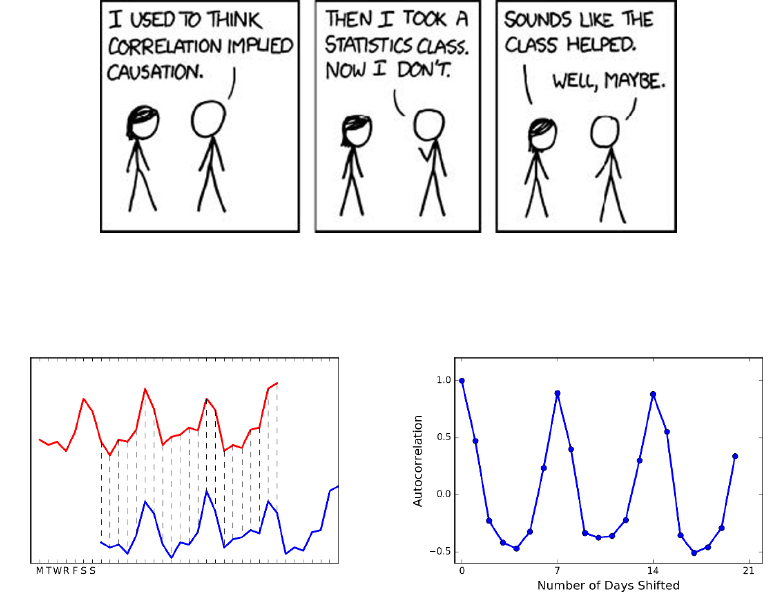
46 CHAPTER 2. MATHEMATICAL PRELIMINARIES
Figure 2.10: Correlation does not imply causation. (Source https://www.xkcd.
com/552.)
Figure 2.11: Cyclic trends in a time series (left) are revealed through correlating
it against shifts of itself (right) .
the other. For example, the fact that we can put people on a diet that makes
them lose weight without getting shorter is convincing evidence that weight does
not cause height. But it is often harder to do these experiments the other way,
e.g. there is no reasonable way to make people shorter other than by hacking
off limbs.
2.3.4 Detecting Periodicities by Autocorrelation
Suppose a space alien was hired to analyze U.S. sales at a toy company. Instead
of a nice smooth function showing a consistent trend, they would be astonished
to see a giant bump every twelfth month, every year. This alien would have
discovered the phenomenon of Christmas.
Seasonal trends reflect cycles of a fixed duration, rising and falling in a reg-
ular pattern. Many human activities proceed with a seven-day cycle associated
with the work week. Large populations of a type of insect called a cicada emerge
on a 13-year or 17-year cycle, in an effort to prevent predators from learning to
2.4. LOGARITHMS 47
eat them.
How can we recognize such cyclic patterns in a sequence S? Suppose we
correlate the values of Siwith Si+p, for all 1 ≤i≤n−p. If the values are in sync
for a particular period length p, then this correlation with itself will be unusually
high relative to other possible lag values. Comparing a sequence to itself is called
an autocorrelation, and the series of correlations for all 1 ≤k≤n−1 is called
the autocorrelation function. Figure 2.11 presents a time series of daily sales,
and the associated autocorrelation function for this data. The peak at a shift of
seven days (and every multiple of seven days) establishes that there is a weekly
periodicity in sales: more stuff gets sold on weekends.
Autocorrelation is an important concept in predicting future events, because
it means we can use previous observations as features in a model. The heuristic
that tomorrow’s weather will be similar to today’s is based on autocorrelation,
with a lag of p= 1 days. Certainly we would expect such a model to be
more accurate than predictions made on weather data from six months ago (lag
p= 180 days).
Generally speaking, the autocorrelation function for many quantities tends
to be highest for very short lags. This is why long-term predictions are less accu-
rate than short-term forecasts: the autocorrelations are generally much weaker.
But periodic cycles do sometimes stretch much longer. Indeed, a weather fore-
cast based on a lag of p= 365 days will be much better than one of p= 180,
because of seasonal effects.
Computing the full autocorrelation function requires calculating n−1 differ-
ent correlations on points of the time series, which can get expensive for large n.
Fortunately, there is an efficient algorithm based on the fast Fourier transform
(FFT), which makes it possible to construct the autocorrelation function even
for very long sequences.
2.4 Logarithms
The logarithm is the inverse exponential function y=bx, an equation that can
be rewritten as x= logby. This definition is the same as saying that
blogby=y.
Exponential functions grow at a very fast rate: consider b={21,22,23,24, . . .}.
In contrast, logarithms grow a very slow rate: these are just the exponents of
the previous series {1,2,3,4, . . .}. They are associated with any process where
we are repeatedly multiplying by some value of b, or repeatedly dividing by b.
Just remember the definition:
y= logbx←→ by=x.
Logarithms are very useful things, and arise often in data analysis. Here
I detail three important roles logarithms play in data science. Surprisingly,
only one of them is related to the seven algorithmic applications of logarithms

48 CHAPTER 2. MATHEMATICAL PRELIMINARIES
I present in The Algorithm Design Manual [Ski08]. Logarithms are indeed very
useful things.
2.4.1 Logarithms and Multiplying Probabilities
Logarithms were first invented as an aide to computation, by reducing the prob-
lem of multiplication to that of addition. In particular, to compute the product
p=x·y, we could compute the sum of the logarithms s= logbx+ logbyand
then take the inverse of the logarithm (i.e. raising bto the sth power) to get p,
because:
p=x·y=b(logbx+logby).
This is the trick that powered the mechanical slide rules that geeks used in the
days before pocket calculators.
However, this idea remains important today, particularly when multiplying
long chains of probabilities. Probabilities are small numbers. Thus multiplying
long chains of probability yield very small numbers that govern the chances of
very rare events. There are serious numerical stability problems with floating
point multiplication on real computers. Numerical errors will creep in, and will
eventually overwhelm the true value of small-enough numbers.
Summing the logarithms of probabilities is much more numerically stable
than multiplying them, but yields an equivalent result because:
n
Y
i=1
pi=bP, where P=
n
X
i=1
logb(pi).
We can raise our sum to an exponential if we need the real probability, but
usually this is not necessary. When we just need to compare two probabilities
to decide which one is larger we can safely stay in log world, because bigger
logarithms correspond to bigger probabilities.
There is one quirk to be aware of. Recall that the log2(1
2) = −1. The
logarithms of probabilities are all negative numbers except for log(1) = 0. This
is the reason why equations with logs of probabilities often feature negative
signs in strange places. Be on the lookout for them.
2.4.2 Logarithms and Ratios
Ratios are quantities of the form a/b. They occur often in data sets either as
elementary features or values derived from feature pairs. Ratios naturally occur
in normalizing data for conditions (i.e. weight after some treatment over the
initial weight) or time (i.e. today’s price over yesterday’s price).
But ratios behave differently when reflecting increases than decreases. The
ratio 200/100 is 200% above baseline, but 100/200 is only 50% below despite
being a similar magnitude change. Thus doing things like averaging ratios is
committing a statistical sin. Do you really want a doubling followed by a halving
to average out as an increase, as opposed to a neutral change?
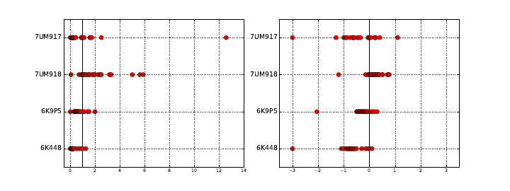
2.4. LOGARITHMS 49
Figure 2.12: Plotting ratios on a scale cramps the space allocated to small ratios
relative to large ratios (left). Plotting the logarithms of ratios better represents
the underlying data (right).
One solution here would have been to use the geometric mean. But better is
taking the logarithm of these ratios, so that they yield equal displacement, since
log22 = 1 and log2(1/2) = −1. We get the extra bonus that a unit ratio maps
to zero, so positive and negative numbers correspond to improper and proper
ratios, respectively.
A rookie mistake my students often make involves plotting the value of ratios
instead of their logarithms. Figure 2.12 (left) is a graph from a student paper,
showing the ratio of new score over old score on data over 24 hours (each red
dot is the measurement for one hour) on four different data sets (each given a
row). The solid black line shows the ratio of one, where both scores give the
same result. Now try to read this graph: it isn’t easy because the points on the
left side of the line are cramped together in a narrow strip. What jumps out at
you are the outliers. Certainly the new algorithm does terrible on 7UM917 in
the top row: that point all the way to the right is a real outlier.
Except that it isn’t. Now look at Figure 2.12 (right), where we plot the
logarithms of the ratios. The space devoted to left and right of the black line
can now be equal. And it shows that this point wasn’t really such an outlier at
all. The magnitude of improvement of the leftmost points is much greater than
that of the rightmost points. This plot reveals that new algorithm generally
makes things better, only because we are showing logs of ratios instead of the
ratios themselves.
2.4.3 Logarithms and Normalizing Skewed Distributions
Variables which follow symmetric, bell-shaped distributions tend to be nice as
features in models. They show substantial variation, so they can be used to
discriminate between things, but not over such a wide range that outliers are
overwhelming.
But not every distribution is symmetric. Consider the one in Figure 2.13
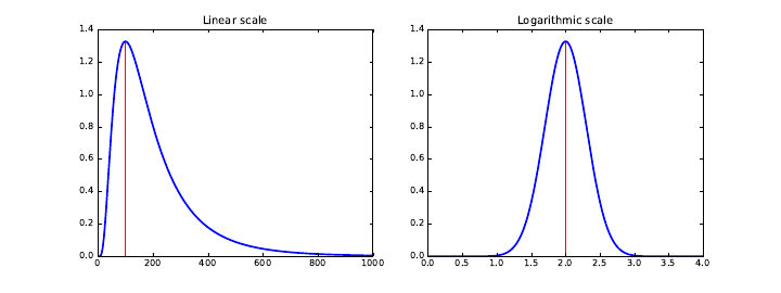
50 CHAPTER 2. MATHEMATICAL PRELIMINARIES
Figure 2.13: Hitting a skewed data distribution (left) with a log often yields a
more bell-shaped distribution (right).
(left). The tail on the right goes much further than the tail on the left. And
we are destined to see far more lopsided distributions when we discuss power
laws, in Section 5.1.5. Wealth is representative of such a distribution, where
the poorest human has zero or perhaps negative wealth, the average person
(optimistically) is in the thousands of dollars, and Bill Gates is pushing $100
billion as of this writing.
We need a normalization to convert such distributions into something easier
to deal with. To ring the bell of a power law distribution we need something
non-linear, that reduces large values to a disproportionate degree compared to
more modest values.
The logarithm is the transformation of choice for power law variables. Hit
your long-tailed distribution with a log and often good things happen. The
distribution in Figure 2.13 happened to be the log normal distribution, so taking
the logarithm yielded a perfect bell-curve on right. Taking the logarithm of
variables with a power law distribution brings them more in line with traditional
distributions. For example, as an upper-middle class professional, my wealth is
roughly the same number of logs from my starving students as I am from Bill
Gates!
Sometimes taking the logarithm proves too drastic a hit, and a less dramatic
non-linear transformation like the square root works better to normalize a dis-
tribution. The acid test is to plot a frequency distribution of the transformed
values and see if it looks bell-shaped: grossly-symmetric, with a bulge in the
middle. That is when you know you have the right function.
2.5 War Story: Fitting Designer Genes
The word bioinformatician is life science speak for “data scientist,” the prac-
titioner of an emerging discipline which studies massive collections of DNA
sequence data looking for patterns. Sequence data is very interesting to work

2.5. WAR STORY: FITTING DESIGNER GENES 51
with, and I have played bioinformatician in research projects since the very
beginnings of the human genome project.
DNA sequences are strings on the four letter alphabet {A, C, G, T }. Proteins
form the stuff that we are physically constructed from, and are composed of
strings of 20 different types of molecular units, called amino acids. Genes are
the DNA sequences which describe exactly how to make specific proteins, with
the units each described by a triplet of {A, C, G, T }s called codons.
For our purposes, it suffices to know that there are a huge number of possible
DNA sequences describing genes which could code for any particular desired
protein sequence. But only one of them is used. My biologist collaborators and
I wanted to know why.
Originally, it was assumed that all of these different synonymous encodings
were essentially identical, but statistics performed on sequence data made it
clear that certain codons are used more often than others. The biological con-
clusion is that “codons matter,” and there are good biological reasons why this
should be.
We became interested in whether “neighboring pairs of codon matter.” Per-
haps certain pairs of triples are like oil and water, and hate to mix. Certain
letter pairs in English have order preferences: you see the bigram gh far more
often than hg. Maybe this is true of DNA as well? If so, there would be pairs
of triples which should be underrepresented in DNA sequence data.
To test this, we needed a score comparing the number of times we actually
see a particular triple (say x=CAT ) next to another particular triple (say
y=GAG) to what we would expect by chance. Let F(xy) be the frequency
of xy, number of times we actually see codon xfollowed by codon yin the
DNA sequence database. These codons code for specific amino acids, say a
and brespectively. For amino acid a, the probability that it will be coded by
xis P(x) = F(x)/F (a), and similarly P(y) = F(y)/F (b). Then the expected
number of times of seeing xy is
Expected(xy) = F(x)
F(a)F(y)
F(b)F(ab)
Based on this, we can compute a codon pair score for any given hexamer xy
as follows:
CP S(xy) = ln Observed(xy)
Expected(xy)= ln
F(xy)
F(x)F(y)
F(a)F(b)F(ab)
Taking the logarithm of this ratio produced very nice properties. Most im-
portantly, the sign of the score distinguished over-represented pairs from under-
represented pairs. Because the magnitudes were symmetric (+1 was just as
impressive as −1) we could add or average these scores in a sensible way to give
a score for each gene. We used these scores to design genes that should be bad
for viruses, which gave an exciting new technology for making vaccines. See the
chapter notes (Section 2.6) for more details.
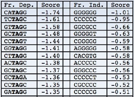
52 CHAPTER 2. MATHEMATICAL PRELIMINARIES
Figure 2.14: Patterns in DNA sequences with the lowest codon pair scores
become obvious on inspection. When interpreted in-frame, the stop symbol
TAG is substantially depleted (left). When interpreted in the other two frames,
the most avoided patterns are all very low complexity, like runs of a single base
(right)
Knowing that certain pairs of codons were bad did not explain why they were
bad. But by computing two related scores (details unimportant) and sorting
the triplets based on them, as shown in Figure 2.14, certain patterns popped
out. Do you notice the patterns? All the bad sequences on the left contain
T AG, which turns out to be a special codon that tells the gene to stop. And
all the bad sequences on the right consist of Cand Gin very simple repetitive
sequences. These explain biologically why patterns are avoided by evolution,
meaning we discovered something very meaningful about life.
There are two take-home lessons from this story. First, developing numerical
scoring functions which highlight specific aspects of items can be very useful
to reveal patterns. Indeed, Chapter 4 will focus on the development of such
systems. Second, hitting such quantities with a logarithm can make them even
more useful, enabling us to see the forest for the trees.
2.6 Chapter Notes
There are many excellent introductions to probability theory available, including
[Tij12, BT08]. The same goes for elementary statistics, with good introductory
texts including [JWHT13, Whe13]. The brief history of probability theory in
this chapter is based on Weaver [Wea82].
In its strongest form, the efficient market hypothesis states that the stock
market is essentially unpredictable using public information. My personal advice
is that you should invest in index funds that do not actively try to predict the
direction of the market. Malkiel’s A Random Walk Down Wall Street [Mal99]
2.7. EXERCISES 53
is an excellent introduction to such investment thinking.
The Fast Fourier Transform (FFT) provides an O(nlog n) time algorithm to
compute the full autocorrelation function of an n-element sequence, where the
straightforward computation of ncorrelations takes O(n2). Bracewell [Bra99]
and Brigham [Bri88] are excellent introductions to Fourier transforms and the
FFT. See also the exposition in Press et.al. [PFTV07].
The comic strip in Figure 2.10 comes from Randall Munroe’s webcomic xkcd,
specifically https://xkcd.com/552, and is reprinted with permission.
The war story of Section 2.5 revolves around our work on how the phe-
nomenon of codon pair bias affects gene translation. Figure 2.14 comes from
my collaborator Justin Gardin. See [CPS+08, MCP+10, Ski12] for discussions
of how we exploited codon pair bias to design vaccines for viral diseases like
polio and the flu.
2.7 Exercises
Probability
2-1. [3] Suppose that 80% of people like peanut butter, 89% like jelly, and 78% like
both. Given that a randomly sampled person likes peanut butter, what is the
probability that she also likes jelly?
2-2. [3] Suppose that P(A) = 0.3 and P(B) = 0.7.
(a) Can you compute P(Aand B) if you only know P(A) and P(B)?
(b) Assuming that events Aand Barise from independent random processes:
•What is P(Aand B)?
•What is P(Aor B)?
•What is P(A|B)?
2-3. [3] Consider a game where your score is the maximum value from two dice.
Compute the probability of each event from {1,...,6}.
2-4. [8] Prove that the cumulative distribution function of the maximum of a pair of
values drawn from random variable Xis the square of the original cumulative
distribution function of X.
2-5. [5] If two binary random variables Xand Yare independent, are ¯
X(the com-
plement of X) and Yalso independent? Give a proof or a counterexample.
Statistics
2-6. [3] Compare each pair of distributions to decide which one has the greater
mean and the greater standard deviation. You do not need to calculate the
actual values of µand σ, just how they compare with each other.
(a) i. 3,5,5,5,8,11,11,11,13.
ii. 3,5,5,5,8,11,11,11,20.
(b) i. −20,0,0,0,15,25,30,30.
ii. −40,0,0,0,15,25,30,30.
54 CHAPTER 2. MATHEMATICAL PRELIMINARIES
(c) i. 0,2,4,6,8,10.
ii. 20,22,24,26,28,30.
(d) i. 100,200,300,400,500.
ii. 0,50,300,550,600.
2-7. [3] Construct a probability distribution where none of the mass lies within one
σof the mean.
2-8. [3] How does the arithmetic and geometric mean compare on random integers?
2-9. [3] Show that the arithmetic mean equals the geometric mean when all terms
are the same.
Correlation Analysis
2-10. [3] True or false: a correlation coefficient of −0.9 indicates a stronger linear
relationship than a correlation coefficient of 0.5. Explain why.
2-11. [3] What would be the correlation coefficient between the annual salaries of
college and high school graduates at a given company, if for each possible job
title the college graduates always made:
(a) $5,000 more than high school grads?
(b) 25% more than high school grads?
(c) 15% less than high school grads?
2-12. [3] What would be the correlation between the ages of husbands and wives if
men always married woman who were:
(a) Three years younger than themselves?
(b) Two years older than themselves?
(c) Half as old as themselves?
2-13. [5] Use data or literature found in a Google search to estimate/measure the
strength of the correlation between:
(a) Hits and walks scored for hitters in baseball.
(b) Hits and walks allowed by pitchers in baseball.
2-14. [5] Compute the Pearson and Spearman Rank correlations for uniformly drawn
samples of points (x, xk). How do these values change as a function of increasing
k?
Logarithms
2-15. [3] Show that the logarithm of any number less than 1 is negative.
2-16. [3] Show that the logarithm of zero is undefined.
2-17. [5] Prove that
x·y=b(logbx+logby)
2-18. [5] Prove the correctness of the formula for changing a base-blogarithm to base-
a, that
loga(x) = logb(x)/logb(a).
2.7. EXERCISES 55
Implementation Projects
2-19. [3] Find some interesting data sets, and compare how similar their means and
medians are. What are the distributions where the mean and median differ on
the most?
2-20. [3] Find some interesting data sets and search all pairs for interesting correla-
tions. Perhaps start with what is available at http://www.data-manual.com/
data. What do you find?
Interview Questions
2-21. [3] What is the probability of getting exactly kheads on ntosses, where the
coin has a probability of pin coming up heads on each toss? What about kor
more heads?
2-22. [5] Suppose that the probability of getting a head on the ith toss of an ever-
changing coin is f(i). How would you efficiently compute the probability of
getting exactly kheads in ntosses?
2-23. [5] At halftime of a basketball game you are offered two possible challenges:
(a) Take three shots, and make at least two of them.
(b) Take eight shots, and make at least five of them.
Which challenge should you pick to have a better chance of winning the game?
2-24. [3] Tossing a coin ten times resulted in eight heads and two tails. How would
you analyze whether a coin is fair? What is the p-value?
2-25. [5] Given a stream of nnumbers, show how to select one uniformly at random
using only constant storage. What if you don’t know nin advance?
2-26. [5] Ak-streak starts at toss iin a sequence of ncoin flips when the outcome of the
ith flip and the next k−1 flips are identical. For example, sequence HTTTHH
contains 2-streaks starting at the second, third, and fifth tosses. What are the
expected number of k-streaks that you will see in ntosses of a fair coin ?
2-27. [5] A person randomly types an eight-digit number into a pocket calculator.
What is the probability that the number looks the same even if the calculator
is turned upside down?
2-28. [3] You play a dice rolling game where you have two choices:
(a) Roll the dice once and get rewarded with a prize equal to the outcome
number (e.g, $3 for number “3”) and then stop the game.
(b) You can reject the first reward according to its outcome and roll the dice
a second time, and get rewarded in the same way.
Which strategy should you choose to maximize your reward? That is, for what
outcomes of the first roll should you chose to play the second game? What is
the statistical expectation of reward if you choose the second strategy?
2-29. [3] What is A/B testing and how does it work?
2-30. [3] What is the difference between statistical independence and correlation?
2-31. [3] We often say that correlation does not imply causation. What does this
mean?
56 CHAPTER 2. MATHEMATICAL PRELIMINARIES
2-32. [5] What is the difference between a skewed distribution and a uniform one?
Kaggle Challenges
2-33. Cause–effect pairs: correlation vs. causation.
https://www.kaggle.com/c/cause-effect-pairs
2-34. Predict the next “random number” in a sequence.
https://www.kaggle.com/c/random-number-grand-challenge
2-35. Predict the fate of animals at a pet shelter.
https://www.kaggle.com/c/shelter-animal-outcomes
Chapter 3
Data Munging
On two occasions I have been asked, “Pray, Mr. Babbage, if you put
into the machine wrong figures, will the right answers come out?”
. . . I am not able rightly to apprehend the kind of confusion of ideas
that could provoke such a question.
– Charles Babbage
Most data scientists spend much of their time cleaning and formatting data.
The rest spend most of their time complaining that there is no data available
to do what they want to do.
In this chapter, we will work through some of the basic mechanics of com-
puting with data. Not the high-faluting stuff like statistics or machine learning,
but the grunt work of finding data and cleaning it that goes under the moniker
of data munging.
While practical questions like “What is the best library or programming
language available?” are clearly important, the answers change so rapidly that
a book like this one is the wrong place to address them. So I will stick at the
level of general principles, instead of shaping this book around a particular set
of software tools. Still, we will discuss the landscape of available resources in
this chapter: why they exist, what they do, and how best to use them.
The first step in any data science project is getting your hands on the right
data. But this is often distressingly hard. This chapter will survey the richest
hunting grounds for data resources, and then introduce techniques for cleaning
what you kill. Wrangling your data so you that can safely analyze it is critical
for meaningful results. As Babbage himself might have said more concisely,
“garbage in, garbage out.”
3.1 Languages for Data Science
In theory, every sufficiently powerful programming language is capable of ex-
pressing any algorithm worth computing. But in practice, certain programming
58 CHAPTER 3. DATA MUNGING
languages prove much better than others at specific tasks. Better here might
denote easier for the programmer or perhaps more computationally efficient,
depending upon the mission at hand.
The primary data science programming languages to be aware of are:
•Python: This is today’s bread-and-butter programming language for data
science. Python contains a variety of language features to make basic
data munging easier, like regular expressions. It is an interpreted lan-
guage, making the development process quicker and enjoyable. Python
is supported by an enormous variety of libraries, doing everything from
scraping to visualization to linear algebra and machine learning.
Perhaps the biggest strike against Python is efficiency: interpreted lan-
guages cannot compete with compiled ones for speed. But Python compil-
ers exist in a fashion, and support linking in efficient C/assembly language
libraries for computationally-intensive tasks. Bottom line, Python should
probably be your primary tool in working through the material we present
in this book.
•Perl: This used to be the go to language for data munging on the web,
before Python ate it for lunch. In the TIOBE programming language pop-
ularity index (http://www.tiobe.com/tiobe-index), Python first ex-
ceeded Perl in popularity in 2008 and hasn’t looked back. There are several
reasons for this, including stronger support for object-oriented program-
ming and better available libraries, but the bottom line is that there are
few good reasons to start projects in Perl at this point. Don’t be surprised
if you encounter it in some legacy project, however.
•R: This is the programming language of statisticians, with the deepest
libraries available for data analysis and visualization. The data science
world is split between R and Python camps, with R perhaps more suit-
able for exploration and Python better for production use. The style of
interaction with R is somewhat of an acquired taste, so I encourage you
to play with it a bit to see whether it feels natural to you.
Linkages exist between R and Python, so you can conveniently call R
library functions in Python code. This provides access to advanced statis-
tical methods, which may not be supported by the native Python libraries.
•Matlab: The Mat here stands for matrix, as Matlab is a language de-
signed for the fast and efficient manipulation of matrices. As we will see,
many machine learning algorithms reduce to operations on matrices, mak-
ing Matlab a natural choice for engineers programming at a high-level of
abstraction.
Matlab is a proprietary system. However, much of its functionality is
available in GNU Octave, an open-source alternative.

3.1. LANGUAGES FOR DATA SCIENCE 59
•Java and C/C++: These mainstream programming languages for the
development of large systems are important in big data applications. Par-
allel processing systems like Hadoop and Spark are based on Java and
C++, respectively. If you are living in the world of distributed comput-
ing, then you are living in a world of Java and C++ instead of the other
languages listed here.
•Mathematica/Wolfram Alpha: Mathematica is a proprietary system pro-
viding computational support for all aspects of numerical and symbolic
mathematics, built upon the less proprietary Wolfram programming lan-
guage. It is the foundation of the Wolfram Alpha computational knowl-
edge engine, which processes natural language-like queries through a mix
of algorithms and pre-digested data sources. Check it out at http://www.
wolframalpha.com.
I will confess a warm spot for Mathematica.1It is what I tend to reach
for when I am doing a small data analysis or simulation, but cost has
traditionally put it out of the range of many users. The release of the
Wolfram language perhaps now opens it up to a wider community.
•Excel: Spreadsheet programs like Excel are powerful tools for exploratory
data analysis, such as playing with a given data set to see what it contains.
They deserve our respect for such applications.
Full featured spreadsheet programs contain a surprising amount of hidden
functionality for power users. A student of mine who rose to become a
Microsoft executive told me that 25% of all new feature requests for Excel
proposed functionality already present there. The special functions and
data manipulation features you want probably are in Excel if you look
hard enough, in the same way that a Python library for what you need
probably will be found if you search for it.
3.1.1 The Importance of Notebook Environments
The primary deliverable for a data science project should not be a program. It
should not be a data set. It should not be the results of running the program
on your data. It should not just be a written report.
The deliverable result of every data science project should be a computable
notebook tying together the code, data, computational results, and written
analysis of what you have learned in the process. Figure 3.1 presents an excerpt
from a Jupyter/IPython notebook, showing how it integrates code, graphics,
and documentation into a descriptive document which can be executed like a
program.
The reason this is so important is that computational results are the product
of long chains of parameter selections and design decisions. This creates several
problems that are solved by notebook computing environments:
1Full disclosure: I have known Stephen Wolfram for over thirty years. Indeed, we invented
the iPad together [Bar10, MOR+88].
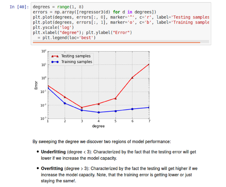
60 CHAPTER 3. DATA MUNGING
Figure 3.1: Jupyter/IPython notebooks tie together code, computational re-
sults, and documentation.

3.1. LANGUAGES FOR DATA SCIENCE 61
•Computations need to be reproducible. We must be able to run the same
programs again from scratch, and get exactly the same result. This means
that data pipelines must be complete: taking raw input and producing the
final output. It is terrible karma to start with a raw data set, do some
processing, edit/format the data files by hand, and then do some more
processing – because what you did by hand cannot be readily done again
on another data set, or undone after you realize that you may have goofed
up.
•Computations must be tweakable. Often reconsideration or evaluation will
prompt a change to one or more parameters or algorithms. This requires
rerunning the notebook to produce the new computation. There is nothing
more disheartening to be given a big data product without provenance and
told that this is the final result and you can’t change anything. A notebook
is never finished until after the entire project is done.
•Data pipelines need to be documented. That notebooks permit you to
integrate text and visualizations with your code provides a powerful way
to communicate what you are doing and why, in ways that traditional
programming environments cannot match.
Take-Home Lesson: Use a notebook environment like IPython or Mathematica
to build and report the results of any data science project.
3.1.2 Standard Data Formats
Data comes from all sorts of places, and in all kinds of formats. Which represen-
tation is best depends upon who the ultimate consumer is. Charts and graphs
are marvelous ways to convey the meaning of numerical data to people. Indeed,
Chapter 6 will focus on techniques for visualizing data. But these pictures are
essentially useless as a source of data to compute with. There is a long way
from printed maps to Google Maps.
The best computational data formats have several useful properties:
•They are easy for computers to parse: Data written in a useful format is
destined to be used again, elsewhere. Sophisticated data formats are often
supported by APIs that govern technical details ensuring proper format.
•They are easy for people to read: Eyeballing data is an essential operation
in many contexts. Which of the data files in this directory is the right one
for me to use? What do we know about the data fields in this file? What
is the gross range of values for each particular field?
These use cases speak to the enormous value of being able to open a data
file in a text editor to look at it. Typically, this means presenting the
data in a human-readable text-encoded format, with records demarcated
by separate lines, and fields separated by delimiting symbols.

62 CHAPTER 3. DATA MUNGING
•They are widely used by other tools and systems: The urge to invent
proprietary data standard beats firmly in the corporate heart, and most
software developers would rather share a toothbrush than a file format.
But these are impulses to be avoided. The power of data comes from
mixing and matching it with other data resources, which is best facilitated
by using popular standard formats.
One property I have omitted from this list is conciseness, since it is generally
not a primary concern for most applications running on modern computing
systems. The quest to minimize data storage costs often works against other
goals. Cleverly packing multiple fields into the higher-order bits of integers saves
space, but at the cost of making it incompatible and unreadable.
General compression utilities like gzip prove amazingly good at removing the
redundancy of human-friendly formatting. Disk prices are unbelievably cheap:
as I write this you can buy a 4TB drive for about $100, meaning less than the
cost of one hour of developer time wasted programming a tighter format. Unless
you are operating at the scale of Facebook or Google, conciseness does not have
nearly the importance you are liable to think it does.2
The most important data formats/representations to be aware of are dis-
cussed below:
•CSV (comma separated value) files: These files provide the simplest, most
popular format to exchange data between programs. That each line repre-
sents a single record, with fields separated by commas, is obvious from in-
spection. But subtleties revolve around special characters and text strings:
what if your data about names contains a comma, like “Thurston Howell,
Jr.” The csv format provides ways to escape code such characters so they
are not treated as delimiters, but it is messy. A better alternative is to
use a rarer delimiter character, as in tsv or tab separated value files.
The best test of whether your csv file is properly formatted is whether
Microsoft Excel or some other spreadsheet program can read it without
hassle. Make sure the results of every project pass this test as soon as the
first csv file has been written, to avoid pain later.
•XML (eXtensible Markup Language): Structured but non-tabular data
are often written as text with annotations. The natural output of a
named-entity tagger for text wraps the relevant substrings of a text in
brackets denoting person, place, or thing. I am writing this book in La-
Tex, a formatting language with bracketing commands positioned around
mathematical expressions and italicized text. All webpages are written in
HTML, the hypertext markup language which organizes documents using
bracketing commands like <b> and </b> to enclose bold faced text.
XML is a language for writing specifications of such markup languages. A
proper XML specification enables the user to parse any document comply-
ing with the specification. Designing such specifications and fully adhering
2Indeed, my friends at Google assure me that they are often slovenly about space even at
the petabyte scale.
3.1. LANGUAGES FOR DATA SCIENCE 63
to them requires discipline, but is worthwhile. In the first version of our
Lydia text analysis system, we wrote our markups in a “pseudo-XML,”
read by ad hoc parsers that handled 99% of the documents correctly but
broke whenever we tried to extend them. After a painful switch to XML,
everything worked more reliably and more efficiently, because we could
deploy fast, open-source XML parsers to handle all the dirty work of en-
forcing our specifications.
•SQL (structured query language) databases: Spreadsheets are naturally
structured around single tables of data. In contrast, relational databases
prove excellent for manipulating multiple distinct but related tables, using
SQL to provide a clunky but powerful query language.
Any reasonable database system imports and exports records as either csv
or XML files, as well as an internal content dump. The internal represen-
tation in databases is opaque, so it really isn’t accurate to describe them
as a data format. Still, I emphasize them here because SQL databases
generally prove a better and more powerful solution than manipulating
multiple data files in an ad hoc manner.
•JSON (JavaScript Object Notation): This is a format for transmitting data
objects between programs. It is a natural way to communicate the state of
variables/data structures from one system to another. This representation
is basically a list of attribute-value pairs corresponding to variable/field
names, and the associated values:
{"employees":[
{"firstName":"John", "lastName":"Doe"},
{"firstName":"Anna", "lastName":"Smith"},
{"firstName":"Peter", "lastName":"Jones"}
]}
Because library functions that support reading and writing JSON objects
are readily available in all modern programming languages, it has become
a very convenient way to store data structures for later use. JSON objects
are human readable, but are quite cluttered-looking, representing arrays of
records compared to CSV files. Use them for complex structured objects,
but not simple tables of data.
•Protocol buffers: These are a language/platform-neutral way of serializing
structured data for communications and storage across applications. They
are essentially lighter weight versions of XML (where you define the format
of your structured data), designed to communicate small amounts of data
across programs like JSON. This data format is used for much of the inter-
machine communication at Google. Apache Thrift is a related standard,
used at Facebook.
64 CHAPTER 3. DATA MUNGING
3.2 Collecting Data
The most critical issue in any data science or modeling project is finding the
right data set. Identifying viable data sources is an art, one that revolves around
three basic questions:
•Who might actually have the data I need?
•Why might they decide to make it available to me?
•How can I get my hands on it?
In this section, we will explore the answers to these questions. We look at
common sources of data, and what you are likely to be able to find and why.
We then review the primary mechanisms for getting access, including APIs,
scraping, and logging.
3.2.1 Hunting
Who has the data, and how can you get it? Some of the likely suspects are
reviewed below.
Companies and Proprietary Data Sources
Large companies like Facebook, Google, Amazon, American Express, and Blue
Cross have amazing amounts of exciting data about users and transactions,
data which could be used to improve how the world works. The problem is that
getting outside access is usually impossible. Companies are reluctant to share
data for two good reasons:
•Business issues, and the fear of helping their competition.
•Privacy issues, and the fear of offending their customers.
A heartwarming tale of what can happen with corporate data release oc-
curred when AOL provided academics with a data set of millions of queries to
its search engine, carefully stripped of identifying information. The first thing
the academics discovered was that the most frequently-entered queries were des-
perate attempts to escape to other search engines like Google. This did nothing
to increase public confidence in the quality of AOL search.
Their second discovery was that it proved much harder to anonymize search
queries than had previously been suspected. Sure you can replace user names
with id numbers, but it is not that hard to figure out who the guy on Long Island
repeatedly querying Steven Skiena,Stony Brook, and https://twitter.com/
search?q=Skiena&src=sprv is. Indeed, as soon as it became publicized that
people’s identities had been revealed by this data release, the responsible party
was fired and the data set disappeared. User privacy is important, and ethical
issues around data science will be discussed in Section 12.7.
3.2. COLLECTING DATA 65
So don’t think you are going to sweet talk companies into releasing confiden-
tial user data. However, many responsible companies like The New York Times,
Twitter, Facebook, and Google do release certain data, typically by rate-limited
application program interfaces (APIs). They generally have two motives:
•Providing customers and third parties with data that can increase sales.
For example, releasing data about query frequency and ad pricing can
encourage more people to place ads on a given platform.
•It is generally better for the company to provide well-behaved APIs than
having cowboys repeatedly hammer and scrape their site.
So hunt for a public API before reading Section 3.2.2 on scraping. You won’t
find exactly the content or volume that you dream of, but probably something
that will suffice to get started. Be aware of limits and terms of use.
Other organizations do provide bulk downloads of interesting data for off-
line analysis, as with the Google Ngrams, IMDb, and the taxi fare data sets
discussed in Chapter 1. Large data sets often come with valuable metadata,
such as book titles, image captions, and edit history, which can be re-purposed
with proper imagination.
Finally, most organizations have internal data sets of relevance to their busi-
ness. As an employee, you should be able to get privileged access while you
work there. Be aware that companies have internal data access policies, so you
will still be subject to certain restrictions. Violating the terms of these policies
is an excellent way to become an ex-employee.
Government Data Sources
Collecting data is one of the important things that governments do. Indeed,
the requirement that the United States conduct a census of its population is
mandated by our constitution, and has been running on schedule every ten
years since 1790.
City, state, and federal governments have become increasingly committed
to open data, to facilitate novel applications and improve how government can
fulfill its mission. The website http://Data.gov is an initiative by the federal
government to centrally collect its data sources, and at last count points to over
100,000 data sets!
Government data differs from industrial data in that, in principle, it belongs
to the People. The Freedom of Information Act (FOI) enables any citizen to
make a formal request for any government document or data set. Such a request
triggers a process to determine what can be released without compromising the
national interest or violating privacy.
State governments operate under fifty different sets of laws, so data that is
tightly held in one jurisdiction may be freely available in others. Major cities
like New York have larger data processing operations than many states, again
with restrictions that vary by location.
66 CHAPTER 3. DATA MUNGING
I recommend the following way of thinking about government records. If
you cannot find what you need online after some snooping around, figure out
which agency is likely to have it. Make a friendly call to them to see if they
can help you find what you want. But if they stonewall you, feel free to try for
a FOI act request. Preserving privacy is typically the biggest issue in deciding
whether a particular government data set can be released.
Academic Data Sets
There is a vast world of academic scholarship, covering all that humanity has
deemed worth knowing. An increasing fraction of academic research involves
the creation of large data sets. Many journals now require making source data
available to other researchers prior to publication. Expect to be able to find
vast amounts of economic, medical, demographic, historical, and scientific data
if you look hard enough.
The key to finding these data sets is to track down the relevant papers.
There is an academic literature on just about any topic of interest. Google
Scholar is the most accessible source of research publications. Search by topic,
and perhaps “Open Science” or “data.” Research publications will typically
provide pointers to where its associated data can be found. If not, contacting
the author directly with a request should quickly yield the desired result.
The biggest catch with using published data sets is that someone else has
worked hard to analyze them before you got to them, so these previously mined
sources may have been sucked dry of interesting new results. But bringing fresh
questions to old data generally opens new possibilities.
Often interesting data science projects involve collaborations between re-
searchers from different disciplines, such as the social and natural sciences.
These people speak different languages than you do, and may seem intimidating
at first. But they often welcome collaboration, and once you get past the jargon
it is usually possible to understand their issues on a reasonable level without
specialized study. Be assured that people from other disciplines are generally
not any smarter than you are.
Sweat Equity
Sometimes you will have to work for your data, instead of just taking it from
others. Much historical data still exists only in books or other paper documents,
thus requiring manual entry and curation. A graph or table might contain
information that we need, but it can be hard to get numbers from a graphic
locked in a PDF (portable document format) file.
I have observed that computationally-oriented people vastly over-estimate
the amount of effort it takes to do manual data entry. At one record per minute,
you can easily enter 1,000 records in only two work days. Instead, computational
people tend to devote massive efforts trying to avoid such grunt work, like
hunting in vain for optical character recognition (OCR) systems that don’t make
3.2. COLLECTING DATA 67
a mess of the file, or spending more time cleaning up a noisy scan than it would
take to just type it in again fresh.
A middle ground here comes in paying someone else to do the dirty work for
you. Crowdsourcing platforms like Amazon Turk and CrowdFlower enable you
to pay for armies of people to help you extract data, or even collect it in the
first place. Tasks requiring human annotation like labeling images or answering
surveys are particularly good use of remote workers. Crowdsourcing will be
discussed in greater detail in Section 3.5.
Many amazing open data resources have been built up by teams of contrib-
utors, like Wikipedia, Freebase, and IMDb. But there is an important concept
to remember: people generally work better when you pay them.
3.2.2 Scraping
Webpages often contain valuable text and numerical data, which we would like
to get our hands on. For example, in our project to build a gambling system
for the sport of jai-alai, we needed to feed our system the results of yesterday’s
matches and the schedule of what games were going on today. Our solution
was to scrape the websites of jai-alai betting establishments, which posted this
information for their fans.
There are two distinct steps to make this happen, spidering and scraping:
•Spidering is the process of downloading the right set of pages for analysis.
•Scraping is the fine art of stripping this content from each page to prepare
it for computational analysis.
The first thing to realize is that webpages are generally written in simple-to-
understand formatting languages like HTML and/or JavaScript. Your browser
knows these languages, and interprets the text of the webpage as a program
to specify what to display. By calling a function that emulates/pretends to
be a web browser, your program can download any webpage and interpret the
contents for analysis.
Traditionally, scraping programs were site-specific scripts hacked up to look
for particular HTML patterns flanking the content of interest. This exploited the
fact that large numbers of pages on specific websites are generated by programs
themselves, and hence highly predictable in their format. But such scripts tend
to be ugly and brittle, breaking whenever the target website tinkers with the
internal structure of its pages.
Today, libraries in languages like Python (see BeautifulSoup) make it easier
to write robust spiders and scrapers. Indeed, someone else probably has already
written a spider/scraper for every popular website and made it available on
SourceForge or Github, so search before you code.
Certain spidering missions may be trivial, for example, hitting a single URL
(uniform resource locator) at regular time intervals. Such patterns occur in mon-
itoring, say, the sales rank of this book from its Amazon page. Somewhat more
sophisticated approaches to spidering are based on the name regularity of the
68 CHAPTER 3. DATA MUNGING
underlying URLs. If all the pages on a site are specified by the date or product
ID number, for example http://www.amazon.com/gp/product/1107041376/,
iterating through the entire range of interesting values becomes just a matter
of counting.
The most advanced form of spidering is web crawling, where you systemat-
ically traverse all outgoing links from a given root page, continuing recursively
until you have visited every page on the target website. This is what Google does
in indexing the web. You can do it too, with enough patience and easy-to-find
web crawling libraries in Python.
Please understand that politeness limits how rapidly you should spider/crawl
a given website. It is considered bad form to hit a site more than once a second,
and indeed best practices dictate that providers block access to the people who
are hammering them.
Every major website contains a terms of service document that restricts what
you can legally do with any associated data. Generally speaking, most sites will
leave you alone provided you don’t hammer them, and do not redistribute any
data you scrape. Understand that this is an observation, not a legal opinion.
Indeed, read about the Aaron Schwartz case, where a well-known Internet fig-
ure was brought up on serious criminal charges for violating terms of services
in spidering/scraping journal articles, and literally hounded to death. If you
are attempting a web-scraping project professionally, be sure that management
understands the terms of service before you get too creative with someone else’s
property.
3.2.3 Logging
If you own a potential data source, treat it like you own it. Internal access to
a web service, communications device, or laboratory instrument grants you the
right and responsibility to log all activity for downstream analysis.
Amazing things can be done with ambient data collection from weblogs
and sensing devices, soon destined to explode with the coming “Internet of
Things.” The accelerometers in cell phones can be used to measure the strength
of earthquakes, with the correlation of events within a region sufficient to filter
out people driving on bumpy roads or leaving their phones in a clothes dryer.
Monitoring the GPS data of a fleet of taxi cabs tracks traffic congestion on
city streets. Computational analysis of image and video streams opens the
door to countless applications. Another cool idea is to use cameras as weather
instruments, by looking at the color of the sky in the background of the millions
of photographs uploaded to photo sites daily.
The primary reason to instrument your system to collect data is because
you can. You might not know exactly what to do with it now, but any well-
constructed data set is likely to become of value once it hits a certain critical
mass of size.
Current storage costs make clear just how low a barrier it is to instrument a
system. My local Costco is currently selling three terabyte disk drive for under
$100, which is Big O of nothing. If each transaction record takes 1 kilobyte (one

3.3. CLEANING DATA 69
thousand characters), this device in principle has room for 3 billion records,
roughly one for every two people on earth.
The important considerations in designing any logging system are:
•Build it to endure with limited maintenance. Set it and forget it, by
provisioning it with enough storage for unlimited expansion, and a backup.
•Store all fields of possible value, without going crazy.
•Use a human-readable format or transactions database, so you can un-
derstand exactly what is in there when the time comes, months or years
later, to sit down and analyze your data.
3.3 Cleaning Data
“Garbage in, garbage out” is the fundamental principle of data analysis. The
road from raw data to a clean, analyzable data set can be a long one.
Many potential issues can arise in cleaning data for analysis. In this section,
we discuss identifying processing artifacts and integrating diverse data sets. Our
focus here is the processing before we do our real analysis, to make sure that
the garbage never gets in in the first place.
Take-Home Lesson: Savvy painting restorers only do things to the original that
are reversible. They never do harm. Similarly, data cleaning is always done
on a copy of the original data, ideally by a pipeline that makes changes in a
systematic and repeatable way.
3.3.1 Errors vs. Artifacts
Under ancient Jewish law, if a suspect on trial was unanimously found guilty
by all judges, then this suspect would be acquitted. The judges had noticed
that unanimous agreement often indicates the presence of a systemic error in
the judicial process. They reasoned that when something seems too good to be
true, a mistake has likely been made somewhere.
If we view data items as measurements about some aspect of the world,
data errors represent information that is fundamentally lost in acquisition. The
Gaussian noise blurring the resolution of our sensors represents error, precision
which has been permanently lost. The two hours of missing logs because the
server crashed represents data error: it is information which cannot be recon-
structed again.
By contrast, artifacts are generally systematic problems arising from pro-
cessing done to the raw information it was constructed from. The good news is
that processing artifacts can be corrected, so long as the original raw data set
remains available. The bad news is that these artifacts must be detected before
they can be corrected.

70 CHAPTER 3. DATA MUNGING
Figure 3.2: What artifacts can you find in this time series, counting the number
of author’s names first appearing in the scientific literature each year?
The key to detecting processing artifacts is the “sniff test,” examining the
product closely enough to get a whiff of something bad. Something bad is usually
something unexpected or surprising, because people are naturally optimists.
Surprising observations are what data scientists live for. Indeed, such insights
are the primary reason we do what we do. But in my experience, most surprises
turn out to be artifacts, so we must look at them skeptically.
Figure 3.2 presents computational results from a project where we investi-
gated the process of scientific publication. It shows a time series of the 100,000
most prolific authors, binned according to the year of their first paper appearing
in Pubmed, an essentially complete bibliography of the biomedical literature.
Study this figure closely, and see if you can discover any artifacts worth
commenting on. I see at least two of them. Extra credit will be awarded if you
can figure out what caused the problem.
The key to finding artifacts is to look for anomalies in the data, that con-
tradict what you expect to see. What should the distribution in the number of
virgin authors look like, and how should it change over time? First, construct
a prior distribution of what you expect to see, so that you can then properly
evaluate potential anomalies against it.
My intuition says that the distribution of new top scientists should be pretty
flat, because new stars are born with every successive class of graduate students.
I would also guess that there may be a gradual drift upward as population
expands, and more people enter the scientific community. But that’s not what
I see in Figure 3.2. So try to enumerate what the anomalies/potential artifacts
are. . .
I see two big bumps when I look at Figure 3.2: a left bump starting around
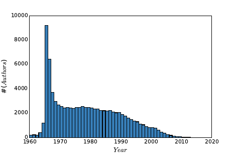
3.3. CLEANING DATA 71
Figure 3.3: The cleaned data removes these artifacts, and the resulting distri-
bution looks correct.
1965, and a peak which explodes in 2002. On reflection, the leftmost bump
makes sense. This left peak occurs the year when Pubmed first started to
systematically collect bibliographic records. Although there is some very in-
complete data from 1960–1964, most older scientists who had been publishing
papers for several years would “emerge” only with the start of systematic records
in 1965. So this explains the left peak, which then settles down by 1970 to what
looks like the flat distribution we expected.
But what about that giant 2002 peak? And the decline in new authors to
almost zero in the years which precede it? A similar decline is also visible to
the right of the big peak. Were all the world’s major scientists destined to be
born in 2002?
A careful inspection of the records in the big peak revealed the source of
the anomaly: first names. In the early days of Pubmed, authors were identified
by their initials and last names. But late in 2001, SS Skiena became Steven S.
Skiena, so it looked like a new author emerging from the heavens.
But why the declines to nothingness to the left and right of this peak? Recall
that we limited this study to the 100,000 most prolific scientists. A scientific
rock star emerging in 1998 would be unlikely to appear in this ranking because
their name was doomed to change a few years later, not leaving enough time
to accumulate a full career of papers. Similar things happen at the very right
of the distribution: newly created scientists in 2010 would never be able to
achieve a full career’s work in only a couple of years. Both phenomena are
neatly explained by this first name basis.
Cleaning this data to unify name references took us a few iterations to get
right. Even after eliminating the 2002 peak, we still saw a substantial dip in
prominent scientists starting their careers in the mid 1990s. This was because
many people who had a great half career pre-first names and a second great
half career post-first names did not rise to the threshold of a great full career

72 CHAPTER 3. DATA MUNGING
in either single period. Thus we had to match all the names in the full before
identifying who were the top 100,000 scientists.
Figure 3.3 shows our final distribution of authors, which matches the pla-
tonic ideal of what we expected the distribution to be. Don’t be too quick to
rationalize away how your data looks coming out of the computer. My collabo-
rators were at one point ready to write off the 2002 bump as due to increases in
research funding or the creation of new scientific journals. Always be suspicious
of whether your data is clean enough to trust.
3.3.2 Data Compatibility
We say that a comparison of two items is “apples to apples” when it is fair com-
parison, that the items involved are similar enough that they can be meaning-
fully stood up against each other. In contrast, “apples to oranges” comparisons
are ultimately meaningless. For example:
•It makes no sense to compare weights of 123.5 against 78.9, when one is
in pounds and the other is in kilograms.
•It makes no sense to directly compare the movie gross of Gone with the
Wind against that of Avatar, because 1939 dollars are 15.43 times more
valuable than 2009 dollars.
•It makes no sense to compare the price of gold at noon today in New York
and London, because the time zones are five hours off, and the prices
affected by intervening events.
•It makes no sense to compare the stock price of Microsoft on February 17,
2003 to that of February 18, 2003, because the intervening 2-for-1 stock
split cut the price in half, but reflects no change in real value.
These types of data comparability issues arise whenever data sets are merged.
Here I hope to show you how insidious such comparability issues can be, to
sensitize you as to why you need to be aware of them. Further, for certain
important classes of conversions I point to ways to deal with them.
Take-Home Lesson: Review the meaning of each of the fields in any data set
you work with. If you do not understand what’s in there down to the units of
measurement, there is no sensible way you can use it.
Unit Conversions
Quantifying observations in physical systems requires standard units of measure-
ment. Unfortunately there exist many functionally equivalent but incompatible
systems of measurement. My 12-year old daughter and I both weigh about 70,
but one of us is in pounds and the other in kilograms.
3.3. CLEANING DATA 73
Disastrous things like rocket explosions happen when measurements are en-
tered into computer systems using the wrong units of measurement. In par-
ticular, NASA lost the $125 million Mars Climate Orbiter space mission on
September 23, 1999 due to a metric-to-English conversion issue.
Such problems are best addressed by selecting a single system of measure-
ments and sticking to it. The metric system offers several advantages over the
traditional English system. In particular, individual measurements are naturally
expressed as single decimal quantities (like 3.28 meters) instead of incomparable
pairs of quantities (5 feet, 8 inches). This same issue arises in measuring angles
(radians vs. degrees/seconds) and weight (kilograms vs. pounds/oz).
Sticking to the metric system does not by itself solve all comparability is-
sues, since there is nothing to prevent you from mixing heights in meters and
centimeters. But it is a good start.
How can you defend yourself against incompatible units when merging data
sets? Vigilance has to be your main weapon. Make sure that you know the
intended units for each numerical column in your data set, and verify compat-
ibility when merging. Any column which does not have an associated unit or
object type should immediately be suspect.
When merging records from diverse sources, it is an excellent practice to
create a new “origin” or “source” field to identify where each record came from.
This provides at least the hope that unit conversion mistakes can be corrected
later, by systematically operating on the records from the problematic source.
A partially-automated procedure to detect such problems can be devised
from statistical significance testing, to be discussed in Section 5.3. Suppose we
were to plot the frequencies of human heights in a merged data set of English
(feet) and metric (meter) measurements. We would see one peak in the distri-
bution around 1.8 and a second around 5.5. The existence of multiple peaks in a
distribution should make us suspicious. The p-value resulting from significance
testing on the two input populations provides a rigorous measurement of the
degree to which our suspicions are validated.
Numerical Representation Conversions
Numerical features are the easiest to incorporate into mathematical models.
Indeed, certain machine learning algorithms such as linear regression and sup-
port vector machines work only with numerically-coded data. But even turning
numbers into numbers can be a subtle problem. Numerical fields might be rep-
resented in different ways: as integers (123), as decimals (123.5), or even as
fractions (123 1/2). Numbers can even be represented as text, requiring the
conversion from “ten million” to 10000000 for numerical processing.
Numerical representation issues can take credit for destroying another rocket
ship. An Ariane 5 rocket launched at a cost of $500 million on June 4, 1996
exploded forty seconds after lift-off, with the cause ultimately ascribed to an
unsuccessful conversion of a 64-bit floating point number to a 16-bit integer.
The distinction between integers and floating point (real) numbers is impor-
tant to maintain. Integers are counting numbers: quantities which are really
74 CHAPTER 3. DATA MUNGING
discrete should be represented as integers. Physically measured quantities are
never precisely quantified, because we live in a continuous world. Thus all mea-
surements should be reported as real numbers. Integer approximations of real
numbers are sometimes used in a misbegotten attempt to save space. Don’t do
this: the quantification effects of rounding or truncation introduces artifacts.
In one particularly clumsy data set we encountered, baby weights were rep-
resented as two integer fields (pounds and the remaining ounces). Much better
would have been to combine them into a single decimal quantity.
Name Unification
Integrating records from two distinct data sets requires them to share a common
key field. Names are frequently used as key fields, but they are often reported
inconsistently. Is Jos´e the same fellow as Jose? Such diacritic marks are banned
from the official birth records of several U.S. states, in an aggressive attempt to
force them to be consistent.
As another case in point, databases show my publications as authored by the
Cartesian product of my first (Steve,Steven, or S.), middle (Sol,S., or blank),
and last (Skiena) names, allowing for nine different variations. And things get
worse if we include misspellings. I can find myself on Google with a first name
of Stephen and last names of Skienna and Skeina.
Unifying records by key is a very ugly problem, which doesn’t have a magic
bullet. This is exactly why ID numbers were invented, so use them as keys if
you possibly can.
The best general technique is unification: doing simple text transformations
to reduce each name to a single canonical version. Converting all strings to
lower case increases the number of (usually correct) collisions. Eliminating
middle names or at least reducing them to an abbreviation creates even more
name matches/collisions, as does mapping first names to canonical versions (like
turning all Steves into Stevens).
Any such transformation runs the risk of creating Frankenstein-people, single
records assembled from multiple bodies. Applications differ in whether the
greater danger lies in merging too aggressively or too timidly. Figure out where
your task sits on this spectrum and act accordingly.
An important concern in merging data sets is character code unification.
Characters in text strings are assigned numerical representations, with the map-
ping between symbols and number governed by the character code standard.
Unfortunately, there are several different character code standards in common
usage, meaning that what you scrape from a webpage might not be in the same
character code as assumed by the system which will process it.
Historically, the good old 7-bit ASCII code standard was expanded to the
8-bit IS0 8859-1 Latin alphabet code, which adds characters and punctuation
marks from several European languages. UTF-8 is an encoding of all Unicode
characters using variable numbers of 8-bit blocks, which is backwards compatible
with ASCII. It is the dominant encoding for web-pages, although other systems
remain in use.
3.3. CLEANING DATA 75
Correctly unifying character codes after merging is pretty much impossible.
You must have the discipline to pick a single code as a standard, and check the
encoding of each input file on preprocessing, converting it to the target before
further work.
Time/Date Unification
Data/time stamps are used to infer the relative order of events, and group events
by relative simultaneity. Integrating event data from multiple sources requires
careful cleaning to ensure meaningful results.
First let us consider issues in measuring time. The clocks from two computers
never exactly agree, so precisely aligning logs from different systems requires a
mix of work and guesswork. There are also time zone issues when dealing with
data from different regions, as well as diversities in local rules governing changes
in daylight saving time.
The right answer here is to align all time measurements to Coordinated Uni-
versal Time (UTC), a modern standard subsuming the traditional Greenwich
Mean Time (GMT). A related standard is UNIX time, which reports an event’s
precise time in terms of the number of elapsed seconds since 00:00:00 UTC on
Thursday, January 1, 1970.
The Gregorian calendar is common throughout the technology world, al-
though many other calendar systems are in use in different countries. Subtle
algorithms must be used to convert between calendar systems, as described in
[RD01]. A bigger problem for date alignment concerns the proper interpretation
of time zones and the international date line.
Time series unification is often complicated by the nature of the business
calendar. Financial markets are closed on weekends and holidays, making for
questions of interpretation when you are correlating, say, stock prices to local
temperature. What is the right moment over the weekend to measure tempera-
ture, so as to be consistent with other days of the week? Languages like Python
contain extensive libraries to deal with financial time series data to get issues
like this correct. Similar issues arise with monthly data, because months (and
even years) have different lengths.
Financial Unification
Money makes the world go round, which is why so many data science projects
revolve around financial time series. But money can be dirty, so this data
requires cleaning.
One issue here is currency conversion, representing international prices using
a standardized financial unit. Currency exchange rates can vary by a few percent
within a given day, so certain applications require time-sensitive conversions.
Conversion rates are not truly standardized. Different markets will each have
different rates and spreads, the gap between buying and selling prices that cover
the cost of conversion.

76 CHAPTER 3. DATA MUNGING
The other important correction is for inflation. The time value of money
implies that a dollar today is (generally) more valuable than a dollar a year
from now, with interest rates providing the right way to discount future dollars.
Inflation rates are estimated by tracking price changes over baskets of items,
and provide a way to standardize the purchasing power of a dollar over time.
Using unadjusted prices in a model over non-trivial periods of time is just
begging for trouble. A group of my students once got very excited by the
strong correlation observed between stock prices and oil prices over a thirty-
year period, and so tried to use stock prices in a commodity prediction model.
But both goods were priced in dollars, without any adjustment as they inflated.
The time series of prices of essentially any pair of items will correlate strongly
over time when you do not correct for inflation.
In fact, the most meaningful way to represent price changes over time is
probably not differences but returns, which normalize the difference by the initial
price:
ri=pi+1 −pi
pi
This is more analogous to a percentage change, with the advantage here that
taking the logarithm of this ratio becomes symmetric to gains and losses.
Financial time series contain many other subtleties which require cleaning.
Many stocks give scheduled dividends to the shareholder on a particular date
every year. Say, for example, that Microsoft will pay a $2.50 dividend on Jan-
uary 16. If you own a share of Microsoft at the start of business that day, you
receive this check, so the value of the share then immediately drops by $2.50
the moment after the dividend is issued. This price decline reflects no real loss
to the shareholder, but properly cleaned data needs to factor the dividend into
the price of the stock. It is easy to imagine a model trained on uncorrected
price data learning to sell stocks just prior to its issuing dividends, and feeling
unjustly proud of itself for doing so.
3.3.3 Dealing with Missing Values
Not all data sets are complete. An important aspect of data cleaning is iden-
tifying fields for which data isn’t there, and then properly compensating for
them:
•What is the year of death of a living person?
•What should you do with a survey question left blank, or filled with an
obviously outlandish value?
•What is the relative frequency of events too rare to see in a limited-size
sample?
Numerical data sets expect a value for every element in a matrix. Setting
missing values to zero is tempting, but generally wrong, because there is always
some ambiguity as to whether these values should be interpreted as data or not.

3.3. CLEANING DATA 77
Is someone’s salary zero because he is unemployed, or did he just not answer
the question?
The danger with using nonsense values as not-data symbols is that they
can get misinterpreted as data when it comes time to build models. A linear
regression model trained to predict salaries from age, education, and gender will
have trouble with people who refused to answer the question.
Using a value like −1 as a no-data symbol has exactly the same deficiencies
as zero. Indeed, be like the mathematician who is afraid of negative numbers:
stop at nothing to avoid them.
Take-Home Lesson: Separately maintain both the raw data and its cleaned
version. The raw data is the ground truth, and must be preserved intact for
future analysis. The cleaned data may be improved using imputation to fill in
missing values. But keep raw data distinct from cleaned, so we can investigate
different approaches to guessing.
So how should we deal with missing values? The simplest approach is to
drop all records containing missing values. This works just fine when it leaves
enough training data, provided the missing values are absent for non-systematic
reasons. If the people refusing to state their salary were generally those above
the mean, dropping these records will lead to biased results.
But typically we want to make use of records with missing fields. It can be
better to estimate or impute missing values, instead of leaving them blank. We
need general methods for filling in missing values. Candidates include:
•Heuristic-based imputation: Given sufficient knowledge of the underlying
domain, we should be able to make a reasonable guess for the value of
certain fields. If I need to fill in a value for the year you will die, guessing
birth year+80 will prove about right on average, and a lot faster than
waiting for the final answer.
•Mean value imputation: Using the mean value of a variable as a proxy
for missing values is generally sensible. First, adding more values with
the mean leaves the mean unchanged, so we do not bias our statistics by
such imputation. Second, fields with mean values add a vanilla flavor to
most models, so they have a muted impact on any forecast made using
the data.
But the mean might not be appropriate if there is a systematic reason
for missing data. Suppose we used the mean death-year in Wikipedia to
impute the missing value for all living people. This would prove disastrous,
with many people recorded as dying before they were actually born.
•Random value imputation: Another approach is to select a random value
from the column to replace the missing value. This would seem to set us up
for potentially lousy guesses, but that is actually the point. Repeatedly
selecting random values permits statistical evaluation of the impact of
imputation. If we run the model ten times with ten different imputed
78 CHAPTER 3. DATA MUNGING
values and get widely varying results, then we probably shouldn’t have
much confidence in the model. This accuracy check is particularly valuable
when there is a substantial fraction of values missing from the data set.
•Imputation by nearest neighbor: What if we identify the complete record
which matches most closely on all fields present, and use this nearest
neighbor to infer the values of what is missing? Such predictions should
be more accurate than the mean, when there are systematic reasons to
explain variance among records.
This approach requires a distance function to identify the most similar
records. Nearest neighbor methods are an important technique in data
science, and will be presented in greater detail in Section 10.2.
•Imputation by interpolation: More generally, we can use a method like
linear regression (see Section 9.1) to predict the values of the target col-
umn, given the other fields in the record. Such models can be trained over
full records and then applied to those with missing values.
Using linear regression to predict missing values works best when there is
only one field missing per record. The potential danger here is creating
significant outliers through lousy predictions. Regression models can easily
turn an incomplete record into an outlier, by filling the missing fields in
with unusually high or low values. This would lead downstream analysis
to focus more attention on the records with missing values, exactly the
opposite of what we want to do.
Such concerns emphasize the importance of outlier detection, the final step
in the cleaning process that will be considered here.
3.3.4 Outlier Detection
Mistakes in data collection can easily produce outliers that can interfere with
proper analysis. An interesting example concerns the largest dinosaur vertebra
ever discovered. Measured at 1500 millimeters, it implies an individual that was
188 feet long. This is amazing, particularly because the second largest specimen
ever discovered comes in at only 122 feet.
The most likely explanation here (see [Gol16]) is that this giant fossil never
actually existed: it has been missing from the American Museum of Natural
History for over a hundred years. Perhaps the original measurement was taken
on a conventionally-sized bone and the center two digits accidentally transposed,
reducing the vertebra down to 1050 millimeters.
Outlier elements are often created by data entry mistakes, as apparently was
the case here. They can also result from errors in scraping, say an irregularity
in formatting causing a footnote number to be interpreted as a numerical value.
Just because something is written down doesn’t make it correct. As with the
dinosaur example, a single outlier element can lead to major misinterpretations.
3.4. WAR STORY: BEATING THE MARKET 79
General sanity checking requires looking at the largest and smallest values
in each variable/column to see whether they are too far out of line. This can
best be done by plotting the frequency histogram and looking at the location of
the extreme elements. Visual inspection can also confirm that the distribution
looks the way it should, typically bell-shaped.
In normally distributed data, the probability that a value is kstandard de-
viations from the mean decreases exponentially with k. This explains why there
are no 10-foot basketball players, and provides a sound threshold to identify
outliers. Power law distributions are less easy to detect outliers in: there really
is a Bill Gates worth over 10,000 times as much as the average individual.
It is too simple to just delete the rows containing outlier fields and move
on. Outliers often point to more systematic problems that one must deal with.
Consider a data set of historical figures by lifespan. It is easy to finger the
biblical Methuselah (at 969 years) as an outlier, and remove him.
But it is better to figure out whether he is indicative of other figures that we
should consider removing. Observe that Methuselah had no firmly established
birth and death dates. Perhaps the published ages of anybody without dates
should be considered suspicious enough to prune. By contrast, the person with
the shortest lifespan in Wikipedia (John I, King of France) lived only five days.
But his birth (November 15) and death (November 20) dates in 1316 convinces
me that his lifespan was accurate.
3.4 War Story: Beating the Market
Every time we met, my graduate student Wenbin told me we were making
money. But he sounded less and less confident every time I asked.
Our Lydia sentiment analysis system took in massive text feeds of news and
social media, reducing them to daily time series of frequency and sentiment
for the millions of different people, places, and organizations mentioned within.
When somebody wins a sports championship, many articles get written describ-
ing how great an athlete they are. But when this player then gets busted on drug
charges, the tone of the articles about them immediately changes. By keeping
count of the relative frequency of association with positive words (“victorious”)
vs. negative words (“arrested”) in the text stream, we can construct sentiment
signals for any news-worthy entity.
Wenbin studied how sentiment signals could be used to predict future events
like the gross for a given movie, in response to the quality of published reviews
or buzz. But he particularly wanted to use this data to play the stock market.
Stocks move up and down according to news. A missed earnings report is bad
news for a company, so the price goes down. Food and Drug Administration
(FDA) approval of a new drug is great news for the company which owns it, so
the price goes up. If Wenbin could use our sentiment signal to predict future
stock prices, well, let’s just say I wouldn’t have to pay him as a research assistant
anymore.
So he simulated a strategy of buying the stocks that showed the highest
80 CHAPTER 3. DATA MUNGING
sentiment in that day’s news, and then shorting those with the lowest sentiment.
He got great results. “See,” he said. “We are making money.”
The numbers looked great, but I had one quibble. Using today’s news re-
sults to predict current price movements wasn’t really fair, because the event
described in the article may have already moved the price before we had any
chance to read about it. Stock prices should react very quickly to important
news.
So Wenbin simulated the strategy of buying stocks based on sentiment from
the previous day’s news, to create a gap between the observed news and price
changes. The return rate went down substantially, but was still positive. “See,”
he said. “We are still making money.”
But I remained a little uncomfortable with this. Many economists believe
that the financial markets are efficient, meaning that all public news is instantly
reflected in changing prices. Prices certainly changed in response to news, but
you would not be able to get in fast enough to exploit the information. We had
to remain skeptical enough to make sure there were no data/timing problems
that could explain our results.
So I pressed Wenbin about exactly how he had performed his simulation. His
strategy bought and sold at the closing price every day. But that left sixteen
hours until the next day’s open, plenty of time for the world to react to events
that happened while I slept. He switched his simulated purchase to the opening
price. Again, the return rate went down substantially, but was still positive.
“See,” he said. “We are still making some money.”
But might there still be other artifacts in how we timed our data, giving
us essentially tomorrow’s newspaper today? In good faith, we chased down all
other possibilities we could think of, such as whether the published article dates
reflected when they appeared instead of when they were written. After doing
our best to be skeptical, his strategies still seemed to show positive returns from
news sentiment.
Our paper on this analysis [ZS10] has been well received, and Wenbin has
gone on to be a successful quant, using sentiment among other signals to trade
in the financial markets. But I remain slightly queasy about this result. Clean-
ing our data to precisely time-stamp each news article was very difficult to do
correctly. Our system was originally designed to produce daily time series in a
batch mode, so it is hard to be sure that we did everything right in the millions
of articles downloaded over several years to now perform finer-scale analysis.
The take-home lesson is that cleanliness is important when there is money
on the line. Further, it is better to design a clean environment at the beginning
of analysis instead of furiously washing up at the end.
3.5 Crowdsourcing
No single person has all the answers. Not even me. Much of what passes for
wisdom is how we aggregate expertise, assembling opinions from the knowledge
and experience of others.

3.5. CROWDSOURCING 81
Figure 3.4: Guess how many pennies I have in this jar? (left) The correct answer
was determined using precise scientific methods (right).
Crowdsourcing harnesses the insights and labor from large numbers of people
towards a common goal. It exploits the wisdom of crowds, that the collective
knowledge of a group of people might well be greater than that of the smartest
individual among them.
This notion began with an ox. Francis Galton, a founder of statistical science
and a relative of Charles Darwin, attended a local livestock fair in 1906. As part
of the festivities, villagers were invited to guess the weight of this particular ox,
with the person whose guess proved closest to the mark earning a prize. Almost
800 participants took a whack at it. No one picked the actual weight of 1,178
pounds, yet Galton observed that the average guess was amazingly close: 1,179
pounds! Galton’s experiment suggests that for certain tasks one can get better
results by involving a diverse collection of people, instead of just asking the
experts.
Crowdsourcing serves as an important source of data in building models, es-
pecially for tasks associated with human perception. Humans remain the state-
of-the-art system in natural language processing and computer vision, achieving
the highest level of performance. The best way to gather training data often
requires asking people to score a particular text or image. Doing this on a large
enough scale to build substantial training data typically requires a large number
of annotators, indeed a crowd.
Social media and other new technologies have made it easier to collect and
aggregate opinions on a massive scale. But how can we separate the wisdom of
crowds from the cries of the rabble?
3.5.1 The Penny Demo
Let’s start by performing a little wisdom of crowds experiment of our own.
Figure 3.4 contains photos of a jar of pennies I accumulated in my office over
many years. How many pennies do I have in this jar? Make your own guess
now, because I am going to tell you the answer on the next page.

82 CHAPTER 3. DATA MUNGING
To get the right answer, I had my biologist-collaborator Justin Garden weigh
the pennies on a precision laboratory scale. Dividing by the weight of a single
penny gives the count. Justin can be seen diligently performing his task in
Figure 3.4 (right).
So I ask again: how many pennies do you think I have in this jar? I performed
this experiment on students in my data science class. How will your answer
compare to theirs?
I first asked eleven of my students to write their opinions on cards and
quietly pass them up to me at the front of the room. Thus these guesses were
completely independent of each other. The results, sorted for convenience, were:
537, 556, 600, 636, 1200, 1250, 2350, 3000, 5000, 11,000, 15,000.
I then wrote then wrote these numbers on the board, and computed some
statistics. The median of these guesses was 1250, with a mean of 3739. In
fact, there were exactly 1879 pennies in the jar. The median score among my
students was closer to the right amount than any single guess.
But before revealing the actual total, I then asked another dozen students
to guess. The only difference was that this cohort had seen the guesses from
the first set of students written on the board. Their choices were:
750, 750, 1000, 1000, 1000, 1250, 1400, 1770, 1800, 3500, 4000, 5000.
Exposing the cohort to other people’s guesses strongly conditioned the dis-
tribution by eliminating all outliers: the minimum among the second group was
greater than four of the previous guesses, and the maximum less than or equal
to three of the previous round. Within this cohort, the median was 1325 and
the mean 1935. Both happen to be somewhat closer to the actual answer, but
it is clear that group-think had settled in to make it happen.
Anchoring is the well-known cognitive bias that people’s judgments get ir-
rationally fixated on the first number they hear. Car dealers exploit this all the
time, initially giving an inflated cost for the vehicle so that subsequent prices
sound like a bargain.
I then did one final test before revealing the answer. I allowed my students
to bid on the jar, meaning that they had to be confident enough to risk money
on the result. This yielded exactly two bids from brave students, at 1500 and
2000 pennies respectively. I pocketed $1.21 from the sucker with the high bid,
but both proved quite close. This is not a surprise: people willing to bet their
own money on an event are, by definition, confident in their selection.
3.5.2 When is the Crowd Wise?
According to James Surowiecki in his book The Wisdom of Crowds [Sur05],
crowds are wise when four conditions are satisfied:

3.5. CROWDSOURCING 83
•When the opinions are independent: Our experiment highlighted how
easy it is for a group to lapse into group-think. People naturally get
influenced by others. If you want someone’s true opinion, you must ask
them in isolation.
•When crowds are people with diverse knowledge and methods: Crowds
only add information when there is disagreement. A committee composed
of perfectly-correlated experts contributes nothing more than you could
learn from any one of them. In the penny-guessing problem, some people
estimated the volume of the container, while others gauged the sag of my
arm as I lifted the heavy mass. Alternate approaches might have estimated
how many pennies I could have accumulated in twenty years of occasionally
emptying my pockets, or recalled their own hoarding experiences.
•When the problem is in a domain that does not need specialized knowledge:
I trust the consensus of the crowd in certain important decisions, like
which type of car to buy or who should serve as the president of my
country (gulp). But when it comes to deciding whether my tumor sample
is cancerous or benign, I will trust the word of one doctor over a cast of
1,000 names drawn at random from the phone book.
Why? Because the question at hand benefits greatly from specialized
knowledge and experience. There is a genuine reason why the doctor
should know more than all the others. For simpler perceptual tasks the
mob rules, but one must be careful not to ask the crowd something they
have no way of knowing.
•Opinions can be fairly aggregated: The least useful part of any mass
survey form is the open response field “Tell us what you think!”. The
problem here is that there is no way to combine these opinions to form
a consensus, because different people have different issues and concerns.
Perhaps these texts could be put into buckets by similarity, but this is
hard to do effectively.
The most common use of such free-form responses are anecdotal. People
cherry-pick the most positive-sounding ones, then put them on a slide to
impress the boss.
Take-Home Lesson: Be an incomparable element on the partial order of life.
Diverse, independent thinking contributes the most wisdom to the crowd.
3.5.3 Mechanisms for Aggregation
Collecting wisdom from a set of responses requires using the right aggrega-
tion mechanism. For estimating numerical quantities, standard techniques like
plotting the frequency distribution and computing summary statistics are ap-
propriate. Both the mean and median implicitly assume that the errors are
84 CHAPTER 3. DATA MUNGING
symmetrically distributed. A quick look at the shape of the distribution can
generally confirm or reject that hypothesis.
The median is, generally speaking, a more appropriate choice than the mean
in such aggregation problems. It reduces the influence of outliers, which is a
particular problem in the case of mass experiments where a certain fraction of
your participants are likely to be bozos. On our penny guessing data, the mean
produced a ghastly over-estimate of 3739, which reduced to 2843 after removing
the largest and smallest guess, and then down to 2005 once trimming the two
outliers on each end (recall the correct answer was 1879).
Removing outliers is a very good strategy, but we may have other grounds
to judge the reliability of our subjects, such as their performance on other tests
where we do know the answer. Taking a weighted average, where we give more
weight to the scores deemed more reliable, provides a way to take such confidence
measures into account.
For classification problems, voting is the basic aggregation mechanism. The
Condorcet jury theorem justifies our faith in democracy. It states that if the
probability of each voter being correct on a given issue is p > 0.5, the probability
that a majority of the voters are correct (P(n)) is greater than p. In fact, it is
exactly:
P(n) =
n
X
i=(n+1)/2n
ipi(1 −p)n−i
Large voter counts give statistical validity even to highly contested elections.
Suppose p= 0.51, meaning the forces of right are a bare majority. A jury of 101
members would reach the correct decision 57% of the time, while P(1001) = 0.73
and P(10001) = 0.9999. The probability of a correct decision approaches 1 as
n→ ∞.
There are natural limitations to the power of electoral systems, however.
Arrow’s impossibility theorem states that no electoral system for summing per-
mutations of preferences as votes satisfies four natural conditions for the fairness
of an election. This will be discussed in Section 4.6, in the context of scores and
rankings.
3.5.4 Crowdsourcing Services
Crowdsourcing services like Amazon Turk and CrowdFlower provide the oppor-
tunity for you to hire large numbers of people to do small amounts of piecework.
They help you to wrangle people, in order to create data for you to wrangle.
These crowdsourcing services maintain a large stable of freelance workers,
serving as the middleman between them and potential employers. These work-
ers, generally called Turkers, are provided with lists of available jobs and what
they will pay, as shown in Figure 3.5. Employers generally have some ability to
control the location and credentials of who they hire, and the power to reject a
worker’s efforts without pay, if they deem it inadequate. But statistics on em-
ployers’ acceptance rates are published, and good workers are unlikely to labor
for bad actors.

3.5. CROWDSOURCING 85
Figure 3.5: Representative tasks on Mechanical Turk.
The tasks assigned to Turkers generally involve simple cognitive efforts that
cannot currently be performed well by computers. Good applications of Turkers
include:
•Measuring aspects of human perception: Crowdsourcing systems pro-
vide efficient ways to gather representative opinions on simple tasks. One
nice application was establishing linkages between colors in red-green-blue
space, and the names by which people typically identify them in a lan-
guage. This is important to know when writing descriptions of products
and images.
So where is the boundary in color space between “blue” and “light blue,”
or “robin’s egg blue” and “teal”? The right names are a function of
culture and convention, not physics. To find out, you must ask people,
and crowdsourcing permits you to easily query hundreds or thousands of
different people.
•Obtaining training data for machine learning classifiers: Our primary
interest in crowdsourcing will be to produce human annotations that serve
as training data. Many machine learning problems seek to do a particular
task “as well as people do.” Doing so requires a large number of training
instances to establish what people did, when given the chance.
For example, suppose we sought to build a sentiment analysis system ca-
pable of reading a written review and deciding whether its opinion of a
product is favorable or unfavorable. We will need a large number of re-
views labeled by annotators to serve as testing/training data. Further, we
need the same reviews labeled repeatedly by different annotators, so as to
86 CHAPTER 3. DATA MUNGING
identify any inter-annotator disagreements concerning the exact meaning
of a text.
•Obtaining evaluation data for computer systems:A/B testing is a stan-
dard method for optimizing user interfaces: show half of the judges version
Aof a given system and the other half version B. Then test which group
did better according to some metric. Turkers can provide feedback on how
interesting a given app is, or how well a new classifier is performing.
One of my grad students (Yanqing Chen) used CrowdFlower to evaluate
a system he built to identify the most relevant Wikipedia category for a
particular entity. Which category better describes Barack Obama: Presi-
dents of the United States or African-American Authors? For $200, he got
people to answer a total of 10,000 such multiple-choice questions, enough
for him to properly evaluate his system.
•Putting humans into the machine: There still exist many cognitive tasks
that people do much better than machines. A cleverly-designed interface
can supply user queries to people sitting inside the computer, waiting to
serve those in need.
Suppose you wanted to build an app to help the visually impaired, enabling
the user to snap a picture and ask someone for help. Maybe they are in
their kitchen, and need someone to read the label on a can to them. This
app could call a Turker as a subroutine, to do such a task as it is needed.
Of course, these image-annotation pairs should be retained for future anal-
ysis. They could serve as training data for a machine learning program to
take the people out of the loop, as much as possible.
•Independent creative efforts: Crowdsourcing can be used to commission
large numbers of creative works on demand. You can order blog posts
or articles on demand, or written product reviews both good and bad.
Anything that you might imagine can be created, if you just specify what
you want.
Here are two silly examples that I somehow find inspiring:
–The Sheep Market (http://www.thesheepmarket.com) commissioned
10,000 drawings of sheep for pennies each. As a conceptual art piece,
it tries to sell them to the highest bidder. What creative endeavors
can you think of that people will do for you at $0.25 a pop?
–Emoji Dick (http://www.emojidick.com) was a crowdsourced ef-
fort to translate the great American novel Moby Dick completely
into emoji images. Its creators partitioned the book into roughly
10,000 parts, and farmed out each part to be translated by three
separate Turkers. Other Turkers were hired to select the best one of
these to be incorporated into the final book. Over 800 Turkers were
involved, with the total cost of $3,676 raised by the crowd-funding
site Kickstarter.
3.5. CROWDSOURCING 87
•Economic/psychological experiments: Crowdsourcing has proven a boon
to social scientists conducting experiments in behavioral economics and
psychology. Instead of bribing local undergraduates to participate in their
studies, these investigators can now expand their subject pool to the entire
world. They get the power to harness larger populations, perform inde-
pendent replications in different countries, and thus test whether there are
cultural biases of their hypotheses.
There are many exciting tasks that can be profitably completed using crowd-
sourcing. However, you are doomed to disappointment if you employ Turkers
for the wrong task, in the wrong way. Bad uses of crowdsourcing include:
•Any task that requires advanced training: Although every person possesses
unique skills and expertise, crowdsourcing workers come with no specific
training. They are designed to be treated as interchangeable parts. You do
not establish a personal relationship with these workers, and any sensible
gig will be too short to allow for more than a few minutes training.
Tasks requiring specific technical skills are not reasonably crowdsourced.
However, they might be reasonably subcontracted, in traditional longer-
term arrangements.
•Any task you cannot specify clearly: You have no mechanism for back-
and-forth communication with Turkers. Generally speaking, they have no
way to ask you questions. Thus the system works only if you can specify
your tasks clearly, concisely, and unambiguously.
This is much harder than it looks. Realize that you are trying to program
people instead of computers, with all the attendant bugs associated with
“do as I say” trumping “do what I mean.” Test your specifications out
on local people before opening up your job to the masses, and then do
a small test run on your crowdsourcing platform to evaluate how it goes
before cutting loose with the bulk of your budget. You may be in for
some cultural surprises. Things that seem obvious to you might mean
something quite different to a worker halfway around the world.
•Any task where you cannot verify whether they are doing a good job: Turk-
ers have a single motivation for taking on your piecework: they are trying
to convert their time into money as efficiently as possible. They are look-
ing out for jobs offering the best buck for their bang, and the smartest ones
will seek to complete your task as quickly and thoughtlessly as possible.
Crowdsourcing platforms permit employers to withhold payment if the
contracted work is unacceptable. Taking advantage of this requires some
efficient way to check the quality of the product. Perhaps you should
ask them to complete certain tasks where you already know the correct
answer. Perhaps you can compare their responses to that of other inde-
pendent workers, and throw out their work if it disagrees too often from
the consensus.
88 CHAPTER 3. DATA MUNGING
It is very important to employ some quality control mechanism. Some
fraction of the available workers on any platform are bots, looking for
multiple-choice tasks to attack through randomness. Others may be peo-
ple with language skills wholly inadequate for the given task. You need
to check and reject to avoid being a sucker.
However, you cannot fairly complain about results from poorly specified
tasks. Rejecting too high a fraction of work will lower your reputation,
with workers and the platform. It is particularly bad karma to refuse to
pay people but use their work product anyway.
•Any illegal task, or one too inhuman to subject people to: You are not
allowed to ask a Turker to do something illegal or unethical. The clas-
sic example is hiring someone to write bad reviews of your competitor’s
products. Hiring a hit man makes you just as guilty of murder as the guy
who fired the shots. Be aware that there are electronic trails that can be
followed from the public placement of your ad directly back to you.
People at educational and research institutions are held to a higher stan-
dard than the law, through their institutional review board or IRB. The
IRB is a committee of researchers and administrative officials who must
approve any research on human subjects before it is undertaken. Be-
nign crowdsourcing applications such as the ones we have discussed are
routinely approved, after the researchers have undergone a short online
training course to make sure they understand the rules.
Always realize that there is a person at the other end of the machine.
Don’t assign them tasks that are offensive, degrading, privacy-violating,
or too stressful. You will probably get better results out of your workers
if you treat them like human beings.
Getting people to do your bidding requires proper incentives, not just clear
instructions. In life, you generally get what you pay for. Be aware of the
currently prevailing minimum hourly wage in your country, and price your tasks
accordingly. This is not a legal requirement, but it is generally good business.
The sinister glow that comes from hiring workers at $0.50 per hour wears
off quickly once you see the low quality of workers that your tasks attract. You
can easily eat up all your savings by the need to rigorously correct their work
product, perhaps by paying multiple workers do it repeatedly. Higher paying
tasks find workers much more quickly, so be prepared to wait if you do not pay
the prevailing rate. Bots and their functional equivalents are happier to accept
slave wages than the workers you really want to hire.
3.5.5 Gamification
There is an alternative to paying people to annotate or transcribe your data.
Instead, make things so much fun that people will work for you for free!
Games with a purpose (GWAP) are systems which disguise data collection
as a game people want to play, or a task people themselves want done. With
3.5. CROWDSOURCING 89
the right combination of game, motive, and imagination, amazing things can be
done. Successful examples include:
•CAPTCHAs for optical character recognition (OCR): CAPTCHAs are
those distorted text images you frequently encounter when creating an
account on the web. They demand that you type in the contents of text
strings shown in the image to prove that you are a human, thus enabling
them to deny access to bots and other programmed systems.
ReCAPTCHAs were invented to get useful data from the over 100 million
CAPTCHAs displayed each day. Two text strings are displayed in each,
one of which the system checks in order to grant entry. The other rep-
resents a hard case for an OCR system that is digitizing old books and
newspapers. The answers are mapped back to improve the digitization of
archival documents, transcribing over 40 million words per day.
•Psychological/IQ testing in games/apps: Psychologists have established
five basic personality traits as important and reproducible aspects of per-
sonality. Academic psychologists use multiple-choice personality tests to
measure where individuals sit along personality scales for each of the big
five traits: openness, conscientiousness, extroversion, agreeableness, and
neuroticism.
By turning these surveys into game apps (“What are your personality
traits?”) psychologists have gathered personality measurements on over
75,000 different people, along with other data on preferences and behavior.
This has created an enormous data set to study many interesting issues
in the psychology of personality.
•The FoldIt game for predicting protein structures: Predicting the struc-
tures formed by protein molecules is one of the great computational chal-
lenges in science. Despite many years of work, what makes a protein fold
into a particular shape is still not well understood.
FoldIt (https://fold.it) is a game challenging non-biologists to design
protein molecules that fold into a particular shape. Players are scored as
to how closely their design approaches the given target, with the highest
scoring players ranked on a leader board. Several scientific papers have
been published on the strength of the winning designs.
The key to success here is making a game that is playable enough to become
popular. This is much harder than it may appear. There are millions of free
apps in the app store, mostly games. Very few are ever tried by more than
a few hundred people, which is nowhere near enough to be interesting from a
data collection standpoint. Adding the extra constraint that the game generate
interesting scientific data while being playable makes this task even harder.
Motivational techniques should be used to improve playability. Keeping
score is an important part of any game, and the game should be designed so that
performance increases rapidly at first, in order to hook the player. Progress bars
90 CHAPTER 3. DATA MUNGING
provide encouragement to reach the next level. Awarding badges and providing
leader boards seen by others encourages greater efforts. Napoleon instituted
a wide array of ribbons and decorations for his soldiers, observing that “it is
amazing what men will do for a strip of cloth.”
The primary design principle of games such as FoldIt is to abstract the
domain technicality away, into the scoring function. The game is configured
so players need not really understand issues of molecular dynamics, just that
certain changes make the scores go up while others make them go down. The
player will build their own intuition about the domain as they play, resulting in
designs which may never occur to experts skilled in the art.
3.6 Chapter Notes
The Charles Babbage quote from the start of this chapter is from his book
Passages from the Life of a Philosopher [Bab11]. I recommend Padua’s graphic
novel [Pad15] for an amusing but meaningful (albeit fictitious) introduction to
his work and relationship with Ada Lovelace.
Many books deal with hands-on practical matters of data wrangling in par-
ticular programming languages. Particularly useful are the O’Reilly books for
data science in Python, including [Gru15, McK12].
The story of our jai-alai betting system, including the role of website scrap-
ing, is reported in my book Calculated Bets [Ski01]. It is a quick and fun overview
of how to build simulation models for prediction, and will be the subject of the
war story of Section 7.8.
The failure of space missions due to numerical computing errors has been
well chronicled in popular media. See Gleick [Gle96] and Stephenson et al.
[SMB+99] for discussions of the Ariane 5 and Mars Climate Orbiter space mis-
sions, respectively.
The clever idea of using accelerometers in cell phones to detect earthquakes
comes from Faulkner et al. [FCH+14]. Representative studies of large sets of
Flickr images includes Kisilevich et al. [KKK+10].
Kittur [KCS08] reports on experiences with crowdsourcing user studies on
Amazon Turk. Our use of CrowdFlower to identify appropriate descriptions
of historical figures was presented in [CPS15]. Methods for gamification in
instruction are discussed in [DDKN11, Kap12]. Recaptchas are introduced in
Von Ahn, et al. [VAMM+08]. The large-scale collection of psychological trait
data via mobile apps is due to Kosinski, et al. [KSG13].
3.7 Exercises
Data Munging
3-1. [3] Spend two hours getting familiar with one of the following programming
languages: Python, R, MatLab, Wolfram Alpha/Language. Then write a brief
paper with your impressions on its characteristics:
3.7. EXERCISES 91
•Expressibility.
•Runtime speed.
•Breadth of library functions.
•Programming environment.
•Suitability for algorithmically-intensive tasks.
•Suitability for general data munging tasks.
3-2. [5] Pick two of the primary data science programming languages, and write
programs to solve the following tasks in both of them. Which language did you
find most suitable for each task?
(a) Hello World!
(b) Read numbers from a file, and print them out in sorted order.
(c) Read a text file, and count the total number of words.
(d) Read a text file, and count the total number of distinct words.
(e) Read a file of numbers, and plot a frequency histogram of them.
(f) Download a page from the web, and scrape it.
3-3. [3] Play around for a little while with Python, R, and Matlab. Which do you
like best? What are the strengths and weaknesses of each?
3-4. [5] Construct a data set of nhuman heights, with p% of them recording in En-
glish (feet) and the rest with metric (meter) measurements. Use statistical tests
to test whether this distribution is distinguishable from one properly recorded
in meters. What is the boundary as a function of nand pwhere it becomes
clear there is a problem?
Data Sources
3-5. [3] Find a table of storage prices over time. Analyze this data, and make a
projection about the cost/volume of data storage five years from now. What
will disk prices be in 25 or 50 years?
3-6. [5] For one or more of the following The Quant Shop challenges, find relevant
data sources and assess their quality:
•Miss Universe.
•Movie gross.
•Baby weight.
•Art auction price.
•Snow on Christmas.
•Super Bowl/college champion.
•Ghoul pool?
•Future gold/oil price?
Data Cleaning
92 CHAPTER 3. DATA MUNGING
3-7. [3] Find out what was weird about September 1752. What special steps might
the data scientists of the day have had to take to normalize annual statistics?
3-8. [3] What types of outliers might you expect to occur in the following data sets:
(a) Student grades.
(b) Salary data.
(c) Lifespans in Wikipedia.
3-9. [3] A health sensor produces a stream of twenty different values, including blood
pressure, heart rate, and body temperature. Describe two or more techniques
you could use to check whether the stream of data coming from the sensor is
valid.
Implementation Projects
3-10. [5] Implement a function that extracts the set of hashtags from a data frame
of tweets. Hashtags begin with the “#” character and contain any combination
of upper and lowercase characters and digits. Assume the hashtag ends where
there is a space or a punctuation mark, like a comma, semicolon, or period.
3-11. [5] The laws governing voter registration records differ from state to state in the
United States. Identify one or more states with very lax rules, and see what you
must do to get your hands on the data. Hint: Florida.
Crowdsourcing
3-12. [5] Describe how crowdsourced workers might have been employed to help gather
data for The Quant Shop challenges:
•Miss Universe.
•Movie gross.
•Baby weight.
•Art auction price.
•Snow on Christmas.
•Super Bowl/college champion.
•Ghoul pool.
•Future gold/oil price?:
3-13. [3] Suppose you are paying Turkers to read texts and annotate them based on
the underlying sentiment (positive or negative) that each passage conveys. This
is an opinion task, but how can we algorithmically judge whether the Turker was
answering in a random or arbitrary manner instead of doing their job seriously?
Interview Questions
3-14. [5] Suppose you built a system to predict stock prices. How would you evaluate
it?
3-15. [5] In general, how would you screen for outliers, and what should you do if you
find one?
3-16. [3] Why does data cleaning play a vital role in analysis?
3.7. EXERCISES 93
3-17. [5] During analysis, how do you treat missing values?
3-18. [5] Explain selection bias. Why is it important? How can data management
procedures like handling missing data make it worse?
3-19. [3] How do you efficiently scrape web data?
Kaggle Challenges
3-20. Partially sunny, with a chance of hashtags.
https://www.kaggle.com/c/crowdflower-weather-twitter
3-21. Predict end of day stock returns, without being deceived by noise.
https://www.kaggle.com/c/the-winton-stock-market-challenge
3-22. Data cleaning and the analysis of historical climate change.
https://www.kaggle.com/berkeleyearth/climate-change-earth-surface-temperature-data
Chapter 4
Scores and Rankings
Money is a scoreboard where you can rank how you’re doing against
other people.
– Mark Cuban
Scoring functions are measures that reduce multi-dimensional records to a single
value, highlighting some particular property of the data. A familiar example
of scoring functions are those used to assign student grades in courses such as
mine. Students can then be ranked (sorted) according to these numerical scores,
and later assigned letter grades based on this order.
Grades are typically computed by functions over numerical features that
reflect student performance, such as the points awarded on each homework and
exam. Each student receives a single combined score, often scaled between 0
and 100. These scores typically come from a linear combination of the input
variables, perhaps giving 8% weight to each of five homework assignments, and
20% weight to each of three exams.
There are several things to observe about such grading rubrics, which we
will use as a model for more general scoring and ranking functions:
•Degree of arbitrariness: Every teacher/professor uses a different trade-off
between homework scores and exams when judging their students. Some
weigh the final exam more than all the other variables. Some normalize
each value to 100 before averaging, while others convert each score to a Z-
score. They all differ in philosophy, yet every teacher/professor is certain
that their grading system is the best way to do things.
•Lack of validation data: There is no gold standard informing instruc-
tors of the “right” grade that their students should have received in the
course. Students often complain that I should give them a better grade,
but self-interest seems to lurk behind these requests more than objectiv-
ity. Indeed, I rarely hear students recommend that I lower their grade.

96 CHAPTER 4. SCORES AND RANKINGS
Without objective feedback or standards to compare against, there is no
rigorous way for me to evaluate my grading system and improve it.
•General Robustness: And yet, despite using widely-disparate and totally
unvalidated approaches, different grading systems generally produce simi-
lar results. Every school has a cohort of straight-A students who monopo-
lize a sizable chunk of the top grades in each course. This couldn’t happen
if all these different grading systems were arbitrarily ordering student per-
formance. C students generally muddle along in the middle-to-lower tiers
of the bulk of their classes, instead of alternating As and Fs on the way
to their final average. All grading systems are different, yet almost all are
defensible.
In this chapter, we will use scoring and ranking functions as our first foray
into data analysis. Not everybody loves them as much as I do. Scoring func-
tions often seem arbitrary and ad hoc, and in the wrong hands can produce
impressive-looking numbers which are essentially meaningless. Because their
effectiveness generally cannot be validated, these techniques are not as scientif-
ically sound as the statistical and machine learning methods we will present in
subsequent chapters.
But I think it is important to appreciate scoring functions for what they
are: useful, heuristic ways to tease understanding from large data sets. A
scoring function is sometimes called a statistic, which lends it greater dignity
and respect. We will introduce several methods for getting meaningful scores
from data.
4.1 The Body Mass Index (BMI)
Everybody loves to eat, and our modern world of plenty provides numerous
opportunities for doing so. The result is that a sizable percentage of the popu-
lation are above their optimal body weight. But how can you tell whether you
are one of them?
The body mass index (BMI) is a score or statistic designed to capture whether
your weight is under control. It is defined as
BM I =mass
height2
where mass is measured in kilograms and height in meters.
As I write this, I am 68 inches tall (1.727 meters) and feeling slightly pudgy
at 150 lbs (68.0 kg). Thus my BMI is 68.0/(1.7272) = 22.8. This isn’t so terrible,
however, because commonly accepted BMI ranges in the United States define:
•Underweight: below 18.5.
•Normal weight: from 18.5 to 25.
•Overweight: from 25 to 30.
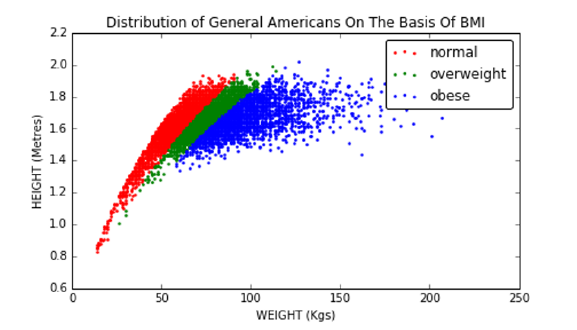
4.1. THE BODY MASS INDEX (BMI) 97
Figure 4.1: Height–weight scatter plot, for 1000 representative Americans. Col-
ors illustrate class labels in the BMI distribution.
•Obese: over 30.
Thus I am considered to be in normal range, with another dozen pounds
to gain before I officially become overweight. Figure 4.1 plots where a repre-
sentative group of Americans sit in height–weight space according to this scale.
Each point in this scatter plot is a person, colored according to their weight
classification by BMI. Regions of seemingly solid color are so dense with people
that the dots overlap. Outlier points to the right correspond to the heaviest
individuals.
The BMI is an example of a very successful statistic/scoring function. It
is widely used and generally accepted, although some in the public health field
quibble that better statistics are available.
The logic for the BMI is almost sound. The square of height should be pro-
portional to area. But mass should grow proportional to the volume, not area,
so why is it not mass/height3? Historically, BMI was designed to correlate with
the percentage of body fat in an individual, which is a much harder measure-
ment to make than height and weight. Experiments with several simple scoring
functions, including m/l and m/l3revealed that BMI works best.
It is very interesting to look at BMI distributions for extreme populations.
Consider professional athletes in American football (NFL) and basketball (NBA):
•Basketball players are notoriously tall individuals. They also have to run
up and down the court all day, promoting superior fitness.
•American football players are notoriously heavy individuals. In particular,
linemen exist only to block or move other linemen, thus placing a premium
on bulk.
Let’s look at some data. Figure 4.2 shows the BMI distributions of basketball
and football players, by sport. And indeed, almost all of the basketball players
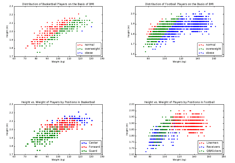
98 CHAPTER 4. SCORES AND RANKINGS
Figure 4.2: BMI distributions of professional basketball (left) and football
(right) players.
Figure 4.3: Position in basketball (left) and football (right) is largely determined
by size.
have normal BMI despite their very abnormal heights. And the football players
are almost uniformly animals, with most scored as obese despite the fact that
they are also well-conditioned athletes. These football players are generally
optimized for strength, instead of cardiovascular fitness.
In Chapter 6, we will discuss visualization techniques to highlight the presen-
tation of data, but let’s start to develop our aesthetic here. We use scatter plots
to show each individual as a point in height–weight space, with labels (weight
class or player position) shown as colors.
The breakdown of BMI by position is also revealing, and shown in Figure
4.3. In basketball, the guards are quick and sleek while the centers are tall and
intimidating. So all of these positions segregate neatly by size. In football, the
skill players (the quarterbacks, kickers, and punters) prove to be considerably
smaller than the sides of beef on the line.
4.2. DEVELOPING SCORING SYSTEMS 99
4.2 Developing Scoring Systems
Scores are functions that map the features of each entity to a numerical value
of merit. This section will look at the basic approaches for building effective
scoring systems, and evaluating them.
4.2.1 Gold Standards and Proxies
Historically, paper currencies were backed with gold, meaning that one paper
dollar could always be traded in for $1 worth of gold. This was why we knew
that our money was worth more than the paper it was printed on.
In data science, a gold standard is a set of labels or answers that we trust to
be correct. In the original formulation of BMI, the gold standard was the body
fat percentages carefully measured on a small number of subjects. Of course,
such measurements are subject to some error, but by defining these values to be
the gold standard for fitness we accept them to be the right measure. In gold
we trust.
The presence of a gold standard provides a rigorous way to develop a good
scoring system. We can use curve-fitting technique like linear regression (to be
discussed in Section 9.1) to weigh the input features so as to best approximate
the “right answers” on the gold standard instances.
But it can be hard to find real gold standards. Proxies are easier-to-find data
that should correlate well with the desired but unobtainable ground truth. BMI
was designed to be a proxy for body fat percentages. It is easily computable
from just height and weight, and does a pretty good job correlating with body
fat. This means it is seldom necessary to test buoyancy in water tanks or “pinch
an inch” with calipers, more intrusive measures that directly quantify the extent
of an individual’s flab.
Suppose I wanted to improve the grading system I use for next year’s data
science course. I have student data from the previous year, meaning their scores
on homework and tests, but I don’t really have a gold standard on what grades
these students deserved. I have only the grade I gave them, which is meaningless
if I am trying to improve the system.
I need a proxy for their unknown “real” course merit. A good candidate for
this might be each student’s cumulative GPA in their other courses. Generally
speaking, student performance should be conserved across courses. If my scor-
ing system hurts the GPA of the best students and helps the lower tier, I am
probably doing something wrong.
Proxies are particularly good when evaluating scoring/ranking systems. In
our book Who’s Bigger? [SW13] we used Wikipedia to rank historical figures by
“significance.” We did not have any gold standard significance data measuring
how important these people really were. But we used several proxies to evaluate
how we were doing to keep us honest:
•The prices that collectors will pay for autographs from celebrities should
generally correlate with the celebrity’s significance. The higher the price
people are willing to pay, the bigger the star.
100 CHAPTER 4. SCORES AND RANKINGS
•The statistics of how good a baseball player is should generally correlate
with the player’s significance. The better the athlete, the more important
they are likely to be.
•Published rankings appearing in books and magazines list the top pres-
idents, movie stars, singers, authors, etc. Presidents ranked higher by
historians should generally be ranked higher by us. Such opinions, in ag-
gregate, should generally correlate with the significance of these historical
figures.
We will discuss the workings of our historical significance scores in greater
detail in Section 4.7.
4.2.2 Scores vs. Rankings
Rankings are permutations ordering nentities by merit, generally constructed by
sorting the output of some scoring system. Popular examples of rankings/rating
systems include:
•Football/basketball top twenty: Press agencies generally rank the top
college sports teams by aggregating the votes of coaches or sportswriters.
Typically, each voter provides their own personal ranking of the top twenty
teams, and each team gets awarded more points the higher they appear
on the voter’s list. Summing up the points from each voter gives a total
score for each team, and sorting these scores defines the ranking.
•University academic rankings: The magazine U.S News and World Report
publishes annual rankings of the top American colleges and universities.
Their methodology is proprietary and changes each year, presumably to
motivate people to buy the new rankings. But it is generally a score
produced from statistics like faculty/student ratio, acceptance ratio, the
standardized test scores of its students and applicants, and maybe the
performance of its football/basketball teams :-). Polls of academic experts
also go into the mix.
•Google PageRank/search results: Every query to a search engine triggers
a substantial amount of computation, implicitly ranking the relevance of
every document on the web against the query. Documents are scored on
the basis of how well they match the text of the query, coupled with ratings
of the inherent quality of each page. The most famous page quality metric
here is PageRank, the network-centrality algorithm that will be reviewed
in Section 10.4.
•Class rank: Most High Schools rank students according to their grades,
with the top ranked student honored as class valedictorian. The scor-
ing function underlying these rankings is typically grade-point average
(GPA), where the contribution of each course is weighted by its number
of credits, and each possible letter grade is mapped to a number (typically
4.2. DEVELOPING SCORING SYSTEMS 101
A= 4.0). But there are natural variants: many schools choose to weigh
honors courses more heavily than lightweight classes like gym, to reflect
the greater difficulty of getting good grades.
Generally speaking, sorting the results of a scoring system yields a numerical
ranking. But thinking the other way, each item’s ranking position (say, 493th
out of 2196) yields a numerical score for the item as well.
Since scores and rankings are duals of each other, which provides a more
meaningful representation of the data? As in any comparison, the best answer
is that it depends, on issues like:
•Will the numbers be presented in isolation? Rankings are good at pro-
viding context for interpreting scores. As I write this, Stony Brook’s
basketball team ranks 111th among the nation’s 351 college teams, on the
strength of our RPI (ratings percentage index) of 39.18. Which number
gives you a better idea of whether we have a good or bad team, 111th or
39.18?
•What is the underlying distribution of scores? By definition, the top
ranked entity has a better score than the second ranked one, but this tells
you nothing about the magnitude of the difference between them. Are
they virtually tied, or is #1 crushing it?
Differences in rankings appear to be linear: the difference between 1 and 2
seems the same as the difference between 111 and 112. But this is not gen-
erally true in scoring systems. Indeed, small absolute scoring differences
can often yield big ranking differences.
•Do you care about the extremes or the middle? Well-designed scoring sys-
tems often have a bell-shaped distribution. With the scores concentrated
around the mean, small differences in score can mean large differences in
rank. In a normal distribution, increasing your score from the mean by
one standard deviation (σ) moves you from the 50th percentile to the 84th
percentile. But the same sized change from 1σto 2σtakes you only from
the 84th to 92.5th percentile.
So when an organization slips from first to tenth, heads should roll. But
when Stony Brook’s team slides from 111th to 120th, it likely represents
an insignificant difference in score and should be discounted. Rankings
are good at highlighting the very best and very worst entities among the
group, but less so the differences near the median.
4.2.3 Recognizing Good Scoring Functions
Good scoring functions are good because they are easily interpretable and gen-
erally believable. Here we review the properties of statistics which point in these
directions:
102 CHAPTER 4. SCORES AND RANKINGS
•Easily computable: Good statistics can be easily described and presented.
BMI is an excellent example: it contains only two parameters, and is eval-
uated using only simple algebra. It was found as the result of a search
through all simple functional forms on a small number of easily obtained,
relevant variables. It is an excellent exercise to brainstorm possible statis-
tics from a given set of features on a data set you know well, for practice.
•Easily understandable: It should be clear from the description of the
statistics that the ranking is relevant to the question at hand. “Mass
adjusted by height” explains why BMI is associated with obesity. Clearly
explaining the ideas behind your statistic is necessary for other people to
trust it enough to use.
•Monotonic interpretations of variables: You should have a sense of how
each of the features used in your scoring function correlate with the ob-
jective. Mass should correlate positively with BMI, because being heavy
requires that you weigh a lot. Height should correlate negatively, because
tall people naturally weigh more than short people.
Generally speaking, you are producing a scoring function without an ac-
tual gold standard to compare against. This requires understanding what
your variables mean, so your scoring function will properly correlate with
this mushy objective.
•Produces generally satisfying results on outliers: Ideally you know enough
about certain individual points to have a sense of where they belong in
any reasonable scoring system. If I am truly surprised by the identity
of the top entities revealed by the scoring system, it probably is a bug,
not a feature. When I compute the grades of the students in my courses,
I already know the names of several stars and several bozos from their
questions in class. If my computed grades do not grossly correspond to
these impressions, there is a potential bug that needs to be tracked down.
If the data items really are completely anonymous to you, you probably
should spend some time getting to know your domain better. At the very
least, construct artificial examples (“Superstar” and “Superdork”) with
feature values so that they should be near the top and bottom of the
ranking, and then see how they fit in with the real data.
•Uses systematically normalized variables: Variables drawn from bell-
shaped distributions behave sensibly in scoring functions. There will be
outliers at the tails of either end which correspond to the best/worst items,
plus a peak in the middle of items whose scores should all be relatively
similar.
These normally-distributed variables should be turned into Z-scores (see
Section 4.3) before adding them together, so that all features have compa-
rable means and variance. This reduces the scoring function’s dependence
on magic constants to adjust the weights, so no single feature has too
dominant an impact on the results.

4.3. Z-SCORES AND NORMALIZATION 103
µB= 21.9σB= 1.92
µZ= 0 σZ= 1
B 19 22 24 20 23 19 21 24 24 23
Z−1.51 0.05 1.09 −0.98 0.57 −1.51 −0.46 1.09 1.09 0.57
Figure 4.4: Taking the Z-scores of a set of values Bnormalizes them to have
mean µ= 0 and σ= 1.
Generally speaking, summing up Z-scores using the correct signs (plus for
positively correlated variables and minus for negative correlations) with
uniform weights will do roughly the right thing. A better function might
weigh these variables by importance, according to the strength of the
correlation with the target. But it is unlikely to not make much difference.
•Breaks ties in meaningful ways: Ranking functions are of very limited
value when there are bunches of ties. Ranking the handiness of people by
how many fingers they have won’t be very revealing. There will be a very
select group with twelve, a vast majority tied with ten, and then small
groups of increasingly disabled accident victims until we get down to zero.
In general, scores should be real numbers over a healthy range, in order to
minimize the likelihood of ties. Introducing secondary features to break
ties is valuable, and makes sense provided these features also correlate
with the property you care about.
4.3 Z-scores and Normalization
An important principle of data science is that we must try to make it as easy
as possible for our models to do the right thing. Machine learning techniques
like linear regression purport to find the line optimally fitting to a given data
set. But it is critical to normalize all the different variables to make their
range/distribution comparable before we try to use them to fit something.
Z-scores will be our primary method of normalization. The Z-score transform
is computed:
Zi= (ai−µ)/σ
where µis the mean of the distribution and σthe associated standard deviation.
Z-scores transform arbitrary sets of variables to a uniform range. The Z-
scores of height measured in inches will be exactly the same as that of the
height measured in miles. The average value of a Z-score over all points is zero.
Figure 4.4 shows a set of integers reduced to Z-scores. Values greater than the
mean become positive, while those less than the mean become negative. The
standard deviation of the Z-scores is 1, so all distributions of Z-scores have
similar properties.
Transforming values to Z-scores accomplishes two goals. First, they aid in
visualizing patterns and correlations, by ensuring that all fields have an identical
104 CHAPTER 4. SCORES AND RANKINGS
mean (zero) and operate over a similar range. We understand that a Z-score of
3.87 must represent basketball-player level height in a way that 79.8 does not,
without familiarity with the measurement unit (say inches). Second, the use
of Z-scores makes it easier on our machine learning algorithms, by making all
different features of a comparable scale.
In theory, performing a linear transformation like the Z-score doesn’t really
do anything that most learning algorithms couldn’t figure out by themselves.
These algorithms generally find the best coefficient to multiply each variable
with, which is free to be near σif the algorithm really wants it to be.
However, the realities of numerical computation kick in here. Suppose we
were trying to build a linear model on two variables associated with U.S. cities,
say, area in square miles and population. The first has a mean of about 5 and a
max around 100. The second has a mean about 25,000 and a max of 8,000,000.
For the two variables to have a similar effect on our model, we must divide the
second variable by a factor of 100,000 or so.
This causes numerical precision problems, because a very small change in the
value of the coefficient causes a very large change in how much the population
variable dominates the model. Much better would be to have the variables be
grossly the same scale and distribution range, so the issue is whether one feature
gets weighted, say, twice as strongly as another.
Z-scores are best used on normally distributed variables, which, after all, are
completely described by mean µand standard deviation σ. But they work less
well when the distribution is a power law. Consider the wealth distribution in the
United States, which may have a mean of (say) $200,000, with a σ= $200,000.
The Z-score of $80 billion dollar Bill Gates would then be 4999, still an incredible
outlier given the mean of zero.
Your biggest data analysis sins will come in using improperly normalized
variables in your analysis. What can we do to bring Bill Gates down to size?
We can hit him with a log, as we discussed in Section 2.4.
4.4 Advanced Ranking Techniques
Most bread-and-butter ranking tasks are solved by computing scores as linear
combinations of features, and then sorting them. In the absence of any gold
standard, these methods produce statistics which are often revealing and infor-
mative.
That said, several powerful techniques have been developed to compute rank-
ings from specific types of inputs: the results of paired comparisons, relationship
networks, and even assemblies of other rankings. We review these methods here,
for inspiration.
4.4.1 Elo Rankings
Rankings are often formed by analyzing sequences of binary comparisons, which
arise naturally in competitions between entities:
4.4. ADVANCED RANKING TECHNIQUES 105
•Sports contest results: Typical sporting events, be they football games or
chess matches, pit teams Aand Bagainst each other. Only one of them
will win. Thus each match is essentially a binary comparison of merit.
•Votes and polls: Knowledgeable individuals are often asked to compare
options and decide which choice they think is better. In an election, these
comparisons are called votes. A major component of certain university
rankings come from asking professors: which school is better, Aor B?
In the movie The Social Network, Facebook’s Mark Zuckerberg is shown
getting his start with FaceMash, a website showing viewers two faces and
asking them to pick which one is more attractive. His site then ranked all
the faces from most to least attractive, based on these paired comparisons.
•Implicit comparisons: From the right vantage point, feature data can be
meaningfully interpreted as pairwise comparisons. Suppose a student has
been accepted by both universities Aand B, but opts for A. This can be
taken as an implicit vote that Ais better than B.
What is the right way to interpret collections of such votes, especially where
there are many candidates, and not all pairs of players face off against each
other? It isn’t reasonable to say the one with the most wins wins, because (a)
they might have competed in more comparisons than other players, and (b) they
might have avoided strong opponents and beaten up only inferior competition.
The Elo system starts by rating all players, presumably equally, and then
incrementally adjusts each player’s score in response to the result of each match,
according to the formula:
r0(A) = r(A) + k(SA−µA),
where
•r(A) and r0(A) represent the previous and updated scores for player A.
•kis a fixed parameter reflecting the maximum possible score adjustment
in response to a single match. A small value of kresults in fairly static
rankings, while using too large a kwill cause wild swings in ranking based
on the latest match.
•SAis the scoring result achieved by player Ain the match under consid-
eration. Typically, SA= 1 if Awon, and SA=−1 if Alost.
•µAwas the expected result for Awhen competing against B. If Ahas
exactly the same skill level as B, then presumably µA= 0. But suppose
that Ais a champion and Bis a beginner or chump. Our expectation is
that Ashould almost certainly win in a head-to-head matchup, so µA>0
and is likely to be quite close to 1.
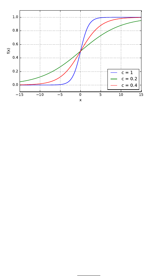
106 CHAPTER 4. SCORES AND RANKINGS
Figure 4.5: The shape of the logit function, for three different values for c.
All is clear here except how to determine µA. Given an estimate of the
probability that Abeats B(PA>B ), then
µA= 1 ·PA>B + (−1) ·(1 −PA>B ).
This win probability clearly depends on the magnitude of the skill difference
between players Aand B, which is exactly what is supposed to be measured by
the ranking system. Thus x=r(A)−r(B) represents this skill difference.
To complete the Elo ranking system, we need a way to take this real variable
xand convert it to a meaningful probability. This is an important problem we
will repeatedly encounter in this book, solved by a bit of mathematics called
the logit function.
The Logit Function
Suppose we want to take a real variable −∞ < x < ∞and convert it to a
probability 0 ≤p≤1. There are many ways one might imagine doing this, but
a particularly simple transformation is p=f(x), where
f(x) = 1
1 + e−cx
The shape of the logit function f(x) is shown in Figure 4.5. Particularly
note the special cases at the mid and endpoints:
•When two players are of equal ability, x= 0, and f(0) = 1/2, reflects that
both players have an equal probability of winning.
•When player Ahas a vast advantage, x→ ∞, and f(∞) = 1, defining
that Ais a lock to win the match.
4.4. ADVANCED RANKING TECHNIQUES 107
Garry Kasparov
2851
Steven Skiena
1200
Judit Polgar Magnus Carlsen
2735 2882
Steven Skiena Judit Polgar
K = 2771
S = 1280
P = 2790
C = 2827
Judit Polgar
P = 2790
S = 1280
Figure 4.6: Changes in ELO scores as a consequence of an unlikely chess tour-
nament.
•When player Bhas a vast advantage, x→ −∞, and f(−∞) = 0, denoting
that Bis a lock to win the match.
These are exactly the values we want if xmeasures the skill difference between
the players.
The logit function smoothly and symmetrically interpolates between these
poles. The parameter cin the logit function governs how steep the transition
is. Do small differences in skill translate into large differences in the probability
of winning? For c= 0, the landscape is as flat as a pancake: f(x) = 1/2 for all
x. The larger cis, the sharper the transition, as shown in Figure 4.5. Indeed,
c=∞yields a step function from 0 to 1.
Setting c= 1 is a reasonable start, but the right choice is domain specific.
Observing how often a given skill-difference magnitude results in an upset (the
weaker party winning) helps specify the parameter. The Elo Chess ranking
system was designed so that r(A)−r(B) = 400 means that Ahas ten times the
probability of winning than B.
Figure 4.6 illustrates Elo computations, in the context of a highly unlikely
tournament featuring three of the greatest chess players in history, and one low-
ranked patzer. Here k= 40, implying a maximum possible scoring swing of 80
points as a consequence of any single match. The standard logit function gave
Kasparov a probability of 0.999886 of beating Skiena in the first round, but
through a miracle akin to raising Lazarus the match went the other way. As a
consequence, 80 points went from Kasparov’s ranking to mine.
On the other side of the bracket two real chess champions did battle, with the
more imaginable upset by Polgar moving only 55 points. She wiped the floor
with me the final round, an achievement so clearly expected that she gained
essentially zero rating points. The Elo method is very effective at updating
ratings in response to surprise, not just victory.

108 CHAPTER 4. SCORES AND RANKINGS
1
2
3
4
5
A
C
B
D
E
B
A
C
D
E
A
B
C
E
D
A
B
D
C
E
A:
B:
C:
D:
E:
5
8
12
16
19
Figure 4.7: Borda’s method for constructing the consensus ranking of
{A, B, C, D, E}from a set of four input rankings, using linear weights.
4.4.2 Merging Rankings
Any single numeric feature f, like height, can seed n
2pairwise comparisons
among nitems, by testing whether f(A)> f(B) for each pair of items Aand
B. We could feed these pairs to the Elo method to obtain a ranking, but this
would be a silly way to think about things. After all, the result of any such
analysis would simply reflect the sorted order of f.
Integrating a collection of rankings by several different features makes for a
more interesting problem, however. Here we interpret the sorted order of the
ith feature as defining a permutation Pion the items of interest. We seek the
consensus permutation P, which somehow best reflects all of the component
permutations P1, . . . , Pk.
This requires defining a distance function to measure the similarity between
two permutations. A similar issue arose in defining the Spearman rank corre-
lation coefficient (see Section 2.3.1), where we compared two variables by the
measure of agreement in the relative order of the elements.1
Borda’s method creates a consensus ranking from multiple other rankings by
using a simple scoring system. In particular, we assign a cost or weight to each
of the npositions in the permutation. Then, for each of the nelements, we sum
up the weights of its positions over all of the kinput rankings. Sorting these n
scores determines the final consensus ranking.
All is now clear except for the mapping between positions and costs. The
simplest cost function assign ipoints for appearing in the ith position in each
permutation, i.e. we sum up the ranks of the element over all permutations.
This is what we do in the example of Figure 4.7. Item Agets 3 ·1 + 1 ·2=5
points on the strength of appearing first in three rankings and second in one.
Item Cfinishes with 12 points by finishing 2, 3, 3, and 4. The final consensus
ranking of {A, B, C, D, E}integrates all the votes from all input rankings, even
though the consensus disagrees at least in part with all four input rankings.
But it is not clear that using linear weights represents the best choice,
because it assumes uniform confidence in our accuracy to position elements
1Observe the difference between a similarity measure and a distance metric. In correlation,
the scores get bigger as elements get more similar, while in a distance function the difference
goes to zero. Distance metrics will be discussed more thoroughly in Section 10.1.1.
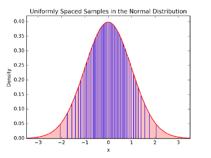
4.4. ADVANCED RANKING TECHNIQUES 109
Figure 4.8: Equally-spaced values by the normal distribution are closer in the
middle than the ends, making appropriate weights for Borda’s method.
throughout the permutation. Typically, we will know the most about the mer-
its of our top choices, but will be fairly fuzzy about exactly how those near the
middle order among themselves. If this is so, a better approach might be to
award more points for the distinction between 1st and 2nd than between 110th
and 111th.
This type of weighting is implicitly performed by a bell-shaped curve. Sup-
pose we sample nitems at equal intervals from a normal distribution, as shown
in Figure 4.8. Assigning these xvalues as the positional weights produces more
spread at the highest and lowest ranks than the center. The tail regions really
are as wide as they appear for these 50 equally-spaced points: recall that 95%
of the probability mass sits within 2σof the center.
Alternately, if our confidence is not symmetric, we could sample from the
half-normal distribution, so the tail of our ranks is weighted by the peak of
the normal distribution. This way, there is the greatest separation among the
highest-ranked elements, but little distinction among the elements of the tail.
Your choice of weighting function here is domain dependent, so pick one that
seems to do a good job on your problem. Identifying the very best cost function
turns out to be an ill-posed problem. And strange things happen when we try
to design the perfect election system, as will be shown in Section 4.6.
4.4.3 Digraph-based Rankings
Networks provide an alternate way to think about a set of votes of the form “A
ranks ahead of B.” We can construct a directed graph/network where there is
a vertex corresponding to each entity, and a directed edge (A, B) for each vote
that Aranks ahead of B.
The optimal ranking would then be a permutation Pof the vertices which
110 CHAPTER 4. SCORES AND RANKINGS
A
B C
D
E
A
B C
D
E
Figure 4.9: Consistently ordered preferences yield an acyclic graph or DAG
(left). Inconsistent preferences result in directed cycles, which can be broken by
deleting small sets of carefully selected edges, here shown dashed (right).
violates the fewest number of edges, where edge (A, B) is violated if Bcomes
before Ain the final ranking permutation P.
If the votes were totally consistent, then this optimal permutation would
violate exactly zero edges. Indeed, this is the case when there are no directed
cycles in the graph. A directed cycle like (A, C), (C, E), (E, A) represents
an inherent contradiction to any rank order, because there will always be an
unhappy edge no matter which order you choose.
A directed graph without cycles is called a directed acyclic graph or DAG.
An alert reader with a bit of algorithms background will recall that finding
this optimal vertex order is called topologically sorting the DAG, which can
be performed efficiently in linear time. Figure 4.9 (left) is a DAG, and has
exactly two distinct orders consistent with the directed edges: {A, B, C, D, E}
and {A, C, B, D, E}.
However, it is exceedingly unlikely that a real set of features or voters will
all happen to be mutually consistent. The maximum acyclic subgraph problem
seeks to find the smallest number of edges to delete to leave a DAG. Removing
edge (E, A) suffices in Figure 4.9 (right). Unfortunately, the problem of finding
the best ranking here is NP-complete, meaning that no efficient algorithm exists
for finding the optimal solution.
But there are natural heuristics. A good clue as to where a vertex vbelongs
is the difference dvbetween its in-degree and its out-degree. When dvis highly
negative, it probably belongs near the front of the permutation, since it domi-
nates many elements but is dominated by only a few. One can build a decent
ranking permutation by sorting the vertices according to these differences. Even
better is incrementally inserting the most negative (or most positive) vertex v
into its logical position, deleting the edges incident on v, and then adjusting the
counts before positioning the next best vertex.

4.5. WAR STORY: CLYDE’S REVENGE 111
4.4.4 PageRank
There is a different and more famous method to order the vertices in a network
by importance: the PageRank algorithm underpinning Google’s search engine.
The web is constructed of webpages, most of which contain links to other
webpages. Your webpage linking to mine is an implicit endorsement that you
think my page is pretty good. If it is interpreted as a vote that “you think my
page is better than yours,” we can construct the network of links and treat it
as a maximum acyclic-subgraph problem, discussed in the previous subsection.
But dominance isn’t really the right interpretation for links on the web.
PageRank instead rewards vertices which have the most in-links to it: if all
roads lead to Rome, Rome must be a fairly important place. Further, it weighs
these in-links by the strength of the source: a link to me from an important
page should count for more than one from a spam site.
The details here are interesting, but I will defer a deeper discussion to Section
10.4, when we discuss network analysis. However, I hope this brief introduction
to PageRank helps you appreciate the following tale.
4.5 War Story: Clyde’s Revenge
During my sophomore year of high school, I had the idea of writing a program to
predict the outcome of professional football games. I wasn’t all that interested
in football as a sport, but I observed several of my classmates betting their
lunch money on the outcome of the weekend football games. It seemed clear to
me that writing a program which accurately predicted the outcome of football
games could have significant value, and be a very cool thing to do besides.
In retrospect, the program I came up with now seems hopelessly crude. My
program would average the points scored by team xand the points allowed by
team yto predict the number of points xwill score against y.
Px=((points scored by team x) + (points allowed by team y))
2×(games played)
Py=((points scored by team y) + (points allowed by team x))
2×(games played)
I would then adjust these numbers up or down in response to other factors,
particularly home field advantage, round the numbers appropriately, and call
what was left my predicted score for the game.
This computer program, Clyde, was my first attempt to build a scoring
function for some aspect of the real world. It had a certain amount of logic
going for it. Good teams score more points than they allow, while bad teams
allow more points than they score. If team xplays a team ywhich has given up
a lot of points, then xshould score more points against ythan it does against
112 CHAPTER 4. SCORES AND RANKINGS
teams with better defenses. Similarly, the more points team xhas scored against
the rest of the league, the more points it is likely to score against y.
Of course, this crude model couldn’t capture all aspects of football reality.
Suppose team xhas been playing all stiffs thus far in the season, while team y
has been playing the best teams in the league. Team ymight be a much better
team than xeven though its record so far is poor. This model also ignores
any injuries a team is suffering from, whether the weather is hot or cold, and
whether the team is hot or cold. It disregards all the factors that make sports
inherently unpredictable.
And yet, even such a simple model can do a reasonable job of predicting
the outcome of football games. If you compute the point averages as above,
and give the home team an additional three points as a bonus, you will pick
the winner in almost two-thirds of all football games. Compare this to the even
cruder model of flipping a coin, which predicts only half the games correctly.
That was the first major lesson Clyde taught me:
Even crude mathematical models can have real predictive power.
As an audacious 16 year-old, I wrote to our local newspaper, The New
Brunswick Home News, explaining that I had a computer program to predict
football game results and was ready to offer them the exclusive opportunity to
publish my predictions each week. Remember that this was back in 1977, well
before personal computers had registered on the public consciousness. In those
days, the idea of a high school kid actually using a computer had considerable
gee-whiz novelty value. To appreciate how much times have changed, check out
the article the paper published about Clyde and I in Figure 4.10.
I got the job. Clyde predicted the outcome of each game in the 1977 National
Football League. As I recall, Clyde and I finished the season with the seemingly
impressive record of 135–70. Each week, they would compare my predictions
against those of the newspaper’s sportswriters. As I recall, we all finished within
a few games of each other, although most of the sportswriters finished with
better records than the computer.
The Home News was so impressed by my work that they didn’t renew me
the following season. However, Clyde’s picks for the 1978 season were published
in the Philadelphia Inquirer, a much bigger newspaper. I didn’t have the col-
umn to myself, though. Instead, the Inquirer included me among ten amateur
and professional prognosticators, or touts. Each week we had to predict the
outcomes of four games against the point spread.
The point spread in football is a way of handicapping stronger teams for
betting purposes. The point spread is designed to make each game a 50/50
proposition, and hence makes predicting the outcome of games much harder.
Clyde and I didn’t do very well against the spread during the 1978 National
Football League season, and neither did most of the other Philadelphia Inquirer
touts. We predicted only 46% of our games correctly against the spread, a
performance good (or bad) enough to finish 7th out of the ten published prog-
nosticators. Picking against the spread taught me a second major life lesson:
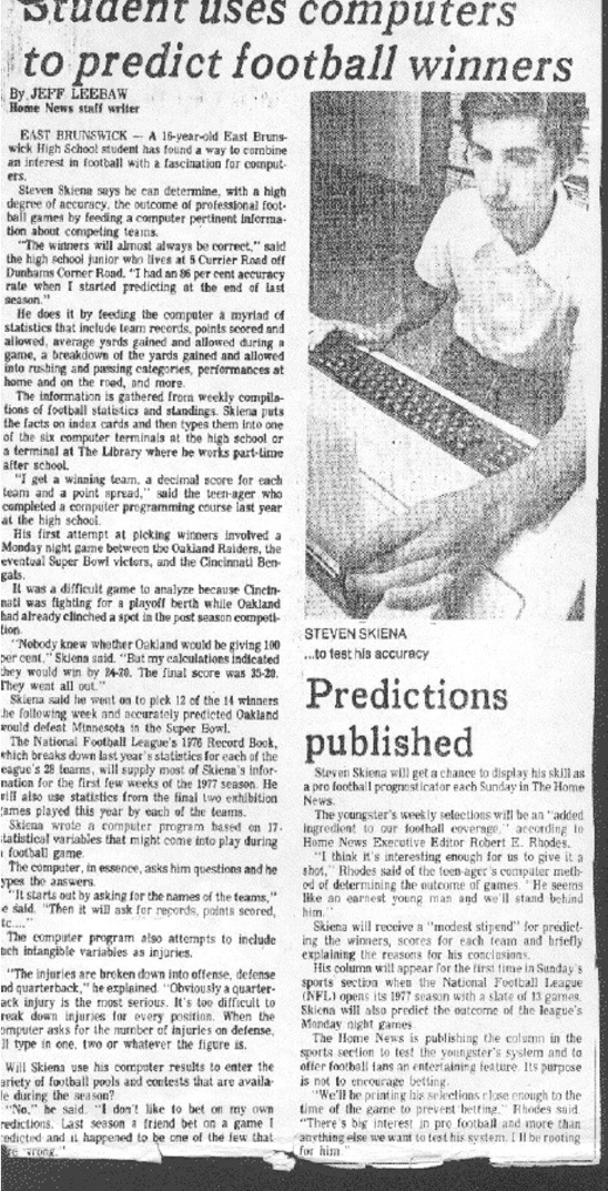
4.5. WAR STORY: CLYDE’S REVENGE 113
Figure 4.10: My first attempt at mathematical modeling.
114 CHAPTER 4. SCORES AND RANKINGS
Crude mathematical models do not have real predictive power when
there is real money on the line.
So Clyde was not destined to revolutionize the world of football prognosti-
cation. I pretty much forgot about it until I assigned the challenge of predicting
the Super Bowl as a project in my data science class. The team that got the
job was made up of students from India, meaning they knew much more about
cricket than American football when they started.
Still, they rose to the challenge, becoming fans as they built a large data
set on the outcome of every professional and college game played over the past
ten years. They did a logistic regression analysis over 142 different features
including rushing, passing, and kicking yardage, time of possession, and number
of punts. They then proudly reported to me the accuracy of their model: correct
predictions on 51.52% of NFL games.
“What!” I screamed, “That’s terrible!” “Fifty percent is what you get by
flipping a coin. Try averaging the points scored and yielded by the two teams,
and give three points to the home team. How does that simple model do?”
On their data set, this Clyde-light model picked 59.02% of all games cor-
rectly, much much better than their sophisticated-looking machine learning
model. They had gotten lost in the mist of too many features, which were
not properly normalized, and built using statistics collected over too long a
history to be representative of the current team composition. Eventually the
students managed to come up with a PageRank-based model that did a little
bit better (60.61%), but Clyde did almost as well serving as a baseline model.
There are several important lessons here. First, garbage in, garbage out.
If you don’t prepare a clean, properly normalized data set, the most advanced
machine learning algorithms can’t save you. Second, simple scores based on a
modest amount of domain-specific knowledge can do surprisingly well. Further,
they help keep you honest. Build and evaluate simple, understandable baselines
before you invest in more powerful approaches. Clyde going baseline left their
machine learning model defenseless.
4.6 Arrow’s Impossibility Theorem
We have seen several approaches to construct rankings or scoring functions from
data. If we have a gold standard reporting the “right” relative order for at least
some of the entities, then this could be used to train or evaluate our scoring
function to agree with these rankings to the greatest extent possible.
But without a gold standard, it can be shown that no best ranking system
exists. This is a consequence of Arrow’s impossibility theorem, which proves
that no election system for aggregating permutations of preferences satisfies the
following desirable and innocent-looking properties:
•The system should be complete, in that when asked to choose between
alternatives Aand B, it should say (1) Ais preferred to B, (2) Bis
preferred to A, or (3) there is equal preference between them.

4.7. WAR STORY: WHO’S BIGGER? 115
Voter Red Green Blue
x 1 2 3
y 2 3 1
z 3 1 2
Figure 4.11: Preference rankings for colors highlighting the loss of transitivity.
Red is preferred to green and green preferred to blue, yet blue is preferred to
red.
•The results should be transitive, meaning if Ais preferred to B, and Bis
preferred to C, then Amust be preferred to C.
•If every individual prefers Ato B, then the system should prefer Ato B.
•The system should not depend only upon the preferences of one individual,
a dictator.
•The preference of Acompared to Bshould be independent of preferences
for any other alternatives, like C.
Figure 4.11 captures some of the flavor of Arrow’s theorem, and the non-
transitive nature of “rock-paper-scissors” type ordering. It shows three voters
(x,y, and z) ranking their preferences among colors. To establish the preference
among two colors aand b, a logical system might compare how many permuta-
tions rank abefore bas opposed to bbefore a. By this system, red is preferred
to green by xand y, so red wins. Similarly, green is preferred to blue by xand
z, so green wins. By transitivity, red should be preferred to blue by implication
on these results. Yet yand z, prefer blue to red, violating an inherent property
we want our election system to preserve.
Arrow’s theorem is very surprising, but does it mean that we should give up
on rankings as a tool for analyzing data? Of course not, no more than Arrow’s
theorem means that we should give up on democracy. Traditional voting systems
based on the idea that the majority rules generally do a good job of reflecting
popular preferences, once appropriately generalized to deal with large numbers
of candidates. And the techniques in this chapter generally do a good job of
ranking items in interesting and meaningful ways.
Take-Home Lesson: We do not seek correct rankings, because this is an ill-
defined objective. Instead, we seek rankings that are useful and interesting.
4.7 War Story: Who’s Bigger?
My students sometimes tell me that I am history. I hope this isn’t true quite
yet, but I am very interested in history, as is my former postdoc Charles Ward.
Charles and I got to chatting about who the most significant figures in history
116 CHAPTER 4. SCORES AND RANKINGS
were, and how you might measure this. Like most people, we found our answers
in Wikipedia.
Wikipedia is an amazing thing, a distributed work product built by over
100,000 authors which somehow maintains a generally sound standard of accu-
racy and depth. Wikipedia captures an astonishing amount of human knowledge
in an open and machine-readable form.
We set about using the English Wikipedia as a data source to base historical
rankings on. Our first step was to extract feature variables from each person’s
Wikipedia page that should clearly correlate with historical significance. This
included features like:
•Length: Most significant historical figures should have longer Wikipedia
pages than lesser mortals. Thus article length in words provides a natural
feature reflecting historical wattage, to at least some degree.
•Hits: The most significant figures have their Wikipedia pages read more
often than others, because they are of greater interest to a larger number
of people. My Wikipedia page gets hit an average of twenty times per day,
which is pretty cool. But Issac Newton’s page gets hit an average of 7700
times per day, which is a hell of a lot better.
•PageRank: Significant historical figures interact with other significant
historical figures, which get reflected as hyperlink references in Wikipedia
articles. This defines a directed graph where the vertices are articles, and
the directed edges hyperlinks. Computing the PageRank of this graph will
measure the centrality of each historical figure, which correlates well with
significance.
All told, we extracted six features for each historical figure. Next, we normal-
ized these variables before aggregating, essentially by combining the underlying
rankings with normally-distributed weights, as suggested in Section 4.4.2. We
used a technique called statistical factor analysis related to principal component
analysis (discussed in Section 8.5.2), to isolate two factors that explained most
of the variance in our data. A simple linear combination of these variables gave
us a scoring function, and we sorted the scores to determine our initial ranking,
something we called fame.
The top twenty figures by our fame score are shown in Figure 4.12 (right).
We studied these rankings and decided that it didn’t really capture what we
wanted it to. The top twenty by fame included pop musicians like Madonna
and Michael Jackson, and three contemporary U.S. presidents. It was clear that
contemporary figures ranked far higher than we thought they should: our scoring
function was capturing current fame much more than historical significance.
Our solution was to decay the scores of contemporary figures to account
for the passage of time. That a current celebrity gets a lot of Wikipedia hits
is impressive, but that we still care about someone who died 300 years ago is
much more impressive. The top twenty figures after age correction are shown
in Figure 4.12 (left).

4.7. WAR STORY: WHO’S BIGGER? 117
Signif Name
1 Jesus
2 Napoleon
3 William Shakespeare
4 Muhammad
5 Abraham Lincoln
6 George Washington
7 Adolf Hitler
8 Aristotle
9 Alexander the Great
10 Thomas Jefferson
11 Henry VIII
12 Elizabeth I
13 Julius Caesar
14 Charles Darwin
15 Karl Marx
16 Martin Luther
17 Queen Victoria
18 Joseph Stalin
19 Theodore Roosevelt
20 Albert Einstein
Fame Person
1 George W. Bush
2 Barack Obama
3 Jesus
4 Adolf Hitler
5 Ronald Reagan
6 Bill Clinton
7 Napoleon
8 Michael Jackson
9 W. Shakespeare
10 Elvis Presley
11 Muhammad
12 Joseph Stalin
13 Abraham Lincoln
14 G. Washington
15 Albert Einstein
16 John F. Kennedy
17 Elizabeth II
18 John Paul II
19 Madonna
20 Britney Spears
Figure 4.12: The top 20 historical figures, ranked by significance (left) and
contemporary fame (right).
Now this was what we were looking for! We validated the rankings using
whatever proxies for historical significance we could find: other published rank-
ings, autograph prices, sports statistics, history textbooks, and Hall of Fame
election results. Our rankings showed a strong correlation against all of these
proxies.
Indeed, I think these rankings are wonderfully revealing. We wrote a book
describing all kinds of things that could be learned from them [SW13]. I proudly
encourage you to read it if you are interested in history and culture. The more
we studied these rankings, the more I was impressed in their general soundness.
That said, our published rankings did not meet with universal agreement.
Far from it. Dozens of newspaper and magazine articles were published about
our rankings, many quite hostile. Why didn’t people respect them, despite our
extensive validation? In retrospect, most of the flack we fielded came for three
different reasons:
•Differing implicit notions of significance: Our methods were designed
to measure meme-strength, how successfully these historical figures were
propagating their names though history. But many readers thought our
methods should capture notions of historical greatness. Who was most
important, in terms of changing the world? And do we mean world or
just the English-speaking world? How can there be no Chinese or Indian
118 CHAPTER 4. SCORES AND RANKINGS
figures on the list when they represent over 30% of the world’s population?
We must agree on what we are trying to measure before measuring it.
Height is an excellent measure of size, but it does not do a good job of
capturing obesity. However, height is very useful to select players for a
basketball team.
•Outliers: Sniff tests are important to evaluating the results of an analysis.
With respect to our rankings, this meant checking the placement of people
we knew, to confirm that they fell in reasonable places.
I felt great about our method’s ranking of the vast majority of historical
figures. But there were a few people who our method ranked higher than
any reasonable person would, specifically President George W. Bush (36)
and teenage TV star Hilary Duff (1626). One could look at these out-
liers and dismiss the entire thing. But understand that we ranked almost
850,000 historical figures, roughly the population of San Francisco. A few
cherry-picked bad examples must be put in the proper context.
•Pigeonhole constraints: Most reviewers saw only the rankings of our top
100 figures, and they complained about exactly where we placed people
and who didn’t make the cut. The women’s TV show The View com-
plained we didn’t have enough women. I recall British articles complain-
ing we had Winston Churchill (37) ranked too low, South African articles
that thought we dissed Nelson Mandela (356), Chinese articles saying we
didn’t have enough Chinese, and even a Chilean magazine whining about
the absence of Chileans.
Some of this reflects cultural differences. These critics had a different
implicit notion of significance than reflected by English Wikipedia. But
much of it reflects the fact that there are exactly one hundred places in
the top 100. Many of the figures they saw as missing were just slightly
outside the visible horizon. For every new person we moved into the top
hundred, we had to drop somebody else out. But readers almost never
suggested names that should be omitted, only those who had to be added.
What is the moral here? Try to anticipate the concerns of the audience for
your rankings. We were encouraged to explicitly call our measure meme-strength
instead of significance. In retrospect, using this less-loaded name would have
permitted our readers to better appreciate what we were doing. We probably
also should have discouraged readers from latching on to our top 100 rankings,
and instead concentrate on relative orderings within groups of interest: who
were the top musicians, scientists, and artists? This might have proved less
controversial, better helping people build trust in what we were doing.
4.8 Chapter Notes
Langville and Meyer [LM12] provide a through introduction to most of the
ranking methods discussed here, including Elo and PageRank.
4.9. EXERCISES 119
One important topic not covered in this chapter is learning to rank methods,
which exploit gold standard ranking data to train appropriate scoring functions.
Such ground truth data is generally not available, but proxies can sometimes be
found. When evaluating search engines, the observation that a user clicked the
(say) fourth item presented to them can be interpreted as a vote that it should
have been higher ranked than the three placed above it. SVMrank [Joa02]
presents a method for learning ranking functions from such data.
The heuristic proposed minimizing edge conflicts in a vertex order is due
to Eades et. al. [ELS93]. My presentation of Arrow’s impossibility theorem is
based on notes from Watkins [Wat16].
The war stories of this chapter were drawn very closely from my books
Calculated Bets and Who’s Bigger? Don’t sue me for self-plagiarism.
4.9 Exercises
Scores and Rankings
4-1. [3] Let Xrepresent a random variable drawn from the normal distribution de-
fined by µ= 2 and σ= 3. Suppose we observe X= 5.08. Find the Z-score of x,
and determine how many standard deviations away from the mean that xis.
4-2. [3] What percentage of the standard normal distribution (µ= 0, σ= 1) is found
in each region?
(a) Z > 1.13.
(b) Z < 0.18.
(c) Z > 8.
(d) |Z|<0.5.
4-3. [3] Amanda took the Graduate Record Examination (GRE), and scored 160 in
verbal reasoning and 157 in quantitative reasoning. The mean score for verbal
reasoning was 151 with a standard deviation of 7, compared with mean µ= 153
and σ= 7.67 for quantitative reasoning. Assume that both distributions are
normal.
(a) What were Amanda’s Z-scores on these exam sections? Mark these scores
on a standard normal distribution curve.
(b) Which section did she do better on, relative to other students?
(c) Find her percentile scores for the two exams.
4-4. [3] Identify three successful and well-used scoring functions in areas of personal
interest to you. For each, explain what makes it a good scoring function and
how it is used by others.
4-5. [5] Find a data set on properties of one of the following classes of things:
(a) The countries of the world.
(b) Movies and movie stars.
(c) Sports stars.
120 CHAPTER 4. SCORES AND RANKINGS
(d) Universities.
Construct a sensible ranking function reflecting quality or popularity. How well
is this correlated with some external measure aiming at a similar result?
4-6. [5] Produce two substantially different but sensible scoring functions on the same
set of items. How different are the resulting rankings? Does the fact that both
have to be sensible constrain rankings to be grossly similar?
4-7. [3] The scoring systems used by professional sports leagues to select the most
valuable player award winner typically involves assigning positional weights to
permutations specified by voters. What systems do they use in professional
baseball, basketball, and football? Are they similar? Do you think they are
sensible?
Implementation Projects
4-8. [5] Use Elo ratings to rank all the teams in a sport such as baseball, football,
or basketball, which adjusts the rating in response to each new game outcome.
How accurately do these Elo ratings predict the results of future contests?
4-9. [5] Evaluate the robustness of Borda’s method by applying krandom swaps to
each of mdistinct copies of the permutation p={1,2,...,n}. What is the
threshold where Borda’s method fails to reconstruct p, as a function of n,k,
and m?
Interview Questions
4-10. [5] What makes a data set a gold standard?
4-11. [5] How can you test whether a new credit risk scoring model works?
4-12. [5] How would you forecast sales for a particular book, based on Amazon public
data?
Kaggle Challenges
4-13. Rating chess players from game positions.
https://www.kaggle.com/c/chess
4-14. Develop a financial credit scoring system.
https://www.kaggle.com/c/GiveMeSomeCredit
4-15. Predict the salary of a job from its ad.
https://www.kaggle.com/c/job-salary-prediction
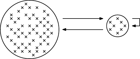
Chapter 5
Statistical Analysis
It is easy to lie with statistics, but easier to lie without them.
– Frederick Mosteller
I will confess that I have never had a truly satisfying conversation with a statis-
tician. This is not completely for want of trying. Several times over the years
I have taken problems of interest to statisticians, but always came back with
answers like “You can’t do it that way” or “But it’s not independent,” instead
of hearing “Here is the way you can handle it.”
To be fair, these statisticians generally did not appreciate talking with me,
either. Statisticians have been thinking seriously about data for far longer than
computer scientists, and have many powerful methods and ideas to show for it.
In this chapter, I will introduce some of these important tools, like the definitions
of certain fundamental distributions and tests for statistical significance. This
chapter will also introduce Baysian analysis, a way to rigorously assess how new
data should affect our previous estimates of future events.
Population
Sample
Probability
Inferential Statistics
Descriptive
Statistics
Figure 5.1: The central dogma of statistics: analysis of a small random sample
enables drawing rigorous inferences about the entire population.
122 CHAPTER 5. STATISTICAL ANALYSIS
Figure 5.1 illustrates the process of statistical reasoning. There is an un-
derlying population of possible things that we can potentially observe. Only a
relatively small subset of them are actually sampled, ideally at random, mean-
ing that we can observe properties of the sampled items. Probability theory
describes what properties our sample should have, given the properties of the
underlying population. But statistical inference works the other way, where we
try to deduce what the full population is like given analysis of the sample.
Ideally, we will learn to think like a statistician: enough so as to remain
vigilant and guard against overinterpretation and error, while retaining our
confidence to play with data and take it where it leads us.
5.1 Statistical Distributions
Every variable that we observe defines a particular frequency distribution, which
reflects how often each particular value arises. The unique properties of variables
like height, weight, and IQ are captured by their distributions. But the shapes
of these distributions are themselves not unique: to a great extent, the world’s
rich variety of data appear only in a small number of classical forms.
These classical distributions have two nice properties: (1) they describe
shapes of frequency distributions that arise often in practice, and (2) they can
often be described mathematically using closed-form expressions with very few
parameters. Once abstracted from specific data observations, they become prob-
ability distributions, worthy of independent study.
Familiarity with the classical probability distributions is important. They
arise often in practice, so you should be on the look out for them. They give us
a vocabulary to talk about what our data looks like. We will review the most
important statistical distributions (binomial, normal, Poisson, and power law)
in the sections to follow, emphasizing the properties that define their essential
character.
Note that your observed data does not necessarily arise from a particular
theoretical distribution just because its shape is similar. Statistical tests can
be used to rigorously prove whether your experimentally-observed data reflects
samples drawn from a particular distribution.
But I am going to save you the trouble of actually running any of these tests.
I will state with high confidence that your real-world data does not precisely fit
any of the famous theoretical distributions.
Why is that? Understand that the world is a complicated place, which makes
measuring it a messy process. Your observations will probably be drawn from
multiple sample populations, each of which has a somewhat different underlying
distribution. Something funny generally happens at the tails of any observed
distribution: a sudden burst of unusually high or low values. Measurements will
have errors associated with them, sometimes in weird systematic ways.
But that said, understanding the basic distributions is indeed very impor-
tant. Each classical distribution is classical for a reason. Understanding these
reasons tells you a lot about observed data, so they will be reviewed here.
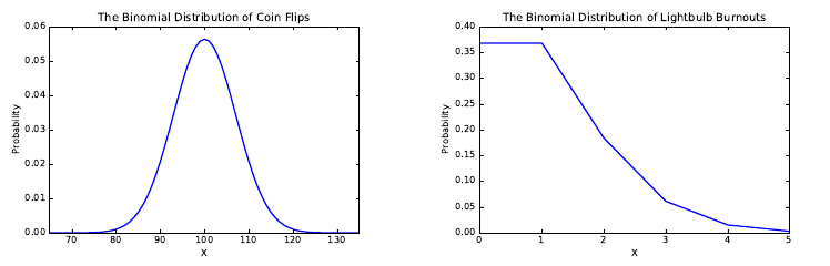
5.1. STATISTICAL DISTRIBUTIONS 123
Figure 5.2: The binomial distribution can be used to model the distribution of
heads in 200 coin tosses with p= 0.5 (left), and the number of blown lightbulbs
in 1000 events with failure probability p= 0.001 (right).
5.1.1 The Binomial Distribution
Consider an experiment consisting of identical, independent trials which have
two possible outcomes P1and P2, with the respective probabilities of pand
q= (1−p). Perhaps your experiment is flipping fair coins, where the probability
of heads (p= 0.5) is the same as getting tails (q= 0.5). Perhaps it is repeatedly
turning on a light switch, where the probability of suddenly discovering that
you must change the bulb (p= 0.001) is much less than that of seeing the light
(q= 0.999).
The binomial distribution reports the probability of getting exactly x P1
events in the course of nindependent trials, in no particular order. Independence
is important here: we are assuming the probability of failure of a bulb has no
relation to how many times it has previously been used. The pdf for the binomial
distribution is defined by:
P(X=x) = n
xpx(1 −p)(n−x)
There are several things to observe about the binomial distribution:
•It is discrete: Both arguments to the binomial distribution (nand x) must
be integers. The smoothness of Figure 5.2 (left) is an illusion, because
n= 200 is fairly large. There is no way of getting 101.25 heads in 200
coin tosses.
•You probably can explain the theory behind it: You first encountered the
binomial distribution in high school. Remember Pascal’s triangle? To end
up with exactly xheads in nflips in a particular sequence occurs with
probability px(1 −p)(n−x), for each of the n
xdistinct flip sequences.
•It is sort of bell-shaped: For a fair coin (p= 0.5), the binomial distribution
is perfectly symmetrical, with the mean in the middle. This is not true

124 CHAPTER 5. STATISTICAL ANALYSIS
Figure 5.3: The probability density function (pdf) of the normal distribution
(left) with its corresponding cumulative density function (cdf) on right.
in the lightbulb case: if we only turn on the bulb n= 1000 times, the
most likely number of failures will be zero. This rings just half the bell
in Figure 5.2. That said, as n→ ∞ we will get a symmetric distribution
peaking at the mean.
•It is defined using only two parameters: All we need are values of pand
nto completely define a given binomial distribution.
Many things can be reasonably modeled by the binomial distribution. Recall
the variance in the performance of a p= 0.300 hitter discussed in Section 2.2.3.
There the probability of getting a hit with each trial was p= 0.3, with n= 500
trials per season. Thus the number of hits per season are drawn from a binomial
distribution.
Realizing that it was a binomial distribution meant that we really didn’t have
to use simulation to construct the distribution. Properties like the expected
number of hits µ=np = 500 ×0.3 = 150 and its standard deviation σ=
√npq =√500 ×0.3×0.7 = 10.25 simply fall out of closed-form formulas that
you can look up when needed.
5.1.2 The Normal Distribution
A great many natural phenomenon are modeled by bell-shaped curves. Mea-
sured characteristics like height, weight, lifespan, and IQ all fit the same basic
scheme: the bulk of the values lie pretty close to the mean, the distribution is
symmetric, and no value is too extreme. In the entire history of the world, there
has never been either a 12-foot-tall man or a 140-year-old woman.
The mother of all bell-shaped curves is the Gaussian or normal distribution,
which is completely parameterized by its mean and standard deviation:
P(x) = 1
σ√2πe−(x−µ)2/2σ2
5.1. STATISTICAL DISTRIBUTIONS 125
Figure 5.3 shows the pdf and cdf of the normal distribution. There are
several things to note:
•It is continuous: The arguments to the normal distribution (mean µand
standard deviation σ) are free to arbitrary real numbers, with the lone
constraint that σ > 0.
•You probably can’t explain where it comes from: The normal distribution
is a generalization of the binomial distribution, where n→ ∞ and the
degree of concentration around the mean is specified by the parameter σ.
Take your intuition here from the binomial distribution, and trust that
Gauss got his calculations right: the great mathematician worked out
the normal distribution for his Ph.D. dissertation. Or consult any decent
statistics book if you are really curious to see where it comes from.
•It truly is bell-shaped: The Gaussian distribution is the platonic exam-
ple of a bell-shaped curve. Because it operates on a continuous variable
(like height) instead of a discrete count (say, the number of events) it
is perfectly smooth. Because it goes infinitely in both directions, there
is no truncation of the tails at either end. The normal distribution is a
theoretical construct, which helps explain this perfection.
•It is also defined using only two parameters: However, these are different
parameters than the binomial distribution! The normal distribution is
completely defined by its central point (given by the mean µ) and its
spread (given by the standard deviation σ). They are the only knobs we
can use to tweak the distribution.
What’s Normal?
An amazing number of naturally-occurring phenomenon are modeled by the
normal distribution. Perhaps the most important one is measurement error.
Every time you measure your weight on a bathroom scale, you will get a some-
what different answer, even if your weight has not changed. Sometimes the scale
will read high and other times low, depending upon room temperature and the
warping of the floor. Small errors are more likely than big ones, and slightly
high is just as likely as slightly low. Experimental error is generally normally
distributed as Gaussian noise.
Physical phenomenon like height, weight, and lifespan all have bell-shaped
distributions, by similar arguments. Yet the claim that such distributions are
normal is usually made too casually, without precisely specifying the underlying
population. Is human height normally distributed? Certainly not: men and
women have different mean heights and associated distributions. Is male height
normally distributed? Certainly not: by including children in the mix and
shrinking senior citizens you again have the sum of several different underlying
distributions. Is the height of adult males in the United States normal? No,
probably not even then. There are non-trivial populations with growth disorders
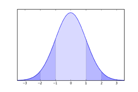
126 CHAPTER 5. STATISTICAL ANALYSIS
Figure 5.4: The normal distribution implies tight bounds on the probability of
lying far from the mean. 68% of the values must lie within one sigma of the
mean, and 95% within 2σ, and 99.7% within 3σ.
like dwarfism and acromegaly, that leave bunches of people substantially shorter
and taller than could be explained by the normal distribution.
Perhaps the most famous bell-shaped but non-normal distribution is that
of daily returns (percentage price movements) in the financial markets. A big
market crash is defined by a large percentage price drop: on October 10, 1987,
the Dow Jones average lost 22.61% of its value. Big stock market crashes occur
with much greater frequency than can be accurately modeled by the normal dis-
tribution. Indeed, every substantial market crash wipes out a certain number of
quants who assumed normality, and inadequately insured against such extreme
events. It turns out that the logarithm of stock returns proves to be normally
distributed, resulting in a distribution with far fatter tails than normal.
Although we must remember that bell-shaped distributions are not always
normal, making such an assumption is a reasonable way to start thinking in the
absence of better knowledge.
5.1.3 Implications of the Normal Distribution
Recall that the mean and standard deviation together always roughly charac-
terize any frequency distribution, as discussed in Section 2.2.4. But they do a
spectacularly good job of characterizing the normal distribution, because they
define the normal distribution.
Figure 5.4 illustrates the famous 68%–95%–99% rule of the normal distribu-
tion. Sixty-eight percent of the probability mass must lie within the region ±1σ
of the mean. Further, 95% of the probability is within 2σ, and 99.7% within
3σ.
This means that values far from the mean (in terms of σ) are vanishingly
rare in any normally distributed variable. Indeed the term six sigma is used to

5.1. STATISTICAL DISTRIBUTIONS 127
connote quality standards so high that defects are incredibly rare events. We
want plane crashes to be six sigma events. The probability of a 6σevent on the
normal distribution is approximately 2 parts per billion.
Intelligence as measured by IQ is normally distributed, with a mean of 100
and standard deviation σ= 15. Thus 95% of the population lies within 2σof
the mean, from 70 to 130. This leaves only 2.5% of people with IQs above 130,
and another 2.5% below 70. A total of 99.7% of the mass lies within 3σof the
mean, i.e. people with IQs between 55 and 145.
So how smart is the smartest person in the world? If we assume a population
of 7 billion people, the probability of a randomly-selected person being smartest
is approximately 1.43 ×10⁻¹⁰. This is about the same probability of a single
sample lying more than 6.5σfrom the mean. Thus the smartest person in the
world should have an IQ of approximately 197.5, according to this reckoning.
The degree to which you accept this depends upon how strongly you believe
that IQ really is normally distributed. Such models are usually in grave danger
of breaking down at the extremes. Indeed, by this model there is almost the
same probability of there being someone dumb enough to earn a negative score
on an IQ test.
5.1.4 Poisson Distribution
The Poisson distribution measures the frequency of intervals between rare events.
Suppose we model human lifespan by a sequence of daily events, where there
is a small but constant probability 1 −pthat one happens to stop breathing
today. A lifespan of exactly ndays means successfully breathing for each of
the first n−1 days and then forever breaking the pattern on the nth day. The
probability of living exactly ndays is given by P r(n) = pn−1(1 −p), yielding
an expected lifespan
µ=
∞
X
k=0
k·P r(k).
The Poisson distribution basically follows from this analysis, but takes a
more convenient argument than p. Instead it is based on µ, the average value of
the distribution. Since each pdefines a particular value of µ, these parameters
are in some sense equivalent, but the average is much easier to estimate or
measure. The Poisson distribution yields the very simple closed form:
P r(x) = e−µµx
x!
Once you start thinking the right way, many distributions begin to look
Poisson, because they represent intervals between rare events.
Recall the binomial distribution lightbulb model from the previous section.
This made it easy to compute the expected number of changes in Figure 5.2
(right), but not the lifespan distribution, which is Poisson. Figure 5.5 plots the
associated Poisson distribution for µ= 1/p = 1000, which shows that we should
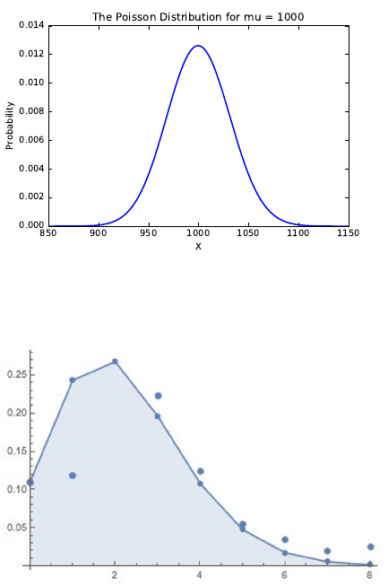
128 CHAPTER 5. STATISTICAL ANALYSIS
Figure 5.5: The lifespan distribution of lightbulbs with an expected life of µ=
1000 hours, as modeled by a Poisson distribution.
Figure 5.6: The observed fraction of families with xkids (isolated points) is
accurately modeled by Poisson distribution, defined by an average of µ= 2.2
children per family (polyline).
expect almost all bulbs to glow for between 900 and 1100 hours before the dying
of the light.
Alternately, suppose we model the number of children by a process where
the family keeps having children until after one too many tantrums, bake sales,
or loads of laundry, a parent finally cracks. “That’s it! I’ve had enough of this.
No more!”
Under such a model, family size should be modeled as a Poisson distribution,
where every day there is a small but non-zero probability of a breakdown that
results in shutting down the factory.
How well does the “I’ve had it” model work to predict family size? The
polygonal line in Figure 5.6 represents the Poisson distribution with the param-
eter λ= 2.2, meaning families have an average of 2.2 kids. The points represent
the fraction of families with kchildren, drawn from the 2010 U.S. General Social
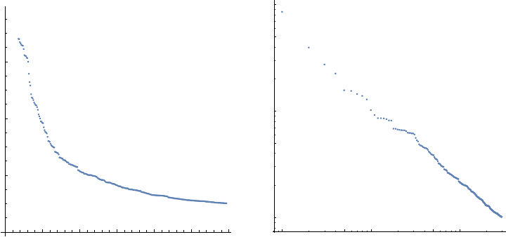
5.1. STATISTICAL DISTRIBUTIONS 129
50 100 150 200 250 300
200 000
400 000
600 000
1 5 10 50 100
1×10⁵
5×10⁵
1×10⁶
5×10⁶
1×10⁷
Figure 5.7: The population of U.S. cities by decreasing rank (left). On the right
is the same data, now including the very largest cities, but plotted on a log-log
scale. That they sit on a line is indicative of a power law distribution.
Survey (GSS).
There is excellent agreement over all family sizes except k= 1, and frankly,
my personal experience suggests there are more singleton kids than this data
set represents. Together, knowing just the mean and the formula for Poisson
distribution enables us to construct a reasonable estimate of the real family-size
distribution.
5.1.5 Power Law Distributions
Many data distributions exhibit much longer tails than could be possible under
the normal or Poisson distributions. Consider, for example, the population of
cities. There were exactly 297 U.S. cities in 2014 with populations greater than
100,000 people, according to Wikipedia. The population of the kth largest city,
for 1 ≤k≤297 is presented in Figure 5.7 (left). It shows that a relatively
small number of cities have populations wildly dominating the rest. Indeed, the
seventeen largest cities have populations so large they have been clipped off this
plot so that we can see the rest.
These cities have a mean population of 304,689, with a ghastly standard
deviation of 599,816. Something is wrong when the standard deviation is so
large relative to the mean. Under a normal distribution, 99.7% of the mass lies
within 3σof the mean, thus making it unlikely that any of these cities would
have a population above 2.1 million people. Yet Houston has a population of
2.2 million people, and New York (at 8.4 million people) is more than 13σabove
the mean! City populations are clearly not normally distributed. In fact, they
observe a different distribution, called a power law.

130 CHAPTER 5. STATISTICAL ANALYSIS
For a given variable Xdefined by a power law distribution,
P(X=x) = cx−α
This is parameterized by two constants: the exponent αand normalization
constant c.
Power law distributions require some thinking to properly parse. The total
probability defined by this distribution is the area under the curve:
A=Z∞
x=−∞
cx−α=cZ∞
x=−∞
x−α
The particular value of Ais defined by the parameters αand c. The normal-
ization constant cis chosen specifically for a given αto make sure that A= 1,
as demanded by the laws of probability. Other than that, cis of no particular
importance to us.
The real action happens with α. Note that when we double the value of the
input (from xto 2x), we decrease the probability by a factor of f= 2−α. This
looks bad, but for any given αit is just a constant. So what the power law is
really saying is that the probability of a 2x-sized event is 2αtimes less frequent
than an x-sized event, for all x.
Personal wealth is well modeled by a power law, where f≈0.2=1/5. This
means that over a large range, if Zpeople have xdollars, then Z/5 people have
2xdollars. One fifth as many people have $200,000 than have $100,000. If there
are 625 people in the world worth $5 billion, then there should be approximately
125 multi-billionaires each worth $10 billion. Further, there should be 25 super-
billionaires each worth $20 billion, five hyper-billionaires at the $40 billion level,
and finally a single Bill Gates worth $80 billion.
Power laws define the “80/20” rules which account for all the inequality of
our world: the observation that the top 20% of the Agets fully 80% of the
B. Power laws tend to arise whenever the rich get richer, where there is an
increasing probability you will get more based on what you already have. Big
cities grow disproportionately large because more people are attracted to cities
when they are big. Because of his wealth, Bill Gates gets access to much better
investment opportunities than I do, so his money grows faster than mine does.
Many distributions are defined by such preferential growth or attachment
models, including:
•Internet sites with xusers: Websites get more popular because they have
more users. You are more likely to join Instagram or Facebook because
your friends have already joined Instagram or Facebook. Preferential at-
tachment leads to a power law distribution.
•Words used with a relative frequency of x: There is a long tail of millions
of words like algorist or defenestrate1that are rarely used in the English
1Defenestrate means “to throw someone out a window.”

5.1. STATISTICAL DISTRIBUTIONS 131
language. On the other hand, a small set of words like the are used wildly
more often than the rest.
Zipf’s law governs the distribution of word usage in natural languages, and
states that the kth most popular word (as measured by frequency rank)
is used only 1/kth as frequently as the most popular word. To gauge how
well it works, consider the ranks of words based on frequencies from the
English Wikipedia below:
It should be convincing that frequency of use drops rapidly with rank:
recall that grandmom is only a slang form of grandma, not the real McCoy.
Why is this a power law? A word of rank 2xhas a frequency of F2x∼
F1/2x, compared to Fx∼F1/x. Thus halving the rank doubles the fre-
quency, and this corresponds to the power law with α= 1.
What is the mechanism behind the evolution of languages that lead to this
distribution? A plausible explanation is that people learn and use words
because they hear other people using them. Any mechanism that favors
the already popular leads to a power law.
•Frequency of earthquakes of magnitude x: The Richter scale for measuring
the strength of earthquakes is logarithmic, meaning a 5.3 quake is ten times
stronger than a 4.3 scale event. Adding one to the magnitude multiplies
the strength by a factor of ten.
With such a rapidly increasing scale it makes sense that bigger events
are rarer than smaller ones. I cause a 0.02 magnitude quake every time
I flush a toilet. There are indeed billions of such events each day, but
larger quakes get increasingly rare with size. Whenever a quantity grows
in a potentially unbounded manner but the likelihood it does diminishes
exponentially, you get a power law. Data shows this is as true of the energy
released by earthquakes as it is with the casualties of wars: mercifully the
number of conflicts which kill xpeople decreases as a power law.
Learn to keep your eyes open for power law distributions. You will find them
everywhere in our unjust world. They are revealed by the following properties:
•Power laws show as straight lines on log value, log frequency plots: Check
out the graph of city populations in Figure 5.7 (right). Although there are
some gaps at the edges where data gets scarce, by and large the points lie
Rank Word Count
1the 25131726
110 even 415055
212 men 177630
312 least 132652
412 police 99926
514 quite 79205
614 include 65764
714 knowledge 57974
816 set 50862
916 doctor 46091
Rank Word Count
1017 build 41890
2017 essential 21803
3018 sounds 13867
4018 boards 9811
5018 rage 7385
6019 occupied 5813
7020 continually 4650
8020 delay 3835
9021 delayed 3233
10021 glances 2767
Rank Word Count
10021 glances 2767
20026 ecclesiastical 881
30028 zero-sum 405
40029 excluded 218
50030 sympathizes 124
60034 capon 77
70023 fibs 49
80039 conventionalized 33
90079 grandmom 23
100033 slum-dwellers 17

132 CHAPTER 5. STATISTICAL ANALYSIS
neatly on a line. This is the main characteristic of a power law. By the
way, the slope of this line is determined by α, the constant defining the
shape of the power law distribution.
•The mean does not make sense: Bill Gates alone adds about $250 to the
wealth of the average person in the United States. This is weird. Under a
power law distribution there is a very small but non-zero probability that
someone will have infinite wealth, so what does this do to the mean? The
median does a much better job of capturing the bulk of such distributions
than the observed mean.
•The standard deviation does not make sense: In a power law distribution,
the standard deviation is typically as large or larger than the mean. This
means that the distribution is very poorly characterized by µand σ, while
the power law provides a very good description in terms of αand c.
•The distribution is scale invariant: Suppose we plotted the populations
of the 300th through 600th largest U.S. cities, instead of the top 300 as
in Figure 5.7 (left). The shape would look very much the same, with the
population of the 300th largest city towering over the tail. Any exponential
function is scale invariant, because it looks the same at any resolution.
This is a consequence of it being a straight line on a log-log plot: any
subrange is a straight line segment, which has the same parameters in its
window as the full distribution.
Take-Home Lesson: Be on the lookout for power law distributions. They reflect
the inequalities of the world, which means that they are everywhere.
5.2 Sampling from Distributions
Sampling points from a given probability distribution is a common operation,
one which it is pays to know how to do. Perhaps you need test data from a power
law distribution to run a simulation, or to verify that your program operates
under extreme conditions. Testing whether your data in fact fits a particular
distribution requires something to compare it against, and that should generally
be properly-generated synthetic data drawn from the canonical distribution.
There is a general technique for sampling from any given probability distri-
bution, called inverse transform sampling. Recall that we can move between
the probability density function Pand the cumulative density function Cby
integration and differentiation. We can move back and forth between them
because:
P(k=X) = C0(k) = C(X≤k+δ)−C(X≤k), and

5.2. SAMPLING FROM DISTRIBUTIONS 133
Figure 5.8: The inverse transform sampling method enables us to convert a
random number generated uniformly from [0,1] (here 0.729) to a random sample
drawn from any distribution, given its cdf.
C(X≤k) = Zk
x=−∞
P(X=x).
Suppose I want to sample a point from this possibly very complicated distri-
bution. I can use a uniform random number generator to select a value pin the
interval [0,...,1]. We can interpret pas a probability, and use it as an index
on the cumulative distribution C. Precisely, we report the exact value of xsuch
that C(X≤x) = p.
Figure 5.8 illustrates the approach, here sampling from the normal distri-
bution. Suppose p= 0.729 is the random number selected from our uniform
generator. We return the xvalue such that y= 0.729, so x= 0.62 as per this
cdf.
If you are working with a popular probability distribution in a well-supported
language like Python, there is almost certainly a library function to generate
random samples already available. So look for the right library before you write
your own.
5.2.1 Random Sampling beyond One Dimension
Correctly sampling from a given distribution becomes a very subtle problem
once you increase the number of dimensions. Consider the task of sampling
points uniformly from within a circle. Think for a moment about how you
might do this before we proceed.

134 CHAPTER 5. STATISTICAL ANALYSIS
Figure 5.9: Randomly generating 10,000 points by angle-radius pairs clearly
oversamples near the origin of the circle (left). In contrast, Monte Carlo sam-
pling generates points uniformly within the circle (right).
The clever among you may hit upon the idea of sampling the angle and
distance from the center independently. The angle that any sampled point
must make with respect to the origin and positive x-axis varies between 0 and
2π. The distance from the origin must be a value between 0 and r. Select these
coordinates uniformly at random and you have a random point in the circle.
This method is clever, but wrong. Sure, any point so created must lie within
the circle. But the points are not selected with uniform frequency. This method
will generate points where half of them will lie within a distance of at most r/2
from the center. But most of the area of the circle is farther from the center
than that! Thus we will oversample near the origin, at the expense of the mass
near the boundary. This is shown by Figure 5.9 (left), a plot of 10,000 points
generated using this method.
A dumb technique that proves correct is Monte Carlo sampling. The xand
ycoordinates of every point in the circle range from −rto r, as do many points
outside the circle. Thus sampling these values uniformly at random gives us
a point which lies in a bounding box of the circle, but not always within the
circle itself. This can be easily tested: is the distance from (x, y) to the origin
at most r, i.e. is px2+y2≤r? If yes, we have found a random point in the
circle. If not, we toss it out and try again. Figure 5.9 (right) plots 10,000 points
constructed using this method: see how uniformly they cover the circle, without
any obvious places of over- or under-sampling.
The efficiency here depends entirely upon the ratio of the desired region
volume (the area of the circle) to the volume of the bounding box (the area of
a square). Since 78.5% of this bounded box is occupied by the circle, less than
two trials on average suffice to find each new circle point.
5.3. STATISTICAL SIGNIFICANCE 135
Figure 5.10: Correlation vs. causation: the number of Computer Science Ph.Ds
awarded each year in the United States strongly correlates with video/pinball
arcade revenue. (from [Vig15])
5.3 Statistical Significance
Statisticians are largely concerned with whether observations on data are signifi-
cant. Computational analysis will readily find a host of patterns and correlations
in any interesting data set. But does a particular correlation reflect a real phe-
nomena, as opposed to just chance? In other words, when is an observation
really significant?
Sufficiently strong correlations on large data sets may seem to be “obviously”
meaningful, but the issues are often quite subtle. For one thing, correlation does
not imply causation. Figure 5.10 convincingly demonstrates that the volume of
advanced study in computer science correlates with how much video games are
being played. I’d like to think I have driven more people to algorithms than
Nintendo, but maybe this is just the same thing? The graphs of such spurious
correlations literally fill a book [Vig15], and a very funny one at that.
The discipline of statistics comes into its own in making subtle distinctions
about whether an observation is meaningful or not. The classical example comes
from medical statistics, in determining the efficacy of drug treatments. A phar-
maceutical company conducts an experiment comparing two drugs. Drug A
cured 19 of 34 patients. Drug Bcured 14 of 21 patients. Is drug Breally better
than drug A? FDA approval of new drugs can add or subtract billions from the
value of drug companies. But can you be sure that a new drug represents a real
improvement? How do you tell?
5.3.1 The Significance of Significance
Statistical significance measures our confidence that there is a genuine difference
between two given distributions. This is important. But statistical significance
does not measure the importance or magnitude of this difference. For large
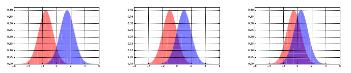
136 CHAPTER 5. STATISTICAL ANALYSIS
Figure 5.11: Pairs of normal distributions with the same variance, but decreasing
difference in their means from left to right. As the means get closer, the greater
overlap between the distributions makes it harder to tell them apart.
enough sample sizes, extremely small differences can register as highly significant
on statistical tests.
For example, suppose I get suckered into betting tails on a coin which comes
up heads 51% of the time, instead of the 50% we associate with a fair coin. After
100 tosses of a fair coin, I would expect to see 51% or more heads 46.02% of
the time, so I have absolutely no grounds for complaint when I do. After 1,000
tosses, the probability of seeing at least 510 heads falls to 0.274. By 10,000
tosses, the probability of seeing so many heads is only 0.0233, and I should
start to become suspicious of whether the coin is fair. After 100,000 tosses, the
probability of fairness will be down to 1.29 ×10⁻¹⁰, so small that I must issue
a formal complaint, even if I thought my opponent to be a gentleman.
But here is the thing. Although it is now crystal clear that I had been tricked
into using a biased coin, the consequences of this act are not substantial. For
almost any issue in life worth flipping over, I would be willing to take the short
side of the coin, because the stakes are just not high enough. At $1 bet per flip,
my expected loss even after 100,000 tosses would only be $1,000 bucks.
Significance tells you how unlikely it is that something is due to chance, but
not whether it is important. We really care about effect size, the magnitude
of difference between the two groups. We informally categorize a medium-level
effect size as visible to the naked eye by a careful observer. On this scale, large
effects pop out, and small effects are not completely trivial [SF12]. There are
several statistics which try to measure the effect size, including:
•Cohen’s d: The importance of the difference between two means µand
µ0depends on the absolute magnitude of the change, but also the natural
variation of the distributions as measured by σor σ0. This effect size can
be measured by:
d= (|µ−µ0|)/σ.
A reasonable threshold for a small effect size is >0.2, medium effect >0.5,
and large effect size >0.8.
•Pearson’s correlation coefficient r: Measures the degree of linear relation-
ship between two variables, on a scale from −1 to 1. The thresholds for
effect sizes are comparable to the mean shift: small effects start at ±0.2,

5.3. STATISTICAL SIGNIFICANCE 137
Figure 5.12: Pairs of normal distributions with the same difference in their
means but increasing variance, from left to right. As the variance increases,
there becomes greater overlap between the distributions, making it harder to
tell them apart.
medium effects about ±0.5, and large effect sizes require correlations of
±0.8.
•The coefficient of variation r2: The square of the correlation coefficient
reflects the proportion of the variance in one variable that is explained by
the other. The thresholds follow from squaring those above. Small effects
explain at least 4% of the variance, medium effects ≥25% and large effect
sizes at least 64%.
•Percentage of overlap: The area under any single probability distribu-
tion is, by definition, 1. The area of intersection between two given dis-
tributions is a good measure of their similarity, as shown in Figure 5.11.
Identical distributions overlap 100%, while disjoint intervals overlap 0%.
Reasonable thresholds are: for small effects 53% overlap, medium effects
67% overlap, and large effect sizes 85% overlap.
Of course, any sizable effect which is not statistically significant is inherently
suspect. The CS study vs. video game play correlation in Figure 5.10 was so
high (r= 0.985) that the effect size would be huge, were the number of sample
points and methodology sound enough to support the conclusion.
Take-Home Lesson: Statistical significance depends upon the number of sam-
ples, while the effect size does not.
5.3.2 The T-test: Comparing Population Means
We have seen that large mean shifts between two populations suggest large effect
sizes. But how many measurements do we need before we can safely believe that
the phenomenon is real. Suppose we measure the IQs of twenty men and twenty
women. Does the data show that one group is smarter, on average? Certainly
the sample means will differ, at least a bit, but is this difference significant?
The t-test evaluates whether the population means of two samples are dif-
ferent. This problem commonly arises in AB testing, associated with evaluating

138 CHAPTER 5. STATISTICAL ANALYSIS
whether a product change makes a difference in performance. Suppose you show
one group of users version A, and another group version B. Further, suppose
you measure a system performance value for each user, such as the number of
times they click on ads or the number of stars they give it when asked about
the experience. The t-test measures whether the observed difference between
the two groups is significant.
Two means differ significantly if:
•The mean difference is relatively large: This makes sense. One can con-
clude that men weigh more than women on average fairly easily, because
the effect size is so large. According to the Center for Disease Control2
the average American male weighed 195.5 pounds in 2010, whereas the
average American woman weighted 166.2 pounds. This is huge. Proving
that a much more subtle difference, like IQ, is real requires much more
evidence to be equally convincing.
•The standard deviations are small enough: This also makes sense. It is
easy to convince yourself that men and women have, on average, the same
number of fingers because the counts we observe are very tightly bunched
around the mean: {10,10,10,10,9,10 . . .}. The equal-finger count hypoth-
esis would require much more evidence if the numbers jumped around a
lot. I would be reluctant to commit to a true distributional average of
µ= 10 if I what I observed was {3, 15, 6, 14, 17, 5}.
•The number of samples are large enough: This again makes sense. The
more data I see, the more solidly I become convinced that the sample will
accurately represent its underlying distribution. For example, men un-
doubtedly have fewer fingers on average than women, as a consequence of
more adventures with power tools.3But it would require a very large num-
ber of samples to observe and validate this relatively rare phenomenon.
The t-test starts by computing a test statistic on the two sets of observations.
Welch’s t-statistic is defined as
t=¯x1−¯x2
qσ12
n1+σ22
n2
where ¯xi,σi, and niare the mean, standard deviation, and population size of
sample i, respectively.
Let us parse this equation carefully. The numerator is the difference between
the means, so the bigger this difference, the bigger the value of the t-statistic.
The standard deviations are in the denominator, so the smaller that σiis, the
bigger the value of the t-statistic. If this is confusing, recall what happens when
you divide xby a number approaching zero. Increasing the sample sizes ni
2http://www.cdc.gov/nchs/fastats/obesity-overweight.htm
3This observation alone may be sufficient to resolve the gender–IQ relationship, without
the need for additional statistical evidence.
5.3. STATISTICAL SIGNIFICANCE 139
also makes the denominator smaller, so the larger niis, the bigger the value of
the t-statistic. In all cases, the factors that make us more confident in there
being a real difference between the two distributions increases the value of the
t-statistic.
Interpreting the meaning of a particular value of the t-statistic comes from
looking up a number in an appropriate table. For a desired significance level
αand number of degrees of freedom (essentially the sample sizes), the table
entry specifies the value vthat the t-statistic tmust exceed. If t > v, then the
observation is significant to the αlevel.
Why Does This Work?
Statistical tests like the t-test often seem like voodoo to me, because we look
up a number from some magic table and treat it like gospel. The oracle has
spoken: the difference is significant! Of course there is real mathematics behind
significance testing, but the derivation involves calculus and strange functions
(like the gamma function Γ(n), a real numbered generalization of factorials).
These complex calculations are why the convention arose to look things up in a
precomputed table, instead of computing it yourself.
You can find derivations of the relevant formulae in any good statistics book,
if you are interested. These tests are based on ideas like random sampling. We
have seen how the mean and standard deviation constrain the shape of any
underlying probability distribution. Getting a sample average very far from the
mean implies bad luck. Randomly picking values several standard deviations
away from the population mean is very unlikely, according to the theory. This
makes it more likely that observing such a large difference is the result of drawing
from a different distribution.
Much of the technicality here is a consequence of dealing with subtle phe-
nomenon and small data sets. Historically, observed data was a very scarce
resource, and it remains so in many situations. Recall our discussion of drug
efficacy testing, where someone new must die for every single point we collect.
The big data world you will likely inhabit generally features more observations
(everybody visiting our webpage), lower stakes (do customers buy more when
you show them a green background instead of a blue background?), and per-
haps smaller effect sizes (how big an improvement do we really need to justify
changing the background color?).
5.3.3 The Kolmogorov-Smirnov Test
The t-test compares two samples drawn from presumably normal distribu-
tions according to the distance between their respective means. Instead, the
Kolmogorov-Smirnov (KS) test compares the cumulative distribution functions
(cdfs) of the two sample distributions and assesses how similar they are.
This is illustrated in Figure 5.13. The cdfs of the two different samples are
plotted on the same chart. If the two samples are drawn from the same dis-
tribution, the ranges of xvalues should largely overlap. Further, since both

140 CHAPTER 5. STATISTICAL ANALYSIS
Figure 5.13: The Kolmogorov-Smirnov test quantifies the difference between
two probability distributions by the maximum y-distance gap between the two
cumulative distribution functions. On the left, two samples from the same
normal distribution. On the right, comparison of samples from uniform and
normal distributions drawn over the same x-range.
distributions are represented as cdfs, the y-axis represents cumulative probabil-
ity from 0 to 1. Both functions increase monotonically from left to right, where
C(x) is the fraction of the sample ≤x.
We seek to identify the value of xfor which the associated yvalues of the
two cdfs differ by as much as possible. The distance D(C1, C2) between the
distributions C1and C2is the difference of the yvalues at this critical x, formally
stated as
D(C1, C2) = max
−∞≤x≤∞ |C1(x)−C2(x)|
The more substantially that two sample distributions differ at some value,
the more likely it is that they were drawn from different distributions. Figure
5.13 (left) shows two independent samples from the same normal distribution.
Note the resulting tiny gap between them. In contrast, Figure 5.13 (right)
compares a sample drawn from a normal distribution against one drawn from
the uniform distribution. The KS-test is not fooled: observe the big gaps near
the tails, where we would expect to see it.
The KS-test compares the value of D(C1, C2) against a particular target,
declaring that two distributions differ at the significance level of αwhen:
D(C1, C2)> c(α)rn1+n2
n1n2
where c(α) is a constant to look up in a table.
The function of the sample sizes has some intuition behind it. Assume for
simplicity that both samples have the same size, n. Then
rn1+n2
n1n2
=r2n
n2=r2
n

5.3. STATISTICAL SIGNIFICANCE 141
The quantity √narises naturally in sampling problems, such as the standard
deviation of the binomial distribution. The expected difference between the
number of heads and tails in ncoin flips is on the order of √n. In the context
of the KS-test, it similarly reflects the expected deviation when two samples
should be considered the same. The KS-test reflects what is happening in the
meat of the distribution, where a robust determination can be made.
I like the Kolmogorov-Smirnov test. It provides pictures of the distributions
that I can understand, that identify the weakest point in the assumption that
they are identical. This test has fewer technical assumptions and variants than
the t-test, meaning we are less likely to make a mistake using it. And the
KS-test can be applied to many problems, including testing whether points are
drawn from a normal distribution.
Normality Testing
When plotted, the normal distribution yields a bell-shaped curve. But not every
bell-shaped distribution is normal, and it is sometimes important to know the
difference.
There exist specialized statistical tests for testing the normality of a given
distributional samples f1. But we can use the general KS-test to do the job,
provided we can identify a meaningful f2to compare f1to.
This is exactly why I introduced random sampling methods in Section 5.2.
Using the cumulative distribution method we described, statistically-sound ran-
dom samples of npoints can be drawn from any distribution that you know
the cdf of, for any n. For f2, we should pick a meaningful number of points to
compare against. We can use n2=n1, or perhaps a somewhat larger sample
if n1is very small. We want to be sure that we are capturing the shape of the
desired distribution with our sample.
So if we construct our random sample for f2from the normal distribution,
the KS-test should not be able to distinguish f1from f2if f1also comes from
a normal distribution on the same µand σ.
One word of caution. A sufficiently-sensitive statistical test will probably
reject the normality of just about any observed distribution. The normal distri-
bution is an abstraction, and the world is a complicated place. But looking at
the plot of the KS-test shows you exactly where the deviations are happening.
Are the tails too fat or too lean? Is the distribution skewed? With this under-
standing, you can decide whether the differences are big enough to matter to
you.
5.3.4 The Bonferroni Correction
It has long been the convention in science to use α= 0.05 as the cutoff between
statistical significance and irrelevance. A statistical significance of 0.05 means
there is a probability of 1/20 that this result would have come about purely by
chance.

142 CHAPTER 5. STATISTICAL ANALYSIS
This is not an unreasonable standard when collecting data to test a chal-
lenging hypothesis. Betting on a horse at 20 to 1 odds and winning your bet is a
noteworthy accomplishment. Unless you simultaneously placed bets on millions
of other horses. Then bragging about the small number of 20-1 bets where you
actually won would be misleading, to say the least.
Thus fishing expeditions which test millions of hypotheses must be held
to higher standards. This is the fallacy that created the strong but spurious
correlation between computer science Ph.Ds and video game activity in Figure
5.10. It was discovered in the course of comparing thousands of time series
against each other, and retaining only the most amusing-sounding pairs which
happened to show a high correlation score.
The Bonferroni correction4provides an important balance in weighing how
much we trust an apparently significant statistical result. It speaks to the fact
that how you found the correlation can be as important as the strength of the
correlation itself. Someone who buys a million lottery tickets and wins once has
much less impressive mojo going than the fellow who buys a single ticket and
wins.
The Bonferroni correction states that when testing ndifferent hypotheses
simultaneously, the resulting p-value must rise to a level of α/n, in order to be
considered as significant at the αlevel.
As with any statistical test, there lurk many subtleties in properly applying
the correction. But the big principle here is important to grasp. Computing
people are particularly prone to running large-scale comparisons of all things
against all things, or hunting for unusual outliers and patterns. After all, once
you’ve written the analysis program, why not run it on all your data? Presenting
only the best, cherry-picked results makes it easy to fool other people. The
Bonferroni correction is the way to prevent you from fooling yourself.
5.3.5 False Discovery Rate
The Bonferroni correction safeguards us from being too quick to accept the sig-
nificance of a lone successful hypothesis among many trials. But often when
working with large, high-dimensional data we are faced with a different prob-
lem. Perhaps all mof the variables correlate (perhaps weakly) with the target
variable. If nis large enough, many of these correlations will be statistically
significant. Have we really made so many important discoveries?
The Benjamini-Hochberg procedure for minimizing false discovery rate (FDR)
procedure gives a very simple way to draw the cutoff between interesting and
uninteresting variables based on significance. Sort the variables by the strength
of their p-value, so the more extreme variables lie on the left, and the least
significant variables on the right. Now consider the ith ranked variable in this
ordering. We accept the significance of this variable at the αlevel if
∀i
j=1 (pj≤j
mα)
4I have always thought that “The Bonferroni Correction” would make a fabulous title for
an action movie. Dwayne Johnson as Bonferroni?
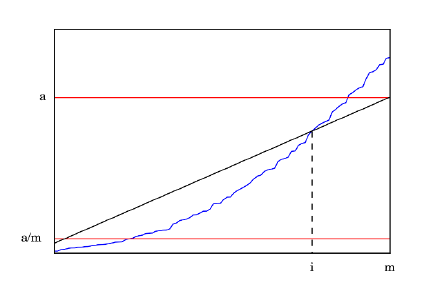
5.4. WAR STORY: DISCOVERING THE FOUNTAIN OF YOUTH? 143
Figure 5.14: The Benjamini-Hochberg procedure minimizes false discovery rate,
by accepting p-values only when pi≤αi/m. The blue curve shows the sorted p-
values, and the diagonal defines the cutoff for when such a p-value is significant.
The situation is illustrated in Figure 5.14. The p-values are sorted in increas-
ing order from left to right, as denoted by the irregular blue curve. If we were
accepting all p-values less than α, we accept too many. This is why Bonferroni
developed his correction. But requiring all p-values to meet the standard of the
Bonferroni correction (where the curve crosses α/m) is too stringent.
The Benjamini-Hochberg procedure recognizes that if many values are really
significant to a certain standard, a certain fraction of them should be significant
to a much higher standard. The diagonal line in Figure 5.14 appropriately
enforces this level of quality control.
5.4 War Story: Discovering the Fountain of Youth?
It had been a beautiful wedding. We were very happy for Rachel and David, the
bride and groom. I had eaten like a king, danced with my lovely wife, and was
enjoying a warm post-prime rib glow when it hit me that something was off. I
looked around the room and did a double-take. Somehow, for the first time in
many years, I had become younger than most of the people in the crowd.
This may not seem like a big deal to you, but that is because you the reader
probably are younger than most people in many settings. But trust me, there
will come a time when you notice such things. I remember when I first realized
that I had been attending college at the time when most of my students were
being born. Then they started being born when I was in graduate school.
Today’s college students were not only born after I became a professor, but
after I got tenure here. So how could I be younger than most of the people at
this wedding?
There were two possibilities. Either it was by chance that so many older
144 CHAPTER 5. STATISTICAL ANALYSIS
people entered the room, or there was a reason explaining this phenomenon,
This is why statistical significance tests and p-values were invented, to aid in
distinguishing something from nothing.
So what was the probability that I, then at age 54, would have been younger
than most of the 251 people at Rachel’s wedding? According to Wolfram Al-
pha (more precisely, the 2008–2012 American Community Survey five-year es-
timates), there were 309.1 million people in the United States, of whom 77.1
million were age 55 or older. Almost exactly 25% of the population is older than
I am as I write these words.
The probability that the majority of 251 randomly selected Americans would
be older than 55 years is thus given by:
p=
251
X
i=126 251
i(1 −.75)i(0.75)(251−i)= 8.98 ×10⁻¹⁸
This probability is impossibly small, comparable to pulling a fair coin out of
your pocket and having it come up heads 56 times in a row. This could not have
been the result of a chance event. There had to be a reason why I was junior
to most of this crowd, and the answer wasn’t that I was getting any younger.
When I asked Rachel about it, she mentioned that, for budgetary reasons,
they decided against inviting children to the wedding. This seemed like it could
be a reasonable explanation. After all, this rule excluded 73.9 million people
under the age of eighteen from attending the wedding, thus saving billions of
dollars over what it would have cost to invite them all. The fraction fof people
younger than me who are not children works out to f= 1 −(77.1/(309.1−
73.9)) = 0.672. This is substantially larger than 0.5, however. The probability
of my being younger than the median in a random sample drawn from this
cohort is:
p=
251
X
i=126 251
i(1 −.0672)i(0.672)(251−i)= 9.118 ×10⁻⁹
Although this is much larger than the previous p-value, it is still impossibly
small: akin to tossing off 27 straight heads on your fair coin. Just forbidding
children was not nearly powerful enough to make me young again.
I went back to Rachel and made her fess up. It turns out her mother had an
unusually large number of cousins growing up, and she was exceptionally good at
keeping in touch with all of them. Recall Einstein’s Theory of Relativity, where
E=mc2denotes that everyone is my mother’s cousin, twice removed. All of
these cousins were invited to the wedding. With Rachel’s family outpopulating
the groom’s unusually tiny clan, this cohort of senior cousins came to dominate
the dance floor.
Indeed, we can compute the number of the older-cousins (c) that must be
invited to yield a 50/50 chance that I would be younger than the median guest,
assuming the rest of the 251 guests were selected at random. It turns out that
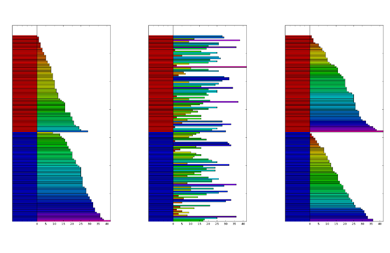
5.5. PERMUTATION TESTS AND P-VALUES 145
Figure 5.15: Permutation tests reveal the significance of the correlation between
gender and the height (left). A random assignment of gender to height (center)
results in a substantially different distribution of outcomes when sorted (right),
validating the significance of the original relationship.
c= 65 single cousins (or 32.5 married pairs) suffice, once the children have been
excluded (f= 0.672).
The moral here is that it is important to compute the probability of any
interesting observation before declaring it to be a miracle. Never stop with a
partial explanation, if it does not reduce the surprise to plausible levels. There
likely is a genuine phenomenon underlying any sufficiently rare event, and fer-
reting out what it is makes data science exciting.
5.5 Permutation Tests and P-values
Traditional statistical significance tests prove quite effective at deciding whether
two samples are in fact drawn from the same distribution. However, these tests
must be properly performed in order to do their job. Many standard tests have
subtleties like the issues of one- vs. two-sided tests, distributional assumptions,
and more. Performing these tests correctly requires care and training.
Permutation tests allow a more general and computationally idiot-proof way
to establish significance. If your hypothesis is supported by the data, then
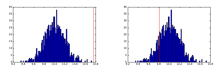
146 CHAPTER 5. STATISTICAL ANALYSIS
Figure 5.16: Permutation tests score significance by the position of the score on
actual data against a distribution of scores produced by random permutations.
A position on the extreme tail (left) is highly significant, but one within the
body of the distribution (left) is uninteresting.
randomly shuffled data sets should be less likely to support it. By conducting
many trials against randomized data, we can establish exactly how unusual the
phenomenon is that you are testing for.
Consider Figure 5.15, where we denote the independent variable (gender:
male or female) and dependent variable (say, height) using colors. The orig-
inal outcome color distribution (left) looks starkly different between men and
women, reflective of the genuine differences in height. But how unusual is this
difference? We can construct a new data set by randomly assigning gender
to the original outcome variables (center). Sorting within each group makes
clear that the pseudo-male/female distribution of outcomes is now much more
balanced than in the original data (right). This demonstrates that gender was
indeed a significant factor in determining height, a conclusion we would come
to believe even more strongly after it happens again and again over 1,000 or
1,000,000 trials.
The rank of the test statistic on the real data among the distribution of
statistic values from random permutations determines the significance level or
p-value. Figure 5.16 (left) shows what we are looking for. The real value lies
on the very right of the distribution, attesting to significant. In the figure on
right, the real value lies in the squishy middle of the distribution, suggesting no
effect.
Permutation tests require that you develop a statistic which reflects your
hypothesis about the data. The correlation coefficient is a reasonable choice
if you want to establish an important relationship between a specific pair of
variables. Ideally the observed correlation in the real data will be stronger than
in any random permutation of it. To validate the gender–height connection,
perhaps our statistic could be the difference in the average heights of men and
women. Again, we hope this proves larger in the real data than in most random
permutations of it.
Be creative in your choice of statistic: the power of permutation tests is

5.5. PERMUTATION TESTS AND P-VALUES 147
that they can work with pretty much anything you can come up with to prove
your case. It is best if your statistic minimizes the chance of ties, since you are
honor-bound to count all ties against your hypothesis.
Take-Home Lesson: Permutation tests give you the probability of your data
given your hypothesis, namely that the statistic will be an outlier compared to
the random sample distribution. This is not quite the same as proving your
hypothesis given the data, which is the traditional goal of statistical significance
testing. But it is much better than nothing.
The significance score or p-value of a permutation test depends upon how
many random tries are run. Always try to do at least 1,000 random trials, and
more if it is feasible. The more permutations you try, the more impressive your
significance p-value can be, at least up to a point. If the given input is in fact
the best of all k! permutations, the most extreme p-value you can get is 1/k!,
no matter how many random permutations you try. Oversampling will inflate
your denominator without increasing your true confidence one bit.
Take-Home Lesson: P-values are computed to increase your confidence that an
observation is real and interesting. This only works when you do the permuta-
tion test honestly, by performing experiments that can provide a fair measure
of surprise.
5.5.1 Generating Random Permutations
Generating random permutations is another important sampling problem that
people often botch up. The two algorithms below both use sequences of random
swaps to scramble up the initial permutation {1,2, . . . , n}.
But ensuring that all n! permutations are generated uniformly at random is
a tricky business. Indeed only one of these algorithms gets it right. Is it this
one,
for i= 1 to ndo a[i] = i;
for i= 1 to n−1 do swap[a[i], a[Random[i, n]];
or is it this:
for i= 1 to ndo a[i] = i;
for i= 1 to n−1 do swap[a[i], a[Random[1, n]];
Think about this carefully: the difference here is very subtle. It is so subtle
you might not even notice it in the code. The critical difference is the 1 or iin
the call to Random. One of these algorithms is right and one of these algorithms
is wrong. If you think you can tell, convincingly explain why one works and the
other one doesn’t.
If you really must know, the first algorithm is the correct one. It picks
a random element from 1 to nfor the first position, then leaves it alone and
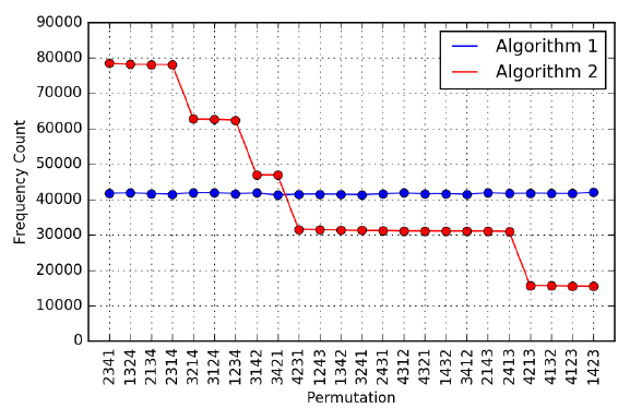
148 CHAPTER 5. STATISTICAL ANALYSIS
Figure 5.17: The generation frequency of all 4! = 24 permutations using two
different algorithms. Algorithm 1 generates them with uniform frequency, while
algorithm 2 is substantially biased.
recurs on the rest. It generates permutations uniformly at random. The second
algorithm gives certain elements a better chance to end up first, showing that
the distribution is not uniform.
But if you can’t prove this theoretically, you can use the idea of a permu-
tation test. Implement both of the algorithms, and perform 1,000,000 runs of
each, constructing random permutations of, say, n= 4 elements. Count how
often each algorithm generates each one of the 4! = 24 distinct permutations.
The results of such an experiment are shown in Figure 5.17. Algorithm 1 proves
incredibly steady, with a standard deviation of 166.1 occurrences. In contrast,
there is an eight-fold difference between the most and least frequent permuta-
tions under algorithm 2, with σ= 20,923.9.
The moral here is that random generation can be very subtle. And that
Monte Carlo-type experiments like permutation tests can eliminate the need for
subtle reasoning. Verify, then trust.
5.5.2 DiMaggio’s Hitting Streak
One of baseball’s most amazing records is Joe DiMaggio’s 56-game hitting
streak. The job of a batter is to get hits, and they receive perhaps four chances
every game to get one. Even very good hitters often fail.
But back in 1941, Joe DiMaggio succeeded in getting hits in 56 straight
games, a truly amazing accomplishment. No player in the seventy-five years
since then has come close to this record, nor any one before him.
But how unusual was such a long streak in the context of his career? DiMag-

5.5. PERMUTATION TESTS AND P-VALUES 149
Figure 5.18: The distribution of longest hitting streaks, over 100,000 simulated
careers. DiMaggio’s actual 56-game hitting streak stands at the very tail of this
distribution, thus demonstrating the difficulty of this feat.
gio played 1736 games, with 2214 hits in 6821 at bats. Thus he should get hits
in roughly 1 −(1 −(2214/6821))4= 79.2% of his games with four at bats.
What is the probability that someone with his skill level could manage such a
consecutive game streak in the course of their career?
For those of you tired of my baseball analogies, let’s put this in another
context. Suppose you are a student who averages a grade of 90 on tests. You
are a very good student to be sure, but not perfect. What are the chances you
could have a hot streak where you scored above 90 on ten straight tests? What
about twenty straight? Could you possibly ace 56 tests in a row?5If such a long
streak happened, would that mean that you had taken your studies to another
level, or did you just get lucky?
So when DiMaggio had his hitting streak, was it just an expected conse-
quence of his undisputed skills and consistency, or did he just get lucky? He
was one of the very best hitters of his or any time, an all-star every season of
his thirteen-year career. But we also know that DiMaggio got lucky from time
to time. After all, he was married to the movie star Marilyn Monroe.
To resolve this question, we used random numbers to simulate when he
got hits over a synthetic “career” of 1736 games. Each game, the simulated
Joe received four chances to hit, and succeeded with a probability of p=
(2214/6821) = 0.325. We could then identify the longest hitting streak over
the course of this simulated career. By simulating 100,000 DiMaggio careers,
we get a frequency distribution of streaks that can put the rarity of his accom-
plishment in context, getting a p-value in the process.
The results are shown in Figure 5.18. In only 44 of 100,000 simulated careers
(p= 0.00044) did DiMaggio manage a streak of at least 56 games. Thus the
length is quite out of line with what would be expected from him. The second
5Not if you are taking one of my classes, I tell you.

150 CHAPTER 5. STATISTICAL ANALYSIS
Figure 5.19: Bayes’ Theorem in action.
longest streak of any major league hitter is only 44 games, so it is out of line
with everyone else as well. But he also once hit in 61 straight games at a lower
level of competition, so he seems to have had an extraordinary capacity for
consistency.
Hitting streaks can be thought of as runs between games without hits, and so
can be modeled using a Poisson distribution. But Monte Carlo simulations pro-
vide answers without detailed mathematics. Permutation tests give us insight
with minimal knowledge and intellectual effort.
5.6 Bayesian Reasoning
The conditional probability P(A|B) measures the likelihood of event Agiven
knowledge that event Bhas occurred. We will rely on conditional probability
throughout this book, because it lets us update our confidence in an event in
response to fresh evidence, like observed data.
Bayes’ Theorem is an important tool for working with conditional probabil-
ities, because it lets us turn the conditionals around:
P(A|B) = P(B|A)P(A)
P(B)
With Bayes theorem, we can convert the question of P(outcome|data) to
P(data|outcome), which is often much easier to compute. In some sense, Bayes’
theorem is just a consequence of algebra, but it leads to a different way of
thinking about probability.
Figure 5.19 illustrates Bayes’ theorem in action. The event space consists of
picking one of four blocks. The complex events Aand Brepresent sub-ranges
of blocks, where P(A) = 3/4 and P(B) = 2/4 = 1/2. By counting blocks from
the figure, we can see that P(A|B)=1/2 and P(B|A)=1/3. These also follow

5.7. CHAPTER NOTES 151
directly from Bayes’ theorem:
P(A|B) = P(B|A)P(A)
P(B)=(1/3) ·(3/4)
(1/2) = 1/2
P(B|A) = P(A|B)P(B)
P(A)=(1/2) ·(1/2)
(3/4) = 1/3
Bayesian reasoning reflects how a prior probability P(A) is updated to give
the posterior probability P(A|B) in the face of a new observation B, according
to the ratio of the likelihood P(B|A) and the marginal probability P(B). The
prior probability P(A) reflects our initial assumption about the world, to be
revised based on the additional evidence B.
Bayesian reasoning is an important way to look at the world. Walking into
Rachel and David’s wedding, my prior assumption was that the age distribution
would reflect that of the world at large. But my confidence weakened with every
elderly cousin I encountered, until it finally crumbled.
We will use Bayesian reasoning to build classifiers in Section 11.1. But keep
this philosophy in mind as you analyze data. You should come to each task with
a prior conception of what the answers should be, and then revise in accordance
with statistical evidence.
5.7 Chapter Notes
Every data scientist should take a good elementary statistics course. Represen-
tative texts include Freedman [FPP07] and James et al. [JWHT13]. Wheelan
[Whe13] is a gentler introduction, with Huff [Huf10] the classic treatise on how
best to lie with statistics.
Donoho [Don15] presents a fascinating history of data science from the van-
tage point of a statistician. It makes an effective case that most of the major
principles of today’s data science were originally developed by statisticians, al-
though they were not quickly embraced by the discipline at large. Modern
statisticians have begun having much more satisfying conversations with com-
puter scientists on these matters as interests have mutually converged.
Vigen [Vig15] presents an amusing collection of spurious correlations drawn
from a large number of interesting time series. Figure 5.10 is representative,
and is reprinted with permission.
It has been demonstrated that the size of American families is reasonably well
fit by a Poisson distribution. In fact, an analysis of household size distributions
from 104 countries suggests that the “I’ve had enough” model works around the
world [JLSI99].
5.8 Exercises
Statistical Distributions
152 CHAPTER 5. STATISTICAL ANALYSIS
5-1. [5] Explain which distribution seems most appropriate for the following phe-
nomenon: binomial, normal, Poisson, or power law?
(a) The number of leaves on a fully grown oak tree.
(b) The age at which people’s hair turns grey.
(c) The number of hairs on the heads of 20-year olds.
(d) The number of people who have been hit by lightning xtimes.
(e) The number of miles driven before your car needs a new transmission.
(f) The number of runs a batter will get, per cricket over.
(g) The number of leopard spots per square foot of leopard skin.
(h) The number of people with exactly xpennies sitting in drawers.
(i) The number of apps on people’s cell phones.
(j) The daily attendance in Skiena’s data science course.
5-2. [5] Explain which distribution seems most appropriate for the following The
Quant Shop phenomenon: binomial, normal, Poisson, or power law?
(a) The beauty of contestants at the Miss Universe contest.
(b) The gross of movies produced by Hollywood studios.
(c) The birth weight of babies.
(d) The price of art works at auction.
(e) The amount of snow New York will receive on Christmas.
(f) The number of teams that will win xgames in a given football season.
(g) The lifespans of famous people.
(h) The daily price of gold over a given year.
5-3. [5] Assuming that the relevant distribution is normal, estimate the probability
of the following events:
(a) That there will be 70 or more heads in the next hundred flips of a fair
coin?
(b) That a randomly selected person will weight over 300 lbs?
5-4. [3] The average on a history exam was 85 out of 100 points, with a standard
deviation of 15. Was the distribution of the scores on this exam symmetric?
If not, what shape would you expect this distribution to have? Explain your
reasoning.
5-5. [5] Facebook data shows that 50% of Facebook users have a hundred or more
friends. Further, the average user’s friend count is 190. What do these findings
say about the shape of the distribution of number of friends of Facebook users?
Significance Testing
5-6. [3] Which of the following events are likely independent and which are not?
(a) Coin tosses.
5.8. EXERCISES 153
(b) Basketball shots.
(c) Party success rates in presidential elections.
5-7. [5] The 2010 American Community Survey estimates that 47.1% of women aged
15 years and over are married.
(a) Randomly select three women between these ages. What is the probability
that the third woman selected is the only one that is married?
(b) What is the probability that all three women are married?
(c) On average, how many women would you expect to sample before selecting
a married woman? What is the standard deviation?
(d) If the proportion of married women was actually 30%, how many women
would you expect to sample before selecting a married woman? What is
the standard deviation?
(e) Based on your answers to parts (c) and (d), how does decreasing the prob-
ability of an event affect the mean and standard deviation of the wait time
until success?
Permutation Tests and P-values
5-8. [5] Prove that the permutation generation algorithm of page 147 generates per-
mutations correctly, meaning uniformly at random.
5-9. [5] Obtain data on the heights of mmen and wwomen.
(a) Use a t-test to establish the significance of whether the men are on average
taller than the women.
(b) Perform a permutation test to establish the same thing: whether the men
are on average taller than the women.
Implementation Projects
5-10. [5] In sporting events, good teams tend to come back and win. But is this
because they know how to win, or just because after a long-enough game the
better team will generally prevail? Experiment with a random coin flip model,
where the better team has a probability of p > 0.5 of outplaying the other over
a single period.
For games of nperiods, how often does the better team win, and how often
does it come from behind, for a given probability p? How does this compare to
statistics from real sports?
5-11. [8] February 2 is Groundhog Day in the United States, when it is said that six
more weeks of winter follows if the groundhog sees its shadow. Taking whether
it is sunny on February 2 as a proxy for the groundhog’s input, is there any
predictive power to this tradition? Do a study based on weather records, and
report the accuracy of the beast’s forecasts along with its statistical significance
Interview Questions
5-12. [3] What is conditional probability?
5-13. [3] What is Bayes Theorem? And why is it useful in practice?
154 CHAPTER 5. STATISTICAL ANALYSIS
5-14. [8] How would you improve a spam detection algorithm that uses a naive Bayes
classifier?
5-15. [5] A coin is tossed ten times and the results are two tails and eight heads. How
can you tell whether the coin is fair? What is the p-value for this result?
5-16. [8] Now suppose that ten coins are each tossed ten times, for a total of 100
tosses. How would you test whether the coins are fair?
5-17. [8] An ant is placed on an infinitely long twig. The ant can move one step
backward or one step forward with the same probability, during discrete time
steps. What is the probability that the ant will return to its starting point after
2nsteps?
5-18. [5] You are about to get on a plane to Seattle. Should you bring an umbrella?
You call three random friends of yours who live there and ask each independently
whether it is raining. Each of friends has a 2/3 chance of telling you the truth
and a 1/3 chance of lying. All three friends tell you that it is raining. What is
the probability that it is actually raining in Seattle?
Kaggle Challenges
5-19. Decide whether a car bought at an auction is a bad buy.
https://www.kaggle.com/c/DontGetKicked
5-20. Forecast the demand of a product in a given week.
https://www.kaggle.com/c/grupo-bimbo-inventory-demand
5-21. How much rain we will get in the next hour?
https://www.kaggle.com/c/how-much-did-it-rain
Chapter 6
Visualizing Data
At their best, graphics are instruments for reasoning.
– Edward Tufte
Effective data visualization is an important aspect of data science, for at least
three distinct reasons:
•Exploratory data analysis: What does your data really look like? Getting
a handle on what you are dealing with is the first step of any serious
analysis. Plots and visualizations are the best way I know of to do this.
•Error detection: Did you do something stupid in your analysis? Feeding
unvisualized data to any machine learning algorithm is asking for trouble.
Problems with outlier points, insufficient cleaning, and erroneous assump-
tions reveal themselves immediately when properly visualizing your data.
Too often a summary statistic (77.8% accurate!) hides what your model
is really doing. Taking a good hard look what you are getting right vs.
wrong is the first step to performing better.
•Communication: Can you present what you have learned effectively to
others? Meaningful results become actionable only after they are shared.
Your success as a data scientist rests on convincing other people that
you know what you are talking about. A picture is worth 1,000 words,
especially when you are giving a presentation to a skeptical audience.
You have probably been making graphs and charts since grade school. Ubiq-
uitous software makes it easy to create professional-looking images. So what is
so hard about data visualization?
To answer, I offer a parable. A terrible incident during my youth concerned
an attack on an ice skating champion. A thug hit her on the knee with a stick,
hoping to knock her out of the upcoming Olympic games. Fortunately, he missed
the knee, and the skater went on to win the silver medal.
156 CHAPTER 6. VISUALIZING DATA
But upon getting to know his client, the thug’s lawyer came up with an
interesting defense. This crime, he said, was clearly too complex for his client
to have conceived on his own. This left an impression on me, for it meant that
I had underestimated the cognitive capacity necessary to rap someone on the
leg with a stick.
My intended moral here is that many things are more complicated than
they look. In particular, I speak of the problem of plotting data on a graph to
capture what it is saying. An amazingly high fraction of the charts I have seen
in presentations are terrible, either conveying no message or misconveying what
the data actually showed. Bad charts can have negative value, by leading you
in the wrong direction.
In this section, we will come to understand the principles that make standard
plot designs work, and show how they can be misleading if not properly used.
From this experience, we will try to develop your sense of when graphs might
be lying, and how you can construct better ones.
6.1 Exploratory Data Analysis
The advent of massive data sets is changing in the way science is done. The
traditional scientific method is hypothesis driven. The researcher formulates a
theory of how the world works, and then seeks to support or reject this hy-
pothesis based on data. By contrast, data-driven science starts by assembling a
substantial data set, and then hunts for patterns that ideally will play the role
of hypotheses for future analysis.
Exploratory data analysis is the search for patterns and trends in a given data
set. Visualization techniques play an important part in this quest. Looking
carefully at your data is important for several reasons, including identifying
mistakes in collection/processing, finding violations of statistical assumptions,
and suggesting interesting hypotheses.
In this section, we will discuss how to go about doing exploratory data
analysis, and what visualization brings to the table as part of the process.
6.1.1 Confronting a New Data Set
What should you do when encountering a new data set? This depends somewhat
upon why you are interested in it in the first place, but the initial steps of
exploration prove almost application-independent.
Here are some basic steps that I encourage doing to get acquainted with any
new data set, which I illustrate in exploring the body measurement data set
NHANES, available at https://www.statcrunch.com/app/index.php?dataid=
1406047. This is tabular data, but the general principles here are applicable to
a broader class of resources:
•Answer the basic questions: There are several things you should know
about your data set before you even open the file. Ask questions like:
6.1. EXPLORATORY DATA ANALYSIS 157
–Who constructed this data set, when, and why? Understanding how
your data was obtained provides clues as to how relevant it is likely
to be, and whether we should trust it. It also points us to the right
people if we need to know more about the data’s origin or provenance.
With a little digging, I discovered that it came from the National
Health and Nutrition Examination Survey 2009–2010, and who was
responsible for posting it.
–How big is it? How rich is the data set in terms of the number of fields
or columns? How large is it as measured by the number of records or
rows? If it is too big to explore easily with interactive tools, extract
a small sample and do your initial explorations on that. This data
set has 4978 records (2452 men and 2526 women), each with seven
data fields plus gender.
–What do the fields mean? Walk through each of the columns in your
data set, and be sure you understand what they are. Which fields are
numerical or categorical? What units were the quantities measured
in? Which fields are IDs or descriptions, instead of data to com-
pute with? A quick review shows that the lengths and weights here
were measured using the metric system, in centimeters and kilograms
respectively.
•Look for familiar or interpretable records: I find it extremely valuable to
get familiar with a few records, to the point where I know their names.
Records are generally associated with a person, place, or thing that you
already have some knowledge about, so you can put it in context and
evaluate the soundness of the data you have on it. But if not, find a
few records of special interest to get to know, perhaps the ones with the
maximum or minimum values of the most important field.
If familiar records do not exist, it sometimes pays to create them. A
clever developer of a medical records database told me that he had used
the top 5000 historical names from Who’s Bigger to serve as patient names
while developing the product. This was a much more inspired idea than
making up artificial names like “Patient F1253.” They were fun enough
to encourage playing with the system, and memorable enough that outlier
cases could be flagged and reported: e.g. “There is something seriously
wrong with Franz Kafka.”
•Summary statistics: Look at the basic statistics of each column. Tukey’s
five number summary is a great start for numerical values, consisting of
the extreme values (max and min), plus the median and quartile elements.
Applied to the components of our height/weight data set, we get:

158 CHAPTER 6. VISUALIZING DATA
Min 25% Median 75% Max
Age 241 418 584 748 959
Weight 32.4 67.2 78.8 92.6 218.2
Height 140 160 167 175 204
Leg Length 23.7 35.7 38.4 41 55.5
Arm Length 29.5 35.5 37.4 39.4 47.7
Arm Circumference 19.5 29.7 32.8 36.1 141.1
Waist 59.1 87.5 97.95 108.3 172
This is very informative. First, what’s the deal that the median age is 584?
Going back to the data, we learn that age is measured in months, meaning
the median is 48.67 years. Arm and leg length seem to have about the same
median, but leg length has much greater variability. I never knew that.
But suddenly I realize that people are more often described as long/short
legged than long/short armed, so maybe this is why.
For categorical fields, like occupation, the analogous summary would be a
report on how many different label types appear in the column, and what
the three most popular categories are, with associated frequencies.
•Pairwise correlations: A matrix of correlation coefficients between all
pairs of columns (or at least the columns against the dependent variables
of interest) gives you an inkling of how easy it will be to build a successful
model. Ideally, we will have several features which strongly correlate with
the outcome, while not strongly correlating with each other. Only one
column from a set of perfectly correlated features has any value, because
all the other features are completely defined from any single column.
Leg Arm Arm
Age Weight Height Length Length Circum Waist
Age 1.000
Weight 0.017 1.000
Height −0.105 0.443 1.000
Leg Len −0.268 0.238 0.745 1.000
Arm Len 0.053 0.583 0.801 0.614 1.000
Arm Circ 0.007 0.890 0.226 0.088 0.444 1.000
Waist 0.227 0.892 0.181 −0.029 0.402 0.820 1.000
These pairwise correlations are quite interesting. Why is height negatively
correlated with age? The people here are all adults (241 months = 20.1
years), so they are all fully grown. But the previous generation was shorter
than the people of today. Further, people shrink when they get older, so
together this probably explains it. The strong correlation between weight
and waist size (0.89) reflects an unfortunate truth about nature.
•Class breakdowns: Are there interesting ways to break things down by
major categorical variables, like gender or location? Through summary
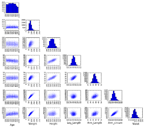
6.1. EXPLORATORY DATA ANALYSIS 159
Figure 6.1: The array of dot plots of variable pairs provides quick insight into
the distributions of data values and their correlations.
statistics, you can gauge whether there is a difference among the distribu-
tions when conditioned on the category. Look especially where you think
there should be differences, based on your understanding of the data and
application.
The correlations were generally similar by gender, but there were some
interesting differences. For example, the correlation between height and
weight is stronger for men (0.443) than women (0.297).
•Plots of distributions: This chapter focuses on visualization techniques
for data. Use the chart types we will discuss in Section 6.3 to eyeball the
distributions, looking for patterns and outliers. What is the general shape
of each distribution? Should the data be cleaned or transformed to make
it more bell-shaped?
Figure 6.1 shows the power of a grid of dot plots of different variables. At
a glance we see that there are no wild outliers, which pairs are correlated,
and the nature of any trend lines. Armed with this single graphic, we are
now ready to apply this data set to whatever is the challenge at hand.
6.1.2 Summary Statistics and Anscombe’s Quartet
There are profound limits to how well you can understand data without visu-
alization techniques. This is best depicted by Anscombe’s quartet: four two-
dimensional data sets, each with eleven points and shown in Figure 6.2. All four

160 CHAPTER 6. VISUALIZING DATA
I II III IV
x y x y x y x y
10.0 8.04 10.0 9.14 10.0 7.46 8.0 6.58
8.0 6.95 8.0 8.14 8.0 6.77 8.0 5.76
13.0 7.58 13.0 8.74 13.0 12.74 8.0 7.71
9.0 8.81 9.0 8.77 9.0 7.11 8.0 8.84
11.0 8.33 11.0 9.26 11.0 7.81 8.0 8.47
14.0 9.96 14.0 8.10 14.0 8.84 8.0 7.04
6.0 7.24 6.0 6.13 6.0 6.08 8.0 5.25
4.0 4.26 4.0 3.10 4.0 5.39 19.0 12.50
12.0 10.84 12.0 9.31 12.0 8.15 8.0 5.56
7.0 4.82 7.0 7.26 7.0 6.42 8.0 7.91
5.0 5.68 5.0 4.74 5.0 5.73 8.0 6.89
Mean 9.0 7.5 9.0 7.5 9.0 7.5 9.0 7.5
Var. 10.0 3.75 10.0 3.75 10.0 3.75 10.0 3.75
Corr. 0.816 0.816 0.816 0.816
Figure 6.2: Four data sets with identical statistical properties. What do they
look like?
data sets have identical means for the xand yvalues, identical variances for the
xand yvalues, and the exact same correlation between the xand yvalues.
These data sets must all be pretty similar, right? Study the numbers for a
little while so you can get an idea of what they look like.
Got it? Now peak at the dot plots of these data sets in Figure 6.3. They all
look different, and tell substantially different stories. One trends linear, while a
second looks almost parabolic. Two others are almost perfectly linear modulo
outliers, but with wildly different slopes.
The point here is that you can instantly appreciate these differences with
a glance at the scatter plot. Even simple visualizations are powerful tools for
understanding what is going on in a data set. Any sensible data scientist strives
to take full advantage of visualization techniques.
6.1.3 Visualization Tools
An extensive collection of software tools are available to support visualization.
Generally speaking, visualization tasks fall into three categories, and the right
choice of tools depends upon what your mission really is:
•Exploratory data analysis: Here we seek to perform quick, interactive
explorations of a given data set. Spreadsheet programs like Excel and
notebook-based programming environments like iPython, R, and Mathe-
matica are effective at building the standard plot types. The key here is
hiding the complexity, so the plotting routines default to doing something
reasonable but can be customized if necessary.
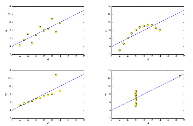
6.1. EXPLORATORY DATA ANALYSIS 161
Figure 6.3: Plots of the Ascombe quartet. These data sets are all dramatically
different, even though they have identical summary statistics.
•Publication/presentation quality charts: Just because Excel is very pop-
ular does not mean it produces the best possible graphs/plots. The best
visualizations are an interaction between scientist and software, taking full
advantage of the flexibility of a tool to maximize the information content
of the graphic.
Plotting libraries like MatPlotLib or Gnuplot support a host of options
enabling your graph to look exactly like you want it to. The statistical lan-
guage R has a very extensive library of data visualizations. Look through
catalogs of the plot types supported by your favorite library, to help you
find the best representation for your data.
•Interactive visualization for external applications: Building dashboards
that facilitate user interaction with proprietary data sets is a typical task
for data science-oriented software engineers. The typical mission here is
to build tools that support exploratory data analysis for less technically-
skilled, more application-oriented personnel.
Such systems can be readily built in programming languages like Python,
using standard plotting libraries. There is also a class of third-party
systems for building dashboards, like Tableau. These systems are pro-
grammable at a higher-level than other tools, supporting particular inter-
action paradigms and linked-views across distinct views of the data.

162 CHAPTER 6. VISUALIZING DATA
Figure 6.4: Which painting do you like better? Forming intelligent preferences
in art or visualizations depend upon having a distinctive visual aesthetic.
6.2 Developing a Visualization Aesthetic
Sensible appreciation of art or wine requires developing a particular taste or
aesthetic. It isn’t so much about whether you like something, but figuring out
why you like it. Art experts talk about the range of a painter’s palate, use of
light, or the energy/tension of a composition. Wine connoisseurs testify to the
fragrance, body, acidity, and clarity of their favorite plonk, and how much oak
or tannin it contains. They always have something better to say than “that
tastes good.”
Distinguishing good/bad visualizations requires developing a design aes-
thetic, and a vocabulary to talk about data representations. Figure 6.4 presents
two famous landmarks in Western painting. Which one is better? This question
is meaningless without a sense of aesthetics and a vocabulary to describe it.
My visual aesthetic and vocabulary is largely derived from the books of
Edward Tufte [Tuf83, Tuf90, Tuf97]. He is an artist: indeed I once got to meet
him at his former art gallery across from Chelsea Piers in Manhattan. He has
thought long and hard about what makes a chart or graph informative and
beautiful, basing a design aesthetic on the following principles:
•Maximize data-ink ratio: Your visualization is supposed to show off your
data. So why is so much of what you see in charts the background grids,
shading, and tic-marks?
•Minimize the lie factor: As a scientist, your data should reveal the truth,
ideally the truth you want to see revealed. But are you being honest with
your audience, or using graphical devices that mislead them into seeing
something that isn’t really there?
•Minimize chartjunk: Modern visualization software often adds cool visual
effects that have little to do with your data set. Is your graphic interesting
because of your data, or in spite of it?
•Use proper scales and clear labeling: Accurate interpretation of data de-
pends upon non-data elements like scale and labeling. Are your descriptive
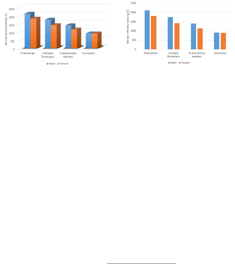
6.2. DEVELOPING A VISUALIZATION AESTHETIC 163
Figure 6.5: Three-dimensional monoliths casting rendered shadows (l) may look
impressive. But they really are just chartjunk, which serves to reduce the clarity
and data-ink ratio from just showing the data (r).
materials optimized for clarity and precision?
•Make effective use of color: The human eye has the power to discriminate
between small gradations in hue and color saturation. Are you using color
to highlight important properties of your data, or just to make an artistic
statement?
•Exploit the power of repetition: Arrays of similar graphics with different
but related data elements provide a concise and powerful way to enable
visual comparisons. Are your chart multiples facilitating comparisons, or
merely redundant?
Each of these principles will be detailed in the subsections below.
6.2.1 Maximizing Data-Ink Ratio
In any graphic, some of the ink is used to represent the actual underlying data,
while the rest is employed on graphic effects. Generally speaking, visualizations
should focus on showing the data itself. We define the data-ink ratio to be:
Data-Ink Ratio = Data-Ink
Total ink used in graphic
Figure 6.5 presents average salary by gender (Bureau of Labor Statistics,
2015), and helps clarify this notion. Which data representation do you pre-
fer? The image on the left says “Cool, how did you make those shadows and
that three-dimensional perspective effect?” The image on the right says “Wow,
women really are underpaid at all points on the income spectrum. But why is
the gap smallest for counselors?”
Maximizing the data-ink ratio lets the data talk, which is the entire point
of the visualization exercise in the first place. The flat perspective on the right
permits a fairer comparison of the heights of the bars, so the males do not look

164 CHAPTER 6. VISUALIZING DATA
like pipsqueaks to the women. The colors do a nice job enabling us to compare
apples-to-apples.
There are more extreme ways to increase the data-ink ratio. Why do we
need bars at all? The same information could be conveyed by plotting a point
of the appropriate height, and would clearly be an improvement were we plotting
much more than the eight points shown here. Be aware that less can be more
in visualizing data.
6.2.2 Minimizing the Lie Factor
A visualization seeks to tell a true story about what the data is saying. The
baldest form of lie is to fudge your data, but it remains quite possible to report
your data accurately, yet deliberately mislead your audience about what it is
saying. Tufte defines the lie factor of a chart as:
lie factor = (size of an effect in the graphic)
(size of the effect in the data)
Graphical integrity requires minimizing this lie factor, by avoiding the tech-
niques which tend to mislead. Bad practices include:
•Presenting means without variance: The data values {100,100,100,100,100}
and {200,0,100,200,0}tell different stories, even though both means are
100. If you cannot plot the actual points with the mean, at least show
the variance, to make clear the degree to which the mean reflects the
distribution.
•Presenting interpolations without the actual data: Regression lines and
fitted curves are effective at communicating trends and simplifying large
data sets. But without showing the data points it is based on, it is im-
possible to ascertain the quality of the fit.
•Distortions of scale: The aspect ratio of a figure can have a huge effect on
how we interpret what we are seeing. Figure 6.6 presents three renderings
of a given financial time series, identical except for the aspect ratio of the
chart.
In the bottom rendering, the series looks flat: there is nothing to worry
about here. On the right, profits have fallen off a cliff: the sky is falling!
The left corner plot presents a serious decline, but with signs of an autumn
rebound.
Which plot is right? People are generally used to seeing plots presented
according to the Golden ratio, implying that the width should be about 1.6
times the height. Give this shape to them, unless you have well-developed
reasons why it is inappropriate. Psychologists inform us that 45 degree
lines are the most readily interpretable, so avoid shapes that substantially
amplify or mute lines from this objective.
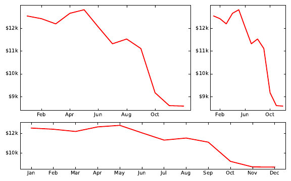
6.2. DEVELOPING A VISUALIZATION AESTHETIC 165
Figure 6.6: Three renderings of the same financial time series. Which most
accurately represents the situation?
•Eliminating tick labels from numerical axes: Even the worst scale dis-
tortions can be completely concealed by not printing numerical reference
labels on axes. Only with the numerical scale markings can the actual
data values be reconstructed from the plot.
•Hide the origin point from the plot: The implicit assumption in most
graphs is that the range of values on the y-axis goes from zero to ymax. We
lose the ability to visually compare magnitudes if the y-range instead goes
from ymin −to ymax. The largest value suddenly looks many times larger
than the smallest value, instead of being scaled to the proper proportion.
If Figure 6.5 (right) were drawn with a tight y-range [900,2500], the mes-
sage would be that counselors were starving, instead of earning salaries as
close to teachers as software developers are to pharmacists. Such decep-
tions can be recognized provided the scales are marked on the axis, but
are hard to catch.
Despite Tufte’s formula, the lie factor cannot be computed mechanically,
because it requires understanding the agenda that is behind the distortion. In
reading any graph, it is important to know who produced it and why. Under-
standing their agenda should sensitize you to potentially misleading messages
encoded in the graphic.
6.2.3 Minimizing Chartjunk
Extraneous visual elements distract from the message the data is trying to tell.
In an exciting graphic, the data tells the story, not the chartjunk.
166 CHAPTER 6. VISUALIZING DATA
Figure 6.7: A monthly time series of sales. How can we improve/simplify this
bar chart time series?
Figure 6.7 presents a monthly time series of sales at a company beginning
to encounter bad times. The graphic in question is a bar plot, a perfectly sound
way to represent time series data, and is drawn using conventional, perhaps
default, options using a reasonable plotting package.
But can we simplify this plot by removing elements to make the data stand
out better? Think about this for a minute before peeking at Figure 6.8, which
presents a series of four successive simplifications to this chart. The critical
operations are:
•Jailbreak your data (upper left): Heavy grids imprison your data, by visu-
ally dominating the contents. Often graphs can be improved by removing
the grid, or at least lightening it.
The potential value of the data grid is that it facilitates more precise
interpretation of numerical quantities. Thus grids tend to be most useful
on plots with large numbers of values which may need to be accurately
quoted. Light grids can adequately manage such tasks.
•Stop throwing shade (upper right): The colored background here con-
tributes nothing to the interpretation of the graphic. Removing it in-
creases the data-ink ratio, and makes it less obtrusive.
•Think outside the box (lower left): The bounding box does not really
contribute information, particularly the upper and rightmost boundaries
which do not define axes. Take them out, and let more air into your plots.
•Make missing ink work for you (lower right): The effect of the reference
grid can be recovered by removing lines from the bars instead of adding
elements. This makes it easier to compare the magnitude of biggest num-
bers, by focusing attention on big changes in the relatively small top piece,
instead of small changes in the long bar.
6.2. DEVELOPING A VISUALIZATION AESTHETIC 167
Figure 6.8: Four successive simplifications of Figure 6.7, by removing extraneous
non-data elements.
The architect Mies van der Rohe famously said that “less is more.” Remov-
ing elements from plots often improves them far more than adding things. Make
this part of your graphical design philosophy.
6.2.4 Proper Scaling and Labeling
Deficiencies in scaling and labeling are the primary source of intentional or ac-
cidental misinformation in graphs. Labels need to report the proper magnitude
of numbers, and scale needs to show these numbers to the right resolution, in a
way to facilitate comparison. Generally speaking, data should be scaled so as
to fill the space allotted to it on the chart.
Reasonable people can differ as to whether to scale the axes over the full
theoretical range of the variable, or cut it down to reflect only the observed
values. But certain decisions are clearly unreasonable.
Figure 6.9 (left) was produced by a student of mine, presenting the cor-
relation between two variables for almost a hundred languages. Because the
correlation ranges between [−1,1], he forced the plot to respect this interval.
The vast sea of white in this plot captures only the notion that we might have
done better, by getting the correlation closer to 1.0. But the chart is otherwise
unreadable.
Figure 6.9 (right) presents exactly the same data, but with a truncated scale.
Now we can see where there are increases in performance as we move from left
to right, and read off the score for any given language. Previously, the bars

168 CHAPTER 6. VISUALIZING DATA
Figure 6.9: Scaling over the maximum possible range (left) is silly when all
it shows is white space. Better scaling permits more meaningful comparisons
(right).
were so far removed from the labels that it was difficult to make the name–bar
correspondence at all.
The biggest sin of truncated scales comes when you do not show the whole
of each bar, so the length of the bar no longer reflects the relative value of the
variable. We show the y= 0 line here, helping the reader to know that each bar
must be whole. Getting the data out of its prison grid would also have helped.
6.2.5 Effective Use of Color and Shading
Colors are increasingly assumed as part of any graphical communication. In-
deed, I was pleased to learn that my publisher’s printing costs are now identical
for color and black-and-white, so you the reader are not paying any more to see
my color graphics here.
Colors play two major roles in charts, namely marking class distinctions and
encoding numerical values. Representing points of different types, clusters, or
classes with different colors encodes another layer of information on a conven-
tional dot plot. This is a great idea when we are trying to establish the extent
of differences in the data distribution across classes. The most critical thing is
that the classes be easily distinguishable from each other, by using bold primary
colors.
It is best when the colors are selected to have mnemonic values to link nat-
urally to the class at hand. Losses should be printed in red ink, environmental
causes associated with green, nations with their flag colors, and sports teams
with their jersey colors. Coloring points to represent males as blue and females
as red offers a subtle clue to help the viewer interpret a scatter plot, as shown
in Figure 9.17.
Selecting colors to represent a numerical scale is a more difficult problem.
Rainbow color maps are perceptually non-linear, meaning it is not obvious to
anyone whether purple lies before or after green. Thus while plotting numbers in
rainbow colors groups similar numbers in similar colors, the relative magnitudes
are imperceptible without explicitly referencing the color scale. Figure 6.10
presents several color scales from Python’s MatPlotLib, for comparison.

6.2. DEVELOPING A VISUALIZATION AESTHETIC 169
Figure 6.10: Color scales from Python’s MatPlotLib, varying hue, saturation,
and brightness. Rainbow color maps are perceptually non-linear, making it
difficult to recognize the magnitudes of differences.
Much better are color scales based on a varying either brightness or satura-
tion. The brightness of a color is modulated by blending the hue with a shade
of gray, somewhere between white and black. Saturation is controlled by mixing
in a fraction of gray, where 0 produces the pure hue, and 1 removes all color.
Another popular color scale features distinct positive/negative colors (say,
blue and red, as in the seismic color scale of Figure 6.10) reflected around a white
or gray center at zero. Thus hue tells the viewer the polarity of the number,
while brightness/saturation reflects magnitude. Certain color scales are much
better for color-blind people, particularly those avoiding use of red and green.
As a general rule, large areas on plots should be shown with unsaturated
colors. The converse is true for small regions, which stand out better with
saturated colors. Color systems are a surprisingly technical and complicated
matter, which means that you should always use well established color scales,
instead of inventing your own.
6.2.6 The Power of Repetition
Small multiple plots and tables are excellent ways to represent multivariate data.
Recall the power of grids showing all bivariate distributions in Figure 6.1.
There are many applications of small multiple charts. We can use them to
break down a distribution by classes, perhaps plotting separate but comparable
charts by region, gender, or time period. Arrays of plots facilitate comparisons:
what has changed between different distributions.
Time series plots enable us to compare the same quantities at different cal-
endar points. Even better is to compare multiple time series, either as lines on
the same plot, or multiple plots in a logical array reflecting their relationship.

170 CHAPTER 6. VISUALIZING DATA
6.3 Chart Types
In this section, we will survey the rationale behind the primary types of data
visualizations. For each chart, I present best practices for using them, and
outline the degrees of freedom you have to make your presentation as effective
as possible.
Nothing says “Here’s a plot of some data” like a thoughtlessly-produced
graphic, created using the default settings of some software tool. My students
present me with such undigested data products way too often, and this section
is somewhat of a personal reaction against it.
Take-Home Lesson: You have the power and responsibility to produce mean-
ingful and interpretable presentations of your work. Effective visualization
involves an iterative process of looking at the data, deciding what story it is
trying to tell, and then improving the display to tell the story better.
Figure 6.11 presents a handy decision tree to help select the right data rep-
resentation, from Abela [Abe13]. The most important charts will be reviewed
in this section, but use this tree to better understand why certain visualizations
are more appropriate in certain contexts. We need to produce the right plot for
a given data set, not just the first thing that comes to mind.
6.3.1 Tabular Data
Tables of numbers can be beautiful things, and are very effective ways to present
data. Although they may appear to lack the visual appeal of graphic presenta-
tions, tables have several advantages over other representations, including:
•Representation of precision: The resolution of a number tells you some-
thing about the process of how it was obtained: an average salary of
$79,815 says something different than $80,000. Such subtleties are gener-
ally lost on plots, but nakedly clear in numerical tables.
•Representation of scale: The digit lengths of numbers in a table can be
likened to bar charts, on a logarithmic scale. Right-justifying numbers
best communicates order-of-magnitude differences, as (to a lesser extent)
does scanning the leading digits of numbers in a column.
left center right
1 1 1
10 10 10
100 100 100
1000 1000 1000
Left justifying numbers prevents such comparisons, so always be sure to
right justify them.

6.3. CHART TYPES 171
www.ExtremePresentation.com
©
200
9
A
. Abela —
a.v.abela@gm
ail.
com
Chart Suggestions—A ought-Starter
Circular Area Chart
Line Chart
Column Chart
Line Chart
Scatter Chart
3D Area Chart
Pie Chart
Waterfall Chart
Stacked 100% Column Chart
with Subcomponents
Stacked Area Chart
Stacked 100%
Area Chart
Stacked
Column Chart
Stacked 100%
Column Chart
Bubble Chart
Scatter Chart
Variable Width
Column Chart
Table or Table with
Embedded Charts
Bar Chart
Column Chart
Column Histogram
Line Histogram
ree
Variables
Two
Variables
Single
Variable
Many Periods
Few Periods
Two Variables
Two Variables
Two Variables
per Item
per Item
per Item
Many
Many
Many
Categories
Categories
Categories
One Variable per Item
One Variable per Item
One Variable per Item
One Variable per Item
Among Items
Among Items
Among Items
What would you
like to show?
Many Items
Many Items
Many Items
Few Categories
Few Categories
Few Categories
Few Items
Few Items
Few Items
Many Periods
Many Periods
Many Periods
Cyclical Data
Cyclical Data
Cyclical Data
Cyclical Data
Non-Cyclical Data
Non-Cyclical Data
Non-Cyclical Data
Few Periods
Few Periods
Few Periods
Single or Few Categories
Single or Few Categories
Single or Few Categories
Single or Few Categories
Many Categories
Many Categories
Many Categories
Many Categories
Over Time
Over Time
Over Time
Comparison
Comparison
Comparison
Distribution
Distribution
Distribution
Few
Data
Data
Data
Points
Many
Data
Data
Points
Two
Variables
Variables
Variables
ree
Variables
Variables
Variables
Relationship
Relationship
Relationship
Composition
Composition
Composition
Simple Share
Simple Share
Simple Share
of Total
of Total
of Total
Accumulation or
Accumulation or
Accumulation or
Subtraction to Total
Subtraction to Total
Subtraction to Total
Components
Components
Components
Components
of Components
of Components
of Components
of Components
Static
Static
Static
Only Relative
Only Relative
Only Relative
Diff erences Matter
Diff erences Matter
Diff erences Matter
Relative and Absolute
Relative and Absolute
Relative and Absolute
Diff erences Matter
Diff erences Matter
Diff erences Matter
Only Relative
Only Relative
Only Relative
Only Relative
Diff erences Matter
Diff erences Matter
Diff erences Matter
Diff erences Matter
Relative and Absolute
Relative and Absolute
Relative and Absolute
Diff erences Matter
Diff erences Matter
Diff erences Matter
Changing
Changing
Changing
Over Time
Over Time
Over Time
Figure 6.11: A clever decision tree to help identify the best visual representation
for representing data. Reprinted with permission from Abela [Abe13].
172 CHAPTER 6. VISUALIZING DATA
•Multivariate visualization: Geometry gets complicated to understand
once we move beyond two dimensions. But tables can remain manage-
able even for large numbers of variables. Recall Babe Ruth’s baseball
statistics from Figure 1.1, a table of twenty-eight columns which is readily
interpretable by any knowledgeable fan.
•Heterogeneous data: Tables generally are the best way to present a mix
of numerical and categorical attributes, like text and labels. Glyphs like
emojis can even be used to represent the values of certain fields.
•Compactness: Tables are particularly useful for representing small num-
bers of points. Two points in two dimensions can be drawn as a line, but
why bother? A small table is generally better than a sparse visual.
Presenting tabular data seems simple to do (“just put it in a table”), akin to
rapping a leg with a stick. But subtleties go into producing the most informative
tables. Best practices include:
•Order rows to invite comparison: You have the freedom to order the rows
in a table any way you want, so take advantage of it. Sorting the rows
according to the values of an important column is generally a good idea.
Thus grouping the rows is valuable to facilitate comparison, by putting
likes with likes.
Sorting by size or date can be more revealing than the name in many
contexts. Using a canonical order of the rows (say, lexicographic by name)
can be helpful for looking up items by name, but this is generally not a
concern unless the table has many rows.
•Order columns to highlight importance, or pairwise relationships: Eyes
darting from left-to-right across the page cannot make effective visual com-
parisons, but neighboring fields are easy to contrast. Generally speaking,
columns should be organized to group similar fields, hiding the least im-
portant ones on the right.
•Right-justify uniform-precision numbers: Visually comparing 3.1415 with
39.2 in a table is a hopeless task: the bigger number has to look bigger.
Best is to right justify them, and set all to be the same precision: 3.14 vs.
39.20.
•Use emphasis,font, or color to highlight important entries: Marking
the extreme values in each column so they stand out reveals important
information at a glance. It is easy to overdo this, however, so strive for
subtlety.
•Avoid excessive-length column descriptors: White ribbons in tables are
distracting, and usually result from column labels that are longer than the
values they represent. Use abbreviations or multiple-line word stacking to
minimize the problem, and clarify any ambiguity in the caption attached
to the table.

6.3. CHART TYPES 173
To help illustrate these possible sins, here is a table recording six properties
of fifteen different nations, with the row and column orders given at random.
Do you see any possible ways of improving it?
Country Area Density Birthrate Population Mortality GDP
Russia 17075200 8.37 99.6 142893540 15.39 8900.0
Mexico 1972550 54.47 92.2 107449525 20.91 9000.0
Japan 377835 337.35 99.0 127463611 3.26 28200.0
United Kingdom 244820 247.57 99.0 60609153 5.16 27700.0
New Zealand 268680 15.17 99.0 4076140 5.85 21600.0
Afghanistan 647500 47.96 36.0 31056997 163.07 700.0
Israel 20770 305.83 95.4 6352117 7.03 19800.0
United States 9631420 30.99 97.0 298444215 6.5 37800.0
China 9596960 136.92 90.9 1313973713 24.18 5000.0
Tajikistan 143100 51.16 99.4 7320815 110.76 1000.0
Burma 678500 69.83 85.3 47382633 67.24 1800.0
Tanzania 945087 39.62 78.2 37445392 98.54 600.0
Tonga 748 153.33 98.5 114689 12.62 2200.0
Germany 357021 230.86 99.0 82422299 4.16 27600.0
Australia 7686850 2.64 100.0 20264082 4.69 29000.0
There are many possible orderings of the rows (countries). Sorting by any
single column is an improvement over random, although we could also group
them by region/continent. The order of the columns can be made more un-
derstandable by putting like next to like. Finally, tricks like right-justifying
numbers, removing uninformative digits, adding commas, and highlighting the
biggest value in each column makes the data easier to read:
Birth
Country Population Area Density Mortality GDP Rate
Afghanistan 31,056,997 647,500 47.96 163.07 700 36.0
Australia 20,264,082 7,686,850 2.64 4.69 29,000 100.0
Burma 47,382,633 678,500 69.83 67.24 1,800 85.3
China 1,313,973,713 9,596,960 136.92 24.18 5,000 90.9
Germany 82,422,299 357,021 230.86 4.16 27,600 99.0
Israel 6,352,117 20,770 305.83 7.03 19,800 95.4
Japan 127,463,611 377,835 337.35 3.26 28,200 99.0
Mexico 107,449,525 1,972,550 54.47 20.91 9,000 92.2
New Zealand 4,076,140 268,680 15.17 5.85 21,600 99.0
Russia 142,893,540 17,075,200 8.37 15.39 8,900 99.6
Tajikistan 7,320,815 143,100 51.16 110.76 1,000 99.4
Tanzania 37,445,392 945,087 39.62 98.54 600 78.2
Tonga 114,689 748 153.33 12.62 2,200 98.5
United Kingdom 60,609,153 244,820 247.57 5.16 27,700 99.0
United States 298,444,215 9,631,420 30.99 6.50 37,800 97.0
174 CHAPTER 6. VISUALIZING DATA
Figure 6.12: Many of the line chart styles that we have seen are supported by
Python’s MatPlotLib package.
6.3.2 Dot and Line Plots
Dot and line plots are the most ubiquitous forms of data graphic, providing a
visual representation of a function y=f(x) defined by a set of (x, y) points.
Dot plots just show the data points, while line plots connect them or interpolate
to define a continuous function f(x). Figure 6.12 shows several different styles
of line plots, varying in the degree of emphasis they give the points vs. the
interpolated curve. Advantages of line charts include:
•Interpolation and fitting: The interpolation curve derived from the points
provides a prediction for f(x) over the full range of possible x. This enables
us to sanity check or reference other values, and make explicit the trends
shown in the data.
Overlaying a fitted or smoothed curve on the same graph as the source
data is a very powerful combination. The fit provides a model explaining
what the data says, while the actual points enable us to make an educated
judgment of how well we trust the model.
•Dot plots: A great thing about line plots is that you don’t actually have to
show the line, resulting in a dot plot. Connecting points by line segments
(polylines) proves misleading in many situations. If the function is only
defined at integer points, or the x-values represent distinct conditions,
then it makes no sense at all to interpolate between them.
Further, polylines dramatically swing out of their way to capture outliers,
thus visually encouraging us to concentrate on exactly the points we should
most ignore. High frequency up-and-down movement distracts us from
6.3. CHART TYPES 175
seeing the broader trend, which is the primary reason for staring at a
chart.
Best practices with line charts include:
•Show data points, not just fits: It is generally important to show the
actual data, instead of just the fitted or interpolated lines.
The key is to make sure that one does not overwhelm the other. To
represent large numbers of points unobtrusively, we can (a) reduce the
size of the points, possibly to pinpricks, and/or (b) lighten the shade of
the points so they sit in the background. Remember that there are fifty
shades of gray, and that subtlety is the key.
•Show the full variable range if possible: By default, most graphic software
plots from xmin to xmax and ymin to ymax, where the mins and maxes are
defined over the input data values. But the logical min and max are
context specific, and it can reduce the lie factor to show the full range.
Counts should logically start from zero, not ymin.
But sometimes showing the full range is uninformative, by completely
flattening out the effect you are trying to illustrate. This was the case in
Figure 6.9. One possible solution is to use a log scale for the axis, so as to
embed a wider range of numbers in a space efficient way. But if you must
truncate the range, make clear what you are doing, by using axis labels
with tick marks, and clarifying any ambiguity in the associated caption.
•Admit uncertainty when plotting averages: The points appearing on a line
or dot plot are often obtained by averaging multiple observations. The
resulting mean better captures the distribution than any single observa-
tion. But means have differing interpretations based on variance. Both
{8.5,11.0,13.5,7.0,10.0}and {9.9,9.6,10.3,10.1,10.1}average to be 10.0,
but the degree to which we trust them to be precise differs substantially.
There are several ways to confess the level of measurement uncertainty in
our plots. My favorite simply plots all the underlying data values on the
same graph as the means, using the same x-value as the associated mean.
These points will be visually unobtrusive relative to the heavier trend line,
provided they are drawn as small dots and lightly shaded, but they are
now available for inspection and analysis.
A second approach plots the standard deviation σaround yas a whisker,
showing the interval [y−σ, y +σ]. This interval representation is honest,
denoting the range with 68% of the values under a normal distribution.
Longer whiskers means you should be more suspicious of the accuracy of
the means, while short whiskers implies greater precision.
Box plots concisely record the range and distribution of values at a point
with a box. This box shows the range of values from the quartiles (25%
and 75%), and is cut at the median (50th percentile). Typically whiskers
176 CHAPTER 6. VISUALIZING DATA
Figure 6.13: Box and whisker plots concisely show the range/quartiles (i.e.
median and variance) of a distribution.
(hairs) are added to show the range of the highest and lowest values.
Figure 6.13 shows a box-and-whisker plot of weight as a function of height
in a population sample. The median weight increases with height, but
not the maximum, because fewer points in the tallest bucket reduces the
chance for an outlier maximum value.
Real scientists seem to love box-and-whisker plots, but I personally find
them to be overkill. If you really can’t represent the actual data points,
perhaps just show the contour lines flanking your mean/median at the
25th and 75th percentiles. This conveys exactly the same information as
the box in the box plot, with less chartjunk.
•Never connect points for categorical data: Suppose you measure some
variable (perhaps, median income) for several different classes (say, the
fifty states, from Alabama to Wyoming). It might make sense to display
this as a dot plot, with 1 ≤x≤50, but it would be silly and misleading
to connect the points. Why? Because there is no meaningful adjacency
between state iand state i+ 1. Indeed, such graphs are better off thought
of as bar charts, discussed in Section 6.3.4
Indeed, connecting points by polylines is very often chartjunk. Trend or
fit lines are often more revealing and informative. Try to show the raw
data points themselves, albeit lightly and unobtrusively.
•Use color and hatching to distinguish lines/classes: Often we are faced
representing the same function f(x) drawn over two or more classes, per-
haps income as a function of schooling, separately for men and women.
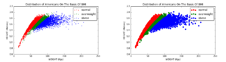
6.3. CHART TYPES 177
Figure 6.14: Smaller dots on scatter plots (left) reveal more detail than the
default dot size (right).
These are best handled by assigning distinct colors to the line/points for
each class. Line hatchings (dotted, dashed, solid, and bold) can also be
used, but these are often harder to distinguish than colors, unless the
output media is black and white. In practice, two to four such lines can
be distinguished on a single plot, before the visual collapses into a mess.
To visualize a large number of groups, partition them into logical clusters
and use multiple line plots, each with few enough lines to be uncluttered.
6.3.3 Scatter Plots
Massive data sets are a real challenge to present in an effective manner, because
large numbers of points easily overwhelm graphic representations, resulting in
an image of the black ball of death. But when properly drawn, scatter plots are
capable of showing thousands of bivariate (two-dimensional) points in a clear
understandable manner.
Scatter plots show the values of every (x, y) point in a given data set. We
used scatter plots in Section 4.1 to represent the body mass status of individuals
by representing them as points in height–weight space. The color of each point
reflected their classification as normal, overweight, or obese. Best practices
associated with scatter plots include:
•Scatter the right-sized dots: In the movie Oh G-d, George Burns as the
creator looks back on the avocado as his biggest mistake. Why? Because
he made the pit too large. Most people’s biggest mistake with scatter
plots is that they make the points too large.
The scatter plots in Figure 6.14 show the BMI distribution for over 1,000
Americans, with two different sizes of dots. Observe how the smaller dots
show finer structure, because they are less likely to overlap and obscure
other data points.
Now we see a fine structure of a dense core, while still being able to detect
the light halo of outliers. The default dot size for most plotting programs
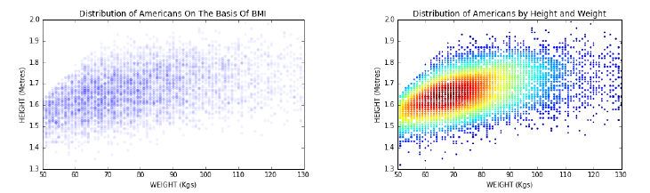
178 CHAPTER 6. VISUALIZING DATA
Figure 6.15: Overlapping dots can obscure scatter plots, particularly for large
data sets. Reducing the opacity of the dots (left) shows some of the fine struc-
ture of the data (left). But a colored heatmap more dramatically reveals the
distribution of the points (right).
is appropriate for about fifty points. But for larger data sets, use smaller
dots.
•Color or jiggle integer points before scatter-plotting them: Scatter plots
reveal grid patterns when the xand yvalues have integer values, because
there are no smooth gradations between them. These scatter plots look
unnatural, but even worse tend to obscure data because often multiple
points will share exactly the same coordinates.
There are two reasonable solutions. The first is to color each point based
on its frequency of occurrence. Such plots are called heatmaps, and concen-
tration centers become readily visible provided that a sensible color scale
is used. Figure 6.15 shows a heatmap of height–weight data, which does
a much better job of revealing point concentrations than the associated
simple dot plot.
A related idea is to reduce the opacity (equivalently, increase the trans-
parency) of the points we scatter plot. By default, points are generally
drawn to be opaque, yielding a mass when there are overlapping points.
But now suppose we permit these points to be lightly shaded and trans-
parent. Now the overlapping points show up as darker than singletons,
yielding a heatmap in multiple shades of gray.
The second approach is to add a small amount of random noise to each
point, to jiggle it within a sub-unit radius circle around its original po-
sition. Now we will see the full multiplicity of points, and break the
distracting regularity of the grid.
•Project multivariate data down to two dimensions, or use arrays of pair-
wise plots: Beings from our universe find it difficult to visualize data sets
in four or more dimensions. Higher-dimensional data sets can often be
projected down to two dimensions before rendering them on scatter plots,
using techniques such as principal component analysis and self-organizing
6.3. CHART TYPES 179
maps. A pretty example appears a few chapters ahead in Figure 11.16,
where we project a hundred dimensions down to two, revealing a very
coherent view of this high-dimensional data set.
The good thing about such plots is that they can provide effective views of
things we couldn’t otherwise see. The bad thing is that the two dimensions
no longer mean anything. More specifically, the new dimensions do not
have variable names that can convey meaning, because each of the two
“new” dimensions encodes properties of all the original dimensions.
An alternative representation is to plot a grid or lattice of all pairwise
projections, each showing just two of the original dimensions. This is a
wonderful way to get a sense of which pairs of dimensions correlate with
each other, as we showed in Figure 6.1.
•Three-dimensional-scatter plots help only when there is real structure to
show: TV news stories about data science always feature some researcher
gripping a three-dimensional point cloud and rotating it through space,
striving for some important scientific insight. They never find it, because
the view of a cloud from any given direction looks pretty much the same
as the view from any other direction. There generally isn’t a vantage point
where it suddenly becomes clear how the dimensions interact.
The exception is when the data was actually derived from structured three-
dimensional objects, such as laser scans of a given scene. Most of the
data we encounter in data science doesn’t fit this description, so have
low expectations for interactive visualization. Use the grid of all two-
dimensional projections technique, which essentially views the cloud from
all orthogonal directions.
•Bubble plots vary color and size to represent additional dimensions: Mod-
ulating the color, shape, size, and shading of dots enables dot plots to
represent additional dimensions, on bubble plots. This generally works
better than plotting points in three dimensions.
Indeed Figure 6.16 neatly shows four dimensions (GDP, life expectancy,
population, and geographic region) using x,y, size, and color, respectively.
There is much to read into such a bubble chart: it clearly reveals the
correlation between GDP and health (by the straight line fit, although
note that the x-values are not linearly-spaced), the new world is generally
richer than the old world, and that the biggest countries (China and India)
generally sit in the middle of the pack. Certain rich but sick nations are
doing abysmally by their people (e.g. South Africa), while countries like
Cuba and Vietnam seem to be punching above their weight.
6.3.4 Bar Plots and Pie Charts
Bar plots and pie charts are tools for presenting the relative proportions of
categorical variables. Both work by partitioning a geometric whole, be it a
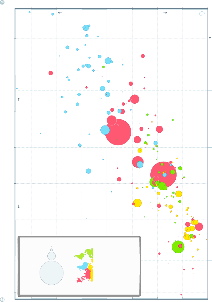
180 CHAPTER 6. VISUALIZING DATA
DATA SOURCES—INCOME: World Bank’s GDP per capita, PPP (2011 international $). Income of Syria & Cuba are Gapminder estimates. X-axis uses log-scale to make a doubling income show same distance on all levels. POPULATION: Data from UN Population Division. LIFE EXPECTANCY: IHME GBD-2015, as of Oct 2016.
ANIMATING GRAPH: Go to www.gapminder.org/tools to see how this graph changed historically and compare 500 other indicators. LICENSE:
Our charts are freely available under Creative Commons Attribution License. Please copy, share, modify, integrate and even sell them, as long as you mention: ”Based on a free chart from www.gapminder.org”.
$1 000 $2 000 $16 000$4 000 $8 000 $32 000 $64 000 $128 000
LEVEL 2
LEVEL 1 LEVEL 3 LEVEL 4INCOME LEVELS
50 60
55 7065 8075 85
INCOME
POOR RICH
version 15
apminder World 2015
India
Japan
Indonesia
Spain
Vietnam
Ethiopia
Congo
Dem. Rep.
Czech Rep.
South Africa
Sudan
Tanzania
Switzerland
Mali
Burkina Faso
Madagascar
Slovak Rep.
Uganda
Kenya
Norway
Cameroon
Guinea
Ghana
Zimbabwe
Niger
Cote d'Ivoire
Bosnia & Herz.
Senegal
Burundi
Rwanda
Moldova
Benin
Sierra Leone
Chad
Lao
Papua N. G.
Malawi
Tajikistan
Togo
Maced F.
Dominican R.
Eritrea
Nicaragua
Liberia
Honduras
Congo, Rep.
Mauritania
Oman
Trinidad & Tobago
Singapore
Gabon
Palestine
Guyana
Monten.
Luxembourg
Gambia
Fiji
Comoros
Equatorial
Guinea
Kuwait
Solomon Isl.
Djibouti
Kiribati
Micronesia
Brunei
Seychelles
Mars. Isl.
Andorra
United Arab Em.
Central African Rep.
Somalia
Guinea-Bissau
Mozambique
Afghanistan
Lesotho
Haiti
North Korea
Timor-Leste
Nepal
Bangladesh
Kyrgyz Rep.
Cambodia
Swaziland
Pakistan
Nigeria
USA
Saudi Arabia
Russia
Egypt
Philippines
Italy
France
Australia
Sweden
Ireland
Netherlands
Germany
Austria
Belgium
Denm.
UK
Finl.
N. Zeal.
South Korea
Sloven.
Greece
Portugal
Israel
Malta
Cyprus
Iceland
Algeria
Brazil
Mexico
Argentina
Malaysia
Azerbaijan
Suriname
Belarus
Costa Rica
Maldives
South Sudan
Zambia
Vanuatu
Myanmar
Syria
Sao T & P
Uzbekistan
Tonga
Samoa
Bolivia
Cape Verde
Georgia
Guatemala
Bhutan
Ukraine
Belize
St.V&G
Grenada
Morocco Armenia
El Salvador Jamaica
Paraguay
St. Lucia
Dominica
Ecuador
Sri Lanka
Albania
Tunisia
Jordan
Colombia
Peru
Serbia
Barbados
Lebanon
Turkey
Thailand Iran
Venezuela Bulgaria
Libya
Mauritius
Romania
Latvia Lithuania
Bahamas
Kazakhastan
Iraq
Namibia
Mongolia
Uruguay
Croatia
Panama
Cuba
Chile
Poland
Hungary
Estonia
Antig.& B.
Puerto
Rico
Bahrain
Aruba
Angola
Qatar
Turkmenistan
Canada
Bermuda
Yemen
China
COLOR BY REGION
SIZE BY POPULATION
www.gapminder.org
1
10
100
1 000
million
This graph compares
Life Expectancy & GDP per capita
for all 182 nations
recognized by the UN.
a free fact-based worldview
HEALTH & INCOME
OF NATIONS
IN 2015
HEALTH
SICK HEALTHY
Life expectancy (years)
GDP per capita ($ adjusted for price differences, PPP 2011)
Figure 6.16: Adding size and color to a scatter plot leads to natural four-
dimensional visualizations, here illustrating properties of the world’s nations.
Based on a free chart from http://www.gapminder.org.
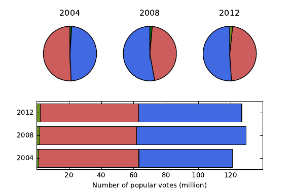
6.3. CHART TYPES 181
Figure 6.17: Voter data from three U.S. presidential elections. Bar plots and
pie charts display the frequency of proportion of categorical variables. Relative
magnitudes in a time series can be displayed by modulating the area of the line
or circle.
bar or a circle, into areas proportional to the frequency of each group. Both
elements are effective in multiples, to enable comparisons. Indeed, partitioning
each bar into pieces yields the stacked bar chart.
Figure 6.17 shows voter data from three years of U.S. presidential elections,
presented as both pie and bar charts. The blue represents Democratic votes, the
red Republican votes. The pies more clearly shows which side won each elections,
but the bars show the Republican vote totals have stayed fairly constant while
the Democrats were generally growing. Observe that these bars can be easily
compared because they are left-justified.
Certain critics get whipped into an almost religious fever against pie charts,
because they take up more space than necessary and are generally harder to
read and compare. But pie charts are arguably better for showing percentages
of totality. Many people seem to like them, so they are probably harmless in
small quantities. Best practices for bar plots and pie charts include:
•Directly label slices of the pie: Pie charts are often accompanied by legend
keys labeling what each color slice corresponds to. This is very distracting,
because your eyes must move back and forth between the key and the pie
to interpret this.
Much better is to label each slice directly, inside the slice or just beyond
the rim. This has a secondary benefit of discouraging the use of too many
slices, because slivers generally become uninterpretable. It helps to group
the slivers into a single slice called other, and then perhaps present a
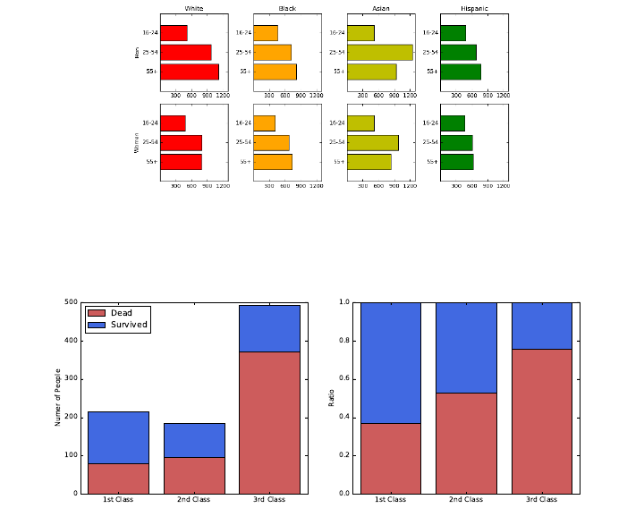
182 CHAPTER 6. VISUALIZING DATA
Figure 6.18: Small multiple bar plots/tables are excellent ways to represent
multivariate data for comparison.
Figure 6.19: Stacked bar charts illustrating the survivorship rate on the doomed
ship Titanic, by ticket class. The histogram (left) informs us of the size of each
class, but scaled bars (right) better capture proportions. Primary conclusion:
you were better off not to be traveling steerage (third class).
second pie chart decomposed into the major other components.
•Use bar charts to enable precise comparisons: When anchored on a fixed
line, arrays of bars make it easy to identify the minimum and maximum
values in a series, and whether a trend is increasing or decreasing.
Stacked bar charts are concise, but harder to use for such purposes. Pre-
senting an array of small bar charts, here one for each gender/ethnic group,
empowers us to make such fine comparisons, as shown in Figure 6.18.
•Scale appropriately, depending upon whether you seek to highlight absolute
magnitude or proportion: Pie charts exist to represent fractions of the
whole. In presenting a series of pie or bar charts, your most critical decision
is whether you want to show the size of the whole, or instead the fractions
of each subgroup.
Figure 6.19 shows two stacked bar charts presenting survivorship statistics
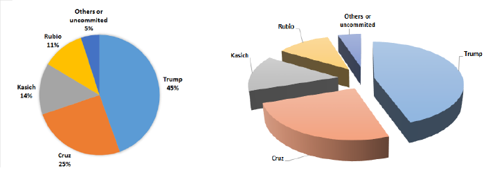
6.3. CHART TYPES 183
Figure 6.20: Pie charts of delegates to the 2016 Republican convention by can-
didate. Which one is better and why?
on the doomed ship Titanic, reported by ticket class. The histogram (left)
precisely records the sizes of each class and the resulting outcomes. The
chart with equal length bars (right) better captures how the mortality rate
increased for lower classes.
Pie charts can also be used to show changes in magnitude, by varying the
area of the circle defining the pie. But it is harder for the eye to calculate
area than length, making comparisons difficult. Modulating the radius to
reflect magnitude instead of area is even more deceptive, because doubling
the radius of a circle multiplies the area by four.
Bad Pie Charts
Figure 6.20 shows two pie charts reporting the distribution of delegates to the
2016 Republican convention, by candidate. The left pie is two-dimensional,
while the chart on right has thick slices neatly separated to show off this depth.
Which one is better at conveying the distribution of votes?
It should be clear that the three-dimensional effects and separation are pure
chartjunk, that only obscures the relationship between the size of the slices. The
actual data values disappeared as well, perhaps because there wasn’t enough
space left for them after all those shadows. But why do we need a pie chart at
all? A little table of labels/colors with an extra column with percentages would
be more concise and informative.
6.3.5 Histograms
The interesting properties of variables or features are defined by their underlying
frequency distribution. Where is the peak of the distribution, and is the mode
near the mean? Is the distribution symmetric or skewed? Where are the tails?
Might it be bimodal, suggesting that the distribution is drawn from a mix of
two or more underlying populations?
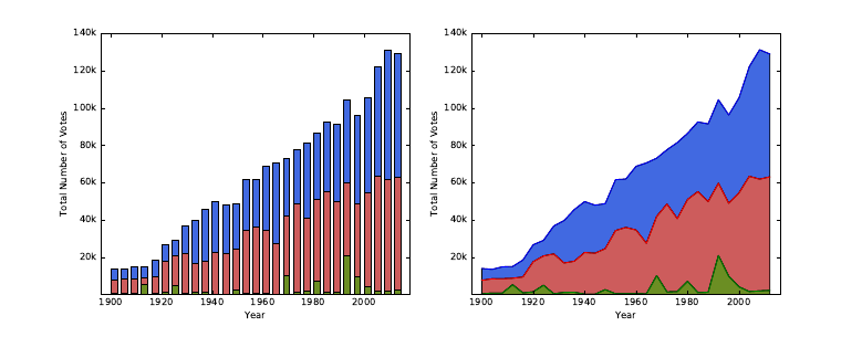
184 CHAPTER 6. VISUALIZING DATA
Figure 6.21: Time series of vote totals in U.S. presidential elections by party en-
able us to see the changes in magnitude and distribution. Democrats are shown
in blue, and Republicans in red. It is hard to visualize changes, particularly in
the middle layers of the stack.
Often we are faced with a large number of observations of a particular vari-
able, and seek to plot a representation for them. Histograms are plots of the
observed frequency distributions. When the variable is defined over a large
range of possible values relative to the nobservations, it is unlikely we will ever
see any exact duplication. However, by partitioning the value range into an ap-
propriate number of equal-width bins, we can accumulate different counts per
bin, and approximate the underlying probability distribution.
The biggest issue in building a histogram is deciding on the right number of
bins to use. Too many bins, and there will be only a few points in even the most
popular bucket. We turned to binning to solve exactly this problem in the first
place. But use too few bins, and you won’t see enough detail to understand the
shape of the distribution.
Figure 6.22 illustrates the consequences of bin size on the appearance of a
histogram. The plots in the top row bin 100,000 points from a normal distri-
bution into ten, twenty, and fifty buckets respectively. There are enough points
to fill fifty buckets, and the distribution on right looks beautiful. The plots in
the bottom row bin have only 100 points, so the thirty-bucket plot on right is
sparse and scraggy. Here seven bins (shown on the left) seems to produce the
most representative plot.
It is impossible to give hard and fast rules to select the best bin count bfor
showing off your data. Realize you will never be able to discriminate between
more than a hundred bins by eye, so this provides a logical upper bound. In
general, I like to see an average of 10 to 50 points per bin to make things
smooth, so b=dn/25egives a reasonable first guess. But experiment with
different values of b, because the right bin count will work much better than the
others. You will know it when you see it.
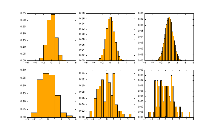
6.3. CHART TYPES 185
Figure 6.22: Histograms of a given distribution can look wildly different de-
pending on the number of bins. A large data set benefits from many bins (top).
But the structure of a smaller data set is best shown when each bin a non-trivial
number of element.
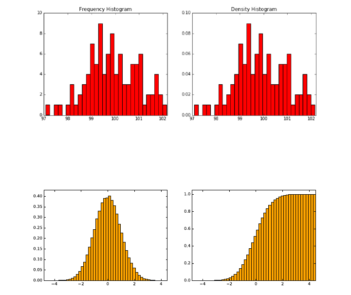
186 CHAPTER 6. VISUALIZING DATA
Figure 6.23: Dividing counts by the total yields a probability density plot, which
is more generally interpretable even though the shapes are identical.
Figure 6.24: Generally speaking, histograms are better for displaying peaks in
a distribution, but cdfs are better for showing tails.
Best practices for histograms include:
•Turn your histogram into a pdf: Typically, we interpret our data as
observations that approximate the probability density function (pdf) of
an underlying random variable. If so, it becomes more interpretable to
label the y-axis by the fraction of elements in each bucket, instead of the
total count. This is particularly true in large data sets, where the buckets
are full enough that we are unconcerned about the exact level of support.
Figure 6.23 shows the same data, plotted on the right as a pdf instead of a
histogram. The shape is exactly the same in both plots: all that changes
is the label on the y-axis. Yet the result is easier to interpret, because it
is in terms of probabilities instead of counts.
•Consider the cdf: The cumulative density function (cdf) is the integral of
the pdf, and the two functions contain exactly the same information. So
consider using a cdf instead of a histogram to represent your distribution,
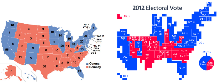
6.3. CHART TYPES 187
Figure 6.25: Maps summarizing the results of the 2012 U.S. presidential election.
The recipient of each state’s electoral votes is effectively presented on a data
map (left), while a cartogram making the area of each state proportional to
the number of votes (right) better captures the magnitude of Obama’s victory.
Source: Images from Wikipedia.
as shown in Figure 6.24.
One great thing about plotting the cdf is that it does not rely on a bin
count parameter, so it presents a true, unadulterated view of your data.
Recall how great the cdfs looked in the Kolmogorov-Smirnov test, Figure
5.13. We draw a cdf as a line plot with n+ 2 points for nobservations.
The first and last points are (xmin −, 0) and (xmax +, 1). We then sort
the observations to yield S={s1, . . . , sn}, and plot (si, i/n) for all i.
Cumulative distributions require slightly more sophistication to read than
histograms. The cdf is monotonically increasing, so there are no peaks
in the distribution. Instead, the mode is marked by the longest vertical
line segment. But cdfs are much better at highlighting the tails of a
distribution. The reason is clear: the small counts at the tails are obscured
by the axis on a histogram, but accumulate into visible stuff in the cdf.
6.3.6 Data Maps
Maps use the spatial arrangement of regions to represent places, concepts, or
things. We have all mastered skills for navigating the world through maps, skills
which translate into understanding related visualizations.
Traditional data maps use color or shading to highlight properties of the
regions in the map. Figure 6.25 (left) colors each state according to whether
they voted for Barack Obama (blue) or his opponent Mitt Romney (red) in the
2012 U.S. presidential election. The map makes clear the country’s political
divisions. The northeast and west coasts are as solidly blue as the Midwest and
south are red.

188 CHAPTER 6. VISUALIZING DATA
Figure 6.26: The periodic table maps the elements into logical groupings, re-
flecting chemical properties. Source:http://sciencenotes.org
Maps are not limited to geographic regions. The most powerful map in the
history of scientific visualization is chemistry’s periodic table of the elements.
Connected regions show where the metals and Nobel gases reside, as well as
spots where undiscovered elements had to lie. The periodic table is a map with
enough detail to be repeatedly referenced by working chemists, yet is easily
understood by school children.
What gives the periodic table such power as a visualization?
•The map has a story to tell: Maps are valuable when they encode infor-
mation worth referencing or assimilating. The periodic table is the right
visualization of the elements because of the structure of electron shells,
and their importance on chemical properties and bonding. The map bears
repeated scrutiny because it has important things to tell us.
Data maps are fascinating, because breaking variables down by region
so often leads to interesting stories. Regions on maps generally reflect
cultural, historical, economic, and linguistic continuities, so phenomena
deriving from any of these factors generally show themselves clearly on
data maps.
•Regions are contiguous, and adjacency means something: The continu-
ity of regions in Figure 6.26 is reflected by its color scheme, grouping
elements sharing similar properties, like the alkali metals and the Nobel
gases. Two elements sitting next to each other usually means that they
share something important in common.
6.4. GREAT VISUALIZATIONS 189
•The squares are big enough to see: A critical decision in canonizing the
periodic table was the placement of the Lanthanide (elements 57–71) and
Actinide metals (elements 89–103). They are conventionally presented as
the bottom two rows, but logically belong within the body of the table in
the unlabeled green squares.
However, the conventional rendering avoids two problems. To do it “right,”
these elements would either be compressed into hopelessly thin slivers, or
else the table would need to become twice as wide to accommodate them.
•It is not too faithful to reality: Improving reality for the sake of better
maps is a long and honorable tradition. Recall that the Mercator projec-
tion distorts the size of landmasses near the poles (yes, Greenland, I am
looking at you) in order to preserve their shape.
Cartograms are maps distorted such that regions reflect some underlying
variable, like population. Figure 6.25 (right) plots the electoral results of
2012 on a map where the area of each state is proportional to its popu-
lation/electoral votes. Only now does the magnitude of Obama’s victory
become clear: those giant red Midwestern states shrink down to an ap-
propriate size, yielding a map of more blue than red.
6.4 Great Visualizations
Developing your own visualization aesthetic gives you a language to talk about
what you like and what you don’t like. I now encourage you to apply your
judgment to assess the merits and demerits of certain charts and graphs.
In this section, we will look at a select group of classic visualizations which
I consider great. There are a large number of terrible graphics I would love to
contrast them against, but I was taught that it is not nice to make fun of people.
This is especially true when there are copyright restrictions over the use of
such images in a book like this. However, I strongly encourage you to visit
http://wtfviz.net/ to see a collection of startling charts and graphics. Many
are quite amusing, for reasons you should now be able to articulate using the
ideas in this chapter.
6.4.1 Marey’s Train Schedule
Tufte points to E.J. Marey’s railroad schedule as a landmark in graphical design.
It is shown in Figure 6.27. The hours of the day are represented on the x-axis.
Indeed, this rectangular plot is really a cylinder cut at 6AM and laid down
flat. The y-axis represents all the stations on the Paris to Lyon line. Each line
represents the route of a particular train, reporting where it should be at each
moment in time.
Normal train schedules are tables, with a column for each train, a row for
each station, and entry (i, j) reporting the time train jarrives at station i. Such
tables are useful to tell us what time to arrive to catch our train. But Marey’s

190 CHAPTER 6. VISUALIZING DATA
Figure 6.27: Marey’s train schedule plots the position of each train as a function
of time.
design provides much more information. What else can you see here that you
cannot with conventional time tables?
•How fast is the train moving? The slope of a line measures how steep it
is. The faster the train, the greater the absolute slope. Slower trains are
marked by flatter lines, because they take more time to cover the given
ground.
A special case here is identifying periods when the train is idling in the
station. At these times, the line is horizontal, indicating no movement
down the line.
•When do trains pass each other? The direction of a train is given by the
slope of the associated line. Northbound trains have a positive slope, and
southbound trains a negative slope. Two trains pass each other at the
intersection points of two lines, letting passengers know when to look out
the window and wave.
•When is rush hour? There is a concentration of trains leaving both Paris
and Lyon around 7PM, which tells me that must have been the most
popular time to travel. The trip typically took around eleven hours, so
this must have been a sleeper train, where travelers would arrive at their
destination bright and early the next day.
The departure times for trains at a station are also there, of course. Each
station is marked by a horizontal line, so look for the time when trains cross
your station in the proper direction.

6.4. GREAT VISUALIZATIONS 191
Figure 6.28: Cholera deaths center around a pump on Broad street, revealing
the source of the epidemic.
My only quibble here is that it would have been even better with a lighter
data grid. Never imprison your data!
6.4.2 Snow’s Cholera Map
A particularly famous data map changed the course of medical history. Cholera
was a terrible disease which killed large numbers of people in 19th-century cities.
The plague would come suddenly and strike people dead, with the cause a
mystery to the science of the day.
John Snow plotted cholera cases from an epidemic of 1854 on a street map
of London, hoping to see a pattern. Each dot in Figure 6.28 represented a
household struck with the disease. What do you see?
Snow noticed a cluster of the cases centered on Broad Street. Further, at the
center of the cluster was a cross, denoting a well where the residents got their
drinking water. The source of the epidemic was traced to the handle of a single
water pump. They changed the handle, and suddenly people stopped getting
sick. This proved that cholera was an infectious disease caused by contaminated
water, and pointed the way towards preventing it.
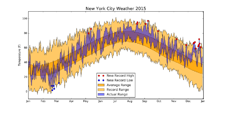
192 CHAPTER 6. VISUALIZING DATA
Figure 6.29: This weather year in review displays a clear story in over 2000
numbers.
6.4.3 New York’s Weather Year
It is almost worth enduring a New York winter to see a particular graphic which
appears in The New York Times each January, summarizing the weather of the
previous year. Figure 6.29 presents an independent rendition of the same data,
which captures why this chart is exciting. For every day of the year, we see
the high and low temperature plotted on a graph, along with historical data to
put it in context: the average daily high and low, as well as the highest/lowest
temperatures ever recorded for that date.
What is so great about that? First, it shows 6 ×365 = 2190 numbers in a
coherent manner, which facilitates comparisons on the sine curve of the seasons:
•We can tell when there were hot and cold spells, and how long they lasted.
•We can tell what days had big swings in temperature, and when the ther-
mometer hardly moved at all.
•We can tell whether the weather was unusual this year. Was it an unusu-
ally hot or cold year, or both? When were record high/lows set, and when
did they get close to setting them?
This single graphic is rich, clear, and informative. Be inspired by it.
6.5 Reading Graphs
What you see isn’t always what you get. I have seen many graphs brought to
me by my students over the years. Some have been amazing, and most others
good enough to get the job done.
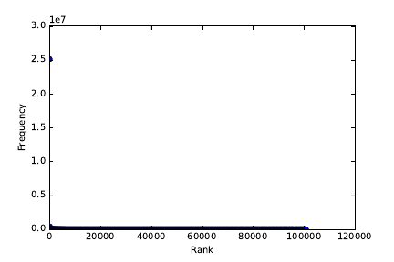
6.5. READING GRAPHS 193
Figure 6.30: A dotplot of word frequency by rank. What do you see?
But I also repeatedly see plots with the same basic problems. In this section,
for a few of my pet peeves, I present the original plot along with the way to
remedy the problem. With experience, you should be able to identify these
kinds of problems just by looking at the initial plot.
6.5.1 The Obscured Distribution
Figure 6.30 portrays the frequency of 10,000 English words, sorted by frequency.
It doesn’t look very exciting: all you can see is a single point at (1,2.5). What
happened, and how can you fix it?
If you stare at the figure long enough, you will see there are actually a lot
more points. But they all sit on the line y= 0, and overlap each other to the
extent that they form an undifferentiated mass.
The alert reader will realize that this single point is in fact an outlier, with
magnitude so large as to shrink all other totals toward zero. A natural reaction
would delete the biggest point, but curiously the remaining points will look
much the same.
The problem is that this distribution is a power law, and plotting a power
law on a linear scale shows nothing. The key here is to plot it on log scale, as in
Figure 6.31 (left). Now you can see the points, and the mapping from ranks to
frequency. Even better is plotting it on a log-log scale, as in Figure 6.31 (right).
The straight line here confirms that we are dealing with a power law.
6.5.2 Overinterpreting Variance
In bioinformatics, one seeks to discover how life works by looking at data. Figure
6.32 (left) presents a graph of the folding energy of genes as a function of their
length. Look at this graph, and see if you can make a discovery.
It is pretty clear that something is going on in there. For gene lengths above
1500, the plot starts jumping around, producing some very negative values. Did
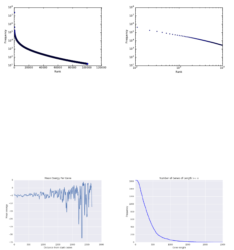
194 CHAPTER 6. VISUALIZING DATA
Figure 6.31: Frequency of 10,000 English words. Plotting the word frequencies
on a log scale (left), or even better on a log-log scale reveals that it is power law
(right).
Figure 6.32: Folding energy of genes as a function of their length. Mistak-
ing variance for signal: the extreme values in the left figure are artifacts from
averaging small numbers of samples.

6.6. INTERACTIVE VISUALIZATION 195
we just discover that energy varies inversely with gene length?
No. We just overinterpreted variance. The first clue is that what looked
very steady starts to go haywire as the length increases. Most genes are very
short in length. Thus the points on the right side of the left plot are based on
very little data. The average of a few points is not as robust as the average of
many points. Indeed, a frequency plot of the number of genes by length (on
right) shows that the counts drop off to nothing right where it starts jumping.
How could we fix it? The right thing to do here is to threshold the plot by
only showing the values with enough data support, perhaps at length 500 or a
bit more. Beyond that, we might bin them by length and take the average, in
order to prove that the jumping effect goes away.
6.6 Interactive Visualization
The charts and graphs we have discussed so far were all static images, designed
to be studied by the viewer, but not manipulated. Interactive visualization
techniques are becoming increasingly important for exploratory data analysis.
Mobile apps, notebooks, and webpages with interactive visualization widgets
can be especially effective in presenting data, and disseminating it to larger
audiences to explore. Providing viewers with the power to play with the actual
data helps ensure that the story presented by a graphic is the true and complete
story.
If you are going to view your data online, it makes sense to do so using
interactive widgets. These are generally extensions of the basic plots that we
have described in this chapter, with features like offering pop-ups with more
information when the user scrolls over points, or encouraging the user to change
the scale ranges with sliders.
There are few potential downsides to interactive visualization. First, it is
harder to communicate exactly what you are seeing to others, compared with
static images. They might not be seeing exactly the same thing as you. Screen-
shots of interactive systems generally cannot compare to publication-quality
graphics optimized on traditional systems. The problem with what you see is
what you get (WYSIWYG) systems is that, generally, what you see is all you
get. Interactive systems are best for exploration, not presentation.
There are also excesses which tend to arise in interactive visualization.
Knobs and features get added because they can, but the visual effects they
add can distract rather than add to the message. Rotating three-dimensional
point clouds always looks cool, but I find them hard to interpret and very seldom
find such views insightful.
Making data tell a story requires some insight into how to tell stories.
Films and television represent the state-of-the-art in narrative presentation.
Like them, the best interactive presentations show a narrative, such as moving
through time or rifling through alternative hypotheses. For inspiration, I en-
courage you to watch the late Han Rosling’s TED talk1using animated bubble
1https://www.ted.com/talks/hans_rosling_shows_the_best_stats_you_ve_ever_seen
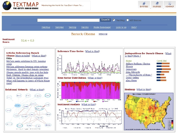
196 CHAPTER 6. VISUALIZING DATA
Figure 6.33: The TextMap dashboard for Barack Obama, circa 2008.
charts to present the history of social and economic development for all the
world’s nations.
Recent trends in cloud-based visualization encourage you to upload your
data to a site like Google Charts https://developers.google.com/chart/,
so you can take advantage of interactive visualization tools and widgets that
they provide. These tools produce very nice interactive plots, and are easy to
use.
The possible sticking point is security, since you are giving your data to a
third party. I hope and trust that the CIA analysts have access to their own in-
house solutions which keep their data confidential. But feel free to experiment
with these tools in less sensitive situations.
6.7 War Story: TextMapping the World
My biggest experience in data visualization came as a result of our large scale
news/sentiment analysis system. TextMap presented a news analysis dashboard,
for every entity whose name appeared in news articles of the time. Barack
Obama’s page is shown in Figure 6.33. Our dashboard was made up of a variety
of subcomponents:
•Reference time series: Here we reported how often the given entity ap-
peared in the news, as a function of time. Spikes corresponded to more
important news events. Further, we partitioned these counts according
6.7. WAR STORY: TEXTMAPPING THE WORLD 197
to appearances in each section of the newspaper: news, sports, entertain-
ment, or business.
•News sector distribution: This graph contains exactly the same data as
in the reference time series, but presented as a stacked area plot to show
the fraction of entity references in each section of the paper. Obama
clearly presents as a news figure. But other people exhibited interesting
transitions, such as Arnold Schwarzenegger when he shifted from acting
to politics.
•Sentiment analysis: Here we present a time series measuring the senti-
ment of the entity, by presenting the normalized difference of the number
of positive news mentions to total references. Thus zero represented a
neutral reputation, and we provided a central reference line to put the
placement into perspective. Here Obama’s sentiment ebbs and flows with
events, but generally stays on the right side of the line.
It was nice to see bad things happen to bad people, by watching their news
sentiment drop. As I recall, the lowest news sentiment ever achieved was
by a mom who achieved notoriety by cyberbullying one of her daughter’s
social rivals into committing suicide.
•Heatmap: Here we presented a data map showing the relative reference
frequency of the entity. Obama’s great red patch around Illinois is because
he was serving as a senator from there at the time he first ran for president.
Many classes entities showed strong regional biases, like sports figures and
politicians, but less so entertainment figures like movie stars and singers.
•Juxtapositions and relational network: Our system built a network on
news entities, by linking two entities whenever they were mentioned in
the same article. The strength of this relationship could be measured by
the number of articles linking them together. The strongest of these asso-
ciations are reported as juxtapositions, with their frequency and strength
shown by a bar chart on a logarithmic scale.
We have not really talked so far about network visualization, but the
key idea is to position vertices so neighbors are located near each other,
meaning the edges are short. Stronger friendships are shown by thicker
lines.
•Related articles: We provided links to representative news articles men-
tioning the given entity.
One deficiency of our dashboard was that it was not interactive. In fact, it
was anti-interactive: the only animation was a gif of the world spinning forlornly
in the upper-left corner. Many of the plots we rendered required large amounts
of data access from our clunky database, particularly the heatmap. Since it
could not be rendered interactively, we precomputed these maps offline and
showed them on demand.
198 CHAPTER 6. VISUALIZING DATA
After Mikhail updated our infrastructure (see the war story of Section 12.2),
it became possible for us to support some interactive plots, particularly time
series. We developed a new user interface called TextMap Access that let users
play with our data.
But when General Sentiment licensed the technology, the first thing it dis-
posed of was our user interface. It didn’t make sense to the business analysts
who were our customers. It was too complicated. There is a substantial differ-
ence between surface appeal and the real effectiveness of an interface for users.
Look carefully at our TextMap dashboard: it had “What is this?” buttons
in several locations. This was a sign of weakness: if our graphics were really
intuitive enough we would not have needed them.
Although I grumbled about the new interface, I was undoubtedly wrong.
General Sentiment employed a bunch of analysts who used our system all day
long, and were available to talk to our developers. Presumably the interface
evolved to serve them better. The best interfaces are built by a dialog between
developers and users.
What are the take-home lessons from this experience? There is a lot I still
find cool about this dashboard: the presentation was rich enough to really expose
interesting things about how the world worked. But not everyone agreed. Dif-
ferent customers preferred different interfaces, because they did different things
with them.
One lesson here is the power of providing alternate views of the same data.
The reference time series and news sector distribution were exactly the same
data, but provided quite different insights when presented in different ways.
All songs are made from the same notes, but how you arrange them makes for
different kinds of music.
6.8 Chapter Notes
I strongly recommend Edward Tufte’s books [Tuf83, Tuf90, Tuf97] to anyone
interested in the art of scientific visualization. You don’t even have to read
them. Just look at the pictures for effective contrasts between good and bad
graphics, and plots that really convey stories in data.
Similarly good books on data visualization are Few [Few09] and far between.
Interesting blogs about data visualization are http://flowingdata.com and
http://viz.wtf. The first focuses on great visualizations, the second seeking
out the disasters. The story of Snow’s cholera map is reported in Johnson
[Joh07].
The chartjunk removal example from Section 6.2.3 was inspired by an ex-
ample by Tim Bray at http://www.tbray.org. Anscombe’s quartet was first
presented in [Ans73]. The basic architecture of our Lydia/TextMap news analy-
sis system is reported in Lloyd et al. [LKS05], with additional papers describing
heatmaps [MBL+06] and the Access user interface [BWPS10].
6.9. EXERCISES 199
6.9 Exercises
Exploratory Data Analysis
6-1. [5] Provide answers to the questions associated with the following data sets,
available at http://www.data-manual.com/data.
(a) Analyze the movie data set. What is the range of movie gross in the United
States? Which type of movies are most likely to succeed in the market?
Comedy? PG-13? Drama?
(b) Analyze the Manhattan rolling sales data set. Where in Manhattan is the
most/least expensive real estate located? What is the relationship between
sales price and gross square feet?
(c) Analyze the 2012 Olympic data set. What can you say about the relation-
ship between a country’s population and the number of medals it wins?
What can you say about the relationship between the ratio of female and
male counts and the GDP of that country?
(d) Analyze the GDP per capita data set. How do countries from Europe, Asia,
and Africa compare in the rates of growth in GDP? When have countries
faced substantial changes in GDP, and what historical events were likely
most responsible for it?
6-2. [3] For one or more of the data sets from http://www.data-manual.com/data,
answer the following basic questions:
(a) Who constructed it, when, and why?
(b) How big is it?
(c) What do the fields mean?
(d) Identify a few familiar or interpretable records.
(e) Provide Tukey’s five number summary for each column.
(f) Construct a pairwise correlation matrix for each pair of columns.
(g) Construct a pairwise distribution plot for each interesting pair of columns.
Interpreting Visualizations
6-3. [5] Search your favorite news websites until you find ten interesting charts/plots,
ideally half good and half bad. For each, please critique along the following
dimensions, using the vocabulary we have developed in this chapter:
(a) Does it do a good job or a bad job of presenting the data?
(b) Does the presentation appear to be biased, either deliberately or acciden-
tally?
(c) Is there chartjunk in the figure?
(d) Are the axes labeled in a clear and informative way?
(e) Is the color used effectively?
(f) How can we make the graphic better?
200 CHAPTER 6. VISUALIZING DATA
6-4. [3] Visit http://www.wtfviz.net. Find five laughably bad visualizations, and
explain why they are both bad and amusing.
Creating Visualizations
6-5. [5] Construct a revealing visualization of some aspect of your favorite data set,
using:
(a) A well-designed table.
(b) A dot and/or line plot.
(c) A scatter plot.
(d) A heatmap.
(e) A bar plot or pie chart.
(f) A histogram.
(g) A data map.
6-6. [5] Create ten different versions of line charts for a particular set of (x, y) points.
Which ones are best and which ones worst? Explain why.
6-7. [3] Construct scatter plots for sets of 10, 100, 1000, and 10,000 points. Experi-
ment with the point size to find the most revealing value for each data set.
6-8. [5] Experiment with different color scales to construct scatter plots for a par-
ticular set of (x, y, z) points, where color is used to represent the zdimension.
Which color schemes work best? Which are the worst? Explain why.
Implementation Projects
6-9. [5] Build an interactive exploration widget for your favorite data set, using
appropriate libraries and tools. Start simple, but be as creative as you want to
be.
6-10. [5] Create a data video/movie, by recording/filming an interactive data explo-
ration. It should not be long, but how interesting/revealing can you make it?
Interview Questions
6-11. [3] Describe some good practices in data visualization?
6-12. [5] Explain Tufte’s concept of chart junk.
6-13. [8] How would you to determine whether the statistics published in an article
are either wrong or presented to support a biased view?
Kaggle Challenges
6-14. Analyze data from San Francisco Bay Area bike sharing.
https://www.kaggle.com/benhamner/sf-bay-area-bike-share
6-15. Predict whether West Nile virus is present in a given time and place.
https://www.kaggle.com/c/predict-west-nile-virus
6-16. What type of crime is most likely at a given time and place?
https://www.kaggle.com/c/sf-crime
Chapter 7
Mathematical Models
All models are wrong, but some models are useful.
– George Box
So far in this book, a variety of tools have been developed to manipulate and
interpret data. But we haven’t really dealt with modeling, which is the process of
encapsulating information into a tool which can forecast and make predictions.
Predictive models are structured around some idea of what causes future
events to happen. Extrapolating from recent trends and observations assumes
a world view that the future will be like the past. More sophisticated models,
such as the laws of physics, provide principled notions of causation; fundamental
explanations of why things happen.
This chapter will concentrate on designing and validating models. Effectively
formulating models requires a detailed understanding of the space of possible
choices.
Accurately evaluating the performance of a model can be surprisingly hard,
but it is essential for knowing how to interpret the resulting predictions. The
best forecasting system is not necessarily the most accurate one, but the model
with the best sense of its boundaries and limitations.
7.1 Philosophies of Modeling
Engineers and scientists are often leery of the p-word (philosophy). But it pays
to think in some fundamental way about what we are trying to do, and why.
Recall that people turn to data scientists for wisdom, instead of programs.
In this section, we will turn to different ways of thinking about models to
help shape the way we build them.
7.1.1 Occam’s Razor
Occam’s razor is the philosophical principle that “the simplest explanation is

202 CHAPTER 7. MATHEMATICAL MODELS
the best explanation.” According to William of Occam, a 13th-century theolo-
gian, given two models or theories which do an equally accurate job of making
predictions, we should opt for the simpler one as sounder and more robust. It
is more likely to be making the right decision for the right reasons.
Occam’s notion of simpler generally refers to reducing the number of assump-
tions employed in developing the model. With respect to statistical modeling,
Occam’s razor speaks to the need to minimize the parameter count of a model.
Overfitting occurs when a model tries too hard to achieve accurate performance
on its training data. This happens when there are so many parameters that the
model can essentially memorize its training set, instead of generalizing appro-
priately to minimize the effects of error and outliers.
Overfit models tend to perform extremely well on training data, but much
less accurately on independent test data. Invoking Occam’s razor requires that
we have a meaningful way to evaluate how accurately our models are performing.
Simplicity is not an absolute virtue, when it leads to poor performance. Deep
learning is a powerful technique for building models with millions of parameters,
which we will discuss in Section 11.6. Despite the danger of overfitting, these
models perform extremely well on a variety of complex tasks. Occam would have
been suspicious of such models, but come to accept those that have substantially
more predictive power than the alternatives.
Appreciate the inherent trade-off between accuracy and simplicity. It is
almost always possible to “improve” the performance of any model by kludging-
on extra parameters and rules to govern exceptions. Complexity has a cost, as
explicitly captured in machine learning methods like LASSO/ridge regression.
These techniques employ penalty functions to minimize the features used in the
model.
Take-Home Lesson: Accuracy is not the best metric to use in judging the
quality of a model. Simpler models tend to be more robust and understandable
than complicated alternatives. Improved performance on specific tests is often
more attributable to variance or overfitting than insight.
7.1.2 Bias–Variance Trade-Offs
This tension between model complexity and performance shows up in the sta-
tistical notion of the bias–variance trade-off:
•Bias is error from incorrect assumptions built into the model, such as
restricting an interpolating function to be linear instead of a higher-order
curve.
•Variance is error from sensitivity to fluctuations in the training set. If our
training set contains sampling or measurement error, this noise introduces
variance into the resulting model.
Errors of bias produce underfit models. They do not fit the training data as
tightly as possible, were they allowed the freedom to do so. In popular discourse,

7.1. PHILOSOPHIES OF MODELING 203
I associate the word “bias” with prejudice, and the correspondence is fairly apt:
an apriori assumption that one group is inferior to another will result in less
accurate predictions than an unbiased one. Models that perform lousy on both
training and testing data are underfit.
Errors of variance result in overfit models: their quest for accuracy causes
them to mistake noise for signal, and they adjust so well to the training data
that noise leads them astray. Models that do much better on testing data than
training data are overfit.1
Take-Home Lesson: Models based on first principles or assumptions are likely
to suffer from bias, while data-driven models are in greater danger of overfit-
ting.
7.1.3 What Would Nate Silver Do?
Nate Silver is perhaps the most prominent public face of data science today. A
quantitative fellow who left a management consulting job to develop baseball
forecasting methods, he rose to fame through his election forecast website http:
//www.fivethirtyeight.com. Here he used quantitative methods to analyze
poll results to predict the results of U.S. presidential elections. In the 2008
election, he accurately called the winner of 49 of the 50 states, and improved
in 2012 to bag 50 out of 50. The results of the 2016 election proved a shock
to just about everyone, but alone among public commentators Nate Silver had
identified a substantial chance of Trump winning the electoral college while
losing the popular vote. This indeed proved to be the case.
Silver wrote an excellent book The Signal and the Noise: Why so many
predictions fail – but some don’t [Sil12]. There he writes sensibly about state-
of-the-art forecasting in several fields, including sports, weather and earthquake
prediction, and financial modeling. He outlines principles for effective modeling,
including:
•Think probabilistically: Forecasts which make concrete statements are
less meaningful than those that are inherently probabilistic. A forecast
that Trump has only 28.3% chance of winning is more meaningful than
one that categorically states that he will lose.
The real world is an uncertain place, and successful models recognize this
uncertainty. There are always a range of possible outcomes that can occur
with slight perturbations of reality, and this should be captured in your
model. Forecasts of numerical quantities should not be single numbers, but
instead report probability distributions. Specifying a standard deviation
σalong with the mean prediction µsuffices to describe such a distribution,
particularly if it is assumed to be normal.
1To complete this taxonomy, models that do better on testing data than the training data
are said to be cheating.
204 CHAPTER 7. MATHEMATICAL MODELS
Several of the machine learning techniques we will study naturally provide
probabilistic answers. Logistic regression provides a confidence along with
each classification it makes. Methods that vote among the labels of the
knearest neighbors define a natural confidence measure, based on the
consistency of the labels in the neighborhood. Collecting ten of eleven
votes for blue means something stronger than seven out of eleven.
•Change your forecast in response to new information: Live models are
much more interesting than dead ones. A model is live if it is contin-
ually updating predictions in response to new information. Building an
infrastructure that maintains a live model is more intricate than that of a
one-off computation, but much more valuable.
Live models are more intellectually honest than dead ones. Fresh informa-
tion should change the result of any forecast. Scientists should be open to
changing opinions in response to new data: indeed, this is what separates
scientists from hacks and trolls.
Dynamically-changing forecasts provide excellent opportunities to evalu-
ate your model. Do they ultimately converge on the correct answer? Does
uncertainty diminish as the event approaches? Any live model should track
and display its predictions over time, so the viewer can gauge whether
changes accurately reflected the impact of new information.
•Look for consensus: A good forecast comes from multiple distinct sources
of evidence. Data should derive from as many different sources as possible.
Ideally, multiple models should be built, each trying to predict the same
thing in different ways. You should have an opinion as to which model is
the best, but be concerned when it substantially differs from the herd.
Often third parties produce competing forecasts, which you can monitor
and compare against. Being different doesn’t mean that you are wrong,
but it does provide a reality check. Who has been doing better lately?
What explains the differences in the forecast? Can your model be im-
proved?
Google’s Flu Trends forecasting model predicted disease outbreaks by
monitoring key words on search: a surge in people looking for aspirin or
fever might suggest that illness is spreading. Google’s forecasting model
proved quite consistent with the Center for Disease Control’s (CDC) statis-
tics on actual flu cases for several years, until they embarrassingly went
astray.
The world changes. Among the changes was that Google’s search interface
began to suggest search queries in response to a user’s history. When of-
fered the suggestion, many more people started searching for aspirin after
searching for fever. And the old model suddenly wasn’t accurate any-
more. Google’s sins lay in not monitoring its performance and adjusting
over time.

7.2. A TAXONOMY OF MODELS 205
Certain machine learning methods explicitly strive for consensus. Boosting
algorithms combine large numbers of weak classifiers to produce a strong
one. Ensemble decision tree methods build many independent classifiers,
and vote among them to make the best decision. Such methods can have
a robustness which eludes more single-track models.
•Employ Baysian reasoning: Bayes’ theorem has several interpretations,
but perhaps most cogently provides a way to calculate how probabilities
change in response to new evidence. When stated as
P(A|B) = P(B|A)P(A)
P(B)
it provides a way to calculate how the probability of event Achanges in
response to new evidence B.
Applying Bayes’ theorem requires a prior probability P(A), the likelihood
of event Abefore knowing the status of a particular event B. This might
be the result of running a classifier to predict the status of Afrom other
features, or background knowledge about event frequencies in a popula-
tion. Without a good estimate for this prior, it is very difficult to know
how seriously to take the classifier.
Suppose Ais the event that person xis actually a terrorist, and Bis
the result of a feature-based classifier that decides if xlooks like a terror-
ist. When trained/evaluated on a data set of 1,000 people, half of whom
were terrorists, the classifier achieved an enviable accuracy of, say, 90%.
The classifier now says that Skiena looks like a terrorist. What is the
probability that Skiena really is a terrorist?
The key insight here is that the prior probability of “xis a terrorist” is
really, really low. If there are a hundred terrorists operating in the United
States, then P(A) = 100/300,000,000 = 3.33 ×10⁻⁷. The probability of
the terrorist detector saying yes, P(B) = 0.5, while the probability of the
detector being right when it says yes P(B|A)=0.9. Multiplying this out
gives a still very tiny probability that I am a bad guy,
P(A|B) = P(B|A)P(A)
P(B)=(0.9)(3.33 ×10⁻⁷)
(0.5) = 6 ×10⁻⁷
although admittedly now greater than that of a random citizen.
Factoring in prior probabilities is essential to getting the right interpreta-
tion from this classifier. Bayesian reasoning starts from the prior distribu-
tion, then weighs further evidence by how strongly it should impact the
probability of the event.
7.2 A Taxonomy of Models
Models come in, well, many different models. Part of developing a philosophy
of modeling is understanding your available degrees of freedom in design and
206 CHAPTER 7. MATHEMATICAL MODELS
implementation. In this section, we will look at model types along several differ-
ent dimensions, reviewing the primary technical issues which arise to distinguish
each class.
7.2.1 Linear vs. Non-Linear Models
Linear models are governed by equations that weigh each feature variable by a
coefficient reflecting its importance, and sum up these values to produce a score.
Powerful machine learning techniques, such as linear regression, can be used to
identify the best possible coefficients to fit training data, yielding very effective
models.
But generally speaking, the world is not linear. Richer mathematical descrip-
tions include higher-order polynomials, logarithms, and exponentials. These
permit models that fit training data much more tightly than linear functions
can. Generally speaking, it is much harder to find the best possible coefficients
to fit non-linear models. But we don’t have to find the best possible fit: deep
learning methods, based on neural networks, offer excellent performance despite
inherent difficulties in optimization.
Modeling cowboys often sneer in contempt at the simplicity of linear models.
But linear models offer substantial benefits. They are readily understandable,
generally defensible, easy to build, and avoid overfitting on modest-sized data
sets. Occam’s razor tells us that “the simplest explanation is the best explana-
tion.” I am generally happier with a robust linear model, yielding an accuracy
of x%, than a complex non-linear beast only a few percentage points better on
limited testing data.
7.2.2 Blackbox vs. Descriptive Models
Black boxes are devices that do their job, but in some unknown manner. Stuff
goes in and stuff comes out, but how the sausage is made is completely impen-
etrable to outsiders.
By contrast, we prefer models that are descriptive, meaning they provide
some insight into why they are making their decisions. Theory-driven models are
generally descriptive, because they are explicit implementations of a particular
well-developed theory. If you believe the theory, you have a reason to trust the
underlying model, and any resulting predictions.
Certain machine learning models prove less opaque than others. Linear
regression models are descriptive, because one can see exactly which variables
receive the most weight, and measure how much they contribute to the resulting
prediction. Decision tree models enable you to follow the exact decision path
used to make a classification. “Our model denied you a home mortgage because
your income is less than $10,000 per year, you have greater than $50,000 in
credit card debt, and you have been unemployed over the past year.”
But the unfortunate truth is that blackbox modeling techniques such as
deep learning can be extremely effective. Neural network models are generally
completely opaque as to why they do what they do. Figure 7.1 makes this

7.2. A TAXONOMY OF MODELS 207
Figure 7.1: Synthetic images that are mistakenly recognized as objects by state-
of-the-art Deep Learning neural networks, each with a confidence greater than
99.6%. Source: [NYC15].
clear. It shows images which were very carefully constructed to fool state-of-
the-art neural networks. They succeeded brilliantly. The networks in question
had ≥99.6% confidence that they had found the right label for every image in
Figure 7.1.
The scandal here is not that the network got the labels wrong on these
perverse images, for these recognizers are very impressive systems. Indeed, they
were much more accurate than dreamed possible only a year or two before. The
problem is that the creators of these classifiers had no idea why their programs
made such terrible errors, or how they could prevent them in the future.
A similar story is told of a system built for the military to distinguish images
of cars from trucks. It performed well in training, but disastrously in the field.
Only later was it realized that the training images for cars were shot on a sunny
day and those of trucks on a cloudy day, so the system had learned to link the
sky in the background with the class of the vehicle.
Tales like these highlight why visualizing the training data and using descrip-
tive models can be so important. You must be convinced that your model has
the information it needs to make the decisions you are asking of it, particularly
in situations where the stakes are high.
7.2.3 First-Principle vs. Data-Driven Models
First-principle models are based on a belief of how the system under investi-
gation really works. It might be a theoretical explanation, like Newton’s laws
of motion. Such models can employ the full weight of classical mathematics:
calculus, algebra, geometry, and more. The model might be a discrete event
simulation, as will be discussed in Section 7.7. It might be seat-of-the-pants
reasoning from an understanding of the domain: voters are unhappy if the
economy is bad, therefore variables which measure the state of the economy
should help us predict who will win the election.
208 CHAPTER 7. MATHEMATICAL MODELS
In contrast, data-driven models are based on observed correlations between
input parameters and outcome variables. The same basic model might be used
to predict tomorrow’s weather or the price of a given stock, differing only on the
data it was trained on. Machine learning methods make it possible to build an
effective model on a domain one knows nothing about, provided we are given a
good enough training set.
Because this is a book on data science, you might infer that my heart lies
more on the side of data-driven models. But this isn’t really true. Data science is
also about science, and things that happen for understandable reasons. Models
which ignore this are doomed to fail embarrassingly in certain circumstances.
There is an alternate way to frame this discussion, however. Ad hoc models
are built using domain-specific knowledge to guide their structure and design.
These tend to be brittle in response to changing conditions, and difficult to
apply to new tasks. In contrast, machine learning models for classification
and regression are general, because they employ no problem-specific ideas, only
specific data. Retrain the models on fresh data, and they adapt to changing
conditions. Train them on a different data set, and they can do something
completely different. By this rubric, general models sound much better than ad
hoc ones.
The truth is that the best models are a mixture of both theory and data. It
is important to understand your domain as deeply as possible, while using the
best data you can in order to fit and evaluate your models.
7.2.4 Stochastic vs. Deterministic Models
Demanding a single deterministic “prediction” from a model can be a fool’s
errand. The world is a complex place of many realities, with events that gener-
ally would not unfold in exactly the same way if time could be run over again.
Good forecasting models incorporate such thinking, and produce probability
distributions over all possible events.
Stochastic is a fancy word meaning “randomly determined.” Techniques
that explicitly build some notion of probability into the model include logistic
regression and Monte Carlo simulation. It is important that your model observe
the basic properties of probabilities, including:
•Each probability is a value between 0 and 1: Scores that are not con-
strained to be in this range do not directly estimate probabilities. The
solution is often to put the values through a logit function (see Section
4.4.1) to turn them into probabilities in a principled way.
•That they must sum to 1: Independently generating values between 0
and 1 does not mean that they together add up to a unit probability, over
the full event space. The solution here is to scale these values so that
they do, by dividing each by the partition function. See Section 9.7.4.
Alternately, rethink your model to understand why they didn’t add up in
the first place.
7.2. A TAXONOMY OF MODELS 209
•Rare events do not have probability zero: Any event that is possible must
have a greater than zero probability of occurrence. Discounting is a way
of evaluating the likelihood of unseen but possible events, and will be
discussed in Section 11.1.2.
Probabilities are a measure of humility about the accuracy of our model,
and the uncertainty of a complex world. Models must be honest in what they
do and don’t know.
There are certain advantages of deterministic models, however. First-principle
models often yield only one possible answer. Newton’s laws of motion will tell
you exactly how long a mass takes to fall a given distance.
That deterministic models always return the same answer helps greatly in
debugging their implementation. This speaks to the need to optimize repeata-
bility during model development. Fix the initial seed if you are using a random
number generator, so you can rerun it and get the same answer. Build a re-
gression test suite for your model, so you can confirm that the answers remain
identical on a given input after program modifications.
7.2.5 Flat vs. Hierarchical Models
Interesting problems often exist on several different levels, each of which may
require independent submodels. Predicting the future price for a particular
stock really should involve submodels for analyzing such separate issues as (a)
the general state of the economy, (b) the company’s balance sheet, and (c) the
performance of other companies in its industrial sector.
Imposing a hierarchical structure on a model permits it to be built and
evaluated in a logical and transparent way, instead of as a black box. Certain
subproblems lend themselves to theory-based, first-principle models, which can
then be used as features in a general data-driven model. Explicitly hierarchical
models are descriptive: one can trace a final decision back to the appropriate
top-level subproblem, and report how strongly it contributed to making the
observed result.
The first step to build a hierarchical model is explicitly decomposing our
problem into subproblems. Typically these represent mechanisms governing the
underlying process being modeled. What should the model depend on? If data
and resources exist to make a principled submodel for each piece, great! If
not, it is OK to leave it as a null model or baseline, and explicitly describe the
omission when documenting the results.
Deep learning models can be thought of as being both flat and hierarchical,
at the same time. They are typically trained on large sets of unwashed data, so
there is no explicit definition of subproblems to guide the subprocess. Looked
at as a whole, the network does only one thing. But because they are built from
multiple nested layers (the deep in deep learning), these models presume that
there are complex features there to be learned from the lower level inputs.
I am always reluctant to believe that machine learning models prove better
than me at inferring the basic organizing principles in a domain that I un-
210 CHAPTER 7. MATHEMATICAL MODELS
derstand. Even when employing deep learning, it pays to sketch out a rough
hierarchical structure that likely exists for your network to find. For example,
any image processing network should generalize from patches of pixels to edges,
and then from boundaries to sub-objects to scene analysis as we move to higher
layers. This influences the architecture of your network, and helps you validate
it. Do you see evidence that your network is making the right decisions for the
right reasons?
7.3 Baseline Models
A wise man once observed that a broken clock is right twice a day. As modelers
we strive to be better than this, but proving that we are requires some level of
rigorous evaluation.
The first step to assess the complexity of your task involves building baseline
models: the simplest reasonable models that produce answers we can compare
against. More sophisticated models should do better than baseline models, but
verifying that they really do and, if so by how much, puts its performance into
the proper context.
Certain forecasting tasks are inherently harder than others. A simple base-
line (“yes”) has proven very accurate in predicting whether the sun will rise
tomorrow. By contrast, you could get rich predicting whether the stock mar-
ket will go up or down 51% of the time. Only after you decisively beat your
baselines can your models really be deemed effective.
7.3.1 Baseline Models for Classification
There are two common tasks for data science models: classification and value
prediction. In classification tasks, we are given a small set of possible labels
for any given item, like (spam or not spam), (man or woman), or (bicycle, car,
or truck). We seek a system that will generate a label accurately describing a
particular instance of an email, person, or vehicle.
Representative baseline models for classification include:
•Uniform or random selection among labels: If you have absolutely no
prior distribution on the objects, you might as well make an arbitrary
selection using the broken watch method. Comparing your stock market
prediction model against random coin flips will go a long way to showing
how hard the problem is.
I think of such a blind classifier as the monkey, because it is like asking
your pet to make the decision for you. In a prediction problem with twenty
possible labels or classes, doing substantially better than 5% is the first
evidence that you have some insight into the problem. You first have to
show me that you can beat the monkey before I start to trust you.
•The most common label appearing in the training data: A large training
set usually provides some notion of a prior distribution on the classes.
7.3. BASELINE MODELS 211
Selecting the most frequent label is better than selecting them uniformly
or randomly. This is the theory behind the sun-will-rise-tomorrow baseline
model.
•The most accurate single-feature model: Powerful models strive to exploit
all the useful features present in a given data set. But it is valuable to
know what the best single feature can do. Building the best classifier on
a single numerical feature xis easy: we are declaring that the item is in
class 1 if x≥t, and class 2 if otherwise. To find the best threshold t,
we can test all npossible thresholds of the form ti=xi+, where xiis
the value of the feature in the ith of ntraining instances. Then select the
threshold which yields the most accurate classifier on your training data.
Occam’s razor deems the simplest model to be best. Only when your
complicated model beats all single-factor models does it start to be inter-
esting.
•Somebody else’s model: Often we are not the first person to attempt a
particular task. Your company may have a legacy model that you are
charged with updating or revising. Perhaps a close variant of the problem
has been discussed in an academic paper, and maybe they even released
their code on the web for you to experiment with.
One of two things can happen when you compare your model against
someone else’s work: either you beat them or you don’t. If you beat
them, you now have something worth bragging about. If you don’t, it is
a chance to learn and improve. Why didn’t you win? The fact that you
lost gives you certainty that your model can be improved, at least to the
level of the other guy’s model.
•Clairvoyance: There are circumstances when even the best possible model
cannot theoretically reach 100% accuracy. Suppose that two data records
are exactly the same in feature space, but with contradictory labels. There
is no deterministic classifier that could ever get both of these problems
right, so we’re doomed to less than perfect performance. But the tighter
upper bound from an optimally clairvoyant predictor might convince you
that your baseline model is better than you thought.
The need for better upper bounds often arises when your training data is
the result of a human annotation process, and multiple annotators evaluate
the same instances. We get inherent contradictions whenever two anno-
tators disagree with each other. I’ve worked on problems where 86.6%
correct was the highest possible score. This lowers expectations. A good
bit of life advice is to expect little from your fellow man, and realize you
will have to make do with a lot less than that.
212 CHAPTER 7. MATHEMATICAL MODELS
7.3.2 Baseline Models for Value Prediction
In value prediction problems, we are given a collection of feature-value pairs
(fi, vi) to use to train a function Fsuch that F(vi) = vi. Baseline models for
value prediction problems follow from similar techniques to what were proposed
for classification, like:
•Mean or median: Just ignore the features, so you can always output
the consensus value of the target. This proves to be quite an informative
baseline, because if you can’t substantially beat always guessing the mean,
either you have the wrong features or are working on a hopeless task.
•Linear regression: We will thoroughly cover linear regression in Section
9.1. But for now, it suffices to understand that this powerful but simple-to-
use technique builds the best possible linear function for value prediction
problems. This baseline enables you to better judge the performance of
non-linear models. If they do not perform substantially better than the
linear classifier, they are probably not worth the effort.
•Value of the previous point in time: Time series forecasting is a common
task, where we are charged with predicting the value f(tn, x) at time
tngiven feature set xand the observed values f0(ti) for 1 ≤i < n.
But today’s weather is a good guess for whether it will rain tomorrow.
Similarly, the value of the previous observed value f0(tn−1) is a reasonable
forecast for time f(tn). It is often surprisingly difficult to beat this baseline
in practice.
Baseline models must be fair: they should be simple but not stupid. You
want to present a target that you hope or expect to beat, but not a sitting
duck. You should feel relieved when you beat your baseline, but not boastful or
smirking.
7.4 Evaluating Models
Congratulations! You have built a predictive model for classification or value
prediction. Now, how good is it?
This innocent-looking question does not have a simple answer. We will
detail the key technical issues in the sections below. But the informal sniff test
is perhaps the most important criteria for evaluating a model. Do you really
believe that it is doing a good job on your training and testing instances?
The formal evaluations that will be detailed below reduce the performance
of a model down to a few summary statistics, aggregated over many instances.
But many sins in a model can be hidden when you only interact with these
aggregate scores. You have no way of knowing whether there are bugs in your
implementation or data normalization, resulting in poorer performance than it
should have. Perhaps you intermingled your training and test data, yielding
much better scores on your testbed than you deserve.

7.4. EVALUATING MODELS 213
Predicted Class
Yes No
Actual Yes True Positives (TP) False Negatives (FN)
Class No False Positives (FP) True Negatives (TN)
Figure 7.2: The confusion matrix for binary classifiers, defining different classes
of correct and erroneous predictions.
To really know what is happening, you need to do a sniff test. My personal
sniff test involves looking carefully at a few example instances where the model
got it right, and a few where it got it wrong. The goal is to make sure that
I understand why the model got the results that it did. Ideally these will be
records whose “names” you understand, instances where you have some intuition
about what the right answers should be as a result of exploratory data analysis
or familiarity with the domain.
Take-Home Lesson: Too many data scientists only care about the evaluation
statistics of their models. But good scientists have an understanding of whether
the errors they are making are defensible, serious, or irrelevant.
Another issue is your degree of surprise at the evaluated accuracy of the
model. Is it performing better or worse than you expected? How accurate do
you think you would be at the given task, if you had to use human judgment.
A related question is establishing a sense of how valuable it would be if the
model performed just a little better. An NLP task that classifies words correctly
with 95% accuracy makes a mistake roughly once every two to three sentences.
Is this good enough? The better its current performance is, the harder it will
be to make further improvements.
But the best way to assess models involves out-of-sample predictions, results
on data that you never saw (or even better, did not exist) when you built the
model. Good performance on the data that you trained models on is very
suspect, because models can easily be overfit. Out of sample predictions are
the key to being honest, provided you have enough data and time to test them.
This is why I had my Quant Shop students build models to make predictions of
future events, and then forced them to watch and see whether they were right
or not.
7.4.1 Evaluating Classifiers
Evaluating a classifier means measuring how accurately our predicted labels
match the gold standard labels in the evaluation set. For the common case of
two distinct labels or classes (binary classification), we typically call the smaller
and more interesting of the two classes as positive and the larger/other class as
negative. In a spam classification problem, the spam would typically be positive
and the ham (non-spam) would be negative. This labeling aims to ensure that
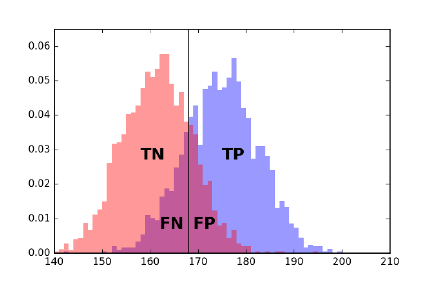
214 CHAPTER 7. MATHEMATICAL MODELS
Figure 7.3: What happens if we classify everyone of height ≥168 centimeters as
male? The four possible results in the confusion matrix reflect which instances
were classified correctly (TP and TN) and which ones were not (FN and FP).
identifying the positives is at least as hard as identifying the negatives, although
often the test instances are selected so that the classes are of equal cardinality.
There are four possible results of what the classification model could do
on any given instance, which defines the confusion matrix or contingency table
shown in Figure 7.2:
•True Positives (TP): Here our classifier labels a positive item as positive,
resulting in a win for the classifier.
•True Negatives (TN): Here the classifier correctly determines that a mem-
ber of the negative class deserves a negative label. Another win.
•False Positives (FP): The classifier mistakenly calls a negative item as a
positive, resulting in a “type I” classification error.
•False Negatives (FN): The classifier mistakenly declares a positive item
as negative, resulting in a “type II” classification error.
Figure 7.3 illustrates where these result classes fall in separating two distri-
butions (men and women), where the decision variable is height as measured
in centimeters. The classifier under evaluation labels everyone of height ≥168
centimeters as male. The purple regions represent the intersection of both male
and female. These tails represent the incorrectly classified elements.
Accuracy, Precision, Recall, and F-Score
There are several different evaluation statistics which can be computed from the
true/false positive/negative counts detailed above. The reason we need so many
statistics is that we must defend our classifier against two baseline opponents,
the sharp and the monkey.

7.4. EVALUATING MODELS 215
The sharp is the opponent who knows what evaluation system we are using,
and picks the baseline model which will do best according to it. The sharp will
try to make the evaluation statistic look bad, by achieving a high score with a
useless classifier. That might mean declaring all items positive, or perhaps all
negative.
In contrast, the monkey randomly guesses on each instance. To interpret our
model’s performance, it is important to establish by how much it beats both
the sharp and the monkey.
The first statistic measures the accuracy of classifier, the ratio of the number
of correct predictions over total predictions. Thus:
accuracy =T P +T N
T P +T N +F N +F P
By multiplying such fractions by 100, we can get a percentage accuracy score.
Accuracy is a sensible number which is relatively easy to explain, so it is
worth providing in any evaluation environment. How accurate is the monkey,
when half of the instances are positive and half negative? The monkey would
be expected to achieve an accuracy of 50% by random guessing. The same
accuracy of 50% would be achieved by the sharp, by always guessing positive,
or (equivalently) always guessing negative. The sharp would get a different half
of the instances correct in each case.
Still, accuracy alone has limitations as an evaluation metric, particularly
when the positive class is much smaller than the negative class. Consider the
development of a classifier to diagnose whether a patient has cancer, where
the positive class has the disease (i.e. tests positive) and the negative class is
healthy. The prior distribution is that the vast majority of people are healthy,
so
p=|positive|
|positive|+|negative|1
2
The expected accuracy of a fair-coin monkey would still be 0.5: it should get
an average of half of the positives and half the negatives right. But the sharp
would declare everyone to be healthy, achieving an accuracy of 1 −p. Suppose
that only 5% of the test takers really had the disease. The sharp could brag
about her accuracy of 95%, while simultaneously dooming all members of the
diseased class to an early death.
Thus we need evaluation metrics that are more sensitive to getting the pos-
itive class right. Precision measures how often this classifier is correct when it
dares to say positive:
precision =T P
(T P +F P )
Achieving high precision is impossible for either a sharp or a monkey, because
the fraction of positives (p= 0.05) is so low. If the classifier issues too many
positive labels, it is doomed to low precision because so many bullets miss
their mark, resulting in many false positives. But if the classifier is stingy with
positive labels, very few of them are likely to connect with the rare positive

216 CHAPTER 7. MATHEMATICAL MODELS
Monkey
predicted class
yes no
yes (pn)q(pn)(1 −q)
no ((1 −p)n)q((1 −p)n)(1 −q)
Balanced Classifier
predicted class
yes no
yes (pn)q(pn)(1 −q)
no ((1 −p)n)(1 −q) ((1 −p)n)q
Figure 7.4: The expected performance of a monkey classifier on ninstances,
where p·nare positive and (1 −p)·nare negative. The monkey guesses positive
with probability q(left). Also, the expected performance of a balanced classifier,
which somehow correctly classifies members of each class with probability q
(right).
Monkey Sharp Balanced Classifier
q0.05 0.5 0.0 1.0 0.5 0.75 0.9 0.99 1.0
accuracy 0.905 0.5 0.95 0.05 0.5 0.75 0.9 0.99 1.
precision 0.05 0.05 — 0.05 0.05 0.136 0.321 0.839 1.
recall 0.05 0.5 0. 1. 0.5 0.75 0.9 0.99 1.
F score 0.05 0.091 — 0.095 0.091 0.231 0.474 0.908 1.
Figure 7.5: Performance of several classifiers, under different performance mea-
sures.
instances, so the classifier achieves low true positives. These baseline classifiers
achieve precision proportional to the positive class probability p= 0.05, because
they are flying blind.
In the cancer diagnosis case, we might be more ready to tolerate false posi-
tives (errors where we scare a healthy person with a wrong diagnosis) than false
negatives (errors where we kill a sick patient by misdiagnosing their illness).
Recall measures how often you prove right on all positive instances:
recall =T P
(T P +F N )
A high recall implies that the classifier has few false negatives. The easiest
way to achieve this declares that everyone has cancer, as done by a sharp always
answering yes. This classifier has high recall but low precision: 95% of the test
takers will receive an unnecessary scare. There is an inherent trade-off between
precision and recall when building classifiers: the braver your predictions are,
the less likely they are to be right.
But people are hard-wired to want a single measurement describing the
performance of their system. The F-score (or sometimes F1-score) is such a
combination, returning the harmonic mean of precision and recall:
F= 2 ·precision ·recall
precision + recall
F-score is a very tough measure to beat. The harmonic mean is always less
than or equal to the arithmetic mean, and the lower number has a dispropor-
7.4. EVALUATING MODELS 217
tionate large effect. Achieving a high F-score requires both high recall and high
precision. None of our baseline classifiers manage a decent F-score despite high
accuracy and recall values, because their precision is too low.
The F-score and related evaluation metrics were developed to evaluate mean-
ingful classifiers, not monkeys or sharps. To gain insight in how to interpret
them, let’s consider a class of magically balanced classifiers, which somehow
show equal accuracy on both positive and negative instances. This isn’t usually
the case, but classifiers selected to achieve high F-scores must balance precision
and recall statistics, which means they must show decent performance on both
positive and negative instances.
Figure 7.5 summarizes the performance of both baseline and balanced classi-
fiers on our cancer detection problem, benchmarked on all four of our evaluation
metrics. The take away lessons are:
•Accuracy is a misleading statistic when the class sizes are substantially
different: A baseline classifier mindlessly answering “no” for every in-
stance achieved an accuracy of 95% on the cancer problem, better even
than a balanced classifier that got 94% right on each class.
•Recall equals accuracy if and only if the classifiers are balanced: Good
things happen when the accuracy for recognizing both classes is the same.
This doesn’t happen automatically during training, when the class sizes
are different. Indeed, this is one reason why it is generally a good practice
to have an equal number of positive and negative examples in your training
set.
•High precision is very hard to achieve in unbalanced class sizes: Even a
balanced classifier that gets 99% accuracy on both positive and negative
examples cannot achieve a precision above 84% on the cancer problem.
This is because there are twenty times more negative instances than pos-
itive ones. The false positives from misclassifying the larger class at a 1%
rate remains substantial against the background of 5% true positives.
•F-score does the best job of any single statistic, but all four work together to
describe the performance of a classifier: Is the precision of your classifier
greater than its recall? Then it is labeling too few instances as positives,
and so perhaps you can tune it better. Is the recall higher than the
precision? Maybe we can improve the F-score by being less aggressive in
calling positives. Is the accuracy far from the recall? Then our classifier
isn’t very balanced. So check which side is doing worse, and how we might
be able to fix it.
A useful trick to increase the precision of a model at the expense of recall
is to give it the power to say “I don’t know.” Classifiers typically do better on
easy cases than hard ones, with the difficulty defined by how far the example is
from being assigned the alternate label.
Defining a notion of confidence that your proposed classification is correct is
the key to when you should pass on a question. Only venture a guess when your
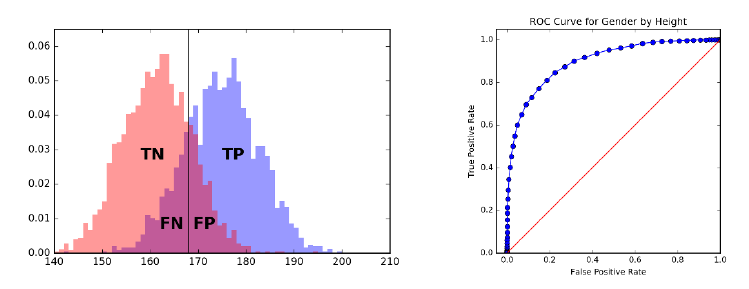
218 CHAPTER 7. MATHEMATICAL MODELS
Figure 7.6: The ROC curve helps us select the best threshold to use in a clas-
sifier, by displaying the trade-off between true positives and false positive at
every possible setting. The monkey ROCs the main diagonal here.
confidence is above a given threshold. Patients whose test scores are near the
boundary would generally prefer a diagnosis of “borderline result” to “you’ve
got cancer,” particularly if the classifier is not really confident in its decision.
Our precision and recall statistics must be reconsidered to properly accom-
modate the new indeterminate class. There is no need to change the precision
formula: we evaluate only on the instances we call positive. But the denom-
inator for recall must explicitly account for all elements we refused to label.
Assuming we are accurate in our confidence measures, precision will increase at
the expense of recall.
7.4.2 Receiver-Operator Characteristic (ROC) Curves
Many classifiers come with natural knobs that you can tweak to alter the trade-
off between precision and recall. For example, consider systems which compute
a numerical score reflecting “in classness,” perhaps by assessing how much the
given test sample looks like cancer. Certain samples will score more positively
than others. But where do we draw the line between positive and negative?
If our “in classness” score is accurate, then it should generally be higher for
positive items than negative ones. The positive examples will define a different
score distribution than the negative instances, as shown in Figure 7.6 (left).
It would be great if these distributions were completely disjoint, because then
there would be a score threshold tsuch that all instances with scores ≥tare
positive and all < t are negative. This would define a perfect classifier.
But it is more likely that the two distributions will overlap, to at least some
degree, turning the problem of identifying the best threshold into a judgment
call based on our relative distaste towards false positives and false negatives.
The Receiver Operating Characteristic (ROC) curve provides a visual repre-
sentation of our complete space of options in putting together a classifier. Each

7.4. EVALUATING MODELS 219
point on this curve represents a particular classifier threshold, defined by its
false positive and false negative rates.2These rates are in turn defined by the
count of errors divided by the total number of positives in the evaluation data,
and perhaps multiplied by one hundred to turn into percentages.
Consider what happens as we sweep our threshold from left to right over
these distributions. Every time we pass over another example, we either increase
the number of true positives (if this example was positive) or false positives (if
this example was in fact a negative). At the very left, we achieve true/false
positive rates of 0%, since the classifier labeled nothing as positive at that cutoff.
Moving as far to the right as possible, all examples will be labeled positively, and
hence both rates become 100%. Each threshold in between defines a possible
classifier, and the sweep defines a staircase curve in true/false positive rate space
taking us from (0%,0%) to (100%,100%).
Suppose the score function was defined by a monkey, i.e. an arbitrary ran-
dom value for each instance. Then as we sweep our threshold to the right, the
label of the next example should be positive or negative with equal probability.
Thus we are equally likely to increase our true positive rate as false, and the
ROC curve should cruise along the main diagonal.
Doing better than the monkey implies an ROC curve that lies above the
diagonal. The best possible ROC curve shoots up immediately from (0%,0%)
to (0%,100%), meaning it encounters all positive instances before any negative
ones. It then steps to the right with each negative example, until it finally
reaches the upper right corner.
The area under the ROC curve (AUC) is often used as a statistic measuring
the quality of scoring function defining the classifier. The best possible ROC
curve has an area of 100% ×100% →1, while the monkey’s triangle has an area
of 1/2. The closer the area is to 1, the better our classification function is.
7.4.3 Evaluating Multiclass Systems
Many classification problems are non-binary, meaning that they must decide
among more than two classes. Google News has separate sections for U.S. and
world news, plus business, entertainment, sports, health, science, and technol-
ogy. Thus the article classifier which governs the behavior of this site must
assign each article a label from eight different classes.
The more possible class labels you have, the harder it is to get the classifi-
cation right. The expected accuracy of a classification monkey with dlabels is
1/d, so the accuracy drops rapidly with increased class complexity.
This makes properly evaluating multiclass classifiers a challenge, because low
success numbers get disheartening. A better statistic is the top-ksuccess rate,
which generalizes accuracy for some specific value of k≥1. How often was the
right label among the top kpossibilities?
This measure is good, because it gives us partial credit for getting close to
the right answer. How close is good enough is defined by the parameter k. For
2The strange name for this beast is a legacy of its original application, in tuning the
performance of radar systems.
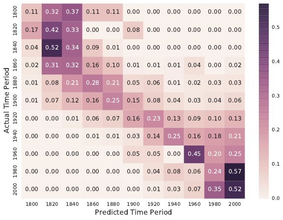
220 CHAPTER 7. MATHEMATICAL MODELS
Figure 7.7: Confusion matrix for a document dating system: the main diagonal
reflects accurate classification.
k= 1, this reduces to accuracy. For k=d,any possible label suffices, and
the success rate is 100% by definition. Typical values are 3, 5, or 10: high
enough that a good classifier should achieve an accuracy above 50% and be
visibly better than the monkey. But not too much better, because an effective
evaluation should leave us with substantial room to do better. In fact, it is a
good practice to compute the top krate for all kfrom 1 to d, or at least high
enough that the task becomes easy.
An even more powerful evaluation tool is the confusion matrix C, a d×d
matrix where C[x, y] reports the number (or fraction) of instances of class x
which get labeled as class y.
How do we read a confusion matrix, like the one shown in Figure 7.7? It
is taken from the evaluation environment we built to test a document dating
classifier, which analyzes texts to predict the period of authorship. Such docu-
ment dating will be the ongoing example on evaluation through the rest of this
chapter.
The most important feature is the main diagonal, C[i, i], which counts how
many (or what fraction of) items from class iwere correctly labeled as class i.
We hope for a heavy main diagonal in our matrix. Ours in a hard task, and
Figure 7.7 shows a strong but not perfect main diagonal. There are several
places where documents are more frequently classified in the neighboring period
than the correct one.
But the most interesting features of the confusion matrix are the large counts
7.4. EVALUATING MODELS 221
C[i, j] that do not lie along the main diagonal. These represent commonly
confused classes. In our example, the matrix shows a distressingly high number
of documents (6%) from 1900 classified as 2000, when none are classified as
1800. Such asymmetries suggest directions to improve the classifier.
There are two possible explanations for class confusions. The first is a bug in
the classifier, which means that we have to work harder to make it distinguish i
from j. But the second involves humility, the realization that classes iand jmay
overlap to such a degree that it is ill-defined what the right answer should be.
Maybe writing styles don’t really change that much over a twenty-year period?
In the Google News example, the lines between the science and technology
categories is very fuzzy. Where should an article about commercial space flights
go? Google says science, but I say technology. Frequent confusion might suggest
merging the two categories, as they represent a difference without a distinction.
Sparse rows in the confusion matrix indicate classes poorly represented in
the training data, while sparse columns indicate labels which the classifier is
reluctant to assign. Either indication is an argument that perhaps we should
consider abandoning this label, and merge the two similar categories.
The rows and columns of the confusion matrix provide analogous perfor-
mance statistics to those of Section 7.4.1 for multiple classes, parameterized by
class. Precisioniis the fraction of all items declared class ithat were in fact of
class i:
precisioni=C[i, i]/
d
X
j=1
C[j, i].
Recalliis the fraction of all members of class ithat were correctly identified as
such:
recalli=C[i, i]/
d
X
j=1
C[i, j].
7.4.4 Evaluating Value Prediction Models
Value prediction problems can be thought of as classification tasks, but over
an infinite number of classes. However, there are more direct ways to evaluate
regression systems, based on the distance between the predicted and actual
values.
Error Statistics
For numerical values, error is a function of the difference between a forecast y0=
f(x) and the actual result y. Measuring the performance of a value prediction
system involves two decisions: (1) fixing the specific individual error function,
and (2) selecting the statistic to best represent the full error distribution.
The primary choices for the individual error function include:
•Absolute error: The value ∆ = y0−yhas the virtue of being simple
and symmetric, so the sign can distinguish the case where y0> y from
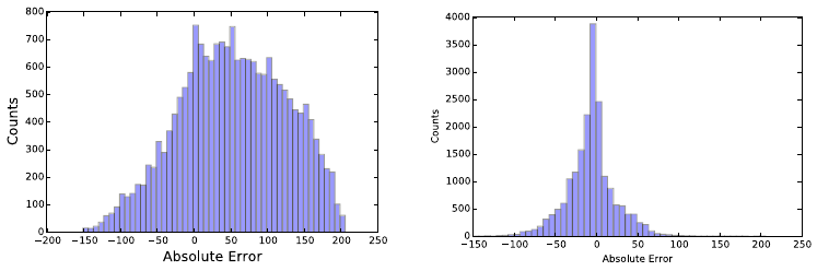
222 CHAPTER 7. MATHEMATICAL MODELS
Figure 7.8: Error distribution histograms for random (left) and naive Bayes
classifiers predicting the year of authorship for documents (right).
y > y0. The problem comes in aggregating these values into a summary
statistic. Do offsetting errors like −1 and 1 mean that the system is
perfect? Typically the absolute value of the error is taken to obliterate
the sign.
•Relative error: The absolute magnitude of error is meaningless without a
sense of the units involved. An absolute error of 1.2 in a person’s predicted
height is good if it is measured in millimeters, but terrible if measured in
miles.
Normalizing the error by the magnitude of the observation produces a
unit-less quantity, which can be sensibly interpreted as a fraction or (mul-
tiplied by 100%) as a percentage: = (y−y0)/y. Absolute error weighs
instances with larger values of yas more important than smaller ones, a
bias corrected when computing relative errors.
•Squared error: The value ∆2= (y0−y)2is always positive, and hence
these values can be meaningfully summed. Large errors values contribute
disproportionately to the total when squaring: ∆2for ∆ = 2 is four times
larger than ∆2for ∆ = 1. Thus outliers can easily come to dominate the
error statistic in a large ensemble.
It is a very good idea to plot a histogram of the absolute error distribution
for any value predictor, as there is much you can learn from it. The distribution
should be symmetric, and centered around zero. It should be bell-shaped, mean-
ing small errors are more common than big errors. And extreme outliers should
be rare. If any of the conditions are wrong, there is likely a simple way to im-
prove the forecasting procedure. For example, if it is not centered around zero,
adding an constant offset to all forecasts will improve the consensus results.
Figure 7.8 presents the absolute error distributions from two models for pre-
dicting the year of authorship of documents from their word usage distribution.
On the left, we see the error distribution for the monkey, randomly guessing a

7.4. EVALUATING MODELS 223
Performance Statistics
Error Distributions
Confusion Matrices
Evaluation
Environment
Model
Validation
Data
Figure 7.9: Block diagram of a basic model evaluation environment.
year from 1800 to 2005. What do we see? The error distribution is broad and
bad, as we might have expected, but also asymmetric. Far more documents
produced positive errors than negative ones. Why? The test corpus apparently
contained more modern documents than older ones, so (year −monkey year) is
more often positive than negative. Even the monkey can learn something from
seeing the distribution.
In contrast, Figure 7.8 (right) presents the error distribution for our naive
Bayes classifier for document dating. This looks much better: there is a sharp
peak around zero, and much narrower tails. But the longer tail now resides to
the left of zero, telling us that we are still calling a distressing number of very
old documents modern. We need to examine some of these instances, to figure
out why that is the case.
We need a summary statistic reducing such error distributions to a single
number, in order to compare the performance of different value prediction mod-
els. A commonly-used statistic is mean squared error (MSE), which is computed
MSE(Y, Y 0) = 1
n
n
X
i=1
(y0
i−yi)2
Because it weighs each term quadratically, outliers have a disproportionate ef-
fect. Thus median squared error might be a more informative statistic for noisy
instances.
Root mean squared (RMSD) error is simply the square root of mean squared
error:
RMSD(Θ) = pMSE(Y, Y 0).
The advantage of RMSD is that its magnitude is interpretable on the same
scale as the original values, just as standard deviation is a more interpretable
quantity than variance. But this does not eliminate the problem that outlier
elements can substantially skew the total.
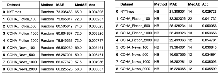
224 CHAPTER 7. MATHEMATICAL MODELS
Figure 7.10: Evaluation environment results for predicting the year of author-
ship for documents, comparing the monkey (left) to a naive Bayes classifier
(right).
7.5 Evaluation Environments
A substantial part of any data science project revolves around building a reason-
able evaluation environment. In particular, you need a single-command program
to run your model on the evaluation data, and produce plots/reports on its ef-
fectiveness, as shown in Figure 7.9.
Why single command? If it is not easy to run, you won’t try it often enough.
If the results are not easy to read and interpret, you will not glean enough
information to make it worth the effort.
The input to an evaluation environment is a set of instances with the associ-
ated output results/labels, plus a model under test. The system runs the model
on each instance, compares each result against this gold standard, and outputs
summary statistics and distribution plots showing the performance it achieved
on this test set.
A good evaluation system has the following properties:
•It produces error distributions in addition to binary outcomes: how close
your prediction was, not just whether it was right or wrong. Recall Figure
7.8 for inspiration.
•It produces a report with multiple plots about several different input dis-
tributions automatically, to read carefully at your leisure.
•It outputs the relevant summary statistics about performance, so you can
quickly gauge quality. Are you doing better or worse than last time?
As an example, Figure 7.10 presents the output of our evaluation environ-
ment for the two document-dating models presented in the previous section.
Recall that the task is to predict the year of authorship of a given document
from word usage. What is worth noting?
7.5. EVALUATION ENVIRONMENTS 225
•Test sets broken down by type: Observe the the evaluation environment
partitioned the inputs into nine separate subsets, some news and some
fiction, and of lengths from 100 to 2000 words. Thus at a glance we could
see separately how well we do on each.
•Logical progressions of difficulty: It is obviously harder to make age
determination from shorter documents than longer ones. By separating
the harder and smaller cases, we better understand our source of errors.
We see a big improvement in naive Bayes as we move from 100 to 500
words, but these gains saturate before 2000 words.
•Problem appropriate statistics: We did not print out every possible error
metric, only mean and median absolute error and accuracy (how often did
we get the year exactly right?). These are enough for us to see that news
is easier than fiction, that our model is much better than the monkey,
and that our chances of identifying the actual year correctly (measured by
accuracy) are still too small for us to worry about.
This evaluation gives us the information we need to see how we are doing,
without overwhelming us with numbers that we won’t ever really look at.
7.5.1 Data Hygiene for Evaluation
An evaluation is only meaningful when you don’t fool yourself. Terrible things
happen when people evaluate their models in an undisciplined manner, losing
the distinction between training, testing, and evaluation data.
Upon taking position of a data set with the intention of building a predictive
model, your first operation should be to partition the input into three parts:
•Training data: This is what you are completely free to play with. Use
it to study the domain, and set the parameters of your model. Typically
about 60% of the full data set should be devoted to training.
•Testing data: Comprising about 20% of the full data set, this is what
you use to evaluate how good your model is. Typically, people experiment
with multiple machine learning approaches or basic parameter settings,
so testing enables you to establish the relative performance of all these
different models for the same task.
Testing a model usually reveals that it isn’t performing as well as we would
like, thus triggering another cycle of design and refinement. Poor perfor-
mance on test data relative to how it did on the training data suggests a
model which has been overfit.
•Evaluation data: The final 20% of the data should be set aside for a
rainy day: to confirm the performance of the final model right before it
goes into production. This works only if you never opened the evaluation
data until it was really needed.
226 CHAPTER 7. MATHEMATICAL MODELS
The reason to enforce these separations should be obvious. Students would
do much better on examinations if they were granted access to the answer key
in advance, because they would know exactly what to study. But this would
not reflect how much they actually had learned. Keeping testing data separate
from training enforces that the tests measure something important about what
the model understands. And holding out the final evaluation data to use only
after the model gets stable ensures that the specifics of the test set have not
leaked into the model through repeated testing iterations. The evaluation set
serves as out-of-sample data to validate the final model.
In doing the original partitioning, you must be careful not to create unde-
sirable artifacts, or destroy desirable ones. Simply partitioning the file in the
order it was given is dangerous, because any structural difference between the
populations of the training and testing corpus means that the model will not
perform as well as it should.
But suppose you were building a model to predict future stock prices. It
would be dangerous to randomly select 60% of the samples over all history
as the training data, instead of all the samples over the first 60% of time.
Why? Suppose your model “learned” which would be the up and down days in
the market from the training data, and then used this insight to make virtual
predictions for other stocks on these same days. This model would perform far
better in testing than in practice. Proper sampling techniques are quite subtle,
and discussed in Section 5.2.
It is essential to maintain the veil of ignorance over your evaluation data for
as long as possible, because you spoil it as soon as you use it. Jokes are never
funny the second time you hear them, after you already know the punchline. If
you do wear out the integrity of your testing and evaluation sets, the best solu-
tion is to start from fresh, out-of-sample data, but this is not always available.
Otherwise, randomly re-partition the full data set into fresh training, testing,
and evaluation samples, and retrain all of your models from scratch to reboot
the process. But this should be recognized as an unhappy outcome.
7.5.2 Amplifying Small Evaluation Sets
The idea of rigidly partitioning the input into training, test, and evaluation sets
makes sense only on large enough data sets. Suppose you have 100,000 records at
your disposal. There isn’t going to be a qualitative difference between training
on 60,000 records instead of 100,000, so it is better to facilitate a rigorous
evaluation.
But what if you only have a few dozen examples? As of this writing, there
have been only 45 U.S. presidents, so any analysis you can do on them represents
very small sample statistics. New data points come very slowly, only once every
four years or so. Similar issues arise in medical trials, which are very expensive to
run, potentially yielding data on well under a hundred patients. Any application
where we must pay for human annotation means that we will end up with less
data for training than we might like.
What can you do when you cannot afford to give up a fraction of your data
7.5. EVALUATION ENVIRONMENTS 227
for testing? Cross-validation partitions the data into kequal-sized chunks, then
trains kdistinct models. Model iis trained on the union of all blocks x6=i,
totaling (k−1)/kth of the data, and tested on the held out ith block. The
average performance of these kclassifiers stands in as the presumed accuracy
for the full model.
The extreme case here is leave one out cross-validation, where ndistinct
models are each trained on different sets of n−1 examples, to determine whether
the classifier was good or not. This maximizes the amount of training data, while
still leaving something to evaluate against.
A real advantage of cross validation is that it yields a standard deviation
of performance, not only a mean. Each classifier trained on a particular subset
of the data will differ slightly from its peers. Further, the test data for each
classifier will differ, resulting in different performance scores. Coupling the mean
with the standard deviation and assuming normality gives you a performance
distribution, and a better idea of how well to trust the results. This makes
cross-validation very much worth doing on large data sets as well, because you
can afford to make several partitions and retrain, thus increasing confidence
that your model is good.
Of the kmodels resulting from cross validation, which should you pick as
your final product? Perhaps you could use the one which performed best on its
testing quota. But a better alternative is to retrain on all the data and trust
that it will be at least as good as the less lavishly trained models. This is not
ideal, but if you can’t get enough data then you must do the best with what
you’ve got.
Here are a few other ideas that can help to amplify small data sets for
training and evaluation:
•Create negative examples from a prior distribution: Suppose one wanted
to build a classifier to identify who would be qualified to be a candidate
for president. There are very few real examples of presidential candidates
(positive instances), but presumably the elite pool is so small that a ran-
dom person will almost certainly be unqualified. When positive examples
are rare, all others are very likely negative, and can be so labeled to provide
training data as necessary.
•Perturb real examples to create similar but synthetic ones: A useful trick
to avoid overfitting creates new training instances by adding random noise
to distort labeled examples. We then preserve the original outcome label
with the new instance.
For example, suppose we are trying to train an optical character recogni-
tion (OCR) system to recognize the letters of some alphabet in scanned
pages. An expensive human was originally given the task of labeling a
few hundred images with the characters that were contained in them. We
can amplify this to a few million images by adding noise at random, and
rotating/translating/dilating the region of interest. A classifier trained on
228 CHAPTER 7. MATHEMATICAL MODELS
this synthetic data should be far more robust than one restricted to the
original annotated data.
•Give partial credit when you can: When you have fewer training/testing
examples than you want, you must squeeze as much information from each
one as possible.
Suppose that our classifier outputs a value measuring its confidence in its
decision, in addition to the proposed label. This confidence level gives
us additional resolution with which to evaluate the classifier, beyond just
whether it got the label right. It is a bigger strike against the classifier
when it gets a confident prediction wrong, than it is on an instance where
it thought the answer was a tossup. On a presidential-sized problem,
I would trust a classifier that got 30 right and 15 wrong with accurate
confidence values much more than one with 32 right and 13 wrong, but
with confidence values all over the map.
7.6 War Story: 100% Accuracy
The two businessmen looked a little uncomfortable at the university, out of
place with their dark blue suits to our shorts and sneakers. Call them Pablo
and Juan. But they needed us to make their vision a reality.
“The business world still works on paper,” Pablo explained. He was the one
in the darker suit. “We have a contract to digitize all of Wall Street’s financial
documents that are still printed on paper. They will pay us a fortune to get a
computer to do the scanning. Right now they hire people to type each document
in three times, just to make sure they got it absolutely right.”
It sounded exciting, and they had the resources to make it happen. But
there was one caveat. “Our system cannot make any errors. It can say ‘I don’t
know’ sometimes. But whenever it calls a letter it has to be 100% correct.”
“No problem.” I told them. “Just let me say I don’t know 100% of the time,
and I can design a system to meet your specification.”
Pablo frowned. “But that will cost us a fortune. In the system we want to
build, images of the I don’t knows will go to human operators for them to read.
But we can’t afford to pay them to read everything.”
My colleagues and I agreed to take the job, and in time we developed a
reasonable OCR system from scratch. But one thing bothered me.
“These Wall Street guys who gave you the money are smart, aren’t they?,”
I asked Pablo one day.
“Smart as a whip,” he answered.
“Then how could they possibly believe it when you said you could build an
OCR system that was 100% accurate.”
“Because they thought that I had done it before,” he said with a laugh.
It seems that Pablo’s previous company had built a box that digitized price
data from the television monitors of the time. In this case, the letters were
exact patterns of bits, all written in exactly the same font and the same size.
7.7. SIMULATION MODELS 229
The TV signal was digital, too, with no error at all from imaging, imperfectly-
formed blobs of printers ink, dark spots, or folds in the paper. It was trivial
to test for an exact match between a perfect pattern of bits (the image) and
another perfect pattern of bits (the character in the device’s font), since there is
no source of uncertainty. But this problem had nothing to do with OCR, even
if both involved reading letters.
Our reasonable OCR system did what it could with the business documents
it was given, but of course we couldn’t get to 100%. Eventually, the Wall Street
guys took their business back to the Philippines, where they paid three people to
type in each document and voted two out of three if there was any disagreement.
We shifted direction and got into the business of reading handwritten survey
forms submitted by consumers, lured by the promise of grocery store coupons.
This problem was harder, but the stakes not as high: they were paying us a
crummy $0.22 a form and didn’t expect perfection. Our competition was an
operation that used prison labor to type in the data. We caught a break when
one of those prisoners sent a threatening letter to an address they found on
a survey form, which then threw the business to us. But even our extensive
automation couldn’t read these forms for less than $0.40 a pop, so the contract
went back to prison after we rolled belly up.
The fundamental lesson here is that no pattern recognition system for any
reasonable problem will bat 100% all the time. The only way never to be wrong
is to never make a prediction. Careful evaluation is necessary to measure how
well your system is working and where it is making mistakes, in order to make
the system better.
7.7 Simulation Models
There is an important class of first-principle models which are not primarily data
driven, yet which prove very valuable for understanding widely diverse phenom-
ena. Simulations are models that attempt to replicate real-world systems and
processes, so we can observe and analyze their behavior.
Simulations are important for demonstrating the validity of our understand-
ing of a system. A simple simulation which captures much of the behavioral
complexity of a system must explain how it works, by Occam’s razor. Famous
physicist Richard Feynman said, “What I cannot create, I do not understand.”
What you cannot simulate, and get some level of accuracy in the observed re-
sults, you do not understand.
Monte Carlo simulations use random numbers to synthesize alternate reali-
ties. Replicating an event millions of times under slightly perturbed conditions
permits us to generate a probability distribution on the set of outcomes. This
was the idea behind permutation tests for statistical significance. We also saw
(in Section 5.5.2) that random coin flips could stand in for when a batter got hits
or made out, so we could simulate an arbitrary number of careers and observe
what happened over the course of them.
The key to building an effective Monte Carlo simulation is designing an
230 CHAPTER 7. MATHEMATICAL MODELS
appropriate discrete event model. A new random number is used by the model
to replicate each decision or event outcome. You may have to decide whether
to go left or go right in a transportation model, so flip a coin. A health or
insurance model may have to decide whether a particular patient will have a
heart attack today, so flip an appropriately weighted coin. The price of a stock
in a financial model can either go up or down at each tick, which again can be
a coin flip. A basketball player will hit or miss a shot, with a likelihood that
depends upon their shooting skill and the quality of their defender.
The accuracy of such a simulation rests on the probabilities that you assign
to heads and tails. This governs how often each outcome occurs. Obviously, you
are not restricted to using a fair coin, meaning 50/50. Instead, the probabilities
need to reflect assumptions of the likelihood of the event given the state of the
model. These parameters are often set using statistical analysis, by observing
the distribution of events as they occurred in the data. Part of the value of
Monte Carlo simulations is that they let us play with alternate realities, by
changing certain parameters and seeing what happens.
A critical aspect of effective simulation is evaluation. Programming errors
and modeling inadequacies are common enough that no simulation can be ac-
cepted on faith. The key is to hold back one or more classes of observations
of the system from direct incorporation in your model. This provides behavior
that is out of sample, so we can compare the distribution of results from the
simulation with these observations. If they don’t jibe, your simulation is just
jive. Don’t let it go live.
7.8 War Story: Calculated Bets
Where there is gambling there is money, and where there is money there will be
models. During our family trips to Florida as a kid, I developed a passion for
the sport of jai-alai. And, as I learned how to build mathematical models as a
grown-up, I grew obsessed with developing a profitable betting system for the
sport.
Jai-alai is a sport of Basque origin where opposing players or teams alternate
hurling a ball against the wall and catching it, until one of them finally misses
and loses the point. The throwing and catching is done with an enlarged basket
or cesta, the ball or pelota is made of goat skin and hard rubber, and the wall is of
granite or concrete; ingredients which lead to fast and exciting action captured
in Figure 7.11. In the United States, jai-alai is most associated with the state
of Florida, which permits gambling on the results of matches.
What makes jai-alai of particular interest is its unique and very peculiar
scoring system. Each jai-alai match involves eight players, named 1 through 8
to reflect their playing order. Each match starts with players 1 and 2 playing,
and the rest of the players waiting patiently in line. All players start the game
with zero points each. Each point in the match involves two players; one who
will win and one who will lose. The loser will go to the end of the line, while
the winner will add to his point total and await the next point, until he has

7.8. WAR STORY: CALCULATED BETS 231
Figure 7.11: Jai-alai is a fast, exciting ball game like handball, but you can bet
on it.
accumulated enough points to claim the match.
It was obvious to me, even as a kid, that this scoring system would not
be equally fair to all the different players. Starting early in the queue gave you
more chances to play, and even a kludge they added to double the value of points
later in the match couldn’t perfectly fix it. But understanding the strength of
these biases could give me an edge in betting.
My quest to build a betting system for jai-alai, started by simulating this
very peculiar scoring system. A jai-alai match consists of a sequence of discrete
events, described by the following flow structure:
Initialize the current players to 1 and 2.
Initialize the queue of players to {3,4,5,6,7,8}.
Initialize the point total for each player to zero.
So long as the current winner has less than 7 points:
Pick a random number to decide who wins the next point.
Add one (or if beyond the seventh point, two) to the
total of the simulated point winner.
Put the simulated point loser at the end of the queue.
Get the next player off the front of the queue.
End So long as.
Identify the current point winner as the winner of the match.
The only step here which needs more elaboration is that of simulating a
point between two players. If the purpose of our simulation is to see how biases
in the scoring system affect the outcome of the match, it makes the most sense
to consider the case in which all players are equally skillful. To give every player
a 50/50 chance of winning each point he is involved in, we can flip a simulated
coin to determine who wins and who loses.
I implemented the jai-alai simulation in my favorite programming language,
and ran it on 1,000,000 jai-alai games. The simulation produced a table of
statistics, telling me how often each betting outcome paid off, assuming that all
the players were equally skillful. Figure 7.12 reports the number of simulated

232 CHAPTER 7. MATHEMATICAL MODELS
Simulated Observed
Position Wins % Wins Wins % Wins
1 162675 16.27% 1750 14.1%
2 162963 16.30% 1813 14.6%
3 139128 13.91% 1592 12.8%
4 124455 12.45% 1425 11.5%
5 101992 10.20% 1487 12.0%
6 102703 10.27% 1541 12.4%
7 88559 8.86% 1370 11.1%
8 117525 11.75% 1405 11.3%
1,000,000 100.00% 12,383 100.0%
Figure 7.12: Win biases observed in the jai-alai simulations match well with
results observed in actual matches.
wins for each of the eight starting positions. What insights can we draw from
this table?
•Positions 1 and 2 have a substantial advantage over the rest of the field.
Either of the initial players are almost twice as likely to come first, second,
or third than the poor shlub in position 7.
•Positions 1 and 2 win at essentially the same frequency. This is as it
should be, since both players start the game on the court instead of in the
queue. The fact that players 1 and 2 have very similar statistics increases
our confidence in the correctness of the simulation.
•Positions 1 and 2 do not have identical statistics because we simulated
“only” one million games. If you flip a coin a million times, it almost
certainly won’t come up exactly half heads and half tails. However, the
ratio of heads to tails should keep getting closer to 50/50 the more coins
we flip.
The simulated gap between players 1 and 2 tells us something about the
limitations on the accuracy of our simulation. We shouldn’t trust any
conclusions which depends upon such small differences in the observed
values.
To validate the accuracy of the simulation, we compared our results to statis-
tics on the actual outcomes of over 12,000 jai-alai matches, also in Figure 7.12.
The results basically agree with the simulation, subject to the limits of the small
sample size. Post positions 1 and 2 won most often in real matches, and position
7 least often.
Now we knew the probability that each possible betting opportunity in jai-
alai paid off. Were we now ready to start making money? Unfortunately not.
7.9. CHAPTER NOTES 233
Even though we have established that post position is a major factor in deter-
mining the outcome of jai-alai matches, perhaps the dominant one, we still had
several hurdles to overcome before we could bet responsibly:
•The impact of player skills: Obviously, a good player is more likely to win
than a bad one, regardless of their post positions. It is clear that a better
model for predicting the outcome of jai-alai matches would factor relative
skills into the queuing model.
•The sophistication of the betting public: Many people had noticed the
impact of post-position bias before I did. Indeed, data analysis revealed
the jai-alai betting public had largely factored the effect of post position
in the odds. Fortunately for us, however, largely did not mean completely.
•The house cut – Frontons keep about 20% of the betting pool as the house
percentage, and thus we had to do much better then the average bettor
just to break even.
My simulation provided information on which outcomes were most likely. It
did not by itself identify which are the best bets. A good bet depends both upon
the likelihood of the event occurring and the payoff when it occurs. Payoffs are
decided by the rest of the betting public. To find the best bets to make, we had
to work a lot harder:
•We had to analyze past match data to determine who were the better play-
ers. Once we knew who was better, we could bias the simulated coin tosses
in their favor, to make our simulation more accurate for each individual
match.
•We had to analyze payoff data to build a model of other bettor’s prefer-
ences. In jai-alai, you are betting against the public, so you need to be
able to model their thinking in order to predict the payoffs for a particular
bet.
•We had to model the impact of the house’s cut on the betting pool. Certain
bets, which otherwise might have been profitable, go into the red when
you factor in these costs.
The bottom line is that we did it, with 544% returns on our initial stake.
The full story of our gambling system is reported in my book Calculated Bets
[Ski01]. Check it out: I bet you will like it. It is fun reading about successful
models, but even more fun to build them.
7.9 Chapter Notes
Silver [Sil12] is an excellent introduction to the complexities of models and
forecasting in a variety of domains. Textbooks on mathematical modeling issues
include Bender [Ben12] and Giordano [GFH13].
234 CHAPTER 7. MATHEMATICAL MODELS
The Google Flu Trends project is an excellent case study in both the power
and limitation of big data analysis. See Ginsberg et al. [GMP+09] for the
original description, and Lazer et al. [LKKV14] for a fascinating post-mortem
on how it all went wrong.
Technical aspects of the OCR system presented in Section 7.6 is reported in
Sazaklis et. al. [SAMS97]. The work on year of authorship detection (and as-
sociated evaluation environment example) is from my students Vivek Kulkarni,
Parth Dandiwala, and Yingtao Tian [KTDS17].
7.10 Exercises
Properties of Models
7-1. [3] Quantum physics is much more complicated than Newtonian physics. Which
model passes the Occam’s Razor test, and why?
7-2. [5] Identify a set of models of interest. For each of these, decide which properties
these models have:
(a) Are they discrete or continuous?
(b) Are they linear or non-linear?
(c) Are they blackbox or descriptive?
(d) Are they general or ad hoc?
(e) Are they data driven or first principle?
7-3. [3] Give examples of first-principle and data-driven models used in practice.
7-4. [5] For one or more of the following The Quant Shop challenges, discuss whether
principled or data-driven models seem to be the more promising approach:
•Miss Universe.
•Movie gross.
•Baby weight.
•Art auction price.
•Snow on Christmas.
•Super Bowl/college champion.
•Ghoul pool.
•Future gold/oil price.
7-5. [5] For one or more of the following The Quant Shop challenges, partition the
full problem into subproblems that can be independently modeled:
•Miss Universe.
•Movie gross.
•Baby weight.
•Art auction price.
7.10. EXERCISES 235
•Snow on Christmas.
•Super Bowl/college champion.
•Ghoul pool.
•Future gold/oil price.
Evaluation Environments
7-6. [3] Suppose you build a classifier that answers yes on every possible input. What
precision and recall will this classifier achieve?
7-7. [3] Explain what precision and recall are. How do they relate to the ROC curve?
7-8. [5] Is it better to have too many false positives, or too many false negatives?
Explain.
7-9. [5] Explain what overfitting is, and how you would control for it.
7-10. [5] Suppose f≤1/2 is the fraction of positive elements in a classification. What
is the probability pthat the monkey should guess positive, as a function of f,
in order to maximize the specific evaluation metric below? Report both pand
the expected evaluation score the monkey achieves.
(a) Accuracy.
(b) Precision.
(c) Recall.
(d) F-score.
7-11. [5] What is cross-validation? How might we pick the right value of kfor k-fold
cross validation?
7-12. [8] How might we know whether we have collected enough data to train a model?
7-13. [5] Explain why we have training, test, and validation data sets and how they
are used effectively?
7-14. [5] Suppose we want to train a binary classifier where one class is very rare.
Give an example of such a problem. How should we train this model? What
metrics should we use to measure performance?
7-15. [5] Propose baseline models for one or more of the following The Quant Shop
challenges:
•Miss Universe.
•Movie gross.
•Baby weight.
•Art auction price.
•Snow on Christmas.
•Super Bowl/college champion.
•Ghoul pool.
•Future gold/oil price.
Implementation Projects
236 CHAPTER 7. MATHEMATICAL MODELS
7-16. [5] Build a model to forecast the outcomes of one of the following types of betable
events, and rigorously analyze it through back testing:
(a) Sports like football, basketball, and horse racing.
(b) Pooled bets involving multiple events, like soccer pools or the NCAA bas-
ketball tournament.
(c) Games of chance like particular lotteries, fantasy sports, and poker.
(d) Election forecasts for local and congressional elections.
(e) Stock or commodity price prediction/trading.
Rigorous testing will probably confirm that your models are not strong enough
for profitable wagering, and this is 100% ok. Be honest: make sure that you
are using fresh enough prices/odds to reflect betting opportunities which would
still be available at the time you place your simulated bet. To convince me that
your model is in fact genuinely profitable, send me a cut of the money and then
I will believe you.
7-17. [5] Build a general model evaluation system in your favorite programming lan-
guage, and set it up with the right data to assess models for a particular prob-
lem. Your environment should report performance statistics, error distributions
and/or confusion matrices as appropriate.
Interview Questions
7-18. [3] Estimate prior probabilities for the following events:
(a) The sun will come up tomorrow.
(b) A major war involving your country will start over the next year.
(c) A newborn kid will live to be 100 years old.
(d) Today you will meet the person whom you will marry.
(e) The Chicago Cubs will win the World Series this year.
7-19. [5] What do we mean when we talk about the bias–variance trade-off?
7-20. [5] A test has a true positive rate of 100% and false positive rate of 5%. In this
population 1 out of 1000 people have the condition the test identifies. Given a
positive test, what is the probability this person actually has the condition?
7-21. [5] Which is better: having good data or good models? And how do you define
good?
7-22. [3] What do you think about the idea of injecting noise into your data set to
test the sensitivity of your models?
7-23. [5] How would you define and measure the predictive power of a metric?
Kaggle Challenges
7-24. Will a particular grant application be funded?
https://www.kaggle.com/c/unimelb
7-25. Who will win the NCAA basketball tournament?
https://www.kaggle.com/c/march-machine-learning-mania-2016
7-26. Predict the annual sales in a given restaurant.
https://www.kaggle.com/c/restaurant-revenue-prediction
Chapter 8
Linear Algebra
We often hear that mathematics consists mainly of “proving theo-
rems.” Is a writer’s job mainly that of “writing sentences?”
– Gian-Carlo Rota
The data part of your data science project involves reducing all of the relevant
information you can find into one or more data matrices, ideally as large as pos-
sible. The rows of each matrix represent items or examples, while the columns
represent distinct features or attributes.
Linear algebra is the mathematics of matrices: the properties of arrange-
ments of numbers and the operations that act on them. This makes it the lan-
guage of data science. Many machine learning algorithms are best understood
through linear algebra. Indeed algorithms for problems like linear regression
can be reduced to a single formula, multiplying the right chain of matrix prod-
ucts to yield the desired results. Such algorithms can simultaneously be both
simple and intimidating, trivial to implement and yet hard to make efficient and
robust.
You presumably took a course in linear algebra at some point, but perhaps
have forgotten much of it. Here I will review most of what you need to know:
the basic operations on matrices, why they are useful, and how to build an
intuition for what they do.
8.1 The Power of Linear Algebra
Why is linear algebra so powerful? It regulates how matrices work, and matrices
are everywhere. Matrix representations of important objects include:
•Data: The most generally useful representation of numerical data sets
are as n×mmatrices. The nrows represent objects, items, or instances,
while the mcolumns each represent distinct features or dimensions.
238 CHAPTER 8. LINEAR ALGEBRA
•Geometric point sets: An n×mmatrix can represent a cloud of points in
space. The nrows each represent a geometric point, while the mcolumns
define the dimensions. Certain matrix operations have distinct geometric
interpretations, enabling us to generalize the two-dimensional geometry
we can actually visualize into higher-dimensional spaces.
•Systems of equations: A linear equation is defined by the sum of variables
weighted by constant coefficients, like:
y=c0+c1x1+c2x2+. . . cm−1xm−1.
A system of nlinear equations can be represented as an n×mmatrix,
where each row represents an equation, and each of the mcolumns is
associated with the coefficients of a particular variable (or the constant
“variable” 1 in the case of c0). Often it is necessary to represent the y
value for each equation as well. This is typically done using a separate
n×1 array or vector of solution values.
•Graphs and networks: Graphs are made up of vertices and edges, where
edges are defined as ordered pairs of vertices, like (i, j). A graph with n
vertices and medges can be represented as an n×nmatrix M, where
M[i, j] denotes the number (or weight) of edges from vertex ito vertex
j. There are surprising connections between combinatorial properties and
linear algebra, such as the relationship between paths in graphs and matrix
multiplication, and how vertex clusters relate to the eigenvalues/vectors
of appropriate matrices.
•Rearrangement operations: Matrices can do things. Carefully designed
matrices can perform geometric operations on point sets, like translation,
rotation, and scaling. Multiplying a data matrix by an appropriate permu-
tation matrix will reorder its rows and columns. Movements can be defined
by vectors, the n×1 matrices powerful enough to encode operations like
translation and permutation.
The ubiquity of matrices means that a substantial infrastructure of tools
has been developed to manipulate them. In particular, the high-performance
linear algebra libraries for your favorite programming language mean that you
should never implement any basic algorithm by yourself. The best library im-
plementations optimize dirty things like numerical precision, cache-misses, and
the use of multiple cores, right down to the assembly-language level. Our job
is to formulate the problem using linear algebra, and leave the algorithmics to
these libraries.
8.1.1 Interpreting Linear Algebraic Formulae
Concise formulas written as products of matrices can provide the power to do
amazing things, including linear regression, matrix compression, and geometric

8.1. THE POWER OF LINEAR ALGEBRA 239
transformations. Algebraic substitution coupled with a rich set of identities
yields elegant, mechanical ways to manipulate such formulas.
However, I find it very difficult to interpret such strings of operations in
ways that I really understand. For example, take the “algorithm” behind least
squares linear regression, which is:
c= (ATA)−1ATb
where the n×msystem is Ax =band wis the vector of coefficients of the best
fitting line.
One reason why I find linear algebra challenging is the nomenclature. There
are many different terms and concepts which must be grokked to really follow
what is going on. But a bigger problem is that most of the proofs are, for
good reason, algebraic. To my taste, algebraic proofs generally do not carry
intuition about why things work the way they do. Algebraic proofs are easier
to verify step-by-step in a mechanical way, rather than by understanding the
ideas behind the argument.
I will present only one formal proof in this text. And by design both the
theorem and the proof are incorrect.
Theorem 1. 2=1.
Proof.
a=b
a2=ab
a2−b2=ab −b2
(a+b)(a−b) = b(a−b)
a+b=b
2b=b
2=1
If you have never seen such a proof before, you might find it convincing,
even though I trust you understand on a conceptual level that 2 6= 1. Each
line follows from the one before it, through direct algebraic substitution. The
problem, as it turns out, comes when canceling (a−b), because we are in fact
dividing by zero.
What are the lessons from this proof? Proofs are about ideas, not just
algebraic manipulation. No idea means no proof. To understand linear algebra,
your goal should be to first validate the simplest interesting case (typically two
dimensions) in order to build intuition, and then try to imagine how it might
generalize to higher dimensions. There are always special cases to watch for, like
division by zero. In linear algebra, these cases include dimensional mismatches

240 CHAPTER 8. LINEAR ALGEBRA
Figure 8.1: Points can be reduced to vectors on the unit sphere, plus magnitudes.
and singular (meaning non-invertible) matrices. The theory of linear algebra
works except when it doesn’t work, and it is better to think in terms of the
common cases rather than the pathological ones.
8.1.2 Geometry and Vectors
There is a useful interpretation of “vectors,” meaning 1 ×dmatrices, as vectors
in the geometric sense, meaning directed rays from the origin through a given
point in ddimensions.
Normalizing each such vector vto be of unit length (by dividing each coor-
dinate by the distance from vto the origin) puts it on a d-dimensional sphere,
as shown in Figure 8.1: a circle for points in the plane, a real sphere for d= 3,
and some unvisualizable hypersphere for d≥4.
This normalization proves a useful thing to do. The distances between points
become angles between vectors, for the purposes of comparison. Two nearby
points will define a small angle between them through the origin: small distances
imply small angles. Ignoring magnitudes is a form of scaling, making all points
directly comparable.
The dot product is a useful operation reducing vectors to scalar quantities.
The dot product of two length-nvectors Aand Bis defined:
A·B=
n
X
i=1
AiBi
We can use the dot product operation to compute the angle θ=6AOB
between vectors Aand B, where Ois the origin:
cos(Θ) = A·B
||A|| ||B||
Let’s try to parse this formula. The ||V|| symbol means “the length of V.”
For unit vectors, this is, by definition, equal to 1. In general, it is the quantity
by which we must divide Vby to make it a unit vector.
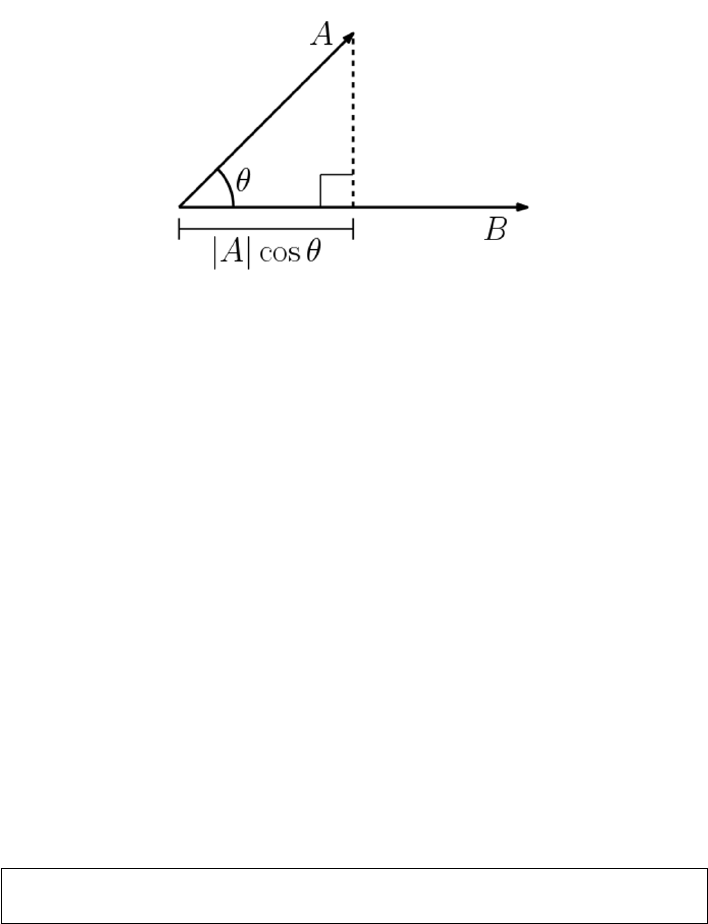
8.2. VISUALIZING MATRIX OPERATIONS 241
Figure 8.2: The dot product of two vectors defines the cosine of the angle
between them.
But what is the connection between dot product and angle? Consider the
simplest case of an angle defined between two rays, Aat zero degrees and
B= (x, y). Thus the unit ray is A= (1,0). In this case, the dot product
is 1 ·x+ 0 ·y=x, which is exactly what cos(θ) should be if Bis a unit
vector. We can take it on faith that this generalizes for general B, and to higher
dimensions.
So a smaller angle means closer points on the sphere. But there is another
connection between things we know. Recall the special cases of the cosine func-
tion, here given in radians:
cos(0) = 1,cos(π/2) = 0,cos(π) = −1.
The values of the cosine function range from [−1,1], exactly the same range as
that of the correlation coefficient. Further, the interpretation is the same: two
identical vectors are perfectly correlated, while antipodal points are perfectly
negatively correlated. Orthogonal points/vectors (the case of Θ = π/2) have as
little to do with each other as possible.
The cosine function is exactly the correlation of two mean-zero variables.
For unit vectors, ||A|| =||B|| = 1, so the angle between Aand Bis completely
defined by the dot product.
Take-Home Lesson: The dot product of two vectors measures similarity in
exactly the same way as the Pearson correlation coefficient.
8.2 Visualizing Matrix Operations
I assume that you have had some previous exposure to the basic matrix opera-
tions of transposition, multiplication, and inversion. This section is intended as
a refresher, rather than an introduction.

242 CHAPTER 8. LINEAR ALGEBRA
Figure 8.3: Matrix image examples: Lincoln (left) and his memorial (right).
The center image is a linear combination of left and right, for α= 0.5.
But to provide better intuition, I will represent matrices as images rather
than numbers, so we can see what happens when we operate on them. Figure
8.3 shows our primary matrix images: President Abraham Lincoln (left) and
the building which serves as his memorial (right). The former is a human face,
while the latter contains particularly strong rows and columns.
Be aware that we will be quietly rescaling the matrix between each operation,
so the absolute color does not matter. The interesting patterns come in the
differences between light and dark, meaning the smallest and biggest numbers
in the current matrix. Also, note that the origin element of the matrix M[1,1]
represents the upper left corner of the image.
8.2.1 Matrix Addition
Matrix addition is a simple operation: for matrices Aand B, each of dimensions
n×m,C=A+Bimplies that:
Cij =Aij +Bij ,for all 1 ≤i≤nand 1 ≤j≤m.
Scalar multiplication provides a way to change the weight of every element
in a matrix simultaneously, perhaps to normalize them. For any matrix Aand
number c,A0=c·Aimplies that
A0
ij =cAij ,for all 1 ≤i≤nand 1 ≤j≤m.
Combining matrix addition with scalar multiplication gives us the power to
perform linear combinations of matrices. The formula α·A+ (1 −α)·Benables
us to fade smoothly between A(for α= 1) and B(for α= 0), as shown in
Figure 8.3. This provides a way to morph the images from Ato B.
The transpose of a matrix Minterchanges rows and columns, turning an
a×bmatrix into a b×amatrix MT, where
MT
ij =Mji for all 1 ≤i≤nand 1 ≤j≤m.
The transpose of a square matrix is a square matrix, so Mand MTcan safely
be added or multiplied together. More generally, the transpose is an operation
that is used to orient a matrix so it can be added to or multiplied by its target.

8.2. VISUALIZING MATRIX OPERATIONS 243
Figure 8.4: Lincoln (left) and its transposition (right). The sum of a matrix
and its transposition is symmetric along its main diagonal (right).
The transpose of a matrix sort of “rotates” it by 180 degrees, so (AT)T=A.
In the case of square matrices, adding a matrix to its transpose is symmetric,
as shown in Figure 8.4 (right). The reason is clear: C=A+ATimplies that
Cij =Aij +Aji =Cji.
8.2.2 Matrix Multiplication
Matrix multiplication is an aggregate version of the vector dot or inner product.
Recall that for two n-element vectors, Xand Y, the dot product X·Yis defined:
X·Y=
n
X
i=1
XiYi
Dot products measure how “in sync” the two vectors are. We have already seen
the dot product when computing the cosine distance and correlation coefficient.
It is an operation that reduces a pair of vectors to a single number.
The matrix product XY Tof these two vectors produces a 1 ×1 matrix
containing the dot product X·Y. For general matrices, the product C=AB
is defined by:
Cij =
k
X
i=1
Aik ·Bkj
For this to work, Aand Bmust share the same inner dimensions, implying that
if Ais n×kthen Bmust have dimensions k×m. Each element of the n×m
product matrix Cis a dot product of the ith row of Awith the jth column of
B.
The most important properties of matrix multiplication are:
•It does not commute:Commutativity is the notation that order doesn’t
matter, that x·y=y·x. Although we take commutativity for granted
when multiplying integers, order does matter in matrix multiplication. For
any pair of non-square matrices Aand B, at most one of either AB or BA
244 CHAPTER 8. LINEAR ALGEBRA
has compatible dimensions. But even square matrix multiplication does
not commute, as shown by the products below:
1 1
0 1·1 1
1 0=2 1
1 06=1 1
1 0·1 1
0 1=1 2
1 1
and the covariance matrices of Figure 8.5.
•Matrix multiplication is associative:Associativity grants us the right to
parenthesize as we wish, performing operations in the relative order that
we choose. In computing the product ABC, we have a choice of two op-
tions: (AB)Cor A(BC). Longer chains of matrices permit even more
freedom, with the number of possible parenthesizations growing exponen-
tially in the length of the chain. All of these will return the same answer,
as demonstrated here:
1 2
4 41 0
0 2!3 2
1 0=1 4
3 83 2
1 0=7 2
17 6
1 2
3 4 1 0
0 23 2
1 0!=1 2
3 43 2
2 0=7 2
17 6
There are two primary reasons why associativity matters to us. In an
algebraic sense, it enables us to identify neighboring pairs of matrices in a
chain and replace them according to an identity, if we have one. But the
other issue is computational. The size of intermediate matrix products can
easily blow up in the middle. Suppose we seek to calculate ABCD, where
Ais 1×n,Band Care n×n, and Dis n×1. The product (AB)(CD) costs
only 2n2+noperations, assuming the conventional nested-loop matrix
multiplication algorithm. In contrast, (A(BC))Dweighs in at n3+n2+n
operations.
The nested-loop matrix multiplication algorithm you were taught in high
school is trivially easy to program, and indeed appears on page 398. But don’t
program it. Much faster and more numerically stable algorithms exist in the
highly optimized linear algebra libraries associated with your favorite program-
ming language. Formulating your algorithms as matrix products on large arrays,
instead of using ad hoc logic is counter-intuitive to most computer scientists.
But this strategy can produce very big performance wins in practice.
8.2.3 Applications of Matrix Multiplication
On the face of it, matrix multiplication is an ungainly operation. When I
was first exposed to linear algebra, I couldn’t understand why we couldn’t just
multiply the numbers on a pairwise basis, like matrix addition, and be done
with it.
The reason we care about matrix multiplication is that there are many things
we can do with it. We will review these applications here.

8.2. VISUALIZING MATRIX OPERATIONS 245
Figure 8.5: The Lincoln memorial M(left) and its covariance matrices. The big
block in the middle of M·MT(center) results from the similarity of all rows
from the middle stripe of M. The tight grid pattern of MT·M(right) reflects
the regular pattern of the columns on the memorial building.
Covariance Matrices
Multiplying a matrix Aby its transpose ATis a very common operation. Why?
For one thing, we can multiply it: if Ais an n×dmatrix, then ATis a d×
nmatrix. Thus it is always compatible to multiply AAT. They are equally
compatible to multiply the other way, i.e. ATA.
Both of these products have important interpretations. Suppose Ais an
n×dfeature matrix, consisting of nrows representing items or points, and d
columns representing the observed features of these items. Then:
•C=A·ATis an n×nmatrix of dot products, measuring the “in sync-
ness” among the points. In particular Cij is a measure of how similar item
iis to item j.
•D=AT·Ais a d×dmatrix of dot products, measuring the “in sync-ness”
among columns or features. Now Dij represents the similarity between
feature iand feature j.
These beasts are common enough to earn their own name, covariance ma-
trices. This term comes up often in conversations among data scientists, so
get comfortable with it. The covariance formula we gave when computing the
correlation coefficient was
Cov(X, Y ) =
n
X
i=1
(Xi−¯
X)(Yi−¯
Y).
so, strictly speaking, our beasts are covariance matrices only if the rows or
columns of Ahave mean zero. But regardless, the magnitudes of the matrix
product captures the degree to which the values of particular row or column
pairs move together.
Figure 8.5 presents the covariance matrices of the Lincoln memorial. Darker
spots define rows and columns in the image with the greatest similarity. Try to
understand where the visible structures in these covariance matrices come from.
246 CHAPTER 8. LINEAR ALGEBRA
Figure 8.5 (center) presents M·MT, the covariance matrix of the rows. The
big dark box in the middle represents the large dot products resulting from any
two rows cutting across all the memorial’s white columns. These bands of light
and dark are strongly correlated, and the intensely dark regions contribute to
a large dot product. The light rows corresponding to the sky, pediment, and
stairs are equally correlated and coherent, but lack the dark regions to make
their dot products large enough.
The right image presents MT·M, which is the covariance matrix of the
columns. All the pairs of matrix columns strongly correlate with each other,
either positively or negatively, but the matrix columns through the white build-
ing columns have low weight and hence a small dot product. Together, they
define a checkerboard of alternating dark and light stripes.
Matrix Multiplication and Paths
Square matrices can be multiplied by themselves without transposition. Indeed,
A2=A×Ais called the square of matrix A. More generally Akis called the
kth power of the matrix.
The powers of matrix Ahave a very natural interpretation, when Arep-
resents the adjacency matrix of a graph or network. In an adjacency matrix,
A[i, j] = 1 when (i, j) is an edge in the network. Otherwise, when iand jare
not direct neighbors, A[i, j] = 0.
For such 0/1 matrices, the product A2yields the number of paths of length
two in A. In particular:
A2[i, j] =
n
X
k=1
A[i, k]·A[k, j].
There is exactly one path of length two from ito jfor every intermediate vertex
ksuch that (i, k) and (k, j) are both edges in the graph. The sum of these path
counts is computed by the dot product above.
But computing powers of matrices makes sense even for more general matri-
ces. It simulates the effects of diffusion, spreading out the weight of each element
among related elements. Such things happen in Google’s famous PageRank al-
gorithm, and other iterative processes such as contagion spreading.
Matrix Multiplication and Permutations
Matrix multiplication is often used just to rearrange the order of the elements
in a particular matrix. Recall that high-performance matrix multiplication rou-
tines are blindingly fast, enough so they can often perform such operations faster
than ad hoc programming logic. They also provide a way to describe such op-
erations in the notation of algebraic formulae, thus preserving compactness and
readability.
The most famous rearrangement matrix does nothing at all. The identity
matrix is an n×nmatrix consisting of all zeros, except for the ones all along

8.2. VISUALIZING MATRIX OPERATIONS 247
P=
0010
1000
0001
0100
M=
11 12 13 14
21 22 23 24
31 32 33 34
41 42 43 44
P M =
31 32 33 34
11 12 13 14
41 42 43 44
21 22 23 24
Figure 8.6: Multiplying a matrix by a permutation matrix rearranges its rows
and columns.
Figure 8.7: Multiplying the Lincoln matrix Mby the reverse permutation matrix
r(center). The product r·Mflips Lincoln upside down (left), while M·rparts
his hair on the other side of his head (right).
the main diagonal. For n= 4,
I=
1000
0100
0010
0001
Convince yourself that AI =IA =A, meaning that multiplication by the
identity matrix commutes.
Note that each row and column of Icontains exactly one non-zero element.
Matrices with this property are called permutation matrices, because the non-
zero element in position (i, j) can be interpreted as meaning that element iis
in position jof a permutation. For example, the permutation (2,4,3,1) defines
the permutation matrix:
P(2431) =
0001
1000
0010
0100
Observe that the identity matrix corresponds to the permutation (1,2, . . . , n).
The key point here is that we can multiply Aby the appropriate permutation
matrix to rearrange the rows and columns, however we wish. Figure 8.7 shows
what happens when we multiply our image by a “reverse” permutation matrix
248 CHAPTER 8. LINEAR ALGEBRA
r, where the ones lie along the minor diagonal. Because matrix multiplication is
not generally commutative, we get different results for A·rand r·A. Convince
yourself why.
Rotating Points in Space
Multiplying something by the right matrix can have magical properties. We
have seen how a set of npoints in the plane (i.e. two dimensions) can be
represented by an (n×2)-dimensional matrix S. Multiplying such points by the
right matrix can yield natural geometric transformations.
The rotation matrix Rθperforms the transformation of rotating points about
the origin through an angle of θ. In two dimensions, Rθis defined as
Rθ=cos(θ)−sin(θ)
sin(θ) cos(θ)
In particular, after the appropriate multiplication/rotation, point (x, y) goes to
x0
y0=Rθx
y=xcos(θ)−ysin(θ)
xsin(θ) + ycos(θ)
For θ= 180◦=πradians, cos(θ) = −1 and sin(θ) = 0, so this reduces to
(−x, −y), doing the right thing by putting the point in the opposing quadrant.
For our (n×2)-dimensional point matrix S, we can use the transpose function
to orient the matrix appropriately. Check to confirm that
S0= (RθST)T
does exactly what we want to do.
Natural generalizations of Rθexist to rotate points in arbitrary dimensions.
Further, arbitrary sequences of successive transformations can be realized by
multiplying chains of rotation, dilation, and reflection matrices, yielding a com-
pact description of complex manipulations.
8.2.4 Identity Matrices and Inversion
Identity operations play a big role in algebraic structures. For numerical addi-
tion, zero is the identity element, since 0 + x=x+ 0 = x. The same role is
played by one for multiplication, since 1 ·x=x·1 = x.
In matrix multiplication, the identity element is the identity matrix, with all
ones down the main diagonal. Multiplication by the identity matrix commutes,
so IA =AI =A.
The inverse operation is about taking an element xdown to its identity
element. For numerical addition, the inverse of xis (−x), because x+(−x) = 0.
The inverse operation for multiplication is called division. We can invert a
number by multiplying it by its reciprocal, since x·(1/x) = 1.
People do not generally talk about dividing matrices. However, they very
frequently go about inverting them. We say A−1is the multiplicative inverse

8.2. VISUALIZING MATRIX OPERATIONS 249
Figure 8.8: The inverse of Lincoln does not look much like the man (left) but
M·M−1produces the identity matrix, modulo small non-zero terms due to
numerical precision issues.
of matrix Aif A·A−1=I, where Iis the identity matrix. Inversion is an
important special case of division, since A·A−1=Iimplies A−1=I/A. They
are in fact equivalent operations, because A/B =A·B−1.
Figure 8.8 (left) shows the inverse of our Lincoln picture, which looks pretty
much like random noise. But multiplying it by the image yields the thin main
diagonal of the identity matrix, albeit superimposed on a background of numeri-
cal error. Floating point computations are inherently imprecise, and algorithms
like inversion which perform repeated additions and multiplications often accu-
mulate error in the process.
How can we compute the inverse of a matrix? A closed form exists for finding
the inverse A−1of a 2 ×2 matrix A, namely:
A−1=a b
c d−1
=1
ad −bcd−b
−c a
More generally, there is an approach to inverting matrices by solving a linear
system using Gaussian elimination.
Observe that this closed form for inversion divides by zero whenever the
products of the diagonals are equal, i.e. ad =bc. This tells us that such
matrices are not invertible or singular, meaning no inverse exists. Just as we
cannot divide numbers by zero, we cannot invert singular matrices.
The matrices we can invert are called non-singular, and life is better when
our matrices have this property. The test of whether a matrix is invertible is
whether its determinant is not zero. For 2 ×2 matrices, the determinant is the
difference between the product of its diagonals, exactly the denominator in the
inversion formula.
Further, the determinant is only defined for square matrices, so only square
matricies are invertible. The cost of computing this determinant is O(n3), so
it is expensive on large matricies, indeed as expensive as trying to invert the
matrix itself using Gaussian elimination.

250 CHAPTER 8. LINEAR ALGEBRA
[A|I] =
6 4 1 1 0 0
1072010
5 3 1 0 0 1
=
11010−1
01001−2
5 3 1 0 0 1
=
1001−1 1
0 1 0 0 1 −2
5 3 1 0 0 1
=
100 1−1 1
0 1 0 0 1 −2
001−5 2 2
→A−1=
1−1 1
0 1 −2
−5 2 2
Figure 8.9: The inverse of a matrix can be computed by Gaussian elimination.
8.2.5 Matrix Inversion and Linear Systems
Linear equations are defined by the sum of variables weighted by constant co-
efficients:
y=c0+c1x1+c2x2+. . . cm−1xm−1.
Thus the coefficients defining a system of nlinear equations can be represented
as an n×mmatrix C. Here each row represents an equation, and each of the
mcolumns the coefficients of a distinct variable.
We can neatly evaluate all nof these equations on a particular m×1 input
vector X, by multiplying C·X. The result will be an n×1 vector, reporting
the value fi(X) for each of the nlinear equations, 1 ≤i≤n. The special case
here is the additive term c0. For proper interpretation, the associated column
in Xshould contain all ones.
If we generalize Xto be an m×pmatrix containing pdistinct points, our
product C·xresults in an n×pmatrix, evaluating every point against every
equation in a single matrix multiplication.
But the primary operation on systems of nequations is to solve them, mean-
ing to identify the Xvector necessary to yield a target Yvalue for each equation.
Give the n×1 vector of solution values Yand coefficient matrix C, we seek X
such that C·X=Y.
Matrix inversion can be used to solve linear systems. Multiplying both sides
of CX =Yby the inverse of C yields:
(C−1C)X=C−1Y−→ X=C−1Y.
Thus the system of equations can be solved by inverting Cand then multiplying
C−1by Y.
Gaussian elimination is another approach to solving linear systems, which I
trust you have seen before. Recall that it solves the equations by performing
row addition/subtraction operations to simplify the equation matrix Cuntil it
reduces to the identity matrix. This makes it trivial to read off the values of the

8.2. VISUALIZING MATRIX OPERATIONS 251
variables, since every equation has been reduced to the form Xi=Y0
i, where Y0
is the result of applying these same row operations to the original target vector
Y.
Computing the matrix inverse can be done in the same fashion, as shown in
Figure 8.9. We perform row operations to simplify the coefficient matrix to the
identity matrix Iin order to create the inverse. I think of this as the algorithm
of Dorian Gray: the coefficient matrix Cbeautifies to the identity matrix, while
the target Iages into the inverse.1
Therefore we can use matrix inversion to solve linear systems, and linear
system solvers to invert matrices. Thus the two problems are in some sense
equivalent. Computing the inverse makes it cheap to evaluate multiple Yvectors
for a given system C, by reducing it to a single matrix multiplication. But this
can be done even more efficiently with LU-decomposition, discussed in Section
8.3.2. Gaussian elimination proves more numerically stable than inversion, and
is generally the method of choice when solving linear systems.
8.2.6 Matrix Rank
A system of equations is properly determined when there are nlinearly inde-
pendent equations and nunknowns. For example, the linear system
2x1+ 1x2= 5
3x1−2x2= 4
is properly determined. The only solution is the point (x1= 2, x2= 1).
In contrast, systems of equations are underdetermined if there are rows (equa-
tions) that can be expressed as linear combinations of other rows. The linear
system
2x1+ 1x2= 5
4x1+ 2x2= 10
is underdetermined, because the second row is twice that of the first row. It
should be clear that there is not enough information to solve an undetermined
system of linear equations.
The rank of a matrix measures the number of linearly independent rows. An
n×nmatrix should be rank nfor all operations to be properly defined on it.
The rank of the matrix can be computed by running Gaussian elimination.
If it is underdetermined, then certain variables will disappear in the course of
row-reduction operations. There is also a connection between underdetermined
systems and singular matrices: recall that they were identified by having a
determinant of zero. That is why the difference in the cross product here (2 ·
2−4·1) equals zero.
1In Oscar Wilde’s novel The Picture of Dorian Gray, the protagonist remains beautiful,
while his picture ages horribly over the years.
252 CHAPTER 8. LINEAR ALGEBRA
Feature matrices are often of lower rank than we might desire. Files of
examples tend to contain duplicate entries, which would result in two rows of
the matrix being identical. It is also quite possible for multiple columns to be
equivalent: imagine each record as containing the height measured in both feet
and meters, for example.
These things certainly happen, and are bad when they do. Certain algo-
rithms on our Lincoln memorial image failed numerically. It turned out that
our 512 ×512 image had a rank of only 508, so not all rows were linearly inde-
pendent. To make it a full-rank matrix, you can add a small amount of random
noise to each element, which will increase the rank without serious image dis-
tortion. This kludge might get your data to pass through an algorithm without
a warning message, but it is indicative of numerical trouble to come.
Linear systems can be “almost” of lower rank, which results in a greater
danger of precision loss due to numerical issues. This is formally captured by a
matrix invariant called the condition number, which in the case of a linear system
measures how sensitive the value of Xis to small changes of Yin Y=AX.
Be aware of the vagaries of numerical computation when evaluating your
results. For example, it is a good practice to compute AX for any purported
solution X, and see how well AX really compares to Y. In theory the difference
will be zero, but in practice you may be surprised how rough the calculation
really is.
8.3 Factoring Matrices
Factoring matrix Ainto matrices Band Crepresents a particular aspect of
division. We have seen that any non-singular matrix Mhas an inverse M−1,
so the identity matrix Ican be factored as I=MM−1. This proves that
some matrices (like I) can be factored, and further that they might have many
distinct factorizations. In this case, every possible non-singular Mdefines a
different factorization.
Matrix factorization is an important abstraction in data science, leading
to concise feature representations and ideas like topic modeling. It plays an
important part in solving linear systems, through special factorizations like LU-
decomposition.
Unfortunately, finding such factorizations is problematic. Factoring integers
is a hard problem, although that complexity goes away when you are allowed
floating point numbers. Factoring matrices proves harder: for a particular ma-
trix, exact factorization may not be possible, particularly if we seek the factor-
ization M=XY where Xand Yhave prescribed dimensions.
8.3.1 Why Factor Feature Matrices?
Many important machine learning algorithms can be viewed in terms of factoring
a matrix. Suppose we are given an n×mfeature matrix Awhere, as per the

8.3. FACTORING MATRICES 253
..........
..........
..........
..........
..........
..........
..........
..........
..........
...
..........
..........
..........
..........
..........
..........
...
...
...
...
...
...
...
...
...
...
...
...
..........
≈
Figure 8.10: Factoring a feature matrix A≈BC yields Bas a more concise
representation of the items and Cas a more concise representations of the
features AT.
usual convention, rows represent items/examples and columns represent features
of the examples.
Now suppose that we can factor matrix A, meaning express it as the product
A≈B·C, where Bis an n×kmatrix and Cak×mmatrix. Presuming that
k < min(n, m), as shown in Figure 8.10, this is a good thing for several reasons:
•Together, Band Cprovide a compressed representation of matrix A: Fea-
ture matrices are generally large, ungainly things to work with. Factoriza-
tion provides a way to encode all the information of the large matrix into
two smaller matrices, which together will be smaller than the original.
•Bserves as a smaller feature matrix on the items, replacing A: The
factor matrix Bhas nrows, just like the original matrix A. However, it
has substantially fewer columns, since k < m. This means that “most” of
the information in Ais now encoded in B. Fewer columns mean a smaller
matrix, and less parameters to fit in any model built using these new
features. These more abstract features may also be of interest to other
applications, as concise descriptions of the rows of the data set.
•CTserves as a small feature matrix on the features, replacing AT: Trans-
posing the feature matrix turns columns/features into rows/items. The
factor matrix CThas mrows and kcolumns of properties representing
them. In many cases, the moriginal “features” are worth modeling in
their own right.
Consider a representative example from text analysis. Perhaps we want to
represent ndocuments, each a tweet or other social message post, in terms
of the vocabulary it uses. Each of our mfeatures will correspond to a distinct
vocabulary word, and A[i, j] will record how often vocabulary word wj(say, cat)
appeared in message number i. The working vocabulary in English is large with
a long tail, so perhaps we can restrict it to the m= 50,000 most frequently used
words. Most messages will be short, with no more than a few hundred words.
Thus our feature matrix Awill be very sparse, riddled with a huge number of
zeros.
Now suppose that we can factor A=BC, where the inner dimension kis
relatively small. Say k= 100. Now each post will be represented by a row of
254 CHAPTER 8. LINEAR ALGEBRA
Bcontaining only a hundred numbers, instead of the full 50,000. This makes
it much easier to compare the texts for similarity in a meaningful way. These
kdimensions can be thought of as analogous to the “topics” in the documents,
so all the posts about sports should light up a different set of topics than those
about relationships.
The matrix CTcan now be thought of as containing a feature vector for
each of the vocabulary words. This is interesting. We would expect words that
apply in similar contexts to have similar topic vectors. Color words like yellow
and red are likely to look fairly similar in topic space, while baseball and sex
should have quite distant relationships.
Note that this word–topic matrix is potentially useful in any problem seeking
to use language as features. The connection with social message posts is largely
gone, so it would be applicable to other domains like books and news. Indeed,
such compressed word embeddings prove a very powerful tool in natural language
processing (NLP), as will be discussed in Section 11.6.3.
8.3.2 LU Decomposition and Determinants
LU decomposition is a particular matrix factorization which factors a square
matrix Ainto lower and upper triangular matrices Land U, such that A=L·U.
A matrix is triangular if it contains all zero terms either above or below the
main diagonal. The lower triangular matrix Lhas all non-zero terms below the
main diagonal. The other factor, U, is the upper triangular matrix. Since the
main diagonal of Lconsists of all ones, we can pack the entire decomposition
into the same space as the original n×nmatrix.
The primary value of LU decomposition is that it proves useful in solving
linear systems AX =Y, particularly when solving multiple problems with the
same Abut different Y. The matrix Lis what results from clearing out all
of the values above the main diagonal, via Gaussian elimination. Once in this
triangular form, the remaining equations can be directly simplified. The ma-
trix Ureflects what row operations have occurred in the course of building L.
Simplifying Uand applying Lto Yrequires less work than solving Afrom
scratch.
The other importance of LU decomposition is in yielding an algorithm to
compute the determinant of a matrix. The determinant of Ais the product of
the main diagonal elements of U. As we have seen, a determinant of zero means
the matrix is not of full rank.
Figure 8.11 illustrates the LU decomposition of the Lincoln memorial. There
is a distinct texture visible to the two triangular matrices. This particular LU
decomposition function (in Mathematica) took advantage of the fact that the
equations in a system can be permuted with no loss of information. The same
does not hold true for images, but we see accurate reconstructions of the white
columns of the memorial, albeit out of position.

8.4. EIGENVALUES AND EIGENVECTORS 255
Figure 8.11: The LU decomposition of the Lincoln memorial (left), with the
product L·U(center). The rows of the LU matrix were permuted during
calculation, but when properly ordered fully reconstructed the image (right).
8.4 Eigenvalues and Eigenvectors
Multiplying a vector Uby a square matrix Acan have the same effect as multi-
plying it by a scalar l. Consider this pair of examples. Indeed, check them out
by hand:
−5 2
2−2·2
−1=−62
−1
−5 2
2−2·1
2=−11
2
Both of these equalities feature products with the same 2 ×1 vector Uon the
left as on the right. On one side Uis multiplied by a matrix A, and on the other
by a scalar λ. In cases like this, when AU =λU, we say that λis an eigenvalue
of matrix A, and Uis its associated eigenvector.
Such eigenvector–eigenvalue pairs are a curious thing. That the scalar λcan
do the same thing to Uas the entire matrix Atells us that they must be special.
Together, the eigenvector Uand eigenvalue λmust encode a lot of information
about A.
Further, there are generally multiple such eigenvector–eigenvalue pairs for
any matrix. Note that the second example above works on the same matrix A,
but yields a different Uand λ.
8.4.1 Properties of Eigenvalues
The theory of eigenvalues gets us deeper into the thicket of linear algebra than I
am prepared to do in this text. Generally speaking, however, we can summarize
the properties that will prove important to us:
•Each eigenvalue has an associated eigenvector. They always come in pairs.
•There are, in general, neigenvector–eigenvalue pairs for every full rank
n×nmatrix.
256 CHAPTER 8. LINEAR ALGEBRA
•Every pair of eigenvectors of a symmetric matrix are mutually orthogonal,
the same way that the xand y-axes in the plane are orthogonal. Two
vectors are orthogonal if their dot product is zero. Observe that (0,1) ·
(1,0) = 0, as does (2,−1) ·(1,2) = 0 from the previous example.
•The upshot from this is that eigenvectors can play the role of dimensions
or bases in some n-dimensional space. This opens up many geometric in-
terpretations of matrices. In particular, any matrix can be encoded where
each eigenvalue represents the magnitude of its associated eigenvector.
8.4.2 Computing Eigenvalues
The ndistinct eigenvalues of a rank-nmatrix can be found by factoring its
characteristic equation. Start from the defining equality AU =λU. Convince
yourself that this remains unchanged when we multiply by the identity matrix
I, so
AU =λIU →(A−λI)U= 0.
For our example matrix, we get
A−λI =−5−λ2
2−2−λ
Note that our equality (A−λI)U= 0 remains true if we multiply vector U
by any scalar value c. This implies that there are an infinite number of solutions,
and hence the linear system must be underdetermined.
In such a situation, the determinant of the matrix must be zero. With a
2×2 matrix, the determinant is just the cross product ad −bc, so
(−5−λ)(−2−λ)−2·2 = λ2+ 7λ+ 6 = 0.
Solving for λwith the quadratic formula yields λ=−1 and λ=−6. More
generally, the determinant |A−λI|is a polynomial of degree n, and hence the
roots of this characteristic equation define the eigenvalues of A.
The vector associated with any given eigenvalue can be computed by solving
a linear system. As per our example, we know that
−5 2
2−2·u1
u2=λu1
u2
for any eigenvalue λand associated eigenvector U=u1
u2. Once we fix the
value of λ, we have a system of nequations and nunknowns, and thus can solve
for the values of U. For λ=−1,
−5u1+ 2u2=−1u1−→ −4u1+ 2u2= 0
2u1+−2u2=−1u2−→ 2u1+−1u2= 0
which has the solution u1= 1, u2= 2, yielding the associated eigenvector.
8.5. EIGENVALUE DECOMPOSITION 257
For λ=−6, we get
−5u1+ 2u2=−6u1−→ 1u1+ 2u2= 0
2u1+−2u2=−6u2−→ 2u1+ 4u2= 0
This system is underdetermined, so u1= 2, u2=−1 and any constant multiple
of this qualifies as an eigenvector. This makes sense: because Uis on both sides
of the equality AU =λU, for any constant c, the vector U0=c·Uequally
satisfies the definition.
Faster algorithms for eigenvalue/vector computations are based on a matrix
factorization approach called QR decomposition. Other algorithms try to avoid
solving the full linear system. For example, an alternate approach repeatedly
uses U0= (AU)/λ to compute better and better approximations to Uuntil it
converges. When conditions are right, this can be much faster than solving the
full linear system.
The largest eigenvalues and their associated vectors are, generally speaking,
more important that the rest. Why? Because they make a larger contribution
to approximating the matrix A. Thus high-performance linear algebra systems
use special routines for finding the klargest (and smallest) eigenvalues and then
iterative methods to reconstruct the vectors for each.
8.5 Eigenvalue Decomposition
Any n×nsymmetric matrix Mcan be decomposed into the sum of its n
eigenvector products. We call the neigenpairs (λi, Ui), for 1 ≤i≤n. By
convention we sort by size, so λi≥λi−ifor all i.
Since each eigenvector Uiis an n×1 matrix, multiplying it by its transpose
yields an n×nmatrix product, UiUiT. This has exactly the same dimensions
as the original matrix M. We can compute the linear combination of these
matrices weighted by its corresponding eigenvalue. In fact, this reconstructs
the original matrix, since:
M=
n
X
i=1
λiUiUiT
This result holds only for symmetric matrices, so we cannot use it to encode
our image. But covariance matrices are always symmetric, and they encode the
basic features of each row and column of the matrix.
Thus the covariance matrix can be represented by its eigenvalue decompo-
sition. This takes slightly more space than the initial matrix: neigenvectors of
length n, plus neigenvalues vs. the n(n+ 1)/2 elements in the upper triangle
of the symmetric matrix plus main diagonal.
However, by using only the vectors associated with the largest eigenvalues
we get a good approximation of the matrix. The smaller dimensions contribute
very little to the matrix values, and so they can be excluded with little resulting
error. This dimension reduction method is very useful to produce smaller, more
effective feature sets.
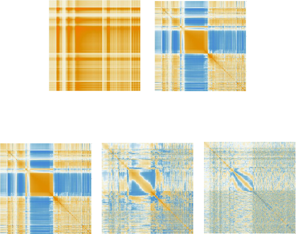
258 CHAPTER 8. LINEAR ALGEBRA
Figure 8.12: The Lincoln memorial’s biggest eigenvector suffices to capture much
of the detail of its covariance matrix.
Figure 8.13: Error in reconstructing the Lincoln memorial from the one, five,
and fifty largest eigenvectors.
Figure 8.12 (left) shows the reconstruction of the Lincoln memorial’s covari-
ance matrix Mfrom its single largest eigenvector, i.e. U1·UT
1, along with its
associated error matrix M−U1·UT
1. Even a single eigenvector does a very
respectable job at reconstruction, restoring features like the large central block.
The plot in Figure 8.12 (right) shows that the errors occur in patchy regions,
because more subtle detail requires additional vectors to encode. Figure 8.13
shows the error plot when using the one, five, and fifty largest eigenvectors.
The error regions get smaller as we reconstruct finer detail, and the magnitude
of the errors smaller. Realize that even fifty eigenvectors is less than 10% of
the 512 necessary to restore a perfect matrix, but this suffices for a very good
approximation.
8.5.1 Singular Value Decomposition
Eigenvalue decomposition is a very good thing. But it only works on symmetric
matrices. Singular value decomposition is a more general matrix factorization
approach, that similarly reduces a matrix to the sum of other matrices defined
by vectors.
The singular value decomposition of an n×mreal matrix Mfactors it into
three matrices U,D, and V, with dimensions n×n,n×m, and m×mrespec-

8.5. EIGENVALUE DECOMPOSITION 259
Figure 8.14: Singular value matrices in the decomposition of Lincoln, for 50
singular values.
tively. This factorization is of the form2
M=UDV T
The center matrix Dhas the property that it is a diagonal matrix, meaning all
non-zero values lie on the main diagonal like the identity matrix I.
Don’t worry about how we find this factorization. Instead, let’s concentrate
on what it means. The product U·Dhas the effect of multiplying U[i, j] by
D[j, j], because all terms of Dare zero except along the main diagonal. Thus
Dcan be interpreted as measuring the relative importance of each column of
U, or through D·VT, the importance of each row of VT. These weight values
of Dare called the singular values of M.
Let Xand Ybe vectors, of dimensionality n×1 and 1×m, respectively. The
matrix outer product P=XNYis the n×mmatrix where P[j, k] = X[j]Y[k].
The traditional matrix multiplication C=A·Bcan be expressed as the sum of
these outer products, namely:
C=A·B=X
k
AkOBT
k
where Akis the vector defined by the kth column of A, and BT
kis the vector
defined by the kth row of B.
Putting this together, matrix Mcan be expressed as the sum of outer prod-
ucts of vectors resulting from the singular value decomposition, namely (UD)k
and (VT)kfor 1 ≤k≤m. Further, the singular values Ddefine how much con-
tribution each outer product makes to M, so it suffices to take only the vectors
associated with the largest singular values to get an approximation to M.
2Should Mcontain convex numbers, then this generalizes to M=U DV ∗, where V∗means
the conjugate transpose of V.

260 CHAPTER 8. LINEAR ALGEBRA
Figure 8.15: Lincoln’s face reconstructed from 5 (left) and 50 (center) singular
values, with the error for k= 50 (right).
Figure 8.14 (left) presents the vectors associated with the first fifty singular
values of Lincoln’s face. If you look carefully, you can see how the first five to
ten vectors are considerably more blocky than subsequent ones, indicating that
the early vectors rough out the basic structure of the matrix, with subsequent
vectors adding greater detail. Figure 8.14 (right) shows how the mean squared
error between the matrix and its reconstruction shrinks as we add additional
vectors.
These effects become even more vivid when we look at the reconstructed
images themselves. Figure 8.15 (left) shows Lincoln’s face with only the five
strongest vectors, which is less than 1% of what is available for perfect recon-
struction. But even at this point you could pick him out of a police lineup.
Figure 8.15 (center) demonstrates the greater detail when we include fifty vec-
tors. This looks as good as the raw image in print, although the error plot
(Figure 8.15 (right)) highlights the missing detail.
Take-Home Lesson: Singular value decomposition (SVD) is a powerful tech-
nique to reduce the dimensionality of any feature matrix.
8.5.2 Principal Components Analysis
Principal components analysis (PCA) is a closely related technique for reducing
the dimensionality of data sets. Like SVD, we will define vectors to represent
the data set. Like SVD, we will order them by successive importance, so we can
reconstruct an approximate representation using few components. PCA and
SVD are so closely related as to be indistinguishable for our purposes. They do
the same thing in the same way, but coming from different directions.
The principal components define the axes of an ellipsoid best fitting the
points. The origin of this set of axes is the centroid of the points. PCA starts
by identifying the direction to project the points on to so as to explain the
maximum amount of variance. This is the line through the centroid that, in
some sense, best fits the points, making it analogous to linear regression. We
can then project each point onto this line, with this point of intersection defin-
ing a particular position on the line relative to the centroid. These projected

8.5. EIGENVALUE DECOMPOSITION 261
Figure 8.16: PCA projects the black points onto orthogonal axis, rotated to
yield the alternate representation in red (left). The values of each component
are given by projecting each point onto the appropriate axis (right).
positions now define the first dimension (or principal component) of our new
representation, as shown in Figure 8.16.
For each subsequent component, we seek the line lk, which is orthogonal to
all previous lines and explains the largest amount of the remaining variance.
That each dimension is orthogonal to each other means they act like coordinate
axes, establishing the connection to eigenvectors. Each subsequent dimension is
progressively less important than the ones before it, because we chose the most
promising directions first. Later components contribute only progressively finer
detail, and hence we can stop once this is small enough.
Suppose that dimensions xand yare virtually identical. We would expect
that the regression line will project down to y=xon these two dimensions, so
they could then largely be replaced by a single dimension. PCA constructs new
dimensions as linear combinations of the original ones, collapsing those which
are highly correlated into a lower-dimensional space. Statistical factor analysis
is a technique which identifies the most important orthogonal dimensions (as
measured by correlation) that explain the bulk of the variance.
Relatively few components suffice to capture the basic structure of the point
set. The residual that remains is likely to be noise, and is often better off
removed from the data. After dimension reduction via PCA (or SVD), we
should end up with cleaner data, not merely a smaller number of dimensions.
Take-Home Lesson: PCA and SVD are essentially two different approaches to
computing the same thing. They should serve equally well as low-dimensional
approximations of a feature matrix.
262 CHAPTER 8. LINEAR ALGEBRA
8.6 War Story: The Human Factors
I first came to be amazed by the power of dimension reduction methods like
PCA and SVD in the course of our analysis of historical figures for our book
Who’s Bigger. Recall (from the war story of Section 4.7) how we analyzed the
structure and content of Wikipedia, ultimately extracting a half-dozen features
like PageRank and article length for each of the 800,000+ articles about people
in the English edition. This reduced each of these people to a six-dimensional
feature vector, which we would analyze to judge their relative significance.
But things proved not as straightforward as we thought. Wildly different
people were ranked highest by each particular variable. It wasn’t clear how to
interpret them.
“There is so much variance and random noise in our features,” my co-author
Charles observed. “Let’s identify the major factors underlying these observed
variables that really show what is going on.”
Charles’ solution was factor analysis, which is a variant of PCA, which is in
turn a variant of SVD. All of these techniques compress feature matrices into a
smaller set of variables or factors, with the goal that these factors explain most
of the variance in the full feature matrix. We expected factor analysis would
extract a single underlying factor defining individual significance. But instead,
our input variables yielded two independent factors explaining the data. Both
explained roughly equal proportions of the variance (31% and 28%), meaning
that these latent variables were approximately of equal importance. But the
cool thing is what these factors showed.
Factors (or singular vectors, or principle components) are just linear combi-
nations of the original input features. They don’t come with names attached to
them, so usually you would just describe them as Factor 1 and Factor 2. But
our two factors were so distinctive that Charles gave them the names gravitas
and celebrity, and you can see why in Figure 8.17.
Our gravitas factor largely comes from (or “loads on,” in statistical par-
lance) the two forms of PageRank. Gravitas seems to accurately capture no-
tions of achievement-based recognition. In contrast, the celebrity factor loads
more strongly on page hits, revisions, and article length. The celebrity fac-
tor better captures the popular (some might say vulgar) notions of reputation.
The wattage of singers, actors, and other entertainers are better measured by
celebrity then gravitas.
To get a feel for the distinction between gravitas and celebrity, compare
our highest ranked figures for each factor, in Figure 8.17. The high gravitas
figures on the left are clearly old-fashioned heavyweights, people of stature and
accomplishment. They are philosophers, kings, and statesmen. Those names
listed in Figure 8.17 (right) are such complete celebrities that the top four walk
this earth with only one name. They are professional wrestlers, actors, and
singers. It is quite telling that the only two figures here showing any gravitas
on our celebrity-gravitas meter are Britney Spears (1981– ) [566] and Michael
Jackson (1958–2009) [136], both among the Platonic ideals of modern celebrity.
I find it amazing that these unsupervised methods were able to tease apart
8.7. CHAPTER NOTES 263
Figure 8.17: The gravitas and celebrity factors do an excellent job partitioning
two types of famous people.
two distinct types of fame, without any labeled training examples or even a
preconception of what they were looking for. The factors/vectors/components
simply reflected what was there in the data to be found.
This celebrity-gravitas continuum serves as an instructive example of the
power of dimension reduction methods. All the factors/vectors/components all
must, by definition, be orthogonal to each other. This means that they each
measure different things, in a way that two correlated input variables do not.
It pays to do some exploratory data analysis on your main components to try
to figure out what they really mean, in the context of your application. The
factors are yours to name as you wish, just like a cat or a dog, so choose names
you will be happy to live with.
8.7 Chapter Notes
There are many popular textbooks providing introductions to linear algebra, in-
cluding [LLM15, Str11, Tuc88]. Klein [Kle13] presents an interesting introduc-
tion to linear algebra for computer science, with an emphasis on programming
and applications like coding theory and computer graphics.
8.8 Exercises
Basic Linear Algebra
8-1. [3] Give a pair of square matrices Aand Bsuch that:
(a) AB =BA (it commutes).
(b) AB 6=BA (does not commute).
264 CHAPTER 8. LINEAR ALGEBRA
In general, matrix multiplication is not commutative.
8-2. [3] Prove that matrix addition is associative, i.e. that (A+B)+C=A+(B+C)
for compatible matrices A,Band C.
8-3. [5] Prove that matrix multiplication is associative, i.e. that (AB)C=A(BC)
for compatible matrices A,Band C.
8-4. [3] Prove that AB =BA, if Aand Bare diagonal matrices of the same order.
8-5. [5] Prove that if AC =CA and BC =CB, then
C(AB +BA) = (AB +BA)C.
8-6. [3] Are the matrices MM Tand MTMsquare and symmetric? Explain.
8-7. [5] Prove that (A−1)−1=A.
8-8. [5] Prove that (AT)−1= (A−1)Tfor any non-singular matrix A.
8-9. [5] Is the LU factorization of a matrix unique? Justify your answer.
8-10. [3] Explain how to solve the matrix equation Ax =b?
8-11. [5] Show that if Mis a square matrix which is not invertible, then either Lor
Uin the LU-decomposition M=L·Uhas a zero in its diagonal.
Eigenvalues and Eigenvectors
8-12. [3] Let M=2 1
0 2. Find all eigenvalues of M. Does Mhave two linearly
independent eigenvectors?
8-13. [3] Prove that the eigenvalues of Aand ATare identical.
8-14. [3] Prove that the eigenvalues of a diagonal matrix are equal to the diagonal
elements.
8-15. [5] Suppose that matrix Ahas an eigenvector vwith eigenvalue λ. Show that v
is also an eigenvector for A2, and find the corresponding eigenvalue. How about
for Ak, for 2 ≤k≤n?
8-16. [5] Suppose that Ais an invertible matrix with eigenvector v. Show that vis
also an eigenvector for A−1.
8-17. [8] Show that the eigenvalues of MMTare the same as that of MTM. Are
their eigenvectors also the same?
Implementation Projects
8-18. [5] Compare the speed of a library function for matrix multiplication to your
own implementation of the nested loops algorithm.
•How much faster is the library on products of random n×nmatricies, as
a function of nas ngets large?
•What about the product of an n×mand m×nmatrix, where nm?
•By how much do you improve the performance of your implementation to
calculate C=A·Bby first transposing Binternally, so all dot products
are computed along rows of the matrices to improve cache performance?
8-19. [5] Implement Gaussian elimination for solving systems of equations, C·X=Y.
Compare your implementation against a popular library routine for:
8.8. EXERCISES 265
(a) Speed: How does the run time compare, for both dense and sparse coeffi-
cient matrices?
(b) Accuracy: What are the size of the numerical residuals CX −Y, partic-
ularly as the condition number of the matrix increases.
(c) Stability: Does your program crash on a singular matrix? What about
almost singular matrices, created by adding a little random noise to a
singular matrix?
Interview Questions
8-20. [5] Why is vectorization considered a powerful method for optimizing numerical
code?
8-21. [3] What is singular value decomposition? What is a singular value? And what
is a singular vector?
8-22. [5] Explain the difference between “long” and “wide” format data. When might
each arise in practice?
Kaggle Challenges
8-23. Tell what someone is looking at from analysis of their brain waves.
https://www.kaggle.com/c/decoding-the-human-brain
8-24. Decide whether a particular student will answer a given question correctly.
https://www.kaggle.com/c/WhatDoYouKnow
8-25. Identify mobile phone users from accelerometer data.
https://www.kaggle.com/c/accelerometer-biometric-competition
Chapter 9
Linear and Logistic
Regression
An unsophisticated forecaster uses statistics as a drunken man uses
lamp posts – for support rather than illumination.
– Andrew Lang
Linear regression is the most representative “machine learning” method to build
models for value prediction and classification from training data. It offers a
study in contrasts:
•Linear regression has a beautiful theoretical foundation yet, in practice,
this algebraic formulation is generally discarded in favor of faster, more
heuristic optimization.
•Linear regression models are, by definition, linear. This provides an op-
portunity to witness the limitations of such models, as well as develop
clever techniques to generalize to other forms.
•Linear regression simultaneously encourages model building with hundreds
of variables, and regularization techniques to ensure that most of them will
get ignored.
Linear regression is a bread-and-butter modeling technique that should serve
as your baseline approach to building data-driven models. These models are
typically easy to build, straightforward to interpret, and often do quite well in
practice. With enough skill and toil, more advanced machine learning techniques
might yield better performance, but the possible payoff is often not worth the
effort. Build your linear regression models first, then decide whether it is worth
working harder to achieve better results.
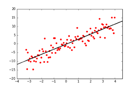
268 CHAPTER 9. LINEAR AND LOGISTIC REGRESSION
Figure 9.1: Linear regression produces the line which best fits a set of points.
9.1 Linear Regression
Given a collection of npoints, linear regression seeks to find the line which best
approximates or fits the points, as shown in Figure 9.1. There are many reasons
why we might want to do this. One class of goals involves simplification and
compression: we can replace a large set of noisy data points in the xy-plane
by a tidy line that describes them, as shown in Figure 9.1. This regression
line is useful for visualization, by showing the underlying trend in the data and
highlighting the location and magnitude of outliers.
However, we will be most interested in regression as a method for value fore-
casting. We can envision each observed point p= (x, y) to be the result of a
function y=f(x), where xrepresents the feature variables and ythe indepen-
dent target variable. Given a collection of nsuch points {p1, p2, . . . , pn}, we
seek the f(x) which best explains these points. This function f(x) interpolates
or models the points, providing a way to estimate the value y0associated with
any possible x0, namely that y0=f(x0).
9.1.1 Linear Regression and Duality
There is a connection between regression and solving linear equations, which is
interesting to explore. When solving linear systems, we seek the single point
that lies on ngiven lines. In regression, we are instead given npoints, and
we seek the line that lies on “all” points. There are two differences here: (a)
the interchange of points for lines and (b) finding the best fit under constraints
verses a totally constrained problem (“all” vs. all).
The distinction between points and lines proves trivial, because they both
are really the same thing. In two-dimensional space, both points (s, t) and lines
y=mx +bare defined by two parameters: {s, t}and {m, b}, respectively.
Further, by an appropriate duality transformation, these lines are equivalent to
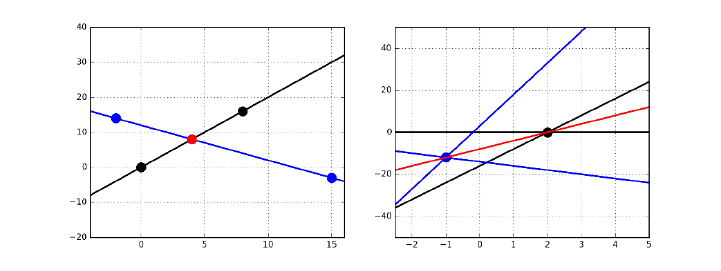
9.1. LINEAR REGRESSION 269
Figure 9.2: Points are equivalent to lines under a duality transform. The point
(4,8) in red (left) maps to the red line y= 4x−8 on right. Both sets of three
collinear points on the left correspond to three lines passing through the same
point on right.
points in another space. In particular, consider the transform that
(s, t)←→ y=sx −t.
Now any set of points that lie on a single line get mapped to a set of lines which
intersect a singular point – so finding a line that hits all of a set of points is
algorithmically the same thing as finding a point that hits all of a set of lines.
Figure 9.2 shows an example. The point of intersection in Figure 9.2 (left)
is p= (4,8), and it corresponds to the red line y= 4x−8 on the right. This
red point pis defined by the intersection of black and blue lines. In the dual
space, these lines turn into black and blue points lying on the red line. Three
collinear points on left (red with either two black or two blue) map to three
lines passing through a common point on the right: one red and two of the
same color. This duality transformation reverses the roles of points and lines in
a way that everything makes sense.
The big difference in defining linear regression is that we seek a line that
comes as close as possible to hitting all the points. We must be careful about
measuring error in the proper way in order to make this work.
9.1.2 Error in Linear Regression
The residual error of a fitted line f(x) is the difference between the predicted
and actual values. As shown in Figure 9.3, for a particular feature vector xi
and corresponding target value yi, the residual error riis defined:
ri=yi−f(xi).
This is what we will care about, but note that it is not the only way that
error might have been defined. The closest distance to the line is in fact defined
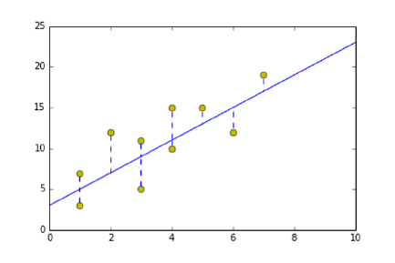
270 CHAPTER 9. LINEAR AND LOGISTIC REGRESSION
Figure 9.3: The residual error in least squares is the projection of yi−f(X)
down to X, not the shortest distance between the line and the point.
by the perpendicular-bisector through the target point. But we are seeking to
forecast the value of yifrom xi, so the residual is the right notion of error for
our purposes.
Least squares regression minimizes the sum of the squares of the residuals
of all points. This metric has been chosen because (1) squaring the residual
ignores the signs of the errors, so positive and negative residuals do not offset
each other, and (2) it leads to a surprisingly nice closed form for finding the
coefficients of the best-fitting line.
9.1.3 Finding the Optimal Fit
Linear regression seeks the line y=f(x) which minimizes the sum of the squared
errors over all the training points, i.e. the coefficient vector wthat minimizes
n
X
i=1
(yi−f(xi))2, where f(x) = w0+
m−1
X
i=1
wixi
Suppose we are trying to fit a set of npoints, each of which is mdimensional.
The first m−1 dimensions of each point is the feature vector (x1, . . . , xm−1),
with the last value y=xmserving as the target or dependent variable.
We can encode these nfeature vectors as an n×(m−1) matrix. We can
make it an n×mmatrix Aby prepending a column of ones to the matrix. This
column can be thought of as a “constant” feature, one that when multiplied by
the appropriate coefficient becomes the y-intercept of the fitted line. Further,
the ntarget values can be nicely represented in an n×1 vector b.
The optimal regression line f(x) we seek is defined by an m×1 vector of
coefficients w={w0, w1, . . . , wm−1}. Evaluating this function on these points
is exactly the product A·w, creating an n×1 vector of target value predictions.
Thus (b−A·w) is the vector of residual values.

9.1. LINEAR REGRESSION 271
How can we find the coefficients of the best fitting line? The vector wis
given by:
w= (ATA)−1ATb.
First, let’s grok this before we try to understand it. The dimensions of the
term on the right are
((m×n)(n×m))(m×n)(n×1) →(m×1).
which exactly matches the dimensions of the target vector w, so that is good.
Further, (ATA) defines the covariance matrix on the columns/features of the
data matrix, and inverting it is akin to solving a system of equations. The term
ATbcomputes the dot products of the data values and the target values for each
of the mfeatures, providing a measure of how correlated each feature is with
the target results. We don’t understand why this works yet, but it should be
clear that this equation is made up of meaningful components.
Take-Home Lesson: That the least squares regression line is defined by
w= (ATA)−1ATbmeans that solving regression problems reduces to invert-
ing and multiplying matrices. This formula works fine for small matrices, but
the gradient descent algorithm (see Section 9.4) will prove more efficient in
practice.
Consider the case of a single variable x, where we seek the best-fitting line
of the form y=w0+w1x. The slope of this line is given by
w1=
n
X
i=1
(xi−¯x)(yi−¯y)
Pn
i=1 (xi−¯x)2=rxy
σx
σy
with w0= ¯y−w1¯x, because of the nice observation that the best-fitting line
passes through (¯x, ¯y).
The connection with the correlation coefficient (rxy ) here is clear. If xwere
uncorrelated with y(rxy = 0), then w1should indeed be zero. Even if they were
perfectly correlated (rxy = 1), we must scale xto bring it into the right size
range of y. This is the role of σy/σx.
Now, where does the linear regression formula come from? It should be
clear that in the best-fitting line, we cannot change any of the coefficients w
and hope to make a better fit. This means that the error vector (b−Aw) has
to be orthogonal with the vector associated with each variable xi, or else there
would be a way to change the coefficient to fit it better.
Orthogonal vectors have dot products of zero. Since the ith column of AT
has a zero dot product with the error vector, (AT)(b−Aw) = ¯
0, where ¯
0 is a
vector of all zeros. Straightforward algebra then yields
w= (ATA)−1ATb.
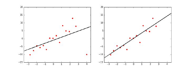
272 CHAPTER 9. LINEAR AND LOGISTIC REGRESSION
Figure 9.4: Removing outlier points (left) can result in much more meaningful
fits (right).
9.2 Better Regression Models
Given a matrix Aof npoints, each of m−1 dimensions, and an n×1 target
array b, we can invert and multiply the appropriate matrices to get the desired
coefficient matrix w. This defines a regression model. Done!
However, there are several steps one can take which can lead to better re-
gression models. Some of these involve manipulating the input data to increase
the likelihood of an accurate model, but others require more conceptual issues
of what our model should look like.
9.2.1 Removing Outliers
Linear regression seeks the line y=f(x) which minimizes the sum of the squared
errors over all training points, i.e. the coefficient vector wthat minimizes
n
X
i=1
(yi−f(xi))2, where f(x) = w0+
m−1
X
i=1
wixi
Because of the quadratic weight of the residuals, outlying points can greatly
affect the fit. A point at a distance 10 from its prediction has 100 times the
impact on training error than a point only 1 unit from the fitted line. One might
argue that this is appropriate, but it should be clear that outlier points have a
big impact in the shape of the best-fitting line. This creates a problem when
the outlier points reflect noise rather than signal, because the regression line
goes out of its way to accommodate the bad data instead of fitting the good.
We first encountered this problem back in Figure 6.3, with the Anscombe
quartet, a collection of four small data sets with identical summary statistics
and regression lines. Two of these point sets achieved their magic because of
solitary outlier points. Remove the outliers, and the fit now goes through the
heart of the data.

9.2. BETTER REGRESSION MODELS 273
Figure 9.4 shows the best-fitting regression line with (left) and without
(right) an outlier point in the lower right. The fit on the right is much bet-
ter: with an r2of 0.917 without the outlier, compared to 0.548 with the outlier.
Therefore identifying outlying points and removing them in a principled
way can yield a more robust fit. The simplest approach is to fit the entire set of
points, and then use the magnitude of the residual ri= (yi−f(xi))2to decide
whether point piis an outlier. It is important to convince yourself that these
points really represent errors before deleting them, however. Otherwise you will
be left with an impressively linear fit that works well only on the examples you
didn’t delete.
9.2.2 Fitting Non-Linear Functions
Linear relationships are easier to understand than non-linear ones, and grossly
appropriate as a default assumption in the absence of better data. Many phe-
nomena are linear in nature, with the dependent variable growing roughly pro-
portionally with the input variables:
•Income grows roughly linearly with the amount of time worked.
•The price of a home grows roughly linearly with the size of the living area
it contains.
•People’s weight increases roughly linearly with the amount of food eaten.
Linear regression does great when it tries to fit data that in fact has an
underlying linear relationship. But, generally speaking, no interesting function
is perfectly linear. Indeed, there is an old statistician’s rule that states if you
want a function to be linear, measure it at only two points.
We could greatly increase the repertoire of shapes we can model if we move
beyond linear functions. Linear regression fits lines, not high-order curves. But
we can fit quadratics by adding an extra variable with the value x2to our data
matrix, in addition to x. The model y=w0+w1x+w2x2is quadratic, but note
that it is a linear function of its non-linear input values. We can fit arbitrarily-
complex functions by adding the right higher-order variables to our data matrix,
and forming linear combinations of them. We can fit arbitrary polynomials and
exponentials/logarithms by explicitly including the right component variables
in our data matrix, such as √x, lg(x), x3, and 1/x.
Extra features can also be used to capture non-linear interactions between
pairs of input variables. The area of a rectangle Ais computed length ×width,
meaning one cannot get an accurate approximation of Aas a linear combination
of length and width. But, once we add an area feature to our data matrix, this
non-linear interaction can be captured with a linear model.
However, explicit inclusion of all possible non-linear terms quickly becomes
intractable. Adding all powers xifor 1 ≤i≤kwill blow up the data matrix by a
factor of k. Including all product pairs among nvariables is even worse, making
the matrix n(n+ 1)/2 times larger. One must be judicious about which non-
linear terms to consider for a role in the model. Indeed, one of the advantages
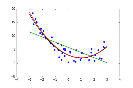
274 CHAPTER 9. LINEAR AND LOGISTIC REGRESSION
Figure 9.5: Higher-order models (red) can lead to better fits than linear models
(green).
of more powerful learning methods, like support vector machines, will be that
they can incorporate non-linear terms without explicit enumeration.
9.2.3 Feature and Target Scaling
In principle, linear regression can find the best linear model fitting any data set.
But we should do whatever we can to help it find the right model. This generally
involves preprocessing the data to optimize for expressibility, interpretability,
and numerical stability. The issue here is that features which vary over wide
numerical ranges require coefficients over similarly wide ranges to bring them
together.
Suppose we wanted to build a model to predict the gross national product
of countries in dollars, as a function of their population size x1and literacy rate
x2. Both factors seem like reasonable components of such a model. Indeed,
both factors may well contribute equally to the amount of economic activity.
But they operate on entirely different scales: national populations vary from
tens of thousands to over a billion people, while the fraction of people who can
read is, by definition, between zero and one. One might imagine the resulting
fitted model as looking somewhat like this:
GDP = $10,000x1+ $10,000,000,000,000x2.
This is very bad, for several reasons:
•Unreadable coefficients: Quick, what is the coefficient of x2in the above
equation? It is hard for us to deal with the magnitude of such numbers
(it is 10 trillion), and hard for us to tell which variable makes a more
important contribution to the result given their ranges. Is it x1or x2?
•Numerical imprecision: Numerical optimization algorithms have trouble
when values range over many orders of magnitude. It isn’t just the fact
9.2. BETTER REGRESSION MODELS 275
that floating point numbers are represented by a finite number of bits.
More important is that many machine learning algorithms get parame-
terized by constants that must hold simultaneously for all variables. For
example, using fixed step sizes in gradient descent search (to be discussed
in Section 9.4.2) might cause it to wildly overshoot in certain directions
while undershooting in others.
•Inappropriate formulations: The model given above to predict GDP is
silly on the face of it. Suppose I decide to form my own country, which
would have exactly one person in it, who could read. Do we really think
that Skienaland should have a GDP of $10,000,000,010,000?
A better model might be something like:
GDP = $20,000x1x2
which can be interpreted as each of the x1people creating wealth at a
rate modulated by their literacy. This generally requires seeding the data
matrix with the appropriate product terms. But there is a chance that
with proper (logarithmic) target scaling, this model might fall directly out
from linear regression.
We will now consider three different forms of scaling, which address these
different types of problems.
Feature Scaling: Z-Scores
We have previously discussed Z-scores, which scale the values of each feature
individually, so that the mean is zero and the ranges are comparable. Let µbe
the mean value of the given feature, and σthe standard deviation. Then the
Z-score of xis Z(x)=(x−µ)/σ.
Using Z-scores in regression addresses the question of interpretability. Since
all features will have similar means and variances, the magnitude of the co-
efficients will determine the relative importance of these factors towards the
forecast. Indeed, in proper conditions, these coefficients will reflect the corre-
lation coefficient of each variable with the target. Further, that these variables
now range over the same magnitude simplifies the work for the optimization
algorithm.
Sublinear Feature Scaling
Consider a linear model for predicting the number of years of education ythat
a child will receive as a function of household income. Education levels can
vary between 0 and 12 + 4 + 5 = 19 years, since we consider up to the possible
completion of a Ph.D. A family’s income level xcan vary between 0 and Bill
Gates. But observe that no model of the form
y=w1x+w0

276 CHAPTER 9. LINEAR AND LOGISTIC REGRESSION
can possibly give sensible answers for both my kids and Bill Gates’ kids. The
real impact of income on education level is presumably at the lower end: children
below the poverty line may not, on average, go beyond high school, while upper-
middle-class kids generally go to college. But there is no way to capture this in
a linearly-weighted variable without dooming the Gates children to hundreds or
thousands of years at school.
An enormous gap between the largest/smallest and median values means
that no coefficient can use the feature without blowup on big values. Income
level is power law distributed, and the Z-scores of such power law variables
can’t help, because they are just linear transformations. The key is to re-
place/augment such features xwith sublinear functions like log(x) and √x.
Z-scores of these transformed variables will prove much more meaningful to
build models from.
Sublinear Target Scaling
Small-scale variables need small-scale targets, in order to be realized using small-
scale coefficients. Trying to predict GDP from Z-scored variables will require
enormously large coefficients. How else could you get to trillions of dollars from
a linear combination of variables ranging from −3 to +3?
Perhaps scaling the target value from dollars to billions of dollars here would
be helpful, but there is a deeper problem. When your features are normally dis-
tributed, you can only do a good job regressing to a similarly distributed target.
Statistics like GDP are likely power law distributed: there are many small poor
countries compared to very few large rich ones. Any linear combination of
normally-distributed variables cannot effectively realize a power law-distributed
target.
The solution here is that trying to predict the logarithm (logc(y)) of a power
law target yis usually better than predicting yitself. Of course, the value cf(x)
can then be used to estimate y, but the potential now exists to make meaningful
predictions over the full range of values. Hitting a power law function with a
logarithm generally produces a better behaved, more normal distribution.
It also enables us to implicitly realize a broader range of functions. Suppose
the “right” function to predict gross domestic product was in fact
GDP = $20,000x1x2.
This could never be realized by linear regression without interaction variables.
But observe that
log(GDP ) = log($20,000x1x2) = log($20,000) + log(x1) + log(x2).
Thus the logarithms of arbitrary interaction products could be realized, provided
the feature matrix contained the logs of the original input variables as well.
9.3. WAR STORY: TAXI DERIVER 277
9.2.4 Dealing with Highly-Correlated Features
A final pitfall we will discuss is the problem of highly-correlated features. It is
great to have features that are highly correlated with the target: these enable
us to build highly-predictive models. However, having multiple features which
are highly correlated with each other can be asking for trouble.
Suppose you have two perfectly-correlated features in your data matrix, say
the subject’s height in feet (x1) as well as their height in meters (x2). Since
1 meter equals 3.28084 feet, these two variables are perfectly correlated. But
having both of these variables can’t really help our model, because adding a
perfectly correlated feature provides no additional information to make predic-
tions. If such duplicate features really had value for us, it would imply that we
could build increasingly accurate models simply by making additional copies of
columns from any data matrix!
But correlated features are harmful to models, not just neutral. Suppose
our dependent variable is a function of height. Note that equally good models
can be built dependent only on x1, or only on x2, or on any arbitrary linear
combination of x1and x2. Which is the right model to report as the answer?
This is confusing, but even worse things can happen. The rows in the co-
variance matrix will be mutually dependent, so computing w= (ATA)−1ATb
now requires inverting a singular matrix! Numerical methods for computing the
regression are liable to fail.
The solution here is to identify feature pairs which correlate excessively
strongly, by computing the appropriate covariance matrix. If they are lurking,
you can eliminate either variable with little loss of power. Better is to elimi-
nate these correlations entirely, by combining the features. This is one of the
problems solved by dimension reduction, using techniques like singular value
decomposition that we discussed in Section 8.5.1.
9.3 War Story: Taxi Deriver
I am proud of many things in my life, but perhaps most so of being a New
Yorker. I live in the most exciting city on earth, the true center of the universe.
Astronomers, at least the good ones, will tell you that each new year starts
when the ball drops in Times Square, and then radiates out from New York at
the speed of light to the rest of the world.
New York cab drivers are respected around the world for their savvy and
street smarts. It is customary to tip the driver for each ride, but there is no
established tradition of how much that should be. In New York restaurants,
the “right” amount to tip the waiter is to double the tax, but I am unaware of
any such heuristic for taxi tipping. My algorithm is to round up to the nearest
dollar and then toss in a couple of bucks depending upon how fast he got me
there. But I have always felt unsure. Am I a cheapskate? Or maybe a sucker?
The taxi data set discussed in Section 1.2.4 promised to hold the answer.
It contained over 80 million records, with fields for date, time, pickup and

278 CHAPTER 9. LINEAR AND LOGISTIC REGRESSION
drop off locations, distance traveled, fare, and of course tip. Do people pay
disproportionately for longer or shorter trips? Late at night or on weekends?
Do others reward fast drivers like I do? It should all be there in the data.
My student, Oleksii Starov, rose to the challenge. We added appropriate
features to the data set to capture some of these notions. To explicitly capture
conditions like late night and weekends, we set up binary indicator variables,
where 1 would denote that the trip was late night and 0 at some other time of
day. The coefficients of our final regression equation was:
variable LR coefficient
(intercept) 0.08370835
duration 0.00000035
distance 0.00000004
fare 0.17503086
tolls 0.06267343
surcharge 0.01924337
weekends −0.02823731
business day 0.06977724
rush hour 0.01281997
late night 0.04967453
# of passengers −0.00657358
The results here can be explained simply. Only one variable really matters:
the fare on the meter. This model tips 17.5% of the total fare, with very minor
adjustments for other things. A single parameter model tipping 18.3% of each
fare proved almost as accurate as the ten-factor model.
There were very strong correlations between the fare and both distance trav-
eled (0.95) and trip duration (0.88), but both of these factors are part of the
formula by which fares are calculated. These correlations with fare are so strong
that neither variable can contribute much additional information. To our disap-
pointment, we couldn’t really tease out an influence of time of day or anything
else, because these correlations were so weak.
A deeper look at the data revealed that every single tip in the database
was charged to a credit card, as opposed to being paid by cash. Entering
the tip amount into the meter after each cash transaction is tedious and time
consuming, particularly when you are hustling to get as many fares as possible
on each 12 hour shift. Further, real New York cabbies are savvy and street-smart
enough not to want to pay taxes on tips no one else knows about.
I always pay my fares with cash, but the people who pay by credit card are
confronted with a menu offering them the choice of what tip to leave. The data
clearly showed most of them mindlessly hitting the middle button, instead of
modulating their choice to reflect the quality of service.
Using 80 million fare records to fit a simple linear regression on ten variables
is obscene overkill. Better use of this data would be to construct hundreds or
even thousands of different models, each designed for a particular class of trips.
Perhaps we could build a separate model for trips between each pair of city zip

9.4. REGRESSION AS PARAMETER FITTING 279
codes. Indeed, recall our map of such tipping behavior, presented back in Figure
1.7.
It took several minutes for the solver to find the best fit on such a large data
set, but that it finished at all meant some algorithm faster and more robust
than matrix inversion had to be involved. These algorithms view regression as
a parameter fitting problem, as we will discuss in the next section.
9.4 Regression as Parameter Fitting
The closed form formula for linear regression, w= (ATA)−1ATb, is concise and
elegant. However, it has some issues which make it suboptimal for computation
in practice. Matrix inversion is slow for large systems, and prone to numerical
instability. Further, the formulation is brittle: the linear algebra magic here is
hard to extend to more general optimization problems.
But there is an alternate way to formulate and solve linear regression prob-
lems, which proves better in practice. This approach leads to faster algorithms,
more robust numerics, and can be readily adapted to other learning algorithms.
It models linear regression as a parameter fitting problem, and deploys search
algorithms to find the best values that it can for these parameters.
For linear regression, we seek the line that best fits the points, over all pos-
sible sets of coefficients. Specifically, we seek the line y=f(x) which minimizes
the sum of the squared errors over all training points, i.e. the coefficient vector
wthat minimizes
n
X
i=1
(yi−f(xi))2, where f(x) = w0+
m−1
X
i=1
wixi
For concreteness, let us start with the case where we are trying to model
yas a linear function of a single variable or feature x, so y=f(x) means
y=w0+w1x. To define our regression line, we seek the parameter pair (w0, w1)
which minimizes error or cost or loss, namely the sum of squares deviation
between the point values and the line.
Every possible pair of values for (w0, w1) will define some line, but we really
want the values that minimize the error or loss function J(w0, w1), where
J(w0, w1) = 1
2n
n
X
i=1
(yi−f(xi))2
=1
2n
n
X
i=1
(yi−(w0+w1xi))2
The sum of squares errors should be clear, but where does the 1/(2n) come
from? The 1/n turns this into an average error per row, and the 1/2 is a
common convention for technical reasons. But be clear that the 1/(2n) in no
way effects the results of the optimization. This multiplier will be the same for
each (w0, w1) pair, and so has no say in which parameters get chosen.
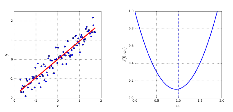
280 CHAPTER 9. LINEAR AND LOGISTIC REGRESSION
Figure 9.6: The best possible regression line y=w1x(left) can be found by
identifying the w1that minimizes the error of the fit, defined by the minima of
a convex function.
So how can we find the right values for w0and w1? We might try a bunch of
random value pairs, and keep the one which scores best, i.e. with minimum loss
J(w0, w1). But it seems very unlikely to stumble on the best or even a decent
solution. To search more systematically, we will have to take advantage of a
special property lurking within the loss function.
9.4.1 Convex Parameter Spaces
The upshot of the above discussion is that the loss function J(w0, w1) defines a
surface in (w0, w1)-space, with our interest being in the point in this space with
smallest zvalue, where z=J(w0, w1).
Let’s start by making it even simpler, forcing our regression line to pass
through the origin by setting w0= 0. This leaves us only one free parameter to
find, namely the slope of the line w1. Certain slopes will do a wildly better job
of fitting the points shown in Figure 9.6 (left) than others, with the line y=x
clearly being the desired fit.
Figure 9.6 (right) shows how the fitting error (loss) varies with w1. The
interesting thing is that the error function is shaped sort of like a parabola. It
hits a single minimum value at the bottom of the curve. The x-value of this
minimum point defines the best slope w1for the regression line, which happens
to be w1= 1.
Any convex surface has exactly one local minima. Further, for any convex
search space it is quite easy to find this minima: just keep walking in a downward
direction until you hit it. From every point on the surface, we can take a small
step to a nearby point on the surface. Some directions will take us up to a
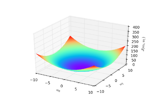
9.4. REGRESSION AS PARAMETER FITTING 281
Figure 9.7: Linear regression defines a convex parameter space, where each point
represents a possible line, and the minimum point defines the best fitting line.
higher value, but others will take us down. Provided that we can identify which
step will take us lower, we will move closer to the minima. And there always is
such direction, except when we are standing on the minimal point itself!
Figure 9.7 shows the surface we get for the full regression problem in (w0, w1)-
space. The loss function J(w0, w1) looks like a bowl with a single smallest z-
value, which defines the optimal values for the two parameters of the line. The
great thing is that this loss function J(w0, w1) is again convex, and indeed it
remains convex for any linear regression problem in any number of dimensions.
How can we tell whether a given function is convex? Remember back to when
you took calculus in one variable, x. You learned how to take the derivative
f0(x) of a function f(x), which corresponds to the value of the slope of the
surface of f(x) at every point. Whenever this derivative was zero, it meant
that you had hit some point of interest, be it a local maxima or a minima.
Recall the second derivative f00(x), which was the derivative function of the
derivative f0(x). Depending upon the sign of this second derivative f00(x), you
could identify whether you hit a maxima or minima.
Bottom line: the analysis of such derivatives can tell us which functions
are and are not convex. We will not delve deeper here. But once it has been
established that our loss function is convex, we know that we can trust a proce-
dure like gradient descent search, which gets us to the global optima by walking
downward.
9.4.2 Gradient Descent Search
We can find the minima of a convex function simply by starting at an arbitrary
point, and repeatedly walking in a downward direction. There is only one point
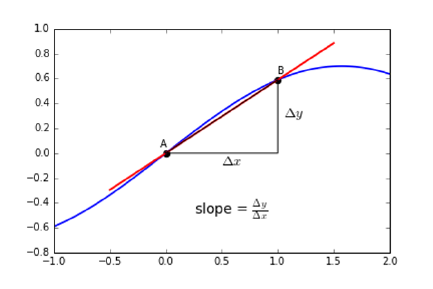
282 CHAPTER 9. LINEAR AND LOGISTIC REGRESSION
Figure 9.8: The tangent line approximates the derivative at a point.
where there is no way down: the global minima itself. And it is this point that
defines the parameters of the best fitting regression line.
But how can we find a direction that leads us down the hill? Again, let’s
consider the single variable case first, so we seek the slope w1of the best-fitting
line where w0= 0. Suppose our current slope candidate is x0. In this restrictive
one-dimensional setting, we can only move to the left or to the right. Try a
small step in each direction, i.e. the values x0−and x0+. If the value
of J(0, x0−)< J(0, x0), then we should move to the left to go down. If
J(0, x0+)< J(0, x0), then we should move to the right. If neither is true,
it means that we have no place to go to reduce J, so we must have found the
minima.
The direction down at f(x0) is defined by the slope of the tangent line at
this point. A positive slope means that the minima must lie on the left, while
a negative slope puts it on the right. The magnitude of this slope describes the
steepness of this drop: by how much will J(0, x0−) differ from J(0, x0)?
This slope can be approximated by finding the unique line which passes
through points (x0, J(0, x0)) and (x0, J(0, x0−)), as shown in Figure 9.8. This
is exactly what is done in computing the derivative, which at each point specifies
the tangent to the curve.
As we move beyond one dimension, we gain the freedom to move in a greater
range of directions. Diagonal moves let us cut across multiple dimensions at
once. But in principle, we can get the same effect by taking multiple steps, along
each distinct dimension in an axis-oriented direction. Think of the Manhattan
street grid, where we can get anywhere we want by moving in a combination of
north–south and east–west steps. Finding these directions requires computing
the partial derivative of the objective function along each dimension, namely:

9.4. REGRESSION AS PARAMETER FITTING 283
Gradient descent search in two dimensions
Repeat until convergence {
wt+1
0:= wt
0−α∂
∂w0
Jwt
0, wt
1
wt+1
1:= wt
1−α∂
∂w1
Jwt
0, wt
1
}
Figure 9.9: Pseudocode for regression by gradient descent search. The variable
tdenotes the iteration number of the computation.
∂
∂wj
=2
∂wj
1
2n
n
X
i=1
(f(xi)−bi)2
=2
∂wj
1
2n
n
X
i=1
(w0+ (w1xi)−bi)2
But zig-zagging along dimensions seems slow and clumsy. Like Superman,
we want to leap buildings in a single bound. The magnitude of the partial
derivatives defines the steepness in each direction, and the resulting vector (say
three steps west for every one step north) defines the fastest way down from
this point.
9.4.3 What is the Right Learning Rate?
The derivative of the loss function points us in the right direction to walk towards
the minima, which specifies the parameters to solve our regression problem. But
it doesn’t tell us how far to walk. The value of this direction decreases with
distance. It is indeed true that the fastest way to drive to Miami from New York
is to head south, but at some point you will need more detailed instructions.
Gradient descent search operates in rounds: find the best direction, take a
step, and then repeat until we hit the target. The size of our step is called the
learning rate, and it defines the speed with which we find the minima. Taking
tiny baby steps and repeatedly consulting the map (i.e. partial derivatives) will
indeed get us there, but only very slowly.
However, bigger isn’t always better. If the learning rate is too high, we might
jump past the minima, as shown in Figure 9.10 (right). This might mean slow
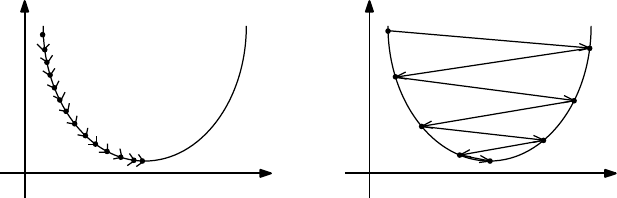
284 CHAPTER 9. LINEAR AND LOGISTIC REGRESSION
θ1θ1
I(θ1)I(θ1)
Figure 9.10: The effect of learning rate/step size. Taking too small a step size
requires many iterations to converge, while too large a step size causes us to
overshoot the minima.
progress towards the hole as we bounce past it on each step, or even negative
progress as we end up at a value of J(w) higher than where we were before.
In principle, we want a large learning rate at the beginning of our search, but
one which decreases as we get closer to our goal. We need to monitor the value
of our loss function over the course of the optimization. If progress becomes
too slow, we can increase the step size by a multiplicative factor (say 3) or give
up: accepting the current parameter values for our fitting line as good enough.
But if the value of J(w) increases, it means that we have overshot our goal.
Thus our step size was too large, so we should decrease the learning rate by a
multiplicative factor: say by 1/3.
The details of this are messy, heuristic, and ad hoc. But fortunately library
functions for gradient descent search have built-in algorithms for adjusting the
learning rate. Presumably these algorithms have been highly tuned, and should
generally do what they are supposed to do.
But the shape of the surface makes a big difference as to how successfully
gradient descent search finds the global minimum. If our bowl-shaped surface
was relatively flat, like a plate, the truly lowest point might be obscured by a
cloud of noise and numerical error. Even if we do eventually find the minima,
it might take us a very long time to get there.
However, even worse things happen when our loss function is not convex,
meaning there can be many local minima, as in Figure 9.11. Now this can’t
be the case for linear regression, but does happen for many other interesting
machine learning problems we will encounter.
Local optimization can easily get stuck in local minima for non-convex func-
tions. Suppose we want to reach the top of a ski slope from our lodge in the
valley. If we start by walking up to the second floor of the lodge, we will get
trapped forever, unless there is some mechanism for taking steps backwards to
free us from the local optima. This is the value of search heuristics like sim-
ulated annealing, which provides a way out of small local optima to keep us
advancing towards the global goal.
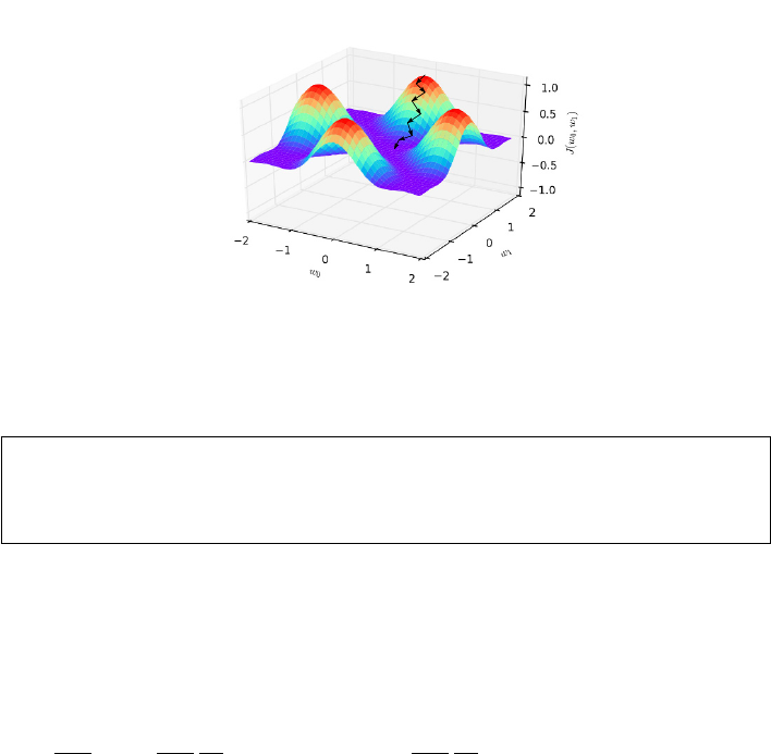
9.4. REGRESSION AS PARAMETER FITTING 285
Figure 9.11: Gradient descent search finds local minima for non-convex surfaces,
but does not guarantee a globally optimum solution.
Take-Home Lesson: Gradient descent search remains useful in practice for non-
convex optimization, although it no longer guarantees an optimal solution.
Instead, we should start repeatedly from different initialization points, and use
the best local minima we find to define our solution.
9.4.4 Stochastic Gradient Descent
The algebraic definition of our loss function hides something very expensive
going on:
∂
∂wj
=2
∂wj
1
2n
n
X
i=1
(f(xi)−bi)2=2
∂wj
1
2n
n
X
i=1
(w0+ (w1xi)−bi)2
It’s that summation. To compute the best direction and rate of change for
each dimension j, we must cycle through all nof our training points. Evaluating
each partial derivative takes time linear in the number of examples, for each
step! For linear regression on our lavish taxicab data set, this means 80 million
squared-difference computations just to identify the absolute best direction to
advance one step towards the goal.
This is madness. Instead, we can try an approximation that uses only a small
number of examples to estimate the derivative, and hopes that the resulting
direction indeed points down. On average it should, since every point will
eventually get to vote on direction.
Stochastic gradient descent is an optimization approach based on sampling
a small batch of training points, ideally at random, and using them to estimate
the derivative at our current position. The smaller the batch size we use, the
faster the evaluation is, although we should be more skeptical that the estimated
direction is correct. Optimizing the learning rate and the batch size for gradient
286 CHAPTER 9. LINEAR AND LOGISTIC REGRESSION
descent leads to very fast optimization for convex functions, with the details
blessedly concealed by a call to a library function.
It can be expensive to make random choices at every step of the search. Bet-
ter is to randomize the order of the training examples once, to avoid systematic
artifacts in how they are presented, and then build our batches by simply march-
ing down the list. This way we can insure that all nof our training instances
eventually do contribute to the search, ideally several times as we repeatedly
sweep through all examples over the course of optimization.
9.5 Simplifying Models through Regularization
Linear regression is happy to determine the best possible linear fit to any collec-
tion of ndata points, each specified by m−1 independent variables and a given
target value. But the “best” fit may not be what we really want.
The problem is this. Most of the m−1 possible features may be uncorrelated
with the target, and thus have no real predictive power. Typically, these will
show as variables with small coefficients. However, the regression algorithm
will use these values to nudge the line so as to reduce least square error on the
given training examples. Using noise (the uncorrelated variables) to fit noise
(the residual left from a simple model on the genuinely correlated variables) is
asking for trouble.
Representative here is our experience with the taxi tipping model, as detailed
in the war story. The full regression model using ten variables had a mean
squared error of 1.5448. The single-variable regression model operating only
on fare did slightly worse, with an error of 1.5487. But this difference is just
noise. The single variable model is obviously better, by Occam’s or anybody
else’s razor.
Other problems arise when using unconstrained regression. We have seen
how strongly correlated features introduce ambiguity into the model. If features
Aand Bare perfectly correlated, using both yields the same accuracy as using
either one, resulting in more complicated and less interpretable models.
Providing a rich set of features to regression is good, but remember that “the
simplest explanation is best.” The simplest explanation relies on the smallest
number of variables that do a good job of modeling the data. Ideally our regres-
sion would select the most important variables and fit them, but the objective
function we have discussed only tries to minimize sum of squares error. We need
to change our objective function, through the magic of regularization.
9.5.1 Ridge Regression
Regularization is the trick of adding secondary terms to the objective function
to favor models that keep coefficients small. Suppose we generalize our loss
function with a second set of terms that are a function of the coefficients, not

9.5. SIMPLIFYING MODELS THROUGH REGULARIZATION 287
the training data:
J(w) = 1
2n
n
X
i=1
(yi−f(xi))2+λ
m
X
j=1
w2
j
In this formulation, we pay a penalty proportional to the sum of squares
of the coefficients used in the model. By squaring the coefficients, we ignore
sign and focus on magnitude. The constant λmodulates the relative strength
of the regularization constraints. The higher λis, the harder the optimization
will work to reduce coefficient size, at the expense of increased residuals. It
eventually becomes more worthwhile to set the coefficient of an uncorrelated
variable to zero, rather than use it to overfit the training set.
Penalizing the sum of squared coefficients, as in the loss function above, is
called ridge regression or Tikhonov regularization. Assuming that the depen-
dent variables have all been properly normalized to mean zero, their coefficient
magnitude is a measure of their value to the objective function.
How can we optimize the parameters for ridge regression? A natural exten-
sion to the least squares formulation does the job. Let Γ be our n×n“coefficient
weight penalty” matrix. For simplicity, let Γ = I, the identity matrix. The sum-
of-squares loss function we seek to minimize then becomes
||Aw −b||2+||λΓw||2
The notation ||v|| denotes the norm of v, a distance function on a vector or
matrix. The norm of ||Γw||2is exactly the sum of squares of the coefficients
when Γ = I. Seen this way, the closed form to optimize for wis believable as
w= (ATA+λΓTΓ)−1ATb.
Thus the normal form equation can be generalized to deal with regular-
ization. But, alternately, we can compute the partial derivatives of this loss
function and use gradient descent search to do the job faster on large matri-
ces. In any case, library functions for ridge regression and its cousin LASSO
regression will be readily available to use on your problem.
9.5.2 LASSO Regression
Ridge regression optimizes to select small coefficients. Because of sum-of-squares
cost function, it particularly punishes the largest coefficients. This makes it
great to avoid models of the form y=w0+w1x1, where w0is a large positive
number and w1an offsetting large negative number.
Although ridge regression is effective at reducing the magnitude of the co-
efficients, this criteria does not really push them to zero and totally eliminate
the variable from the model. An alternate choice here is to try to minimize the
sum of the absolute values of the coefficients, which is just as happy to drive
down the smallest coefficients as the big ones.

288 CHAPTER 9. LINEAR AND LOGISTIC REGRESSION
LASSO regression (for “Least Absolute Shrinkage and Selection Operator”)
meets this criteria: minimizing the L1metric on the coefficients instead of the
L2metric of ridge regression. With LASSO, we specify an explicit constraint t
as to what the sum of the coefficients can be, and the optimization minimizes
the sum of squares error under this constraint:
J(w, t) = 1
2n
n
X
i=1
(yi−f(xi))2subject to
m
X
j=1 |wj| ≤ t.
Specifying a smaller value of ttightens the LASSO, further constraining the
magnitudes of the coefficients w.
As an example of how LASSO zeros out small coefficients, observe what it
did to the taxi tipping model for a particular value of t:
variable LR coefficient LASSO
(intercept) 0.08370835 0.079601141
duration 0.00000035 0.00000035
distance 0.00000004 0.00000004
fare 0.17503086 0.17804921
tolls 0.06267343 0.00000000
surcharge 0.01924337 0.00000000
weekends −0.02823731 0.00000000
business day 0.06977724 0.00000000
rush hour 0.01281997 0.00000000
late night 0.04967453 0.00000000
# of passengers −0.00657358 0.00000000
As you can see, LASSO zeroed out most of the coefficients, resulting in
a simpler and more robust model, which fits the data almost as well as the
unconstrained linear regression.
But why does LASSO actively drive coefficients to zero? It has to do with
the shape of the circle of the L1metric. As we will see in Figure 10.2, the
shape of the L1circle (the collection of points equidistant from the origin) is
not round, but has vertices and lower-dimensional features like edges and faces.
Constraining our coefficients wto lie on the surface of a radius-t L1circle means
it is likely to hit one of these lower-dimensional features, meaning the unused
dimensions get zero coefficients.
Which works better, LASSO or ridge regression? The answer is that it de-
pends. Both methods should be supported in your favorite optimization library,
so try each of them and see what happens.
9.5.3 Trade-Offs between Fit and Complexity
How do we set the right value for our regularization parameter, be it λor
t? Using a small-enough λor a large-enough tprovides little penalty against
selecting the coefficients to minimize training error. By contrast, using a very
large λor very small tensures small coefficients, even at the cost of substantial
9.6. CLASSIFICATION AND LOGISTIC REGRESSION 289
modeling error. Tuning these parameters enables us to seek the sweet spot
between over and under-fitting.
By optimizing these models over a large range of values for the appropriate
regularization parameter t, we get a graph of the evaluation error as a function
of t. A good fit to the training data with few/small parameters is more robust
than a slightly better fit with many parameters.
Managing this trade-off is largely a question of taste. However, several met-
rics have been developed to help with model selection. Most prominent are
the Akaike Information Criteria (AIC) and the Baysian Information Criteria
(BIC). We will not delve deeper than their names, so it is fair for you to think of
these metrics as voodoo at this point. But your optimization/evaluation system
may well output them for the fitted models they produce, providing a way to
compare models with different numbers of parameters.
Even though LASSO/ridge regression punishes coefficients based on magni-
tude, they do not explicitly set them to zero if you want exactly kparameters.
You must be the one to remove useless variables from your model. Automatic
feature-selection methods might decide to zero-out small coefficients, but ex-
plicitly constructing models from all possible subsets of features is generally
computationally infeasible.
The features to be removed first should be those with (a) small coefficients,
(b) low correlation with the objective function, (c) high correlation with another
feature in the model, and (d) no obvious justifiable relationship with the target.
For example, a famous study once showed a strong correlation between the
U.S. gross national product and the annual volume of butter production in
Bangladesh. The sage modeler can reject this variable as ridiculous, in ways
that automated methods cannot.
9.6 Classification and Logistic Regression
We are often faced with the challenge of assigning items the right label according
to a predefined set of classes:
•Is the vehicle in the image a car or a truck? Is a given tissue sample
indicative of cancer, or is it benign?
•Is a particular piece of email spam, or personalized content of interest to
the user?
•Social media analysis seeks to identify properties of people from associated
data. Is a given person male or female? Will they tend to vote Democrat
or Republican?
Classification is the problem of predicting the right label for a given input
record. The task differs from regression in that labels are discrete entities, not
continuous function values. Trying to pick the right answer from two possibilities
might seem easier than forecasting open-ended quantities, but it is also a lot
easier to get dinged for being wrong.
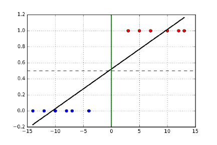
290 CHAPTER 9. LINEAR AND LOGISTIC REGRESSION
Figure 9.12: The optimal regression line cuts through the classes, even though
a perfect separator line (x= 0) exists.
In this section, approaches to building classification systems using linear
regression will be developed, but this is just the beginning. Classification is
a bread-and-butter problem in data science, and we will see several other ap-
proaches over the next two chapters.
9.6.1 Regression for Classification
We can apply linear regression to classification problems by converting the class
names of training examples to numbers. For now, let’s restrict our attention to
two class problems, or binary classification. We will generalize this to multi-class
problems in Section 9.7.2.
Numbering these classes as 0/1 works fine for binary classifiers. By conven-
tion, the “positive” class gets 0 and the “negative” one 1:
•male=0 / female=1
•democrat=0 / republican=1
•spam=1 / non-spam=0
•cancer=1 / benign=0
The negative/1 class generally denotes the rarer or more special case. There
is no value judgment intended here by positive/negative: indeed, when the
classes are of equal size the choice is made arbitrarily.
We might consider training a regression line f(x) for our feature vector x
where the target values are these 0/1 labels, as shown in Figure 9.12. There
is some logic here. Instances similar to positive training examples should get
lower scores than those closer to negative instances. We can threshold the value
returned by f(x) to interpret it as a label: f(x)≤0.5 means that xis positive.
When f(x)>0.5 we instead assign the negative label.
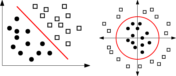
9.6. CLASSIFICATION AND LOGISTIC REGRESSION 291
X1
X2
X1
X2
Figure 9.13: A separating line partitions two classes in feature space (left).
However, non-linear separators are better at fitting certain training sets (right).
But there are problems with this formulation. Suppose we add a number
of “very negative” examples to the training data. The regression line will tilt
towards these examples, putting the correct classification of more marginal ex-
amples at risk. This is unfortunate, because we would have already properly
classified these very negative points, anyway. We really want the line to cut
between the classes and serve as a border, instead of through these classes as a
scorer.
9.6.2 Decision Boundaries
The right way to think about classification is as carving feature space into
regions, so that all the points within any given region are destined to be assigned
the same label. Regions are defined by their boundaries, so we want regression
to find separating lines instead of a fit.
Figure 9.13 (left) shows how training examples for binary classification can be
viewed as colored points in feature space. Our hopes for accurate classification
rest on regional coherence among the points. This means that nearby points
tend to have similar labels, and that boundaries between regions tend to be
sharp instead of fuzzy.
Ideally, our two classes will be well-separated in feature space, so a line can
easily partition them. But more generally, there will be outliers. We need to
judge our classifier by the “purity” of the resulting separation, penalizing the
misclassification of points which lie on the wrong side of the line.
Any set of points can be perfectly partitioned, if we design a complicated-
enough boundary that swerves in and out to capture all instances with a given
label. See Figure 9.14. Such complicated separators usually reflect overfitting
the training set. Linear separators offer the virtue of simplicity and robustness
and, as we will see, can be effectively constructed using logistic regression.
More generally, we may be interested in non-linear but low-complexity de-
cision boundaries, if they better separate the class boundaries. The ideal sep-
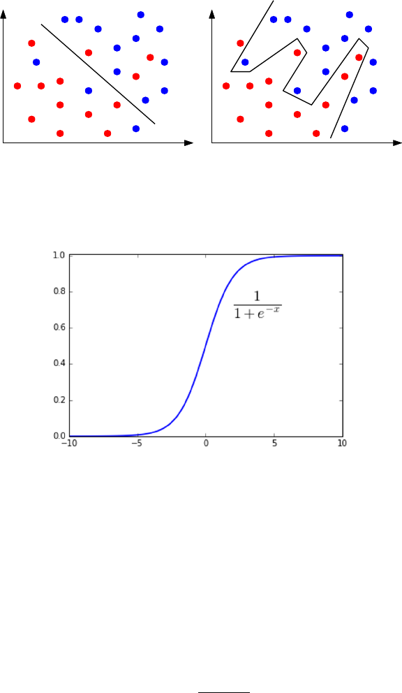
292 CHAPTER 9. LINEAR AND LOGISTIC REGRESSION
Figure 9.14: Linear classifiers cannot always separate two classes (left). How-
ever, perfect separation achieved using complex boundaries usually reflects over-
fitting more than insight (right).
Figure 9.15: The logit function maps a score to a probability.
arating curve in Figure 9.13 (right) is not a line, but a circle. However, it can
be found as a linear function of quadratic features like x2
1and x1x2. We can
use logistic regression to find non-linear boundaries if the data matrix is seeded
with non-linear features, as discussed in Section 9.2.2.
9.6.3 Logistic Regression
Recall the logit function f(x), which we introduced back in Section 4.4.1:
f(x) = 1
1 + e−cx
This function takes as input a real value −∞ ≤ x≤ ∞, and produces a value
ranging over [0,1], i.e. a probability. Figure 9.15 plots the logit function f(x),
which is a sigmoidal curve: flat at both sides but a steep rise in the middle.

9.6. CLASSIFICATION AND LOGISTIC REGRESSION 293
The shape of the logit function makes it particularly suited to the interpre-
tation of classification boundaries. In particular, let xbe a score that reflects
the distance that a particular point plies above/below or left/right of a line l
separating two classes. We want f(x) to measure the probability that pdeserves
a negative label.
The logit function maps scores into probabilities using only one parameter.
The important cases are those at the midpoint and endpoints. Logit says that
f(0) = 1/2, meaning that the label of a point on the boundary is essentially a
coin toss between the two possibilities. This is as it should be. More unam-
biguous decisions can be made the greater our distance from this boundary, so
f(∞) = 1 and f(−∞) = 0.
Our confidence as a function of distance is modulated by the scaling constant
c. A value of cnear zero makes for a very gradual transition from positive to
negative. In contrast, we can turn the logit into a staircase by assigning a large
enough value to c, meaning that small distances from the boundary translate
into large increases in confidence of classification.
We need three things to use the logit function effectively for classification:
•Extending f(x) beyond a single variable, to a full (m−1)-dimensional
input vector x.
•The threshold value tsetting the midpoint of our score distribution (here
zero).
•The value of the scaling constant cregulating the steepness of the transi-
tion.
We can achieve all three by fitting a linear function h(x, w) to the data,
where
h(x, w) = w0+
m−1
X
i=1
wi·xi
which can then be plugged into the logistic function to yield the classifier:
f(x) = 1
1 + e−h(x,w)
Note that the coefficients of h(x, w) are rich enough to encode the threshold (t=
w0) and steepness (cis essentially the average of w1through wn−1) parameters.
The only remaining question is how to fit the coefficient vector wto the
training data. Recall that we are given a zero/one class label yifor each input
vector xi, where 1 ≤i≤n. We need a penalty function that ascribes appropriate
costs to returning f(xi) as the probability that the class yiis positive, i.e. yi= 1.
Let us first consider the case where yireally is 1. Ideally f(xi) = 1 in this
case, so we want to penalize it for being smaller than 1. Indeed, we want to
punish it aggressively when f(yi)→0, because that means that the classifier is
stating that element ihas little chance of being in class-1, when that actually
is the case.

294 CHAPTER 9. LINEAR AND LOGISTIC REGRESSION
Figure 9.16: Cost penalties for positive (blue) and negative (right) elements.
The penalty is zero if the correct label is assigned with probability 1, but in-
creasing as a function of misplaced confidence.
The logarithmic function cost(xi,1) = −log(f(xi)) turns out to be a good
penalty function when yi= 1. Recall the definition of the logarithm (or inverse
exponential function) from Section 2.4, namely that
y= logbx→by=x.
As shown in Figure 9.16, log(1) = 0 for any reasonable base, so zero penalty is
charged when f(xi) = 1, which is as it should be for correctly identifying yi= 1.
Since blogbx=x, log(x)→ −∞ as x→0. This makes cost(xi,1) = −log(f(xi))
an increasingly severe penalty the more we misclassify yi.
Now consider the case where yi= 0. We want to punish the classifier for
high values of f(xi), i.e. more as f(xi)→1. A little reflection should convince
you that the right penalty is now cost(xi,0) = −log(1 −f(xi)).
To tie these together, note what happens when we multiply cost(xi,1) times
yi. There are only two possible values, namely yi= 0 or yi= 1. This has the
desired effect, because the penalty is zeroed out in the case where it does not
apply. Similarly, multiplying by (1 −yi) has the opposite effect: zeroing out the
penalty when yi= 1, and applying it when yi= 0. Multiplying the costs by the
appropriate indicator variables enables us to define the loss function for logistic
regression as an algebraic formula:
J(w) = 1
n
n
X
i=1
cost(f(xi, w), yi)
=−1
n[
n
X
i=1
yilog f(xi, w) + (1 −yi) log(1 −f(xi, w))]
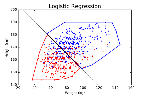
9.7. ISSUES IN LOGISTIC CLASSIFICATION 295
Figure 9.17: The logistic regression classifier best separating men and women
in weight–height space. The red region contains 229 women and only 63 men,
while the blue region contains 223 men to 65 women.
The wonderful thing about this loss function is that it is convex, meaning
that we can find the parameters wwhich best fit the training examples using
gradient descent. Thus we can use logistic regression to find the best linear
separator between two classes, providing a natural approach to binary classifi-
cation.
9.7 Issues in Logistic Classification
There are several nuances to building effective classifiers, issues which are rel-
evant both to logistic regression and the other machine learning methods that
we will explore over the next two chapters. These include managing unbalanced
class sizes, multi-class classification, and constructing true probability distribu-
tions from independent classifiers.
9.7.1 Balanced Training Classes
Consider the following classification problem, which is of great interest to law
enforcement agencies in any country. Given the data you have on a particular
person p, decide whether pis a terrorist or is no particular threat.
The quality of the data available to you will ultimately determine the ac-
curacy of your classifier, but regardless, there is something about this problem
that makes it very hard. It is the fact that there are not enough terrorists
available in the general population.
296 CHAPTER 9. LINEAR AND LOGISTIC REGRESSION
In the United States, we have been blessed with general peace and security.
It would not surprise me if there were only 300 or so genuine terrorists in the
entire country. In a country of 300 million people, this means that only one out
of every million people are active terrorists.
There are two major consequences of this imbalance. The first is that any
meaningful classifier is doomed to have a lot of false positives. Even if our
classifier proved correct an unheard of 99.999% of the time, it would classify
3,000 innocent people as terrorists, ten times the number of bad guys we will
catch. Similar issues were discussed in Section 7.4.1, concerning precision and
recall.
But the second consequence of this imbalance is that there cannot be many
examples of actual terrorists to train on. We might have tens of thousands
of innocent people to serve as positive/class-0 examples, but only a few dozen
known terrorists to be negative/class-1 training instances.
Consider what the logistic classifier is going to do in such an instance. Even
misclassifying all of the terrorists as clean cannot contribute too much to the
loss function, compared with the cost of how we treat the bigger class. It is
more likely to draw a separating line to clear everybody than go hunting for
terrorists. The moral here is that it is generally best to use equal numbers of
positive and negative examples.
But one class may be hard to find examples for. So what are our options to
produce a better classifier?
•Force balanced classes by discarding members of the bigger class: This
is the simplest way to realize balanced training classes. It is perfectly
justified if you have enough rare-class elements to build a respectable
classifier. By discarding the excess instances we don’t need, we create a
harder problem that does not favor the majority class.
•Replicate elements of the smaller class, ideally with perturbation: A sim-
ple way to get more training examples is to clone the terrorists, inserting
perfect replicas of them into the training set under different names. These
repeated examples do look like terrorists, after all, and adding enough of
them will make the classes balanced.
This formulation is brittle, however. These identical data records might
create numerical instabilities, and certainly have a tendency towards over-
fitting, since moving one extra real terrorist to the right side of the bound-
ary moves all her clones as well. It might be better to add a certain amount
of random noise to each cloned example, consistent with variance in the
general population. This makes the classifier work harder to find them,
and thus minimizes overfitting.
•Weigh the rare training examples more heavily than instances of the bigger
class: The loss function for parameter optimization contains a separate
term for the error of each training instance. Adding a coefficient to ascribe
more weight to the most important instances leaves a convex optimization
problem, so it can still be optimized by stochastic gradient descent.
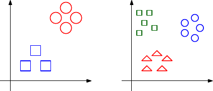
9.7. ISSUES IN LOGISTIC CLASSIFICATION 297
X2
X1
Binary classification
X2
X1
Multi-class classification
Figure 9.18: Multi-class classification problems are a generalization of binary
classification.
The problem with all three of these solutions is that we bias the classifier, by
changing the underlying probability distribution. It is important for a classifier
to know that terrorists are extremely rare in the general population, perhaps
by specifying a Baysian prior distribution.
Of course the best solution would be to round up more training examples
from the rarer class, but that isn’t always possible. These three techniques are
about the best we can muster as an alternative.
9.7.2 Multi-Class Classification
Often classification tasks involve picking from more than two distinct labels.
Consider the problem of identifying the genre of a given movie. Logical possi-
bilities include drama,comedy,animation,action,documentary, and musical.
A natural but misguided approach to represent k-distinct classes would add
class numbers beyond 0/1. In a hair-color classification problem, perhaps we
could assign blond = 0, brown = 1, red = 2, black = 4, and so on until we
exhaust human variation. Then we could perform a linear regression to predict
class number.
But this is generally a bad idea. Ordinal scales are defined by either increas-
ing or decreasing values. Unless the ordering of your classes reflects an ordinal
scale, the class numbering will be a meaningless target to regress against.
Consider the hair-color numbering above. Should red hair lie between brown
and black (as currently defined), or between blond and brown? Is grey hair a
lighter shade of blond, say class −1, or is it an incomparable condition due
principally to aging? Presumably the features that contribute to grey hair (age
and the number of teen-age children) are completely orthogonal to those of
blond hair (hair salon exposure and Northern European ancestry). If so, there
is no way a linear regression system fitting hair color as a continuous variable
would be destined to separate these colors out from darker hair.
Certain sets of classes are properly defined by ordinal scales. For example,
consider classes formed when people grade themselves on survey questions like
“Skiena’s class is too much work” or “How many stars do you give this movie?”
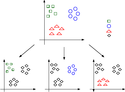
298 CHAPTER 9. LINEAR AND LOGISTIC REGRESSION
X2
X1
X2
X1
X2
X1
X2
X1
Class 1:
Class 2:
Class 3:
Others:
Figure 9.19: Voting among multiple one-vs.-rest classifiers is generally the best
way to do multi-class classification.
Completely Agree ↔Mostly Agree ↔Neutral ↔Mostly Disagree ↔Completely Disagree
Four stars ↔Three stars ↔Two stars ↔One stars ↔Zero stars
Classes defined by such Likert scales are ordinal, and hence such class num-
bers are a perfectly reasonable thing to regress against. In particular, mistak-
enly assigning an element to an adjacent class is much less of a problem than
assigning it to the wrong end of the scale.
But generally speaking, class labels are not ordinal. A better idea for multi-
class discrimination involves building many one-vs.-all classifiers, as shown in
Figure 9.19. For each of the possible classes Ci, where 1 ≤i≤c, we train a
logistic classifier to distinguish elements of Ciagainst the union of elements from
all other classes combined. To identify the label associated with a new element
x, we test it against all cof these classifiers, and return the label iwhich has
the highest associated probability.
This approach should seem straightforward and reasonable, but note that
the classification problem gets harder the more classes you have. Consider the
monkey. By flipping a coin, a monkey should be able to correctly label 50% of
the examples in any binary classification problem. But now assume there are
a hundred classes. The monkey will only guess correctly 1% of the time. The
task is now very hard, and even an excellent classifier will have a difficult time
producing good results on it.
9.7.3 Hierarchical Classification
When your problem contains a large number of classes, it pays to group them
into a tree or hierarchy so as to improve both accuracy and efficiency. Suppose
9.7. ISSUES IN LOGISTIC CLASSIFICATION 299
we built a binary tree, where each individual category is represented by a leaf
node. Each internal node represents a classifier for distinguishing between the
left descendants and the right descendants.
To use this hierarchy to classify a new item x, we start at the root. Running
the root classifier on xwill specify it as belonging to either the left or right
subtree. Moving down one level, we compare xwith the new node’s classifier
and keep recurring until we hit a leaf, which defines the label assigned to x.
The time it takes is proportional to the height of the tree, ideally logarithmic
in the number of classes c, instead of being linear in cif we explicitly compare
against every class. Classifiers based on this approach are called decision trees,
and will be discussed further in Section 11.2.
Ideally this hierarchy can be built from domain knowledge, ensuring that
categories representing similar classes are grouped together. This has two ben-
efits. First, it makes it more likely that misclassifications will still produce
labels from similar classes. Second, it means that intermediate nodes can define
higher-order concepts, which can be more accurately recognized. Suppose that
the one hundred categories in a image classification problem included “car,”
“truck,” “boat,” and “bicycle”. When all of these categories are descendants of
an intermediate node called “vehicle,” we can interpret the path to this node as
a lower-resolution, higher-accuracy classifier.
There is another, independent danger with classification that becomes more
acute as the number of classes grows. Members of certain classes (think “college
students”) are much more plentiful than others, like “rock stars.” The relative
disparity between the size of the largest and smallest classes typically grows
along with number of classes.
For this example, let’s agree that “rock stars” tend to be sullen, grungy-
looking males, providing useful features for any classifier. However, only a
small fraction of sullen, grungy-looking males are rock stars, because there are
extremely few people who have succeeded in this demanding profession. Clas-
sification systems which do not have a proper sense of the prior distribution on
labels are doomed having many false positives, by assigning rare labels much
too frequently.
This is the heart of Baysian analysis: updating our current (prior) under-
standing of the probability distribution in the face of new evidence. Here, the
evidence is the result is from a classifier. If we incorporate a sound prior distri-
bution into our reasoning, we can ensure that items require particularly strong
evidence to be assigned to rare classes.
9.7.4 Partition Functions and Multinomial Regression
Recall that our preferred means of multi-class classification involved training
independent single-class vs. all logistic classifiers Fi(x), where 1 ≤i≤cand c
is the number of distinct labels. One minor issue remains. The probabilities we
get from logistic regression aren’t really probabilities. Turning them into real
probabilities requires the idea of a partition function.

300 CHAPTER 9. LINEAR AND LOGISTIC REGRESSION
For any particular item x, summing up the “probabilities” over all possible
labels for xshould yield T= 1, where
T=
c
X
i=1
Fi(x).
But should doesn’t mean is. All of these classifiers were trained independently,
and hence there is nothing forcing them to sum to T= 1.
A solution is to divide all of these probabilities by the appropriate constant,
namely F0(x) = F(x)/T . This may sound like a kludge, because it is. But this
is essentially what physicists do when they talk about partition functions, which
serve as denominators turning something proportional to probabilities into real
probabilities.
Multinomial regression is a more principled method of training independent
single-class vs. all classifiers, so that the probabilities work out right. This
involves using the correct partition function for log odds ratios, which are com-
puted with exponentials of the resulting values. More than this I will not say,
but it is reasonable to look for a multinomial regression function in your favorite
machine learning library and see how it does when faced with a multi-class re-
gression problem.
A related notion to the partition function arises in Baysian analysis. We are
often faced with a challenge of identifying the most likely item label, say A, as
a function of evidence E. Recall that Bayes’ theorem states that
P(A|E) = P(E|A)P(A)
P(E)
Computing this as a real probability requires knowing the denominator P(E),
which can be a murky thing to compute. But comparing P(A|E) to P(B|E) in
order to determine whether label Ais more likely than label Bdoes not require
knowing P(E), since it is the same in both expressions. Like a physicist, we can
waive it away, mumbling about the “partition function.”
9.8 Chapter Notes
Linear and logistic regression are standard topics in statistics and optimization.
Textbooks on linear/logistic regression and its applications include [JWHT13,
Wei05].
The treatment of the gradient descent approach to solving regression here
was inspired by Andrew Ng, as presented in his Coursera machine learning
course. I strongly recommend his video lectures to those interested in a more
thorough treatment of the subject.
The discovery that butter production in Bangladesh accurately forecasted
the S&P 500 stock index is due to Leinweber [Lei07]. Unfortunately, like most
spurious correlations it broke down immediately after its discovery, and no
longer has predictive power.
9.9. EXERCISES 301
9.9 Exercises
Linear Regression
9-1. [3] Construct an example on n≥6 points where the optimal regression line is
y=x, even though none of the input points lie directly on this line.
9-2. [3] Suppose we fit a regression line to predict the shelf life of an apple based on
its weight. For a particular apple, we predict the shelf life to be 4.6 days. The
apples residual is −0.6 days. Did we over or under estimate the shelf-life of the
apple? Explain your reasoning.
9-3. [3] Suppose we want to find the best-fitting function y=f(x) where y=w2x+
wx. How can we use linear regression to find the best value of w?
9-4. [3] Suppose we have the opportunity to pick between using the best fitting
model of the form y=f(x) where y=w2xor y=wx, for constant coefficient
w. Which of these is more general, or are they identical?
9-5. [5] Explain what a long-tailed distribution is, and provide three examples of rel-
evant phenomena that have long tails. Why are they important in classification
and regression problems?
9-6. [5] Using a linear algebra library/package, implement the closed form regression
solver w= (ATA)−1ATb. How well does it perform, relative to an existing
solver?
9-7. [3] Establish the effect that different values for the constant cof the logit function
have on the probability of classification being 0.01, 1, 2, and 10 units from the
boundary.
Experiments with Linear Regression
9-8. [5] Experiment with the effects of fitting non-linear functions with linear regres-
sion. For a given (x, y) data set, construct the best fitting line where the set
of variables are {1, x, . . . , xk}, for a range of different k. Does the model get
better or worse over the course of this process, both in terms of fitting error and
general robustness?
9-9. [5] Experiment with the effects of feature scaling in linear regression. For a
given data set with at least two features (dimensions), multiply all the values
of one feature by 10k, for −10 ≤k≤10. Does this operation cause a loss of
numerical accuracy in fitting?
9-10. [5] Experiment with the effects of highly correlated features in linear regression.
For a given (x, y) data set, replicate the value of xwith small but increasing
amounts of random noise. What is returned when the new column is perfectly
correlated with the original? What happens with increasing amounts of random
noise?
9-11. [5] Experiment with the effects of outliers on linear regression. For a given (x, y)
data set, construct the best fitting line. Repeatedly delete the point with the
largest residual, and refit. Is the sequence of predicted slopes relatively stable
for much of this process?
9-12. [5] Experiment with the effects of regularization on linear/logistic regression.
For a given multi-dimensional data set, construct the best fitting line with (a)
302 CHAPTER 9. LINEAR AND LOGISTIC REGRESSION
no regularization, (b) ridge regression, and (c) LASSO regression; the latter two
with a range of constraint values. How does the accuracy of the model change
as we reduce the size and number of parameters?
Implementation Projects
9-13. [5] Use linear/logistic regression to build a model for one of the following The
Quant Shop challenges:
(a) Miss Universe.
(b) Movie gross.
(c) Baby weight.
(d) Art auction price.
(e) White Christmas.
(f) Football champions.
(g) Ghoul pool.
(h) Gold/oil prices.
9-14. [5] This story about predicting the results of the NCAA college basketball
tournament is instructive:
http://www.nytimes.com/2015/03/22/opinion/sunday/making-march-madness-easy.
html.
Implement such a logistic regression classifier, and extend it to other sports like
football.
Interview Questions
9-15. [8] Suppose we are training a model using stochastic gradient descent. How do
we know if we are converging to a solution?
9-16. [5] Do gradient descent methods always converge to the same point?
9-17. [5] What assumptions are required for linear regression? What if some of these
assumptions are violated?
9-18. [5] How do we train a logistic regression model? How do we interpret its coeffi-
cients?
Kaggle Challenges
9-19. Identify what is being cooked, given the list of ingredients.
https://www.kaggle.com/c/whats-cooking
9-20. Which customers are satisfied with their bank?
https://www.kaggle.com/c/santander-customer-satisfaction
9-21. What does a worker need access to in order to do their job?
https://www.kaggle.com/c/amazon-employee-access-challenge
Chapter 10
Distance and Network
Methods
When a measure becomes a target, it ceases to be a measure.
– Charles Goodhart (Goodhart’s Law)
An n×ddata matrix, consisting of nexamples/rows each defined by dfea-
tures/columns, naturally defines a set of npoints in a d-dimensional geometric
space. Interpreting examples as points in space provides a powerful way to
think about them – like the stars in the heavens. Which stars are the closest
to our sun, i.e. our nearest neighbors? Galaxies are natural groupings of stars
identified by clustering the data. Which stars share the Milky Way with our
sun?
There is a close connection between collections of points in space and vertices
in networks. Often we build networks from geometric point sets, by connecting
close pairs of points by edges. Conversely, we can build point sets from networks,
by embedding the vertices in space, so that pairs of connected vertices are
located near each other in the embedding.
Several of the important problems on geometric data readily generalize to
network data, including nearest neighbor classification and clustering. Thus
we treat both topics together in this chapter, to better exploit the synergies
between them.
10.1 Measuring Distances
The most basic issue in the geometry of points pand qin ddimensions is how
best to measure the distance between them. It might not be obvious that there
is any issue here to speak of, since the traditional Euclidean metric is obviously

304 CHAPTER 10. DISTANCE AND NETWORK METHODS
how you measure distances. The Euclidean matrix defines
d(p, q) = v
u
u
t
d
X
i=1 |pi−qi|2
But there are other reasonable notions of distance to consider. Indeed, what
is a distance metric? How does it differ from an arbitrary scoring function?
10.1.1 Distance Metrics
Distance measures most obviously differ from similarity scores, like the correla-
tion coefficient, in their direction of growth. Distance measures get smaller as
items become more similar, while the converse is true of similarity functions.
There are certain useful mathematical properties we assume of any reason-
able distance measure. We say a distance measure is a metric if it satisfies the
following properties:
•Positivity:d(x, y)≥0 for all xand y.
•Identity:d(x, y) = 0 if and only if x=y.
•Symmetry:d(x, y) = d(y, x) for all xand y.
•Triangle inequality:d(x, y)≤d(x, z) + d(z, y) for all x,y, and z.
These properties are important for reasoning about data. Indeed, many algo-
rithms work correctly only when the distance function is a metric.
The Euclidean distance is a metric, which is why these conditions seem
so natural to us. However, other equally-natural similarity measures are not
distance metrics:
•Correlation coefficient: Fails positivity because it ranges from −1 to 1.
Also fails identity, as the correlation of a sequence with itself is 1.
•Cosine similarity/dot product: Similar to correlation coefficient, it fails
positivity and identity for the same reason.
•Travel times in a directed network: In a world with one-way streets, the
distance from xto yis not necessarily the same as the distance from yto
x.
•Cheapest airfare: This often violates the triangle inequality, because the
cheapest way to fly from xto ymight well involve taking a detour through
z, due to bizarre airline pricing strategies.
By contrast, it is not immediately obvious that certain well-known distance
functions are metrics, such as edit distance used in string matching. Instead of
making assumptions, prove or disprove each of the four basic properties, to be
sure you understand what you are working with.
10.1. MEASURING DISTANCES 305
Figure 10.1: Many different paths across a grid have equal Manhattan (L1)
distance.
10.1.2 The LkDistance Metric
The Euclidean distance is just a special case of a more general family of distance
functions, known as the Lkdistance metric or norm:
dk(p, q) = k
v
u
u
t
d
X
i=1 |pi−qi|k= (
d
X
i=1 |pi−qi|k)1/k
The parameter kprovides a way to trade off between the largest and the total
dimensional differences. The value for kcan be any number between 1 and ∞,
with particularly popular values including:
•Manhattan distance (k= 1): If we ignore exceptions like Broadway,
all streets in Manhattan run east–west and all avenues north–south, thus
defining a regular grid. The distance between two locations is then the
sum of this north–south difference and the east–west difference, since tall
buildings prevent any chance of shortcuts.
Similarly, the L1or Manhattan distance is the total sum of the deviations
between the dimensions. Everything is linear, so a difference of 1 in each
of two dimensions is the same as a difference of 2 in only one dimension.
Because we cannot take advantage of diagonal short-cuts, there are typi-
cally many possible shortest paths between two points, as shown in Figure
10.1.
•Euclidean distance (k= 2): This is the most popular distance metric,
offering more weight to the largest dimensional deviation without over-
whelming the lesser dimensions.
•Maximum component (k=∞): As the value of kincreases, smaller
dimensional differences fade into irrelevance. If a>b, then akbk.
Taking the kth root of ak+bkapproaches aas bk/ak→0.

306 CHAPTER 10. DISTANCE AND NETWORK METHODS
Figure 10.2: The shape of circles defining equal distances changes with k.
Consider the distance of points p1= (2,0) and p2= (2,1.99) from the
origin:
–For k= 1, the distances are 2 and 3.99, respectively.
–For k= 2, they are 2 and 2.82136.
–For k= 1000, they are 2 and 2.00001.
–For k=∞, they are 2 and 2.
The L∞metric returns the largest single dimensional difference as the
distance.
We are comfortable with Euclidean distance because we live in a Euclidean
world. We believe in the truth of the Pythagorean theorem, that the sides of
a right triangle obey the relationship that a2+b2=c2. In the world of Lk
distances, the Pythagorean theorem would be ak+bk=ck.
We are similarly comfortable with the notion that circles are round. Recall
that a circle is defined as the collection of points which are at a distance rfrom
an origin point p. Change the definition of distance, and you change the shape
of a circle.
The shape of an Lk“circle” governs which points are equal neighbors about
a center point p. Figure 10.2 illustrates how the shape evolves with k. Under
Manhattan distance (k= 1), the circle looks like a diamond. For k= 2, it is
the round object we are familiar with. For k=∞, this circle stretches out to
an axis-oriented box.
There is smooth transition from the diamond to the box as we vary 1 ≤k≤
∞. Selecting the value of kis equivalent to choosing which circle best fits our
domain model. The distinctions here become particularly important in higher
dimensional spaces: do we care about deviations in all dimensions, or primarily
the biggest ones?
Take-Home Lesson: Selecting the right value of kcan have a significant effect on
the meaningfulness of your distance function, particularly in high-dimensional
spaces.
10.1. MEASURING DISTANCES 307
Taking the kth root of the sum of kth-power terms is necessary for the
resulting “distance” values to satisfy the metric property. However, in many
applications we will be only using the distances for comparison: testing whether
d(x, p)≤d(x, q) as opposed to using the values in formulas or isolation.
Because we take the absolute value of each dimensional distance before rais-
ing it to the kth power, the summation within the distance function always
yields a positive value. The kth root/power function is monotonic, meaning
that for x, y, k ≥0
(x>y)→(xk> yk).
Thus the order of distance comparison is unchanged if we do not take the kth
root of the summation. Avoiding the kth root calculation saves time, which
can prove non-trivial when many distance computations are performed, as in
nearest neighbor search.
10.1.3 Working in Higher Dimensions
I personally have no geometric sense about higher-dimensional spaces, anything
where d > 3. Usually, the best we can do is to think about higher-dimensional
geometries through linear algebra: the equations which govern our understand-
ing of two/three-dimensional geometries readily generalize for arbitrary d, and
that is just the way things work.
We can develop some intuition about working with a higher-dimensional data
set through projection methods, which reduce the dimensionality to levels we
can understand. It is often helpful to visualize the two-dimensional projections
of the data by ignoring the other d−2 dimensions entirely, and instead study
dot plots of dimensional pairs. Through dimension reduction methods like prin-
ciple component analysis (see Section 8.5.2), we can combine highly correlated
features to produce a cleaner representation. Of course, some details are lost in
the process: whether it is noise or nuance depends upon your interpretation.
It should be clear that as we increase the number of dimensions in our data
set, we are implicitly saying that each dimension is a less important part of
the whole. In measuring the distance between two points in feature space,
understand that large dmeans that there are more ways for points to be close
(or far) from each other: we can imagine them being almost identical along all
dimensions but one.
This makes the choice of distance metric most important in high-dimensional
data spaces. Of course, we can always stick with L2distance, which is a safe
and standard choice. But if we want to reward points for being close on many
dimensions, we prefer a metric leaning more towards L1. If instead things are
similar when there are no single fields of gross dissimilarity, we perhaps should
be interested in something closer to L∞.
One way to think about this is whether we are more concerned about random
added noise to our features, or exceptional events leading to large artifacts. L1
is undesirable in the former case, because the metric will add up the noise
from all dimensions in the distance. But artifacts make L∞suspect, because a

308 CHAPTER 10. DISTANCE AND NETWORK METHODS
substantial error in any single column will come to dominate the entire distance
calculation.
Take-Home Lesson: Use your freedom to select the best distance metric. Eval-
uate how well different functions work to tease out the similarity of items in
your data set.
10.1.4 Dimensional Egalitarianism
The Lkdistance metrics all implicitly weigh each dimension equally. It doesn’t
have to be this way. Sometimes we come to a problem with a domain-specific
understanding that certain features are more important for similarity than oth-
ers. We can encode this information using a coefficient cito specify a different
weight to each dimension:
dk(p, q) = k
v
u
u
t
d
X
i=1
ci|pi−qi|k= (
d
X
i=1
ci|pi−qi|k)1/k
We can view the traditional Lkdistance as a special case of this more general
formula, where ci= 1 for 1 ≤i≤d. This dimension-weighted distance still
satisfies the metric properties.
If you have ground-truth data about the desired distance between certain
pairs of points, then you can use linear regression to fit the coefficients cito best
match your training set. But, generally speaking, dimension-weighted distance
is often not a great idea. Unless you have a genuine reason to know that certain
dimensions are more important than others, you are simply encoding your biases
into the distance formula.
But much more serious biases creep in if you do not normalize your variables
before computing distances. Suppose we have a choice of reporting a distance
in either meters or kilometers. The contribution of a 30 meter difference in the
distance function will either be 302= 900 or 0.03=0.0009, literally a million-fold
difference in weight.
The correct approach is to normalize the values of each dimension by Z-
scores before computing your distance. Replace each value xiby its Z-score
z= (x−µi)/σi, where µiis the mean value of dimension iand σiits standard
deviation. Now the expected value of xiis zero for all dimensions, and the
spread is tightly controlled if they were normally distributed to start with.
More stringent efforts must be taken if a particular dimension is, say, power law
distributed. Review Section 4.3 on normalization for relevant techniques, like
first hitting it with a logarithm before computing the Z-score.
Take-Home Lesson: The most common use of dimension-weighted distance
metrics is as a kludge to mask the fact that you didn’t properly normalize your
data. Don’t fall into this trap. Replace the original values by Z-scores before
computing distances, to ensure that all dimensions contribute equally to the
result.

10.1. MEASURING DISTANCES 309
10.1.5 Points vs. Vectors
Vectors and points are both defined by arrays of numbers, but they are concep-
tually different beasts for representing items in feature space. Vectors decouple
direction from magnitude, and so can be thought of as defining points on the
surface of a unit sphere.
To see why this is important, consider the problem of identifying the nearest
documents from word–topic counts. Suppose we have partitioned the vocabulary
of English into ndifferent subsets based on topics, so each vocabulary word sits
in exactly one of the topics. We can represent each article Aas a bag of words, as
a point pin n-dimensional space where piequals the number of words appearing
in article Athat come from topic i.
If we want a long article on football to be close to a short article on football,
the magnitude of this vector cannot matter, only its direction. Without nor-
malization for length, all the tiny tweet-length documents will bunch up near
the origin, instead of clustering semantically in topic space as we desire.
Norms are measures of vector magnitude, essentially distance functions in-
volving only one point, because the second is taken to be the origin. Vectors
are essentially normalized points, where we divide the value of each dimension
of pby its L2-norm L2(p), which is the distance between pand the origin O:
L2(p) = v
u
u
t
n
X
i=1
p2
i
After such normalization, the length of each vector will be 1, turning it into a
point on the unit sphere about the origin.
We have several possible distance metrics to use in comparing pairs of vec-
tors. The first class is defined by the Lkmetrics, including Euclidean distance.
This works because points on the surface of a sphere are still points in space.
But we can perhaps more meaningfully consider the distance between two vec-
tors in terms of the angle defined between them. We have seen that the cosine
similarity between two points pand qis their dot product divided by their
L2-norms:
cos(p, q) = p·q
||p|| ||q||
For previously normalized vectors, these norms equal 1, so all that matters is
the dot product.
The cosine function here is a similarity function, not a distance measure,
because larger values mean higher similarity. Defining a cosine distance as
1− |cos(p, q)|does yield distance measure that satisfies three of the metric
properties, all but the triangle inequality. A true distance metric follows from

310 CHAPTER 10. DISTANCE AND NETWORK METHODS
angular distance, where
d(p, q)=1−arccos(cos(p, q))
π
Here arccos() is the inverse cosine function cos−1(), and πis the largest angle
range in radians.
10.1.6 Distances between Probability Distributions
Recall the Kolmogorov-Smirnov test (Section 5.3.3), which enabled us to deter-
mine whether two sets of samples were likely drawn from the same underlying
probability distribution.
This suggests that we often need a way to compare a pair of distributions and
determine a measure of similarity or distance between them. A typical appli-
cation comes in measuring how closely one distribution approximates another,
providing a way to identify the best of a set of possible models.
The distance measures that have been described for points could, in princi-
ple, be applied to measure the similarity of two probability distributions Pand
Qover a given discrete variable range R.
Suppose that Rcan take on any of exactly dpossible values, say R=
{r1, . . . , rd}. Let pi(qi) denote the probability that X=riunder distribu-
tion P(Q). Since Pand Qare both probability distributions, we know that
d
X
i=1
pi=
d
X
i=1
qi= 1
The spectrum of piand qivalues for 1 ≤i≤dcan be thought of as d-dimensional
points representing Pand Q, whose distance could be computed using the Eu-
clidean metric.
Still, there are more specialized measures, which do a better job of assessing
the similarity of probability distributions. They are based on the information-
theoretic notion of entropy, which defines a measure of uncertainty for the value
of a sample drawn from the distribution. This makes the concept mildly analo-
gous to variance.
The entropy H(P) of a probability distribution Pis given by
H(P) =
d
X
i=1
pilog2(1
pi
) = −
d
X
i=1
pilog2(pi).
Like distance, entropy is always a non-negative quantity. The two sums above
differ only in how they achieve it. Because piis a probability, it is generally less
than 1, and hence log(pi) is generally negative. Thus either taking the reciprocal
of the probabilities before taking the log or negating each term suffices to make
H(P)≥0 for all P.
Entropy is a measure of uncertainty. Consider the distribution where p1=
1 and pi= 0, for 2 ≤i≤d. This is like tossing a totally loaded die, so

10.2. NEAREST NEIGHBOR CLASSIFICATION 311
despite having dsides there is no uncertainty about the outcome. Sure enough,
H(P) = 0, because either pior log2(1) zeros out every term in the summation.
Now consider the distribution where qi= 1/d for 1 ≤i≤d. This represents
fair dice roll, the maximally uncertain distribution where H(Q) = log2(d) bits.
The flip side of uncertainty is information. The entropy H(P) corresponds
to how much information you learn after a sample from Pis revealed. You learn
nothing when someone tells you something you already know.
The standard distance measures on probability distributions are based on
entropy and information theory. The Kullback-Leibler (KL) divergence measures
the uncertainty gained or information lost when replacing distribution Pwith
Q. Specifically,
KL(P||Q) =
d
X
i=1
pilog2
pi
qi
Suppose P=Q. Then nothing should be gained or lost, and KL(P, P )=0
because lg(1) = 0. But the worse a replacement Qis for P, the larger KL(P||Q)
gets, blowing up to ∞when pi> qi= 0.
The KL divergence resembles a distance measure, but is not a metric, be-
cause it is not symmetric (KL(P||Q)6=KL(Q||P)) and does not satisfies the
triangle inequality. However, it forms the basis of the Jensen-Shannon diver-
gence JS(P, Q):
JS(P, Q) = 1
2KL(P||M) + 1
2KL(Q||M)
where the distribution Mis the average of Pand Q, i.e. mi= (pi+qi)/2.
JS(P, Q) is clearly symmetric while preserving the other properties of KL
divergence. Further pJS(P, Q) magically satisfies the triangle inequality, turn-
ing it into a true metric. This is the right function to use for measuring the
distance between probability distributions.
10.2 Nearest Neighbor Classification
Distance functions grant us the ability to identify which points are closest to
a given target. This provides great power, and is the engine behind nearest
neighbor classification. Given a set of labeled training examples, we seek the
training example which is most similar to an unlabeled point p, and then take
the class label for pfrom its nearest labeled neighbor.
The idea here is simple. We use the nearest labeled neighbor to a given query
point qas its representative. If we are dealing with a classification problem, we
will assign qthe same label as it nearest neighbor(s). If we are dealing with a
regression problem, assign qthe mean/median value of its nearest neighbor(s).
These forecasts are readily defensible assuming (1) the feature space coherently
captures the properties of the elements in question, and (2) the distance function
meaningfully recognizes similar rows/points when they are encountered.
The Bible exhorts us to love thy neighbor. There are three big advantages
to nearest neighbor methods for classification:
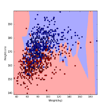
312 CHAPTER 10. DISTANCE AND NETWORK METHODS
Figure 10.3: The decision boundary of nearest-neighbor classifiers can be non-
linear.
•Simplicity: Nearest neighbor methods are not rocket science; there is no
math here more intimidating than a distance metric. This is important,
because it means we can know exactly what is going on and avoid being
the victim of bugs or misconceptions.
•Interpretability: Studying the nearest-neighbors of a given query point
qexplains exactly why the classifier made the decision it did. If you
disagree with this outcome, you can systematically debug things. Were
the neighboring points incorrectly labeled? Did your distance function fail
to pick out the items which were the logical peer group for q?
•Non-linearity: Nearest neighbor classifiers have decision boundaries which
are piecewise-linear, but can crinkle arbitrarily following the training ex-
ample herd, as shown in Figure 10.3. From calculus we know that piecewise-
linear functions approach smooth curves once the pieces get small enough.
Thus nearest neighbor classifiers enable us to realize very complicated de-
cision boundaries, indeed surfaces so complex that they have no concise
representation.
There are several aspects to building effective nearest neighbor classifiers,
including technical issues related to robustness and efficiency. But foremost
is learning to appreciate the power of analogy. We discuss these issues in the
sections below.
10.2.1 Seeking Good Analogies
Certain intellectual disciplines rest on the power of analogies. Lawyers don’t
reason from laws directly as much as they rely on precedents: the results of

10.2. NEAREST NEIGHBOR CLASSIFICATION 313
previously decided cases by respected jurists. The right decision for the current
case (I win or I lose) is a function of which prior cases can be demonstrated to
be most fundamentally similar to the matter at hand.
Similarly, much of medical practice rests on experience. The old country
doctor thinks back to her previous patients to recall cases with similar symptoms
to yours that managed to survive, and then gives you the same stuff she gave
them. My current physician (Dr. Learner) is now in his eighties, but I trust
him ahead of all those young whipper-snappers relying only on the latest stuff
taught in medical school.
Getting the greatest benefits from nearest neighbor methods involves learn-
ing to respect analogical reasoning. What is the right way to predict the price of
a house? We can describe each property in terms of features like the area of the
lot and the number of bedrooms, and assign each a dollar weight to be added
together via linear regression. Or we can look for “comps,” seeking comparable
properties in similar neighborhoods, and forecast a price similar to what we see.
The second approach is analogical reasoning.
I encourage you to get hold of a data set where you have domain knowledge
and interest, and do some experiments with finding nearest neighbors. One re-
source that always inspires me is http://www.baseball-reference.com, which
reports the ten nearest neighbors for each player, based on their statistics to
date. I find these analogies amazingly evocative: the identified players often fill
similar roles and styles which should not be explicitly captured by the statistics.
Yet somehow they are.
Try to do this with another domain you care about: books, movies, music, or
whatever. Come to feel the power of nearest neighbor methods, and analogies.
Take-Home Lesson: Identifying the ten nearest neighbors to points you know
about provides an excellent way to understand the strengths and limitations of
a given data set. Visualizing such analogies should be your first step in dealing
with any high-dimensional data set.
10.2.2 k-Nearest Neighbors
To classify a given query point q, nearest neighbor methods return the label
of q0, the closest labeled point to q. This is a reasonable hypothesis, assuming
that similarity in feature space implies similarity in label space. However, this
classification is based on exactly one training example, which should give us
pause.
More robust classification or interpolation follows from voting over multiple
close neighbors. Suppose we find the kpoints closest to our query, where kis
typically some value ranging from 3 to 50 depending upon the size of n. The
arrangement of the labeled points coupled with the choice of kcarves the feature
space into regions, with all the points in a particular given region assigned the
same label.
Consider Figure 10.4, which attempts to build a gender classifier from data
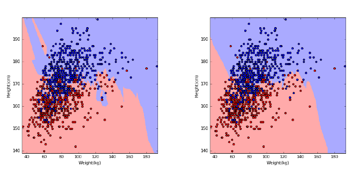
314 CHAPTER 10. DISTANCE AND NETWORK METHODS
Figure 10.4: The effect of kon the decision boundary for gender classification
using k-NN. Compare k= 3 (left) and k= 10 (right) with k= 1 in Figure 10.3.
on height and weight. Generally speaking, women are shorter and lighter than
men, but there are many exceptions, particularly near the decision boundary. As
shown in Figure 10.4, increasing ktends to produce larger regions with smoother
boundaries, representing more robust decisions. However, the larger we make
k, the more generic our decisions are. Choosing k=nis simply another name
for the majority classifier, where we assign each point the most common label
regardless of its individual features.
The right way to set kis to assign a fraction of labeled training examples as
an evaluation set, and then experiment with different values of the parameter
kto see where the best performance is achieved. These evaluation values can
then be thrown back into the training/target set, once khas been selected.
For a binary classification problem, we want kto be an odd number, so the
decision never comes out to be a tie. Generally speaking, the difference between
the number of positive and negative votes can be interpreted as a measure of
our confidence in the decision.
There are potential asymmetries concerning geometric nearest neighbors.
Every point has a nearest neighbor, but for outlier points these nearest neighbors
may not be particular close. These outlier points in fact can have an outsized
role in classification, defining the nearest neighbor to a huge volume of feature
space. However, if you picked your training examples properly this should be
largely uninhabited territory, a region in feature space where points rarely occur.
The idea of nearest neighbor classification can be generalized to function
interpolation, by averaging the values of the knearest points. This is presumably
done by real-estate websites like www.zillow.com, to predict housing prices from
nearest neighbors. Such averaging schemes can be generalized by non-uniform
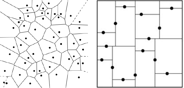
10.2. NEAREST NEIGHBOR CLASSIFICATION 315
Figure 10.5: Data structures for nearest neighbor search include Voronoi dia-
grams (left) and kd-trees (right).
weights, valuing points differently according to distance rank or magnitude.
Similar ideas work for all classification methods.
10.2.3 Finding Nearest Neighbors
Perhaps the biggest limitation of nearest neighbor classification methods is their
runtime cost. Comparing a query point qin ddimensions against nsuch training
points is most obviously done by performing nexplicit distance comparisons, at
a cost of O(nd). With thousands or even millions of training points available,
this search can introduce a notable lag into any classification system.
One approach to speeding up the search involves the use of geometric data
structures. Popular choices include:
•Voronoi diagrams: For a set of target points, we would like to partition
the space around them into cells such that each cell contains exactly one
target point. Further, we want each cell’s target point to be the nearest
target neighbor for all locations in the cell. Such a partition is called a
Voronoi diagram, and is illustrated in Figure 10.5 (left).
The boundaries of Voronoi diagrams are defined by the perpendicular
bisectors between pairs of points (a, b). Each bisector cuts the space in
half: one half containing aand the other containing b, such that all points
on a’s half are closer to athan b, and visa versa.
Voronoi diagrams are a wonderful tool for thinking about data, and have
many nice properties. Efficient algorithms for building them and searching
them exist, particularly in two dimensions. However, these procedures
rapidly become more complex as the dimensionality increases, making
them generally impractical beyond two or three dimensions.
•Grid indexes: We can carve up space into d-dimensional boxes, by divid-
ing the range of each dimension into rintervals or buckets. For example,
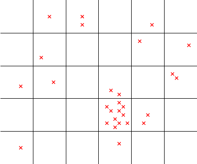
316 CHAPTER 10. DISTANCE AND NETWORK METHODS
012345
0
1
2
3
4
Figure 10.6: A grid index data structure provides fast access to nearest neighbors
when the points are uniformly distributed, but can be inefficient when points in
certain regions are densely clustered.
consider a two-dimensional space where each axis was a probability, thus
ranging from 0 to 1. This range can be divided into requal-sized intervals,
such that the ith interval ranges between [(i−1)/r, i/r].
These intervals define a regular grid over the space, so we can associate
each of the training points with the grid cell where it belongs. Search now
becomes the problem of identifying the right grid cell for point qthrough
array lookup or binary search, and then comparing qagainst all the points
in this cell to identify the nearest neighbor.
Such grid indexes can be effective, but there are potential problems. First,
the training points might not be uniformly distributed, and many cells
might be empties, as in Figure 10.6. Establishing a non-uniform grid might
lead to a more balanced arrangement, but makes it harder to quickly find
the cell containing q. But there is also no guarantee that the nearest
neighbor of qactually lives within the same cell as q, particularly if qlies
very close to the cell’s boundary. This means we must search neighboring
cells as well, to ensure we find the absolute nearest neighbor.
•Kd-trees: There are a large class of tree-based data structures which par-
tition space using a hierarchy of divisions that facilitates search. Starting
from an arbitrary dimension as the root, each node in the kd-tree defines
median line/plane that splits the points equally according to that dimen-
sion. The construction recurs on each side using a different dimension,
and so on until the region defined by a node contains just one training
point.
10.2. NEAREST NEIGHBOR CLASSIFICATION 317
This construction hierarchy is ideally suited to support search. Starting
at the root, we test whether the query point qis to the left or right of the
median line/plane. This identifies which side qlies on, and hence which
side of the tree to recur on. The search time is log n, since we split the
point set in half with each step down the tree.
There are a variety of such space-partition search tree structures avail-
able, with one or more likely implemented in your favorite programming
language’s function library. Some offer faster search times on problems
like nearest neighbor, with perhaps a trade-off of accuracy for speed.
Although these techniques can indeed speed nearest neighbor search in mod-
est numbers of dimensions (say 2 ≤d≤10), they get less effective as the di-
mensionality increases. The reason is that the number of ways that two points
can be close to each other increases rapidly with the dimensionality, making
it harder to cut away regions which have no chance of containing the nearest
neighbor to q. Deterministic nearest neighbor search eventually reduces to linear
search, for high-enough dimensionality data.
10.2.4 Locality Sensitive Hashing
To achieve faster running times, we must abandon the idea of finding the exact
nearest neighbor, and settle for a good guess. We want to batch up nearby
points into buckets by similarity, and quickly find the most appropriate bucket
Bfor our query point q. By only computing the distance between qand the
points in the bucket, we save search time when |B| n.
This was the basic idea behind the grid index, described in the previous
section, but the search structures become unwieldy and unbalanced in practice.
A better approach is based on hashing.
Locality sensitive hashing (LSH) is defined by a hash function h(p) that takes
a point or vector as input and produces a number or code as output such that
it is likely that h(a) = h(b) if aand bare close to each other, and h(a)6=h(b)
if they are far apart.
Such locality sensitive hash functions readily serve the same role as the grid
index, without the fuss. We can simply maintain a table of points bucketed by
this one-dimensional hash value, and then look up potential matches for query
point qby searching for h(q).
How can we build such locality sensitive hash functions? The idea is easiest
to understand at first when restricting to vectors instead of points. Recall that
sets of d-dimensional vectors can be thought of as points on the surface of a
sphere, meaning a circle when d= 2.
Let us consider an arbitrary line l1through the origin of this circle, which
cuts the circle in half, as in Figure 10.7. Indeed, we can randomly select l1by
simply picking a random angle 0 ≤θ1<2π. This angle defines the slope of a
line passing through the origin O, and together θ1and Ocompletely specify l1.
If randomly chosen, l1should grossly partition the vectors, putting about half
of them on the left and the remainder on the right.

318 CHAPTER 10. DISTANCE AND NETWORK METHODS
Figure 10.7: Nearby points on the circle generally lie on the same side of random
lines through the origin. Locality-sensitive hash codes for each point can be
composed as a sequence of sidedness tests (left or right) for any specific sequence
of lines.
Now add a second random divider l2, which should share the same properties.
This then partitions all the vectors among four regions, {LL, LR, RL, RR},
defined by their status relative to these dividers l1and l2.
The nearest neighbor of any vector vshould lie in the same region as v,
unless we got unlucky and either l1or l2separated them. But the probability
p(v1, v2) that both v1and v2are on the same side of ldepends upon the angle
between v1and v2. Specifically p(v1, v2)=1−θ(v1, v2)/π.
Thus we can compute the exact probability that near neighbors are preserved
for npoints and mrandom planes. The pattern of Land Rover these mplanes
defines an m-bit locality-sensitive hash code h(v) for any vector v. As we move
beyond the two planes of our example to longer codes, the expected number of
points in each bucket drops to n/2m, albeit with an increased risk that one of
the mplanes separates a vector from its true nearest neighbor.
Note that this approach can easily be generalized beyond two dimensions.
Let the hyperplane be defined by its normal vector r, which is perpendicular
in direction to the plane. The sign of s=v·rdetermines which side a query
vector vlies on. Recall that the dot product of two orthogonal vectors is 0, so
s= 0 if vlies exactly on the separating plane. Further, sis positive if vis above
this plane, and negative if vis below it. Thus the ith hyperplane contributes
exactly one bit to the hash code, where hi(q) = 0 iff v·ri≤0.
Such functions can be generalized beyond vectors to arbitrary point sets.
Further, their precision can be improved by building multiple sets of code words
for each item, involving different sets of random hyperplanes. So long as q
shares at least one codeword with its true nearest neighbor, we will eventually
10.3. GRAPHS, NETWORKS, AND DISTANCES 319
encounter a bucket containing both of these points.
Note that LSH has exactly the opposite goal from traditional hash functions
used for cryptographic applications or to manage hash tables. Traditional hash
functions seek to ensure that pairs of similar items result in wildly different hash
values, so we can recognize changes and utilize the full range of the table. In
contrast, LSH wants similar items to recieve the exact same hash code, so we
can recognize similarity by collision. With LSH, nearest neighbors belong in the
same bucket.
Locality sensitive hashing has other applications in data science, beyond
nearest neighbor search. Perhaps the most important is constructing compressed
feature representations from complicated objects, say video or music streams.
LSH codes constructed from intervals of these streams define numerical values
potentially suitable as features for pattern matching or model building.
10.3 Graphs, Networks, and Distances
Agraph G= (V, E) is defined on a set of vertices V, and contains a set of
edges Eof ordered or unordered pairs of vertices from V. In modeling a road
network, the vertices may represent the cities or junctions, certain pairs of
which are directly connected by roads/edges. In analyzing human interactions,
the vertices typically represent people, with edges connecting pairs of related
souls.
Many other modern data sets are naturally modeled in terms of graphs or
networks:
•The Worldwide Web (WWW): Here there is a vertex in the graph for each
webpage, with a directed edge (x, y) if webpage xcontains a hyperlink to
webpage y.
•Product/customer networks: These arise in any company that has many
customers and types of products: be it Amazon, Netflix, or even the corner
grocery store. There are two types of vertices: one set for customers
and another for products. Edge (x, y) denotes a product ypurchased by
customer x.
•Genetic networks: Here the vertices represent the different genes/proteins
in a particular organisms. Think of this as a parts list for the beast.
Edge (x, y) denotes that there are interactions between parts xand y.
Perhaps gene xregulates gene y, or proteins xand ybind together to
make a larger complex. Such interaction networks encode considerable
information about how the underlying system works.
Graphs and point sets are closely related objects. Both are composed of
discrete entities (points or vertices) representing items in a set. Both of them en-
code important notions of distance and relationships, either near–far or connected–
independent. Point sets can be meaningfully represented by graphs, and graphs
by point sets.
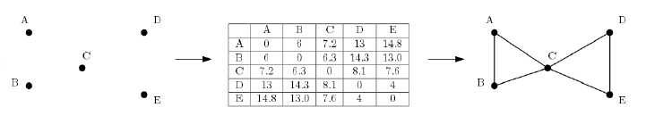
320 CHAPTER 10. DISTANCE AND NETWORK METHODS
Figure 10.8: The pairwise distances between a set of points in space (left) define
a complete weighted graph (center). Thresholding by a distance cutoff removes
all long edges, leaving a sparse graph that captures the structure of the points
(right).
10.3.1 Weighted Graphs and Induced Networks
The edges in graphs capture binary relations, where each edge (x, y) represents
that there is a relationship between xand y. The existence of this relationship is
sometimes all there is to know about it, as in the connection between webpages
or the fact of someone having purchased a particular product.
But there is often an inherent measure of the strength or closeness of the
relationship. Certainly we see it in road networks: each road segment has a
length or travel time, which is essential to know for finding the best route to
drive between two points. We say that a graph is weighted if every edge has a
numerical value associated with it.
And this weight is often (but not always) naturally interpreted as a distance.
Indeed one can interpret a data set of npoints in space as a complete weighted
graph on nvertices, where the weight of edge (x, y) is the geometric distance
between points xand yin space. For many applications, this graph encodes all
the relevant information about the points.
Graphs are most naturally represented by n×nadjacency matrices. Define a
non-edge symbol x. Matrix Mrepresents graph G= (V, E) when M[i, j]6=xif
and only if vertices i, j ∈Vare connected by an edge (i, j)∈E. For unweighted
networks, typically the edge symbol is 1 while x= 0. For distance weighted
graphs, the weight of edge (i, j) is the cost of travel between them, so setting
x=∞denotes the lack of any direct connection between iand j.
This matrix representation for networks has considerable power, because we
can introduce all our tools from linear algebra to work with them. Unfortunately,
it comes with a cost, because it can be hopelessly expensive to store n×n
matrices once networks get beyond a few hundred vertices. There are more
efficient ways to store large sparse graphs, with many vertices but relatively few
pairs connected by edges. I will not discuss the details of graph algorithms here,
but refer you with confidence to my book The Algorithm Design Manual [Ski08]
for you to learn more.
Pictures of graphs/networks are often made by assigning each vertex a point
in the plane, and drawing lines between these vertex-points to represent edges.
Such node-ink diagrams are immensely valuable to visualize the structure of

10.3. GRAPHS, NETWORKS, AND DISTANCES 321
the networks you are working with. They can be algorithmically constructed
using force-directed layout, where edges act like springs to bring adjacent pairs
of vertices close together, and non-adjacent vertices repel each other.
Such drawings establish the connection between graph structures and point
positions. An embedding is a point representation of the vertices of a graph
that captures some aspect of its structure. Performing a feature compression
like eigenvalue or singular value decomposition (see Section 8.5) on the the
adjacency matrix of a graph produces a lower-dimensional representation that
serves as a point representation of each vertex. Other approaches to graph
embeddings include DeepWalk, to be discussed in Section 11.6.3.
Take-Home Lesson: Point sets can be meaningfully represented by
graphs/distance matrices, and graphs/distance matrices meaningfully repre-
sented by point sets (embeddings).
Geometric graphs defined by the distances between points are representative
of a class of graphs I will call induced networks, where the edges are defined in
a mechanical way from some external data source. This is a common source of
networks in data science, so it is important to keep an eye out for ways that
your data set might be turned into a graph.
Distance or similarity functions are commonly used to construct networks
on sets of items. Typically we are interested in edges connecting each vertex to
its kclosest/most similar vertices. We get a sparse graph by keeping kmodest,
say k≈10, meaning that it can be easily worked with even for large values of
n.
But there are other types of induced networks. Typical would be to connect
vertices xand ywhenever they have a meaningful attribute in common. For
example, we can construct an induced social network on people from their re-
sumes, linking any two people who worked at the same company or attended the
same school in a similar period. Such networks tend to have a blocky structure,
where there are large subsets of vertices forming fully connected cliques. After
all, if xgraduated from the same college as y, and ygraduated from the same
college as z, then this implies that (x, z) must also be an edge in the graph.
10.3.2 Talking About Graphs
There is a vocabulary about graphs that is important to know for working
with them. Talking the talk is an important part of walking the walk. Several
fundamental properties of graphs impact what they represent, and how we can
use them. Thus the first step in any graph problem is determining the flavors
of the graphs you are dealing with:
•Undirected vs. Directed: A graph G= (V, E) is undirected if edge (x, y)∈
Eimplies that (y, x) is also in E. If not, we say that the graph is directed.
Road networks between cities are typically undirected, since any large road
has lanes going in both directions. Street networks within cities are almost
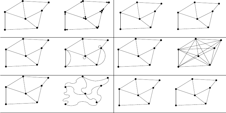
322 CHAPTER 10. DISTANCE AND NETWORK METHODS
undirected directed
unweighted
5
9
2
5
7
4
3
7
12
weighted
3
simple non−simple
sparse dense
embedded topological
unlabeled labeled
B
C
D
E
F
G
A
Figure 10.9: Important properties/flavors of graphs
always directed, because there are at least a few one-way streets lurking
somewhere. Webpage graphs are typically directed, because the link from
page xto page yneed not be reciprocated.
•Weighted vs. Unweighted: As discussed in Section 10.3.1, each edge (or
vertex) in a weighted graph Gis assigned a numerical value, or weight.
The edges of a road network graph might be weighted with their length,
drive-time, or speed limit, depending upon the application. In unweighted
graphs, there is no cost distinction between various edges and vertices.
Distance graphs are inherently weighted, while social/web networks are
generally unweighted. The difference determines whether the feature vec-
tors associated with vertices are 0/1 or numerical values of importance,
which may have to be normalized.
•Simple vs. Non-simple: Certain types of edges complicate the task of
working with graphs. A self-loop is an edge (x, x), involving only one
vertex. An edge (x, y) is a multiedge if it occurs more than once in the
graph.
Both of these structures require special care in preprocessing for feature
generation. Hence any graph that avoids them is called simple. We often
seek to remove both self-loops and multiedges at the beginning of analysis.
•Sparse vs. Dense: Graphs are sparse when only a small fraction of
the total possible vertex pairs (n
2for a simple, undirected graph on n
vertices) actually have edges defined between them. Graphs where a large
fraction of the vertex pairs define edges are called dense. There is no
official boundary between what is called sparse and what is called dense,
10.3. GRAPHS, NETWORKS, AND DISTANCES 323
but typically dense graphs have a quadratic number of edges, while sparse
graphs are linear in size.
Sparse graphs are usually sparse for application-specific reasons. Road
networks must be sparse graphs because of road junctions. The most
ghastly intersection I’ve ever heard of was the endpoint of only nine dif-
ferent roads. k-nearest neighbor graphs have vertex degrees of exactly
k. Sparse graphs make possible much more space efficient representations
than adjacency matrices, allowing the representation of much larger net-
works.
•Embedded vs. Topological – A graph is embedded if the vertices and edges
are assigned geometric positions. Thus, any drawing of a graph is an
embedding, which may or may not have algorithmic significance.
Occasionally, the structure of a graph is completely defined by the geom-
etry of its embedding, as we have seen in the definition of the distance
graph where the weights are defined by the Euclidean distance between
each pair of points. Low-dimensional representations of adjacency matri-
ces by SVD also qualify as embeddings, point representations that capture
much of the connectivity information of the graph.
•Labeled vs. Unlabeled – Each vertex is assigned a unique name or identifier
in a labeled graph to distinguish it from all other vertices. In unlabeled
graphs no such distinctions are made.
Graphs arising in data science applications are often naturally and mean-
ingfully labeled, such as city names in a transportation network. These
are useful as identifiers for representative examples, and also to provide
linkages to external data sources where appropriate.
10.3.3 Graph Theory
Graph theory is an important area of mathematics which deals with the fun-
damental properties of networks and how to compute them. Most computer
science students get exposed to graph theory through their courses in discrete
structures or algorithms.
The classical algorithms for finding shortest paths, connected components,
spanning trees, cuts, matchings and topological sorting can be applied to any
reasonable graph. However, I have not seen these tools applied as generally in
data science as I think they should be. One reason is that the graphs in data
science tend to be very large, limiting the complexity of what can be done with
them. But a lot is simply myopia: people do not see that a distance or similarity
matrix is really just a graph than can take advantage of other tools.
I take the opportunity here to review the connections of these fundamental
problems to data science, and encourage the interested reader to deepen their
understanding through my algorithm book [Ski08].
324 CHAPTER 10. DISTANCE AND NETWORK METHODS
•Shortest paths: For a distance “matrix” m, the value of m[i, j] should
reflect the minimum length path between vertices iand j. Note that
independent estimates of pairwise distance are often inconsistent, and do
not necessarily satisfy the triangle inequality. But when m0[i, j] reflects
the shortest path distance from ito jin any matrix mit must satisfy the
metric properties. This may well present a better matrix for analysis than
the original.
•Connected components: Each disjoint piece of a graph is called a con-
nected component. Identifying whether your graph consists of a single
component or multiple pieces is important. First, any algorithms you run
will achieve better performance if you deal with the components indepen-
dently. Separate components can be independent for sound reasons, e.g.
there is no road crossing between the United States and Europe because
of an ocean. But separate components might indicate trouble, such as
processing artifacts or insufficient connectivity to work with.
•Minimum spanning trees: A spanning tree is the minimal set of edges
linking all the vertices in a graph, essentially a proof that the graph is
connected. The minimum weight spanning tree serves as the sparsest
possible representation of the structure of the graph, making it useful for
visualization. Indeed, we will show that minimum spanning trees have an
important role in clustering algorithms in Section 10.5.
•Edge cuts: A cluster in a graph is defined by a subset of vertices c,
with the property that (a) there is considerable similarity between pairs
of vertices within c, and (b) there is weak connectivity between vertices
in cand out of c. The edges (x, y) where x∈cand y6∈ cdefine a cut
separating the cluster from the rest of the graph, making finding such cuts
an important aspect of cluster analysis.
•Matchings: Marrying off each vertex with a similar, loyal partner can be
useful in many ways. Interesting types of comparisons become possible
after such a matching. For example, looking at all close pairs that differ in
one attribute (say gender) might shed light on how that variable impacts
a particular outcome variable (think income or lifespan). Matchings also
provide ways to reduce the effective size of a network. By replacing each
matched pair with a vertex representing its centroid, we can construct a
graph with half the vertices, but still representative of the whole.
•Topological sorting: Ranking problems (recall Chapter 4) impose a peck-
ing order on a collection of items according to some merit criteria. Topo-
logical sorting ranks the vertices of a directed acyclic graph (DAG) so edge
(i, j) implies that iranks above jin the pecking order. Given a collection
of observed constraints of the form “ishould rank above j,” topological
sorting defines an item-order consistent with these observations.

10.4. PAGERANK 325
10.4 PageRank
It is often valuable to categorize the relative importance of vertices in a graph.
Perhaps the simplest notion is based on vertex degree, the number of edges
connecting vertex vto the rest of the graph. The more connected a vertex is,
the more important it probably is.
The degree of vertex vmakes a good feature to represent the item associated
with v. But even better is PageRank [BP98], the original secret sauce behind
Google’s search engine. PageRank ignores the textual content of webpages,
to focus only on the structure of the hyperlinks between pages. The more
important pages (vertices) should have higher in-degree than lesser pages, for
sure. But the importance of the pages that link to you also matter. Having a
large stable of contacts recommending you for a job is great, but it is even better
when one of them is currently serving as the President of the United States.
PageRank is best understood in the context of random walks along a net-
work. Suppose we start from an arbitrary vertex and then randomly select an
outgoing link uniformly from the set of possibilities. Now repeat the process
from here, jumping to a random neighbor of our current location at each step.
The PageRank of vertex vis a measure of probability that, starting from a ran-
dom vertex, you will arrive at vafter a long series of such random steps. The
basic formula for the PageRank of v(P R(v)) is:
P Rj(v) = X
(u,v)∈E
P Rj−1(u)
out −degree(u)
This is a recursive formula, with jas the iteration number. We initialize
P R0(vi) = 1/n for each vertex viin the network, where 1 ≤i≤n. The
PageRank values will change in each iteration, but converge surprisingly quickly
to stable values. For undirected graphs, this probability is essentially the same as
each vertex’s in-degree, but much more interesting things happen with directed
graphs.
In essence, PageRank relies on the idea that if all roads lead to Rome, Rome
must be a pretty important place. It is the paths to your page that counts.
This is what makes PageRank hard to game: other people must link to your
webpage, and whatever shouting you do about yourself is irrelevant.
There are several tweaks one can make to this basic PageRank formula to
make the results more interesting. We can allow the walk to jump to an arbitrary
vertex (instead of a linked neighbor) to allow faster diffusion in the network.
Let pbe the probability of following a link in the next step, also known as the
damping factor. Then
P Rj(v) = X
(u,v)∈E
(1 −p)
n+pP Rj−1(u)
out-degree(u)
where nis the number of vertices in the graph. Other enhancements involve
making changes to the network itself. By adding edges from every vertex to a

326 CHAPTER 10. DISTANCE AND NETWORK METHODS
PageRank PR1 (all pages)
1 Napoleon
2 George W. Bush
3 Carl Linnaeus
4 Jesus
5 Barack Obama
6 Aristotle
7 William Shakespeare
8 Elizabeth II
9 Adolf Hitler
10 Bill Clinton
PageRank PR2 (only people)
1 George W. Bush
2 Bill Clinton
3 William Shakespeare
4 Ronald Reagan
5 Adolf Hitler
6 Barack Obama
7 Napoleon
8 Richard Nixon
9 Franklin D. Roosevelt
10 Elizabeth II
Table 10.1: Historical individuals with the highest PageRank in the 2010 English
Wikipedia, drawn over the full Wikipedia graph (left) and when restricted to
links to other people (right).
single super-vertex, we ensure that random walks cannot get trapped in some
small corner of the network. Self-loops and parallel edges (multiedges) can be
deleted to avoid biases from repetition.
There is also a linear algebraic interpretation of PageRank. Let Mbe a
matrix of vertex-vertex transition probabilities, so Mij is the probability that
our next step from iwill be to j. Clearly Mij = 1/out-degree(i) if there is a
directed edge from ito j, and zero if otherwise. The jth round estimate for the
PageRank vector P Rjcan be computed as
P Rj=M·P Rj−1
After this estimate converges, P R =M·P R, or λU =M U where λ=
1 and Urepresents the PageRank vector. This is the defining equation for
eigenvalues, so the n×1 vector of PageRank values turns out to be the principle
eigenvector of the transition probability matrix defined by the links. Thus
iterative methods for computing eigenvectors and fast matrix multiplication
leads to efficient PageRank computations.
How well does PageRank work at smoking out the most central vertices? To
provide some intuition, we ran PageRank on the link network from the English
edition of Wikipedia, focusing on the pages associated with people. Table 10.1
(left) lists the ten historical figures with the highest PageRank.
These high-PageRank figures are all readily recognized as very significant
people. The least familiar among them is probably Carl Linnaeus (1707–1778)
[46], biology’s “father of taxonomy” whose Linnaean system (Genus species;
e.g., Homo sapiens) is used to classify all life on earth. He was a great scientist,
but why is he so very highly regarded by PageRank? The Wikipedia pages of
all the plant and animal species he first classified link back to him, so thousands
of life forms contribute prominent paths to his page.
The Linnaeus example points out a possible weakness of PageRank: do we
really want plants and other inanimate objects voting on who the most promi-

10.5. CLUSTERING 327
Figure 10.10: PageRank graphs for Barack Obama, over all Wikipedia pages
(left) and when restricted only to people (right)
nent people are? Figure 10.10 (left) shows a subset of the full PageRank graph
for Barack Obama [91]. Note, for example, that although the links associated
with Obama seem very reasonable, we can still reach Obama in only two clicks
from the Wikipedia page for Dinosaurs. Should extinct beasts contribute to the
President’s centrality?
Adding and deleting sets of edges from a given network gives rise to different
networks, some of which better reveal underlying significance using PageRank.
Suppose we compute PageRank (denoted PR2) using only the Wikipedia edges
linking people. This computation would ignore any contribution from places,
organizations, and lower organisms. Figure 10.10 (right) shows a sample of the
PageRank graph for Barack Obama [91] when we restrict it to only people.
PageRank on this graph favors a slightly different cohort of people, shown in
Table 10.1 (right). Jesus, Linnaeus and Aristotle (384–322 B.C.)[8] are now gone,
replaced by three recent U.S. presidents – who clearly have direct connections
from many important people. So which version of PageRank is better, PR1 or
PR2? Both seem to capture reasonable notions of centrality with a substan-
tial but not overwhelming correlation (0.68), so both make sense as potential
features in a data set.
10.5 Clustering
Clustering is the problem of grouping points by similarity. Often items come
from a small number of logical “sources” or “explanations”, and clustering is
a good way to reveal these origins. Consider what would happen if an alien
species were to come across height and weight data for a large number of hu-
mans. They would presumably figure out that there seem to be two clusters
representing distinct populations, one consistently bigger than the other. If
the aliens were really on the ball, they might call these populations ‘men” and
“women”. Indeed, the two height-weight clusters in Figure 10.11 are both highly
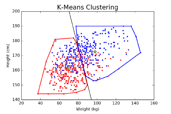
328 CHAPTER 10. DISTANCE AND NETWORK METHODS
Figure 10.11: Clustering people in weight-height space, using 2-means cluster-
ing. The left cluster contains 240 women and 112 men, while the right cluster
contains 174 men to 54 women. Compare this to the logistic regression classifier
trained on this same data set, in Figure 9.17.
concentrated in one particular gender.
Patterns on a two-dimensional dot plot are generally fairly easy to see, but we
often deal with higher-dimensional data that humans cannot effectively visual-
ize. Now we need algorithms to find these patterns for us. Clustering is perhaps
the first thing to do with any interesting data set. Applications include:
•Hypothesis development: Learning that there appear to be (say) four dis-
tinct populations represented in your data set should spark the question
as to why they are there. If these clusters are compact and well-separated
enough, there has to be a reason and it is your business to find it. Once
you have assigned each element a cluster label, you can study multiple
representatives of the same cluster to figure out what they have in com-
mon, or look at pairs of items from different clusters and identify why they
are different.
•Modeling over smaller subsets of data: Data sets often contain a very
large number of rows (n) relative to the number of feature columns (m):
think the taxi cab data of 80 million trips with ten recorded fields per
trip. Clustering provides a logical way to partition a large single set of
records in a (say) a hundred distinct subsets each ordered by similarity.
Each of these clusters still contains more than enough records to fit a
forecasting model on, and the resulting model may be more accurate on
this restricted class of items then a general model trained over all items.
Making a forecast now involves identifying the appropriate cluster your
10.5. CLUSTERING 329
query item qbelongs to, via a nearest neighbor search, and then using the
appropriate model for that cluster to make the call on q.
•Data reduction: Dealing with millions or billions of records can be over-
whelming, for processing or visualization. Consider the computational
cost of identifying the nearest neighbor to a given query point, or trying
to understand a dot plot with a million points. One technique is to cluster
the points by similarity, and then appoint the centroid of each cluster to
represent the entire cluster. Such nearest neighbor models can be quite
robust because you are reporting the consensus label of the cluster, and it
comes with a natural measure of confidence: the accuracy of this consensus
over the full cluster.
•Outlier detection: Certain items resulting from any data collection pro-
cedure will be unlike all the others. Perhaps they reflect data entry errors
or bad measurements. Perhaps they signal lies or other misconduct. Or
maybe they result from the unexpected mixture of populations, a few
strange apples potentially spoiling the entire basket.
Outlier detection is the problem of ridding a data set of discordant items,
so the remainder better reflects the desired population. Clustering is a
useful first step to find outliers. The cluster elements furthest from their
assigned cluster center don’t really fit well there, but also don’t fit better
anywhere else. This makes them candidates to be outliers. Since invaders
from another population would tend to cluster themselves together, we
may well cast suspicions on small clusters whose centers lie unusually far
from all the other cluster centers.
Clustering is an inherently ill-defined problem, since proper clusters depend
upon context and the eye of the beholder. Look at Figure 10.12. How many
different clusters do you see there? Some see three, other see nine, and others
vote for pretty much any number in between.
How many clusters you see depends somewhat upon how many clusters you
want to see. People can be clustered into two groups, the lumpers and the
splitters, depending upon their inclination to make fine distinctions. Splitters
look at dogs, and see poodles, terriers, and cocker spaniels. Lumpers look at
dogs, and see mammals. Splitters draw more exciting conclusions, while lumpers
are less likely to overfit their data. Which mindset is most appropriate depends
upon your task.
Many different clustering algorithms have been developed, and we will review
the most prominent methods (k-means, agglomerative clustering, and spectral
clustering) in the sections below. But it is easy to get too caught up in the
differences between methods. If your data exhibits strong-enough clusters, any
method is going to find something like it. But when an algorithm returns
clusters with very poor coherence, usually your data set is more to blame than
the algorithm itself.
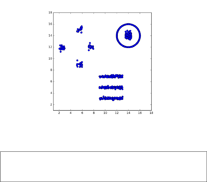
330 CHAPTER 10. DISTANCE AND NETWORK METHODS
Figure 10.12: How many clusters do you see here?
Take-Home Lesson: Make sure you are using a distance metric which accu-
rately reflects the similarities that you are looking to find. The specific choice
of clustering algorithm usually proves much less important than the similar-
ity/distance measure which underlies it.
10.5.1 k-means Clustering
We have been somewhat lax in defining exactly what a clustering algorithm
should return as an answer. One possibility is to label each point with the
name of the cluster that it is in. If there are kclusters, these labels can be the
integers 1 through k, where labeling point pwith imeans it is in the ith cluster.
An equivalent output representation might be kseparate lists of points, where
list irepresents all the points in the ith cluster.
But a more abstract notion reports the center point of each cluster. Typically
we think of natural clusters as compact, Gaussian-like regions, where there is an
ideal center defining the location where the points “should” be. Given the set
of these centers, clustering the points becomes easy: simply assign each point p
to the center point Ciclosest to it. The ith cluster consists of all points whose
nearest center is Ci.
k-means clustering is a fast, simple-to-understand, and generally effective
approach to clustering. It starts by making a guess as to where the cluster
centers might be, evaluates the quality of these centers, and then refines them
to make better center estimates.

10.5. CLUSTERING 331
K-means clustering
Select kpoints as initial cluster centers C1, . . . , Ck.
Repeat until convergence {
For 1 ≤i≤n, map point pito its nearest cluster center Cj
Compute centroid C0
jof the points nearest Cj,for 1 ≤j≤k
For all 1 ≤j≤k, set Cj=C0
j
}
Figure 10.13: Pseudocode for the k-means clustering algorithm.
The algorithm starts by assuming that there will be exactly kclusters in
the data, and then proceeds to pick initial centers for each cluster. Perhaps
this means randomly selecting kpoints from the set of npoints Sand calling
them centers, or selecting krandom points from the bounding box of S. Now
test each of the npoints against all kof the centers, and assign each point in
Sto its nearest current center. We can now compute a better estimate of the
center of each cluster, as the centroid of the points assigned to it. Repeat until
the cluster assignments are sufficiently stable, presumably when they have not
changed since the previous generation. Figure 10.13 provides pseudocode of this
k-means procedure.
Figure 10.14 presents an animation of k-means in action. The initial guesses
for the cluster centers are truly bad, and the initial assignments of points to
centers splits the real clusters instead of respecting them. But the situation
rapidly improves, with the centroids drifting into positions that separates the
points in the desired way. Note that the k-means procedure does not necessar-
ily terminate with the best possible set of kcenters, only at a locally-optimal
solution that provides a logical stopping point. It is a good idea to repeat the
entire procedure several times with different random initializations and accept
the best clustering found over all. The mean squared error is the sum of squares
of the distance between each point Piand its center Cj, divided by the number
of points n. The better of two clusterings can be identified as having lower mean
squared error, or some other reasonable error statistic.
Centers or Centroids?
There are at least two possible criteria for computing a new estimate for the
center point as a function of the set S0of points assigned to it. The centroid C
of a point set is computed by taking the average value of each dimension. For

332 CHAPTER 10. DISTANCE AND NETWORK METHODS
Figure 10.14: The iterations of k-means (for k= 3) as it converges on a stable
and accurate clustering. Fully seven iterations are needed, because of the un-
fortunate placement of the three initial cluster centers near the logical center.
the dth dimension,
Cd=1
|S0|X
p∈S0
p[d]
The centroid serves as the center of mass of S0, the place where the vectors
defined through this point sum to zero. This balance criteria defines a natural
and unique center for any S0. Speed of computation is another nice thing about
using the centroid. For n d-dimensional points in S0, this takes O(nd) time,
meaning linear in the input size of the points.
For numerical data points, using the centroid over an appropriate Lkmetric
(like Euclidean distance) should work just fine. However, centroids are not well
defined when clustering data records with non-numerical attributes, like cate-
gorical data. What is the centroid of 7 blonds, 2 red-heads, and 6 gray-haired
people? We have discussed how to construct meaningful distance functions over
categorical records. The problem here is not so much measuring similarity, as
constructing a representative center.
There is a natural solution, sometimes called the k-mediods algorithm. Sup-
pose instead of the centroid we define the centermost point Cin S0to be the
cluster representative. This is the point which minimizes the sum of distances
10.5. CLUSTERING 333
to all other points in the cluster:
C= arg min
c∈S0
n
X
i=1
d(c, pi)
An advantage of using a centerpoint to define the cluster is that it gives the
cluster a potential name and identity, assuming the input points correspond to
items with identifiable names.
Using the centermost input example as center means we can run k-means
so long as we have a meaningful distance function. Further, we don’t lose very
much precision by picking the centermost point instead of the centroid. Indeed,
the sum of distances through the centermost point is at most twice that of the
centroid, on numerical examples where the centroid can be computed. The big
win of the centroid is that it can be computed faster than the centermost vertex,
by a factor of n.
Using center vertices to represent clusters permits one to extend k-means
naturally to graphs and networks. For weighted graphs, it is natural to employ a
shortest path algorithm to construct a matrix Dsuch that D[i, j] is the length of
the shortest path in the graph from vertex ito vertex j. Once Dis constructed,
k-means can proceed by reading the distances off this matrix, instead of calling a
distance function. For unweighted graphs, a linear time algorithm like breadth-
first search can be efficiently used to compute graph distances on demand.
How Many Clusters?
Inherent to the interpretation of k-means clustering is the idea of a mixture
model. Instead of all our observed data coming from a single source, we presume
that our data is coming from kdifferent populations or sources. Each source
is generating points to be like its center, but with some degree of variation or
error. The question of how many clusters a data set has is fundamental: how
many different populations were drawn upon when selecting the sample?
The first step in the k-means algorithm is to initialize k, the number of
clusters in the given data set. Sometimes we have a preconception of how many
clusters we want to see: perhaps two or three for balance or visualization, or
maybe 100 or 1000 as a proxy for “many” when partitioning a large input file
into smaller sets for separate modeling.
But generally speaking this is a problem, because the “right” number of
clusters is usually unknown. Indeed, the primary reason to cluster in the first
place is our limited understanding of the structure of the data set.
The easiest way to find the right kis to try them all, and then pick the best
one. Starting from k= 2 to as high as you feel you have time for, perform
k-means and evaluate the resulting clustering according to the mean squared
error (MSE) of the points from their centers. Plotting this yields an error curve,
as shown in Figure 10.16. The error curve for random centers is also provided.
Both error curves show the MSE of points from their centers decreasing as
we allow more and more cluster centers. But the wrong interpretation would
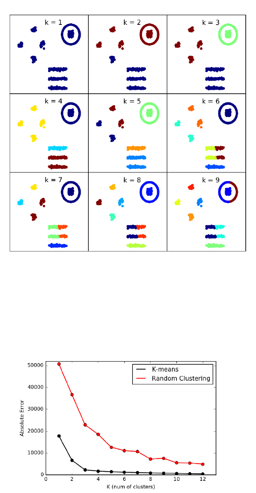
334 CHAPTER 10. DISTANCE AND NETWORK METHODS
Figure 10.15: Running k-means for k= 1 to k= 9. The “right” clustering is
found for k= 3, but the algorithm is unable to properly distinguish between
nested circular clusters and long thin clusters for large k.
Figure 10.16: The error curve for k-means clustering on the point set of Figure
10.12, showing a bend in the elbow reflecting the three major clusters in the
data. The error curve for random cluster centers is shown for comparison.
10.5. CLUSTERING 335
be to suggest we need kas large as possible, because the MSE should decrease
when allowing more centers. Indeed, inserting a new center at a random position
rinto a previous k-means solution can only decrease the mean squared error,
by happening to land closer to a few of the input points than their previous
center. This carves out a new cluster around r, but presumably an even better
clustering would have been found running by k-means from scratch on (k+ 1)
centers.
What we seek from the error curve in Figure 10.16 is the value kwhere the
rate of decline decreases, because we have exceeded number of true sources, and
so each additional center is acting like a random point in the previous discussion.
The error curve should look something like an arm in typing position: it slopes
down rapidly from shoulder to elbow, and then slower from the elbow to the
wrist. We want kto be located exactly at the elbow. This point might be easier
to identify when compared to a similar MSE error plot for random centers, since
the relative rate of error reduction for random centers should be analogous to
what we see past the elbow. The slow downward drift is telling us the extra
clusters are not doing anything special for us.
Each new cluster center adds dparameters to the model, where dis the
dimensionality of the point set. Occam’s razor tells us that the simplest model
is best, which is the philosophical basis for using the bend in the elbow to select
k. There are formal criterias of merit which incorporate both the number of
parameters and the prediction error to evaluate models, such as the Akaike
information criterion (AIC). However, in practice you should feel confident in
making a reasonable choice for kbased on the shape of the error curve.
Expectation Maximization
The k-means algorithm is the most prominent example of a class of learning
algorithms based on expectation maximization (EM). The details require more
formal statistics than I am prepared to delve into here, but the principle can
be observed in the two logical steps of the k-means algorithm: (a) assigning
points to the estimated cluster center that is closest to them, and (b) using
these point assignments to improve the estimate of the cluster center. The
assignment operation is the expectation or E-step of the algorithm, while the
centroid computation is the parameter maximization or M-step.
The names “expectation” and “maximization” have no particular resonance
to me in terms of the k-means algorithm. However, the general form of an itera-
tive parameter-fitting algorithm which improves parameters in rounds based on
the errors of the previous models does seem a sensible thing to do. For example,
perhaps we might have partially labeled classification data, where there are rel-
atively few training examples confidently assigned to the correct class. We can
build classifiers based on these training examples, and use them to assign the
unlabeled points to candidate classes. This presumably defines larger training
sets, so we should be able to fit a better model for each class. Now reassigning
the points and iterating again should converge on a better model.

336 CHAPTER 10. DISTANCE AND NETWORK METHODS
Figure 10.17: Agglomerative clustering of gene expression data.
10.5.2 Agglomerative Clustering
Many sources of data are generated from a process defined by an underlying
hierarchy or taxonomy. Often this is the result of an evolutionary process: In
the Beginning there was one thing, which repeatedly bifurcated to create a rich
universe of items. All animals and plant species are the result of an evolutionary
process, and so are human languages and cultural/ethic groupings. To a lesser
but still real extent, so are products like movies and books. This book can be
described as a “Data Science Textbook”, which is an emerging sub-genre split off
from “Computer Science Textbook”, which logically goes back to “Engineering
Textbook”, to “Textbook”, to “Non-Fiction” eventually back to the original
source: perhaps “Book”.
Ideally, in the course of clustering items we will reconstruct these evolution-
ary histories. This goal is explicit in agglomerative clustering, a collection of
bottom-up methods that repeatedly merge the two nearest clusters into a big-
ger super-cluster, defining a rooted tree whose leaves are the individual items
and whose root defines the universe.
Figure 10.17 illustrates agglomerative clustering applied to gene expression
data. Here each column represents a particular gene, and each row the results
of an experiment measuring how active each gene was in a particular condition.
As an analogy, say each of the columns represented different people, and one
particular row assessed their spirits right after an election. Fans of the winning
party would be more excited than usual (green), while voters for the losing team
would be depressed (red). Most of the rest of the world wouldn’t care (black).
As it is with people, so it is with genes: different things turn them on and off,
and analyzing gene expression data can reveal what makes them tick.
So how do we read Figure 10.17? By inspection it is clear that there are
blocks of columns which all behave similarly, getting turned on and turned off in
similar conditions. The discovery of these blocks are reflected in the tree above
the matrix: regions of great similarity are associated with small branchings.
Each node of the tree represents the merging of two clusters. The height of
the node is proportional to the distance between the two clusters being merged.
The taller the edge, the more dodgy the notion that these clusters should be
merged. The columns of the matrix have been permuted to reflect this tree
10.5. CLUSTERING 337
organization, enabling us to visualize hundreds of genes quantified in fourteen
dimensions (with each row defining a distinct dimension).
Biological clusterings are often associated with such dendograms or phylo-
genic trees, because they are the result of an evolutionary process. Indeed, the
clusters of similar gene expression behavior seen here are the results of the or-
ganism evolving a new function, that changes the response of certain genes to
a particular condition.
Using Agglomerative Trees
Agglomerative clustering returns a tree on top of the groupings of items. After
cutting the longest edges in this tree, what remains are the disjoint groups
of items produced by clustering algorithms like k-means. But this tree is a
marvelous thing, with powers well beyond the item partitioning:
•Organization of clusters and subclusters: Each internal node in the tree
defines a particular cluster, comprised of all the leaf-node elements be-
low it. But the tree describes hierarchy among these clusters, from the
most refined/specific clusters near the leaves to the most general clusters
near the root. Ideally, nodes of a tree define nameable concepts: natural
groupings that a domain expert could explain if asked. These various lev-
els of granularity are important, because they define structural concepts
we might not have noticed prior to doing clustering.
•Visualization of the clustering process: A drawing of this agglomeration
tree tells us a lot about the clustering process, particularly if the drawing
reflects the cost of each merging step. Ideally there will be very long edges
near the root of the tree, showing that the highest-level clusters are well
separated and belong in distinct groupings. We can tell if the groupings are
balanced, or whether the high level groupings are of substantially different
sizes. Long chains of merging small clusters into a big cluster is generally
a bad sign, although the choice of merging criteria (to be discussed below)
can bias the shape of the tree. Outliers show up nicely on a phylogenic
tree, as singleton elements or small clusters that connect near the root
through long edges.
•Natural measure of cluster distance: An interesting property of any tree
Tis that there is exactly one path in Tbetween any two nodes xand
y. Each internal vertex in an agglomerative clustering tree has a weight
associated with it, the cost of merging together the two subtrees below it.
We can compute a “cluster distance” between any two leaves by the sum
of the merger costs on the path between them. If the tree is good, this
can be more meaningful than the Euclidean distance between the records
associated with xand y.
•Efficient classification of new items: One important application for clus-
tering is classification. Suppose have agglomeratively clustered the prod-
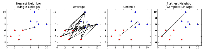
338 CHAPTER 10. DISTANCE AND NETWORK METHODS
Figure 10.18: Four distance measures for identifying the nearest pair of clusters.
ucts in a store, to build a taxonomy of clusters. Now a new part comes
along. What category should it be classified under?
For k-means, each of the cclusters are categorized by their centroid, so
classifying a new item qreduces to computing the distance between qand
all ccentroids to identify the nearest cluster. A hierarchical tree provides a
potentially faster method. Suppose we have precomputed the centroids of
all the leaves on the left and right subtrees beneath each node. Identifying
the right position in the hierarchy for a new item qstarts by comparing
qto the centroids of the root’s left and right subtrees. The nearest of the
two centroids to qdefines the appropriate side of the tree, so we resume
the search there one level down. This search takes time proportional to
the height of the tree, instead of the number of leaves. This is typically
an improvement from nto log n, which is much better.
Understand that binary merging trees can be drawn in many different ways
that reflect exactly the same structure, because there is no inherent notion of
which is the left child and which is the right child. This means that there are
2n−1distinct permutations of the nleaves possible, by flipping the direction of
any subset of the n−1 internal nodes in the tree. Realize this when trying to
read such a taxonomy: two items which look far away in left-right order might
well have been neighbors had this flipping been done in a different way. And
the rightmost node of the left subtree might be next to the leftmost node in the
right subtree, even though they are really quite far apart in the taxonomy.
Building Agglomerative Cluster Trees
The basic agglomerative clustering algorithm is simple enough to be described
in two sentences. Initially, each item is assigned to its own cluster. Merge the
two closest clusters into one by putting a root over them, and repeat until only
one cluster remains.
All that remains is to specify how to compute the distance between clusters.
When the clusters contain single items, the answer is easy: use your favorite
distance metric like L2. But there are several reasonable answers for the distance
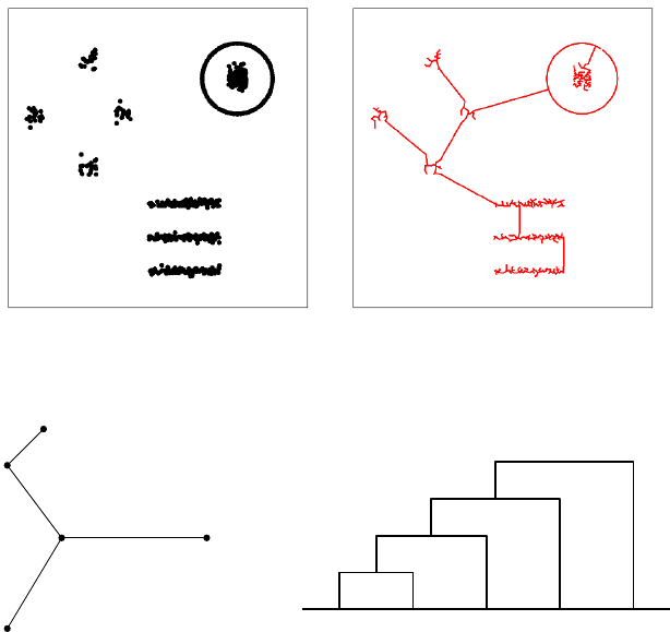
10.5. CLUSTERING 339
Figure 10.19: Single linkage clustering is equivalent to finding the minimum
spanning tree of a network.
v1
v2
v3v5
v4
1
2
3
4
v1v2v3v4v5
1
2
3
4
Figure 10.20: Kruskal’s algorithm for minimum spanning tree is indeed single-
linkage agglomerative clustering, as shown by the cluster tree on right.
between two non-trivial clusters, which lead to different trees on the same input,
and can have a profound impact on the shape of the resulting clusters. The
leading candidates, illustrated in Figure 10.18, are:
•Nearest neighbor (single link): Here the distance between clusters C1and
C2is defined by the closest pair of points spanning them:
d(C1, C2) = min
x∈C1,y∈C2||x−y||
Using this metric is called single link clustering, because the decision to
merge is based solely on the single closest link between the clusters.
The minimum spanning tree of a graph Gis tree drawn from the edges
of Gconnecting all vertices at lowest total cost. Agglomerative clustering
with the single link criteria is essentially the same as Kruskal’s algorithm,
which creates the minimum spanning tree (MST) of a graph by repeatedly
adding the lowest weight edge remaining which does not create a cycle in
the emerging tree.

340 CHAPTER 10. DISTANCE AND NETWORK METHODS
The connection between the MST (with nnodes and n−1 edges) and
the cluster tree (with nleaves, n−1 internal nodes, and 2n−2 edges) is
somewhat subtle: the order of insertion edges in the MST from smallest
to largest describes the order of merging in the cluster tree, as shown in
Figure 10.20.
The Platonic ideal of clusters are as compact circular regions, which gen-
erally radiate out from centroids, as in k-means clustering. By contrast,
single-link clustering tends to create relatively long, skinny clusters, be-
cause the merging decision is based only on the nearness of boundary
points. Single link clustering is fast, but tends to be error prone, as out-
lier points can easily suck two well-defined clusters together.
•Average link: Here we compute distance between all pairs of cluster-
spanning points, and average them for a more robust merging criteria
than single-link:
d(C1, C2) = 1
|C1||C2|X
x∈C1X
y∈C2
||x−y||
This will tend to avoid the skinny clusters of single-link, but at a greater
computational cost. The straightforward implementation of average link
clustering is O(n3), because each of the nmerges will potentially require
touching O(n2) edges to recompute the nearest remaining cluster. This is
ntimes slower than single link clustering, which can be implemented in
O(n2) time.
•Nearest centroid: Here we maintain the centroid of each cluster, and
merge the cluster-pair with the closest centroids. This has two main ad-
vantages. First, it tends to produce clusters similar to average link, be-
cause outlier points in a cluster get overwhelmed as the cluster size (num-
ber of points) increases. Second, it is much faster to compare the centroids
of the two clusters than test all |C1||C2|point-pairs in the simplest imple-
mentation. Of course, centroids can only be computed for records with all
numerical values, but the algorithm can be adapted to use the centermost
point in each cluster (medioid) as a representative in the general case.
•Furthest link: Here the cost of merging two clusters is the farthest pair
of points between them:
d(C1, C2) = max
x∈C1,y∈C2||x−y||
This sounds like madness, but this is the criteria which works hardest to
keep clusters round, by penalizing mergers with distant outlier elements.
Which of these is best? As always in this business, it depends. For very
large data sets, we are most concerned with using the fastest algorithms , which
are typically single linkage or nearest centroid with appropriate data structures.
For small to modest-sized data sets, we are most concerned with quality, making
more robust methods attractive.

10.5. CLUSTERING 341
10.5.3 Comparing Clusterings
It is a common practice to try several clustering algorithms on the same data
set, and use the one which looks best for our purposes. The clusterings produced
by two different algorithms should be fairly similar if both algorithms are doing
reasonable things, but it is often of interest to measure exactly how similar
they are. This means we need to define a similarity or distance measure on
clusterings.
Every cluster is defined by a subset of items, be they points or records. The
Jaccard similarity J(s1, s2) of sets s1and s2is defined as the ratio of their
intersection and union:
J(s1, s2) = |s1∩s2|
|s1∪s2|
Because the intersection of two sets is always no bigger than the union of their
elements, 0 ≤J(s1, s2)≤1. Jaccard similarity is a generally useful measure to
know about, for example, in comparing the similarity of the knearest neighbors
of a point under two different distance metrics, or how often the top elements
by one criteria match the top elements by a different metric.
This similarity measure can be turned into a proper distance metric d(s1, s2)
called the Jaccard distance, where
d(s1, s2)=1−J(s1, s2)
This distance function only takes on values between 0 and 1, but satisfies all of
the properties of a metric, including the triangle inequality.
Each clustering is described by a partition of the universal set, and may
have many parts. The Rand index is a natural measure of similarity between
two clusterings c1and c2. If the clusterings are compatible, then any pair of
items in the same subset of c1should be in the same subset of c2, and any pairs
in different clusters of c1should be separated in c2. The Rand index counts the
number of such consistent pairs of items, and divides it by the total number of
pairs n
2to create a ratio from 0 to 1, where 1 denotes identical clusterings.
10.5.4 Similarity Graphs and Cut-Based Clustering
Recall our initial discussion of clustering, where I asked asked how many clusters
you saw in the point set repeated in Figure 10.21. To come up with the reason-
able answer of nine clusters, your internal clustering algorithm had to manage
tricks like classifying a ring around a central blob as two distinct clusters, and
avoid merging two lines that move suspiciously close to each other. k-means
doesn’t have a chance of doing this, as shown in Figure 10.21 (left), because
it always seeks circular clusters and is happy to split long stringy clusters. Of
the agglomerative clustering procedures, only single-link with exactly the right
threshold might have a chance to do the right thing, but it is easily fooled into
merging two clusters by a single close point pair.
Clusters are not always round. Recognizing those that are not requires a
high-enough density of points that are sufficiently contiguous that we are not
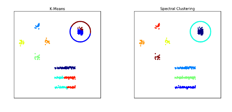
342 CHAPTER 10. DISTANCE AND NETWORK METHODS
Figure 10.21: The results of k-means (left) and cut-based spectral clustering
(right) on our 9-cluster example. Spectral clustering correctly finds connected
clusters here that k-means cannot.
tempted to cut a cluster in two. We seek clusters that are connected in an
appropriate similarity graph.
An n×nsimilarity matrix Sscores how much alike each pair of elements pi
and pjare. Similarity is essentially the inverse of distance: when piis close to
pj, then the item associated with pimust be similar to that of pj. It is natural
to measure similarity on a scale from 0 to 1, where 0 represents completely
different and 1 means identical. This can be realized by making S[i, j] an inverse
exponential function of distance, regulated by a parameter β:
S[i, j] = e−β||pi−pj||
This works because e0= 1 and e−x= 1/ex→0 as x→ ∞.
Asimilarity graph has a weighted edge (i, j) between each pair of vertices i
and jreflecting the similar of piand pj. This is exactly the similarity matrix
described above. However, we can make this graph sparse by setting all small
terms (S[i, j]≤tfor some threshold t) to zero. This greatly reduces the number
of edges in the graph. We can even turn it into an unweighted graph by setting
the weight to 1 for all S[i, j]> t.
Cuts in Graphs
Real clusters in similarity graphs have the appearance of being dense regions
which are only loosely connected to the rest of graph. A cluster Chas a weight
which is a function of the edges within the cluster:
W(C) = X
x∈CX
y∈C
S[i, j]
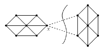
10.5. CLUSTERING 343
Figure 10.22: Low weight cuts in similarity graphs identify natural clusters.
The edges connecting Cto the rest of the graph define a cut, meaning the set of
edges who have one vertex in Cand the other in the rest of the graph (V−C).
The weight of this cut W0(C) is defined:
W0(C) = X
x∈CX
y∈V−C
S[i, j]
Ideally clusters will have a high weight W(C) but a small cut W0(C), as shown
in Figure 10.22. The conductance of cluster Cis the ratio of cut weight over
internal weight (W0(C)/W (C)), with better clusters having lower conductance.
Finding low conductance clusters is a challenge. Help comes, surprisingly,
from linear algebra. The similarity matrix Sis a symmetric matrix, meaning
that it has an eigenvalue decomposition as discussed in Section 8.5. We saw
that the leading eigenvector results in a blocky approximation to S, with the
contribution of additional eigenvectors gradually improving the approximation.
Dropping the smallest eigenvectors removes either details or noise, depending
upon the interpretation.
Note that the ideal similarity matrix is a blocky matrix, because within each
cluster we expect a dense connection of highly-similar pairs, with little cross talk
to vertices of other clusters. This suggests using the eigenvectors of Sto define
robust features to cluster the vertices on. Performing k-means clustering on this
transformed feature space will recover good clusters.
This approach is called spectral clustering. We construct an appropriately
normalized similarity matrix called the Laplacian, where L=D−Sand D
is the degree-weighted identity matrix, so D[i, i] = PjS[i, j]. The kmost
important eigenvectors of Ldefine an n×kfeature matrix. Curiously, the most
valuable eigenvectors for clustering here turn out to have the smallest non-zero
eigenvalues, due to special properties of the Laplacian matrix. Performing k-
means clustering in this feature space generates highly connected clusters.

344 CHAPTER 10. DISTANCE AND NETWORK METHODS
Take-Home Lesson: What is the right clustering algorithm to use for your data?
There are many possibilities to consider, but your most important decisions are:
•What is the right distance function to use?
•What are you doing to properly normalize your variables?
•Do your clusters look sensible to you when appropriately visualized? Un-
derstand that clustering is never perfect, because the algorithm can’t read
your mind. But is it good enough?
10.6 War Story: Cluster Bombing
My host at the research labs of a major media/tech company during my sabbat-
ical was Amanda Stent, the leader of their natural language processing (NLP)
group. She is exceptionally efficient, excessively polite, and generally imper-
turbable. But with enough provocation she can get her dander up, and I heard
the exasperation in her voice when she muttered “Product people!”
Part of her mission at the lab was to interface with company product groups
which needed expertise in language technologies. The offenders here were with
the news product, responsible for showing users recent articles of interest to
them. The article clustering module was an important part of this effort, because
it grouped together all articles written about the same story/event. Users did
not want to read ten different articles about the same baseball game or Internet
meme. Showing users repeated stories from a single article cluster proved highly
annoying, and chased them away from our site.
But article clustering only helps when the clusters themselves are accurate.
“This is the third time they have come to me complaining about the clus-
tering. They never give me specific examples of what is wrong, just complaints
that the clusters are not good enough. They keep sending me links to postings
they find on Stack Overflow about new clustering algorithms, and ask if we
should be using these instead.”
I agreed to talk to them for her.
First, I made sure that the product people understood that clustering is an
ill-defined problem, and that no matter what algorithm they used, there were
going to be occasional mistakes that they would have to live with. This didn’t
mean that there wasn’t any room for improvement over their current clustering
algorithm, but that they would have to temper any dreams of perfection.
Second, I told them that we could not hope to fix the problem until we
were given clear examples of what exactly was going wrong. I asked them for
twenty examples of article pairs which were co-clustered by the algorithm, but
should not have been. And another twenty examples of article pairs which
naturally belonged in the same cluster, yet this similarity was not recognized
by the algorithm.
10.7. CHAPTER NOTES 345
This had the desired effect. They readily agreed that my requests were
sensible, and necessary to diagnose the problem. They told me they would get
right on top of it. But this required work from their end, and everyone is busy
with too many things. So I never heard back from them again, and was left to
spend the rest of my sabbatical in a productive peace.
Months later, Amanda told me she had again spoken with the product peo-
ple. Someone had discovered that their clustering module was only using the
words from the headlines as features, and ignoring the entire contents of the
actual article. There was nothing wrong with the algorithm per-se, only with
the features, and it worked much better soon as it was given a richer feature
set.
What are the morals of this tale? A man has got to know his limitations,
and so does a clustering algorithm. Go to Google News right now, and carefully
study the article clusters. If you have a discerning eye you will find several small
errors, and maybe something really embarrassing. But the more amazing thing
is how well this works in the big picture, that you can produce an informative,
non-redundant news feed algorithmically from thousands of different sources.
Effective clustering is never perfect, but can be immensely valuable.
The second moral is that feature engineering and distance functions matter
in clustering much more than the specific algorithmic approach. Those prod-
uct people dreamed of a high-powered algorithm which would solve all their
problems, yet were only clustering on the headlines. Headlines are designed to
attract attention, not explain the story. The best newspaper headlines in his-
tory, such as “Headless Body Found in Topless Bar” and “Ford to City, Drop
Dead” would be impossible to link to more sober ledes associated with the same
stories.
10.7 Chapter Notes
Distance computations are a basis of the field of computational geometry, the
study of algorithms and data structures for manipulating point sets. Excellent
introductions to computational geometry include [O’R01, dBvKOS00].
Samet [Sam06] is the best reference on kd-trees and other spatial data struc-
tures for nearest neighbor search. All major (and many minor) variants are de-
veloped in substantial detail. A shorter survey [Sam05] is also available. Indyk
[Ind04] ably surveys recent results in approximate nearest neighbor search in
high dimensions, based on random projection methods.
Graph theory is the study of the abstract properties of graphs, with West
[Wes00] serving as an excellent introduction. Networks represent empirical
connections between real-world entities for encoding information about them.
Easley and Kleinberg [EK10] discuss the foundations of a science of networks in
society.
Clustering, also known as cluster analysis, is a classical topic in statistics and
computer science. Representative treatments include Everitt et al. [ELLS11] and
James et al. [JWHT13].
346 CHAPTER 10. DISTANCE AND NETWORK METHODS
10.8 Exercises
Distance Metrics
10-1. [3] Prove that Euclidean distance is in fact a metric.
10-2. [5] Prove that Lpdistance is a metric, for all p≥1.
10-3. [5] Prove that dimension-weighted Lpdistance is a metric, for all p≥1.
10-4. [3] Experiment with data to convince yourself that (a) cosine distance is not a
true distance metric, and that (b) angular distance is a distance metric.
10-5. [5] Prove that edit distance on text strings defines a metric.
10-6. [8] Show that the expected distance between two points chosen uniformly and
independently from a line of length 1 is 1/3. Establish convincing upper and
lower bounds on this expected distance for partial credit.
Nearest Neighbor Classification
10-7. [3] What is the maximum number of nearest neighbors that a given point pcan
have in two dimensions, assuming the possibility of ties?
10-8. [5] Following up on the previous question, what is the maximum number of
different points that can have a given point pas its nearest neighbor, again in
two dimensions?
10-9. [3] Construct a two-class point set on n≥10 points in two dimensions, where
every point would be misclassified according to its nearest neighbor.
10-10. [5] Repeat the previous question, but where we now classify each point according
to its three nearest neighbors (k= 3).
10-11. [5] Suppose a two-class, k= 1 nearest-neighbor classifier is trained with at least
three positive points and at least three negative points.
(a) Might it possible this classifier could label all new examples as positive?
(b) What if k= 3?
Networks
10-12. [3] Give explanations for what the nodes with the largest in-degree and out-
degree might be in the following graphs:
(a) The telephone graph, where edge (x, y) means xcalls y.
(b) The Twitter graph, where edge (x, y) means xfollows y.
10-13. [3] Power law distributions on vertex degree in networks usually result from
preferential attachment, a mechanism by which new edges are more likely to
connect to nodes of high degree. For each of the following graphs, suggest what
their vertex degree distribution is, and if they are power law distributed describe
what the preferential attachment mechanism might be.
(a) Social networks like Facebook or Instagram.
(b) Sites on the World Wide Web (WWW).
(c) Road networks connecting cities.
10.8. EXERCISES 347
(d) Product/customer networks like Amazon or Netflix.
10-14. [5] For each of the following graph-theoretic properties, give an example of a
real-world network that satisfies the property, and a second network which does
not.
(a) Directed vs. undirected.
(b) Weighted vs. unweighted.
(c) Simple vs. non-simple.
(d) Sparse vs. dense.
(e) Embedded vs. topological.
(f) Labeled vs. unlabeled.
10-15. [3] Prove that in any simple graph, there are always an even number of vertices
with odd vertex degree.
10-16. [3] Implement a simple version of the PageRank algorithm, and test it on your
favorite network. Which vertices get highlighted as most central?
Clustering
10-17. [5] For a data set with points at positions (4,10), (7,10) (4,8), (6,8), (3,4),
(2,2), (5,2), (9,3), (12,3), (11,4), (10,5), and (12,6), show the clustering that
results from
(a) Single-linkage clustering
(b) Average-linkage clustering
(c) Furthest-neighbor (complete linkage) clustering.
10-18. [3] For each of the following The Quant Shop prediction challenges, propose
available data that might make it feasible to employ nearest-neighbor/analogical
methods to the task:
(a) Miss Universe.
(b) Movie gross.
(c) Baby weight.
(d) Art auction price.
(e) White Christmas.
(f) Football champions.
(g) Ghoul pool.
(h) Gold/oil prices.
10-19. [3] Perform k-means clustering manually on the following points, for k= 2:
S={(1,4),(1,3),(0,4),(5,1),(6,2),(4,0)}
Plot the points and the final clusters.
348 CHAPTER 10. DISTANCE AND NETWORK METHODS
10-20. [5] Implement two versions of a simple k-means algorithm: one of which uses
numerical centroids as centers, the other of which restricts centers to be input
points from the data set. Then experiment. Which algorithm converges faster
on average? Which algorithm produces clusterings with lower absolute and
mean-squared error, and by how much?
10-21. [5] Suppose s1and s2are randomly selected subsets from a universal set with
nitems. What is the expected value of the Jaccard similarity J(s1, s2)?
10-22. [5] Identify a data set on entities where you have some sense of natural clusters
which should emerge, be it on people, universities, companies, or movies. Cluster
it by one or more algorithms, perhaps k-means and agglomerative clustering.
Then evaluate the resulting clusters based on your knowledge of the domain.
Did they do a good job? What things did it get wrong? Can you explain why
the algorithm did not reconstruct what was in your head?
10-23. [5] Assume that we are trying to cluster n= 10 points in one dimension, where
point pihas a position of x=i. What is the agglomerative clustering tree for
these points under
(a) Single-link clustering
(b) Average-link clustering
(c) Complete-link/furthest-neighbor clustering
10-24. [5] Assume that we are trying to cluster n= 10 points in one dimension, where
point pihas a position of x= 2i. What is the agglomerative clustering tree for
these points under
(a) Single-link clustering
(b) Average-link clustering
(c) Complete-link/furthest-neighbor clustering
Implementation Projects
10-25. [5] Do experiments studying the impact of merging criteria (single-link, cen-
troid, average-link, furthest link) on the properties of the resulting cluster tree.
Which leads to the tallest trees? The most balanced? How do their running
times compare? Which method produces results most consistent with k-means
clustering?
10-26. [5] Experiment with the performance of different algorithms/data structures for
finding the nearest neighbor of a query point qamong npoints in ddimensions.
What is the maximum dfor which each method remains viable? How much
faster are heuristic methods based on LSH than methods that guarantee the
exact nearest neighbor, at what loss of accuracy?
Interview Questions
10-27. [5] What is curse of dimensionality? How does it affect distance and similarity
measures?
10-28. [5] What is clustering? Describe an example algorithm that performs clustering.
How can we know whether it produced decent clusters on our data set?
10-29. [5] How might we be able to estimate the right number of clusters to use with
a given data set?
10.8. EXERCISES 349
10-30. [5] What is the difference between unsupervised and supervised learning?
10-31. [5] How can you deal with correlated features in your data set by reducing the
dimensionality of the data.
10-32. [5] Explain what a local optimum is. Why is it important in k-means clustering?
Kaggle Challenges
10-33. Which people are most influential in a given social network?
10-34. Who is destined to become friends in an online social network?
https://www.kaggle.com/c/socialNetwork
10-35. Predict which product a consumer is most likely to buy.
https://www.kaggle.com/c/coupon-purchase-prediction
https://www.kaggle.com/c/predict-who-is-more-influential-in-a-social-network
Chapter 11
Machine Learning
Any sufficiently advanced form of cheating is indistinguishable from
learning.
– Jan Schaumann
For much of my career, I was highly suspicious of the importance of machine
learning. I sat through many talks over the years, with grandiose claims and very
meager results. But it is clear that the tide has turned. The most interesting
work in computer science today revolves around machine learning, both powerful
new algorithms and exciting new applications.
This revolution has occurred for several reasons. First, the volume of data
and computing power available crossed a magic threshold where machine learn-
ing systems started doing interesting things, even using old approaches. This
inspired greater activity in developing methods that scale better, and greater
investment in data resources and system development. The culture of open
source software deserves to take a bow, because new ideas turn into available
tools amazingly quickly. Machine learning today is an exploding field with a
great deal of excitement about it.
We have so far discussed two ways of building models based on data, linear
regression and nearest neighbor approaches, both in fairly extensive detail. For
many applications, this is all you will need to know. If you have enough labeled
training data, all methods are likely to produce good results. And if you don’t,
all methods are likely to fail. The impact of the best machine learning algorithm
can make a difference, but generally only at the margins. I feel that the purpose
of my book is to get you from crawling to walking, so that more specialized books
can teach you how to run.
That said, a slew of interesting and important machine learning algorithms
have been developed. We will review these methods here in this chapter, with
the goal of understanding the strengths and weaknesses of each, along several
relevant dimensions of performance:
352 CHAPTER 11. MACHINE LEARNING
•Power and expressibility: Machine learning methods differ in the richness
and complexity of the models they support. Linear regression fits linear
functions, while nearest neighbor methods define piecewise-linear sepa-
ration boundaries with enough pieces to approximate arbitrary curves.
Greater expressive power provides the possibility of more accurate mod-
els, as well as the dangers of overfitting.
•Interpretability: Powerful methods like deep learning often produce mod-
els that are completely impenetrable. They might provide very accurate
classification in practice, but no human-readable explanation of why they
are making the decisions they do. In contrast, the largest coefficients
in a linear regression model identify the most powerful features, and the
identities of nearest neighbors enable us to independently determine our
confidence in these analogies.
I personally believe that interpretability is an important property of a
model, and am generally happier to take a lesser-performing model I un-
derstand over a slightly more accurate one that I don’t. This may not
be a universally shared opinion, but you have a sense whether you really
understand your model and its particular application domain.
•Ease of use: Certain machine learning methods feature relatively few
parameters or decisions, meaning they work right out of the box. Both
linear regression and nearest neighbor classification are quite simple in
this regard. In contrast, methods like support vector machines (SVMs)
provide much greater scope to optimize algorithm performance with the
proper settings. My sense is that the available tools for machine learning
will continue to get better: easier to use and more powerful. But for now,
certain methods allow the user enough rope to hang themselves if they
don’t know what they are doing.
•Training speed: Methods differ greatly in how fast they fit the neces-
sary parameters of the model, which determines how much training data
you can afford to use in practice. Traditional linear regression methods
can be expensive to fit for large models. In contrast, nearest neighbor
search requires almost no training time at all, outside that of building the
appropriate search data structure.
•Prediction speed: Methods differ in how fast they make classification de-
cisions on a new query q. Linear/logistic regression is fast, just computing
a weighted sum of the fields in the input records. In contrast, nearest
neighbor search requires explicitly testing qagainst a substantial amount
of the training test. In general there is a trade-off with training speed:
you can pay me now or pay me later.
Figure 11.1 presents my subjective ratings of roughly where the approaches
discussed in this chapter fit along these performance dimensions. These ratings
are not the voice of G-d, and reasonable people can have different opinions.

353
Figure 11.1: Subjective rankings of machine learning approaches along five di-
mensions, on a 1 to 10 scale with higher being better.
Hopefully they survey the landscape of machine learning algorithms in a useful
manner. Certainly no single machine learning method dominates all the others.
This observation is formalized in the appropriately named no free lunch theorem,
which proves there does not exist a single machine learning algorithm better
than all the others on all problems.
That said, it is still possible to rank methods according to priority of use for
practitioners. My ordering of methods in this book (and Figure 11.1) starts with
the ones that are easy to use/tune, but have lower discriminative power than the
most advanced methods. Generally speaking, I encourage you to start with the
easy methods and work your way down the list if the potential improvements
in accuracy really justify it.
It is easy to misuse the material I will present in this chapter, because there
is a natural temptation to try all possible machine learning algorithms and
pick whichever model gives the highest reported accuracy or F1 score. Done
naively through a single library call, which makes this easy, you are likely to
discover that all models do about the same on your training data. Further,
any performance differences between them that you do find are more likely
attributable to variance than insight. Experiments like this is what statistical
significance testing was invented for.
The most important factor that will determine the quality of your models
is the quality of your features. We talked a lot about data cleaning in Chapter
3, which concerns the proper preparation of your data matrix. We delve more
deeply into feature engineering in Section 11.5.4, before discussing deep learning
methods that strive to engineer their own features.
One final comment. Data scientists tend to have a favorite machine learning
approach, which they advocate for in a similar manner to their favorite pro-
gramming language or sports team. A large part of this is experience, meaning
that because they are most familiar with a particular implementation it works
best in their hands. But part of it is magical thinking, the fact that they noticed
one library slightly outperforming others on a few examples and inappropriately
generalized.
Power of Ease of Ease of Training Prediction
Method Expression Interpretation Use Speed Speed
Linear Regression 59999
Nearest Neighbor 598102
Naive Bayes 48798
Decision Trees 88779
Support Vector Machines 86677
Boosting 96666
Graphical Models 98344
Deep Learning 10 3 4 3 7

354 CHAPTER 11. MACHINE LEARNING
Don’t fall into this trap. Select methods which best fit the needs of your
application based on the criteria above, and gain enough experience with their
various knobs and levers to optimize performance.
11.1 Naive Bayes
Recall that two events Aand Bare independent if p(Aand B) = p(A)·p(B).
If Ais the event that “my favorite sports team wins today” and Bis “the stock
market goes up today,” then presumably Aand Bare independent. But this is
not true in general. Consider the case if Ais the event that “I get an A in Data
Science this semester” and Bis “I get an A in a different course this semester.”
There are dependencies between these events: renewed enthusiasms for either
study or drinking will affect course performance in a correlated manner. In the
general case,
p(Aand B) = p(A)·p(B|A) = p(A) + P(B)−p(Aor B).
If everything was independent, the world of probability would be a much
simpler place. The naive Bayes classification algorithm crosses its fingers and
assumes independence, to avoid the need to compute these messy conditional
probabilities.
11.1.1 Formulation
Suppose we wish to classify the vector X= (x1,...xn) into one of mclasses
C1, . . . , Cm. We seek to compute the probability of each possible class given X,
so we can assign Xthe label of the class with highest probability. By Bayes
theorem,
p(Ci|X) = p(Ci)·p(X|Ci)
p(X)
Let’s parse this equation. The term p(Ci) is the prior probability, the probabil-
ity of the class label without any specific evidence. I know that you the reader
are more likely to have black hair than red hair, because more people in the
world have black hair than red hair.1
The denominator P(X) gives the probability of seeing the given input vector
Xover all possible input vectors. Establishing the exact value of P(X) seems
somewhat dicey, but mercifully is usually unnecessary. Observe that this de-
nominator is the same for all classes. We only seek to establish a class label for
X, so the value of p(X) has no effect on our decision. Selecting the class with
highest probability means
C(X) = arg max
i=1,...,m
p(Ci)·p(X|Ci)
p(X)= arg max
i=1,...,m
p(Ci)·p(X|Ci).
1Wikipedia claims that only 1–2% of the world’s population are redheads.

11.1. NAIVE BAYES 355
Day Outlook Temp Humidity Beach?
1 Sunny High High Yes
2 Sunny High Normal Yes
3 Sunny Low Normal No
4 Sunny Mild High Yes
5 Rain Mild Normal No
6Rain High High No
7 Rain Low Normal No
8 Cloudy High High No
9 Cloudy High Normal Yes
10 Cloudy Mild Normal No
P(X|Class) Probability in Class
Outlook Beach No Beach
Sunny 3/4 1/6
Rain 0/4 3/6
Cloudy 1/4 2/6
Temperature Beach No Beach
High 3/4 2/6
Mild 1/4 2/6
Low 0/4 2/6
Humidity Beach No Beach
High 2/4 2/6
Normal 2/4 4/6
P(Beach Day) 4/10 6/10
Figure 11.2: Probabilities to support a naive Bayes calculation on whether
today is a good day to go to the beach: tabulated events (left) with marginal
probability distributions (right).
The remaining term p(X|Ci) is the probability of seeing input vector Xgiven
that we know the class of the item is Ci. This also seems somewhat dicey. What
is the probability someone weighs 150 lbs and is 5 foot 8 inches tall, given that
they are male? It should be clear that p(X|Ci) will generally be very small:
there is a huge space of possible input vectors consistent with the class, only
one of which corresponds to the given item.
But now suppose we lived where everything was independent, i.e. the prob-
ability of event Aand event Bwas always p(A)·p(B). Then
p(X|Ci) =
n
Y
j=1
p(xj|Ci).
Now anyone who really believes in a world of independent probabilities is quite
naive, hence the name naive Bayes. But such an assumption really does make
the computations much easier. Putting this together:
C(X) = arg max
i=1,...,m
p(Ci)·p(X|Ci) = arg max
i=1,...,m
p(Ci)
n
Y
j=1
p(xj|Ci).
Finally, we should hit the product with a log to turn it to a sum, for better
numerical stability. The logs of probabilities will be negative numbers, but less
likely events are more negative than common ones. Thus the complete naive
Bayes algorithm is given by the following formula:
C(X) = arg max
i=1,...,m
(log(p(Ci)) +
n
X
j=1
log(p(xj|Ci))).
How do we calculate the p(xj|Ci), the probability of observation xjgiven
class label i? This is easy from the training data, particularly if xjis a cate-
gorical variable, like “has red hair.” We can simply select all class iinstances
356 CHAPTER 11. MACHINE LEARNING
in the training set, and compute the fraction of them which have property xj.
This fraction defines a reasonable estimate of p(xj|Ci). A bit more imagination
is needed when xjis a numerical variable, like “age=18” or “the word dog oc-
curred six times in the given document,” but in principle is computed by how
often this value is observed in the training set.
Figure 11.2 illustrates the naive Bayes procedure. On the left, it presents a
table of ten observations of weather conditions, and whether each observation
proved to be a day to go to the beach, or instead stay home. This table has been
broken down on the right, to produce conditional probabilities of the weather
condition given the activity. From these probabilities, we can use Bayes theorem
to compute:
P(Beach|(Sunny,Mild,High))
= (P(Sunny|Beach) ×P(Mild|Beach) ×P(High|Beach) ×P(Beach)
= (3/4) ×(1/4) ×(2/4) ×(4/10) = 0.0375
P(No Beach|(Sunny,Mild,High))
= (P(Sunny|No) ×P(Mild|No) ×P(High|No)) ×P(No)
= (1/6) ×(2/6) ×(2/6) ×(6/10) = 0.0111
Since 0.0375 >0.0111, naive Bayes is telling us to hit the beach. Note that
it is irrelevant that this particular combination of (Sunny,Mild,High) appeared
in the training data. We are basing our decision on the aggregate probabilities,
not a single row as in nearest neighbor classification.
11.1.2 Dealing with Zero Counts (Discounting)
There is a subtle but important feature preparation issue particularly associated
with the naive Bayes algorithm. Observed counts do not accurately capture the
frequency of rare events, for which there is typically a long tail.
The issue was first raised by the mathematician Laplace, who asked: What
is the probability the sun will rise tomorrow? It may be close to one, but it
ain’t exactly 1.0. Although the sun has risen like clockwork each morning for
the 36.5 million mornings or so since man started noticing such things, it will
not do so forever. The time will come where the earth or sun explodes, and so
there is a small but non-zero chance that tonight’s the night.
There can always be events which have not yet been seen in any finite data
set. You might well have records on a hundred people, none of whom happen
to have red hair. Concluding that the probability of red hair is 0/100 = 0 is
potentially disastrous when we are asked to classify someone with red hair, since
the probability of them being in each and every class will be zero. Even worse
would be if there was exactly one redhead in the entire training set, say labeled

11.2. DECISION TREE CLASSIFIERS 357
with class C2. Our naive Bayes classifier would decide that every future redhead
just had to be in class C2, regardless of other evidence.
Discounting is a statistical technique to adjust counts for yet-unseen events,
by explicitly leaving probability mass available for them. The simplest and most
popular technique is add-one discounting, where we add one to the frequency all
outcomes, including unseen. For example, suppose we were drawing balls from
an urn. After seeing five reds and three greens, what is the probability we will
see a new color on the next draw? If we employ add-one discounting,
P(red) = (5 + 1)/((5 + 1) + (3 + 1) + (0 + 1)) = 6/11,and
P(green) = (3 + 1)/((5 + 1) + (3 + 1) + (0 + 1)) = 4/11,
leaving the new color a probability mass of
P(new-color) = 1/((5 + 1) + (3 + 1) + (0 + 1)) = 1/11.
For small numbers of samples or large numbers of known classes, the dis-
counting causes a non-trivial damping of the probabilities. Our estimate for the
probability of seeing a red ball changes from 5/8 = 0.625 to 6/11 = 0.545 when
we employ add-one discounting. But this is a safer and more honest estimate,
and the differences will disappear into nothingness after we have seen enough
samples.
You should be aware that other discounting methods have been developed,
and adding one might not be the best possible estimator in all situations. That
said, not discounting counts is asking for trouble, and no one will be fired for
using the add-one method.
Discounting becomes particularly important in natural language processing,
where the traditional bag of words representation models a document as a word
frequency count vector over the language’s entire vocabulary, say 100,000 words.
Because word usage frequency is governed by a power law (Zipf’s law), words
in the tail are quite rare. Have you ever seen the English word defenestrate
before?2Even worse, documents of less than book length are too short to
contain 100,000 words, so we are doomed to see zeros wherever we look. Add-
one discounting turns these count vectors into sensible probability vectors, with
non-zero probabilities of seeing rare and so far unencountered words.
11.2 Decision Tree Classifiers
Adecision tree is a binary branching structure used to classify an arbitrary input
vector X. Each node in the tree contains a simple feature comparison against
some field xi∈X, like “is xi≥23.7?” The result of each such comparison is
either true or false, determining whether we should proceed along to the left or
right child of the given node. These structures are sometimes called classification
and regression trees (CART) because they can be applied to a broader class of
problems.
2It means to throw someone out the window.
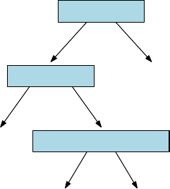
358 CHAPTER 11. MACHINE LEARNING
Yes No
Survived
0.73 35%
Died
0.17 61%
Died
0.05 2%
Survived
0.89 2%
Is sex male?
Is age >9.5?
More than two siblings?
Figure 11.3: Simple decision tree for predicting mortality on the Titanic.
The decision tree partitions training examples into groups of relatively uni-
form class composition, so the decision then becomes easy. Figure 11.3 presents
an example of a decision tree, designed to predict your chances of surviving
the shipwreck of the Titanic. Each row/instance travels a unique root-to-leaf
path to classification. The root test here reflects the naval tradition of women
and children first: 73% of the women survived, so this feature alone is enough
to make a prediction for women. The second level of the tree reflects children
first: any male 10 years or older is deemed out of luck. Even the younger ones
must pass one final hurdle: they generally made it to a lifeboat only if they had
brothers and sisters to lobby for them.
What is the accuracy of this model on the training data? It depends upon
what faction of the examples end on each leaf, and how pure these leaf samples
are. For the example of Figure 11.3, augmented with coverage percentage and
survival fraction (purity) at each node, the classification accuracy Aof this tree
is:
A= (0.35)(73%) + (0.61)(83%) + (0.02)(95%) + (0.02)(89%) = 78.86%.
An accuracy of 78.86% is not bad for such a simple decision procedure. We
could have driven it up to 100% by completing the tree so each of the 1317
passengers had a leaf to themselves, labeling that node with their ultimate
fate. Perhaps 23-year-old second-class males were more likely to survive than
either 22- or 24-year-old males, an observation the tree could leverage for higher
training accuracy. But such a complicated tree would be wildly overfit, finding
structure that isn’t meaningfully there. The tree in Figure 11.3 is interpretable,
robust, and reasonably accurate. Beyond that, it is every man for himself.
Advantages of decision trees include:
•Non-linearity: Each leaf represents a chunk of the decision space, but
reached through a potentially complicated path. This chain of logic per-
mits decision trees to represent highly complicated decision boundaries.
11.2. DECISION TREE CLASSIFIERS 359
•Support for categorical variables: Decision trees make natural use of
categorical variables, like “if hair color = red,” in addition to numerical
data. Categorical variables fit less comfortably into most other machine
learning methods.
•Interpretability: Decision trees are explainable; you can read them and
understand what their reasoning is. Thus decision tree algorithms can tell
you something about your data set that you might not have seen before.
Also, interpretability lets you vet whether you trust the decisions it will
make: is it making decisions for the right reasons?
•Robustness: The number of possible decision trees grows exponentially
in the number of features and possible tests, which means that we can
build as many as we wish. Constructing many random decision trees
(CART) and taking the result of each as a vote for the given label increases
robustness, and permits us to assess the confidence of our classification.
•Application to regression: The subset of items which follow a similar
path down a decision tree are likely similar in properties other than just
label. For each such subset, we can use linear regression to build a special
prediction model for the numerical values of such leaf items. This will
presumably perform better than a more general model trained over all
instances.
The biggest disadvantage of decision trees is a certain lack of elegance.
Learning methods like logistic regression and support vector machines use math.
Advanced probability theory, linear algebra, higher-dimensional geometry. You
know, math.
By contrast, decision trees are a hacker’s game. There are many cool knobs
to twist in the training procedure, and relatively little theory to help you twist
them in the right way.
But the fact of the matter is that decision tree models work very well in
practice. Gradient boosted decision trees (GBDTs) are currently the most fre-
quently used machine learning method to win Kaggle competitions. We will
work through this in stages. First decision trees, then boosting in the subse-
quent section.
11.2.1 Constructing Decision Trees
Decision trees are built in a top-down manner. We start from a given collection
of training instances, each with nfeatures and labeled with one of mclasses
C1, . . . , Cm. Each node in the decision tree contains a binary predicate, a logic
condition derived from a given feature.
Features with a discrete set of values vican easily be turned into binary
predicates through equality testing: “is feature xi=vij ?” Thus there are
|vi|distinct predicates associated with xi. Numerical features can be turned
into binary predicates with the addition of a threshold t: “is feature xi≥t?”

360 CHAPTER 11. MACHINE LEARNING
The set of potentially interesting thresholds tare defined by the gaps between
the observed values that xitakes on in the training set. If the complete set
of observations of xiare (10,11,11,14,20), the meaningful possible values for
t∈(10,11,14) or perhaps t∈(10.5,11.5,17). Both threshold sets produce the
same partitions of the observations, but using the midpoints of each gap seems
sounder when generalizing to future values unseen in training.
We need a way to evaluate each predicate for how well it will contribute to
partitioning the set Sof training examples reachable from this node. An ideal
predicate pwould be a pure partition of S, so that the class labels are disjoint.
In this dream all members of Sfrom each class Ciwill appear exclusively on one
side of the tree, however, such purity is not usually possible. We also want pred-
icates that produce balanced splits of S, meaning that the left subtree contains
roughly as many elements from Sas the right subtree. Balanced splits make
faster progress in classification, and also are potentially more robust. Setting
the threshold tto the minimum value of xipicks off a lone element from S,
produces a perfectly pure but maximally imbalanced split.
Thus our selection criteria should reward both balance and purity, to max-
imize what we learn from the test. One way to measure the purity of an item
subset Sis as the converse of disorder, or entropy. Let fidenote the fraction of
Swhich is of class Ci. Then the information theoretic entropy of S,H(S), can
be computed:
H(S) = −
m
X
i=1
filog2fi
The negative sign here exists to make the entire quantity positive, since the
logarithm of a proper fraction is always negative.
Let’s parse this formula. The purest possible contribution occurs when all
elements belong to a single class, meaning fj= 1 for some class j. The contri-
bution of class jto H(S) is 1 log2(1) = 0, identical to that of all other classes:
0·log2(0) = 0. The most disordered version is when all mclasses are represented
equally, meaning fi= 1/m. Then H(S) = log2(m) by the above definition. The
smaller the entropy, the better the node is for classification.
The value of a potential split applied to a tree node is how much it reduces
the entropy of the system. Suppose a Boolean predicate ppartitions Sinto two
disjoint subsets, so S=S1∪S2. Then the information gain of pis defined
IGp(S) = H(S)−
2
X
j=1
|Si|
|S|H(Si)
We seek the predicate p0which maximizes this information gain, as the best
splitter for S. This criteria implicitly prefers balanced splits since both sides of
the tree are evaluated.
Alternate measures of purity have been defined and are used in practice.
The Gini impurity is based on another quantity (fi(1 −fi)), which is zero in
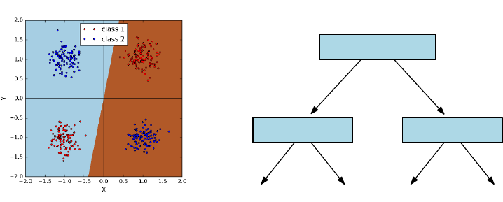
11.2. DECISION TREE CLASSIFIERS 361
Yes No
class 1
x>0
y>0y >0
class 1class 2 class 2
Figure 11.4: The exclusive OR function cannot be fit by linear classifiers. On
the left, we present four natural clusters in x−yspace. This demonstrates
the complete inability of logistic regression to find a meaningful separator, even
though a small decision tree easily does the job (right).
both cases of pure splits, fi= 0 or fi= 1:
IG(f) =
m
X
i=1
fi(1 −fi) =
m
X
i=1
(fi−f2
i) =
m
X
i=1
fi−
m
X
i=1
f2
i= 1 −
m
X
i=1
f2
i
Predicate selection criteria to optimize Gini impurity can be similarly defined.
We need a stopping condition to complete the heuristic. When is a node
pure enough to call it a leaf? By setting a threshold on information gain, we
stop dividing when the reward of another test is less than .
An alternate strategy is to build out the full tree until all leaves are com-
pletely pure, and then prune it back by eliminating nodes which contribute the
least information gain. It is fairly common that a large universe may have no
good splitters near the root, but better ones emerge as the set of live items gets
smaller. This approach has the benefit of not giving up too early in the process.
11.2.2 Realizing Exclusive Or
Some decision boundary shapes can be hard or even impossible to fit using a
particular machine learning approach. Most notoriously, linear classifiers cannot
be used to fit certain simple non-linear functions like eXclusive OR (XOR). The
logic function A⊕Bis defined as
A⊕B= (Aor ¯
B) or ( ¯
Aor B).
For points (x, y) in two dimensions, we can define predicates such that A
means “is x≥0?” and Bmeans the “is y≥0?”. Then there are two distinct
regions where A⊕Btrue, opposing quadrants in this xy-plane shown in Figure
362 CHAPTER 11. MACHINE LEARNING
11.4 (left). The need to carve up two regions with one line explains why XOR
is impossible for linear classifiers.
Decision trees are powerful enough to recognize XOR. Indeed, the two-level
tree in Figure 11.4 (right) does the job. After the root tests whether Ais true
or false, the second level tests for Bare already conditioned on A, so each of
the four leaves can be associated with a distinct quadrant, allowing for proper
classification.
Although decision trees can recognize XOR, that doesn’t mean it is easy to
find the tree that does it. What makes XOR hard to deal with is that you can’t
see yourself making progress toward better classification, even if you pick the
correct root node. In the example above, choosing a root node of “is x > 0?”
causes no apparent enrichment of class purity on either side. The value of this
test only becomes apparent if we look ahead another level, since the information
gain is zero.
Greedy decision tree construction heuristics fail on problems like XOR. This
suggests the value of more sophisticated and computationally expensive tree
building procedures in difficult cases, which look-ahead like computer chess
programs, evaluating the worth of move pnot now, but how it looks several
moves later.
11.2.3 Ensembles of Decision Trees
There are an enormous number of possible decision trees which can be built
on any training set S. Further, each of them will classify all training examples
perfectly, if we keep refining until all leaves are pure. This suggests building
hundreds or even thousands of different trees, and evaluating a query item q
against each of them to return a possible label. By letting each tree cast its
own independent vote, we gain confidence that the most commonly seen label
will be the right label.
For this to avoid group-think, we need the trees to be diverse. Repeatedly
using a deterministic construction procedure that finds the best tree is worthless,
because they will all be identical. Better would be to randomly select a new
splitting dimension at each tree node, and then find the best possible threshold
for this variable to define the predicate.
But even with random dimension selection, the resulting trees often are
highly correlated. A better approach is bagging, building the best possible trees
on relatively small random subsets of items. Done properly, the resulting trees
should be relatively independent of each other, providing a diversity of classifiers
to work with, facilitating the wisdom of crowds.
Using ensembles of decision trees has another advantage beyond robustness.
The degree of consensus among the trees offers a measure of confidence for any
classification decision. There is a big difference in the majority label appearing
in 501 of 1000 trees vs. 947 of them.
This fraction can be interpreted as a probability, but even better might be
to feed this number into logistic regression for a better motivated measure of
confidence. Assuming we have a binary classification problem, let fidenote the
11.3. BOOSTING AND ENSEMBLE LEARNING 363
fraction of trees picking class C1on input vector Xi. Run the entire training
set through the decision tree ensemble. Now define a logistic regression problem
where fiis input variable and the class of Xithe output variable. The resulting
logit function will determine an appropriate confidence level, for any observed
fraction of agreement.
11.3 Boosting and Ensemble Learning
The idea of aggregating large numbers of noisy “predictors” into one stronger
classifier applies to algorithms as well as crowds. It is often the case that many
different features all weakly correlate with the dependent variable. So what is
the best way we can combine them into one stronger classifier?
11.3.1 Voting with Classifiers
Ensemble learning is the strategy of combining many different classifiers into one
predictive unit. The naive Bayes approach of Section 11.1 has a little of this
flavor, because it uses each feature as a separate relatively weak classifier, then
multiplies them together. Linear/logistic regression has a similar interpretation,
in that it assigns a weight to each feature to maximize the predictive power of
the ensemble.
But more generally, ensemble learning revolves on the idea of voting. We saw
that decision trees can be more powerful in aggregate, by constructing hundreds
or thousands of them over random subsets of examples. The wisdom of crowds
comes from the triumph of diversity of thought over the individual with greatest
expertise.
Democracy rests on the principle of one man, one vote. Your educated,
reasoned judgment of the best course of action counts equally as the vote of
that loud-mouthed idiot down the hall. Democracy makes sense in terms of the
dynamics of society: shared decisions generally affect the idiot just as much as
they do you, so equality dictates that all people deserve an equal say in the
matter.
But the same argument does not apply to classifiers. The most natural way
to use multiple classifiers gives each a vote, and takes the majority label. But
why should each classifier get the same vote?
Figure 11.5 captures some of the complexity of assigning weights to classi-
fiers. The example consists of five voters, each classifying five items. All voters
are pretty good, each getting 60% correct, with the exception of v1, who batted
80%. The majority option proves no better than the worst individual classifier,
however, at 60%. But a perfect classifier results if we drop voters v4and v5and
weigh the remainders equally. What makes v2and v3valuable is not their over-
all accuracy, but their performance on the hardest problems (Dand especially
E).
There seem to be three primary ways to assign weights to the classifier/voters.
The simplest might be to give more weight to the votes of classifiers who have

364 CHAPTER 11. MACHINE LEARNING
Item/voter V1V2V3V4V5Majority Best weights
A * * * * * *
B * * * * * *
C * * * * * *
D * * *
E * * *
% correct 80% 60% 60% 60% 60% 60% 100%
best weight 1/3 1/3 1/3 0 0
Figure 11.5: Uniform weighting of votes does not always produce the best pos-
sible classifier, even when voters are equally accurate, because some problem
instances are harder than others (here, Dand E). The “*” denotes that the
given voter classified the given item correctly.
proven accurate in the past, perhaps assigning vithe multiplicative weight ti/T ,
where tiis the number of times viclassified correctly and T=Pc
i=1 ti. Note
that this weighting scheme would do no better than majority rule on the example
of Figure 11.5.
A second approach could be to use linear/logistic regression to find the best
possible weights. In a binary classification problem, the two classes would be
denoted as 0 and 1, respectively. The 0-1 results from each classifier can be
used as a feature to predict the actual class value. This formulation would find
non-uniform weights that favor classifiers correlated with the correct answers,
but do not explicitly seek to maximize the number of correct classifications.
11.3.2 Boosting Algorithms
The third idea is boosting. The key point is to weigh the examples according
to how hard they are to get right, and reward classifiers based on the weight of
the examples they get right, not just the count.
To set the weights of the classifier, we will adjust the weights of the training
examples. Easy training examples will be properly classified by most classifiers:
we reward classifiers more for getting the hard cases right.
A representative boosting algorithm is AdaBoost, presented in Figure 11.6.
We will not stress the details here, particularly the specifics of the weight ad-
justments in each round. We presume our classifier will be constructed as the
union of non-linear classifiers of the form “is (vi≥ti)?”, i.e. using thresholded
features as classifiers.
The algorithm proceeds in Trounds, for t={0, . . . , T }. Initially all train-
ing examples (points) should be of equal weight, so wi,0= 1/n for all points
x1, . . . , xn. We consider all possible feature/threshold classifiers, and identify
the fi(x) which minimizes t, the sum of the weights of the misclassified points.
The weight αtof the new classifier depends upon how accurate it is on the

11.3. BOOSTING AND ENSEMBLE LEARNING 365
AdaBoost
For tin 1 . . . T :
•Choose ft(x):
•Find weak learner ht(x) that minimizes t, the weighted sum
error for misclassified points t=Piwi,t
•Choose αt=1
2ln 1−t
t
•Add to ensemble:
•Ft(x) = Ft−1(x) + αtht(x)
•Update weights:
•wi,t+1 = (wi,t)e−yiαtht(xi)for all i
•Renormalize wi,t+1 such that Piwi,t+1 = 1
Figure 11.6: Pseudocode for the AdaBoost algorithm.
current point set, as measured by
αt=1
2ln(1−t
t
)
The point weights are normalized so Pn
i=1 wi= 1, so there must always be a
classifier with error t≤0.5.3
In the next round, the weights of the misclassified points are boosted to
make them more important. Let ht(xi) be the class (−1 or 1) predicted for xi,
and yithe correct class or that point. The sign of ht(xi)·yreflects whether
the classes agree (positive) or disagree (negative). We then adjust the weights
according to
w0
i,t+1 =wi,te−yiαtht(xi)
before re-normalizing all of them so they continue to sum to 1, i.e.
C=
n
X
i=1
w0
i,t+1,and wi,t+1 =w0
i,t+1/C.
The example in Figure 11.7 shows a final classifier as the linear sum of three
thresholded single-variable classifiers. Think of them as the simplest possible
3Consider two classifiers, one which calls class C0if xi≥ti, the other of which calls class
C1if xi≥ti. The first classifier is right exactly when the second one is wrong, so one of these
two must be at least 50%.

366 CHAPTER 11. MACHINE LEARNING
0.42 + 0.65 + 0.92
Figure 11.7: The final classifier is a weighted ensemble that correctly classifies
all points, despite errors in each component classifier which are highlighted in
red.
decision trees, each with exactly one node. The weights assigned by AdaBoost
are not uniform, but not so crazily skewed in this particular instance that they
behave different than a majority classifier. Observe the non-linear decision
boundary, resulting from the discrete nature of thresholded tests/decision trees.
Boosting is particularly valuable when applied to decision trees as the el-
ementary classifiers. The popular gradient boosted decision trees (GBDT) ap-
proach typically starts with a universe of small trees, with perhaps four to ten
nodes each. Such trees each encode a simple-enough logic that they do not
overfit the data. The relative weights assigned to each of these trees follows
from a training procedure, which tries to fit the errors from the previous rounds
(residuals) and increases the weights of the trees that correctly classified the
harder examples.
Boosting works hard to classify every training instance correctly, meaning
it works particularly hard to classify the most difficult instances. There is an
adage that “hard cases make bad law,” suggesting that difficult-to-decide cases
make poor precedents for subsequent analysis. This is an important argument
against boosting, because the method would seem prone to overfitting, although
it generally performs well in practice.
The danger of overfitting is particularly severe when the training data is
not a perfect gold standard. Human class annotations are often subjective and
inconsistent, leading boosting to amplify the noise at the expense of the signal.
The best boosting algorithms will deal with overfitting though regularization.
The goal will be to minimize the number of non-zero coefficients, and avoid
large coefficients that place too much faith in any one classifier in the ensemble.
Take-Home Lesson: Boosting can take advantage of weak classifiers in an ef-
fective way. However, it can behave in particularly pathological ways when a
fraction of your training examples are incorrectly annotated.
11.4 Support Vector Machines
Support vector machines (SVMs) are an important way of building non-linear
classifiers. They can be viewed as a relative of logistic regression, which sought
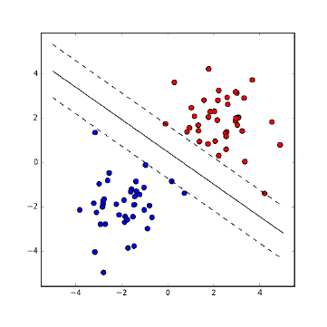
11.4. SUPPORT VECTOR MACHINES 367
Figure 11.8: SVMs seek to separate the two classes by the largest margin,
creating a channel around the separating line.
the line/plane lbest separating points with two classes of labels. Logistic re-
gression assigned a query point qits class label depending upon whether qlay
above or below this line l. Further, it used the logit function to transform the
distance from qto linto the probability that qbelongs in the identified class.
The optimization consideration in logistic regression involved minimizing
the sum of the misclassification probabilities over all the points. By contrast,
support vector machines work by seeking maximum margin linear separators
between the two classes. Figure 11.8(left) shows red and blue points separated
by a line. This line seeks to maximize the distance dto the nearest training
point, the maximum margin of separation between red and blue. This a natural
objective in building a decision boundary between two classes, since the larger
the margin, the farther any of our training points are from being misclassified.
The maximum margin classifier should be the most robust separator between
the two classes.
There are several properties that help define the maximum margin separator
between sets of red and blue points:
•The optimal line must be in the midpoint of the channel, a distance d
away from both the nearest red point and the nearest blue point. If this
were not so, we could shift the line over until it did bisect this channel,
thus enlarging the margin in the process.
•The actual separating channel is defined by its contact with a small num-
ber of the red and blue points, where “a small number” means at most
twice the number of dimensions of the points, for well-behaved point sets
avoiding d+ 1 points lying on any d-dimensional face. This is different
than with logistic regression, where all the points contribute to fitting the
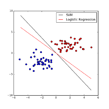
368 CHAPTER 11. MACHINE LEARNING
Figure 11.9: Both logistic regression and SVMs produce separating lines between
point sets, but optimized for different criteria.
best position of the line. These contact points are the support vectors
defining the channel.
•Points inside the convex hull of either the red or blue points have absolutely
no effect on the maximum margin separator, since we need all same-colored
points to be on the same side of the boundary. We could delete these
interior points or move them around, but the maximum margin separator
will not change until one of the points leaves the hull and enters the
separating strip.
•It is not always possible to perfectly separate red from blue by using a
straight line. Imagine a blue point sitting somewhere within the convex
hull of the red points. There is no way to carve this blue point away from
the red using only a line.
Logistic regression and support vector machines both produce separating
lines between point sets. These are optimized for different criteria, and hence
can be different, as shown in Figure 11.9. Logistic regression seeks the separator
which maximizes the total confidence in our classification summed over all the
points, while the wide margin separator of SVM does the best it can with
the closest points between the sets. Both methods generally produce similar
classifiers.
11.4. SUPPORT VECTOR MACHINES 369
11.4.1 Linear SVMs
These properties define the optimization of linear support vector machines. The
separating line/plane, like any other line/plane, can be written as
w·x−b= 0
for a vector of coefficients wdotted with a vector of input variables x. The
channel separating the two classes will be defined by two lines parallel to this
and equidistant on both sides, namely w·x−b= 1 and w·x−b= 1.
The actual geometric separation between the lines depends upon w, namely
2/||w||. For intuition, think about the slope in two dimensions: these lines will
be distance 2 apart for horizontal lines but negligibly far apart if they are nearly
vertical. This separating channel must be devoid of points, and indeed separate
red from blue points. Thus we must add constraints. For every red (class 1)
point xi, we insist that
w·x−b≥1,
while every blue (class −1) point ximust satisfy
w·x−b≤ −1,
If we let yi∈[−1,1] denote the class of xi, then these can be combined to yield
the optimization problem
max ||w||,where yi(w·xi−b)≥1 for all 1 ≤i≤n.
This can be solved using techniques akin to linear programming. Note that
the channel must be defined by the points making contact with its boundaries.
These vectors “support” the channel, which is where the provocative name sup-
port vector machines comes from. The optimization algorithm of efficient solvers
like LibLinear and LibSVM search through the relevant small subsets of support
vectors which potentially define separating channels to find the widest one.
Note that there are more general optimization criteria for SVMs, which
seek the line that defines a wide channel and penalizes (but does not forbid)
points that are misclassified. This sort of dual-objective function (make the
channel wide while misclassifying few points) can be thought of as a form of
regularization, with a constant to trade off between the two objectives. Gradient
descent search can be used to solve these general problems.
11.4.2 Non-linear SVMs
SVMs define a hyperplane which separates the points from the two classes.
Planes are lines in higher dimensions, readily defined using linear algebra. So
how can this linear method produce a non-linear decision boundary?
For a given point set to have a maximum margin separator, the two colors
must first be linearly separable. But as we have seen this is not always the case.
Consider the pathological case of Figure 11.10 (left), where the cluster of red
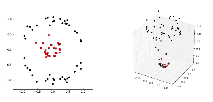
370 CHAPTER 11. MACHINE LEARNING
Figure 11.10: Projecting points to higher dimensions can make them linearly
separable.
points is surrounded by a ring-shaped cluster of black points. How might such
a thing arise? Suppose we partition travel destinations into day trips or long
trips, depending upon whether they are close enough to our given location. The
longitude and latitudes of each possible destination will yield data with exactly
the same structure as Figure 11.10 (left).
The key idea is that we can project our d-dimensional points into a higher-
dimensional space, where there will be more possibilities to separate them. For
nred/blue points along a line in one dimension, there are only n−1 potentially
interesting ways to separate them, specifically with a cut between the ith and
(i+ 1)st points for 1 ≤i<n. But this blows up to approximately n
2ways
as we move to two dimensions, because there is more freedom to partition as
we increase dimensionality. Figure 11.10 (right) demonstrates how lifting points
through the transformation (x, y)→(x, y, x2+y2) puts them on a paraboloid,
and makes it possible to linearly separate classes which were inseparable in the
original space.
If we jack the dimensionality of any two-class point set high enough, there
will always be a separating line between the red and black points. Indeed, if
we put the npoints in ndimensions through a reasonable transform, they will
always be linearly separable in a very simple way. For intuition, think about the
special case of two points (one red and one blue) in two dimensions: obviously
there must be a line separating them. Projecting this separating plane down to
the original space results in some form of curved decision boundary, and hence
the non-linearity of SVMs depends upon exactly how the input was projected
to a higher-dimensional space.
One nice way to turn npoints in ddimensions into npoints in ndimensions

11.4. SUPPORT VECTOR MACHINES 371
might be to represent each point by its distances to all ninput points. In
particular, for each point piwe can create a vector visuch that vij =dist(i, j),
the distance from pito pj. The vector of such distances should serve as a
powerful set of features for classifying any new point q, since the distances to
members of the actual class should be small compared to those of the other
class.
This feature space is indeed powerful, and one can readily imagine writing
a function to turn the original n×dfeature matrix into a new n×nfeature
matrix for classification. The problem here is space, because the number of
input points nis usually vastly larger than the dimension dthat they sit in.
Such a transform would be feasible to construct only for fairly small point sets,
say n≤1000. Further, working with such high-dimensional points should be
very expensive, since every single distance evaluation now takes time linear in
the number of points n, instead of the data dimension d. But something amazing
happens. . .
11.4.3 Kernels
The magic of SVMs is that this distance-feature matrix need not actually be
computed explicitly. In fact, the optimization inherent in finding the maximum
margin separator only performs the dot products of points with other points
and vectors. Thus we could imagine performing the distance expansion on the
fly, when the associated point is being used in a comparison. Hence there would
be no need to precompute the distance matrix: we can expand the points from
dto ndimensions as needed, do the distance computation, and then throw the
expansions away.
This would work to eliminate the space bottleneck, but we would still pay
a heavy price in computation time. The really amazing thing is that there are
functions, called kernels, which return what is essentially the distance compu-
tation on the larger vector without ever constructing the larger vector. Doing
SVMs with kernels gives us the power of finding the best separator over a variety
of non-linear functions without much additional cost. The mathematics moves
beyond the scope of what I’d like to cover here, but:
Take-Home Lesson: Kernel functions are what gives SVMs their power to sep-
arate project d-dimensional points to ndimensions, so they can be separated
without spending more that dsteps on the computation.
Support vector machines require experience to use effectively. There are
many different kernel functions available, beyond the distance kernel I presented
here. Each have advantages on certain data sets, so there is a need to futz with
the options of tools like LibSVM to get the best performance. They work best
on medium-sized data sets, with thousands but not millions of points.
372 CHAPTER 11. MACHINE LEARNING
11.5 Degrees of Supervision
There is a natural distinction between machine learning approaches based on
the degree and nature of the supervision employed in amassing training and
evaluation data. Like any taxonomy, there is some fuzziness around the margins,
making it an unsatisfying exercise to try to label exactly what a given system
is and is not doing. However, like any good taxonomy it gives you a frame to
guide your thinking, and suggests approaches that might lead to better results.
The methods discussed so far in this chapter assume that we are given train-
ing data with class labels or target variables, leaving our task as one to train
classifier or regression systems. But getting to the point of having labeled data
is usually the hard part. Machine learning algorithms generally perform better
the more data you can give them, but annotation is often difficult and expen-
sive. Modulating the degree of supervision provides a way to raise the volume
so your classifier can hear what is going on.
11.5.1 Supervised Learning
Supervised learning is the bread-and-butter paradigm for classification and re-
gression problems. We are given vectors of features xi, each with an associated
class label or target value yi. The annotations yirepresent the supervision,
typically derived from some manual process which limits the potential amount
of training data.
In certain problems, the annotations of the training data come from obser-
vations in interacting with the world, or at least a simulation of it. Google’s
AlphaGo program was the first computer program to beat the world champion
at Go. A position evaluation function is a scoring function that takes a board
position and computes a number estimating how strong it is. AlphaGo’s posi-
tion evaluation function was trained on all published games by human masters,
but much more data was needed. The solution was, essentially, to build a po-
sition evaluator by training against itself. Position evaluation is substantially
enhanced by search – looking several moves ahead before calling the evaluation
function on each leaf. Trying to predict the post-search score without the search
produces a stronger evaluation function. And generating this training data is
just a result of computation: the program playing against itself.
This idea of learning from the environment is called reinforcement learn-
ing. It cannot be applied everywhere, but it is always worth looking for clever
approaches to generate mechanically-annotated training data.
11.5.2 Unsupervised Learning
Unsupervised methods try to find structure in the data, by providing labels
(clusters) or values (rankings) without any trusted standard. They are best
used for exploration, for making sense of a data set otherwise untouched by
human hands.
11.5. DEGREES OF SUPERVISION 373
The mother of all unsupervised learning methods is clustering, which we
discussed extensively in Section 10.5. Note that clustering can be used to provide
training data for classification even in the absence of labels. If we presume that
the clusters found represent genuine phenomenon, we can then use the cluster
ID as a label for all the elements in the given cluster. These can now serve as
training data to build a classifier to predict the cluster ID. Predicting cluster
IDs can be useful even if these concepts do not have a name associated with
them, providing a reasonable label for any input record q.
Topic Modeling
Another important class of unsupervised methods is topic modeling, typically
associated with documents drawn over a given vocabulary. Documents are writ-
ten about topics, usually a mix of topics. This book is partitioned into chapters,
each of which is about a different topic, but it also touches on subjects ranging
from baseball to weddings. But what is a topic? Typically each topic is associ-
ated with a particular set of vocabulary words. Articles about baseball mention
hits,pitchers,strikeouts,bases, and slugging.Married,engaged,groom,bride,
love, and celebrate are words associated with the topic of wedding. Certain
words can represent multiple topics. For example love is also associated with
tennis, and hits with gangsters.
Once one has a set of topics (t1, . . . , tk) and the words which define them, the
problem of identifying the specific topics associated with any given document
dseems fairly straightforward. We count the number of word occurrences of d
in common with ti, and report success whenever this is high enough. If given
a set of documents manually labeled with topics, it seems reasonable to count
the frequency of each word over every topic class, to construct the list of words
most strongly associated with each topic.
But that is all very heavily supervised. Topic modeling is an unsupervised
approach that infers the topics and the word lists from scratch, just given un-
labeled documents. We can represent these texts by a w×dfrequency matrix
F, where wis the vocabulary size and dthe number of documents and F[i, j]
reflects how many times work iappears in document j. Suppose we factor F
into F≈W×D, where Wis a w×tword–topic matrix and Dis a t×dtopic–
document matrix. The largest entries in the ith row of Wreflect the topics
word wiis most strongly linked to, while the largest entries in the jth column
of Dreflect the topics best represented in document dj.
Such a factorization would represent a completely unsupervised form of
learning, with the exception of specifying the desired number of topics t. It
seems a messy process to construct such an approximate factorization, but there
are a variety of approaches to try to do so. Perhaps the most popular method
for topic modeling is an approach called latent Dirichlet allocation (LDA), which
produces a similar set of matrices Wand D, although not strictly produced by
factorization.
Figure 11.5.2 presents a toy example of LDA in action. Three excellent
books were analyzed, with the goal of seeing how they were organized among

374 CHAPTER 11. MACHINE LEARNING
Figure 11.11: Illustration of topic modeling (LDA). The three books are rep-
resented by their distribution of topics (left). Each topic is represented by a
list of words, with the weight a measure of its importance to the topic (right).
Documents are made up of words: the magic of LDA is that it simultaneously
infers the topics and word assignments in an unsupervised manner.
three latent topics. The LDA algorithm defined these topics in an unsupervised
way, by assigning each word weights for how much it contributes to each topic.
The results here are generally effective: the concept of each topic emerges from
its most important words (on the right). And the word distribution within each
book can then be readily partitioned among the three latent topics (on the left).
Note that this factorization mindset can be applied beyond documents, to
any feature matrix F. The matrix decomposition approaches we have previously
discussed, like singular value decomposition and principle components analysis,
are equally unsupervised, inducing structure inherent in the data sets without
our lead in finding it.
11.5.3 Semi-supervised Learning
The gap between supervised and unsupervised learning is filled by semi-supervised
learning methods, which amplify small amounts of labeled training data into
more. Turning small numbers of examples into larger numbers is often called
bootstrapping, from the notion of “pulling yourself up from your bootstraps.”
Semi-supervised approaches personify the cunning which needs be deployed to
build substantive training sets.
We assume that we are given a small number of labeled examples as (xi, yi)
pairs, backed by a large number of inputs xjof unknown label. Instead of
directly building our model from the training set, we can use it to classify the
mass of unlabeled instances. Perhaps we use a nearest neighbor approach to
classify these unknowns, or any of the other approaches we have discussed here.
But once we classify them, we assume the labels are correct and retrain on the
larger set.
Such approaches benefit strongly from having a reliable evaluation set. We
need to establish that the model trained on the bootstrapped examples performs
better than one trained on what we started with. Adding billions of training
examples is worthless if the labels are garbage.
There are other ways to generate training data without annotations. Often
it seems easier to find positive examples than negative examples. Consider the
Text T1T2T3
The Bible 0.73 0.01 0.26
Data Sci Manual 0.05 0.83 0.12
Who’s Bigger? 0.08 0.23 0.69
T1T2T3
Term Wei ght Term Weight Term Weight
God 0.028 CPU 0.021 past 0.013
Jesus 0.012 computer 0.010 history 0.011
pray 0.006 data 0.005 old 0.006
Israel 0.003 program 0.003 war 0.004
Moses 0.001 math 0.002 book 0.002

11.5. DEGREES OF SUPERVISION 375
problem of training a grammar corrector, meaning it distinguishes proper bits
of writing from ill-formed stuff. It is easy to get a hold of large amounts of
proper examples of English: whatever gets published in books and newspapers
generally qualifies as good. But it seems harder to get a hold of a large corpora
of incorrect writing. Still, we can observe that randomly adding, deleting, or
substituting arbitrary words to any text almost always makes it worse.4By
labeling all published text as correct and all random perturbations as incorrect,
we can create as large a training set as we desire without hiring someone to
annotate it.
How can we evaluate such a classifier? It is usually feasible to get enough
genuine annotated data for evaluation purposes, because what we need for eval-
uation is typically much smaller than that for training. We can also use our
classifier to suggest what to annotate. The most valuable examples for the anno-
tator to vet are those that our classifier makes mistakes on: published sentences
marked incorrect or random mutations that pass the test are worth passing to
a human judge.
11.5.4 Feature Engineering
Feature engineering is the fine art of applying domain knowledge to make it
easier for machine learning algorithms to do their intended job. In the context
of our taxonomy here, feature engineering can be considered an important part
of supervised learning, where the supervision applies to the feature vectors xi
instead of the associated target annotations yi.
It is important to ensure that features are presented to models in a way that
the model can properly use them. Incorporating application-specific knowledge
into the data instead of learning it sounds like cheating, to amateurs. But the
pros understand that there are things that cannot be learned easily, and hence
are better explicitly put into the feature set.
Consider a model to price art at auctions. Auction houses make their money
by charging a commission to the winning bidder, on top of what they pay
the owner. Different houses charge different rates, but they can amount to a
substantial bill. Since the total cost to the winner is split between purchase
price and commission, higher commissions may well lower the purchase price,
by cutting into what the bidder can afford to pay the owner.
So how can you represent the commission price in an art pricing model? I can
think of at least three different approaches, some of which can have disastrous
outcomes:
•Specify the commission percentage as a feature: Representing the house
cut (say 10%) as a column in the feature set might not be usable in a
linear model. The hit taken by the bidder is the product of the tax rate
and the final price. It has a multiplicative effect, not an additive effect,
4Give it a try someplace on this page. Pick a word at random and replace it by red. Then
again with the. And finally with defenestrate. Is my original text clearly better written than
what you get after such a change?
376 CHAPTER 11. MACHINE LEARNING
and hence cannot be meaningfully exploited if the price range for the art
spans from $100 to $1,000,000.
•Include the actual commission paid as a feature: Cheater. . . If you include
the commission ultimately paid as a feature, you pollute the features with
data not known at the time of the auction. Indeed, if all paintings were
faced with a 10% tax, and the tax paid was a feature, a perfectly accurate
(and completely useless) model would predict the price as ten times the
tax paid!
•Set the regression target variable to be the total amount paid: Since the
house commission rates and add-on fees are known to the buyer before
they make the bid, the right target variable should be the total amount
paid. Any given prediction of the total purchase price can be broken down
later into the purchase price, commission, and taxes according to the rules
of the house.
Feature engineering can be thought of as a domain-dependent version of data
cleaning, so the techniques discussed in Section 3.3 all apply here. The most
important of them will be reviewed here in context, now that we have finally
reached the point of actually building data-driven models:
•Z-scores and normalization: Normally-distributed values over compara-
ble numerical ranges make the best features, in general. To make the
ranges comparable, turn the values into Z-scores, by subtracting off the
mean and dividing by the standard deviation, Z= (x−µ)/σ. To make a
power law variable more normal, replace xin the feature set with log x.
•Impute missing values: Make sure there are no missing values in your
data and, if so, replace them by a meaningful guess or estimate. Recording
that someone’s weight equals −1 is an effortless way to mess up any model.
The simplest imputation method replaces each missing value by the mean
of the given column, and generally suffices, but stronger methods train
a model to predict the missing value based on the other variables in the
record. Review Section 3.3.3 for details.
•Dimension reduction: Recall that regularization is a way of forcing mod-
els to discard irrelevant features to prevent overfitting. It is even more
effective to eliminate irrelevant features before fitting your models, by re-
moving them from the data set. When is a feature xlikely irrelevant for
your model? Poor correlation with the target variable y, plus the lack of
any qualitative reason you can give for why xmight impact yare both
excellent indicators.
Dimension reduction techniques like singular-value decomposition are ex-
cellent ways to reduce large feature vectors to more powerful and concise
representations. The benefits include faster training times, less overfitting,
and noise reduction from observations.
11.6. DEEP LEARNING 377
•Explicit incorporation of non-linear combinations: Certain products or
ratios of feature variables have natural interpretations in context. Area
or volume are products of length, width, and height, yet cannot be part
of any linear model unless explicitly made a column in the feature ma-
trix. Aggregate totals, like career points scored in sports or total dollars
earned in salary, are usually incomparable between items of different age
or duration. But converting totals into rates (like points per game played
or dollars per hour) usually make more meaningful features.
Defining these products and ratios requires domain-specific information,
and careful thought during the feature engineering process. You are much
more likely to know the right combinations than your non-linear classifier
is to find it on its own.
Don’t be shy here. The difference between a good model and a bad model
usually comes down to quality of its feature engineering. Advanced machine
learning algorithms are glamorous, but it is the data preparation that produces
the results.
11.6 Deep Learning
The machine learning algorithms we have studied here do not really scale well to
huge data sets, for several reasons. Models like linear regression generally have
relatively few parameters, say one coefficient per column, and hence cannot
really benefit from enormous numbers of training examples. If the data has a
good linear fit, you will be able to find it with a small data set. And if doesn’t,
well, you didn’t really want to find it anyway.
Deep learning is an incredibly exciting recent development in machine learn-
ing. It is based on neural networks, a popular approach from the 1980s which
then fell substantially out of style. But over the past five years something hap-
pened, and suddenly multi-layer (deep) networks began wildly out-performing
traditional approaches on classical problems in computer vision and natural
language processing.
Exactly why this happened remains somewhat of a mystery. It doesn’t seem
that there was a fundamental algorithmic breakthrough so much as that data
volume and computational speeds crossed a threshold where the ability to ex-
ploit enormous amounts of training data overcame methods more effective at
dealing with a scarce resource. But infrastructure is rapidly developing to lever-
age this advantage: new open source software frameworks like Google’s Tensor-
Flow make it easy to specify network architectures to special-purpose processors
designed to speed training by orders of magnitude.
What distinguishes deep learning from other approaches is that it generally
avoids feature engineering. Each layer in a neural network generally accepts
as its input the output of its previous layer, yielding progressively higher-level
features as we move up towards the top of the network. This serves to define
a hierarchy of understanding from the raw input to the final result, and indeed
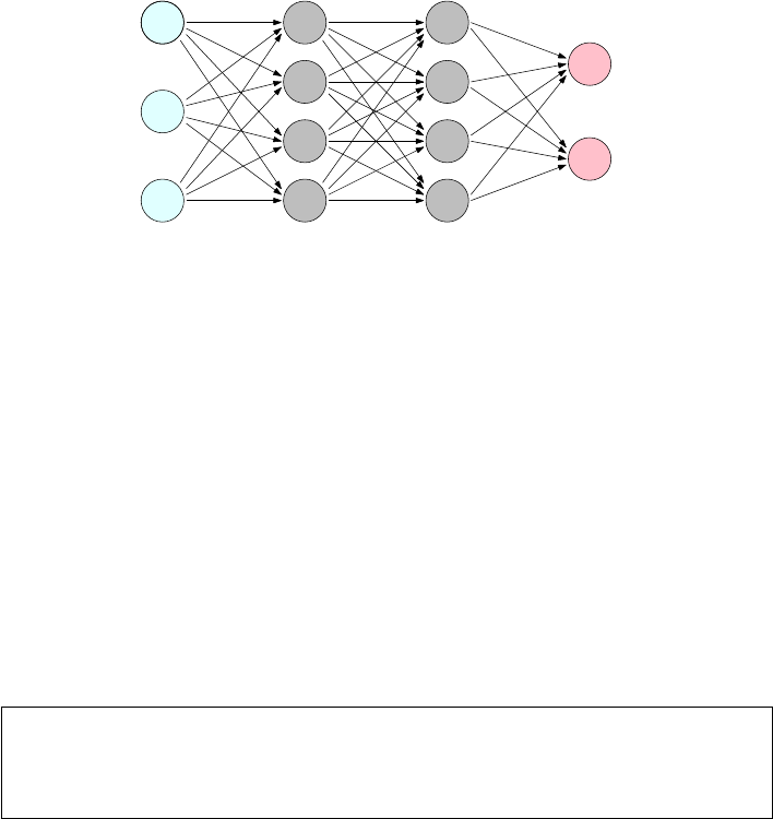
378 CHAPTER 11. MACHINE LEARNING
v1
1
v1
2
v1
3
v2
1
v2
2
v2
3
v2
4
v3
1
v3
2
v3
3
v3
4
v4
1
v4
2
w4
24
layer 1 layer 2 layer 3 layer 4
Figure 11.12: Deep learning networks have hidden layers of parameters.
the penultimate level of a network designed for one task often provides useful
high-level features for related tasks.
Why are neural networks so successful? Nobody really knows. There are
indications that for many tasks the full weight of these networks are not really
needed; that what they are doing will eventually be done using less opaque
methods. Neural networks seem to work by overfitting, finding a way to use
millions of examples to fit millions of parameters. Yet they generally manage
to avoid the worst behavior of overfitting, perhaps by using less precise ways to
encode knowledge. A system explicitly memorizing long strings of text to split
out on demand will seem brittle and overfit, while one representing such phrases
in a looser way is liable to be more flexible and generalizable.
This is a field which is advancing rapidly, enough so that I want to keep
my treatment strictly at the idea level. What are the key properties of these
networks? Why have they suddenly become so successful?
Take-Home Lesson: Deep learning is a very exciting technology that has legs,
although it is best suited for domains with enormous amounts of training data.
Thus most data science models will continue to be built using the traditional
classification and regression algorithms that we detailed earlier in this chapter.
11.6.1 Networks and Depth
Figure 11.12 illustrates the architecture of a deep learning network. Each node
xrepresents a computational unit, which computes the value of a given sim-
ple function f(x) over all inputs to it. For now, perhaps view it as a simple
adder that adds all the inputs, then outputs the sum. Each directed edge (x, y)
connects the output of node xto the input of a node yhigher in the network.
Further, each such edge has an associated multiplier coefficient wx,y . The value
actually passed to yis the wx,y ·f(x), meaning node ycomputes a weighted
sum of its inputs.
The left column of Figure 11.12 represents a set of input variables, the values
of which change whenever we ask the network to make a prediction. Think of this
11.6. DEEP LEARNING 379
as the interface to the network. Links from here to the next level propagate out
this input value to all the nodes which will compute with it. On the right side are
one or more output variables, presenting the final results of this computation.
Between these input and output layers sit hidden layers of nodes. Given the
weights of all the coefficients, the network structure, and the values of input
variables, the computation is straightforward: compute the values of the lowest
level in the network, propagate them forward, and repeat from the next level
until you hit the top.
Learning the network means setting the weights of the coefficient parameters
wx,y. The more edges there are, the more parameters we have to learn. In prin-
ciple, learning means analyzing a training corpus of (xi, yi) pairs, and adjusting
weights of the edge parameters so that the output nodes generate something
close to yiwhen fed input xi.
Network Depth
The depth of the network should, in some sense, correspond to the conceptual
hierarchy associated with the objects being modeled. The image we should have
is the input being successively transformed, filtered, boiled down, and banged
into better and better shape as we move up the network. Generally speaking,
the number of nodes should progressively decrease as we move up to higher
layers.
We can think of each layer as providing a level of abstraction. Consider a
classification problem over images, perhaps deciding whether the image contains
a picture of a cat or not. Thinking in terms of successive levels of abstraction, im-
ages can be said to be made from pixels, neighborhood patches, edges, textures,
regions, simple objects, compound objects, and scenes. This is an argument that
at least eight levels of abstraction could potentially be recognizable and usable
by networks on images. Similar hierarchies exist in document understanding
(characters, words, phrases, sentences, paragraphs, sections, documents) and
any other artifacts of similar complexity.
Indeed, deep learning networks trained for specific tasks can produce valu-
able general-purpose features, by exposing the outputs of lower levels in the
network as powerful features for conventional classifiers. For example, Imagenet
is a popular network for object recognition from images. One high-level layer of
1000 nodes measures the confidence that the image contains objects of each of
1000 different types. The patterns of what objects light up to what degree are
generally useful for other tasks, such as measuring image similarity.
We do not impose any real vision of what each of these levels should repre-
sent, only to connect them so that the potential to recognize such complexity
exists. Neighborhood patches are functions of small groups of connected pixels,
while regions will be made up of small numbers of connected patches. Some
sense of what we are trying to recognize goes into designing this topology, but
the network does what it feels it has to do during training to minimize training
error, or loss.
The disadvantages of deeper networks is that they become harder to train
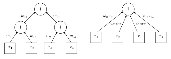
380 CHAPTER 11. MACHINE LEARNING
Figure 11.13: Addition networks do not benefit from depth. The two layer
network (left) computes exactly the function as the equivalent one layer network
(right).
the larger and deeper they get. Each new layer adds a fresh set of edge-weight
parameters, increasing the risks of overfitting. Properly ascribing the effect of
prediction errors to edge-weights becomes increasingly difficult, as the number
of intervening layers grows between the edge and the observed result. However,
networks with over ten layers and millions of parameters have been success-
fully trained and, generally speaking, recognition performance increases with
the complexity of the network.
Networks also get more computationally expensive to make predictions as
the depth increases, since the computation takes time linear in the number of
edges in the network. This is not terrible, especially since all the nodes on any
given level can be evaluated in parallel on multiple cores to reduce the prediction
time. Training time is where the real computational bottlenecks generally exist.
Non-linearity
The image of recognizing increasing levels of abstraction up the hidden layers
of a network is certainly a compelling one. It is fair to ask if it is real, however.
Do extra layers in a network really give us additional computational power to
do things we can’t with less?
The example of Figure 11.13 seems to argue the converse. It shows addition
networks built with two and three layers of nodes, respectively, but both com-
pute exactly the same function on all inputs. This suggests that the extra layer
was unnecessary, except perhaps to reduce the engineering constraint of node
degree, the number of edges entering as input.
What it really shows is that we need more complicated, non-linear node ac-
tivation functions φ(v) to take advantage of depth. Non-linear functions cannot
be composed in the same way that addition can be composed to yield addition.
This nonlinear activation function φ(vi) typically operates on a weighted sum
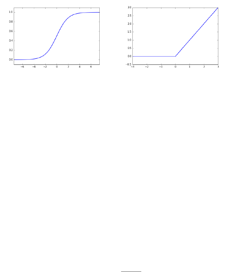
11.6. DEEP LEARNING 381
Figure 11.14: The logistic (left) and ReLU (right) activation functions for nodes
in neural networks.
of the inputs x, where
vi=β+X
i
wixi.
Here βis a constant for the given node, perhaps to be learned in training. It
is called the bias of the node because it defines the activation in the absence of
other inputs.
That computing the output values of layer linvolves applying the activation
function φto weighted sums of the values from layer l−1 has an important
implication on performance. In particular, neural network evaluation basically
just involves one matrix multiplication per level, where the weighted sums are
obtained by multiplying an |Vl|×|Vl−1|weight matrix Wby an |Vl−1|×1 output
vector Vl−1. Each element of the resulting |Vl| × 1 vector is then hit with the
φfunction to prepare the output values for that layer. Fast libraries for matrix
multiplication can perform the heart of this evaluation very efficiently.
A suite of interesting, non-linear activation functions have been deployed in
building networks. Two of the most prominent, shown in Figure 11.14, include:
•Logit: We have previously encountered the logistic function or logit, in
our discussion of logistic regression for classification. Here
f(x) = 1
1 + e−x
This unit has the property that the output is constrained to the range
[0,1], where f(0) = 1/2. Further, the function is differentiable, so back-
propagation can be used to train the resulting network.
•Rectified linear units (ReLU): A rectifier or diode in an electrical circuit
lets current flow in only one direction. Its response function f(x) is linear
when xis positive, but zero when xis negative, as shown in Figure 11.14

382 CHAPTER 11. MACHINE LEARNING
(right).
f(x) = xwhen x≥0
= 0 when x < 0
This kink at x= 0 is enough to remove the linearity from the function,
and provides a natural way to turn off the unit by driving it negative. The
ReLU function remains differentiable, but has quite a different response
than the logit, increasing monotonically and being unbounded on one side.
I am not really aware of a theory explaining why certain functions should
perform better in certain contexts. Specific activation functions presumably
became popular because they worked well in experiments, with the choice of unit
being something you can change if you don’t feel your network is performing as
well as it should.
Generally speaking, adding one hidden layer adds considerable power to the
network, with additional layers suffering from diminishing returns. The theory
shows that networks without any hidden layers have the power to recognize
linearly separable classes, but we turned to neural nets to build more powerful
classifiers.
Take-Home Lesson: Start with one hidden layer with a number of nodes be-
tween the size of the input and output layers, so they are forced to learn
compressed representations that make for powerful features.
11.6.2 Backpropagation
Backpropagation is the primary training procedure for neural networks, which
achieves very impressive results by fitting large numbers of parameters incre-
mentally on large training sets. It is quite reminiscent of stochastic gradient
descent, which we introduced in Section 9.4.
Our basic problem is this. We are given a neural network with preliminary
values for each parameter wl
ij , meaning the multiplier that the output of node
vl−1
jgets before being added to node vl
i. We are also given a training set
consisting of ninput vector-output value pairs (xa, ya), where 1 ≤a≤n. In
our network model, the vector xirepresents the values to be assigned to the
input layer v1, and yithe desired response from the output layer vl. Evaluating
the current network on xiwill result in an output vector vl. The error Elof the
network at layer lcan be measured, perhaps as
El=||yi−vl||2=X
j
(φ(β+X
j
wl
ij vl−1
ij )−yij )2
We would like to improve the values of the weight coefficients wl
ij so they
better predict yiand minimize El. This equation above defines the loss Elas
a function of the weight coefficients, since the input values from the previous

11.6. DEEP LEARNING 383
Source 1 2 3 4 5
Apple iPhone iPad apple MacBook iPod
apple apples blackberry Apple iphone fruit
car cars vehicle automobile truck Car
chess Chess backgammon mahjong checkers tournaments
dentist dentists dental orthodontist dentistry Dentist
dog dogs puppy pet cat puppies
Mexico Puerto Peru Guatemala Colombia Argentina
red blue yellow purple orange pink
running run ran runs runing start
write writing read written tell Write
Figure 11.15: Nearest neighbors in word embeddings capture terms with similar
roles and meaning.
layer vl−1is fixed. As in stochastic gradient descent, the current value of the
wl
ij defines a point pon this error surface, and the derivative of Elat this point
defines the direction of steepest descent reducing the errors. Walking down a
distance din this direction defined by the current step size or learning rate yields
updated values of the coefficients, whose vldoes a better job predicting yafrom
xa.
But this only changes coefficients in the output layer. To move down to the
previous layer, note that the previous evaluation of the network provided an
output for each of these nodes as a function of the input. To repeat the same
training procedure, we need a target value for each node in layer l−1 to play
the role of yafrom our training example. Given yaand the new weights to
compute vl, we can compute values for the outputs of these layers which would
perfectly predict yi. With these targets, we can modify the coefficient weights
at this level, and keep propagating backwards until we hit the bottom of the
network, at the input layer.
11.6.3 Word and Graph Embeddings
There is one particular unsupervised application of deep learning technology
that I have found readily applicable to several problems of interest. This has
the extra benefit of being accessible to a broader audience with no familiarity
with neural networks. Word embeddings are distributed representations of what
words actually mean or do.
Each word is denoted by a single point in, say, 100-dimensional space, so that
words which play similar roles tend to be represented by nearby points. Figure
11.15 presents the five nearest neighbors of several characteristic English words
according to the GloVe word embedding [PSM14], and I trust you will agree
that they capture an amazing amount of each word’s meaning by association.
The primary value of word embeddings is as general features to apply in
384 CHAPTER 11. MACHINE LEARNING
specific machine learning applications. Let’s reconsider the problem of distin-
guishing spam from meaningful email messages. In the traditional bag of words
representation, each message might be represented as a sparse vector b, where
b[i] might report the number of times vocabulary word wiappears in the mes-
sage. A reasonable vocabulary size vfor English is 100,000 words, turning binto
a ghastly 100,000-dimensional representation that does not capture the similar-
ity between related terms. Word vector representations prove much less brittle,
because of the lower dimensionality.
We have seen how algorithms like singular value decomposition (SVD) or
principle components analysis can be used to compress an n×mfeature matrix
Mto an n×kmatrix M0(where km) in such a way that M0retains most
of the information of M. Similarly, we can think of word embeddings as a
compression of a v×tword–text incidence matrix M, where tis the number of
documents in corpus, and M[i, j] measures the relevance of word ito document
j. Compressing this matrix to v×kwould yield a form of word embedding.
That said, neural networks are the most popular approach to building word
embeddings. Imagine a network where the input layer accepts the current em-
beddings of (say) five words, w1, . . . , w5, corresponding to a particular five word
phrase from our document training corps. The network’s task might be to pre-
dict the embedding of the middle word w3from the embeddings of the flanking
four words. Through backpropagation, we can adjust the weights of the nodes
in the network so it improves the accuracy on this particular example. The key
here is that we continue the backpropagation past the lowest level, so that we
modify the actual input parameters! These parameters represented the embed-
dings for the words in the given phrase, so this step improves the embedding
for the prediction task. Repeating this on a large number of training examples
yields a meaningful embedding for the entire vocabulary.
A major reason for the popularity of word embeddings is word2vec, a ter-
rific implementation of this algorithm, which can rapidly train embeddings for
hundreds of thousands of vocabulary words on gigabytes of text in a totally un-
supervised manner. The most important parameter you must set is the desired
number of dimensions d. If dis too small, the embedding does not have the
freedom to fully capture the meaning of the given symbol. If dis too large,
the representation becomes unwieldy and overfit. Generally speaking, the sweet
spot lies somewhere between 50 and 300 dimensions.
Graph Embeddings
Suppose we are given an n×npairwise similarity matrix Sdefined over a
universe of nitems. We can construct the adjacency matrix of similarity graph G
by declaring an edge (x, y) whenever the similarity of xand yin Sis high enough.
This large matrix Gmight be compressed using singular value decomposition
(SVD) or principle components analysis (PCA), but this proves expensive on
large networks.
Programs like word2vec do an excellent job constructing representations from
sequences of symbols in a training corpus. The key to applying them in new
11.7. WAR STORY: THE NAME GAME 385
domains is mapping your particular data set to strings over an interesting vo-
cabulary. DeepWalk is an approach to building graph embeddings, point repre-
sentations for each vertex such that “similar” vertices are placed close together
in space.
Our vocabulary can be chosen to be the set of distinct vertex IDs, from 1 to
n. But what is the text that can represent the graph as a sequence of symbols?
We can construct random walks over the network, where we start from an
arbitrary vertex and repeatedly jump to a random neighbor. These walks can
be thought of as “sentences” over our vocabulary of vertex-words. The resulting
embeddings, after running word2vec on these random walks, prove very effective
features in applications.
DeepWalk is an excellent illustration of how word embeddings can be used
to capture meaning from any large-scale corpus of sequences, irrespective of
whether they are drawn from a natural language. The same idea plays an
important role in the following war story.
11.7 War Story: The Name Game
My brother uses the name Thor Rabinowitz whenever he needs an alias for a
restaurant reservation or online form. To understand this war story, you first
have to appreciate why this is very funny.
•Thor is the name of an ancient Norse god, and more recent super-hero
character. There are a small but not insignificant number of people in the
world named Thor, the majority of whom presumably are Norwegian.
•Rabinowitz is a Polish-Jewish surname, which means “son of the rabbi.”
There are a small but not insignificant number of people in the world
named Rabinowitz, essentially none of whom are Norwegian.
The upshot is that there has never been a person with that name, a fact
you can readily confirm by Googling “Thor Rabinowitz”. Mentioning this name
should trigger cognitive dissonance in any listener, because the two names are
so culturally incompatible.
The specter of Thor Rabinowitz hangs over this tale. My colleague Yifan
Hu was trying to find a way to prove that a user logging in from a suspicious
machine was really who they said they were. If the next login attempt to my
account suddenly comes from Nigeria after many years in New York, is it really
me or a bad guy trying to steal my account?
“The bad guy won’t know who your friends are,” Yifan observed. “What if
we challenge you to recognize the names of two friends from your email contact
list in a list of fake names. Only the real owner will know who they are.”
“How are you going to get the fake names?” I asked. “Maybe use the names
of other people who are not contacts of the owner?”
“No way,” said Yifan. “Customers will get upset if we show their names to
the bad guy. But we can just make up names by picking first and last names
and sticking them together.”

386 CHAPTER 11. MACHINE LEARNING
“But Thor Rabinowitz wouldn’t fool anybody,” I countered, explaining the
need for cultural compatibility.
We needed a way to represent names so as to capture subtle cultural affinities.
He suggested something like a word embedding could do the job, but we needed
training text be that would encode this information.
Yifan rose to the occasion. He obtained a data set composed of the names
of the most important email contacts for over 2 million people. Contact lists for
representative individuals5might be:
•Brad Pitt: Angelina Jolie, Jennifer Aniston, George Clooney, Cate Blanchett,
Julia Roberts.
•Donald Trump: Mike Pence, Ivanika Trump, Paul Ryan, Vladimir Putin,
Mitch McConnell.
•Xi Jinping: Hu Jintao, Jiang Zemin, Peng Liyuan, Xi Mingze, Ke Lingling.
We could treat each email contact list as a string of names, and then con-
catenate these strings to be sentences in a 2 million-line document. Feeding this
to word2vec would train embeddings for each first/last name token appearing
in the corpus. Since certain name tokens like John could appear either as first
or last names, we created separate symbols to distinguish the cases of John/1
from John/2.
Word2vec made short work of the task, creating a one hundred-dimensional
vector for each name token with marvelous locality properties. First names
associated with the same gender clustered near each other. Why? Men generally
have more male friends in their contact list than women, and visa versa. These
co-locations pulled the genders together. Within each gender we see clusterings
of names by ethnic groupings: Chinese names near Chinese names and Turkish
names near other Turkish names. The principle that birds of a feather flock
together (homophily) holds here as well.
Names regularly go in and out of fashion. We even see names clustering by
age of popularity. My daughter’s friends all seem to have names like Brianna,
Brittany,Jessica, and Samantha. Sure enough, these name embeddings clus-
ter tightly together in space, because they do so in time: these kids tend to
communicate most often with peers of similar age.
We see similar phenomena with last name tokens. Figure 11.16 presents
a map of the 5000 most frequent last names, drawn by projecting our one
hundred-dimensional name embeddings down to two dimensions. Names have
been color-coded according to their dominant racial classification according to
U.S. Census data. The cutouts in Figure 11.16 highlight the homogeneity of
regions by cultural group. Overall the embedding clearly places White, Black,
Hispanic, and Asian names in large contiguous regions. There are two distinct
5Great care was taken throughout this project to preserve user privacy. The names of the
email account owners were never included in the data, and all uncommon names were filtered
out. To prevent any possible misinterpretation here, the examples shown are not really the
contact lists for Brad Pitt, Donald Trump, and Xi Jinping.
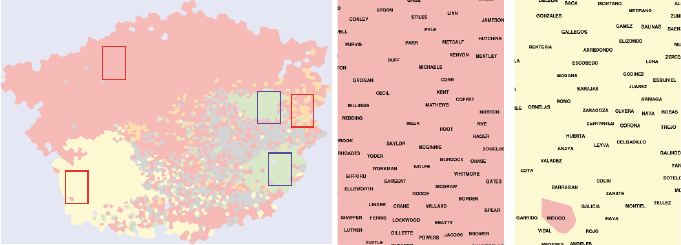
11.8. CHAPTER NOTES 387
Figure 11.16: Visualization of the name embedding for the most frequent 5000
last names from email contact data, showing a two-dimensional projection view
of the embedding (left). Insets from left to right highlight British (center), and
Hispanic (right) names.
Asian regions in the map. Figure 11.17 presents insets for these two regions,
revealing that one cluster consists of Chinese names and the other of Indian
names.
With very few Thors corresponding with very few Rabinowitzes, these corre-
sponding name tokens are destined to lie far apart in embedding space. But the
first name tokens popular within a given demographic are likely to lie near the
last names from the same demographic, since the same close linkages appear in
individual contact lists. Thus the nearest last name token yto a specific first
name token xis likely to be culturally compatible, making xy a good candidate
for a reasonable-sounding name.
The moral of this story is the power of word embeddings to effortlessly
capture structure latent in any long sequence of symbols, where order matters.
Programs like word2vec are great fun to play with, and remarkably easy to use.
Experiment with any interesting data set you have, and you will be surprised
at the properties it uncovers.
11.8 Chapter Notes
Good introductions to machine learning include Bishop [Bis07] and Friedman
et al. [FHT01]. Deep learning is currently the most exciting area of machine
learning, with the book by Goodfellow, Bengio, and Courville [GBC16] serving
as the most comprehensive treatment.
Word embeddings were introduced by Mikolov et al. [MCCD13], along with
their powerful implementation of word2vec. Goldberg and Levy [LG14] have
shown that word2vec is implicitly factoring the pointwise mutual information
matrix of word co-locations. In fact, the neural network model is not really
fundamental to what it is doing. Our DeepWalk approach to graph embeddings
is described in Perozzi et al. [PaRS14].
INFO
CORPORATION
SUPPORT
SMITH
AND
DE
JOHNSON
WILLIAMS JONES
BROWN
NOREPLY
MILLER
COM
GARCIA
SERVICE
OF
CASUALTY
DAVIS
GROUP
RODRIGUEZ
CUSTOMERSERVICE
ONE
AIRLINES
LEE
MARTINEZ
WILSON
THOMAS
ANDERSON
GONZALEZ
FARGO
SILVA
TAYLOR
LOPEZ
MARTIN
HERNANDEZ
MOORE
THOMPSON
HOME
WHITE
SANTOS
JACKSON
PEREZ
CUSTOMER
EMAIL
HARRIS
VAN
MARIA
BRANDS
SANCHEZ
ENTERTAINMENT
SECRET
AMAZON
LEWIS
CLARK
CO
ROBINSON
WALKER
YOUNG
OLIVEIRA
SCOTT
GAMBLE
ALLEN
KING
TORRES
SOFTWARE
NOBLE
HALL
ANN
CARLOS
HILL
WRIGHT
GREEN
STEWART
TO
RAMIREZ
YORK
ADAMS
PATEL
NEWSLETTER
CAMPBELL
NGUYEN
BAKER
BANK
NELSON
SINGH
RIVERA
FLORES
JAMES
DIAZ
CRUZ
MITCHELL
ROBERTS
GOMEZ
VIA
KUMAR
CLEARING
EVANS
RAMOS
LTD
RODRIGUES
DA
FERREIRA
EDWARDS
PARKER
PHILLIPS
CARTER
KELLY
KHAN
PEREIRA
TURNER
SOUZA
MURPHY
ALVES
ANTONIO
CARD
COLLINS
MARIE
MORRIS
REYES
CELL
CRISTINA
MORALES
EXPRESS
MORGAN
CASTRO
MEDIA
AMERICA
COOK
LIMA
BELL
COSTA
COOPER
FERNANDEZ
LUIS
ROGERS
ORTIZ
NEWS
ALI
STORE
ALVAREZ
DEL
BAILEY
RUIZ
ROSE
WATSON
WOOD
GOMES
WARD
DAVID
PETERSON
ROSS
WALGREEN
GUTIERREZ
MEMBER
GRAY
DONOTREPLY
BENNETT
HOWARD
UNION
RICHARDSON
ALEXANDER
COX
CASTILLO
ALBERTO
HEALTH
HUGHES
ROMERO
RIBEIRO
DANIEL
CLUB
SHAH
REED
MARTINS
WIRELESS
ITA
PAULA
BROOKS
PRICE
FOSTER
MORENO
VARGAS
JOSE
SULLIVAN
DO
WONG
LONG
SERVICING
PERRY
FERNANDES
MENDOZA
POWELL
JOHN
MURRAY
GRAHAM
KIM
RUSSELL
HAMILTON
WORK
DEPOT
FORD
WEST
JIMENEZ
LOANS
MYERS
FISHER
JORDAN
BUTLER
LAKES
PAUL
GORDON
AT
COLE
CREDIT
HERRERA
SANDERS
BARNES
HENRY
AHMED
MEDINA
RYAN
HENDERSON
JENKINS
GEORGE
WALLACE
ELLIS
CARVALHO
ALMEIDA
SHARMA
ANDRADE
OFFICE
TRAVEL
AL
KENNEDY
ONLINE
COLEMAN
SIMMONS
ROCHA
PATTERSON
MARSHALL
HAYES
RIVER
LOPES
CAMPOS
JOSEPH
HARRISON
REYNOLDS
HOUSE
MANUEL
MEYER
MIRANDA
MCDONALD
TEAM
ROJAS
LE
GIBSON
SHAW
STEVENS
SERVICES
NETWORK
BLACK
GRIFFIN
FERNANDO
STONE
CARE
SOARES
US
AGUILAR
CHEN
FOX
TRAN
BRYANT
LOVE
EDUARDO
GRANT
WAGNER
CHAVEZ
HUNTER
PALMER
WOODS
SIMPSON
CHAN
WELLS
SCHMIDT
PERMANENTE
BURNS
LYNN
RAY
DIAS
MASON
DIXON
ROBERTSON
PHARMACY
LP
FAMILY
MILLS
RICHARDS
CRAWFORD
ROSA
WEBB
VIEIRA
WASHINGTON
GONZALES
FREEMAN
ANGEL
HOLMES
BARBOSA
PORTER
PETERS
LAWRENCE
WARREN
JEAN
HUNT
TUCKER
SALES
SANTANA
REID
SALAZAR
CLARKE
KNIGHT
OWENS
LEISURE
FERGUSON
MENDEZ
HENRIQUE
LA
VASQUEZ
DOS
SANTIAGO
EL
OBRIEN
NEW
HART
SOTO
BOYD
LANE
AUTO
ANDREWS
MARQUES
CANADA
MICHAEL
VEGA
MACHADO
DUNN
VAZQUEZ
LLC
CENTER
BANKS
MATTHEWS
OLSON
ARAUJO
GARDNER
ANNE
ELENA
HICKS
JOHNSTON
WANG
DANIELS
BURKE
SNYDER
LUCAS
RICE
COHEN
PAYNE
STUDIOS
DELGADO
WALSH
GUZMAN
STEPHENS
SPENCER
ROBERTO
ARMSTRONG
BERRY
MORRISON
ARNOLD
CHAPMAN
HAWKINS
WEBMASTER
CUNNINGHAM
MAY
HANSEN
UNIVERSITY
GREENE
HUDSON
DI
RIOS
LUIZ
PARK
BRADLEY
MOM
JACOBS
ORTEGA
PATRICIA
RILEY
CARROLL
MOREIRA
ELLIOTT
SECURITY
CAROLINA
LYNCH
JO
GMAIL
MOLINA
HOFFMAN
MAIL
DAY
SCHNEIDER
FRANCO
DEAN
LI
SPORTS
DOUGLAS
FRANCIS
WEBER
YAHOO
DUNCAN
LIMITED
CARR
KELLEY
OLIVER
AUSTIN
ALVARADO
WEAVER
NICHOLS
NUNES
ACOSTA
DUARTE
CESAR
MENDES
INSURANCE
NAVARRO
HARPER
WILLIS
HARVEY
GUERRERO
PERKINS
PIERCE
DAVIDSON
FROM
BARRETT
UK
AUGUSTO
GUPTA
JOS
ST
ELIZABETH
HELP
CARDOSO
WHEELER
LUCIA
ANTHONY
FREITAS
JENSEN
NASCIMENTO
FRANCISCO
DIRECT
SIMON
FRANKLIN
PARTS
CHARLES
IN
GILBERT
MALDONADO
BECKER
GONALVES
CARLSON
CONTRERAS
REIS
CARPENTER WATKINS
WILLIAMSON
GARZA
BISHOP
LUNA
LARSON
SUAREZ
MARY
DOMINGUEZ
KLEIN
LITTLE
WALTERS
NEWMAN
INTERNATIONAL
PACHECO
APARECIDA
TAN
JAVIER
MARA
FIGUEROA
MELO
LIU
GARCA
AVILA
AIRWAYS
DAD
LIFE
FOR
THE
GABRIEL
LAWSON
BURTON
BILLING
GUERRA
DEPARTMENT
BATISTA
SANDOVAL
RICHARD
FRANK
CHRISTIAN
ESTRADA
PEARSON
FULLER
LEON
SYSTEMS
BORGES
HOLLAND
MCCARTHY
CABRERA
MONTGOMERY
IP
HOWELL
GONZLEZ
CORREA
KAY
SAN
LPEZ
HANSON
SA
LAMBERT
CRAIG
LAURA
BECK
KELLER
TEIXEIRA
SCHULTZ
CHANG
COLLEGE
CURTIS
BER
ANDREA
SOUSA
BLOCK
FONSECA
MILES
WARNER
GAMING
PAULO
DEBT
SIMS
OCONNOR
JOBS
FOWLER
WELCH
MEJIA
PATRICK
LEONARD
SCHWARTZ
FITCH
LAW
LOWE
LIM
MIGUEL
CHAMBERS
MCCOY
ALEJANDRO
PADILLA
ORLANDO
WADE
HOTEL
MUOZ
MUNOZ
HASSAN
GARRETT
BENSON
DENNIS
GREGORY
BOWMAN
ISABEL
TERRY
GILL
MARQUEZ
ENRIQUE
MORAN
JANE
YANG
FLEMING
DAWSON
RICARDO
ROY
ROBERT
QUINN
FUENTES
MIKE
LARA
HOPKINS
MARK
TECHNOLOGY
DOYLE
VALDEZ
LIVRE
MUSIC
JUNIOR
BARKER
AHMAD
WOLF
BARNETT
SHOP
FERNANDA
PAGE
BATES
MANN
LIN
CITY
POWERS
HO
TODD
WATTS
FINANCE
ARIAS
JENNINGS
FIELDS
STANLEY
PABLO
RODRGUEZ
AGUIRRE
BLAKE
MONTEIRO
CENTRAL
LYONS
FISCHER
ESPINOZA
CROSS
ADMISSIONS
AYALA
FLETCHER
STEELE
HIGGINS
SUTTON
HUSSAIN
BARROS
TIM
NEAL
BREWER
ANDRES
HARDY
PENA
BRASIL
MORA
NATIONAL
BRITO
NG
PINTO
SCHOOL
JAIN
REGINA
FELIPE
PHAM
HERNNDEZ
CALDWELL
RIVAS
FITZGERALD
MANAGER
DAVIES
LAM
RHODES
ME
UPDATE
ESCOBAR
RO
PIERRE
BARBER
MOHAMED
SERRANO
PARKS
NORRIS
LLOYD
DURAN
BALL
BALDWIN
MY
WU
BAUER
WOLFE
WHITNEY
HAYNES
ROWE
SAUNDERS
BETH
MOSS
MEDEIROS
BLAIR
FRIEND
BRADY CUMMINGS
JOBROYALTY
WEBSTER
HOLT
CAMACHO
CARRILLO
GALLAGHER
BOWEN
JOE
ROMAN
LEAL
NEWTON
ZHANG
MAN
PREZ
BYRD
SOSA
MCLAUGHLIN
MICHELLE
MACDONALD
MAXWELL
MORAES
ENERGY
SCRIPTS
GRACE
MARTNEZ
BLANCO
OUTLET
FRAZIER
ZIMMERMAN
ALONSO
REEVES
BRUNO
MATOS
VALENCIA
BRYAN
CHURCH
HALE
SHELTON
LINDA
MC
CHANDLER
HORTON
MOURA
BHAI
CALDERON
JUAREZ
GRIFFITH
GOODMAN
BUSH
MANNING
CARDENAS
WEISS
STEVENSON
ADMIN
ROBLES
MUELLER
CAMERON
MERCADO
VAUGHN
SHARP
VINCENT
TAVARES
THORNTON
SUE
BRUCE
GRAVES
SWANSON
FLYNN
LEVY
BEATRIZ
BERNARD
PINEDA
ALEJANDRA
CORTEZ
DAS
BURGESS
GROSS
CASEY
PHOTO
AMP
RODGERS
MACK
HERTZ
TYLER
LOZANO
LANG
SHERMAN
MARIN
FINANCIAL
JOHNS
SALINAS
DESK
NUNEZ
ROBBINS
CASA
HAMMOND
COMMUNICATIONS
SOLIS
OPINIONS
HUANG
VERA
CURRY
NICOLE
OWEN
MCKENZIE
WALTER
TERESA
CRUISE
NORMAN
BABY
GUY
SNCHEZ
UNITED
CECILIA
MALONE
WATERS
BARTON
CORTES
FRENCH
MCDANIEL
ERICKSON
BUSINESS
JORGE
KRAMER
MOHAMMED
ENGLISH
CUNHA
GOODWIN
OCHOA
GABRIELA
YU
LOGAN
ROTH
MONTOYA
SALAS
POTTER
JOYCE
REDDY
HARRINGTON
BARRY
WALTON
KAUR
JOY
WISE
CHRISTENSEN
ELLEN
GARNER
MOBILE
VILLA
RAMSEY
RESOURCES
EUGENIA
HOGAN
ANA
MARSH
RAHMAN
SCHROEDER
PINHEIRO
HELENA
MAG
NOGUEIRA
MA
CANNON
SEATS
MCGEE
MAMA
TOWNSEND
ONEILL
RAO
WILLIAM
RUSSO
VELASQUEZ
REESE
VILLANUEVA
ROSSI
PARSONS
ROSALES
CLAUDIA
GIBBS HINES
INTERNET
RAFAEL
PAZ
COELHO
BENJAMIN
MCKINNEY
USA
JOB
FELIX
VELEZ
IBRAHIM
BUCHANAN
ORG
CAREY
TATE
BEST
FARRELL
BRAVO
CHRIS
BRENNAN
WILKINSON
BAUTISTA
VON
ACEVEDO
OSBORNE
BRAGA
NORTON
SOLOMON
RANGEL
MCGUIRE
SILVEIRA
LOU
PONCE
VICTOR
PEA
KARMA
HARMON
PRIMA
ESPINOSA
RESEARCH
MOODY
KANE
PIRES
SAMUEL
GIL
ATKINSON
FARMER
MEHTA
POPE
MORTON
NASH
END
INGRAM
FLOWERS
HUBBARD
PRADO
LOAN
LEITE
TRUJILLO
BEAN
ALEX
RICH
HOUSTON
BOWERS
MCLEAN
COLON
OROZCO
KERR
PATTON
AMARAL
NICHOLSON
GLOVER
NEVES
OLSEN
YATES
COBB
ZAMORA
HODGES
LAU
HAMPTON
STREET
CLAYTON
WALL
PRATT
SHEPHERD
BOND
HR
STOKES
PETERSEN
BARRETO
BY
BURNETT
BASS
STEIN
HARTMAN
BRIGGS
JUAN
CHUNG
ABRAHAM
VELAZQUEZ
SWEENEY
FLOYD
CAIN
CARSON
ROSARIO
AZEVEDO
SUN
DRAKE
MOON
BILL
FARIAS
STATE
CHIN
CHENG
MCBRIDE
MICHEL
CABRAL
MCCORMICK
TRUST
ADVISOR
CAROL
MARCELO
CHASE
FOLEY
ET
KEITH
DEE
MEYERS
LISA
XAVIER
LUZ
FRIENDFINDER
COUNTY
MENEZES
CONNER
VILLARREAL
GUEVARA
FREIGHT
MATERNITY
WILKINS
FOOTBALL
STRICKLAND
ON
PALACIOS
KENT
VICTORIA
DAIRY
BARRERA
VIDAL
SMALL
KOCH
LAMB
PRINCE
SAVAGE
BONILLA
PEDRO
ALLISON
MARKS
KAREN
ABREU
GLENN
MATHEWS
LARSEN
HESS
POWER
GOV
GERMANY
PETER
AID
ASHLEY
POOLE
AIRBNB
MAX
ELIAS
STEPHENSON
BEACH
DESAI
HOOD
ABBOTT
AUTHORIZED
SPARKS
HARDWARE
MONTES
LOUIS
BERGER
MULLER
BALLARD
BAXTER
MUHAMMAD
MULLINS
CHAVES
OMAR
ZENDESK
SUMMERS
VILLEGAS
RIGHTS
RUBIO
GOLDEN
IBARRA
BEN
KIRBY
BROCK
SHANNON
HUTCHINSON
ALEXANDRE
LUIZA
GAMES
PARRA
SALGADO
MARCOS
GMEZ
MORNING
ARAJO
MANAGEMENT
KIRK
GLASS
MAIA
BRADFORD
COMPANY
RAYMOND
BUENO
LINDSEY
MARCELA
ANDREW
MELENDEZ
CERVANTES
WILCOX
BERG
DAVILA
ALBERT
COLLIER
MARIO
STEVE
BAY
ODONNELL
ALFONSO
FRASER
QUINTERO
BOB
FASHION
EDU
DILLON
MAE
JEFFERSON
GATES
SIERRA
MONROE
TOM
AO
MASSEY
RANDALL
JACOB
TECH
TOOMEY
BENITEZ
HORN
STUART
TAPIA
BARATO
NOLAN
NORTH
LAKE
VALENZUELA
DU
MAYER
LUISA
ROMANO
SHORT
PAT
MORROW
ACCOUNT
SANTA
DAN
NET
BERNAL
VELASCO
REILLY
KEMP
DONOVAN
GREER
JAY
JOSHI
AQUINO
LU
LEVINE
NUEZ
KATZ
LO
ARROYO
JESUS
HERMAN
HOLLOWAY
PERALTA
RODRIGO
SWEEPSTAKES
BOOTH
CONWAY
EN
FOOD
BOONE
FRIEDMAN
DAVENPORT
RUTH
SKINNER
MOTA
TANG
SHIELDS
SEGUROS
PRIMO
VIANA
DAVE
DENTAL
ABDUL
ADRIAN
MCKAY
FARIA
MELLO
CLAY
MALIK
MEZA
AGUIAR
CASE
COPELAND
COCHRAN
GOLD
FRANCE
SINGLETON
ADKINS
PHONE
DECKER
MACEDO
SRL
HEATH
ATKINS
HANCOCK
SNOW
CAMARGO
REAL
STRONG
CASH
WHITAKER
BOWLING
DYER
LEBLANC
MCINTYRE
VALLE
GUSTAVO
ADRIANA
TEST
TOLEDO
CALLAHAN
CHRISTOPHER
LIBRE
GIRL
BELTRAN
MCINTOSH
MADISON
HANNA
BRIDGES
BOYLE
PRESTON
FROST
MURILLO
FORBES
MACIEL
DALTON
NOEL
DALE
ZAPATA
HODGE
EAGLE
SUPPLY
MACIAS
UNDERWOOD
CANO
WORLD
FASHIONS
BUCKLEY
QUEIROZ
SMART
DUFFY
SO
NIELSEN
BIRD
IQBAL
BARR
JIM
BLUE
MCGRATH
SHAFFER
DAZ
REWARDS
HUGO
FERNNDEZ
STARK
AMORIM
TANNER
MCDOWELL
CARMEN
MCMAHON
COMFORT
SAWYER
GALLEGOS
HARDING
STAR
AZIZ
WARE
GILES
ALFREDO
SIS
MORAIS
DESIGN
MAHONEY
LEUNG
HOOVER
BOYER
EATON
SCHAEFER
FITZPATRICK
CAR
JACK
BARRIOS
KAPLAN
RECRUITMENT
CONLEY
GUADALUPE
ALEXANDRA
FITNESS
MEDICAL
OSORIO
VENTURA
OI
PITTMAN
HONG
MARKETING
ALICE
CUEVAS
SOLUTIONS
GOLDSTEIN
AUSTRALIA
PAOLA
CABALLERO
GILMORE
VIVO
ORR
HOBBS
HUFF
GENERAL
COOKE
ADAM
PAREDES
BARRON
CLINE
NANCY
MUNIZ
BRANCH
SPENCE
GOLDBERG
BARTLETT
HEAD
JARAMILLO
ANGELES
MAGAZINE
WYATT
ROBERSON
PAIVA
WIGGINS
MCCLURE
MOSES
LIST
HOWE
INDIA
ARTHUR
BRAZIL
IVAN
CHOI
MCLEOD
SINCLAIR
MARINO
CHU
MARINA
PRASAD
BYRNE
INES
JACOBSON
HUMPHREY
KNOX
KIDS
BRAUN
HUYNH
BEARD
PROPERTY
OCONNELL
MATHIS
THOMSON
LINDSAY
CONTROL
HURST
VU
LINE
STAFFORD
LANDRY
PHELPS
ROSAS
DICKSON
ARCHER
BRADSHAW
NAIR
RAMREZ
MIDDLETON
TRACY
ANNA
WILEY
LUGO
HAIR
LESTER
WERNER
BUCK
DIEGO
SWEET
GARRISON
GARY
SAM
MCCALL
VARELA
ANGELA
GOOD
IGNACIO
CHARTERED
HURLEY
HAHN
MATA
MARKET
SIQUEIRA
MCMILLAN
ANDRE
WINTER
GOULD
ALFARO
CORDERO
GRIMES
GILLESPIE
AMIN
MERRITT
VAUGHAN
HARRELL
LAI
BENDER
WAYNE
RELATIONS
SLOAN
MCCULLOUGH
PACE
CONRAD
COMMUNITY
VICENTE
DANTAS
DIGITAL
ERIC
BLACKWELL
CONVERSE
WINTERS
FREDERICK
DALY
ARTURO
CEL
SANDRA
MAURICIO
RUSH
ABBAS
DELA
HAYDEN
WHITEHEAD
TREVINO
BEASLEY
ROACH
PARRISH
SHARE
ENTERPRISES
SCHMITT
GUIMARES
BENTLEY
RITA
ANDERSEN
MAC
SHIRLEY
BOY
BELLO
MEADOWS
IT
CARDONA
HIGH
COMBS
SUSAN
HENDRICKS
ARELLANO
KRAUSE
GALVAN
GALINDO
DIANE
CALL
MCKEE
HUBER
SAMPSON
SUTHERLAND
MORSE
MULLEN
BRO
DONNELLY
BROWNING
FIGUEIREDO
CRANE
DONALDSON
HULL
PITTS
VALENTINE
PEARCE
DICKERSON
HAAS
KNAPP
LESLIE
ISMAIL
NIXON
LEACH
NAVY
INVESTMENT
BRANDT
FREIRE
PLUS
ABU
MICRO
NOVAK
KAUFMAN
ROCK
FRY
BLANCHARD
SHAIKH
DADDY
KLINE
LIVINGSTON
XM
PIMENTEL
CORDOVA
CORREIA
HIDALGO
SHEA
LEO
LINK
CASTELLANOS
HEBERT
CARRASCO
LEMOS
DURHAM
DUKE
DIANA
BRIAN
CLARO
CONTABILIDADE
CHEUNG
STUDENT
KAISER
VANCE
ONEAL
NIEVES
PECK
MCDERMOTT
PALMA
DORSEY
CONTACT
LEONARDO
ARTS
TRADING
MONICA
MELTON
DANIELA
WEEKS
TV
CHRISTINE
HUFFMAN
VERMA
GAINES
LORENA
MCCANN
ORDERS
WOODWARD
SHEPPARD
KATHY
MCPHERSON
GALLO
BULLOCK
ELLISON
CONNOR
WOODARD
ONEIL
MCCONNELL
ADMINISTRATOR
BRANDON
HASAN
CONNOLLY
CORDEIRO
LANGE
EVERETT
RANDOLPH
SERGIO
GONCALVES
BAIRD
PERSONAL
ART
BASTOS
BRIGHT
DINIZ
GUEDES
BEZERRA
QUINTANA
POTTS
REZENDE
KEVIN
ISAAC
MARCUS
VASCONCELOS
CAROLINE
MADDEN
TAX
SEBASTIAN
AVERY
STOUT
COSTELLO
CHOW
ENRIQUEZ
BROWNE
JENNIFER
BURGOS
RIVERS
GALLARDO
HOPE MCCLAIN
HORNE
CALHOUN
WILKERSON
DENISE
CASTANEDA
HEWITT
BARN
RAJ
JULIE
HENSON
MOSLEY
AMOR
GENTRY
RICHMOND
DIAMOND
NETO
BLACKBURN
HALEY
VALLEY
CARLA
GODOY
BOARD
TOURS
ZAVALA
POLLARD
RAMON
PUGH
EDWARD
DAILY
CARNEIRO
RENEE
CLEMENTS
CREATIVE
GRUPO
MALONEY
HUERTA
HURTADO
JARVIS
HICKMAN
VILLALOBOS
DOHERTY
DON
MILENA
NIETO
GORMAN
SILVIA
ALAM
ARMANDO
POST
DOUGHERTY
FLANAGAN
MCKENNA
ARORA
CHONG
IRWIN
RED
LILIANA
AGUILERA
ISLAM
CROSBY
LEARNING
BARBARA
ELECTRIC
TONY
SILVER
CARNEY
FIELD
PHAN
EDUCATION
SHARPE
ACADEMY
KEY
CHERRY
MATHEW
YEE
FERRARI
SAMPAIO
CAMP
HOANG
NGO
BUSTAMANTE
STANTON
LOUISE
HOOPER
COWAN
VOGEL
SANDY
KRUEGER
ROWLAND
CIV
SINGER
OR
PORTO
SELLERS
HILLS
CSAR
STUDIO
DELANEY
DEALS
MORIN
DAWN
SPEARS
BURCH
JUDY
SEGURA
CHACON
GAY
ABDULLAH
ZAMBRANO
SLATER
SISTER
JEFF
JAN
PENNINGTON
PROPERTIES
GOLDMAN
HERBERT
STARR
BUY
CLAUDIO
BARLOW
MONTERO
REALTY
ROSEN
HOLDEN
WALLER
CONSUMER
TRUONG
POP
KNOWLES
MAYO
COTTON
SEARS
MAHER
GUILLERMO
ARGENTINA
MCGOWAN
FILHO
WORLDWIDE
ERNESTO
SAMUELS
SHAPIRO
SANFORD
EVE
TREJO
TOVAR
HOLDER
RITTER
BAEZ
MCNEIL
TRAVIS
VENDAS
HAYS
SAENZ
OLX
AGARWAL
DUDLEY
MERCER
PAYMENTS
RICHTER
CROWLEY
ROSENBERG
REY
SHEPARD
BENTON
HENSLEY
AIR
KUHN
CISNEROS
BRAY
NICOLAS
SARAH
SHEEHAN
SOLANO
AARON
DUBOIS
MCFARLAND
NAVA
CANTU
OJEDA
MAYNARD
AYERS
RUBIN
SIR
DUNLAP
FAULKNER
BECERRA
NICHOLAS
VO
PRIETO
MENA
BERMUDEZ
ALUMNI
GUEST
ANTUNES
EVENTS
MIHAI
OTERO
MISHRA
SHARON
LEIGH
BOLTON
GLOBAL
VERGARA
RH
MAYS
RASMUSSEN
CORBETT
CORONA
DONNA
FREY
URIBE
CLARA
PRUITT
DALEY
ESQUIVEL
DWYER
WELSH
GALLOWAY
SALVADOR
PLACE
OCAMPO
PROCTOR
FERRER
FARLEY
LUTZ
CREEK
WILLS
MCKNIGHT
MCCABE
LOBO
WEB
RAE
MARIANO
FONG
POPA
EMMANUEL
VALDES
SON
ROSADO
VANESSA
MOONEY
STERN
SPRINGER
POSTMASTER
HICKEY
GUIMARAES
DOWNS
FRITZ
DEVELOPMENT
MCNAMARA
ONG
LORD
LAND
FELDMAN
WALLS
DELEON
JULIA
CASSIDY
LANCASTER
LARRY
BOURKE
CARMONA
CLIENT
JIMNEZ
PRO
ALICIA
JASON
ZUNIGA
GODFREY
GEE
GLORIA
COMERCIAL
REALTYTRAC
FRANA
SAAD
HARTLEY
RAZA
PATIL
ELDER
FARM
DOLAN
ESTHER
LOWERY
ED
HINTON
DEPT
CAREERS
LUCERO
XU
CAVALCANTE
AMAYA
EMERSON
ARCE
HILTON
HERRING
ESPOSITO
GIBBONS
MOYER
DREW
ROLLINS
HARDIN
COUNTRY
CURRAN
STAFF
MAIN
RIO
APPLICATIONS
LEANDRO
KESSLER
LY
LEVIN
CLEMENT
GRIFFITHS
TALBOTS
RANA
KENNY
CRISTIAN
DODSON
DANG
SEXTON
MOSER
KENDALL
KORS
SCHULZ
VERONICA
NEWELL
MCCARTY
CORRETORA
LIRA
DRIVER
HAN
EWING
MERRILL
HOMES
BUI
DICKINSON
BRAND
QUIROZ
WIFE
WILDLIFE
CHRISTIE
BACON
LYON
FINLEY
SARMIENTO
APARTMENTS
CHAMBERLAIN
VINICIUS
OSCAR
VITAMIN
STEPHEN
ICE
BLOOM
MEIER
DUTRA
COMPTON
LORENZO
FINCH
SAEED
SWAN
RICO
DONAHUE
BRITT
RIVERO
JACQUES
HYDE
MONTENEGRO
PROGRAM
ANGELICA
EGAN
MADDOX
ENGLAND
ALAN
CLIFFORD
LONDON
ASSIS
MARGARITA
MARINHO
BENAVIDES
BOOKER
HESTER
ALLAN
BONNER
TOMLINSON
HENDRIX
CLAIMS
SCHMITZ
OLIVA
LEHMAN
BOSS
SKY
SOCIAL
HOFFMANN
CROWE
STERLING
QUEEN
FRYE
BOGDAN
SORIANO
FISH
CRESPO
MARIANA
ESTES
NO
TAM
GREENBERG
ISRAEL
MERCEDES
GMBH
WESLEY
CLEVELAND
FULTON
COFFEY
CRAFT
ANDREI
GO
CACERES
DODD
SENIOR
BOYCE
BLANKENSHIP
RESERVATIONS
ALBUQUERQUE
WEBBER
MCALLISTER
KARINA
BERNARDO
HUMBERTO
MASTERS
GROVE
FABIAN
PARIS
KENNEL
SAAVEDRA
RITCHIE
WESTON
ABRAMS
PETTY
MATTOS
MACKEY
MIHAELA
FIRST
FREE
WITT
ACCOUNTS
KIDD
JAIME
MCGILL
OLIVARES
KAMAL
VILA
FINK
REYNA
CAMILO
AMY
GRECO
YOU
GAL
AREVALO
MAGALHES
POPESCU
COURTNEY
RAUL
ODOM
KERN
SEED
SYKES
TRAINING
VALENTIN
BRITTON
SYED
IMVEIS
GREENWOOD
INS
MATIAS
PHOTOGRAPHY
YADAV
SIMMS
MACKENZIE
ALCANTARA
OTTO
SALEH
JULIO
RIGGS
FALCON
TYSON
MILTON
DANCE
ORELLANA
ABEL
TAXI
HASTINGS
BARON
DOWNING
MADRID
ROBIN
ROLAND
SENA
BETTY
BROTHERS
DEMPSEY
MICHAELS
LOCKE
RIZZO
ABD
PAPA
SAID
GUILLEN
HEALTHCARE
HELLER
DEBBIE
GAGNON
INVESTMENTS
JESSICA
TERRELL
BRENT
DSOUZA
HAINES
WOLFF
KENNEY
DRISCOLL
HOLMAN
GUTHRIE
CONSTRUCTION
DICK
SOUTH
MAGEE
CHILDS
RESPUESTA
ROQUE
STAFFING
OSBORN
SIMONS
BINTI
BYERS
SIEGEL
FRIDAY
DENTON
ENGEL
WILDER
LOW
RUTHERFORD
COOLEY
ESTEBAN
STEFAN
SWIFT
NA
SANDERSON
CASTAEDA
MCFADDEN
PHILIPPINES
WARRANTY
RAQUEL
MEXICO
KINNEY
ZIEGLER
MELISSA
RANKIN
CULLEN
MOTTA
STELLA
RENE
WITHIN
SELF
ESPARZA
GUNN
ATENDIMENTO
JUSTICE
GARRIDO
ASSOCIATES
BUTT
WHITFIELD
BEAR
DONALD
CHO
BEAUTY
SNIDER
BATTLE
BABU
KO
COUTO
COUTINHO
ENG
PORTILLO
JOYNER
YODER
RIDDLE
HOLLEY
SEYMOUR
FINANCEIRO
DEAL
ALARCON
CALIFORNIA
IGLESIAS
RASHID
AU
DAUGHERTY
SHERIDAN
KROGER
WILL
BOX
JUNG
SCHWAB
AVALOS
HELPDESK
REZA
LANGLEY
MARCO
SCHUMACHER
JANSEN
MATTHEW
TOYOTA
HATFIELD
MODAS
MAHMOOD
DAILEY
MEDRANO
LADY
LOCKHART
LUKE
LAB
ANGELO
PRINTING
LACERDA
FRANKS
SHOEMAKER
VAZ
PIZZA
CRAMER
HA
BIN
ALFORD
HEALY
GAUTHIER
MAR
DEVINE
LARKIN
STEINER
AMOS
SARGENT
RICK
HOTELS
WYNN
GOFF
ALERTS
BURT
AC
FEDERAL
BENOIT
INNOVATION
FERRELL
SONG
HANEY
DAVISON
KIRKLAND
MAJOR
JERRY
DENIS
CASAS
MONTALVO
GAMBOA
CLAUDE
BROTHER
HUMANOS
INTERACTIVE
REGAN
PURCELL
HOTMAIL
LUCIANO
CARUSO
HELMS
PREMIER
MD
AMADOR
ELISA
MOTORS
HAY
MUSTAFA
CARVER
BETANCOURT
HATCHER
WORKFORCE
SIDDIQUI
FORREST
GRANADOS
LIGHT
CA
FRANCOIS
DUNBAR
ADVANTAGE
HU
DOWNEY
GANDHI
WAY
KIRKPATRICK
DARIO
ROCHE
PRITCHARD
MAHMOUD
MOYA
OTT
RON
DRUMMOND
KHALID
HOSPITAL
MOHAN
SORENSEN
AVILES
BERMAN
FAN
RADU
WINKLER
LING
HERRON
SIMONE
AMANDA
GUTIRREZ
CONSULTING
CLIENTES
CANTRELL
MENDONA
NAVARRETE
PICKETT
ALEXIS
VALLEJO
FELICIANO BRENDA
ALSTON
EMERY
GODWIN
KEARNEY
MOHAMMAD
PATE
PARDO
CHANEY
OHARA
HADDAD
CANALES
DILLARD
CATHERINE
CLAIRE
VIRTUAL
KYLE
ROGER
EDGE
ALEXANDRU
CANCER
CINDY
MASTER
PRINT
MAI
MINOR
ARRUDA
EAST
BINGHAM
LINARES
STEVEN
RIDGE
REHMAN
THORPE
LUDWIG
FATIMA
PLUMMER
MARIUS
KANG
CARVAJAL
MI
OSMAN
BEATTY
ROE
LEDESMA
PIKE
TALLEY
CASTLE
VILLAGE
TEMPLE
OLEARY
FOODS
PHILIP
READ
PUBLISHING
BOUCHER
MEEKS
TORO
MOHD
RINCON
ROYAL
CONNELLY
BUSTOS
KENDRICK
CS
MATT
VIRGINIA
MCMANUS
ACKERMAN
PRYOR
ZHOU
QUINONES
FERRAZ
GERMAN
CHANDRA
KRAFT
PAN
SALCEDO
OLVERA
DUQUE
GOLF
HANNAH
URBAN
ODELL
ENGINEERING
TILLMAN
NAME
FAJARDO
BOWDEN
EVANGELISTA
CARTWRIGHT
SU
SERRA
CORBIN
NOVO
CARRANZA
KEENAN
MEREDITH
INCORPORATED
CONNELL
DOE
RUCKER
PRESS
BURRELL
PIPER
ROLDAN
PERERA
WHALEN
HOLLIS
GRADY
DEWITT
VISION
KARIM
MAILER
RUTLEDGE
SONI
BERNSTEIN
GERARDO
NAGY
FOREMAN
PIERSON
POLLOCK
BURGER
BARNARD
ASH
DRAPER
HELEN
SWAIN
ELAINE
PAEZ
ROMO SOLEDAD
CHIU
OLIVIER
GLEASON
BARAJAS
BIG
SARA
LOTT
STRATTON
HENDRICKSON
EARL
HHONORS
GORE
STEPHANIE
ANWAR
FIX
MCGINNIS
MAURO
SEPULVEDA
MARCIA
PANDEY
LUND
LCIA
MARTA
CAHILL
HUSBAND
LOWRY
GROVES
JULIAN
BEE
COTE
COVINGTON
WOODRUFF
PLAZA
BROUSSARD
CALVO
MCCAULEY
EVENTOS
TRIBUNE
YOUR
LEN
GUILHERME
HUTCHISON
KURTZ
GAYLE
ARANDA
JARRETT
TIRE
CORNEJO
WINSTON
EDGAR
WHITLEY
DARLING
SCHAFER
MCCORMACK
COKER
JI
HAMMER
GILLIAM
MOBLEY
GREGG
COORDINATOR
ZEPEDA
IRENE
BERTRAND
KIMBALL
ESCALANTE
EDMONDS
HATCH
ASHRAF
GARLAND
PEACOCK
DYE
HOSSAIN
CARRERA
PLATT
ROUSE
DOTSON
PASSOS
WOOTEN
SUSANA
MAYFIELD
WOMACK
MARION
BIGGS
ALBA
TIME
FINN
ANDR
MAGUIRE
VIEW
GOSS
QUICK
SWARTZ
PARENT
BAPTIST
BIANCHI
MARRERO
TUTTLE
LEA
QURESHI
JOAN
METZGER
DODGE
KULKARNI
MAGALHAES
LEONE
HAND
WORKMAN
SP
CROCKER
BURKS
RAI
JANET
VERNON
SALEEM
HORNER
ARIEL
FABIO
PARTNERS
SANDS
COATES
BERGERON
CROW
PAL
RAM
UNCLE
ANDREEA
CRONIN
KOENIG
BLEVINS
GALVEZ
FARRIS
HOLCOMB
HOPPER
CUELLAR
KRISHNA
MONEY
STINSON
PAIGE
BRANDO
BELCHER
CHUA
VELA
TOTH
GAS
VALE
RESTREPO
WALDEN
HAGEN
EDDY
JOEL
STANFORD
CAMARA
JEFFREY
OMALLEY
BLAND
CHAPPELL
HSU
PENN
TONG
RECRUITING
PASTOR
KEN
JEFFRIES
WITH
DIRECTOR
SEWELL
MESQUITA
DOBSON
TURISMO
LUCA
STAHL
MEAD
LAURENT
DUONG
ANSARI
CORONADO
SLAUGHTER
CARMICHAEL
GIORDANO
PEDERSEN
QUEZADA
CHAU
KONG
SHAFER
MENESES
PAM
WEIR
HIRSCH
SALMON
GUSTAFSON
DUKES
TOPS
CARLTON
HARDEN
ADLER
LTDA
ROBISON
JAMISON
MAURER
PHIPPS
CLIFTON
ROBSON
ANIMAL
DOOLEY
TEAGUE
BLUM
APONTE
BUTCHER
PEIXOTO
MLLER
REDMOND
VERDE
VALENTE
CROUCH
MCCLELLAN
BAIN
MCHUGH
FLORIN
ELDRIDGE
THORNE
LETICIA
NOWAK
MICHELE
MARINE
FACTORY
MOUNTAIN
CAETANO
MCCRAY
FUNK
KAYE
LACY
SALEM
PAGAN
HERITAGE
NEUMANN
FOURNIER
JEWELL
SAMSON
SHERWOOD
GROSSMAN
NARANJO
LABEL
FAGAN
DAHL
CUMMINS
GERBER
HAMM
GALE
FAIR
AGRAWAL
PHILIPPE
SECRETARY
HUTCHINS
REPLY
MELL
RESENDE
ASSISTANT
MCNEILL
ORDER
HUGGINS
HEREDIA
REECE
MONROY
NATHAN
VINSON
CH
STACY
DANIELLE
BOWER
RUDOLPH
MAILBOX
TINA
MARC
YAN
FURTADO
HEART
LOTS
APARECIDO
TOBIN
CURRIE
JACKIE
CLINIC
COAST
ERWIN
CHI
RENATO
INN
CARL
NIX
FERRIS
POOL
DANA
ZHAO
CORRA
ZARATE
KATE
IRELAND
ROONEY
MARIAN
GREY
MCKINLEY
GAMA
GEIGER
GASTON
METZ
BACA
SADLER
RAINEY
DOAN
LILLY
SERNA
ANAND
MCELROY
CORP
SCHWARZ
DICKEY
MACKAY
TAMAYO
ROSENTHAL
PAYROLL
HIPOTECARIO
WHITTAKER
LEONG
SCHAFFER
LOJA
BURRIS
AN
COYLE
CONDE
WORLEY
GIRALDO
RACHEL
SIM
SILVERMAN
PULIDO
LOMBARDI
COUCH
MARGARET
VARGHESE
ZONE
HARRY
NEELY
CHAUHAN
ANDRS
GRIGGS
TOMPKINS
CHERYL
KRUSE
STUBBS
VOGT
QUIROGA
BRIDAL
LAUREN
ARTEAGA
VIDEO
CAPITAL
TATUM
TECHNICAL
MCGHEE
TELLEZ
STROUD VICKERS
SYLVESTER
METCALF
ELMORE
QUIZ
KEATING
MANLEY
MERCHANT
PRAKASH
POLK
CEBALLOS
LOCKWOOD
BERGMAN
HINOJOSA
WEI
CONTI
BURROWS
FINE
MESA
CLIENTE
DUNHAM
BARROSO
WATT
ARAGON
BOSWELL
ALDRIDGE
SINGLE
KOEHLER
VOSS
IVEY
HUSSEIN
MCDONOUGH
BHATT
POINT
HANLEY
HEARD
ROPER
PAINTER
VASILE
FARR
CHRISTINA
AMES
SHELDON
YEAGER
BOUTIQUE
STRAUSS
LEYVA
JACOBSEN
BOO
TRAVELS
STEWARD
CHRISTY
GIMENEZ
ALEMAN
SORIA
UP
NOVA
USER
PELLETIER
KAPOOR
DUMAS
KAHN
GARG
PUBLIC
NATION
GARDEN
FAY
TROTTER
PARTY
HOLBROOK
EDITH
EVELYN
LEIVA
BODY
DARBY
KITCHEN
CREWS
PASCUAL
NEGRON
ARREDONDO
AS
VALVERDE
WINN
SPORTSMANS
LIANG
BAUM
GREG
ERNST
CAVALCANTI
OREILLY
SCHREIBER
ERVIN
JOO
DUGAN
WOO
MCGREGOR
LYN
STOVER
MORE
SANCHES
NETWORKS
DAFITI
RICCI
SHERRY
COLBERT
OSULLIVAN
BREWSTER
COULTER
MADRIGAL
INFORMATION
NOT
CHILDERS
LUJAN
BOGGS
TRINDADE
AGENCY
PERES
BASSETT
KRISHNAN
RATLIFF
SAUCEDO
SALIM
SUPER
SOL
LONGO
WILLARD
BOSTON
KRAUS
HAGAN
THI
GRIMM
SHEIKH
STORY
BUSCH
LEMUS
GIVENS
SRIVASTAVA
SHRESTHA
FUNG
HACKETT
MCMULLEN
LIZ
WEINSTEIN
HOSKINS
PADGETT
BUCKNER
DOMINGO
OKEEFE
MARTHA
VENTAS
CONNORS
OGDEN
MCRAE
LANGFORD
TREE
SCHUSTER
PET
HINDS
KHALIL
CONSTANTIN
MAYES
SCOUTS
GROVER
MCGRAW
HOLLIDAY
LACEY
LOMBARDO
SALAH
COLOMBIA
URBINA
PAPPAS
IONESCU
BB
VITOR
SFPPDRAFTAUTHORIZATION
WILHELM
PUCKETT
SOFIA
CHAGAS
BILLINGS
GOODE
WESTBROOK
ANAYA
NANCE
TIPTON
MEADE
DELIA
GAIL
TOUR
CORNELL
ARAYA
SMILEY
WHYTE
ZHU
LOVELL
MILLIGAN
AKERS
REA
HABIB
HONDA
FRED
VIP
ACCOUNTING
CATHY
WADDELL
BRENNER
RECIPIENTS
PONTES
COFFMAN
MARTINO
SNELL
MALCOLM
ADAMSON
BALANCE
ALBRIGHT
PIMENTA
WAITE
CONKLIN
HAWK
MCGOVERN
ALBRECHT
CONROY
WAN
LAY
KEYS
GILLIS
BARRIENTOS
JOLLY
MARI
HADLEY
PENNY
YEUNG
ANGULO
ARENAS
HUI
TOLBERT
CROCKETT
NUGENT
CHILDRESS
VISA
CARLISLE
FRIENDS
CAREER
DUBAI
CODY
LAYTON
ULLAH
NORWOOD
BELEN
MINER
DINH
WALDRON
STOCK
ABDEL
RUBEN
PERSAUD
AMBROSE
AURELIO
VENEGAS
TIWARI
FORTE
UDDIN
TIA
CAO
TALBOT
TODAY
LANIER
GARAY
FAGUNDES
BULLARD
HAYWARD
RENTALS
MO
REES
KRUGER
YARBROUGH
GRAF
WEINER
LORI
THURMAN
BHATIA
MELVIN
ANITA
CENTRE
SHEN
CARO
PESSOA
ESCOBEDO
MURDOCK
ANTNIO
HUTTON
CONCEPCION
GIRARD
SCHULTE
ALVARENGA
BENEDICT
FERRARO
DENNY
LOURDES
LYMPHOMA
HEATHER
MOHR
LINCOLN
CROWDER
DOLORES
SWENSON
CRABTREE
QUIGLEY
GERARD
RUEDA
HAWLEY
BEAL
EVA
LATHAM
POE
PINA
RUSS
MALAYSIA
EM
HOLLINGSWORTH
ULLOA
BRAGG
BATEMAN
MCWILLIAMS
CLEMENTE
TREMBLAY
ASSESSORIA
TECHNOLOGIES
BARBOZA
CENTENO
AUGUSTINE
KOHLER
SHEFFIELD
HINSON
NEFF
ROWLEY
PAI
MCFARLANE
FLOOD
LIVE
DORAN
WISEMAN
PORRAS
STACEY
BOWLES
FERRO
CORCORAN
ATLANTA
JARA
HANDY
NEWSOME
FRESHDESK
TUDOR
OROURKE
MARROQUIN
REPORTS
ROCIO
BLANTON
GARDINER
MANSFIELD
PAR
OVIEDO
VANDER
CLEARY
REEDER
MAYA
NUMBER
MCQUEEN
BARROW
BARTH
COLVIN
DESIGNS
WATER
GENTILE
DELUCA
DIETRICH
HECTOR
MCDONNELL
QUINTANILLA
PROF
GASPAR
CHRISTIANSEN
BEYER
LINS
ROB
RIDER
RADIO
CHOWDHURY
ESTEVES
GIFFORD
FLORENCE
CLEMONS
ALENCAR
SPA
SOCCER
STILES
ESCOLA
CHAMPION
AP
VILELA
ALINA
BAR
MONTIEL
FURNITURE
ELKINS
VZQUEZ
JORGENSEN
KOWALSKI
LUCY
BELLA
FRIAS
FONTANA
VANG
COE
BETTS
DAWKINS
IMRAN
TALENT
FACUL
FONTES
EMILIO
FRAGA
ADRIANO
SPRAGUE
DOMINGUES
SANTAMARIA
FLAHERTY
SHETTY
BLISS
DOG
ELECTRONICS
TRIPP
BULL
BA
WHITING
HAMID
ADDISON
DOWLING
SALDANA
SHEARER
GOLDSMITH
ROXANA
RAINES
DUMITRU
PEARL
NEIL
MORRISSEY
CRUMP
HILLIARD
LUCIO
GUNTER
DUFF
CORNELIUS
IOANA
RECORDS
ADOLFO
TEEN
HOYT
GODDARD
MANCINI
HENLEY
ANTOINE
FENTON
SINHA
LOOK
ZIMMER
GANNON
MOSELEY
MUSA
LAZAR
PAYTON
TOLENTINO
CORMIER
PACK
RAJA
DOBBS
HOBSON
BLACKMON
MEEHAN
ECKERT
DENT
CASANOVA
HATHAWAY
BOOK
CHAVARRIA
BLOUNT
HUMAN
DOLL
STAN
INSTITUTE
SOTELO
CALVERT
MILLAN
BABCOCK
INMAN
CLINTON
PAULINO
PINO
CEZAR
NARVAEZ
AMARO
COUTURE
GOYAL
POLANCO
ASHBY
ADAIR
BRANTLEY
TRINH
BARRAGAN
CHADWICK
ROMANIA
SPIVEY
FONTAINE
HUNG
AGENT
JUDD
NAYLOR
GERALDO
SANABRIA
REGISTRATION
BARCLAY
CAMPO
NORIEGA
CENTRO
SHUKLA
PETTIT
QUESADA
JNIOR
COLES
YAP
EPSTEIN
SUMNER
TEJADA
PARIKH
LAIRD
WILKES
NOOR
FOUNTAIN
MOTT
OAKLEY
JAVED
SCHERER
RENDON
GRANGER
VIGIL
FAYE
REYNOSO
JONATHAN
CARON
PA
YOST
HENRIQUEZ
BELLAMY
KEEN
HINKLE
IRVING
TRINIDAD
BAUMANN
KWAN
VITALE
RALPH
BAHIA
DIEHL
YOUTH
HURT
DOSS
MONTANO
SMYTH
HYATT
LISBOA
ZELAYA
CRUISES
LOS
PAULSON
BAUMAN
PARTNER
CHESTER
PALACIO
HUMPHRIES
BALLESTEROS
ADEL
HAM
LAN
COLOMBO
GHOSH
STALEY
MENENDEZ
GRACIELA
FOOTE
GRANDE
ANTON
USMAN
BARONE
MAGNO
FEEDBACK
HIGHTOWER
CORDOBA
PERDOMO
CARRINGTON
HOFF
TOBIAS
CARLO
LORENZ
BEAVER
DUTTON
DUPONT
MAIER
CHEVROLET
LOZADA
MCKINNON
ASHTON
MOTOR
BAPTISTE
HERNAN
AKHTAR
KAUFFMAN
LYNNE
TIDWELL
PARR
STAPLETON
MICHAUD
SEGOVIA
OAKES
SOLORZANO
FUCHS
ROOT
DIALLO
DANGELO
LAGOS
NICK
COPE
BRIONES
DURAND
SONIA
GONZAGA
HAWTHORNE
JENNY
SCHMID
SHIPLEY
CARDOZO
YOLANDA
TELES
ARRINGTON
HOUSER
SHEETS
BEVERLY
HELTON
HAIDER
HORVATH
MED
HURD
KILGORE
SAINI
BOUTIQE
SIMES
PARA
URBANO
HODGSON
MARIS
BOTELHO
PUTNAM
RENNER
WRAY
DIETZ
DUGGAN
MCNALLY
HUNTERS
EPPS
AMERICAN
COREY
SULTAN
CERQUEIRA
ION
RING
JIANG
ADM
BAER
MACRI
RYDER
ESTELA
BANDA
ROS
WHALEY
HAMLIN
ORDOEZ
TARGET
DOW
LANDERS
BACH
HARMAN
GOODRICH
LINTON
SHOES
TU
CAVANAUGH
SADE
HE
NATALIA
AKBAR
BLACKMAN
MORELAND
ESTRELLA
GOINS
WHITMAN
BARTLEY
CONSULTORIA
PRESCOTT
OLIVERA
MULLIGAN
COUGHLIN
ROBERTA
HAUSER
PARRY
CHANCE
TRENT
CLOUD
MUIR
NAGEL
GAMEZ
STRINGER
BUTTS
ISAACS
BOUCHARD
YI
DALLAS
DICKENS
ZUIGA
HAYWOOD
BRYSON
MARCIO
JEN
VALDIVIA
MADSEN
AYRES
HARTMANN
LINHAS
CUZ
MEMBERSHIP
TIERNEY
IYER
DOCTOR
SAPP
SAYED
PETIT
FERRARA
BERRIOS
STEINBERG
BOLDEN
ALTAMIRANO
MESSINA
BURKETT
MALLORY
CRAVEN
STAPLES
MOREAU
MARX
SHIPPING
SHELLEY
VALERIA
LIVING
SALTER
PURDY
STEEL
MCCRACKEN
TERRA
JUDITH
GAVIN
EUBANKS
ANDY
YANEZ
HWANG
AFONSO
GUIDRY
MARTN
MEI
HILFIGER
ALTMAN
ORANGE
VIAJES
DELLA
ORNELAS
LANDIS
MCCAIN
CUTLER
COURT
NEWSLETTERS
BREEN
BARNHART
FRANZ
SAINT
COUSIN
EMANUEL
DEJESUS
MONTE
ESCAMILLA
BURROUGHS
WENDY
COMPRAS
BUNCH
TA
CASINO
IRVIN
FOUNDATION
AWAD
HENNING
MCCLENDON
PEDRAZA
TRANSPORT
PHILLIP
THAKUR
ELEMENTARY
HAGER
TIMMONS
ROMEO
ALONZO
ANDERS
PEREYRA
BRUNNER
HOUSING
VELOSO
YUSUF
RAMEY
FEDERICO
PEOPLES
POIRIER
RICKS
RICKETTS
GHEORGHE
STOREY
YUEN
APARICIO
TITUS
MISTRY
KAMINSKI
THACKER
SANTORO
CONOSCO
MUTUAL
NACIONAL
CLOTHING
ROA
CADENA
JEROME
GRAPHICS
ENNIS
ENGENHARIA
GREGORIO
FAROOQ
PASCAL
SARAIVA
LOURENO
WING
PICKERING
CASILLAS
FAITH
MCCORD
VIDA
CONNIE
CHEW
SAMS
ELIZONDO
VALLADARES
SHORE
PORTAL
COLIN
RASHEED
BOLAND
SANTO
MNDEZ
EASON
WELLER
HERNDON
GUZMN
LOVETT
CHISHOLM
BARB
MENSAH
GRAYSON
CONSULTANTS
SHAHID
SOLAR
DONOHUE
OVERTON
FS
WAKEFIELD
COACH
LAWTON
SEVILLA
FELTON
BT
ALLEY
JUSTIN
BIRCH
CORLEY
LEGAL
MAM
ULRICH
REAGAN
MUNRO
EASTMAN
MORLEY
CONTE
MATHUR
MARTINI
BERNARDES
FONTENOT
OAKS
TOMA
PENDLETON
JON
BAPTISTA
DILL
MENON
ENGLE
OH
LAWLER
CYCLES
BR
RESORT
ASLAM
MCNULTY
RENATA
JARDIM
DAMICO
PRODUCTS
LANGSTON
LEROY
ESPERANZA
MANSOUR
SCHILLING
COUNCIL
LAL
RUBY
IONUT
CHOICE
TSANG
HARGROVE
FLOREZ
WILD
MOSTAFA
AUCTIONS
SAC
BOURGEOIS
COMPUTER
CHING
MOJICA
MUNSON
MERINO
IRM
GRUBER
VEIGA
POLO
ALDANA
PRINTER
PUENTE
CROFT
NISSAN
TATIANA
STORM
GARZON
ALINE
RAMSAY
AGUSTIN
HANKINS
CRENSHAW
MESSER
ACUA
KEENE
STARKS
MAYORGA
CHILD
IVY
YOUNGBLOOD
JEFFERS
HAMEED
WHITTINGTON
SPAULDING
ARRIAGA
TOWN
PRITCHETT
THIAGO
COONEY
ROUSSEAU
CROWELL
RODAS
JANSSEN
FORRESTER
HOOKER
DEMARCO
TRACEY
MIMS
DOWD
GEORGES
BOCK
PFEIFFER
DAVEY
WASHBURN
BOSCO
CARRIER
WHITLOCK
PIA
RAHIM
MANZANO
VARNER
SAUER
FLINT
CC
CERDA
LIND
AMIGA
CAPUTO
SCHULER
CABLE
REARDON
WORTHINGTON
HERRMANN
LEMON
DAGOSTINO
HILLMAN
BLANK
DOUGLASS
LADD
POSEY
MCNEAL
VALERIO
TAMMY
EMILIA
ROWAN
ASSISTANCE
TROY
VILLAR
GOULART
ARANGO
LASER
SC
SHIN
BRAZ
RUSHING
PATERSON
MALHOTRA
MCNAIR
SAMIR
ZHENG
PARISH
CHUN
ETIENNE
ROBB
MONIQUE
BUSBY
PERRIN
SONS
CATALIN
LEVI
KEYES
CORRIGAN
OSPINA
RENTERIA
MIRZA
WETZEL
BENTO
WHELAN
CORONEL
YOUSSEF
MALLOY
KEANE
MARKETPLACE
BANSAL
LAUGHLIN
HARE
TRIVEDI
MAK
STONER
LINO
MACLEOD
JILL
BAYER
BURNHAM
HOLLY
BANCO
NAIK
IRIZARRY
FREECYCLE
THOMASON
PARKINSON
DUVALL
ROBLEDO
THAYER
PAMELA
HARLEY
DUNNE
CANDIDO
RUFF
CONTATO
SALON
FIERRO
FAUST
CRAIN
REPAIR
CRANDALL
MATHIEU
DEVLIN
ARIF
CHOU
LACKEY
FOOT
GODINEZ
PTE
NAPIER
RICHEY
CLANCY
BIANCO
LEARY
HUMPHREYS
FEITOSA
REBECCA
JUNE
GALICIA
CAROLYN
WALLIS
SALE
ANSWER
LEASING
IRIS
SOMMER
NANA
JONAS
TSAI
LEHMANN
KEARNS
SY
VACATION
CHECK
PAK
HUBERT
SURVEY
MCCOLLUM
OSHEA
WHITMORE
CEPEDA
JOSHUA
MEHMOOD
GREENFIELD
NICOLAE
DELL
FALCO
SANTANDER
ABAD
SPRING
GIPSON
ISLAND
DOVE
RAPP
TELLO
AMATO
LUNDY
CULVER
WOODY
LAZO
SHELL
SNEED
FRANCES
RANSOM
ANG
CORRALES
AKINS
CIFUENTES
BAIG
DES
LILIA
EARLY
DOMINGOS
SPICER
BOURNE
JOHNSTONE
PATRICIO
WAREHOUSE
SCHRADER
BARTHOLOMEW
YBARRA
BH
DOTY
FU
FLOR
VIVIANA
HOUGH
PEGGY
LODGE
FARRAR
MAS
LANCE
FABER
PARMAR
LEAHY
ALDRICH
CATES
MONAHAN
JIN
HELM
BORDEN
ALFRED
JULIANA
LYLE
DEB
SLADE
CHAUDHARY
SEGURO
LENTZ
DOMINIQUE
JOINER
RESTAURANT
PATIO
MCLAIN
MATHIAS
SCHUBERT
ABBASI
STALLINGS
KOVACS
AUNT
SQUIRES
OSWALD
CASTING
HEARN
PS
BISPO
CAMILA
SPANGLER
EBERT
REPRESENTAES
SKELTON
KHANNA
ALL
DASH
APPLE
NUNN
HAIRSTON
WOODALL
BURR
CARBAJAL
TRIMBLE
PERSON
PR
PRESLEY
WELLINGTON
SHEILA
BARRAZA
BRISCOE
IRVINE
CHEEK
SCHOFIELD
LAURIE
SANDER
LAWS
YOGA
YONG
DELONG
DAMIAN
KATHERINE
MARTENS
HUTSON
STOVALL
ALAIN
RHOADES
GRAFF
ZIMMERMANN
LAYNE
BRICE
NADEAU
PEPPER
SPRINGS
GIRON
IMOVEIS
BARAHONA
TAHIR
LAS
TEACHER
GRILL
LEDBETTER
AG
KWOK
JESS
RACING
CHAMPAGNE
HYMAN
REGIONAL
RAMALHO
EMMA
GAGE
HEIN
COMER
CATALINA
TOMAS
OBAMA
PENG
CONCURSOS
SHAHZAD
ARTE
NESBITT
RAJU
AHMADI
STRANGE
NOW
DUVAL
DARNELL
OTOOLE
TE
ELITE
DAIGLE
MARCEL
BRODERICK
PETE
COYNE
TILLEY
DELIVERY
TEXAS
MONCADA
CROOK
THURSTON
SANTILLAN
SMALLS
WOODSON
KISER
MONGE
SOURCE
SPAIN
FR
BAGLEY
ATWOOD
BGOSH
CAT
KILPATRICK
FORTIN
FREEDMAN
NOBRE
BELANGER
DAUGHTER
MARVIN
ESTER
COLEY
KELLOGG
PAES
VITAL
CARABALLO
RUDD
GOUVEIA
SANDHU
WINNER
DURANT
NUEVO
BONNIE
ABERNATHY
SHAVER
UNGER
PRATER
THAKKAR
REN
KIMBLE
KINCAID
SHI
KARLA
BECKY
UNDERGRADUATE
NERI
DEVRIES
GOODSON
BLEDSOE
BITTENCOURT
SALLES
RADER
PANG
SALERNO
BYNUM
KINSEY
OUELLETTE
FORMAN
PATHAK
LUU
EMILY
MERCIER
LUCENA
YAO
TINSLEY
DAMASCENO
NOONAN
REICH
ERIKA
CELIA
MOE
LINN
KNOTT
BROOKE
WINSLOW
ISSA
RATE
DONATO
FACULDADE
ESPINO
ZARAGOZA
CONDON
BRANNON
CALDERN
HUMMEL
MALL
GILCHRIST
KEEGAN
POLICE
THERESA
CALLAWAY
LAVOIE
COTTRELL
MUNICIPAL
CLASS
FALK
MACLEAN
TONEY
EUGENIO
PIZARRO
KNUTSON
PANDYA
VLAD
CARIBBEAN
DEVI
GARVEY
HASKINS
JULIEN
RAPHAEL
CHVEZ
GYM
WILLOUGHBY
BORJA
GAMAL
TOTAL
FORSTER
ADMINISTRATION
MICROSOFT
LUTHER
DORIS
PYLE
DION
ALLRED
PREMIUM
IS
ROWELL
PALUMBO
CORRAL
EASTON
VICK
TADEU
DUMONT
ELY
NORMA
ARENA
MATEO
DUPREE
JAMIESON
STAUFFER
SEAMAN
SB
DESMOND
CAFE
CYNTHIA
COLLAZO
MENARD
MORTGAGE
CAVAZOS
MOCK
GAFFNEY
QUEVEDO
XIONG
RUFFIN
STACK
JAMAL
REDDING
NEVILLE
PRIEST
MAGDALENA
COSMETICS
AGGARWAL
SYLVIA
GRIER
BACK
ROOM
FALLON
SAS
BRUNSON
BOYKIN
ROD
PANTOJA
FIORE
PULSE
TIO
HEDRICK
CYR
SHULTZ
ARNDT MILLARD
HAKIM
SAMPLES
HOROWITZ
MARCH
SAGE
TARIQ
RINALDI
SIMOES
SHOOK
THAI
PRINGLE
FARAH
JAEGER
SI
ARGUETA
BARBOUR
SCHAEFFER
PAQUETTE
BENEFITS
PRESIDENT
BINDER
CLEMENS
MIRIAM
ASIF
SHANE
MEANS
SOLER
STARKEY
DUBE
KELSEY
WAHL
DOZIER
MOELLER
WORTH
COHN
INFANTE
HOUGHTON
COTA
JAMESON
HARWOOD
BHATTI
CRUM
MILNER
SUREZ
CARRION
HONEY
IRMA
TENORIO
SWANN
HUSTON
FINNEY
LYLES
ANTONIA
DIGGS
UPTON
NOEMI
VYAS
LEFEBVRE
BECKMAN
MARKHAM
TEJEDA
SIMONA
MYLES
FORTUNE
BOSCH
HUDDLESTON
SECRETARIA
GRFICA
PRODUCTIONS
AR
ROBINS
GILLETTE
HENRIQUES
DERRICK
PARADISE
PARRIS
DELACRUZ
DAI
GAME
ESTEVEZ
ELLIOT
ARSHAD
SHIPMAN
SAXENA
REDMAN
KAMARA
MOSQUERA
LAWYER
RANDY
HITCHCOCK
SGT
LERNER
HOOK
LENNON
FLORA
CALDAS
FOSS
LUONG
PARENTS
AA
TEODORO
PARHAM
MOB
OLIVIA
PEACE
COMUNICAO
EMPLOYMENT
HORACIO
NEZ
NOTIFICATION
IMMIGRATION
APPAREL
VANN
HANKS
BIS
OLDHAM
ISABELLE
CHURCHILL
DELGADILLO
LOCKETT
SOPHIE
BRINK
CORNWELL
CHAND
PICKENS
KENYON
LEVESQUE
HADI
JEFFERY
GUO
AMIR
PM
MILLAR
HAQUE
HECK
BABA
FLORIDA
BONE
GOETZ
MCCLELLAND
SHAWN
SALMAN
TIRADO
PERDUE
FAISAL
RABELO
PURVIS
PHELAN
CAPPS
SMALLWOOD
SALAM
HERMANN
NOE
FANG
ECHOLS
MATEUS
WENDT
BURNETTE
GYMBOREE
IOAN
NICHOLLS
HUT
LAST
DYSON
YEN
WILDE
CARNES
NICOLETA
CARY
PARADA
CUNHADA
MOREL
MARTEL
SCRUGGS
AMIGO
SHETH
REAVES
BASHIR
HOLIDAY
GOH
MOSHER
SOUTO
CHAO
RANDLE
MCCALLUM
NASIR
SIZEMORE
JUDGE
NICKERSON
MONK
HAPPY
STEARNS
LIDIA
KELLEHER
VIANNA
RENAUD
BRUNER
VALADEZ
TABOR
MEU
CARBONE
CRYSTAL
MODI
HYLTON
LOGISTICS
RJ
SM
GUIDO
BOUDREAU
BRIDGE
BANDEIRA
NERY
SRINIVASAN
RAJAN
PARISI
LENZ
WHEATLEY
CIA
CHIANG
CECIL
SLACK
PILLAI
JERNIGAN
MUKHERJEE
JIMMY
JHA
THANH
BOUDREAUX
SEGAL
TEMPLETON
MASTERSON
GRACIA
COATS
SEE
DIEZ
COON
MCCARTNEY
WELDON
CINTRON
AREA
SEN
MCARTHUR
TIFFANY
SAMSUNG
STODDARD
COTTER
CARLIN
BADER
RADFORD
SHANKAR
JANICE
SPORT
OANA
NINA
TRIPLETT
LAING
LOUIE
FIRE
ASHER
TAHA
TOP
LOVELACE
BURNER
CLARKSON
DOUG
KRIEGER
SERVIOS
NATHALIE
NAWAZ
LATIF
CROOKS
HS
EDMONDSON
ASSOCIATION
YIP
DORMAN
CONFIRMATION
SCANLON
VIERA
YOON
LONGORIA
RENT
SH
FISCAL
JOAO
HANLON
TERAN
SALA
AJAYI
HARMS
MANCUSO
MEEK
MONDRAGON
RAND
SEALS
WYLIE
TEE
LUI
HEATON
ANCA
LOBATO
PATTY
AKRAM
LAUER
CBN
COOL
ALCALA
LUNSFORD
HOLGUIN
NURSE
HALIM
EDSON
DONG
AUGUSTIN
HERZOG
TSE
ABDALLAH
ANH
SORENSON
BEAUCHAMP
PC
HONEYCUTT
ALANIZ
SCHELL
JAIRO
GUILLORY
GROGAN
SALLY
ARNETT
OFFICER
TESTA
MOLNAR
GINA
KENNETH
SPEAR
ROJO
HOOKS
GARVIN
WHITTEN
BARBA
KA
BERLIN
ROYER
BEAM
BELLE
LEWANDOWSKI
ASKEW
PALERMO
SAHA
YVONNE
FESTAS
MARR
GALLANT
ARMOUR
DASILVA
KEMPER
ANGIE
BRANCO
GALLEGO
NASSER
TRABAJO
FABIANO
BUS
BECKETT
PANCHAL
DAO
SQUARE
JAMIL
SELL
CAN
HOGUE
SALOMON
CONNECTION
HATTON
YANCEY
CREW
BILAL
AM
HIGGS
STEEN
CHEE
KOPP
CONNECT
TURNBULL
CALLOWAY
PORTELA
ENTERPRISE
RENTAL
OWUSU
JOHANNA
BEATTIE
JURADO
MAGANA
GALVIN
VILLALBA
ESPINAL
FABIOLA
WEINBERG
STEFFEN
LAMAR
VISTA
PALOMINO
SALISBURY
GALARZA
DIN
SOMERS
VIOLA
PROMOTIONS
EYE
SCARBOROUGH
COBURN
ALERTER
MEDLEY
STYLES
SAFETY
RIDLEY
MAIS
SAYLOR
ECHEVERRIA
REGIS
MATTSON
MCAFEE
BROUGHTON
SUZANNE
PITT
JOHANSEN
VANEGAS
FEENEY
SEAN
FAIRCHILD
AKA
GOUGH
POINTE
POSTAL
SAUL
WILES
SZABO
ARANA
DARDEN
DOBBINS
BOWIE
GLEN
MAZZA
SPEED
OPERATIONS
MWANGI
JAIMES
CHARLTON
SOMMERS
PEREA
NORA
HEALEY
PAREKH
CURLEY
FENNELL
MILAN
BURK
BIBLE
CHOPRA
FUN
CAVE
BASSO
BRETT
MIN
KARL
HARDER
NOLASCO
BACHMAN
HENNESSY
SPECIAL
KOHN
WILLEY
WITHERS
CASPER
MOHAMAD
MONACO
SOUTHERN
MAHAN
EASLEY
JEWELRY
NAVAS
WINCHESTER
ZAMAN
KOLB
SILVESTRE
FOREST
MAYBERRY
CARMO
MATEI
BURDICK
GLYNN
HAMEL
FLAVIA
HILDEBRAND
WISNIEWSKI
LAURENCE
CONN
FENG
GALVO
HANNON
SHANK
GARBER
CONCEIO
MARILYN
PELLEGRINO
ANDINO
CAGLE
PRATHER
AGNEW
RONALD
WHARTON
COSGROVE
SEQUEIRA
RODOLFO
HUBBY
RAMONA
MING
TAI
WENZEL
BEJARANO
RETAIL
REINHARDT
FORSYTHE
RESORTS
REITER
BEEBE
NAEEM
MARES
UL
BROWER
KINGSLEY
FIT
ROCA
JEANNE
COOMBS
RESOURCE
IVERSON
CORNETT
NVC
CREATIONS
DUTTA
DAL
ELAM
KOH
VALERIE
QUINLAN
GILMAN
ROGERIO
WEATHERS
GOEL
CASTELLANO
THOM
GONSALVES
INQUIRY
LINDER
MAHARAJ
GRAND
KEEFE
SEAY
MIDDLE
BAUMGARTNER
LEDFORD
MANI
SETHI
MM
EUGENE
MULLIN
PADRON
BERNIER
CHAPA
FAHEY
LACROIX
DURBIN
RAVI
REWARD
FRANTZ
FORT
SABINO
CAICEDO
SATO
DIABETES
KEE
LEGGETT
SABRINA
ALLARD
GANT
TOSCANO
ALERT
MARLENE
JETER
PARROTT
PESSOAL
RUST
AIKEN
CAUDILL
VA
BABE
GAO
PICARD
FOY
OLGA
JOANNE
HIGGINBOTHAM
LIBRARY
TAIT
BIANCA
ELLSWORTH
JADHAV
WHITEHOUSE
DJ
SOLIMAN
VAL
ROAD
FORSYTH
RHOADS
FISHMAN
FRANCA
SHOESOURCE
KROLL
CULP
WINE
ELETRO
STILL
CHRISTOPHE
CON
DEBORAH
SORIN
ENQUIRIES
NAYAK
NIGERIA
PEOPLE
MABEL
ANNIE
DIZON
GARCES
NELLY
GALAN
LUC
CARTAGENA
PSYCHICS
SUBRAMANIAN
BEAULIEU
FRESH
VIVAS
MAHON
ILIE
POLLACK
BRASWELL
WILBURN
SOCIETY
HOFMANN
HORAN
PEDERSON
NADEEM
ADI
NYE
SHANAHAN
BO
MART
RODNEY
MOTHER
NEWBERRY
BUITRAGO
POSADA
PEPE
COLLECTION
WAUGH
BARBIERI
HEINZ
WISDOM
MAT
KIMBERLY
CORPORATE
CRIS
PALM
W
WASHINGTON
W
N
N
FIELD
S
HARDY
FRAZIER
MAC
K
SU
N
J
EFFERSON
S
TR
O
N
G
GAINES
A
NDOLPH
M
CCLAIN
M
AY
O
W
E
S
LEY
M
I
L
TERRELL
BATTLE
JO
YNE
R
A
L
S
T
O
N
M
INOR
I
LLMAN
F
O
REMA
N
RL
P
AIGE
SLAUGHTE
R
J
AMISON
MCCRAY
MELL
HEARD
STEWARD
D
COLBER
T
N
O
RW
OOD
P
AYTON
E
PP
S
B
O
LDEN
HILFIGER
MCCLENDON
N
S
TARK
S
M
IM
S
LUNDY
RANSOM
H
AIRSTO
N
PER
SO
N
B
RI
CE
S
MALL
S
WO
REN
R
U
FFI
N
D
O
ZIE
R
LYLE
S
D
I
GGS
VANN
LOC
KET
T
P
I
C
KEN
S
SMALLWOOD
SM
SM
S
EAL
S
CALLOWAY
C
DARDEN
LEGGETT
GO
NZALE
S
LUNA
M
U
N
O
PENA
JUAREZ
S
ALINA
S
VIDAL
C
ERVANTE
S
V
ELASC
O
GALLEGO
S
AN
G
ELE
S
R
OSAS
A
R
G
ALIND
O
HUERT
A
TRE
JO
S
AEN
Z
NAVA
CO
R
O
NA
ESQUIVE
L
D
ELEO
N
Z
U
NI
GA
RI
C
O
MEXICO
ESPARZA
G
ARRID
O
MEDRAN
O
O
LVERA
R
O
M
O
BARAJAS
ZEPEDA
M
ENESES
MO
N
R
ZARATE
B
A
C
A
TELLEZ
LEYVA
ARREDONDO
ANAYA
E
SCO
BED
O
M
AY
A
M
O
NTIEL
SO
TEL
O
BARRA
G
AN
M
O
NTAN
O
DA
GAME
Z
Y
ANE
Z
O
RNELA
S
ILLA
ELIZ
O
ND
O
COLI
N
ARRIAGA
VALERI
O
RENTERIA
GODINEZ
G
ALI
C
IA
CA
ZARAGOZ
A
C
OT
A
DEL
G
ADILL
O
VALADEZ
M
O
AL
C
A
L
ROJO
MA
G
AN
A
A
RE
S
J
ACOBS
N
P
OWER
S
WOLF
E
NO
RT
ON
C
HA
SE
K
EN
T
M
ATHEWS
GATES
D
S
HAFFER
E
ATON
CO
NLE
Y
B
ENTLEY
C
RAN
E
HU
L
MC
BY
DER
C
HAMBERLAI
N
CO
FFE
Y
MICHAELS
Y
ODE
R
S
AR
G
ENT
BEATTY
E
IKE
MCGINNIS
TUTTLE
DODGE
WO
RKMAN
HUTCHINS
FERRI
S
D
M
ETCAL
F
LOCKWOO
D
O
LBROO
K
WILLARD
MCG
RA
W
B
ILLIN
GS
CO
NKLI
N
MU
RD
OCK
G
IFF
O
R
D
S
TILE
S
S
S
S
HEARE
R
DU
FF
PARR
ROOT
H
A
G
E
R
STORM
WORTHINGTON
D
OUG
LA
SS
AD
D
WHITM
O
R
E
BORDEN
RHOADES
LINN
LU
THER
PYLE
L
R
EDDIN
G
J
AME
SO
N
GILLETT
E
R
NWELL
KENY
O
N
PURVI
S
MO
N
C
E
C
I
L
M
EE
K
G
R
OG
AN
S
PEAR
S
AYL
O
R
CO
NN
BR
O
WE
R
LINDER
E
LL
S
W
O
RTH
NYE
1
2
3
AIRLINE
S
F
ARGO
R
ET
GAMBLE
NGUYE
N
STOR
E
LE
C
HE
N
AN
N
PERMANENTE
E
PERMANENTE
PERMANENTE
W
AN
G
LI
LIU
YAN
G
LIN
PHAM
LAM
WU
ZHAN
G
HUAN
G
NI
CO
L
E
C
RUIS
E
Y
U
A
S
HLEY
T
OO
ME
Y
L
U
LO
LEUN
G
MO
HUYNH
VU
C
HE
U
N
G
CHO
W
R
ENEE
PHAN
MP
HO
AN
G
T
R
UO
N
G
VO
X
U
K
OR
S
HAN
B
UI
TAM
LO
C
SONG
INTERACTIV
INT
INT
H
U
FAN
MAI
K
AN
G
ZH
OU
PAN
SU
HS
U
YAN
C
HI
Z
HA
O
D
O
A
N
LIANG
NO
T
F
U
N
G
ZH
U
YEUNG
DINH
S
HEN
TRINH
W
AN
L
A
N
J
IAN
G
T
U
YI
DALL
A
G
TA
TS
AN
G
Z
HEN
G
MAK
C
H
OU
TS
AI
FU
K
WOK
PENG
LUU
DE
GUO
A
N
G
C
HIAN
G
L
OU
IE
YIP
T
EE
LUI
D
O
T
SE
D
A
O
MIN
F
ENG
G
A
O
G
H
KHAN
S
HA
H
SHARM
A
G
UPT
A
H
USS
AI
N
JAIN
MEHTA
I
MALIK
IQ
BAL
AMIN
S
HAIKH
VERMA
AROR
A
A
GARWA
L
M
I
S
HR
A
RANA
SYE
D
Y
ADA
V
B
M
AHM
OOD
S
IDDIQU
I
G
ANDH
I
K
HALID
S
ONI
PANDEY
RAI
S
ALEEM
A
AG
RAWAL
ANAND
PRAKA
S
H
K
AP
OOR
S
HEIKH
SRIVASTAVA
A
S
HRE
S
THA
TIWAR
I
RAJA
S
H
U
KL
A
PARIKH
J
AVE
D
U
SMA
N
AKHTAR
SAIN
I
IYER
R
MISTRY
FAR
OOQ
A
S
LA
M
M
ALH
O
TRA
BAN
SA
ARIF
B
AI
G
AU
DHAR
Y
KHANNA
TAHIR
THAKKAR
PATHAK
A
GG
A
A
S
I
F
BHATT
A
RSHA
D
S
AXENA
S
HETH
BASHI
R
J
HA
NAWAZ
AL
PAREKH
U
L
GO
E
L
SETHI
NAYAK
5

388 CHAPTER 11. MACHINE LEARNING
Figure 11.17: The two distinct Asian clusters in name space reflect different
cultural groups. On the left, an inset showing Chinese/South Asian names. On
the right, an inset from the cluster of Indian family names.
The Titanic survival examples are derived from the Kaggle competition
https://www.kaggle.com/c/titanic. The war story on fake name genera-
tion is a result of work with Shuchu Han, Yifan Hu, Baris Coskun, and Meizhu
Liu at Yahoo labs.
11.9 Exercises
Classification
11-1. [3] Using the naive Bayes classifier of Figure 11.2, decide whether (Cloudy,High,
Normal) and (Sunny,Low,High) are beach days.
11-2. [8] Apply the naive Bayes technique for multiclass text classification. Specif-
ically, use The New York Times Developer API to fetch recent articles from
several sections of the newspaper. Then, using the simple Bernoulli model for
word presence, implement a classifier which, given the text of an article from
The New York Times, predicts which section the article belongs to.
11-3. [3] What is regularization, and what kind of problems with machine learning
does it solve?
Decision Trees
11-4. [3] Give decision trees to represent the following Boolean functions:
(a) Aand ¯
B.
(b) Aor (Band C).
(c) (Aand B) or (Cand D).
11.9. EXERCISES 389
11-5. [3] Suppose we are given an n×dlabeled classification data matrix, where each
item has an associated label class A or class B. Give a proof or a counterexample
to each of the statements below:
(a) Does there always exist a decision tree classifier which perfectly separates
Afrom B?
(b) Does there always exist a decision tree classifier which perfectly separates
Afrom Bif the nfeature vectors are all distinct?
(c) Does there always exist a logistic regression classifier which perfectly sep-
arates Afrom B?
(d) Does there always exist a logistic regression classifier which perfectly sep-
arates Afrom Bif the nfeature vectors are all distinct?
11-6. [3] Consider a set of nlabeled points in two dimensions. Is it possible to build a
finite-sized decision tree classifier with tests of the form “is x > c?”, “is x < c?”,
“is y > c?”, and “is y < c?” which classifies each possible query exactly like a
nearest neighbor classifier?
Support Vector Machines
11-7. [3] Give a linear-time algorithm to find the maximum-width separating line in
one dimension.
11-8. [8] Give an O(nk+1) algorithm to find the maximum-width separating line in k
dimensions.
11-9. [3] Suppose we use support vector machines to find a perfect separating line
between a given set of nred and blue points. Now suppose we delete all the
points which are not support vectors, and use SVM to find the best separator
of what remains. Might this separating line be different than the one before?
Neural Networks
11-10. [5] Specify the network structure and node activation functions to enable a
neural network model to implement linear regression.
11-11. [5] Specify the network structure and node activation functions to enable a
neural network model to implement logistic regression.
Implementation Projects
11-12. [5] Find a data set involving an interesting sequence of symbols: perhaps text,
color sequences in images, or event logs from some device. Use word2vec to
construct symbol embeddings from them, and explore through nearest neighbor
analysis. What interesting structures do the embeddings capture?
11-13. [5] Experiment with different discounting methods estimating the frequency of
words in English. In particular, evaluate the degree to which frequencies on
short text files (1000 words, 10,000 words, 100,000 words, and 1,000,000 words)
reflect the frequencies over a large text corpora, say, 10,000,000 words.
Interview Questions
11-14. [5] What is deep learning? What are some of the characteristics that distinguish
it from traditional machine learning
390 CHAPTER 11. MACHINE LEARNING
11-15. [5] When would you use random forests vs. SVMs, and why?
11-16. [5] Do you think fifty small decision trees are better than a large one? Why?
11-17. [8] How would you come up with a program to identify plagiarism in documents?
Kaggle Challenges
11-18. How relevant are given search results to the user?
https://www.kaggle.com/c/crowdflower-search-relevance
11-19. Did a movie reviewer like or dislike the film?
https://www.kaggle.com/c/sentiment-analysis-on-movie-reviews
11-20. From sensor data, determine which home appliance is currently in use.
https://www.kaggle.com/c/belkin-energy-disaggregation-competition
Chapter 12
Big Data: Achieving Scale
A change in quantity also entails a change in quality.
– Friedrich Engels
I was once interviewed on a television program, and asked the difference between
data and big data. After some thought, I gave them an answer which I will still
hold to today: “size.”
Bupkis is a marvelous Yiddish word meaning “too small to matter.” Used
in a sentence like “He got paid bupkis for it,” it is a complaint about a paltry
sum of money. Perhaps the closest analogy in English vernacular would be the
word “peanuts.”
Generally speaking, the data volumes we have dealt with thus far in this
book all amount to bupkis. Human annotated training sets run in the hundreds
to thousands of examples, but anything you must pay people to create has a
hard time running into the millions. The log of all New York taxi rides for
several years discussed in Section 1.6 came to 80 million records. Not bad, but
still bupkis: you can store this easily on your laptop, and make a scan through
the file to tabulate statistics in minutes.
The buzzword big data is perhaps reaching its expiration date, but presumes
the analysis of truly massive data sets. What big means increases with time,
but I will currently draw the starting line at around 1 terabyte.
This isn’t as impressive as it may sound. After all, as of this writing a
terabyte-scale disk will set you back only $100, which is bupkis. But acquiring
a meaningful data set to fill it will take some initiative, perhaps privileged access
inside a major internet company or large volumes of video. There are plenty of
organizations wrestling with petabytes and even exabytes of data on a regular
basis.
Big data requires a larger scale of infrastructure than the projects we have
considered to date. Moving enormous volumes of data between machines re-
quires fast networks and patience. We need to move away from sequential
processing, even beyond multiple cores to large numbers of machines floating

392 CHAPTER 12. BIG DATA: ACHIEVING SCALE
in the clouds. These computations scale to the point where we must consider
robustness, because of the near certainty that some hardware component will
fail before we get our answer.
Working with data generally gets harder with size. In this section, I will try
to sensitize you to the general issues associated with massive data sets. It is
important to understand why size matters, so you will be able to contribute to
projects that operate at that scale.
12.1 What is Big Data?
How big is big? Any number I give you will be out of date by the time I
type it, but here are some 2016 statistics I stumbled across, primarily at http:
//www.internetlivestats.com/ :
•Twitter: 600 million tweets per day.
•Facebook: 600 terabytes of incoming data each day, from 1.6 billion active
users.
•Google: 3.5 billion search queries per day.
•Instagram: 52 million new photos per day.
•Apple: 130 billion total app downloads.
•Netflix: 125 million hours of TV shows and movies streamed daily.
•Email: 205 billion messages per day.
Size matters: we can do amazing things with this stuff. But other things
also matter. This section will look at some of the technical and conceptual
complexities of dealing with big data.
Take-Home Lesson: Big data generally consists of massive numbers of rows
(records) over a relatively small number of columns (features). Thus big data
is often overkill to accurately fit a single model for a given problem. The value
generally comes from fitting many distinct models, as in training a custom
model personalized for each distinct user.
12.1.1 Big Data as Bad Data
Massive data sets are typically the result of opportunity, instead of design. In
traditional hypothesis-driven science, we design an experiment to gather exactly
the data we need to answer our specific question. But big data is more typi-
cally the product of some logging process recording discrete events, or perhaps
distributed contributions from millions of people over social media. The data
12.1. WHAT IS BIG DATA? 393
scientist generally has little or no control of the collection process, just a vague
charter to turn all those bits into money.
Consider the task of measuring popular opinion from the posts on a social
media platform, or online review site. Big data can be a wonderful resource.
But it is particularly prone to biases and limitations that make it difficult to
draw accurate conclusions from, including:
•Unrepresentative participation: There are sampling biases inherent in any
ambient data source. The data from any particular social media site does
not reflect the people who don’t use it – and you must be careful not to
overgeneralize.
Amazon users buy far more books than shoppers at Walmart. Their polit-
ical affiliations and economic status differs as well. You get equally-biased
but very different views of the world if analyzing data from Instagram (too
young), The New York Times (too liberal), Fox News (too conservative),
or The Wall Street Journal (too wealthy).
•Spam and machine-generated content: Big data sources are worse than
unrepresentative. Often they have been engineered to be deliberately mis-
leading.
Any online platform large enough to generate enormous amounts of data
is large enough for there to be economic incentives to pervert it. Armies of
paid reviewers work each day writing fake and misleading product reviews.
Bots churn out mechanically written tweets and longer texts in volume,
and even are the primary consumers of it: a sizable fraction of the hits
reported on any website are from mechanical crawlers, instead of people.
Fully 90% of all email sent over networks is spam: the effectiveness of
spam filters at several stages of the pipeline is the only reason you don’t
see more of it.
Spam filtering is an essential part of the data cleaning process on any
social media analysis. If you don’t remove the spam, it will be lying to
you instead of just misleading you.
•Too much redundancy: Many human activities follow a power law distri-
bution, meaning that a very small percentage of the items account for a
large percentage of the total activity. News and social media concentrates
heavily on the latest missteps of the Kardashian’s and similar celebrities,
covering them with articles by the thousands. Many of these will be al-
most exact duplicates of other articles. How much more does the full set
of them tell you than any one of them would?
This law of unequal coverage implies that much of the data we see through
ambient sources is something we have seen before. Removing this duplica-
tion is an essential cleaning step for many applications. Any photo sharing
site will contain thousands of images of the Empire State Building, but
none of the building I work in. Training a classifier with such images will

394 CHAPTER 12. BIG DATA: ACHIEVING SCALE
produce fabulous features for landmarks, that may or may not be useful
for more general tasks.
•Susceptibility to temporal bias: Products change in response to competi-
tion and changes in consumer demand. Often these improvements change
the way people use these products. A time series resulting from ambient
data collection might well encode several product/interface transitions,
which make it hard to distinguish artifact from signal.
A notorious example revolves around Google Flu Trends, which for sev-
eral years successfully forecast flu outbreaks on the basis of search engine
queries. But then the model started performing badly. One factor was
that Google added an auto-complete mechanism, where it suggests rele-
vant queries during your search process. This changed the distribution of
search queries sufficiently to make time series data from before the change
incomparable with the data that follows.
Some of these effects can be mitigated through careful normalization, but
often they are baked so tightly into the data to prevent meaningful longi-
tudinal analysis.
Take-Home Lesson: Big data is data we have. Good data is data appropriate
to the challenge at hand. Big data is bad data if it cannot really answer the
questions we care about.
12.1.2 The Three Vs
Management consulting types have latched onto a notion of the three Vs of big
data as a means of explaining it: the properties of volume,variety, and velocity.
They provide a foundation to talk about what makes big data different. The
Vs are:
•Volume: It goes without saying that big data is bigger than little data.
The distinction is one of class. We leave the world where we can represent
our data in a spreadsheet or process it on a single machine. This re-
quires developing a more sophisticated computational infrastructure, and
restricting our analysis to linear-time algorithms for efficiency.
•Variety: Ambient data collection typically moves beyond the matrix to
amass heterogeneous data, which often requires ad hoc integration tech-
niques.
Consider social media. Posts may well include text, links, photos, and
video. Depending upon our task, all of these may be relevant, but text
processing requires vastly different techniques than network data and mul-
timedia. Even images and videos are quite different beasts, not to be pro-
cessed using the same pipeline. Meaningfully integrating these materials
into a single data set for analysis requires substantial thought and effort.
12.2. WAR STORY: INFRASTRUCTURE MATTERS 395
•Velocity: Collecting data from ambient sources implies that the system is
live, meaning it is always on, always collecting data. In contrast, the data
sets we have studied to date have generally been dead, meaning collected
once and stuffed into a file for later analysis.
Live data means that infrastructures must be built for collecting, index-
ing, accessing, and visualizing the results, typically through a dashboard
system. Live data means that consumers want real-time access to the
latest results, through graphs, charts, and APIs.
Depending upon the industry, real-time access may involve updating the
state of the database within seconds or even milliseconds of actual events.
In particular, the financial systems associated with high-frequency trading
demand immediate access to the latest information. You are in a race
against the other guy, and you profit only if you win.
Data velocity is perhaps the place where data science differs most substan-
tially from classical statistics. It is what stokes the demand for advanced
system architectures, which require engineers who build for scale using the
latest technologies.
The management set sometimes defines a fourth V: veracity, a measure for
how much we trust the underlying data. Here we are faced with the problem
of eliminating spam and other artifacts resulting from the collection process,
beyond the level of normal cleaning.
12.2 War Story: Infrastructure Matters
I should have recognized the depth of Mikhail’s distress the instant he lifted his
eyebrow at me.
My Ph.D. student Mikhail Bautin is perhaps the best programmer I have
ever seen. Or you have ever seen, probably. Indeed, he finished in 1st place at
the 12th International Olympiad in Informatics with a perfect score, marking
him as the best high school-level programmer in the world that year.
At this point, our Lydia news analysis project had a substantial infrastruc-
ture, running on a bunch of machines. Text spidered from news sources around
the world was normalized and passed through a natural language processing
(NLP) pipeline we had written for English, and the extracted entities and their
sentiment were identified from the text and stored in a big database. With a
series of SQL commands this data could be extracted to a format where you
could display it on a webpage, or run it in a spreadsheet.
I wanted us to study the degree to which machine translation preserved
detectable sentiment. If so, it provided an easy way to generalize our sentiment
analysis to languages beyond English. It would be low-hanging fruit to stick
some third-party language translator into our pipeline and see what happened.
I thought this was a timely and important study, and indeed, our subsequent
paper [BVS08] has been cited 155 times as of this writing. So I gave the project
396 CHAPTER 12. BIG DATA: ACHIEVING SCALE
to my best Ph.D. student, and even offered him the services of a very able mas-
ters student to help with some of the technical issues. Quietly and obediently,
he accepted the task. But he did raise his eyebrow at me.
Three weeks later he stepped into my office. The infrastructure my lab had
developed for maintaining the news analysis in our database was old-fashioned
and crufty. It would not scale. It offended his sense of being. Unless I let him
rewrite the entire thing from scratch using modern technology, he was leaving
graduate school immediately. He had used his spare time during these three
weeks to secure a very lucrative job offer from a world-class hedge fund, and
was stopping by to say farewell.
I can be a very reasonable man, once things are stated plainly enough. Yes,
his dissertation could be on such an infrastructure. He turned around and
immediately got down to work.
The first thing that had to go was the central MYSQL database where all
our news and sentiment references were stored. It was a bottleneck. It could not
be distributed across a cluster of machines. He was going to store everything in
a distributed file system (HDFS) so that there was no single bottleneck: reads
and writes could happen all over our cluster.
The second thing that had to go was our jury-rigged approach to coordinat-
ing the machines in our cluster on their various tasks. It was unreliable. There
was no error-recovery mechanism. He was going to rewrite all our backend
processing as MapReduce jobs using Hadoop.
The third thing that had to go was the ad hoc file format we used to repre-
sent news articles and their annotations. It was buggy. There were exceptions
everywhere. Our parsers often broke on them for stupid reasons. This is why
G-d had invented XML, to provide a way to rigorously express structured data,
and efficient off-the-shelf tools to parse it. Any text that passed through his
code was going to pass an XML validator first. He refused to touch the disease-
ridden Perl scripts that did our NLP analysis, but isolated this code completely
enough that the infection could be contained.
With so many moving parts, even Mikhail took some time to get his infras-
tructure right. Replacing our infrastructure meant that we couldn’t advance on
any other project until it was complete. Whenever I fretted that we couldn’t
get any experimental analysis done until he was ready, he quietly reminded me
about the standing offer he had from the hedge fund, and continued right on
with what he was doing.
And of course, Mikhail was right. The scale of what we could do in the lab
increased ten-fold with the new infrastructure. There was much less downtime,
and scrambling to restore the database after a power-glitch became a thing of
the past. The APIs he developed to regulate access to the data powered all our
application analysis in a convenient and logical way. His infrastructure cleanly
survived a porting to the Amazon Cloud environment, running every night to
keep up with the world’s news.
The take-home lesson here is that infrastructure matters. Most of this book
talks about higher-level concepts: statistics, machine learning, visualization –
and it is easy to get hoity-toity about what is science and what is plumbing.
12.3. ALGORITHMICS FOR BIG DATA 397
But civilization does not run right without effective plumbing. Infrastructures
that are clean, efficient, scalable, and maintainable, built using modern software
technologies, are essential to effective data science. Operations that reduce tech-
nical debt like refactoring, and upgrading libraries/tools to currently supported
versions are not no-ops or procrastinating, but the key to making it easier to do
the stuff you really want to do.
12.3 Algorithmics for Big Data
Big data requires efficient algorithms to work on it. In this section, we will delve
briefly into the basic algorithmic issues associated with big data: asymptotic
complexity, hashing, and streaming models to optimize I/O performance in large
data files.
I do not have the time or space here to provide a comprehensive introduction
to the design and analysis of combinatorial algorithms. However, I can confi-
dently recommend The Algorithm Design Manual [Ski08] as an excellent book
on these matters, if you happen to be looking for one.
12.3.1 Big Oh Analysis
Traditional algorithm analysis is based on an abstract computer called the Ran-
dom Access Machine or RAM. On such a model:
•Each simple operation takes exactly one step.
•Each memory operation takes exactly one step.
Hence counting up the operations performed over the course of the algorithm
gives its running time.
Generally speaking, the number of operations performed by any algorithm
is a function of the size of the input n: a matrix with nrows, a text with n
words, a point set with npoints. Algorithm analysis is the process of estimating
or bounding the number of steps the algorithm takes as a function of n.
For algorithms defined by for-loops, such analysis is fairly straightforward.
The depth of the nesting of these loops defines the complexity of the algorithm.
A single loop from 1 to ndefines a linear-time or O(n) algorithm, while two
nested loops defines a quadratic-time or O(n2) algorithm. Two sequential for-
loops that do not nest are still linear, because n+n= 2nsteps are used instead
of n×n=n2such operations.
Examples of basic loop-structure algorithms include:
•Find the nearest neighbor of point p: We need to compare pagainst
all npoints in a given array a. The distance computation between p
and point a[i] requires subtracting and squaring dterms, where dis the
dimensionality of p. Looping through all npoints and keeping track of
the closest point takes O(d·n) time. Since dis typically small enough to
be thought of as a constant, this is considered a linear-time algorithm.
398 CHAPTER 12. BIG DATA: ACHIEVING SCALE
•The closest pair of points in a set: We need to compare every point a[i]
against every other point a[j], where 1 ≤i6=j≤n. By the reasoning
above, this takes O(d·n2) time, and would be considered a quadratic-time
algorithm.
•Matrix multiplication: Multiplying an x×ymatrix times a y×zmatrix
results in an x×zmatrix, where each of the x·zterms is the dot product
of two y-length vectors:
C = numpy.zeros((x, z))
for i in range(0,x-1):
for j in range(0, z-1):
for k in range(0, y-1):
C[i][j] += A[i][k] * B[k][j]
This algorithm takes x·y·zsteps. If n= max(x, y, z), then this takes at
most O(n3) steps, and would be considered a cubic-time algorithm.
For algorithms which are defined by conditional while loops or recursion,
the analysis often requires more sophistication. Examples, with very concise
explanations, include:
•Adding two numbers: Very simple operations might have no conditionals,
like adding two numbers together. There is no real value of nhere, only
two, so this takes constant time or O(1).
•Binary search: We seek to locate a given search key kin a sorted ar-
ray A, containing nitems. Think about searching for a name in the
telephone book. We compare kagainst the middle element A[n/2], and
decide whether what we are looking for lies in the top half or the bottom
half. The number of halvings until we get down to 1 is log2(n), as we
discussed in Section 2.4. Thus binary search runs in O(log n) time.
•Mergesort: Two sorted lists with a total of nitems can be merged into
a single sorted list in linear time: take out the smaller of the two head
elements as first in sorted order, and repeat. Mergesort splits the nele-
ments into two halves, sorts each, and then merges them. The number of
halvings until we get down to 1 is again log2(n) (do see Section 2.4), and
merging all elements at all levels yields an O(nlog n) sorting algorithm.
This was a very fast algorithmic review, perhaps too quick for comprehen-
sion, but it did manage to provide representatives of six different algorithm
complexity classes. These complexity functions define a spectrum from fastest
to slowest, defined by the following ordering:
O(1) O(log n)O(n)O(nlog n)O(n2)O(n3).

12.3. ALGORITHMICS FOR BIG DATA 399
Take-Home Lesson: Algorithms running on big data sets must be linear or
near-linear, perhaps O(nlog n). Quadratic algorithms become impossible to
contemplate for n > 10,000.
12.3.2 Hashing
Hashing is a technique which can often turn quadratic algorithms into linear-
time algorithms, making them tractable for dealing with the scale of data we
hope to work with.
We first discussed hash functions in the context of locality-sensitive hashing
(LSH) in Section 10.2.4. A hash function htakes an object xand maps it to a
specific integer h(x). The key idea is that whenever x=y, then h(x) = h(y).
Thus we can use h(x) as an integer to index an array, and collect all similar
objects in the same place. Different items are usually mapped to different places,
assuming a well-designed hash function, but there are no guarantees.
Objects that we seek to hash are often sequences of simpler elements. For
example, files or text strings are just sequences of elementary characters. These
elementary components usually have a natural mapping to numbers: character
codes like Unicode by definition map symbols to numbers, for example. The
first step to hash xis to represent it as a sequence of such numbers, with no
loss of information. Let us assume each of the n=|S|character numbers of x
are integers between 0 and α−1.
Turning the vector of numbers into a single representative number is the job
of the hash function h(x). A good way to do this is to think of the vector as a
base-αnumber, so
h(x) =
n−1
X
i=0
αn−(i+1)xi(mod m).
The mod function (xmod m) returns the remainder of xdivided by m, and so
yields a number between 0 and m−1. This n-digit, base-αnumber is doomed
to be huge, so taking the remainder gives us a way to get a representative code
of modest size. The principle here is the same as a roulette wheel for gambling:
the ball’s long path around the wheel ultimately ends in one of m= 38 slots, as
determined by the remainder of the path length divided by the circumference
of the wheel.
Such hash functions are amazingly useful things. Major applications include:
•Dictionary maintenance: A hash table is an array-based data structure
using h(x) to define the position of object x, coupled with an appropriate
collision-resolution method. Properly implemented, such hash tables yield
constant time (or O(1)) search times in practice.
This is much better than binary search, and hence hash tables are widely
used in practice. Indeed, Python uses hashing below the hood to link
variable names to the values they store. Hashing is also the fundamental
400 CHAPTER 12. BIG DATA: ACHIEVING SCALE
idea behind distributed computing systems like MapReduce, which will be
discussed in Section 12.6.
•Frequency counting: A common task in analyzing logs is tabulating
the frequencies of given events, such as word counts or page hits. The
fastest/easiest approach is to set up a hash table with event types as the
key, and increment the associated counter for each new event. Properly
implemented, this algorithm is linear in the total number of events being
analyzed.
•Duplicate removal: An important data cleaning chore is identifying du-
plicate records in a data stream and removing them. Perhaps these are
all the email addresses we have of our customers, and want to make sure
we only spam each of them once. Alternately, we may seek to construct
the complete vocabulary of a given language from large volumes of text.
The basic algorithm is simple. For each item in the stream, check whether
it is already in the hash table. If not insert it, if so ignore it. Properly im-
plemented, this algorithm takes time linear in the total number of records
being analyzed.
•Canonization: Often the same object can be referred to by multiple differ-
ent names. Vocabulary words are generally case-insensitive, meaning that
“The” is equivalent to “the.” Determining the vocabulary of a language
requires unifying alternate forms, mapping them to a single key.
This process of constructing a canonical representation can be interpreted
as hashing. Generally speaking, this requires a domain-specific simplifi-
cation function doing such things as reduction to lower case, white space
removal, stop word elimination, and abbreviation expansion. These canon-
ical keys can then be hashed, using conventional hash functions.
•Cryptographic hashing: By constructing concise and uninvertible repre-
sentations, hashing can be used to monitor and constrain human behavior.
How can you prove that an input file remains unchanged since you last
analyzed it? Construct a hash code or checksum for the file when you
worked on it, and save this code for comparison with the file hash at any
point in the future. They will be the same if the file is unchanged, and
almost surely differ if any alterations have occurred.
Suppose you want to commit to a bid on a specific item, but not reveal
the actual price you will pay until all bids are in. Hash your bid us-
ing a given cryptographic hash function, and submit the resulting hash
code. After the deadline, send your bid in again, this time without en-
cryption. Any suspicious mind can hash your now open bid, and confirm
the value matches your previously submitted hash code. The key is that
it be difficult to produce collisions with the given hash function, meaning
you cannot readily construct another message which will hash to the same
code. Otherwise you could submit the second message instead of the first,
changing your bid after the deadline.
12.3. ALGORITHMICS FOR BIG DATA 401
12.3.3 Exploiting the Storage Hierarchy
Big data algorithms are often storage-bound or bandwidth-bound rather than
compute-bound. This means that the cost of waiting around for data to arrive
where it is needed exceeds that of algorithmically manipulating it to get the
desired results. It still takes half an hour to just to read 1 terabyte of data
from a modern disk. Achieving good performance can rest more on smart data
management than sophisticated algorithmics.
To be available for analysis, data must be stored somewhere in a computing
system. There are several possible types of devices to put it on, which differ
greatly in speed, capacity, and latency. The performance differences between
different levels of the storage hierarchy is so enormous that we cannot ignore it
in our abstraction of the RAM machine. Indeed, the ratio of the access speed
from disk to cache memory is roughly the same (106) as the speed of a tortoise
to the exit velocity of the earth!
The major levels of the storage hierarchy are:
•Cache memory: Modern computer architectures feature a complex sys-
tem of registers and caches to store working copies of the data actively
being used. Some of this is used for prefetching: grabbing larger blocks of
data around memory locations which have been recently accessed, in antic-
ipation of them being needed later. Cache sizes are typically measured in
megabytes, with access times between five and one hundred times faster
than main memory. This performance makes it very advantageous for
computations to exploit locality, to use particular data items intensively
in concentrated bursts, rather than intermittently over a long computa-
tion.
•Main memory: This is what holds the general state of the computation,
and where large data structures are hosted and maintained. Main memory
is generally measured in gigabytes, and runs hundreds to thousands of
times faster than disk storage. To the greatest extent possible, we need
data structures that fit into main memory and avoid the paging behavior
of virtual memory.
•Main memory on another machine: Latency times on a local area net-
work run into the low-order milliseconds, making it generally faster than
secondary storage devices like disks. This means that distributed data
structures like hash tables can be meaningfully maintained across net-
works of machines, but with access times that can be hundreds of times
slower than main memory.
•Disk storage: Secondary storage devices can be measured in terabytes,
providing the capacity that enables big data to get big. Physical devices
like spinning disks take considerable time to move the read head to the
position where the data is. Once there, it is relatively quick to read a
large block of data. This motivates pre-fetching, copying large chunks of
files into memory under the assumption that they will be needed later.
402 CHAPTER 12. BIG DATA: ACHIEVING SCALE
Latency issues generally act like a volume discount: we pay a lot for the first
item we access, but then get a bunch more very cheaply. We need to organize
our computations to take advantage of this, using techniques like:
•Process files and data structures in streams: It is important to access
files and data structures sequentially whenever possible, to exploit pre-
fetching. This means arrays are better than linked structures, because
logically-neighboring elements sit near each other on the storage device.
It means making entire passes over data files that read each item once, and
then perform all necessary computations with it before moving on. Much
of the advantage of sorting data is that we can jump to the appropriate
location in question. Realize that such random access is expensive: think
sweeping instead of searching.
•Think big files instead of directories: One can organize a corpus of doc-
uments such that each is in its own file. This is logical for humans but
slow for machines, when there are millions of tiny files. Much better is to
organize them in one large file to efficiently sweep through all examples,
instead of requiring a separate disk access for each one.
•Packing data concisely: The cost of decompressing data being held in
main memory is generally much smaller than the extra transfer costs for
larger files. This is an argument that it pays to represent large data files
concisely whenever you can. This might mean explicit file compression
schemes, with small enough file sizes so that they can be expanded in
memory.
It does mean designing file formats and data structures to be concisely
encoded. Consider representing DNA sequences, which are long strings
on a four-letter alphabet. Each letter/base can be represented in 2 bits,
meaning that four bases can be represented in a single 8-bit byte and
thirty-two bases in a 64-bit word. Such data-size reductions can greatly
reduce transfer times, and are worth the computational effort to pack and
unpack.
We have previously touted the importance of readability in file formats
in Section 3.1.2, and hold to that opinion here. Minor size reductions are
likely not worth the loss of readability or ease of parsing. But cutting a
file size in half is equivalent to doubling your transfer rate, which may
matter in a big data environment.
12.3.4 Streaming and Single-Pass Algorithms
Data is not necessarily stored forever. Or even at all. In applications with a
very high volume of updates and activity, it may pay to compute statistics on
the fly as the data emerges so we can then throw the original away.
In a streaming or single-pass algorithm, we get only one chance to view each
element of the input. We can assume some memory, but not enough to store the

12.4. FILTERING AND SAMPLING 403
bulk of the individual records. We need to decide what to do with each element
when we see it, and then it is gone.
For example, suppose we seek to compute the mean of a stream of numbers
as it passes by. This is not a hard problem: we can keep two variables: s
representing the running sum to date, and nthe number of items we have seen
so far. For each new observation ai, we add it to sand increment n. Whenever
someone needs to know the current mean µ=¯
Aof the stream A, we report the
value of s/n.
What about computing the variance or standard deviation of the stream?
This seems harder. Recall that
V(A) = σ2=Pn
i=1(ai−¯
A)2
n−1
The problem is that the sequence mean ¯
Acannot be known until we hit the
end of the stream, at which point we have lost the original elements to subtract
against the mean.
But all is not lost. Recall that there is an alternate formula for the variance,
the mean of the square minus the square of the mean:
V(a) = ( 1
n
n
X
i=1
(ai)2)−(¯
A)2
Thus by keeping track of a running sum of squares of the elements in addition to
nand s, we have all the material we need to compute the variance on demand.
Many quantities cannot be computed exactly under the streaming model.
An example would be finding the median element of a long sequence. Suppose
we don’t have enough memory to store half the elements of the full stream. The
first element that we chose to delete, whatever it is, could be made to be the
median by a carefully-designed stream of elements yet unseen. We need to have
all the data simultaneously available to us to solve certain problems.
But even if we cannot compute something exactly, we can often come up with
an estimate that is good enough for government work. Important problems of
this type include identifying the most frequent items in a stream, the number
of distinct elements, or even estimating element frequency when we do not have
enough memory to keep an exact counter.
Sketching involves using what storage we do have to keep track of a partial
representation of the sequence. Perhaps this is a frequency histogram of items
binned by value, or a small hash table of values we have seen to date. The quality
of our estimate increases with the amount of memory we have to store our sketch.
Random sampling is an immensely useful tool for constructing sketches, and is
the focus of Section 12.4.
12.4 Filtering and Sampling
One important benefit of big data is that with sufficient volume you can afford
to throw most of your data away. And this can be quite worthwhile, to make
404 CHAPTER 12. BIG DATA: ACHIEVING SCALE
your analysis cleaner and easier.
I distinguish between two distinct ways to throw data away, filtering and
sampling. Filtering means selecting a relevant subset of data based on a specific
criteria. For example, suppose we wanted to build a language model for an
application in the United States, and we wanted to train it on data from Twitter.
English accounts for only about one third of all tweets on Twitter, so filtering
out all other languages leaves enough for meaningful analysis.
We can think of filtering as a special form of cleaning, where we remove data
not because it is erroneous but because it is distracting to the matter at hand.
Filtering away irrelevant or hard-to-interpret data requires application-specific
knowledge. English is indeed the primary language in use in the United States,
making the decision to filter the data in this way perfectly reasonable.
But filtering introduces biases. Over 10% of the U.S. population speaks
Spanish. Shouldn’t they be represented in the language model, amigo? It is
important to select the right filtering criteria to achieve the outcome we seek.
Perhaps we might better filter tweets based on location of origin, instead of
language.
In contrast, sampling means selecting an appropriate size subset in an arbi-
trary manner, without domain-specific criteria. There are several reasons why
we may want to subsample good, relevant data:
•Right-sizing training data: Simple, robust models generally have few pa-
rameters, making big data unnecessary to fit them. Subsampling your
data in an unbiased way leads to efficient model fitting, but is still repre-
sentative of the entire data set.
•Data partitioning: Model-building hygiene requires cleanly separating
training, testing, and evaluation data, typically in a 60%, 20%, and 20%
mix. Constructing these partitions in an unbiased manner is necessary for
the veracity of this process.
•Exploratory data analysis and visualization: Spreadsheet-sized data sets
are fast and easy to explore. An unbiased sample is representative of the
whole while remaining comprehensible.
Sampling nrecords in an efficient and unbiased manner is a more subtle task
than it may appear at first. There are two general approaches, deterministic
and randomized, which detailed in the following sections.
12.4.1 Deterministic Sampling Algorithms
Our straw man sampling algorithm will be sampling by truncation, which simply
takes the first nrecords in the file as the desired sample. This is simple, and
has the property that it is readily reproducible, meaning someone else with the
full data file could easily reconstruct the sample.
However, the order of records in a file often encodes semantic information,
meaning that truncated samples often contain subtle effects from factors such
as:
12.4. FILTERING AND SAMPLING 405
•Temporal biases: Log files are typically constructed by appending new
records to the end of the file. Thus the first nrecords would be the oldest
available, and will not reflect recent regime changes.
•Lexicographic biases: Many files are sorted according to the primary key,
which means that the first nrecords are biased to a particular population.
Imagine a personnel roster sorted by name. The first nrecords might
consist only of the As, which means that we will probably over-sample
Arabic names from the general population, and under-sample Chinese
ones.
•Numerical biases: Often files are sorted by identity numbers, which may
appear to be arbitrarily defined. But ID numbers can encode meaning.
Consider sorting the personnel records by their U.S. social security num-
bers. In fact, the first five digits of social security numbers are generally
a function of the year and place of birth. Thus truncation leads to a
geographically and age-biased sample.
Often data files are constructed by concatenating smaller files together,
some of which may be far more enriched in positive examples than others.
In particularly pathological cases, the record number might completely
encode the class variable, meaning that an accurate but totally useless
classifier may follow from using the class ID as a feature.
So truncation is generally a bad idea. A somewhat better approach is uni-
form sampling. Suppose we seek to sample n/m records out of nfrom a given
file. A straightforward approach is to start from the ith record, where iis some
value between 1 and m, and then sample every mth record starting from i.
Another way of saying this is that we output the jth record if j(mod m) = i.
Such uniform sampling provides a way to balance many concerns:
•We obtain exactly the desired number of records for our sample.
•It is quick and reproducible by anyone given the file and the values of i
and m.
•It is easy to construct multiple disjoint samples. If we repeat the process
with a different offset i, we get an independent sample.
Twitter uses this method to govern API services that provide access to
tweets. The free level of access (the spritzer hose) rations out 1% of the stream
by giving every 100th tweet. Professional levels of access dispense every tenth
tweet or even more, depending upon what you are willing to pay for.
This is generally better than truncation, but there still exist potential peri-
odic temporal biases. If you sample every mth record in the log, perhaps every
item you see will be associated with an event from a Tuesday, or at 11PM each
night. On files sorted by numbers, you are in danger of ending up with items
with the same lower order digits. Telephone numbers ending in “000” or repeat
406 CHAPTER 12. BIG DATA: ACHIEVING SCALE
digits like “8888” are often reserved for business use instead of residential, thus
biasing the sample. You can minimize the chances of such phenomenon by forc-
ing mto be a large-enough prime number, but the only certain way to avoid
sampling biases is to use randomization.
12.4.2 Randomized and Stream Sampling
Randomly sampling records with a probability presults in a selection of an
expected p·nitems, without any explicit biases. Typical random number gen-
erators return a value between 0 and 1, drawn from a uniform distribution. We
can use the sampling probability pas a threshold. As we scan each new record,
generate a new random number r. When r≤p, we accept this record into our
sample, but when r > p we ignore it.
Random sampling is a generally sound methodology, but it comes with cer-
tain technical quirks. Statistical discrepancies ensure that certain regions or
demographics will be over-sampled relative to population, however in an unbi-
ased manner and to a predictable extent. Multiple random samples will not be
disjoint, and random sampling is not reproducible without the seed and random
generator.
Because the ultimate number of sampled records depends upon randomness,
we may end up with slightly too many or too few items. If we need exactly k
items, we can construct a random permutation of the items and truncate it after
the first k. Algorithms for constructing random permutations were discussed
in Section 5.5.1. These are simple, but require large amounts of irregular data
movement, making them potentially bad news for large files. A simpler approach
is to append a new random number field to each record, and sort with this as
the key. Taking the first krecords from this sorted file is equivalent to randomly
sampling exactly krecords.
Obtaining a fixed size random sample from a stream is a trickier problem,
because we cannot store all the items until the end. Indeed, we don’t even know
how big nwill ultimately be.
To solve this problem, we will maintain a uniformly selected sample in an
array of size k, updated as each new element arrives from the stream. The
probability that the nth stream element belongs in the sample is k/n, and so
we will insert it into our array if random number r≤k/n. Doing so must kick
a current resident out of the table, and selecting which current array element is
the victim can be done with another call to the random number generator.
12.5 Parallelism
Two heads are better than one, and a hundred heads better than two. Com-
puting technology has matured in ways that make it increasingly feasible to
commandeer multiple processing elements on demand for your application. Mi-
croprocessors routinely have 4 cores and beyond, making it worth thinking about
parallelism even on individual machines. The advent of data centers and cloud
12.5. PARALLELISM 407
computing has made it easy to rent large numbers of machines on demand,
enabling even small-time operators to take advantage of big distributed infras-
tructures.
There are two distinct approaches to simultaneously computing with multi-
ple machines, namely parallel and distributed computing. The distinction here
is how tightly coupled the machines are, and whether the tasks are CPU-bound
or memory/IO-bound. Roughly:
•Parallel processing happens on one machine, involving multiple cores and/or
processors that communicate through threads and operating system re-
sources. Such tightly-coupled computation is often CPU-bound, limited
more by the number of cycles than the movement of data through the
machine. The emphasis is solving a particular computing problem faster
than one could sequentially.
•Distributed processing happens on many machines, using network com-
munication. The potential scale here is enormous, but most appropriate
to loosely-coupled jobs which do not communicate much. Often the goal
of distributed processing involves sharing resources like memory and sec-
ondary storage across multiple machines, more so than exploiting multiple
CPUs. Whenever the speed of reading data from a disk is the bottleneck,
we are better off having many machines reading as many different disks
as possible, simultaneously.
In this section, we introduce the basic principles of parallel computing,
and two relatively simple ways to exploit it: data parallelism and grid search.
MapReduce is the primary paradigm for distributed computing on big data, and
will be the topic of Section 12.6.
12.5.1 One, Two, Many
Primitive cultures were not very numerically savvy, and supposedly only counted
using the words one,two, and many. This is actually a very good way to think
about parallel and distributed computing, because the complexity increases very
rapidly with the number of machines:
•One: Try to keep all the cores of your box busy, but you are working on
one computer. This isn’t distributed computing.
•Two: Perhaps you will try to manually divide the work between a few
machines on your local network. This is barely distributed computing,
and is generally managed through ad hoc techniques.
•Many: To take advantage of dozens or even hundreds of machines, per-
haps in the cloud, we have no choice but to employ a system like MapRe-
duce that can efficiently manage these resources.

408 CHAPTER 12. BIG DATA: ACHIEVING SCALE
Complexity increases hand-in-hand with the number of agents being coor-
dinated towards a task. Consider what changes as social gatherings scale in
size. There is a continual trend of making do with looser coordination as size
increases, and a greater chance of unexpected and catastrophic events occurring,
until they become so likely that the unexpected must be expected:
•1person: A date is easy to arrange using personal communication.
•>2persons: A dinner among friends requires active coordination.
•>10 persons: A group meeting requires that there be a leader in charge.
•>100 persons: A wedding dinner requires a fixed menu, because the
kitchen cannot manage the diversity of possible orders.
•>1000 persons: At any community festival or parade, no one knows the
majority of attendees.
•>10,000 persons: After any major political demonstration, somebody
is going to spend the night in the hospital, even if the march is peaceful.
•>100,000 persons: At any large sporting event, one of the spectators
will presumably die that day, either through a heart attack [BSC+11] or
an accident on the drive home.
If some of these sound unrealistic to you, recall that the length of a typical
human life is 80 years ×365 days/year = 29,200 days. But perhaps this sheds
light on some of the challenges of parallelization and distributed computing:
•Coordination: How do we assign work units to processors, particularly
when we have more work units than workers? How do we aggregate or
combine each worker’s efforts into a single result?
•Communication: To what extent can workers share partial results? How
can we know when all the workers have finished their tasks?
•Fault tolerance: How do we reassign tasks if workers quit or die? Must we
protect against malicious and systematic attacks, or just random failures?
Take-Home Lesson: Parallel computing works when we can minimize commu-
nication and coordination complexity, and complete the task with low proba-
bility of failure.
12.5. PARALLELISM 409
12.5.2 Data Parallelism
Data parallelism involves partitioning and replicating the data among multiple
processors and disks, running the same algorithm on each piece, and then col-
lecting the results together to produce the final results. We assume a master
machine divvying out tasks to a bunch of slaves, and collecting the results.
A representative task is aggregating statistics from a large collection of files,
say, counting how often words appear in a massive text corpus. The counts for
each file can be computed independently as partial results towards the whole,
and the task of merging these resulting count files easily computed by a single
machine at the end. The primary advantage of this is simplicity, because all
counting processes are running the same program. The inter-processor com-
munication is straightforward: moving the files to the appropriate machine,
starting the job, and then reporting the results back to the master machine.
The most straightforward approach to multicore computing involves data
parallelism. Data naturally forms partitions established by time, clustering
algorithms, or natural categories. For most aggregation problems, records can
be partitioned arbitrarily, provided all subproblems will be merged together at
the end, as shown in Figure 12.1.
For more complicated problems, it takes additional work to combine the
results of these runs together later. Recall the k-means clustering algorithm
(Section 10.5.1), which has two steps:
1. For each point, identifies which current cluster center is closest to it.
2. Computes the new centroid of the points now associated with it.
Assuming the points have been spread across multiple machines, the first step
requires the master to communicate all current centers to each machine, while
the second step requires each slave to report back to the master the new centroids
of the points in its partition. The master then appropriately computes the
averages of these centroids to end the iteration.
12.5.3 Grid Search
A second approach to exploit parallelism involves multiple independent runs
on the same data. We have seen that many machine learning methods involve
parameters which impact the quality of the ultimate result, such as selecting the
right number of clusters kfor k-means clustering. Picking the best one means
trying them all, and each of these runs can be conducted simultaneously on
different machines.
Grid search is the quest for the right meta-parameters in training. It is diffi-
cult to predict exactly how varying the learning rate or batch size in stochastic-
gradient descent affects the quality of the final model. Multiple independent
fits can be run in parallel, and in the end we take the best one according to our
evaluation.
Effectively searching the space over kdifferent parameters is difficult because
of interactions: identifying the best value single of each parameter separately
410 CHAPTER 12. BIG DATA: ACHIEVING SCALE
does not necessarily produce the best parameter set when combined. Typically,
reasonable minimum and maximum values for each parameter piare established
by the user, as well as the number of values tifor this parameter to be tested
at. Each interval is partitioned into equally-spaced values governed by this ti.
We then try all parameter sets which can be formed by picking one value per
interval, establishing the grid in grid search.
How much should we believe that the best model in a grid search is really
better than the others? Often there is simple variance that explains the small
differences in performance on a given test set, turning grid search into cherry-
picking for the number which makes our performance sound best. If you have
the computational resources available to conduct a grid search for your model,
feel free to go ahead, but recognize the limits of what trial-and-error can do.
12.5.4 Cloud Computing Services
Platforms such as Amazon AWS, Google Cloud, and Microsoft Azure make
it easy to rent large (or small) numbers of machines for short-term (or long-
term) jobs. They provide you with the ability to get access to exactly the right
computing resources when you need them, provided that you can pay for them,
of course.
The cost models for these service providers are somewhat complicated, how-
ever. They will typically be hourly charges for each virtual machine, as a
function of the processor type, number of cores, and main memory involved.
Reasonable machines will rent for between 10 and 50 cents/hour. You will pay
for the amount of long-term storage as a function of gigabyte/months, with dif-
ferent cost tiers depending upon access patterns. Further, you pay bandwidth
charges covering the volume of data transfer between machines and over the
web.
Spot pricing and reserved instances can lead to lower hourly costs for special
usage patterns, but with extra caveats. Under spot pricing, machines go to the
highest bidder, so your job is at risk of being interrupted if someone else needs it
more than you do. With reserved instances, you pay a certain amount up front
in order to get a lower hourly price. This makes sense if you will be needing
one computer 24/7 for a year, but not if you need a hundred computers each
for one particular day.
Fortunately, it can be free to experiment. All the major cloud providers
provide some free time to new users, so you can play with the setup and decide
on their dime whether it is appropriate for you.
12.6 MapReduce
Google’s MapReduce paradigm for distributed computing has spread widely
through open-source implementations like Hadoop and Spark. It offers a simple
programming model with several benefits, including straightforward scaling to
12.6. MAPREDUCE 411
Work
Result
W1W2W3
F1F2F3
worker 2 worker 3worker 1
Figure 12.1: Divide and conquer is the algorithmic paradigm of distributed
computing.
hundreds or even thousands of machines, and fault tolerance through redun-
dancy.
The level of abstraction of programming models steadily increases over time,
as reflected by more powerful tools and systems that hide implementation details
from the user. If you are doing data science on a multiple-computer scale,
MapReduce computing is probably going on under the hood, even if you are
not explicitly programming it.
An important class of large-scale data science tasks have the following basic
structure:
•Iterate over a large number of items, be they data records, text strings,
or directories of files.
•Extract something of interest from each item, be it the value of a particular
field, frequency counts of each word, or the presence/absence of particular
patterns in each file.
•Aggregate these intermediate results over all items, and generate an ap-
propriate combined result.
Representatives of these class of problems include word frequency count-
ing, k-means clustering, and PageRank computations. All are solvable through
straightforward iterative algorithms, whose running times scale linearly in the
size of the input. But this can be inadequate for inputs of massive size, where the
files don’t naturally fit in the memory of a single machine. Think about web-
scale problems, like word-frequency counting over billions of tweets, k-means
clustering on hundred of millions of Facebook profiles, and PageRank over all
websites on the Internet.
The typical solution here is divide and conquer. Partition the input files
among mdifferent machines, perform the computations in parallel on each of
them, and then combine the results on the appropriate machine. Such a solution
412 CHAPTER 12. BIG DATA: ACHIEVING SCALE
works, in principle, for word counting, because even enormous text corpora will
ultimately reduce to relatively small files of distinct vocabulary words with as-
sociated frequency counts, which can then be readily added together to produce
the total counts.
But consider a PageRank computation, where for each node vwe need to
sum up the PageRank from all nodes xwhere xpoints to v. There is no way
we can cut the graph into separate pieces such that all these xvertices will sit
on the same machine as v. Getting things in the right place to work with them
is at the heart of what MapReduce is all about.
12.6.1 Map-Reduce Programming
The key to distributing such computations is setting up a distributed hash table
of buckets, where all the items with the same key get mapped to the same bucket:
•Word count: For counting the total frequency of a particular word w
across a set of files, we need to collect the frequency counts for all the files
in a single bucket associated with w. There they can be added together
to produce the final total.
•k-means clustering: The critical step in k-means clustering is updating
the new centroid c0of the points closest to the current centroid c. After
hashing all the points pclosest to cto a single bucket associated with c,
we can compute c0in a single sweep through this bucket.
•PageRank: The new PageRank of vertex vis the sum of old PageRank
for all neighboring vertices x, where (x, v) is a directed edge in the graph.
Hashing the PageRank of xto the bucket for all adjacent vertices vcollects
all relevant information in the right place, so we can update the PageRank
in one sweep through them.
These algorithms can be specified through two programmer-written func-
tions, map and reduce:
•Map: Make a sweep through each input file, hashing or emitting key-
value pairs as appropriate. Consider the following pseudocode for the
word count mapper:
Map(String docid, String text):
for each word w in text:
Emit(w, 1);
•Reduce: Make a sweep through the set of values vassociated with a
specific key k, aggregating and processing accordingly. Pseudocode for
the word count reducer is:
12.6. MAPREDUCE 413
do your duty
do be do
be do
be there when
duty calls
Map
Map
Map
do: 1
your: 1
duty: 1
do: 3
be: 2
be: 1
there: 1
when: 1
duty: 1
calls: 1
Reduce
Reduce
do: 4
duty: 2
there: 1
calls: 1
your: 1
be: 3
when: 1
Figure 12.2: Word count in action. Count combination has been performed
before mapping to reduce the size of the map files.
Reduce(String term, Iterator<Int>values):
int sum = 0;
for each v in values:
sum += v;
The efficiency of a MapReduce program depends upon many things, but one
important objective is keeping the number of emits to a minimum. Emitting a
count for each word triggers a message across machines, and this communication
and associated writes to the bucket prove costly in large quantities. The more
stuff that is mapped, the more that must eventually be reduced.
The ideal is to combine counts from particular input streams locally before,
and then emit only the total for each distinct word per file. This could be
done by adding extra logic/data structures to the map function. An alternate
idea is to run mini-reducers in memory after the map phase, but before inter-
processor communication, as an optimization to reduce network traffic. We note
that optimization for in-memory computation is one of the major performance
advantages of Spark over Hadoop for MapReduce-style programming.
Figure 12.2 illustrates the flow of a MapReduce job for word counting, using
three mappers and two reducers. Combination has been done locally, so the
counts for each word used more than once in an input file (here doc and be)
have been tabulated prior to emitting them to the reducers.
One problem illustrated by Figure 12.2 is that of mapping skew, the natural
imbalance in the amount of work assigned to each reduce task. In this toy
example, the top reducer has been assigned map files with 33% more words and
60% larger counts than its partner. For a task with a serial running time of
T, perfect parallelization with nprocessors would yield a running time of T/n.
But the running time of a MapReduce job is determined by the largest, slowest
piece. Mapper skew dooms us to a largest piece that is often substantially higher
than the average size.

414 CHAPTER 12. BIG DATA: ACHIEVING SCALE
One source of mapper skew is the luck of the draw, that it is rare to flip n
coins and end up with exactly as many heads as tails. But a more serious prob-
lem is that key frequency is often power law distributed, so the most frequent
key will come to dominate the counts. Consider the word count problem, and
assume that word frequency observes Zipf’s law from Section 5.1.5. Then the
frequency of the most popular word (the) should be greater than the sum of the
thousand words ranked from 1000 to 2000. Whichever bucket the ends up in is
likely to prove the hardest one to digest.1
12.6.2 MapReduce under the Hood
All this is fine. But how does a MapReduce implementation like Hadoop ensure
that all mapped items go to the right place? And how does it assign work to
processors and synchronize the MapReduce operations, all in a fault-tolerant
way?
There are two major components: the distributed hash table (or file system),
and the run-time system handling coordination and managing resources. Both
of these are detailed below.
Distributed File Systems
Large collections of computers can contribute their memory space (RAM) and
local disk storage to attack a job, not just their CPUs. A distributed file system
such as the Hadoop Distributed File System (HDFS) can be implemented as
a distributed hash table. After a collection of machines register their available
memory with the coordinating runtime system, each can be assigned a certain
hash table range that it will be responsible for. Each process doing mapping
can then ensure that the emitted items are forwarded to the appropriate bucket
on the appropriate machine.
Because large numbers of items might be mapped to a single bucket, we
may choose to represent buckets as disk files, with the new items appended to
the end. Disk access is slow, but disk throughput is reasonable, so linear scans
through files are generally manageable.
One problem with such a distributed hash table is fault tolerance: a single
machine crash could lose enough values to invalidate the entire computation.
The solution is to replicate everything for reliability on commodity hardware.
In particular, the run-time system will replicate each item on three different
machines, to minimize the chances of losing data in a hardware failure. Once the
runtime system senses that a machine or disk is down, it gets to work replicating
the lost data from these copies to restore the health of the file system.
1This is one of the reasons the most frequent words in a language are declared stop words,
and often omitted as features in text analysis problems.
12.6. MAPREDUCE 415
MapReduce Runtime System
The other major component of MapReduce environments for Hadoop or Spark
is their runtime system, the layer of software which regulates such tasks as:
•Processor scheduling: Which cores get assigned to running which map
and reduce tasks, and on which input files? The programmer can help by
suggesting how many mappers and reducers should be active at any one
time, but the assignment of jobs to cores is up to the runtime system.
•Data distribution: This might involve moving data to an available proces-
sor that can deal with it, but recall that typical map and reduce operations
require simple linear sweeps through potentially large files. Thus moving
a file might be more expensive than just doing the computation we desire
locally.
Thus it is better to move processes to data. The runtime system should
have configuration of which resources are available on which machine, and
the general layout of the network. It can make an appropriate decision of
which processes should run where.
•Synchronization: Reducers can’t run until something has been mapped to
them, and can’t complete until after the mapping is done. Spark permits
more complicated work flows, beyond synchronized rounds of map and
reduce. It is the runtime system that handles this synchronization.
•Error and fault tolerance: The reliability of MapReduce requires recov-
ering gracefully from hardware and communications failures. When the
runtime system detects a worker failure, it attempts to restart the com-
putation. When this fails, it transfers the uncompleted tasks to other
workers. That this all happens seamlessly, without the involvement of
the programmer, enables us to scale computations to large networks of
machines, on the scale where hiccups become likely instead of rare events.
Layers upon Layers
Systems like HDFS and Hadoop are merely layers of software that other systems
can build on. Although Spark can be thought of as a competitor for Hadoop,
in fact it can leverage the Hadoop distributed file system and is often most
efficient when doing so. These days, my students seem to spend less time writing
low-level MapReduce jobs, because they instead use software layers working at
higher levels of abstraction.
The full big data ecosystem consists of many different species. An important
class are NoSQL databases, which permit the distribution of structured data
over a distributed network of machines, enabling you to combine the RAM and
disk from multiple machines. Further, these systems are typically designed so
you can add additional machines and resources as you need them. The cost of
this flexibility is that they usually support simpler query languages than full
SQL, but still rich enough for many applications.
416 CHAPTER 12. BIG DATA: ACHIEVING SCALE
The big data software ecosystem evolves much more rapidly than the foun-
dational matters discussed in this book. Google searches and a scan of the
O’Reilly book catalog should reveal the latest technologies when you are ready
to get down to business.
12.7 Societal and Ethical Implications
Our ability to get into serious trouble increases with size. A car can cause a
more serious accident than a bicycle, and an airplane more serious carnage than
an automobile.
Big data can do great things for the world, but it also holds the power to
hurt individuals and society at large. Behaviors that are harmless on a small
scale, like scraping, become intellectual property theft in the large. Describing
the accuracy of your model in an excessively favorable light is common for Pow-
erPoint presentations, but has real implications when your model then governs
credit authorization or access to medical treatment. Losing access to your email
account is a bonehead move, but not properly securing personal data for 100
million customers becomes potentially criminal.
I end this book with a brief survey of common ethical concerns in the world
of big data, to help sensitize you to the types of things the public worries about
or should worry about:
•Integrity in communications and modeling: The data scientist serves
as the conduit between their analysis and their employer or the general
public. There is a great temptation to make our results seem stronger
than they really are, by using a variety of time-tested techniques:
–We can report a correlation or precision level, without comparing it
to a baseline or reporting a p-value.
–We can cherry pick among multiple experiments, and present only the
best results we get, instead of presenting a more accurate picture.
–We can use visualization techniques to obscure information, instead
of reveal it.
Embedded within every model are assumptions and weaknesses. A good
modeler knows what the limitations of their model are: what they trust
it to be able to do and where they start to feel less certain. An honest
modeler communicates the full picture of their work: what they know and
what they are not so sure of.
Conflicts of interest are a genuine concern in data science. Often, one
knows what the “right answer” is before the study, particularly the result
that the boss wants most to hear. Perhaps your results will be used to
influence public opinion, or appear in testimony before legal or govern-
mental authorities. Accurate reporting and dissemination of results are
essential behavior for ethical data scientists.
12.7. SOCIETAL AND ETHICAL IMPLICATIONS 417
•Transparency and ownership: Typically companies and research organi-
zations publish data use and retention policies to demonstrate that they
can be trusted with their customer’s data. Such transparency is impor-
tant, but has proven to be subject to change just as soon as the commercial
value of the data becomes apparent. It is often easier to get forgiveness
than to get permission.
To what extent do users own the data that they have generated? Own-
ership means that they should have the right to see what information
has been collected from them, and the ability to prevent the future use of
this material. These issues can get difficult, both technically and ethically.
Should a criminal be able to demand all references to their crime be struck
from a search engine like Google? Should my daughter be able to request
removal of images of her posted by others without her permission?
Data errors can propagate and harm individuals, without allowing a mech-
anism to people to access and understand what information has been col-
lected about them. Incorrect or incomplete financial information can ruin
somebody’s credit rating, but credit agencies are forced by law to make
each person’s record available to them and provide a mechanism to cor-
rect errors. However, data provenance is generally lost in the course of
merging files, so these updates do not necessarily get back to all derivative
products which were built from defective data. Without it, how can your
customers discover and fix the incorrect information that you have about
them?
•Uncorrectable decisions and feedback loops: Employing models as hard
screening criteria can be dangerous, particularly in domains where the
model is just a proxy for what you really want to measure. Correlation
is not causation. But consider a model suggesting that it is risky to hire
a particular job candidate because people like him who live in lower-class
neighborhoods are more likely to be arrested. If all employers use such
models, these people simply won’t get hired, and are driven deeper into
poverty through no fault of their own.
These problems are particularly insidious because they are generally un-
correctable. The victim of the model typically has no means of appeal.
And the owner of the model has no way to know what they are miss-
ing, i.e. how many good candidates were screened away without further
consideration.
•Model-driven bias and filters: Big data permits the customization of
products to best fit each individual user. Google, Facebook, and others
analyze your data so as to show you the results their algorithms think you
most want to see.
But these algorithms may contain inadvertent biases picked up from ma-
chine learning algorithms on dubious training sets. Perhaps the search
engine will show good job opportunities to men much more often than to
women, or discriminate on other criteria.
418 CHAPTER 12. BIG DATA: ACHIEVING SCALE
Showing you exactly what you say you want to see may prevent you from
seeing information that you really need to see. Such filters may have some
responsibility for political polarization in our society: do you see opposing
viewpoints, or just an echo chamber for your own thoughts?
•Maintaining the security of large data sets: Big data presents a bigger
target for hackers than a spreadsheet on your hard drive. We have declared
files with 100 million records to be bupkis, but that might represent per-
sonal data on 30% of the population of the United States. Data breaches
of this magnitude occur with distressing frequency.
Making 100 million people change their password costs 190 man-years of
wasted effort, even if each correction takes only one minute. But most
information cannot be changed so readily: addresses, ID numbers, and
account information persist for years if not a lifetime, making the damage
from batch releases of data impossible to ever fully mitigate.
Data scientists have obligations to fully adhere to the security practices
of their organizations and identify potential weaknesses. They also have
a responsibility to minimize the dangers of security breaches through en-
cryption and anonymization. But perhaps most important is to avoid
requesting fields and records you don’t need, and (this is absolutely the
most difficult thing to do) deleting data once your project’s need for it has
expired.
•Maintaining privacy in aggregated data: It is not enough to delete names,
addresses, and identity numbers to maintain privacy in a data set. Even
anonymized data can be effectively de-anonymized in clever ways, by us-
ing orthogonal data sources. Consider the taxi data set we introduced in
Section 1.6. It never contained any passenger identifier information in the
first place. Yet it does provide pickup GPS coordinates to a resolution
which might pinpoint a particular house as the source, and a particu-
lar strip joint as the destination. Now we have a pretty good idea who
made that trip, and an equally good idea who might be interested in this
information if the bloke were married.
A related experiment identified particular taxi trips taken by celebrities,
so as to figure out their destination and how well they tipped [Gay14].
By using Google to find paparazzi photographs of celebrities getting into
taxis and extracting the time and place they were taken, it was easy to
identify the record corresponding to that exact pickup as containing the
desired target.
Ethical issues in data science are serious enough that professional organiza-
tions have weighed in on best practices, including the Data Science Code of Pro-
fessional Conduct (http://www.datascienceassn.org/code-of-conduct.html)
of the Data Science Association and the Ethical Guidelines for Statistical Prac-
tices (http://www.amstat.org/about/ethicalguidelines.cfm) of the Amer-
ican Statistical Association.
12.8. CHAPTER NOTES 419
I encourage you to read these documents to help you develop your sense of
ethical issues and standards of professional behavior. Recall that people turn to
data scientists for wisdom and consul, more than just code. Do what you can
to prove worthy of this trust.
12.8 Chapter Notes
There exist no shortage of books on the topic of big data analysis. Leskovec,
Rajarman and Ullman [LRU14] is perhaps the most comprehensive of these,
and a good place to turn for a somewhat deeper treatment of the topics we
discuss here. This book and some companion videos are available at http:
//www.mmds.org.
My favorite hands-on resources on software technologies are generally books
from O’Reilly Media. In the context of this chapter, I recommend their books
on data analytics with Hadoop [BK16] and Spark [RLOW15].
O’Neil [O’N16] provides a thought-provoking look at the social dangers of
big data analysis, emphasizing the misuse of opaque models relying on proxy
data sources that create feedback loops which exacerbate the problems they are
trying to solve.
The analogy of disk/cache speeds to tortoise/escape velocity is due to Michael
Bender.
12.9 Exercises
Parallel and Distributed Processing
12-1. [3] What is the difference between parallel processing and distributed process-
ing?
12-2. [3] What are the benefits of MapReduce?
12-3. [5] Design MapReduce algorithms to take large files of integers and compute:
•The largest integer.
•The average of all the integers.
•The number of distinct integers in the input.
•The mode of the integers.
•The median of the integers.
12-4. [3] Would we expect map skew to be a bigger problem when there are ten
reducers or a hundred reducers?
12-5. [3] Would we expect the problem of map skew to increase or decrease when we
combine counts from each file before emitting them?
12-6. [5] For each of the following The Quant Shop prediction challenges dream up
the most massive possible data source that might reasonably exist, who might
have it, and what biases might lurk in its view of the world.
420 CHAPTER 12. BIG DATA: ACHIEVING SCALE
(a) Miss Universe.
(b) Movie gross.
(c) Baby weight.
(d) Art auction price.
(e) White Christmas.
(f) Football champions.
(g) Ghoul pool.
(h) Gold/oil prices.
Ethics
12-7. [3] What are five practical ways one can go about protecting privacy in big data?
12-8. [3] What do you consider to be acceptable boundaries for Facebook to use the
data it has about you? Give examples of uses which would be unacceptable to
you. Are these forbidden by their data usage agreement?
12-9. [3] Give examples of decision making where you would trust an algorithm to
make as good or better decisions as a person. For what tasks would you trust
human judgment more than an algorithm? Why?
Implementation Projects
12-10. [5] Do the stream sampling methods we discussed really produce uniform random
samples from the desired distribution? Implement them, draw samples, and run
them through the appropriate statistical test.
12-11. [5] Set up a Hadoop or Spark cluster that spans two or more machines. Run a
basic task like word counting. Does it really run faster than a simple job on one
machine? How many machines/cores do you need in order to win?
12-12. [5] Find a big enough data source which you have access to, that you can justify
processing with more than a single machine. Do something interesting with it.
Interview Questions
12-13. [3] What is your definition of big data?
12-14. [5] What is the largest data set that you have processed? What did you do, and
what were the results?
12-15. [8] Give five predictions about what will happen in the world over the next
twenty years?
12-16. [5] Give some examples of best practices in data science.
12-17. [5] How might you detect bogus reviews, or bogus Facebook accounts used for
bad purposes?
12-18. [5] What do the map function and the reduce function do, under the Map-Reduce
paradigm? What do the combiner and partitioner do?
12-19. [5] Do you think that the typed login/password will eventually disappear? How
might they be replaced?
12-20. [5] When a data scientist cannot draw any conclusion from a data set, what
should they say to their boss/customer?
12.9. EXERCISES 421
12-21. [3] What are hash table collisions? How can they be avoided? How frequently
do they occur?
Kaggle Challenges
12-22. Which customers will become repeat buyers?
https://www.kaggle.com/c/acquire-valued-shoppers-challenge
12-23. Which customers are worth sending junk mail to?
https://www.kaggle.com/c/springleaf-marketing-response
12-24. Which hotel should you recommend to a given traveler?
https://www.kaggle.com/c/expedia-hotel-recommendations
Chapter 13
Coda
“Begin at the beginning,” the King said, gravely, “and go on till you
come to the end: then stop.”
– Lewis Carroll
Hopefully you the reader have been at least partially enlightened by this book,
and remain excited by the power of data. The most common path to employing
these skills is to take a job in industry. This is a noble calling, but be aware
there are also other possibilities.
13.1 Get a Job!
There are very rosy predictions of the job prospects for future data scientists.
The McKinsey Global Institute projects that demand for “deep analytical talent
in the United States could be 50% to 60% greater than its projected supply by
2018.” The job placement site www.glassdoor.com informs me that as of today,
the average data scientist salary is precisely $113,436. Harvard Business Review
declared that being a data scientist is “the sexiest job of the 21st century”
[DP12]. That sounds like the place where I want to be!
But all this testimony would be much more convincing if there was some
widely shared understanding of what exactly a data scientist is. It is less obvious
to me that there are ever destined to be vast numbers of jobs with the official
title of data scientist the way there are for, say software engineer or computer
programmer. But don’t panic.
It is fair to say that there are several different types of jobs that relate to
data science, distinguished by the relative importance of applications knowledge
and technical strength. I see the following basic career tracks related to data
science:
•Software engineering for data science: A substantial fraction of high-end
software development positions are at big data companies like Google,

424 CHAPTER 13. CODA
Facebook, and Amazon, or data-centric companies in the financial sector,
like banks and hedge funds. These jobs revolve around building large-
scale software infrastructures for managing data, and generally require a
degree in computer science to acquire the necessary technical skills and
experience.
•Statistician/data scientists: There has always been a diverse job market
for trained statisticians, especially in health care, manufacturing, busi-
ness, education, and the government/non-profit sectors. This world will
continue to grow and thrive, although I suspect it will demand stronger
computational skills than in the past. These computational-oriented sta-
tistical analysts will have training or experience in data science, building
on a strong foundation in statistics.
•Quantitative business analysts: A large cohort of business professionals
work in marketing, sales, advertising, and management, providing essen-
tial functions at any product-based or consulting company. These careers
require a greater degree of business domain knowledge than the previous
two categories, but increasingly expect quantitative skills. They may be
hiring you to work in marketing, but demand a background or experience
in data science/analytics. Or they hire you to work in human resources,
but expect you to be able to develop metrics for job performance and
satisfaction.
The material covered in this book is essential for all three of these career
tracks, but obviously you have more to learn. The careers which are easiest to
train for also prove to be the quickest to saturate, so keep developing your skills
through coursework, projects, and practice.
13.2 Go to Graduate School!
If you find the ideas and methods presented in this book interesting, perhaps
you are the kind of person who should think about going to graduate school.1
Technical skills age quickly without advanced training, and it can be difficult to
find the time for professional training after joining the working world.
Graduate programs in data science are rapidly emerging from host depart-
ments of computer science, statistics, business, applied mathematics, and the
like. Which type of program is most appropriate for you depends upon your un-
dergraduate training and life experiences. Depending upon their focus, data sci-
ence programs will differ wildly in the computational and statistical background
they expect. Generally speaking, the technically-hardest programs in terms of
programming, machine learning, and statistics provide the best preparation for
the future. Be aware of grandiose claims from programs which minimize these
demands.
1Good for you if you are already there!
13.3. PROFESSIONAL CONSULTING SERVICES 425
Most of these programs are at the masters level, but outstanding students
who are able to make the life commitment should consider the possibility of un-
dertaking a Ph.D degree. Graduate study in computer science, machine learn-
ing, or statistics involves courses in advanced topics that build upon what you
learned as an undergraduate, but more importantly you will be doing new and
original research in the area of your choice. All reasonable American doctoral
programs will pay tuition and fees for all accepted Ph.D students, plus enough
of a stipend to live comfortably if not lavishly.
If you have a strong computer science background and the right stuff, I
would encourage you to continue your studies, ideally by coming to work with
us at Stony Brook! My group does research in a variety of interesting topics
in data science, as you can tell from the war stories. Please check us out at
http://www.data-manual.com/gradstudy.
13.3 Professional Consulting Services
Algorist Technologies is a consulting firm that provides its clients with short-
term, expert help in data science and algorithm design. Typically, an Algorist
consultant is called in for one to three days worth of intensive on site discussion
and analysis with the client’s own development staff. Algorist has built an
impressive record of performance improvements with several companies and
applications, as well as expert witness services and longer-term consulting.
Visit www.algorist.com/consulting for more information on the services
provided by Algorist Technologies.
Bibliography
[Abe13] Andrew Abela. Advanced Presentations by Design: Creating Communi-
cation that Drives Action. Pfeiffer, 2nd edition, 2013.
[Ans73] Francis J Anscombe. Graphs in statistical analysis. The American Statis-
tician, 27(1):17–21, 1973.
[Bab11] Charles Babbage. Passages from the Life of a Philosopher. Cambridge
University Press, 2011.
[Bar10] James Barron. Apple’s new device looks like a winner. From 1988. The
New York Times, January 28, 2010.
[Ben12] Edward A Bender. An Introduction to Mathematical Modeling. Courier
Corporation, 2012.
[Bis07] Christopher Bishop. Pattern Recognition and Machine Learning (Infor-
mation Science and Statistics. Springer, New York, 2007.
[BK07] Robert M. Bell and Yehuda Koren. Lessons from the Netflix prize chal-
lenge. ACM SIGKDD Explorations Newsletter, 9(2):75–79, 2007.
[BK16] Benjamin Bengfort and Jenny Kim. Data Analytics with Hadoop: An
Introduction for Data Scientists. O’Reilly Media, Inc., 2016.
[BP98] Serge Brin and Larry Page. The Anatomy of a Large-Scale Hypertex-
tual Web Search Engine. In Proc. 7th Int. Conf. on World Wide Web
(WWW), pages 107–117, 1998.
[Bra99] Ronald Bracewell. The Fourier Transform and its Applications.
McGraw-Hill, 3rd edition, 1999.
[Bri88] E. Oran Brigham. The Fast Fourier Transform. Prentice Hall, Engle-
wood Cliffs NJ, facimile edition, 1988.
[BSC+11] M. Borjesson, L. Serratosa, F. Carre, D. Corrado, J. Drezner, D. Dug-
more, H. Heidbuchel, K. Mellwig, N. Panhuyzen-Goedkoop, M. Pa-
padakis, H. Rasmusen, S. Sharma, E. Solberg, F. van Buuren, and
A. Pelliccia. Consensus document regarding cardiovascular safety at
sports arenas. European Heart Journal, 32:2119–2124, 2011.
[BT08] Dimitri Bertsekas and John Tsitsklis. Introduction to Probability. Athena
Scientific, 2nd edition, 2008.
428 CHAPTER 14. BIBLIOGRAPHY
[BVS08] Mikhail Bautin, Lohit Vijayarenu, and Steven Skiena. International Sen-
timent Analysis for News and Blogs. In Proceedings of the International
Conference on Weblogs and Social Media, Seattle, WA, April 2008.
[BWPS10] Mikhail Bautin, Charles B Ward, Akshay Patil, and Steven S Skiena.
Access: news and blog analysis for the social sciences. In Proceedings
of the 19th International Conference on World Wide Web, pages 1229–
1232. ACM, 2010.
[CPS+08] J Robert Coleman, Dimitris Papamichail, Steven Skiena, Bruce Futcher,
Eckard Wimmer, and Steffen Mueller. Virus attenuation by genome-scale
changes in codon pair bias. Science, 320(5884):1784–1787, 2008.
[CPS15] Yanqing Chen, Bryan Perozzi, and Steven Skiena. Vector-based similar-
ity measurements for historical figures. In International Conference on
Similarity Search and Applications, pages 179–190. Springer, 2015.
[dBvKOS00] Mark de Berg, Mark van Kreveld, Mark Overmars, and Otfried
Schwarzkopf. Computational Geometry: Algorithms and Applications.
Springer, 2nd edition, 2000.
[DDKN11] Sebastian Deterding, Dan Dixon, Rilla Khaled, and Lennart Nacke. From
game design elements to gamefulness: defining gamification. In Proceed-
ings of the 15th International Academic MindTrek Conference: Envi-
sioning future media environments, pages 9–15. ACM, 2011.
[Don15] David Donoho. 50 years of data science. Tukey Centennial Workshop,
Princeton NJ, 2015.
[DP12] Thomas H Davenport and DJ Patil. Data scientist. Harvard Business
Review, 90(5):70–76, 2012.
[EK10] David Easley and Jon Kleinberg. Networks, Crowds, and Markets: Rea-
soning about a highly connected world. Cambridge University Press, 2010.
[ELLS11] Brian Everitt, Sabine Landau, Mmorven Leese, and Daniel Stahl. Cluster
Analysis. Wiley, 5th edition, 2011.
[ELS93] Peter Eades, X. Lin, and William F. Smyth. A fast and effective heuristic
for the feedback arc set problem. Information Processing Letters, 47:319–
323, 1993.
[FCH+14] Matthew Faulkner, Robert Clayton, Thomas Heaton, K Mani Chandy,
Monica Kohler, Julian Bunn, Richard Guy, Annie Liu, Michael Olson,
MingHei Cheng, et al. Community sense and response systems: Your
phone as quake detector. Communications of the ACM, 57(7):66–75,
2014.
[Few09] Stephen Few. Now You See It: simple visualization techniques for quan-
titative analysis. Analytics Press, Oakland CA, 2009.
[FHT01] Jerome Friedman, Trevor Hastie, and Robert Tibshirani. The Elements
of Statistical Learning. Springer, 2001.
[FPP07] David Freedman, Robert Pisani, and Roger Purves. Statistics. WW
Norton & Co, New York, 2007.
[Gay14] C. Gayomali. NYC taxi data blunder reveals which celebs don’t tip
and who frequents strip clubs. http://www.fastcompany.com/3036573/,
October 2. 2014.
429
[GBC16] Ian Goodfellow, Yoshua Bengio, and Aaron Courville. Deep Learning.
MIT Press, 2016.
[GFH13] Frank R. Giordano, William P. Fox, and Steven B. Horton. A First
Course in Mathematical Modeling. Nelson Education, 2013.
[Gle96] James Gleick. A bug and a crash: sometimes a bug is more than a
nuisance. The New York Times Magazine, December 1, 1996.
[GMP+09] Jeremy Ginsberg, Matthew H Mohebbi, Rajan S Patel, Lynnette Bram-
mer, Mark S Smolinski, and Larry Brilliant. Detecting influenza epi-
demics using search engine query data. Nature, 457(7232):1012–1014,
2009.
[Gol16] David Goldenberg. The biggest dinosaur in history may never have ex-
isted. FiveThirtyEight, http://fivethirtyeight.com/features/the-biggest-
dinosaur-in-history-may-never-have-existed/, January 11, 2016.
[Gru15] Joel Grus. Data Science from Scratch: First principles with Python.
O’Reilly Media, Inc., 2015.
[GSS07] Namrata Godbole, Manja Srinivasaiah, and Steven Skiena. Large-scale
sentiment analysis for news and blogs. Int. Conf. Weblogs and Social
Media, 7:21, 2007.
[HC88] Diane F Halpern and Stanley Coren. Do right-handers live longer? Na-
ture, 333:213, 1988.
[HC91] Diane F Halpern and Stanley Coren. Handedness and life span. N Engl
J Med, 324(14):998–998, 1991.
[HS10] Yancheng Hong and Steven Skiena. The wisdom of bookies? sentiment
analysis vs. the NFL point spread. In Int. Conf. on Weblogs and Social
Media, 2010.
[Huf10] Darrell Huff. How to Lie with Statistics. WW Norton & Company, 2010.
[Ind04] Piotr Indyk. Nearest neighbors in high-dimensional spaces. In J. Good-
man and J. O’Rourke, editors, Handbook of Discrete and Computational
Geometry, pages 877–892. CRC Press, 2004.
[Jam10] Bill James. The New Bill James Historical Baseball Abstract. Simon and
Schuster, 2010.
[JLSI99] Vic Jennings, Bill Lloyd-Smith, and Duncan Ironmonger. Household
size and the Poisson distribution. J. Australian Population Association,
16:65–84, 1999.
[Joa02] Thorsten Joachims. Optimizing search engines using clickthrough data.
In Proceedings of the Eighth ACM SIGKDD International Conference on
Knowledge Discovery and Data Mining, pages 133–142. ACM, 2002.
[Joh07] Steven Johnson. The Ghost Map: The story of London’s most terrifying
epidemic – and how it changed science, cities, and the modern world.
Riverhead Books, 2007.
[JWHT13] Gareth James, Daniela Witten, Trevor Hastie, and Robert Tibshirani.
An Introduction to Statistical Learning. Springer-Verlag, sixth edition,
2013.
[Kap12] Karl M Kapp. The Gamification of Learning and Instruction: Game-
based methods and strategies for training and education. Wiley, 2012.
430 CHAPTER 14. BIBLIOGRAPHY
[KARPS15] Vivek Kulkarni, Rami Al-Rfou, Bryan Perozzi, and Steven Skiena. Sta-
tistically significant detection of linguistic change. In Proceedings of
the 24th International Conference on World Wide Web, pages 625–635.
ACM, 2015.
[KCS08] Aniket Kittur, Ed H Chi, and Bongwon Suh. Crowdsourcing user studies
with mechanical turk. In Proceedings of the SIGCHI Conference on
Human Factors in Computing Systems, pages 453–456. ACM, 2008.
[KKK+10] Slava Kisilevich, Milos Krstajic, Daniel Keim, Natalia Andrienko, and
Gennady Andrienko. Event-based analysis of people’s activities and be-
havior using flickr and panoramio geotagged photo collections. In 2010
14th International Conference Information Visualisation, pages 289–296.
IEEE, 2010.
[Kle13] Phillip Klein. Coding the Matrix: Linear Algebra through Computer
Science Applications. Newtonian Press, 2013.
[KSG13] Michal Kosinski, David Stillwell, and Thore Graepel. Private traits and
attributes are predictable from digital records of human behavior. Proc.
National Academy of Sciences, 110(15):5802–5805, 2013.
[KTDS17] Vivek Kulkarni, Yingtao Tian, Parth Dandiwala, and Steven Skiena.
Dating documents: A domain independent approach to predict year of
authorship. Submitted for publication, 2017.
[Lei07] David J. Leinweber. Stupid data miner tricks: overfitting the S&P 500.
The Journal of Investing, 16(1):15–22, 2007.
[Lew04] Michael Lewis. Moneyball: The art of winning an unfair game. WW
Norton & Company, 2004.
[LG14] Omer Levy and Yoav Goldberg. Neural word embedding as implicit ma-
trix factorization. In Advances in Neural Information Processing Sys-
tems, pages 2177–2185, 2014.
[LKKV14] David Lazer, Ryan Kennedy, Gary King, and Alessandro Vespignani.
The parable of Google flu: traps in big data analysis. Science,
343(6176):1203–1205, 2014.
[LKS05] Levon Lloyd, Dimitrios Kechagias, and Steven Skiena. Lydia: A system
for large-scale news analysis. In SPIRE, pages 161–166, 2005.
[LLM15] David Lay, Steven Lay, and Judi McDonald. Linear Algebra and its
Applications. Pearson, 5th edition, 2015.
[LM12] Amy Langville and Carl Meyer. Who’s #1? The Science of Rating and
Ranking. Princeton Univ. Press, 2012.
[LRU14] Jure Leskovec, Anand Rajaraman, and Jeffrey David Ullman. Mining of
Massive Datasets. Cambridge University Press, 2014.
[Mal99] Burton Gordon Malkiel. A Random Walk Down Wall Street: Including
a life-cycle guide to personal investing. WW Norton & Company, 1999.
[MAV+11] J. Michel, Y. Shen A. Aiden, A. Veres, M. Gray, Google Books Team,
J. Pickett, D. Hoiberg, D. Clancy, P. Norvig, J. Orwant, S. Pinker,
M. Nowak, and E. Aiden. Quantitative analysis of culture using millions
of digitized books. Science, 331:176–182, 2011.
431
[MBL+06] Andrew Mehler, Yunfan Bao, Xin Li, Yue Wang, and Steven Skiena.
Spatial Analysis of News Sources. In IEEE Trans. Vis. Comput. Graph.,
volume 12, pages 765–772, 2006.
[MCCD13] Tomas Mikolov, Kai Chen, Greg Corrado, and Jeffrey Dean. Effi-
cient estimation of word representations in vector space. arXiv preprint
arXiv:1301.3781, 2013.
[McK12] Wes McKinney. Python for Data Analysis: Data wrangling with Pandas,
NumPy, and IPython. O’Reilly Media, Inc., 2012.
[McM04] Chris McManus. Right Hand, Left Hand: The origins of asymmetry in
brains, bodies, atoms and cultures. Harvard University Press, 2004.
[MCP+10] Steffen Mueller, J Robert Coleman, Dimitris Papamichail, Charles B
Ward, Anjaruwee Nimnual, Bruce Futcher, Steven Skiena, and Eckard
Wimmer. Live attenuated influenza virus vaccines by computer-aided
rational design. Nature Biotechnology, 28(7):723–726, 2010.
[MOR+88] Bartlett W Mel, Stephen M Omohundro, Arch D Robison, Steven S
Skiena, Kurt H. Thearling, Luke T. Young, and Stephen Wolfram.
Tablet: personal computer of the year 2000. Communications of the
ACM, 31(6):638–648, 1988.
[NYC15] Anh Nguyen, Jason Yosinski, and Jeff Clune. Deep neural networks are
easily fooled: High confidence predictions for unrecognizable images. In
Computer Vision and Pattern Recognition (CVPR), 2015 IEEE Confer-
ence on, pages 427–436. IEEE, 2015.
[O’N16] Cathy O’Neil. Weapons of Math Destruction: How big data increases
inequality and threatens democracy. Crown Publishing Group, 2016.
[O’R01] Joseph O’Rourke. Computational Geometry in C. Cambridge University
Press, New York, 2nd edition, 2001.
[Pad15] Sydney Padua. The Thrilling Adventures of Lovelace and Babbage: The
(mostly) true story of the first computer. Penguin, 2015.
[PaRS14] Bryan Perozzi, Rami al Rfou, and Steven Skiena. Deepwalk: Online
learning of social representations. In Proceedings of the 20th ACM
SIGKDD International Conference on Knowledge Discovery and Data
Mining, pages 701–710. ACM, 2014.
[PFTV07] William Press, Brian Flannery, Saul Teukolsky, and William T. Vetter-
ling. Numerical Recipes: The art of scientific computing. Cambridge
University Press, 3rd edition, 2007.
[PSM14] Jeffrey Pennington, Richard Socher, and Christopher D. Manning.
Glove: Global vectors for word representation. In Empirical Methods
in Natural Language Processing (EMNLP), pages 1532–1543, 2014.
[RD01] Ed Reingold and Nachum Dershowitz. Calendrical Calculations: The
Millennium Edition. Cambridge University Press, New York, 2001.
[RLOW15] Sandy Ryza, Uri Laserson, Sean Owen, and Josh Wills. Advanced An-
alytics with Spark: Patterns for Learning from Data at Scale. O’Reilly
Media, Inc., 2015.
[Sam05] H. Samet. Multidimensional spatial data structures. In D. Mehta and
S. Sahni, editors, Handbook of Data Structures and Applications, pages
16:1–16:29. Chapman and Hall/CRC, 2005.
432 CHAPTER 14. BIBLIOGRAPHY
[Sam06] Hanan Samet. Foundations of Multidimensional and Metric Data Struc-
tures. Morgan Kaufmann, 2006.
[SAMS97] George N Sazaklis, Esther M Arkin, Joseph SB Mitchell, and Steven S
Skiena. Geometric decision trees for optical character recognition. In
Proceedings of the 13th Annual Symposium on Computational Geometry,
pages 394–396. ACM, 1997.
[SF12] Gail M. Sullivan and Richard Feinn. Using effect size: or why the pvalue
is not enough. J. Graduate Medical Education, 4:279282, 2012.
[Sil12] Nate Silver. The Signal and the Noise: Why so many predictions fail-but
some don’t. Penguin, 2012.
[Ski01] S. Skiena. Calculated Bets: Computers, Gambling, and Mathematical
Modeling to Win. Cambridge University Press, New York, 2001.
[Ski08] S. Skiena. The Algorithm Design Manual. Springer-Verlag, London,
second edition, 2008.
[Ski12] Steven Skiena. Redesigning viral genomes. Computer, 45(3):0047–53,
2012.
[SMB+99] Arthur G Stephenson, Daniel R Mulville, Frank H Bauer, Greg A Duke-
man, Peter Norvig, Lia S LaPiana, Peter J Rutledge, David Folta, and
Robert Sackheim. Mars climate orbiter mishap investigation board phase
i report. NASA, Washington, DC, page 44, 1999.
[SRS+14] Paolo Santi, Giovanni Resta, Michael Szell, Stanislav Sobolevsky,
Steven H Strogatz, and Carlo Ratti. Quantifying the benefits of ve-
hicle pooling with shareability networks. Proceedings of the National
Academy of Sciences, 111(37):13290–13294, 2014.
[SS15] Oleksii Starov and Steven Skiena. GIS technology supports taxi tip
prediction. Esri Map Book, 2014 User Conference, July 14-17, San Diego,
2015.
[Str11] Gilbert Strang. Introduction to Linear Algebra. Wellesley-Cambridge
Press, 2011.
[Sur05] James Surowiecki. The wisdom of crowds. Anchor, 2005.
[SW13] Steven S. Skiena and Charles B. Ward. Who’s Bigger?: Where Historical
Figures Really Rank. Cambridge University Press, 2013.
[Tij12] Henk Tijms. Understanding Probability. Cambridge University Press,
2012.
[Tuc88] Alan Tucker. A Unified Introduction to Linear Algebra: Models, methods,
and theory. Macmillan, 1988.
[Tuf83] Edward R Tufte. The Visual Display of Quantitative Information.
Graphics Press, Cheshire, CT, 1983.
[Tuf90] Edward R Tufte. Envisioning Information. Graphics Press, Cheshire,
CT, 1990.
[Tuf97] Edward R Tufte. Visual Explanations. Graphics Press, Cheshire, CT,
1997.
[VAMM+08] Luis Von Ahn, Benjamin Maurer, Colin McMillen, David Abraham, and
Manuel Blum. recaptcha: Human-based character recognition via web
security measures. Science, 321(5895):1465–1468, 2008.
433
[Vig15] Tyler Vigen. Spurious Correlations. Hatchette Books, 2015.
[Wat16] Thayer Watkins. Arrow’s impossibility theorem for ag-
gregating individual preferences into social preferences.
http://www.sjsu.edu/faculty/watkins/arrow.htm, 2016.
[Wea82] Warren Weaver. Lady Luck. Dover Publications, 1982.
[Wei05] Sanford Weisberg. Applied linear regression, volume 528. Wiley, 2005.
[Wes00] Doug West. Introduction to Graph Theory. Prentice-Hall, Englewood
Cliffs NJ, second edition, 2000.
[Whe13] Charles Wheelan. Naked Statistics: Stripping the dread from the data.
WW Norton & Company, 2013.
[ZS09] Wenbin Zhang and Steven Skiena. Improving movie gross prediction
through news analysis. In Proceedings of the 2009 IEEE/WIC/ACM
International Joint Conference on Web Intelligence and Intelligent Agent
Technology-Volume 01, pages 301–304. IEEE Computer Society, 2009.
[ZS10] Wenbin Zhang and Steven Skiena. Trading strategies to exploit blog and
news sentiment. In Proc. Int. Conf. Weblogs and Social Media (ICWSM),
2010.
Index
A/B testing, 86
Aaron Schwartz case, 68
AB testing, 137
academic data, 66
accuracy, 215, 228
activation function, 380
AdaBoost, 364
add-one discounting, 357
agglomerative cluster trees, 338
aggregation mechanisms, 83
Akaike information criterion, 289,
335
algorithm analysis, 397
Amazon Turk, 67, 84
tasks assigned, 85
Turkers, 84
American basketball players, 97
analogies, 312
anchoring, 82
angular distance, 310
Anscombe’s Quartet, 159
AOL, 64
API, 65
Apple iPhone sales, 34
application program interfaces, 65
area under the ROC curve, 219
Aristotle, 326, 327
Arrow’s impossibility theorem, 84,
114
artifacts, 69
Ascombe quartet, 272
asking interesting questions, 4
associativity, 244
autocorrelation, 46
average link, 340
Babbage, Charles, 57, 90
backpropagation, 382
Bacon, Kevin, 9
bag of words, 14
bagging, 362
balanced training classes, 295
bar charts, 179
best practices, 181
stacked, 181
Barzun, Jacques, 5
baseball encyclopedia, 5
baseline models, 210
for classification, 210
for value prediction, 212
Bayes’ theorem, 150, 205, 299
Baysian information criteria, 289
bell-shaped, 123, 141
distribution, 101
bias, 202, 417
lexicographic, 405
numerical, 405
temporal, 405
bias–variance trade-off, 202
big data, 391
algorithms, 397
bad data, 392
statistics, 392
big data engineer, 4
big oh analysis, 397
binary relations, 320
binary search, 398
binomial distribution, 123
436 INDEX
bioinformatician, 50
Blumenstock, Josh, 27
Body Mass Index, 96, 177
Bonferroni correction, 141
boosting, 363, 364
algorithms, 364
bootstrapping, 374
Borda’s method, 108
box plots, 175
Box, George, 201
box-and-whisker plots, 176
bubble plots, 179
bupkis, 391
Bush, George W., 326
C–language, 59
cache memory, 401
canonical representation, 400
canonization, 400
CAPTCHAs, 89
Carroll, Lewis, 423
cartograms, 189
Center for Disease Control, 204
center of mass, 332
centrality measures, 34
centroids, 331
character code unification, 74
characteristic equation, 256
characterizing distributions, 39
chart types, 170
bar charts, 179
data maps, 187
dot and line plots, 174
histograms, 183
pie charts, 179
scatter plots, 177
tabular data, 170
cicada, 46
classification, 16, 210, 289
binary, 290, 314
multi-class, 297
regression, 290
classification and regression trees,
357
classifiers
balanced, 217
evaluating, 213
one-vs.-all, 298
perfect, 218
Clinton, Bill, 326
Clinton, Bill], 326
closest pair of points, 398
cloud computing services, 410
cluster
conductance, 343
distance, 337
clustering, 327, 373
agglomerative, 336
applications, 328
biological, 337
cut-based, 341
k-means, 330
single link, 339
visualization of, 337
clusters
number of, 333
organization of, 337
Clyde, 111, 112
coefficient vector, 270
Cohen’s d, 136
collaborative filtering, 9
communication, 408, 416
commutativity, 243
company data, 64
computer scientist, 2
conditional probability, 30, 31
Condorcet jury theorem, 84
confusion matrix, 214, 220
connected components, 324
contingency table, 214
convex, 280
convex hull, 368
coordination, 408
correlation
analysis, 40
interpretation, 43
significance, 45
correlation and causation, 45, 135
cosine similarity, 309
cross validation, 227
advantages, 227
CrowdFlower, 67, 84, 86
INDEX 437
crowdsourcing, 67, 80
bad uses, 87
crowdsourcing services, 84
cryptographic hashing, 400
CSV files, 62
cumulative density function, 33,
132, 186
currency conversion, 75
cut, 343
damping factor, 325
Darwin, Charles, 81
data, 237, 391
quantitative vs. categorical, 15
big vs. little, 15
cleaning, 69
collecting, 64
compatibility, 72
errors, 69
for evaluation, 225
for testing, 225
for training, 225
logging, 68
properties, 14
scraping, 67
structured, 14
types, 14
unstructured, 14
visualizing, 155
data analysis, 404
data centrism, 2
data cleaning, 376
data errors, 417
data formats, 61
data hygiene
evaluation, 225
data munging, 57
data parallelism, 409
data partition, 404
data processing, 10
data reduction, 329
data science, 1
languages, 57
models, 210
data science television, 17
data scientist, 2
data sources, 64
data visualization, 155
data-driven, 156
models, 207
de M´er´e, Chevalier, 29
decision boundaries, 291
decision tree classifiers, 299, 357
decision trees, 357
advantages, 358
construction, 359
ensembles of, 362
deep learning, 202, 352, 377
models, 209
network, 378
DeepWalk, 385
degree of vertex, 325
depth, 378
derivative, 281
partial, 282
second, 281
descriptive statistics, 34
deterministic sampling algorithms,
404
developing scoring systems, 99
dictionary maintenance, 399
DiMaggio, 148
dimension reduction, 277, 376
dimensional egalitarianism, 308
dimensions, 384
dinosaur vertebra, 78
directed acyclic graph, 110
directed graph, 321
discounting, 209, 356
disk storage, 401
distance methods, 303
distance metrics, 304
Lk, 305
euclidean, 305
manhattan distance, 305
maximum component, 305
distances, 319
measuring, 303
distributed file system, 396
distributed processing, 407
divide and conquer, 411
DNA sequences, 402
438 INDEX
dot product, 241
duality, 268
duplicate removal, 400
E-step, 335
edge cuts, 324
edges, 319
effect size, 136
eigenvalues, 255
computation, 256
decomposition, 257
properties of, 255
Elizabeth II, 326
Elo rankings, 104
embedded graph, 323
embedding, 321
Emoji Dick, 86
Engels, Friedrich, 391
ensemble learning, 363
entropy, 310
equations
determined, 251
underdetermined, 251
error, 202, 221
absolute, 221
detection, 155
mean squared, 223, 331
relative, 222
residual, 269
root mean squared, 223
squared, 222
statistics, 221
errors vs. artifacts, 69
ethical implications, 416
Euclidean metric, 303
evaluation
environments, 224
statistics, 214
event, 28
Excel, 59
exclusive or, 361
exercises, 23, 53, 90, 119, 151, 199,
234, 263, 301, 346, 388,
419
expectation maximization, 335
expected value, 28
experiment, 27
exploratory data analysis, 155, 156
visualization, 160
F-score, 216
Facebook, 21
false negatives, 214
false positives, 214
fast Fourier transform, 47
fault tolerance, 408
feature engineering, 375
feature scaling, 274
sublinear, 275
z-scores, 275
features
highly-correlated, 277
Fermat, Pierre de, 30
Feynman, Richard, 229
FFT, 47
filtering, 403
financial market, 126
financial unification, 75
fit and complexity, 288
FoldIt, 89
football, 111
American players, 97
game prediction, 111
forecasting
time series, 212
formulation, 354
Freedom of Information Act, 12, 65
frequency counting, 400
frequency distributions, 184
furthest link, 340
Galton, Francis, 81
games with a purpose, 88
gamification, 88
garbage in, garbage out, 3, 69
Gates, Bill, 130
Gaussian
elimination, 250
Gaussian distribution, 124
Gaussian noise, 125
General Sentiment, 20
genius, 19
INDEX 439
geometric mean, 35
geometric point sets, 238
geometry, 240
Gini impurity, 360
Global Positioning System, 12
gold standards, 99
good scoring functions, 101
Goodhart’s law, 303
Goodhart, Charles, 303
Google
AlphaGo, 372
TensorFlow, 377
Google Flu Trends, 394
Google News, 219
Google Ngrams, 10
Google Scholar, 66
government data, 65
gradient boosted decision trees,
359, 366
gradient descent search, 281
graph embeddings, 384
graph theory, 323
graphs, 238, 319, 321
cuts, 342
dense, 322
directed, 321
embedded, 323
labeled, 323
non-simple, 322
simple, 322
sparse, 322
topological, 323
undirected, 321
unlabeled, 323
unweighted, 322
weighted, 320, 322
Gray, Dorian, 251
grid indexes, 315
grid search, 409
Hadoop distributed file system, 414
Hamming, Richard W., 1
hash functions, 399
applications, 399
hashing, 399
heatmaps, 178
hedge fund, 1
hierarchy, 298
higher dimensions, 307, 370
histograms, 32, 183, 222
best practices, 186
bin size, 184
Hitler, Adolf, 326
HTML, 67
hypothesis development, 328
hypothesis driven, 156, 392
Imagenet, 379
IMDb, 7
imputation
by interpolation, 78
by mean value, 77
by nearest neighbor, 78
by random value, 77
heuristic-based, 77
independence, 30, 123, 354
inflation rates, 76
information gain, 360
information theoretic entropy, 360
infrastructure, 396
inner product, 243
institutional review board, 88
Internet Movie Database, 7
Internet of Things, 68
inverse transform sampling, 132
IPython, 61
IQ testing, 89
Jaccard distance, 341
Jaccard similarity, 341
Jackson, Michael [136], 262
Java, 59
Jesus, 326
JSON, 63
k-means clustering, 343, 409
k-mediods algorithm, 332
k-nearest neighbors, 313
Kaggle, viii
kd-trees, 316
kernels, 371
Kolmogorov-Smirnov test, 139
440 INDEX
Kruskal’s algorithm, 339
Kullback-Leibler divergence, 311
labeled graphs, 323
Lang, Andrew, 267
Laplace, 356
Laplacian, 343
large-scale question, 9
latent Dirichlet allocation, 373
learning rate, 283, 383
learning to rank, 119
least squares regression, 270
lie factor, 164
Lincoln, Abraham, 242
line charts, 174
advantages, 174
best practices, 175
line hatchings, 177
linear algebra, 237
power of, 237
linear algebraic formulae
interpretation, 238
linear equation, 238
linear programming, 369
linear regression, 212, 267
error, 269
solving, 270
linear support vector machines, 369
linear systems, 250
Linnaeus, Carl, 326
live data, 395
locality, 401
locality sensitive hashing, 317
logarithm, 47
logistic classification
issues, 295
logistic function, 381
logistic regression, 366
logit, 381
logit function, 106, 292
loss function, 280, 294
LU decomposition, 254
lumpers, 329
M-step, 335
machine learning, 351
algorithms, 375
classifiers, 85
models, 208
main memory, 401
major league baseball, 6
MapReduce, 407, 410
programming, 412
MapReduce runtime system, 415
matchings, 324
Mathematica, 59, 61
Matlab, 58
matrix, 14, 237, 270, 373
addition, 242
adjacency, 246, 320
covariance, 245, 257, 271
determinant, 249, 254
eigenvalues, 255
eigenvectors, 255
factoring, 252
identity, 246, 248
inversion, 248
linear combinations of, 242
multiplication, 243
multiplicative inverse of, 249
non-singular, 249
permutation, 247
rank, 251
reasons for factoring, 252
rotation, 248
singular, 249
transpose of, 242
triangular, 254
underdetermined, 256
matrix multiplication, 243, 398
applications, 244
matrix operations
visualizing, 241
maximum margin separator, 367
mean, 34, 83, 125, 132, 138, 212,
227, 403
arithmetic, 35
geometric, 35
measurement error, 125
median, 35, 83, 132, 212, 403
mergesort, 398
metadata, 7
INDEX 441
method centrism, 2
metric, 304
identity, 304
positivity, 304
symmetry, 304
triangle inequality, 304
minima
global, 284
local, 284
minimum spanning tree, 324, 339
missing values, 76, 376
mixture model, 333
Moby Dick, 86
mode, 36
model-driven, 417
modeling, 201, 328, 416
philosophies of, 201
principles for effectiveness, 203
models
ad hoc, 208
baseline, 210
blackbox, 206
data science, 210
data-driven, 207
deep learning, 209
descriptive, 206
deterministic, 208
evaluating, 212
first-principle, 207
flat, 209
Google’s forecasting, 204
hierarchical, 209
linear, 206
live, 204
machine learning, 208
neural network, 206
non-linear, 206
overfit, 203
simplifying, 286
simulation, 229
stochastic, 208
taxonomy of, 205
underfit, 202
Moneyball, 5
monkey, 215
monotonic, 307
Monte Carlo
sampling, 134
simulations, 229
Mosteller, Frederick, 121
multiclass systems
evaluating, 219
multiedge, 322
multinomial regression, 299
multiplying probabilities, 48
naive Bayes, 354, 363
name unification, 74
Napoleon, 326
NASA, 73
National Football League, 112
natural language processing, 20
nearest centroid, 340
nearest neighbor, 339, 397
nearest neighbor classification, 311
advantages, 311
nearest neighbors
finding, 315
negative class, 213
Netflix prize, 9
network
depth, 379
network methods, 303
networks, 109, 238, 319, 378
induced, 320
learning, 379
neural networks, 377
new data set, 156
New York, 277
Nixon, Richard, 326
NLP-based system, 21
no free lunch theorem, 353
node
bias of, 381
non-linear classifiers, 366
non-linear functions
fitting, 273
non-linear support vector
machines, 369
non-linearity, 358, 377, 380
norm, 287
normal, 125
442 INDEX
normal distribution, 79, 109, 124,
141
implications, 126
normality testing, 141
normalization, 103, 376
normalizing skewed distribution, 49
norms, 309
NoSQL databases, 415
notebook environments, 59
numerical conversions, 73
Obama, Barack, 326
Obama, Barack [91], 327
Obama, Barack], 326
Occam’s razor, 201, 211, 286
Occam, William of, 202
Oh G-d, 177
optimization
local, 284
Oracle of Bacon, 9
outlier, 118
detection, 78
outlier detection, 329
outliers
removing, 272
overfitting, 202, 296
overlap percentage, 137
ownership, 417
p-values, 145
packing data, 402
PageRank, 100, 111, 325
pairwise correlations, 158
parallel processing, 407
parallelism, 406
parameter fitting, 279
parameter spaces
convex, 280
partition function, 299
Pascal’s triangle, 123
Pascal, Blaise, 30
paths, 246
Pearson correlation coefficient, 41,
136
penalty function, 293
performance of models, 39
periodic table, 188
Perl, 58
permutation, 246
randomly generating, 147
tests, 145
personal wealth, 130
pie charts, 179
bad examples, 183
best practices, 181
point spread, 112
points
rotating, 248
points vs. vectors, 309
Poisson distribution, 127
position evaluation function, 372
positive class, 213
power law distribution, 129
power law function, 276
precision, 3, 215, 221
prefetching, 401
principal components, 260
analysis, 260
prior probability, 354
privacy, 418
probabilistic, 203
probability, 27, 29, 354
probability density function, 32,
132, 186
probability distribution, 32
probability of an event, 28
probability of an outcome, 28
probability vs. statistics, 29
program flow graph, 322
programming languages, 57
protocol buffers, 63
proxies, 99
psychologists, 89
Pubmed, 70
pure partition, 360
Pythagorean theorem, 306
Python, 58, 67
Quant Shop, 17
R, 58
Rand index, 341
INDEX 443
random access machine, 397
random sampling, 403, 406
random variable, 28
ranking systems
class rank, 100
search results, 100
top sports teams, 100
university rankings, 100
rankings, 95
digraph-based, 109
historical, 117
merging, 108
techniques, 104
ratio, 48
ray
unit, 241
Reagan, Ronald, 326
rearrangement operations, 238
recall, 216, 221
receiver-operator characteristic
curve, 218
rectified linear units, 381
rectifier, 381
redundancy, 393
regression, 16
application, 359
for classification, 290
LASSO, 287
logistic, 289, 292
ridge, 286
regression models, 272
removing outliers, 272
regularization, 286, 376
reinforcement learning, 372
Richter scale, 131
right-sizing training data, 404
road network, 322
robustness, 3, 96, 359
Roosevelt, Franklin D., 326
Rota, Gian-Carlo, 237
sabermetrics, 22
sample space, 27
sampling, 132, 403, 404
beyond one dimension, 133
by truncation, 404
scalar
multiplication, 242
scale invariant, 132
scales
Likert, 298
ordinal, 297
scaling constant, 293
scatter plots, 98, 177
best practices, 177
three-dimensional, 179
Schaumann, Jan, 351
scientist, 2
scores, 95
threshold, 218
scores vs. rankings, 100
scoring functions, 95
security, 418
self-loop, 322
semi-supervised learning, 374
Shakespeare, William, 326
sharp, 215
Sheep Market, 86
shortest paths, 324
signal to noise ratio, 37
significance level, 139
Silver, Nate, 203
similarity graphs, 341
similarity matrix, 342
simple graph, 322
single-command program, 224
single-pass algorithm, 402
singular value decomposition, 258
sketching, 403
skew, 413
Skiena, Len, ix
small evaluation set, 226
social media, 392
analysis, 21
data, 394
Social Network–movie, 105
spam, 393
spam filtering, 393
Spearman rank correlation
coefficient, 42, 108
Spears, Britney [566], 262
spectral clustering, 343
444 INDEX
spidering, 67
splitters, 329
sports performance, 38
SQL databases, 63
standard deviation, 36, 125, 132,
138, 227, 403
statistical analysis, 121, 230
statistical distributions, 122
statistical proxy, 7
statistical significance, 135
statistics, 29
stochastic gradient descent, 285,
296, 382
stock market, 37, 79, 126
Stony Brook University, 20
stop words, 414
storage hierarchy, 401
streaming, 402
summary statistics, 157, 159
supervised learning, 372
supervision, 372
degrees of, 372
support vector machines, 352, 366
support vectors, 368
Surowiecki, James, 82
sweat equity, 66
T-test, 137
tangent line, 282
target scaling, 274
sublinear, 276
taxi
records from New York, 11
tipping model, 286
tipping rate, 13, 277
taxi driver, 277
terms of service, 68
test statistic, 138
text analysis, 253
theory of relativity, 144
Tikhonov regularization, 287
time unification, 75
Titanic, 183, 358
top-k success rate, 219
topic modeling, 373
topological graph, 323
topological sorting, 110, 324
transparency, 417
tree, 298, 336
trees
agglomerative, 337
true negatives, 214
true positives, 214
truncation, 405
Tufte, Edward, 155, 162
Twitter, 392, 404, 405
U.S. presidential elections, 187, 203
uncertainty, 175
undirected graph, 321
uniform distribution, 406
uniform sampling, 405
uninvertible, 400
unit conversions, 72
UNIX time, 75
unlabeled graphs, 323
unrepresentative participation, 393
unsupervised learning, 372
unweighted graph, 322
urban transportation network, 11
validation data, 95
value prediction, 210
value prediction models
evaluating, 221
variability measures, 36
variance, 36, 202, 403
interpretation, 37
variation coefficient, 137
variety, 394
vectors, 240
unit, 240
velocity, 394
veracity, 395
vertex, 319
vertices, 319
visualization, 404
chart types, 170
critiquing, 189
interactive, 195
tools, 160
visualization aesthetic, 162
INDEX 445
chartjunk, 162, 165
colors, 163, 168
data-ink ratio, 162, 163
lie factor, 162, 164
repetition, 163, 169
scaling and labeling, 162, 167
volume, 394
Voronoi diagrams, 315
voting, 363
with classifiers, 363
web crawling, 68
weighted average, 84
weighted graph, 322
Welch’s t-statistic, 138
Wikipedia, 20, 79, 116, 326
wisdom, 19
wisdom of crowds, 81
Wolfram Alpha, 59, 144
word embeddings, 254, 383
word2vec, 384
XML, 62
Z-score, 103, 308, 376
Zipf’s law, 131, 357
