Thinking With Type : A Critical Guide For Designers, Writers, Editors, And Students (2nd Edition) Designers Writers Editors
User Manual:
Open the PDF directly: View PDF  .
.
Page Count: 224 [warning: Documents this large are best viewed by clicking the View PDF Link!]

Typography is what language looks like.

Dedicated to (1928–2007) and all my teachers.
princeton architectural press . new york
a critical guide
for designers,
writers, editors
& students
ellen lupton
type
thinking
with
Published by
Princeton Architectural Press
37 East Seventh Street
New York, New York 10003
For a free catalog of books, call 1.800.722.6657.
Visit our web site at www.papress.com.
© 2004, 2010 Princeton Architectural Press
Princeton Architectural Press
All rights reserved
Second, revised and expanded edition
No part of this book may be used or reproduced in
any manner without written permission from the
publisher, except in the context of reviews.
Every reasonable attempt has been made to identify
owners of copyright. Errors or omissions will be
corrected in subsequent editions.
Library of Congress Cataloging-in-Publication Data
Lupton, Ellen.
Thinking with type : a critical guide for designers,
writers, editors, & students / Ellen Lupton. — 2nd
rev. and expanded ed.
p. cm.
Includes bibliographical references and index.
ISBN 978-1-56898-969-3 (alk. paper)
1. Graphic design (Typography) 2. Type and
type-founding. I. Title.
Z246.L87 2010
686.2’2—dc22
2010005389
eISBN 978-1-61689-022-3
Ellen Lupton
First edition: Mark Lamster
Second edition: Nicola Bednarek
Jennifer Tobias and Ellen Lupton
Paintings by Ellen Lupton
Dan Meyers
Scala Pro, designed by Martin Majoor
Thesis, designed by Luc(as) de Groot
Nettie Aljian, Bree Anne Apperley, Sara Bader, Janet Behning,
Becca Casbon, Carina Cha, Tom Cho, Penny (Yuen Pik) Chu,
Carolyn Deuschle, Russell Fernandez, Pete Fitzpatrick,
Wendy Fuller, Jan Haux, Linda Lee, Laurie Manfra, John Myers,
Katharine Myers, Steve Royal, Dan Simon, Andrew Stepanian,
Jennifer Thompson, Paul Wagner, Joe Weston, and Deb Wood
of Princeton Architectural Press
—Kevin C. Lippert, publisher
This project was produced with editorial support from the
Center for Design Thinking, Maryland Institute College of Art.
—essential texts on design.
Also available in this series:
D.I.Y. Design It Yourself, Ellen Lupton, 978-1-56898-552-7
Elements of Design, Gail Greet Hannah, 978-1-56898-329-5
Geometry of Design, Kimberly Elam, 978-1-56898-249-6
Graphic Design Theory, Helen Armstrong, 978-1-56898-772-9
Grid Systems, Kimberly Elam, 978-1-56898-465-0
Lettering & Type, Bruce Willen, Nolen Strals, 978-1-56898-765-1
Indie Publishing, Ellen Lupton, 978-1-56898-760-6
Typographic Systems, Kimberly Elam, 978-1-56898-687-6
Visual Grammar, Christian Leborg, 978-1-56898-581-7
The Wayfinding Handbook, David Gibson, 978-1-56898-769-9
7
9
10 letter
14 Humanism and the Body
16 Enlightenment and Abstraction
22 Monster Fonts
26 Reform and Revolution
28 Type as Program
30 Type as Narrative
32 Back to Work
36 Anatomy
38 Size
42 Scale
46 Type Classification
48 Type Families
50 Superfamilies
52 Capitals and Small Capitals
54 Mixing Typefaces
56 Numerals
58 Punctuation
60 Ornaments
64 Lettering
68 Logotypes and Branding
72 Typefaces on Screen
74 Bitmap Typefaces
76 Typeface Design
78 Exercise: Modular Letterforms
80 Font Formats
82 Font Licensing
84 text
88 Errors and Ownership
90 Spacing
92 Linearity
96 Birth of the User
102 Kerning
104 Tracking
106 Exercise: Space and Meaning
108 Line Spacing
112 Alignment
118 Exercise: Alignment
120 Vertical Text
124 Enlarged Capitals
126 Marking Paragraphs
130 Captions
132 Hierarchy
144 Exercise: Hierarchy
146 Exercise: Long Lists
148 grid
152 Grid as Frame
160 Dividing Space
164 Grid as Program
170 Grid as Table
174 Return to Universals
176 Golden Section
178 Single-Column Grid
180 Multicolumn Grid
194 Modular Grid
202 Exercise: Modular Grid
204 Data Tables
206 Exercise: Data Tables
208 APPeNdix
210 Spaces and Punctuation
212 Editing
214 Editing Hard Copy
215 Editing Soft Copy
216 Proofreading
218 Free Advice
220
222
coNteNts
6 |
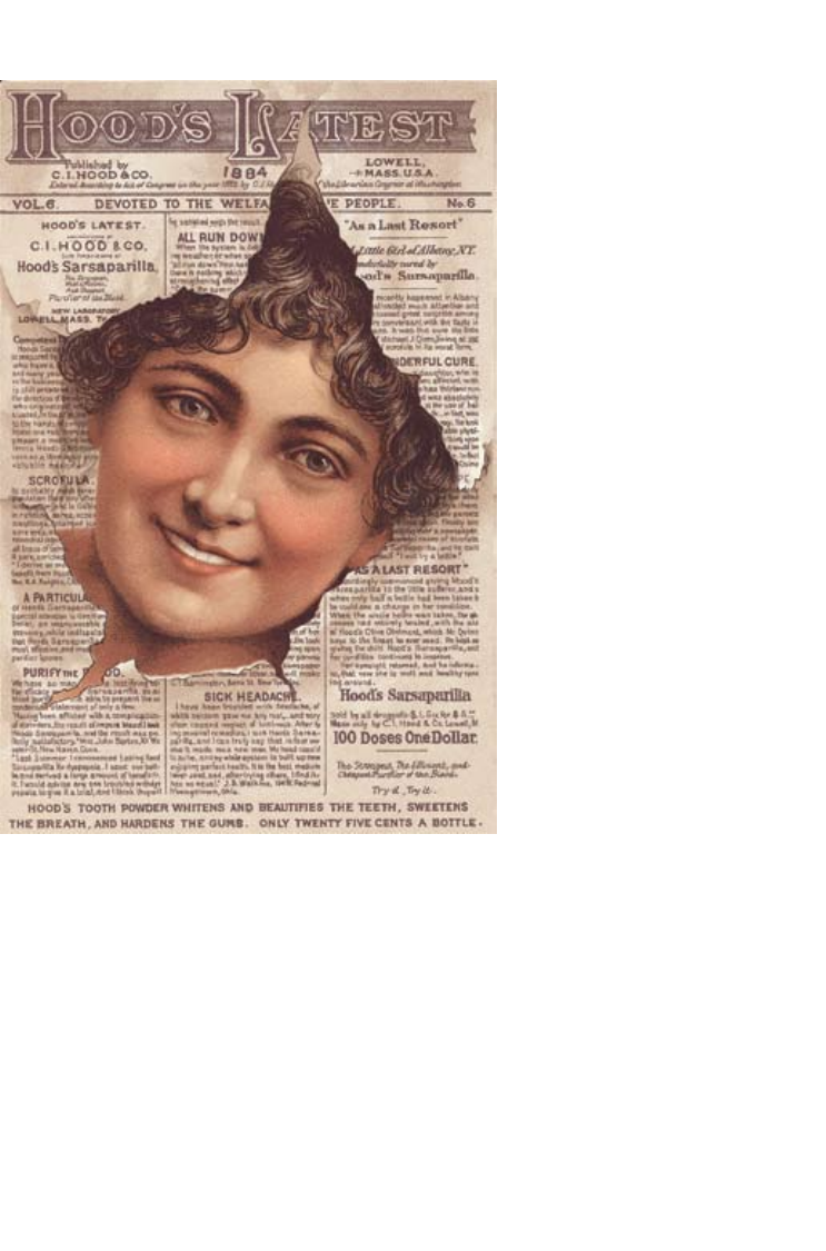
’ Advertisement, lithograph, 1884.
Reproduced at actual size. A woman’s healthy face bursts through a
sheet of text, her bright complexion proving the product’s efficacy better
than any written claim. Both text and image were drawn by hand,
reproduced via color lithography.
iNtroductioN
Since the first edition of Thinking with Type appeared in 2004, this book has
been widely adopted in design programs around the world. Whenever a
young designer hands me a battered copy of Thinking with Type to sign at a
lecture or event, I am warmed with joy from serif to stem. Those scuffed
covers and dinged corners are evidence that typography is thriving in the
hands and minds of the next generation.
I’ve put on some weight since 2004, and so has this book. For the new
edition, I decided to let out the seams and give the content more room to
breathe. If you—like most graphic designers—like to sweat the little stuff,
you’ll find a lot to love, honor, and worry about in the pages that follow.
Finicky matters such as kerning, small capitals, non-lining numerals,
punctuation, alignment, and baseline grids that were touched on briefly in
the first edition are developed here in more detail, along with new topics that
were previously omitted, such as how to style a drop capital, what you need
to know about optical sizes, and when to say “typeface” instead of “font” at
your next AIGA wine-and-carrot-stick party. This new book has more of
everything: more fonts, more exercises, more examples, a more bodacious
index, and best of all, more type crimes—more disgraceful “don’ts” to
complement the dignified “do’s.”
I was inspired to write the first edition of this book while searching for a
textbook for my own type classes, which I have been teaching at Maryland
Institute College of Art (MICA) since 1997. Some books on typography focus
on the classical page; others are vast and encyclopedic, overflowing with facts
and details. Some rely heavily on illustrations of their authors’ own work,
providing narrow views of a diverse practice, while others are chatty and
dumbed down, presented in a condescending tone.
I sought a book that is serene and intelligible, a volume where design and
text gently collaborate to enhance understanding. I sought a work that is
small and compact, economical yet well constructed—a handbook designed
for the hands. I sought a book that reflects the diversity of typographic life,
past and present, exposing my students to history, theory, and ideas. Finally,
I sought a book that would be relevant across the media of visual design,
from the printed page to the glowing screen.
I found no alternative but to write the book myself.
| 7
Worried? See page 81
8 |
Thinking with Type is assembled in three sections: , , and ,
building from the basic atom of the letterform to the organization of words
into coherent bodies and flexible systems. Each section opens with a
narrative essay about the cultural and theoretical issues that fuel typographic
design across a range of media. The demonstration pages that follow each
essay show not just how typography is structured, but why, asserting the
functional and cultural basis for design habits and conventions. Throughout
the book, examples of design practice demonstrate the elasticity of the
typographic system, whose rules can (nearly) all be broken.
The first section, , reveals how early typefaces referred to
the body, emulating the work of the hand. The abstractions of neoclassicism
bred the strange progeny of nineteenth-century commercial typography.
In the twentieth century, avant-garde artists and designers explored the
alphabet as a theoretical system. With the rise of digital design tools,
typography revived its connections with the body.
The second section, , considers the massing of letters into larger
bodies. Text is a field or texture whose grain, color, density, and silhouette
can be endlessly adjusted. Technology has shaped the design of typographic
space, from the concrete physicality of metal type to the flexibility—and
constraints—offered by digital media. Text has evolved from a closed, stable
body to a fluid and open ecology.
The third section, , looks at spatial organization. In the early twentieth
century, Dada and Futurist artists attacked the rectilinear constraints of metal
type and exposed the mechanical grid of letterpress. Swiss designers in the
1940s and 1950s created design’s first total methodology by rationalizing the
grid. Their work, which introduced programmatic thinking to a field
governed by taste and convention, remains profoundly relevant to the
systematic thinking required when designing for multimedia.
This book is about thinking with typography—in the end, the emphasis
falls on with. Typography is a tool for doing things with: shaping content,
giving language a physical body, enabling the social flow of messages.
Typography is an ongoing tradition that connects you with other designers,
past and future. Type is with you everywhere you go—the street, the mall, the
web, your apartment. This book aims to speak to, and with, all the readers
and writers, designers and producers, teachers and students, whose work
engages the ordered yet unpredictable life of the visible word.
| 9
As a designer, writer, and visual thinker, I am indebted to my teachers at the
Cooper Union, where I studied art and design from 1981 to 1985. Back then,
the design world was neatly divided between a Swiss-inflected modernism
and an idea-based approach rooted in American advertising and illustration.
My teachers, including George Sadek, William Bevington, and James Craig,
staked out a place between those worlds, allowing the modernist fascination
with abstract systems to collide with the strange, the poetic, and the popular.
The title of this book, Thinking with Type, is an homage to James Craig’s
primer Designing with Type, the utilitarian classic that was our textbook at the
Cooper Union. If that book was a handyman’s manual to basic typography,
this one is a naturalist’s field guide, approaching type as a phenomenon that
is more evolutionary than mechanical. What I really learned from my
teachers was not rules and facts but how to think: how to use visual and
verbal language to develop ideas. For me, discovering typography was like
finding the bridge that connects art and language.
To write my own book for the twenty-first century, Idecided to educate
myself again. In 2003 I enrolled in the Doctorate in Communications
Design program at the University of Baltimore and completed my degree in
2008. There I worked with Stuart Moulthrop and Nancy Kaplan, world-class
scholars, critics, and designers of networked media and digital interfaces.
Their influence is seen throughout this book.
My colleagues at MICA have built a distinctive design culture at the
school; special thanks go to Ray Allen, Fred Lazarus, Guna Nadarajan,
Brockett Horne, Jennifer Cole Phillips, and all my students.
The editor of Thinking with Type’s first edition, Mark Lamster, remains
one of my most respected colleagues. The editor of the second edition,
Nicola Bednarek, helped me balance and refine the expanded content. I
thank Kevin Lippert, publisher at Princeton Architectural Press, for many,
many years of support. Numerous designers and scholars helped me along
the way, including Peter Bilak, Matteo Bologna, Vivian Folkenflik, Jonathan
Hoefler, Eric Karnes, Elke Gasselseder, Hans Lijklema, William Noel, and
Jeffrey Zeldman, as well as all the other designers who shared their work.
I learn something every day from my children, Jay and Ruby, and from my
parents, my twin sister, and the amazing Miller family. My friends—Jennifer
Tobias, Edward Bottone, Claudia Matzko, and Joy Hayes—sustain my life.
My husband, Abbott Miller, is the greatest designer I know, and I am proud
to include his work in this volume.
AckNowledgmeNts
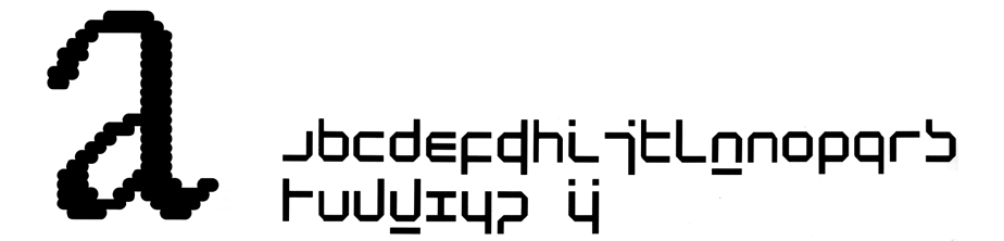
{letter}
12 |
, ,
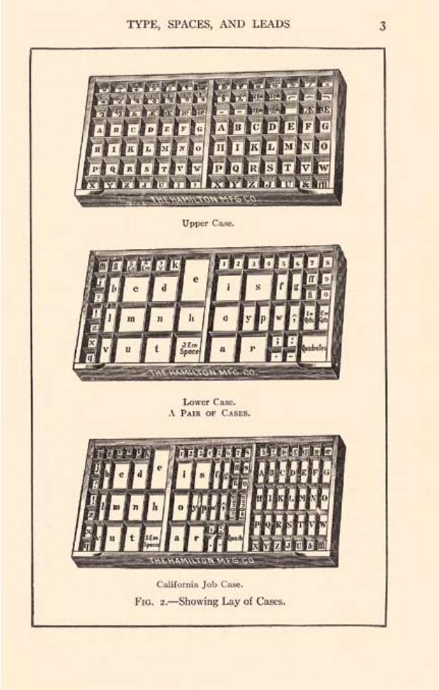
Diagram, 1917. Author:
Frank S. Henry. In a
letterpress printing shop,
gridded cases hold fonts of type
and spacing material. Capital
letters are stored in a drawer
above the minuscule letters.
Hence the terms “uppercase”
and “lowercase” are derived
from the physical space of the
print shop.
| 13
letter
Printed text,
1456.
. It is a book about how to use them.
Typefaces are an essential resource employed by graphic designers, just as
glass, stone, steel, and other materials are employed by architects. Graphic
designers sometimes create their own typefaces and custom lettering. More
commonly, however, they tap the vast library of existing typefaces, choosing
and combining them in response to a particular audience or situation. To
do this with wit and wisdom requires knowledge of how—and why—
letterforms have evolved.
Words originated as gestures of the body. The first typefaces were directly
modeled on the forms of calligraphy. Typefaces, however, are not bodily
gestures—they are manufactured images designed for infinite repetition.
The history of typography reflects a continual tension between the hand and
the machine, the organic and the geometric, the human body and the
abstract system. These tensions, which marked the birth of printed letters
over five hundred year ago, continue to energize typography today.
Movable type, invented by Johannes Gutenberg in Germany in the early
fifteenth century, revolutionized writing in the West. Whereas scribes had
previously manufactured books and documents by hand, printing with type
allowed for mass production: large quantities of letters could be cast from a
mold and assembled into “forms.” After the pages were proofed, corrected,
and printed, the letters were put away in gridded cases for reuse.
Movable type had been employed earlier in China but had proven less
useful there. Whereas the Chinese writing system contains tens of
thousands of distinct characters, the Latin alphabet translates the sounds of
speech into a small set of marks, making it well-suited to mechanization.
Gutenberg’s famous Bible took the handmade manuscript as its model.
Emulating the dense, dark handwriting known as “blackletter,” he
reproduced its erratic texture by creating variations of each letter as well
as numerous ligatures (characters that combine two or more letters into
a single form).
This chapter extends and revises “Laws of the Letter,” Ellen
Lupton and J. Abbott Miller, Design Writing Research: Writing
on Graphic Design (New York: Kiosk, 1996; London: Phaidon,
1999), 53–61.
Lorem ipsum dolor sit amet,
consectetuer adipiscing elit.
Integer pharetra, nisl ut
luctus ullamcorper, augue
tortor egestas ante, vel pharetra
pede urna ac neque. Mauris
ac mi eu purus tincidunt
Lorem ipsum dolor sit amet,
consectetuer adipiscing elit.
Integer pharetra, nisl ut
luctus ullamcorper, augue
tortor egestas ante, vel
pharetra pede urna ac
neque. Mauris ac mi eu
Lorem ipsum dolor sit amet,
consectetuer adipiscing elit.
Integer pharetra, nisl ut luctus
ullamcorper, augue tortor egestas
ante, vel pharetra pede urna ac
neque. Mauris ac mi eu purus
tincidunt faucibus. Proin volutpat
dignissim lectus. Nunc eu erat.
was designed in
1995 by Robert
Slimbach, who
reconceives
historical type-
faces for digital
use. Adobe Jenson
is less mannered
and decorative
than Centaur.
was created by the
English design
reformer William
Morris in 1890.
He sought to
recapture the dark
and solemn
density of Jenson’s
pages.
, designed from
1912 to 1914 by Bruce
Rogers, is a revival of
Jenson’s type that
emphasizes its ribbonlike
stroke.
learned to print in
Mainz, the German
birthplace of typography,
before establishing his
own printing press in
Venice around 1465. His
letters have strong vertical
stems, and the transition
from thick to thin
emulates the path of a
broad-nibbed pen.
was designed in the
1990s by the Dutch
typographer, teacher, and
theorist Gerrit Noordzij.
This digitally constructed
font captures the
dynamic, three-
dimensional quality of
fifteenth-century roman
typefaces as well as their gothic (rather than humanist) origins. As
Noordzij explains, Jenson “adapted the German letters to Italian fashion
(somewhat rounder, somewhat lighter), and thus created roman type.”
was introduced in 1991 by the
Dutch typographer Martin Majoor. Although
this thoroughly contemporary typeface has
geometric serifs and rational, almost modular
forms, it reflects the calligraphic origins of
type, as seen in letters such as a.
14 |
| 15
In fifteenth-century Italy, humanist writers and scholars rejected gothic
scripts in favor of the lettera antica, a classical mode of handwriting with
wider, more open forms. The preference for lettera antica was part of
the Renaissance (rebirth) of classical art and literature. Nicolas Jenson,
a Frenchman who had learned to print in Germany, established an
influential printing firm in Venice around 1469. His typefaces merged the
gothic traditions he had known in France and Germany with the Italian
taste for rounder, lighter forms. They are considered among the first—and
finest—roman typefaces.
Many typefaces we use today, including Garamond, Bembo, Palatino,
and Jenson, are named for printers who worked in the fifteenth and
sixteenth centuries. These typefaces are generally known as “humanist.”
Contemporary revivals of historical typefaces are designed to conform with
modern technologies and current demands for sharpness and uniformity.
Each revival responds to—or reacts against—the production methods,
printing styles, and artistic habits of its own time. Some revivals are based
on metal types, punches (steel prototypes), or drawings that still exist; most
rely solely on printed specimens.
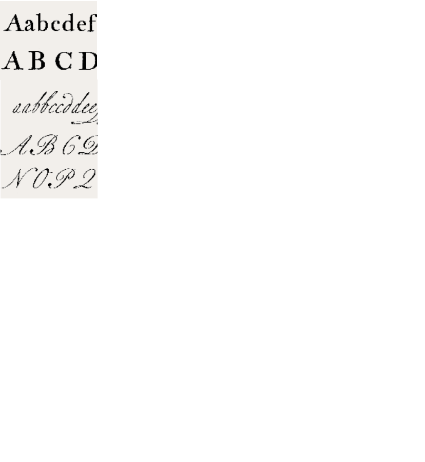
Italic letters, also introduced in fifteenth-century Italy, were modeled on a
more casual style of handwriting. While the upright humanist scripts
appeared in expensively produced books, the cursive form thrived in the
cheaper writing shops, where it could be written more rapidly than the
carefully formed lettera antica. Aldus Manutius, a Venetian printer,
publisher, and scholar, used italic typefaces in his internationally distributed
series of small, inexpensive printed books. For calligraphers, the italic form
was economical because it saved time, while in printing, the cursive form
saved space. Aldus Manutius often paired cursive letters with roman
capitals; the two styles still were considered fundamentally distinct.
In the sixteenth century, printers began integrating roman and italic
forms into type families with matching weights and x-heights (the height of
the main body of the lowercase letter). Today, the italic style in most fonts is
not simply a slanted version of the roman; it incorporates the curves, angles,
and narrower proportions associated with cursive forms.
humanismandthebody
designed roman
and italic types
for Aldus
Manutius. The
roman and italic
were conceived as
separate typefaces.
created
roman and italic types for
the Imprimerie Royale,
Paris, 1642, that are
coordinated into a larger
type family.
On the complex origins
of roman type, see Gerrit
Noordzij, Letterletter
(Vancouver: Hartley and
Marks, 2000).
16 |
designed
model letterforms for the printing
press of Louis XIV. Instructed by
a royal committee, Simonneau
designed his letters on a finely
meshed grid. A royal typeface
(romain du roi) was then
created by Philippe Grandjean,
based on Simonneau’s
engravings.
argued that
letters should reflect the ideal
human body. Regarding the
letter A, he wrote: “the cross-
stroke covers the man’s organ
of generation, to signify that
Modesty and Chastity are
required, before all else, in those
who seek acquaintance with
well-shaped letters.”
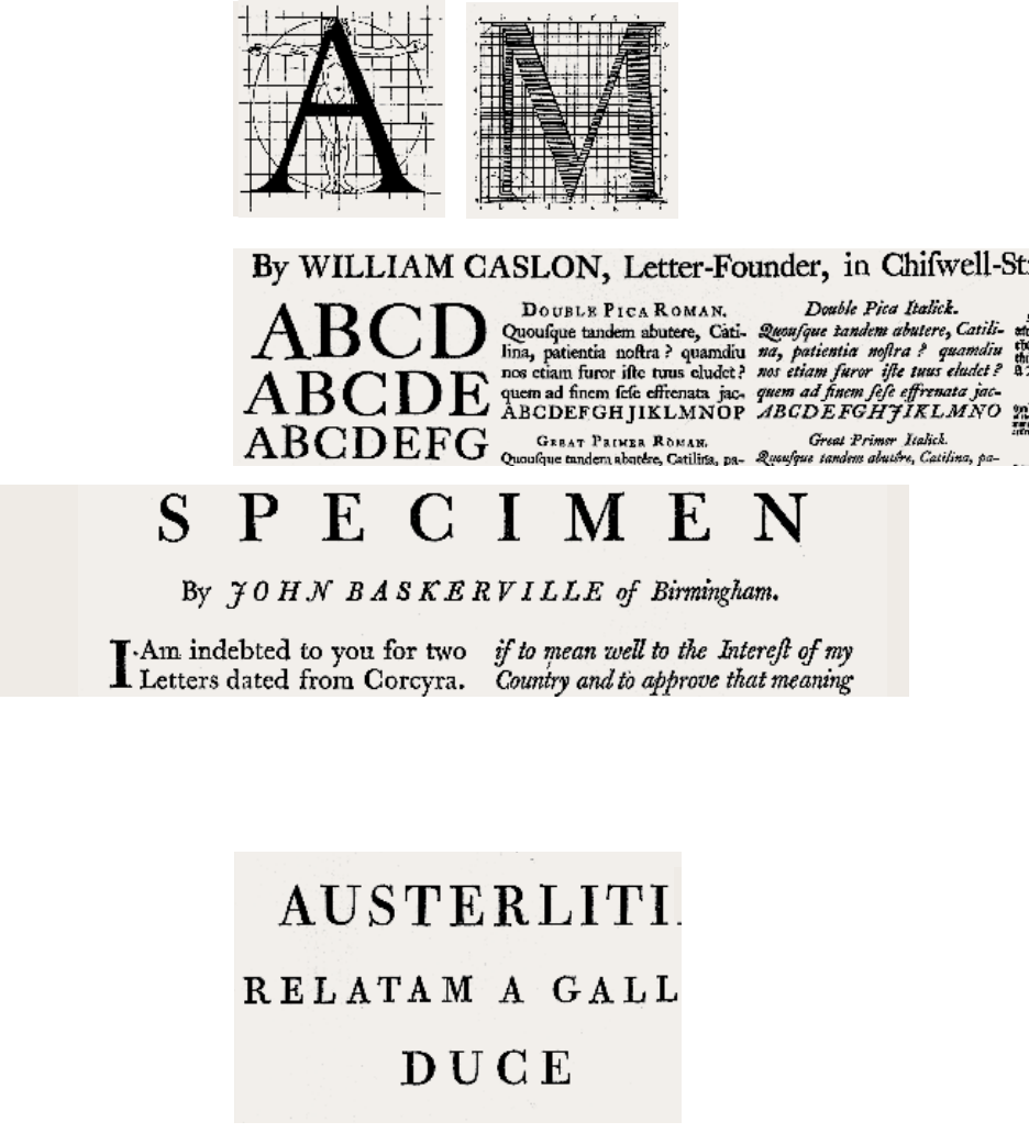
was a printer working in England in the 1750s
and 1760s. He aimed to surpass Caslon by creating sharply detailed
letters with more vivid contrast between thick and thin elements.
Whereas Caslon’s letters were widely used during his own time,
Baskerville’s work was denounced by many of his contemporaries as
amateur and extremist.
produced
typefaces in eighteenth-century
England with crisp, upright
characters that appear, as
Robert Bringhurst has written,
“more modelled and less written
than Renaissance forms.”
created letters at the close of
the eighteenth century that
exhibit abrupt, unmodulated
contrast between thick and
thin elements, and razor-thin
serifs unsupported by curved
brackets. Similar typefaces were
designed in the same period by
François-Ambroise Didot
(1784) in France and Justus
Erich Walbaum (1800) in
Germany.
| 17
, 1743.
Samples of “Roman Print”
and “Italian Hand.”
This accusation was reported
to Baskerville in a letter from
his admirer Benjamin
Franklin. For the full letter,
see F. E. Pardoe, John
Baskerville of Birmingham:
Letter-Founder and Printer
(London: Frederick Muller
Limited, 1975), 68.
See also Robert Bringhurst,
The Elements of Typographic
Style (Vancouver: Hartley and
Marks, 1992, 1997).
enlightenmentandabstraction
Renaissance artists sought standards of proportion in the idealized human
body. The French designer and typographer Geofroy Tory published a series
of diagrams in 1529 that linked the anatomy of letters to the anatomy of
man. A new approach—distanced from the body—would unfold in the age
of scientific and philosophical Enlightenment.
A committee appointed by Louis XIV in France in 1693 set out to
construct roman letters against a finely meshed grid. Whereas Tory’s
diagrams were produced as woodcuts, the gridded depictions of the romain
du roi (king’s alphabet) were engraved, made by incising a copper plate with
a tool called a graver. The lead typefaces derived from these large-scale
diagrams reflect the linear character of engraving as well as the scientific
attitude of the king’s committee.
Engraved letters—whose fluid lines are unconstrained by the letter press’s
mechanical grid—offered an apt medium for formal lettering. Engraved
reproductions of penmanship disseminated the work of the great eighteenth-
century writing masters. Books such as George Bickham’s The Universal
Penman (1743) featured roman letters—each engraved as a unique
character—as well as lavishly curved scripts.
Eighteenth-century typography was influenced by new styles of
handwriting and their engraved reproductions. Printers such as William
Caslon in the 1720s and John Baskerville in the 1750s abandoned the rigid
nib of humanism for the flexible steel pen and the pointed quill, writing
instruments that rendered a fluid, swelling path. Baskerville, himself a
master calligrapher, would have admired the thinly sculpted lines that
appeared in the engraved writing books. He created typefaces of such
sharpness and contrast that contemporaries accused him of “blinding all the
Readers in the Nation; for the strokes of your letters, being too thin and
narrow, hurt the Eye.” To heighten the startling precision of his pages,
Baskerville made his own inks and hot-pressed his pages after printing.
At the turn of the nineteenth century, Giambattista Bodoni in Italy and
Firmin Didot in France carried Baskerville’s severe vocabulary to new
extremes. Their typefaces—which have a wholly vertical axis, sharp contrast
between thick and thin, and crisp, waferlike serifs—were the gateway to an
explosive vision of typography unhinged from calligraphy.
The romain du roi was designed not by a typographer but by a government committee
consisting of two priests, an accountant, and an engineer. —robertbringhurst, 1992
18 |
| 19
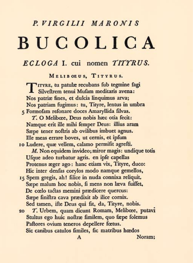
() Book page,
1757. Printed by John
Baskerville. The typefaces
created by Baskerville in the
eighteenth century were
remarkable—even shocking—
in their day for their sharp,
upright forms and stark contrast
between thick and thin
elements. In addition to a
roman text face, this page
utilizes italic capitals, large-
scale capitals (generously
letterspaced), small capitals
(scaled to coordinate with
lowercase text), and non-lining
or old-style numerals (designed
with ascenders, descenders, and
a small body height to work
with lowercase characters).
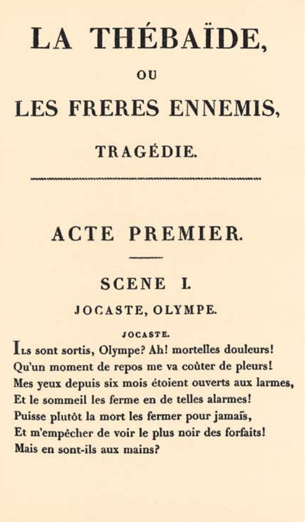
() Book page,
1801. Printed by Firmin
Didot. The typefaces cut by the
Didot family in France were
even more abstract and severe
than those of Baskerville, with
slablike, unbracketed serifs and
a stark contrast from thick to
thin. Nineteenth-century
printers and typographers called
these glittering typefaces
“modern.”
Both pages reproduced
from William Dana Orcutt,
In Quest of the Perfect Book
(New York: Little, Brown and
Company, 1926); margins are
not accurate.
20 |
,
| 21
Satirical
essay by Francis Hopkinson, The
American Museum, Volume 1 (1787).
Courtesy of the Boston Public
Library. This eighteenth-century essay
is an early example of expressive
typography. The author, poking fun at
the emerging news media, suggests a
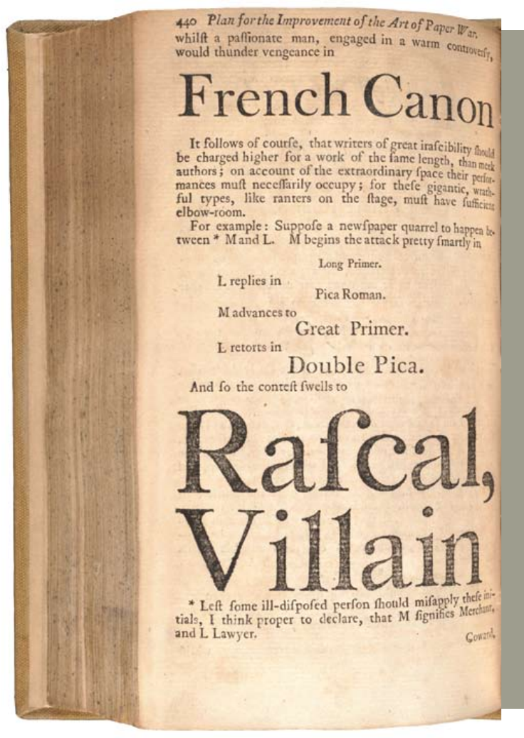
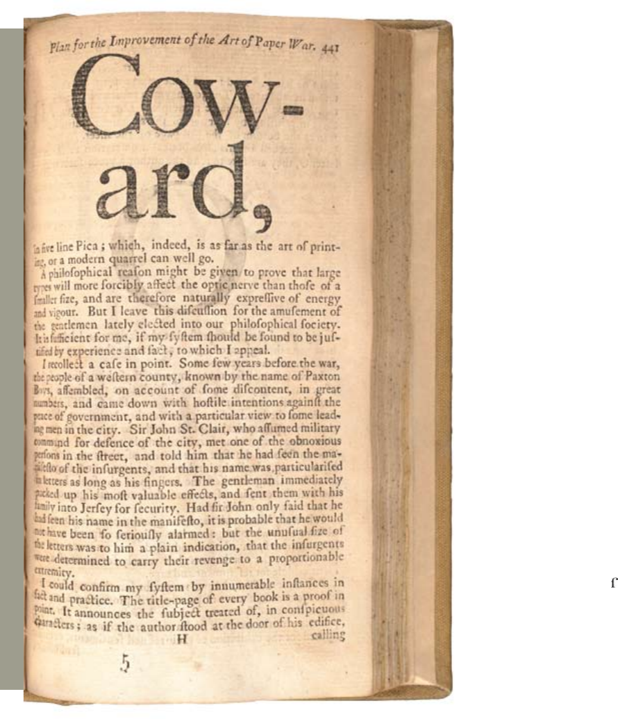
“paper war” between a lawyer and a
merchant. As the two men toss attacks
at each other, the type gets progressively
bigger. The terms Long Primer, Pica
Roman, Great Primer, Double Pica,
and Five Line Pica were used at the
time to identify type sizes. The symbol
is an s. Hopkinson was no stranger to
design. He created the stars and stripes
motif of the American flag.
My person was hideous, my stature gigantic. What did this mean? Who was I? What was I?...
Accursed creator! Why did you create a monster so hideous that even you turned away from
me in disgust? — maryshelley, Frankenstein, 1831
is the nineteenth-
century term for letters with no
serifs. Gothic letters command
attention with their massive
frontality. Although sans-serif
letters were later associated with
rationality and neutrality, they
lent emotional impact to early
advertising.
is the name given to
the inflated, hyperbold type
style introduced in the early
nineteenth century. These faces
exaggerated the polarization
of letters into thick and thin
components seen in the
typographic forms of Bodoni
and Didot.
, or slab, typefaces
transformed the serif from a
refined detail to a load-bearing
slab. As an independent
architectural component, the
slab serif asserts its own weight
and mass. Introduced in 1806,
this style was quickly denounced
by purists as “a typographical
monstrosity.”
22 |
typefaces
are designed to fit in narrow
spaces. Nineteenth-century
advertisements often combined
fonts of varying style and
proportion on a single page.
These bombastic mixtures were
typically aligned, however, in
static, centered compositions.
,

| 23
Although Bodoni and Didot fueled their designs with the calligraphic
practices of their time, they created forms that collided with typographic
tradition and unleashed a strange new world, where the structural attributes
of the letter—serif and stem, thick and thin strokes, vertical and horizontal
stress—would be subject to bizarre experiments. In search of a beauty both
rational and sublime, Bodoni and Didot had created a monster: an abstract
and dehumanized approach to the design of letters.
With the rise of industrialization and mass consumption in the nineteenth
century came the explosion of advertising, a new form of communication
demanding new kinds of typography. Type designers created big, bold faces
by embellishing and engorging the body parts of classical letters. Fonts of
astonishing height, width, and depth appeared—expanded, contracted,
shadowed, inlined, fattened, faceted, and floriated. Serifs abandoned their
role as finishing details to become independent architectural structures, and
the vertical stress of traditional letters canted in new directions.
Lead, the material for casting metal type, is too soft to hold its shape at
large sizes under the pressure of the printing press. In contrast, type cut
from wood can be printed at gigantic scales. The introduction of the
combined pantograph and router in 1834 revolutionized wood-type
manufacture. The pantograph is a tracing device that, when linked to a
router for carving, allows a parent drawing to spawn variants with different
proportions, weights, and decorative excresences.
This mechanized design approach treated the alphabet as a flexible system
divorced from calligraphy. The search for archetypal, perfectly proportioned
letterforms gave way to a new view of typography as an elastic system of
formal features (weight, stress, stem, crossbars, serifs, angles, curves,
ascenders, descenders). The relationships among letters in a typeface became
more important than the identity of individual characters.
monsterfonts
For extensive analysis and examples of decorated types, see Rob Roy Kelly, American Wood Type:
1828–1900, Notes on the Evolution of Decorated and Large Letters (New York: Da Capo Press, 1969).
See also Ruari McLean, “An Examination of Egyptians,” in Texts on Type: Critical Writings on
Typography, ed. Steven Heller and Philip B. Meggs (New York: Allworth Press, 2001), 70–76.
/
Type historian Rob Roy Kelly
studied the mechanized design
strategies that served to generate
a spectacular variety of display
letters in the nineteenth century.
This diagram shows how the
basic square serif form—called
Egyptian or slab—was cut,
pinched, pulled, and curled to
spawn new species of ornament.
Serifs were transformed from
calligraphic end-strokes into
independent geometric elements
that could be freely adjusted.
24 |
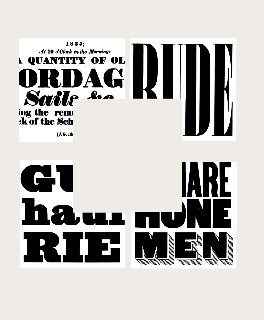
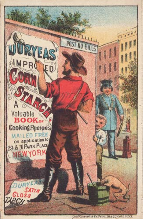
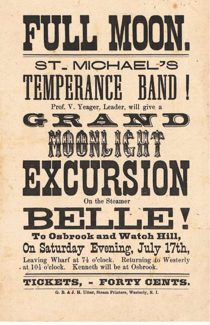
’
()
Lithographic trade card, 1878.
The rise of advertising in the
nineteenth century stimulated
demand for large-scale letters that
could command attention in
urban space. Here, a man is
shown posting a bill in flagrant
disregard for the law, while a
police officer approaches from
around the corner.
()
Letterpress poster, 1875. A dozen
different fonts are used in this
poster for a steamship cruise. A
size and style of typeface has been
chosen for each line to maximize
the scale of the letters in the space
allotted. Although the typefaces are
exotic, the centered layout is as
static and conventional as a
tombstone.
Printing, having found in the book a refuge in which to lead an autonomous existence, is
pitilessly dragged out into the street by advertisements....Locust swarms of print, which
already eclipse the sun of what is taken for intellect in city dwellers, will grow thicker
with each succeeding year. —walterbenjamin, 1925
| 25
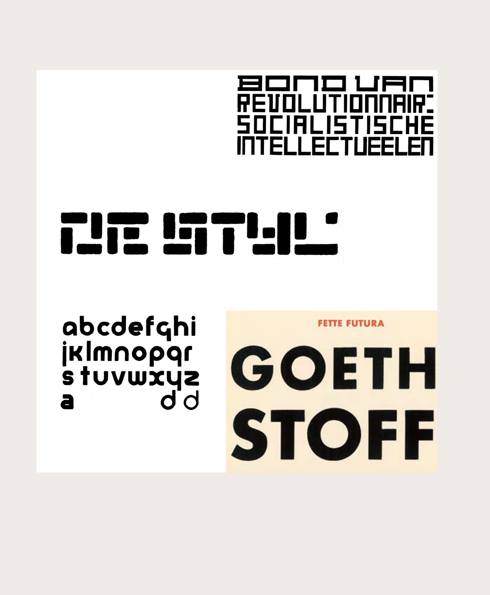
designed Futura
in Germany in 1927. Although
it is strongly geometric, with
perfectly round Os, Futura is a
practical, subtly designed typeface
that remains widely used today.
created this typeface design,
called universal, at the Bauhaus in 1925.
Consisting only of lowercase letters, it is built
from straight lines and circles.
designed
this logo for the magazine
De Stijl in 1917. Whereas
van Doesburg’s characters are
unbroken, Huszár’s letters
consist of pixel-like modules.
, founder and chief promoter
of the Dutch De Stijl movement, designed this alphabet
with perpendicular elements in 1919. Applied here to
the letterhead of the Union of Revolutionary Socialists,
the hand-drawn characters vary in width, allowing
them to fill out the overall rectangle. The De Stijl
movement called for the reduction of painting,
architecture, objects, and letters to elemental units.
26 |
| 27
reformandrevolution
The calming, abstract forms of those new typefaces that dispense with handwritten movement
offer the typographer new shapes of tonal value that are very purely attuned. These types can be
used in light, semi-bold, or in saturated black forms. — paulrenner, 1931
Some designers viewed the distortion of the alphabet as gross and immoral,
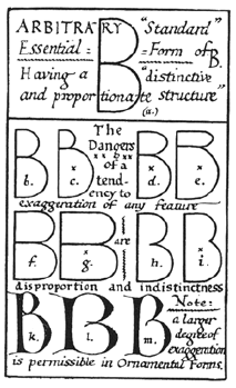
tied to a destructive and inhumane industrial system. Writing in 1906,
Edward Johnston revived the search for an essential, standard alphabet and
warned against the “dangers” of exaggeration. Johnston, inspired by the
nineteenth-century Arts and Crafts movement, looked back to the
Renaissance and Middle Ages for pure, uncorrupted letterforms.
Although reformers like Johnston remained romantically attached to
history, they redefined the designer as an intellectual distanced from
the commercial mainstream. The modern design reformer was a critic of
society, striving to create objects and images that would challenge and revise
dominant habits and practices.
The avant-garde artists of the early twentieth century rejected historical
forms but adopted the model of the critical outsider. Members of the De Stijl
group in the Netherlands reduced the alphabet to perpendicular elements.
At the Bauhaus, Herbert Bayer and Josef Albers constructed letters from
basic geometric forms—the circle, square, and triangle—which they viewed
as elements of a universal language of vision.
Such experiments approached the alphabet as a system of abstract
relationships. Like the popular printers of the nineteenth century, avant-
garde designers rejected the quest for essential letters grounded in the
human hand and body, but they offered austere, theoretical alternatives in
place of the solicitous novelty of mainstream advertising.
Assembled like machines from modular components, these experimental
designs emulated factory production. Yet most were produced by hand
rather than as mechanical typefaces (although many are now available
digitally). Futura, completed by Paul Renner in 1927, embodied the
obsessions of the avant garde in a multipurpose, commercially available
typeface. Although Renner disdained the active movement of calligraphy in
favor of forms that are “calming” and abstract, he tempered the geometry of
Futura with subtle variations in stroke, curve, and proportion. Renner
designed Futura in numerous weights, viewing his type family as a painterly
tool for constructing a page in shades of gray.
based
this 1906 diagram of “essential”
characters on ancient Roman
inscriptions. While deriding
commercial lettering, Johnston
accepted the embellishment of
medieval-inspired forms.
On Futura, see Christopher
Burke, Paul Renner: The Art
of Typography (New York:
Princeton Architectural Press,
1998). On the experimental
typefaces of the 1920s and
1930s, see Robin Kinross,
Unjustified Texts: Perspectives
on Typography (London:
Hyphen Press, 2002), 233–45.
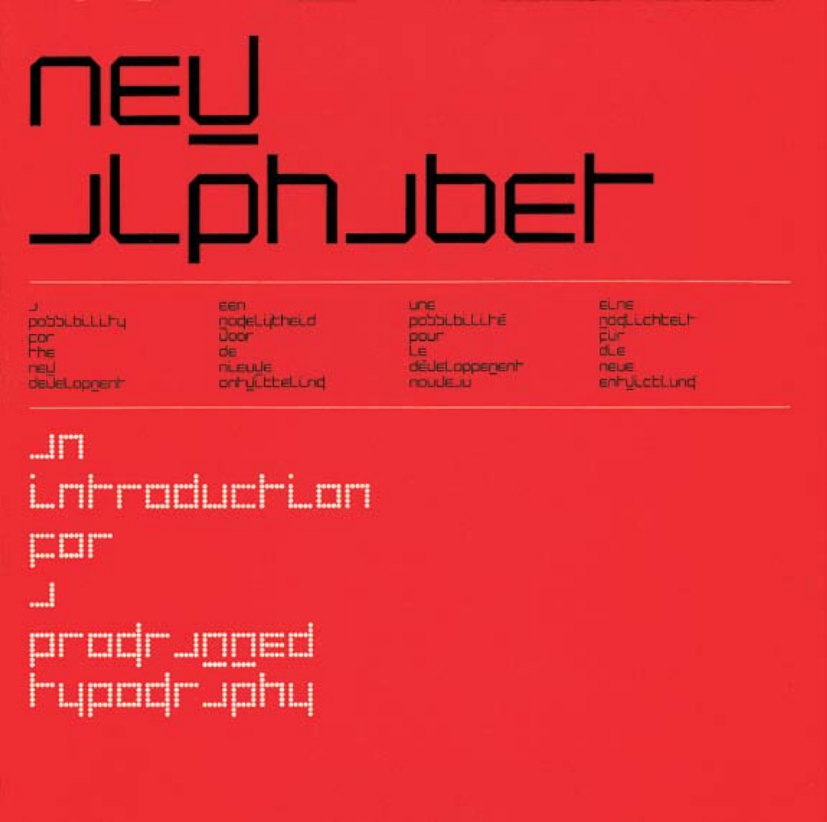
published his designs for a “new alphabet,”
consisting of no diagonals or curves, in 1967. The Foundry (London)
began releasing digital editions of Crouwel’s typefaces in 1997.
28 |
| 29
Responding in 1967 to the rise of electronic communication, the Dutch
designer Wim Crouwel published designs for a “new alphabet” constructed
from straight lines. Rejecting centuries of typographic convention, he
designed his letters for optimal display on a video screen (CRT),
where curves and angles are rendered with horizontal scan lines. In a
brochure promoting his new alphabet, subtitled“An Introduction
for a Programmed Typography,” he proposed a design methodology in
which decisions are rule-based and systematic.
In the mid-1980s, personal computers and low-resolution printers put the
tools of typography in the hands of a broader public. In 1985 Zuzana Licko
began designing typefaces that exploited the rough grain of early desktop
systems. While other digital fonts imposed the coarse grid of screen displays
and dot-matrix printers onto traditional typographic forms, Licko embraced
the language of digital equipment. She and her husband, Rudy VanderLans,
cofounders of Emigre Fonts and Emigre magazine, called themselves the
“new primitives,” pioneers of a technological dawn.
By the early 1990s, with the introduction of high-resolution laser printers
and outline font technologies such as PostScript, type designers were less
constrained by low-resolution outputs. While various signage systems and
digital output devices still rely on bitmap fonts today, it is the fascination
with programmed, geometric structures that has enabled bitmap forms to
continue evolving as a visual ethos in print and digital media.
typeasprogram
Living with computers gives funny ideas. — wimcrouwel, 1967
presented
this “scanned” version of a
Garamond a in contrast
with his own new alphabet,
whose forms accept the gridded
structure of the screen. See
Wim Crouwel, New Alphabet
(Amsterdam: Total Design,
1967).
created
coarse-resolution fonts for
desktop screens and printers in
1985. These fonts have since
been integrated into Emigre’s
extensive Lo-Res font family,
designed for print and digital
media.
See Rudy VanderLans
and Zuzana Licko, Emigre:
Graphic Design into the Digital
Realm (New York: Van
Nostrand Reinhold, 1993) and
Emigre No. 70: The Look Back
Issue, Selections from Emigre
Magazine, 1984–2009 (Berkeley:
Gingko Press, 2009).
Oakland Emigre
Emperor
produced a body
of experimental typography
that strongly influenced
typeface design in the 1990s.
His posters for the Detroit
Focus Gallery feature
damaged and defective forms,
drawn by hand or culled
from third-generation
photocopies or from sheets
of transfer lettering.
Collection of the Cooper-
Hewitt, National Design
Museum.
30 |
| 31
In the early 1990s, as digital design tools began supporting the seamless
reproduction and integration of media, many designers grew dissatisfied
with clean, unsullied surfaces, seeking instead to plunge the letter into the
harsh and caustic world of physical processes. Letters, which for centuries
had sought perfection in ever more exact technologies, became scratched,
bent, bruised, and polluted.
Barry Deck’s typeface Template Gothic, designed in 1990, is based on letters
drawn with a plastic stencil. The typeface thus refers to a process that is at
once mechanical and manual. Deck designed Template Gothic while he was
a student of Ed Fella, whose experimental posters inspired a generation of
digital typographers. After Template Gothic was released commercially
by Emigre Fonts, its use spread worldwide, making it an emblem of digital
typography for the 1990s.
P. Scott Makela’s typeface Dead History, also designed in 1990, is a pastiche
of two existing typefaces: the traditional serif font Centennial and the Pop
classic VAG Rounded. By manipulating the vectors of readymade fonts,
Makela adopted the sampling strategy employed in contemporary art and
music. He also embraced the burden of history and precedent, which play a
role in nearly every typographic innovation.
The Dutch typographers Erik van Blokland and Just van Rossum have
combined the roles of designer and programmer, creating typefaces that
embrace chance, change, and uncertainty. Their 1990 typeface Beowulf
was the first in a series of typefaces with randomized outlines and
programmed behaviors.
typeasnarrative
The industrial methods of producing typography meant that all letters
had to be identical....Typography is now produced with sophisticated
equipment that doesn’t impose such rules. The only limitations are in
our expectations. — erikvanbloklandandjustvanrossum, 2000
Template Gothic: flawed technology
Dead History: feeding on the past
32 |
backtowork
Although the 1990s are best remembered for images of chaos and decay,
serious type designers continued to build general purpose typefaces
designed to comfortably accommodate broad bodies of text. Such workhorse
type families provide graphic designers with flexible palettes of letterforms.
Licko produced historical revivals during the 1990s alongside her
experimental display faces. Her 1996 typeface Mrs Eaves, inspired by the
eighteenth-century types of Baskerville, became one of the most popular
typefaces of its time. In 2009, Mrs Eaves was joined by Mr Eaves,
a sans-serif version of the feminine favorite.
Fred Smeijers’s Quadraat (above) and Martin Majoor’s Scala (used for the
text of this book) offer crisp interpretations of typographic tradition. These
typefaces look back to sixteenth-century printing from a contemporary point
of view, as seen in their simply drawn, decisively geometric serifs.
Introduced in 1992, the Quadraat family soon expanded to include sans-
serif forms in numerous weights and styles.
In 2000 Tobias Frere-Jones introduced Gotham, derived from letters found
at the Port Authority Bus Terminal in New York City. With its distinctive yet
utilitarian style, Gotham became the signature typeface of Barack Obama’s
2008 presidential campaign. By 2009, typography’s First Family had over
fifty weights and styles.
When choosing a typeface, graphic designers consider the history
of typefaces, their current connotations, as well as their formal qualities.
The goal is to find an appropriate match between a style of letters and the
specific social situation and body of content that define the project at hand.
There is no playbook that assigns a fixed meaning or function to every
typeface; each designer must confront the library of possibilities in light of
a project’s unique circumstances.
Mrs Eaves: working woman seeks reliable mate
Quadraat: all-purpose hard Baroque
Gotham: Blue-Collar Curves
| 33
. Website, 2004. Design: Fred Smeijers and Rudy
Geeraerts. This Flash-based website for a digital type foundry allows
users to test fonts on the fly. The designers launched their own “label”
after creating typefaces such as Quadraat for FontShop
International. Shown here is Arnhem.
34 |
| 35
Book, 2000. Design: Bruce Mau. Publisher:
Phaidon. Photograph: Dan Meyers. In this postindustrial
manifesto, graphic designer Bruce Mau imagines a typeface that
comes alive with simulated intelligence.
-
anatomy
36 |
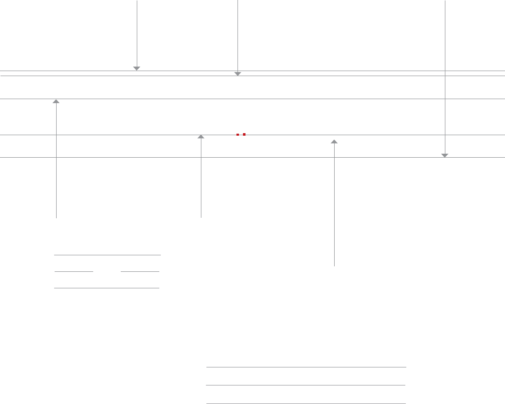
Bone
The distance from the
baseline to the top of the
capital letter determines
the letter’s point size.
skin, Body
is where all the
letters sit. This is the most stable
axis along a line of text, and it
is a crucial edge for aligning text
with images or with other text.
The curves at the
bottom of letters hang slightly
below the baseline. Commas
and semicolons also cross the
baseline. If a typeface were not
positioned this way, it would
appear to teeter precariously.
Without overhang, rounded
letters would look smaller than
their flat-footed compatriots.
Some elements may
extend slightly above
the cap height.
Hey, look!
They supersized
my x-height.
Two blocks of text
are often aligned along
a shared baseline.
Here, 14/18 Scala Pro
(14-pt type with 18 pts
of line spacing) is paired
with 7/9 Scala Pro.
Although kids learn to write using
ruled paper that divides letters
exactly in half, most typefaces are
not designed that way. The
x-height usually occupies more
than half of the cap height. The
larger the x-height is in relation
to the cap height, the bigger the
letters appear to be. In a field of
text, the greatest density occurs
between the baseline and the
x-height.
- is the height of the
main body of the lowercase letter
(or the height of a lowercase x),
excluding its ascenders and
descenders.
| 37
The length of a letter’s
descenders contributes
to its overall style and
attitude.
, -
Attempts to standardize the
measurement of type began in the eighteenth
century. The point system is the standard used
today. One point equals 1/72 inch or .35
millimeters. Twelve points equal one pica, the
unit commonly used to measure column widths.
Typography can also be measured in inches,
millimeters, or pixels. Most software applications
let the designer choose a preferred unit of
measure; picas and points are standard defaults.
nerdalert:
picas = p
points = p, pts
picas, points = p
-point Helvetica with points of line spacing =
/ Helvetica
A letter also has a horizontal measure,
called its set width. The set width is the body of
the letter plus a sliver of space that protects it
from other letters. The width of a letter is intrinsic
to the proportions and visual impression of the
typeface. Some typefaces have a narrow set width,
and some have a wide one.
You can change the set width of a typeface by
fiddling with its horizontal or vertical scale.
This distorts the line weight of the letters,
however, forcing heavy elements to become thin,
and thin elements to become thick. Instead of
torturing a letterform, choose a typeface that has
the proportions you are looking for, such as
condensed, compressed, wide, or extended.
size
12 points
equal 1 pica
6 picas
(72 points)
equal 1 inch
60-
A typeface is measured
from the top of the
capital letter to the
bottom of the lowest
descender, plus a small
buffer space.
In metal type,
the point size
is the height of
the type slug.
Wide load
tight wad
tight Wad
The set width is the body of the letter
plus the space beside it.
The letters in the compressed version of the typeface
have a narrower set width.
typecrime
The proportions of the letters have been
digitally distorted in order to create wider
or narrower letters.
Big
Wide load
38 |

When two typefaces are set in the same point size, one often
looks bigger than the other. Differences in x-height, line weight,
and set width affect the letters’ apparent scale.
Mrs Eaves rejects the twentieth-century appetite
for supersized x-heights. This typeface, inspired
by the eighteenth-century designs of Baskerville,
is named after Sarah Eaves, Baskerville’s
mistress, housekeeper, and collaborator.
The couple lived together for sixteen years
before marrying in 1764.
Like his lovely wife, MR EAVES has a low waist
and a small body. His loose letterspacing also
makes him work well with his mate.
The size of a typeface is a matter of context. A line of text that
looks tiny on a television screen may appear appropriately
scaled in a page of printed text. Smaller proportions affect
legibility as well as space consumption. A diminutive x-height is a
luxury that requires sacrifice.
12/14
8/10
The x-height of a typeface affects its
apparent size, its space efficiency,
and its overall visual impact. Like
hemlines and hair styles, x-heights
go in and out of fashion. Bigger type
bodies became popular in the mid-
twentieth century, making letterforms
look larger by maximizing the area
within the overall point size.
Because of its huge x-height, Helvetica can remain
legible at small sizes. Set in 8 pts for a magazine
caption, Helvetica can look quite elegant. The same
typeface could look bulky and bland, however, standing
12 pts tall on a business card.
Typefaces with small x-heights, such as
Mrs Eaves, use space less efficiently than
those with big lower bodies. However, their
delicate proportions have lyrical charm.
12/14
12/14
8/10
Do Ilook fat in this paragraph?
32- 32- 32- 32-
The default type size in many software applications is 12 pts.
Although this generally creates readable type on screen displays,
12-pt text type usually looks big and horsey in print. Sizes between 9
and 11 pts are common for printed text. This caption is 7.5 pts.
32- 32- 32-
| 39
Mr. Big versus Mrs. & Mr. Little

40 |
All the typefaces shown below were inspired by
the sixteenth-century printing types of Claude
Garamond, yet each one reflects its own era.
The lean forms of Garamond 3 appeared during
the Great Depression, while the inflated x-height
of ITC Garamond became an icon of the
flamboyant 1970s.
1930s: Franklin D. Roosevelt, salvador dalí, Duke
Ellington, Scarface, chicken and waffles, shoulder pads, radio.
1970s: Richard Nixon, Claes Oldenburg, Van Halen,
The God father, bell bottoms, guacamole, sitcoms.
1980s: Margaret Thatcher, barbara kruger, Madonna,
Blue Velvet, shoulder pads, pasta salad, desktop publishing.
2000s: Osama Bin Laden, , the White
Stripes, e Sopranos, mom jeans, heirloom tomatoes, Twitter.
18- 3, designed by Morris Fuller Benton and Thomas Maitland Cleland for ATF, 1936
18- , designed by Tony Stan, 1976
18- , designed by Robert Slimbach, 2005
18- , designed by Robert Slimbach, 1989
Grapes of Wrath
30- 3 30-
size
garamondinthetwentiethcentury:variationsonatheme

| 41
are slim, high-strung prima donnas.
are isky supporting characters.
is the everyman of the printed stage.
get heavy to play small roles.
27-
A type family with optical sizes has different styles
for different sizes of output. The graphic designer
selects a style based on context. Optical sizes
designed for headlines or display tend to have
delicate, lyrical forms, while styles created for text
and captions are built with heavier strokes.
27-
27-
27-
8 80
A or headline style looks
spindly and weak when set at small
sizes. Display styles are intended for
use at pts. and larger.
In the era of , type designers created a different
punch for each size of type, adjusting its weight, spacing, and
other features. Each size required a unique typeface design.
When the type design process became automated in
the , many typefounders
economized by simply enlarging or reducing a base
design to generate different sizes.
This to type sizes
became the norm for photo and digital type
production. When a text-sized letterform is
enlarged to poster-sized proportions, its thin
features become too heavy (and vice versa).
Basic styles are designed
for sizes ranging from to
pts. Their features are strong
and meaty but not too assertive.
styles are built with
the heaviest stroke weight.
They are designed for sizes
ranging from to pts.
opticalsizes
10
No Job Too Small
48- 8-
typecrime
Some typefaces that work well
at large sizes look too fragile
when reduced.
42 |
scale
Scale is the size of design elements in comparison
to other elements in a layout as well as to the
physical context of the work. Scale is relative.
12-pt type displayed on a 32-inch monitor can look
very small, while 12-pt type printed on a book
page can look flabby and overweight. Designers
create hierarchy and contrast by playing with the
scale of letterforms. Changes in scale help create
visual contrast, movement, and depth as well as
express hierarchies of importance. Scale is
physical. People intuitively judge the size of
objects in relation to their own bodies and
environments.
tHe
world
is FlAt
tHe
world
is FlAt
typecrime
Minimal differences in
type size make this
design look tentative
and arbitrary.
The strong contrast between
type sizes gives this design
dynamism, decisiveness,
and depth.
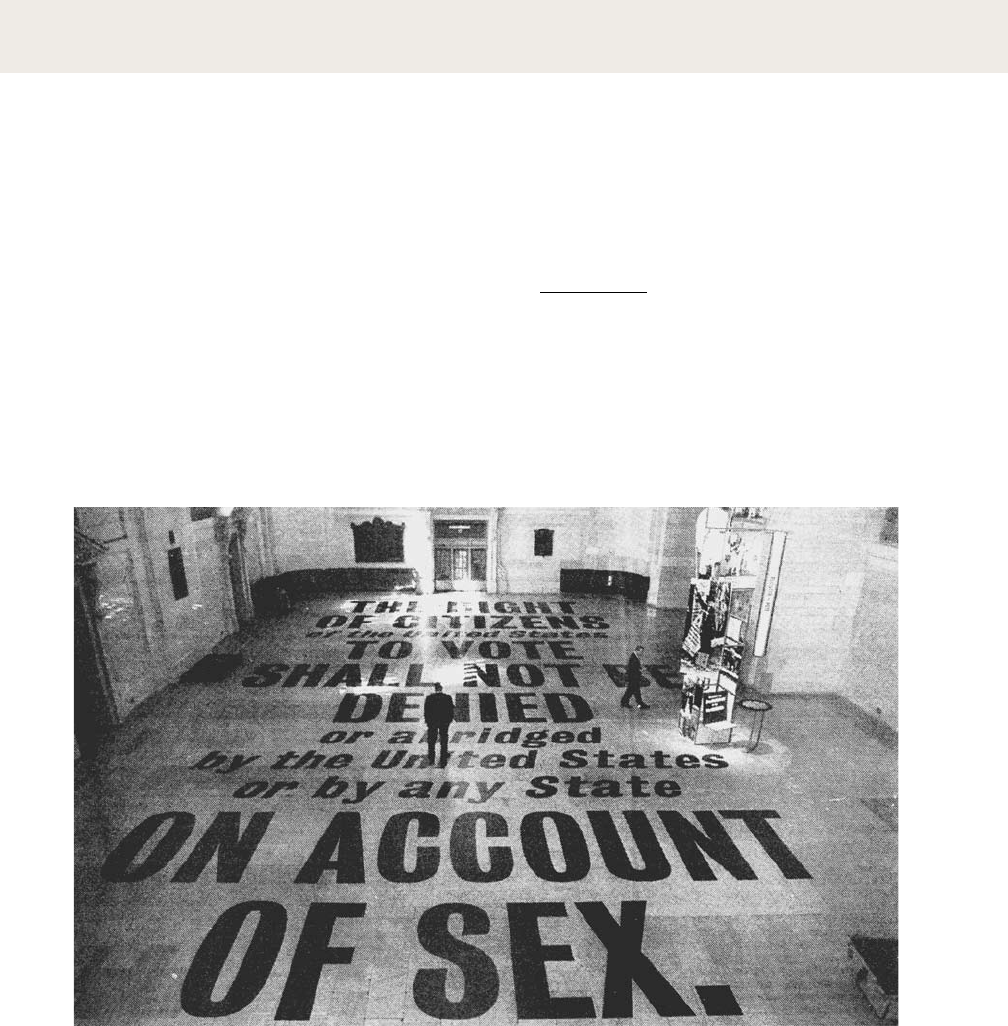
Typographic installation at Grand
Central Station, New York City, 1995. Designer: Stephen Doyle.
Sponsors: The New York State Division of Women, the
Metropolitan Transportation Authority, Revlon, and Merrill
Lynch. Large-scale text creates impact in this public installation.
| 43
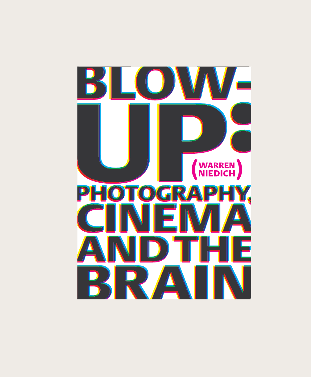
-: , ,
Book cover, 2003. Designers: Paul Carlos and Urshula
Barbour/Pure + Applied. Author: Warren Niedich. Cropping the
letters increases their sense of scale. The overlapping colors suggest
an extreme detail of a printed or photographic process.
Niedich_6cover.indd 1 12/12/09 2:55:30 PM
scale
44 |
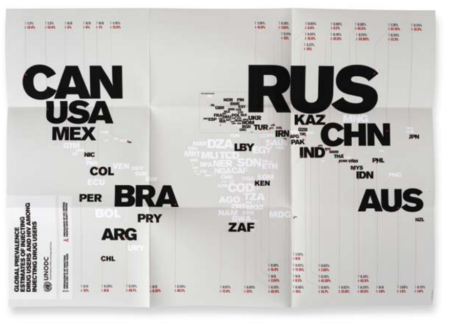
’ ()
Maps, 2009. Design: Harry Pearce and Jason Ching/
Pentagram. This series of posters for the United Nations’ Office on
Drugs and Crime uses typographic scale to compare drug treatment
programs, HIV incidence, and other data worldwide. The designers
built simple world maps from country abbreviation codes (GBR,
USA, RUS, etc.). The posters are aimed specifically at the Russian
police, whose country has a poor track record in drug treatment.
Note Russia’s high incidence of HIV and low availability of
addiction rehabilitation programs.
revolver: zeitschrift für
film (magazine for film)
Magazine, 1998–2003.
Designer: Gerwin Schmidt.
This magazine is created by and
for film directors. The contrast
between the big type and the small
pages creates drama and surprise.
| 45

typeclassification
A basic system for classifying typefaces was devised in the nineteenth
century, when printers sought to identify a heritage for their own craft
analogous to that of art history. Humanist letterforms are closely
connected to calligraphy and the movement of the hand. Transitional
and modern typefaces are more abstract and less organic. These three
main groups correspond roughly to the Renaissance, Baroque, and
Enlightenment periods in art and literature. Historians and critics of
typography have since proposed more finely grained schemes that
attempt to better capture the diversity of letterforms. Designers in the
twentieth and twenty-first centuries have continued to create new
typefaces based on historic characteristics.
Aa Aa Aa
The roman typefaces of the
fifteenth and sixteenth centuries
emulated classical calligraphy.
Sabon was designed by
Jan Tschichold in 1966, based
on the sixteenth-century
typefaces of Claude Garamond.
These typefaces have sharper
serifs and a more vertical axis
than humanist letters. When the
typefaces of John Baskerville
were introduced in the mid-
eighteenth century, their sharp
forms and high contrast were
considered shocking.
The typefaces designed by
Giambattista Bodoni in the late
eighteenth and early nineteenth
centuries are radically abstract.
Note the thin, straight serifs;
vertical axis; and sharp contrast
from thick to thin strokes.
Aa
Numerous bold and decorative
typefaces were introduced in the
nineteenth century for use in
advertising. Egyptian typefaces
have heavy, slablike serifs.
Aa
Aa
Aa
Sans-serif typefaces became
common in the twentieth
century. Gill Sans, designed by
Eric Gill in 1928, has humanist
characteristics. Note the small,
lilting counter in the letter a,
and the calligraphic variations
in line weight.
Helvetica, designed by Max
Miedinger in 1957, is one of
the world’s most widely used
typefaces.Its uniform, upright
character makes it similar to
transitional serif letters. These
fonts are also referred to as
“anonymous sans serif.”
Some sans-serif types are built
around geometric forms.
In Futura, designed by Paul
Renner in 1927, the Os are
perfect circles, and the peaks
of the A and M are sharp
triangles.
46 |
This is not a book about fonts. It is a book about
how to use them. Typefaces are essential resources
for the graphic designer, just as glass, stone, steel,
and other materials are employed by the architect.
This is not a book about fonts. It is a book about how
to use them. Typefaces are essential resources for the
graphic designer, just as glass, stone, steel, and other
materials are employed by the architect.
This is not a book about fonts. It is a book about how
to use them. Typefaces are essential resources for the
graphic designer, just as glass, stone, steel, and other
materials are employed by the architect.
This is not a book about fonts. It is a book about how
to use them. Typ efaces are essential resources for the
graphic designer, just as glass, stone, steel, and other
materials are employed by the architect.
Bodoni
14
Baskerville
14
Clarendon
14
Gill Sans
14
Helvetica
14
Selecting type with
wit and wisdom
requires knowledge
of how and why
letterforms evolved.
Selecting type with wit
and wisdom requires
knowledge of how
and why letterforms
evolved.
Selecting type with
wit and wisdom
requires knowledge
of how and why
letterforms evolved.
Selecting type with wit
and wisdom requires
knowledge
of how and why
letterforms evolved.
Sabon
14
Selecting type with
wit and wisdom
requires knowledge of
how and why
letterforms evolved.
Futura
14
Selecting type with
wit and wisdom
requires knowledge of
how and why
letterforms evolved.
9/12 7/9
9/12 7/9
9.5/12 7.5/9
8/12 6/9
9/12 7/9
8/12 6/9
8.5/12 6.5/9
Selecting type with
wit and wisdom
requires knowledge
of how and why
letterforms evolved.
| 47
classictypefaces

typefamilies
In the sixteeenth century, printers began
organizing roman and italic typefaces into
matched families. The concept was formalized
in the early twentieth century.
The roman form is the core or spine from which a family of typefaces derives.
Italic letters, which are based on cursive writing, have forms distinct from roman.
the lowercase -.
Bold (and semibold) typefaces are used for emphasis within a hierarchy.
Bold (and semibold) typefaces each need to include an italic version, too.
( )
The roman form, also called plain or regular, is the standard,
upright version of a typeface. It is typically conceived as the
parent of a larger family.
The italic form is used to create emphasis. Especially among serif
faces, it often employs shapes and strokes distinct from its roman
counterpart. Note the differences between the roman and italic a.
Small caps (capitals) are designed to integrate with a line of text,
where full-size capitals would stand out awkwardly. Small capitals
are slightly taller than the x-height of lowercase letters.
Bold versions of traditional text fonts were added in the twentieth
century to meet the need for emphatic forms. Sans-serif families
often include a broad range of weights (thin, bold, black, etc.).
The typeface designer tries to make the two bold versions feel
similar in comparison to the roman, without making the overall
form too heavy. The counters need to stay clear and open at
small sizes. Many designers prefer not to use bold and semi-bold
versions of traditional typefaces such as Garamond, because
these weights are alien to the historic families.
Italics are not
slanted
letters.
typecrime:
The wide, ungainly
forms of these
mechanically skewed
letters look forced
and unnatural.
, designed by Robert Slimbach, 1988
48 |
Some italics aren’t slanted at all.
In the type family Quadraat, the
italic form is upright.
, designed by Fred Smeijers, 1992.
anatomyofatypefamily
| 49
’ Magazine cover, 2002. Design: Dave Eggers.
This magazine cover uses the Garamond 3 typeface family in
various sizes. Although the typeface is classical and conservative,
the obsessive, slightly deranged layout is distinctly contemporary.
,
50 |
superfamilies
Scala
Scala Italic
Scala Bold
, designed by
Martin Majoor, includes
Scala (1991) and Scala Sans
(1993). The serif and sans-
serif forms have a common
spine. Scala Pro (OpenType
format) was released in 2005.
Scala Sans Light
Scala Sans
Scala Sans Condensed
Scala Sans Cond Bold
Scala Sans Bold
Scala Sans Black
SCala jewel crystal
scala jewel diamond
scala jewel pearl
Scala jewel saphyr
A traditional roman book face typically has a
small family—an intimate group consisting of
roman, italic, small caps, and possibly bold and
semibold (each with an italic variant) styles. Sans-
serif families often come in many more weights
and sizes, such as thin, light, black, compressed,
and condensed. A superfamily consists of dozens
of related fonts in multiple weights and/or
widths, often with both sans-serif and serif
versions. Small capitals and non-lining numerals
(once found only in serif fonts) are included in
the sans-serif versions of Thesis, Scala Pro, and
many other contemporary superfamilies.
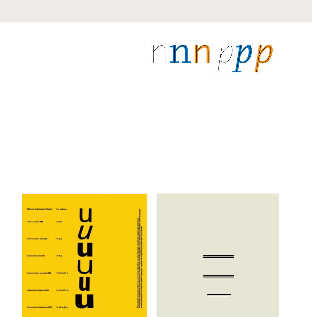
was designed by the Swiss typographer Adrian Frutiger
in 1957. He designed twenty-one versions of Univers, in five weights
and five widths. Whereas some type families grow over time, Univers
was conceived as a total system from its inception.
, a superfamily designed by Jeremy Tankard in 2009, is
inspired by three nineteenth-century type styles: sans serif, Egyptian,
and fat face. The inclusion of the fat face style, with its wafer-thin
serifs and ultrawide verticals, gives this family an unusual twist.
WITHIN THE ENCLOSURE,
TO VIEW THE
The Money raised by these Tickets will be applied to defray
the expences of the Day.
W. Pratt, Printer, Stokesley
anatomyofasuperfamily
, designed by Lu(cas) de Groot, 1994
energize typography today. Writing
in the West was revolutionized early
in the Renaissance, when Johannes
Gutenberg introduced moveable type
This is not a book about fonts. It is a book about how to use them. Typefaces
are essential resources for the graphic designer, just as glass, stone, steel, and
other materials are employed by the architect. some designers create
their own custom fonts. But most
graphic designers will tap the vast
store of already existing typefaces,
choosing and combining each with
regard to the audience or situation.
Selecting type with wit and wisdom
requires knowledge of how and why
letterforms have evolved. The history
of typography reflects a continual tension between the hand and machine, the
organic and geometric, the human body and the abstract system. These tensions
marked the birth of printed letters five centuries ago, and they continue to
in Germany. Whereas documents and
books had previously been written by
hand, printing with type mobilized all
of the techniques of mass production.
| 51
anatomyofasuperfamily
52 |
capitalsandsmallcapitals
Design: Chris Dixon,
2009. This page detail
mixes serif types from the
Miller family (including true
Small Caps) with the sans-
serif family Verlag.
A word set in ALL CAPS within running text can
look big and bulky, and A LONG PASSAGE SET
ENTIRELY IN CAPITALS CAN LOOK UTTERLY
INSANE. are designed to match
the x-height of lowercase letters. Designers,
enamored with the squarish proportions of true
, employ them not only within bodies
of text but for subheads, bylines, invitations, and
more. Rather than M S C
C, many designers prefer to use
, creating a clean line with no ascending
elements. InDesign and other programs allow
users to create FALSE SMALL CAPS at the press of a
button; these SCRAWNY LETTERS look out of place.
p s e u d o s m a l l c a p s are shrunken versions of FULL-SIZE CAPS.
typecrime
Helvetica was never meant to include
small caps. These automatically
generated characters look puny and
starved; they are an abomination
against nature.
integrate with lowercase letters.
,
Only use small caps when they are
officially included with the type family.
When working with OpenType fonts
(labeled Pro), access small caps in
InDesign via the Character
Options>OpenType menu. Older formats
list small caps as a separate file in the
Type>Font menu.
CAPITAL
investment
CAPITAL
punishment
CAPITAL
crime
typecrime
In this stack of lowercase
and capital letters, the
spaces between lines appear
uneven because caps are tall
but have no descenders.
The leading has been fine-
tuned by selectively shifting
the baselines of the small
capitals to make the space
between lines look even.
CAPITAL
investment
CAPITAL
punishment
CAPITAL
crime
+
–
| 53
44 AMUSEMENT NUMÉRO 5 JUIN 2009
FREE PLAYERS
45 AMUSEMENT NUMÉRO 5 JUIN 2009
FREE PLAYERS
« MA
PHILOSOPHIE
PASSE PAR
LE GAMEPLAY »
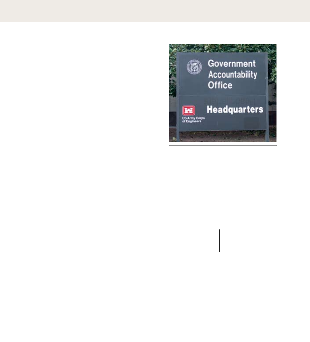
KEITA TAKAHASHI
En cette fin du mois de mars, Keita Takahashi fait escale en France.
Quelques jours plus tôt, le game designer japonais était à San Francisco
pour la Game Developers Conference, grand raout annuel de la profession où,
comme à son habitude, il a abreuvé ses confrères de réflexions rafraîchissantes sur le jeu vidéo.
Mais, avant toute chose, il leur a montré sa nouvelle écharpe, qu’il porte encore sur lui
pour ce mini-séjour parisien. Confectionnée par Madame Takahashi mère, celle-ci
a notamment pour avantage de permettre au fiston d’y glisser ses mains afin
de les protéger en cas de grand froid. Ce précieux tricot est aussi
le premier « produit dérivé » de Noby Noby Boy, le dernier jeu
en date de Keita Takahashi, disponible depuis le mois de février
sur le service de téléchargement de la PS3 pour la somme quasi-ridicule
de 3,99 euros. Cette écharpe à l’effigie du souriant Boy se révèle même
remarquablement en phase avec le jeu qui l’a inspirée :
tranquillement singulière, résolument artisanale et conçue
pour qu’on se sente bien quand on y met les mains.
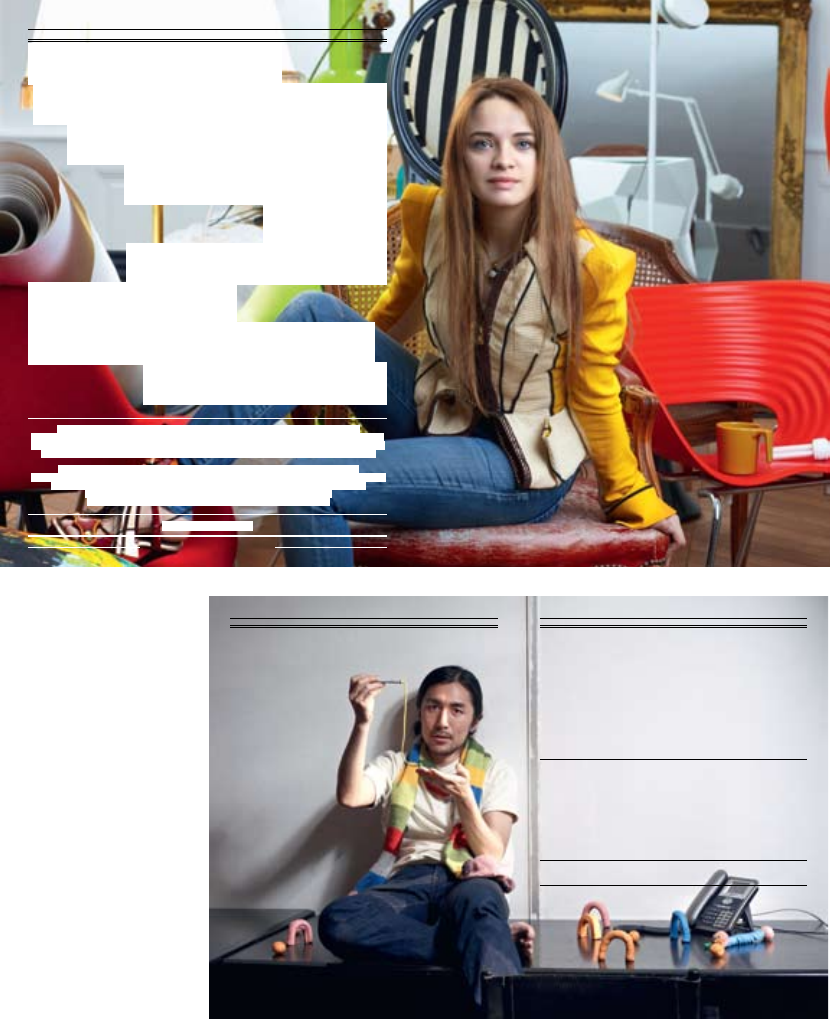
Clay Fighter Erwan Higuinen
Photographie Sébastien Agnetti
FREE PLAYERSFREE PLAY ERS
96 AMUSEMENT NUMÉRO 5 JUIN 2009
AMUSEMENT x SIMS 3
97 AMUSEMENT NUMÉRO 5 JUIN 2009
AMUSEMENT x SIMS 3
« JE FINIRAI
PAR METTRE LE
BAZAR UN PEU
PARTOUT ! »
SARA
FORESTIER
CASSE LA
BARAQUE DANS
LES SIMS 3
Simuler avec une grande finesse ses traits psychologiques, personnaliser son avatar
avec tant de possibilités qu'elles le rendent unique, proposer une expérience interactive qui va au-
delà du simple jeu, et vous propulse dans les subtilités de nos modes de vie ? Voici un petit aperçu
de ce que propose Les Sims 3, dernier épisode de la saga culte lancée il y a tout juste dix ans.
Jeune actrice pleine d’énergie et aux réactions imprévisibles, Sara Forestier montre
dans chacun de ses rôles une grande créativité qu’elle exprime également depuis plusieurs années
dans la réalisation de courts-métrages. À l’affiche à la rentrée dans Victor, une comédie
de Thomas Gilou sur les relations familiales, Sara était toute trouvée
pour casser la baraque dans Les Sims 3 ! Et elle ne s’est pas gênée !
Photographie François Rousseau
96 AMUSEMENT NUMÉRO 5 JUIN 2009
AMUSEMENT x SIMS 3Jean Apc
Veste blazer Louis Vuitton
Bague et collier Bon Ton ,
quartz fumé/Diamants Pasquale Bruni
Chaussures Louis Vuitton
Sièges Eames Plastic Side Chair verte,
Organic Chair rouge,
Tom Vac Rouge,
Pantone Chair Orange,
Wire Chair DKR rouge
Vitra
Design: Alice Litscher, 2009.
This French culture magazine
employs a startling mix of
tightly leaded Didot capitals in
roman and italic. Running text
is set in Glypha.
-
54 |
mixingtypefaces
Combining typefaces is like making a salad. Start
with a small number of elements representing
dierent colors, tastes, and textures. Strive
for contrast rather than harmony, looking
for emphatic dierences rather than mushy
transitions. Give each ingredient a role to play:
sweet tomatoes, crunchy cucumbers, and the
pungent shock of an occasional anchovy. When
mixing typefaces on the same line, designers
usually adjust the point size so that the x-heights
align. When placing typefaces on separate lines,
it often makes sense to create contrast in scale
as well as style or weight. Try mixing big, light
type with small, dark type for a criss-cross of
contrasting flavors and textures.
Creamy and Extra Crunchy | Differences within a single family
Sweet Child of | Differences within a
Noodles with Potato Sauce | Bland and blander
Jack Sprat and his voluptuous wife | Two-way contrast
Sweet, sour, and hot | Three-way contrast
Mr. Potatohead and Mrs. Pearbutt | Too close for comfort
single-familymixes
47 67
;
56 75
multiple-familymixes
, ,
typecrime
These typefaces are from the
same family, but they are too
close in weight to mix well.
typecrime
These two type styles are too
similar to provide a counter-
point to each other.
typecrime:’
A slightly squeezed variant of the primary font has been
used to make the second line fit better (as if we wouldn’t
notice). Yet another weight appears on the bottom line.
: Design: Chris Dixon, 2010.
This content-intensive page detail mixes four different type families
from various points in history, ranging from the early advertising
face Egyptian Bold Condensed to the functional contemporary sans
Verlag. These diverse ingredients are mixed here at different scales to
create typographic tension and contrast.
, designed by
Adrian Frutiger, 1979. The
large scale of the letters is
counterbalanced by the fine line
of the stroke.
, designed
by Matthew Carter with
Jonathan Hoefler and Tobias
Frere-Jones, 1997–2000. Known
as a Scotch Roman typeface,
it has crisp serifs and strong
contrast between thick and thin.
,
a Linotype font based on a
typeface from 1820. This quirky,
chunky face has been used
intermittently at New York
Magazine since the publication
was first designed by Milton
Glaser in the 1970s. Here, the
ultra-black type set at a relatively
small size makes an incisive bite
in the page.
, designed by Jonathan
Hoefler, 1996. Originally
commissioned by Abbott
Miller for exclusive use by the
Guggenheim Museum, Verlag
has become a widely used
general-purpose typeface. Its
approachable geometric forms
are based on Frank Lloyd
Wright’s lettering for the facade
of the Guggenheim.
| 55
56 |
numerals
Lining numerals take up uniform widths of space,
enabling the numbers to line up when tabulated
in columns. They were introduced around the
turn of the twentieth century to meet the needs of
modern business. Lining numerals are the same
height as capital letters, so they sometimes look
big and bulky when appearing in running text.
123
456
liningnumerals non-liningnumerals
123
456
123
456
Non-lining numerals, also called text or old style
numerals, have ascenders and descenders, like
lowercase letters. Non-lining numerals returned to
favor in the 1990s, valued for their idiosyncratic
appearance and their traditional typographic
attitude. Like letterforms, old style numerals are
proportional; each one has its own set width.
What is the cost of War and Peace? e cover price
of the Modern Library Classics paperback edition is
$15.00, discounted 32% by Amazon to $10.50. But
what about the human cost in terms of hours squan-
dered reading a super-sized work of literary fiction? If
you can read 400 words per minute, double the aver-
age, it will take you 1,476 minutes (24.6 hours) to
read War and Peace. Devoting just four hours per day
to the task, you could finish the work in a little over
six days. If you earn $7.25 per hour (minimum wage
in the U.S.), the cost of reading War and Peace will be
$184.50 (130.4716, £11.9391, or ¥17676.299).
-
What is the cost of War and Peace? e cover price
of the Modern Library Classics paperback edition is
., discounted by Amazon to .. But
what about the human cost in terms of hours squan-
dered reading a super-sized work of literary fiction? If
you can read words per minute, double the aver-
age, it will take you , minutes (. hours) to read
War and Peace. Devoting just four hours per day to
the task, you could finish the work in a little over six
days. If you earn . per hour (minimum wage in
the U.S.), the cost of reading War and Peace will be
. (., ., or .).
includes both lining and non-lining
numerals, allowing designers to choose a style in response to
the circumstances of the project. The lining numerals appear
large, because they have the height of capital letters.
Non-lining numerals integrate visually with the text. Different math
and currency symbols are designed to match the different numeral
styles. Smaller currency symbols look better with non-lining
numerals.
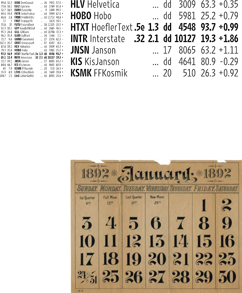
| 57
, 1892
The charming numerals in this
calendar don’t line up into neat
columns, because they have
varied set widths. They would
not be suitable for setting
modern financial data.
, designed by Tobias Frere-Jones, 2000, was created for
the extreme typographic conditions of the Wall Street Journal’s
financial pages. The numerals are designed to line up into
columns. The different weights of Retina have matching set
widths, allowing the newspaper to mix weights while
maintaining perfectly aligned columns. The notched forms
(called ink traps) prevent ink from filling in the letterforms
when printed at tiny sizes.
123

58 |
punctuation
A well-designed comma carries the essence of the
typeface down to its delicious details. Helvetica’s
comma is a chunky square mounted to a jaunty
curve, while Bodoni’s is a voluptuous, thin-
stemmed orb. Designers and editors need to learn
various typographic conventions in addition to
mastering the grammatical rules of punctuation.
A pandemic error is the use of straight prime or
hatch marks (often called dumb quotes) in place
of apostrophes and quotation marks (also known
as curly quotes, typographer’s quotes, or smart
quotes). Double and single quotation marks are
represented with four distinct characters, each
accessed with a dierent keystroke combination.
Know thy keystrokes! It usually falls to the
designer to purge the client’s manuscript of
spurious punctuation.
5'2" eyes of blue
It’s a dog’s life.
He said, “That’s
what she said.”
“The thoughtless overuse” of
quotation marks is a disgrace
upon literary style—and on
typographic style as well.
typecrime
Quotation marks carve out chunks of
white space from the edge of the text.
Make a clean edge by pushing the
quotation marks into the margin.
nerdalert:To create hanging punctuation in InDesign,
insert a word space before the quotation mark. Pressing
the option key, use the left arrow key to back the quotation
mark into the margin. You can also use the Optical Margin
Alignment or Indent to Here tools.
See for more punctuation blunders.
{[“‘,.;:’”]}
{[“‘,.;:’”]}
commonlyabusedpunctuationmarks
“Hanging punctuation” prevents
quotations and other marks from
taking a bite out of the crisp left
edge of a text block.
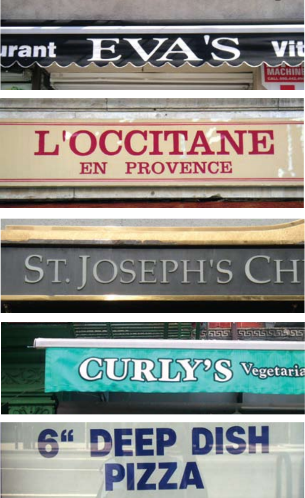
| 59
typecrimes
City streets have become a
dangerous place. Millions of
dollars a year are spent
producing commercial signs
that are fraught with
typographic misdoings. While
some of these signs are cheaply
made over-the-counter products,
others were designed for
prominent businesses and
institutions. There is no excuse
for such gross negligence.
gettin’itright
Apostrophes and quotation
marks are sometimes called
curly quotes. Here, you can
enjoy them in a meat-free
environment.
gettin’itwrong
The correct use of hatch marks
is to indicate inches and feet.
Alas, this pizza is the hapless
victim of a misplaced keystroke.
In InDesign or Illustrator, use
the Glyphs palette to find hatch
marks when you need them.
’
60 |
ornaments
`rr!wewe:
aRESTRAINT
yii
Ornaments, 2007. Design: Marian Bantjes.
, designed by Supisa Wattanasansanee/Cadson Demak,
2008. Distributed by T26.
Fry and Steele, London, 1794.
Collection of Jan Tholenaar, Reinoud Tholenaar, and
Saskia Ottenhoff-Tholenaar.
Not all typographic elements represent language.
For centuries, ornaments have been designed
to integrate directly with text. In the letterpress
era, printers assembled decorative elements one
by one to build larger forms and patterns on
the page. Decorative rules served to frame and
divide content. In the nineteenth century, printers
provided their customers with vast collections of
readymade illustrations that could easily be mixed
with text. Today, numerous forms of ornament are
available as digital fonts, which can be typed on
a keyboard, scaled, and output like any typeface.
Some contemporary ornaments are modular
systems designed to combine into larger patterns
and configurations, allowing the graphic designer
to invent new arrangements out of given pieces.
Themed collections of icons and illustrations are
also available as digital fonts.
| 61
! ( ) , - . 1 2
3 45 6 7 8 9 <>
? A B C D E F G
H I J K L M N O P Q R S
T U V W X Y Z [ \ ] a b
c d e f g h i j k m n o p
Design: Abbott
Miller, 1996. The designer repeated a
single ornament from the font Whirligigs,
designed by Zuzana Licko in 1994, to
create an ethereal veil of ink. Whirligigs
are modular units that fit together to
create an infinite variety of patterns.
, designed by Zuzana Licko, Emigre, 1994.
k
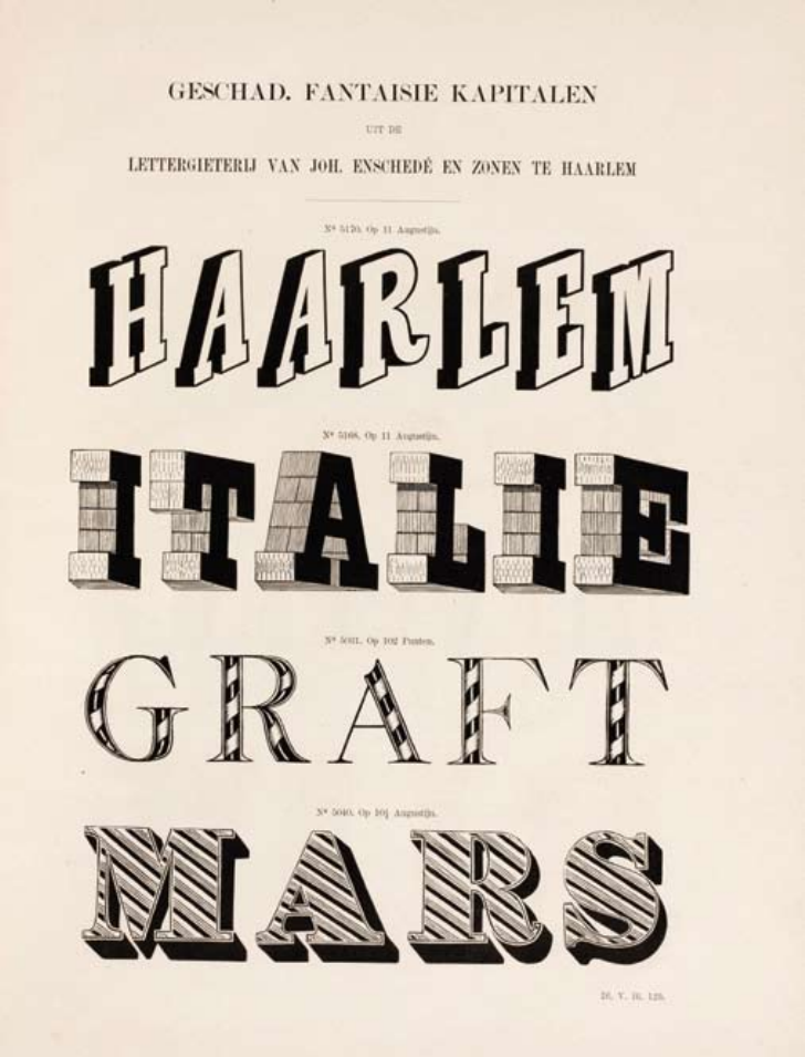
62 |
Type specimen, 1897. Design: Joh.
Enchedé & Zohnen. Collection of Jan Tholenaar, Reinoud
Tholenaar, and Saskia Ottenhoff-Tholenaar.
ornaments
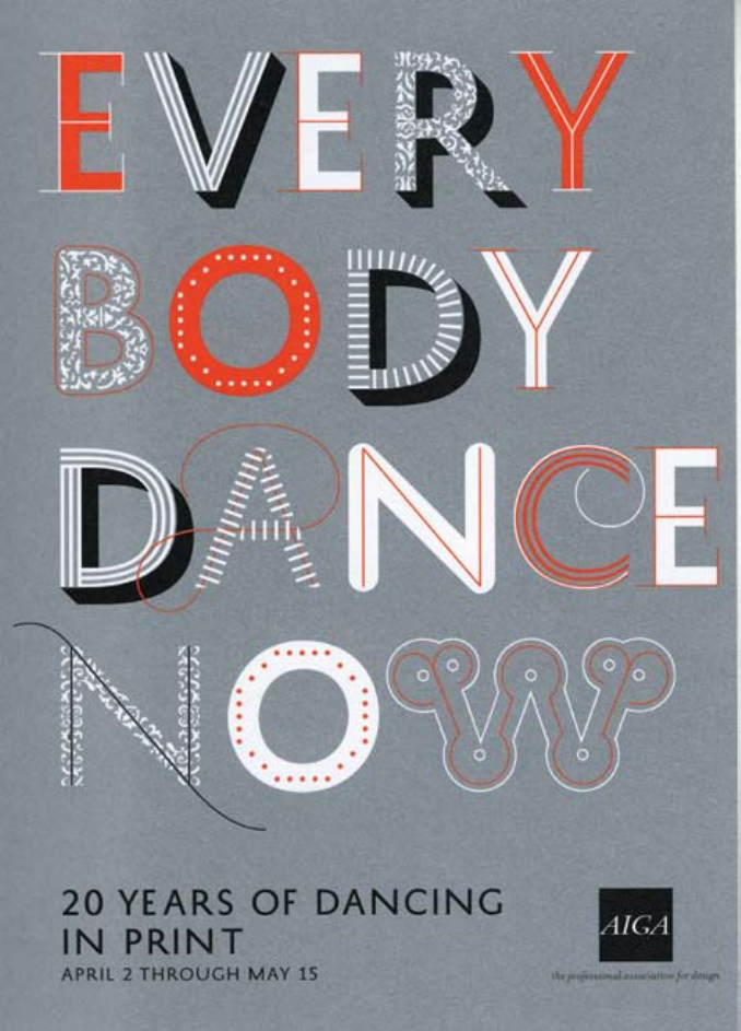
| 63
Postcard, 2009. Design: Abbott
Miller, Kristen Spilman, Jeremy Hoffman/Pentagram. Peter
Bilak’s typeface History, designed in 2008, consists of numerous
decorative and structural elements that can be layered into
distinctive combinations.
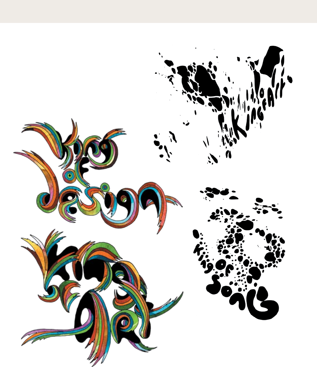
64 |
lettering
Creating letters by hand allows graphic artists to
integrate imagery and text, making design and
illustration into fluidly integrated practices.
Lettering can emulate existing typefaces or derive
from the artist’s own drawing or writing style.
Designers create lettering by hand and with
software, often combining diverse techniques.
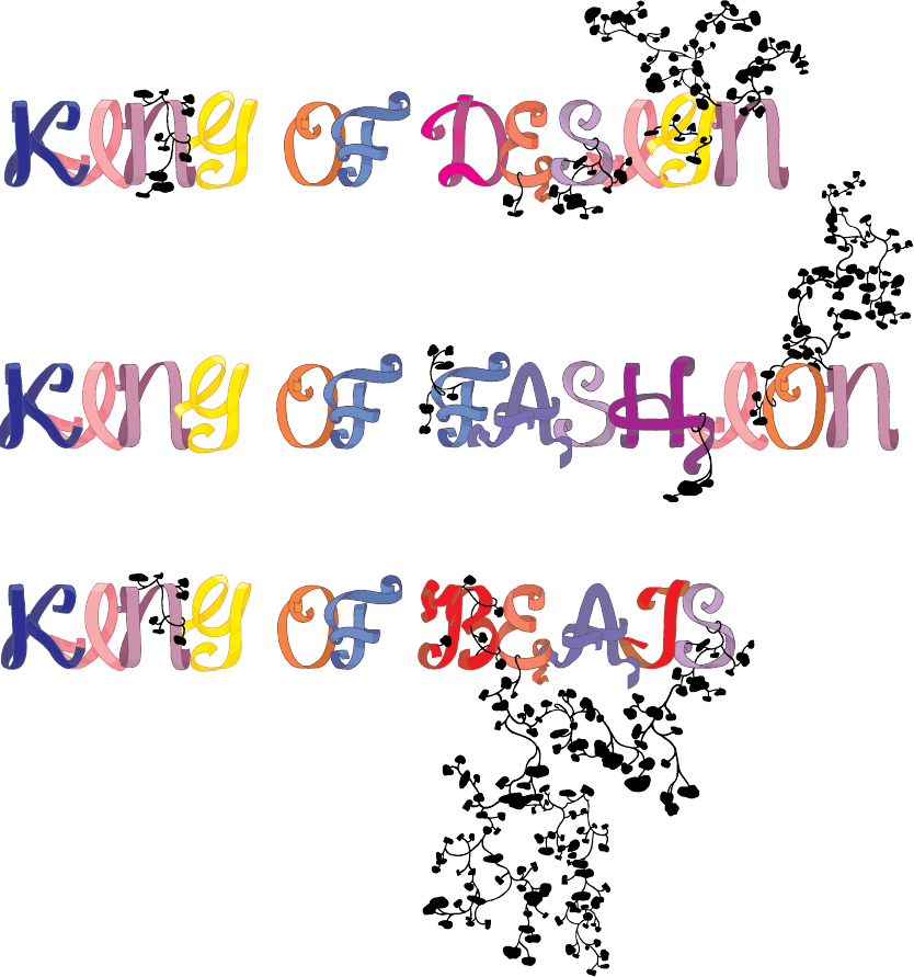
| 65
:
Designer: Deanne Cheuk,
2002–2003.These magazine
headlines combine drawing and
painting with digital techniques.
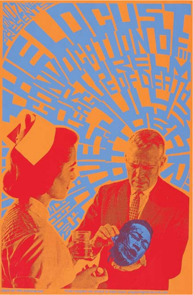
66 |
the locust (left) and melt banana (right) Screenprint
posters, 2002. Designer: Nolen Strals. Hand lettering is a vibrant
force in graphic design, as seen in these music posters. Lettering is the
basis of many digital typefaces, but nothing is quite as potent as the
real thing.
lettering
| 67
68 |
logotypesandbranding
A logotype uses typography or lettering to depict
the name or initials of an organization in a
memorable way. Whereas some trademarks
consist of an abstract symbol or a pictorial icon, a
logotype uses words and letters to create a
distinctive visual image. Logotypes can be built
with existing typefaces or with custom-drawn
letterforms. A logotype is part of an overall visual
brand, which the designer conceives as a
“language” that lives (and changes) in various
circumstances. A complete visual identity can
consist of colors, patterns, icons, signage
components, and a selection of typefaces.
Sometimes a logotype becomes the basis for the
design of a complete typeface. Many type
designers collaborate with graphic designers to
create typefaces that are unique to a given client.
Identity program, 1998. Design: Jochen
Stankowski. This identity for an engineering firm is
built around the H, whose proportions change in
different contexts.
| 69
Identity, 2009. Design:
Edenspiek ermann.
This ambitious visual identity
program uses custom letterforms
based on the typeface Agenda.
The letters in the custom
typeface are designed to split
apart into elements that can be
mirrored, layered, flipped, and
animated for a variety of
applications, including signage,
posters, printed matter, and
web communications.
, ,
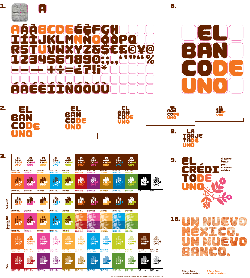
70 |
Visual branding, 2007. Agency: Saron.
Identity design: Joshua Distler, Mike Abbink, Gabor Schreier,
Virginia Sardón. Custom typeface design: Mike Abbink, Paul van
der Laan. This elaborate identity program for a Mexican bank uses
a custom typeface whose blocky forms are inspired by Mayan glyphs.
logotypesandbranding
| 71
Visual branding, 2009. Design: Duffy &
Partners. A logotype is part of a larger graphic language. Duffy &
Partners develop logotypes in concert with a rich range of elements,
including colors, patterns, and typefaces. The designers use techniques
such as outlining, layering, and framing to create depth, detail, and
the sense of a human touch. These elements work together to express
the personality of the brand.
72 |
typefacesonscreen
Verdana was designed by the
legendary typographer Matthew Carter in 1996
for digital display. Verdana has a large x-height,
simple curves, open forms, and loose spacing.
Georgia is a serif screen face built with
sturdy strokes, simple curves, open counters,
and generous spacing. Designed by Matthew
Carter in 1996 for Microsoft, Georgia is widely
used on the web.
During the early years of the World Wide Web,
designers were forced to work within the narrow
range of typefaces commonly installed on the
computers of their end users. Since then, several
techniques have emerged for embedding fonts
within web content or for delivering fonts to end
users when they visit a site. In one approach,
specially formatted fonts are hosted on a third-
party server and then downloaded by users;
designers pay a fee for the service. Another
approach implements the @font-face rule in CSS,
which can download any kind of digital font hosted
on a server; only typefaces licensed for this use can
be accessed legally via @font-face.
, released in 1996 by Microsoft, were
designed specifically for the web. Prior to the rise of font embedding,
these were among a handful of typefaces that could be relilably
used online.
Screen shot, detail, 2009. Typefaces: Greta
and Fedra, designed by Peter Bilak/Typotheque. In 2009, the
digital type foundry Typotheque launched a pioneering service
that allows designers to display Typotheque fonts on any website in
exchange for a one-time license fee. Typotheque’s Open Type fonts,
which support global languages including Arabic and Hindi, are
hosted by Typotheque and accessed using the CSS @font-face rule.
webfonts1.0
Website, 2009. Designed by Jason Santa Maria for
Liz Danzico. Typeface: Skolar, designed by David Brezina/
Typetogether. This site design uses Typekit, a third-party service
that delivers fonts to end users when they visit a site. Typekit deters
piracy by obscuring the origins of the font. Designers or site owners
pay a subscription fee to the service.
| 73
Website, 2002.
Design: Peter Cho. Simple
bitmapped letters are animated
in three-dimensional space.
Anti-aliasing creates the appearance of smooth
curves on screen by changing the brightness of
the pixels or sub-pixels along the edges of each
letterform. Photoshop and other software
packages allow designers to select strong or weak
anti-aliasing. When displayed at very small sizes,
strongly anti-aliased type can look blurry. It also
increases the number of colors in an image file.
-
- : (simulated screen capture)
- : (simulated screen capture)
-
74 |
bitmaptypefaces
Bitmap typefaces are built out of the pixels
(picture elements) that structure a screen display
or other output device. While a PostScript letter
consists of a vector outline, a true bitmap
character contains a fixed number of rectilinear
units that are displayed either on or off. True
bitmap characters are used on devices such as
cash registers, signboard displays, and various
small-scale screens.
Most contemporary bitmap typefaces are not
true bitmaps. They are drawn as outlines on a
grid and then output as PostScript, TrueType, or
OpenType fonts. Thus they can be easily used
with any standard layout software. Many
designers like to exploit the visible geometry of
pixelated characters.
Receipt, 2003. This
cash register receipt, printed with a
bitmap font, is from a design and
typography bookstore in Amsterdam.
- , designed by Zuzana Licko,
Emigre. Released in 2001, the Lo-Res type family
is a collection of outline (PostScript) fonts based
on bitmap designs created by Licko in 1985.
Lo-Res Narrow consists of a series of different
sizes, each one constructed with a one-pixel stroke
weight. Thus Lo-ResTwentyEight Narrow has
dramatically lighter and tighter forms than
Lo-ResNine Narrow, which gets blockier as it is
enlarged. Designed for display on screen at low
resolutions, a bitmap font should be used at its
root size or at integer multiples of that size.
(Enlarge 9-pixel type to 18, 27, 36, and so on).
LoResNine
LoResTwelve
LoResFifteen
LoResTwentyEight
LoResNine
LoResTwelve
LoResFifteen
LoResTwentyEight
Set at size of root resolution
(9, 12, 15, and 28 pts)
All set at 28 pts
| 75
[8]
[9]
, designed by Gustavo
Ferreira in 2009 and distributed by
Typotheque. Elementar is a bitmap
type family consisting of dozens of
weights and styles made by
manipulating common parameters
such as height, width, and the degree of
contrast between horizontal and
vertical elements. Elementar is suitable
for print, screen, and interfaces. It is
inspired by Adrian Frutiger’s Univers
type family.
76 |
typefacedesign
Fontlab and other applications allow designers to
create functional fonts that work seamlessly with
standard software programs such as InDesign and
Photoshop.
The first step in designing a typeface is to define a
basic concept. Will the letters be serif or sans serif?
Will they be modular or organic? Will you construct
them geometrically or base them on handwriting?
Will you use them for display or for text? Will you
work with historic source material or invent the
characters more or less from scratch?
The next step is to create drawings. Some
designers start with pencil before working digitally,
while others build their letterforms directly with font
Drawing and finished type, 2001. Art and type
direction: Andy Cruz. Typeface design: Ken Barber/House
Industries. Font engineering: Rich Roat. House Industries is a
digital type foundry that creates original typefaces inspired by
popular culture and design history. Designer Ken Barber makes
pencil drawings by hand and then digitizes the outlines. Castaways
is from a series of typefaces based on commercial signs from Las
Vegas. The shapes of the letters recall the handpainted strokes made
by traditional sign painters and lettering artists.
design software. Begin by drawing a few core letters,
such as o, u, h, and n, building curves, lines, and
shapes that will reappear throughout the font. All the
letters in a typeface are distinct from each other, yet
they share many attributes, such as x-height, line
weight, stress, and a common vocabulary of forms
and proportions.
You can control the spacing of the typeface by
adding blank areas next to each character as well as
creating kerning pairs that determine the distance
between particular characters. Producing a complete
typeface is an enormous task. However, for people
with a knack for drawing letterforms, the process is
hugely rewarding.
| 77
Page proof and screen shot, 2003. Design:
Jonathan Hoefler/Hoefler & Frere-Jones. Mercury is a typeface
designed for modern newspapers, whose production demands fast,
high-volume printing on cheap paper. The typeface’s bullet-proof
letterforms feature chunky serifs and sturdy upright strokes. The
notes marked on the proof below comment on everything from the
width or weight of a letter to the size and shape of a serif. Many
such proofs are made during the design process. In a digital
typeface, each letterform consists of a series of curves and lines
controlled by points. In a large type family, different weights and
widths can be made automatically by interpolating between
extremes such as light and heavy or narrow and wide. The designer
then adjusts each variant to ensure legibility and visual consistency.
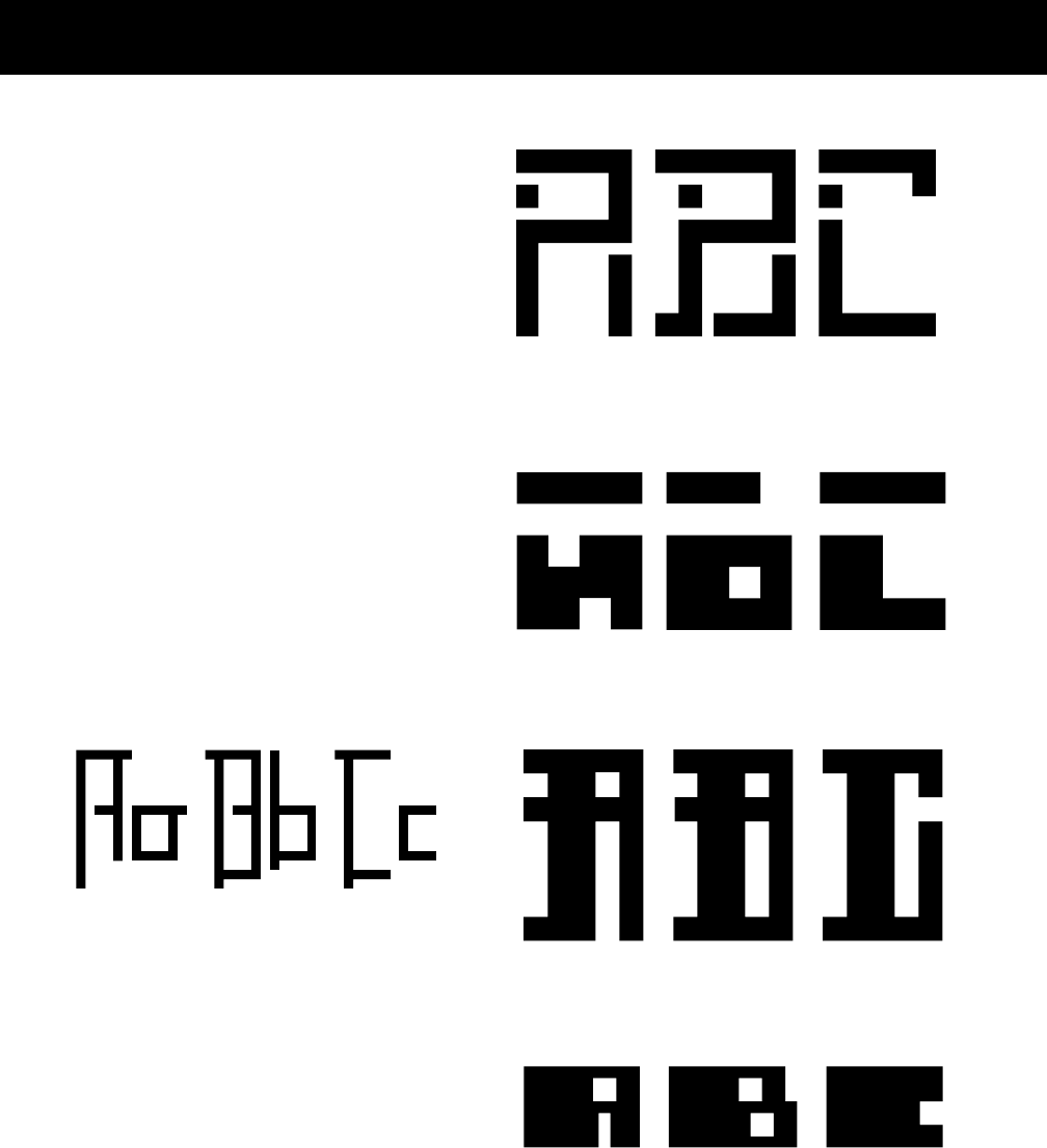
exercise:modularletterforms
Create a prototype for a bitmap typeface by
designing letters on a grid of squares or a grid
of dots. Substitute the curves and diagonals of
traditional letterforms with gridded and
rectilinear elements. Avoid making detailed
“staircases,” which are just curves and
diagonals in disguise. This exercise looks back
to the 1910s and 1920s, when avant-garde
designers made experimental typefaces out of
simple geometric parts. The project also speaks
to the structure of digital technologies, from
cash register receipts and LED signs to
on-screen font display, showing that a typeface
is a system of elements.
Wendy Neese
James Alvarez
Bruce Willen
Joey Potts
Brendon McClean
78 |
Examples of student work from
Maryland Institute College of Art
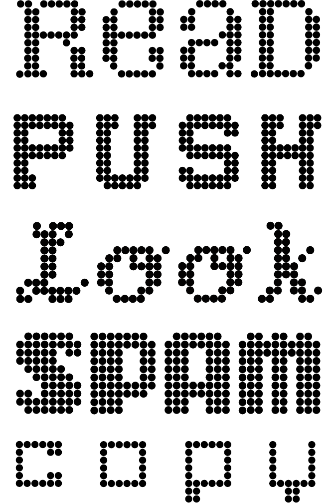
Michelle Ghiotti
| 79
Becky Slogeris
Bryan Connor
Julia Kim
Virginia Sasser

80 |
fontformats
Where do fonts come from, and why are there so
many dierent formats? Some come loaded with
your computer’s operating system, while others
are bundled with software packages. A few of these
widely distributed typefaces are of the highest
quality, such as Adobe Garamond Pro and Hoefler
Text, while others (including Comic Sans, Apple
Chancery, and Papyrus) are reviled by design
snobs everywhere.
If you want to expand your vocabulary beyond
this familiar fare, you will need to purchase fonts
from digital type foundries. These range from
large establishments like Adobe and FontShop,
which license thousands of dierent typefaces,
to independent producers that distribute just a
few, such as Underware in the Netherlands or
Jeremy Tankard Typography in the U.K. You can
also learn to make your own fonts as well as find
fonts that are distributed for free online.
The dierent font formats reflect technical
innovations and business arrangements developed
over time. Older font formats are still generally
usable on modern operating systems.
/ 1 was developed for desktop computer
systems in the 1980s by Adobe. Type I fonts are output using
the PostScript programming language, created for generating
high-resolution images on paper or film. A Type 1 font consists
of two files: a screen font and a printer font. You must install
both files in order to fully use these fonts.
is a later font format, created by Apple and Microsoft
for use with their operating systems. TrueType fonts are easier
to install than Type 1 fonts because they consist of a single font
file rather than two.
, a format developed by Adobe, works on multiple
platforms. Each file supports up to 65,000 characters, allowing
multiple styles and character variations to be contained in a
single font file. In a TrueType or Type 1 font, small capitals,
alternate ligatures, and other special characters must be
contained in separate font files (sometimes labelled “Expert”);
in an OpenType font they are part of the main font. These
expanded character sets can also include accented letters
and other special glyphs needed for typesetting a variety of
languages. OpenType fonts with expanded character sets are
commonly labeled “Pro.” OpenType fonts also automatically
adjust the position of hyphens, brackets, and parentheses for
letters set in all-capitals.
nerdalert:Access small caps and numerals quickly
through the Type>OpenType options menu or other
OpenType layout tool in your design software. Small
caps will not appear as a style variant in the Font menu,
because OpenType treats them as part of the main font.
With any font, you can view all the special characters
through the Type and Tables>Glyphs menu. You will
find many unexpected elements, including swashes,
ligatures, ornaments, fractions, and more. Double click
a glyph to insert it into to your text frame.
£ § ¥ ¾
å ë ð ñ ò þ
ÿ ą ě ę ġ ģ ž
į ĭ † ‡
, OpenType font, designed by Martin Majoor, 2005. Scala
Pro has numerous special characters for typesetting diverse European
languages. You can access these characters using the Glyphs palette
in InDesign.
-
,
{[(HALF-BAKED?)]}
HALFBAKED?
, PostScript/Type 1 font format
, OpenType font format
| 81
’
.
typeface or font?
A typeface is the design of the letterforms; a font is the delivery mechanism.
In metal type, the design is embodied in the punches from which molds are
made. A font consists of the cast metal printing types. In digital systems, the
typeface is the visual design, while the font is the software that allows you to
install, access, and output the design. A single typeface might be available in
several font formats. In part because the design of digital typefaces and the
production of fonts are so fluidly linked today, most people use the terms
interchangeably. Type nerds insist, however, on using them precisely.
character or glyph?
Type designers distinguish characters from glyphs in order to comply with
Unicode, an international system for identifying all of the world’s recognized
writing systems. Only a symbol with a unique function is considered a
character and is thus assigned a code point in Unicode. A single character,
such as a lowercase a, can be embodied by several dierent glyphs (a, a, ).
Each glyph is a specific expression of a given character.
Roman or roman?
The Roman Empire is a proper noun and thus is capitalized, but we identify
roman letterforms, like italic ones, in lowercase. The name of the Latin
alphabet is capitalized.
82 |
fontlicensing
Who is the user of a typeface? In the end, the user
is the reader. But before a set of letters can find
their way onto the cover of a book or the back of
a cereal box, they must pass through the hands of
another user: the graphic designer.
Digital fonts are easy to copy, alter, and
distribute, but when you purchase a font, you
accept an end user license agreement (EULA) that
limits how you can use it. Intellectual property law
in the United States protects the font as a piece
of software (a unique set of vector points), but it
does not protect the visual design of the typeface.
Thus it is a violation of standard EULAs to copy
a digital font and share it with other people (your
friends, your clients, or your Uncle Bob). It is
also illegal to open a font file in FontLab, add new
glyphs or alter some of its characters, and save the
font under a new name or under its trademarked
name. In additon to having economic concerns,
typeface designers worry about their work being
corrupted as users edit their fonts and then share
them with other people.
Most EULAs do allow you to alter the outlines
of a font for use in a logo or headline, however,
as long as you do not alter the software itself. It is
also legal to create new digital versions of printed
type specimens. For example, you could print
out an alphabet in Helvetica, redraw the letters,
digitize them with font design software, and
release your own bespoke edition of Helvetica.
If nothing else, this laborious exercise would
teach you the value of a well-designed typeface.
A broadly usable typeface includes numerous
weights, styles, and special characters as well as
a strong underlying design. Fonts are expensive
because they are carefully crafted products.
Most of the FREE FONTS found on the Internet have
poor spacing and incomplete character sets. Many
are stolen property distributed without consent. The
fonts displayed here, however, are freely given by their
creators. A typeface comes to life and finds a voice as
people begin to use it.
Some fonts are distributed freely in order to preserve
UNFAMILIAR traditions. Disseminating a historic revival
at no cost to users encourages a broader understanding
of history. Reviving typefaces is a DEEP-ROOTED
practice. Why should one creator claim ownership of
another’s work? Who controls the past?
SOME FREE FONTS are produced for underserved
linguistic communities for whom few typefaces are
available. Still others are created by people who want
to participate in the open source movement. The OFL
(Open Font License) permits users to alter a typeface
and contribute to its ongoing evolution.
a viable, diverse ecology of content
(journalism, design, art, typography, and more),
everyone has to pay. everyone shouldn’t
have to pay for everything. If some resources are
willingly given away, the result is a .
freefonts
, designed by Jos Buivenga/Ex Ljbris, 2004
, designed by Jack Usine/SMeltery.net, 2003
, designed by Adam Półtawski,
1920s–1930s; digitized by Janusz Marian Nowacki, 1996
Open Font License, designed by Victor Gaultney, 2001
, revival of Frederic W. Goudy’s Goudy
Old Style, 1916, designed by Barry Schwartz, 2010; distributed
by the League of Moveable Type
| 83
, ’
Minou Drouet
was a French
child poet
and composer
widely derided
by intellectuals
in the 1950s.
, designed by the League of Moveable Type, 2009; revival of Morris Fuller Benton’s
.1., released by American Type Founders Company (ATF) in 1903.
, designed by Eduardo Recife/ Misprinted Type, 2002
, designed by Eduardo Recife, 2003
, designed by Eduardo Recife, 2001
, designed by Eduardo Recife, 2001
: Roland Barthes, “Myth Today,” 1957; translated by Annette Lavers.
{TEXT}
Poster, 1996.
Designer: Hayes Henderson.
Rather than represent
cyberspace as an ethereal grid,
the designer has used blotches
of overlapping text to build an
ominous, looming body.
| 87
text
, . In typography,
“text” is defined as an ongoing sequence of words, distinct from shorter
headlines or captions. The main block is often called the “body,” comprising
the principal mass of content. Also known as “running text,” it can flow
from one page, column, or box to another. Text can be viewed as a thing—a
sound and sturdy object—or a fluid poured into the containers of page or
screen. Text can be solid or liquid, body or blood.
As body, text has more integrity and wholeness than the elements that
surround it, from pictures, captions, and page numbers to banners, buttons,
and menus. Designers generally treat a body of text consistently, letting it
appear as a coherent substance that is distributed across the spaces of a
document. In digital media, long texts are typically broken into chunks that
can be accessed by search engines or hypertext links. Contemporary
designers and writers produce content for various contexts, from the pages
of print to an array of software environments, screen conditions, and digital
devices, each posing its own limits and opportunities.
Designers provide ways into—and out of—the flood of words
by breaking up text into pieces and offering shortcuts and alternate routes
through masses of information. From a simple indent (signaling the
entrance to a new idea) to a highlighted link (announcing a jump to another
location), typography helps readers navigate the flow of content. The user
could be searching for a specific piece of data or struggling to quickly
process a volume of content in order to extract elements for immediate use.
Although many books define the purpose of typography as enhancing the
readability of the written word, one of design’s most humane functions is,
in actuality, to help readers avoid reading.
88 |
- English
manuscript, thirteenth
century. Walters Ms. W.102,
fol. 33v. Collection of the
Walters Art Museum,
Baltimore. The monk is
climbing up the side of the page
to replace a piece of faulty text
with the corrected line in the
bottom margin.
-
| 89
Typography helped seal the literary notion of “the text” as a complete,
original work, a stable body of ideas expressed in an essential form. Before
the invention of printing, handwritten documents were riddled with errors.
Copies were copied from copies, each with its own glitches and gaps.
Scribes devised inventive ways to insert missing lines into manuscripts in
order to salvage and repair these laboriously crafted objects.
Printing with movable type was the first system of mass production,
replacing the hand-copied manuscript. As in other forms of mass
production, the cost of manufacturing (setting type, insuring its correctness,
and running a press) drops for each unit as the size of the print run
increases. Labor and capital are invested in tooling and preparing the
technology, rather than in making the individual unit. The printing system
allows editors and authors to correct a work as it passes from handwritten
manuscript to typographic galley. “Proofs” are test copies made before final
production begins. The proofreader’s craft ensures the faithfulness of the
printed text to the author’s handwritten original.
Yet even the text that has passed through the castle gates of print is
inconstant. Each edition of a book represents one fossil record of a text, a
record that changes every time the work is translated, quoted, revised,
interpreted, or taught. Since the rise of digital tools for writing and
publishing, manuscript originals have all but vanished. Electronic redlining
is replacing the hieroglyphics of the editor. Online texts can be downloaded
by users and reformatted, repurposed, and recombined.
Print helped establish the figure of the author as the owner of a text, and
copyright laws were written in the early eighteenth century to protect the
author’s rights to this property. The digital age is riven by battles between
those who argue, on the one hand, for the fundamental liberty of data and
ideas, and those who hope to protect—sometimes indefinitely—the
investment made in publishing and authoring content.
A classic typographic page emphasizes the completeness and closure of a
work, its authority as a finished product. Alternative design strategies in the
twentieth and twenty-first centuries reflect the contested nature of
authorship by revealing the openness of texts to the flow of information and
the corrosiveness of history.
errors and ownership
Typography tended to alter language from a means of perception and exploration
to a portable commodity. —marshall mcluhan, 1962
On the future of
intellectual property, see
Lawrence Lessig, Free
Culture: How Big Media
Uses Technology and the Law
to Lock Down Culture and
Control Creativity (New
York: Penguin, 2004).
Marshall McLuhan,
The Gutenberg Galaxy
(Toronto: University of
Toronto Press, 1962).
90 |
:
, -
,
Book, 1989. Designer:
Richard Eckersley. Author:
Avital Ronell. Compositor:
Michael Jensen. Publisher:
University of Nebraska Press.
Photograph: Dan Meyers.
This book, a philosophical study
of writing as a material
technology, uses typography
to emphasize the rhetorical
argument of the text. This
spread, for example, is fractured
by typographic “rivers,” spaces
that connect vertically through
the page. Rivers violate the
even, unified texture that is a
sacred goal within traditional
typographic design.
, ,

| 91
Design is as much an act of spacing as an act of marking. The typographer’s
art concerns not only the positive grain of letterforms, but the negative gaps
between and around them. In letterpress printing, every space is constructed
by a physical object, a blank piece of metal or wood with no raised image.
The faceless slugs of lead and slivers of copper inserted as spaces between
words or letters are as physical as the relief characters around them. Thin
strips of lead (called “leading”) divide the horizontal lines of type; wider
blocks of “furniture” hold the margins of the page.
Although we take the breaks between words for granted, spoken language
is perceived as a continuous flow, with no audible gaps. Spacing has become
crucial, however, to alphabetic writing, which translates the sounds of
speech into multiple characters. Spaces were introduced after the invention
of the Greek alphabet to make words intelligible as distinct units.
Tryreadingalineoftextwithoutspacingtoseehowimportantithasbecome.
With the invention of typography, spacing and punctuation ossified from
gap and gesture to physical artifact. Punctuation marks, which were used
differently from one scribe to another in the manuscript era, became part of
the standardized, rule-bound apparatus of the printed page. The
communications scholar Walter Ong has shown how printing converted the
word into a visual object precisely located in space: “Alphabet letterpress
printing, in which each letter was cast on a separate piece of metal, or type,
marked a psychological breakthrough of the first order....Print situates words in space more
relentlessly than writing ever did. Writing moves words from the sound world to the world of visual
space, but print locks words into position in this space.” Typography made
text into a thing, a material object with known dimensions and fixed
locations.
The French philosopher Jacques Derrida, who devised the theory of
deconstruction in the 1960s, wrote that although the alphabet represents
sound, it cannot function without silent marks and spaces. Typography
manipulates the silent dimensions of the alphabet, employing habits and
techniques—such as spacing and punctuation—that are seen but not heard.
The Latin alphabet, rather than evolve into a transparent code for recording
speech, developed its own visual resources, becoming a more powerful
technology as it left behind its connections to the spoken word.
spacing
Walter Ong, Orality and
Literacy: The Technologizing
of the Word (London
and New York: Methuen,
1981). See also Jacques
Derrida, Of Grammatology,
trans. Gayatri Chakravorty
Spivak (Baltimore: Johns
Hopkins University Press,
1976).
That a speech supposedly alive can lend itself to spacing in its
own writing is what relates to its own death. —jacques derrida, 1976

92 |
In his essay “From Work to Text,” the French critic Roland Barthes presented
two opposing models of writing: the closed, fixed “work” versus the open,
unstable “text.” In Barthes’s view, the work is a tidy, neatly packaged object,
proofread and copyrighted, made perfect and complete by the art of printing.
The text, in contrast, is impossible to contain, operating across a dispersed
web of standard plots and received ideas. Barthes pictured the text as “woven
entirely with citations, references, echoes, cultural languages (what language is not?), antecedent and
contemporary, which cut across and through in a vast stereophony....The metaphor of the Text is that
of the network.” Writing in the 1960s and 1970s, Barthes anticipated the
Internet as a decentralized web of connections.
Barthes was describing literature, yet his ideas resonate for typography, the
visual manifestation of language. The singular body of the traditional text
page has long been supported by the navigational features of the book, from
page numbers and headings that mark a reader’s location to such tools as the
index, appendix, abstract, footnote, and table of contents. These devices were
able to emerge because the typographic book is a fixed sequence of pages, a
body lodged in a grid of known coordinates.
All such devices are attacks on linearity, providing means of entrance and
escape from the one-way stream of discourse. Whereas talking flows in a
single direction, writing occupies space as well as time. Tapping that spatial
dimension—and thus liberating readers from the bonds of linearity—is
among typography’s most urgent tasks.
Although digital media are commonly celebrated for their potential as
nonlinear potential communication, linearity nonetheless thrives in the
electronic realm, from the “CNN crawl” that marches along the bottom of
the television screen to the ticker-style LED signs that loop through the urban
environment. Film titles—the celebrated convergence of typography and
cinema—serve to distract the audience from the inescapable tedium
of a contractually decreed, top-down disclosure of ownership and authorship.
Basic electronic book readers, such as Amazon’s Kindle (2007), provide a
highly sequential, predominantly linear experience; flipping back or skipping
ahead is more cumbersome in some electronic books than in paper ones.
Linearity dominates many commercial software applications. Word
processing programs, for example, treat documents as a linear stream.
linearity
A text...is a multi-dimensional space in which a variety of writings,
none of them original, blend and clash. —roland barthes, 1971
Roland Barthes, “From
Work to Text,” in Image/
Music/Text, trans. Stephen
Heath (New York: Hill
and Wang, 1977), 155–64.

| 93
(In contrast, page layout programs such as Quark XPress and Adobe
InDesign allow users to work spatially, breaking up text into columns and
pages that can be anchored and landmarked.) PowerPoint and other
presentation software programs are supposed to illuminate the spoken word
by guiding the audience through the linear unfolding of an oral address.
Typically, however, PowerPoint enforces the one-way flow of speech rather
than alleviating it. While a single sheet of paper could provide a map or
summary of an oral presentation, a PowerPoint show drags out in time
across numerous screens.
Not all digital media favor linear flow over spatial arrangement, however.
The database, one of the defining information structures of our time, is a
nonlinear form. Providing readers and writers with a simultaneous menu of
options, a database is a system of elements that can be arranged in countless
sequences. Page layouts are built on the fly from chunks of information,
assembled in response to user feedback. The web is pushing authors,
editors, and designers to work inventively with new modes of microcontent
(page titles, key words, alt tags) that allow data to be searched, indexed,
tagged, or otherwise marked for recall.
Databases are the structure behind electronic games, magazines, and
catalogues, genres that create an information space rather than a linear
sequence. Physical stores and libraries are databases of tangible objects found
in the built environment. Media critic Lev Manovich has described language
itself as a kind of database, an archive of elements from which people
assemble the linear utterances of speech. Many design projects call for the
emphasis of space over sequence, system over utterance, simultaneous
structure over linear narrative. Contemporary design often combines aspects
of architecture, typography, film, wayfinding, branding, and other modes
of address. By dramatizing the spatial quality of a project, designers can
foster understanding of complex documents or environments.
The history of typography is marked by the increasingly sophisti cated use
of space. In the digital age, where characters are accessed by keystroke and
mouse, not gathered from heavy drawers of manufactured units, space has
become more liquid than concrete, and typography has evolved from a stable
body of objects to a flexible system of attributes.
Database and narrative are natural enemies. Competing for the same territory of human culture,
each claims an exclusive right to make meaning of the world. —lev manovich, 2002
On the linearity of word
processing, see Nancy Kaplan,
“Blake’s Problem and Ours:
Some Reflections on the
Image and the Word,”
Readerly/Writerly Texts, 3.2
(Spring/Summer 1996), 125.
On PowerPoint, see Edward
R. Tufte, “The Cognitive Style
of PowerPoint,” (Cheshire,
Conn.: Graphics Press, 2003).
On the aesthetics of the
database, see Lev Manovich,
The Language of New Media
(Cambridge: MITPress,
2002).
2.0. Interactive
media, 2003. Designers: Plumb
Design Inc. This digital thesaurus
presents words within a dynamic web
of relationships. The central term is
linked to nodes representing that word’s
different senses. The more connections
each of these satellite nodes contain,
the bigger and closer it appears on the
screen. Clicking on a satellite word
brings it to the center.
94 |
Succeeding the Author, the scriptor no longer bears within him
passions, humours, feelings, impressions, but rather this immense
dictionary from which he draws a writing that can know no halt.
—roland barthes, 1968
| 95
//
Concordance and text stats
for Roland Barthes’s book
Image/Music/Text. Publisher:
Amazon.com, 2010. Amazon
presents automated analyses
of a book’s text in order to
give readers an idea of what is
inside. The concordance feature
lists the book’s one hundred
most commonly used words
in alphabetical order and
sizes them according to their
frequency.
96 |

| 97
Barthes’s model of the text as an open web of references, rather than a
closed and perfect work, asserts the importance of the reader over the writer
in creating meaning. The reader “plays” the text as a musician plays an
instrument. The author does not control its significance: “The text itself
plays (like a door, like a machine with ‘play’) and the reader plays twice over,
playing the Text as one plays a game, looking for a practice which
reproduces it.” Like an interpretation of a musical score, reading is a
performance of the written word.
Graphic designers embraced the idea of the readerly text in the 1980s and
early 1990s, using layers of text and interlocking grids to explore Barthes’s
theory of the “death of the author.” In place of the classical model of
typography as a crystal goblet for content, this alternative view assumes that
content itself changes with each act of representation. Typography becomes
a mode of interpretation.
Redefining typography as “discourse,” designer Katherine McCoy
imploded the traditional dichotomy between seeing and reading. Pictures
can be read (analyzed, decoded, taken apart), and words can be seen
(perceived as icons, forms, patterns). Valuing ambiguity and complexity, her
approach challenged readers to produce their own meanings while also
trying to elevate the status of designers within the process of authorship.
Another model, which undermined the designer’s new claim to power,
surfaced at the end of the 1990s, borrowed not from literary criticism but
from human-computer interaction (HCI) studies and the fields of interface
and usability design. The dominant subject of our age has become neither
reader nor writer but user, a figure conceived as a bundle of needs and
impairments—cognitive, physical, emotional. Like a patient or child, the
user is a figure to be protected and cared for but also scrutinized and
controlled, submitted to research and testing.
How texts are used becomes more important than what they mean.
Someone clicked here to get over there. Someone who bought this also
bought that. The interactive environment not only provides users with a
degree of control and self-direction but also, more quietly and insidiously, it
gathers data about its audiences. Barthes’s image of the text as a game to be
played still holds, as the user responds to signals from the system. We may
play the text, but it is also playing us.
birth of the user
Design a human-machine interface in accordance with the abilities and
foibles of humankind, and you will help the user not only get the job done,
but be a happier, more productive person. —jef raskin, 2000
:
Book, 1990. Designers:
Katherine McCoy, P. Scott
Makela, and Mary Lou
Kroh. Publisher: Rizzoli.
Photograph: Dan Meyers.
Under the direction of
Katherine and Michael
McCoy, the graduate program
in graphic and industrial
design at Cranbrook Academy
of Art was a leading center
for experimental design from
the 1970s through the early
1990s. Katherine McCoy
developed a model of
“typography as discourse,” in
which the designer and reader
actively interpret a text.

98 |
Graphic designers can use theories of user interaction to revisit some of
our basic assumptions about visual communication. Why, for example, are
readers on the web less patient than readers of print? It is commonly
believed that digital displays are inherently more difficult to read than ink on
paper. Yet HCI studies conducted in the late 1980s proved that crisp black
text on a white background can be read just as efficiently from a screen as
from a printed page.
The impatience of the digital reader arises from culture, not from the
essential character of display technologies. Users of websites have different
expectations than users of print. They expect to feel “productive,” not
contemplative. They expect to be in search mode, not processing mode.
Users also expect to be disappointed, distracted, and delayed by false leads.
The cultural habits of the screen are driving changes in design for print,
while at the same time affirming print’s role as a place where extended
reading can still occur.
Another common assumption is that icons are a more universal mode of
communication than text. Icons are central to the GUIs (graphical user
interfaces) that routinely connect users with computers. Yet text can often
provide a more specific and understandable cue than a picture. Icons don’t
actually simplify the trans lation of content into multiple languages, because
they require explanation in multiple languages. The endless icons
of the digital desktop, often rendered with gratuitous detail and depth,
function more to enforce brand identity than to support usability. In the
twentieth century, modern designers hailed pictures as a “universal”
language, yet in the age of code, text has become a more common denom-
inator than images—searchable, translatable, and capable of being
reformatted and restyled for alternative or future media.
Perhaps the most persistent impulse of twentieth-century art and design
was to physically integrate form and content. The Dada and Futurist poets,
for example, used typography to create texts whose content was inextricable
from the concrete layout of specific letterforms on a page. In the twenty-first
century, form and content are being pulled back apart. Style sheets, for
example, compel designers to think globally and systematically instead of
focusing on the fixed construction of a particular surface. This way of
On screen readability,
see John D. Gould et al.,
“Reading from CRT Displays
Can Be as Fast as Reading
from Paper,” Human Factors,
29, 5 (1987): 497–517.
On the restless user, see
Jakob Nielsen, Designing
Web Usability (Indianapolis:
New Riders, 2000).
On the failure of interface
icons, see Jef Raskin,
The Humane Interface: New
Directions for Designing
Interactive Systems (Reading,
Mass.: Addison-Wesley, 2000).
Web users don’t like to read....They want to keep moving and clicking.
—jakob nielsen, 2000

| 99
Jef Raskin talks about the
scarcity of human attention
as well as the myth of white
space in The Humane
Interface: New Directions for
Designing Interactive Systems,
cited on p. 74.
thinking allows content to be reformatted for different devices or users, and
it also prepares for the afterlife of data as electronic storage media begin
their own cycles of decay and obsolescence.
In the twentieth century, modern artists and critics asserted that each
medium is specific. They defined film, for example, as a constructive
language distinct from theater, and they described painting as a physical
medium that refers to its own processes. Today, however, the medium is not
always the message. Design has become a “transmedia” enterprise, as
authors and producers create worlds of characters, places, situations, and
interactions that can appear across a variety of products. A game might live
in different versions on a video screen, a desktop computer, a game console,
and a cell phone, as well as on t-shirts, lunch boxes, and plastic toys.
The beauty and wonder of “white space” is another modernist myth that is
subject to revision in the age of the user. Modern designers discovered that
open space on a page can have as much physical presence as printed areas.
White space is not always a mental kindness, however. Edward Tufte, a fierce
advocate of visual density, argues for maximizing the amount of data
conveyed on a single page or screen. In order to help readers make
connections and comparisons, as well as to find information quickly, a single
surface packed with well-organized information is sometimes better than
multiple pages with a lot of blank space. In typography as in urban life,
density invites intimate exchange among people and ideas.
In our much-fabled era of information overload, a person can still process
only one message at a time. This brute fact of cognition is the secret behind
magic tricks: sleights of hand occur while the attention of the audience is
drawn elsewhere. Given the fierce competition for their attention, users have
a chance to shape the information economy by choosing what to look at.
Designers can help them make satisfying choices.
Typography is an interface to the alphabet. User theory tends to favor
normative solutions over innovative ones, pushing design into the
background. Readers usually ignore the typographic interface, gliding
comfortably along literacy’s habitual groove. Sometimes, however, the
interface should be allowed to fail. By making itself evident, typography can
illuminate the construction and identity of a page, screen, place, or product.
On transmedia design
thinking, see Brenda Laurel,
Utopian Entrepreneur
(Cambridge: MITPress,
2001).
If people weren’t good at finding tiny things in long lists, the Wall Street
Journal would have gone out of business years ago. —jef raskin, 2000

100 |
Typography, invented in the Renaissance, allowed text to become a fixed
and stable form. Like the body of the letter, the body of text was transformed
into an industrial commodity that gradually became more open and flexible.
Critics of electronic media have noted that the rise of networked
communication did not lead to the much feared destruction of typography
(or even to the death of print), but rather to the burgeoning of the alphabetic
empire. As Peter Lunenfeld points out, the computer has revived the power
and prevalence of writing: “Alphanumeric text has risen from its own ashes,
a digital phoenix taking flight on monitors, across networks, and in the
realms of virtual space.” The computer display is more hospitable to text
than the screens of film or television because it offers physical proximity,
user control, and a scale appropriate to the body.
The printed book is no longer the chief custodian of the written word.
Branding is a powerful variant of literacy that revolves around symbols,
icons, and typographic standards, leaving its marks on buildings, packages,
album covers, websites, store displays, and countless other surfaces and
spaces. With the expansion of the Internet, new (and old) conventions for
displaying text quickly congealed, adapting metaphors from print and
architecture: window, frame, page, banner, menu. Designers working within
this stream of multiple media confront text in myriad forms, giving shape to
extended bodies but also to headlines, decks, captions, notes, pull quotes,
logotypes, navigation bars, alt tags, and other prosthetic clumps of language
that announce, support, and even eclipse the main body of text.
The dissolution of writing is most extreme in the realm of the
web, where distracted readers safeguard their time and prize function over
form. This debt of restlessness is owed not to the essential nature of
computer monitors, but to the new behaviors engendered by the Internet, a
place of searching and finding, scanning and mining. The reader, having
toppled the author’s seat of power during the twentieth century, now ails
and lags, replaced by the dominant subject of our own era: the user, a figure
whose scant attention is our most coveted commodity. Do not squander it.
On electronic writing, see
Peter Lunenfeld, Snap to
Grid: A User’s Guide to
Digital Arts, Media, and
Cultures (Cambridge: MIT
Press, 2001); Jay David
Bolter, Writing Space:
Computers, Hypertext, and
the Remediation of Print
(Mahwah, NJ: Lawrence
Erlbaum Associates, 2001),
and Stuart Moulthrop, “You
Say You Want a Revolution?
Hypertext and the Laws
of Media,” in The New Media
Reader, ed. Noah Wardrip-
Fruin and Nick Monfort
(Cambridge: MITPress,
2003), 691–703.
Hypertext means the end of the death of literature. —stuart moulthrop, 1991
| 101
. Website, 2010.
Design: Jessica Helfand, William Drenttel,
Michael Bierut, and Betsy Vardell. Packing
an enormous volume of content onto its home
page, this design discourse supersite brings
print-quality typography to the screen.

102 |
Warm Type
Warm Type
Warm Type
Kerning is an adjustment of the space between
two letters. The characters of the Latin alphabet
emerged over time; they were never designed
with mechanical or automated spacing in mind.
Thus some letter combinations look awkward
without special spacing considerations. Gaps
occur, for example, around letters whose forms
angle outward or frame an open space (W, Y, V,
T). In metal type, a kerned letter extends past the
lead slug that supports it, allowing two letters to
fit more closely together. In digital fonts, the
space between letter pairs is controlled by a
kerning table created by the type designer, which
specifies spaces between problematic letter
combinations.
Working in a page layout program, a designer
can choose to use metric kerning or optical kerning
as well as adjusting the space between letters
manually where desired. A well-designed typeface
requires little or no additional kerning, especially
at text sizes.
uses the kerning tables that are built into
the typeface. When you select metric kerning in your page
layout program, you are using the spacing that was intended by
the type designer. Metric kerning usually looks good, especially
at small sizes. Cheap novelty fonts often have little or no built-
in kerning and will need to be optically kerned.
is executed automatically by the page layout
program. Rather than using the pairs addressed in the font’s
kerning table, optical kerning assesses the shapes of all
characters and adjusts the spacing wherever needed. Some
graphic designers apply optical kerning to headlines and metric
kerning to text. You can make this process efficient and
consistent by setting kerning as part of your character styles.
kerning
Takes Two
Takes Two
Takes Two
,
Spacing appears uneven, with gaps around T/a, T/w, and w/o.
,
Spacing appears more even between T/a and T/w.
,
Spacing seems more even between T/a, T/w, and w/o.
LOVE LETTERS
,
Spacing is tight between T/T.
LOVE LETTERS
,
Improved spacing between T/T.
LOVE LETTERS
,
Improved spacing between T/ T and O/V.
,
Spacing appears uneven between W/a and T/y.
,
Spacing appears more even between W/a and T/y.
,
Spacing is comparable to metric kerning.

| 103
The subtle differences
between metric and optical kerning become more
apparent at larger sizes. Most problems occur
between capital and lowercase letters. The spacing
between H/a, T/a, and T/o improves with optical
kerning. The optical kerning applied here in
InDesign has created tighter spacing for large text
and looser spacing for small text. Look at both
effects before choosing a kerning method.
,
nerd alert: In addition to using optical kerning, the text
above has word spacing reduced to 80 percent. With large type,
normal word spacing often looks too wide. Adjust word spacing
in the Paragraph>Justification menu in InDesign.
Books And Harlots
Can Be Taken To Bed.
Books And Harlots Have Their Quarrels In Public.
,
Books and harlots—
footnotes in one are
as banknotes in the
stockings of the other.
—walter benjamin, 1925
Books And Harlots Have Their Quarrels In Public.
Books And Harlots
Can Be Taken To Bed.
Books and harlots—
footnotes in one are
as banknotes in the
stockings of the other.
—walter benjamin, 1925
metric versus optical kerning
Ha
Ha
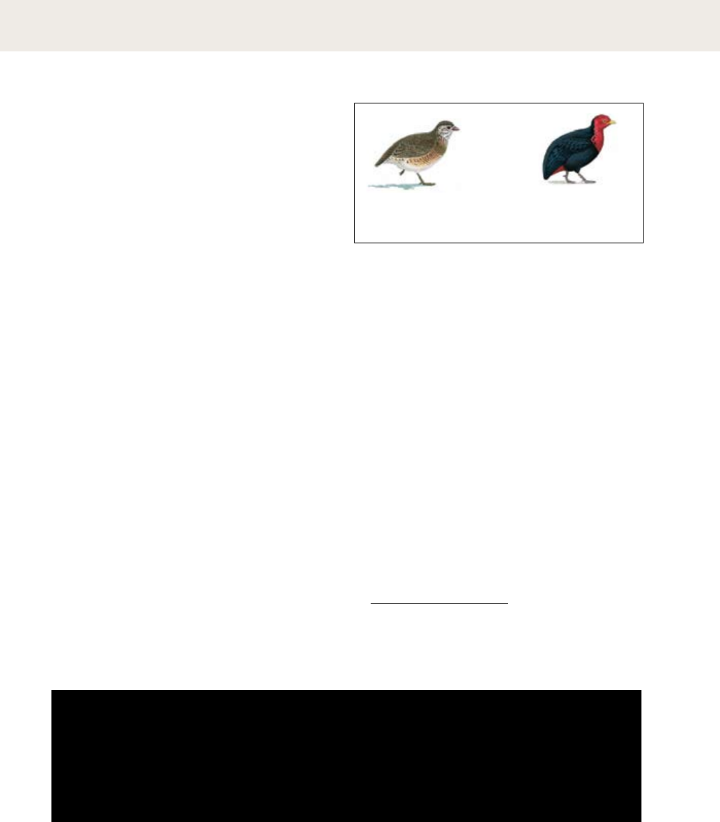
104 |
tracking
Adjusting the overall spacing of a group of letters
is called tracking or letterspacing. By expanding the
tracking across a word, line, or entire block of
text, the designer can create a more airy, open
field. In blocks of text, tracking is usually applied
in small increments, creating a subtle effect not
noticeable to the casual reader. Occasionally, a
single word or phrase is tracked for emphasis,
especially when CAPS or are used
within a line. Negative tracking, rarely desirable in
text sizes, can be used sparingly to help bring up a
short line of text. White type on a black background
is considered more legible when it is tracked.
type crime
Letters are tracked too close
for comfort.
Letters do love one another.
However, due to their
anatomical differences, some
letters have a hard time
achieving intimacy. Consider
the letter V, for example, whose
seductive valley makes her
limbs stretch out above her
base. In contrast, L solidly
holds his ground yet harbors a
certain emptiness above the
waist. Capital letters, being
square and conservative, prefer
to keep a little distance from
their neighbors.
(+20)
Letters do love one another.
However, due to their
anatomical differences, some
letters have a hard time
achieving intimacy. Consider
the letter V, for example,
whose seductive valley makes
her limbs stretch out above
her base. In contrast, L solidly
holds his ground yet harbors
a certain emptiness above the
waist. Capital letters, being
square and conservative,
prefer to keep a little distance
from their neighbors.
(-20)
Letters do love one another.
However, due to their anatomical
differences, some letters have
a hard time achieving intimacy.
Consider the letter V, for
example, whose seductive valley
makes her limbs stretch out
above her base. In contrast,
L solidly holds his ground yet
harbors a certain emptiness
above the waist. Capital letters,
being square and conservative,
prefer to keep a little distance
from their neighbors.
Books and harlots—both have their
type of man, who both lives off and
harasses them. In the case of books,
critics. walter benjamin, 1925
,
Books and harlots—both have their
type of man, who both lives off and
harasses them. In the case of books,
critics. walter benjamin, 1925
, +25
-
Arborophila chloropus
in ( cm)
Southeast Asia
=
<
Lophura nycthemera
– i n ( – cm)
Southeast Asia
Argusianus argus
. – . i n ( – cm)
Southeast Asia
-
Haematortyx sanguiniceps
in ( cm)
Borneo
-
Rollulus rouloul
in ( cm)
Southeast Asia
Lophura ignita
– . in ( – cm)
Southeast Asia
=
<
=
<
Gallus gallus
. – . in ( – cm)
Southern Asia
=<
Book, 2007. Author: Les Beletsky.
Publisher: The Johns Hopkins University. Art Director:
Charles Nix. Designers: Charles Nix, Whitney Grant, and
May Jampathom. This book, set in Adobe Caslon and Caslon
540, uses tracked small capitals for caption headings.
tracking text type
| 105
Designers most commonly apply tracking to
headlines and logos (where kerning adjustments
are also frequently required). As text gets bigger,
the space between letters expands, and some
designers use tracking to diminish overall spacing
in large-scale text. Loose or open tracking is
commonly applied to capitals and small capitals,
which appear more regal standing slightly apart.
and Logotypes, 2006. Design: Duy
& Partners. The generously tracked capitals in these logotypes give
them an aable, antiquarian flavor while imparting an overall
lightness to the designs.
Logotype, 1962. Design:
Herb Lubalin. Ultra-tight
letterspacing was a hallmark of
progressive commercial graphics
in the 1960s and 1970s. Here,
the letters cradle each other with
an intimacy appropriate to the
subject matter.
LOVE LETTERS
LOVE LETTERS
,
love letters, love letters
love letters, love letters
:
: (+75)
: . (+75)
:
: (+75)
type crime:
Loosely spaced lowercase letters—especially italics—look
awkward because these characters are designed to sit
closely together on a line.
tracking headlines and logotypes

106 |
exercise: space and meaning
Johnschen Kudos
Johnschen Kudos Johnschen Kudos
You can express the meaning of a word
or an idea through the spacing, sizing,
and placement of letters on the page.
Designers often think this way when
creating logotypes, posters, or editorial
headlines. The compositions shown here
express physical processes such as
disruption, expansion, and migration
through the spacing and arrangement of
letters. The round Os in Futura make it
a fun typeface to use for this project.
Examples of student work from
Maryland Institute College of Art
sition
c o mpression
transition
dis uption
r
expansion
transition
Heather Williams
Jason Hogg
migration
ig
r
a
t
m
ion
repetition
o
o
Heather Williams
elimina ion
t
t
t
t
t
t
t
t
t
t
t
t
oo
o
o
o
o
o
expansion expansion
Marcos Kolthar
expansion
| 107
108 |
The distance from the baseline of one
line of type to another is called line
spacing. It is also called leading, in ref-
erence to the strips of lead used to
separate lines of metal type. The
default setting in most layout and
imaging software is 120 percent of the
type size. Thus 10-pt type is set with 12
pts of line spacing. Designers play
with line spacing in order to create
distinctive layouts. Reducing the stan-
dard distance creates a denser typo-
graphic color—while risking collisions
between ascenders and descenders.
6/6
(6 pt type with 6 pts line
spacing, or “set solid”)
6/7.2
(Auto spacing; 6 pt type
with 7.2 pts line spacing)
6/8
(6 pt type with
8 pts line spacing)
The distance from the baseline of one
line of type to another is called line
spacing. It is also called leading, in ref-
erence to the strips of lead used to
separate lines of metal type. The
default setting in most layout and
imaging software is 120 percent of the
type size. Thus 10-pt type is set with 12
pts of line spacing. Designers play with
line spacing in order to create distinc-
tive layouts. Reducing the standard
distance creates a denser typographic
color—while risking collisions between
ascenders and descenders.
6/12
(6 pt type with
12 pts line spacing)
line spacing
The distance from the baseline of one line of type
to another is called line spacing. It is also called
leading, in reference to the strips of lead used to
separate lines of metal type. The default setting in
most layout and imaging software is 120 percent
of the type size. Thus 10-pt type is set with 12 pts
of line spacing. Designers play with line spacing
in order to create distinctive typographic
arrangements. Reducing the standard distance
creates a denser typographic color, while risking
collisions between ascenders and descenders.
Expanding the line spacing creates a lighter, more
open text block. As leading increases, lines of type
become independent graphic elements rather
than parts of an overall visual shape and texture.
variations in line spacing
dierent
folks
dierent
strokes
type crime
Here, auto spacing yields
an uneven effect.
Adjusting line spacing with
the baseline shift tool helps create
an even appearance.
dierent
folks
dierent
strokes
nerd alert: A baseline shift is a manual
adjustment of the horizontal position of one
or more characters. Baseline shifts are often
used when mixing different sizes or styles of type. The
baseline shift tool can be found in the Type tool bar of
standard software applications.
Aa
| 109
:
Magazine page, 1992.
Designer: Abbott Miller.
Publisher: Patsy Tarr. The
extreme line spacing allows two
strands of text to interweave.
110 |
line spacing
Book spread, 2008.
Designer: Vanessa Barbara with Elaine Ramos and Maria
Carolina Sampaio. Publisher: Cosac Naify. Here, pages of text are
set with loose line spacing and printed on thin paper. The vertical
placement of the text block varies from spread to spread, allowing
text to show through between the lines.
Designers experiment with extreme line spacing
to create distinctive typographic textures. Open
spacing allows designers to play with the space
between the lines, while tight spacing creates
intriguing, sometimes uncomfortable, collisions.
| 111
:
Book, 1970. Design: Paolo
Soleri. This classic work of
postmodern design uses ultra-
tight line spacing to create
dramatic density on the page.
Produced long before the era of
digital page layout, this book
exploited the possibilities of
phototypesetting and dry
transfer lettering.
112 |
alignment
justified
Left and right edges are both even
Justified text makes a clean shape on the page.
Its efficient use of space makes it the norm for
newspapers and books. Ugly gaps can occur,
however, as text is forced into lines of even
measure. Avoid this by using a line length that
is long enough in relation to the size of type.
As type gets smaller, more words will fit on
each line.
Justified text, which has even edges on both the left
and right sides of the column, has been the norm
since the invention of printing with movable type,
which enabled the creation of page after page of
straight-edged columns. In metal type setting, the
printer justifies each line by hand, using small
metal spacers to alter the spaces between words
and letters and thus make all the lines the same
length. Digital typesetting performs the same
labor automatically. Justified type makes efficient
use of space. It also creates a clean, compact
shape on the page. Ugly gaps can occur, however,
when the line length is too short in relation to the
size of type used. Hyphenation breaks up long
words and helps keep the lines of text tightly
packed. Designers often use negative tracking to fit
additional characters on a line, or positive tracking
to even out a line of type that looks too loose.
Ugly gaps appear when
the designer has made
the line length too
short, or the author
has selected words that
are too long.
type crime
A column that is too
narrow is full of gaps.
Centered text is symmetrical,
like the facade of a classical building.
Centered type often appears on
invitations, title pages, certificates, and tomb stones.
The edges of a centered column
are often dramatically uneven.
Centered lines should be broken to emphasize a key phrase
(such as the name of the bride
or the date of her wedding)
or to allow a new thought to begin on its own line.
Breaking lines in this manner is called
breaking for sense.
centered
Lines of ueven length on a central axis
Centered text is formal and classical. It invites
the designer to break a text for sense and
create elegant, organic shapes. Centering is
often the simplest and most intuitive way to
place a typographic element. Used without
care, centered text can look staid and
mournful, like a tombstone.
’
.
type crime
In most
uses, centered text
should be broken into
phrases with a variety
of long and short lines.
Choosing to align text in justified, centered, or
ragged columns is a fundamental typographic act.
Each mode of alignment carries unique formal
qualities, cultural associations, and aesthetic risks.
| 113
flush left/ragged right
Left edge is hard; right edge is soft
Flush left text respects the organic flow of
language and avoids the uneven spacing that
plagues justified type. A bad rag can ruin the
relaxed, organic appearance of a flush left
column. Designers must strive vigilantly to
create the illusion of a random, natural edge
without resorting to excessive hyphenation.
In flush left/ragged right text, the left edge is
hard and the right edge soft. Word spaces do not
fluctuate, so there are never big holes
inside the lines of text. This format, which was
used primarily for setting poetry before
the twentieth century, respects the flow of
language rather than submitting to the law of the
box. Despite its advantages, however, the flush
left format is fraught with danger. Above all, the
designer must work hard to control the
appearance of the rag that forms along the right
edge. A good rag looks pleasantly uneven, with
no lines that are excessively long or short, and
with hyphenation kept to a minimum. A rag is
considered “bad” when it looks too even (or too
uneven), or when it begins to form regular
shapes, like wedges, moons, or diving boards.
A bad rag will fall
into weird shapes
along the right
edge, instead
of looking
random.
type crime
An ugly wedge shape spoils
the ragged edge.
flush right/ragged left
Right edge is hard; left edge is soft
Flush right text can be a welcome departure from
the familiar. Used for captions, side bars, and
other marginalia, it can suggest affinities among
elements. Because flush right text is unusual, it
can annoy cautious readers. Bad rags threaten
flush right text just as they afflict flush left, and
punctuation can weaken the hard right edge.
Flush right/ragged left is a variant of the more
familiar flush left setting. It is common wisdom
among typographers that flush right text is hard to
read, because it forces the reader’s eye to find a
new position at the start of each line.
This could be true, or it could be an urban legend.
That being said, the flush right setting is rarely
employed for long bodies of text. Used in smaller
blocks, however, flush right text forms effective
marginal notes, sidebars, pull quotes, or other
passages that comment on a main body or image.
A flush or ragged edge can suggest attraction
(or repulsion) between chunks of information.
Lots of punctuation
(at the ends of lines)
will attack, threaten,
and generally
weaken the flush
right edge.
type crime
Excessive
punctuation weakens the
right edge.
114 |
alignment
Printed for Jacob Tonson, 1698. Title
pages are traditionally set centered. This two-color title page was
printed in two passes of the press (note the o-kilter registration of the
two colors of ink). Large typefaces were created primarily for use on
title pages or in hymn books.
,
Printed by the Roycroft Shop, 1908. This neo-Renaissance book
page harkens back to the first century of printing. Not only is the
block of text perfectly justified, but paragraph symbols are used in
place of indents and line breaks to preserve the solidity of the page.
The four modes of alignment (centered, justified,
flush left, and flush right) form the basic grammar
of typographic composition. Each one has traditional
uses that make intuitive sense to readers.
centered justified
| 115
/ Printed by Bill
Lansing, 1945. Traditionally, poetry is set flush left, because the line
breaks are an essential element of the literary form. Poetry is not
ususally set centered, except in greeting cards.
Designed and written by W. A.
Dwiggins, 1928. In this classic guide to commercial art practices,
Dwiggins has placed callouts or subject cues in the margins. On
the left-hand (verso) page shown here, the cues are set flush right,
drawing them closer to the content they identify.
flush left flush right
116 |
alignment
: :
Book spread, 2002. Designer: Stephen Farrell.
Author: Steve Tomasula. In this typographic novel, texts and
images align left and right against a series of thin rules. Hanging
punctuation and boldface letters emphasize the flush edges.
Designers sometimes use the archetypal modes
of alignment in ways that emphasize their visual
qualities. Combining dierent types of alignment
can yield dynamic and surprising layouts.
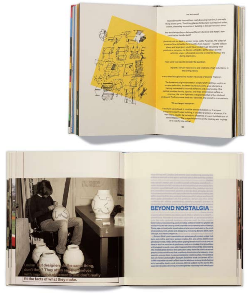
| 117
: Book, 2003. Designers: COMA.
Photograph: Dan Meyers. Transparent paper emphasizes the
justified text block. Images hang from a consistent horizontal point,
creating a throughline that is visible along the edge of the book.
: Book,
2002. Designer: Januzzi
Smith. Author: Cecil
Balmond. Photograph: Dan
Meyers. This book is a
manifesto for an informal
approach to structural
engineering and architecture.
The text columns juxtapose
flush right against flush left
alignments, creating a tiny but
insistent seam or fissure inside
the text and irregular rags
along the outer edges.

Use modes of alignment (flush left, flush
right, justified, and centered) to actively
interpret a passage of text. The passage
here, from Walter Ong’s book Orality and
Literacy: The Technologizing of the Word,
explains how the invention of printing
with movable type imposed a new spatial
order on the written word, in contrast
with the more organic pages of the
manu script era. The solutions shown
here comment on the conflicts between
hard and soft, industrial and natural,
planning and chance, that underlie all
typographic composition.
. writing moves words from
.
.
-, .
in handwriting, control of space
:
,
,
,
.
, -
, .
tends to be ornamental,
ornate, as in calligraphy.
the sound world
to a world of visual space,
Randomly spaced words break free from a rigidly justified column.
Lu Zhang
Passages of flush left and flush right text hinge from a central axis.
Johnschen Kudos
Long, centered lines are bridges between narrow, ragged columns.
Benjamin Lutz
situates words in space more relentlessly
than writing ever did. Control of position
is everything in print. Printed texts look
machine-made, as they are. Typographic
control typically impresses most by its
tidiness and invisibility: the lines perfectly
regular, all justified on the right side,
everything coming out even visually, and
without the aid of guidelines or ruled
borders that often occur in manuscripts.
This is an insistent world of cold,
non-human, facts.
moves words from the sound world
to a world of visual space,
but print locks words
into position in this space.
In handwriting, control of space
tends to be ornamental, ornate,
as in calligraphy.
Print situates words
in space more
relentlessly than
writing ever did.
but print locks
words into position
in this space.
Control of position
is everything in
print. Printed texts
look machine-made,
as they are.
Typographic control
typically impresses
most by its tidiness
and invisibility: the
lines perfectly regular,
all justified on the
right side, everything
coming out even
visually, and without
the aid of guidelines
or ruled borders that
often occur in
manuscripts.
Writing moves words from the sound world to a world of visual space,
In handwriting, control of space tends to be ornamental, ornate.
This is an insistent
world of cold,
non-human, facts.
exercise: alignment
118 |
Examples of student work from
Maryland Institute College of Art
relentlessly than writing ever did. Writing
moves words from the sound world to a
world of visual space, but print locks words
into position in this space. Control of posi-
tion is everything in print. Printed texts
look machine-made, as they are. In hand-
writing, control of space tends to be orna-
mental, ornate, as in calligraphy. Typo-
graphic control typically impresses most by
its tidiness and invisibility: the lines per-
fectly regular, all justified on the right side,
everything coming out even visually, and
without the aid of guidelines or ruled bor-
ders that often occur in manuscripts. This
is an insistent world of cold, non-human,
facts.
Print situates words in space more
The beginning of the paragraph is moved to the end.
Daniel Arbello
Elements break away from a justified column.
Efrat Levush
Text is forced into a grid of ragged squares.
Kim Bender
A single line slides out of a justified block.
Kapila Chase
Print situates words in space more relentlessly than writing ever
did. Writing moves words from the sound world to a world of
visual space, but print locks words into position in this space.
Printed texts look machine-made, as they are. In handwriting,
control of space tends to be ornamental, ornate, as in calligraphy.
Typographic control typically impresses most by its tidiness and
invisibility: the lines perfectly regular, all justified on the right
side, everything coming out even visually, and without the aid of
guidelines or ruled borders that often occur in manuscripts.
, -, .
Control of position is everything in print.
Print situates words in space
more relentlessly than writing
ever did.
but print locks words into
position in this space. Control
of position is everything in
print. Printed texts look
machine-made, as they are.
Typographic control typically
impresses most by its tidiness
and invisibility: the lines
perfectly regular, all justified
on the right side, everything
coming out even visually, and
without the aid of guidelines
or ruled borders that often
occur in manuscripts.
This is an insistent world of
cold, non-human, facts.
Writing moves words
from the sound world
to a world of
In handwriting, control of
space tends to be ornamental,
ornate, as in calligraphy.
Print situates
words in space
more relentlessly
than writing ever
did. Writing moves
words from the
sound world to
a world of visual
space, but print
locks words into
position in this
space.
Control of
position is
everything in
print. Printed
texts look
machine-made,
as they are. In
handwriting,
control of space
tends to be
ornamental,
ornate, as in
calligraphy.
Typographic
control typically
impresses most
by its tidiness
and invisibility:
the lines perfectly
regular, all
justified on the
right side,
everything coming
out even visually,
and without the
aid of guidelines
or ruled borders
that often occur
in manuscripts.
This is an
insistent world of
cold, non-
human, facts.
| 119
120 |
Roman letters are designed to sit side by side, not
on top of one another. Stacks of lowercase letters
are especially awk ward because the ascenders and
descenders make the vertical spacing appear
uneven, and the varied width of the characters
makes the stacks look precarious. (The letter I is a
perennial problem.) Capital letters form more
stable stacks than lowercase letters. Centering the
column helps to even out the differences in
width. Many Asian writing systems, including
Chinese, are traditionally written vertically; the
square shape of the characters supports this
orientation. The simplest way to make a line of
Latin text vertical is to rotate the text from
horizontal to vertical. This preserves the natural
affinity among letters sitting on a line while
creating a vertical axis.
vertical text
Stacked letters sometimes appear on
the spines of books, but vertical baselines are more
common. Starting from the top and reading down
is the dominant direction in the United States.
There is no fixed rule
determining whether type should run from top to
bottom or from bottom to top. It is more common,
however, especially in the United States, to run text
on the spines of books from top to bottom. (You can
also run text up and down simultaneously.)
,
top to bottom bottom to top both directions
v
e
r
t
i
g
o
v
e
r
t
i
g
o
type crime
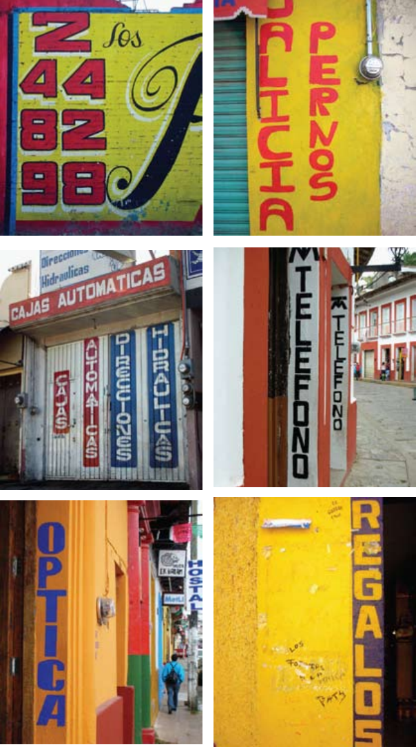
| 121
Photographs by Andrea
Marks. Stacked letters often
appear on commercial street
signs, which often employ thin,
vertical slices of space. The
letters in these signs were drawn
by hand. Wide characters and
squared-off Os stack better than
narrow letters with traditional
rounded forms. In some
instances, the letters have been
specially aligned to create
vertical relationships, as in the
“Optica” sign at right, painted
on a sliver of flat molding inside
a door frame.
122 |
vertical text
| 123
Poster for
the Public Theater, 1994.
Designer: Paula Scher/
Pentagram. Type set on
a vertical baseline creates
movement across the poster.
The theater’s logo, which also
employs a vertical baseline,
can be easily placed on street
banners.
( )
Poster, 1997. Designer:
Gerwin Schmidt. Publisher:
Art-Club Karlsruhe. The axes
of type and landscape intersect
to create posters that are simple,
powerful, and direct. The text
is mirrored in German and
French.
124 |
of a text, the reader
needs an invitation to come inside. Enlarged
capitals, also called versals, commonly mark the
entrance to a chapter in a book or an article
in a magazine. Many medieval manuscripts are
illuminated with elaborately painted rubrics.
This tradition continued with the rise of the
printing press. At first, initials were hand-
painted onto printed pages, making mass-
produced books resemble manuscripts, which were more valuable than
printed books. Initials soon became part of typography. A printer could set
them together with the main text in wood blocks or cast lead characters, or
add them with a separate process such as engraving. Today, enlarged caps
are easily styled as part of a publication’s typographic system.
enlarged capitals
Book page, eighteenth
century. This page was printed in two passes: letterpress
type with engraved illustrations.
Newspaper page, 2009. Art director:
Nicholas Blechman. Illustrator: Ellen Lupton. The dropped capital is a
separate illustration placed in the layout.

| 125
, the worst of times, or just
Times New Roman? The dropped capital used here
(The Serif Bold) was positioned as a separate element. A
text wrap was applied to an invisible box sitting behind the capital,
so that the text appears to flow around the intruding right prow of
the W. Likewise, the left prow extends out into the margin, making
the character feel firmly anchored in the text block. Hand-crafted
solutions like this one cannot be applied systematically.
i , the enlarged capital sits on the same
baseline as the text that follows. This simple solution is easy to im-
plement on both page and screen. Setting the first few words of the
text block in helps smooth the transition between
the initial and the text.
a cut into the text block is called a
dropped capital or drop cap. This example was produced
using the Drop Caps feature in InDesign. The software
automatically creates a space around one or more characters and
drops them the requested number of lines. The designer can adjust
the size and tracking of the capital to match it to the surrounding
text. Similar solutions can be implemented on the web in CSS. The
space around the capital is rectangular, which can be visually awk-
ward, as seen here with the sloping silhouette of the letter A.
w
the drop cap convention
for other purposes. An illustration or icon can appear in
place of a letterform. Purely typographic alternatives are
also possible, such as inserting a title or subtitle into space carved
from the primary text block. Such devices mobilize a familar page
structure for diverse and sometimes unexpected uses.
grab your
reader by
the cahunas
and never
ever let go

126 |
Paragraphs do not occur in nature. Whereas
sentences are grammatical units intrinsic to the
spoken language, paragraphs are a literary
convention designed to divide masses of content
into appetizing portions.
Indents have been common since the
seventeenth century. Adding space between
paragraphs (paragraph spacing) is another
standard device. On the web, a paragraph is a
semantic unit (the <p> tag in html) that is
typically displayed on screen with space inserted
after it.
A typical indent is an em space, or a quad, a
fixed unit of space roughly the width of the
letter’s cap height. An em is thus proportional to
the size of the type; if you change the point size
or column width, the indents will remain
appropriately scaled. Alternatively, you can use
the tab key to create an indent of any depth.
A designer might use this technique in order to
align the indents with a vertical grid line or other
page element. Avoid indenting the very first line
of a body of text. An indent signals a break or
separation; there is no need to make a break
when the text has just begun.
Despite the ubiquity of indents and paragraph
spacing, designers have developed numerous
alternatives that allow them to shape content in
distinctive ways.
nerd alert: Use the Space After Paragraph feature in
your page layout program to insert a precise increment of
space between paragraphs. Skipping a full line often creates
too open an effect and wastes a lot of space. Get in the habit
of inserting a full paragraph return (Enter key) only at the end
of paragraphs; insert a line break when you don’t want to add
additional space (Shift + Enter).
marking paragraphs
The table is covered with a table cloth which itself is protected
by a plastic table cloth. Drapes and double drapes are at the
windows. We have carpets, slipcovers, coasters, wain scoting,
lampshades. Each trinket sits on a doily, each flower in its pot,
and each pot in its saucer.
Everything is protected and surrounded. Even in the gar den,
each cluster is encircled with wire netting, each path is out-
lined by bricks, mosaics, or flagstones.
This could be analyzed as an anxious sequestration, as an
obsessional symbolism: the obsession of the cottage owner
and small capitalist not only to possess, but to underline what
he possesses two or three times. There, as other places, the
unconscious speaks in the redundancy of signs, in their con-
notations and overworking.
— Jean Baudrillard, 1969
The table is covered with a table cloth which itself is protected
by a plastic table cloth. Drapes and double drapes are at the
windows. We have carpets, slipcovers, coasters, wainscoting,
lampshades. Each trinket sits on a doily, each flower in its pot,
and each pot in its saucer.
Everything is protected and surrounded. Even in the garden,
each cluster is encircled with wire netting, each path is out-
lined by bricks, mosaics, or flagstones.
This could be analyzed as an anxious sequestration, as an
obsessional symbolism: the obsession of the cottage owner
and small capitalist not only to possess, but to underline what
he possesses two or three times. There, as other places, the
unconscious speaks in the redundancy of signs, in their con-
notations and overworking.
— Jean Baudrillard, 1969
1/2 ( )
| 127
The table is covered with a table cloth which itself is pro-
tected by a plastic table cloth. Drapes and double drapes are at
the windows. We have carpets, slipcovers, coasters, wainscot-
ing, lampshades. Each trinket sits on a doily, each flower in its
pot, and each pot in its saucer.
Everything is protected and surrounded. Even in the garden,
each cluster is encircled with wire netting, each path is out-
lined by bricks, mosaics, or flagstones.
This could be analyzed as an anxious sequestration, as an
ob ses sional symbolism: the obsession of the cottage owner
and small capitalist not only to possess, but to underline what
he possesses two or three times. There, as other places, the
uncons cious speaks in the redundancy of signs, in their con-
notations and overworking.
— Jean Baudrillard, 1969
The table is covered with a table cloth which itself is protected
by a plastic table cloth. Drapes and double drapes are at the
windows. We have carpets, slipcovers, coasters, wainscoting,
lampshades. Each trinket sits on a doily, each flower in its pot,
and each pot in its saucer. Everything is protected and sur-
rounded. Even in the garden, each cluster is encircled with wire
netting, each path is outlined by bricks, mosaics, or
flagstones. This could be analyzed as an anxious sequestra-
tion, as an obsessional symbolism: the obsession of the cottage
owner and small capitalist not only to possess, but to underline
what he possesses two or three times. There, as other places,
the unconscious speaks in the redundancy of signs, in their
connotations and overworking.
— Jean Baudrillard, 1969
The table is covered with a table cloth which itself is protected
by a plastic table cloth. Drapes and double drapes are at the
windows. We have carpets, slipcovers, coasters, wain scoting,
lampshades. Each trinket sits on a doily, each flower in its
pot, and each pot in its saucer.
Everything is protected and surrounded. Even in the garden,
each cluster is encircled with wire netting, each path is out-
lined by bricks, mosaics, or flagstones.
This could be analyzed as an anxious sequestration, as an
obses sional symbolism: the obsession of the cottage owner
and small capitalist not only to possess, but to underline
what he possesses two or three times. There, as other places,
the unconscious speaks in the redundancy of signs, in their
connotations and overworking.
— Jean Baudrillard, 1969
( ) ,
The table is covered with a table cloth which itself is protected
by a plastic table cloth. Drapes and double drapes are at the
windows. We have carpets, slipcovers, coasters, wainscoting,
lampshades. Each trinket sits on a doily, each flower in its pot,
and each pot in its saucer. ■ Everything is protected and sur-
rounded. Even in the garden, each cluster is encircled with
wire netting, each path is outlined by bricks, mosaics, or
flagstones. ■ This could be analyzed as an anxious sequestra-
tion, as an obsessional symbolism: the obsession of the cottage
owner and small capitalist not only to possess, but to underline
what he possesses two or three times. There, as other places,
the unconscious speaks in the redundancy of signs, in their
connotations and overworking.
— Jean Baudrillard, 1969
, type crime: Using paragraph spacing
and indents together squanders space and gives the text block a
flabby, indefinite shape.
128 |
Page detail, c. 1500. In this beautiful arrangement, the
dense, unbroken text column contrasts with a flurry of surrounding
details, including a dropped capital, marginal notes, and the
triangular chapter summary.
marking paragraphs
Dierent kinds of content invite dierent
approaches to marking paragraphs. In early
printed books, paragraphs were indicated with
a symbol, such as ||, with no additional space or
line break. In the seven teenth century, it became
standard to indent the first line of a paragraph
and break the line at the end. Commercial
printing tends to embrace fragmentation over
wholeness, allowing readers to sample bits and
pieces of text. Modern literary forms such as the
interview invite designers to construct inventive
typographic systems.
, 1911. This busy design entreats the
reader with an overload of signals: indents, line breaks, paragraph
spacing, and ornaments.
| 129
:
Book
spread, 2004. Designed by
Franc Nunoo-Quarcoo
and Karen Howard. Outdents
(instead of indents) mark
paragraph breaks in this multi-
authored text.
Book spread, 2004. Designed
and edited by Jan van Toorn.
Lines and blocks of text slide
into the margin to mark
changes of voice in an ongoing
conversation.
130 |
captions
The placement and styling of captions aect the
reader’s experience as well as the visual economy
and impact of page layouts. Some readers are
primarily attracted to pictures and captions,
while others prefer to follow a dominant written
narrative, consulting illustrations in support of the
text. From a reader’s perspective, close proximity
of captions and images is a welcome convenience.
Placing captions adjacent to pictures is not always
an efficient use of space, however. Designers
should approach such problems editorially. If
captions are essential to understanding the visual
content, keep them close to the pictures. If their
function is merely documentary, adjacency is
more easily sacrificed.
—1 3 Mai o 200 916
Z o o m / /
CPolítica 2. 0
J o s é S ó c r a te s
contrata equipa
d e O b a m a p a ra
as legislativas
A em presa Blue State trabalhou a área
onl i n e da candid atu ra d e Obam a. A
maioria absoluta PS é o novo d esafio
O caminho p ara a maioria absoluta at é
pod e n ão pa s sar p e l o Tw it ter , ma s a ca m-
panha de José Sócrates nas próximas
eleições legislativas vai ter nas redes
sociais um palco p rivilegiado para ten-
ta r cri ar um a ond a de en tus iasm o e mi li-
tân cia socialis ta entre os e leitore s.
A ca nd id at ura d e Ba ra ck O ba ma à p re -
si dê ncia dos Estado s Unidos é a ref erên-
cia d e st a e str a té g ia. E a t e nt a tiv a de re p li-
c a r a “ m u d a n ç a ” d e m o c r a t a e m W a s h i n g -
ton vai contar com um contributo de
peso: o Partido Socialista contratou os
ser viços da Blue State Dig ital, empresa
responsável pelo desenvolvimento da
ve rtente on li ne e multim éd ia da campa -
nh a do a go ra p residente Bar ack Obama.
Seg undo info rmações recolhidas pelo
ijunto do gabinete do primeiro-minis-
tro, o objectivo é tran spor tar para Por-
tug al o concei to de campanha d e proxi-
midad e ado ptada por Ob ama . Com co n-
tactos diários através de emails, SMS,
f ó r u n s o n l i n e e re d e s s o c i a i s c o m o o Fa c e -
boo k, o Hi5, o Twitte r ou o Flickr.
A s p a l a v r a s d e o r d e m sã o a n g a r i a r n o v o s
mil itantes, cim entar simpatias e garan -
tir presenças n as ac tividades da ca mpa -
nha s ocialista – ou s eja, um trabalho de
fun do junto das bas es do partido com o
objectivo de alargar ao máximo o uni-
verso de votantes do PS. E que terá na
ima gem de Sócrates – à sem elhança de
Obama nas el eiç ões no rte -americanas –
o foco essencial de toda a comunicação.
O acordo com a Blue State Digital só
ser á anunciad o oficialm ente no fina l de
Jun ho, data em que al guns administra-
do re s da e mp re sa v ir ão a Portugal “para
definir toda a metodologia de trabalho
até à s eleições leg islativas”, avançou a o
ia mes ma fonte.
A colabo ração da emp resa norte -ame-
ri cana co m o PS t ev e iní cio ant es d o co n-
gresso do partido, em Fevereiro. “Esti-
ver am no c o ng r es so, on d e já d e ram a lgu -
mas i deias, e desde e ntão temos estado
em contacto perman ent e par a dec idir a
pa rt e op era ci on al d e alg um as i ni ci ati va s
q u e q u e r e m o s de s e n v o l v e r ” , c o m o o e n v i o
de SMS por bluetooth para as localida-
des por o nde pas sar a c arav ana da ca m-
pan ha socialist a nas legislativas.
O si te S óc ra tes 20 09 , de sc ri to c om o um
movimento online d e apoio à reeleição
do pr im eir o-m in istr o, é u m exe mpl o de s-
sa co laboração. O p rojecto r eplica al gu-
mas receitas online na candidatura de
Oba ma à presid ência norte- americana,
como a aposta em chats, emissão de
víd eos ou a prom oção de fór uns. O des-
t a q u e v a i p o r é m p a r a a r e d e s o c i a l M y M o v ,
que preten de unir simp atizante s e criar
“uma estrutura p aralela de pessoas não
vin culadas ao par tido”.
A Blu e State foi a empresa que cri ou o
site my.barackobama.com, plataforma
que recolheu os donativos e a angaria-
ção de voluntários para a candidatura .
E o res ultado foi ava ssalador: 3 mi lhões
de donativos pessoais, 368 milhões de
euros a ngari ados e 2 mi lhões d e partici-
pan tes em rede s sociais na int ernet.
Alé m de ter trab alhado neste s projec-
tos com os democratas, a Blue State já
colaborou com o Partido Trabalhista
ing l ês. O a c or d o com o P S é u m nov o p as -
so na internacionalização da empresa,
que v ê nesta col aboraçã o uma possí vel
pon te para o mercado brasile iro.
ADR IANO NO BRE
adr iano.no bre@ ion line .pt
A con c epçã o do
sit e S ócra tes2 0 09
foi o p r i mei r o fruto
da co l abor ação
com a B l ue Sta te
COMO SÉ FAZ UMA
CA MPANHA WE B 2.0
IN TERN ET
A camp anha de Barack Obam a para as eleições
presi den ciais norte-am ericanas pôs a int ernet no
c en t r o d a s a t e n ç õe s de t od o s os p ol í t i co s . O s
principais partid os portugu eses j á estão onli ne há
vári os anos, mas dão cada ve z mai s im portância
a esta p lataforma n a sua comunicação com
o s el e i t o r e s . A a p o s t a e m v í d e o s e
pod casts é um hábito. As emi ssões
e m d i r e c t o c re s c e m . N ã o e s t a r
online é não existi r.
FA C E B O O K
Se uma rede social serve para alimentar relações
de am izad e ou trabalh o em suporte online, por que
não ap roveitá-la para aumentar a quantidade de
voto s? A di ferença está ap enas n a trans formação
do co nceito de “ ami go” em “el eitor”. Barack
Obama con seguiu reu nir mais de 6 milh ões
de “amigos” n o Facebook. O s parti dos
p o r t u g u e s e s n ã o s ã o a s s i m t ão
a m b i c i o s o s , m a s v ã o e s t a r
t o d o s p re s e n t e s .
T W I T T E R
São 1 40 caracteres d e cada vez. O limi te máximo
de cada texto nesta nova forma d e comuni cação ,
que repli ca o estilo d e lingu agem dos SM S, mas
é mai s conci sa e di recta. Com a d iferen ça de
as mensag ens en viad as ficarem acessíveis a
tod os os seguidores. Há quem diga que é
apen as um a mod a, mas a Presi dên cia
da República já aderiu, tal como
16 d eput ados p ortugueses.
—1 3 Mai o 200 9 17
>>
“Es sencial”, “p rioritário” e “indisp ensá-
vel”. As palavras são unânimes no dis-
cur so dos resp onsáv eis pel os prin cipai s
p a r t i d o s p o r t u g u e s e s : es t a r o n l i n e é e s s e n -
cia l, ser vist o nas redes s ociais é priori-
tário, alimentar a interactividade com
os cidadãos é indispensável. Por isso,
es tã o to do s pr es en te s. P S, P SD, CDS, Blo-
co de E sq uerd a (B E) e PCP a pos ta m cada
vez m ai s na we b 2. 0 par a co mun ic ar co m
o ele itor. O reto rno, garante m, “é muito
imp ortante”. Ma s ainda não é decisivo.
“Em 2005 houve uma primeira vira-
gem a s é rio p a ra o on l ine , ma s ain d a inc i -
pie nte. Agora vai s er um pouco melhor,
embor a às ve zes si nta que as apo sta s ão
feit a s n ão tan t o p elo co n t eúdo c o m o pela s
not ícias que pode m gerar”, diz o secre-
tár io -ger al a djun to do P SD , Emí dio G uer -
reiro. Apesar das reticências, o social-
-democrata não tem dúvidas : “É ine gá-
vel que estas formas de comunicação
envolvem mais as pessoas e é impossí-
vel u m partido m oderno não est ar pre-
sente.” Assim, o PSD está a “alimentar
um a pre se nç a din âmi ca e d e inter ac ção ”
com os eleitores. Além do si te oficial, o
partido já tem conta no Twitter e no
Facebook. N a pr óxima seman a ap resen-
tará novidades: “Toda a nossa campa-
nh a va i ap os tar na envolvênci a e na pro-
cur a de feedback do s cidadãos”, garan-
te Em ídio Guerreiro.
O PCP t ambém não n ega a impor tân-
cia da internet, mas não a considera
“es sencial pa ra garantir o voto, o u criar
laç os mais fortes ”. “Nesse aspecto, con-
tinuamos convictos de que o contacto
pes so a l e di rec to co nt inua a s er a m elho r
arm a”, defende So fia Grilo, colaborado -
ra do departamento de prop aganda do
PCP e g estora dos sit es institucionais.
O partido sublinha que foi “o primeiro
a est ar o nli n e ”, de s d e 199 6 . E t em au m e n-
ta do suce ssivame nte a ofe rta de con teú-
dos. Ví deos onlin e, fóruns di gitais e pro -
grama de rádio em podcast são já um
háb i to. P a ra a s em an a, e p or q ue é “n e ces -
sár io ter uma visão i ntegrada da comu-
nicação p olíti ca”, serã o anunc iadas con -
tas n o Twitter, no Facebook e no Fli ckr.
Redes onde o BE já marca presença.
Ta l co mo no MyS pa ce e Hi5. T ud o “agre -
gad o no portal E squerda.net, um canal
informativo actualizado diariamente”.
“O ac esso às notíci as altero u-se muito e
já há pessoas que só consomem infor-
maç ão através de si tes ou rede s sociais.
Os part idos n ão pod em alh ear- se dis so”,
constata Jorge Costa, director de cam-
panha do BE para as europeias. Daí a
emi s s ão de d e bat es n a int e r net o u o a pro -
veitamento “dos perfis, ou blogues dos
mil i tan t es” , c om o “i ns tr ume n to d e co mu -
nicaç ão, coment ário ou aler ta para a cti -
vid ades do BE”.
É o caminho que o CDS quer trilhar,
até p orque “o nú mero de ade sões e res-
po stas” à s in ic ia tiv as d o par ti do na i nt er-
net “ tem aumentad o considerav elmen-
te ”, diz o secr etário- geral, J oão Alme ida.
Embora “convicto da importância da
we b 2.0 ”, o re spo ns áve l defe nd e que n es -
ta á re a “é i mp os sí vel comparar Portugal
com os Estados Unidos”. “O nosso elei-
tor ado não t em a mesm a apetê ncia qu e
os no rte-americ anos pela internet.”
Nãováodiabotecê-las:
é m e l h o r e s t a r n a i n t e r n e t
Pa r tid os já n ão di spe nsa m
a pre sen ça na s red es so cia is,
mas a ind a acr edi tam q ue
a cam pan ha va i dec idi r-s e
nos m edi a tr a dic ion ais
S M S
O contact o por SMS já pode ser consid erado u ma
forma de com unic ação an tiq uad a entre o s parti dos
e os seus militantes. Fo i desta form a que Paulo
Portas anunciou, p or exemplo, os candid atos d o
CDS às elei ções europeias. Ag ora o PS q uer
introdu zir uma novi dade: enviar SMS por
bluetooth aos habi tantes que tenh am
essa t ecno log ia act iva nas regi ões
p o r o n d e p a s s a r a c a r a v a n a d a
campanh a soci alista.
E-M AIL
É a form a de comun icação mai s tradicion al dos
partidos com os seus mili tant es e sim pati zant es.
Não apenas p ara enviar informaç ões sobre
a c t i vi d a d e s p a rt i d ár i a s , m a s s o b r e tu d o p a r a
recol her opiniões. “ Na altura em q ue criám os
u m e n d e r e ç o e s p e c í fi c o p a ra r e c e b e r
queixas sobre a ASAE recebíamos mais
de 3 00 em ails por dia”, aponta o
s e c r e t á r i o - g e r a l d o C D S ,
João Morei ra.
Signage proposal
Agency: Saron
Design: Joshua Distler,
Mike Abbink, Gabor
Schreier, Virginia Sardón
Signage proposal
Agency: Saron
Design: Joshua Distler,
Mike Abbink, Gabor
Schreier, Virginia Sardón
| Signage proposal | Agency: Saron | Design:
Joshua Distler, Mike Abbink, Gabor Schreier, Virginia Sardón
Signage proposal
Agency: Saron
Design: Joshua Distler,
Mike Abbink, Gabor
Schreier, Virginia Sardón
Newspaper, 2009. Design: Nick Mrozowski.
© www.ionline.pt. Captions tell a story in this
layout from the Portuguese newspaper i.
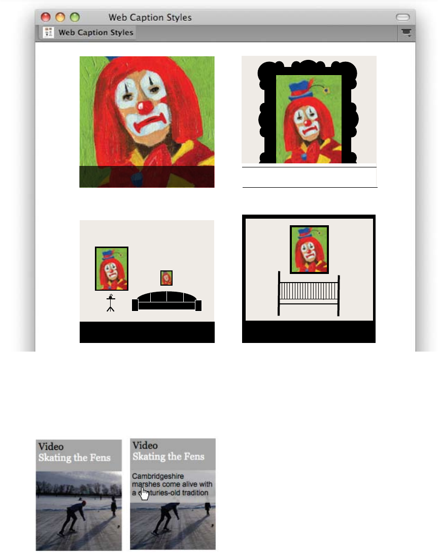
| 131
Online content
management systems coordinate pictures and
captions in a database. Designers use rules,
frames, overlays, and color blocks to visually
connect images and captions, creating
coherent units. Shown here are four dierent
ways to style captions for the web.
Guardian.co.uk, 2009. Design director:
Mark Porter. A secondary caption reveals
itself when users rolls over this image on
the Guardian’s home page.
Don’t put a tiny piece of furniture under a
large painting, or vice versa.
Don’t hang objects over a child’s bed,
especially depressing objects.
Why is the clown sad? How to artfully
display a work of art.
Avoid overpowering a delicate work of art
with a heavy frame.
132 |
angel
archangel
cherubim
seraphim
pope
cardinal
archbishop
bishop
work
chapter
section
subsection
I Division of angels
A. Angel
B. Archangel
C. Cherubim
D. Seraphim
II Ruling body of clergy
A. Pope
B. Cardinal
C. Archbishop
D. Bishop
III Parts of a text
A. Work
B. Chapter
C. Section
D. Subsection
Division of angels
Angel
Archangel
Cherubim
Seraphim
Ruling body of clergy
Pope
Cardinal
Archbishop
Bishop
Parts of a text
Work
Chapter
Section
Subsection
Angel
Archangel
Cherubim
Seraphim
Pope
Cardinal
Archbishop
Bishop
Work
Chapter
Section
Subsection
, ,
, ,
, ,
A typographic hierarchy expresses the organization
of content, emphasizing some elements and
subordinating others. A visual hierarchy helps
readers scan a text, knowing where to enter and
exit and how to pick and choose among its
offerings. Each level of the hierarchy should be
signaled by one or more cues, applied consistently
across a body of text. A cue can be spatial (indent,
line spacing, placement) or graphic (size, style,
color). Infinite variations are possible.
Writers are trained to avoid redundancy as seen
in the expressions “future plans” or “past history.”
In typography, some redundancy is acceptable,
even recommended. For example, paragraphs are
traditionally marked with a line break and an
indent, a redundancy that has proven quite
practical, as each signal provides backup for the
other. To create an elegant economy of signals, try
using no more than three cues for each level or
break in a document.
Emphasizing a word or phrase within a body of
text usually requires only one signal. Italic is the
standard form of emphasis. There are many
alternatives, however, including boldface,
, or a change in color. A full-range type family
such as Scala has many weight and style variations
designed to work together. You can also create
emphasis with a different font. If you want to
mix font families, such as Scala and Futura, adjust
the sizes so that the x-heights align.
hierarchy
type crime
Emphasis can be created
with just one shift.
bold,
italic,
underlined
caps!
expressing hierarchy
| 133
Various forms of dysfunction appear among populations exposed
to typography for long periods of time. Listed here are a number
of frequently observed afflictions.
An excessive attachment to and fascination with the
shape of letters, often to the exclusion of other interests and
object choices. Typophiliacs usually die penniless and alone.
The irrational dislike of letterforms, often marked
by a preference for icons, dingbats, and—in fatal cases—bullets
and daggers. The fears of the typophobe can often be quieted
(but not cured) by steady doses of Helvetica and Times Roman.
A persistent anxiety that one has selected the
wrong typeface. This condition is often paired with (optical
kerning disorder), the need to constantly adjust and readjust the
spaces between letters.
The promiscuous refusal to make a lifelong
commitment to a single typeface—or even to five or six, as some
doctors recommend. The typothermiac is constantly tempted to
test drive “hot” new fonts, often without a proper license.
COMMON TYPOGRAPHIC DISEASES
Various forms of dysfunction appear among populations
exposed to typography for long periods of time. Listed
here are a number of frequently observed afflictions.
Typophilia An excessive attachment to and fascination with the shape of
letters, often to the exclusion of other interests and object choices.
Typophiliacs usually die penniless and alone.
Typophobia The irrational dislike of letterforms, often marked by a preference
for icons, dingbats, and—in fatal cases—bullets and daggers.
The fears of the typophobe can often be quieted (but not cured)
by steady doses of Helvetica and Times Roman.
T ypochondria A persistent anxiety that one has selected the wrong typeface.
This condition is often paired with (optical kerning disorder),
the need to constantly adjust and readjust the spaces between
letters.
Typothermia The promiscuous refusal to make a lifelong commitment to a
single typeface—or even to five or six, as some doctors recommend.
The typothermiac is constantly tempted to test drive “hot” new fonts,
often without a proper license.
There are endless
ways to express
the hierarchy
of a document.
134 |
hierarchy
Complex
content requires a deeply layered hierarchy. In
magazines and websites, a typographic format is
often implemented by multiple users, including
authors, editors, designers, and web producers.
If a hierarchy is clearly organized, users are more
likely to apply it consistently. Designers create
style guides to explain the princples of a hierarchy
to the system’s users and demonstrate how the
system should be implemented.
Magazine redesign, 2009.
Design: Sezione Aurea. Publications often commission design firms
to create new formats that can be implemented by sta designers
and editors. This redesign uses the typefaces Myriad and Utopia,
designed by Robert Slimbach. A comprehensive style guide serves to
communicate the new format to the magazine’s sta.
| 135
Website, 2010. Designer: Graham Stinson. The
City is a social networking site that helps churches and non-profits
engage in community activities. Auto-detection determines whether
the reader is using a desktop or mobile phone and then re-routes
layout characteristics in order to create a custom view. Each layout
references a dierent CSS file; the main HTML for each page
remains the same.
Designers and editors
should organize content structurally rather than
stylistically, especially in digital documents. When
creating style sheets in a page layout program,
label the elements with terms such as “title,”
“subtitle,” and “caption” rather than “bold,” “tiny,”
or “apple green Arial.” In CSS, elements such
as em (emphasis), strong, and p (paragraph)
are structural, whereas i (italic), b (bold), and
br (break) are visual. As a body of content is
translated into dierent media, the styles should
continue to refer to the parts of the document
rather than to specific visual attributes.
Structural hierarchies help make websites
understandable to search engines and accessible
to diverse users. A document should have only
one h1 heading, because search engines apply
the strongest value to this level of the document.
Thus to conform with web standards, designers
should apply heading levels (h1, h2, and so on)
structurally, even when they choose to make some
levels look the same. Using structural, semantic
markup is a central principle of web standards.
For more on web standards, see Jerey Zeldman with Ethan
Marcotte, Designing with Web Standards, third edition (Berkeley,
CA: New Riders, 2009).
136 |
hierarchy
The web was
invented in order to provide universal access
to information, regardless of a person’s physical
abilities or access to specialized hardware or
software. Many users lack the browsers or
software plug-ins required for displaying certain
kinds of files, while visually impaired users have
difficulty with small type and non-verbal content.
Creating structural hierarchies allows designers to
plan alternate layouts suited to the software,
hardware, and physical needs of diverse
audiences.
. Website, 2003.
Designer: Colin Day/Exclamation Communications. Publisher:
The Clapham Institute. This site was designed to be accessible to
sighted and non-sighted users. Below is a linearized version of the
home page. A visually impaired reader would hear this text,
including the alt tags for each image. The “skip to content” anchor
allows users to avoid listening to a list of navigation elements.
Sometimes good typography is heard, not
seeen. Visually impaired users employ automated
screen readers that linearize websites into a
continuous text that can be read aloud by a
machine. Techniques for achieving successful
linearization include avoiding layout tables;
consistently using alt tags, image captions, and
image descriptions; and placing page anchors in
front of repeated navigation elements that enable
users to go directly to the main content. Various
software programs allow designers to test the
linearization of their pages.
| 137
. Website, 2010. Design: Dan Mall and Kevin
Sharon/Happy Cog. Front-end code: Jenn Lukas. Information
architecture: Kevin Hoffman. Accessibility research and testing:
Angela Colter and Jennifer Sutton. The visual layout of this
website () is optimized for sighted users, while the source order
of the code () is optimized for the visually impaired, allowing
users to linearize the text with an automated screen reader. For
example, in the visual display, the navigation menu appears
immediately below the logo. In the source code, however, the
organization name is followed directly by the tagline, preventing the
top of the page from clogging up with navigation elements. Such
differences between the visual display and the source order are kept
to a minimum because not everyone who uses a screen reader is
blind, and some people with disabilities who navigate via source
order can see the visual layout with their eyes. If the visual layout
differs too much from the source code, these users would be confused.
The relationship between the visual layout and the source order is
also optimized for search engines.
138 |
hierarchy
| 139
/ ,
Book, 1999. Designer: Anne Burdick. Publisher:
Österreichische Akademie der Wissenschaften. This book
presents essays from the journal Die Fackel, published by the
Viennese writer Karl Kraus from 1899 to 1936. The journal’s text
appears in the center of each page. This text is sometimes
represented with an image of the original publication and
sometimes filtered through the modern typography of the new
edition. In the beige-colored margins, different styles and sizes of
type indicate different modes of editorial commentary.
-
140 |
Magazine, 2008. Designed by Luke
Hayman/Pentagram and Kate Elazegui/Radar.
Mass-market magazine covers often combine a
big photograph, a big headline, and a big logo
with a swarm of teasers about articles to be found
inside. Radar’s covers present feature stories front
and center while enticing readers with numerous
compact headlines. In contrast, the magazine’s
table of contents provides a more leisurely overview.
Here, the typographic hierarchy emphasizes the
articles’ titles and uses the page numbers as easy-to-
find anchors.
hierarchy
| 141
Magazine, front and back covers,
2009. Design: Dave Eggers. Illustrations: Charles
Burns. The busy but readable covers of this literary
magazine use slab serif text in multiple sizes and
weights to advertise the content found inside. The line
illustrations integrate comfortably with the text. A full
table of contents appears on the back cover, providing
readers with an easy-to-use interface. Influenced by
nineteenth-century almanacs, the design of The Believer
uses borders and frames to draw attention to the content
and create a memorable visual identity.
142 |
Posters, 2003–2006.
Designers: Michael Bierut and team/Pentagram. Produced
over a series of years for a single client, these posters apply diverse
typographic treatments and hierarchies to similar bodies of content.
The black-and-white palette creates consistency over time.
hierarchy
Michael Bierut, Kerrie Powell, Sunnie Guglielmo Michael Bierut, Justin Weyers
Michael Bierut
| 143
;
Michael Bierut, Genevieve Panuska
Michael Bierut, Andrew Mapes Michael Bierut, Michelle Leong, Sasha Fernando
Michael Bierut, Jacqueline Kim
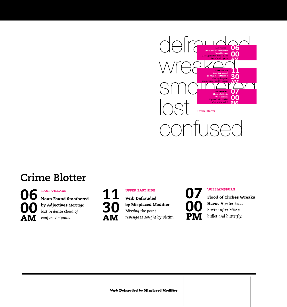
144 |
Crime Blotter
6:00AM | EAST VILLAGE
Noun Found Smothered by Adjectives
Message lost in dense cloud of confused signals.
11:30AM | UPPER EAST SIDE
Missing the point, revenge is sought by victim.
7:00PM | WILLIAMSBURG
Flood of Clichés Wreaks Havoc
Hipster kicks bucket after biting bullet.
Katie Burk, Paulo Lopez
exercise: hierarchy
Choose a text that has a recurring structure,
such as a table of contents, a news aggregator,
or a calendar of events. Analyze the structure of
the content (main title, subtitles, time, location,
body text, and so on) and create a visual hierarchy
that expresses this structure. Make it easy for
readers to find the information they want. For
example, in a crime report some readers might
scan for location, looking for data about their
neighborhood, while others might be more
drawn to the lurid details of particular crimes.
Use changes in size, weight, leading, style, and
column structure to distinguish the levels of the
hierarchy. Make a style sheet (in a page layout
program for print or in CSS for the web) in order
to create several variations quickly.
Callie Neylan, Betsy Martin
Callie Neylan, Betsy Martin
| 145
David Wright, Nelson Hsu
<h1>
<h2>
<h3>
<class=“time”>
<p>
These typographic variations
were generated in CSS using the
structural hierarchy presented
above.
Examples of work by sta
designers in a workshop at
National Public Radio, 2010.
146 |
exercise: long lists
()
Go shopping.
*
Make a word salad. Write down
every word you can think of that
relates to the problem. Sort the
words to discover patterns and
ideas.
,
Go to the library. Books are
packed with information and
inspiration.
',
Think like a curator. Collect
everything you know about the
problem. Display your data and
look for meaningful patterns
'/
Ask people what they wish for.
(/
Wear five hats. Evaluate
an idea from five different
perspectives. White=information.
Red=emotion. Yellow=optimism.
Black=pessimism. Green=growth.
Blue=process
)*
Design a system or tool instead of
an object or artifact.
))
Visualize the bigger picture.
Make a diagram showing how
your problem fits into larger
systems. For example, a shopping
bag relates to how people shop,
how bags are manufactured and
shipped, and what happens to
bags when people are finished
with them.
)-
Simplify. Explain your idea in a
single sentence.
).
Set constraints. Cut down on
brain clutter by limiting yourself
to a particular material, size,
vocabulary, etc.
)/
Recycle. A bad solution for one
problem could be a good solution
for another.
*&
When you hit a dead end, try
again later
+
Do a Google check. Who else has
solved your problem?
'*
Make a word map. Write down
the problem on the middle
of a piece of paper. Diagram
everything you can think of
about the problem (context,
history, similar problems,
competing ideas, available
resources, etc).
('
Find a place to think where you
won’t be distracted by other
tasks.
((
Take a walk or take a shower.
(.
Think about your idea while
falling asleep or waking up. )( -
Visualize the competition. Make
a map showing where your
problem, product, client, or
concept sits in relation to similar
or competing problems or ideas.
)&
Sketch. Make quick, simple
diagrams of different ideas.
)'
Sketch in 3D. Make models with
cardboard and tape instead of
pencil and paper.
)+
Compare and connect. Find
metaphors for your problem. ),
Empathize. Imagine yourself as
the user, reader, or client.
-
Rewrite the problem. If the
problem is “X,” change it to
“Why?”
')
If your problem is overwhelming
(“end global warming” or
“design a universal typeface”),
break it down into smaller parts
(“get people to walk more” or
“design six letters”).
'+
Write down every obvious
solution you can think of in order
to clear your mind for something
new.
'-
Think like an anthropologist.
Observe people doing an activity
related to your problem (using
a product, completing a task,
taking the bus, etc.)
(+
Eat less food. Digesting a big
lunch consumes energy that your
brain could be using to get ideas.
(,
Chew more gum. Research shows
that chewing gum not only cleans
your teeth but loosens up your
mind and makes you smarter.
(-
Put all your ideas on index cards.
Compare them. Sort them. Rank
them.
'
Triangulate. Identify three
sides of the problem, such
as “audience,” “voice,” and
“message.” Collect and organize
ideas in these categories.
(
Make a cube. Take an idea or
problem and describe, compare,
analyze (break down), associate,
apply, and argue for and against
it. If working in a team, assign a
different side of the cube to each
person.
.
Imagine the obvious solution.
Now, imagine its opposite.
/
Look for solutions you admire.
Analyze why you admire them.
'(
Apply thinking from another
field to your problem. (“How
would a zoologist design a
backpack?” “How would a chef
choose a color palette?”)
(&
Ask people about their personal
experiences.
(*
Drink tea.
''
Find a place where you can pin
up your ideas and look at them
as a group.
'.
Ask people what they like and
don’t like.
)
Think like a journalist. Ask who,
what, when, where, why.
8H7?DI>EFF?D=
40 tips and tricks 4 getting in the mood 2 get ideas
'&
Think like an interior decorator.
Create a mood board with
magazine clippings, fabric
samples, snapshots, key words,
etc.
designed by sabrina kogan
Sabrina Kogan
In the real world of graphic design, managing
large quantities of text is a routine challenge.
Designers use the principles of hierarchy,
alignment, and page layout to make content easy
to scan and enjoyable to read. You can try this
exercise with any long list of entries: calendar
events, dictionary definitions, pithy quotes,
classified ads, or a page from a college course
catalog. Numbering the elements in the list gives
you a graphic element to manipulate. Design
a poster that presents the content in a visually
interesting way. Work with style sheets to test
dierent type treatments quickly and consistently.
| 147
sjdhfjshdfkjshfkshdfkjhsk-
fhskdfhksjdhfkjsdhfkjsdfkjs- dfkdsjnfkjsdbfkjsdbjkfbsdkjfbjks-
dbfkjsbdkfjbsdkfbsj
Triangulate. Identify three sides of the problem, such 1
as “audience,” “voice,” and “message.” Collect and
organize ideas in these categories.
Make a cube. Take an idea or problem and describe, 2
compare, analyze (break down), associate, apply, and
argue for and against it. If working in a team, assign a
dierent side of the cube to each person.
Think like a journalist. Ask who, what, when, where, 3
w h y .
Make a word salad. Write down every word you can 4
think of that relates to the problem. Sort the words
to discover patterns and ideas.
Do a Google check. Who else has solved your 5
problem?
Go to the library. Books are packed with 6
information and inspiration.
Rewrite the problem. If the problem is “X,” change 7
it to “Why?”
Imagine the obvious solution. Now, imagine its 8
opposite.
Look for solutions you admire. Analyze why you 9
admire them.
Think like an interior decorator. Create a mood 1 0
board with magazine clippings, fabric samples,
snapshots, key words, etc.
Find a place where you can pin up your ideas and 1 1
look at them as a group.
Apply thinking from another eld to your problem. 12
(“How would a zoologist design a backpack?” “How
would a chef choose a color palette?”)
If your problem is overwhelming (“end global 1 3
warming” or “design a universal typeface”), break it
down into smaller parts (“get people to walk more”
or “design six letters”).
Make a word map. Write down the problem on 1 4
the middle of a piece of paper. Diag ram everything
you can think of about the problem (context,
history, similar problems, competing ideas, available
resources, etc).
Write down every obvious solution you can think of 1 5
in order to clear your mind for something new.
Think like a curator. Collect everything you know 1 6
about the problem. Display your data and look for
meaningful patterns.
Think like an anthropologist. Obser ve people doing 1 7
an activity related to your problem (using a product,
completing a task, taking the bus, etc.)
Ask people what they like and don’t like.1 8
Ask people what they wish for.1 9
Ask people about their personal experiences.20
Find a place to think where you won’t be distracted 21
by other tasks.
Take a walk or take a shower.22
Go shopping.23
Drink tea.24
Eat less food. Digesting a big lunch consumes energy 2 5
that your brain could be using to get ideas.
Chew more gum. Research shows that chewing 26
gum not only cleans your teeth but loosens up your
mind and makes you smarter.
Put all your ideas on index cards. Compare them. 27
Sort them. Rank them.
Think about your idea while falling asleep or 28
waking up.
Wear ve hats. Evaluate an idea from ve dierent 29
perspectives. White=information (What are the
facts?). Red=emotion (How does the idea make
you feel?). Yellow=optimism (What’s great about the
idea?). Black=pessimism (What’s wrong with the
idea?). Green=growth (What are alternatives to the
idea?). Blue=process (How is the evaluation process
going?).
Sketch. Make quick, simple diag rams of dierent 3 0
ideas.
Sketch in 3D. Make models with cardboard and tape 3 1
instead of pencil and paper.
Visualize the competition. Make a map showing 3 2
where your problem, product, client, or concept sits
in relation to similar or competing problems or ideas.
Visualize the bigger picture. Make a diagram 3 3
showing how your problem ts into larger systems.
For example, a shopping bag relates to how people
shop, how bags are manufactured and shipped, and
what happens to bags when people are nished with
them.
Design a system or tool instead of an object or 34
artifact.
Compare and connect. Find metaphors for your 3 5
problem.
Empathize. Imagine yourself as the user, reader, or 3 6
client.
Simplify. Explain your idea in a single sentence.3 7
Set constraints. Cut down on brain clutter by 3 8
limiting yourself to a particular material, size,
vocabulary, etc.
Recycle. A bad solution for one problem could be a 39
good solution for another.
When you hit a dead end, tr y again later.40
brain
sho p ping
40 Tips and Tricks for Getting in the Mood to Get Ideas
Triangulate.
Identify three sides of the problem, such as “audience,” “voice,”
and “message.” Collect and organize ideas in these categories.
Make a cube.
Take an idea or problem and describe, compare,
analyze (break down), associate, apply, and argue for and
against it. If working in a team, assign a different side of the
cube to each person.
Think like a journalist.
Ask who, what, when, where, why.
Make a word salad.
Write down every word you can think of that relates to the
problem. Sort the words to discover patterns and ideas.
Do a Google check.
Who else has solved your problem?
Go to the library.
Books are packed with information and inspiration.
Rewrite the problem.
If the problem is “X,” change it to “Why?”
Imagine the obvious solution.
Now, imagine its opposite.
Look for solutions you admire.
Analyze why you admire them.
Think like an interior decorator.
Create a mood board with magazine clippings, fabric samples,
snapshots, key words, etc.
Pin up your ideas somewhere
and look at them as a group.
Apply thinking from another field
to your problem. (“How would a zoologist design a backpack?”
“How would a chef choose a color palette?”)
Break it down into smaller parts
if your problem is overwhelming. (change “end global
warming” to “get people to walk more” or “design a universal
typeface” to “design six letters”).
Make a word map.
Write down the problem on the middle of a piece of paper.
Diagram everything you can think of about the problem
(context, history, similar problems, competing ideas, available
resources, etc).
Write down every obvious solution
you can think of in order to clear your mind for something new.
Think like a curator.
Collect everything you know about the problem. Display your
data and look for meaningful patterns.
Think like an anthropologist.
Observe people doing an activity related to your problem (using
a product, completing a task, taking the bus, etc.)
Ask people
what they like and don’t like.
Ask people
what they wish for.
Ask people
about their personal experiences.
Find a place to think
where you won’t be distracted by other tasks.
Take a walk outside
or take a shower.
Design a system or tool
instead of an object or artifact.
Compare and connect.
Find metaphors for your problem.
Go shopping.
Visit the mall or auto repair store for surprising inspiration.
Drink tea.
A hot cup of tea can comfort and help refocus.
Eat less food.
Digesting a big lunch consumes energy that your brain
could be using to get ideas.
Chew more gum.
Research shows that chewing gum not only cleans your teeth
but loosens up your mind and makes you smarter.
Put all your ideas on index cards.
Compare them. Sort them. Rank them.
Think about your idea
while falling asleep or waking up.
Wear five hats.
Evaluate an idea from five different perspectives.
White = information (What are the facts?).
Red = emotion (How does the idea make you feel?).
Yellow = optimism (What’s great about the idea?).
Black = pessimism (What’s wrong with the idea?).
Green = growth (What are alternatives to the idea?).
Blue = process (How is the evaluation process going?).
Sketch.
Make quick, simple diagrams of different ideas.
Sketch in 3D.
Make models with cardboard and tape instead of
pencil and paper.
Visualize the competition.
Make a map showing where your problem, product,
client, or concept sits in relation to similar or competing
problems or ideas.
Visualize the bigger picture.
Make a diagram showing how your problem fits into larger
systems. For example, a shopping bag relates to how people
shop, how bags are manufactured and shipped, and what
happens to bags when people are finished with them.
Empathize.
Imagine yourself as the user, reader, or client.
Simplify.
Explain your idea in a single sentence.
Set constraints.
Cut down on brain clutter by limiting yourself to a particular
material, size, vocabulary, etc.
Recycle.
A bad solution for one problem could be a good solution
for another.
When you hit a dead end, try again later.
1
2
3
4
5
6
7
8
9
10
12
13
14
15
16
17
18
19
20
21
22
25
26
27
28
29
30
31
32
33
34
35
36
37
38
39
40
11
23
24
’
Becky Slogeris
Andy Mangold
Examples of student work from
Maryland Institute College of Art.
{GRID}
150 |
Book, 1472. Printed by
Nicolas Jenson, Venice
Collection of the Walters Art
Museum, Baltimore. This book
features an elegant, unbroken
text block set in one of the
earliest roman typefaces. The
page has no line breaks or
indents.
-

| 151
. A grid can be
simple or complex, specific or generic, tightly defined or loosely interpreted.
Typographic grids are all about control. They establish a system for
arranging content within the space of a page, screen, or the built
environment. Designed in response to the internal pressures of content
(text, image, data) and the outer edge or frame (page, screen, window),
an effective grid is not a rigid formula but a flexible and resilient structure,
a skeleton that moves in concert with the muscular mass of information.
Grids belong to the technological framework of typography, from the
concrete modularity of letterpress to the rulers, guides, and coordinate
systems employed in graphics applications. Although software generates
illusions of smooth curves and continuous tones, every digital image or
mark is constructed—ultimately—from a grid of neatly bounded blocks. The
ubiquitous language of the (graphical user interface) creates a gridded
space in which windows overlay windows in a haphazard way.
In addition to their place in the background of design production, grids
have become explicit theoretical tools. Avant-garde designers in the 1910s
and 1920s exposed the mechanical grid of letterpress, bringing it to the
polemical surface of the page. In Switzerland after World War II, graphic
designers built a total design methodology around the typographic grid,
hoping to construct with it a new and rational social order.
The grid has evolved across centuries of typographic development.
For graphic designers, grids are carefully honed intellectual devices, infused
with ideology and ambition, and they are the inescapable mesh that filters,
at some level of resolution, nearly every system of writing and reproduction.
GRID
152 |
Book page,
1497. Printed by Anton
Koberger. A two-column
grid engulfs a second set of
columns. Each page is a
dense mass incised with
narrow gutters and open
spaces where illuminated
capitals would have been
added by hand. The layout
changes from page to page.

| 153
Alphabetic writing, like most writing systems, is organized into columns
and rows of characters. Whereas handwriting flows into connected lines,
the mechanics of metal type impose a stricter order. Each letter occupies its
own block, and the letters congregate in orderly rectangles. Stored in gridded
cases, the characters become an archive of elements, a matrix of existing
forms from which each page is composed.
Until the twentieth century, grids served as frames for fields of text. The
margins of a classical book page create a pristine barrier around a flush,
solid block of text. A page dominated by a solitary field of type remains
today’s most common book format, although that perfect rectangle is now
broken with indents and line breaks, and the margins are peppered with
page numbers and running heads (text indicating the book or chapter title).
In addition to the classical norm of the single-column page, various
alternative layouts existed during the first centuries of printing, from the
two-column grid of Gutenberg’s Bible to more elaborate layouts derived
from the medieval scribal tradition, where passages of scripture are
surrounded by scholarly commentary. Polyglot (multilingual) books display
a text in several languages simultaneously, demanding complex divisions
of the surface.
Such formats permit multiple streams of text to coexist while defending
the sovereignty of the page-as-frame. The philosopher Jacques Derrida has
described the frame in Western art as a form that seems to be separate from
the work, yet is necessary for marking its difference from everyday life. A
frame or pedestal elevates the work, removing it from the realm of the
ordinary. The work thus depends on the frame for its status and visibility.
Typography is, by and large, an art of framing, a form designed to melt
away as it yields itself to content. Designers focus much of their energy on
margins, edges, and empty spaces, elements that oscillate between present
and absent, visible and invisible. With print’s ascent, margins became the
user interface of the book, providing space for page numbers, running
heads, commentary, notes, and ornaments.
grid as frame
The frame... disappears, buries itself, effaces itself, melts away at the moment it deploys its
greatest energy. The frame is in no way a background ... but neither is its thickness as margin
a figure. Or at least it is a figure that comes away of its own accord. —jacques derrida, 1987
154 |
| 155
Book
spread, 1568. Printed by
Christopher Plantin,
Antwerp. Plantin’s polyglot
Bible is zoned for five different
translations (Hebrew, Greek,
Aramaic, Syriac, and Latin).
Each zone is proportioned to
accommodate the typographic
texture of a particular script.
The page is a dense rectangle
cut into parts. The pieces—
though highly individualized—
fit together into a unified
whole. Reproduced from
William Dana Orcutt, In
Quest of the Perfect Book
(New York: Little, Brown and
Co., 1926).
156 |
’ () Book
page, Paris, 1724. The two-
column grid devised for this
bilingual book provides a large,
single-column block for the
French text, with two columns
below for the Latin. The
quotation marks serve as a
frame along the left edge of the
quoted passage.
() Newspaper
page, 1861. Early newspaper
advertisements were designed
by the paper’s printer, not
supplied by the client or an
advertising agency. This dense
field of entries occupies a four-
column grid, with ruled lines to
create order.
( ) Book, 1854.
In this unusual book structure,
the notes appear in the center
of the page rather than along
the bottom or the edges. The
margin has moved from outside
to inside.
,
| 157
158 |
| 159
160 |
:
’
Poem, 1912. Author: F. T.
Marinetti. In this Futurist
poem, Marinetti attacked the
conventions of poetry and the
restrictions imposed by the
mechanical grid of letterpress.
The rectilinear pressures of
the grid are nonetheless evident
in the composed work.
- Poster,
1923. Designer: El Lissitzky.
The Russian Constructivist
artist and designer traveled
extensively in Europe in the
1920s, where he collaborated
with other members of the
international avantgarde,
including the Dadaist Kurt
Schwitters. This precisely
assembled poster for a Dada
event is organized and activated
by the rectilinear grid of
letterpress.
Postcard, 1925.
Designer: Piet Zwart.
Collection of Elaine
Lustig Cohen. The Dutch
graphic designer Piet Zwart was
influenced by the De Stijl
movement as well as
Constructivism. In the visual
identity he created for Fortoliet,
a flooring company, Zwart
built monumental letters out of
typographic rules.
| 161
dividing space
In the nineteenth century, the multi-columned, multimedia pages of news-
papers and magazines challenged the supremacy of the book and its insular
edge, making way for new typologies of the grid. By questioning the
protective function of the frame, modern artists and designers unleashed the
grid as a flexible, critical, and systematic tool. Avant-garde artists and poets
attacked the barriers between art and everyday life, creating new objects and
practices that merged with urban experience.
Leading the assault against print’s traditional syntax was F. T. Marinetti,
who established the Futurist movement in 1909. Marinetti devised poems
that combined different styles and sizes of type and allowed lines of text to
span multiple rows. Marinetti’s ingenius manipulations of the printing
process work against—but inside—the constraints of letterpress, exposing
the technological grid even while trying to overturn it.
Dada artists and poets
performed similar typographic experiments, using letterpress printing as well as
collage, montage, and various forms of photo mechanical reproduction.
Constructivism, which originated in the Soviet Union at the end of the
1910s, built on Futurist and Dada typography, bringing a more rational
approach to the attack on typographic tradition. El Lissitzky employed the
elements of the print shop to emphasize the mechanics of letterpress, using
printer’s rules to make the technological matrix actively and physically
present. Constructivism used rules to divide space, throwing its symmetry
into a new kind of balance. The page was no longer a fixed, hierarchical
window through which content might be viewed, but an expanse that could
be mapped and articulated, a space extending beyond the edge.
For Dutch artists and designers, the grid was a gateway to the infinite.
The paintings of Piet Mondrian, their abstract surfaces crossed by vertical
and horizontal lines, suggest the expansion of the grid beyond the limits of
the canvas. Theo van Doesburg, Piet Zwart, and other members of the Dutch
De Stijl group applied this idea to design and typography. Converting the
curves and angles of the alphabet into perpendicular systems, they forced
the letter through the mesh of the grid. Like the Constructivists, they used
vertical and horizontal bars to structure the surface of the page.
Typography is mostly an act of dividing a limited surface. —willi baumeister, 1923
162 |
Letterhead, 1924. Designer:
Herbert Bayer. Collection of
Elaine Lustig Cohen. Herbert
Bayer’s letterheads for the
Bauhaus are manifestos for a
new typographic order. Rather
than provide a decorative frame
or a centered title, Bayer treated
the entire page as a surface to be
divided. Points, short hatches,
and lines of type indicate axes
for folding the sheet and
positioning text. This letterhead
also promotes Bayer’s idea that
all letters should be lowercase,
a point expounded in small
print across the bottom.
The new typography not only contests the classical “framework”
but also the whole principle of symmetry. — paul renner, 1931
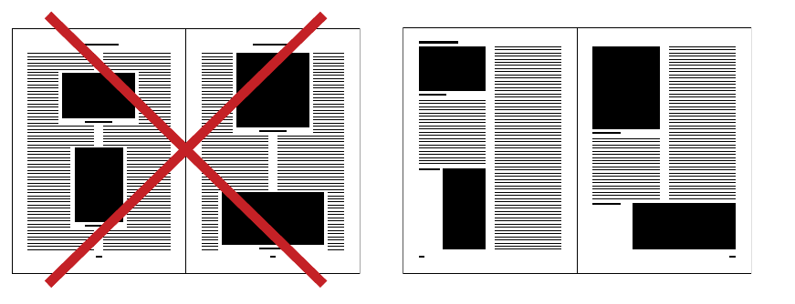
| 163
Jan Tschichold’s book The New Typography, published in Germany in
1928, took ideas from Futurism, Constructivism, and De Stijl and conveyed
them as practical advice for commercial printers and designers. Functionally
zoned letterheads using standard paper sizes were central to Tschichold’s
practical application of modernism. Whereas Futurism and Dada had
aggressively attacked convention, Tschichold advocated design as a means of
discipline and order, and he began to theorize the grid as a modular system
based on standard measures.
By describing the expansion of space in all directions, the modern grid
slipped past the classical frame of the page. Similarly, modern architecture
had displaced the centered facades of classical building with broken planes,
modular elements, and continuous ribbons of windows. The protective
frame became a continuous field.
Diagram, 1928
(redrawn). Designer and
author: Jan Tschichold
Tschichold’s diagram of good and bad magazine design
advocates staggering images in relation to content instead of
forcing text to wrap around blocks moored at the center of
the page. Explaining this experiment, Tschichold wrote that
his redesigned pages would be even more effective if the photo-
graphic halftones (called “blocks”) were produced in fixed
rather than arbitrary sizes.
I have intentionally shown blocks of different and “accidental” widths,
since this is what usually has to be contended with (although in the
future, with standard block-sizes, it will happen less often).
—jan tschichold, 1928
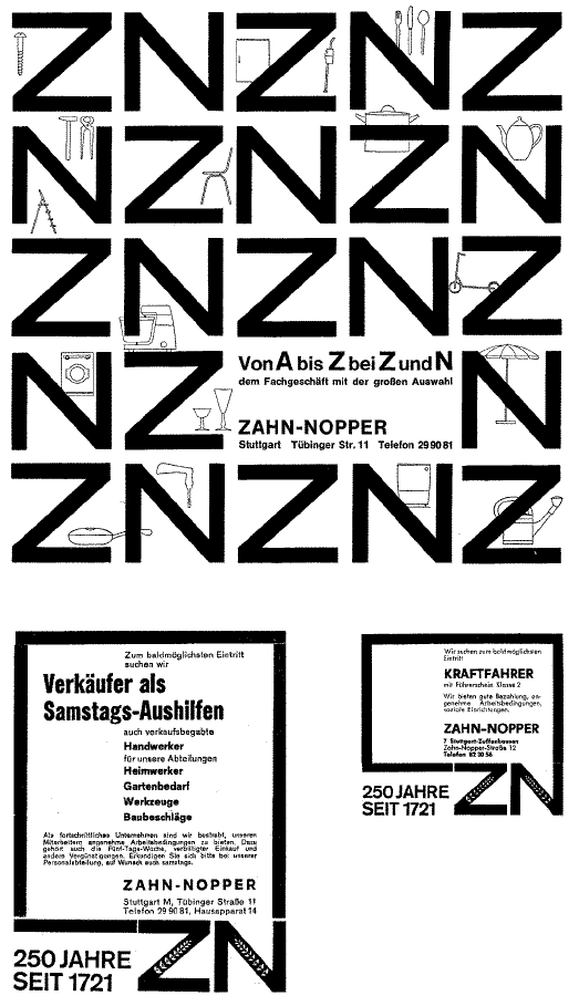
164 |
- Store identity,
1961–63. Designer: Anton
Stankowski. This identity
system demonstrates a
programmatic approach to
design, using a limited set of
elements to construct diverse yet
genetically linked solutions.
The system is governed by
flexible rules for construction
rather than a fixed logotype.

| 165
During the post–World War II period, graphic designers in Switzerland
honed ideas from the New Typography into a total design methodology.
It was at this time that the term grid (Raster) became commonly applied
to page layout. Max Bill, Karl Gerstner, Josef Müller-Brockmann, Emil Ruder,
and others were practitioners and theorists of a new rationalism that aimed
to catalyze an honest and democratic society. Rejecting the artistic clichés
of self expression and raw intuition, they aspired to what Ruder called “a
cool and fascinating beauty.”
Gerstner’s book Designing Programmes (1964) is a manifesto for systems-
oriented design. Gerstner defined a design “programme” as a set of rules for
constructing a range of visual solutions. Connecting his methodology with
the new field of computer programming, Gerstner presented examples of
computer-generated patterns that were made by mathematically describing
visual elements and combining them according to simple rules.
Expanding on the pioneering ideas of Bayer, Tschichold, Renner, and
other designers of the avant garde, the Swiss rationalists rejected the
centuries-old model of the page-as-frame in favor of a continuous
architectural space. Whereas a traditional book would have placed captions,
commentary, and folios within a protective margin, the rationalist grid cut
the page into multiple columns, each bearing equal weight within the whole,
suggesting an indefinite progression outward. Pictures were cropped to fit
the modules of the grid, yielding shapes of unusual proportion.
Constructing ever more elaborate grids, the Swiss designers used the
confines of a repeated structure to generate variation and surprise. Such
grids could be activated in numerous ways within a single publication,
always referring back to the root structure.
This approach, which quickly became known as “Swiss design,” found
adherents (and detractors) around the world. Many American designers
dismissed Swiss rationalism as irrelevant to a society driven by pop culture
and hungry for rapidly transforming styles. Programmatic thinking is now
being revived, however, as designers today confront large-scale information
projects. The need is greater than ever for flexible “programs” designed to
accommodate dynamic bodies of content.
grid as program
Classics of Swiss design
theory include Josef Müller-
Brockmann, Grid Systems in
Graphic Design (Switzerland:
Ram Publications, 1996;
first published in 1961) and
The Graphic Artist and His
Design Problems (Switzerland:
Arthur Niggli Ltd., 1961);
and Karl Gerstner, Designing
Programmes (Switzerland:
Arthur Niggli, 1964). See also
Emil Ruder, Typography (New
York: Hastings House, 1981;
first published in 1967).
The typographic grid is a proportional regulator for composition, tables, pictures, etc ....
The difficulty is: to find the balance, the maximum of conformity to a rule with the maximum
of freedom. Or: the maximum of constants with the greatest possible variability.”
—karl gerstner, 1961
166 |
| 167
Designed by Max Bill in 1940, this book is
considered the first use of a systematic modular
grid. Each image is sized to fit the column
structure—as Jan Tschichold had predicted in
1928—filling one, two, or three zones.
Acknowledging the originality of its layout,
the author credits Bill as “the creator of the
typographical structure of the book.”
/
Book, 1940. Designer: Max Bill.
Author: Max Roth. Photograph:
Dan Meyers.
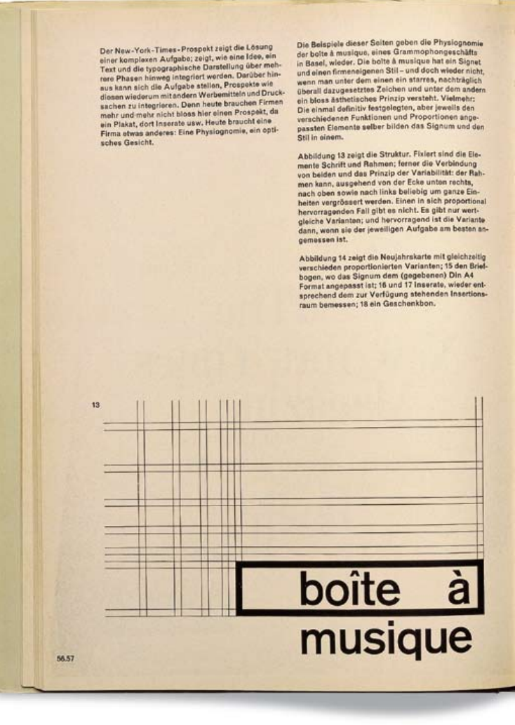
168 |
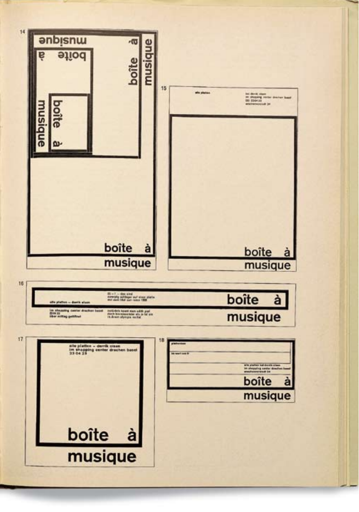
| 169
( )
Book, 1964. Designer and
author: Karl Gerstner.
Publisher: Arthur Niggli.
Photograph: Dan Meyers.
Karl Gerstner’s book Designing
Programmes is a design theory
classic whose relevance has been
renewed in the age of networked
media. Shown here is Gerstner’s
identity for Boîte à Musique
(Music Box), in which a system
of elements changes in response
to its context.
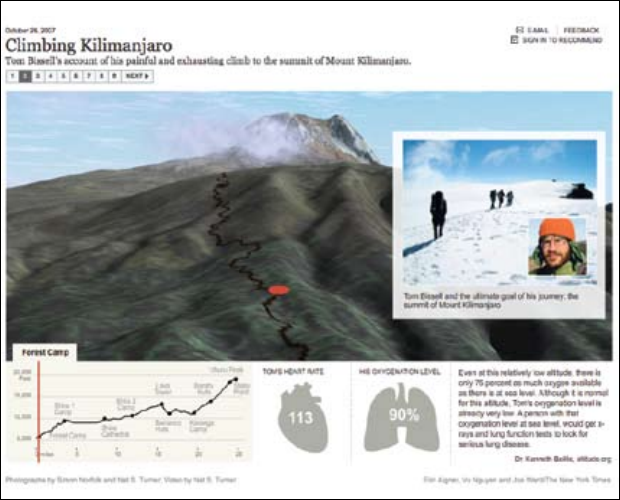
170 |
grid as table
Tables and graphs are a variant of the typographic grid. A table consists of
vertical columns and horizontal rows, each cell occupied by data. A graph is
a line mapped along the x and y axes of a grid, each dimension representing
a variable (such as time and stock value, shown below). As explained by
Edward Tufte, the leading critic and theorist of information design, tables
and graphs allow relationships among numbers to be perceived and rapidly
compared by the eye. In tables and graphs, the grid is a cognitive tool.
Tables are a central aspect of web design. The table feature was
incorporated into code in 1995 so that web authors could present
tabular data. Graphic designers, eager to give shape to the web’s wide and
flacid text bodies, quickly devised unauthorized uses for the table,
transforming this tool for representing data into nothing more, nor less,
than a typographic grid. Designers have used the table feature to control the
placement of images and captions and to build margins, gutters, and
multicolumn screens. Designers also use tables to combine multiple styles
of alignment—such as flush left and flush right—within a document, and
to construct elegantly numbered and bulleted lists.
() Interactive
information graphic, 2007.
Graphics director: Steve
Duenes/NYTimes.com.
Courtesy of the New York
Times. This interactive three-
dimensional travelogue traces
Tom Bissell’s harrowing
climb to the top of Mount
Kilimanjaro. The fever graph
plots the distance Bissell
traveled in relation to the
changing elevation. The
graphic coordinates his path
with photographs shot along
the way and an ongoing
account of Bissell’s rising
heart rate and plummeting
oxygenation level.
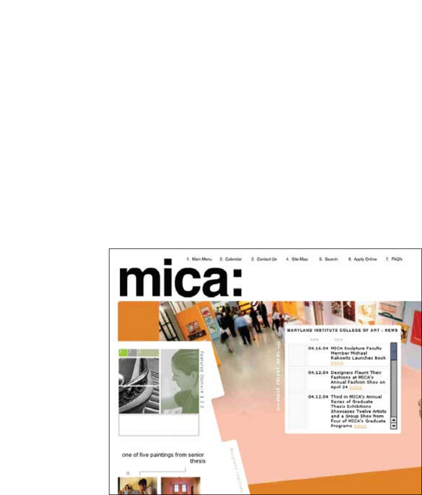
| 171
By creating cells that span multiple columns and rows, designers build
layout structures that bear little relation to the logically ordered fields of a
data chart. A master table typically establishes areas for navigation, content,
and site identity, and each region contains a smaller table—or tables—inside
itself. Grids propagate inside of grids.
Advocates of web standards reject such workarounds as spurious and
unethical design tactics. Visually driven, illogical layout tables can cause
problems for sight-impaired users, who implement various devices to
translate digital pages into sound, cell by cell, row by row. Assistive screen
readers “linearize” digital text into a stream of spoken words. Accessibility
experts encourage web designers to “think in linear terms” wherever
possible, and to make sure their tables make sense when read in a
continuous sequence. Accessible websites also consider the needs of users
working with older software or text-only browsers. Linear thinking helps not
only sight-impaired audiences but also the users of mobile devices, where
space is tight.
. Website, 2004.
Designers: Carton Donofrio
Partners. Publisher: Maryland
Institute College of Art.
HTML tables, with their borders
gently expressed, are an element
of this neatly gridded webpage.
Here, the table element is used
not as a secret grid but as a
structure for organizing content
in columns and rows.
On the aesthetics and ethics
of information design, see
Edward Tufte, Envisioning
Information (Cheshire, Conn.:
Graphics Press, 1990).
On designing accessible
websites, see Jerey Zeldman
with Ethan Marcotte, Designing
with Web Standards, third
edition (Berkeley, CA: New
Riders, 2009) and Patrick
Lynch and Sarah Horton, Web
Style Guide: Basic Design
Principles for Creating Web Sites
(New Haven: Yale University
Press, 2001). See also the site
www.webstyleguide.com.
172 |
, the mark-up system that allowed the Internet to become a global
mass medium, is the virtual counterpart to letterpress, which mechanized
the production of the book and cleared the ground for a world culture of
print. Like letterpress, is a text-hungry medium that can be coaxed,
with some resistance, to display images.
coexists with other languages on the web, just as alternative
technologies appeared alongside letterpress. Lithography, invented for the
manufacture of images in the eighteenth century, soon incorporated words
in addition to pictures, just as letterpress made space in its mechanical
grid for woodcuts, engravings, and photographic halftone blocks. In the
twentieth century, lithography replaced letterpress as the world’s dominant
printing method; used with digital or photographic typesetting, it conveys
text and pictures with equal comfort.
Lithography is not governed by grids as relentlessly as letterpress; neither
is Flash, the animation software that became a common web-design tool at
the turn of the twentieth century. Flash was originally designed for the
creation of vector-based cartoons. Although Flash’s primary purpose was
pictorial, designers were soon using it to construct the interfaces of entire
websites. The Flash sites that became, in the late 1990s, icons of a new web
aesthetic were more cinematic than typographic, often featuring a painterly
mix of word and image. They were soon supplanted by template-driven sites
built dynamically by content management systems. In such sites, elements
are placed via CSS (Cascading Style Sheets); the resulting designs have a
structured appearance that is predictable over time.
Website (detail), 2004.
Designers: Thomas Romer,
Jason Hillyer, Charles
Michelet, Robert Reed, and
Matthew Richmond/The
Chopping Block. This website
reprises the design of early
twentieth-century fruit-crate
labels, which were produced as
lithographic prints that merge
text and image. The webpage is
animated, loading elements
over time.
Hand-coding is as slow
and deliberate as setting
metal type. Empty table cells
are used to define areas of
open space, but makes
these collapse if the cells are
truly empty, causing the grid
to implode. The transparent
images that often fill these
spaces are virtual equivalents
to the blank spacing material
of metal type.
| 173
. Website, 2009. Designer: Joshua Davis. In
this template-driven site, elements are automatically arranged in a
uniform grid.

174 |
William Gibson’s 1984 novel Neuromancer envisions cyberspace as a vast
ethereal grid. Gibson’s data cowboy leaves behind the “meat” of his
body and drifts off into a “transparent 3d chessboard extending to infinity.”
In Gibson’s novel, this chessboard grid is projected on an internal surface of
the mind, bound by no screen or window.
The grid as infinite space—defying edges and dominated by the mind
rather than the body—is a powerful instrument within modernist theory,
where it is a form both rational and sublime. In the early twentieth century,
avant-garde designers exposed the grid in order to dramatize the mechanical
conditions of print. After World War II, Swiss designers built a total design
methodology around the grid, infusing it with ideological intentions. The
grid was their key to a universal language. With the postmodern turn toward
historical, vernacular, and popular sources in the 1970s and 1980s, many
designers rejected the rationalist grid as a quaint artifact of Switzerland’s
own orderly society.
The rise of the Internet has rekindled interest in universal design
thinking. The web was invented in the early 1990s (in Switzerland) to let
scientists and researchers share documents created with different software
applications. Its inventor, Tim Berners-Lee, never guessed that the web
would become a design-driven medium connecting vast numbers of
differently abled and divergently motivated people around the globe.
Universal design systems can no longer be dismissed as the irrelevant
musings of a small, localized design community. A second modernism has
emerged, reinvigorating the utopian search for universal forms that marked
the birth of design as a discourse and a discipline nearly a century earlier.
Against the opacity and singularity of unique visual expressions—grounded
in regional preferences and private obsessions—ideas of commonality,
transparency, and openness are being reborn as information seeks once
again to shed its physical body.
On the invention of the
web, see Tim Berners-Lee,
Weaving the Web (New York:
HarperCollins, 1999). For a
contemporary account of
universal design thinking,
see William Lidwell, Kritina
Holden, and Jill Butler,
Universal Principles of Design
(Gloucester, Mass.: Rockport
Publishers, 2003). See also
William Gibson, Neuromancer
(New York: Ace Books, 1984).
To produce designs that are objectively informative is primarily
a socio-cultural task. —josef müller-brockmann, 1961
return to universals
| 175
..
Website, 2003. Designer:
Luna Maurer. Publisher:
Sandberg Institute. The grid is
a navigation device that warps
and changes as the user rolls
over it. The vertical axis
represents departments in the
school, and the horizontal axis
represents types of program
information. As the user passes
over the grid, cells fill with light
and appear to lift away from
the screen, indicating the
availability of information at
that intersection.
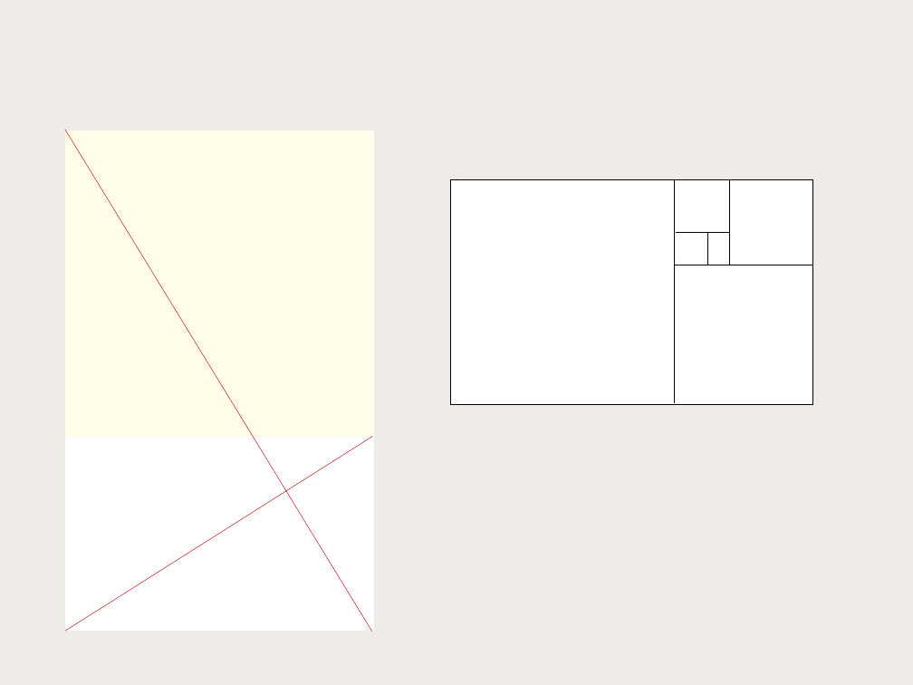
176 |
No book about typography would be complete
without a discussion of the golden section, a ratio
(relationship between two numbers) that has been
used in Western art and architecture for more
than two thousand years. The formula for the
golden section is a : b = b : (a+b).
This means that the smaller of two
elements (such as the shorter side of a rectangle)
relates to the larger element in the same way that
the larger element relates to the two parts
combined. In other words, side a is to side b as
side b is to the sum of both sides. Expressed
numerically, the ratio for the golden section
is 1 : 1.618.
Some graphic designers are fascinated with
the golden section and use it to create various
grids and page formats—indeed, entire books
have been written on the subject. Other designers
believe that the golden section is no more valid as
a basis for deriving sizes and proportions than
other methods, such as beginning from standard
industrial paper sizes, or dividing surfaces into
halves or squares, or simply picking whole-
number page formats and making logical
divisions within them.
golden section
The golden section, which
appears in nature as well as in
art and design, has many
surprising properties. For
example, when you remove a
square from a golden
rectangle, the remainder is
another golden rectangle, a
process that can be infinitely
repeated to create a spiral.
a
b
| 177
Commercial printers generally
prefer to work with pages trimmed
to even measures rather than with
obscure fractions. However,
you can float golden rectangles
within a page of any trim size.
For a more detailed account of
design and the golden section,
see Kimberly Elam, Geometry
of Design (New York: Princeton
Architectural Press, 2001).
For an emphasis on applying
the golden section to typography,
see John Kane, A Type Primer
(London: Laurence King, 2002).
Golden rectangle of text on
8.5 x 11-inch page (U.S. standard)
It may well be absurd to base a website on the golden section,
but here, nonetheless, is a design for one. This wire frame diagram
describes a webpage that is 500 x 809 pixels. The “golden screen”
is then divided with squares and golden rectangles.
local
nav
subcontent
and
links
global navigation
main
content
A grid can be simple or complex, specific or generic, tightly defined or
loosely interpreted. Typographic grids are all about control. They
establish a system for arranging content within the space of page,
screen, or built environment. Designed in response to the internal
pressures of content (text, image, data) and the outer edge or frame
(page, screen, window), an effective grid is not a rigid formula but a
flexible and resilient structure, a skeleton that moves in concert with the
muscular mass of content. Grids belong to the technological framework
of typography, from the concrete modularity of letterpress to the
ubiquitous rulers, guides, and coordinate systems of graphics
applications. Although software generates illusions of smooth curves
and continuous tones, every digital image or mark is constructed—
ultimately—from a grid of neatly bounded blocks. The ubiquitous
language of the gui (graphical user interface) creates a gridded space in
which windows overlay windows. In addition to their place in the
background of design production, grids have become explicit theoretical
tools. Avant-garde designers in the 1910s and 1920s exposed the
mechanical grid of letterpress, bringing it to the polemical surface of the
page. In Switzerland after World War II, graphic designers built a total
design methodology around the typographic grid, hoping to build from
it a new and rational social order. The grid has evolved across centuries
of typographic evolution. For graphic designers, grids are carefully
honed intellectual devices, infused with ideology and ambition, and they
are the inescapable mesh that filters, at some level of resolution, nearly
every system of writing and reproduction. A grid can be simple or
complex, specific or generic, tightly defined or loosely interpreted.
Typographic grids are all about control. They establish a system for
arranging content within the space of page, screen, or built environment.
Designed in response to the internal pressures of content (text, image,
data) and the outer edge or frame (page, screen, window), an effective
grid is not a rigid formula but a flexible and resilient structure, a
skeleton that moves in concert with the muscular mass of content. Grids
belong to the technological framework of typography, from the concrete
modularity of letterpress to the ubiquitous rulers, guides, and coordinate
systems of graphics applications. Although software generates illusions
of smooth curves and continuous tones, every digital image or mark is
constructed—ultimately—from a grid of neatly bounded blocks. The
ubiquitous language of the gui (graphical user interface) creates a
gridded space in which windows overlay windows. In addition to their
A grid can be simple or complex, specific or generic, tightly defined or
loosely interpreted. Typographic grids are all about control. They
establish a system for arranging content within the space of page, screen,
or built environment. Designed in response to the internal pressures of
content (text, image, data) and the outer edge or frame (page, screen,
window), an effective grid is not a rigid formula but a flexible and
resilient structure, a skeleton that moves in concert with the muscular
mass of content. Grids belong to the technological framework of
typography, from the concrete modularity of letterpress to the ubiquitous
rulers, guides, and coordinate systems of graphics applications.
Although software generates illusions of smooth curves and continuous
tones, every digital image or mark is constructed—ultimately—from a
grid of neatly bounded blocks. The ubiquitous language of the gui
(graphical user interface) creates a gridded space in which windows
overlay windows. In addition to their place in the background of design
production, grids have become explicit theoretical tools. Avant-garde
designers in the 1910s and 1920s exposed the mechanical grid of
letterpress, bringing it to the polemical surface of the page. In
Switzerland after World War II, graphic designers built a total design
methodology around the typographic grid, hoping to build from it a new
and rational social order. The grid has evolved across centuries of
typographic evolution. For graphic designers, grids are carefully honed
intellectual devices, infused with ideology and ambition, and they are the
inescapable mesh that filters, at some level of resolution, nearly every
system of writing and reproduction. A grid can be simple or complex,
specific or generic, tightly defined or loosely interpreted. Typographic
grids are all about control. They establish a system for arranging content
within the space of page, screen, or built environment. Designed in
response to the internal pressures of content (text, image, data) and the
outer edge or frame (page, screen, window), an effective grid is not a
rigid formula but a flexible and resilient structure, a skeleton that moves
in concert with the muscular mass of content. Grids belong to the
technological framework of typography, from the concrete modularity of
letterpress to the ubiquitous rulers, guides, and coordinate systems of
graphics applications. Although software generates illusions of smooth
curves and continuous tones, every digital image or mark is
constructed—ultimately—from a grid of neatly bounded blocks. The
ubiquitous language of the gui (graphical user interface) creates a
gridded space in which windows overlay windows. In addition to their
logo
Golden rectangle of text on
A4 page (European standard, 210 x 297 mm)
: = : (+)
178 |
Every time you open a new document in a page
layout program, you are prompted to create a
grid. The simplest grid consists of a single
column of text surounded by margins.
By asking for page dimensions and margin
widths from the outset, layout programs
encourage you to design your page from the
outside in. (The text column is the space left
over when the margins have been subtracted.)
Alternatively, you can design your page
from the inside out, by setting your margins
to zero and then positioning guidelines and
text boxes on a blank page. This allows you
to experiment with the margins and columns
rather than making a commitment as soon
as you open a new document. You can add
guidelines to a master page after they meet
your satisfaction.
single-column grid
This standard, 8.5 x 11-inch page has even margins
all the way around. It is a highly economical, but
not very interesting, design.
This page is an inch shorter than a standard
U.S. letter. The text block is a square, leaving
margins of varying dimension.
A grid can be simple or complex, specific or generic, tightly defined or loosely interpreted.
Typographic grids are all about control. They establish a system for arranging content within the
space of page, screen, or built environment. Designed in response to the internal pressures of
content (text, image, data) and the outer edge or frame (page, screen, window), an effective grid
is not a rigid formula but a flexible and resilient structure, a skeleton that moves in concert with
the muscular mass of content. Grids belong to the technological framework of typography, from
the concrete modularity of letterpress to the ubiquitous rulers, guides, and coordinate systems of
graphics applications. Although software generates illusions of smooth curves and continuous
tones, every digital image or mark is constructed—ultimately—from a grid of neatly bounded
blocks. The ubiquitous language of the gui (graphical user interface) creates a gridded space in
which windows overlay windows. In addition to their place in the background of design
production, grids have become explicit theoretical tools. Avant-garde designers in the 1910s and
1920s exposed the mechanical grid of letterpress, bringing it to the polemical surface of the page.
In Switzerland after World War II, graphic designers built a total design methodology around the
typographic grid, hoping to build from it a new and rational social order. The grid has evolved
across centuries of typographic evolution. For graphic designers, grids are carefully honed
intellectual devices, infused with ideology and ambition, and they are the inescapable mesh that
filters, at some level of resolution, nearly every system of writing and reproduction. A grid can
be simple or complex, specific or generic, tightly defined or loosely interpreted. Typographic
grids are all about control. They establish a system for arranging content within the space of
page, screen, or built environment. Designed in response to the internal pressures of content
(text, image, data) and the outer edge or frame (page, screen, window), an effective grid is not a
rigid formula but a flexible and resilient structure, a skeleton that moves in concert with the
muscular mass of content. Grids belong to the technological framework of typography, from the
concrete modularity of letterpress to the ubiquitous rulers, guides, and coordinate systems of
graphics applications. Although software generates illusions of smooth curves and continuous
tones, every digital image or mark is constructed—ultimately—from a grid of neatly bounded
blocks. The ubiquitous language of the gui (graphical user interface) creates a gridded space in
which windows overlay windows. In addition to their place in the background of design
production, grids have become explicit theoretical tools. Avant-garde designers in the 1910s and
1920s exposed the mechanical grid of letterpress, bringing it to the polemical surface of the page.
In Switzerland after World War II, graphic designers built a total design methodology around the
typographic grid, hoping to build from it a new and rational social order. The grid has evolved
across centuries of typographic evolution. For graphic designers, grids are carefully honed
intellectual devices, infused with ideology and ambition, and they are the inescapable mesh that
filters, at some level of resolution, nearly every system of writing and reproduction. A grid can
be simple or complex, specific or generic, tightly defined or loosely interpreted. Typographic
grids are all about control. They establish a system for arranging content within the space of
page, screen, or built environment. Designed in response to the internal pressures of content
(text, image, data) and the outer edge or frame (page, screen, window), an effective grid is not a
rigid formula but a flexible and resilient structure, a skeleton that moves in concert with the
muscular mass of content. Grids belong to the technological framework of typography, from the
A grid can be simple or complex, specific or generic, tightly defined or loosely interpreted.
Typographic grids are all about control. They establish a system for arranging content within
the space of page, screen, or built environment. Designed in response to the internal
pressures of content (text, image, data) and the outer edge or frame (page, screen, window),
an effective grid is not a rigid formula but a flexible and resilient structure, a skeleton that
moves in concert with the muscular mass of content. Grids belong to the technological
framework of typography, from the concrete modularity of letterpress to the ubiquitous
rulers, guides, and coordinate systems of graphics applications. Although software generates
illusions of smooth curves and continuous tones, every digital image or mark is constructed—
ultimately—from a grid of neatly bounded blocks. The ubiquitous language of the gui
(graphical user interface) creates a gridded space in which windows overlay windows. In
addition to their place in the background of design production, grids have become explicit
theoretical tools. Avant-garde designers in the 1910s and 1920s exposed the mechanical grid
of letterpress, bringing it to the polemical surface of the page. In Switzerland after World War
II, graphic designers built a total design methodology around the typographic grid, hoping to
build from it a new and rational social order. The grid has evolved across centuries of
typographic evolution. For graphic designers, grids are carefully honed intellectual devices,
infused with ideology and ambition, and they are the inescapable mesh that filters, at some
level of resolution, nearly every system of writing and reproduction. A grid can be simple or
complex, specific or generic, tightly defined or loosely interpreted. Typographic grids are all
about control. They establish a system for arranging content within the space of page, screen,
or built environment. Designed in response to the internal pressures of content (text, image,
data) and the outer edge or frame (page, screen, window), an effective grid is not a rigid
formula but a flexible and resilient structure, a skeleton that moves in concert with the
muscular mass of content. Grids belong to the technological framework of typography, from
the concrete modularity of letterpress to the ubiquitous rulers, guides, and coordinate
systems of graphics applications. Although software generates illusions of smooth curves and
continuous tones, every digital image or mark is constructed—ultimately—from a grid of
neatly bounded blocks. The ubiquitous language of the gui (graphical user interface) creates
a gridded space in which windows overlay windows. In addition to their place in the
background of design production, grids have become explicit theoretical tools. Avant-garde
designers in the 1910s and 1920s exposed the mechanical grid of letterpress, bringing it to
| 179
Books and magazines should be designed
as spreads (facing pages). The two-page
spread, rather than the individual page, is
the main unit of design. Left and right
margins become inside and outside
margins. Page layout programs assume that
the inside margins are the same on both
the left- and right-hand pages, yielding a
symmetrical, mirror-image spread. You are
free, however, to set your own margins and
create an asymmetrical spread.
In this symmetrical double-page spread, the inside
margins are wider than the outside margins,
creating more open space at the spine of the book.
In this asymmetrical layout, the left margin is
always wider than the right margin, whether it
appears along the inside or outside edge of the page.
A grid can be simple or complex, specific or generic, tightly defined or loosely interpreted.
Typographic grids are all about control. They establish a system for arranging content within
the space of page, screen, or built environment. Designed in response to the internal
pressures of content (text, image, data) and the outer edge or frame (page, screen, window),
an effective grid is not a rigid formula but a flexible and resilient structure, a skeleton that
moves in concert with the muscular mass of content. Grids belong to the technological
framework of typography, from the concrete modularity of letterpress to the ubiquitous
rulers, guides, and coordinate systems of graphics applications. Although software generates
illusions of smooth curves and continuous tones, every digital image or mark is
constructed—ultimately—from a grid of neatly bounded blocks. The ubiquitous language of
the gui (graphical user interface) creates a gridded space in which windows overlay windows.
In addition to their place in the background of design production, grids have become explicit
theoretical tools. Avant-garde designers in the 1910s and 1920s exposed the mechanical grid
of letterpress, bringing it to the polemical surface of the page. In Switzerland after World War
II, graphic designers built a total design methodology around the typographic grid, hoping
to build from it a new and rational social order. The grid has evolved across centuries of
typographic evolution. For graphic designers, grids are carefully honed intellectual devices,
infused with ideology and ambition, and they are the inescapable mesh that filters, at some
level of resolution, nearly every system of writing and reproduction. A grid can be simple or
complex, specific or generic, tightly defined or loosely interpreted. Typographic grids are all
about control. They establish a system for arranging content within the space of page, screen,
or built environment. Designed in response to the internal pressures of content (text, image,
data) and the outer edge or frame (page, screen, window), an effective grid is not a rigid
formula but a flexible and resilient structure, a skeleton that moves in concert with the
muscular mass of content. Grids belong to the technological framework of typography, from
the concrete modularity of letterpress to the ubiquitous rulers, guides, and coordinate
systems of graphics applications. Although software generates illusions of smooth curves
and continuous tones, every digital image or mark is constructed—ultimately—from a grid
of neatly bounded blocks. The ubiquitous language of the gui (graphical user interface)
creates a gridded space in which windows overlay windows. In addition to their place in the
background of design production, grids have become explicit theoretical tools. Avant-garde
designers in the 1910s and 1920s exposed the mechanical grid of letterpress, bringing it to
grid systems page one
A grid can be simple or complex, specific or generic, tightly defined or loosely interpreted.
Typographic grids are all about control. They establish a system for arranging content within
the space of page, screen, or built environment. Designed in response to the internal
pressures of content (text, image, data) and the outer edge or frame (page, screen, window),
an effective grid is not a rigid formula but a flexible and resilient structure, a skeleton that
moves in concert with the muscular mass of content. Grids belong to the technological
framework of typography, from the concrete modularity of letterpress to the ubiquitous
rulers, guides, and coordinate systems of graphics applications. Although software generates
illusions of smooth curves and continuous tones, every digital image or mark is constructed—
ultimately—from a grid of neatly bounded blocks. The ubiquitous language of the gui
(graphical user interface) creates a gridded space in which windows overlay windows. In
addition to their place in the background of design production, grids have become explicit
theoretical tools. Avant-garde designers in the 1910s and 1920s exposed the mechanical grid
of letterpress, bringing it to the polemical surface of the page. In Switzerland after World War
II, graphic designers built a total design methodology around the typographic grid, hoping to
build from it a new and rational social order. The grid has evolved across centuries of
typographic evolution. For graphic designers, grids are carefully honed intellectual devices,
infused with ideology and ambition, and they are the inescapable mesh that filters, at some
level of resolution, nearly every system of writing and reproduction. A grid can be simple or
complex, specific or generic, tightly defined or loosely interpreted. Typographic grids are all
about control. They establish a system for arranging content within the space of page, screen,
or built environment. Designed in response to the internal pressures of content (text, image,
data) and the outer edge or frame (page, screen, window), an effective grid is not a rigid
formula but a flexible and resilient structure, a skeleton that moves in concert with the
muscular mass of content. Grids belong to the technological framework of typography, from
the concrete modularity of letterpress to the ubiquitous rulers, guides, and coordinate
systems of graphics applications. Although software generates illusions of smooth curves and
continuous tones, every digital image or mark is constructed—ultimately—from a grid of
neatly bounded blocks. The ubiquitous language of the gui (graphical user interface) creates
a gridded space in which windows overlay windows. In addition to their place in the
background of design production, grids have become explicit theoretical tools. Avant-garde
designers in the 1910s and 1920s exposed the mechanical grid of letterpress, bringing it to
A grid can be simple or complex, specific or generic, tightly defined or loosely
interpreted. Typographic grids are all about control. They establish a system for
arranging content within the space of page, screen, or built environment.
Designed in response to the internal pressures of content (text, image, data) and
the outer edge or frame (page, screen, window), an effective grid is not a rigid
formula but a flexible and resilient structure, a skeleton that moves in concert
with the muscular mass of content. Grids belong to the technological
framework of typography, from the concrete modularity of letterpress to the
ubiquitous rulers, guides, and coordinate systems of graphics applications.
Although software generates illusions of smooth curves and continuous tones,
every digital image or mark is constructed—ultimately—from a grid of neatly
bounded blocks. The ubiquitous language of the gui (graphical user interface)
creates a gridded space in which windows overlay windows. In addition to their
place in the background of design production, grids have become explicit
theoretical tools. Avant-garde designers in the 1910s and 1920s exposed the
mechanical grid of letterpress, bringing it to the polemical surface of the page.
In Switzerland after World War II, graphic designers built a total design
methodology around the typographic grid, hoping to build from it a new and
rational social order. The grid has evolved across centuries of typographic
evolution. For graphic designers, grids are carefully honed intellectual devices,
infused with ideology and ambition, and they are the inescapable mesh that
filters, at some level of resolution, nearly every system of writing and
reproduction. A grid can be simple or complex, specific or generic, tightly
defined or loosely interpreted. Typographic grids are all about control. They
establish a system for arranging content within the space of page, screen, or
built environment. Designed in response to the internal pressures of content
(text, image, data) and the outer edge or frame (page, screen, window), an
effective grid is not a rigid formula but a flexible and resilient structure, a
skeleton that moves in concert with the muscular mass of content. Grids belong
to the technological framework of typography, from the concrete modularity of
letterpress to the ubiquitous rulers, guides, and coordinate systems of graphics
applications. Although software generates illusions of smooth curves and
continuous tones, every digital image or mark is constructed—ultimately—
from a grid of neatly bounded blocks. The ubiquitous language of the gui
(graphical user interface) creates a gridded space in which windows overlay
windows. In addition to their place in the background of design production,
grids have become explicit theoretical tools. Avant-garde designers in the 1910s
and 1920s exposed the mechanical grid of letterpress, bringing it to the
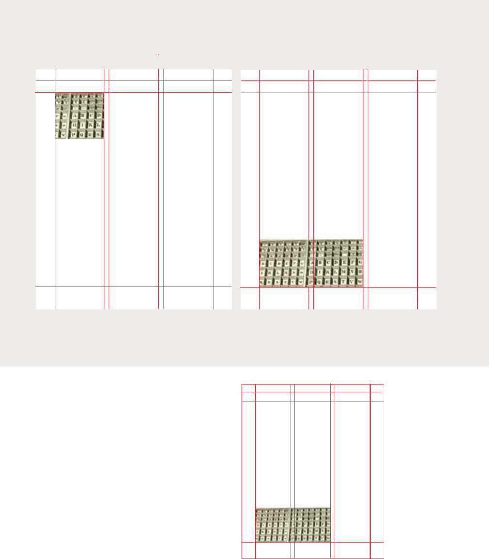
180 |
multicolumn grid
A grid can be simple or complex,
specific or generic, tightly defined
or loosely interpreted.
Typographic grids are all about
control. They establish a system
for arranging content within the
space of page, screen, or built
environment. Designed in
response to the internal pressures
of content (text, image, data) and
the outer edge or frame (page,
screen, window), an effective grid
is not a rigid formula but a
flexible and resilient structure, a
skeleton that moves in concert
with the muscular mass of
content. Grids belong to the
technological framework of
typography, from the concrete
modularity of letterpress to the
ubiquitous rulers, guides, and
coordinate systems of graphics
applications. Although software
generates illusions of smooth
curves and continuous tones,
every digital image or mark is
constructed—ultimately—from a
grid of neatly bounded blocks.
The ubiquitous language of the
gui (graphical user interface)
creates a gridded space in which
windows overlay windows. In
addition to their place in the
background of design production,
grids have become explicit
theoretical tools. Avant-garde
designers in the 1910s and 1920s
exposed the mechanical grid of
letterpress, bringing it to the
polemical surface of the page. In
A grid can be simple or complex,
specific or generic, tightly defined
or loosely interpreted.
Typographic grids are all about
control. They establish a system
for arranging content within the
space of page, screen, or built
environment. Designed in
response to the internal pressures
of content (text, image, data) and
the outer edge or frame (page,
screen, window), an effective grid
is not a rigid formula but a
flexible and resilient structure, a
skeleton that moves in concert
with the muscular mass of
content. Grids belong to the
technological framework of
typography, from the concrete
modularity of letterpress to the
ubiquitous rulers, guides, and
coordinate systems of graphics
applications. Although software
generates illusions of smooth
curves and continuous tones,
every digital image or mark is
constructed—ultimately—from a
grid of neatly bounded blocks.
The ubiquitous language of the
A grid can be simple or complex,
specific or generic, tightly defined
or loosely interpreted. Typographic
grids are all about control. They
establish a system for arranging
content within the space of page,
screen, or built environment.
Designed in response to the
internal pressures of content (text,
image, data) and the outer edge or
frame (page, screen, window), an
effective grid is not a rigid formula
but a flexible and resilient
structure, a skeleton that moves in
concert with the muscular mass of
content. Grids belong to the
technological framework of
typography, from the concrete
modularity of letterpress to the
ubiquitous rulers, guides, and
coordinate systems of graphics
applications. Although software
generates illusions of smooth
curves and continuous tones, every
digital image or mark is
constructed—ultimately—from a
grid of neatly bounded blocks. The
ubiquitous language of the gui
(graphical user interface) creates a
gridded space in which windows
overlay windows. In addition to
their place in the background of
design production, grids have
become explicit theoretical tools.
Avant-garde designers in the 1910s
and 1920s exposed the mechanical
grid of letterpress, bringing it to
the polemical surface of the page.
In Switzerland after World War II,
graphic designers built a total
A grid can be simple or complex,
specific or generic, tightly defined
or loosely interpreted.
Typographic grids are all about
control. They establish a system
for arranging content within the
space of page, screen, or built
environment. Designed in
response to the internal pressures
of content (text, image, data) and
the outer edge or frame (page,
screen, window), an effective grid
is not a rigid formula but a
flexible and resilient structure, a
skeleton that moves in concert
with the muscular mass of
content. Grids belong to the
technological framework of
typography, from the concrete
modularity of letterpress to the
ubiquitous rulers, guides, and
coordinate systems of graphics
applications. Although software
generates illusions of smooth
curves and continuous tones,
every digital image or mark is
constructed—ultimately—from a
grid of neatly bounded blocks.
The ubiquitous language of the
A grid can be simple or complex,
specific or generic, tightly defined
or loosely interpreted.
Typographic grids are all about
control. They establish a system
for arranging content within the
space of page, screen, or built
environment. Designed in
response to the internal
pressures of content (text, image,
data) and the outer edge or frame
(page, screen, window), an
effective grid is not a rigid
formula but a flexible and
resilient structure, a skeleton that
moves in concert with the
muscular mass of content. Grids
belong to the technological
framework of typography, from
the concrete modularity of
letterpress to the ubiquitous
rulers, guides, and coordinate
systems of graphics applications.
Although software generates
illusions of smooth curves and
continuous tones, every digital
image or mark is constructed—
ultimately—from a grid of neatly
bounded blocks. The ubiquitous
The typographic grid is a proportional
regulator for composition, tables, pictures,
etc. It is a formal programme to
accommodate x unknown items. The
typographic grid is a proportional
regulator for composition, tables, pictures,
etc. It is a formal programme to
accommodate x unknown items.
The typographic grid is a proportional
regulator for composition, tables,
pictures, etc. It is a formal programme
to accommodate x unknown items.
The typographic grid is a proportional
regulator for composition, tables,
pictures, etc. It is a formal programme
to accommodate x unknown items.
Grid systems Grid systems
The typographic grid is a proportional
regulator for composition, tables, pictures,
etc. It is a formal programme to
accommodate x unknown items.The
typographic grid is a proportional regulator
for composition, tables, pictures, etc. It is a
formal programme to accommodate x
unknown items.
The typographic grid is a proportional
regulator for composition, tables, pictures, etc.
It is a formal programme to accommodate x
unknown items.The typographic grid is a
proportional regulator for composition, tables,
pictures, etc. It is a formal programme to
accommodate x unknown items.
Grid systems
While single-column grids work well for
simple documents, multicolumn grids provide
flexible formats for publications that have a
complex hierarchy or that integrate text and
illustrations. The more columns you create,
the more flexible your grid becomes.
You can use the grid to articulate the hierarchy
of the publication by creating zones for
different kinds of content. A text or image can
occupy a single column or it can span several.
Not all the space has to be filled.
There are numerous ways to use a basic column
grid. Here, one column has been reserved for
images and captions, and the others for text.
In this variation, images and text share
column space.
Elements
of varying
width are
staggered
within the
structure of
the grid.
A grid can be simple or complex, specific or generic, tightly defined or
loosely interpreted. Typographic grids are all about control. They
establish a system for arranging content within the space of page,
screen, or built environment. Designed in response to the internal
pressures of content (text, image, data) and the outer edge or frame
(page, screen, window), an effective grid is not a rigid formula but a
flexible and resilient structure, a skeleton that moves in concert with the
muscular mass of content. Grids belong to the technological framework
of typography, from the concrete modularity of letterpress to the
ubiquitous rulers, guides, and coordinate systems of graphics
applications. Although software generates illusions of smooth curves
and continuous tones, every digital image or mark is constructed—
ultimately—from a grid of neatly bounded blocks. The ubiquitous
language of the gui (graphical user interface) creates a gridded space in
which windows overlay windows. In addition to their place in the
background of design production, grids have become explicit theoretical
tools. Avant-garde designers in the 1910s and 1920s exposed the
mechanical grid of letterpress, bringing it to the polemical surface of the
page. In Switzerland after World War II, graphic designers built a total
design methodology around the typographic grid, hoping to build from
it a new and rational social order. The grid has evolved across centuries
of typographic evolution. For graphic designers, grids are carefully
honed intellectual devices, infused with ideology and ambition, and they
are the inescapable mesh that filters, at some level of resolution, nearly
every system of writing and reproduction. A grid can be simple or
complex, specific or generic, tightly defined or loosely interpreted.
Typographic grids are all about control. They establish a system for
arranging content within the space of page, screen, or built
environment. Designed in response to the internal pressures of content
| 181
A grid can be simple or complex, specific or generic, tightly defined or
loosely interpreted. Typographic grids are all about control. They
establish a system for arranging content within the space of page,
screen, or built environment. Designed in response to the internal
pressures of content (text, image, data) and the outer edge or frame
(page, screen, window), an effective grid is not a rigid formula but a
flexible and resilient structure, a skeleton that moves in concert with
the muscular mass of content. Grids belong to the technological
framework of typography, from the concrete modularity of letterpress to
the ubiquitous rulers, guides, and coordinate systems of graphics
applications. Although software generates illusions of smooth curves
and continuous tones, every digital image or mark is constructed—
ultimately—from a grid of neatly bounded blocks. The ubiquitous
language of the gui (graphical user interface) creates a gridded space in
which windows overlay windows. In addition to their place in the
background of design production, grids have become explicit theoretical
tools. Avant-garde designers in the 1910s and 1920s exposed the
mechanical grid of letterpress, bringing it to the polemical surface of
the page. In Switzerland after World War II, graphic designers built a
total design methodology around the typographic grid, hoping to build
from it a new and rational social order. The grid has evolved across
centuries of typographic evolution. For graphic designers, grids are
carefully honed intellectual devices, infused with ideology and
ambition, and they are the inescapable mesh that filters, at some level
of resolution, nearly every system of writing and reproduction. A grid
can be simple or complex, specific or generic, tightly defined or loosely
interpreted. Typographic grids are all about control. They establish a
system for arranging content within the space of page, screen, or built
environment. Designed in response to the internal pressures of content
(text, image, data) and the outer edge or frame (page, screen, window),
an effective grid is not a rigid formula but a flexible and resilient
The typographic grid is a proportional
regulator for composition, tables,
pictures, etc. It is a formal programme
to accommodate x unknown items.
The typographic grid is a proportional
regulator for composition, tables,
pictures, etc. It is a formal programme
to accommodate x unknown items.
Grid systems
A grid can be simple or complex, specific or generic, tightly defined or
loosely interpreted. Typographic grids are all about control. They
establish a system for arranging content within the space of page,
screen, or built environment. Designed in response to the internal
pressures of content (text, image, data) and the outer edge or frame
(page, screen, window), an effective grid is not a rigid formula but a
flexible and resilient structure, a skeleton that moves in concert with
the muscular mass of content. Grids belong to the technological
framework of typography, from the concrete modularity of letterpress to
the ubiquitous rulers, guides, and coordinate systems of graphics
applications. Although software generates illusions of smooth curves
and continuous tones, every digital image or mark is constructed—
ultimately—from a grid of neatly bounded blocks. The ubiquitous
language of the gui (graphical user interface) creates a gridded space in
which windows overlay windows. In addition to their place in the
background of design production, grids have become explicit theoretical
tools. Avant-garde designers in the 1910s and 1920s exposed the
mechanical grid of letterpress, bringing it to the polemical surface of
the page. In Switzerland after World War II, graphic designers built a
total design methodology around the typographic grid, hoping to build
from it a new and rational social order. The grid has evolved across
centuries of typographic evolution. For graphic designers, grids are
carefully honed intellectual devices, infused with ideology and
ambition, and they are the inescapable mesh that filters, at some level
of resolution, nearly every system of writing and reproduction. A grid
can be simple or complex, specific or generic, tightly defined or loosely
interpreted. Typographic grids are all about control. They establish a
system for arranging content within the space of page, screen, or built
environment. Designed in response to the internal pressures of content
(text, image, data) and the outer edge or frame (page, screen, window),
an effective grid is not a rigid formula but a flexible and resilient
The typographic grid is a proportional
regulator for composition, tables,
pictures, etc. It is a formal programme
to accommodate x unknown items.
The typographic grid is a proportional
regulator for composition, tables,
pictures, etc. It is a formal programme
to accommodate x unknown items.
The typographic grid is a proportional
regulator for composition, tables,
pictures, etc. It is a formal programme
to accommodate x unknown items.
The typographic grid is a proportional
regulator for composition, tables,
pictures, etc. It is a formal programme
to accommodate x unknown items.
The typographic grid is a proportional
regulator for composition, tables,
pictures, etc. It is a formal programme
to accommodate x unknown items.
In addition to creating vertical
zones with the columns of the grid, you can
also divide the page horizontally. For example,
an area across the top can be reserved for
images and captions, and body text can “hang”
from a common line. In architecture, a
horizontal reference point like this is known
as a datum.
Columns of text hang from a datum,
falling downward with an uneven rag
across the bottom.
A grid can be simple or
complex, specific or generic,
tightly defined or loosely
interpreted. Typographic
grids are all about control.
They establish a system for
arranging content within
the space of page, screen, or
built environment.
Designed in response to the
internal pressures of
content (text, image, data)
and the outer edge or frame
(page, screen, window), an
effective grid is not a rigid
formula but a flexible and
resilient structure, a
skeleton that moves in
concert with the muscular
mass of content. Grids
belong to the technological
framework of typography,
from the concrete
modularity of letterpress to
the ubiquitous rulers,
guides, and coordinate
systems of graphics
applications. Although
software generates illusions
of smooth curves and
continuous tones, every
A grid can be simple or
complex, specific or generic,
tightly defined or loosely
interpreted. Typographic
grids are all about control.
They establish a system for
arranging content within
the space of page, screen, or
built environment.
Designed in response to the
internal pressures of
content (text, image, data)
and the outer edge or frame
(page, screen, window), an
effective grid is not a rigid
formula but a flexible and
resilient structure, a
skeleton that moves in
concert with the muscular
mass of content. Grids
belong to the technological
framework of typography,
from the concrete
modularity of letterpress to
the ubiquitous rulers,
guides, and coordinate
systems of graphics
applications. Although
software generates illusions
of smooth curves and
continuous tones, every
A grid can be simple or
complex, specific or generic,
tightly defined or loosely
interpreted. Typographic
grids are all about control.
They establish a system for
arranging content within
the space of page, screen, or
built environment.
Designed in response to the
internal pressures of
content (text, image, data)
and the outer edge or frame
(page, screen, window), an
effective grid is not a rigid
formula but a flexible and
resilient structure, a
skeleton that moves in
concert with the muscular
mass of content. Grids
belong to the technological
framework of typography,
from the concrete
modularity of letterpress to
the ubiquitous rulers,
guides, and coordinate
The typographic grid is a
proportional regulator for
composition, tables, pictures,
etc. It is a formal programme
to accommodate x items.
Grid systems
The typographic grid is a
proportional regulator for
composition, tables, pictures,
etc. It is a formal programme
to accommodate x unknown
items. The typographic grid is
a proportional regulator for
composition, tables, pictures,
etc. It is a formal programme
to accommodate x unknown
items.
A horizontal band divides a text zone from an
image zone. Elements gravitate toward this line,
which provides an internal structure for the page.
182 |
multicolumn grid

| 183
,
2003|04 Booklet,
2003. Designer: Clemens
Schedler/Büro für konkrete
Gestaltung. Publisher: Hotel
Therme, Switzerland. This
publication for a spa in
Switzerland uses a five-column
grid. The main text fills a four-
column block, and the smaller
texts occupy single columns.
184 |
multicolumn grid
| 185
: 2003
Catalogue, 2003. Designer:
Hans Dieter Reichert.
Publisher: Phaidon.
Photograph: Dan Meyers. This
catalogue for a book publisher
provides a rational and elegant
structure for displaying hundreds
of different books, each one
presented as a physical object
annotated with documentary
data. The margins act as a
navigational interface for the
catalogue. Divisions occur both
horizontally and vertically.
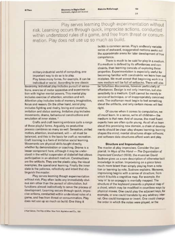
186 |
multicolumn grid
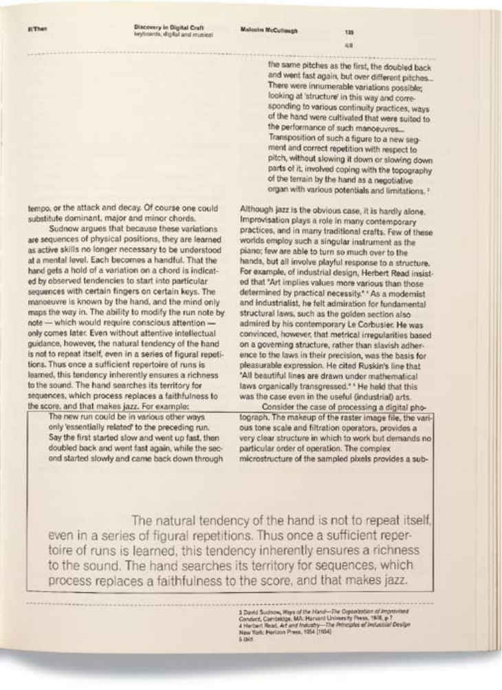
| 187
/ :
Book, 1999.
Designers: Mevis and
Van Deursen. Editor: Jan
Abrams. Publisher:
Netherlands Design Institute.
Photograph: Dan Meyers.
In this book about new media,
a two-column grid contains the
main body of text. The pull
quotes, running across two
columns, are framed in thinly
ruled boxes that suggest the
overlapping “windows” on a
computer screen. The top
margin, which resembles the
tool bar in a browser, provides
an interface to the book.
188 |
multicolumn grid
| 189
+ 27
Journal, 1996. Designers:
Cyan, Berlin. In the pages of
this experimental journal,
compact columns of justified
text are pushed to the outer
margins. By marking
paragraphs with symbols rather
than indents and line breaks,
the designers have maximized
the density of the text field.
Running heads, page numbers,
and images are narrow channels
cut into a solid wall of text.
Footnotes are also treated as
justified blocks, turned 90
degrees against the grain of the
page.
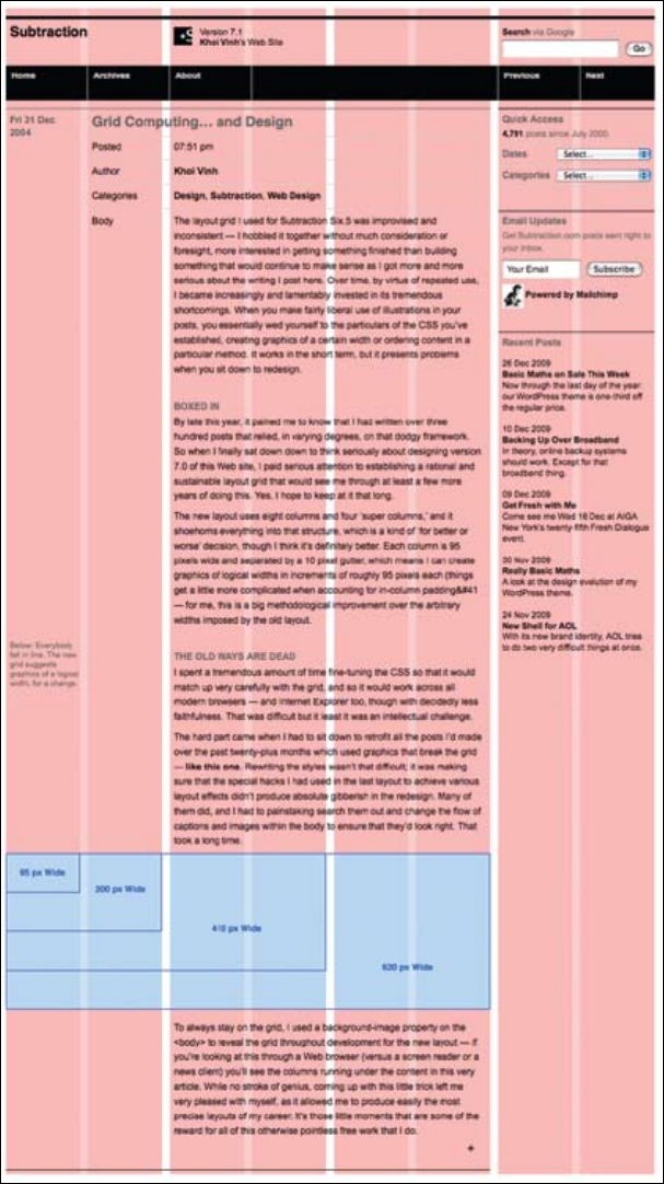
190 |
multicolumn grid
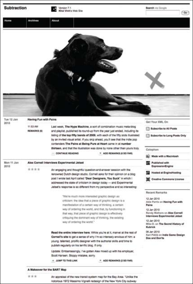
| 191
Website, 2008. Designer: Khoi Vinh. While
countless websites are divided into three or more columns, a fully
functioning grid should allow some components to “break the
grid” by crossing over multiple columns within a content area. The
generous swaths of white space in Vinh’s webpages free the eye from
relentless clutter while emphasizing the underlying grid structure.
Vinh sometimes uses a grid as a background image to check
alignments as he works.
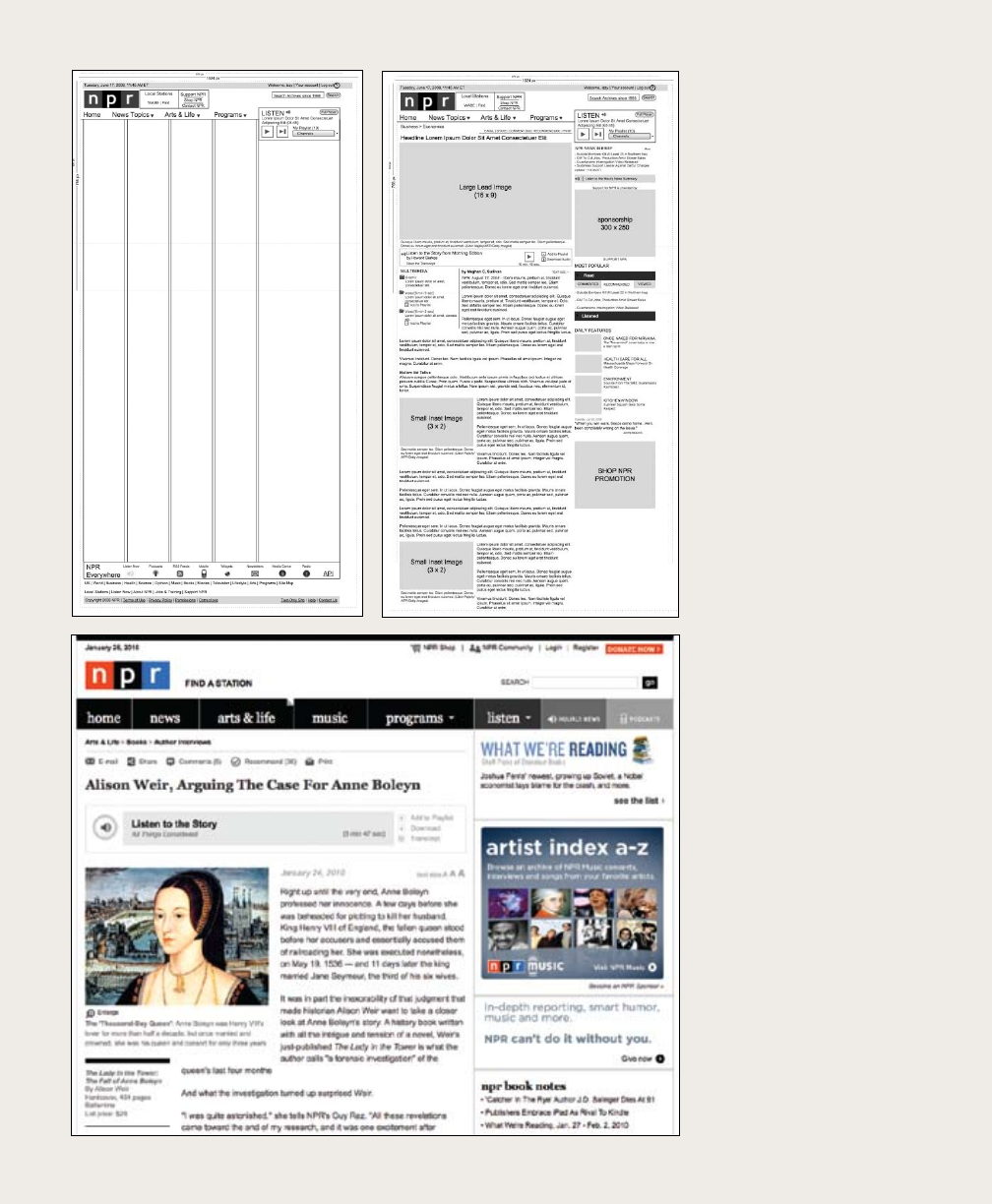
multicolumn grid
. Website, 2009–10.
Designer: NPR sta (Darren
Mauro, Jennifer Sharp,
Callie Neylan, David Wright,
Brian Ingles, K. Libner, Scott
Stroud). The web design process
typically begins with designing
a grid and wire frames that
describe typical pages. The
visual details, such as type
choice, hierarchy, and styling of
navigation elements, are added
later. The site has eight page
templates, each designed for a
dierent editorial situation.
192 |
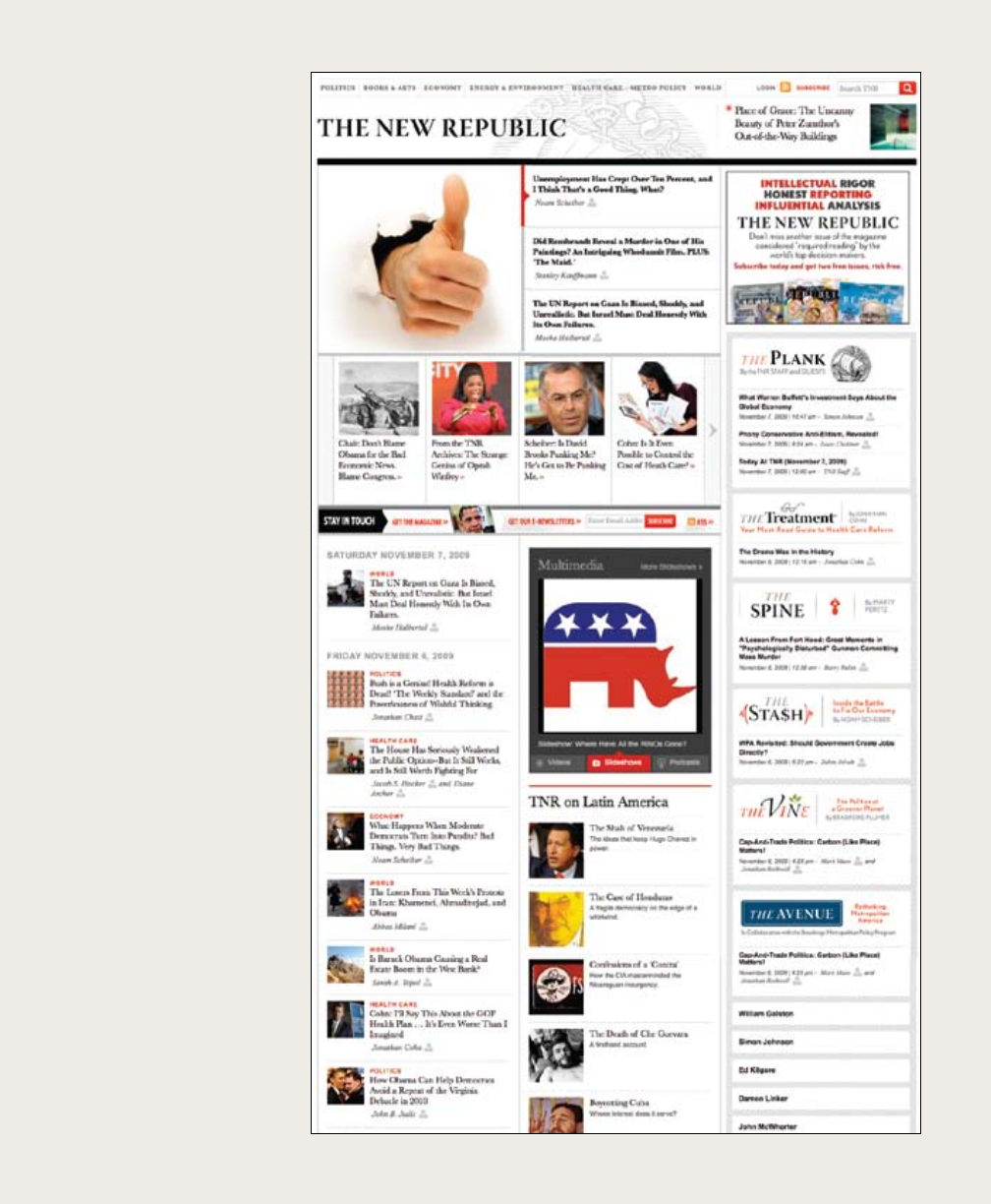
Online
magazine, 2009. The home
page of this online magazine
uses a three-column grid to
provide readers with direct links
to a vast quantity of editorial
content. Opinion sections
each have their own logotypes,
designed to reflect the literary
tone of the overall brand.
| 193
194 |
modular grid
current line width: 0.25 pt
Grid diagram, 1963 (redrawn).
Designer: Karl Gerstner. Publisher: Arthur Niggli, Zurich.
This square grid consists of six vertical columns and six
horizontal modules, overlayed by grids of one, two, three, and
four units. Vertically, the grid is governed by a 10-pt measure,
which would determine the spacing of type from baseline to
baseline.
| 195
A modular grid has consistent horizontal
divisions from top to bottom in addition to
vertical divisions from left to right. These
modules govern the placement and cropping
of pictures as well as text. In the 1950s and
1960s, Swiss graphic designers including
Gerstner, Ruder, and Müller-Brockmann
devised modular grid systems like the one
shown here.
This modular grid has four columns and four rows.
An image or a text block can occupy one or more
modules.
Endless variations are possible.
A grid can be simple or complex, specific or generic, tightly defined or
loosely interpreted. Typographic grids are all about control. They establish
a system for arranging content within the space of page, screen, or built
environment. Designed in response to the internal pressures of content
(text, image, data) and the outer edge or frame (page, screen, window),
an effective grid is not a rigid formula but a flexible and resilient structure,
a skeleton that moves in concert with the muscular mass of content. Grids
belong to the technological framework of typography, from the concrete
modularity of letterpress to the ubiquitous rulers, guides, and coordinate
systems of graphics applications. Although software generates illusions
of smooth curves and continuous tones, every digital image or mark is
constructed—ultimately—from a grid of neatly bounded blocks. The
ubiquitous language of the gui (graphical user interface) creates a gridded
space in which windows overlay windows. In addition to their place in the
background of design production, grids have become explicit theoretical
tools. Avant-garde designers in the 1910s and 1920s exposed the grid of
letterpress, bringing it to the polemical surface of the page. In Switzerland
after World War II, graphic designers built a total design methodology
around the typographic grid, hoping to build from it a new and rational
social order. The grid has evolved across centuries of typographic evolution.
For graphic designers, grids are carefully honed intellectual devices,
infused with ideology and ambition, and they are the inescapable mesh that
filters, at some level of resolution, nearly every system of writing and
Grid systems
The typographic grid is a proportional
regulator for composition, tables, pictures,
etc. It is a formal programme to
accommodate x unknown items.The
typographic grid is a proportional regulator
for composition, tables, pictures, etc. It is a
formal programme to accommodate x
unknown items.
The typographic grid is a proportional
regulator for composition, tables, pictures,
etc. It is a formal programme to
accommodate x unknown items.The
typographic grid is a proportional regulator
for composition, tables, pictures, etc. It is a
formal programme to accommodate x
unknown items.
The typographic grid is a proportional
regulator for composition, tables, pictures,
etc. It is a formal programme to
accommodate x unknown items.The
typographic grid is a proportional regulator
for composition, tables, pictures, etc. It is a
formal programme to accommodate x
unknown items.
A grid can be simple or complex, specific or
generic, tightly defined or loosely interpreted.
Typographic grids are all about control. They
establish a system for arranging content within
the space of page, screen, or built environment.
Designed in response to the internal pressures
of content (text, image, data) and the outer edge
or frame (page, screen, window), an effective
grid is not a rigid formula but a flexible and
resilient structure, a skeleton that moves in
concert with the muscular mass of content.
Grids belong to the technological framework of
typography, from the concrete modularity of
letterpress to the ubiquitous rulers, guides, and
coordinate systems of graphics applications.
Although software generates illusions of smooth
curves and continuous tones, every digital image
or mark is constructed—ultimately—from a grid
of neatly bounded blocks. The ubiquitous
language of the gui (graphical user interface)
creates a gridded space in which windows
overlay windows. In addition to their place in
the background of design production, grids have
A grid can be simple or complex, specific or
generic, tightly defined or loosely interpreted.
Typographic grids are all about control. They
establish a system for arranging content within
the space of page, screen, or built environment.
Designed in response to the internal pressures
of content (text, image, data) and the outer edge
or frame (page, screen, window), an effective
grid is not a rigid formula but a flexible and
resilient structure, a skeleton that moves in
concert with the muscular mass of content.
Grids belong to the technological framework of
typography, from the concrete modularity of
letterpress to the ubiquitous rulers, guides, and
coordinate systems of graphics applications.
Although software generates illusions of
smooth curves and continuous tones, every
digital image or mark is constructed—
ultimately—from a grid of neatly bounded
blocks. The ubiquitous language of the gui
(graphical user interface) creates a gridded
space in which windows overlay windows. In
addition to their place in the background of
design production, grids have become explicit
Grid systems
The typographic grid is a proportional
regulator for composition, tables, pictures,
etc. It is a formal programme to
accommodate x unknown items.The
typographic grid is a proportional regulator
for composition, tables, pictures, etc. It is a
formal programme to accommodate x
unknown items.
The typographic grid is a proportional
regulator for composition, tables, pictures,
etc. It is a formal programme to
accommodate x unknown items.The
typographic grid is a proportional regulator
for composition, tables, pictures, etc. It is a
formal programme to accommodate x
unknown items.
The typographic grid is a proportional
regulator for composition, tables, pictures,
etc. It is a formal programme to
accommodate x unknown items.The
typographic grid is a proportional regulator
for composition, tables, pictures, etc. It is a
formal programme to accommodate x
unknown items.
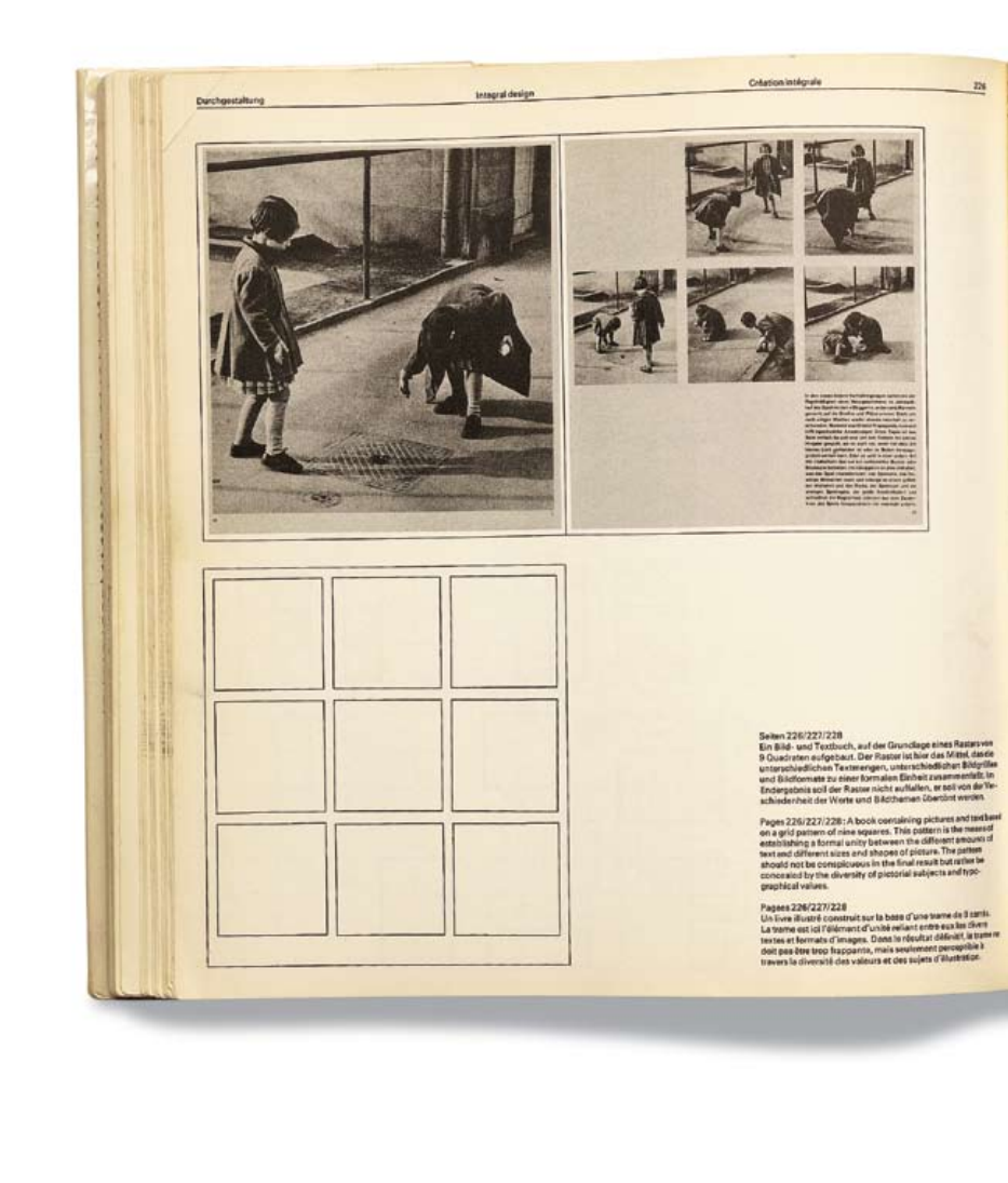
196 |
modular grid
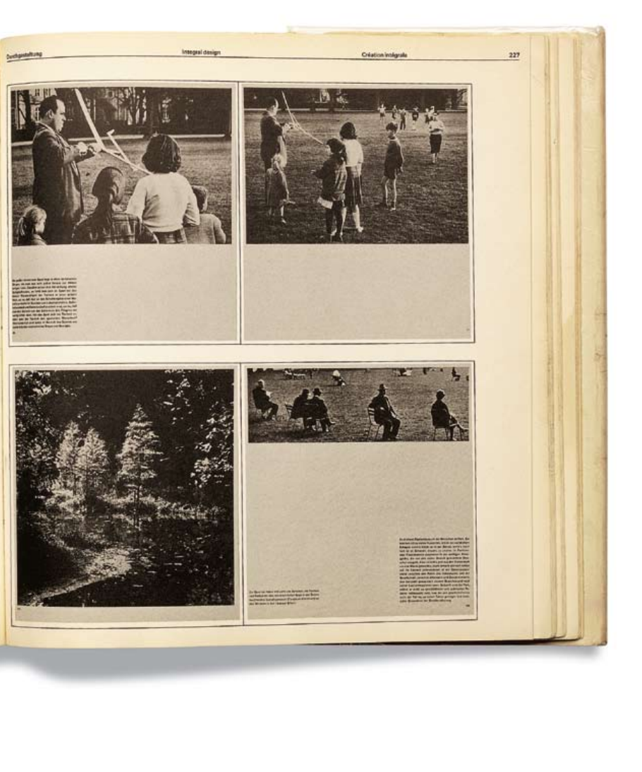
| 197
Book, 1967. Designer and
author: Emil Ruder. Publisher: Arthur Niggli,
Zurich. Photograph: Dan Meyers. In this
classic design text, Emil Ruder demonstrates the
use of a modular grid.
198 |
modular grid
Modular grids are created by positioning
horizontal guidelines in relation to a baseline grid
that governs the whole document. Baseline grids
serve to anchor all (or nearly all) layout elements
to a common rhythm. Create a baseline grid by
choosing the typesize and leading of your text,
such as 10-pt Scala Pro with 12 pts leading
(10/12). Avoid auto leading so that you can work
with whole numbers that multiply and divide
cleanly. Use this line space increment to set the
baseline grid in your document preferences.
Adjust the top or bottom page margin to absorb
any space left over by the baseline grid.
Determine the number of horizontal page
units in relation to the numer of lines in your
baseline grid. Count how many lines fit in a full
column of text and then choose a number that
divides evenly into the line count to create
horizontal page divisions. A column with forty-
two lines of text divides neatly into seven
horizontal modules with six lines each. If your
line count is not neatly divisible, adjust the top
and/or bottom page margins to absorb the
leftover lines.
To style headlines, captions, and other
elements, choose line spacing that works with the
baseline grid, such as 18/24 for headlines, 14/18
for subheads, and 8/12 for captions. Web
designers can choose similar increments (line
height in CSS) to create style sheets with neatly
coordinated baselines.
Where possible, position all page elements in
relation to the baseline grid. Don’t force it,
though. Sometimes a layout works better when
you override the grid. View the baseline grid
when you want to check the position of elements;
turn it off when it’s distracting.
In InDesign, set the baseline grid in
the Preferences>Grids and Guides window. Create
horizontal divisions in Layout>Create Guides. Make the
horizontal guides correspond to the baselines of the
page’s primary text by choosing a number of rows that
divides evenly into the number of lines in a full column
of text.
The first line of the text starts
12 pts from the top of the text frame. In the default
setting, the first line is positioned according to the cap
height.
In a modular grid, horizontal
guidelines are placed in relation to
the overall baseline grid of the
document. Baseline grids help
designers build pages in which all (or
nearly all) elements are anchored by a
common rhythm. Start by choosing
the typesize and leading of your text,
such as 10-pt Scala Pro with 12 pts
leading (10/12). Avoid auto leading so
that you can work with a whole
number that multiplies and divides
cleanly. Use this line space increment
to determine the baseline grid in
your document Preferences. Adjust
the top or bottom page margin to
absorb any extra space left over by the
baseline grid.
Determine the number of
horizontal units in relation to the
numer of lines in the baseline grid.
Count how many lines fit in a full
column of text. Find a number that
divides easily into this measure to
create horizontal page divisions. A
column with 42 lines of text divides
neatly into 7 horizontal modules with
six lines each. If necessary, adjust the
page margins to eliminate extra lines.
T o style headlines, captions, and
other elements, choose line spacing
that works with the baseline grid,
such as 18/24 for headlines, 14/18 for
subheads, and 8/12 for captions.
Where possible, position all page
elements in relation to the baseline
grid. Don’t force it, though.
Sometimes a layout works better
when you override the grid. View the
baseline grid when you want to check
the position of elements; turn it off
nerd alert: Working in InDesign, you
can make your text frames automatically
align with the baseline grid. Go to
Object>Text Frame Options>Baseline
Options and choose Leading. If your
leading (line spacing) is 12 pts, the first
baseline will fall 12 pts from the top of
the text frame.
| 199
Modular grids are created by
positioning horizontal guidelines in
relation to a baseline grid that governs
the whole document. Baseline grids
serve to anchor all (or nearly all)
elements to a common rhythm.
Create a baseline grid by choosing
the typesize and leading of your text,
such as 10-pt Scala Pro with 12 pts
leading (10/12). Avoid auto leading so
that you can work with whole
numbers that multiply and divide
cleanly. Use this line space increment
to set the baseline grid in your
document preferences. Adjust the top
or bottom page margin to absorb any
space left over by the baseline grid.
Determine the number of
horizontal page units in relation to
the numer of lines in the baseline
grid. Count how many lines fit in a
full column of text and then choose a
number that divides easily into the
line count to create horizontal page
divisions. A column with forty-two
lines of text divides neatly into seven
horizontal modules with six lines
each. If your line count is not neatly
divisible, adjust the top and/or
bottom page margins to absorb
leftover lines.
To style headlines, captions, and
other elements, choose line spacing
that works with the baseline grid,
such as 18/24 for headlines, 14/18 for
subheads, and 8/12 for captions.
(Web designers can choose similar
increments (line height) to create
style sheets with coordinated
baselines.)
Where possible, position all page
elements in relation to the baseline
grid. Don’t force it, though.
Sometimes a layout works better
when you override the grid. View the
baseline grid when you want to check
the position of elements; turn it off
when it’s distracting.
InDesign, set the baseline grid in
the Preferences>Grids and Guides
window. Create horizontal divisions
in Layout>Create Guides. Make the
horizontal guides correspond to the
baselines of the page’s primary text
by choosing a number of rows that
divides evenly into the number of
lines in a full column of text.
Working in InDesign, you can make
baseline grids
create a common rhythm
Captions and other
details are styled
to coordinate with
the dominant base-
line grid.
9/12 Scala Sans Pro Italic :
10/12 Scala Pro.
This measure determines
the baseline grid.
32/48 pt Scala Sans Pro Bold
18/24 Scala Sans Pro Italic
200 |
36
100 Years of Humanitarian Design Design Like You Give a Damn
37
Conventional “handcrafted” homes had undergone “no structural
advances in 5,000 years,” Fuller argued. They were poorly lit,
required much maintenance, and did not make effi cient use of raw
materials. Most conventional buildings depended on gravity for their
strength. But what if a building could be suspended, as a sail from a
mast, allowing for greater strength and the use of fewer materials?
Fuller’s thinking led to the design of the Dymaxion House,
a small-scale model of which was fi rst exhibited at a Marshall
Field’s department store in Chicago in 1929. His radical scheme
embraced the principle of tension and aimed to do “more with less.”
It was spherical, to make effi cient use of materials, and clad in
maintenance-free aluminum. It was naturally climate controlled and
could be lit by a single light source through a system of mirrors and
dimmers. All the mechanicals, wiring, and appliances were built into
the walls and mast to allow for easy replacement. The house was
also one of the fi rst examples of self-suffi cient (or “autonomous,”
as Fuller put it) green design. Wind turbines produced energy. The
roof collected rainwater. Water-saving “fog guns” handled washing
(including people), and Fuller’s “package toilet” composted waste
and recovered methane gas.13
While the Dymaxion House was unabashedly ahead of its time
(it would be two decades before Fuller could fi nd backing to build
a full-scale prototype), the concept of building with tension rather
than compression would become central to Fuller’s work and
would eventually lead to his most lasting contribution to the fi eld
of humanitarian design: the geodesic dome. Fuller’s principle
of tensegrity became a staple of tent design, and by extension,
emergency shelter, that endures to this day.
Like the Dymaxion House, few of these early designs for “factory-
built” housing achieved widespread commercial viability. For
example, Le Corbusier’s low-cost housing for workers in Pessac,
near Bordeaux, France, went unoccupied for eight years after it was
built. However, this concept of mass-produced housing would have
a number of lasting implications for low-cost shelter. It prefi gured
a move away from the craft of building toward the technology of
building. It took design out of the realm of the many and put it in
the hands of an educated few. Perhaps more important, it negated
the need for a dialogue between the architect and the occupant.
Suddenly a house could be designed, detailed, and delivered without
the architect ever meeting its owner.
Manufactured Housing
Meanwhile, in the rest of America, the industrialization of
architecture took a very different tack. By the early ’20s the
automobile had become an integral part of American life. Trailers
were common and had been adapted by migrant workers and others
into dwellings. With the onset of the Depression, the demand for
cheap, portable housing grew. A mobile home seemed the next
logical step. In 1936 Wally Byam built the fi rst Airstream trailer,
a steel-clad, aerodynamic embodiment of home on the road.
Although the Airstream would eventually become an American icon,
designs such as the Durham Portable House would prove far more
infl uential.14
Not only did the Durham, which cost between $1,500 and $3,000,
mimic the styling of a conventional home, it also was a precursor
1934
Modern Housing
Catherine Bauer
1934
National Housing Act of 1934
USA
built two prototypes based on his ideas for exhibition: The immeubles
villas (1922) and the Maison Citrohan (1922), a play on the automobile
name Citroën. Throughout the ’20s Le Corbusier expounded on his
ideas for a new industrialized architecture in a series of manifestos
and urban plans.
Another early pioneer of prefabrication and component building
systems was the German architect Walter Gropius. Gropius, who
founded the Bauhaus and served as its director from 1919 to 1928,
personifi ed the architect as public servant and teacher. Throughout
the ’20s and ’30s Gropius experimented with prefabricated wall
panels and eventually whole structures. During his tenure and that of
his successors, the Bauhaus became a nexus for socially conscious
design.
Gropius, along with Marcel Breuer, is also credited with designing
the fi rst slab apartment block. This new building type, which would
become the model for many future affordable-housing projects, was
conceived to overcome the cramped, lightless tenement housing
that had resulted from rampant land speculation at the turn of the
century. The basic plan consisted of parallel rows of four- to 11-story
apartment blocks. Each slab was only one apartment deep with
windows front and back. The slabs were sited on a “superblock” at
an angle to the street with communal green spaces between them to
allow maximum sunlight into each apartment.12
“Architecture is a process of
giving form and pattern to the
social life of the community.
Architecture is not an
individual act performed by an
artist-architect and charged
with his emotions. Building is
a collective action.”
Hannes Meyer, director of Bauhaus, 1928 to 1930
1929
Dymaxion House
Chicago, Ill., USA
R. Buckminster Fuller
1930
Housing Act of 1930
England
1930–39
Drought and Dust Storms
Midwestern and southern plains, USA
1931
Prefabricated houses built for the
Hirsch Copper and Brass Works
Finow, Germany
Walter Gropius
1931
Slab apartment blocks on the
Wannsee shore
Berlin, Germany
Walter Gropius
Others would also experiment with standardized building
components, modular systems, and prefabrication, including the
French industrial designer Jean Prouvé and Frank Lloyd Wright, but
perhaps none more passionately than the American inventor
R. Buckminster Fuller.
Fuller arrived on what he termed “spaceship earth” in 1895. Like
Gropius and Le Corbusier, he believed that mass-manufactured
dwellings represented the future of housing. His most lasting
contribution, however, was his fervent belief in the power of design
to improve the human condition. In a sense Fuller, who was known
for his eccentric use of language and his marathon lectures (the
longest lasted 42 hours and only recently has been fully transcribed),
was the fi rst evangelist of humanitarian design.
In 1927, after the death of his elder daughter and the collapse of
his fi rst business, he found himself at the edge of Lake Michigan
contemplating suicide. He was a failure, “a throw-away.” What
brought him from the brink, he later recounted, was the simple idea
that his experience might ultimately be somehow useful to his fellow
human beings. Rather than taking his own life, he decided to embark
on a lifelong experiment, using himself as his own best research
subject. He became “Guinea Pig B” (for Bucky), the world’s fi rst test
pilot of a “design-science revolution,” the sole purpose of which was
to improve “human livingry,” and he started with the house.
Walter Gropius, slab apartment blocks on the Wannsee Shore, Berlin, 1931
1930s
1931
Flood
China
The Yellow River, the second largest
river in China, fl oods. Death toll
estimates range from 850,000 to four
million. The fl ooding is followed by
famine and outbreaks of disease.
1936
Airstream Clipper
Los Angeles, Calif., USA
Wally Byam
1937
Housing Act of 1937
USA
R. Buckminster Fuller with an early model of his Dymaxion House
Buckminster Fuller Institute
0-01 p032-055_History_Essay_01.indd 36-37 12/12/09 4:10:44 PM
ISBN 1-933045-25-6 $35.00
The greatest humanitarian challenge we
face today is that of providing shelter.
Currently one in seven people lives in a slum or refugee camp,
and more than three billion people—nearly half the world's
population—do not have access to clean water or adequate
sanitation. The physical design of our homes, neighborhoods,
and communities shapes every aspect of our lives. Yet too
often architects are desperately needed in the places where
they can least be afforded.
Edited by Architecture for Humanity, Design Like You Give a
Damn is a compendium of innovative projects from around the
world that demonstrate the power of design to improve lives.
The fi rst book to bring the best of humanitarian architecture
and design to the printed page, Design Like You Give a Damn
offers a history of the movement toward socially conscious
design and showcases more than 80 contemporary solutions
to such urgent needs as basic shelter, health care, education,
and access to clean water, energy, and sanitation.
Design Like You Give a Damn is an indispensable resource
for designers and humanitarian organizations charged with
rebuilding after disaster and engaged in the search for
sustainable development. It is also a call to action to anyone
committed to building a better world.
JAC KET F RONT: left, Rufi sque Women’s Centre,
Rufi sque, Senegal, Hollmén Reuter Sandman
Architects, photograph courtesy Hollmén Reuter
Sandman Architects; right, Baninajar Refugee
Camp, Khuzestan, Iran, shelters built with
Super Adobe system created by Nader Khalili,
photograph courtesy UNDP
Printed in China
Design Like You
Giv e a Damn
Architectural Responses to Humanitarian Crises_Edited by Architecture for Humanity
Design Like You
G iv e a Da m n
Architectural Responses to Humanitarian Crises Edited by Architecture for Humanity
“Committed, unapologetically architectural in name and
mission, Architecture for Humanity stands up for people
in need. It demonstrates a quality of leadership, providing
renewed appreciation for architecture and winning
respect and trust.”
Robert Ivy, editor-in-chief, Architectural Record
“Architecture for Humanity offers innovative and
cost-effective ideas for housing the homeless
and rebuilding lives.”
Jessie Scanlon, Business Week
“An offering of ‘hope by design’ to a challenged world.”
James Cramer, Design Intelligence
FOUNDED IN 1999 by Cameron Sinclair and Kate Stohr, Architecture for
Humanity is a grassroots nonprofi t organization that seeks architectural
solutions to humanitarian crises. Through design-build programs, competi-
tions, educational forums, and partnerships with community development
and relief organizations, Architecture for Humanity creates opportunities
for architects and designers from around the world to assist communities
in need. Where resources and expertise are scarce, innovative, sustainable,
and collaborative design can make a difference.
EDITED BY Architecture for Humanity,
a volunteer-based organization
that provides architectural solutions
to humanitarian crises, Design Like
You Give a Damn brings the best of
humanitarian design to the printed
page. Proceeds from the sale of
this book will support the work of
Architecture for Humanity.
FEATURING WORK BY:
Acumen Fund
Logan Allen
César Añorve
Arup Associates
Stephan Augustin
Barefoot Architects
Peter Brewin and William Crawford
Bustan
Cal-Earth
Center for Community Research
and Design
Center for Urban Pedagogy
CHF International
Chinese University of Hong Kong
Common Ground Community
Design Corps
Detroit Collaborative Design Center
East Coast Architects
ELEMENTAL Housing Initiative
Ferrara Design
FTL Design Engineering Studio
Future Systems
Deborah Gans and Matt Jelacic
Grant Gibbs
Vinay Gupta
Habitat for Humanity Northern Ireland
Harvard Graduate School of Design
Health Habitat
Heavy Trash
Hierve-Diseñeria
Hole-in-the-Wall Schools
Hollmén Reuter Sandman Architects
William Hsu
I-Beam Design
Icosa Village
Intermediate Technology Development
Group
Jorge Mario Jáuregui Architects
Justiceville, USA
Diébédo Francis Kéré
KickStart
LA Architects
LILA Design
Lotus Energy
Mad Housers
Native American Photovoltaics
Oxfam
Sergio Palleroni
Potters for Peace
Project Locus
Michael Rakowitz
RBGC Architecture, Research & Urbanism
Red Feather Development Group
Relief International
Roundabout Outdoor
Rural Studio
Rafi Segal and Eyal Weizman
SENSEable City Laboratory
Shelter Architecture
Shelter For Life
shelterproject
Shelter Systems
Shigeru Ban Architects
Shrinking Cities
Sphere Project
Strong Angel
Süd-Chemie
Swee Hong Ng
Technical University, Vienna
TechnoCraft
theskyisbeautiful architecture
UNHCR
World Conservation Union
World Shelters
AFH_dustjacket2.indd 1 12/12/09 4:18:30 PM
Book, 2006.
Designers: Paul Carlos, Urshula Barbour,
Katharina Seifert, and Farha Khan/Pure + Applied.
Authors: Architecture for Humanity, Kate Stohr,
and Cameron Sinclair. This book design uses a
modular grid to bring order to complex content. Some
pages are dense with body text, captions, and small
images, while others feature full-bleed photography
layered with short statements and hard-hitting
statistics.
modular grid
| 201
60
Housing Lightweight Emergency Tent Design Like You Give a Damn
61
Lightweight
Emergency Tent
Location_Various
Date_2002–present
Organization_Offi ce of the United Nations High
Commissioner for Refugees (UNHCR)
End client_Refugees, internally displaced
populations
Design consultant_Ghassem Fardanesh
Manufacturer_H. Sheikh Noor-ud-Din & Sons
(Pvt.) Limited, Lahore, Pakistan
Cost per unit_Approx. $100
Area_178 sq. ft./16.5 sq. m
Occupancy_4–5 people
Dimensions_18 x 9.8 x 6.9 ft./5.5 x 3 x 2.1 m
Weight_91 lb./41.5 kg
Designers have tried to rethink this
basic tent for decades. Everything from
prefabricated structures to shipping
containers to polyurethane yurts has been
suggested or attempted. But as the agency
politely points out in its guide to emergency
materials, to date none of these systems
has proven effective in refugee situations.
Most fail simply because other emergency
shelter arrangements will have been made
before these systems even arrive. Some
tent alternatives are perceived as “too
permanent,” making them diffi cult to site in
host communities and creating less incentive
for a refugee to return home. Others are
diffi cult or costly to replicate.
But in recent years there has been a
growing sense within the agency that the
design of the standard family tent could
and should be radically overhauled. In most
emergencies the agency sends out plastic
sheeting fi rst. Depending on the size and
complexity of the crisis, this sheeting may
be the response of fi rst and last resort.
However, in cases where local materials
are not available to build more permanent
structures, where families cannot fi nd
shelter within the community or are
displaced for longer periods of time, the
UNHCR provides more durable alternatives —
typically a ridge-style or center-pole-double-
fl y tent made from canvas. Yet these canvas
tents are not only heavy, cumbersome to
carry, and costly to ship, but because canvas
rots they deteriorate quickly and cannot
be stockpiled for long periods. Wear and
tear on the weakened material in the fi eld
signifi cantly shortens the useful lifespan of
the shelter.
In 2002 the UNHCR began testing a new
design for the basic family tent it regularly
dispatched to areas of crisis. The agency’s
In war-torn countries
and areas devastated by
disaster, the presence
of UNHCR tents is one of
the fi rst signs of aid.
The UNHCR’s new Lightweight Emergency
Tents in use in Meulaboh, West Sumatra,
following the Indian Ocean tsunami of 2004
© T. Pengilley/UNHCR
1-02 p060-063_Light Weight.indd 60-61 12/12/09 3:27:52 PM
68
Housing GripClips Design Like You Give a Damn
69
Not only did he design the fi rst geodesic
backpacking tent, based on Buckminster
Fuller’s ideas, for The North Face in the
1970s, but he also lived in a collection of
tents (with his wife and three children) for
more than 20 years—all of which he designed
himself, including the tent that housed the
family washing machine.
Although many of Gillis’s tent innovations
have stemmed from efforts to improve his
own living conditions, from the beginning he
saw the potential for translating his ideas to
emergency shelter—in particular using the
plastic sheeting that has become a standard
component of relief projects. However,
working with plastic sheeting meant fi nding
a way to “hold on to it.” Gillis explains: “It was
diffi cult to join the material without puncturing
it. But puncturing it is a bad idea because it
weakens it. The material deteriorates less if
you don’t injure it.” The designer went through
more than 10 different iterations before
arriving at the GripClip, a small plastic fastener
that clips onto any type of sheeting and ties it
to a frame.
Reducing the shelter to its most
fundamental element, the connection between
the sheeting and the support, enabled Gillis to
design a number of tents, from a basic shelter
frame kit to more elaborate dome structures.
The clips also offered another advantage:
They allowed for a range of shapes. Whereas
most relief agencies distribute tunnel-shaped
tents because the structure can be covered
It would be safe to say
that few people know the
ins and outs of tents
better than Robert Gillis.
GripClips
Location_Various
Date_1975–present
Designer_Robert Gillis
Manufacturer_Shelter Systems
Cost_$8–10 (set of 4)
opposite
A GripClip, secured to a cross-piece of frame,
shown from inside a shelter. The frame pieces are
secured with plastic wrap.
above
GripClip’s two plastic parts are designed to be
twisted together with a piece of sheeting between
them. The clip itself can be fastened to a frame
structure with plastic ties, rope, or pipe clamps.
right
Robert Gillis inside a tent built with GripClips.
All photographs © www.dometents.com
with one large sheet of material, these tents
are less stable in the wind than dome-shaped
tents. Using GripClips, Gillis found he was
able to layer sheeting in shingles to create a
more stable structure that would also shed
rain. “And I didn’t have to sew it or heat-weld
it or anything,” he recalls. “Here was the
perfect thing: It was totally wonderful.”
More recently Gillis has focused on
creating clips and fasteners to attach plastic
sheeting to roofs, frameworks, piping, or
plywood, allowing families to turn damaged
structures into transitional homes while they
rebuild.
1-04 p068-069_GripClips.indd 68-69 12/12/09 3:29:16 PM
222
223
women
Walter Kalin et al., eds., The Face of Human Rights, Baden:
Lars Müller, 2004
WORK
of the world’s
working hours,
PRODUCE
of the world’s food,
and yet
EARN
of the world’s
income and
OWN LESS THAN
of the world’s
property
2/3
1/2
10%
1%
BETWEEN
40-60%
of sexual assaults are
committed against girls
younger than 16.
“Prevention and response
to sexual and gender-based violence
in refugee situations”, UNHCR
Women constitute of the
estimated
people living in absolute poverty
Walter Kalin et al., eds., The Face of Human Rights,
Baden: Lars Müller, 2004
70%
1,300,000,000
110 million
2/3
children not in school are girls
Walter Kalin et al., eds., The Face of Human Rights,
Baden: Lars Müller, 2004
Helena Sandman
of the
2-08 p220-221_STATS_Women.indd 222-223 12/12/09 3:32:12 PM
;
exercise: modular grid
Common typographic disorders
Various forms of dysfunction appear among populations exposed
to typography for long periods of time. Listed here are a number
of frequently observed afflictions.
typophilia
An excessive attachment to and fascination with the shape of
letters, often to the exclusion of other interests and object choices.
Typophiliacs usually die penniless and alone.
typophobia
The irrational dislike of letterforms, often marked by a preference for
icons, dingbats, and—in fatal cases—bullets and daggers. The fears
of the typophobe can often be quieted (but not cured) by steady
doses of Helvetica and Times Roman.
typochondria
A persistent anxiety that one has selected the wrong typeface. This
condition is often paired with okd (optical kerning disorder), the need
to constantly adjust and readjust the spaces between letters.
Common
typographic
disorders
Various forms of dysfunction appear among
populations exposed to typography for long
periods of time. Listed here are a number of
frequently observed afflictions.
typophobia
The irrational dislike of letterforms, often
marked by a preference for icons, dingbats,
and—in fatal cases—bullets and daggers.
The fears of the typophobe can often be
quieted (but not cured) by steady doses of
Helvetica and Times Roman.
typophilia
An excessive attachment to and fascination
with the shape of letters, often to the
exclusion of other interests and object
choices. Typophiliacs usually die penniless
and alone.
typochondria
A persistent anxiety that one has selected the
wrong typeface. This condition is often paired
with OKD (optical kerning disorder), the need
to constantly adjust and readjust the spaces
between letters.
202 |
Use a modular grid to arrange a text in as
many ways as you can. By employing just one
size of type and flush left alignment only, you
will construct a typographic hierarchy
exclusively by means of spatial arrangement.
To make the project more complex, begin
adding variables such as weight, size, and
alignment.
Common
typographic
disorders
Various forms of dysfunction appear among
populations exposed to typography for long
periods of time. Listed here are a number of
frequently observed afflictions.
typophobia
The irrational dislike
of letterforms, often
marked by a
preference for icons,
dingbats, and—in
fatal cases—bullets
and daggers. The
fears of the
typophobe can often
be quieted (but not
cured) by steady
doses of Helvetica
and Times Roman.
typophilia
An excessive
attachment to and
fascination with the
shape of letters, often
to the exclusion of
other interests and
object choices.
Typophiliacs usually
die penniless and
alone.
typochondria
A persistent anxiety
that one has selected
the wrong typeface.
This condition is often
paired with OKD
(optical kerning
disorder), the need to
constantly adjust and
readjust the spaces
between letters.
Various forms of dysfunction appear among
populations exposed to typography for long
periods of time. Listed here are a number of
frequently observed afflictions.
Various forms of dysfunction appear among
populations exposed to typography for long
periods of time. Listed here are a number of
frequently observed afflictions.
The irrational dislike of letterforms, often
marked by a preference for icons, dingbats,
and—in fatal cases—bullets and daggers.
The fears of the typophobe can often be
quieted (but not cured) by steady doses of
Helvetica and Times Roman.
typophobia
typophobia
An excessive attachment to and fascination
with the shape of letters, often to the
exclusion of other interests and object
choices. Typophiliacs usually die penniless
and alone.
typophilia
typophilia
A persistent anxiety that one has selected the
wrong typeface. This condition is often paired
with OKD (optical kerning disorder), the need
to constantly adjust and readjust the spaces
between letters.
The irrational dislike of letterforms, often
marked by a preference for icons, dingbats,
and—in fatal cases—bullets and daggers.
The fears of the typophobe can often be
quieted (but not cured) by steady doses of
Helvetica and Times Roman.
An excessive attachment to and fascination
with the shape of letters, often to the exclusion
of other interests and object choices.
Typophiliacs usually die penniless and alone.
A persistent anxiety that one has selected the
wrong typeface. This condition is often paired
with okd (optical kerning disorder), the need
to constantly adjust and readjust the spaces
between letters.
typochondria
typochondria
Common
typographic
disorders
Various forms of
dysfunction appear
among populations
exposed to
typography for long
periods of time. Listed
here are a number of
frequently observed
afflictions.
The irrational dislike
of letterforms, often
marked by a
preference for icons,
dingbats, and—
in fatal cases—bullets
and daggers.
The fears of the
typophobe can often
be quieted (but
not cured) by steady
doses of Helvetica
and Times Roman.
typophobia
typophilia
An excessive
attachment to and
fascination with the
shape of letters, often
to the exclusion of
other interests and
object choices.
Typophiliacs usually
die penniless and
alone.
A persistent anxiety
that one has selected
the wrong typeface.
This condition is
often paired with
OKD (optical kerning
disorder), the need
to constantly adjust
and readjust the
spaces between
letters.
typochondria
Common
typographic
disorders
Various forms of dysfunction appear among
populations exposed to typography for long
periods of time. Listed here are a number of
frequently observed afflflictions.
The irrational dislike of letterforms, often
marked by a preference for icons, dingbats,
and—in fatal cases—bullets and daggers.
The fears of the typophobe can often be
quieted (but not cured) by steady doses of
Helvetica and Times Roman.
typophobia
An excessive attachment to and fascination
with the shape of letters, often to the
exclusion of other interests and object
choices. Typophiliacs usually die penniless
and alone.
typophilia
A persistent anxiety that one has selected
the wrong typeface. This condition is often
paired with okd (optical kerning disorder), the
need to constantly adjust and readjust the
spaces between letters.
typochondria
Common
typographic
disorders
Common
typographic
disorders
, ,
| 203
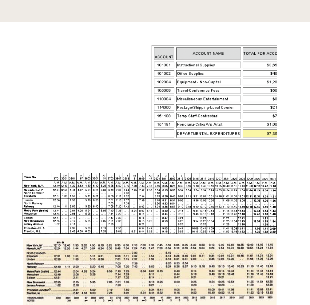
204 |
data tables
, Original schedule with redesign
by Edward Tufte. From Edward Tufte, Envisioning Information (Cheshire, Conn.: Graphics Press,
1990). The original design (top) is organized with heavy horizontal and vertical divisions. Tufte calls
this a “data prison.” His redesign uses the alignment of the typographic elements themselves to express
the table’s underlying structure.
The design of charts and graphs is a rich
area of typographic practice. In a data table,
the grid acquires semantic significance.
Columns and rows contain different types of
content that readers can scan and quickly
compare. Designers (and software defaults)
often over-emphasize the linear grid of a
table rather than allowing the typography to
command the page and stake out its own
territory. As columns of text align visually, they
create implied grid lines on the page or screen.
type crime: The rules and boxes used in data
tables should illuminate the relationships among data, not trap
each entry inside a heavily guarded cell.
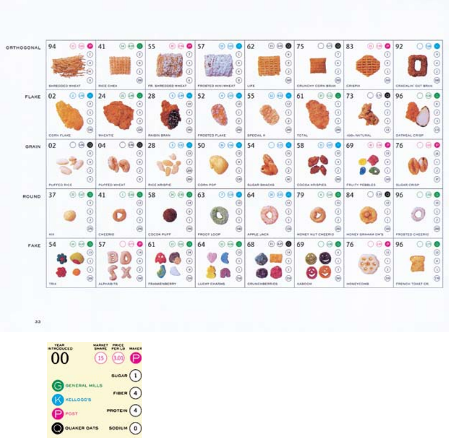
| 205
Magazine page (detail),
1998. Designer: Catherine Weese. Photography: John
Halpern. Publisher: Patsy Tarr, 2wice Magazine. This
chart organizes breakfast cereals by shape and annotates
them according to a dozen characteristics, from fiber content
to price per pound. Visual displays of data allow readers to
quickly compare items. One might observe, for example, that
in breakfast cereals, intensity of sugar is usually accompanied
by intensity of color.
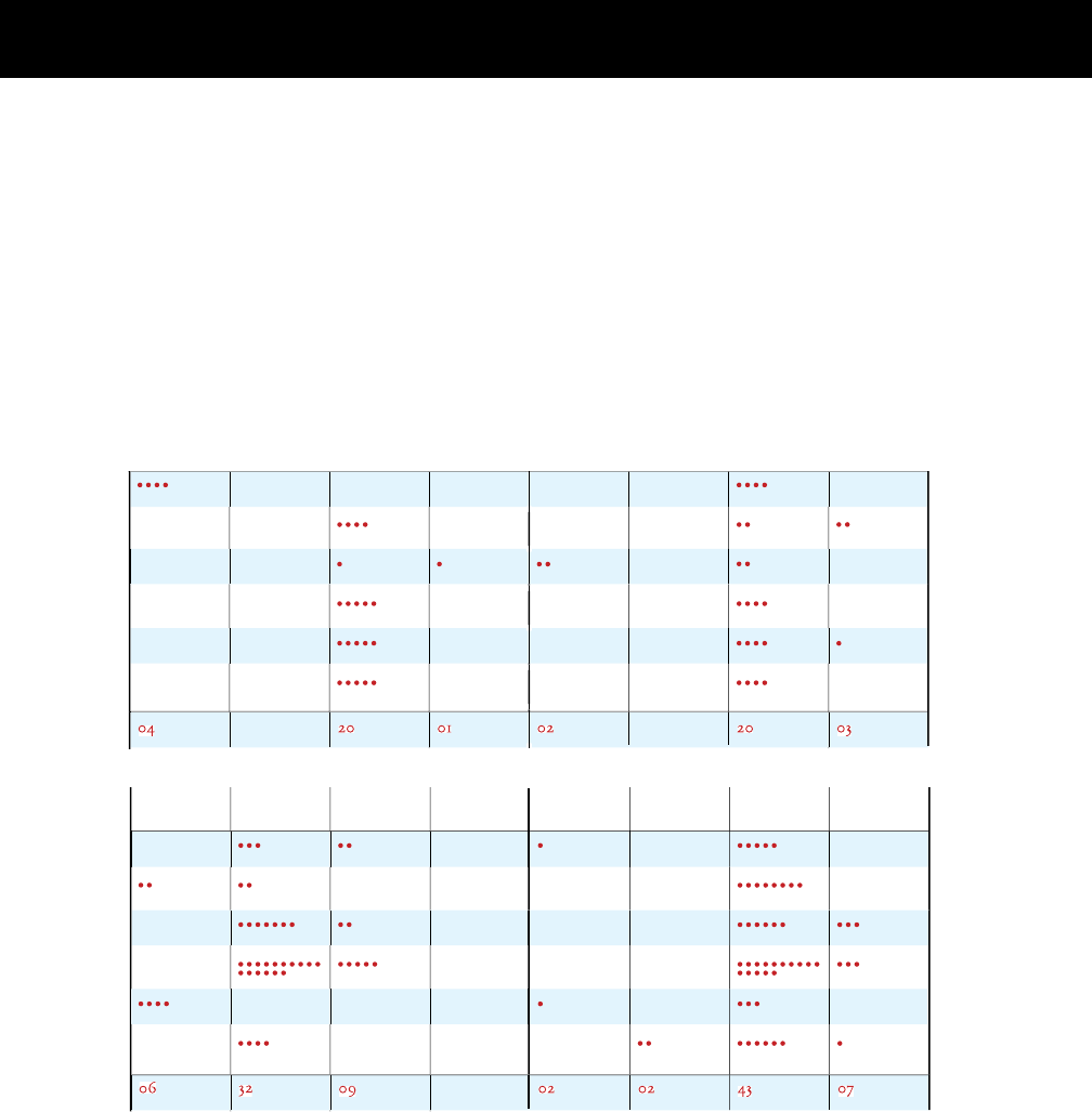
206 |
exercise: data tables
left
al
on
e
take
n
t
o
n
e
st
thr
o
wn
i
n
w
ater
b
o
th
n
e
s
t
a
n
d
w
ater
1
0
1
4
1
5
2
9
02
06
left
al
on
e
take
n
t
o
n
e
st
thr
o
wn
i
n
w
ater
b
o
th
n
e
s
t
a
n
d
w
ater
s
ep
t
oct
t
o
ta
l
left
al
on
e
take
n
t
o
n
e
st
thr
o
wn
i
n
w
ater
b
o
th
n
e
s
t
a
n
d
w
ater
left
al
on
e
take
n
t
o
n
e
st
thr
o
wn
i
n
w
ater
b
o
th
n
e
s
t
a
n
d
w
ater
2
0
22
01
0
5
1
5
1
7
n
o
v
j
a
n
t
o
ta
l
de
c
c
h
l
oroformed ant
s
fri
en
d
s
st
ran
g
er
s
in
t
o
xi
ca
ted ant
s
Find a chart from an old science book or other
source and redesign it. Shown at right is a
nineteenth-century table documenting an
experiment about ants. The old design
emphasizes vertical divisions at the expense of
horizontal ones, and it jumbles together text and
numbers within the table cells.
The redesign below eliminates many of the
ruled lines, replacing them, where needed, with a
pale tone that unifies the long horizontal rows of
data. The redesigned chart also replaces most of
the numerals with dots, a technique that lets the
eye visually compare the results without having to
read each numeral separately.
| 207
Data table
from Sir John Lubbock, Ants, Bees,
and Wasps (New York: D. Appleton
and Company, 1893). The author of
this experiment studied how ants
responded upon meeting either
“friends” (members of their own
colony) or “strangers.” In the first
experiment, the friends and strangers
were rendered unconscious with
chloroform. In the second
experiment, the ants were merely
intoxicated. The chloroformed
ants—whether friends or strangers—
were usually taken for dead and
pitched into a moat of water
surrounding the colony. The
intoxicated ants were treated with
more discrimination. Many of the
drunken friends were taken back to
the nest for rehab ilitation, whereas
drunken strangers were generally
tossed in the moat. Ants, one might
conclude, should not rely on the
kindness of strangers.
’
{APPENDIX}

210 |
spaces and punctuation
Writers or clients often supply manuscripts that
employ incorrect dashes or faulty word spacing.
Consult a definitive work such as The Chicago
Manual of Style for a complete guide to punctuation.
The following rules are especially pertinent for
designers.
are created by the space bar. Use just one
space between sentences or after a comma, colon, or
semicolon. One of the first steps in typesetting a
manuscript is to purge it of all double spaces. Thus the
space bar should not be used to create indents or
otherwise position text on a line. Use tabs instead.
refuses to recognize double spaces altogether.
are wider than word spaces. An en space can
be used to render a more emphatic distance between
elements on a line: for example, to separate a subhead
from the text that immediately follows, or to separate
elements gathered along a single line in a letterhead.
express strong grammatical breaks. An em
dash is one em wide—the width of the point size of the
typeface. In manuscripts, dashes are often represented
with a double hyphen (--); these must be replaced.
serve primarily to connect numbers (1–10).
An en is half the width of an em. Manuscripts rarely
employ en dashes, so the designer needs to supply them.
connect linked words and phrases, and they
break words at the ends of lines. Typesetting programs
break words automatically. Disable auto hyphenation when
working with ragged or centered text; use discretionary
hyphens instead, and only when unavoidable.
, which are inserted manually to
break lines, only appear in the document if they are
needed. (If a text is reflowed in subsequent editing, a
discretionary hyphen will disappear.) Wayward hyphens
often occur in the mid-dle of a line when the typesetter has
inserted a “hard” hyphen instead of a discretionary one.
have distinct “open” and “closed”
forms, unlike hatch marks, which are straight up and
down. A single close quote also serves as an apostrophe
(“It’s Bob’s font.”). Prime or hatch marks should only be
used to indicate inches and feet (5'2''). Used incorrectly,
hatches are known as “dumb quotes.” Although computer
operating systems and typesetting programs often include
automatic “smart quote” features, e-mailed, word-
processed, and/or client-supplied text can be riddled with
dumb quotes. Auto smart quote programs often render
apostrophes upside down (‘tis instead of ’tis), so
designers must be vigilant and learn the necessary
keystrokes.
consist of three periods, which can be rendered
with no spaces between them, or with open tracking
(letterspacing), or with word spaces. An ellipsis indicates
an omitted section in a quoted text or…a temporal break.
Most typefaces include an ellipsis character, which
presents closely spaced points.
These keystrokes listed below are
commonly used in word processing, page layout, and
illustration software. Some fonts do not include a full range
of special characters.
—
–
-
-
‘
’
“
”
…
( )
†
‡
©
®
€
fi
fl
é
è
à
ù
ç
ü
ö
dashes
em dash
en dash
standard hyphen
discretionary hyphen
punctuation
single open quote
single close quote
double open quote
double close quote
ellipsis
other marks
en space
dagger
double dagger
copyright symbol
resister symbol
Euro symbol
fi ligature
fl ligature
accent aigu
accent grave
accent grave
accent grave
cédille
umlaut
umlaut
keystrokes
shift-option-hyphen
option-hyphen
(hyphen key)
command-hyphen
option-]
shift-option-]
option-[
shift-option-[
option-;
option-space bar
option-t
shift-option-7
option-g
option-r
shift-option-2
shift-option-5
shift-option-6
option-e + e
option-` + e
option-` + a
option-` + u
option-c
option-u + u
option-u + o
These interruptions—especially the snide remarks--are killing my buzz.
Dashes express a break in the flow of a sentence. In a word-processed
document, dashes can be indicated with two hyphens. Em dashes are
required, however, in typesetting. No spaces are used around dashes.
El Lissitzky lived 1890–1941. Rodchenko lived longer (1891-1956).
An en dash connects two numbers. It means “up to and including,”
not “between.” No spaces are used around en dashes.
Don’t put two spaces between sentences. They leave an ugly gap.
Although writers persist in putting double spaces between sentences
(a habit often learned in high school), all such spaces must be purged
from a manuscript when it is set in type.
It’s okay to be second-best, but never, ever second–best.
Do not use en dashes where the humble hyphen is required.
She was 5'2'' with eyes of blue. ''I'm not dumb,'' she said. ''I'm prime.''
The purpose of prime marks, or hatch marks, is to indicate inches
and feet. Their use to mark quotations is a common blight across the
typographic landscape.
“I’m not smart,” he replied. “I’m a quotation mark.”
Unlike prime marks, quotation marks include an opening and closing
character. Single close quotes also serve as apostrophes. Incorrectly used
prime marks must be routed out and destroyed.
crime: Prime marks (a.k.a. dumb quotes) used in place of quotation marks
In the beginning was...the word….Typography came later.
The periods in an ellipsis can be separated with word spaces, or, as we prefer, they can be
tracked open (letterspaced). Most typefaces include an ellipsis character, whose points are
more tightly spaced. After a sentence, use a period plus an ellipsis (four dots).
An ellipsis character is used here in place of separate points.
crime: Hyphen between numbers
crime: Two spaces between sentences
crime: Two hyphens in place of an em dash
crime: En dash in hyphenated word
| 211
Since the onslaught of desktop publishing back in
the dark days of the mid-1980s, graphic designers
have taken on roles formerly occupied by distinct
trades, such as typesetting and mechanical
pasteup. Designers are often expected to be
editors as well. Every project should have a true
editor, a person with the training and disposition
to judge the correctness, accuracy, and consistency
of written content. Neither a project’s author nor
its designer should be its editor, who is rightly a
neutral party between them. If a project team
includes no properly trained editor, try to find one.
If that fails, make sure that someone is responsible
for this crucial role, for the failure to edit carefully
is the source of costly and embarrassing errors.
Editing a text for publication has three basic
phases. Developmental editing addresses broad
issues of the content and the structure of a work;
indeed, it can include judging a work’s fitness for
publication in the first place. Copy editing (also
called line editing or manuscript editing) seeks to
root out redundancies, inconsistencies,
grammatical errors, and other flaws appearing
across the body of the work. The copy editor—who
must study every word and sentence—is not
expected to question the overall meaning or
structure of a work, nor to alter an author’s style,
but rather to refine and correct. Proofreading,
which checks the correctness, consistency, and
flow of designed, typset pages, is the final stage.
Depending on the nature of the project and its
team, each of these phases may go through
several rounds.
After a document has
been written, edited, designed, and proofread, a
printer’s proof is created by the printer from the
digital files supplied by the designer. Many
clients (or authors) fail to recognize errors (or
make decisions) until the printer’s proofs are
issued. This luxury has its costs, and someone
will have to pay.
’ (’ ) These are errors that can be
assigned to the printer, and they must be corrected at no
expense to the designer or client. A printer’s error is an
obvious and blatant divergence from the digital files and
other instructions provided by the designer and agreed to
by the printer. Printer’s errors are surprisingly rare in the
digital age.
’ (’ ) These are not so rare.
Author’s alterations are changes to the approved text or
layout of the work. If the change originates with the
designer, the designer is responsible. If it originates with
the client or author, she or he is responsible. Keeping
records of each phase of a project’s develop ment is helpful
in assigning blame later. Designers can charge the client a
fee for the on top of the printer’s fee, as the designer
must correct the file, print out new hard copy, get the
client’s approval (again), communicate with the printer
(again), and so on. If agreed to in advance, designers can
charge fees for any change to an approved document,
even before the printer’s proof is issued.
’ (’ ) Errors made by the editor
are the responsibility of the editor’s employer, typically the
client or publisher of the work. Good editors help prevent
everyone’s errors from occurring in the first place.
For more detailed information about the editorial
process, see The Chicago Manual of Style, 15th Edition
(Chicago: University of Chicago Press, 2003).
Manuscript editing, also called copyediting or line editing, requires attention to every word in
a manuscript, a thorough knowledge of the style to be followed, and the ability to make quick,
logical, and defensible decisions. —the chicago manual of style, 2003
editing
212 |

| 213
No matter how brilliant your prose, an editor will discover errors
in spelling, grammar, consistency, redundancy, and construction.
Only an editor can see beyond a writer’s navel.
The time you spend fiddling with formatting will be spent again by the editor and/or
designer, removing extra keystrokes. Provide flush left copy, in one font, double-spaced.
Writers should not over-format their texts.
Don’t use the space bar to create indents (just key in a single tab), and don’t use extra
spaces to create centered effects or layouts (unless you really are E. E. Cummings).
The space bar is not a design tool.
One of them is dotting your i’s with hearts and smiley faces. The other is leaving two
spaces between sentences. In typesetting, one space only must be left between sentences.
Some lessons learned in high school are best forgotten.
Each time a file is “corrected,” new errors can appear, from problems with rags, justification,
and page breaks to spelling mistakes, missing words, and botched or incomplete corrections.
Every change threatens to introduce new errors.
Changes made after a printer’s proof has been made (blue line, press proof, or other)
are expensive. They also will slow down your project, which, of course, is already late.
Don’t wait for the proofs to seriously examine the typeset text.
Famous last words: “We’ll catch it in the blue lines.”
editing hard copy
Don’t mark manuscripts or proofs
with Post-It notes. They can fall off,
block the text, and make the
document hard to photocopy.
delete
delete
pose trans
transpose
let it stand
stet (“let it stand”)
addspace
separate; add space
secondrate
add hyphen
left-over
remove hyphen
Dashing-no?
em dash (—)
1914-1918
en dash (–)
italic
italic
boldface
boldface
remove underline
remove underline
CASE
lowercase
case
uppercase
case
small caps
Writers, editors, and designers use special symbols to mark changes such
as deleting, posingtrans, or correcting words or phrases. If you change
your mind about a deletion, place dots beneath it. Remove a comma, by
circling it. Add a period with a circled dot If two words runtogether, insert a
straight line and a space mark.
To combine two paragraphs, connect them with a line and note the comment
“run-in” in the margin. (Circling notes prevents the typesetter from confusing
comments with content.)
Insert two short lines to hyphenate a word such as secondrate. When
removing a hyphen, close up the left-over space. To replace a hyphen with an
em dash-a symbol that expresses a grammatical break-write a tiny m above
the hyphen. If a manuscript indicates dashes with double hyphens--like this--
the typesetter or designer is expected to convert them without being told.
Use an en dash, not a hyphen, to connect two numbers, such as 1914-1918.
In addition to correcting grammar, spelling, punctuation, and clarity of prose,
editors indicate typographic styles such as italic (with an underscore) and
boldface (with a wavy line). Underlining, which is rarely used in formal
typography, is removed like this. Draw A Line Through A Capital Letter to
change it to lowercase. underline a letter with three strokes to capitalize it.
Use two underlines to indicate small capitals.
Double-space the manuscript and leave a generous margin to provide room
for comments and corrections. Align the text flush left, ragged right, and
disable automatic hyphenation.
214 |
editing soft copy
Editing an electronic file and allowing the author to see the changes is
called redlining (also referred to as “editing online”). Basic housekeeping
includes removing all double spaces and converting hatches (a.k.a. ''dumb
quotes'') to quotation marks and apostrophes (a.k.a. “smart quotes”). The
editor need not point out these changes to the author.
Changes to the structure and wording of the text must be
communicated to the author. A visual convention is needed for showing
deleted and added material. Words to be removed are typically struck out,
and words added or substituted can be underlined, highlighted, or rendered
in color. A line in the margin indicates that a change has been recommended.
[Queries to the author are set off with brackets.]A
Underlining, or striking out, punctuation is visually confusing, so the
editor often strikes out an entire word, or phrase,—or phrase—and types
in the freshly punctuated passage as an addition. To hyphenate a word such
as secondrate second-rate, strike it out and add the hyphenated form. When
converting hyphens to en dashes (1914–18)—or changing double hyphens to
em dashes—the editor simply keys them in. Typographic styles such as italic,
boldface, and small capitals can also be changed directly.
Although redlining is wonderfully fluid and direct, it can be dangerous.
The editor must scrupulously remove all traces of the editing process before
releasing the file for design and typesetting. Potential disasters include words
that are stucktogether, a missing , or a forgotten comment to the author [Are
you out of your mother-loving mind?].
___
A. Queries to the author can also take the form of footnotes. Identify these notes with
letters, so they are not confused with footnotes that belong to the text.
| 215
proofreading
216 |
proofreading takes place after an edited manuscript has been
designed and typeset. New errrors can appear at any time during the
handling of a document, and old errors-previously unrecognized—
can leap to the eye once the text has been set in type. The proofreader
corrects gross errors in spelling, grammar, and fact, but avoid
changes in style and content. Changes at this stage are not only
expensive but they can affect the page design and introduce new
problems.
Proofreading is different task from editing, although the editor
may play a role in it, along with or in addition to the author or client.
Although the designer or typesetter 1 should not be given the role of
proof reader, designers must nonetheless inspect their work carefully
for errors before sending it back to the editor, author, or client.
Mark all corrections in the margin of the proof, and indicate the position
of changes within the text. Don’t write between the lines. Many of the same
interline symbols are used in proofreading and in copy editing, but proofreaders
use an additional set of flags for marginal notes.
Don’t obliterate what is being crossed out and deleted, so the typesetter can read it.
Mark all changes on one master proof. If several copies of the proof are
circulated for approval, one person (usually the editor) is responsible for
transferring corrections to a master copy.
Don’t give the designer a proof with conflicting or indecisive comments.
types of proofs Depending on how a project is organized and
produced, some or all of the following proofs may be involved.
Galley proofs are typically supplied in a book-length project. They consist of text
that has been typeset but not paginated and do not yet include illustrations.
Page proofs are broken into pages and include illustrations, page numbers,
running heads, and other details.
Revised proofs include changes that have been recommended by the proofreader
and input by the designer or typesetter.
Printer’s proofs are generated by the printer. At this phase, changes become
increasingly costly, complex, and ill-advised. In theory, one is only looking for
printers’ errors—not errors in design or verbal style—at this stage. Printer’s
proofs might include blue lines (one color only) and/or color proofs.
_________
1. The designer and typesetter may be the same person. In a design studio, as opposed
to a publishing house, designers are generally responsible for typesetting.
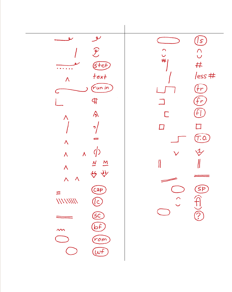
delete delete
delete and close up delete and cllose up
let it stand (stet) let it stand
insert text or character insert
run in paragraph
start new paragraph start new paragraph
insert punctuation insert punctuation
change punctuation change; punctuation
insert hyphen insert hyphen
insert parentheses insert parentheses
insert en or em dash insert en dash
insert quotes insert quotes
capitalize capitalize
change to lowercase LOWERCASE
change to small caps small caps
change to bold bold
change to roman roman
wrong font wrong font
| 217
run in
paragraph
letterspace letterspace
close up clo se up
insert space insertspace
reduce space reduce space
transpose posetrans
flush right flush right
flush left flush left
indent 1 em indent 1 em
move to next line move to next line
superscript superscript1
align vertically align vertically
align horizontally align horizontally
spell out abbreviation spell out abbrev.
use ligature use ligature (flour)
query that cannot be query
resolved by proofreader
Proofreader’s marks derived from The Chicago
Manual of Style and David Jury, About Face:
Reviving the Rules of Typography (East Sussex:
Rotovision, 2001). Marking conventions do
vary slightly from source to source.

free advice
Many desperate acts of design (including gradients, drop shadows, and the gratuitous use
of transparency) are perpetrated in the absence of a strong concept. A good idea provides a
framework for design decisions, guiding the work.
Think more, design less.
Just as designers should avoid filling up space with arbitrary visual effects, writers should
remember that no one loves their words as much as they do.
Say more, write less.
Always work with a sharp blade. Although graphic design is not a terribly dangerous
occupation, many late-night accidents occur involving dull X-Acto blades. Protect your
printouts from senseless bloodshed.
May your thoughts be deep and your wounds be shallow.
Cheap stuff is usually cheap because of how it’s made, what it’s made of,
and who made it. Buy better quality goods, less often.
Spend more, buy less.
In an era of exurban sprawl, closely knit neighborhoods have renewed appeal.
So, too, on page and screen, where a rich texture of information can function
better than sparseness and isolation.
Density is the new white space.
Rather than force content into rigid containers, create systems that are flexible and
responsive to the material they are intended to accommodate.
Make the shoe fit, not the foot.
Amateur typographers make their type too big. The 12-pt default—which looks okay on
the screen—often looks horsey on the page. Experienced designers, however, make their
type too tiny: shown here, 7.5-pt Scala Pro.
Make it bigger. (Courtesy of Paula Scher)
218 |

| 219
Pay attention to your clients, your users, your readers, and your friends.
Your design will get better as you listen to other people.
It is easier to talk than to listen.
Designers respond to a need, a problem, a circumstance, that arises in the world.
The best work is produced in relation to interesting situations—an open-minded
client, a good cause, or great content.
Design is an art of situations.
Design helps the systems of daily life run smoothly, letting users and readers ignore
how things are put together. Design should sometimes announce itself in order to shed
light on the system, exposing its construction, identity, personality, and politics.
An interface calls attention to itself at its point of failure.
A graphic designer can set out to change the world one business card at a time—
as long as it is the business card of a really interesting person.
No job is too small.
A powerful concept can drive decisions about color, layout, type choice, format, and so on,
preventing senseless acts of whimsy. (On the other hand, senseless acts of whimsy sometimes
lead to powerful concepts.)
The idea is the machine that makes the art. (Courtesy of Sol Lewitt)
Your best time for thinking could be early in the morning, late at night, or even, in rare
circumstances, during class or between nine and five. Whether your best time is in the
shower, at the gym, or on the train, use it for your hardest thinking.
The early bird gets to work before everyone else.
Design is social. It lives in society, it creates society, and it needs a society of its own—
a community of designers committed to advancing and debating our shared hopes and
desires. Read, write, and talk about design whenever you can.
Build the discourse.
Go forth and reproduce.
220 |
bibliography
letter
Bartram, Alan. Five Hundred Years of Book Design.
London: British Library, 2001.
Benjamin, Walter. One Way Street and Other Writings.
London: Verso, 1978.
Blackwell, Lewis. Twentieth-Century Type. New Haven: Yale
University Press, 2004.
Boyarski, Dan, Christine Neuwirth, Jodi Forlizzi, and Susan
Harkness Regli. “A Study of Fonts Designed for Screen Display.”
CHI 98 (April 1998): 18–23.
Broos, Kees, and Paul Hefting. Dutch Graphic Design: A Century.
Cambridge: MITPress, 1993.
Burke, Christopher. Paul Renner: The Art of Typography. New York:
Princeton Architectural Press, 1998.
Clouse, Doug and Angela Voulangas. The Handy Book of Artistic
Printing. New York: Princeton Architectural Press, 2009.
Christin, Anne-Marie. A History of Writing, from Hieroglyph to
Multimedia. Paris: Flammarion, 2002.
Crouwel, Wim. New Alphabet: An Introduction for a Programmed
Typography. Amsterdam: Wim Crouwel/Total Design, 1967.
______, Kees Broos, and David Quay. Wim Crouwel: Alphabets.
Amsterdam: BIS Publishers, 2003.
Cruz, Andy, Ken Barber, and Rich Roat. House Industries. Berlin:
Die Gestalten Verlag, 2004.
De Jong, Cees, Alston W. Purvis, and Jan Tholenaar, eds. Type: A
Visual History of Typefaces, Volume I, 1628–1900. Cologne:
Taschen, 2009.
Eason, Ron, and Sarah Rookledge. Rookledge’s International Directory
of Type Designers: A Biographical Handbook. New York: Sarabande
Press, 1994.
Gray, Nicolete. A History of Lettering. Oxford: Phaidon Press, 1986.
Heller, Steven, and Philip B. Meggs, eds. Texts on Type: Critical
Writings on Typography. New York: Allworth Press, 2001.
Johnston, Edward. Writing & Illuminating & Lettering. London:
Sir Isaac Pitman & Sons, 1932.
Kelly, Rob Roy. American Wood Type: 1828–1900. New York: Da Capo
Press, 1969.
Kinross, Robin. Unjustified Texts: Perspectives on Typography. London:
Hyphen Press, 2002.
Lawson, Alexander. Anatomy of a Typeface. Boston: David R. Godine,
1990.
Lewis, John. Anatomy of Printing: The Influences of Art and History on
its Design. New York: Watson-Guptill Publications, 1970.
———. Typography: Basic Principles, Influences and Trends Since the
Nineteenth Century. New York: Reinhold Publishing, 1963.
McMurtrie, Douglas. The Book: The Story of Printing and
Bookmaking. New York: Dorset Press, 1943.
Morison, Stanley. Letter Forms. London: Nattali & Maurice, 1968.
Noordzij, Gerrit. Letterletter: An Inconsistent Collection of Tentative
Theories That Do Not Claim Any Authority Other Than That of
Common Sense. Vancouver: Hartley and Marks, 2000.
Pardoe, F. E. John Baskerville of Birmingham: Letter-Founder and
Printer. London: Frederick Muller Limited, 1975.
Perry, Michael. Hand Job: A Catalog of Type. New York: Princeton
Architectural Press, 2007.
Shelley, Mary. Frankenstein. New York: The Modern Library, 1999.
First published 1831.
Re, Margaret. Typographically Speaking: The Art of Matthew Carter.
New York: Princeton Architectural Press, 2002.
Triggs, Teal. The Typographic Experiment: Radical Innovation in
Contemporary Type Design. London: Thames & Hudson, 2003.
Updike, Daniel. Printing Types: Their History, Forms, and Use,
Volumes I and II. New York: Dover Publications, 1980.
VanderLans, Rudy, and Zuzana Licko. Emigre: Graphic Design into the
Digital Realm. New York: Van Nostrand Reinhold, 1993.
Vanderlans, Rudy. Emigre No. 70: The Look Back Issue, Selections from
Emigre Magazine, 1984–2009. Berkeley, CA: Gingko Press, 2009.
Willen, Bruce and Nolen Strals. Lettering & Type: Creating Letters and
Designing Typefaces. New York: Princeton Architectural Press,
2009.
text
Armstrong, Helen. Graphic Design Theory: Readings from the Field.
New York: Princeton Architectural Press, 2009.
Barthes, Roland. Image/Music/Text. Trans. Stephen Heath. New York:
Hill and Wang, 1977.
———. Mythologies. Trans. Annette Lavers. New York: Hill and Wang,
1977.
Baudrillard, Jean. For a Critique of the Political Economy of the Sign.
St. Louis, MO: Telos Press, 1981.
Benjamin, Walter. Reflections. Ed. Peter Demetz. New York: Schocken
Books, 1978.
Bierut, Michael. Forty Posters for the Yale School of Architecture.
Cohoes, NY: Mohawk Fine Papers, 2007.
Bolter, Jay David. Writing Space: Computers, Hypertext, and the
Remediation of Print. Mahwah, NJ: Lawrence Erlbaum
Associates, 2001.
Derrida, Jacques. Of Grammatology. Trans. Gayatri Chakravorty
Spivak. Baltimore: Johns Hopkins University Press, 1976.
Diamond, Jared. Guns, Germs, and Steel: The Fates of Human Societies.
New York: W. W. Norton, 1997.
Kaplan, Nancy. “Blake’s Problem and Ours: Some Reflections on
the Image and the Word.” Readerly/Writerly Texts, 3.2 (Spring/
Summer 1996): 115–33.
Gould, John D. et al. “Reading from CRT Displays Can Be as Fast as
Reading from Paper.” Human Factors 29, 5 (1987): 497–517.
Helfand, Jessica. Screen: Essays on Graphic Design, New Media, and
Visual Culture. New York: Princeton Architectural Press, 2001.
Lessig, Lawrence. Free Culture: How Big Media Uses Technology and
the Law to Lock Down Culture and Control Creativity. New York:
Penguin, 2004.
Laurel, Brenda. Utopian Entrepreneur. Cambridge: MITPress, 2001.
Lunenfeld, Peter. Snap to Grid: A User’s Guide to Digital Arts, Media,
and Cultures. Cambridge: MIT Press, 2001.
Manovich, Lev. The Language of New Media. Cambridge: MITPress,
2002.
McCoy, Katherine and Michael McCoy. Cranbrook Design: The New
Discourse. New York: Rizzoli, 1990.
———. “American Graphic Design Expression.” Design Quarterly
148 (1990): 4–22.

| 221
McLuhan, Marshall. The Gutenberg Galaxy. Toronto: University of
Toronto Press, 1962.
Millman, Debbie. The Essential Principles of Graphic Design.
Cincinnati: How, 2008.
Moulthrop, Stuart. “You Say You Want a Revolution? Hypertext and
the Laws of Media” in The New Media Reader. Noah Wardrip-
Fruin and Nick Monfort, eds. Cambridge: MITPress,
2003. 691–703.
Nielsen, Jakob. Designing Web Usability. Indianapolis: New Riders,
2000.
Ong, Walter. Orality and Literacy: The Technologizing of the Word.
New York: Methuen, 1982.
Raskin, Jef. The Human Interface: New Directions for Designing
Interactive Systems. Reading, MA: Addison-Wesley, 2000.
Ronell, Avital. The Telephone Book: Technology, Schizophrenia, Electric
Speech. Lincoln, NE: University of Nebraska Press, 1989.
grid
Berners-Lee, Tim. Weaving the Web: The Original Design
and Ultimate Destiny of the World Wide Web. New York:
HarperCollins, 1999.
Bosshard, Hans Rudolf. Der Typografische Raster/The Typographic
Grid. Sulgen, Switzerland: Verlag Niggli, 2000.
Cantz, Hatje. Karl Gerstner: Review of 5 x 10 Years of Graphic Design
etc. Ostfildern-Ruit, Germany: Hatje Cantz Verlag, 2001.
Elam, Kimberly. Geometry of Design. New York: Princeton
Architectural Press, 2001.
Gerstner, Karl. Designing Programmes. Sulgen, Switzerland: Arthur
Niggli Ltd., 1964.
Gibson, William. Neuromancer. New York: Ace Books, 1984.
Higgins, Hannah P. The Grid Book. Cambridge: MIT Press, 2009.
Hochuli, Jost, and Robin Kinross. Designing Books: Practice and
Theory. London: Hyphen Press, 1996.
Krauss, Rosalind. “Grids” in The Originality of the Avant-Garde and
Other Modernist Myths. Cambridge: MIT Press, 1985. 9–22.
Küsters, Christian and Emily King. Restart: New Systems in Graphic
Design. London: Thames and Hudson, 2002.
Lidwell, William, Kritina Holden, and Jill Butler. Universal Principles
of Design. Gloucester, MA: Rockport Publishers, 2003.
Müller-Brockmann, Josef. The Graphic Artist and his Design
Problems. Sulgen, Switzerland: Arthur Niggli Ltd., 1961.
____. Grid Systems in Graphic Design. Santa Monica: Ram
Publications, 1996. First published in 1961.
____. A History of Graphic Communication. Sulgen, Switzerland:
Arthur Niggli Ltd., 1971.
Nicolai, Carsten. Grid Index. Berlin: Die Gestalten, 2009.
Roberts, Lucienne, and Julia Shrift. The Designer and the Grid.
East Sussex, UK: RotoVision, 2002.
Rothschild, Deborah, Ellen Lupton, and Darra Goldstein. Graphic
Design in the Mechanical Age: Selections from the Merrill C. Berman
Collection. New Haven: Yale University Press, 1999.
Ruder, Emil. Typography. Sulgen, Switzerland: Arthur Niggli Ltd.,
New York: Hastings House, 1981. First published in 1967.
Rüegg, Ruedi. Basic Typography: Design with Letters. New York:
Van Nostrand Reinhold, 1989.
Samara, Timothy. Making and Breaking the Grid: A Graphic Design
Layout Workshop. Gloucester, MA: Rockport Publishers, 2002.
Tufte, Edward R. Envisioning Information. Cheshire, CT:
Graphics Press, 1990.
———. The Cognitive Style of PowerPoint. Cheshire, CT: Graphics
Press, 2003.
Zeldman, Jerey with Ethan Marcotte. Designing with Web
Standards, Third Edition. Berkeley, CA: New Riders, 2009.
manuals and monographs
Baines, Phil, and Andrew Haslam. Type and Typography. New York:
Watson-Guptill Publications, 2002.
Bringhurst, Robert. The Elements of Typographic Style. Vancouver:
Hartley and Marks, 1992, 1997.
The Chicago Manual of Style, 15th Edition. Chicago: University of
Chicago Press, 2003.
Dwiggins, W. A. Layout in Advertising. New York: Harper and
Brothers Publishers, 1928.
Eckersley, Richard et al. Glossary of Typesetting Terms. Chicago:
University of Chicago Press, 1994.
Felton, Paul. Type Heresy: Breaking the Ten Commandments of
Typography. London: Merrell, 2006.
French, Nigel. InDesign Type: Professional Typography with Adobe
InDesign CS2. Berkeley, CA: Peachpit Press, 2006.
Jardi, Enric. Twenty-Two Tips on Typography (That Some Designers
Will Never Reveal). Barcelona: Actar, 2007.
Jury, David. About Face: Reviving the Rules of Typography. East Sussex,
UK: RotoVision, 2001.
Kane, John. A Type Primer. London: Laurence King, 2002.
Kunz, Willi. Typography: Macro- and Micro-Aesthetics. Sulgen,
Switzerland: Verlag Arthur Niggli, 1998.
Lupton, Ellen and J. Abbott Miller. Design Writing Research:
Writing on Graphic Design. London: Phaidon, 1999.
Lupton, Ellen and Jennifer Cole Phillips. Graphic Design: The New
Basics. New York: Princeton Architectural Press, 2008.
Lynch, Patrick, and Sarah Horton. Web Style Guide: Basic Design
Principles for Creating Web Sites. New Haven: Yale University
Press, 2001.
Millman, Debbie. The Essential Principles of Graphic Design.
Cincinnati: How, 2008.
Rosendorf, Theodore. The Typographic Desk Reference. New Castle:
Oak Knoll, 2008.
Samara, Timothy. Typography Workbook: A Real-World Guide to Using
Type in Graphic Design. Beverly, MA: Rockport, 2004.
Scher, Paula. Make It Bigger. New York: Princeton Architectural
Press, 2002.
Spiekermann, Erik, and E. M. Ginger. Stop Stealing Sheep and Find
Out How Type Works. Mountain View, CA: Adobe Press, 1993.
Strizver, Ilene. Type Rules: The Designer's Guide to Professional
Typography. Cincinnati: North Light Books, 2001.
Strunk, William Jr. and E. B. White. The Elements of Style. Illustrated
by Maira Kalman. New York: Penguin Press, 2005.
Tschichold, Jan. The Form of the Book: Essays on the Morality of Good
Design. Point Roberts, WA: Hartley & Marks, 1991.
222 |
index
abbink, Mike 70
Abrams, Jan 187
accent characters 210
accessibility 136, 171
Adobe 80, 93
Adobe Caslon 104
Adobe Garamond 40
Adobe Garamond Premiere Pro 41
Adobe Garamond Pro 48, 56, 80
Adobe Jenson 14
advertising 24
Agenda 69
AIGA 7
Albers, Josef 27
alignment 112, 114–19
Alternate Gothic No.1 83
Alvarez, James 78
Amazon.com 95
Amazon Kindle 92
American Type Founders
Company (ATF) 83
Amusement Magazine 53
anti-aliasing 73
antique Tuscan type style 23
antique type style 23
Antykwa Poltawskiego 82
apostrophe 58–59
Apple 80
Apple Chancery 80
Arbello, Daniel 119
Architecture for Humanity 200
Arnhem 33
Arthur Niggli 169, 194, 197
Arts and Crafts movement 27
ascender 19, 36, 37
ATF 40, 83
Audimat 82
author’s alteration 212
authorship 89, 95–97
auto leading 198
auto spacing 108
balmond, Cecil 117
Bantjes, Marian 60
Barbara, Vanessa 110
Barber, Ken 76
Barbour, Urshula 43, 200
Barthes, Roland 83, 92–97
baseline 36, 37, 120, 123
baseline grid 98–99
baseline shift 108
Baskerville 39, 47
Baskerville, John 16–17, 19, 46
Baudrillard, Jean 126–27
Bauhaus 26–27
Baumeister, Willi 161
Bayer, Herbert 26–27, 162, 165
Bembo 15
Bender, Kim 119
Benjamin, Walter 24
Benton, Morris Fuller 40, 83
Beowulf 31
Berners-Lee, Tim 174
Bevington, William 9
Bickham, George 17
Bierut, Michael 101, 142–43
Bilak, Peter 63, 72
Bill, Max 165–67
bitmap typeface 29, 73–74, 78–79
blackletter 13
Blechman, Nicholas 124
van Blokland, Erik 31
Bodoni 22–23, 39, 41, 47, 54, 58
Bodoni, Giambattista 16–17, 46
body text 87, 92, 126
Bolter, Jay David 100
Boston Public Library 21
bowl 36
branding 68–71, 100, 193
Brezina, David 72
Bringhurst, Robert 16, 17
Buivenga, Jos 82
Burdick, Anne 139
Burk, Katie 144
Burke, Christopher 27
Burns, Charles 141
Büro für konkrete Gestaltung 183
Butler, Jill 174
calligraphy 13, 46
cap height 36–37
capitals 19, 52, 104–105, 120
caption 130
Carlos, Paul 43, 200
Carter, Matthew 55, 72
Carton Donofrio Partners 171
Cascading Style Sheets
See CSS
Caslon 540 104
Caslon, William 16, 17
Centaur 14
Centennial 31
centered alignment 24, 112, 114,
118, 120
chart 203–206
Chase, Kapila 119
Cheuk, Deanne 65
Ching, Jason 44
Cho, Peter 73
Clarendon 23, 47
Cleland, Thomas Maitland 40
CNN crawl 92
colon 210
Colter, Angela 137
COMA 117
Comic Sans 80
comma 58, 210
Connor, Bryan 79
Constructivism 160–61, 163
copy editing 212
copyright 89, 92
Cosac Naify 110
counter 36
Cranbrook Academy of Art 97
cross bar 36
Crouwel, Wim 28–29
Cruz, Andy 76
CSS 72, 125, 135, 144–45, 172, 198
curly quote 58–59
Cyan 189
cyberspace 86, 174
dada 98, 160, 161
Dance Ink Magazine 61
Danzico, Liz 72
dash 211
database 93
data prison 204
data table 205–207
datum 181
Davis, Joshua 173
Day, Colin 136
Dead History 31
Deck, Barry 31
Demak, Cadson 60
Derrida, Jacques 91, 153
descender 19, 36–37
desktop publishing 29
De Stijl 26–27, 160–61, 163
Detroit Focus Gallery 30
developmental editing 212
Didot 22–23, 53
Didot, Firmin 19
Didot, François-Ambroise 16
Dirty Ego 83
discretionary hyphen 210
Distler, Joshua 70
Dixon, Chris 52, 55
van Doesburg, Theo 26, 161
Double Pica 21
Downcome 83
Doyle, Stephen 42
Drenttel, William 101
dropped capitals 124–25, 128
Drouet, Minou 83
dry transfer lettering 111
Duenes, Steve 170
Duy & Partners 71, 105
dumb quotes 58, 210
Dwiggins, W. A. 115
eaves, Sarah 39
Eckersley, Richard 90
Edenspiekermann 69
editing 212–14
editing hard copy 214
editing soft copy 215
editor’s alterations 212
Eggers, Dave 49, 141
Egyptian 22, 23, 46, 50, 55
Elam, Kimberly 177
Elazegui, Kate 140
Elementar 75
ellipsis 210–11
em dash 210–11
Emigre magazine 29
Emigre Fonts 31, 61, 74
em space 126
en dash 210–11
end user license agreement 82
engraving 17, 124, 172
enlarged capitals 124–25
en space 210
EULA. See end user license
agreement.
Exclamation Communications 136
Ex Ljbris 82
fantaisie Kapitalen 62
Farrell, Stephen 116
fat face 22, 50
Fedra 72
Fella, Ed 30, 31
Fernando, Sasha 143
Ferreira, Gustavo 75
finial 36
Five Line Pica 21
Flash 33, 172
flush left alignment 112–19, 202
flush right alignment 113–18
font embedding 72
font formats 80
Fontin 82
Fontlab 76
font licensing 82
FontShop International 33, 80
framing 71, 153
Franklin, Benjamin 17
Frere-Jones, Tobias 32, 55, 57
Frutiger, Adrian 50, 55, 75
Fry and Steele 60
Futura 26–27, 47, 54, 56
Futurism 98, 160–61, 163
garamond 15, 29
Garamond 3 40, 49
Garamond, Claude 40
Garamond Premiere Pro 40
Gaultney, Victor 82
Geeraerts, Rudy 33
Gentium 82
geometric sans serif 46

| 223
Georgia 72
Gerstner, Karl 165, 169, 194–95
Ghiotti, Michelle 79
Gibson, William 174
Gill, Eric 46
Gill Sans 46, 47
Glaser, Milton 55
glyph 59, 80, 81
Glypha 53, 55
golden rectangle 177
golden section 176, 177
Golden Type 14
Gotham 32
gothic type style 22
Goudy, Frederic W. 82
Goudy Old Style 82
Gould, John D. 98
Grandjean, Philippe 16
Grant, Whitney 104
graph 170, 204
graphical user interface 98, 151
Great Primer 21
Greek alphabet 91
Greta 72
grid 17, 78, 126, 151
Grio, Francesco 15
de Groot, Lu(cas) 51
Guggenheim Museum 55
gui 151
GUI 98
Gutenberg 153
Gutenberg, Johannes 13
halpern, John 205
hanging indentation 127
hanging punctuation 58 , 116
hang line 181
hatch mark 58–59, 210–11
Hayman, Luke 140
HCI 97, 98
headline 140
Helvetica 39, 46, 47, 82
Helevetica Neue 54, 56, 58
Helfand, Jessica 101
Henderson, Hayes 86
hierarchy 42, 132–48, 180, 192
Hillyer, Jason 172
History 63
Hoefler & Frere-Jones 77
Hoefler, Jonathan 55, 77
Hoefler Text 80
Homan, Jeremy 63
Homan, Kevin 137
Hogg, Jason 107
Holden, Kritina 174
Hopkinson, Francis 21
horizontal and vertical scaling 38
Horton, Sarah 171
House Industries 76
Howard, Karen 129
Hsu, Nelson 145
html 126, 135, 170, 171, 172
human-computer interaction
97, 98
humanist sans serif 46
humanist type classification
15, 46
Huszár, Vilmos 26
hyphen 210, 211
identity design 68–71
Imprimerie Royale, Paris 15
indent 126–32
InDesign 52, 58, 76, 80, 93, 103,
125, 198
Ingles, Brian 192
interaction design 98
interface design 97, 99
Interstate 38, 39
italic 15, 19 48, 50, 81
ITC Garamond 40
jampathom, May 104
Jannon, Jean 15
Jenson 14–15
Jenson, Nicolas 14–15
Jeremy Tankard Typography 80
Joh. Enchedé & Zohnen 62
Johnston, Edward 27
Jury, David 217
justified alignment 112–19
kane, John 177
Kaplan, Nancy 9, 93
Kelly, Rob Roy 23
kerning 102–105
Khan, Farha 200
Kim, Jacqueline 143
Kim, Julia 79
Kinross, Robin 27
Koberger, Anton 152
Kogan, Sabrina 146
Kolthar, Marcos 107
Kraus, Karl 139
Kroh, Mary Lou 97
Kudos, Johnschen 106, 118
laan, Paul van der 70
Lansing, Bill 115
Latin alphabet 81, 91, 120
Latin type style 23
Laurel, Brenda 99
leading 108
League Gothic 83
League of Moveable Type 82, 83
Leong, Michelle 143
Lessig, Lawrence 89
lettera antica 15
lettering 64, 66
letterpress 24, 60, 91, 108, 124,
151, 153, 160, 161, 172
letterspacing 104
Levush, Efrat 119
Lewitt, Sol 219
Libner, K. 192
Licko, Zuzana 29, 32, 61, 74
Lidwell, William 174
ligature 13, 36, 210
linearity 92–93
linearization 136, 137, 171
line spacing 38, 108–11, 132, 198
lining numerals 56
Linotype 55
Lissitzky, El 160, 161
lithography 172
Litscher, Alice 53
logotype 68–71, 193
Long Primer 21
Lopez, Paulo 144
Lo-Res 29, 74
Louis XIV 17
lowercase 36
Lubalin, Herb 105
Lubbock, Sir John 207
Lukas, Jenn 137
Lunenfeld, Peter 100
Lupton, Ellen 124
Lutz, Benjamin 118
Lynch, Patrick 171
majoor, Martin 32, 50, 80
Makela, P. Scott 31, 97
Mall, Dan 137
Mangold, Andy 147
Manovich, Lev 93
manuscript editing 212
Manutius, Aldus 15
Mapes, Andrew 143
Marcotte, Ethan 135, 171
Marinetti, F. T. 160–61
Marks, Andrea 121
Martin, Betsy 144
Maryland Institute College of Art
7, 78, 106, 118, 147
Mau, Bruce 35
Maurer, Luna 175
Mauro, Darren 192
McClean, Brendon 78
McCoy, Katherine 97
McLean, Ruari 23
McLuhan, Marshall 89
McSweeney’s 49
Mercury 77
metric kerning 102, 103
Mevis and Van Deursen 187
Meyers, Dan 35, 90, 97, 117, 169,
185, 187
Meyers, Emil 197
Michelet, Charles 172
Microsoft 72, 80
Miedinger, Max 46
Miller 52, 55
Miller, Abbott 55, 61, 63, 109
Misproject 83
mixing typefaces 54
modern type classification 19, 46
modular grid 194–203
Mondrian, Piet 161
Morris, William 14
Moulthrop, Stuart 9, 100
movable type 13, 89, 118
Mr Eaves 32, 39
Mrozowski, Nick 130
Mrs Eaves 32, 39
Müller-Brockmann, Josef 165,
174, 195
multicolumn grid 161, 180–92
Myriad 134
neese, Wendy 78
nerd alerts 58, 80, 103, 108,
126, 198
Netherlands Design Institute 187
new alphabet 28, 29
New York Magazine 52
Neylan, Callie 144, 192
Niedich, Warren 43
Nielsen, John D. 98
Nix, Charles 104
non-lining numerals 19, 50, 56
Noordzij, Gerrit 14, 15
Nowacki, Janusz Marian 82
NPR.org 192
numerals 56
Nunoo-Quarcoo, Franc 129
obama, Barack 32
OFL 82
OFL Sorts Mill Goudy 82
old-style numerals. See non-lining
numerals.
old style type classification 46
Ong, Walter 91, 118
Open Font License (OFL) 82
OpenType 50, 52, 74, 80
optical kerning 102–103
optical sizes 41
Orcutt, William Dana 19, 155
ornament 60–63, 128
Österreichische Akademie der
Wissenschaften 139
OurType.com 33
224 |
index
outdent 127
overhang 37
palatino 15
pantograph 23
Panuska, Genevieve 143
Papyrus 80
paragraph 126–28
paragraph spacing 126–28
Pardoe, F. E. 17
Pearce, Harry 44
Pentagram 44, 63, 123, 140,
142–44
Phaidon 35, 185
Photoshop 73, 76
pica 38
Pica Roman 21
pixel 73, 74
Plantin, Christopher 155
Plumb Design Inc. 94
point system 38
Półtawski, Adam 82
polyglot 153, 155
Porter, Mark 131
postmodernism 174
PostScript 29, 74, 80
Potts, Joey 78
Powell, Kerrie 142
PowerPoint 93
prime mark 58, 211
printer’s error 212
proofreading 89, 92, 212, 216, 217
pseudo small caps 52
punch 15, 41
punctuation 58, 91, 113
Pure + Applied 43, 200
quad 126
Quadraat 32, 33, 48, 54
Quadraat Sans 54
Quark XPress 93
quotation mark 58, 59, 210, 211
radar 140
rag 113, 117
Ramos, Elaine 110
Raskin, Jef 97–99
Recife, Eduardo 83
redundancy 132
Reed, Robert 172
Reichert, Hans Dieter 185
Renner, Paul 26–27, 162, 165
Restraint 60
Retina 57
reversed type 104
Revolver: Zeitschrift für Film 45
Richmond, Matthew 172
river 90
Rizzoli 97
Roat, Rich 76
Rogers, Bruce 14
romain du roi 16, 17
roman type 15, 50, 19, 81
Romer, Thomas 172
Ronell, Avital 90
Roth, Max 167
Roycroft Shop 114
Ruder, Emil 165, 195, 197
Ruit 14
sabon 46–47
Sadek, George 9
Saron 70
Sampaio, Maria Carolina 110
Sandberg Institute 175
sans serif 20, 50
Santa Maria, Jason 72
Sardón, Virginia 70
Sasser, Virginia 79
Scala 14, 32, 38, 50, 80
Scala Pro 37, 39, 50, 80, 102,
108, 198
Scala Sans 50
Scala Sans Pro 56, 199
scale 42–44
Schedler, Clemens 183
Scher, Paula 123, 218
Schmidt, Gerwin 45
Schreier, Gabor 70
Schwartz, Barry 82
Schwitters, Kurt 160
Scotch Roman 55
Seifert, Katharina 200
semicolon 210
serif 19, 23, 36, 50, 77
set width 38, 57
Sezione Aurea 134
Sharon, Kevin 137
Sharp, Jennifer 192
Shelley, Mary 22
Shortcut 83
Simonneau, Louis 16
Sinclair, Cameron 200
single-column grid 156, 178, 179
Skolar 72
slab serif 22, 23, 46, 141
Slimbach, Robert 14, 40, 48, 134
Slogeris, Becky 79, 147
small capitals 19, 36, 50, 52, 80,
104, 105, 125, 132
smart quotes 58, 210
Smeijers, Fred 32–33, 48
SMeltery.net 82
Smith, Januzzi 117
Soleri, Paolo 111
Solidarietà Internazionale 134
spacing 91–93, 99, 102–10, 120,
126, 132, 153
Speakup 60
Spilman, Kristen 63
spine 36
spread 179
stacked letters 120, 121
Stankowski, Anton 164
Stankowski, Jochen 68
Stan, Tony 40
steel pen 17
stem 36
Stinson, Graham 135
Stohr, Kate 200
Strals, Nolen 66
Stroud, Scott 192
style guide 134
style sheets 98, 135, 146
sub-pixel 73
superfamily 50
Sutton, Jennifer 137
Swiss design 165, 174
t26 60
table 170
Tankard, Jeremy 50
Tarr, Patsy 109, 205
Template Gothic 31
terminal 36
text numerals 56
The Believer 141
The Chicago Manual of Style 210,
212, 217
The Chopping Block 172
The Clapham Institute 136
The Foundry 28
The New Republic 193
Thesis 50, 51, 54, 125
Times New Roman 125
Tomasula, Steve 116
Tonson, Jacob 114
van Toorn, Jan 129
Tory, Geofroy 16, 17
tracking 104, 105, 125
transitional sans serif 46
transitional type classification 46
Trilogy 50
TrueType 74, 80
Tschichold, Jan 46, 163–65, 167
Tufte, Edward 93, 99, 171, 204
Tuscan type style 23
two-column grid 153, 156, 187
Type 1 80
type classification 45–46
type crimes 38, 41, 42, 52, 54, 58,
104, 112, 113, 120, 127, 132,
204, 211
typeface design 76–77
type families 48, 77
Typekit 72
TypeTogether 72
typographer’s quotes 58
Typotheque 72
underware 80
Unicode 81
Univers 50, 54, 75
universal alphabet 26
universal design 174
uppercase 36
usability design 97, 98
Usine, Jack 82
Utopia 134
vAG Rounded 31, 54
VanderLans, Rudy 29
van Rossum, Just 31
Vardell, Betsy 101
Verdana 72
Verlag 52, 55
versal 124
vertical text 120–23
Vinh, Khoi 191
walbaum, Justus Erich 16
Wattanasansanee, Supisa 60
web design 33, 69, 72–73, 93, 98,
100–101, 125–26, 131, 135–37,
144–45, 170–72, 173, 175–77,
191–93, 198
web standards 135, 171
Weese, Catherine 205
Weyers, Justin 142
Whirligigs 61
white space 99, 191
Willen, Bruce 78
Williams, Heather 107
wood type 23
word space 210–11, 213
World Wide Web 72
Wright, David 145, 192
Wright, Frank Lloyd 55
x-height 36–37
zeldman, Jerey 135, 171
Zhang, Lu 118
Zwart, Piet 160–61
