TracerPlus Desktop For Windows Mobile/CE T Racer Tracer Plus User Guide
User Manual: T-Racer
Open the PDF directly: View PDF  .
.
Page Count: 88
- Table of Contents
- Chapter 1: TracerPlus Desktop Introduction
- Chapter 2: Installation
- Chapter 3: Getting Started
- Chapter 4: Project Properties
- Chapter 5: Session Settings
- 5.1 Field Settings
- 5.2 Form Designer
- 5.3 Data Capture
- 5.4 Import/Export
- 5.5 Printer Settings
- 5.6 Messaging (Professional Version Only)
- 5.7 Advanced Settings
- Chapter 6: Form Logic and Actions
- Chapter 7: Building and Deploying your Project
- Chapter 8: Importing and Exporting Projects
- Chapter 9: Client Manager (Windows Mobile/CE only)
- Chapter 10: Deploy Server Manager (Android only)
- Appendix A: TracerPlus Keyboard Shortcuts
- Appendix B: Advanced Launcher Screen Customization
- Appendix C: Date and Time Formatting Characters
- Appendix D: TracerPlus Email Message Report Sample
- Appendix E: Field Input Example
- Appendix F: Text Data Import and Export

DESKTOP
USER GUIDE
TracerPlus Desktop Version 9.5
Portable Technology Solutions, LLC
221 David Court
Calverton, NY 11933
www.tracerplus.com
Mobile App Development Tool for
Windows Mobile/CE and Android

TracerPlus Desktop Developed by Portable Technology Solutions 1
TracerPlus™ Desktop
User Guide
TracerPlus Desktop
Version 9.5
Portable Technology Solutions, LLC
Toll-Free: 1-877-640-4152 (US)
Telephone: 1-631-727-8084
Fax: 1-501-421-5085
Web: www.tracerplus.com
This document and the software described by this document are copyright 2001-2017 by Portable Technology
Solutions LLC. All rights reserved. Use of the software described herein may only be done in accordance with the
License Agreement provided with the software. This document may not be reproduced in full or partial form
except for the purpose of using the software described herein in accordance with the License Agreement
provided with the software. Information in this document is subject to change without notice.
Portable Technology Solutions, PTS, the PTS Logo, TracerPlus and the TracerPlus logo are trademarks of Portable
Technology Solutions, LLC. Windows and the Windows Logo are registered trademarks of Microsoft Corporation.
All other trademarks and registered trademarks are the property of their respective owners.
PORTABLE TECHNOLOGY SOLUTIONS, LLC WILL NOT BE LIABLE FOR (A) ANY BUG, ERROR, OMISSION, DEFECT,
DEFICIENCY, OR NONCONFORMITY IN TRACERPLUS OR THISDOCUMENTATION; (B) IMPLIED MERCHANTIBILITY
OF FITNESS FOR A PARTICULAR PURPOSE; (C) IMPLIED WARRANTY RELATING TO COURSE OF DEALING, OR
USAGEOF TRADE OR ANY OTHER IMPLIED WARRANTY WHATSOEVER; (D) CLAIM OF INFRINGEMENT; (E) CLAIM
IN TORT, WHETHER OR NOT ARISING IN WHOLE OR PART FROM PORTABLE TECHNOLOGY SOLUTIONS
CORPORATION'S FAULT, NEGLIGENCE, STRICT LIABILITY, OR PRODUCT LIABILITY,
OR (F) CLAIM FOR ANY DIRECT, INDIRECT, INCIDENTAL, SPECIAL, OR CONSEQUENTIAL DAMAGES, OR LOSS OF
DATA, REVENUE, LICENSEES GOODWILL, OR USE. IN NO CASE SHALL PORTABLE TECHNOLOGY SOLUTIONS LLC
LIABILITY EXCEED THE PRICE THAT LICENSEE PAID FOR TRACERPLUS.
TracerPlus Desktop Developed by Portable Technology Solutions 2
TracerPlus™ Desktop
Design and Deployment Tool
For TracerPlus Windows Mobile/CE and TracerPlus Android
User Guide
Table of Contents
TABLE OF CONTENTS ................................................................................................................................... 2
CHAPTER 1: TRACERPLUS DESKTOP INTRODUCTION ..................................................................................... 5
1.1 INTRODUCTION............................................................................................................................................ 5
1.2 COMMON TRACERPLUS APPLICATIONS ............................................................................................................ 5
1.3 TRACERPLUS ARCHITECTURE AND LICENSING .................................................................................................... 5
1.4 WHAT’S NEW IN TRACERPLUS 9 .................................................................................................................... 6
1.5 PTS SERVICES ............................................................................................................................................. 6
1.6 TRACERPLUS SOLUTION CENTER ..................................................................................................................... 6
CHAPTER 2: INSTALLATION .......................................................................................................................... 7
2.1 TRACERPLUS DESKTOP SYSTEM REQUIREMENTS ............................................................................................... 7
2.2 SYSTEM REQUIREMENTS FOR THE TRACERPLUS MOBILE CLIENT .......................................................................... 7
2.3 INSTALLATION ............................................................................................................................................. 7
2.3.1 Installing the TracerPlus Mobile Client .............................................................................................. 7
2.4 REMOVING TRACERPLUS ............................................................................................................................... 7
2.4.1 Removing TracerPlus Desktop ........................................................................................................... 7
2.4.2 Removing TracerPlus Mobile Client ................................................................................................... 7
CHAPTER 3: GETTING STARTED .................................................................................................................... 8
3.1 TRACERPLUS SOLUTION CENTER PROJECT ........................................................................................................ 8
3.2 CREATE NEW PROJECT .................................................................................................................................. 8
3.3 OPENING AN EXISTING PROJECT ..................................................................................................................... 9
3.4 IMPORTING A PROJECT ................................................................................................................................. 9
3.5 DEPLOYING TO A MOBILE DEVICE ................................................................................................................... 9
3.6 ADDING TO A PROJECT .................................................................................................................................. 9
CHAPTER 4: PROJECT PROPERTIES ............................................................................................................. 10
4.1 PROJECT SETTINGS ..................................................................................................................................... 10
4.2 ADMIN SETTINGS ....................................................................................................................................... 11
4.2.1 Validate Users From This List option ................................................................................................ 12
4.2.2 Validate Users From External Session option .................................................................................. 13
4.3 LAUNCHER SETTINGS .................................................................................................................................. 13
4.4 CONNECT SETTINGS ................................................................................................................................... 14
4.4.1 Hosts ................................................................................................................................................ 15
4.4.2 Live Sessions ..................................................................................................................................... 15
4.4.3 Sync Timers ...................................................................................................................................... 15
4.4.4 Sync Conditions ................................................................................................................................ 15
TracerPlus Desktop Developed by Portable Technology Solutions 3
4.4.5 Sync Feedback .................................................................................................................................. 16
4.5 PUBLISHER SETTINGS ........................................................................................................................................ 17
CHAPTER 5: SESSION SETTINGS .................................................................................................................. 20
5.1 FIELD SETTINGS ......................................................................................................................................... 20
5.1.1 Field Settings Toolbar ...................................................................................................................... 21
5.1.1.1 Importing a Field List .............................................................................................................................................. 21
5.1.2 General Settings ............................................................................................................................... 22
5.1.3 After Scan Settings ........................................................................................................................... 25
5.1.4 Validation Settings ........................................................................................................................... 26
5.1.5 Lookup Options Settings .................................................................................................................. 27
5.1.6 Drop Down Options .......................................................................................................................... 28
5.1.6.1 Dropdown Items Import ......................................................................................................................................... 29
5.1.7 Variable Options .............................................................................................................................. 30
5.1.8 Calculated Options ........................................................................................................................... 32
5.1.9 Radio Button Options ....................................................................................................................... 35
5.1.9.1 Radio Button Items Import ..................................................................................................................................... 35
5.2 FORM DESIGNER ....................................................................................................................................... 36
5.2.1 Form Designer Toolbar .................................................................................................................... 37
5.2.2 Create Control Toolbar..................................................................................................................... 38
5.2.3 Control Properties ............................................................................................................................ 39
5.2.3.1 Common Properties ................................................................................................................................................ 39
5.2.3.2 Label Properties ...................................................................................................................................................... 40
5.2.3.3 Field Properties....................................................................................................................................................... 40
5.2.3.4 Button Properties ................................................................................................................................................... 41
5.2.3.5 Image Properties .................................................................................................................................................... 51
5.2.3.6 Tab Properties ........................................................................................................................................................ 52
5.2.3.7 Grid Properties ....................................................................................................................................................... 52
5.2.3.8 Timer Properties ..................................................................................................................................................... 56
5.3 DATA CAPTURE ......................................................................................................................................... 56
5.4 IMPORT/EXPORT ....................................................................................................................................... 59
5.5 PRINTER SETTINGS ..................................................................................................................................... 61
5.6 MESSAGING (PROFESSIONAL VERSION ONLY) ................................................................................................. 63
5.7 ADVANCED SETTINGS ................................................................................................................................. 65
CHAPTER 6: FORM LOGIC AND ACTIONS .................................................................................................... 67
6.1 FORM LOGIC TOOLBAR ............................................................................................................................... 67
6.2 LOGIC ITEM LIST ........................................................................................................................................ 68
CHAPTER 7: BUILDING AND DEPLOYING YOUR PROJECT ............................................................................. 72
7.1 BUILD OPTIONS ......................................................................................................................................... 72
7.2 BUILDING AND DEPLOYING YOUR PROJECT ...................................................................................................... 72
7.3 DEVICE SIDE WIRELESS DEPLOYMENT (ANDROID ONLY) ................................................................................... 73
CHAPTER 8: IMPORTING AND EXPORTING PROJECTS ................................................................................. 74
8.1 PROJECT EXPORT ....................................................................................................................................... 74
8.2 PROJECT IMPORT ....................................................................................................................................... 74
CHAPTER 9: CLIENT MANAGER (WINDOWS MOBILE/CE ONLY) ................................................................... 75
9.1 TOOLS...................................................................................................................................................... 75
TracerPlus Desktop Developed by Portable Technology Solutions 4
9.2 CLIENT GRID ............................................................................................................................................. 76
CHAPTER 10: DEPLOY SERVER MANAGER (ANDROID ONLY) ....................................................................... 77
10.1 TOOLS...................................................................................................................................................... 78
10.2 PROJECT GRID ........................................................................................................................................... 78
APPENDIX A: TRACERPLUS KEYBOARD SHORTCUTS .................................................................................... 79
APPENDIX B: ADVANCED LAUNCHER SCREEN CUSTOMIZATION .................................................................. 80
APPENDIX C: DATE AND TIME FORMATTING CHARACTERS ......................................................................... 82
APPENDIX D: TRACERPLUS EMAIL MESSAGE REPORT SAMPLE .................................................................... 83
APPENDIX E: FIELD INPUT EXAMPLE .......................................................................................................... 86
APPENDIX F: TEXT DATA IMPORT AND EXPORT .......................................................................................... 87

Chapter 1: TracerPlus Desktop Introduction
TracerPlus Desktop Developed by Portable Technology Solutions 5
Chapter 1: TracerPlus Desktop Introduction
1.1 Introduction
TracerPlus Desktop is a free mobile application design tool that makes it easy for users of any skill level to
design mobile data collection forms for Android and Windows Mobile/CE handhelds, smart phones, tablets, and
barcode/RFID terminals.
1.2 Common TracerPlus Applications
TracerPlus Desktop makes it simple for programmers and non-programmers to create a wide variety of
enterprise class mobile applications. Features including image capture, wireless syncing, mobile printing and
barcode/RFID data capture give users limitless possibilities when designing mobile applications. For a full list of
features visit the TracerPlus Feature Matrix.
Common TracerPlus Applications Include:
• Inventory Management
• Fixed Asset Tracking
• Mobile Inspections
• Route Accounting
• Attendance/Event Tracking
• Equipment Check In /Check Out
• Mobile Sales
• RFID Item Locating (Geiger)
• RFID Room Scans
1.3 TracerPlus Architecture and Licensing
TracerPlus Desktop also includes the installation and download information for the TracerPlus Mobile Client
and information for installing TracerPlus Connect. All of these products can be trialed at no cost. When all three
products are used together, mobile projects can be completed in 3 easy steps.
1) Download TracerPlus Desktop to begin designing mobile applications.
2) Configure data syncing between your TracerPlus Desktop project and your data using TracerPlus
Connect.
3) When testing is complete, deploy your solution to your licensed mobile workforce.
Note: TracerPlus does support simple text file import/export without the additional purchase of TracerPlus
Connect. However, TracerPlus Connect is highly recommended for syncing to and from your ODBC, Text, or
Excel data sources due to its more flexible configuration options.

Chapter 1: TracerPlus Desktop Introduction
TracerPlus Desktop Developed by Portable Technology Solutions 6
1.4 What’s New in TracerPlus 9
Many new features and GUI enhancements are introduced for both TracerPlus Desktop and the TracerPlus
Mobile Client. For a complete list of features refer to the TracerPlus Feature Matrix.
• Form Logic
• Date and Time calculations
• Importing of session settings directly from a data source
• Undo function added to the Form Designer
• RFID Read Speed Enhancements
• Importing of fields and dropdown/radio button list items
• TracerPlus Desktop Publisher Edition for branding your own TracerPlus apps (9.1)
• OBD II Support (9.1)
• Auto Registration (9.1)
• Multiple Print/Email reports per session (9.1)
• Support for Native Barcode Scanner on CipherLab Android Devices (9.1)
• Support for Native Barcode Scanner on CipherLab Windows Mobile/CE Devices (9.2)
• Support for Native NFC Scanner on Android Devices (9.2)
• Auto Field Refresh at set intervals – Android Only (9.2)
• Front/Rear Camera selection and Camera Silent Mode – Android Only (9.2)
• User Logins now support referencing Session data for User credentials and login status (9.5)
• Deploy Server Manager to deploy TracerPlus Desktop projects over the air without the need for USB
connection to a PC, Android Only (9.5)
1.5 PTS Services
TracerPlus trial and registered users have a wide variety of support resources available to them. This includes
online tools, videos/FAQs, and even phone support for more immediate or detailed needs.
PTS offers Comprehensive Support Agreements, including phone support and free software upgrades during the
active period of the support plan. One and three year plans are available. For more information, contact your
authorized reseller or PTS directly.
Additional Support and Educational References are available in the Support area of TracerPlus.com.
1.6 TracerPlus Solution Center
As a service to our users, PTS offers free pre-built TracerPlus projects for a wide variety of specific applications.
These projects can be modified to fit your exact needs or used as is. For a listing of available projects, visit the
Solution Center on the web or from the TracerPlus Desktop Welcome screen.

Chapter 2: Installation
TracerPlus Desktop Developed by Portable Technology Solutions 7
Chapter 2: Installation
This chapter details the TracerPlus Desktop and TracerPlus Mobile Client installation requirements and
processes.
2.1 TracerPlus Desktop System Requirements
• Windows XP and newer.
• Microsoft .NET Framework 3.5 SP1 or greater (You will be prompted for install if required).
2.2 System Requirements for the TracerPlus Mobile Client
• Windows Mobile/CE
o ActiveSync version 3.5 or higher for XP users.
o Windows Mobile Device Center for Vista and Windows 7/8/10 users.
o A PDA, barcode or RFID enabled mobile device running Windows Embedded
Handheld/Compact, Windows Mobile 2003 – 6.x, Pocket PC, CE version 5.0 or higher or CE.Net.
• Android
o Android OS 2.3 and greater.
o Internet access for data syncing (if using TracerPlus Connect).
2.3 Installation
1. Download TracerPlus Desktop.
2. Double-click the downloaded tracerplus_desktop.exe to begin the installation.
3. Follow the installation prompts.
2.3.1 Installing the TracerPlus Mobile Client
• Navigate to the ToolsInstall TracerPlus to Device menu option in TracerPlus Desktop.
• Select the appropriate device platform.
• Follow the on screen instructions provided.
2.4 Removing TracerPlus
2.4.1 Removing TracerPlus Desktop
1. Open the Add/Remove Programs feature in MS Windows via control panel.
2. Select TracerPlus Desktop 9 and click the “Remove” button.
2.4.2 Removing TracerPlus Mobile Client
• Windows Mobile/CE
1. Navigate to SettingsRemove Programs.
2. Select TracerPlus and click Remove.
• Android
1. Navigate to SettingsApps.
2. Select TracerPlus and click Uninstall.

Chapter 3: Getting Started
TracerPlus Desktop Developed by Portable Technology Solutions 8
Chapter 3: Getting Started
This chapter outlines how to get started with TracerPlus Desktop but does not get into detail on specific
TracerPlus features. To start, we should define some terms used.
Definitions:
Project – A file that can be deployed to the TracerPlus Mobile Client, consisting of a session or multiple sessions,
that can be used dependently or independently to perform mobile tasks.
Session – A mobile data entry form with a related data table or a stand-alone table used for storing and sharing
data with other sessions. TracerPlus supports up to 32 sessions in a single project.
To quickly get started using TracerPlus Desktop, a new user can:
• Select a pre-built application from the TracerPlus Solution Center.
• Create a new project from scratch.
• Open an existing project.
• Import a project from another source.
3.1 TracerPlus Solution Center Project
From the TracerPlus Welcome screen, follow the instructions below to quickly load a TracerPlus sample project.
1. In the Welcome Screen click the Samples button.
2. Use the Search or the Category List to browse the different projects.
3. Click the Select button to view Project screen shots and project descriptions.
4. Click the Next button to select the sample you wish to import.
5. Modify the Project Name and Save To fields, then select Import.
6. When complete you will be taken to the Project Properties screen.
7. The project is now ready for deployment to a device or for further modification if required. Refer to
Section 3.5 for immediate deployment options.
3.2 Create New Project
To create a New Project, follow these steps.
1. In the Welcome Screen click the New Project button.
2. Enter a Name and Location to save your project or use the default.
3. Click the Create Session button to add a new session to your project. One session is added to your
project automatically with the creation of a new project.
4. Click the tab for your new session or select it from the Project Explorer menu.

Chapter 3: Getting Started
TracerPlus Desktop Developed by Portable Technology Solutions 9
3.3 Opening an existing Project
To open an existing project, follow these steps.
1. Click FileOpen.
2. Locate the project file you wish to open (*.tpp file).
3.4 Importing a Project
To import an existing project, follow these steps.
1. Click FileImport.
2. Locate the project file you wish to import (*.tpe file).
3.5 Deploying to a Mobile Device
Once your form is designed, click the Build/Deploy button to turn your project into a newly configured mobile
application. Chapter 7 focuses on some of the options you have when deploying your project.
3.6 Adding to a Project
You can add an existing project to your current project by using the FileAdd menu option. Choose the project
you wish to add and it will be appended to the end of the currently opened project. This is useful for combining
projects.
Chapter 4: Project Properties
TracerPlus Desktop Developed by Portable Technology Solutions 10
Chapter 4: Project Properties
Project Properties are used to define project level options and settings. These include Project Settings, Admin,
Launcher and Connect options.
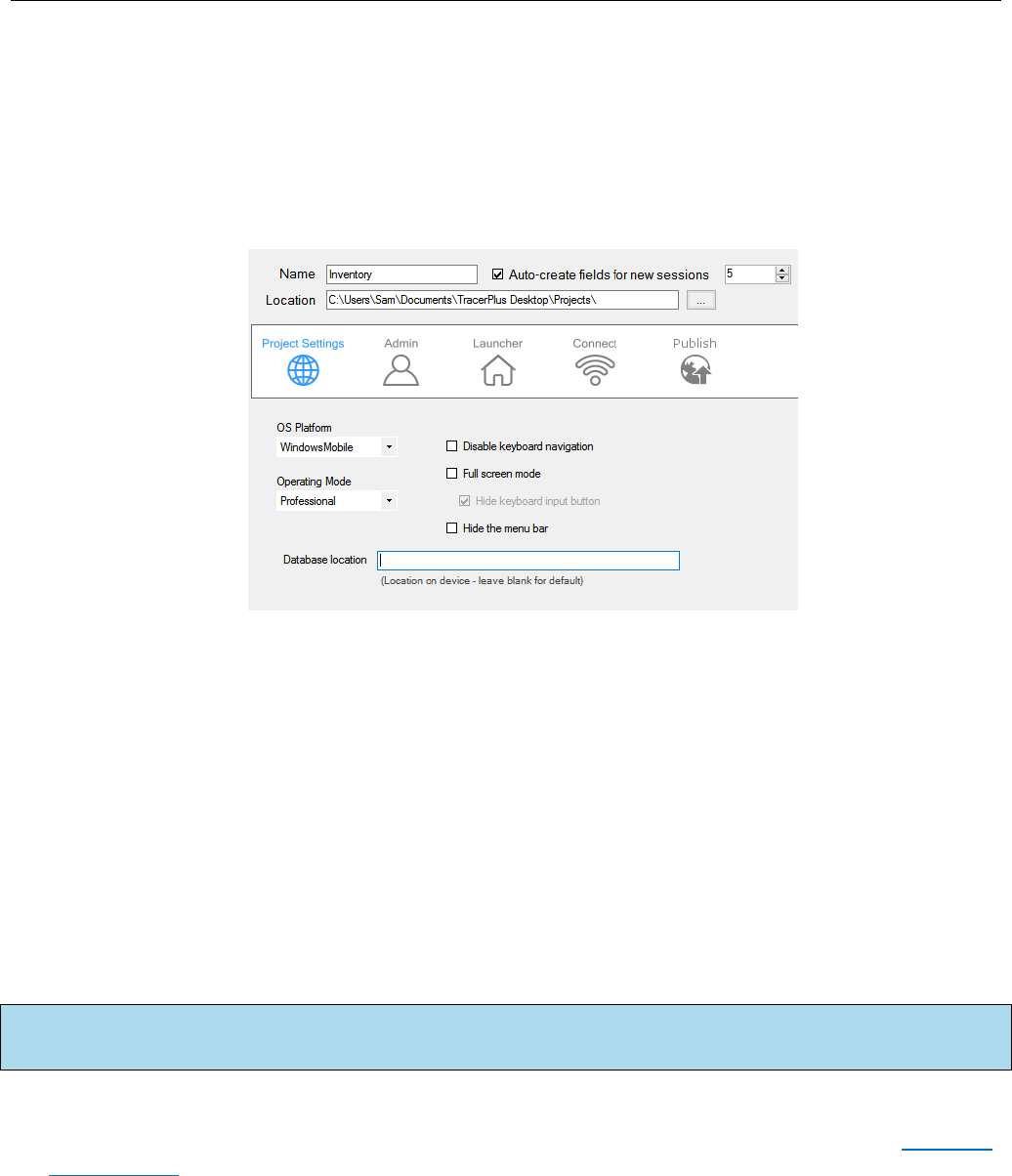
4.1 Project Settings
Name
Enter a name for the project. The FileSave As menu can also be used to change the name of a project.
Auto create fields for new sessions
Enable this option to auto create a desired number of fields instead of manually adding them to any newly
created session.
Location
Select the location on the PC where the project is to be saved.
OS Platform
Select the operating system platform for this project. This platform selection can also be changed from the
ToolsBuild/Deploy window.
Operating mode
Select the mode (Standard or Professional) of TracerPlus you have purchased or wish to trial. The TracerPlus
Feature Matrix details the difference between these modes.
Disable Keyboard Navigation (Windows Mobile/CE only)
Check this option to disable keyboard navigation on the device.
Note: The default operating system (OS) for any new project can be set via the View
Preferences menu
option.
Chapter 4: Project Properties
TracerPlus Desktop Developed by Portable Technology Solutions 11
Full screen mode
Check this option to run TracerPlus in full screen mode. When enabled, the Start Menu and the Task Bar are
not visible on the mobile device.
Hide the Menu Bar
Check this option to hide the TracerPlus menu bar on the mobile device.
Hide keyboard input button
Choose to display the keyboard input button in full screen mode.
Database Location (Windows Mobile/CE only)
TracerPlus offers the ability to control the storage location of data collected on the handheld. The default
location of this data file is \Program Files\TracerPlus8\Data. This is a useful option if you need to store large
amounts of data on a SD card.
4.2 Admin Settings
Select the Admin option from the Project properties to set passwords and user login options for the TracerPlus
Mobile Client.

Chapter 4: Project Properties
TracerPlus Desktop Developed by Portable Technology Solutions 12
Use Admin Passwords
When checked, the user is prompted to enter a password when attempting to perform specific TracerPlus
functions. This differs from the password entered in the Manage Users window in that these control access
to specific tasks while the previous password setting provided access to TracerPlus itself. The five items you
can password protect are Delete one record, Delete all records, Edit records, Session Settings, and Field
Settings.
Inactivity timeout
When checked, the Inactivity timeout value causes TracerPlus to return to the home screen after the
specified time period has elapsed with no user activity. If Require Login is enabled, TracerPlus returns to the
user login form.
Minutes
Use the Minutes field to specify number of minutes before an inactivity timeout.
Seconds
Use the Seconds field to specify the number of seconds before an inactivity timeout.
Require login
When checked and fully configured, users are required to log in after launching TracerPlus. Login IDs can
allow or limit access to specific TracerPlus sessions. The configuration of users and their access levels are
accomplished in Section 4.2.1 and Section 4.2.2 below.
Clear User Name after Login
When checked, this option clears the user name after login.
4.2.1 Validate Users From This List option
When you choose this option, users are created and managed directly from the grid control on this
screen. This section allows you to manage users and their specific privileges. User passwords can also be
set here.
• Add: Add a new user to the list.
• Remove: Delete the selected user from the list.
• Clear All: Delete all users from the list.
• Add from File: Browse for an existing .tsc file to import an existing users list. This is helpful for
previous users of TracerPlus who may already have login profiles.
User Name/Password Fields
Enter the name or nickname of the user here along with the associated password.
Available Sessions/Selected Sessions
To enable a particular session for the selected user, highlight it in the Available Sessions column and
click the > button. To remove a previously added session for the selected user, highlight it in the
Selected Sessions column and click the < button. In order to add or remove all available sessions, click
the >> or << buttons respectively.
Chapter 4: Project Properties
TracerPlus Desktop Developed by Portable Technology Solutions 13
4.2.2 Validate Users From External Session option
When you choose this option, users are validated against a selected TracerPlus Session. Additionally,
you must configure which data fields of that session to assign to the different properties involving the
User Login.
• Session – This is the session to use for referencing/validating the entered username.
• Username field – The field to compare against the entered username.
• Password field – The field to compare against the entered password.
• Accessible Sessions Field – The field to use to access Available sessions for a given user. The
data stored in this field must use a “1” to represent an accessible session or a “0” for an
inaccessible session. For example, a string of “10011000000000000000000000000000” would
indicate that the user is allowed to access Session1, Session 4, and Session 5 of your project.
This string can be a maximum of 32 characters representing the maximum number of sessions
allowed in a TracerPlus project. If this string is shorter than 32, the remaining sessions are
considered accessible for this user.
• Logged In Status Field – The field to use to write the current logged in status of a given user
represented as “1” for logged in and “0” for logged out.
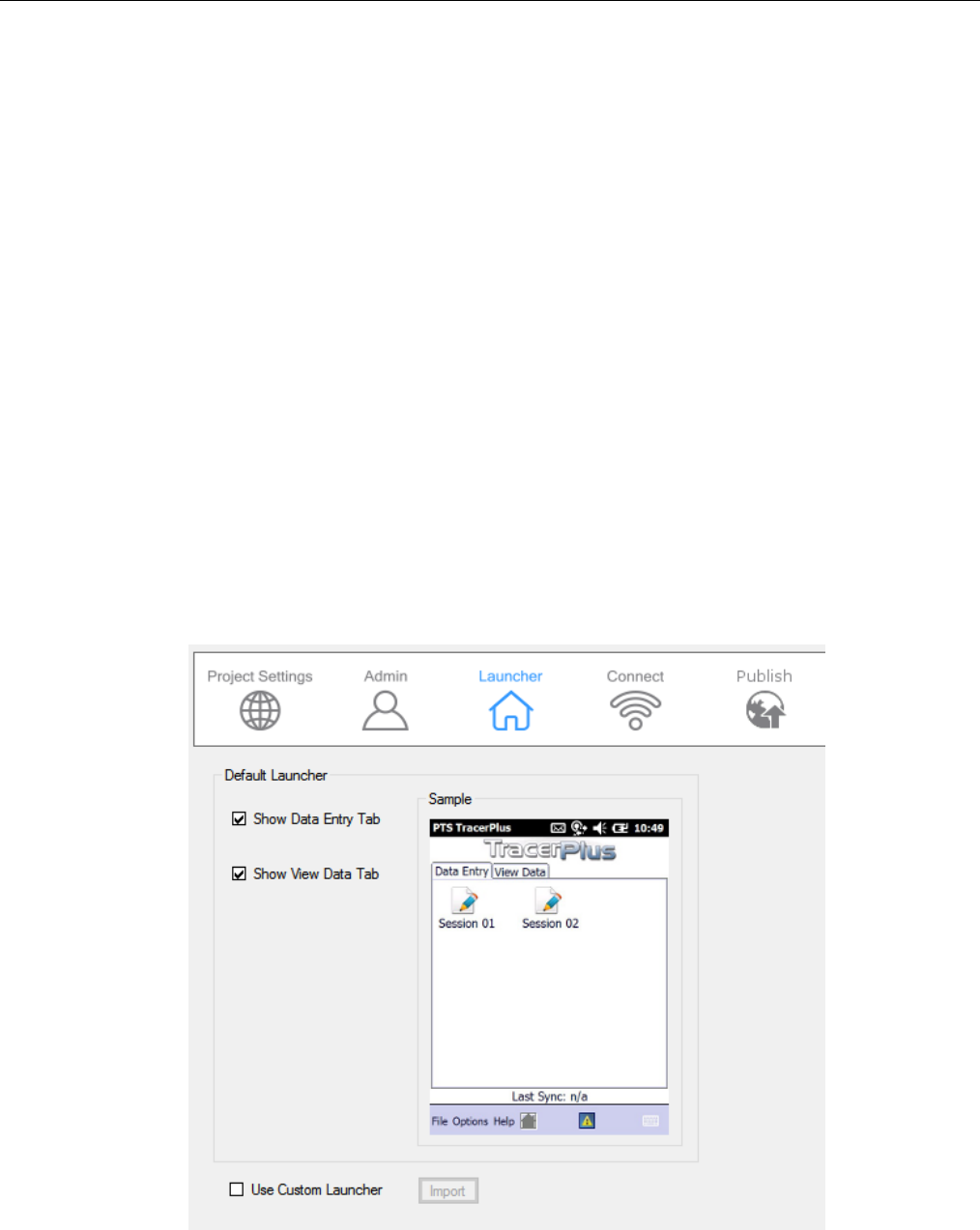
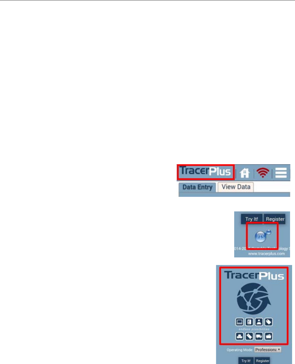
4.3 Launcher Settings
Launcher settings allow the modification of the tabs presented on the TracerPlus launcher (home) screen. The
default launcher enables two tabs; Data Entry and View Data.
Chapter 4: Project Properties
TracerPlus Desktop Developed by Portable Technology Solutions 14
Show Data Entry Tab
When checked, the Data Entry tab is displayed on the TracerPlus Launcher screen. This tab contains sessions
that are marked as enabled in TracerPlus Desktop and provides access to the Data Entry form for the clicked
session.
Show View Data Tab
When checked, the View Data tab is displayed on the TracerPlus Launcher screen. This tab contains sessions
that are marked as enabled in TracerPlus Desktop and provides access to the View Data grid for the clicked
session.
Use Custom Launcher
When checked, this option allows you to use a custom created Launcher file instead of the default. Many
options are available for further customization of the launcher file. Click the Import button to attach a
custom created Launcher file (.tsc/.tac) to your project. Refer to Appendix B for more detail on custom
Launcher configuration settings.
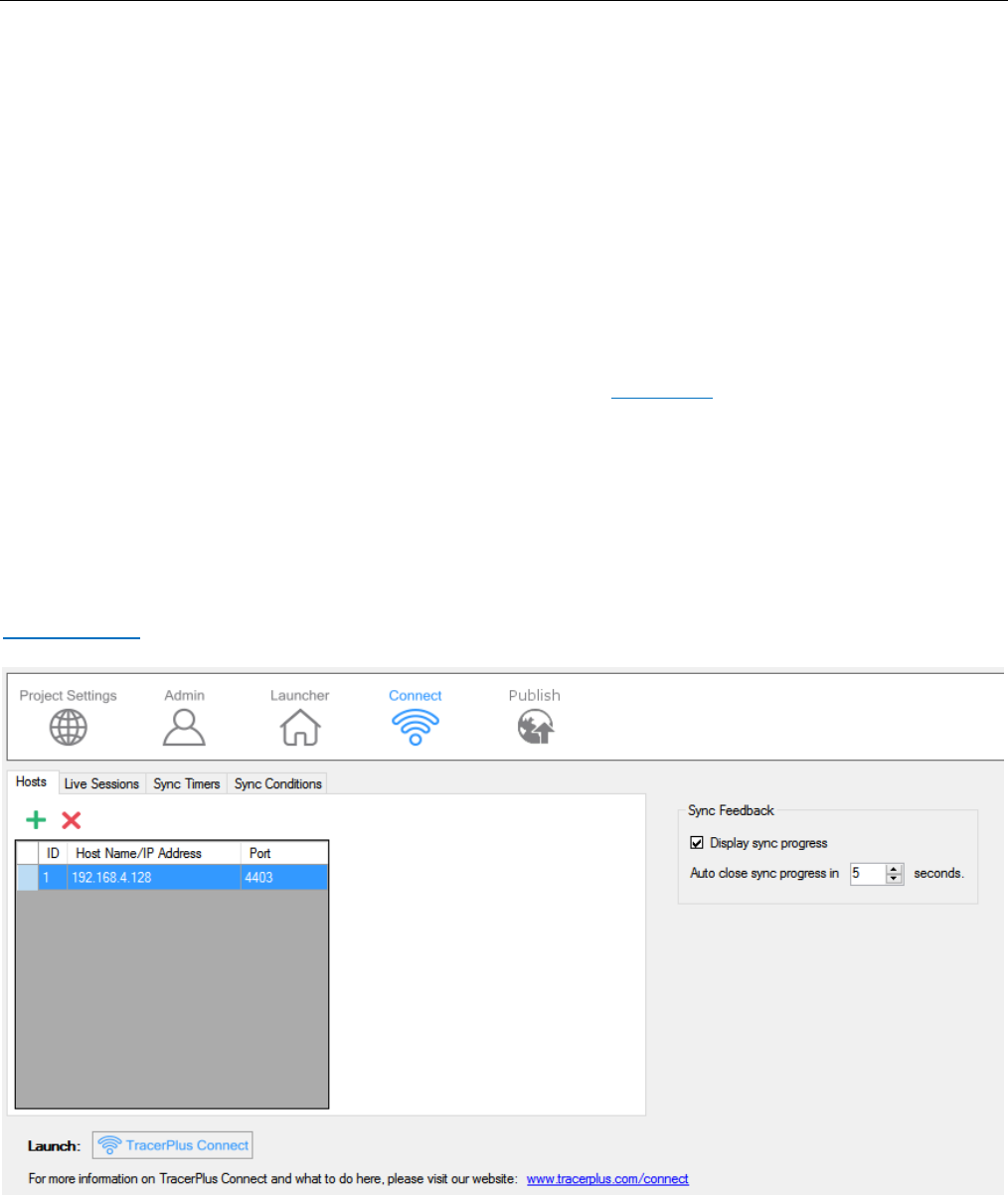
4.4 Connect Settings
TracerPlus projects can be configured to share data seamlessly with pre-existing data sources via TracerPlus
Connect. TracerPlus Connect is an all-in-one solution that allows for both wireless and batch syncing of data to
and from a wide range of data sources, including MySQL, SQL, Oracle, Microsoft Access, Microsoft Excel, text
files and many other ODBC compliant databases. For more info on TracerPlus Connect, visit our website at
TracerPlus.com.

Chapter 4: Project Properties
TracerPlus Desktop Developed by Portable Technology Solutions 15
4.4.1 Hosts
The Host is a PC or server running TracerPlus Connect. This is the PC that the TracerPlus Mobile Client
communicates with when syncing data. Multiple hosts can be configured here in the event that data
needs to be retrieved or sent from multiple locations.
• ID – The ID is a sequential value automatically assigned to identify the host. This ID is used when
referenced in other areas of your TracerPlus Desktop project.
• Host Name/IP Address – The Host Name is the network address of the PC running TracerPlus
Connect. This value can either be the literal IP address or the network name of the PC.
• Port – The Port setting identifies which network port TracerPlus Connect is using. The default
port is 4403, or 4404 if the host is running as a Windows Service.
4.4.2 Live Sessions
Live Sessions allow the application to communicate with the TracerPlus Connect server in real time. Any
new records, deleted records or edited data gets applied immediately to the data source if a wireless
connection is available. If no wireless connection is available, the data is stored locally on the mobile
device until a wireless connection becomes available.
• Enabled – This option enables the live session for use.
• Session – This value is used to select which session from your project should use live data. If
there are multiple sessions in your project, each session can be individually added as your
application requires.
• Host ID – The Host ID refers to the ID as configured in the Hosts Tab.
• Profile ID – The Profile ID refers to the live profile ID configured in TracerPlus Connect. Refer to
the TracerPlus Connect User Guide for more information on how to configure a live profile.
4.4.3 Sync Timers
Sync Timers allow setting of the time period at which a given device sends or receives data without
mobile user interaction. The timer starts when TracerPlus is first opened and resets when TracerPlus is
closed on the mobile device.
• Enabled – When enabled, this timer is active whenever TracerPlus is running on the device.
• Interval – The Interval defines how often this sync timer triggers while TracerPlus is running.
This value is measured in seconds.
• Host ID – The Host ID identifies which host is used for the sync initiated by the timer. The Host
ID refers to the ID as configured in the Hosts Tab.
• Profile ID – The Profile ID identifies which TracerPlus Connect profile should be used for the
sync initiated by the timer. Refer to the TracerPlus Connect User Guide for more information on
how to configure a TracerPlus Connect profile.
4.4.4 Sync Conditions
Sync Conditions define the conditions that need to be met to allow a synchronization to occur. Three
condition types can be set, DateTime, Database Count and Notification. The first two condition types

Chapter 4: Project Properties
TracerPlus Desktop Developed by Portable Technology Solutions 16
are used to control either a Timed Sync or a sync initiated by a DoSync button action. The last, the
Notification condition is used to initiate a sync when a device is attached to an active USB connection.
DateTime Condition
The DateTime condition enables a sync to only run before or after the specified time. If a specific
window of time is required, that can be accomplished by using two unique DateTime Conditions;
one specifying the earliest start time (After) and one specifying the latest start time (Before).
Before/After
Select whether the time evaluation should be before or after the specified time.
Time
Enter the time to use in this evaluation.
Message
A custom message to display when a sync condition fails and the sync will not run.
Database Count Condition
The Database Count Condition controls when a synchronization can occur based on a session record
count.
Session
Select the project session to use for the record count evaluation.
Records
Select the operator to use for the record count evaluation.
Value
Select the value for the record count evaluation.
Message
A custom message to display when a sync condition fails and the sync will not run.
Notification
A Notification condition allows a sync to be initiated upon an active USB connecting being made.
Name
This is the name of the Sync condition. The user can rename a Sync condition rule here.
Profile ID
The Profile ID identifies which TracerPlus Connect profile should be used for the sync initiated by
the timer. Refer to the TracerPlus Connect User Guide for more information on how to configure a
TracerPlus Connect profile.
4.4.5 Sync Feedback
Sync Feedback allows users to enable the Sync Progress dialog on the TracerPlus Mobile Client.
Chapter 4: Project Properties
TracerPlus Desktop Developed by Portable Technology Solutions 17
Display Sync Progress
Check Display Sync Progress to enable the displaying of a syncing progress dialog.
Auto close sync progress in
The amount of time the sync progress window remains open after a completed sync. After a
successful sync the user can also select the Close button. Setting this to “0” forces the user to close
the sync dialog.
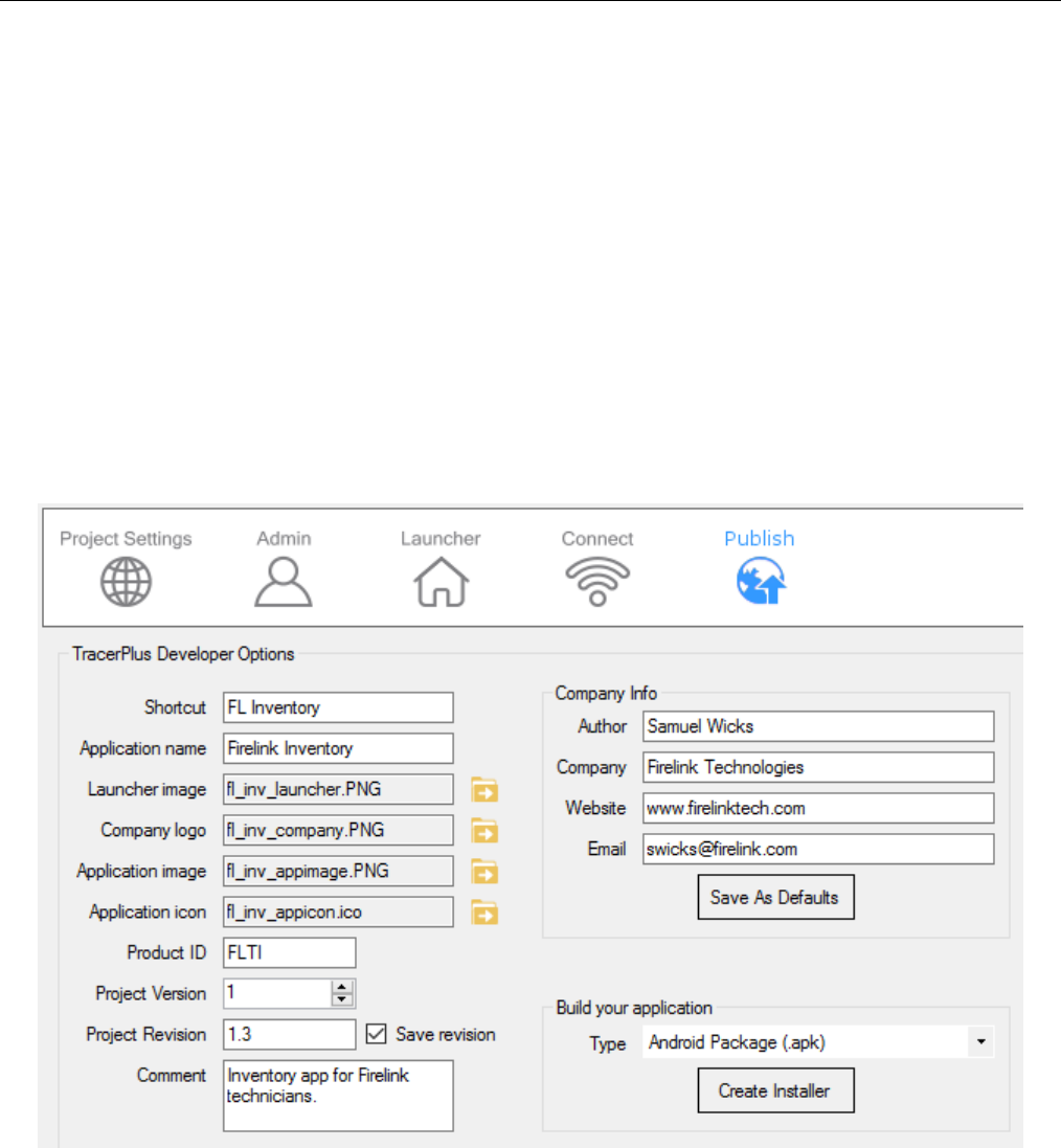
4.5 Publisher Settings
Publisher settings allow a TracerPlus Developer to create a customized version of a TracerPlus Desktop project
as their own. A developer’s unique project can be packaged into an installable file and branded with their own
company and contact information.
To unlock the Publisher Settings, a license of TracerPlus Desktop Publisher must be purchased. Please contact
your sales rep or reseller to purchase TracerPlus Desktop Publisher Edition.
Author
Used to specify the creator of the project. This value will also be displayed when the project is imported
from the Import Project dialog.
Company
Specifies the company that created the project. This value will show up on the Splash and About screens on
the mobile device.
Chapter 4: Project Properties
TracerPlus Desktop Developed by Portable Technology Solutions 18
Website
The web address of the company that created the current project. This will be displayed on the Splash and
About screens on the mobile device.
Email
The Email address of the company that created the project. This will be displayed on the Splash and About
screens on the mobile device.
Save As Defaults
Save the Company Info settings so on the next Publisher project the defaults are used for the Company Info
settings.
Shortcut
The text that is displayed on the device underneath the icon to open the application.
Application Name
The name of the application deployed to the mobile device. Depending on the mobile device’s operating
system this will be displayed in different spots. Typically, in the Add/Remove programs listing, and when the
application is open in the Window Frame of the application.
Launcher Image
Allows the developer to change the top banner image
displayed on the launcher page.
Android recommended image size: 540 × 90
Windows Mobile recommended image size: 167 × 25
Company Logo
Allows the developer to change the company logo displayed on the About screen
and the splash screen.
Android recommended image size: 320 × 255
Windows Mobile recommended image size: 65 × 65
Application Image
Allows the developer to change the application image displayed on the
splash screen.
Android recommended image size: 540 × 648
Windows Mobile recommended image size: 167 × 25

Chapter 4: Project Properties
TracerPlus Desktop Developed by Portable Technology Solutions 19
Application Icon
Allows the developer to change the icon displayed in the Windows Mobile
“Programs” folder and the Android application drawer.
Android recommended image size: 512 × 512
Windows Mobile recommended image size: 16 x 16, 32 × 32 or 64 x 64 (must
be a .ico file)
Product ID
Create a unique 4-digit alphanumeric product code that requires different applications to use unique
licenses.
Project Version
A developer selectable number to indicate the version of the project. This value is displayed on the About
screen on the mobile device and is used for debugging purposes.
Project Revision
A developer selectable revision to indicate the version of the project. This value is displayed on the About
screen on the mobile device and is used for debugging purposes. In order to properly upgrade on Android
and post to the Play Store, the version number must be greater than the project’s last used Revision
number.
Save revision
When enabled, a backup copy of the project is saved every time the revision value changes. This allows a
developer to revert to an earlier revision if required. These revision copies are saved in the project’s save
path in a sub folder called Revisions.
Comment
A developer field for adding a description or other value to the Publisher settings.
Build your application
The Build your application settings are used to create the installer package for the current project. When
built for Windows Mobile/CE, the installer can be deployed in two ways, as an auto installing .cab file or as a
standalone PDA installer that can be run from a Windows PC. When creating an install package for an
Android based device, an .apk package will be built which can be installed directly onto an Android device.
To build the package select the OS desired and click Build.
Chapter 5: Session Settings
TracerPlus Desktop Developed by Portable Technology Solutions 20
Chapter 5: Session Settings
A TracerPlus session is a mobile data entry form with a related data table or a stand-alone table used for storing
and sharing data with other sessions. TracerPlus supports up to 32 sessions in a single project. In the Project
Explorer, select the session you wish to configure, or click the Add button to create a new session.
Session Name
Specify a name for the session created. This will be see on the launcher, data entry and view data screens to
reference this session.
Session Icon
The image button next to the Session Name setting, clicking this will allow you to specify an image to use in
place of the defaults for the session icon that allows access to the session entry form.
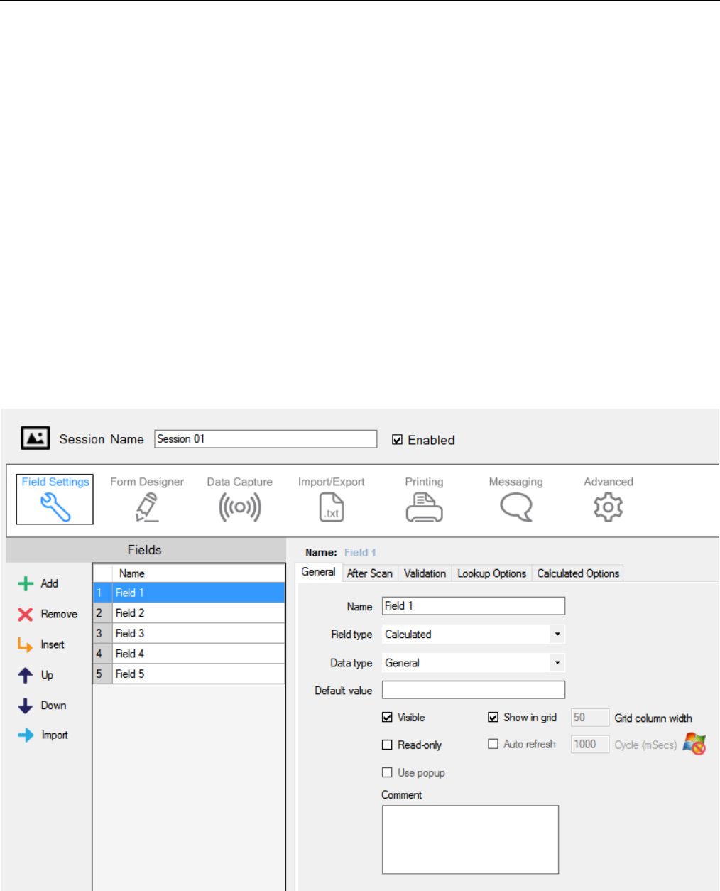
5.1 Field Settings
After a session is created, fields should be configured via the Field Settings tab. Available settings are General,
After Scan, Validation, Variable, Lookup Options, Drop Down, Radio Button and Calculated.

Chapter 5: Session Settings
TracerPlus Desktop Developed by Portable Technology Solutions 21
5.1.1 Field Settings Toolbar
Use the Field Settings Toolbar to add new fields, remove fields, and change field order.
• Add – Click the Add button to add a new field to the current session.
• Remove – Click the Remove button to remove the selected field from the session.
• Insert – Click the Insert button to insert a new field before the currently selected field.
• Up – Click the Up button to move the selected field up by one.
• Down – Click the Down button to move the selected field down by one.
• Import – Click the Import button to import the field list from a data source such as an ODBC table,
Excel Spreadsheet, or text file. For further information review Section 5.1.1.1
5.1.1.1 Importing a Field List
A list of fields can be imported directly into TracerPlus Desktop from a user selected data source. These
data source can include an ODBC database table, Excel Spreadsheet, or text file. In the case of an Excel
spreadsheet or text file the field list will come from one of the rows of data within the data source.
Please note that importing a field list will clear any fields already configured.
Data Provider
The type of data source used in the import process. Can be ODBC, Excel, or Text.
ODBC
Select ODBC to import the field list from a database table
Data Source
The database to be used in the import process.
Schema (optional)
The schema within the database to be used for the import process.
Username
The username of the selected database.
Password
The Password for the user.
Table
The Table to be used in the import process.
Excel
Select Excel to import the field list from a Microsoft Excel worksheet.
Workbook
Use the workbook field to select the Microsoft Excel workbook used in the import process. Use
the File Open button to navigate to the desired workbook.

Chapter 5: Session Settings
TracerPlus Desktop Developed by Portable Technology Solutions 22
Worksheet
The worksheet within the selected workbook to use in the import process.
Start Row
The row within the worksheet that contains the list of field names to import.
Text File
Select the Text option to import the field list from a text file.
Select Folder
Use the Select Folder field to navigate to the folder that contains the text file to be used in the
import process. Use the Folder button to navigate to the desired folder.
Filename
The filename of the text file to be used in the import process.
Start Row
The row within the text file that contains the list of field names to import.
5.1.2 General Settings
General Field Settings allow the user to define basic field attributes of the selected field.
Name
Enter the name of the field.
Field Type
Set the Field Type based on the type of data being collected or presented. Available field types are
shown below.
Text
Text fields can display alpha-numeric characters, and should be used for keyboard, barcode,
RFID, MSR, or other forms of input.
Dropdown
Dropdown fields allow the user to select from a pre-defined list of items. When a field is set to
Dropdown, a Dropdown Options tab appears allowing additional configuration. More
information on how to configure a Dropdown can be found in 5.1.6 Drop Down Options.
Checkbox
Checkbox fields are used when simple Yes/No, True/False or On/Off selections are needed.
Variable
Variable fields auto populate based on the selected variable type. More information about
variable options can be found in 5.1.7 Variable Options.

Chapter 5: Session Settings
TracerPlus Desktop Developed by Portable Technology Solutions 23
Signature (Professional Version Only)
When a field is set as a Signature, a pop-up Signature window opens whenever the field is
selected.
Dimensions (Android Only)
Customize the height and width of the signature popup in pixels.
Calculated (Professional Version Only)
A Calculated field records values from mathematical operations, GPS Coordinates, parsed data
or concatenated string data. More information regarding Calculated fields can be found in 5.1.8
Calculated Options.
Image (Professional version only)
When a field is set as Image, the user can capture images on devices with integrated cameras.
When selecting this field type, your data entry form displays a button allowing the user to
launch the camera dialog. This dialog allows you to preview a previously taken picture or
capture a new one.
Radio Button
A Radio Button field allows the presentation of multiple choices where only one choice is
selectable. When a field is set to Radio Button, a Radio Button Options tab appears allowing
additional configuration. More information on how to configure a Radio Button can be found in
5.1.9 Radio Button Options.
Data Type
The Data Type represents the format of the expected data for the selected field.
General
General is set to accept all data types in a field.
Numeric
Numeric is set when the field is being used for numeric data only. When set to Numeric, this
allows for the use of a popup calculator if the Use Popup option is selected. This also validates
the field for numeric data.
Date/Time
Date/Time is used to enter formatted date and time values. These formats are configurable
using the date time format configuration screen. Click the Format button to bring up the
Date/Time Formatting dialog.
Current Date/Time Format
From this field the user can enter the format desired by entering valid Date/Time format
characters. These characters are described in detail in Appendix C. The format can be
cleared via the Clear button.
Select date format
This list contains some commonly used date formats. Select one from this list and it will be
added to the Current Date/Time Format string.

Chapter 5: Session Settings
TracerPlus Desktop Developed by Portable Technology Solutions 24
Select time format
This list contains some commonly used time formats. Select one from this list and it will be
added to the Current Date/Time Format string.
Use GMT Date/Time
Select this option to use a GMT based time stamp independent of the user’s local time zone.
Default value
Default value represents the value that is initially displayed in a field when first loading the form.
Visible
This option determines whether this field is visible on the form. Even if a field is not visible, data will
still be stored in this field, e.g. a Date/Time stamp hidden from the user.
Show in grid
When Show in grid is selected, the field is visible in the View Data table. By default, the Show in grid
option is applied to the first four fields. When enabled, you can specify a Grid column width
(Windows Mobile/CE Only).
Read only
When Read only is enabled, the user does not have the ability to enter or modify data in the
selected field.
Auto refresh (Android Only)
When Auto refresh is selected, field data is refreshed periodically. When enabled, you can specify a
Cycle in milliseconds which determines the amount of time that passes between refreshes. Enabling
this setting is useful for refreshing Date/Time fields or GPS Coordinates.
Use popup
Use popup allows a popup window to appear when a Numeric or Date/Time field is selected by the
user.
Numeric popup dialog (Professional Version Only)
The Numeric popup dialog works like a calculator. When a numeric field is selected, the current
numeric value in that field is placed in the calculator. The user can then do simple math
calculations on that value or input a numeric value to the field.
Numeric popup dialog button definitions
+10 : Adds 10 to the current value
- 10 : Subtracts 10 from the current value
+1 : Adds 1 to the current value
- 1 : Subtracts 1 from the current value
+\- : Switches the value between positive and negative
C : Clears the value

Chapter 5: Session Settings
TracerPlus Desktop Developed by Portable Technology Solutions 25
Date/Time popup dialog (Professional Version Only)
The Date/Time popup dialog is used to select dates and times from a calendar and/or time
picker. No date/time will be entered to the field unless selected.
Comment
The Comment field is used to store design notes or comments for future reference. These notes are
not deployed to the form.
5.1.3 After Scan Settings
After Scan settings enable users to automate repetitive steps when collecting data. These settings are
activated after any of the following actions: completed bar code or RFID scan, selecting a drop down
item, pressing a Down Arrow, Enter or a Tab Key.
Auto submit
When enabled, a record is automatically submitted after an After Scan event for this field.
Clear on submit
When enabled, the field is cleared or returned to its default state after a record is submitted.
Disabling Clear on submit is useful if the same field value is required for multiple record entries.
Refresh field before submit
When enabled, field data is refreshed when the record is submitted. This setting is relevant for
Date/Time, Calculated, Lookup and Variable Field types.
Auto find on scan
Check this option to automatically perform a search of existing records for the data entered into the
field. The existing record will be opened in edit mode if the data is found.
Not found action
This property allows you to select an action to take when an auto find action cannot locate the
requested record based on the data entered.
PromptUser
A prompt is displayed indicating the record is not found allowing the user to choose an
action to take.
NoPrompt_Add
This setting automatically adds a new record when the record is not found. No prompt is
displayed.
NoPrompt_Discard
No new record is added when the record is not found and no prompt is displayed.
Play sound on data change
When enabled, a chime will be played when the selected field value changes.

Chapter 5: Session Settings
TracerPlus Desktop Developed by Portable Technology Solutions 26
Disable Data Changed trigger on blank (NULL) data
If this option is enabled, the data changed trigger for this field will not fire when the data for the
selected field is empty/blank. This trigger is used to refresh any lookups or calculated fields that
depend on the data in this field.
Goto Control ID on data change
Specifies a control on the form by Control ID, which receives focus after the current field value
changes. If the control specified is a button it will perform the button action.
Goto field
This option allows the user to control the ‘tab order’ for the selected field. When a successful After
Scan event occurs on this field, focus is set to the specified Goto field.
Disable go to field
When enabled, overrides the Go to field set enabling you to utilize settings such as Conditional Logic
to control the flow of your form.
5.1.4 Validation Settings
Validation Settings allow the user to enforce data integrity checks before submitting a record.
Validate immediately
This option represents whether a field should be validated immediately after the selected field loses
focus. Please note, when Validate immediately is not selected, the field data is still validated when
the record is submitted.
Ignore on Blank (Null) Data
This option allows you to disregard validation checks if the selected field is blank.
Case Insensitive
When enabled, ignores the text case for Data Comparison, Unique in table and Unique in record
validations.
Unique in table
When selected, this option prevents duplicate data values within the current session.
Unique in record
When selected, this option prevents duplicate data values within the current record.
Data comparison
When enabled, the selected field data is compared to the chosen comparison field based on the
selected operator.
Barcode type
When enabled, the barcode scanned in the field must match the selected barcode type. Please note,
that this feature is only supported for devices with embedded barcode scanners natively supported
by TracerPlus.
Chapter 5: Session Settings
TracerPlus Desktop Developed by Portable Technology Solutions 27
Min/Max
Min/Max can be set in one of two modes, Length or Value. When set to Length, the string length of
the field is validated; when set to Value, the numeric value of the field is validated. Specify an entry
of zero to disable this rule.
Validation Error Options
No Error Sound
With this option enabled, a validation error will not trigger a sound notification.
No Error Message
When this option is enabled, the user is not presented with any message when a validation fails.
Submit on Error
With this option enabled, data is always submitted even if a validation error occurs.
Save To Field
You can choose to save a validation error message to a field in your session. This is commonly
used to record the validation error message without interrupting the user’s workflow.
Custom Validation Error message
This option overrides the default error message provided via the Custom Validation Error
Message textbox.
Custom Validation Error Sound
This option is used to allow a custom sound to play when this validation error occurs. This is
useful to bring attention to a specific validation error. This only supports .wav file types.
Goto Field on Error
When enabled, select a field to set focus to when the data validation error occurs.
5.1.5 Lookup Options Settings
A Lookup field is populated with data from another session (source). The returned data is based on the
lookup definition as described below. To configure a Lookup field, select the Lookup Options tab for the
selected field.
Enable Lookups
Check this option to enable the lookup for this field.
Source session
Select the session to use as the source of your lookup data.
Note: This is helpful in a mixed language environment allowing you to set error messages in any number of
languages.

Chapter 5: Session Settings
TracerPlus Desktop Developed by Portable Technology Solutions 28
Relationships
The relationship defines the link between the source session data and the current form data. Use
the Add/Delete buttons to add or delete relationships as needed.
AND/OR selection
This option defines how lookups behave with multiple relationships. With an AND lookup, all
relationships must match for the lookup to be successful. With an OR lookup, at least one
relationship must match for the lookup to be successful.
Local Field
The local field describes the field in this session used in the lookup relationship.
Remote Field
The remote field is the field from the source session which is matched against the local field
when performing the lookup.
Trigger field
The Trigger field causes the lookup to be performed. The lookup takes place when an After Scan
event occurs on the Trigger field.
Lookup result display value
The Lookup result display value defines the data that is returned from the lookup.
Source field
Select the Source field from which to return the data when a lookup is successful.
Return a static value
As an alternative to returning the data in a selected Source field, you can choose to return the
specified static value when a successful lookup is performed.
Update source
This option allows the user to update the data found in a source session. If a successful lookup is
performed, any changes made to that field value are then updated to the Source field in the
Source session data when the local record is submitted.
Append if not found
Use Append if not found to add a new record to the source session if the lookup is
unsuccessful. The newly added record includes the data for the relationships along with the
local field value.
Return Value If Not Found
Configure this option to return a static value on a failed lookup.
5.1.6 Drop Down Options
This tab is used to configure the various Drop Down options.

Chapter 5: Session Settings
TracerPlus Desktop Developed by Portable Technology Solutions 29
Drop Down Items
Items in the selected field’s Drop Down list are entered in this area. You can use the add or delete
buttons, to add or remove items in this list. Display value is the data presented in the list on the
mobile device. Additionally, a Filter Value can be used to limit the presentation of those display
items that match a specific filter as discussed below and the DB value is used to submit the specified
value instead of the display value.
5.1.6.1 Dropdown Items Import
You can import your dropdown items from the following data sources: ODBC, Excel, or text file.
When you click the Import button, you are presented with a dialog box that allows you to proceed
with the import process.
Data Provider
Select the data source from which to import the dropdown items. You can choose between
ODBC, Excel, or text file. The following options are dependent on the data provider selected.
ODBC
Datasource
Select the data source name (DSN) which contains the table from which you will import
your dropdown items.
Schema (optional)
The schema for the DSN you are using to import the data.
Username
If the DSN requires a login, you must enter the username here.
Password
If the DSN requires a login, you must enter the password here. Once you’ve entered
both the username and password, press Login to continue.
Table
Select the table which contains the data from which you want to import your dropdown
items.
Excel
Workbook
Select the Excel workbook which contains the worksheet from which you will import
your dropdown data.
Worksheet
Select the Excel worksheet which contains the data from which you will import your
dropdown items.

Chapter 5: Session Settings
TracerPlus Desktop Developed by Portable Technology Solutions 30
Text File
Select folder
Select the location of the text file from which you would like to import your dropdown
items.
Filename
Select the filename of the text file which contains the data to import from.
Display value
Select the column from your specified data source from which you will import items. That
column’s data is imported into the Display value column of the dropdown field’s list items.
Also import filter values
Choose whether to also import filter values, and if so, which column to import those values
from. The data from that column is imported into the Filter value column of the dropdown
field’s list items.
Also import DB values
Choose whether to also import DB values, and if so, which column to import those values from.
The data from that column is imported into the DB value column of the dropdown field’s list
items.
Filter on value from
This option selects the field used to set the filter value. The Drop Down list items are filtered based
on this value.
Restrict to list items only
With this selected, users cannot enter “free form” drop down entries; they are limited to items in
the list.
Sort items
Setting this option presorts the items in a list. This is performed as an alphanumeric descending
sort.
Use DB Value
Setting this option allows the application to store a different value to the database versus what the
user selects from the displayed drop down value. The values to store are entered to the DB value
field.
5.1.7 Variable Options
This tab is used to configure the options for a Variable field type. TracerPlus supports the Variable
options outlined below.
Note: Additionally, the device can import dropdown items via text file discussed in Appendix F or via a
TracerPlus Connect synchronization.

Chapter 5: Session Settings
TracerPlus Desktop Developed by Portable Technology Solutions 31
User
When selected, this field is auto populated with the login ID of the current user. If user logins are
not being used, this option defaults to the device ID.
Device
When selected, this field is auto populated with the device ID. The device ID is an identifier that is
unique to the device.
Increment
When Increment is selected, the Starting value and Increment by settings are displayed. This
feature is meant to be used with the Auto Find on Scan field setting, enabling users to lookup a
record value and automatically increment a field using this variable option.
Starting value
The Starting value represents the initial value to be auto populated in the selected field.
Increment by
The Increment by value is used to determine how much to increase the Starting value after
each variable update.
AutoNumber
The AutoNumber variable is used as an auto incrementing value that increments whenever a record
is added to the database. When this variable type is selected, the Starting value and Increment by
settings are displayed.
Starting value
The Starting value represents the initial value to be auto populated in the selected field.
Increment by
The Increment by value is used to determine how much to increase the Starting value after
every record submit.
Reset auto number on deploy
When enabled, resets the AutoNumber stored on the device and starts over at the set Starting
Value.
Input Type
The Input Type variable stores how data was entered in the selected Source Field.
If a user:
• Scans a barcode: the barcode type is stored, e.g. code 39, UPC, etc. (supported hardware
only).
• Reads RFID tag: the value “RFID” is stored (supported hardware only).
• Types a value: the value “Keyboard” is stored.
Counter
The Counter variable behaves similarly to increment except that it restarts/resets whenever the
user leaves the entry screen or a Reset Counter button is clicked.

Chapter 5: Session Settings
TracerPlus Desktop Developed by Portable Technology Solutions 32
SQL - For Advanced Users
The SQL variable allows custom SQL queries to be run against the TracerPlus Database. These
queries can include field values entered to a TracerPlus form. For example, SELECT COUNT(*)
FROM Session2 WHERE Field1='[*0*]' AND Field2='[*1*]', where the [*x*] tokens
define a field on your form by index as field values supplied in the WHERE clause.
Trigger field
The field which triggers the SQL query to be executed. This also occurs when first opening the
form, and after a record submit.
Custom SQL
Use the Custom SQL text box to enter the custom SQL to be queried against the TracerPlus
database.
5.1.8 Calculated Options
This tab is used to configure the options for a Calculated field type.
Function
Select the operation you wish to perform. TracerPlus supports the functions outlined below.
Add
This function is used to Add two or more values when Data type is set to Number. If the field’s
Data type is set to General, a string concatenation is performed.
Subtract
This function is used to subtract two or more numeric values.
Multiply
This function is used to multiply two or more numeric values.
Divide
This function is used to divide two or more numeric values.
Modulus
Modulus will return the remainder of a division operation.
Average
Average will sum all the numeric operands, and then return the quotient of the sum divided by
the number of operands. Non-numeric operands are treated as a numeric value of zero.
MIN
The MIN function is used to select the smallest value between two or more numeric values
when Data type is set to Number. When the Data type is set to General, the field with the
shortest string length is returned.

Chapter 5: Session Settings
TracerPlus Desktop Developed by Portable Technology Solutions 33
MAX
The MAX function is used to select the largest value between two or more numeric values when
Data type is set to Number. When the Data type is set to General, the field with the longest
string length is returned.
LEFT
The LEFT function is used to extract source field data beginning at the left side of the string to
the defined stop point.
MID
The MID function is used to extract source field data from the defined start point to the defined
stop point.
RIGHT
The RIGHT function is used to extract source field data beginning from the right side of the
string to the defined stop point.
GPS_LATITUDE
The GPS_LATITUDE function populates the selected field with current latitude of the device
(supported hardware only).
GPS_LONGITUDE
The GPS_LONGITUDE function populates the selected field with the current longitude of the
device (supported hardware only).
GPS_Altitude
The GPS_Altitude function populates the selected field with the current altitude of the device
(supported hardware only).
Setting Parameters for Add, Subtract, Divide, Modulus, MIN, MAX
From the Parameter drop down menu, choose two or more operands that you would like to include
in the function by highlighting the field and selecting Insert. Constant values can also be inserted by
typing over the first drop down selection <Select field or type a CONSTANT>. When a constant is
entered, the calculation uses that constant value (alpha or numeric) instead of any field value that
would otherwise be taken from the chosen field.
Result=
The Result= dialog displays the function with the operands selected. To view larger calculations,
simply hover over the Result= dialog box. This formula is also displayed as a tree view allowing
you to see any nested calculations for the fields involved. The Formula Tree can be used to
remove operands by right clicking and selecting Remove.
Format Options
The format options allow you to format the result of a calculation.
Decimal places
Specifies the number of decimal places displayed for numeric data types. This can range
from zero to six.

Chapter 5: Session Settings
TracerPlus Desktop Developed by Portable Technology Solutions 34
Currency
Adds a regional currency symbol to the beginning of the string.
DateTime resolution
When performing a calculation with a DateTime field and a Numeric field the DateTime
resolution specifies the number of Days, Hours, Minutes, or Seconds are added or
subtracted from the DateTime field.
Format
Specifies the resulting format of a DateTime elapsed operation. This is available when
subtracting one DateTime field from another. The formatters available include the format
strings for Days, Hours, Minutes, and Seconds. For a full list of these formatters see
Appendix C.
Ignore blank/NULL values
Ignore blank or null values for average calculations. This also removes the blank or null value as an
operand in the average calculation. Enabled for average calculations only.
Setting Parameters for LEFT, MID, and RIGHT
When the LEFT, MID or RIGHT functions are selected, a different configuration screen is displayed to
enable the configuration of data parsing.
Source Field
The Source Field contains the data to be parsed.
Count occurrences from the right
When enabled, counts the occurrences of a CHAR type starting from the right hand side of the
data string.
Start
The Start point defines where the parsing begins. A Start point is only available when the MID
function is selected.
Stop
The Stop point defines where the parsing ends.
Type
There are two available types, INDEX, and CHAR. INDEX is used to define a start/stop point
based on string length. CHAR is used to match a specific character or ASCII value.
Value
When INDEX is used, the Start point Value specifies the location in the string where the
parsing should start and the Stop point Value specifies how many characters to include.
When CHAR is used, the Start point Value indicates what letter, number or delimiter starts
the parsing. The CHAR Stop point Value indicates what letter, number or delimiter value at
which the parsing stops. Common delimiters like a tab or enter key cannot be visually
represented in ASCII so TracerPlus shows them as HEX values (e.g. 0x09, 0x0D).

Chapter 5: Session Settings
TracerPlus Desktop Developed by Portable Technology Solutions 35
Dynamic Parsing
Additionally, data can be parsed based on variable field data by choosing a field from
the Value drop down list. As a result, the spot at which a parse is performed can vary
from record to record based on the value contained in this selected field. Dynamic
parsing is possible for both INDEX and CHAR types.
Occurrence
The Occurrence field is only available when choosing a CHAR delimiter. This option is useful
if the string to be parsed contains multiple instances of the same delimiter. The Occurrence
value indicates how many times to pass the CHAR delimiter before starting/stopping the
parse.
5.1.9 Radio Button Options
This tab is used to configure the Radio Button specific options.
Radio Button Items
Enter the values for the various Radio Button items for this field. Only one of these items will be
selectable on the form. In the case that no item is selected, this field for that record will be blank.
Radio buttons can be further customized using the Form Designer.
5.1.9.1 Radio Button Items Import
You can import your radio button items from the following data sources: ODBC, Excel, or text file.
Once you click the Import button, you will be presented with a dialog box that allows you to
proceed with the import process.
Data Provider
Select which data source to import the radio button items from. You can choose between ODBC,
Excel, and text file. The following options are dependent on the data provider selected.
ODBC
Datasource
Select the data source name (DSN) which contains the table from which you will import
your radio button items.
Schema (optional)
The schema for the DSN you are using to import the data.
Username
If the DSN requires a user to login, you must enter the username here.
Password
If the DSN requires a user to login, you must enter the password here. Once you’ve
entered both the username and password, hit Login to continue.

Chapter 5: Session Settings
TracerPlus Desktop Developed by Portable Technology Solutions 36
Table
Select the table which contains the data from which you want to import your radio
button items.
Excel
Workbook
Select the Excel workbook which contains the worksheet from which you will import
your radio button data.
Worksheet
Select the Excel worksheet which contains the data from which you will import your
radio button items.
Text File
Select folder
Select the location of the text file from which you would like to import your radio button
items.
Filename
Select the filename of the text file which contains the data to import from.
Display value
Select the column from your specified data source from which you will import items. That
column’s data will be imported into the Display value column of the radio button field’s list
items.
5.2 Form Designer
The Form Designer allows the user to completely customize the data collection screen. Using the Form
Designer, the user can drag and drop Controls to the form such as textbox entry fields, labels, tabs, buttons,
data grids, and images (e.g. company logos).
When creating a new form and first selecting the Form Designer tab, you will be presented with an option to
build your form automatically. Choosing the Create Default button places all the tabs, fields, labels and buttons
that have been configured in the Field Settings tab into your form using the default layout. From there, each
element can be moved and edited as desired. Alternatively, you can select the Blank Canvas option to create the
look of your form from the ground up.
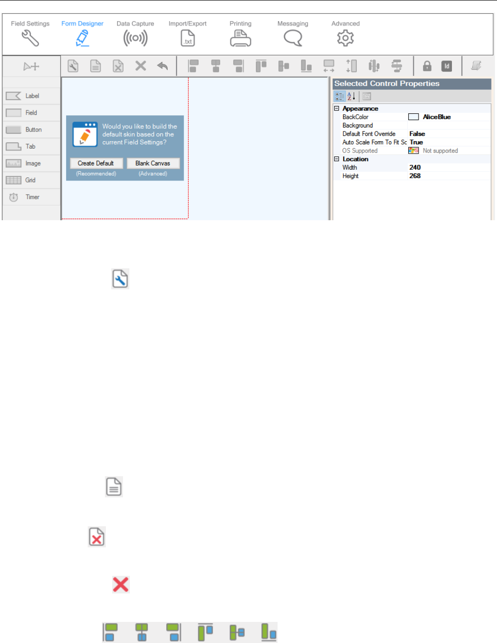
Chapter 5: Session Settings
TracerPlus Desktop Developed by Portable Technology Solutions 37
5.2.1 Form Designer Toolbar
The Form Designer Toolbar allows the user to add, remove, and modify elements of the design form.
Form Properties
Click the Form Properties icon to open the Form Properties dialog. From this dialog, the user can adjust
different attributes of the form.
Name (optional)
Enter a name for the form.
Dimensions
Use this drop down to set the dimensions of the form. The drop down contains some commonly
used dimensions for different device screen sizes. To set a custom size, select Custom from the drop
down and enter the dimensions into the Width and Height fields.
Automatically scale form to match
When checked, this allows any existing form controls to scale to the newly selected screen size.
Set to Defaults
Press the Set to Defaults button to return to the default form, using the defined Field Settings.
Clear Form
Press the Clear Form button to completely clear the contents of the form.
Delete Selection
Click this button to remove the selected control(s).
Align Controls
Chapter 5: Session Settings
TracerPlus Desktop Developed by Portable Technology Solutions 38
Select one of these six buttons to align any selected controls along the edge chosen. The six options are:
Align Left, Align Horizontal, Align Right, Align Top, Align Vertical, and Align Bottom. To align multiple
objects, hold the shift button while selecting the controls you wish to align. All alignments are based on
the position of the first control you select. In the case of the horizontal/vertical align buttons; the
respective midpoints of the selected controls will be aligned to match that of the first selected control. If
only one control is selected, that control will be centered with respect to the form.
Match Width/Height
The Match Width and Match Height buttons allow you to force the height/width of any selected
controls to match. To match multiple controls, hold the shift button while selecting the controls to
match. All width/heights are based on the position of the first control you select. Please note, text box
and drop down list controls do not allow the adjustment of their heights. To adjust the height of these
type controls, adjust the font properties instead.
Equally Space Horizontally/Vertically
With three or more controls selected, the respective spacing between the selected controls is made
equal. This spacing is calculated from the total amount of space available between the left-most/top-
most and right-most/bottom-most controls, divided by the number of controls selected.
Undo
The Undo button undoes the previous action.
Lock
The Lock button locks all controls on the form, preventing them from being moved. If clicked again the
Lock button will unlock all controls on the form.
ID
The ID button toggles the visibility of a control’s Control ID directly on the form.
Form Logic
Opens the Form Logic Window, described in Chapter 7: Form Logic.
5.2.2 Create Control Toolbar
Using the Create Control Toolbar on the left side of the form designer, users are able to add new
Controls to the form. Clicking one of these menu items places the corresponding control on the form. To
configure the properties of each control, use the Control Properties grid described in the Control
Properties section of this chapter. To remove focus from a selected control, click the Cursor button in
the upper left corner.
Label
Click the Label button, then click the location on the form where the label is to be added.
Field
Click the Field button, then click the location on the form where the Field is to be added.

Chapter 5: Session Settings
TracerPlus Desktop Developed by Portable Technology Solutions 39
Button
Click the Button button, then click the location on the form where the Button is to be added.
Tab
Click the Tab button, then click the location on the form where the Tab is to be added. Right click on
the newly added Tab control to add or remove Tab pages. Please note that Tab controls can only be
added directly to the form and not within another Tab control.
Image
Click the Image button, then click the location on the form where the Image is to be added.
Grid
Click the Grid button, then click the location on the form where the Grid is to be added.
Timer
Click the Timer button, then click the location on the form where the Timer is to be added. The
Timer is a special control that is only visible on the Form Designer.
5.2.3 Control Properties
Whenever a control is selected on the form, the Control Properties Grid is populated with a variety of
configurable options. The available options vary depending on the type of control selected. The
different types of control properties are described below.
5.2.3.1 Common Properties
Many of the properties presented in this grid are common to all controls. These are discussed below.
Control ID
The Control ID is a unique identifier for all controls on the form.
BackColor
This determines the background color of the selected control. To choose a color, click the BackColor
dropdown to open the color selection dialog.
ForeColor
This determines the foreground color of the selected control. Currently, this setting is reserved for
font color. To choose a color, click the ForeColor dropdown to open the color selection dialog.
Font
Use this option to select custom fonts from those installed on the host PC. Click the font name then
the button to open the font selection window. From there you can select font, font style and size.
Note: You can place multiple controls on the form simultaneously via the mouse scroll wheel or by holding the
ALT key while clicking on the form. When using the mouse scroll wheel, a number appears inside the crosshair
symbol cursor. This number represents the number of controls to be placed after clicking the mouse button.
Chapter 5: Session Settings
TracerPlus Desktop Developed by Portable Technology Solutions 40
Caption
Change the Caption value to set the text which appears on the control.
Visible
Change this setting to turn the visibility of the selected control on or off. Please note that this setting
only changes the visibility for the selected control on the mobile device. The control is always visible
in the Form Designer.
Location (Top, Left, Width, Height, Locked)
The Location settings provide a precise way to place the control on the form. Settings are provided
for Top and Left starting points as well as Width and Height. The additional Locked property
prevents accidental mouse movement of the selected control during form design.
5.2.3.2 Label Properties
Justification
Setting the justification allows the text of a label to be aligned as selected.
• Left – Align the caption/data of the label to the left hand side of the control.
• Right – Align the caption/data of the label to the right hand side of the control.
• Center – Align the caption/data of the label to be centered relative to the position of the
control.
Data Driven
Setting the data driven option to True allows the caption of the label to be set based on the current
value of a data record. When this option is true, the user must select a data field from which to get
the presented data.
Source Field
The Source Field is used to assign which field the data is taken from when displaying current
record data.
5.2.3.3 Field Properties
Hide Refresh Button (Windows Mobile/CE only)
In many cases, entry fields include a refresh button to update data. To hide this button, set this
option to True.
Multiline
Setting the Multiline property to True allows the user to create a field that shows multiple lines of
data, including a scroll bar if needed. This property is particularly useful with comment or memo
type field data.
Note: While you can choose any font that is properly installed on your PC, in many cases you will need to
manually copy that font to the mobile device in order for it to render correctly. With the variety of both mobile
and desktop operating systems and the resulting differences in how each handles fonts, the method of copying
that font may vary. Check your device/PC guide for additional information. The user is also responsible for
confirming that each font can legally be copied to the mobile device.

Chapter 5: Session Settings
TracerPlus Desktop Developed by Portable Technology Solutions 41
TextCase
Setting this property to Upper or Lower case forces the data entered into the field control to that
case respectively.
Mask Input
This setting will mask each character with an asterisk (*) as it is typed into a field. This is useful for
password type fields or sensitive information.
Hide Keyboard
This setting is used to control the visibility of the on-screen keyboard when this control is selected
(Android only).
• Never – The on-screen keyboard will be visible when this control is selected.
• OnFocus – The on-screen keyboard will be hidden only when this control is first selected.
Clicking the control while it is already selected will show the on-screen keyboard.
• Always – The on-screen keyboard will be hidden when this control is selected.
Source Field
The Source Field is used to assign a field in your Session to this control. This control is visually
presented to match the respective Field Type of the selected field.
Input type
This setting is used to control the allowed type of input for this control. Available options are
described below.
• Any – Allows all forms of data input.
• Keyboard – Limits data to keyboard entry only.
• Barcode – Enables the barcode scanner for this field (supported hardware only). In Android,
uses the devices built in camera for barcode scanning. RFID and keyboard entry are not
disabled.
• RFID – Enables the RFID scanner for this field (supported hardware only). Barcode and
keyboard entry are disabled.
Radio Button Item
Choose which of the radio button items this field control should represent.
5.2.3.4 Button Properties
Button Actions
Every button placed on the form is intended to perform a certain action. Different
properties are enabled depending on the selected button action.
None
This setting results in no action taken when the button is pressed.
Done
Closes the entry form and returns the user back to the previous screen.

Chapter 5: Session Settings
TracerPlus Desktop Developed by Portable Technology Solutions 42
Confirmation Prompt
If true, the user is prompted to save data before leaving the form. If false, the
form is closed immediately with no prompt.
Submit
Saves the current contents of the form to the database.
Clear All
Clears all of the contents of the Entry Form.
Use Default Field Values
This option allows you to set all fields to their configured default value instead of
completely clearing the data in the fields.
Include Read Only Fields
This option defines whether Read-Only fields are also cleared by the Clear All
action.
Confirmation Prompt
If true, the user is prompted for confirmation before performing the Clear All
action.
Refresh
Refreshes the information contained in the specified SourceField or Refresh Control
ID. Data may need to be refreshed for a number of reasons including calculations,
lookup fields, data grids or even Date/Time fields.
Source Field
Indicates which field should be refreshed.
Refresh Control ID
Indicates the Control ID on the form that should be refreshed. This overrides the
SourceField setting.
Launcher
The Launcher action closes the data collection form and returns the user to the
Launcher screen.
Confirmation Prompt
If true, the user is prompted to save data before leaving the form. If false, the
form is closed immediately with no prompt.
Print
Opens the print dialog.
ReportToUse
The print report to default to when the print prompt is displayed. The list is
made up of the available print reports configured for the current session.

Chapter 5: Session Settings
TracerPlus Desktop Developed by Portable Technology Solutions 43
TPCLive Status
Opens the TracerPlus Connect live status dialog, used to indicate the status of the
connection to the TracerPlus Connect server.
ReadSerial
Attempts to read the serial port for externally provided data. This requires an
enabled RS232 serial port on the mobile device.
SourceField
Used to indicate which field should receive the serial data being read.
LaunchCam
Launches the camera viewfinder to capture an image (supported hardware only).
Default Camera (Android Only)
Determines the default camera to use when starting the camera. If Front is
selected and there is none available, the back camera will be used. This is only
available when performing an Auto Capture as described below.
Auto Capture (Android Only)
If true, the image will be captured with no user intervention. If false, the user will
be prompted to take a picture.
Source Field
Indicates which field stores the captured image after taking a picture.
Goto Page
Displays a new tab page when the button is clicked.
Goto Page
This defines which tab is displayed when the button is clicked. It is important to
note that the first page on a given tab is considered index 0. Optionally, this
value can be set to +1 to go to the next page or -1 to go to the previous page.
Tab Control ID
The targeted Tab Control. The tab’s Control ID is displayed in the System section
of the Control Properties grid.
FieldInput
Inputs keyboard data into a specified form control. An example use of the FieldInput
is outlined in Appendix E.
Target Control ID
Defines the control by its Control ID to receive the keyboard data. The Control ID
is displayed in the System section of the Control Properties grid.

Chapter 5: Session Settings
TracerPlus Desktop Developed by Portable Technology Solutions 44
Overwrite
This setting indicates whether any existing data in the selected control should be
overwritten or appended.
Trigger After Scan
This option defines whether this button action fires the After Scan event for the
assigned control.
String Value
This property controls the actual keyboard data entered to the target control.
CustomAction
Reserved for internal PTS use.
Data View
Return the user to the Data View screen.
Scan
Turn on the embedded barcode scanner (supported hardware only). Please contact
PTS Technical Support if you have a question on whether your device is supported.
Logout
Execute a user logout when clicked. This is only relevant if you have implemented
User Logins.
Confirmation Prompt
If true, the user is prompted for confirmation before performing the Logout
action.
Run Application (Windows Mobile/CE only)
This action offers the ability to launch a 3rd party application.
External Application
Enter the location (file path on the device) of the 3rd party application you wish
to launch. For example, “\Windows\iexplore.exe” launches the web browser.
CMD Line Control ID
Allows command line parameters to be passed to the External Application
specified in this Control ID. For example, an online map could be loaded by
passing in map coordinates via a URL while using iexplore.exe for the External
Application.
ExportData
This action exports session data for each session as defined in each Session’s
Import/Export settings.
SendMessage
This action opens the Messaging dialog.

Chapter 5: Session Settings
TracerPlus Desktop Developed by Portable Technology Solutions 45
ReportToUse
The message report to default to when the message prompt is displayed. The list
is made up of the available message reports configured for the current session.
RFIDTagWrite
This action performs an RFID tag write to the specified RFID tag (supported hardware
only).
Tag ID Control ID
Specifies the control on the form that contains the tag ID to be written to.
Read/Write Control ID
Specifies the control on the form that contains the data to write.
Tag Memory Bank
Specifies the memory bank to write to. The memory banks supported are
detailed below.
MEMORY_BANK_EPC
The memory bank of the EPC value used to identify the tag.
MEMORY_BANK_USER
The memory bank used to store additional user defined data.
RFIDTagRead
This action performs an RFID tag read of the specified RFID tag (supported hardware
only).
Tag ID Control ID
Specifies the control on the form that contains the tag ID to be read from.
Read/Write Control ID
Specifies the control on the form that will accept the data read from the tag.
Tag Memory Bank
This property determines which memory bank the data is read from.
MEMORY_BANK_EPC
The memory bank of the EPC value used to identify the tag.
MEMORY_BANK_USER
The memory bank used to store additional user defined data.
DoSync
This action initiates data synchronization to a TracerPlus Connect server.

Chapter 5: Session Settings
TracerPlus Desktop Developed by Portable Technology Solutions 46
SyncHostID
The SyncHostID is used to identify which host you wish to sync with. This Host ID is available
via the Connect options in the Project Properties tab. The tab labeled Hosts allows you to
define and identify any number of TracerPlus Connect hosts.
SyncProfileID
The SyncProfileID identifies which profile to sync within your TracerPlus Connect project.
Sync Filters
Sync Filters are supplied to the TracerPlus Connect server to filter the data requested in a
sync. This allows a user to filter data at the time of sync. To configure Sync Filters, click the
ellipsis button.
• Profile ID – Defines the profile that receives the filters.
• Process ID – Defines the process within the profile that receives the filters.
• Filter ID – Specifies the dynamic filter in TracerPlus Connect to use.
• Field – This is the field that contains the filter value to use during the sync.
GridPost
This action posts the records in a cached grid to its source session. This action can also be
accomplished via the Grid toolbar.
Grid Control ID
This property is used to identify the grid that the GridPost action applies to.
GridDeleteAll
When in cached mode, this action clears all the records in the grid. If set in non-cached mode,
this button deletes all records in the grid’s source session. This action can also be accomplished
via the Grid toolbar.
Grid Control ID
This property is used to identify the grid that the GridDeleteAll action applies to.
Confirmation Prompt
If true, the user is prompted before deleting all records from the grid control.
GridDelete
When in cached mode, this action clears the selected record from the grid. If set in non-cached
mode, this button deletes the selected record in the grid’s source session. This action can also
be accomplished via the Grid toolbar.
Grid Control ID
This property is used to identify the grid that the GridDelete action applies to.
RFIDInventory
This button activates the RFID scanner (equivalent to pressing the scan trigger on the device).
Tapping the button again stops the RFID scanner (supported hardware only).

Chapter 5: Session Settings
TracerPlus Desktop Developed by Portable Technology Solutions 47
Scanner On Caption
Choose a caption to display on the button when the RFID scanner is on. This value is set to
the standard button caption by default.
Scanner On Color
Choose a color for the button when the RFID scanner is on. This value is set to the standard
background color of the button by default.
Exit
This button allows the user to quit TracerPlus directly from the entry form.
Confirmation Prompt
This option prompts the user for confirmation before exiting the application.
DBFirst
This action populates the entry form with data from the first record in the currently open
session. This record is then in edit mode until the record is submitted or another DB button
action is triggered.
Grid Control ID
This property is used to identify the Grid Control that the DBFirst action applies to. This will
navigate the selected grid control’s data instead of the session data. This action also applies
to the DBLast, DBNext, DBPrevious and DBNewRecord button actions.
DBLast
This action populates the entry form with data from the last record in the currently open
session. This record is then in edit mode until the record is submitted or another DB button
action is triggered.
DBNext
This action populates the entry form with data from the next available record in the currently
open session. This record is then in edit mode until the record is submitted or another DB
button action is triggered.
DBPrevious
This action populates the entry form with data from the previous available record in the
currently open session. This record is then in edit mode until the record is submitted or another
DB button action is triggered.
DBNewRecord
This action resets the entry form to its default setting; allowing a new record to be added. This
button can also be used to undo the edit state of the other DB Navigation buttons.
DBDeleteAll
This action deletes all records in the currently open session.

Chapter 5: Session Settings
TracerPlus Desktop Developed by Portable Technology Solutions 48
Delete Data From All Sessions
If set to True, data from all sessions is deleted. If False, only the current session’s data is
deleted.
Confirmation Prompt
If true, the user is prompted before deleting all records.
RFIDTagLocator
This action is used to find a specified RFID tag by its tag ID. When the button is clicked, a pop up
window appears with a meter gauge. This meter along with an audio cue is used to determine
the proximity to the specified Tag ID (supported hardware only).
Tag ID Control ID
This property defines which control on the entry form contains the Tag ID you wish to
locate.
RFIDFlushTagList
This action is used to manually clear the RFID tag list (supported hardware only).
Validate Field
This action validates the data in the defined field against that field’s Validation Settings.
Source Field
Defines the field on which to perform data validation.
OnFail Goto Control ID
Set focus to this Control ID if the data validation fails. If this Control ID is a button, the
button action is performed.
OnSuccess Goto Control ID
Set focus to this Control ID if the data validation passes. If this Control ID is a button, the
button action is performed.
ConfirmationPrompt
This button prompts the user for a yes or no confirmation with a configurable message.
MessagePrompt
Defines the confirmation message presented to the user.
OnYes Goto Control ID
Defines the control ID to go to if the user answers Yes. If this is a button, the button action
will be performed.
OnNo Goto Control ID
Defines the control ID to go to if the user answers No. If this is a button, the button action
will be performed.

Chapter 5: Session Settings
TracerPlus Desktop Developed by Portable Technology Solutions 49
ResetCounter
This button action resets the Counter variable value for the selected Source Field. To configure a
counter a variable go to the Counter Variable Type settings.
Source Field
Defines the counter field to reset.
IncrementValue / DecrementValue
Increase or decrease the numeric value of a field by an integer value defined by you. Note that
Increment and Decrement are two independent, separate actions.
Source Field
The field containing the value to increase/decrease. If the data from this field is not numeric
the button action is not performed.
Increment/Decrement By
The integer value to increase/decrease the Source Field’s value by.
TriggerAfterScan
When set to True, the Source Field’s after scan settings are triggered when the
Increment/Decrement action has been performed.
GridSort
This button action will sort a grid control.
Grid Control ID
This property is used to identify the grid that the Sort action applies to.
Grid Sort Column Index
This property is used to identify the column within the grid to apply the Sort action to.
GPS Average
Improves GPS accuracy by capturing multiple GPS coordinates and calculating the average.
Sample Count
Defines how many GPS coordinate samples should be taken. The higher this value is the
more accurate the GPS reading.
Latitude Control ID
Set to the control on your form that should display and capture the GPS Latitude.
Longitude Control ID
Set to the control on your form that should display and capture the GPS Longitude.
Auto Close GPS Dialog
When set to True, this automatically closes the GPS dialog box when it has finished taking all
GPS samples. This dialog will remain open if set to False.

Chapter 5: Session Settings
TracerPlus Desktop Developed by Portable Technology Solutions 50
Minimum Precision
Measured in meters, the lower this value is the more accurate the GPS reading.
Timer
Use a button action to start/stop a timer control.
Timer ID
The control ID of the timer control to activate.
Action
Choose whether the button starts or stops the timer.
Toggled Caption
Choose a caption to display on the button when the Timer has been started and is running.
Toggled Color
Choose a color for the button when the Timer has been started and is running.
ToggleInput
Toggles the Input Type for a selected control. Toggling will switch the Input Type between Any,
Barcode, Keyboard and RFID
Toggle Input Control ID
Control specified by Control ID that will have its Input Type toggled.
Toggle Default
The default Input Type of the specified control when first opening the form.
Toggle Any
Allow toggling to the Any Input Type.
Toggle Barcode
Allow toggling to the Barcode Input Type.
Toggle Keyboard
Allow toggling to the Keyboard Input Type.
Toggle RFID
Allow toggling to the RFID Input Type.
Toggle Caption Any
Specifies the button caption when toggled to the Any Input Type.
Toggle Caption Barcode
Specifies the button caption when toggled to the Barcode Input Type.
Toggle Caption Keyboard
Specifies the button caption when toggled to the Keyboard Input Type.

Chapter 5: Session Settings
TracerPlus Desktop Developed by Portable Technology Solutions 51
Toggle Caption RFID
Specifies the button caption when toggled to the RFID Input Type.
OBD2 (Android only)
Retrieve diagnostic information from an OBD2 enabled automobile via a Bluetooth capable
OBD2 transmitter. Configure this button action further via the available OBD2 Options property
that is displayed upon selection.
Bluetooth pair name
This is the name assigned to the OBD2 device connected to your car and transmitting the
Bluetooth signal. The Bluetooth pairing must be done in the Android settings application.
Type
Specify the type of diagnostic information to retrieve.
Control ID
Specify where the diagnostic information is returned to via control ID.
Hot Key (Windows Mobile/CE only)
This property allows the user to set a physical hot key to a specific button on the form.
Goto Control ID
This property allows the user to set focus to a specific control after a button action has taken place.
If this Control ID is also a button, the Button Action will be performed. This is a very useful property
for allowing multiple actions to occur with a single button press.
5.2.3.5 Image Properties
ImageStyle
The ImageStyle property defines the type of image added to the form.
Image
Selecting this option allows the user to add a custom image. This option also enables the ability
to define clickable Button Actions to the image control.
StatusIcon (Windows Mobile/CE only)
This option allows the user to display this image as a Status icon. Currently, there is one
available status icon type.
Filtered: Displayed when the current session’s data is filtered.
ButtonAction
An image can be configured to act like a button. This feature supports all of the actions described in
the Button Properties section of this document.
Source Field
This property serves two purposes depending on its configuration.

Chapter 5: Session Settings
TracerPlus Desktop Developed by Portable Technology Solutions 52
• If this Image Control has a button action defined, this Source Field property
defines which Field to use as appropriate for the defined button action.
• If this Image Control is not defined with a Button Action, the Source Field
property references the source field data for the filename of the image to load.
This presents an easy way to dynamically change the image of this image control
based on variable data directly on the form.
Image
Use the Image property to select the image to be displayed in this control. Click the button to
browse your PC for the image.
ClickedImage
If the image is used as a button, the ClickedImage property is used to show a custom image when
the image has been clicked. This is useful to add a visual indicator to show that the button has been
pressed. Click the button to browse your PC for the image.
5.2.3.6 Tab Properties
TabsAlign
The TabsAlign property determines the orientation of the selected tab control. The 4 options are
Right, Left, Top and Bottom. Selecting one of these options moves the tabs to this defined edge of
the tab control.
Caption
Use the Caption attribute to change the text on the selected tab.
Goto Control ID
This option allows the user to specify a control on the tab that receives focus when the tab is
selected.
Hide tab border
Use the Hide tab border option to turn off the tab control border and its tabs. When set to True,
form buttons with a ButtonAction of GotoPage are required to navigate the tab control.
5.2.3.7 Grid Properties
Show Column Headers
This setting provides the option to enable or disable the column headers for the Grid Control.
Data Options
By clicking the field to the right of the Data Options label, you are presented with a button which
opens the Grid Control Options dialog.
Grid Control Options
This dialog is used to configure the data related options of a Grid Control.

Chapter 5: Session Settings
TracerPlus Desktop Developed by Portable Technology Solutions 53
Source Session
A dropdown that lists the sessions available to use as a Source Session. This can be assigned
to any session in the current project.
Column Tab
This group of settings determines which fields from the source session will be visible in the
Grid Control. Click the Add button to add a column to the grid.
Appearance
These properties determine how these columns will appear within the Grid Control.
Caption
Use this option to customize the column header text.
Column Width (Windows Mobile/CE only)
This setting determines the width of the selected column within the context of the
Grid Control.
Control Binding
These properties set how the column will be bound in the grid.
Binding Direction
Specifies whether data entered into a control, or selected in a grid is copied to the
corresponding side of a binding.
• Both – Data entered into a control is copied to the grid column. Data
selected in the grid is copied to the control.
• FromControl – Data entered into a control is copied to the grid column.
Data selected in the grid is not copied to the control.
• ToControl – Data selected in the grid is copied to the control. Data entered
into a control is not copied to the grid column.
Bound Control
The Bound Control defines a control on the form which is “linked” to the selected
column. This control is specified by the Control ID. When bound, a control on the
form is populated with the column data for the selected row in the Grid Control.
This can also be used to enter new rows of data to the grid control from the bound
control. This is described in the Cached Mode settings of the Grid Control.
Key Column
This setting determines whether or not the column is unique when adding a new
row in Cached Mode.
Clear Control on Insert/Update (Cached Mode Only)
When set to True, this column’s bound control is cleared if a new row is inserted to
the grid.

Chapter 5: Session Settings
TracerPlus Desktop Developed by Portable Technology Solutions 54
Required in Binding (Cached Mode Only)
When set to True, this column is required before a bind inserts a new row to the
grid.
Triggers Binding (Cached Mode Only)
When set to True, this column’s bound control inserts a row to the grid.
Data
These properties determine the behavior of the columns within the Grid Control.
Sort
This setting is used to sort the column by either ascending or descending order. Only
one column can be sorted at a time.
Allow Ascending Sort
If Allow Ascending Sort is set to False, an ascending sort is not allowed when sorting
the grid control on the selected column.
Allow Descending Sort
If Allow Descending Sort is set to False, a descending sort is not allowed when
sorting the grid control on the selected column.
Allow Natural Sort
If Allow Natural Sort is set to False, a natural sort is not allowed when sorting the
grid control on the selected column.
Source Field
This setting selects the field from the Source Session to be displayed in this column.
Column Type (Cached Mode Only)
This setting determines the data type displayed in the grid. Available options are
Data and SUM.
• Data – Column data added to the grid is entered exactly as it appears in the
bound control.
• SUM – Column data is entered as a numeric value. If a row is being updated,
the existing numeric value will be added to the new value being entered
into the grid column.
Filter Tab
It is possible to refine the data results displayed by adding filters to the Grid Control.
Filter Name
An editable name used to describe what the filter does.

Chapter 5: Session Settings
TracerPlus Desktop Developed by Portable Technology Solutions 55
Filter Operator
The Filter operator sets the comparison type when the filter is applied. This comparison
can be one of the following values: Equal, NotEqual, LIKE, GreaterThan,
GreaterThanOrEqual, LessThan, or LessThanOrEqual.
Local Field
The Local Field is the field in the current session used in the filter.
Remote Field
The remote field is the field from the Source Session which is matched against the local
field when applying the filter.
Read-Only (Windows Mobile/CE only)
When set to False, the data in the Grid Control can be edited directly in the column.
Cached Mode
Cached Mode changes the way the Grid Control displays and stores data. When using Cached
Mode, the data within the Grid Control is not data loaded from the Source Session. The data is
instead entered from the Entry Form, from the bound controls, and stored until the form data is
submitted. The data is submitted to the Source Session of the Grid Control by either submitting the
data, or performing a GridPost button action.
Cached Mode Options
Beep when row added
When set to True, a chime is played when a new row is added to the Grid Control.
Beep when row Updated
When set to True, a chime is played when an existing row is updated in the Grid Control.
Show Toolbar
Displays a toolbar at the top of the grid control allowing you to delete records, delete all records in
both Cached and non-Cached Mode, or submit records when in Cached Mode.
Record Count Control ID
The Record Count Control ID allows the user to select a field or control on the form that contains
the number of rows in the grid. This field is specified by the field’s Control ID.
Retain Designed Sort
When set to True, this option forces a grid control to always apply the selected sort in the entry
form. This sort is retained even if a second column is selected. This results in two sorted columns.
Edit Mode on Record Select
When set to True, sets the entry form in an edit mode for the currently selected record. Only
available when the Source Session is the current session.
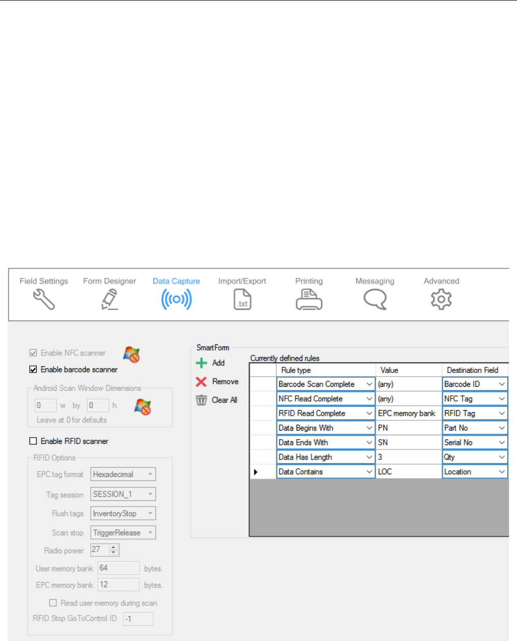
Chapter 5: Session Settings
TracerPlus Desktop Developed by Portable Technology Solutions 56
5.2.3.8 Timer Properties
Interval
The amount of time, in milliseconds, that must elapse before the timer is triggered.
Loop
Choose whether the timer should run on the set Interval indefinitely after the timer is first
triggered.
Auto Start on Form Open
Choose whether the timer should start running when the form is opened. When set to False, the
timer needs to be triggered by the Timer button action.
Go to Control ID
The control defined here by its control ID is given focus once the timer triggers. If the control is a
button, the assigned button action is executed.
5.3 Data Capture

Chapter 5: Session Settings
TracerPlus Desktop Developed by Portable Technology Solutions 57
Enable NFC Scanner (Android Only)
Check this setting to enable a natively supported NFC reader.
Enable Barcode Scanner
Check this setting to enable a natively supported barcode scanner. Non-supported devices rely on a 3rd party
keyboard wedge application to capture barcode data into TracerPlus and are unaffected by this option
setting.
Android Scan Window Dimensions
Allows for customization of the scan window size when scanning a barcode using a camera on an
Android based device. Leave as zero for defaults.
Enable RFID Scanner
Enable this setting to turn on the RFID scanner for supported RFID Mobile Terminals and supported
Bluetooth add-on modules. When enabled, the RFID options listed below become available.
EPC tag format
Select the desired EPC tag format, Hex or ASCII, to read and write tag data.
Tag Session
The Tag Session is a setting for making inventory events easier to manage. These sessions serve two
purposes: Determines how often a tag will respond to a query from the reader and allows for multiple
readers to conduct independent inventories. Select from the 4 options below:
• SESSION_0 – Does not stay Inventoried at all.
• SESSION_1 – Stays Inventoried for .5 to 5 seconds (Recommended).
• SESSION_2 – Stays Inventoried for at least 2 seconds.
• SESSION_3 – Stays inventoried for at least 2 seconds.
Flush Tags
The Flush Tags setting is used to select when the scanner’s internal RFID tag list is flushed. The options
are described below.
• InventoryStop – Clears the tag list when the trigger is released.
• OnSubmit – Clears the tag list when the session data is submitted.
• User – Allows the user to clear the tag list at the desired time, using a button with a Button
Action of RFIDFlushTagList.
Scan Stop
This setting is used to configure when the RFID scanner stops scanning. The options are described
below.
• Trigger Release – Scanning stops when the trigger is released.
• Tag Read – Scanning stops after a tag is read.

Chapter 5: Session Settings
TracerPlus Desktop Developed by Portable Technology Solutions 58
Radio Power
This option sets the signal strength of the RFID reader; the range for this is 5 – 30 decibels. This is a
useful setting when working in different environments. For example, when working in close proximity to
a tag, it is sometimes better to use a lower power to achieve better short range resolution.
User memory bank
Specifies the size, in bytes, of the RFID tag’s user memory bank.
EPC Memory Bank
Specifies the size, in bytes, of the RFID tag’s EPC memory bank.
Read user memory during scan
When enabled, causes the user memory to be interrogated during the scanning process. This allows
both the EPC value and the User Memory bank value to be read into a TracerPlus field at the same time.
This requires a Smart Form rule be created to direct this data to a field on your form (see below).
RFID Stop Goto Control ID (Set in Form Designer)
Specifies a control to set focus to, or a button to click when an RFID read operation is complete. This
value can be defined for any control on the form and is based on the Control ID from the form designer.
If this control is a button, the defined button action is executed. This will occur when the user releases
the scan trigger, or when the user selects a Perform Inventory button to stop a scan.
SmartForm
The SmartForm setting forces entered data into a specific field on the form based on user defined rules. This
speeds the data collection process while also eliminating data entry error. This feature can be set for any
type of data input including barcode scan, RFID read as well as keyboard input. Rules can be added and
removed with the toolbar to the left of the SmartForm. The rule types are described below.
• Barcode scan complete – Forces the barcode data into the selected field when a barcode scan is
complete (supported hardware only).
• NFC read complete – Forces the NFC tag data into the selected field when an NFC read is
complete (supported hardware only).
• RFID read complete – Forces the RFID tag data into the selected field when a RFID read is
complete (supported hardware only).
EPC memory bank – Reads the contents of the RFID tag’s EPC bank.
User memory bank – Reads the contents of the RFID tag’s User bank.
• Data begins with – Forces data into the selected field when the data begins with the specified
character(s).
• Data ends with – Forces data into the selected field when the data ends with the specified
character(s).
• Data contains – Forces data into the selected field when the data contains the specified
character(s).
• Data has length – Forces data into the selected field when the data is the specified length.
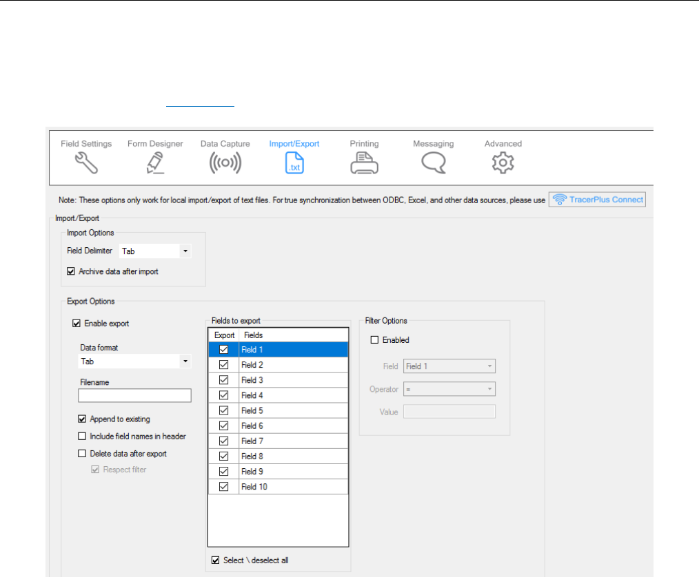
Chapter 5: Session Settings
TracerPlus Desktop Developed by Portable Technology Solutions 59
5.4 Import/Export
The data Import/Export settings control how data is imported and exported from the TracerPlus sessions.
These settings are used for local device text file import/export and not related to TracerPlus Connect
synchronizations. Refer to Appendix F for more info on importing and exporting text data.
Import Options
Options to be applied when performing a data import.
Field Delimiter
This option specifies what the delimiter type is within the data import file. Delimiters available are Tab and
CommaNoQuotes.
Archive data after import
When Archive data after import is selected, any previously imported file is renamed with an “old_” prefix
after a successful new import. Import files include both dropdown list contents as well as any session data.
Export Options
Options to be applied when performing a data export.
Data Format
This option allows the user to select from one of six possible data formatting types.

Chapter 5: Session Settings
TracerPlus Desktop Developed by Portable Technology Solutions 60
Tab
This formatting option separates each field with a tab character. Each record is terminated with a
Carriage Return/Line Feed (CRLF).
Comma
This formatting option wraps each field in quotation marks and separates each field with a comma. Each
record is terminated with CRLF.
Fixed Width
This formatting option transfers all fields using a fixed width. Any space remaining at the end of field
data is padded with spaces. Use the Max Length field setting to define the width of each fixed width
field. Each record is terminated with CRLF.
XML
This formatting option allows data to be transferred in XML format.
HTML
This formatting option transfers all data in HTML table formats allowing the data to be viewed in a web
browser.
Comma No Quote
This formatting option separates each field with a comma. Each record is terminated with CRLF.
Append to existing
When this option is selected, new data is added to a pre-existing file. If this option is not selected, any
previously transferred data is overwritten.
Include field names in header
When this option is enabled, the user configured field names are included as a header row in the exported
file.
Delete data after export
Select Delete data after export if the data should be removed from the mobile device database after a
successful export.
Respect Filter
When enabled, only data matching the current export filter is deleted.
Send non-visible fields (Standard Mode Only)
When this option is selected, data from fields that have been set to a Visible value of False in the General
Field Settings are still exported. This option is only available in Standard Mode since the Professional mode
allows for individual field selection for export as discussed below.
Fields to export (Professional Mode Only)
This grid provides the user with the ability to choose which fields are exported. If a field is checked in this
grid, it will be included in the export data file.
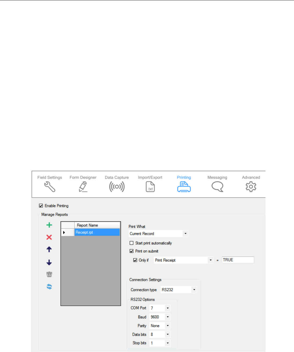
Chapter 5: Session Settings
TracerPlus Desktop Developed by Portable Technology Solutions 61
Filter options
The Filter options allow the user to control the data to be included in the export process.
Enabled
Checking this option enables the configured filter.
Field
This drop down is used to select which field the filter applies to.
Operator
This dropdown is used to select which operator is to be used for this filter. The operators that are
available include: Equal, Not Equal, Like, Greater Than, Greater Than or Equal, Less Than, and Less than
or Equal.
Value
This field is used to select the value to apply to the filter.
5.5 Printer Settings
TracerPlus enables users to print data directly from TracerPlus to a wide variety of printers. The option to
configure printer settings is available individually for each session.
Enabled
Enables printing for the selected session.

Chapter 5: Session Settings
TracerPlus Desktop Developed by Portable Technology Solutions 62
Manage Reports
Each session supports multiple print reports. Each of which can be sent to different printers. Use the
Manage Reports toolbar to add and organize the reports to be used for the session. After a report has been
added to the list, use the drop down to select from the available print reports. Reports are files that define
the layout of the content to be printed. For more information on creating custom printer reports, please
refer to the TracerPlus Print User Guide included as PC shortcut with this installation.
Print What
The Print What drop down provides the ability to select the records from the current session that you would
like to print. These include:
All records
This setting prints all records in the current session.
Current record
This setting prints the currently selected record. If printing from the Data View screen, this is the record
highlighted in the grid. If printing from the Data Entry screen, the most recently submitted record is
printed. If printing via a Print button action, this option represents the data currently presented on the
screen.
Prompt for filter
With this option enabled, a dialog appears when a print request is made. A filter can be applied to your
session data allowing only records matching that filter to be printed.
Start print automatically
When this option is enabled, the print job is automatically started using the default options.
Print on submit
Enabling this feature triggers a print when a record is submitted, regardless of any conditions.
Only if
Check this if you want to enable a condition for print on submit. Doing so allows you choose the field for the
filter condition, and the filter value to check for.
Connection type
The Connection Type drop down allows you to select the connection type you wish to make to your printer.
The three connection options available are RS232, TCP/IP, and Bluetooth.
RS232 (Windows Mobile/CE only)
RS232 (serial) connections allow your mobile device to connect to a printer via an RS232 serial port. The
options provided for RS232 connectivity need to be set to match the printer’s settings. Refer to your
Printer User Guide to determine how these values should be set.
TCP/IP
TCP/IP connection type is used when connection to an Ethernet networked printer is required. This is
commonly used if the printer offers an 802.11 wireless interface (Wi-Fi) or if the printer is attached to
the same Ethernet network as a wireless device. The settings required are the printer’s IP address and IP
port.
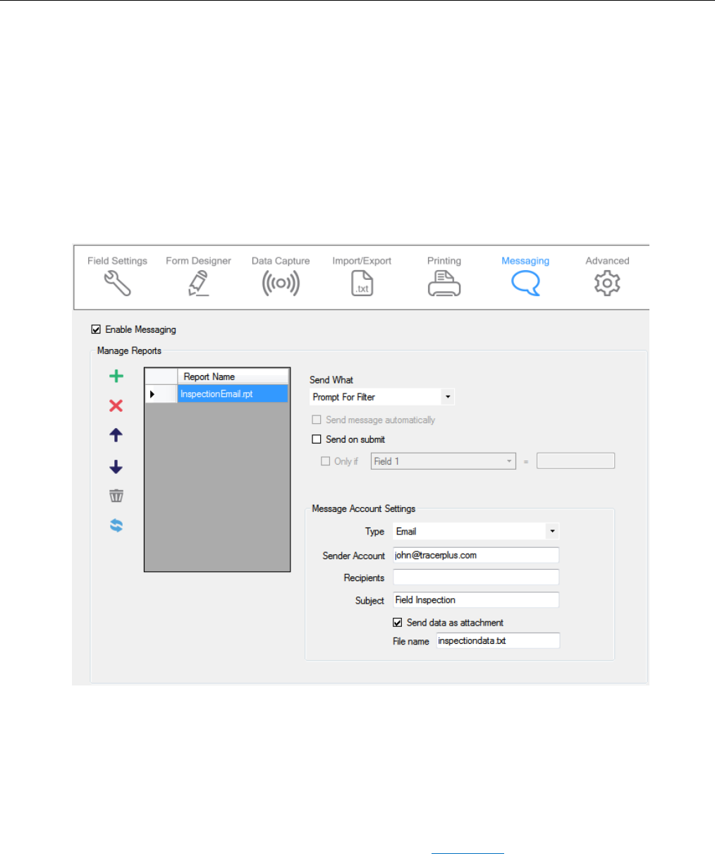
Chapter 5: Session Settings
TracerPlus Desktop Developed by Portable Technology Solutions 63
Bluetooth
The Bluetooth option allows connection to a Bluetooth compatible printer. For Android Devices, the
only required option for this setting is the Pair Name. This name must match the name you configured
when pairing your printer to your mobile device. For Windows Mobile/CE Devices, the only required
option for this setting is the Com Port which should match the virtual com port you assigned to the
printer during the pairing process.
5.6 Messaging (Professional Version Only)
The Messaging option enables users to send email reports and text messages that reference session data. This
option requires an active email or text messaging account configured on the device.
Enabled
Click to enable messaging for the selected session.
Manage Reports
Each session supports multiple message reports. Use the Manage Reports toolbar to add and organize the
reports to be used for the session. After a report has been added to the list, use the drop down to select
from the available message reports. Reports are files that define the layout of the content to be sent. For
more information on creating custom message reports, refer to Appendix D of this guide regarding message
format options.
The Send What drop down provides the ability to select the records from the current session that you would
like to send. These include:

Chapter 5: Session Settings
TracerPlus Desktop Developed by Portable Technology Solutions 64
All records
This setting sends all records in the message.
Current record
This setting sends the currently selected record. If messaging from the Data View screen, this is the
record highlighted in the grid. If messaging from the Data Entry screen, the most recently submitted
record is sent. If messaging via a Message button action, this option represents the data currently
presented on the screen.
Prompt for filter
With this option enabled, a dialog appears when a message request is made. A filter can be applied to
your session data allowing only records matching that filter to be sent.
Send message automatically
When this option is enabled, the message is automatically sent using the default options.
Send on submit
Enabling this feature triggers a message when a record is submitted.
Only if
Use the Only If option to limit when a message is sent during a submit by using a filter. Setting a filter
causes the Send on Submit to occur if the filter condition is met.
Message Account Settings
Type
This drop down determines whether the message will be sent as an email or a text message.
Sender Account
This is an email account configured on the device and used to send the report. When the Type is set to
SMS text message, this field is disabled.
Recipients
When sending an email, enter the email addresses of all intended recipients separated by a semi-colon.
To send an SMS text message, enter the recipient’s complete phone number; do not enter hyphens or
parentheses. This information can also be overridden by directives in a custom .rpt file using report
variable options. Refer to Appendix D for more information on report variable options.
Subject
For email, this is the subject line sent in the email. This option is not used when sending text messages.
This value can also be overridden within a custom .rpt file using report variable options. Refer to
Appendix D for more information on report variable options.
Send data as attachment
When enabled, attaches a data file to the email instead of including the data in the body of the email.
File Name
Specify the file name and extension of the email attachment.
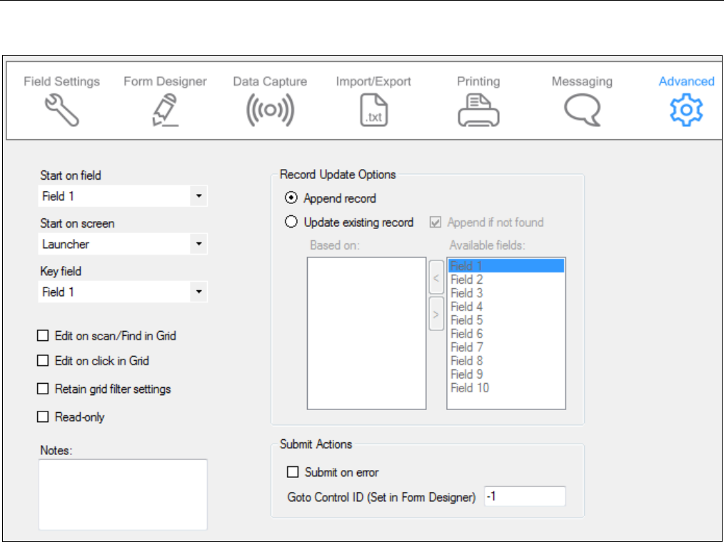
Chapter 5: Session Settings
TracerPlus Desktop Developed by Portable Technology Solutions 65
5.7 Advanced Settings
Start on field
Select the first field the user is focused on when launching the Data Entry screen.
Start on screen
This option determines the screen to first load when running TracerPlus. This setting refers to the last
used session in TracerPlus to determine which session Start On Screen value to use.
Key field (Windows Mobile/CE only)
The Key field is used to improve search and sort performance in large data sets by creating index files
based on unique fields. By designating a field as a Key field, a much faster way to search the database is
provided.
Edit on scan/Find in Grid
Select Edit on scan/Find in Grid to automatically open records in the Data Entry screen when a record is
located using the Find option on the View Data screen.
Edit on click in Grid
Select Edit on click in Grid to automatically edit a record in the Data Entry screen when clicked in the
Data View screen. Please note that when this option is selected, it is not possible to delete a single
selected record from the grid.

Chapter 5: Session Settings
TracerPlus Desktop Developed by Portable Technology Solutions 66
Retain grid filter settings (Windows Mobile/CE only)
In the TracerPlus Data View screen, users can filter data to optimize searches based on a selected field
and input value. When the Retain grid filter settings option is selected, this filter is not cleared when
entering the data entry form. The filter can be cleared or changed manually and is cleared automatically
when a session is closed or TracerPlus is shut down. When the filter is active, all data entry queries
respect the filter and record counts also reflect the filter count. When this option is enabled, a filter icon
alerts the mobile user of the filtering status during data entry.
Read-only
When checked, this session data is Read-only.
Notes
Use this Notes field to make session design notes or comments for future reference. These notes are not
shown in the project file on the mobile device.
Record Update Options
Append record
When Append record is selected, records are always added to the data table when submitted.
Update existing record
When Update existing record is enabled, the submitted record, if found, is updated with the current
data entered on the entry form.
Append if not found
This allows new records to be submitted to the database even if the record is not found.
Based on
The Based on field(s) is used to locate the record before an update. At least one Based on field
must be selected from the session’s available fields.
Submit on error
When Submit on error is enabled, data that fails field or record level validations is still submitted to
the database.
Goto Control ID (Set in Form Designer)
This option is used to define where to set focus when a record is submitted. This value can be
defined for any control on the form and is based on the Control ID from the form designer. If this
control is a button, the defined Button Action is executed.
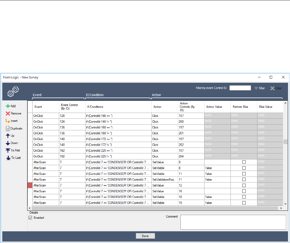
Chapter 6: Form Logic and Actions
TracerPlus Desktop Developed by Portable Technology Solutions 67
Chapter 6: Form Logic and Actions
The Form Logic Settings within TracerPlus Desktop allows for complete control over the current state of the
form. Using Form Logic, a user can completely customize the look and feel of the form based on the current
state of the form. A large number of Actions are available to both control this look and feel and modify the data
on the form as needed.
6.1 Form Logic Toolbar
Use the Form Logic toolbar to add, remove and control the order of all the logic items configured on the form.
Add
Adds a new Logic Item to the list.
Remove
Removes the currently selected Logic Item(s) from the list.
Insert
Inserts a new row above the selected row.
Duplicate
Duplicates the currently selected Logic Item(s) in the list.

Chapter 6: Form Logic and Actions
TracerPlus Desktop Developed by Portable Technology Solutions 68
Up
Moves the currently selected Logic Item up within the list.
Down
Moves the currently selected Logic Item down within the list.
To First
Moves the currently selected row(s) to the top of the list.
To Last
Moves the currently selected row(s) to the bottom of the list.
6.2 Logic Item List
The Form Logic within the user’s form is comprised of a list of logic items. These logic items are triggered by an
action on your form, specified in the Event category on the Logic List. The logic items will perform and Action on
the form specified in the Action category of the Logic List. Finally, this action will only be performed if the
Conditions defined in the If/Condition category are met.
Event
The Event defines what happens on the form when the current Logic Item is triggered. There are a number
of different options for triggering a Logic Item. They are all described below.
OnFocus
Event that occurs when a field gains focus.
LostFocus
Event that occurs when a field loses focus.
AfterScan
Event that occurs when a TracerPlus AfterScan event is fired. This includes a scan event, enter key
pressed in a field, down key pressed in a field, tab key pressed in a field, or a drop down selection is
made.
FieldValueChanged
Event that occurs when a value in a field changes.
FormInitialize
Event that occurs when a form is first opened or immediately after a submit occurs and the form
refreshed to defaults.
OnClick
Event that occurs when a button on the form is clicked.
ValidationFailed
Event that occurs when a field validation fails.

Chapter 6: Form Logic and Actions
TracerPlus Desktop Developed by Portable Technology Solutions 69
ValidationSuccessful
Event that occurs when a field validation is successful.
CalcRefreshed
Event that occurs when field calculation is done refreshing.
LookupRefreshed
Event that occurs when a lookup field has been refreshed.
OnSubmit
Event that occurs when a record submit has been performed on the form.
SyncComplete
Event that occurs when a data synchronization with TracerPlus Connect has completed.
LiveModeConnected
Event that occurs when a TracerPlus Connect live connection has been established.
LiveModeDisconnected
Event that occurs when a TracerPlus Connect live connection has been ended.
CachedGridInsert
Event that occurs when a new row is inserted into a cached grid.
CachedGridUpdate
Event that occurs when a row in a cached grid is updated by a bound control.
Event Control (By ID)
The Event Control ID specifies which control on the form is the one that should trigger the selected Event. In
some cases, this is not available. Events like OnSubmit, and FormInitialize will not use this property since no
control fires those specific events.
If/Conditions
This section allows a user to specify the conditions that must be met in order for the Logic Item to perform
the Action. If these conditions are not met the user can specify an Else Action which will be performed when
the conditions fail. To configure the conditions for a Logic Item simply click in the If/Conditions cell and a
popup will be displayed to configure the conditions.
Condition Control (By ID)
The control on the form, specified by the Control ID that will be used in the condition evaluation.
Comparison Type
The method of comparing the Condition’s Value to the value in the specified Control. This can be one of
the following: Equal (=), Not Equal (<>), Greater Than (>), Greater Than Or Equal (>=), Less Than (<), Less
Than Or Equal (<=), StartsWith, EndsWith, Contains, or HasLength.

Chapter 6: Form Logic and Actions
TracerPlus Desktop Developed by Portable Technology Solutions 70
Value
The value to compare against the value in the selected Condition Control. This can be either a static
value entered into the Value cell, or a field token can be entered so that the current value in the
specified field will be used in the evaluation. Field tokens are in the form [*n*] where ‘n’ is the zero
based field index. For example, [*4*] would take the value currently entered into field 5 on the form.
AND/OR
When using multiple conditions use the AND/OR radio buttons to select how multiple conditions will be
combined in the evaluation.
Action
The Action category of the form logic item defines what happens on the form when the event occurs and
the condition (if any) is met. The Actions are described below:
Click
Performs a click of a button on a form. Not valid for any other control type.
ExecuteSQL
Executes a SQL query against the TracerPlus database. This is not supported against live data when a
TracerPlus session is configured for live mode.
GotoControl
Sets focus to a control.
GotoPage
Sets the active tab page of a tab control.
PlaySound
Plays a sound file. This must be a .wav file that is available on the mobile device.
Refresh
Refreshes a control’s contents.
SetBackColor
Sets a control’s background color.
SetFont
Sets the font of a control.
SetForeColor
Sets a control’s fore color, this is generally the font color of the specified control.
SetPosition
Sets the position of a control on the form. This position is specified by the Top, Left, Height and Width of
the control.
SetReadOnly
Sets a control to a read only state if True, and not read only if False.

Chapter 6: Form Logic and Actions
TracerPlus Desktop Developed by Portable Technology Solutions 71
SetValidationEnabled
Turns on or off the validation of the field associated to the selected control. This can be used to override
the validation settings configured in the field settings.
SetValue
Sets the text value of a control. If the control is a field this will enter the current text for that field. If the
control is a label it will change the caption of the label.
SetVisible
Sets a control’s visibility.
ShowMessage
Displays a message on the screen.
TriggerAfterScan
Triggers an after scan event on the specified Action control.
ValidateField
Performs a field validation.
Action Controls (By ID)
Specifies the control on the form that will be used in the Action.
Action Value
The value to be used on the specified control. This value is dependent on the Action selected.
Perform Else
Specifies whether or not an else branch will be performed when the conditions specified fails evaluation. If
no conditions are specified this will be forced to False.
Else Value
The value of the Action that will be used when the conditions evaluate to False. If no conditions are defined
this option will not be available.
Details Panel
At the bottom of the logic list there is an additional panel for further settings when a logic item has been
selected.
Enabled
Enables or Disables the selected logic item.
Comment
Optional field to comment on the selected logic item. This option has no effect on the logic item, other
than to describe the item for a user.

Chapter 7: Building and Deploying your Project
TracerPlus Desktop Developed by Portable Technology Solutions 72
Chapter 7: Building and Deploying your Project
The build process is used to turn your project into a complete configuration ready to be sent to one or more
mobile devices. To access the Build/Deploy form click ToolsBuild/Deploy, or use the button described in
Chapter 3.
7.1 Build Options
Here the user can choose to build/deploy a project to a connected client (mobile device), or simply build it for
later deployment.
Build only
Use the Build only option if you wish to only build your project at this time.
Build and deploy
Select Build and deploy if you wish to both build the configuration, and copy it to the connected mobile
device.
Select Platform
Select the platform you wish to deploy to.
7.2 Building and deploying your project
Windows Mobile Options
When deploying to a Windows Mobile or CE device, it will display the connected device’s Nickname, Version of
TracerPlus and Registered status in the Connected Client section.
Android Connection Options
When deploying to an Android device, a connection type must be selected. These connection types are detailed
below.
Use Deploy Server
Generates a QR code that will be displayed on screen and can be scanned via the devices camera to deploy
projects remotely without requiring a USB connection to the PC. From this same dialog, the IP Address can
also be modified rebuilding the QR code with the new address. To send this QR Code to remote users click
the Save QR Code button.
Use Portable Device (MTP)
Deploys the project using the MTP connection method. Select the connected Android device from the
device drop down you wish to deploy to.
Note: To access the Deploy Server on the mobile device, the mobile user must access the Download Project
option from the menu within the TracerPlus application. See Section 7.3 for more info on using the Download
Project function.

Chapter 7: Building and Deploying your Project
TracerPlus Desktop Developed by Portable Technology Solutions 73
Android Debug Bridge
Deploys the project using the Android Debug Bridge. You must enable USB Debugging in the Developer
Options on your Android device, and have installed the ADB driver for your PC to enable this option.
Mapped Drive
This option deploys the project to a connected Android device that has connected as a mapped drive.
Deploy
Press the deploy button to deploy your project to the connected mobile device.
Close
Press Close to close the Build/Deployment dialog and return to the project.
7.3 Device Side Wireless Deployment (Android Only)
To complete the wireless deployment to the handheld device the project needs to be downloaded using the
Download Project dialog on the device. To Access this dialog, select MenuDownload Project. Using the
Download Project dialog, complete the steps below.
Scan QR Code
Press the Scan QR Code button to download the project using the QR Code generated in Section 7.2 or
using the Deploy Server Manager detailed in Chapter 10. After clicking Scan QR Code, scan the QR code
using the device’s built in 2D barcode scanner. If the device is not equipped with a 2D scanner, click the Use
Camera button to scan the QR Code using the device’s built in camera. Upon successful download of the
project, the dialog will close and the project can be updated by clicking the Home icon.
Manual Deployment
If the QR Code deployment feature is not used, enter the IP Address and Port of the deployment server to
the Address text box in the format of http://192.168.20.97:4409 as an example. Use the Project drop down
to select the project desired, then click the Download button to complete the project deployment. The
Refresh Projects button will retrieve the full list of available projects from the Deployment Server. Upon
successful download of the project, the dialog will close and the project can be updated by clicking the
Home icon.
Note: After a QR code deployment, the server info and downloaded project will be added to this dialog. Further
updates to this project can be deployed using this dialog and just clicking the Download button as opposed to
going through the process of scanning the QR Code again.

Chapter 8: Importing and Exporting Projects
TracerPlus Desktop Developed by Portable Technology Solutions 74
Chapter 8: Importing and Exporting Projects
It is possible to import/export your TracerPlus Desktop projects. The import/export procedures described here
enable users to share TracerPlus projects with customers, end users and the TracerPlus community.
8.1 Project Export
To export a project, choose the FileExport option from the menu. You are presented with the Export Project
dialog. After entering the information described below, click the Export button to export your project.
Export To
The Export To field displays the save location of the exported file. To change the location, click the browse
button and navigate to the desired location.
Created On
This property is a read-only time stamp marking when the export file was created.
Revision
This field provides the project creator with the opportunity to assign a version number to the exported file.
Author
This field can be used to identify the creator of the project.
Password
Enter a password to protect this project from being modified by anyone else unless they have the password.
Comment
The Comment field allows the author to include a note with the exported file.
8.2 Project Import
To import a project, choose the FileImport option from the menu. You are presented with the Import Project
dialog. You can choose to import your project from the two different sources listed below. If the project is
password protected, you will need to enter the correct password to continue importing the project to modify it.
You can deploy the project to your device if you do not have the password.
From file (.tpe)
Choose this option to import a project from a TracerPlus Desktop export file (.tpe).
From TracerPlus.com
Choose this option to import a project from the Tracerplus.com Solution Center, an online library of free,
premade apps ready to be deployed. This option can also be accessed from the Welcome screen, by clicking
the Samples button.
Follow the on-screen instructions to complete the import process.
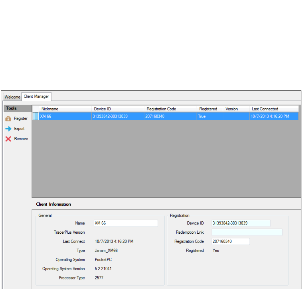
Chapter 9: Client Manager (Windows Mobile/CE only)
TracerPlus Desktop Developed by Portable Technology Solutions 75
Chapter 9: Client Manager (Windows Mobile/CE only)
TracerPlus Desktop allows you to view all of your Windows Mobile/CE clients (devices) and their status from the
Client Manager. This allows the user to quickly and easily view registration, version and other device
information. To view the Client Manager tab, click Tools Client Manager.
The Client Manager provides an easy way to register licenses of TracerPlus after purchase. You will need an
active internet connection and your Redemption Link email. This email is sent automatically after purchase.
9.1 Tools
Register
Select the client or clients (CTRL + Click) you would like to register in the grid and click the Register button.
This opens the Client Registration window. Follow the on-screen instructions to complete the registration
process.
Client Registration
After selecting the clients to register, enter a valid Redemption link for each of the clients, and a valid
Email address. Click the Request button to submit your request. If successful, the client(s) will be
automatically registered and an Email is sent to the address provided.
Chapter 9: Client Manager (Windows Mobile/CE only)
TracerPlus Desktop Developed by Portable Technology Solutions 76
Export
Use the Export button to export a file that contains complete registration info for all your devices. This
can be used for large scale deployment operations using auto-restore .cab files, or to keep a separate
record of all your device registrations.
Remove
Click the Remove button to remove the currently selected client from the Client Manager. Connected
clients cannot be removed from this list.
9.2 Client Grid
The Client grid lists all of the devices which have connected to TracerPlus Desktop. Use this grid to manage the
clients and check client status. This includes information relevant to your devices, and the ability to assign
unique nicknames. To view detailed information on each client, select the client from the grid and review the
Client Information panel.
Note: Mobile Client registration can now be done remotely through TracerPlus on the device. Simply click the
register option in TracerPlus and you are prompted to enter a Redeem Code. Enter the Redemption Link(s) you
received in the Redemption Link email and click the Key icon. If you are connected to the internet, a code will be
returned and your device will now be registered.
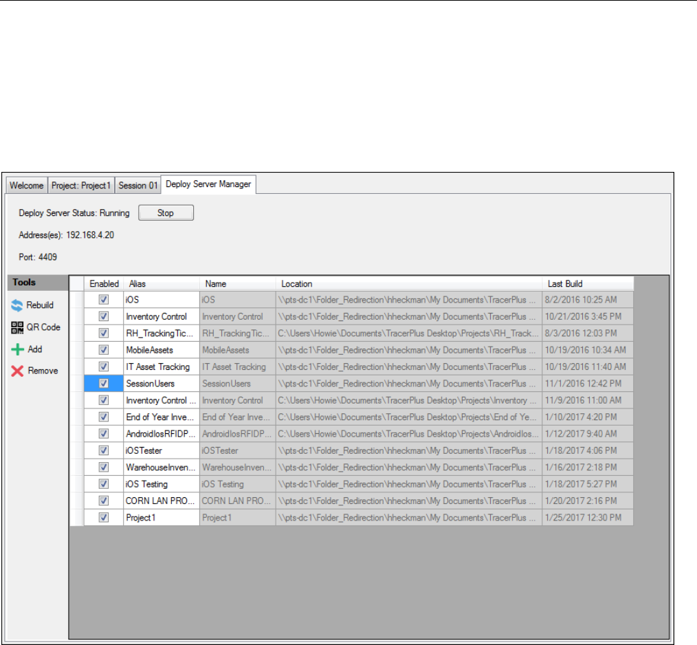
Chapter 10: Deploy Server Manager (Android only)
TracerPlus Desktop Developed by Portable Technology Solutions 77
Chapter 10: Deploy Server Manager (Android only)
TracerPlus Desktop allows you run a TracerPlus Project Deploy Server right from your PC. The Deploy server
allows your mobile users to download a project from your server at any time simply by scanning a QR code or
selecting a project from a presented drop down list on the mobile device. This eliminates the requirement to
have a mobile device connected to your PC in order to deploy a new project.
Deploy Server Status
Displays the current status of the deploy server along with the option to Start and Stop the server. This must be
running in order to use the Deploy Server feature. This is set to stopped by default however can be set to start
automatically when TracerPlus Desktop starts via the ViewPreferences dialog within TracerPlus Desktop.
Address(es)
Displays the current IP address the Deploy Server is running on. This is typically the IP address of the PC
TracerPlus Desktop is installed to. This address can be modified during the QR Code deployment method if
needed.
Port
Displays the current port the Deploy Server is using and should be open on your firewall. This is set to port 4409
by default. This port can be changed in TracerPlus Desktop via the ViewPreferences dialog.

Chapter 10: Deploy Server Manager (Android only)
TracerPlus Desktop Developed by Portable Technology Solutions 78
10.1 Tools
Rebuild
Select a project from the grid and click the Rebuild button to rebuild the project for deploy without having
to open the project in TracerPlus Desktop. This will also update the selected project with any changes that
have been made to it.
QR Code
Select a project from the grid and click the QR Code button to generate a QR Code. This QR code can be
scanned within TracerPlus on the mobile device to load the selected project to the device. Alternatively, this
QR code can be saved as an image and sent via email to any users who may not have access to the QR code
presented on the screen. The Deploy Server IP Address and Port are embedded into the QR code and is how
the device knows how to communicate back to the deploy server.
Add
Click the Add button to add a new project to the Deploy Server library
Remove
Click the Remove button to remove a project from the Deploy Server library
10.2 Project Grid
The Project grid lists all of the projects available to your mobile devices when accessing this Deploy Server.
Information about each of the projects is presented in the grid along with the ability to enable or disable any
given project from being available for deploy via the Deploy Server.
• Enabled – Enable whether or not a project is accessible via the Deploy Server.
• Alias – Used to give the project a name other than the project name and what is displayed in the Project
Download list on the device.
• Name – Displays the TracerPlus Desktop given Project Name.
• Location – Displays the location of the TracerPlus Desktop Project.
• Last Build – Displays the date/time the project was last Built.
Note: To access the Deploy Server on the mobile device, the mobile user must access the TracerPlus Download
Project option from the menu within the TracerPlus application. Please see Section 7.3 form more info on
downloading these projects.

Appendix A: TracerPlus Keyboard Shortcuts
TracerPlus Desktop Developed by Portable Technology Solutions 79
Appendix A: TracerPlus Keyboard Shortcuts
The following document provides information regarding navigation within TracerPlus using keyboard shortcuts.
This guide may be useful for any device but is especially relevant for any device running without a touch screen.
Function
Key
Examples
Dropdown Item Select
Up/Down
Any Dropdown box.
Tab Switching
Left/Right
Launcher.
Window Scroll
Alt Up/ Alt Down
Entry Form, Entry Grid.
Control/Button Selection
Tab
Any form with multiple controls.
Click/Un-Click Check box
Space bar
Allow checking/un-checking of check boxes.

Appendix B: Advanced Launcher Screen Customization
TracerPlus Desktop Developed by Portable Technology Solutions 80
Appendix B: Advanced Launcher Screen Customization
As described in Section 4.3, the TracerPlus Launcher screen is used to easily navigate TracerPlus sessions and
allows for easy data entry and data viewing. A Launcher file is created automatically when TracerPlus Desktop
deploys to your device. This file contains the default instructions along with any tab visibility settings chosen
within desktop’s Launcher settings.
Additional Launcher configuration is possible allowing for the following:
• Custom tab labeling.
• Custom session icons.
• Additional tabs.
• The ability to specify which sessions appear on each tab.
These configurations are especially useful for grouping sessions to form an organized menu of different mobile
applications. However, this requires some configuration outside of TracerPlus Desktop. To reconfigure the
Launcher screen, you need to replace the Launcher.tsc file that is created by TracerPlus Desktop upon
deployment.
This file can easily be created in Notepad or other text editing programs. Alternatively, you can navigate to the
\My Documents\TracerPlus9\SystemInfo\Skins folder of the connected device and copy the default
Launcher.tsc file to your PC, using this file as a partially created template. Once you have completed your
custom Launcher, it can be imported to your desktop project using the Import option discussed in Section 4.3. If
your custom Launcher is using different icons, these .bmp files must manually be copied over to the \My
Documents\TracerPlus9\SystemInfo\Skins folder of the device.
Launcher file Tags
The Following tags are used to create the Launcher.tsc file. An example is available below.
<launcher>
This is the root node (or tag) of the Launcher file.
useroverride
The useroverride attribute must be set to true if the user wishes to modify the Launcher file.
<pages>
The starting node (or tag) of the individual Launcher pages to be created.
<page>
This tag contains the page index and the name attributes.
page index
A zero based index of the pages (The first page should be labeled "0").
name
This attribute defines the visible name shown on the new tab being created.
<sessions>
The sessions tag marks the beginning of the session being added to the current page.
<session>
Defines a new session to be added to the current page and to encapsulate session attributes.
index
The index of the session this shortcut should point to (The first session should be labeled "0").
caption
The text that displays below the session icon.
cell
The location on the screen where the shortcut is displayed. This can be a value between 0 and 8
with 0 being the top left cell, and 8 being the lower right cell.
view
Specifies whether the shortcut will open the data entry or view data screens. Options are 1 –
View Data, and 2 – Data Entry Screen.
icon Defines a custom icon to be displayed for the session shortcut. This should be a 28x28 pixel
bitmap (.bmp) image. The bitmap file is placed in the Skins folder of the device.
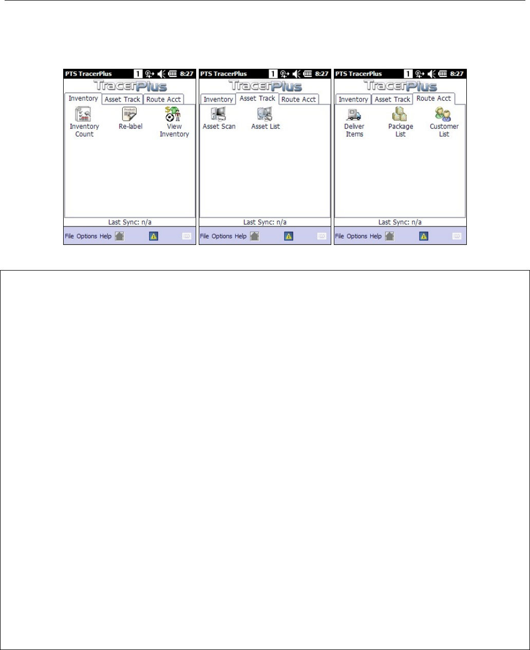
Appendix B: Advanced Launcher Screen Customization
TracerPlus Desktop Developed by Portable Technology Solutions 81
Example Session Launcher file
To create three tabs similar to these below, review the following Launcher.tsc file.
Tab 1: Inventory Tab 2: Asset Track Tab 3: Route Accounting
<?xml version="1.0" encoding="utf-8"?>
<launcher version="8.0" useroverride="True" showconfig="False" showviewdata="False" showdataentry="False"
customlauncher="True">
<pages lastselectedtab="0">
<page index="0" pageref="" name="Inventory">
<sessions>
<session index="0" caption="Inventory Count" cell="0" view="2" icon="inventory.bmp" />
<session index="2" caption="Re-label" cell="1" view="2" icon="RMS_Relabel.bmp" />
<session index="1" caption="View Inventory" cell="2" view="1" icon="RMS_Items.bmp" />
</sessions>
</page>
<page index="1" pageref="" name="Asset Track">
<sessions>
<session index="3" caption="Asset Scan" cell="0" view="2" icon="asset-scan.bmp" />
<session index="4" caption="Asset List" cell="1" view="1" icon="asset-view.bmp" />
</sessions>
</page>
<page index="2" pageref="" name="Route Acct">
<sessions>
<session index="5" caption="Deliver Items" cell="0" view="2" icon="RMS_Receive.bmp" />
<session index="6" caption="Package List" cell="1" view="1" icon="RMS_View_Package.bmp" />
<session index="7" caption="Customer List" cell="2" view="1" icon="customer-list.bmp" />
</sessions>
</page>
</pages>
</launcher>

Appendix D: TracerPlus Email Message Report Sample
TracerPlus Desktop Developed by Portable Technology Solutions 82
Appendix C: Date and Time Formatting Characters
z Julian Date. Integer assigned to a whole solar day in the Julian day count.
d
The one-digit or the two-digit day.
dd
The two-digit day. Single-digit day values are preceded by a zero.
ddd
The three-character weekday abbreviation.
dddd
The full weekday name.
gg
The period and era string that is contained in the CAL_SERASTRING value that is
associated with the specified locale. Windows CE ignores this e
lement if the date to
be formatted does not have an associated era or period string.
h
The one-digit or the two-digit hour in 12-hour format.
hh
The two-digit hour in 12-hour format. Single-digit values are preceded by a zero.
H
The one-digit or the two-digit hour in 24-hour format.
HH
The two-digit hour in 24-hour format. Single-digit values are preceded by a zero.
m
The one-digit or the two-digit minute.
mm
The two-digit minute. Single-digit values are preceded by a zero.
M
The one-digit or the two-digit month number.
MM
The two-digit month number. Single-digit values are preceded by a zero.
MMM
The three-character month abbreviation.
MMMM
The full month name.
t
The one-letter A.M. and P.M. abbreviation (that is, “AM” is displayed as “A”).
t’’’M’’’
The two-letter A.M. and P.M. abbreviation (that is, “AM” is displayed as “AM”).
y
The year is displayed as the last two digits, but with no leading zero for any year that
is less than 10.
yy
The last two digits of the year. For example, 1998 would be displayed as “98”.
yyyy
The full year. For example, 1998 would be displayed as “1998”.

Appendix D: TracerPlus Email Message Report Sample
TracerPlus Desktop Developed by Portable Technology Solutions 83
Appendix D: TracerPlus Email Message Report Sample
Sample format using advanced features
The following is a sample report using all the previously described elements. The end result is a mobile
inspection report available for emailing.
This example may be useful because it discusses how to use these provided reports in conjunction with
TracerPlus data. This example also includes a brief discussion on how images and signatures can be attached to
an email message.
<format>
<definevars>
<var name ="date" type="DB" source="field1"/>
<var name ="location" type="DB" source="field2"/>
<var name ="item1" type="DB" source="field3"/>
<var name ="item2" type="DB" source="field4"/>
<var name ="item3" type="DB" source="field5"/>
<var name ="item4" type="DB" source="field6"/>
<var name ="item5" type="DB" source="field7"/>
<var name ="photo" type="BIN" source="field8"/>
<var name ="inspector" type="DB" source="field9"/>
<var name ="signature" type="BIN" source="field10"/>
<var name ="message_subject" type="DB" source="field11"/>
<var name ="message_recipients" type="DB" source="field12"/>
</definevars>
<printerdata>
<formatheader max_records_per_page="1">
</formatheader>
<pageheader>
<br/>
New Inspection Report<br/>
Date: <var name="date"/><asc>0D</asc>
Location: <var name="location"/><asc>0D</asc>
<br/>
Inspection Items:<br/>
</pageheader>
<record>
Item 1: <var name="item1"/><asc>0D</asc>
Item 2: <var name="item2"/><asc>0D</asc>
Item 3: <var name="item3"/><asc>0D</asc>
Item 4: <var name="item4"/><asc>0D</asc>
Item 5: <var name="item5"/><asc>0D</asc>
<var name="message_subject" disableprint="1"/>
<var name="message_recipients" disableprint="1"/>
</record>

Appendix D: TracerPlus Email Message Report Sample
TracerPlus Desktop Developed by Portable Technology Solutions 84
<pagefooter>
<br/>
Inspector: <var name="inspector"/><asc>0D</asc>
<br/>
Attachments:<br/>
<var name="signature"/><asc>0D</asc>
<var name="photo"/><asc>0D</asc>
<br/>
<asc>0C</asc>
</pagefooter>
<formatfooter>
</formatfooter>
</printerdata>
</format>
<definevars>
This section of a report defines the variable data for a messaging report. These definitions allow you to define
variables that are assigned to specific fields within a TracerPlus session. In this example, we have defined the
following variables:
Date, Location, Items 1-5, Photo, Inspector, Signature, Subject and Recipients
Each variable definition contains information about the datatype along with the TracerPlus field mapping for use
in obtaining the dynamic data associated to that variable. Note that variables of type DB indicate text data that
is intended to be inserted into the report. Variables of type BIN indicate binary data that are intended to be
included in this email message as attachments.
<formatheader>
Every report contains a format header which usually contains additional parameters relative to the overall
report. In the example above, the only setting required in this area is the number of inspection records to
include in this report. Since this inspection report is only emailing data on one specific site inspection, this value
should be “1” as shown.
<pageheader>
Every report also contains a page header section which allows you to define elements that appear on every
page. In the example above, since there is only one page, this contains simple header type information for the
body of the email message being prepared. The title of this sample report is “New Inspection Report”. Also
included in this header are the date and location of this particular inspection. It is worth noting that both of
these values are referencing data from TracerPlus via the respective variable definitions.

Appendix D: TracerPlus Email Message Report Sample
TracerPlus Desktop Developed by Portable Technology Solutions 85
<record>
The record section of a report allows you to define the section(s) of the report that will print for every record
included in this message. In the example above, this will only represent one record since we are only creating
one inspection report from one record.
In this example, the data being referenced here are Items 1-5. These items are generic to this example but might
reflect certain inspection items for a given location.
<pagefooter>
The pagefooter allows any summary type data to be sent. In this example, there are simply 2 references to the
associated attachment files; the signature and photo.
message_subject
This variable setting allows you to reference a specified field in the TracerPlus data to use as your email subject.
This allows the subject to vary based on the data being sent, and overrides the Subject setting defined in the
Messaging section.
message_recipient
This variable setting allows you to reference a specific field in the TracerPlus data to use for your email
recipient(s). This is useful when the email address is driven by the data being entered, and overrides the
Recipient setting defined in the Messaging section.
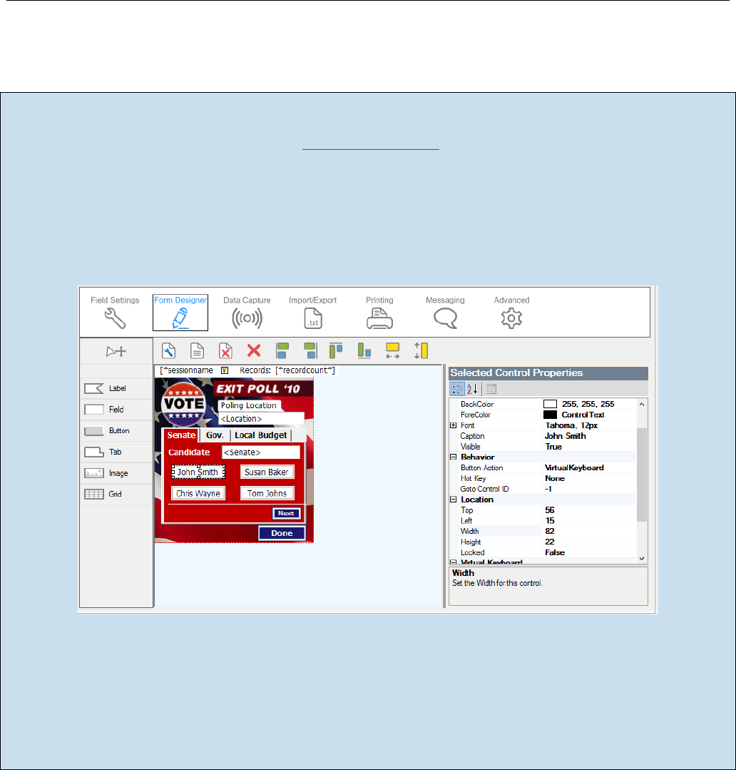
Appendix E: Field Input Example
TracerPlus Desktop Developed by Portable Technology Solutions 86
Appendix E: Field Input Example
Field Input Sample - Exit Polling Application
This Project is available for free download at www.tracerplus.com in the online Solution Center.
In this sample, the Field Input is used to capture Exit Polling information. The end result is a simple form
allowing a user to select the appropriate candidate using one of four buttons on the form. Each of these buttons
are set as Field Input buttons and they enter the selected candidate into the Candidate field (the Target
Control). In this case the TriggerAfterScan is set to True which enables the Auto Submit set in the Field settings
to automatically save the selected candidate, then clear the field for the next entry.
Setting the Field Input properties
The Target Control ID value has been set to 3 which in this example matches the System>Control ID of the
Candidate field above the buttons. Overwrite has been set to true so each time a user selects a candidate it
enters only that value in the field. TriggerAfterScan causes the candidate to be submitted since the Candidate
field has auto submit set. Lastly, the String Value is set to the candidate’s name. This is the value entered into
the Candidate field and recorded in the database when the button is pressed.
Appendix F: Text Data Import and Export
TracerPlus Desktop Developed by Portable Technology Solutions 87
Appendix F: Text Data Import and Export
Although TracerPlus Connect is recommended for data syncing to and from ODBC, Excel and Text sources, users
also have the option to manually import and export text data. This requires the manual steps outlined below.
Importing Text Data
TracerPlus users can manually import both drop down and session data. Follow the instructions below for
importing data into the TracerPlus Mobile Client.
Importing Drop Down Data
Data can be imported to drop down fields by placing a text file into the \My
Documents\TracerPlus9\Data\For_Import folder of your connected device. This file should be named in the
format of SxxFyy.txt where xx = the session number and yy = the field number (e.g. S02F05.txt would import
drop down values to field 5 in session 2). The file should contain each drop down value separated by a
carriage return. When using drop down filters or DB Values, this data should be separated by a tab
character. Once copied to the device, select FileImport Data to import the drop down list(s). Alternatively,
appending a _auto to the text filename auto imports drop down data when TracerPlus is launched on your
device.
Importing Session Data
Data can be imported to a session by placing a tab-delimited text file into the \My
Documents\TracerPlus9\Data\For_Import folder of your connected device. This file should be named in the
format of Sxx_data.txt where xx = the session number (e.g. S03_data.txt would import data to session 3).
Once copied to the device, select FileImport Data to import this session data. Alternatively, appending a
_auto to the text filename auto imports the session data when TracerPlus is launched on your device.
Custom Import
Custom importing allows you to control which TracerPlus session to import data into and where that
data comes from. This differs from general importing in that it enables you to only choose an individual
session to import into instead of all sessions. To perform a Custom Import, select the Session to import
into, then select the data file you wish to import.
Exporting Text Data
Data can be exported from TracerPlus by selecting the FileExport Data option, or by clicking a button on your
form that has a button action of ExportData. This exports data for any session it is enabled for to the \My
Documents\TracerPlus9\Data\Exported folder of your device. The formatting of this data export is configured
via the settings described in Section 5.4. When exporting data containing images or signatures, these files are
saved to a Bin folder located in the directory referenced above.
Note for Android OS Users: The location of the export folder differs slightly on Android based devices. This
location is \tracerplus9\data\exported and is typically found in the \mnt\sdcard directory.
Note for Android OS Users: The location of the import folder differs slightly on Android based devices. This
location is \tracerplus9\data\for_import and is typically found in the \mnt\sdcard directory.
